Best Art Foundation Websites of 2026 (21 Real-World Examples)
Art foundation websites that make collections, archives, exhibitions and artist support easier to find.
Explore 21 real foundation websites and specific public resource pages, with genuine screenshots, original observations and practical tradeoffs. The strongest patterns connect a cultural mission to useful visitor tasks.
An art foundation may serve applicants, researchers, visitors, educators, rights requesters and supporters at once. A powerful artwork or artist portrait can establish a distinctive identity, but it does not tell a researcher how to access an archive or an artist whether a grant accepts applications. These examples show different ways to connect historical stewardship, current programmes and practical information.
The collection includes artist-endowed foundations, grantmakers and collection or exhibition foundations. Judd’s 101 Spring Street page, KADIST’s International programme page and the Keith Haring Foundation’s About page are deliberately identified resource views rather than interchangeable homepage captures. Reviews concern public website design and information, not the quality of collections, grant decisions, investment value or independently certified accessibility.
Before the examples
What makes good art foundation website design in 2026?
Turn the mission into visitor tasks
Make the distinction between learning about an artist, exploring artworks, applying for support, planning a visit and requesting rights clear. A broad foundation menu should not require visitors to understand the organisation chart.
Give programmes dependable dates and status
Attach real opening and closing dates, locations, eligibility routes and application states to the relevant records. Preserve completed programmes as archives rather than making old announcements appear current.
Connect images to useful context
Identify works, artists, locations and credits where permitted. Distinguish an exhibition photograph, an archive record, a commissioned film and a decorative campaign image.
Keep access and maintenance visible
Explain archive closures, temporary venue changes and access arrangements honestly. Offer a meaningful alternative, and keep essential research or grant routes available when the homepage changes.
The collection · 21 examples
21 art foundation websites worth studying
The random target of 21 was saved before research. All 21 examples have accepted direct browser captures and original reviews. Joan Mitchell Foundation is the explicit Editors Choice for turning its dual mission into useful, distinct routes for researchers and living artists.
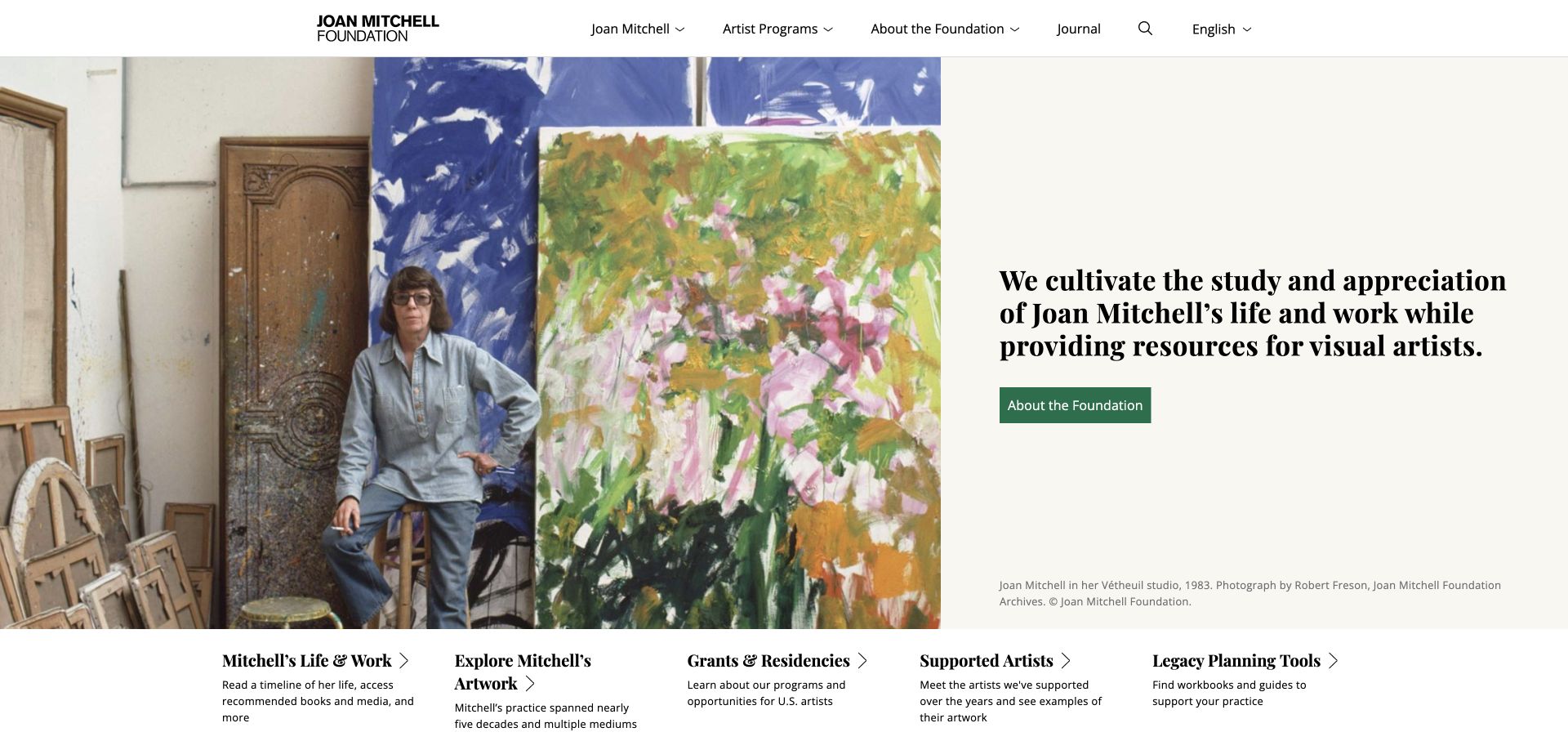
The Joan Mitchell Foundation places a captioned studio photograph beside a concise explanation of its two-part mission. Direct paths underneath distinguish the artist’s life, artworks, grants and residencies, supported artists and legacy-planning tools. Journal dates and the fellow announcement add current activity without replacing those enduring routes. This is an especially useful model for a specialist foundation serving researchers and practising artists through the same website.
What you can learn
Turn each part of a foundation’s mission into an explicit visitor route. Let an evocative image establish context while practical resources remain immediately discoverable.
Pros
The five task-based entry points distinguish research from artist support.
A full image credit gives the historical photograph meaningful context.
Cons & considerations
The dense row of entry points needs careful reflow on narrow screens.
Prominent announcements must retain their dates as funding cycles change.
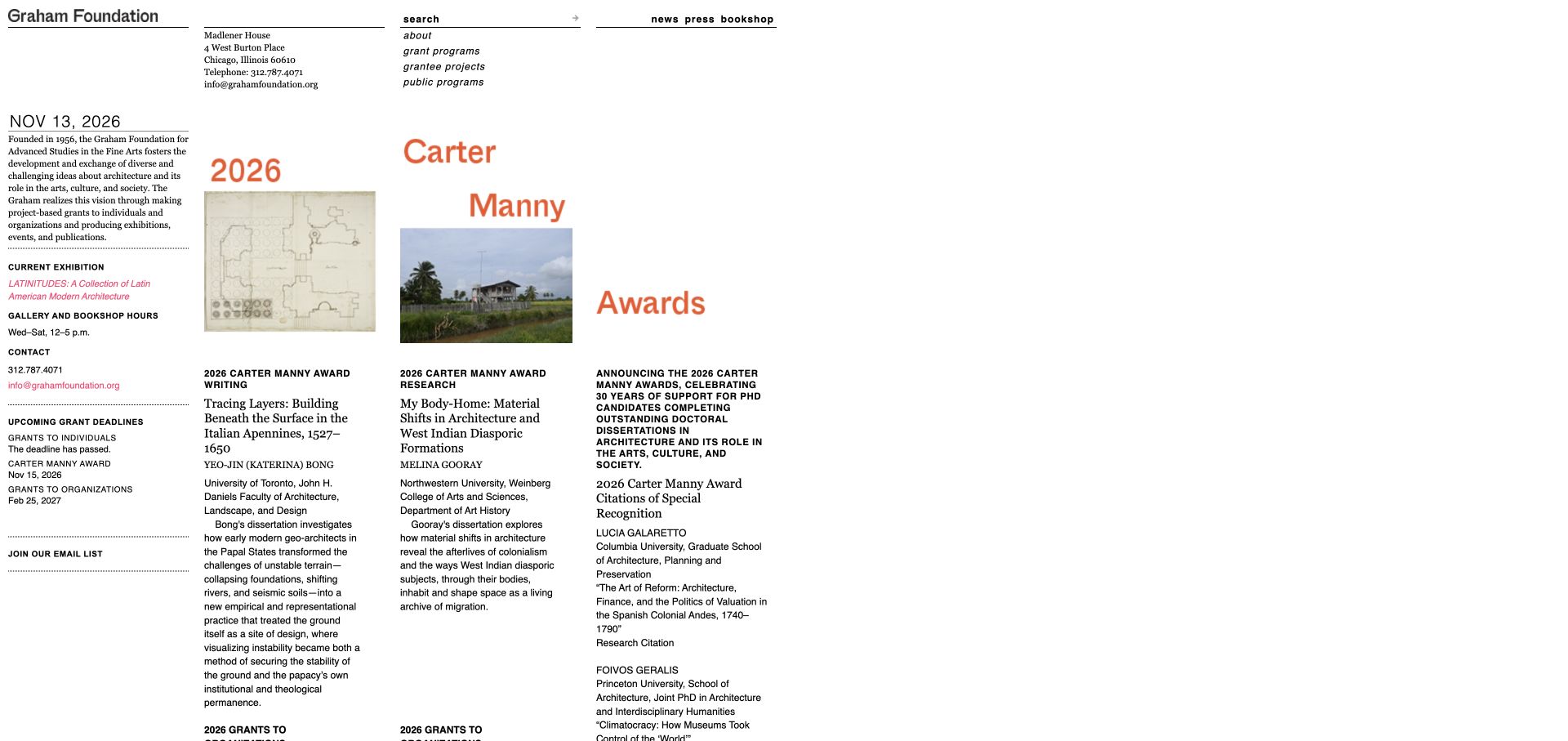
The Graham Foundation uses a tightly set, newspaper-like grid rather than a large marketing hero. Address, gallery hours, current exhibition and upcoming grant deadlines appear alongside the foundation’s purpose. Grantee projects identify titles, people, organisations and project types. The information is unusually concrete, although the narrow columns and small text make this a reference for editorial organisation rather than a typography specification to copy unchanged.
What you can learn
Keep deadline status and visit details close to programme discovery. A closed application should say that it is closed while retaining a route to the relevant guidance.
Pros
Expired and forthcoming grant dates are distinguished explicitly.
Grantee records connect the funding programme to identifiable work.
Cons & considerations
Small body text and narrow fixed-looking columns reduce reading comfort.
Several images have generic filenames rather than descriptive alternatives.
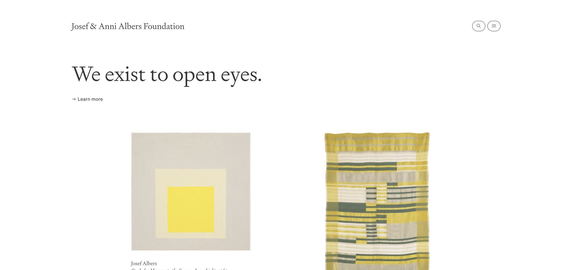
The Josef & Anni Albers Foundation gives its purpose a short typographic opening, followed by large, individually identified works. Its menu separates the artists, art, learning, resources and the foundation, with biography, teaching, archives and rights as specific destinations. The quiet surface makes the artwork prominent without removing scholarly structure. The main tradeoff is that much of that useful structure sits behind the menu control.
What you can learn
Present objects as distinct records with artist, title and date, then connect them to learning and research. A spare homepage still needs a dependable information architecture.
Pros
Artwork labels identify the subject rather than treating images as decoration.
Learning, archives and rights have distinct navigation roles.
Cons & considerations
A menu-only top level adds a step for returning researchers.
A broad collection needs search and useful filters beyond attractive image spacing.
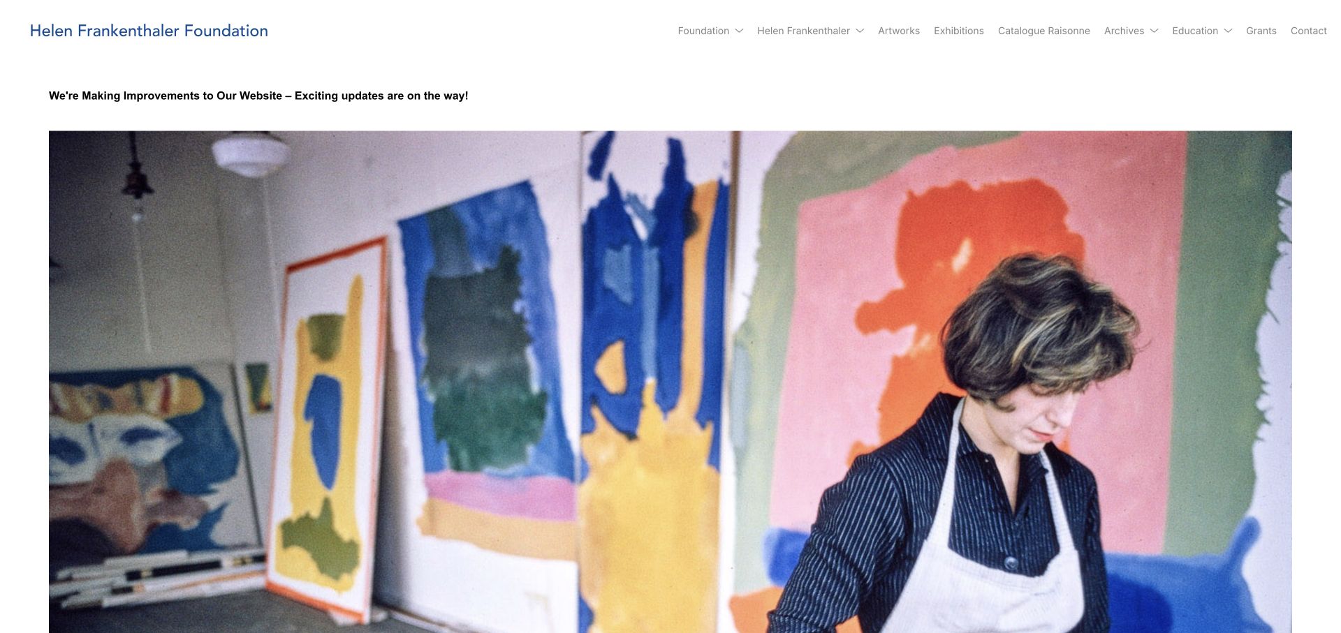
The reviewed Helen Frankenthaler Foundation homepage openly states that website improvements are underway. A large, credited studio photograph remains the central content, while the navigation preserves routes for artworks, exhibitions, archives, education and grants. This is not presented as a fully developed new homepage. Its useful lesson is continuity: an update notice can be honest without turning the whole public site into a dead end.
What you can learn
During a redesign, keep essential resources reachable and explain the temporary state clearly. Do not let an announcement replace all existing research and grant navigation.
Pros
The temporary website state is communicated directly.
Core artwork, archive, education and grant routes remain visible.
Cons & considerations
The homepage offers little current programme detail during the stated improvements.
Light navigation text needs adequate contrast against the white background.
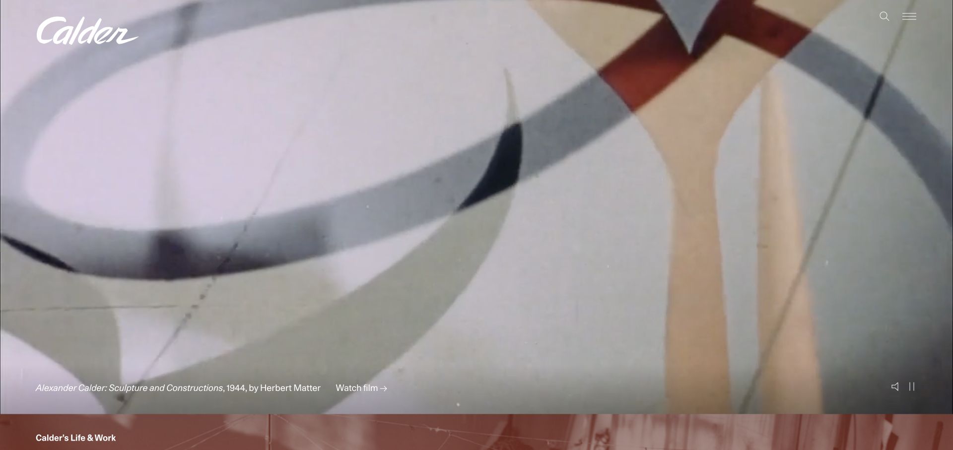
The Calder Foundation uses historic films as an immersive introduction, with a visible film title and playback controls over the image. Beneath, life periods, an archive and a worldwide map provide different routes into the artist’s work. Artwork and historical-photograph records include useful identifying context. The opening is distinctive, but some reviewed film and timeline links expose an older hosting hostname and should be audited before being imitated.
What you can learn
Choose media that expresses something meaningful about the artist, then retain ordinary biography and archive paths. Historical footage needs identification, controls and a nonvideo route to the information.
Pros
The film is identified rather than used as an anonymous background.
Timeline, archive and geographical browsing support different research approaches.
Cons & considerations
Large moving imagery requires careful motion and loading behaviour.
Several destinations use an older host and merit a canonical-link review.
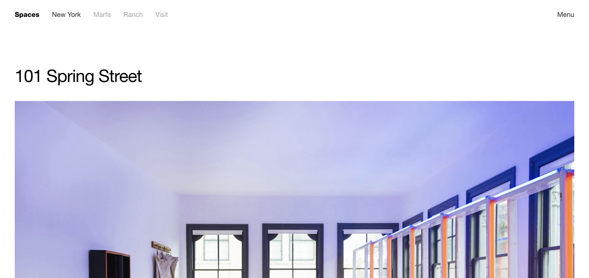
The Judd Foundation’s 101 Spring Street page gives the building a clear title and large interior image, then separates location, art, history, visiting and restoration. Links connect installed artworks and the booking route to the same place record. This makes a specific foundation property more than a promotional photograph. It also shows why a detailed location page can be more useful to study than an abstract organisational homepage.
What you can learn
Treat a preserved space as a maintained content record. Connect its history and installed works to practical visiting information without making the booking action carry the whole explanation.
Pros
The page distinguishes history, artworks, restoration and visit tasks.
A place-specific booking route is linked from the relevant context.
Cons & considerations
The large opening image pushes practical visit information farther down.
Long historical sections benefit from clear section navigation on smaller screens.
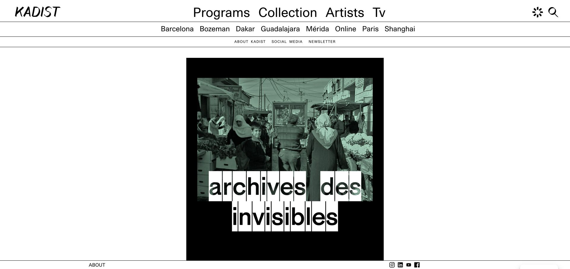
KADIST’s reviewed International page leads with large programme, collection, artist and video routes, followed by location choices. The programme stream names exhibitions, events, venues and date ranges, while the footer retains Paris address and gallery hours. The strong black-and-white structure supports changing artwork imagery. It is an effective way to show a distributed programme, provided each location and event maintains its own unambiguous context.
What you can learn
When programmes span several cities, keep location and event dates attached to each item. Do not rely on the organisation’s headquarters footer to explain where an individual event happens.
Pros
Programme cards pair titles with venue or city and dates.
Collection and artist exploration remain separate from current events.
Cons & considerations
The large navigation and image-led stream create a demanding first screen.
A long international feed needs useful filtering and clear archive states.
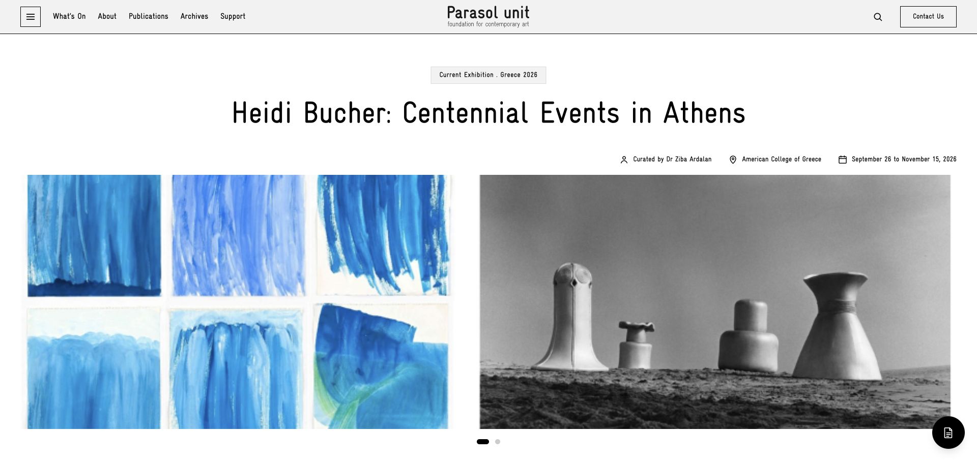
Parasol unit places its current exhibition title above a two-image presentation and supplies curator, host location and dates in the same section. The navigation keeps What’s On, publications, archives and support visible. Lower on the page, institutional background and supported artists broaden the context. The exhibition is not assumed to take place at a permanent home venue, which is an important detail for a foundation working across locations.
What you can learn
Treat curator, venue and dates as essential exhibition content, not footer details. Preserve an archive and publication route so completed programmes remain useful.
Pros
Current exhibition metadata is grouped together near its imagery.
Archives and publications have permanent navigation destinations.
Cons & considerations
An automatic newsletter dialog interrupts the first visit.
Repeated carousel content requires a careful accessible implementation.
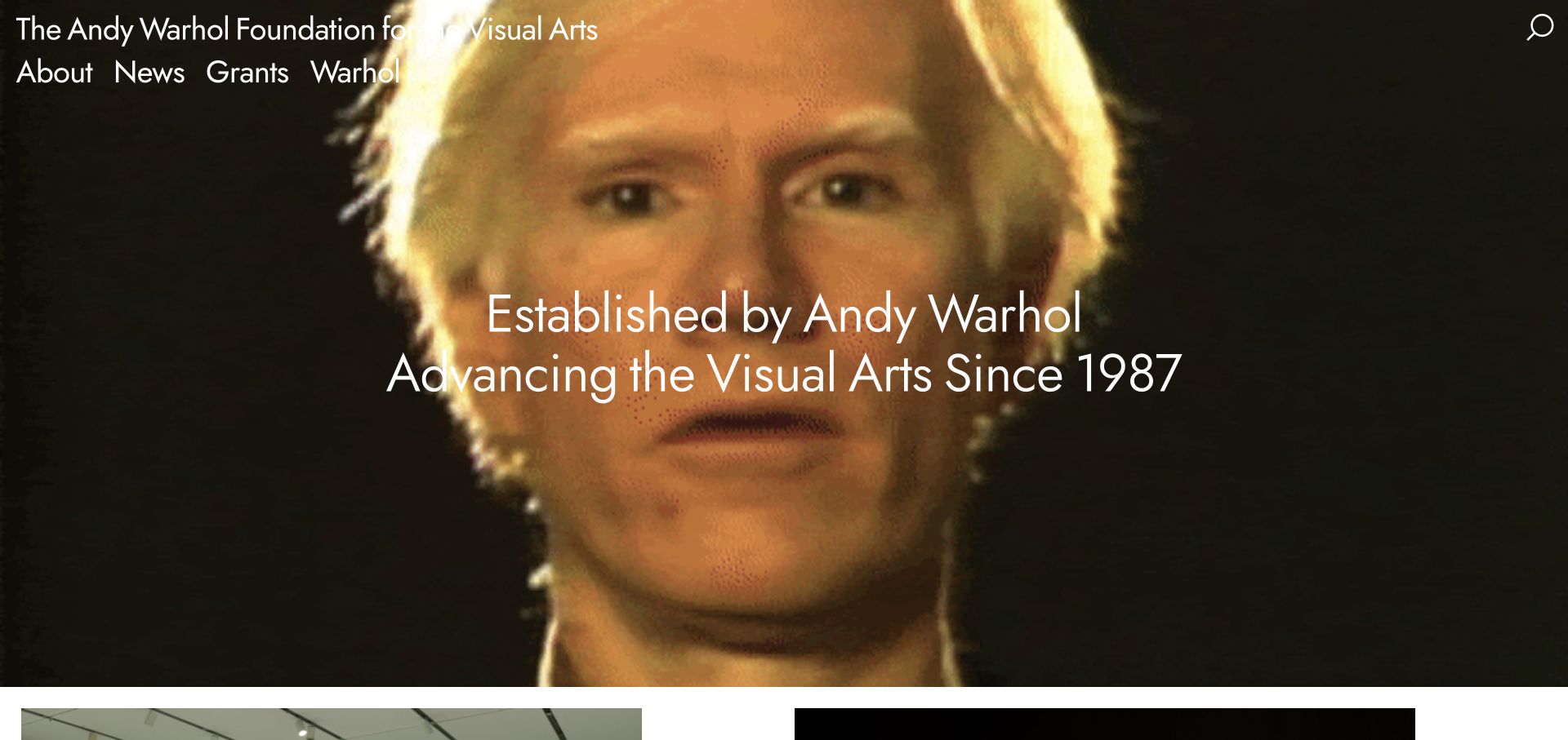
The Andy Warhol Foundation uses a direct statement over a historic image, with About, News, Grants and Warhol as the main choices. The page then gives supported exhibitions and organisations specific titles, locations and categories. Recent organisational news has an explicit date. This prevents the foundation’s identity from becoming only an artist biography, while the photographic opening demonstrates the contrast challenges that large overlay text can create.
What you can learn
Make the relationship between legacy and present-day grantmaking visible. Show the supported project, organisation and location rather than replacing that evidence with a general impact slogan.
Pros
The main navigation distinguishes grants from artist information.
Supported work is identified by organisation, place and support category.
Cons & considerations
White text can lose contrast over bright areas of the hero image.
Large visual openings should not obscure application guidance for urgent visitors.
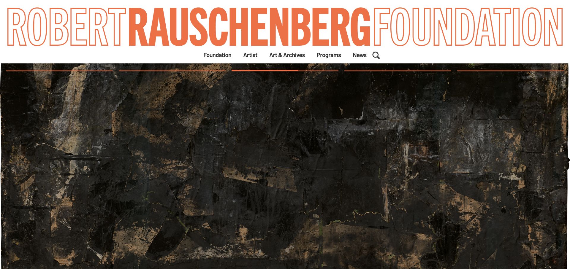
The Robert Rauschenberg Foundation gives its name an oversized orange wordmark but keeps the navigation straightforward: foundation, artist, art and archives, programmes and news. The homepage links a catalogue raisonné, artwork discovery, oral histories and archival collections. A notice explains a forthcoming archives closure and its reason. The expressive identity therefore sits on top of useful operational information rather than replacing it.
What you can learn
Let the identity be distinctive while task labels remain plain. Announce access changes where researchers can find them, with dates and an explanation rather than an unexplained unavailable state.
Pros
Archive, oral-history and artwork resources have distinct destinations.
The forthcoming researcher-access change is explained in a visible news item.
Cons & considerations
A very large wordmark consumes substantial first-screen space.
Repeated Learn More links need sufficient contextual accessible names.
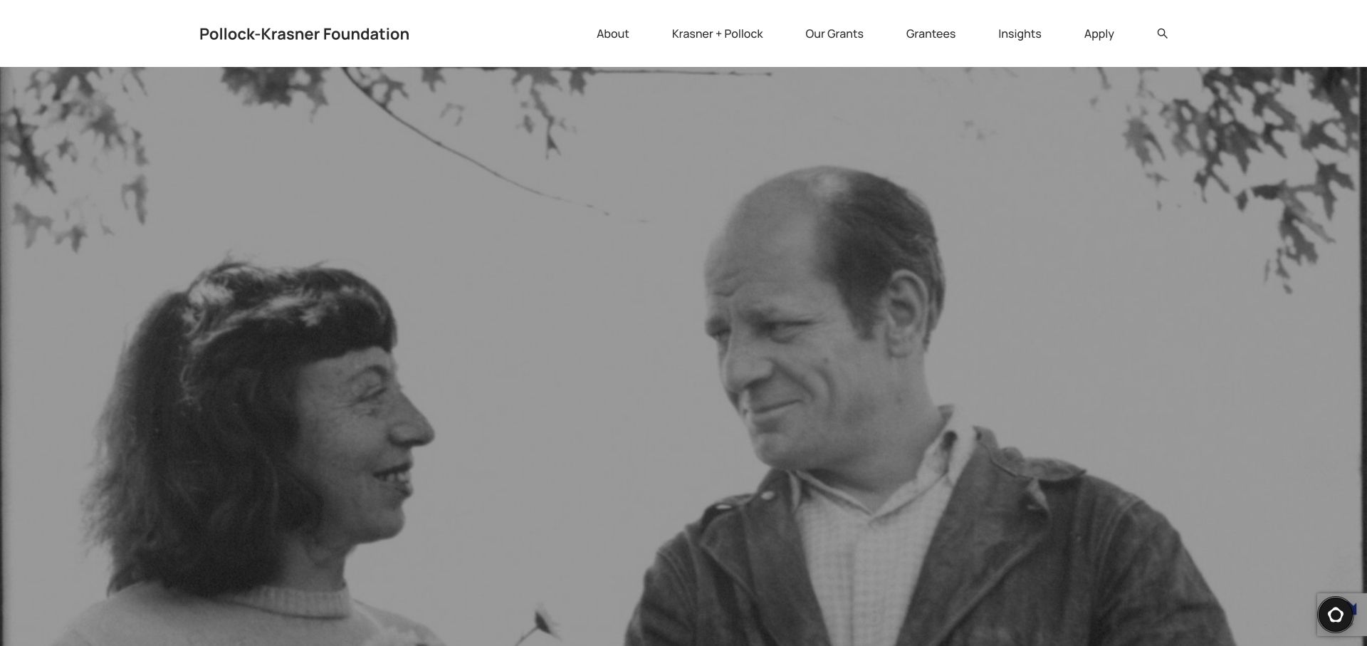
The Pollock-Krasner Foundation pairs a restrained navigation with a full-width historical photograph. Our Grants, Grantees and Apply are direct choices alongside information about the founders. Lower content connects the artists’ legacy to support for living practitioners and provides named, credited artworks. The structure is useful for foundations whose most urgent visitors are applicants, although the large image delays the plain-language explanation on the first screen.
What you can learn
Keep application and recipient information as first-class navigation items. Historical content can explain the origin of the programme without forcing an applicant through a biography first.
Pros
Apply and Grantees are visible top-level routes.
Artwork credits distinguish historical material from decorative imagery.
Cons & considerations
The photographic opening occupies almost the whole initial viewport.
An embedded chat service adds another interface that needs testing and privacy review.
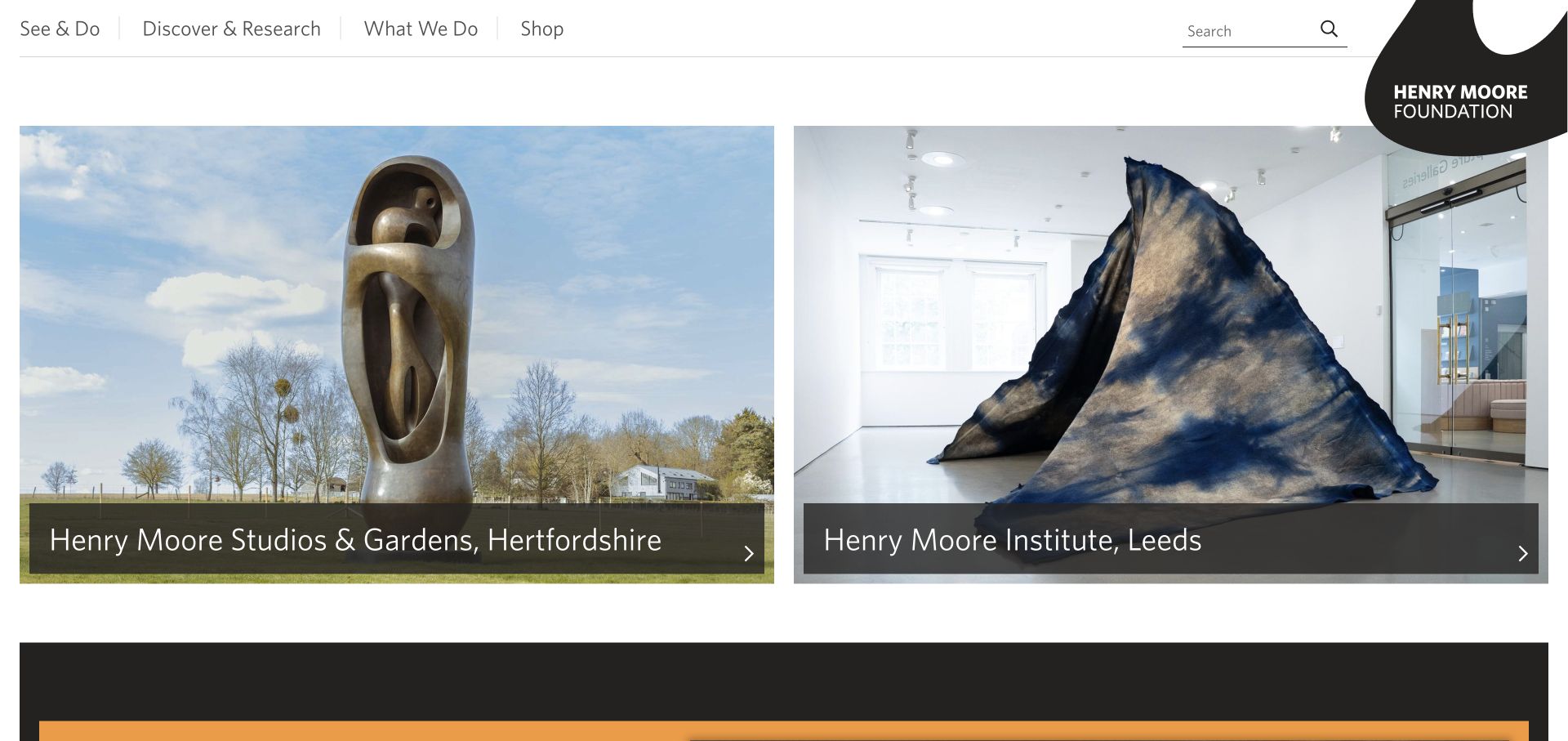
The Henry Moore Foundation presents its Hertfordshire studios and gardens beside its Leeds institute as two equally clear image panels. The main navigation distinguishes seeing and doing from discovering and researching. Dated exhibitions, grants, fellowships and library news then give the foundation’s work further structure. The layout helps visitors recognise that the institution is not one building with one set of arrangements.
What you can learn
Where a foundation operates different sites, name and locate each one immediately. Keep its own visit, access and research details connected to that site rather than publishing one ambiguous global schedule.
Pros
The two locations are named directly on their entry panels.
Research and public-visit intentions have distinct top-level language.
Cons & considerations
Large image panels must reflow without hiding the location labels.
Old promotional offers in the news stream need clear dates and archive handling.
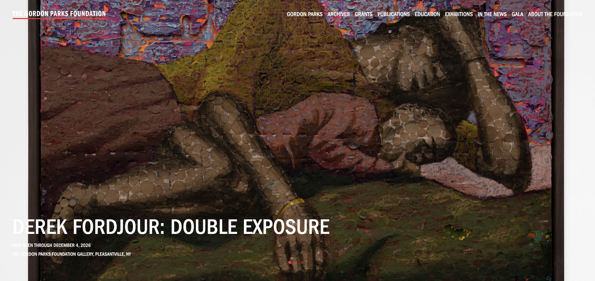
The Gordon Parks Foundation gives current activity an immersive photographic presentation while keeping archives, grants, publications, education and exhibitions in the header. The reviewed page also links an editorial feature about people who knew Parks. This puts contemporary programme activity alongside the artist’s legacy. The visual impact is substantial, but thin white text over changing photographs and several dropdown-style labels demand careful usability attention.
What you can learn
Use strong photography to introduce current work, but retain clearly labelled routes to the institution’s longer-lived resources. Each changing image needs an equally dependable text treatment.
Pros
The header distinguishes archival, educational and grant-related material.
A feature route offers narrative context beyond an exhibition announcement.
Cons & considerations
Overlay text may have inconsistent contrast across slideshow images.
The anniversary popup adds an interruption before ordinary exploration.
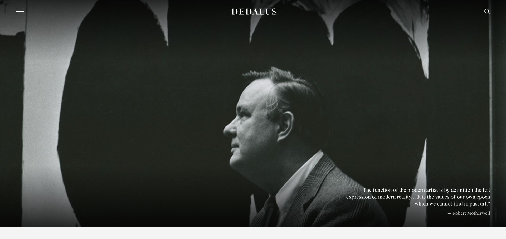
Dedalus opens with a full-screen Robert Motherwell portrait and attributed quotation. Its menu then reveals a substantial structure divided into the artist, programmes and the foundation. Fellowships, award recipients, research resources, catalogues and archives have their own destinations, while programme cards identify publications and award types. The initial image supplies atmosphere, but the menu is where the site explains most of its practical value.
What you can learn
A strong artist image can establish context, but scholarly and programme material still needs a clear taxonomy. Make the distinction between an award, a recipient and a research resource easy to follow.
Pros
The menu organises a broad archive under three understandable groups.
Programme records identify award type and publication subject.
Cons & considerations
The initial viewport offers little immediate explanation beyond the artist quotation.
Menu and search controls carry a large share of the discovery work.
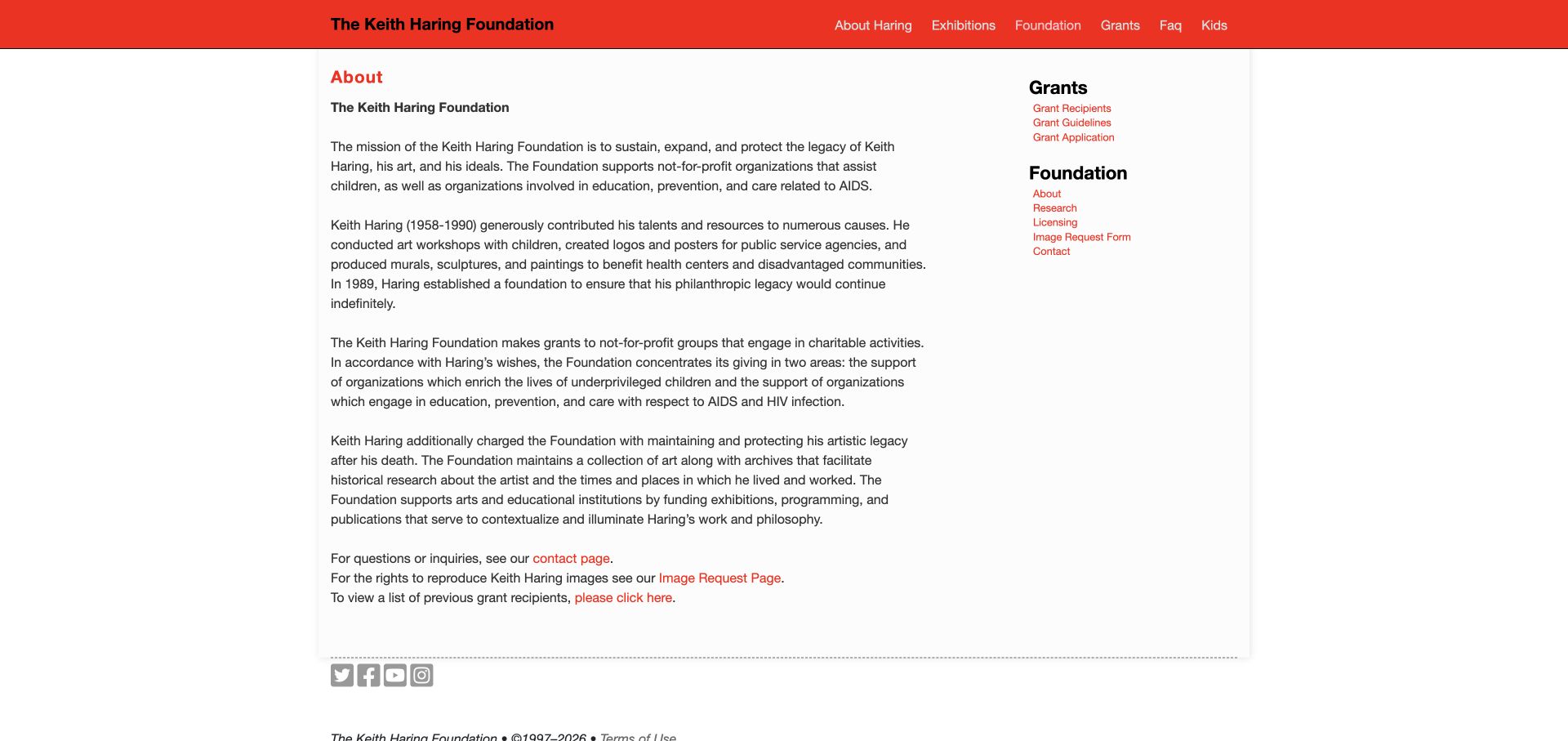
The Keith Haring Foundation’s About page uses a red header, readable body text and a simple right-hand resource list. The mission explains both legacy stewardship and charitable priorities. Grants, research, licensing, image requests and contact are presented as different tasks rather than a single enquiry form. The page is visually restrained compared with the image-heavy examples in this collection, but it communicates responsibilities and routes directly.
What you can learn
Use plain-language mission text and a small resource navigation to distinguish different enquiries. Rights requests, research access and grant applications should not be treated as interchangeable contact tasks.
Pros
The sidebar makes grant guidance and rights-related tasks easy to identify.
The mission describes both stewardship and philanthropic activity.
Cons & considerations
A long text block could use more subheadings for scanning.
Generic phrases such as click here are less useful than descriptive link labels.
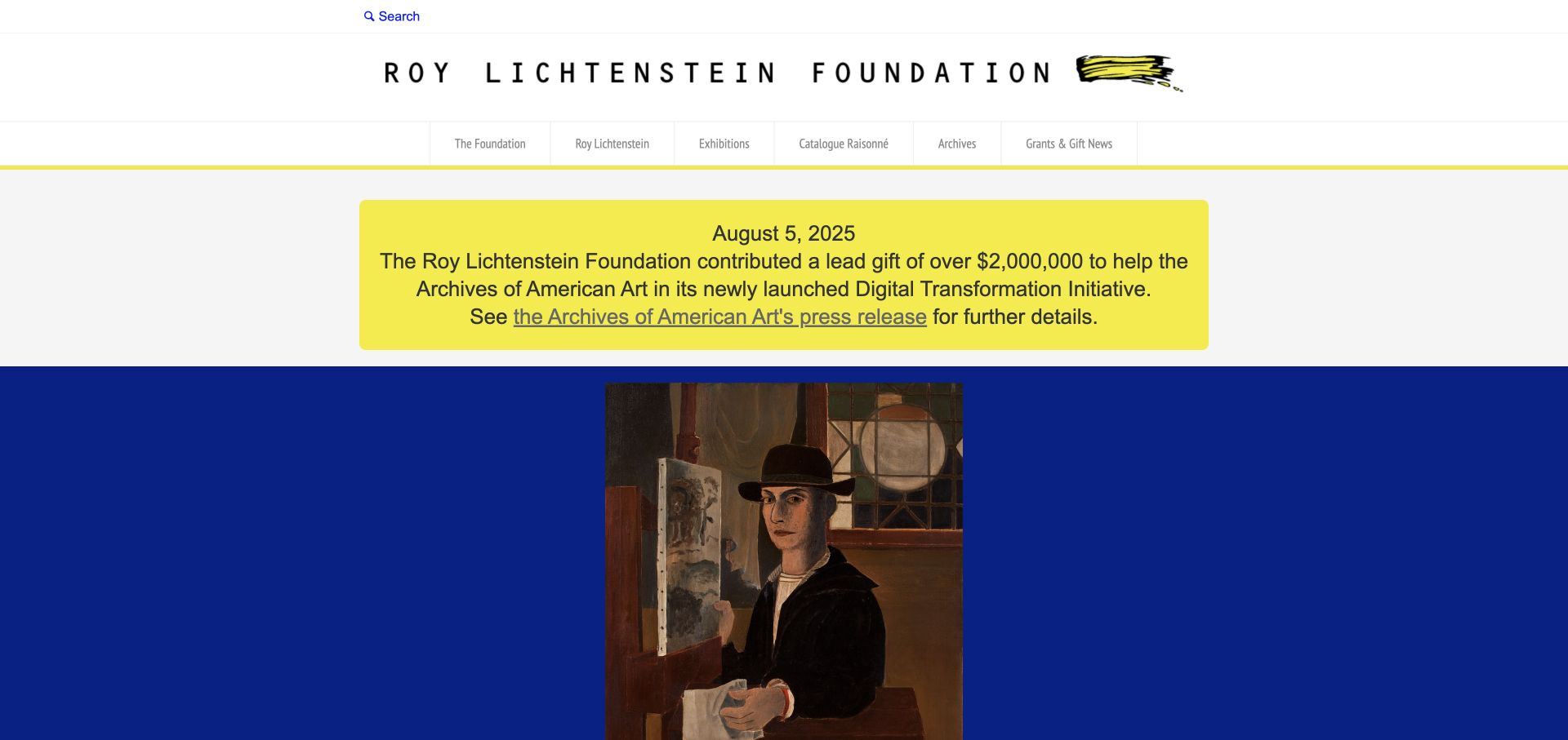
The Roy Lichtenstein Foundation combines a wide wordmark, a brushstroke mark and restrained primary-colour accents. A prominent dated notice links to an external institutional press release, while the navigation distinguishes exhibitions, a catalogue raisonné, archives and grant news. An artwork slideshow follows. This is a useful example of connecting a significant announcement to its source, although the large notice and header leave less room for artwork context at the top.
What you can learn
Attach a date and an authoritative destination to major institutional announcements. Keep catalogue, archive and exhibition routes distinct so the homepage does not have to carry every research task.
Pros
The announcement includes a specific date and supporting institutional link.
The catalogue raisonné has a direct navigation destination.
Cons & considerations
The prominent notice dominates the initial content hierarchy.
Small grey navigation labels may be hard to read at some sizes.
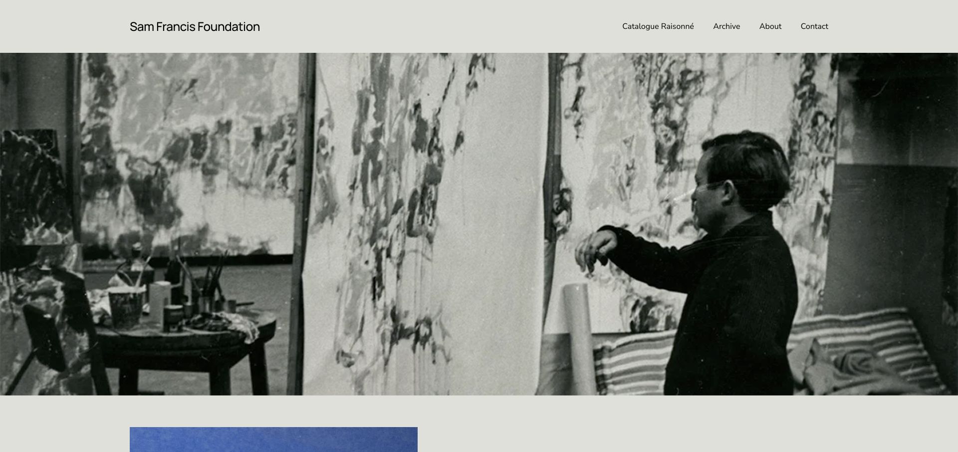
The Sam Francis Foundation uses a full-width studio photograph and a very short navigation for its catalogue, archive, background and contact information. The body focuses on a bilingual publication and includes editor, publisher, format, date and a purchase route. This is a useful model for a small foundation with one current publishing priority. It also illustrates the risk of allowing one announcement to stand in for a fuller explanation of the organisation.
What you can learn
A publication feature should identify the edition, contributors and destination clearly. Retain durable archive and foundation information so the site remains useful when the launch campaign ends.
Pros
The publication is supported by specific edition and contributor information.
A short navigation keeps archive and catalogue routes visible.
Cons & considerations
The first image pushes the current publication explanation below the fold.
A single announcement offers limited context for visitors unfamiliar with the foundation.
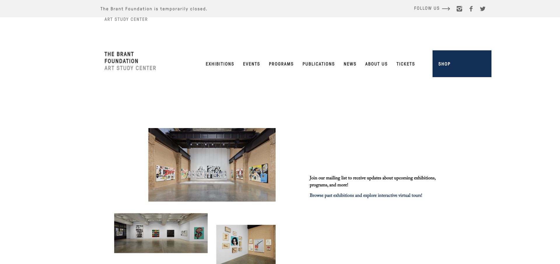
The Brant Foundation explicitly states that it is temporarily closed, while continuing to offer exhibition archives, virtual tours, publications and news. Installation photographs sit within a spacious layout rather than implying a current exhibition. The navigation retains tickets and the shop, so the closure message must remain consistent at those destinations too. The useful design lesson is honest operational status combined with meaningful alternatives, not pretending that a physical visit is currently available.
What you can learn
When a venue is closed, say so clearly and offer the archive or another genuine next step. Keep that status consistent across ticketing, opening hours and promotional modules.
Pros
Temporary closure is stated prominently rather than hidden in visit details.
Past exhibitions and virtual tours provide useful alternatives.
Cons & considerations
Ticket and visit routes need consistent closure messaging.
Large empty areas and old news can make the homepage feel less current.
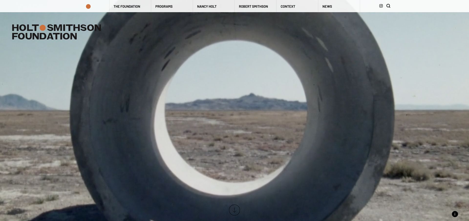
Holt/Smithson Foundation places a landscape artwork behind a bold identity, then supplies a direct route to the page text and media information. Below, a map identifies individual artworks, while artist biographies, programme information and contextual material provide further paths. The site connects artistic ideas to places rather than assuming all work can be understood through a conventional gallery grid. Its extensive map interface needs an equally useful text-based alternative.
What you can learn
For site-specific art, connect the place, work and explanatory record. Make image information and textual discovery available without requiring every visitor to operate a map.
Pros
The hero exposes media information and a route to explanatory text.
Named artwork map controls support place-based exploration.
Cons & considerations
A map with many controls can be demanding for keyboard or small-screen use.
The long homepage needs clear navigation between biography, context and programme material.
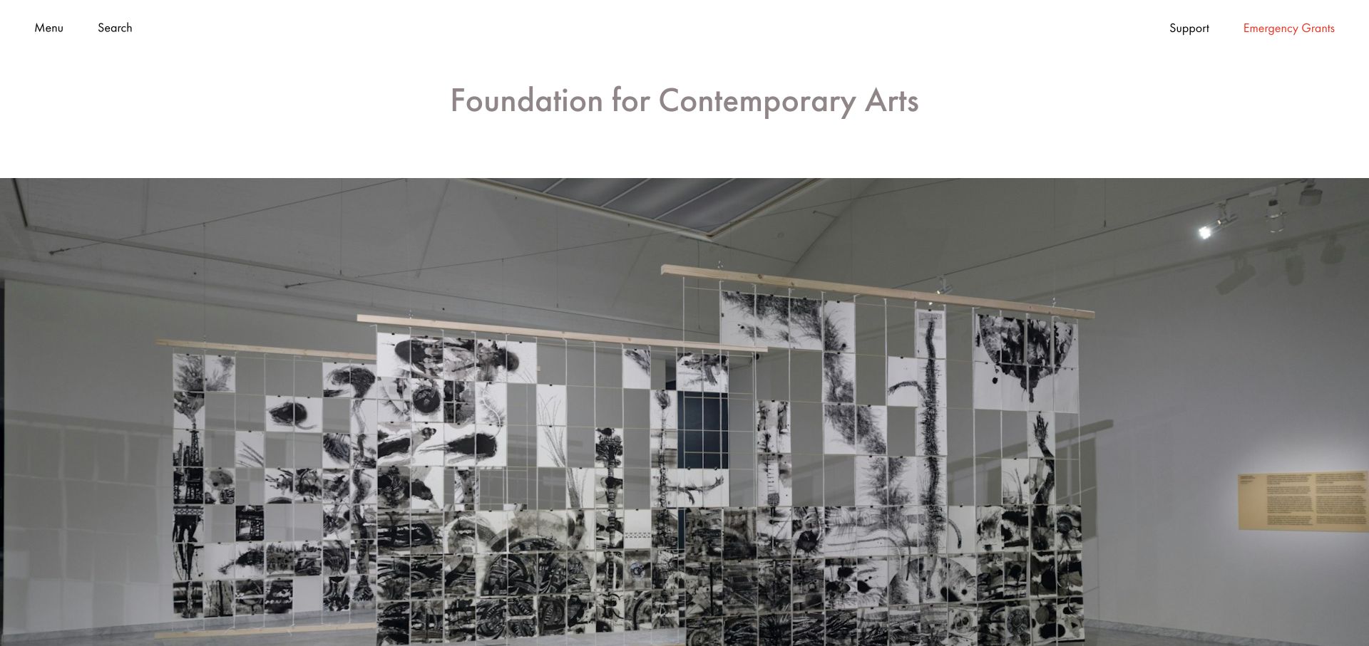
Foundation for Contemporary Arts gives Emergency Grants a persistent header position beside support, while the main navigation separates grant programmes, recipients and works for sale. The fuller menu differentiates application, nomination and invitation routes and allows recipient browsing by discipline or year. Current grant news and credited performance imagery bring the programme to life. The broad structure is useful, though a full-screen image initially delays the detail of the announcement.
What you can learn
Give time-sensitive support a direct route and explain how each programme selects recipients. An artist should not have to begin an application to learn whether the programme accepts one.
Pros
Emergency Grants remain directly reachable from the header.
Programme selection methods and recipient filters are explicitly distinguished.
Cons & considerations
The image-heavy opening can delay the practical announcement text.
A very long menu needs careful mobile, focus and keyboard behaviour.
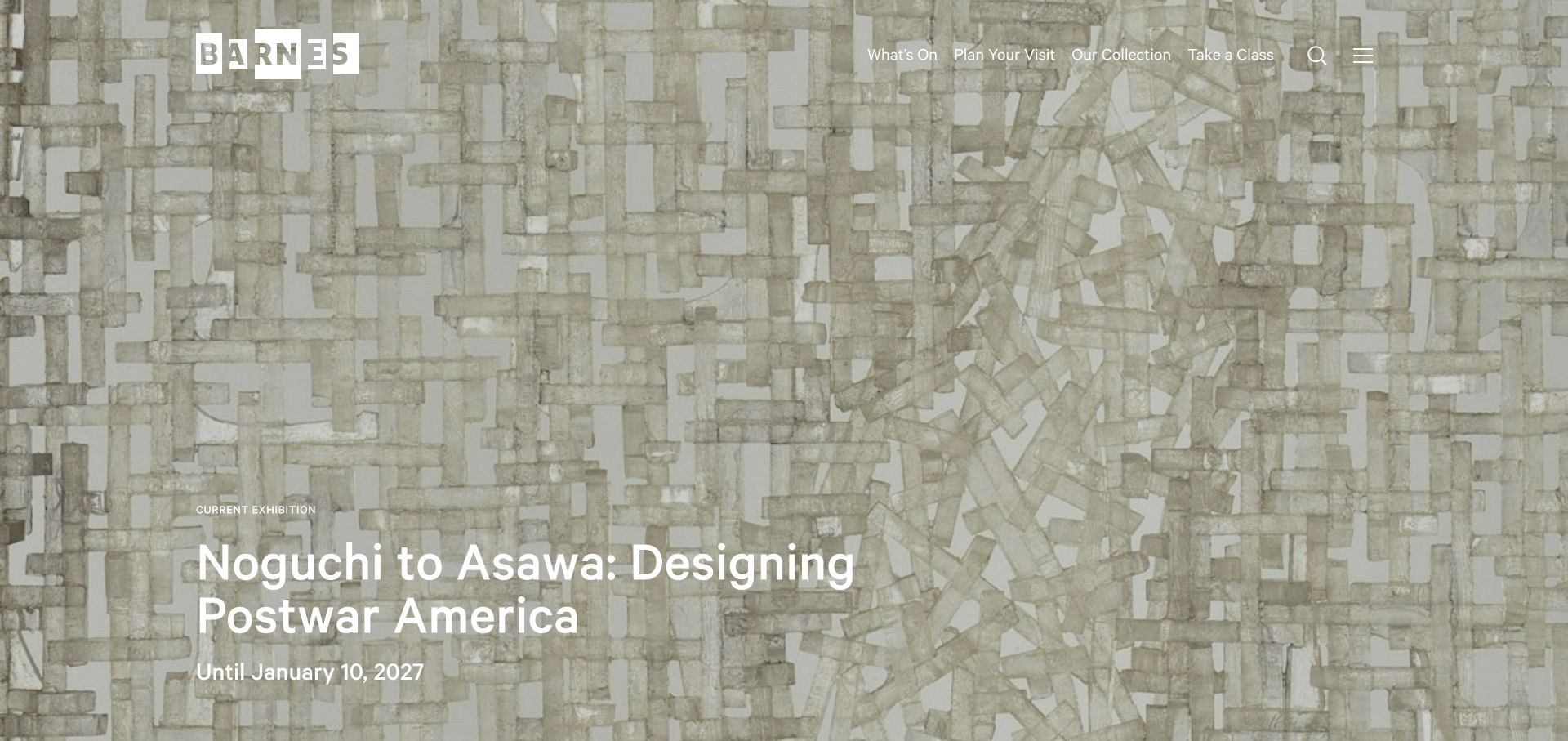
The Barnes Foundation pairs its current exhibition with an end date and a visual treatment drawn from the work. The header immediately distinguishes What’s On, Plan Your Visit, Our Collection and Take a Class. Hours, location, access information and image-licensing routes remain in the footer. The task labels are especially useful for a foundation that combines an art collection, public events and education, although the large image makes text contrast and loading behaviour important.
What you can learn
Use visitor tasks to organise a collection-led foundation. Put exhibition dates near the title while keeping visit planning, collection browsing and learning as distinct routes.
Pros
The four main actions describe recognisable visitor intentions.
The current exhibition has an explicit end date.
Cons & considerations
White text over detailed artwork needs consistent contrast testing.
Important practical details remain far below the full-screen opening.
Kegan is a freelance web designer and developer with 15+ years of experience helping businesses turn complicated website requirements into clear, maintainable digital experiences. He works directly with clients from planning and design through development, launch, and ongoing support.
For art foundation website design, his development approach focuses on mission and program structure, artist and collection records, grant eligibility, public access information, and distinct research, application and support journeys. The scope can be a targeted improvement or a complete custom build, with responsive layouts, thoughtful content structure, and integrations chosen around the people using and maintaining the site.
Show 3 other art foundation website designersHide other art foundation website designers
Plan an art foundation website around the resource, not just the announcement
Map audiences to clear and durable destinations
Begin with the tasks people need to complete, not a list of internal departments. Researchers may need a catalogue, finding aid, image request or archive appointment. Artists may need eligibility guidance or an application route. Visitors need the right venue, dates, access information and booking conditions. Supporters need a clear explanation of the work and a genuine support path. These audiences can share an identity without sharing every journey.
Joan Mitchell Foundation makes its two-part mission concrete with distinct routes to the artist’s work, grants and residencies, supported artists and planning tools. Foundation for Contemporary Arts differentiates programmes by how recipients are selected. The Barnes uses plain visitor actions. Each approach reduces the need to interpret institutional vocabulary before reaching relevant information.
Give important destinations stable addresses and a useful place in the navigation. A homepage feature should link to a complete resource record rather than become the only place the information exists. Keep archive, rights and programme enquiries distinct when they have different processes. Do not imply that a general contact form is an application, an authentication service or permission to reproduce an artwork.
Build programme and visit records that can outlive a campaign
An exhibition record needs more than a title and image. Identify the artist or contributors, host venue, actual dates and the foundation’s role. Grant records need a clear status, relevant guidance and a distinction between application, nomination and invitation. A date shown in a news feed is not necessarily the deadline or the date of the underlying event.
KADIST associates international programmes with places and date ranges. Parasol unit groups curator, host and dates alongside its exhibition title. Graham states that an individual-grant deadline has passed while retaining the relevant route. These are practical content patterns that can be maintained as arrangements change, independent of a particular visual treatment.
Create deliberate transitions between upcoming, current, completed, closed and archived states. A temporary physical closure should agree across the homepage, ticketing page and footer hours. The Brant Foundation keeps archive alternatives available during a stated closure. Rauschenberg’s archive notice explains a future access change. Preserve historically useful material while making the current operating position unambiguous.
Treat collections, archives and media as structured knowledge
Artwork records benefit from stable identifiers, accurate titles, artist names, dates, media information, permitted images and rights context. Archival resources may need finding aids, access conditions, citation guidance and a way to ask an informed research question. A public thumbnail is not permission to reproduce a work, and a digital record should not imply that the physical object is accessible without an appointment.
The Albers Foundation connects object presentation with teaching and resources. Calder offers timelines, an archive and geographical discovery. Judd’s location record relates the place to its installed artworks and restoration history. Holt/Smithson connects site-specific works to a map and biographies. Each pattern uses a different organising principle, so choose the one that reflects the actual material rather than adding every possible interface.
Retain text alternatives for image-heavy and map-based experiences. Caption historical films and photographs, provide sensible controls for moving media and avoid making essential information dependent on autoplay. Test search and filtering with meaningful content, not only empty results. Record unknown dates or incomplete attribution honestly rather than manufacturing precision for a cleaner layout.
Make the foundation’s identity expressive but the service reliable
Artist-endowed organisations have distinctive visual material to work with, but a logo, quotation or full-screen artwork cannot replace the institutional explanation. Use typography, colour and imagery to establish a point of view, then keep task labels clear. Researchers returning for a document should not have to watch a long animation or dismiss repeated promotional dialogs before reaching it.
Rauschenberg’s large wordmark sits above a conventional resource taxonomy; Dedalus leads with an artist portrait but supplies a substantial programme structure in its menu. Helen Frankenthaler Foundation openly states a temporary website-improvement phase while retaining resource routes. These examples have different strengths and limitations, but each highlights the importance of continuity beyond a homepage redesign.
Assign editorial responsibility for team details, grants, visitor arrangements, rights information and dated announcements. Review contrast over changing imagery, menu behaviour, keyboard navigation and document accessibility as routine maintenance. Keep meaningful creation and review dates; rebuilding a page does not make a historical exhibition or grant cycle new. A foundation website becomes more useful through dependable records, not simply through more frequent homepage updates.
The editing job behind the design
Choose a stack around reliable records and responsible access
Evaluate the content system by how it handles artists, artworks, exhibitions, programmes, venues, dates and rights. Editors should update a shared record once and have consistent information appear in listings and detail pages.
Archives and grant applications may require different systems and privacy boundaries from a public editorial site. Explain external handoffs and collect only information relevant to the task. Do not expose private applicant, donor or research records through public templates or analytics.
The visible stack reflects bounded public evidence and shared audit attempts, not every internal application or collection-management system. A blocked scan does not justify a guessed CMS. Image delivery, an embedded video or a supporting library has a narrower meaning than the foundation’s entire technical architecture.
Our WordPress website examples offer a separate look at publishing approaches. A visible platform label is evidence for that named page, not a guarantee that the same system will suit your requirements.
Before the public launch
Art foundation website planning checklist
Identify researchers, artists, visitors, educators and supporters as distinct audiences.
Give artworks, archives, grants and visit planning durable destinations.
Distinguish application, nomination and invitation-based support.
Attach status, dates and location to each programme record.
Keep closed grants informative rather than presenting a dead end.
Make temporary physical and research-access closures explicit.
Preserve completed programmes as clearly labelled archives.
Record artwork identity, captions and permitted rights context accurately.
Keep media controls and nonvideo alternatives available.
Provide text-based routes alongside interactive maps.
Separate general enquiries, rights requests and private applications.
Assign owners for access details, deadlines and long-lived research resources.
These checks are a project checklist, not a performance, legal, security, or accessibility certification. Test real journeys with the people responsible for the website before making claims about the result.
Sources & editorial method
How this collection was selected and reviewed
The original target of 21 was randomly drawn and saved before research. Every included source was read and visually reviewed in Chrome, with an accepted original 1920×907 JPEG capture and actual UTC timestamp. Optional cookies were rejected where an explicit choice was available; other cookie, visit, anniversary or newsletter notices were dismissed through ordinary controls. No overlay was removed with DOM edits. Judd is the 101 Spring Street location page, KADIST is its International programme page, and Keith Haring is the foundation About page. Helen Frankenthaler’s stated website improvements and Brant’s temporary physical closure are described rather than hidden. Dia was excluded after a security-verification response, without bypass. Joan Mitchell Foundation was explicitly selected for information design, not grant or institutional outcomes. Broad technology audits remain part of the shared publication process.
Each example links to its actual source page. Screenshots are direct browser captures with their own capture dates; moving imagery, announcements and live designs can change. The notes describe observable design choices and conditional tradeoffs, not measured traffic, conversion results, service quality, or accessibility conformance.
Technology labels use public page metadata, asset evidence, or explicitly cited platform documentation. Platform documentation is not a complete current deployment audit. A component reference may be legacy or unused; it is not a complete backend inventory. Unknown stacks are omitted. These sites are editorial examples, not our client portfolio.
Written, Edited and Curated are separate editorial records, not timestamps advanced by a rebuild. Website designs and imagery belong to their owners. See our editorial standards or suggest a correction.
Questions worth asking
Art Foundation website design questions
What should an art foundation homepage prioritise?
Make its mission understandable and provide clear routes to the actual resources: artworks, archives, programmes, grant guidance, visits and rights information where relevant. The priorities depend on the foundation’s work, not a universal homepage checklist.
Should an expired grant page be removed?
Not necessarily. Keep useful historical guidance or recipient information, but clearly state that the deadline has passed and provide the appropriate current programme route. Do not leave an old application looking open.
How should a foundation handle temporary closure?
State whether the venue, archive or another service is affected, include meaningful dates when known and keep the message consistent across booking and visit pages. Offer genuine archive or online alternatives without implying physical access remains available.
Why is Joan Mitchell Foundation the Editors Choice?
The reviewed homepage turns its combined legacy and artist-support mission into distinct routes for artworks, life and work, grants, supported artists and planning tools. The choice recognises website communication, not independently measured institutional performance.
Does an image on a foundation website grant reproduction rights?
No. A public image and its credit do not automatically grant permission to reuse an artwork. Follow the foundation’s stated rights or image-request process and the conditions applying to the particular material.
Begin with dependable resource records and clear routes for the people who use them. Let the art shape the identity, while dates, access information and programme details make the foundation’s work easier to understand and use.