Best Architectural Photographer Websites of 2026 (27 Real-World Examples)
Architectural photographer websites that give strong images useful context, clear project routes and a recognisable point of view.
Explore 27 real architectural photography websites and portfolio views, with genuine screenshots, original design observations and practical tradeoffs for an image-led practice.
An architectural photographer’s website is not the same thing as an architect’s portfolio. It has to communicate the photographer’s role, approach and range while crediting the people who designed the buildings. A beautiful photograph can create immediate interest, but a potential client also needs to find comparable assignments, understand the working relationship and reach the right contact.
This collection includes individual practices, specialist partnerships and architecture-focused portfolio sections within broader photographic work. Several accepted views are deliberately labelled collection or index pages rather than interchangeable homepages. The observations concern public website presentation, not a ranking of photographic skill, fee levels, licensing value or independently certified accessibility.
Before the examples
What makes good architectural photographer website design in 2026?
Make the image a route, not a dead end
Give selected photographs clear project identities and durable detail pages. An immersive opening still needs an understandable path to complete sets, relevant assignments and contact.
Preserve architectural and photographic roles
Name the project, architect, designer and photographer accurately where the information is available. Do not imply that the photographer designed the building or that a public image grants reproduction permission.
Give the archive a useful structure
Choose relevant disciplines, building types, places or architect indexes. A small selected edit and a complete archive can coexist without making every visitor scroll through every assignment.
Keep visual restraint usable
Test contrast over changing photographs, responsive crops, keyboard controls, lightboxes and motion. Sparse text should be an editorial decision, not an excuse to omit meaningful labels and project context.
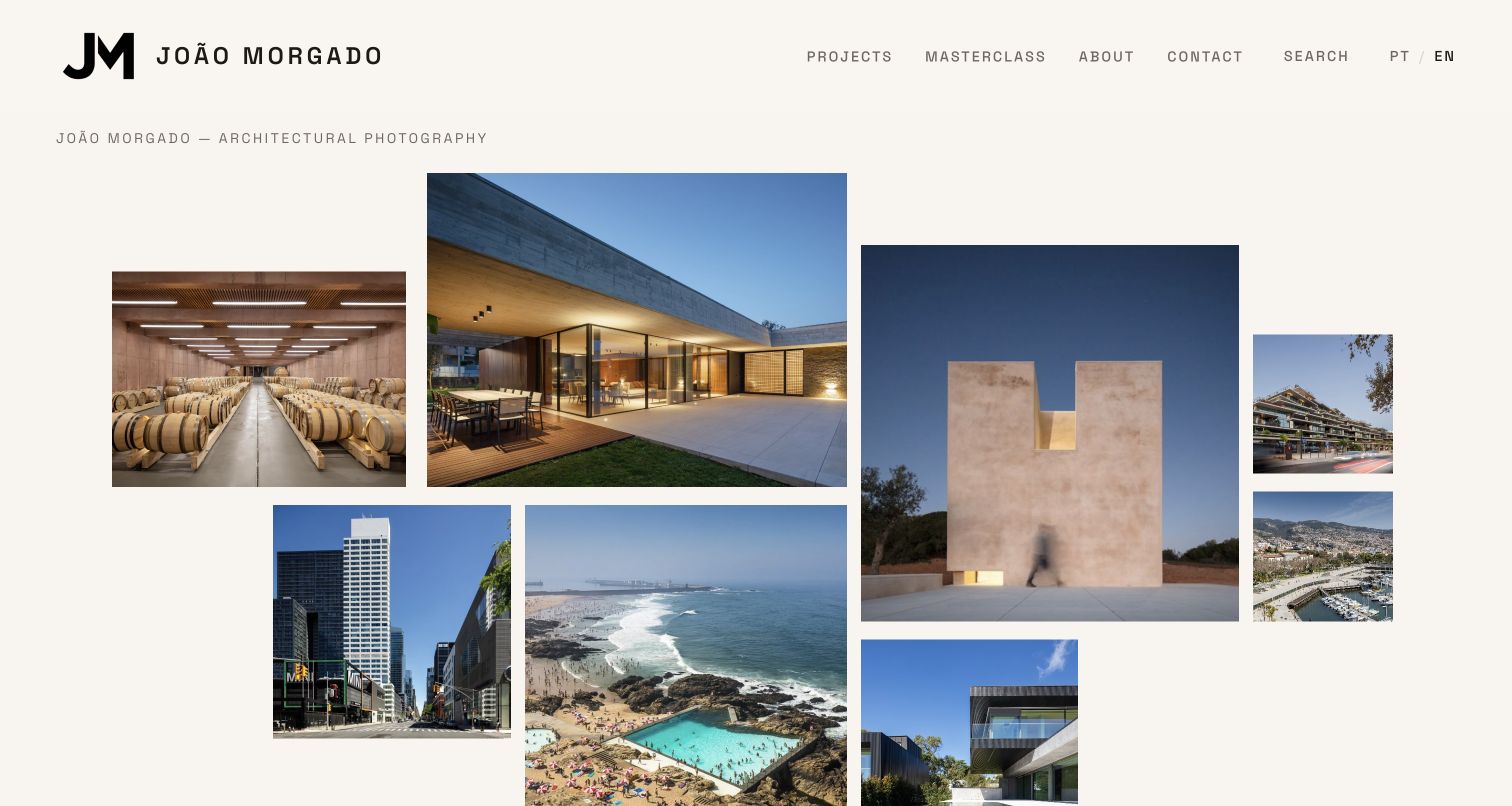
The original random target of 27 was saved before research. All 27 examples have a genuine accepted browser capture and an original site-specific review. João Morgado is the explicit Editors Choice for combining a distinctive image mosaic with practical, credited project discovery.
João Morgado’s English homepage presents an irregular mosaic of buildings and spaces, with each image leading to a named project. Below, a more regular selected-project grid identifies the architect and location rather than asking the photograph to explain everything. Projects, a masterclass, background, contact and search remain visible beside the Portuguese and English choices. The specialist practice balances visual variety with a clear editorial layer, making it a particularly useful model for an architectural photographer.
What you can learn
Give a portfolio a recognisable visual rhythm, but support it with consistent project names, design credits and places. Let a striking first impression lead directly into usable project records.
Pros
Selected project cards identify both architect and location.
Search and language choices remain visible beside the short main navigation.
Cons & considerations
An irregular mosaic needs careful crop and order checks at different screen sizes.
The reviewed LinkedIn destination was generic, and footer privacy labels need functional destinations.
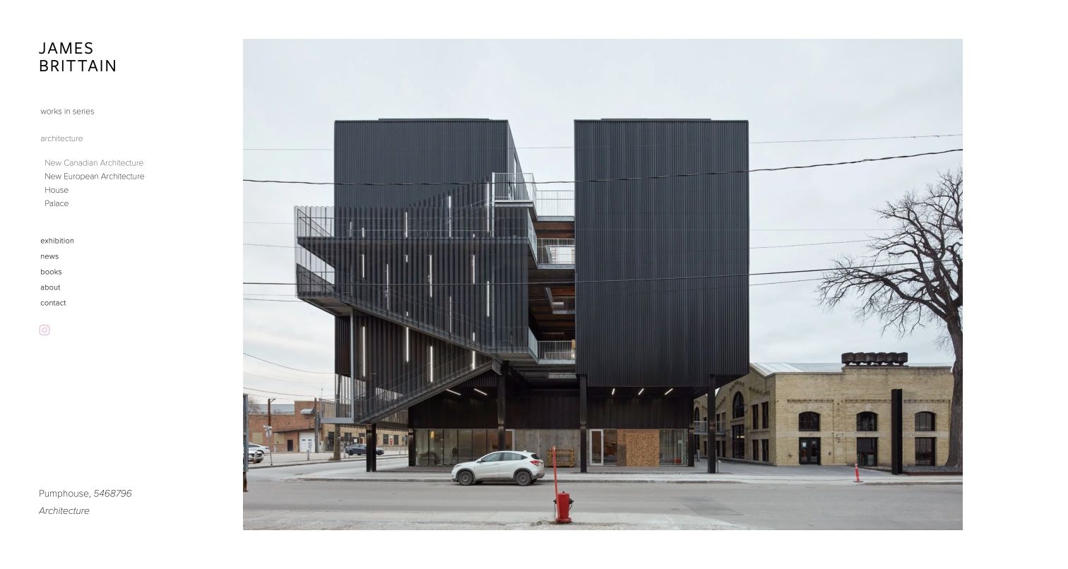
James Brittain’s New Canadian Architecture portfolio uses a quiet left sidebar and a large image area. The reviewed opening identifies Pumphouse and 5468796 Architecture, with further images grouped into a sequence of named Canadian projects. The sidebar distinguishes commissioned architecture from works in series, books, exhibitions and background information. This is a deliberately focused portfolio page, not a homepage capture, and the context makes its minimalism useful rather than anonymous.
What you can learn
A single-image sequence can work when project and architect context remains clear. Separate commissioned architectural work from personal series without requiring different visual identities.
Pros
Project names and architect credits accompany the image sequence.
Personal series, books and commissioned work have distinct routes.
Cons & considerations
Small, light sidebar text needs readable contrast and sizing.
Some project labels contain spelling inconsistencies that deserve an editorial check.
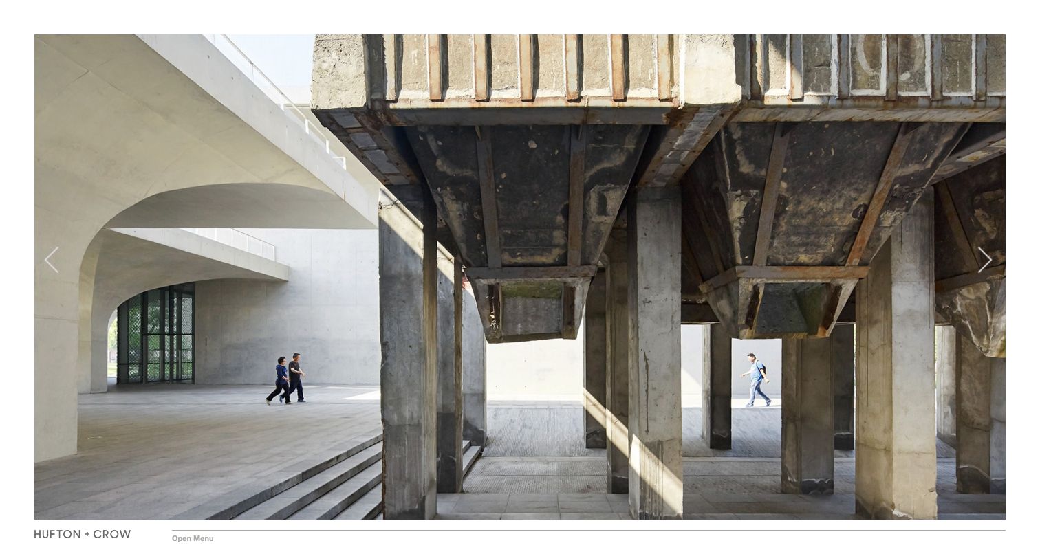
Hufton + Crow places a large landscape photograph inside a thin white frame, with the practice name and menu at the bottom. Previous and next controls allow the opening image to change, while the underlying navigation distinguishes projects, background and contact. The reviewed view shows how much presence a photograph can gain without a headline placed over its centre. The tradeoff is discoverability: project identification and the menu need to remain understandable beyond the visual impression.
What you can learn
If the photograph is the opening statement, keep navigation out of its most important detail. Provide project identification and obvious controls rather than expecting every visitor to explore by intuition.
Pros
The image is given a large, uncluttered viewing area.
A short navigation separates project browsing from practical contact.
Cons & considerations
Bottom-edge menu placement may be less obvious to a first-time visitor.
A large opening image needs responsive derivatives and a dependable loading state.
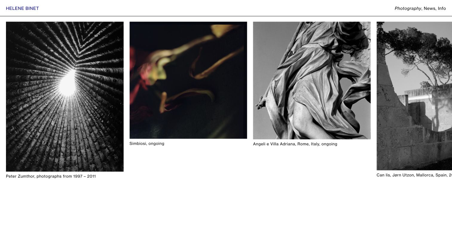
Hélène Binet’s photography index places differently proportioned images in a horizontal sequence beneath a very short header. Each item names a series, subject or architect and often a place or span of years. Peter Zumthor, Simbiosi and Can Lis therefore read as separate bodies of work rather than decorative cards. Photography, news and information are the only main choices. The editorial restraint gives the work space while retaining valuable context.
What you can learn
Use series-level titles and dates to make an image index meaningful. Preserve the natural variety of image proportions while making the direction of browsing clear.
Pros
Series captions supply subject, location or date context.
The three-part navigation is concise and predictable.
Cons & considerations
Horizontal browsing needs a clear alternative for keyboard and narrow-screen use.
Cards continuing beyond the viewport need sufficient affordance to show more work exists.
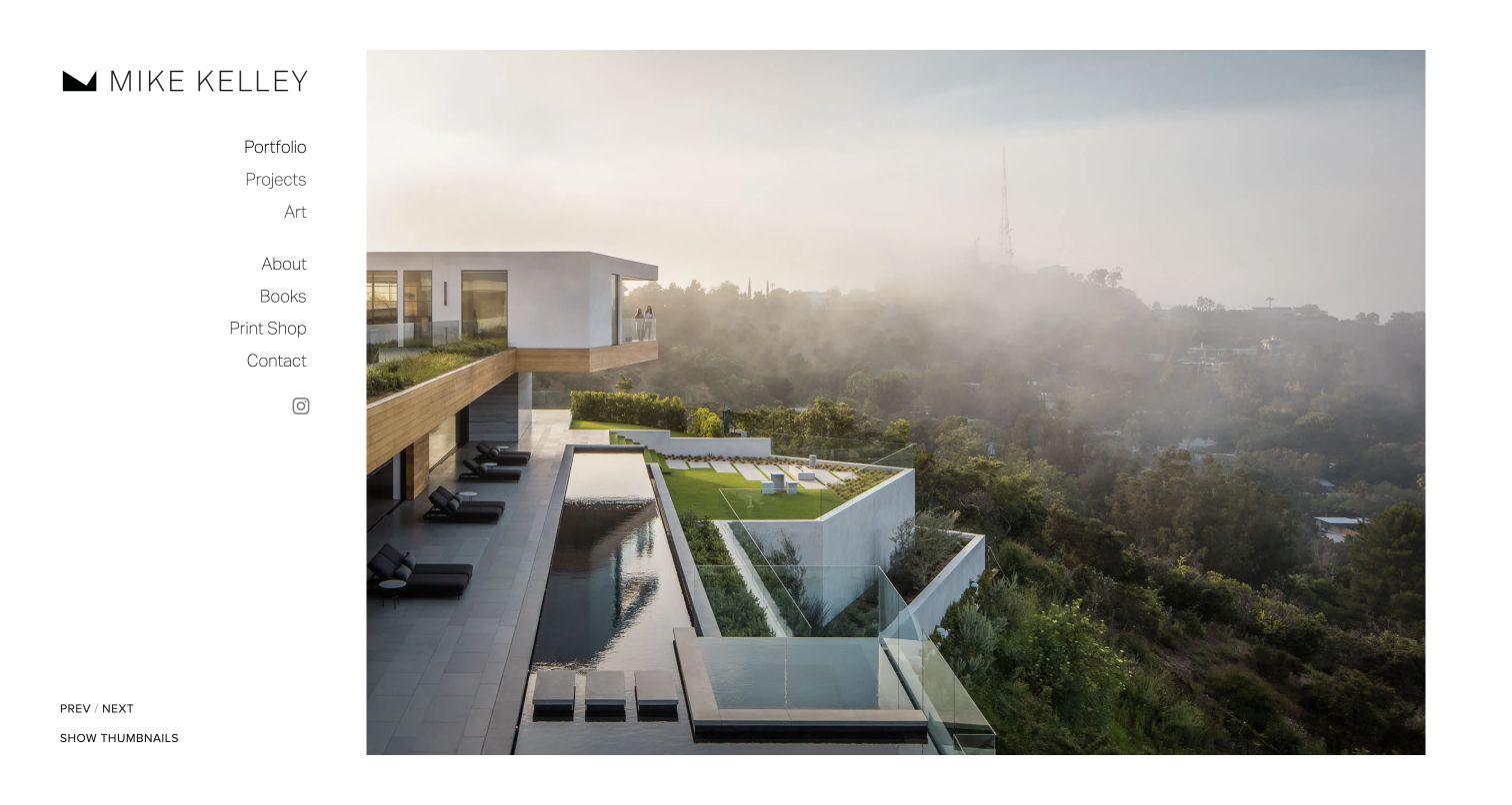
Mike Kelley uses a spacious sidebar beside one large architectural photograph. Portfolio, projects and art are separate destinations, while books, a print shop and contact remain available. Small previous and next labels are accompanied by a thumbnail option, giving visitors another way to explore the selection. The design lets the photograph carry the atmosphere without covering it with marketing copy, although the opening images need more consistent descriptive context.
What you can learn
Offer a quick selected-image edit and a deeper project route as different experiences. Keep thumbnail discovery available for visitors who want to scan rather than advance one image at a time.
Pros
Selected images, project commissions and personal art are clearly separated.
A thumbnail option provides a second browsing approach.
Cons & considerations
Several image alternatives use filenames rather than useful descriptions.
Small previous and next labels need clear focus and touch targets.
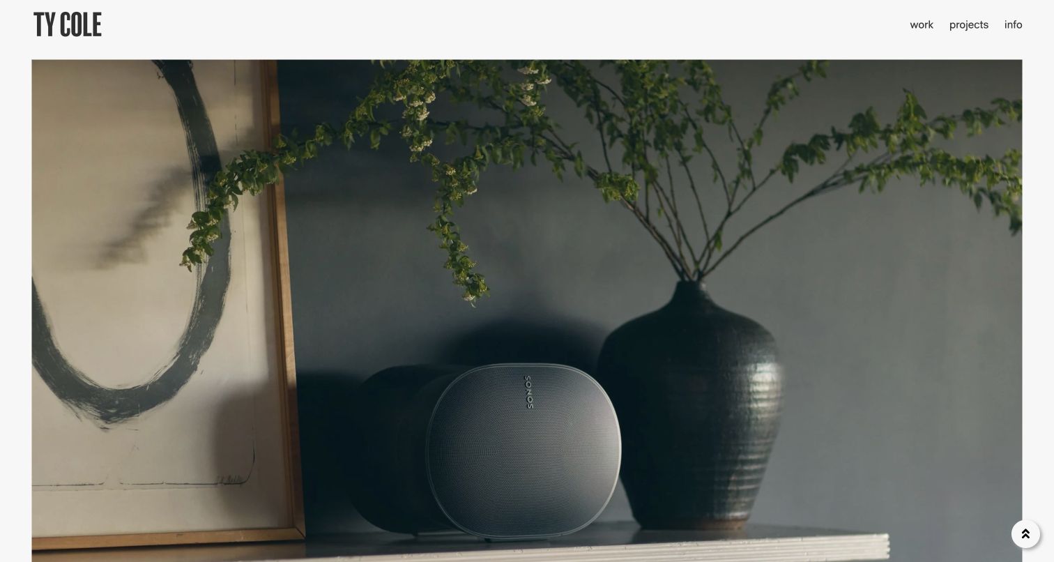
Ty Cole’s homepage gives a bold condensed wordmark a small fixed-looking header position, with work, projects and information at the opposite side. The reviewed image fills almost all remaining space. Opening the work control reveals interiors, architecture, people, travel, commissions and motion as distinct categories. The structure supports a broader photographic practice without making the homepage a collage of unrelated services, but first-time visitors must open a control to see the range.
What you can learn
Use a short top-level structure for a broad practice, then label the disciplines plainly. Keep important category routes available without relying on the current hero photograph to communicate every specialism.
Pros
The compact header leaves the photograph visually dominant.
The work menu distinguishes architecture, interiors and motion explicitly.
Cons & considerations
Categories are concealed until the work control is opened.
The reviewed opening image had a filename-style alternative rather than project context.
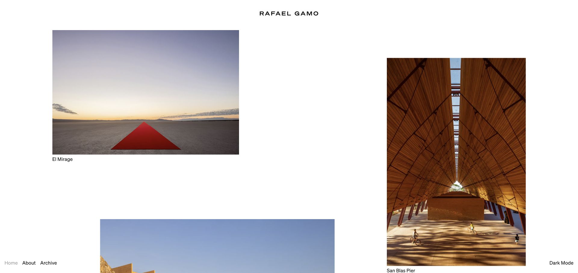
Rafael Gamo’s project index uses generous white space and uneven image placement, with the project name directly beneath each photograph. The broader source index pairs those names with architects or collaborators, including public, cultural, hospitality and residential work. Home, About and Archive sit at the lower edge with a dark-mode choice. The accepted view uses the site logo’s own no-splash destination, not an altered page or hidden introduction.
What you can learn
An informal image rhythm still needs project names and durable detail routes. Provide an archive for breadth and retain ordinary navigation so the exploratory layout does not become the only discovery mechanism.
Pros
Project images lead to individual records with meaningful names.
An archive route supports exploration beyond the curated opening.
Cons & considerations
A very long loose grid needs clear reading and keyboard order.
The initial splash adds an extra step before the ordinary project index.
Matthew Millman places a distinctive monogram and compact discipline navigation over a full-screen photograph. Architecture is subdivided into residential, commercial and institutional work, while interiors, art, portraits, books and publications remain separate. The reviewed opening shows an artwork installation in progress rather than an empty polished room. The categories explain the breadth of the practice, but placing the whole navigation over changing imagery creates contrast and context challenges.
What you can learn
A broad portfolio benefits from a small number of meaningful disciplines and subcategories. Keep those labels readable over every image, and identify installation or process photographs as carefully as completed spaces.
Pros
Architecture and interiors have useful project-type subdivisions.
Books and publications sit outside the main image categories.
Cons & considerations
Overlay navigation can lose contrast as the background changes.
The opening uses a dated copyright label and a filename-style image description.
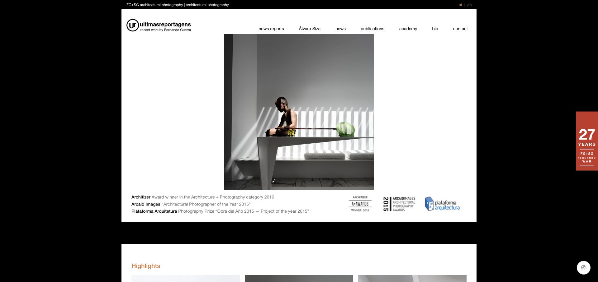
Fernando Guerra’s últimasreportagens site frames a central photographic sequence in a compact white content area against black. Navigation includes reports, a dedicated Álvaro Siza route, news, publications, an academy, biography and contact. Historical award references and dated publishing or archive news establish a broader practice around the photographs. The source combines archive and editorial functions, although its mixed language treatment and older news dates need careful interpretation.
What you can learn
Give a long-running archive routes into its collaborations, publications and educational work. Keep the date of historical recognition visible rather than presenting every achievement as a new announcement.
Pros
Publications, education and biography are clearly separate from the work archive.
Recognition and news items retain dates or years.
Cons & considerations
Mixed language and translated labels can create inconsistent naming.
Older homepage news needs a clear archive context and a maintained current-work route.
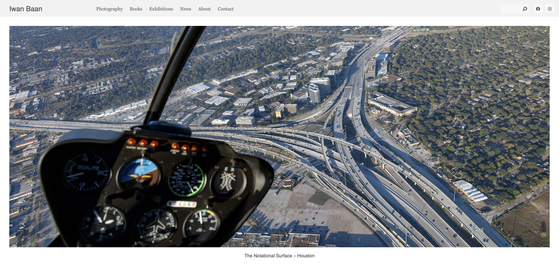
Iwan Baan’s homepage uses large image panels, with a clear title beneath the reviewed Houston aerial photograph. Other linked stories name the building or place and frequently its architect, from La Tourette to Google Bay View and LACMA. Photography, books, exhibitions, news, background and contact remain in an ordinary header with search. The site treats photographs as entries into stories rather than a set of isolated hero backgrounds.
What you can learn
Pair the immersive image with a visible story title and a durable project route. Let books and exhibitions extend the practice without hiding the core portfolio navigation.
Pros
Project panels include recognisable titles and design attribution.
Search remains available alongside the main portfolio and publishing routes.
Cons & considerations
A long run of very large images can make scanning expensive.
Several links in the reviewed source lack their own descriptive accessible text.
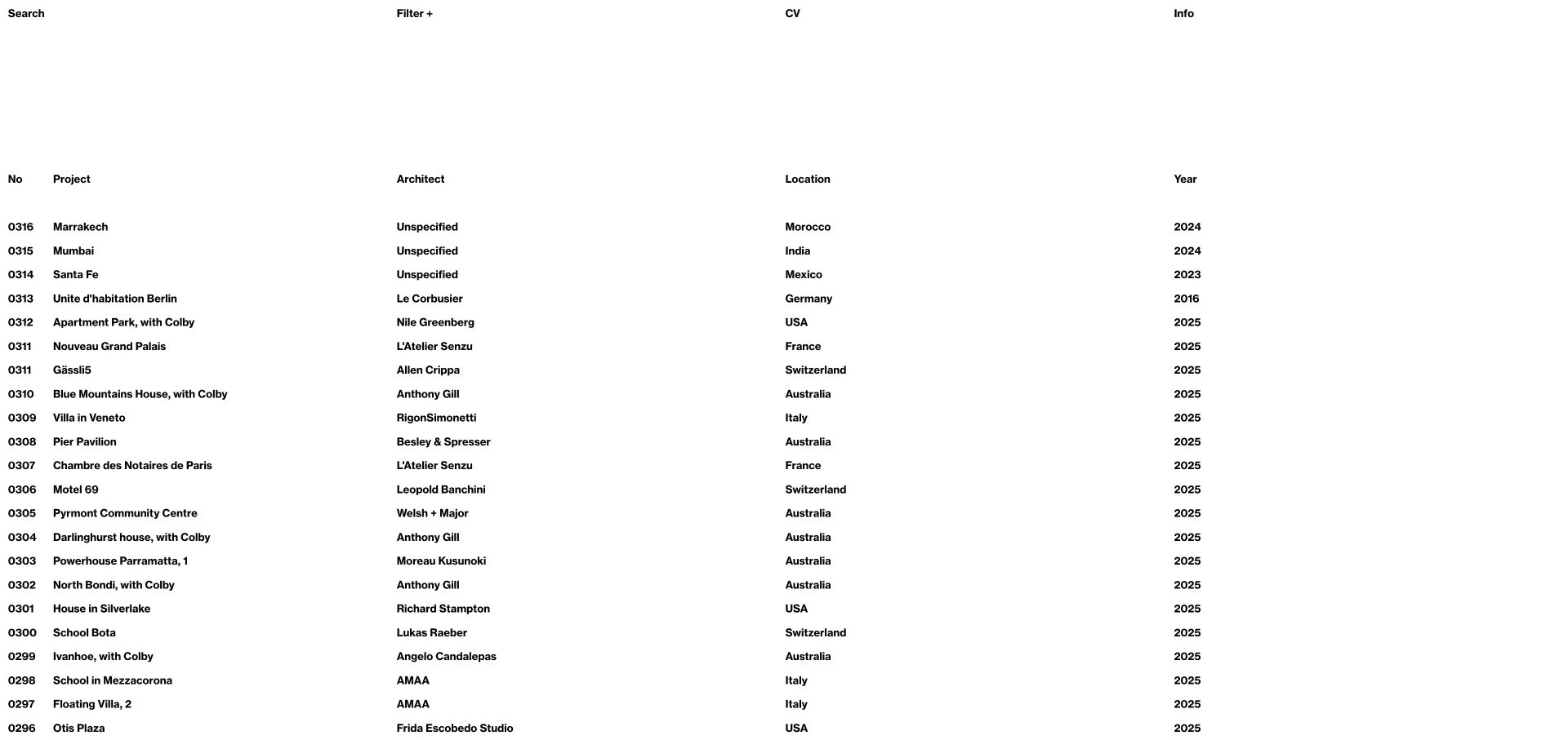
Rory Gardiner’s site-visit index makes an unusually text-led first impression. Rows identify a record number, project, architect, country and year, with search and filter controls above. Unknown architects are explicitly marked as unspecified rather than filled with guesses. The page is a useful counterpoint to full-screen photography sites: it supports finding and comparing work, although the dense table needs an equally clear image-discovery experience and responsive treatment.
What you can learn
For a deep archive, model project metadata explicitly and preserve uncertainty honestly. A visitor who knows a place, architect or year should have a route other than scrolling through every photograph.
Pros
Project, architect, location and year are distinct fields.
Unspecified attribution is labelled instead of invented.
Cons & considerations
The dense text index can feel unfamiliar without an introductory cue.
A wide table needs carefully tested narrow-screen and keyboard behaviour.
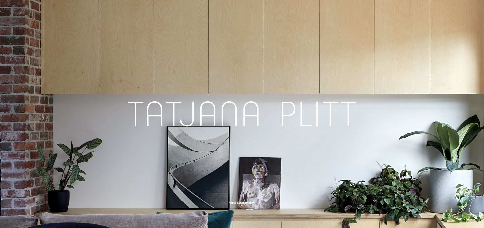
Tatjana Plitt’s homepage begins with an immersive interior image and a custom-looking thin wordmark. The wider navigation separates sustainability, residential, commercial and lifestyle, with named architecture practices represented in the project stream. Background, contact and press are distinct supporting routes. The sustainability category offers a more specific lens than a generic portfolio label, but it should be understood as the photographer’s classification rather than independent certification of the buildings shown.
What you can learn
Use a meaningful theme to help the right client recognise relevant work, then back it with named projects. A category label should not imply a certification or measurable performance claim the page does not establish.
Pros
The portfolio has both project-type and thematic entry routes.
Named architecture practices provide context beyond an attractive image.
Cons & considerations
The full-screen opening delays the conventional navigation.
Thin white lettering needs contrast checks across every changing image.
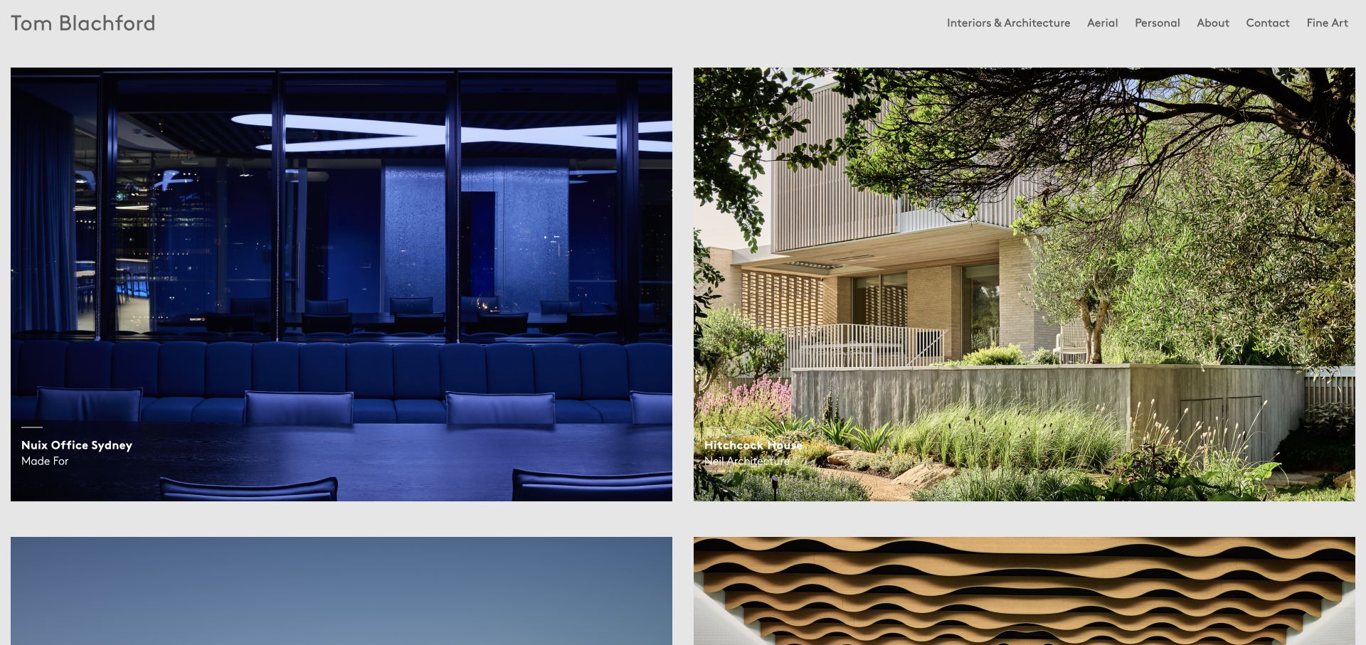
Tom Blachford’s personal and commissioned portfolio presents two large project cards per row. The reviewed opening identifies Nuix Office Sydney with Made For and Hitchcock House with Neil Architecture. Further cards span schools, hotels, houses and a recycling plant, each offering a complete gallery. A short header separates interiors and architecture from aerial, personal and fine-art work. This is a practical portfolio landing page rather than the site’s initial two-choice gateway.
What you can learn
Give each photographic set a project name, designer credit and obvious gallery route. A consistent grid helps viewers compare the range without confusing the photographer’s role with the architect’s work.
Pros
The cards clearly pair project titles with design credits.
Full-gallery links distinguish a complete set from a single preview image.
Cons & considerations
Overlay captions require sufficient contrast on both dark and bright photographs.
A long project grid benefits from filters or a useful archive index.
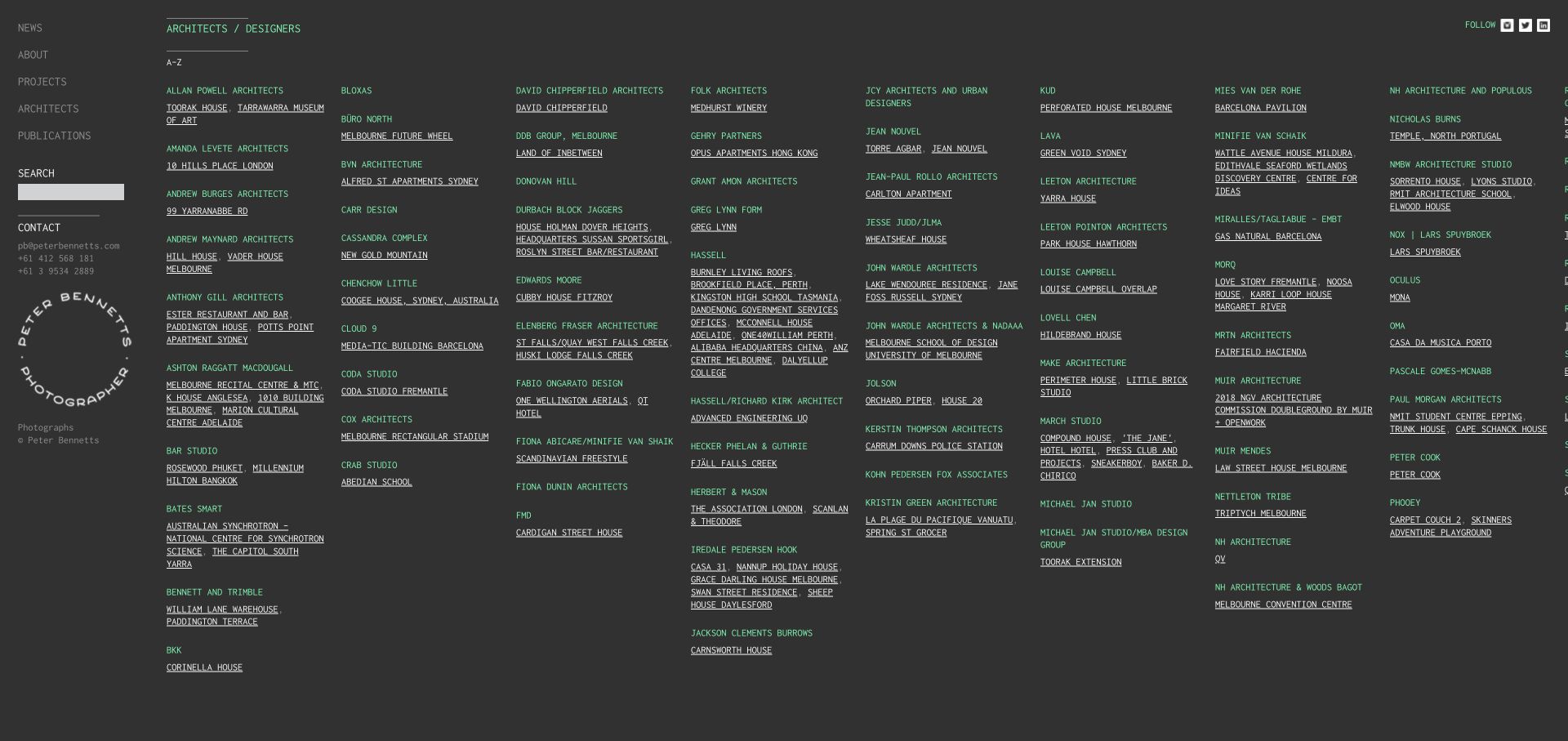
Peter Bennetts’ reviewed architects and designers index presents alphabetised names with linked projects in a multi-column dark layout. It is a deliberately text-based resource view, not a photo-led homepage capture. The sidebar retains news, background, projects, architects, publications, search and direct contact details. This makes design attribution a browsing route in its own right. Small text and the wide arrangement, however, make the information architecture more instructive than the exact visual sizing.
What you can learn
If people recognise the architect before the project name, provide that as an index. Maintain descriptive project links and a search route rather than forcing every visit through a visual slideshow.
Pros
Architect names group related project destinations clearly.
Search and contact remain visible in the persistent sidebar.
Cons & considerations
Small light text on a dark background can be difficult to read.
The wide multi-column index needs a usable narrow-screen alternative.
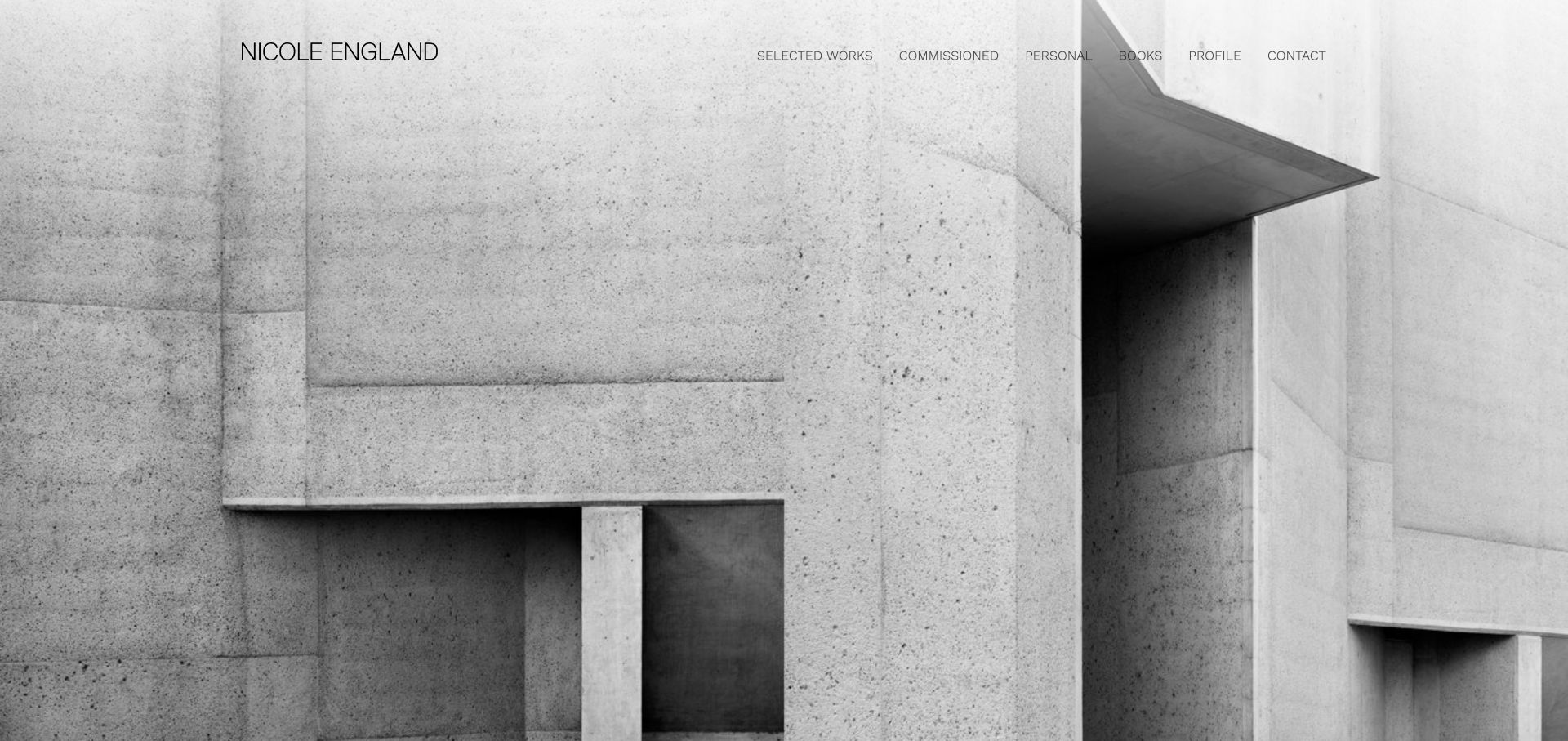
Nicole England’s homepage places a restrained name and navigation over a full-screen black-and-white architectural photograph. Selected work, commissioned work, personal projects, books, profile and contact are all directly visible. The opening photograph supplies texture and spatial character rather than acting as a backdrop to sales copy. Its strength is the clarity of the practice divisions; its limitation is how little immediate project or image context is supplied in the reviewed first view.
What you can learn
Let a distinctive image establish tone while keeping the kinds of work plainly labelled. Include enough project context for visitors to understand what they are seeing without sacrificing the visual calm.
Pros
Commissioned and personal work have separate visible destinations.
Books are treated as a meaningful part of the practice.
Cons & considerations
Text placed over changing architectural imagery needs consistent contrast.
The initial image alternative names the photographer rather than describing the project.
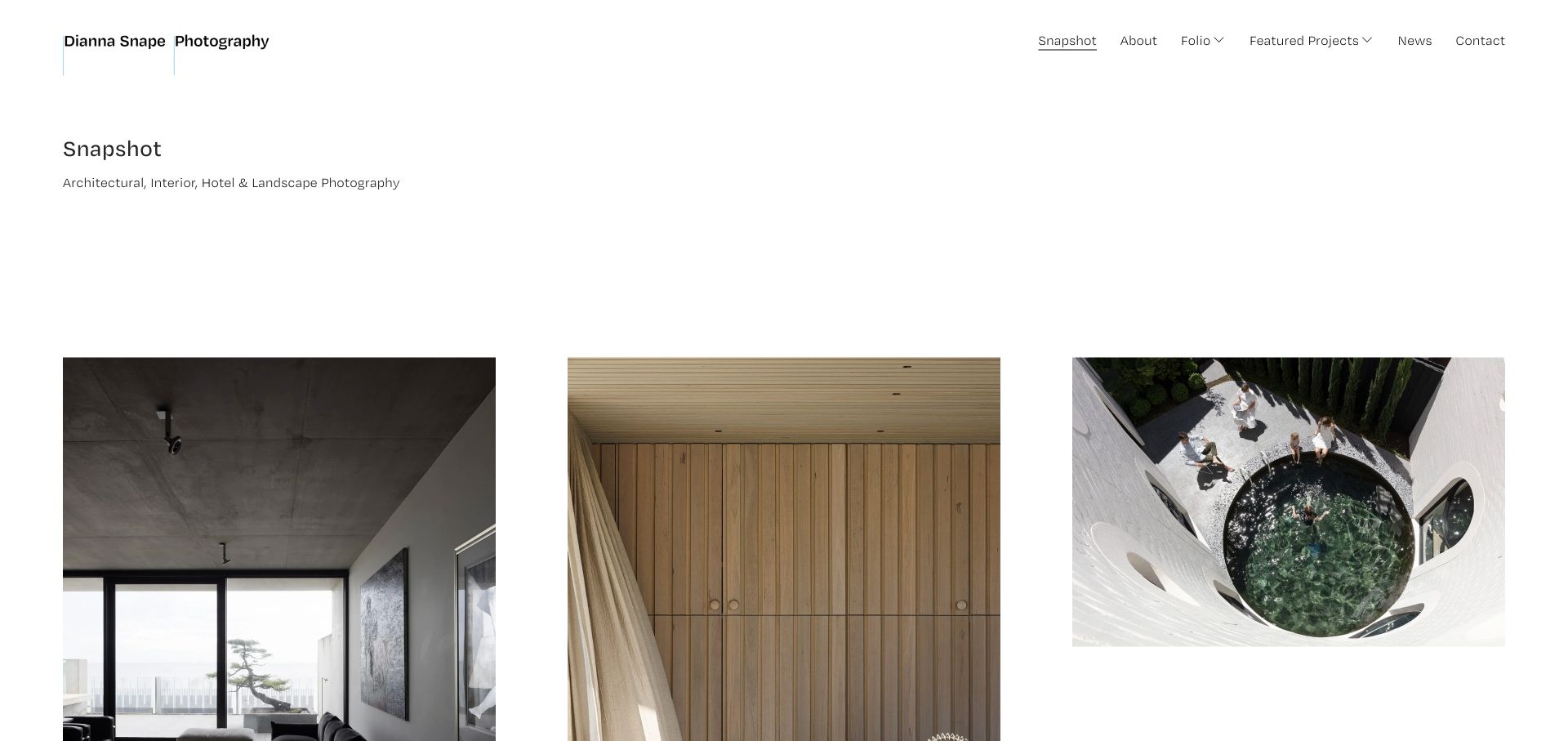
Dianna Snape’s Snapshot homepage identifies architecture, interiors, hotels and landscape photography before a spacious three-column image arrangement. Folio and featured projects are separate menu areas, supported by background, news and contact. Many image labels identify the project and architect, which is useful even though some retain duplicated Copy suffixes or filenames. The page explains the scope before asking visitors to interpret the photography alone.
What you can learn
Use a short scope statement to orient visitors, then let a selected grid show the range. Preserve project and architect names in image context, and clean internal editing labels before publication.
Pros
The introduction states the photographic specialisms clearly.
Folio browsing and featured projects have different navigation roles.
Cons & considerations
Several image labels expose Copy suffixes or internal filenames.
The generous gap above the grid postpones the first view of the work.
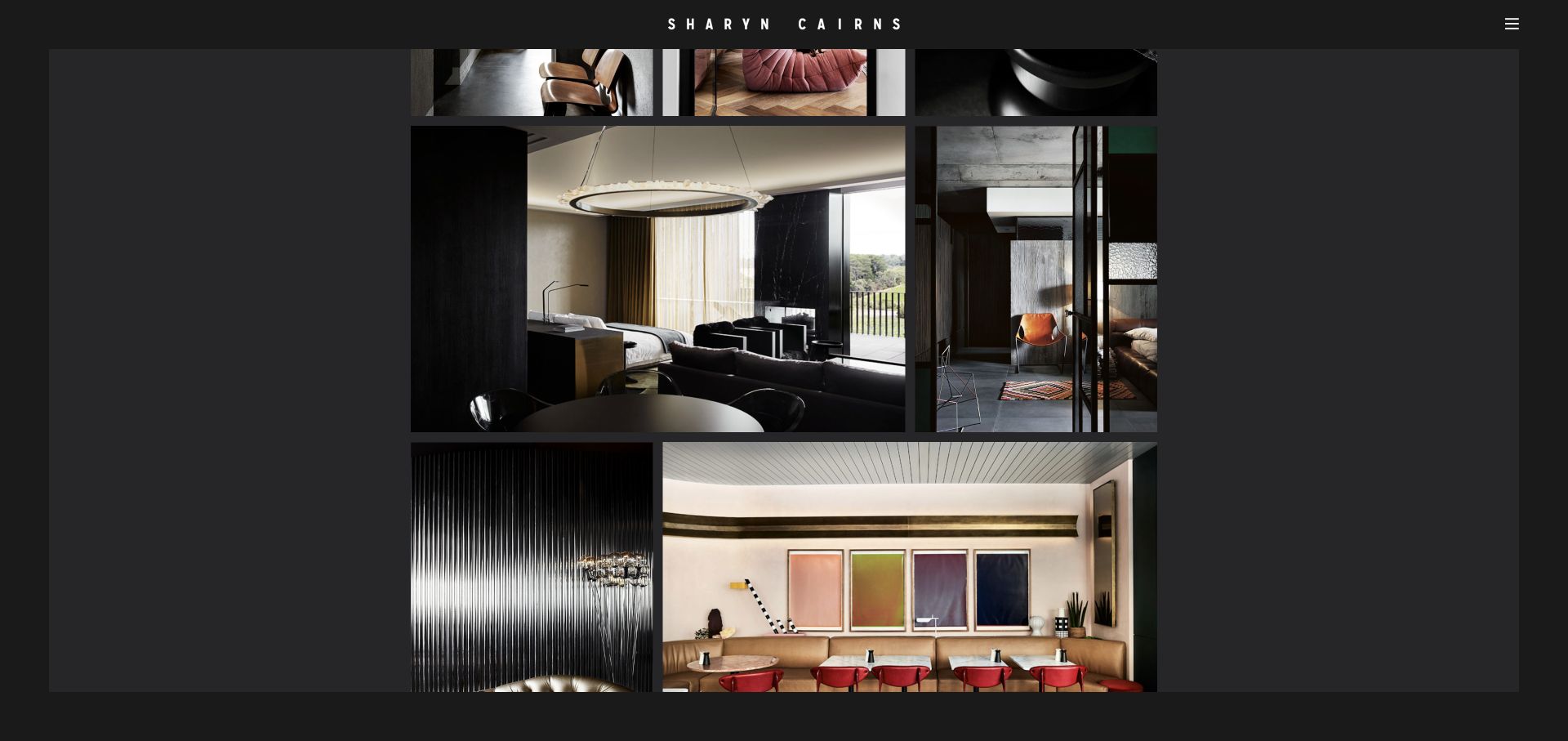
Sharyn Cairns’ reviewed Interiors collection uses a charcoal surface and a closely arranged grid of differently proportioned photographs. The accepted view is keyboard-scrolled into that image sequence, with the wordmark and menu retained at the top. Adjacent collection routes link interiors to commercial work and a second interior edit. The visual cohesion is strong, but the sparse visible text leaves project identification and architectural attribution less clear than in metadata-rich examples.
What you can learn
A consistent background and careful image spacing can create a coherent visual edit without uniform crops. Retain enough descriptive text and project credit so the sequence remains useful beyond its atmosphere.
Pros
Varied image proportions are preserved within a coherent dark presentation.
Neighbouring collection routes support continued exploration.
Cons & considerations
Sparse captions make individual projects harder to identify.
The first collection screen adds a large title-only stage before the image grid.
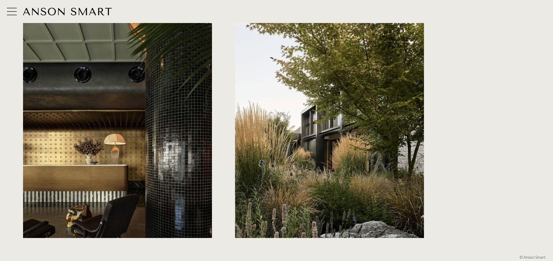
Anson Smart’s homepage uses an off-white background, a wide wordmark and a small menu control above a pair of large photographs. The source identifies work such as Hannah St Hotel and Arent & Pyke’s Speargrass House rather than relying entirely on filenames. The opening pairs a detailed hospitality interior with a planted residential exterior, demonstrating visual range without a busy collage. Navigation and project context still need to remain discoverable beyond the oversized image pairs.
What you can learn
Use a small selected pairing to show range, but preserve the identity of each commission. A minimal surface should not mean that project discovery depends on recognising the building by sight.
Pros
The opening presents contrasting spaces within one calm visual treatment.
Project labels identify designers or places in the public source.
Cons & considerations
The menu is concealed behind a small icon-only control.
Very large paired images need considered stacking and crop behaviour on mobile.
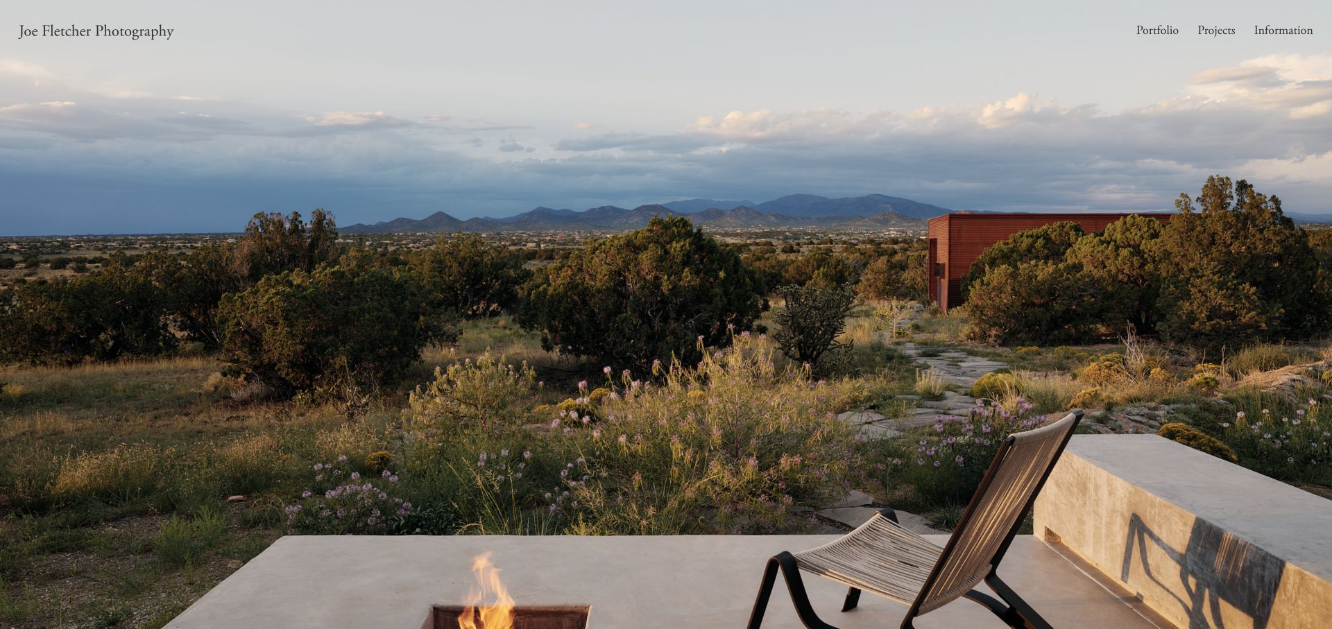
Joe Fletcher’s homepage puts a landscape-and-building photograph across the entire viewport. A small serif name and three straightforward routes—portfolio, projects and information—sit above it. The restrained navigation makes the distinction between a selected edit, deeper commissions and practical background understandable. The reviewed first screen is intentionally almost all image, so descriptive project context and a clear next step must be carried by the subsequent portfolio experience.
What you can learn
A quiet three-route structure can support a strongly image-led opening. Keep the distinction between selected images, complete projects and practical information explicit.
Pros
The main navigation is short and easy to interpret.
The photograph is not obscured by an oversized promotional headline.
Cons & considerations
The opening lacks a visible project caption in the reviewed view.
Overlay navigation needs contrast testing as the featured image changes.
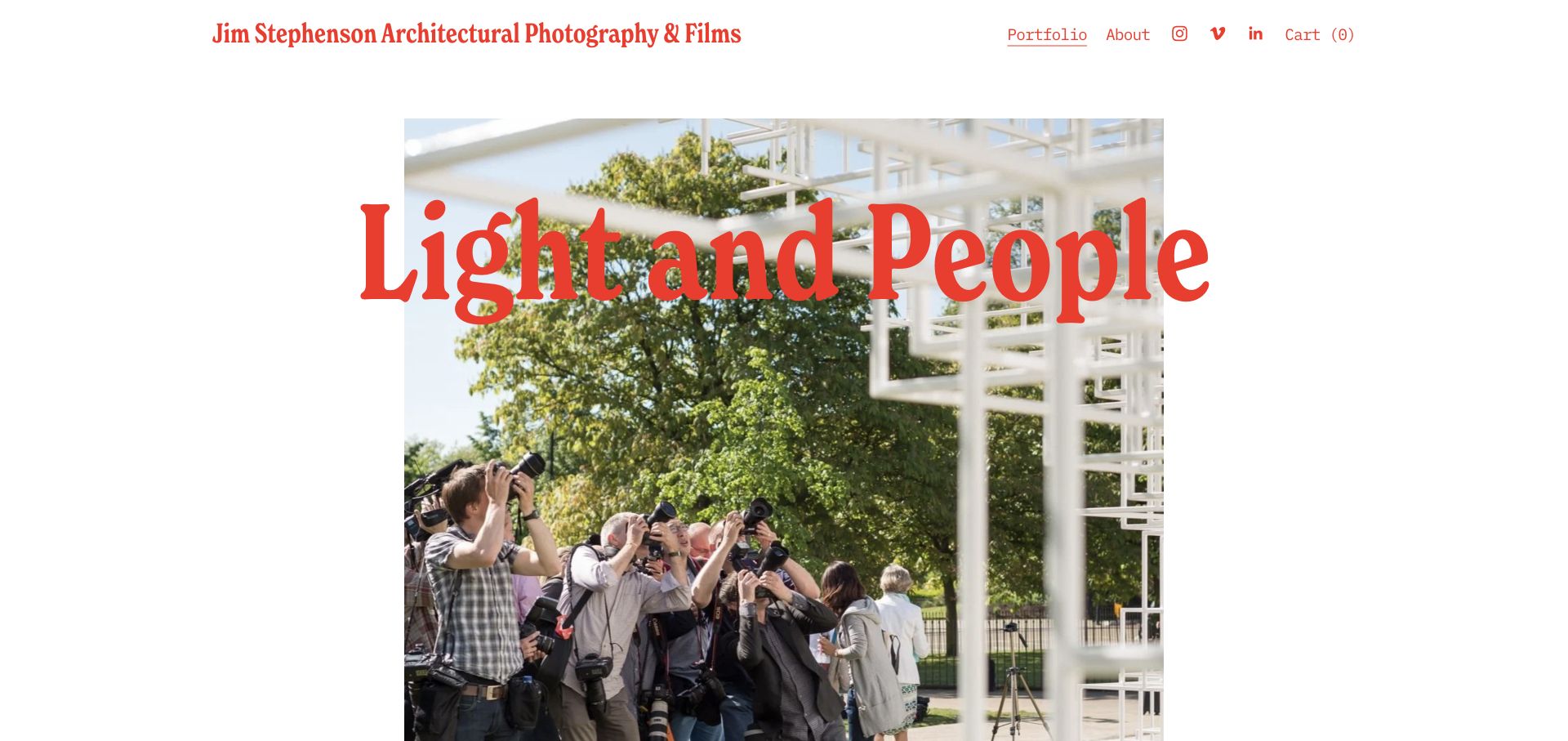
Jim Stephenson’s Light and People overview combines a bold red title, a photograph of people observing architecture and a substantial first-person explanation. Images and films illustrate an approach centred on how spaces are used, with natural light, everyday activity and context discussed explicitly. The page distinguishes still photography from collaborative film production and retains direct contact details. It is a useful alternative to a silent portfolio, though its length and embedded media require disciplined reading structure.
What you can learn
Explain a photographic point of view through both examples and specific working practices. A potential client should understand how a commission will be approached, not only whether the pictures look attractive.
Pros
The overview explains a specific approach rather than generic creative promises.
Still photography and film collaboration are distinguished clearly.
Cons & considerations
Large overlapping red type needs careful reflow over the image.
A long essay with numerous video embeds needs loading and navigation discipline.
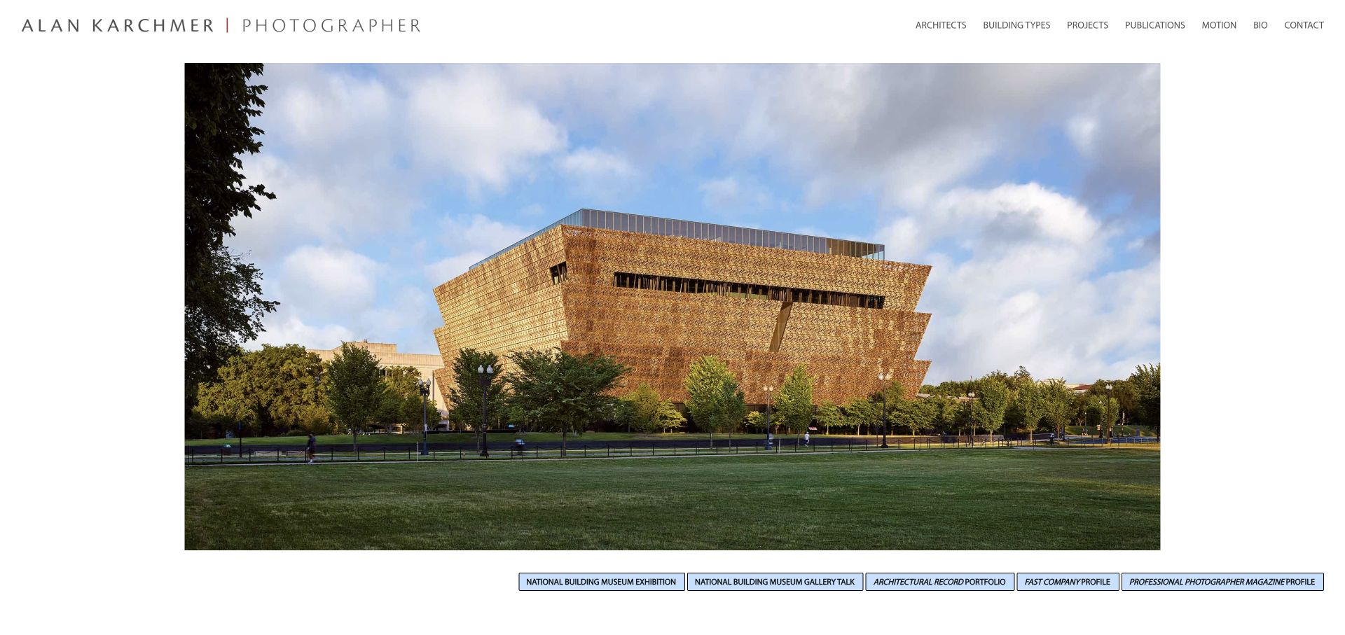
Alan Karchmer’s homepage gives a large architectural photograph a generous white frame beneath a restrained identity. The header exposes architects, building types and projects as separate ways to browse, followed by publications, motion, biography and contact. A row of explicitly labelled external exhibition and editorial-profile links adds context. This offers useful depth behind a simple opening, although generic numbered image descriptions limit the accessibility of the featured sequence.
What you can learn
Provide more than one index when the portfolio is large enough to justify it. Keep architectural attribution, project type and press recognition as separate content roles rather than blending them into one undifferentiated gallery.
Pros
Architect, building-type and project browsing are distinct.
External recognition links say which publication or institution they lead to.
Cons & considerations
Numbered image filenames do not supply useful descriptive alternatives.
Small uppercase navigation and tightly packed profile links need readable spacing.
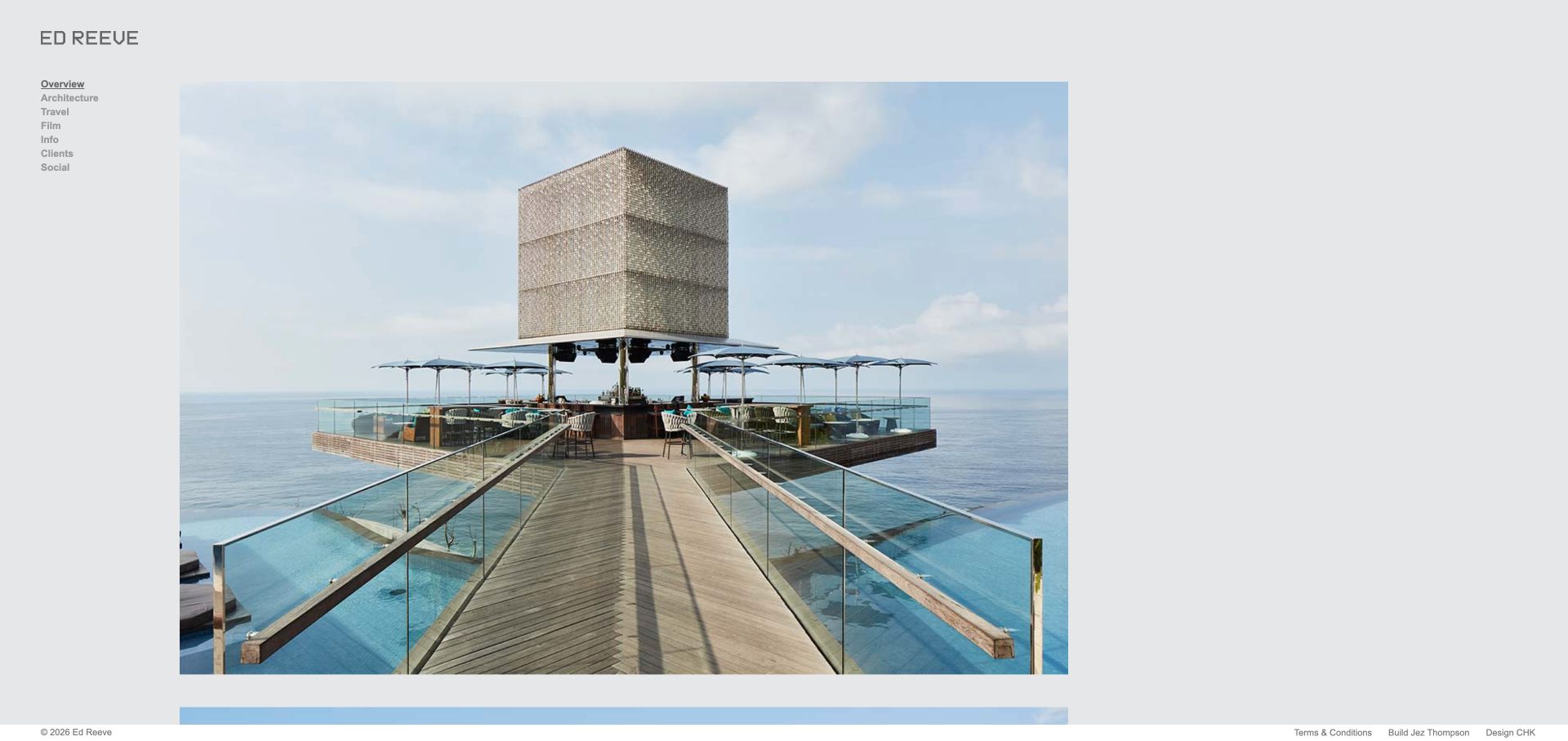
Ed Reeve’s overview places a plain grey identity and compact sidebar beside a wide architectural photograph. Architecture, travel and film are distinct categories, while information, clients and social routes sit underneath. A slim footer retains terms and design credits. The layout shows how a consistent sidebar can remain useful without a large corporate header, but the small type and almost caption-free opening place more responsibility on the deeper project pages.
What you can learn
Keep the photographer’s disciplines visible next to the work, not hidden behind a full-screen introduction. Use the detail pages to supply project identity and credits that the overview cannot carry alone.
Pros
Architecture, travel and film have separate direct routes.
The quiet sidebar leaves the image composition largely untouched.
Cons & considerations
The small navigation text needs comfortable size and contrast.
The initial overview supplies little visible project identification.
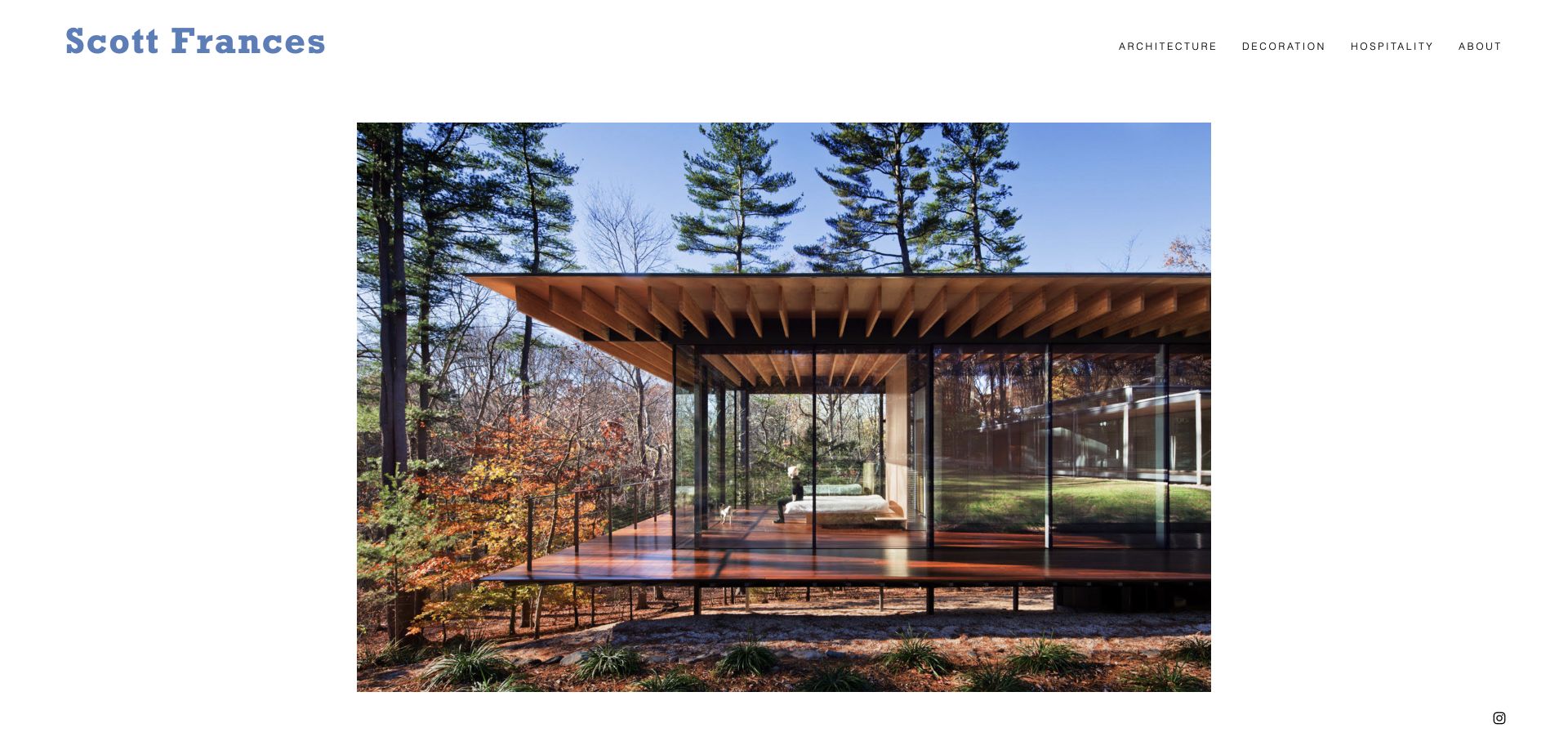
Scott Frances combines a blue name treatment with a short header for architecture, decoration, hospitality and background. A single large interior photograph sits within substantial white space rather than filling every edge. The public image descriptions identify projects, designers and places, including Soori Highline and Soo K. Chan. The clear discipline split helps potential clients orient themselves, while the minimal first view offers little practical commission information until they follow another route.
What you can learn
A simple discipline taxonomy can be enough when each category contains a coherent edit. Keep image descriptions specific even when the visible layout is almost entirely photographic.
Pros
Architecture, decoration and hospitality are clear, separate categories.
Image descriptions include useful project and designer context.
Cons & considerations
The first screen provides little visible commissioning or contact information.
A single-image opening needs an obvious path to the rest of the work.
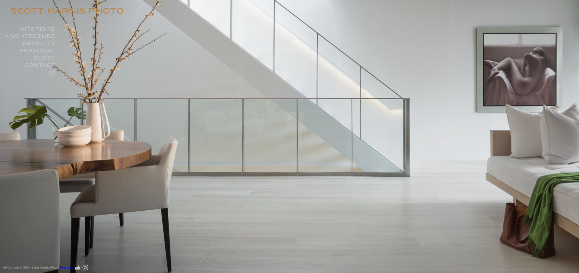
Scott Hargis uses a full-screen interior photograph behind a compact left-hand navigation. Interiors, architecture, projects, personal work, background and contact are direct choices, with residential and commercial interior subcategories in the public structure. The opening includes a person using the space, showing occupation rather than only an empty room. The design has strong photographic presence, but text contrast and inconsistent image descriptions need attention when this approach is adapted.
What you can learn
Make the main bodies of work easy to reach even in an immersive layout. Check overlay text against every featured photograph and describe the subject rather than relying on a generic photographer name.
Pros
The sidebar separates architectural, interior and personal work.
Interior subcategories distinguish residential from commercial commissions.
Cons & considerations
Some navigation sits over visually complex areas of the photograph.
Image alternatives mix useful descriptions with generic names and filenames.
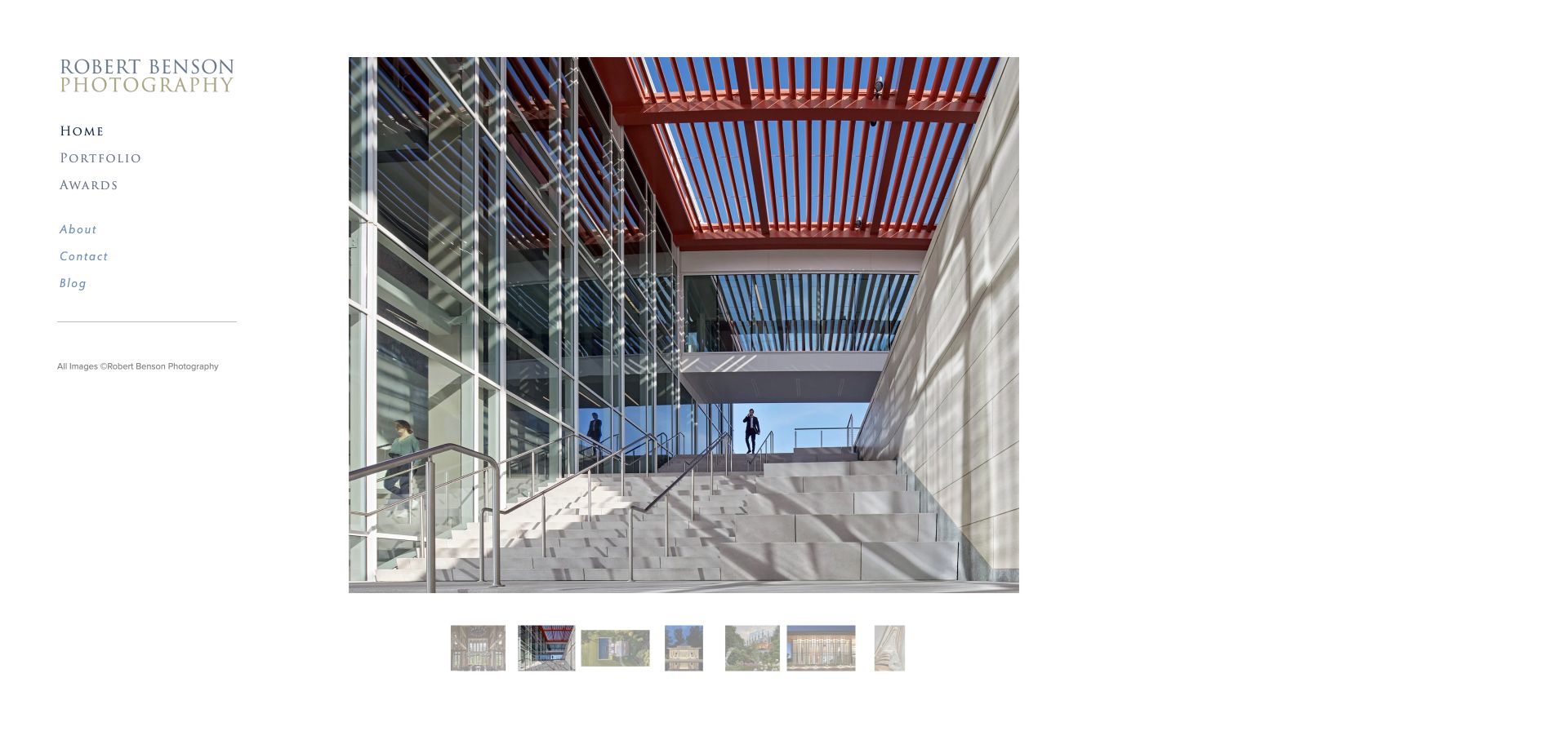
Robert Benson Photography uses a quiet sidebar beside a large selected image and a row of visible thumbnails. The portfolio menu distinguishes higher education, student housing, K–12, civic, medical, science and technology, hospitality and other sectors. Awards, background, contact and a blog are separate routes. The sector structure helps an institutional client locate relevant work without interpreting a generic gallery, while the thumbnail edit supplies an immediate visual overview.
What you can learn
Organise a specialist architectural portfolio around the kinds of commissions clients recognise. Give viewers both a curated first look and a way to navigate directly to comparable work.
Pros
The sector taxonomy is specific enough for institutional commissioning.
Visible thumbnails let visitors scan the selected gallery.
Cons & considerations
A large sector menu needs clear grouping on narrow screens.
The featured image alternatives expose filenames rather than complete project descriptions.
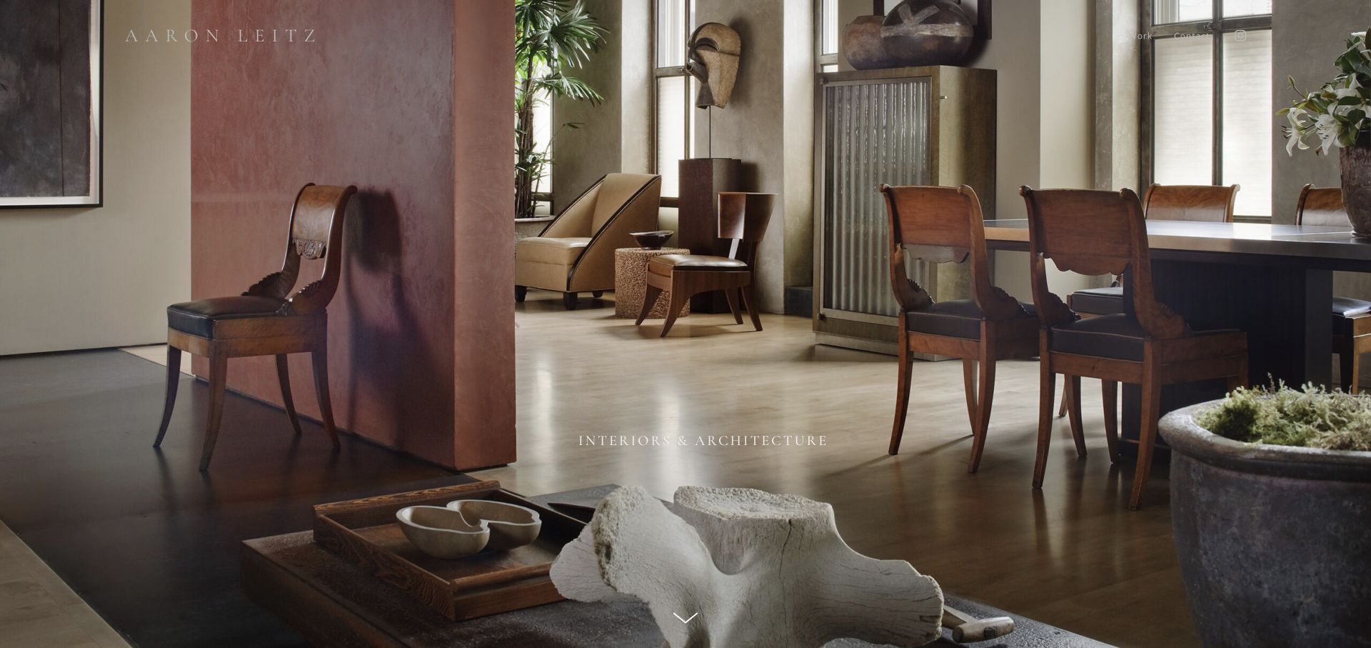
Aaron Leitz’s Interiors and Architecture page opens with an immersive interior photograph and restrained typography, then explains how commissioned work relates to the artist’s wider practice. A sequence of interior and architectural images follows, while Work and Contact remain the main header choices. The page gives the commission a specific conceptual context rather than presenting fine art and commercial photography as unrelated businesses. The useful introduction should remain readable despite the image-led opening.
What you can learn
Explain how an artistic approach informs commissioned work, using plain language and relevant photographs. Keep the contact route simple while preserving meaningful context for each architectural set.
Pros
The introduction connects the commissioned portfolio to a specific creative approach.
The header keeps work and contact as clear primary tasks.
Cons & considerations
Thin light typography can lose contrast over bright interior details.
Many image labels are internal filenames instead of project and designer descriptions.
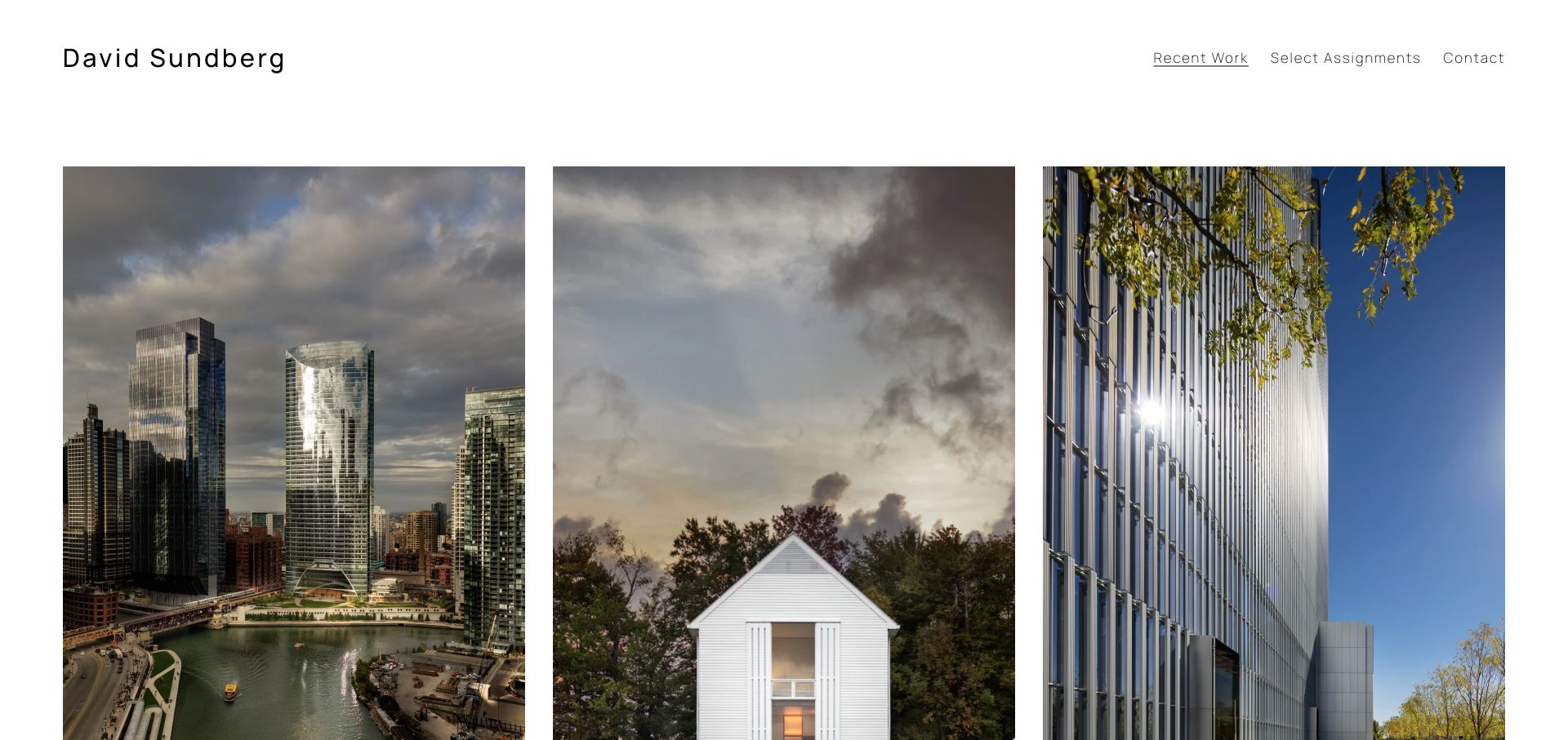
David Sundberg’s homepage presents three large project images per row beneath a short navigation for recent work, selected assignments and contact. The records name River Point, Pennsylvania House, Salt Lake City Courthouse and other projects, each linked to its own page. The varied building scales are easy to compare because the grid remains consistent. The initial view prioritises the photographs, so dates and architectural credits need to remain clear in the project records rather than being inferred from the Recent Work label.
What you can learn
A concise grid can make a specialist portfolio approachable without a mandatory slideshow. Give every image a named destination and distinguish a recent selection from the complete assignment archive.
Pros
Project names lead directly to individual case-study pages.
Recent work, deeper assignments and contact have distinct routes.
Cons & considerations
The Recent Work label needs supporting dates when chronology matters.
Large portrait-oriented cards need thoughtful crops and ordering on smaller screens.
Kegan is a freelance web designer and developer with 15+ years of experience helping businesses turn complicated website requirements into clear, maintainable digital experiences. He works directly with clients from planning and design through development, launch, and ongoing support.
For architectural photographer website design, his development approach focuses on complete project sets, useful architectural and location context, clear image credits and rights information, and straightforward commissioning enquiries. The scope can be a targeted improvement or a complete custom build, with responsive layouts, thoughtful content structure, and integrations chosen around the people using and maintaining the site.
Show 3 other architectural photographer website designersHide other architectural photographer website designers
Plan an architectural photography website as a useful body of work
Decide what the portfolio must communicate before choosing a layout
Begin with the practice rather than a fashionable gallery effect. Is the work primarily commissioned architecture, interior design, hospitality, institutional projects, fine art or a combination? Which audiences commission it, and what do they need to compare? A designer choosing a photographer for a small house has different questions from a university commissioning a multi-building campus. The site should help those visitors recognise relevant work without making claims about experience that the portfolio cannot support.
Robert Benson’s sector taxonomy distinguishes educational, civic, medical and other assignments. Ty Cole separates architecture and interiors from people, travel and motion. Nicole England and Mike Kelley keep commissioned and personal work distinct, with books or print sales as additional routes. These structures are worth studying because the labels explain the practice; the underlying visual style could change without destroying that organisation.
Choose a manageable first edit. It should demonstrate a point of view and useful range, not simply include every photograph that is technically successful. Give the complete archive a separate route when it is genuinely helpful. A prospective client should be able to move from a striking selected image to a coherent commission, then to the relevant contact or representation information. Do not make a visitor guess whether the site is selling prints, licensing existing images or accepting new assignments.
Create project records with accurate attribution and useful context
Model each commission as a record with a stable name, relevant location, architect or designer credit, photographic role and selected images. Add dates when they clarify the project rather than manufacturing a sense of freshness. Some commissions include interior designers, landscape designers, clients and collaborators as well as architects. Preserve those distinctions instead of using a single ambiguous client field for every contribution.
João Morgado’s selected project cards name architects and places. James Brittain pairs the Canadian work with project and practice names, while Tom Blachford connects each preview to a complete gallery and design credit. Hélène Binet often identifies a body of work through subject, location and a span of years. Those approaches show that metadata can be concise without disappearing entirely. It should be accurate in visible captions, image alternatives and search records, not merely buried in an image filename.
Keep image identity and permissions separate. A portfolio thumbnail does not grant visitors permission to download, republish or use a photograph commercially. Publish an appropriate enquiry or licensing route when relevant and use the practice’s actual terms. When the website includes editorial screenshots or outside recognition, identify that source clearly. Do not turn a publication logo into an unsupported endorsement or imply that an award for a building is an award for the photography.
Balance a selected visual edit with dependable archive discovery
A single-image opening, a masonry collection, a consistent grid and a text index solve different problems. The image sequence creates focus; the grid supports comparison; the text index helps people who know a project, architect, country or year. The strongest choice depends on the size and nature of the work. Adding every pattern can create more confusion than usefulness, especially if the same project appears under inconsistent names.
Rory Gardiner presents site visits as structured records with project, architect, country and year, explicitly preserving unspecified attribution. Peter Bennetts supplies an architect-based index, while Alan Karchmer offers architects, building types and projects as different routes. David Sundberg gives a concise recent-work grid an assignment archive alongside it. These are useful counterpoints to the near-full-screen image openings elsewhere in the collection.
If using filters, define what each one means and how combinations behave. A residential interior may also belong to a commissioned architectural set; a location may be the building’s place rather than the photographer’s service area. Keep meaningful empty states and a clear reset. Search should find common variations of project and practice names without requiring exact punctuation. Small portfolios may need only a good index and clear headings rather than a complex filtering interface.
Protect the photograph while making the interface readable
Architectural photography relies on composition, detail, light and proportion. A website crop can alter that meaning, so choose image behaviour deliberately. Decide which views preserve the complete frame, which thumbnails may crop and where a larger view is available. Inspect the actual focal areas on smaller screens, particularly when portrait and landscape photographs share one template. Avoid assuming that centre-cropping every source will keep the important architectural relationship intact.
Hufton + Crow gives the photograph a quiet framed opening. Scott Frances leaves substantial white space around a single interior. Rafael Gamo and João Morgado use different image sizes and spacing to create a less uniform rhythm, while Sharyn Cairns uses a dark surface to tie an interior edit together. These are aesthetic choices, not universal rules. Each needs enough navigation and contextual text to remain a usable website rather than a sequence that only the photographer understands.
Test overlay text against every image state, not only the one used in the design mockup. A menu that reads well on a dark wall may vanish over a bright sky. Keep keyboard focus visible, make gallery controls discoverable and give motion a sensible pause or reduced-motion treatment. Lightboxes should have clear close controls and return focus appropriately. Do not use filenames, Copy suffixes or a repeated photographer name as a substitute for useful image descriptions.
Make image delivery part of the design brief
A photography portfolio is especially vulnerable to a beautiful but empty first screen. The initial browser view should reach a meaningful photograph reliably rather than wait for every image in the archive. Decide which image has priority, reserve its layout space and provide appropriately sized versions for the actual display. Do not send a huge master file to every phone simply because the desktop composition is wide. A technically smaller file is not automatically a better result either: preserve sufficient detail for the intended viewing context.
Review loading in the same way a visitor experiences it. Several sources in this collection initially showed a blank or transitional frame before their imagery appeared. That is an observation about the reviewed session, not a laboratory performance score, but it illustrates why a gallery needs a deliberate loading experience. A quiet background, meaningful page identity and usable navigation should remain intact while images arrive. Avoid an indefinite spinner that gives no useful next step when an asset fails.
Consider the relationship between an overview and a larger view. A grid preview can use a lighter derivative, while a deliberate enlargement can request more detail. Maintain the image orientation and visual continuity so the larger version feels like the same photograph rather than an unrelated crop. Test slower connections and repeat visits as well as the ideal first load. Review any video embeds separately; loading several players before the visitor reaches them can undermine an otherwise restrained page.
Write an editorial layer that works beyond the image
A concise portfolio does not need long text on every card, but it does need a consistent way to identify what the visitor is seeing. Decide which information belongs in the thumbnail caption, which belongs on the project page and which should be available to assistive technology. A project title can be brief, while its detail record names the architect, place, collaborators and commission context. Keep those records structured so the same work is not described differently in a grid, search result and gallery.
Use image alternatives for the purpose of the image in that setting. A linked thumbnail may need a clear destination name; a photograph being studied in a sequence may need a description of the space or view. Avoid treating a filename or a collection-wide photographer name as sufficient in every context. The collection contains examples with useful project labels as well as internal names and editing suffixes, making this a practical maintenance issue rather than an abstract rule.
Preserve a readable route to supporting information when the main experience is highly visual. A text index can serve a visitor who remembers an architect or country, while ordinary headings and links can make a long visual essay easier to navigate. Do not promise that a sparse layout is automatically accessible, fast or search-friendly. Verify the tasks and content themselves. The aim is not to describe away the photograph, but to ensure that its identity and the surrounding professional relationship remain understandable.
Explain the working relationship and maintain the portfolio responsibly
A commissioning page can be concise while still explaining what the practice offers. State the relevant base or working area, the type of commissions, how an enquiry reaches the right person and whether representation handles assignments or licensing. Avoid publishing private client information, access arrangements or unpublished architectural material merely because it is available internally. A contact form should ask for enough context to begin a conversation, not require every production detail before the person can reach you.
Jim Stephenson’s overview is useful because it explains an actual working approach through images, films and a personal essay. Aaron Leitz connects commissioned architecture with his wider artistic practice. These are stronger models than generic claims about passion or quality: they help a visitor understand how the work is made and what kind of collaboration to expect. The details should come from the photographer’s real practice, not be copied from an admired peer.
Schedule reviews of project credits, contact destinations, external representation, press links and dated news. A portfolio can be visually timeless while its practical information becomes stale. Check loading states on real connections and remove broken or misleading destinations. Do not mistake a coming-soon page, blocked source or compromised-looking content for a complete example just to fill a collection. An honest smaller edit is better than unsupported claims, and the saved research target should guide work without overriding evidence quality.
The editing job behind the design
Choose a stack that respects images and structured project records
Evaluate the content system by its handling of projects, image sets, credits, orientation, captions and reusable categories. A photographer should not need to rebuild the page layout to add one correctly attributed commission.
Use appropriate image derivatives, dimensions and loading priorities so the first meaningful photograph appears reliably. Keep private client delivery, proofing and licensing systems separate from the public portfolio where those workflows require it.
Public stack observations are bounded evidence, not a complete inventory of editing, archiving or delivery tools. A visible image host or gallery script does not identify the photographer’s entire workflow. Technologies are left unlisted when there is no reliable public evidence for them.
Our WordPress website examples offer a separate look at publishing approaches. A visible platform label is evidence for that named page, not a guarantee that the same system will suit your requirements.
Define the actual photographic specialisms and commissioning audiences.
Separate selected images, complete commissions and personal work where useful.
Give each project a stable name and destination.
Credit architects, designers, collaborators and photographic roles accurately.
Use dates and places where they add meaningful context.
Preserve uncertainty rather than guessing missing attribution.
Choose archive categories that match the real body of work.
Test image crops in both portrait and landscape layouts.
Provide readable navigation over every featured image.
Check keyboard controls, lightboxes, focus return and motion preferences.
Replace internal filenames and Copy labels with useful descriptions.
Make assignment, representation and licensing routes understandable.
Keep private client materials outside the public portfolio.
Review external links, contact details and dated news regularly.
These checks are a project checklist, not a performance, legal, security, or accessibility certification. Test real journeys with the people responsible for the website before making claims about the result.
Sources & editorial method
How this collection was selected and reviewed
Each included public source was directly read and visually reviewed, with a genuine browser screenshot and recorded capture date. Collection and index pages are labelled as such rather than presented as homepage views; Sharyn Cairns’ image shows the Interiors collection after scrolling. Rafael Gamo’s project index uses the site’s own no-splash destination. Optional cookies and notices were handled through ordinary controls where offered. Screenshots were not rebuilt, and page content was not hidden to manufacture a cleaner design. The observations distinguish visible features from conditional tradeoffs; the selection concerns website communication, not photographic merit, licensing value or measured client outcomes.
Each example links to its actual source page. Screenshots are direct browser captures with their own capture dates; moving imagery, announcements and live designs can change. The notes describe observable design choices and conditional tradeoffs, not measured traffic, conversion results, service quality, or accessibility conformance.
Technology labels use public page metadata, asset evidence, or explicitly cited platform documentation. Platform documentation is not a complete current deployment audit. A component reference may be legacy or unused; it is not a complete backend inventory. Unknown stacks are omitted. These sites are editorial examples, not our client portfolio.
Written, Edited and Curated are separate editorial records, not timestamps advanced by a rebuild. Website designs and imagery belong to their owners. See our editorial standards or suggest a correction.
Should the homepage use one image or a project grid?
Either can work. A single photograph creates focus, while a grid makes comparison easier. The important part is a clear route from the opening to named projects, complete sets and practical information.
What context should an architectural photograph include?
Where available, identify the project, architect or designer, relevant place and photographic role. Keep attribution accurate and distinguish it from permissions to reproduce the image.
How should personal and commissioned work be organised?
Use clear labels when the audiences or purposes differ, but keep a coherent identity. Explain the relationship between artistic work and commissions if that helps a client understand the practice.
Why is João Morgado the Editors Choice?
The reviewed specialist practice combines a distinctive image mosaic with direct project links, architect and location context, search and language choices. The editorial choice recognises website communication, not independently measured photographic or business performance.
Does publishing a photograph make it free to reuse?
No. A publicly visible portfolio image does not automatically grant reproduction or commercial-use rights. Follow the photographer’s stated licensing or enquiry process and the terms applying to the particular image.
Start with a coherent edit and accurate project context. Let the photographs establish the point of view, then make the archive, working relationship and next step clear enough for a real commission.