Best Orchestra Websites of 2026 (19 Real-World Examples)
Real orchestra websites showing how performance imagery, calendars and practical visitor guidance work together.
An orchestra website needs to make the music inviting and the next step understandable. These examples connect season campaigns with concert dates, venues, ticket options, education and the questions a first-time visitor brings.
Orchestras often have to explain more than one kind of experience. A classical series, a film with a live score, a youth performance and a community event can all appear on the same homepage. A strong design gives each an accurate label and an appropriate route, while keeping the calendar and practical attendance information easy to find.
The collection includes regional orchestras and dedicated ensemble sections within broader arts organisations. Each review considers the actual public page and its accepted screenshot. Campaign imagery may show guest performers, dancers, film artwork or audiences rather than the orchestra itself; those distinctions are retained. The collection studies website design, not musical quality, ticket value or measured commercial outcomes.
Before the examples
What makes good orchestra website design in 2026?
Give every performance a practical brief
Keep the title, format, date, time and venue together. Distinguish individual performances from the season or series they belong to, and make the next action explicit before sending a visitor to ticketing.
Welcome people who have never attended
A named first-visit route should answer confirmed questions about arrival, seating, access and the experience. Avoid assuming visitors already know the hall, the repertoire or the difference between a subscription and a single ticket.
Separate attendance, learning and support
An orchestra can also operate youth ensembles, a school or a chorus. Give these activities distinct labels and contact routes, while keeping the shared organisation understandable. Do not make a concertgoer navigate through lesson-registration information to find the programme.
Keep essential information outside changing artwork
A campaign can establish mood, but readable dates and actions need a stable home. Maintain a usable calendar alongside carousels and give motion clear controls. Review sale messages, deadlines and relative dates as part of ordinary publishing.
The collection · 19 examples
19 orchestra websites worth studying
These 19 genuine public pages were reviewed and captured directly. Boise Phil is the explicit Editors Choice for the way its homepage explains a performance format and connects programme discovery with first-visit help, while distinguishing its orchestra, youth and choral activities. The remaining examples offer useful alternatives and tradeoffs rather than an artistic ranking.
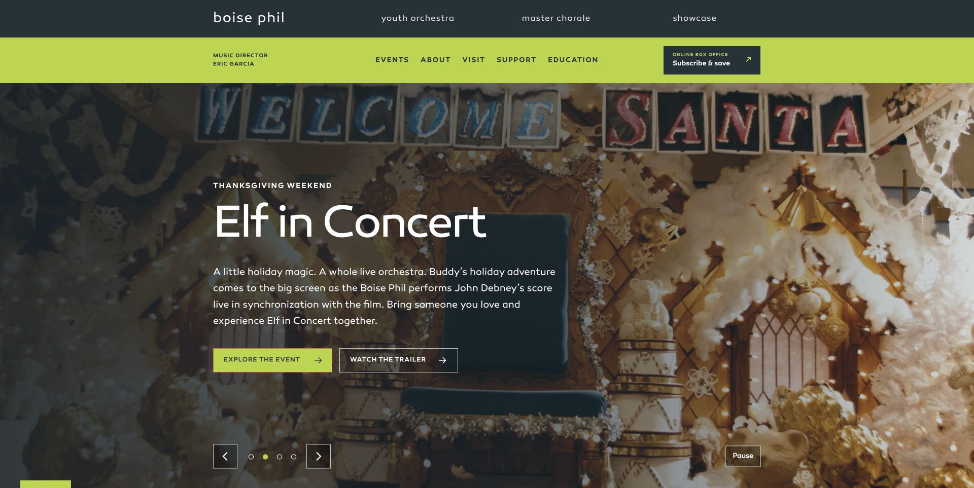
Boise Phil combines charcoal and lime navigation with a spacious campaign panel. The captured Elf in Concert feature explains that the orchestra performs the film score live and separates event details from the trailer. Visible controls include a pause action. Below, series cards lead into a specific film-concert brief, first-visit advice and separate introductions to the orchestra, youth ensembles and master chorale. The cookie window was closed without optional consent. Programme discovery connects well to practical assistance, although the online box-office label rotates through several tasks and the extensive sponsor and footer sections require a long scroll.
What you can learn
Explain the experience before presenting the ticket action, especially for film concerts and other hybrid formats. Give newcomers a visible welcome with practical next steps, and make youth, chorus and professional performance routes distinct without fragmenting the organisation's identity.
Pros
The campaign separates event information from the optional trailer and provides a pause control.
First-visit guidance sits within the main homepage story rather than only the footer.
Cons & considerations
The rotating box-office task label may change while a visitor is deciding where to click.
The long sponsor and footer sections repeat many destinations already introduced above.
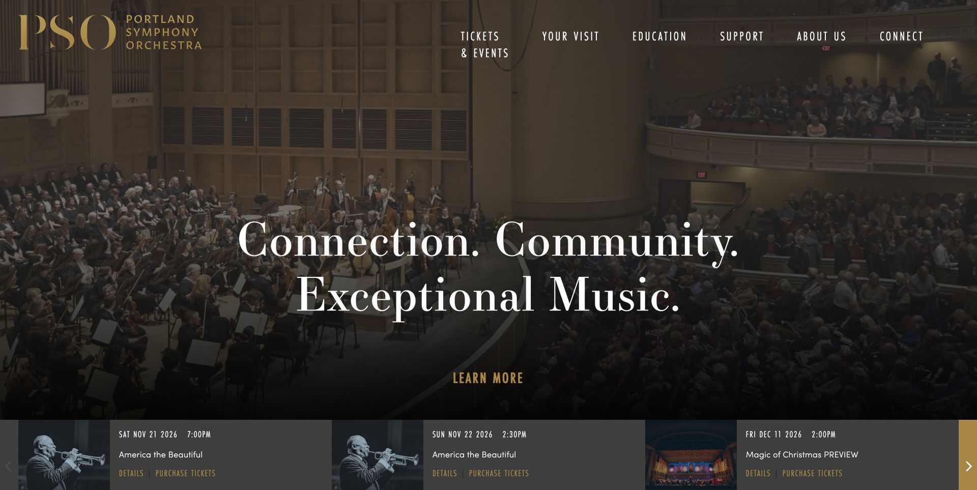
Portland Symphony Orchestra opens with an expansive photograph of musicians and their audience inside the concert hall. Gold branding and condensed navigation sit above a large white statement, while an event strip at the bottom supplies dates, times and separate information and purchase links. The page then distinguishes classical concerts, pops, Christmas performances and programmes for younger audiences. Education has its own routes rather than being folded into a general institutional story. The photograph makes the venue experience tangible; the practical strip gives returning visitors a quicker path than the broad introductory headline. Readers still need to move beyond the opening to compare the wider programme.
What you can learn
Let a strong venue photograph establish the experience, but attach a compact, readable event summary to it. Keep the performance date and the difference between learning more and buying visible without requiring visitors to interpret campaign artwork.
Pros
The opening connects an actual concert setting with specific upcoming performance information.
Distinct concert and education categories support several kinds of visitor.
Cons & considerations
The large general statement occupies space that could introduce the next programme.
Featured events are divided across a rotating presentation rather than one complete comparison.
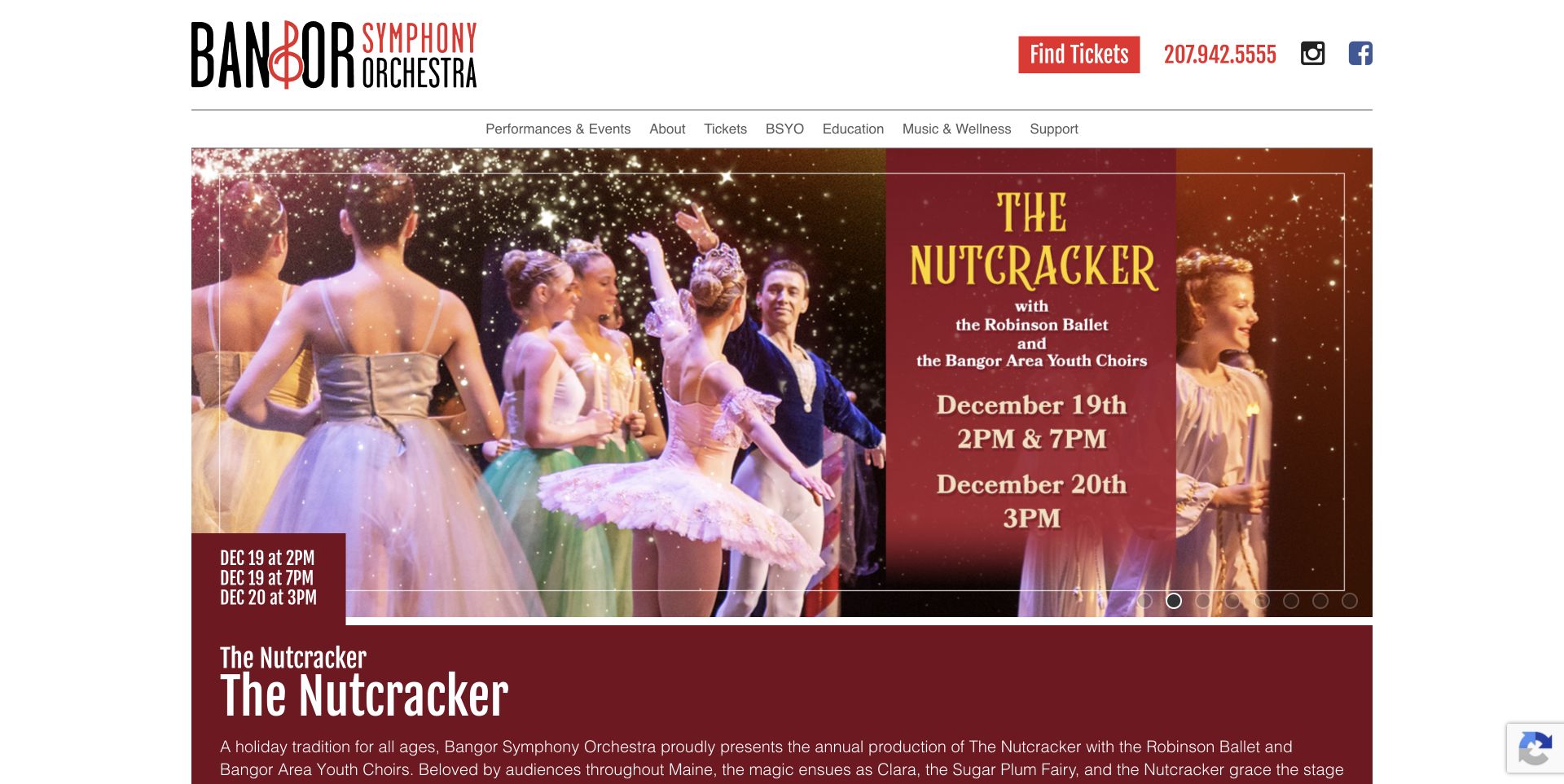
Bangor Symphony Orchestra places a compact white header above a large production photograph. The captured feature is The Nutcracker with Robinson Ballet and a choir, so the page communicates a collaboration rather than presenting the dancers as orchestra members. A burgundy panel repeats the title and performance dates in real text beneath the image. Find Tickets and the box-office phone are prominent, while later event entries explain masterworks, chamber performances and film programmes. Subscribe, Donate and Watch Online identify different relationships with the organisation. Some event excerpts expose working labels such as Program Book and TBD, making the page feel less edited than its strong opening photograph.
What you can learn
Repeat essential production information outside the promotional image and name collaborators accurately. Review calendar excerpts as public copy, removing internal placeholders and giving each entry a clear, consistent route to the full programme and ticket options.
Pros
Ticket access and telephone help remain visible in the main header.
The production image is supported by readable title and date information.
Cons & considerations
Several event excerpts contain abbreviated or unfinished-looking editorial labels.
The featured production uses substantial space before the broader calendar appears.
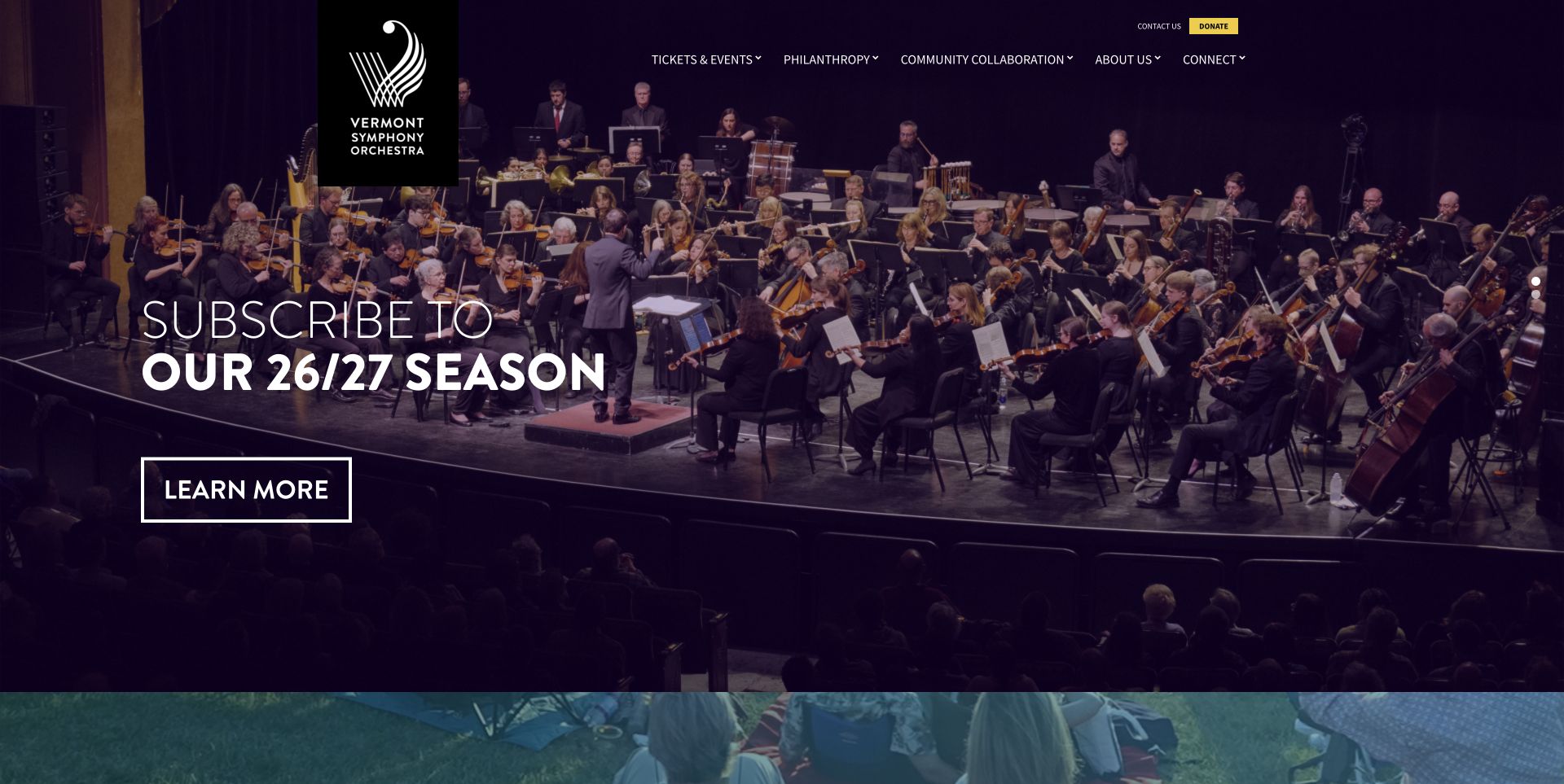
Vermont Symphony Orchestra gives a full-width stage photograph most of the first screen. A dark purple treatment supports the large white season-subscription headline and an outlined Learn More button, while the black logo block hangs from the top edge. Tickets & Events, Philanthropy and Community provide distinct primary destinations, with a contrasting donation action. The short body introduces the organisation's statewide work and education before moving to email signup. This is a focused introduction to the season, although it leaves individual dates and venue comparisons behind the event navigation. Its reach remains an institutional claim, not independent evidence of audience outcomes.
What you can learn
A short homepage can work when it clearly identifies the organisation and its next destination. If performances move between venues, make the calendar route particularly obvious and bring a small amount of date and location information into the opening.
Pros
The orchestra photograph gives the organisation a concrete human presence.
A limited set of primary sections keeps the first navigation easy to scan.
Cons & considerations
The opening promotes subscriptions without exposing individual concert details.
The brief body offers little support for comparing dates or venues before another click.
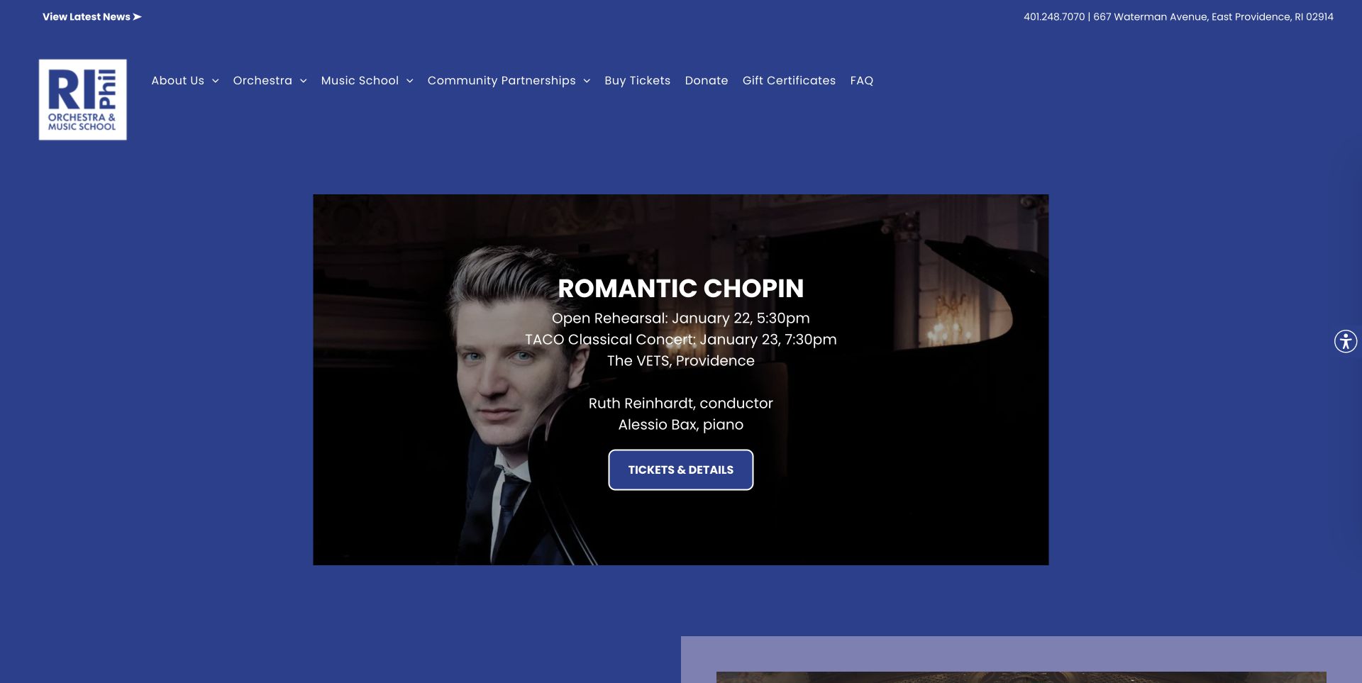
Rhode Island Philharmonic combines its orchestra and music school under a broad blue header. The captured Romantic Chopin feature keeps the pianist photograph beside dates, times, venue and named artists, distinguishing the open rehearsal from the concert. Ticket and detail actions sit together. Below, school programmes receive substantial space through private lessons, groups and ensembles, while news and community information extend the page. Separate contact information helps distinguish box-office questions from lesson enquiries. A newsletter window appeared during review and was closed through its normal control before this capture. The two institutional purposes create a long journey for visitors seeking only the concert calendar.
What you can learn
When concerts and classes share a website, identify the two paths explicitly and keep their contact details distinct. A rehearsal and a performance should have separate date labels even when they share the same campaign image and programme title.
Pros
The featured event clearly distinguishes rehearsal and concert arrangements.
Navigation names the orchestra and school rather than hiding their relationship.
Cons & considerations
The newsletter interruption adds a step before visitors can inspect the page.
The long education content makes the complete concert programme less immediate.
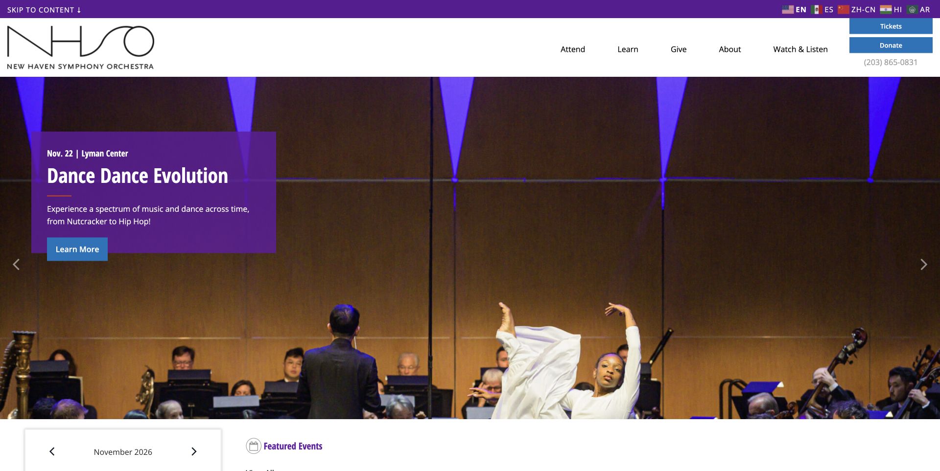
New Haven Symphony places a purple event-information box over performance imagery. In the captured Dance Dance Evolution feature, the title, date and Lyman Center venue appear together above a clear information action. The white masthead retains Tickets and Donate, while a separate language strip offers several named language choices. Below the campaign, a monthly calendar sits beside featured events rather than leaving dates entirely inside promotional graphics. Attend, Learn, Give and Watch & Listen distinguish practical visitor intentions. The same homepage also carries institutional announcements and participation opportunities. These broaden the organisation's story, though the variety of campaigns competes with the otherwise direct concert-planning route.
What you can learn
Treat a featured concert as a small factual brief, then offer a calendar for comparison. Make language and first-visit support discoverable without requiring readers to search through the institution's history or interpret an unfamiliar programme category.
Pros
The opening presents event title, date and venue as a coherent group.
Language choices and stable ticket access are visible before the main campaign.
Cons & considerations
A monthly calendar can occupy considerable space when relatively few events are listed.
Several institutional promotions divide attention below the performance feature.
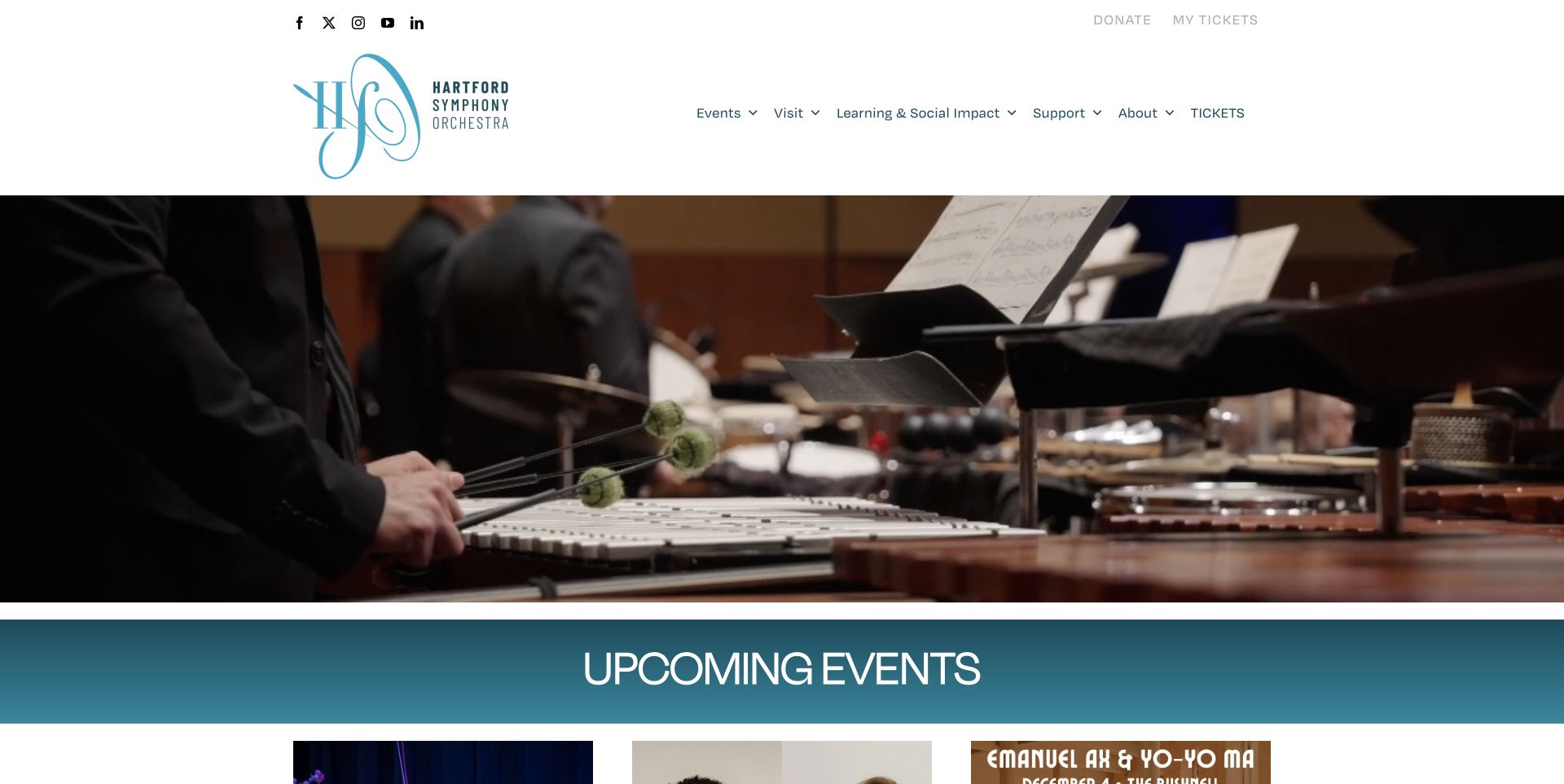
Hartford Symphony Orchestra gives its opening video space beneath a restrained white header. The captured frame shows a percussionist, with no promotional headline covering the performance. The next section becomes more practical: three upcoming-event cards identify series, dates and ticket actions. A music-director search, the Masterworks season and community activity then receive their own sections. My Tickets, Events and Visit remain separate from support and organisational information. An auction promotion was closed normally before capture; no transaction was attempted. The transition from atmospheric footage to structured event cards is useful, although a visitor landing on the first screen must look further down for an actual concert choice.
What you can learn
If the opening relies on motion rather than a headline, put a concise event list directly after it. Use consistent series, date and ticket fields so the practical section complements the imagery instead of becoming another promotional carousel.
Pros
The uncluttered opening lets the musicians' performance carry the visual identity.
Upcoming cards expose date and series information alongside the action.
Cons & considerations
The first screen does not immediately identify a specific upcoming performance.
Promotional interruptions and repeated general information links add friction to a short visit.
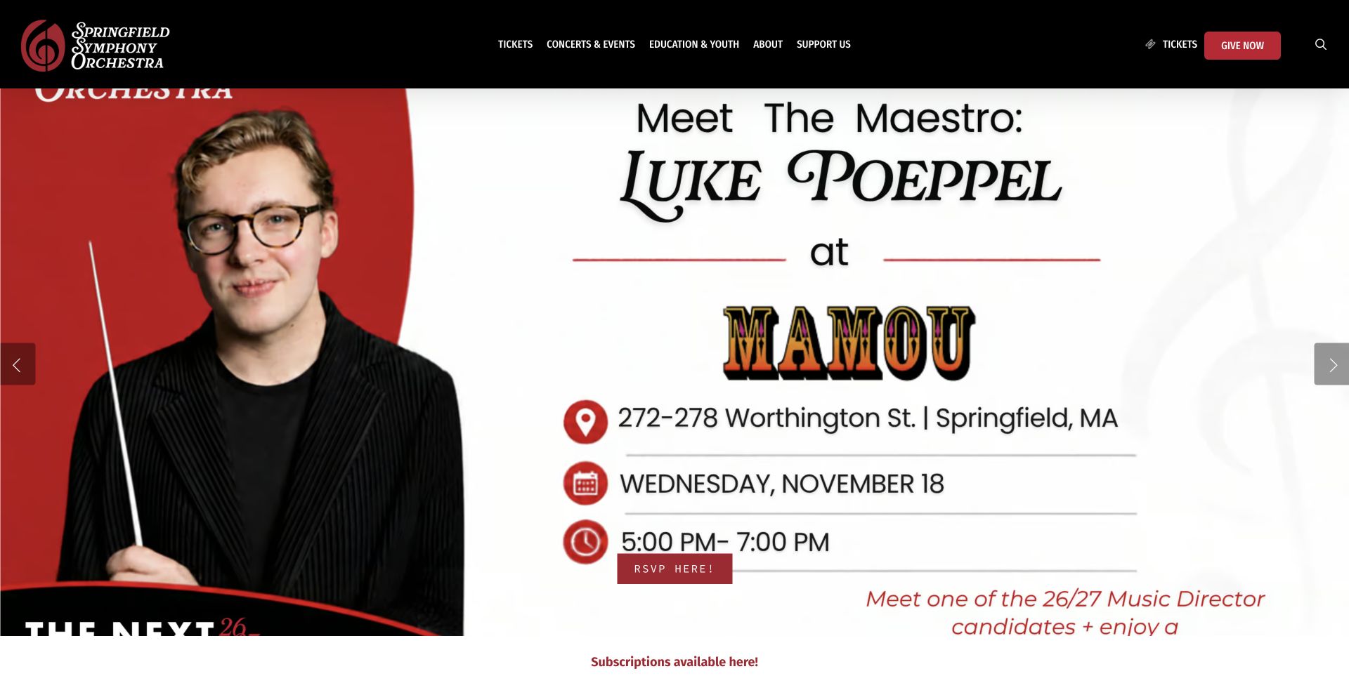
Springfield Symphony Orchestra in Massachusetts uses a black header and red-and-white identity above a large Meet the Maestro poster. The captured promotion names Luke Poeppel, a local venue, a date and an RSVP action. This gives the site a community-event focus rather than a generic orchestral statement. Separate links below distinguish subscriptions from single tickets, followed by news and programme information. The footer is unusually specific about ordinary box-office hours and concert-night arrangements. The main poster is cropped by the viewport, however, and much of its essential wording is embedded in the image. Repeated blog and news entries lengthen the lower page unnecessarily.
What you can learn
Promotional posters need a companion text summary with the same title, date, location and action. Preserve a reliable ticket route outside the artwork, and avoid repeating identical news cards when a short, maintained update list would be clearer.
Pros
The promotion connects the orchestra to a named local event and venue.
Separate ticket types and detailed office hours answer practical attendance questions.
Cons & considerations
Image-based event text is vulnerable to cropping and is harder to scan independently.
Repeated news material consumes space without adding a new visitor decision.
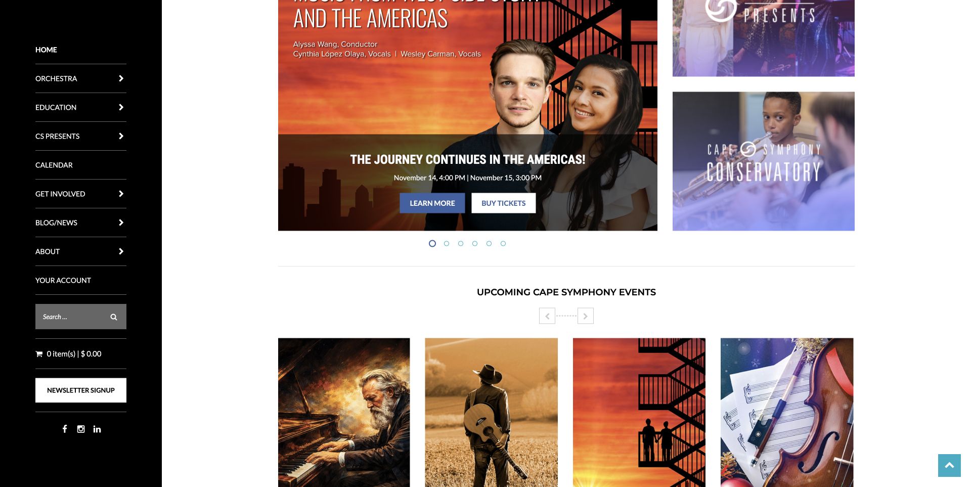
Cape Symphony uses a black navigation rail to keep Orchestra, Education, Presents and the calendar distinct. The accepted screenshot is a scrolled homepage view of the campaign and upcoming-event cards, not the top of the page. The selected campaign combines a West Side Story and Americas programme with a date and separate information and ticket actions. Nearby panels introduce the conservatory and other presentations. A header also distinguishes Tickets, Classes and Donate. The shared identity accommodates different arts activities, although the permanent rail and several promotional panels leave a dense first impression on a wide screen.
What you can learn
Use explicit activity names when one organisation sells concert tickets and teaches classes. Keep the same distinctions in navigation and action labels, and ensure a rotating feature has a readable event summary that works independently of the image.
Pros
The persistent rail makes the orchestra and teaching branches easy to distinguish.
Campaign information and booking actions remain adjacent in the reviewed view.
Cons & considerations
The rail and several adjacent panels compete for a limited content area.
Rotating campaigns make the first impression change without revealing the full programme at once.
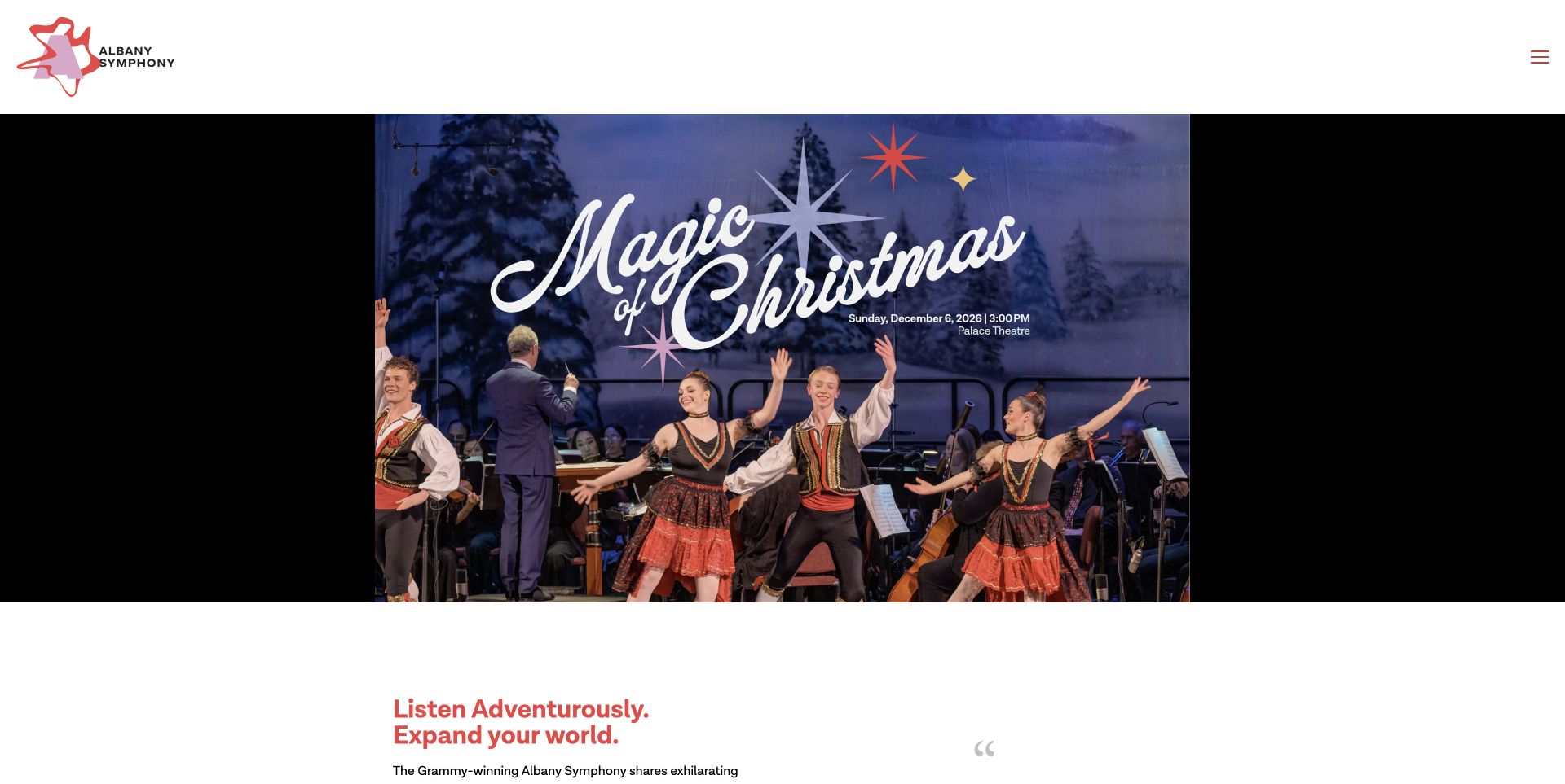
Albany Symphony places a centred performance poster beneath an expansive white header. The captured Magic of Christmas artwork sits against black side margins, while the organisation's colourful mark and a compact menu control occupy the space above. Below, the page supplies real-text dates, venues, conductors, collaborators and repertoire for upcoming programmes. A separate section explains the focus on living composers and links to recordings, followed by education and support. That editorial depth helps listeners inspect the programme before booking. The quiet header hides most navigation behind a menu, and several image descriptions retain generic file names rather than explaining their visual content.
What you can learn
Use the homepage to help people understand a programme, not simply recognise its poster. Keep dates and repertoire in readable text, connect new work to recordings, and make the route to the complete event calendar visible alongside the main campaign.
Pros
Programme summaries include venue, artists and musical context before the detail page.
Recordings and education extend the experience beyond a ticket purchase.
Cons & considerations
The large header and collapsed navigation delay direct access to common destinations.
Generic image descriptions and image-based campaign text weaken an otherwise detailed introduction.
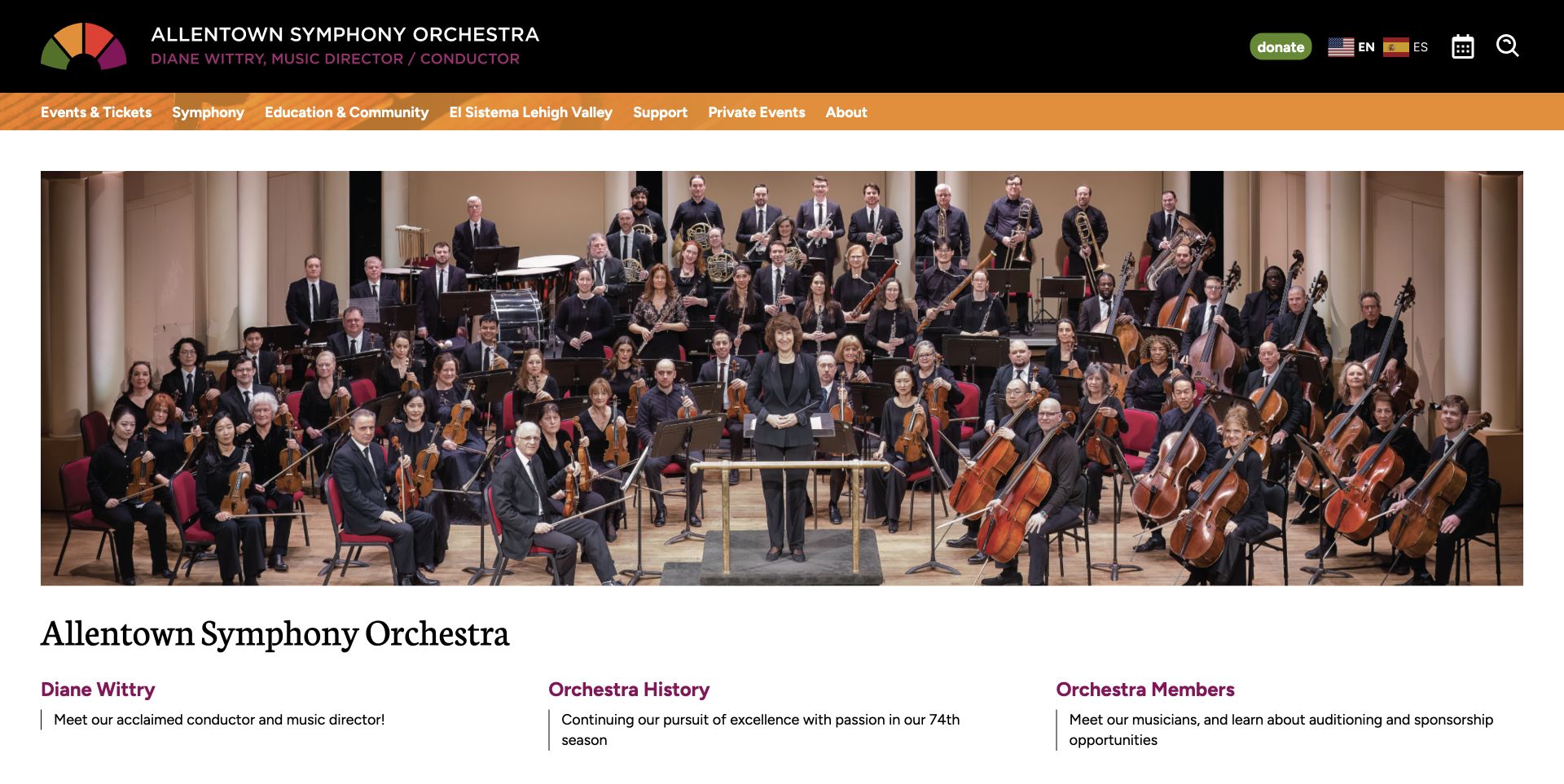
Allentown Symphony's dedicated section within Miller Symphony Hall starts with a wide portrait of the whole orchestra. An orange navigation strip separates the black institutional header from a straightforward three-column directory. The links explain the conductor, orchestra history, members, auditions, chorus and concert calendar with short descriptions. This alternative to an event-led homepage explains who makes up the orchestra and where to explore next. The broader header still offers Events & Tickets and education routes. Some descriptions contain an undated audition deadline or an older season reference, so the evergreen directory needs editorial maintenance as well as a current event calendar.
What you can learn
Give an orchestra inside a venue website a clear section identity and descriptive links to its people, programmes and calendar. Keep evergreen introductions separate from deadlines, and assign ownership for updating any time-sensitive descriptions embedded in that directory.
Pros
The full-orchestra portrait gives the institutional section a clear subject.
Short descriptions explain what each destination offers before the visitor opens it.
Cons & considerations
The page does not introduce the next concert before the institutional links.
Deadlines and season references can become stale inside otherwise evergreen descriptions.
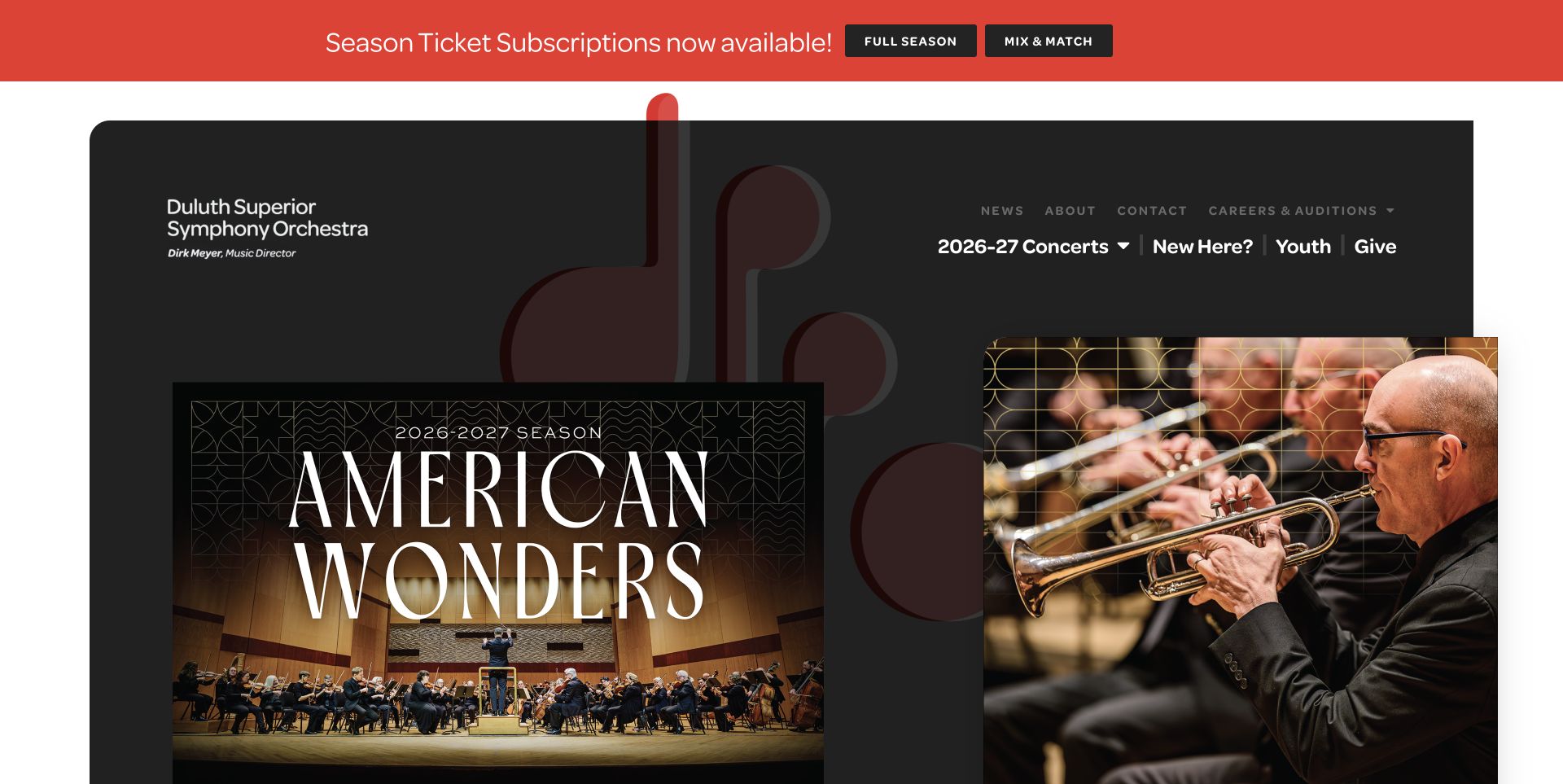
Duluth Superior Symphony Orchestra uses an asymmetrical dark composition, combining American Wonders season artwork with a close view of brass players. A red strip above the page distinguishes full-season and mix-and-match subscriptions. The main navigation is short, including concerts, New Here?, Youth and Give. Further down, a dedicated shuttle section explains how to reach Symphony Hall, with separate subscription, single-pass and information links. New subscriptions and renewals also have distinct actions. These practical distinctions are valuable, though the page still carries July-to-August sale wording during the November review. Artist profiles, youth programmes and news extend the homepage well beyond the strong season presentation.
What you can learn
Attendance support can be as important as the concert artwork. Give transport, first-visit questions and subscription types explicit labels, and review sale windows separately from the season dates so older instructions do not undermine an otherwise current campaign.
Pros
The season artwork and close performance photograph establish a distinctive visual rhythm.
Shuttle and renewal information addresses concrete planning tasks.
Cons & considerations
Outdated sale-window copy sits alongside currently promoted subscriptions.
The large opening artwork pushes individual concert comparisons below the first screen.
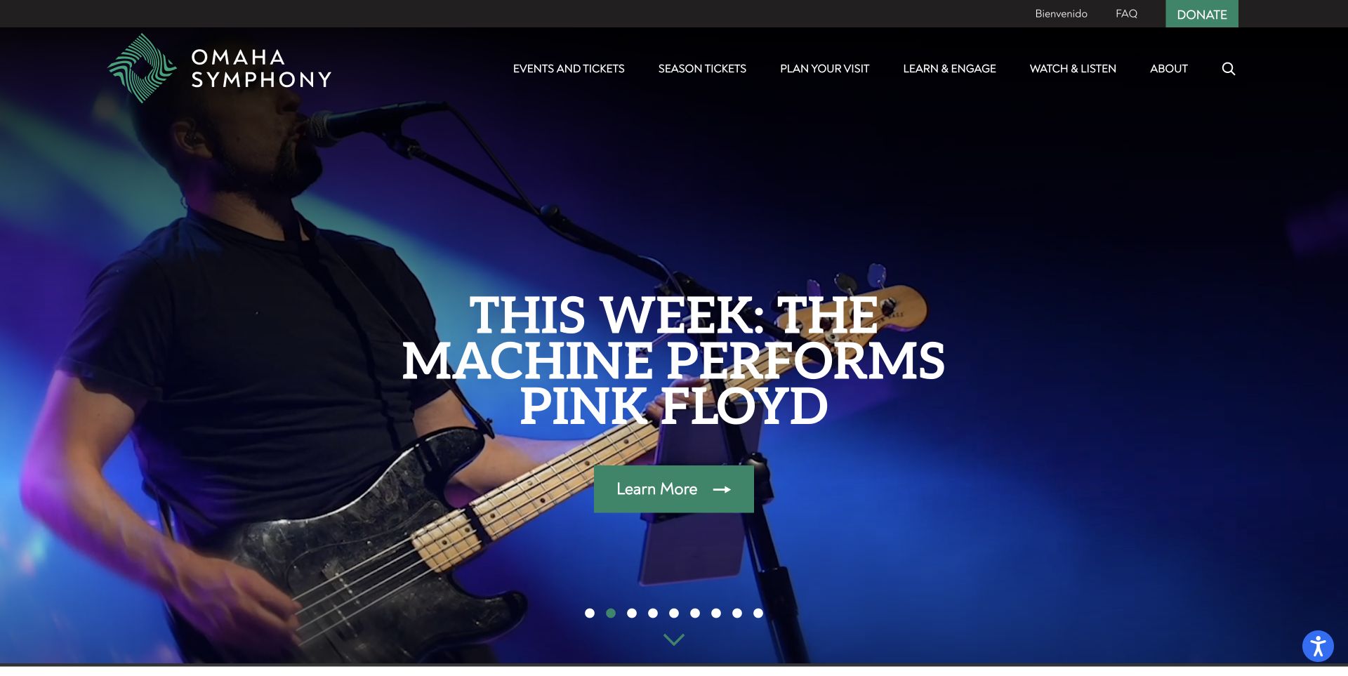
Omaha Symphony uses a dark full-screen campaign beneath stable navigation. The captured slide promotes The Machine Performs Pink Floyd with a musician photograph, large white headline and green Learn More action. It is one of nine promotional slides, not a view of the orchestra itself. Below, upcoming-event cards give dates and substantial descriptions, including the distinction between a film screening with live score and a conventional concert. Watch & Listen introduces interviews and recorded performances, while the footer separates the ticket office from administration. The campaign's size and many slides make the event list essential for comparing the programme.
What you can learn
A varied programme needs clear format labels and descriptions outside the rotating feature. Tell visitors when an event includes a live film score, a guest band or a classical programme, and keep ticket-office help distinct from general administration.
Pros
Upcoming cards explain the performance format as well as the event date.
Stable visit and listening routes support people who are not ready to buy.
Cons & considerations
Nine campaign states are difficult to review as a complete set.
The captured headline uses relative timing while exact dates sit further down the page.
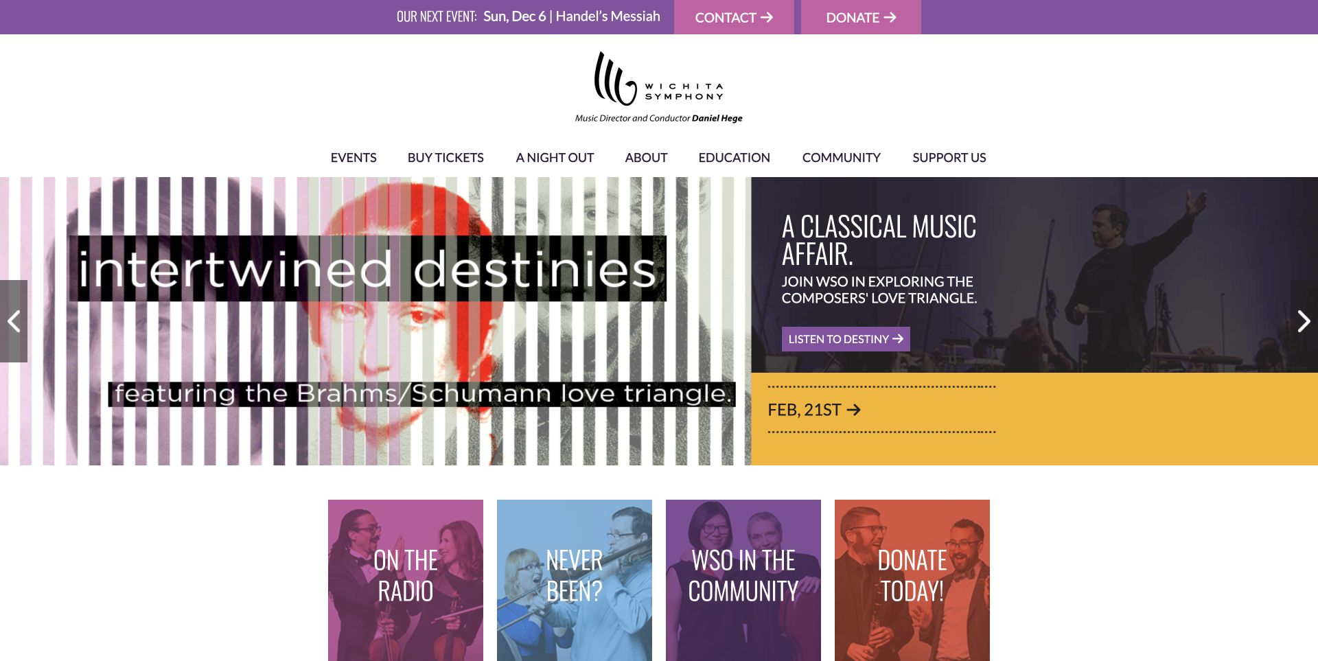
Wichita Symphony puts its next event in a narrow purple strip above a spacious white identity area. The captured Intertwined Destinies campaign divides the screen between graphic artwork and a darker explanatory panel, with the date isolated in a yellow block. Below, coloured tiles lead to radio, first-visit guidance, community activity and giving. A Night Out groups the evening guideline, parking, restaurants and FAQs, making the practical experience part of the main navigation. The page's campaign language is expressive, although action labels such as Listen to Destiny are less explicit than a plain ticket or programme label. A broader event comparison requires leaving the homepage feature.
What you can learn
Make first-time attendance an understandable journey with travel, timing and venue guidance. Expressive campaign labels can carry personality, but the purchase action should still tell a visitor whether it opens programme information or an external ticketing service.
Pros
The top strip preserves a next-event route while the main campaign rotates.
The Night Out grouping addresses questions beyond the performance programme.
Cons & considerations
Rhetorical action labels make some ticket destinations less immediately clear.
The homepage offers campaign choices rather than a compact chronological concert list.
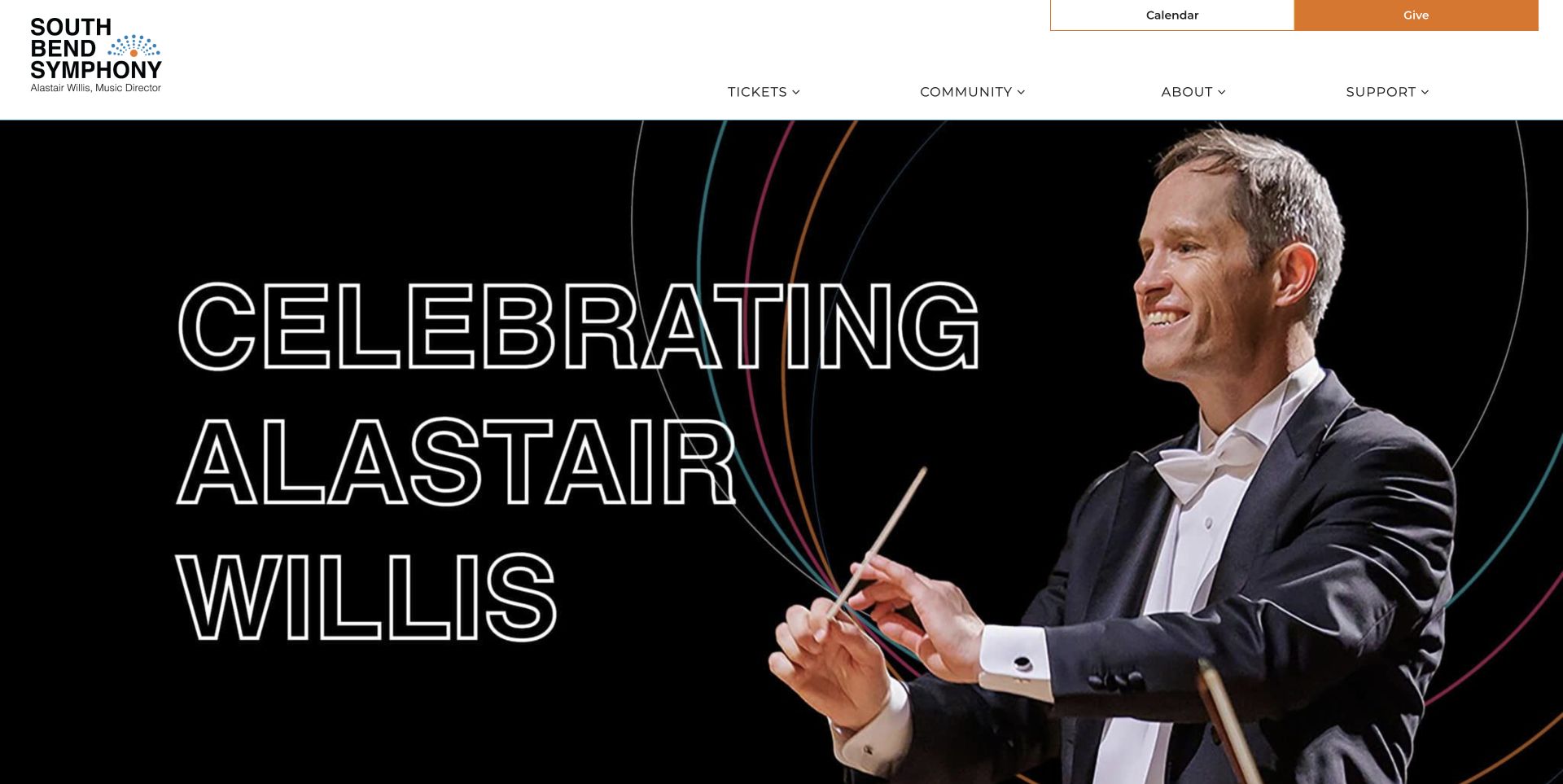
South Bend Symphony opens with a large portrait and outlined lettering celebrating Alastair Willis. A restrained white header keeps Calendar and Give prominent, with four main groups for tickets, community, the organisation and support. The homepage then moves into upcoming-event cards, presenting separate dates and times for Saturday and Sunday performances of the same holiday programme. Community events appear alongside ticketed concerts, while the footer exposes student tickets, subscriptions and visit planning. The opening offers a strong season identity, but most of its message is embedded in the image and it contains no immediate event action. Visitors seeking performances rely on the calendar link or list below.
What you can learn
A milestone campaign should retain a clear route to ordinary concert planning. Keep separate performances as explicit dated entries, and repeat important campaign wording as page text so the season identity remains understandable without relying on the graphic alone.
Pros
The header limits its main navigation to four understandable groups.
Separate performance entries make alternative dates and times easy to distinguish.
Cons & considerations
The large opening image offers little immediate programme or booking information.
Useful student-ticket and visit links are more apparent in the extensive footer.
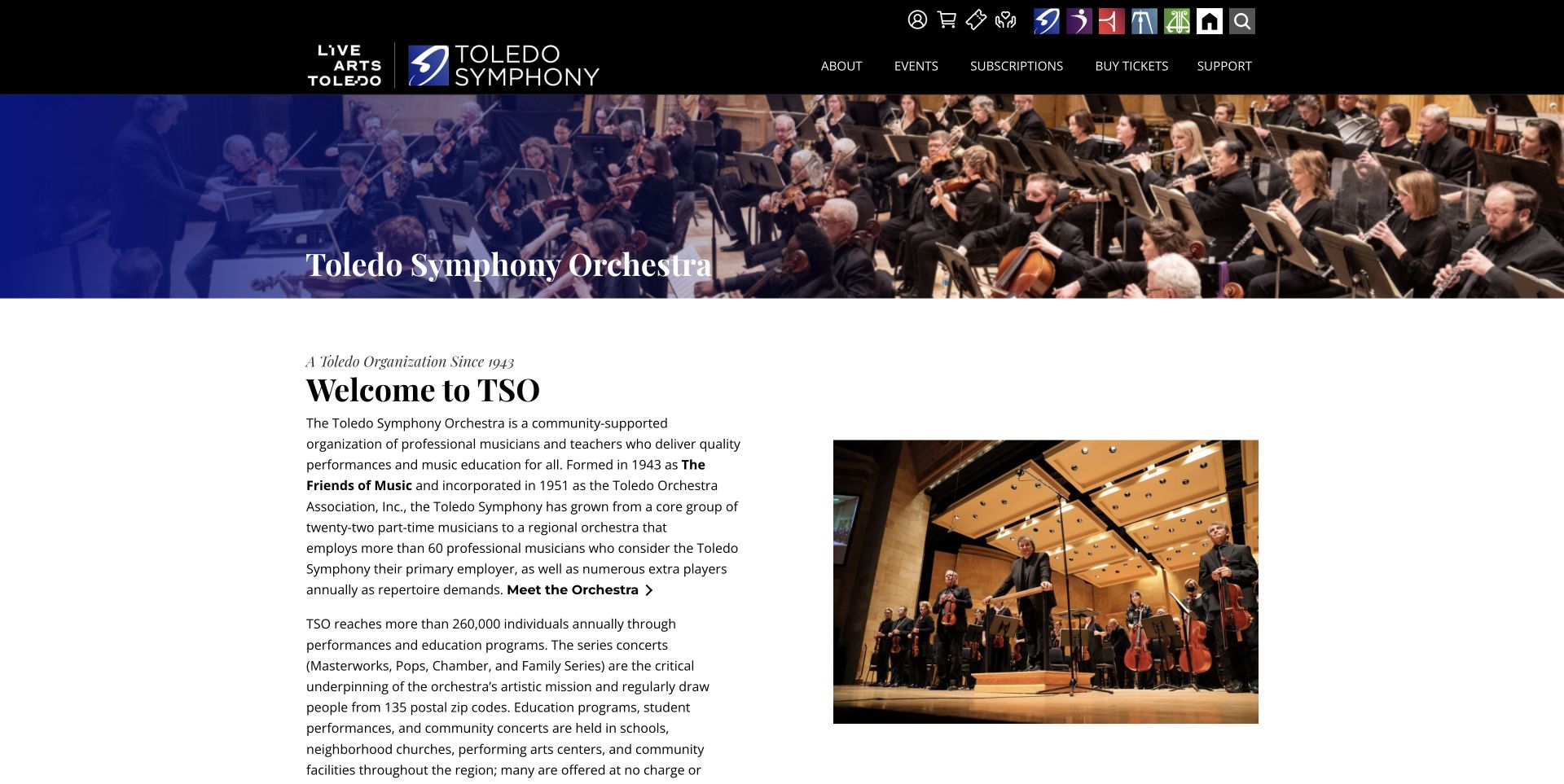
Toledo Symphony's section of Live Arts Toledo uses a compact orchestra banner with a blue gradient, followed by a text-and-photo introduction. The header retains the parent organisation and orchestra identities while offering switches to ballet, jazz and music education. Further down, an event list exposes the date, time, series and separate detail and ticket actions. The accepted capture follows a normal rejection of optional cookies. This page demonstrates how an ensemble can retain its own identity inside a shared organisation. Its lengthy institutional introduction appears before the programme, however, and the small icon-based organisation switcher asks unfamiliar visitors to recognise symbols rather than descriptive names.
What you can learn
When several arts organisations share a website, show which ensemble's section is active and keep its calendar scoped correctly. Combine a concise institutional introduction with a date-led event list, and label cross-organisation navigation in words as well as icons.
Pros
The orchestra retains its own branding beneath the shared arts identity.
Event rows separate programme information from ticket purchase and display performance times.
Cons & considerations
A long history-focused introduction delays access to the current programme.
Small organisation icons are less self-explanatory than the section's main navigation labels.
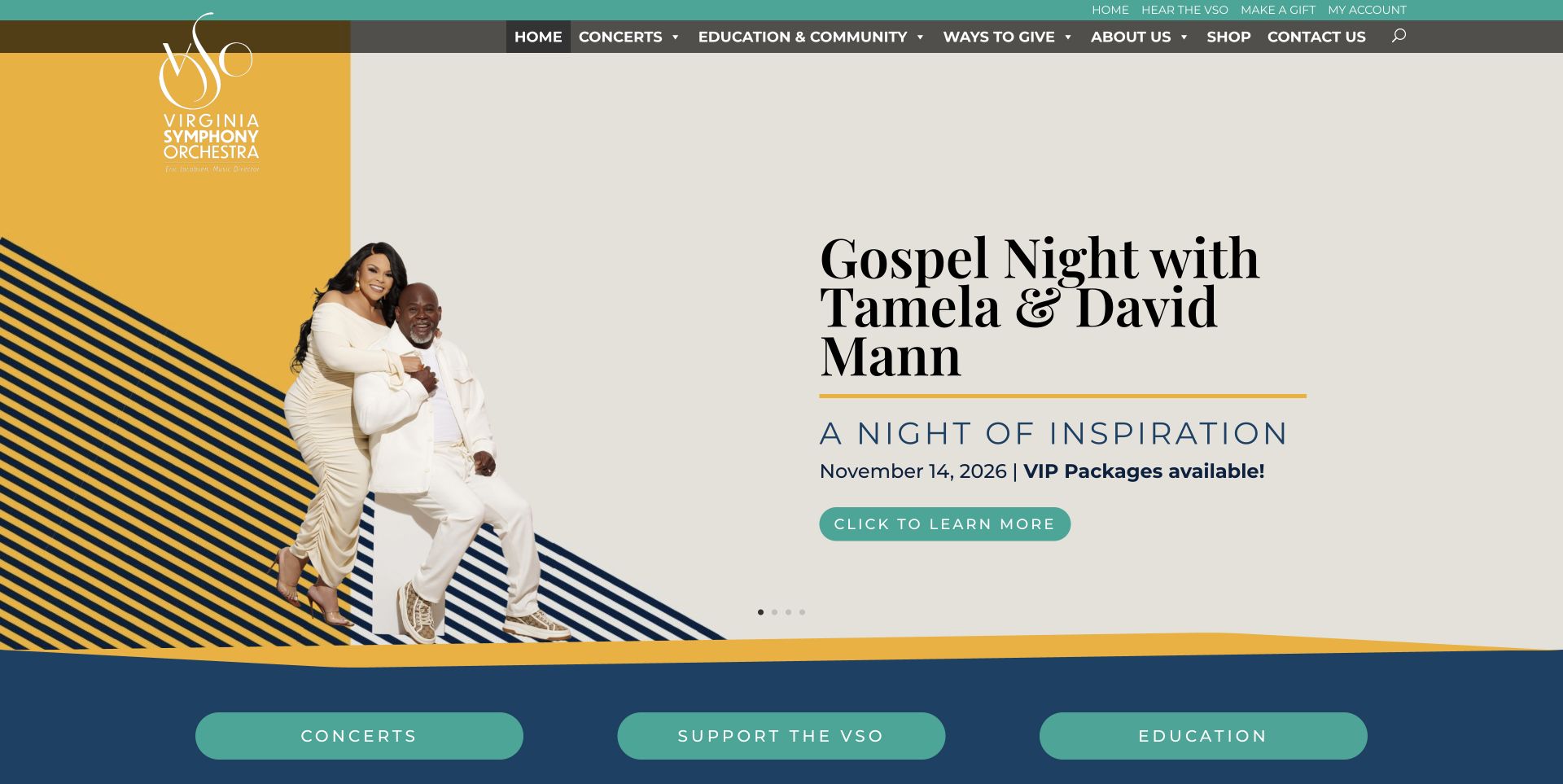
Virginia Symphony's captured Gospel Night campaign uses a pale background, artist photograph and navy typography, framed by yellow and teal accents. The date and information button sit beneath the large headline. Three broad shortcuts then direct visitors to concerts, support and education before a small upcoming-show list. This keeps the organisation's main purposes understandable even when the featured programme changes. Lower on the page, an official-ticket-seller notice explains approved purchasing channels, followed by practical box-office and visit links. Two upper navigation rows repeat several destinations, and the upcoming cards do not expose all venue information, so people comparing performances across the region still need to open details.
What you can learn
Give the homepage a small set of clear visitor routes beneath the campaign. For an orchestra performing across multiple venues, bring location information into each event summary and place trustworthy ticket guidance close to the first booking action.
Pros
The campaign's date and next action are visually grouped with the title.
Concerts, support and education receive equally clear homepage shortcuts.
Cons & considerations
Duplicated navigation consumes space without adding much orientation.
Venue details and the official-ticket notice sit deeper than the initial event choices.
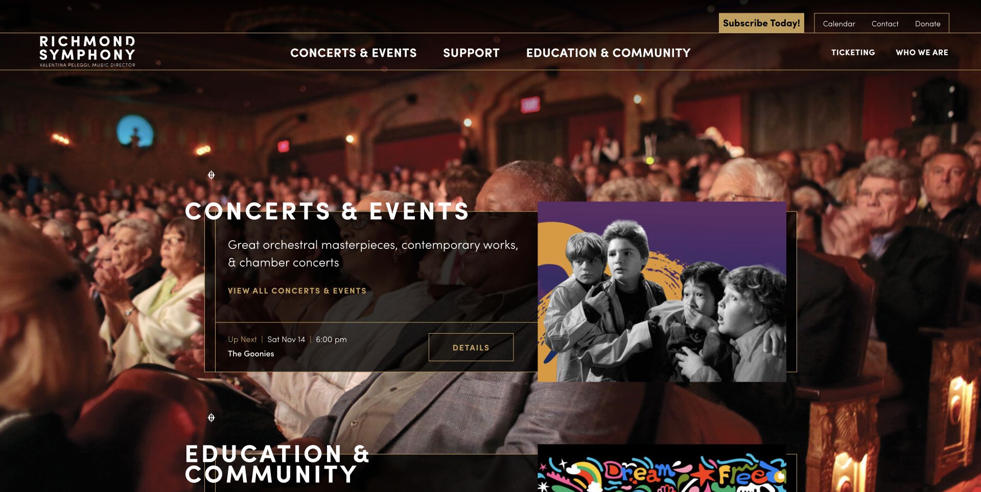
Richmond Symphony uses a photograph of its audience as the background for outlined, translucent content panels. The first panel introduces concerts and events, with a separate next-event strip and artwork for The Goonies. An education and community panel follows the same visual structure. This connects the institution to the people attending rather than relying only on musician portraits. Lower down, an editorial mosaic mixes performances, subscriptions and gift cards, with dates and descriptions on the relevant cards. The composition is distinctive, but the mixture is not a simple chronological calendar. Background detail also competes with small panel text, especially where the photograph is brightest.
What you can learn
A strong audience image can make an orchestra feel approachable when practical information stays in predictable panels. Keep the next event distinct from wider category navigation, and provide a clear chronological alternative to a mixed promotional news grid.
Pros
Concert and community categories use a consistent panel structure.
A next-event strip supplies a date, time and dedicated detail action.
Cons & considerations
The mixed event and promotion grid makes chronological comparison less direct.
Small text over a detailed audience photograph requires careful contrast management.
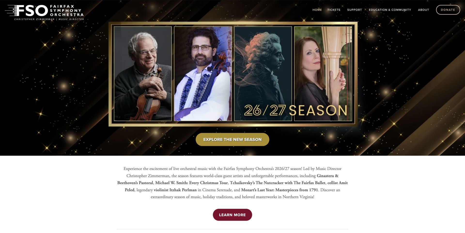
Fairfax Symphony uses a black-and-gold season montage above one prominent Explore the New Season button. A short paragraph names selected artists and programmes, followed by a second route to the season overview and an email-news invitation. The main Tickets menu carries more detail than the body, listing performances by date alongside student-ticket and venue-direction links. The homepage is therefore a focused gateway rather than a full event catalogue. Its simple next step is useful, although important names remain embedded in the artwork and visitors need another page to compare practical concert details. The open-ended announcement about more performances also depends on regular editorial attention.
What you can learn
A concise season landing page needs one unmistakable next step and a maintained overview behind it. Keep date-labelled event links discoverable, repeat the key season message in real text, and avoid leaving future-announcement copy indefinitely without a clear update.
Pros
One primary season action gives the opening a clear direction.
The ticket menu names dates and specific performances rather than generic categories alone.
Cons & considerations
The homepage offers few practical event details outside the navigation.
Image-based wording and vague upcoming-announcement copy need additional editorial care.
Kegan is a freelance web designer and developer with 15+ years of experience helping businesses turn complicated website requirements into clear, maintainable digital experiences. He works directly with clients from planning and design through development, launch, and ongoing support.
For orchestra website design, his development approach focuses on concert calendars, programme and venue details, subscription and single-ticket routes, first-visit guidance, and distinct education and support information. The scope can be a targeted improvement or a complete custom build, with responsive layouts, thoughtful content structure, and integrations chosen around the people using and maintaining the site.
Show 3 other orchestra website designersHide other orchestra website designers
Plan an orchestra website around the programme and the visit
Model the concert before designing its promotional card
Start with separate records for a programme and its performances. A programme can run on several dates, at several venues or in different formats. Store the title, confirmed artists, repertoire, audience context and description once, then attach a date, time, location and official ticket destination to each performance. This reduces the need to repeat facts manually across a homepage and calendar.
Decide which information appears in the listing before someone opens a detail page. A date alone is insufficient when a regional orchestra performs in different towns or halls. A familiar film title may also need an explanation that the score is performed live. Boise and Omaha demonstrate why a short description of the experience can be more useful than an unexplained programme category.
Give the record a clear lifecycle. Announced, on-sale, sold-out and past events need different wording and actions. Keep archival programme information available without implying that old tickets can still be purchased. Review relative phrases such as this Saturday, next week or now on sale whenever the featured campaign changes. A visible date does not automatically keep the surrounding copy accurate.
Build a first-visit route around actual questions
List the decisions a new visitor needs to make before attending. These may include choosing a concert, finding the correct venue, understanding arrival arrangements and contacting the box office about access needs. Wichita groups the experience as a night out, while Duluth gives transport its own practical section. Use the questions relevant to the real organisation rather than copying another orchestra's promises.
Confirm guidance with the venue and ticketing teams. A single orchestra may use several halls with different seating, parking and access arrangements. Make the applicable location clear and give people a direct contact when the answer depends on their circumstances. Distinguish the performance venue, administrative office and teaching address so the footer does not accidentally send visitors to the wrong place.
Keep this support visible without slowing down experienced ticket buyers. A prominent calendar or ticket link can coexist with a clearly named first-time route. Use labels that describe the destination, and explain external ticketing handoffs. Public navigation checks can confirm that a link reaches the intended service without placing an order or entering personal information into its forms.
Organise the institution without hiding its different audiences
Map the people who use the site: single-ticket buyers, subscribers, students, families, donors, musicians and community partners. This does not require a separate homepage for each audience. It requires understandable destinations and a small number of shared navigation groups. Rhode Island's combined orchestra and school, and Cape Symphony's separate activities, show the importance of naming these branches explicitly.
When the ensemble shares a website with a venue or wider arts organisation, show the current section clearly. Allentown and Toledo provide specific orchestra pages inside larger properties. Preserve access to the shared calendar and ticket service while ensuring that the orchestra's people, programme and identity remain recognisable. Avoid relying only on small logos or internal abbreviations to explain the relationship.
Give institutional content an editorial purpose. Musicians, conductors, education and community work can help visitors understand the organisation, but a long history should not be the only route to the next concert. Place the most common attendance tasks near the top, then provide descriptive links for deeper exploration. Keep dated audition notices out of evergreen introductions unless someone owns their maintenance.
Choose expressive media that survives ordinary content changes
Performance photography, illustration and audience images can each tell a useful story. Portland shows the hall, Richmond uses the audience, and several sites focus on a particular programme. Select imagery that accurately represents the featured experience. Identify guest productions and film artwork honestly, and keep essential information as real text rather than relying on a poster embedded in the page.
Design the text treatment around the actual image. A dark panel, gradient or separate column may improve readability, but every crop and responsive size still needs attention. For moving backgrounds, provide pause and reduced-motion behaviour and a useful fallback. Do not make the visitor wait for a carousel to discover a date that could sit in a stable event strip or calendar.
Treat maintenance as part of the visual system. Consistent event fields, reusable cards and a clear archive policy can prevent contradictory dates and ticket messages. Review popup behaviour, image descriptions and promotional excerpts alongside the main campaign. A polished opening loses usefulness when its lower cards contain old deadlines or when a newsletter window prevents visitors from reading the programme.
The editing job behind the design
Choose tools around shared event records and clear handoffs
Evaluate the content system by how easily staff can maintain programmes, individual performances, venues, artists and audience information. Reusable records should support the homepage, series pages and calendar without duplicating dates or ticket URLs. Keep campaign flexibility separate from the accuracy of the underlying facts.
Ticketing, donations, tuition and subscriptions are different transactions even when they use the same provider. Give each a clear public label and confirm the intended handoff. Do not infer transaction quality, accessibility or availability from a logo alone, and never use real purchases or form submissions as routine website QA.
The stacks in this collection reflect bounded broad public-source audit attempts. An unavailable or partial scan remains qualified; it is not evidence of an absent technology or a hidden backend. Use the records as scoped observations and choose tools through verified operational requirements rather than treating another orchestra's visual design as proof of its full architecture.
Our WordPress website examples offer a separate look at publishing approaches. A visible platform label is evidence for that named page, not a guarantee that the same system will suit your requirements.
Before the public launch
Orchestra website planning checklist
Separate a concert programme from its individual performance dates.
Show the time and correct venue alongside each event title.
Explain film concerts, guest presentations and community events accurately.
Keep essential dates and actions outside image-only posters.
Provide a stable calendar beyond the rotating homepage campaign.
Distinguish single tickets, subscriptions, donations and lesson registration.
Offer a named route for first-time visitors near the main programme.
Verify travel and access guidance with each relevant venue.
Separate performance, administrative and teaching addresses.
Give motion meaningful controls and a readable fallback.
Review sale windows, audition deadlines and relative-date wording.
Keep optional overlays dismissible and promotional excerpts fully edited.
These checks are a project checklist, not a performance, legal, security, or accessibility certification. Test real journeys with the people responsible for the website before making claims about the result.
Sources & editorial method
How this collection was selected and reviewed
The original random target of 19 was saved before research. Each included public page was directly reviewed and captured without an open obstructing popup. Normal controls dismissed the Rhode Island newsletter and Hartford promotion, closed the Boise cookie window without optional consent, and rejected Toledo cookies. Cape Symphony's accepted capture is explicitly a scrolled campaign-and-events view. Allentown and Toledo use their exact orchestra-section URLs. Symphony New Hampshire was held because the observed cookie overlay offered only acceptance; Portsmouth and Fort Wayne were held after two unsuitable capture attempts each. The originals remain private and none was retouched. Every included page received the standard bounded broad technology-audit attempt; partial and unavailable results remain honest limitations. Boise Phil's explicit Editors Choice recognises observed information design, not musical quality, service quality or measured outcomes. Source programmes and dates may change after observation.
Each example links to its actual source page. Screenshots are direct browser captures with their own capture dates; moving imagery, announcements and live designs can change. The notes describe observable design choices and conditional tradeoffs, not measured traffic, conversion results, service quality, or accessibility conformance.
Technology labels use public page metadata, asset evidence, or explicitly cited platform documentation. Platform documentation is not a complete current deployment audit. A component reference may be legacy or unused; it is not a complete backend inventory. Unknown stacks are omitted. These sites are editorial examples, not our client portfolio.
Written, Edited and Curated are separate editorial records, not timestamps advanced by a rebuild. Website designs and imagery belong to their owners. See our editorial standards or suggest a correction.
Questions worth asking
Orchestra website design questions
What should an orchestra website show first?
A clear current concert or season invitation, supported by dates, format, venue context and an obvious next action. Keep a calendar accessible for people who want to compare the full programme rather than follow the featured campaign.
How should a site present several performances of one concert?
Keep the programme description together and give each performance its own date, time, venue and ticket link. Do not make visitors infer whether an availability message applies to one performance or the entire run.
How can the website help first-time concertgoers?
Provide a named first-visit route with confirmed arrival, venue, seating and access information. Explain unfamiliar formats and offer a box-office contact for questions that depend on a particular performance or visitor.
Should an orchestra and its music school share a homepage?
They can share an identity when the routes remain distinct. Label concerts, classes, youth ensembles and support clearly, and keep their practical information and contacts separate so visitors can find the relevant activity without understanding the organisation's internal structure.
Why is Boise Phil the Editors Choice?
The reviewed homepage explains the featured performance format and connects programme discovery with first-visit support while distinguishing orchestra, youth and choral activities. This is a website-design judgement based on direct review, not a claim about musical or commercial outcomes.
Begin with a dependable concert record and a useful welcome. Let the imagery express the experience while the page makes the date, place and next step easy to understand.