Best Developer Tool Websites of 2026 (26 Real-World Examples)
How to explain a technical product, demonstrate a meaningful task and connect the first visit with useful documentation.
A developer-tool website has to earn attention from people who want to understand what a tool does and how it fits their work. A strong visual identity helps, but the most useful pages connect a clear category, an honest example and a practical route into evaluation or implementation.
Developer tools are not one interchangeable category. A language, a formatter, a testing framework, a hosted database and a documentation platform address different parts of the work. Explain the tool’s particular role before presenting a long list of capabilities. The opening should help a visitor recognise the task, the intended environment and the next useful destination without making them reverse-engineer a product name or decorative code block.
Technical audiences still include different levels of familiarity. Someone experienced in one ecosystem can be a beginner in another. A developer evaluating a tool, an administrator comparing responsibilities and a teammate looking up a reference may arrive on the same public property. Good architecture gives them distinct routes while keeping the relationship between marketing, documentation, playgrounds, accounts and support understandable.
The examples include precisely identified homepages, product pages, guides and working-tool views. They are website-design references rather than product recommendations, benchmarks or assessments of a customer deployment. Earlier accepted direct screenshots keep their original dates and pixels. A current source check establishes topic fit without implying that an older image was captured again or that the depicted software was tested during this review.
Before the examples
What makes good developer tool website design in 2026?
Name the tool’s role before expanding the promise
Identify the category and the task in ordinary technical language. A visitor should be able to distinguish a runtime, a build utility, an API-content platform and a hosted service without reading several paragraphs of brand positioning. A broad headline can establish tone, but the supporting sentence should give the product a concrete job.
Show one believable task rather than every panel
Use a small code example, a recognisable workflow or a focused interface preview to explain the product. Identify example data and the relevant context. A busy screen can look substantial without communicating much, particularly when reduced on mobile. Give the illustration a readable explanation outside the image.
Connect the first step with its prerequisites
A copyable command or signup action is useful only when the visitor understands what it starts. Keep supported environments, account requirements and the next verification step reachable. Do not make a simple-looking installation block imply that configuration, testing or organisational review is finished.
Keep learning, reference and evaluation distinguishable
Getting-started guides, API references, playgrounds, demonstrations and sales routes serve different needs. Give each an explicit label. A new user needs a sequence, while an experienced user may need one precise answer. Search should support those tasks without replacing the ordinary browseable structure.
Scope comparisons and automated-looking results
Treat benchmark charts, suggested fixes and AI demonstrations as evidence with specific limits. Explain conditions and sources rather than implying universal performance or correctness. Separate product capabilities from the technologies used on the public website, and separate a depicted workflow from an independently observed action.
Make ongoing documentation part of the product experience
Version context, migration information, release notes and support destinations need clear ownership. A polished homepage followed by stale setup instructions creates a broken journey. Preserve stable permanent routes while making changing notices and product relationships explicit, including transitions between open-source projects and commercial services.
The collection · 26 examples
26 developer tool websites worth studying
These 26 genuine public examples span developer platforms, focused utilities, languages, build and testing tools, technical-content services and implementation resources. The reviews identify the actual captured view and compare how each explains a task, supports evaluation and connects to deeper material.
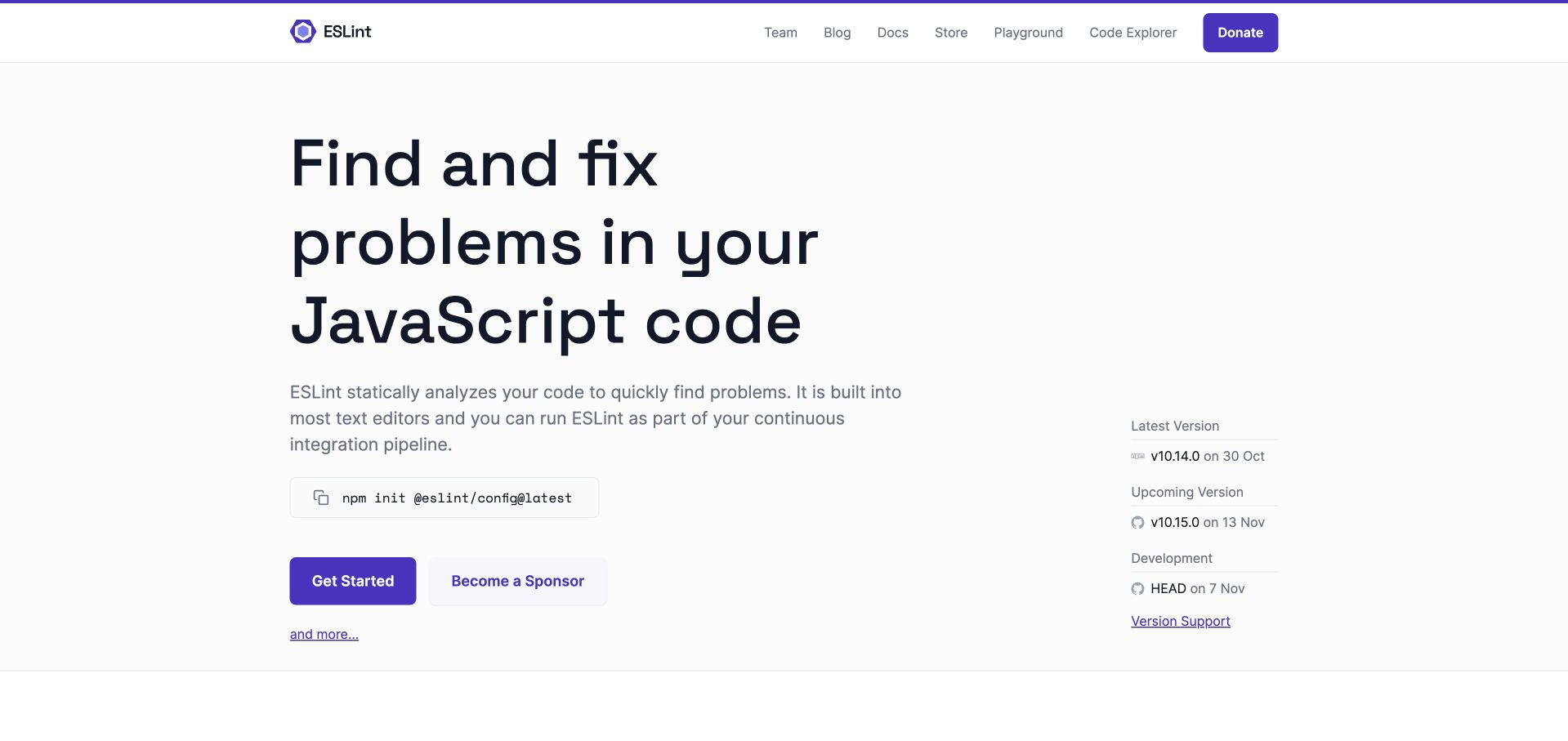
ESLint’s light homepage gives a large code-quality statement most of the left column, then follows it with a short role explanation and an install command. A narrow right column separates current, upcoming and development versions. Documentation, playground and code-explorer routes remain visible in the header, with sponsorship clearly distinguished from getting started. The useful pattern is a focused tool explaining its purpose without obscuring the practical next step. The version labels belong to the dated capture; they are not presented as a current recommendation or proof that a project has been comprehensively checked.
What you can learn
Make the tool’s role, first setup step and support context easy to distinguish. Link installation to a guide that explains configuration rather than implying that copying a command completes the work. Keep version information owned and updated, while separating project sponsorship from the instructions a new user needs.
Pros
Purpose, setup and version information each have an identifiable place.
Playground and code-explorer routes support investigation before installation.
Cons & considerations
If a broad fix-oriented statement leads the page, explain the scope of analysis.
If several versions are shown, clarify which documentation and support policy applies.
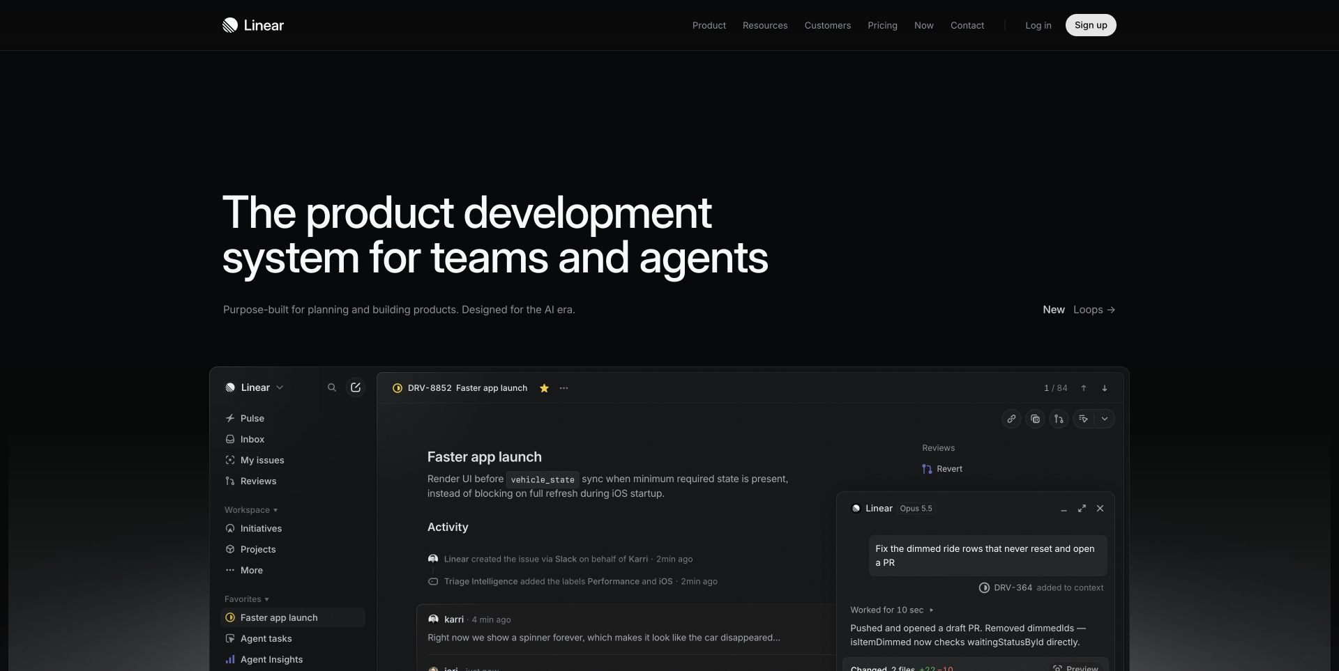
Linear’s near-black introduction places a large product-development statement above an illustrated issue workspace. A left navigation, issue detail and activity stream give the product a recognisable daily object, while an adjacent assistant panel shows another part of the pictured workflow. The quiet header retains resources, pricing, login and signup without competing with the working surface. The useful pattern is an application image connected directly to the category being explained. The image is a public demonstration, not a view into a customer workspace or evidence that an illustrated agent action occurred.
What you can learn
Choose a believable task and make the core object understandable before showing every available panel. Explain how issues, projects and reviews relate to one another, especially for evaluators who will not use the tool every day. Keep an illustrative agent contribution distinct from the approval and responsibility rules inside a real organisation.
Pros
The issue view gives the broad development proposition a concrete subject.
The restrained navigation leaves the main workflow easy to identify.
Cons & considerations
If the audience is unfamiliar with issue terminology, provide a plain-language starting explanation.
If dense interface imagery is essential, supply readable supporting views on small screens.
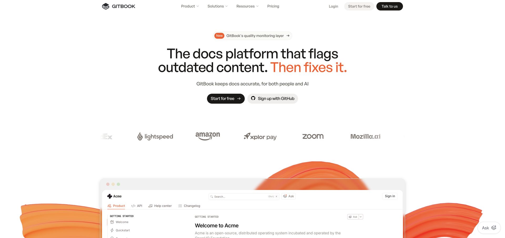
GitBook’s white opening centres an outdated-documentation problem above two account-starting options. A customer-mark row separates that introduction from a documentation workspace emerging below, framed by orange artwork. Product, resources and pricing remain in the header, with assisted evaluation separately labelled. The useful pattern is giving an editor-like interface a maintenance purpose rather than presenting it as another generic writing tool. The public illustration and automatic-sounding headline do not establish how a particular team reviews, approves or publishes proposed changes.
What you can learn
Connect the product story to an actual maintenance task: identifying a stale page, assigning review and making an approved update available to readers. Show where automation assists and where editorial responsibility remains. Distinguish the person configuring a documentation project from the person simply reading its published output.
Pros
A specific maintenance problem gives the product preview a clear reason to exist.
Self-service and assisted-evaluation routes remain distinct.
Cons & considerations
If the headline implies automatic correction, explain review and approval boundaries.
If an established knowledge base is shown, explain the starting process for a new project as well.
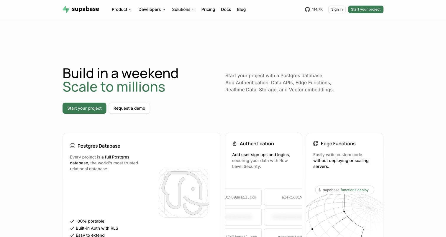
Supabase’s captured opening uses a broad building statement on the left and a more concrete database-platform description on the right. Start-project and demo actions sit together, while the first cards identify Postgres, authentication and edge functions. Fine borders and restrained green accents organise the technical material without making the opening a large code block. The useful pattern is a short bridge between platform positioning and recognisable building tasks. The pictured marketing page does not reveal the private console, establish a customer’s configuration or prove the scale implied by promotional wording.
What you can learn
Explain the underlying job before listing related capabilities, and help a beginner identify a sensible first step. A developer may investigate a database or authentication card before being ready to provision a project. Keep documentation and prerequisites available without treating a capability description as a complete implementation plan.
Pros
The first cards give the broad platform message concrete technical meaning.
Project creation and a demo remain separately labelled.
Cons & considerations
If several capabilities compete equally, indicate a practical beginner route.
If technical terms lead the cards, provide explanations for less experienced evaluators.
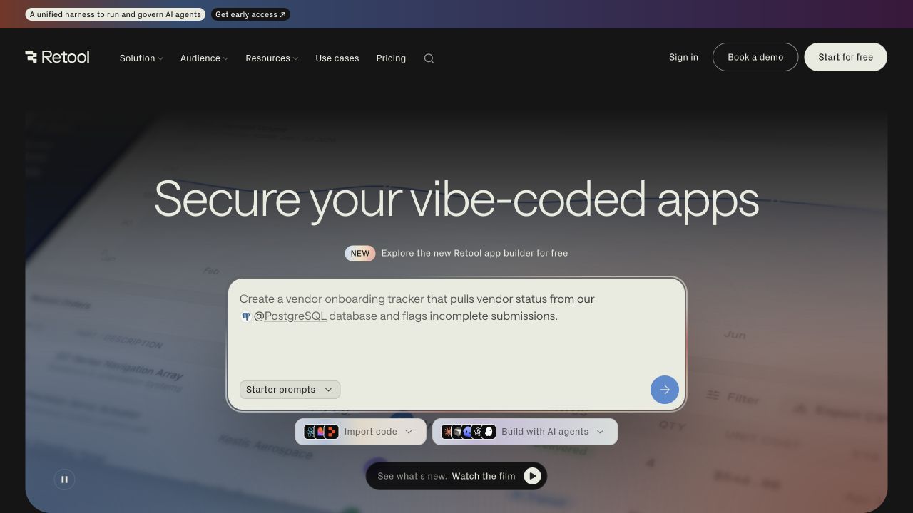
Retool’s captured homepage places a prompt panel at the centre of a dark introduction. The example describes a vendor-onboarding tracker and names a database input, making the app-building category more concrete. Import and agent-oriented routes sit beneath the panel, with an optional film control below. The header separates pricing, sales evaluation and getting started. The useful design pattern is showing a representative request beside multiple ways to begin. The public prompt and background application imagery are not evidence that the pictured application was deployed or independently reviewed for security.
What you can learn
Use an example request to explain the intended output, but connect it to clear prerequisites and a review process. Code import, a prompted build and an agent integration may require different preparation. Name those differences without implying that a short request settles data access, permissions, testing or the responsibility for approving the finished application.
Pros
The example request names a concrete business task and input.
Several starting workflows are visible without hiding conventional evaluation routes.
Cons & considerations
If a prompt appears immediately usable, explain what happens before data is connected.
If the main promise concerns security, support it with specific scoped technical material.
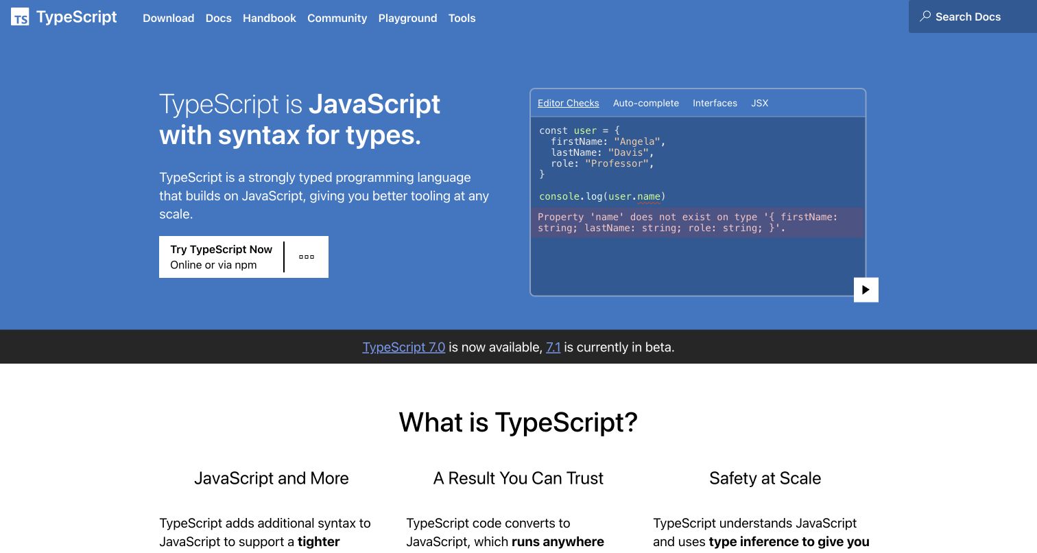
TypeScript’s blue introduction pairs a short category explanation with a compact editor-style panel. The pictured example highlights a property-name problem, while tabs distinguish other editor capabilities. Download, documentation, handbook and playground routes remain in a straightforward header. A release strip and the beginning of a broader explanation follow below. The useful pattern is a small technical example supporting the proposition instead of relying on a large abstract illustration. The sample is educational material, not a claim that a type system prevents every runtime or application-design error.
What you can learn
Choose an example that demonstrates the tool’s particular role and explain the problem in readable language. Give learners a browser-based exploration route and experienced users a direct path to installation and reference material. Keep the distinction between editor feedback, generated output and runtime behaviour clear enough that the demonstration does not overpromise.
Pros
The example connects the category explanation to a concrete editor task.
Learning, experimentation and installation have distinct destinations.
Cons & considerations
If a code sample carries the explanation, provide context for readers new to the language.
If release notices are prominent, keep them separate from stable getting-started material.
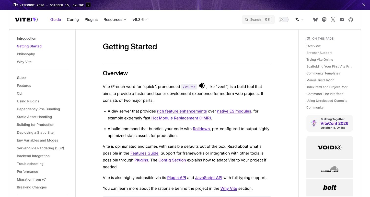
Vite’s captured getting-started guide uses three columns: topic navigation on the left, a readable overview in the centre and a local contents list on the right. The introduction describes the development and build roles before the longer setup material. Search, version selection and configuration routes remain above the article. The useful design pattern is a learning page that gives a visitor orientation without turning every section into a separate landing page. This is the official guide view, not a marketing homepage or a benchmark of the tool’s behaviour on another project.
What you can learn
Explain the tool’s role and the sequence of work before presenting commands. Keep configuration reference and plugin details reachable without forcing beginners to read them first. Use a local contents list to support long pages, and make version context clear so a reader can distinguish current instructions from material for a different release.
Pros
The central article remains readable alongside two levels of navigation.
Guide and configuration destinations distinguish learning from reference.
Cons & considerations
If the sidebar grows substantially, preserve a clear starting sequence.
If instructions depend on a version, make the relevant context visible throughout the journey.
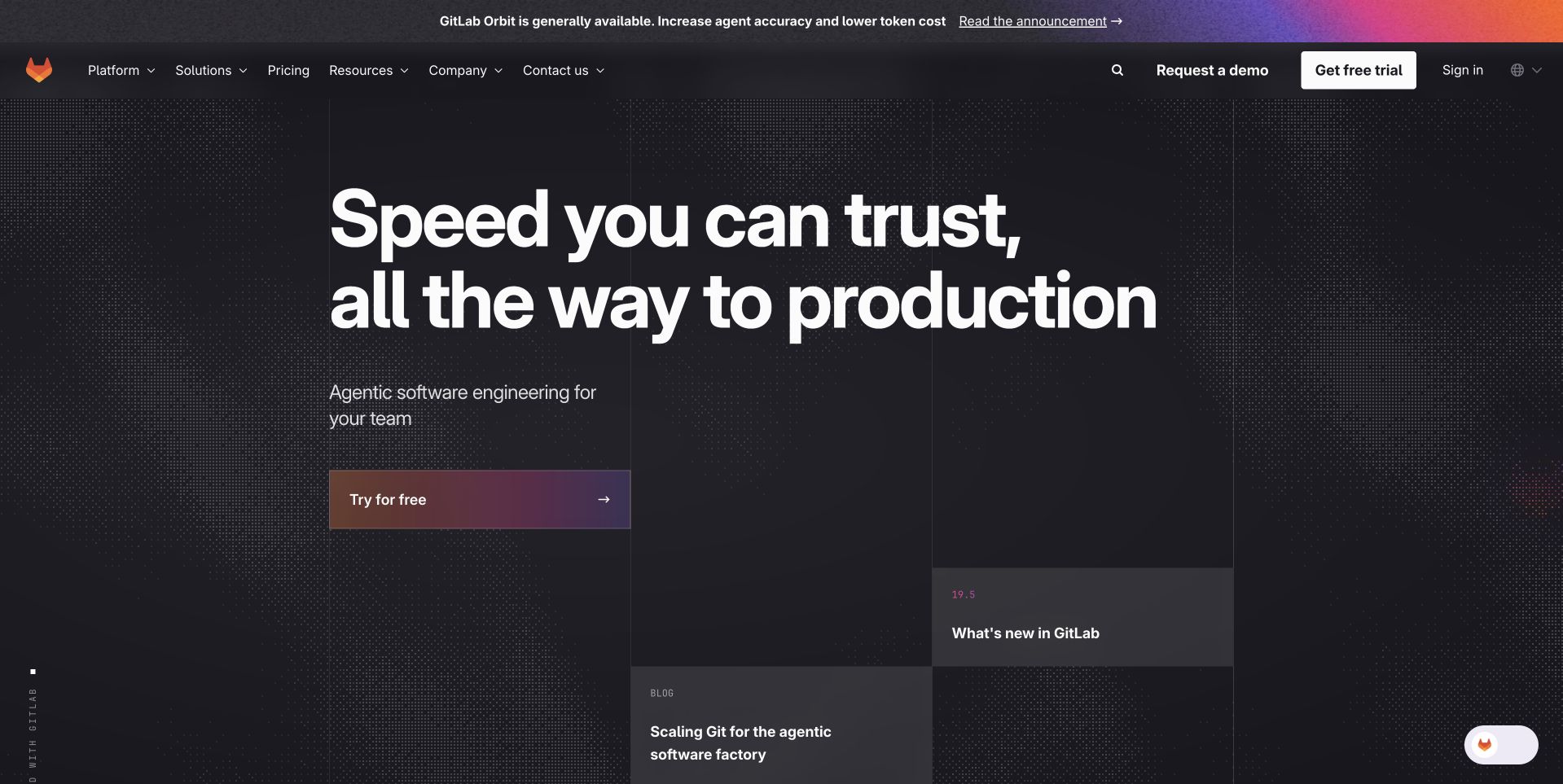
GitLab’s dark homepage centres a large software-delivery proposition on a patterned field. Trial, demo and sign-in actions remain in the header, while lower editorial cards begin to introduce related material. The top announcement is visually distinct from the permanent navigation. The useful pattern is giving a current campaign a strong identity without making it the only way to investigate the platform. The pictured speed and agent-related language are marketing presentation, not an independent measurement of delivery performance or proof of the controls in a customer environment.
What you can learn
Help visitors translate the umbrella message into a specific software-development task. Source management, delivery pipelines, governance and organisational administration need different explanations. Preserve direct documentation and account routes, and connect broad efficiency language to scoped product material rather than letting a promotional headline substitute for an evaluation.
Pros
Trial, assisted evaluation and account access are individually labelled.
The announcement and permanent navigation occupy distinct layers.
Cons & considerations
If one campaign dominates the introduction, retain routes for familiar day-to-day tasks.
If the proposition combines speed and control, explain the relevant product boundaries and responsibilities.
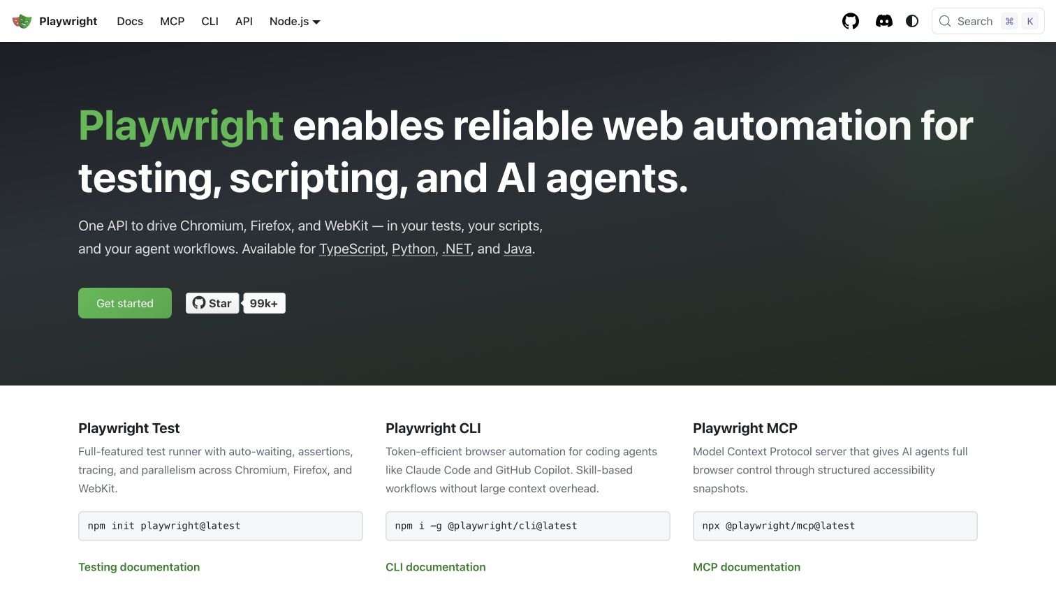
Playwright’s captured homepage gives a broad automation explanation a large dark introduction, then follows it with three columns for the test runner, command-line tool and MCP interface. Each column has a short description, an install command and a documentation link. Language choices and search remain in the header. The useful pattern is separating related entry points before a developer has to decide which instructions apply. The public page explains the project’s offer; it is not an independent test of reliability, browser coverage or the safety of an automated workflow.
What you can learn
Name the distinct task behind each installation route and link it to the correct documentation. A developer writing tests, scripting a browser and configuring an agent should not have to infer the differences from package names. Provide prerequisites and clarify the scope of examples before encouraging command copying.
Pros
The three columns connect purpose, starting command and documentation.
Supported-language routes are easy to identify in the introduction.
Cons & considerations
If several packages share a brand, make the selection criteria explicit.
If a command is prominent, keep prerequisites and the next verification step nearby.
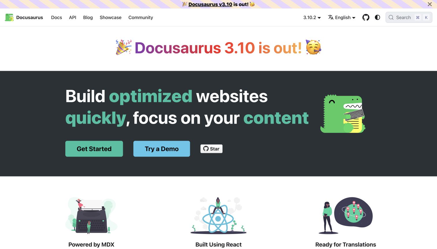
Docusaurus uses a recognisable green mascot, a dark central band and large start/demo actions to introduce its documentation-building role. Below, illustrated feature blocks begin to explain content authoring, the component model and translations. A release announcement is kept above the main introduction, while version, language and search controls remain in the header. The useful pattern is an approachable identity connected to practical evaluation choices. The illustration and feature labels do not establish the performance, accessibility or translation quality of a site built with the tool.
What you can learn
Let the identity make a technical project approachable, then explain the actual authoring and publishing work. A demo and a getting-started guide serve different levels of commitment. Keep version selection and language navigation understandable, and distinguish a framework capability from the content and implementation decisions a particular project still requires.
Pros
Start and demonstration actions give visitors two clear evaluation options.
The feature blocks begin to explain the workflow beyond the headline.
Cons & considerations
If release messaging appears in more than one place, avoid letting it overwhelm stable guidance.
If a capability sounds automatic, explain the project-specific work needed to use it well.
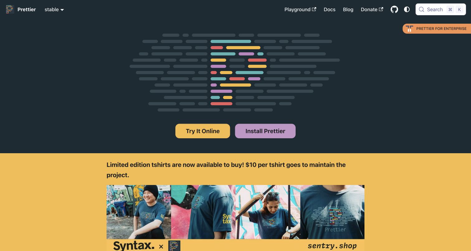
Prettier’s captured homepage gives a large code-shaped multicolour mark most of the opening space. Two strong actions offer trying the tool online or installing it, while documentation, a playground and community-support routes remain in the header. A merchandise section begins immediately below the dark introduction. The useful pattern is a memorable identity connected to two practical starting choices, rather than a long generic feature pitch. For a visitor unfamiliar with code formatting, however, the actual category explanation sits below the most prominent opening elements.
What you can learn
Match the amount of introductory explanation to the audience’s familiarity, but keep the core task explicit somewhere easy to reach. An online playground can show the result before installation. Separate project support and merchandise from the main learning path so those useful secondary activities do not replace the explanation of what the utility does.
Pros
Online experimentation and installation are visibly separate actions.
The distinctive mark provides a consistent visual identity for a small utility.
Cons & considerations
If the opening assumes familiarity, add an accessible route to the category explanation.
If project-support content appears early, preserve a clear path to practical documentation.
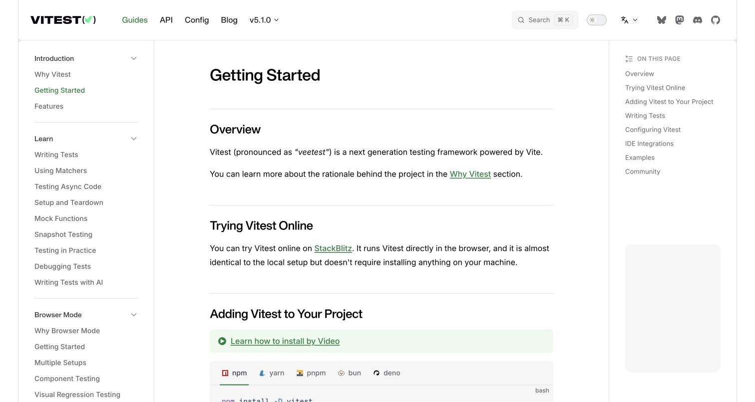
Vitest’s getting-started page combines a left learning hierarchy with a central overview and a right local contents list. The visible article explains the project briefly, then introduces trying it online before adding it to a project. Package-manager tabs begin the installation section below. Version and search controls remain in the top navigation. The useful pattern is giving a visitor a low-commitment exploration route without losing the local setup path. This is a documentation view, not proof that a particular codebase has suitable tests or that every supported environment behaves identically.
What you can learn
Separate initial understanding, online experimentation and project installation into a clear sequence. Keep the package-manager choice close to the relevant command, and explain prerequisites before a reader copies instructions. A long testing reference should remain navigable without making a new user understand every advanced mode before writing a first meaningful test.
Pros
The online trial precedes the more committed installation step.
Local contents and the learning sidebar support different navigation needs.
Cons & considerations
If several testing modes share the guide, make their intended uses distinguishable.
If setup instructions vary by environment, keep version and prerequisite context explicit.
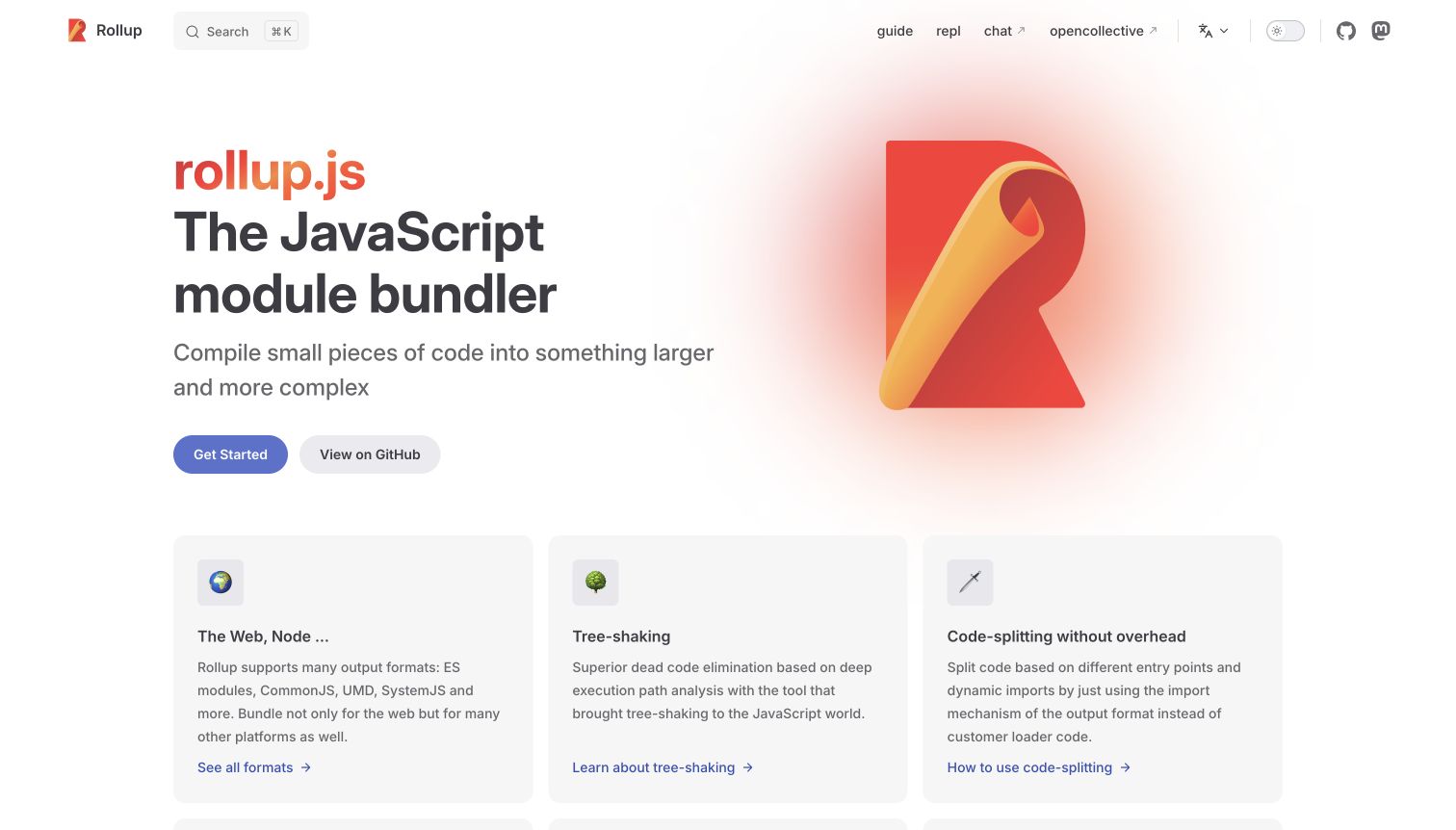
Rollup’s light homepage pairs a large red-orange mark with a plainly named JavaScript bundler category. Get-started and repository actions sit under a short explanation, followed by three capability cards. The header is compact, with guide, experimentation, community and language routes. The useful design pattern is a clear definition of the tool’s job before a visitor enters a much larger configuration surface. The capability descriptions are the project’s presentation, not independently measured claims about output size, build speed or the suitability of a particular configuration.
What you can learn
State the technical category in recognisable terms, then connect each capability to a practical question. Someone evaluating output formats needs different detail from someone writing a plugin. Preserve a short beginner path alongside reference and repository access rather than relying on the brand mark to explain a specialist build tool.
Pros
The main heading identifies the tool’s category directly.
Capability cards give several implementation questions distinct destinations.
Cons & considerations
If advanced terminology appears early, provide a plain explanation or guide link.
If comparative wording is used, support its precise scope rather than implying universal results.
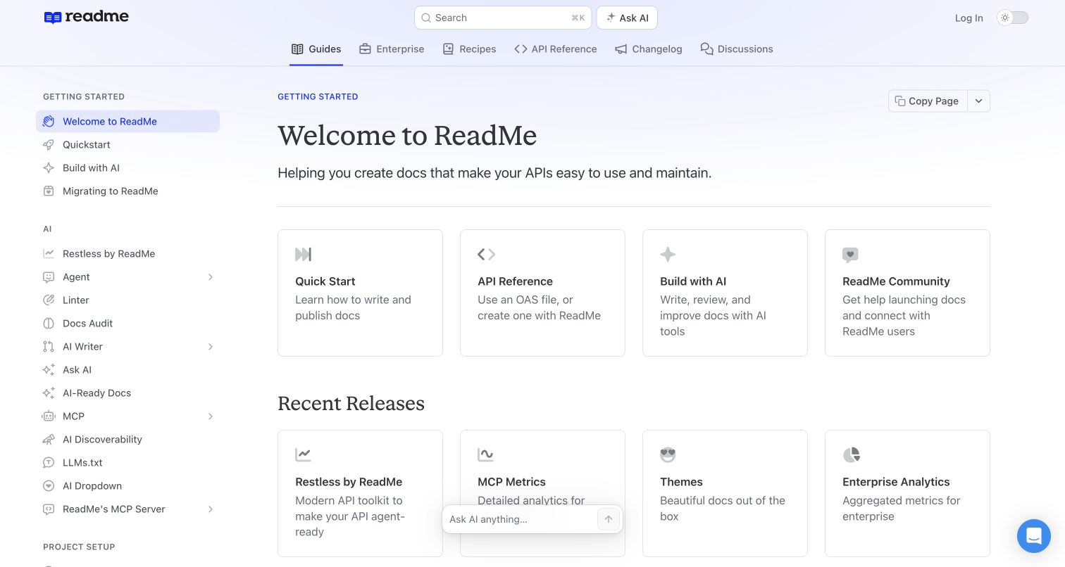
ReadMe’s welcome page combines a left navigation with a central set of starting cards for publishing, API reference, AI-related work and community help. A separate recent-releases row follows, while guides, recipes, reference and changelog have individual header destinations. The useful pattern is a public documentation property showing how the product organises learning and ongoing reference tasks. This is the official welcome article, not a marketing homepage or a private customer portal. Small assistant and chat controls are present without opening an overlay across the article.
What you can learn
Give new users a small set of task-based starting points before exposing the full reference hierarchy. Separate learning, reference, updates and community so readers can choose the right kind of help. If AI assistance is offered, retain conventional articles and clear source context rather than making a generated answer the only way through the material.
Pros
Starting cards distinguish several practical documentation tasks.
Guides, API reference and updates remain separate navigation categories.
Cons & considerations
If the sidebar expands substantially, keep the initial route easy to identify.
If multiple assistant controls are present, avoid letting them compete with ordinary search and articles.
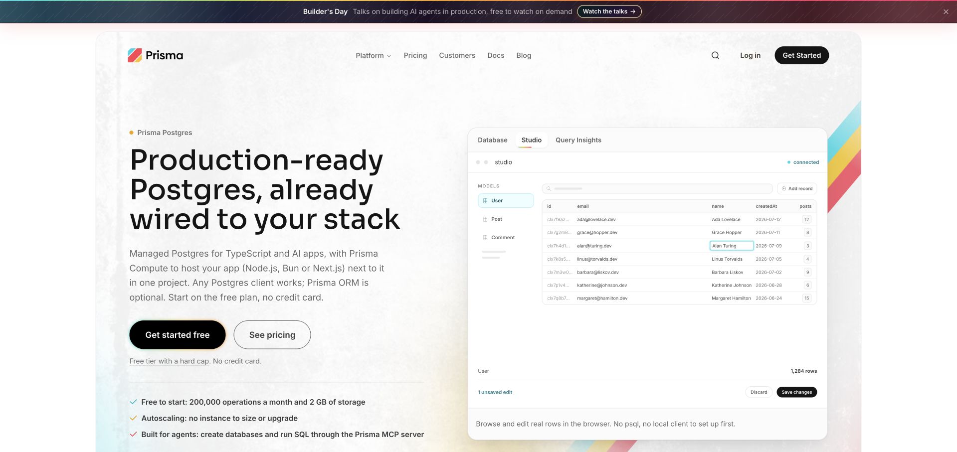
Prisma Postgres places a large product-specific heading beside a Studio-style table illustration. Tabs name database, editing and query-insight views, while pricing and getting-started actions have distinct positions on the left. The example includes an edited cell and save/discard controls, giving an infrastructure offer a recognisable task. The useful pattern is a connection between a managed service and the work a developer can inspect. The table is a public demonstration, not customer data or evidence of the deployment, permissions or backup arrangement in another project.
What you can learn
Show a representative task without letting the interface illustration imply that the infrastructure decision is complete. Explain the service boundary, compatible workflows and next evaluation step. Keep commercial terms, technical prerequisites and operational responsibilities available separately, and identify example records so a polished table is not mistaken for a live customer environment.
Pros
The table makes an abstract database service easier to picture.
Pricing and account-starting actions have separate labels.
Cons & considerations
If several capabilities share one preview, explain what each actually controls.
If managed-service language leads the page, identify the customer’s remaining responsibilities in supporting material.
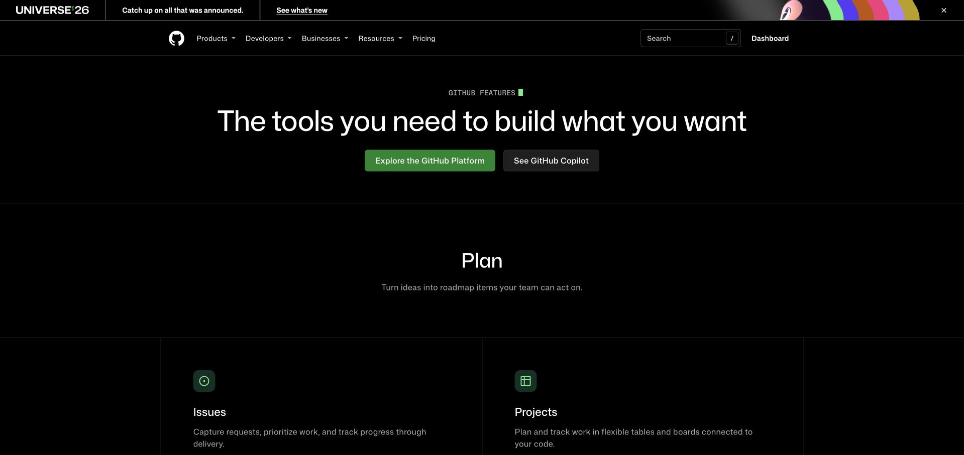
GitHub’s feature page uses a black background and a short central proposition, followed by a Plan section with separate issue and project cards. Two opening actions distinguish exploring the wider platform from investigating a particular AI-related product. The header retains developer, business, resource and pricing routes. The useful pattern is organising a broad catalogue around work rather than presenting an undifferentiated collection of product logos. This is a public feature overview; the account-navigation label in the retained image does not make the pictured content a private repository or customer workspace.
What you can learn
Group a large developer offer by meaningful tasks and show the connection between them. Planning, reviewing, building and administering have related but distinct information needs. Give each group descriptive destinations and preserve stable documentation routes, so a current campaign or product announcement does not become the only explanation of the platform.
Pros
The Plan grouping gives the initial feature cards an understandable relationship.
The two main actions distinguish broad exploration from a specific product.
Cons & considerations
If the catalogue is large, maintain a clear route to a narrow task.
If campaign notices change frequently, keep the permanent category structure consistent.
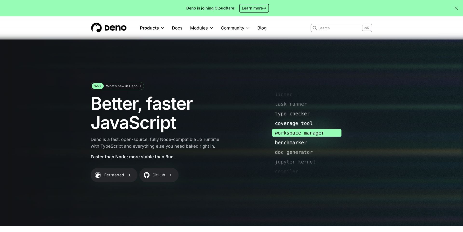
Deno’s captured homepage pairs a large JavaScript proposition with a vertical list of included developer tools. A green highlight gives that list a visual focal point without turning it into a dense specification table. Getting-started and repository actions sit together, while products, documentation and community have separate header routes. The useful design pattern is making an integrated toolkit more concrete through recognisable tasks. Comparative speed and stability wording remains supplier positioning, not an independent test or a conclusion about another application’s runtime choice.
What you can learn
Explain which tasks are integrated and why that matters to the intended developer. Keep the core runtime, optional services and supporting ecosystem distinguishable rather than making a broad toolkit statement cover everything under one brand. Connect the introductory list to installation, compatibility and reference material that a visitor can actually investigate.
Pros
The highlighted task list gives the integrated-toolkit message concrete meaning.
Getting started and repository access are clearly separated.
Cons & considerations
If comparisons lead the copy, provide precise methodology and scope.
If several commercial and open-source products share a brand, explain their different roles.
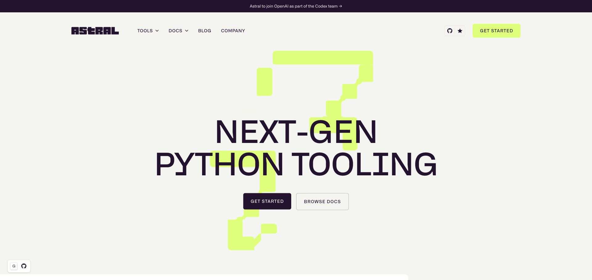
Astral’s captured homepage uses a cream background, deep-purple typography and a lime geometric graphic. A short Python-tooling category statement sits above separate get-started and documentation actions. Tools, docs, blog and company routes remain in a compact header, while a separate announcement occupies the top bar. The useful pattern is a focused category explanation with visual character without an elaborate product collage. This public introduction does not itself demonstrate performance results or identify the implementation of every tool and web property associated with the brand.
What you can learn
Keep an umbrella proposition narrow enough that a visitor recognises the ecosystem and the work involved. Then provide a clear choice between a first practical step and deeper documentation. A distinctive visual system can support that clarity, but individual tools still need their own purpose, installation instructions and appropriately scoped evidence for comparative claims.
Pros
The short category statement is easy to identify in the opening.
Starting and documentation routes have different labels and visual emphasis.
Cons & considerations
If the family contains several tools, help visitors choose the relevant one next.
If performance becomes a central argument, connect it to reproducible context rather than visual energy alone.
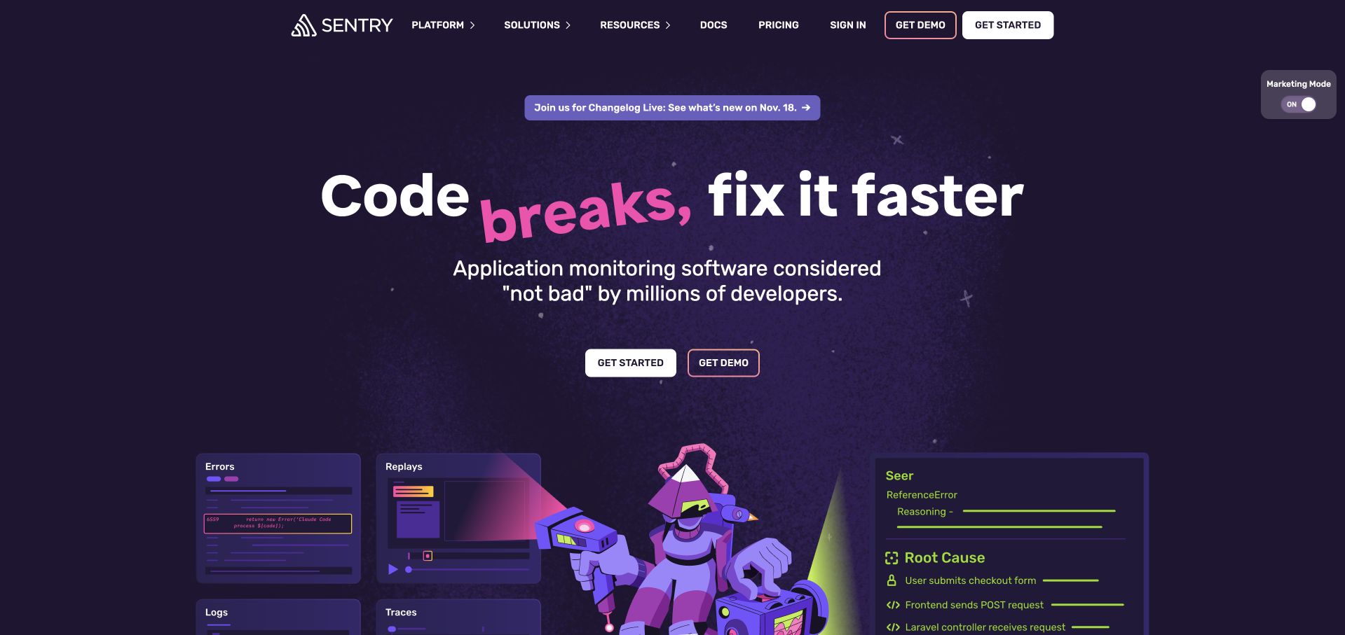
Sentry’s purple opening combines a short error-focused headline with illustrated panels for errors, replays, logs and traces. A playful character occupies the middle of that product world, while getting-started and demo actions remain plainly labelled. Documentation and pricing are visible in the header. The useful pattern is a distinctive tone connected to the kinds of technical evidence a developer expects to investigate. The illustrated diagnosis and marketing language are not an independently verified root cause, monitoring result or guarantee that a defect will be found or repaired.
What you can learn
Let visual personality support a concrete problem rather than replace the explanation. Connect each illustrated monitoring area to readable product material and distinguish a demonstration from a real investigation. Developers should be able to find setup requirements and reference information without having to interpret a campaign’s humour or assume that an automatic-looking panel settles responsibility for a fix.
Pros
The illustration connects the brand’s tone to recognisable monitoring tasks.
Self-service, demo, documentation and pricing routes remain distinguishable.
Cons & considerations
If diagnostic output is illustrated, label its context and avoid implying guaranteed conclusions.
If humour leads the message, retain precise explanations for evaluators unfamiliar with the product.
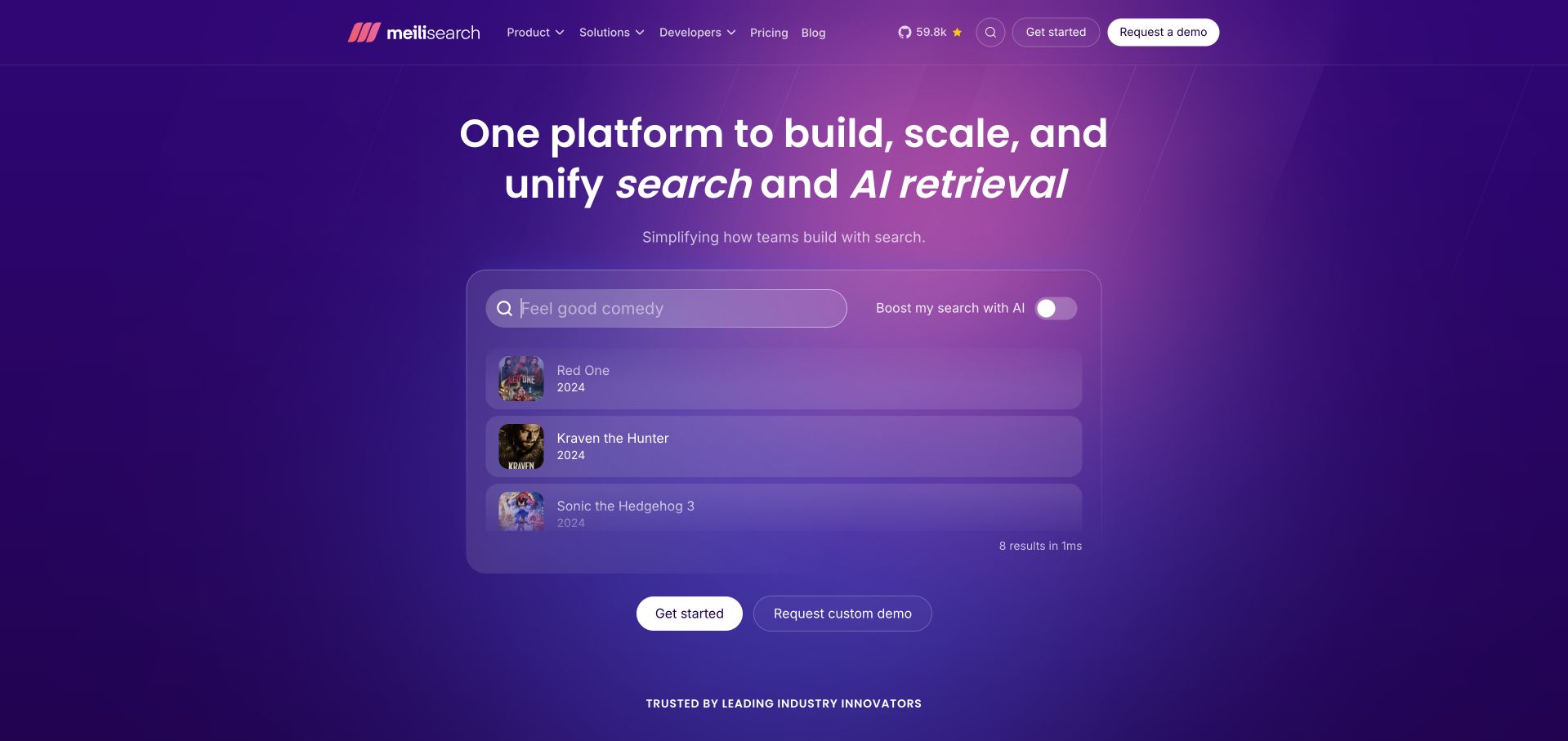
Meilisearch places a movie-query example directly inside its purple introduction. Result rows, small images and a separate AI-related toggle give the search-and-retrieval proposition a tangible output. Getting-started and custom-demo actions sit below the example, while developer and pricing routes remain in the header. The useful pattern is a representative task at the centre of a technical offer, rather than a database illustration with no clear user question. The curated results and displayed timing are demonstration material, not independent evidence of relevance or performance on a different dataset.
What you can learn
Use a realistic query and understandable result set to introduce a search product, then explain how a developer connects data and configures behaviour. Keep ordinary retrieval, optional generative features and the application interface distinguishable. A compact example should lead to a meaningful evaluation, not imply that every catalogue or language will behave like the demonstration.
Pros
The query and results make the technical category immediately concrete.
Self-service and assisted evaluation are separately labelled.
Cons & considerations
If a curated example implies quality, explain the limits of that sample.
If several search and AI features share the offer, define their individual roles and configuration needs.
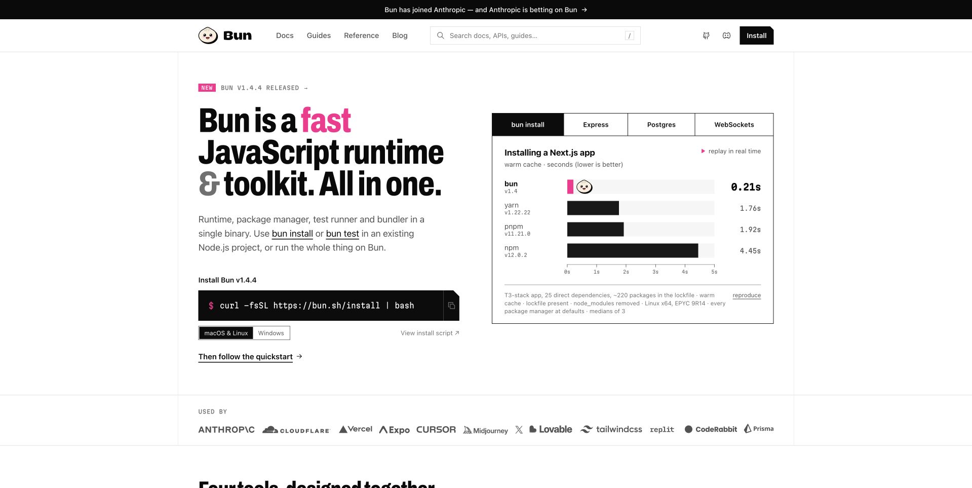
Bun’s white opening pairs a bold runtime-and-toolkit statement with an installation command and operating-system choice. A benchmark panel occupies the right, with tabs for different tasks and a visible methodology/reproduction area. Documentation, guides and reference material are separately labelled in the header. The useful design pattern is combining an immediate starting point with supplier-presented comparative evidence. The captured chart is not an independent benchmark, and the install command was not executed as part of this website-design review.
What you can learn
Make the starting route practical without encouraging a developer to skip context. Explain what the toolkit contains, identify prerequisites and provide a way to inspect an installation script. Scope benchmark language to the actual task and conditions shown, with readable methodology instead of implying that one comparison predicts every project’s performance.
Pros
The install block gives experienced users a concrete next step.
Task tabs and reproduction context make the comparative panel more specific.
Cons & considerations
If benchmark bars dominate, keep methodology readable rather than decorative.
If a shell command is prominent, preserve a clear route to prerequisites and installation details.
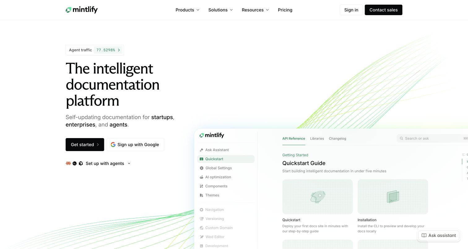
Mintlify’s captured homepage pairs a large serif introduction with a documentation preview on the right. Fine green curves connect the two areas visually without replacing the visible navigation and article cards. Conventional signup and agent-oriented setup choices appear below the explanation, while pricing and sales remain in the header. The useful pattern is a tool showing the kind of reading experience it helps produce. The self-updating wording and illustrated assistant do not establish the review rules, accuracy or permissions inside a real organisation’s documentation process.
What you can learn
Separate a reader exploring published documentation from an administrator configuring a project. Use the preview to explain the output, then connect each setup route to appropriate prerequisites. If maintenance or AI assistance is part of the proposition, explain editorial review and source ownership rather than treating freshness as an automatic property of the visual design.
Pros
The documentation preview makes the category more concrete than an abstract illustration.
Different setup routes acknowledge different developer workflows.
Cons & considerations
If a cropped preview carries the explanation, provide fuller readable examples elsewhere.
If several setup mechanisms appear together, help a beginner identify the preferred starting path.
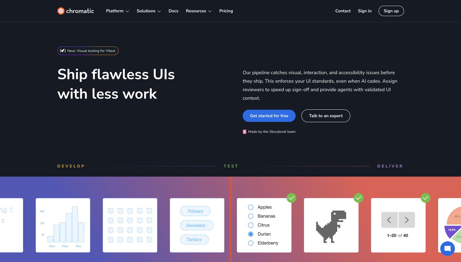
Chromatic’s dark opening separates a large interface-quality proposition from a short explanation and two evaluation actions. Below it, a coloured pipeline connects developing, testing and delivering through familiar component fragments. Documentation and pricing remain visible in the header. The useful design pattern is several related review activities shown as stages of one workflow rather than an unrelated list of features. The public illustration does not independently establish that a customer interface is free of defects, meets an accessibility standard or has suitable permissions for every participant.
What you can learn
Explain the handoffs between people and activities. A developer starting a check, a reviewer considering a change and an administrator managing the organisation need different information. Give testing categories understandable labels and keep reports, human judgment and release decisions distinct so the marketing pipeline does not imply that every problem is automatically resolved.
Pros
The staged illustration gives separate testing capabilities a shared structure.
Self-service and expert-led evaluation have distinct labels.
Cons & considerations
If several test categories arrive together, explain their practical differences.
If the headline suggests flawless output, qualify it with the actual product scope and review responsibilities.
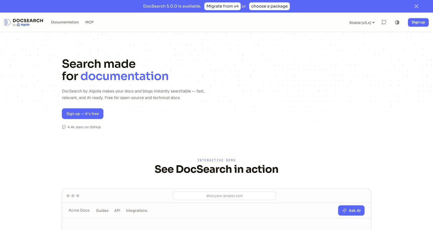
DocSearch’s dedicated product site gives documentation search a clear blue-and-white introduction. A short explanation names docs and blogs, while documentation, version context and signup remain in the header. An explicitly labelled interactive-demo section begins below, helping connect the offer with the kind of interface a visitor can investigate. The useful pattern is a narrow use case giving an infrastructure service a comprehensible entrance. This is a distinct Algolia product property, not a second unrelated company or a clean replacement image of Algolia’s broader homepage.
What you can learn
Name the intended content and audience before describing advanced search capabilities. Keep eligibility, implementation and version information reachable from the introduction, then use a demonstration to explain the reader’s task. Distinguish supplier claims about speed, relevance and usability from independent evaluation, especially when the visitor’s own documentation structure will affect the eventual experience.
Pros
The heading narrows the category to documentation rather than generic search.
The demo section has an explicit label and a visible place in the page.
Cons & considerations
If eligibility conditions matter, explain them before signup.
If a demonstration is below the opening, make its purpose clear without requiring guesswork.
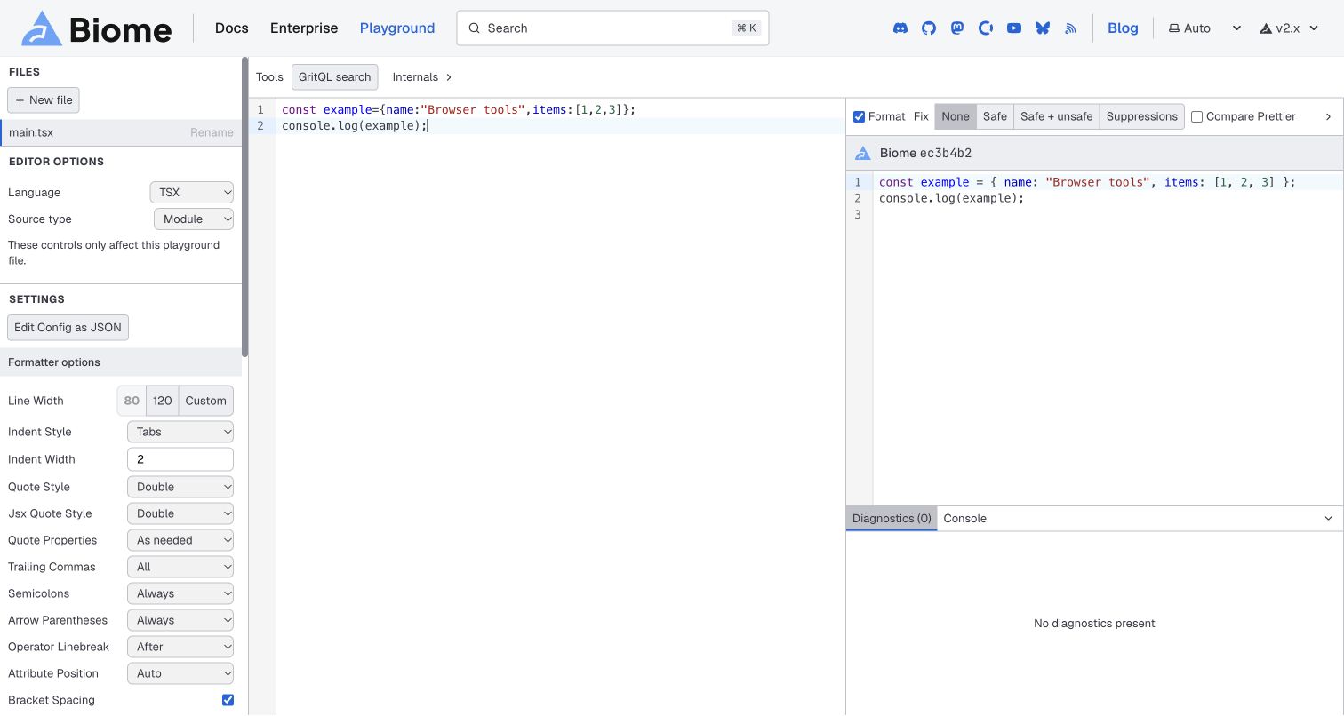
Biome’s retained playground capture shows a narrow settings column beside input and output editors. The sample contains a small TypeScript-style expression, with spacing changes visible in the formatted result. Controls distinguish formatting, fixing and comparison, while a diagnostics area sits below the output. The useful pattern is giving an evaluator direct visual context for what a utility changes. This is a working-tool view with a normal insertion caret, not a marketing homepage or a performance test. The pictured empty diagnostics panel does not establish that a different codebase has no problems.
What you can learn
Choose a small example that makes a transformation easy to follow, and keep the settings that influence it nearby. Explain the difference between formatting, diagnostic findings and automatic fixes. Preserve readable labels and documentation links so someone can interpret the output without treating the playground as proof of comprehensive correctness.
Pros
Input and output can be compared without changing pages.
Settings and diagnostics have separate identifiable regions.
Cons & considerations
If many controls appear together, provide a clear default exploration path.
If automatic fixes are offered, explain their scope and when review is still needed.
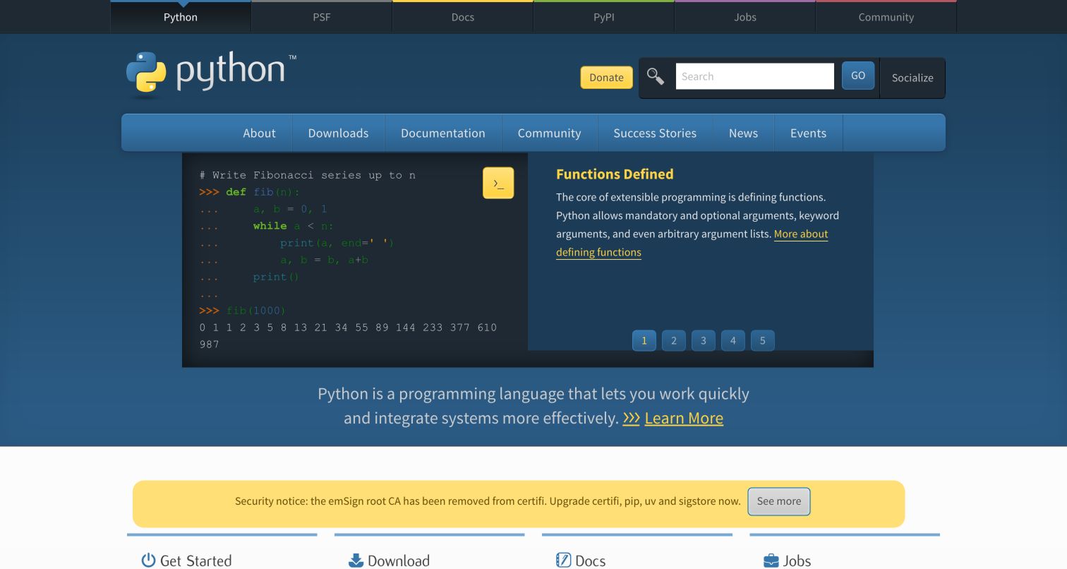
Python’s captured homepage pairs a functions example with a readable explanation inside a blue opening. The navigation distinguishes downloads, documentation, community and other ecosystem destinations, while a broader network bar connects related properties. A yellow security-related announcement appears below as ordinary page content. The useful pattern is an educational sample connecting the language identity to an actual coding concept without removing routes for experienced visitors. The example and announcement retain their original capture date; they are not current installation or security advice from this design collection.
What you can learn
Use a small, understandable concept to introduce a language, then give beginners, existing users and contributors appropriate next steps. Keep documentation and installation routes distinct from news, jobs and community activity. Assign owners to time-sensitive notices so a strong stable homepage structure does not leave changing guidance without clear review and context.
Pros
The code sample and explanation occupy one coherent teaching block.
Downloads, documentation and community have individually named destinations.
Cons & considerations
If rotating examples carry the introduction, preserve readable non-rotating context.
If time-sensitive notices are prominent, maintain their ownership, dates and destinations.
Kegan is a freelance web designer and developer with 15+ years of experience helping businesses turn complicated website requirements into clear, maintainable digital experiences. He works directly with clients from planning and design through development, launch, and ongoing support.
For developer tool website design, his development approach focuses on specific developer tasks, useful documentation and installation routes, clearly scoped product demonstrations, maintainable release information, and distinct community and commercial support paths. The scope can be a targeted improvement or a complete custom build, with responsive layouts, thoughtful content structure, and integrations chosen around the people using and maintaining the site.
Show 3 other developer tool website designersHide other developer tool website designers
Plan a developer-tool website around understanding, trying and using the tool
Write a short product map before choosing the visual direction
List the tool’s main job, intended users, supported context and principal objects. A planning product might organise issues and projects; a formatter transforms code; a documentation service connects source material with a published reading experience. Those differences should determine the examples, labels and information hierarchy. Start with what someone needs to understand, not with an animation style borrowed from another technical brand.
Map adjacent products and services so the umbrella identity does not obscure important boundaries. An open-source runtime, a hosted deployment service and enterprise support can share a brand without being the same offer. Decide what the introduction must explain and what belongs in product-level detail. The website should make those relationships easier to investigate rather than imply that one slogan describes every capability and responsibility.
Choose the smallest useful demonstration and explain its limits
Select a task that makes the product’s particular role visible. A short input/output example can explain a formatter more clearly than a generic code-editor photograph. A recognisable issue can give a planning interface a reason to exist. A product illustration should have enough context for someone outside the immediate team to understand what changes and why the next action matters.
Label demonstration data and distinguish a public illustration from a live product test. If the example suggests a diagnosis, automatic edit or recommendation, explain the relevant review boundary. If comparative figures appear, provide readable methodology and conditions. A curated result or a single benchmark cannot establish universal quality. Keep the text useful when the image is too small to read or moving media is not played.
Design a first-run route without hiding implementation work
Decide what a new visitor can meaningfully do before creating an account or changing a project. An online playground, a sample dataset or a clearly described demonstration can reduce uncertainty. If installation is the appropriate first step, link the command to actual prerequisites, supported environments and current instructions. Do not treat a copy button as the whole onboarding experience.
Define a small successful first task and show where to verify it. Separate experimenting, adding a tool to an existing project and provisioning a hosted service. Those actions have different risks and requirements. Keep commands and examples owned by the appropriate technical reviewers, and explain any external account or repository handoff. The website should make the next step intelligible without claiming that a short introduction replaces configuration or professional judgment.
Build documentation for both a learning sequence and a precise lookup
Give getting-started material a short ordered route through concepts, prerequisites and a first task. Keep reference material separate enough that an experienced reader can reach a specific API, setting or command without repeating the tutorial. Use descriptive navigation and local contents lists where a long article needs them. The hierarchy should reflect the work, not simply the internal structure of the product team.
Plan search as a supplement to that structure. New users may not know the right query, so provide examples and browseable categories. Identify the version and environment a page applies to, especially when installation or migration instructions differ. Keep relevant learning, reference, changelog and support destinations connected without making their content indistinguishable. A consistent visual system can help orientation while allowing each type of page to do its own job.
Explain the people, commercial boundaries and review responsibilities
A development product may serve an individual contributor, a reviewer and an organisation administrator. State the task of each important route without exposing unnecessary private information in an initial enquiry. Separate self-service exploration, account access, assisted evaluation and existing-customer support. Explain what a trial or conversation starts rather than using several identical buttons for different processes.
Where a service supports collaboration, make the conceptual handoffs understandable. Showing a review pipeline is useful, but it should not imply that every change is approved automatically or that a pictured report establishes complete correctness. Commercial and technical reviewers should confirm claims about permissions, product boundaries and support. Do not invent response commitments, compliance assurances or operating arrangements simply because another attractive website uses similar language.
Test complete tasks and keep changing information maintainable
Test the journey from recognising the category to finding a guide, trying an example and locating help. Check navigation, code readability, copy controls, search, forms and external destinations on realistic screen sizes and with keyboard interaction. Verify that illustrative interfaces are not mistaken for functioning forms and that actual tools explain their inputs and outputs. A screenshot review cannot substitute for testing the implemented experience.
Assign owners to installation snippets, version selectors, pricing links, release notices and product screenshots. Record what was actually checked and distinguish older capture dates from current source observations. A technical website becomes less useful when a campaign is refreshed but the setup route points to outdated guidance. Keep website usability, software performance, security and deployment suitability as separate questions with their own evidence and review responsibilities.
The editing job behind the design
Choose a publishing setup that supports accurate examples and maintained reference material
Start with content relationships and editing responsibilities. Marketing explanations, reference documentation, interactive examples and account systems may belong in different tools. Agree on the links and boundaries between them first. A framework used by an admired example is not automatically the right choice for another project’s authors, review process or product integrations.
Model versions, commands, product terms and important destinations so they can be updated consistently. Keep demonstration records and claims separate from current commercial information. Code snippets need the same review discipline as prose: identify their context, owner and intended purpose instead of copying a visually impressive block that nobody maintains.
Plan the actual responsibilities of documentation search, forms, media, accounts and playground execution. Public technology evidence identifies only an observed page resource or cited relationship, not a full backend or an assurance that another team should adopt that stack. Test the chosen implementation with realistic content and tasks, then maintain it alongside the product.
Our WordPress website examples offer a separate look at publishing approaches. A visible platform label is evidence for that named page, not a guarantee that the same system will suit your requirements.
Before the public launch
Developer-tool website planning checklist
State the tool’s actual category, task and intended environment.
Explain how related products and hosted services differ.
Choose one meaningful demonstration instead of a collage of screens.
Label illustrative data and explain the limits of suggested results.
Make code and interface explanations readable on narrow screens.
Connect install commands to prerequisites and current documentation.
Provide a realistic first task and a way to verify it.
Distinguish learning guides, reference, playgrounds and support.
Keep version and environment context clear in technical material.
Explain trial, signup, sales and external-account handoffs.
Scope benchmark and automated-action claims to actual evidence.
Assign owners to commands, screenshots, release notices and destinations.
Test whole navigation, example, form and documentation journeys.
Keep website checks distinct from product security and performance assessment.
These checks are a project checklist, not a performance, legal, security, or accessibility certification. Test real journeys with the people responsible for the website before making claims about the result.
Sources & editorial method
How this collection was selected and reviewed
The original26-example target was drawn and saved before research, without rerolling. Current official sources establish the developer-tool or implementation-resource fit of each distinct public property. Every retained direct capture was independently viewed at full size, hashed and checked against its original source dimensions. Earlier image bytes, source URLs and capture dates remain unchanged. Three obstructed or pointer-ambiguous unpublished candidates were replaced with separately qualified clean original views of DocSearch, Biome and Python; the holds remain in private history. Original industry-specific notes adapt our earlier editorial observations without portraying the screenshots as fresh captures. Editors Choice is a website-design judgment about a specialist project’s clarity, practical setup and reference routes, not a service endorsement or product benchmark. The reviews do not independently establish performance, security, legal compliance, customer outcomes or private account behaviour. Unknown technologies remain omitted pending separate qualified public evidence.
Each example links to its actual source page. Screenshots are direct browser captures with their own capture dates; moving imagery, announcements and live designs can change. The notes describe observable design choices and conditional tradeoffs, not measured traffic, conversion results, service quality, or accessibility conformance.
Technology labels use public page metadata, asset evidence, or explicitly cited platform documentation. Platform documentation is not a complete current deployment audit. A component reference may be legacy or unused; it is not a complete backend inventory. Unknown stacks are omitted. These sites are editorial examples, not our client portfolio.
Written, Edited and Curated are separate editorial records, not timestamps advanced by a rebuild. Website designs and imagery belong to their owners. See our editorial standards or suggest a correction.
Questions worth asking
Developer Tool website design questions
Does every developer homepage need a code snippet?
No. Use code when it helps explain the specific task. A small input/output example can suit a utility, while a planning platform may be clearer through a recognisable issue or review workflow. The important requirement is understandable context, not a decorative code block added to make the page look technical.
Should documentation replace a marketing homepage?
It depends on the tool and audience. A focused open-source project can use a concise introduction connected directly to a guide. A wider platform may need product and commercial context first. In either case, keep learning, reference, evaluation and account tasks distinguishable rather than asking one page to perform every job.
What makes a good installation block?
It names the relevant environment, links to prerequisites and explains the next step. A command should belong to maintained technical guidance, not be copied from another project for its appearance. Provide the context needed to understand what the command starts and how to verify a small successful result.
Can a playground demonstrate that a tool is correct or fast?
It can demonstrate a particular example, not universal results. Identify the sample, settings and limits. Benchmarks need their own methodology, and suggested fixes need review boundaries. A polished interactive surface should make evaluation easier without implying that every codebase or deployment will behave the same way.
Why are documentation and working-tool views included?
They show important parts of the public developer experience beyond an introductory hero. A guide can illustrate navigation and learning structure, while a playground can show input, settings and output. Each example is labelled with its actual source view so these are not presented as interchangeable homepages.
Borrow a clear explanation, a meaningful example and a sensible next step. Then design the site around the actual tool, the people using it and the documentation your team can keep accurate.