Best Commercial Photographer Websites of 2026 (25 Real-World Examples)
Commercial photographer websites that help a commissioner understand the work
A commercial photography portfolio needs more than impressive individual pictures. It should make the photographer’s specialism, assignment context, production role and next conversation understandable without flattening a distinctive visual voice.
Commercial photography covers very different buying decisions. A brand planning a still-life campaign, a hotel seeking a property story and an editor commissioning a portrait may all enjoy the same photograph, yet need different evidence before making contact. The website should help each recognize the relevant work. That does not require a corporate sales presentation or an enormous services menu. A useful category system, named projects, accurate credits and a straightforward inquiry route can supply the missing context around an image-led portfolio.
This collection includes people whose public work spans commissioned editorial, brand, hospitality, architectural and related assignments. The common subject is how their websites present a professional photographic practice, not a ranking of photographers or a recommendation for a specific production. Some original screenshots were captured earlier and retain their real dates; current first-party portfolio and practice information was used to qualify the commercial angle. A photograph can communicate taste and approach. It cannot, on its own, establish fees, availability, licensing terms, production capacity or what happened after an inquiry.
Before the examples
What makes good commercial photographer website design in 2026?
Let the right work lead to the right conversation
Choose opening images for the kind of commission the practice genuinely undertakes. A broad visual archive can remain broad, but brand work, commissioned editorial, personal series, prints and teaching should not become indistinguishable. Use clear category names and short assignment captions so a new visitor can find relevant evidence without already knowing the photographer’s career.
Explain the assignment without claiming every contribution
A finished photograph may involve an agency, client team, producer, stylist, location, models, assistants and post-production specialists. Explain the photographer’s role and credit collaborators where permission allows. Label tests and self-initiated work honestly. The website can demonstrate a point of view without implying that every pictured image was a paid campaign or that one person delivered every production service.
Keep image-led presentation compatible with practical access
A full-screen photograph, quiet grid or unusual archive can be effective. Contact, project names and category navigation still need readable routes. Do not make a custom pointer, hidden hover label or autoplay sequence the only way to discover the work. A commissioner who has limited time should be able to survey the portfolio and find the appropriate contact without completing a visual puzzle.
Compare the route from first impression to a relevant assignment. Notice how each site separates subject matter, commissioned work, personal projects and practical information, then borrow the organizing principle rather than the photographer’s images.
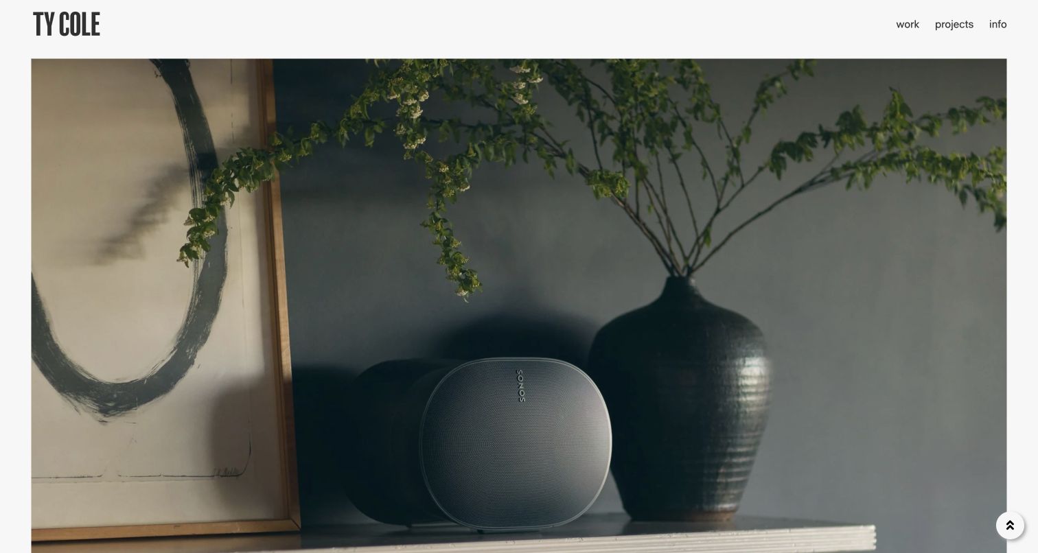
Ty Cole’s retained homepage puts a Sonos speaker, a dark ceramic vase and a framed artwork inside a domestic scene. The image fills a large bordered stage beneath a compact wordmark and three ordinary navigation labels. The product becomes part of an environment rather than an isolated sales object. Current official Commissions content includes hospitality, product and brand-campaign assignments, making the opening relevant to a broader commercial practice. The pictured frame is a portfolio introduction, not an explanation of the production brief, licensing arrangement or photographer’s full responsibilities.
What you can learn
Use one image to establish the kind of visual judgment a commissioner is considering, then connect it to named assignments and a clear account of your role. An environment can demonstrate product storytelling without turning the photographer’s own homepage into a product advertisement.
Pros
A recognizable product is shown within a considered, believable interior composition.
A short header leaves the photograph prominent while retaining normal work and information routes.
Cons & considerations
If the opening carries no caption, visitors may not know which brand or assignment it represents.
If work categories stay hidden until interaction, a new commissioner needs another clear way to discover the range.
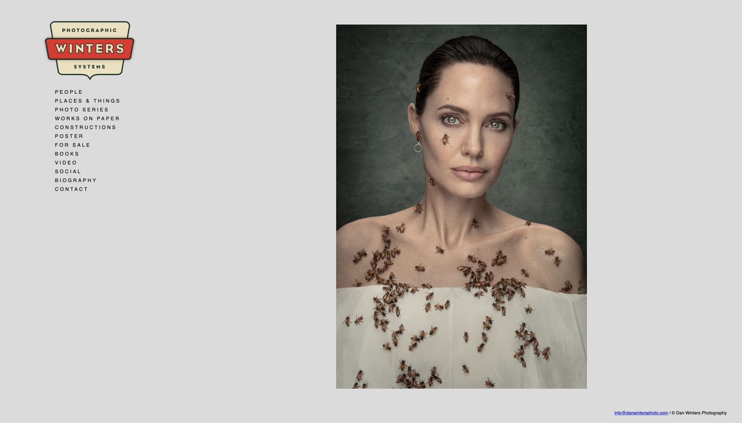
Dan Winters’ saved opening pairs a large portrait with a small, persistent subject index and a colorful badge-like identity on gray. People, places and things, photo series, constructions, books and contact are arranged as text rather than competing thumbnail panels. This gives an art director a way to enter a substantial archive while the photograph establishes a particular visual voice. The current official homepage also identifies a named magazine portrait, supporting the commissioned-editorial context. The earlier portrait is not presented as today’s homepage image or proof of a particular advertising relationship.
What you can learn
Organize a diverse archive around categories a commissioner can actually use, while giving the selected image enough space to be understood. Separate client assignments, personal series and purchasable work with accurate labels instead of suggesting that every image had the same commercial purpose.
Pros
The persistent subject index exposes several kinds of work without opening a menu.
A single dominant portrait creates an unambiguous visual starting point.
Cons & considerations
If the small letter-spaced labels are retained, readable sizing and touch targets need testing.
If project context is absent from the opening, the next page must explain the assignment and credits.
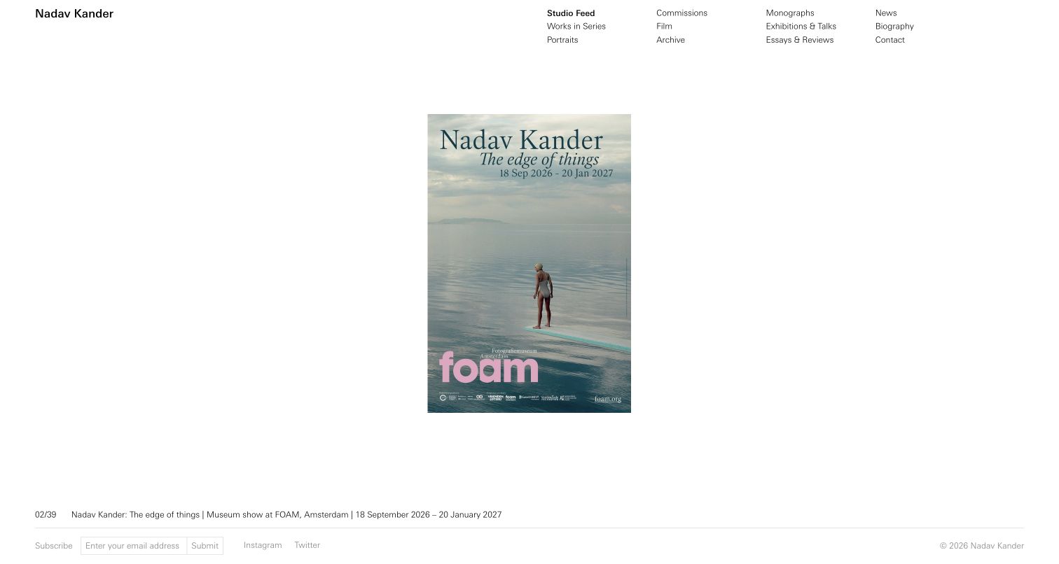
Nadav Kander’s retained homepage gives a single exhibition poster extensive white space beneath a compact, multi-column navigation system. Studio Feed, Works in Series, Portraits, Commissions, Film and Archive are distinguished rather than blended into an undifferentiated image stream. A short caption and sequence count sit near the bottom. Current official Commissions content names editorial, theatre, fashion and entertainment assignments, qualifying the professional commercial angle without making the pictured exhibition an advertisement. The interesting design decision is the separation of public artistic activity from the commissioned archive, not a claim that the quiet opening is suitable for every photographer.
What you can learn
Make personal authorship and commissioned capability separately discoverable. An exhibition or book can introduce a point of view, but a buyer with a live brief still needs a direct route to relevant assignments, production context and contact information.
Pros
The navigation distinguishes commissioned work from series, exhibitions and other studio activity.
A restrained caption gives the selected feed item a clear identity.
Cons & considerations
If most visitors arrive with a commercial brief, an exhibition-led first frame may delay relevant work.
If navigation stays small and dispersed, mobile grouping and keyboard discovery need particular care.
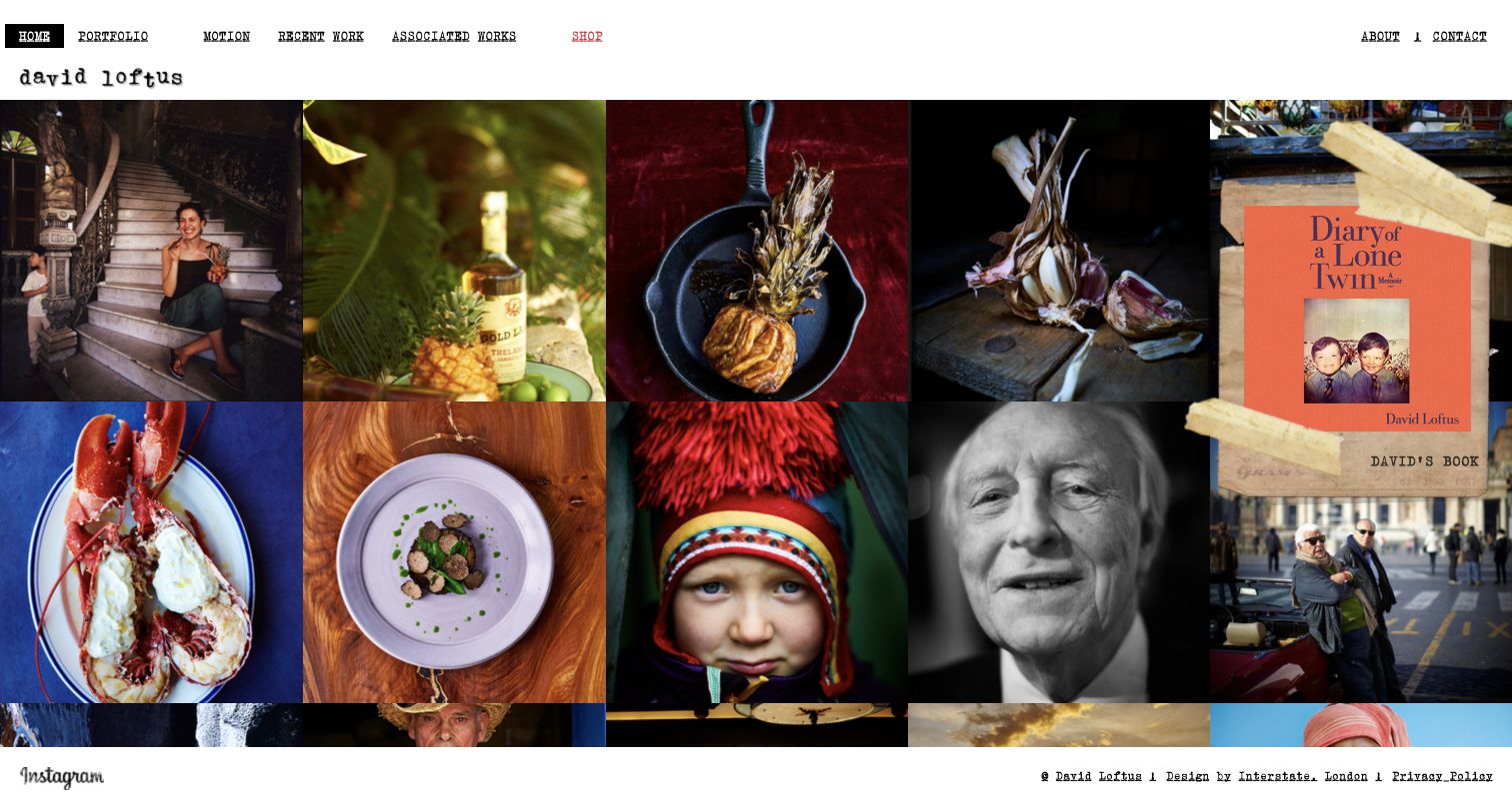
David Loftus’ retained homepage uses a dense horizontal image strip beneath a white, typewriter-style header. A portrait, a bottle, cooked food, garlic and a book cover place several related kinds of image-making next to one another. Portfolio, Motion, Recent Work and associated assignments remain separate from the shop, biography and contact routes. Current official navigation names food, drinks, interiors and lifestyle categories and identifies specific commercial and publishing projects. The screen is useful for studying how a recognisable photographic world can span clients and formats without requiring a long service pitch before any work appears.
What you can learn
Show a coherent range through the selection and adjacency of images, then label the assignments clearly. A brand commissioner should be able to distinguish a food campaign, editorial story, book and personal project even when they share the same visual sensibility.
Pros
The opening demonstrates subject range through actual pictures rather than a long service list.
Commercial work, moving image and authored products have distinct navigation roles.
Cons & considerations
If the image strip relies on lateral movement, provide a usable small-screen alternative.
If unrelated formats receive equal prominence, concise captions are needed to prevent ambiguous project relationships.
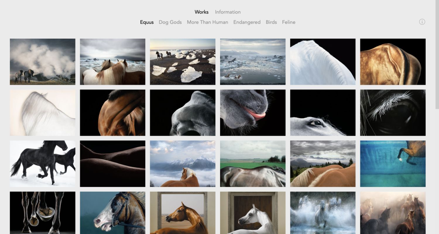
Tim Flach’s saved portfolio shows a regular grid of horses photographed at different scales, from whole animals in landscapes to close studies of coat, eye and movement. A restrained two-level header separates Works and Information from the named bodies of work. The repetition makes this feel like a focused investigation rather than a mixed general-purpose feed. Current official FAQs explicitly discuss commercial shoots, while the pictured Equus selection remains an authored series rather than a named advertising campaign. A specialist portfolio can communicate approach without implying that every image was a client commission.
What you can learn
Let the portfolio make a specific specialism legible through useful variation, not a repeated claim of expertise. Connect the series to accurate information about commissions and working arrangements. Keep artistic projects and client work identifiable even when both demonstrate related photographic skills.
Pros
Consistent thumbnail geometry makes differences in viewpoint and detail easy to compare.
Named project groupings give a deep specialist archive a recognizable structure.
Cons & considerations
If the series dominates the first view, a commercial buyer may need a more explicit commission route.
If many photographs load together, responsive image delivery becomes important for slower connections.
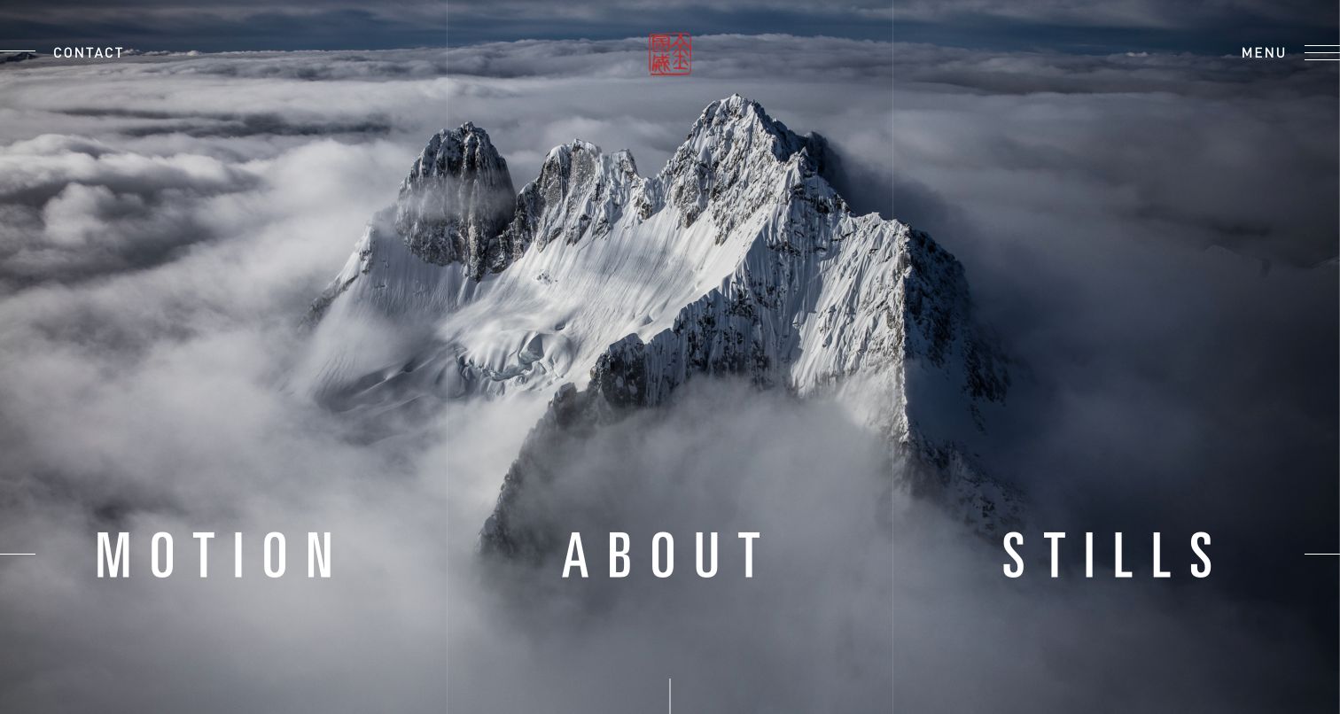
Jimmy Chin’s retained opening places Motion, About and Stills across a snowy mountain photograph, with contact and menu controls kept at the upper edges. The image provides the subject context before a visitor selects a medium. Current official biography information explicitly identifies commercial direction for named brands, alongside photographic and documentary work. The saved mountain scene is therefore a relevant introduction to the practice, but it is not labeled here as a particular commercial campaign. Its useful lesson is the clean distinction between still and moving-image portfolios within one recognizable visual world.
What you can learn
When buyers may need different production formats, make those paths visible before asking them to inspect a long mixed feed. Let the opening photograph establish the specialism, then explain the role, collaborators and deliverables inside each assignment rather than relying on scenery alone.
Pros
Large format labels distinguish still photography from motion at the first decision point.
Contact remains visible without competing with the landscape’s main visual structure.
Cons & considerations
If navigation sits on changing imagery, contrast must hold across every frame and crop.
If the opening remains purely atmospheric, subsequent pages need concrete assignment context and production information.
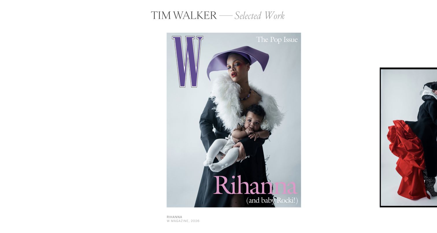
Tim Walker’s retained Selected Work view places a magazine cover prominently in white space, with the beginning of the next framed image visible at the right. A small caption identifies the publication and year rather than leaving the cover completely unexplained. Restrained typography lets the cover carry the character. Current official biographical material describes fashion editorial work and commissioned creative projects. The screen should be read as a published-work presentation, not an independently verified account of a campaign’s commercial results or a claim that all visible graphic design was the photographer’s contribution.
What you can learn
Preserve the publication or campaign context around a photograph when that context helps explain its use. Add precise role and collaborator credits rather than treating a finished cover as evidence that the photographer supplied every part of the final layout.
Pros
A concise publication caption connects the image to a recognizable finished application.
Generous spacing gives the selected work room without adding decorative interface elements.
Cons & considerations
If the sequence is horizontally navigated, mobile and keyboard alternatives need testing.
If a cover is the main proof, additional photographs may be needed to show the underlying photographic series.
Matthew Millman’s retained opening shows people installing large reflective forms, with a compact monogram and subject navigation over the left side. Architecture, Art, Interior Design, Portraits, Books and Publications suggest distinct routes into the work rather than one continuous slideshow. The current official site further separates commercial and residential architecture and interiors. For a commercial photographer, the useful point is the ability to show more than a finished empty room: the pictured installation brings process, scale and people into the introduction. It does not establish the client, exact production role or usage rights for the selected frame.
What you can learn
Use a commission category system broad enough to reflect genuine work but specific enough to support a buyer’s brief. A process image can add another useful dimension, provided project pages explain who commissioned the photographs and what the photographer contributed.
Pros
The image shows human scale and production context rather than only a polished finished setting.
Several clear subject categories help separate different kinds of commissioned work.
Cons & considerations
If navigation overlays photographs, readability needs checking against every selected image.
If a monogram leads the identity, the full photographer name should remain easy to find elsewhere.
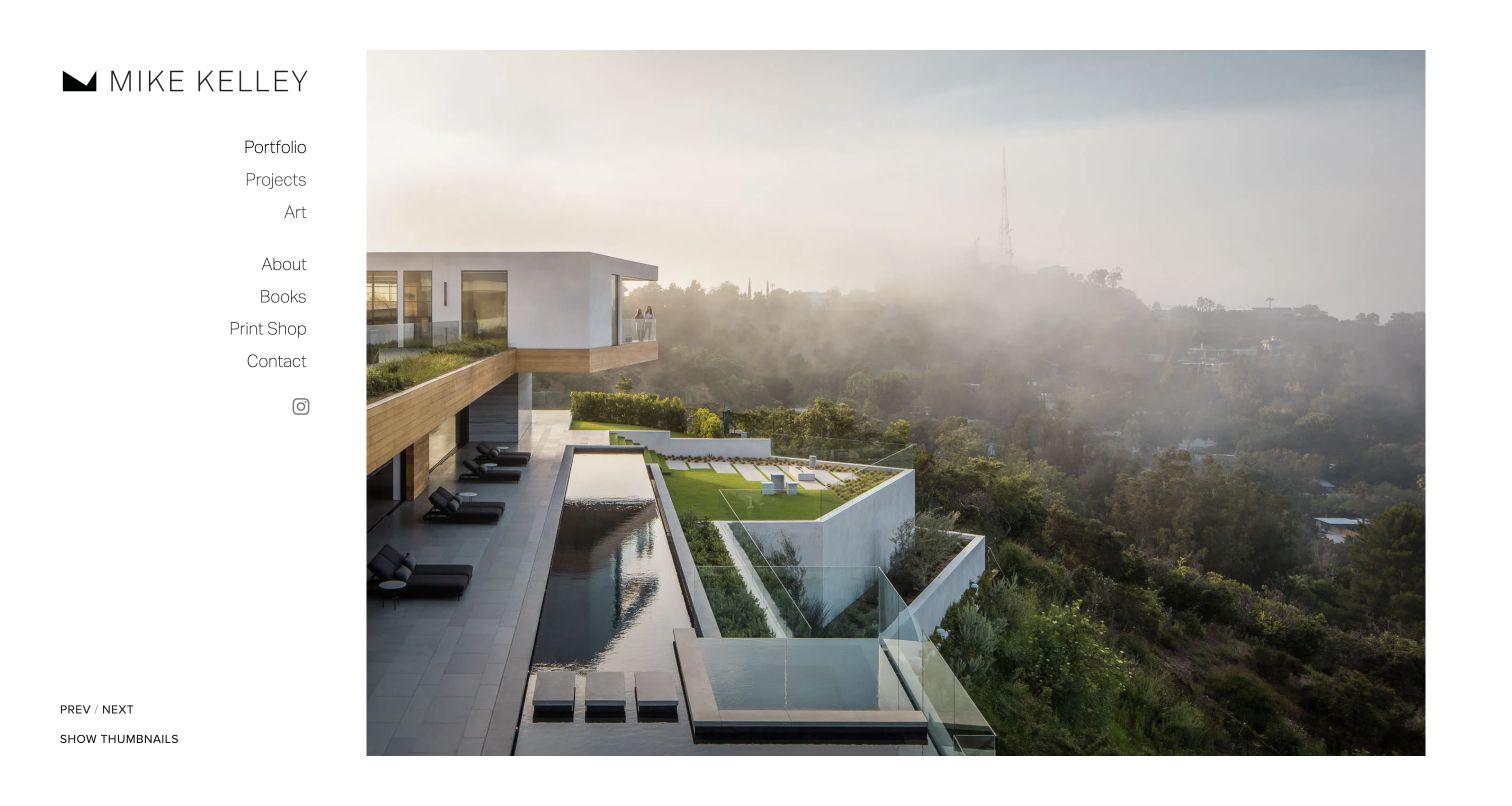
Mike Kelley’s retained homepage gives a house, pool and hillside view most of the screen while reserving a white sidebar for portfolio, projects, art, information, books, shop and contact. Previous, Next and Show Thumbnails appear as ordinary text near the lower-left corner. The separation keeps navigation off the photographic subject and acknowledges that some visitors want a quick overview rather than a slow image sequence. Current official biography information identifies work for architecture and design firms. The review concerns the website’s commercial portfolio presentation, not an assessment of those commissions or of the building pictured.
What you can learn
Offer both an immersive image view and a faster way to survey the archive. Keep business contact, project context and personal artwork distinct so a commissioner can follow the relevant route without assuming every photograph represents the same kind of engagement.
Pros
A separate sidebar avoids placing essential navigation over detailed photography.
The visible thumbnail option supports a different pace of portfolio review.
Cons & considerations
If the first image has no caption, a buyer must open project material to establish context.
If the sidebar consumes too much mobile width, it needs a carefully reorganized compact state.
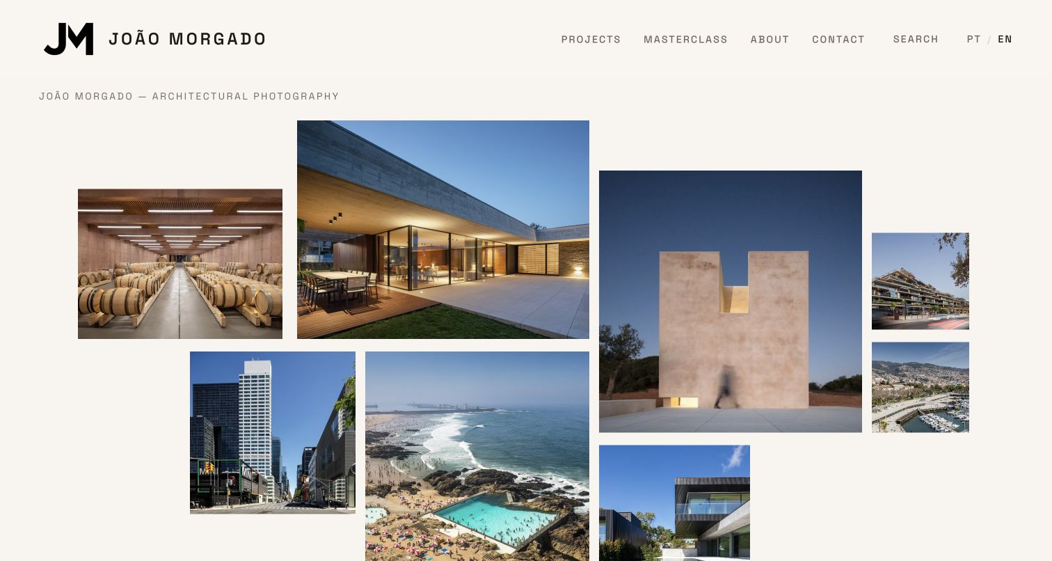
João Morgado’s retained English homepage arranges interiors, buildings and places in an irregular mosaic on a warm pale background. A short identity line identifies architectural photography, while Projects, About, Contact, Search and language choices remain visible above. Current official selected-project records name architects and locations, providing a useful bridge from an attractive opening to actual commissioned-project context. For a commercial portfolio, the strength is not the mosaic by itself but the ability to connect a memorable image selection to a discoverable business archive. The earlier screenshot does not establish that every tile or project list remains unchanged.
What you can learn
Use an expressive opening as an entrance to structured project information. Pair photographs with accurate client or collaborator names, places and roles so someone preparing a commission can understand the range without mistaking every subject for the same service.
Pros
The mosaic demonstrates several scales and settings without a long introductory pitch.
Visible search and language choices support different ways of entering the archive.
Cons & considerations
If tile proportions vary, mobile crops need to preserve the important subject matter.
If the homepage emphasizes visual variety, project records must supply the missing commercial context.
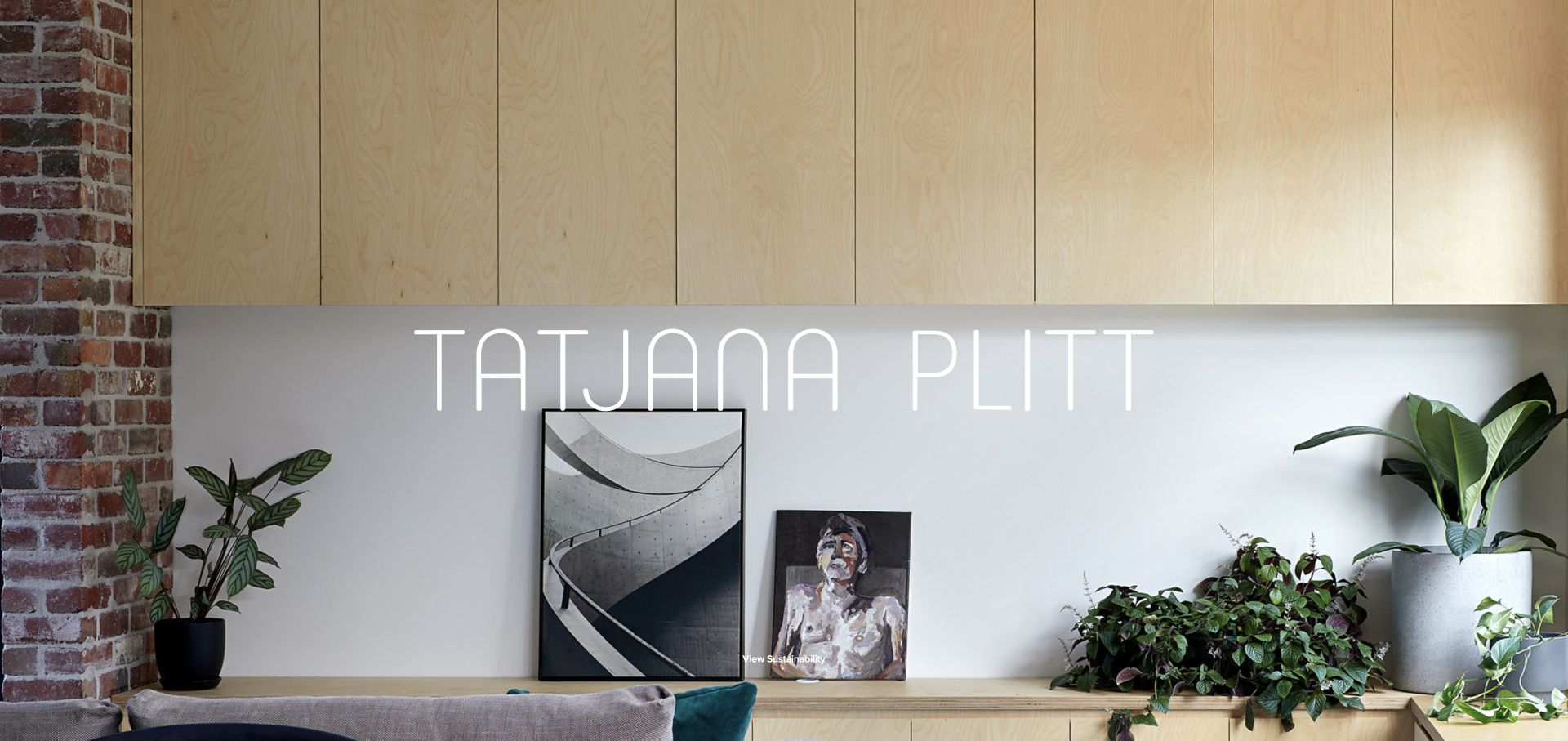
Tatjana Plitt’s retained opening places a fine white wordmark over a bright interior with timber cabinets, plants and artwork. The image does not compete with an additional sales paragraph; a small View Sustainability action supplies the visible project entrance. Current official navigation separates Sustainability, Residential, Commercial and Lifestyle, giving the image-led introduction a more practical service structure. This is useful for a commissioned photographer whose work crosses different kinds of spaces and audiences. The pictured interior demonstrates the website’s presentation approach; it does not establish the building’s environmental performance or independently substantiate the photographer’s sustainability claims.
What you can learn
Make a specialist point of view visible, then explain the category in terms a commissioner can use. If sustainability is a portfolio theme, identify the actual project and relevant contributors rather than asking a photograph to prove an environmental outcome.
Pros
The restrained wordmark leaves the interior photograph as the main evidence.
Current portfolio categories distinguish commercial and lifestyle work from residential subjects.
Cons & considerations
If the small action sits on detailed imagery, contrast and touch-target size need checking.
If a themed label leads the experience, the next page should explain precisely what that theme means.
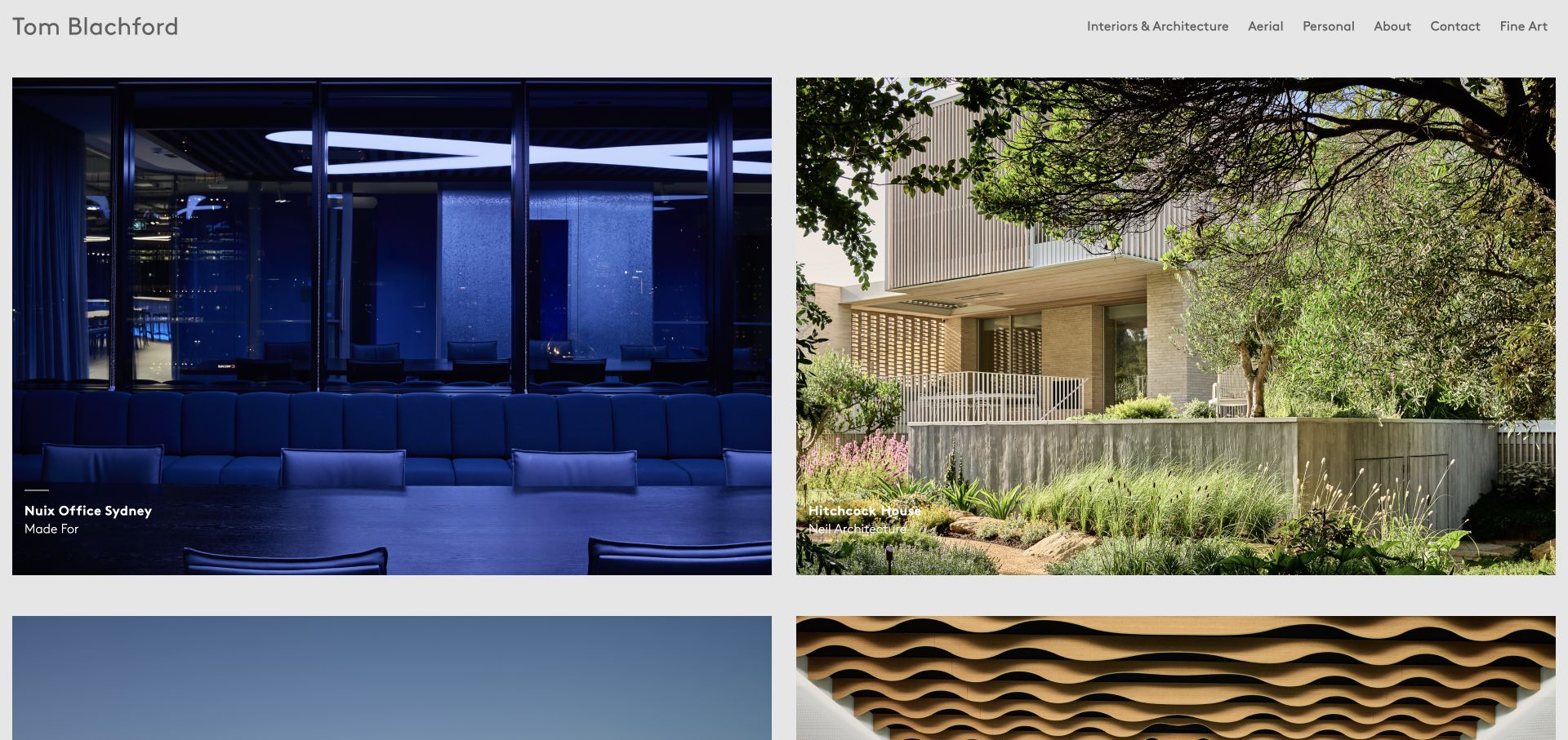
Tom Blachford’s retained portfolio places two large project cards side by side, with a dark blue office photograph contrasted against a sunlit house. Captions identify Nuix Office Sydney and Hitchcock House and credit the associated design practices. Interiors and Architecture, Aerial, Personal, About, Contact and Fine Art remain visible in the header. Current official project listings include hotels, workplaces, restaurants and other design commissions. The useful commercial pattern is a portfolio that helps a buyer identify an assignment type and its collaborators before entering the full series, while retaining a separate route for personal work.
What you can learn
Use project names and collaborator credits as part of the initial selection, not information reserved for a distant case-study footer. An art director can then compare relevant assignments without assuming that every image in a mixed archive answers the same brief.
Pros
Large paired cards preserve meaningful photographic detail while showing more than one project.
Visible captions tie the pictures to named assignments and design collaborators.
Cons & considerations
If captions overlay photographs, their readability should survive every image crop.
If personal and commissioned work share the same grid later, explicit project labeling remains important.
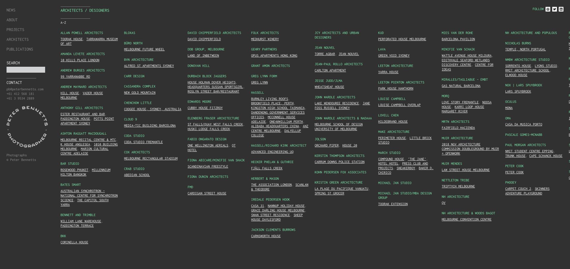
Peter Bennetts’ retained Architects and Designers page uses a dense alphabetical index on charcoal, with muted green practice names and white project links. A fixed left column preserves news, projects, publications, search and direct contact details. Unlike a mood-led homepage, this exact directory helps a visitor locate work by an organization or project they already know. Current official content continues to name design practices alongside completed project links. It is a useful commercial-photography reference for archive retrieval and client context, not a suggestion that every portfolio should begin with a similarly dense desktop directory.
What you can learn
Give an established archive a second entrance organized around the terms commissioners remember. Keep an image overview for exploratory browsing, but let specific client, collaborator and project searches reach a useful destination without requiring a long visual sequence first.
Pros
The alphabetical structure makes named relationships and assignments explicit.
Search and contact remain available alongside the long index.
Cons & considerations
If many narrow columns are used, the index needs a clear small-screen reading order.
If project titles rely on small underlined text, spacing and readable type become especially important.
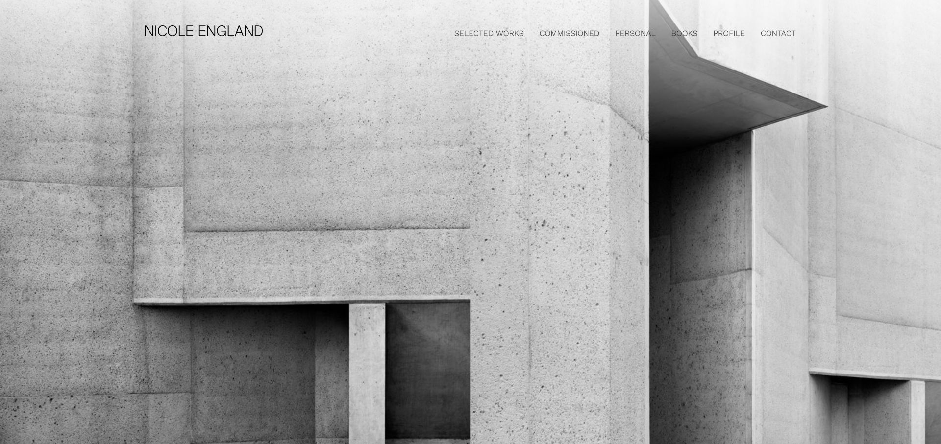
Nicole England’s retained homepage places a restrained wordmark and thin navigation over a monochrome architectural photograph. Selected Works, Commissioned, Personal, Books, Profile and Contact provide a concise set of entrances without covering the building with descriptive copy. The current official homepage retains an explicit Commissioned route, which is important for interpreting a portfolio that also contains personal publications and projects. For commercial photographers, the useful idea is to preserve one recognizable visual identity while making the working context of different bodies of work legible. The opening itself does not explain the pictured assignment, its client or its licensing terms.
What you can learn
Separate commissioned projects from personal work without making either feel like a secondary website. Use the project page to identify the brief and contribution, while a short information route explains how a prospective client can discuss a new assignment.
Pros
The header distinguishes commissioned work, personal projects and books using ordinary labels.
The monochrome opening and restrained type create a coherent, uncluttered introduction.
Cons & considerations
If navigation sits on a full-image background, contrast needs testing beyond this one frame.
If the first photograph is uncaptioned, subsequent project information must supply assignment context.
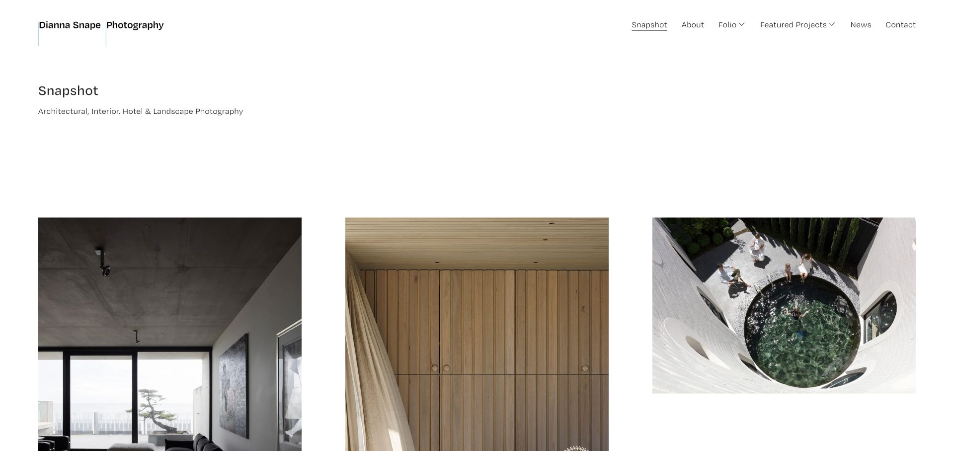
Dianna Snape’s retained Snapshot page uses a short subject description above three generously spaced photographs. A dark interior, a warm timber detail and an overhead courtyard image demonstrate variation within a clear architectural, interior, hotel and landscape focus. The header separates Snapshot, About, Folio, Featured Projects, News and Contact. Current official content identifies named architecture and hotel assignments, supporting the business context rather than relying on an abstract creative statement. The saved view is useful for studying how a specialist practice can introduce scope plainly before letting an image sequence carry the nuance of its work.
What you can learn
Use a short, accurate discipline description to frame the gallery. Then let a few contrasting images demonstrate the range of assignments, while named projects and credits explain what a client was commissioning and which contribution belongs to the photographer.
Pros
A concise subject line gives commercial visitors a useful frame for the photographs.
Generous spacing allows different image proportions and subject scales to coexist.
Cons & considerations
If broad folio labels expand into many subcategories, keep a clear overview route available.
If thumbnails lack visible captions, the project destination needs precise names and collaborators.
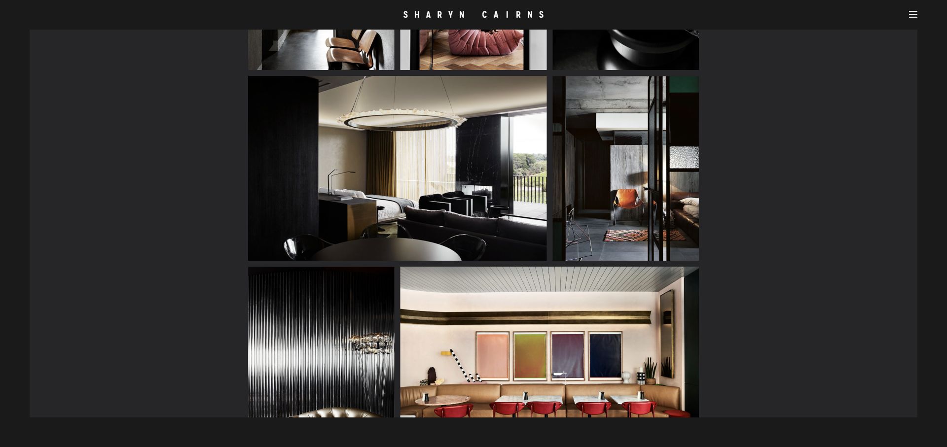
Sharyn Cairns’ retained Interiors view uses a dark surrounding field and an uneven arrangement of differently proportioned photographs. A dining room, material details and restaurant seating share the frame without being forced into identical square thumbnails. The centered wordmark and compact menu remain separate from the pictures. Current official navigation distinguishes Food, Hotels and Travel, People and Commercial from the interiors galleries, while individual records identify publications and projects. This makes the saved view relevant to a broader commissioned practice, although the pictured page is specifically Interiors rather than the complete commercial portfolio or a named campaign case study.
What you can learn
Give photography enough proportion flexibility to communicate its intended composition, but pair the gallery with usable subject categories and assignment names. Atmosphere is more useful to a commissioner when it can be connected to the appropriate kind of work.
Pros
Different image proportions preserve detail and rhythm across a varied interiors selection.
The dark outer field gives the photographs a consistent presentation setting.
Cons & considerations
If navigation is entirely collapsed, commercial categories need clear labels once the menu opens.
If the gallery becomes long, meaningful project names help visitors relocate a relevant assignment.
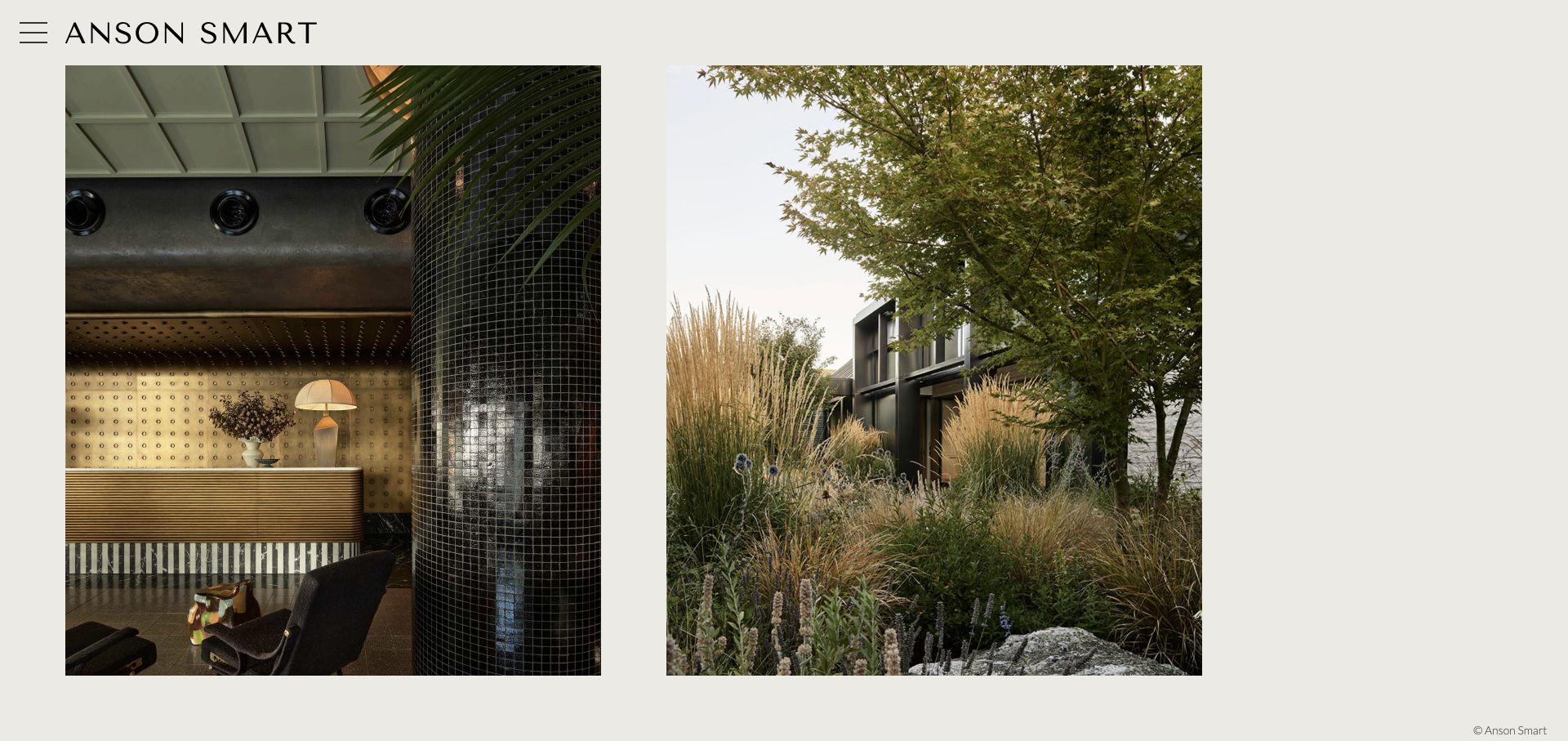
Anson Smart’s retained homepage places two large vertical photographs under a wide, simple wordmark and a compact menu icon. A richly detailed interior and a planted exterior demonstrate different visual settings within the same quiet frame. Current official portfolio information includes food, lifestyle, hospitality and named brand assignments, so the picture-led opening belongs to a wider commercial practice rather than only an architectural specialty. Its useful pattern is to establish a consistent visual voice before categorizing the work. The frame does not identify either assignment; the portfolio and information pages must supply that context.
What you can learn
Use a small number of strong pictures to establish visual consistency, then make subject categories and named assignments easy to discover. Keep moving-image work, brand collaborations and editorial stories accurately described rather than treating a mixed archive as a single undifferentiated capability claim.
Pros
Two generous image areas create a clear comparison without a crowded thumbnail wall.
A restrained surrounding interface allows material, light and composition to remain prominent.
Cons & considerations
If only a menu icon exposes categories, recognizable labels become essential inside it.
If opening images lack captions, buyers need project-level context before evaluating relevance to a brief.
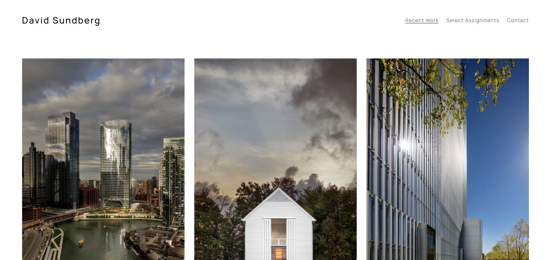
David Sundberg’s retained Recent Work page places three tall photographs in an evenly spaced row: a city tower, a small white building and a close view of an institutional façade. A compact header offers Recent Work, Select Assignments and Contact, giving the pictures most of the space. Current official content names architectural projects including River Point, Cornell Tech and New Lab. The commercial design lesson is the separation between recent visual selection and a more deliberate assignment archive. The frame lacks detailed commission credits and does not establish complete client relationships or production responsibility.
What you can learn
Make a recent-work selection easy to scan, but provide an archive organized around actual assignments. Add enough project context for a commissioner to distinguish corporate, civic and residential work without reading visual style as proof of the entire service offer.
Pros
Three consistent image frames make differences in subject and scale easy to compare.
The small header keeps assignment browsing and contact discoverable.
Cons & considerations
If the grid relies on tall crops, each small-screen version needs a deliberate composition check.
If project names are absent from the opening, the assignment page must make context explicit.
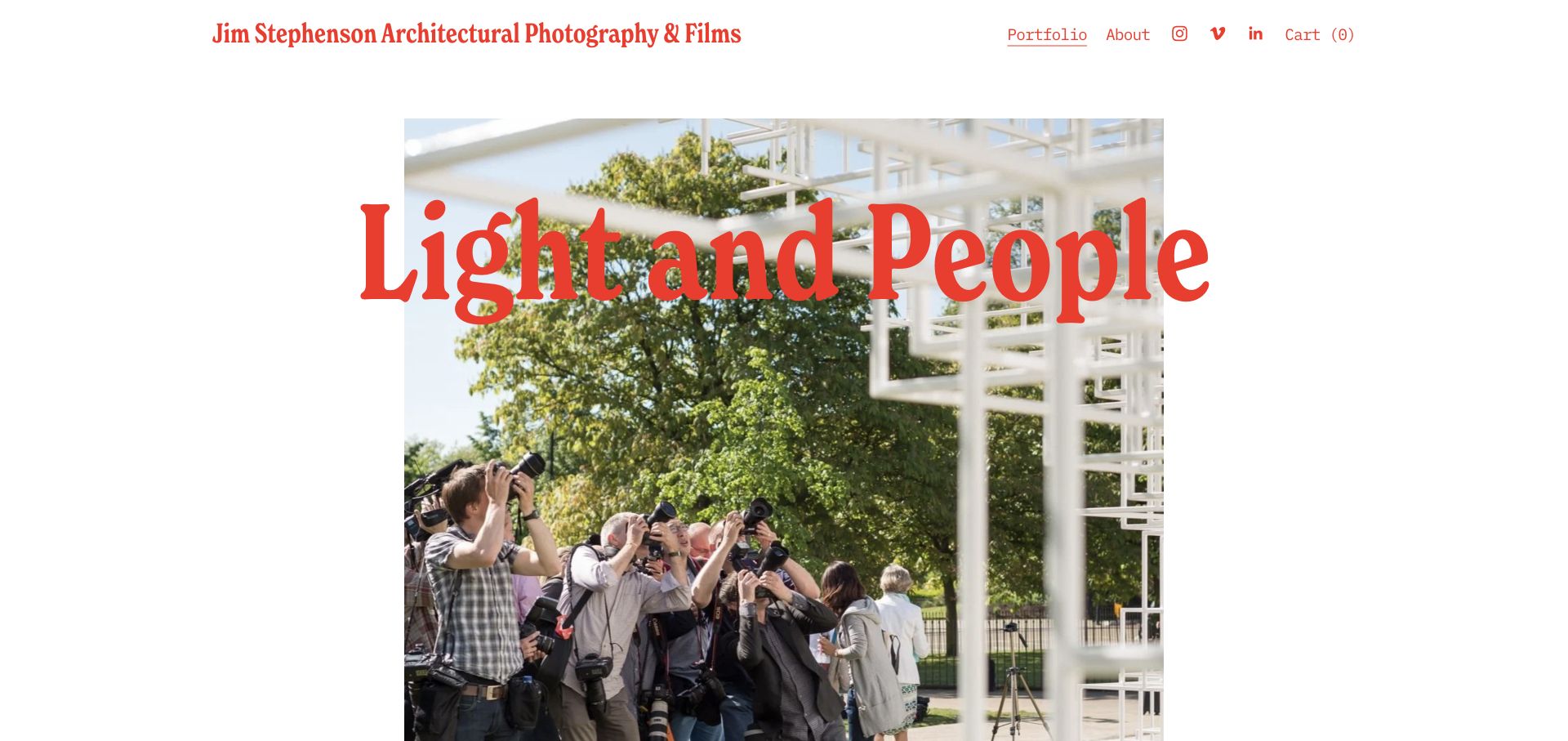
Jim Stephenson’s retained overview places large red Light and People lettering across a photograph of visitors looking upward in a bright built space. The identity explicitly names architectural photography and films, and Portfolio and About remain visible beside simple social links. Current official overview text distinguishes commissioned documentation from personal work and explains attention to how people use spaces. For a commercial portfolio, the useful pattern is a succinct statement about approach joined to an image that demonstrates its subject. The pictured visitors do not establish whether the website’s own navigation or booking process works.
What you can learn
Explain a working perspective in terms a client can understand, then show a relevant image rather than a generic promise of creativity. Keep the assignment, role and collaborators available below so a memorable statement does not replace practical commissioning information.
Pros
The headline provides a clear interpretive lens for the photograph beneath it.
Photography and film are identified together without disguising them as one identical deliverable.
Cons & considerations
If oversized type covers key image details, smaller viewports need another composition.
If an approach statement leads the page, clear project evidence should follow before further promotional claims.
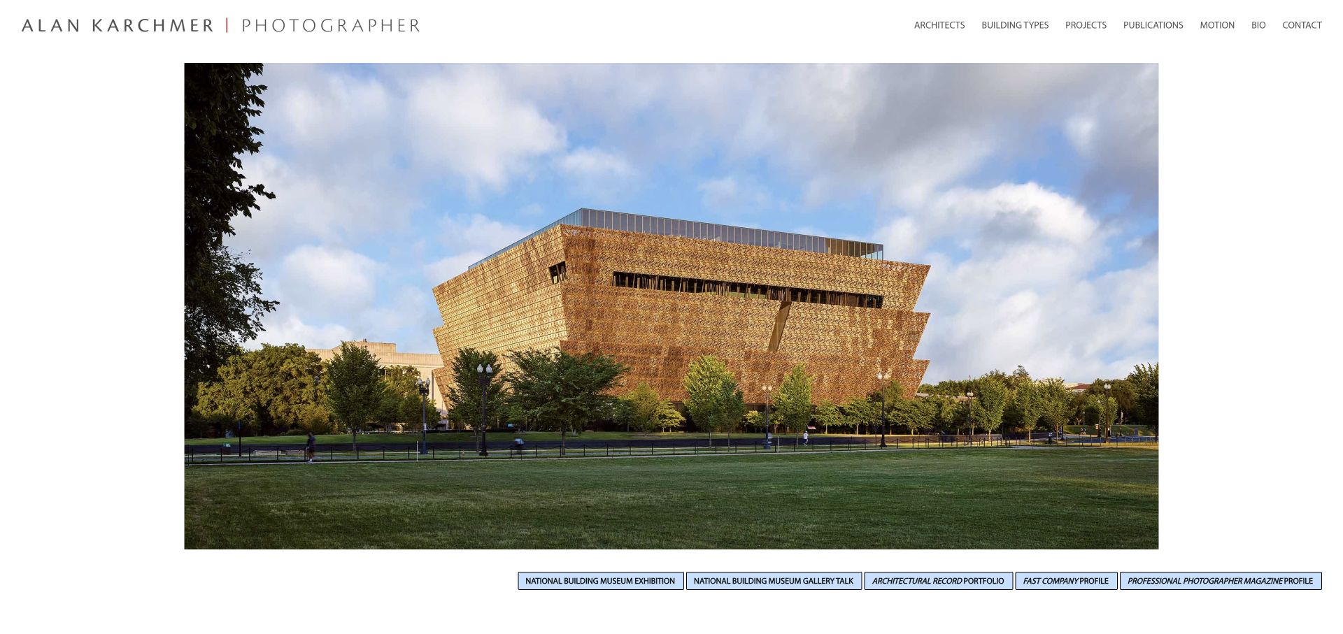
Alan Karchmer’s retained homepage gives a large architectural photograph a white, framed stage beneath the full photographer name. The navigation offers Architects, Building Types, Projects, Publications, Motion, Bio and Contact, providing several ways to locate relevant work. A row of publication and exhibition references appears below the photograph. Current official content retains those project and category routes. For commercial photographers, this is a useful model for organizing a specialist archive around the questions a commissioner brings, rather than assuming everyone wants to browse the same chronological feed. The references are presentation context, not independently scored endorsements of the service.
What you can learn
Offer alternative archive entrances when clients remember different things about a project. An organization name, building type or publication can each be a useful retrieval route, provided the underlying project records keep accurate captions, roles and image credits.
Pros
Project, building-type and architect routes acknowledge different commissioning search habits.
The full name and contact link remain clear above the visual work.
Cons & considerations
If the header uses many small labels, spacing and readable sizing need testing.
If recognition links crowd the lower edge, retain a direct path into the actual project archive.
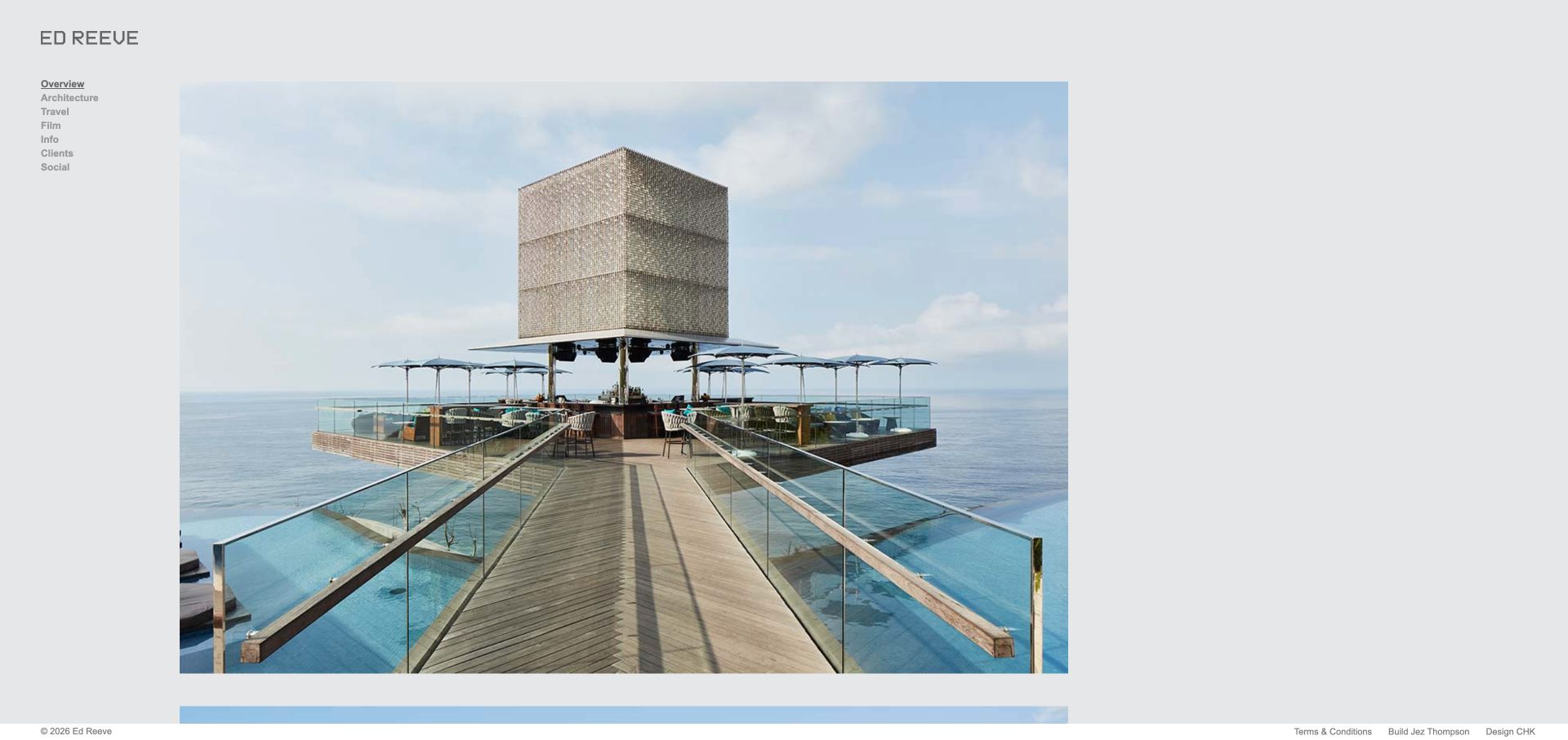
Ed Reeve’s retained overview places a large coastal structure photograph on light gray beside a narrow left-hand index. Architecture, Travel, Film, Info, Clients and Social give different kinds of material their own entry points. Current official navigation also separates corporate moving image, commercial spaces, hospitality, retail and workplace subjects. This is useful for a photographer whose commissioned practice is broader than the first architectural image suggests. The large photograph introduces a point of view, while the visible Clients route provides another way into professional context without turning the opening into a wall of logos.
What you can learn
Offer a direct client or assignment route when a broad visual archive could obscure the business offer. Keep sector and medium distinctions useful, and identify the photographer’s role on the project rather than allowing a category label to imply every production capability.
Pros
The sidebar keeps commercial discovery routes visible without covering the photograph.
Current subject categories can narrow the archive by a commissioner’s sector.
Cons & considerations
If navigation remains very small, it needs a more readable compact-screen state.
If the opening image is uncaptioned, the project destination should identify its setting and assignment.
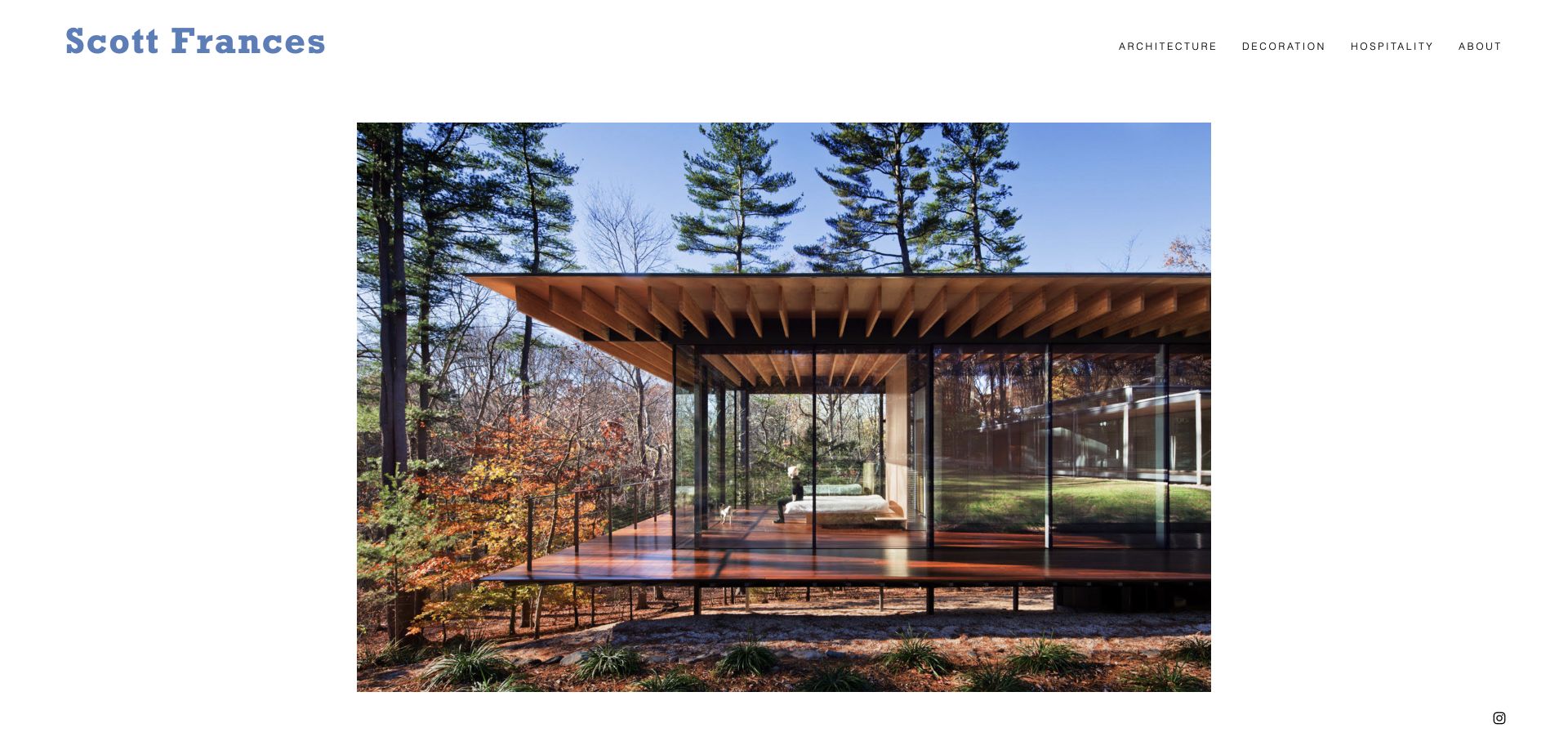
Scott Frances’ retained homepage centers a large photograph of a glass-walled building in a wooded setting, with a blue name and three subject categories across the top. Architecture, Decoration and Hospitality form a concise commercial taxonomy rather than an exhaustive service menu. The current official homepage also names a project and design collaborator, connecting the photography to a built-environment assignment. This screen is useful for studying restraint: the portfolio can feel distinctive through typography, image selection and spacing without adding a complex interactive introduction. The saved scene remains an earlier capture, distinct from the current homepage’s named project.
What you can learn
Choose a few accurate categories that reflect how clients commission the work. Support the visual restraint with project names, collaborators and a reachable information page so simplicity does not become uncertainty about what the photographer actually takes on.
Pros
The compact subject taxonomy makes a clear specialist practice easy to recognize.
A generous white frame preserves the photograph’s shape and detailed environment.
Cons & considerations
If contact is nested under About, the route needs to remain obvious to new visitors.
If a single image dominates, another archive view should support faster comparison.
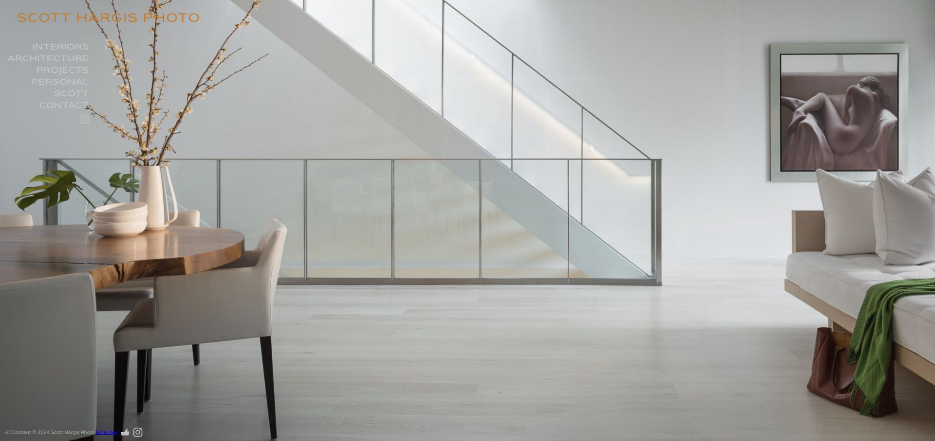
Scott Hargis’ retained opening fills the screen with a pale interior, carrying a gold name and white navigation at the left. Interiors, Architecture, Projects, Personal, Scott and Contact separate the main kinds of content without a separate promotional paragraph. Current official project listings include commercial interiors, workplace and retail assignments as well as residences. The website is a useful reference for showing the intended photographic scale immediately, but the very light interface text also exposes the tradeoff of placing navigation directly over a photograph. The review concerns presentation, not property quality or marketing performance.
What you can learn
Treat the opening image and navigation as a single composition, but preserve readable labels across the entire image sequence. Make commercial and personal assignments distinguishable and use project records to explain the relationship rather than implying that every photographed space had the same brief.
Pros
The large photograph establishes the interiors focus before any extended introduction.
Current project routes separate commercial subjects and preserve a personal-work category.
Cons & considerations
If pale navigation crosses a pale photograph, contrast needs careful review.
If project thumbnails or captions sit below the first view, make the continuation easy to recognize.
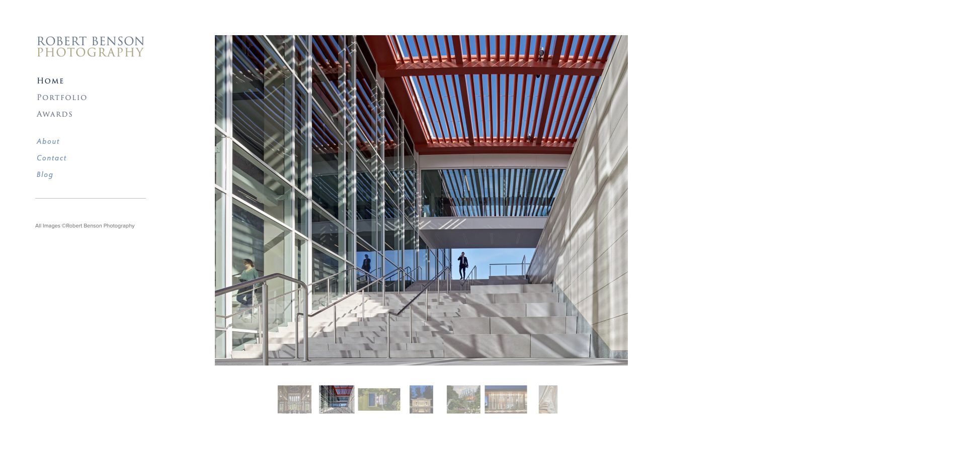
Robert Benson Photography’s retained opening places a bright stair-and-glass photograph beside a traditional white sidebar. Home, Portfolio, Awards, About, Contact and Blog appear as a small index, while a thumbnail strip below the main picture offers a faster survey. Current official portfolio categories include Corporate, Hospitality, Medical and educational settings. The useful commercial pattern is a specialist archive that serves both someone seeking an initial impression and someone looking for a sector match. This is the robertbensonphoto.com practice; similarly named photographers on other domains are not used as evidence for its clients, biography or work.
What you can learn
Let viewers switch between a focused photograph and a useful archive overview. Connect sector categories to accurate project records and credits, and verify identity carefully before attaching client claims to a portfolio with a common personal name.
Pros
The thumbnail strip offers a quicker survey beside the selected photograph.
The sidebar keeps portfolio, background and contact in predictable locations.
Cons & considerations
If thumbnails are the only selection control, focus and touch behavior need testing.
If the sector archive grows, captions should explain project relationships without overstating them.
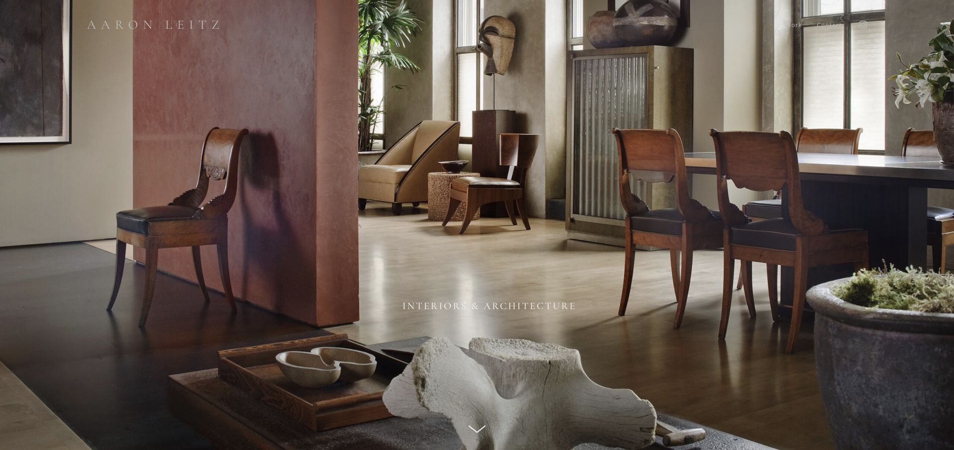
Aaron Leitz’s retained Interiors and Architecture entrance places an unobtrusive name and navigation over a warm, layered interior. A small category title and downward control establish that more content follows rather than filling the image with a sales message. The current official page explicitly describes collaboration with interior designers and architects and identifies the work as commissions. That gives the atmospheric opening an understandable business context. For commercial photographers, the useful pattern is a focused gallery whose accompanying text explains the working relationship, while the photograph remains large enough to demonstrate material and spatial detail.
What you can learn
Connect an image-led portfolio to a concise explanation of who commissions the work and what the photographer contributes. Let the project sequence show variety, but keep role, contact and collaboration information available without requiring a visitor to interpret the imagery alone.
Pros
The quiet interface lets the interior’s layers and material details remain visible.
Current page copy directly describes the commissioning relationship and intended photographic contribution.
Cons & considerations
If fine lettering sits on varied imagery, contrast needs checking at smaller sizes.
If a downward control is important, its purpose should be clear to keyboard and touch users.
Kegan is a freelance web designer and developer with 15+ years of experience helping businesses turn complicated website requirements into clear, maintainable digital experiences. He works directly with clients from planning and design through development, launch, and ongoing support.
For commercial photographer website design, his development approach focuses on purposeful commissioning portfolios, clear project and collaborator credits, practical image-rights context, and straightforward representation or project enquiry routes. The scope can be a targeted improvement or a complete custom build, with responsive layouts, thoughtful content structure, and integrations chosen around the people using and maintaining the site.
Show 3 other commercial photographer website designersHide other commercial photographer website designers
Plan a commercial photography website around how assignments are commissioned
Define the practice before choosing the opening image
Write a practical description of the work the photographer wants the site to represent. Food, products, portraits, lifestyle, hospitality and architecture require different supporting information even when the visual treatment overlaps. Identify what is currently offered, what is occasional and what belongs to a personal archive. If stills and moving image are both available, explain the actual role in each. A photographer who directs a film is not automatically a full-service production company, and a page containing video does not establish the services behind it.
Use that description to select a small number of meaningful navigation routes. A client should not have to distinguish between poetic category names before seeing a relevant assignment. Plain labels can coexist with expressive project titles. Review the proposed structure with a few realistic questions: where would a food brand begin, how would an architectural practice find a full series, and where would an editor identify portrait work? The answers should be visible in the structure, not dependent on a long biography.
Build a project record rather than only a picture feed
Give each selected assignment a stable title, brief context, year where appropriate, client or publication credit, photographer role and media sequence. Explain whether the work was commissioned, self-initiated or created as a test. Keep the account proportionate: a small execution assignment does not need a fictional strategy narrative, and a well-known subject does not establish a direct relationship with every organization associated with it. Where a commission came through an agency, represent that relationship accurately rather than quietly claiming an unrelated direct client.
Select the images needed to understand the assignment. A lead image might show the overall visual idea, followed by a detail, an alternative application or a second scene that demonstrates consistency. Do not add near-duplicates merely to make the project appear larger. If only a limited selection can be published, say so without exposing confidential material. Record image order and captions in the content system so the sequence can be revised when permissions, the available work or the practice’s focus changes.
Show a usable range without hiding the specialism
A large archive can make a photographer look unfocused when every subject arrives in one undifferentiated grid. Create a small editorial selection first, then offer a deeper view by subject, assignment or relevant sector. A specialist can show meaningful variation within a narrow theme: different scales, lighting conditions, environments or applications. The point is not to claim universal coverage. It is to help a commissioner see enough relevant evidence to begin a sensible conversation about a new brief.
Keep personal work available when it explains the photographer’s interests and visual approach, but label the relationship clearly. A landscape series can inform a brand campaign without itself becoming advertising evidence. Likewise, publication covers, prints and books have different purposes from a commission inquiry. Use titles and short descriptions to prevent those paths from collapsing into one commercial claim. Think of the archive as a set of useful entrances for different visitors, not a requirement that every person inspect every image.
Make production information useful but appropriately bounded
A concise information page can identify the photographer’s location, usual travel area, representation and the types of assignments considered. Explain whether production coordination, motion direction or other services are handled directly or with collaborators. Avoid presenting a flexible network as a permanent in-house department. If the site names crew, studios or partners, obtain appropriate permission and keep those relationships current. The visitor needs an accurate picture of how the first conversation will work, not a speculative list of everything that might be possible.
Do not turn a public portfolio into an improvised contract. It can explain what information helps prepare an estimate, such as intended use, dates, locations, deliverables and production requirements. Specific rights, fees and terms belong in a properly reviewed agreement for the actual assignment. Do not publish confidential client figures or imply that an old project’s arrangement applies to a new one. Clear boundaries make the site more helpful while leaving room for a brief to develop through discussion.
Prepare images for the website rather than the delivery archive
Treat public portfolio images and client-delivery files as different assets. Prepare sensible responsive sizes, intentional crops and a sequence that makes sense on a narrow screen. A panoramic image may need a different overview treatment from a portrait or a detailed product photograph. Preserve the original proportions when they carry meaning, and do not let a generic card crop remove the subject that explains the assignment. Reserve very large files for a deliberate viewing need instead of automatically sending the full production source to every visitor.
Keep important project information as ordinary text rather than only inside a photograph or publication cover. Meaningful image alternatives should describe what matters in the page’s context without turning every image into a keyword list. Galleries need usable focus, touch and keyboard behavior; drag gestures should not be the sole control. Provide a useful still when a moving-image preview is unavailable and avoid unexpected sound. These requirements must be checked in the finished implementation, because a successful screenshot does not demonstrate interactive accessibility or loading performance.
Design the first inquiry around a real brief
Keep the initial inquiry approachable. Name, reply address and a short description may be enough to begin, with optional fields for dates, location, intended use or the kind of assignment. A prospective client may not know a complete shot list yet. Give them a way to explain uncertainty instead of forcing artificial precision. If representation handles particular regions or types of work, label those contacts clearly so an editorial request, brand production and print inquiry do not all enter an unexplained form.
Explain what happens after submission without promising availability or acceptance. A useful confirmation says the message was received only after the system has actually accepted it. Test delivery, required-field feedback and failure states with non-production fixtures. Protect the form against abuse without making it a barrier to legitimate inquiries, and avoid asking for confidential documents at the first step unless there is a clear, secure workflow. An email link can be a useful alternative, but the address and responsibility for checking it need ongoing ownership.
Keep credits, permissions and the archive maintainable
Create structured fields for project title, category, role, collaborators, client or publication, description and media. Separate the public image rendition from the source asset and record the permissions or approval process privately. The editor should be able to correct a name or remove an image without rebuilding the entire design. A visually restrained portfolio still needs an operational plan for who publishes, who approves sensitive material and who responds when a credit or image should change.
Preserve useful project URLs when the portfolio is reorganized, and redirect deliberately when a page must retire. Review representation, contact details, biography and featured selections as the practice evolves. Keep backups, secure administrative access and a realistic maintenance arrangement. The website is part of the photographer’s professional archive as well as an introduction to future work. Its structure should therefore make accurate updates easier rather than rewarding an attractive but fragile one-off composition.
The editing job behind the design
Choose the platform around the media and editorial workflow
A hosted portfolio service or conventional CMS can be sufficient when the main needs are image sequences, project records, an information page and a reliable inquiry route. A custom frontend can make sense for a deliberate archive or interaction system, but it adds responsibility for image handling, editing, testing and maintenance. Start with those operational needs rather than choosing a framework because a reference looks visually similar.
Model captions, credits and categories before choosing gallery extensions. Decide how still photographs, video posters, motion playback and client-delivery links are handled separately. Public website technology does not reveal the photographer’s camera system, editing software or production workflow. A visible component is one observation about that public page, not proof of the whole business infrastructure.
Test the actual portfolio with realistic media and long project titles. Check small-screen crops, slow loading, keyboard navigation, reduced-motion behavior, contact delivery and an expired or unavailable video. A strong platform choice is one the practice can maintain accurately, not a guarantee that every gallery or inquiry will work without further design and testing.
Our WordPress website examples offer a separate look at publishing approaches. A visible platform label is evidence for that named page, not a guarantee that the same system will suit your requirements.
Before the public launch
Commercial photographer website checklist
Describe the actual specialism and geographic working context.
Select an opening that relates to work genuinely offered.
Separate commissioned assignments, personal work and purchasable products.
Give projects clear titles and useful category membership.
Record the photographer’s role and credit collaborators accurately.
Label tests, self-initiated work and limited public selections honestly.
Show a meaningful sequence rather than a large set of near-duplicates.
Prepare responsive image renditions and deliberate small-screen crops.
Keep important project context available as ordinary text.
Provide keyboard- and touch-operable gallery controls.
Give moving-image previews useful stills and intentional playback.
Identify representation and the correct contact for each inquiry type.
Ask for enough brief information without demanding false certainty.
Verify form acceptance, delivery and understandable failure messages.
Assign responsibility for permissions, credits, updates and redirects.
These checks are a project checklist, not a performance, legal, security, or accessibility certification. Test real journeys with the people responsible for the website before making claims about the result.
Sources & editorial method
How this collection was selected and reviewed
We assessed observable portfolio presentation, image hierarchy, assignment context, navigation and contact discovery. Retained original direct captures keep their actual dates and source identities, while current first-party practice and project information qualifies each example’s commercial relevance. The collection includes commissioned editorial and specialist built-environment work as well as broader commercial imagery. Editors Choice identifies an interesting website approach, not a service-quality endorsement, measured ranking or assessment of fees, contracts or client outcomes.
Each example links to its actual source page. Screenshots are direct browser captures with their own capture dates; moving imagery, announcements and live designs can change. The notes describe observable design choices and conditional tradeoffs, not measured traffic, conversion results, service quality, or accessibility conformance.
Technology labels use public page metadata, asset evidence, or explicitly cited platform documentation. Platform documentation is not a complete current deployment audit. A component reference may be legacy or unused; it is not a complete backend inventory. Unknown stacks are omitted. These sites are editorial examples, not our client portfolio.
Written, Edited and Curated are separate editorial records, not timestamps advanced by a rebuild. Website designs and imagery belong to their owners. See our editorial standards or suggest a correction.
Questions worth asking
Commercial Photographer website design questions
Should a commercial photography website show personal projects?
Yes, when they help explain the photographer’s point of view. Label them as personal or self-initiated and keep a useful route to commissioned assignments. Shared visual style does not mean a personal series was created for a client.
Does every project need a long case study?
No. A short assignment description, role, credits and a carefully selected image sequence are often more useful than generic process language. Add detail when there is a genuine decision or production context to explain, not to make a narrow assignment sound larger.
Should pricing be published?
That depends on how the work is scoped. A site can explain the information needed for an estimate and any clearly defined offer. Do not imply that one public price covers different usage, production requirements, deliverables and schedules when it does not.
Is a full-screen slideshow better than a thumbnail grid?
Neither is universally better. A large image can establish visual character, while a grid or index supports faster comparison. Many practices benefit from both, provided captions, navigation and the contact route remain usable.
Can a portfolio screenshot prove the gallery is accessible?
No. A still image can support observations about visible layout and readability. Keyboard access, focus states, alternatives, motion preferences and touch behavior require separate checks of the actual implementation.
Why do some examples emphasize architecture or hospitality?
Those are genuine specialist commercial photography practices. Their project and client organization can be useful beyond that subject matter, but the lesson is how assignments are explained—not that every photographer should adopt the same specialism or visual style.
Borrow a clearer assignment caption, a better archive entrance or a more useful first-inquiry route. Keep the visual voice your own, and make the working relationship as understandable as the photographs are memorable.