Best Ballet Company Websites of 2026 (16 Real-World Examples)
Real ballet company websites that connect performance imagery with tickets, training, giving and a clear plan for attending.
A ballet company homepage has several audiences at once: someone choosing a first performance, a returning subscriber, a prospective student and a supporter. These examples show different ways to make those journeys legible without losing the atmosphere of the work on stage.
Performance photography gives a ballet website an immediate visual identity, but a striking image does not tell a visitor when to attend, where to sit or which ticket seller to trust. The most useful design decisions in this collection sit around that imagery: a concise date and venue strip, a stable production title, a clearly named ticket action or an explicit distinction between a single performance and a season package.
The reviewed pages range from regional companies to larger institutions and contemporary ensembles. They also reveal the complications of a shared homepage: school registration, donations, auditions and subscriptions can each become the opening campaign. Study how a site names the audience for a promotion and provides a persistent route back to performances. This is a design review of public pages, not an assessment of artistic quality, ticket availability or a company's services.
Before the examples
What makes good ballet company website design in 2026?
Put attendance facts beside the campaign
Keep the production name, performance dates and venue readable as text near the ticket action. A visitor should not need to decode a poster or wait for a carousel to discover whether a performance fits their plans.
Separate ticket, school and support journeys
Use specific labels for single tickets, season packages, classes and giving. These are different decisions, often for different people; a general Learn more button is helpful only when the surrounding heading explains its destination.
Let photography lead without hiding navigation
Test wordmarks, menus and buttons over every frame of a moving hero. A quiet text panel or persistent utility bar can provide dependable orientation while the imagery changes.
Plan for the whole season
A homepage needs an update path for sold-out dates, past campaigns and the next season. Build production information as reusable records so the calendar, homepage cards and individual performance pages do not contradict one another.
The collection · 16 examples
16 ballet company websites worth studying
These 16 company homepages were directly reviewed and captured. Ballet Tucson is the explicit Editors Choice for the way its production image, date-and-venue strip and separate subscription route make the first decision practical. The remaining examples explore other useful approaches rather than forming a ranking.
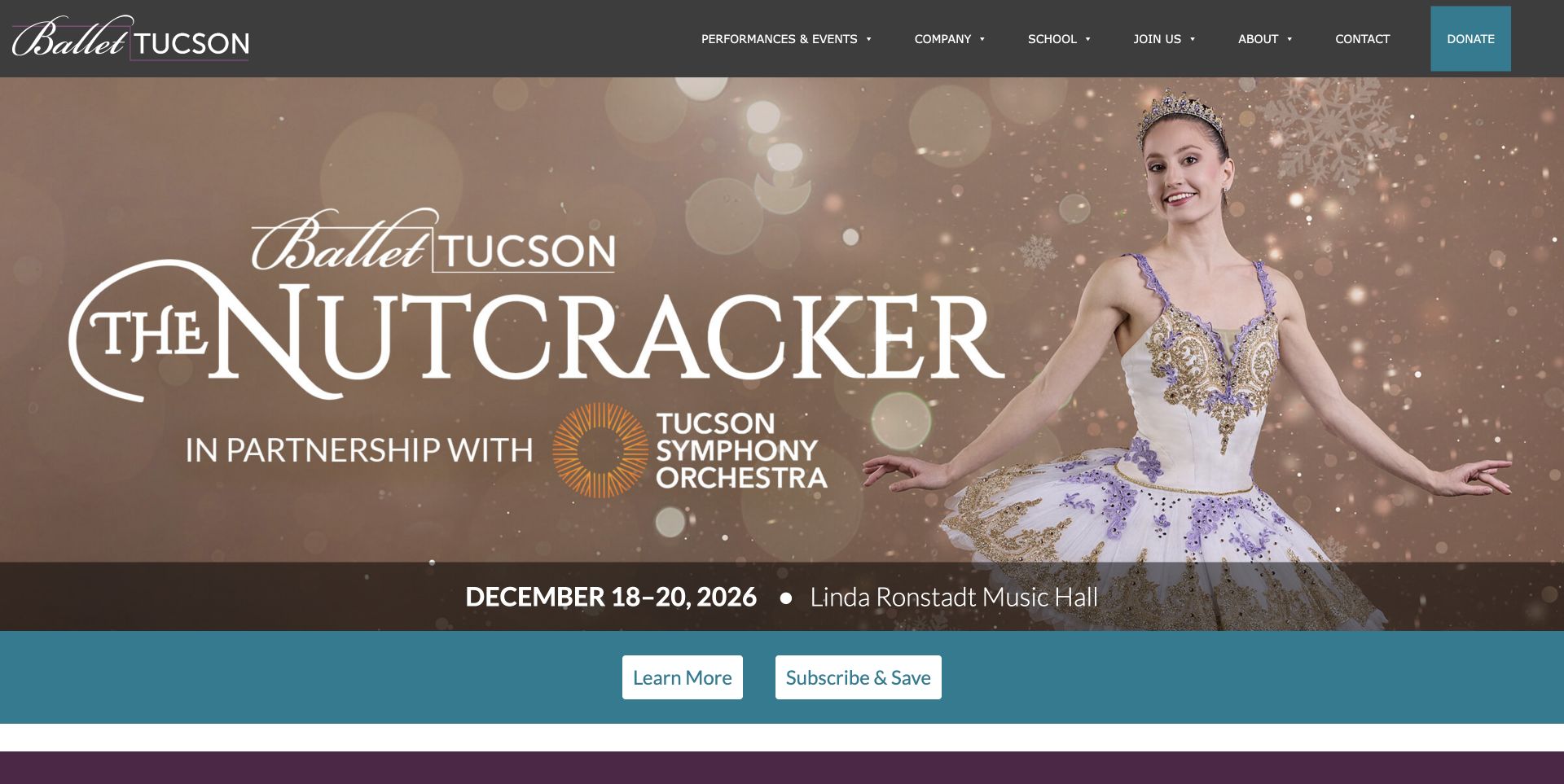
Ballet Tucson gives its production artwork room to attract attention, then puts the date range and venue into a separate horizontal strip. The Nutcracker title, dancer and orchestra partnership establish the event visually; the practical information remains readable beneath the image. A blue action band distinguishes learning about the production from subscribing. The compact dark header separates performances, company information, the school and support. Farther down, the homepage connects the anniversary season with special events and education, so the seasonal promotion still belongs to a larger organization.
What you can learn
Keep the details that let someone plan a visit close to the emotional opening. A clearly separated date, venue and next step can make expressive campaign artwork useful without asking the picture to carry every piece of information.
Pros
The event date and named venue are visible before a visitor leaves the homepage.
Production information and subscription options have distinct, plainly labeled routes.
Cons & considerations
The large artwork gives a single production most of the first screen.
A newcomer still needs another page for the full ticket and arrival details.
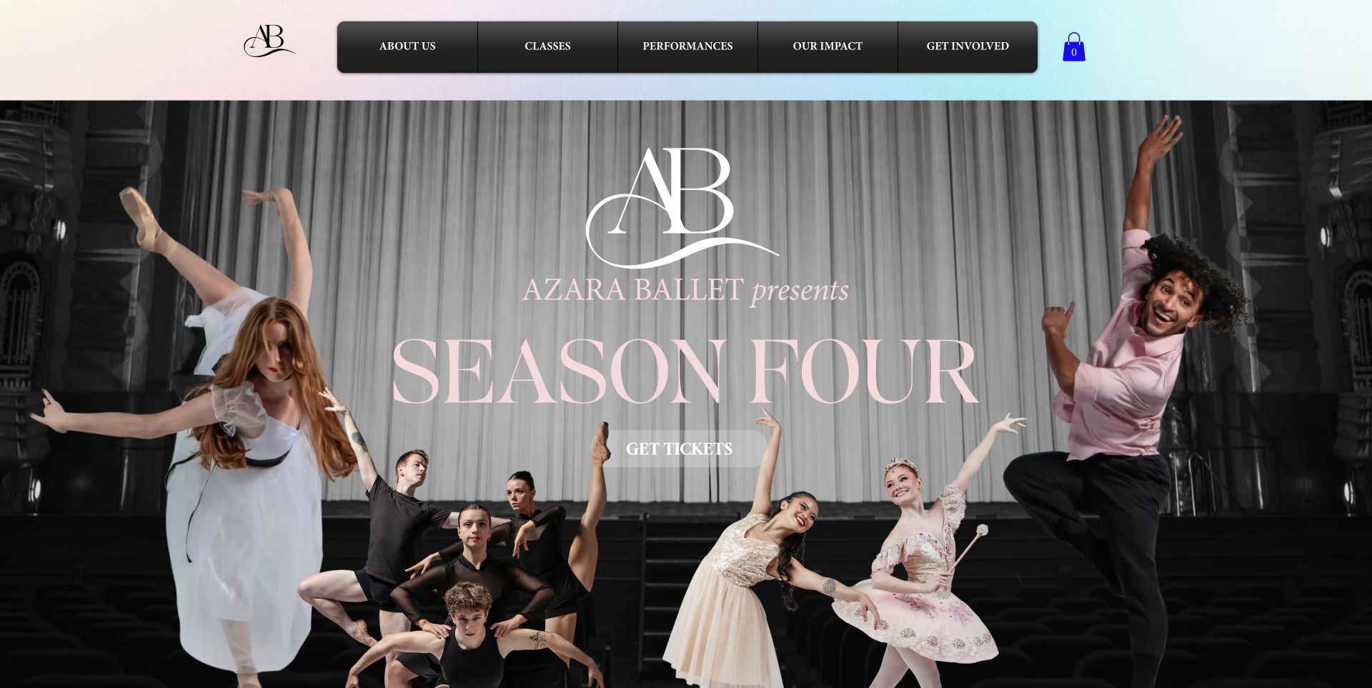
Azara Ballet opens with a composite of dancers around a large Season Four title. The restrained pink lettering and pale gradient header soften a dark theatrical setting, while the black navigation bar provides a strong boundary above the artwork. The ticket link sits inside the season composition instead of competing with several promotional buttons. The page later explains the company's mission and links to the dancers, classes and outreach. Those sections give useful organizational context to an opening that otherwise relies heavily on visual atmosphere.
What you can learn
Let an ensemble image explain the character of the company, then follow it with concrete paths for attending, participating and supporting. Keep the primary action identifiable when it shares space with an elaborate poster-like composition.
Pros
The dancers receive a prominent collective introduction rather than appearing as anonymous decoration.
Performances, classes and community impact have separate navigation labels.
Cons & considerations
The translucent ticket treatment has less emphasis than the large season lettering.
Specific performance dates and the venue require moving beyond the opening composition.
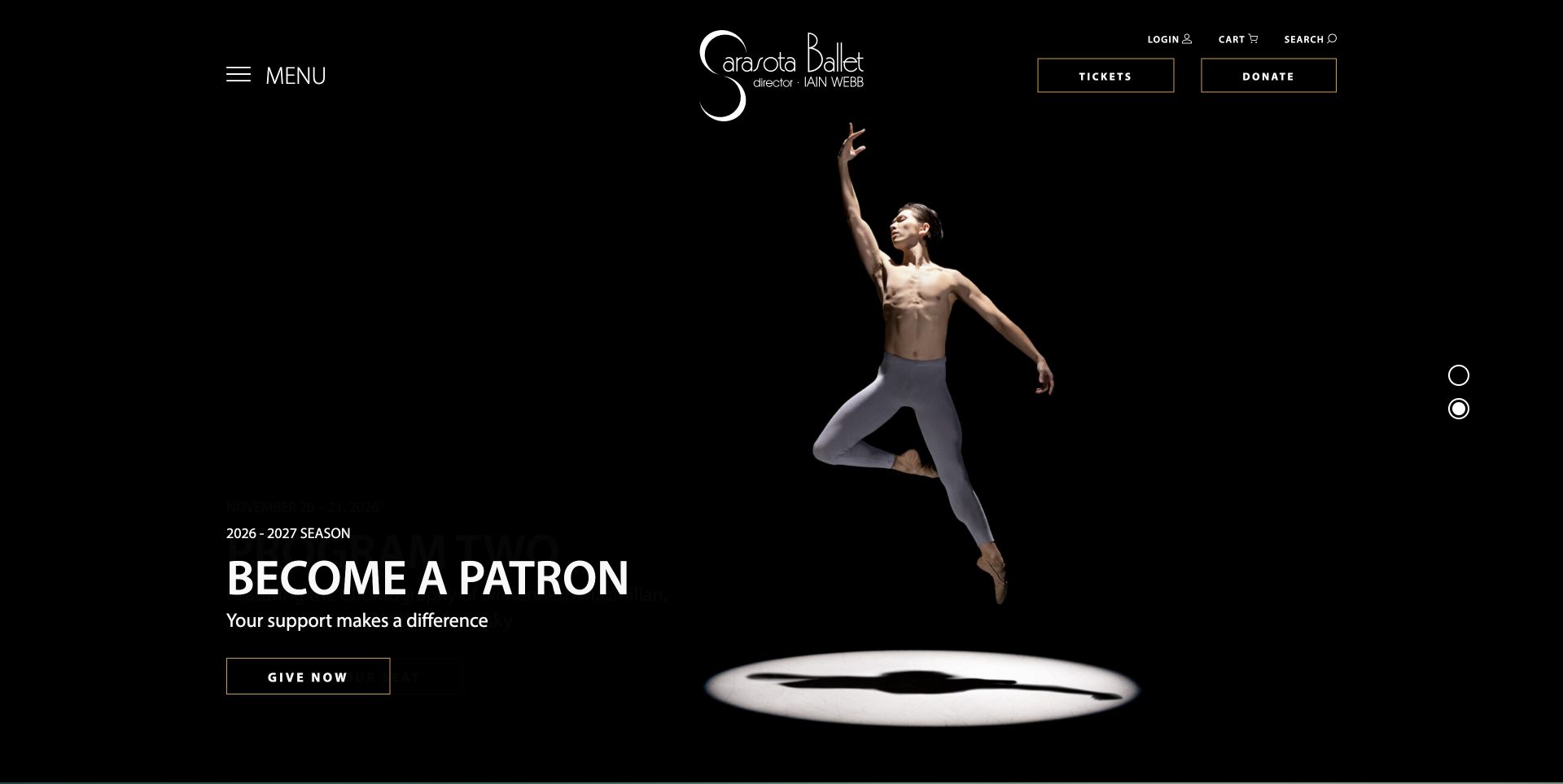
The Sarasota Ballet uses a black background and an isolated dancer to create a theatrical opening with very little visual clutter. The captured patron slide places a short support message and an outlined giving button at the lower left. Tickets and Donate remain separate in the header alongside account utilities, while a menu holds the larger site structure. Below the opening, production cards bring dates, program names and further information together. The contrast between a spacious campaign image and a detailed performance list helps the site serve both immediate visitors and people following the season.
What you can learn
Persistent practical actions can support a changing campaign hero. Keep buying a ticket and supporting the organization easy to locate even when the main slide shifts from a production to fundraising.
Pros
The dancer has strong separation from the dark background and surrounding interface.
Performance cards provide structured dates and program information below the campaign area.
Cons & considerations
The large opening requires scrolling before comparing several productions.
A collapsed main menu adds a step for visitors seeking company or education information.
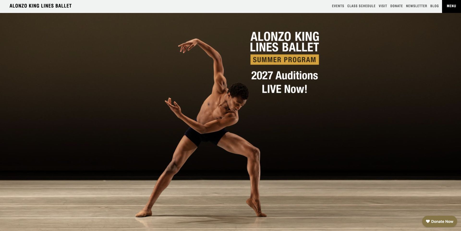
Alonzo King LINES Ballet places a large dance photograph beneath a slim, practical header. The captured slide promotes summer-program auditions using a clear title block positioned away from the dancer's body. Events, class schedules, visiting information and support stay available in the top bar. Below the hero, the site offers routes to artists, touring, teachers and education before a detailed upcoming-events section. The page demonstrates how one photographic identity can connect public performances with training, although the opening campaign changes which audience receives the strongest immediate invitation.
What you can learn
Use photography with intentional space for campaign information, and keep frequent tasks outside the rotating hero. Audiences should still find events or classes when the current slide is aimed at prospective dancers.
Pros
The compact header leaves most of the screen available for the dance image.
Touring, classes and education receive distinct destinations in the broader page structure.
Cons & considerations
Much of the campaign message is incorporated into a graphic rather than ordinary text.
The rotating opening can foreground auditions instead of the next public performance.
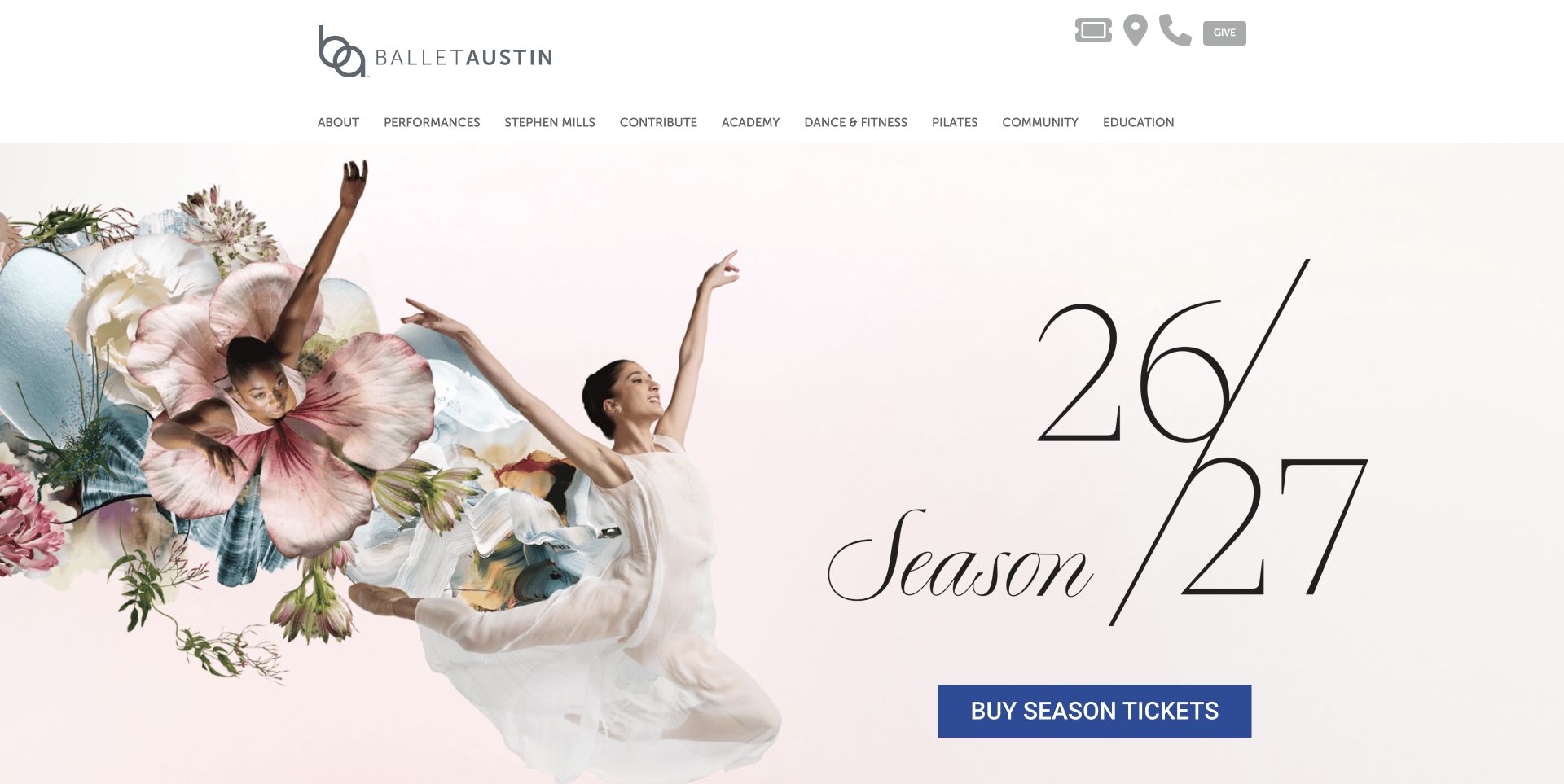
Ballet Austin combines dancers, flowers and generous pale space in its season artwork. The large season numerals establish the campaign, while a blue ticket button stands apart from the delicate image and typography. A conventional horizontal menu names performances, the academy, dance and fitness, Pilates, community and education. Below the hero, short promotional blocks distinguish enrollment, season tickets and a holiday opening weekend. This approach keeps a broad institution understandable without placing every program inside the main campaign image, though the number of top-level choices makes the header relatively dense.
What you can learn
Choose a primary action color that remains distinct from the campaign palette. Then give each secondary program a concise description and destination instead of adding more buttons over the opening photograph.
Pros
The blue season-ticket action remains easy to distinguish against the pale artwork.
Education and adult participation routes are named directly in the main navigation.
Cons & considerations
The long navigation row asks visitors to scan several related program labels.
The season-led opening does not show individual production dates immediately.
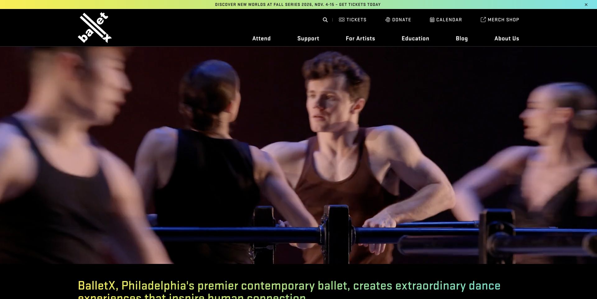
BalletX leads with moving performance footage under a black header and a thin, colorful announcement strip. Its angled logo and bright gradient accents give the page an energetic identity without putting a large text panel over the dancers. The next section states the company's purpose, followed by upcoming series, touring dates and artist profiles. Event entries distinguish ticket links from further information and identify locations. The design is especially useful as a study in connecting expressive motion with structured operational content, rather than expecting the opening video alone to explain what can be attended.
What you can learn
Treat performance footage as an introduction, then make the event structure precise. A visitor should be able to distinguish a home series from a tour stop and choose information or tickets without interpreting the visual campaign.
Pros
The event list supplies dates, locations and separate ticket and information routes.
Dancer profiles connect the performance imagery to identifiable artists.
Cons & considerations
The large video can delay the first detailed event choices on a short screen.
Several carousels and icon-heavy controls create a busy browsing experience farther down.
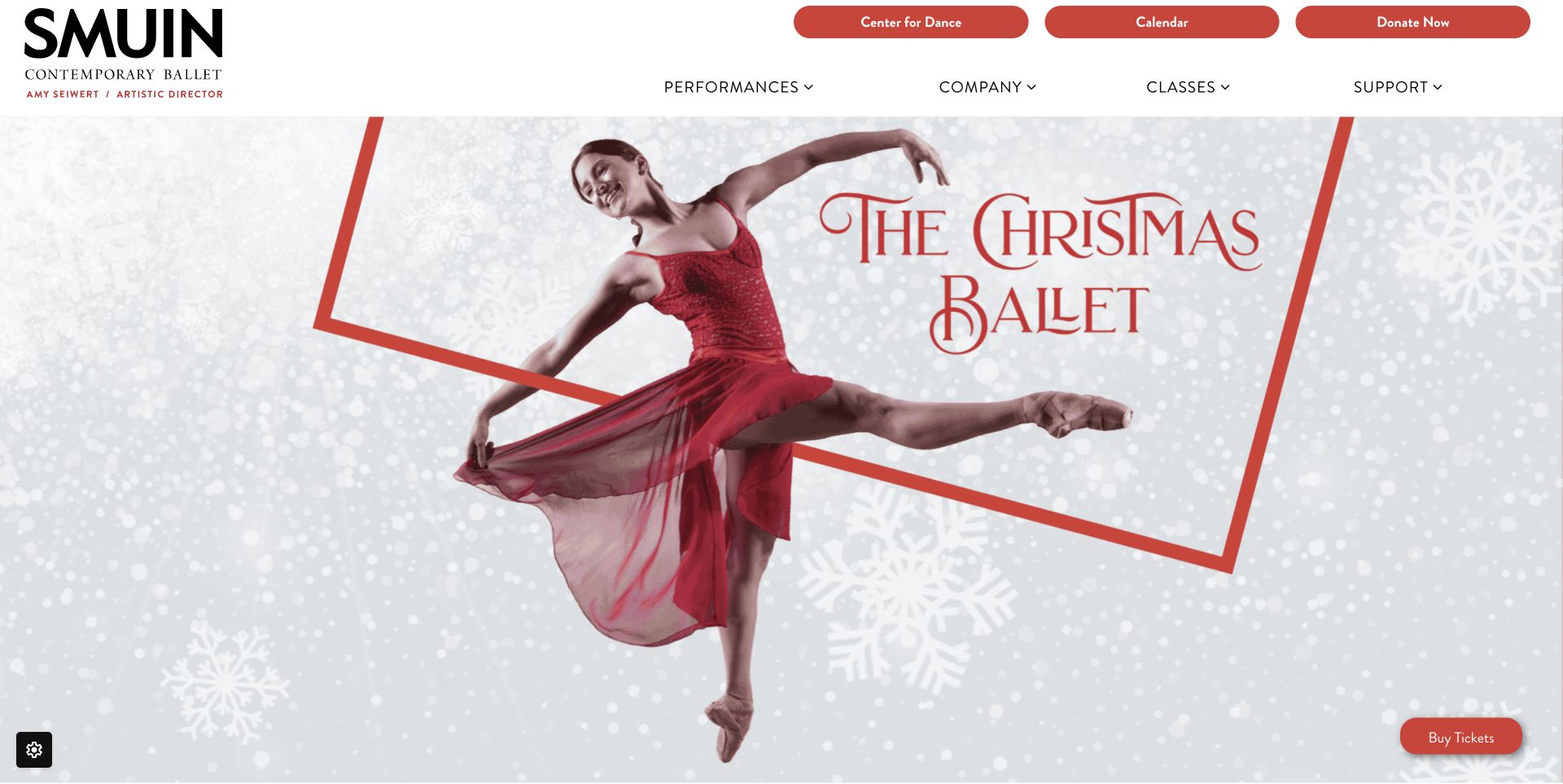
Smuin Contemporary Ballet pairs a prominent black wordmark with a festive production image framed in red. Rounded red controls for the dance center, calendar and support sit above the main performance and company navigation. A small ticket action remains at the lower edge of the captured hero. The page continues into the season's events with dates and a connection to the company's wider programs. Cookie and newsletter overlays were dismissed using their normal controls before this capture; the accepted image shows the actual campaign and navigation without those interruptions.
What you can learn
A campaign can borrow the clarity of a poster while the website supplies dependable shortcuts around it. Keep the calendar and tickets available independently of a decorative title or rotating promotional image.
Pros
The large wordmark gives the company a clear identity above seasonal artwork.
Calendar and dance-center shortcuts distinguish recurring tasks from performance browsing.
Cons & considerations
The first screen emphasizes the production image more than dates and venues.
Multiple rounded actions in the header compete for attention with the ticket shortcut.
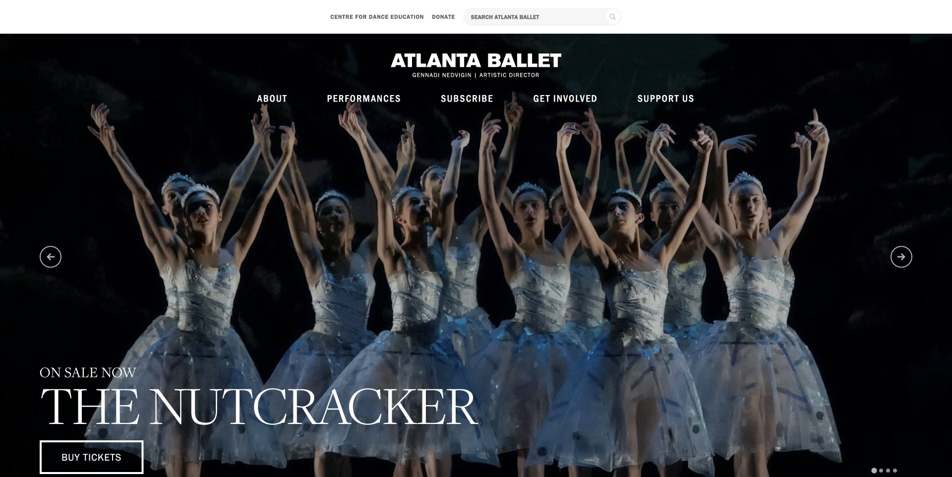
Atlanta Ballet places a centered wordmark and a concise navigation row over a full-width performance photograph. A narrow utility bar keeps search, the education center and support separate. The captured opening uses a large production title and a simple ticket button, with slider controls at the sides and lower edge. The rest of the homepage introduces upcoming productions, support, education and news. That familiar structure gives visitors practical ways to continue after an atmospheric first impression, while the changing hero depends on disciplined campaign updates and clear individual production destinations.
What you can learn
Use a dramatic opening without letting it become the only navigation system. A consistent production list underneath can give visitors a stable way to compare the season even when hero slides rotate.
Pros
Search and education utilities are separated from the main performance navigation.
Upcoming-production entries connect named programs with their date ranges.
Cons & considerations
The oversized hero limits how much of the season is visible at once.
Changing slides can make campaign details harder to read at a visitor's own pace.
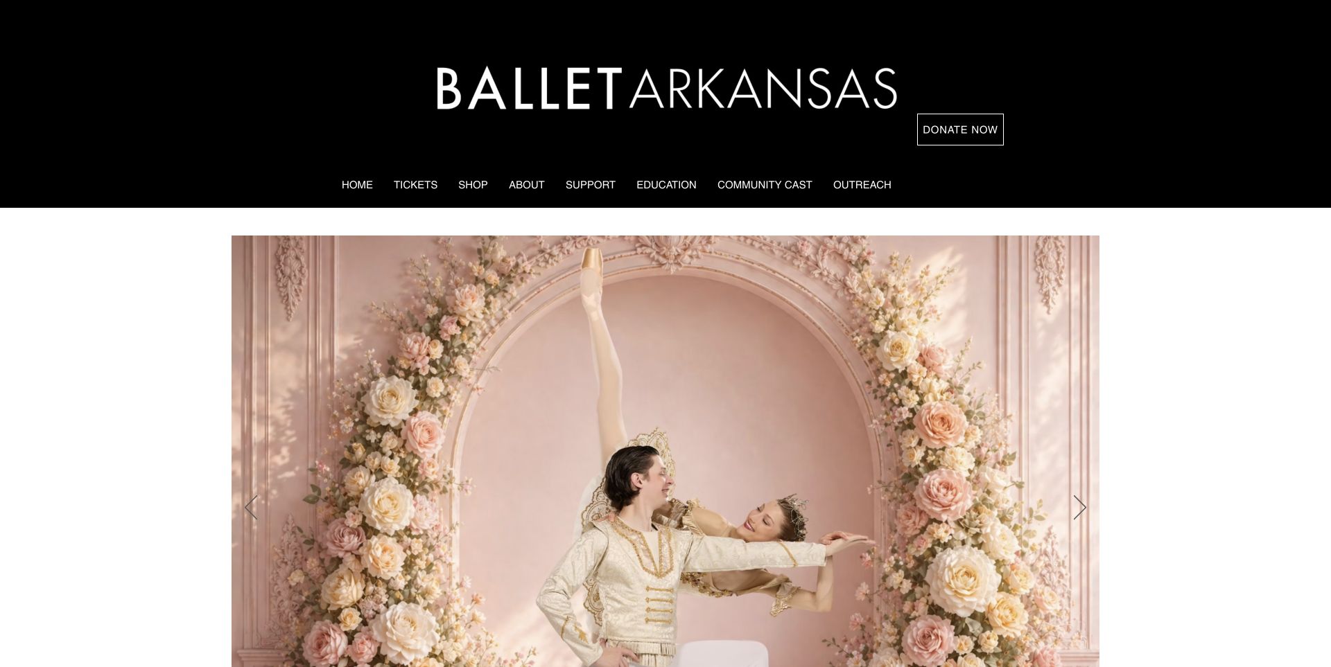
Ballet Arkansas gives its wordmark an unusually large black header, with a single outlined donation action and a simple navigation row. The centered image carousel sits within white margins rather than filling the entire browser width. The page then explains the season and separates two holiday experiences with their own descriptions. Tickets, education, community cast and outreach are clearly distinguished in the navigation. The opening is visually calm, but its generous masthead and large photograph postpone the practical production information that appears farther down the page.
What you can learn
A strong institutional header can make a small organization's site feel coherent, but it needs a deliberate relationship to the content below. Reserve enough opening space for the next useful performance detail, not just the logo.
Pros
Community-cast participation and outreach have explicit navigation labels.
The two holiday productions are explained as distinct experiences on the homepage.
Cons & considerations
The tall masthead consumes considerable space before the main photograph begins.
The captured opening does not immediately provide a production date or ticket detail.
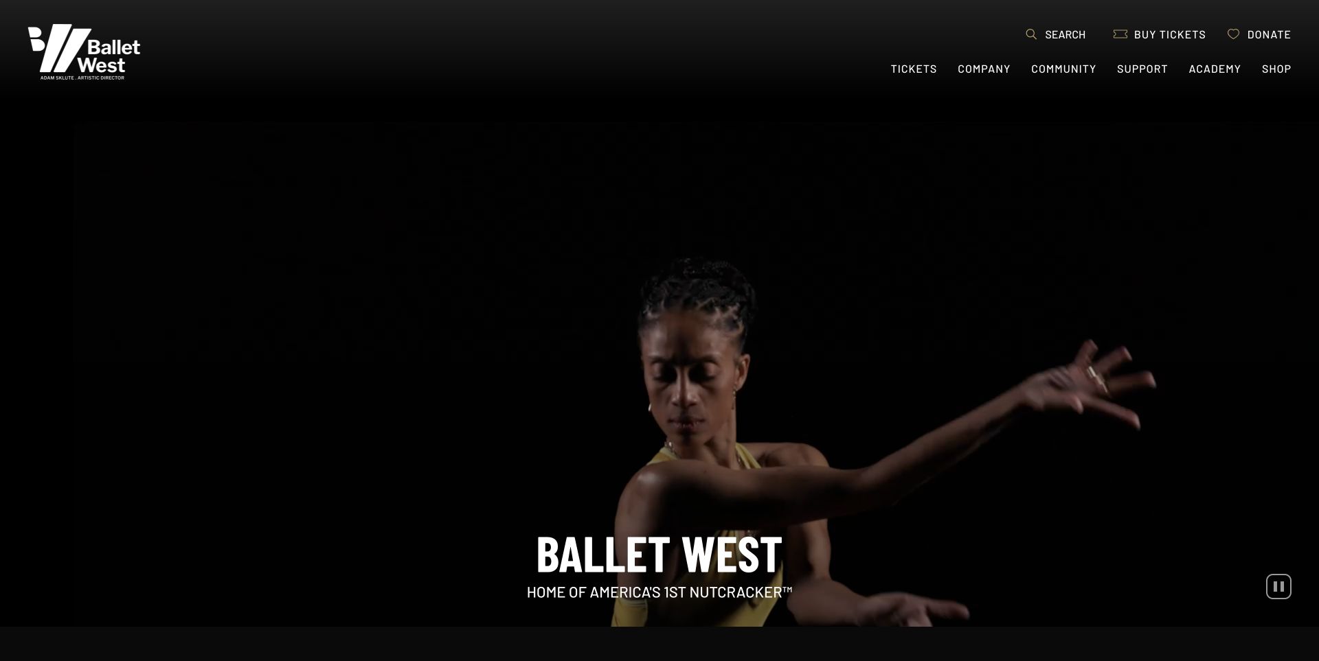
Ballet West uses a dark performance video beneath a compact two-level header. Its angular mark stands out at the upper left, while search, ticket buying and giving occupy a utility row on the right. The main navigation separates company, community, academy and shop content. A short title anchors the lower portion of the hero, and a visible pause control offers a way to stop the motion. Below that opening, named productions include concise descriptions and ticket links. The page makes film an expressive introduction while retaining a conventional route to the season.
What you can learn
If motion occupies the opening screen, provide an obvious playback control and a stable route to practical content. The video should establish character without becoming a requirement for understanding the company's offering.
Pros
The visible pause control gives visitors a direct way to stop the hero motion.
Ticket buying remains available in the header independently of the main film.
Cons & considerations
Dark footage can make fine interface details less prominent in some frames.
Specific production choices appear below a large introductory video area.
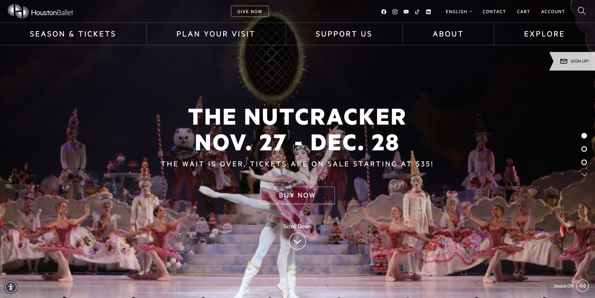
Houston Ballet places the production title, date range and ticket invitation over stage footage. The main categories sit in a broad navigation row, with account, language and search utilities above. The captured view includes a starting-price message, while a downward cue indicates that more content follows. Sound is visibly off. This is a focused invitation to a particular production rather than a compact season overview. The design gives the event considerable impact, but visitors looking for education, community work or another performance need to use the surrounding navigation.
What you can learn
A focused event hero should carry enough practical context to justify its screen space. Keep the date and next step readable over changing media, and preserve routes for visitors whose task differs from the promoted production.
Pros
The production date range is included in the main headline instead of being hidden behind a link.
Visit planning has a dedicated top-level navigation category.
Cons & considerations
The dense utility header and wide category row create several competing navigation levels.
The full-screen campaign provides little immediate comparison with other productions.
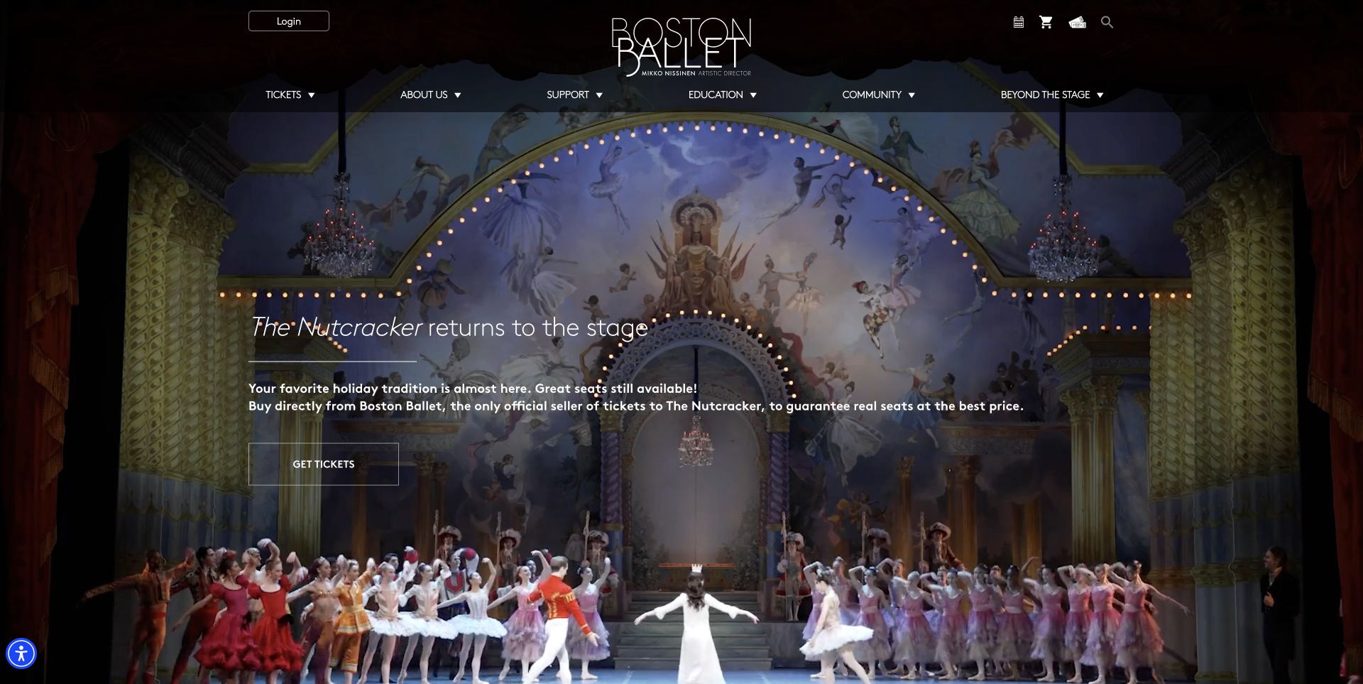
Boston Ballet frames its opening with a centered wordmark, account utilities and a menu for tickets, support, education and community. The performance image is darkened behind a short production headline and a clear ticket button. The accompanying copy explains the official seller relationship, addressing a practical concern before visitors leave for booking. Further sections cover subscriptions, attending the ballet, support and education. The combination is useful because the page does not rely entirely on spectacle: it places a concrete ticketing explanation near the action that needs that reassurance.
What you can learn
Use the space near a booking action to answer a real concern about the transaction. An official-source explanation can be more useful than another promotional adjective, provided the site can support the claim and keep it current.
Pros
The official ticket-source explanation sits directly beside the production invitation.
Attending-the-ballet guidance has a distinct section for first-time visitors.
Cons & considerations
The small supporting copy sits over a detailed image and requires careful contrast handling.
The opening does not show the date range as prominently as the production title.
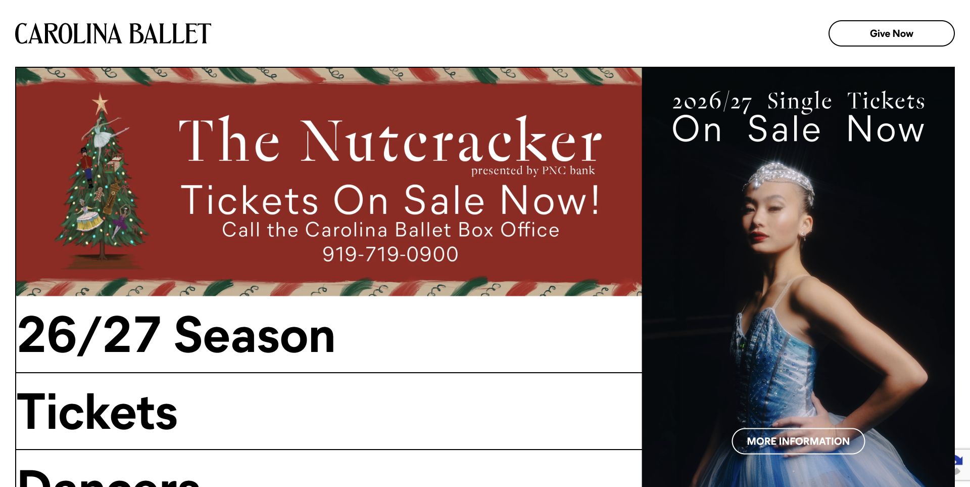
Carolina Ballet uses a large serif wordmark and an outlined giving button above a striking split composition. The left side combines a holiday announcement with oversized horizontal rows for the season and tickets; the right presents a tall dancer portrait and a further-information action. The black, white and red palette keeps the interface forceful and relatively simple. The unusually large destination labels are easy to notice, although the hero also contains substantial text within campaign artwork. The result feels more like an editorial contents page than a conventional institutional homepage.
What you can learn
Large navigation can become part of the visual identity when the choices are few and purposeful. Keep important event information available as readable page content as well as campaign graphics, especially when the artwork contains several messages.
Pros
Season and ticket destinations receive strong visual emphasis through scale.
The split layout lets a portrait and practical navigation occupy separate areas.
Cons & considerations
Text incorporated into the holiday artwork makes the opening information dense.
The very large rows push lower destinations beyond the first screen.
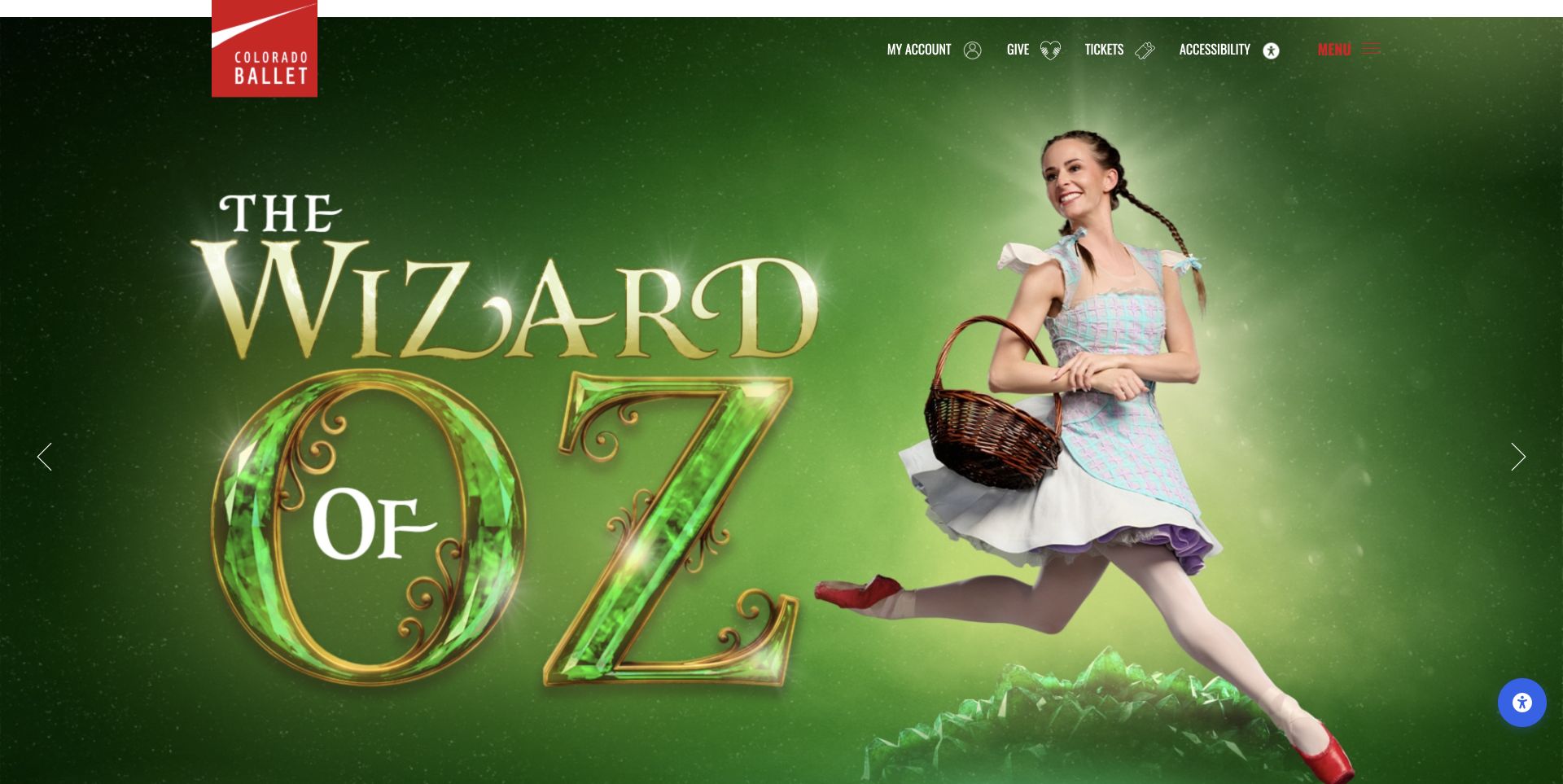
Colorado Ballet gives its production artwork almost the entire opening viewport. The captured Wizard of Oz slide uses a green setting, an expressive dancer and large title lettering, while a vertical red logo anchors the top edge. Account, giving, tickets and accessibility links remain in a slim utility row, with a menu for the larger site. Below the campaign, the homepage describes the season, academy, community programs and support needs. The accepted screenshot follows a normal dismissal of the site's donation popup and preserves the actual unobstructed page.
What you can learn
When production artwork dominates, keep functional utilities stable and visibly separate. Follow the campaign with ordinary text explaining the organization and its programs so that the website remains useful beyond one promotion.
Pros
The red logo provides a consistent institutional marker against changing production colors.
The broader page connects performance promotion with education and community programs.
Cons & considerations
The main navigation is behind a menu rather than immediately exposing its categories.
The opening artwork offers less practical date and venue information than some other examples.
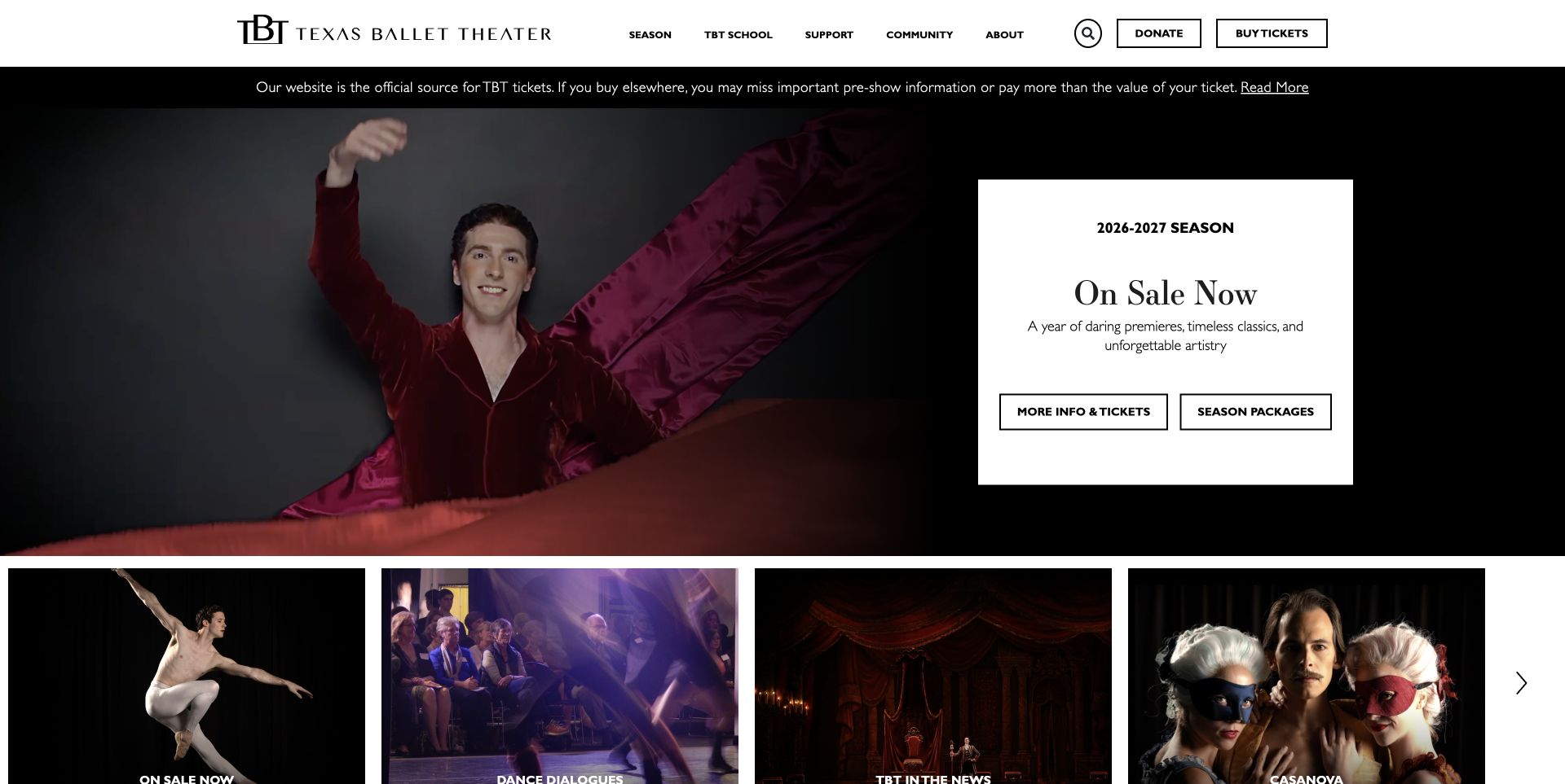
Texas Ballet Theater pairs a performance image with a separate white information card on a black background. The season label, short introduction and two outlined actions remain clear because they do not sit directly over the dancer. A compact header supplies search, giving and ticket access, while a narrow notice explains the official ticket source. Below the hero, a row of visual entry points introduces the season, in-studio programming and other content. The page also gives first-time visitors a dedicated explanation of attending the ballet, including practical arrival questions.
What you can learn
Place essential copy on a stable surface when the surrounding imagery changes. Distinguish an individual ticket route from a season-package route, and make the next page explain which location or production the visitor is choosing.
Pros
The white card gives the introductory text and actions a dependable reading surface.
Single-ticket information and season packages are presented as separate choices.
Cons & considerations
The two equally weighted hero actions still require visitors to understand the package distinction.
The dense visual row below the hero can compete with the primary season invitation.
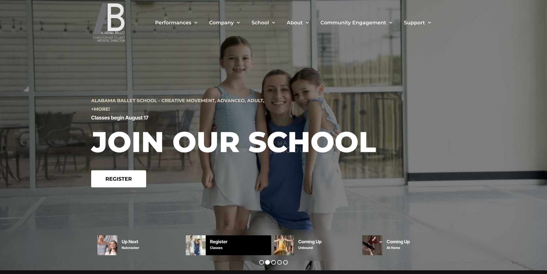
Alabama Ballet uses a full-width campaign slider with a large logo and a clear main navigation row. The captured school slide shows a teacher and children alongside a prominent registration action. Small labeled thumbnails at the bottom distinguish the upcoming production, classes and other programs, giving more context than anonymous carousel dots alone. The homepage continues into company information, support and performance reviews. It demonstrates how one visual system can address several audiences, while also showing the need to maintain dates and enrollment messages carefully as the season progresses.
What you can learn
When a slider serves different audiences, label its destinations with meaningful tasks. A visitor should be able to recognize performance information, classes and other programming without waiting for each slide to appear.
Pros
Labeled thumbnails explain the different campaign destinations before a visitor selects one.
The school invitation uses a real teaching scene and a direct registration label.
Cons & considerations
Several audience goals share the same rotating opening, which can dilute the performance priority.
Date-sensitive enrollment copy needs maintenance after the advertised start date has passed.
Kegan is a freelance web designer and developer with 15+ years of experience helping businesses turn complicated website requirements into clear, maintainable digital experiences. He works directly with clients from planning and design through development, launch, and ongoing support.
For ballet company website design, his development approach focuses on season and production navigation, performance dates, venue and access information, ticketing handoffs, and distinct participation and support journeys. The scope can be a targeted improvement or a complete custom build, with responsive layouts, thoughtful content structure, and integrations chosen around the people using and maintaining the site.
Show 3 other ballet company website designersHide other ballet company website designers
Plan a ballet company website around the visitor's next decision
Start with a production information model
Define the reusable facts for every production before designing the hero: title, dates, venue, running time when confirmed, ticket destination, age guidance when supplied by the company and an appropriate image. Keep those facts independent of any poster artwork. An image can establish the mood while text carries information that needs to remain readable and searchable.
Decide how a production moves from announcement to sale, then to a past-season archive. The homepage card, calendar entry and detail page should share the same underlying record. A dedicated status field is safer than leaving an expired Buy tickets button on an old campaign simply because nobody remembered every place it appeared.
Include a preview of the destination behind each primary action. Single tickets, a subscription package and a donation form should have different labels. Where ticketing opens another service, explain the handoff and identify the official seller without implying that every external marketplace is authorized.
Give each audience a dependable route
List the principal tasks before allocating navigation space. A first-time attendee may need venue and arrival details; a subscriber may want the season; a parent may be looking for a school; a supporter may need giving information. These tasks can share a brand without being collapsed into one generic menu item.
Keep a persistent performance route visible even while the homepage promotes an audition, a fundraising appeal or school registration. Alabama Ballet's labeled campaign thumbnails and the utility navigation on several larger sites show different approaches to this problem. A label that names the destination is more informative than an unlabeled carousel dot.
Write audience-specific introductions on the destination pages. Explain who a class is for, what a subscription includes or how a gift supports the organization using verified information. Avoid expecting a new visitor to understand internal program names or institutional abbreviations before they can choose a route.
Treat motion as an enhancement to complete content
A performance video can communicate movement that a still image cannot, but it should not be the only place a production title or date appears. Keep the core campaign readable when the video has not loaded, when motion is reduced and when the viewport is narrow. Choose a deliberate poster frame rather than relying on an arbitrary first frame.
Provide a visible pause control for moving background content and check contrast across changing scenes. Put important copy in a stable area or on a background that remains legible. The appropriate treatment may be a white panel, a dark overlay or a separate text strip; the choice should follow the actual images rather than a generic hero template.
Review the page with the newsletter, chat and donation prompts that visitors can encounter. A carefully composed hero can become unusable when a second campaign covers it. Keep optional prompts dismissible through normal controls and ensure the main ticket path remains understandable after dismissal.
Design the trip beyond the ticket button
A production page should answer the questions that precede attendance, using information confirmed by the company and venue. Link to accessibility arrangements, directions, parking or transit guidance and the relevant box-office contact. Make clear when a performance uses a different venue from the company's school or office.
Keep dates and locations as real text, with an unambiguous year and time zone where necessary. Group multiple performances so a reader can compare them without opening every event separately. Avoid putting a starting price on the homepage unless there is a reliable process for keeping the accompanying conditions current.
Test the entire public journey without submitting a purchase: homepage to production, performance selection and the handoff to the official ticket service. Check that the destination still refers to the intended production and season. A working homepage link alone does not establish that the full booking experience is clear.
The editing job behind the design
Choose a publishing and ticketing setup the company can maintain
Begin with the team's editorial responsibilities. Production records, artist biographies, school programs and venue information need predictable fields and an understandable review process. A content system that lets staff update those records consistently is more useful than a custom animation that only its original developer can change.
Keep ticketing, donations and school registration explicit in the architecture. They may use different providers, but visitors should understand why they are leaving the main site and which organization operates the next step. Verify the live destinations and preserve accessible text links even when promotional artwork supplies a second action.
The stacks shown with these examples reflect bounded public-source observations, not a full technical inventory. A blocked or unavailable audit does not establish the absence of a platform. Do not choose a system because a photograph-heavy site appears to use it; compare publishing needs, integration support, accessibility and maintainability using evidence relevant to your own project.
Our WordPress website examples offer a separate look at publishing approaches. A visible platform label is evidence for that named page, not a guarantee that the same system will suit your requirements.
Before the public launch
Ballet company website planning checklist
Give every production a stable page with readable dates and venue information.
Distinguish single tickets, season packages and donation actions.
Identify the official ticket destination before an external handoff.
Keep a visible performance route during school and fundraising campaigns.
Use audience-specific labels for classes, auditions and community programs.
Provide useful text when hero video or imagery is unavailable.
Check text contrast across every moving hero scene.
Provide pause and reduced-motion behavior for animated content.
Make optional newsletter, chat and donation prompts dismissible.
Link verified venue, accessibility and arrival information near attendance details.
Define an editorial process for expired dates and archived seasons.
Review the public ticket journey without placing a test purchase.
These checks are a project checklist, not a performance, legal, security, or accessibility certification. Test real journeys with the people responsible for the website before making claims about the result.
Sources & editorial method
How this collection was selected and reviewed
The original random target was 16, saved before research. Each selected public homepage was inspected directly, captured without an open obstructing popup and reviewed for specific design decisions. Optional consent was rejected or necessary-only settings retained where controls allowed it. A candidate with no safely confirmed consent dismissal and a separate capture with an obstructing chat teaser were not included. Colorado Ballet's accepted screenshot follows dismissal of its donation popup through the site's normal close control; the earlier obstructed capture remains private historical evidence. Each included source received the standard bounded public technology-audit attempt, with unavailable observations retained honestly. Ballet Tucson's explicit Editors Choice recognizes the reviewed site's information design, not artistic or service quality. Production promotions are observations at capture time and can change.
Each example links to its actual source page. Screenshots are direct browser captures with their own capture dates; moving imagery, announcements and live designs can change. The notes describe observable design choices and conditional tradeoffs, not measured traffic, conversion results, service quality, or accessibility conformance.
Technology labels use public page metadata, asset evidence, or explicitly cited platform documentation. Platform documentation is not a complete current deployment audit. A component reference may be legacy or unused; it is not a complete backend inventory. Unknown stacks are omitted. These sites are editorial examples, not our client portfolio.
Written, Edited and Curated are separate editorial records, not timestamps advanced by a rebuild. Website designs and imagery belong to their owners. See our editorial standards or suggest a correction.
Questions worth asking
Ballet Company website design questions
What should a ballet company homepage show first?
Usually a current performance or season campaign with a clear title, date or date range, venue and a specific next action. If the opening campaign serves a different audience, such as school applicants or donors, retain an obvious route to performances.
Should tickets and subscriptions use the same button?
Separate labels are usually clearer because choosing one performance differs from buying a package. Explain the package on its destination page and keep the single-ticket route easy to find.
Does a ballet website need an opening video?
No. A well-chosen still image can establish the work just as effectively. If video is used, keep essential information outside it, provide pause and reduced-motion behavior, and use a useful fallback image.
How should a company combine its school and performance information?
Give the two audiences distinct navigation labels and destination pages while keeping a consistent visual identity. School registration should explain the relevant program and requirements rather than relying on a performance campaign to provide context.
What does Editors Choice mean in this collection?
It is an explicit editorial selection for a design decision observed on the reviewed website. Ballet Tucson was selected for connecting its campaign to readable date and venue details and distinct production and subscription actions. It is not an award for performance quality or a claim about ticketing outcomes.
Use these sites to compare how a strong performance identity can sit alongside practical attendance information. Start with accurate production records and clear audience routes, then decide how imagery, typography and motion can support those decisions.