An electricity website has to serve an ordinary billing visit, a move and an urgent outage question through the same public entrance. These twenty examples compare how utilities organize those needs alongside safety guidance, assistance and their wider public responsibilities.
A utility homepage is often used under pressure. A customer may be on a phone with little battery, helping a relative, uncertain which company serves an address, or trying to understand an unfamiliar bill. The design should make the next step clear before asking that person to understand the organization. Payment, outage information, account recovery and assistance deserve specific labels and a predictable location.
This collection includes regional customer sites and group-level utility websites. Their purposes differ: a corporate parent may explain investment and direct customers to operating companies, while a local provider may put account service first. The reviews make those distinctions explicit. They examine visible design and public content, not service reliability, billing accuracy, emergency response or the quality of an authenticated account system.
Before the examples
What makes good electric utility website design in 2026?
Keep urgent public information outside login
Separate outage reporting, outage status and safety guidance from routine account activity. Make the public route obvious even when payment or account access receives the largest button. Use the utility’s approved emergency instructions and identify the relevant service territory.
Make territory and provider identity explicit
A corporate group, network operator and retail supplier may have different responsibilities. Explain the relationship before moving visitors to another domain. Preserve the selected region and provide a clear way to correct it without restarting the journey.
Place support beside payment
People who cannot pay need a useful next step as much as those ready to make a payment. Give assistance, payment arrangements and billing explanations recognizable labels. Describe eligibility and required information on the appropriate detail page rather than implying that every visitor qualifies.
Control the height of the opening
Audience navigation, account controls, service alerts, cookie notices and a campaign can accumulate into several screens. Review them together. Reserve a stable place for the most frequent and urgent tasks, including when a temporary notice is active.
The collection · 20 examples
20 electric utility websites worth studying
These twenty official websites show task-card layouts, regional selection, account consoles, operational notices and corporate-to-local handoffs. Each example has a genuine screenshot and collection-specific analysis. They are design references rather than a ranking of electricity providers.
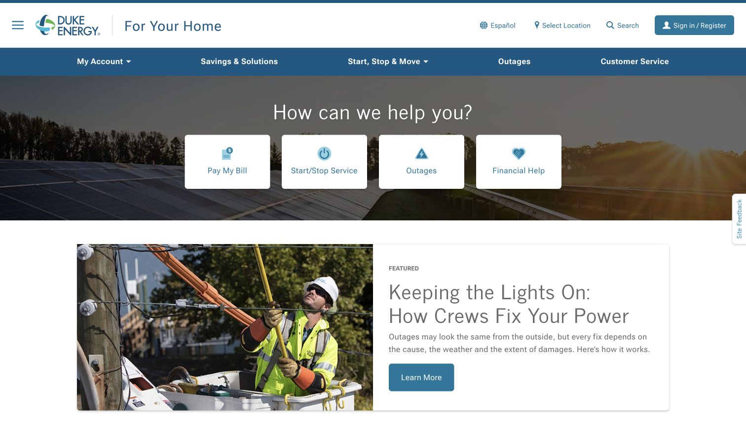
Duke Energy places four substantial white task cards over an energy image, giving payment, service changes, outages and financial help a consistent visual weight. The page feels like a practical entrance to customer service before it becomes a corporate story. Navigation groups savings, moving and support in familiar language, while the location control acknowledges that information varies by service territory. This is a useful example of allowing a promotional background to establish context without making the campaign the only useful action.
What you can learn
Build the opening around recurring customer intentions, then make location a visible part of the journey. Preserve the chosen territory when visitors enter assistance, outage or moving guidance, and explain why a location is needed before asking for it.
Pros
Large labeled cards make common tasks easy to distinguish at a glance.
Financial help receives the same opening prominence as payment and account changes.
Cons & considerations
Territory selection can introduce an extra step before a specific answer appears.
The image and four equal actions require careful prioritization on narrow screens.
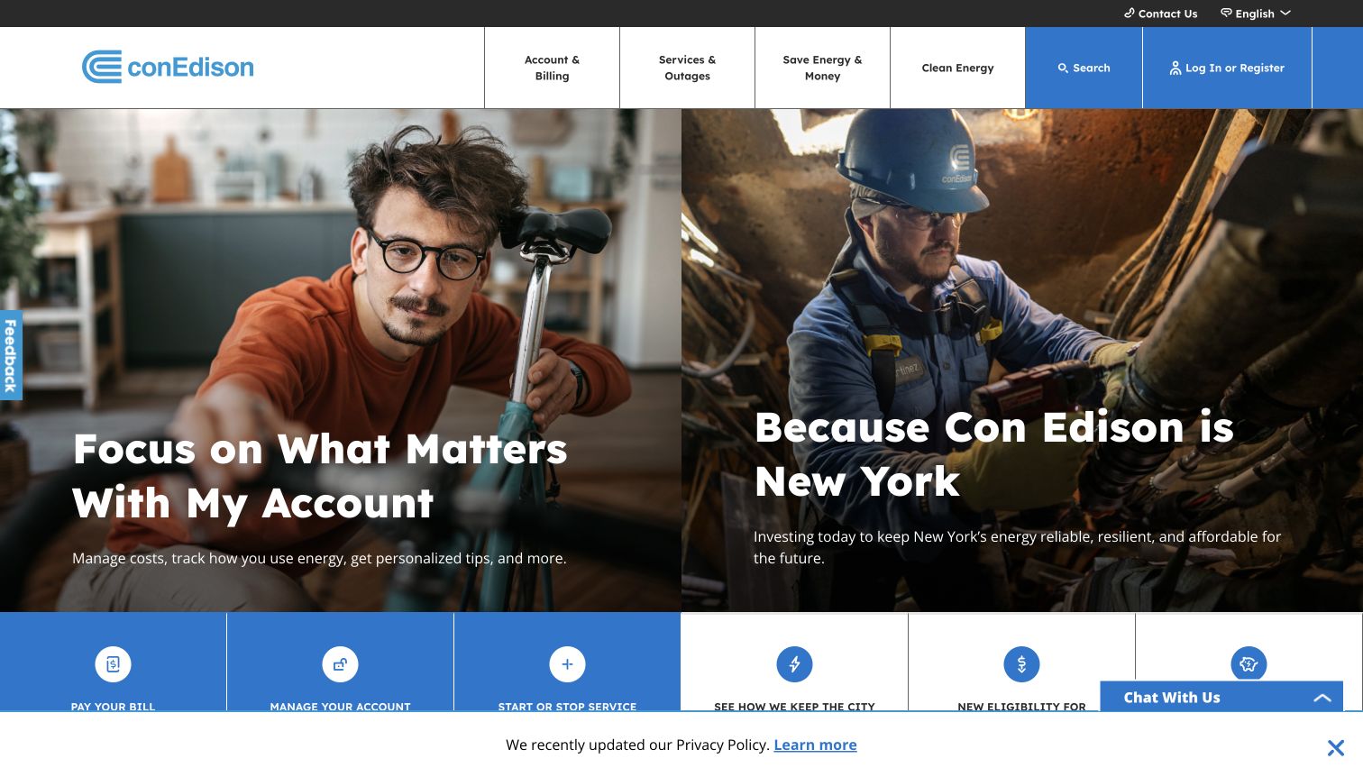
Con Edison divides its opening between a customer account message and a photograph of field work. The two panels introduce personal service and city infrastructure as related responsibilities. A strong blue action area and account-oriented navigation keep practical routes available beneath the storytelling. The contrast is instructive: a utility can discuss investment without hiding everyday support, but two equally prominent stories ask the visitor to decide which part of the organization they need before moving forward.
What you can learn
Give the account route an unmistakable label and keep urgent outage information outside the campaign rotation. Test whether a returning customer can identify payment or reporting immediately, even when the adjacent infrastructure story changes with a new campaign.
Pros
The paired photographs connect household service with visible work in the community.
Consistent blue navigation provides a recognizable structure around changing editorial material.
Cons & considerations
Two opening stories compete for attention when a visitor arrives with one urgent task.
Privacy and chat controls occupy additional space around the bottom of the initial view.
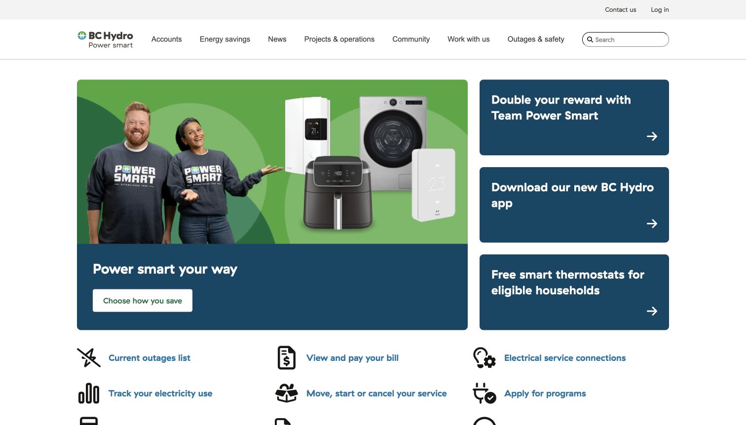
BC Hydro uses a large savings campaign beside smaller program and app promotions, creating an opening that behaves more like an editorial hub than a login screen. The next row translates everyday needs into labeled icons, including outages, payments, connections and moving. That separation gives campaigns room to explain benefits while retaining a repeatable service pattern. It also means a person with a simple task must scan past several offers before reaching the most compact set of functional choices.
What you can learn
Treat promotions and customer transactions as different content types with their own hierarchy. Keep the task row stable across campaigns and give every program a clear next step that can later explain eligibility, location and any required account access.
Pros
A consistent icon row gathers several recurring account and service tasks.
Different card sizes distinguish the main campaign from supporting programs.
Cons & considerations
The promotional opening can delay the route to an urgent practical action.
Several savings offers need careful labels so customers can distinguish their purposes.
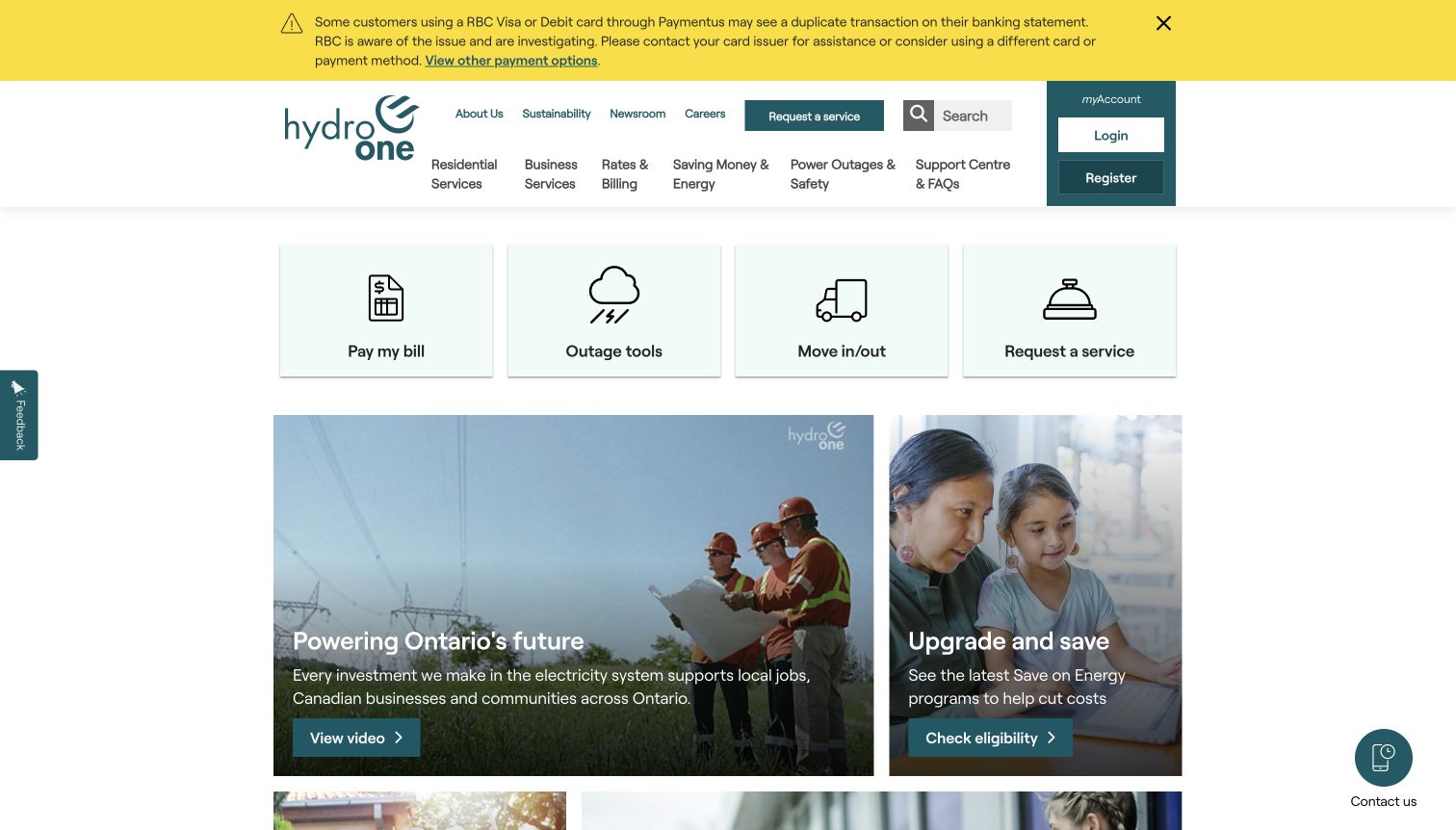
Hydro One leads the observed page with a conspicuous yellow notice about a payment-processing issue, then keeps four customer tasks visible below the header. Payment, outage tools, moving and service requests appear as spacious cards with consistent icons. This combination shows how operational communication can be integrated into the ordinary page instead of replacing it. The notice has a clear visual identity, while the account login and service cards still give unaffected visitors somewhere useful to go.
What you can learn
Design an alert system with severity, ownership, expiry and a destination for the full explanation. Reserve enough room for the regular task hub so a temporary notice does not make routine service inaccessible. Check the combined header and alert height on mobile.
Pros
The yellow notice is immediately distinguishable from routine promotional content.
Four simple cards retain the core service hierarchy beneath the interruption.
Cons & considerations
An extended notice can consume much of the first screen on smaller devices.
The dense upper navigation adds choices before visitors reach the task cards.
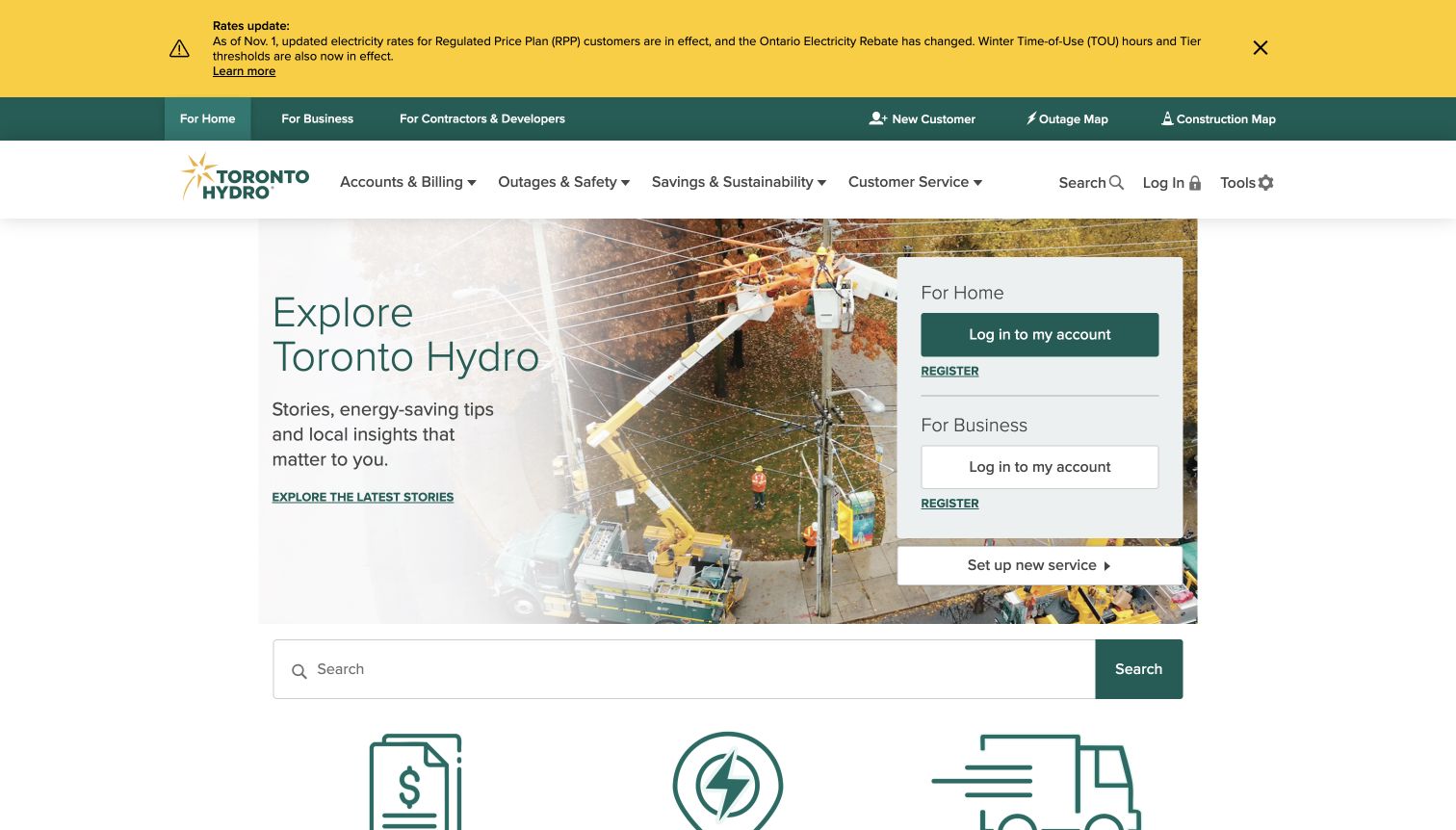
Toronto Hydro overlays its field-work photograph with separate home and business account panels, while a service setup link sits directly beneath them. A yellow rate notice and an audience navigation strip occupy the top of the page. The arrangement gives returning customers a clear way to select the right account context without abandoning the public website. Lower down, search and illustrated shortcuts broaden the journey to billing, outages and moving, making the page useful to visitors who are not ready to sign in.
What you can learn
Use audience distinctions where the next step truly differs, and keep the selected context consistent in account guidance. An operational banner should explain its scope concisely; its height must be considered together with audience navigation, the main menu and login controls.
Pros
Home and business account entrances are explicitly named rather than implied.
A new-service route is visible beside the returning-customer login choices.
Cons & considerations
Several stacked navigation and alert layers make the opening relatively tall.
The generic search field competes with more specific shortcuts farther down.
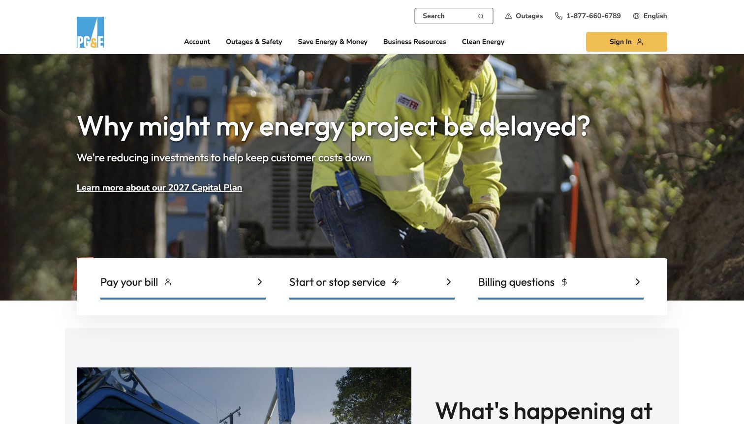
PG&E uses the main headline to address a concrete question about project delays, supported by a field-worker photograph and a link to further explanation. Three large actions below cover payment, starting or stopping service, and billing questions. The opening is notable because an uncomfortable operational topic receives the hero position, yet the page still offers ordinary customer routes. The navigation separately exposes outages, savings and business resources, avoiding the assumption that every visitor wants the current corporate explanation.
What you can learn
When the organization needs to explain a disruption or policy change, state the customer question directly and provide a clearly scoped detail page. Keep common tasks in a stable area, and distinguish an informational link from a transaction that requires authentication.
Pros
The headline makes the subject of the operational explanation immediately clear.
Large task buttons preserve everyday usefulness below the campaign message.
Cons & considerations
The full-width photograph leaves less initial space for additional support resources.
Outage information is separated from the three central task buttons.
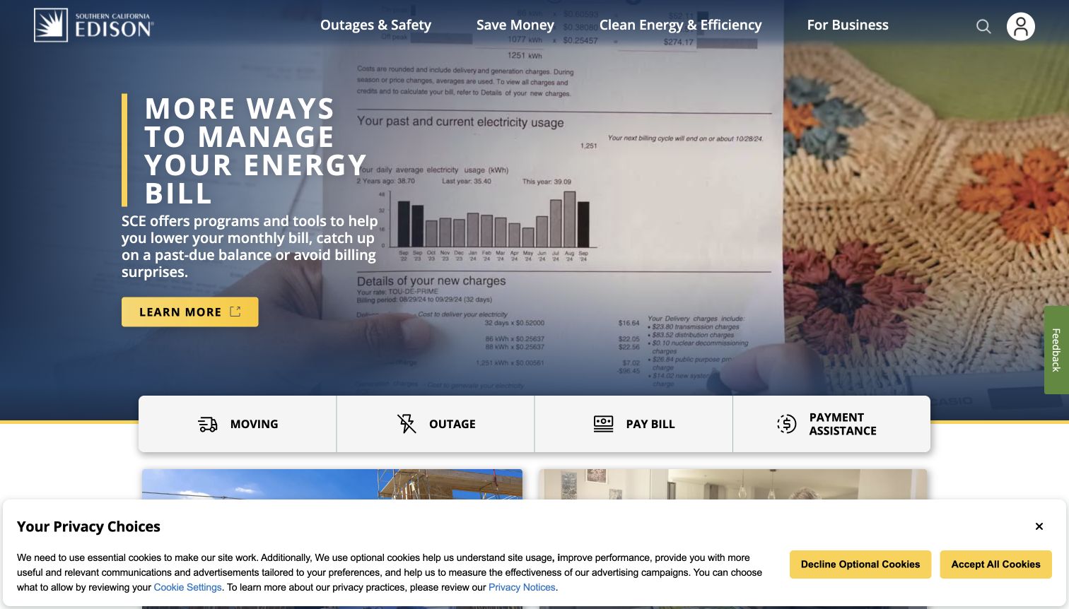
Southern California Edison builds the opening around understanding and managing an energy bill, using a bill image rather than an abstract infrastructure scene. A four-part bar presents moving, outages, payment and assistance in parallel. The page then expands into specific support and safety topics, including explanations of billing situations. The observed privacy notice covers part of the lower viewport but leaves the core message and task bar readable. The overall pattern connects an empathetic headline with concrete routes that customers can recognize.
What you can learn
Write assistance labels around the problem a customer is experiencing, and keep them visible beside payment. A task bar should remain usable when notices are present. Evaluate the entire first viewport, including consent and feedback widgets, instead of judging only the hero artwork.
Pros
Payment assistance is treated as a first-class action alongside paying a bill.
The visual bill reference gives the opening message a tangible customer context.
Cons & considerations
The privacy notice reduces the amount of supporting content visible immediately.
Several safety and billing cards below the task bar require clear grouping.
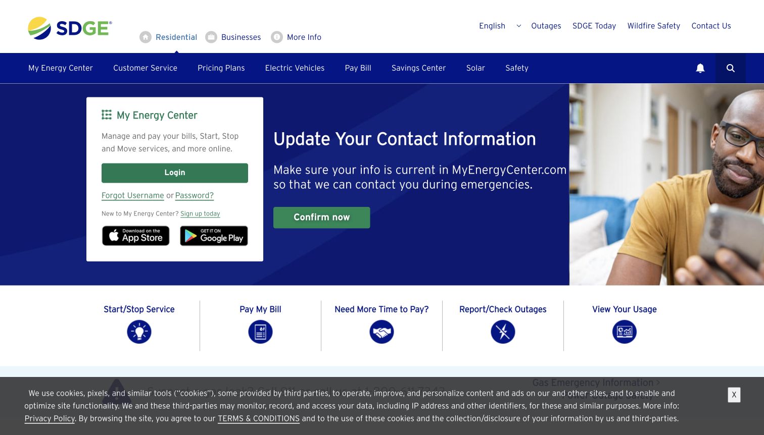
San Diego Gas & Electric places a My Energy Center panel beside a message asking customers to keep contact information current. The panel names account activities and provides login, recovery and registration routes. Below it, five labeled actions cover service changes, payment, arrangements, outages and usage. This creates a practical bridge between the public website and a separate account destination. The surrounding navigation also distinguishes electricity information from gas safety, an important content boundary for a provider that handles both services.
What you can learn
Explain what visitors can accomplish in a separate portal before sending them there. Use specific task labels for account activities, and retain public emergency information outside authentication. Verify that the handoff remains understandable when a customer follows a deep link or returns from a failed login.
Pros
Account recovery and registration are visible beside the main login action.
The task row includes payment arrangements and usage rather than payment alone.
Cons & considerations
Two navigation rows and a cookie notice add considerable surrounding interface.
The account panel and campaign button both point toward portal-related activity.
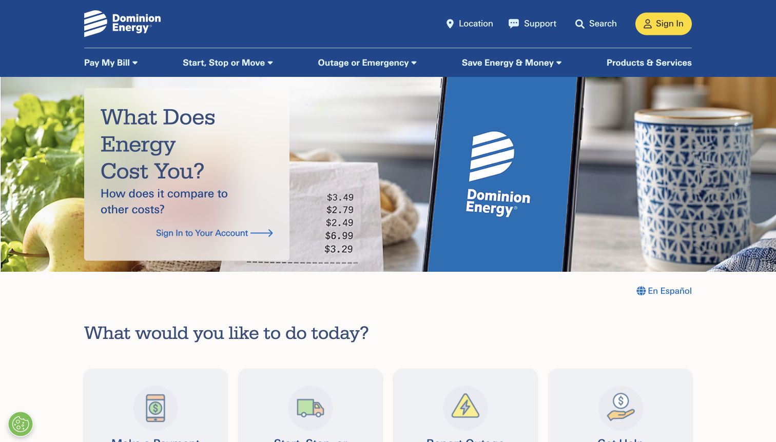
Dominion Energy opens with a question about household energy costs, illustrated by a phone and everyday objects. The next section asks what the visitor wants to do and offers payment, moving, outage reporting and help with bills. Location appears prominently in the header because many routes depend on the service territory. The page uses a strong blue-and-yellow visual system to connect a campaign about costs with practical assistance, though the main hero action still emphasizes signing into an account.
What you can learn
Keep the task vocabulary stable while adapting the answer to the selected territory. Explain assistance routes independently from account marketing so a visitor can understand available help before signing in. Make regional context easy to review and change throughout the public journey.
Pros
The task section uses plain verbs and recognizable customer situations.
Location and support controls are visible in the upper utility navigation.
Cons & considerations
The large campaign occupies substantial space before the full task selection.
Several actions depend on a location selector that adds a decision step.
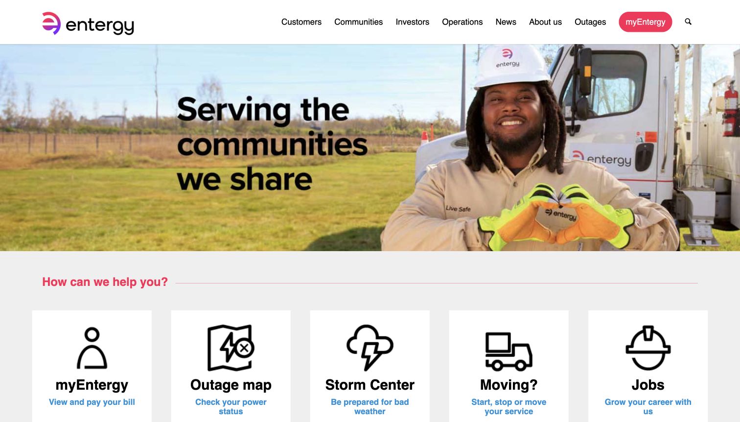
Entergy introduces its community message through a photograph of a field employee, then presents five large cards for accounts, outages, storm preparation, moving and jobs. Each card combines an icon, a short title and a line explaining the destination. The helpful distinction is between an outage map and storm preparation: one answers a current-status question, while the other supports planning. Careers receives equal card treatment, showing how a broad utility homepage may mix customer and organizational audiences in the same opening structure.
What you can learn
Use supporting text to distinguish routes that sound similar, particularly live status, incident reporting and preparedness. Before giving every audience equal space, compare their urgency and frequency. Keep descriptive accessible names on the links as well as visible labels on the cards.
Pros
Short descriptions clarify what visitors can do after choosing each card.
Storm preparation and current outage status are presented as separate needs.
Cons & considerations
The jobs card competes with four more immediate customer-service destinations.
Some inspected link names were generic even where the visible card text was clear.
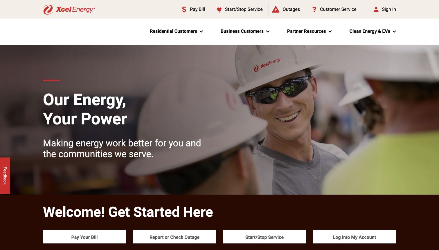
Xcel Energy first asked for a service area; the captured Colorado page then placed payment, moving, outages and support in a persistent top rail. A large worker photograph introduces the regional site, with a second row of task buttons immediately below. The remainder organizes energy services into convenience, affordability, account management and safety themes. This is a useful regionalization pattern because the same broad design can serve several territories while the page content and destinations remain tied to a selected place.
What you can learn
Make regional choice explicit before showing location-sensitive guidance, then retain it in URLs and visible controls where possible. Avoid requiring a second selection for every related task. Test direct entry into regional pages and provide a clear route back when a visitor chose the wrong area.
Pros
The top rail keeps urgent service links separate from broader audience menus.
The Colorado context gives the public landing page a specific service scope.
Cons & considerations
The initial service-area choice introduces friction for unfamiliar or rushed visitors.
A large hero repeats branding before the second set of task buttons.
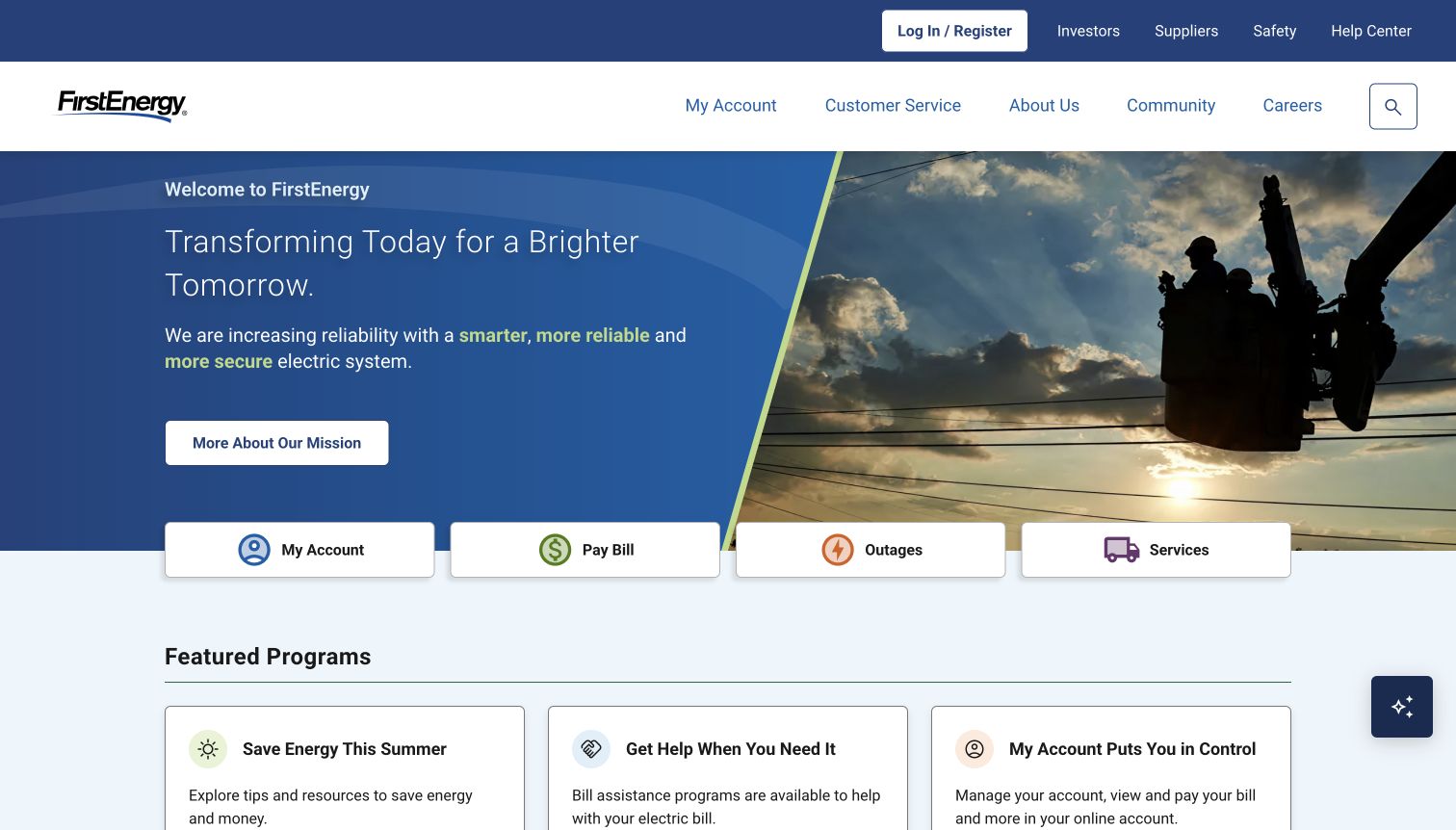
FirstEnergy combines a message about grid reliability with a photograph of line work, then places four compact account and service buttons across the bottom of the hero. Below, assistance, energy-saving guidance and account registration appear as separate program cards. The structure makes the corporate mission visible without requiring visitors to read it before finding payment or outages. Its footer also exposes the operating companies, which matters for a group whose customers may recognize a local utility name more readily than the parent brand.
What you can learn
When a parent company serves several operating brands, connect the group story to an obvious local-service path. Use consistent task names across the hero and footer, and make seasonal program content part of the publishing review so old campaigns do not linger without context.
Pros
A short four-button row provides a compact and repeatable service entrance.
Operating-company links help connect the parent organization to local identities.
Cons & considerations
The captured program area still used a summer-themed label in November.
Broad labels such as Services need more explanation after the initial click.
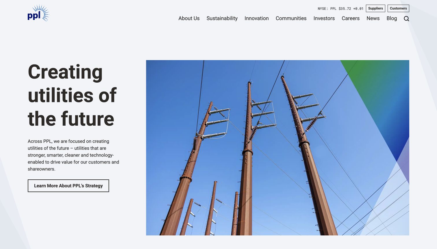
PPL Corporation leads with a large typography-led statement and a photograph of transmission infrastructure. Its primary navigation prioritizes strategy, sustainability, innovation, investors and careers; a smaller Customers link sits above. Farther down, an operating-company section directs people who need bills, outages or account service to the appropriate utility. This is a different kind of electric-utility website from an account portal. The page is useful as an example of separating a group-level story from the practical services delivered by its operating companies.
What you can learn
Decide whether the domain is principally a corporate publication or a customer service entrance, and make that distinction obvious. If it attracts misdirected customers, offer a conspicuous utility selector with clear destinations. Do not make someone read investor material to identify the correct service provider.
Pros
The restrained split layout gives the corporate message a clear visual hierarchy.
An operating-company section explains where customer transactions belong.
Cons & considerations
The small Customers link has less prominence than the corporate navigation.
Everyday service routes require a handoff to another property or company.
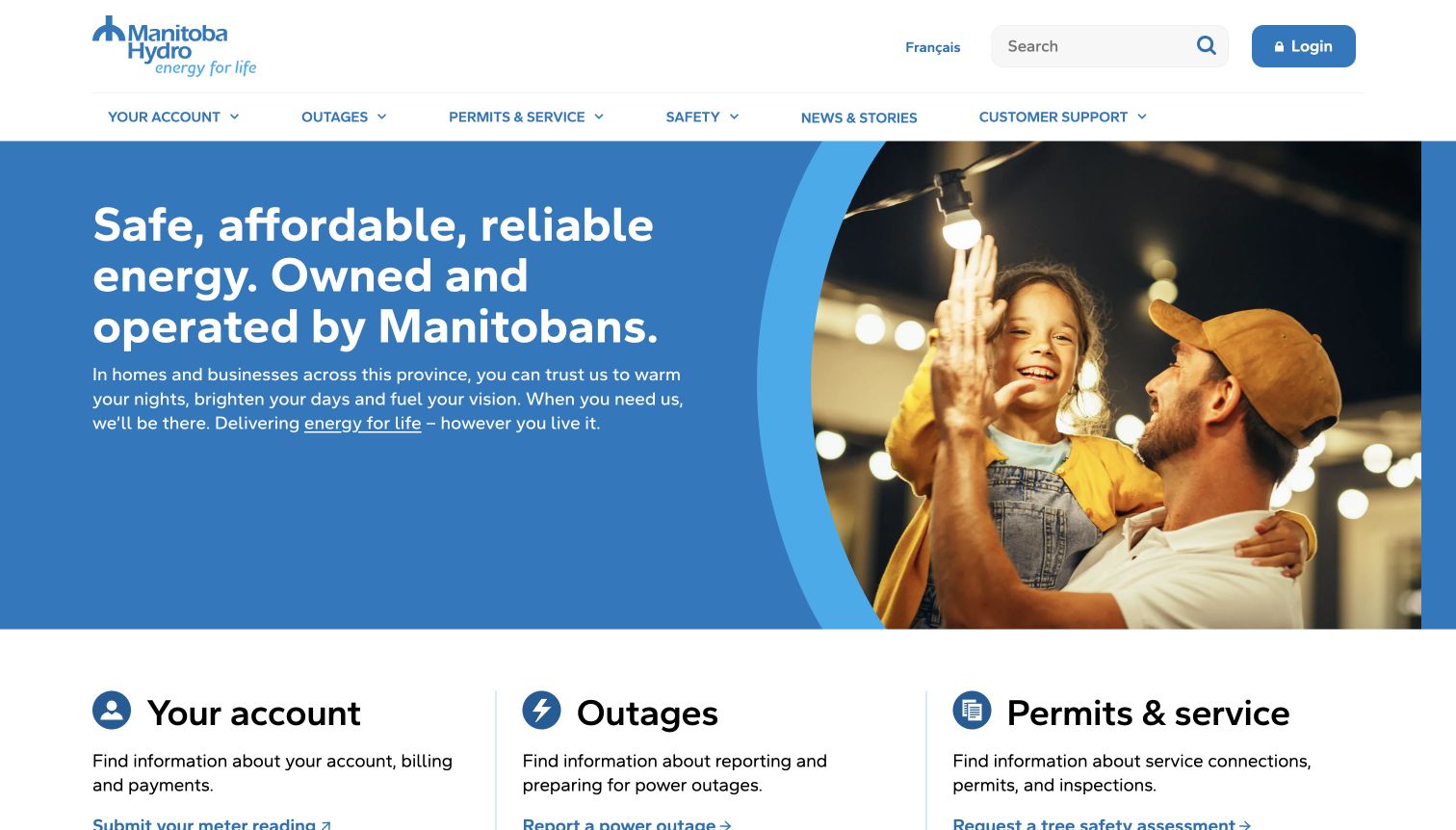
Manitoba Hydro follows its family photograph and public-service introduction with three clear categories: accounts, outages, and permits or service. Each category includes a short explanation and specific links rather than a single ambiguous button. Meter readings, payment help, outage reporting and temporary disconnection therefore become visible without opening a menu. The result is a particularly useful comparison for teams deciding whether an icon-only shortcut strip provides enough context. Here, the categories teach the scope of the site while also supporting a direct task.
What you can learn
Group tasks according to a customer’s situation and give each group a brief description. Keep the most useful links exposed, especially where the category name might be unfamiliar. Make sure the broader community message does not push outage reporting too far down a small screen.
Pros
Explanatory text clarifies what belongs in each of the three service groups.
Specific links reduce dependence on an expanded navigation menu.
Cons & considerations
The large opening photograph delays the complete task list on shorter viewports.
Permits and service combines several distinct situations that need careful follow-through.
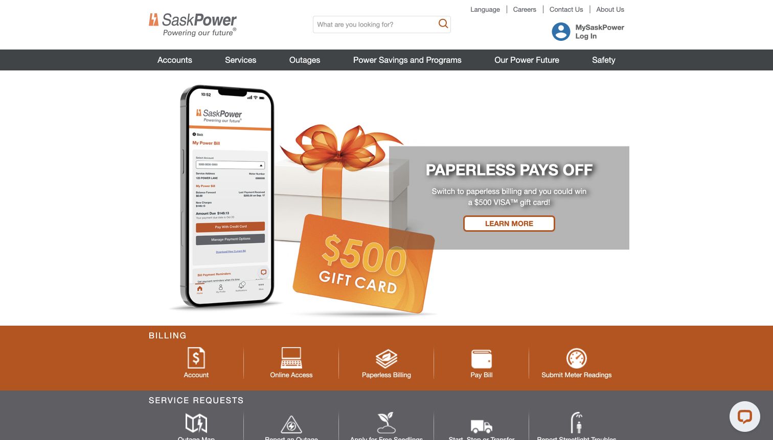
SaskPower separates billing actions from service requests using two horizontal bands beneath a paperless-billing campaign. The billing row includes account access, payment and meter readings; the next row covers outages and other requests. That grouping is more informative than one undifferentiated collection of icons because it shows which tasks manage an existing relationship and which ask the utility to act. The promotional hero is visually dominant, however, so the service-request row begins near the bottom of the captured screen.
What you can learn
Organize shortcuts by task type when a utility offers many self-service actions. Retain text labels with the icons and keep emergency routes visible independently of promotional content. Review the vertical order on mobile, where a two-band desktop pattern can become a long sequence.
Pros
Billing and operational requests are visually separated into understandable groups.
Meter readings appear directly in the billing shortcuts for quick discovery.
Cons & considerations
The promotional artwork occupies most of the first viewport above the actions.
Several similarly weighted shortcuts can make the mobile version lengthy.
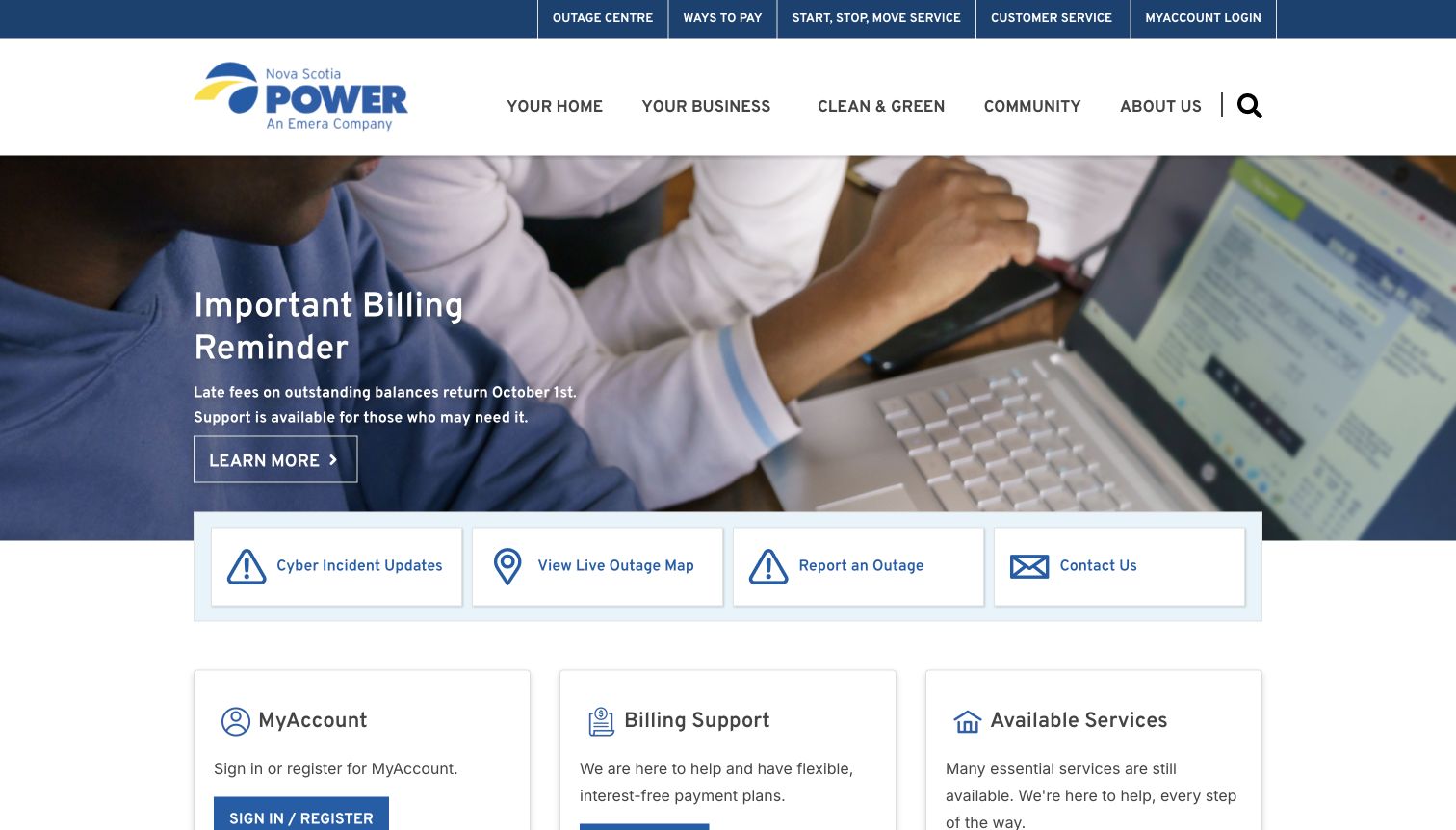
Nova Scotia Power uses its main banner for a billing reminder and explicitly mentions support, then places cyber-incident updates, an outage map, outage reporting and contact details in a prominent row. The next set of cards explains account access, billing support and available services. This arrangement is valuable because it treats operational communication as part of the customer journey, with multiple ways to find a relevant next step. The screenshot records the notice as observed; the review does not assess the underlying incident or billing policy.
What you can learn
When normal services are changing, distinguish the latest update from the continuing routes that still work. Put support beside the notice, name the destination clearly, and assign an owner to keep status information current. Avoid leaving visitors to infer which account functions remain available.
Pros
Incident updates and outage reporting have direct, separately labeled entrances.
Support cards connect the headline notice with practical next steps.
Cons & considerations
A returning customer must scan several communication layers before account details.
Time-sensitive notices need disciplined review to remain useful and accurate.
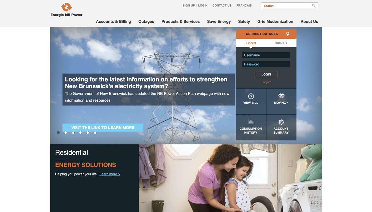
NB Power’s observed English page places a narrow account console beside a large message about electricity-system information. The console includes login fields, registration, outages and shortcuts to bills, moving and consumption history. Residential and business content follows underneath. The layout demonstrates how a public homepage can reserve a consistent area for returning customers while the larger panel changes editorially. Its density is also the main tradeoff: the account console contains several small controls and competing labels within a relatively narrow column.
What you can learn
Keep public information understandable without authentication, and identify which shortcuts require an account before the handoff. A compact console should have a clear order for login, recovery and urgent service information. Check label contrast, tap targets and error states rather than relying on desktop density alone.
Pros
Account and outage destinations remain visible beside the current public message.
Residential and business pathways give the broader content a recognizable structure.
Cons & considerations
Small controls in the narrow console can demand more precise interaction.
The promotional panel and account area compete strongly within the same hero.
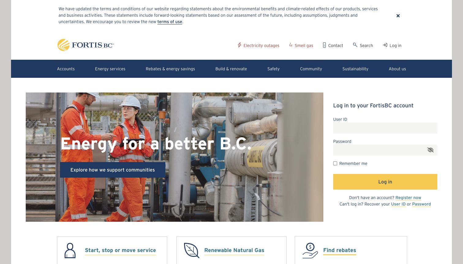
FortisBC gives roughly parallel space to a community image and a complete account login form. User ID, password, recovery and registration are visible without opening an overlay, while outage and gas-safety links sit in the upper utility navigation. The captured page also carries a prominent informational notice above the main header. This makes the site a useful study in accumulated interface height: each element serves a purpose, but together they determine how much room remains for the service cards beneath the hero.
What you can learn
Plan the login area as a complete component, including recovery, registration and clear labels. Keep safety information publicly reachable. When adding legal or operational notices, inspect the combined first screen so a necessary message does not unintentionally push routine service choices out of view.
Pros
The account form includes recovery and registration beside the sign-in action.
Electricity outages and gas safety receive distinct labels in the top navigation.
Cons & considerations
The long upper notice adds considerable height before the main content begins.
Eight primary categories create a broad navigation surface to manage on mobile.
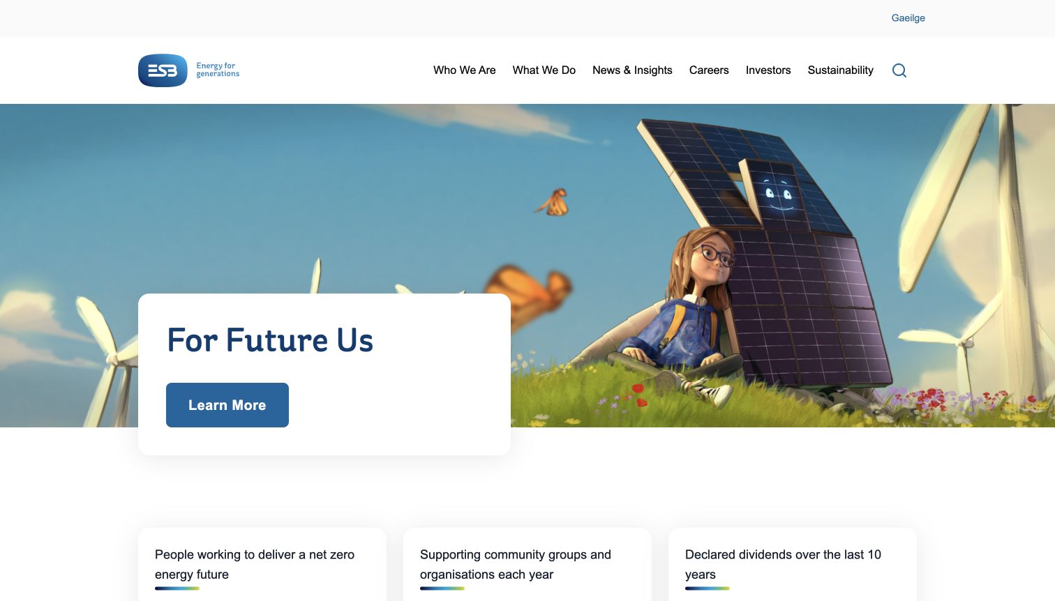
ESB’s homepage uses an illustrated future-energy campaign followed by organizational figures, purpose and links to its network, retail and charging activities. The primary menu emphasizes the company, news, careers, investors and sustainability. This is clearly a group-level publication, with customer services explained through distinct divisions farther down the page. The useful design lesson is the explicit relationship between the umbrella brand and those destinations. A visitor can learn which part of the organization handles networks or retail instead of assuming the parent homepage is an account portal.
What you can learn
Explain the role of each operating division in plain language and link to the right destination with its full name. A corporate campaign can establish identity, but customer routing should remain discoverable near the opening. Keep organizational figures dated and tied to their own supporting context.
Pros
Separate division descriptions clarify the difference between networks and retail.
The illustrated campaign gives the corporate site a distinctive visual identity.
Cons & considerations
Urgent customer-service destinations are less immediate than the group-level story.
Several content carousels require careful keyboard, motion and small-screen review.
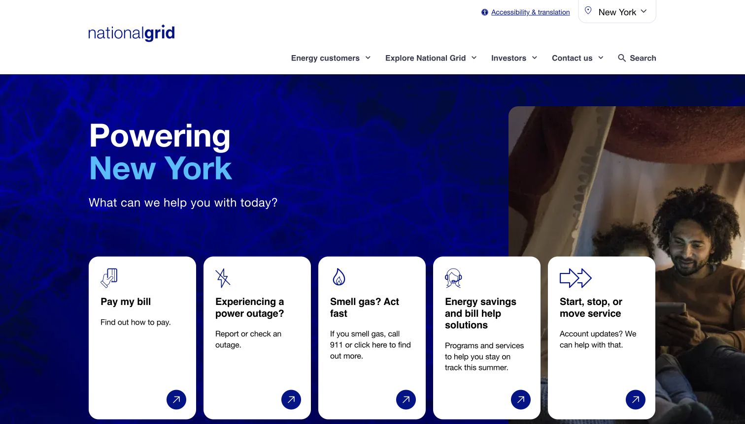
National Grid’s observed New York page gives five tall task cards much of the opening viewport. Payment, outage reporting, gas emergencies, help with bills and moving each receive an icon, heading, explanation and arrow. The location control remains visible above, while company and investor material is grouped into separate menus. Unlike a homepage dominated by a campaign button, this design makes customer intentions the primary content. The card descriptions also clarify that an outage task and a gas emergency require different kinds of response.
What you can learn
Make service territory explicit and use explanatory text where the stakes or destinations differ. Test the horizontal card arrangement with keyboard navigation, text enlargement and narrow screens. Preserve the urgent actions even when one card contains more text or a regional campaign changes the background.
Pros
Five concrete customer intentions dominate the first screen rather than a generic slogan.
Visible regional context helps explain why service links lead to particular destinations.
Cons & considerations
Tall cards with unequal text lengths need careful responsive treatment.
Several customer tasks hand off to other National Grid domains or account systems.
Plan the service journey before choosing the visual theme
Define the five highest-priority situations
Start with an outage, a payment, trouble paying, a move and an account-access problem. Identify the first question, required information, responsible system and fallback for each. Use service data and customer research to set their relative prominence.
Document the public and authenticated boundary
List which actions can be explained without login and which require an account. Before each handoff, name the destination and explain the task. Design useful recovery when authentication fails or the customer does not know the account holder’s details.
Specify outage-data behavior
Treat an outage map as a data product with loading, empty, unavailable and stale states. Explain its territory and update behavior. Provide a text alternative and a route to official reporting guidance; a map pin alone cannot communicate every affected address or restoration condition.
Create a governed notice system
Give notices a severity, owner, start and review time, affected audience and detail link. Establish who can publish urgent information and who removes it. Test more than one simultaneous notice so a billing update cannot conceal a higher-priority safety message.
Design for language and constrained devices
Use concise labels, readable contrast and generous targets. Test keyboard navigation, enlarged text, reduced motion and slower connections. Keep essential instructions available when imagery, scripts or external widgets fail, and review translated content with appropriate language expertise.
Measure successful next steps
Track whether visitors reach the correct public guidance or account destination, not simply how often they click the hero. Pair analytics with task observation and customer-support feedback. Respect consent and avoid collecting unnecessary account or incident details in marketing tools.
The editing job behind the design
Choose a stack that supports clear information and dependable handoffs
The content platform should support regional ownership, scheduled review, emergency notices, translation and reusable service guidance. Account portals, outage systems and payment services may be separate products. Define their contracts, visible handoffs and fallback behavior before selecting a visual component library. A familiar-looking widget does not establish the reliability of the service behind it.
Public stack observations identify exposed website components only. Delivery services, analytics, fonts and JavaScript libraries do not prove the utility’s internal billing or grid systems. Every example receives a broad public audit attempt; unavailable or blocked evidence remains unknown. Use the observations to frame implementation questions, then evaluate the actual product requirements independently.
Our WordPress website examples offer a separate look at publishing approaches. A visible platform label is evidence for that named page, not a guarantee that the same system will suit your requirements.
Before the public launch
Electric utility website launch checklist
Outage status, reporting and emergency guidance have distinct, descriptive routes.
Essential public safety information remains reachable without account authentication.
The current territory and relevant provider are visible where they affect the answer.
Payment help is discoverable beside payment and billing information.
Account recovery and registration have clear labels and useful explanations.
External portal transitions identify the destination before the visitor leaves.
Outage maps have readable loading, stale, unavailable and text-alternative states.
Temporary notices have an owner, review time and removal process.
Headers, notices, consent controls and campaign content are tested together on mobile.
Navigation works with keyboard input and remains usable with enlarged text.
Critical tasks survive missing imagery and failed nonessential widgets.
No launch claim implies accessibility certification or service performance from a limited visual review.
These checks are a project checklist, not a performance, legal, security, or accessibility certification. Test real journeys with the people responsible for the website before making claims about the result.
Sources & editorial method
How this collection was selected and reviewed
We inspected twenty distinct official electricity-provider or utility-group websites and saved genuine browser screenshots with their source URL, actual capture date and dimensions. Regional pages are identified where relevant. The saved random target was twenty and was not rerolled. Reviews describe the observed public page and its design tradeoffs. No payment, outage report, account login or other real transaction was submitted. Some screenshots retain readable nonblocking privacy notices. Public technology audits are attempts to identify exposed components, not examinations of internal utility systems.
Each example links to its actual source page. Screenshots are direct browser captures with their own capture dates; moving imagery, announcements and live designs can change. The notes describe observable design choices and conditional tradeoffs, not measured traffic, conversion results, service quality, or accessibility conformance.
Technology labels use public page metadata, asset evidence, or explicitly cited platform documentation. Platform documentation is not a complete current deployment audit. A component reference may be legacy or unused; it is not a complete backend inventory. Unknown stacks are omitted. These sites are editorial examples, not our client portfolio.
Written, Edited and Curated are separate editorial records, not timestamps advanced by a rebuild. Website designs and imagery belong to their owners. See our editorial standards or suggest a correction.
Questions worth asking
Electric Utility website design questions
What should an electric utility homepage prioritize?
Make urgent information and common service tasks easy to identify: outages, payment, moving, support and account access. Their order should reflect local customer needs. Corporate storytelling can coexist with these routes, but it should not determine whether a person can find help.
Should a utility put a login form on the homepage?
It can help returning customers if labels, recovery and registration are clear. A prominent sign-in button can also work. In either case, keep public guidance available without login and test the handoff into the actual account system separately.
How should a website handle different service regions?
Ask for the minimum location context needed and explain why it matters. Keep the selected region visible, retain it across related guidance, and allow correction. Distinguish regional company pages from a parent organization’s general information.
Is an outage map enough?
No. Visitors may need to report a problem, understand the scope of the map, find official safety guidance or read information without a map interface. Provide appropriate text and status alternatives and communicate when the underlying data is unavailable or old.
Can these examples establish accessibility or utility reliability?
No. A screenshot and public-page inspection reveal design patterns and possible friction. They cannot establish accessibility conformance, operational reliability, restoration accuracy or successful account transactions. Those require separate evaluation with the relevant systems and users.
A useful electric utility website reduces uncertainty at the moment someone needs help. Start with clear service territory, specific task labels and reliable public guidance, then build the visual system around those responsibilities.