A rail website needs to help passengers find a connection, understand a fare and recover when the plan changes. These examples examine how operators arrange booking, live information and practical support.
Rail passengers arrive with different levels of certainty. A commuter may know the exact station pair and only need a departure time. A visitor may know a city but not its stations, fare types or transfer rules. Someone already holding a ticket may need to change it, find assistance or understand a cancellation. The website should recognize those situations before asking every person to start a new purchase.
The following thirteen operator websites show several approaches: compact station-pair forms, broad booking panels, destination-led campaigns and separate tools for timetable inquiries. The reviews focus on visible information architecture and interaction entry points. They do not establish ticket availability, operational punctuality, checkout completion or accessibility conformance.
Before the examples
What makes good rail operator website design in 2026?
Make stations unambiguous
Distinguish cities, station groups and individual stations. Show location context in suggestions, preserve the selected station name in results and explain transfers or local connections before purchase.
Separate planning from live status
A future timetable inquiry is different from checking a train already due to run. Give each a clear entry point, label dates and time zones, and state when operational information is unavailable or has not refreshed.
Explain fare consequences
Present flexibility, service restrictions, seat requirements and passenger eligibility where they affect comparison. A low headline price is not a substitute for explaining what a traveler can change after purchase.
Support the journey after payment
Keep booking retrieval, ticket changes, assistance, refunds and disruption guidance visible to returning passengers. Name the reference or information required to retrieve a trip before asking someone to search for it.
The collection · 13 examples
13 rail operator websites worth studying
These thirteen distinct official operator pages compare how rail brands balance a structured route search with destinations, service notices and existing-trip support. Each example includes an observed design decision, its practical benefit and a tradeoff to test.
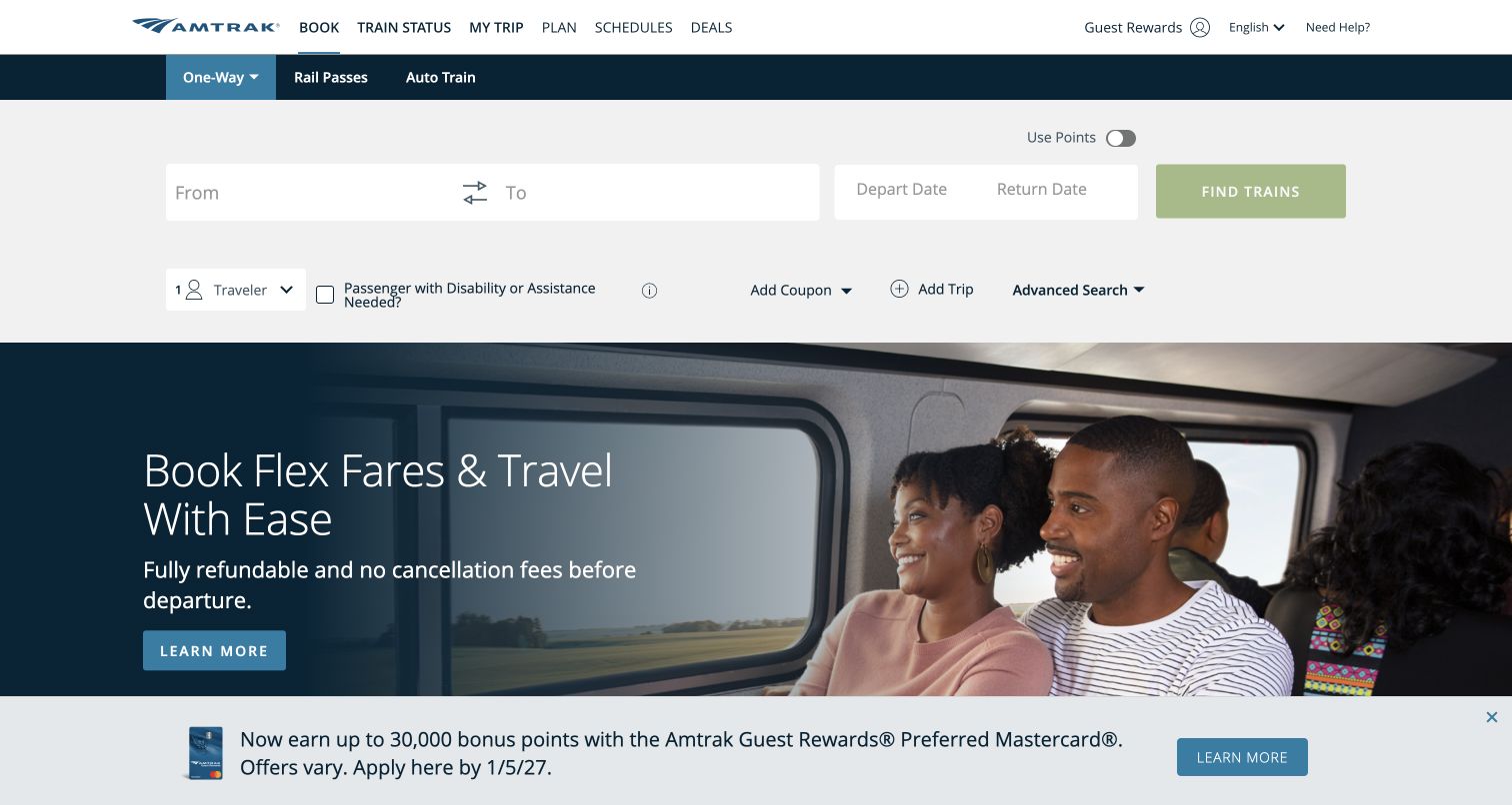
Amtrak places its station and date controls above the promotional photograph, so the first practical action does not depend on a campaign. Trip type, rail passes and Auto Train are separated in a product row. The form includes travelers, assistance needs, coupons and an advanced-search route, while Train Status and My Trip remain in the main navigation. That breadth reflects the different information needed for a simple ticket and a more specialized journey. The screenshot shows a clear distinction between finding trains and reading about fare flexibility; it does not demonstrate the later checkout.
What you can learn
Lead with the information needed to discover a service, then reveal specialized options without making them mandatory. Explain assistance and discount choices at the point where they affect results, and keep existing-trip support separate from new sales.
Pros
The journey form appears before the hero campaign.
Train status and existing trips have named navigation entries.
Cons & considerations
Many optional controls can make the form feel demanding.
Disabled search actions need a clear explanation of missing information.
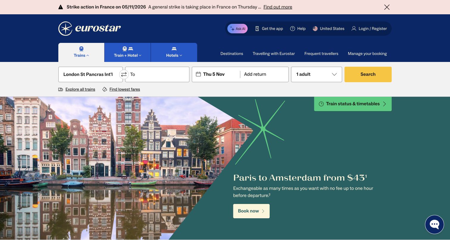
Eurostar's US-English homepage puts a journey form below the header and a travel-disruption notice above it. The visible form includes a named origin station, destination, outbound date, optional return and passenger count. A separate train-status and timetable link remains visible beside the destination campaign. The page also distinguishes trains from train-and-hotel products. This combination is useful for international rail, where a traveler may arrive either to plan a holiday or to resolve an existing journey. The notice and campaign have different visual treatments, helping a service message avoid blending into a fare offer.
What you can learn
Reserve a consistent position for disruption information and preserve the booking form underneath. Make market, language, currency and station defaults explicit, since a familiar city name may contain several stations and different departure requirements.
Pros
The disruption strip sits above promotional content.
Status and timetables have an explicit shortcut.
Cons & considerations
A preselected origin may not match a first-time visitor’s journey.
Multiple travel products require clear boundaries between their conditions.
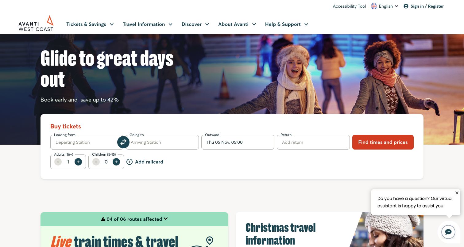
Avanti West Coast overlays a white ticket form on a seasonal leisure photograph, then introduces a separate live-train-information panel below. The sales form names departing and arriving stations, dates, adults, children and railcards. Its action promises times and prices, which describes the next result more specifically than a generic submit button. The service panel uses a contrasting green treatment and an affected-routes indicator. This is a useful distinction: purchasing a future trip and checking today's train are related but not interchangeable tasks. The observed interface gives each a recognizable place without requiring an account first.
What you can learn
Name the expected result of each action. Separate fare discovery from live operations, and attach disruption indicators to a route-specific explanation so passengers can tell whether a network warning affects their own train.
Pros
The booking action explains that it returns times and prices.
Railcard and passenger controls are visible beside the journey fields.
Cons & considerations
Live information begins below the larger sales module.
Chat prompts can compete with service content near the screen edge.
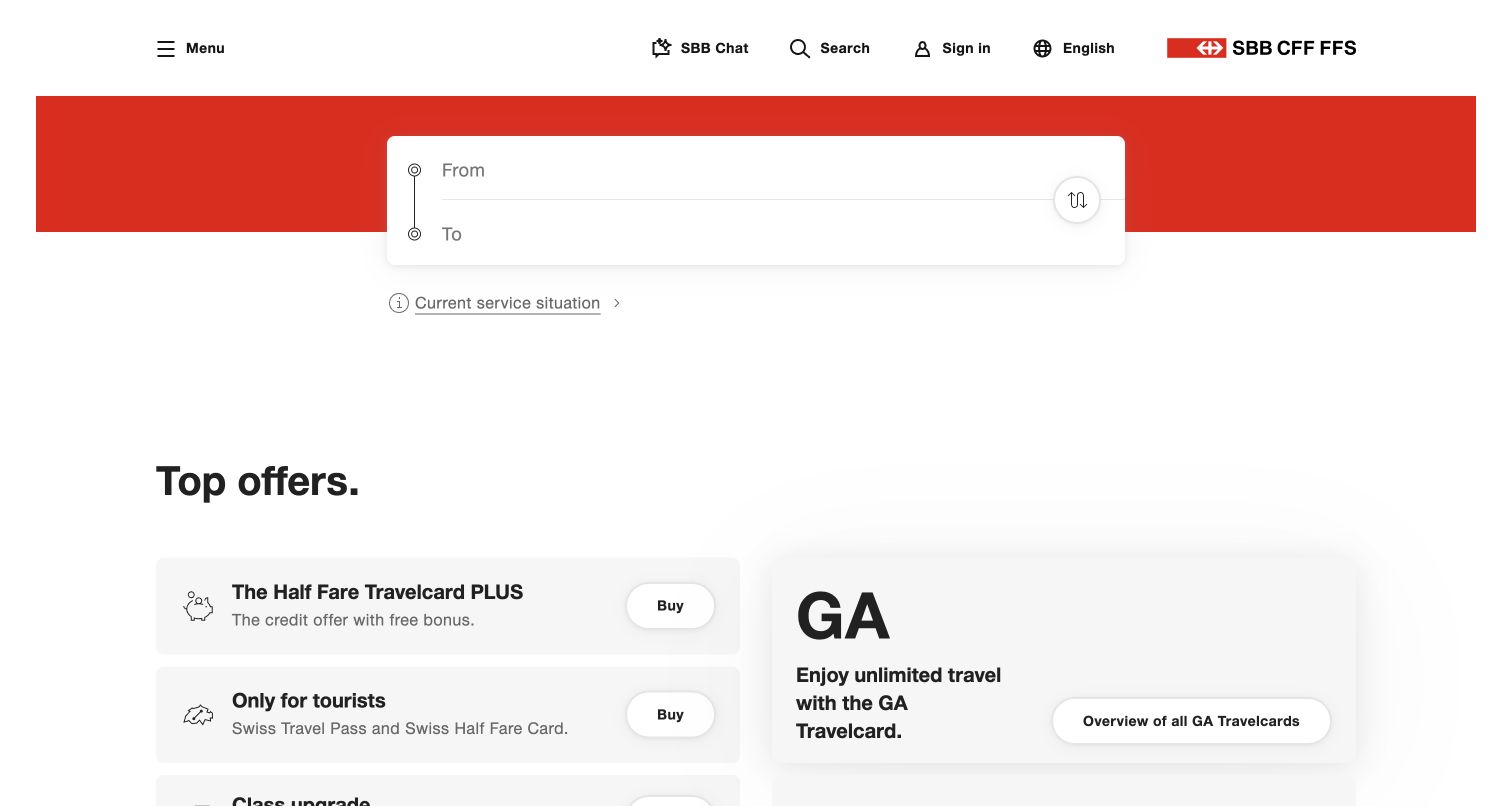
SBB's English homepage starts with a compact From and To panel against a red band. The surrounding white space gives those two inputs unusual prominence, and a current-service-situation link sits directly below. Offers appear farther down as restrained cards for travel products and visitor passes rather than interrupting the initial route decision. The header uses a compact menu alongside search, sign-in and language controls. This is a useful reference for a utility-led rail website: the opening asks for the minimum route context before presenting a wide product catalog. The small starting form still depends on excellent station recognition and clear subsequent steps.
What you can learn
Keep the first planning decision simple, while ensuring station suggestions distinguish similar names and locations. Put a current-service shortcut next to the planner so a regular passenger can check conditions without entering a new ticket journey.
Pros
Two prominent inputs create a focused starting point.
Current service information is linked immediately below the planner.
Cons & considerations
The minimal form provides little explanation of the next step.
A collapsed main menu can make less common support tasks harder to discover.
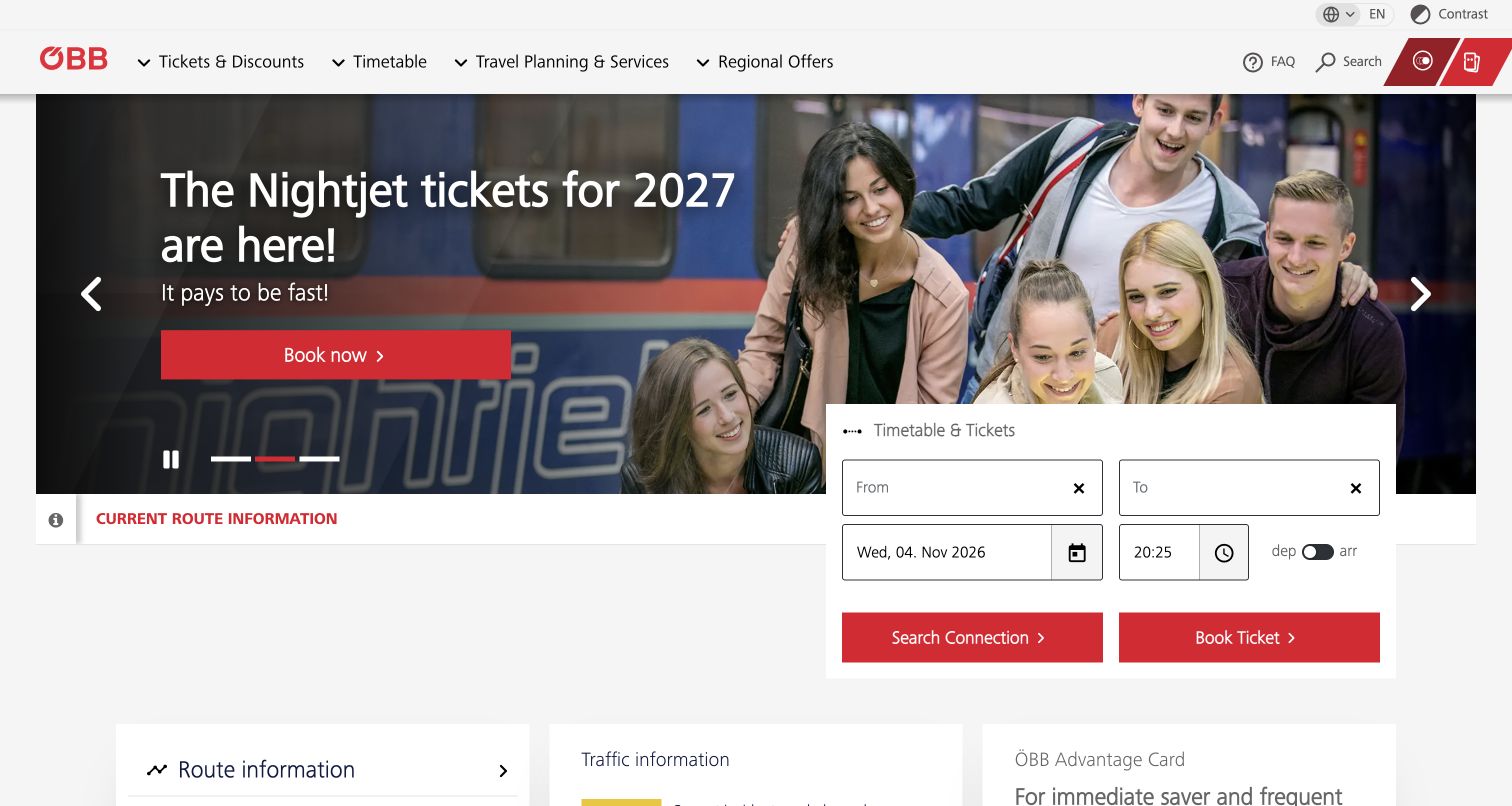
ÖBB places a timetable-and-tickets card over the lower edge of a promotional carousel. The card combines origin, destination, date, time and a departure-versus-arrival switch, then offers distinct Search Connection and Book Ticket buttons. A current-route-information strip and traffic-information section add operational context outside the campaign. The explicit arrival-time option is especially useful when a passenger needs to reach an appointment rather than leave at a particular hour. This homepage illustrates the value of distinguishing a timetable inquiry from a purchase, although two adjacent red actions need enough explanation to prevent uncertainty about which one to choose.
What you can learn
Let people plan by arrival as well as departure when the timetable supports it. Explain the difference between a connection search and a ticket purchase, and preserve selected journey details if the visitor moves between those tools.
Pros
Departure and arrival timing are explicitly selectable.
Current-route information has a stable location below the hero.
Cons & considerations
Two equally prominent actions can require extra explanation.
The overlapping form and large carousel need careful mobile ordering.
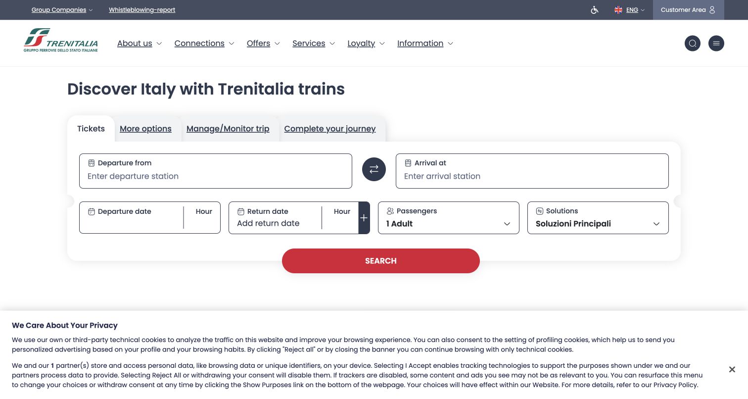
Trenitalia's English page gives the booking panel most of the opening screen. Origin and destination occupy a broad first row; dates, hours, passengers and a solutions control follow underneath. Tabs distinguish tickets, more options, managing or monitoring a trip, and completing the journey. The structure presents rail travel as a sequence extending beyond purchase, with airport connections and visitor offers farther down. The interface is an instructive example of using a substantial form instead of a dominant hero image. It also shows a localization detail worth checking: the observed solutions value remained in Italian within an otherwise English interface.
What you can learn
Keep journey-management tools adjacent to booking, but use labels that describe a passenger’s task. Audit translated controls and default values throughout the form, because a single unexplained category can interrupt an otherwise familiar route-search sequence.
Pros
The large form gives station fields clear visual space.
Managing and monitoring an existing trip has a dedicated tab.
Cons & considerations
Several date, hour and solution controls increase initial complexity.
The observed mixed-language value needs clarification for English-speaking visitors.
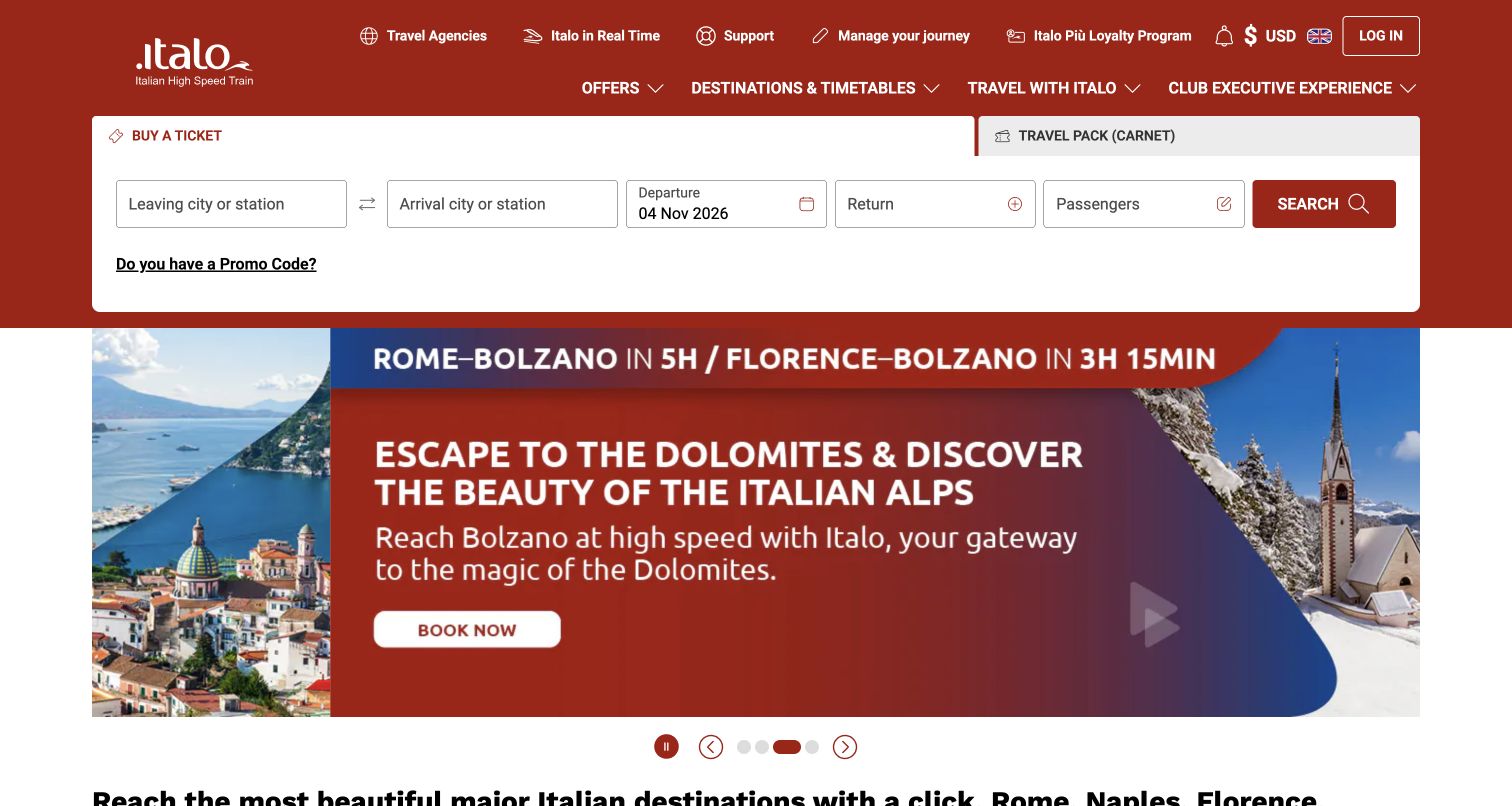
Italo places a white ticket strip within its red header area, above a destination carousel. The form asks for leaving and arriving cities or stations, departure, return and passengers, with a promo-code link below. The upper utility navigation separately exposes real-time information, support and management of an existing journey. The campaign can change from cities to mountain destinations while those practical controls remain in the same position. This is a useful pattern for a brand that sells an experience as well as transportation. The form’s language also acknowledges that a traveler may think in cities rather than know the exact station name.
What you can learn
Keep the booking strip independent of rotating destination imagery. Accept city-oriented discovery where appropriate, then make the actual station explicit before purchase and preserve visible support for passengers who already hold a ticket.
Pros
The form explicitly allows a city or station as an entry concept.
Real-time and manage-journey routes remain in the utility navigation.
Cons & considerations
Promotions and premium-service links create a busy header.
Destination inspiration must not obscure the exact station ultimately selected.
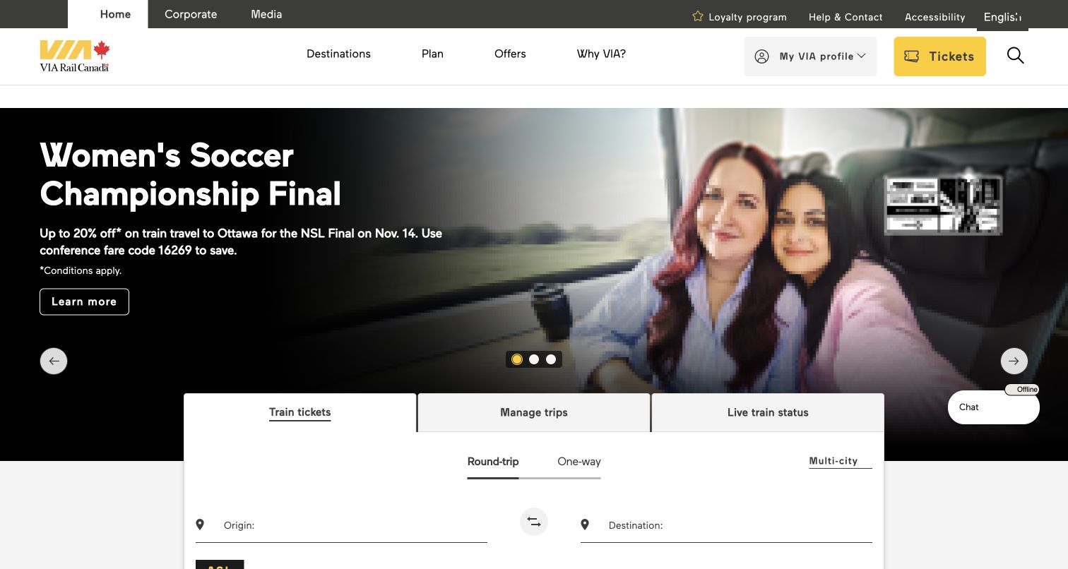
VIA Rail places Train tickets, Manage trips and Live train status in adjacent tabs beneath a large campaign photograph. The active form distinguishes round-trip, one-way and multi-city travel and begins with origin and destination. A separate Tickets button in the header provides another clear sales route, while accessibility and help remain visible in the utility row. The peer tabs are the most useful lesson here: someone returning after purchase does not have to reinterpret a booking-only homepage to find a relevant action. The layout supports several stages of travel, though the tall campaign means the form continues below the initial viewport.
What you can learn
Give existing passengers a first-class entry point beside new bookings. Keep the selected travel mode visible and describe whether a ticket action opens another window or system, so the transition does not feel like lost context.
Pros
Booking, management and live status are grouped with explicit labels.
Accessibility and help links are visible before the main content.
Cons & considerations
The campaign occupies substantial vertical space above the form.
Multi-city travel requires clear explanation of how separate legs are connected.
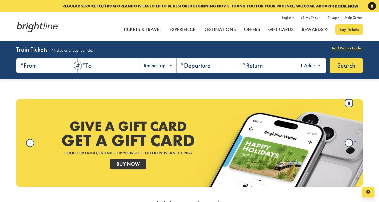
Brightline uses a yellow service-announcement strip above the header and a blue booking bar beneath it. The form includes stations, trip type, departure and return dates, guests and a separate promo-code option. Below that stable bar, the carousel promotes events, premium travel and gift cards. Both the announcement area and promotional media expose pause controls, a helpful detail when several moving messages share the page. The arrangement keeps the ticket task stable while allowing commercial stories to change. The operational message still needs to remain distinct from a promotion, especially when both use the same bright brand color.
What you can learn
Give service announcements a defined meaning and a permanent detail destination. Keep the booking bar readable while campaigns rotate, and test pause controls, keyboard focus and reduced-motion behavior wherever multiple animated regions coexist.
Pros
Required fields are identified within the ticket area.
Moving announcements and campaigns expose pause controls.
Cons & considerations
Brand-colored service and sales messages can look similar.
A wide single-row form needs a deliberate mobile stacking order.
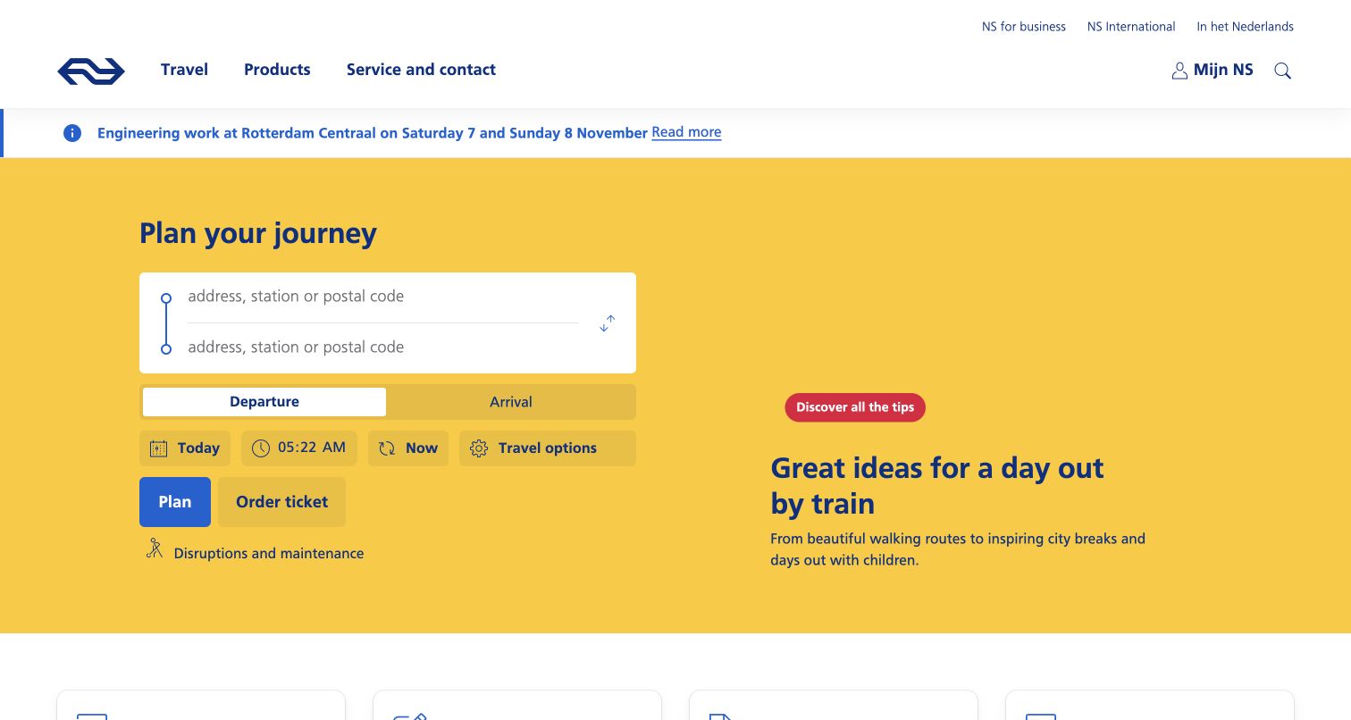
NS uses a yellow planning area with origin and destination fields that accept an address, station or postal code. Departure and arrival are distinct timing choices, with date, time, Now and travel-options controls nearby. Separate Plan and Order ticket actions clarify that a journey inquiry and a purchase are not identical. A disruption link sits below the planner, while an engineering-work notice appears above it. Farther down, service cards address refunds and missed check-in or check-out. The homepage therefore treats everyday rail travel as both movement and account-related problem solving, rather than presenting only leisure destinations.
What you can learn
Support the way passengers describe real locations, then explain the stations and transfers in results. Keep planning, ticket purchase and recovery tasks distinct, and place engineering notices where a commuter can notice them before starting a journey.
Pros
Inputs accept addresses and postal codes as well as stations.
Departure and arrival timing have clear separate states.
Cons & considerations
Many small options require careful keyboard and touch treatment.
Plan and Order ticket need consistent context when moving between their flows.
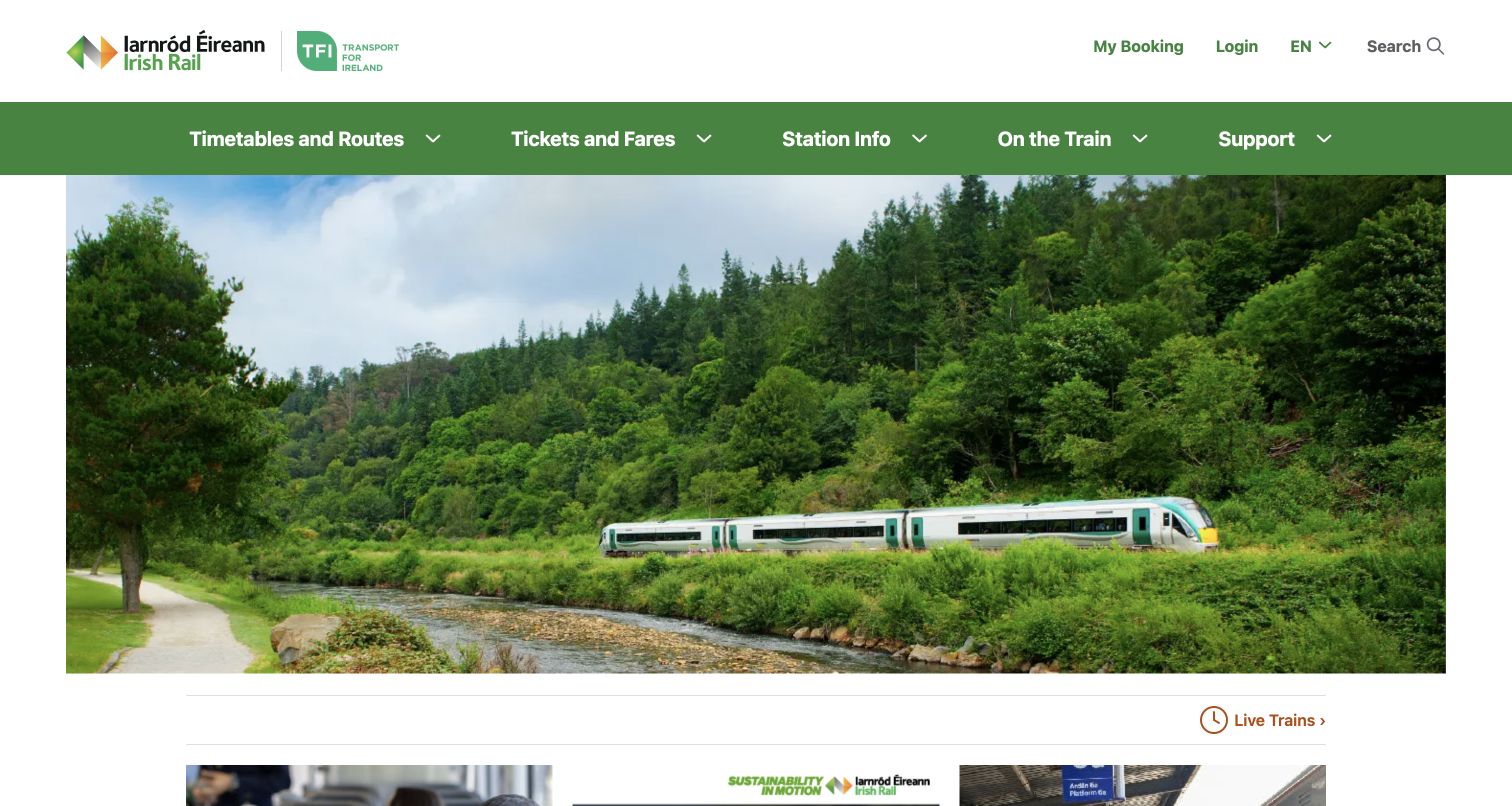
Irish Rail combines a scenic train photograph with a straightforward menu for timetables and routes, tickets and fares, station information, onboard travel and support. My Booking is separately visible in the utility header, and a Live Trains link appears beneath the image. The observed page continues with service updates, event trains and information for travelers using a pass. This is a useful reference for the content structure around a booking engine: stations and onboard rules receive their own categories rather than being hidden under a broad corporate menu. The large photograph nevertheless leaves the first screen more orienting than transactional.
What you can learn
Use a passenger-centered taxonomy that distinguishes the station, the train and the ticket. Bring live information and booking access close to the opening, and give special ticket-holder instructions a specific label rather than assuming every visitor is buying a new fare.
Pros
Station information and onboard guidance have separate categories.
My Booking is visible in the utility navigation.
Cons & considerations
The large scenic image delays detailed task controls.
A small Live Trains link may receive less attention than the surrounding promotions.
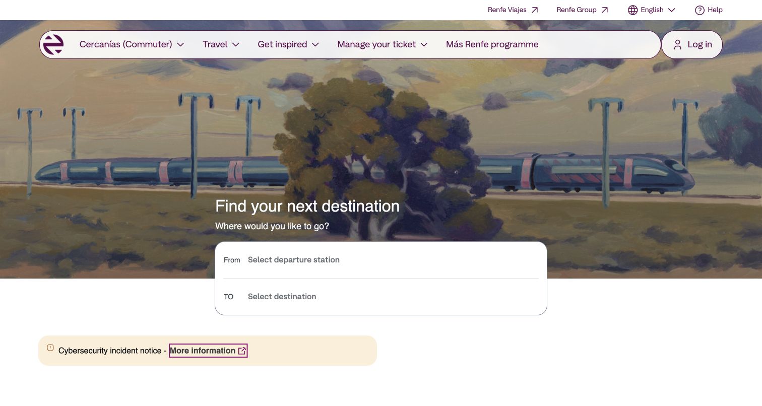
Renfe's English homepage places a rounded origin-and-destination panel under an illustrated train landscape. The navigation separates commuter services, travel, inspiration and ticket management, with language and help available above. The opening asks a small question before exposing the full complexity of the operator's products. Below the form, a clearly bounded notice area demonstrates how non-promotional information can receive its own visual treatment. The design is useful for teams serving both everyday and leisure passengers, but the broad opening categories need clear follow-through so someone knows which service type applies to their route and fare.
What you can learn
Start with a simple route question when it can narrow the product space. Make the chosen stations and service category explicit in the next step, and reserve a distinct notice component for information that should not be confused with a destination campaign.
Pros
The station pair is visually isolated from the background.
Ticket management is named in the primary navigation.
Cons & considerations
The initial form provides little detail about the later search steps.
Commuter and longer-distance products need clear boundaries after route selection.
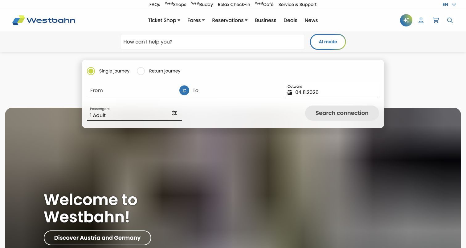
WESTbahn gives its journey widget a raised white card with single or return travel, stations, date and passenger controls. A separate question field and AI-mode button appear above it, while the navigation distinguishes ticket shop, fares and reservations. Destination campaigns sit behind the lower part of the card. The useful distinction is that structured booking remains visible even when a conversational help option is offered. A visitor can begin a precise connection search without describing the trip in prose. The additional help field does create competition for the first interaction, so the relationship between advice and booking should remain explicit.
What you can learn
Treat conversational assistance as an optional route to guidance while preserving a complete structured planner. Explain when a recommendation becomes an actual reservation, and use consistent station and passenger details across the handoff between advice and ticket selection.
Pros
Single and return journey choices are visible above the station fields.
The structured planner remains available beside the help interface.
Cons & considerations
Two input areas can make the intended starting point less obvious.
A disabled search button needs an understandable indication of required fields.
Design the journey before designing the booking panel
Define passenger situations
Map the needs of a commuter, an occasional leisure traveler, an international visitor and someone whose train has changed. Identify which tasks require a station pair and which should be reachable immediately without one.
Specify the route model
Document how the system treats city groups, individual stations, connecting services and arrival-time searches. Decide what happens when a passenger enters a partial name, a familiar local nickname or a place outside the operator’s network.
Create a fare explanation system
Compare ticket restrictions in consistent terms. Identify seat reservations, traveler discounts and services that require a separate purchase. Show the difference between a fare quote, a held reservation and a completed ticket without implying that a search reserves availability.
Plan disruption and recovery paths
Connect notices to affected routes and travel dates. Explain where passengers can find alternatives, change a trip or seek assistance. Give operational teams a publishing process with ownership, review times and an expiry rule for notices.
Maintain context across systems
If timetable, ticketing, account and assistance tools live in different systems, preserve selected stations and dates where appropriate. Label new-window or partner transitions and provide a way back without losing the passenger’s work.
Test difficult states
Exercise ambiguous stations, no trains, sold-out services, changed dates, expired sessions and unavailable live feeds. Include keyboard, screen-reader, enlarged-text and mobile checks across the complete journey rather than assessing only the homepage.
The editing job behind the design
Choose a platform that can explain its data
A rail marketing site, timetable service and ticketing system may have different owners and release cycles. Define those boundaries before choosing a content platform. The passenger-facing layer needs reliable station identifiers, clear time handling, accessible form controls and a graceful response when an integration is unavailable.
Publicly observed scripts and libraries can suggest how a page is assembled, but they do not prove the operator’s reservation backend or live-data architecture. Evaluate any proposed booking widget against actual fare rules, station coverage, language needs and failure states. Keep operational notices publishable even when a sales integration has a problem.
Our WordPress website examples offer a separate look at publishing approaches. A visible platform label is evidence for that named page, not a guarantee that the same system will suit your requirements.
Before the public launch
Rail operator website planning checklist
New bookings, live status and existing-trip management have distinct entry points.
Station suggestions distinguish similarly named places and city groups.
Departure and arrival timing modes are clearly labeled.
Date defaults and relevant time zones are visible.
Passenger age groups, assistance and discount choices explain their effect.
Fare comparisons use consistent language for changes, refunds and restrictions.
A search result is not presented as a reserved or purchased ticket.
Service notices identify affected routes and dates.
Passengers can retrieve a booking without navigating through a new sale.
Transfers, partner systems and new windows are explained.
No-results, unavailable-data and expired-session states offer a useful next step.
The complete ticket and support journey works with keyboard navigation and enlarged text.
These checks are a project checklist, not a performance, legal, security, or accessibility certification. Test real journeys with the people responsible for the website before making claims about the result.
Sources & editorial method
How this collection was selected and reviewed
We reviewed thirteen distinct official rail operator websites and retained direct browser captures with source URLs, actual capture dates and dimensions. The collection uses the saved thirteen-example target. Pages that returned access restrictions or incomplete evidence were excluded. Reviews analyze public layout, labels and task entry points; no tickets were bought, no booking forms were submitted and no operational performance claims were tested.
Each example links to its actual source page. Screenshots are direct browser captures with their own capture dates; moving imagery, announcements and live designs can change. The notes describe observable design choices and conditional tradeoffs, not measured traffic, conversion results, service quality, or accessibility conformance.
Technology labels use public page metadata, asset evidence, or explicitly cited platform documentation. Platform documentation is not a complete current deployment audit. A component reference may be legacy or unused; it is not a complete backend inventory. Unknown stacks are omitted. These sites are editorial examples, not our client portfolio.
Written, Edited and Curated are separate editorial records, not timestamps advanced by a rebuild. Website designs and imagery belong to their owners. See our editorial standards or suggest a correction.
Questions worth asking
Rail Operator website design questions
Should a rail homepage begin with ticket booking?
Often a station-pair planner is useful, but returning passengers also need live status and booking management. Choose the hierarchy from real passenger tasks and keep operational shortcuts visible even when sales campaigns occupy the hero.
What is the difference between a timetable search and ticket search?
A timetable inquiry identifies possible services, while a ticket search may add availability, fares, passenger eligibility and reservation conditions. If they are separate tools, explain the distinction and preserve journey context when passengers move between them.
How should rail websites handle several stations in one city?
Show whether the selection represents a city group or a specific station. Include enough geographic context to avoid mistaken departures, and make the final station explicit before the passenger confirms a ticket.
Where should disruption information appear?
Provide a stable public route to current service information and surface major notices near planning tools. Connect the notice to affected routes and dates, show its review context, and explain the passenger’s next available action.
Do these screenshots verify a successful booking experience?
No. They document public pages and visible entry points. Purchase completion, payment behavior, ticket delivery and detailed accessibility need separate authorized testing in an appropriate environment.
Borrow the structure that fits your passengers, then test the details that make a rail journey understandable: the correct station, a clear time, a fare with known conditions and a dependable route to help.