Best Winery Websites of 2026 (22 Real-World Examples)
Winery website examples that give place, wine and hospitality a clear relationship
A winery website has to express a producer's identity while explaining how people can learn, visit or acquire its wines. These twenty-two examples range from small allocation-led producers to estates with tours, restaurants, rooms and events.
Begin with the relationship between the growing sites, production winery and visitor destination. Those may be different places. Readers need to understand which landscape defines the wines, where a tasting actually happens and whether that experience is open, appointment-only or unavailable. A beautiful vineyard photograph should lead to accurate public information rather than an assumption of walk-in hospitality.
This collection studies public website design and editorial structure, not wine quality, consumption advice, investment value or purchase eligibility. Each selected page was inspected without making an age assertion, creating an account or completing an order or booking. Age-gated candidates were excluded, including gates that appeared after other page content loaded.
Before the examples
What makes good winery website design in 2026?
Explain the producer before its superlatives
Give concrete geographic, grape and production context in ordinary language. Identify vineyards and people where that information is relevant. Heritage, awards and sustainability claims need their own context and supporting detail; they should not be used as substitutes for explaining what the winery actually is.
Make the visit truthful and specific
State whether the public can visit, whether appointments are required and which location receives guests. Add practical access, travel and accessibility information. A working winery without a public tasting room should say so clearly instead of borrowing a resort-style reservation promise.
Separate learning, acquisition and membership
A wine library, current release, allocation list and paid club serve different purposes. Keep those labels distinct and explain commitments before collecting information. Readers should be able to learn about wines without confusing a historic vintage record with currently available inventory.
Maintain dates and operational boundaries
Vintage details, seasonal experiences, release windows, food service and holiday openings change at different speeds. Define who owns each fact. Keep current hospitality information separate from historical writing and distinguish an aspiration, planned facility or future release from something available now.
The collection · 22 examples
22 winery websites worth studying
Look at the relationship between the visual introduction and the next useful page. Littorai connects its landscape to agricultural practice; Arnot-Roberts uses a botanical entrance and regional vineyard index; Saxum opens with commissioned illustration; Mayacamas separates two visitor locations. These are different design strategies, not a single visual recipe for looking premium.
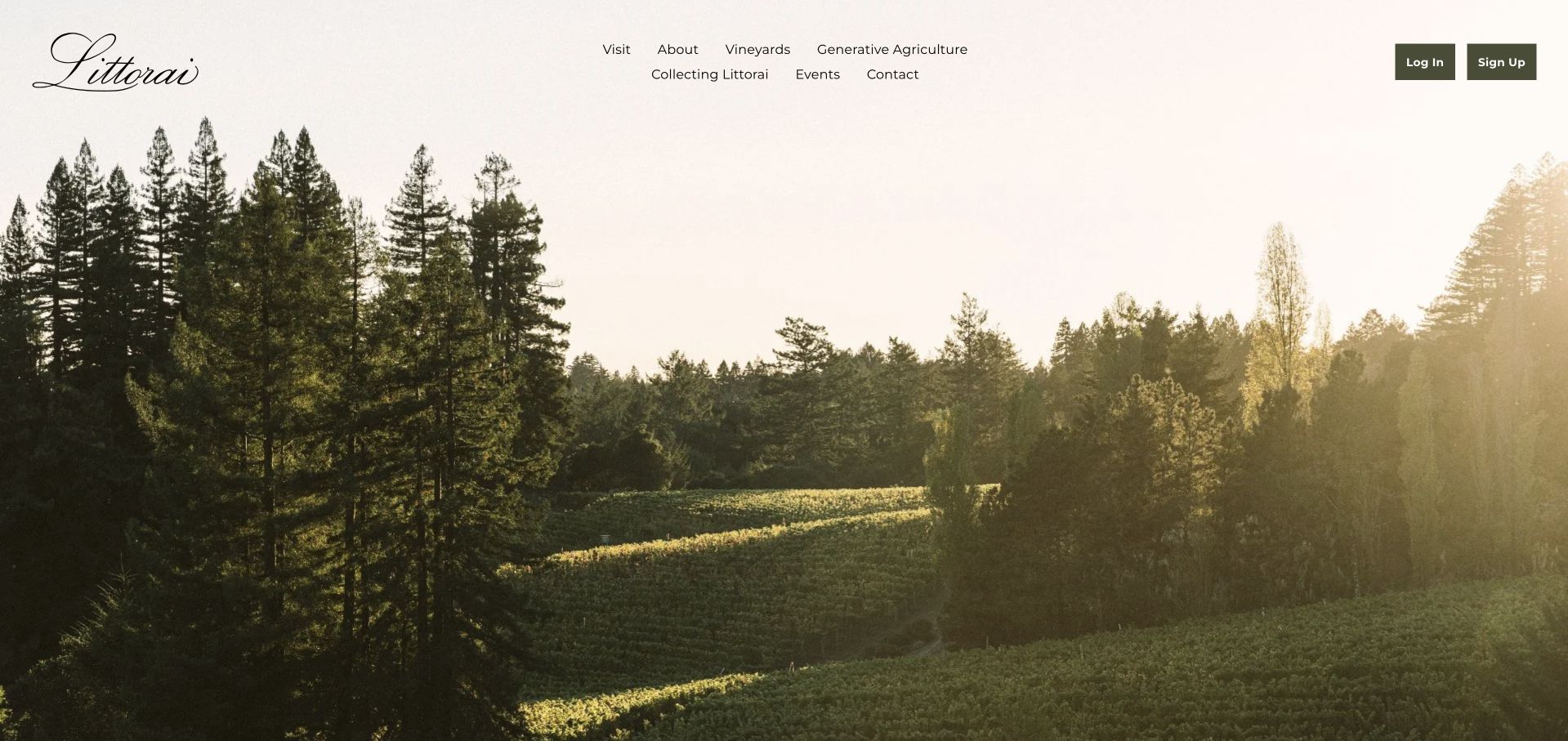
Littorai opens with a broad vineyard landscape bordered by trees, allowing its script mark and restrained cream navigation to feel integrated with the place. The page explains the origin of the name, then pairs the coastal-wine story with real farm and vineyard photographs. Generative agriculture receives its own navigation destination alongside vineyards, visiting and collecting the wines. Member login and signup are visually distinct from those public editorial routes. The site is useful for studying how a small winery can communicate depth without making bottle shopping the entire introduction.
What you can learn
Let the actual land and farming work supply the identity, then provide plainly labeled routes for learning, visiting and an existing collector's account. Agricultural positioning gains meaning from specific supporting pages and real activity, not merely a landscape used as a decorative background.
Pros
The navigation gives farming and vineyards equal structural weight with visiting and collecting.
Real farm photographs broaden the estate story beyond a familiar bottle-and-glass still life.
Cons & considerations
If the opening landscape occupies a full screen, preserve a clear visual cue that useful explanatory content continues below it.
Keep environmental or agricultural claims specific, dated and supported on the dedicated practice page as methods evolve.
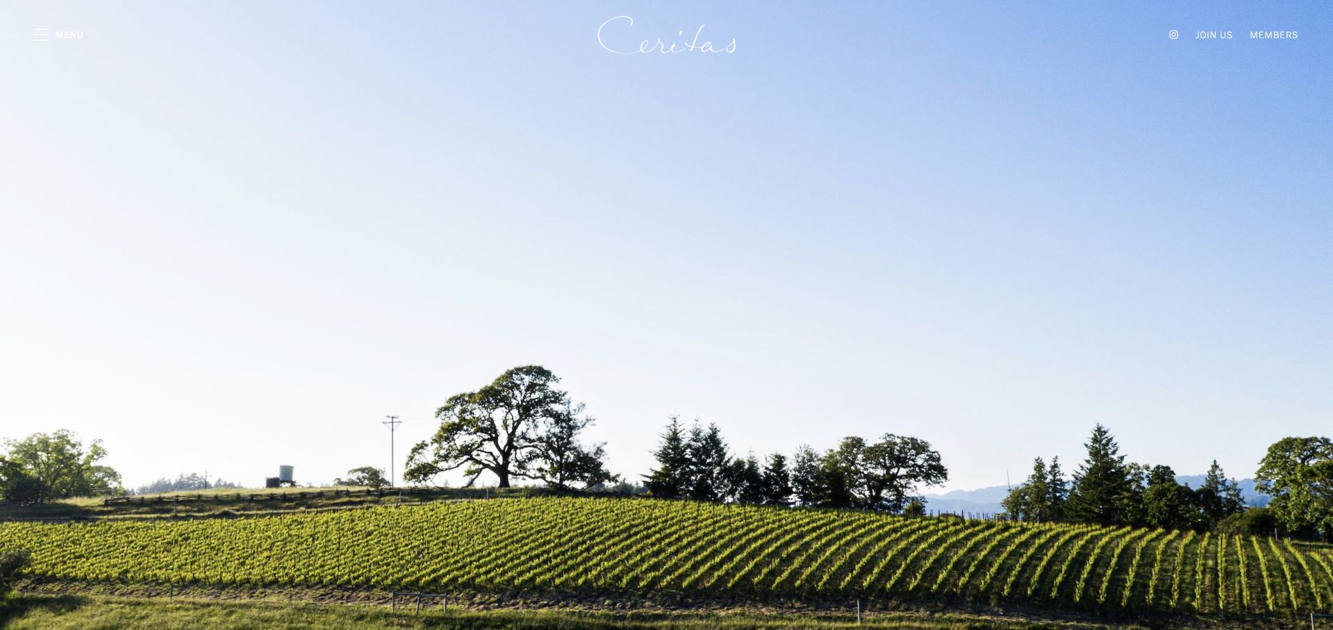
Ceritas uses an unusually generous area of sky above its vineyard, with a delicate script mark and a minimal set of visible member actions. The main text explains the winery's coastal-site focus and names the grape varieties it works with. Rather than building a long homepage store, it offers a short statement about place and a mailing-list route. A menu provides further discovery while the footer exposes policies and contact information. This makes a useful study in the tradeoff between a contemplative premium introduction and the orientation a first-time visitor still needs.
What you can learn
A spare design needs precise words and a dependable menu because there is little else to explain the offer. Separate an editorial introduction from the allocation relationship, and make clear what joining a list means before collecting any personal information.
Pros
The restrained paragraph gives concrete geographic and varietal context instead of relying only on abstract luxury language.
Member access is visibly separated from the public brand statement and mailing-list invitation.
Cons & considerations
Check the white script and menu text against the lightest areas of the sky photograph across responsive crops.
If visiting information is available, give it a clear public destination so new readers do not assume membership is required to ask practical questions.
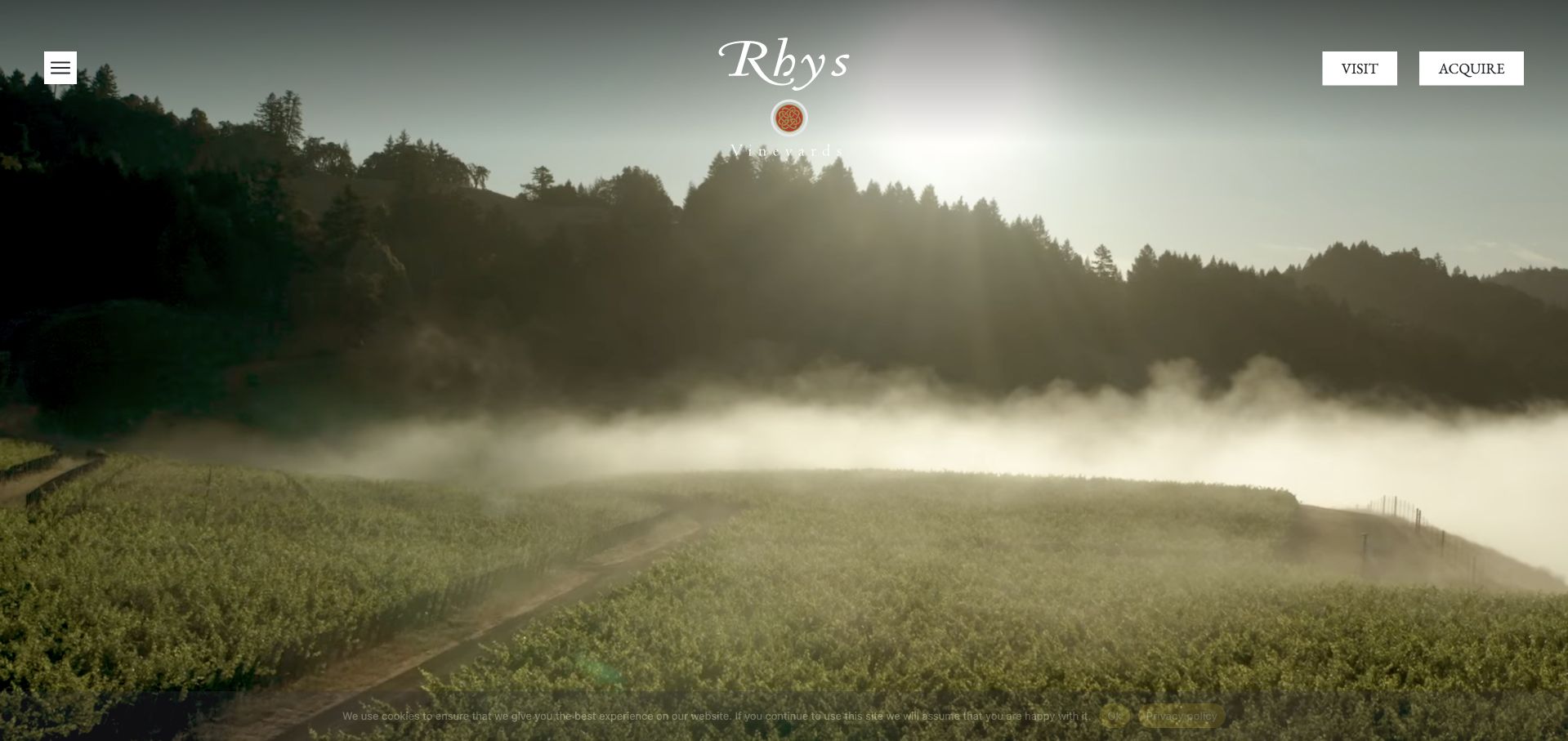
Rhys gives its opening landscape almost the whole viewport, while visit and acquire remain two clear contrasting actions in the corner. The content that follows is much more specific: the winery explains its site-selection questions, presents a directory of named vineyards and introduces its cave and winemaking process. Private by-appointment tastings are described separately from general wine acquisition. The design therefore joins a visually quiet entrance to a substantial educational site, making it useful for a producer whose individual vineyards need to be understood as more than labels on bottles.
What you can learn
Use an atmospheric opening as an invitation into specific evidence: vineyard names, geography and process details should be discoverable in a consistent structure. Keep the visit requirements public even if appointment scheduling eventually moves to another service or account system.
Pros
A named vineyard directory provides repeatable destinations for readers interested in particular growing sites.
The visit and acquire actions distinguish hospitality interest from joining the winery's purchase relationship.
Cons & considerations
If a vineyard carousel carries the directory, ensure all sites remain reachable with a keyboard and without swipe gestures.
For a full-screen landscape, provide meaningful headings and navigation labels so essential orientation is not dependent on the photograph.
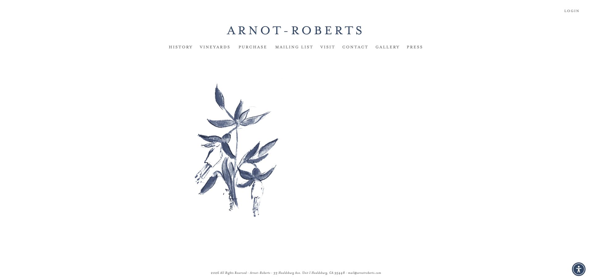
Arnot-Roberts uses abundant white space, widely spaced serif type and a single botanical illustration instead of a conventional cinematic vineyard hero. Its plain navigation names history, vineyards, purchase, mailing list, visiting, contact and press. The vineyard directory then groups specific sites by region and includes grape varieties in the link labels. This contrast is the useful design idea: the homepage can stay extremely restrained because a deeper page carries detailed geographic organization. The approach feels closer to an editorial index than a conventional hospitality sales page.
What you can learn
Keep a minimalist entrance connected to a genuinely informative index. Region, site name and grape variety are useful editorial metadata that help readers make sense of a producer's range without turning the homepage into a long, repetitive product grid.
Pros
The botanical opening establishes a distinctive identity without requiring video, rotating promotions or a purchase interruption.
Region-grouped vineyard links combine place and grape information in readable text.
Cons & considerations
If the vineyard maps contain interactive markers, give each marker a descriptive label and retain the textual list as an alternative.
On small screens and zoomed views, test the widely spaced navigation so it wraps into usable targets instead of becoming tiny text.
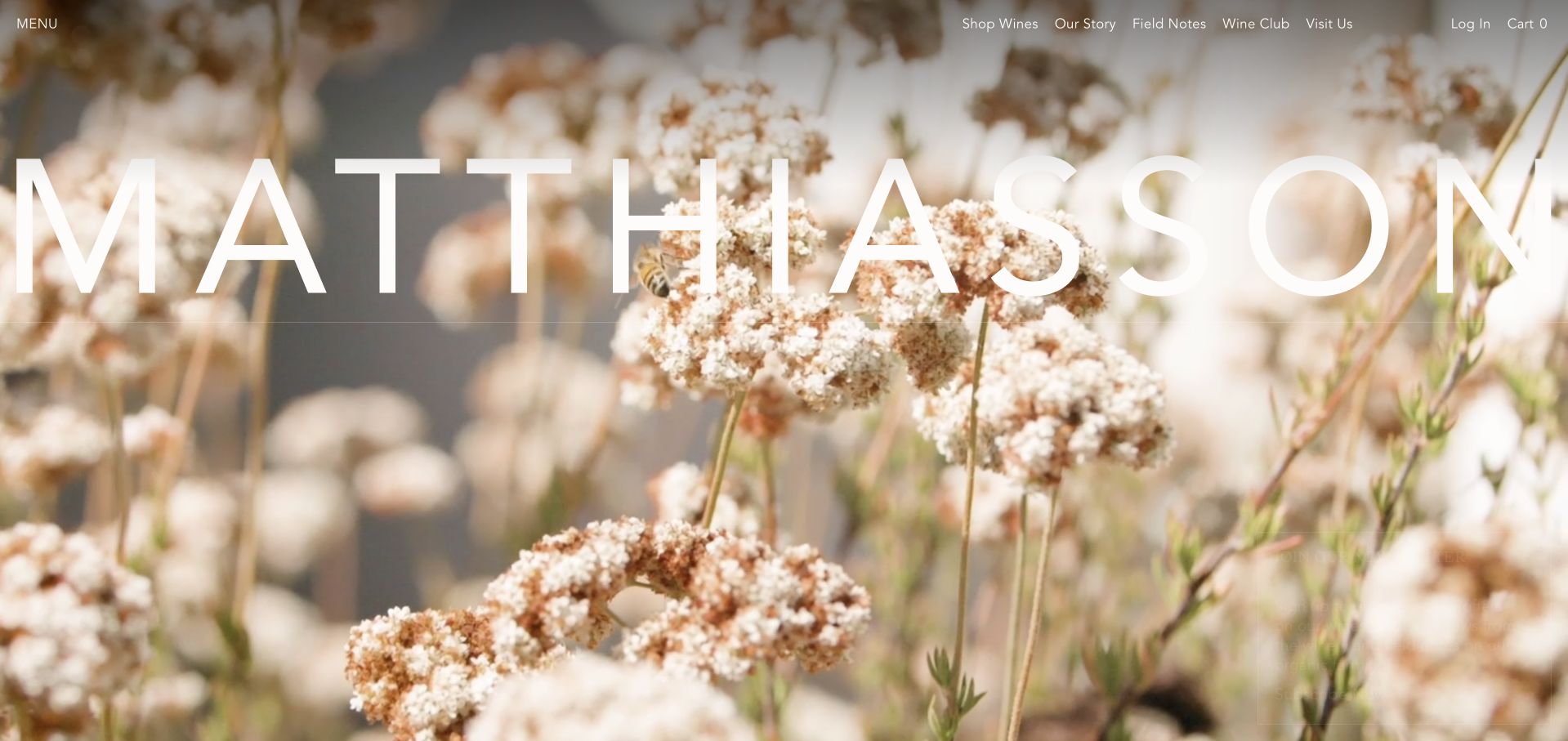
Matthiasson puts flowering plants rather than a bottle in its opening image, carrying the winery name across the screen in large clean lettering. The navigation separates wines, the company story, field notes, the club and visits. The body connects that visual introduction to current named wines, a sustainability framework and a sequence of agricultural priorities. A glossary, tasting notes and trade material extend the site beyond marketing. The example is useful because the farming identity becomes a content system, rather than one unsubstantiated environmental word beside the logo.
What you can learn
Choose an agricultural visual idea that can lead into detailed, maintained editorial material. Explain practices and wine records in connected pages, while keeping shop and visit tasks visible for readers who are not ready to study the entire approach.
Pros
Field notes, a glossary and practice pages give the farming-centered identity destinations with different levels of detail.
Wine, club and visit routes remain distinct rather than being merged into one generic membership action.
Cons & considerations
If large white type overlays pale flowers, test contrast through every frame or crop and provide an appropriate stable background.
Sustainability and regenerative-practice statements need ongoing editorial review; distinguish goals from documented current methods and certifications.
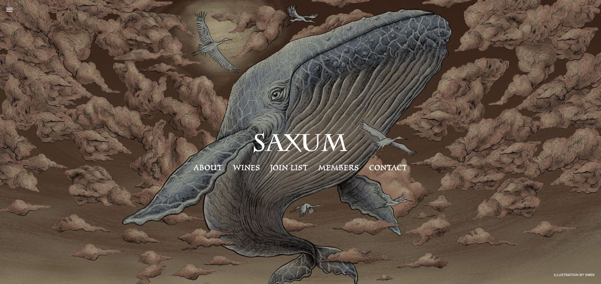
Saxum uses a detailed illustrated whale and cloud scene, credited to the artist, as the entire homepage environment. A compact central group gives direct routes to the company, wines, joining the list, existing members and contact. The wine library organizes named bottlings as a set of clear destinations rather than requiring an account to see what the producer makes. It is a useful counterexample to the assumption that every winery must open with a drone flight over rows of vines: an artistic identity can be more memorable while navigation remains short.
What you can learn
If commissioned artwork defines the entrance, keep the functional choices clear and the artist credit intact. Let the wine library explain the range in ordinary text, and distinguish reading about a bottling from the separate process of receiving an allocation.
Pros
The credited illustration gives the winery a visually distinctive opening without depending on familiar estate-photo conventions.
The central action labels distinguish an interested newcomer from an existing member.
Cons & considerations
Check text contrast across the detailed illustration and supply an appropriate simplified crop for narrow screens.
Where a wine library uses previous and next controls, include a full index so readers can jump directly to a named bottling.
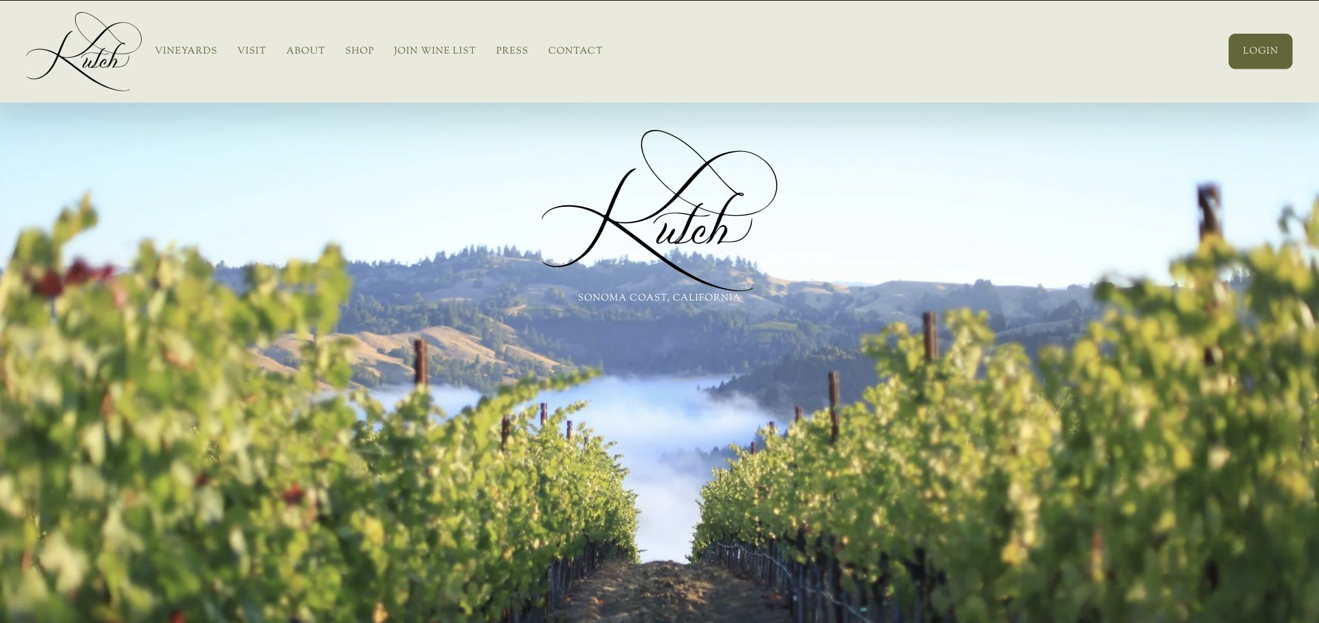
Kutch introduces Sonoma Coast through fog between vineyard rows and a prominently repeated script mark. The header offers vineyards, visits, the company story, the shop and a wine-list signup. Below the landscape, a visit section explains that tasting requests are accommodated as the schedule allows, with direct named contact routes rather than an unconditional booking promise. A longer origin story and brief timeline document the estate's development. The design is useful for a small producer whose hospitality arrangements need to remain personal and capacity-aware.
What you can learn
Be explicit about what a visit request does and does not guarantee. Use the landscape to establish the wine's setting, but let a maintained visit section explain how to inquire, where the estate is and which facilities are planned rather than already operating.
Pros
The visit section gives a candid scheduling expectation and a direct contact rather than implying unrestricted walk-ins.
The coastal image and vineyard navigation reinforce a specific geographic identity.
Cons & considerations
If estate facilities are under development, keep planned and operating services clearly separated as the project progresses.
For the long company history, add readable headings and anchors so practical visit information does not become buried on a phone.
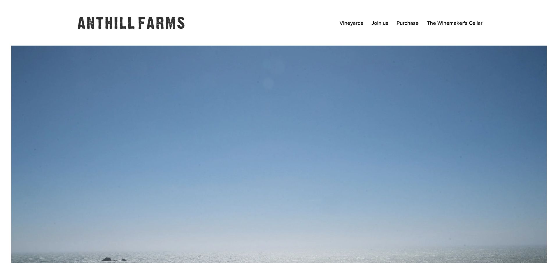
Anthill Farms uses a simple white header and an expansive coastal photograph, keeping its visible menu to vineyards, joining, purchasing and the cellar club. The most important practical line is unusually direct: the winery does not have a public tasting room and asks visitors to email about scheduling. An address and email appear with that statement. This is useful inspiration for a producer that wants to look welcoming without promising drop-in hospitality it cannot provide. The minimal layout works by giving a small number of destinations clear responsibility.
What you can learn
Publish a truthful visit limitation as ordinary site content, not as a surprise after a reservation request. A quiet visual identity can support a small producer well when the contact route and distinction between purchase, membership and visiting are unambiguous.
Pros
The explicit no-public-tasting-room statement prevents an attractive estate image from creating a misleading walk-in expectation.
Four short navigation choices keep the allocation and wine-discovery journeys easy to recognize.
Cons & considerations
Where the coastal photograph is dominated by open sky, test its responsive crop so it still conveys a meaningful sense of place.
Give important photographs descriptive alternative text rather than camera filenames, particularly when there is little other homepage content.
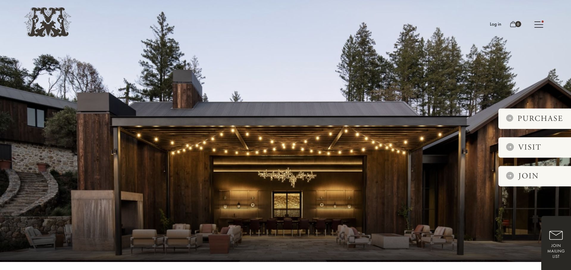
Mayacamas places purchase, visit and join in three large white actions beside a photograph of its estate hospitality space. Each action has a short explanatory label in the accessible page structure. Farther down, visiting splits explicitly between the estate and downtown tasting room, with prior reservations described for both. The history and classical winemaking story remain separate from those immediate tasks. The useful pattern is the combination of a strong architectural impression with a simple decision model that acknowledges two substantially different physical experiences.
What you can learn
Start with the few actions people actually need, then ask which location before presenting a reservation path. Heritage can enrich the decision without becoming a compulsory long-form introduction before visitors discover whether they want the mountain estate or town room.
Pros
Purchase, visit and membership are visually and verbally distinguished at the opening.
Estate and downtown receive separate visit links rather than sharing one ambiguous reservation destination.
Cons & considerations
Keep appointment requirements, travel expectations and any experience differences visible before sending people to a reservation service.
If the large side-mounted actions overlap imagery on mobile, test their stacking and keyboard focus so they remain readable and easy to activate.
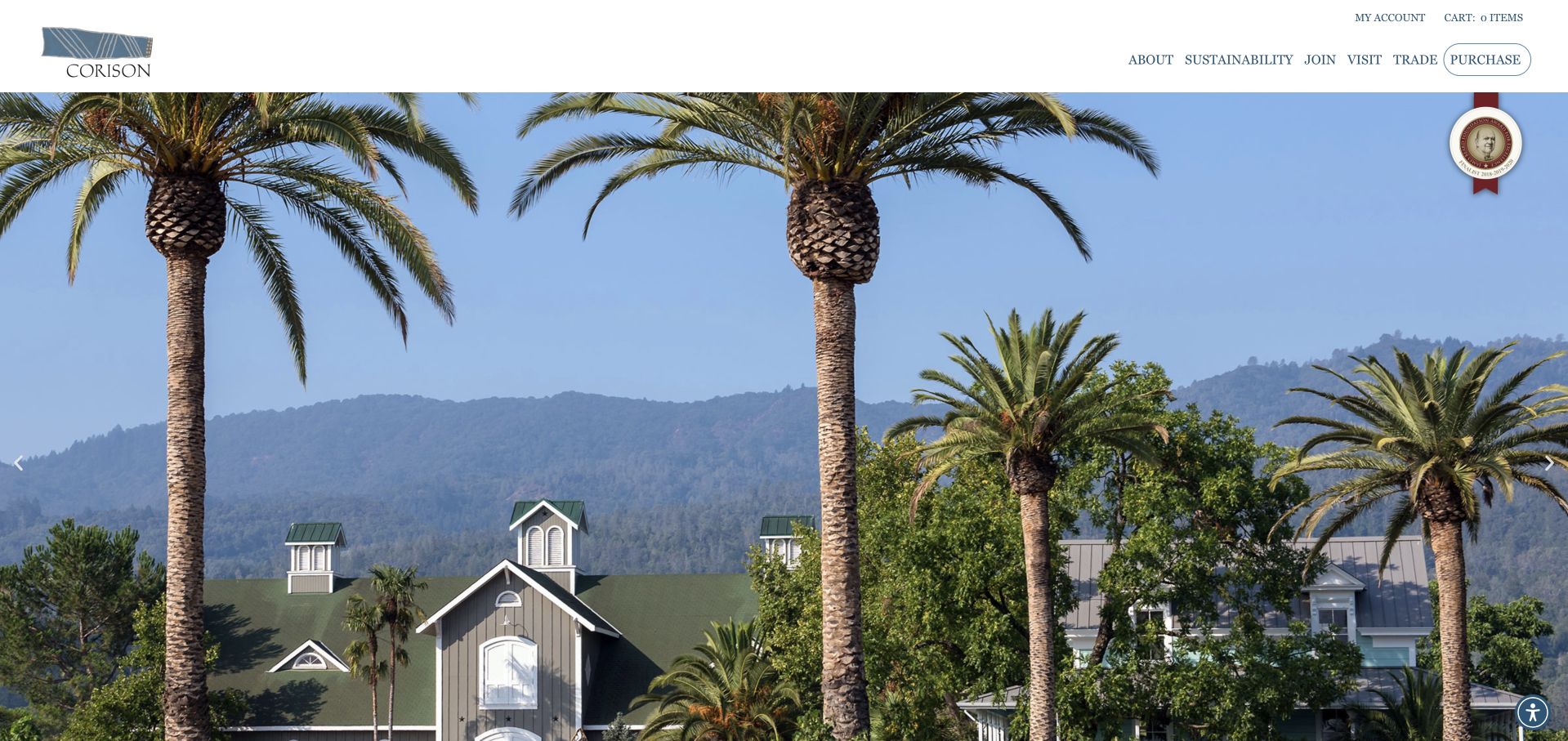
Corison opens on its recognizable working winery with a restrained white header and separate destinations for the company, sustainability, joining, visiting, trade and purchasing. The body introduces the Cabernet focus, then adds a vineyard update with a month and year. Current family and harvest material gives the heritage story a continuing present tense. News and accolades sit alongside that material rather than replacing it. The site is useful for a producer that wants a personal, credible editorial rhythm without turning the homepage into an undifferentiated stream of social posts.
What you can learn
Give farm updates their own dated editorial record and an archive. That lets the winery communicate a living agricultural practice while preserving dependable top-level routes for tasting, purchasing and professional trade needs.
Pros
The dated vineyard update distinguishes current work from the enduring company history.
A dedicated trade destination recognizes a professional audience without mixing its material into consumer shopping.
Cons & considerations
Where a rotating hero supplies the estate image, provide an obvious pause option and ensure each photograph preserves header contrast.
If sustainability accolades are highlighted, retain the award's exact year and context and separate them from broader claims about current practices.
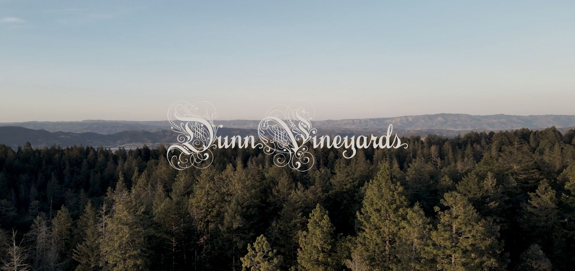
Dunn begins with a broad mountain and forest view and an ornate mark rather than a sales headline. The page then becomes a long, photo-rich narrative about the family, the property and individual vineyard blocks. Story, vineyards, people, wines and visiting are distinct navigation ideas, while joining the list is separate from contact. The useful feature is the way ordinary working-property images and direct language support the estate's personality. It does not need to borrow a polished resort aesthetic to explain its history and agricultural focus.
What you can learn
Use a long narrative when the family and land genuinely provide material worth reading, but give it a usable table of contents. Structured vineyard headings and persistent task routes allow an atmospheric story to coexist with quick questions about wines and visits.
Pros
Specific vineyard-block names and development history provide substance beyond a generic multigeneration family statement.
Working-property photography supports a consistent, candid identity rather than an interchangeable luxury setting.
Cons & considerations
If the opening is almost entirely landscape, make the menu and continuation cue apparent before users need to discover them by scrolling.
Audit repeated blocks and image descriptions in the long page so assistive reading does not encounter duplicated vineyard text or incomplete labels.
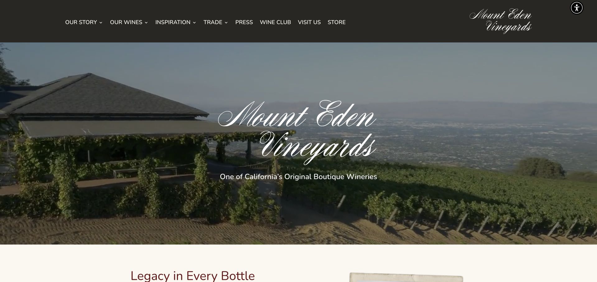
Mount Eden pairs a dark header with an elevated view of the estate and the landscape beyond it. Its opening identifies the winery plainly before the page moves into a historical introduction, individual wine entries, the club and visiting. The visit paragraph is notably practical, naming appointment-only weekday tastings and a small-group limit rather than implying unrestricted hospitality. Trade and press have dedicated destinations. It is useful for studying how a heritage story can remain visible while the site still explains specific products and the conditions of an actual visit.
What you can learn
Use the estate view to establish place, then turn the heritage into concrete wine records and clear appointment expectations. Eligibility, group size and opening arrangements should be public information, not details disclosed only after a visitor begins a booking.
Pros
Individual wine links create a clear product structure beneath the broader estate story.
The visit introduction states appointment and group-size constraints before the reservation destination.
Cons & considerations
If the opening uses moving video, retain a stable fallback and user-operated pause controls rather than relying on an accessibility overlay.
Check that wine-club links in different navigation areas reach one maintained source of membership details.
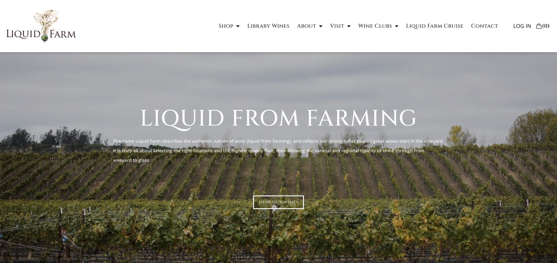
Liquid Farm introduces its name through a vineyard photograph and a short explanation connecting wine to farming. The following sections identify the Santa Barbara and Sta. Rita Hills context, then shift to a farmhouse-style tasting room in Los Olivos. Shopping, library wines, visits and clubs are separate menu choices. The footer publishes the tasting-room address and opening time. This is useful for a winery whose growing-site story is essential to the brand but whose practical visitor destination is a town room rather than the landscape in the hero photograph.
What you can learn
Explain the relationship between where grapes grow, where wine is made and where visitors are received. A consistent visual identity can connect those places, but directions and visit copy must name the actual tasting-room destination.
Pros
The town tasting room receives a concrete address and its own visit route rather than being confused with the vineyard hero.
Current shopping and library-wine destinations acknowledge two different kinds of product discovery.
Cons & considerations
If only an opening time is shown in the footer, add closing times and holiday exceptions where people plan their visit.
As clubs or travel experiences expand, keep their commitments clearly described instead of allowing a prominent promotion to substitute for membership terms.
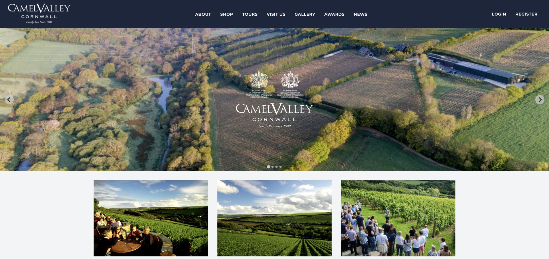
Camel Valley opens with an aerial view of its Cornish vineyard and a dark, highly legible header. Immediately below, three cards distinguish buying online, visiting and booking a tour. The page explains the terrace experience, presents named wines and provides an estate introduction. Its footer is unusually operational, publishing weekday opening, weekend closures, advance-booking expectations and a dog policy. This makes a useful example of a vineyard where a scenic visit, a guided activity and a purchase are related but should not be described as the same task.
What you can learn
Use a small set of cards to separate self-directed visits, guided experiences and wine shopping. Preserve the operational details in readable text and keep date-sensitive information maintained, particularly when the estate's working pattern differs from a typical weekend leisure attraction.
Pros
The first three cards turn a broad vineyard image into clear, different next steps.
Opening days, booking requirements and arrival policies are published together rather than dispersed across social posts.
Cons & considerations
If the latest-news area contains older items, distinguish it from current operational announcements and review its prominence.
Ensure tour and terrace availability is confirmed on the detail pages before visitors interpret the scenic homepage as a promise of walk-in access.
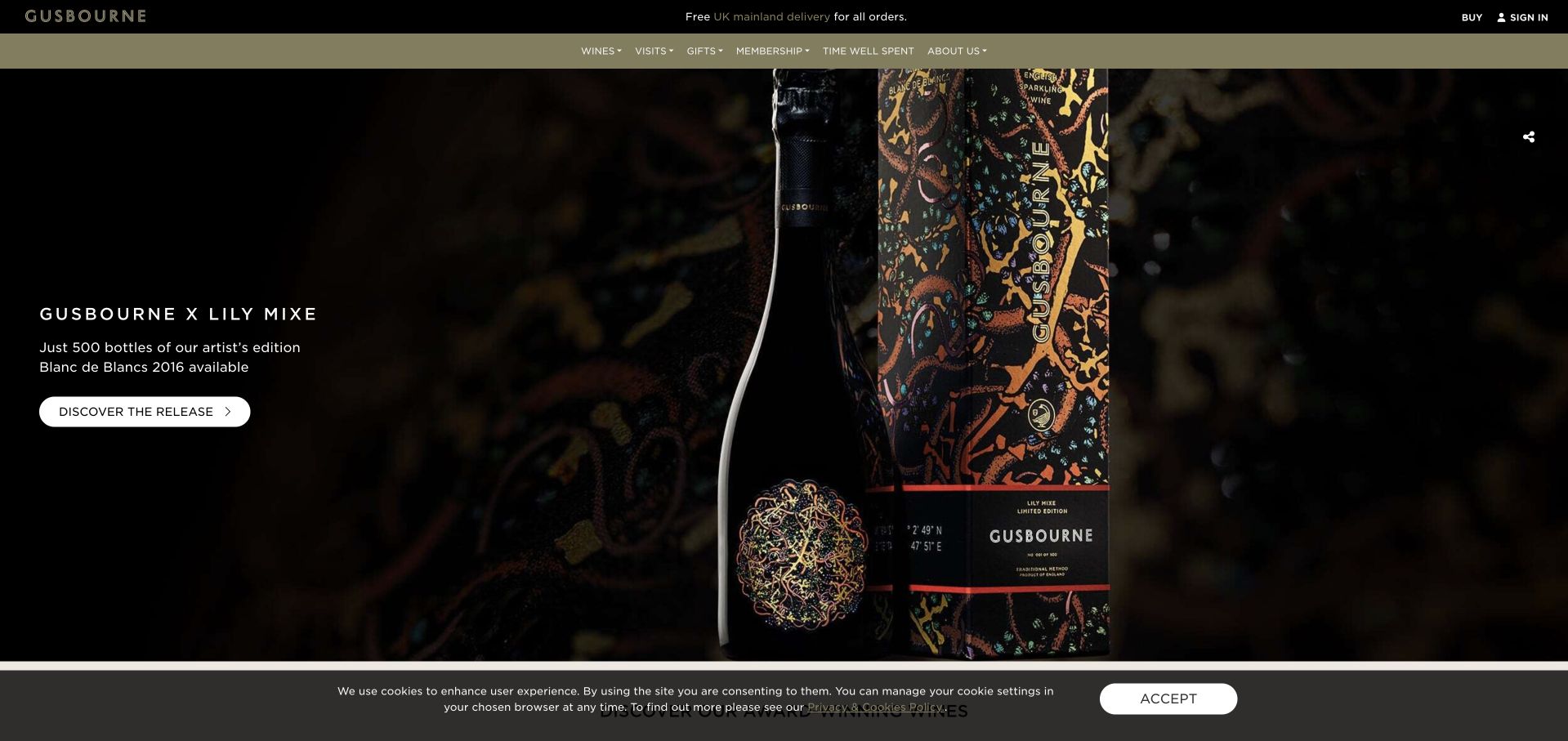
Gusbourne gives an artist-edition release the opening screen, using a close view of its illustrated packaging and a focused discovery action. A separate navigation line names wines, visits, gifts and membership. The homepage then introduces seasonal gift collections, tours, dining experiences and editorial articles. The site is useful for studying a winery that behaves like both a product brand and a destination: time-limited campaigns change the opening, but stable categories remain available for people who arrived with a different intention.
What you can learn
Treat a campaign as an editorial layer above enduring wine and visit records. Product editions, gifts and events should each lead to the right explanation, with their date, vintage and commitment visible before a visitor begins any transaction.
Pros
The artist-edition opening connects packaging design to a specific release rather than using decorative art without context.
Visits, gifts and membership remain recognizable categories alongside wine discovery.
Cons & considerations
As seasonal modules accumulate, remove expired offers and keep the ordinary estate visit easy to find.
Test carousel controls and heading order so the large number of promotional cards remains understandable without visual scanning or swipe gestures.
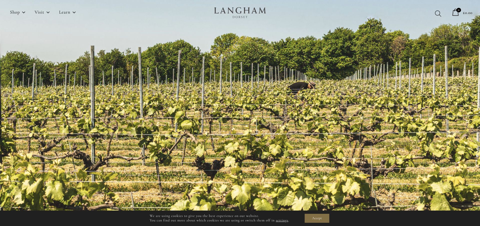
Langham opens with a broad view along the vines under a compact shop, visit and learn menu. The page describes its single-vineyard sparkling-wine focus, presents individual wines and then makes the visit practical with tours, the cafe, events and directions. A dated Christmas dining entry shows how seasonal programming fits within that structure. The footer includes day-by-day hours and deeper farming and winemaking pages. The useful pattern is a small top-level menu supported by a more specific hospitality and learning system.
What you can learn
Keep high-level navigation short, but make the next layer descriptive. Wine learning, a cafe lunch and a guided tour are distinct reasons to visit the same estate; give each a stable destination and make current dates and availability separate from the enduring vineyard story.
Pros
Tours, cafe, events and find-us links turn the rural setting into a practical day-visit proposition.
The learning structure separates viticulture, winemaking and the team instead of collapsing all expertise into one long about page.
Cons & considerations
Audit calls to action for development-site addresses; a public about link should not send visitors to a staging hostname.
Where sold-out bottles remain featured, label that state clearly and offer useful range discovery without implying current stock.
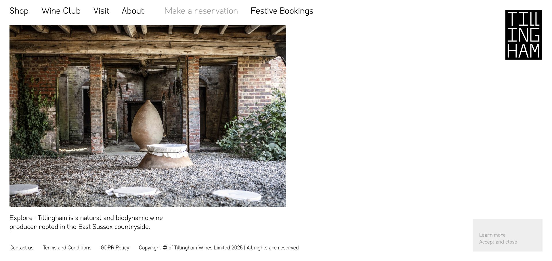
Tillingham uses a white editorial layout, a compact stacked wordmark and large photographs presented as a sequence of experiences. The captured panel introduces the wine producer through an agricultural scene, while other panels connect to rooms, the restaurant, tours and a journal. The main navigation distinguishes the shop, wine club, visit and company information, with separate reservation language. This is useful inspiration for a producer whose site must explain a farmstead stay rather than only a bottle range, although the image-led sequence puts pressure on navigation clarity.
What you can learn
Build a destination narrative from actual spaces and activities, but keep each action's purpose explicit. A room reservation, restaurant table and wine tour have different practical requirements even when the same booking service handles more than one of them.
Pros
Actual farmstead and hospitality photography gives the range of experiences a coherent sense of place.
The public visit and journal routes allow exploration without requiring a reservation or wine-club account.
Cons & considerations
If experience cards rotate, provide stable labels and controls so essential information is not available only in a transient slide.
Give reservation triggers semantic buttons or links with clear destination names, and test contrast on the subdued secondary labels.
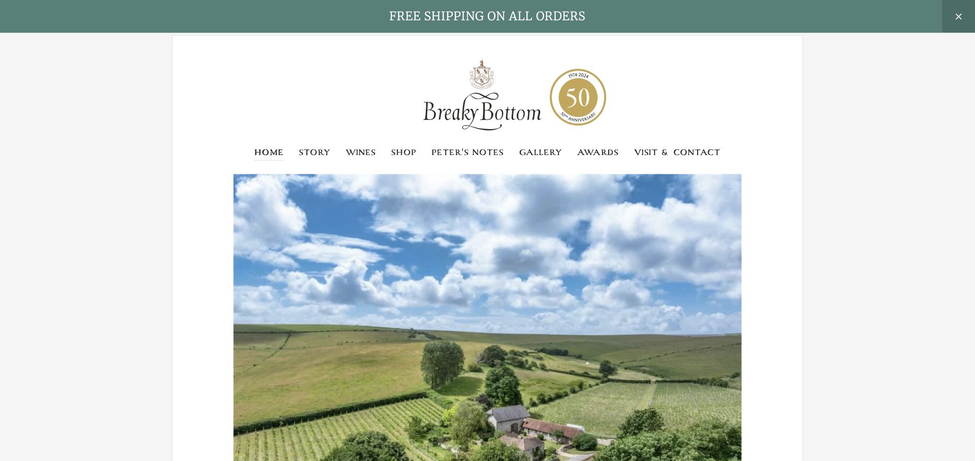
Breaky Bottom uses a centered editorial layout, a restrained green announcement bar and an aerial photograph of the isolated vineyard valley. The page's introductory story is explicitly tied to family, place and continuity, while the navigation separates terroir, history, wines, stockists and visiting. Peter's Notes gives the producer a recognizable editorial voice rather than a generic news label. It is useful for studying how a small rural estate can communicate character through its real setting and archive without needing a highly animated luxury presentation.
What you can learn
Use a distinctive place and a specific editorial voice as durable assets. Keep historical writing identified as such, and pair it with a maintained visit page so the personal story does not inadvertently promise access arrangements that may have changed.
Pros
The secluded-valley photograph explains the estate's physical character more directly than a general countryside image.
Terroir, history and personal notes create different routes into the producer's identity.
Cons & considerations
As family or operating circumstances change, date historical notes and separately maintain current visitor and contact information.
If awards are available primarily in a PDF, provide a readable HTML summary with years and context for mobile and assistive readers.
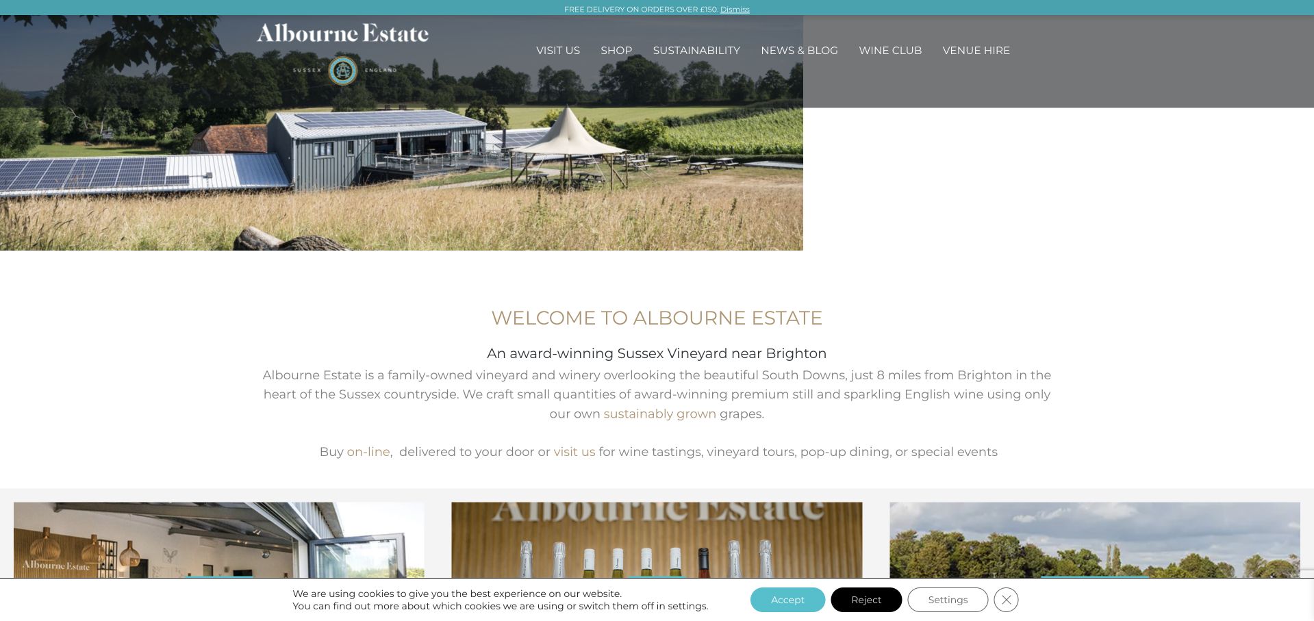
Albourne introduces itself as a Sussex vineyard near Brighton, with a photograph of the actual winery buildings and landscape. Its paragraph explains that wine is estate-grown, then immediately points to online purchasing and visits. A series of cards repeats the core tasks: visit, shop, sustainability, news, club and venue hire. The footer supplies directions and opening-hours routes. The design is useful because geographic context and practical tasks appear quickly, making a small estate understandable without requiring a long history or a cinematic opening sequence.
What you can learn
Give a new reader three pieces of orientation early: what the estate is, where it is and what they can do there. Use the supporting cards to separate public hospitality, purchasing and private hire, then attach each to a maintained detail page.
Pros
The near-Brighton description provides useful geographic orientation beyond a rural postal address.
Task cards distinguish venue hire from ordinary visits and wine discovery.
Cons & considerations
Test wide-screen and mobile image sizing so the estate photograph does not leave an unintended empty section of the hero.
Where sustainability is a primary navigation item, keep the underlying claims specific and the supporting evidence current rather than relying on an unqualified headline.
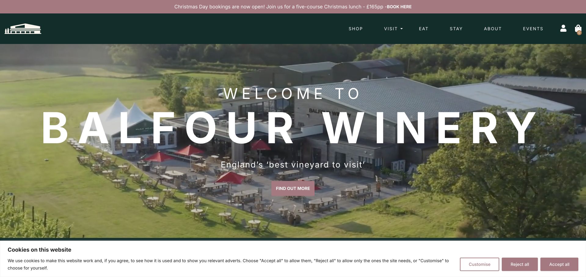
Balfour uses an aerial view of its hospitality buildings and grounds to make the winery feel like a destination. The menu separates shopping, visiting, eating, staying and events, and a seasonal notice promotes a specific Christmas meal. Farther down, the site introduces tours, dining, pubs and hotels as related offers. The useful design pattern is this plain-language division of a broad hospitality business. It lets someone planning lunch take a different route from someone researching a tour or accommodation, rather than making every intent pass through a wine catalog.
What you can learn
Name the guest's intended activity in the navigation and explain where it takes place. Broad hospitality brands need especially clear location and commitment boundaries so a strong estate image does not imply that every hotel, pub or event belongs to the same property.
Pros
Activity-based labels make eating and staying visible without requiring knowledge of the winery's wider business.
A direct accessibility-guide link provides a route to practical information beyond the marketing photographs.
Cons & considerations
If a superlative visit claim appears in the hero, identify the source and year so readers can understand its scope.
Keep dated dining promotions and social-feed material subordinate to current menus, arrival information and the actual availability of each experience.
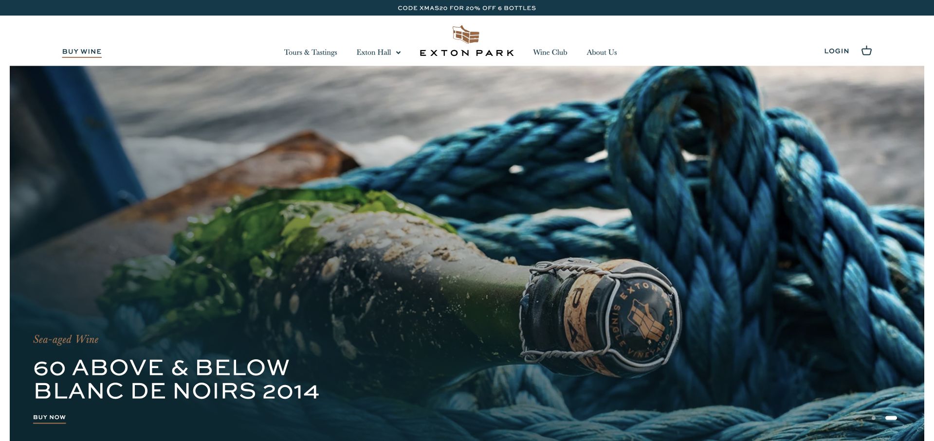
Exton Park gives a sea-aged-wine campaign the opening screen, using a close photograph of the bottle and marine equipment rather than a conventional vineyard panorama. The header still names wine, tours, the hall and the club. A product grid organizes reserve blends and vintages, while separate sections describe estate tours and corporate or private uses of Exton Hall. The example is useful for a producer with an unusual technical story: the campaign attracts attention, but the catalog and hospitality structure remain recognizable underneath it.
What you can learn
Make an unusual production story concrete through the actual release and supporting explanation. Keep the experiment distinct from ordinary product attributes, then provide separate, clearly described routes for touring the estate and hiring a hospitality space.
Pros
The sea-aged campaign has a specific visual subject and product destination rather than an unsupported abstract innovation claim.
Wine discovery, tours and hall hire receive different structural areas within one consistent site.
Cons & considerations
When limited releases or advance deposits appear, publish the exact product status and terms before any transaction begins.
Audit promotional links that still reference a temporary hosted-store address so readers remain on the intended official destination.
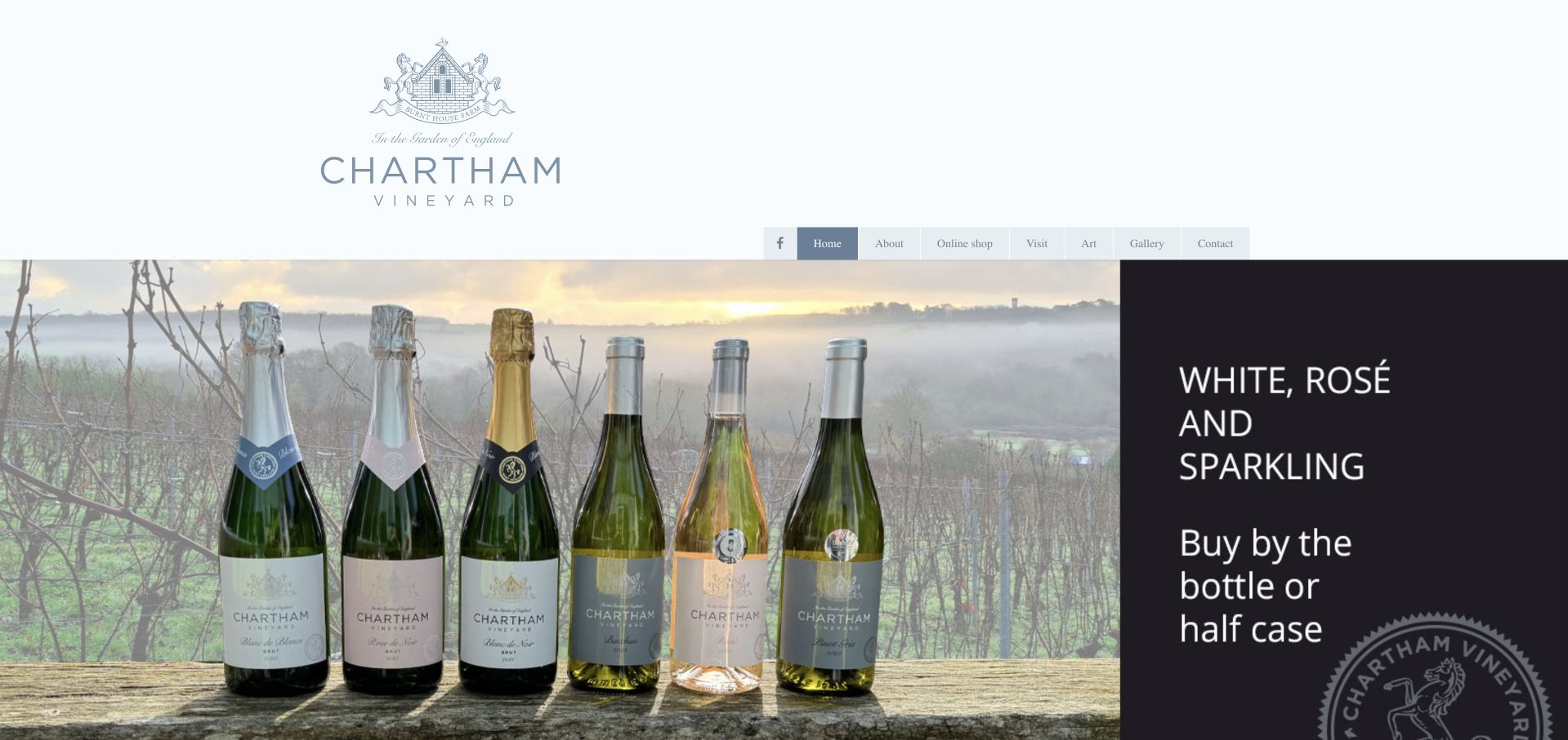
Chartham pairs a large identity area with a photographic wine-range banner, then uses straightforward cards for the online shop, visits, the vineyard shop and the family enterprise. The homepage names Saturday opening hours, guided-tour times and the free art-gallery offer. These are unusually useful details for a small destination that is not open like an everyday retail store. The design is useful as an example of plain information architecture doing substantial work without complex animation or a luxury editorial vocabulary.
What you can learn
Prioritize truthful opening arrangements and the differences between a casual shop visit, a booked tour and an additional attraction. A simple grid can serve a small winery effectively when each card answers a real question and directs readers to a specific maintained page.
Pros
The Saturday shop and tour times appear as readable content, reducing ambiguity about when a rural visit is possible.
The art gallery is identified as a separate attraction rather than hidden in a general photo gallery.
Cons & considerations
Where banners contain promotional text inside images, repeat the essential offer in HTML and check the narrow-screen crop.
Retain current directions alongside the postal address and review older map-service links so an arrival route remains dependable.
Kegan is a freelance web designer and developer with 15+ years of experience helping businesses turn complicated website requirements into clear, maintainable digital experiences. He works directly with clients from planning and design through development, launch, and ongoing support.
For winery website design, his development approach focuses on wine and vineyard storytelling, tasting-visit information, club and shop connections, and clear reservation-system handoffs. The scope can be a targeted improvement or a complete custom build, with responsive layouts, thoughtful content structure, and integrations chosen around the people using and maintaining the site.
Show 3 other winery website designersHide other winery website designers
Plan a winery site around the estate, the wine record and the real visit
Map the places and audiences
List vineyards, production sites, tasting rooms, restaurants and accommodation separately. Identify which are visitor destinations and which should not receive unannounced arrivals. Then define public learners, existing collectors, prospective members, visitors and trade users as different audiences with overlapping information needs.
Create a durable wine-content model
Separate the wine identity from its vintage records and sale availability. Store grapes, vineyard, region, production notes and relevant technical material consistently. A new release should not require rewriting the entire producer story, and an older wine should remain clearly identified as a library record.
Describe the visit before the booking tool
Publish the location, duration, format, price context, requirements and accessibility information appropriate to the experience. Explain appointment-only or no-public-room arrangements openly. Connect each experience to the correct scheduling destination without submitting a real reservation as part of routine design testing.
Define the meaning of joining
A newsletter, allocation waiting list, account and paid wine club are not interchangeable. Give each a truthful description, including expectations and commitments where relevant. Avoid making a generic join button carry several different relationships without explaining them before the form.
Build a maintained editorial program
Use farm updates, field notes, vineyard profiles or historical archives when the producer has material to sustain them. Date current updates and distinguish old notes from present operating instructions. Assign review dates for environmental claims, awards, event promotions and plans for future facilities.
Test the entire public discovery path
Find a named wine, understand its vineyard, identify a visit option and locate practical directions on a phone and with a keyboard. Test menu overlays, image contrast, zoom and reduced motion. Stop before age assertions, account creation, agreements, payments or booking submission; use suitable test environments for private workflows.
The editing job behind the design
Choose a publishing system that distinguishes stories from transactions
The public content system should keep vineyard, wine, vintage, place and experience records connected. Commerce and reservation systems may own current stock, capacity and customer relationships. Document the boundary so editors do not manually duplicate rapidly changing availability in a scenic homepage module or copy private member information into public analytics.
Choose integrations after testing their real public behavior. Wine catalogs, club explanations and visitor information should remain useful if a store, map or booking embed is unavailable. Public technology evidence does not establish the quality or security of the winery's private systems, and an account-provider relationship should not be inferred solely from the visual style of a page.
Our WordPress website examples offer a separate look at publishing approaches. A visible platform label is evidence for that named page, not a guarantee that the same system will suit your requirements.
Before the public launch
Winery website planning checklist
Identify the producer's region, grape focus and relevant growing sites.
Distinguish vineyards, production facilities and visitor locations.
State clearly whether public tastings exist and appointments are required.
Publish practical directions and relevant accessibility information.
Separate wine identities, vintage records and current inventory.
Distinguish newsletters, allocations, accounts and paid clubs.
Explain each experience before sending visitors to a booking provider.
Date field notes, seasonal events and release announcements.
Support agricultural and environmental claims with specific maintained detail.
Keep artist credits and image rights associated with commissioned work.
Test contrast, image crops, menu focus and reduced-motion behavior.
Verify public journeys without age attestations, orders, accounts or reservations.
These checks are a project checklist, not a performance, legal, security, or accessibility certification. Test real journeys with the people responsible for the website before making claims about the result.
Sources & editorial method
How this collection was selected and reviewed
The twenty-two examples meet the collection's saved target. Each selected official homepage was independently inspected in an ordinary browser and captured directly, with original commentary on visible design, content structure and conditional tradeoffs. Arnot-Roberts' vineyard directory and Saxum's public wine library were also inspected to understand their homepage navigation. Age-gated candidates were excluded rather than entered; no age attestations, purchases, subscriptions, accounts or reservations were submitted. Editors Choice is an explicit design selection within the collection, not a wine-quality endorsement, purchasing recommendation or visitor vote.
Each example links to its actual source page. Screenshots are direct browser captures with their own capture dates; moving imagery, announcements and live designs can change. The notes describe observable design choices and conditional tradeoffs, not measured traffic, conversion results, service quality, or accessibility conformance.
Technology labels use public page metadata, asset evidence, or explicitly cited platform documentation. Platform documentation is not a complete current deployment audit. A component reference may be legacy or unused; it is not a complete backend inventory. Unknown stacks are omitted. These sites are editorial examples, not our client portfolio.
Written, Edited and Curated are separate editorial records, not timestamps advanced by a rebuild. Website designs and imagery belong to their owners. See our editorial standards or suggest a correction.
Questions worth asking
Winery website design questions
What should a winery website explain first?
Identify the producer and its place, then offer clear routes to wines, visits and the appropriate collector relationship. Readers should not need to interpret a landscape photograph or a luxury adjective to learn where the winery is or whether it receives visitors.
Should every winery site have an immediate booking button?
Only when the winery actually offers a bookable experience. Some small producers accommodate visits by request or have no public tasting room. Anthill Farms states that limitation directly, while Mayacamas distinguishes estate and downtown appointment options. Truthful access information matters more than a universal conversion pattern.
How should a wine archive differ from the shop?
The archive documents a wine and its vintages; the shop describes what is currently available under the applicable sales conditions. They can share underlying records, but an archived vintage should not look like a promise of stock. Keep current release and library labels clear.
What makes a winery website distinctive without using video?
Specific material from the producer is often enough: the actual land, people, working spaces, editorial voice or commissioned art. Arnot-Roberts uses a botanical illustration and Saxum uses a credited illustrated scene. Distinctiveness can come from precise choices rather than continuous motion.
How much detail belongs in a sustainability section?
Enough to explain the actual practices, scope and current status of the claim. Distinguish goals, methods and certifications, name the relevant sites and review the information as practices change. A dedicated page can carry evidence while the homepage offers a concise, accurate introduction.
A useful winery website makes place tangible and the next step honest. Connect distinctive imagery to specific wine and vineyard information, explain the actual visit and keep membership and transactions clearly separate from public discovery.