Best Cheesemonger Websites of 2026 (17 Real-World Examples)
Cheesemonger websites that make discovery, gifting and shop visits easier to understand.
The best cheese-shop website is not simply a photograph of a beautiful board. It helps a customer choose between unfamiliar products, understand portions and find the right way to buy or visit.
A cheesemonger has a valuable advantage online: the product offers color, texture, packaging and a rich range of serving contexts. Those assets can also obscure the practical decision. Someone choosing a gift may not know a recipient’s preferences; someone planning a dinner may not understand portions; a regular customer may want one particular cheese quickly. A useful website translates specialist knowledge into ordinary choices without overwhelming visitors with terminology or reducing every product to a generic luxury claim.
These 17 examples span independent counters, larger merchants, creamery brands and a neighborhood cooperative with a wider food offer. Read the design in that context. A maker’s store locator does a different job from an independent retailer’s assortment, and a pizza-and-cheese destination may prioritize today’s hours over shipped gift boxes. Cheese Plus is our first editorial selection for its clear neighborhood character and practical variety of uses. The collection is not a ranking of flavor, production standards, food safety or delivery performance; it is a set of visible design patterns to consider in a specific brief.
Before the examples
What makes good cheesemonger website design in 2026?
Organize by the customer’s decision
Individual cheeses, a curated gift, a recurring club and a celebration arrangement are different tasks. Give them clear names and destinations before asking visitors to choose. Murray’s broad menu shows how learning and gifting can sit beside ordinary retail, while Cheese Plus connects sandwiches, catering and a club within a smaller local identity. The right structure depends on the actual shop, not on copying the largest assortment in the collection.
Make specialist detail understandable
Give each product an accurate plain-language description before relying on technical vocabulary. Clarify the format sold, approximate portion or weight, what is included and any information the business is qualified to publish about ingredients or allergens. Close photography can reveal texture and wrapping, as Saxelby’s campaign illustrates, but it cannot replace the written record. Keep claims specific to the product rather than letting a general craft story cover every item.
Keep real-world use visible
A customer may want to visit the counter, arrange catering or find a stockist rather than place a shipped order. Show the relevant places and explain which services each supports. The Cheese Board Collective’s hours and daily-food cards are a useful reminder that immediate local information can be more valuable than a full-screen gift campaign. Keep shop hours and current offers editable outside permanent photography or illustration.
The collection · 17 examples
17 cheesemonger websites worth studying
Look at the decision each opening supports: a specific cheese, a gift, a club, a maker’s product range or a visit to a local shop. Compare the information around the photograph as carefully as the photograph itself.
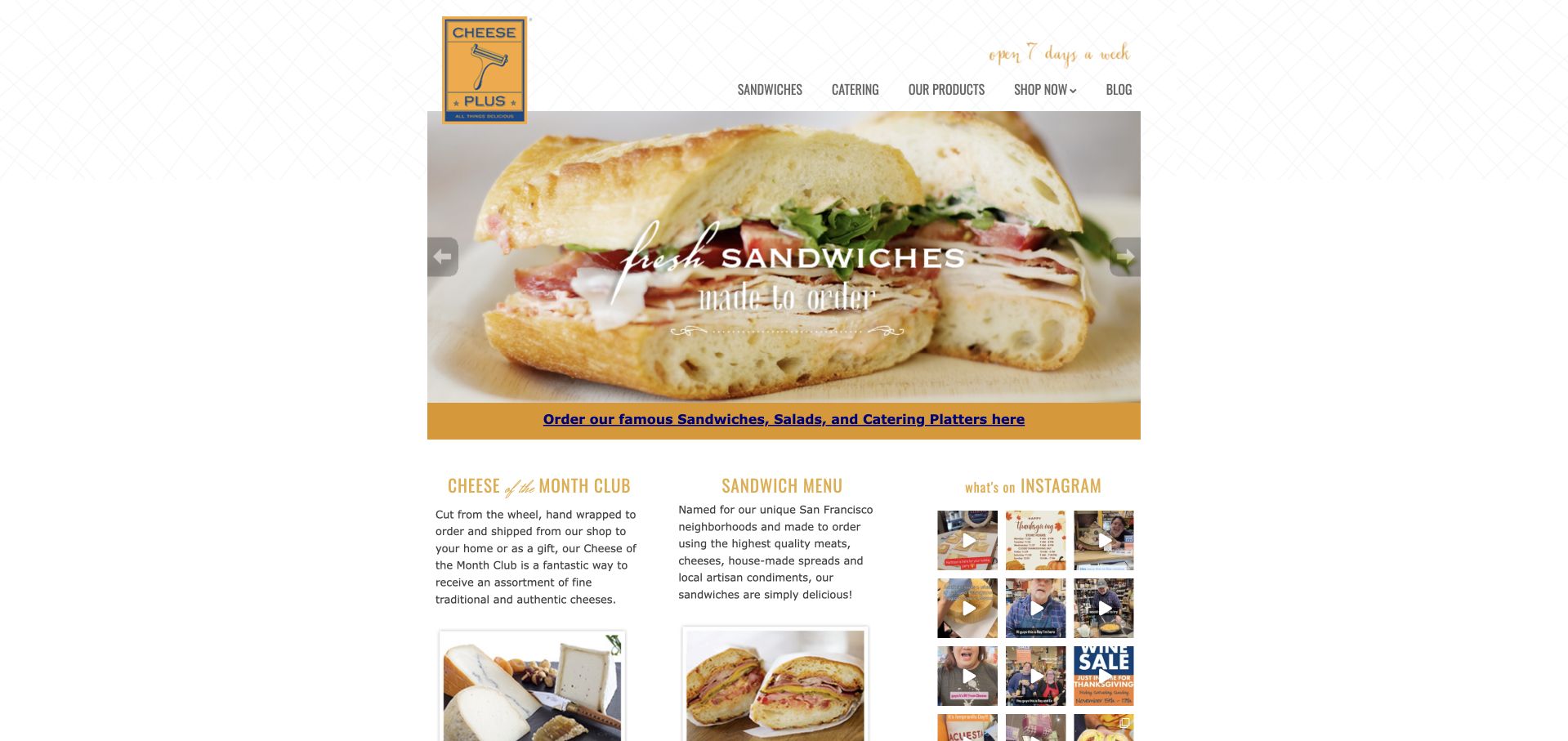
Cheese Plus keeps its homepage in a narrow central column, with a yellow cheese-grater identity and a fine patterned background rather than a huge promotional canvas. The rotating food photography introduces sandwiches and catering, followed by a gold strip of ordering links. Below it, three compact columns introduce the cheese club, sandwich menu and social photographs. The result feels like a real neighborhood specialty shop with several everyday reasons to visit, not merely an online gift-box seller. It is our first editorial selection for its clear local character and useful connection between counter food, specialist shopping and recurring discovery.
What you can learn
A small cheesemonger does not need to imitate a national catalog. Start with its strongest local uses, keep ordering routes literal and use a compact recurring feature such as a cheese club to explain why customers might return between special occasions.
Pros
The grater identity and gold accents create a recognizable specialist-shop character.
Separate sandwich, catering and club links explain several useful customer journeys.
Cons & considerations
Small body text needs careful enlargement when the layout reaches phones.
The narrow composition provides limited room for detailed delivery or collection explanations.
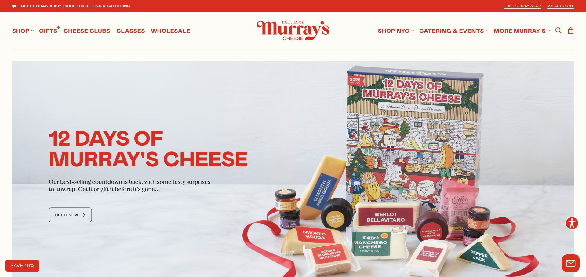
Murray’s Cheese uses red lettering and a warm cream background to establish a cheerful, consistent storefront. The opening campaign pairs a large seasonal headline with a photographed assortment of products and packaging, while the header retains separate routes for cheese, gifts, clubs, classes and wholesale. That distinction is useful: a shopper choosing a gift has a different task from someone enrolling in a class or replenishing a favorite cheese. The page gives the campaign plenty of space without removing those other routes. Study it for the way a broad specialist business can remain visually coherent even when the offer extends beyond individual products.
What you can learn
Organize the menu around real buying intentions, not only cheese varieties. Keep classes, gifts and recurring clubs distinct, then let temporary campaigns introduce particular products without becoming the only way customers can understand the full business.
Pros
Red-and-cream styling connects the large campaign with the detailed retail navigation.
Distinct menu routes acknowledge shopping, learning and recurring membership intentions.
Cons & considerations
A broad menu can become crowded before visitors reach the product selection.
Seasonal packaging campaigns need clear expiry and availability information at their destination.
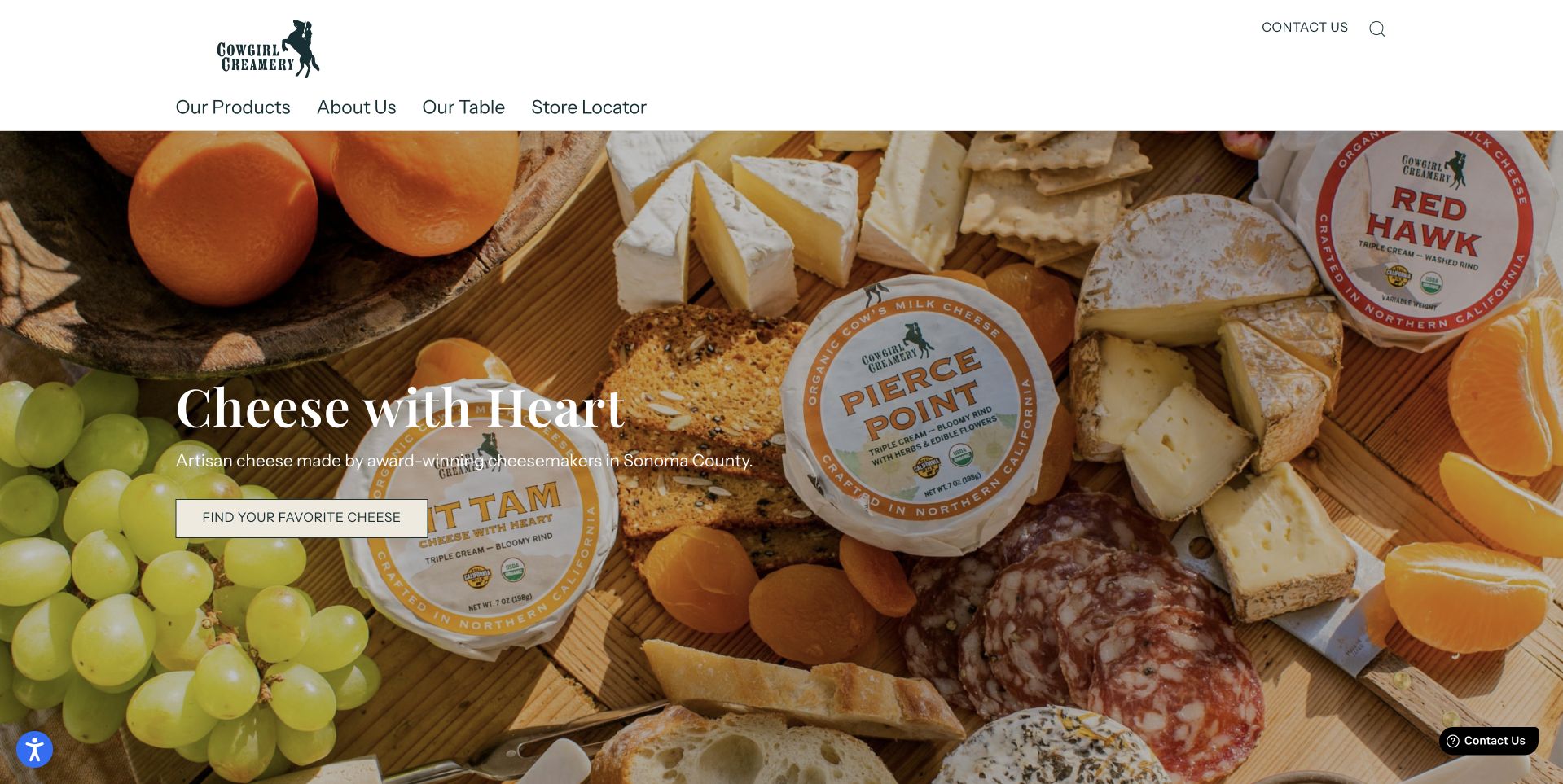
Cowgirl Creamery opens with a generous photograph of cheeses arranged with fruit and accompaniments. The products and their visible packaging occupy most of the frame, while a short white headline and a modest product button sit at the left. Above it, the header is unusually restrained, with routes for products, the company and a store locator. That makes the page feel like a maker’s introduction rather than a large independent cheesemonger catalog. The design is worth studying for how it uses one coherent board to show a family of products. It does not need numerous unrelated category tiles to explain the brand’s central subject.
What you can learn
For a cheese producer, distinguish product discovery from finding a stockist. A clear locator can be more helpful than implying that every visitor can place a direct order, and product photography should make the actual packaged range recognizable away from the website.
Pros
The cheese-board photograph shows several products within one coherent composition.
A short navigation gives product discovery and store finding distinct destinations.
Cons & considerations
White hero text depends on adequate contrast over changing food photographs.
The opening view gives limited practical detail about where purchasing happens.
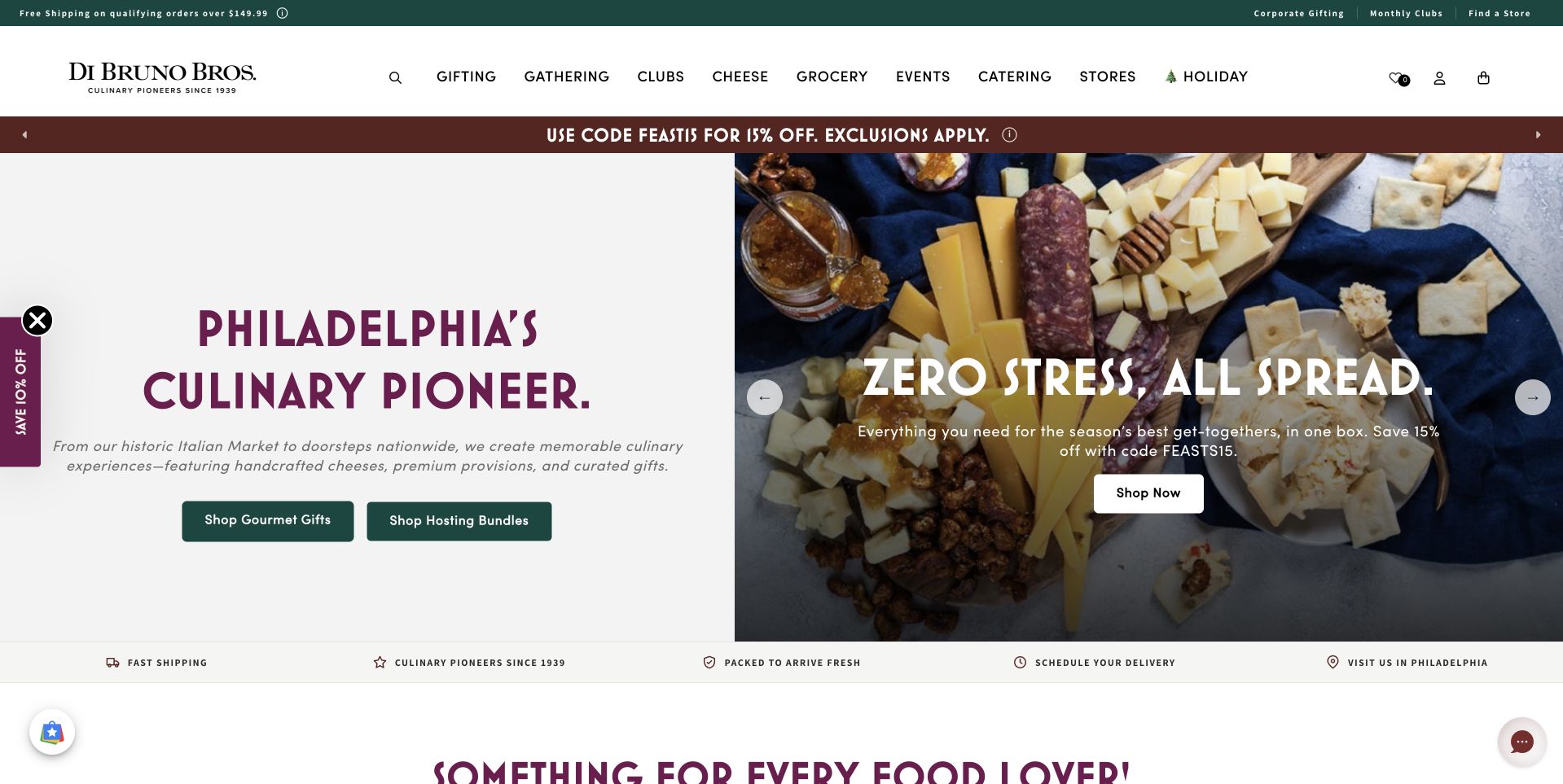
Di Bruno Bros. splits the opening into a pale text panel and a colorful board of cheeses, cured foods and accompaniments. A Philadelphia-focused headline gives the business a place-based identity, while separate buttons lead toward gourmet gifts and holiday feasts. The burgundy, green and cream palette continues from the header into the campaign. This is useful for a retailer whose offer is broader than individual cheeses: the composition presents an assembled occasion while the navigation retains grocery, catering and store routes. The page avoids asking the visitor to derive the whole proposition from a brand name or a single anonymous product photograph.
What you can learn
Place-based identity becomes more useful when paired with a concrete shopping decision. Tell visitors whether they are choosing a gift, planning a meal or visiting a store, and keep the distinction visible when the photograph shows several kinds of food together.
Pros
The split composition gives the headline a stable, readable background.
Separate gift and feast actions translate the styled board into clear intentions.
Cons & considerations
Several promotional strips can compete with the central campaign on smaller screens.
An assembled food photograph needs destination details about exactly what is included.
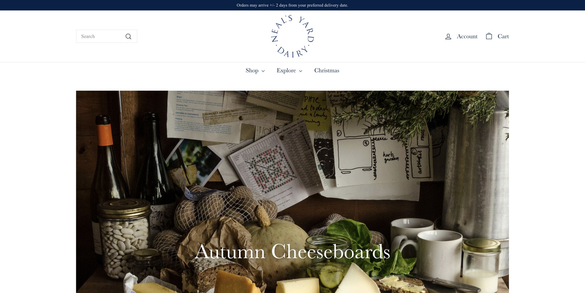
Neal’s Yard Dairy keeps a great deal of white space around its circular identity and navigation. Beneath that quiet header, an autumn cheeseboard photograph fills a centered rectangle rather than stretching to every browser edge. Bottles, wrapped cheeses and produce make the scene feel like an editorial table, while the short campaign label stays subordinate to the food. This is a useful example of visual restraint in a category often crowded with offers. The page’s spaciousness gives the selection room to feel considered, although a customer still needs subsequent product information to understand particular cheeses, portions and delivery arrangements.
What you can learn
Use white space to give a specialist selection room, but do not confuse quiet design with missing information. Pair an editorial campaign with readable product descriptions, clear availability and an obvious shop route so newcomers can move beyond admiration into an informed choice.
Pros
The centered photograph and generous margins give the assortment a deliberate pace.
A restrained identity avoids competing with the textures of the food itself.
Cons & considerations
Small navigation labels need close attention to mobile readability and tap sizes.
The atmospheric first view leaves practical product differences to later pages.
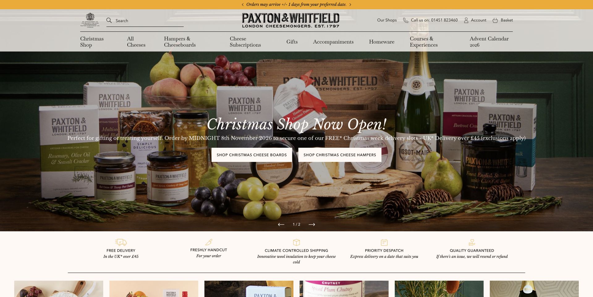
Paxton & Whitfield places a traditional black wordmark above a densely structured retail navigation. A photographed seasonal assortment fills the main banner, with two light shopping actions over the darker food and packaging. A narrow benefits row begins beneath the campaign, creating a transition from gift imagery to practical service information. This is useful for understanding a large specialist assortment: cheese, accompaniments, homeware and courses are all given named places in the menu rather than being hidden under one Shop label. The result is information-rich, but it asks careful prioritization to keep the first screen from becoming a list of equally urgent choices.
What you can learn
A heritage retailer can preserve a traditional identity while organizing a broad modern offer. Group menu items by the task they support, keep benefits concrete and ensure seasonal promotions do not obscure the ordinary route to an individual cheese or a store.
Pros
The traditional identity connects gifts, products and experiences.
A benefit row separates service information from the campaign.
Cons & considerations
The extensive navigation risks visual overload when every category is equally prominent.
Buttons over a busy assortment photograph need consistent contrast and spacing.
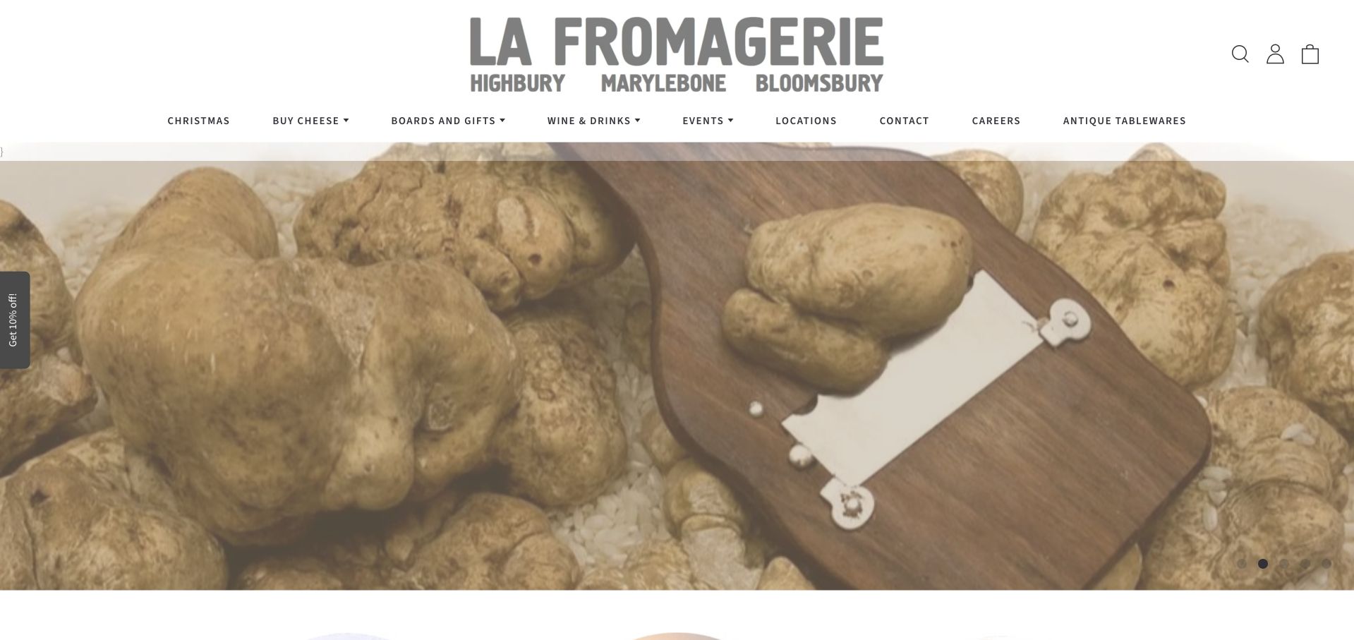
La Fromagerie makes its name the dominant element of the white header, with the shop locations printed directly beneath it. The opening photograph is a tactile still life of bread, cheese and a serving board, using texture rather than promotional packaging to establish the subject. The menu distinguishes buying cheese, locations, contact and wholesale, while the page continues into separate descriptions of the physical places. That is useful for a business whose brand spans shops, food and hospitality. The visual tone remains consistent, but the site does not have to pretend all customers are completing the same kind of online transaction.
What you can learn
If location is part of the experience, put it near the identity rather than leaving it to the footer. Keep wholesale, store visits and online buying as distinct routes, especially when one photographic style represents several different services.
Pros
The large wordmark and location line make the physical shop network visible.
Tactile food photography supports a coherent identity without relying on discount graphics.
Cons & considerations
The opening image alone does not explain the practical differences between locations.
Closely spaced menu labels need a well-tested mobile navigation alternative.
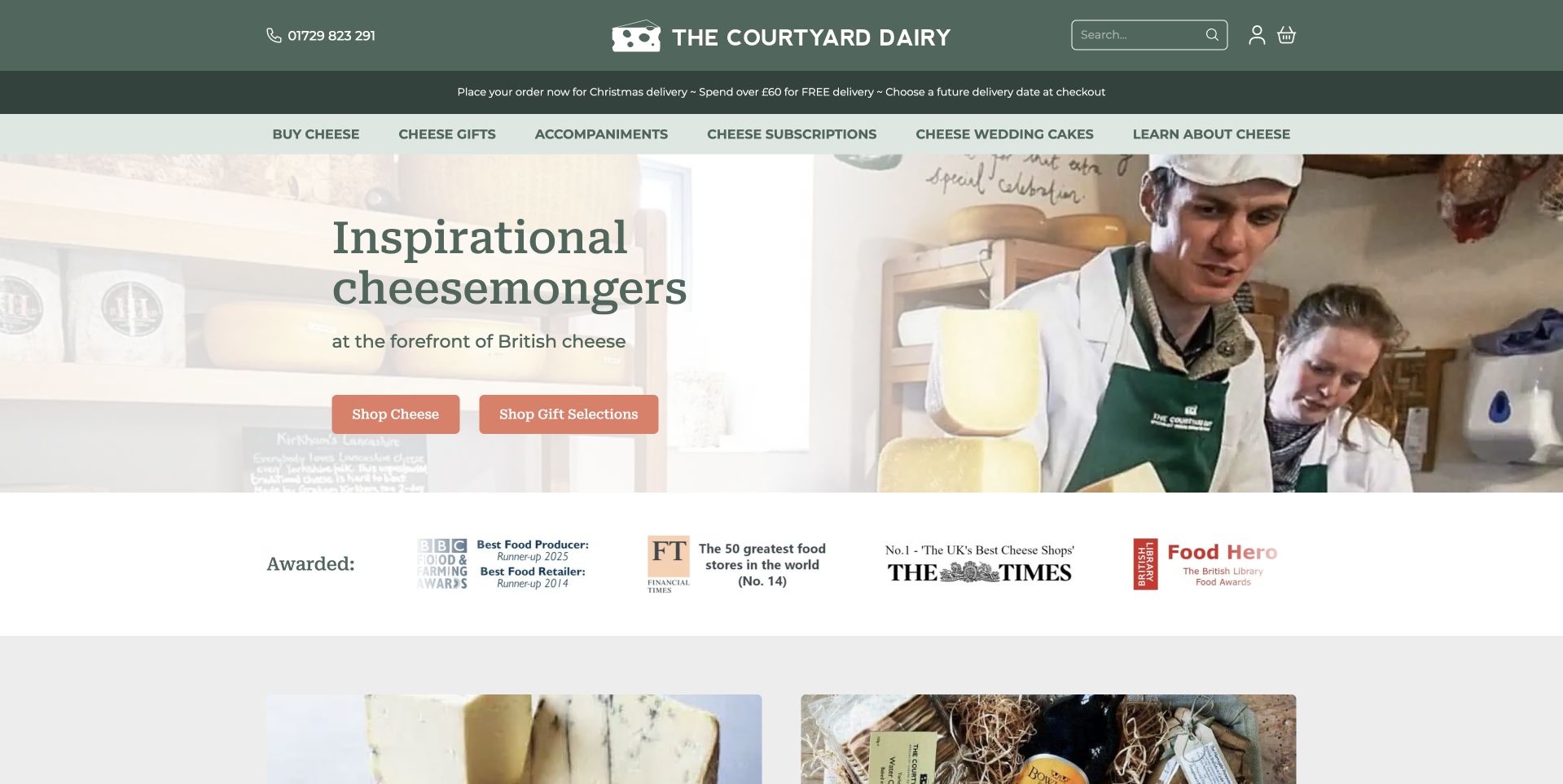
The Courtyard Dairy divides its hero between a pale text panel and a photograph of people working with cheese at the counter. The green header, warm buttons and short descriptive headline give the scene a friendly, grounded tone. This is a useful departure from endless close-ups of cheeseboards: the image shows the human activity around the product. Routes for buying cheese, subscriptions and celebration cakes sit in the navigation, while a row of publisher-presented accolades appears below. Those accolades are site content, not independent conclusions of this review. The core design lesson is how the shop’s expertise is made visible through a working scene.
What you can learn
Show the actual selection or counter experience when advice is part of the offer. Give online purchases, subscriptions and bespoke event requests separate destinations so an approachable team photograph leads into useful choices rather than a vague contact form for everything.
Pros
The working-counter photograph gives the service a human setting.
The split layout protects readability without covering the people.
Cons & considerations
Displayed accolades need clear sources and should not replace useful product detail.
Several specialist buying routes require concise explanations on their destination pages.
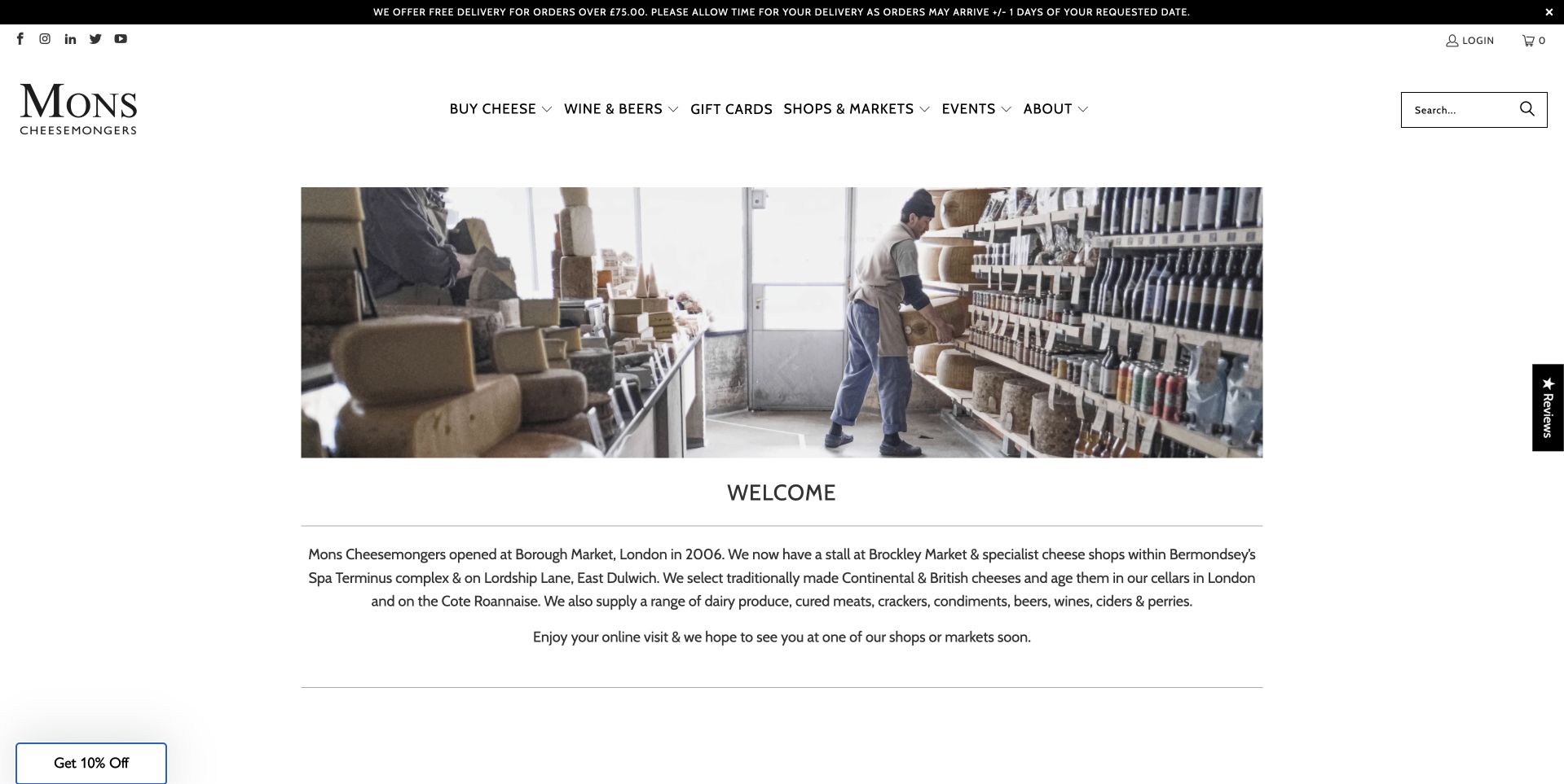
Mons Cheesemongers uses a white header with a small black serif identity and an unusually restrained introduction. A wide photograph of a working cheese shop sits above a centered welcome paragraph, with shelves, staff and product creating the visual context. The page does not immediately become a discount grid. Navigation still separates cheese buying, shops and markets, events and company information, so the quieter opening has practical routes around it. This is worth studying for a specialist business that wants to explain selection and maturation alongside retail. The photograph suggests a real working environment, while the text provides the necessary explanation of the offer.
What you can learn
A shop-interior photograph can carry atmosphere without a large slogan over it. Follow it with a concise explanation of the business, then make the paths to current stock, physical shops and educational events explicit enough that visitors do not have to browse the entire story first.
Pros
The working interior introduces people and products together.
Market, event and shopping routes support different customer tasks.
Cons & considerations
A small centered welcome paragraph can be difficult to scan quickly.
The restrained hero offers less immediate guidance to a first-time gift shopper.
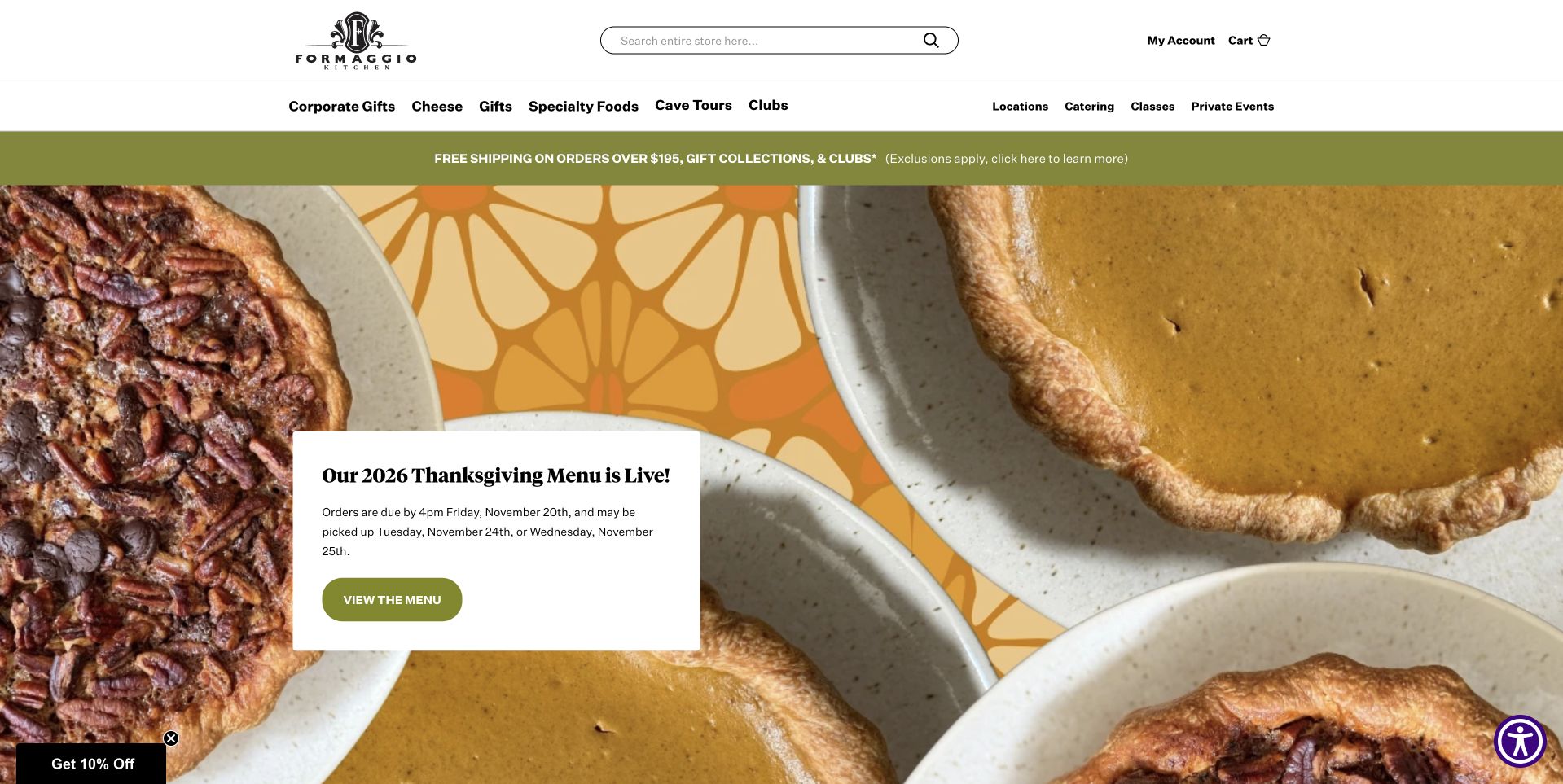
Formaggio Kitchen opens with a large, overhead photograph of seasonal pies, using olive and cream tones around the food. A small white campaign card sits within that photograph, while a slim header retains access to the broader gourmet-cheese and specialty-food store. The choice of pies rather than cheese is informative: the business’s current campaign extends beyond the category in its name. The page is useful for studying how a specialist retailer can introduce a wider prepared-food offer without abandoning its identity. It also shows why campaign wording needs to be specific, because an attractive dessert photograph alone does not explain ordering or collection arrangements.
What you can learn
When a cheese shop promotes a wider kitchen offer, name the campaign and its ordering conditions plainly. Keep the ordinary cheese catalog accessible, and give pickup or shipping information a clear destination so seasonal appetite does not turn into uncertainty at checkout.
Pros
The overhead table gives the kitchen campaign a coherent setting.
Store navigation remains available above the temporary promotion.
Cons & considerations
A non-cheese hero can confuse newcomers unless the broader offer is clearly explained.
A small campaign card needs sufficient text size on mobile displays.
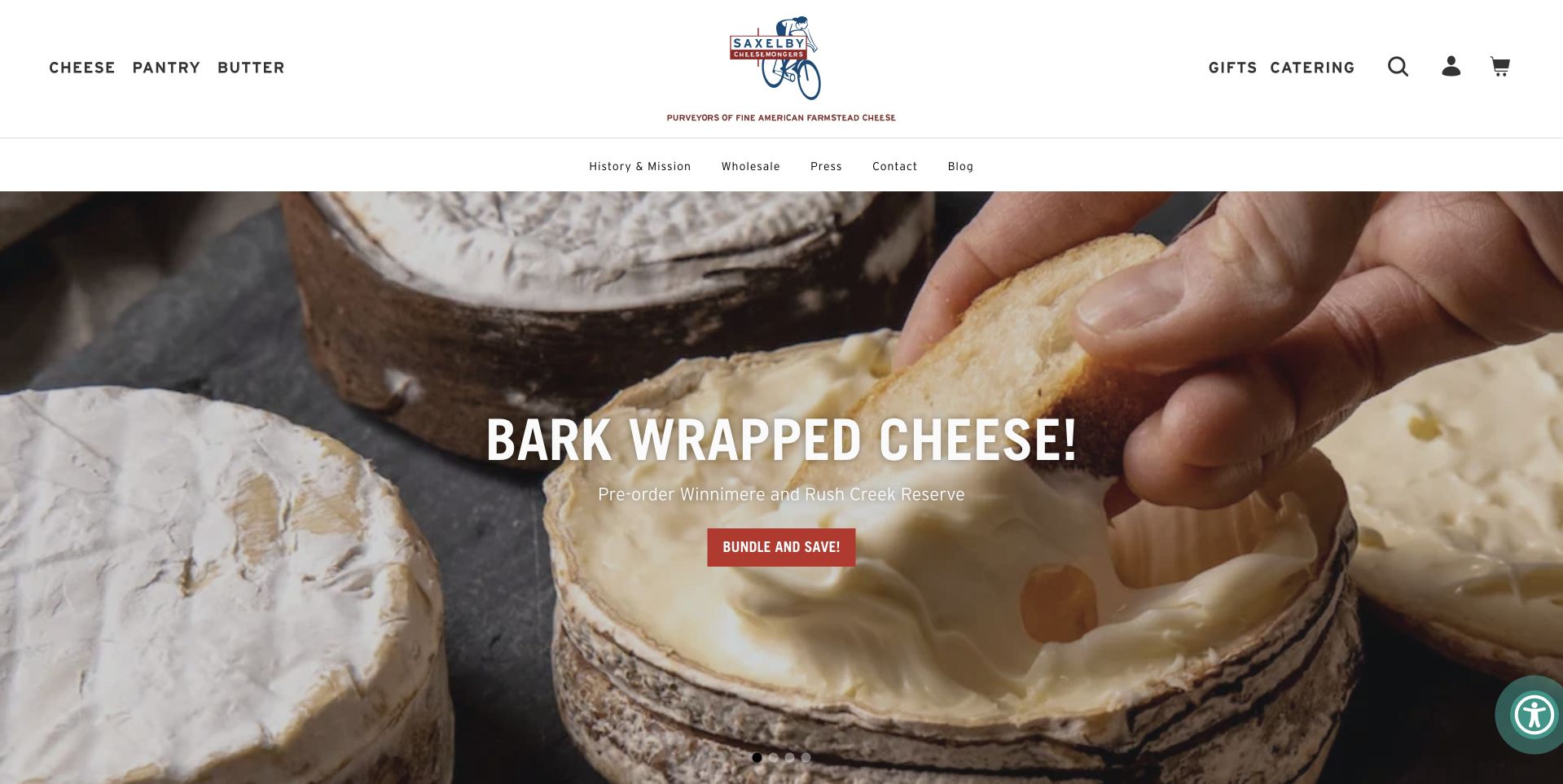
Saxelby Cheesemongers leaves a generous white header around a small illustrated identity, then gives the hero to a close photograph of hands opening a bark-wrapped cheese. A short uppercase headline and red action sit over the image, making the particular cheese the immediate subject. The navigation separates cheese, pantry, butter and gifts without becoming a vast menu. This is useful product storytelling: the photograph explains something about form and texture that a pack shot would miss. It does not independently establish quality or provenance, but it gives a visitor a compelling reason to investigate the actual cheese description and available format.
What you can learn
Use close product photography to reveal a meaningful difference, such as wrapping, texture or serving form. Then support it with accurate product details and portions rather than relying on the emotional appeal of hands, packaging or rustic materials to justify a purchase.
Pros
The handling photograph makes the featured cheese’s physical form easy to notice.
A red collection action remains visible within the restrained white-and-food palette.
Cons & considerations
The short campaign assumes visitors will continue to the detailed cheese description.
White uppercase lettering needs stable contrast as the hero image is cropped.
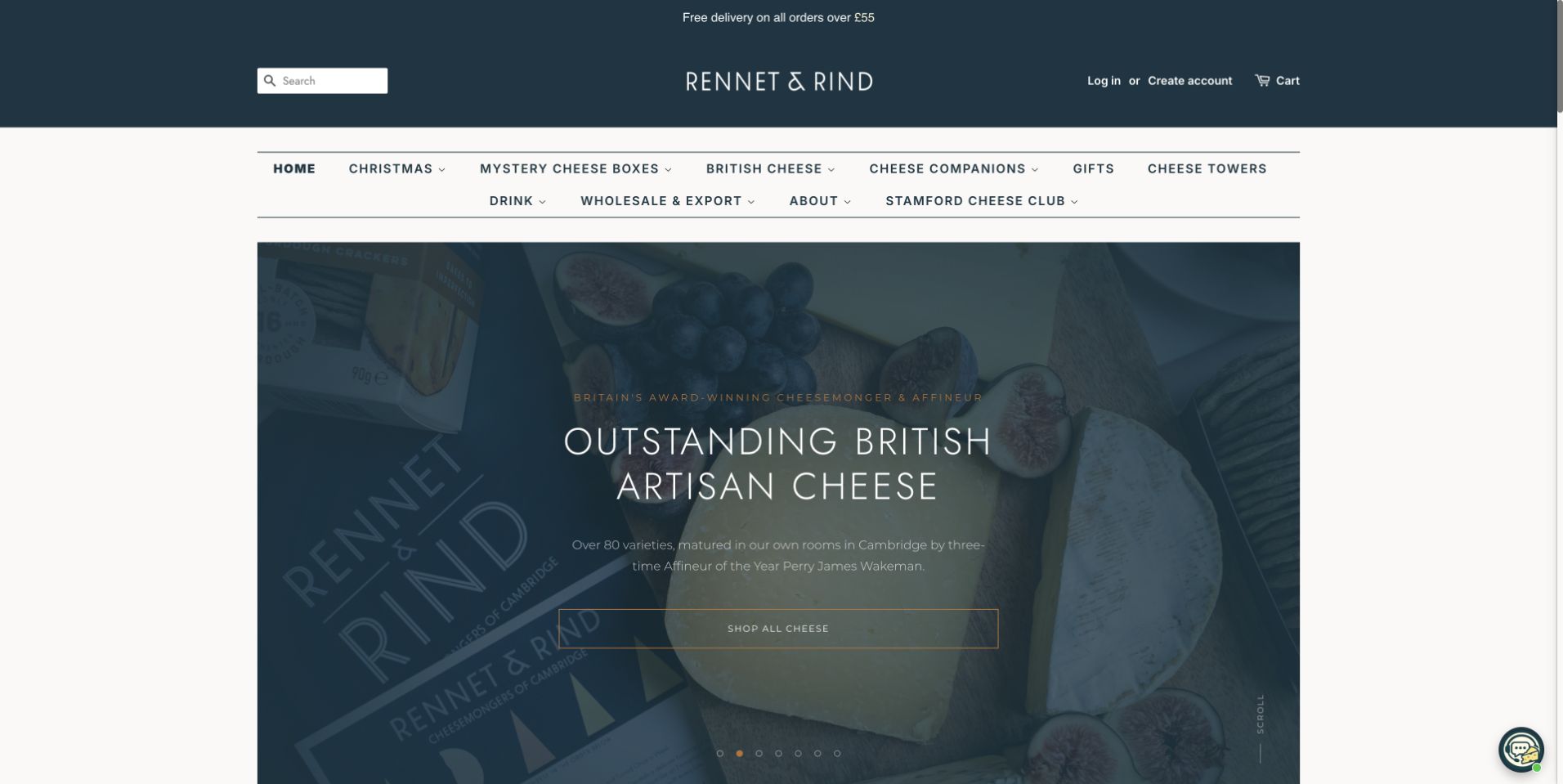
Rennet & Rind uses a dark blue masthead above a detailed category navigation and a centered cheese photograph. The hero is narrower than the browser, leaving white space around the product rather than turning the food into a full-bleed texture. A short white message and small action occupy the darker center of the image. The navigation includes subscription, celebration, gift and wholesale routes, making the specialist offer broader than a single shopping list. This page is useful for considering a compact catalog layout in which the identity, menu and hero remain visibly separate. Its restrained scale also reveals the importance of making small text comfortably readable.
What you can learn
A compact specialist storefront needs especially clear labels. Keep recurring subscriptions and trade supply distinct from one-off purchases, and use the hero to introduce a collection rather than expecting a small photographic caption to explain the entire catalog structure.
Pros
The blue masthead creates continuity around the food photograph.
Subscription and wholesale labels distinguish buying models.
Cons & considerations
Fine text over a dark image can be difficult to read at small sizes.
A broad category row needs careful responsive grouping to avoid cramped navigation.
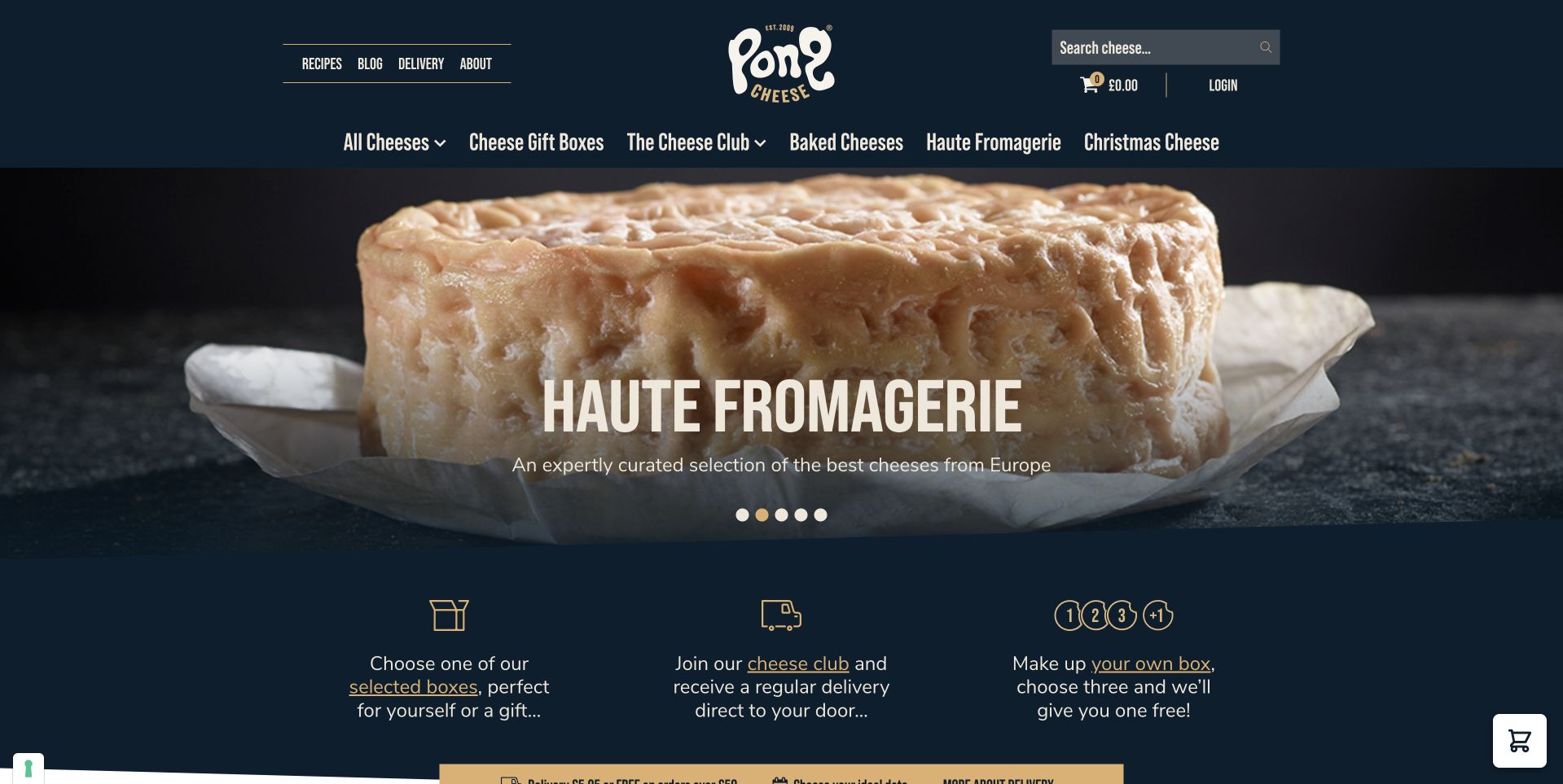
Pong Cheese uses a playful white wordmark on navy, then introduces a large close-up of a cheese-filled pastry under its Haute Fromagerie campaign. The dark background keeps the food as the bright focal point. Beneath the hero, three illustrated benefit blocks explain choosing a gift, joining the club and making a box. This is useful because it translates a stylized campaign into distinct ways to buy. The menu above also separates individual cheeses and boxes. The design makes the store feel characterful, but the practical lesson is the small decision structure immediately below the photograph rather than the novelty of the headline alone.
What you can learn
After an attention-grabbing food campaign, offer a short set of concrete customer choices. Distinguish gifts, recurring orders and custom assortments, then explain their terms on separate pages so customers do not confuse a subscription with a one-time cheese box.
Pros
The navy background gives the pastry photograph strong visual prominence.
Three buying-model blocks turn a playful campaign into understandable next steps.
Cons & considerations
Special campaign names require supporting wording for visitors unfamiliar with the range.
The top menu still needs clear mobile grouping as product categories grow.
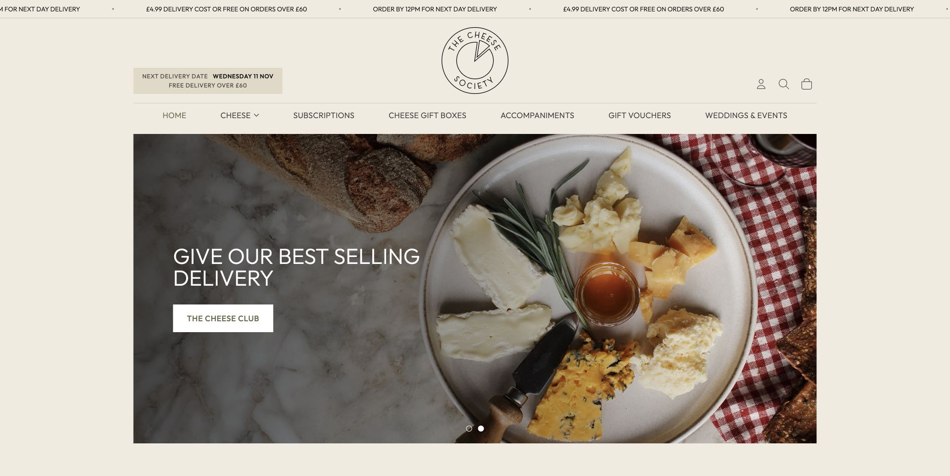
The Cheese Society uses a warm cream header, a small circular identity and a centered photograph of a generous cheese board. The white campaign wording sits over the darker left side of the food, while the next browsing choices remain in the menu above. A cheese-club route is explicitly labelled alongside the ordinary cheese and gift categories, which helps explain the recurring offer without replacing the whole storefront with subscription messaging. The page is useful for its quiet visual consistency. The styling gives the board an occasion, but the menu preserves a practical distinction between choosing a specific product, buying a gift and joining a club.
What you can learn
A cheese-board photograph can introduce several buying intentions, but the navigation must distinguish them. Make recurring deliveries, one-off gifts and individual products separate decisions, with clear portions, schedule and cancellation information on the relevant destination pages.
Pros
The cream palette connects the board and circular identity.
The club route is explicit rather than hidden.
Cons & considerations
White campaign text can become harder to read over lighter food details.
The quiet opening leaves product quantities and delivery eligibility to subsequent pages.
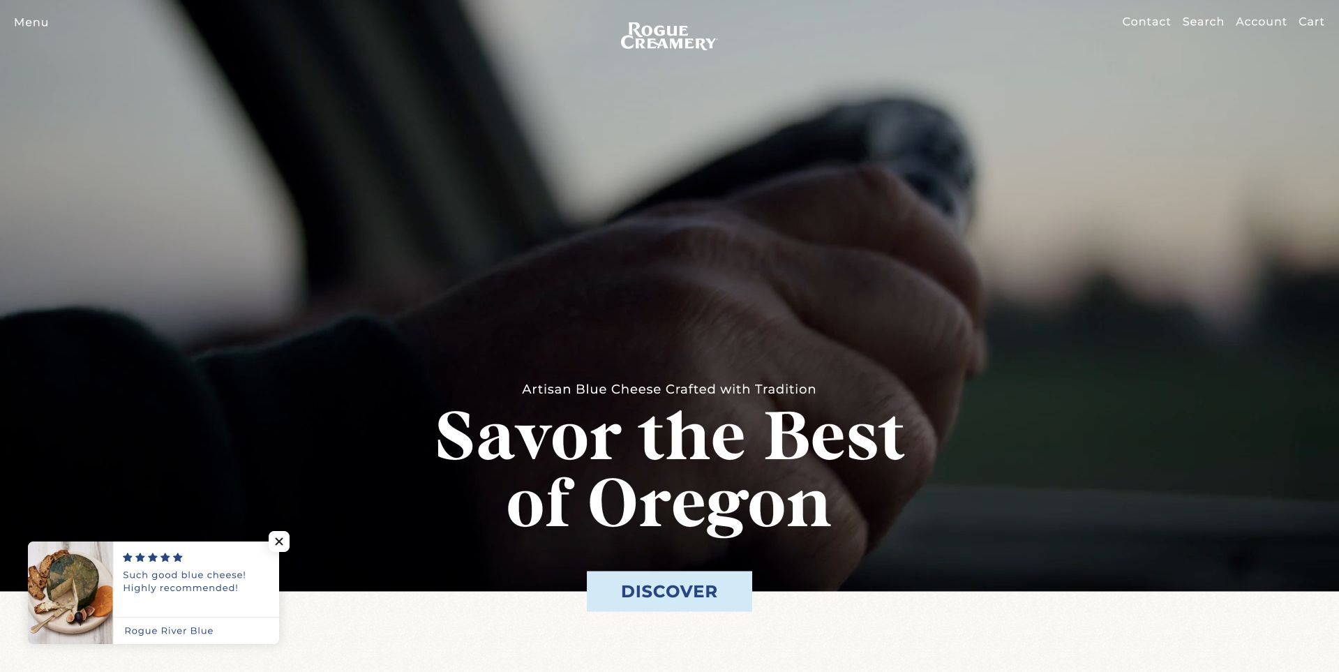
Rogue Creamery uses a dark, close photographic scene of hands and cheese, with a small white identity above and a centered serif statement about Oregon. A pale Discover button gives the scene one clear next step. The restrained navigation and cinematic image feel more like a producer introduction than a crowded cheese marketplace. This is a useful reference for how a maker can frame place and craft without immediately displaying dozens of product tiles. The site’s quality wording is its own positioning rather than a conclusion of this review. A visitor still needs the product and company information to evaluate specific cheeses and purchasing choices.
What you can learn
A maker’s story can begin with place and process, but it should lead somewhere concrete. Give the introductory action a descriptive destination and support any production or regional claims with clear information rather than expecting dark craft photography to act as verification.
Pros
The restrained identity leaves the craft image as the subject.
A pale action keeps the first decision clear.
Cons & considerations
Motion-led imagery needs a useful still alternative and reduced-motion support.
The atmospheric first screen gives little immediate information about individual products or stockists.
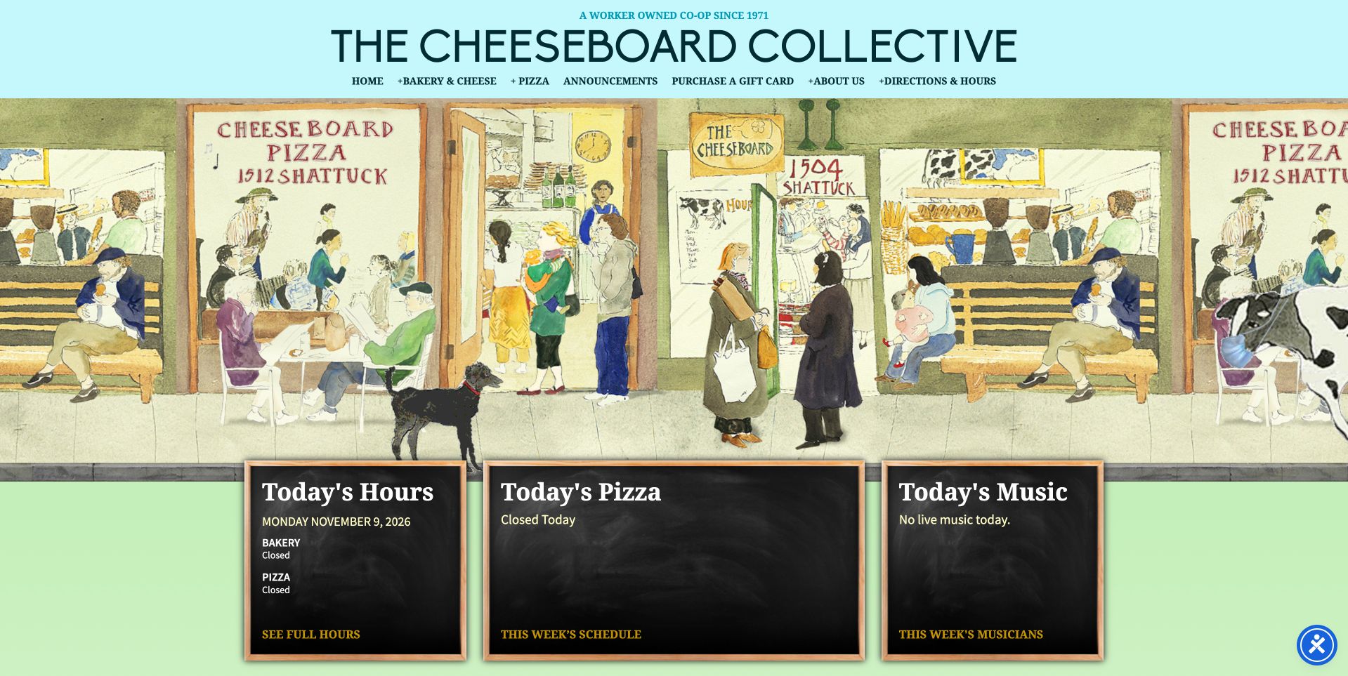
The Cheese Board Collective combines a light blue header with a wide illustrated storefront scene. Beneath that artwork, three dark cards introduce today’s hours, pizza and music. This is a very different first-screen priority from the national gift-box retailers: the website supports a real visit to a neighborhood place. The illustration supplies personality, while the daily cards give a customer immediate practical value. Cheese remains part of a wider cooperative food identity rather than the only visible product. Study the page for its distinction between long-lived local character and short-lived operating information, each given an appropriate visual container.
What you can learn
For a busy local food destination, current information may deserve more space than a product catalog. Separate daily hours, changing menus and events into editable modules, while retaining a consistent illustrated or photographic identity that does not need rebuilding every morning.
Pros
The illustrated shopfront creates a distinctive place-based identity without generic stock imagery.
Daily hours, pizza and music receive clear, dedicated information cards.
Cons & considerations
Dark daily cards need enough text contrast and active content maintenance.
A cheese shopper may need an additional step to find the specialist retail range.
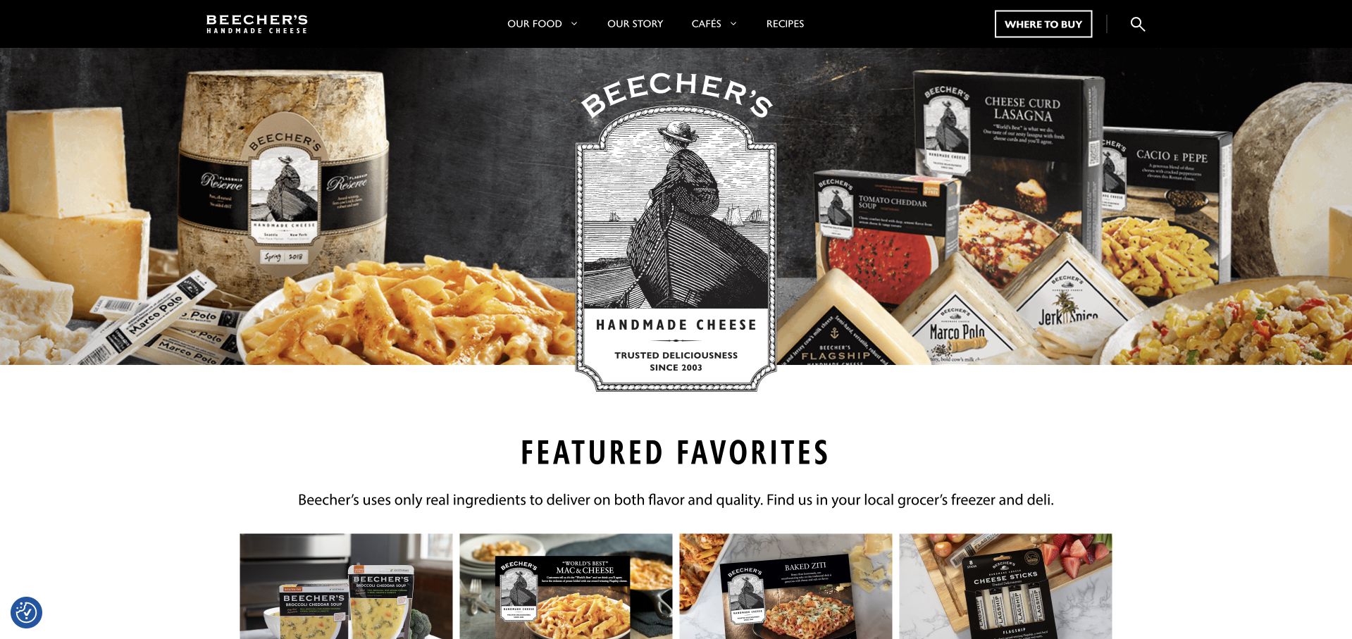
Beecher’s Handmade Cheese uses a black header above a large arrangement of branded packages, cheese and a prepared macaroni dish. The central package-like identity overlaps the composition, making the products recognizable rather than presenting an anonymous cheeseboard. A Featured Favorites section starts directly below, moving the page quickly from brand introduction to specific products. The navigation also retains company, location and recipe routes. This is useful for a maker whose customers may encounter the packaging in shops as well as online. The consistent black-and-cream identity connects those contexts, while the actual product selection provides the practical next step after the photograph.
What you can learn
Show recognizable packaging when the website and physical retail share the same products. Keep the brand arrangement simple enough to understand, then follow it with readable product names and purchasing routes rather than relying on a large promotional composition to do all the explanatory work.
Pros
The packaging photograph connects discovery with recognizable products.
Featured products follow the hero without a long narrative.
Cons & considerations
A dense arrangement of packages can be hard to interpret at mobile sizes.
The opening view needs subsequent detail to distinguish direct shopping from finding locations.
Kegan is a freelance web designer and developer with 15+ years of experience helping businesses turn complicated website requirements into clear, maintainable digital experiences. He works directly with clients from planning and design through development, launch, and ongoing support.
For cheesemonger website design, his development approach focuses on cheese and producer discovery, dietary and storage information, shop and delivery details, gifting, and dependable ordering handoffs. The scope can be a targeted improvement or a complete custom build, with responsive layouts, thoughtful content structure, and integrations chosen around the people using and maintaining the site.
Show 3 other cheesemonger website designersHide other cheesemonger website designers
Turn counter knowledge into a clear digital buying journey
Build a useful product record before adding filters
Start with a representative selection and agree consistent names, formats, weights, availability and descriptions. Decide which attributes customers actually use and which require explanation. A filter that seems obvious to a cheese specialist can confuse a newcomer if its terms are not introduced. Keep the data manageable for the staff who update it. Include approved ingredient and allergen information at the appropriate point, and do not infer dietary or health suitability from visual appearance.
Separate gifts, recurring clubs and bespoke requests
A gift needs a delivery date, recipient and clear contents. A club needs a schedule, recurring price and understandable pause or cancellation conditions. A celebration arrangement may need a discussion about quantities, timing and collection. Map those differences before drawing their cards. The same photograph can make all three feel attractive, but the destination and form fields should reflect the different commitments rather than treating everything as an interchangeable product.
Design around stock changes and substitution decisions
Specialist assortments can change. Decide how sold-out items are shown, whether substitutions are offered and who approves the wording that explains them. Keep seasonal boards and gift collections tied to current contents rather than leaving an old photograph to imply a guarantee. For a small counter, a manageable set of accurate products may be better than a huge catalog that is rarely reconciled with the real shop.
The editing job behind the design
Choose a maintainable product and content system
[object Object]
[object Object]
[object Object]
Our WordPress website examples offer a separate look at publishing approaches. A visible platform label is evidence for that named page, not a guarantee that the same system will suit your requirements.
Before the public launch
A cheesemonger website planning checklist
State whether the website primarily supports a local counter, shipped retail, a maker’s range or a distinct combination.
Map individual buying, gifts, clubs, catering and stockist finding into separate, plainly named routes.
Create consistent product records for the actual format, portion or weight and current availability.
Publish ingredient, allergen and other approved product details without inventing health or dietary assurances.
Explain what a photographed board includes and what is only a serving suggestion or prop.
Document delivery areas, eligible dates, collection arrangements and seasonal cut-offs beside the relevant journey.
State recurring charges, schedules and customer controls before someone joins a cheese club.
Give every physical shop its own current hours, address, telephone and service information.
Agree how sold-out products and substitutions will be explained and who maintains those decisions.
Use real shop and product imagery with permissions and useful alternative text where appropriate.
Test product filtering, enquiry forms and checkout with readable mobile controls and keyboard access.
Assign an owner to seasonal assortments, campaign expiry and ongoing stock-content reconciliation.
These checks are a project checklist, not a performance, legal, security, or accessibility certification. Test real journeys with the people responsible for the website before making claims about the result.
Sources & editorial method
How this collection was selected and reviewed
Each example was reviewed as a public website and captured in a normal browser. Observations concern visible design and customer journeys, not taste, certification, food safety, suitability or measured sales results. Maker, merchant and mixed-service contexts are identified where relevant. Any visible technology information is limited to separately supported public evidence, never inferred from style alone.
Each example links to its actual source page. Screenshots are direct browser captures with their own capture dates; moving imagery, announcements and live designs can change. The notes describe observable design choices and conditional tradeoffs, not measured traffic, conversion results, service quality, or accessibility conformance.
Technology labels use public page metadata, asset evidence, or explicitly cited platform documentation. Platform documentation is not a complete current deployment audit. A component reference may be legacy or unused; it is not a complete backend inventory. Unknown stacks are omitted. These sites are editorial examples, not our client portfolio.
Written, Edited and Curated are separate editorial records, not timestamps advanced by a rebuild. Website designs and imagery belong to their owners. See our editorial standards or suggest a correction.
Questions worth asking
Cheesemonger website design questions
Should a cheesemonger lead with gifts or individual cheeses?
Choose based on the shop’s main customers, then preserve the alternative route. A gift-led campaign can attract occasion shoppers, but a regular customer looking for a specific cheese should not have to navigate an unrelated gift-selection process first.
How much cheese information belongs on a product page?
Enough to understand the actual item and the format being sold. Use accurate descriptions, portions or weights and approved ingredient information. Explain specialist terms where they help, and avoid turning unverified production or health claims into sales reassurance.
Can a small shop offer a cheese club online?
Yes, if the operational side is clear. Explain the schedule, recurring price, contents policy and customer controls. Choose a system staff can maintain, rather than treating the club as only another promotional card with an ordinary checkout button.
Should the website show the shop or styled cheeseboards?
Both can be useful for different jobs. The real shop establishes place and people; a board can introduce an occasion or assortment. Be clear about what customers receive, and keep hours and practical information separate from decorative imagery.
Are the examples all using the same kind of ecommerce system?
No such assumption should be made. A visible storefront reveals only part of the system, and some examples emphasize stockists or local visits rather than direct ecommerce. Technology labels require evidence and do not establish the complete operational stack.
Start with the questions a good cheesemonger answers at the counter, then give those answers a clear structure online. The result should help someone choose confidently, understand the buying model and reach the right shop or product—not merely admire a beautiful board.