Best Pottery Class Websites of 2026 (19 Real-World Examples)
Pottery-class websites that explain the learning format, the studio and what happens after the first session.
Explore 19 real pottery-class websites and course pages. Study how independent studios, ceramic schools and community organizations distinguish a first taste of clay from sustained teaching and independent studio practice.
A photograph of hands at a wheel makes pottery feel immediate. Choosing the right class requires more context. A newcomer needs to know whether a session teaches wheel throwing, handbuilding or decorating an existing piece, how much time it involves and what happens to the work afterward. A returning maker may instead be looking for a particular technique or access to a studio.
These examples preserve those different offers. The collection includes specialist pottery studios and dedicated ceramics programs within larger organizations. Reviews consider the public information and visual structure, with actual views of the pages described. They do not assess teaching quality, certify studio access or promise a particular finished object.
Before the examples
What makes good pottery class website design in 2026?
Name the format before the booking action
Explain whether the offer is a taster, a multi-session course, private instruction or independent studio time. Give wheel throwing, handbuilding and pottery painting their own accurate descriptions. A photograph of clay does not establish what will be taught.
Make the full commitment understandable
Connect the level, session count, duration and location. Explain the studio’s approved material, firing and collection arrangements. Visitors should be able to distinguish the advertised session price from any separately charged instruction or finishing.
Show the studio without making it the whole story
Use real images of the workspace, teaching and ceramic work to explain the environment. Keep a clear route to course information beside the visual introduction, and avoid suggesting that professional display pieces are guaranteed beginner outcomes.
The collection · 19 examples
19 pottery class websites worth studying
Compare these 19 distinct pottery-class properties for their approaches to beginner guidance, course structure and studio identity. Mudflat is the researched Editors Choice for its explicit introductory route and clear progression into longer learning formats.
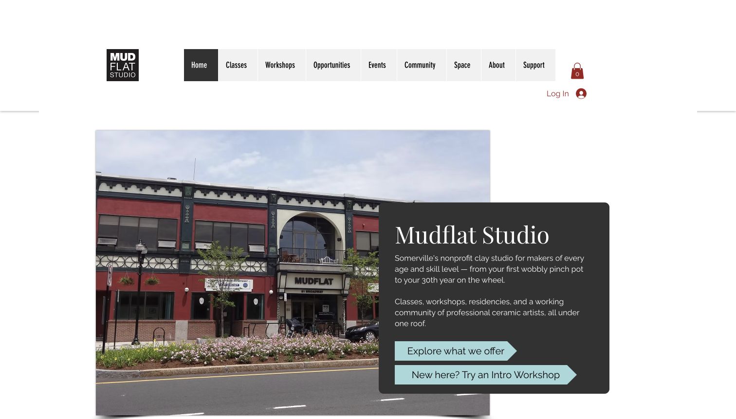
Mudflat combines a photograph of its actual building with a dark introductory panel, grounding the offer in a recognizable local place. Two pale blue arrows make the first decision unusually clear: explore the wider program or take the introductory workshop route. The wording addresses a new visitor directly instead of expecting them to understand the difference between every ceramic technique. Further down, registration dates and separate links for longer classes, short introductions, workshops and young learners give the program a usable structure. The main navigation also distinguishes community activity, space and support. The page communicates the breadth of a nonprofit studio while still giving an inexperienced visitor a concrete way to begin.
What you can learn
Borrow the explicit beginner route and the progression into more sustained learning. Let the studio's own course definitions explain the next step, while keeping registration timing separate from general descriptions that remain useful throughout the year.
Pros
Introductory and broader program actions are visibly different.
A venue photograph anchors the local identity.
Cons & considerations
The broad institutional navigation offers many choices.
Registration announcements need careful seasonal maintenance.
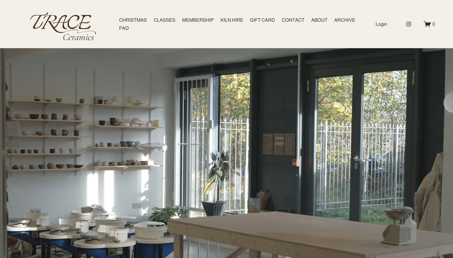
Trace opens with a large photograph of pottery wheels, worktables and shelves in a bright studio. A cream header and expressive wordmark keep the surrounding interface quiet, giving the real space a strong role in the introduction. Classes, membership, kiln hire and practical information are named separately in the navigation. Below the opening image, the page explains the Hackney Wick location and its focus on traditional Asian ceramic techniques. Beginner courses and membership receive different sections, followed by questions about course choice, missed sessions and collecting finished pottery. This makes the page more informative than a purely atmospheric gallery, although the large image fills most of the first screen before the introductory explanation and main class links appear.
What you can learn
Use the physical studio to establish character, then explain the teaching approach in ordinary language. Keep questions about firing and collection close to the course information, because the experience continues after the initial making session finishes.
Pros
Real studio imagery gives the offer a tangible setting.
Beginner and member information have distinct sections.
Cons & considerations
The opening image delays detailed class comparison.
A long navigation row can become visually crowded.
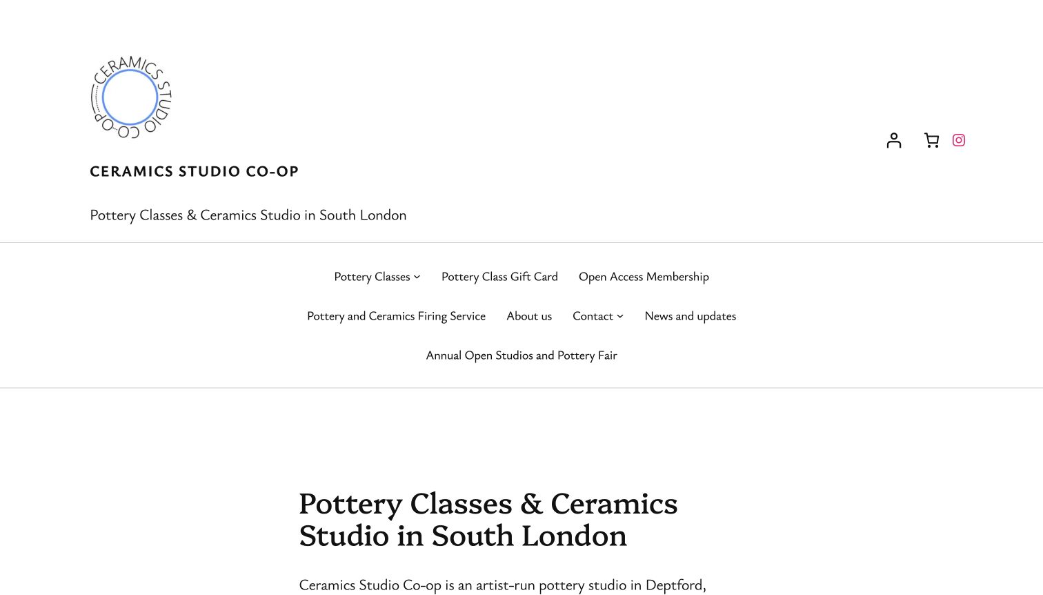
Ceramics Studio Co-op uses a restrained white layout with a circular mark, a direct South London description and clearly named service links. The opening text identifies the studio as artist-run and links pottery classes, wheel courses, taster sessions, membership and firing services within a short explanation. Those contextual links give a visitor several relevant paths without requiring a visual carousel to explain the offer. A studio-image slideshow follows, and the later introduction describes the cooperative model and community. The design favors explicit information over a dramatic hero. Its main tradeoff is vertical space: the tall identity area and multi-line navigation occupy much of the captured first screen before the principal heading and introduction begin.
What you can learn
Write the first paragraph as an orientation tool, with links attached to recognizable course and service names. A cooperative's operating model can add useful context, but the practical route into a class should remain easy to separate from institutional explanation.
Pros
Descriptive links explain the available services.
The local and artist-run identity is stated directly.
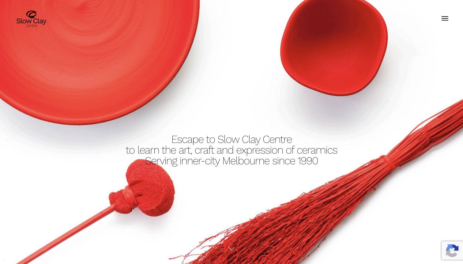
Slow Clay's opening is dominated by a striking arrangement of red ceramic pieces and red objects against white. A small logo, compact menu control and centrally placed introductory statement let the image establish a distinctive visual mood. The page then expands into a substantial catalog of in-person learning: wheel tasters, beginner courses, more advanced sessions, intensives, handbuilding and specialist topics. Separate areas distinguish online offerings and workshops. This progression makes the website useful as a reference for a studio with more than one entry point into ceramics. The opening is deliberately atmospheric, however, so the actual course choices arrive after the first-screen image rather than alongside it. Visitors who already know their preferred format depend more heavily on the menu or scrolling.
What you can learn
Let finished work convey creative range, then organize the teaching program by recognizable format and experience level. Keep the catalog structure consistent as specialist workshops change so the visual introduction does not become the only way to understand the studio.
Pros
Distinctive ceramic imagery establishes a memorable visual identity.
The program separates several learning formats.
Cons & considerations
The menu hides detailed routes until opened.
A large image postpones immediate course comparison.
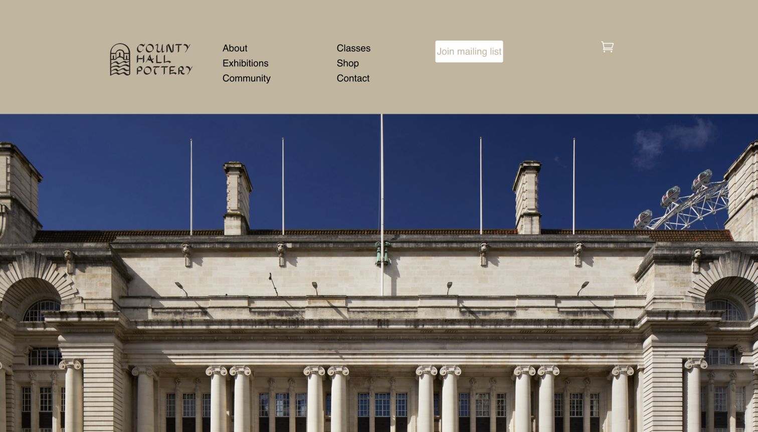
County Hall Pottery introduces itself through the architecture of its setting. A broad building photograph sits beneath a muted beige header, where the compact hand-drawn mark and two short navigation columns feel consistent with a craft organization. Classes, exhibitions, community and shopping are clearly separated before the page explains the studio. Further sections pair images with the gallery, teaching and retail offers. The observed exhibition text also records a change to the in-house program, showing why these distinct strands need their own current descriptions. For a class-focused visitor, the design offers an attractive sense of place, but the building image occupies the opening screen and the actual learning formats sit farther down or behind the Classes route.
What you can learn
Use a distinctive setting to establish context while preserving separate routes for learning, visiting and buying. When an exhibition program changes, update its own section clearly instead of allowing an attractive building photograph to imply that every previous activity continues.
Pros
Architecture provides a specific sense of place.
Navigation separates classes from exhibitions and retail.
Cons & considerations
The opening image gives little immediate course detail.
Different program strands require independent content maintenance.
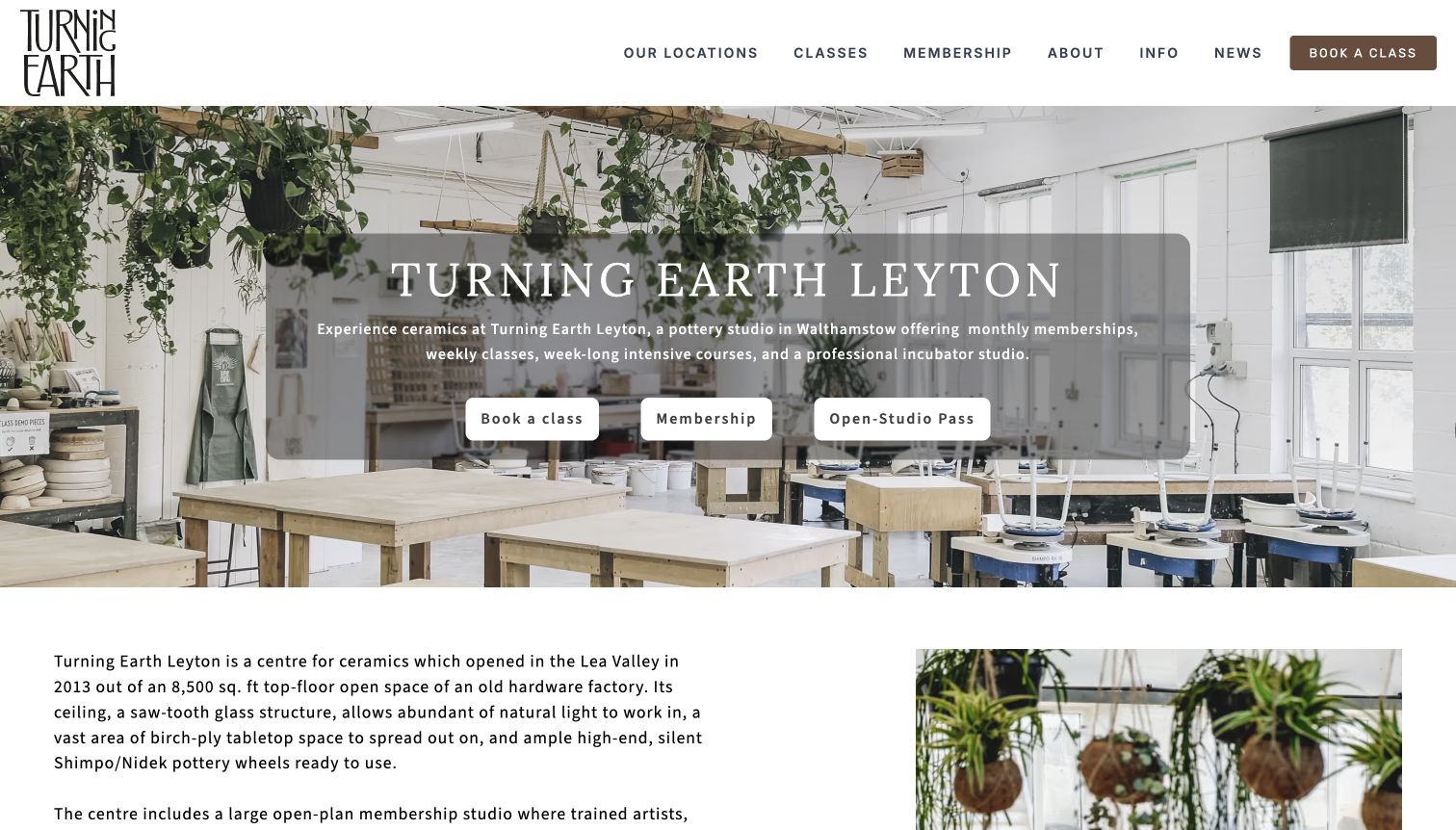
Turning Earth's Leyton page names the location prominently over a bright photograph of the working studio. A shaded panel keeps its introduction and three buttons together: Book a class, Membership and Open-Studio Pass. Those actions represent different kinds of participation rather than interchangeable marketing labels. The following text explains the setting and facilities, with links to studio imagery, opening hours and local arrival information. Farther down, a dedicated Classes at Leyton section introduces levels and techniques. The location-specific structure is useful because it connects the offer to one physical space rather than making a visitor infer which branch is being shown. The substantial introductory text nevertheless asks for some reading before the detailed course choices appear.
What you can learn
Make the participation model explicit before presenting availability. A taught class, regular membership and independent studio pass should each have a clear definition, with the location preserved throughout the next step so visitors do not mix up branch-specific offers.
Pros
The location remains explicit in the opening content.
Three labeled actions distinguish participation models.
Cons & considerations
The large overlay competes with the studio photograph.
Detailed introductory paragraphs precede the course list.
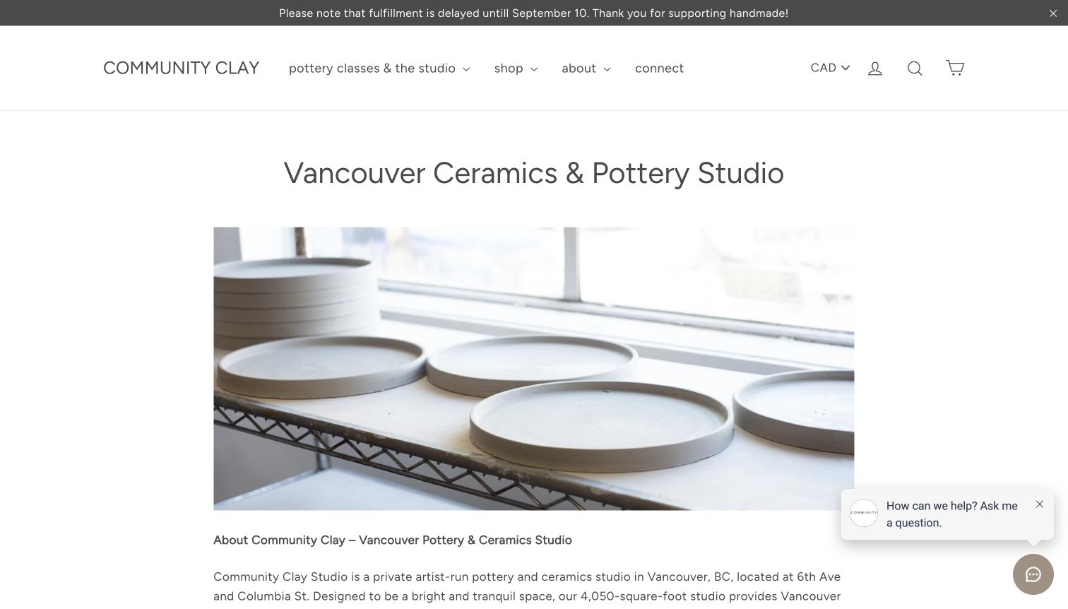
Community Clay's Vancouver introduction uses a title, wide photograph of ceramic work and a text-led description. The page explains the studio's location, physical setting and approach to participation before offering routes into classes and other activities. Its sections discuss pricing approaches, programming and the studio's own access information rather than leaving the word community unexplained. The surrounding navigation distinguishes pottery classes from shopping, which matters for a site that also sells handmade work. The reviewed view retains a chat prompt and a fulfillment announcement; these elements show how retail and support messages can overlap with a teaching journey. The announcement's date also illustrates the need to review time-sensitive copy independently of the durable studio introduction.
What you can learn
Give participation principles specific supporting information and a clear route to ask a relevant question. Keep retail notices scoped to the people they affect, and review dated announcements so they do not distract someone trying to understand a class or studio visit.
Pros
The studio description goes beyond a generic community claim.
Teaching and retail routes are named separately.
Cons & considerations
The chat prompt occupies part of the reading area.
A dated fulfillment notice can distract course visitors.
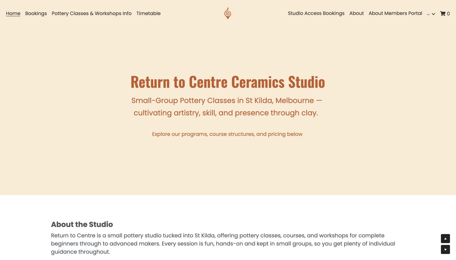
Return to Centre begins with a warm cream field and a large terracotta heading that identifies the studio and its St Kilda setting. The introduction states the small-group offer directly, without requiring a visitor to interpret a promotional video. Navigation links jump to bookings, course information and the timetable. The page then separates current open bookings from a broader set of learning pathways, including short courses, longer programs and individual skill development. A weekly timetable gives another way to understand the offer. This structure is useful for a studio whose teaching cannot be reduced to a single one-off experience. The long page and numerous program names create a comparison challenge, particularly when a visitor is still deciding how much instruction they want.
What you can learn
Distinguish what can currently be booked from the complete teaching menu. A plain-language overview and an anchored timetable can support a complex program, but explain the difference between named pathways before asking a beginner to choose one.
Pros
Location and small-group focus are stated immediately.
Bookings and the wider course menu are separated.
Cons & considerations
Many named programs create a substantial reading task.
The text-led opening offers little visual teaching context.
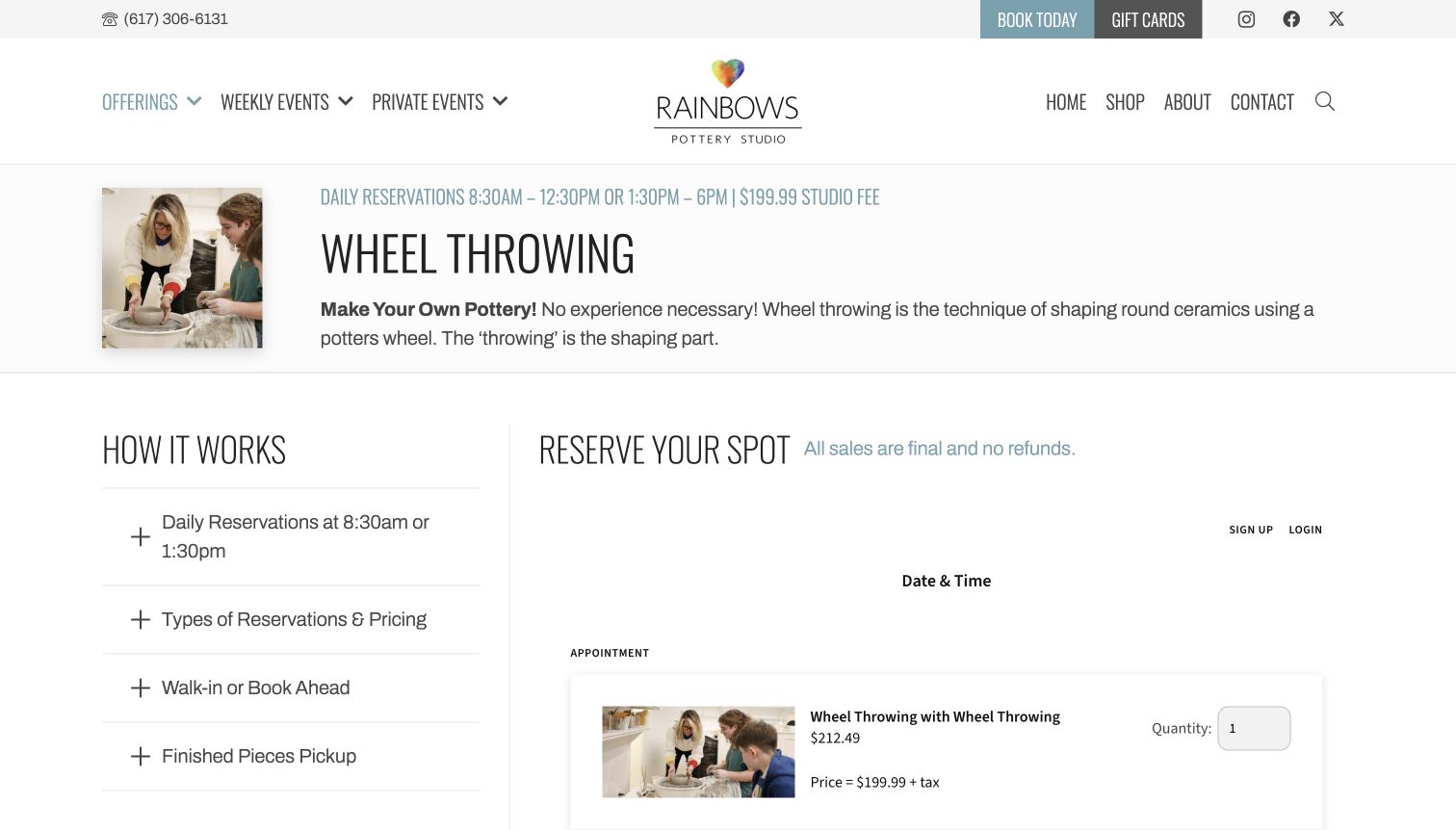
Rainbows' wheel-throwing page introduces the technique in plain language alongside a small photograph of instruction at the wheel. A prominent title and a concise reservation line establish the topic before a two-column layout separates How It Works from Reserve Your Spot. Expandable questions cover reservations, pricing, walk-ins and collection of finished pieces. The booking area remains visible beside that explanation, and the reviewed page distinguishes a studio fee from optional expert instruction rather than presenting every cost as one undifferentiated package. This is a helpful information pattern, although important details sit inside collapsed panels and the separate booking component has its own visual language. The review concerns the page's communication; no slot, quantity or paid option was selected.
What you can learn
Explain the class and the booking terms beside each other. If instruction, materials or finishing are separate options, make those distinctions understandable before a visitor reaches the transaction step, and keep the finished-piece collection process visible.
Pros
Practical questions sit alongside the reservation area.
The technique is explained for a newcomer.
Cons & considerations
Collapsed panels can hide important pricing details.
The booking component introduces a different visual style.
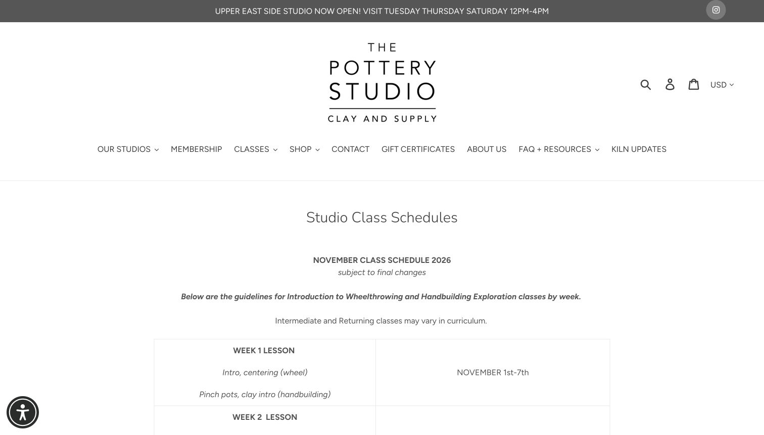
The Pottery Studio's schedule page is deliberately informational. A clear page title introduces the current month, followed by a table that pairs each teaching week with its date range and lesson focus. Wheel throwing and handbuilding are distinguished within the same sequence, so students can understand how a course progresses rather than seeing only a list of available times. Further down, location-specific timetables name sessions and instructors. The consistent black-on-white layout makes the content feel like an operational reference rather than a promotion. The main header is substantial, and a long schedule requires careful reading, but the page gives returning students useful context that a beautiful homepage alone cannot supply. It also states that the schedule is subject to change.
What you can learn
Publish the learning sequence as structured information when it helps students plan. Keep curriculum guidance distinct from live availability, and preserve clear location headings so a useful shared timetable does not cause visitors to confuse different studios.
Pros
The table connects lessons with actual date ranges.
Location sections distinguish different studio schedules.
Cons & considerations
The long page makes quick location comparison harder.
A large header delays the practical schedule content.
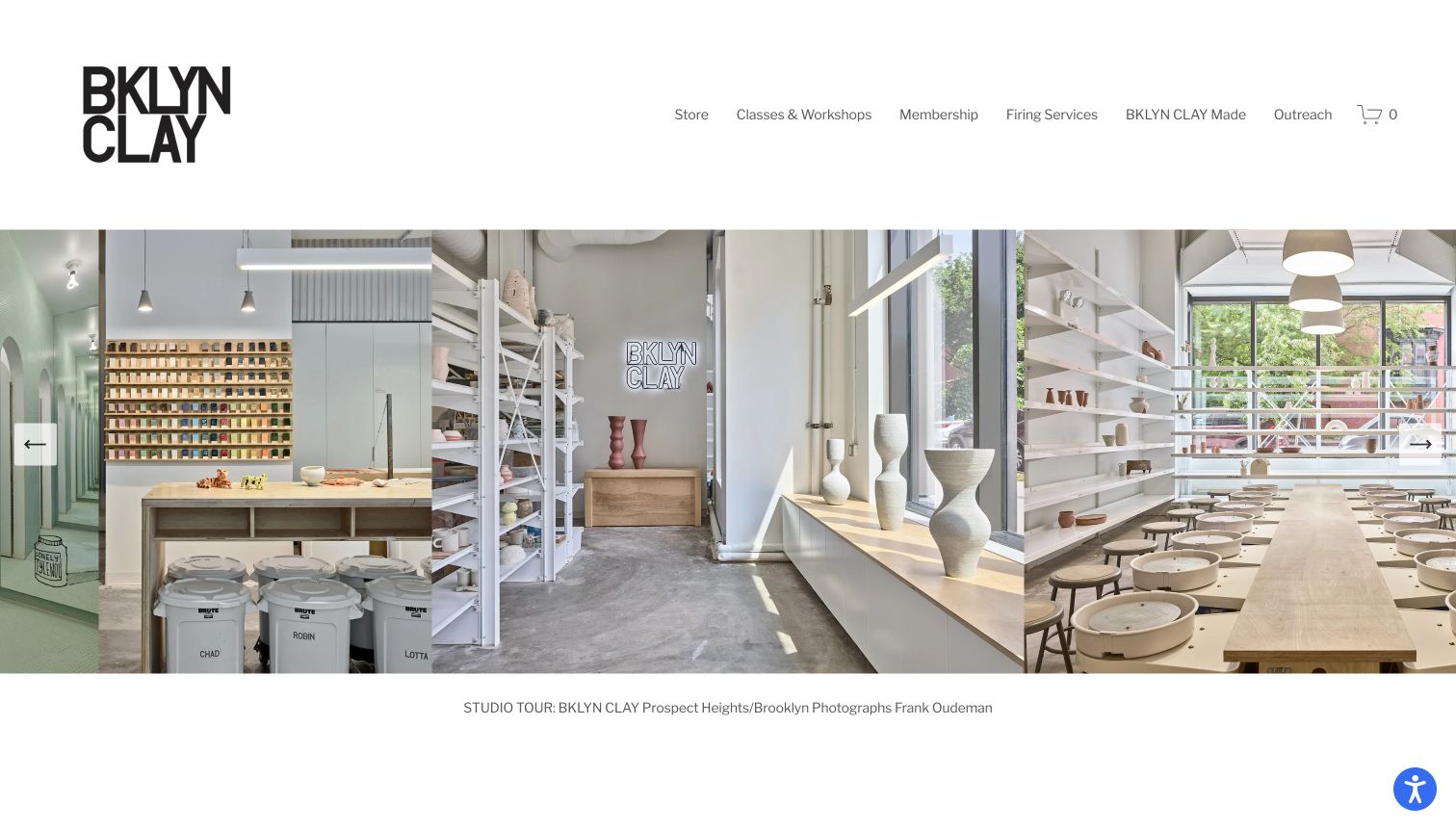
BKLYN CLAY uses a bold stacked wordmark and a wide photographic studio tour as its opening statement. Several views of shelves, wheels and workspaces appear together, with a caption naming the location and photographer. That explicit attribution and location context make the imagery more useful than an anonymous mood board. The quiet header groups classes and workshops, membership, firing services and the studio's own products into separate destinations. The page later introduces workshops and further studio material, but the first screen is primarily a tour of the space. This is a strong reference for showing the environment in which learning happens, while also illustrating the tradeoff between impressive studio photography and immediate information about course duration, level and registration.
What you can learn
Photograph the real working environment and label the location being shown. Pair that visual confidence with a direct, consistent route into course information so visitors can move from imagining themselves in the studio to understanding the available teaching formats.
Pros
Studio photographs are given location and author context.
Teaching, firing and product routes are distinct.
Cons & considerations
The opening tour postpones detailed class information.
Multiple studio views need clear location labels throughout.
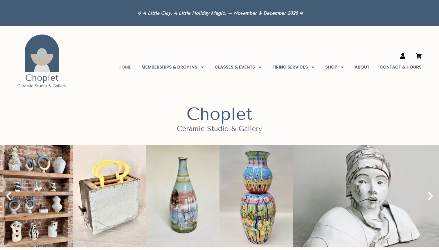
Choplet frames its homepage with a muted blue and cream identity, a small seasonal announcement and clearly grouped navigation. The opening gallery gives ceramic objects and sculptural work generous space, communicating a range of outcomes before the site explains its studio ethos. Classes and workshops then receive a direct route, while separate membership sections identify the different locations and their purposes. This makes the site useful as a reference for a ceramics organization that supports both learners and independent makers. The large masthead and repeated studio name take considerable vertical space before the gallery, and the instructional offer is not the only first-screen message. A visitor must distinguish the creative showcase from the practical class or membership path.
What you can learn
Use finished work to show creative range without implying that every beginner course produces those exact outcomes. Keep class descriptions, independent studio access and location details clearly separated so the gallery supports the decision instead of replacing it.
Pros
A coherent craft identity frames varied ceramic work.
Membership locations are identified separately.
Cons & considerations
The opening header repeats the studio identity at length.
Course details arrive after a substantial visual introduction.
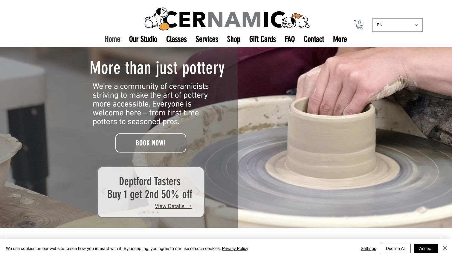
Cernamic places a close view of hands working at a pottery wheel behind its introductory message. A dark translucent panel keeps the welcome and Book Now action readable while preserving the material process in the image. The header uses an expressive wordmark and direct categories for classes, services, gifts and practical questions. A small promotional panel introduces a particular taster offer, while later cards distinguish classes, kiln hire, group activity and membership. The page therefore speaks to both first-time and continuing potters, with a clear visual focus on making. The reviewed capture retains its cookie notice. Several promotions and service categories compete for attention, and a general booking label still requires the visitor to understand which class format suits them.
What you can learn
Show the process itself when the aim is to make a new activity feel approachable. Follow the welcoming introduction with clear course-format definitions, and keep changing offers secondary to the dependable route into the full teaching program.
Pros
A making photograph explains the activity immediately.
Service cards separate classes from studio support.
Cons & considerations
Promotional panels compete with the main class action.
The cookie notice occupies part of the first screen.
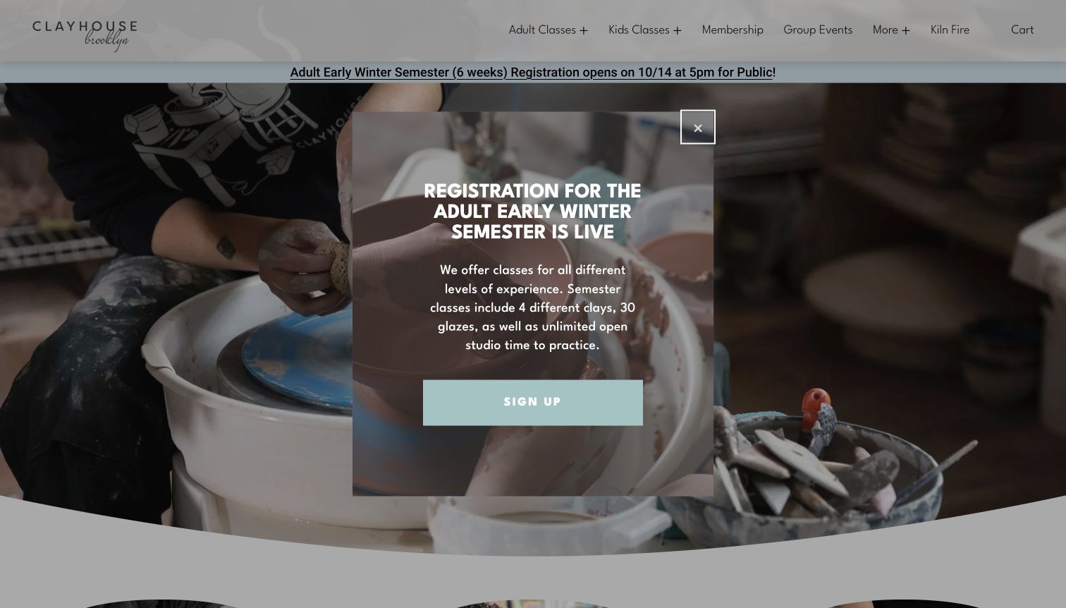
Clayhouse's underlying homepage organizes learning around three useful choices: semester classes, private lessons and one-time classes. Each receives a short explanation that tells visitors why they might choose it, rather than relying on an unfamiliar program name. The navigation also separates adult and children's classes from membership and group events. In the reviewed opening view, a centered semester-registration promotion overlays a close photograph of hands at the wheel. Its copy gives specific course context, but it temporarily obscures the broader set of pathways. Farther down, the local introduction and frequently asked questions address practical expectations, including the difference between this studio and a paint-your-own pottery service. The site is useful for its explicit format distinctions and its example of a prominent registration interruption.
What you can learn
Name the commitment before the visitor chooses a class: a semester, an individual lesson or a one-off introduction. Let registration announcements support those stable choices, and keep a clear dismissal route when a promotion covers the wider course menu.
Pros
Learning formats have concise, recognizable descriptions.
Practical questions clarify what the studio does offer.
Cons & considerations
The registration overlay obscures the initial overview.
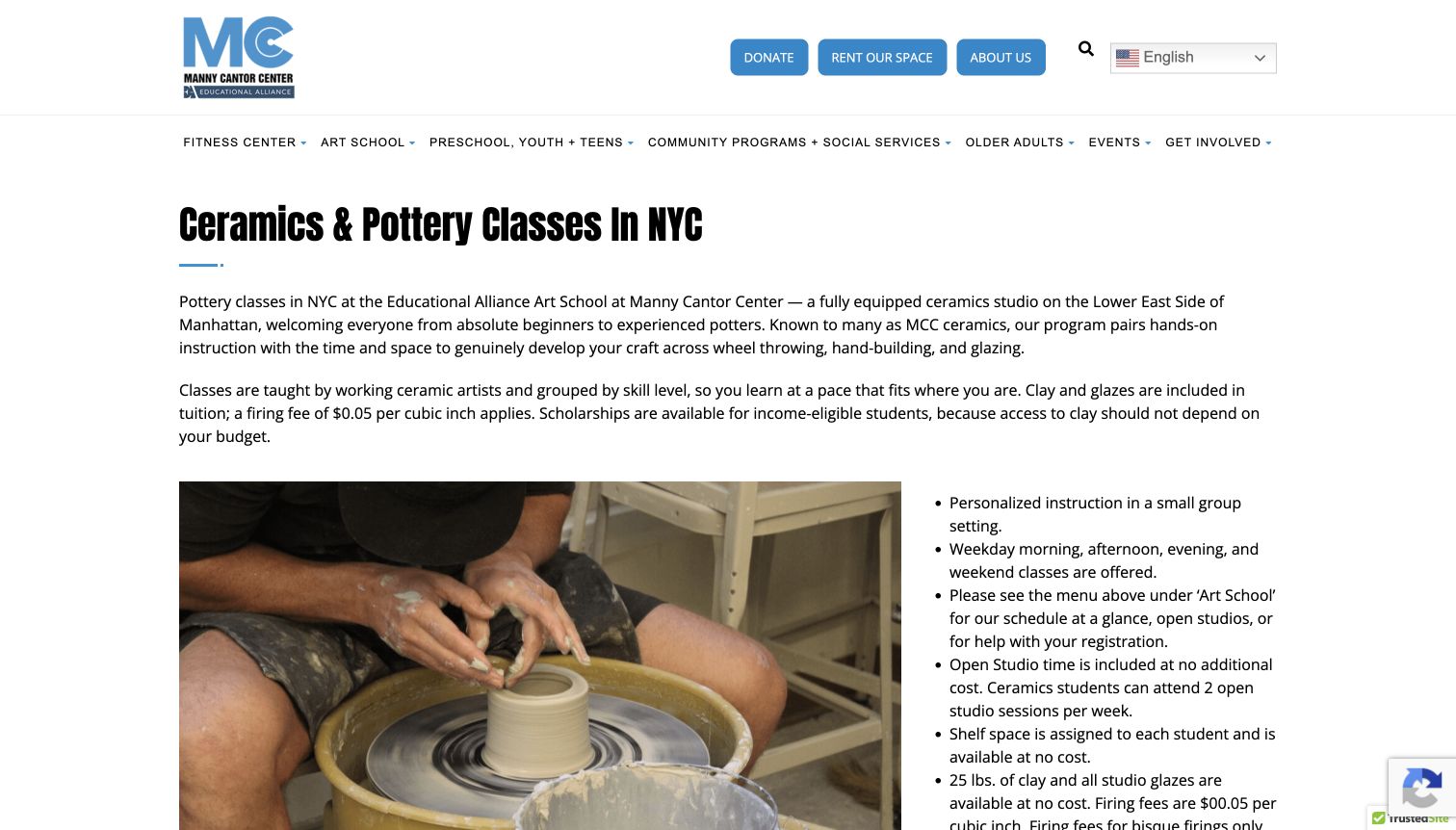
Manny Cantor Center gives ceramics its own focused page within a much broader community website. The main heading identifies the subject and city, and two introductory paragraphs explain the learning formats and how the program is organized. A working-at-the-wheel photograph sits beside practical bullet points about instruction, class timing, studio practice and materials. This pairing is useful because the visitor can understand both the activity and the surrounding arrangements without interpreting a generic art-school promotion. The larger site navigation remains visible, placing the course within its organizational context. The tradeoff is a busy global menu and a fairly text-heavy introduction. Schedule links and repeated fee details also need coordinated maintenance so the page and its linked documents tell the same story.
What you can learn
Give a specialist course enough dedicated space even when it belongs to a large organization. Put materials, studio access and additional charges into an explicit information structure, and keep downloadable schedules aligned with the current page description.
Pros
The ceramics offer has a clear dedicated introduction.
Practical bullets accompany a relevant teaching photograph.
Cons & considerations
The wider organization adds a crowded global navigation.
Repeated details and schedule documents can diverge over time.
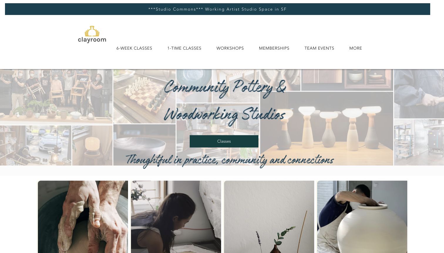
Clayroom's navigation begins with six-week and one-time classes, making duration a first-level distinction. Workshops, memberships and team events follow as separate choices. The opening collage shows finished objects, people making and studio activity, with a central Classes action connecting the atmosphere to the offer. Below it, image cards explain the different ways to participate, including independent studio membership. This is useful for visitors who know how much time they want to commit but do not yet know the technical language of ceramics. The site also includes woodworking, so the descriptions need to preserve the difference between disciplines. The pale collage and script lettering give the hero a soft appearance, while the image details can compete with the short central message.
What you can learn
Organize the first choice around a distinction visitors understand, such as a one-time session or a longer course. When several crafts share a site, repeat the specific discipline in the next step so duration alone does not become an ambiguous label.
Pros
Class duration is visible in the primary navigation.
Cards distinguish instruction from independent membership.
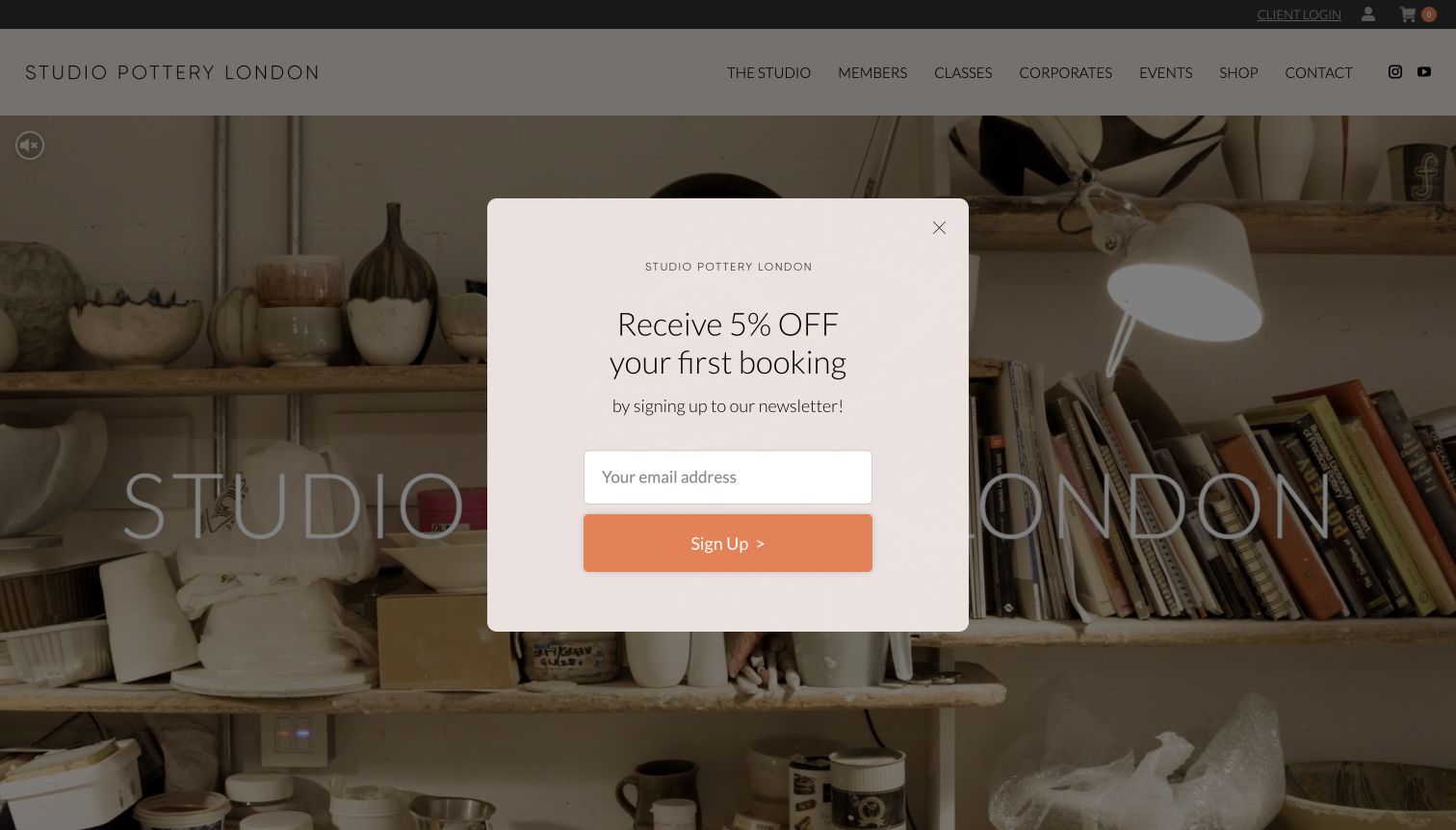
Studio Pottery London uses a restrained wordmark and a studio scene to establish its atmosphere. Classes, membership, corporate activity, events and shopping have distinct routes in the header, while later image cards repeat the principal destinations. The page explains the studio's central London setting and introduces the teaching team and resident-potter context. In the captured first visit, a newsletter discount invitation appears over the scene, making the promotional layer part of the initial experience. The underlying structure remains useful for understanding how a studio can connect learning with an ongoing making community. The design also illustrates a familiar tension: an otherwise quiet introduction becomes a decision about an email offer before the visitor has explored the classes.
What you can learn
Keep the calm visual identity consistent with the actual browsing sequence. Separate class, membership and event routes, and time promotional invitations so they do not become the main obstacle between a new visitor and the teaching information they came to inspect.
Pros
Participation routes are consistently named in the header.
Studio imagery gives the teaching offer a physical context.
Cons & considerations
The newsletter overlay obscures the opening scene.
Course details require moving beyond the atmosphere-led introduction.
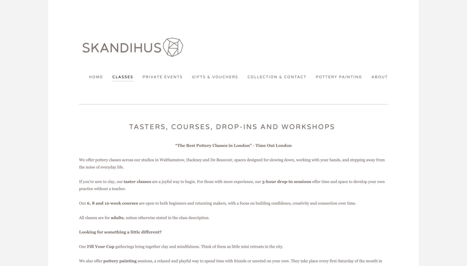
SkandiHus's classes page begins with a concise explanation of tasters, courses, drop-ins and workshops. The important differences are stated in ordinary language, including which options are for newcomers and which provide independent practice without a teacher. Course durations and the usual adult audience are also made explicit. A quiet grey wordmark, thin divider and generous white space keep the page focused on reading rather than a large promotional image. Location-specific class cards follow, giving the visitor a second decision after the format is understood. This sequence is helpful for a multi-studio offer, although the relatively small text and long introductory block can make quick comparison slower than a compact table or set of consistently structured cards.
What you can learn
Explain the teaching model before asking someone to choose a location or date. In particular, distinguish an instructor-led session from independent studio time; the two may look similar in photographs but create very different expectations for a beginner.
Pros
The page explains several formats in plain language.
Location selection follows the introductory guidance.
Cons & considerations
Small text makes the introduction feel dense.
Format comparison depends on reading several paragraphs.
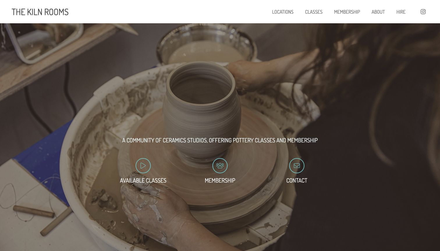
The Kiln Rooms puts a close view of wheel throwing behind a short description of its studio community. Three labeled icon actions lead to available classes, membership and contact, keeping the first decision compact. A restrained top navigation then groups locations, classes, membership, institutional information and hire. Below the hero, the site explains the different London locations before introducing class formats and studio access. This gives visitors two complementary ways to browse: by the type of participation they want and by the place they can attend. The opening is visually simple, but its large photograph still uses most of the first screen. Detailed distinctions between a taster, a longer course and private instruction require following the later sections.
What you can learn
Use a small number of explicit opening routes, then explain location and course format in a consistent order. Labeled icons can help organize those choices, but the labels should carry the meaning without requiring visitors to interpret the symbol alone.
Pros
Three opening actions keep the first decision focused.
Locations and participation formats have separate sections.
Cons & considerations
Detailed course information sits below the large hero.
Several studio locations require careful offer-specific labeling.
Kegan is a freelance web designer and developer with 15+ years of experience helping businesses turn complicated website requirements into clear, maintainable digital experiences. He works directly with clients from planning and design through development, launch, and ongoing support.
For pottery class website design, his development approach focuses on pottery class websites that explain formats, experience levels, materials, firing arrangements and practical studio-booking information. The scope can be a targeted improvement or a complete custom build, with responsive layouts, thoughtful content structure, and integrations chosen around the people using and maintaining the site.
Show 3 other pottery class website designersHide other pottery class website designers
Plan around the learner and the complete ceramic process
Define the teaching offer in a shared content structure
Begin with the distinctions that affect a learner’s choice. Record the technique, intended experience level, session count, session duration, location and whether an instructor is present. A one-time taster and an independent studio pass may both involve a pottery wheel, but they should not share a vague description simply because the same equipment appears in their photographs.
Use consistent fields when several courses are comparable. Let the team explain the studio’s actual level definitions and prerequisites rather than inventing a generic beginner-to-expert scale. If a course welcomes several levels, describe how that works using approved information. Keep age requirements and any accompanying-adult arrangements tied to the specific offer.
Then decide how much browsing structure the catalog needs. A small studio can make a few clearly described options easier to choose than a complex search tool. A larger program may need location, format and date filters. In either case, keep an unfiltered overview available and make the selected course name recognizable when the visitor moves into a booking service.
Explain what happens during and after the class
A pottery experience does not necessarily end when the session ends. Work may need to dry, be fired, be glazed or be collected later. Describe the studio’s own process and expected communication without inventing a guaranteed completion date. Explain what the student does, what the studio handles and whether an additional visit is part of the offer.
Put inclusion and price information near the course description. Clay, tools, instruction, studio practice and firing may be bundled or charged separately. Avoid a prominent starting price that can only be understood after opening several unrelated policy pages. If the booking component adds tax or optional services, the surrounding explanation should prepare visitors for that distinction.
Use examples of student work carefully. A finished professional object can convey creative range, while a class photograph can show how learning takes place. Label the context instead of implying that every student will make an identical object. Keep questions about preparation, missed sessions, refunds and collection linked from the course so practical information does not depend on a promotional overlay.
Keep locations, dates and availability coherent
When several studios share a website, make the location part of the course identity. Carry it through listing cards, descriptions, schedules and booking links. A general studio tour should identify which space is shown. Do not let a photograph of one branch imply that another has the same equipment, layout or access arrangements.
Separate the durable teaching description from current registration status. A semester announcement should have a review date and a clear owner. A course that is not open for booking can still explain its content, but its next action should accurately lead to future dates or an inquiry rather than look like a confirmed place. Keep downloadable schedules aligned with the web page.
Plan for ordinary browsing interruptions. Optional newsletters, chat and media should not hide the information needed to select a class. Preserve a readable introduction when video is unavailable and give promotions an obvious dismissal. After launch, review expired dates, inconsistent location names and unclear price inclusions as content maintenance tasks rather than waiting for a complete redesign.
The editing job behind the design
Choose publishing and booking tools that preserve the course details
Use structured course and session records when the same information appears in several places. Keep the approved booking service as the source of live availability, and define which team member updates descriptions, dates and studio details.
Give class formats, locations and levels consistent names across the public website and the booking step. Keep customer and payment information in the appropriate private systems; ordinary course browsing should not require an account.
Treat the technology stacks as public evidence about specific reviewed pages. A visible booking link does not establish the entire studio’s software, and an unavailable scan is not a reason to guess an underlying platform.
Our WordPress website examples offer a separate look at publishing approaches. A visible platform label is evidence for that named page, not a guarantee that the same system will suit your requirements.
Before the public launch
Pottery-class website brief checklist
Name the actual technique taught.
Distinguish taught sessions from independent studio access.
Explain the studio’s level definitions and prerequisites.
State session count, duration and location together.
Identify age or accompanying-adult requirements where relevant.
Separate included materials from additional charges.
Explain the studio’s firing and finishing arrangements.
Describe collection and any required return visit.
Use course-specific cancellation and missed-session information.
Label the location shown in studio photographs.
Distinguish display work from expected class outcomes.
Keep registration announcements and schedules current.
Provide a readable route around optional video and promotional overlays.
Make course details and booking actions clearly different.
These checks are a project checklist, not a performance, legal, security, or accessibility certification. Test real journeys with the people responsible for the website before making claims about the result.
Sources & editorial method
How this collection was selected and reviewed
These 19 distinct public pottery-class properties were reviewed on November 11, 2026. The screenshots are direct views of the pages discussed. Turning Earth uses its Leyton studio page; Community Clay uses its Vancouver studio introduction; Rainbows uses its wheel-throwing offering; The Pottery Studio uses its class schedule; Manny Cantor Center uses its ceramics page; and SkandiHus uses its classes overview. The other images show homepages. Visible promotional and cookie notices are retained where they appeared. Mudflat’s institutional description was checked on its own About page before the editorial selection. Reviews describe design and information choices, with technology evidence qualified to the reviewed public page.
Each example links to its actual source page. Screenshots are direct browser captures with their own capture dates; moving imagery, announcements and live designs can change. The notes describe observable design choices and conditional tradeoffs, not measured traffic, conversion results, service quality, or accessibility conformance.
Technology labels use public page metadata, asset evidence, or explicitly cited platform documentation. Platform documentation is not a complete current deployment audit. A component reference may be legacy or unused; it is not a complete backend inventory. Unknown stacks are omitted. These sites are editorial examples, not our client portfolio.
Written, Edited and Curated are separate editorial records, not timestamps advanced by a rebuild. Website designs and imagery belong to their owners. See our editorial standards or suggest a correction.
Questions worth asking
Pottery Class website design questions
What should a beginner see before booking?
Explain the technique, intended level, session length and what is included. Make it clear whether the session includes instruction and what happens to the work after class. Use the studio’s actual terms rather than promising a particular finished result.
Should wheel throwing and handbuilding share a page?
They can appear in one catalog, but their descriptions should stay distinct. Explain the difference in plain language and identify which technique each course teaches before the visitor reaches a booking action.
How should studio membership differ from a class?
State whether instruction is included, what access is provided and what experience the studio requires. Independent practice is a different offer from a taught beginner session even when both use the same workspace.
Where should firing and collection information appear?
Place a concise explanation beside the relevant class details, with a link to fuller policies when necessary. Visitors should understand whether the work is collected later, whether another visit is involved and which costs are separate.
Does a small studio need a complex course finder?
Usually only if the catalog justifies it. A few consistently described options may be easier to compare. Larger programs can benefit from filters for location, format or date, provided a clear overview remains available.
Does Editors Choice certify the teaching or studio?
No. It is an editorial website-design selection based on public presentation and communication. It does not establish teaching quality, studio suitability, accessibility conformance or a guaranteed learning outcome.
Make the learning format as clear as the atmosphere is inviting. Explain the commitment, show the real studio and connect each course to the practical details that help someone choose with confidence.