Best Boxing Gym Websites of 2026 (14 Real-World Examples)
Fourteen boxing gym websites showing how clubs, coaches and fitness studios explain the first visit.
A boxing website needs to make the training experience understandable before it asks someone to step into the gym. These examples show different ways to connect atmosphere with programs, coaches, schedules and membership details.
A newcomer may be looking for a noncontact fitness class, technical instruction, a youth program or a route into competition. Those are different needs, even when the same gym serves them all. Strong boxing gym websites make the distinctions clear and help visitors choose a suitable first session.
This collection includes independent clubs, established training gyms and boxing fitness studios. It compares their public website design and information structure, not the quality of their coaching or the outcomes of their training. The useful ideas are practical: show the real setting, explain participation and make the next step specific.
Before the examples
What makes good boxing gym website design in 2026?
Explain the kind of boxing
Distinguish noncontact fitness, technical classes, sparring and competitive pathways. A dramatic training photograph cannot tell a beginner which activities are expected or optional.
Make the first visit concrete
Put the location, suitable class, equipment arrangements and arrival guidance close to the trial action. Explain what happens after someone requests a place.
Keep programs and access separate
Class membership, open gym use and private coaching may have different terms. Show inclusions and exclusions clearly before the visitor reaches checkout.
The collection · 14 examples
14 boxing gym websites worth studying
Study how these fourteen sites turn boxing imagery and personality into useful decisions. Each review identifies a specific design pattern, its practical lesson and the tradeoffs visible during the source visit.
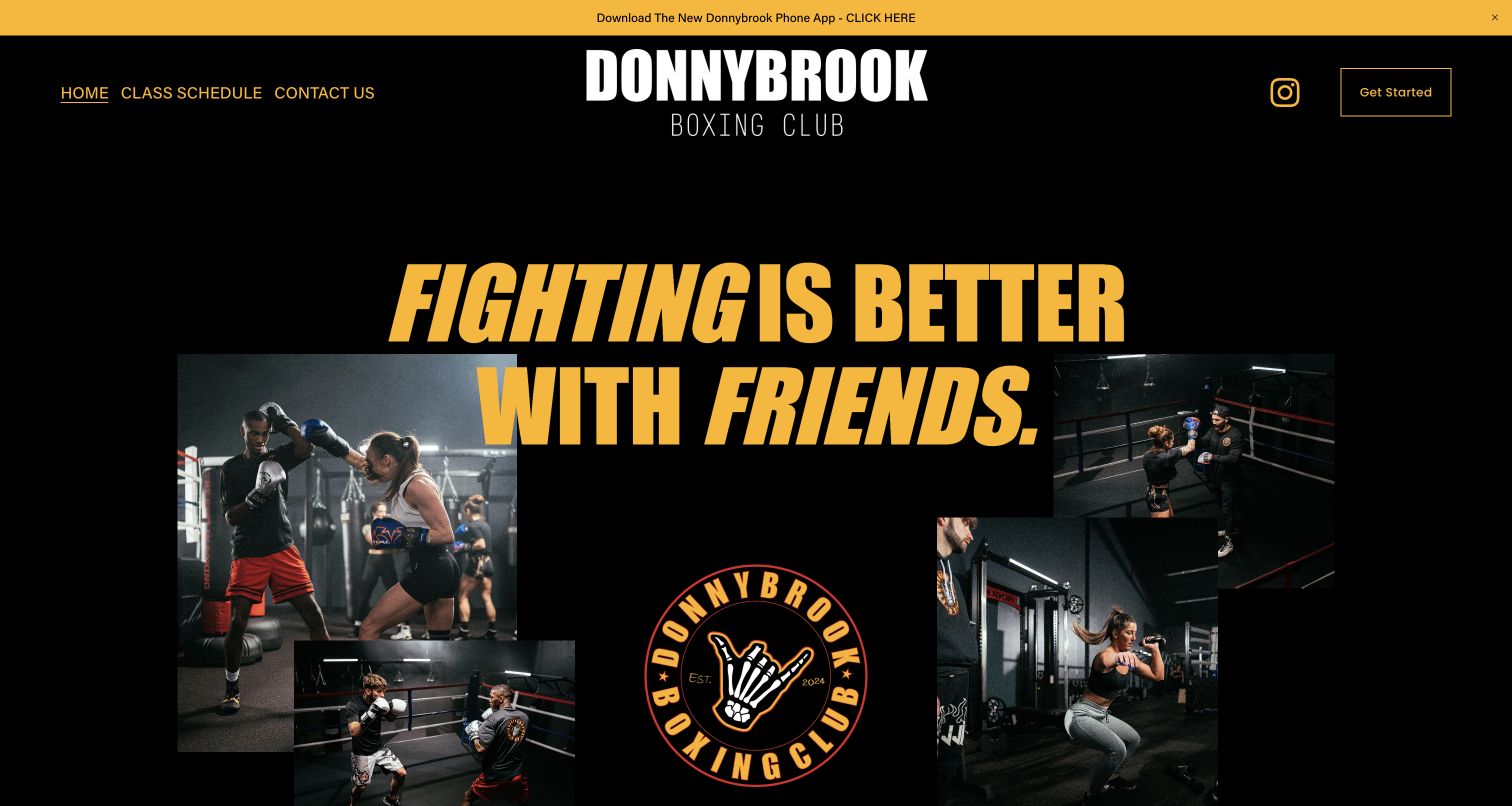
Donnybrook combines warm yellow type, a black background and a collage of real training photographs. Its central message emphasizes shared participation, and the concise header keeps class schedules and contact routes visible. The next section explains a free first class, including the supplied gloves and wraps, before introducing the head coach. Membership cards distinguish class access from equipment access and explain what each option excludes. That combination makes this the editorial selection: the design has character while helping a beginner understand what participation involves. The app announcement takes attention above the introduction, and several differently worded actions lead to the same classes destination. The contact form also displays preselected notification options, which deserve a clearer, more deliberate consent choice.
What you can learn
Make a distinctive brand useful by answering the first-visit questions directly. Show what membership includes and excludes, keep action labels faithful to their destinations, and let people choose communications deliberately rather than relying on preset boxes.
Pros
Real training images reinforce the community-focused introduction.
Membership descriptions distinguish classes from gym access.
Cons & considerations
Several action labels share a less specific destination.
Preselected communication options weaken the contact experience.
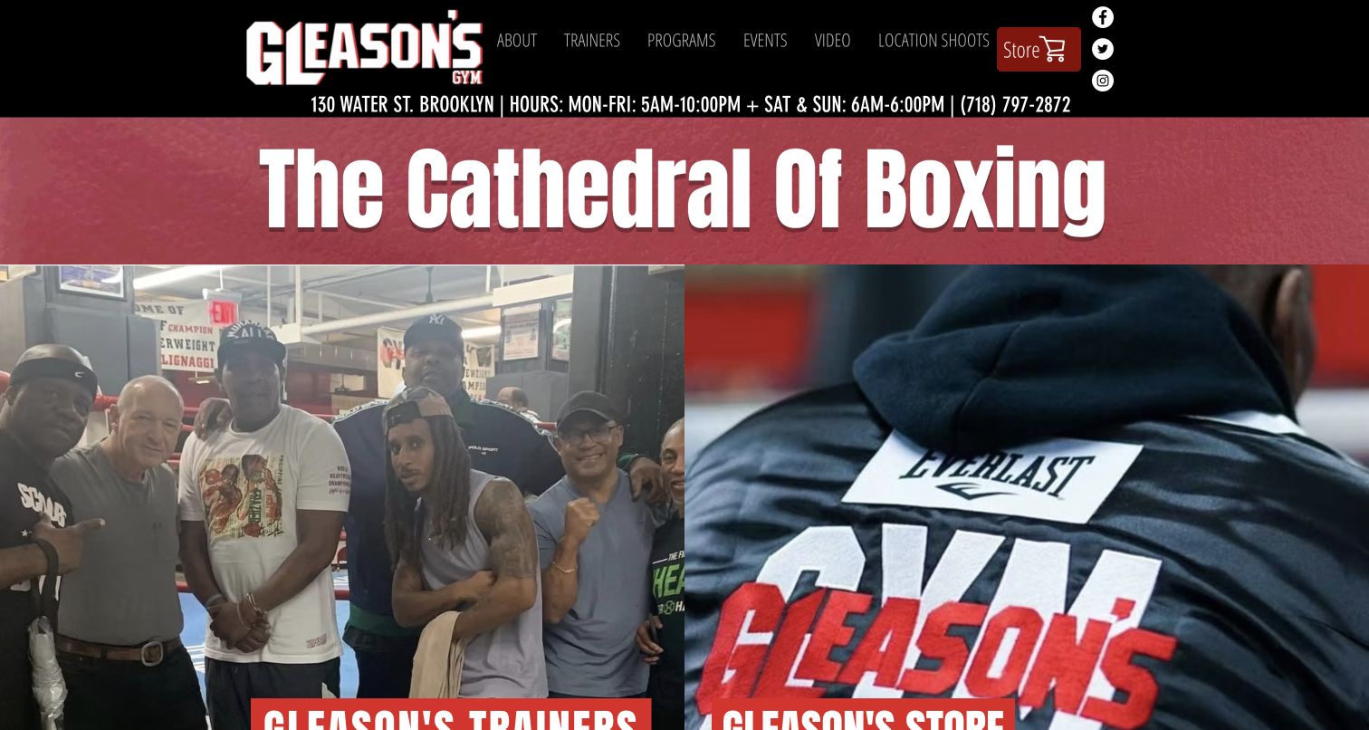
Gleason’s Gym gives its name and sporting identity a bold red-and-black treatment, but keeps the address, telephone number and opening hours visible above it. The first content row combines gym photography with merchandise, showing the business’s training and retail sides together. Navigation then separates trainers, programs, events and production-related visits. Farther down, the president’s introduction and dated event links provide a substantial organizational story. This is useful for studying how a well-known gym can retain practical information alongside its reputation. The storefront competes with the first training decision, however, and the growing list of events makes the page dense. The site works best when a visitor already knows whether they want coaching, an event or a purchase.
What you can learn
Give heritage a strong visual role without displacing the information required for a visit. Separate retail, event and training routes early, and keep time-sensitive event material organized so new members can identify their next step.
Pros
Opening hours and location remain easy to locate.
Training and specialist activities have named navigation routes.
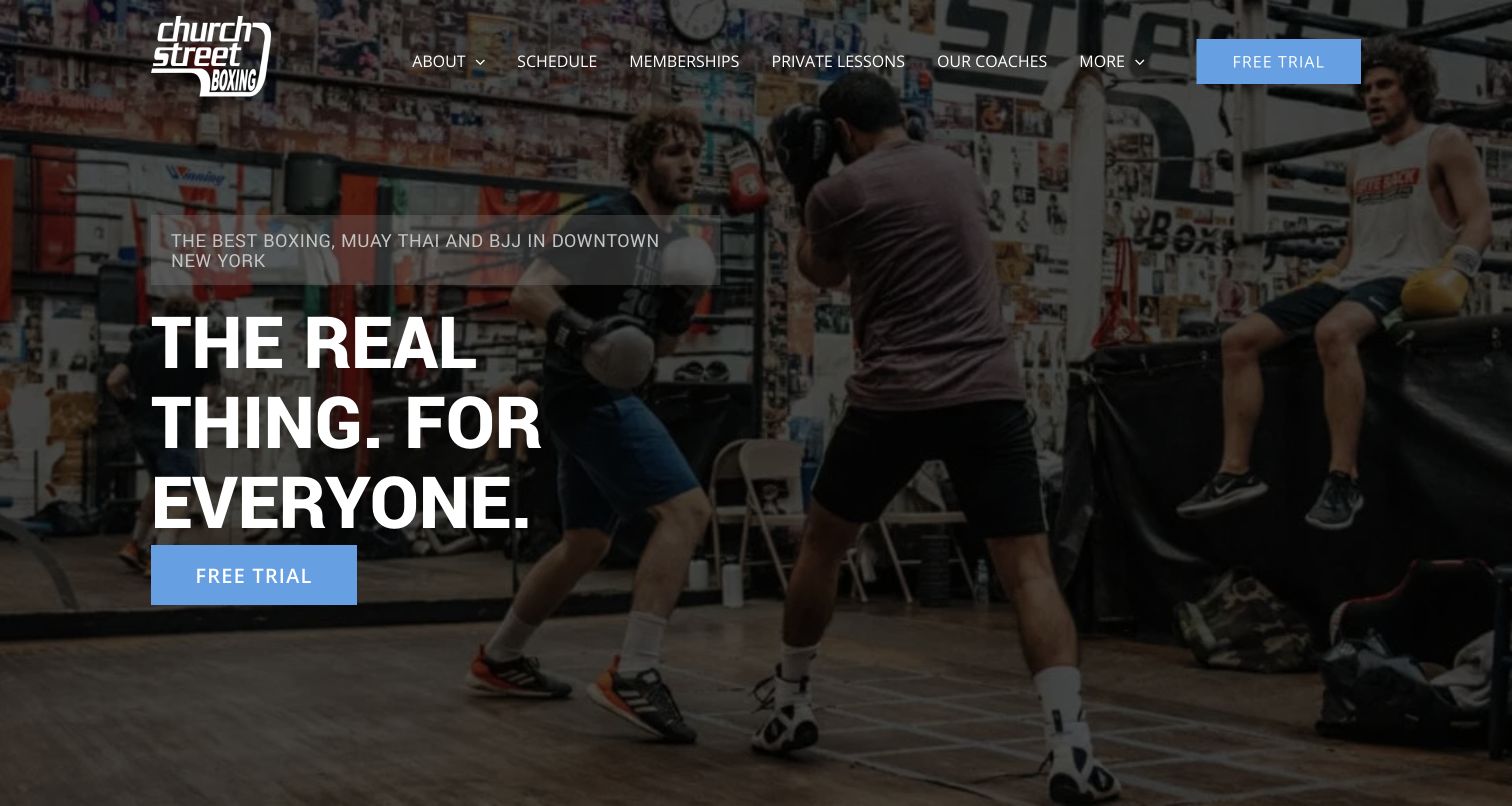
Church Street Boxing’s Park Place site opens with a real training photograph, a short inclusive statement and a blue free-trial action. The next section turns that invitation into a three-stage process: visit, discuss a program and begin training. This is more useful than a general promise to transform someone’s fitness because it describes what happens at the gym. Separate program descriptions cover boxing alongside Muay Thai, Brazilian jiu-jitsu and youth options. The page also links schedules, memberships, private lessons and coaches through a concise header. The broad photograph gives the gym character, although it delays the program comparison. Visitors still need to distinguish boxing instruction from the other disciplines before selecting the most appropriate session.
What you can learn
Answer the emotional uncertainty of a first visit with a simple, factual sequence. Pair a welcoming headline with program distinctions and a visible schedule rather than making the trial button carry every explanation.
Pros
The first-visit sequence makes an unfamiliar process concrete.
Coaching and membership tasks are clearly named.
Cons & considerations
The large hero postpones program details.
Several disciplines require careful audience separation.
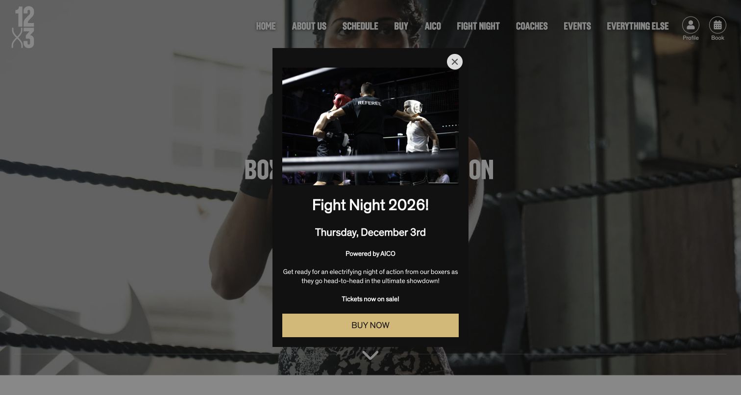
12x3’s East London boxing page connects a local search intent with a specific gym, coach profiles and a schedule link. The text explains options for different experience levels, including people who want to learn without contact, and gives practical arrival guidance. That makes the page more useful than a location name appended to a generic sales pitch. The captured visit also shows a prominent Fight Night promotion covering much of the underlying introduction. Its event photograph and gold action are visually forceful, but the overlay interrupts the visitor’s immediate task. This example is worth studying as a local service page with helpful supporting information, while recognizing that an event campaign can temporarily obscure the core offer.
What you can learn
Give each location page its own useful arrival, coaching and program information. If an event promotion is necessary, make it easy to dismiss and ensure the primary local task remains understandable beneath it.
Pros
Local detail connects the page with a real training location.
Experience and contact preferences receive explicit attention.
Cons & considerations
The captured event overlay hides the introduction.
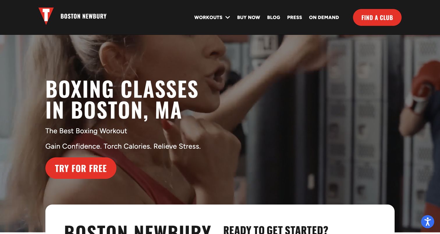
TITLE’s Boston Newbury Street page uses a familiar black-and-red identity while placing the city directly in the main heading. A free-class action sits beside the boxing imagery, and a local information block supplies the studio’s address and contact routes. Below, the workout is explained as stages rather than a vague high-intensity promise: preparation, bag rounds, recovery and core work. The schedule and common newcomer questions provide more operational detail. This is a boxing fitness studio example, not evidence of a competitive fighting program. The large opening visual still pushes practical details down, and promotional benefits occupy substantial space. Its strongest lesson is the combination of shared brand design with genuinely local information and an understandable class structure.
What you can learn
Keep a consistent brand system across locations, but make the branch address, class format and first-visit questions specific. Explain the workout before sending someone into an external scheduling or registration flow.
Pros
The branch name and address establish local relevance.
The class sequence helps visitors picture participation.
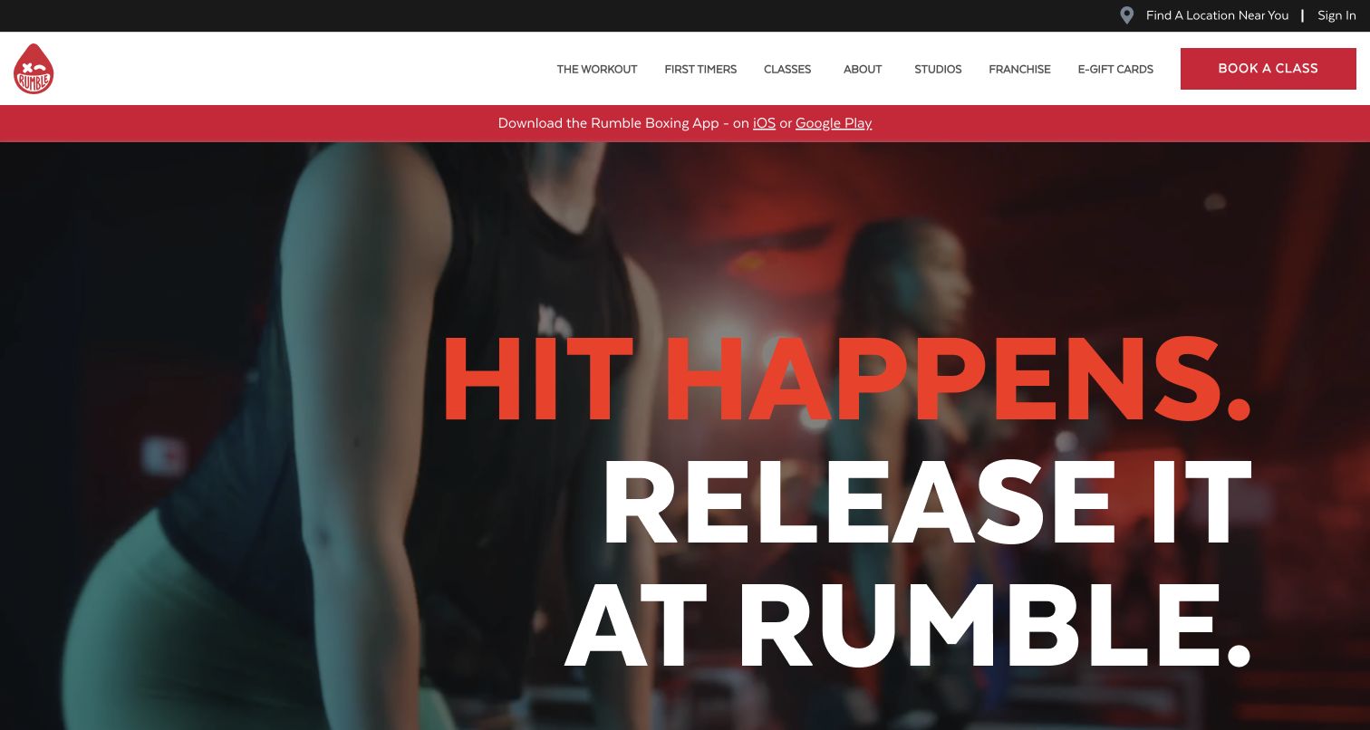
Rumble uses large condensed lettering, a stark black-and-white palette and red accents to make its opening feel like a fitness campaign. The main navigation gives first-timers their own destination alongside workouts, classes and studios. The page describes a boxing-and-strength format, with the structure and duration presented as part of a recognizable product. A studio finder and app promotion support the larger network. This is useful for a business selling a repeatable class experience across locations, rather than a single traditional boxing club. The dominant slogan and moving imagery provide atmosphere before operational detail. The app strip also competes for attention before a new visitor has chosen a studio or understood how to attend a first class.
What you can learn
Give first-timers an explicit route when the brand has its own workout vocabulary. Use a strong campaign identity to attract attention, then quickly connect it to location selection, class expectations and a sensible next action.
Pros
First-timer navigation addresses a distinct visitor need.
The boxing-and-strength format is described consistently.
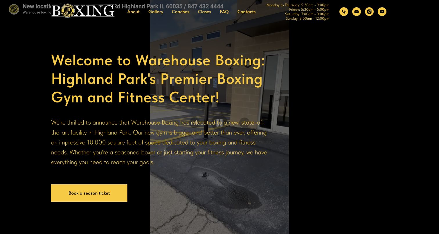
Warehouse Boxing introduces its facility through dark imagery, yellow accents and a substantial narrative about the gym. The header groups gallery, coaches, classes, questions and contact into a single-page journey, while operating hours remain visible. Coach biographies and program sections give visitors more than a list of equipment. The site also shows how boxing, weights and other classes fit within one facility. This makes it useful for a local gym with several reasons to visit. The captured opening is less successful where header content overlaps the relocation message, and the long introductory story asks for patience before the class choices become clear. A season-ticket booking label also needs context for visitors unfamiliar with that terminology.
What you can learn
Use a facility story to establish personality, but give the first session, class schedule and current location their own clear space. Check fixed headers against announcements and replace ambiguous booking language with a specific visitor action.
Pros
Persistent section navigation supports a long page.
Coach profiles connect the facility with real people.
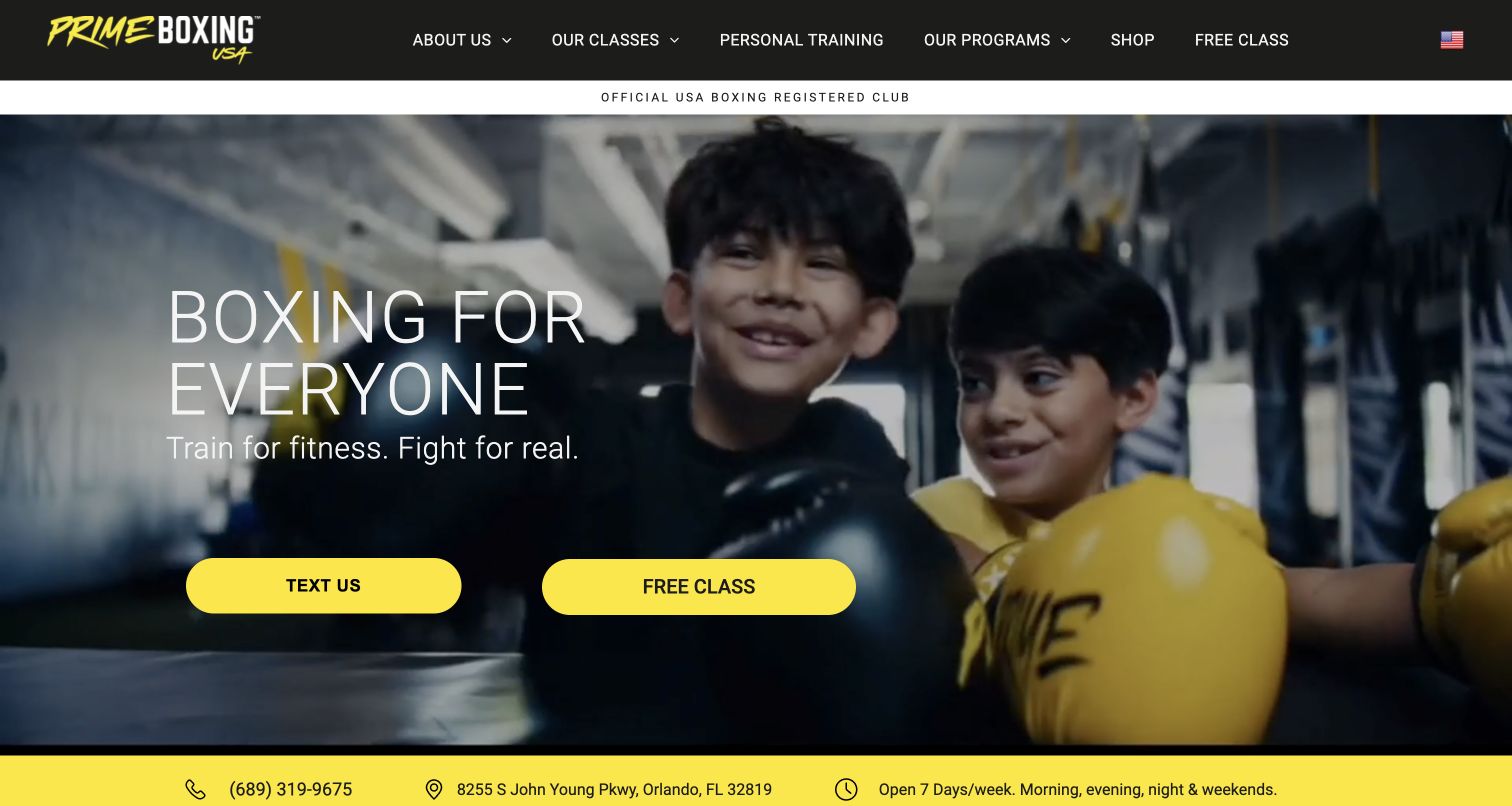
Prime Boxing USA puts its location, contact information and hours in a utility strip above a black-and-yellow navigation. The hero photograph shows younger participants, while the accompanying statement distinguishes fitness training from fighting. Below, program routes cover fitness, competition, children and women, making the audience range explicit. Coach and schedule links give that broad invitation practical support. This is useful for a gym that wants to welcome beginners without erasing its sporting focus. The first screen presents both texting and a free class as strong actions, so the preferred starting point is less obvious. Visitors also need the program descriptions to understand which sessions involve technical boxing, fitness work or a pathway toward competition.
What you can learn
Name the different reasons people train and make the appropriate path visible before enrollment. Keep local essentials prominent, but select one primary newcomer action so several equally strong buttons do not create a new decision.
Pros
Location and operating details are immediately available.
Programs distinguish several genuine audience needs.
Cons & considerations
Competing first actions weaken the initial hierarchy.
Broad program labels still need session-level explanation.
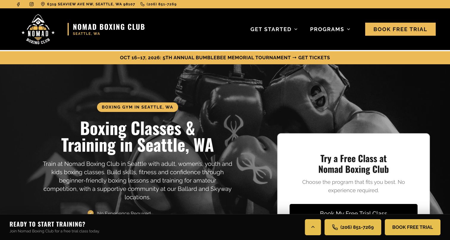
Nomad Boxing Club combines a black-and-gold identity with visible Seattle contact details and a trial-session panel. Its introduction describes the club community, then separates adult, women’s, youth, children’s and competition-related programs. The presence of named coaching information makes those routes feel connected to a real organization rather than a generic fitness offer. This is a useful model for communicating a broad community mission while retaining concrete participation choices. The opening is quite dense, however: a long introduction, a trial card and a persistent lower action compete for space. The captured page also retains an October event strip after those dates have passed. That detail shows why ongoing program information and temporary promotions need different maintenance routines.
What you can learn
Make community purpose visible through specific programs and people. Keep the trial route clear without repeating it in every available position, and remove expired event promotions so they do not undermine otherwise useful current information.
Pros
Audience-specific programs make the club’s scope understandable.
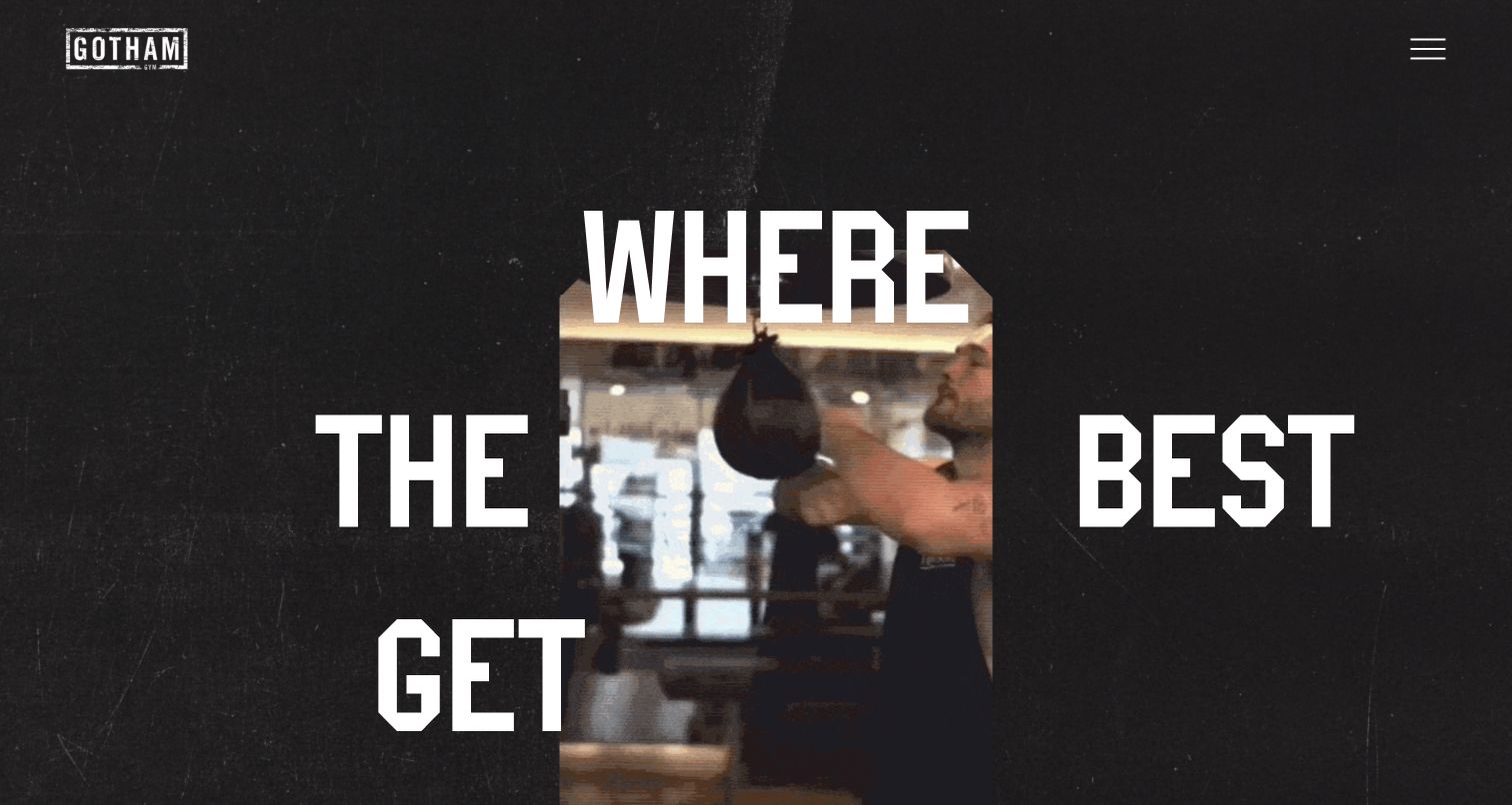
Gotham Gym uses oversized fragmented lettering around a central training portrait to create an editorial first impression. The restrained black palette and textured background put the imagery and type in charge, while navigation sits behind a compact menu. Lower sections bring the offer back to trainers, private sessions, classes and location information. Named coach profiles are particularly useful because they give the brand a human structure beyond the opening visual. The site is worth studying for its confidence in composition, but the same treatment slows practical orientation. A visitor must work past the headline arrangement and open navigation to locate routine tasks. Location-specific offerings also need to remain clearly attached to the relevant gym rather than read as a promise across every branch.
What you can learn
Use distinctive typography when it expresses the gym’s character, but preserve an obvious route to schedules and locations. Pair the brand treatment with real coach information and keep branch-specific services clearly scoped.
Pros
The opening composition has a recognizable visual identity.
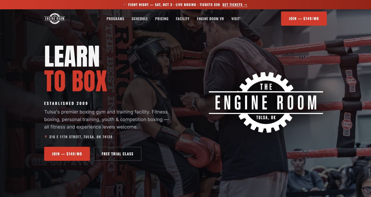
Engine Room Boxing pairs a training photograph with a direct learning-focused headline, its Tulsa address and two different starting actions. A paid membership button is more prominent than the quieter free-trial option. Below, the page distinguishes fitness boxing, personal training, youth sessions and a competition team, with specific descriptions of their different expectations. A visible weekly schedule gives the program list an operational counterpart. The gear-shaped identity and red accents create a coherent local brand. This is a useful example of explaining several training pathways in one place. The captured header still promotes an October fight night, however, and the paid action arrives before the visitor has compared the programs. Additional specialist offerings broaden an already substantial page.
What you can learn
Organize boxing programs around participation goals and entry requirements, then connect them to a maintained schedule. Keep temporary events current and give newcomers enough context before the most prominent action asks them to join.
Pros
Programs have distinct participation expectations.
A weekly timetable supports the general service descriptions.
Cons & considerations
An expired event remains prominent in the header.
The membership action precedes the program comparison.
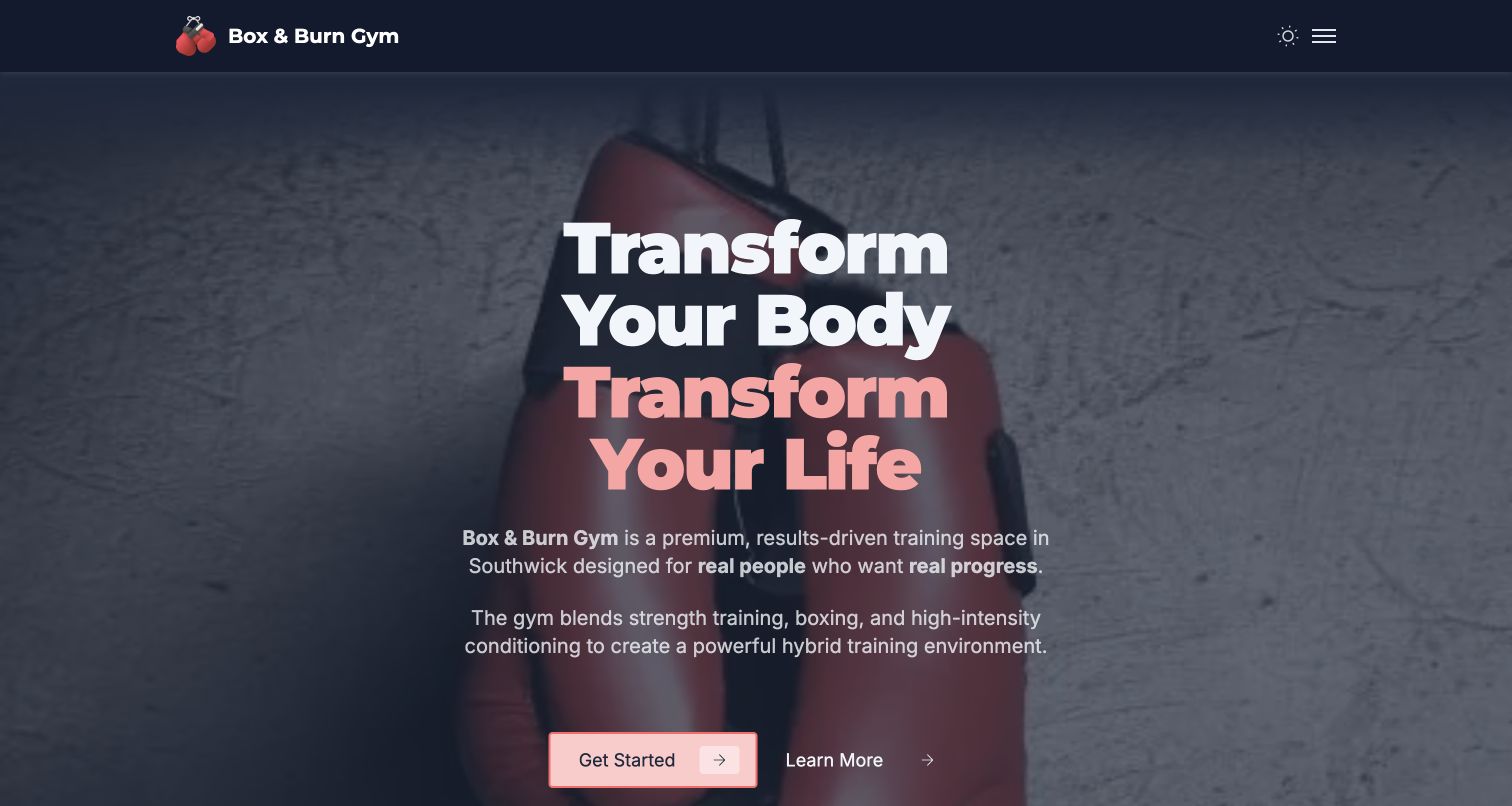
Box & Burn’s Southwick homepage places a large motivational heading over a boxing-bag photograph, then explains the combination of strength work, boxing and conditioning. Service cards separate personal training, small groups, boxing coaching and other activities before a substantial membership section compares access and session allowances. The plan descriptions include practical limitations and cancellation information, which is more useful than price cards without conditions. This is a hybrid gym example rather than a boxing-only club. The opening headline is broad, and the desktop header hides navigation behind a menu icon. A long list of plans also asks visitors to compare several formats before they know which training route best fits their goal.
What you can learn
Explain the relationship between training formats before presenting every membership. Keep useful conditions near each plan, but help visitors narrow the choices through plain program labels and visible navigation rather than a generic transformation promise.
Pros
Membership cards include meaningful access distinctions.
Service descriptions separate boxing from wider fitness training.
Cons & considerations
The headline provides little distinctive local information.
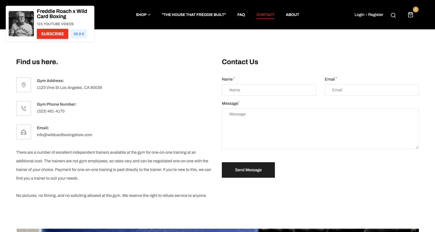
Wild Card Boxing’s contact page uses a plain two-column layout: location and gym information on the left, a message form on the right. The practical copy explains that one-to-one trainers operate independently and arrange their own rates, preventing a visitor from assuming coaching is automatically included in gym access. It also gives the gym’s address and telephone number directly. This is the gym information page within a retail-oriented website, not a review of its storefront as a training program. The black header still prioritizes shopping and account functions, and a floating video-subscription panel overlaps the brand area in the capture. The useful lesson is the explicit explanation of an operational relationship that many gym sites leave ambiguous.
What you can learn
State who provides coaching, what is included and how a newcomer can ask for help. When retail and training share a website, preserve a clearly labeled gym route and keep promotional widgets away from essential navigation.
Pros
The trainer arrangement is explained in plain language.
Address and telephone details are presented together.
Cons & considerations
Retail navigation competes with gym information.
A floating subscription panel overlaps the header.
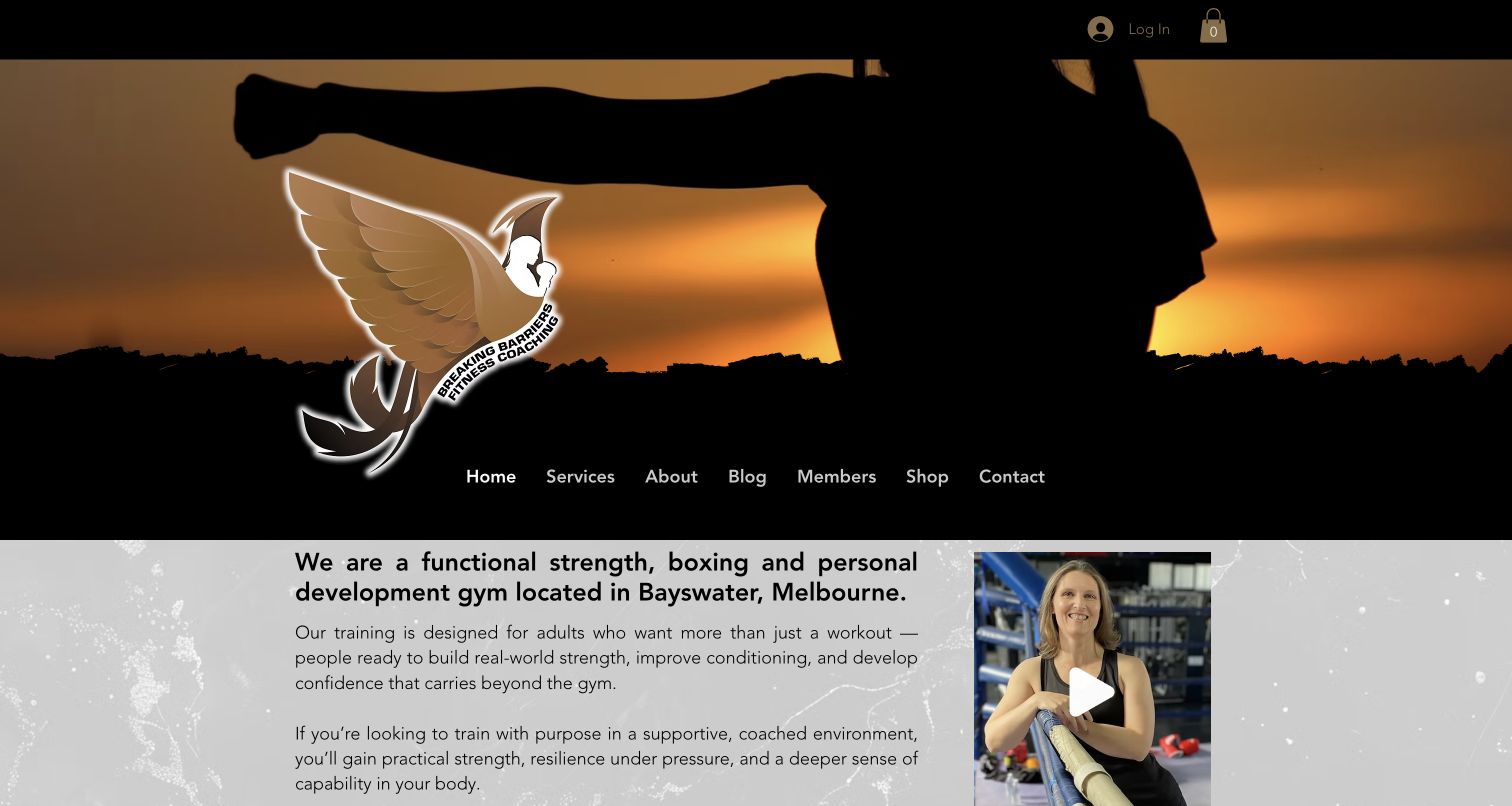
Breaking Barriers opens with a dramatic silhouette and large emblem, then introduces its Bayswater location and the combination of strength, boxing and personal development. A coach video sits beside that explanation, giving the abstract positioning a recognizable person. Lower program cards name boxing and conditioning alongside strength, martial arts and recovery sessions, while a separate newcomer action leads toward plans. The About Jo section explains the coach’s approach in her own voice. This is useful for studying a specialist gym where the person and philosophy matter as much as the equipment. The large identity area delays the practical introduction, and broad wellbeing language needs concrete session detail to remain useful. Member and shop links also compete with the first-visit journey.
What you can learn
Connect a personal coaching philosophy with named programs and a clear first step. Use the coach’s presence to make the offer specific, while keeping session expectations distinct from broad promises about confidence or wellbeing.
Pros
A visible coach introduction gives the business a human identity.
Named programs distinguish boxing from other sessions.
Cons & considerations
The tall identity area postpones practical information.
Broad positioning requires further session-level detail.
Kegan is a freelance web designer and developer with 15+ years of experience helping businesses turn complicated website requirements into clear, maintainable digital experiences. He works directly with clients from planning and design through development, launch, and ongoing support.
For boxing gym website design, his development approach focuses on program distinctions, first-class information, coach profiles, schedules and membership inclusions. The scope can be a targeted improvement or a complete custom build, with responsive layouts, thoughtful content structure, and integrations chosen around the people using and maintaining the site.
Show 3 other boxing gym website designersHide other boxing gym website designers
Planning a boxing gym website that helps people start
Map the first-time visitor journey
List the questions someone asks before attending: where the gym is, which session suits their experience, whether contact is involved and what equipment they need. Answer these in ordinary language instead of assuming familiarity with boxing terms.
Choose a primary action that matches the actual process. A free trial, introductory lesson and membership purchase are different commitments; the button should describe the one offered.
Test the information path from the homepage to the correct session. Returning members still need quick timetable access, but their routine should not obscure the explanation a newcomer requires.
Describe programs through participation
Organize programs by useful distinctions such as age, experience, training goal and contact expectations. Explain any assessment or coach approval before presenting a session as open to everyone.
Introduce coaches with verified roles and relevant background. Avoid unsupported performance, health or safety promises; describe the actual instruction and supervision arrangements instead.
Use photographs of the real gym and people where permission allows. Captions and nearby copy should explain the setting, especially when several branches or training formats share the site.
Maintain the operational information
Give schedules, prices, opening hours and announcements clear owners. Expired fight-night promotions can make an otherwise maintained gym website feel abandoned.
Keep booking and membership links consistent with their labels. If another service handles registration, explain the transition and make the studio or program identity unmistakable.
Review contact and marketing choices separately. A request about classes should not automatically become agreement to every promotional channel, and unnecessary fields should not stand between a visitor and a simple answer.
The editing job behind the design
Choosing tools for a boxing gym website
Start with the content and operating needs: a maintained schedule, clear program pages, coach information and a reliable enrollment route. A small club may need a simpler system than a multi-location fitness brand.
Public websites can reveal builders, scripts, fonts and embedded scheduling tools, but those signals do not establish the complete membership or coaching operation. Treat the visible stacks as scoped research rather than a shopping list.
Evaluate booking services for the actual class rules, access arrangements and communication choices. The public page should remain useful when an embedded schedule or social feed is slow or unavailable.
Our WordPress website examples offer a separate look at publishing approaches. A visible platform label is evidence for that named page, not a guarantee that the same system will suit your requirements.
Before the public launch
Boxing gym website checklist
State the gym’s city and location clearly.
Separate noncontact fitness from contact or competitive training.
Explain beginner suitability and any prerequisites.
Show the current timetable through a clearly labeled route.
Describe what a first class involves.
Explain equipment provision and arrival expectations.
Introduce real coaches with verified roles.
Distinguish classes, private coaching and open gym access.
Keep membership inclusions and exclusions together.
Use descriptive booking and trial labels.
Remove expired event announcements promptly.
Provide a useful fallback for external schedules and feeds.
Make communication preferences a deliberate choice.
Keep branch-specific programs attached to the correct location.
These checks are a project checklist, not a performance, legal, security, or accessibility certification. Test real journeys with the people responsible for the website before making claims about the result.
Sources & editorial method
How this collection was selected and reviewed
We reviewed these public source pages and captured their actual desktop views on November 11, 2026. The collection includes traditional boxing clubs, gyms with several training disciplines and noncontact boxing fitness studios; each review keeps that scope explicit. The Wild Card example uses its gym contact page, while 12x3 uses its East London landing page. Visible promotions and overlays remain in the captures. Donnybrook is our explicit Editors Choice for its distinctive community presentation, clear first-class explanation and useful membership distinctions. This is an editorial website-design selection, not a coaching, safety or service-quality endorsement. Broad public technology checks accompany the sources; unavailable checks do not justify guessed stack claims. Prices, schedules and program terms can change, so confirm them with the gym before attending.
Each example links to its actual source page. Screenshots are direct browser captures with their own capture dates; moving imagery, announcements and live designs can change. The notes describe observable design choices and conditional tradeoffs, not measured traffic, conversion results, service quality, or accessibility conformance.
Technology labels use public page metadata, asset evidence, or explicitly cited platform documentation. Platform documentation is not a complete current deployment audit. A component reference may be legacy or unused; it is not a complete backend inventory. Unknown stacks are omitted. These sites are editorial examples, not our client portfolio.
Written, Edited and Curated are separate editorial records, not timestamps advanced by a rebuild. Website designs and imagery belong to their owners. See our editorial standards or suggest a correction.
Questions worth asking
Boxing Gym website design questions
What should a boxing gym homepage explain first?
The location, the kind of training offered and the appropriate first step. A visitor should be able to distinguish a fitness class from technical boxing or a competitive pathway before choosing a session.
Should a boxing gym show membership prices?
Clear prices help when they are maintained and paired with inclusions, exclusions and relevant terms. If a plan requires an assessment or discussion, explain that process instead of presenting an incomplete price.
How should boxing fitness and sparring be presented?
As distinct activities with explicit expectations. Explain whether contact is involved, whether it is optional and whether a coach must approve participation. Avoid implying that every boxing class includes sparring.
What makes coach profiles useful?
Verified names, roles, relevant background and a clear explanation of the sessions each person teaches. Profiles should help visitors understand the offer without inventing results, qualifications or endorsements.
Does an Editors Choice badge rank the gym’s coaching?
No. It identifies an editorial website-design selection based on the reviewed public presentation. It does not certify coaching quality, safety, fitness outcomes or suitability for a particular person.
Can the visible technology stack reveal the entire gym system?
No. Public page evidence may identify a builder, script or booking embed, but it does not reveal every private membership, payment or operational system. Unavailable checks remain unresolved rather than guessed.
A strong boxing gym website makes the first visit feel understandable. Keep the visual energy, then support it with clear program distinctions, practical details and an honest next step.