Best Orthodontist Websites of 2026 (26 Real-World Examples)
Orthodontic practice websites that connect personality with practical new-patient information
These 26 orthodontic websites explore clinician introductions, local practice identity, treatment research, consultation choices and the details that should remain clear behind a prominent booking button.
An orthodontic website has to serve a parent researching a child’s first visit, an adult comparing services and a returning patient looking for practical help. A large smile photograph cannot answer all three. The useful structure begins with the practice, responsible clinicians, locations and appointment types, then gives treatment information enough room to be understandable without implying that the visitor can determine suitability from a marketing page.
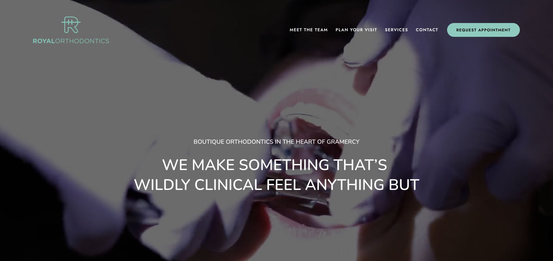
Royal Orthodontics is our Editors Choice for a distinctive boutique-practice presentation anchored in its Gramercy location. The dark clinical imagery and restrained mint identity establish a recognisable mood, while team, services and visit-planning routes add substance. The selection recognises website art direction and communication, not treatment effectiveness, professional superiority or a measured ranking.
The examples range from small specialist practices to regional groups and dedicated location pages. Study the supporting pages as closely as the hero: a clear costs explanation or accurate office page can contribute more to the journey than another animated headline. Commercial provider tiers, review figures and before-and-after imagery are source claims and illustrations, not independent verification of what a particular person can expect.
Before the examples
What makes good orthodontist website design in 2026?
Introduce the actual clinician and practice
Use real photographs and named profiles with accurate professional roles, current locations and useful background. Explain who a visitor is asking to see rather than presenting an anonymous collection of badges. A clinician portrait should lead to substantive information, not simply decorate a generic page copied across several offices.
Explain the consultation before inviting a booking
State whether the action requests contact, reserves a time or opens an external booking service. Explain in-person and virtual formats separately where offered, including what is and is not included. A preferred-date field should not imply that an appointment is confirmed, and a complimentary-consultation offer needs clear terms rather than only a large button.
Keep treatment and payment claims in context
Give treatments readable explanations reviewed by the responsible professional. Clearly distinguish educational material, commercial product information and an individual recommendation. Explain advertised payment figures and inclusions where applicable. Do not let awards, provider tiers, financing language or smile photographs imply universal suitability, a guaranteed result or a complete cost estimate.
The collection · 26 examples
26 orthodontist websites worth studying
Compare how each example handles the transition from an attractive first impression to a real practice enquiry. Look for the clinician, location, consultation format and practical information that remain available without interacting with a carousel.
Royal Orthodontics opens with a darkened clinical film, small mint-green branding and a concise appointment action. The centred message deliberately contrasts the technical nature of orthodontics with a less intimidating experience. Beneath it, family treatment information and a practice introduction explain what the atmospheric first screen leaves unsaid. The Gramercy location gives the brand a concrete local anchor rather than a vague metropolitan identity.
What you can learn
Give a small practice one distinctive visual idea, then support it with literal information about location, clinician and appointment options. The brand mood should make the service easier to approach, not require visitors to decode what the practice actually does.
Pros
A restrained mint-and-dark palette creates a coherent identity across the header and primary action.
The local positioning and family-treatment section turn an atmospheric introduction into a specific practice story.
Cons & considerations
A moving, darkened hero requires readable contrast and a usable reduced-motion alternative.
The conceptual headline depends on nearby service copy to explain the offer to first-time visitors.
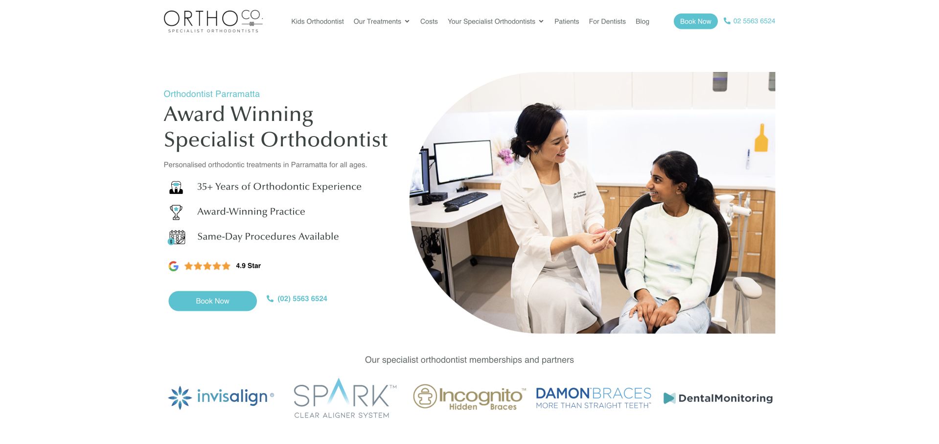
Ortho Co. uses a bright white layout, turquoise accents and a consultation photograph to introduce its Parramatta practice. The first screen combines a short service description, a compact list of practice statements and a booking button, with a telephone option alongside. Product and membership logos appear beneath the hero rather than becoming the headline themselves. Further copy introduces the principal orthodontist and local address. The structure is conventional in a useful way: service, person, place and next step can all be found without opening a complex menu.
What you can learn
A credential-led introduction still needs a clear service description and practical location information. Keep the first booking action simple, then provide sourceable clinician details and explain the treatment options on their own pages rather than within a crowded logo strip.
Pros
The consultation photograph and restrained turquoise actions create an approachable clinical introduction.
Booking, phone and local-practice information are visible early in the browsing journey.
Cons & considerations
Several prestige statements compete for attention before visitors compare treatment options.
A row of commercial treatment logos does not itself explain which option suits an individual visitor.
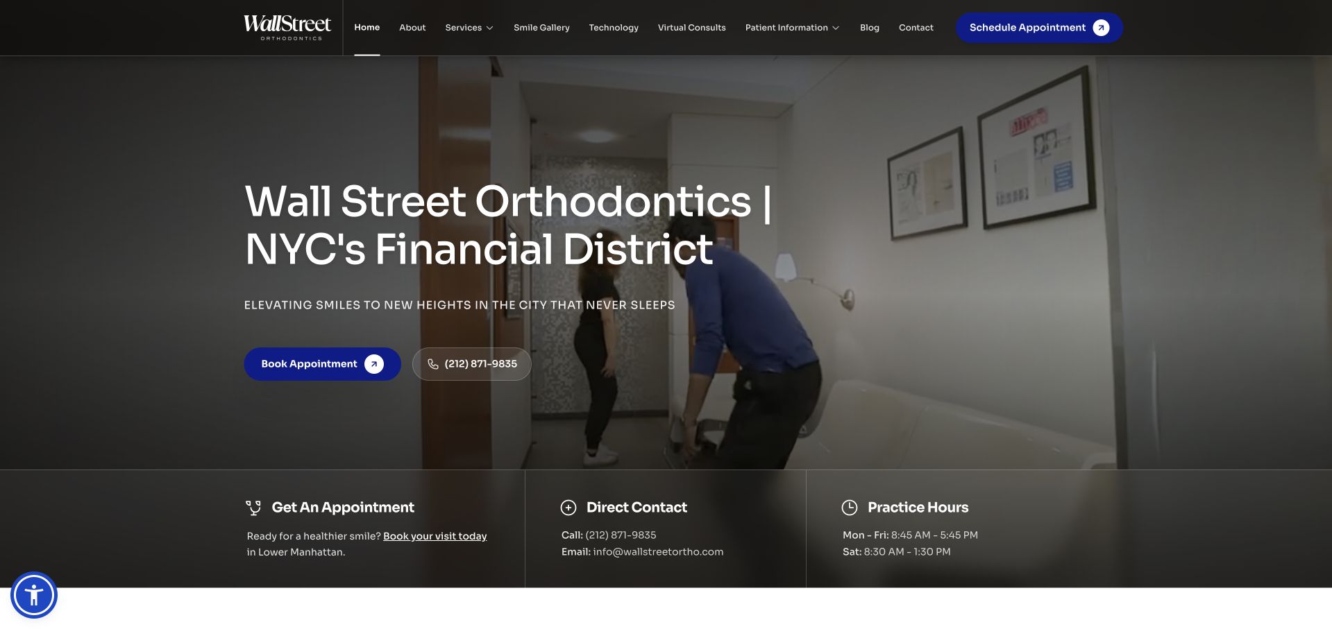
Wall Street Orthodontics places its Financial District identity over a darkened practice photograph, using bright blue for the appointment action. The opening is followed by compact information blocks for booking, direct contact and office hours. That combination makes the local service easier to evaluate than a visual-only introduction: someone can establish the neighbourhood, find the phone number and see the operating pattern immediately. The page then expands into a more conventional practice explanation.
What you can learn
If a practice’s location is central to its appeal, make contact details and opening hours part of the main journey rather than footer-only content. Use a photographic hero for context, but keep the essential appointment information readable independently of its background.
Pros
The neighbourhood is named directly in the main heading rather than implied through imagery.
Contact and hours blocks answer practical questions close to the first appointment action.
Cons & considerations
Dark imagery and several overlapping text treatments can reduce immediate scanning clarity.
The large hero occupies space that could otherwise explain new-patient arrangements before a click.
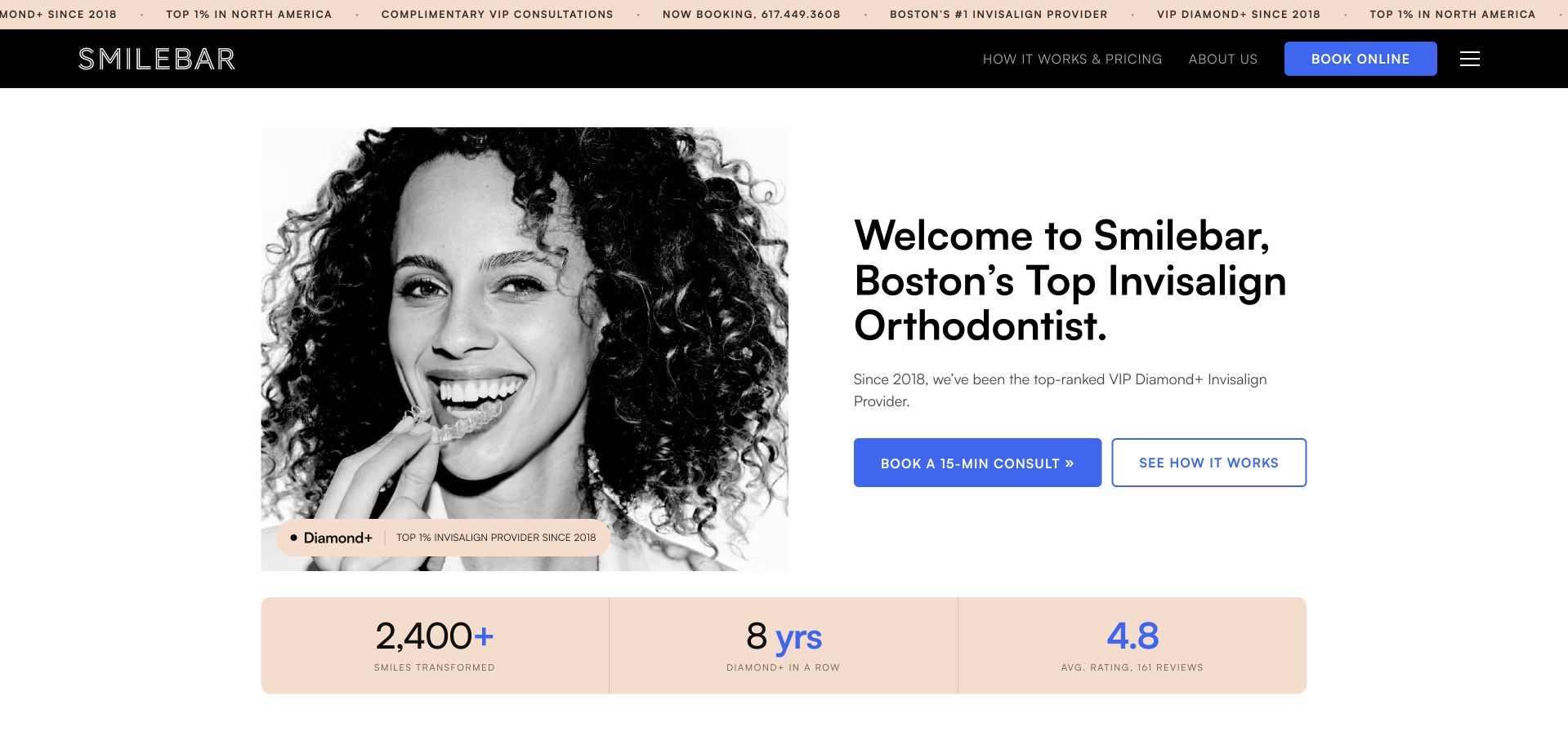
Smilebar uses a monochrome portrait, a pale peach evidence strip and a clean split layout to foreground its aligner offering. The first screen pairs a short-consultation action with a separate explanation link, allowing visitors to choose between contacting the practice and understanding the process. Commercial provider credentials, review figures and media logos receive substantial visual emphasis, followed by an interior photograph. The design is notably more product-like than a broad family-dental homepage.
What you can learn
When a practice specialises in one prominent service, offer two clear routes: learn how it works or ask about a consultation. Keep commercial provider tiers and review statistics subordinate to explanations of suitability, clinician oversight and what an initial conversation actually includes.
Pros
The split composition gives the service explanation and primary consultation action a clear hierarchy.
A secondary process link accommodates visitors who are interested but not ready to enquire.
Cons & considerations
Provider-ranking and review claims occupy considerable attention and need independently checkable context.
A highly focused aligner message can obscure other services or suitability limits if detail pages are weak.
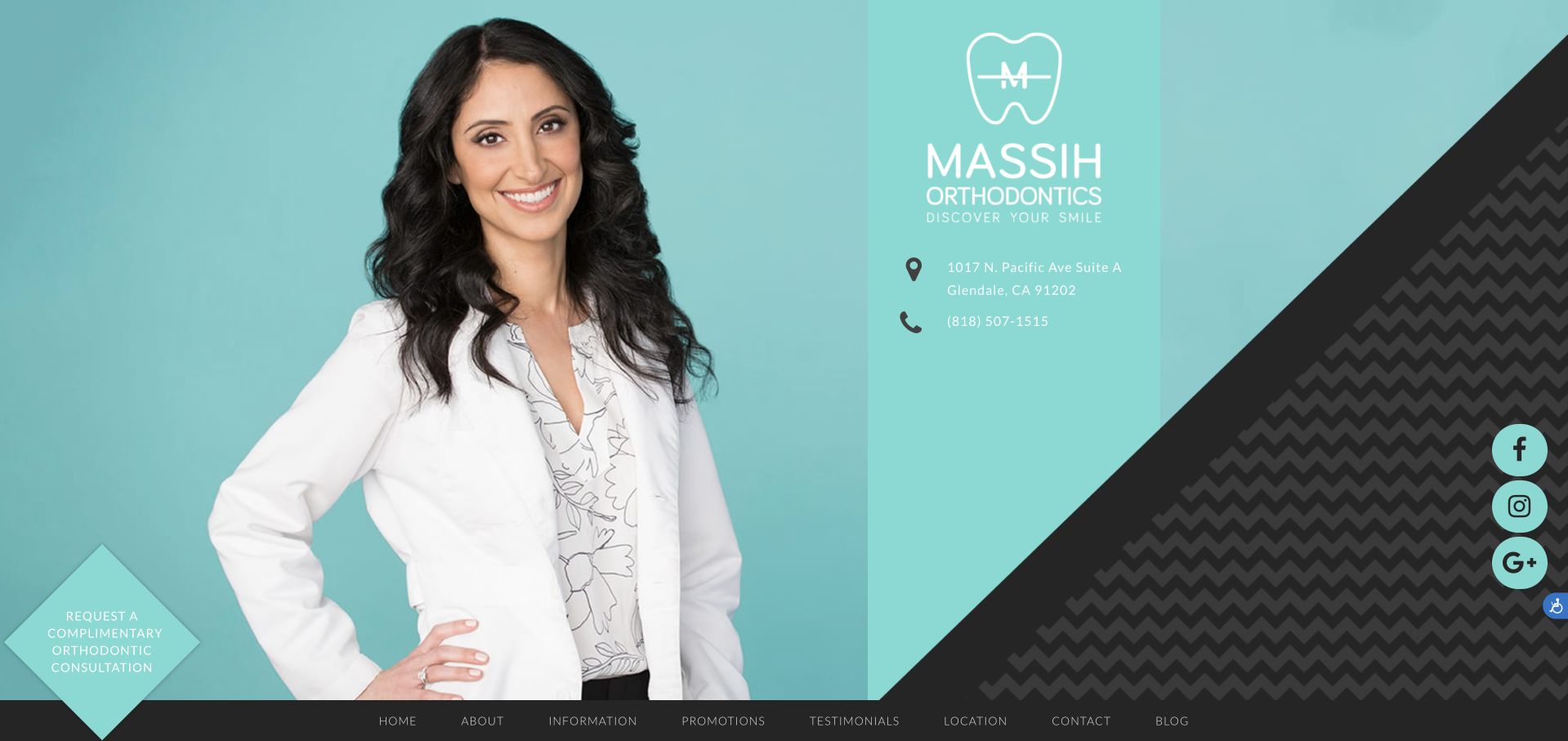
Massih Orthodontics gives its clinician portrait a prominent turquoise backdrop rather than beginning with a generic smiling-family montage. The surrounding copy introduces the practice’s approach and leads to a consultation request. Supporting destinations include the doctor’s story, a before-and-after gallery and explanations of scanning equipment. Together these create a recognisable personal practice identity while preserving common patient tasks. The visual balance is strongest when the portrait, headline and action are all readable; the long introductory paragraphs and multiple commercial badges create more work for someone trying to extract practical information quickly.
What you can learn
A clinician portrait can make an independent practice feel identifiable, but it should link to substantive information about the person and appointment process. Keep equipment explanations understandable, and separate illustrative treatment photography from any promise about a visitor’s likely result.
Pros
The portrait and turquoise palette make the practice visually identifiable from the opening screen.
Doctor, consultation and gallery destinations support different stages of a prospective patient’s research.
Cons & considerations
Long introductory paragraphs ask visitors to read extensively before comparing practical service details.
Multiple provider badges can dominate without explaining their relevance or the limits of treatment examples.
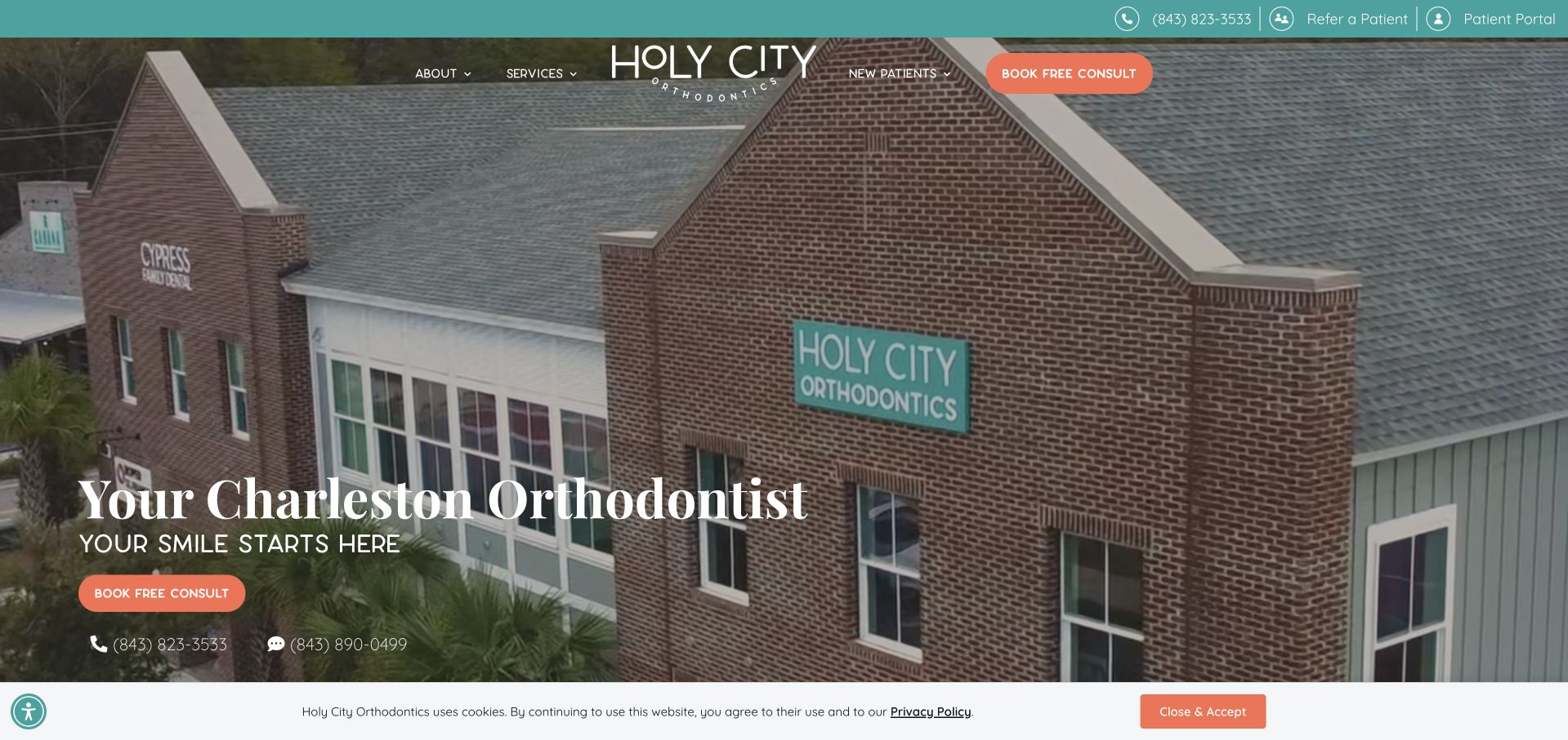
Holy City Orthodontics opens with the exterior of its Johns Island practice, overlaid with a Charleston service heading and a contrasting consultation button. This is immediately more place-specific than a stock portrait: visitors see a building they might actually visit. The page follows with aligner information and a named clinician introduction, connecting the location to the person behind the service. Phone and text options remain visible alongside the main booking route. The treatment promotion is assertive, so the most transferable part of the design is its local orientation and contact structure rather than unverified comparisons about speed or effectiveness.
What you can learn
Use real premises photography when it helps visitors recognise the practice and understand where an appointment will happen. Pair the image with literal location text and distinct contact options, while reviewing promotional treatment comparisons independently of the design.
Pros
The practice exterior gives the local identity a concrete and recognisable visual anchor.
Consultation, telephone and text routes offer alternatives to a single online booking task.
Cons & considerations
Text over a detailed exterior image needs careful contrast at every responsive crop.
Strong promotional claims should not substitute for balanced treatment information and individual assessment.
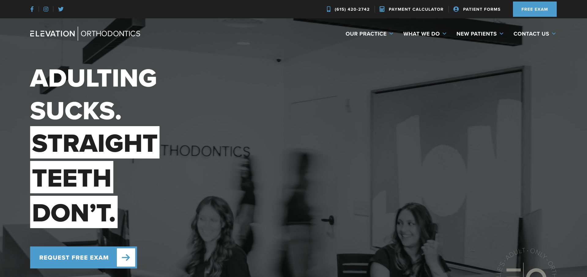
Elevation Orthodontics uses an oversized, deliberately informal headline against dark practice imagery, with a blue exam-request button below. The tone immediately differs from the soft family imagery common across the category. A subsequent Nashville heading and treatment introduction supply the local and service context that the headline omits. The page also presents a short starting sequence and an office video destination. This is useful for studying audience-specific voice: the design is not trying to sound equally suited to every visitor.
What you can learn
A distinctive tone can help a practice speak to a specific audience, but the following section must promptly establish service, location and next steps. Treat personality as an editorial decision rather than a reason to hide essential appointment information.
Pros
The strong typographic treatment clearly differentiates the practice from conventional family-clinic layouts.
A short starting sequence gives the visitor a practical counterpart to the personality-led opening.
Cons & considerations
The intentionally blunt headline may alienate visitors seeking a more formal healthcare tone.
Large display type and dark imagery require restraint so they do not bury service and location detail.
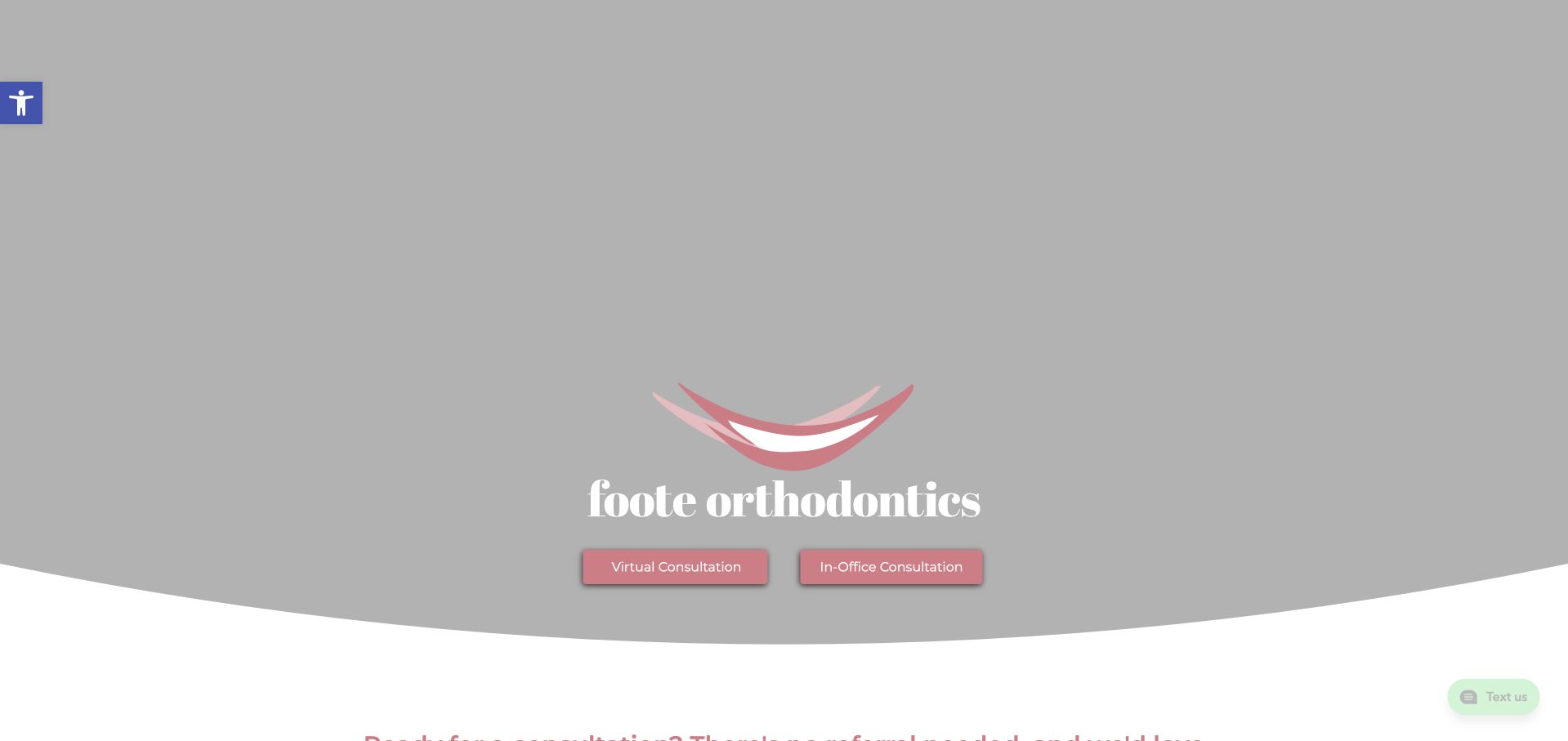
Foote Orthodontics uses a soft grey-and-pink identity and places virtual and in-office consultation options near the top of the page. The visible enquiry sequence asks about consultation type, preferred date and office before later steps. This gives the form a practical organising principle rather than presenting every possible field at once. Supporting content introduces the practice and treatment approach further down. The opening hero is visually restrained and depends heavily on its logo and actions, so the consultation controls carry much of the initial usefulness. A date preference should remain clearly distinct from a confirmed booking.
What you can learn
If visitors can enquire through several appointment formats, ask that question early and explain what happens after submission. Label preferred dates as requests, provide a telephone alternative and defer sensitive clinical history until the appropriate secure part of the workflow.
Pros
Virtual and in-office choices acknowledge that prospective patients have different access preferences.
The staged enquiry begins with appointment logistics rather than an unrestricted clinical-history field.
Cons & considerations
The subdued first screen offers limited explanation before the consultation controls appear.
A date selector can imply confirmation unless the follow-up and scheduling status are explicitly explained.
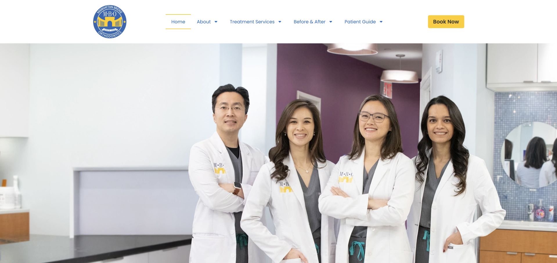
Manhattan Bridge Orthodontics introduces the practice with a group photograph of clinicians in an actual treatment environment. The white header, restrained navigation and yellow appointment action give the image room without turning the page into a purely photographic presentation. Elsewhere, the practice distinguishes its Manhattan and Flushing offices with separate address information, and the copy emphasises communication with patients. The useful pattern is the connection between identifiable people and concrete places. A visitor can move from seeing who works there to checking where to attend, rather than confronting an anonymous brand with one generic enquiry destination.
What you can learn
For a practice with more than one office, show the team but keep location choice explicit throughout the contact journey. Pair each address with its relevant practical information, and avoid assuming that an attractive group photograph answers questions about availability or accessibility.
Pros
A real clinician group provides a human introduction more specific than generic stock imagery.
Separate office addresses give the practice’s multiple-location offer a practical structure.
Cons & considerations
A large team photograph can delay treatment explanations if introductory copy remains secondary.
Visitors still need office-specific logistics rather than assuming every location offers identical arrangements.
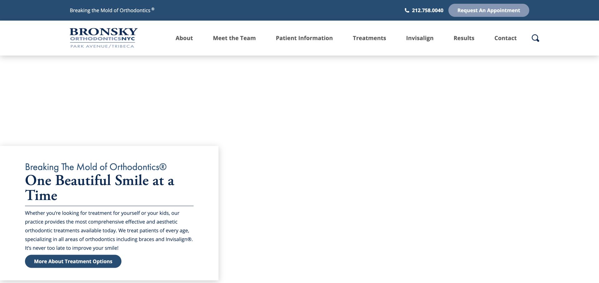
Bronsky Orthodontics combines a slim blue information band, a white navigation area and an editorial-style introduction over a large visual field. A compact text panel explains that the practice serves different ages and provides a direct route to treatment information. The typography is more restrained than the exuberant headlines used by some orthodontic brands, giving the page a measured character. The broader practice story follows beneath the opening.
What you can learn
Use a stable explanatory panel and treatment link alongside prominent media so the page remains useful even before someone watches or explores the imagery. Let practice history deepen the introduction rather than becoming a long prerequisite to finding patient information.
Pros
A compact introductory panel keeps the treatment route available beside the large visual area.
Restrained typography supports a consistent specialist-practice identity without an excessive badge collection.
Cons & considerations
The large media region can feel empty or incomplete if imagery loads slowly.
A lengthy practice narrative needs clear links to practical new-patient questions and location information.
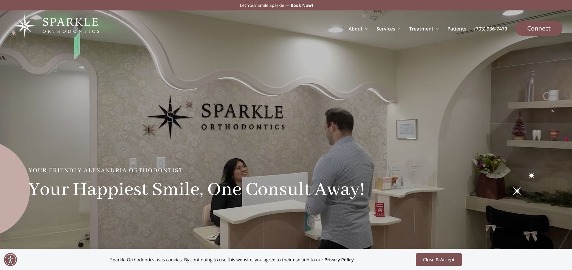
Sparkle Orthodontics uses playful decorative shapes, smiling portraits and an approachable introduction that names Alexandria directly. The content then connects the practice to its clinician’s local background rather than relying only on a generic promise of better smiles. Treatment options, practical FAQs and location information sit within the same broad journey. The design demonstrates how a small practice can be expressive without abandoning literal service labels. Its friendlier tone works best when it remains inclusive across ages and languages, and when the extensive decorative treatment does not compete with the contact and service information underneath.
What you can learn
A community story becomes useful when visitors can connect it to a named clinician, a real address and understandable service options. Keep decorative personality consistent, but make booking, language access and appointment expectations clearer than the surrounding visual flourishes.
Pros
The local introduction and clinician story give the playful brand a specific community context.
Treatment categories and practical questions provide substance beyond the decorative visual identity.
Cons & considerations
Numerous decorative elements can compete with the hierarchy of essential appointment information.
Friendly treatment language still needs balanced clinical review rather than implying universal suitability or results.
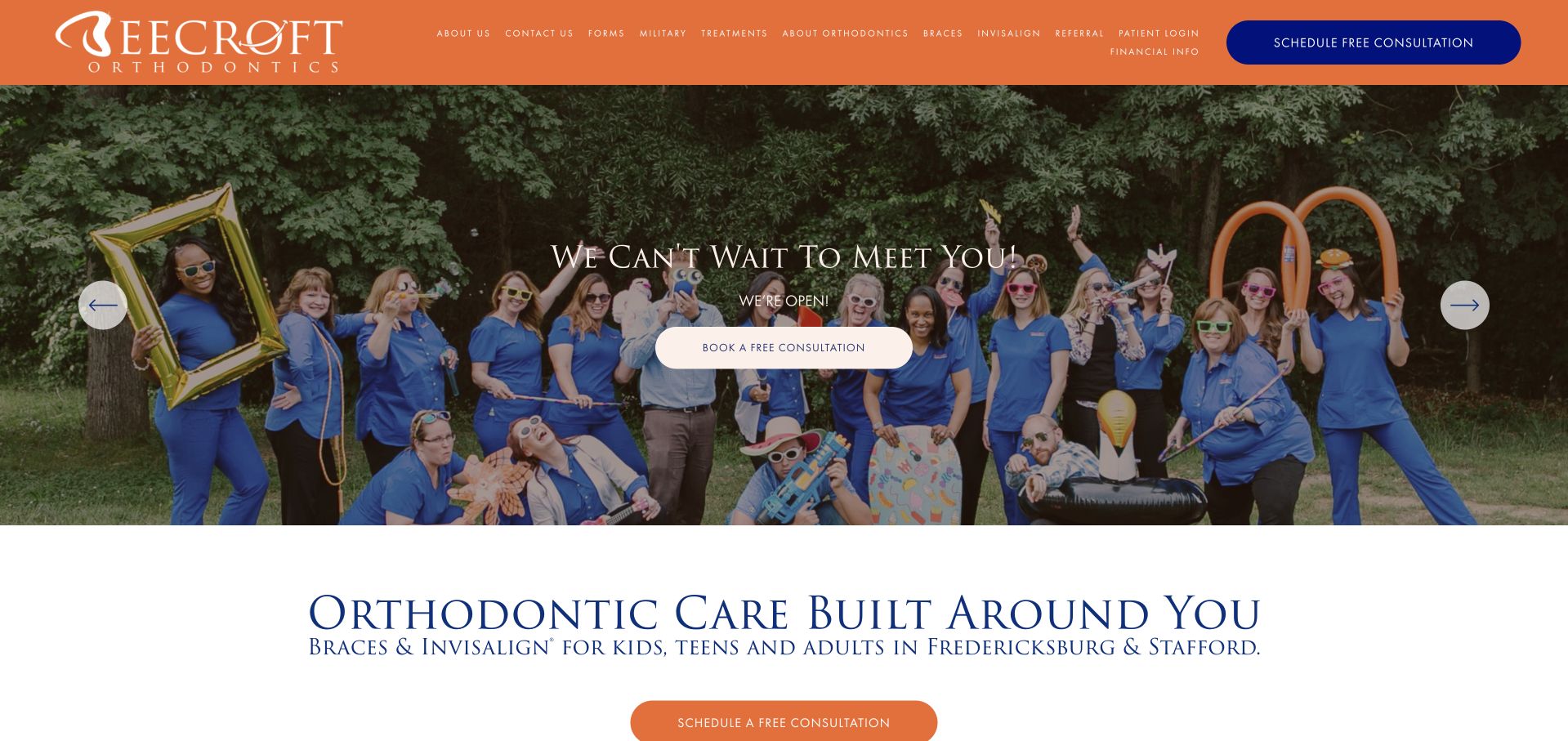
Beecroft Orthodontics uses orange branding and a broad team photograph to create an energetic opening. Beneath the rotating hero, a clear service heading identifies braces and aligners for different age groups, along with the Fredericksburg and Stafford locations. Call, text and consultation links appear together, allowing visitors to choose the communication method they prefer. Further sections introduce treatment offerings and practice details. The carousel gives the site space for multiple messages, but also introduces repetition and changes the initial emphasis depending on the active slide.
What you can learn
Keep the essential service, audience and locations visible independently of a carousel. Offer distinct communication routes with understandable labels, and make sure the visitor knows whether an online consultation action requests contact or books a confirmed appointment.
Pros
The team photograph gives the practice a recognisable human presence in the first screen.
Phone, text and consultation actions accommodate different communication preferences without hiding alternatives.
Cons & considerations
Rotating promotional messages create repetition and can change what first-time visitors see.
Several contact actions need clear hierarchy so the page does not become a row of competing buttons.
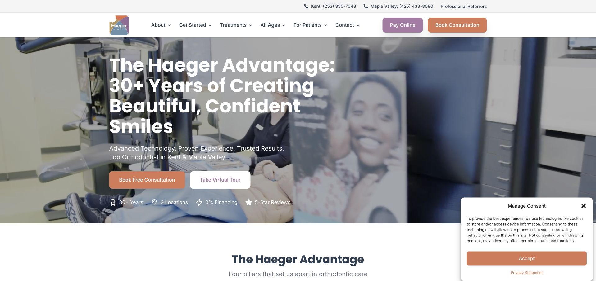
Haeger Orthodontics introduces its practice with a large family-oriented hero, an orange consultation action and a separate virtual-tour route. A compact row presents selected practice statements, followed by a four-part explanation of its positioning. This gives the page a repeatable structure: a quick overview for scanners and more explanation for visitors who continue. The framework is more useful than a long uninterrupted list of benefits, although the statements about experience, financing and outcomes remain the practice’s own claims.
What you can learn
Group practice differentiators into a small number of understandable themes, then connect each theme to practical evidence or detail. A virtual tour can supplement the introduction, but it should not replace written information about location, access and appointment arrangements.
Pros
The thematic framework creates a more scannable introduction than a single long practice description.
A separate tour route lets visitors explore the environment without interrupting the consultation task.
Cons & considerations
Experience, finance and review statements need context rather than functioning as self-verifying badges.
A large hero and several benefit sections can postpone straightforward service comparisons and new-patient instructions.
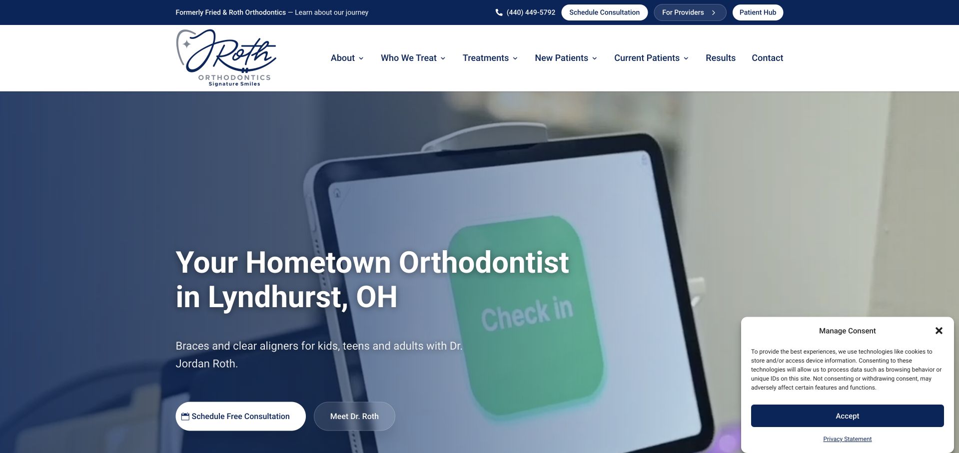
J. Roth Orthodontics uses a dark-blue gradient, light typography and a direct Lyndhurst heading to establish its local practice identity. The introduction names the orthodontist and states that children, teenagers and adults are served, while a consultation button and doctor-profile link provide two clear next steps. Small supporting labels sit beneath rather than replacing the main explanation. Lower sections introduce age-specific care and additional practice information. The page is worth studying for its explicit person-place-service combination, not for assuming that prominent training, technology or outcome statements automatically establish an individual visitor’s suitability for treatment.
What you can learn
Put the clinician’s name, practice location and intended age groups into the introductory hierarchy. Offer a substantive profile beside the booking route so visitors can learn about the person before submitting an enquiry, and substantiate any credential-style labels separately.
Pros
The opening gives the practice’s location and treating clinician a clear textual identity.
Consultation and doctor-profile links support both action-oriented visitors and those still researching.
Cons & considerations
The dark gradient and animated hero elements depend on careful loading and contrast management.
Compact credential labels can oversimplify information that needs explanation on an accessible detail page.
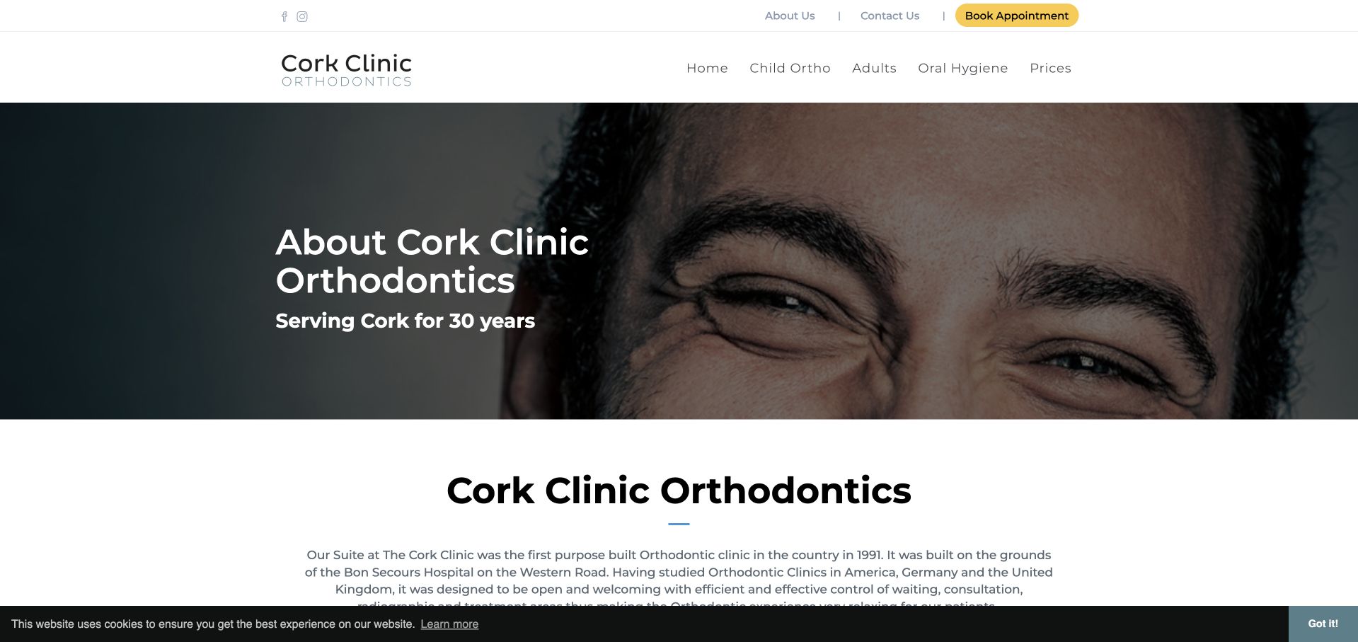
Cork Clinic Orthodontics’ about page uses a conventional, text-led layout to explain the practice’s premises and introduce its team. Rather than leaning on an oversized promotional hero, it gives space to the clinic’s history and the named orthodontist’s background. Team photographs break up the written material, creating a more informative destination than a single generic “about us” paragraph. This is useful as a supporting-page reference, especially for practices whose homepage is visually led. The design is less contemporary than some examples in the collection, but it demonstrates the value of giving organisational and practitioner information a stable, readable home.
What you can learn
Do not treat the about page as filler between the homepage and contact form. Explain who runs the practice, where appointments happen and how the team is structured, using short sections that make lengthy professional biographies easier to navigate.
Pros
Named team profiles make the practice less anonymous than an unqualified corporate introduction.
The page gives the premises and practice history dedicated explanatory space.
Cons & considerations
Long prose sections increase the scanning effort compared with a more clearly segmented profile layout.
Generic image labels and older presentation patterns warrant accessibility and content-maintenance attention.
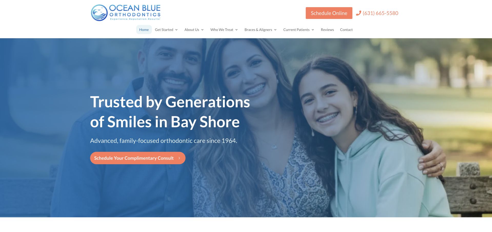
Ocean Blue Orthodontics uses a blue-and-white palette with a warm contrasting consultation button. The first-screen message names Bay Shore and introduces the practice’s family positioning. Beneath it, a numbered sequence explains consultation, payment arrangements and starting treatment, followed by service categories and practice differentiators. The sequence makes the page feel organised around a visitor journey rather than a loose collection of promotions. Its strongest lesson is procedural clarity. The finance and treatment statements still require their own conditions, and a simplified three-step journey should not imply that every patient’s assessment or treatment follows an identical course.
What you can learn
Use a short sequence to explain administrative next steps, while keeping clinical assessment separate from a sales-style funnel. Clarify the difference between an initial consultation, financial arrangements and a treatment decision, with links to the detail behind each stage.
Pros
The local heading and contrasting consultation action give the first screen a clear purpose.
The numbered process provides a simple organising structure for visitors unfamiliar with the practice.
Cons & considerations
A highly simplified journey can understate the individual assessment required before treatment decisions.
Prominent payment language needs clear terms and should not overshadow clinical suitability information.
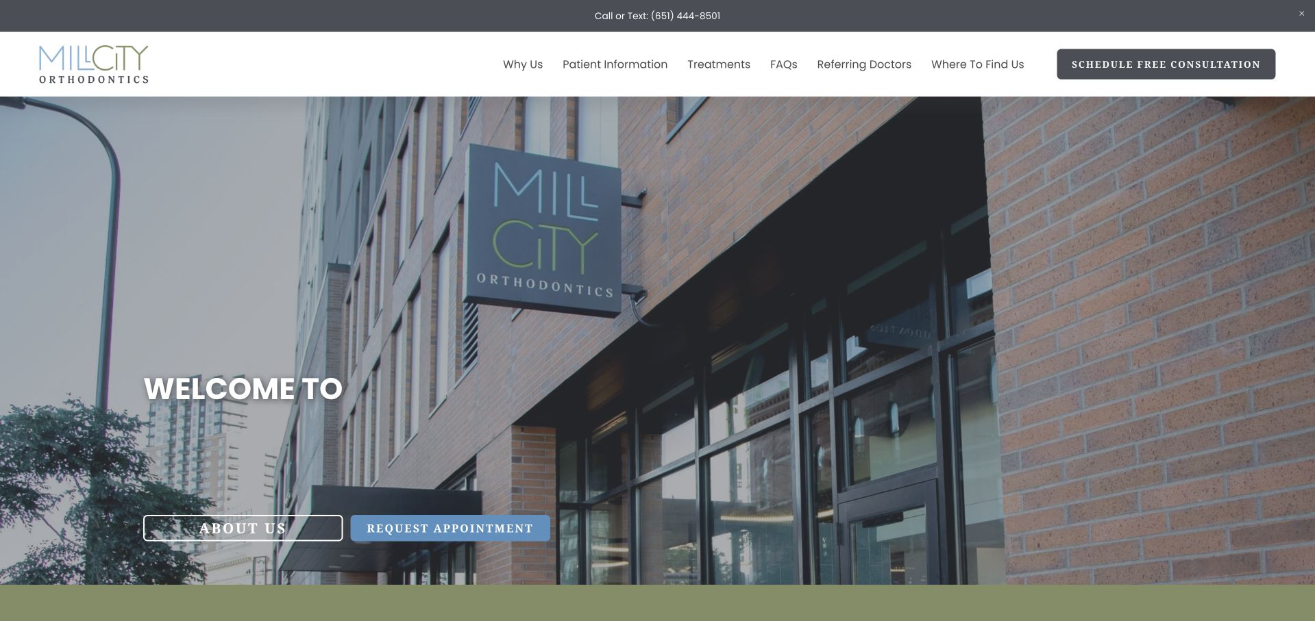
Mill City Orthodontics opens with a photograph of its street-facing premises, a restrained blue-grey identity and paired about and appointment links. The image makes the practice feel located in a real neighbourhood rather than inside an anonymous medical stock library. Further down, short sections introduce braces, aligners and the named doctor, followed by patient-story media. The structure is compact enough to understand quickly, with the building serving as a visual introduction instead of a substitute for service information.
What you can learn
A real exterior can help people recognise a local practice, especially when paired with a concise explanation of services and the treating clinician. Keep testimonial media optional and provide written alternatives so the practical journey does not depend on watching a video.
Pros
The premises photograph creates a concrete local identity rather than an interchangeable healthcare mood.
About and appointment routes let visitors choose between learning more and making contact.
Cons & considerations
Welcome-led headlines need nearby descriptive copy to establish services and location without inference.
Embedded patient videos add loading, captioning and consent considerations beyond the static page design.
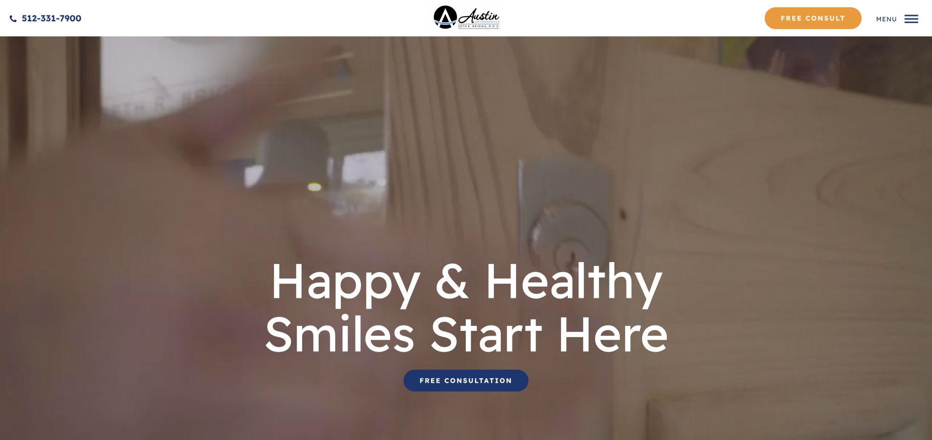
Austin Orthodontics uses warm treatment-room imagery, a concise heading and a consultation action to introduce the practice. The next section turns to practical themes: payment arrangements, age groups and a named doctor introduction. This sequence matters because it moves from an emotional first impression to questions visitors commonly bring to a treatment enquiry. Distinct learn-more links keep those topics from becoming one enormous paragraph. Some promotional assurances are unusually strong and should not be copied without appropriate review. The useful design pattern is the progression from a simple welcome into specific, separately explorable information about the practice.
What you can learn
After a welcoming hero, answer a short set of concrete questions about access, payment and who provides care. Give each subject a dedicated detail destination, and distinguish financial arrangements or practice assurances from a promise about an individual clinical outcome.
Pros
The supporting topic sections connect the initial welcome to practical visitor concerns.
A named doctor introduction gives the service a clear human reference point.
Cons & considerations
Strong guarantee-style language needs careful qualification and should not be treated as design evidence.
The broad opening image occupies space before visitors encounter the more useful service distinctions.
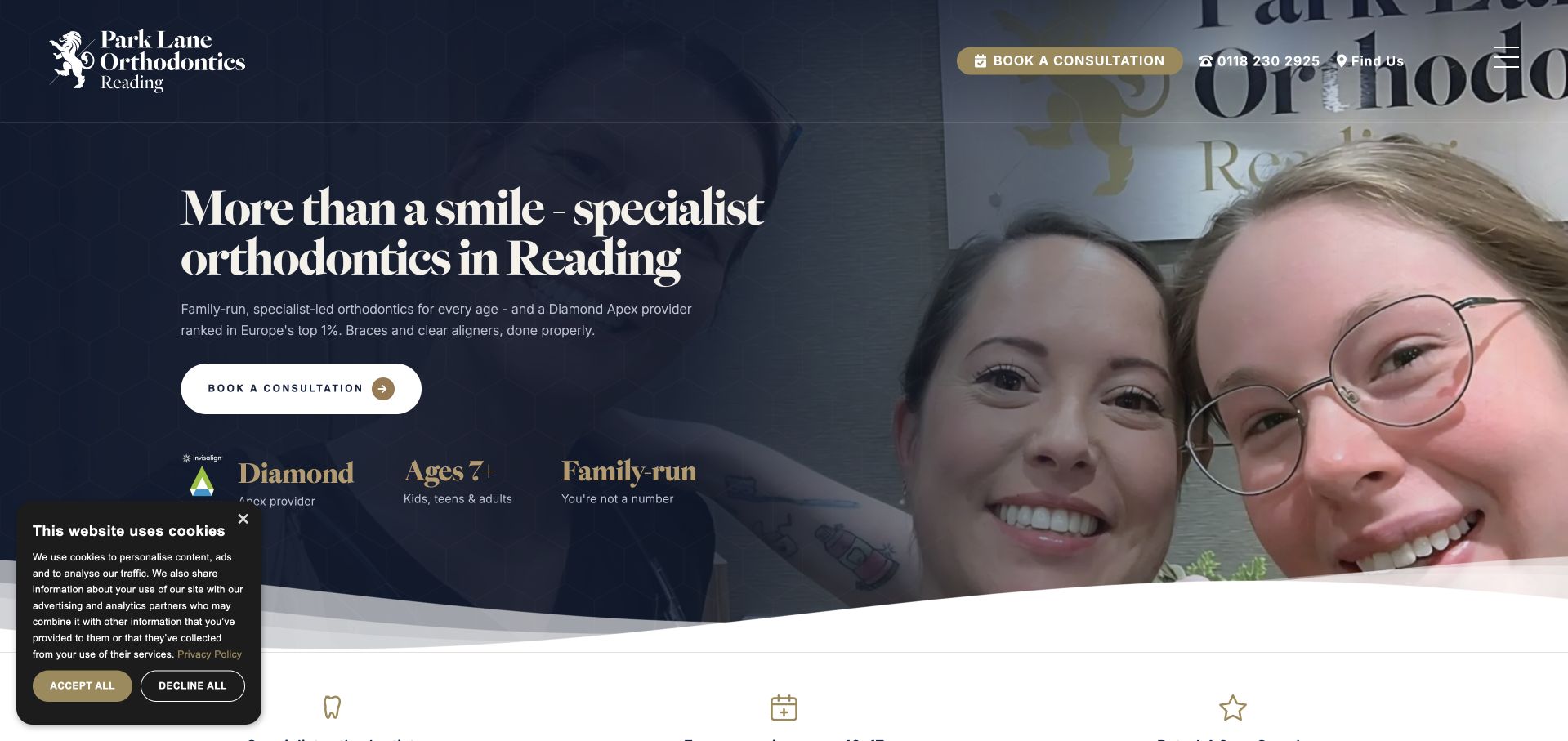
Park Lane Orthodontics uses a deep navy hero, a genuine practice photograph and a prominent Reading location statement. Supporting labels introduce age groups and the family-run positioning, while a consultation action remains visually distinct. The page also provides specific information about screening and specialist roles rather than relying solely on general welcoming language. Awards and provider status take up a noticeable part of the surrounding content, creating both recognition and additional scanning work. This example is useful for studying how to make a specialist identity explicit, provided that badges do not crowd out the practical information a new patient needs.
What you can learn
Explain the difference between the practice’s services and professional roles in plain language. Place age eligibility, screening arrangements and consultation expectations near the action, then move extensive awards and credentials into supporting content with appropriate sourcing and context.
Pros
The heading names both the local area and the specialist nature of the practice.
Age and screening information give visitors practical detail beyond a generic appointment invitation.
Cons & considerations
Numerous award and provider labels compete with the service explanation for attention.
Text over practice photography requires careful contrast and crop testing across screen sizes.
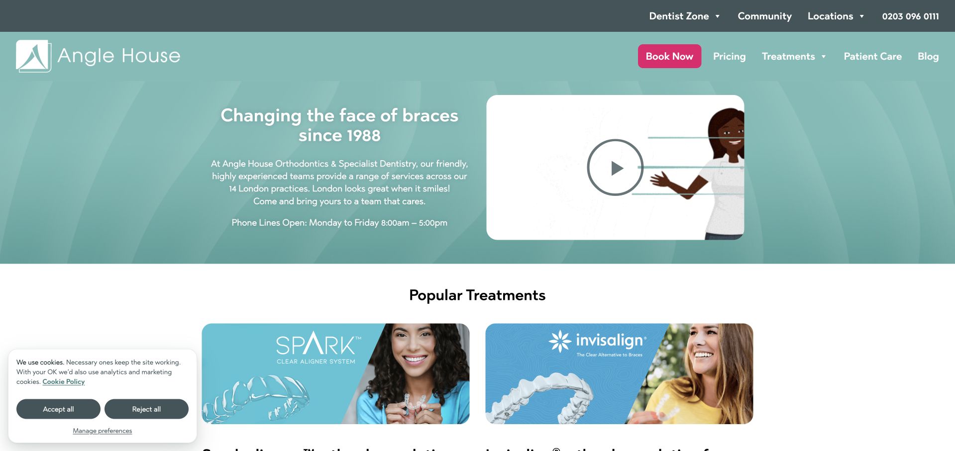
Angle House uses a pale turquoise hero, restrained white typography and a prominent practice-finding route to introduce its London network. The first explanatory copy establishes the multi-practice context, while the following treatment collection gives individual aligner and braces options their own destinations. A video is available without being the only source of information. The structure recognises two different visitor tasks: finding a suitable location and learning about treatment categories.
What you can learn
For a practice group, keep location discovery and treatment research connected but distinct. Let visitors find the relevant office from any service page, and publish office-specific availability and contact details instead of relying on one generic network-wide booking message.
Pros
The multi-practice context is explained rather than hidden behind a single-clinic presentation.
Individual treatment destinations provide a structured alternative to a very long general services page.
Cons & considerations
Visitors may need additional steps to establish which services are available at their chosen practice.
A rotating treatment catalogue and video introduce more interaction than a simple static directory.
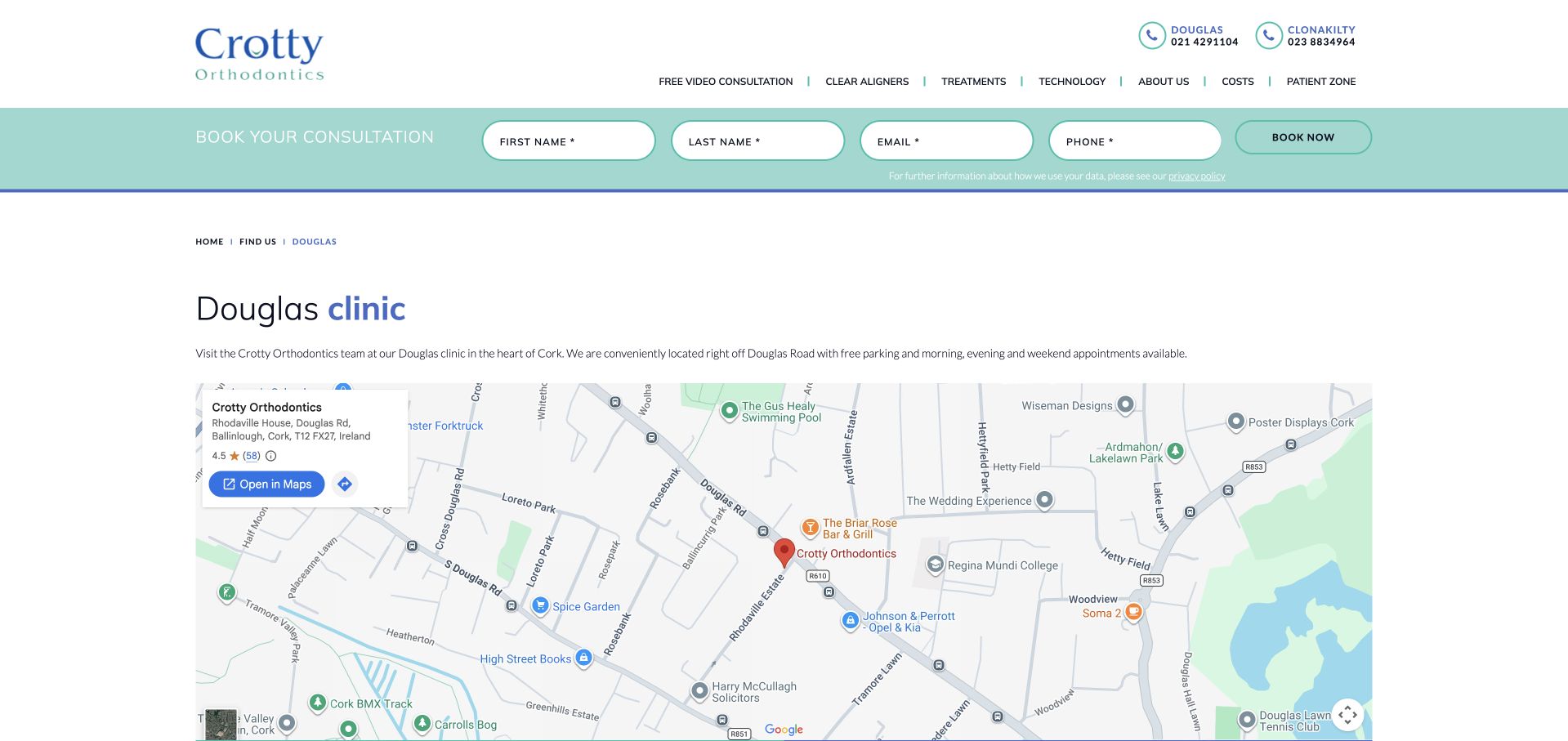
Crotty Orthodontics’ Douglas page is a useful counterpoint to the collection’s large photographic homepages. The brand’s header exposes separate location telephone numbers, while the page itself focuses on an address, opening hours, directions and consultation access. A map supports the logistics rather than carrying the entire explanation. Costs and patient information remain available in the broader navigation. This is the kind of supporting page that makes a multi-office practice usable after someone has decided to enquire.
What you can learn
Give each office an individual page with address, contact details, hours and arrival information. Ensure that a consultation action preserves the selected office, and avoid assuming a map alone explains parking, step-free access or how a visitor should prepare.
Pros
Location-specific details answer concrete questions about attending rather than repeating general practice marketing.
Separate office phone numbers make the multi-location structure visible in the header.
Cons & considerations
A dense site-wide header can delay the actual location content on a practical destination page.
Enquiry controls need to make the selected office and post-submission scheduling process unambiguous.
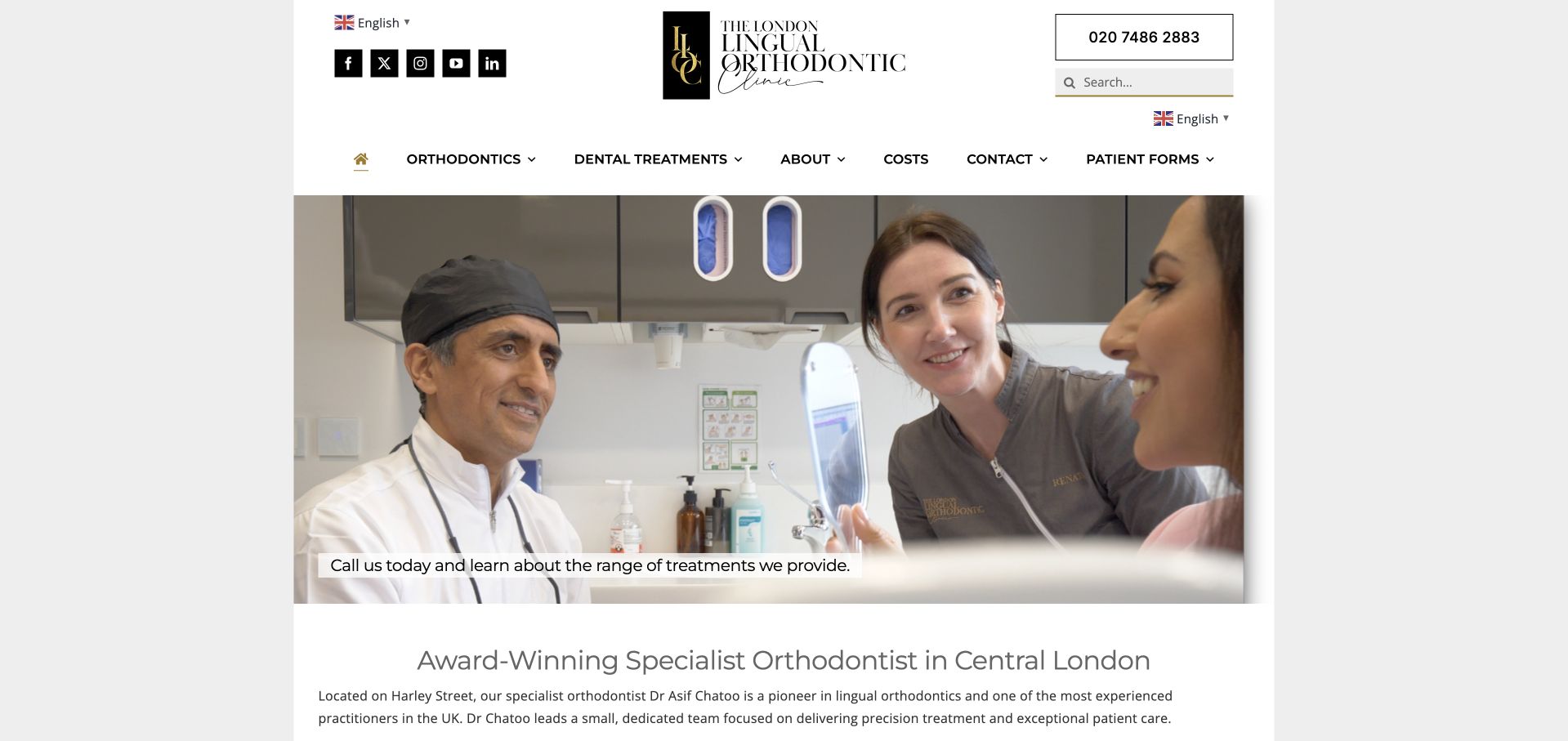
The London Lingual Orthodontic Clinic pairs a real treatment-room photograph with a formal black-and-gold identity and an unusually explanatory introduction. The page names the clinician and location, then explains that the practice’s offering extends beyond the treatment named in the brand. The navigation includes consultation, costs and treatment destinations, creating routes into both practical and specialist information. This is a useful reference for a practice with a potentially unfamiliar specialism: the page does not assume that visitors understand the brand name. Its main tradeoff is the volume of introductory text before a quick scanner can isolate the most relevant next step.
What you can learn
If a specialist term appears in the practice name, explain it without assuming prior knowledge. Introduce the responsible clinician, available appointment route and wider service scope, then break detailed treatment explanations into navigable sections rather than one dense opening block.
Pros
The clinician and central-London location are named in substantive introductory copy.
Costs and consultation destinations sit alongside the specialist treatment information.
Cons & considerations
Several long introductory paragraphs demand substantial reading before visitors reach narrower questions.
Prestige-oriented branding and award language still require supporting context beyond the visual presentation.
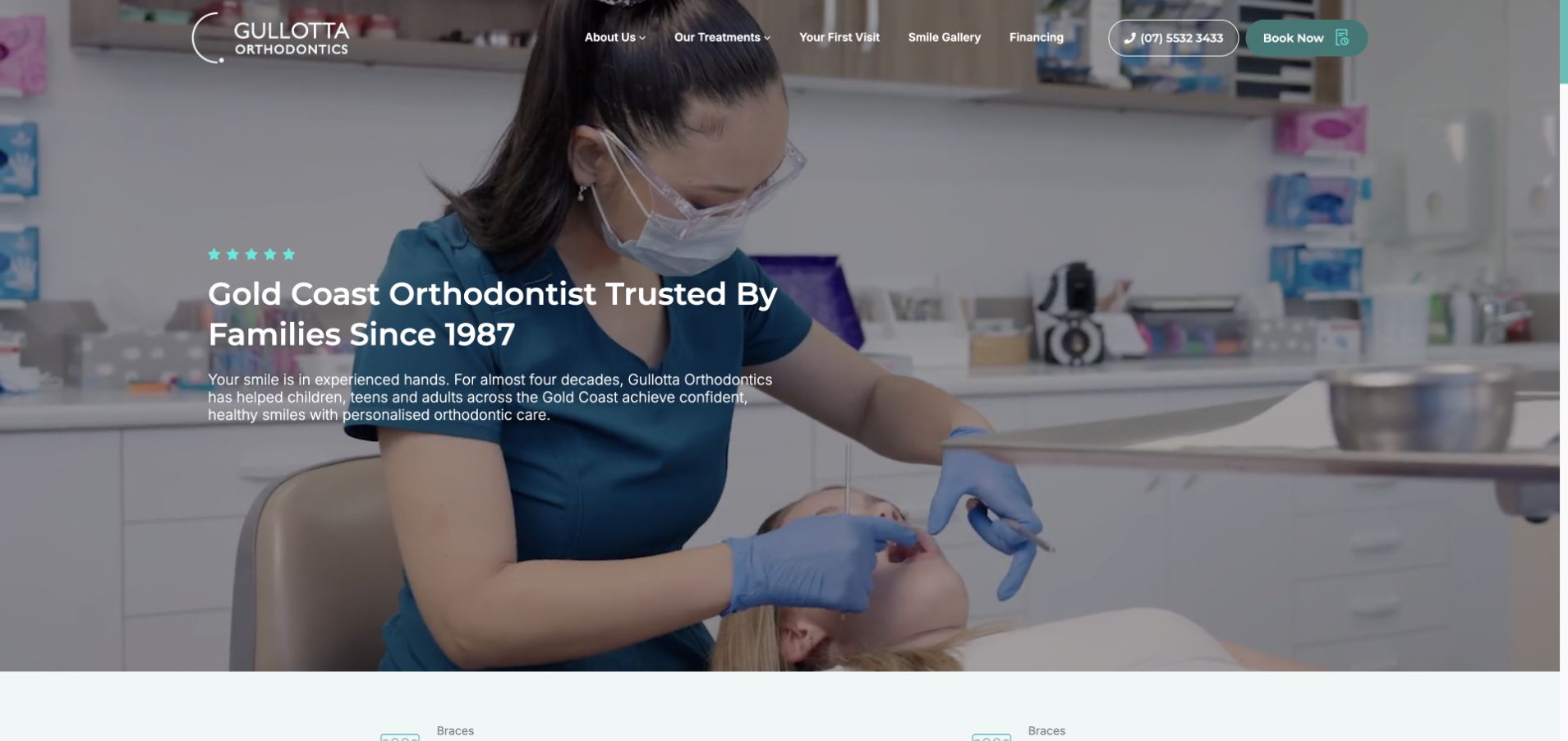
Gullotta Orthodontics opens with a Gold Coast location statement, a clinical photograph and a restrained green action colour. Below the introduction, treatment cards, story tabs and an FAQ collection provide several ways to explore the practice. The referral question is particularly useful as a navigation task: visitors should not have to infer whether they can contact a specialist directly. The page’s mix of history and contemporary treatment information gives it substance beyond the first screen. However, tabs and carousels can hide useful material, so important contact and access details need a stable home outside those interactive components.
What you can learn
A long practice history is most useful when it supports, rather than replaces, current visitor information. Give referral requirements, appointment expectations and location details persistent text destinations, and reserve tabs for supplementary stories that are not essential to making an informed enquiry.
Pros
The local heading establishes the practice’s geographic context before the treatment catalogue.
Referral-related FAQs address a practical uncertainty that can prevent a visitor from enquiring.
Cons & considerations
Several interactive components increase the effort required to discover all supporting information.
Historical and treatment claims need regular review to remain accurate as the practice changes.
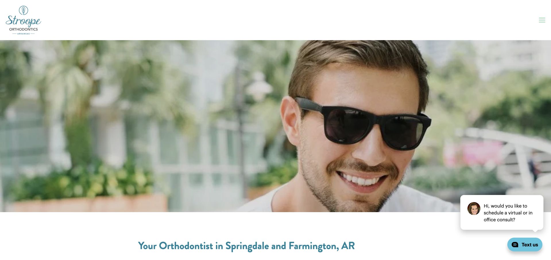
Stroope Orthodontics uses a bright portrait-led opening, pale backgrounds and an informal greeting to make the practice feel less institutional. The following content names its Arkansas locations and connects the practice introduction to financing, treatment and staff information. Small illustrated icons give these supporting destinations a consistent visual language. The approach is deliberately conversational, which can be effective for visitors who find a clinical setting intimidating. It still needs a clear descriptive hierarchy: a friendly greeting is not a substitute for explaining where appointments occur, who the clinician is or what a consultation involves.
What you can learn
If a practice uses an informal voice, anchor it with clear service labels and specific location information. Let the personality make the introduction approachable, while the supporting navigation handles practical topics such as fees, staff and the appointment process.
Pros
The portrait and conversational language create a recognisable small-practice personality.
Illustrated supporting links make financing and treatment destinations easier to scan.
Cons & considerations
A broad greeting needs descriptive headings nearby to communicate service and location precisely.
Multiple chat and contact widgets can compete with the calmer visual tone of the main page.
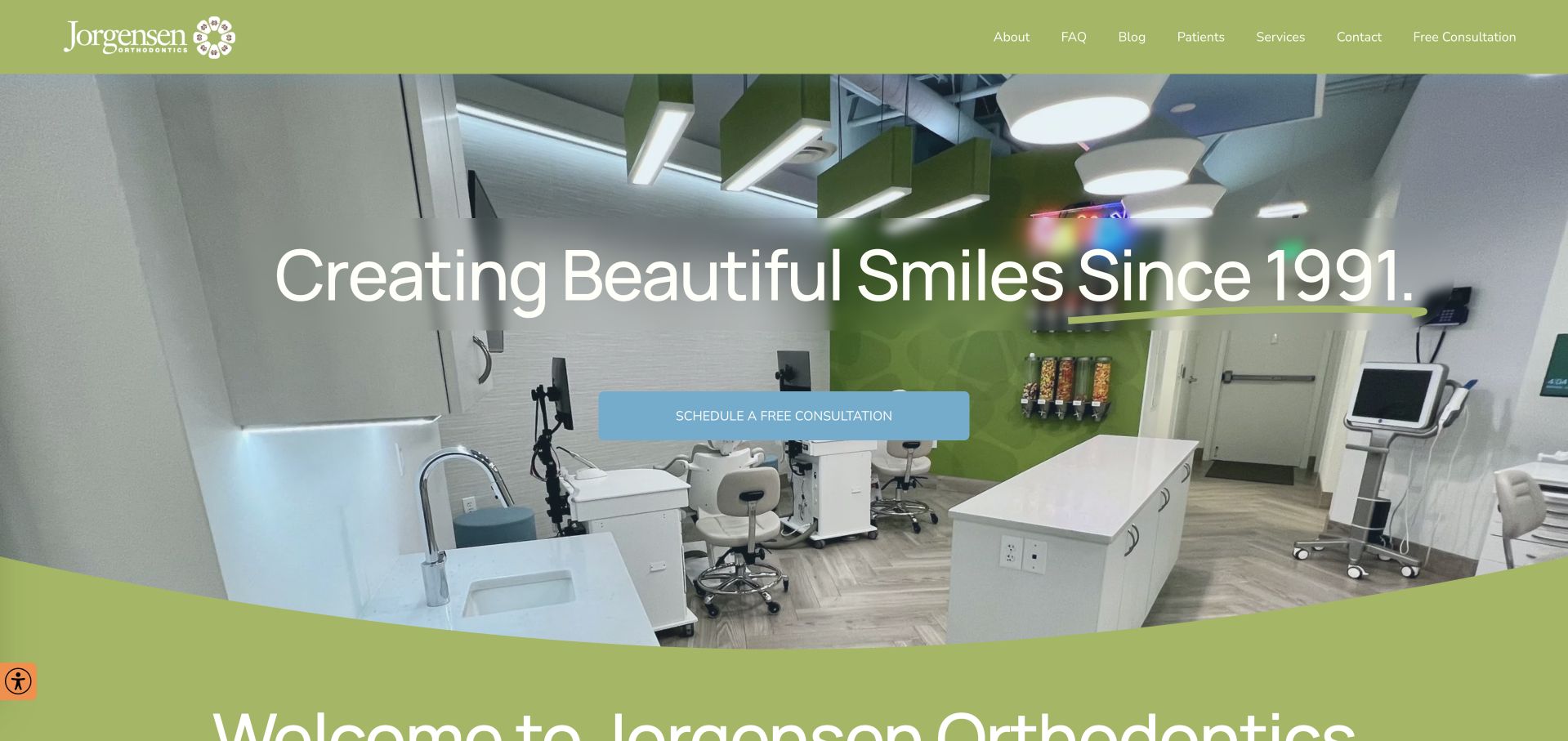
Jorgensen Orthodontics introduces its practice with a large photograph of the treatment environment and a bright green identity. A consultation action is followed by the names of its doctors and the areas served, giving the opening useful specificity. Short sections then group financing, the practice atmosphere and patient feedback into recognisable themes. The design is more literal than conceptual: it shows the office, names the people and explains common visitor concerns.
What you can learn
Use office photography to show a recognisable environment, then name the clinicians and service areas in text. Keep practical financing and appointment information separate from testimonial content, and provide context for any advertised payment figure rather than treating it as universally applicable.
Pros
The real treatment-space photograph gives visitors a concrete view of the practice environment.
Named doctors and local areas make the service identity explicit after the opening hero.
Cons & considerations
Large testimonial sections can displace practical new-patient information further down the page.
Advertised payment figures need clear conditions and should not stand alone as a complete cost explanation.
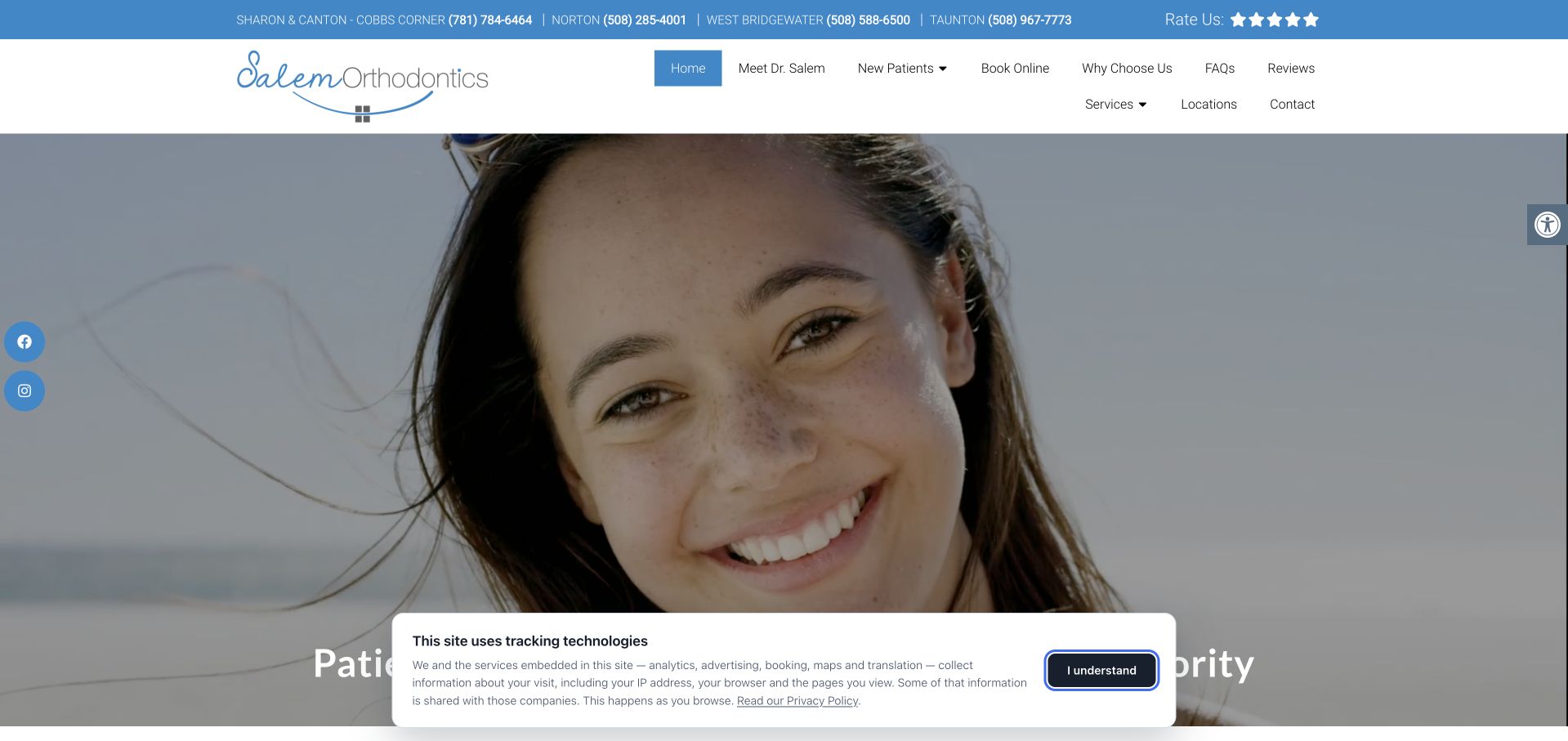
Salem Orthodontics places several office names and telephone numbers in a prominent top strip, then uses a conventional logo, navigation and booking structure below. A large portrait-led hero gives the page a friendlier visual introduction while the header handles the logistical complexity of multiple Massachusetts locations. New-patient and clinician destinations remain readily recognisable. This is useful for studying a practical problem that a single-practice template often ignores: a returning visitor may need the correct office number more urgently than another brand message.
What you can learn
When a practice has several offices, prioritise location-specific contact information without turning the header into an unreadable directory. Group each office with its own number, preserve sensible mobile reading order and carry location choice into the subsequent booking journey.
Pros
Office names and individual telephone numbers directly support returning and location-focused visitors.
Familiar new-patient and clinician navigation gives the broader site a straightforward structure.
Cons & considerations
The multi-number top strip creates substantial visual density before the main introduction.
Large hero imagery and cookie controls reduce the space available for service information in the initial view.
Kegan is a freelance web designer and developer with 15+ years of experience helping businesses turn complicated website requirements into clear, maintainable digital experiences. He works directly with clients from planning and design through development, launch, and ongoing support.
For orthodontist website design, his development approach focuses on practitioner and clinic introductions, carefully reviewed treatment information, appointment expectations, access details, and privacy-conscious consultation handoffs. The scope can be a targeted improvement or a complete custom build, with responsive layouts, thoughtful content structure, and integrations chosen around the people using and maintaining the site.
Show 3 other orthodontist website designersHide other orthodontist website designers
Build the journey from the first question to the correct office
Make one reliable practice and location record
Agree the official practice names, addresses, phone and written contact routes, hours and clinician-location relationships before designing templates. Give each office a useful standalone page with arrival and access information. Crotty’s location page shows why a practical office destination matters after a visitor has moved beyond the homepage.
Separate new-patient research from existing-patient tasks
A returning patient may need office contact, appointment changes or practice-approved instructions rather than a new-consultation funnel. Keep those routes clearly labelled. Do not publish clinical emergency or care instructions without professional approval, and make the organisation’s intended route for urgent questions easy to find.
Treat photographs and testimonials as governed content
Plan how real team, premises and treatment imagery will be supplied, approved and maintained. Keep consent and publication decisions with the practice’s responsible people. Caption before-and-after material with appropriate context rather than implying a typical or promised result. Do not fabricate patient quotations or use generated people as if they were actual patients.
Test the complete scheduling handoff
Rehearse selecting an office, choosing a consultation format and understanding the post-submission message. Keep the selected context visible when an external system opens. Test keyboard access, enlarged text and mobile layouts, including privacy controls and form errors. Do not use real patient information for the design test.
The editing job behind the design
Prefer stable practice information to an elaborate introductory animation
A maintainable practice directory, clinician profiles, service pages and accurate consultation information are the foundation. Compress real photography, provide readable text outside video and keep essential links visible when media fails. Assign clear ownership for hours, team changes, promotions and payment information so the site does not preserve a polished but outdated version of the practice.
Review booking and referral integrations as actual workflows rather than assuming a product label establishes privacy or accessibility. Separate public marketing from later clinical information collection. Check what data is sent through email notifications, third-party scripts and tracking events, with appropriate specialist review for the practice’s jurisdiction and circumstances. A visible booking link does not establish the rest of the website’s technical stack.
Our WordPress website examples offer a separate look at publishing approaches. A visible platform label is evidence for that named page, not a guarantee that the same system will suit your requirements.
Before the public launch
Orthodontic website planning checklist
Name the practice and actual locations clearly.
Introduce current clinicians with accurate roles and profiles.
Separate child, teen and adult service information where useful.
Explain consultation types and what the first action does.
Distinguish a preferred date from a confirmed booking.
Publish accurate costs or a clear cost-information route.
Explain finance terms and promotional inclusions.
Keep treatment claims professionally reviewed.
Use approved real practice and patient imagery with context.
Provide returning-patient and appointment-change routes.
Offer written contact options alongside telephone details.
Test the complete external scheduling journey and error messages.
These checks are a project checklist, not a performance, legal, security, or accessibility certification. Test real journeys with the people responsible for the website before making claims about the result.
Sources & editorial method
How this collection was selected and reviewed
The 26-example target was saved before this research began and was not rerolled to fit the available material. The editorial team directly inspected the official public pages, captured them in a normal browser and recorded actual capture URLs, timestamps and image dimensions. Blank loading frames, challenge pages, broken destinations and unrelated content were excluded or replaced. Reviews concern observable website presentation, navigation and information, not the competence of a orthodontic provider, clinical outcomes, safety, appointment availability or accessibility conformance. Commercial claims, testimonials and badges remain the source organisation’s statements, not independent verification. Technology labels require public source evidence and do not establish a complete backend inventory. No appointments, accounts, enquiries, screenings or private intake forms were completed. Website imagery and trademarks belong to their owners.
Each example links to its actual source page. Screenshots are direct browser captures with their own capture dates; moving imagery, announcements and live designs can change. The notes describe observable design choices and conditional tradeoffs, not measured traffic, conversion results, service quality, or accessibility conformance.
Technology labels use public page metadata, asset evidence, or explicitly cited platform documentation. Platform documentation is not a complete current deployment audit. A component reference may be legacy or unused; it is not a complete backend inventory. Unknown stacks are omitted. These sites are editorial examples, not our client portfolio.
Written, Edited and Curated are separate editorial records, not timestamps advanced by a rebuild. Website designs and imagery belong to their owners. See our editorial standards or suggest a correction.
Questions worth asking
Orthodontist website design questions
Should an orthodontic homepage lead with a treatment brand?
Only if that reflects the practice’s actual focus, and even then it needs a clear clinical-service explanation. Visitors should understand who provides care, where appointments happen and how suitability is assessed. Product logos or provider tiers cannot replace a readable introduction to the practice and consultation process.
Are before-and-after galleries useful?
They can help explain the kinds of work a practice chooses to show, but they require appropriate approval, context and professional review. Do not imply that a photographed result is guaranteed or typical for every visitor. Keep the gallery separate from the information a person needs to arrange an assessment.
How should a site show prices or monthly payments?
Use accurate figures with clear scope, inclusions and relevant conditions approved by the practice. Distinguish a starting figure or finance example from the full cost of a particular plan. If an assessment is needed before an estimate, explain that directly rather than hiding all cost information behind an enquiry form.
Do multiple offices need separate pages?
Yes, when visitors must choose between real locations. Each page should provide its address, contact routes, hours and relevant clinician or service information. Preserve the selected office through booking. Avoid producing several nearly identical local pages that repeat marketing copy without helping someone attend the correct practice.
Can a virtual consultation replace an in-person appointment?
The website should describe the format actually offered and let the responsible professionals explain its role and limitations. Do not use the design to imply that every assessment can be completed remotely. Label introductory discussions, photo reviews and confirmed clinical appointments distinctly so visitors understand what they are requesting.
The best orthodontic website ideas make the practice recognisable and the next step understandable. A distinctive hero works hardest when the clinician, office and consultation details remain clear underneath it.