Best Boat Dealer Websites of 2026 (19 Real-World Examples)
Boat-dealer websites that connect life on the water with useful stock information, local contacts and clear ownership support.
Study 19 real boat-dealer websites, from regional lake marinas and towboat specialists to yacht brokerages and a national retail network. Compare how they organize inventory, explain service and help visitors choose a useful next step.
A boating photograph can create interest quickly, but a buyer still needs to understand the vessel, its condition, its location and the dealership relationship. A useful website connects that first impression to practical information without forcing every visitor into a sales conversation.
These examples include new and used boat dealers, yacht brokerages and marinas with rental or club services. Reviews assess the public website’s communication and organization, not vessel condition, dealer credentials, financing suitability or service quality. Distinct sales and ownership models remain clearly qualified.
Before the examples
What makes good boat dealer website design in 2026?
Make the inventory understandable
Distinguish new, used and brokerage boats, identify the stocking location, and show meaningful specifications and price states. Give visitors a way to browse by boat type as well as by manufacturer or model.
Explain the local relationship
Publish the relevant office or marina details and explain what each facility handles. Separate sales, service, storage, rentals and club membership so visitors do not mistake one arrangement for another.
Keep the next step proportionate
Make browsing possible before asking for personal information. Provide a clear inquiry or appointment route with the boat reference and branch context, while keeping financing and customer-account systems distinct.
The collection · 19 examples
19 boat dealer websites worth studying
Compare 19 distinct dealer website properties with direct source captures and original reviews. The Editors Choice recognizes website design and communication; it does not recommend a dealership transaction or establish the quality of a boat or service.
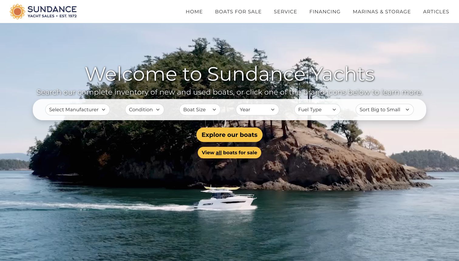
Sundance Yachts places manufacturer, condition, size, year, fuel and sorting controls directly over its opening coastal scene. Yellow actions make both filtered exploration and the complete inventory easy to identify. The page continues with regional context, brand explanations and featured boats that distinguish stock status, condition and length. This combination gives a Pacific Northwest specialist a memorable visual introduction without postponing the buying task. The official service page adds an unusually useful boundary: its department services boats purchased through Sundance. That qualification matters more than a generic service promise. Some anniversary wording in the homepage is older than the current review date, so historical counts should be maintained separately from the enduring company story.
What you can learn
Let atmosphere frame the task instead of replacing it. Connect filters to useful inventory detail, and explain important service eligibility boundaries plainly so prospective buyers understand the relationship they are considering.
Pros
Opening filters and contrasting actions make the shopping route immediately apparent.
The supporting service page explicitly identifies which customers the department serves.
Cons & considerations
Several filters at once may feel demanding to a first-time shopper.
Older anniversary copy illustrates the maintenance burden of time-sensitive company claims.
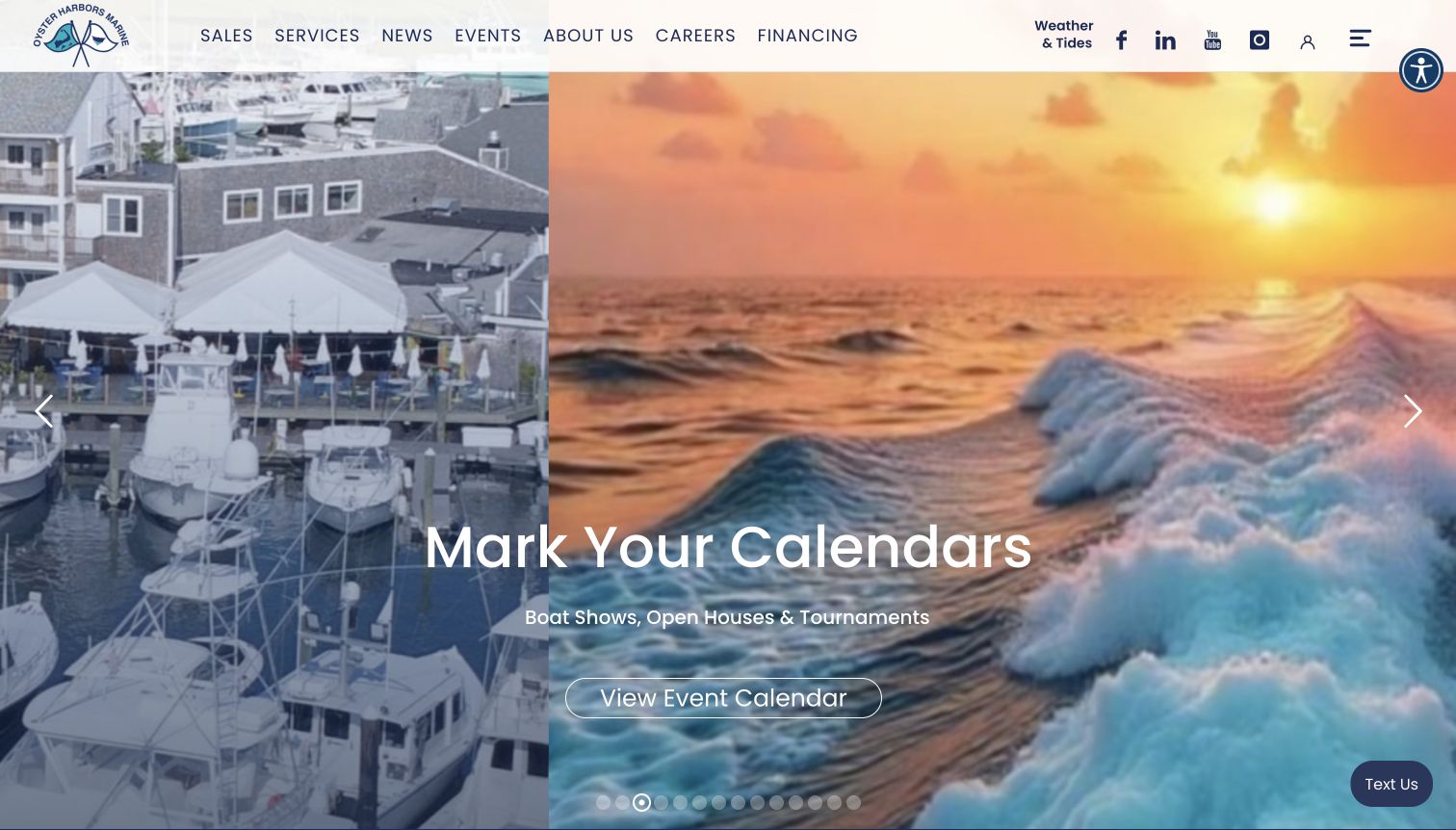
Oyster Harbors Marine places its brand and primary service navigation over a large rotating maritime scene. The captured slide promotes events, while the longer homepage supplies the more practical buying tools: inventory controls for condition, make, model, class, broker, price, length and year. Just-listed cards distinguish new, used and brokerage boats and attach location information to each listing. Regional offices, fuel-dock hours, boating articles and event notices give the dealer a presence beyond the catalog. The page therefore serves both active shoppers and existing boaters, although its many modules make the principal sales route compete with several other interests.
What you can learn
Pair evocative coastal imagery with a dependable inventory entry point. When a dealer combines brokerage, new sales and marina services, label those relationships explicitly and keep local details close to the relevant boat or office.
Pros
Listing cards communicate condition and place before a visitor opens a vessel.
Broker, size and price controls accommodate shoppers with a developed search brief.
Cons & considerations
A changing promotional hero can delay the first direct inventory cue.
The extensive homepage asks visitors to navigate several competing content priorities.
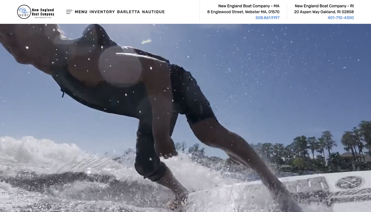
New England Boat Company opens with an energetic watersports video beneath a compact brand-and-inventory header. The Massachusetts and Rhode Island locations have addresses and telephone numbers immediately visible, giving the cinematic scene a practical local anchor. Farther down, boat sales, marine service and storage are separated into distinct tiles, and Barletta and Nautique receive their own explanations and shopping links. The service list includes winterization, detailing and parts, so the site presents an ongoing ownership relationship. Some location and service labels mix Webster, Oxford and Oakland wording; that inconsistency is a useful reminder that a polished visual shell still needs careful content maintenance.
What you can learn
Keep essential branch information available even when the opening uses video. Build the ownership services as understandable destinations, then check every location label and link together so the information remains consistent across the journey.
Pros
Two branch contacts remain visible without opening a menu or form.
Separate sales, service and storage tiles make the broader offer understandable.
Cons & considerations
The video occupies most of the first screen before explanatory content appears.
Inconsistent town labels weaken confidence in otherwise useful local service routes.
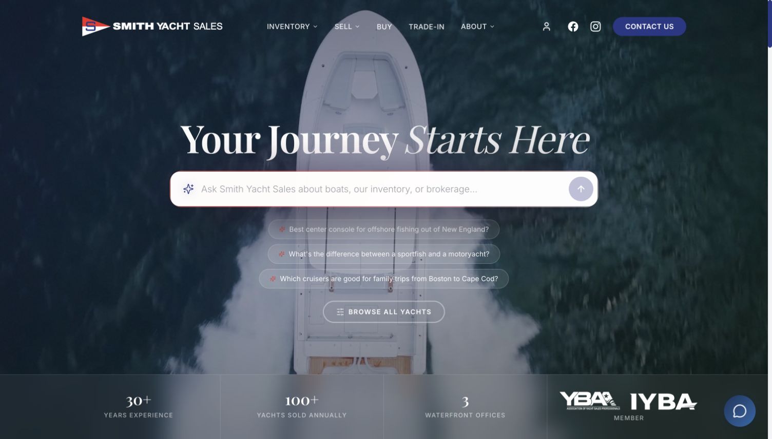
Smith Yacht Sales combines a dark aerial boating scene, restrained navigation and a large conversational search prompt. Suggested questions introduce boat types and regional use cases, while a conventional Browse All Yachts link remains available beneath them. The body then explains the brokerage offer, separates new-brand representation from featured inventory and provides distinct buying, selling and trade-in cards. Vessel cards expose length, condition, location and price; office cards provide another practical point of orientation. The conversation interface was not submitted or tested during this review. Its visual prominence is an interesting discovery pattern, but the dependable inventory and contact routes are the more directly verifiable strengths.
What you can learn
An exploratory interface should complement ordinary browsing. Give buyers who already know their requirements a clear catalog route, and make the differences between brokerage, new sales and trade-in services visible in the page structure.
Pros
Buying, selling and trading receive distinct actions rather than one generic inquiry.
Featured vessel cards carry useful specifications and location beside the photograph.
Cons & considerations
The large conversational prompt may obscure the simpler browsing route.
Certification and performance claims need separate verification beyond their prominent presentation.
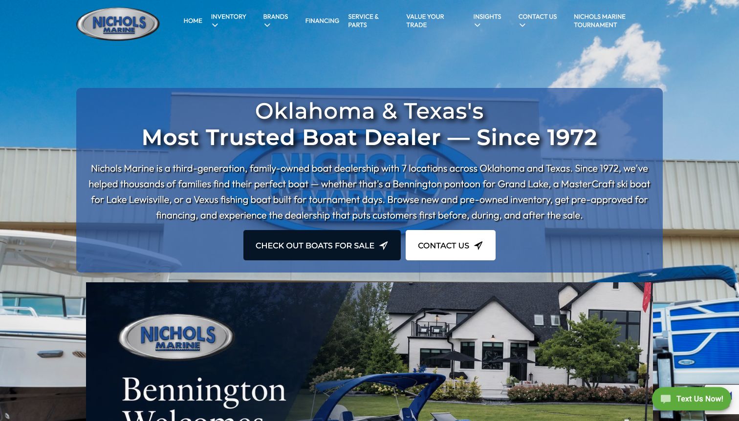
Nichols Marine leads with a clear Oklahoma-and-Texas proposition, a dealership photograph and a substantial explanatory panel. The text names pontoons, ski boats and fishing boats in relation to familiar lakes and activities, helping visitors understand the assortment before searching it. Immediately following are condition, make, model and year controls, then a featured inventory sequence that attaches location to each boat. Service, parts, financing and trade-in routes sit in the main navigation. The presentation is more explicit than a purely cinematic homepage, although the opening paragraph is dense and promotional claims about trust compete with the useful factual explanation.
What you can learn
Use regional examples to explain an inventory without assuming every visitor knows manufacturer names. Move from that introduction to a small set of useful filters, and retain the stocking location on every result card.
Pros
The opening identifies the region and principal boat categories in ordinary language.
Inventory cards show where a boat is located within the dealership network.
Cons & considerations
The long opening paragraph requires more reading than a focused first-screen proposition.
Repeated superlative language can distract from concrete product and service information.
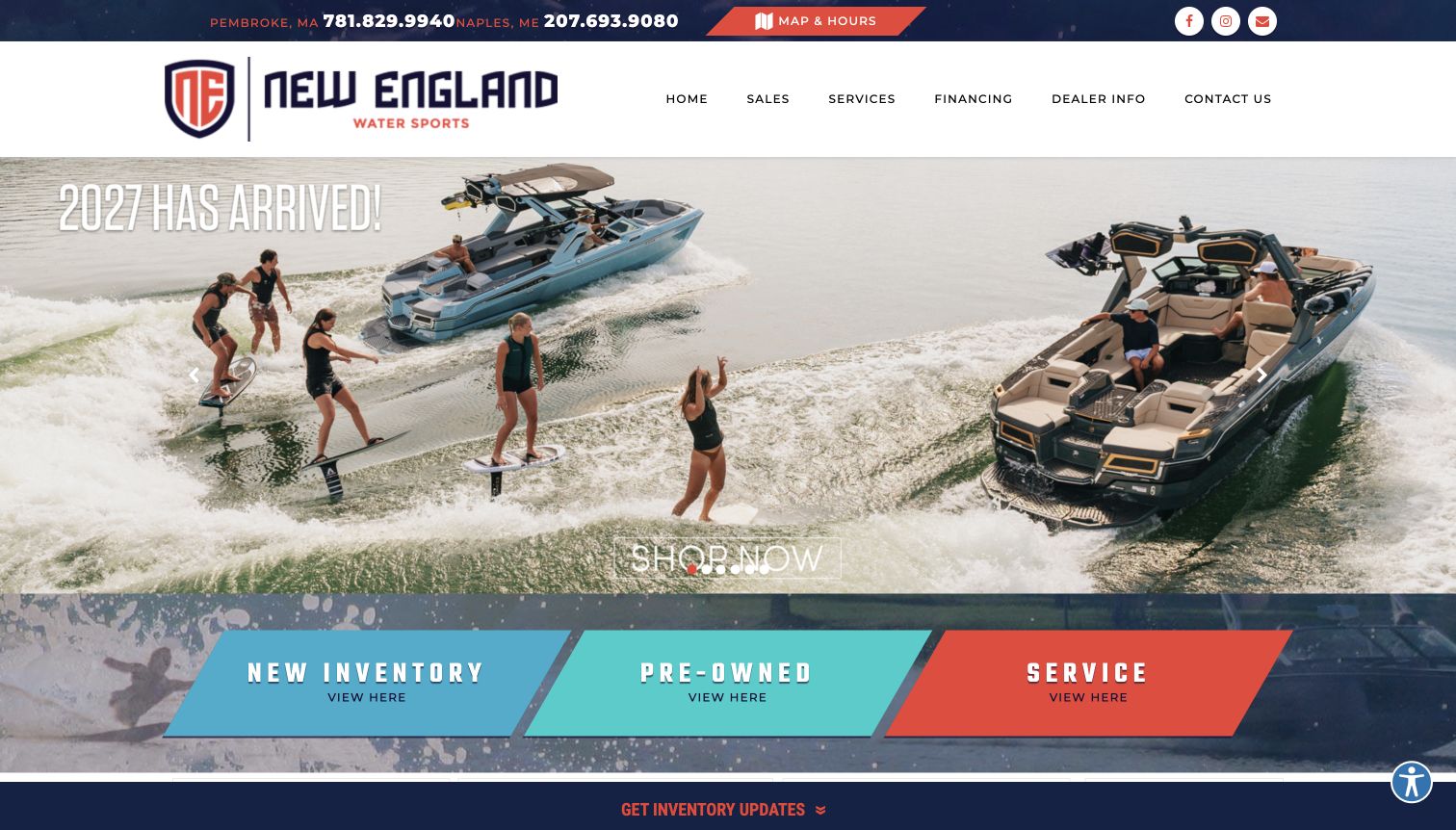
New England Water Sports gives its MasterCraft-oriented offering a lively red, teal and navy presentation. A large boat campaign leads directly into three contrasting tiles for new inventory, pre-owned boats and service. Telephone numbers and map-and-hours access appear above the main navigation, helping visitors distinguish the Maine and Massachusetts facilities. The longer page adds featured stock, brand video, testimonials and an explanation of the wakeboard, wakesurf and ski-boat focus. That specialization is useful context for the inventory. Social embeds and promotional media create a busier lower page, while the strongest part of the design remains the simple separation of shopping and ownership support.
What you can learn
A specialist dealer can use a narrow product focus as an organizing principle. Keep the first choices few and explicit, then explain the activities and support services that make the specialization relevant to a buyer.
Pros
Contrasting new, pre-owned and service tiles are easy to distinguish visually.
Branch telephone numbers and map access are prominent before the main content.
Cons & considerations
The brand campaign assumes visitors already understand the featured model range.
Multiple social and video modules compete with the more useful dealer explanation.
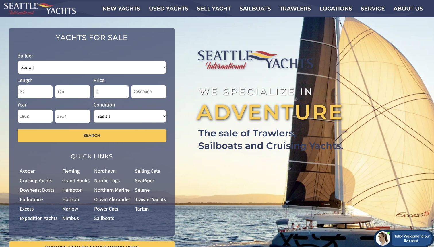
Seattle Yachts places a substantial search panel beside a sailing scene and an adventure-focused headline. Builder, length, price, year and condition inputs are joined by quick links to familiar yacht categories and brands. This is a useful contrast with dealer sites that hide all filtering behind a second page: a knowledgeable shopper can begin narrowing the field immediately. The rest of the homepage emphasizes new-brand representation, featured yachts, regional offices and boating articles. Its range includes sailboats, trawlers and cruising yachts, which remain differentiated in the navigation. The crowded quick-link list and technical inputs favor experienced visitors over someone still learning the vocabulary.
What you can learn
Put advanced search where knowledgeable buyers can find it, but provide a simpler category-led route beside it. Use explanatory landing pages to connect unfamiliar boat terminology with the intended boating activity before asking for detailed filters.
Pros
Search controls are present in the opening view alongside the brand message.
Sailboats and trawlers retain clear navigation identities rather than one undifferentiated catalog.
Cons & considerations
The large quick-link list adds considerable visual density to the first screen.
Technical filter fields provide limited guidance for visitors new to yacht shopping.
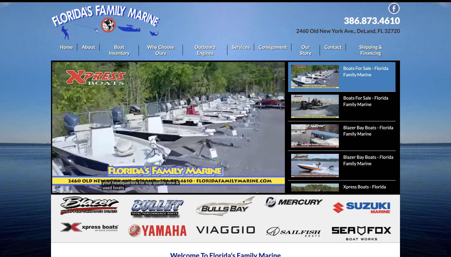
Florida’s Family Marine uses a compact, visually distinctive page built around a large video player and a stack of related boat clips. The telephone number and DeLand address sit prominently beside its illustrated logo. A broad horizontal navigation distinguishes boat inventory, outboard engines, service, consignment and the store; linked manufacturer logos appear immediately beneath the media. A short introduction then states the new-and-used sales and engine-service offer. The result feels like a local showroom translated to the web rather than a minimal luxury campaign. Its compressed navigation and media-heavy opening can, however, require more interpretation than a simple inventory-first design.
What you can learn
Product video is most useful when the visitor can still reach stock, engines and service through clear permanent links. Keep a compact local homepage factual and give each media item a descriptive purpose beyond repeating the dealer name.
Pros
Address and telephone information are prominent within the opening brand area.
Boat, engine, consignment and service routes are visibly distinguished in navigation.
Cons & considerations
The dense horizontal menu gives many choices similar visual weight.
The dominant video area postpones the concise explanation of the dealership offer.
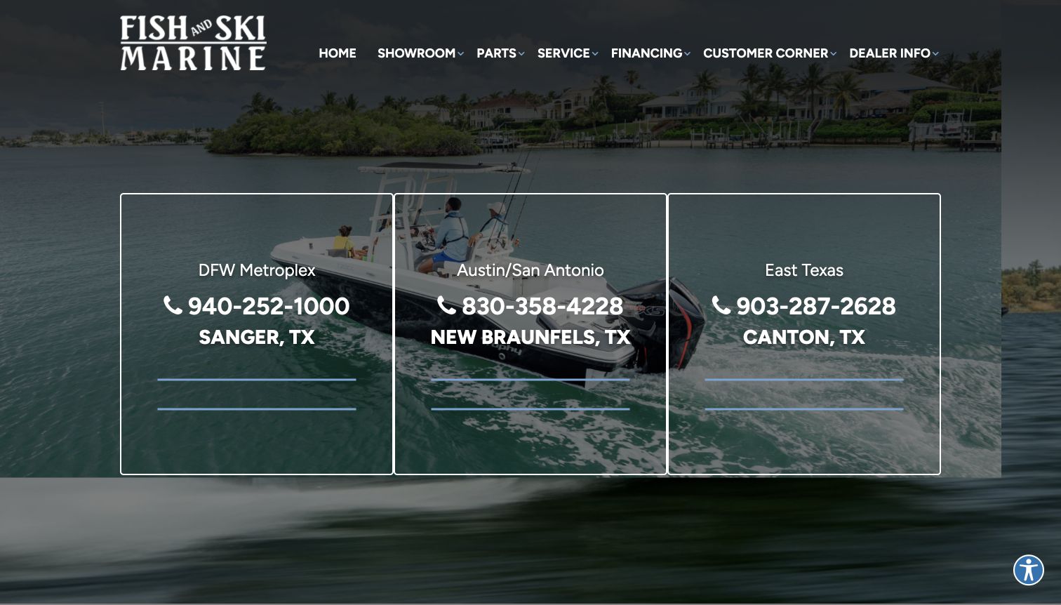
Fish and Ski Marine puts three regional contact panels over its opening boating scene. DFW, Austin–San Antonio and East Texas each receive a telephone number, city, map-and-hours link and inventory route. This makes location the first organizing decision rather than requiring visitors to infer which showroom holds a boat. Below, featured listings show condition and price, manufacturer links provide another browsing route, and service, financing and virtual-tour actions support later decisions. The homepage also explains the family-owned positioning and regional growth. The large contact panels are useful for an established local audience, although they dominate the first screen and offer less immediate product explanation to unfamiliar visitors.
What you can learn
When branches serve distinct markets, route shoppers by place before showing an undifferentiated inventory. Keep the local stock link beside the branch contact so a useful geography choice does not become a dead end.
Pros
Each regional panel combines contact, directions and a corresponding inventory link.
Featured boat listings expose price and condition without requiring an inquiry.
Cons & considerations
Large regional panels occupy the space that could introduce the product range.
Multiple service and finance promotions add competing actions farther down the page.
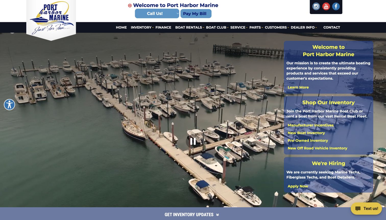
Port Harbor Marine opens with marina footage and stacked panels for its introduction, inventory and hiring. The main navigation includes sales-related choices alongside rentals, a boat club, service, parts and customer resources. The body explains the distinction between hiring a boat and joining the club, while new and pre-owned inventory remain separately linked. A location selector and repeated regional contacts support the multi-site operation. This is a useful example of a dealer presenting several ways to get onto the water. The opening is busy, though: off-road inventory and employment share space with the boat-shopping task, and some broad inventory labels need closer attention from a focused buyer.
What you can learn
Treat renting, club membership and owning as different decisions with different explanations. Keep each route visible, then prevent unrelated stock or recruitment messages from taking priority over the most common boating tasks.
Pros
Rentals and club membership have separate explanations rather than blended promotional copy.
The navigation accounts for existing owners through service, parts and customer resources.
Cons & considerations
Hiring and off-road inventory compete with boat-shopping messages in the opening.
Numerous service categories make the homepage harder to scan quickly.
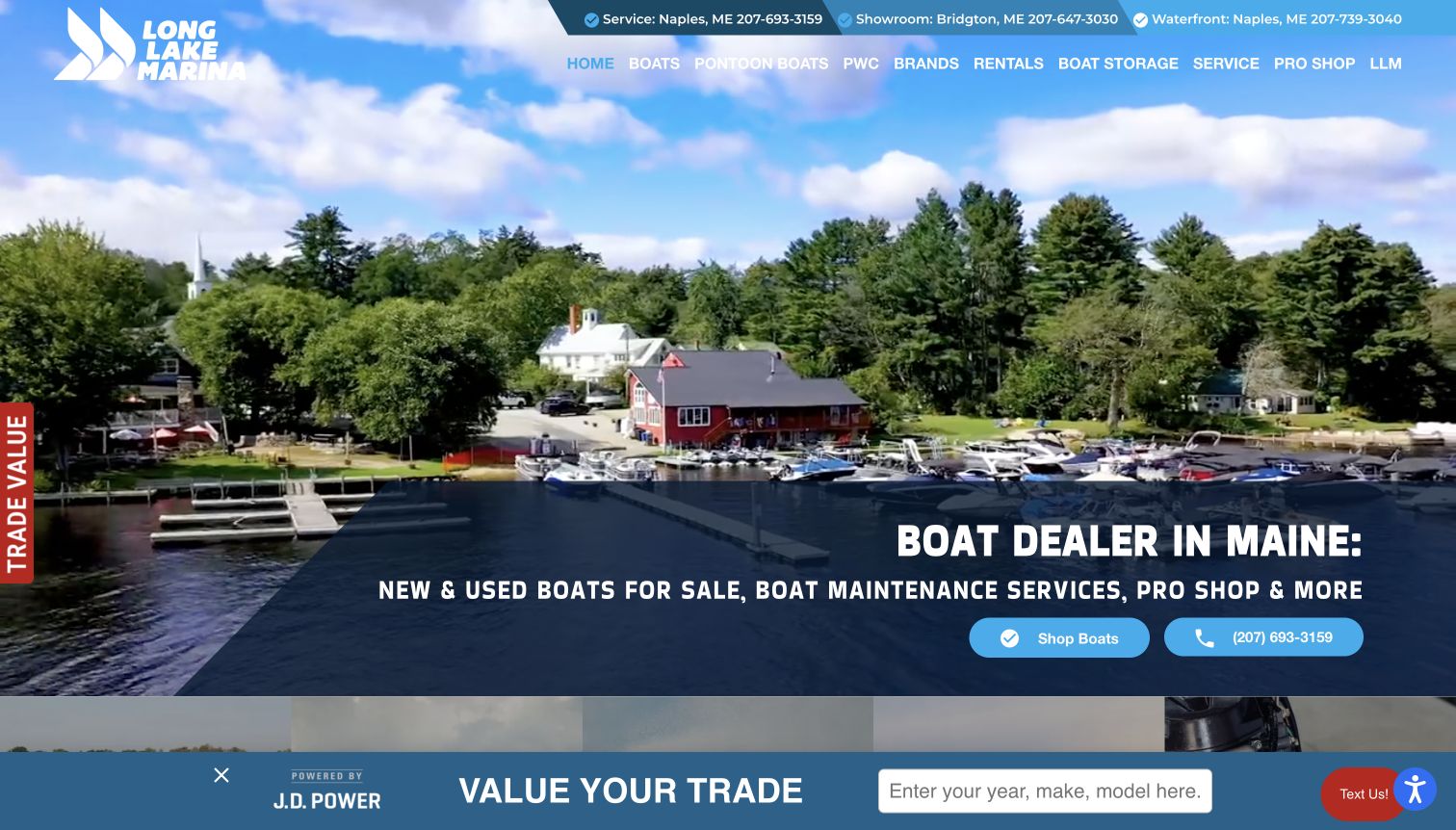
Long Lake Marina combines a waterfront scene with an explicit Maine boat-dealer headline and clear Shop Boats and telephone actions. Its upper utility bar distinguishes a service center, showroom and waterfront facility, which is more informative than a list of unexplained locations. New boats, used boats, personal watercraft, financing and service then receive separate cards. Several inventory carousels show model names and asking prices, giving the page a substantial retail character. A trade-value widget also appears in the captured view. Some cards displayed zero-dollar values during observation; those should not be read as real offers, and illustrate why inventory feeds need editorial checks.
What you can learn
Explain what each facility does before asking visitors to choose one. Keep inventory pricing states meaningful, using a clear contact-for-price label when an amount is unavailable rather than exposing a placeholder value.
Pros
The utility bar distinguishes service, showroom and waterfront functions by location.
The headline states the region and offer without relying only on lifestyle imagery.
Cons & considerations
The trade-value overlay competes with the first-screen shopping and telephone actions.
Zero-dollar inventory values can confuse shoppers when price data is unavailable.
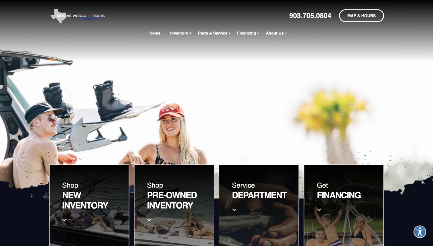
Marine World of Texas uses a restrained monochrome header over a watersports photograph, followed by four large cards for new inventory, pre-owned inventory, service and financing. The telephone number and map-and-hours link are easy to find above them. The longer page extends the ownership offer into detailing, storage, winterization, parts and ceramic coating, with manufacturer shortcuts providing an alternative shopping route. That hierarchy makes the main tasks legible even though the opening image contains little explanatory copy. Several downstream service links lead to the same department page, so the visual separation promises more specificity than the destinations necessarily provide.
What you can learn
A small number of large task cards can organize a broad dealership offer effectively. Make sure each specialized service label either reaches its own explanation or clearly identifies the relevant section of a shared service page.
Pros
Four prominent cards distinguish new stock, used stock, service and financing.
Telephone and directions access are available before entering the main shopping journey.
Cons & considerations
The opening image supplies limited context about location and dealer specialization.
Several specialized ownership-service labels share a general destination rather than detailed pages.
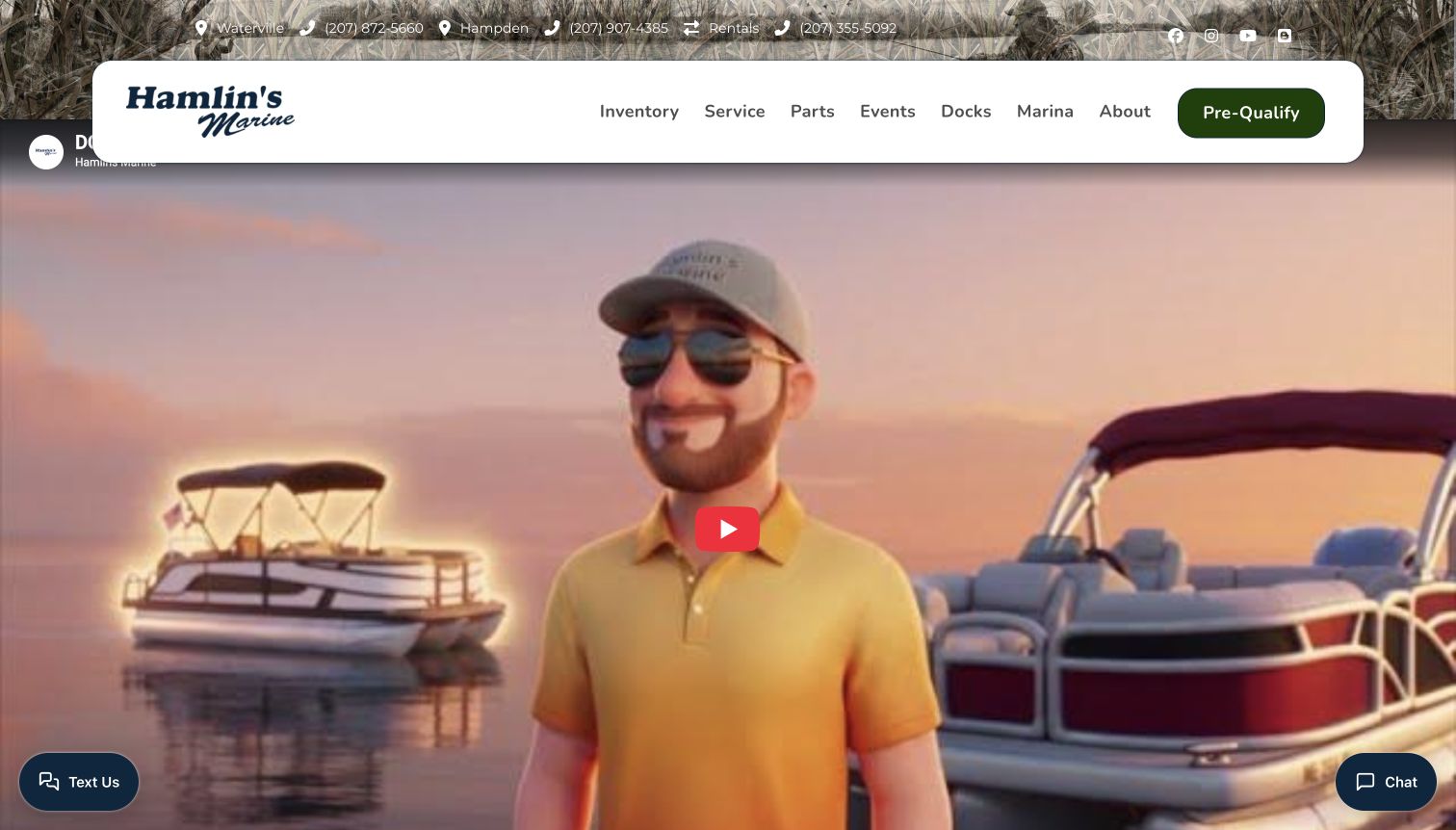
Hamlin’s Marine opens with a characterful promotional video beneath a floating white navigation bar. Regional telephone numbers sit above it, while inventory, service, parts, events, docks and marina links distinguish the business’s different responsibilities. A direct sales-appointment action follows the opening, then customer-review cards and manufacturer-based browsing. The combination emphasizes a recognizable local personality and the continuing marina relationship rather than only a stock grid. The review display and embedded video are presented as source content, not independently verified service outcomes. The first screen is largely promotional, making the fixed inventory label and practical contact details especially important for visitors who want to shop immediately.
What you can learn
A distinctive dealer voice can make an otherwise conventional retail site memorable. Preserve clear inventory and appointment paths around that personality, and give practical information enough prominence to stand without playing the promotional media.
Pros
Inventory and ownership services remain distinct within the prominent navigation bar.
Sales appointment access gives interested visitors a concrete next step.
Cons & considerations
The promotional video occupies most of the opening view before stock information appears.
Review carousels require interpretation and do not independently establish service quality.
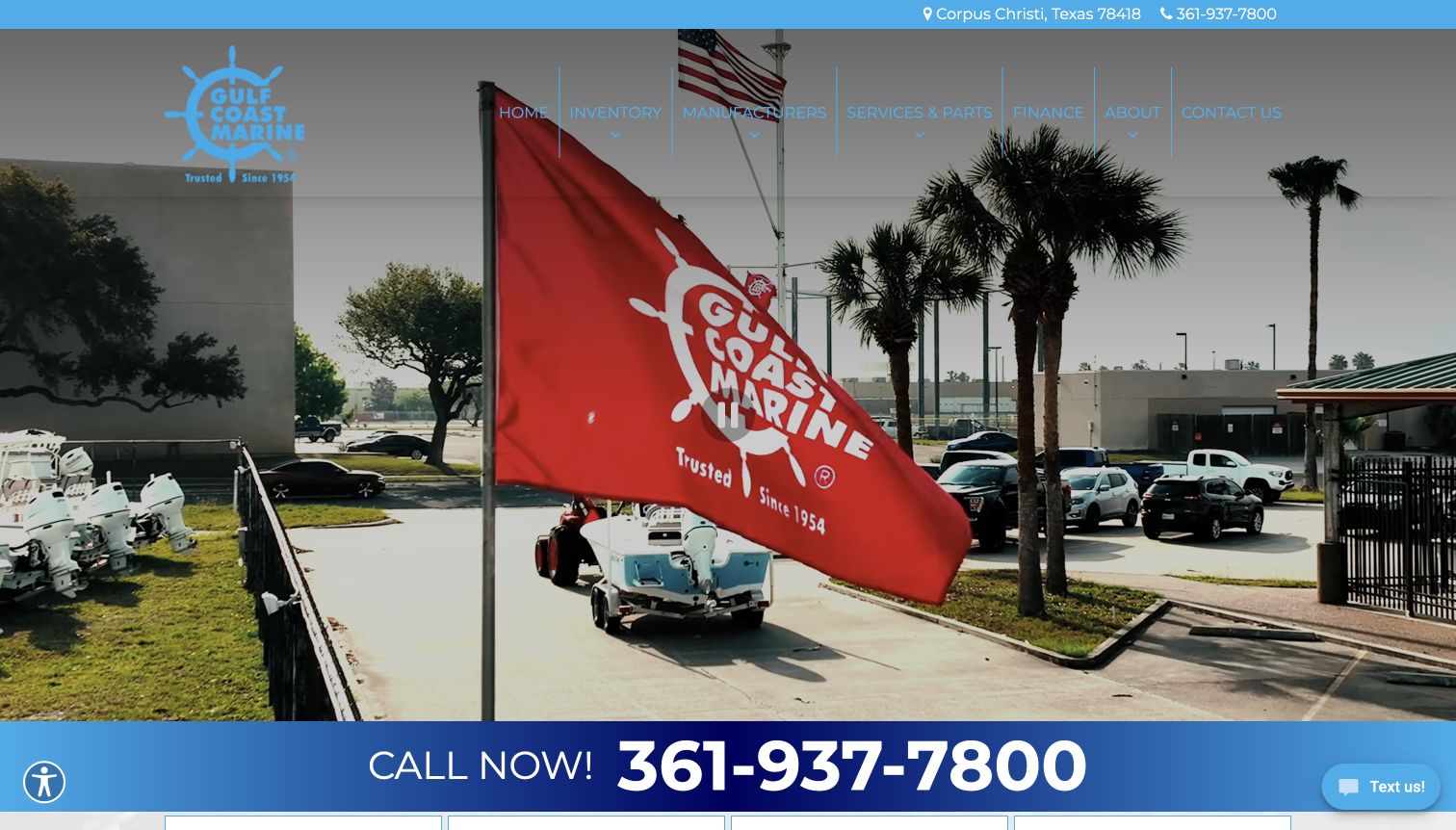
Gulf Coast Marine places its Corpus Christi location and telephone number above a large dealership scene. A broad call-now strip sits directly below the opening, followed by separate new, pre-owned, financing and events cards. The page also includes dated customer reviews with source links, keeping those testimonials distinguishable from the inventory itself. This is a direct local-business approach: the visitor can quickly establish where the dealer operates and how to reach it. The layout favors contact over deeper product comparison in the opening view. Its long review section and multiple callouts can also push the practical stock details farther down the page than an active shopper expects.
What you can learn
Make local contact information prominent, but balance it with an equally obvious inventory path. Testimonials are easier to assess when their source and date remain visible and they do not replace the details needed to compare boats.
Pros
Location and telephone details are clear before the main page content.
New and pre-owned stock receive separate, plainly labeled shopping actions.
Cons & considerations
The dominant call-now treatment provides little product information in the opening.
A lengthy review carousel can distract from the practical inventory journey.
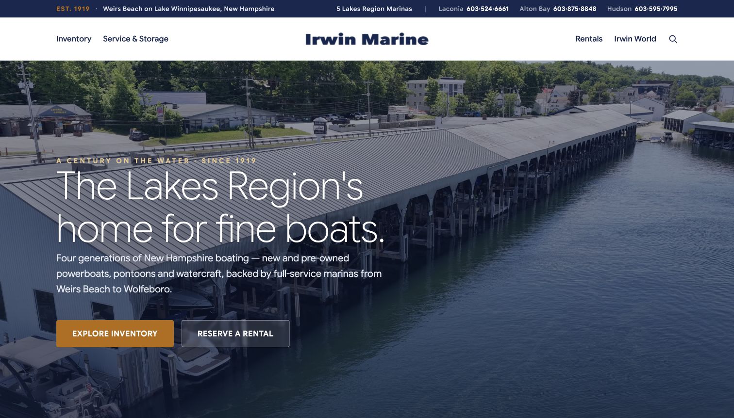
Irwin Marine pairs a broad marina photograph with a clear Lakes Region proposition and two contrasting choices: explore inventory or reserve a rental. A compact header combines regional telephone numbers with service-and-storage access. The body separates new and pre-owned featured stock, boat-type categories, seasonal care, rentals and trade-or-sell options. It also explains the historic business story and current operating context rather than relying entirely on a heritage date. The restrained navy, gold and white treatment helps these sections feel related. Financing and product claims remain dealer statements, while the main design lesson is the careful separation of several boating needs within one regional brand.
What you can learn
Use heritage as context for a present-day offer. Organize the homepage around the decisions visitors actually make—buying, renting, servicing or selling—and keep each action connected to an explanation of what happens next.
Pros
The opening immediately distinguishes inventory browsing from short-term boat rental.
Separate service, storage and trade sections support the wider ownership lifecycle.
Cons & considerations
The many lower-page offers still create a substantial scrolling commitment.
Some featured inventory requires a pricing conversation before direct financial comparison.
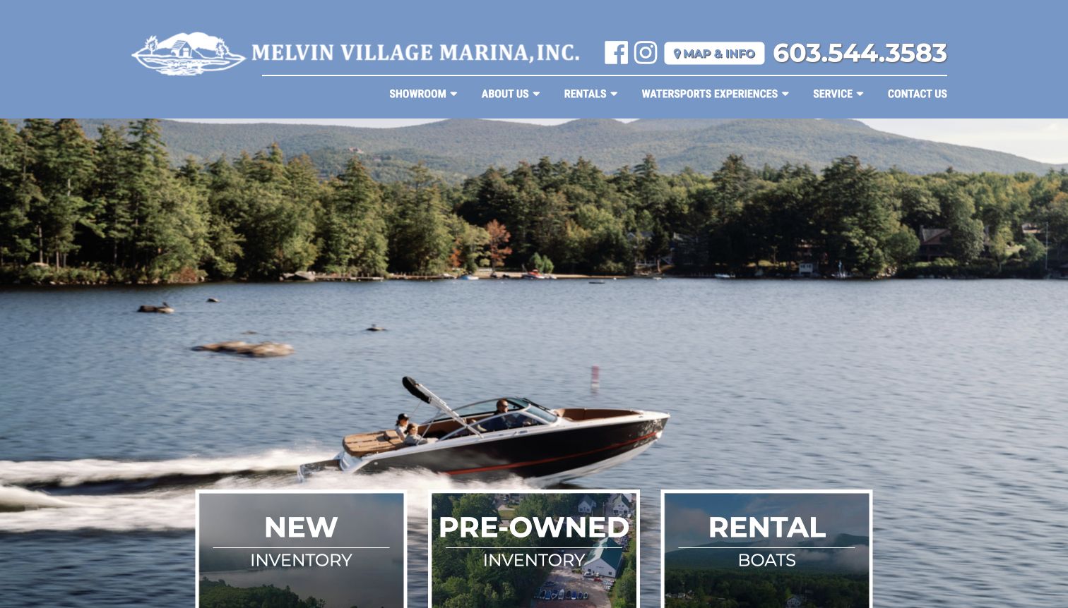
Melvin Village Marina uses a quiet lake scene, a recognizable illustrated identity and a large telephone number to establish its local character. Three large opening cards distinguish new boats, pre-owned boats and rentals. The body adds featured inventory, manufacturer links and a detailed introduction to the lakefront setting and showroom. Department hours are separated in the footer, which is valuable when sales and service operate on different schedules. The page is conventional but specific enough to connect the website with a physical place. Its long introductory paragraph and brand carousel could be easier to scan, while the simple three-way opening remains its strongest organizational device.
What you can learn
Translate a physical dealership into the website through useful local details, not only scenic photography. Keep buying and renting separate, and publish department-specific hours where they help visitors plan a real visit.
Pros
New, pre-owned and rental inventory are differentiated in the first-screen cards.
Separate sales and service hours acknowledge different reasons for visiting the marina.
Cons & considerations
The detailed introductory paragraph makes key showroom facts harder to skim.
A carousel of manufacturer logos adds movement without explaining differences between brands.
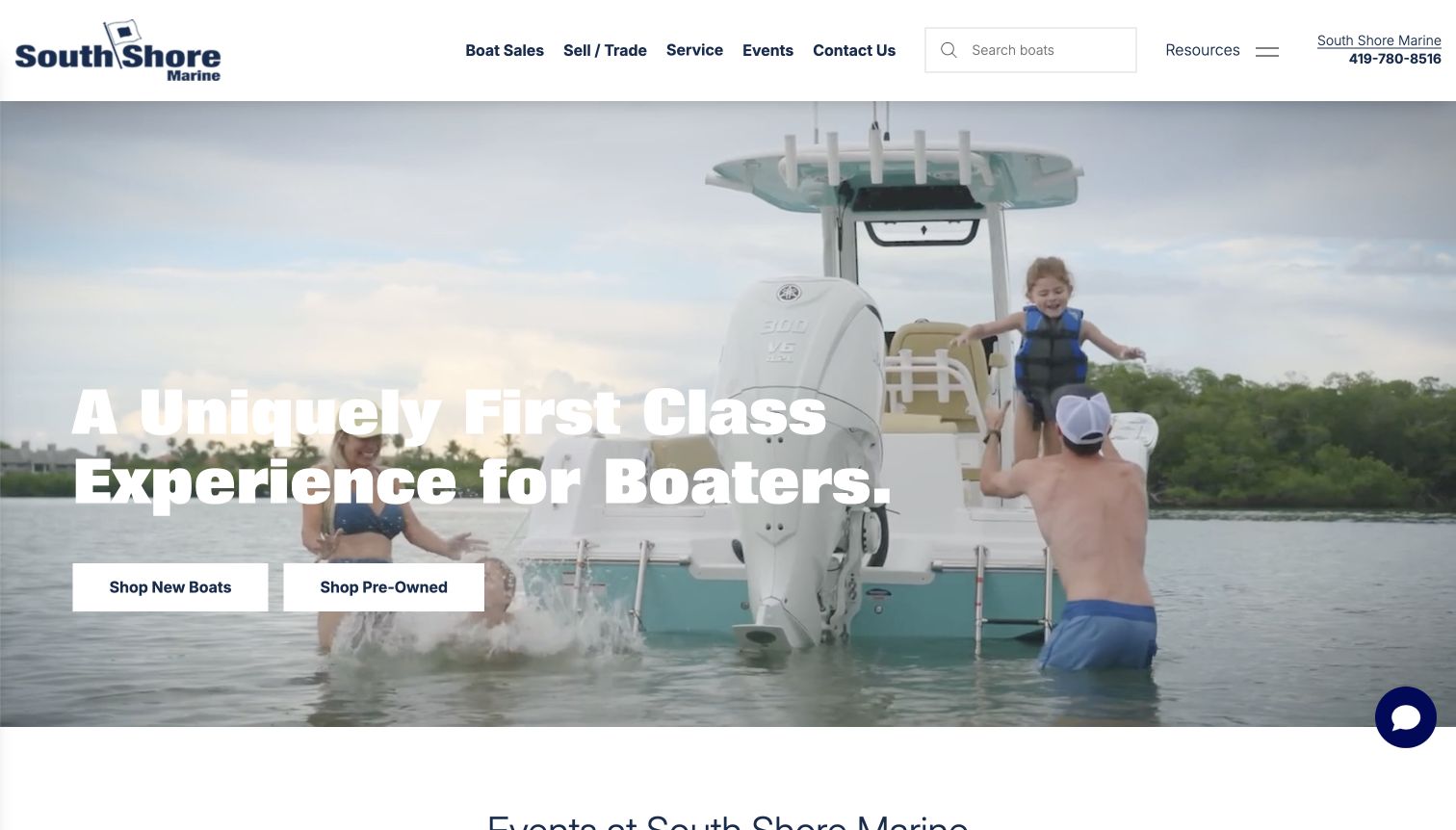
South Shore Marine presents a bright lifestyle scene beneath a clean white header. Two plain, high-contrast buttons divide new and pre-owned shopping, while the header retains search, sell-or-trade, service and contact access. The body expands into events, dealer positioning, financing, insurance and maintenance explanations. This makes the opening simpler than the wider range of services might suggest. The loaded source also contains some inconsistent regional service labels and destinations, so a prospective client should verify local applicability before relying on them. For website planning, the useful pattern is the simple top-level buying choice paired with a careful need to maintain branch-specific content.
What you can learn
A broad dealership can start with a very small decision set. Carry that clarity into every supporting page, especially when shared network templates supply service and location information that must remain accurate for a particular branch.
Pros
New and pre-owned shopping buttons are prominent and visually balanced.
Search, service and sell-or-trade routes remain available in the compact header.
Cons & considerations
Some regional service references need reconciliation with the local dealership context.
The opening proposition is broad and says little about specific boat categories.
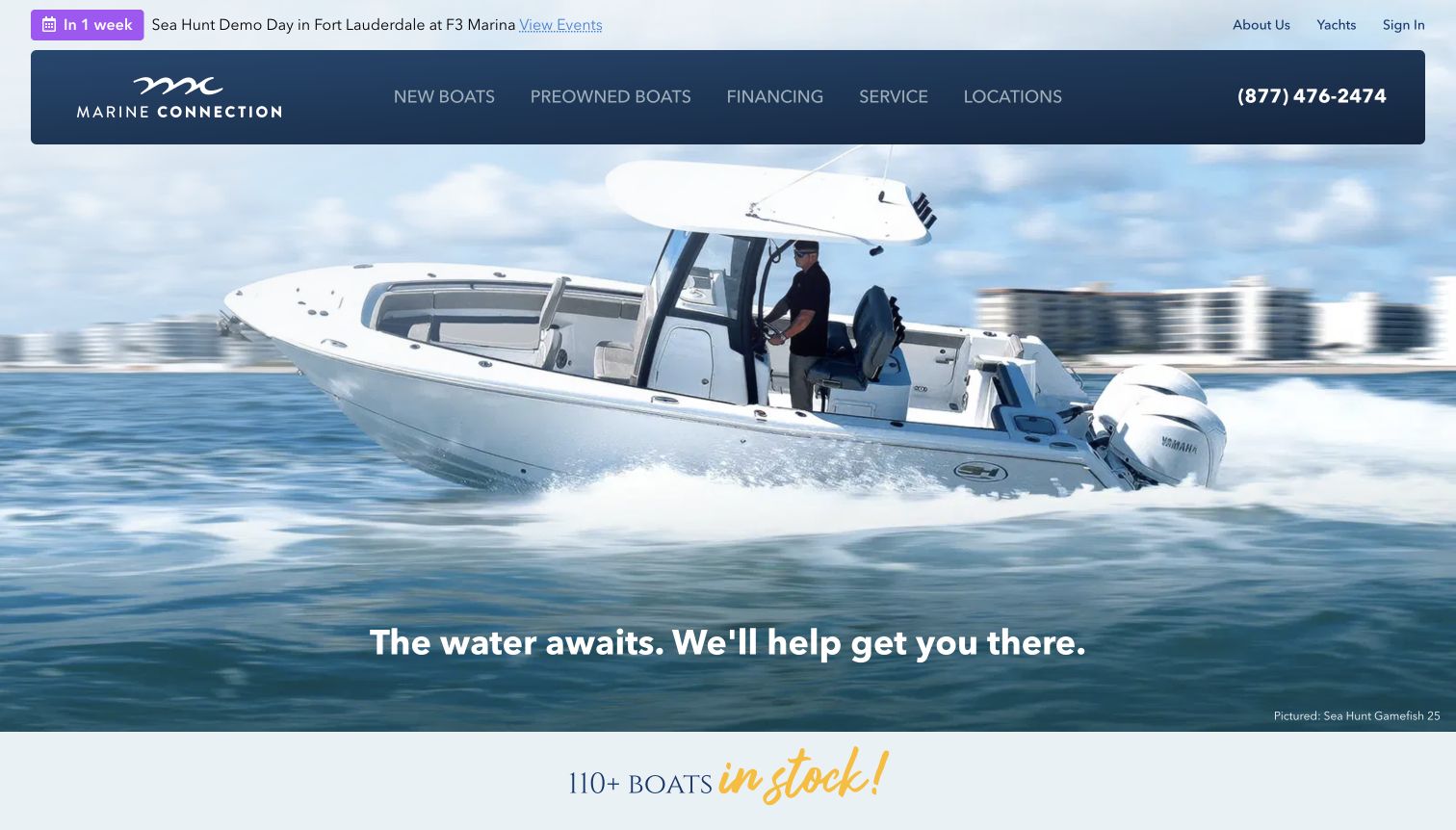
Marine Connection gives its opening boating image a useful product caption that links the pictured model to matching inventory. A compact navy navigation bar keeps new boats, pre-owned boats, service and locations accessible, while the following section supplies keyword search and a complete-stock link. Latest inventory cards show condition and recency, and boat-type shortcuts support visitors who think in categories rather than brands. Branch cards include address, telephone and opening-status information. The visual treatment is polished, but its strongest feature is the continuity between the aspirational photograph and an identifiable product. Dynamic stock counts and opening-status labels create an ongoing accuracy obligation.
What you can learn
When a boat dominates the hero, identify it and provide a useful route to the corresponding stock. Combine brand, type and keyword discovery with branch information so shoppers can move from interest to a practical local inquiry.
Pros
The hero caption connects the pictured boat with a corresponding inventory route.
Branch cards supply address and contact details alongside current opening information.
Cons & considerations
The opening scene pushes the main inventory search just below the first view.
Live-looking stock counts and hours require dependable data and ongoing maintenance.
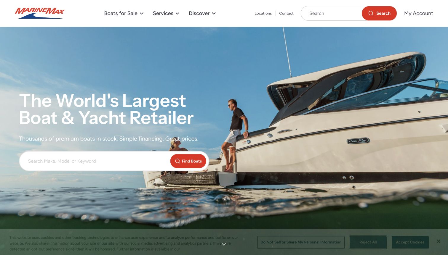
MarineMax uses a broad boating photograph and a large search field to introduce its national inventory. The header is comparatively restrained, with boats, services and discovery navigation plus locations, contact and account access. Brand cards provide a second route into the collection, while buying guides, maintenance resources and events address visitors earlier in the ownership journey. This is a useful large-network contrast to the regional dealers in the collection: keyword discovery carries much of the opening task. The source privacy notice remained visible in the capture. The prominent size and financing statements are marketing claims, not conclusions of this website review.
What you can learn
A large catalog needs both direct search and a way to learn the categories. Keep location discovery available throughout, and support less certain buyers with practical comparisons rather than assuming everyone arrives with a model name.
Pros
The make-or-model search is prominent within the opening brand message.
Buying guides and boat-type resources support visitors who are still exploring.
Cons & considerations
The search-led opening offers less immediate guidance to an unfamiliar shopper.
Network-wide imagery and claims provide limited information about an individual local branch.
Kegan is a freelance web designer and developer with 15+ years of experience helping businesses turn complicated website requirements into clear, maintainable digital experiences. He works directly with clients from planning and design through development, launch, and ongoing support.
For boat dealer website design, his development approach focuses on inventory filtering, branch information, brokerage distinctions and practical ownership-service content. The scope can be a targeted improvement or a complete custom build, with responsive layouts, thoughtful content structure, and integrations chosen around the people using and maintaining the site.
Show 3 other boat dealer website designersHide other boat dealer website designers
Plan the dealer website around inventory, local context and ownership
Define the shopping paths before designing the hero
List the decisions a prospective customer needs to make before contacting the dealership. Some arrive with a manufacturer and model in mind; others know only the activity, such as fishing, cruising or watersports. A useful information structure supports both groups. Separate boat type from brand, and distinguish new inventory, used stock, brokerage listings and models that can be ordered but are not physically available.
Decide which filters actually improve the available collection. Condition, length, location and price are common starting points, but a small specialist inventory may need fewer controls than a large brokerage. Do not make an empty filter look like a useful choice. Preserve the selected criteria when visitors return from a boat detail page, and provide a clear reset when no suitable results remain.
Choose the opening image after these routes are established. A dramatic boating scene can communicate the character of the offer, but should leave a dependable shopping action visible. If a specific vessel is pictured, identify it and link to an appropriate model or inventory page. Keep rentals, boat-club membership and nonmarine stock clearly separate when they belong to the same business. The homepage should help visitors understand the options before it asks them to choose one.
Create a reliable record for every boat
Define the information that belongs to each listing before importing an inventory feed. Include the year, manufacturer, model, condition, dimensions, engine information when documented, current location and sale status. State whether the listing represents a particular boat, a brokerage vessel or a configurable model. Keep stock identifiers and inquiry context consistent so the sales team can understand which item a visitor means.
Use photographs that correspond to the actual listing, with captions when a picture shows a representative model or optional equipment. A concise image sequence should explain the exterior, seating, helm and relevant spaces rather than repeat nearly identical views. Keep video optional and make the essential written information available independently. Obtain the appropriate image rights and avoid publishing private owner information in brokerage materials.
Treat pricing as structured content. Display an actual asking price when approved, or use an explicit contact-for-price state; a zero value or empty field is not an adequate substitute. Explain the scope of any displayed offer without turning an estimate into a promise. Establish who updates availability, changes reserved or sold status and removes expired promotions. A well-maintained listing is more useful than a visually elaborate page whose practical details cannot be trusted by a visitor.
Connect sales with realistic local support
Explain the relationship that continues after a boat inquiry. A dealership may provide maintenance, parts, storage, marina access, rentals or instruction, but those services can have different eligibility rules and locations. State the boundaries plainly. Sundance, for example, explains that its service department serves boats purchased through the business. Another dealer may accept outside service work. Neither arrangement should be inferred merely from a Service navigation label.
Give each branch a clear purpose, address, contact method and department hours. Distinguish a showroom from a waterfront facility or storage site, especially when visitors need to bring equipment or meet a particular team. Use location-specific content carefully when a shared network template supplies the page; incorrect town names and service destinations undermine an otherwise polished presentation.
Keep first contact proportionate to the task. A boat reference, preferred branch and short question may be enough for a sales inquiry. Explain appointment expectations and provide a useful route when an embedded scheduler is unavailable. Do not combine public inquiries with sensitive financing or customer-account records. Assign responsibility for maintaining the stock feed, location information, seasonal hours and service explanations. The website should prepare a useful conversation while leaving inspection, transaction terms and final commitments to the appropriate human process.
The editing job behind the design
Choose tools around dependable inventory and useful local pages
Choose an inventory system that separates real stock from model catalogs and keeps condition, location, specifications, price states and sold status consistent across search and detail pages.
Keep dealership content maintainable alongside the stock feed. Branch responsibilities, service boundaries, staff contacts and seasonal information should not require a full redesign whenever the operation changes.
Use responsive photographs and optional video without making navigation dependent on external media. Keep financing, customer accounts and private inquiries separate from public listing content. The example stacks describe bounded public-page evidence, not complete internal dealer systems.
Our WordPress website examples offer a separate look at publishing approaches. A visible platform label is evidence for that named page, not a guarantee that the same system will suit your requirements.
Before the public launch
Boat-dealer website brief checklist
Distinguish new stock, used boats, brokerage listings and orderable models.
Provide useful browsing by boat type as well as by brand or model.
Choose filters appropriate to the actual inventory size and variety.
Show condition, specifications and stocking location on useful listing cards.
Identify whether images show the actual vessel or a representative model.
Use clear asking-price or contact-for-price states instead of zero placeholders.
Maintain reserved, sold and unavailable status across every stock surface.
Explain what each showroom, marina, service center or storage location handles.
Keep rentals and boat-club membership distinct from boat ownership.
State service eligibility and department-specific hours where relevant.
Preserve boat and branch context when a visitor starts an inquiry.
Assign ownership for inventory feeds, promotions and seasonal location updates.
These checks are a project checklist, not a performance, legal, security, or accessibility certification. Test real journeys with the people responsible for the website before making claims about the result.
Sources & editorial method
How this collection was selected and reviewed
This collection contains 19 distinct public website properties, matching the original saved industry draw. All 19 images are direct browser captures with source URLs, actual capture times, pixel dimensions and attribution retained. The MarineMax first-visit image includes the source privacy notice. Reviews assess visible presentation, navigation and public explanations, not boat condition, dealer credentials, service quality or financing outcomes. Every reviewed homepage received one bounded broad technology-audit attempt: 13 returned checked observations and six declined automated access, which remains explicitly unavailable. No access check was bypassed and unavailable scans do not establish a hidden backend. A separate candidate stopped at a browser security verification page and was excluded before the final selection. No account action, inquiry, finance application, chat submission or purchase was made for this review.
Each example links to its actual source page. Screenshots are direct browser captures with their own capture dates; moving imagery, announcements and live designs can change. The notes describe observable design choices and conditional tradeoffs, not measured traffic, conversion results, service quality, or accessibility conformance.
Technology labels use public page metadata, asset evidence, or explicitly cited platform documentation. Platform documentation is not a complete current deployment audit. A component reference may be legacy or unused; it is not a complete backend inventory. Unknown stacks are omitted. These sites are editorial examples, not our client portfolio.
Written, Edited and Curated are separate editorial records, not timestamps advanced by a rebuild. Website designs and imagery belong to their owners. See our editorial standards or suggest a correction.
Questions worth asking
Boat Dealer website design questions
Should a boat-dealer homepage begin with inventory or lifestyle imagery?
It can combine both. Keep an obvious inventory route visible with the image, and identify a featured boat when possible. The best balance depends on whether visitors already know the product range or need help understanding the available categories.
Should brokerage and new boats share the same search?
They can, provided condition and sales relationship are clearly labeled and useful filters remain available. A visitor should be able to distinguish a specific brokerage vessel from new stock or a model that can be ordered.
What should happen when a boat has no published price?
Use a clear contact-for-price label and retain the boat reference in the inquiry path. Do not display zero as a placeholder or imply that a general payment example is a final offer for that vessel.
Do marinas need separate pages for sales and service?
Separate pages are useful when the responsibilities, eligibility or locations differ. At minimum, explain which facility handles each task and publish the relevant department hours and contact route.
Does the Editors Choice identify the best dealer to buy from?
No. It is an editorial selection for the public website’s design and communication. It does not verify a boat’s condition, the dealership’s performance, financing suitability or the outcome of a transaction.