Best VitePress Websites of 2026 (20 Real-World Examples)
Twenty public properties with genuine captures, current VitePress generator evidence and practical lessons for documentation, custom themes and project publishing.
A VitePress project starts with a content model, not a gradient hero. These examples show how a compact publishing framework supports reference-heavy guides, distinctive project gateways and a dated editorial archive.
VitePress's official introduction describes a static-site generator that turns Markdown into themed HTML and adds a Vue-powered application for later navigation. Its default theme is designed for technical documentation, but custom themes support other content-focused properties. A familiar sidebar is therefore one possible expression of the platform, not its only visual form.
Vue, Vite, Vitest, Rollup and D3 open this collection as recognizable developer brands. Every named public document was independently inspected and declared VitePress in its generator metadata when captured. That signal identifies the publishing property, not the implementation of the documented library, private deployment choices or a measured speed result.
Before the examples
What makes good VitePress website development in 2026?
Treat URLs as part of the content model
VitePress maps Markdown files to generated routes and documents the relationship between source structure, links and clean URLs. Decide how guides, references, translations and old paths will work before reorganizing files. A tidy source folder is not enough if published links from issues and search engines stop reaching useful content.
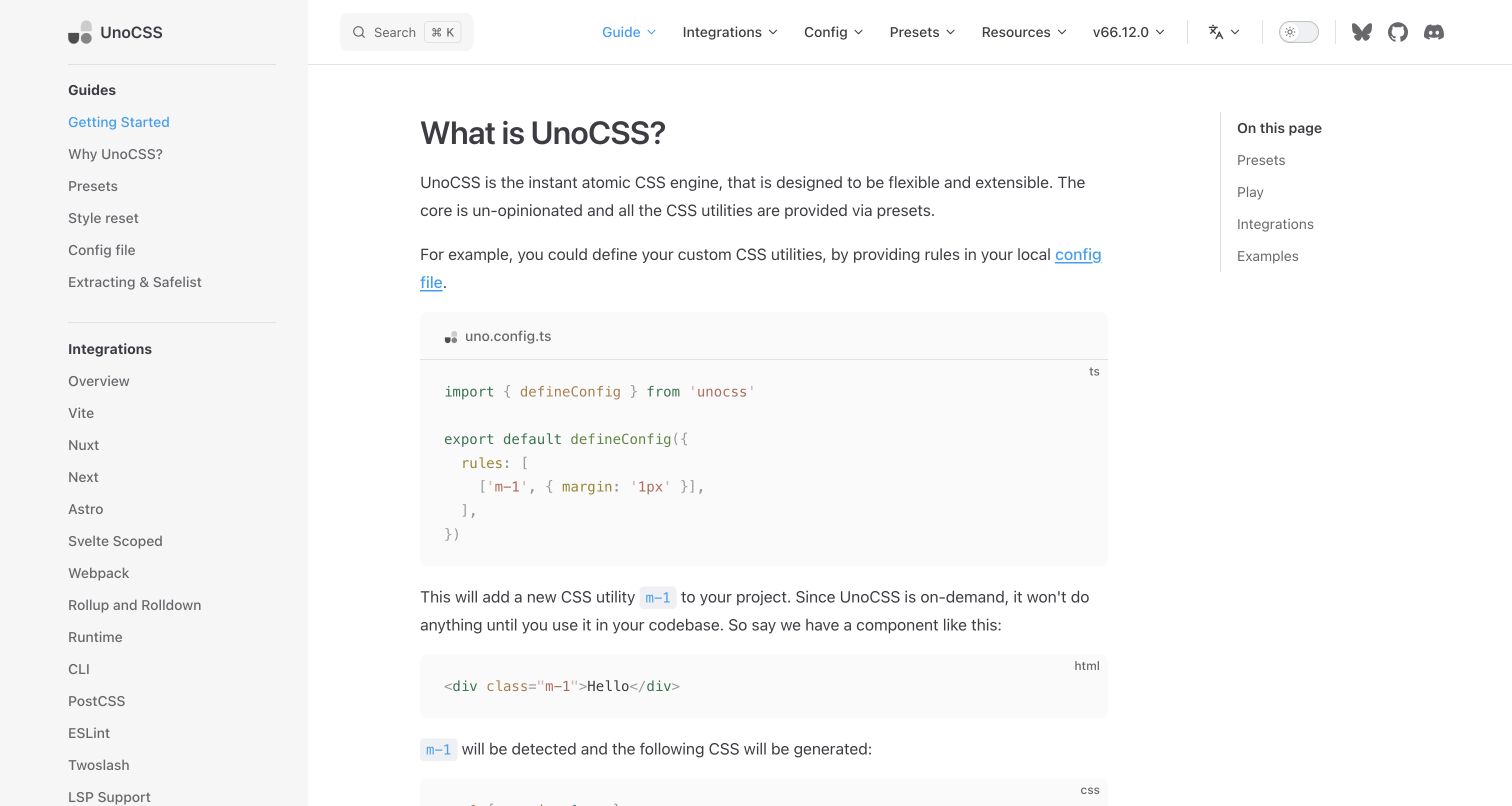
Markdown pages can contain Vue components. Give demos a narrow purpose, useful static context and a maintenance owner. UnoCSS's worked rule sequence illustrates the value of showing configuration and result together; not every explanation needs a live editor or an external playground.
Customize the theme with a realistic ownership budget
The official theme guide supports a custom root layout or extending the default theme. Vue's typography, D3's gallery and The Vue Point's archive show different design directions. Preserve navigation, reading width, error states and accessibility as explicit responsibilities when departing from the default shell.
The collection compares default-theme vocabulary with more substantial customization. Read the examples for their specific decisions: guides versus APIs, installation versus conceptual learning, local reference versus external examples, and archival announcements versus current instructions. Familiar visual patterns can still serve very different audiences.
We start with five recognizable brands or organizations: Vue.js, Vite documentation, Vitest documentation, Rollup, D3. Each attribution applies to the named website property, not every product or website belonging to its organization. This is a curated reading sequence, not a measured ranking.
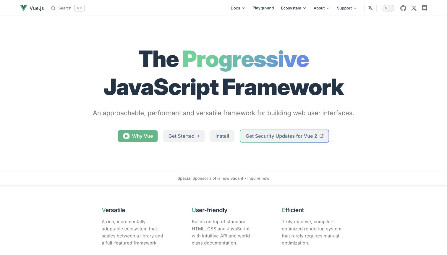
Vue's homepage centers a large gradient-accented heading on a spacious white field. Four actions distinguish an introductory video, guided learning, installation and legacy-version security information. The compact navigation groups documentation, ecosystem and support material without exposing the whole library at once. Below the hero, short conceptual columns continue the explanation before sponsor and reference links, creating a calm introduction to a substantial technical ecosystem.
What you can learn
Use a custom VitePress theme to establish a clear project identity while preserving conventional documentation entrances. The important distinction here is between understanding the framework and preparing an environment, not between two decorative button styles. Keep legacy-support routes accurately labeled and separate from current setup. Evaluate the collapsed menus and ordinary text links with keyboard and zoom testing, since generous desktop whitespace does not establish that the same hierarchy works at every size.
Pros
The opening distinguishes learning, installation and older-version support.
A concise typographic identity leaves the main actions readable without a large media dependency.
Cons & considerations
Several equally visible actions can require more context for a completely unfamiliar visitor.
Sponsor messaging needs a stable place so temporary changes do not disrupt the introductory hierarchy.
Platform source: Current public document generator. The current public document inspected on 2026-11-06 declares meta[name="generator"] content="VitePress v2.0.0-alpha.17". This is evidence for the captured publishing property only; it does not identify the implementation of the software documented, every organizational website, private build configuration or measured performance. Platform evidence is separate from the direct website screenshot and is not a complete current infrastructure audit.
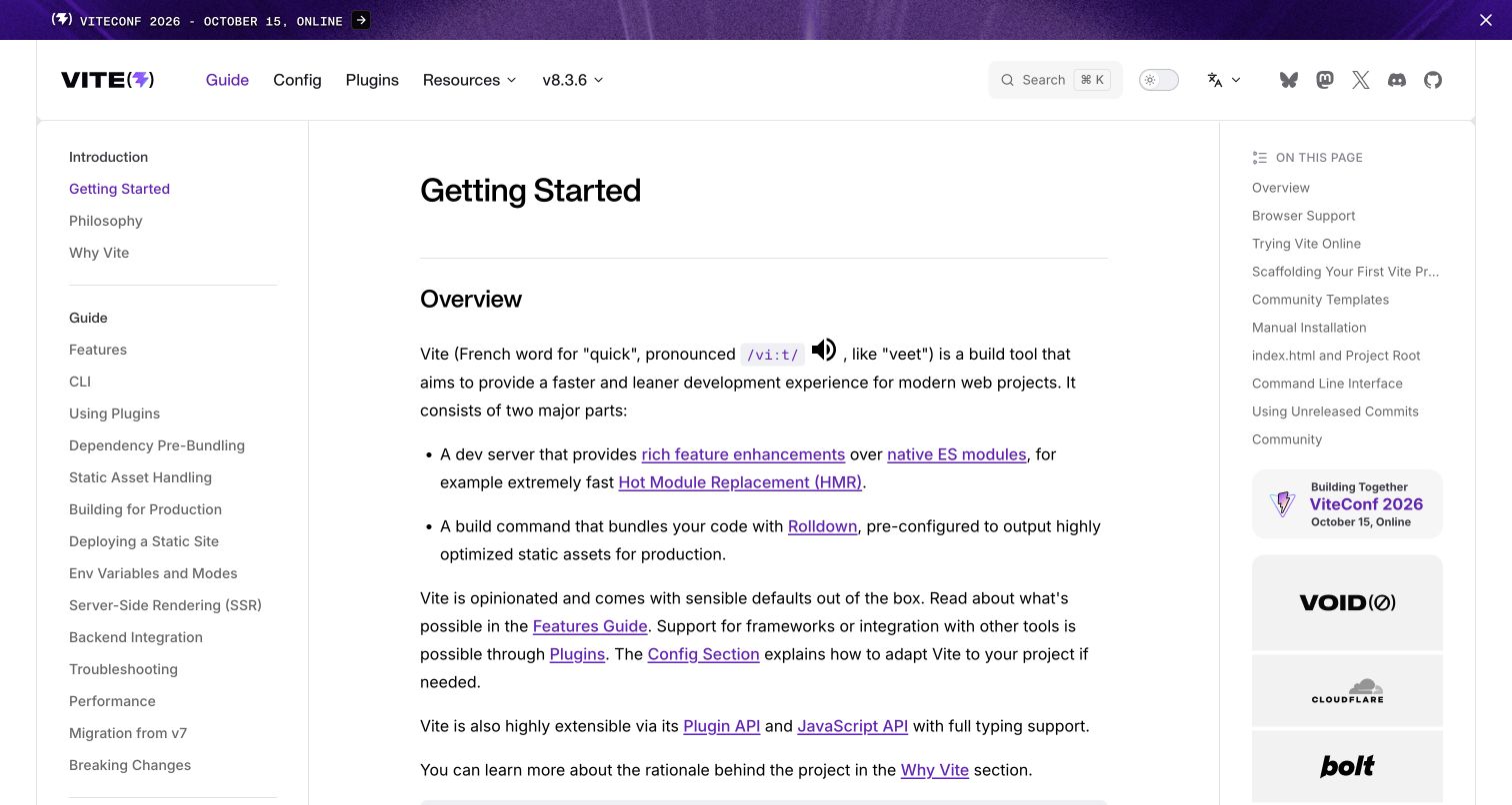
Vite's Getting Started page uses three columns: a detailed topic sidebar, the article and an on-page outline with sponsor blocks below it. The header separates guide, configuration and plugins while retaining release and language controls. The article begins with an overview before setup options. A conference banner remains visible above everything, illustrating how temporary event messaging shares space with enduring documentation.
What you can learn
Design the article layout for readers arriving directly from search, not only for someone progressing from the homepage. VitePress offers a familiar content shell, but the sidebar and article outline need distinct jobs and readable widths. Keep temporary conference content independently maintainable, especially after the event date. Preserve release context around setup and migration links so the publishing framework's version is never confused with the build tool version selected by the reader.
Pros
The sidebar exposes practical integration and troubleshooting topics.
The article outline lets readers jump past introductory material to a specific setup step.
Cons & considerations
Two side columns can constrain long technical examples on medium-width screens.
Event and sponsor content needs review so it does not displace task-critical guidance indefinitely.
Platform source: Current public document generator. The current public document inspected on 2026-11-06 declares meta[name="generator"] content="VitePress v2.0.0-alpha.21". This is evidence for the captured publishing property only; it does not identify the implementation of the software documented, every organizational website, private build configuration or measured performance. Platform evidence is separate from the direct website screenshot and is not a complete current infrastructure audit.
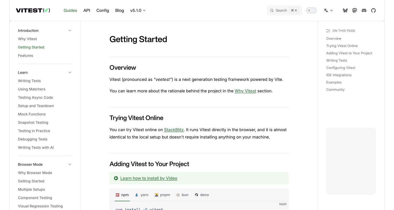
Vitest separates Guides, API, Config and Blog in a restrained header. Its left outline groups introduction, learning, browser mode and later authoring topics, while the current article offers an overview, online trial and local installation. A green video-learning callout sits near the package-manager tabs. The first page combines conceptual orientation with a concrete setup path without abandoning the wider curriculum.
What you can learn
Use VitePress sidebar groups to distinguish a learning sequence from advanced capability areas. Keep an article's own outline shorter than the full topic taxonomy so the two do not compete. Offer video as another explanation of a maintained setup process rather than as the only instruction. When commands vary by package manager, test tab labels and selected states with keyboard navigation, and ensure the local-install path remains understandable without opening the online trial.
Pros
The taxonomy distinguishes learning fundamentals from browser-mode and authoring material.
Online and local setup options are both introduced within the same readable article.
Cons & considerations
A very long sidebar can make the current learning position harder to retain.
Video callouts and command tabs need consistent focus and responsive behavior near the first-screen boundary.
Platform source: Current public document generator. The current public document inspected on 2026-11-06 declares meta[name="generator"] content="VitePress v2.0.0-alpha.20". This is evidence for the captured publishing property only; it does not identify the implementation of the software documented, every organizational website, private build configuration or measured performance. Platform evidence is separate from the direct website screenshot and is not a complete current infrastructure audit.
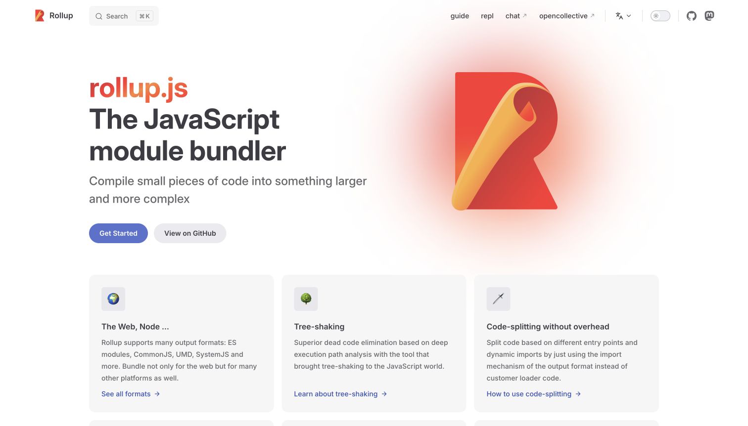
Rollup places a concise introduction beside its folded red-and-yellow mark. Get Started and GitHub form a clear primary pair, and the header keeps guide and REPL links simple. Cards below introduce output formats, tree-shaking and code splitting, each with its own deeper link. The page has recognizable VitePress proportions, but the chosen concepts make the opening specific to the bundler rather than a generic software landing page.
What you can learn
Use the standard home layout to create a small conceptual index rather than an unstructured benefit grid. Each card should point into the maintained explanation or reference that supports it. Keep the REPL clearly distinguishable from documentation and provide ordinary text context if it cannot load. Review the card order against actual newcomer questions; familiar terminology for maintainers may not be the same terminology someone uses when selecting a bundler for the first time.
Pros
Feature cards connect introductory concepts to specific deeper destinations.
The restrained header avoids making every reference topic a top-level menu item.
Cons & considerations
Technical concepts such as tree-shaking may need plain-language context for newcomers.
If the feature grid grows, the initial learning route can become less obvious than individual reference links.
Platform source: Current public document generator. The current public document inspected on 2026-11-06 declares meta[name="generator"] content="VitePress v1.6.4". This is evidence for the captured publishing property only; it does not identify the implementation of the software documented, every organizational website, private build configuration or measured performance. Platform evidence is separate from the direct website screenshot and is not a complete current infrastructure audit.
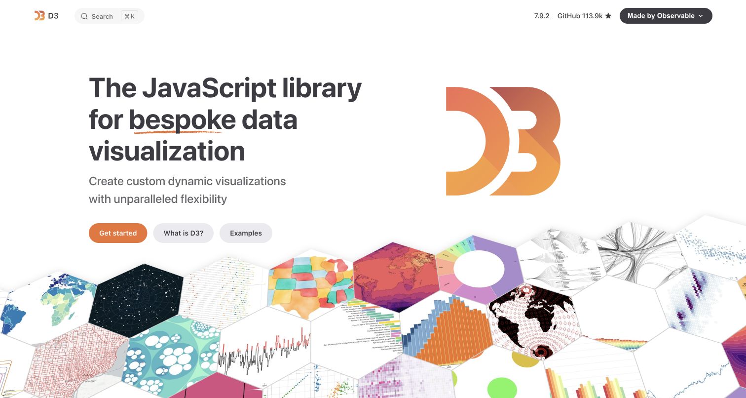
D3 combines a bold introduction with an extensive mosaic of visualization examples. Get Started, What Is D3 and Examples distinguish implementation, conceptual explanation and inspiration. The header is sparse, with search, release information and project links rather than a long documentation menu. The gallery makes the library's visual breadth apparent, while links lead outward to the corresponding Observable examples.
What you can learn
A VitePress property can use a custom theme to foreground the work a library makes possible. Keep the gallery separate from a complete written introduction and a dependable getting-started route. Label external example transitions and preserve attribution, because a gallery link is not necessarily part of the local documentation tree. Provide meaningful alternatives for visual examples and evaluate image loading, motion and focus order rather than assuming that an attractive mosaic is an accessible learning resource.
Pros
The three primary actions acknowledge distinct reading and exploration goals.
The example mosaic shows visual variety without requiring a long feature inventory.
Cons & considerations
A dense gallery can increase media cost and distract from the first implementation step.
External examples need clear context and accessible descriptions beyond their thumbnail appearance.
Platform source: Current public document generator. The current public document inspected on 2026-11-06 declares meta[name="generator"] content="VitePress v1.6.4". This is evidence for the captured publishing property only; it does not identify the implementation of the software documented, every organizational website, private build configuration or measured performance. Platform evidence is separate from the direct website screenshot and is not a complete current infrastructure audit.
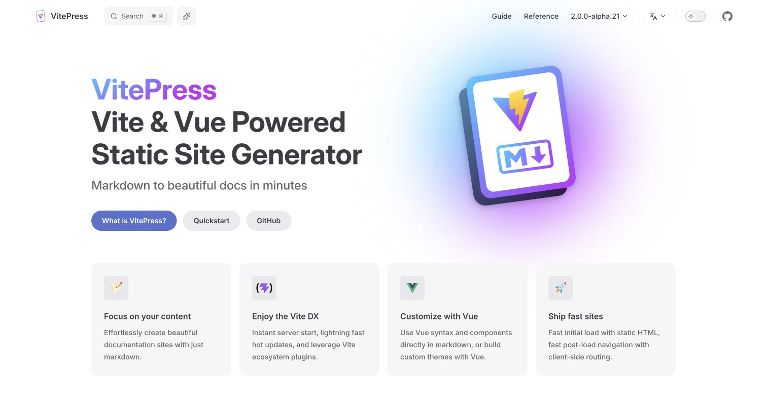
VitePress's own homepage pairs a large publishing-tool introduction with a colorful book-like illustration. What Is VitePress, Quickstart and GitHub give distinct next steps. Four compact feature cards summarize authoring, the development workflow, Vue customization and delivery. The header separates Guide and Reference while showing the selected release context. It is a concise demonstration of the visual vocabulary many other examples extend.
What you can learn
Start with the default theme as a useful baseline, then customize only where a real reading task benefits. VitePress can combine Markdown content with Vue components, but that capability does not require an interactive element on every page. Keep guide and configuration reference separate, and document which framework release the site actually targets. Product copy about speed should become a project testing question, not an assumed performance result for any site using the generator.
Pros
The three hero actions distinguish explanation, setup and source exploration.
A small feature set makes the page easy to scan before entering the documentation.
Cons & considerations
A familiar default composition may need more product-specific context to feel distinctive.
An alpha release label requires deliberate dependency and upgrade decisions rather than automatic adoption.
Platform source: Current public document generator. The current public document inspected on 2026-11-06 declares meta[name="generator"] content="VitePress v2.0.0-alpha.21". This is evidence for the captured publishing property only; it does not identify the implementation of the software documented, every organizational website, private build configuration or measured performance. Platform evidence is separate from the direct website screenshot and is not a complete current infrastructure audit.
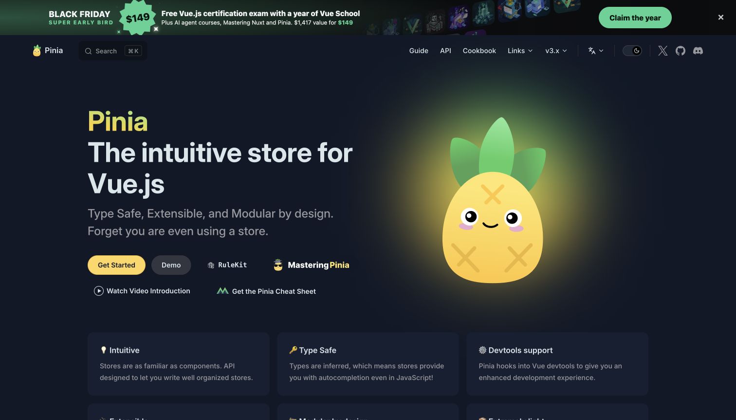
Pinia uses a large pineapple character against a dark background, with an introduction and prominent Get Started action. Guide, API and Cookbook remain separate in the header. The opening also includes demos, courses and cheat-sheet links, and the captured state contains a large training promotion above the navigation. The mascot creates a memorable identity, while the surrounding links show how quickly useful secondary resources can accumulate.
What you can learn
Preserve the distinction between official documentation, interactive examples and external training. VitePress's home actions and feature cards provide room for those routes, but each new link should earn its place in the hierarchy. Keep the primary learning action visible when promotional banners appear, and give campaigns an expiry owner. Check dark-theme contrast for supporting copy and feature cards rather than evaluating only the bright mascot and main heading.
Pros
Guide, API and Cookbook labels distinguish different implementation needs.
The mascot gives a focused technical library a recognizable visual identity.
Cons & considerations
Training promotions and several secondary actions can compete with the main start path.
Dark cards and muted text require contrast checks beyond the most prominent hero elements.
Platform source: Current public document generator. The current public document inspected on 2026-11-06 declares meta[name="generator"] content="VitePress v1.6.4". This is evidence for the captured publishing property only; it does not identify the implementation of the software documented, every organizational website, private build configuration or measured performance. Platform evidence is separate from the direct website screenshot and is not a complete current infrastructure audit.
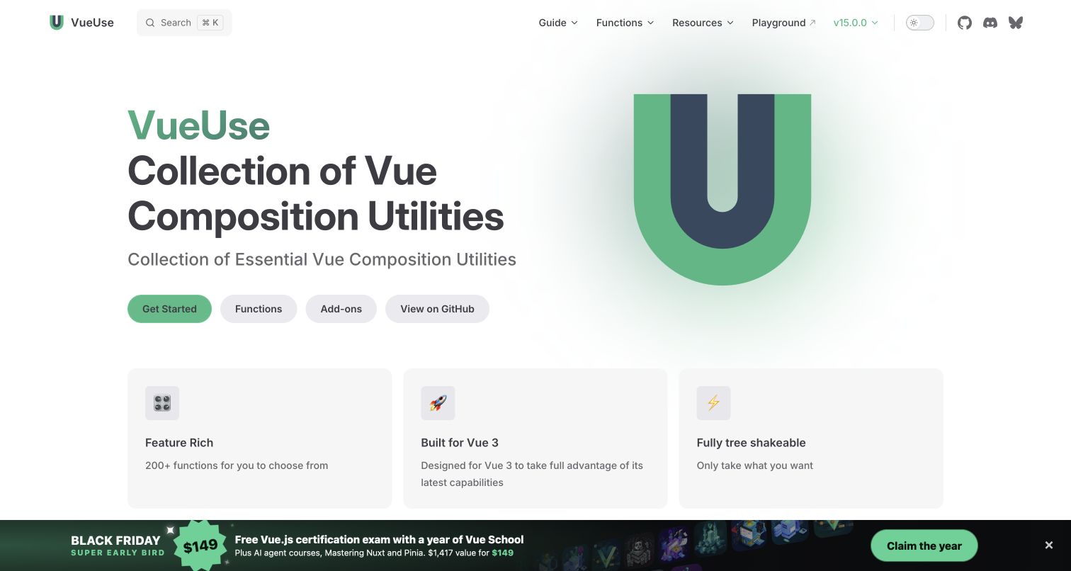
VueUse introduces its collection with a large green mark and a concise description. Get Started, Functions, Add-ons and GitHub appear as separate actions, while the top navigation includes a playground and current release. Feature cards summarize the library before a larger sponsor area. A bottom training campaign is visible in the capture, showing how promotional content coexists with the otherwise restrained documentation gateway.
What you can learn
Give a large utility library a direct catalog route instead of forcing every reader through introductory guidance. VitePress can keep the home page compact while supporting a much deeper function index. Maintain add-ons as a distinct scope, and make external playground transitions clear. Test the persistent campaign alongside mobile navigation and function search; a useful supporting resource should not obscure the exact lookup task that brings a returning reader to the property.
Pros
Functions and Add-ons receive direct entrances beside general onboarding.
The playground and release context remain visible without expanding the complete utility catalog.
Cons & considerations
Several nearly equal hero actions can weaken the default path for a new user.
A persistent bottom promotion needs collision checks with narrow-screen menus and documentation controls.
Platform source: Current public document generator. The current public document inspected on 2026-11-06 declares meta[name="generator"] content="VitePress v2.0.0-alpha.21". This is evidence for the captured publishing property only; it does not identify the implementation of the software documented, every organizational website, private build configuration or measured performance. Platform evidence is separate from the direct website screenshot and is not a complete current infrastructure audit.
UnoCSS's guide begins with a plain explanation followed by a configuration example, a sample element and the resulting CSS. A left outline distinguishes core guidance from framework integrations, and the header separately groups configuration and presets. The right outline is short and article-specific. The page explains a transformation through compact examples rather than beginning with a long list of abstract configuration options.
What you can learn
Use VitePress code blocks to build a progressive explanation: configuration, usage and result should stay visibly connected. Give integrations their own grouping so they do not overwhelm the core learning path. Keep filename labels and language labels meaningful, and test code selection, copy behavior and horizontal overflow. The documentation platform association concerns this guide; it does not establish that every example integration or generated stylesheet uses VitePress.
Pros
The example sequence shows how a rule connects to visible output.
Integration routes are grouped separately from the basic guide.
Cons & considerations
A long integration list can consume substantial sidebar space as the ecosystem expands.
Pale syntax colors and long configuration lines need zoom and contrast testing.
Platform source: Current public document generator. The current public document inspected on 2026-11-06 declares meta[name="generator"] content="VitePress v2.0.0-alpha.21". This is evidence for the captured publishing property only; it does not identify the implementation of the software documented, every organizational website, private build configuration or measured performance. Platform evidence is separate from the direct website screenshot and is not a complete current infrastructure audit.
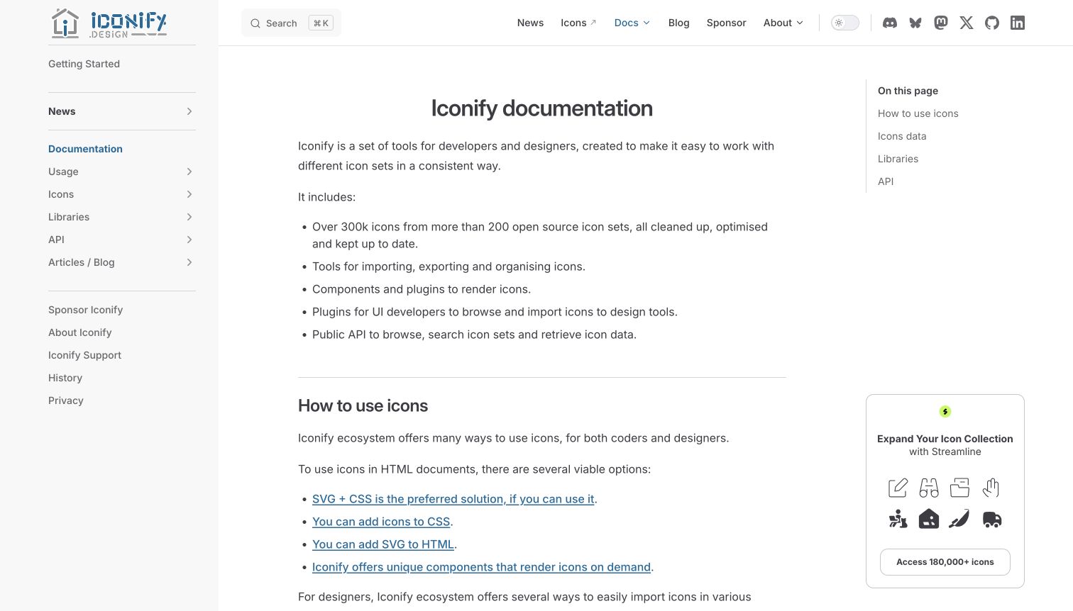
Iconify's documentation opens with a concise ecosystem explanation and a bullet list of capabilities. The left navigation separates usage, icons, libraries and API material, while a small right outline previews those same article sections. Ordinary linked recommendations follow beneath the introduction. A sponsor panel occupies the lower right, but the main page remains predominantly text-led rather than a large icon gallery.
What you can learn
Explain an ecosystem's parts before asking readers to choose a package. VitePress can support this with a structured introduction and category navigation, but the categories need stable meaning across the sidebar and article. Keep design-tool audiences and coding audiences recognizable without maintaining contradictory overviews. Ensure recommendations link to maintained details, and assess sponsor panels at intermediate widths where the article may already be squeezed between two navigation columns.
Pros
The initial capability list makes the ecosystem's scope understandable.
Usage, data, libraries and API have distinct navigation roles.
Cons & considerations
A broad ecosystem overview can still require a clearer first-use recommendation.
An additional sponsor column needs responsive testing so it does not narrow technical content excessively.
Platform source: Current public document generator. The current public document inspected on 2026-11-06 declares meta[name="generator"] content="VitePress v1.6.4". This is evidence for the captured publishing property only; it does not identify the implementation of the software documented, every organizational website, private build configuration or measured performance. Platform evidence is separate from the direct website screenshot and is not a complete current infrastructure audit.
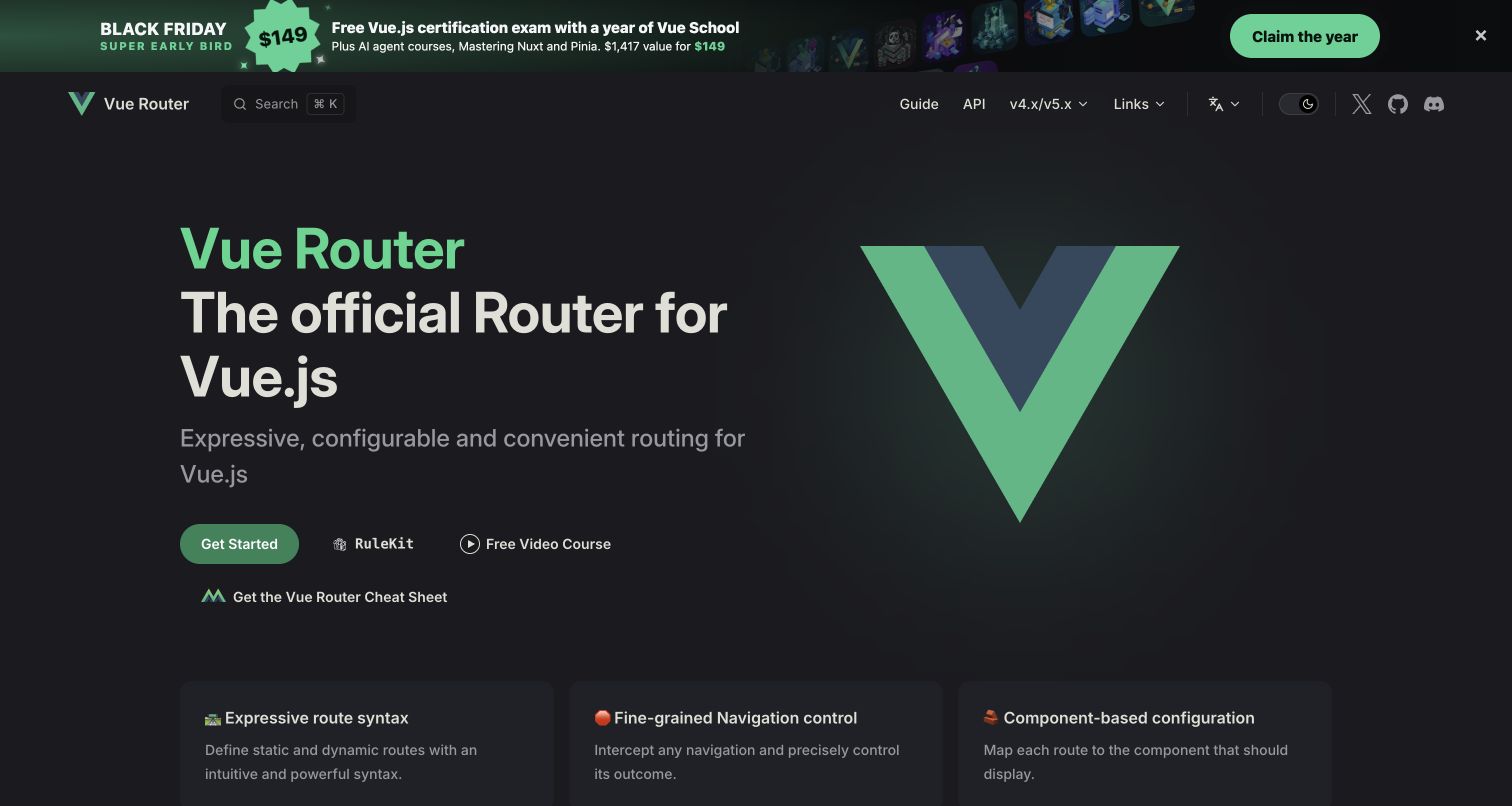
Vue Router pairs a large Vue mark with a concise description of its role. Get Started is the principal action, while training and cheat-sheet links sit nearby. The header is unusually compact, separating Guide and API alongside a version-family selector. The captured dark theme includes a substantial campaign banner above the header and feature cards below, placing practical navigation within a recognizable ecosystem identity.
What you can learn
For an official ecosystem package, familiar branding can reduce orientation work, but compatibility context still needs explicit text. Use VitePress navigation to distinguish the guide from exact API lookup, and keep the version-family selector understandable when several majors share one property. External training should remain optional and visibly separate. Test whether a campaign header changes the position of important controls or crowds the first installation link on shorter screens.
Pros
Guide and API remain clear even with a very small top-level menu.
The introduction immediately establishes the package's relationship to Vue.
Cons & considerations
Multiple secondary education links can complicate a simple installation decision.
A version-family selector needs precise labeling when readers support different application generations.
Platform source: Current public document generator. The current public document inspected on 2026-11-06 declares meta[name="generator"] content="VitePress v2.0.0-alpha.20". This is evidence for the captured publishing property only; it does not identify the implementation of the software documented, every organizational website, private build configuration or measured performance. Platform evidence is separate from the direct website screenshot and is not a complete current infrastructure audit.
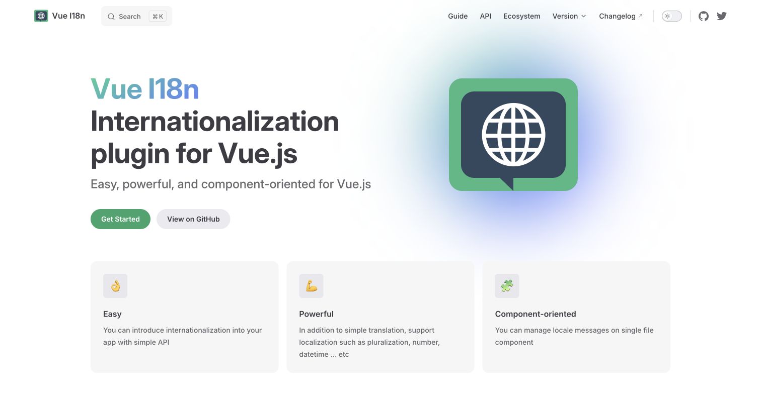
Vue I18n places its localization identity beside a globe-like illustration, followed by three feature columns. Get Started and GitHub are the main actions. The header separates Guide, API and Ecosystem, and provides a version menu and changelog link. The composition is familiar, but its description names internationalization directly rather than requiring visitors to decode the product name or illustration.
What you can learn
Use VitePress's familiar home structure to make a specialist capability approachable. Define the problem in plain language before presenting detailed syntax, then keep API and ecosystem material distinct from the initial guide. A localization product's documentation also needs its own language and version strategy; do not assume that the presence of localization features in the product means every documentation language is available or maintained. Test explanatory examples with realistic text length and characters.
Pros
The introduction states the plugin's purpose without relying only on its acronym.
Guide, API and ecosystem resources are distinct top-level destinations.
Cons & considerations
Generic feature adjectives need supporting examples to become useful selection criteria.
Version choices and translated examples require maintenance so readers do not mix incompatible instructions.
Platform source: Current public document generator. The current public document inspected on 2026-11-06 declares meta[name="generator"] content="VitePress v1.5.0". This is evidence for the captured publishing property only; it does not identify the implementation of the software documented, every organizational website, private build configuration or measured performance. Platform evidence is separate from the direct website screenshot and is not a complete current infrastructure audit.
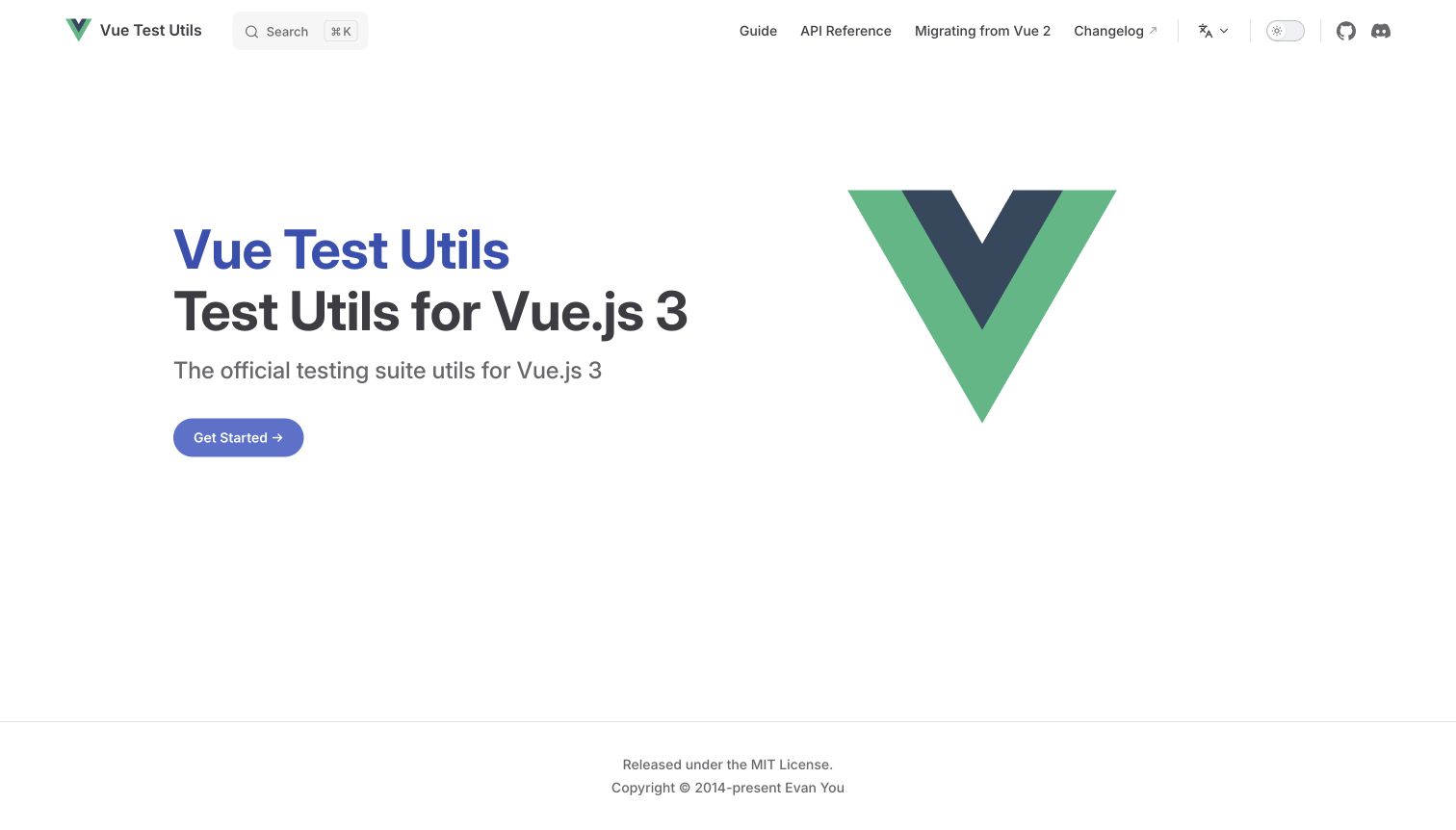
Vue Test Utils uses a sparse white page with a large Vue symbol and one Get Started action. The heading explicitly states the Vue generation it addresses. Guide, API Reference and migration information are separate in the header, with a changelog link nearby. There is little competing promotion or media, making the page a compact gateway into a practical technical library.
What you can learn
A focused VitePress property does not need a long feature grid simply to fill the homepage. State scope clearly, provide the main learning path and retain exact reference and migration routes for experienced users. Evaluate the minimal page by whether those routes are understandable, not by the amount of content displayed. Keep the stated framework generation aligned with deeper examples, and test direct API entries because many returning readers will bypass the quiet introduction entirely.
Pros
The supported Vue generation is explicit in the main introduction.
Migration guidance receives a persistent route instead of being buried in release news.
Cons & considerations
A minimal explanation may leave a newcomer needing more context about when to use the tool.
Large empty areas should be reconsidered if critical setup prerequisites are currently one click away.
Platform source: Current public document generator. The current public document inspected on 2026-11-06 declares meta[name="generator"] content="VitePress v1.6.4". This is evidence for the captured publishing property only; it does not identify the implementation of the software documented, every organizational website, private build configuration or measured performance. Platform evidence is separate from the direct website screenshot and is not a complete current infrastructure audit.
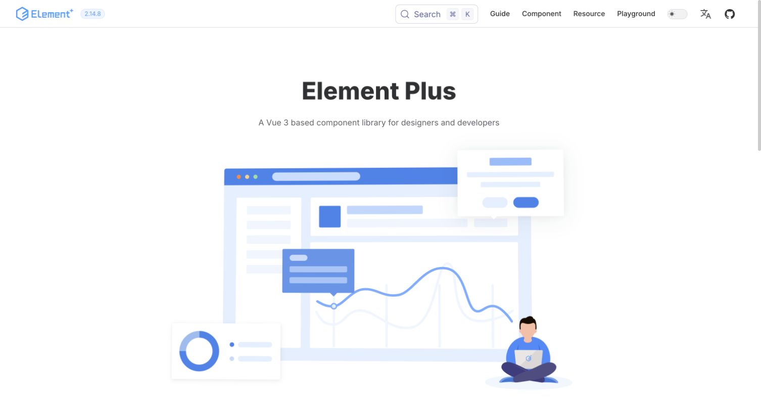
Element Plus introduces a Vue-based component library with a large, pale interface illustration. Guide, Component, Resource and Playground are clearly separated in the header, alongside release, search and language controls. The full page continues into sponsor and resource sections. Its first screen emphasizes the broad interface-system identity, while the navigation provides more practical routes to individual components and design guidance.
What you can learn
A custom VitePress theme can support both design principles and implementation references without making them one undifferentiated library. Keep component lookup directly available and explain what belongs in the resource section. Provide meaningful text context for an illustrative interface that cannot itself be operated. Test the language selector, theme switch and component examples together; an accessible publishing shell does not automatically establish the accessibility of every documented widget or external playground.
Pros
Design guidance, components and supporting resources have separate entrances.
Release and language controls remain available without crowding the main library name.
Cons & considerations
A very large decorative illustration can postpone practical examples on short screens.
Pale illustration details and small release text need contrast and zoom review.
Platform source: Current public document generator. The current public document inspected on 2026-11-06 declares meta[name="generator"] content="VitePress v1.6.4". This is evidence for the captured publishing property only; it does not identify the implementation of the software documented, every organizational website, private build configuration or measured performance. Platform evidence is separate from the direct website screenshot and is not a complete current infrastructure audit.
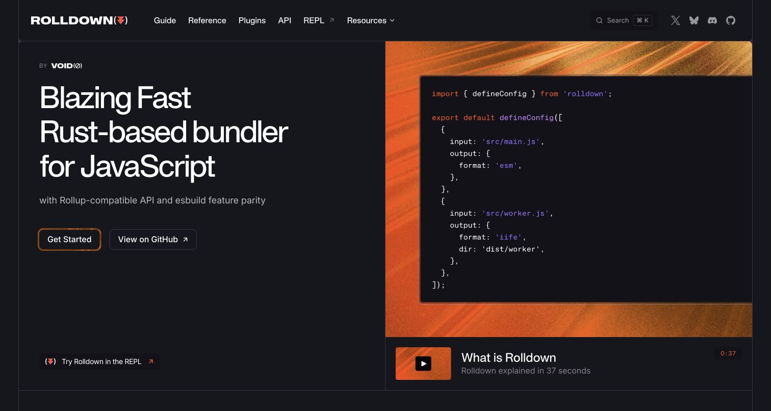
Rolldown uses a dark two-column composition: the product introduction and actions sit left, while a large code panel sits over an orange image on the right. A short explanatory-video link follows the example. Guide, Reference, Plugins and API each have their own header label, with an external REPL nearby. The custom appearance differs substantially from a default documentation home while preserving ordinary reading routes.
What you can learn
Use a custom VitePress layout to show a concrete configuration, not merely a dramatic claim. Keep the code selectable or provide an equivalent text example and maintain a direct start path when media is unavailable. Distinguish the guide, API and configuration reference in the content model before reproducing all four menu labels. Any performance comparison needs its own methodology and date; the website's visual confidence is not independent benchmark evidence.
Pros
The example panel connects the product introduction to a realistic configuration shape.
Detailed documentation areas remain available despite the heavily customized visual design.
Cons & considerations
Large split-screen media can reduce code readability on smaller viewports.
Performance-oriented messaging needs linked context so readers do not generalize beyond the stated comparison.
Platform source: Current public document generator. The current public document inspected on 2026-11-06 declares meta[name="generator"] content="VitePress v2.0.0-alpha.21". This is evidence for the captured publishing property only; it does not identify the implementation of the software documented, every organizational website, private build configuration or measured performance. Platform evidence is separate from the direct website screenshot and is not a complete current infrastructure audit.
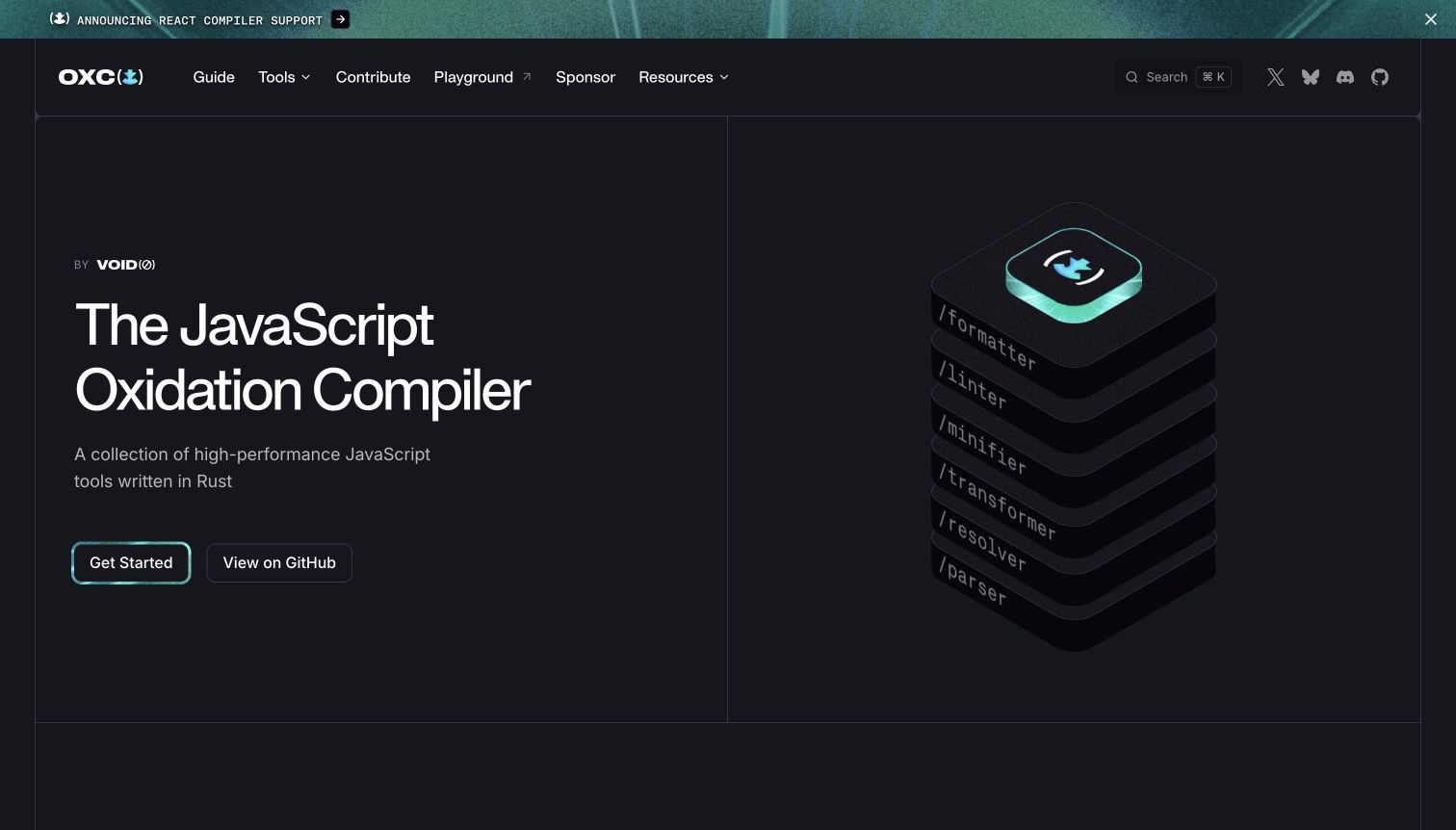
Oxc presents a dark introduction beside stacked tool layers labeled for different compiler responsibilities. Guide and Tools are distinct in the header, with contribution and playground routes also visible. Lower sections expand individual tools through examples and capability summaries. The illustration helps communicate that the project contains several related pieces rather than one single-purpose command, while the main start action remains simple.
What you can learn
Let a VitePress custom theme explain a project family without forcing every tool into the first heading. Map each layer of the visual metaphor to a maintained description and useful next link. Keep contribution and experimentation separate from user setup. Provide static text that names the tools if the illustration cannot be perceived, and date technical comparisons explicitly rather than treating an observed generator or an attractive diagram as proof of claimed runtime behavior.
Pros
The stacked illustration gives a broad tool family a coherent visual model.
Guide, tool discovery and contribution routes acknowledge different visitor roles.
Cons & considerations
A family-level introduction may still need guidance on which tool a newcomer should begin with.
Detailed benchmark claims lower on the page require maintained source and environment context.
Platform source: Current public document generator. The current public document inspected on 2026-11-06 declares meta[name="generator"] content="VitePress v2.0.0-alpha.20". This is evidence for the captured publishing property only; it does not identify the implementation of the software documented, every organizational website, private build configuration or measured performance. Platform evidence is separate from the direct website screenshot and is not a complete current infrastructure audit.
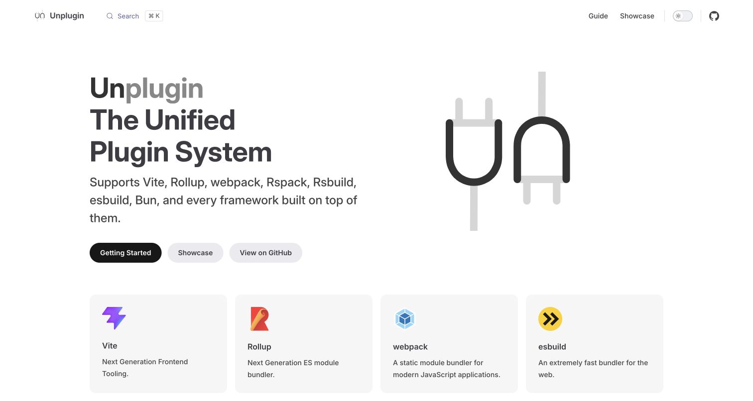
Unplugin combines a black plug illustration with a concise description of a unified plugin system. Getting Started, Showcase and GitHub are separate actions. A row of supported-tool cards follows, connecting recognizable ecosystem names to ordinary links. The header is particularly restrained, using only Guide and Showcase beside search and project controls, so the main concept is not lost in a large reference menu.
What you can learn
Use a VitePress home page to communicate compatibility, then send readers to maintained details rather than implying every target behaves identically. Give showcase projects a clear role distinct from API guidance. Keep supported-tool labels and links under active ownership as the ecosystem changes. The logos here describe Unplugin's intended integrations; they are not evidence that those other projects use VitePress or share the publishing technology of this documentation property.
Pros
The three actions distinguish learning, examples and source inspection.
A small top-level menu leaves the compatibility explanation easy to scan.
Cons & considerations
A long list of supported targets needs detail about actual differences and limitations.
Logo cards can be mistaken for technology-stack evidence unless their integration role is clear.
Platform source: Current public document generator. The current public document inspected on 2026-11-06 declares meta[name="generator"] content="VitePress v2.0.0-alpha.15". This is evidence for the captured publishing property only; it does not identify the implementation of the software documented, every organizational website, private build configuration or measured performance. Platform evidence is separate from the direct website screenshot and is not a complete current infrastructure audit.
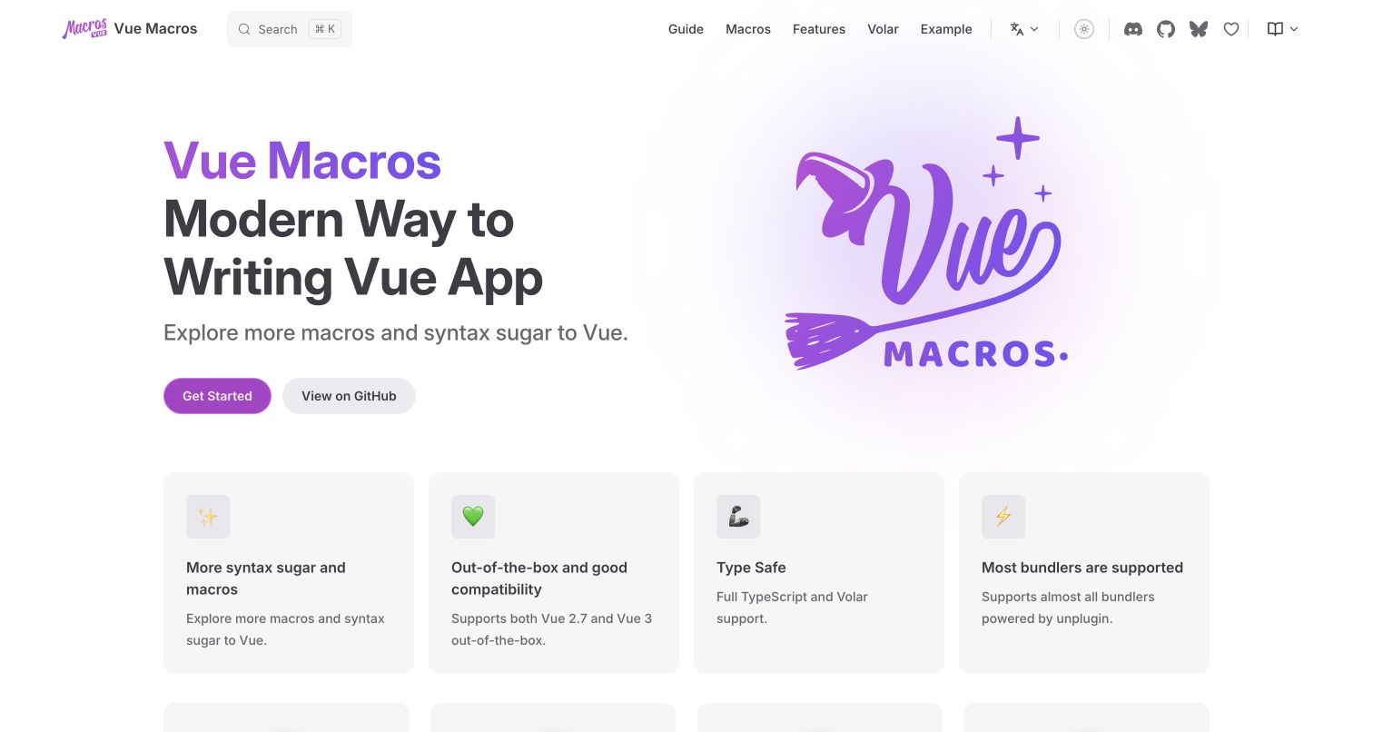
Vue Macros uses purple lettering and a wizard-like illustration to give syntax extensions a playful identity. The header separates Guide, Macros, Features, Volar and Example, while the main actions focus on starting and source. Capability cards follow, then named contributors. The subject is specialized, but the introductory description and recognizable Vue reference help establish context before readers encounter individual macro names.
What you can learn
Use VitePress navigation to expose the conceptual difference between setup, a macro catalog and editor integration. The colorful identity should support, not replace, compatibility explanations and maintained examples. Keep an interactive example optional and give contributors an appropriate supporting role. Review any enhanced-readability control with real content and keyboard testing; adding an accessibility-related option is not by itself evidence that every article, theme state or code block is accessible.
Pros
The navigation separates macro reference from setup and editor-related guidance.
Named contributors give the community project a concrete human context.
Cons & considerations
Several specialist menu labels may need clearer explanations for first-time readers.
Playful branding should not obscure version and compatibility details deeper in the documentation.
Platform source: Current public document generator. The current public document inspected on 2026-11-06 declares meta[name="generator"] content="VitePress v2.0.0-alpha.12". This is evidence for the captured publishing property only; it does not identify the implementation of the software documented, every organizational website, private build configuration or measured performance. Platform evidence is separate from the direct website screenshot and is not a complete current infrastructure audit.
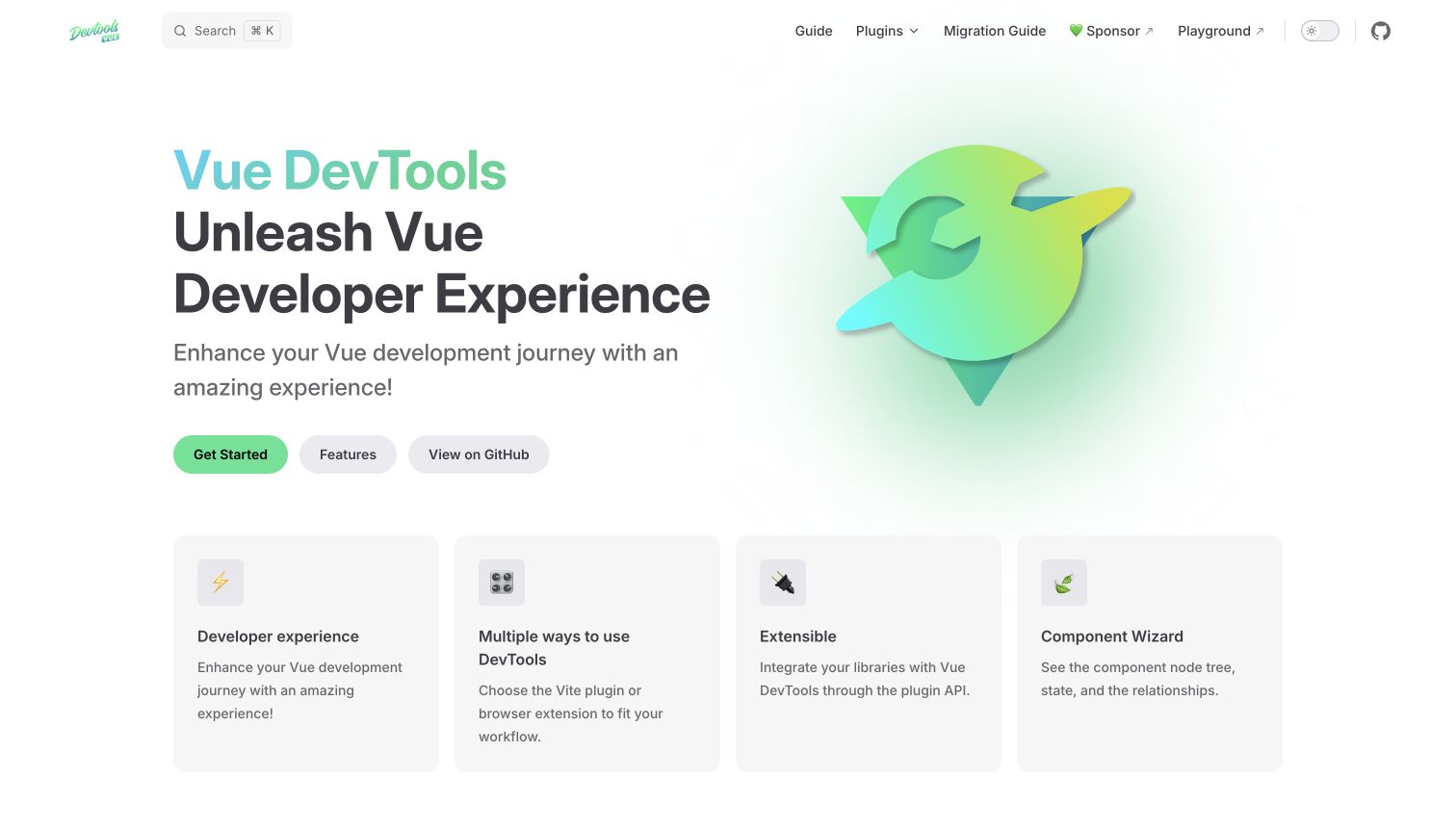
Vue DevTools uses a green-and-blue symbol beside a large introduction and three main actions: Get Started, Features and GitHub. The header adds Plugins, Migration Guide and an external playground. Feature cards name different ways to use the tool and its extension model. The design remains close to a familiar documentation landing page, but the selected routes acknowledge both ordinary users and library integrators.
What you can learn
Define the adoption decision before writing a single generic installation page. A VitePress property can share introductory content while routing browser-extension users, plugin users and integrators to different maintained instructions. Keep migration information easy to find for returning users. Treat the playground as an optional demonstration and preserve the same practical explanation without it. Feature cards should lead to concrete information rather than repeating only broad claims about an improved developer experience.
Pros
Migration guidance has a persistent place in the main navigation.
Feature and plugin routes recognize users evaluating different ways to adopt the tool.
Cons & considerations
Broad introductory copy may need more concrete context for visitors unfamiliar with developer tools.
Several installation methods require clear branching so readers do not combine incompatible setup steps.
Platform source: Current public document generator. The current public document inspected on 2026-11-06 declares meta[name="generator"] content="VitePress v2.0.0-alpha.20". This is evidence for the captured publishing property only; it does not identify the implementation of the software documented, every organizational website, private build configuration or measured performance. Platform evidence is separate from the direct website screenshot and is not a complete current infrastructure audit.
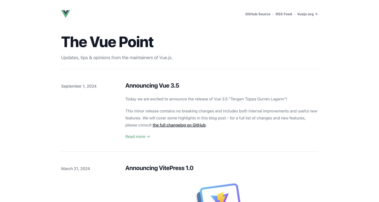
The Vue Point uses a simple masthead, a short description and a chronological article list. Publication dates sit beside post titles and excerpts, while source, RSS and the main Vue site are available in the small header. Unlike the documentation examples, the captured page has no large sidebar or feature grid. The visible leading articles retain their original dates, making the page clearly an editorial archive rather than a current-version reference.
What you can learn
VitePress can publish an editorial site through a custom layout without reproducing its documentation theme. Preserve publication dates and link announcements to maintained references when instructions may age. Keep RSS and source links available for repeat readers. Do not automatically advance old release dates or present the newest visible archive item as the current software release. This approach is useful when project news and evergreen setup material have different owners and update rhythms.
Pros
Visible dates make the age and sequence of announcements understandable.
The small header provides repeat-use routes without overwhelming the article archive.
Cons & considerations
An infrequently updated archive may need clearer links to current documentation and release status.
Long excerpts can reduce scanning efficiency when the archive grows substantially.
Platform source: Current public document generator. The current public document inspected on 2026-11-06 declares meta[name="generator"] content="VitePress v1.3.4". This is evidence for the captured publishing property only; it does not identify the implementation of the software documented, every organizational website, private build configuration or measured performance. Platform evidence is separate from the direct website screenshot and is not a complete current infrastructure audit.
Kegan has 15+ years of experience working with small businesses, Fortune 500 companies, and everything in between. No development job is too big or too small: he brings the same hands-on attention to a focused improvement, a complete website, or a custom application.
For VitePress projects, he can help with responsive interfaces, reusable components, custom functionality, API connections, and performance-minded implementation. He works directly with clients on scope, design, implementation, testing, and handover, with an emphasis on clear communication and a system that remains practical to maintain after launch.
Show 3 other VitePress developersHide other VitePress developers
Choose the smallest publishing structure that serves the material
An article-first technical library
Vite, Vitest, UnoCSS and Iconify keep topic navigation and article outlines visible around substantive introductions. Plan both columns around reader tasks, and keep code readable at intermediate widths.
A distinctive project front door
D3, Rolldown and Oxc show how a custom introduction can explain visual work, a code configuration or a tool family. Preserve a dependable written route into documentation when those richer presentations are unavailable.
An editorial property with its own rhythm
The Vue Point separates a dated article archive from the main reference site. Keep announcement dates intact and link readers toward maintained material when historical instructions no longer describe the current release.
From references to requirements
Plan the content and rendering boundaries together
Write the navigation brief before the hero
List first-use, lookup, migration and contribution journeys. Decide what belongs in global navigation, a sidebar and an article outline. A list of every package feature is not a substitute for a useful documentation taxonomy.
Specify custom-component fallbacks
VitePress pre-renders custom theme code during the production build. Its SSR guidance explains browser-only code boundaries and client-only components. Review third-party editors, charts and widgets accordingly, and ensure the page explains its subject before an optional demo initializes.
Test actual publication and return visits
Verify clean-URL behavior on the chosen host, direct deep links, missing pages, language changes, command tabs, search, keyboard focus and browser history. Include old open tabs and a failed optional asset. Keep temporary event, training and sponsor content separately maintainable.
A useful handover demonstration
Ask the actual team to carry out its routine job: publish a realistic update, correct a mistake, preview a narrow screen, and identify who owns an integration failure. For a library or frontend framework, also ask who maintains the content source and deployment. A polished screenshot does not answer those operational questions.
Beyond the screenshot
VitePress project planning checklist
Separate onboarding, usage guides, migration and exact reference.
Define published routes before reorganizing Markdown files.
Choose default-theme extension or a fully custom layout deliberately.
Keep code and article text readable between side columns.
Provide static context for galleries, editors and external demos.
Review custom components for build-time and browser-time compatibility.
Test direct links, search, language changes and keyboard navigation.
Give promotions, release labels and dated announcements explicit owners.
Test with real content, a keyboard, a small screen, slow or failed requests, and the people who will maintain the system. These are planning checks, not an accessibility, security, performance, or search-ranking certification.
Sources & editorial method
How this VitePress collection was reviewed
Twenty official public properties were independently opened, inspected and directly captured in an ordinary browser on November 6 UTC. The current document's VitePress generator declaration was recorded with each capture, including its exact observed version string. Original reviews address visible design rather than inferring complete private architecture or runtime performance. Some examples share an ecosystem or project family, but each is a distinct public property with its own capture and editorial purpose. The Vue Point retains historical article dates; this review date does not turn them into current release announcements. No accounts, code installations, forms or external playground actions were submitted.
Every image is an unmodified capture from the actual website, with its source and capture date. Some captures are reused from our shared catalog; their dates remain the original capture dates. None comes from a vendor gallery or a generated reconstruction. Moving imagery and live content can change.
Technology attribution uses public page assets or metadata, official platform documentation, or a cited first-party project case study. Documentary and framework-relationship evidence is identified where used; it is not a complete current backend inventory. A CMS image CDN alone does not establish a full CMS deployment. A library’s presence does not prove which individual controls use it, and a platform label does not establish AI authorship.
The composition notes, lessons, pros and tradeoffs are original editorial observations. We have not measured conversion, traffic, security, performance or accessibility conformance. Website owners retain their brands and imagery; these examples are not our client portfolio. Written, Edited and Curated are independent records, not dates advanced by a build. See our editorial standards or suggest a correction.
Questions worth asking
VitePress website development FAQs
Do all VitePress sites need the default documentation appearance?
No. The official theme interface supports custom layouts or extension of the default theme. D3 and The Vue Point show how the same publisher can support a visual project introduction or an editorial archive.
Does a VitePress generator declaration prove the documented product is written in Vue?
No. It identifies the publishing property. A Rust-based tool or a JavaScript library can use a Vue-powered documentation site without changing its own implementation language.
Are good performance scores automatic?
No. The platform provides a rendering model, but actual results depend on content, custom code, third-party scripts and delivery. The screenshots and generator observations in this collection are not performance benchmarks.
What should be tested when embedding a live demo?
Check a meaningful static explanation, loading and failure behavior, keyboard focus, narrow screens and build-time compatibility. The official SSR guidance is relevant when a dependency expects browser APIs during import or rendering.
Choose VitePress for a content structure your team can maintain, then make visual customization serve the material. Reliable links, clear reading modes and well-scoped interactive examples matter more than reproducing a familiar homepage composition.