Best Postmark Websites of 2026 (20 Real-World Examples)
Twenty public websites and services with documented Postmark email workflows, original design reviews and carefully qualified source evidence.
A website often starts a conversation that email continues. The useful design question is how clearly people understand that handoff: what happened, what arrives next and where a reply belongs.
Postmark is an email service, so the examples in this collection are not pages visually built by Postmark. They are public websites for products whose account, transaction, notification or reply workflows are described in official customer cases. That distinction makes the collection more useful: a proposal tool, a ticket service and a community instance all need communication, but they introduce that communication in different ways.
The screenshots show the public design and the reviews explain decisions worth studying. The customer sources establish narrower email relationships, sometimes from an earlier product era. Minecraft's 2011 order confirmations and AgileBits' historical 1Password license delivery are explicitly historical; Mastodon.social is one named instance. A familiar brand or current-looking screenshot never establishes the entire present infrastructure.
Before the examples
What makes good Postmark website development in 2026?
Connect the message to a recognizable event
Start with the person's task. A booking confirmation, a proposal invitation and a password reset should make their cause clear before asking for another action. Give the website a useful confirmation state too, so the person knows what to expect while waiting. A carefully designed inbox message cannot compensate for an ambiguous action on the page.
Keep sending authority behind the application
Postmark's sending API uses a server token and requires a confirmed sender. Keep that authority in trusted server configuration, with the application deciding which event warrants a message and who should receive it. The public interface should expose a specific user task, not a general ability to choose arbitrary recipients or content.
Account recovery, transaction updates and recurring announcements serve different expectations. Postmark documents distinct message streams, including transactional and broadcast streams. Plan the categories before choosing templates, and make optional communication understandable at its point of entry. A shared delivery provider does not mean every recipient should receive every kind of message.
Postmark's delivery event means a receiving mail server accepted the message. It does not prove inbox placement, a human reading it or completion of a purchase or account task. Keep those states distinct in dashboards and support language. Accurate status is more useful than a reassuring label that claims more than the evidence shows.
These websites introduce collaboration, commerce, scheduling, community and specialist services. Each review pairs the public design with the specific email workflow supported by its source, including historical limits where they matter.
We start with five recognizable brands or organizations: Asana, 1Password, Minecraft, LiveChat, Mastodon.social. Each attribution applies to the named website property, not every product or website belonging to its organization. This is a curated reading sequence, not a measured ranking.
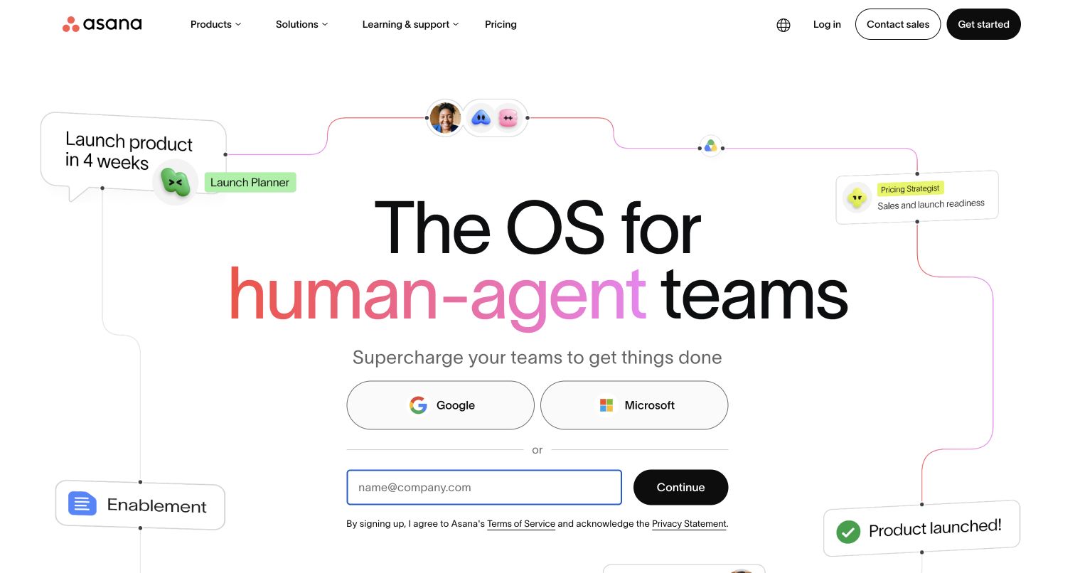
Asana presents work as a connected system. In the retained November 4 view, thin paths join a launch objective to planning roles and a finished outcome beneath a very large headline. The graphic turns an abstract collaboration promise into a sequence readers can follow, while familiar sign-in choices reduce uncertainty about entry. Postmark's historical Asana interview describes receiving task communications and sending email replies into the application. That two-way workflow is relevant to the coordination story, but it does not establish how the current AI features or marketing page operate. The useful reference is the visible relationship between tasks, people and next steps.
What you can learn
Show the connection between an initial request and a completed outcome. If email is another entrance to that workflow, preserve the same task context and make replies feel continuous with the application.
Pros
Connecting lines make a broad work-management proposition concrete without a dense feature table.
Familiar access options sit near the main promise rather than behind an unexplained journey.
Cons & considerations
The expansive hero delays detailed product choices and practical buying information.
Agent-oriented language may require additional explanation for visitors seeking conventional task management.
Platform source: Official Postmark customer case — scoped email workflow. Official Postmark customer case reviewed November 11, 2026. Two-way email for the public Asana collaboration product: customers receive task communication and send replies into the application. Historical vendor interview; not marketing-site runtime. Documented email-service association for the named public product, not evidence of this marketing page’s renderer or its complete current infrastructure. Historical case outcomes are not newly measured performance. Platform evidence is separate from the direct website screenshot and is not a complete current infrastructure audit.
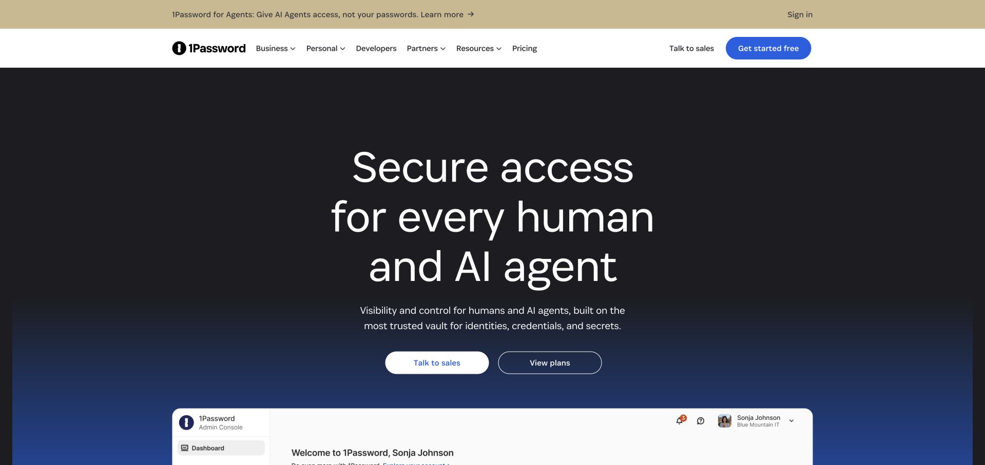
The retained November 9 opening places 1Password inside a dark blue field with a large access-management promise and two contrasting next steps. Business, personal and developer navigation helps separate audiences before the enterprise console preview appears below. An announcement about agents broadens the story, but the hierarchy keeps the main product invitation readable. The Postmark evidence belongs to an earlier period: AgileBits described sending purchase receipts and license files for 1Password in 2011. It is a documented historical relationship, not proof that current subscriptions, enterprise access or agent products use the same email service. Those eras should remain clearly separated.
What you can learn
Give different audiences explicit routes while maintaining one recognizable product identity. When showing a modern interface alongside an older implementation case, label the evidence period so visual freshness cannot imply technical continuity.
Pros
Business and personal navigation gives visitors a useful way to locate their own context.
Two prominent calls to action accommodate both sales conversations and independent plan exploration.
Cons & considerations
The broad access promise combines several product concepts that newcomers must disentangle.
The first screen emphasizes positioning more than a concrete individual password-management task.
Platform source: Official Postmark customer case — scoped email workflow. Official Postmark customer case reviewed November 11, 2026. Historical AgileBits case specifically describes sending purchase receipts and license files to 1Password customers. Preserve that era and scope; do not claim current subscription mail or new enterprise products use Postmark. Documented email-service association for the named public product, not evidence of this marketing page’s renderer or its complete current infrastructure. Historical case outcomes are not newly measured performance. Platform evidence is separate from the direct website screenshot and is not a complete current infrastructure audit.
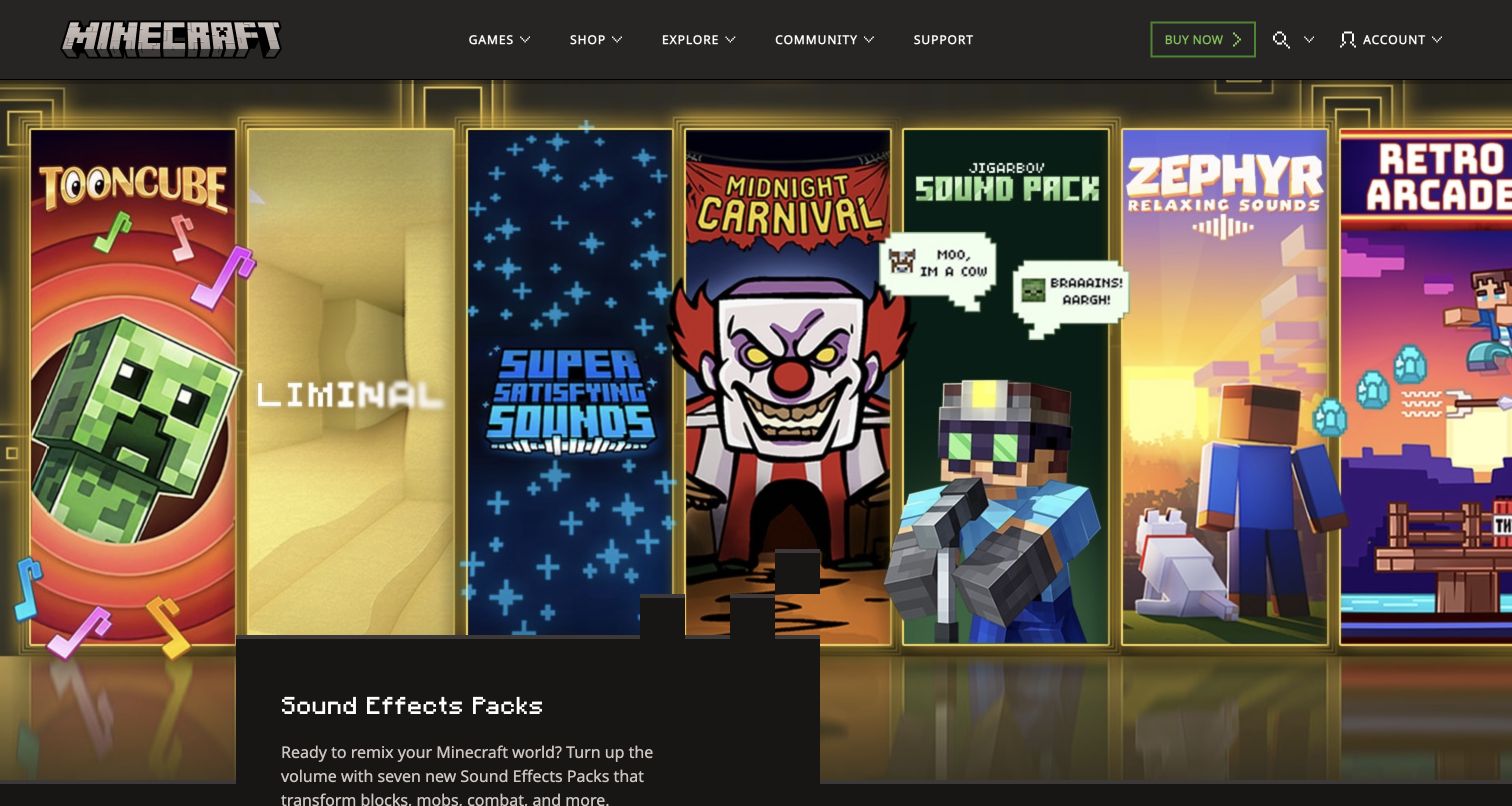
Minecraft's opening is unmistakably tied to its game world. A dark, block-like navigation bar sits above bright pixel artwork, with a compact promotional card introducing sound-effect packs. Games, shopping, exploration, community and support remain distinct routes, so the campaign does not replace the wider site structure. Postmark's Minecraft case is specifically historical: in 2011, Mojang's Minecraft.net developer discussed license-order confirmation problems and a migration to Postmark. That evidence does not establish current Microsoft account mail or the game's engine. The contemporary screenshot is useful for studying a recognizable visual world and its navigation, not for reconstructing today's backend.
What you can learn
Let campaign imagery express the brand while keeping permanent destinations easy to find. Transactional messages should then identify the exact purchase or account event without relying on visitors remembering the current promotion.
Pros
Consistent pixel artwork and block typography identify the property before detailed reading begins.
Permanent navigation preserves routes for players, shoppers, community members and support seekers.
Cons & considerations
A dominant promotion can postpone the basic explanation needed by a first-time visitor.
The opening campaign does not itself clarify historical purchase or account-recovery journeys.
Visible tech stack
Earlier / documented evidence
Postmark
Platform source: Official Postmark customer case — scoped email workflow. Official Postmark customer case reviewed November 11, 2026. Historical 2011 Mojang case names the Minecraft.net web developer and lost license-order confirmations, then documents migration to Postmark. Not evidence of current Microsoft identity/email systems or game engine technology. Documented email-service association for the named public product, not evidence of this marketing page’s renderer or its complete current infrastructure. Historical case outcomes are not newly measured performance. Platform evidence is separate from the direct website screenshot and is not a complete current infrastructure audit.
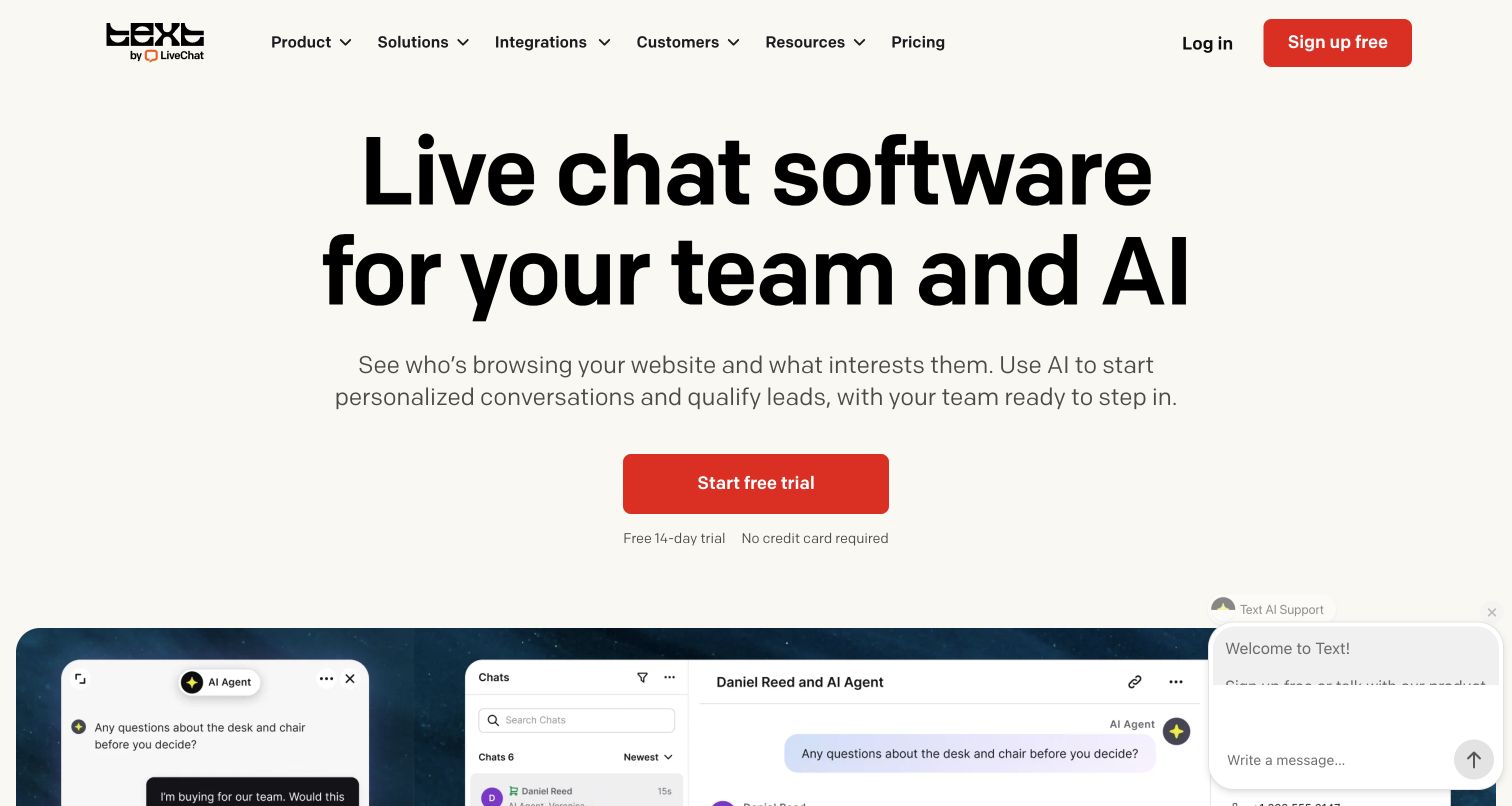
LiveChat's current page uses a nearly monochrome opening with a large headline about teams and AI, a short explanatory paragraph and a red trial button. A conversation interface begins immediately below, turning the abstract promise into a recognizable support setting. The Text branding also makes its evolving product identity visible. The historical Postmark interview refers to new accounts, password reminders, transcripts, reports and inbound ticketing at LiveChat; its old livechatinc.com destination now leads to livechat.com. That continuity supports the named product relationship without proving that every new Text or AI feature uses Postmark. The strongest design decision is the transition from proposition to example.
What you can learn
Place an understandable product scene close to the introductory promise. For support products, show where a conversation starts, who handles it and how the person can continue when the original session ends.
Pros
Large type and a single red primary action make the initial route easy to identify.
The conversation preview gives the software category a concrete visual explanation.
Cons & considerations
The support widget overlaps part of the product preview in the captured opening.
The broad AI promise needs deeper feature detail before visitors can assess implementation fit.
Platform source: Official Postmark customer case — scoped email workflow. Official Postmark customer case reviewed November 11, 2026. Historical LiveChat case covers new accounts, password reminders, chat transcripts, reports and inbound ticketing. Old official link livechatinc.com now redirects to livechat.com; current Text product presentation does not prove all new features use Postmark. Documented email-service association for the named public product, not evidence of this marketing page’s renderer or its complete current infrastructure. Historical case outcomes are not newly measured performance. Platform evidence is separate from the direct website screenshot and is not a complete current infrastructure audit.
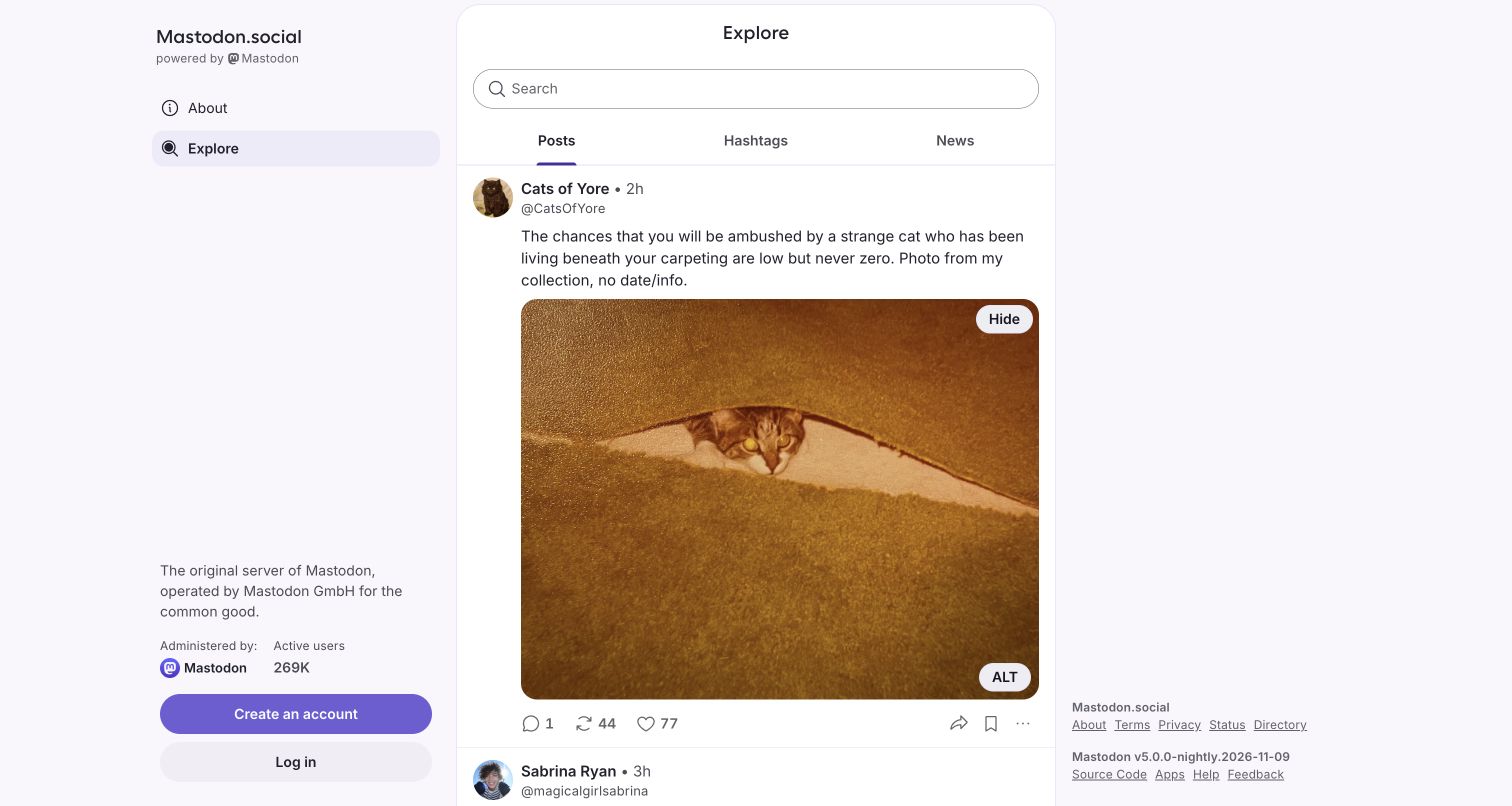
Mastodon.social opens into its Explore feed, where a central column of public posts is framed by quiet navigation and a persistent account invitation. The left rail identifies the server and its operator, an important detail in a federated network where similarly styled communities may be separately run. Postmark's case explicitly concerns this instance and its confirmation, password-reset and mention emails. It should not be extended to every Mastodon server or the separate project website. The captured guest view demonstrates how people can inspect community activity before deciding whether to join, while the surrounding controls explain where participation would begin.
What you can learn
Make the identity and boundaries of a community visible before asking for registration. A recognizable server name should continue into account and notification messages so readers know which service initiated the interaction.
Pros
The public feed supplies immediate evidence of the experience available after joining.
The operator description helps distinguish this instance from the broader federated network.
Cons & considerations
A changing feed can make the first impression depend heavily on individual posts.
The guest opening offers limited explanation of federation and cross-server account expectations.
Platform source: Official Postmark customer case — scoped email workflow. Official Postmark customer case reviewed November 11, 2026. Case explicitly names Mastodon.social, the original public server, and its confirmation, password-reset and mention emails. Do not propagate association to all independent Mastodon servers or joinmastodon.org. Documented email-service association for the named public product, not evidence of this marketing page’s renderer or its complete current infrastructure. Historical case outcomes are not newly measured performance. Platform evidence is separate from the direct website screenshot and is not a complete current infrastructure audit.
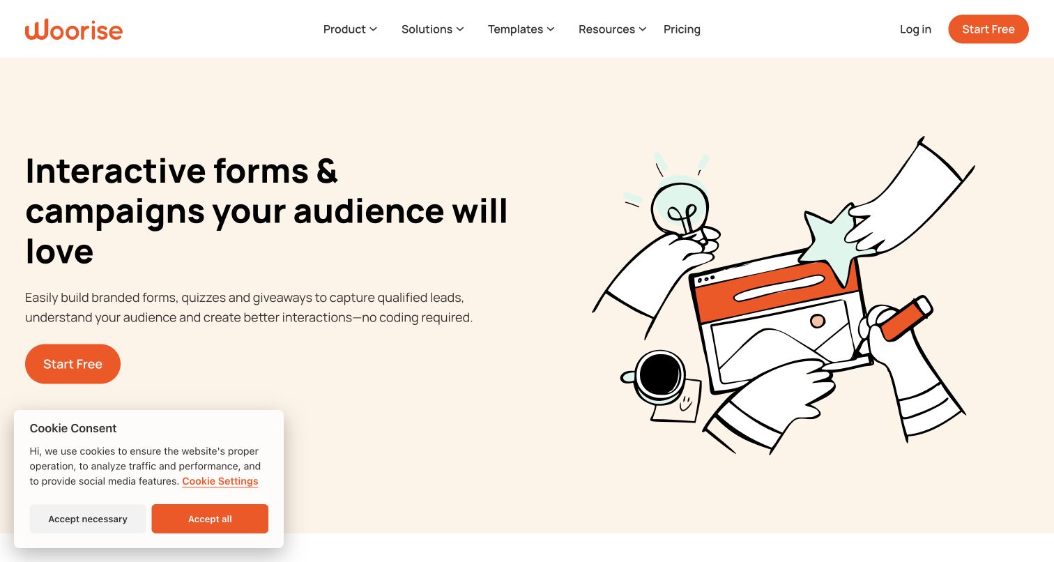
Woorise pairs a straightforward promise about forms and campaigns with an energetic drawing of hands assembling a page. Orange actions and generous cream space keep the interface approachable, while product, solution and template menus offer routes into more specific needs. The opening explains lead capture before asking visitors to start. Its official Postmark case describes confirmation messages, double opt-ins, winner notices and payment receipts for campaigns. These are communication workflows behind the service, not evidence of the homepage's rendering technology. The design is most useful as a way to introduce several related tools without making the first screen read like a specification sheet.
What you can learn
Explain the shared outcome of a toolset before listing every feature. Then use templates and focused navigation to help visitors connect that broad promise to a real campaign and its expected follow-up messages.
Pros
Warm illustration makes the construction process approachable without requiring a technical diagram.
The first paragraph names forms, quizzes and giveaways in practical language.
Cons & considerations
The visible cookie panel occupies part of the lower introductory area.
The playful artwork shows an idea rather than the exact editing interface visitors will use.
Platform source: Official Postmark customer case — scoped email workflow. Official Postmark customer case reviewed November 11, 2026. Postmark handles Woorise campaign confirmations, double opt-ins, winner notifications and payment receipts for its public forms/landing-page service. Documented email-service association for the named public product, not evidence of this marketing page’s renderer or its complete current infrastructure. Historical case outcomes are not newly measured performance. Platform evidence is separate from the direct website screenshot and is not a complete current infrastructure audit.
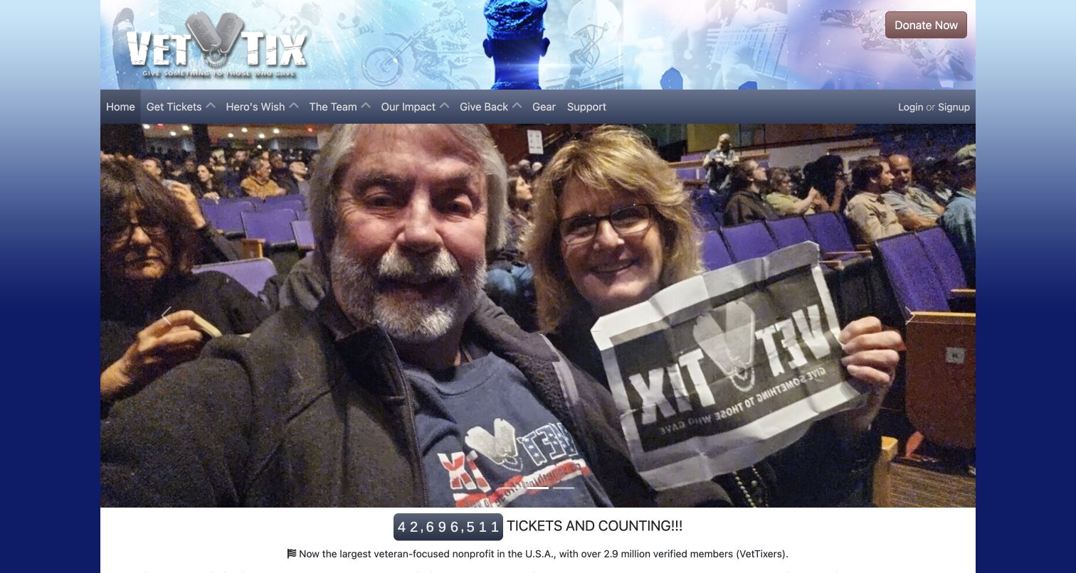
Vet Tix leads with event attendees rather than a software dashboard. A large photograph, military-themed masthead and ticket counter present the service as a shared experience, while ticket access, donations, impact and support remain separate navigation choices. The visual emphasis helps explain the purpose quickly, although the large carousel pushes more detailed eligibility information lower. Postmark's case describes daily event notifications and transactional messages such as password resets, with different message streams serving different needs. The photograph does not demonstrate that infrastructure; it gives the communication a human context. An event notice is useful because it reconnects a member with the opportunity introduced by this site.
What you can learn
Let the service's beneficiaries explain its purpose, then provide clear routes for each audience. Keep time-sensitive opportunity notices distinct from account recovery and donor communication, with wording that matches the reader's relationship to the organization.
Pros
Attendee photography shows the experience the organization exists to make possible.
Separate navigation labels distinguish getting tickets, giving support and understanding impact.
Cons & considerations
The large opening carousel postpones practical participation and eligibility explanations.
Multiple navigation categories and decorative symbols make the header comparatively dense.
Platform source: Official Postmark customer case — scoped email workflow. Official Postmark customer case reviewed November 11, 2026. Public event-ticket service sends member event notifications and transactional messages including password resets through Postmark. Case distinguishes bulk and transactional streams. Documented email-service association for the named public product, not evidence of this marketing page’s renderer or its complete current infrastructure. Historical case outcomes are not newly measured performance. Platform evidence is separate from the direct website screenshot and is not a complete current infrastructure audit.
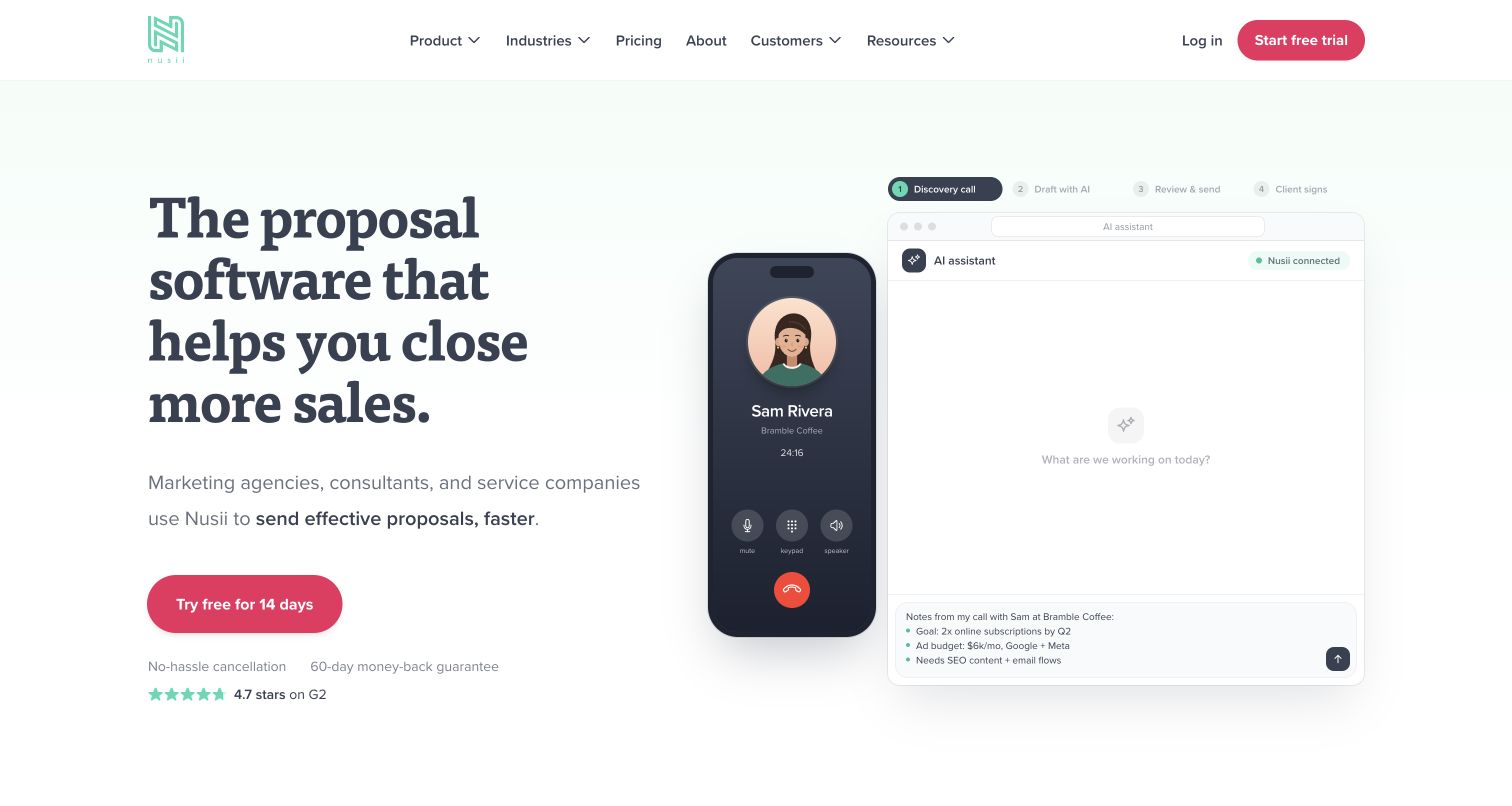
Nusii gives its proposal promise a process illustration. The opening pairs a serif headline with a staged journey from discovery call to draft, review and client signature, using a phone and editor-like panel to connect the steps. A pink trial action stands apart from the pale background, and cancellation language sits close enough to help interpret that invitation. Postmark's case documents proposal delivery, verified customer sending domains and delivery or bounce events shown inside Nusii. That is a narrow association with the communication stage; the current AI drafting illustration does not prove an additional Postmark capability. The sequence is the page's clearest teaching device.
What you can learn
Show the stages around a consequential document rather than presenting only its final appearance. Make delivery status understandable within the same workflow, and distinguish a message delivered from a proposal read, signed or accepted.
Pros
Numbered stages reveal the relationship between a conversation, a document and a decision.
Trial reassurance is placed beside the primary action rather than isolated in a footer.
Cons & considerations
An animated scene can expose only one part of the workflow at a time.
The sales-focused headline leaves detailed document controls for later exploration.
Platform source: Official Postmark customer case — scoped email workflow. Official Postmark customer case reviewed November 11, 2026. Public proposal-management service uses Postmark to deliver customer proposals, send from verified customer domains and surface delivery/bounce events in its product. Documented email-service association for the named public product, not evidence of this marketing page’s renderer or its complete current infrastructure. Historical case outcomes are not newly measured performance. Platform evidence is separate from the direct website screenshot and is not a complete current infrastructure audit.
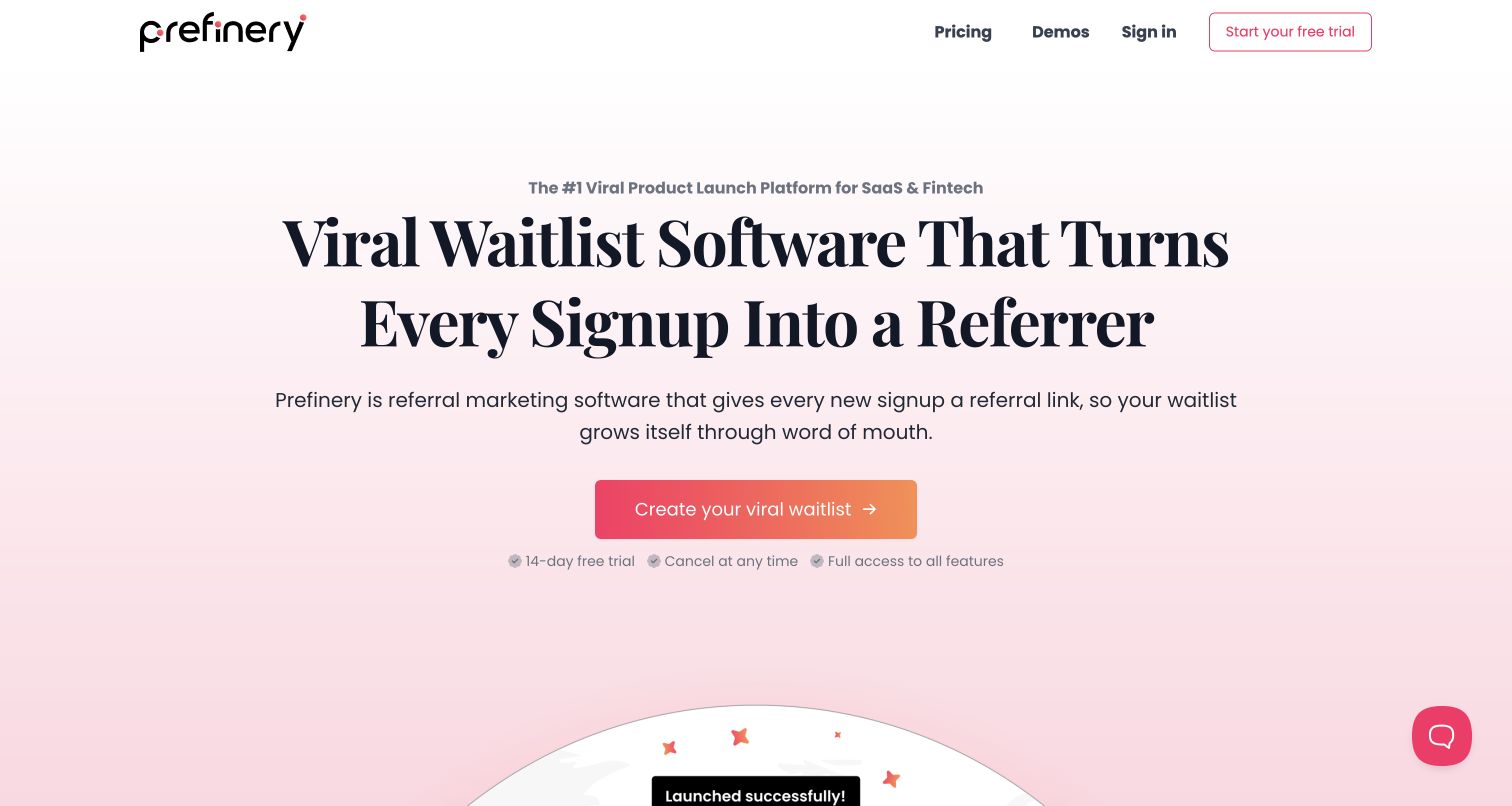
Prefinery makes the referral mechanism its opening focus. A large serif headline explains that each signup can become a referrer, followed by an explanation and a single gradient action. Pricing and demonstrations are easy to locate in the compact header. The restrained composition gives one idea room to land before the more elaborate product material below. Postmark's founder interview describes opt-in confirmations, referral links, invitation codes and broadcast reminders for this service. Those separate message purposes make the loop concrete, but the vendor account is not an independent measurement of growth. The homepage is a useful reference for explaining a mechanism before selling outcomes.
What you can learn
Describe what one participant does and how that creates the next step. Pair referral incentives with clear confirmation and preference expectations, rather than treating every address collected during a launch as permission for every later message.
Pros
The main statement explains the product mechanism without requiring visitors to inspect a diagram.
A short header keeps pricing and demonstration routes within easy reach.
Cons & considerations
The growth language needs evidence and realistic expectations beyond the opening screen.
The first view delays a detailed example of the participant-facing signup experience.
Platform source: Official Postmark customer case — scoped email workflow. Official Postmark customer case reviewed November 11, 2026. Public waitlist/referral service builds branded opt-in confirmations, referral links, invitation codes and broadcast reminders on the Postmark API. Documented email-service association for the named public product, not evidence of this marketing page’s renderer or its complete current infrastructure. Historical case outcomes are not newly measured performance. Platform evidence is separate from the direct website screenshot and is not a complete current infrastructure audit.
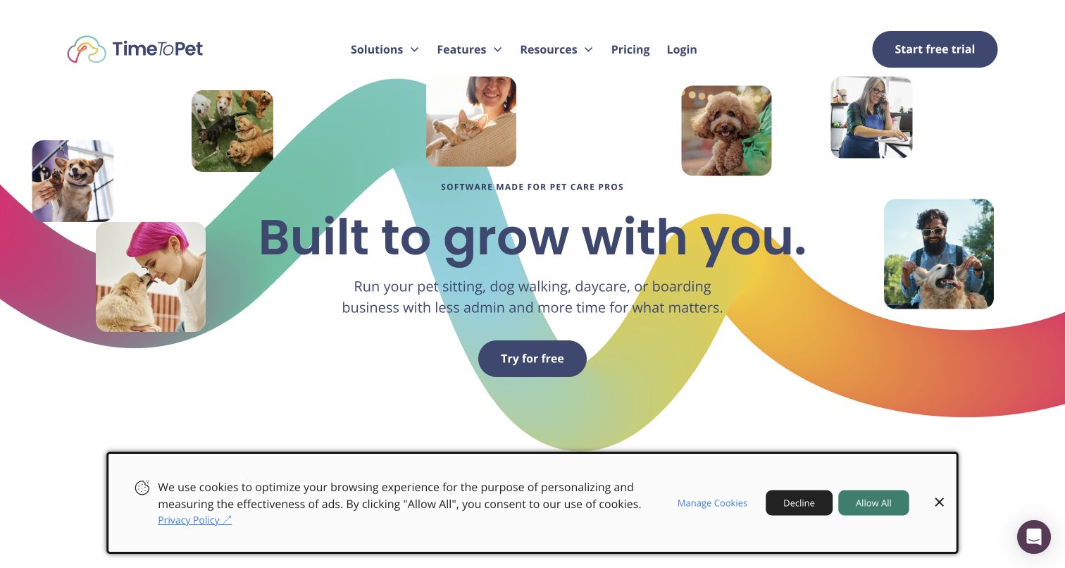
Time To Pet surrounds its growth message with photographs of animals and the people caring for them. A broad colored ribbon connects the collage, while a short paragraph names sitting, walking, daycare and boarding businesses. The page establishes the audience before presenting software details, making the promise of less administration easy to relate to. Postmark's case describes visit reports, notes, photographs and two-way correspondence between providers and pet owners. The connection matters because communication is part of the care experience, not simply a marketing afterthought. The current homepage image supports that emotional framing without demonstrating message delivery or the quality of any pet-care service.
What you can learn
Use the real context of a specialist profession to explain why the software matters. Then make the communication workflow concrete: who receives an update, what it contains and how a reply reaches the right person.
Pros
Photographs and the audience label make the intended customer clear immediately.
The short description names several related business types without overwhelming the main message.
Cons & considerations
The cookie notice takes a substantial strip of the captured first view.
The lifestyle-led opening postpones the actual scheduling and communication interface.
Platform source: Official Postmark customer case — scoped email workflow. Official Postmark customer case reviewed November 11, 2026. Pet-care software's customer communications include visit reports, notes/photos and two-way correspondence processed through Postmark. Public SaaS service, not claim that the marketing page renders with Postmark. Documented email-service association for the named public product, not evidence of this marketing page’s renderer or its complete current infrastructure. Historical case outcomes are not newly measured performance. Platform evidence is separate from the direct website screenshot and is not a complete current infrastructure audit.
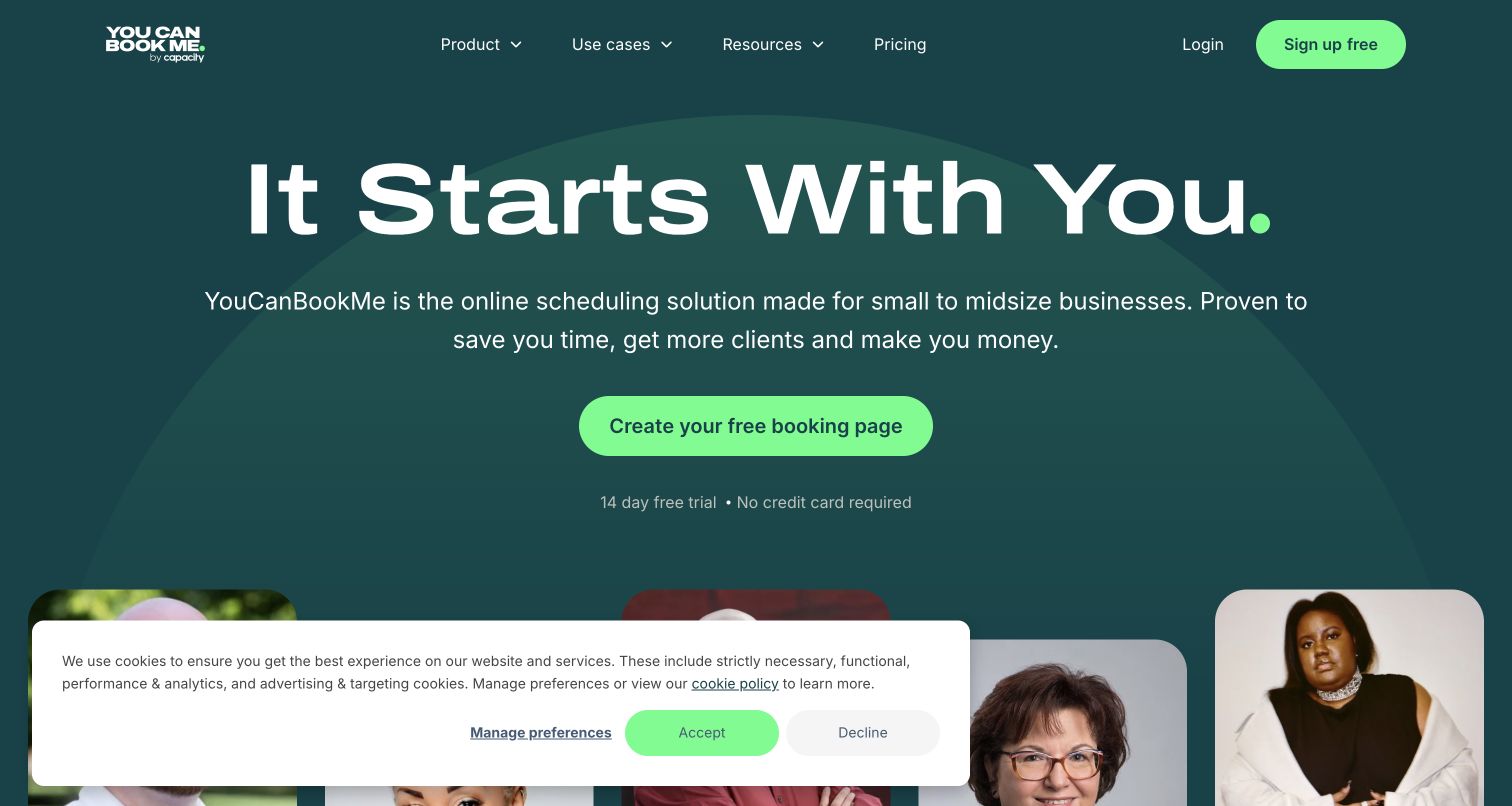
YouCanBookMe's dark teal opening centers an oversized headline and a bright green action to create a booking page. The supporting copy identifies small and midsize businesses, while trial and payment-card reassurance clarify the invitation. Portraits begin below the hero, adding human context after the main task is established. Postmark's case describes booking confirmations, reminders and follow-up messages, together with delivery information used by the support team. That documentary association explains the communication surrounding a booking, not the software drawing the homepage. The most useful idea is the tangible first deliverable: visitors are offered a page they can understand before being introduced to the full scheduling system.
What you can learn
Name the useful thing a new customer will create, then explain the surrounding reminders and confirmations. Keep the public starting step simple while documenting recovery for missed messages, changed appointments and incorrect contact details.
Pros
A strongly contrasting action makes the first task stand out from the surrounding copy.
Trial conditions sit below the invitation, reducing uncertainty.
Cons & considerations
The abstract headline needs its supporting paragraph to explain the software category.
The cookie notice obscures some of the customer imagery in the captured view.
Platform source: Official Postmark customer case — scoped email workflow. Official Postmark customer case reviewed November 11, 2026. Online scheduling service uses Postmark for customer/client booking confirmations, reminders and follow-up emails, with delivery-event troubleshooting. Documented email-service association for the named public product, not evidence of this marketing page’s renderer or its complete current infrastructure. Historical case outcomes are not newly measured performance. Platform evidence is separate from the direct website screenshot and is not a complete current infrastructure audit.
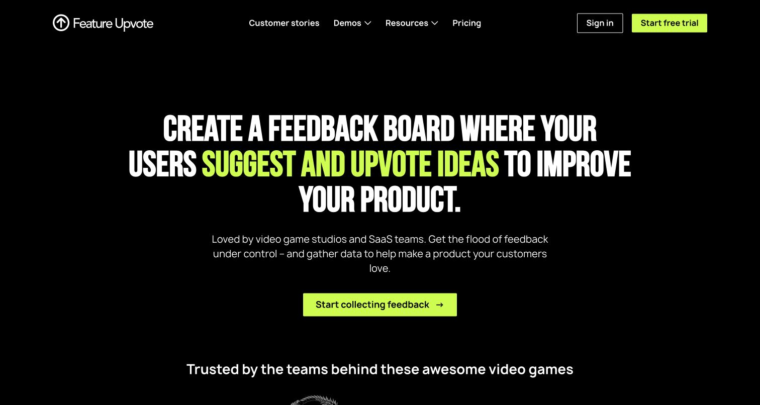
Feature Upvote gives its primary interaction direct treatment. A black page and condensed white heading describe a board where people suggest and upvote ideas; fluorescent green highlights the important verbs and the signup action. The supporting sentence identifies the audience as game studios and SaaS teams, with customer evidence beginning below. Postmark's case covers verification messages, activity notices, trial warnings and weekly summaries, including the discovery of inappropriate summary recipients through delivery visibility. That is evidence about its email workflow, not a reason to participate in a live board during review. The design communicates the tool's job before adding persuasion.
What you can learn
Use specific verbs to explain what a visitor or participant can do. Carry that precision into notification settings, making the triggering event and intended audience explicit rather than assuming all account holders need every recurring summary.
Pros
The headline explains both the interface and its purpose without relying on abstract branding.
One bright accent ties the key interaction to the main call to action.
Cons & considerations
Large condensed capitals can feel demanding when the headline spans several lines.
The opening postpones a visible board example until visitors continue farther down the page.
Platform source: Official Postmark customer case — scoped email workflow. Official Postmark customer case reviewed November 11, 2026. Public feedback-board service documents verification, activity notifications, trial-end warnings and weekly summaries via Postmark; no votes/actions are part of research. Documented email-service association for the named public product, not evidence of this marketing page’s renderer or its complete current infrastructure. Historical case outcomes are not newly measured performance. Platform evidence is separate from the direct website screenshot and is not a complete current infrastructure audit.
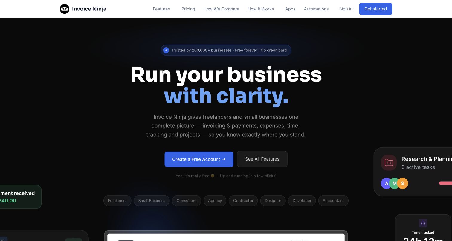
Invoice Ninja places a broad clarity promise on a dark background, then immediately names invoicing, payments, expenses, time tracking and projects. Small role labels help freelancers and other business users recognize themselves, while an alternative feature link sits beside account creation. Floating interface fragments hint at the underlying work without competing with the main headline. The Postmark case specifically describes invoice and payment emails, including delivery, viewing and bounce information. It does not establish that every self-hosted Invoice Ninja installation uses Postmark. The homepage's useful pattern is the quick translation of an aspirational benefit into a bounded set of administrative tasks.
What you can learn
Follow a broad benefit with the actual work the product handles. For invoicing, keep document delivery, a recipient's response and payment status distinct so a message event never masquerades as a completed business transaction.
Pros
The supporting paragraph makes the headline's promise concrete with recognizable business tasks.
A separate feature route supports visitors who want to investigate before creating an account.
Cons & considerations
The dark presentation gives some supporting text less prominence than the main headline.
Floating interface fragments are suggestive but do not explain a complete invoice workflow.
Platform source: Official Postmark customer case — scoped email workflow. Official Postmark customer case reviewed November 11, 2026. Public invoicing/payment platform uses Postmark for invoice and payment emails and delivery/open/bounce status. Do not infer every self-hosted installation uses it. Documented email-service association for the named public product, not evidence of this marketing page’s renderer or its complete current infrastructure. Historical case outcomes are not newly measured performance. Platform evidence is separate from the direct website screenshot and is not a complete current infrastructure audit.
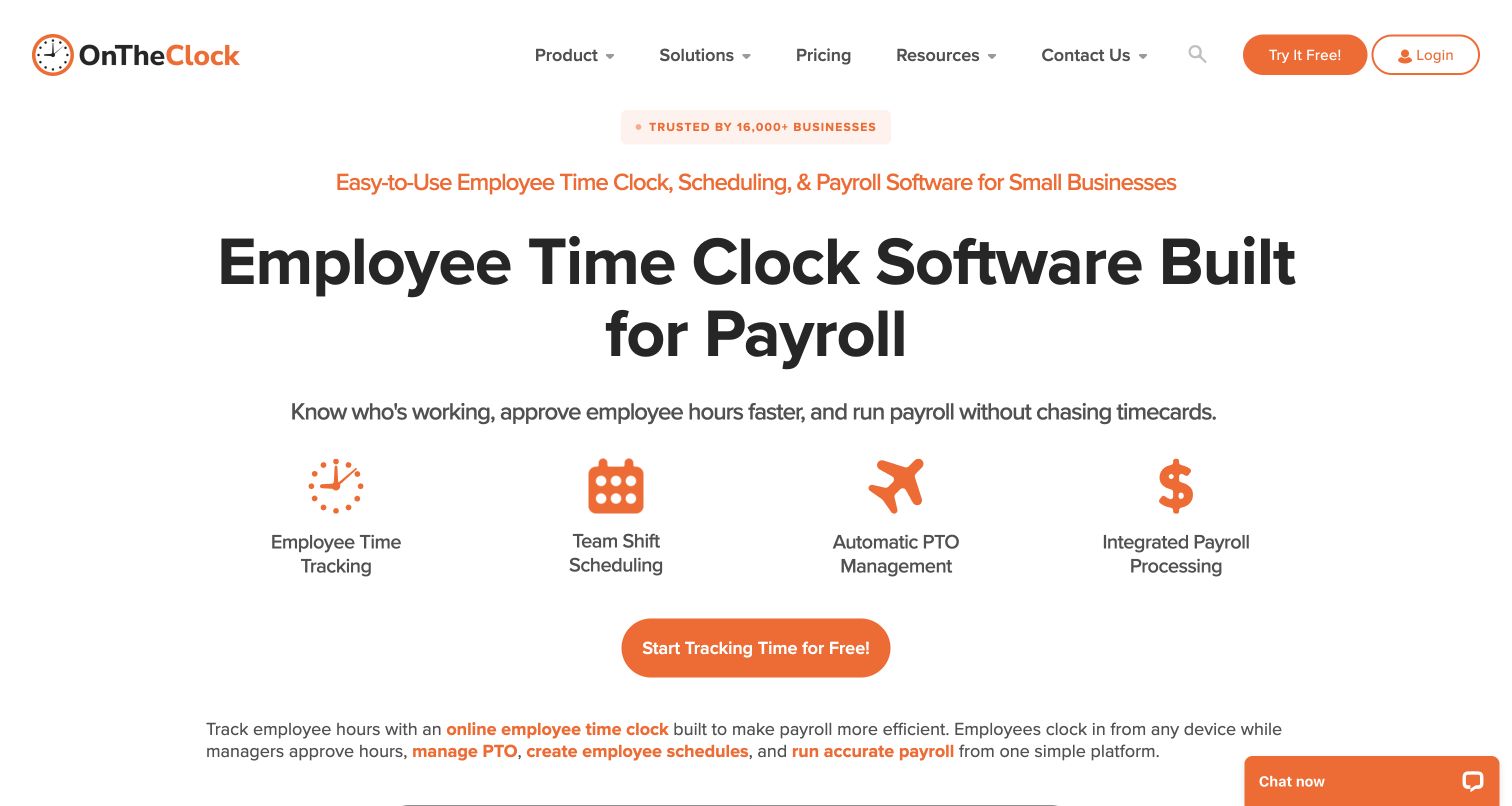
OnTheClock builds its first screen around payroll readiness. Four orange icons divide time tracking, scheduling, time off and payroll into understandable groups, and the surrounding copy connects them to knowing who is working and approving hours. The layout is direct and text-forward, with the action below the feature row rather than interrupting it. Postmark's historical customer case documents transactional messages, including clock-in and clock-out notices, after a move from hosting-provided mail. Its reported improvement is the customer's account, not an independently repeated result. The visible page shows how related administrative tools can be organized around one outcome without claiming a complete technical inventory.
What you can learn
Group features by the operational decision they support. A time notification should carry enough context to be useful while leaving approval, payroll changes and sensitive employee records inside the properly controlled application.
Pros
The four-part feature row makes the breadth of the product easy to scan.
Practical wording connects the tools to a recognizable payroll preparation problem.
Cons & considerations
Several similar introductory statements consume space before any product interface appears.
The first screen offers little visual evidence of the actual approval or timecard experience.
Platform source: Official Postmark customer case — scoped email workflow. Official Postmark customer case reviewed November 11, 2026. Public online time-clock SaaS case documents transactional mail and clock-in/clock-out notifications through Postmark's API. Documented email-service association for the named public product, not evidence of this marketing page’s renderer or its complete current infrastructure. Historical case outcomes are not newly measured performance. Platform evidence is separate from the direct website screenshot and is not a complete current infrastructure audit.
Podia uses oversized type to bring courses, community, coaching and email into one promise. A yellow navigation bar and matching trial action provide a visual system, while creator imagery begins beneath the headline. The breadth is easy to understand by category, though individual workflows need further exploration. Postmark's case is more specific than the word email in that headline: it covers critical password resets, order confirmations and email confirmations, and discusses separating those messages from bulk sending. It does not prove that all present Podia newsletters use Postmark. The retained cookie-dialog state also shows how consent can temporarily dominate an otherwise spare entrance.
What you can learn
When one platform spans many jobs, explain the shared home without merging every communication purpose. Keep account recovery and purchase confirmations distinct from promotional publishing in both the product architecture and the language customers see.
Pros
The headline names the major product categories in language a creator can recognize.
The restrained color system connects navigation and the trial invitation without extra ornament.
Cons & considerations
The first-visit privacy dialog dims the page and interrupts the introductory experience.
The broad promise needs concrete examples before visitors can assess each workflow.
Platform source: Official Postmark customer case — scoped email workflow. Official Postmark customer case reviewed November 11, 2026. Public creator-commerce platform uses Postmark for critical password resets, order confirmations and email confirmations. Case separates transactional email from its newsletter-provider history. Documented email-service association for the named public product, not evidence of this marketing page’s renderer or its complete current infrastructure. Historical case outcomes are not newly measured performance. Platform evidence is separate from the direct website screenshot and is not a complete current infrastructure audit.
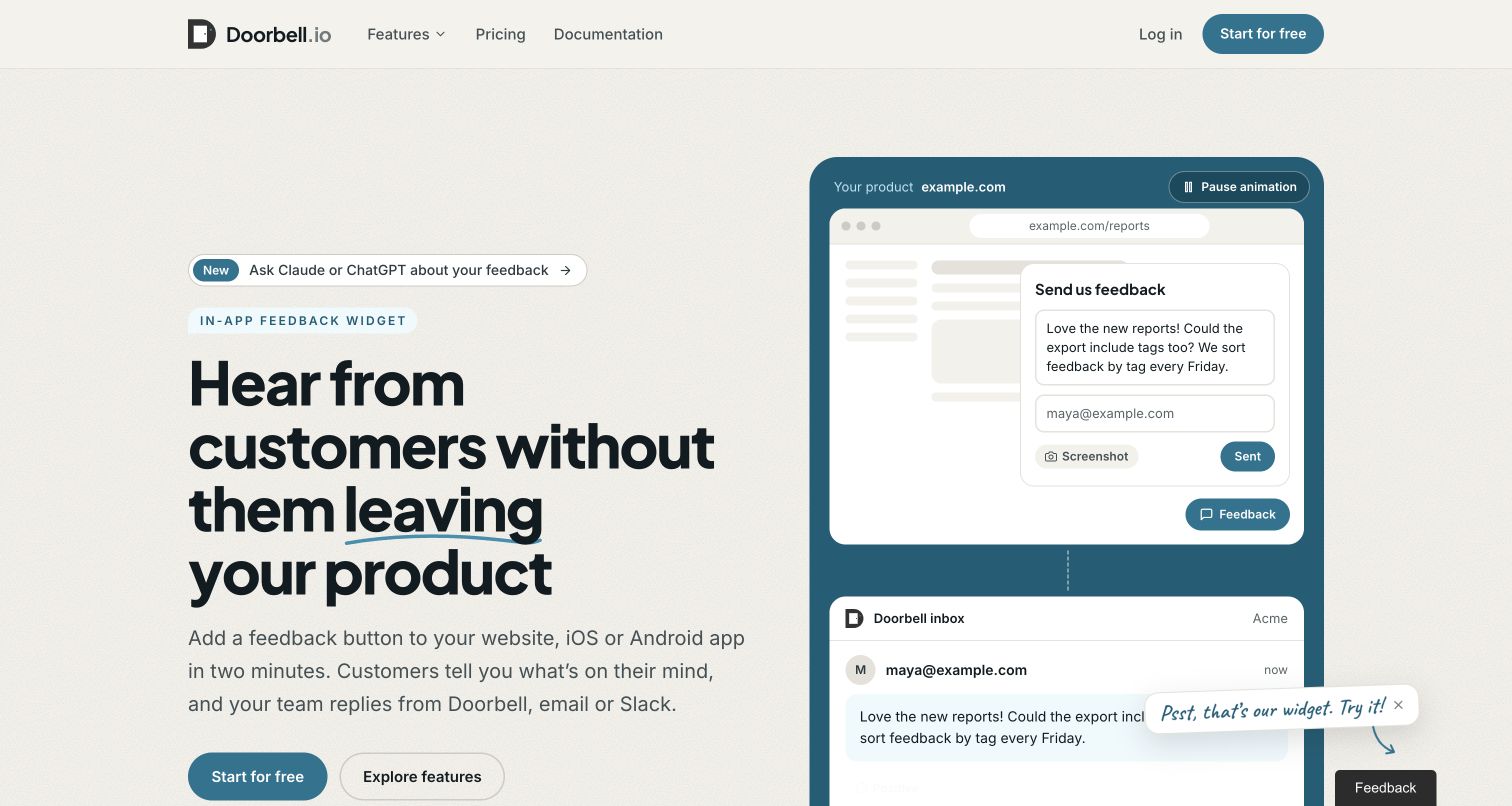
Doorbell places a small feedback widget inside a larger product illustration and connects it to an inbox below. That arrangement explains the service's role more clearly than a list of integrations alone: a customer comments in context, and the team receives a conversation it can handle. A short headline reinforces that the customer need not leave the product. The Postmark case documents notifications, password resets, inbound replies and bounce information, with an evolution from SMTP toward API integration. Those details fit the illustrated communication path without proving that the current AI-related features use the same infrastructure. The page's strongest lesson is showing where a message goes.
What you can learn
Draw the path from a customer's moment of feedback to the team's response. Make delivery problems visible to the responsible operator, and preserve context when a conversation moves between the application and an email inbox.
Pros
The paired widget and inbox illustration makes an otherwise invisible handoff understandable.
Primary and exploratory actions support both quick evaluation and deeper feature reading.
Cons & considerations
The floating live feedback prompt competes with the illustrated feedback interface.
A moving demonstration may require visitors to wait to understand the complete sequence.
Platform source: Official Postmark customer case — scoped email workflow. Official Postmark customer case reviewed November 11, 2026. Public website/app feedback service uses Postmark SMTP/API for notifications and password resets, parses inbound customer replies and receives bounce webhooks. Documented email-service association for the named public product, not evidence of this marketing page’s renderer or its complete current infrastructure. Historical case outcomes are not newly measured performance. Platform evidence is separate from the direct website screenshot and is not a complete current infrastructure audit.
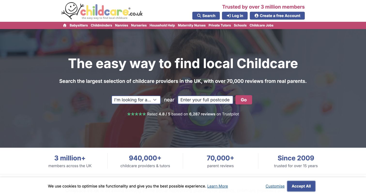
Childcare.co.uk puts a service selector and postcode field in its opening. A category strip exposes different care and education needs, while the headline explains the local matching task without requiring visitors to understand a platform model. Trust and scale statements surround the search, although they remain the site's claims rather than this review's endorsement of individual providers. Postmark's historical case describes notifications when parents message caregivers and the migration of transactional mail. That association belongs to the directory's communication system; it does not classify every listed provider's technology. The useful design pattern is giving a visitor a concrete search task before account complexity.
What you can learn
Ask for the smallest information needed to begin a useful search. When a directory mediates personal conversations, distinguish a message notification from the private conversation itself and explain where the recipient can respond securely.
Pros
The service and location controls express the main visitor task in one row.
Visible category links offer a second route for people still exploring their needs.
Cons & considerations
The dense header presents many choices before a visitor reaches the central search.
Scale and review claims require careful interpretation and cannot replace individual provider assessment.
Platform source: Official Postmark customer case — scoped email workflow. Official Postmark customer case reviewed November 11, 2026. Public parent/provider marketplace case specifically identifies notifications when a parent sends a caregiver message; case documents migration of transactional mail to Postmark. Documented email-service association for the named public product, not evidence of this marketing page’s renderer or its complete current infrastructure. Historical case outcomes are not newly measured performance. Platform evidence is separate from the direct website screenshot and is not a complete current infrastructure audit.
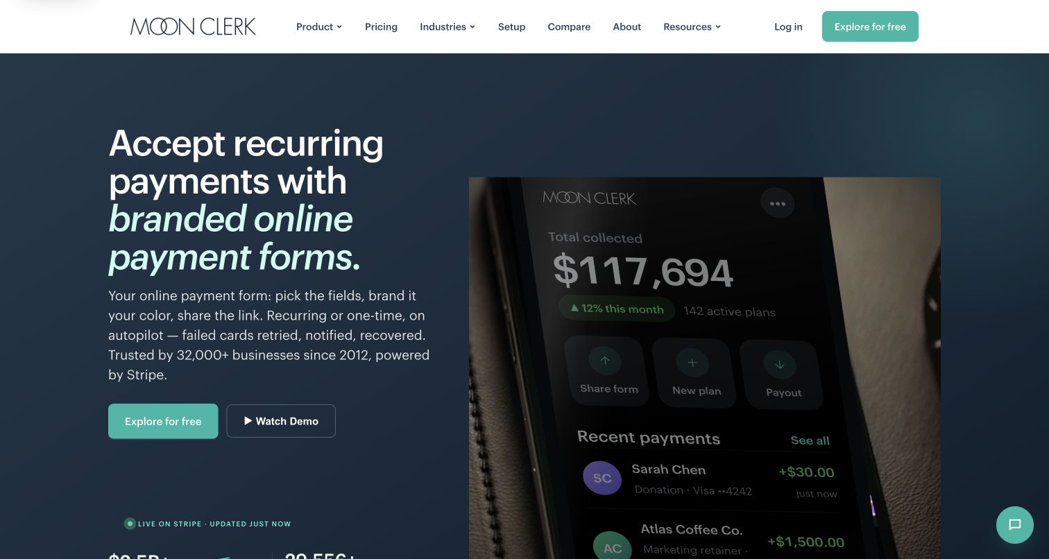
MoonClerk leads with branded payment forms rather than payments jargon. The dark blue hero explains selecting fields, applying a brand and sharing a link, while a large phone-like payment overview gives the result a recognizable shape. An exploratory action and a separate demonstration route support different readiness levels. Postmark's case concerns dynamic receipts and other customer messages, including a documented return to the provider after an earlier migration. It is not evidence about current payment processing or independently verified security. The design is useful for translating infrastructure into a sequence of actions that a business owner can picture performing.
What you can learn
Introduce payment tooling through the form and follow-up a customer will actually experience. Clearly distinguish a payment request, a successful charge, a failed attempt and a receipt, rather than using one generic confirmation for every state.
Pros
The introductory copy translates a technical service into fields, branding and a shareable link.
A visual account overview gives the abstract recurring-payment proposition a concrete reference.
Cons & considerations
The darkened image is less readable than the surrounding headline and action.
Security and scale badges need supporting detail beyond their presence in the opening view.
Platform source: Official Postmark customer case — scoped email workflow. Official Postmark customer case reviewed November 11, 2026. Online recurring-payment service sends dynamic receipts and other emails on behalf of customers, with return to Postmark documented in the case. No checkout/payment QA. Documented email-service association for the named public product, not evidence of this marketing page’s renderer or its complete current infrastructure. Historical case outcomes are not newly measured performance. Platform evidence is separate from the direct website screenshot and is not a complete current infrastructure audit.
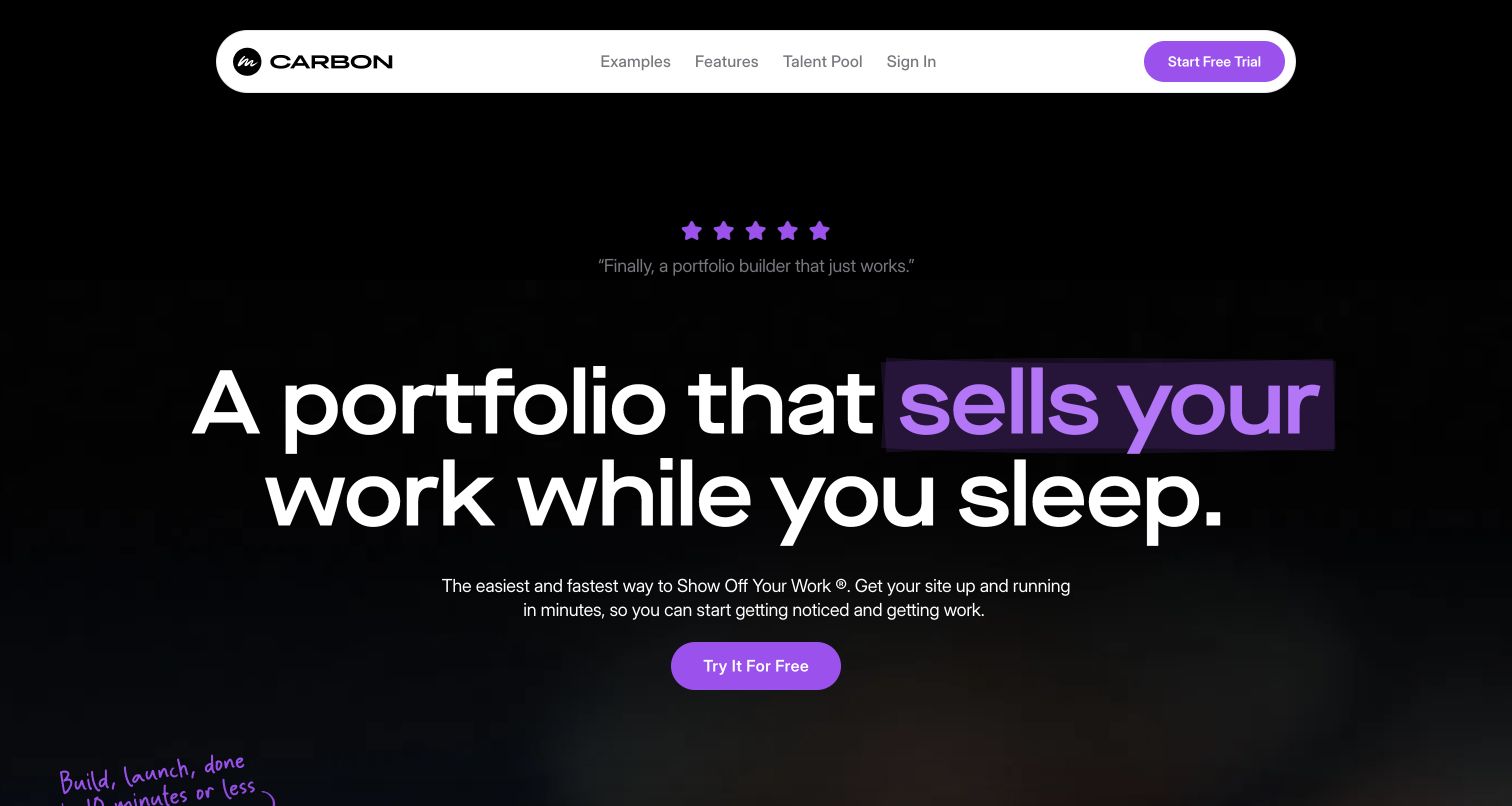
Carbonmade uses a black canvas, a floating white navigation pill and a purple highlight to make its portfolio promise feel like part of a creative identity. Examples and the talent pool offer alternatives to the trial, giving visitors ways to inspect work before building their own site. Trial reassurance follows the hero. Postmark's first-person Carbonmade case is historical and describes the portfolio service's transactional email migration. It does not attribute every creator's portfolio or the current renderer to Postmark. The opening is useful for its focused relationship between a creative outcome, visual tone and a simple first action.
What you can learn
Let the service's own presentation model the confidence it promises creators. Offer real work to inspect alongside signup, then keep account and publishing messages consistent with the portfolio identity without implying that every hosted site shares identical infrastructure.
Pros
The restrained black, white and purple palette creates a clear and recognizable visual hierarchy.
Examples and talent discovery give skeptical visitors useful routes before committing to a trial.
Cons & considerations
The aspirational headline needs product demonstrations to explain the actual editing experience.
Animated emphasis and testimonial changes can make the opening less stable for quick scanning.
Platform source: Official Postmark customer case — scoped email workflow. Official Postmark customer case reviewed November 11, 2026. First-person historical case from co-founder identifies the online portfolio service's transactional email migration to Postmark; not attribution for every creator portfolio or current CMS. Documented email-service association for the named public product, not evidence of this marketing page’s renderer or its complete current infrastructure. Historical case outcomes are not newly measured performance. Platform evidence is separate from the direct website screenshot and is not a complete current infrastructure audit.
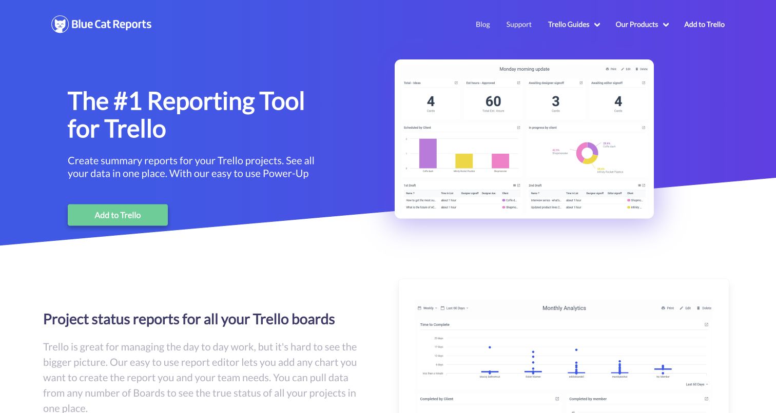
Blue Cat Reports puts a dashboard example beside an explanation of its Trello reporting purpose. The blue-to-purple opening and green installation action are conventional, but the visible charts do important work: visitors can see the summary they are being offered before reading features. A second report example appears as the page begins explaining cross-board visibility. Postmark's case describes transactional messages and scheduled digest emails containing customer report imagery. That is a concrete extension of the dashboard's value, not evidence that Postmark renders its charts or that all Trello users receive these emails. The design emphasizes understandable output over mechanics.
What you can learn
Show the report people will use to make a decision, then explain how it reaches them. A scheduled digest should preserve enough context to be useful while offering a secure route to the full, current application view.
Pros
The dashboard preview makes the reporting result visible immediately beside the main claim.
The installation action is clearly connected to the host product rather than a generic signup.
Cons & considerations
Small chart labels are difficult to evaluate at the opening screenshot scale.
The prominent ranking claim needs separate substantiation and is not an editorial rating here.
Platform source: Official Postmark customer case — scoped email workflow. Official Postmark customer case reviewed November 11, 2026. Public Trello reporting add-on uses Postmark for customer transactional emails and scheduled digest emails that include the customer's report/dashboard. Current public homepage still describes emailed reports. Documented email-service association for the named public product, not evidence of this marketing page’s renderer or its complete current infrastructure. Historical case outcomes are not newly measured performance. Platform evidence is separate from the direct website screenshot and is not a complete current infrastructure audit.
Kegan has 15+ years of experience working with small businesses, Fortune 500 companies, and everything in between. No development job is too big or too small: he brings the same hands-on attention to a focused improvement, a complete website, or a custom application.
For Postmark projects, he can help with responsive interfaces, reusable components, custom functionality, API connections, and performance-minded implementation. He works directly with clients on scope, design, implementation, testing, and handover, with an emphasis on clear communication and a system that remains practical to maintain after launch.
Show 3 other Postmark developersHide other Postmark developers
For receipts, account confirmation and recovery, keep the message focused on one event. State what happened, identify the service and explain the next step. Include a safe route for an unexpected request, and avoid revealing private details simply to make a message feel personalized. The application should still enforce access when the recipient returns.
Continue a conversation
Asana and Doorbell's cases show email as another route into an ongoing discussion. Postmark's inbound processing converts received mail into structured data for an application webhook. That transport is only part of the design: the application must determine the conversation, participant permissions and appropriate response while handling attachments and quoted material carefully.
Blue Cat Reports illustrates a digest that carries an existing product output into the inbox. Decide what the summary helps someone do and how often that help is useful. Make the destination clear when the full information belongs in an authenticated application. Review who remains eligible to receive the digest when accounts, roles or preferences change.
From references to requirements
Plan the experience beyond the send request
Map the website and inbox together
Write down the starting action, confirmation screen, expected message and destination. Include missing or incorrect addresses, delayed delivery and requests repeated by an impatient visitor. Decide which facts belong on the public screen and which require authentication. The same task should remain recognizable across each step.
Give templates realistic content
A template needs to work with long names, missing optional fields, translated text and a plain-text alternative. Keep the primary action understandable without images. Avoid placing essential meaning only inside decorative graphics, and make the visible sender and reply route consistent with the product the person used.
Protect event processing and expect repeats
Postmark's webhook guidance recommends HTTPS, HTTP Basic Authentication and appropriate IP restrictions; it does not currently provide HMAC signatures. Validate event shape and process repeats safely. Outbound delivery events and inbound messages have distinct behavior, so use the documentation for the specific event rather than assuming a universal retry policy.
Decide who can investigate a missing message and which private records they need. Record the intended business event and correlate provider responses without placing credentials or unnecessary message contents in public logs. When a request's result is uncertain, reconcile the actual state before repeating it. A visible support path should exist even when an email never arrives.
A useful handover demonstration
Ask the actual team to carry out its routine job: publish a realistic update, correct a mistake, preview a narrow screen, and identify who owns an integration failure. For a library or frontend framework, also ask who maintains the content source and deployment. A polished screenshot does not answer those operational questions.
Beyond the screenshot
A focused Postmark project checklist
Name the event and intended recipient for each message type.
Explain the expected message beside the website action that starts it.
Keep sending credentials and recipient decisions in trusted server code.
Use an appropriate confirmed sender and a recognizable reply route.
Separate transactional and optional recurring communication deliberately.
Provide useful pending, delayed and recovery states in the application.
Test long content, plain text and image-independent meaning.
Protect webhook endpoints and validate their incoming data.
Distinguish delivery events from human actions and business outcomes.
Document support access, private-data retention and uncertain-outcome recovery.
Test with real content, a keyboard, a small screen, slow or failed requests, and the people who will maintain the system. These are planning checks, not an accessibility, security, performance, or search-ranking certification.
Sources & editorial method
How this Postmark collection was reviewed
We reviewed the public pages, retained captures and official Postmark customer cases on November 11, 2026. Eighteen screenshots were captured directly that day; Asana retains its November 4 capture and 1Password its November 9 capture. Most show the public opening; Mastodon.social redirects to its public Explore feed, and several first visits include cookie notices. The cases document specific email workflows, including explicitly historical licensing examples, rather than the current rendering stack of the photographed pages. Broad public-source stack attempts remain separate and keep their original observation dates; Minecraft's bounded audit timed out without a new stack conclusion. No account access, email send, feedback vote, booking, payment or form submission was used in this review.
Every image is an unmodified capture from the actual website, with its source and capture date. Some captures are reused from our shared catalog; their dates remain the original capture dates. None comes from a vendor gallery or a generated reconstruction. Moving imagery and live content can change.
Technology attribution uses public page assets or metadata, official platform documentation, or a cited first-party project case study. Documentary and framework-relationship evidence is identified where used; it is not a complete current backend inventory. A CMS image CDN alone does not establish a full CMS deployment. A library’s presence does not prove which individual controls use it, and a platform label does not establish AI authorship.
The composition notes, lessons, pros and tradeoffs are original editorial observations. We have not measured conversion, traffic, security, performance or accessibility conformance. Website owners retain their brands and imagery; these examples are not our client portfolio. Written, Edited and Curated are independent records, not dates advanced by a build. See our editorial standards or suggest a correction.
Questions worth asking
Postmark website development FAQs
Are these websites built with Postmark?
Postmark delivers and processes email rather than building the visible page. These examples are public properties with documented Postmark relationships for specified communication workflows. Their design reviews concern what is visible; the technology claims remain limited to the supporting customer sources.
Why include historical customer cases?
A well-described historical workflow can teach a useful design lesson, provided its date and limits stay clear. The Minecraft evidence concerns 2011 license-order confirmations, and the 1Password case concerns AgileBits-era receipts and license files. Neither proves the current infrastructure of newer products.
Does the Mastodon example apply to every server?
No. The source explicitly identifies Mastodon.social and its account and notification emails. Independent Mastodon instances operate separately, so that relationship must not be extended to every server or to the project's separate website.
What does a delivery event prove?
It indicates that the receiving mail server accepted a message. It does not prove inbox placement, that a person read the message or that an intended task was completed. Keep delivery, engagement and application outcomes separate when describing results.
Can replies become part of an application conversation?
Postmark documents inbound processing that sends structured message data to an application webhook. The application still needs to connect that data to the correct conversation, validate the participant and handle repeated or unexpected input. Email transport alone is not an authorization decision.
How should a project use these examples?
Borrow a clear expectation, a useful status or a thoughtful recovery path. Compare the needs of your audience with the particular workflow in each source. Screenshots and customer interviews are design references, not independent guarantees of present delivery performance, security or business results.
Treat the inbox as another part of the same user journey. A clear sender, a specific event and an understandable next step often matter more than elaborate email styling.