Best Docusaurus Websites of 2026 (20 Real-World Examples)
Twenty genuine public properties showing how a React-based documentation publisher supports distinct learning paths, reference libraries and product introductions.
The most useful Docusaurus design decision is rarely the color of the sidebar. It is how readers choose a workflow, keep the right release context and move from an explanation to an exact reference without losing their place.
Docusaurus is a static-site generator whose official introduction describes a React-based site with client-side navigation. Its documentation model organizes pages through sidebars, versions and plugin instances. That structure can support a documentation-only property or a customized product front door; the examples show both approaches rather than a single template repeated twenty times.
The opening selections are Microsoft Playwright, React Native, Jest, Relay and Ionic. All twenty captured public documents expose a Docusaurus generator declaration and framework root. The evidence concerns those named publishing properties, not the software described by their documentation, every corporate website, private build configuration or measured performance.
Before the examples
What makes good Docusaurus website development in 2026?
Design the reading modes before the sidebar
Redux separates tutorials, usage, API and best practices; Bandwidth distinguishes guides, reference and developer tools. Start with these reader tasks, then decide which deserve separate sections or instances. Docusaurus's documented hierarchy provides organizational tools, but it does not determine whether a topic belongs in a tutorial or reference page.
The official versioning guide describes preserved documentation snapshots and warns that they add complexity. Define which releases remain supported, where old links lead and how a reader recognizes the selected version. Product release labels and the website's own generator version are separate facts; the former must not be inferred from the latter.
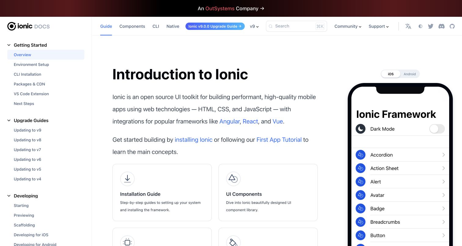
MDX allows React components within Markdown. Babel's paired example and Ionic's component preview illustrate why an interaction might be useful, while conventional prose remains essential. Give custom components an owner, static context and a test plan. Avoid making every article depend on a bespoke interactive feature simply because the authoring format allows one.
These twenty properties range from established framework brands to focused developer services. Study how each establishes the reader's next decision: learning versus setup, capability versus SDK, workflow versus release, or public reference versus account product. The reviews connect visible design to documentation responsibilities without treating a generator declaration as a full stack audit.
We start with five recognizable brands or organizations: Microsoft Playwright, React Native, Jest, Relay, Ionic documentation. Each attribution applies to the named website property, not every product or website belonging to its organization. This is a curated reading sequence, not a measured ranking.
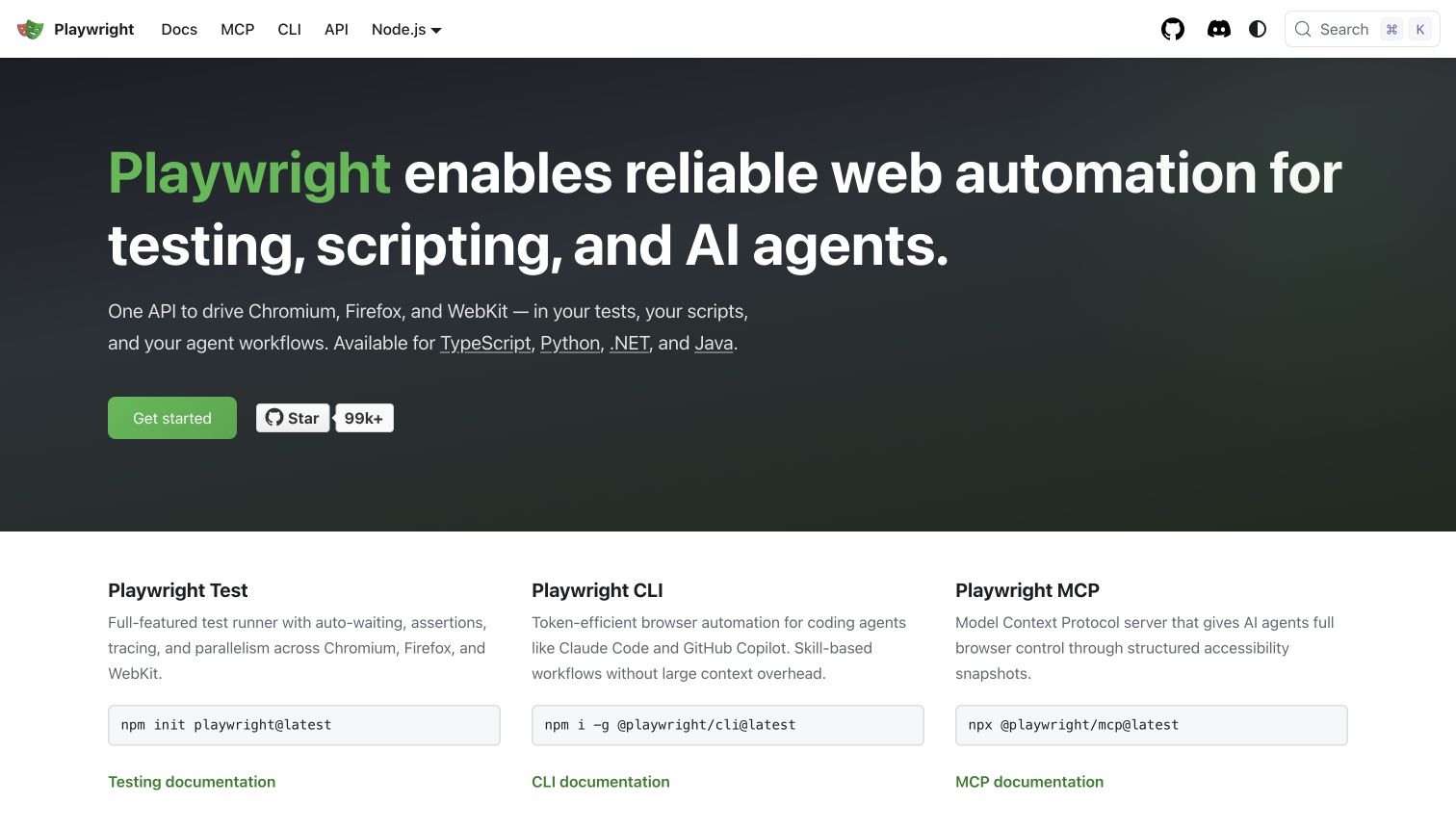
Playwright's homepage introduces the product in a dark, text-led hero before splitting into Test, CLI and MCP columns. Each column includes a command and a documentation link, while the white navigation keeps Docs, MCP, CLI and API distinct. Language links in the opening paragraph provide another route for visitors whose first decision is their programming environment rather than the workflow.
What you can learn
Use a customized Docusaurus landing page to route different audiences into maintained documentation trees. Model the three workflows explicitly rather than duplicating the same generic start button everywhere. Keep command examples selectable and clarify which environment each initializes. When the navigation or a release changes, test both a direct API link and the introductory path; a coherent homepage cannot compensate for a reader landing in the wrong language or documentation section.
Pros
The workflow columns connect descriptions to concrete documentation destinations.
Language choices appear in ordinary text as well as the header selector.
Cons & considerations
If the product family expands, similarly short menu labels may need stronger grouping.
Commands and agent-oriented guidance need release ownership so the opening does not outlive its instructions.
Visible tech stack
Earlier / documented evidence
Docusaurus
Platform source: Current public document generator. The public document inspected on 2026-11-06 declares meta[name="generator"] content="Docusaurus v3.10.1" and exposes the #__docusaurus root. This identifies the captured public publishing property, not the implementation of the software it documents or every organizational website. Platform evidence is separate from the direct website screenshot and is not a complete current infrastructure audit.
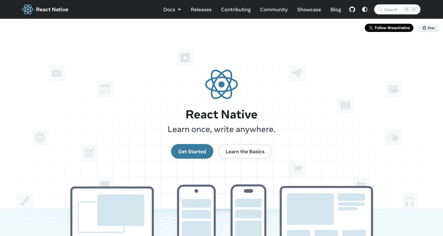
React Native centers a large symbol and simple introduction above device illustrations. Get Started and Learn the Basics are separate actions, helping distinguish environment preparation from conceptual learning. The dark header carries releases, contribution and community destinations without moving those institutional routes into the hero. Farther down, the site explains native interfaces and frameworks through examples, images and linked learning resources.
What you can learn
Separate beginner orientation from setup when they involve genuinely different questions. Docusaurus can support a branded introduction alongside versioned documentation, but the relationship should be explicit at every entry. Keep the device scene supplementary to a readable explanation, and preserve useful routes when animation or social embeds are unavailable. Review old tutorial links alongside release navigation so a newcomer does not unknowingly combine instructions from different generations of the framework.
Pros
Two introductory actions acknowledge different levels of familiarity.
The header distinguishes learning material from community and contribution information.
Cons & considerations
A tall illustrated opening can delay concrete setup details on shorter screens.
If embedded social or video content fails, supporting sections still need understandable static context.
Platform source: Current public document generator. The public document inspected on 2026-11-06 declares meta[name="generator"] content="Docusaurus v3.10.2" and exposes the #__docusaurus root. This identifies the captured public publishing property, not the implementation of the software it documents or every organizational website. Platform evidence is separate from the direct website screenshot and is not a complete current infrastructure audit.
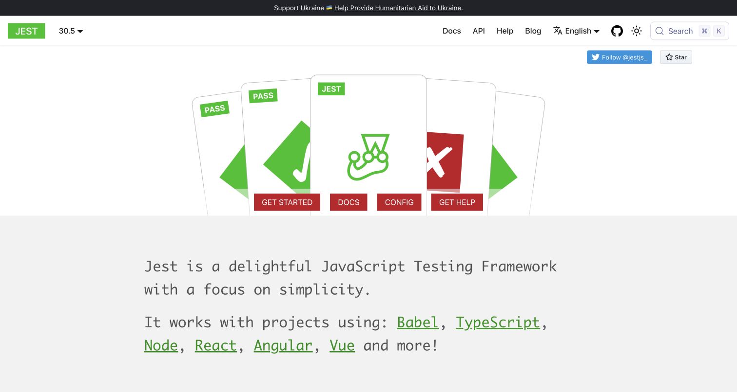
Jest combines a playing-card illustration with green success marks and red action buttons. The opening offers Get Started, Docs, Config and Get Help, while the header separately exposes the API, release selector and language menu. A large monospaced explanation follows, then practical capability sections. The personality is recognizable, but common reader tasks remain ordinary labeled links rather than requiring interaction with the illustration.
What you can learn
Treat the illustrated landing page and the documentation shell as complementary layers. In a Docusaurus project, maintain clear paths to configuration and reference material even when the visual campaign changes. Check whether two buttons leading to the same starting page are useful or simply repetitive. Version and language selectors deserve testing together, because an experienced reader may arrive at an older translated page rather than at the playful homepage.
Pros
Configuration and help receive direct opening links alongside onboarding.
The testing metaphor gives the page a distinctive identity without hiding ordinary navigation.
Cons & considerations
Repeated Get Started and Docs destinations can make the action hierarchy less decisive.
If translated material lags a release, visible version and language controls need clear compatibility cues.
Platform source: Current public document generator. The public document inspected on 2026-11-06 declares meta[name="generator"] content="Docusaurus v3.10.2" and exposes the #__docusaurus root. This identifies the captured public publishing property, not the implementation of the software it documents or every organizational website. Platform evidence is separate from the direct website screenshot and is not a complete current infrastructure audit.
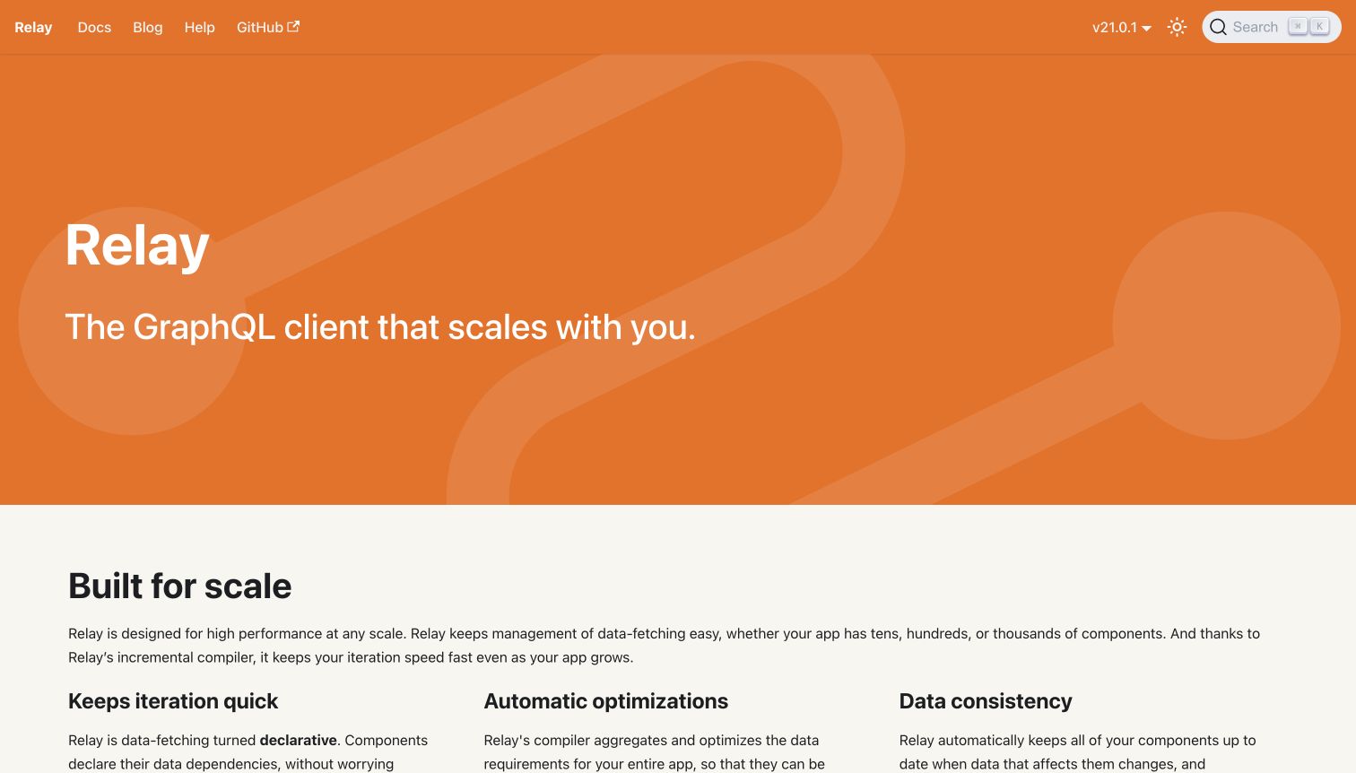
Relay uses an orange patterned hero with a short GraphQL-client introduction and a spare navigation bar. The first content area moves directly into scale, iteration, optimization and consistency explanations, followed by annotated code and reference links. Its release selector is visible in the header. Unlike many product pages, the opening does not add a large competing signup or demo panel.
What you can learn
A documentation-oriented homepage can prioritize understanding over lead capture. Use Docusaurus page components for a concise introduction, then let maintained technical content carry the argument. Give readers a clear next reading step near the promise instead of relying entirely on the header. Preserve code readability and stable section links when the explanation grows, and review technical statements against the release selected rather than treating the landing page as permanently versionless.
Pros
The quiet header makes Docs, Blog and Help immediately distinguishable.
Explanatory sections progress into real API links and code rather than ending at broad benefits.
Cons & considerations
Without a prominent hero start link, a newcomer may need to choose from the header.
Long technical sections need careful line-length and mobile-code handling as examples expand.
Platform source: Current public document generator. The public document inspected on 2026-11-06 declares meta[name="generator"] content="Docusaurus v3.9.2" and exposes the #__docusaurus root. This identifies the captured public publishing property, not the implementation of the software it documents or every organizational website. Platform evidence is separate from the direct website screenshot and is not a complete current infrastructure audit.
Ionic's documentation opens with a persistent left outline, a horizontal product-section menu and a release control. The introduction explains the toolkit beside a phone-sized component preview, then offers installation and component-library cards. Upgrade guides are visible in the sidebar rather than hidden in a release announcement. The result is a genuinely instructional first page, not a separate corporate marketing screen.
What you can learn
Use Docusaurus navigation layers for different questions: product area across the top, documentation topics down the side and release context in a dedicated selector. Keep those dimensions independent and label them consistently. A component demo can make an abstract toolkit concrete, but should not consume the only space available for setup instructions. Test keyboard operation and narrow-screen order so the phone preview enhances the explanation without becoming the first obstacle.
Pros
Upgrade guidance has an enduring place near getting-started material.
The product preview gives the written introduction a concrete visual counterpart.
Cons & considerations
Several simultaneous navigation dimensions can overwhelm readers unfamiliar with the ecosystem.
An embedded preview needs a useful fallback and must not trap focus away from the article.
Platform source: Current public document generator. The public document inspected on 2026-11-06 declares meta[name="generator"] content="Docusaurus v3.10.2" and exposes the #__docusaurus root. This identifies the captured public publishing property, not the implementation of the software it documents or every organizational website. Platform evidence is separate from the direct website screenshot and is not a complete current infrastructure audit.
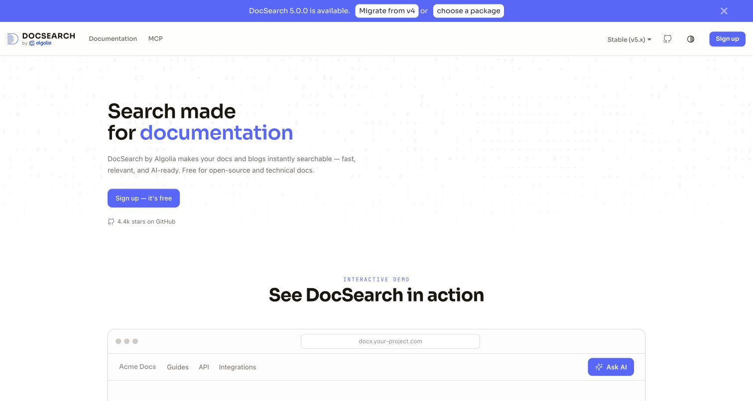
DocSearch pairs a restrained documentation header with a large search-focused introduction. A version announcement sits above the navigation, while a framed interactive demo follows the hero. Documentation, MCP and the stable-version selector remain separate from signup. Lower sections distinguish AI answers, an MCP server and integration options, giving the product narrative more structure than an undifferentiated list of features.
What you can learn
A Docusaurus landing page can demonstrate an interaction while preserving a reliable reference route. Make the demo visibly a demonstration, not the only way to access documentation. Treat its embedded state, loading behavior and keyboard handling as part of the page design. Release announcements should link to maintained migration guidance and remain dismissible. Keep signup and technical reading separate so visitors can evaluate the integration without entering an account workflow.
Pros
A labeled demo area makes the central product behavior tangible.
Version information and migration links appear before readers enter the reference material.
Cons & considerations
If the demo loads slowly, its large reserved area needs a helpful static explanation.
An announcement, signup button and AI features can compete unless their visual priorities remain controlled.
Platform source: Current public document generator. The public document inspected on 2026-11-06 declares meta[name="generator"] content="Docusaurus v3.10.2" and exposes the #__docusaurus root. This identifies the captured public publishing property, not the implementation of the software it documents or every organizational website. Platform evidence is separate from the direct website screenshot and is not a complete current infrastructure audit.
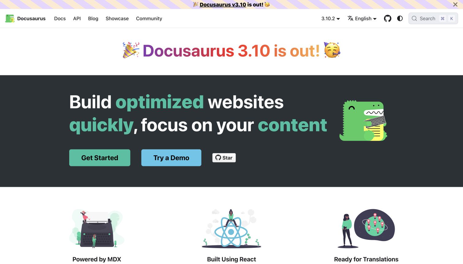
Docusaurus uses a colorful release announcement above a dark hero with its dinosaur character. Get Started and Try a Demo are distinct next steps. Feature illustrations below introduce MDX, React customization, translation and versioning, while Docs and API remain persistent in the header. The screenshot shows how far a recognizable documentation shell can be visually customized without removing the practical reading routes.
What you can learn
Use the framework's own site as a capability reference, not a requirement to reproduce every feature. A Docusaurus brief should decide which content benefits from MDX components, which versions genuinely need preservation and who maintains translations. Keep product release messaging separate from the deployed site's generator metadata; the observed generator string is a publishing signal, not proof that every advertised release or feature has been independently tested.
Pros
The two hero actions distinguish reading from trying the tool.
Illustrated feature summaries connect visual identity to concrete publishing responsibilities.
Cons & considerations
A release banner repeated in the opening can occupy disproportionate vertical space.
Advanced customization adds maintenance work if a small documentation team cannot own the resulting components.
Platform source: Current public document generator. The public document inspected on 2026-11-06 declares meta[name="generator"] content="Docusaurus v4.0.0" and exposes the #__docusaurus root. This identifies the captured public publishing property, not the implementation of the software it documents or every organizational website. Platform evidence is separate from the direct website screenshot and is not a complete current infrastructure audit.
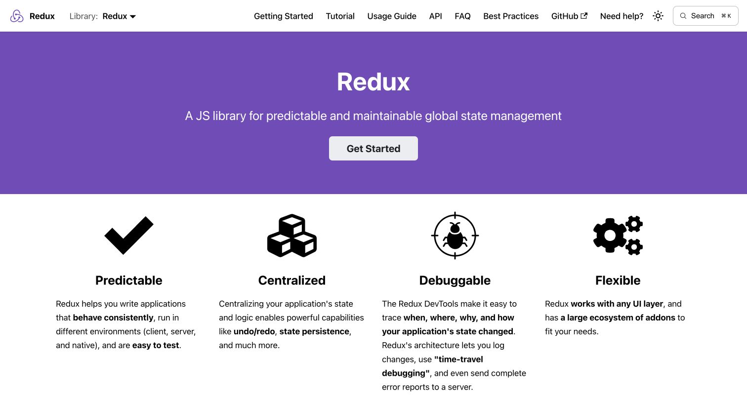
Redux's purple introduction states its role and offers one primary start action. Four illustrated pillars follow, while the header separately labels Getting Started, Tutorial, Usage Guide, API, FAQ and Best Practices. A library selector acknowledges related projects without merging every documentation tree into one sidebar. The homepage is visually simple but gives experienced readers several precise ways around the introductory material.
What you can learn
Distinguish learning sequence, practical guidance and reference rather than placing all articles beneath a generic Docs heading. Docusaurus can maintain these sections with a shared shell, but the editorial taxonomy must come from actual reader tasks. Keep related-library navigation clear about when the reader changes context. Test a deep API URL and a tutorial continuation as well as the homepage, because repeat users may never encounter the introductory purple panel.
Pros
Specific navigation labels make different reading modes visible.
A single primary hero action gives the introductory path a clear hierarchy.
Cons & considerations
A long horizontal menu may need careful grouping on intermediate screen widths.
If related-library routes change, shared navigation must prevent readers mixing incompatible examples.
Platform source: Current public document generator. The public document inspected on 2026-11-06 declares meta[name="generator"] content="Docusaurus v3.10.2" and exposes the #__docusaurus root. This identifies the captured public publishing property, not the implementation of the software it documents or every organizational website. Platform evidence is separate from the direct website screenshot and is not a complete current infrastructure audit.
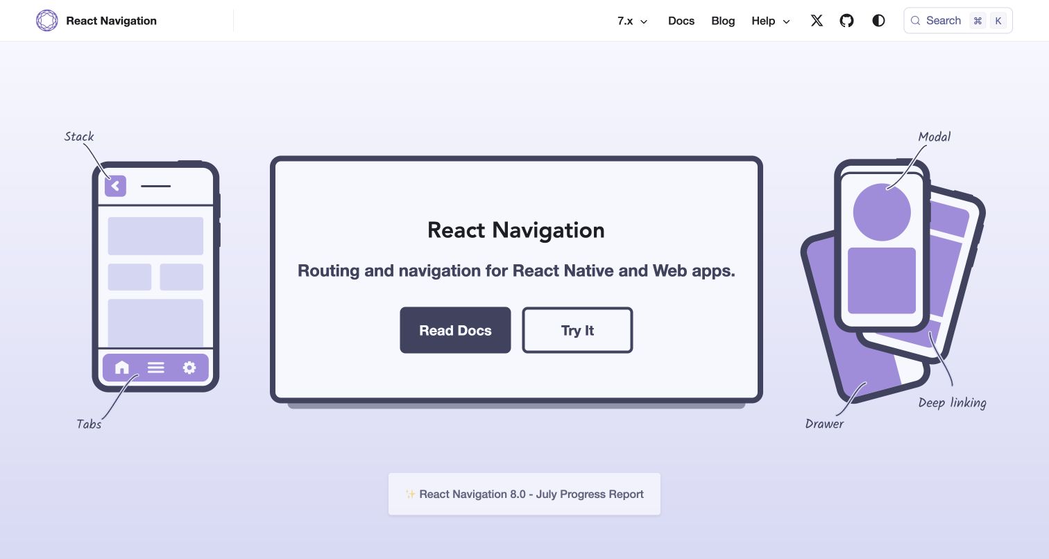
React Navigation surrounds its introduction with drawings of phones and a desktop window. Handwritten labels identify stack, tabs, modal and deep linking, translating the library's subject into an immediately relevant visual system. Read Docs and Try It form a two-action opening, while the version selector and help menu remain in a compact header. A progress report is secondary to the main learning path.
What you can learn
Make the hero illustration explain the subject rather than simply decorate it. With Docusaurus, that custom opening can coexist with a conventional documentation tree. Provide text equivalents for essential concepts and ensure the example route clearly indicates when it leaves for a repository. Maintain progress reports separately from the stable-version context so an announcement about future work does not make current readers assume they are reading a newer API.
Pros
The illustrations connect product terminology to recognizable interface patterns.
Documentation and example exploration are offered as distinct actions.
Cons & considerations
Very pale diagram details may need stronger contrast in alternate viewing conditions.
A future-release announcement needs clear separation from the stable version selected in the header.
Platform source: Current public document generator. The public document inspected on 2026-11-06 declares meta[name="generator"] content="Docusaurus v3.10.2" and exposes the #__docusaurus root. This identifies the captured public publishing property, not the implementation of the software it documents or every organizational website. Platform evidence is separate from the direct website screenshot and is not a complete current infrastructure audit.
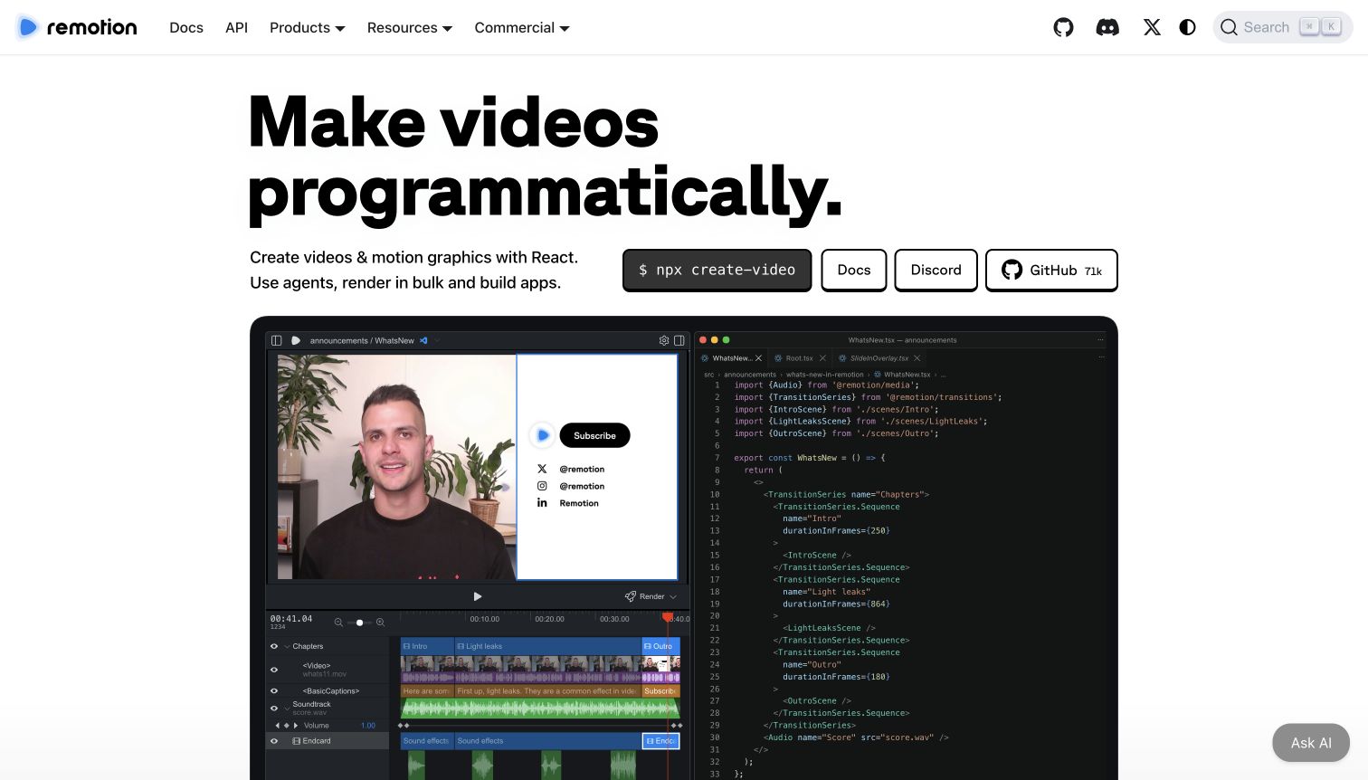
Remotion combines a large typographic introduction with a command, documentation and community links. The captured hero shows a video-editing environment beside code, directly connecting implementation to visible output. Its navigation separates Docs and API from products and commercial information. Further sections distinguish agent-oriented, interactive and programmatic workflows, making the site more than a single documentation index.
What you can learn
Use a custom Docusaurus homepage when a product needs demonstration before detailed reading. Keep the core explanation, command and docs link independent from the large media example. Changing hero words should retain a stable accessible meaning, and video controls need usable keyboard behavior. Maintain commercial information as a separate editorial responsibility; the presence of a software-generated documentation shell does not establish licensing eligibility or the implementation of the application shown.
Pros
The paired editor and code image makes the product model concrete.
Docs and API remain directly available beside broader product and commercial routes.
Cons & considerations
A large media preview can delay practical detail on a short viewport.
Changing introductory words and floating AI controls need motion, focus and overlap checks.
Platform source: Current public document generator. The public document inspected on 2026-11-06 declares meta[name="generator"] content="Docusaurus v3.10.1" and exposes the #__docusaurus root. This identifies the captured public publishing property, not the implementation of the software it documents or every organizational website. Platform evidence is separate from the direct website screenshot and is not a complete current infrastructure audit.
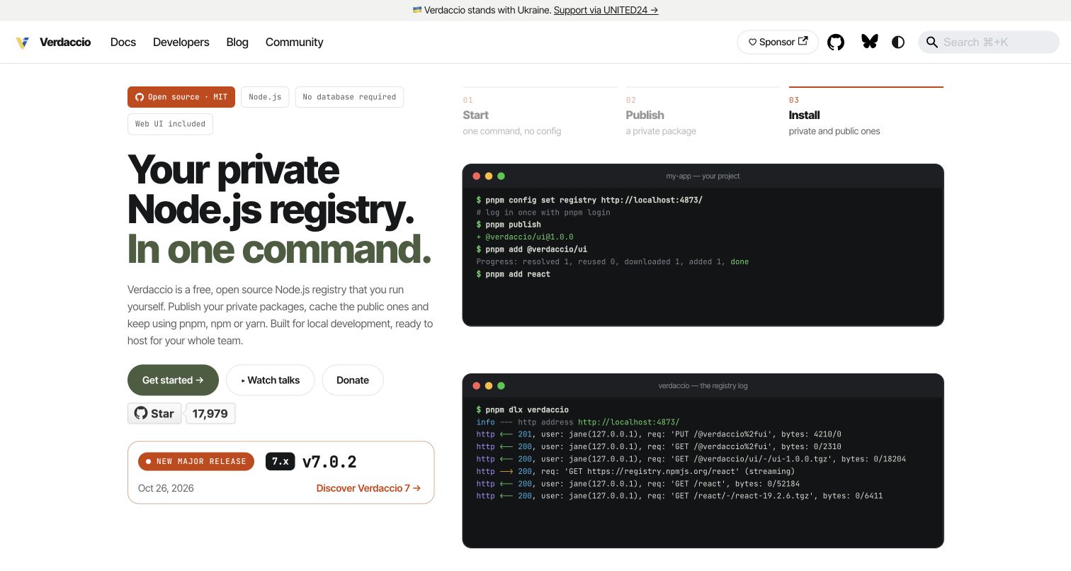
Verdaccio introduces a private registry with a plain explanation, a primary start link and two terminal scenes. A short numbered sequence above the examples connects starting, publishing and installing. The current major release appears in its own card below the hero actions. The restrained olive and orange palette gives the custom page character while the documentation header remains familiar and compact.
What you can learn
Use the homepage to make an unfamiliar system understandable before presenting its full configuration reference. Docusaurus components can pair commands with explanatory states, but each animation needs readable static content and an obvious sequence. Keep a release card maintainable independently from the enduring concept explanation. Distinguish documentation examples from executable instructions in the browsing interface; a visitor should be able to understand the workflow without launching a registry or copying a command.
Pros
The numbered sequence ties separate terminal views into one understandable workflow.
A dedicated release card avoids replacing the whole introduction with temporary news.
Cons & considerations
Animated terminal text can become difficult to follow without pause or static alternatives.
Several secondary actions may distract if onboarding is the visitor's immediate task.
Platform source: Current public document generator. The public document inspected on 2026-11-06 declares meta[name="generator"] content="Docusaurus v3.10.2" and exposes the #__docusaurus root. This identifies the captured public publishing property, not the implementation of the software it documents or every organizational website. Platform evidence is separate from the direct website screenshot and is not a complete current infrastructure audit.
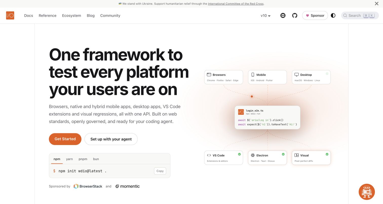
WebdriverIO presents a bold introduction beside a diagram of browsers, mobile, desktop and other targets. A package-manager tab group sits directly beneath the primary actions, while the header separates Docs, Reference and Ecosystem. The page continues into platform-specific sections and code. The result combines a customized product front door with the recognizable structure of a maintained technical documentation site.
What you can learn
Treat package-manager and platform choices as separate state dimensions. In a Docusaurus implementation, shared command tabs should stay synchronized where appropriate without changing unrelated article context. Preserve a direct reference route for repeat readers and a plain-language start path for newcomers. Test the diagram, tabs and floating assistant together on narrow screens, and keep any automated or AI-related product descriptions scoped to maintained guides rather than promises implied by the illustration.
Pros
Setup commands are available without scrolling through an extended marketing narrative.
Docs and Reference labels acknowledge learning and lookup as different tasks.
Cons & considerations
Several interactive demonstrations can add cognitive and loading cost to the landing page.
A floating assistant needs collision and focus testing alongside the package-manager controls.
Platform source: Current public document generator. The public document inspected on 2026-11-06 declares meta[name="generator"] content="Docusaurus v3.10.2" and exposes the #__docusaurus root. This identifies the captured public publishing property, not the implementation of the software it documents or every organizational website. Platform evidence is separate from the direct website screenshot and is not a complete current infrastructure audit.
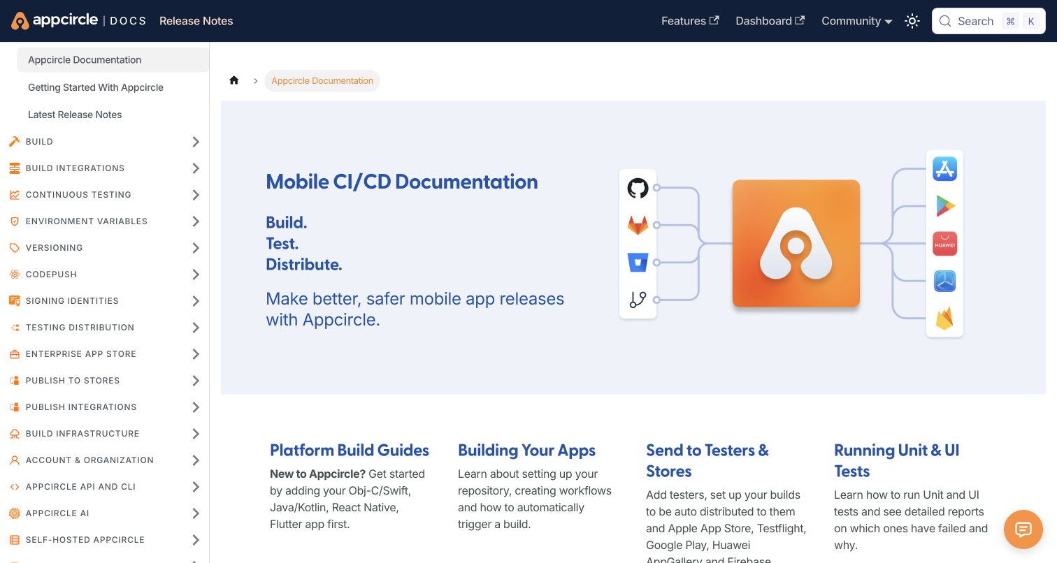
Appcircle's documentation homepage places a source-to-store illustration beside a short mobile-delivery introduction. The left outline exposes build, integrations, testing, signing, distribution and publishing topics in consistent uppercase labels. Practical cards below lead into platform setup and delivery tasks. Release notes and the external dashboard are visible in the header, separating public instructions from the account-based product.
What you can learn
Organize documentation around the lifecycle readers actually follow, then provide useful entrances for people arriving halfway through it. Docusaurus sidebars can hold a broad taxonomy, but icon and capitalization conventions should not substitute for clear names. Keep dashboard links visibly distinct from public reference links. When operational topics expand, review grouping and sidebar length rather than adding every new category at the same visual level indefinitely.
Pros
Lifecycle categories expose the breadth of the product without a separate navigation interaction.
The header distinguishes release information from the external dashboard destination.
Cons & considerations
A long all-caps outline can become harder to scan as categories accumulate.
The large introductory image may push task cards below the first view on smaller screens.
Platform source: Current public document generator. The public document inspected on 2026-11-06 declares meta[name="generator"] content="Docusaurus v3.10.2" and exposes the #__docusaurus root. This identifies the captured public publishing property, not the implementation of the software it documents or every organizational website. Platform evidence is separate from the direct website screenshot and is not a complete current infrastructure audit.
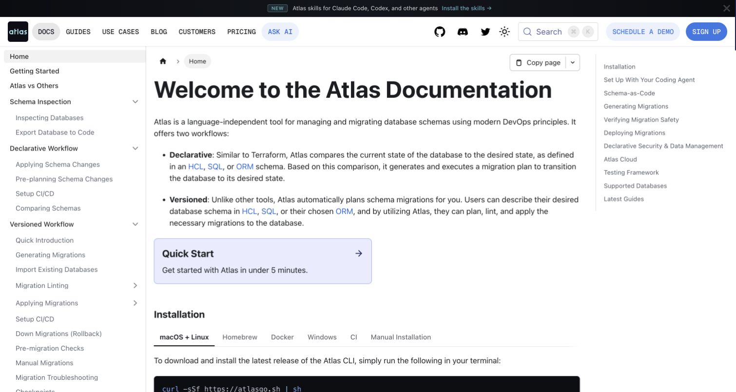
Atlas's documentation opens by contrasting declarative and versioned workflows, then places a Quick Start card before installation tabs. A detailed left outline exposes schema inspection, migration and configuration topics, while a right outline previews the current article. Copy-page controls appear above the heading. The introductory choice is conceptual, but concrete setup remains close enough to support an experienced reader.
What you can learn
Explain a consequential workflow choice before asking someone to copy installation instructions. Docusaurus can combine structured prose, callout cards and tabbed examples, but each element needs an editorial purpose. Keep the article readable between the two navigation columns and test direct links to lower setup sections. Copy-to-Markdown and AI routes should preserve release context and source attribution rather than generating a second, potentially inconsistent version of the documentation.
Pros
The two workflow descriptions help readers understand why later sections differ.
Quick Start and installation options turn the explanation into practical next steps.
Cons & considerations
Two side outlines and a busy header leave less space for long technical lines.
If copy and AI outputs omit context, readers may lose essential version or workflow distinctions.
Platform source: Current public document generator. The public document inspected on 2026-11-06 declares meta[name="generator"] content="Docusaurus v3.9.2" and exposes the #__docusaurus root. This identifies the captured public publishing property, not the implementation of the software it documents or every organizational website. Platform evidence is separate from the direct website screenshot and is not a complete current infrastructure audit.
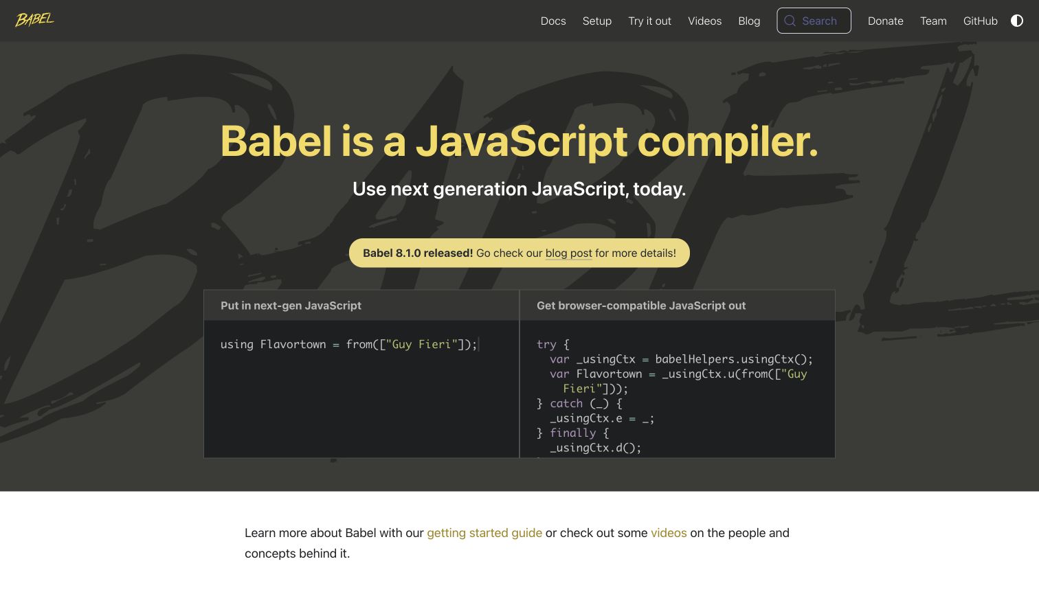
Babel uses a dark yellow-and-charcoal identity with paired input and output code panels. The concise introduction names the compiler, a release capsule links to news, and the navigation separates Docs, Setup and Try It Out. The live example makes the central transformation visible without a long diagram. A short learning paragraph below offers another route into maintained guidance.
What you can learn
A custom Docusaurus page can explain the product through its own input and output, but the demo should remain an enhancement to a complete written introduction. Give both panels meaningful labels, a readable fallback and appropriate keyboard behavior. Keep the compiler's release announcement separate from the website framework's generator version. Test the ordinary setup route when the live editor is unavailable, since onboarding should not depend on a successful interactive demonstration.
Pros
The paired panels communicate a transformation more directly than a decorative illustration.
Docs, Setup and Try It Out make reading, installation and experimentation distinguishable.
Cons & considerations
Small syntax-highlighted text needs contrast and zoom checks on the dark background.
If the editor loads late, its reserved area needs enough context to avoid looking broken.
Platform source: Current public document generator. The public document inspected on 2026-11-06 declares meta[name="generator"] content="Docusaurus v3.10.1" and exposes the #__docusaurus root. This identifies the captured public publishing property, not the implementation of the software it documents or every organizational website. Platform evidence is separate from the direct website screenshot and is not a complete current infrastructure audit.
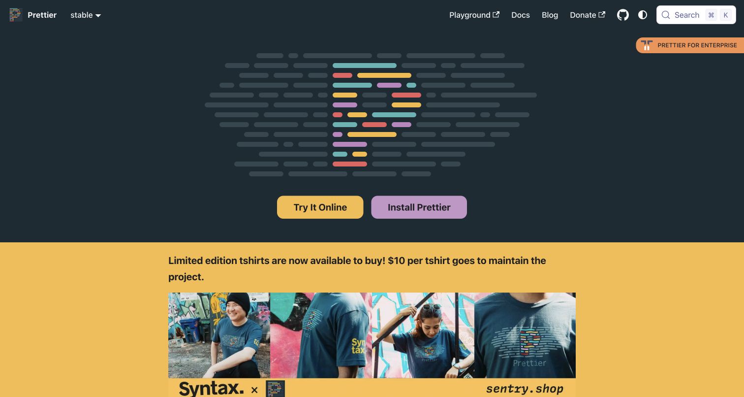
Prettier centers its colorful code-line mark on a dark field and places Try It Online beside Install Prettier. The top bar gives direct access to the playground, documentation and blog, with a release-context selector nearby. In the captured state, a bright merchandise campaign follows immediately beneath the hero. The technical entry points stay visible, but community fundraising occupies substantial first-screen space.
What you can learn
Separate the enduring adoption paths from temporary community promotions. Docusaurus allows a custom landing page and maintained documentation to share a shell, so the two core actions can remain stable while campaigns change below. Provide a textual explanation near an abstract logo, not only after the promotional block. Check that playground transitions, version context and donation destinations are understandable without implying that merchandise or enterprise services are required to use the formatter.
Pros
Trial and installation are presented as equally recognizable but distinct actions.
The repeated playground link supports visitors who bypass the hero.
Cons & considerations
A prominent merchandise campaign can delay the practical explanation of the tool.
An abstract logo-led introduction needs sufficient nearby text for unfamiliar visitors.
Platform source: Current public document generator. The public document inspected on 2026-11-06 declares meta[name="generator"] content="Docusaurus v3.10.2" and exposes the #__docusaurus root. This identifies the captured public publishing property, not the implementation of the software it documents or every organizational website. Platform evidence is separate from the direct website screenshot and is not a complete current infrastructure audit.
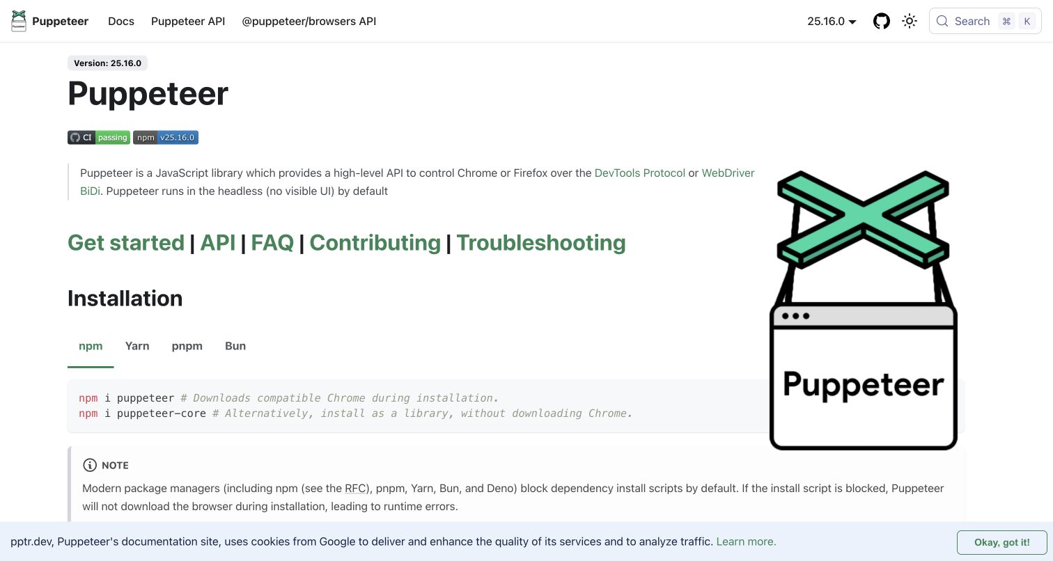
Puppeteer's homepage behaves like a documentation article: it shows the selected version, a brief introduction, a row of learning and troubleshooting links, then installation tabs. A large product illustration occupies the right side, while Docs and two API areas sit in the header. A visible note explains an installation caveat. The captured cookie strip also demonstrates the real space available for reading.
What you can learn
Use Docusaurus article conventions for a homepage when the reader's main goal is to start or look something up. Keep version context close to commands and distinguish related API surfaces with precise labels. Put important caveats adjacent to the relevant example, not in a separate announcement. Ensure package-manager tabs and copy controls remain usable around consent notices, and preserve a complete text route if the illustration or optional browser scripts fail.
Pros
Installation guidance appears in the first screen rather than behind a marketing detour.
The note is placed directly beneath the commands it qualifies.
Cons & considerations
A large illustration reduces room for code and supporting explanation on narrower screens.
Consent layers need testing so lower notes and tab controls do not become obscured.
Platform source: Current public document generator. The public document inspected on 2026-11-06 declares meta[name="generator"] content="Docusaurus v3.10.2" and exposes the #__docusaurus root. This identifies the captured public publishing property, not the implementation of the software it documents or every organizational website. Platform evidence is separate from the direct website screenshot and is not a complete current infrastructure audit.
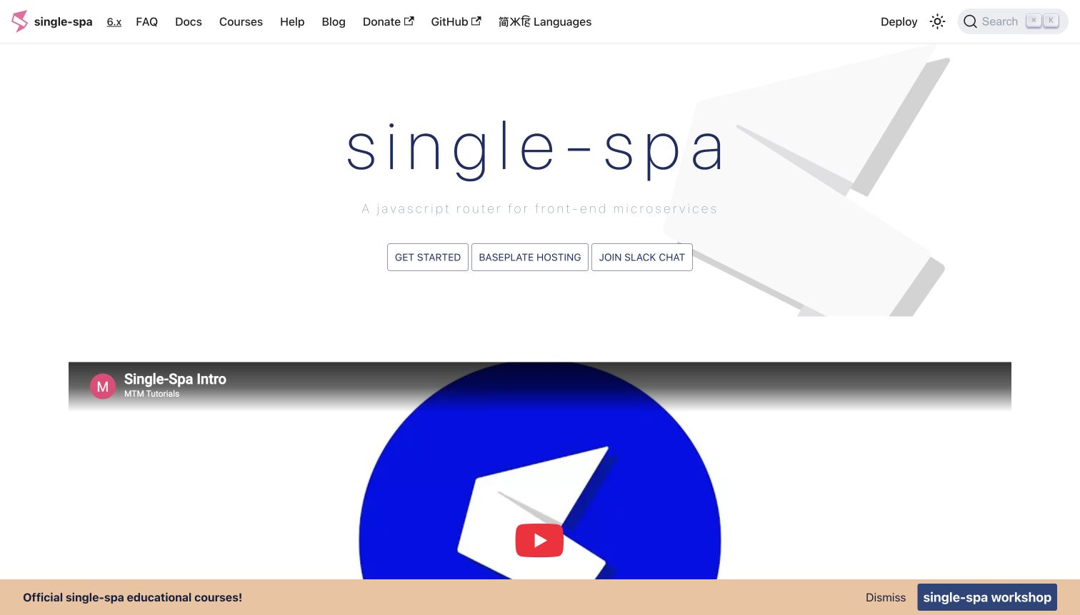
single-spa uses a sparse white hero with a lightweight wordmark and three outlined actions for starting, hosting and community chat. An embedded introductory video follows, with feature explanations farther down. The header keeps version, FAQ and documentation links prominent, while a course promotion appears along the bottom of the captured view. It is a compact concept-led opening rather than a large reference dashboard.
What you can learn
Keep the distinction between the open-source learning path, an external hosting service and community support explicit. Docusaurus can maintain the core documentation while the homepage links outward, but those transitions need predictable labels. Provide a concise static introduction beside the video and review lightweight typography for contrast. A course banner should remain dismissible and should not obscure navigation or make paid education appear to be the only route into the documentation.
Pros
The top bar gives direct access to both documentation and frequently asked questions.
The three hero actions reveal different next steps without a large menu.
Cons & considerations
Very light supporting type can lose legibility in bright or low-contrast conditions.
A video and bottom promotion can compete for limited vertical reading space.
Platform source: Current public document generator. The public document inspected on 2026-11-06 declares meta[name="generator"] content="Docusaurus v3.7.0" and exposes the #__docusaurus root. This identifies the captured public publishing property, not the implementation of the software it documents or every organizational website. Platform evidence is separate from the direct website screenshot and is not a complete current infrastructure audit.
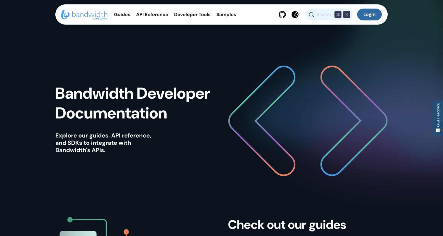
Bandwidth's developer homepage places a rounded white navigation bar over a dark gradient introduction. Guides, API Reference, Developer Tools and Samples receive their own labels. Large graphic brackets reinforce the developer identity without becoming navigation controls. Supporting cards below distinguish explanatory guides, detailed reference and SDKs, while the login action remains separate from public documentation.
What you can learn
Use a Docusaurus front door to distinguish learning, exact lookup and implementation resources before readers enter a deep tree. Keep the visual gateway short enough that its useful cards are discoverable. Maintain ordinary public links even when login and feedback features are added. Treat the corporate site, account product and developer portal as separate scopes; a generator observed on this portal does not establish the publishing technology of every Bandwidth property.
Pros
Task-specific labels make guides and reference clearly different destinations.
Login is recognizable without interrupting access to the public documentation.
Cons & considerations
A tall decorative introduction can postpone the most useful resource cards.
A persistent feedback control needs overlap and keyboard checks beside article and navigation content.
Platform source: Current public document generator. The public document inspected on 2026-11-06 declares meta[name="generator"] content="Docusaurus v3.10.1" and exposes the #__docusaurus root. This identifies the captured public publishing property, not the implementation of the software it documents or every organizational website. Platform evidence is separate from the direct website screenshot and is not a complete current infrastructure audit.
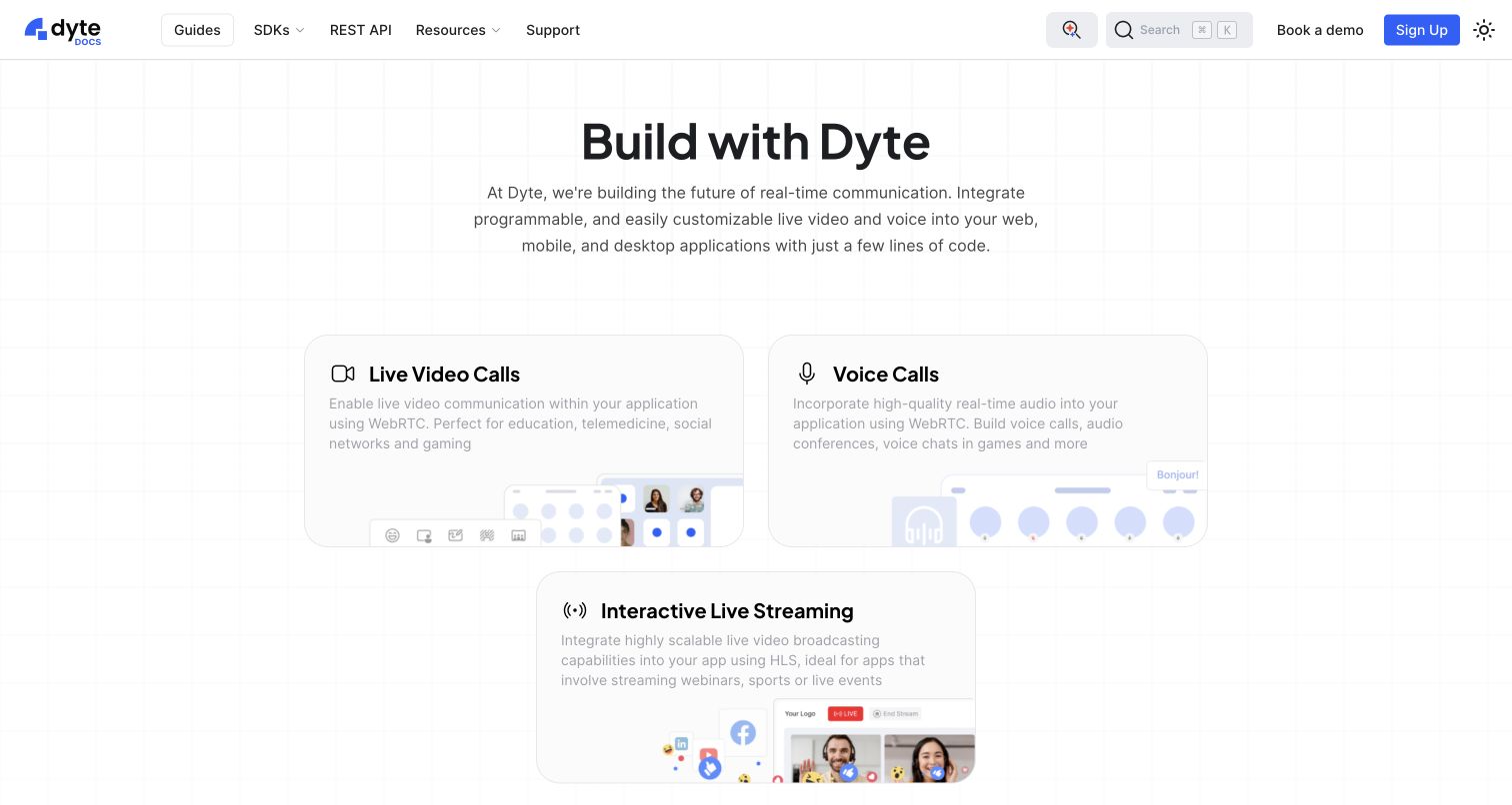
Dyte's documentation introduction organizes live video, voice and streaming into three illustrated cards. A restrained top bar separates Guides, SDKs and REST API, with search, support and account actions nearby. Lower sections introduce common how-to guides, sample applications and framework choices. The first decision is what someone wants to build, rather than requiring them to choose a programming framework immediately.
What you can learn
A Docusaurus homepage can offer use-case and technology-based entrances without forcing one taxonomy to carry every task. Keep the capability cards understandable in ordinary text and connect them to the appropriate guides. Distinguish public examples from actions that start real communication sessions. As SDKs change, review links across the cards, header and lower framework index together; otherwise multiple helpful entry points can slowly become inconsistent versions of the same product map.
Pros
Capability cards give unfamiliar readers a concrete first decision.
Guides, SDKs and REST API are clearly separated in the main navigation.
Cons & considerations
Pale text over decorative card media needs contrast checks across responsive crops.
A broad page with samples, guides and SDKs needs disciplined maintenance to keep repeated routes aligned.
Platform source: Current public document generator. The public document inspected on 2026-11-06 declares meta[name="generator"] content="Docusaurus v3.7.0" and exposes the #__docusaurus root. This identifies the captured public publishing property, not the implementation of the software it documents or every organizational website. Platform evidence is separate from the direct website screenshot and is not a complete current infrastructure audit.
Kegan has 15+ years of experience working with small businesses, Fortune 500 companies, and everything in between. No development job is too big or too small: he brings the same hands-on attention to a focused improvement, a complete website, or a custom application.
For Docusaurus projects, he can help with responsive interfaces, reusable components, custom functionality, API connections, and performance-minded implementation. He works directly with clients on scope, design, implementation, testing, and handover, with an emphasis on clear communication and a system that remains practical to maintain after launch.
Show 3 other Docusaurus developersHide other Docusaurus developers
Choose a documentation front door that matches the reader's task
A direct documentation introduction
Puppeteer and Ionic move quickly into setup and article content. This approach suits visitors who already understand the product and need a reliable next instruction. Keep the selected release and command context visible.
A branded project gateway
React Navigation and Relay introduce the subject before sending readers into deeper guidance. Use diagrams or restrained identity to make a concept understandable, while keeping ordinary documentation links immediately available.
A multi-workflow resource hub
Playwright and Dyte give several legitimate implementation paths their own entrances. Keep workflow, programming language and release choices separate so one selector does not silently change an unrelated reading context.
From references to requirements
Specify content ownership and release behavior before customization
Inventory the routes readers actually enter
Include search-engine deep links, old API URLs, tutorial continuations and links from code repositories. Decide which paths must survive a reorganization and which need maintained redirects. Do not evaluate the information architecture only from the homepage.
Define the version and translation policy
Assign ownership for supported releases, translated articles, images and navigation labels. Docusaurus documents separate translation files and deployment choices; those capabilities still need a practical workflow for review and staleness. Keep a useful default when a language lacks a matching page.
Test the publishing system as a reader
Check headings, code tabs, copy controls, focus order, search, zoom, narrow screens and reduced motion. Include broken optional media and realistic consent states. A successful static build is not proof that a reader can complete a learning task.
A useful handover demonstration
Ask the actual team to carry out its routine job: publish a realistic update, correct a mistake, preview a narrow screen, and identify who owns an integration failure. For a library or frontend framework, also ask who maintains the content source and deployment. A polished screenshot does not answer those operational questions.
Beyond the screenshot
Docusaurus project planning checklist
Separate tutorials, practical guides and exact reference material.
Choose a documentation-only or custom landing-page route deliberately.
Keep workflow, language and release selectors independent.
Define supported versions and a policy for archived links.
Assign owners for translated prose, navigation labels and images.
Provide static context for demos, code editors and animations.
Test direct article entry, keyboard use and readable code at zoom.
Record platform evidence for the exact public property, not the whole organization.
Test with real content, a keyboard, a small screen, slow or failed requests, and the people who will maintain the system. These are planning checks, not an accessibility, security, performance, or search-ranking certification.
Sources & editorial method
How this Docusaurus collection was reviewed
Twenty distinct official public properties were independently inspected and directly captured in an ordinary browser on November 6 UTC. Each document declared a Docusaurus generator value and exposed the framework root during the same session; exact observed strings and timestamps are retained in the research. Apache APISIX was excluded despite a showcase listing because the reviewed current page did not provide that current signal. Every review is original and discusses visible design. No account, code installation, form submission or private repository inspection was required. Generator declarations are publisher-provided evidence, not a security, performance or complete architecture audit.
Every image is an unmodified capture from the actual website, with its source and capture date. Some captures are reused from our shared catalog; their dates remain the original capture dates. None comes from a vendor gallery or a generated reconstruction. Moving imagery and live content can change.
Technology attribution uses public page assets or metadata, official platform documentation, or a cited first-party project case study. Documentary and framework-relationship evidence is identified where used; it is not a complete current backend inventory. A CMS image CDN alone does not establish a full CMS deployment. A library’s presence does not prove which individual controls use it, and a platform label does not establish AI authorship.
The composition notes, lessons, pros and tradeoffs are original editorial observations. We have not measured conversion, traffic, security, performance or accessibility conformance. Website owners retain their brands and imagery; these examples are not our client portfolio. Written, Edited and Curated are independent records, not dates advanced by a build. See our editorial standards or suggest a correction.
Questions worth asking
Docusaurus website development FAQs
Are these examples all standard Docusaurus themes?
No. Some retain a familiar article shell, while others use custom product introductions, illustrations or live demonstrations. The evidence establishes Docusaurus on the captured public document, not which parts use an unchanged default theme.
Does a Docusaurus documentation site mean the product itself uses React?
No. Docusaurus's own publishing architecture uses React, but documentation can describe software written in unrelated languages and frameworks. Keep the documentation implementation distinct from the implementation of the documented product.
Does every project need documentation versioning?
No. The official guide explicitly warns about its complexity. Use preserved versions when release differences justify their maintenance, and define support and archival behavior before adding a selector.
Can translations be added automatically without editorial work?
The platform supports internationalization, but translation quality, coverage and update ownership remain project responsibilities. Plan for prose, labels and image text together rather than treating a language menu as proof that every page is current.
Choose Docusaurus around a maintainable documentation model, then use customization to make the reader's next decision clearer. A distinctive homepage is valuable when the learning and reference routes behind it remain dependable.