Best Segment Websites of 2026 (20 Real-World Examples)
Twenty inspected public websites from organizations with documented Segment customer-data programs, with each application boundary kept explicit.
Segment is a customer-data layer, not a visual design system. Study the clarity of these pages, then decide which customer questions your own data collection should actually answer.
An auction visitor, a software trial user and a fragrance subscriber can all generate useful product signals, but the meaning of those signals is different. These examples combine public design observations with official Twilio cases describing particular customer-data programs. They do not claim that a company’s corporate site, investor portal and transactional application share one implementation. Domino’s Mexico, FOX Sports, IBM Cloud and Yara’s Atfarm context remain specifically identified rather than expanded to every related brand.
Before adding another event to a website, identify the decision someone will make from it. A pageview may indicate curiosity, confusion or accidental navigation. A button click may start a process that never finishes. Good interface design and trustworthy measurement begin with a complete task, a useful success definition and an understanding of what should not be collected.
Before the examples
What makes good Segment website development in 2026?
Start with a small set of meaningful actions
Write a tracking plan around completed customer tasks and the steps needed to diagnose friction. Give each event a stable name, an owner and a clear definition. Specify required properties and permitted values before developers implement it. Avoid collecting every interaction merely because the browser can expose it; a smaller reliable dataset is easier to understand and govern.
Distinguish anonymous browsing, an authenticated person and the organization they act for. Agree on durable identifiers and explain when records should or should not connect. Shared devices, multiple email addresses and staff acting on behalf of customers need explicit handling. A profile that looks complete but joins the wrong people can be worse than an honest incomplete view.
Keep collection and activation accountable
List every destination receiving a signal and the purpose it serves. A customer-support tool, advertising destination and warehouse do not automatically need the same fields. Design consent, deletion and access handling with the actual operating context in mind. Avoid sending sensitive form contents, private URLs or unnecessary free text simply because a destination accepts a flexible payload.
The first five examples are recognizable organizations with direct official Segment evidence. Each review distinguishes the captured public page from the documented data program; older product names and historical program contexts are retained as such.
We start with five recognizable brands or organizations: IBM, Domino’s, Nestlé Purina, Sotheby’s, FOX. Each attribution applies to the named website property, not every product or website belonging to its organization. This is a curated reading sequence, not a measured ranking.
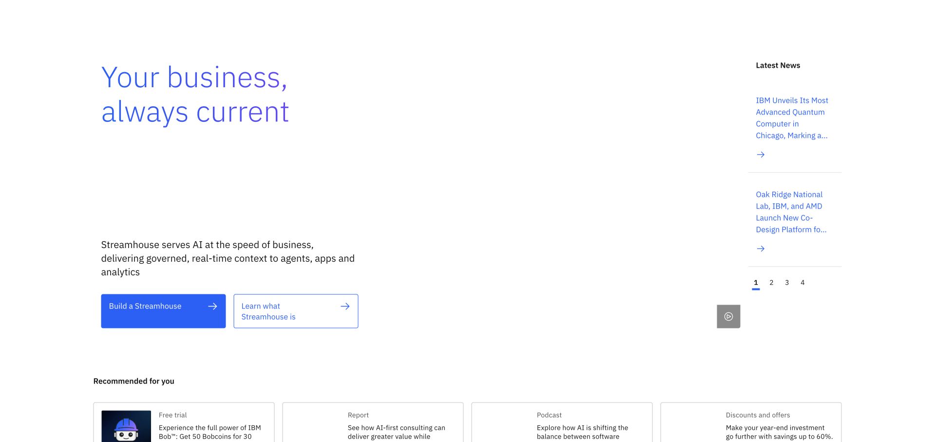
IBM gives its opening product message a generous white field rather than filling the screen with infrastructure diagrams. A pale blue headline, short Streamhouse explanation and two differently weighted actions establish a quiet hierarchy. The narrow news column creates a second reading speed, while recommended resources begin below. Twilio’s case concerns IBM Cloud customer-data collection and event-based communications across its product portfolio; it does not identify the pictured corporate page’s runtime or prove that its current recommendations use Segment.
What you can learn
Borrow the separation between a primary product narrative and supporting news. Define a useful audience decision before instrumenting it: whether someone needs a product explanation, a trial or a related resource. Sending more events cannot repair an unclear hierarchy.
Pros
The narrow news rail adds freshness without displacing the central product explanation.
Solid and outlined actions distinguish immediate product exploration from a learning path.
Cons & considerations
Large unused space makes the opening feel sparse on a wide desktop display.
Several enterprise product terms demand prior knowledge before their practical benefit becomes clear.
Platform source: Official technology-specific customer or workload source. Twilio documents Segment Connections and Protocols in IBM Cloud customer-data standardization and event-based communication across its product portfolio. This evidence establishes only the stated product, workload, organization or historical association. It does not prove that the pictured public page uses the technology, reveal its CMS/frontend, establish a complete current architecture or independently verify vendor-reported outcomes. Platform evidence is separate from the direct website screenshot and is not a complete current infrastructure audit.
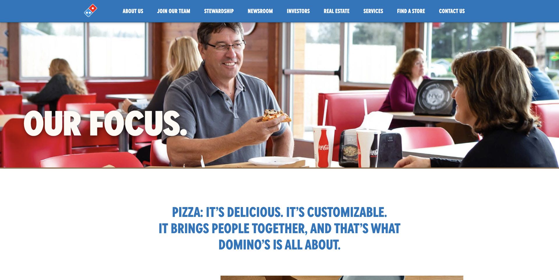
Domino’s corporate site opens with people sharing pizza rather than presenting an ordering widget. The full-width photograph, oversized short statement and compact blue navigation keep its purpose understandable. About, careers, stewardship and investor destinations occupy the same clear top row. Twilio’s Segment story specifically concerns Domino’s Mexico and Alsea’s customer-data environment, not every Domino’s market. This US corporate page is a separate design reference, and its appearance says nothing about the ordering platform’s data collection.
What you can learn
Decide which relationship a page supports before choosing its main action. A corporate visitor, prospective employee and hungry customer need different routes. Event definitions should preserve that context instead of treating every logo click or page visit as equivalent purchase intent.
Pros
The everyday dining photograph makes a large corporate organization feel immediately recognizable.
Straightforward navigation exposes stakeholder tasks without requiring a promotional carousel interaction.
Cons & considerations
The broad corporate message offers less direct guidance for visitors seeking a specific business fact.
Small uppercase navigation labels require more attention than the large welcoming photograph.
Platform source: Official technology-specific customer or workload source. Twilio specifically identifies Domino’s Mexico and Alsea using Segment for unified customer information, marketing audiences and channel measurement. This is not a blanket association for all Domino’s regions. This evidence establishes only the stated product, workload, organization or historical association. It does not prove that the pictured public page uses the technology, reveal its CMS/frontend, establish a complete current architecture or independently verify vendor-reported outcomes. Platform evidence is separate from the direct website screenshot and is not a complete current infrastructure audit.
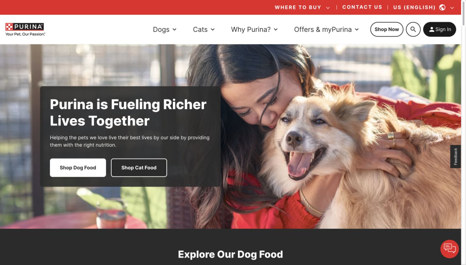
Purina makes a person and dog the dominant visual, then places a dark message panel over the quieter side of the photograph. Two adjacent shopping actions immediately separate dog and cat needs. A red utility strip and familiar product navigation give the warm campaign a practical frame. Twilio documents Segment as an orchestration and identity layer in Purina’s wider marketing-data modernization. That evidence concerns customer signals across systems, not a finding that Segment supplies the photographed page’s content management or frontend.
What you can learn
Use personalization to support a meaningful customer distinction, such as the animal someone cares for, rather than merely varying decorative headlines. Keep a useful default experience for an unidentified visitor and give each audience an equally visible route into relevant information.
Pros
The paired shopping choices translate a broad emotional promise into two understandable next steps.
A dark text panel protects readability without hiding the central human-and-pet relationship.
Cons & considerations
Utility navigation, shopping navigation and feedback controls create several competing peripheral layers.
A campaign photograph alone cannot explain differences among the extensive product and nutrition ranges.
Visible tech stack
Earlier / documented evidence
Segment
Platform source: Official technology-specific customer or workload source. Twilio describes Segment as a central orchestration and identity layer in Nestlé Purina’s marketing-data modernization across web, app and vendor signals. This evidence establishes only the stated product, workload, organization or historical association. It does not prove that the pictured public page uses the technology, reveal its CMS/frontend, establish a complete current architecture or independently verify vendor-reported outcomes. Platform evidence is separate from the direct website screenshot and is not a complete current infrastructure audit.
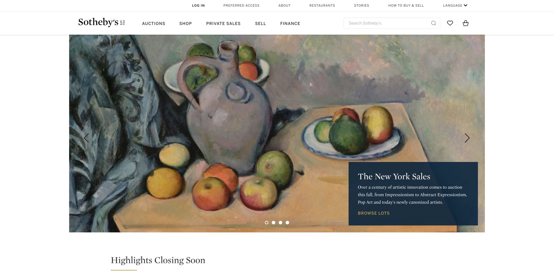
Sotheby’s devotes most of its opening area to a painting, allowing texture and color to establish the experience. The auction caption occupies a contained dark panel in the lower corner instead of becoming a giant headline across the work. A restrained white header organizes auctions, shopping and private sales. Twilio’s case describes Segment customer-data unification implemented with Gangverk. It does not establish the rendering technology of this particular auction homepage or independently validate the performance figures in the vendor story.
What you can learn
Protect the object’s presentation while keeping its context actionable. A catalog event model should distinguish viewing a work, studying a sale and registering interest. These are different levels of intent, and none requires covering the artwork with a dense promotional interface.
Pros
The contained caption preserves a large uninterrupted view of the featured artwork.
Quiet navigation and serif typography align the interface with an editorial auction context.
Cons & considerations
Small sale details and understated controls may be difficult to scan quickly on a large screen.
A rotating feature means important sales can be missed without further browsing or deliberate navigation.
Platform source: Official technology-specific customer or workload source. Twilio describes Sotheby’s centralizing customer information with Segment, implemented with Gangverk, for personalized engagement. This evidence establishes only the stated product, workload, organization or historical association. It does not prove that the pictured public page uses the technology, reveal its CMS/frontend, establish a complete current architecture or independently verify vendor-reported outcomes. Platform evidence is separate from the direct website screenshot and is not a complete current infrastructure audit.
FOX uses a vivid sports celebration as the main introduction to its corporate site. A compact dark-blue header leaves the image largely uninterrupted, and the familiar FOX wordmark anchors leadership, business, news and investor routes. The captured frame emphasizes shared spectacle more than a detailed company explanation. Twilio’s source identifies customer-data standardization and FOX Sports For You personalization within FOX’s digital portfolio. It does not establish the corporate homepage’s CMS or imply that every brand currently shares an identical stack.
What you can learn
A portfolio business can use a recognizable cultural moment to orient visitors, but it still needs explicit paths for different stakeholders. Measure those routes separately from viewing behavior in entertainment products; watching a hero animation is not the same as consuming a show.
Pros
The immersive sports imagery communicates the organization’s entertainment identity before substantial reading.
The narrow corporate navigation keeps investor and leadership routes consistently available.
Cons & considerations
An image-led opening reveals little about the breadth or boundaries of the company’s businesses.
The narrow bottom notice and small navigation text compete with an already visually busy scene.
Platform source: Official technology-specific customer or workload source. Twilio describes Segment data standardization across specified FOX brands and personalized FOX Sports For You content, not the corporate homepage. This evidence establishes only the stated product, workload, organization or historical association. It does not prove that the pictured public page uses the technology, reveal its CMS/frontend, establish a complete current architecture or independently verify vendor-reported outcomes. Platform evidence is separate from the direct website screenshot and is not a complete current infrastructure audit.
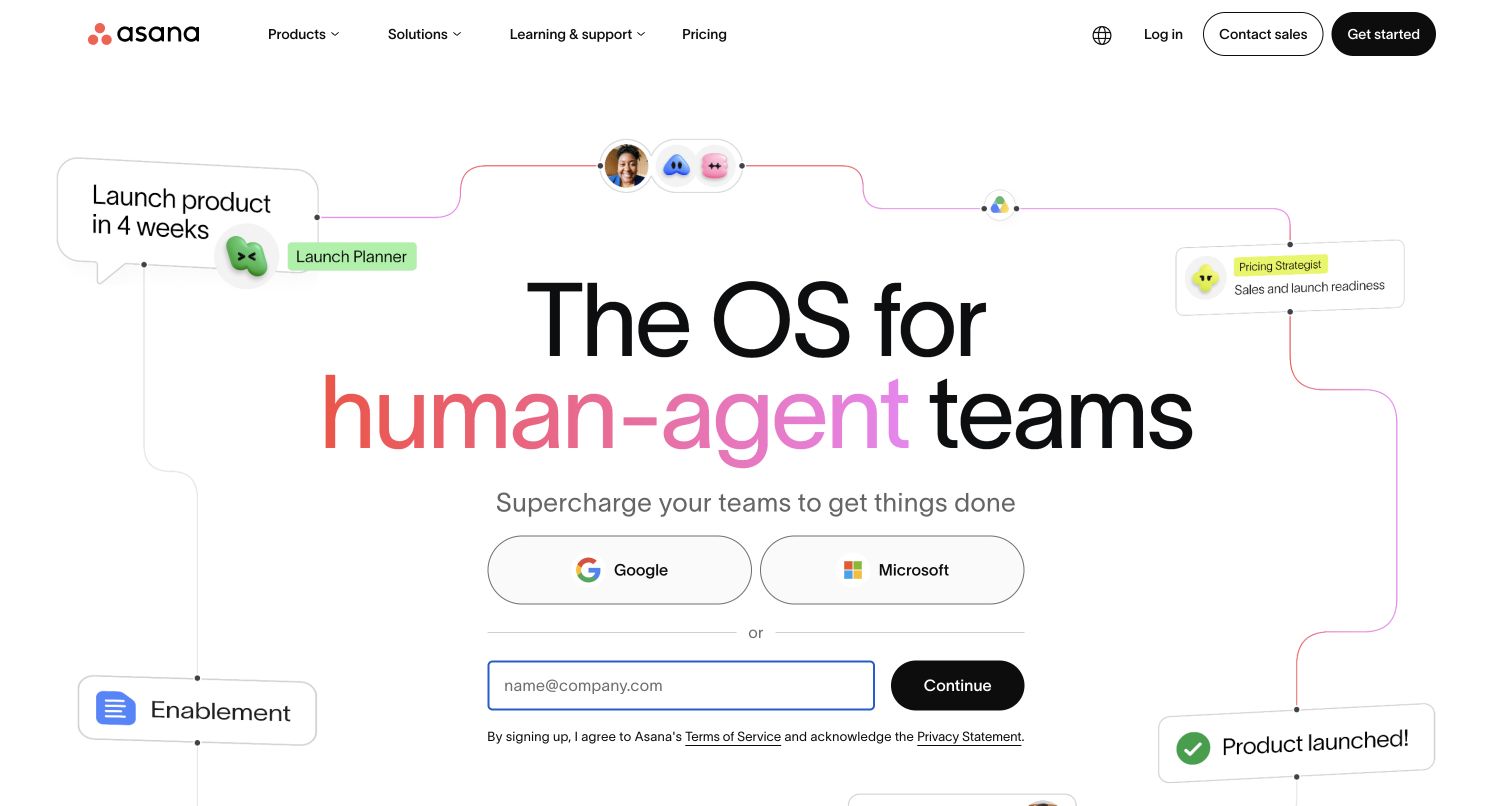
Asana surrounds its central headline with connected task cards, participant avatars and small status messages. The diagram suggests coordinated activity without forcing visitors into a technical architecture lesson. Google and Microsoft entry options sit above a work-email route, while a restrained header keeps product information nearby. Twilio documents Asana using Segment Connections, identity resolution and warehouse-linked audiences to unify customer information. That internal data and activation association is separate from the public signup interface shown in this capture.
What you can learn
Show the relationships that make a product useful, then offer one coherent starting point. If several authentication routes exist, preserve a consistent definition of completed registration. A click on an identity-provider button is an attempted step, not evidence that a new user has successfully joined.
Pros
Connected interface fragments turn an abstract collaboration promise into visible relationships between work items.
Provider buttons and email entry offer recognizable alternatives within one compact conversion area.
Cons & considerations
The illustrated network can feel busy before the visitor understands the product’s core workflow.
The human-agent terminology assumes familiarity with an evolving category rather than defining it immediately.
Platform source: Official technology-specific customer or workload source. Twilio describes Asana using Segment Connections, Unify and warehouse-linked audiences to unify customer information and support marketing activation. This evidence establishes only the stated product, workload, organization or historical association. It does not prove that the pictured public page uses the technology, reveal its CMS/frontend, establish a complete current architecture or independently verify vendor-reported outcomes. Platform evidence is separate from the direct website screenshot and is not a complete current infrastructure audit.
The RealReal’s public investor overview preserves its fashion identity through an expansive model photograph, a light serif title and a very restrained header. The stock symbol and quotation appear beside the title, making the page’s business purpose explicit without abandoning the brand. This is the investor site, chosen because the consumer entry required signup. Twilio’s case concerns Segment and Amplitude across buyer and consignor journeys; it does not identify the investor portal’s technology or demonstrate current consumer-store implementation.
What you can learn
Keep stakeholder pages recognizable, but introduce their practical purpose early. Investor navigation, financial disclosures and market information deserve clear labels independent of shopping journeys. Analytics should distinguish a visit to corporate reporting from a consumer browsing signal rather than merging them into one vague engagement measure.
Pros
The title, stock symbol and quotation quickly identify an investor-specific destination.
Fashion photography maintains continuity with the organization’s consumer-facing identity.
Cons & considerations
The subdued image treatment and small header labels can reduce contrast for rapid scanning.
A large editorial hero delays access to detailed reports for repeat investor visitors.
Platform source: Official technology-specific customer or workload source. Twilio identifies Segment and Amplitude in The RealReal’s buyer and consignor analytics and personalization program. The pictured public property is a separate investor overview. This evidence establishes only the stated product, workload, organization or historical association. It does not prove that the pictured public page uses the technology, reveal its CMS/frontend, establish a complete current architecture or independently verify vendor-reported outcomes. Platform evidence is separate from the direct website screenshot and is not a complete current infrastructure audit.
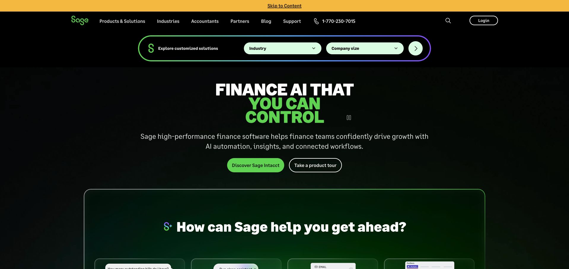
Sage places an industry and company-size selector near the top of its dark opening section. Bright green accents connect that discovery control to the central finance-AI message and the Sage Intacct action. The next section begins a framed product explanation rather than an unrelated visual theme. Twilio’s source describes Segment joining behavioral, CRM and backend signals for Sage’s customer engagement and onboarding. It does not establish the implementation of the pictured selector or the hosting and frontend technology of this homepage.
What you can learn
A useful finder starts with questions customers can answer about themselves. Keep the first choices concise and explain what they affect. Instrument selection, recommendation display and a subsequent product visit separately so that a populated dropdown is not mistaken for a successful match.
Pros
Industry and company size give visitors concrete ways to narrow a complex product portfolio.
Consistent green accents connect discovery controls and primary actions across the dark composition.
Cons & considerations
The AI-led headline remains broad until visitors read the smaller supporting description.
Several top-level product and partner routes can distract from the prominent guided selection path.
Visible tech stack
Earlier / documented evidence
Segment
Platform source: Official technology-specific customer or workload source. Twilio describes Sage joining behavioral, CRM and backend signals through Segment, including identity resolution, onboarding and engagement. This evidence establishes only the stated product, workload, organization or historical association. It does not prove that the pictured public page uses the technology, reveal its CMS/frontend, establish a complete current architecture or independently verify vendor-reported outcomes. Platform evidence is separate from the direct website screenshot and is not a complete current infrastructure audit.
Yara’s captured homepage leads with an aerial industrial scene and a contained announcement about its carbon-capture facility. White text blocks provide clear reading surfaces over detailed equipment, and the blue release button supplies an identifiable next step. Navigation separates offerings, careers, investors and sustainability. Twilio’s Segment story concerns grower engagement and the Atfarm crop-management context, including audience criteria such as region and season. It is not evidence that the pictured corporate release or facility operations run on Segment.
What you can learn
Connect a large strategic claim to a specific place and a source a visitor can read. For customer-data work, respect the difference between corporate communications and product behavior. A person studying a sustainability release should not automatically be interpreted as a grower seeking seasonal recommendations.
Pros
The industrial photograph gives an otherwise abstract corporate announcement a tangible setting.
Contained white text backgrounds preserve legibility across a complex image without erasing its detail.
Cons & considerations
A single current announcement can overshadow the company’s broader product and service proposition.
Small utility controls require deliberate attention against the busy aerial photograph.
Platform source: Official technology-specific customer or workload source. Twilio’s Yara case concerns grower engagement and Atfarm-related audiences using region, crop and season information. This evidence establishes only the stated product, workload, organization or historical association. It does not prove that the pictured public page uses the technology, reveal its CMS/frontend, establish a complete current architecture or independently verify vendor-reported outcomes. Platform evidence is separate from the direct website screenshot and is not a complete current infrastructure audit.
LUISAVIAROMA splits the first large image area between men’s and women’s fashion. The black-and-white portrait and warm close-up create contrast while the thin white header keeps brand, search and shopping utilities orderly. Small category labels sit close to the corresponding images rather than interrupting them. Twilio documents Segment unifying customer information across the retailer’s web, mobile and social touchpoints for marketing activation. That association does not independently establish the commerce engine or the frontend delivering the captured page.
What you can learn
Let a small number of meaningful audience choices organize a large inventory. Track navigation into a department separately from interest in a specific product, and retain clear browsing routes for visitors who decline optional tracking. A visually confident storefront should still work before any identity is known.
Pros
The split composition presents two clear fashion entry points with very little explanatory copy.
A compact header leaves the editorial photography room to establish the retailer’s luxury positioning.
Cons & considerations
Small overlaid category labels can be easy to miss in a large photographic composition.
Image-led discovery provides less help for visitors arriving with a precise product or sizing question.
Visible tech stack
Earlier / documented evidence
Segment
Platform source: Official technology-specific customer or workload source. Twilio describes LUISAVIAROMA using Segment to unify web, mobile and social customer information for personalization and marketing. This evidence establishes only the stated product, workload, organization or historical association. It does not prove that the pictured public page uses the technology, reveal its CMS/frontend, establish a complete current architecture or independently verify vendor-reported outcomes. Platform evidence is separate from the direct website screenshot and is not a complete current infrastructure audit.
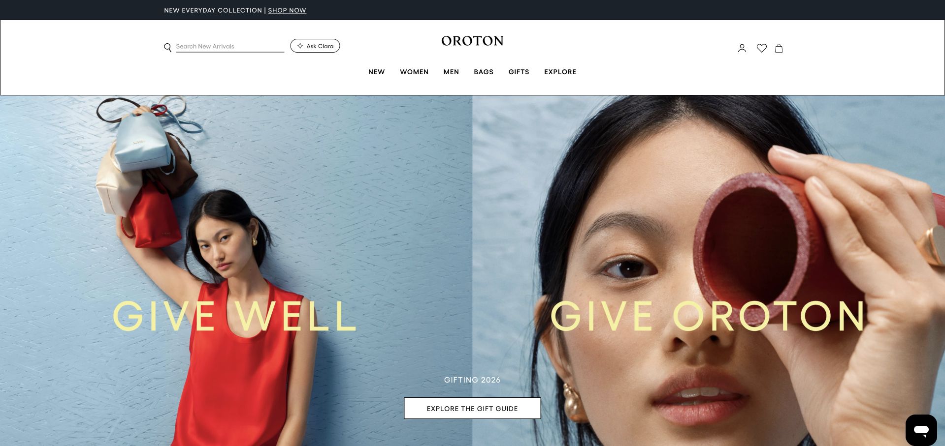
Oroton pairs a full-length model photograph with a close portrait and product detail. The large yellow gifting phrase bridges the images, while one understated guide button provides the main next step. A centered wordmark and generous white header create a calmer frame around the seasonal story. Twilio’s case describes Segment identity resolution alongside Azure Databricks, connecting commerce and point-of-sale information. This documented customer-data program does not mean Segment renders the fashion campaign or supplies every component of the store.
What you can learn
Keep the campaign’s visual promise coherent across crops, headings and destinations. In the supporting data model, choose a durable customer identifier before building complex audience rules. The same shopper appearing under several system-specific identifiers cannot be corrected simply by adding more campaign events.
Pros
The coordinated photographs make the gifting collection feel like one intentional editorial story.
The centered brand and minimal guide action avoid overwhelming the opening with competing sales messages.
Cons & considerations
Large image areas leave little immediate explanation of delivery, materials or gift suitability.
Thin header controls and small campaign details require careful contrast and responsive treatment.
Visible tech stack
Earlier / documented evidence
Segment
Platform source: Official technology-specific customer or workload source. Twilio describes Oroton rebuilding customer identity around a universal identifier with Segment CDP and Azure Databricks, including commerce and point-of-sale sources. This evidence establishes only the stated product, workload, organization or historical association. It does not prove that the pictured public page uses the technology, reveal its CMS/frontend, establish a complete current architecture or independently verify vendor-reported outcomes. Platform evidence is separate from the direct website screenshot and is not a complete current infrastructure audit.
Pura places its holiday fragrance message over a warm close-up of a gift being wrapped. A contained white shopping button remains distinct from the atmospheric background. The header separates diffusers, fragrances, brands and gifting, while a separate offer strip explains the trial proposition. Twilio documents Segment unifying shopping, application and device-related customer signals for retention and recommendations. It does not establish the technology that renders this storefront, and the pictured campaign is not evidence of a particular visitor’s personalized experience.
What you can learn
Separate what a new customer needs to understand from what an existing device owner wants to replenish. Design an understandable anonymous journey first. Subscription, retail purchase and device registration events need explicit relationships, especially when people use different email addresses across those experiences.
Pros
The warm wrapping photograph makes an intangible fragrance product feel connected to a familiar occasion.
Distinct navigation labels separate hardware discovery from scents, brands and gift shopping.
Cons & considerations
Multiple announcement and offer strips reduce the space available for the central campaign.
An atmospheric opening explains little about diffuser compatibility or ongoing refill commitments.
Platform source: Official technology-specific customer or workload source. Twilio identifies Segment in Pura’s unification of shopping, application and device-related customer information, retention and recommendations. This evidence establishes only the stated product, workload, organization or historical association. It does not prove that the pictured public page uses the technology, reveal its CMS/frontend, establish a complete current architecture or independently verify vendor-reported outcomes. Platform evidence is separate from the direct website screenshot and is not a complete current infrastructure audit.
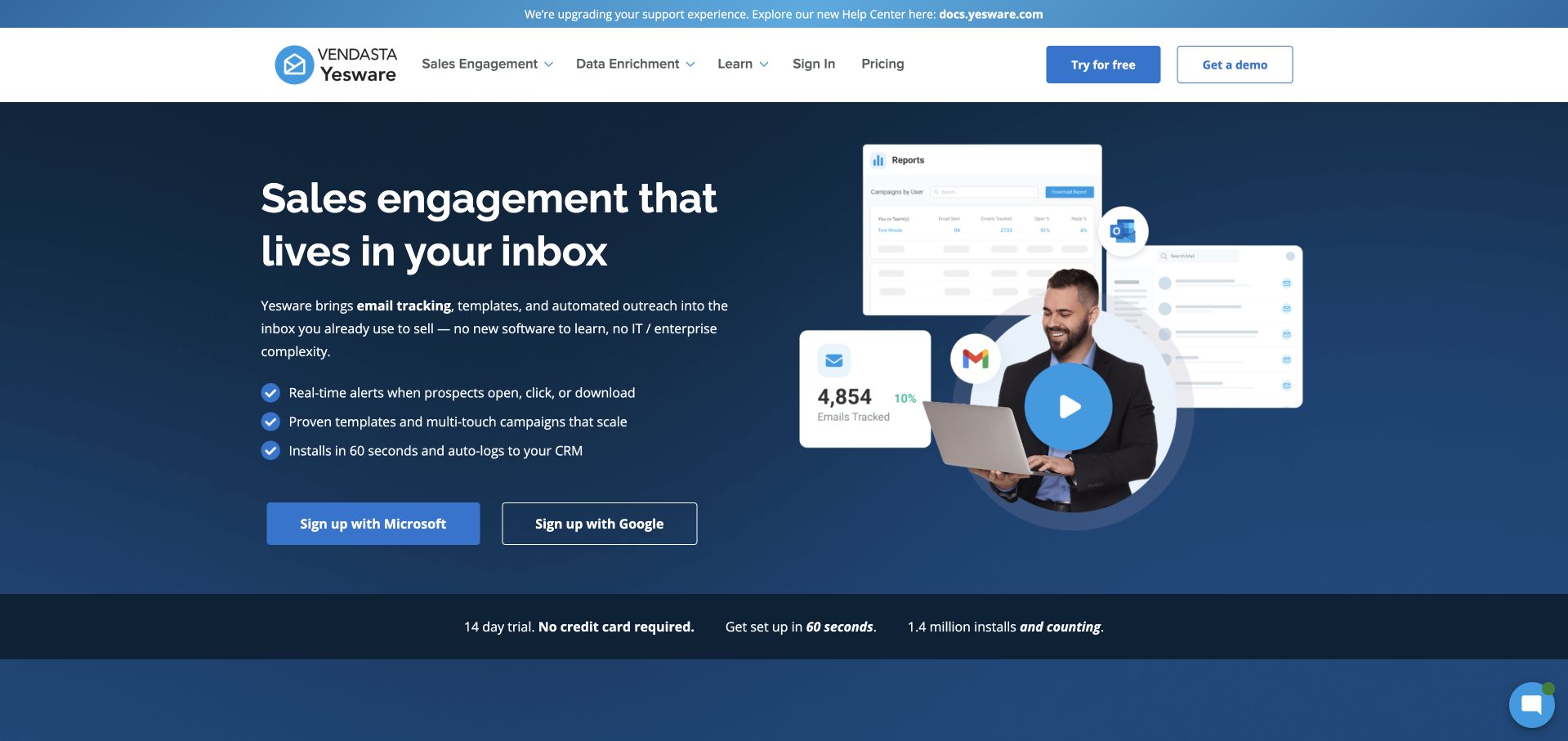
Yesware presents an inbox-centered promise in large white text on a dark blue field. Three short benefit lines and two provider-specific signup buttons sit beside a product collage and video play control. A lower strip introduces trial conditions without competing with the main headline. Twilio’s case identifies Segment event collection feeding Amplitude and other downstream tools for product improvement. That evidence concerns a documented analytics workflow, not a claim that the marketing hero, video or authentication interface is implemented by Segment.
What you can learn
Explain where a tool fits before listing everything it can do. Distinguish Microsoft and Google entry attempts in measurement while keeping the underlying activation goal consistent. A trial becomes useful when someone completes a meaningful inbox task, not merely when a provider button receives a click.
Pros
The inbox framing makes the product’s relationship to an existing work habit immediately understandable.
Short benefits and provider-specific buttons create a compact path from explanation to starting a trial.
Cons & considerations
The video collage contains several small interface details that are difficult to read at a glance.
Two similarly prominent signup choices may need additional guidance for users unsure about their organization’s setup.
Platform source: Official technology-specific customer or workload source. Twilio describes Yesware collecting product and website events with Segment and sending information to Amplitude and other tools for product improvement. This evidence establishes only the stated product, workload, organization or historical association. It does not prove that the pictured public page uses the technology, reveal its CMS/frontend, establish a complete current architecture or independently verify vendor-reported outcomes. Platform evidence is separate from the direct website screenshot and is not a complete current infrastructure audit.
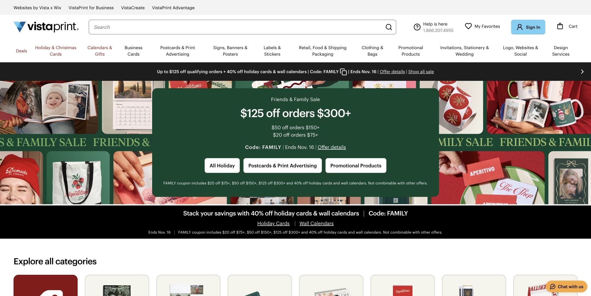
VistaPrint puts its search field near the center of a broad utility header, then exposes many print categories directly beneath it. A green seasonal promotion overlays a collage of finished products, with three category buttons offering a quicker route than reading every offer condition. Twilio’s case describes Segment customer-data unification, governance and experimentation at Vista. It does not prove that this particular promotion is personalized, establish the store’s current complete stack or verify the vendor-reported business outcomes.
What you can learn
For task-driven commerce, navigation and search are part of the product explanation. Name events around useful progress such as opening a product category, selecting a format or starting a design. Keep promotion exposure distinct from an intentional offer selection so experiments answer a meaningful customer question.
Pros
A prominent search field supports visitors who already know which printed item they need.
Finished-product imagery communicates variety more quickly than a long introductory paragraph would.
Cons & considerations
Several stacked offers and detailed conditions create a substantial amount of competing opening copy.
The very broad category row can be hard to scan without familiarity with printing terminology.
Visible tech stack
Earlier / documented evidence
Segment
Platform source: Official technology-specific customer or workload source. Twilio describes Vista using Segment for customer-data centralization, Protocols governance, experimentation and personalization. This evidence establishes only the stated product, workload, organization or historical association. It does not prove that the pictured public page uses the technology, reveal its CMS/frontend, establish a complete current architecture or independently verify vendor-reported outcomes. Platform evidence is separate from the direct website screenshot and is not a complete current infrastructure audit.
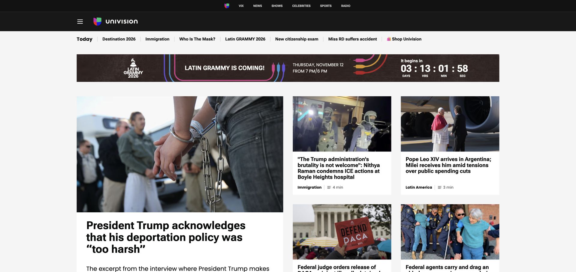
Univision’s captured page combines a large lead news card with a grid of smaller stories. A black brand header, topical shortcut row and event banner establish several levels of navigation before the articles begin. The browser-rendered text appeared in English during this capture; the page is a Spanish-language media destination. Twilio’s Segment case specifically describes the ViX streaming launch and its customer-data layer. It does not establish the infrastructure behind every Univision news page or the current implementation of this homepage.
What you can learn
Keep editorial priority legible even when many topics compete for attention. Separate article-reading events from streaming-product acquisition and account behavior. A translated browser view can alter headline length, so responsive layouts should tolerate language expansion without relying on one exact line break.
Pros
The larger lead card makes the editorial starting point clear within a dense news grid.
Topic shortcuts provide useful alternatives to reading the entire homepage in sequence.
Cons & considerations
The event banner and several navigation tiers push the main journalism further down the opening view.
Translated headline lengths can make already compact secondary cards feel especially crowded.
Visible tech stack
Earlier / documented evidence
Segment
Platform source: Official technology-specific customer or workload source. Twilio specifically describes Segment as a customer-data layer for Univision’s ViX and ViX+ streaming launch, not every public news property. This evidence establishes only the stated product, workload, organization or historical association. It does not prove that the pictured public page uses the technology, reveal its CMS/frontend, establish a complete current architecture or independently verify vendor-reported outcomes. Platform evidence is separate from the direct website screenshot and is not a complete current infrastructure audit.
The Knot Worldwide uses an expansive wedding photograph above its corporate positioning. A restrained wordmark and short stakeholder navigation keep the scene unencumbered. Rounded image corners and generous white space make the page feel more like an introduction than a directory of wedding vendors. Twilio documents Segment event collection across The Knot’s web and mobile products, including analytics and warehouse integration. That product-data association is separate from the corporate homepage pictured here and is not proof of its content platform.
What you can learn
Make the distinction between the parent organization and its consumer services visible in navigation and measurement. Corporate visitors may be researching careers, responsibility or the business itself. Those actions should not be treated as if they were a couple choosing a venue or planning a wedding.
Pros
A recognizable wedding moment connects the parent organization to the people its products serve.
A short corporate navigation avoids making first-time visitors decode a large portfolio of services immediately.
Cons & considerations
The opening photograph takes substantial space before a detailed explanation of the business appears.
A strongly emotional introduction provides limited immediate information for task-focused corporate visitors.
Platform source: Official technology-specific customer or workload source. Twilio describes Segment collection across The Knot’s web and mobile products, including downstream analytics and a Redshift warehouse. This evidence establishes only the stated product, workload, organization or historical association. It does not prove that the pictured public page uses the technology, reveal its CMS/frontend, establish a complete current architecture or independently verify vendor-reported outcomes. Platform evidence is separate from the direct website screenshot and is not a complete current infrastructure audit.
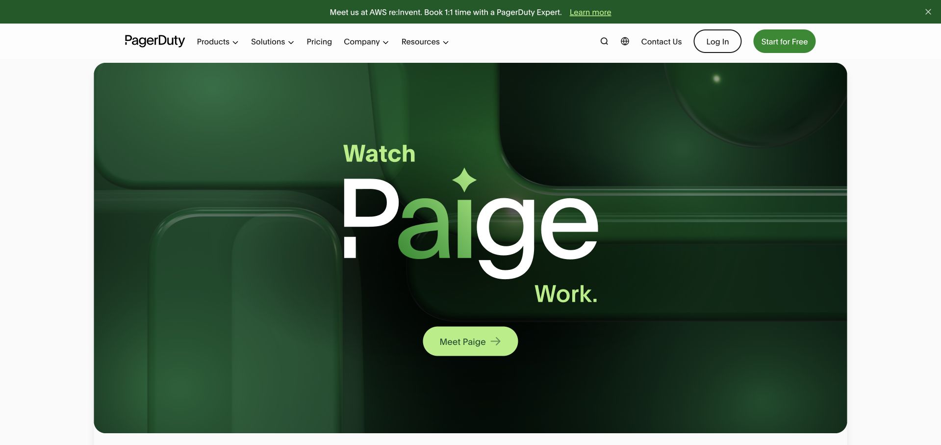
PagerDuty’s captured opening centers a green product feature panel around the Paige name, using depth, light and oversized typography instead of a conventional dashboard screenshot. A small bright action remains easy to identify inside the dark composition. The surrounding white header and event strip retain familiar corporate navigation. Twilio’s historical onboarding case describes Segment behavioral data feeding Pendo guides after PagerDuty’s 2019 IPO. It does not establish that the current Paige feature or marketing panel is built using Segment.
What you can learn
A launch panel can be visually distinctive without replacing the rest of the site’s navigation language. Define measurement around understanding and trying the new capability, not just animation exposure. Product onboarding evidence from an earlier period should not silently become a current architecture claim.
Pros
The concentrated green palette and large product name create a memorable introduction to one capability.
A single bright action gives the stylized feature panel a clear interactive destination.
Cons & considerations
The opening reveals little about the product’s concrete workflow without further navigation or reading.
The event strip and highly stylized hero compete to define the page’s immediate priority.
Platform source: Official technology-specific customer or workload source. Twilio’s case concerns Segment behavioral data feeding personalized Pendo onboarding after PagerDuty’s 2019 IPO. It does not identify the current Paige product architecture. This evidence establishes only the stated product, workload, organization or historical association. It does not prove that the pictured public page uses the technology, reveal its CMS/frontend, establish a complete current architecture or independently verify vendor-reported outcomes. Platform evidence is separate from the direct website screenshot and is not a complete current infrastructure audit.
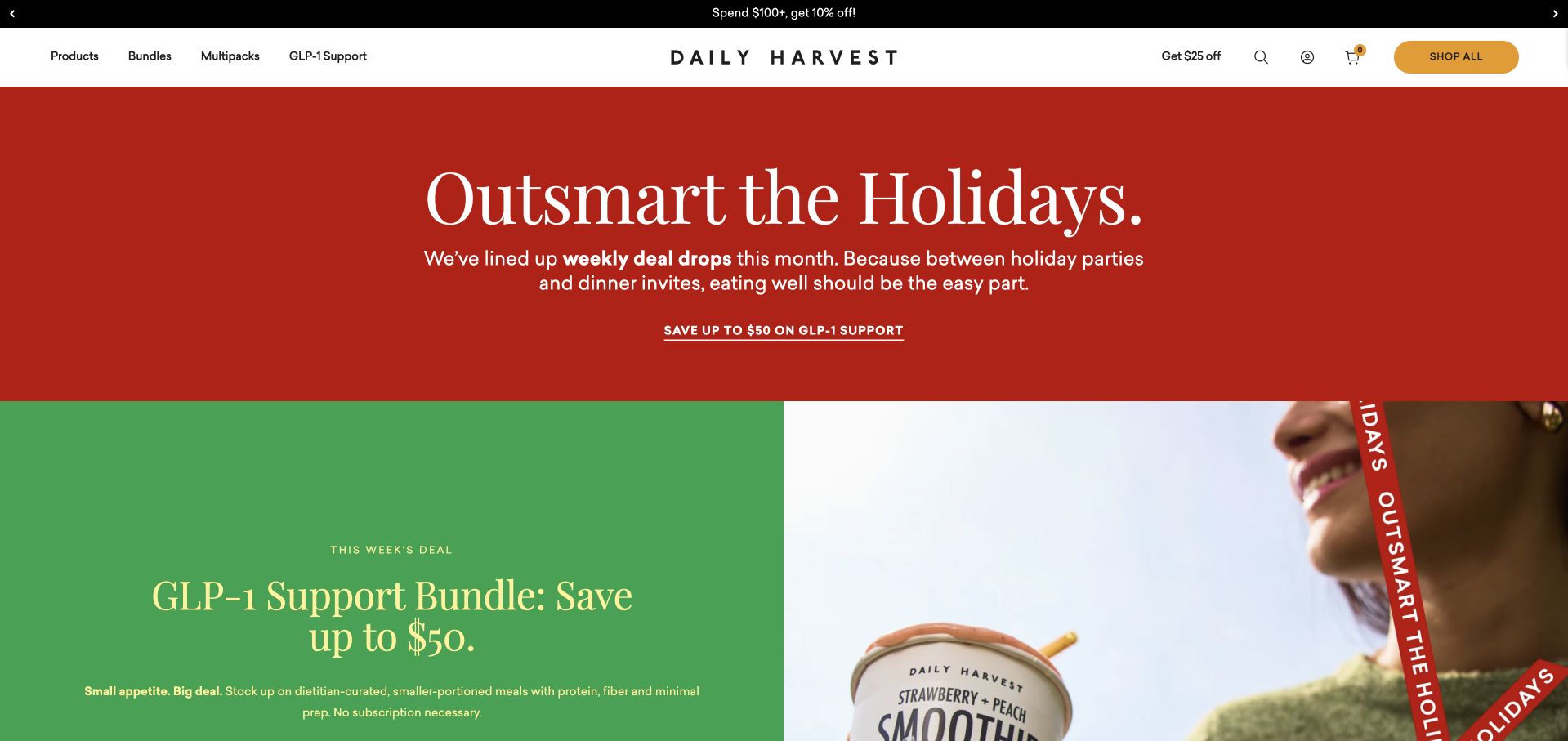
Daily Harvest combines a large red holiday message with a green feature panel and cropped food photography below. The restrained white header keeps product categories, bundles and shopping utilities separate from the seasonal palette. The campaign uses short sentences and a focused savings link rather than an extensive product grid at the top. Twilio’s case describes Segment connecting customer and email information for analytics and personalization. It does not establish the current storefront implementation, the health benefits of an advertised bundle or whether this visitor saw personalization.
What you can learn
Keep seasonal merchandising flexible while preserving stable product navigation. Model a campaign view, a bundle visit and a subscription decision as different actions. Be particularly careful not to turn browsing of a nutrition-related collection into an unsupported assumption about a person’s health or treatment.
Pros
Strong red and green sections give the campaign a recognizable rhythm without changing the header’s basic structure.
The featured bundle has a clear next step within a small amount of promotional copy.
Cons & considerations
The seasonal promotion occupies most of the opening before general product information becomes available.
Nutrition-oriented labels may need fuller explanations than the compact campaign treatment can provide.
Platform source: Official technology-specific customer or workload source. Twilio describes Segment connecting Daily Harvest customer, application and email information for analytics and personalization. This evidence establishes only the stated product, workload, organization or historical association. It does not prove that the pictured public page uses the technology, reveal its CMS/frontend, establish a complete current architecture or independently verify vendor-reported outcomes. Platform evidence is separate from the direct website screenshot and is not a complete current infrastructure audit.
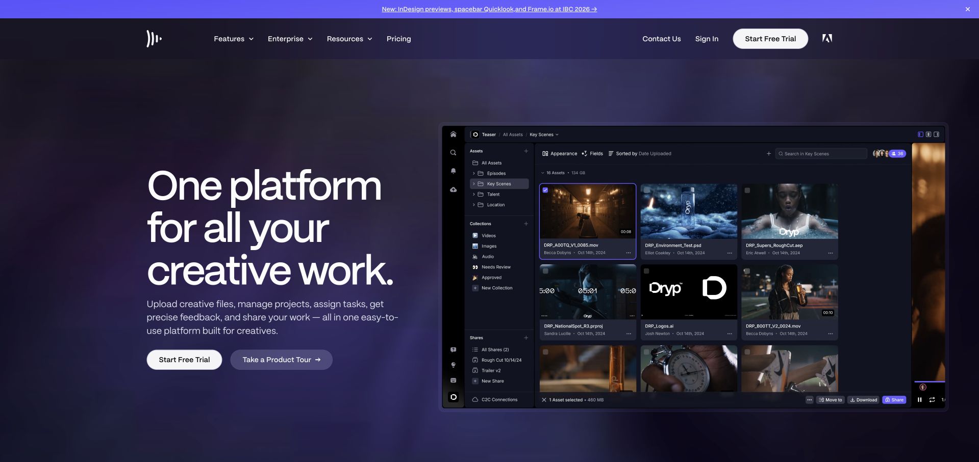
Frame.io sets a large product interface beside a concise promise about creative work. The dark purple field accommodates thumbnail imagery, folders and review controls without making the surrounding text feel like another application panel. Trial and product-tour actions offer different levels of commitment. Twilio’s case describes Segment Personas, a historical product name, combining customer histories for support and messaging. This is documented customer-data use, not a claim that the present Frame.io marketing site or media-review application has an unchanged architecture.
What you can learn
Show enough of a real workflow to make collaboration concrete, then explain what the viewer should notice. Preserve separate events for a tour, trial registration and meaningful collaborative activity. An old support-personalization case can inform planning without being presented as a current stack inspection.
Pros
The interface preview makes files, organization and collaboration tangible within the opening explanation.
Tour and trial actions accommodate visitors who need different amounts of information before starting.
Cons & considerations
The dense interface thumbnail requires enlargement before its smaller review controls can be understood.
A broad creative-work promise needs further detail to distinguish the needs of different production teams.
Platform source: Official technology-specific customer or workload source. Twilio’s case describes Segment Personas, the historical product name used in the source, combining Frame.io customer histories for support and messaging. This evidence establishes only the stated product, workload, organization or historical association. It does not prove that the pictured public page uses the technology, reveal its CMS/frontend, establish a complete current architecture or independently verify vendor-reported outcomes. Platform evidence is separate from the direct website screenshot and is not a complete current infrastructure audit.
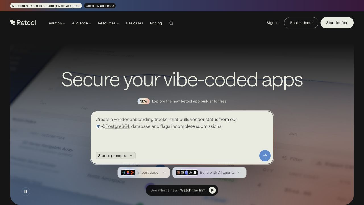
Retool places a large prompt box beneath its main message, showing a concrete vendor-onboarding request rather than only describing an AI app builder. Starter prompts, imported code and building options make different entry routes visible. A dark gradient background contains the feature while the compact header provides conventional product navigation. Twilio’s case documents Segment unifying customer data across Retool’s product and business teams. It does not prove that Segment implements the pictured prompt interface or identify the generated application’s eventual stack.
What you can learn
Give users a plausible starting task and clarify what will happen before execution. Track prompt selection, actual generation and a usable result separately, without recording unnecessary sensitive prompt content. An attractive empty field is only an invitation; it is not evidence that a workflow has succeeded.
Pros
The concrete example request explains the builder’s purpose more clearly than a generic empty input.
Several labeled starting routes acknowledge that visitors may bring code, a prompt or an existing project.
Cons & considerations
The opening emphasizes an emerging AI workflow before explaining the wider platform to unfamiliar visitors.
Several compact creation controls can be difficult to distinguish without prior knowledge of their consequences.
Platform source: Official technology-specific customer or workload source. Twilio describes Segment unifying customer information across Retool product, marketing, sales and support teams. This evidence establishes only the stated product, workload, organization or historical association. It does not prove that the pictured public page uses the technology, reveal its CMS/frontend, establish a complete current architecture or independently verify vendor-reported outcomes. Platform evidence is separate from the direct website screenshot and is not a complete current infrastructure audit.
Kegan has 15+ years of experience working with small businesses, Fortune 500 companies, and everything in between. No development job is too big or too small: he brings the same hands-on attention to a focused improvement, a complete website, or a custom application.
For Segment projects, he can help with website integrations, form and campaign connections, analytics implementation, testing, and clear ownership after launch. He works directly with clients on scope, design, implementation, testing, and handover, with an emphasis on clear communication and a system that remains practical to maintain after launch.
Show 3 other Segment developersHide other Segment developers
Three sensible starting points for Segment development
A limited website measurement layer
Begin with one public journey, such as understanding a service and completing a qualified inquiry. Document successful submission separately from starting the form. Keep destination configuration reviewable and test it without polluting production reporting. Do not add identity resolution or advertising activation before there is a justified use case and a clear data-handling process.
A product and support data foundation
Connect a bounded application workflow to the systems staff use to help customers. Include server-confirmed outcomes when the browser alone cannot know whether a task succeeded. Give support staff useful context without exposing unrelated customer records. Build a clear handoff when an event is delayed, missing or associated with the wrong account.
A governed warehouse and audience program
For a larger program, distinguish data collected from applications, warehouse-derived information and audience activation. Segment’s documentation describes warehouses as destinations with periodic loading and Reverse ETL as a separate direction of movement. Do not call every path real time. Record which source owns a value, when it refreshes and who can approve its use in a campaign.
Plan the event lifecycle before launching new campaigns
Build an event dictionary with real examples
For every event, include a realistic payload, the interface state that produces it and the business question it answers. Distinguish attempted actions from confirmed results, and define deduplication when both browser and server can report the same outcome. Review changes with product, engineering and the people who read the reports rather than leaving interpretation to a future dashboard.
Rehearse the ambiguous customer journeys
Test a visitor who declines optional tracking, switches devices, changes email, uses a shared account or returns after a long absence. Test a failed checkout or form submission without sending it to a real external recipient. Check that identifiers and timestamps remain understandable, and that the interface does not falsely report success while the operational system rejected the action.
Make ongoing governance a named responsibility
Assign ownership for source configuration, destination changes, schema review and unexpected volume. Keep a record of why each destination receives data and a process for retiring obsolete integrations. Plan deletion and correction across downstream copies. A managed collection layer reduces repetitive integration work but cannot decide your organization’s legitimate purpose for every field.
A useful handover demonstration
Ask the actual team to carry out its routine job: publish a realistic update, correct a mistake, preview a narrow screen, and identify who owns an integration failure. For a library or frontend framework, also ask who maintains the content source and deployment. A polished screenshot does not answer those operational questions.
Beyond the screenshot
A practical Segment website checklist
Name the customer question each event answers.
Separate attempts from confirmed outcomes.
Assign stable event names and required properties.
Choose durable person and organization identifiers.
Document anonymous-to-known identity rules.
Minimize sensitive and free-text properties.
List every destination and its approved purpose.
State actual warehouse refresh behavior.
Test consent and unavailable-destination paths.
Prevent duplicate reporting from browser and server.
Assign schema, access and volume-review owners.
Document correction, deletion and integration retirement.
Test with real content, a keyboard, a small screen, slow or failed requests, and the people who will maintain the system. These are planning checks, not an accessibility, security, performance, or search-ranking certification.
Sources & editorial method
How this Segment collection was reviewed
Each accepted public image was inspected and its actual capture provenance retained. Official Twilio customer stories establish only the stated Segment program or product association. Public visual observations do not prove backend implementation, complete current architecture or vendor-reported business results.
Every image is an unmodified capture from the actual website, with its source and capture date. Some captures are reused from our shared catalog; their dates remain the original capture dates. None comes from a vendor gallery or a generated reconstruction. Moving imagery and live content can change.
Technology attribution uses public page assets or metadata, official platform documentation, or a cited first-party project case study. Documentary and framework-relationship evidence is identified where used; it is not a complete current backend inventory. A CMS image CDN alone does not establish a full CMS deployment. A library’s presence does not prove which individual controls use it, and a platform label does not establish AI authorship.
The composition notes, lessons, pros and tradeoffs are original editorial observations. We have not measured conversion, traffic, security, performance or accessibility conformance. Website owners retain their brands and imagery; these examples are not our client portfolio. Written, Edited and Curated are independent records, not dates advanced by a build. See our editorial standards or suggest a correction.
Questions worth asking
Segment website development FAQs
Does a Segment case prove the public homepage uses Segment?
No. The cases support their stated customer-data programs. The pictured public page can be a separate corporate, editorial or investor property with a different implementation.
Is Segment a replacement for a CMS?
No. Its data collection and destination functions address different needs from drafting, reviewing and publishing website content.
Should every click become an event?
Usually not. Begin with meaningful tasks and diagnostic steps. Unowned, ambiguous events add maintenance and privacy costs without necessarily producing useful insight.
Are warehouse updates always instantaneous?
No. Segment’s documentation distinguishes streaming destinations, periodic warehouse loading and reverse movement from warehouses. Verify the path and actual timing your workflow requires.
What should the first implementation prove?
One complete journey with correctly defined events, minimal necessary data and verified destination behavior, including unsuccessful and consent-limited states.