Best Sass Websites of 2026 (20 Real-World Examples)
Twenty public websites with Sass verified in their own website source repositories, genuine dated screenshots and original design reviews.
Sass is a language for authoring stylesheets that compile to CSS. These twenty websites show how different teams organize documentation, learning tools and public project pages around clear visual systems. Each example has website-specific source evidence for Sass, paired with a genuine earlier capture. The evidence establishes an authored styling relationship; it does not identify an exact deployed commit, every visible component or the runtime of the product being described.
A shared stylesheet language does not create a shared aesthetic. The examples range from GitHub’s restrained topic directory to TypeScript’s blue demonstration panel, the public-service structure of Login.gov and the colorful introduction to OpenTelemetry. Their useful lessons concern hierarchy, repeated patterns, content density and the next action. Sass can help maintain the underlying rules, but people still decide what deserves emphasis.
GitHub Docs, Microsoft TypeScript, AWS Amplify Docs, Kubernetes and Datadog Docs open the collection as recognizable developer brands and organizations. Their source records connect an exact public website to its own repository and Sass files. The same standard applies to all twenty examples. Earlier screenshots and broad public audits keep their original dates, and new repository observations have their own dates. Framework packages and unrelated company repositories were not treated as proof of a website implementation.
Before the examples
What makes good Sass website development in 2026?
Give repeated content a clear visual grammar
Decide how headings, explanatory text, actions, notices and reference links relate before creating many individual components. A documentation library needs predictable distinctions between navigation and article content; a learning tool needs consistent examples and filters. Sass variables and mixins can express recurring rules, but naming those rules after their purpose makes the system easier to discuss and maintain.
Use Sass modules to make dependencies explicit and to separate shared foundations from component-specific rules. A small typography or spacing module can be easier to maintain than a global stylesheet whose assumptions are spread across many files. Choose boundaries around meaningful responsibilities, and avoid introducing an abstraction merely because two declarations happen to look similar today.
Organized source files are useful to maintainers, while visitors experience the resulting page. Check the reading order, focus visibility, text contrast, content wrapping and behavior of repeated components. Keep the compiled output proportionate to the page’s needs. A tidy Sass architecture does not itself prove that the interface is accessible, quick to load or easy to understand.
The collection · 20 examples
20 Sass website examples worth studying
These twenty original reviews examine genuine retained captures. Website-specific repositories supply the Sass evidence; the image alone does not reveal a stylesheet language. Read each example as a design reference with a documented authoring relationship, not a claim about a product’s complete current runtime.
We start with five recognizable brands or organizations: GitHub Docs, Microsoft TypeScript, AWS Amplify, Kubernetes, Datadog documentation. Each attribution applies to the named website property, not every product or website belonging to its organization. This is a curated reading sequence, not a measured ranking.
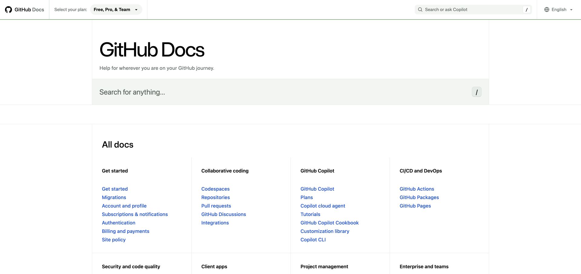
GitHub Docs makes a large information estate feel navigable through alignment and restraint. A broad search field sits beneath the plain page title, followed by evenly spaced topic columns. Fine borders separate groups without enclosing every link in its own card. Blue links provide the main accent, while plan and language controls occupy the quieter utility header. The result gives experienced visitors a direct route and offers newcomers a vocabulary for browsing. GitHub’s documentation repository includes the Sass stylesheets for this exact website; that evidence concerns its publishing interface.
What you can learn
Define a small set of repeatable spacing and heading rules before styling individual documentation sections. Shared Sass modules can support that consistency, but the useful design decision is the clearly differentiated relationship between topic headings and destination links.
Pros
Search and categorized browsing serve different levels of familiarity without competing for the same visual treatment.
Subtle rules preserve the directory’s structure while leaving substantial space around dense groups of links.
Cons & considerations
The spacious title area delays the first detailed destinations on smaller displays.
Broad topic names still require accurate cross-linking when a task spans several product areas.
Platform source: First-party website Sass source and build evidence. The GitHub Docs repository identifies docs.github.com; its frame stylesheet imports Primer and documentation Sass modules, and its package manifest includes the Sass compiler. Website-specific repository evidence for compiled Sass authoring, checked separately from the retained screenshot. It does not prove the exact deployed commit, every pictured component, a browser-side Sass runtime or the associated product’s backend. Original screenshot and broad-audit dates remain unchanged. Platform evidence is separate from the direct website screenshot and is not a complete current infrastructure audit.
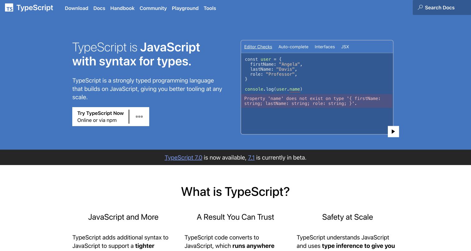
TypeScript’s blue opening pairs a short explanation with a code demonstration, letting the visitor compare the promise with a tangible example. The sample uses a darker panel, a small tab strip and a visible play control; it reads as a demonstration rather than decorative syntax. A white trial action stands apart from the surrounding blue, and a narrow release strip separates the introduction from three explanatory columns. Microsoft’s website repository identifies the production domain and includes its Sass layout and page styles. This relationship concerns the documentation website, not the language compiler.
What you can learn
Put a realistic example next to the first explanation when selling an abstract capability. Preserve a common visual grammar for code, tabs and actions so the demonstration remains readable even when its contents change.
Pros
The split introduction connects a plain-language benefit with an immediately recognizable editor scenario.
Strong contrast distinguishes the trial action from informational navigation and the release announcement.
Cons & considerations
Several navigation labels overlap conceptually for someone who has never used a typed language.
Demonstrations need usable controls and equivalent explanations when motion or scripting is unavailable.
Platform source: First-party website Sass source and build evidence. Microsoft’s TypeScript website README names typescriptlang.org as production. The website package configures gatsby-plugin-sass and contains layout and page SCSS sources. Website-specific repository evidence for compiled Sass authoring, checked separately from the retained screenshot. It does not prove the exact deployed commit, every pictured component, a browser-side Sass runtime or the associated product’s backend. Original screenshot and broad-audit dates remain unchanged. Platform evidence is separate from the direct website screenshot and is not a complete current infrastructure audit.
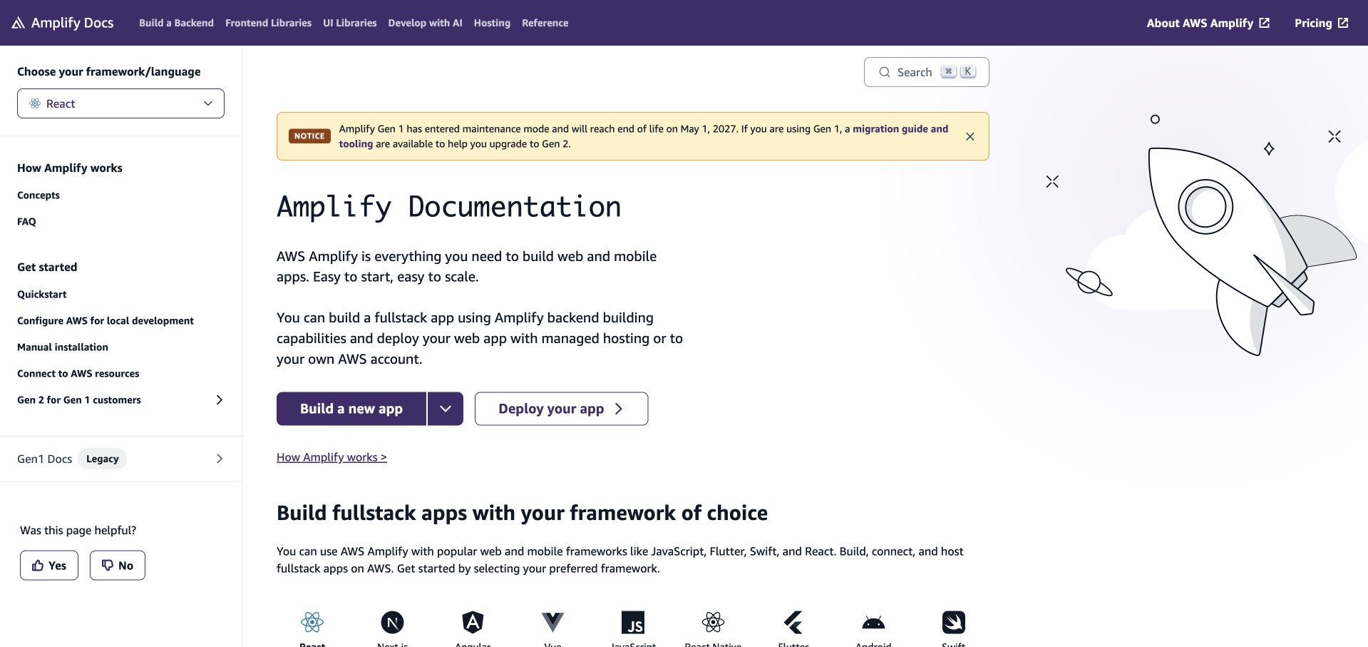
AWS Amplify’s documentation keeps the framework selector above the left navigation, making an important context choice visible before the visitor follows a tutorial. A purple header establishes the product family, while the main column introduces the documentation with two clearly named starting actions. The rocket illustration balances the text without replacing practical guidance. An inline maintenance notice remains visually distinct from the page heading. The official documentation repository maps to this property and imports a shared Sass entrypoint into its application shell, supporting a website-specific authoring association.
What you can learn
Expose choices that change the meaning of instructions near the navigation, not deep inside an article. Use consistent spacing and notice treatments so framework selection, lifecycle information and the next task remain distinguishable across the documentation system.
Pros
The framework selector gives visitors an explicit context for the documentation they are about to read.
Build and deployment actions state separate intentions instead of relying on a vague single call to action.
Cons & considerations
The combination of sidebar, notice and introductory illustration creates a busy initial reading environment.
Version and maintenance messages need careful editing to keep the active guidance unmistakable.
Platform source: First-party website Sass source and build evidence. AWS Amplify’s documentation README maps its production branch to docs.amplify.aws. The website application shell directly imports src/styles/styles.scss. Website-specific repository evidence for compiled Sass authoring, checked separately from the retained screenshot. It does not prove the exact deployed commit, every pictured component, a browser-side Sass runtime or the associated product’s backend. Original screenshot and broad-audit dates remain unchanged. Platform evidence is separate from the direct website screenshot and is not a complete current infrastructure audit.
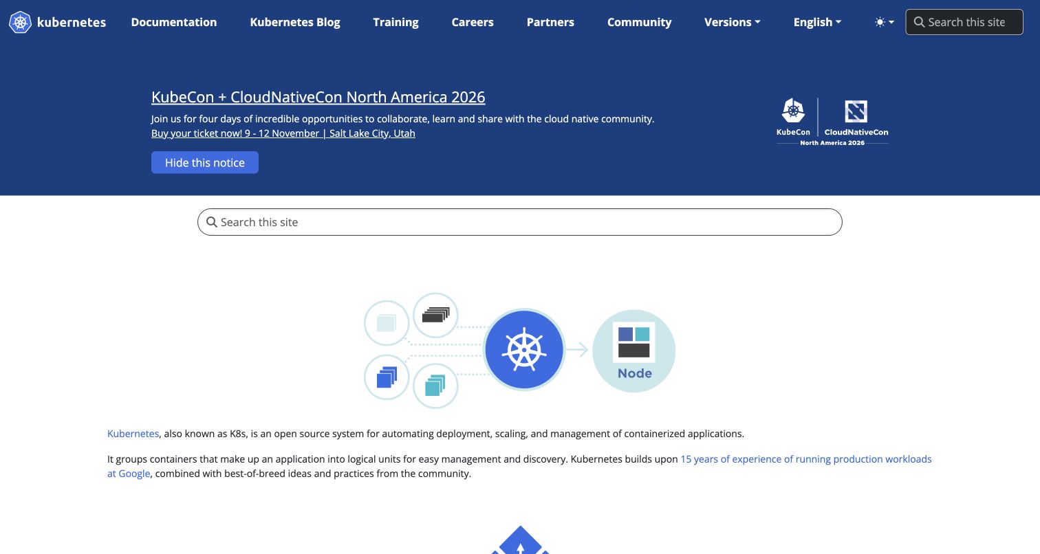
Kubernetes uses a dark blue navigation band to connect documentation, training and community routes. Below an event notice, a wide search field precedes an illustration of containers grouped around the project symbol and a node. That sequence moves from finding information to understanding the subject. The body text is comparatively compact, making the diagram the clearest introduction in the retained capture. The official website repository identifies kubernetes.io and contains project Sass styles within its Docsy-based website build. Those files establish a presentation-layer association, not the implementation of Kubernetes itself.
What you can learn
For a technical project with several audiences, separate persistent navigation from temporary announcements and explanatory content. Maintain a deliberate vertical rhythm so a seasonal event cannot obscure the enduring route into documentation or the project’s central explanation.
Pros
The container-and-node illustration supplies a concrete mental model alongside the written definition.
Documentation, community and training remain visible as distinct destinations in the primary navigation.
Cons & considerations
The event notice consumes considerable space before the project explanation begins.
A second prominent search field adds repetition when the header already contains search.
Platform source: First-party website Sass source and build evidence. The Kubernetes website README identifies kubernetes.io and its Docsy build. Its project Sass entrypoint imports website-specific navigation, documentation and shared styles. Website-specific repository evidence for compiled Sass authoring, checked separately from the retained screenshot. It does not prove the exact deployed commit, every pictured component, a browser-side Sass runtime or the associated product’s backend. Original screenshot and broad-audit dates remain unchanged. Platform evidence is separate from the direct website screenshot and is not a complete current infrastructure audit.
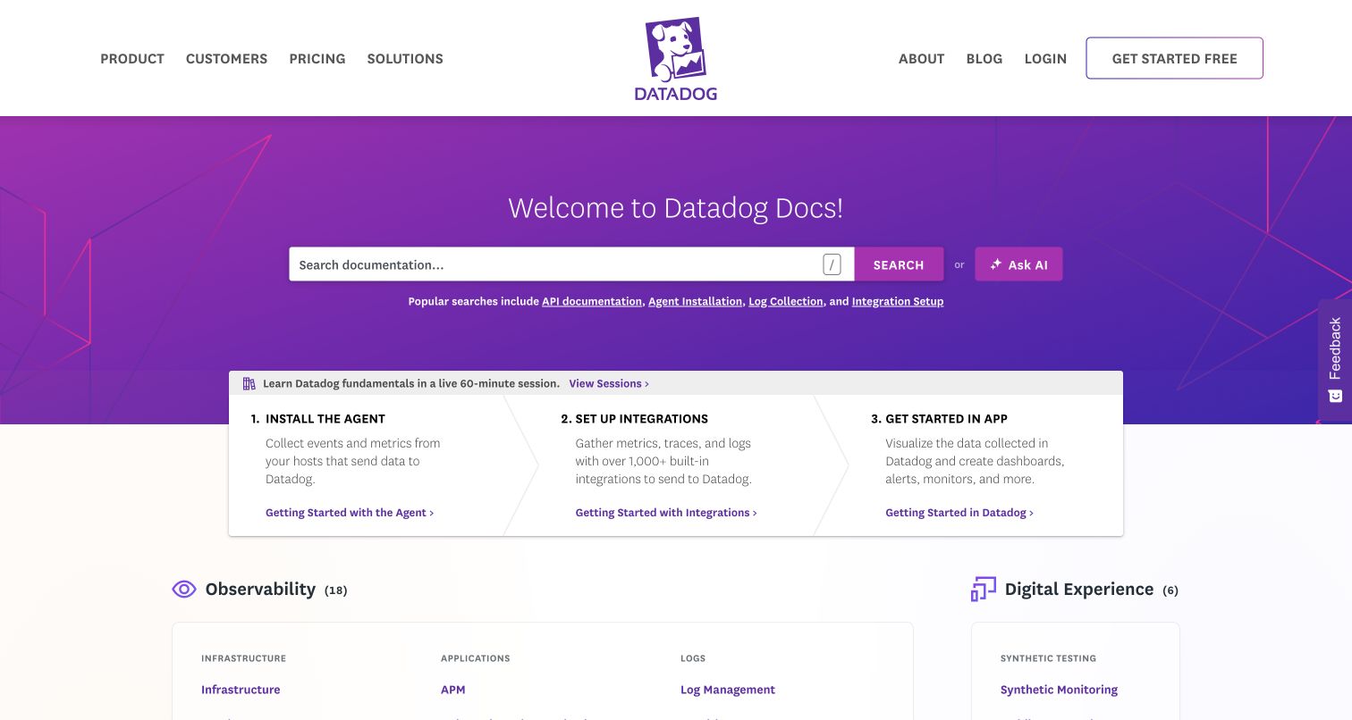
Datadog’s documentation homepage combines a vivid purple search area with a practical three-step introduction. Installation, integrations and application use sit in adjacent panels, turning a large documentation library into an initial sequence. Product categories appear below with quieter headings and icons. The strong brand color belongs to the welcome area, while most instructional content uses white surfaces and restrained typography. The official documentation repository ties its Hugo build to this exact domain and includes a Sass stylesheet that assembles navigation, search and content styles. It does not establish the private application’s architecture.
What you can learn
Give first-time readers a short route through a large product before asking them to understand the full taxonomy. Shared component styles can keep that route consistent, while category pages remain free to present their own detailed information.
Pros
The numbered starting sequence turns an extensive documentation library into an approachable first session.
Search, popular queries and product categories offer useful alternatives for visitors with different levels of knowledge.
Cons & considerations
Commercial navigation and documentation navigation require clear boundaries as the site grows.
The bright welcome area can dominate subtler category information immediately beneath it.
Platform source: First-party website Sass source and build evidence. Datadog’s documentation README maps this repository to docs.datadoghq.com. The website stylesheet entrypoint imports its Sass search, navigation and content modules. Website-specific repository evidence for compiled Sass authoring, checked separately from the retained screenshot. It does not prove the exact deployed commit, every pictured component, a browser-side Sass runtime or the associated product’s backend. Original screenshot and broad-audit dates remain unchanged. Platform evidence is separate from the direct website screenshot and is not a complete current infrastructure audit.
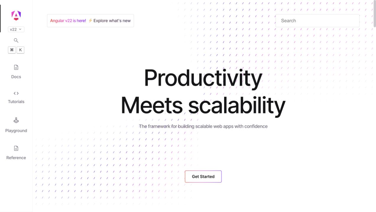
Angular’s retained homepage gives most of the screen to a large two-line statement and one outlined starting action. A narrow left rail carries documentation, tutorials, playground and reference destinations, leaving the central message relatively uncluttered. The pale diagonal pattern adds identity without becoming a competing illustration. Search and version information remain near the top edge. Angular’s first-party repository identifies the angular.dev application, configures SCSS styles in its website build and connects the homepage component to a Sass stylesheet. This is evidence for the pictured website’s authored presentation layer.
What you can learn
Keep the landing page concise when a persistent navigation system already exposes the substantive content. Define styles for the rail, active states and content boundaries together so a sparse introduction and dense reference pages still feel related.
Pros
A limited central action keeps the introductory message focused and easy to scan.
The persistent rail makes learning and reference destinations available without a large conventional header.
Cons & considerations
The minimal hero gives little immediate detail to readers unfamiliar with the framework.
Narrow navigation labels and icon treatments need careful checking at zoomed and compact widths.
Platform source: First-party website Sass source and build evidence. The Angular monorepo’s adev README identifies angular.dev. Its application build explicitly lists SCSS entrypoints, and its homepage component references home.component.scss. Website-specific repository evidence for compiled Sass authoring, checked separately from the retained screenshot. It does not prove the exact deployed commit, every pictured component, a browser-side Sass runtime or the associated product’s backend. Original screenshot and broad-audit dates remain unchanged. Platform evidence is separate from the direct website screenshot and is not a complete current infrastructure audit.
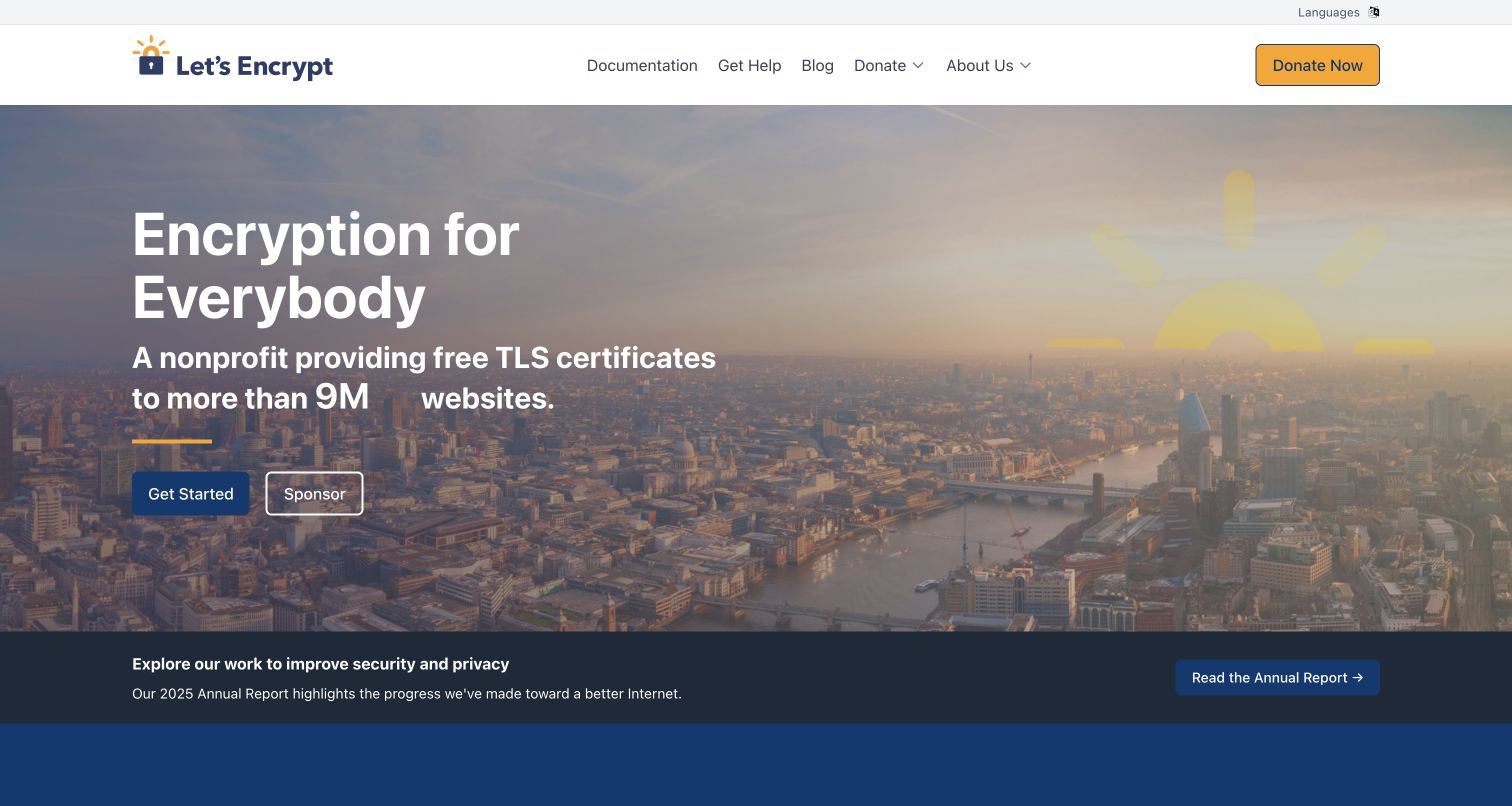
Let’s Encrypt places a large public-benefit message over a city panorama, then gives users and supporters separate actions. A dark treatment over the photograph keeps the white typography readable, while yellow details connect the sun-and-lock identity with the donation control. The lower report strip introduces organizational accountability without interrupting the main action. The website repository explicitly identifies letsencrypt.org and contains its Sass entrypoint and component partials. That evidence concerns the public information site; the certificate service and its security properties require their own independent documentation.
What you can learn
A mission-led site can serve practical and fundraising needs in the same opening if each action has an explicit purpose. Keep shared colors and button treatments stable, while using content order to explain which route suits each visitor.
Pros
The paired starting and sponsorship actions recognize two different reasons to visit the site.
A dedicated report strip brings supporting organizational information into view without crowding the hero text.
Cons & considerations
Text over photography depends on robust contrast across the actual image crop and screen size.
Large numerical or animated statements need a readable final state and a clear supporting source.
Platform source: First-party website Sass source and build evidence. The Let’s Encrypt website README identifies letsencrypt.org. Its main SCSS entrypoint imports the site’s authored presentation partials. Website-specific repository evidence for compiled Sass authoring, checked separately from the retained screenshot. It does not prove the exact deployed commit, every pictured component, a browser-side Sass runtime or the associated product’s backend. Original screenshot and broad-audit dates remain unchanged. Platform evidence is separate from the direct website screenshot and is not a complete current infrastructure audit.
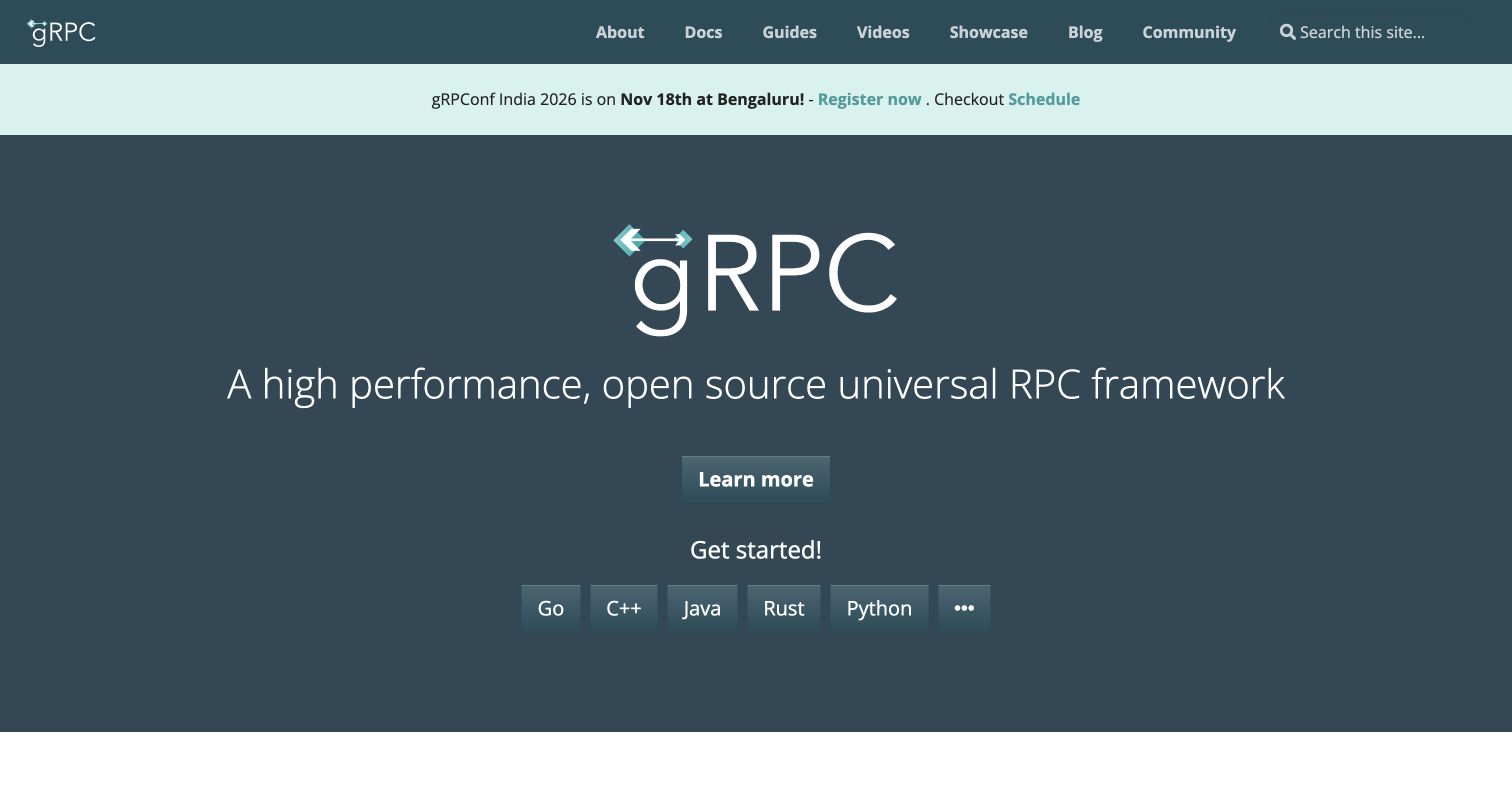
gRPC’s homepage uses a dark slate field, a large project mark and a single-sentence introduction. A general learning action sits above a separate row of language choices, distinguishing explanation from implementation. The turquoise event strip is contained between the header and the hero rather than floating over either. This restrained layout lets the product name and starting routes carry the page. The official grpc.io repository contains the website’s Docsy project Sass files, with its README linking the public site. The association is limited to that website’s styling source.
What you can learn
When a library serves several languages, present the shared concept first and offer language selection as a clearly grouped second step. Consistent action dimensions and spacing make parallel choices easier to compare without implying that one language is preferred.
Pros
General learning and language-specific starting points have separate positions in the reading sequence.
The dark background provides a simple, recognizable setting for the project identity and white text.
Cons & considerations
The short description assumes visitors already understand the terminology used to describe the framework.
An overflow control for additional languages needs a clear accessible name and predictable expansion behavior.
Platform source: First-party website Sass source and build evidence. The gRPC website README identifies grpc.io and its Docsy website build. The project Sass entrypoint imports the website’s custom gRPC styles. Website-specific repository evidence for compiled Sass authoring, checked separately from the retained screenshot. It does not prove the exact deployed commit, every pictured component, a browser-side Sass runtime or the associated product’s backend. Original screenshot and broad-audit dates remain unchanged. Platform evidence is separate from the direct website screenshot and is not a complete current infrastructure audit.
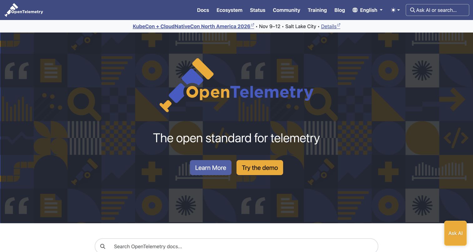
OpenTelemetry’s homepage puts its telescope identity at the center of a patterned dark field. The imagery repeats symbols associated with technical work, but a short statement and two substantial buttons remain the main reading targets. Learning and trying a demonstration receive different colors, helping visitors distinguish research from exploration. The header keeps documentation, ecosystem, status and community paths visible. OpenTelemetry’s website repository explicitly identifies this public property and includes project Sass partials plus a Sass build dependency. This establishes the site’s authored styling relationship, independently of the telemetry software it documents.
What you can learn
Treat decorative pattern, logo and action hierarchy as one composition. Keep the most important labels readable without requiring visitors to interpret the artwork, and carry the same spacing rules into the less theatrical documentation pages.
Pros
The paired actions offer useful paths for readers who want explanation or a practical demonstration.
The patterned hero gives the project a distinct visual identity without requiring a product screenshot.
Cons & considerations
Detailed background artwork can compete with text if its contrast increases in other crops.
Persistent assistance controls should remain clear of reading content and keyboard navigation.
Platform source: First-party website Sass source and build evidence. The OpenTelemetry website README identifies opentelemetry.io. Its project Sass entrypoint imports website-specific components, and the build manifest declares sass-embedded. Website-specific repository evidence for compiled Sass authoring, checked separately from the retained screenshot. It does not prove the exact deployed commit, every pictured component, a browser-side Sass runtime or the associated product’s backend. Original screenshot and broad-audit dates remain unchanged. Platform evidence is separate from the direct website screenshot and is not a complete current infrastructure audit.
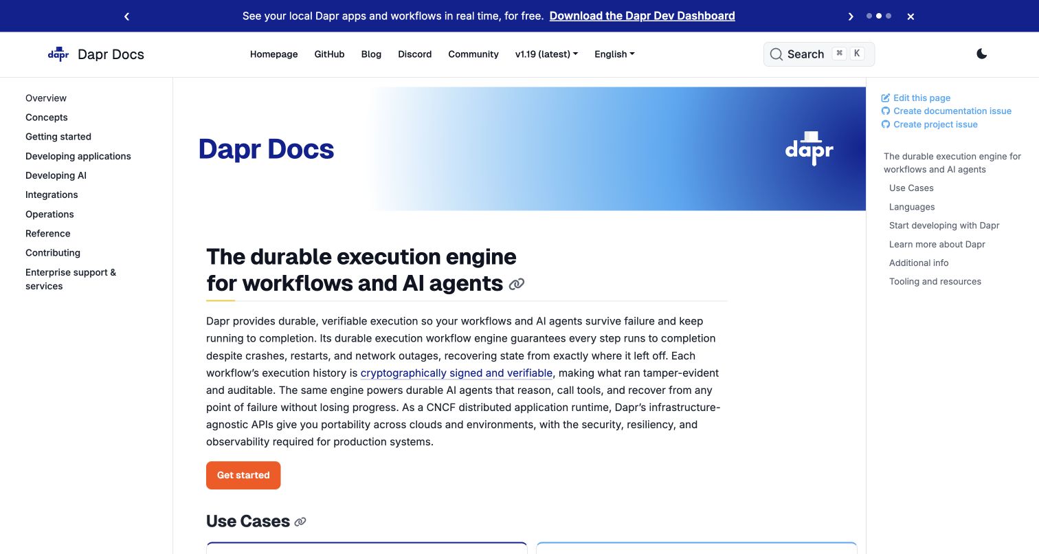
Dapr Docs uses three clear zones: a section list on the left, the article in the center and page contents on the right. A blue gradient title band gives the documentation a recognizable opening without turning every article into a promotional landing page. Beneath it, a substantial heading, descriptive paragraphs and one orange action introduce the subject. The repository README maps the documentation source to docs.dapr.io and its current release branch; project Sass files support the site’s Docsy presentation. This is a website styling association, not a claim about the application runtime being described.
What you can learn
Keep section navigation and in-page navigation visually distinct when both are useful. Plan common spacing, heading anchors and link states together so a visitor can move between the library and the current article without losing their place.
Pros
The left and right navigation columns communicate different levels of the documentation hierarchy.
A restrained accent color gives the starting action a clear position beneath dense introductory text.
Cons & considerations
Three columns can leave limited room for long technical text at intermediate viewport widths.
The opening explanation is lengthy and would benefit from careful editorial maintenance as terminology changes.
Platform source: First-party website Sass source and build evidence. Dapr’s documentation README maps the primary documentation source to docs.dapr.io and describes its Docsy build. The documentation project includes a custom Sass entrypoint and component partials. Website-specific repository evidence for compiled Sass authoring, checked separately from the retained screenshot. It does not prove the exact deployed commit, every pictured component, a browser-side Sass runtime or the associated product’s backend. Original screenshot and broad-audit dates remain unchanged. Platform evidence is separate from the direct website screenshot and is not a complete current infrastructure audit.
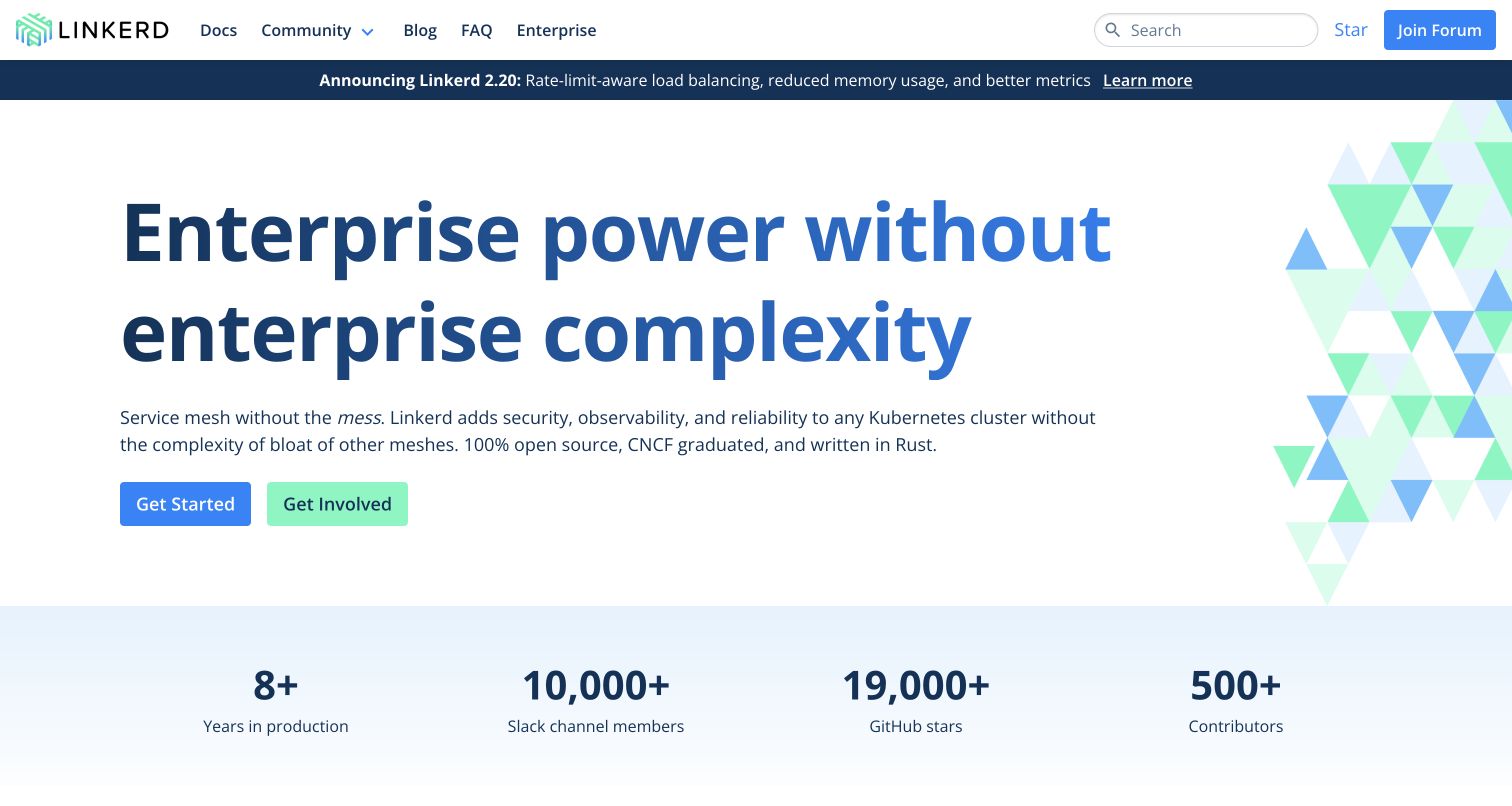
Linkerd’s opening gives a very large blue headline ample white space, with a triangular illustration confined to the right edge. A compact paragraph explains the project before two adjacent actions separate adoption from participation. A pale statistics band begins below the hero, creating a clear transition from the promise to supporting context. The official website repository identifies linkerd.io, documents its Sass build requirement and contains a dedicated main stylesheet. These records concern the public website; they do not establish the service mesh’s runtime, reliability or deployment results.
What you can learn
Use typography and a limited illustration to communicate confidence without crowding the first decision. A shared system of spacing and action styles can hold the page together, but supporting claims still need independent sources and regular editorial review.
Pros
Adoption and community participation are clearly separated through two concise action labels.
The illustration stays at the edge, preserving a generous reading area for the main message.
Cons & considerations
An unusually large headline needs careful wrapping when the available width decreases.
Project statistics can become stale and should not substitute for practical evidence about suitability.
Platform source: First-party website Sass source and build evidence. The Linkerd website repository identifies linkerd.io. Its website README explicitly requires Dart Sass Embedded for the Hugo build, and the same website subtree contains its Sass main stylesheet. Website-specific repository evidence for compiled Sass authoring, checked separately from the retained screenshot. It does not prove the exact deployed commit, every pictured component, a browser-side Sass runtime or the associated product’s backend. Original screenshot and broad-audit dates remain unchanged. Platform evidence is separate from the direct website screenshot and is not a complete current infrastructure audit.
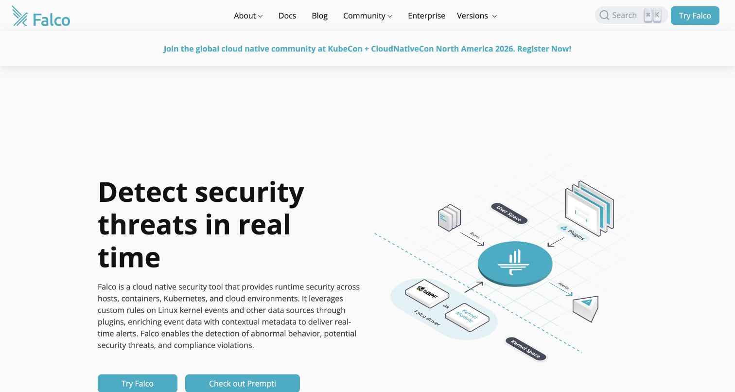
Falco’s homepage balances a plain, forceful headline with an isometric diagram of the system’s inputs and surrounding components. Teal accents connect the diagram, brand mark and actions, while the broad white background keeps the technical explanation approachable. The header exposes documentation and community routes before the visitor reaches the hero. An event announcement occupies its own horizontal area. Falco’s official website repository names falco.org and includes project Sass modules for landing pages, navigation and content. That evidence supports the website’s authored styles without validating the security capabilities described in its copy.
What you can learn
For a complex technical product, give the illustration an explanatory job and let the written introduction establish the visitor’s problem. Repeated color and spacing rules should reinforce relationships, while diagram labels remain meaningful without relying on color alone.
Pros
The diagram creates a visible relationship between the central tool and its surrounding data sources.
Consistent teal accents establish identity while leaving most of the page visually quiet.
Cons & considerations
Small labels inside an illustration may become difficult to read on compact displays.
The large amount of space above the hero can delay access to the practical starting actions.
Platform source: First-party website Sass source and build evidence. Falco’s website README identifies falco.org. Its custom Sass entrypoint imports navigation, landing-page, content and other website presentation modules. Website-specific repository evidence for compiled Sass authoring, checked separately from the retained screenshot. It does not prove the exact deployed commit, every pictured component, a browser-side Sass runtime or the associated product’s backend. Original screenshot and broad-audit dates remain unchanged. Platform evidence is separate from the direct website screenshot and is not a complete current infrastructure audit.
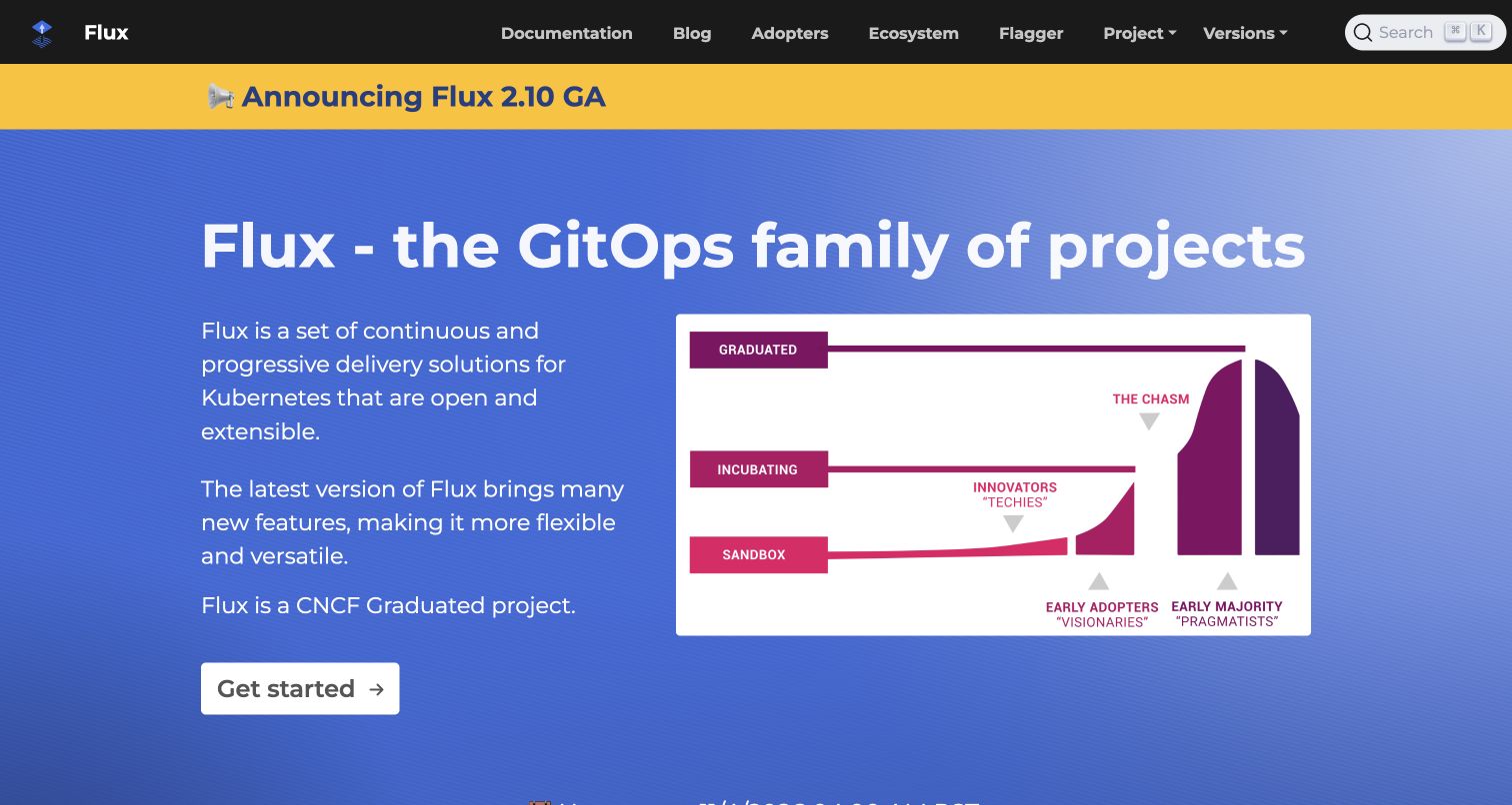
Flux’s retained homepage uses a blue hero beneath a dark navigation bar and a yellow release strip. The large project heading spans the opening, followed by explanatory text on the left and a maturity graphic on the right. A white starting button is visually separate from the colorful background. The page explains a family of projects rather than presenting a single application screenshot. Flux’s website repository explicitly maps to fluxcd.io and contains a Sass entrypoint that imports its Docsy styling. This source relationship applies to the public website’s presentation.
What you can learn
When a project includes several related tools, establish the umbrella proposition before introducing individual destinations. Use a consistent title and action hierarchy so announcements, ecosystem diagrams and navigation remain supporting material rather than competing starting points.
Pros
The first action is easy to identify against the saturated background and supporting illustration.
Navigation keeps documentation and ecosystem destinations separate for visitors with different research goals.
Cons & considerations
The maturity illustration needs explanatory text for visitors who do not know its underlying terminology.
A prominent release banner can distract from the durable project introduction if it grows too detailed.
Platform source: First-party website Sass source and build evidence. The Flux website README identifies fluxcd.io. Its main.scss entrypoint imports the Docsy Sass stylesheet, alongside project-specific Sass partials. Website-specific repository evidence for compiled Sass authoring, checked separately from the retained screenshot. It does not prove the exact deployed commit, every pictured component, a browser-side Sass runtime or the associated product’s backend. Original screenshot and broad-audit dates remain unchanged. Platform evidence is separate from the direct website screenshot and is not a complete current infrastructure audit.
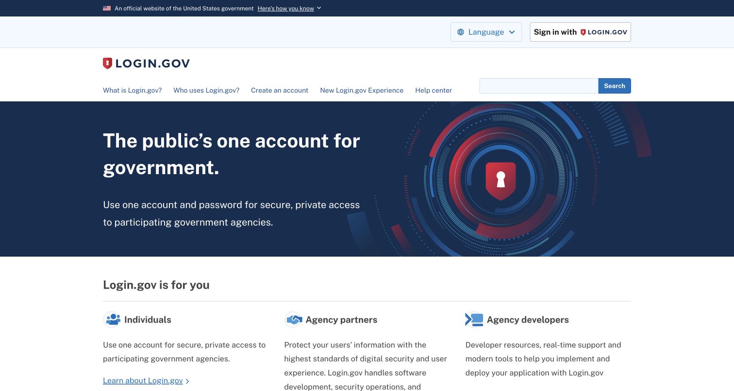
Login.gov introduces a public service through a short headline and a plain explanation, with a lock illustration reinforcing the account theme. The official-government strip and separate sign-in control create recognizable context above the main navigation. Below the dark hero, three audience columns distinguish individuals, agency partners and developers. The public website repository configures the Login.gov domain and an explicit Sass compilation command. This is evidence for the informational website’s presentation layer; it does not establish the implementation or security of the separate authentication service.
What you can learn
State the shared purpose first, then separate audiences using concrete labels and parallel content structures. Build common spacing and link treatments around those repeated sections so institutional visitors and members of the public can find their next step without interpreting internal terminology.
Pros
Audience-specific columns make the service’s different participation paths understandable at a glance.
Sign-in remains visible as a utility action without overwhelming the explanatory content.
Cons & considerations
Several horizontal header bands consume space before the main explanation begins.
Security imagery should support precise service information rather than be treated as proof of protection.
Platform source: First-party website Sass source and build evidence. The Login.gov informational website configuration names the public domain. Its package build compiles assets/scss entrypoints with identity-build-sass into public CSS. Website-specific repository evidence for compiled Sass authoring, checked separately from the retained screenshot. It does not prove the exact deployed commit, every pictured component, a browser-side Sass runtime or the associated product’s backend. Original screenshot and broad-audit dates remain unchanged. Platform evidence is separate from the direct website screenshot and is not a complete current infrastructure audit.
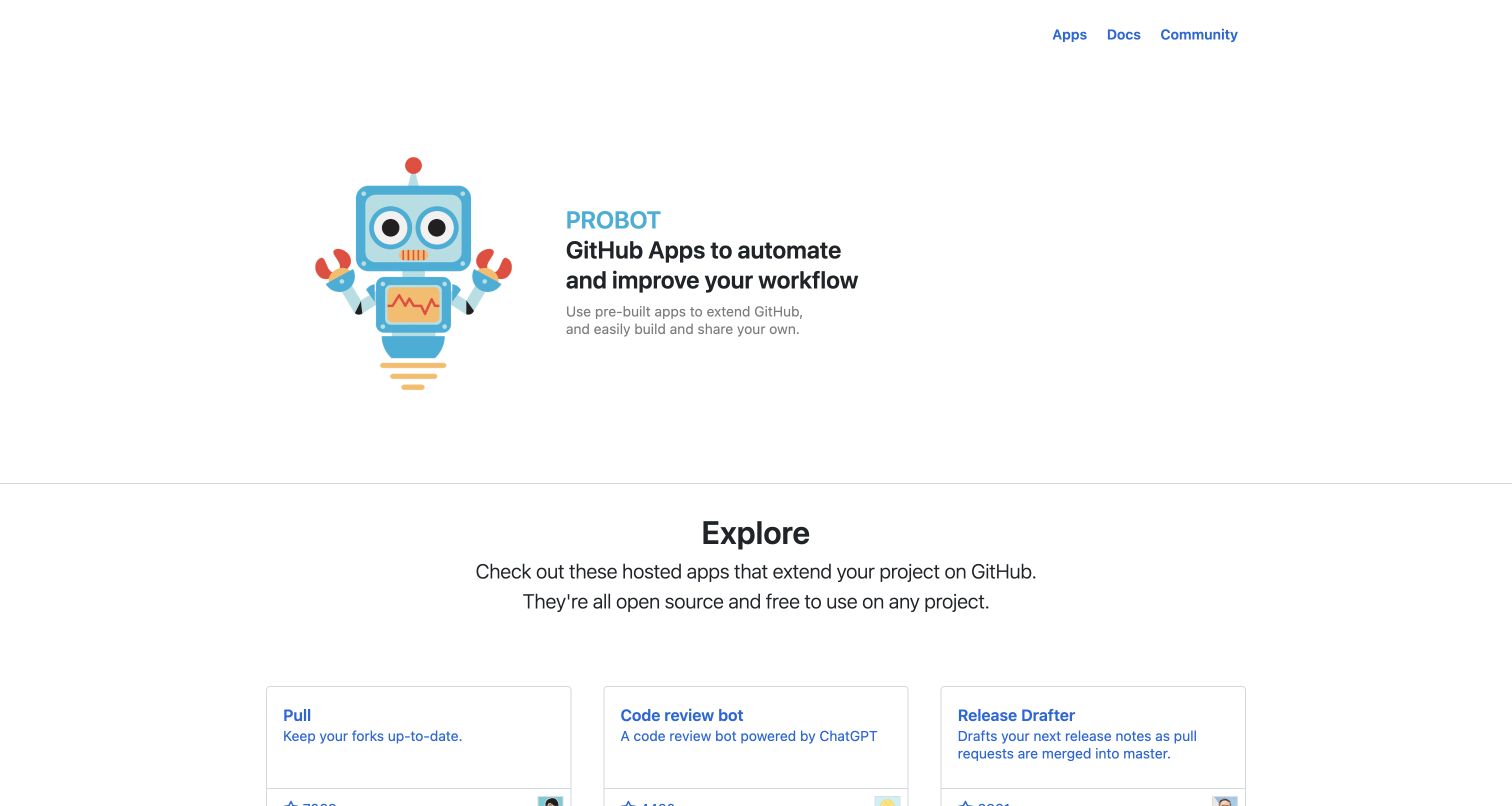
Probot uses a cheerful robot illustration beside a compact description of GitHub automation. The opening leaves substantial white space, while three small header links point to apps, documentation and community. A horizontal rule marks the transition into an exploration section with repeated application cards. The illustration supplies personality, and the catalog supplies practical substance. Probot’s official website repository names this exact public property and documents a Sass command for its stylesheet build. That evidence concerns the site presenting the ecosystem, not the behavior or safety of every listed application.
What you can learn
Pair a memorable introduction with useful examples close enough that visitors can immediately understand what the project enables. Shared card styles and predictable headings are valuable when a community contributes entries with different titles, descriptions and supporting details.
Pros
The mascot makes an automation project approachable without obscuring the concise explanation beside it.
A clear boundary separates the introduction from the practical catalog of available applications.
Cons & considerations
Large empty areas postpone the examples that may be most useful to experienced visitors.
Community listings need consistent metadata and maintenance so the cards remain comparable and trustworthy.
Platform source: First-party website Sass source and build evidence. The Probot website README identifies probot.github.io and documents its Sass build command. Its package manifest invokes a Sass compilation script and its stylesheet assembles website partials. Website-specific repository evidence for compiled Sass authoring, checked separately from the retained screenshot. It does not prove the exact deployed commit, every pictured component, a browser-side Sass runtime or the associated product’s backend. Original screenshot and broad-audit dates remain unchanged. Platform evidence is separate from the direct website screenshot and is not a complete current infrastructure audit.
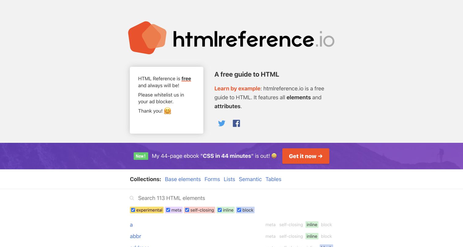
HTML Reference introduces its purpose with a large wordmark and a compact explanation before exposing collections, search and classification filters. Orange accents tie the brand to the example-oriented message, while the reference list uses conventional blue links. An inline promotion creates a strong boundary between the introduction and the working tool. The project’s public repository identifies htmlreference.io, contains the indented Sass entrypoint and supplies a command that compiles it to the website stylesheet. The documented command uses an older compiler, so the example is a design reference rather than a recommended dependency setup.
What you can learn
For a reference site, make the route from explanation to lookup obvious. Reusable styles should distinguish categories, filters and individual entries, giving readers a consistent way to scan a growing catalog without making every item into a large card.
Pros
Collections and filters expose useful ways to reduce a long list of reference entries.
The restrained link treatment keeps the actual learning material familiar and easy to scan.
Cons & considerations
The promotional strip competes with the transition into the reference tool.
Legacy build dependencies require separate review before their configuration is reused in a new project.
Platform source: First-party website Sass source and build evidence. The HTML Reference README and site configuration identify htmlreference.io. Its package build compiles css/website.sass to css/website.css using a legacy node-sass dependency. Website-specific repository evidence for compiled Sass authoring, checked separately from the retained screenshot. It does not prove the exact deployed commit, every pictured component, a browser-side Sass runtime or the associated product’s backend. Original screenshot and broad-audit dates remain unchanged. Platform evidence is separate from the direct website screenshot and is not a complete current infrastructure audit.
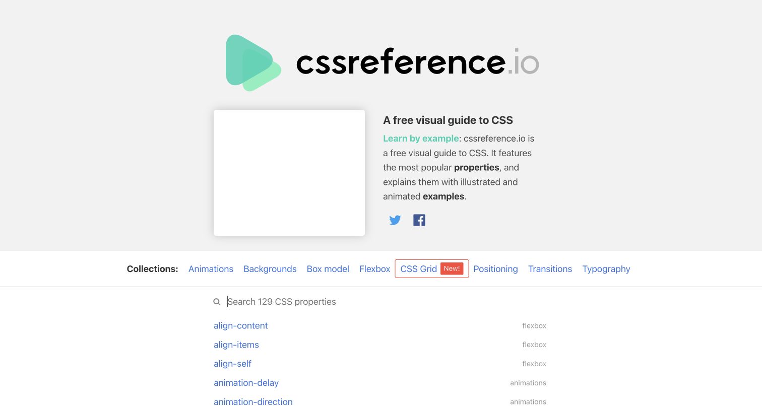
CSS Reference uses a soft green identity and a large wordmark above a brief explanation of its illustrated learning format. A centered collection row leads into search and an alphabetical property list. The design gives the reference content familiar text-link behavior, avoiding a heavy card interface for short technical entries. The public project repository ties the website to cssreference.io and includes its Sass source and compilation script. The source uses a legacy compiler, which is recorded as implementation evidence rather than offered as a suitable starting toolchain today.
What you can learn
Design a reference interface around how people narrow a question: by subject, keyword and exact item name. A modest set of shared layout rules can connect those methods while preserving space for the examples and explanations that make each entry useful.
Pros
Topic collections help readers browse by practical CSS concepts instead of only alphabetical order.
The simple list gives technical names room to remain legible without repetitive decorative containers.
Cons & considerations
The large introductory area delays direct access to the searchable property list.
Empty promotional space can appear visually unresolved even when the core reference tool remains usable.
Platform source: First-party website Sass source and build evidence. The CSS Reference README and site configuration identify cssreference.io. Its package build compiles css/website.sass to css/website.css using a legacy node-sass dependency. Website-specific repository evidence for compiled Sass authoring, checked separately from the retained screenshot. It does not prove the exact deployed commit, every pictured component, a browser-side Sass runtime or the associated product’s backend. Original screenshot and broad-audit dates remain unchanged. Platform evidence is separate from the direct website screenshot and is not a complete current infrastructure audit.
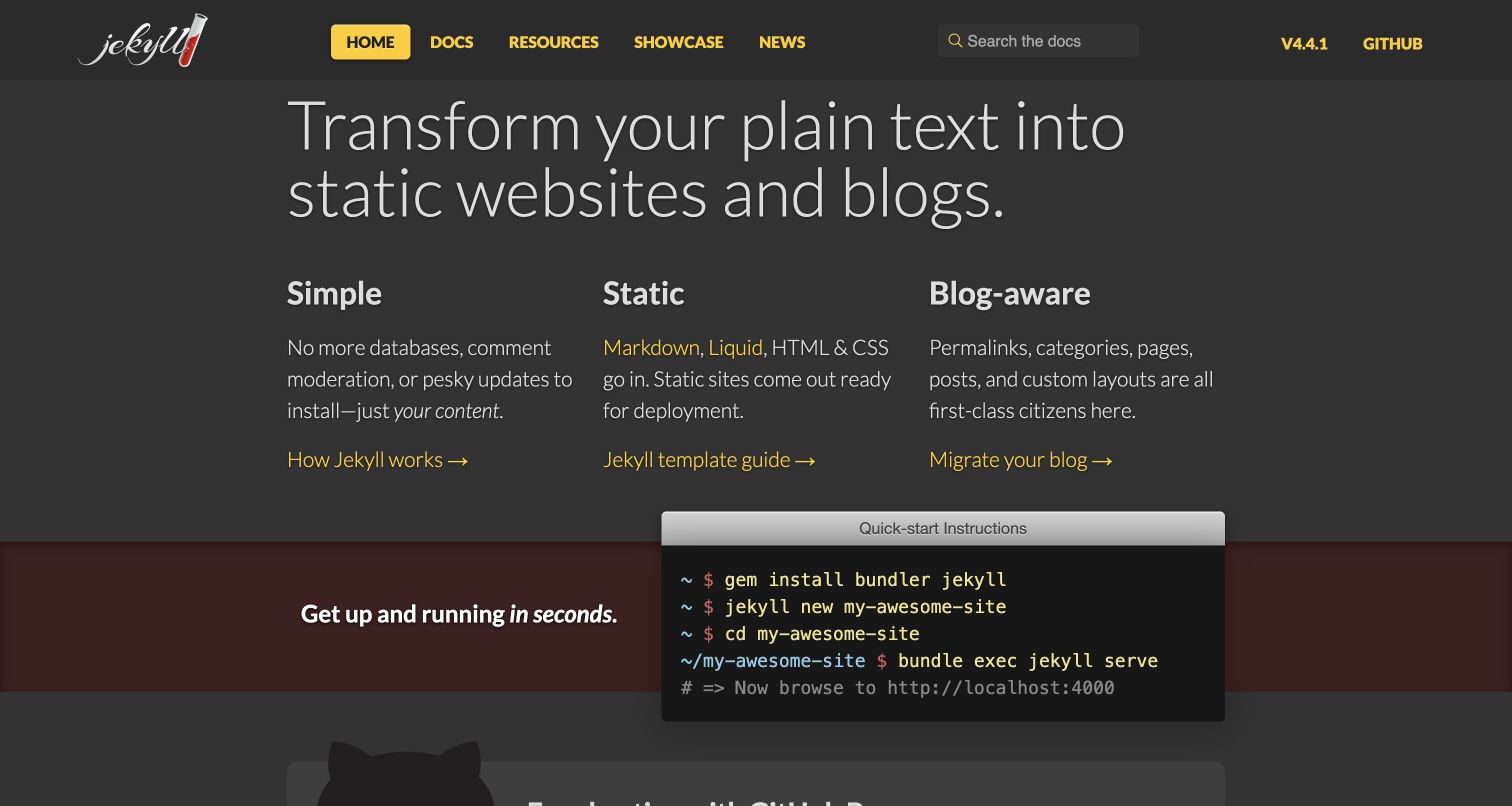
Jekyll’s homepage uses a charcoal background, yellow navigation accents and a large light-weight statement. Three explanatory columns organize its core ideas, each ending in a distinct link. A terminal-style panel then overlaps the boundary of a darker section, connecting the proposition to a concrete starting sequence. The project repository explicitly identifies its documentation directory as the source of jekyllrb.com and includes the website’s Sass entrypoint and configuration. This association concerns the public project website, not every site generated with Jekyll or the entire Ruby ecosystem.
What you can learn
Move from the central promise to a small number of differentiating ideas and then to a realistic first action. Use common type and spacing rules across explanatory text and code so the setup instructions feel like part of the same experience.
Pros
The three-column explanation gives the central proposition an immediately scannable structure.
The terminal panel makes the starting workflow visible without sending visitors to another page first.
Cons & considerations
Thin display typography needs adequate contrast and size across screen conditions.
Installation examples require ongoing maintenance to remain useful as project requirements change.
Platform source: First-party website Sass source and build evidence. The Jekyll repository’s docs/readme.md identifies jekyllrb.com as this documentation site. Its screen.scss entrypoint imports the site’s Sass partials, with Sass configured in the site configuration. Website-specific repository evidence for compiled Sass authoring, checked separately from the retained screenshot. It does not prove the exact deployed commit, every pictured component, a browser-side Sass runtime or the associated product’s backend. Original screenshot and broad-audit dates remain unchanged. Platform evidence is separate from the direct website screenshot and is not a complete current infrastructure audit.
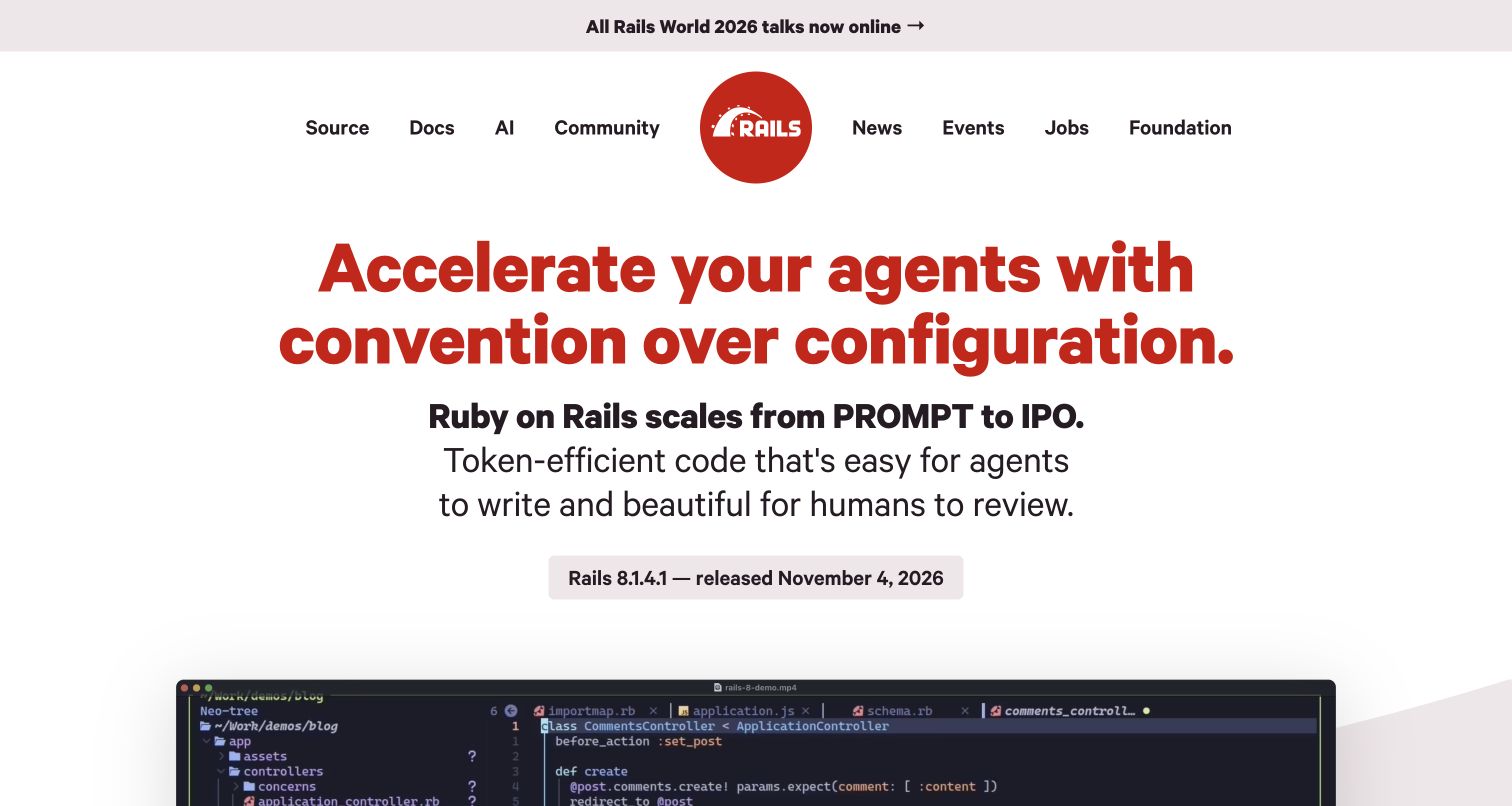
Ruby on Rails centers a circular red mark within a wide navigation row, then uses a large red headline to establish its point of view. Supporting black typography supplies the next level of explanation, and a small release label sits above the beginning of a code demonstration. A separate event strip remains at the top. The first-party website repository states that it generates rubyonrails.org and contains the site’s Sass entrypoint and partials. That establishes a styling-source relationship for this property without attributing the website’s design to the Rails application framework itself.
What you can learn
A strong editorial statement needs a disciplined hierarchy around it. Reuse a small number of heading scales, accent rules and content widths so the supporting explanation and demonstration can clarify the claim instead of adding another competing visual voice.
Pros
The restrained red, black and white palette makes the hierarchy immediately apparent.
The release label and demonstration connect the broad proposition with tangible project material.
Cons & considerations
Large promotional language may leave first-time readers needing a more concrete definition.
Wide centered text requires careful line lengths and wrapping to remain comfortable on smaller screens.
Platform source: First-party website Sass source and build evidence. The Rails website README states that this repository generates rubyonrails.org. Its main site stylesheet is an SCSS entrypoint importing the website’s shared and page-specific Sass partials. Website-specific repository evidence for compiled Sass authoring, checked separately from the retained screenshot. It does not prove the exact deployed commit, every pictured component, a browser-side Sass runtime or the associated product’s backend. Original screenshot and broad-audit dates remain unchanged. Platform evidence is separate from the direct website screenshot and is not a complete current infrastructure audit.
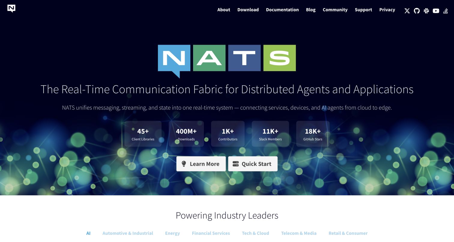
NATS opens with a multicolored wordmark on a nearly black field, followed by a broad explanatory line and a short supporting sentence. A network-like illustration occupies the lower hero, behind a row of project statistics and two white actions. The contrast makes learning and quick-start routes easy to locate despite the detailed backdrop. The official website repository explicitly identifies nats.io and describes its small Sass stylesheet; the site template compiles that entrypoint with Dart Sass. This evidence applies to the public presentation website, not the messaging software or its performance.
What you can learn
Keep the first two actions clear when a technical introduction includes artwork and supporting metrics. Shared token and layout modules can create visual consistency, while the content team remains responsible for maintaining the meaning and provenance of every numerical claim.
Pros
The two white actions remain easy to identify within a visually rich introduction.
A distinctive wordmark and restrained dark background create a recognizable project identity.
Cons & considerations
The long explanatory line needs deliberate wrapping at intermediate screen widths.
Statistics require context and maintenance; their presence alone does not demonstrate suitability for a project.
Platform source: First-party website Sass source and build evidence. The NATS website README identifies nats.io and explicitly describes the Sass stylesheet. Its CSS template compiles assets/sass/main.scss with the Dart Sass transpiler. Website-specific repository evidence for compiled Sass authoring, checked separately from the retained screenshot. It does not prove the exact deployed commit, every pictured component, a browser-side Sass runtime or the associated product’s backend. Original screenshot and broad-audit dates remain unchanged. Platform evidence is separate from the direct website screenshot and is not a complete current infrastructure audit.
Kegan has 15+ years of experience working with small businesses, Fortune 500 companies, and everything in between. No development job is too big or too small: he brings the same hands-on attention to a focused improvement, a complete website, or a custom application.
For Sass projects, he can help with responsive interfaces, reusable components, custom functionality, API connections, and performance-minded implementation. He works directly with clients on scope, design, implementation, testing, and handover, with an emphasis on clear communication and a system that remains practical to maintain after launch.
Show 3 other Sass developersHide other Sass developers
A modest public website can use a compact set of modules for typography, layout, navigation and recurring content. Start with the actual page types and add a shared rule only when it solves a clear problem. Keep component states close to the component, and document the few shared values that contributors should change deliberately.
Several examples combine their own Sass files with a documentation theme. Treat the theme’s supported extension points as an interface: identify where project variables, component overrides and page-specific rules belong. Keep the relationship understandable during upgrades, and test representative article types rather than assuming a successful compilation preserves the intended layout.
Modernize an existing Sass codebase in stages
Inspect the compiler, imports, dependency versions and generated CSS before changing a legacy project. Sass’s module migration tools can help with older import patterns, but a migration still needs review of actual output and component behavior. Some reference repositories use older compilers; their presence here documents their website association and is not a recommendation to adopt the same dependencies.
Plan the content system before the stylesheet structure
Collect representative content and difficult cases
Gather long titles, dense code samples, inline notices, multi-language navigation and pages without imagery before finalizing the visual system. These cases reveal where rigid dimensions or overly broad selectors become difficult to maintain. Define the intended reading sequence first, then decide how shared styles should support it across different page types and widths.
Make shared values and ownership explicit
Record which colors, spacing values and type scales are shared across the site and which are intentionally local. Give common modules clear names and identify who owns their changes. A seemingly small edit to a shared token can affect navigation, notices and documentation examples simultaneously, so review it against the places where it is actually used.
Document how the website compiles its styles and which source entrypoints produce the public assets. Keep dependency updates reviewable and compare the output of meaningful changes. For external design references, preserve the source URL, repository scope and screenshot date independently. A newer repository observation does not make an older capture a fresh visual review of the live deployment.
A useful handover demonstration
Ask the actual team to carry out its routine job: publish a realistic update, correct a mistake, preview a narrow screen, and identify who owns an integration failure. For a library or frontend framework, also ask who maintains the content source and deployment. A polished screenshot does not answer those operational questions.
Beyond the screenshot
A practical Sass website checklist
Identify the primary page types and visitor tasks before creating shared modules.
Use real content, including long labels and dense examples, when testing the layout.
Separate shared foundations from local component rules with clear names and responsibilities.
Prefer explicit module dependencies and review legacy import patterns before upgrading.
Record which entrypoints compile into each public stylesheet.
Check generated CSS as well as the organization of Sass source files.
Keep keyboard focus, text contrast and responsive reading order visible in component reviews.
Test notices, error states and empty content alongside the ideal page.
Assign owners to shared values and document changes that affect several page types.
Keep screenshot dates, repository observations and deployed-release evidence distinct.
Test with real content, a keyboard, a small screen, slow or failed requests, and the people who will maintain the system. These are planning checks, not an accessibility, security, performance, or search-ranking certification.
Sources & editorial method
How this Sass collection was reviewed
This collection was researched and written on November 12, 2026. It contains twenty distinct public website properties and twenty new original reviews. Genuine existing browser captures were recovered from stable authoring records, inspected directly and retained without altered pixels, URLs, dimensions or capture dates. No new browser capture was made. First-party website repositories were read at recorded commit hashes, including website identity documents, actual Sass files and relevant build entrypoints. Archived IBM Carbon and MDN Yari candidates were excluded after their repositories disclosed replacement implementations. Twenty existing broad public-audit attempts were retained: eighteen checked and two partial, with original observation dates. No private application, account, purchase or form was tested. Repository evidence documents a website-specific styling relationship, not an exact production deployment or a complete current backend inventory. Industry links appear only where a reviewed association with a published collection is recorded; unresolved classifications remain omitted.
Every image is an unmodified capture from the actual website, with its source and capture date. Some captures are reused from our shared catalog; their dates remain the original capture dates. None comes from a vendor gallery or a generated reconstruction. Moving imagery and live content can change.
Technology attribution uses public page assets or metadata, official platform documentation, or a cited first-party project case study. Documentary and framework-relationship evidence is identified where used; it is not a complete current backend inventory. A CMS image CDN alone does not establish a full CMS deployment. A library’s presence does not prove which individual controls use it, and a platform label does not establish AI authorship.
The composition notes, lessons, pros and tradeoffs are original editorial observations. We have not measured conversion, traffic, security, performance or accessibility conformance. Website owners retain their brands and imagery; these examples are not our client portfolio. Written, Edited and Curated are independent records, not dates advanced by a build. See our editorial standards or suggest a correction.
Questions worth asking
Sass website development FAQs
What is Sass used for on these websites?
The evidence concerns authoring stylesheets for the exact public website. Sass files are compiled to CSS and can help organize shared values, mixins and modules. The association does not identify the private product runtime or every visible interface component.
How was the Sass association verified?
Each source record connects a public website to its own repository using website documentation or configuration, then records actual Sass files and relevant entrypoints. The evidence is pinned to a repository revision. A company logo, unrelated package or dependency declaration alone was not enough.
Are the screenshots from the repository check date?
No. These are genuine earlier captures retained with their original dates, dimensions and source URLs. The repository check has a separate date. The screenshots show a past visible design and do not prove that a specific source revision was deployed when they were captured.
Does a browser run Sass?
Sass is compiled into CSS before the result is served to a browser. The browser uses the resulting stylesheet. That is why authored repository evidence can establish a Sass relationship even when a bounded public-page audit cannot directly identify the original stylesheet language.
Should a new project copy an example’s older build dependencies?
No dependency recommendation follows from inclusion here. Some repositories retain legacy compilers or import syntax. Review current Sass documentation, the project’s requirements and the generated output before selecting or upgrading a toolchain.
Does Sass guarantee good design or accessibility?
No. The completed website still needs clear content, usable navigation, appropriate semantics, visible focus, readable contrast and considered responsive behavior. Sass can help maintain styling rules, but the language does not make those decisions or certify the result.
Study the hierarchy, navigation and repeated content patterns in these websites, then choose a Sass structure that supports your own content and maintenance needs. Keep the design lesson, source evidence and production deployment facts clearly dated.