Best Prettier Websites of 2026 (20 Real-World Examples)
Twenty public websites with Prettier verified in their own source-maintenance workflows, genuine dated captures and original design reviews.
Prettier formats source code. It does not create a visual design, serve as a content management system or certify a website’s quality. These twenty examples pair documented website formatting workflows with genuine captures of the public properties they support. The design lessons concern navigation, hierarchy, demonstrations and learning paths; the technology evidence concerns the files contributors maintain behind those experiences.
GitHub Docs, AWS Amplify Docs, Angular, React and MDN Web Docs open the collection as recognizable developer brands. Each has an exact website-source relationship and an actual Prettier command, check or contribution hook. A dependency elsewhere in an organization’s repository was not enough. The remaining examples follow the same standard, including dedicated documentation websites and public project homepages.
A formatter has a different relationship to a website than a runtime framework. It can make eligible source files more consistent during development, while the resulting interface still depends on content, components, styles and editorial decisions. Some examples format only selected file types; others exclude imported documentation, generated reference material or particular component directories. Those boundaries remain part of the evidence instead of becoming an unsupported claim that every file or pictured element was formatted.
Before the examples
What makes good Prettier website development in 2026?
Make the formatting scope explicit
List the website directories and file types that the command actually reaches. A root command in a monorepo may cover library packages while missing the public website, and an editor setting can apply differently from a continuous integration check. Keep that distinction visible in contribution instructions so reviewers understand what a formatting change means.
A consistent source layout can make changes easier to read, but it does not choose a useful heading, an accessible control or an effective learning path. Study the screenshots for those decisions and use the repository records to understand the maintenance workflow. Avoid treating a clean formatting check as proof that the completed interface is correct.
Give contributors a documented way to apply formatting and a separate way to check it. Align local tooling with the project’s intended configuration and version, then keep failures understandable. A review should make clear whether a change concerns content, behavior or source layout, rather than hiding all three inside an unexplained automated rewrite.
The following reviews examine twenty genuine public website captures. First-party repositories establish their Prettier source-maintenance workflows. Capture dates, repository observations and earlier broad public audits remain separately recorded; the image alone cannot identify a formatter.
We start with five recognizable brands or organizations: GitHub Docs, AWS Amplify, Google Angular, Meta React, Mozilla MDN Web Docs. Each attribution applies to the named website property, not every product or website belonging to its organization. This is a curated reading sequence, not a measured ranking.
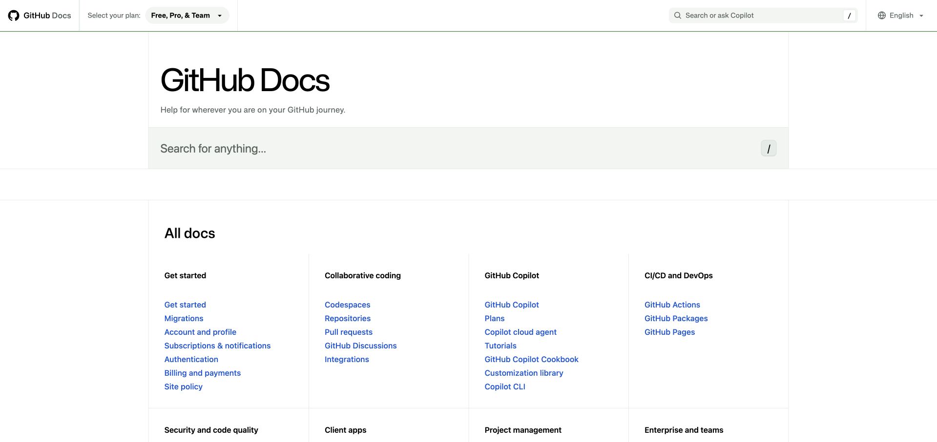
GitHub Docs gives search two prominent positions while keeping the surrounding page almost entirely typographic. The captured homepage separates its introductory heading from an ordered directory of tasks, with fine rules establishing columns instead of heavy cards. Plan selection stays in the header, which makes an important documentation context available before a visitor chooses a topic. Blue links remain the strongest repeated visual signal across categories. This is useful inspiration for a help center with many products, although the long link lists assume visitors already recognize some GitHub terminology. The website repository’s Prettier commands concern source consistency; they do not explain or guarantee this information architecture.
What you can learn
Define a small number of task categories and make their link treatment predictable. A formatter can reduce incidental differences while contributors maintain those components, but editors still need to decide which tasks deserve prominence.
Pros
Plan context appears before the documentation directory.
Repeated link styling makes dense groups easy to compare.
Cons & considerations
Product terminology creates an initial learning burden.
The spacious introduction delays the full topic inventory.
Platform source: First-party website formatting command or contribution hook. The repository identifies docs.github.com. Its prettier and prettier-check commands address website TypeScript, TSX, SCSS and YAML source; release-note data is excluded. Documented source-formatting workflow for the exact public website, with eligible file types and exclusions preserved. This is not a browser-runtime claim, a verified production commit, evidence that a particular command passed, or proof that Prettier caused any visible design choice. Repository observations, retained screenshots and broad-audit dates are independent. Platform evidence is separate from the direct website screenshot and is not a complete current infrastructure audit.
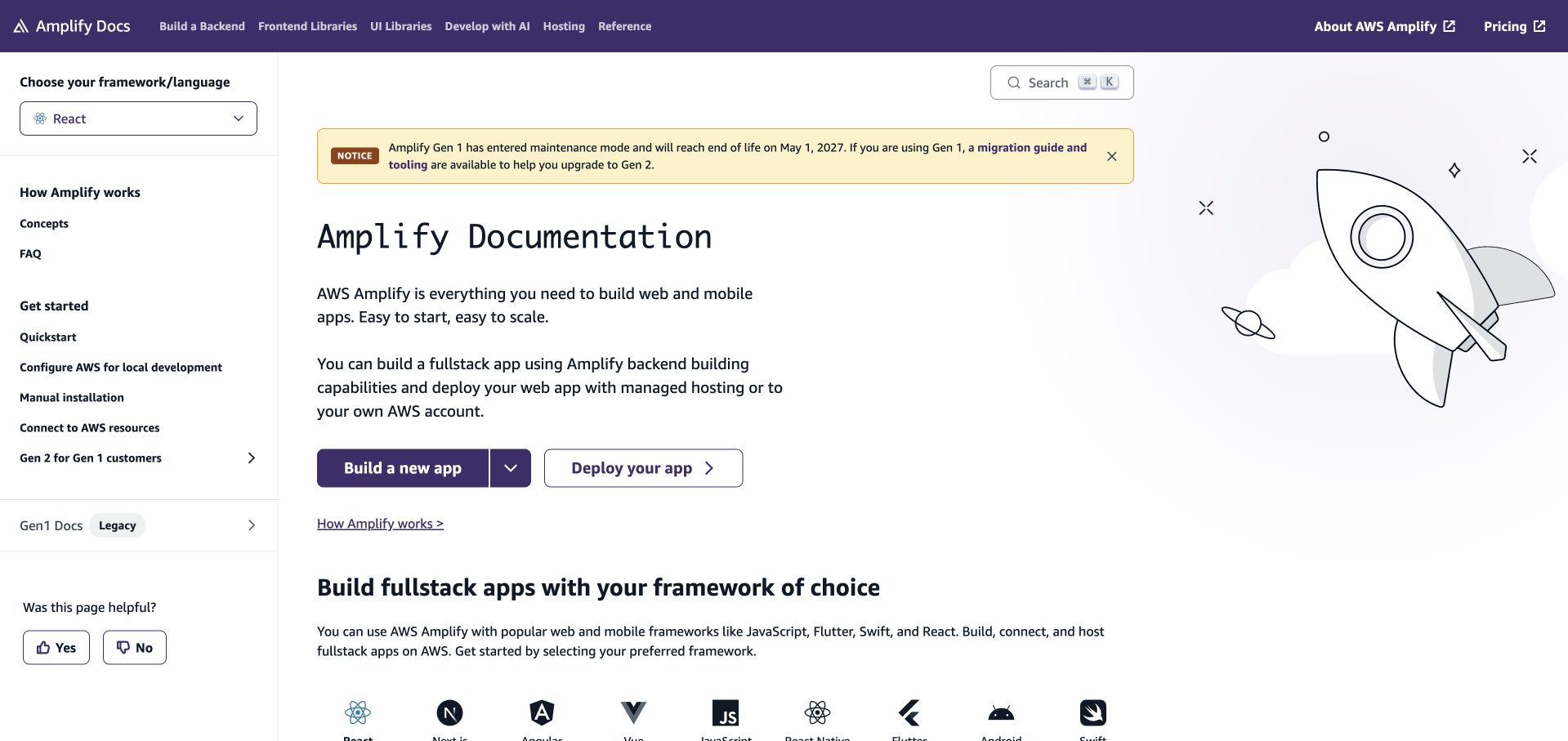
Amplify’s captured documentation page keeps the framework selector above the left navigation, making the selected context part of the reading environment. The central column pairs an introductory explanation with separate build and deployment actions. A migration notice receives a distinct yellow treatment, while the rocket illustration gives the otherwise technical page a lighter tone. Framework marks below the introduction show breadth without replacing the practical navigation. The layout supports users arriving with different tools, but the combination of generation choices, framework choices and product categories introduces several decisions. Its checked website hook and editor settings provide direct Prettier evidence for maintained source files, separate from the page’s visible presentation.
What you can learn
Expose the context that changes instructions before presenting individual steps. Keep migration notices visually distinct from the main task, and review their wording as carefully as the components whose source formatting is automated.
Pros
Framework selection is visible beside the main content.
Build and deployment actions have clearly different labels.
Cons & considerations
Several navigation systems compete for attention.
The illustration uses space that could hold task details.
Platform source: First-party website formatting command or contribution hook. The README maps the production website to docs.amplify.aws. Its Husky hook invokes lint-staged, whose actual command runs Prettier over staged TypeScript, TSX, JavaScript, CSS and MJS website files. Markdown and generated output are excluded. Documented source-formatting workflow for the exact public website, with eligible file types and exclusions preserved. This is not a browser-runtime claim, a verified production commit, evidence that a particular command passed, or proof that Prettier caused any visible design choice. Repository observations, retained screenshots and broad-audit dates are independent. Platform evidence is separate from the direct website screenshot and is not a complete current infrastructure audit.
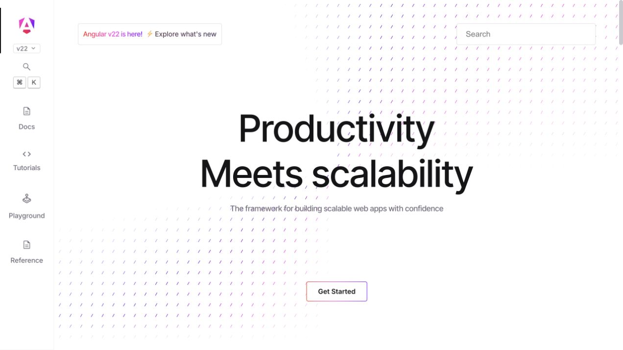
Angular’s homepage uses a narrow vertical rail to keep documentation, tutorials, the playground and reference material visible while the main canvas concentrates on one message. The captured hero gives its headline substantial space and places a single starting action below it. A release notice and search field sit above the central content, with a faint patterned background adding texture without becoming another information layer. This arrangement makes the site’s learning modes easy to distinguish, although the sparse hero offers little immediate evidence of what an Angular project looks like. The repository connects this website to a Prettier-enabled formatting workflow; that development evidence is independent of the visual review.
What you can learn
Separate persistent learning modes from the temporary marketing message. Give each mode a stable location, then test whether a new visitor can choose a route without understanding framework jargon or reading the whole introduction.
Pros
The side rail keeps major learning routes visible.
One primary action creates a clear starting point.
Cons & considerations
The opening message remains broad for newcomers.
Small rail controls deserve careful keyboard and touch testing.
Platform source: First-party website formatting command or contribution hook. The adev README identifies angular.dev. The repository formatting hook invokes ng-dev format, whose configuration explicitly enables Prettier; the ignore file excludes specific generated adev content, not the authored website application. Documented source-formatting workflow for the exact public website, with eligible file types and exclusions preserved. This is not a browser-runtime claim, a verified production commit, evidence that a particular command passed, or proof that Prettier caused any visible design choice. Repository observations, retained screenshots and broad-audit dates are independent. Platform evidence is separate from the direct website screenshot and is not a complete current infrastructure audit.
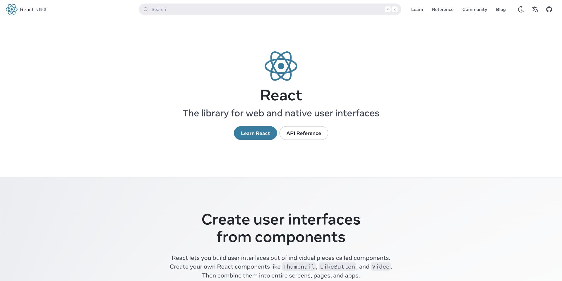
React’s captured homepage presents two immediate routes: learning the library and consulting its API reference. The centered logo, short description and paired actions create a calm opening without concealing the more extensive navigation in the header. Search occupies much of that header, acknowledging that many visitors already know their destination. Below the hero, a component explanation starts translating the product promise into a practical concept. The large amount of whitespace makes the hierarchy clear, though it also pushes concrete examples farther down the page. The checked react.dev repository formats website source with Prettier while treating authored Markdown separately, a useful reminder that formatting scope can differ by content type.
What you can learn
Give beginners and experienced readers different entry points without creating separate identities for the site. Document which source types a formatter covers so contributors do not confuse automated code layout with editorial treatment of prose.
Pros
Learning and API lookup have distinct primary actions.
Search remains prominent outside the introductory hero.
Cons & considerations
Concrete examples begin below a generous opening region.
The simple promise cannot replace a fuller adoption explanation.
Platform source: First-party website formatting command or contribution hook. The README explicitly says this repository powers react.dev. Its format:source and nit:source commands run Prettier on plugins and website src JavaScript, TypeScript, JSX, TSX and CSS. Markdown content is excluded. Documented source-formatting workflow for the exact public website, with eligible file types and exclusions preserved. This is not a browser-runtime claim, a verified production commit, evidence that a particular command passed, or proof that Prettier caused any visible design choice. Repository observations, retained screenshots and broad-audit dates are independent. Platform evidence is separate from the direct website screenshot and is not a complete current infrastructure audit.
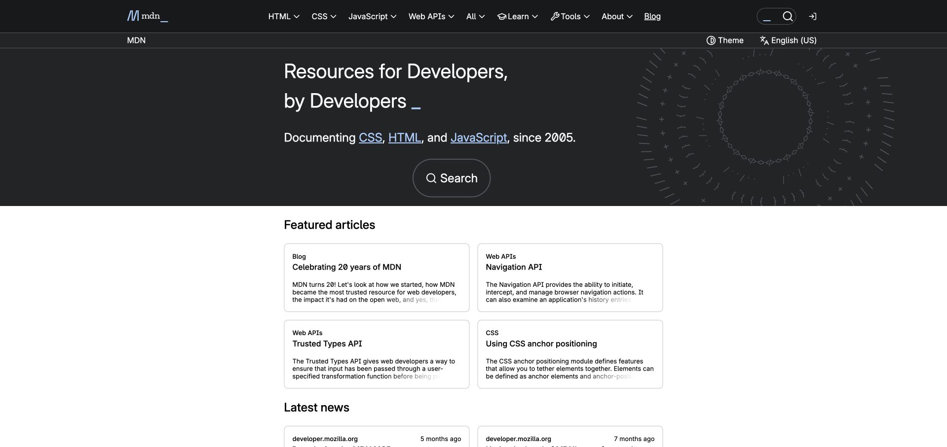
MDN combines a dark introductory area with a light grid of featured articles, creating a visible transition from finding reference material to browsing new reading. The captured header groups core web technologies, while a second row holds page context and display controls. Search receives another prominent treatment within the hero. Article cards use category labels and concise descriptions instead of imagery, which suits a technical reference audience. The design offers both direct lookup and discovery, although the layered header occupies substantial vertical space. Current MDN frontend source includes a Prettier check in its repository workflow; this qualifies the website development process without implying that formatting generates its content or determines its design.
What you can learn
Let reference navigation and editorial discovery coexist, but give them separate visual regions. Keep article metadata concise and reserve automated formatting for source consistency while human editors maintain terminology, hierarchy and factual accuracy.
Pros
Core web topics are available in the main navigation.
Article categories clarify the purpose of each featured card.
Cons & considerations
Two header rows add density before the content.
Text-heavy cards depend on precise titles to remain distinct.
Platform source: First-party website formatting command or contribution hook. Fred identifies itself as MDN’s frontend; the MDN Yari source transition README names Fred as the frontend that builds and serves MDN. Fred’s own test workflow invokes npx prettier --check . on its frontend repository. Documented source-formatting workflow for the exact public website, with eligible file types and exclusions preserved. This is not a browser-runtime claim, a verified production commit, evidence that a particular command passed, or proof that Prettier caused any visible design choice. Repository observations, retained screenshots and broad-audit dates are independent. Platform evidence is separate from the direct website screenshot and is not a complete current infrastructure audit.
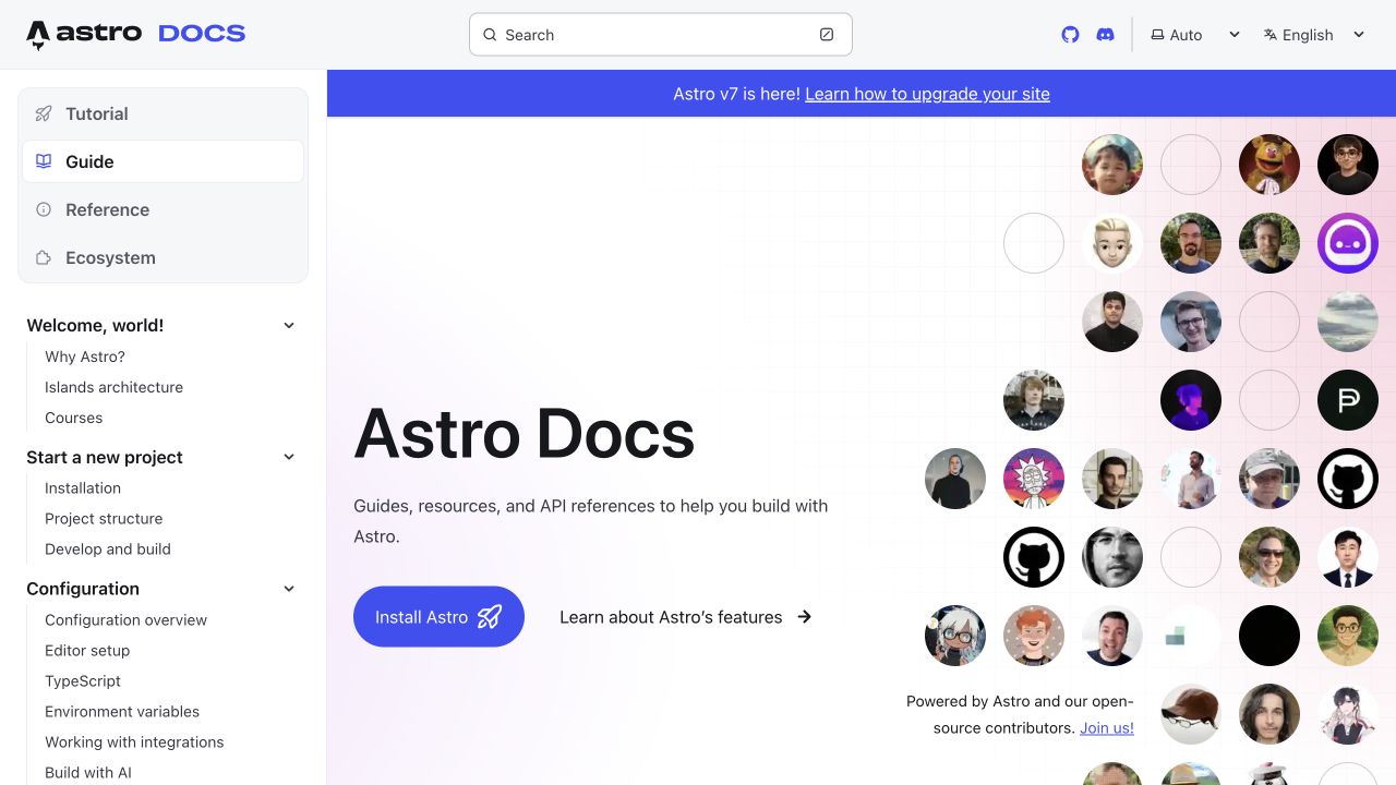
Astro’s documentation capture keeps the full guide navigation beside a welcoming introduction. The sidebar first distinguishes tutorial, guide, reference and ecosystem content, then expands into practical setup and configuration tasks. A broad release banner runs above the main article region, while contributor portraits give the right side a recognizable community presence. Installation receives a strong blue action and feature exploration a quieter companion link. The result feels like a usable manual from the first screen, although the portrait field competes with the otherwise direct task hierarchy. The official documentation repository invokes Prettier for website code and excludes Markdown files from that command’s scope, so its prose should not be attributed to automated formatting.
What you can learn
Introduce a product within the navigation structure visitors will actually use. Distinguish source-code formatting rules from prose conventions, especially when documentation combines authored articles, custom components and many external contributions.
Pros
The sidebar exposes concrete setup tasks immediately.
The installation action is easy to distinguish from exploration.
Cons & considerations
The portrait field adds visual competition near the hero.
Release messaging can distract from first-time onboarding.
Platform source: First-party website formatting command or contribution hook. The README identifies docs.astro.build. Its format:code command runs Prettier across eligible website code with an Astro plugin; Markdown, MDX and generated output are excluded. Documented source-formatting workflow for the exact public website, with eligible file types and exclusions preserved. This is not a browser-runtime claim, a verified production commit, evidence that a particular command passed, or proof that Prettier caused any visible design choice. Repository observations, retained screenshots and broad-audit dates are independent. Platform evidence is separate from the direct website screenshot and is not a complete current infrastructure audit.
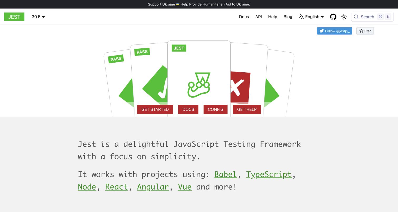
Jest’s captured homepage builds its main illustration from overlapping test-result panels, using green success labels and a contrasting failure mark. Four compact actions sit directly below that scene, covering starting, documentation, configuration and help. A large monospace explanation beneath the illustration connects the product to several JavaScript tools and frameworks. The identity is memorable and related to testing, although the red action row competes with the green success motif. Its website configuration identifies the public hostname and authored stylesheets. The repository’s actual Prettier check includes eligible website CSS and Markdown while excluding JavaScript, TypeScript and generated output, so this example has a narrower maintenance scope than its broad product presentation might suggest.
What you can learn
Borrow visual language from the task a tool performs, then make the principal destinations obvious. Trace formatting commands to the website files they actually include, and keep those checks distinct from the product’s own testing capabilities.
Pros
The illustration relates directly to recognizable test outcomes.
Help and configuration appear alongside the main starting route.
Cons & considerations
Four adjacent actions divide the visitor’s first decision.
Red and green compete as prominent interface signals.
Platform source: First-party website formatting command or contribution hook. The website README maps production to jestjs.io, and its Docusaurus configuration sets that hostname and imports authored CSS. The root lint:prettier-script and lint:prettier:ci commands check eligible files including website CSS and Markdown, while JavaScript/TypeScript and generated website output are excluded. Documented source-formatting workflow for the exact public website, with eligible file types and exclusions preserved. This is not a browser-runtime claim, a verified production commit, evidence that a particular command passed, or proof that Prettier caused any visible design choice. Repository observations, retained screenshots and broad-audit dates are independent. Platform evidence is separate from the direct website screenshot and is not a complete current infrastructure audit.
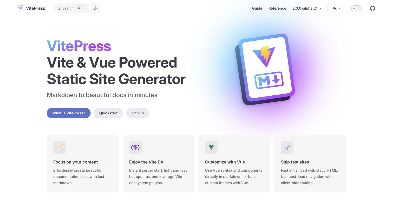
VitePress leads with a literal product description, then organizes its benefits into four evenly sized cards. The captured hero pairs large typography with a dimensional product illustration and gives visitors three routes covering explanation, quick start and source code. Guide and reference links remain visible in the header, along with version, language and display controls. The repeated card treatment makes the product’s core promises easy to scan, but broad claims such as speed still need supporting detail elsewhere. The repository’s Prettier commands cover eligible source and configuration files; its ignore rules exclude Markdown and Vue files, so this example does not claim universal formatting of the documentation website.
What you can learn
Start with an unambiguous product category before describing benefits. In the development workflow, make formatter exclusions as discoverable as the main command so reviewers understand which website files receive consistent automated treatment.
Pros
The headline identifies the product category immediately.
Four parallel cards provide a useful benefit comparison.
Cons & considerations
Three hero actions divide the initial decision.
Performance promises require evidence beyond the captured introduction.
Platform source: First-party website formatting command or contribution hook. The documentation config explicitly sets https://vitepress.dev as siteUrl and sitemap hostname. Root format and format:fail commands invoke Prettier on eligible source/configuration, while Markdown and Vue files are excluded. Documented source-formatting workflow for the exact public website, with eligible file types and exclusions preserved. This is not a browser-runtime claim, a verified production commit, evidence that a particular command passed, or proof that Prettier caused any visible design choice. Repository observations, retained screenshots and broad-audit dates are independent. Platform evidence is separate from the direct website screenshot and is not a complete current infrastructure audit.
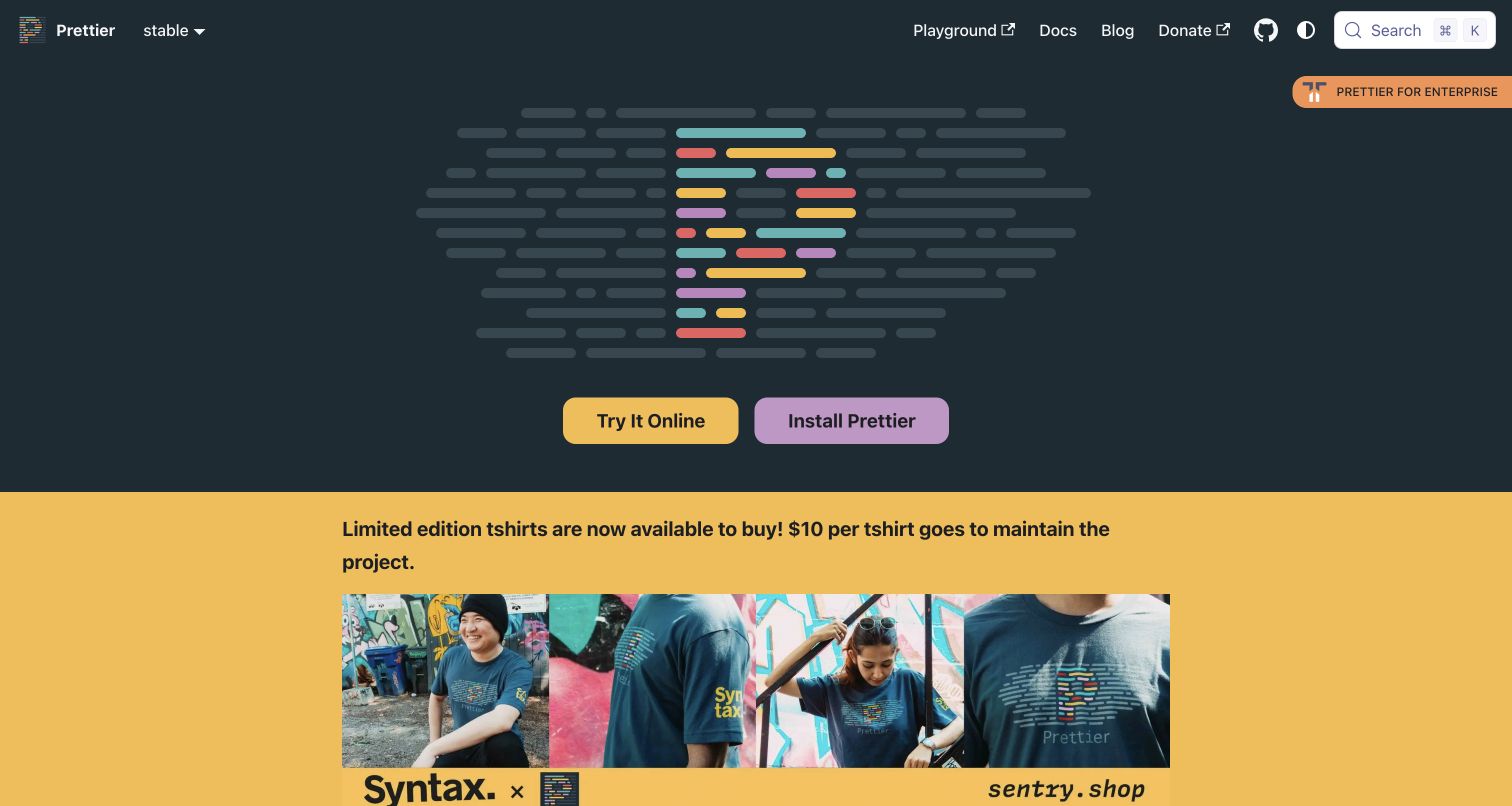
Prettier’s own homepage makes its multicolored code-line symbol the centerpiece of a dark opening region. The captured screen provides two contrasting actions for trying the tool online and installing it, while the navigation keeps documentation and the playground close at hand. Below the hero, a bright merchandise panel introduces community funding and creates a sharp change in tone. The design is easy to recognize, though the opening relies heavily on visitors already knowing what the product does. Its source repository contains both the website and explicit Prettier checks, making the qualification concrete. That evidence concerns the website’s maintained source; the separate interactive formatter is not needed to establish inclusion here.
What you can learn
Offer a low-commitment trial beside installation when a developer tool benefits from hands-on evaluation. Keep community or funding content subordinate to a clear explanation of the product, particularly for visitors arriving without prior context.
Pros
Trial and installation routes have distinct visual emphasis.
The code-line mark creates an immediately recognizable identity.
Cons & considerations
The opening contains little explanatory product copy.
The merchandise panel competes strongly with educational content.
Platform source: First-party website formatting command or contribution hook. The website README identifies prettier.io and explains the website build. Root lint:prettier checks the repository, including authored website files; product test fixtures and vendor files have separate exclusions. Documented source-formatting workflow for the exact public website, with eligible file types and exclusions preserved. This is not a browser-runtime claim, a verified production commit, evidence that a particular command passed, or proof that Prettier caused any visible design choice. Repository observations, retained screenshots and broad-audit dates are independent. Platform evidence is separate from the direct website screenshot and is not a complete current infrastructure audit.
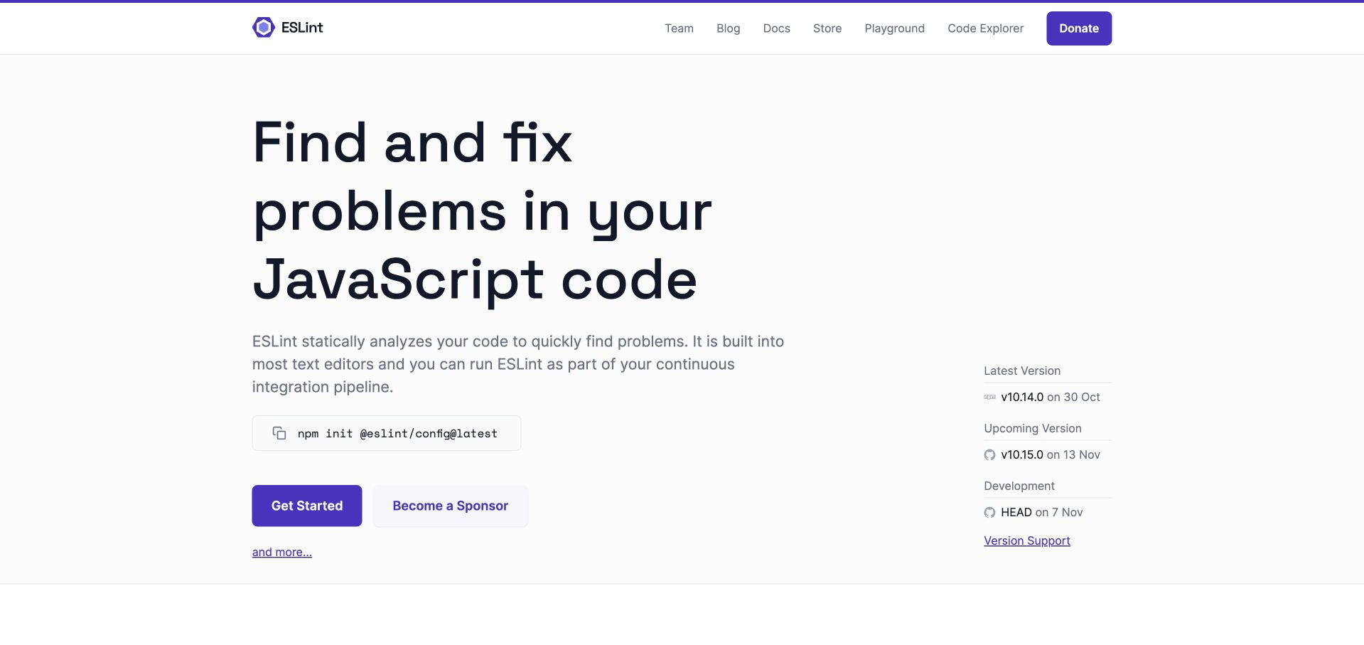
ESLint uses a large, direct headline to explain its purpose before showing an installation command and a clear starting action. The captured homepage gives supporting prose a comfortable reading width and separates release information into a quieter right-hand column. Purple buttons and a thin top rule establish a restrained identity, while navigation covers documentation, the playground and other project resources. The layout makes the basic value easy to understand, although sponsorship and product onboarding share the same action row. The website repository provides explicit Prettier formatting commands with file-type exclusions, distinct from ESLint’s own analysis function. Its inclusion here is therefore based on the website’s maintenance workflow, not the product name or a guessed runtime stack.
What you can learn
State the practical job of a developer tool in ordinary language and keep maintenance information easy to find. Document formatting and linting separately so contributors know which command changes layout and which checks code rules.
Pros
The headline communicates a concrete technical purpose.
Release details add context without dominating the main message.
Cons & considerations
Sponsorship competes with the principal onboarding action.
The long headline takes considerable space on smaller layouts.
Platform source: First-party website formatting command or contribution hook. The README explicitly identifies the source for eslint.org. Website fmt and fmt:check scripts invoke Prettier; ignore rules opt JavaScript, JSX, JSON and SCSS source into the formatting scope. Documented source-formatting workflow for the exact public website, with eligible file types and exclusions preserved. This is not a browser-runtime claim, a verified production commit, evidence that a particular command passed, or proof that Prettier caused any visible design choice. Repository observations, retained screenshots and broad-audit dates are independent. Platform evidence is separate from the direct website screenshot and is not a complete current infrastructure audit.
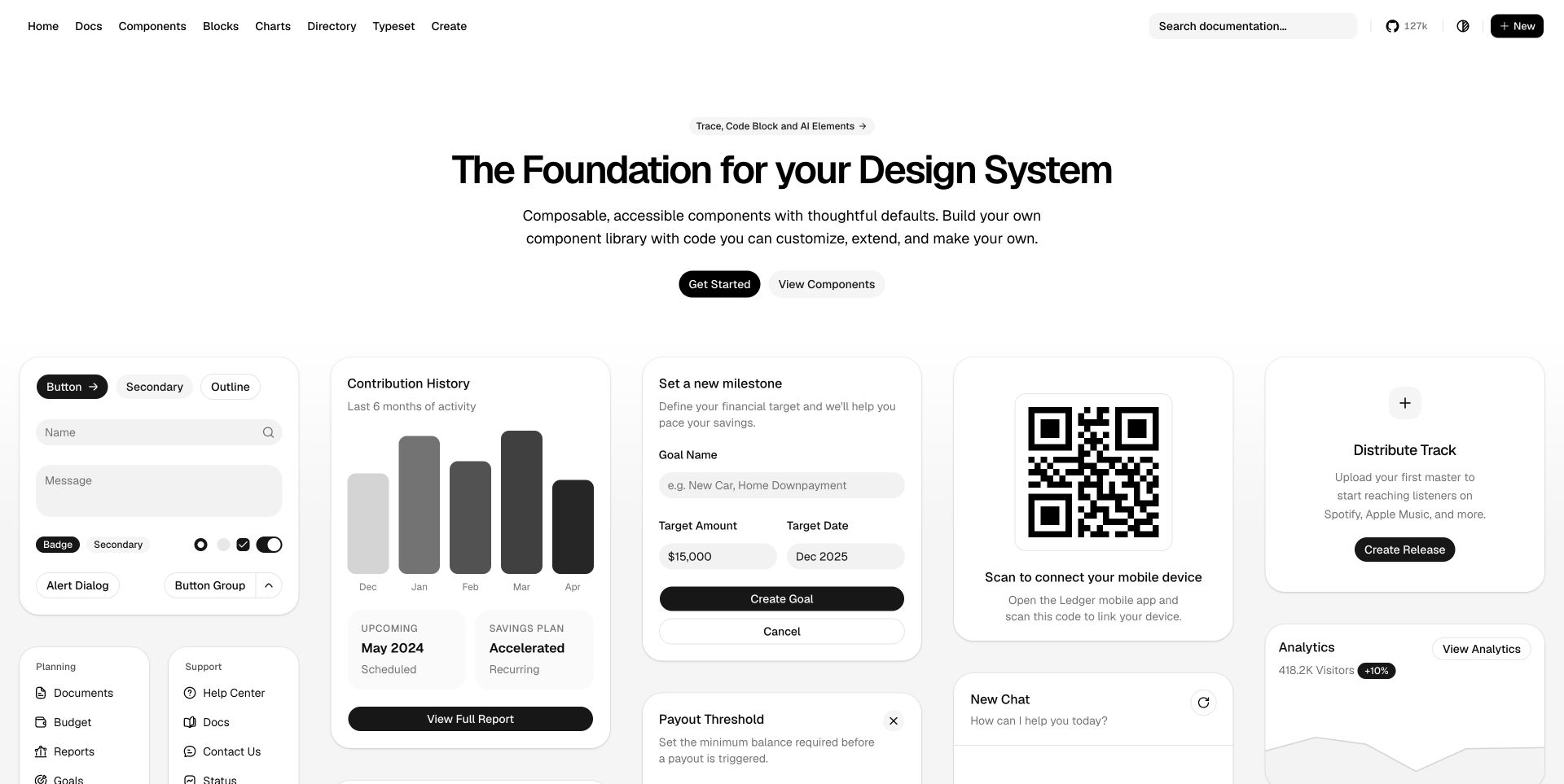
The shadcn/ui homepage places a restrained statement above a wide collection of interface examples. The captured gallery mixes forms, charts, navigation, financial settings and a QR panel, showing how small components can combine into recognizable product screens. Rounded cards, a mostly monochrome palette and consistent control treatments keep the varied examples related. Documentation search remains available in the header, with separate routes for components and larger blocks. The demonstration is persuasive for visitors who already understand component libraries, but the quantity of visual examples can overwhelm a first inspection. The repository’s website package has its own Prettier write and check scripts, providing more precise evidence than a dependency elsewhere in the monorepo.
What you can learn
Demonstrate a system through realistic combinations rather than isolated decorative controls. Keep the website package’s formatting command explicit so contributors can maintain examples without assuming that every neighboring package follows the same workflow.
Pros
The gallery demonstrates several practical interface compositions.
Consistent controls connect otherwise different example panels.
Cons & considerations
The large gallery creates substantial visual competition.
Newcomers may need a clearer explanation of the adoption model.
Platform source: First-party website formatting command or contribution hook. The apps/v4 site configuration sets https://ui.shadcn.com. That website package explicitly runs Prettier write and check commands over its TypeScript, TSX and MDX files, subject to recorded generated-file exclusions. Documented source-formatting workflow for the exact public website, with eligible file types and exclusions preserved. This is not a browser-runtime claim, a verified production commit, evidence that a particular command passed, or proof that Prettier caused any visible design choice. Repository observations, retained screenshots and broad-audit dates are independent. Platform evidence is separate from the direct website screenshot and is not a complete current infrastructure audit.
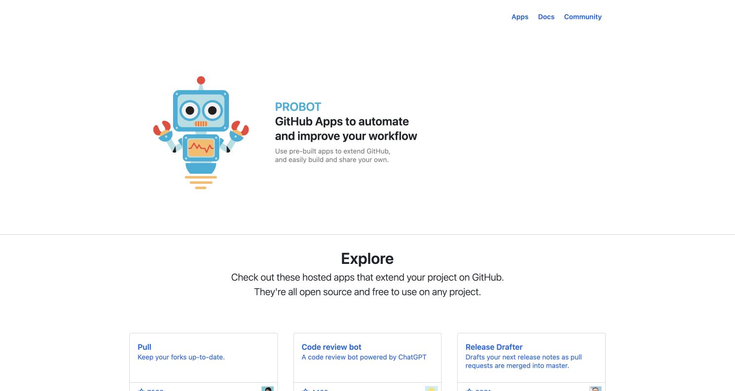
Probot’s captured homepage keeps its introductory block compact, placing a friendly robot illustration beside a short explanation of GitHub automation. The top navigation contains only apps, documentation and community, leaving the page’s purpose easy to identify. A horizontal divider introduces the application directory, whose visible cards use straightforward titles and brief descriptions. The site feels approachable without requiring a large marketing apparatus. However, the open space around the hero reduces the number of applications visible immediately, and the introduction gives little guidance on selecting an appropriate extension. Its website repository explicitly formats JavaScript, Sass and HTML with Prettier, a source-maintenance relationship separate from what individual listed GitHub applications do.
What you can learn
Move quickly from an introductory promise to a useful directory, and give entries short descriptions that explain their jobs. Maintain consistent templates through shared formatting rules while preserving editorial judgment about categories and application suitability.
Pros
The three-item navigation keeps the main routes simple.
Directory cards describe practical jobs in a compact format.
Cons & considerations
Generous hero spacing delays more directory entries.
The opening offers limited guidance for comparing applications.
Platform source: First-party website formatting command or contribution hook. The README identifies this repository as the probot.github.io website. Its format command runs Prettier over website JavaScript, SCSS and HTML files. Documented source-formatting workflow for the exact public website, with eligible file types and exclusions preserved. This is not a browser-runtime claim, a verified production commit, evidence that a particular command passed, or proof that Prettier caused any visible design choice. Repository observations, retained screenshots and broad-audit dates are independent. Platform evidence is separate from the direct website screenshot and is not a complete current infrastructure audit.
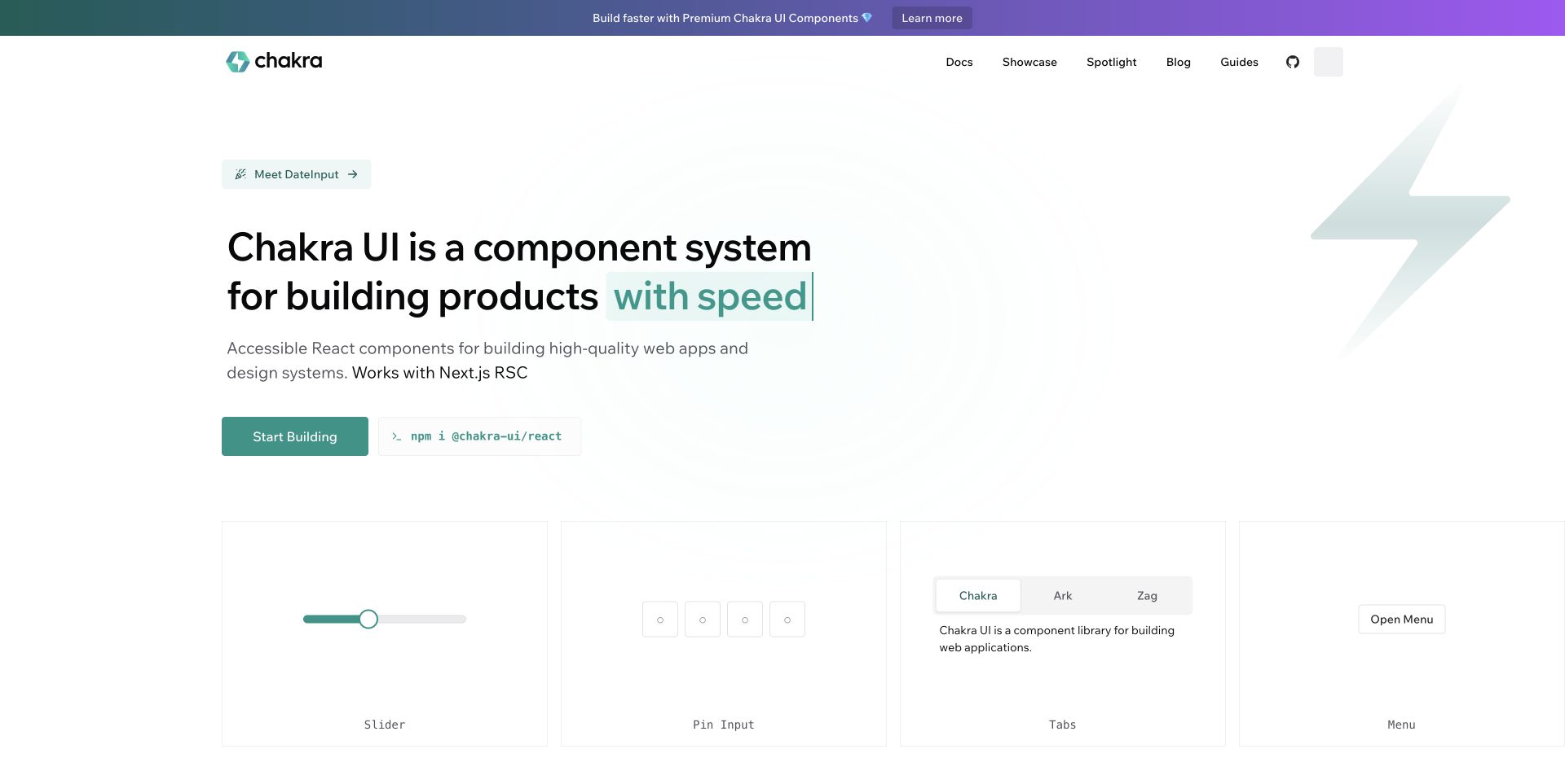
Chakra UI’s homepage presents a large product statement with a colored phrase that carries the strongest emphasis. The captured screen places an installation command beside the primary starting button, then introduces a row of familiar controls including a slider, pin input, tabs and a menu. A promotional strip and a smaller announcement add product news above the main message. The visual language is light and spacious, which suits the component demonstrations, though the pale borders make some regions less distinct. The website lives in a repository whose staged-file hook runs Prettier across relevant source types, while its separate package-only formatting script has a narrower scope and is not the website proof.
What you can learn
Show a few recognizable controls immediately after the product promise, and distinguish installation from exploration. When reviewing monorepo tooling, trace the hook that reaches website files instead of assuming a package-only script covers every app.
Pros
The install command sits beside the starting action.
Small component demonstrations make the promise more tangible.
Cons & considerations
Multiple announcements dilute the opening hierarchy.
Very light panel borders require careful contrast review.
Platform source: First-party website formatting command or contribution hook. The root README identifies apps/www as the latest chakra-ui.com website. The Husky hook invokes lint-staged and its glob runs Prettier over eligible website source; generated public registry material is excluded. The separate package-only format script is not used as website proof. Documented source-formatting workflow for the exact public website, with eligible file types and exclusions preserved. This is not a browser-runtime claim, a verified production commit, evidence that a particular command passed, or proof that Prettier caused any visible design choice. Repository observations, retained screenshots and broad-audit dates are independent. Platform evidence is separate from the direct website screenshot and is not a complete current infrastructure audit.
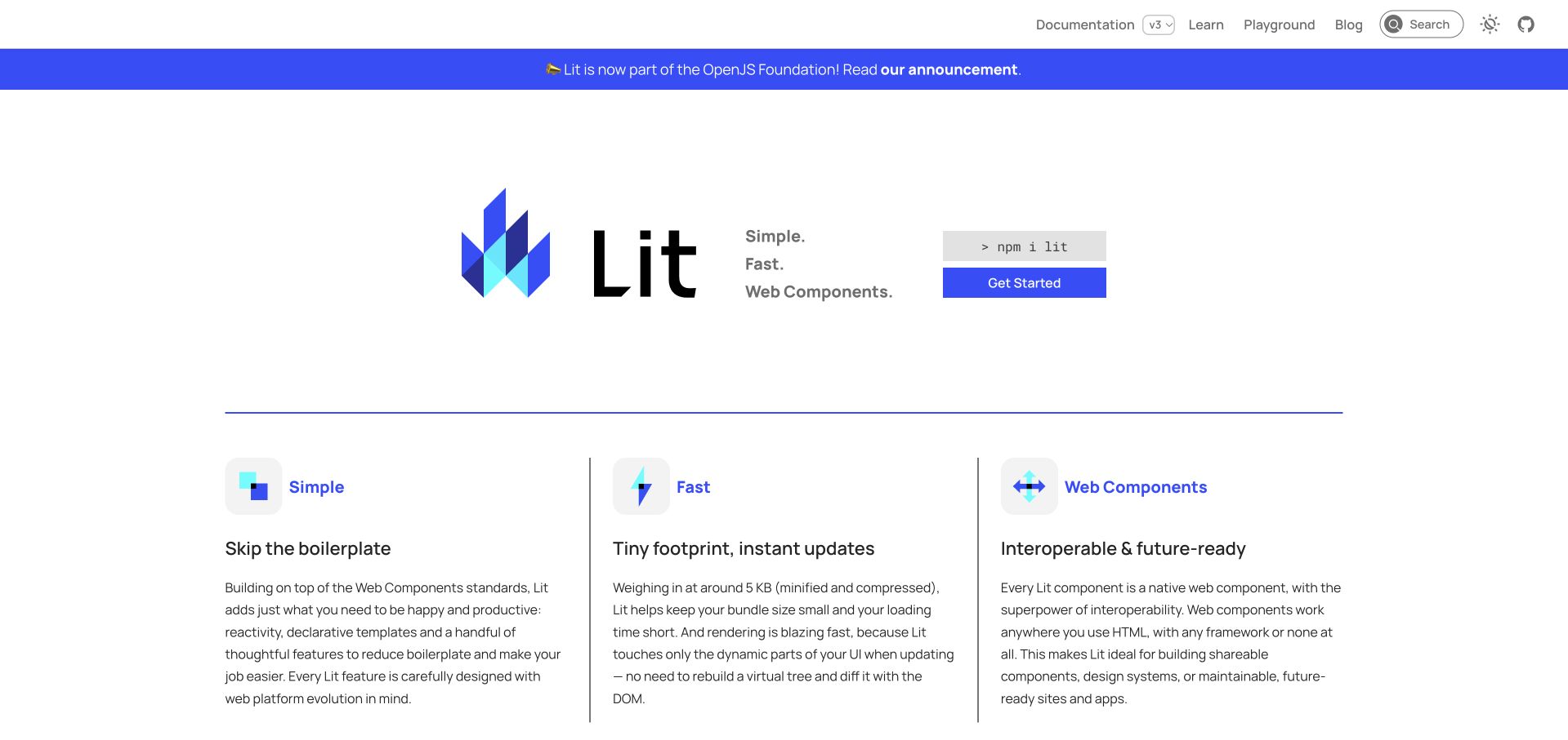
Lit’s captured homepage centers its geometric mark and product name beside a short set of descriptors, with installation and a starting action positioned nearby. Below a thin blue divider, three columns explain the library’s approach, performance positioning and use of web components. Each column combines an icon, a short heading and a more detailed paragraph, giving readers both a quick scan and a longer explanation. The opening is concise, although the later paragraphs become dense when compared with the sparse hero. The dedicated lit.dev repository runs Prettier write and check commands and excludes sample material where specified. This is evidence about the website source workflow rather than every application built with Lit.
What you can learn
Use a short set of parallel explanations to connect a concise product identity with technical substance. Preserve deliberate sample formatting through explicit exclusions, and avoid treating automated source layout as a substitute for readable explanatory prose.
Pros
Installation and the starting route are immediately visible.
Three parallel columns make the core ideas easy to compare.
Cons & considerations
The explanatory paragraphs are relatively dense.
The prominent announcement adds a separate reading priority.
Platform source: First-party website formatting command or contribution hook. The README identifies lit-dev-content as lit.dev content and lit-dev-server as its production server. The dedicated website repository has Prettier format and format:check commands; sample material is deliberately excluded. Documented source-formatting workflow for the exact public website, with eligible file types and exclusions preserved. This is not a browser-runtime claim, a verified production commit, evidence that a particular command passed, or proof that Prettier caused any visible design choice. Repository observations, retained screenshots and broad-audit dates are independent. Platform evidence is separate from the direct website screenshot and is not a complete current infrastructure audit.
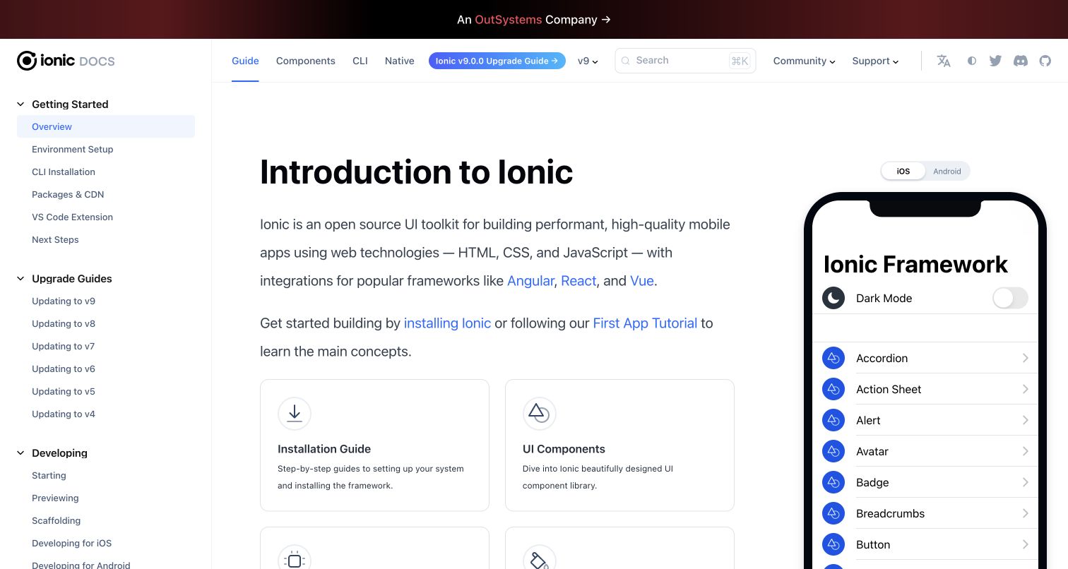
Ionic’s documentation capture combines a substantial left navigation with an introductory article and a phone-shaped demonstration. The overview explains the toolkit, links to supported framework integrations and presents installation and component cards beneath the opening text. The demonstration makes the subject tangible without requiring readers to leave the page. Version and upgrade information remain available across the top, which is helpful for an established framework but adds considerable navigation density. The official website repository explicitly runs Prettier over relevant documentation and interface files, with its contribution guide explaining the command. That source evidence establishes a formatting workflow for this public documentation property, rather than a general claim about Ionic applications.
What you can learn
Place a representative product demonstration beside introductory documentation when it clarifies the subject. Keep version context visible, then separate automated formatting instructions from the editorial work of maintaining accurate setup guidance across supported platforms.
Pros
The phone demonstration gives the introduction concrete context.
Installation and component routes are visible below the overview.
Cons & considerations
The header and sidebar create a dense navigation environment.
The demonstration reduces space available for introductory text.
Platform source: First-party website formatting command or contribution hook. The README identifies the official Ionic documentation and the website configuration sets ionicframework.com with the documentation base path. The package invokes Prettier for website HTML, TypeScript, JSX and documentation; the contribution guide explains its use. Documented source-formatting workflow for the exact public website, with eligible file types and exclusions preserved. This is not a browser-runtime claim, a verified production commit, evidence that a particular command passed, or proof that Prettier caused any visible design choice. Repository observations, retained screenshots and broad-audit dates are independent. Platform evidence is separate from the direct website screenshot and is not a complete current infrastructure audit.
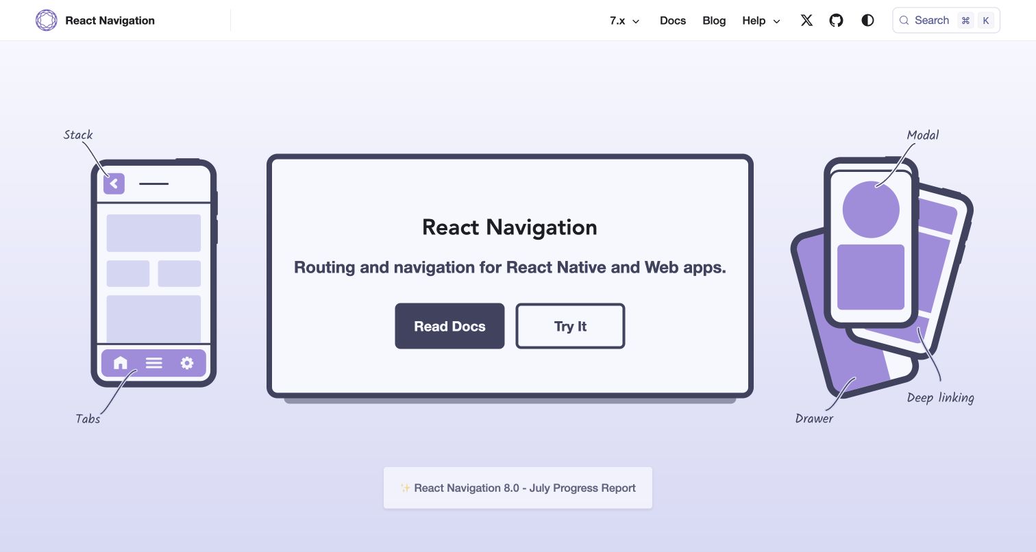
React Navigation turns its homepage into a labeled diagram of the product’s scope. The captured hero surrounds a central panel with phone illustrations that identify stacks, tabs, modals, drawers and deep linking. Two large actions offer documentation and experimentation, while the header keeps version selection and search available. The consistent purple palette joins the diagrams and controls without requiring elaborate decoration. This approach communicates several concepts at once, though the small handwritten annotations depend on sufficient screen space and visual clarity. The website’s own package and staged-file hook invoke Prettier, directly connecting the public documentation property to source formatting without asserting anything about the runtime of apps that use the library.
What you can learn
Use annotated product diagrams when terminology has a spatial meaning, and provide a text route for readers who need more explanation. Keep website formatting commands close to contribution instructions so visual and content changes remain straightforward to review.
Pros
The diagram connects navigation terms to recognizable layouts.
Documentation and experimentation receive equally visible routes.
Cons & considerations
Small annotations may be difficult to read on compact screens.
The introductory scene offers limited implementation detail.
Platform source: First-party website formatting command or contribution hook. The README and website configuration identify reactnavigation.org. Its format command invokes Prettier over eligible website files; the checked lefthook configuration also formats staged files. Documented source-formatting workflow for the exact public website, with eligible file types and exclusions preserved. This is not a browser-runtime claim, a verified production commit, evidence that a particular command passed, or proof that Prettier caused any visible design choice. Repository observations, retained screenshots and broad-audit dates are independent. Platform evidence is separate from the direct website screenshot and is not a complete current infrastructure audit.
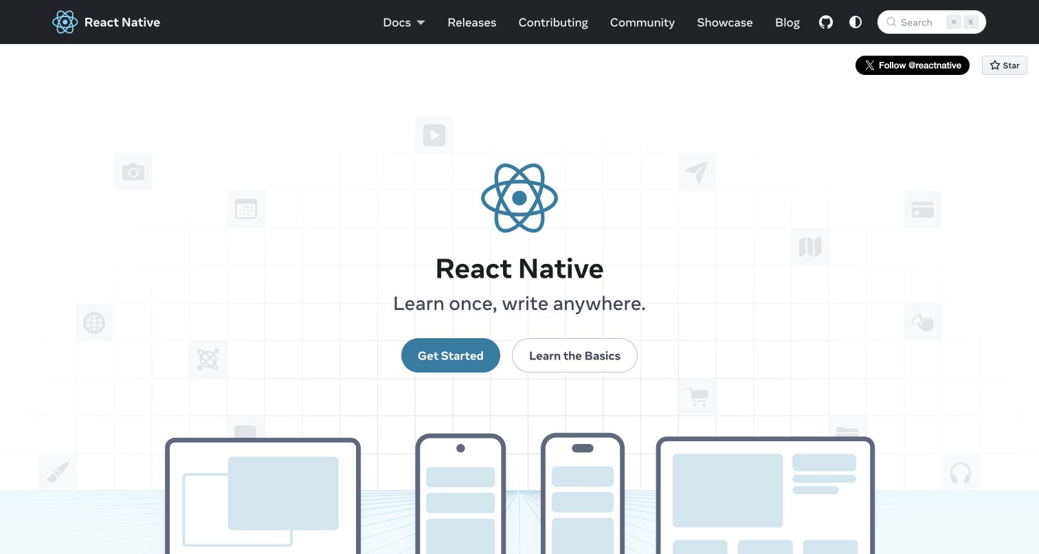
React Native’s homepage combines a familiar React mark with a concise central message and two onboarding choices. The captured design places simplified device outlines below the hero and uses faint interface symbols in the background, suggesting a broad application context without a crowded feature grid. A dark header holds documentation, releases, contribution and community links, giving the project’s ongoing development a visible place. The opening communicates an approachable starting point, although the slogan leaves technical boundaries to later material. Its website package explicitly formats and checks eligible SCSS styles with Prettier, separate from React Native’s native application implementation. Its visual coherence still comes from authored layout and content decisions rather than from the formatter.
What you can learn
Use device imagery to establish scope without implying that every platform behaves identically. Keep onboarding choices distinct and explain implementation boundaries in the next layer of content, where consistent source formatting can support clearer contribution reviews.
Pros
Device illustrations reinforce the product’s cross-platform context.
Starting and learning routes are clearly separated.
Cons & considerations
The concise slogan leaves technical constraints unexplained.
Faint background symbols contribute little practical information.
Platform source: First-party website formatting command or contribution hook. The README explicitly identifies the repository powering reactnative.dev. Its website/package.json formats and checks website src SCSS with Prettier, excluding src/theme. This is a website-style-source relationship, not universal formatting of all content. Documented source-formatting workflow for the exact public website, with eligible file types and exclusions preserved. This is not a browser-runtime claim, a verified production commit, evidence that a particular command passed, or proof that Prettier caused any visible design choice. Repository observations, retained screenshots and broad-audit dates are independent. Platform evidence is separate from the direct website screenshot and is not a complete current infrastructure audit.
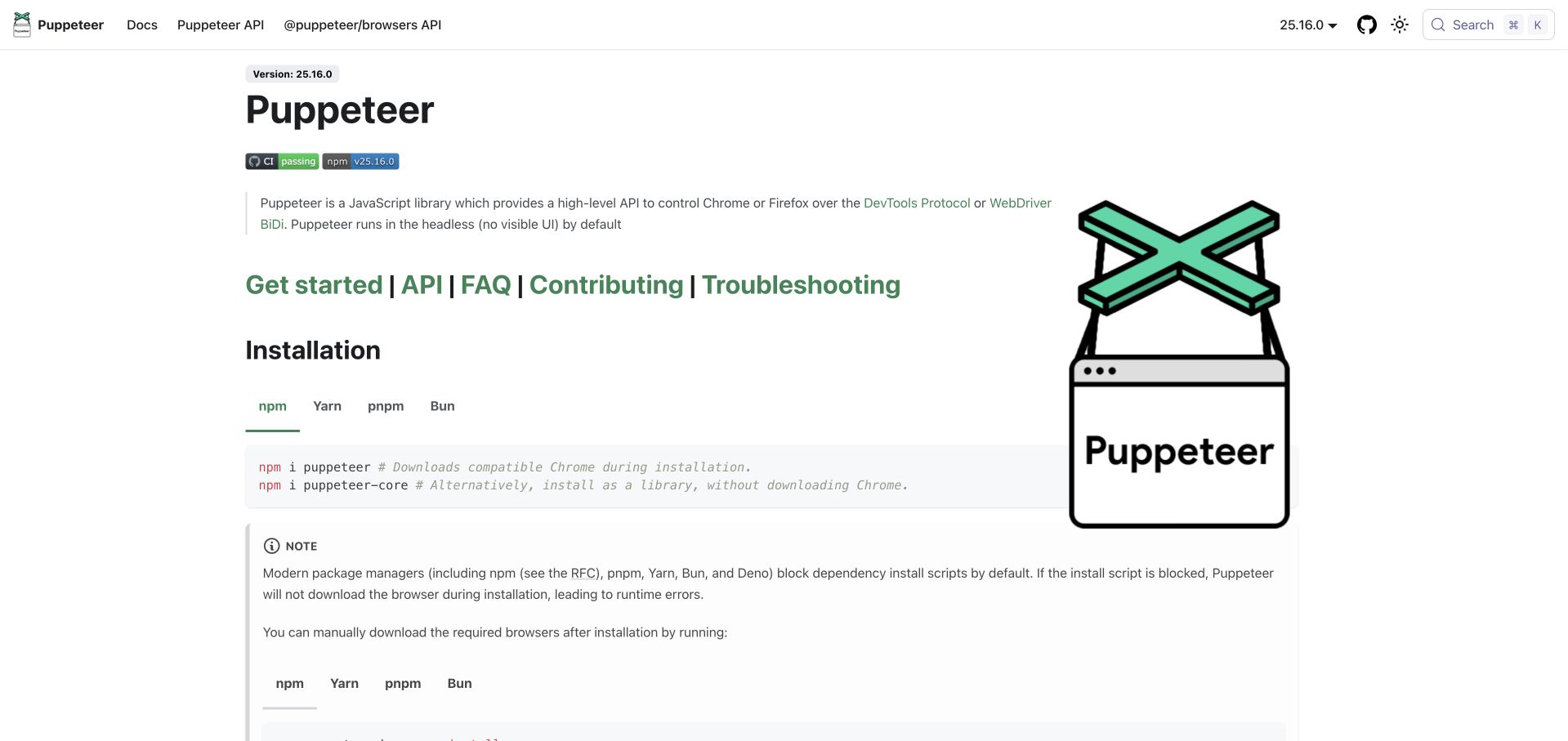
Puppeteer’s captured opening looks like a practical documentation article rather than a marketing landing page. It introduces the library, places major reading routes in a prominent line and quickly reaches installation commands with package-manager tabs. Version context appears near the title and in the header, while a large product illustration occupies the right side. The direct progression suits readers who already know their goal, although the illustration reduces the space available to technical content. A clearly separated note explains an installation caveat below the commands. The repository’s Prettier check includes authored website files while excluding generated documentation, establishing a specific maintenance relationship without implying that the formatter performs browser automation.
What you can learn
Bring installation close to the product definition when implementation is the visitor’s likely next step. Keep generated reference material outside ordinary formatting changes, and distinguish the maintained website shell from product documentation produced by another build process.
Pros
Installation choices are available near the introductory explanation.
Visible version context helps readers interpret the reference material.
Cons & considerations
The large illustration competes with practical instructions.
Several prominent reference links compete for the next action.
Platform source: First-party website formatting command or contribution hook. The website configuration sets pptr.dev and the website README describes generating the documentation property. Root lint:prettier invokes Prettier over authored website source, while generated API and versioned documentation have explicit exclusions. Documented source-formatting workflow for the exact public website, with eligible file types and exclusions preserved. This is not a browser-runtime claim, a verified production commit, evidence that a particular command passed, or proof that Prettier caused any visible design choice. Repository observations, retained screenshots and broad-audit dates are independent. Platform evidence is separate from the direct website screenshot and is not a complete current infrastructure audit.
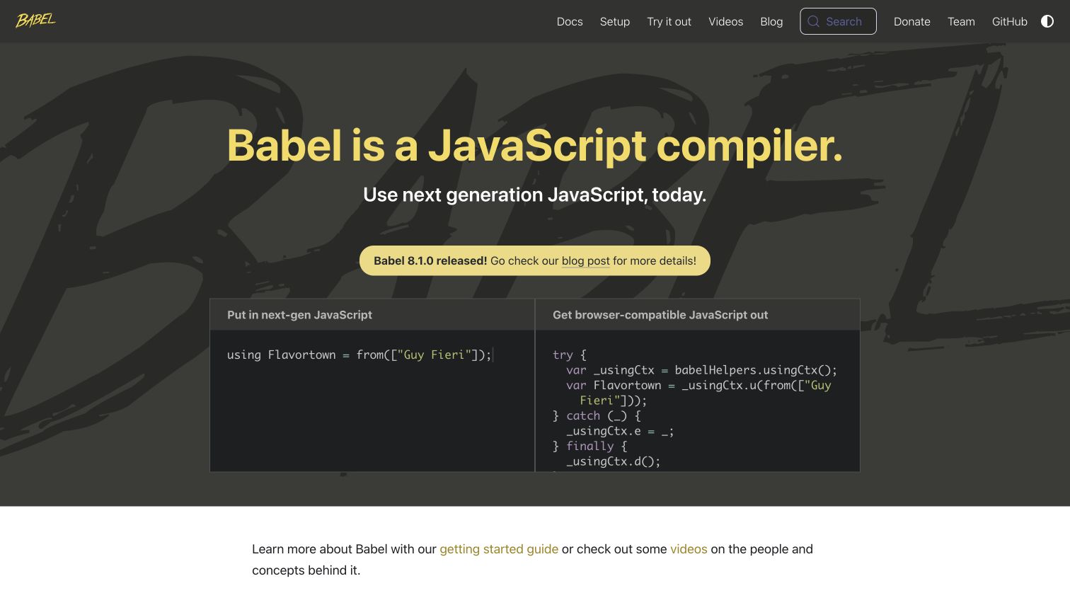
Babel’s captured homepage states its product category immediately and follows with a paired code demonstration. The two panels show an input and transformed output, giving the broad promise a concrete visual counterpart. A yellow release notice sits above the demonstration, while the dark background and oversized brush lettering establish a distinctive identity. Navigation separates documentation, setup, experimentation and educational material. The design is particularly useful for explaining a transformation tool, but the code samples assume familiarity with JavaScript and become visually dense. Prettier evidence here concerns the maintained website’s source workflow, not a claim that Babel and Prettier perform the same function or that the pictured output was generated by the formatter.
What you can learn
Show a transformation through paired examples and label each side clearly. Keep compiler behavior, source formatting and editorial explanation separate in both implementation documentation and marketing copy, so a simple demo does not collapse different responsibilities together.
Pros
The paired panels make the transformation concept concrete.
The opening identifies the product category without ambiguity.
Cons & considerations
The example assumes prior knowledge of JavaScript syntax.
Large background lettering adds texture behind dense technical material.
Platform source: First-party website formatting command or contribution hook. The README maps the main branch of babel/website to babeljs.io. Its lint command runs Prettier on website JavaScript/TypeScript source, and fix:css explicitly targets website/static/css. Documented source-formatting workflow for the exact public website, with eligible file types and exclusions preserved. This is not a browser-runtime claim, a verified production commit, evidence that a particular command passed, or proof that Prettier caused any visible design choice. Repository observations, retained screenshots and broad-audit dates are independent. Platform evidence is separate from the direct website screenshot and is not a complete current infrastructure audit.
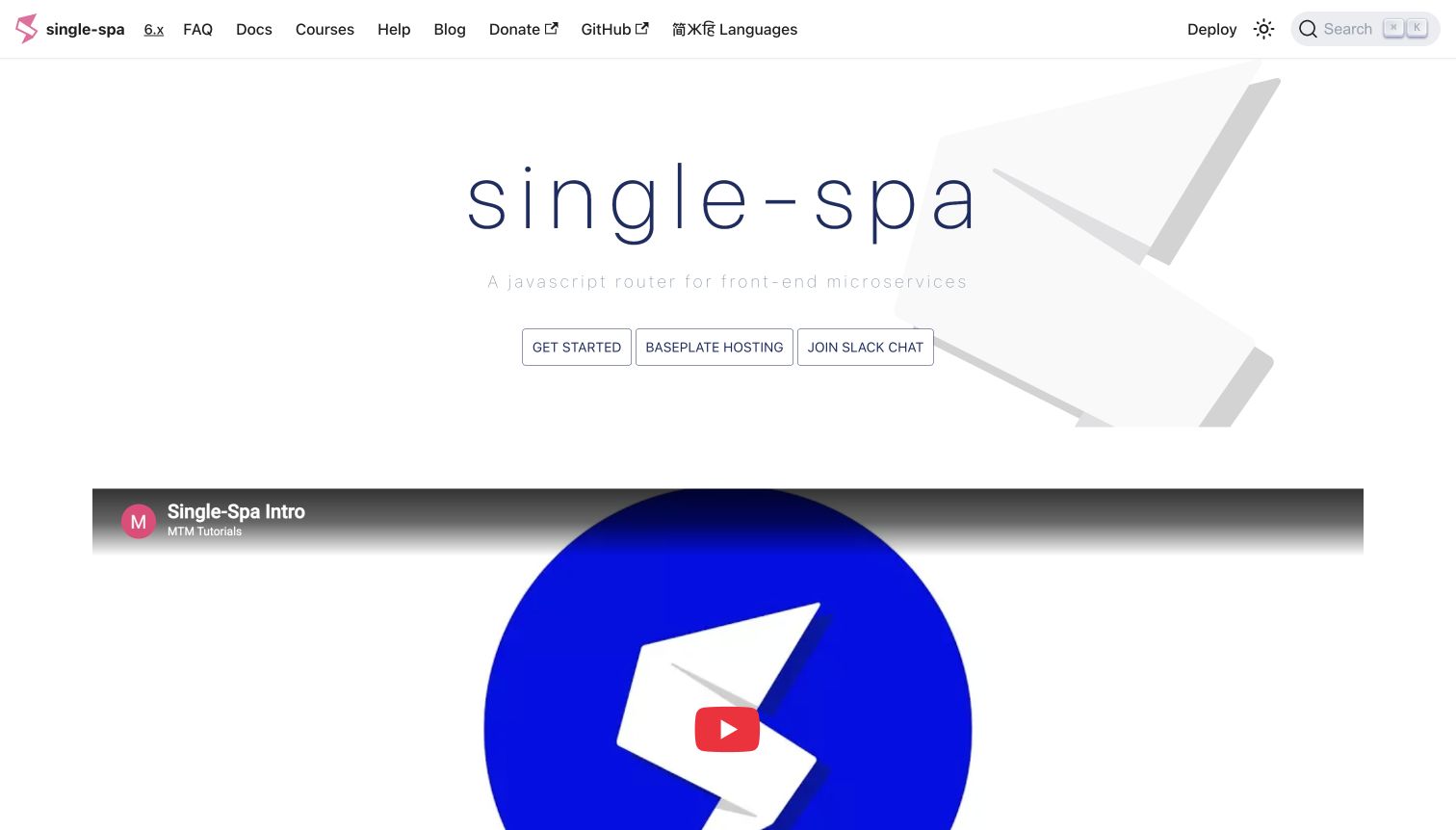
Single-SPA’s captured homepage gives its name most of the opening space, with a short definition and three compact actions underneath. The main navigation offers documentation, frequently asked questions, courses and help, while version selection stays close to the logo. A large introductory video begins immediately below the hero, signaling that the project supports more than one way to learn. The restrained presentation avoids a long feature inventory, but the pale subtitle has limited contrast and the equally styled hero buttons make priorities less obvious. Its dedicated website repository identifies the public property and provides explicit Prettier write and check commands for source and documentation files, beyond a package dependency alone.
What you can learn
Offer multiple learning formats while making the preferred first step clear. A video can supplement a concise introduction, but visitors still need a readable text explanation and predictable navigation when they cannot or prefer not to watch.
Pros
Documentation and several learning formats are easy to locate.
The video sits close to the introductory product explanation.
Cons & considerations
The pale subtitle is difficult to read in the capture.
Three similarly styled actions weaken the initial priority.
Platform source: First-party website formatting command or contribution hook. The README says this repository powers single-spa.js.org and the website configuration sets that hostname. Its format and format:check commands invoke Prettier across eligible website source, styles and Markdown. Documented source-formatting workflow for the exact public website, with eligible file types and exclusions preserved. This is not a browser-runtime claim, a verified production commit, evidence that a particular command passed, or proof that Prettier caused any visible design choice. Repository observations, retained screenshots and broad-audit dates are independent. Platform evidence is separate from the direct website screenshot and is not a complete current infrastructure audit.
Kegan has 15+ years of experience working with small businesses, Fortune 500 companies, and everything in between. No development job is too big or too small: he brings the same hands-on attention to a focused improvement, a complete website, or a custom application.
For Prettier projects, he can help with responsive interfaces, reusable components, custom functionality, API connections, and performance-minded implementation. He works directly with clients on scope, design, implementation, testing, and handover, with an emphasis on clear communication and a system that remains practical to maintain after launch.
Show 3 other Prettier developersHide other Prettier developers
Choose a formatting workflow that fits the website
Use a dedicated website command
For a standalone website, a clear format command and a non-mutating check command give contributors a straightforward starting point. Define what is included before applying a broad rewrite, and review the first change separately from feature work. Keep the command in the same place as the website’s other contribution instructions.
When a website shares a repository with a library or several applications, trace the actual path from the root command to the website package. A package-specific script or staged-file hook may be the relevant evidence. Do not infer website coverage from an unrelated library command, and document exceptions for generated or imported material.
Editor integration and contribution hooks can provide early feedback, while a repository check gives changes a repeatable review step. Explain how contributors can run the same check themselves. Keep formatting distinct from linting, tests and a production build, since each answers a different question about the source or the resulting website.
Plan adoption around the files people actually maintain
Inventory authored, imported and generated files
Identify the website shell, component examples, styles, configuration, translated content and generated reference pages before choosing a glob. Assign a clear owner to each category. A broad repository command can otherwise create noise in files that should be updated through a separate source or generation process.
Make the first formatting change easy to review
Separate an initial formatting pass from changes to navigation, copy or application behavior. Explain the selected version and configuration, and keep the review focused on the intended scope. Future contributors should be able to reproduce the result without relying on one person’s editor preferences.
Continue checking the built website’s content, links, forms, keyboard interaction and layout after introducing a formatter. Source layout is only one maintenance concern. The public examples in this collection should inspire concrete interface decisions, while their repository records help explain how teams keep eligible source files consistent.
A useful handover demonstration
Ask the actual team to carry out its routine job: publish a realistic update, correct a mistake, preview a narrow screen, and identify who owns an integration failure. For a library or frontend framework, also ask who maintains the content source and deployment. A polished screenshot does not answer those operational questions.
Beyond the screenshot
A practical Prettier website checklist
Identify the exact website package or source directory before selecting a formatting command.
Record the eligible languages and file types instead of assuming universal coverage.
Exclude generated output and imported material that should be maintained upstream.
Keep project configuration and the intended formatter version reviewable.
Provide separate commands for applying formatting and checking existing files.
Explain how editor integrations and contribution hooks relate to repository checks.
Review initial formatting changes separately from behavior and content changes.
Keep lint rules, tests, builds and interface review as independent checks.
Test representative website files before extending a command to a wider directory.
Preserve the dates and scope of external source evidence and screenshots.
Test with real content, a keyboard, a small screen, slow or failed requests, and the people who will maintain the system. These are planning checks, not an accessibility, security, performance, or search-ranking certification.
Sources & editorial method
How this Prettier collection was reviewed
The source research and original reviews were completed on November 12, 2026. Twenty distinct public website properties were selected using first-party repository documentation, website configurations and actual Prettier commands or contribution hooks. Sixteen primary records are tied to recorded commit hashes; four use dated branch-source observations with retained source responses. Nineteen genuine earlier captures were recovered from stable authoring records, inspected directly and preserved with their original pixels, URLs, dimensions and dates. Single-SPA has a new direct capture dated November 12, 2026; its earlier published capture remains historical. Twenty earlier broad public-audit attempts remain unchanged: nineteen checked and one partial. No private application or authenticated account was tested. This is evidence of website source maintenance, not a complete current backend inventory, a verified production commit, a successful execution of every listed command or a guarantee of design quality. Industry links use only recorded associations with already-published guides; missing matches remain coverage gaps.
Every image is an unmodified capture from the actual website, with its source and capture date. Some captures are reused from our shared catalog; their dates remain the original capture dates. None comes from a vendor gallery or a generated reconstruction. Moving imagery and live content can change.
Technology attribution uses public page assets or metadata, official platform documentation, or a cited first-party project case study. Documentary and framework-relationship evidence is identified where used; it is not a complete current backend inventory. A CMS image CDN alone does not establish a full CMS deployment. A library’s presence does not prove which individual controls use it, and a platform label does not establish AI authorship.
The composition notes, lessons, pros and tradeoffs are original editorial observations. We have not measured conversion, traffic, security, performance or accessibility conformance. Website owners retain their brands and imagery; these examples are not our client portfolio. Written, Edited and Curated are independent records, not dates advanced by a build. See our editorial standards or suggest a correction.
Questions worth asking
Prettier website development FAQs
What makes a website eligible for this Prettier collection?
Its exact public property must connect to a first-party website source repository, and the source must contain an actual Prettier command, check or contribution hook that reaches eligible website files. A package dependency or company logo alone is insufficient.
Does Prettier run the websites shown here?
The verified relationship is source formatting during development. It is not a claim that Prettier serves the website, provides its content management system or determines its rendered design. The tools and libraries used to deliver each public page are separate questions.
Are all files in these websites formatted with Prettier?
No. Scope varies by project. React Native’s verified command concerns website SCSS, while several other repositories exclude Markdown, imported documentation or generated reference files. Each example retains its actual qualification rather than claiming universal formatting.
Were the screenshots taken when the source files were checked?
Nineteen are genuine earlier captures retained with their original dates, and Single-SPA has a new November 12, 2026 capture. Repository observations have separate dates and sometimes recorded commit hashes. They do not prove that the checked revision was deployed when a screenshot was made.
Does a formatting check replace linting or website testing?
No. Formatting concerns source layout. Linting, functional tests, build checks, accessibility review and content review cover different concerns. A passing formatting check does not establish that navigation, forms or other website behavior works correctly.
How should a team introduce Prettier to an existing website?
Start by identifying authored files and exclusions, agree on the project configuration and version, and make the first formatting change easy to review. Provide repeatable apply and check commands while keeping unrelated content or feature changes separate.
Use these websites to study how technical products explain themselves and organize practical next steps. Treat the formatter as a clearly scoped maintenance tool, and keep the design lesson, source evidence and deployment facts distinct.