Best PostCSS Websites of 2026 (20 Real-World Examples)
Twenty real public websites with separately verified, website-specific PostCSS build evidence and genuine dated screenshots.
PostCSS processes CSS through plugins, so its presence does not imply one visual style. These twenty public properties connect the tool to a documented website build: an explicit configuration, a stylesheet command, or an identified theme dependency. The screenshots show the resulting websites at their recorded capture dates. Study their navigation, documentation layouts and demonstrations without treating a repository file as proof of the exact deployed commit.
CSS tooling is usually most useful when it makes a project’s repeated decisions dependable. A documentation site needs consistent navigation, code panels and article spacing; a component library needs convincing specimens; a landing page needs clear actions and readable supporting details. The visible design deserves its own review even when several sites share a plugin or framework. A build tool supplies transformations, not a content strategy.
React, Mozilla MDN, Kubernetes, Datadog documentation and Algolia DocSearch open this collection. Their reviewed sources identify the particular public website or application package. The remaining examples use the same evidence standard. Sixteen existing captures retain their original dates, and four new captures show Nextra, Fumadocs, Tailwind CSS and the SWR getting-started article. Repository observations and broad public audits are recorded independently.
Before the examples
What makes good PostCSS website development in 2026?
Specify the transformation you actually need
PostCSS provides a way for plugins to inspect and change CSS. Select plugins around explicit project requirements rather than copying a long configuration from an unrelated website. Prefixing, syntax transformations and framework integration solve different problems. Record which responsibility belongs to each plugin, which inputs it receives and where its output goes. That small explanation helps future maintainers distinguish a deliberate requirement from a dependency that survived an earlier experiment.
Autoprefixer uses browser-support data and Browserslist targets to decide which prefixes to add or remove. Agree on the supported audience before adjusting that configuration. Keep the decision in project documentation, then check representative generated styles when targets or dependencies change. A shorter output file is not automatically a better result, and extra prefixes do not guarantee that every feature works in every browser. The target policy and the completed interface need separate checks.
A successful build only establishes that the pipeline completed. Inspect the actual navigation, article width, code overflow, focus indicators and alternative themes. Include long labels and translated content, because repeated components often fail at those boundaries. Screenshots are helpful references for hierarchy and composition; they do not prove keyboard behavior or accessibility. Make those requirements explicit in your own project instead of inferring them from a recognizable brand or a polished example.
The collection · 20 examples
20 PostCSS website examples worth studying
These reviews connect genuine website captures to qualified first-party build records. Some examples use direct PostCSS configuration; others supply an explicit command or a pinned theme whose stylesheet path invokes it. The evidence does not identify private backends or establish a particular deployed build.
We start with five recognizable brands or organizations: React documentation, Mozilla MDN Web Docs, Kubernetes, Datadog documentation, Algolia DocSearch. Each attribution applies to the named website property, not every product or website belonging to its organization. This is a curated reading sequence, not a measured ranking.
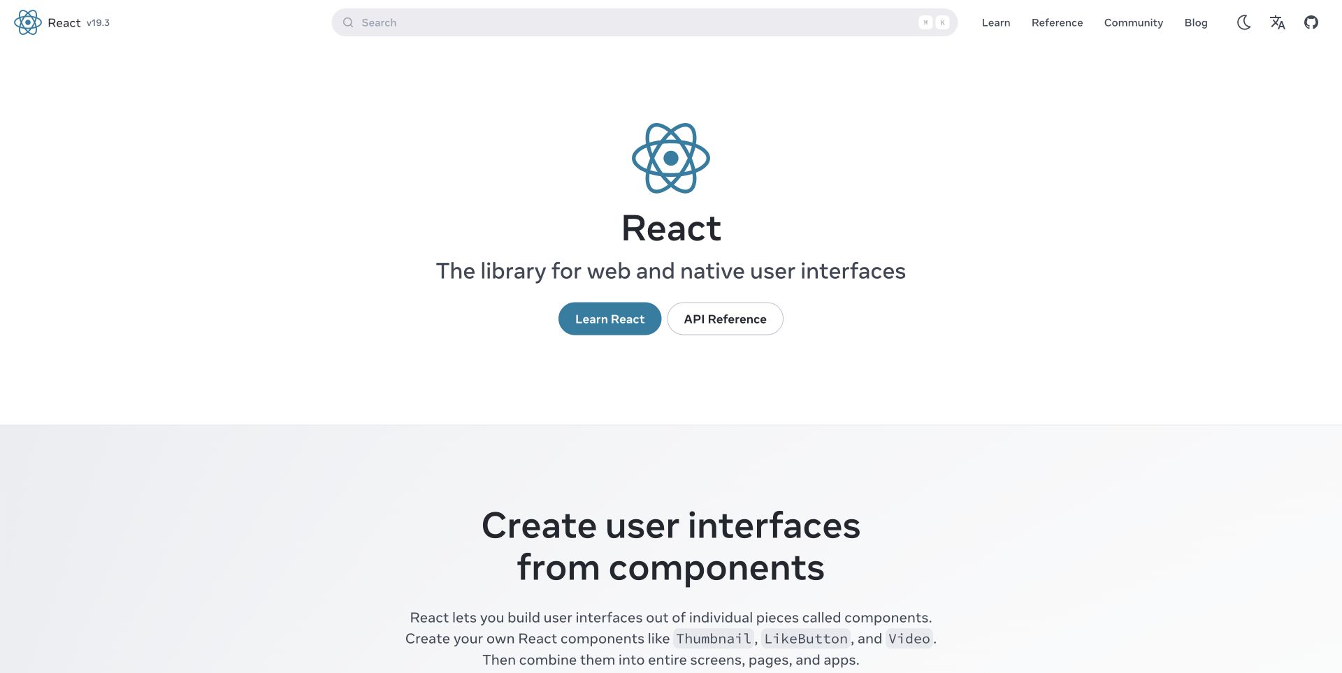
React’s captured homepage puts a large atom mark and a short product definition in the center of an unusually open white field. Learn React and API Reference form the main decision, while search, community and version information stay in a compact header. The next pale section begins explaining components without introducing a competing campaign. The website repository explicitly configures PostCSS plugins for prefixing, compatibility fixes and CSS transformations. That evidence concerns the documentation build; the screenshot alone cannot establish which transform produced a particular border, color or layout.
What you can learn
Keep learning and reference routes explicit in the link labels. Check compiled styles with long headings, keyboard focus and alternative color schemes. A dependable stylesheet pipeline supports consistent patterns, while information architecture remains an editorial decision.
Pros
The primary links describe different reader intentions instead of duplicating a generic start action.
Large margins separate the product introduction from the beginning of the lesson.
Cons & considerations
The spacious opening postpones concrete examples until further down the page.
Version and utility controls are substantially quieter than the hero and need careful focus visibility.
Platform source: Official website CSS build source and pinned dependency evidence. The react.dev repository configures Autoprefixer, flexbox fixes and preset-env in its website PostCSS configuration; its package runs the Next.js website build. First-party, website-specific documented CSS build evidence, reviewed separately from the screenshot. It does not prove the exact deployed commit, execution of a build command, a browser-side PostCSS runtime, or that PostCSS caused a visible design decision. Retained screenshots and broad-audit dates remain independent. Platform evidence is separate from the direct website screenshot and is not a complete current infrastructure audit.
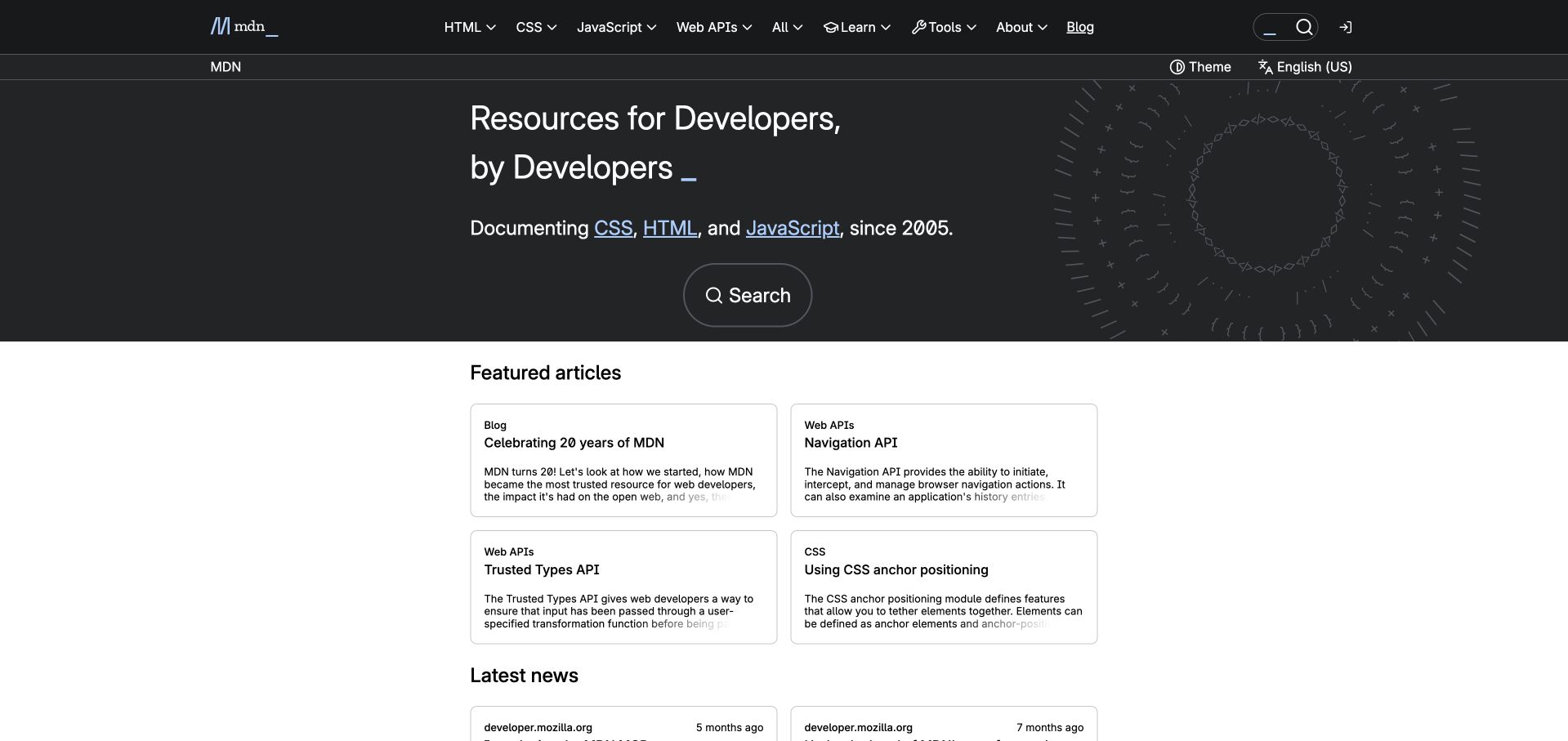
MDN’s retained capture divides the page into a dark introduction and a white reading area. The subject menu names HTML, CSS, JavaScript and Web APIs directly; a second thin bar contains theme and language controls. A large search action sits under the introduction, while featured articles use compact bordered cards. This creates several useful entry points without making every topic a hero button. MDN’s Fred repository explicitly applies PostCSS loaders and plugins to its frontend styles, including custom media and shared data. The association is with the documentation website, not Firefox or every Mozilla service.
What you can learn
Use shared CSS processing for consistent navigation, article cards and themes. Check the delivered styles where dark and light surfaces meet. Search, language choice and topic browsing should remain understandable without decorative effects.
Pros
Topic names offer immediate orientation for readers who already know their subject.
The contrasting article region distinguishes browsing content from the global introduction.
Cons & considerations
Two navigation bars consume vertical space before the reading area begins.
Compact card excerpts can conceal distinctions that require opening the full article.
Platform source: Official website CSS build source and pinned dependency evidence. MDN’s Fred frontend configures postcss-loader with global data, mixins, custom media and preset-env in its actual stylesheet rules. The repository describes the MDN frontend; this is not a claim about Firefox. First-party, website-specific documented CSS build evidence, reviewed separately from the screenshot. It does not prove the exact deployed commit, execution of a build command, a browser-side PostCSS runtime, or that PostCSS caused a visible design decision. Retained screenshots and broad-audit dates remain independent. Platform evidence is separate from the direct website screenshot and is not a complete current infrastructure audit.
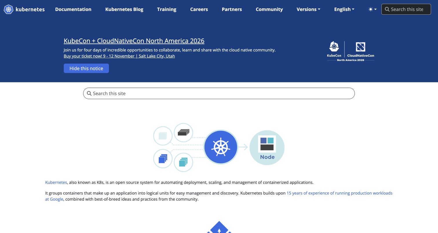
Kubernetes’s captured homepage uses a blue navigation and announcement region, then a broad white area with a second search field and a simple container-to-node diagram. The introductory paragraphs explain the project beneath the illustration instead of placing a dramatic sales message across it. Documentation, training, careers and community each have named routes. The official website source contains a PostCSS configuration using Autoprefixer and the CLI dependency for its Hugo and Docsy build. This is evidence about kubernetes.io’s website tooling, with the original capture date preserved, rather than evidence about software running inside a cluster.
What you can learn
Separate temporary community notices from the stable product explanation. Check generated navigation and documentation styles with translated menus, expanded search and long notices. Build tooling cannot decide which message deserves the strongest position.
Pros
The project illustration supports the technical explanation without replacing readable prose.
Documentation and community destinations remain visible in the same consistent header.
Cons & considerations
The large announcement can push the core explanation well below the navigation.
Two nearby search entry points may feel redundant unless their behavior stays consistent.
Platform source: Official website CSS build source and pinned dependency evidence. The official kubernetes.io source has a website PostCSS configuration using Autoprefixer and declares postcss-cli for its Hugo/Docsy build. This concerns the public website, not Kubernetes cluster software. First-party, website-specific documented CSS build evidence, reviewed separately from the screenshot. It does not prove the exact deployed commit, execution of a build command, a browser-side PostCSS runtime, or that PostCSS caused a visible design decision. Retained screenshots and broad-audit dates remain independent. Platform evidence is separate from the direct website screenshot and is not a complete current infrastructure audit.
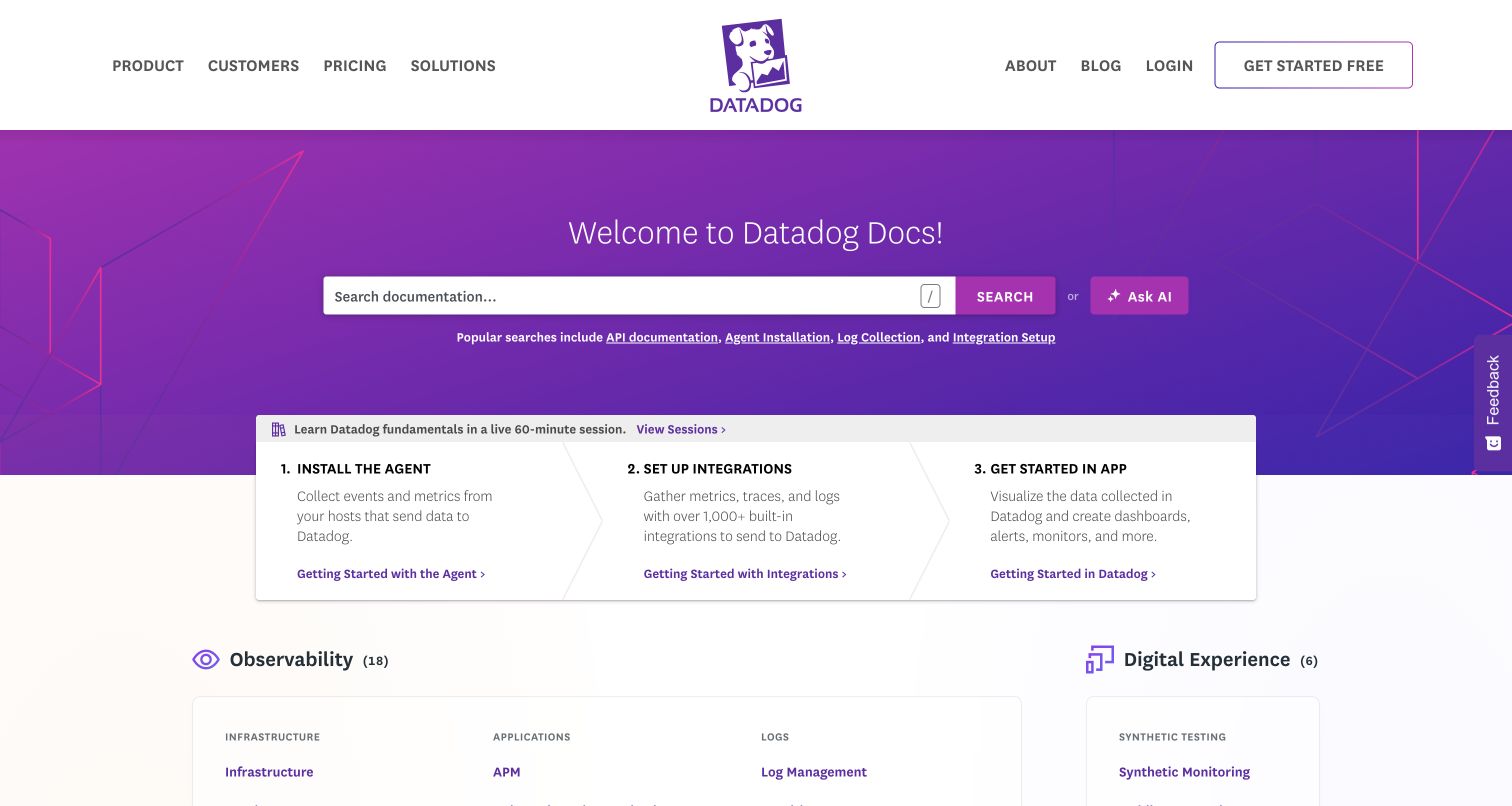
Datadog’s documentation capture places a wide search field inside a purple introductory panel. Popular searches appear directly below it, while an overlapping white strip divides getting started into agent installation, integrations and using the application. Product categories begin beneath this guided sequence, so newcomers and experienced users have different routes through the same page. The reviewed repository explicitly configures PostCSS imports and Autoprefixer in its Hugo documentation package. The source contains other tooling as well; this observation does not assign one generator to every Datadog page or describe the authenticated monitoring product.
What you can learn
Make the relationship between search, onboarding and product categories visible. Verify compiled styles where white cards overlap colored backgrounds. Installation order and product terminology need content ownership independent of the CSS build.
Pros
Popular search suggestions give useful examples of what the documentation can answer.
The numbered starting sequence turns a broad product into concrete introductory tasks.
Cons & considerations
The overlapping panel and several category systems create a relatively dense opening.
A search assistant should remain an optional aid rather than the only route to instructions.
Platform source: Official website CSS build source and pinned dependency evidence. Datadog’s documentation repository explicitly configures postcss-import and Autoprefixer in its Hugo website package. The repository also contains other tooling; this evidence is limited to that documented Hugo stylesheet pipeline and does not identify the private Datadog product backend. First-party, website-specific documented CSS build evidence, reviewed separately from the screenshot. It does not prove the exact deployed commit, execution of a build command, a browser-side PostCSS runtime, or that PostCSS caused a visible design decision. Retained screenshots and broad-audit dates remain independent. Platform evidence is separate from the direct website screenshot and is not a complete current infrastructure audit.
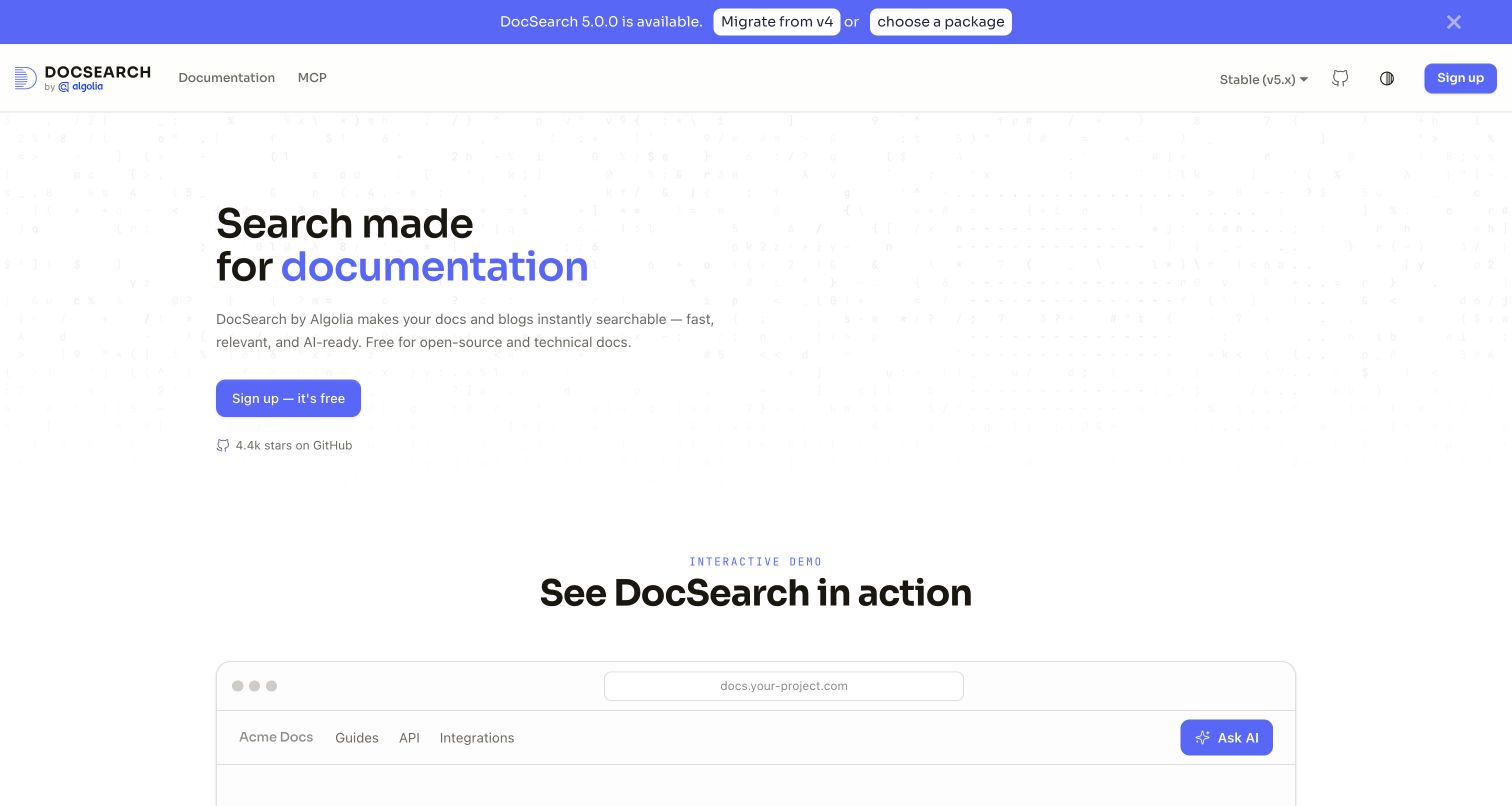
Algolia’s DocSearch homepage keeps the opening proposition on the left, with blue emphasis identifying documentation as the intended search domain. A small signup action sits below the explanation, and a large demonstration frame starts in the next section. The header separates documentation, version selection and the project repository. A release announcement occupies its own strip rather than an obstructing dialog. The exact website’s Docusaurus configuration imports a plugin that explicitly configures PostCSS with the Tailwind plugin. This connects the website application to the build tool without claiming that the screenshot proves search quality or adoption.
What you can learn
Explain the embedded search experience before asking readers to configure it. Test marketing and demonstration surfaces together, distinguishing illustrative controls from account actions. Keep release notices editable without restructuring permanent navigation.
Pros
The main statement identifies a specific use case instead of a vague search benefit.
The demonstration frame provides a natural bridge from explanation to product inspection.
Cons & considerations
A large quiet area postpones much of the demonstration below the opening viewport.
The release strip competes with the enduring product message when both use strong blue accents.
Platform source: Official website CSS build source and pinned dependency evidence. The exact DocSearch website imports its tailwind-loader plugin in the Docusaurus configuration. That plugin explicitly sets configurePostCss plugins to @tailwindcss/postcss. Its README names docsearch.algolia.com. First-party, website-specific documented CSS build evidence, reviewed separately from the screenshot. It does not prove the exact deployed commit, execution of a build command, a browser-side PostCSS runtime, or that PostCSS caused a visible design decision. Retained screenshots and broad-audit dates remain independent. Platform evidence is separate from the direct website screenshot and is not a complete current infrastructure audit.
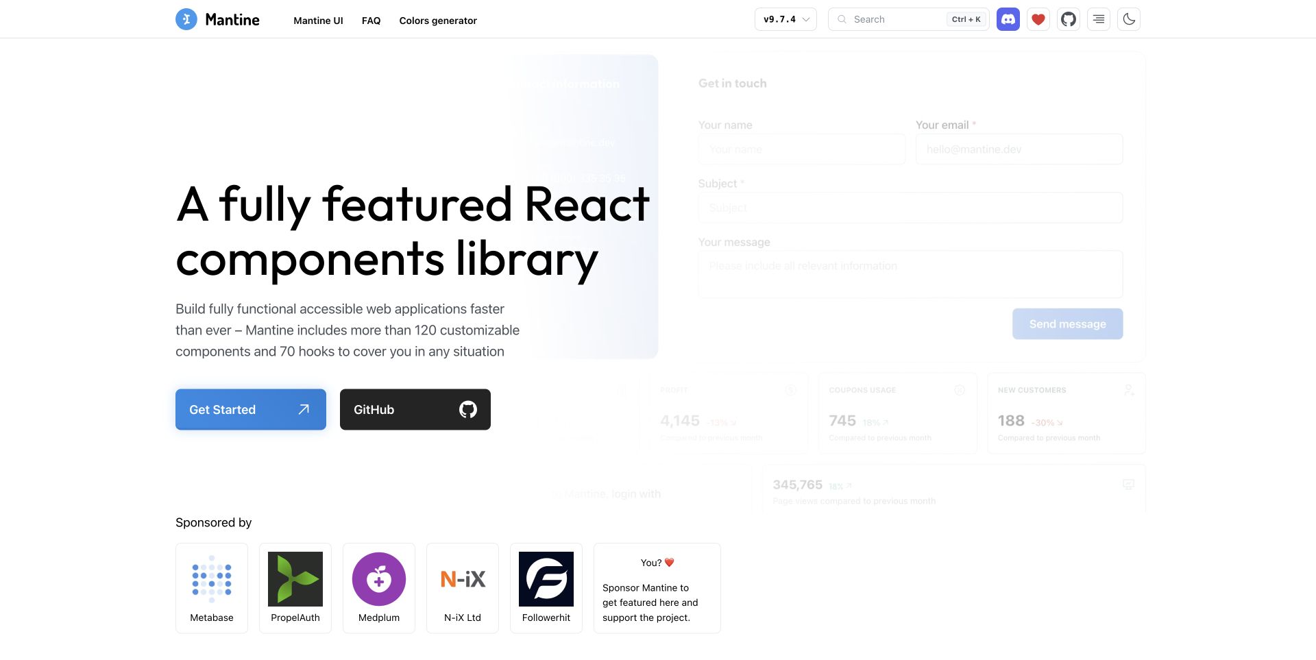
Mantine’s captured homepage places a bold multiline introduction over a pale collage of forms, charts and application panels. The foreground copy remains readable because the specimen imagery is softened, while blue and black buttons separate documentation from the repository. Sponsor cards form a different horizontal region beneath the hero. The exact mantine.dev application imports the repository’s PostCSS configuration, including the Mantine preset and simple variables; its build also writes the domain’s CNAME. That establishes a website-build association, not proof that every displayed component uses the same transformation or meets an accessibility standard.
What you can learn
Treat interface previews as supporting material and keep actions in a readable foreground. Check rendered contrast, focus states and responsive spacing after compilation. Documentation should explain the patterns that decorative imagery can only suggest.
Pros
The foreground proposition stays clear despite the number of interface specimens behind it.
Documentation and source-code routes have visibly different treatments.
Cons & considerations
The softened preview is difficult to inspect as a concrete example.
Sponsor content can compete with the next learning step if its prominence expands.
Platform source: Official website CSS build source and pinned dependency evidence. The apps/mantine.dev website imports the repository PostCSS configuration, which uses postcss-preset-mantine and postcss-simple-vars. Its website build writes the mantine.dev CNAME, making the property association explicit. First-party, website-specific documented CSS build evidence, reviewed separately from the screenshot. It does not prove the exact deployed commit, execution of a build command, a browser-side PostCSS runtime, or that PostCSS caused a visible design decision. Retained screenshots and broad-audit dates remain independent. Platform evidence is separate from the direct website screenshot and is not a complete current infrastructure audit.
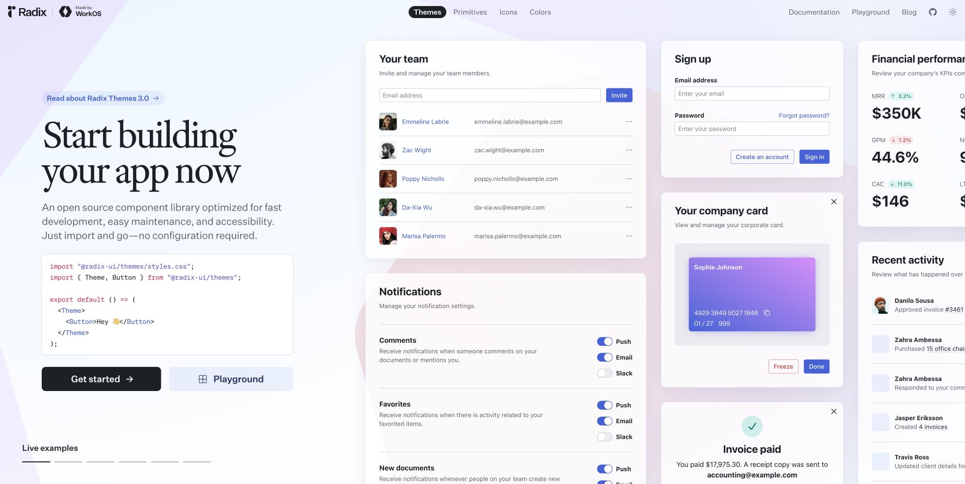
Radix UI’s retained capture combines a serif introduction and short code example with a wide field of sample application panels. Team management, signup, notifications and financial cards demonstrate a common visual language without pretending to be one working customer application. Themes, Primitives, Icons and Colors are separate header choices. The official website repository runs a Next.js build and configures Autoprefixer through PostCSS. This is a documented website tooling association; it does not demonstrate the architecture of downstream products that happen to use Radix components or validate the specimen forms as real account flows.
What you can learn
Show components in realistic combinations while making the demonstration boundary clear. Check spacing, focus treatments and control states across the specimen wall. At narrow widths, keep explanatory code and essential links easy to find.
Pros
The short code sample connects the visual proposition to an implementation starting point.
Several interface types reveal consistency across forms, tables and notification controls.
Cons & considerations
The wide specimen field extends beyond the first viewport and can overwhelm the introduction.
Demo account and payment imagery needs clear context so it cannot be confused with real activity.
Platform source: Official website CSS build source and pinned dependency evidence. The official Radix website repository configures Autoprefixer through postcss.config.js and runs a Next.js website build. This is website stylesheet tooling, not proof of every downstream Radix installation. First-party, website-specific documented CSS build evidence, reviewed separately from the screenshot. It does not prove the exact deployed commit, execution of a build command, a browser-side PostCSS runtime, or that PostCSS caused a visible design decision. Retained screenshots and broad-audit dates remain independent. Platform evidence is separate from the direct website screenshot and is not a complete current infrastructure audit.
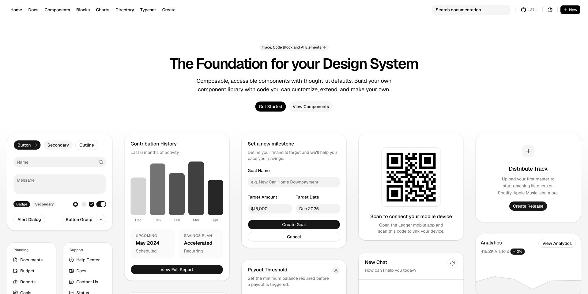
shadcn/ui’s captured homepage uses a centered heading and two small actions above a dense field of monochrome interface specimens. Forms, charts, contribution bars and navigation panels provide tangible examples of the system’s vocabulary. The header separates components, blocks, charts and documentation, while search remains easy to locate. The reviewed v4 website application explicitly configures the Tailwind PostCSS plugin and builds its registry before the Next.js site. The evidence concerns that website’s source pipeline, not every code snippet distributed through its registry or the production quality of a visitor’s eventual application.
What you can learn
Distinguish the website’s build configuration from instructions for consuming its component registry. Test representative specimens, including form labels, empty states and focus outlines. Theme changes should preserve these details as reliably as card borders.
Pros
The component gallery makes the otherwise abstract design-system claim concrete.
Distinct directory and documentation routes support both browsing and implementation tasks.
Cons & considerations
The many specimens make it difficult to choose one obvious first example.
Sample charts and financial values need to remain clearly illustrative rather than evidence of real results.
Platform source: Official website CSS build source and pinned dependency evidence. The shadcn/ui repository’s v4 website application configures @tailwindcss/postcss and declares it in the package that builds the registry and Next.js website. The record is scoped to that documented website application. First-party, website-specific documented CSS build evidence, reviewed separately from the screenshot. It does not prove the exact deployed commit, execution of a build command, a browser-side PostCSS runtime, or that PostCSS caused a visible design decision. Retained screenshots and broad-audit dates remain independent. Platform evidence is separate from the direct website screenshot and is not a complete current infrastructure audit.
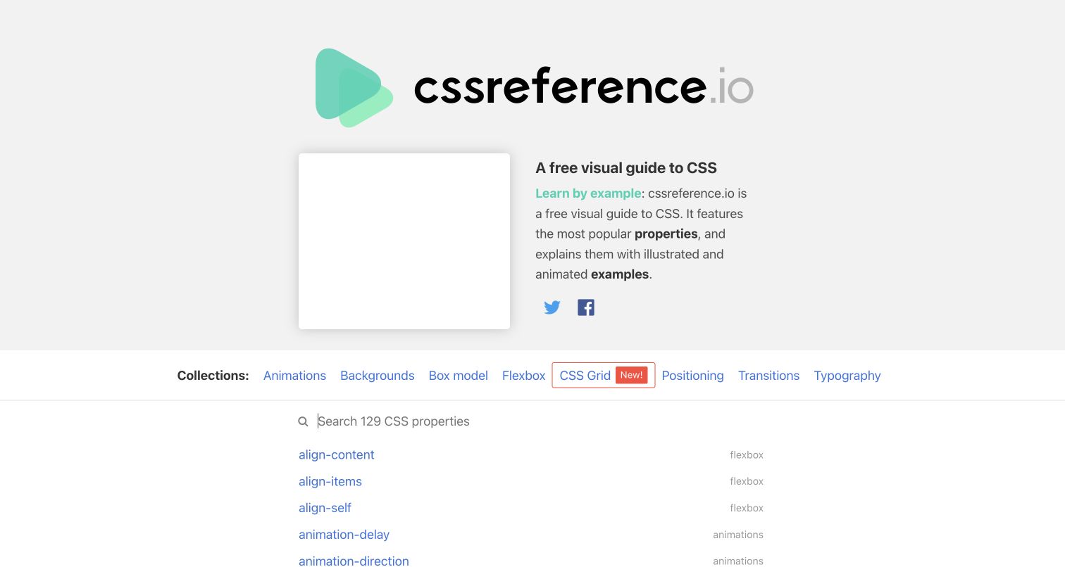
CSS Reference’s retained homepage uses an oversized wordmark, a concise learning-by-example explanation and a collection strip above the property index. A search field sits directly over the alphabetical entries, whose muted category labels add context without turning every row into a card. The captured opening also leaves a conspicuous empty promotional area beside the introduction. Its official repository explicitly runs the PostCSS CLI with Autoprefixer against the website stylesheet after Sass compilation. The command documents an older website build workflow; it is not evidence that those legacy package versions are a recommended starting point today.
What you can learn
Preserve the relationship between category browsing, search and the complete reference list. Before updating older PostCSS dependencies, inspect generated styles and support requirements. Keep instructional examples separate from the website’s own compatibility policy.
Pros
Collections and alphabetical property links give readers two complementary browsing routes.
Category labels add useful context while preserving a compact list.
Cons & considerations
The large blank area weakens the opening composition in the retained capture.
A prominent introduction delays access to the actual properties on shorter screens.
Platform source: Official website CSS build source and pinned dependency evidence. The repository identifies cssreference.io and explicitly runs postcss --use autoprefixer against css/website.css after its Sass compilation. This is a documented source build command, not a verified recent production execution. First-party, website-specific documented CSS build evidence, reviewed separately from the screenshot. It does not prove the exact deployed commit, execution of a build command, a browser-side PostCSS runtime, or that PostCSS caused a visible design decision. Retained screenshots and broad-audit dates remain independent. Platform evidence is separate from the direct website screenshot and is not a complete current infrastructure audit.
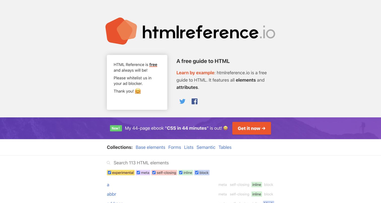
HTML Reference’s captured page pairs an oversized orange identity with a short explanation of elements and attributes. Below an in-page ebook promotion, collection links and colored checkbox labels let readers distinguish experimental, metadata, self-closing, inline and block entries. The alphabetical list begins immediately beneath those controls. The separate official repository identifies htmlreference.io and explicitly invokes PostCSS with Autoprefixer on css/website.css after compiling Sass. This is a concrete website-build record, while the retained screenshot and older package versions remain separately dated evidence. The visible interface is not proof of current browser support for every documented element.
What you can learn
Use meaningful classifications and communicate active filters without relying on color. Keep website stylesheet processing separate from instructional HTML examples. During upgrades, inspect labels, checked states and list spacing together.
Pros
The index exposes meaningful element categories close to the search field.
The concise introduction explains what the collection covers before the detailed list.
Cons & considerations
The promotional strip interrupts the route from explanation to reference lookup.
Several compact colored filters can be hard to distinguish without clear text and state indicators.
Platform source: Official website CSS build source and pinned dependency evidence. The repository identifies htmlreference.io and its website build explicitly passes css/website.css through the PostCSS CLI with Autoprefixer after Sass. The older tool versions remain a historical source-pipeline qualification. First-party, website-specific documented CSS build evidence, reviewed separately from the screenshot. It does not prove the exact deployed commit, execution of a build command, a browser-side PostCSS runtime, or that PostCSS caused a visible design decision. Retained screenshots and broad-audit dates remain independent. Platform evidence is separate from the direct website screenshot and is not a complete current infrastructure audit.
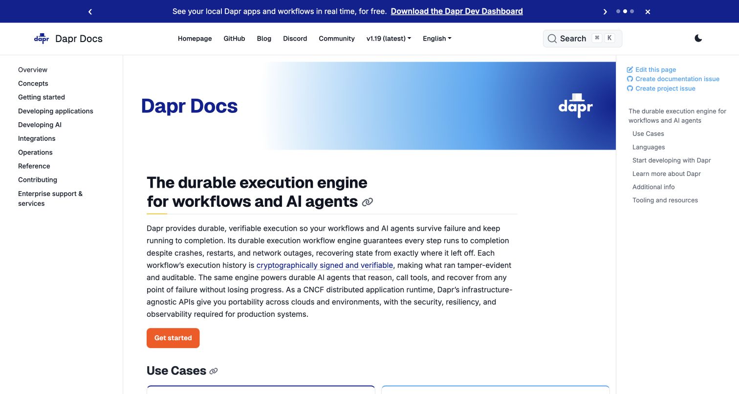
Dapr’s retained documentation capture has a persistent topic list on the left, the introductory article in the center and page-level links on the right. A blue gradient title panel introduces the product, while the first explanatory heading and orange starting action remain in the reading column. A separate announcement strip sits above the navigation. The website configuration imports Docsy and pins version 0.12.0; that exact theme’s stylesheet partial invokes PostCSS for production or right-to-left output. The association is therefore a documented website dependency pipeline, not a claim about Dapr’s distributed execution software or a verified deployed commit.
What you can learn
Distinguish global topics from local article sections before tuning the build pipeline. Check long sidebar labels, translated text and single-column layouts against generated styles. Shared theme tooling cannot make a crowded reading layout understandable by itself.
Pros
The page separates the full manual’s navigation from the current article’s contents.
A specific starting action follows the introduction instead of requiring search.
Cons & considerations
Three columns leave less room for the main article on intermediate widths.
Promotional announcements can distract from the technical task that brought the reader there.
Platform source: Official website CSS build source and pinned dependency evidence. The docs.dapr.io Hugo configuration imports Docsy, pinned to v0.12.0 in go.mod. The exact pinned theme’s stylesheet partial runs postCSS for production or RTL output; the website package supplies its build tools. This is a documented dependency pipeline, not the Dapr application runtime. First-party, website-specific documented CSS build evidence, reviewed separately from the screenshot. It does not prove the exact deployed commit, execution of a build command, a browser-side PostCSS runtime, or that PostCSS caused a visible design decision. Retained screenshots and broad-audit dates remain independent. Platform evidence is separate from the direct website screenshot and is not a complete current infrastructure audit.
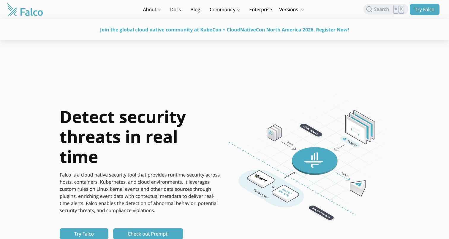
Falco’s captured homepage places a substantial text introduction beside an isometric diagram of event sources, plugins and alerts. Teal accents connect the identity, diagram and starting controls, while documentation, community and version links stay in a compact header. The illustration helps identify the product’s position without requiring visitors to interpret a screenshot of an administrative console. The website selects a pinned Docsy submodule whose production stylesheet partial explicitly invokes PostCSS; its package supplies the CLI and Autoprefixer. This describes the public website build, not the implementation or effectiveness of the security product being presented.
What you can learn
Use diagrams to explain relationships, keeping labels readable outside decorative effects. Check captions, controls and navigation together after stylesheet changes. Neither polished graphics nor PostCSS establishes a security product’s effectiveness.
Pros
The diagram gives concrete structure to an otherwise abstract infrastructure proposition.
The navigation names documentation and community destinations directly.
Cons & considerations
The opening paragraph is dense for readers unfamiliar with runtime security.
A large diagram may lose detail when compressed unless an accessible explanation remains available.
Platform source: Official website CSS build source and pinned dependency evidence. Falco’s website selects Docsy and pins its submodule to commit 9f55cf34808d720bcfff9398c9f9bb7fd8fce4ec. That exact theme’s production stylesheet partial invokes postCSS, and the website supplies postcss-cli and Autoprefixer. First-party, website-specific documented CSS build evidence, reviewed separately from the screenshot. It does not prove the exact deployed commit, execution of a build command, a browser-side PostCSS runtime, or that PostCSS caused a visible design decision. Retained screenshots and broad-audit dates remain independent. Platform evidence is separate from the direct website screenshot and is not a complete current infrastructure audit.
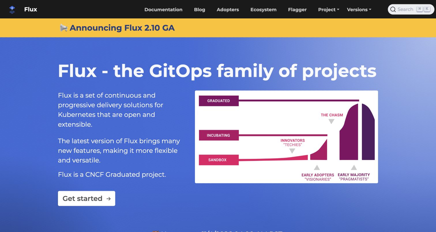
Flux’s retained homepage combines a black utility header, a bright yellow release announcement and a blue introductory field. The main copy describes a family of projects, with a large explanatory graphic occupying the right side and a clear starting action below the text. Documentation, adopters and ecosystem links expose different ways to assess the project. The website repository identifies fluxcd.io and pins Docsy version 0.6.0, whose production CSS pipeline explicitly passes styles through PostCSS. This records a documented website build relationship, not the deployment architecture of organizations using Flux or proof of a newly executed build.
What you can learn
Separate release news from the durable project explanation. Keep older theme dependencies explicit and reproducible. Check announcements, navigation and illustrations at smaller widths, preserving text alternatives wherever graphics carry essential information.
Pros
Release information has a distinct place rather than appearing as an obstructing popup.
Documentation and ecosystem routes support both practical evaluation and implementation.
Cons & considerations
Three strong background treatments compete for attention near the top of the page.
Small labels inside the illustration become difficult to read when the graphic shrinks.
Platform source: Official website CSS build source and pinned dependency evidence. Flux’s website repository identifies fluxcd.io, imports Docsy and pins v0.6.0. The pinned theme’s production stylesheet pipeline passes compiled CSS through postCSS; the website declares the necessary CLI tooling. First-party, website-specific documented CSS build evidence, reviewed separately from the screenshot. It does not prove the exact deployed commit, execution of a build command, a browser-side PostCSS runtime, or that PostCSS caused a visible design decision. Retained screenshots and broad-audit dates remain independent. Platform evidence is separate from the direct website screenshot and is not a complete current infrastructure audit.
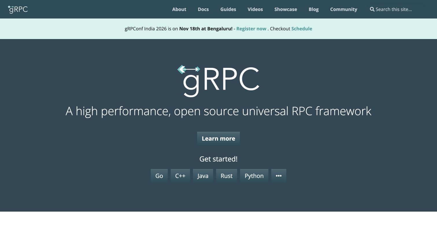
gRPC’s captured homepage uses a large centered wordmark and a single explanatory line on a dark field. A learning action appears above a row of language-specific starting links, while documentation, guides, videos and community occupy the header. A pale event strip is structurally separate from the main introduction. The website repository pins its own Docsy fork; the exact stylesheet partial invokes PostCSS before minification and fingerprinting, and the website package declares the tooling. That supports a public website build association, not a claim that the RPC implementations themselves use a browser styling processor.
What you can learn
Offer language-specific starting paths once the shared product idea is clear. Verify wrapping and keyboard focus in compiled styles. Maintain the theme fork’s provenance instead of assuming every upstream version behaves identically.
Pros
Language-specific links make the next step concrete for experienced developers.
The main proposition stays readable without a complex animation or dashboard illustration.
Cons & considerations
The broad introductory line provides little detail for someone unfamiliar with RPC.
Several similar buttons need a responsive layout that retains all supported choices.
Platform source: Official website CSS build source and pinned dependency evidence. The grpc.io website pins its own Docsy fork to ba20af1c9044e3ad8d83ead5153b243c88539038. That exact theme applies postCSS before minification and fingerprinting; the website package declares PostCSS and its CLI. First-party, website-specific documented CSS build evidence, reviewed separately from the screenshot. It does not prove the exact deployed commit, execution of a build command, a browser-side PostCSS runtime, or that PostCSS caused a visible design decision. Retained screenshots and broad-audit dates remain independent. Platform evidence is separate from the direct website screenshot and is not a complete current infrastructure audit.
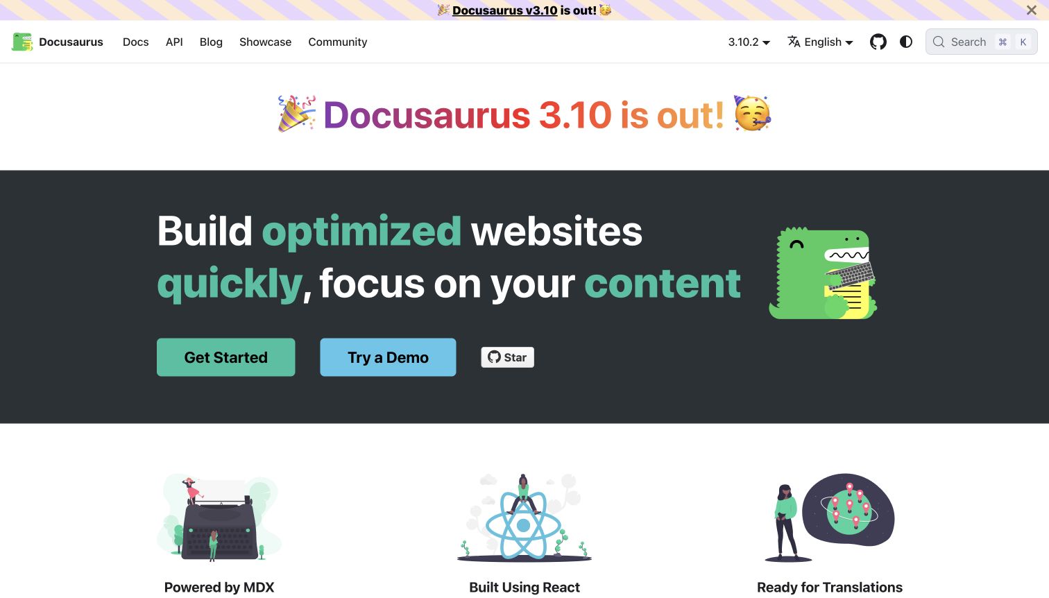
Docusaurus’s captured homepage presents a colorful release heading above a dark hero with a mascot, an emphasized product promise and separate getting-started and demo actions. The header keeps documentation, API, community, version and language choices visible. Three illustrated feature columns begin immediately below the main panel. The project’s own website package runs the local Docusaurus build; the same pinned monorepo’s client stylesheet loader explicitly uses postcss-loader and preset-env. This ties PostCSS to the documented website build path, without claiming that every downstream Docusaurus site has identical plugins or that a particular deployed commit was verified.
What you can learn
Demonstrate the framework’s conventions while keeping onboarding simple. Check generated styles around notices, translations and code content. Package configuration supports an implementation discussion, but it cannot establish measured accessibility or performance outcomes.
Pros
Getting started and trying a demonstration are clearly different actions.
Version and language controls remain in the stable navigation shell.
Cons & considerations
Repeated release announcements consume a large share of the opening view.
The colorful headline and dark hero can compete unless their spacing remains deliberate.
Platform source: Official website CSS build source and pinned dependency evidence. Docusaurus’s own website runs its local Docusaurus build. In the same pinned monorepo, the client stylesheet loader invokes postcss-loader with postcss-preset-env. The website configuration names docusaurus.io; the observation concerns its documented build rather than an independently identified deployed commit. First-party, website-specific documented CSS build evidence, reviewed separately from the screenshot. It does not prove the exact deployed commit, execution of a build command, a browser-side PostCSS runtime, or that PostCSS caused a visible design decision. Retained screenshots and broad-audit dates remain independent. Platform evidence is separate from the direct website screenshot and is not a complete current infrastructure audit.
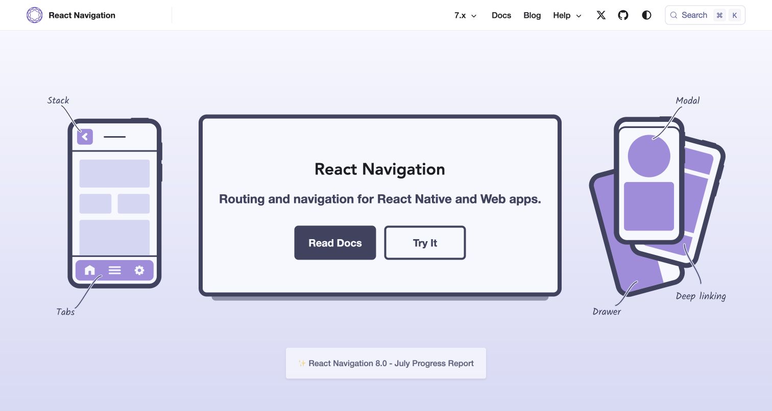
React Navigation’s captured homepage uses a large desktop frame flanked by phone drawings. Handwritten labels identify stack, tabs, modal, drawer and deep-linking concepts, while the central panel gives readers documentation and trial actions. A pale purple palette unifies the drawings and controls without making them look like a real signed-in application. The official documentation website includes a PostCSS configuration for nesting and Autoprefixer alongside its Docusaurus build command. This is website source-tooling evidence, not proof that React Native applications using the library process their interfaces with PostCSS.
What you can learn
Name the interaction patterns shown in demonstrations, and separate documentation from runnable examples. Check annotations, device outlines and buttons at narrow widths. Preserve explanatory text when the original visual arrangement cannot fit.
Pros
The annotations connect abstract navigation terms to recognizable interface structures.
Documentation and experimentation are offered as separate starting routes.
Cons & considerations
The oversized device illustration can postpone more detailed product qualifications.
Handwritten labels may become small or awkward when the composition is reduced.
Platform source: Official website CSS build source and pinned dependency evidence. The official React Navigation website includes a PostCSS configuration with postcss-nesting and Autoprefixer and a Docusaurus build command. This names the documentation website’s stylesheet tooling, not navigation code shipped in React Native applications. First-party, website-specific documented CSS build evidence, reviewed separately from the screenshot. It does not prove the exact deployed commit, execution of a build command, a browser-side PostCSS runtime, or that PostCSS caused a visible design decision. Retained screenshots and broad-audit dates remain independent. Platform evidence is separate from the direct website screenshot and is not a complete current infrastructure audit.
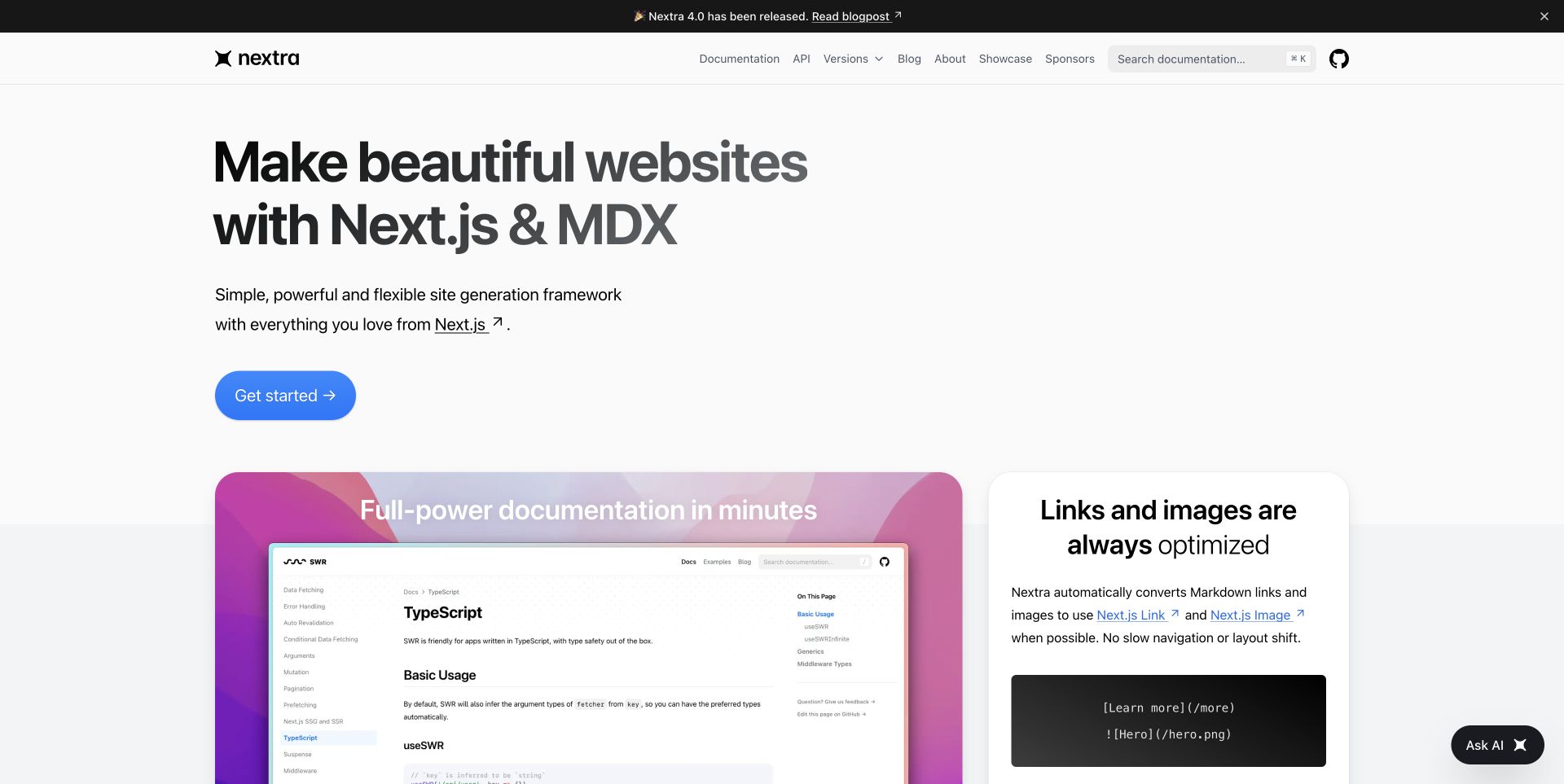
Nextra’s new capture shows a large two-line introduction, a short explanation of its Next.js and MDX foundation and a prominent blue starting button. The next section begins with a colorful documentation screenshot beside a panel explaining link and image handling. Documentation, API, versions and search sit in a restrained header, while the release announcement remains a narrow strip. The exact docs application configures the Tailwind PostCSS plugin and runs its own Next.js build. This evidence applies to nextra.site’s documented website pipeline; the performance and optimization statements on the page were not independently benchmarked.
What you can learn
Explain the framework through labeled examples. Keep feature descriptions readable without screenshots and check long API names and code blocks after compilation. Treat optimization claims as claims unless separately measured.
Pros
The primary starting action is easy to identify before the feature grid begins.
The documentation example gives visual context for the product’s purpose.
Cons & considerations
The very large introduction delays practical detail on a short viewport.
Feature screenshots need accompanying explanations because small interface text is difficult to inspect.
Platform source: Official website CSS build source and pinned dependency evidence. Nextra’s own docs website configures @tailwindcss/postcss in docs/postcss.config.mjs and runs a Next.js build in the same docs package. The repository identifies nextra.site as the documentation website. First-party, website-specific documented CSS build evidence, reviewed separately from the screenshot. It does not prove the exact deployed commit, execution of a build command, a browser-side PostCSS runtime, or that PostCSS caused a visible design decision. Retained screenshots and broad-audit dates remain independent. Platform evidence is separate from the direct website screenshot and is not a complete current infrastructure audit.
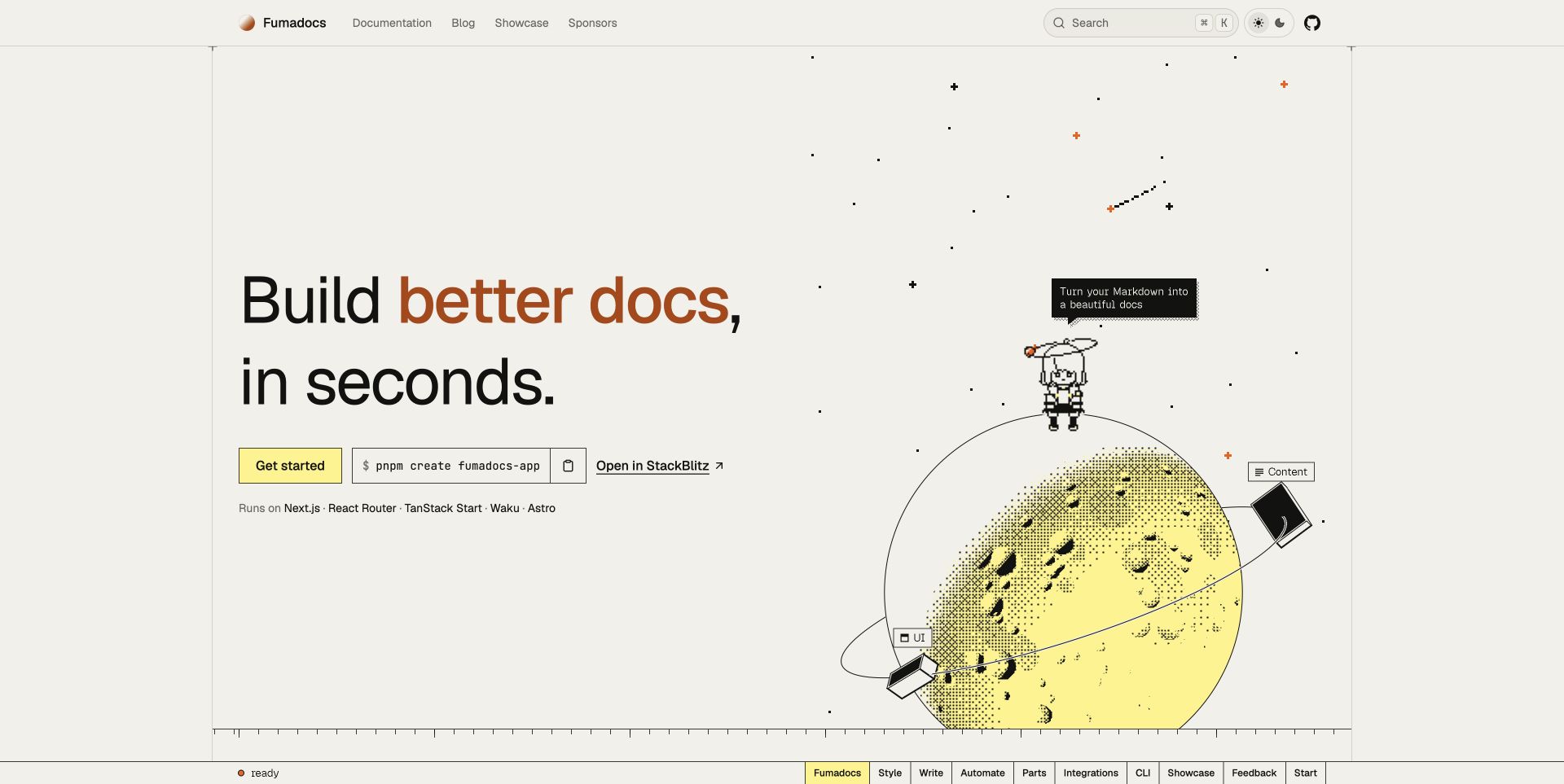
Fumadocs’s new homepage capture pairs oversized text with a pixel-art space scene. A yellow starting action, a visible package command and a browser-sandbox link provide different entry routes in one compact row. Framework names sit beneath them, while a thin section index spans the bottom of the viewport. The result has personality without making the introductory action depend on the illustration. The project’s own docs application explicitly configures the Tailwind PostCSS plugin and a Next.js build. This source evidence is scoped to the Fumadocs website, not every framework or third-party site mentioned in its showcase.
What you can learn
Provide readable commands and ordinary links alongside decorative imagery. Check reduced motion, long commands and narrow layouts after stylesheet changes. A third-party showcase is a discovery aid, not proof of those sites’ complete technology stacks.
Pros
The start button, command and sandbox route accommodate different developer preferences.
The illustration reinforces the project’s identity while leaving the action row readable.
Cons & considerations
The large decorative scene occupies much of the initial viewport.
A persistent section index needs careful spacing so it does not compete with primary navigation.
Platform source: Official website CSS build source and pinned dependency evidence. Fumadocs’s own documentation application configures @tailwindcss/postcss in apps/docs and runs its Next.js website build there. This documents the project website, not every third-party site built with Fumadocs. First-party, website-specific documented CSS build evidence, reviewed separately from the screenshot. It does not prove the exact deployed commit, execution of a build command, a browser-side PostCSS runtime, or that PostCSS caused a visible design decision. Retained screenshots and broad-audit dates remain independent. Platform evidence is separate from the direct website screenshot and is not a complete current infrastructure audit.
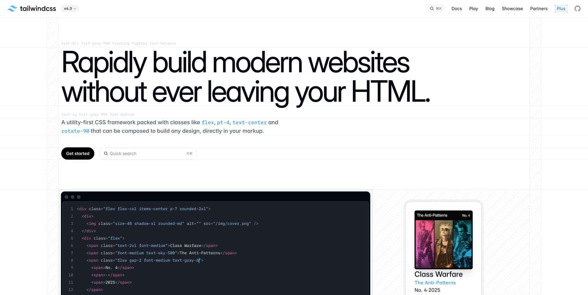
Tailwind CSS’s new homepage capture places an unusually large headline inside a lightly ruled layout. Small utility-class labels appear around the text, while a code panel and a styled record-cover specimen begin below the introduction. A compact header separates documentation, the playground and examples; getting started and quick search are close together beneath the explanation. The official website package itself contains a PostCSS plugin configuration for Tailwind and a Next.js build command. This verifies the documented website workflow without assuming that every Tailwind project uses the same integration or that the pictured example proves performance claims.
What you can learn
Place source syntax beside its visible result. Keep configuration specific to the selected integration and inspect generated styles after plugin upgrades. Large type, code overflow and demonstrations need separate responsive decisions.
Pros
The code/result pairing makes the tool’s authoring approach tangible.
Search and the introductory documentation route remain accessible beneath the main statement.
Cons & considerations
The oversized heading consumes considerable space before the example becomes visible.
Decorative utility labels can resemble implementation instructions without enough surrounding explanation.
Platform source: Official website CSS build source and pinned dependency evidence. The official tailwindcss.com website package contains a postcss plugins configuration for @tailwindcss/postcss and runs next build. This is evidence for the project website’s build, not an assumption that all Tailwind applications use PostCSS. First-party, website-specific documented CSS build evidence, reviewed separately from the screenshot. It does not prove the exact deployed commit, execution of a build command, a browser-side PostCSS runtime, or that PostCSS caused a visible design decision. Retained screenshots and broad-audit dates remain independent. Platform evidence is separate from the direct website screenshot and is not a complete current infrastructure audit.
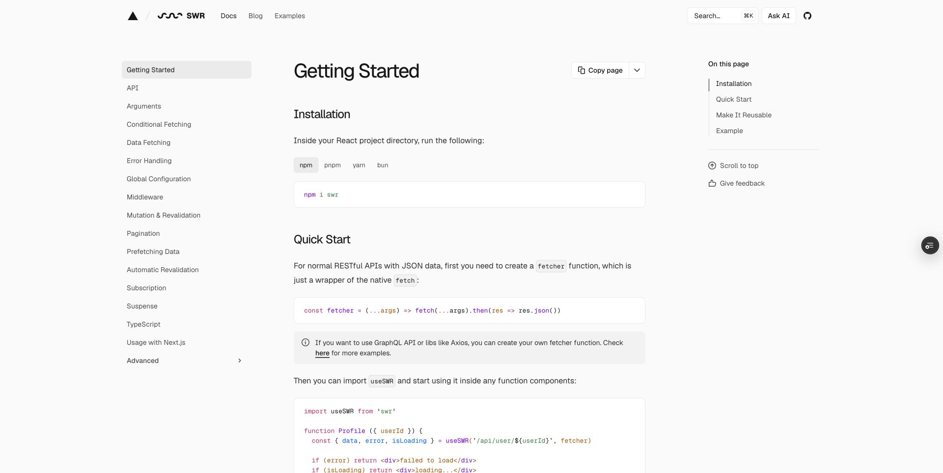
SWR’s captured Getting Started page uses three clear regions: a documentation tree on the left, instructions and code in the center and an article contents list on the right. Package-manager tabs precede the installation command, followed by a short fetcher example and a note linking to alternative data sources. The site’s root now redirects to a separate Vercel marketing page, so this review deliberately uses the actual documentation URL. The official SWR website repository configures the Tailwind PostCSS plugin for its Next.js and Geistdocs build. That evidence describes the documentation website, not SWR’s data-fetching runtime.
What you can learn
Cite and capture the actual documentation page when marketing moves elsewhere. Check code, callouts and navigation together after CSS changes. Verify focus and horizontal scrolling separately; introductory instructions should not require an assistant conversation.
Pros
Installation and the first usable code example are presented in a direct sequence.
The manual tree and article contents have distinct, predictable positions.
Cons & considerations
Three columns reduce the reading width on intermediate displays.
Page utilities and assistant controls should remain secondary to the instructional content.
Platform source: Official website CSS build source and pinned dependency evidence. The official SWR website repository configures @tailwindcss/postcss and a Next.js/Geistdocs build. Its root redirect points to Vercel’s separate marketing page; this example deliberately captures the retained SWR documentation route instead. First-party, website-specific documented CSS build evidence, reviewed separately from the screenshot. It does not prove the exact deployed commit, execution of a build command, a browser-side PostCSS runtime, or that PostCSS caused a visible design decision. Retained screenshots and broad-audit dates remain independent. Platform evidence is separate from the direct website screenshot and is not a complete current infrastructure audit.
Kegan has 15+ years of experience working with small businesses, Fortune 500 companies, and everything in between. No development job is too big or too small: he brings the same hands-on attention to a focused improvement, a complete website, or a custom application.
For PostCSS projects, he can help with responsive interfaces, reusable components, custom functionality, API connections, and performance-minded implementation. He works directly with clients on scope, design, implementation, testing, and handover, with an emphasis on clear communication and a system that remains practical to maintain after launch.
Show 3 other PostCSS developersHide other PostCSS developers
For an existing framework website, inspect its documented build path before adding a separate CSS runner. Determine which package owns the configuration, which theme or plugin supplies transformations and whether development and production take different routes. Keep one clear responsibility for each stylesheet input. The examples show several combinations, but they are evidence of those projects’ sources rather than universal installation recipes for your own application.
A simpler site can keep CSS processing in an explicit command alongside its other asset steps. Document the input file, output location, expected environment and release sequence. Check the generated file for representative selectors and asset URLs before publishing it. When an old project combines Sass and PostCSS, preserve the order intentionally and review dependencies before changing it. An older public repository can explain a historical workflow without recommending its versions for a new project.
Trace theme-provided processing
A website may inherit its CSS pipeline through a theme instead of defining every transform locally. Record the exact theme version or commit and inspect the relevant stylesheet path. Confirm that the application actually selects that dependency. A loose package mention or unused configuration file is weaker evidence than a connected build path. For your own site, make updates reviewable so a theme change cannot quietly replace a supported transformation or alter production-only behavior.
From references to requirements
Plan a maintainable CSS pipeline
Map inputs, plugins and outputs
Start with the project’s real stylesheet entry points. List the runner, plugin configuration, target browsers, generated assets and the command used for a release. Identify files that are instructional examples rather than website inputs. Keep package versions and dependency pins available for review, particularly when a monorepo contains several applications. A compact diagram or written sequence is often enough to make accidental duplicate processing and unused configuration easier to detect.
Prepare representative interface checks
Choose examples that cover the site’s actual content: an article with a long heading, a deeply nested sidebar, a wide code block, a form error and an alternative color scheme. Include ordinary privacy and announcement controls without letting them obscure the main page. Review narrow layouts and keyboard focus alongside the visual styling. These checks concern the finished website, and they remain necessary regardless of which tool generated its CSS.
Make upgrades small and attributable
Keep dependency updates separate enough that a changed stylesheet can be explained. Save the previous build inputs and compare representative output before publishing. Record whether a change came from a plugin, target-browser policy, source CSS or theme update. Define a rollback path that preserves the previous accepted assets. For a public design collection, retain the original observation and capture dates rather than presenting an unchanged old screenshot as a new verification.
Ask the actual team to carry out its routine job: publish a realistic update, correct a mistake, preview a narrow screen, and identify who owns an integration failure. For a library or frontend framework, also ask who maintains the content source and deployment. A polished screenshot does not answer those operational questions.
Beyond the screenshot
A practical PostCSS website checklist
Identify the exact website package and stylesheet entry points.
Document the purpose of each plugin instead of copying an unexplained preset.
Keep target-browser policy explicit and review it with dependency changes.
Trace theme-provided processing to the selected version or commit.
Confirm the production command and the final asset paths.
Keep instructional code examples separate from website build inputs.
Check long headings, nested navigation and code overflow in generated styles.
Verify focus visibility, contrast and alternate themes in the completed interface.
Review narrow layouts and reduced-motion behavior independently of package claims.
Preserve accepted output and a clear rollback path for stylesheet changes.
Test with real content, a keyboard, a small screen, slow or failed requests, and the people who will maintain the system. These are planning checks, not an accessibility, security, performance, or search-ranking certification.
Sources & editorial method
How this PostCSS collection was reviewed
Twenty distinct public website properties were reviewed for the November 12, 2026 Pacific morning batch. First-party website repositories were read without executing their code. Each accepted association identifies an explicit PostCSS configuration, command, loader or connected pinned theme stylesheet path. Unused or insufficiently connected package mentions were omitted. Sixteen genuine prior screenshots were inspected and retained with their original capture metadata. Nextra, Fumadocs, Tailwind CSS and the SWR getting-started article received four new direct Chrome captures on November 12 UTC; the actual pages were unobstructed, with no content or CSS altered. SWR’s marketing redirect was kept separate from the captured documentation URL. The four new source pages received independent bounded broad stack audits; earlier source audit records retain their original dates. Original reviews describe visible decisions without attributing them automatically to a CSS transform. No accounts, form submissions, transactions or private applications were tested. Source configuration is not proof of the exact live deployment or a complete technology inventory.
Every image is an unmodified capture from the actual website, with its source and capture date. Some captures are reused from our shared catalog; their dates remain the original capture dates. None comes from a vendor gallery or a generated reconstruction. Moving imagery and live content can change.
Technology attribution uses public page assets or metadata, official platform documentation, or a cited first-party project case study. Documentary and framework-relationship evidence is identified where used; it is not a complete current backend inventory. A CMS image CDN alone does not establish a full CMS deployment. A library’s presence does not prove which individual controls use it, and a platform label does not establish AI authorship.
The composition notes, lessons, pros and tradeoffs are original editorial observations. We have not measured conversion, traffic, security, performance or accessibility conformance. Website owners retain their brands and imagery; these examples are not our client portfolio. Written, Edited and Curated are independent records, not dates advanced by a build. See our editorial standards or suggest a correction.
Questions worth asking
PostCSS website development FAQs
Does PostCSS give every website the same appearance?
No. It is a CSS processing tool whose behavior depends on the selected plugins and project inputs. The examples have different typography, navigation and content structures. Those design choices still require deliberate work from the website team.
Do these pages run PostCSS inside the visitor’s browser?
That is not the claim. The evidence identifies documented website build configurations, commands or dependency paths. The browser receives the website’s delivered assets; these records do not establish a browser-side PostCSS runtime.
Is a package dependency enough evidence for this collection?
A name in a dependency list alone was insufficient. Each accepted example connects PostCSS to the specific website through configuration, an explicit stylesheet command, a loader or the selected theme’s CSS path. The evidence remains qualified even with that connection.
Can the screenshots prove which plugin created a design feature?
No. A capture shows visible design at a particular time. It does not reveal which transformation produced a color, layout or component, and it cannot establish keyboard behavior or measured accessibility. Those questions require different evidence.
Why are some captures older than the guide?
They are genuine retained screenshots with their original dates and accepted image hashes. The new editorial review and repository observations do not change when those pages were captured. The four new captures are recorded separately.
Should I copy the configuration from one of these sites?
Use it as a documented example, then check your own framework, versions, target browsers and stylesheet requirements. Older repositories and pinned themes may have different constraints. A small explained setup is easier to maintain than an unexamined collection of plugins.
Borrow the clear reading paths, useful demonstrations and consistent interface details. Choose the stylesheet pipeline from your project’s actual requirements, and keep implementation evidence separate from assumptions about how a design was produced.