Best dbt Websites of 2026 (20 Real-World Examples)
Public website design references paired with documented dbt transformation work.
Explore 20 public experiences from organizations with scoped dbt evidence, then plan the definitions, tests and change ownership behind a useful transformation project. dbt is not a CMS, a website framework or a replacement warehouse.
The opening five examples are JetBlue, Siemens, Zendesk, J.Crew and RMIT University. Their selected public pages serve travelers, customers, readers, shoppers and students. Separate dbt Labs cases describe particular organizational data-platform work. A compelling homepage is a design reference; the case establishes a bounded transformation association, not the implementation of the screenshot.
Keep that separation when planning your own project. The relevant question is not how to make a website look as though it uses dbt. It is whether a defined transformation workflow will make analytical datasets easier to understand, review and change. The warehouse, ingestion process, public interface and professional responsibilities still need their own design decisions.
Before the examples
What makes good dbt website development in 2026?
Put dbt in the transformation layer
The official model documentation describes dbt’s role in transforming data within the warehouse. Begin with data already available in the analytical environment and a defined output. Do not assume that adding dbt also supplies ingestion, a transactional application, content editing or every part of data governance. Draw those boundaries explicitly in the project brief.
Define what one row means and which fields identify it before assembling a model. An order, order line and customer-day summary are different outputs. Write the definition for the consumer, not only the engineer. Tests can check selected assumptions, but they cannot resolve an unclear agreement about the question the dataset should answer.
Treat tests as assertions with owners
dbt data tests check declared expectations and report failing records. Built-in checks cover familiar properties such as non-null values, uniqueness, relationships and accepted values; project-specific assertions can add business context. Decide who reviews a failure and what publication behavior follows. A passing run is evidence about those checks, not a guarantee that every business definition is correct.
Exactly 20 public design references are included. Their dbt evidence concerns named analytics or transformation workloads, not proof that every pictured marketing page is rendered with dbt or that every company uses the same complete stack.
We start with five recognizable brands or organizations: JetBlue, Siemens, Zendesk, J.Crew, RMIT University. Each attribution applies to the named website property, not every product or website belonging to its organization. This is a curated reading sequence, not a measured ranking.
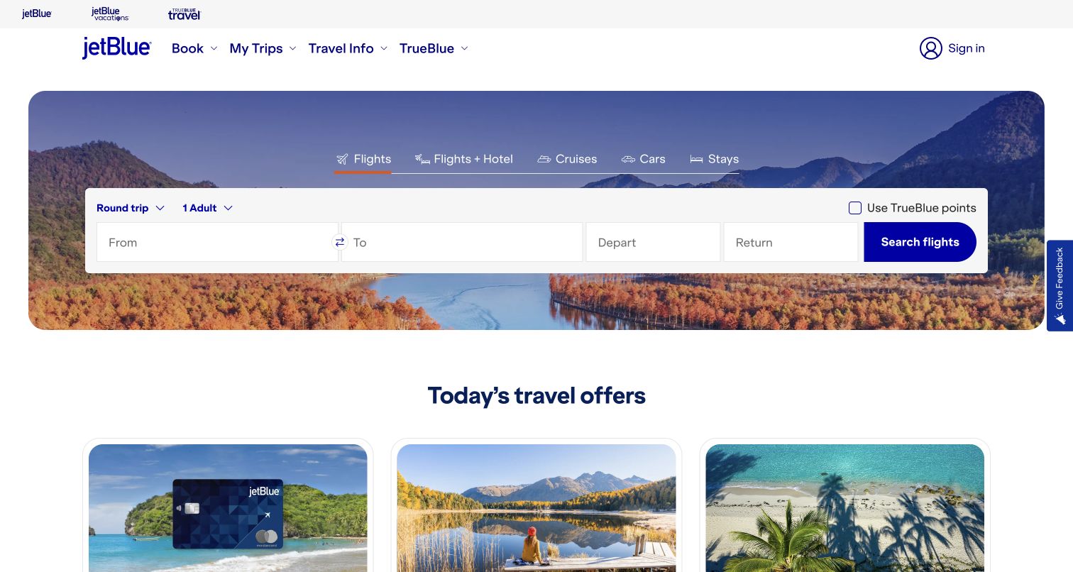
JetBlue puts its booking interface at the center of the opening rather than leading with a large promotional slogan. Tabs distinguish flights, packages, cruises, cars and stays, while the white form separates route, dates and traveler choices against an autumn landscape. A dark blue search action gives the otherwise quiet composition one obvious completion point. Travel offers begin below, so merchandising follows the immediate task instead of obscuring it. The interface is informative without requiring a signed-in account. The dbt association concerns JetBlue’s documented analytics transformation and collaboration work, not a verified database or content system behind this booking page.
What you can learn
Start with the decision visitors already know they need to make. Let photography establish the destination mood, then keep labels, editable defaults and the main search action visually independent from that background.
Pros
The booking task receives priority over secondary travel promotions.
White form panels preserve a clear boundary between inputs and scenery.
Cons & considerations
Several travel-product tabs can crowd a smaller screen.
Travelers need clear validation and date guidance beyond this static opening.
Platform source: Primary documented dbt association. dbt Labs documents JetBlue’s analytics transformation workflow. Platform evidence is separate from the direct website screenshot and is not a complete current infrastructure audit.
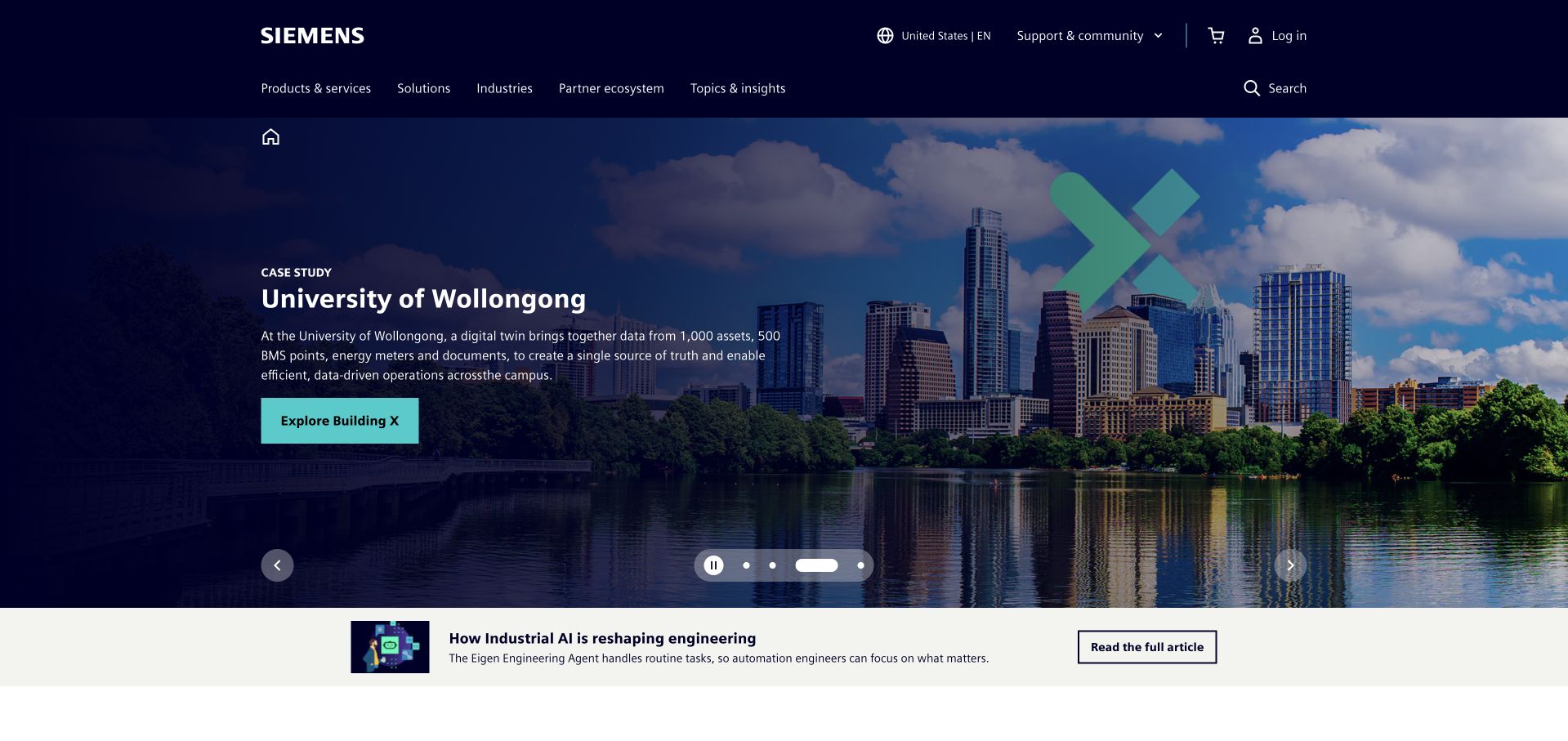
Siemens’ captured US homepage leads with a University of Wollongong case study rather than an undifferentiated product catalog. A city-and-water photograph supports a short description of a campus digital twin, while a turquoise action names the relevant offering. The dark navigation preserves product, solution, industry and partner routes above this rotating editorial area. A smaller industrial-AI story sits below as a separate reading option. This creates useful layers of specificity, although the company’s full scope still depends on the permanent navigation. dbt Labs documents Siemens’ internal data-mesh architecture; that association does not establish the runtime of the pictured public page.
What you can learn
Make a broad enterprise promise concrete with one named application. Explain the setting and the operational problem before asking readers to explore a product, and keep other portfolio routes available outside the carousel.
Pros
A named university case gives the infrastructure proposition a concrete setting.
The product-specific action is more informative than a generic discovery button.
Cons & considerations
A rotating lead story can change the apparent company focus on arrival.
Multiple navigation levels need careful grouping for smaller screens.
Platform source: Primary documented dbt association. dbt Labs documents Siemens’ data-mesh architecture. Platform evidence is separate from the direct website screenshot and is not a complete current infrastructure audit.
Zendesk’s homepage places an oversized automation claim over a warm photograph of a person wearing headphones. The image gives a human context to a service category otherwise likely to rely on abstract interface graphics. Above it, the white header separates platform, products, solutions, resources and pricing, with trial and demo routes clearly distinguished. A black event announcement occupies its own strip instead of replacing the main navigation. The hierarchy is assertive, but the large percentage claim requires supporting definitions and evidence elsewhere. The dbt case describes Zendesk’s governed enterprise data layer and engineering workflow, not this marketing page’s delivery stack.
What you can learn
An automation message still needs a recognizable human context and an inspectable explanation. Separate evaluation routes by intent, and provide the conditions behind prominent outcome claims rather than expecting the photograph to make them credible.
Pros
Warm photography keeps the technical proposition grounded in a service context.
Trial and demonstration actions accommodate different levels of buying readiness.
Cons & considerations
The large quantified headline needs clearly accessible supporting methodology.
A tall announcement and navigation area reduces the opening space for explanation.
Platform source: Primary documented dbt association. dbt Labs documents Zendesk’s governed data engineering. Platform evidence is separate from the direct website screenshot and is not a complete current infrastructure audit.
J.Crew’s captured homepage makes a sale the entire hero, using a dark green field, large white serif percentages and three evenly spaced purchase thresholds. The layout makes the promotional structure visible without relying on a model photograph or a complex animation. Four department actions provide direct routes into the catalog, while the persistent header retains search and ordinary shopping categories. Small conditions and the offer code remain part of the composition, though they require closer reading than the headline figures. dbt Labs’ J.Crew story documents a data-modernization and training project; it does not identify the storefront’s frontend or current transaction backend.
What you can learn
When a promotion has several conditions, give its structure a readable visual form. Preserve the thresholds, exclusions and department routes, and do not let an elegant campaign treatment hide the information needed to interpret the offer.
Pros
Equal columns make the three purchase thresholds easy to compare.
Department actions connect the campaign directly to useful shopping destinations.
Cons & considerations
Small qualifications are less prominent than the large percentage figures.
A promotion-only opening provides little product context for unfamiliar visitors.
Platform source: Primary documented dbt association. dbt Labs documents J.Crew’s data modernization project. Platform evidence is separate from the direct website screenshot and is not a complete current infrastructure audit.
RMIT’s homepage combines a real campus setting with three prominent routes for study, research and partnership. A course-search field sits immediately beneath those choices, so prospective students can move from the institutional promise to a concrete task. The navy utility bar separately addresses students, alumni, staff and library users, while the white main navigation covers the broader university offer. Red accents connect the logo to section boundaries without overwhelming the photograph. The design acknowledges several audiences rather than forcing one generic journey on everyone. RMIT’s dbt case concerns its shared university analytics platform and development tooling, not a technical inventory of this public homepage.
What you can learn
A university homepage should distinguish audiences before expanding the story. Pair an authentic setting with clear task routes, and give course search enough prominence that a prospective student does not have to decode the institution’s internal organization.
Pros
Study, research and partner routes reveal the main audience choices immediately.
Course search translates the broad introduction into a useful next step.
Cons & considerations
Two navigation bands create substantial header density on mobile.
Text over a detailed photograph needs reliable contrast across responsive crops.
Platform source: Primary documented dbt association. dbt Labs documents RMIT’s shared analytics platform. Platform evidence is separate from the direct website screenshot and is not a complete current infrastructure audit.
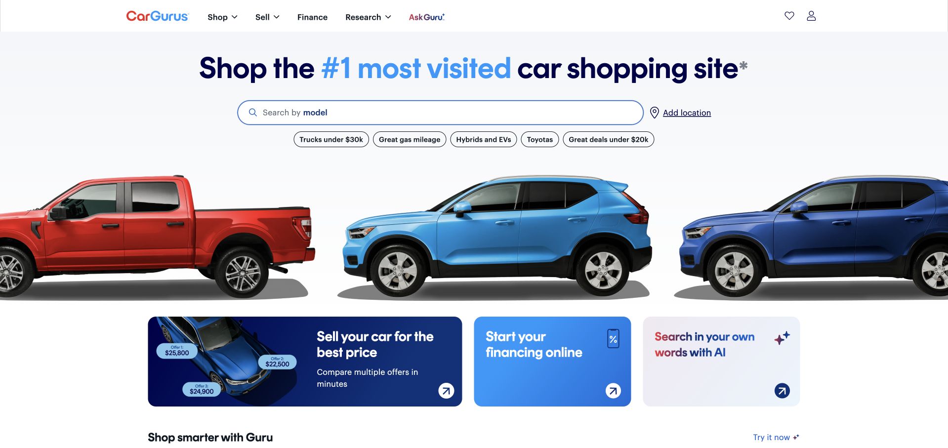
CarGurus places a long vehicle-search field below a bold category claim, with location handled as a distinct adjacent choice. Suggested searches cover budget, fuel economy, hybrids and familiar manufacturers, giving uncertain shoppers a way to begin without choosing a model. A row of cutout vehicles creates category recognition while leaving the search area uncluttered. Selling, financing and conversational discovery appear as separate cards below rather than competing form fields. The result is approachable, although availability depends on adding geographic context. dbt Labs documents CarGurus’ governed analytics and development-platform modernization; it does not verify the software serving this public marketplace.
What you can learn
Offer several starting points without turning the opening into an advanced-search form. Let visitors express a known model or a broader constraint first, then gather the additional information needed to produce meaningful results.
Pros
Suggested searches support people who have a need but no exact model.
Selling and financing remain separate from the primary shopping search.
Cons & considerations
Results can be misleading until location and other constraints are clarified.
A large popularity claim needs a visible explanation of its measurement.
Platform source: Primary documented dbt association. dbt Labs documents CarGurus’ governed analytics workflow. Platform evidence is separate from the direct website screenshot and is not a complete current infrastructure audit.
Custom Ink pairs a large gift-focused headline with a carefully arranged group of customizable products. The photograph shows the breadth of the offer without becoming a dense product grid, while the copy explicitly accommodates both small and large quantities. Browsing products and building a design are separate actions, acknowledging different levels of readiness. Search and human support are unusually prominent in the header, and a short reassurance strip follows the hero. This makes a potentially complicated customization purchase feel more approachable. The dbt source concerns Custom Ink’s analytics deployment and model scheduling, not the public storefront’s complete technology inventory.
What you can learn
For a custom product, explain both the object and the help available to order it. Keep browsing and designing distinct, and surface quantity, delivery and support information before customers have invested time in a configuration.
Pros
Product photography demonstrates several customization possibilities in one coherent scene.
Visible phone and chat routes reduce uncertainty around a bespoke order.
Cons & considerations
A gift-led campaign may initially obscure nonseasonal ordering use cases.
Broad delivery and guarantee claims need accessible conditions for custom work.
Platform source: Primary documented dbt association. dbt Labs documents Custom Ink’s deployment workflow. Platform evidence is separate from the direct website screenshot and is not a complete current infrastructure audit.
INSIDER’s captured storefront uses a full-width fashion photograph and an exceptionally large discount treatment to establish its current campaign. The model overlaps the typography, integrating the promotion into the image instead of placing it in a separate banner. A compact white purchase action remains visible near the lower center, while the dark header preserves departments, releases, kits and shopping controls. The visual restraint is memorable, but the scale of the discount can dominate the brand’s product explanation. The Brazilian site is shown in Chrome’s translated view. dbt Labs documents INSIDER’s internal data-platform ownership and workflow changes, not a fresh storefront runtime audit.
What you can learn
A campaign can be visually singular without removing ordinary shopping routes. Keep the action readable, preserve offer qualifications and make the product’s distinguishing qualities discoverable after the initial promotional impression.
Pros
The photograph and promotional typography form one coherent visual composition.
A short navigation retains recognizable department and product-category routes.
Cons & considerations
Oversized discount imagery leaves little room for a substantive product explanation.
Translated navigation may differ from the original wording and responsive line lengths.
Platform source: Primary documented dbt association. dbt Labs documents INSIDER’s data-platform ownership. Platform evidence is separate from the direct website screenshot and is not a complete current infrastructure audit.
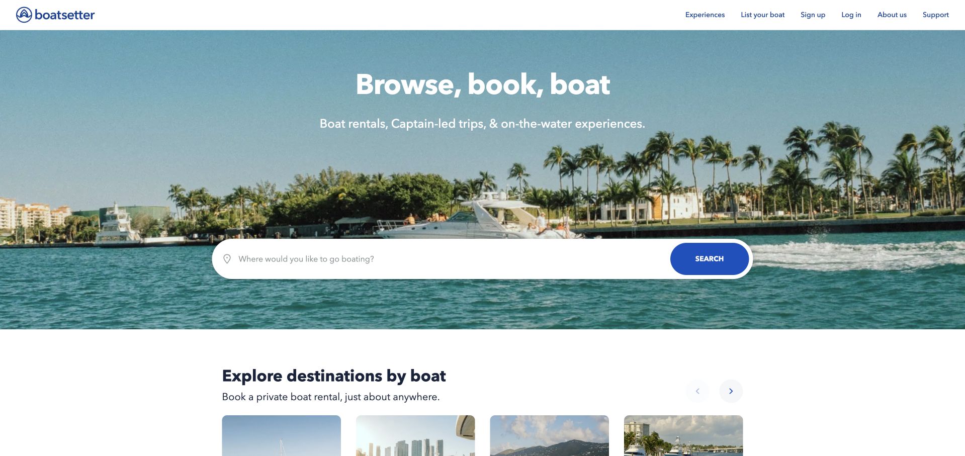
Boatsetter uses a waterfront photograph to establish the experience, then places a single destination-search field across its center. The short opening explanation distinguishes rentals, captain-led trips and other on-water experiences without asking visitors to select every detail immediately. Destination cards begin below, providing an alternative for people still exploring. Owner onboarding and existing-account routes remain in the upper navigation, separate from the guest’s first task. The page succeeds by asking one understandable question, though the detailed booking conditions necessarily come later. The dbt case concerns governed customer and booking-data transformations, including the documented merger context, rather than proving this homepage’s backend.
What you can learn
Ask for the constraint that meaningfully narrows the catalog first. Use imagery to explain the experience, then offer browsing alternatives and disclose availability, operator responsibilities and booking conditions before a visitor commits.
Pros
A single location field makes the initial marketplace task easy to understand.
Destination cards help exploratory visitors who are not ready to search.
Cons & considerations
A simple opening does not explain captain, availability or pricing differences.
White text over photography requires consistent contrast across changing crops.
Platform source: Primary documented dbt association. dbt Labs documents Boatsetter’s customer-data transformations. Platform evidence is separate from the direct website screenshot and is not a complete current infrastructure audit.
Lendi’s homepage opens with a concrete interest-rate question rather than a generic promise about financial freedom. Two turquoise actions offer an appointment or a rate comparison, while a simple house illustration gives the page a recognizable home-loan context. A displayed review score sits below the actions, and lender logos introduce the comparison proposition further down. The limited teal palette makes the interface feel consistent without relying on stock banker photography. The headline’s qualification mark is important because suitability cannot be inferred from one rate. The dbt association concerns Lendi’s managed analytics migration and governance, not this public comparison page’s runtime.
What you can learn
Name the customer’s immediate question, then offer both independent exploration and a conversation. For financial services, keep qualifications and eligibility information close enough that a compelling opening cannot be mistaken for a personalized recommendation.
Pros
A concrete rate question gives the proposition an immediately recognizable context.
Appointment and comparison actions support different customer preferences.
Cons & considerations
The headline’s financial qualification needs a clear, accessible explanation.
Review scores and lender logos cannot establish suitability for an individual borrower.
Platform source: Primary documented dbt association. dbt Labs documents Lendi’s managed analytics migration. Platform evidence is separate from the direct website screenshot and is not a complete current infrastructure audit.
PetScreening combines a pale blue hero, a resident-and-dog photograph and a plainly named software category. Four concise benefit statements introduce the product’s operational context, with a dark demo action below. The header explicitly provides a resident route alongside business navigation, preventing an important secondary audience from having to interpret the sales page. Customer organization logos add a quieter supporting band beneath the hero. The visual warmth helps an administrative category feel approachable, but assistance-animal and compliance language needs precise supporting explanation. dbt Labs’ case concerns PetScreening’s data transformations across business domains, not a verification of this marketing page’s application stack.
What you can learn
Show who a specialist product serves, then separate buyers from the people affected by its workflow. Human photography can establish context, but sensitive policy claims should lead to clear process information rather than remain compressed into marketing bullets.
Pros
The resident route acknowledges a distinct and important nonbuyer audience.
A short benefit list makes the specialist software category easier to scan.
Cons & considerations
Compliance-related phrases require careful explanations beyond a sales-oriented summary.
The large headline leaves limited room for demonstrating the actual working interface.
Platform source: Primary documented dbt association. dbt Labs documents PetScreening’s multi-domain data platform. Platform evidence is separate from the direct website screenshot and is not a complete current infrastructure audit.
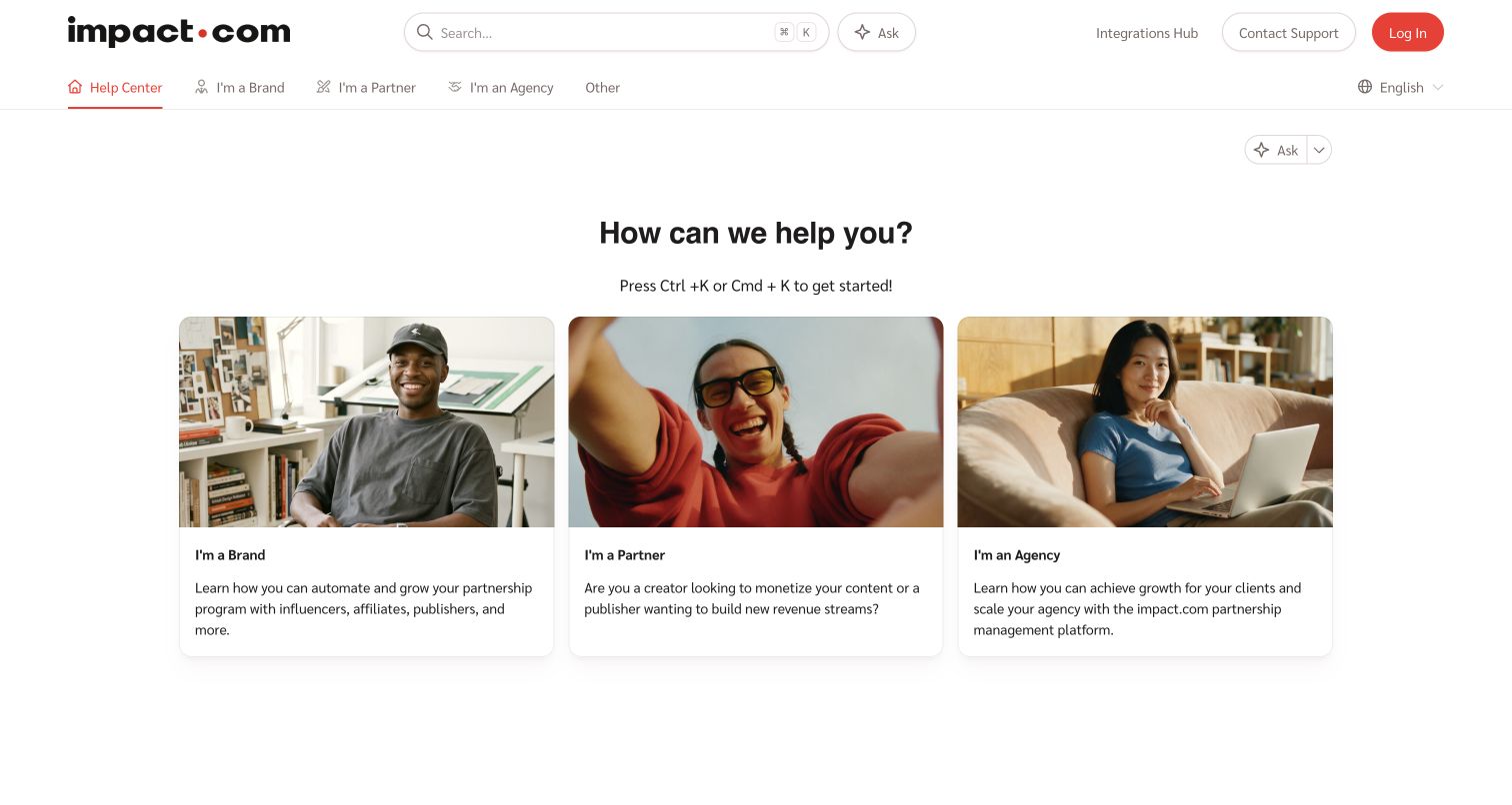
impact.com’s public Help Center makes search persistent in the header, then organizes the page around three audience cards: brands, partners and agencies. Each card combines a human photograph with a short explanation of the relevant support context. The same roles appear in the upper navigation, providing a consistent way to change direction without returning to the gateway. Contact support and login remain separate controls, so public documentation is not visually confused with account access. This is a support-publication reference, not the marketing homepage. dbt Labs documents impact.com’s organizational analytics transformations; that evidence does not identify the help center’s data backend.
What you can learn
For a multi-sided platform, establish the reader’s role before presenting a long documentation tree. Keep search available for experienced users, and label account access separately from public help so readers understand which path requires authentication.
Pros
Audience cards explain the difference between several plausible support journeys.
Persistent search offers a direct route for people with a specific question.
Cons & considerations
Role-based grouping needs a fallback for visitors who fit several categories.
Repeated ask and search controls can make their different behaviors unclear.
Platform source: Primary documented dbt association. dbt Labs documents impact.com’s analytics transformations; the pictured support publication is a separate public design reference. Platform evidence is separate from the direct website screenshot and is not a complete current infrastructure audit.
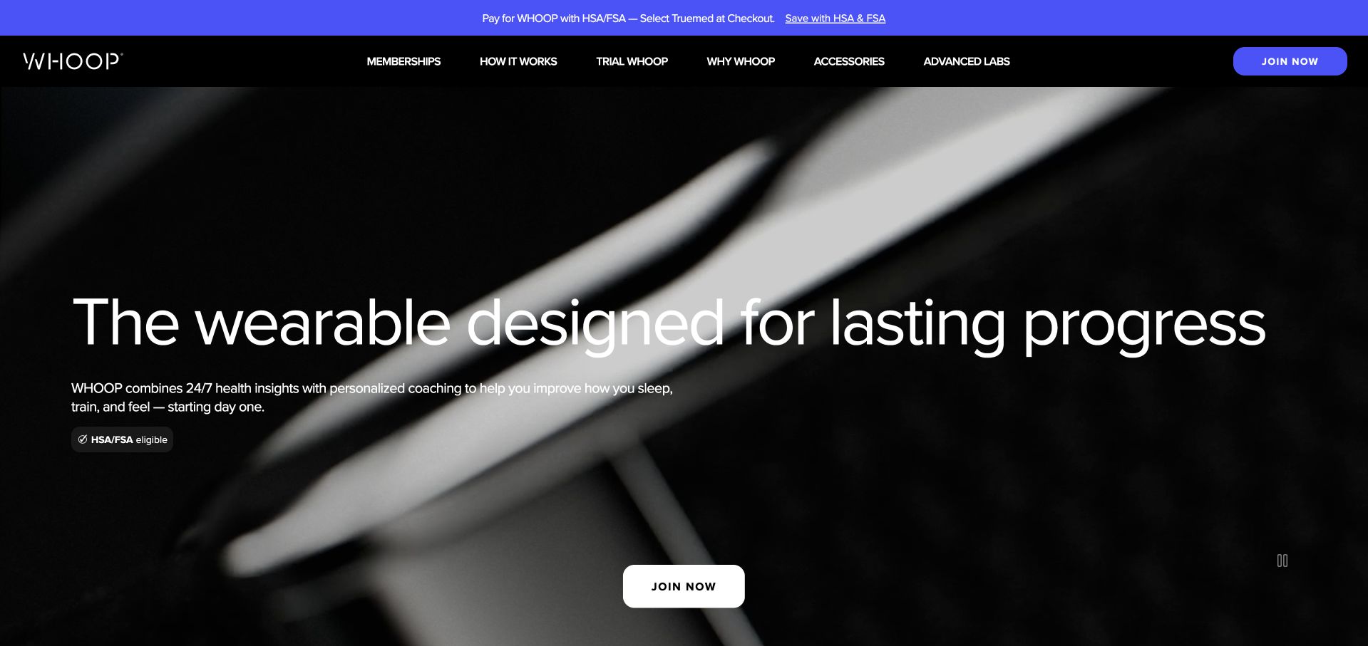
WHOOP uses an almost monochrome product background and a large white statement about sustained progress. A short supporting explanation connects the wearable to sleep, training and personalized guidance, while a centered join action provides the main next step. The header separately exposes memberships, the product explanation, trials and accessories. A bright upper strip handles a payment-related message without changing the core visual system. The close-up imagery establishes a premium product impression, but it does not demonstrate the app or explain membership economics. The dbt case documents WHOOP’s data-quality and transformation migration work, not every algorithm or the public storefront’s backend.
What you can learn
When a device is part of a continuing service, give the service explanation equal weight with the physical object. Make membership costs, trial conditions and the meaning of health-related outputs easy to inspect before the purchase route.
Pros
A restrained palette gives the main proposition and join action strong separation.
Membership and trial routes are visible as distinct evaluation choices.
Cons & considerations
Close-up product imagery does little to explain the actual app experience.
Health-related promises need clear limitations and supporting product information.
Visible tech stack
Earlier / documented evidence
dbt
Platform source: Primary documented dbt association. dbt Labs documents WHOOP’s dbt Core and Cloud work. Platform evidence is separate from the direct website screenshot and is not a complete current infrastructure audit.
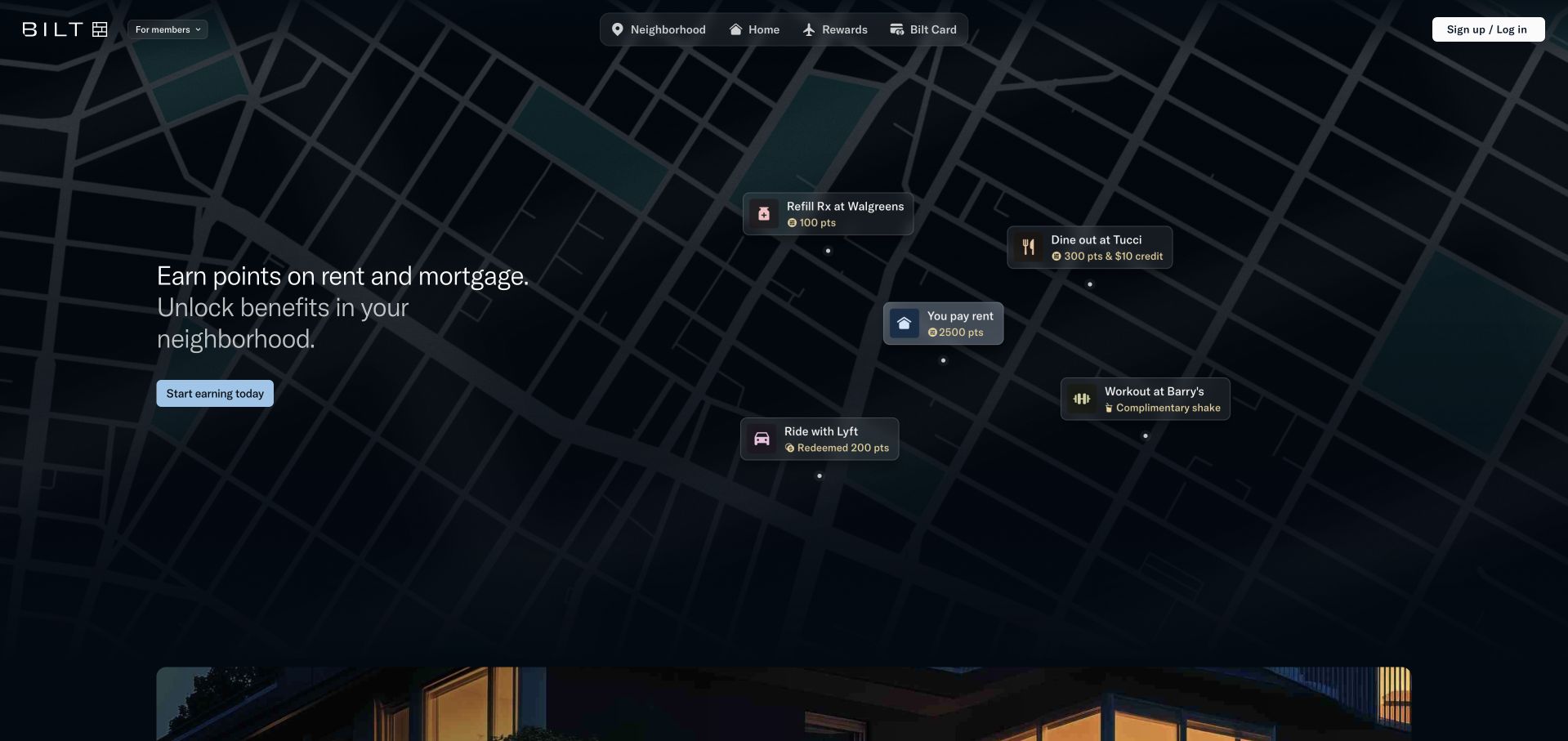
Bilt’s homepage uses a dark street-map composition to connect housing payments with neighborhood benefits. Small floating cards illustrate several activities, while the opening copy explains earning and using points in a compact block on the left. A centered navigation groups neighborhood, home, rewards and the card, with account access separated at the right. The visual metaphor makes a network-based service easier to picture without displaying a conventional financial dashboard. It also creates fine text and contrast challenges on a busy background. The dbt source concerns Bilt’s analytical models and semantic definitions for reporting audiences, not the runtime of this public landing page.
What you can learn
A network product benefits from examples of actual use, not just an abstract points promise. Illustrate a few recognizable activities, then explain eligibility and redemption conditions before visitors mistake a sample benefit for a universal entitlement.
Pros
Activity cards make the relationship between housing and neighborhood rewards tangible.
A limited navigation reflects the main parts of the member proposition.
Cons & considerations
Small floating labels can lose legibility on a narrow screen.
Illustrated reward amounts need clearly accessible eligibility and program conditions.
Visible tech stack
Earlier / documented evidence
dbt
Platform source: Primary documented dbt association. dbt Labs documents Bilt’s embedded analytics models. Platform evidence is separate from the direct website screenshot and is not a complete current infrastructure audit.
Enpal’s homepage uses a house equipped with solar panels, charging equipment and a heat pump to communicate a connected energy proposition. The scene explains the relationship between several products before the visitor opens the product menu. A yellow home-check action stands out against the muted photograph, while a compact central navigation separates products, service, company information and editorial material. Supporting reassurance appears along the bottom of the hero. The captured German page is displayed in Chrome’s translated view. dbt Labs describes Enpal’s analytical data-model modernization across operational domains; it does not establish the public landing page’s frontend or content-management system.
What you can learn
Show how related home products fit into one real setting. Make the initial assessment route obvious, then explain installation scope, eligibility, financing and ongoing responsibilities in detail rather than relying on a polished whole-home illustration.
Pros
The household scene shows how several energy products relate to one another.
A single yellow assessment action is easy to distinguish from the navigation.
Cons & considerations
The captured subtitle overlaps other hero text, weakening readability despite the clear composition.
Broad savings and independence claims require specific conditions and evidence.
Platform source: Primary documented dbt association. dbt Labs documents Enpal’s analytical data models. Platform evidence is separate from the direct website screenshot and is not a complete current infrastructure audit.
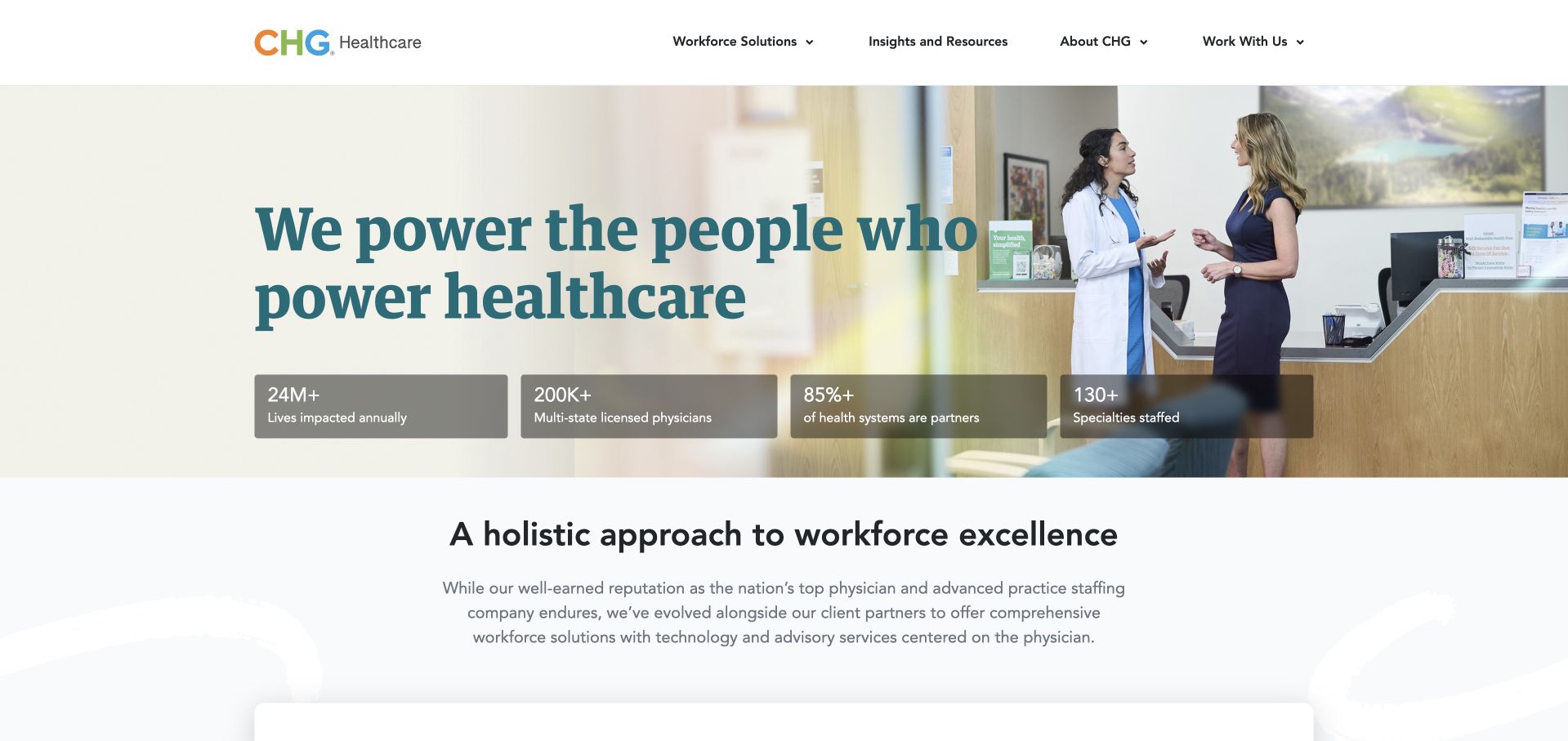
CHG Healthcare pairs a large teal headline with a photograph of two people in a healthcare workplace. Four translucent statistic cards introduce organizational scale before the page moves into a more explicit workforce-solutions explanation. The navigation stays compact, grouping solutions, resources, company information and working relationships rather than listing every staffing specialty. This balances a human introduction with practical corporate context. The important distinction is that the site explains a staffing and advisory business, not an individual patient-care service. dbt Labs documents CHG’s migration from a legacy warehouse to Snowflake and dbt Cloud; that is separate from this public page’s implementation.
What you can learn
For a healthcare-adjacent service, explain the organization’s actual role early. Use human imagery to establish context, then connect scale claims to concrete services and audience routes so visitors do not confuse workforce support with direct clinical care.
Pros
The workplace photograph gives the staffing proposition an understandable human setting.
A short scale strip adds context without creating a dense corporate dashboard.
Cons & considerations
Broad impact figures need accessible definitions and supporting context.
The initial headline alone does not explain individual staffing services or specialties.
Platform source: Primary documented dbt association. dbt Labs documents CHG Healthcare’s data modernization. Platform evidence is separate from the direct website screenshot and is not a complete current infrastructure audit.
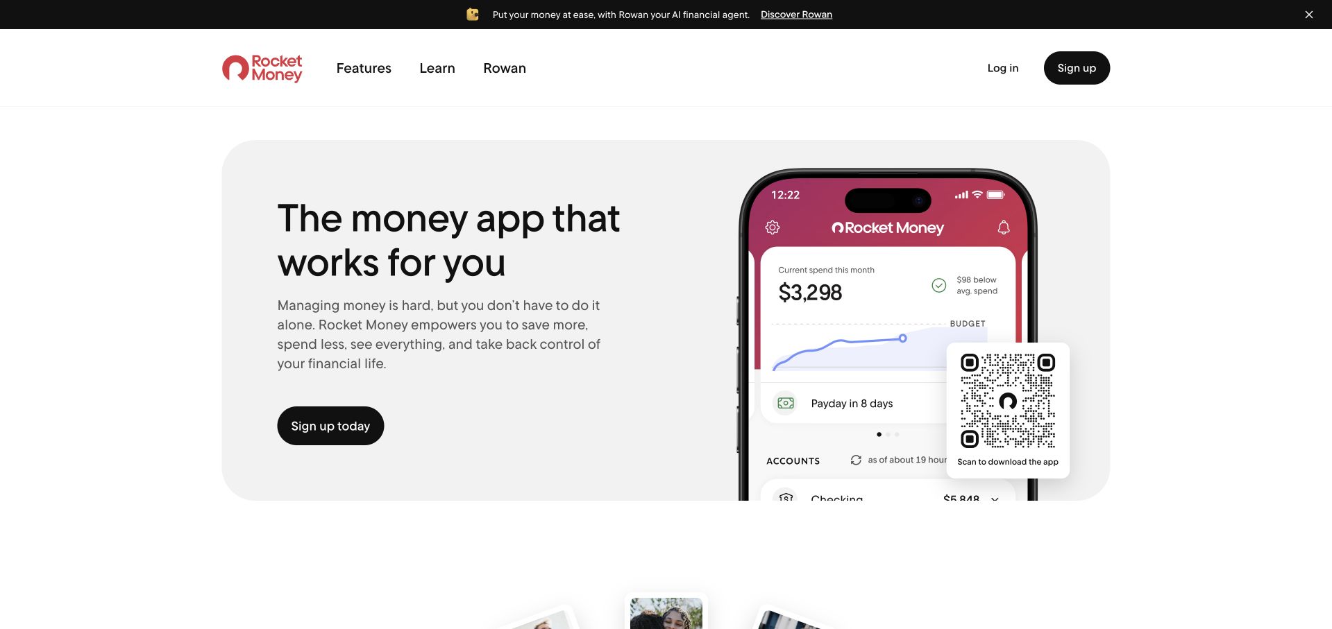
Rocket Money places a short, conversational proposition beside a large phone preview of its spending interface. The rounded pale panel gives the headline, explanation and signup action a shared boundary, while the red app branding remains recognizable inside the device. A QR code provides an explicit desktop-to-phone route instead of assuming visitors will complete everything in the browser. The upper announcement introduces a separate financial-agent feature without replacing the core product explanation. The preview is illustrative, not a private account record. The dbt case concerns financial-reporting and quote-to-cash data models, not a complete technical inventory of this marketing page.
What you can learn
Show one useful product state and explain what a person can do with it. For an app promoted on desktop, make the device handoff clear while keeping ordinary signup and detailed feature information available as alternatives.
Pros
A recognizable spending screen makes the broad money-management promise concrete.
The QR code gives desktop visitors an obvious route to the mobile app.
Cons & considerations
A large phone preview can crowd the explanation on smaller screens.
Financial-benefit language needs clear information about fees, permissions and limitations.
Platform source: Primary documented dbt association. dbt Labs documents Rocket Money’s financial reporting. Platform evidence is separate from the direct website screenshot and is not a complete current infrastructure audit.
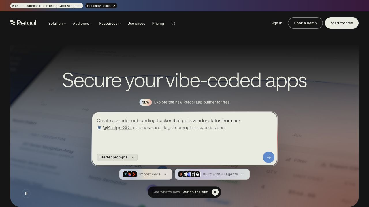
Retool’s captured homepage centers a large prompt area containing a specific vendor-onboarding task connected to a database. This gives the broad application-building proposition an immediate practical shape. Importing existing code and building with AI agents appear as separate routes beneath the prompt, while a film option offers another way to evaluate the product. The dark, softly colored background keeps attention on the working surface rather than a large dashboard collage. The page still assumes some understanding of databases and internal tools. dbt Labs documents Retool’s internal self-service analytics work with dbt Cloud and Databricks, not the infrastructure of this public prompt interface.
What you can learn
Choose an example task that reveals the product’s input, connection and intended output. Provide alternatives for people bringing existing work, and make the boundary between a demonstration and a real connected application unmistakable.
Pros
The vendor-onboarding example explains a plausible business use instead of an abstract capability.
Import and agent-building options acknowledge different starting points.
Cons & considerations
Database terminology can exclude visitors without a technical background.
A prompt demonstration cannot establish security, permissions or production readiness.
Platform source: Primary documented dbt association. dbt Labs documents Retool’s self-service analytics work. Platform evidence is separate from the direct website screenshot and is not a complete current infrastructure audit.
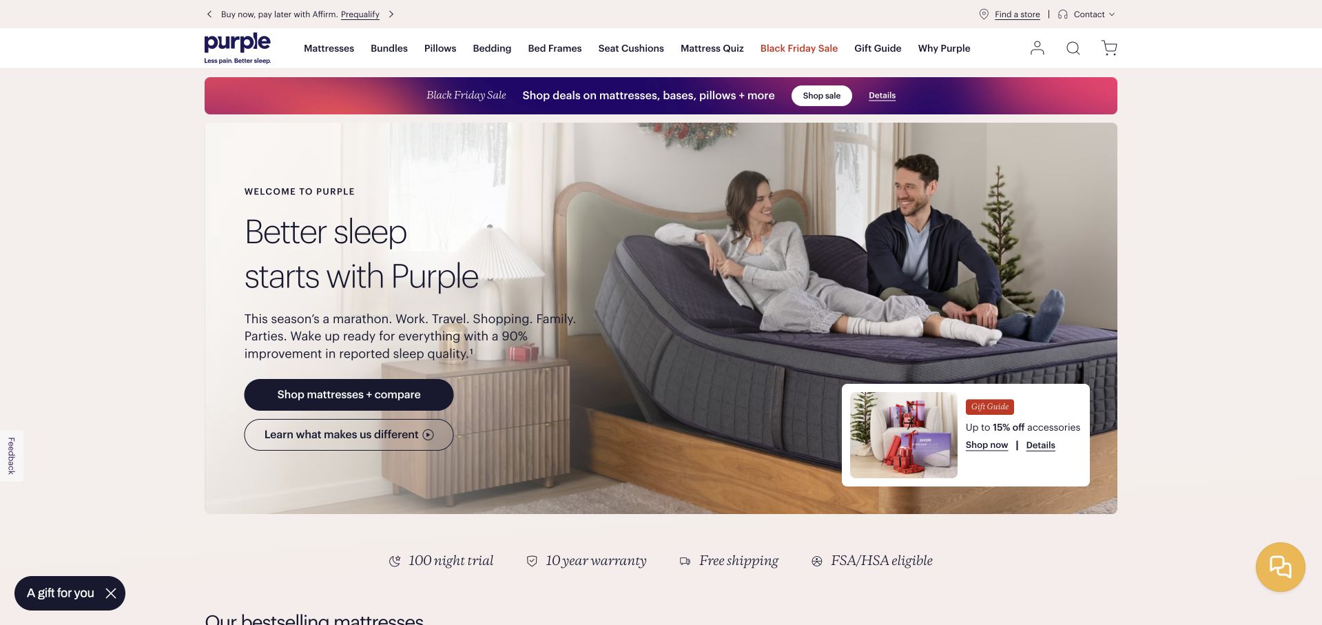
Purple’s homepage shows its adjustable mattress in an ordinary bedroom scene rather than isolating the product on a blank background. The left side pairs a simple sleep proposition with shopping-and-comparison and product-explanation actions. A separate campaign strip and a small gift promotion handle seasonal merchandising without replacing those main evaluation routes. Trial, warranty and shipping information form a concise supporting row beneath the hero. This gives the purchase more context, although several promotions still compete with the core message. The dbt case describes Purple’s effort to standardize analytical definitions and improve data trust, not the storefront’s complete current stack.
What you can learn
For a considered purchase, show the product being used and offer a genuine explanation route alongside shopping. Keep trials, warranties and performance qualifications close enough that visitors can evaluate the offer before choosing a model.
Pros
The bedroom scene demonstrates a relevant product configuration in a familiar setting.
Separate comparison and explanation actions support research before purchase.
Cons & considerations
Several seasonal promotions compete for attention around the main hero.
Quantified sleep claims need accessible study details and clear qualifications.
Platform source: Primary documented dbt association. dbt Labs documents Purple’s data-quality initiative. Platform evidence is separate from the direct website screenshot and is not a complete current infrastructure audit.
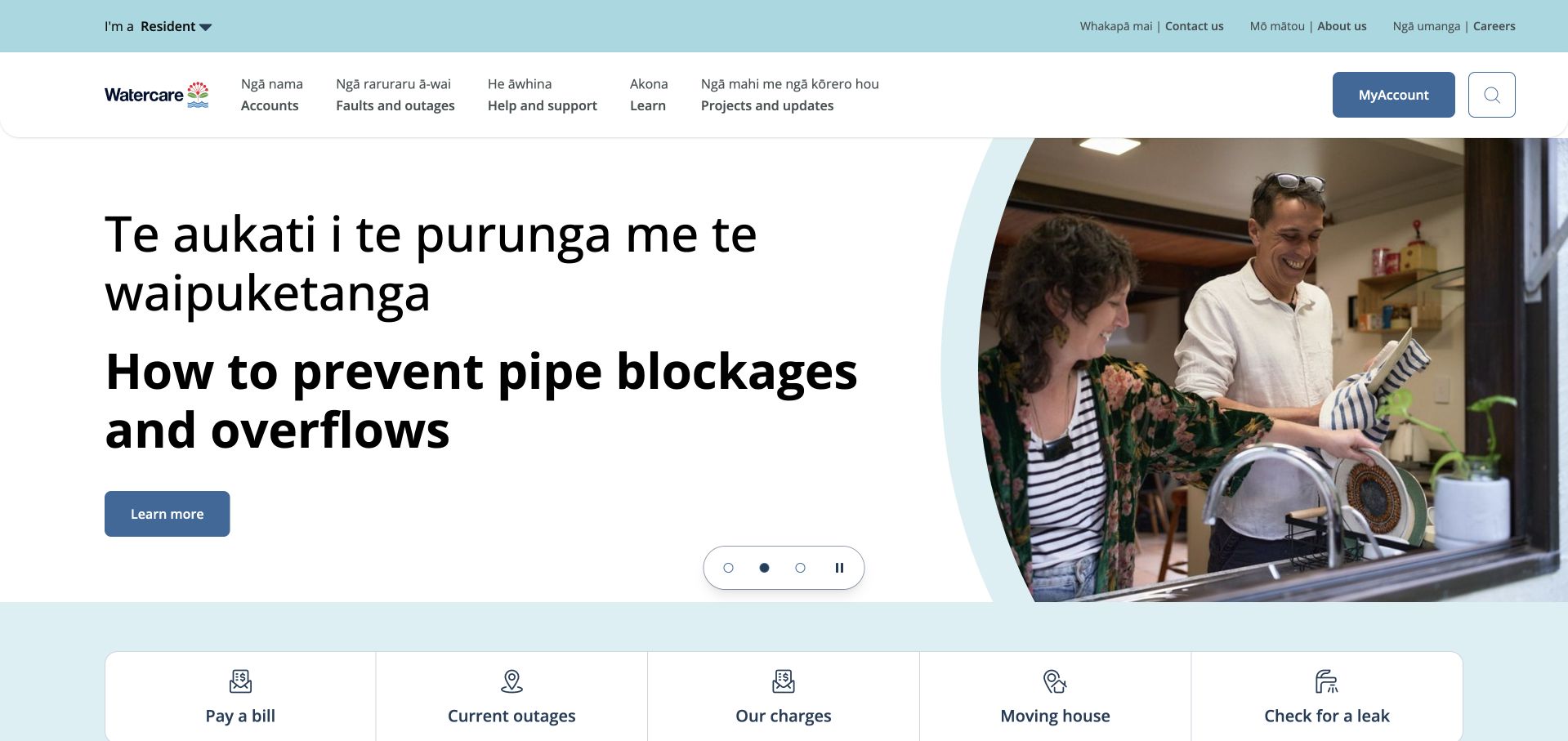
Watercare’s resident homepage gives bilingual text substantial space rather than reducing it to a small utility label. The captured hero explains pipe-blockage prevention beside an ordinary kitchen scene, while the navigation identifies accounts, faults, support, learning and project updates. Five large shortcuts below the hero cover recurring tasks such as bills, outages, charges, moving and leak checks. The layout treats useful public guidance and immediate service needs as complementary, not competing, responsibilities. MyAccount remains a separate labeled destination. dbt Labs’ case concerns Watercare’s analytical warehouse and smart-meter data work; it does not identify the public resident page’s backend.
What you can learn
A utility site should preserve access to urgent and recurring tasks regardless of the current campaign. Give public guidance a concrete household context, and ensure bilingual presentation, account access and outage information remain clear on smaller screens.
Pros
Large task shortcuts keep recurring resident needs independent of the rotating hero.
Bilingual headings are treated as substantive content with a clear visual hierarchy.
Cons & considerations
Long bilingual headlines require careful mobile spacing and line-length control.
Carousel timing must not hide important service guidance from slower readers.
Platform source: Primary documented dbt association. dbt Labs documents Watercare’s analytics data warehouse. Platform evidence is separate from the direct website screenshot and is not a complete current infrastructure audit.
Kegan has 15+ years of experience working with small businesses, Fortune 500 companies, and everything in between. No development job is too big or too small: he brings the same hands-on attention to a focused improvement, a complete website, or a custom application.
For dbt projects, he can help with data modeling, application data access, query design, search and cache integrations, migration planning, access boundaries, and maintainable handover. He works directly with clients on scope, design, implementation, testing, and handover, with an emphasis on clear communication and a system that remains practical to maintain after launch.
Show 3 other dbt developersHide other dbt developers
Take one report with a known source and consumer, define its grain and rebuild its transformation as a reviewed project. Compare the output with agreed examples before expanding. This is a useful starting point when the team needs a maintainable definition more than a wholesale data-platform redesign.
Inventory the scripts and spreadsheet logic that multiple consumers already depend on. Choose a small connected slice, identify its owner and agree on migration checks. Preserve business meaning before improving structure. The goal is a repeatable, reviewable workflow, not a larger model count or a mechanical translation that keeps the same hidden assumptions.
Establish shared definitions across domain teams
When several teams contribute data, agree which models they own and what other teams may depend on. Define review and deprecation expectations before distributing changes. A shared transformation project needs a clear collaboration contract; a dependency graph alone cannot decide who approves a changed metric or resolves conflicting interpretations.
From references to requirements
Plan model meaning, failure handling and incremental change
Write a model contract people can reason about
Choose an initial output and write its definition before selecting a folder structure. State what one row represents, which source records are in scope and how the key is formed. Describe time zones, effective dates, cancellations, duplicates and other conditions that change the interpretation of the data. Use concrete examples that the business owner can review. A customer summary, for instance, needs an explicit rule for which customer identity is used and how source changes affect historical reporting. These choices should not be buried inside a long query that only its author understands.
Separate source cleanup from the business-facing output in a way the team can explain. The exact project structure can vary, but each model should have a clear reason to exist and an intended consumer. Avoid adding an intermediate layer merely because another company’s project has one. Conversely, do not put every source correction, join and reporting rule into a single model that becomes difficult to review. Use the dependency relationships to make the flow understandable, while keeping the business definition near the output that people actually consume.
Agree on acceptance examples and a named reviewer. Compare representative rows, edge cases and meaningful totals rather than only checking that the SQL executes. Document where a new source field or changed interpretation should be discussed. Preserve a record of why a model’s meaning changed so future maintainers can distinguish a deliberate restatement from a defect. dbt supplies transformation workflow components; the team must still agree on the data contract and responsibility for its use. A useful first deliverable is an output another person can explain and verify, not simply a successful build with many model files.
Start from the assumptions that would materially change the output if they were false. A required identifier, an expected relationship or a limited set of statuses can each deserve a check. Add domain-specific assertions where a generic property is insufficient, such as a reconciliation between two defined representations of the same activity. Keep the purpose of each test readable. A large collection of copied checks can create noise without clarifying the most important risks, especially if nobody knows whether a failure is new, expected or actionable.
For each important failure, decide who receives it and what they should inspect first. Define whether the affected output remains available, is marked stale or is withheld from publication while the issue is reviewed. Those are operational decisions, not consequences to assume from the presence of a test. Record a path from the failing records to the source context, while protecting sensitive data in logs and shared notifications. Do not make a dashboard user discover the issue by noticing that a number suddenly looks implausible.
Test the response process as well as the SQL. Use a controlled development example to demonstrate how a known failure is identified, investigated and corrected. Include missing sources, duplicate keys, changed statuses and delayed records among the scenarios appropriate to the project. Explain what a passing suite establishes and what remains outside its scope. Data tests evaluate declared assertions against data; they do not replace review of the transformation’s business meaning, warehouse permissions or upstream collection process. Keep the suite focused enough that the team can maintain it when sources and definitions change, and assign ownership rather than relying on the original author to remember every exception.
Choose incremental processing only with a history and recovery plan
Begin with a correct, understandable transformation before optimizing how much data each run processes. For a candidate incremental model, identify how new and changed records are recognized, how existing rows should be matched and what happens when an update arrives outside the usual window. The official documentation explains that incremental processing depends on the filter and configuration supplied by the project. It is not an automatic discovery of every historical change. A timestamp that works for new events may fail to capture corrections, source deletions or records whose business date differs from their arrival date.
Define and inspect the key used to match records where the selected strategy requires one. Do not treat a configured unique key as a substitute for understanding actual duplicates and nulls in the source. Check the behavior of the exact adapter and strategy rather than assuming all warehouses update data identically. Test a first build, a repeated run, an updated record, a late record and a changed transformation. Include the expected result after each step. A fast incremental run that silently leaves old rows under a previous business rule is not an acceptable optimization.
Plan backfills and rebuilds as deliberate operations. Identify who approves them, which downstream outputs are affected and how cost and access will be reviewed before execution. The documentation’s full-refresh behavior and schema-change options need to be understood for the selected configuration; a schema setting does not by itself restate all historical values under a new transformation. Keep a recovery explanation with the model and tell consumers when a restatement changes previously published results. Choose an incremental approach only when its ongoing complexity is justified by the actual workload. Simpler processing can be preferable when the dataset is modest and the team would otherwise inherit a recovery procedure it cannot confidently operate.
Ask the actual team to carry out its routine job: publish a realistic update, correct a mistake, preview a narrow screen, and identify who owns an integration failure. For a library or frontend framework, also ask who maintains the content source and deployment. A polished screenshot does not answer those operational questions.
Beyond the screenshot
dbt project brief checklist
Define the analytical output and name the consumer and business reviewer before adding models.
Write row grain, source scope, identifiers and time interpretation in plain language.
Map ingestion, warehouse, transformation, scheduling and consumption responsibilities separately.
Keep each model’s purpose and dependencies understandable without copying another organization’s project size.
Choose tests from consequential assumptions rather than collecting checks without an owner.
Define failure notification, investigation and publication behavior for important outputs.
Validate realistic examples, edge cases and reconciliations before accepting a technically successful run.
For incremental models, specify how new, changed, late and removed source records are handled.
Inspect keys and confirm behavior for the selected adapter, materialization and strategy.
Test first builds, repeated runs, backfills, logic changes and historical restatements.
Document approval and recovery procedures before a full refresh or other potentially disruptive rebuild.
Assign model change owners and inform downstream consumers before meanings or schedules change.
Test with real content, a keyboard, a small screen, slow or failed requests, and the people who will maintain the system. These are planning checks, not an accessibility, security, performance, or search-ranking certification.
Sources & editorial method
How this dbt collection was reviewed
The collection contains exactly 20 public design references. The opening five are JetBlue, Siemens, Zendesk, J.Crew and RMIT University. Primary dbt Labs cases establish their stated transformation and organizational workloads; official model, data-test and incremental documentation informs the bounded technical explanations. These sources are not fresh audits of the pictured public-page runtime, independent performance benchmarks or complete current company architectures. Planning recommendations are original project guidance, not a copy of a case study’s claimed outcomes.
Every image is an unmodified capture from the actual website, with its source and capture date. Some captures are reused from our shared catalog; their dates remain the original capture dates. None comes from a vendor gallery or a generated reconstruction. Moving imagery and live content can change.
Technology attribution uses public page assets or metadata, official platform documentation, or a cited first-party project case study. Documentary and framework-relationship evidence is identified where used; it is not a complete current backend inventory. A CMS image CDN alone does not establish a full CMS deployment. A library’s presence does not prove which individual controls use it, and a platform label does not establish AI authorship.
The composition notes, lessons, pros and tradeoffs are original editorial observations. We have not measured conversion, traffic, security, performance or accessibility conformance. Website owners retain their brands and imagery; these examples are not our client portfolio. Written, Edited and Curated are independent records, not dates advanced by a build. See our editorial standards or suggest a correction.
Questions worth asking
dbt website development FAQs
Does dbt build the public pages shown in this collection?
The evidence does not establish that. These are 20 public design references from organizations with documented dbt work in analytical projects. The customer case and screenshot are deliberately separate. Neither a recognizable brand nor a transformation story proves the runtime of a marketing page or storefront.
Is dbt a warehouse or a CMS?
Its documented model workflow concerns transformation within a data warehouse. Plan storage, ingestion, operational applications and content editing separately. A project may integrate several tools, but adding dbt does not by itself replace those responsibilities or establish a complete website architecture.
What does a passing data test prove?
It provides evidence about the declared assertion on the data checked. It does not prove that every business definition, source record or downstream interpretation is correct. Decide what matters, write meaningful checks and give failures an operational owner and response rather than treating a green status as universal validation.
Should every large model be incremental?
No. First establish correctness and measure the workload. Incremental processing adds decisions about change detection, matching, late data and rebuilding history. Choose it where those responsibilities are justified and maintainable, and verify the behavior of the exact adapter and strategy used by the project.
What happens when an incremental model’s business logic changes?
Previously stored rows may need to be deliberately restated rather than only processing new records. Plan the affected history, consumers and recovery operation, and review the selected full-refresh and schema-change behavior. Do not assume a new expression or added column automatically recalculates every historical value.
Start with one well-defined output, meaningful checks and an owner who can explain a change. A larger dependency graph is not a substitute for a trustworthy transformation contract.