Best Awning Installer Websites of 2026 (16 Real-World Examples)
Installed-project context, understandable product choices, local service, and a practical route from inspiration to a professional consultation.
An awning installer’s website needs to show more than a beautiful canopy. A visitor should understand the kind of work the company handles, see relevant installed examples, and know how to begin a conversation about their own property.
The strongest design reference is often the explanation around a project rather than the scale of its photograph. Residential shade, a branded storefront canopy, and a larger commercial structure create different visitor questions, and a useful website makes those routes recognizable.
This collection evaluates public website presentation rather than installation quality, product suitability, engineering, or code compliance. Borrow the structure and communication ideas; do not copy another installer’s project photography, claims, technical recommendations, or implied permissions.
Before the examples
What makes good awning installer website design in 2026?
Show an installed context, not just a detached product
Use approved photographs that help a visitor understand the property, scale, and actual project scope. A close-up of fabric or a product illustration may support the story, but an installed example often explains the kind of work the company provides more clearly.
Organize choices by meaningful visitor needs
Separate actual residential, commercial, fixed, retractable, repair, and other offered categories where those distinctions help navigation. Do not use a large product grid to imply that every option is suitable for every building or that the website replaces professional assessment.
Make the consultation process easy to begin
Explain the real operating area, the information needed for the first discussion, and the next step after inquiry. A visitor should be able to ask a question without providing technical measurements or committing to a final product selection.
The collection · 16 examples
16 awning installer websites worth studying
Compare the relationship between project imagery, product or service categories, regional identity, and the consultation route. These are editorial design references, not technical product recommendations or measured rankings of installers.
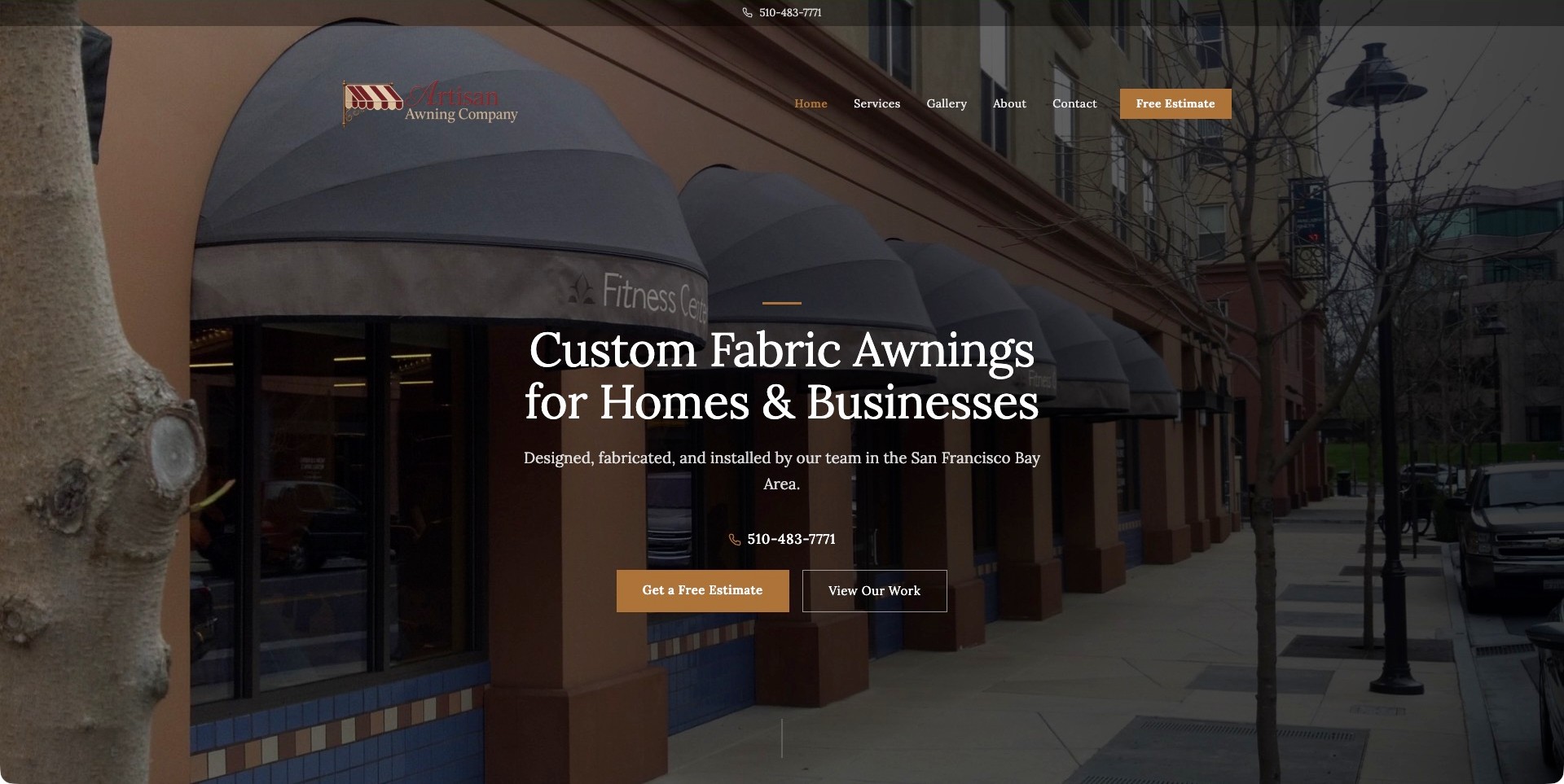
Artisan Awning Company uses a full-width storefront photograph that shows the awnings in relation to windows, entrances, and the street. The warm brown accent, compact serif navigation, and understated logo feel coherent with that architectural setting. A literal fabric-awning headline identifies homes and businesses, while the supporting line names the San Francisco Bay Area and the company’s design, fabrication, and installation roles. Estimate and work-gallery actions sit together below a telephone number. This smaller regional specialist is a useful reference because its introduction explains scope and place without requiring a visitor to interpret a technical product catalog.
What you can learn
Pair an installed-context photograph with a plain statement of the actual service and region. Keep viewing previous work separate from requesting an estimate so inspiration can lead naturally into a conversation without pretending the example is suitable for every property.
Pros
The image explains the relationship between fabric forms, a storefront, and the surrounding building.
Scope, service region, phone, work examples, and estimate are visible together.
Cons & considerations
Small navigation over detailed photography needs careful contrast and focus-state testing.
The very tall hero may postpone product distinctions on shorter laptop and phone screens.
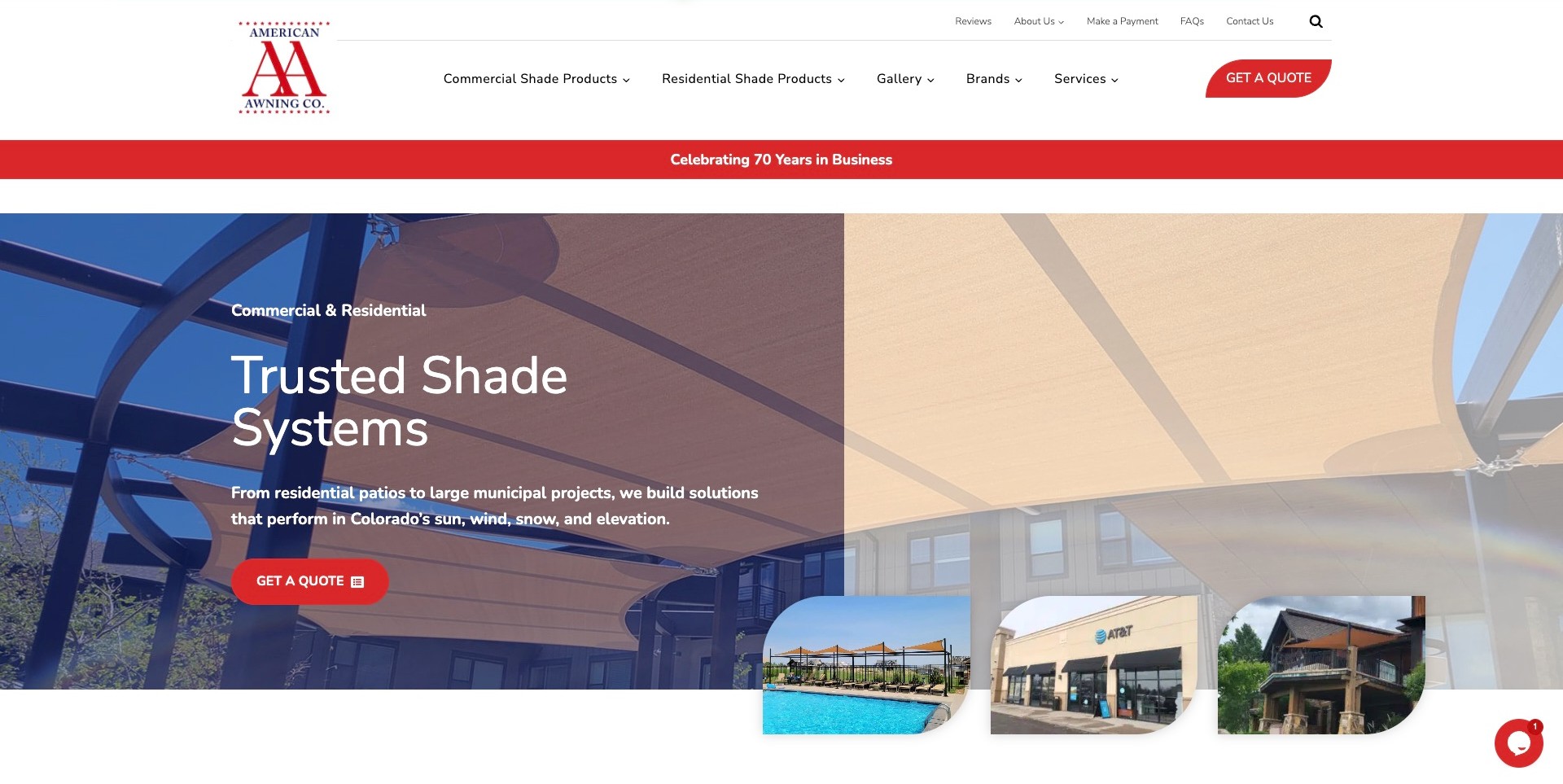
American Awning Company uses a white two-level header, a red identity, and distinct Commercial Shade Products and Residential Shade Products destinations. Its large hero shows a shade structure at building scale, with a Colorado-specific supporting statement and red quote action. Smaller image previews suggest further work without replacing the main installation context. Gallery, Brands, Services, and FAQ give the buyer several research paths before contact. The anniversary strip and climate-performance language are company-presented claims, not our verification. The useful design reference is the separation between customer context, product research, and an ordinary quote request.
What you can learn
Let an audience route narrow a broad catalog without forcing the visitor to know a technical product name. Keep local context and the actual inquiry step visible while ensuring performance claims lead to correctly scoped supporting information.
Pros
Commercial and residential shade ranges are immediately distinguishable in the main navigation.
Project previews communicate variety without relying entirely on a rotating headline.
Cons & considerations
A broad product-and-brand menu needs strong grouping when collapsed onto smaller screens.
Climate claims should not imply that an attractive pictured structure is suitable for every property.
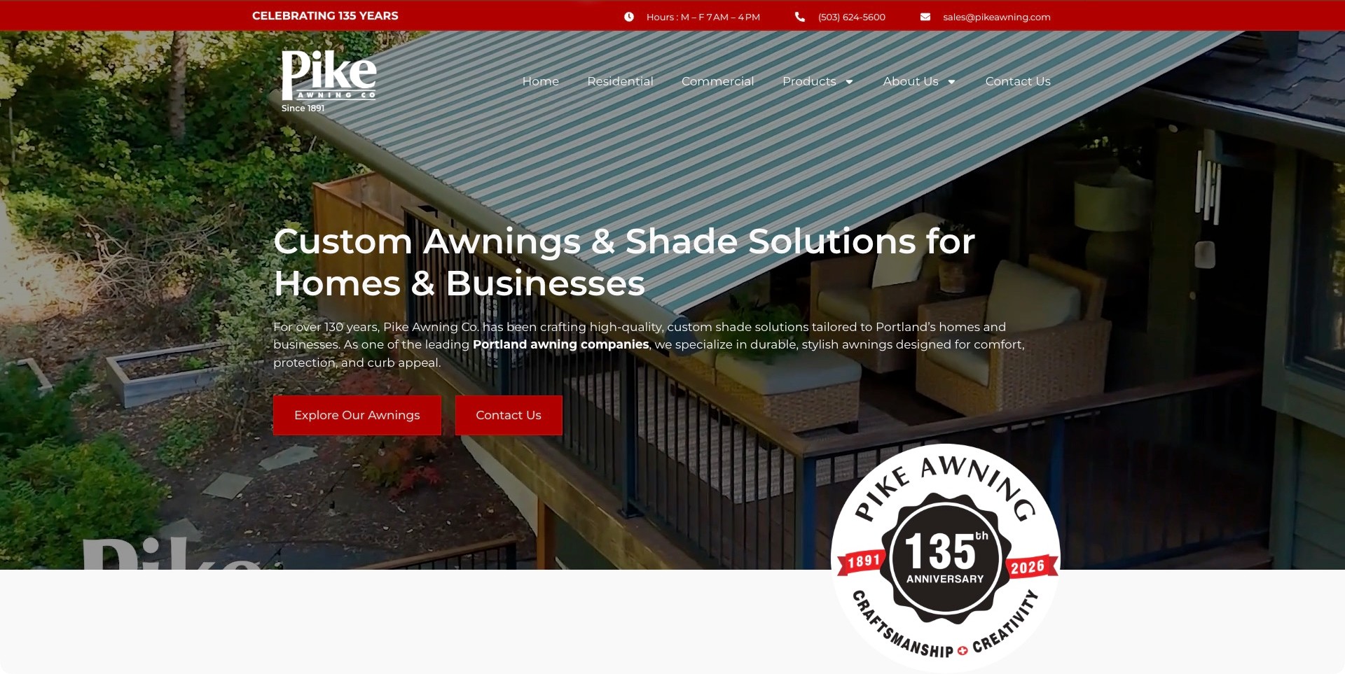
Pike Awning opens with a striped retractable awning shown over a furnished deck, giving the product an immediate residential context. The white headline identifies homes and businesses, and the supporting paragraph names Portland rather than leaving the market implicit. Residential, Commercial, Products, and company information have separate navigation routes. A red upper strip contains hours and contact details, while an anniversary emblem overlaps the hero’s lower edge. The company-history language is a maintained business claim, not proof of installation quality. The useful reference is the combination of a recognizable project setting and clear paths for different buyers.
What you can learn
Use a specific installation context to orient the visitor, then let audience and product routes answer different questions. A commercial buyer should not have to infer that a domestic-looking hero excludes their project, and a history badge should not replace service information.
Pros
Telephone, email, and opening hours are grouped into a practical upper contact strip.
Explore Our Awnings and Contact Us distinguish research from starting an inquiry.
Cons & considerations
The large anniversary emblem competes with the installation image and needs ongoing date maintenance.
Text crossing patterned fabric and vegetation requires tested contrast at different crops.
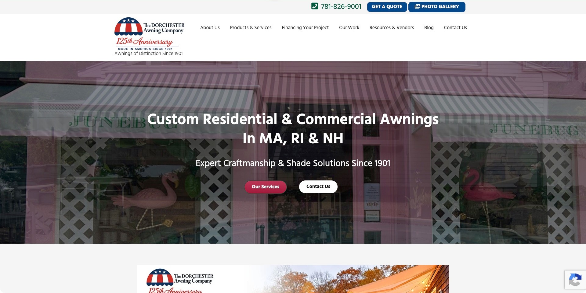
Dorchester Awning uses a spacious white header and a recognizable red, white, and blue mark above large installed-awning imagery. Its headline names both homes and businesses and explicitly identifies Massachusetts, Rhode Island, and New Hampshire. Service and contact buttons sit together beneath the supporting introduction. Products, project financing, completed work, and resources have distinct navigation destinations. The anniversary mark provides company-history context but remains a maintained business claim. The practical lesson is the combination of local eligibility, recognizable installed scale, and research routes that do not assume every visitor is ready to choose a product immediately.
What you can learn
Place the actual service region beside the offering, then provide clear paths into project examples and product information. Explain financing and appointment arrangements in their correct context rather than letting a company-history badge imply commercial or technical guarantees.
Pros
The named states make geographic relevance clear before the visitor reaches a contact form.
Our Work and Resources provide useful research paths beyond the two main hero actions.
Cons & considerations
A large history mark and multi-item menu consume significant vertical space before the service introduction.
Text over striped fabric needs tested contrast and thoughtful phone-sized image crops.
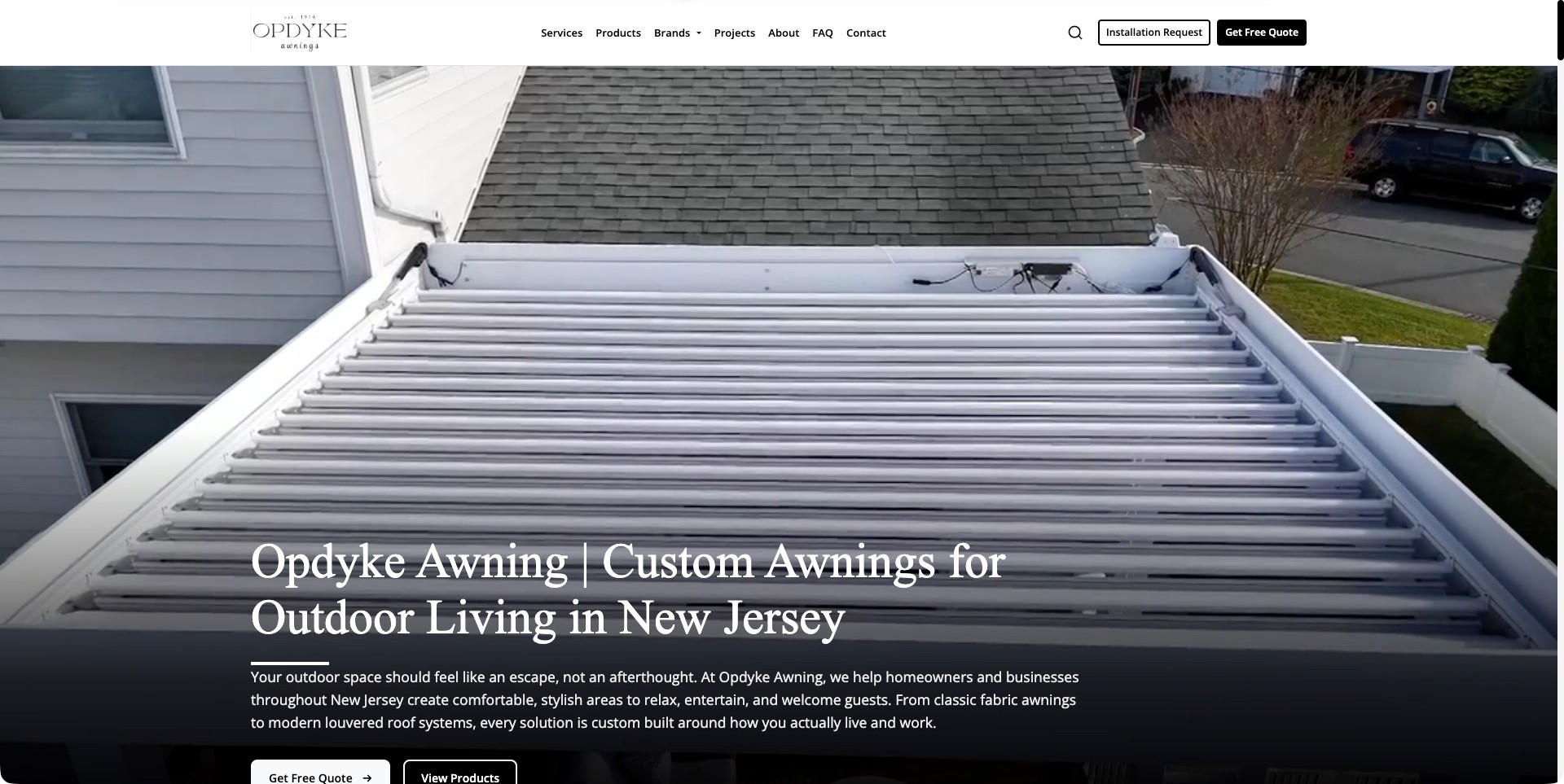
Opdyke Awning places a restrained monochrome header above a large moving product view. The captured frame looks across a louvered roof in its property setting, while a dark gradient supports the New Jersey introduction near the bottom. Services, Products, Brands, Projects, and FAQ are distinct navigation destinations. Installation Request and Get Free Quote appear as separate controls, a useful signal that an existing project stage may differ from a new sales inquiry. The broad outdoor-living message does not establish the engineering, product suitability, or performance of the pictured installation; its value here is the information hierarchy and contextual presentation.
What you can learn
Make a product range and its inquiry stages recognizable without asking the visitor to interpret internal processes. Explain what an installation request means compared with a new quote, and give moving product imagery a readable still alternative.
Pros
The short white header keeps important navigation separate from the busy product imagery.
Project and FAQ destinations support visitors who need context before making contact.
Cons & considerations
Two similarly prominent request controls need destination copy that explains their different outcomes.
A large moving hero needs pause, reduced-motion handling, and meaningful text outside the imagery.
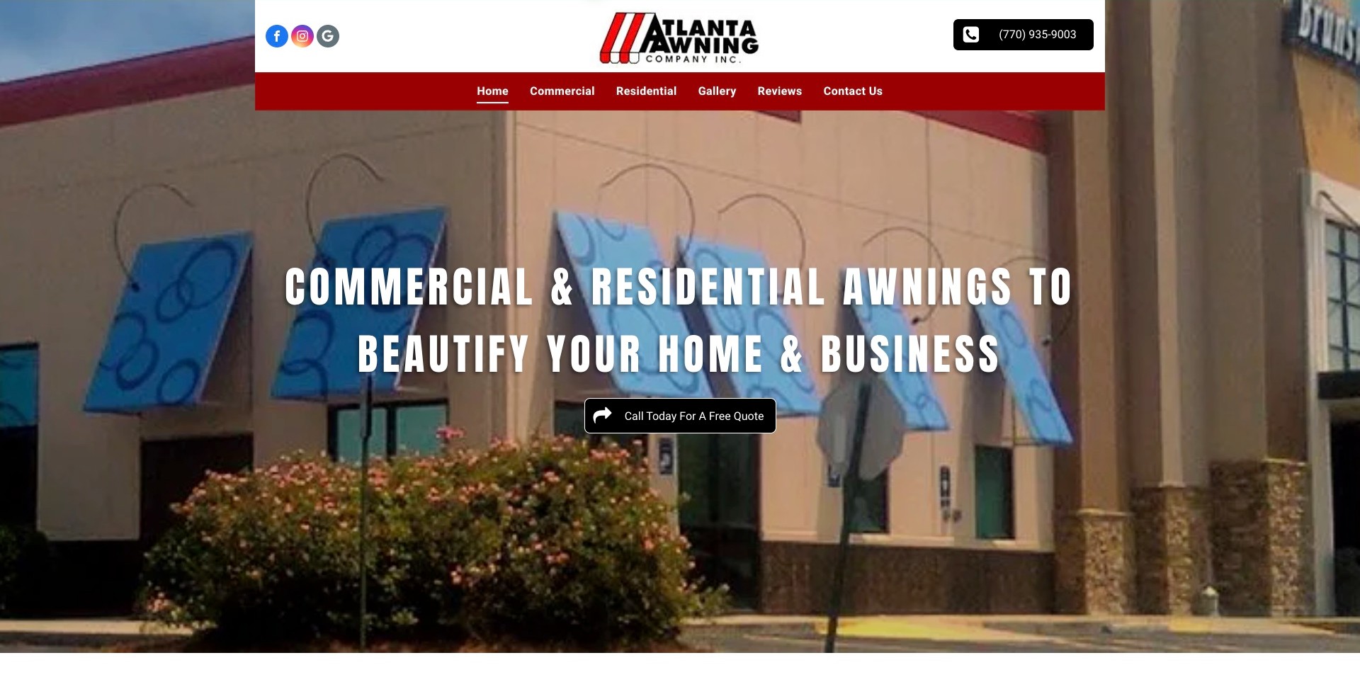
Atlanta Awning uses its red-and-white identity consistently across a contained header and a broad commercial-building photograph. The main navigation separates Commercial and Residential from Gallery, Reviews, and Contact Us. A large condensed headline explains the two audience groups, with a single phone-led quote action below it. The photo shows multiple blue window awnings in relation to the facade rather than an isolated fabric detail. Current company information establishes the Georgia service context. The main lesson is straightforwardness: the website gives a recognizable offering and familiar next destinations without making the visitor work through an elaborate shade-product selector.
What you can learn
Lead with the actual customer groups and show enough building context for the product to make sense. Keep imagery, audience routes, and the inquiry method consistent so visitors can move from an example to a relevant conversation.
Pros
The two audience destinations are visible without opening a complex dropdown.
The phone-led quote action makes the immediate contact method clear.
Cons & considerations
The very large all-capital headline could be shortened for more comfortable narrow-screen reading.
A service-area statement in the first screen would make geographic eligibility more explicit.
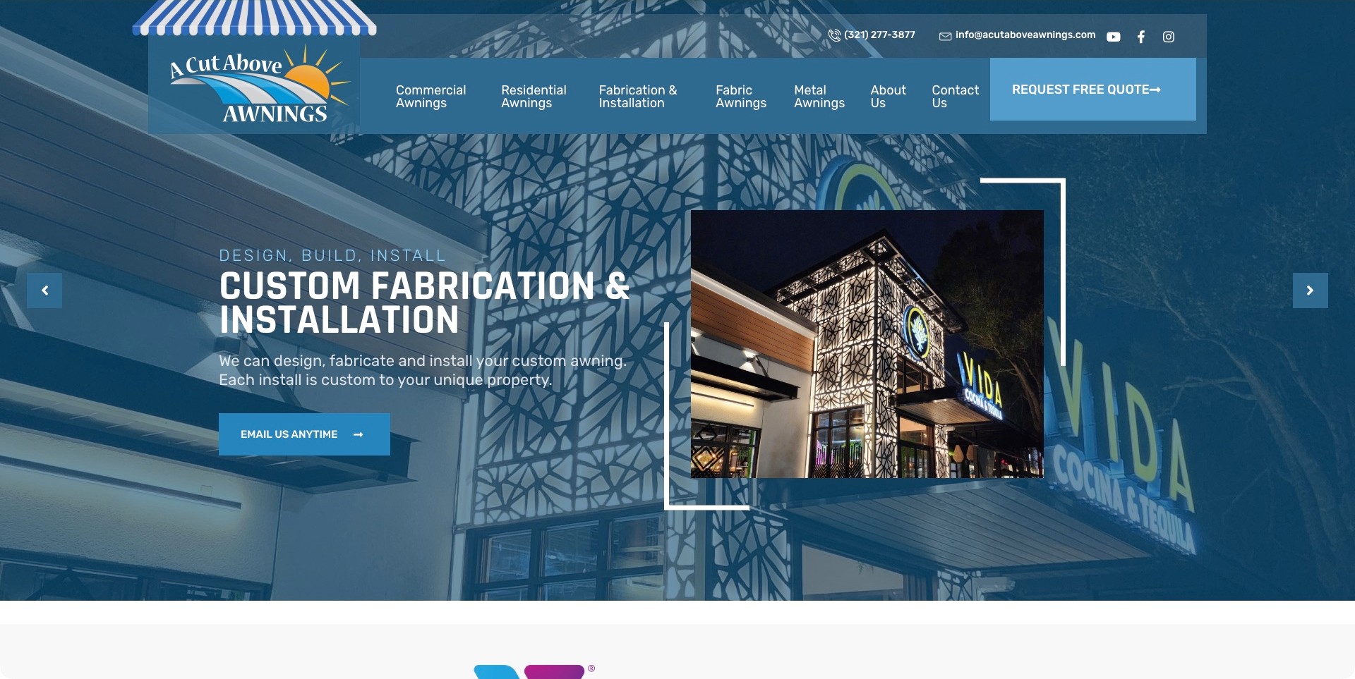
A Cut Above uses a blue overlay across a large commercial-building image and repeats a closer view in a framed inset. The captured carousel panel names custom fabrication and installation, with a short supporting explanation and email action. The header separates commercial and residential awnings from fabrication, fabric, and metal categories, while telephone and email are visible above the menu. This is useful for showing how a business can foreground its own role in a project rather than looking like an unexplained reseller catalog. The photograph remains visual context; it cannot prove design responsibility or technical performance by itself.
What you can learn
Explain the work the company actually undertakes and connect it to a project context. Keep category labels distinct enough that someone can understand whether a link describes an audience, a material, or an installation service.
Pros
Fabrication and installation are named explicitly in both the introduction and navigation.
A close project view supplies detail without losing the larger architectural setting.
Cons & considerations
Several overlapping audience and material categories can require clearer introductory explanations.
A busy background, inset photograph, frame, and carousel controls compete for attention on smaller screens.
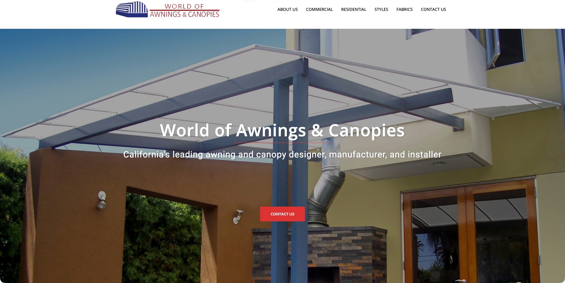
World of Awnings & Canopies places a clean white logo-and-menu header above a broad photograph of a canopy adjoining a residence. The composition leaves the building relationship visible, while a centered company title and short role statement explain design, manufacture, and installation. Commercial, Residential, Styles, and Fabrics are distinct routes rather than one undifferentiated gallery. A red contact button provides the next conversation step without a first-screen form. The headline’s comparative language is the company’s own claim, not an editorial performance ranking. The reference is the restrained structure around an informative installed-context image.
What you can learn
Let the photograph establish scale and architectural context, then let the navigation explain different ways to investigate the offering. Separate material inspiration from suitability decisions that require the company’s actual professional consultation process.
Pros
The image shows how the canopy relates to a facade rather than presenting a detached product rendering.
Styles and fabrics give research-oriented visitors alternatives to an immediate contact request.
Cons & considerations
A single broad California statement may need more precise service-area information near the inquiry route.
White text over a bright canopy requires measured contrast and careful responsive cropping.
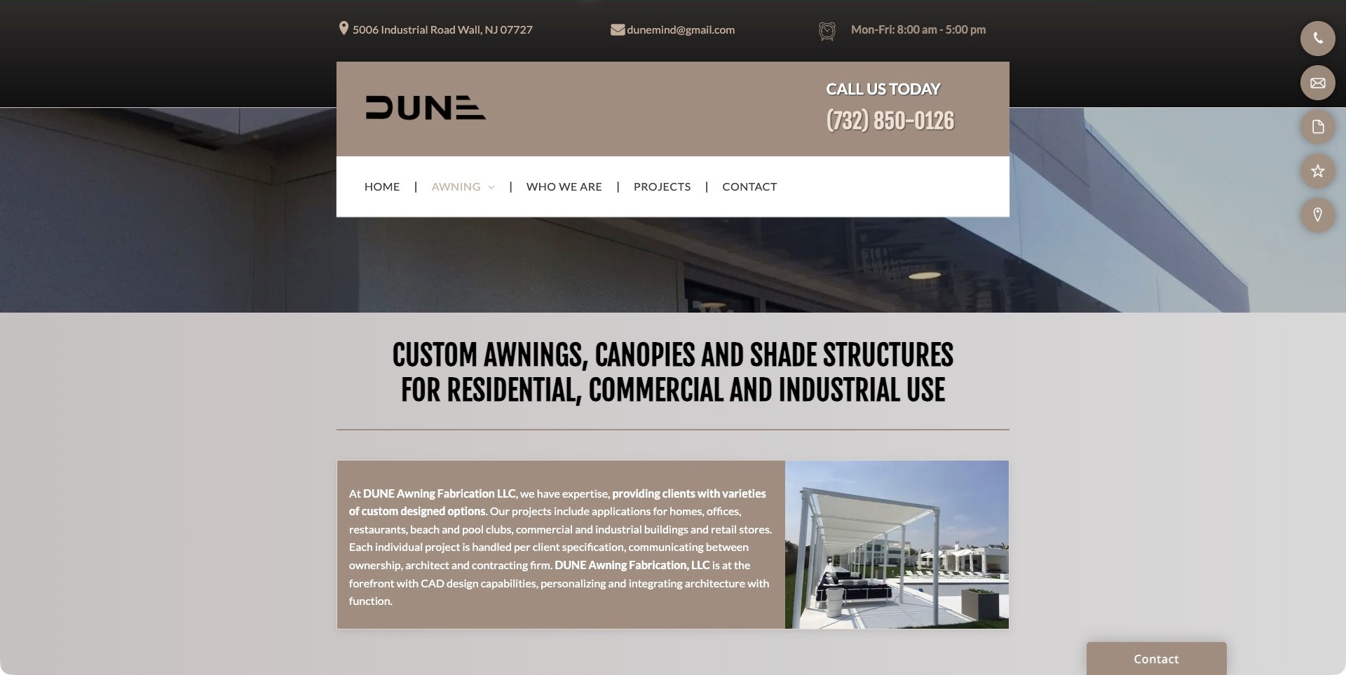
DUNE’s awning page uses warm gray panels, a prominent company mark, and a direct telephone number inside a compact centered header. Address, email, and office hours appear above it. The page then names residential, commercial, and industrial shade work before a split paragraph-and-photo introduction. The copy discusses communication between owners, architects, and contractors, making a custom-project workflow more tangible than a bare product list. A small floating contact rail remains visible along the edge. The design is useful for its practical project framing, not as verification of engineering, weather suitability, or a particular installation result.
What you can learn
Explain the parties involved in a custom project and the business’s actual role before presenting an extensive product range. Keep contact details useful while ensuring the main page, not a floating icon rail, carries the essential information.
Pros
Office details and hours make the business easier to locate and contact.
The introductory photograph and coordination copy give the custom work a concrete setting.
Cons & considerations
Small light text on a medium-tone panel needs contrast and readability checks.
Several floating icons need meaningful labels and should not crowd narrow-screen content.
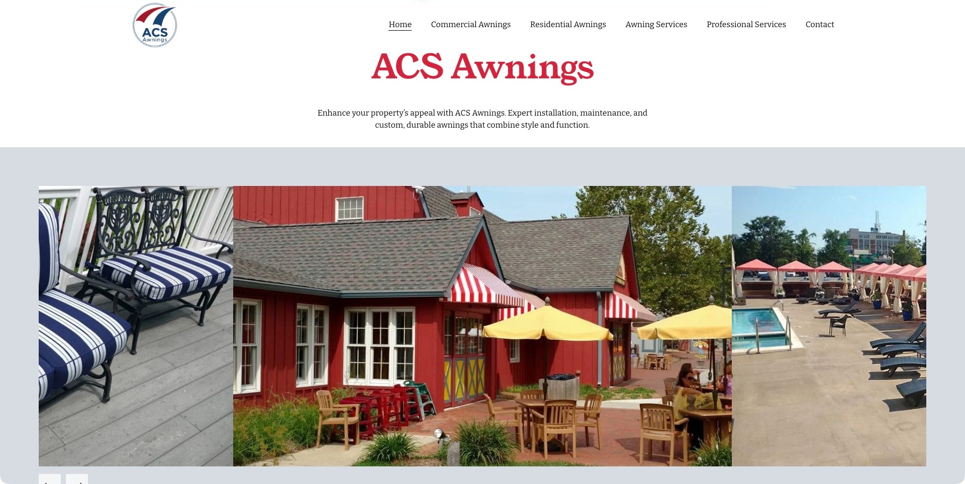
ACS Awnings uses a spacious white header and a large red company title before a short centered description. Commercial Awnings, Residential Awnings, Awning Services, and Professional Services are separate menu items. The image sequence below combines fabric seating, a striped storefront awning, and a poolside shade setting, suggesting the breadth of the visual portfolio without overlaying sales copy on the photographs. Current first-party content explicitly describes installation and maintenance. The useful design pattern is the separation between a readable introduction and illustrative work, although the varied images need captions to establish each project’s actual scope.
What you can learn
Give the visitor an ordinary text explanation before asking them to interpret a broad gallery. If the company handles several related fabric or shade tasks, use captions and clear service boundaries so attractive images do not imply an unverified installation role.
Pros
The company introduction stays readable on a plain background independently of image loading.
Residential and commercial routes give the gallery’s variety a basic audience structure.
Cons & considerations
A company-name heading contributes less scope information than a short descriptive service title would.
Different work images need context rather than relying on appearance to explain the delivered service.
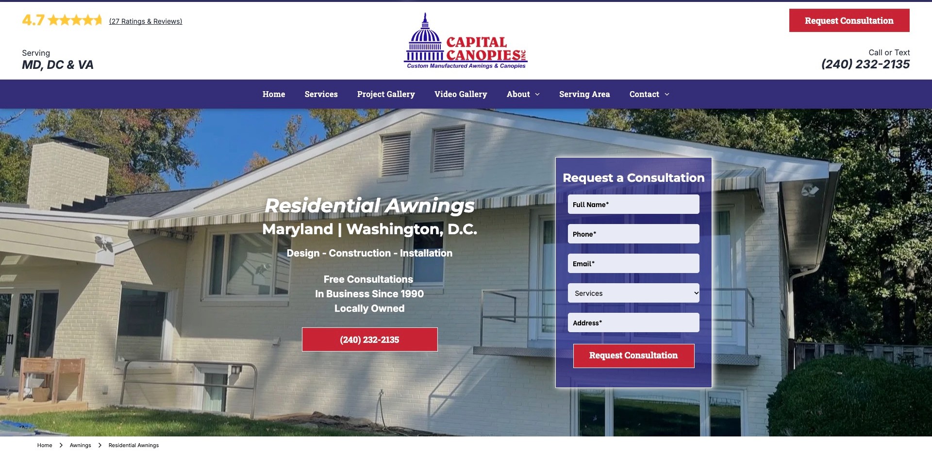
Capital Canopies gives its residential-awning page a prominent Maryland and Washington, D.C. introduction over a complete house photograph. A purple consultation panel sits to the right, while a red phone action offers another way to contact the business. The spacious header includes a service-region statement, review destination, company mark, and call-or-text wording. Project and video galleries are separately named in the navigation. The useful reference is the specificity of the page: the visitor can identify both the property context and the intended contact outcome. Ratings and history statements remain company-presented information rather than an independently measured installer ranking.
What you can learn
Make the local service destination specific enough to answer who, where, and what happens next. Keep the form visually distinct from the photograph, but preserve a way to research examples or contact a person without completing every field.
Pros
The service and region are named together rather than left to the company address.
Call-or-text wording explains an ordinary alternative to the consultation form.
Cons & considerations
A substantial first-screen form may ask for an address before a visitor has read the full scope.
Regional wording should remain consistent between the header, service page, and coverage destination.
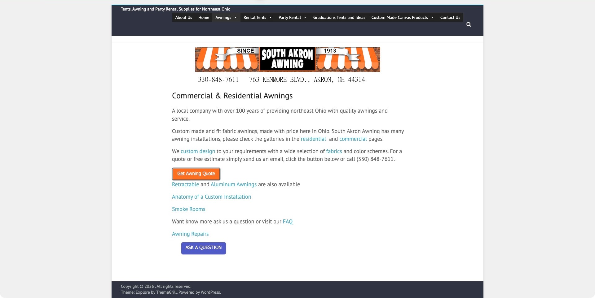
South Akron Awning uses a centered, narrow page with a recognizable striped-awning banner and a readable commercial-and-residential heading. Short paragraphs identify northeast Ohio and connect custom fabric work to separate residential, commercial, design, and fabric destinations. Quote and question buttons are distinct, and repair information is not hidden inside a new-installation pitch. The broader site also handles tents and party rentals, so the dedicated awning page performs an important organizing role. Its visual treatment is modest, but it demonstrates how concrete explanatory copy can make an installer’s offering understandable without requiring an elaborate gallery-led introduction.
What you can learn
Give a specialist service its own coherent page even when the company has unrelated product lines. Link ordinary explanations to examples and materials, and let someone ask a question before treating them as ready to request a quote.
Pros
The narrow text column and short paragraphs keep the service explanation easy to follow.
Repair, fabric, gallery, quotation, and question routes are explicitly named in the body.
Cons & considerations
Important contact details embedded in banner artwork need equivalent accessible text and working links.
A crowded cross-business menu may need clearer grouping on phones and by keyboard.
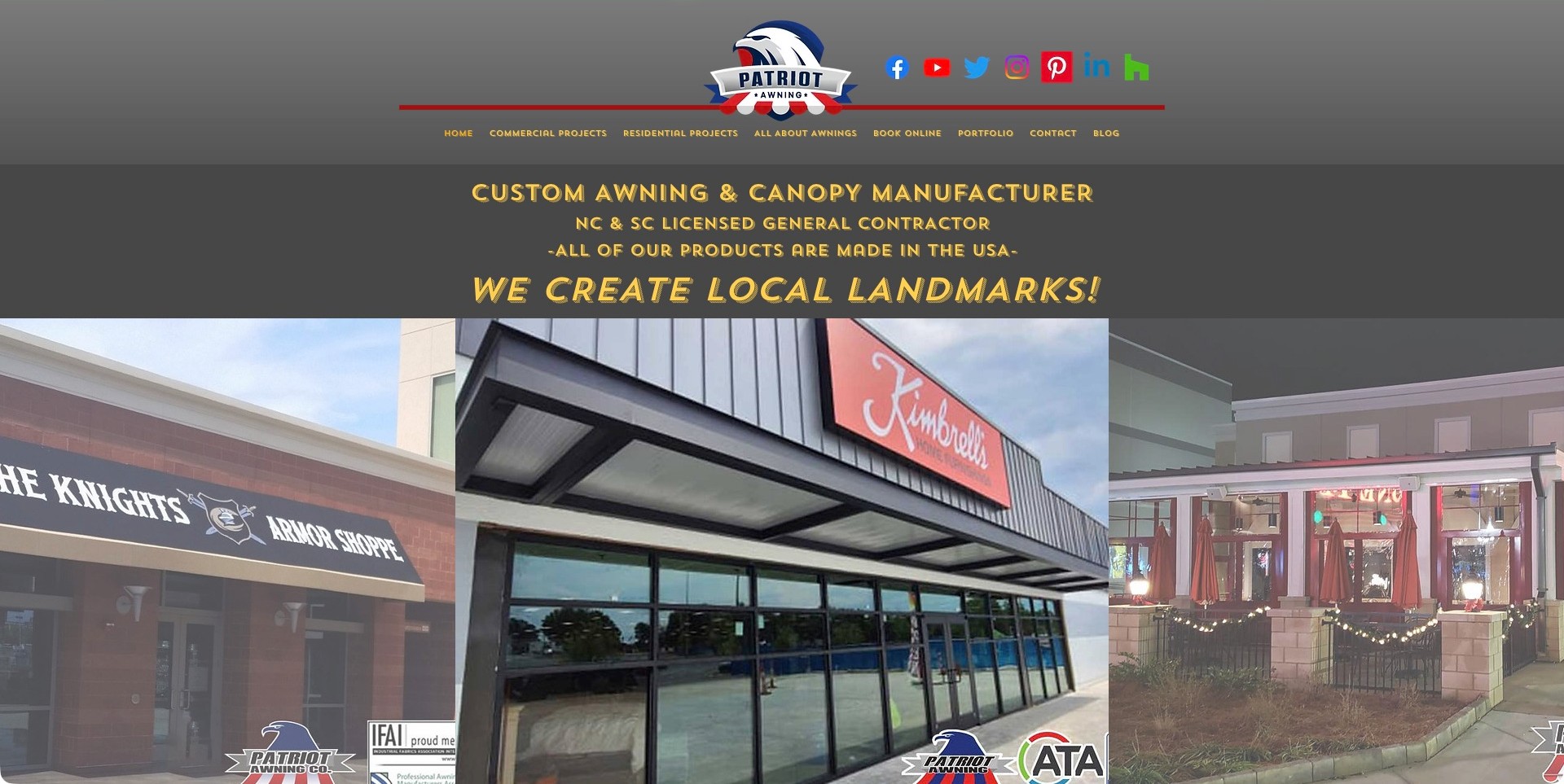
Patriot Awning places a prominent eagle mark and a row of social icons above compact navigation. A dark introductory panel uses gold lettering to name custom awning and canopy work, followed by large storefront images showing different installed forms. Commercial and Residential Projects are separate destinations alongside a portfolio and an awning-information route. The presentation is useful for studying product variety in architectural context rather than a grid of detached fabric samples. Licensing, manufacturing origin, and association marks are company claims requiring their proper evidence; photographs of familiar storefronts do not independently establish the precise scope of a contract.
What you can learn
Use project context to explain the range, but attach captions describing what the business actually delivered. Give different audience groups clear routes and avoid letting dramatic slogans or recognizable client signs do the explanatory work alone.
Pros
Different storefront settings demonstrate the relationship between an awning and the building facade.
Residential and commercial project destinations make the audience split explicit.
Cons & considerations
Small gold navigation on a gray background needs careful readability and focus testing.
Many social icons compete with practical contact and service information in the header.
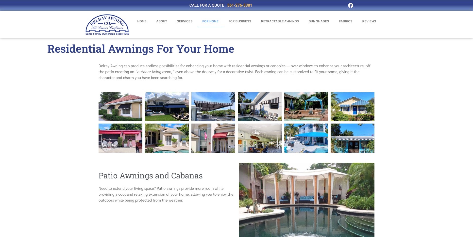
Delray Awning’s residential service page uses an ordinary blue heading and a short introduction above twelve installed-project thumbnails. The grid shows awnings in relation to windows, entrances, patios, and the surrounding building, rather than offering isolated fabric swatches alone. A patio-and-cabana section follows with a larger contextual image beside explanatory copy. The shared header retains separate home, business, retractable-awning, shade, fabric, and review destinations. This is a useful service-page reference because a visitor can compare several settings before making contact. The images explain variety; they do not establish engineering, weather performance, or suitability for another property.
What you can learn
A dedicated audience page can do more explanatory work than a rotating homepage introduction. Give the gallery a clear subject and follow it with substantive category information, while keeping product suitability and site-specific requirements inside the company’s professional consultation process.
Pros
The compact grid lets visitors compare several installed contexts without advancing a carousel.
The following patio section connects visual inspiration to a more specific service explanation.
Cons & considerations
Thumbnails need useful descriptions and a keyboard-accessible enlarged viewing experience.
Small gray introductory text needs contrast and phone-screen readability checks.
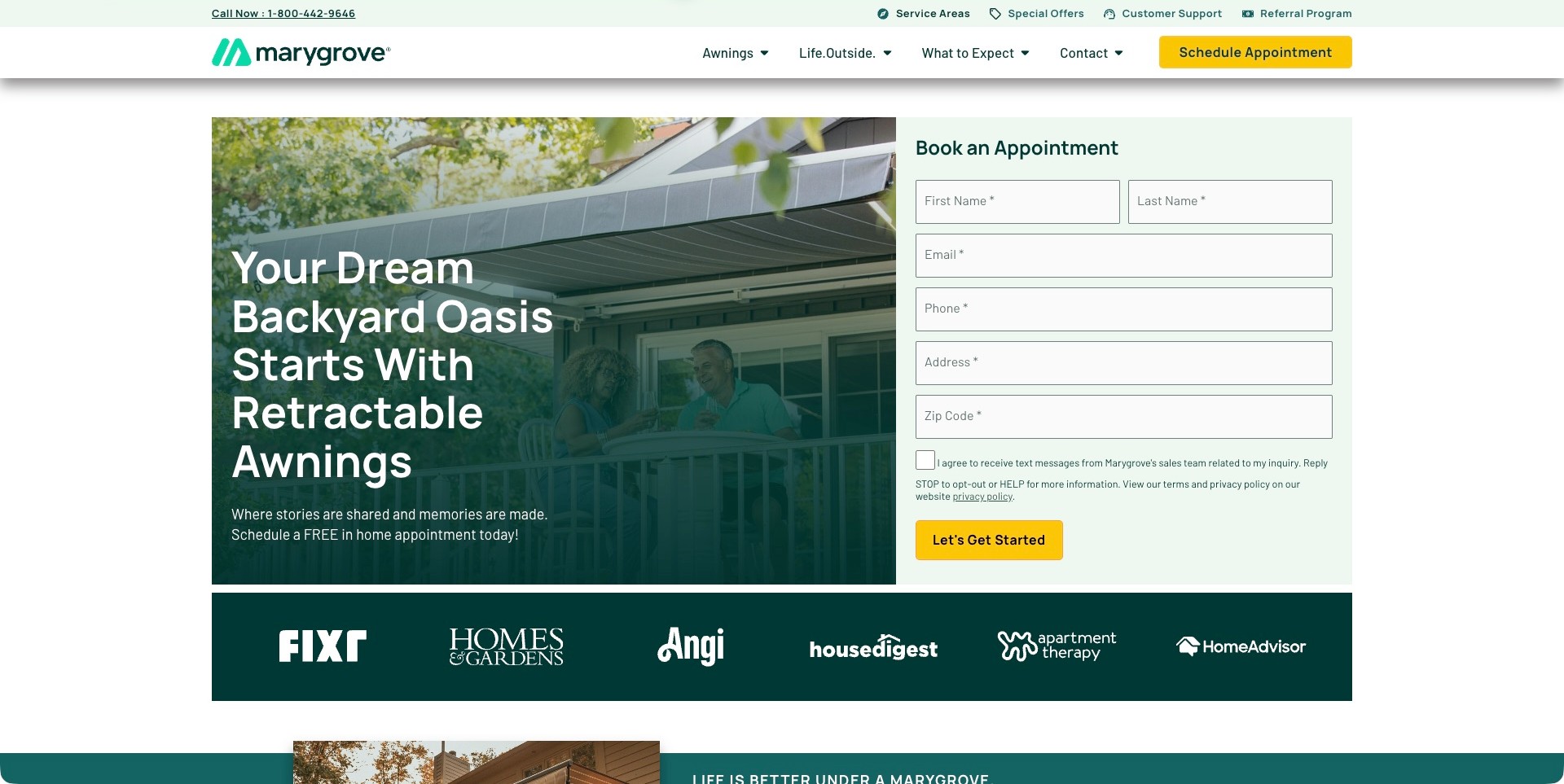
Marygrove pairs a residential patio image with a pale green appointment form in a contained two-column introduction. The headline explicitly names retractable awnings, while the header separates product browsing, What to Expect, service areas, and customer support. Yellow appointment actions are consistent across the navigation and form. The visible form also includes a separate text-message consent control rather than hiding that choice in its main button. This is a useful larger-brand reference for connecting product context with a defined inquiry route. The photograph and media-logo strip do not establish suitability, installation quality, or the outcome of an appointment.
What you can learn
Name the product category and explain the actual appointment stage before asking for detailed contact information. Keep ongoing support and service-area questions accessible, and make any optional messaging choice distinguishable from the request itself.
Pros
What to Expect and Customer Support give prospective and existing customers different information routes.
The plain form background keeps labels separate from the photograph and headline.
Cons & considerations
Several required contact and address fields create substantial commitment in the first screen.
Media logos need accurate sourcing and must not imply a guarantee or universal endorsement.
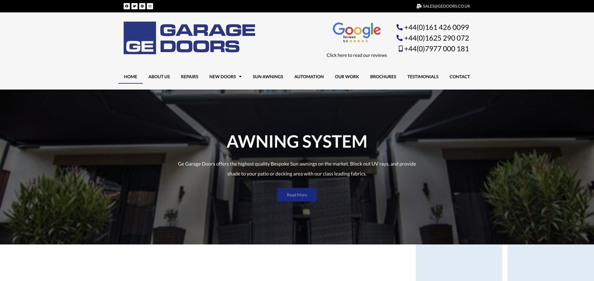
GE Garage Doors makes Sun Awnings an explicit item in its main navigation, alongside doors, repairs, automation, completed work, and brochures. Its retained genuine capture happens to show the awning-system carousel frame: a patio-scale installation beneath a dark overlay with a short description and Read More action. A spacious white header keeps the company mark, review destination, and several telephone contacts separate from the image. Current first-party service wording confirms awning installation and repair. The useful industry lesson is how a broader installer exposes this product family without pretending the company is exclusively an awning specialist.
What you can learn
Give a complementary installation service its own stable navigation destination and supporting information. A carousel can illustrate an installed context, but the relevant category should remain findable when a different slide appears or the animation is unavailable.
Pros
The awning category is named directly rather than hidden inside a broad products label.
Work examples and brochures offer research routes beyond an immediate sales inquiry.
Cons & considerations
The carousel’s small generic action could explain its destination more clearly.
Multiple telephone numbers need location or purpose labels so visitors know which contact applies.
Kegan is a freelance web designer and developer with 15+ years of experience helping businesses turn complicated website requirements into clear, maintainable digital experiences. He works directly with clients from planning and design through development, launch, and ongoing support.
For awning installer website design, his development approach focuses on product and installation distinctions, genuine residential and commercial project galleries, service-area information, material and shading choices, and practical measurement or estimate enquiries. The scope can be a targeted improvement or a complete custom build, with responsive layouts, thoughtful content structure, and integrations chosen around the people using and maintaining the site.
Show 3 other awning installer website designersHide other awning installer website designers
Plan an awning installer website around the move from a reference image to a real project
Identify the property contexts the company genuinely serves
Begin with the business’s actual work rather than a catalog of every shade product on the market. Ask which kinds of inquiries the team can handle and which distinctions affect the first conversation. A homeowner considering a patio, a shop owner thinking about a storefront, and an architect discussing a commercial project may need different examples and documents. Map those needs before deciding the navigation. Use the visitor’s terms and explain any specialist labels. A website can help someone find relevant work without suggesting that an attractive example is automatically suitable for their own building.
Choose a few clear paths that reflect genuine business responsibilities. If residential and commercial projects use different teams or inquiry information, make the distinction useful rather than merely decorative. If the company mainly repairs or recovers existing awnings, do not bury that service beneath new-installation imagery. Explain the normal region and what to do when a property falls near its boundary. Avoid inventing a local branch or a specialist project history to fill a landing page. The first-screen objective is an accurate introduction that lets a visitor recognize whether the company is relevant enough to contact.
Build the project library before designing the gallery
Create a record for each approved project containing publication permission, property context, work actually delivered, product or service category, and any restrictions on naming the client or location. Choose images that explain the installation rather than repeating similar close-ups. A wide view can establish the relationship to the building, while a closer image can show an approved detail or material choice. Keep the caption specific to what is known. A website photograph does not establish structural suitability, wind performance, legal permission, weather protection, or the quality of an installation.
Plan a small number of useful filters only when the project records support them consistently. Residential, commercial, and recognizable product categories may help; a sprawling tag system often adds work without improving the visitor’s decision. Keep a readable project description beside the gallery so the information remains available when an image fails or a person does not use visual browsing. Obtain permission for client logos, storefront names, and testimonials. Treat a project as evidence of the company’s described scope, not as a universal recommendation for anyone who likes the photograph.
Explain the offered categories without becoming a technical selector
Have the appropriate business expert approve the product and service map. Fixed and retractable awnings, canopies, fabric recovery, repairs, shade structures, and other offerings may have different scopes and suppliers. Describe the actual choices the company can discuss and link to substantive information when it helps the visitor. Do not treat every broad shade category as interchangeable or assume that a supplier’s entire catalog is installed by this business. Keep manufacturer references correctly attributed, and distinguish a manufacturer relationship from an independent performance or regulatory endorsement.
A comparison can explain questions for a consultation without recommending a technical solution for an unseen property. Use language about the visitor’s intended use, visual preference, and existing information rather than prescribing fixings, structural details, electrical work, or weather ratings. Direct those matters to appropriately qualified people and official product documentation where relevant. If the company publishes a fabric range or color selector, make clear that images on a screen are references rather than a guaranteed match. A well-organized category page helps a customer prepare a sensible conversation; it does not replace professional site review.
Show how a consultation develops into an agreed project
Describe the actual high-level stages the business supports: initial inquiry, discussion of needs, any appropriate professional visit, proposal, agreed scope, and the company’s normal project handover. Avoid presenting a decorative four-step diagram as a guarantee that every job follows the same schedule. State where details are confirmed by a person and what a visitor receives after submitting a request. A consultation request, a quotation, and a confirmed installation date are different outcomes. The website should make that distinction plain rather than implying that clicking a button settles the project.
Explain what information is useful at the first stage and what can wait. A property location, a description of intended use, and an optional existing photograph may be enough to begin. Do not ask a visitor to climb, remove a component, inspect a mounting point, or take measurements in a risky place for a form. If technical dimensions are needed later, let the company explain its professional process. Provide an ordinary phone alternative and a way to discuss access or communication needs. Clear process copy can make a specialized project feel approachable without transferring responsibility for technical judgments to the customer.
Make local identity and aftercare understandable
State where the company operates and distinguish showroom, workshop, office, installation region, and past project locations. If a visitor can see materials in person, explain the actual arrangement without implying that a showroom is always open or stocked with every option. Keep opening hours and appointments current. For a business with several branches, identify the relevant contact and let people correct a location selection. A large regional map should support readable place names rather than force visitors to infer coverage from an ambiguous boundary.
Give repair, recovery, and aftercare information a deliberate place if the business actually provides it. A returning customer looking for support should not need to submit the same sales form as a new installation prospect. Explain how to ask about the company’s actual warranty or product documentation without rewriting technical instructions into an unreviewed marketing summary. Keep claims tied to the correct product, installer, and terms, and identify who approves them. An aftercare route improves the website’s usefulness, but its presence does not prove the future service response or durability of a product.
Design a short inquiry with a truthful outcome
Start the form with the information the office needs to route a conversation, not every detail it might eventually require. Name, contact preference, property location, general project type, and a short message are often a practical beginning. Make uncertainty an acceptable answer: a customer may like a reference image without knowing the product category. Keep optional uploads bounded and explain what information should not be shared. Avoid requesting private documents or a final technical specification through an unrestricted general contact form unless the organization has an appropriate secure process.
Plan the endpoint, spam protection, storage or delivery, and internal assignment before the visual design is signed off. A confirmation must reflect an accepted request and describe the actual next step, not imply a final quote or installation booking. Label errors in words and preserve entered information appropriately. Test a clearly marked internal request through the complete route and inspect only that authorized test. Offer contact alternatives when scripts, uploads, or form controls fail. A useful consultation journey can be straightforward; it does not need a complex visual configurator to feel professional.
Keep the visual presentation useful on ordinary devices
Choose image sizes and crops for the actual page layouts rather than stretching every project to a full-screen presentation. A visitor needs to see the product in relation to a building, not necessarily download the largest original photograph. Use real text for important names and explanations, keep buttons distinct from image captions, and review contrast when text crosses a photograph. Test keyboard navigation, gallery controls, focus, form labels, and narrow-screen layouts. A beautiful rendered example does not establish accessibility or performance conformance, so keep those claims separate from editorial visual judgment.
Assign an owner for adding projects, checking permissions, updating product availability, maintaining contact details, and reviewing any time-sensitive offers. Keep original assets and publication rights records outside the compressed website versions. Document administrator access, backups, updates, and the correction process. Review recurring customer questions with the office and improve missing explanations. The aim is a maintained reference and consultation service, not a static gallery that gradually accumulates outdated supplier links or promises. Measure actual inquiry behavior only through the organization’s approved policy and do not assume a redesign guarantees new sales.
Use configurators only when they solve a real conversation problem
A color preview or project selector can be helpful when the underlying product information is current and its limitations are explicit. Define whether the tool is inspiration, a way to collect preferences, or part of an actual quotation process. Do not allow an attractive preview to imply structural suitability, permission, exact appearance, or a final price. Give the visitor a normal consultation route if they cannot use the tool or do not know the right option. A small set of approved examples and clear descriptions may provide more useful guidance than an ambitious configurator that nobody can maintain.
For a commercial project, also provide a clear way to discuss approved brand artwork without turning the initial form into a public file-sharing tool. Explain who reviews a supplied logo, which publication permissions are needed, and when a final design is agreed. A visualization should remain an illustrative step, clearly separate from the approved manufacturing information and the company’s actual installation process.
The editing job behind the design
Choose tools for project publishing and consultation handover
Structure projects with approved images, categories, captions, and permissions so the gallery can grow without losing context. Choose a publishing system around the actual editors and product-review responsibilities.
Keep manufacturer information, inquiry handling, optional uploads, and customer records separate from the visual gallery. Document server-verified spam protection, appropriate privacy handling, and who receives each request.
A configurator is an additional maintained product, not a default requirement for every installer. Agree its limits, data ownership, accessible alternative, and update process before adding it to a website brief.
Our WordPress website examples offer a separate look at publishing approaches. A visible platform label is evidence for that named page, not a guarantee that the same system will suit your requirements.
Before the public launch
Awning installer website launch checklist
Confirm the business identity, genuine service region, and working contact details.
Distinguish residential, commercial, repair, and other actually offered work.
Have qualified people approve product descriptions and technical boundaries.
Verify project permissions and captions describing the actual delivered scope.
Keep manufacturer references and credentials correctly attributed.
Avoid inferring structural, regulatory, or weather-performance outcomes from photographs.
Explain consultation, quotation, and confirmed installation as distinct stages.
Do not ask visitors to climb, inspect fixings, or take unsafe measurements for a form.
Keep showroom details, appointment arrangements, and aftercare routes current.
State configurator and color-preview limitations when those tools exist.
Test accessible forms, server-side spam protection, delivery, and truthful confirmations.
Check mobile image crops, readable contrast, keyboard controls, and contact alternatives.
Assign owners for products, projects, permissions, updates, backups, and corrections.
These checks are a project checklist, not a performance, legal, security, or accessibility certification. Test real journeys with the people responsible for the website before making claims about the result.
Sources & editorial method
How this collection was selected and reviewed
The collection evaluates public website design and communication: installed-project context, category clarity, regional identity, and consultation journeys. Editors Choice is an editorial design judgment, not an assessment of product suitability, installation quality, engineering, regulatory compliance, or measured sales performance.
Each example links to its actual source page. Screenshots are direct browser captures with their own capture dates; moving imagery, announcements and live designs can change. The notes describe observable design choices and conditional tradeoffs, not measured traffic, conversion results, service quality, or accessibility conformance.
Technology labels use public page metadata, asset evidence, or explicitly cited platform documentation. Platform documentation is not a complete current deployment audit. A component reference may be legacy or unused; it is not a complete backend inventory. Unknown stacks are omitted. These sites are editorial examples, not our client portfolio.
Written, Edited and Curated are separate editorial records, not timestamps advanced by a rebuild. Website designs and imagery belong to their owners. See our editorial standards or suggest a correction.
Questions worth asking
Awning Installer website design questions
Should the homepage be a gallery or a product catalog?
Use the structure that helps the actual visitor task. Installed project context can establish relevance, while a smaller set of clear categories can lead to the offered products and services. Neither replaces a professional consultation.
Do we need an online configurator?
Only when it solves a real requirement and the company can maintain the data and explain the limits. A preview must not imply a final price, exact color, structural suitability, or approval for a property.
What should each project caption include?
The approved property context and actual delivered scope, with appropriate permission and location detail. Do not use an image to infer performance, compliance, or the suitability of the same solution elsewhere.
Should the form require dimensions?
Ask only for information needed to begin the conversation. Leave technical measurements and site-specific questions to the appropriate professional process, and never ask visitors to take unsafe measurements.
How should repair and aftercare be presented?
Give existing customers a clear route when those services are genuinely offered. Keep product and installer responsibilities and applicable terms accurate instead of treating all support as a new-sales inquiry.
Borrow the project context, clearer choice structure, or more helpful consultation explanation. Build around your own genuine work and keep technical suitability and project approval with qualified people.