Best Pediatrician Websites of 2026 (13 Real-World Examples)
A welcoming local practice, clear new-family information and quick access to the tasks existing families repeat.
A pediatric website serves families repeatedly. Someone may be choosing a practice, finding a form, checking office information or returning to an existing account. Those tasks should not all begin with the same promotional message. Good design gives new families enough context to understand the practice while making routine administration easy to find without collecting unnecessary information.
The examples range from independent local practices to large children’s hospitals. Their needs differ. A neighbourhood office can make its people, location and joining process clear with a compact site. A hospital needs careful separation among clinics, visits, research, professional information and giving. Copying a hospital’s menu breadth will not automatically make a small practice more credible.
This collection reviews public website design, not pediatric care, professional suitability or treatment outcomes. A friendly photograph does not establish who is pictured, whether a clinician currently accepts new patients or how a family will experience care. Have the practice’s responsible clinical and operational teams approve service information and contact instructions. Do not reproduce patient stories, photographs or identifiable records without an appropriate publication process.
Before the examples
What makes good pediatrician website design in 2026?
Separate new families from returning tasks
Give prospective families a public explanation of location, clinicians, joining steps and what an initial enquiry means. Existing families need stable links for forms, billing and the patient portal. Make the boundary obvious before any account login. A new family should not have to create an account simply to learn basic office information, while a returning family should not have to repeat the brand introduction to find a form.
Make the real practice understandable
Show current people, roles, office locations and published service scope in text. Use photographs to add context, with accurate captions and permission. Explain relationships among offices and clinicians rather than assuming a shared logo means identical availability. If the practice has a long history, connect that story to today’s organisation and contact process rather than using a founding year as a substitute for practical information.
Treat office instructions as maintained content
Contact, after-hours information, forms and seasonal notices need an explicit owner. Distinguish routine administrative messages from clinically approved urgent-contact instructions. Avoid repeating different versions of the same telephone or portal destination across banners, graphics and footers. Public educational material needs its own clinical review process; it should not be used as decorative filler or as a substitute for an individual care conversation.
The collection · 13 examples
13 pediatrician websites worth studying
Look at the relationship between warmth and practicality. The first selection highlights a regional pediatric practice; larger hospital examples illustrate different audience and content problems rather than a higher level of care. Each screenshot records one public view and does not verify current patient availability or clinical claims.
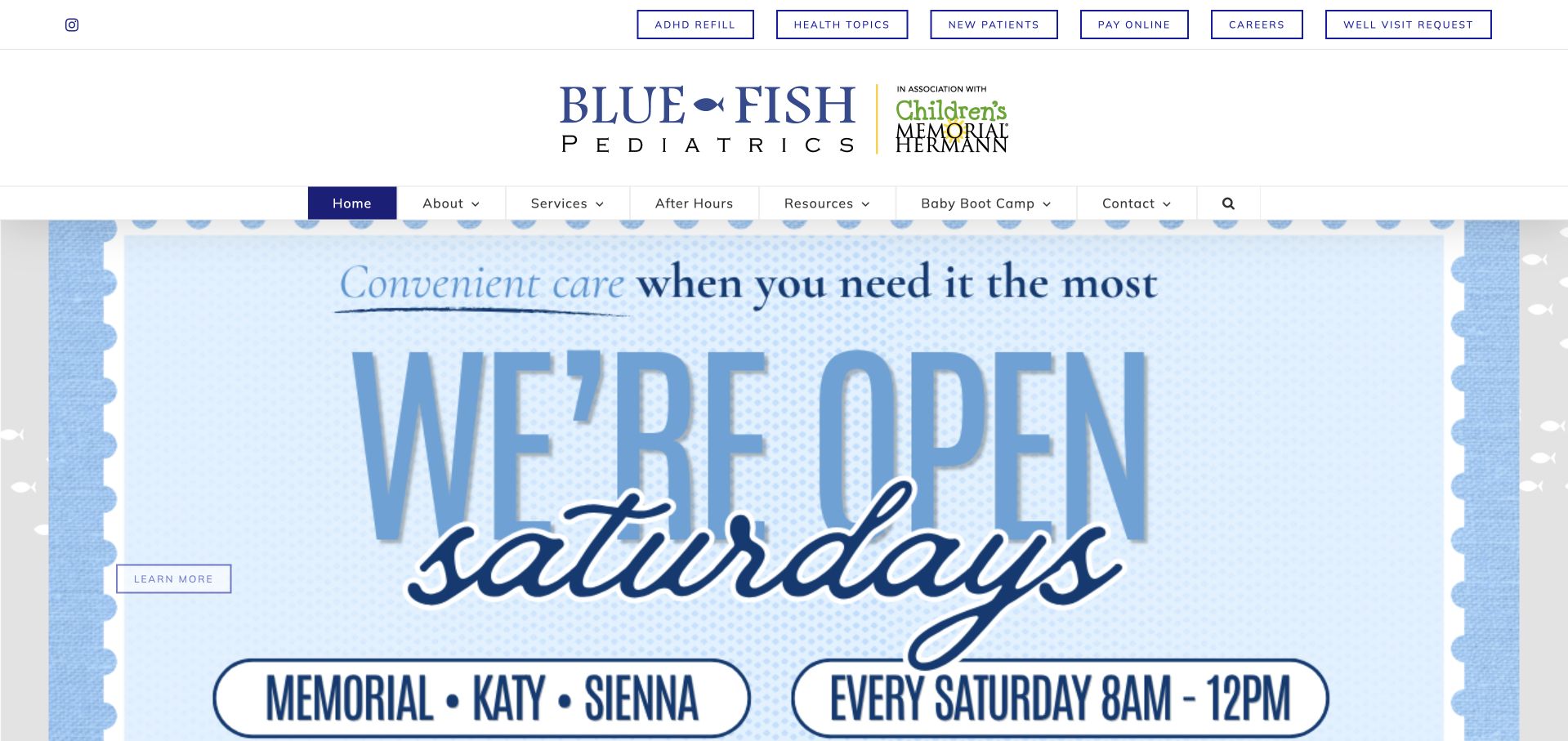
Blue Fish Pediatrics gives recurring family tasks a prominent place above its main navigation. After-hours information, health topics, new-patient details, bill payment and forms are visible before the visitor reaches the full menu. The captured homepage uses a clear Saturday-opening announcement rather than an abstract wellness campaign. Its About page documents the Houston-area practice and its founders, giving the regional positioning a real source. The design is useful because a pediatric website serves existing families repeatedly, not just prospective patients once. The tradeoff is density: utility links, the main menu and a large announcement can compete unless the page consistently distinguishes urgent contact information from routine administrative requests.
What you can learn
Treat existing-family tasks as a first-class navigation problem. Give recurring forms and office information stable destinations, then reserve a distinct, clinically approved presentation for urgent or after-hours instructions rather than mixing everything into a general contact route.
Pros
Common administrative and after-hours tasks are exposed without forcing existing families through a marketing sequence.
The regional practice story and office structure provide a concrete identity beyond the large announcement graphic.
Cons & considerations
Several navigation rows can become crowded on small screens and require careful priority decisions.
An announcement-led hero needs an expiry owner so temporary hours do not remain the apparent permanent service model.
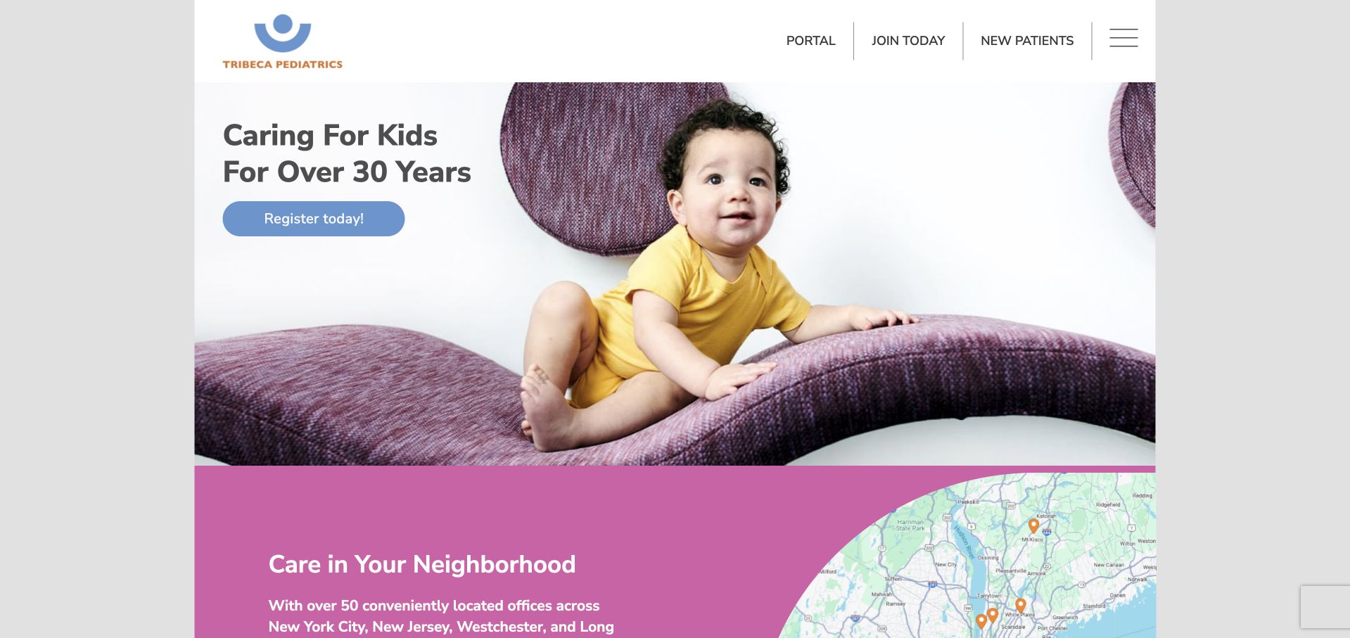
Tribeca Pediatrics combines a compact header with a large child photograph and a concise longevity message. Registration is immediately visible, while the following section introduces neighbourhood care through a map-led treatment. That combination connects a recognisable brand to local access rather than treating the entire practice as one location. The rounded furniture, playful colour and generous whitespace feel intentionally different from a hospital portal. The design should not be copied as a purely decorative style: its practical value comes from the relationship between registration, neighbourhood discovery and existing-patient access. A parent comparing offices still needs details about availability and the process for joining a particular practice.
What you can learn
Use a playful visual identity to make a practice recognisable, then anchor it in real office choices. Distinguish registering interest, becoming a patient and accessing an existing account so a friendly button does not conceal a complicated administrative transition.
Pros
The registration action is prominent without requiring a dense intake form inside the opening view.
A neighbourhood-focused section makes the multi-office structure easier to understand as a local choice.
Cons & considerations
An attractive brand photograph cannot explain which clinicians, hours or services belong to a selected office.
A compact or collapsed menu needs to preserve quick access to existing-patient and after-hours information.
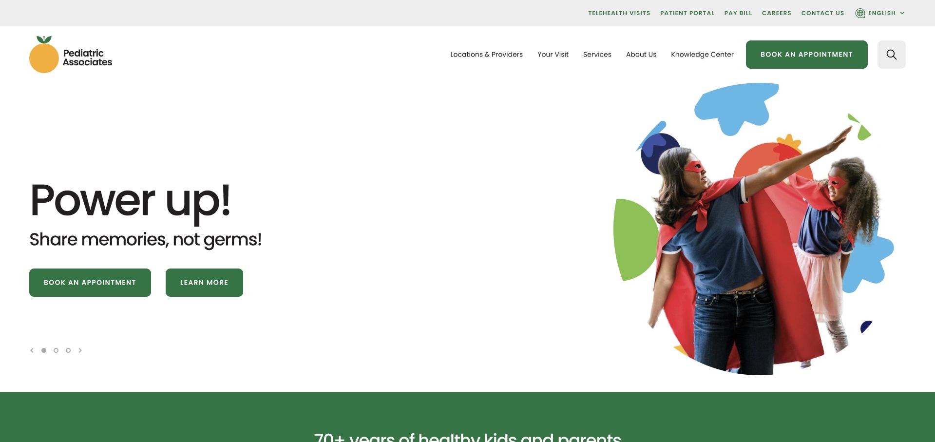
Pediatric Associates uses a bright, playful campaign image with a short action-oriented heading and two clear appointment-related buttons. A slim utility row separates existing-patient tasks from the larger navigation, while the menu exposes locations, physicians and resources. The combination gives the page a family-friendly character without requiring every service to appear in the first view. The campaign image and headline are memorable, but they do not explain how a new family joins or whether a selected office has availability. The most transferable element is the disciplined pairing of characterful imagery and literal actions. It is less useful to reproduce the visual campaign without an equally clear office-selection and new-patient process.
What you can learn
Let illustration or playful photography carry personality while the action labels carry meaning. Maintain a separate route for new families and existing patients, and avoid assuming that an appointment button explains eligibility or office availability by itself.
Pros
The campaign leaves room for straightforward appointment actions rather than surrounding them with competing copy.
Locations and physician discovery remain visible parts of the wider information structure.
Cons & considerations
A short promotional headline offers little practical context for families unfamiliar with the practice.
Existing-patient and new-patient booking routes need clear boundaries once visitors leave the homepage.
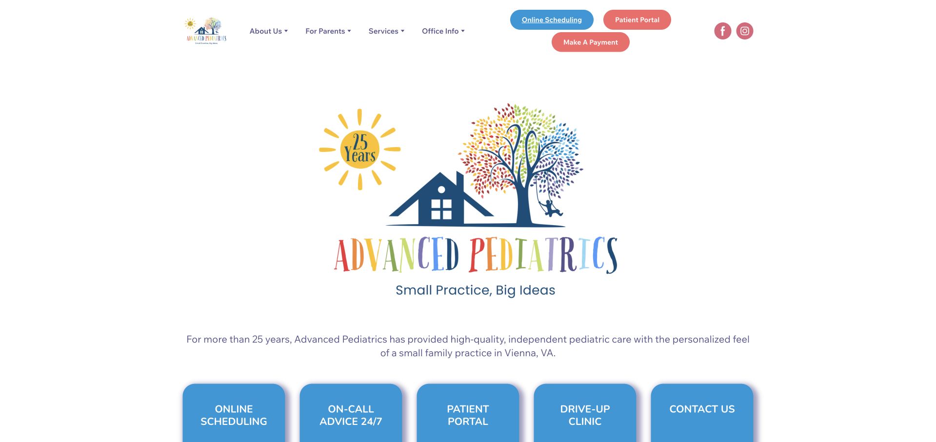
Advanced Pediatrics makes its illustrated house-and-tree identity the centre of the opening. A short small-practice statement and a Vienna, Virginia introduction establish the scale and place more clearly than an anonymous national-style headline would. Below it, large blue cards expose scheduling, on-call information, the patient portal, the drive-up clinic and contact details. Header buttons repeat the most common administrative actions. The opening is deliberately spacious, which makes the identity easy to recognise but also pushes some useful tasks towards the bottom of the first screen. Its strength is the concrete relationship between a named local practice and the recurring tasks families need to complete.
What you can learn
A small pediatric practice does not need a cinematic campaign to be clear. Use a recognisable local identity, then put administrative tasks in literal, consistently labelled cards that remain easy to reach when the logo area collapses on mobile.
Pros
The location and small-practice positioning provide useful context for families evaluating fit.
Large task cards clearly separate portal, scheduling, contact and other recurring administrative destinations.
Cons & considerations
The oversized central identity takes space that could bring practical office details higher in the page.
Repeated header and card actions need consistent destinations so families do not encounter parallel versions of the same task.
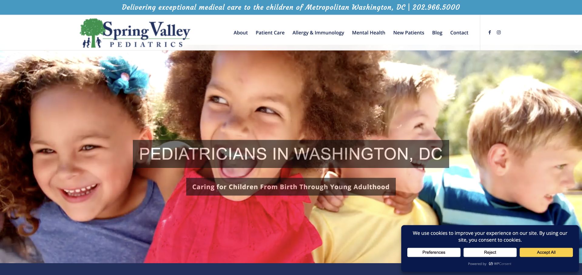
Spring Valley Pediatrics opens with a location-specific pediatric heading over a broad children’s photograph. The contact number appears in a separate top strip, and the main navigation distinguishes patient care, new patients and specialist services. The supporting page develops the practice’s history and explains what a new family should expect. That gives the longevity message more substance than a date alone. The captured first view also shows the limitation of a campaign-heavy approach: the photograph, headline overlays and service announcements need careful coordination to keep the core access information readable. A temporary announcement should remain dismissible and should not become the only route to a newly offered service.
What you can learn
Use practice history to explain continuity, then give new families a plain account of joining and contacting the office. Keep specialty announcements separate from the permanent navigation and avoid letting popups replace a properly maintained service page.
Pros
A visible telephone strip makes a direct contact route available before the visitor explores the full page.
New-patient and patient-care sections reflect distinct information needs rather than one general contact destination.
Cons & considerations
Multiple headline overlays and announcements can reduce the clarity of an otherwise straightforward local introduction.
Historical and service claims require current review rather than relying on longevity as a blanket signal of quality.
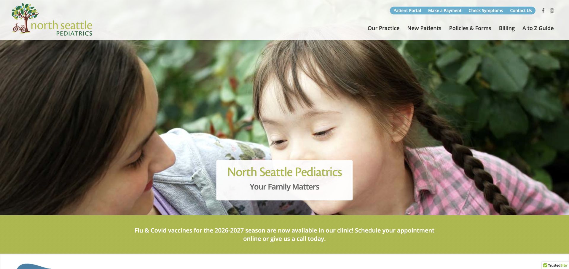
North Seattle Pediatrics pairs a large family-oriented photograph with a small centred practice label. A narrow utility row holds patient and payment tasks, while a full-width notice strip below the image carries timely office information. The main menu separates the practice, new patients, policies and forms, billing and resources. That arrangement recognises how much pediatric administration happens outside appointment booking. The image-led opening feels personal, but the small overlaid label leaves much of the practical explanation to later content. The notice strip is useful only if its content remains current and links to an ordinary page rather than becoming a hard-to-read replacement for maintained office instructions.
What you can learn
Give a neighbourhood practice a stable set of administrative routes and a separate place for time-sensitive notices. Keep dates and ownership with those notices, and ensure the essential office identity and contact details remain understandable without the hero photograph.
Pros
Policies, forms and billing have explicit navigation labels rather than being hidden inside a catch-all resource page.
A distinct notice strip can carry timely information without redesigning the permanent site structure.
Cons & considerations
The opening photograph communicates warmth more clearly than it explains location, availability or how new patients begin.
Small overlay text and a narrow notice band need readable mobile treatments rather than simple scaled-down versions.
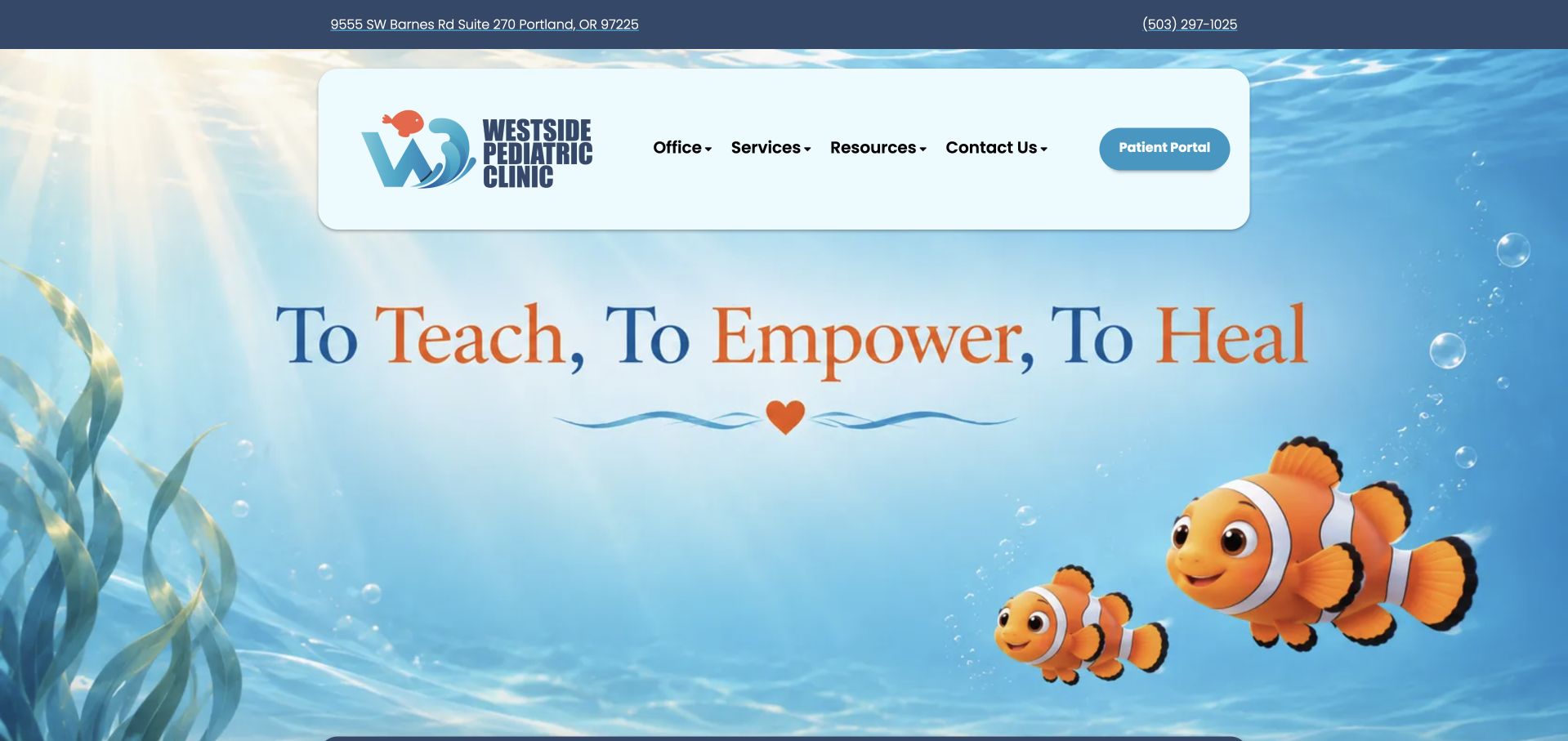
Westside Pediatric Clinic uses an underwater illustration with bright fish and a concise care-oriented statement. A floating white navigation panel keeps office, services, resources, contact and the patient portal visible against the colourful background. The upper address and phone strip grounds the playful scene in a real Portland office. This is a useful example of personality doing one job while navigation does another. The illustration makes the site recognisable, but it should not be expected to explain administrative policies or the process for joining the practice. The current destination differs from the originally requested domain, making clear branding and consistent canonical links especially important for returning families.
What you can learn
A playful illustrated environment can be effective when practical contact information remains literal and stable. Keep the portal visually distinct from public resources, and preserve consistent office naming across redirects, search results and patient communications.
Pros
The floating navigation panel maintains readable task labels against a visually busy illustrated scene.
A separate address and telephone strip connects the imaginative brand treatment to a concrete local office.
Cons & considerations
A large decorative opening delays the practical explanation of new-patient access and office policies.
Illustrated scenes need restrained motion and responsive crops that do not obscure navigation or essential text.
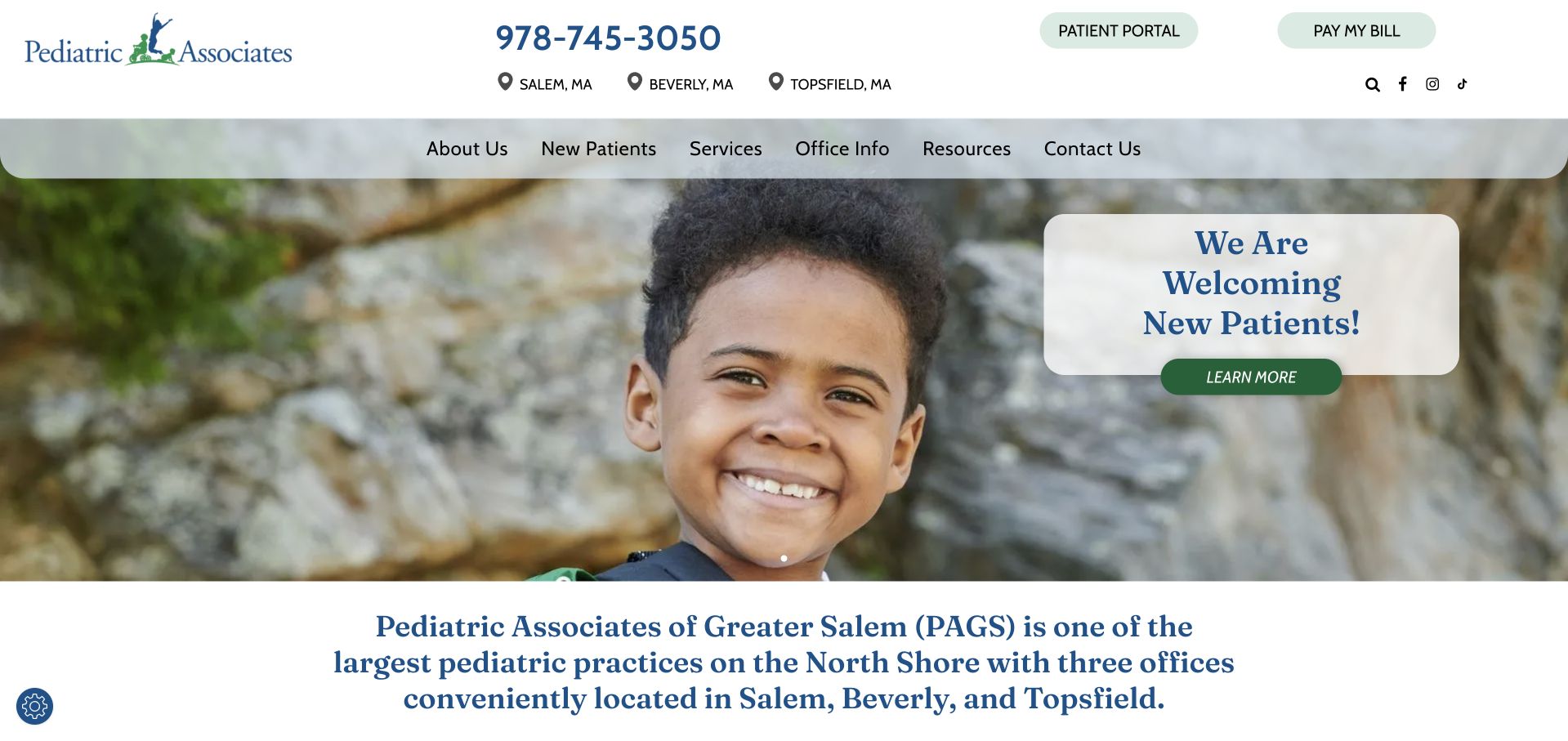
Pediatric Associates of Greater Salem combines a prominent telephone number, three location labels and separate portal and bill-payment buttons in its header. The captured hero places a new-patient invitation over a large children’s photograph, followed by a concise explanation of the North Shore practice. That is an effective sequence for a regional group: the service area is visible before the visitor starts browsing individual offices. The design avoids making every family complete a booking flow simply to learn whether the practice is relevant. Its serif typography and pale green controls feel restrained, though the same restraint makes contrast and text sizing important when the layout is viewed on a narrow screen.
What you can learn
Make regional fit clear before asking for a registration action. Show office choices and existing-family tasks separately, then explain what a new-patient enquiry means and what information can safely be supplied through each public contact route.
Pros
Location labels, telephone access, the portal and bill payment are distinct and immediately visible.
The new-patient invitation is supported by a short regional explanation rather than an isolated marketing button.
Cons & considerations
A broad welcome message still needs current office-level availability and joining instructions.
Fine serif text and pale controls require careful readability checks rather than assuming a calm palette is accessible.
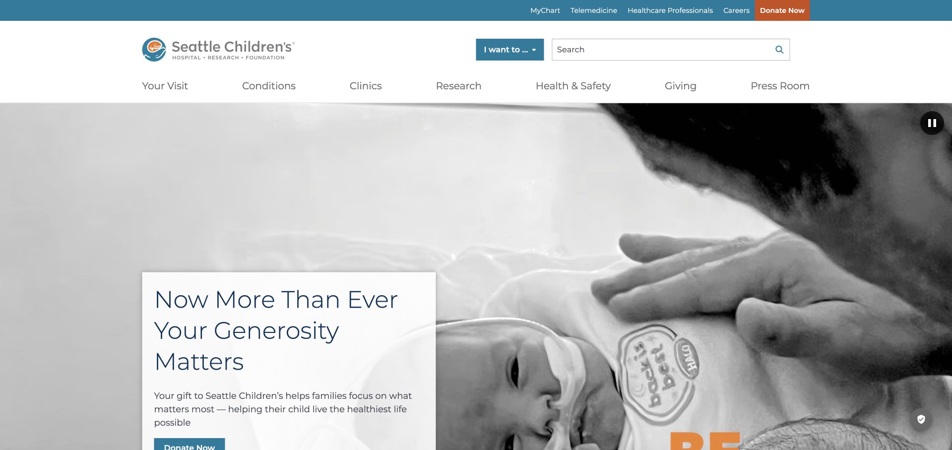
Seattle Children’s shows the complexity of a hospital homepage rather than a small pediatric office. A large photographic campaign occupies the opening, while navigation separates visits, conditions, clinics, research, safety information and giving. A utility row provides existing-patient and professional routes, and a broad search field offers an alternative to browsing the full structure. The captured campaign concerns giving, so the service navigation has to work independently of that message. The useful lesson is how many different audiences require stable entry points. A family seeking a clinic, a clinician making a referral and a donor should not all be pushed through the same emotional campaign or generic contact form.
What you can learn
For a hospital-scale site, separate campaign storytelling from permanent patient navigation. Keep search, clinic discovery and visit preparation visible even when the hero promotes fundraising, and provide distinct professional and existing-patient destinations without entering private systems.
Pros
The main navigation exposes meaningful content categories rather than a single enormous patient-information menu.
Search and utility links offer alternative routes for visitors who already know the task they need to complete.
Cons & considerations
A fundraising-led first view can feel secondary to families arriving for immediate practical information.
The breadth of the site makes consistent terminology and maintained search results particularly important.
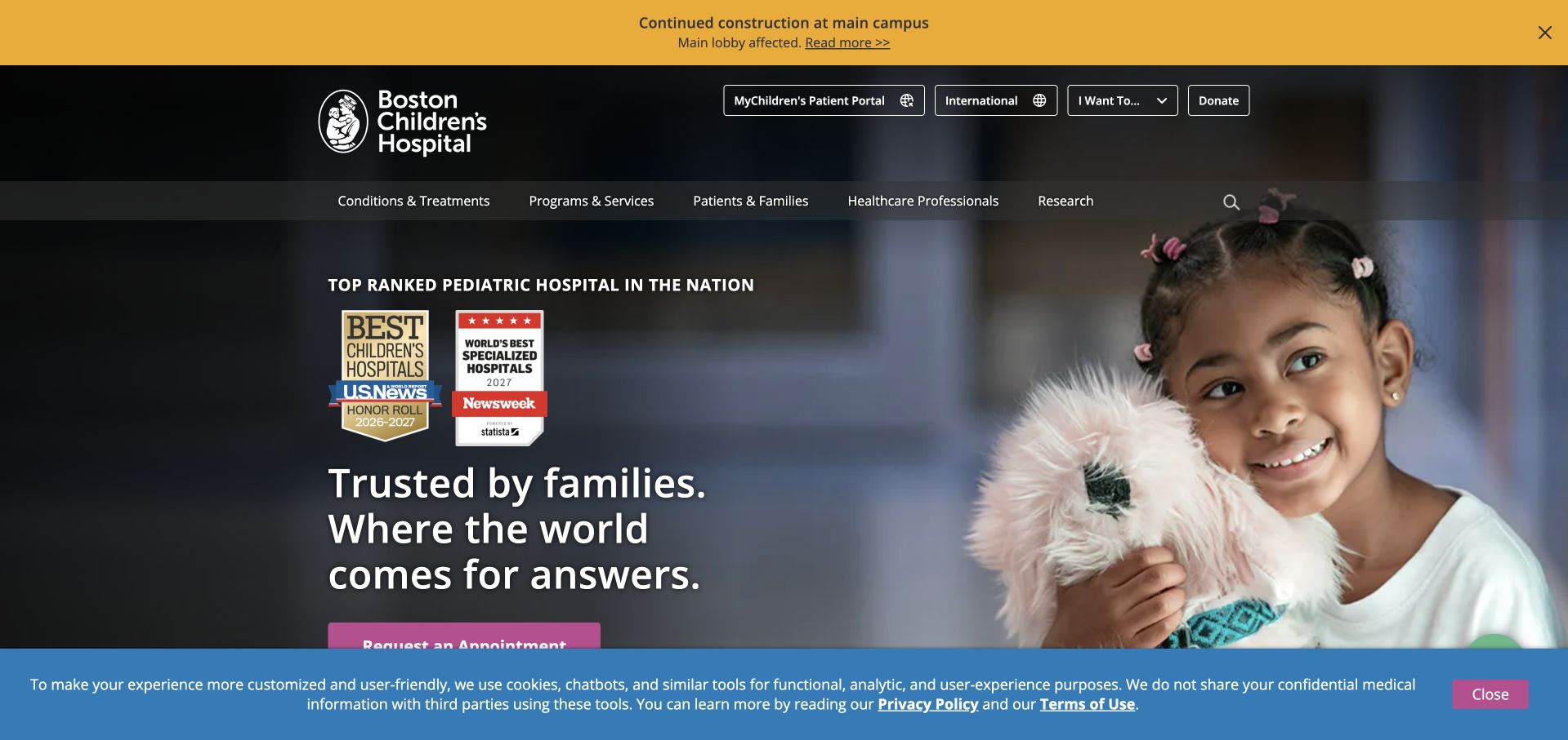
Boston Children’s Hospital combines a dark institutional header with a large child photograph and a recognition-led introduction. Navigation separates treatments, practical family information and research, with appointment, professional and patient-account routes above it. A conspicuous construction notice adds current operational context rather than leaving visitors to discover a disrupted arrival experience later. The design illustrates how institutional evidence, campaign storytelling and practical access can coexist, although they compete for limited space. Recognition graphics remain claims requiring their original source and date; they are not something a screenshot independently verifies. The page is most useful to study as an information system for several audiences, not as a template for reproducing award-heavy healthcare marketing.
What you can learn
Keep operational notices distinct from institutional promotion and give them a clear owner and expiry process. Preserve ordinary patient routes around the campaign so recognition, research and fundraising never become prerequisites for finding visit information.
Pros
The construction notice demonstrates how practical operational information can be separated from the main brand campaign.
Appointment, professional and existing-patient routes recognise that visitors arrive with different tasks.
Cons & considerations
Recognition badges and an emotional hero can crowd the same first view as practical navigation.
A large hospital taxonomy needs consistent labels and search support to remain manageable for unfamiliar families.
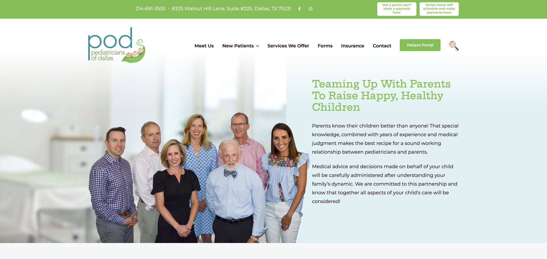
Pediatricians of Dallas makes a group photograph and a parent-partnership statement the central introduction. The header carries a telephone number, physical address and separate payment and portal routes, while the main menu exposes the team, new patients, services, forms and insurance. Those details give the friendly image a practical framework. The page’s green-and-blue identity is consistent across the utility strip, logo and headline. Its main weakness is text density: the opening partnership explanation is longer than the quick office questions a visitor may be trying to answer. The photograph should be treated as the practice’s published presentation, not independent verification of each person’s current role or availability.
What you can learn
A team-led opening can make a local practice understandable as a working relationship. Pair it with concise office facts and clear new-patient steps, and keep staff names, photographs and responsibilities under an explicit update process.
Pros
The address, telephone number and recurring payment or portal tasks are visible before deeper browsing.
A team-led introduction provides a concrete alternative to anonymous stock-style medical imagery.
Cons & considerations
Long partnership paragraphs make the first view slower to scan than a shorter practical introduction would.
Several repeated portal and payment actions need consistent naming and destinations across the header.
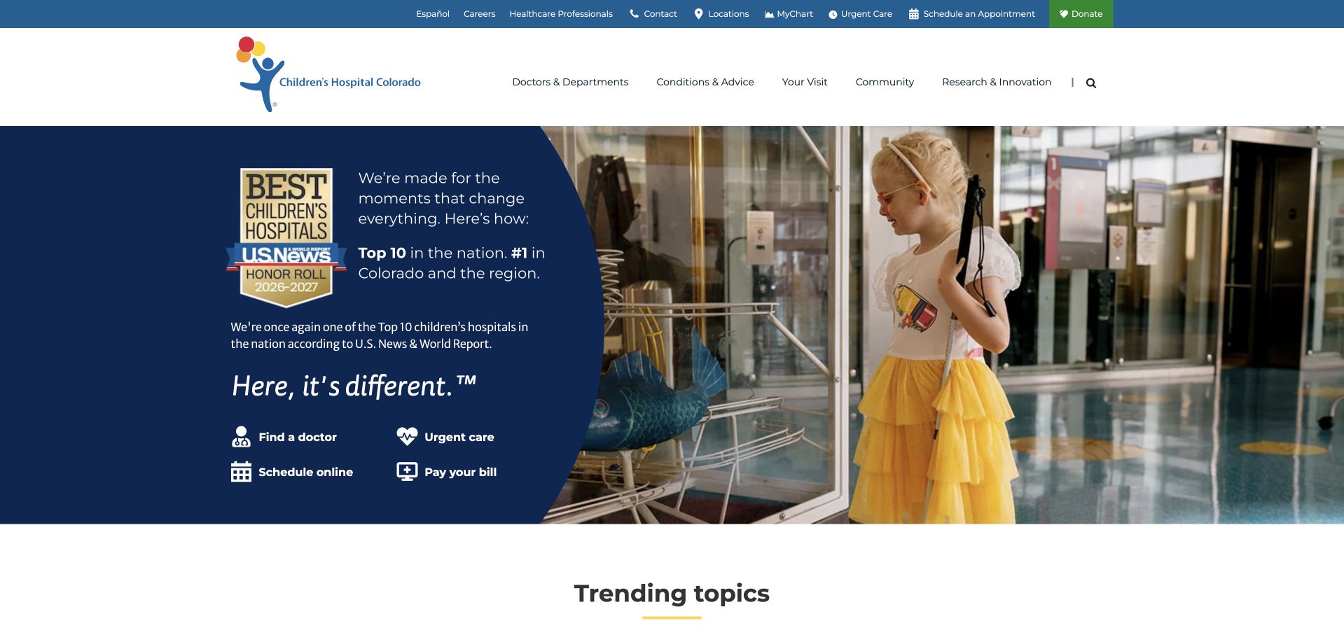
Children’s Colorado places a strong blue information panel beside a large hospital photograph. Within the same panel, visitors can find a doctor, seek urgent care, schedule online or pay a bill. That is the most useful design feature: practical tasks do not disappear when the surrounding campaign focuses on institutional recognition. The white header and utility row provide additional professional and existing-patient routes, followed by a trending-topics section lower on the page. The composition demonstrates a clear task hierarchy within a large organisation, but it also concentrates many actions in one place. Each label needs to make the next environment and any eligibility limitations understandable before the visitor leaves the public site.
What you can learn
If recognition is important to the opening, reserve an equally strong area for patient tasks. Use literal labels and consistent handoffs, then provide local and service-specific detail rather than assuming a hospital-wide message answers every family’s question.
Pros
Doctor discovery, urgent care, scheduling and billing remain visible within the main opening composition.
The blue panel gives text a stable background instead of placing all practical instructions over a photograph.
Cons & considerations
Institutional recognition still consumes substantial attention and needs current, source-qualified presentation.
Several adjacent actions can be difficult to distinguish without clear explanations of the next step and service scope.
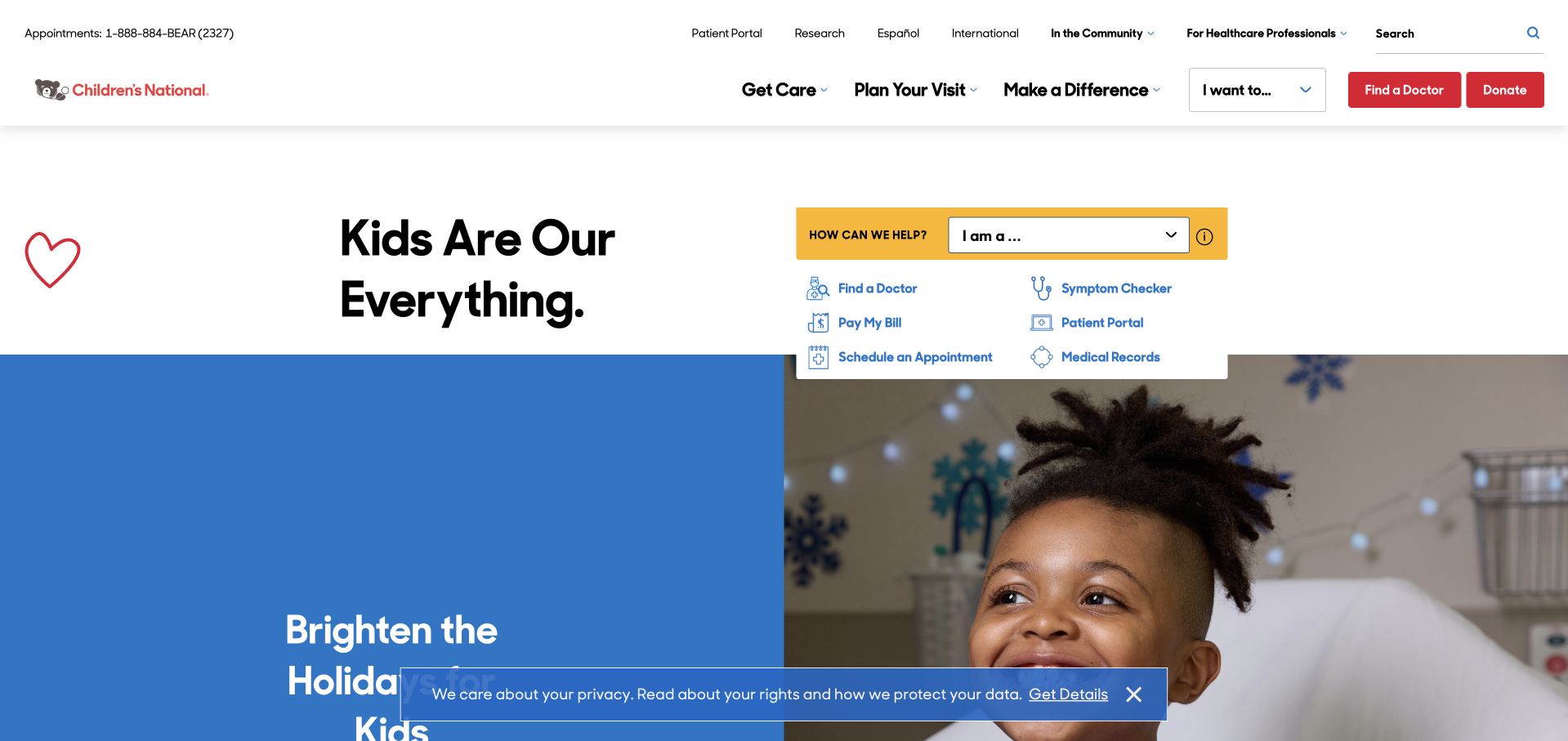
Children’s National uses a concise brand statement beside a yellow task selector and a small collection of practical links. Doctor discovery, scheduling, symptom information and patient access are separated before the larger campaign image begins. The utility row also distinguishes Spanish-language, international, professional and giving destinations. This arrangement lets the homepage acknowledge a broad institutional audience while keeping common family tasks near the top. The lower campaign can change without rewriting that useful interface. The design does need careful wording around symptom information so visitors understand its informational scope, and the compact collection of small links must remain readable rather than becoming a desktop-only shortcut cluster.
What you can learn
A task selector can simplify a complex hospital site when it leads to clear public information rather than an opaque workflow. Keep the permanent family routes above changing campaigns and preserve the same hierarchy when the layout stacks on mobile.
Pros
The opening exposes several common family tasks before the larger campaign takes over the page.
Audience-specific utility links reduce the need for every visitor to navigate the same institutional menu.
Cons & considerations
A small task cluster can become cramped on mobile unless actions are restacked with adequate spacing.
Symptom-related links need explicit informational boundaries and appropriate clinical ownership rather than implied personalised assessment.
Kegan is a freelance web designer and developer with 15+ years of experience helping businesses turn complicated website requirements into clear, maintainable digital experiences. He works directly with clients from planning and design through development, launch, and ongoing support.
For pediatrician website design, his development approach focuses on provider profiles, family resources, office information, and clear appointment-system handoffs. The scope can be a targeted improvement or a complete custom build, with responsive layouts, thoughtful content structure, and integrations chosen around the people using and maintaining the site.
Show 3 other pediatrician website designersHide other pediatrician website designers
Design around the family’s task and the practice’s real workflow
Create a small set of public task pages
Start with new patients, office information, forms, billing and portal access. Write down who maintains each page and which external system it may link to. Give repeated forms clear names and versions, and explain whether they are informational downloads or part of an existing patient process. Do not expose completed forms or private documents in public media folders.
Plan notices without creating a popup maze
Use a bounded notice area for temporary changes such as office arrangements or seasonal administration. Date it, link to a maintained page and define when it should disappear. Do not put the only version of an important instruction into a slideshow or graphic. A parent using a small phone, enlarged text or a keyboard should not need to dismiss several announcements before reaching the telephone route.
Give people and imagery an editorial standard
Record who is pictured, what permission covers and when the image should be reviewed. Keep staff roles and office associations current. Use illustration when it suits the identity, but do not invent testimonials, imply stock subjects are patients or treat a playful style as proof of a child-friendly clinical experience. The practical explanation should remain useful when images do not load.
The editing job behind the design
Keep the public site separate from patient administration
A maintainable practice CMS should manage offices, people, public resources and notices as separate records. Keep recurring office facts in one place, then reuse them consistently. Link to patient-account and payment systems with clear destination labels instead of trying to recreate private workflows inside a general marketing form. The actual privacy and clinical teams should review any enquiry data collection.
Test practical tasks with keyboard navigation, increased text size and small screens. Public forms need clear labels and understandable feedback; images need alternatives appropriate to their purpose. The W3C references provide implementation context, not an accessibility certification. Technology observations here do not reveal a practice’s private records system or establish the security of its patient portal.
Our WordPress website examples offer a separate look at publishing approaches. A visible platform label is evidence for that named page, not a guarantee that the same system will suit your requirements.
Before the public launch
Pediatric website planning checklist
Give new-family information a public route before account registration.
Keep portal access, forms, billing and office information easy to find.
Show current clinicians and their actual office associations.
Explain realistic service geography and new-patient enquiry steps.
Have clinical reviewers approve service descriptions and urgent-contact notices.
Maintain one source for recurring telephone numbers and office details.
Date temporary notices and assign an expiry owner.
Label public downloads clearly and keep completed forms private.
Record publication permission and context for every identifiable photograph.
Avoid fabricated testimonials or implied patient identities in stock images.
Test mobile navigation, keyboard access, enlarged text and form feedback.
Review people, portal destinations, documents and office notices after changes.
These checks are a project checklist, not a performance, legal, security, or accessibility certification. Test real journeys with the people responsible for the website before making claims about the result.
Sources & editorial method
How this collection was selected and reviewed
We inspected the listed public pages and actual browser captures. These original reviews concern design and information structure, not clinical evaluation or patient outcomes. Source claims remain attributed to each practice or hospital; screenshots do not establish professional suitability or current availability.
Each example links to its actual source page. Screenshots are direct browser captures with their own capture dates; moving imagery, announcements and live designs can change. The notes describe observable design choices and conditional tradeoffs, not measured traffic, conversion results, service quality, or accessibility conformance.
Technology labels use public page metadata, asset evidence, or explicitly cited platform documentation. Platform documentation is not a complete current deployment audit. A component reference may be legacy or unused; it is not a complete backend inventory. Unknown stacks are omitted. These sites are editorial examples, not our client portfolio.
Written, Edited and Curated are separate editorial records, not timestamps advanced by a rebuild. Website designs and imagery belong to their owners. See our editorial standards or suggest a correction.
Questions worth asking
Pediatrician website design questions
Does a pediatric practice need a playful website?
Not necessarily. A playful identity can be memorable, but practical clarity matters more. Use illustration or colour when it supports the practice’s actual tone, with readable text and literal labels for appointments, forms and contact.
Should doctor photographs appear on the homepage?
They can help explain a local practice, provided they are current and accurately labelled. A group image needs supporting roles and office information. Do not assume a photograph alone establishes who a family will see or whether someone accepts new patients.
How should a practice organise educational content?
Give it clear topics, clinical ownership and a review process. Keep it separate from office administration and individual advice. An old article should not look current merely because the site has a new design.
Is a hospital homepage a good model for a small office?
Its task separation may be useful, but its scale often is not. A small practice usually needs fewer navigation categories and a clearer local introduction. Borrow the reasoning behind the structure rather than the number of menu items.
Can one contact form handle every request?
It often creates confusion. Routine administration, new-family enquiries and existing-patient communication may have different channels and requirements. Explain the appropriate route before asking for information, and have the practice approve the actual handling process.
The most useful pediatric website is welcoming without becoming vague. Make the people and place understandable, keep recurring family tasks simple and maintain the instructions that matter after the first visit to the website.