Best Ski Resort Websites of 2026 (18 Real-World Examples)
Ski-resort websites that connect mountain character with conditions, lessons, tickets and practical trip planning.
Explore 18 real ski-resort websites, from community mountains to larger destinations with lodging and other activities. Study how their designs balance the appeal of a winter visit with the information people need before choosing a product or planning a day.
A mountain photograph can establish the setting immediately, but it cannot tell a visitor which lifts are running, whether lessons fit their needs or how a ticket differs from a pass. A useful ski-resort website joins that emotional introduction to accurate operational and planning information. The challenge is to serve a returning local and a first-time visitor without forcing either through an irrelevant campaign.
These examples include ski areas with different operating models and activity portfolios. Some emphasize a day on the mountain, while others organize lodging, dining, waterparks or summer visits around a longer stay. The reviews concern public design and information structure. They do not rank skiing quality, establish current terrain conditions or certify operating safety.
Before the examples
What makes good ski resort website design in 2026?
Separate current status from destination imagery
Give the operating report a predictable location and a clear time context. Photographs, historic snowfall and campaign messages should not imply that lifts or terrain are currently available. Make an unavailable reading or seasonal closure understandable without requiring a visitor to interpret a blank widget.
Explain products through visitor needs
Separate day tickets, passes, rentals, lessons and lodging before combining them into packages. Show which audience a lesson serves and what a bundle includes. A first-time visitor should not need to understand internal product names before finding a useful planning route.
Make seasonal maintenance part of the design
A ski homepage changes purpose through the year. Give announcements, deadlines, opening plans and activity schedules an owner. Keep the permanent information structure usable when a promotion ends or a weather-dependent plan changes.
The collection · 18 examples
18 ski resort websites worth studying
Compare 18 distinct ski-resort websites through their operational panels, learning pathways, seasonal menus and ways of turning mountain imagery into useful planning. The explicitly researched Editors Choice recognizes website communication, not service quality or a guaranteed mountain experience.
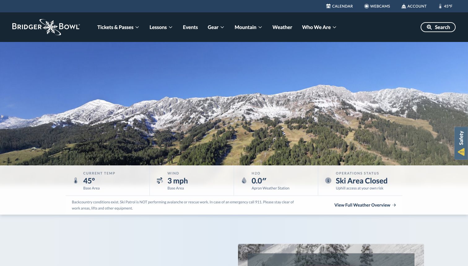
Bridger Bowl puts useful mountain information directly under a wide landscape photograph. Temperature and wind have named locations, while the operations panel plainly says the ski area is closed in the captured preseason view. That distinction makes the attractive image less likely to stand in for current operating information. Farther down, the snowsports section separates private lessons, group lessons, and youth and adult multiweek programs. The weekly calendar gives community activity its own structured place. The directly reviewed background page explains the area's nonprofit, locally focused identity, providing substance beyond a generic destination slogan.
What you can learn
Borrow the hierarchy that puts changing operational information close to the emotional entrance. Give each reading a label and location, then separate lesson audiences so visitors can choose a relevant path without interpreting a single broad school offer.
Pros
The closure notice and weather links are visible in the main homepage sequence.
Lesson categories distinguish format and age group before the visitor opens a program.
Cons & considerations
An October pass-price deadline remained in the November source, showing a campaign-maintenance gap.
The long calendar and highlights sections need clear date context to distinguish current plans from older activity.
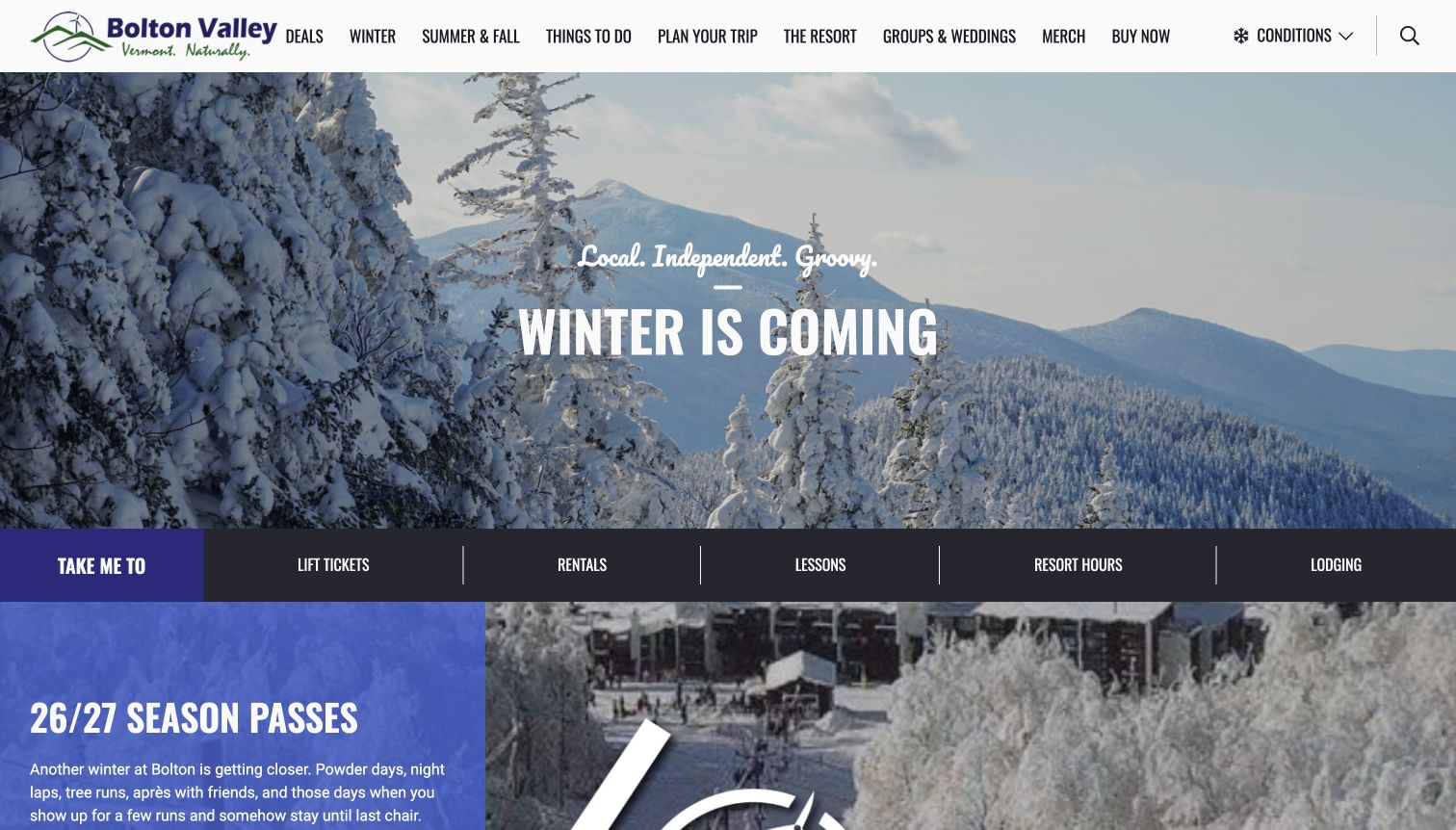
Bolton Valley pairs a large snowy landscape with a distinctly local, informal identity. Its main navigation divides winter from summer and fall, while a separate shortcut row sends visitors toward lift tickets, rentals, lessons, hours, and lodging. That second layer is the most transferable part of the design: someone returning to plan a day does not have to interpret the scenic hero before finding a useful task. Seasonal passes receive a prominent panel below the entrance, and the broader navigation leaves room for groups and other resort activities. The page feels like an operating destination rather than only a photographic campaign.
What you can learn
Give the location a recognizable voice, then put common planning tasks in a stable strip beneath it. Separate seasonal browsing from transactional shortcuts so a first-time visitor and a returning skier can use the same homepage for different purposes.
Pros
The shortcut labels name concrete needs instead of relying on promotional language.
Seasonal navigation makes winter and warmer-weather activities visibly distinct.
Cons & considerations
The large image delays detailed arrival or participation information until further exploration.
A prominent pass campaign needs regular maintenance alongside the more durable trip-planning links.
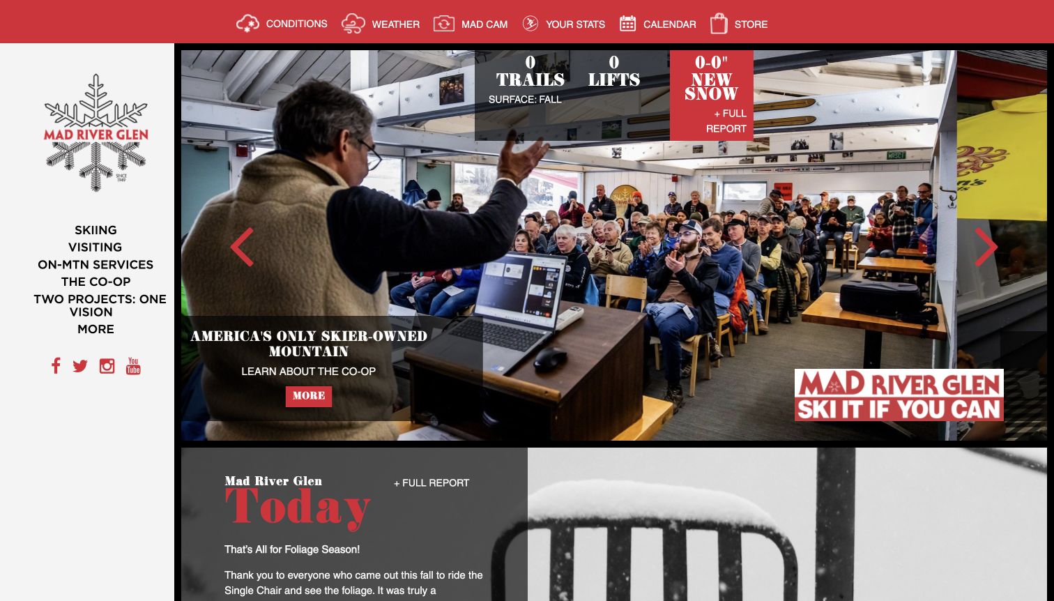
Mad River Glen uses a strong red utility band and a vertical left navigation to frame its homepage. The captured hero features a cooperative gathering rather than treating every opening image as an empty-slope advertisement. Conditions, weather, the camera, calendar, and store remain distinct utility destinations, while the left rail covers skiing, visiting, mountain services, and the cooperative. A compact status overlay lists trail, lift, and snowfall information, with a seasonal summary below. The arrangement gives the site's community identity a visible place without removing the recurring information that a skier may arrive specifically to check.
What you can learn
Let an organization's real ownership or community structure influence the content hierarchy. Pair that story with a persistent operational layer, and make seasonal state explicit rather than expecting a photograph or a zero count to explain whether skiing is available.
Pros
The cooperative section is a named part of the navigation, not a buried footer story.
Weather and camera shortcuts remain distinct from broader visiting content.
Cons & considerations
The combined top band, left rail, and status overlay create a relatively dense entrance.
Several abbreviated readings require nearby context for visitors unfamiliar with mountain reports.
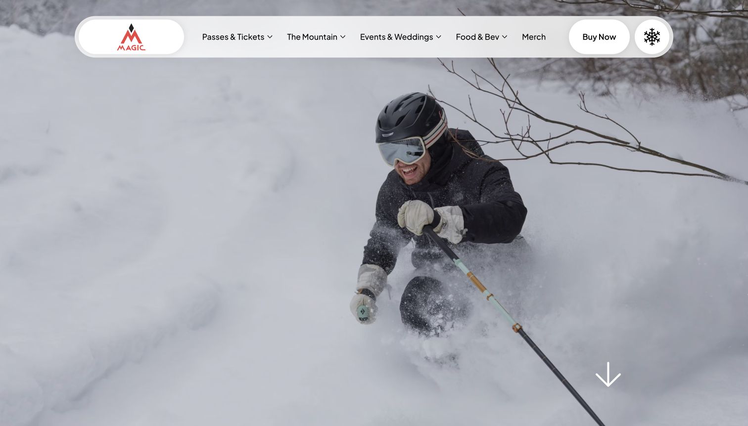
Magic Mountain leads with an action photograph and a floating white navigation pill that contrasts with the snow. Its red mark, concise menu, and informal community language establish a personality before the longer information below. The homepage links to tickets and passes, mountain information, events and weddings, food and beverage, and merchandise. Other visible routes include the alpine update, trail map, lessons, webcam, and current event information. The design is especially useful as a reference for a regional operator that wants a distinctive voice without building its entire opening screen from promotional cards and competing sales notices.
What you can learn
Use a small number of strong visual and verbal cues to make the place recognizable, then preserve plain labels for practical information. Personality works best when a visitor can still find the report, map, lesson, or purchase route without decoding the brand voice.
Pros
The compact navigation contrasts clearly with the photographic background.
Mountain updates and learning resources have identifiable destinations beyond the opening image.
Cons & considerations
Some planning shortcuts sit below the first scenic screen rather than beside the primary menu.
Atmospheric claims about the experience should stay distinguishable from current conditions or guaranteed crowd levels.
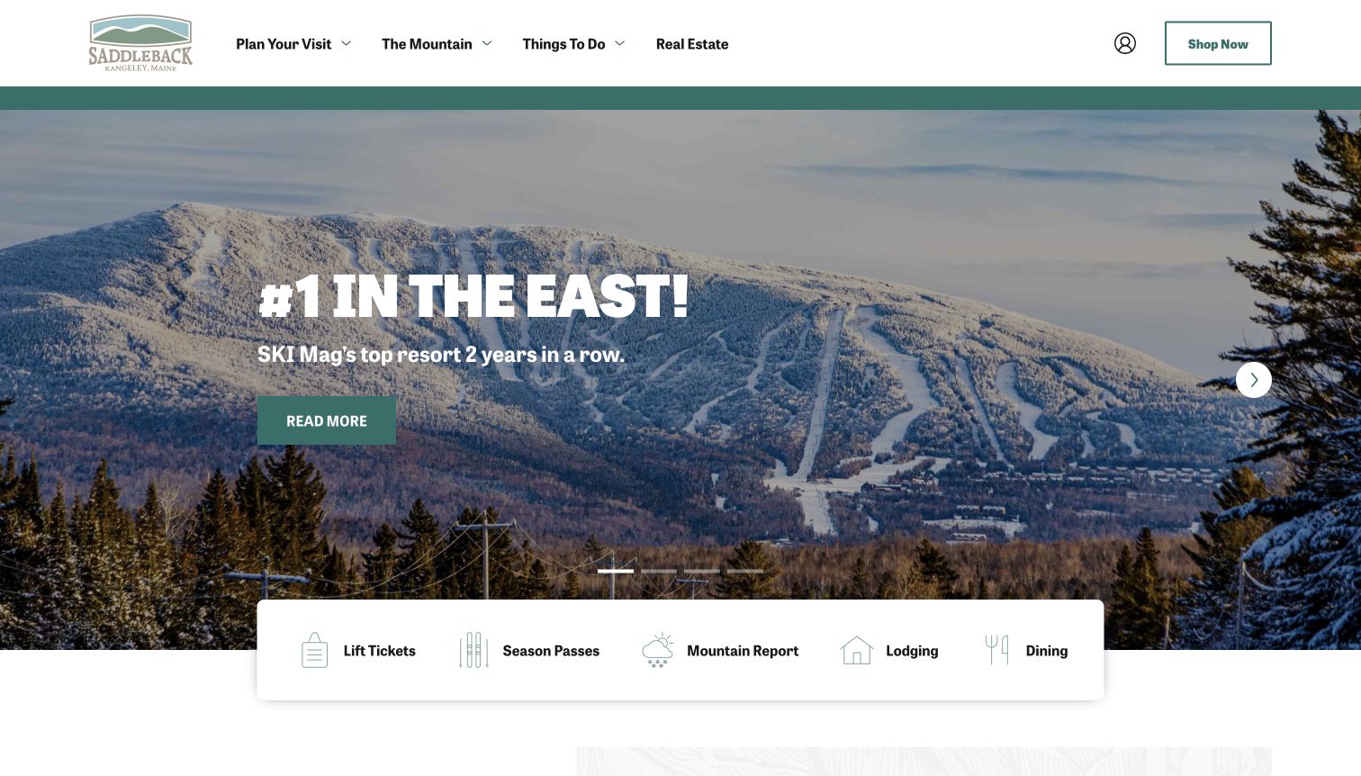
Saddleback combines a green-and-white header with a snowy hero and a broad row of icon-led planning shortcuts. Lift tickets, passes, the mountain report, lodging, and dining sit together in a floating dock, giving the scenic introduction a useful second layer. The main navigation distinguishes planning a visit from exploring the mountain, other activities, and real estate. Below, seasonal announcements and event content give editors places to explain what is happening around the resort. The captured hero also contains an attributed magazine accolade; it functions as the resort's promotional statement, not independent proof of the current visitor experience.
What you can learn
Place the most common day-trip and overnight-planning tasks together, using both words and icons. Give time-sensitive announcements a clear date and an editorial owner so the homepage remains a reliable entry into current information as campaigns change.
Pros
The shortcut dock puts several different planning needs in one coherent row.
The main menu separates the mountain itself from the broader visit.
Cons & considerations
Recent past events were still visible in the dated view and need an obvious archive distinction.
Award-led hero copy can compete with the practical details a new visitor needs first.
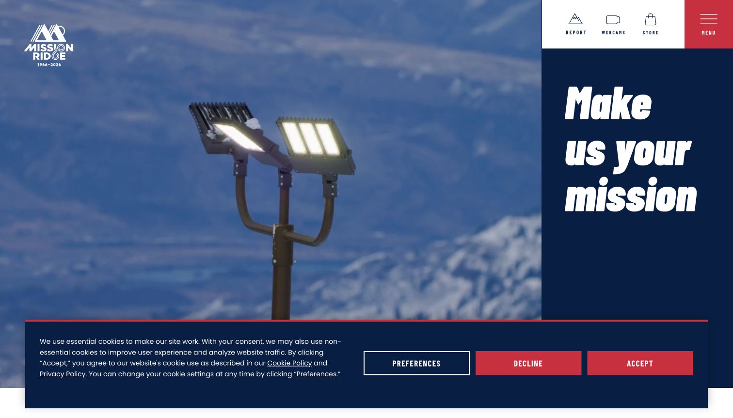
Mission Ridge uses a split opening composition: moving mountain imagery takes most of the width, while a dark blue panel carries the destination statement. Report, webcam, and store controls remain visible alongside a compact red menu. The main content offers tickets, rentals, passes, and lessons, with a separate first-timer route among the planning material. The resulting hierarchy gives the site an identifiable editorial entrance without treating every visitor as ready to buy the same product. A cookie notice occupies the lower part of the captured screen, illustrating how even a relatively restrained composition can accumulate another layer of interface.
What you can learn
Reserve a predictable position for recurring mountain utilities even when the main navigation is compact. Give first-time visitors an explanatory route alongside product links, and keep essential information available when optional media or consent-dependent features are absent.
Pros
Report and webcam controls are recognizable near the top of the page.
The first-timer route acknowledges visitors who need guidance before selecting a product.
Cons & considerations
The compact menu requires an extra action to discover the full information structure.
The consent notice competes with lower-screen content in the captured entrance.
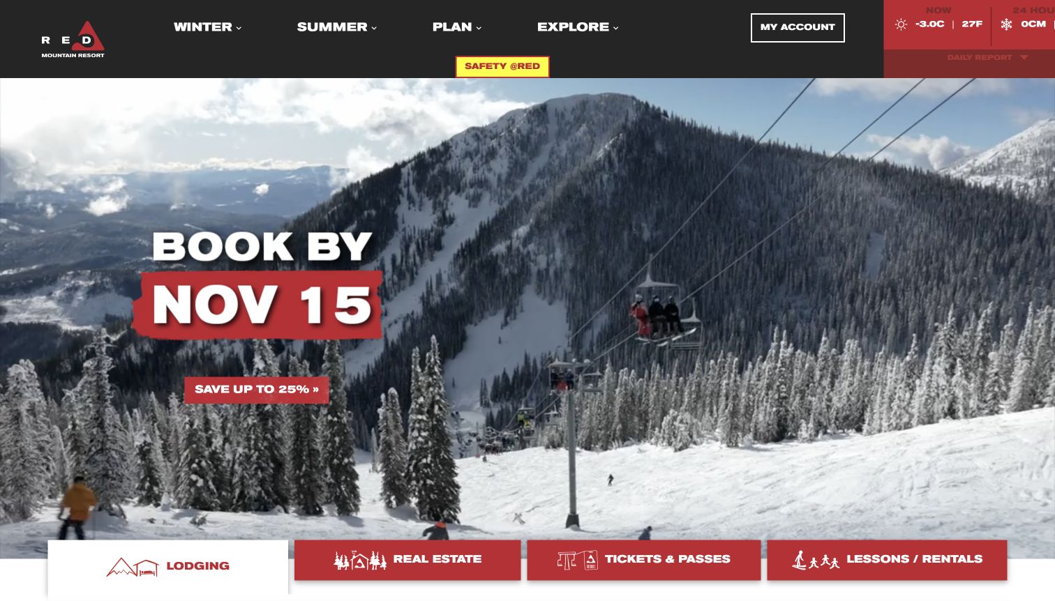
RED Mountain places a snowy lift scene beneath a dark header and a strongly colored weather component. Winter, summer, planning, and exploration are separated in the main navigation, while cards along the bottom of the opening view lead into lodging, real estate, tickets and passes, and lessons and rentals. The page continues into accommodation options, mountain information, and expansion storytelling. This makes the breadth of the destination visible, although the captured booking promotion adds another time-sensitive message to the same entrance. The useful lesson is the deliberate grouping of related products rather than the particular offer or any promise about snow conditions.
What you can learn
Use a few clear destination categories to connect a dramatic landscape with actual visitor decisions. Keep the current conditions component and limited-time offers visually distinct from durable planning links so each can be maintained without rewriting the entire homepage.
Pros
Seasonal categories help visitors distinguish different versions of the destination.
Lodging, tickets, and learning options are exposed as separate planning routes.
Cons & considerations
Real-estate and holiday promotions compete with immediate day-visit needs.
The weather component sits close to the edge in this captured viewport, making spacing important to check.
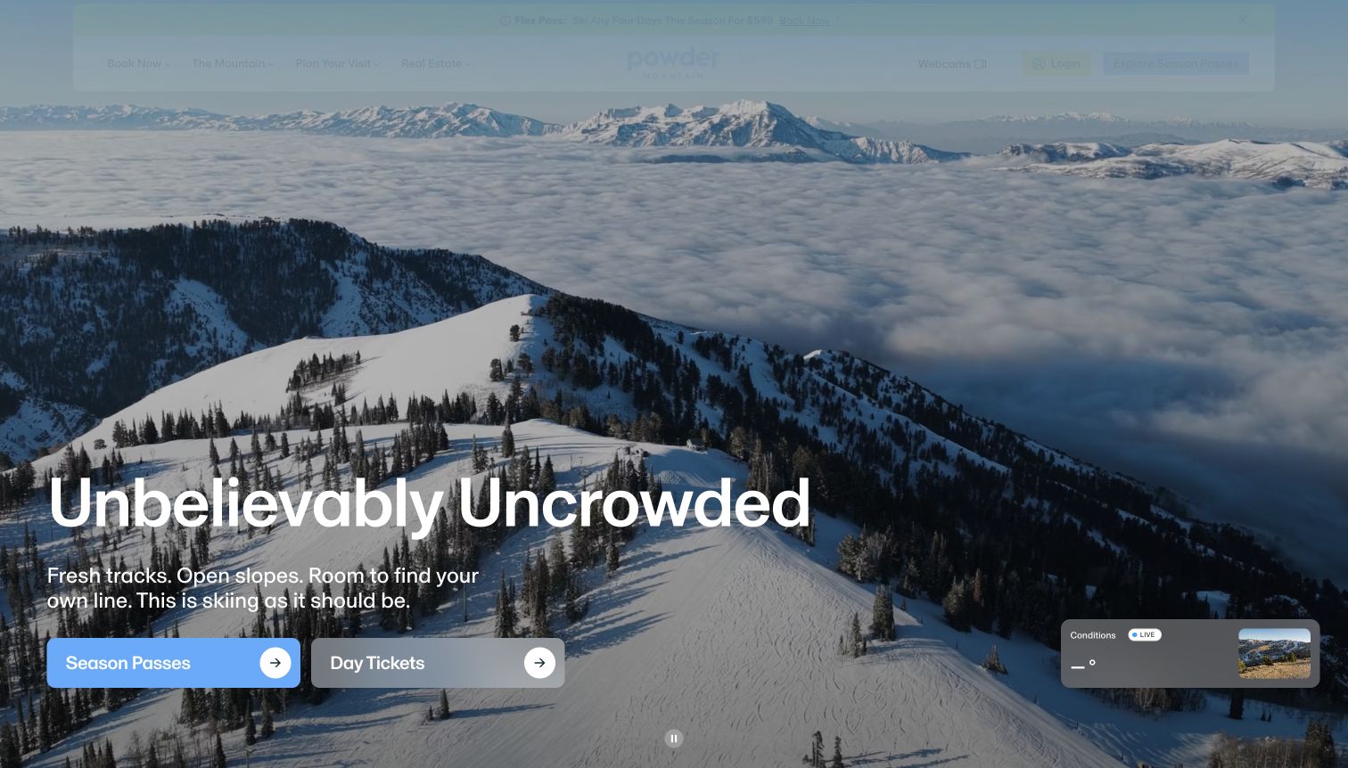
Powder Mountain opens with expansive mountain imagery, a short uncrowded-skiing message, and two substantial buttons for passes and day tickets. Below, a product section makes finer distinctions between unlimited and midweek passes, flexible visits, afternoon tickets, and first-time lessons. Planning links cover the trail map, conditions, transportation, rentals, and lodging. The design therefore moves from a simple emotional entrance to a more detailed product inventory. In the captured opening, the upper navigation is faint and the live-conditions card shows a placeholder, reminders that the visible state of a dynamic page can differ from its complete content structure.
What you can learn
Begin with a small number of choices, then explain the meaningful differences among products in a consistent comparison. Give dynamic weather readings a useful unavailable state and keep navigation readable while media or introductory effects are still settling.
Pros
The main pass and ticket buttons have clear, separate purposes.
The product inventory distinguishes several visit lengths and learning options.
Cons & considerations
The conditions placeholder provides less immediate context than a dated fallback reading.
The faint header in the captured state makes the smaller navigation less prominent than the hero buttons.
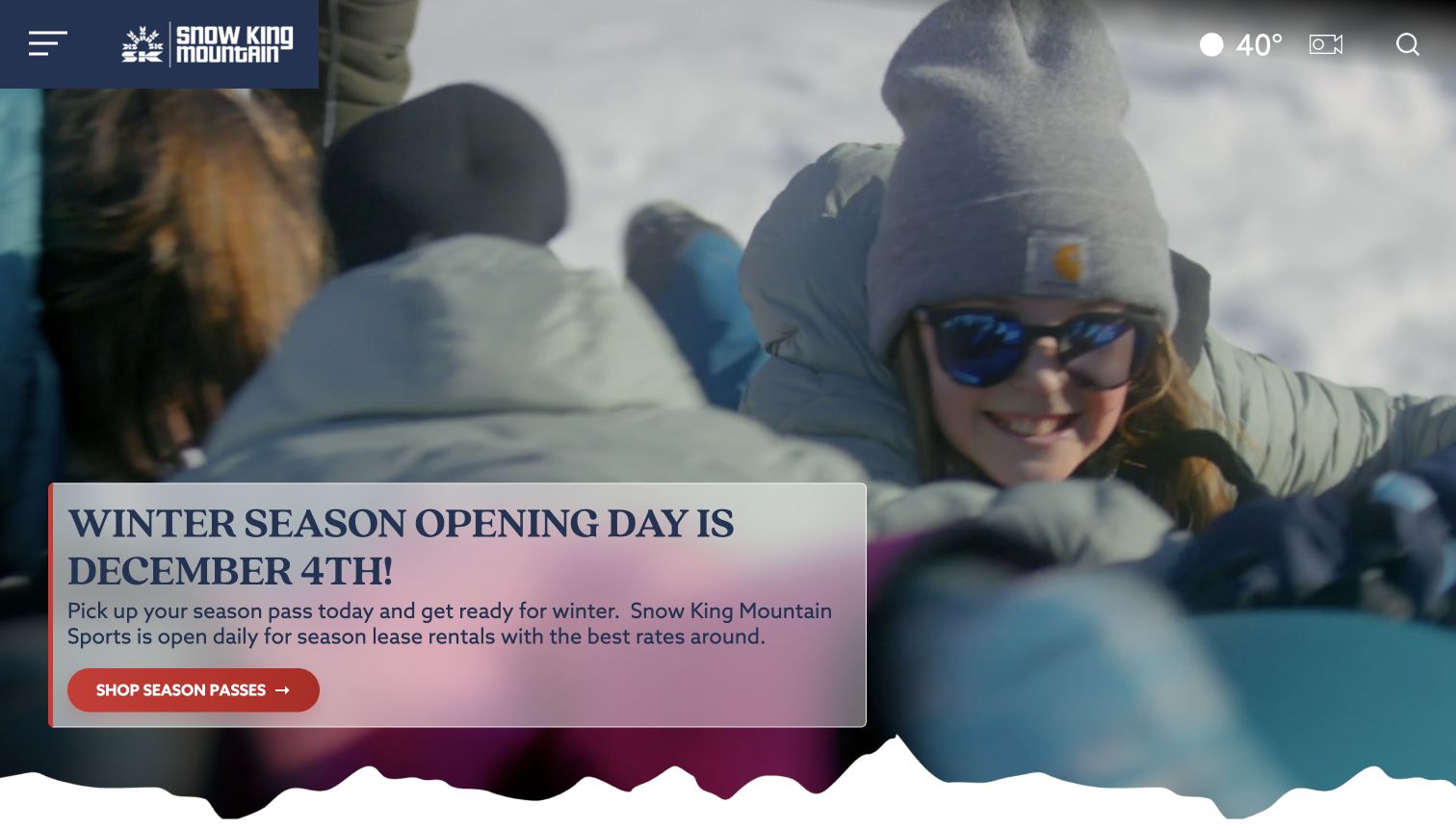
Snow King uses moving winter imagery with a compact dark-blue brand block and a prominent seasonal pass message. Temperature, camera, search, and menu controls occupy the top edge, while a pale campaign card places the immediate action over the photograph. The homepage content extends beyond skiing into tubing, the coaster, gondola visits, and the observatory, with separate material for rentals, school programs, and groups. That breadth is the distinctive design problem here: the site must help visitors understand an activity destination rather than assume everyone arrives for the same kind of ski day. The capture retains the dated opening-season campaign.
What you can learn
Treat activity types as separate planning decisions while keeping their shared location visible. Explain where tickets, lessons, and non-ski experiences diverge, and use seasonal campaigns as a temporary layer rather than the only route to the permanent activity information.
Pros
The homepage acknowledges non-ski interests alongside winter mountain products.
Camera and weather utilities are available without first opening the main menu.
Cons & considerations
The compact menu hides much of the destination structure on the first screen.
The overlaid seasonal campaign takes attention from visitors interested in another activity.
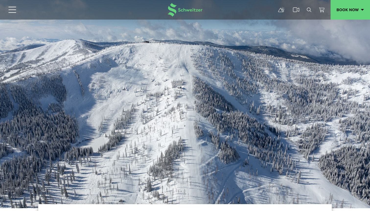
Schweitzer gives its opening screen almost entirely to an aerial mountain view. A slim translucent header contains the logo, compact utilities, and a bright booking button. The underlying booking structure separates lodging, lift tickets, spa visits, cat skiing, rentals, and lessons. Below the landscape, seasonal cards address passes, multiweek programs, the planned opening, and accommodation offers. The visual effect is calm compared with an entrance crowded by unrelated banners, but most practical explanation waits below the image or inside the menu. Its value as a reference is the grouping of distinct reservations under one understandable planning umbrella.
What you can learn
Keep a scenic entrance simple only when the next planning layer is clearly organized. Label each reservation category by the visitor's actual goal, and state uncertainty around seasonal opening information instead of allowing a future date to appear unconditional.
Pros
The bright booking control is easy to distinguish from quieter utility icons.
The booking categories cover both skiing and other parts of an overnight stay.
Cons & considerations
The large image requires scrolling before visitors encounter much explanatory text.
Icon-led utilities and a compact menu demand clear labels and dependable keyboard behavior.
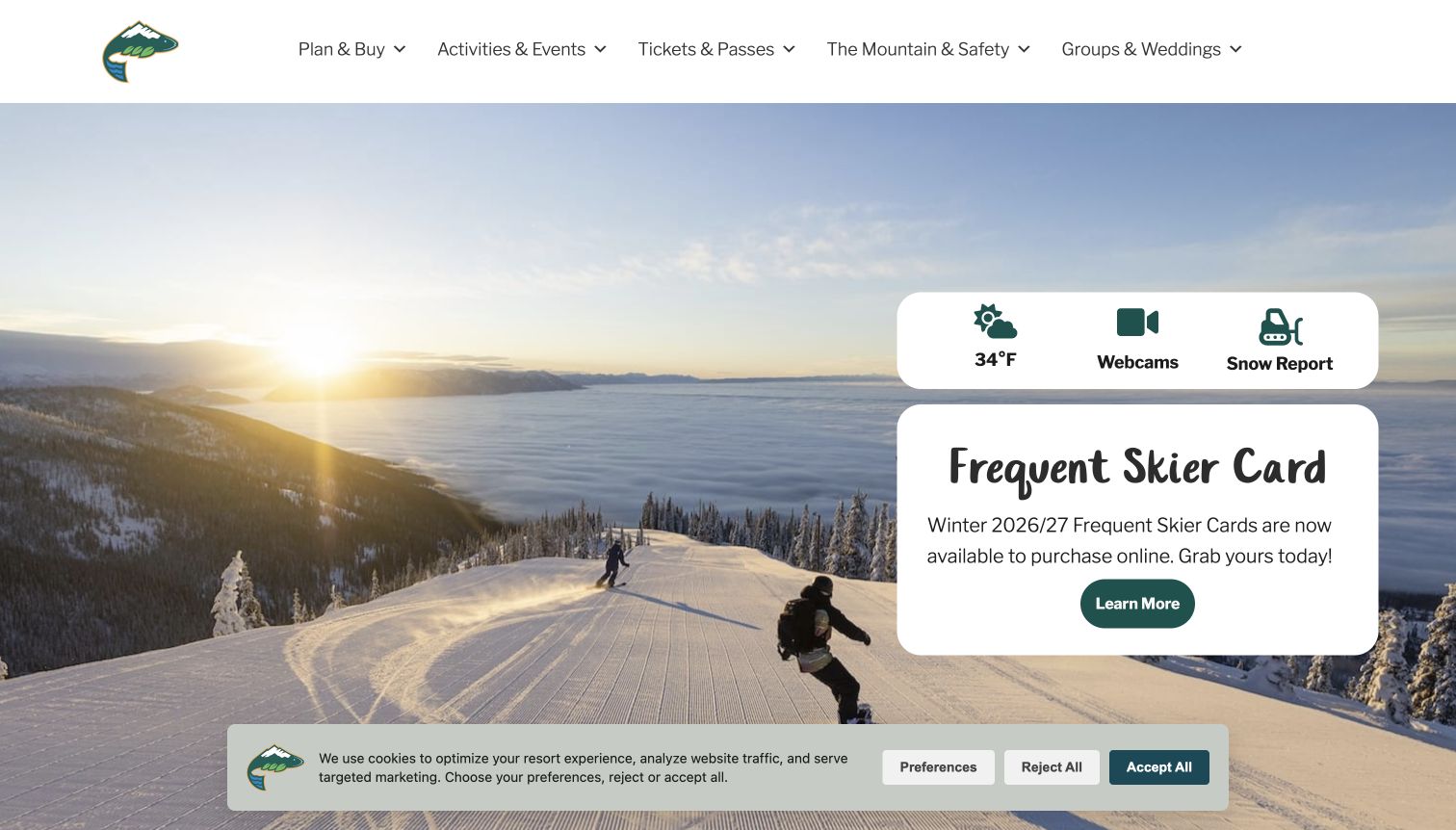
Whitefish Mountain Resort places a sunny groomed-slope photograph behind a white information card. The card combines weather, webcams, and the snow report with a seasonal product promotion, making the practical and commercial purposes of the page visible together. The header covers planning and purchases, activities, tickets, mountain information and safety, and groups. Further content provides a first-time visitor route, lodging categories, lessons, and events. A cookie notice remains visible at the bottom of the captured screen. The example shows how a destination can offer several starting points without requiring every visitor to navigate a single general booking funnel.
What you can learn
Give current mountain information a stable home near the destination image, but distinguish it from the campaign beside it. Include a first-visit explanation for people who need orientation before they can interpret products, accommodation choices, or mountain terminology.
Pros
Webcams and the snow report have clear routes near the opening image.
The first-time visitor content complements the more direct ticket and lodging paths.
Cons & considerations
Promotion and operational information share a compact card and can compete for attention.
The bottom consent notice reduces the space available to the initial landscape and content.
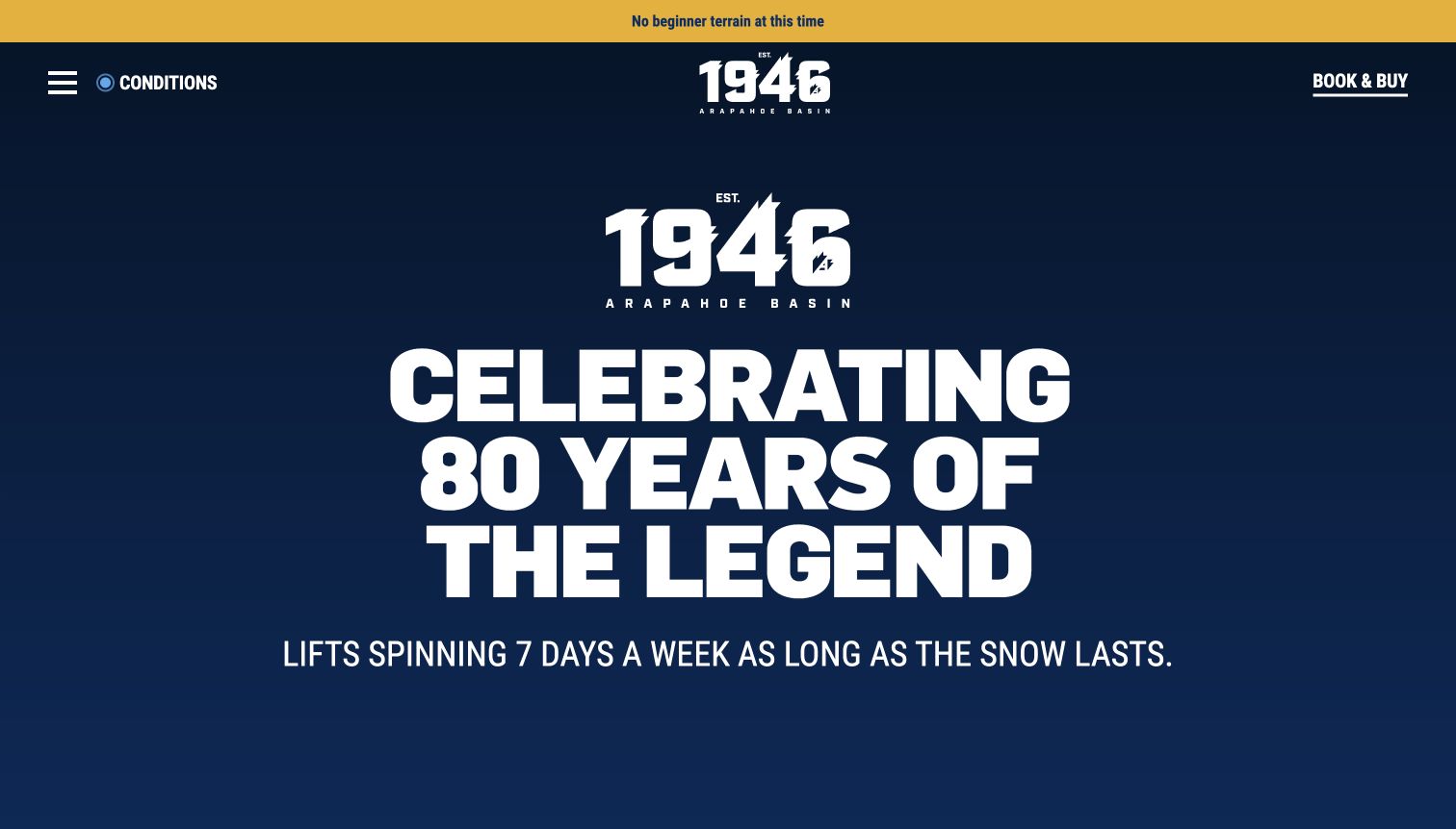
Arapahoe Basin's captured opening uses oversized anniversary typography on a dark background instead of making a mountain photograph carry every message. A yellow notice above it states that beginner terrain is unavailable at the observed time, while conditions and booking controls remain close to the top. The page continues into a field guide, mountain characteristics, events, and writing from the operating team. This is a useful departure from the familiar full-screen snowy panorama. The identity comes from type, history, and editorial voice, while the alert addresses a concrete participation question that a celebratory campaign alone would leave unanswered.
What you can learn
Allow strong typography and a real organizational story to provide the visual entrance. Keep current terrain limitations outside the campaign artwork so they remain visible, readable, and independently editable when the seasonal situation changes.
Pros
The beginner-terrain notice is distinct from the anniversary message.
The editorial field-guide approach provides more context than a sequence of sales cards.
Cons & considerations
The large typographic composition postpones detailed trip planning below the first view.
Historic storytelling and operating updates need separate dates to avoid appearing equally current.
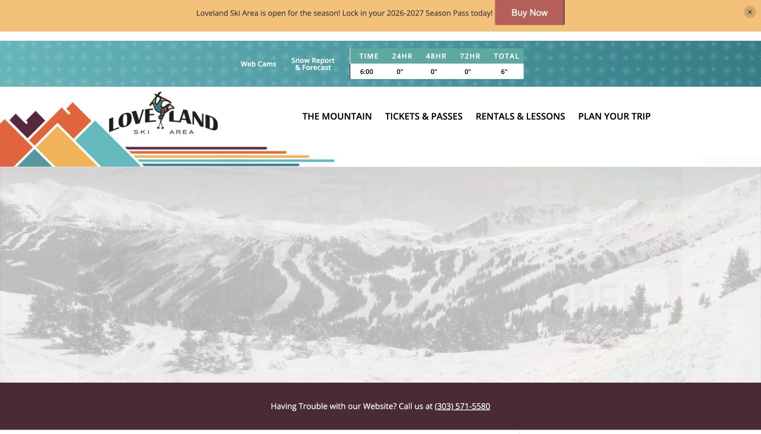
Loveland builds its header around a distinctive retro stripe motif and a small snow-report table. Webcams and the forecast sit beside the time-based readings, while four broad navigation categories cover the mountain, tickets and passes, rentals and lessons, and trip planning. The captured page also shows a season-opening banner and a visible route for visitors having trouble with the website. Below, introductory text, operating updates, and an event list explain more of the local destination. The interface is comparatively information-heavy at the top, but its recurring utilities are concrete rather than being hidden behind a purely photographic entrance.
What you can learn
Make frequently checked readings compact and consistent, with a time label that helps visitors interpret them. Keep the main categories broad enough to scan, then provide a straightforward assistance route when a visitor cannot complete the intended task online.
Pros
The snow table and webcam links sit above the broader trip-planning navigation.
A visible assistance line acknowledges that website journeys can fail.
Cons & considerations
The stacked promotion, report strip, and brand header consume substantial vertical space.
A long introductory paragraph is harder to scan than a short set of approved mountain facts.
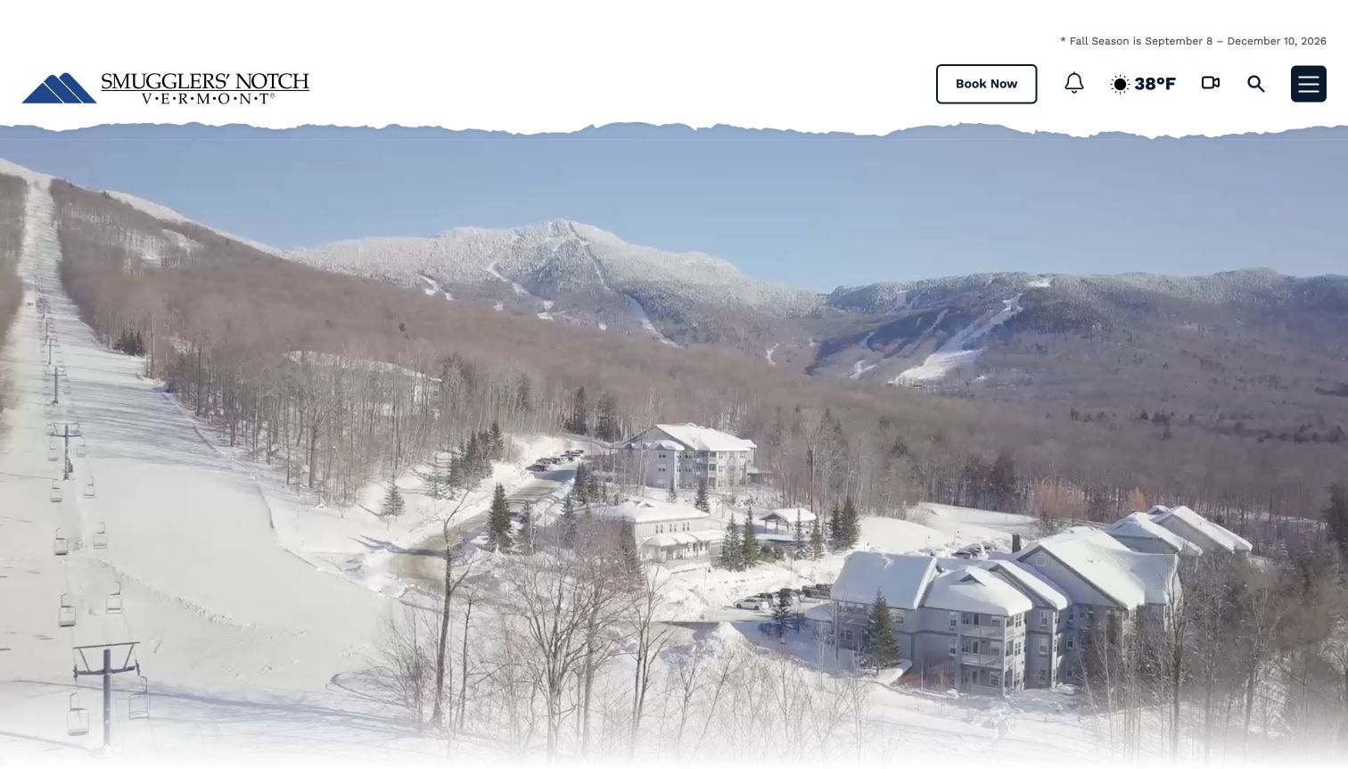
Smugglers' Notch presents an aerial winter village scene under a light header with a jagged lower edge. The brand mark, booking control, weather, webcams, search, and menu give the opening a compact set of utilities. The wider homepage content includes activity schedules with age, place, and inclusion details, as well as lodging, dining, and seasonal offers. This broader family-holiday structure is the useful distinction: the destination is presented as a collection of things to plan around a stay, rather than only a lift-ticket purchase. The captured source also exposes seasonal transitions, which require care when winter imagery and fall activity information appear together.
What you can learn
Describe the whole stay through consistent activity fields, not only attractive photographs. Give age ranges, locations, and inclusion details an editorial owner, and make seasonal boundaries explicit so families can distinguish a current schedule from inspiration for another time of year.
Pros
The activity information includes practical fields beyond a title and picture.
Lodging and dining are treated as part of the same destination-planning problem.
Cons & considerations
The compact main menu conceals much of the destination breadth at first glance.
Mixed seasonal imagery and schedule content can require extra interpretation during transition periods.
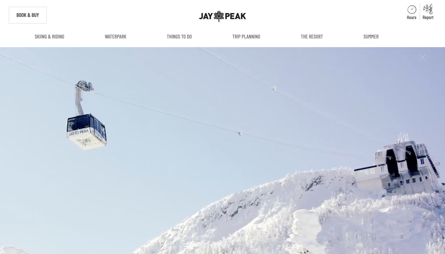
Jay Peak places a large tram scene beneath a clear two-level header. Booking and purchasing sit near hours and the mountain report, while a second navigation row separates skiing and riding, the waterpark, other activities, trip planning, the resort, and summer. The page then presents seasonal packages, lesson options, and event information. This arrangement is useful for a destination with more than one main attraction: a visitor interested in the waterpark does not have to enter a ski-only information structure. The captured offers include specific product conditions, demonstrating why the scope of a promotion belongs near its headline.
What you can learn
Give major attractions their own named routes while keeping shared planning utilities consistent. Put the important limitations of a bundle close to the offer, and maintain a separate durable route for visitors who are comparing activities rather than buying the current campaign.
Pros
The secondary navigation explicitly distinguishes the waterpark from skiing.
Hours and report links remain visible beside the commercial actions.
Cons & considerations
Multiple packages and events can create a busy sequence below the opening image.
The large moving hero needs a useful static alternative and restrained playback behavior.
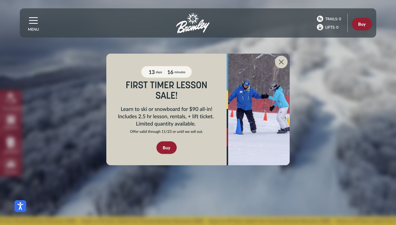
Bromley's captured homepage opens with a first-timer lesson dialog over a softened mountain background. The card names the lesson duration and the inclusion of rentals and a lift ticket, then gives the offer a visible deadline and a purchase route. Behind it, the header preserves trail and lift counts, and the page has shortcuts for the snow report, webcams, lift tickets, and trail map. The broader content continues into seasonal programs, hiring, and mountain identity. This is a useful example of detailed offer communication, while also showing the tradeoff of placing a campaign between a visitor and the general destination page.
What you can learn
When promoting a beginner package, explain what the visitor actually receives before asking for a purchase. Keep its deadline and limits close to the action, and make the invitation easy to dismiss so it does not obstruct people seeking conditions, maps, or unrelated information.
Pros
The offer identifies lesson duration and included equipment and access together.
Operational shortcuts remain part of the underlying homepage structure.
Cons & considerations
The initial dialog obscures much of the general mountain introduction.
Countdown-led promotions need reliable expiry handling and should not become the only route to lesson information.
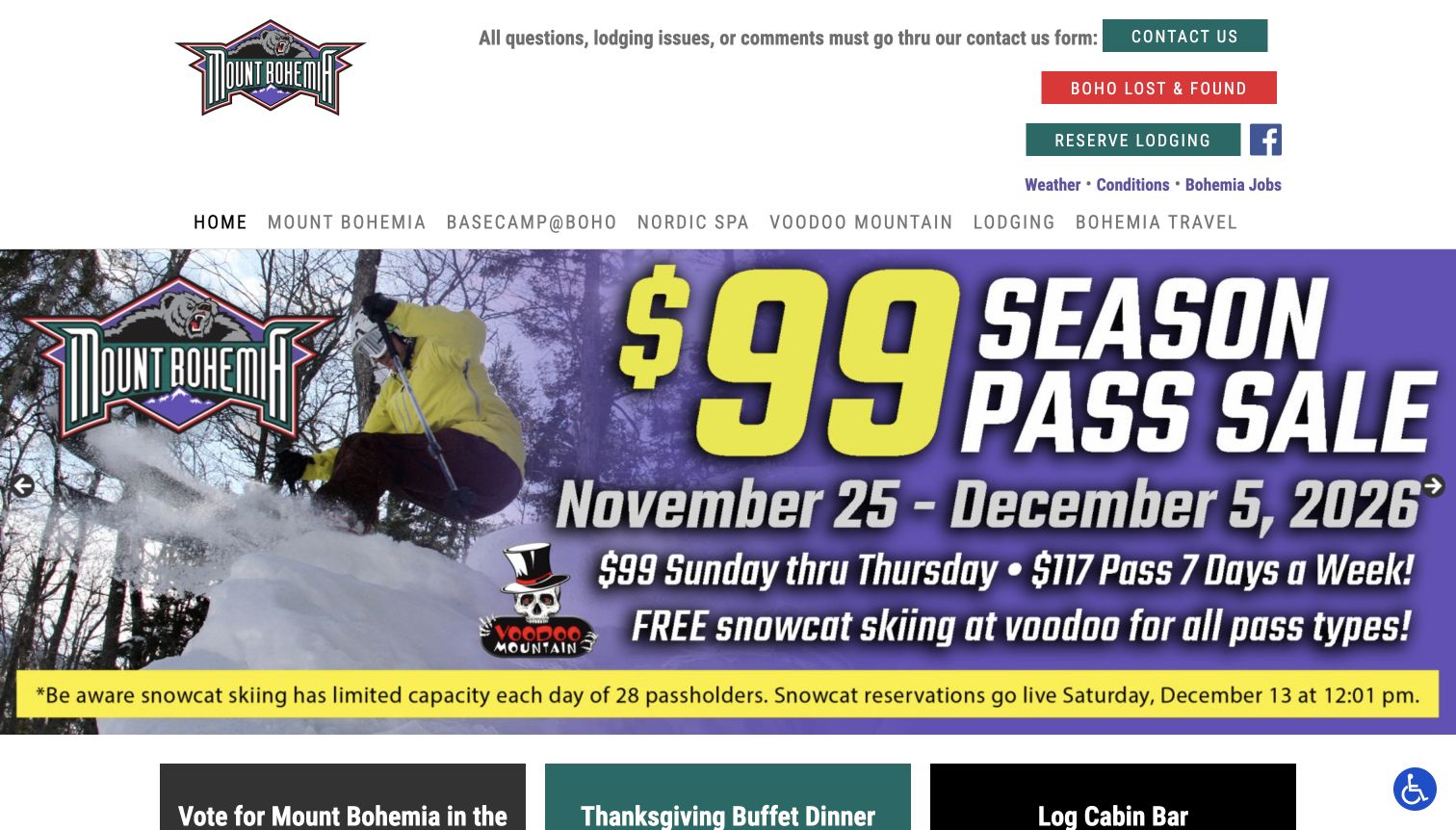
Mount Bohemia uses a straightforward white header followed by a large graphic pass-sale campaign. Contact, lost property, lodging, weather, and conditions are visible above a menu that also includes the mountain, dining, spa, and travel offers. The campaign itself contains dates and a capacity-related qualification, rather than relying on a price alone. Farther down, separate sections explain lodging, food, and spa options. The result is less restrained than some scenic entrances in this collection, but it shows the range of practical services clearly. Its strongest design lesson is the placement of important offer context alongside the most prominent commercial message.
What you can learn
Do not separate a headline offer from the conditions that affect its meaning. Keep the seasonal campaign bounded, and organize lodging, dining, and mountain information as distinct destinations so an enthusiastic promotion does not become the whole information architecture.
Pros
The large campaign makes its dates and a key capacity qualification visible.
Contact and conditions routes are named plainly above the main content.
Cons & considerations
Text embedded in a large promotional graphic needs equivalent readable page content.
The many service buttons and campaign sections create competing paths through the homepage.
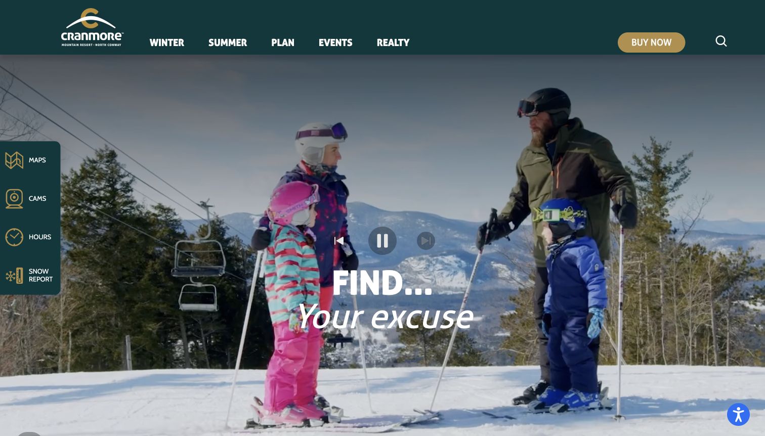
Cranmore combines winter footage of adults and children with a dark green header and a small set of main categories. A vertical utility rail places maps, cameras, hours, and the snow report at the side of the image, independent of the purchase control above. Below the entrance, the content separates tubing, lesson offers, lift tickets, and events. That structure gives the destination more than one point of entry and acknowledges that a family visit may involve different activities. The visible player controls in the capture also make the moving-media component explicit rather than presenting the image as a static design artifact.
What you can learn
Use a stable utility rail or equivalent compact component for information people repeatedly check. Keep those shortcuts distinct from purchases, and give each major family activity a clear explanatory section so visitors can understand the choices before entering a sales service.
Pros
Maps, cameras, hours, and the report are visible beside the scenic entrance.
Tubing, lessons, and lift tickets receive separate content sections.
Cons & considerations
The video and its controls occupy much of the first screen.
Several short promotional sections need consistent detail links to support meaningful comparison.
Kegan is a freelance web designer and developer with 15+ years of experience helping businesses turn complicated website requirements into clear, maintainable digital experiences. He works directly with clients from planning and design through development, launch, and ongoing support.
For ski resort website design, his development approach focuses on ski resort websites that distinguish seasonal conditions, mountain access, lessons, passes and accommodation with clear planning and booking routes. The scope can be a targeted improvement or a complete custom build, with responsive layouts, thoughtful content structure, and integrations chosen around the people using and maintaining the site.
Show 3 other ski resort website designersHide other ski resort website designers
Plan around the visit, the operating report and the season
Map the decisions before choosing the hero
List the decisions that people actually make before visiting the mountain. A returning passholder may need conditions and opening hours, while a first-time family needs to understand lessons, equipment, tickets and where to arrive. An overnight visitor adds accommodation and transport to that list. Give these journeys separate routes before selecting the opening photograph or campaign slogan. The homepage can introduce the place without becoming the only location for every answer.
Build a small, stable set of practical shortcuts. Reports, webcams, maps and hours often have a different use pattern from season-pass sales or editorial stories. Their location and labels should remain predictable when a new promotion takes over the hero. Use words with icons, and preserve readable alternatives when a live widget or media service is unavailable. A zero reading, an unavailable reading and a closed mountain are different states and should not look interchangeable.
Decide which details belong on a product page and which deserve early visibility. The difference between a lesson-only booking and a package including equipment and access can change a visitor's next step. Let the operating team approve those descriptions. Do not ask a designer to infer age eligibility, terrain suitability or participation requirements from photographs. The brief should identify the authoritative source for each operational claim.
Design a coherent seasonal publishing model
Separate durable destination information from details that change daily or by season. The mountain's location and general planning structure may stay stable, while lift status, weather, events, prices and promotional deadlines do not. Identify which system owns each changing field and avoid manually repeating it across the homepage, ticket page and campaign artwork. Every duplicate creates another place that can become stale.
Give winter, summer and shoulder-season content explicit context. A dramatic winter photograph can coexist with a summer activity program, but the navigation should make that relationship clear. Scheduled opening information should retain its approved qualifications, and an old event should be recognizable as archived. Plan a useful closed-season state rather than leaving a collection of empty counts and expired offers in the most prominent part of the site.
Create a publication checklist that editors can use without developer intervention. It should cover campaign start and end dates, links into the correct product, important inclusion details, and the removal of obsolete announcement bars. Keep a clear distinction between a broad operating notice and a sales message. Their urgency, responsibility and update frequency differ, even if both happen to appear near the top of the page.
Connect the public guide to the real booking process
Make the next action match the visitor's intent. Learning about a program, checking availability and purchasing a product are separate steps. Use labels that explain the destination, and preserve the product name when the visitor moves to an approved sales service. If a resort uses different systems for accommodation, lessons and tickets, explain that division instead of presenting every link as one interchangeable booking button.
Treat package explanations as structured information. Record the applicable season, audience, duration and included components, together with the limits the operator has approved for publication. A promotional price without its scope is difficult to compare. Keep detailed policies accessible while summarizing the terms that directly affect the initial decision. Do not imply that browsing a date or sending an inquiry has confirmed a reservation.
Keep the ordinary planning pages useful without optional video, embedded maps, chat or marketing cookies. Provide a clear assistance route and maintain readable contact information without requiring an account. After launch, review actual information paths when new programs or seasons are added. The design should make routine updates easier for the people responsible for the mountain, rather than depend on a complete visual rebuild for every campaign.
The editing job behind the design
Choose tools around operational ownership and clear products
Use structured records for repeating lesson, ticket and activity information, with separate fields for the details that change by date or season. Make the source of operating reports explicit and keep stale readings distinguishable from current ones.
Connect approved sales services through clear product links and consistent names. Keep payment and visitor details in the appropriate private systems. A public reservation link does not prove the software behind the rest of a resort's operations.
Use optimized genuine imagery and useful static alternatives to moving media. The example technology stacks come from bounded public-page audits. Blocked or unavailable scans remain recorded as such; they are not a reason to infer a CMS, weather integration or hidden booking backend.
Our WordPress website examples offer a separate look at publishing approaches. A visible platform label is evidence for that named page, not a guarantee that the same system will suit your requirements.
Before the public launch
Ski-resort website brief checklist
Identify day visitors, returning locals, learners and overnight guests.
Keep conditions, webcams, maps and hours easy to locate.
Label operational readings with their relevant time and location.
Distinguish unavailable data, zero readings and seasonal closure.
Separate tickets, passes, rentals, lessons and accommodation.
Explain package inclusions and approved participation details.
Offer a first-time visitor path before a purchase commitment.
Keep winter and warmer-season activity information clearly labeled.
Give promotions an owner and an expiry or review date.
Make archived events visibly different from upcoming ones.
Use genuine imagery with useful alternatives to video.
Keep critical content readable without optional media or cookies.
Maintain a clear assistance route and consistent product names.
Preserve secure, private handling in the actual booking systems.
These checks are a project checklist, not a performance, legal, security, or accessibility certification. Test real journeys with the people responsible for the website before making claims about the result.
Sources & editorial method
How this collection was selected and reviewed
We directly reviewed these 18 public homepages on November 11, 2026. Their captures preserve the source view at that time, including preseason information, moving-media states and any visible notices. Bromley is shown with its first-timer promotion dialog. Reviews compare observable design and information structure; operational readings, offers and opening plans can change. Each source received a bounded broad public technology-audit attempt. An unavailable scan remains unavailable, and no hidden platform is inferred from the type of resort or a booking link.
Each example links to its actual source page. Screenshots are direct browser captures with their own capture dates; moving imagery, announcements and live designs can change. The notes describe observable design choices and conditional tradeoffs, not measured traffic, conversion results, service quality, or accessibility conformance.
Technology labels use public page metadata, asset evidence, or explicitly cited platform documentation. Platform documentation is not a complete current deployment audit. A component reference may be legacy or unused; it is not a complete backend inventory. Unknown stacks are omitted. These sites are editorial examples, not our client portfolio.
Written, Edited and Curated are separate editorial records, not timestamps advanced by a rebuild. Website designs and imagery belong to their owners. See our editorial standards or suggest a correction.
Questions worth asking
Ski Resort website design questions
What should a ski-resort homepage explain first?
Establish the destination and provide a clear route to current operating information. Then distinguish the main planning needs, such as tickets, lessons, rentals and lodging. A scenic image should not be the only clue about what is currently available.
How should a resort display conditions?
Use the operator's authoritative report, with clear labels and relevant time context. Distinguish a missing reading from zero and explain seasonal closure plainly. Do not let historic photographs or promotional copy imply current terrain availability.
Should beginners have a separate planning route?
A dedicated introduction can help when visitors need to understand equipment, lessons, access and arrival before choosing a product. Use the operator's approved requirements and avoid inventing suitability or safety advice from visual examples.
How can winter and summer content share one site?
Keep the overall destination identity stable and label seasonal activities clearly. Make changing schedules and operating states independently editable, and avoid leaving expired winter offers in the main path to summer information.
Does every resort need a video hero?
No. The examples include useful typographic and informational entrances. Choose media that explains the actual place, keep practical links easy to find and provide a readable alternative when moving imagery does not load or is unwanted.
Does the Editors Choice selection endorse skiing or resort operations?
No. It recognizes an observed website-design and communication approach. It does not establish service quality, current conditions, safety, accessibility conformance, availability or the experience a visitor will have.
Borrow the structure that makes a mountain visit easier to understand. Give the place a clear identity, keep changing operational information honest, and connect each attractive image to a practical next decision.