Best Rock Climbing Guide Websites of 2026 (15 Real-World Examples)
15 rock-climbing guide websites showing how to explain course levels, custom guiding, prices, locations and practical planning.
A strong climbing-guide website helps people understand which experience to investigate. These 15 examples connect real mountain imagery with course choices, learning goals and the practical information behind a guided day.
A first outdoor climb, an indoor-to-outdoor course and a specific multipitch objective involve different questions. A useful website separates those intentions before presenting a calendar or a contact form. It explains the provider’s terminology, gives the relevant location and shows where a visitor can find prerequisites and practical arrangements.
This collection includes regional climbing schools, independent guiding businesses and broader mountain operators with explicit rock-climbing services. Each review is based on a directly inspected public page and a genuine screenshot. We assess website communication and design, not instruction, credentials, safety, route conditions or suitability. Published prices and dates are observations rather than promises about a future reservation.
Before the examples
What makes good rock climbing guide website design in 2026?
Explain the starting point
Give visitors plain-language descriptions of the intended audience and published prerequisites. Keep experience, age, course format and desired objective distinct rather than making a single beginner or advanced label carry every decision.
Make formats comparable
Explain how scheduled courses, private instruction and guided objectives differ. Use consistent fields for location, duration, ratio and price basis when those details are published, with a clear route to the provider’s current policies.
Connect inspiration to planning
Real climbing photography establishes place and activity. Follow it quickly with a useful next step, keeping meeting information, inclusions, preparation and the booking process accessible without a premature request for personal details.
The collection · 15 examples
15 rock climbing guide websites worth studying
Study how these sites translate an outdoor ambition into an understandable website decision. Some use course cards, others detailed questions or a tailored inquiry. The reviews preserve observed weaknesses, including crowded navigation, delayed practical information, contrast problems and overbroad claims.
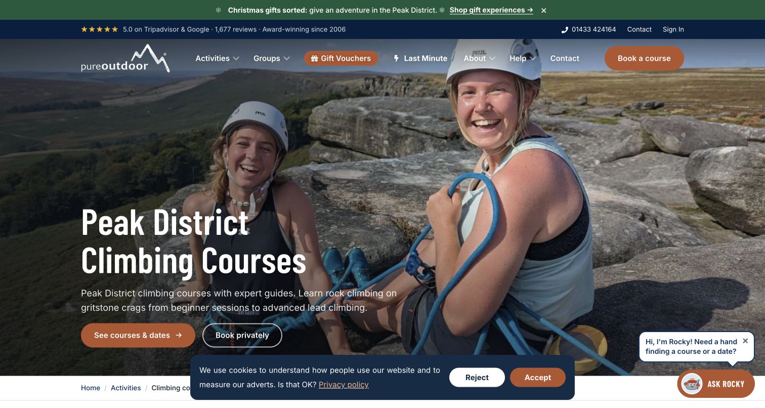
Pure Outdoor makes its climbing catalog understandable through a question: which course fits the visitor? The page explains routes for people who have never climbed, indoor climbers moving outside and those developing particular skills. Course cards then repeat practical facts such as duration, location, group ratio and price basis. Scheduled courses and private bookings have separate actions, so visitors can recognize two different ways to arrange instruction. Learner photography supports that focus. The first view is busier than the underlying structure needs: gift promotion, review strip, cookie panel and chat control compete with the main course proposition. Its strongest feature is the relationship between an understandable starting point and comparable course information.
What you can learn
Explain learning choices before presenting the catalog, then use the same small set of facts for each comparable course. Keep scheduled and private arrangements distinct, and let practical information carry more weight than promotional interruptions or unsupported outcome promises.
Pros
The course guide describes different starting abilities in ordinary language.
Repeated facts make neighboring course cards easier to compare.
Cons & considerations
Several promotional and utility elements compete in the first view.
Specialist course terms still need context for a complete newcomer.
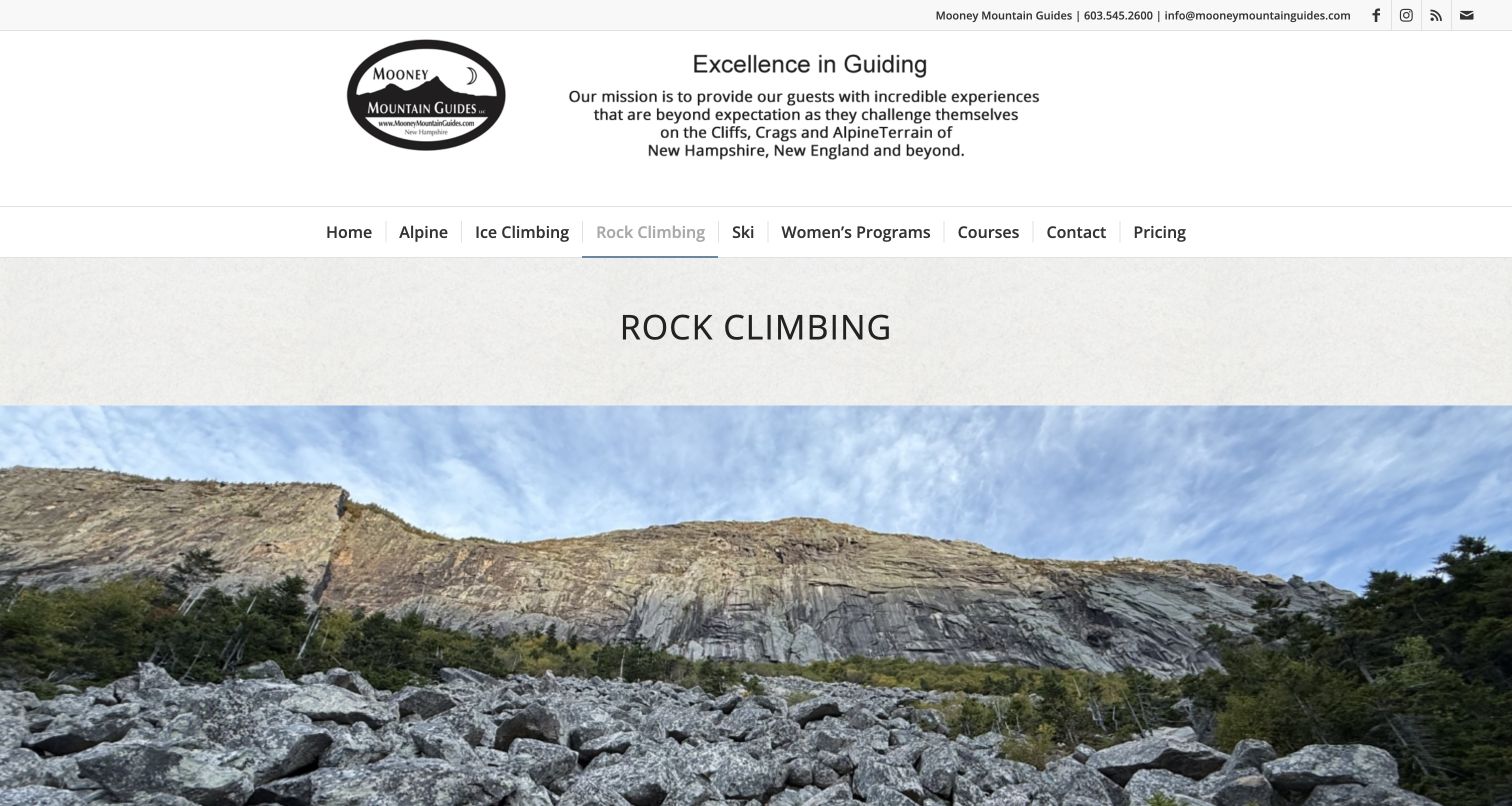
Mooney Mountain Guides uses a straightforward header and large cliff photograph to introduce its rock-climbing offer. The page becomes most informative in its catalog of named New Hampshire venues and learning objectives. Rumney, multipitch experiences, introductory sessions and lead-climbing courses appear with details such as duration, participant ratios and previous experience. These specifics give the visitor more to assess than a general promise of adventure. The initial visual treatment remains relatively spacious, with the photograph delaying the detailed comparisons below. Several course names also assume familiarity with climbing terminology. The useful design pattern is the connection between a recognizable local objective and the information needed to investigate whether that particular offer is relevant.
What you can learn
Use location and learning objectives together when organizing a guiding catalog. Explain what distinguishes each option, publish the provider’s prerequisites clearly and give uncertain visitors a way to ask questions without interpreting technical labels as a suitability assessment.
Pros
Named local venues give the offer geographic specificity.
Duration and experience information support individual course descriptions.
Cons & considerations
The large opening image pushes comparison details farther down.
Technical names can leave first-time visitors needing additional explanation.
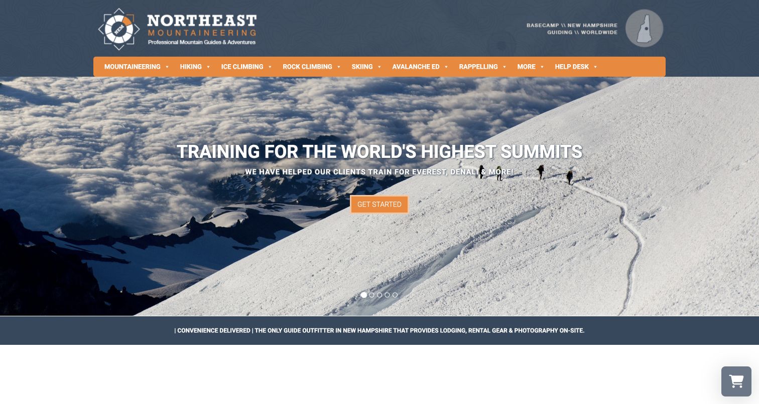
Northeast Mountaineering uses a blue contour-pattern header, orange activity navigation and a broad alpine photograph to establish its mountain identity. Rock climbing is one part of a larger catalog that includes ice, skiing and expeditions. The more distinctive content explains supporting arrangements such as equipment, lodging and photography, alongside a mentoring program intended to extend learning over time. Those sections explain the experience around a day outdoors. The homepage opening nevertheless emphasizes ambitious mountain objectives, so a person seeking a first local rock lesson must look beyond the hero. The extensive activity navigation also gives many destinations equal weight before clarifying which audience each one serves.
What you can learn
Explain the practical support surrounding instruction and distinguish a single guided day from ongoing mentoring. When several mountain activities share a homepage, give local beginners a clear entrance so expedition imagery does not become the only visible statement of the offer.
Pros
Supporting services receive their own explanations rather than vague inclusion claims.
Mentoring is presented as a distinct learning format.
Cons & considerations
The alpine opening competes with local rock-climbing discovery.
A broad activity menu requires visitors to interpret many parallel choices.
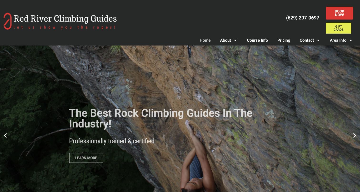
Red River Climbing Guides puts its place name, climbing identity and contact options close together. A dark header with a red carabiner mark sits above a large photograph of a climber beneath sandstone. Course information, pricing and area information are distinct menu items, a practical combination for someone arranging a visit to an unfamiliar region. The body explains customized experiences and equipment inclusions. Rotating promotional messages and a long testimonial sequence make the page more repetitive than its simple menu suggests. Strong superlatives also take attention away from the more useful local details. The site is worth studying for the relationship between service selection, prices and destination planning.
What you can learn
Keep course, pricing and area information easy to reach from the same starting point. Use the destination to make the offer concrete, then explain how a visitor can discuss goals without relying on a rotating slogan or an accumulation of testimonials.
Pros
The navigation separates practical course, price and area questions.
The visual identity and photography clearly communicate the climbing setting.
Cons & considerations
Rotating claims make the opening message less stable.
Long testimonial content postpones concise comparisons between the available formats.
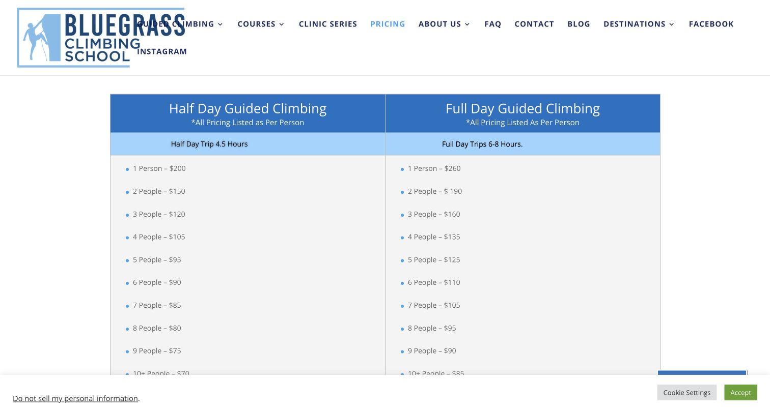
Bluegrass Climbing School’s pricing page gives half-day and full-day options two adjacent columns. Each identifies its duration and shows per-person pricing for different group sizes, making the basis of the comparison unusually explicit. Open-enrollment courses have a separate route and arrangement. Policy information continues below the rates, where visitors can investigate the conditions surrounding a reservation. In the captured desktop view, parts of the header navigation overlap the large blue wordmark, an obvious weakness in an otherwise useful information page. The long policy section also needs careful organization. The valuable pattern is the visible explanation of how time and group size affect a quoted price.
What you can learn
Label whether a rate applies to each participant or the whole group, then present comparable durations together. Keep operational policies nearby but scannable, and check header behavior on the actual page rather than assuming a shared navigation always fits.
Pros
Per-person pricing is explicitly tied to group size.
Adjacent half-day and full-day columns make the duration comparison clear.
Cons & considerations
Header links overlap the brand mark in the observed desktop view.
Dense policy content below the rates could use stronger internal navigation.
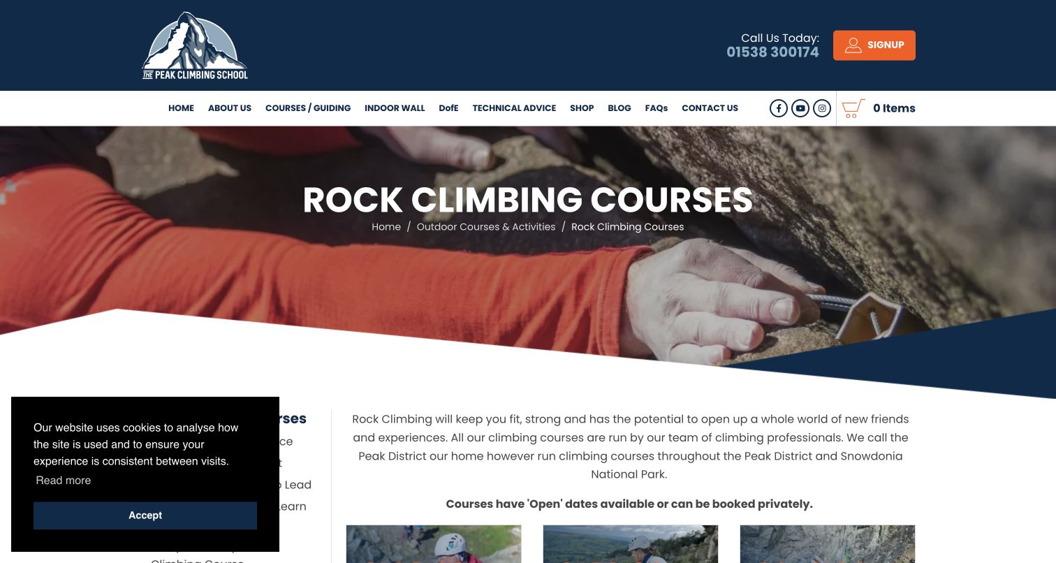
Peak Climbing School’s rock-climbing page combines an orange and navy identity with a gear photograph and a catalog of course cards. The cards distinguish introductory learning, becoming independent, lead climbing and more advanced formats. Repeated information about days, ratios and prices helps visitors compare the options after reading the short descriptions. The page also explains open and private arrangements rather than treating them as interchangeable. Its left-hand navigation includes many other outdoor courses, which can pull attention away from the climbing decision. A cookie panel covers part of that area in the captured first view. The course progression is useful, but a newcomer still needs plain-language help interpreting the technical stages.
What you can learn
Build course cards around consistent comparison fields and connect them to a clear progression explanation. Keep neighboring activity categories secondary on a specialist landing page, and leave enough unobstructed space for the course list when ordinary notices are displayed.
Pros
Course cards repeat practical duration, ratio and price information.
Open and private arrangements are explained as distinct options.
Cons & considerations
The broad sidebar competes with the specific climbing catalog.
Specialist progression labels require interpretation beyond the card titles.
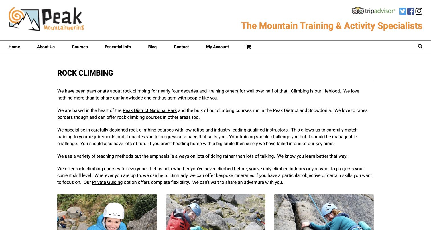
Peak Mountaineering takes a text-led approach to its climbing category. Several introductory paragraphs describe the learning setting and the relationship between its standard courses and private guiding before a three-column course grid begins. The catalog then differentiates tasters, introductory and intermediate learning, lead climbing, multipitch options and self-rescue. Short explanations make these choices more informative than a set of unexplained product names. The tradeoff is the amount of reading required before a visitor reaches a comparison. Prices and other practical facts are not assembled into a single overview at this stage. Explanatory writing organizes the broad offer, but needs a concise entry point.
What you can learn
Give each learning route a clear purpose and explain how private instruction differs from a scheduled course. Summarize the main distinctions near the top, then retain longer context for readers who need it rather than making every visitor begin with several paragraphs.
Pros
Short course descriptions explain the purpose behind specialist names.
Private guiding has an explicit relationship to the standard catalog.
Cons & considerations
The lengthy introduction delays the first course comparison.
Practical facts are spread across routes rather than summarized in the category view.
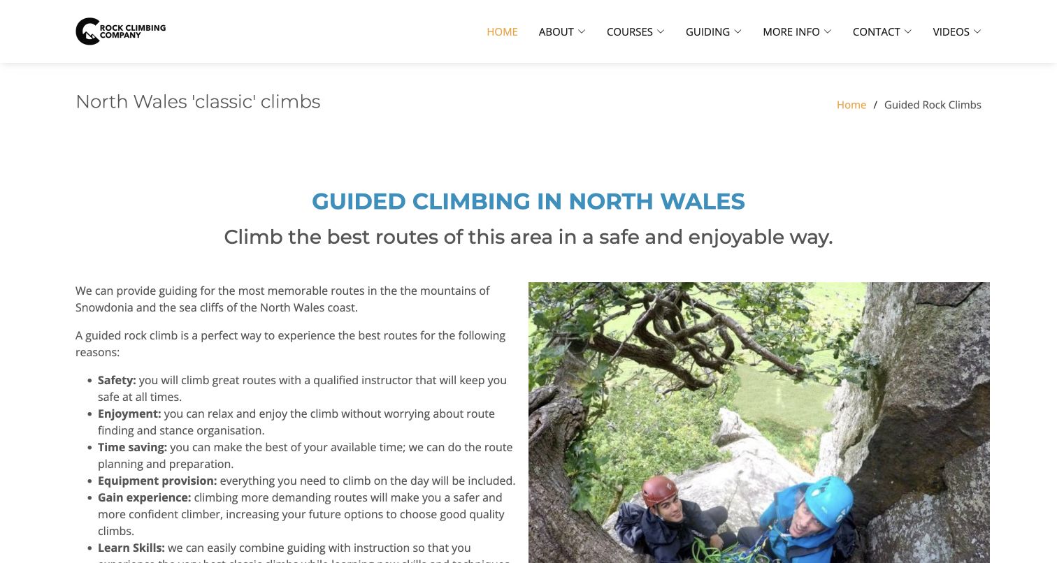
Rock Climbing Company’s guided-climbs page uses a restrained two-column layout: explanatory text on one side and a photograph of climbers on the other. It describes the North Wales setting, different guiding possibilities and the information a prospective client should provide, including goals and previous experience. Pricing by group arrangement gives that custom inquiry a useful frame. Rather than sending everyone straight to a calendar, the page explains why a conversation is part of planning the day. Long bullet paragraphs make some details harder to scan, and absolute reassurance about safety should not be copied as a general promise. The model works best when explaining the service and relevant inquiry questions.
What you can learn
For custom guiding, make the inquiry purposeful. Explain which details help staff understand the request, provide a clearly labeled price basis and keep provider claims proportionate. A useful planning conversation starts with context rather than an unexplained contact button.
Pros
The page tells visitors which goals and experience details to discuss.
Pricing provides context for a tailored guiding inquiry.
Cons & considerations
Long bullet paragraphs weaken the otherwise simple visual hierarchy.
Absolute safety wording needs more careful qualification than the page provides.
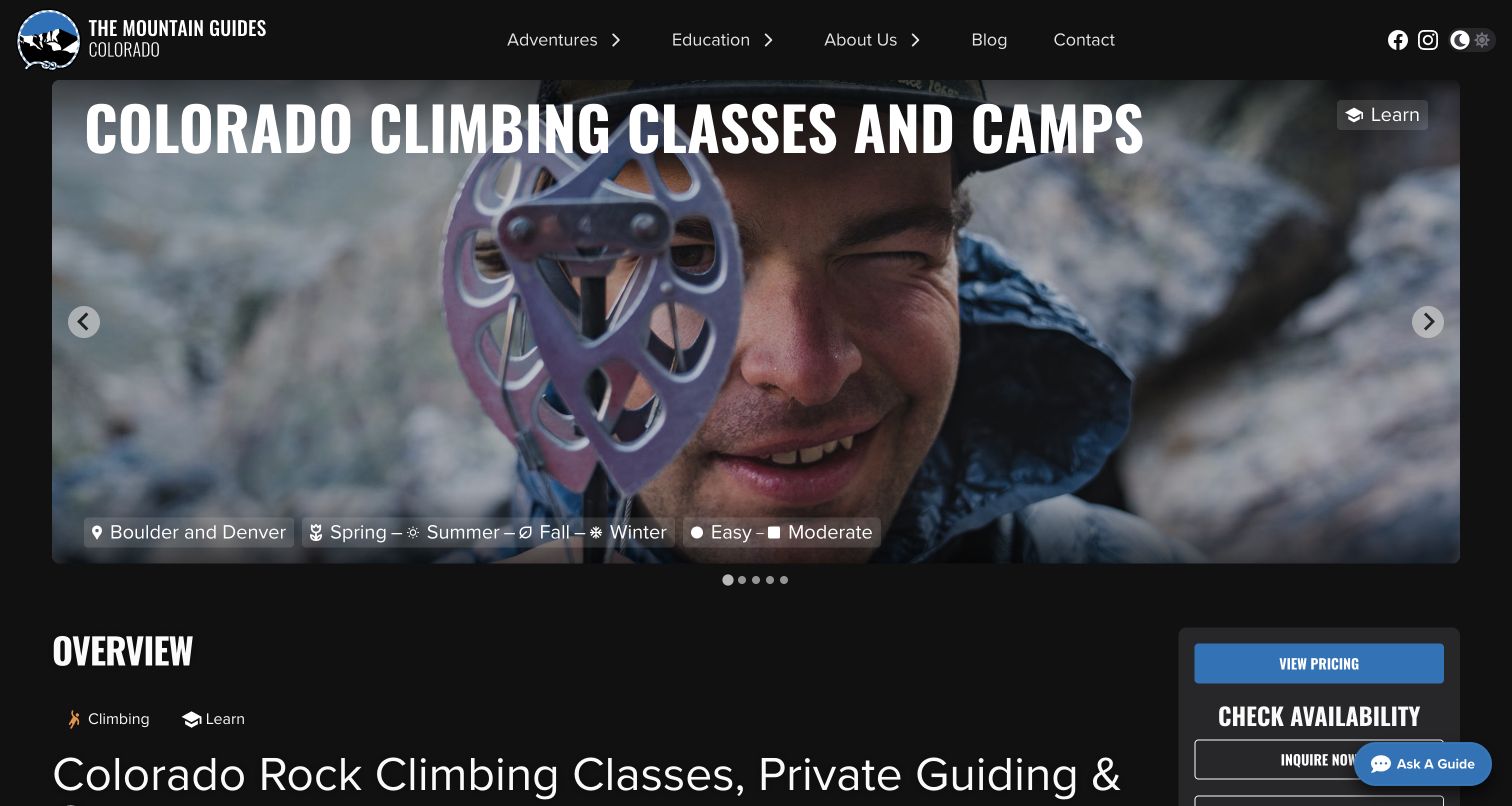
The Mountain Guides places its Colorado classes and camps beneath a large dark hero with a clear Boulder and Denver location reference. Seasonal and difficulty labels offer a quick orientation, while the page below explains several formats for children, beginners and more experienced climbers. Pricing, equipment and itinerary information are organized through additional sections and expandable details. This structure accommodates varied offers without an overloaded introduction. The hero consumes considerable space, and the long overview repeats some ideas before the practical sections. Broad difficulty labels also need context when one page covers different audiences and course types. The useful lesson is the layered arrangement of overview and planning information.
What you can learn
Give a regional landing page one concise overview, then separate the information needed for each format. Use difficulty or season labels only where their meaning is clear, and ensure visitors can distinguish a camp, private day and instructional course before making an inquiry.
Pros
The page establishes its regional setting near the main heading.
Itinerary, equipment and price information have identifiable sections.
Cons & considerations
Large imagery delays access to the practical comparison.
Broad labels can oversimplify a page containing several different learning formats.
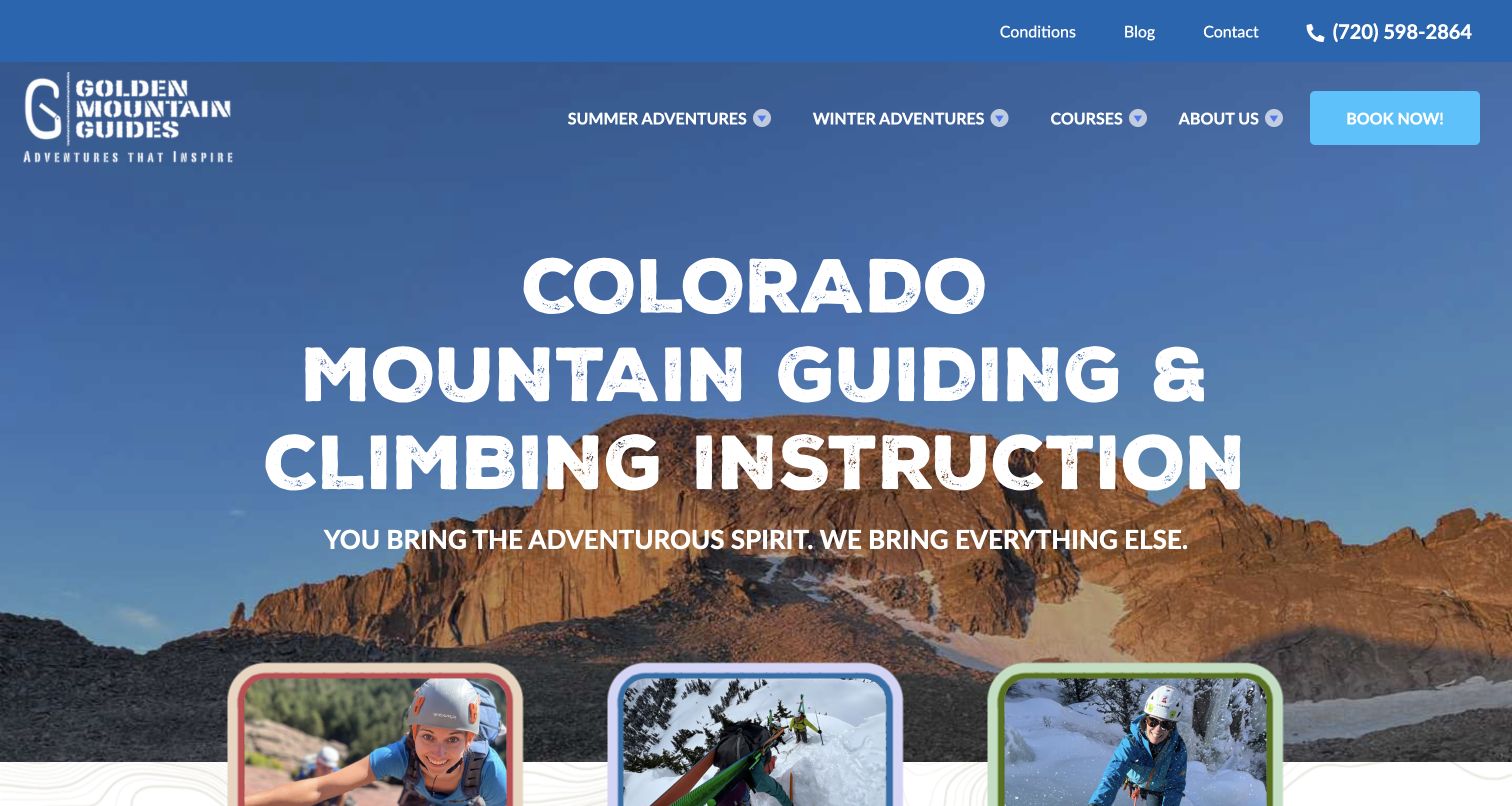
Golden Mountain Guides opens with a strong Colorado heading over mountain imagery, then gives summer, winter and courses separate visual routes. That distinction recognizes that some visitors are choosing an activity while others are looking for a particular learning experience. Conditions, contact information and editorial resources remain visible in the broader navigation. Farther down, named guide profiles give the business a human dimension and explain roles rather than presenting only an anonymous service. The large opening headline still postpones concrete course facts. Seasonal categories and instructional categories also overlap, leaving some visitors to decide which route contains their intended rock-climbing day. Separating motivations is useful when the relationships are explained.
What you can learn
Distinguish choosing an outdoor experience from choosing instruction, then connect the two routes where they overlap. Team profiles and current conditions can support that decision, but should accompany clear service information rather than substitute for duration, location or prerequisites.
Pros
Summer, winter and learning routes are visually distinct.
Named team profiles make the people behind the offer easier to discover.
Cons & considerations
Oversized opening text delays specific service details.
Season and course categories can overlap without an obvious first choice.
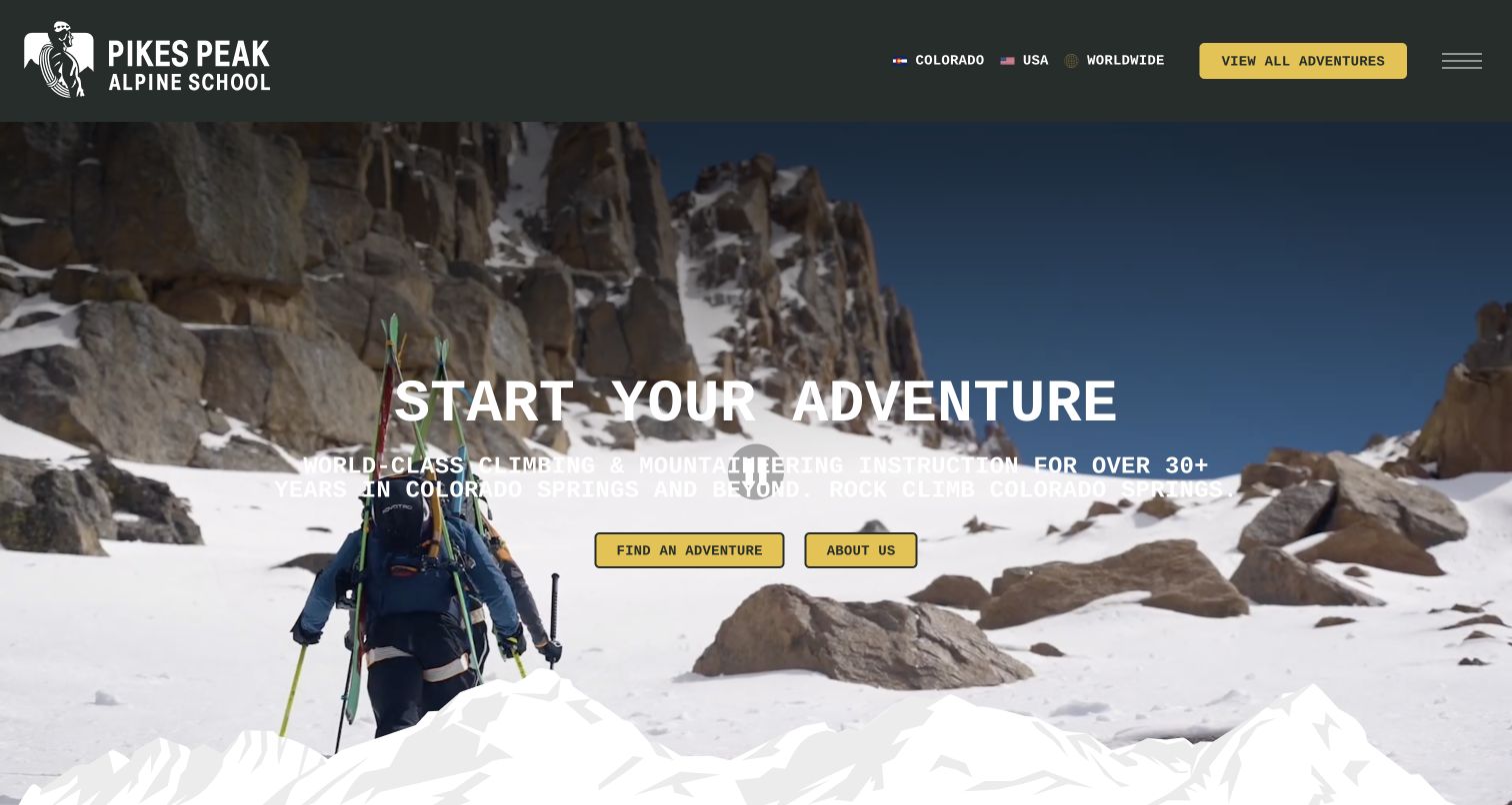
Pikes Peak Alpine School’s homepage leads with a dramatic snowy approach image and a simple invitation to find an adventure. Below that broad opening, activity cards identify specific Colorado outings and climbing options. The page distinguishes private objectives from public courses, then gives the latter a dated calendar section. That separation is useful because a customized day and an advertised group course require different planning decisions. Geographic navigation also supports the wider catalog beyond Colorado. The captured hero’s white supporting text sits over bright snow and is harder to read than the yellow action buttons. Rock-climbing information competes with a broad mountaineering offer, so visitors need the catalog to refine their initial interest.
What you can learn
Separate custom inquiries from scheduled courses and give each a clear next step. Maintain dated listings as operational information, and test text contrast against the actual image frame so a striking mountain scene does not obscure the explanation.
Pros
Private objectives and public courses have distinct explanations.
Dated course listings give scheduled learning a concrete planning route.
Cons & considerations
White supporting text loses clarity against the bright hero image.
The broad adventure opening postpones rock-specific information.
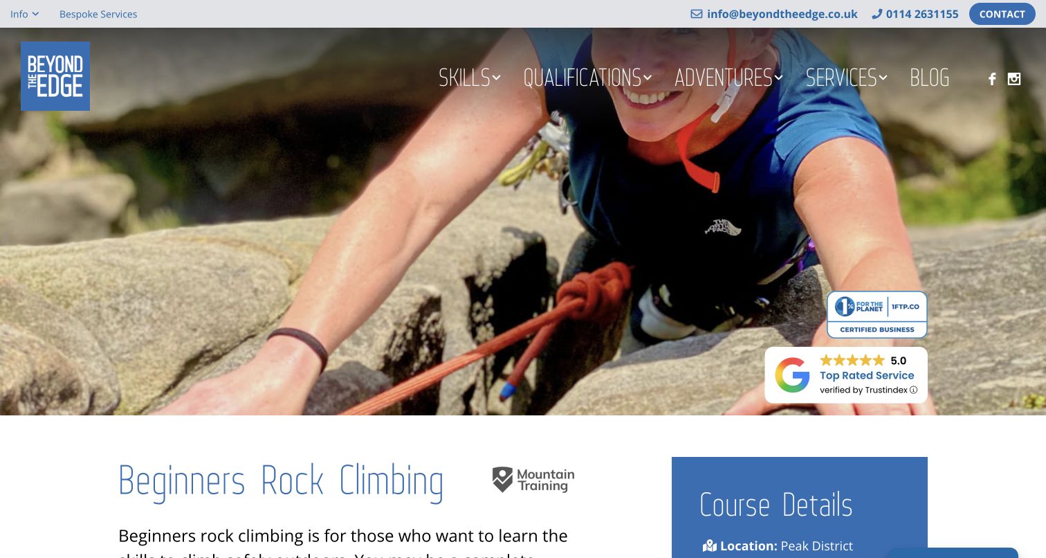
Beyond the Edge’s beginner page uses a close climbing photograph above the course title and a blue details panel. Location, duration, price basis, ratio and level are grouped together, while the main text explains who the course serves and outlines the day. A visible date table connects that explanation to specific scheduled sessions without requiring an immediate checkout. Related courses provide a route onward once the visitor understands the introductory offer. The hero takes up most of the initial viewport and review badges compete with the course title below. Longer descriptive passages and the extensive global menu also add reading overhead. The practical summary helps visitors interpret the fuller explanation.
What you can learn
Put the core course facts in one stable place and pair them with an ordinary-language description of the intended audience. Let dates follow that explanation, and keep the introductory page focused enough that broader qualifications and unrelated activities do not dominate.
Pros
A compact panel groups the main course facts.
The course explanation and visible date list support different planning questions.
Cons & considerations
The large hero delays the substantive course information.
Prominent review badges and extensive navigation compete with the learning proposition.
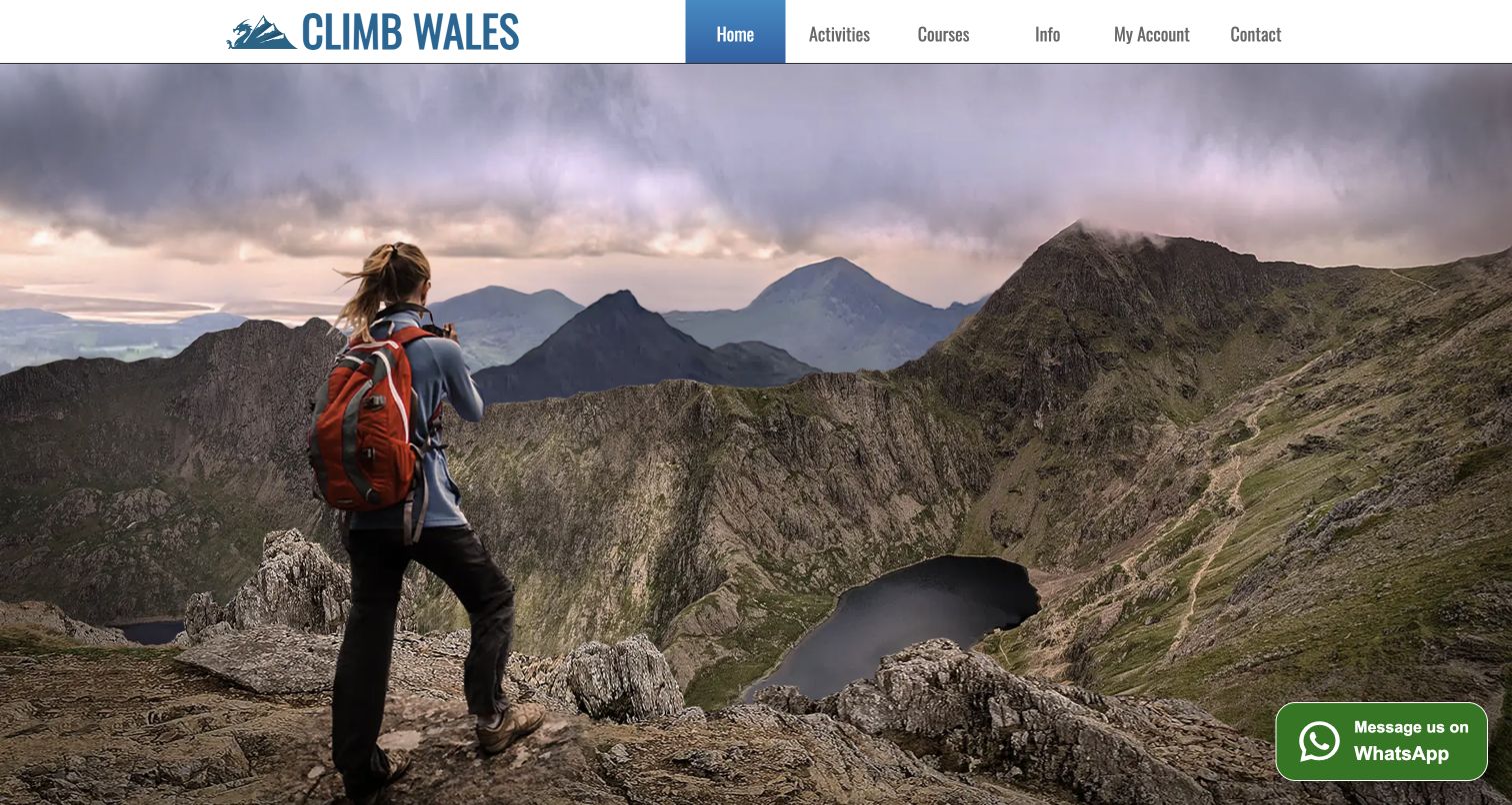
Climb Wales opens with a full-width mountain photograph beneath a compact local brand and navigation. Activities and courses are separate top-level choices, and the body expands that distinction through cards for climbing lessons, mountain guiding and challenge days. The site explains its Snowdonia focus and provides routes to availability and contact, helping connect a scenic introduction to practical planning. The first viewport contains almost no explanation of the offer beyond the brand, however, so readers must scroll before seeing the main heading. Promotional award and rating statements also occupy attention that could explain the differences between services. The useful pattern is the distinction between learning a skill and arranging a guided experience.
What you can learn
Use local photography to establish place, then promptly explain what visitors can arrange there. Distinguish instruction from guiding in both navigation and page descriptions, and provide a clear path to availability without treating reputation statements as a substitute for service detail.
Pros
Activities and courses have separate navigation routes.
The body connects lesson, guiding and challenge formats to the region.
Cons & considerations
The image-dominated first view postpones the main offer explanation.
Awards and rating claims compete with more useful service comparisons.
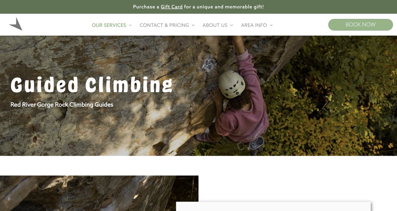
Southeast Mountain Guides gives its Red River Gorge climbing page a direct heading over a close climbing photograph. The deeper content is unusually specific about visitor questions: first experiences, indoor-to-outdoor learning, full versus half days and the distinction between guided climbing and via ferrata. A group-size table states that rates are per participant and identifies excluded taxes and fees. These details help visitors understand the commercial format before following the booking link. The page is also long, with substantial testimonials and repeated explanations before pricing. Some assertions about learning outcomes need individual qualification. The design lesson lies in addressing real planning uncertainties and labeling the basis of the comparison.
What you can learn
Write practical questions in the visitor’s language and answer them beside clearly labeled prices. Keep different activities distinct, avoid implying a universal learning timeline and make long pages navigable so useful details remain reachable without reading every testimonial.
Pros
Questions distinguish related activities and different visitor starting points.
The rate table clearly states its per-participant basis and exclusions.
Cons & considerations
Long testimonial and explanatory sections delay the pricing comparison.
Broad learning-outcome statements need more individual context.
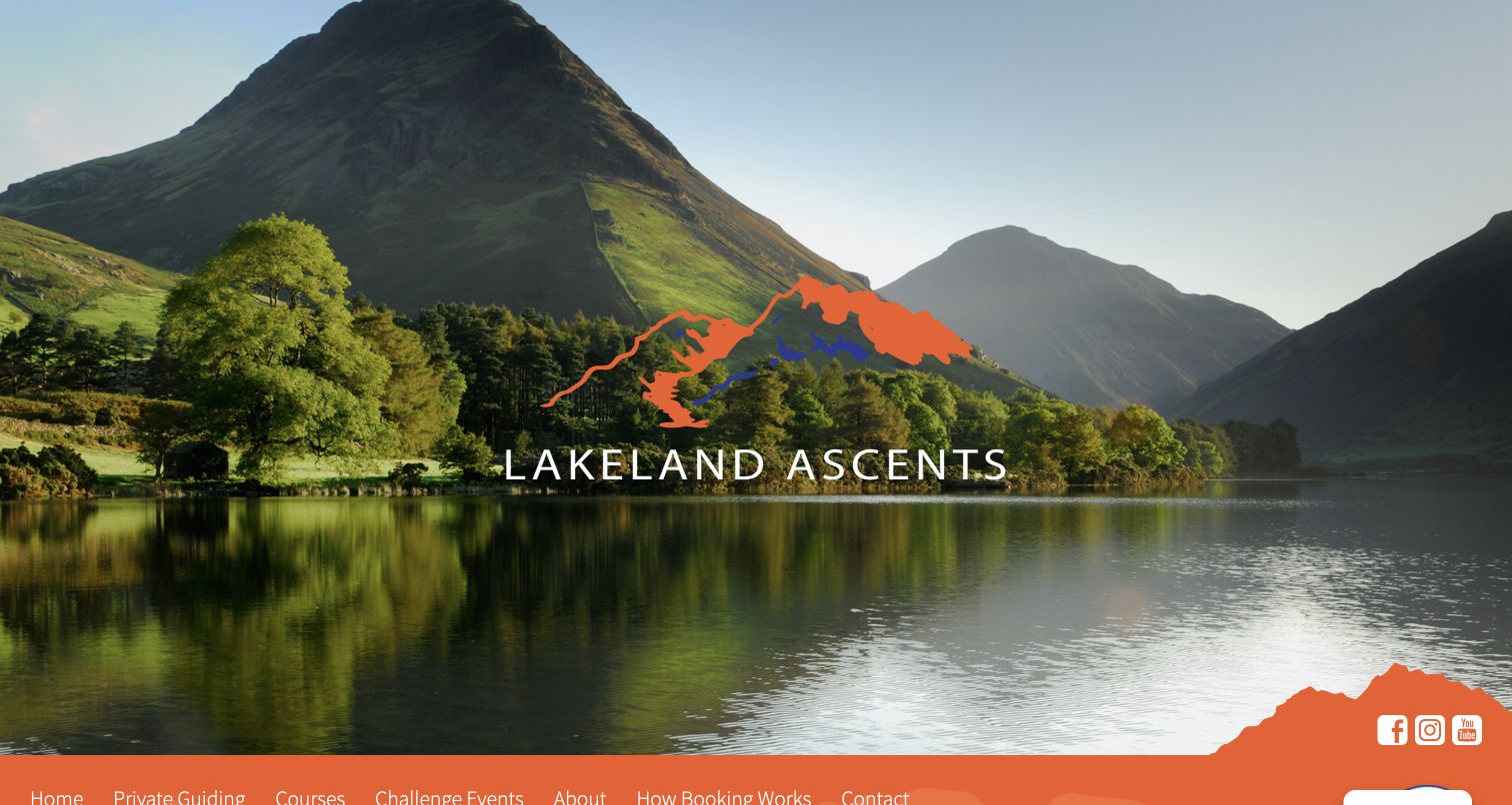
Lakeland Ascents introduces its course page with a large landscape and brand mark before the orange navigation appears. The body explains that instruction is tailored to the learner, then provides a linked list of guiding, introductory climbing, lead climbing, multipitch skills and self-rescue options. Each link has a substantial description, making the directory useful to readers who do not yet know which course name matches their goal. A separate How Booking Works navigation item acknowledges that arranging a bespoke day needs explanation. The full-screen scenic opening delays the page title and course content, while gift and video promotions interrupt the introduction. The strongest pattern is the plain explanation accompanying each learning route.
What you can learn
Give every course link enough context to explain its purpose, especially when the final session is customized. Keep the booking process accessible as a separate explanation, and let the actual course information appear sooner than optional gifts or promotional media.
Pros
Course links include descriptions of their intended learning purpose.
A dedicated booking-process route supports a bespoke service model.
Cons & considerations
The scenic opening pushes the course title below the first screen.
Gift and video promotions interrupt the early course explanation.
Kegan is a freelance web designer and developer with 15+ years of experience helping businesses turn complicated website requirements into clear, maintainable digital experiences. He works directly with clients from planning and design through development, launch, and ongoing support.
For rock climbing guide website design, his development approach focuses on rock climbing guide websites that explain course formats, experience requirements, locations and practical enquiries without unsupported safety or service claims. The scope can be a targeted improvement or a complete custom build, with responsive layouts, thoughtful content structure, and integrations chosen around the people using and maintaining the site.
Show 3 other rock climbing guide website designersHide other rock climbing guide website designers
Plan a climbing-guide website around decisions visitors can understand
Separate learning routes from guided objectives
Begin with the questions visitors bring to the business. Someone may want a first outdoor experience, help moving from a climbing wall to a crag, a structured course or support with a particular route. Those intentions should not disappear into one general adventure category. Map each to the services actually offered and identify which facts the visitor needs before making contact. Explain technical course names in ordinary language, using the provider’s approved prerequisites rather than assuming that an indoor grade predicts outdoor readiness. Keep age, experience, group format and objective as separate dimensions. A family day is not a skill level, and private instruction does not automatically mean advanced climbing. For each route, provide a short explanation, a clear location context and the next useful information page. Let uncertain visitors ask for clarification without presenting the website as a professional suitability assessment. Check the proposed structure against real inquiries handled by the team. A person comparing a scheduled beginner course with a private day should understand the difference without opening several unrelated pages or entering a booking flow. This exercise produces clearer navigation and more useful course descriptions before visual design begins.
Create a consistent practical information pattern
Choose a small set of facts that comparable offers will share. Intended audience, location, duration, published prerequisites, group arrangement and equipment information provide a useful starting point. When a price is shown, explain whether it applies to one participant, an entire group or a particular time block. Identify exclusions and variable arrangements using current provider-approved wording. A starting price should not imply that every visitor receives the same itinerary. Keep preparation, meeting and cancellation information accessible from the course description, and explain when final arrangements are confirmed. For custom guiding, tell visitors what information helps the team discuss their request, without collecting unnecessary personal details in the first step. Scheduled courses need visible dates and an understandable availability route; bespoke days need a clear inquiry process. Neither should require a person to interpret an unexplained checkout screen to understand the basic service. Compare the homepage cards, category pages and detailed descriptions together so repeated facts agree. Where an external booking provider is used, label the transition and maintain the essential explanation on the guide’s own website. The result should remain useful even when a visitor decides to read more before contacting anyone.
Give maintenance the same attention as the opening photograph
Create a short inventory of information that changes during the year: course dates, operating seasons, available regions, prices, equipment arrangements and links to external booking services. Assign responsibility for each item and connect updates to the normal operating routine. A page can remain visually impressive while advertising an expired course or an outdated meeting point. Keep present availability separate from future announcements, and distinguish general educational resources from time-sensitive operational advice. Review broad statements about qualifications, conditions and learning outcomes with the appropriate person before publication; a design review does not verify them. Check the image treatment as part of maintenance too. White type may read clearly over one photograph but disappear over snow or sky in another carousel frame. Keep the important service description as real text and provide a useful static image when motion is unavailable. Test navigation, ordinary notices and embedded booking links together so practical information stays reachable. Finally, preserve a clear contact route for uncertainty. A dependable website explains what is known, identifies what requires confirmation and avoids turning scenic presentation into a promise that every objective or learning outcome is guaranteed.
The editing job behind the design
Choose tools that keep guiding information dependable
Use a content system that makes course facts reusable. A change to a duration, price basis or location should not leave contradictory copies across the homepage, course cards and detailed pages.
Keep instructional content, scheduled dates and custom inquiries distinct in the information model. A shared booking platform does not remove the need to explain how the formats differ.
Use media deliberately. Real landscape and climbing photographs can communicate place and scale, but headings and practical facts should stay readable without waiting for a video or a particular carousel slide.
The public technology audit is a bounded source observation, not a complete backend inventory. Three source audits encountered access checks and produced no new stack conclusion. Their restrictions remain respected; technology, booking software and unseen services are never inferred from the appearance of a page.
Our WordPress website examples offer a separate look at publishing approaches. A visible platform label is evidence for that named page, not a guarantee that the same system will suit your requirements.
Before the public launch
Rock-climbing guide website planning checklist
Give first-time visitors a clearly explained starting route.
Separate guided objectives from structured learning courses.
Explain specialist course names in ordinary language.
Keep age, experience, format and objective distinct.
Publish current provider-approved prerequisites and preparation routes.
Show relevant locations and explain when meeting details are confirmed.
Label rates by participant, group or time block.
Distinguish scheduled dates from custom inquiries.
Keep essential course facts readable before an external booking transition.
Review seasonal information and dated listings regularly.
Check text contrast against actual photographs and video frames.
Qualify provider claims without implying guaranteed safety or learning outcomes.
These checks are a project checklist, not a performance, legal, security, or accessibility certification. Test real journeys with the people responsible for the website before making claims about the result.
Sources & editorial method
How this collection was selected and reviewed
This collection preserves the saved random draw of 15 distinct rock-climbing guide website properties. Every original review combines direct source reading with an inspected browser screenshot captured on November 10, 2026 UTC. The reviewed pages include homepages, course categories, specific course descriptions and a pricing page; each capture records its actual URL, timestamp, dimensions and attribution. One initial image-loading capture was retained privately and replaced with a genuine later capture after the image appeared. Ordinary cookie notices were rejected on two pages; no bookings, forms, accounts, payments or messages were submitted. All 15 sources received a bounded broad technology-audit attempt: 12 returned checked observations and three encountered access checks, which were respected without a new stack claim. Pure Outdoor is the explicit Editors Choice for its plain-language learning routes and consistent course comparisons, selected after reviewing all 15 properties. This is an editorial website-design selection, not an endorsement of service quality, safety, qualifications or results.
Each example links to its actual source page. Screenshots are direct browser captures with their own capture dates; moving imagery, announcements and live designs can change. The notes describe observable design choices and conditional tradeoffs, not measured traffic, conversion results, service quality, or accessibility conformance.
Technology labels use public page metadata, asset evidence, or explicitly cited platform documentation. Platform documentation is not a complete current deployment audit. A component reference may be legacy or unused; it is not a complete backend inventory. Unknown stacks are omitted. These sites are editorial examples, not our client portfolio.
Written, Edited and Curated are separate editorial records, not timestamps advanced by a rebuild. Website designs and imagery belong to their owners. See our editorial standards or suggest a correction.
Questions worth asking
Rock Climbing Guide website design questions
What should a climbing-guide homepage explain first?
Identify the region, the main service formats and the next useful route for a visitor. Separate a guided experience from a learning course, and provide an understandable starting point before showing an extensive activity catalog.
How should beginner and advanced courses be presented?
Describe the intended starting experience and the provider’s published prerequisites in ordinary language. Technical course names can remain, but should be accompanied by an explanation rather than functioning as the only selection criteria.
Should private guiding use the same booking route as scheduled courses?
The underlying system may be shared, but the website should explain the difference. Scheduled courses have advertised dates and formats; private objectives often need a discussion of goals and arrangements before a suitable offer can be confirmed.
What makes climbing prices easier to compare?
State whether each rate is per participant, per group or per time block. Show comparable durations together and identify exclusions or variable arrangements using the provider’s current wording. Avoid presenting a starting price as a universal final quote.
How much should the homepage rely on mountain photography?
Authentic imagery can establish the setting, but should not delay the service explanation. Keep headings readable over the actual image and provide practical routes that remain understandable when video, motion or a carousel does not play.
Does Editors Choice verify guiding credentials or safety?
No. It identifies an explicitly researched example of website design and communication. The reviews do not establish service quality, qualifications, safety, conditions, availability or suitability; those matters require confirmation with the provider.
A useful climbing-guide website turns interest into an informed next question. Pair genuine imagery with clear learning routes, comparable practical facts and current information, then make both further reading and an appropriate conversation easy to find.