Best After-School Program Websites of 2026 (17 Real-World Examples)
After-school websites that explain the afternoon, not just the activity.
Explore 17 after-school programme websites, from specialist activities and language classes to school-age care and academic enrichment. Compare the design decisions that help families understand the offer and find the relevant local information.
After-school is a time of day, not a single service model. A weekly language class, a tutoring appointment and a programme covering the afternoon until collection can all appear in the same search results, yet they answer different needs. A useful website makes that distinction early. Before presenting a booking button, it should explain what the programme actually is, who it is for and which practical details a family needs to confirm.
This collection deliberately includes specialist activity providers, school-age care networks and academic-enrichment organisations. Each review identifies the model it represents. Some screenshots show a dedicated provider entrance inside a broader website rather than a separate after-school timetable. Current first-party programme material was checked for topic fit; the images retain their original direct-capture dates. Inclusion does not imply that all locations offer the same service, that spaces are available or that a short class provides extended childcare.
Study how these sites organise programmes, age ranges, locations and first enquiries. Do not borrow unverified claims about supervision, transport, instruction quality or children’s outcomes. The most useful design reference is the relationship between a family’s question and the information that answers it. A distinctive photograph may communicate character, but the programme’s actual arrangements need readable, maintained text.
Before the examples
What makes good after-school program website design in 2026?
The programme model is unambiguous
Say whether the offer is extended care, a defined activity session, tutoring or another arrangement. Distinguish school-term programmes from camps, weekend classes and ordinary trial lessons. Parents should not have to infer coverage or collection arrangements from a general promise about learning or confidence.
Local practical information is easy to reach
Give the relevant ages, venue, dates and hours a clear place in the journey. Where a provider serves several centres or schools, connect the programme to the actual location. State which details require confirmation and do not let a broad network homepage imply uniform transport, capacity or availability.
The next step is proportionate
An initial enquiry, a tour, a waiting list and a confirmed registration are different actions. Label them accordingly and ask only for information appropriate to that stage. Keep essential programme details available without requiring families to submit a child’s full record just to investigate the offer.
The collection · 17 examples
17 after-school program websites worth studying
These are public website-design examples, not a ranking of programme quality or safeguarding arrangements. Editors Choice highlights a specialist academic-support provider with clearly separated service routes. The other reviews examine school-age care, language enrichment and academic support, always distinguishing their practical attendance models.
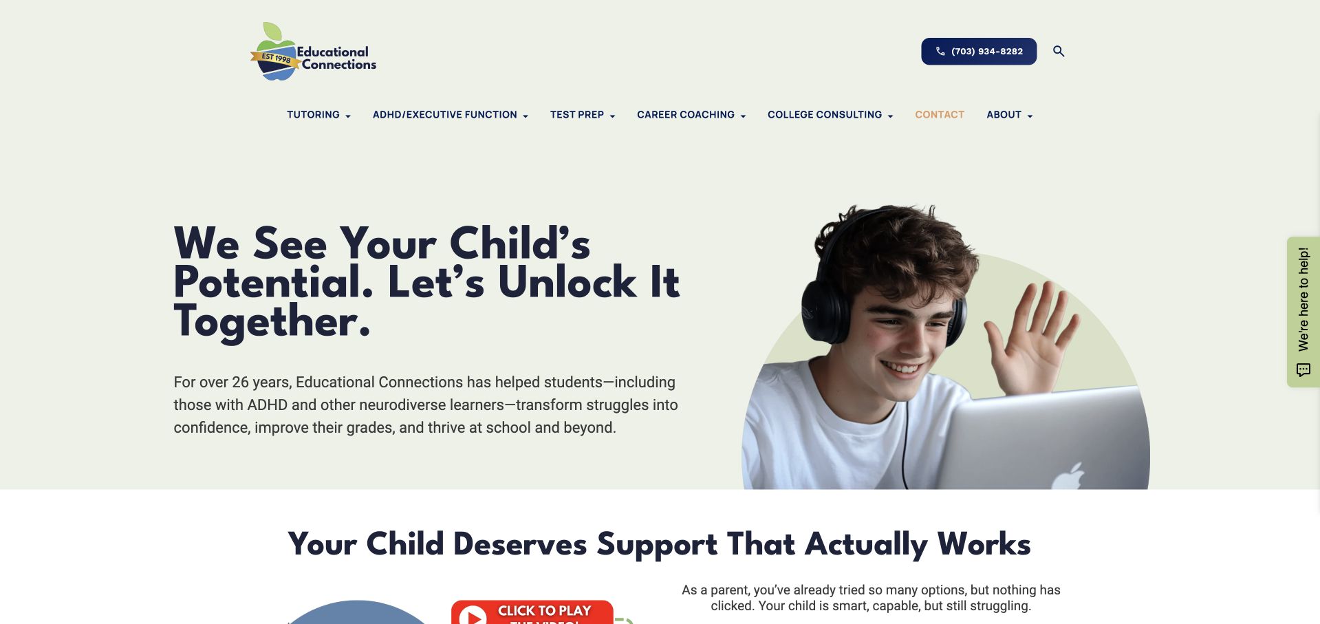
Educational Connections pairs a pale introduction with a student photograph and a navigation system distinguishing tutoring, executive-function coaching, test preparation and college consulting. Current official material confirms support offered outside the normal school day. In this collection it is an academic-enrichment example, not a claim of supervised after-school childcare. The useful design decision is the separation of different kinds of support before the consultation stage, so a parent can begin to identify the relevant subject or service.
What you can learn
Name the form of after-school support precisely. A tutoring session, coaching appointment and childcare programme involve different expectations, even if families compare them during the same search. Make the service type and delivery format explicit before collecting a child’s personal information in a first enquiry.
Pros
Distinct service categories give the broad academic offer a browsable structure.
The public introduction presents the support model before the consultation action.
Cons & considerations
If specialised support is described, avoid turning marketing language into a promise of an individual outcome.
If the offer is virtual or session-based, do not leave families to infer the attendance arrangement.
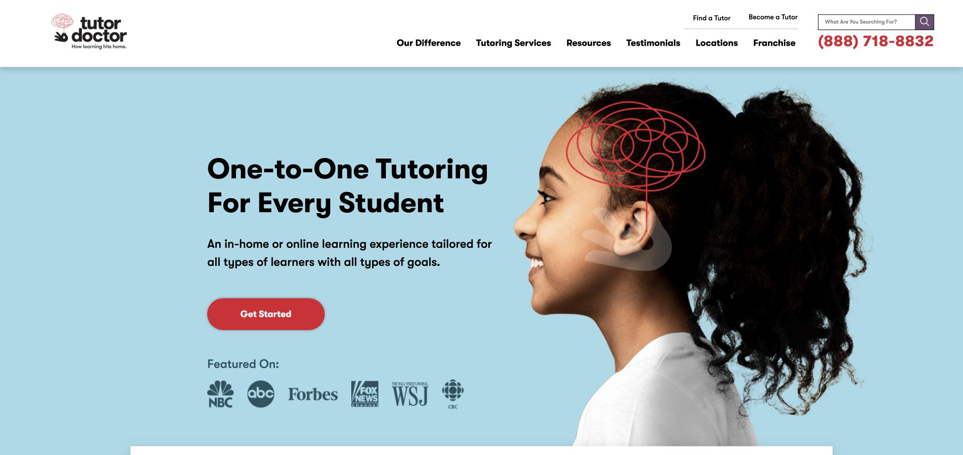
Tutor Doctor pairs a light-blue opening with a student portrait and a concise explanation of one-to-one tutoring. The text explicitly identifies in-home and online learning, while subjects, locations and tutor recruitment occupy separate header routes. Current official local programme material describes after-school scheduling. This is an academic-enrichment example, not extended childcare. The useful design choice is to make the delivery format part of the first explanation rather than expecting a parent to discover it only during a consultation.
What you can learn
State the attendance model as clearly as the subject. Families comparing after-school options need to know whether they are exploring an online appointment, an in-home lesson or a venue-based programme. A shared brand homepage can introduce the format, while local information explains the particular schedule and availability without implying that all branches offer identical arrangements.
Pros
The introduction explicitly distinguishes in-home and online learning.
Subject and location routes support investigation before an enquiry.
Cons & considerations
If local scheduling varies, qualify it on the relevant destination rather than promising universal availability.
If recruitment shares the header, keep it distinct from the route for families seeking tutoring.
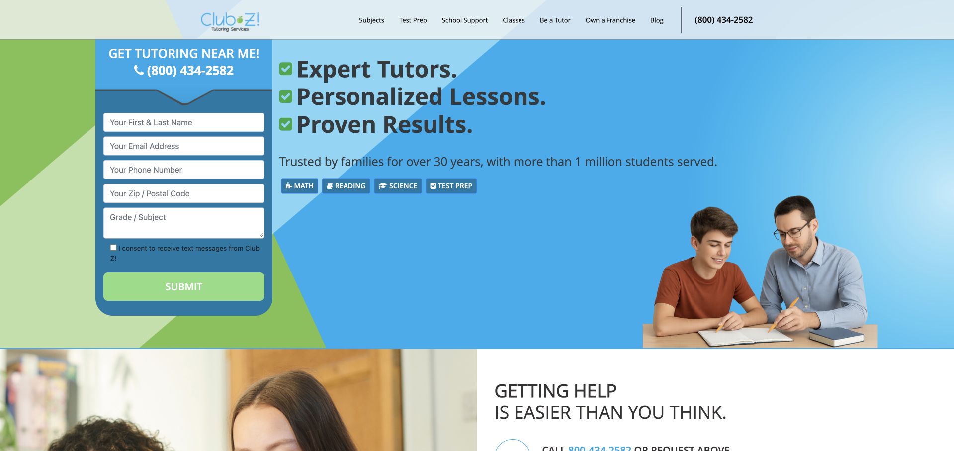
Club Z! Tutoring uses a blue-and-green opening with an in-page enquiry form beside a tutor-and-student photograph. Subject buttons identify maths, reading, science and test preparation, and the header separates school support from other academic routes. Current official local pages explicitly describe after-school tutoring in home and online formats. The retained image is the broader provider homepage, not a local schedule or extended afternoon care. Its practical design lesson concerns subject recognition and the visibility of the first contact step.
What you can learn
Explain the support model before treating the first form as the only route forward. A parent should be able to investigate subjects, delivery and local arrangements without inferring them from a stock learning photograph. Clearly distinguish a request for information from a confirmed appointment or a guaranteed programme place.
Pros
Recognisable subject labels make the academic scope easy to scan.
The local enquiry form is visible rather than hidden behind an ambiguous action.
Cons & considerations
If several contact fields are required, review which are necessary for an initial enquiry.
If promotional outcomes lead the headline, keep the actual service and attendance model equally explicit.
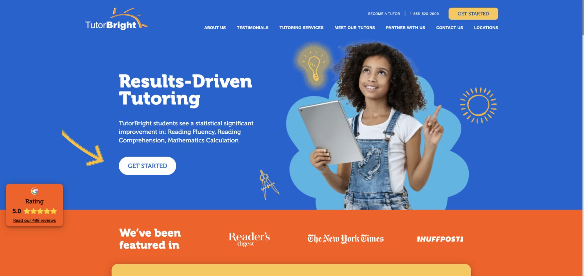
TutorBright combines a saturated blue background with a student photograph and yellow illustrative accents. The main navigation distinguishes tutoring services, tutor profiles, locations and a starting action, and the official page describes in-home and online support. This is included as session-based academic enrichment, not childcare or a particular after-school timetable. The design is useful for examining how a bold brand introduction can coexist with information about the people and formats behind the offer.
What you can learn
Let visitors explore the subject and delivery model behind an energetic introduction. A family comparing after-school support needs to understand what a session involves and how to investigate the relevant arrangement. Tutor profiles and service pages can provide that context without turning a promotional claim into an assurance about an individual learner’s result.
Pros
The header provides separate routes to services, tutors and locations.
A consistent colour system connects the main message and starting action.
Cons & considerations
If results language is prominent, give its basis and limits rather than treating it as a universal promise.
If a fixed review badge is used, ensure it does not obscure controls or practical programme text.
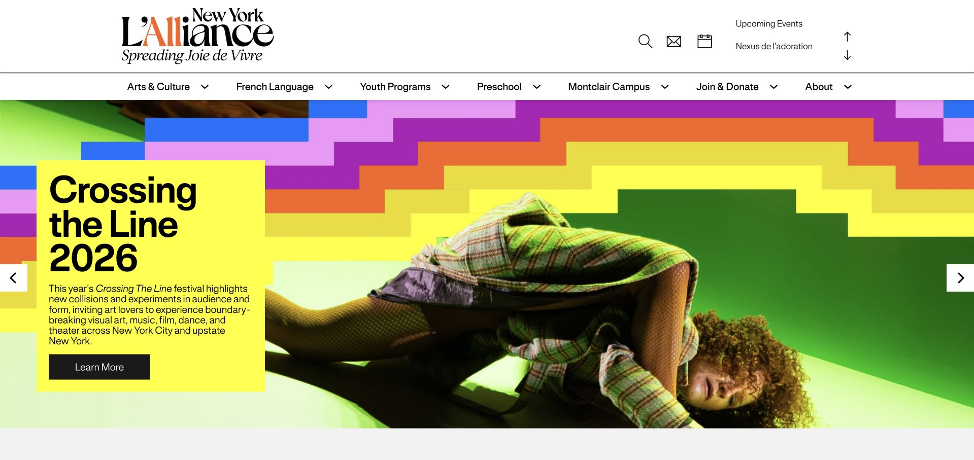
L’Alliance New York’s homepage introduces a cultural organisation through vivid festival graphics, while the Youth Programs menu exposes an Afterschool Programs route. Its current first-party programme page describes French-language creative activities with age groups, times and enrolment choices. The retained screenshot is the broader homepage, not that programme page. The design is useful because it shows how a short enrichment offer can remain discoverable within a much larger mix of language classes, arts activity and family programming.
What you can learn
Give a time-limited after-school class its own practical page while preserving the cultural identity that makes it distinctive. State the age range, language and session commitment clearly, and do not present a short enrichment session as interchangeable with a full afternoon of childcare.
Pros
The youth navigation gives after-school activity a recognisable destination.
The wider cultural identity supplies context for the specialist language offer.
Cons & considerations
If a festival dominates the homepage, keep the youth programme route visible in the header.
If several age groups share a schedule, show eligibility beside each actual class choice.
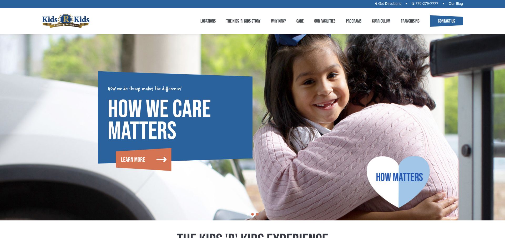
Kids ‘R’ Kids uses a large caregiver-and-child photograph with a blue message panel to introduce its wider care offer. The current public programme navigation explicitly distinguishes Before and After School from infant, preschool, pre-kindergarten and summer activity. For this collection, the important design choice is that the school-age route does not depend on interpreting the opening photograph, which mainly communicates a broader childcare identity. A parent can move from that shared brand introduction towards the relevant programme category.
What you can learn
A provider serving many ages should name its school-age offer directly and then connect it to a location. Keep before-school, after-school and holiday arrangements distinct where they differ. A general message about care can establish context, but it cannot answer whether a particular centre serves a particular school or afternoon schedule.
Pros
Programme navigation explicitly includes before- and after-school activity.
The care-focused visual identity connects the separate age-group offers.
Cons & considerations
If local availability varies, avoid implying that every academy runs every programme.
If the hero rotates, keep the school-age route available outside the slide content.
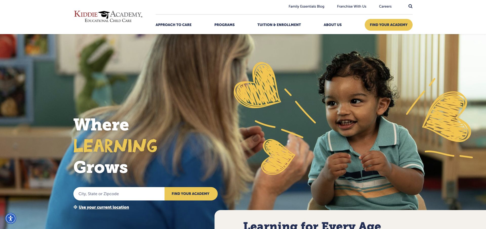
Kiddie Academy puts a location-search field inside a large classroom photograph and follows it with Learning for Every Age. Its current public navigation labels School Age separately from younger programmes, and practical enrolment information directs families to the local academy. The screenshot shows a shared brand homepage rather than an individual after-school schedule. The useful pattern is the pairing of two necessary decisions: finding a suitable age category and identifying the place that can explain the actual arrangement.
What you can learn
Combine age-based discovery with a clear location route, but avoid treating a successful search as proof of a place or programme. A local destination should explain the specific school-age offer, availability and next conversation so parents do not have to repeat the same enquiry across several unrelated forms.
Pros
Age labels make school-age activity distinguishable from preschool programmes.
The opening search makes local discovery an obvious task.
Cons & considerations
If programme availability differs, filter or explain the difference before promising a match.
If location permission is offered, retain an ordinary city or postcode search alternative.
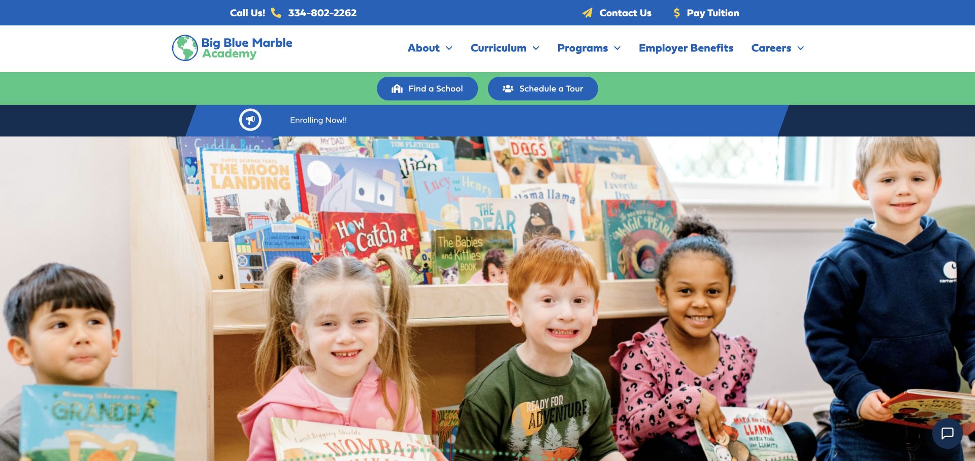
Big Blue Marble Academy combines an energetic classroom photograph with a blue-and-green identity and prominent school-finding actions. The current programme menu explicitly names Before-/After-School Care alongside younger age groups and camps. The homepage itself remains a broad introduction to the organisation rather than a detailed school-age schedule. For after-school website design, the transferable decision is to make an older-child offer a recognisable programme category without requiring a parent to infer it from preschool-led imagery.
What you can learn
Use the shared homepage to introduce the organisation, then give school-age care a direct path with local details. Explain how the afternoon offer differs from preschool, summer camp and occasional activities. A programme label is a starting point for discovery, not a substitute for the location-specific arrangements a parent must confirm.
Pros
The programme menu explicitly includes before-/after-school care.
School-finding and tour routes provide visible ways to investigate a local setting.
Cons & considerations
If younger-child imagery dominates, add text that makes the older-child route unmistakable.
If the same programme name covers different centres, publish the relevant local qualifications.
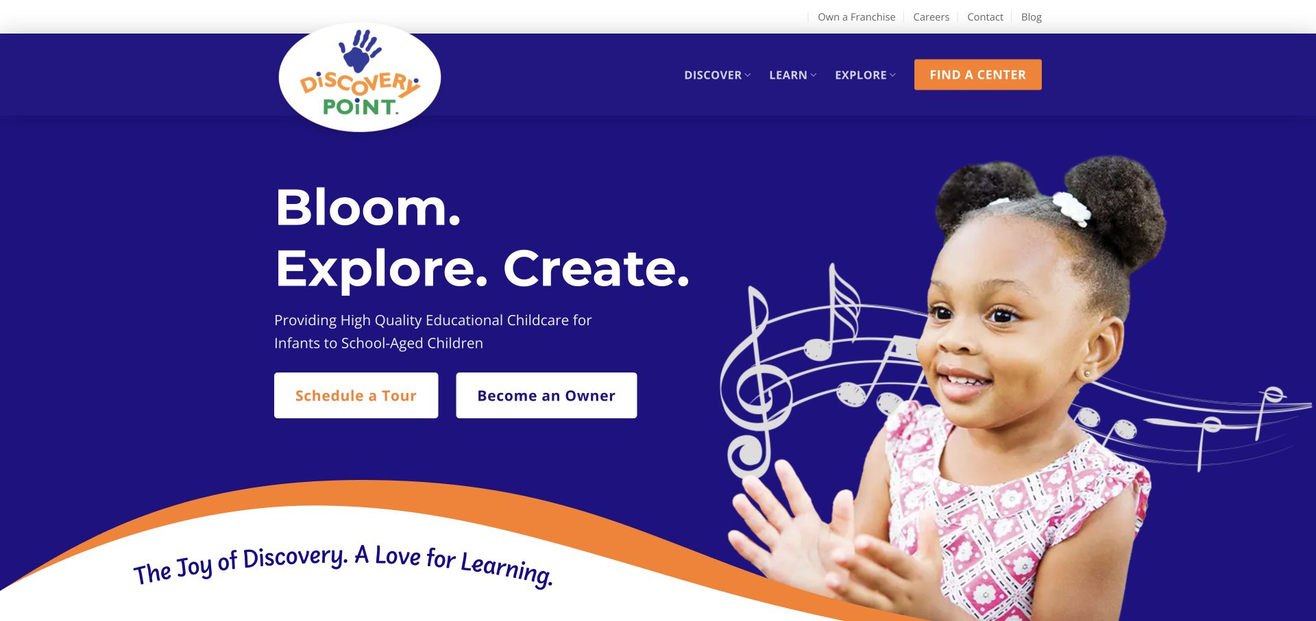
Discovery Point pairs a deep-blue opening with a child photograph, playful graphic elements and separate actions for a tour and business ownership. The introductory text explicitly includes school-aged children, while the current public page also names Before and After School Programs. This makes the age range clearer than relying on a general childcare label alone. The example is useful for examining how a broad provider can keep the school-age offer discoverable even when the opening image represents a younger child.
What you can learn
State the ages served in readable text and connect each programme to a practical local route. Do not rely on a photograph to explain eligibility. If parent enquiries and franchise enquiries share the homepage, keep their labels and visual priorities distinct so a family can identify the relevant next step.
Pros
The opening description explicitly includes school-aged children.
Parent and prospective-owner actions use different labels.
Cons & considerations
If before- and after-school arrangements vary, explain them on each local programme page.
If several hero slides are used, keep essential age information outside the changing message.
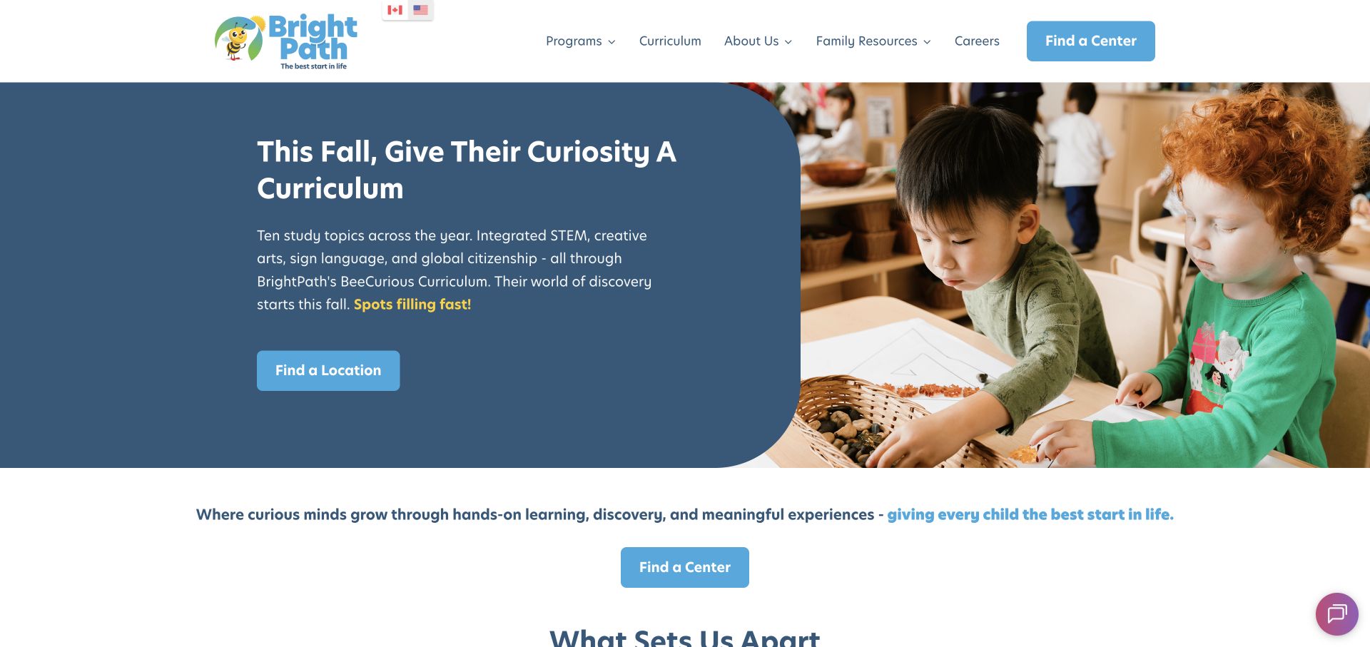
BrightPath’s US homepage uses a restrained blue panel beside classroom imagery and repeats a clear Find a Center action below the introduction. The current official US FAQ confirms that before- and after-school care is offered at many, rather than all, centres. That qualification is important to the design lesson: a shared homepage can introduce an organisation, but a family still needs location-specific information. The screenshot is a general provider entrance, not evidence of a particular centre’s transport, hours or available places.
What you can learn
Use location discovery to resolve operational differences instead of making one broad promise for the whole network. After a parent selects a centre, show the actual school-age programme and the questions that still require confirmation. Keep general curriculum messaging separate from the practical afternoon arrangement.
Pros
A prominent centre-finding action gives the broad offer a usable local route.
The public FAQ qualifies school-age availability rather than implying uniform coverage.
Cons & considerations
If a centre does not offer after-school care, make that clear before a family submits an enquiry.
If transport is mentioned, identify the relevant centre and served schools rather than generalising.
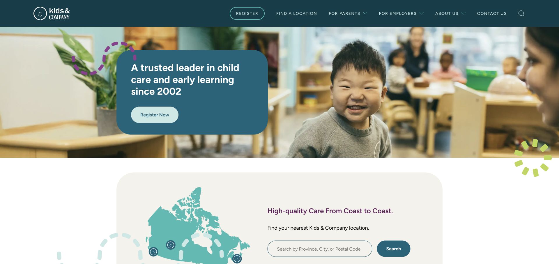
Kids & Company opens with a classroom photograph and a concise care introduction, then offers a map-led location search. The current public menu distinguishes School-Age Learning and Before & After School Care from younger programmes, while employer services have a separate route. This makes the homepage useful as an audience-routing example rather than an after-school timetable. A parent exploring a local afternoon arrangement and an employer investigating benefits do not need to start with the same information or the same form.
What you can learn
Separate family programme discovery from organisational sales, then make the school-age route specific enough to investigate locally. A network-wide map can support that journey, but the destination should explain which age group, schedule and service model the selected centre actually offers.
Pros
The menu distinguishes school-age learning from early education.
Parent and employer routes recognise different visitor intentions.
Cons & considerations
If the map spans several regions, preserve the selected location throughout the enquiry journey.
If programme names differ locally, explain the equivalence rather than relying only on brand terminology.
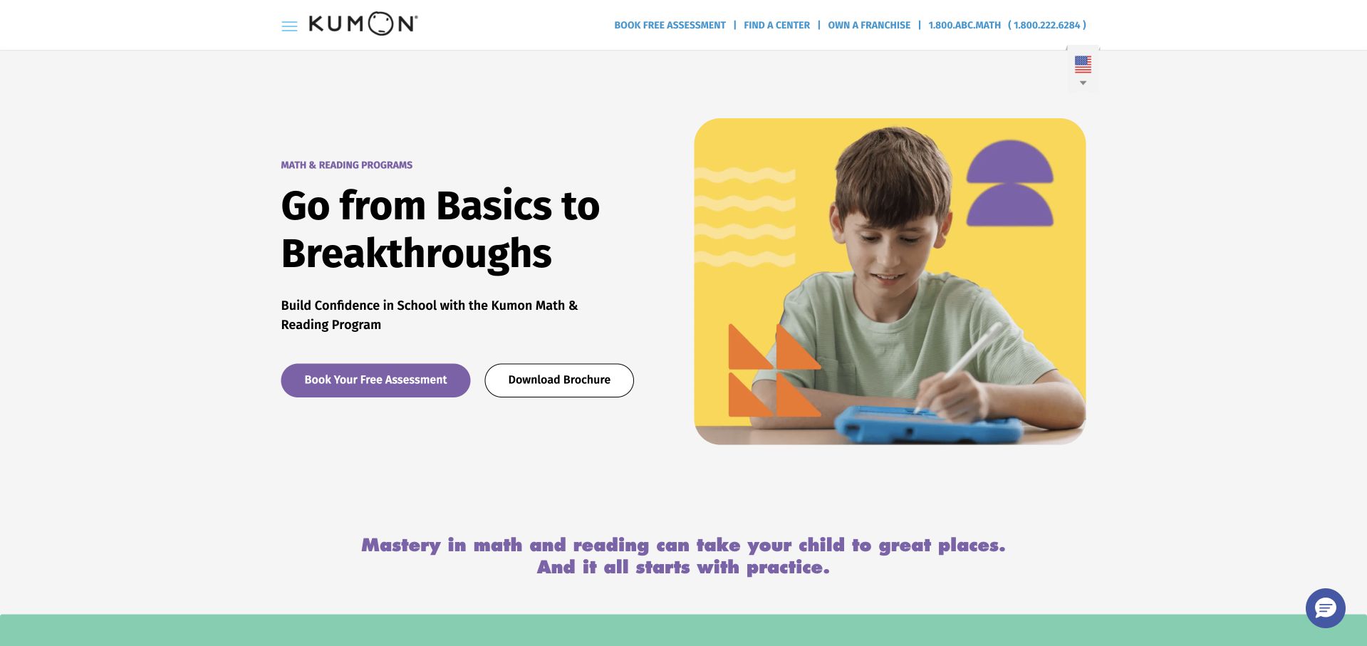
Kumon uses a restrained white layout, a student photograph and a bold subject-led introduction to present maths and reading. The main navigation separates the learning method, individual subjects and centre finding, while the current official page identifies its after-school learning offer. This is an academic-enrichment programme rather than a full afternoon of childcare. The design is useful because a limited subject range can be introduced clearly without displaying a large catalogue or making a parent choose between many unrelated services.
What you can learn
When the offer is focused, explain the method and the practical commitment before expanding the sales message. Help parents distinguish subject study from homework supervision or general care, and connect the broad explanation to the local centre where actual attendance and availability can be confirmed.
Pros
A limited set of subject routes keeps the core offer understandable.
The method and centre-finding links support different stages of investigation.
Cons & considerations
If an assessment is the next step, explain its purpose before asking for registration details.
If home practice is part of participation, make that commitment clear rather than implying all activity occurs on site.
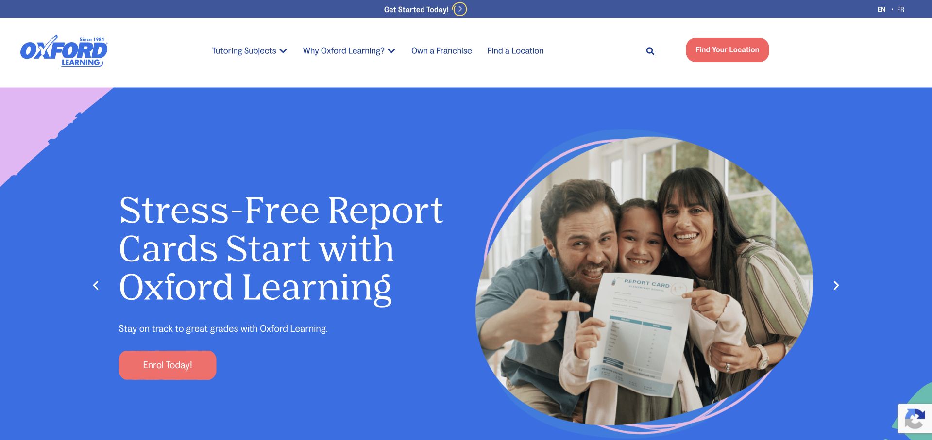
Oxford Learning combines a blue-and-purple promotional opening with a family photograph and an enrolment action. The current public navigation lets visitors explore by age, subject and programme, while the official FAQ describes after-school attendance hours. It is included here as tutoring and enrichment, not as a promise of daily childcare. The useful pattern is the separation of programme discovery from local-centre selection, allowing a parent to investigate the type of support before discussing the specific arrangement.
What you can learn
Give a broad academic offer more than one sensible entrance, such as subject and age, without forcing every possible combination into the first screen. Preserve a clear location route so a visitor can move from general programme information to the actual schedule and enrolment conversation.
Pros
Age and subject routes support different ways a parent may describe a need.
A local-centre route connects general information with practical availability.
Cons & considerations
If seasonal campaigns lead the page, keep the ordinary programme routes visible alongside them.
If outcomes are promoted, distinguish the provider’s claims from the specific service description and attendance commitment.
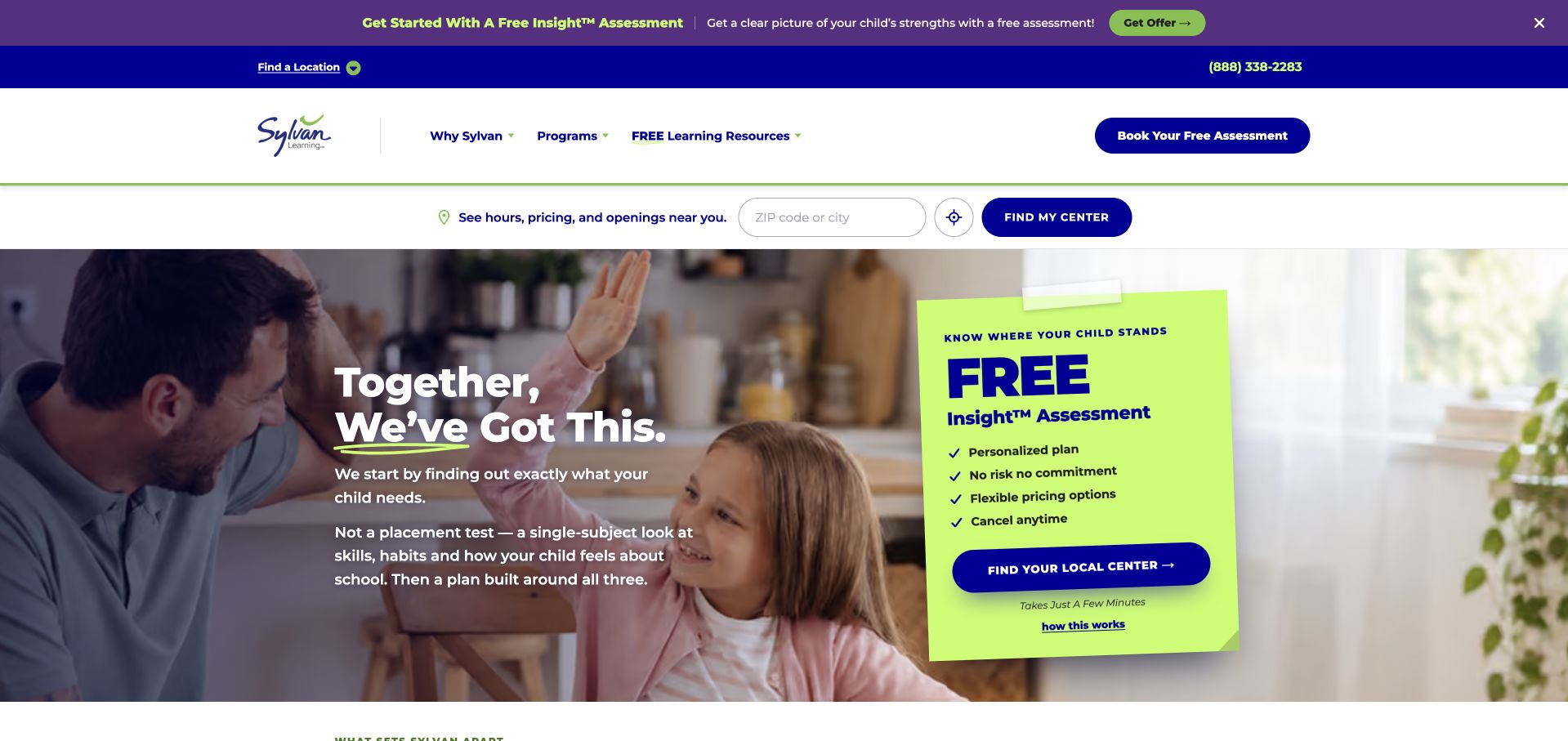
Sylvan Learning pairs a parent-and-student photograph with a prominent assessment action and a visible centre-finding field. Its current public offer separates tutoring subjects, test preparation, study support and additional learning activities. In this collection, the site represents academic enrichment rather than a full after-school care arrangement. The design is useful for studying how a large service catalogue can still provide one recognisable starting point, while keeping programme information available for parents who want to investigate before making contact.
What you can learn
Balance a clear starting action with a genuine browse-first route. A parent may know the subject they are looking for, or may only know that they want a conversation. The homepage can support both without implying that an initial assessment is the same thing as enrolment or a guaranteed result.
Pros
Centre finding gives the national offer a practical local entrance.
Subject and study-support categories make the wider catalogue explorable.
Cons & considerations
If an assessment is promoted as free, explain its actual scope beside the action.
If sales copy dominates the opening, preserve a clear route to format, schedule and programme information.
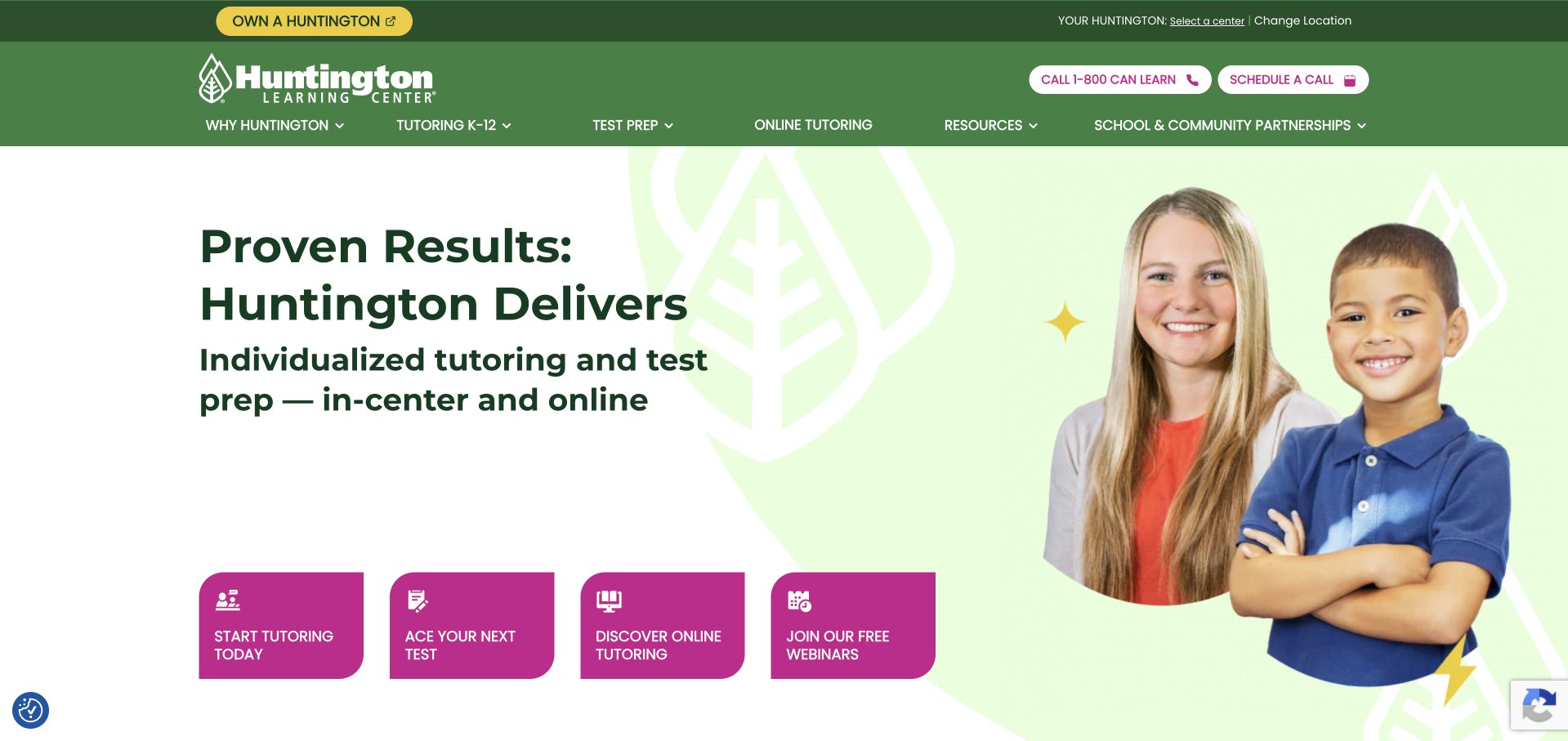
Huntington Learning Center uses a green identity, a teacher-and-student photograph and a concise introduction separating tutoring from test preparation. A row of coloured actions offers recognisable next steps, including starting tutoring and discussing a test goal. The current official offer confirms academic support for school-age learners outside the classroom. It is an enrichment example in this guide, not evidence of school pickup or continuous afternoon care. The practical design lesson is to expose service choices before asking a family to describe everything in one generic form.
What you can learn
Turn the most common reasons for visiting into direct, clearly named routes. Keep subject tutoring, test preparation and online delivery distinct where the arrangements differ. A parent should be able to choose a relevant conversation without interpreting internal programme names or assuming that every service has the same attendance format.
Pros
The first actions distinguish tutoring from test-preparation enquiries.
A consistent green identity connects the separate service choices.
Cons & considerations
If several buttons compete, use wording that makes their different destinations obvious.
If numerical outcomes appear elsewhere, do not use them as a substitute for practical programme information.
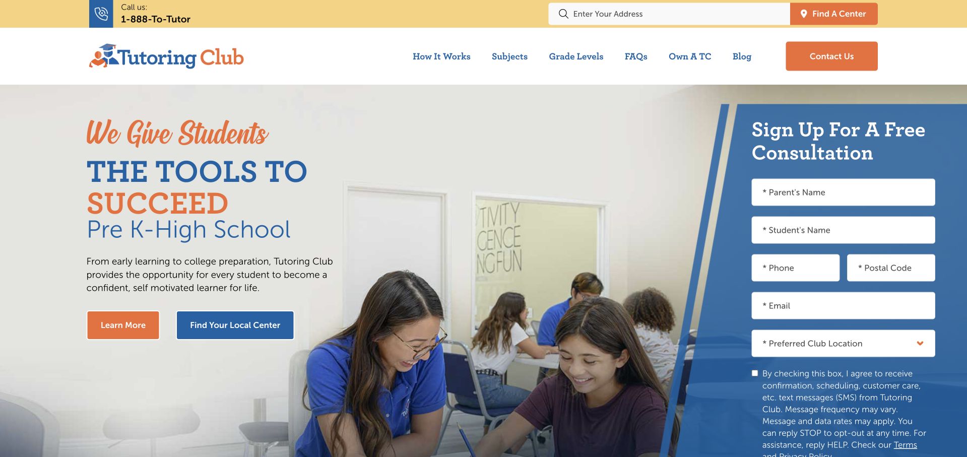
Tutoring Club places a broad school-age learning introduction beside an in-page consultation form. The header separates subjects, grade levels and centre finding, with the current public site naming school support and study skills as well as core academic subjects. This is a session-based academic-enrichment example, not a claim that the provider offers full afternoon childcare. The retained screenshot includes the actual query-bearing source URL, which remains part of the original capture record rather than being rewritten as a different page.
What you can learn
Let parents understand the scope and intended age group before asking for a consultation. If a form appears beside the introduction, keep the subject and local-centre routes available so visitors can investigate what they need rather than treating submission as the only way to learn about the programme.
Pros
Subjects and grade levels provide two concrete ways to explore the offer.
The form is presented as a consultation rather than an immediate class purchase.
Cons & considerations
If the first form requests several child details, review whether every field is necessary at that stage.
If centres differ, establish the relevant location before implying a particular attendance arrangement.
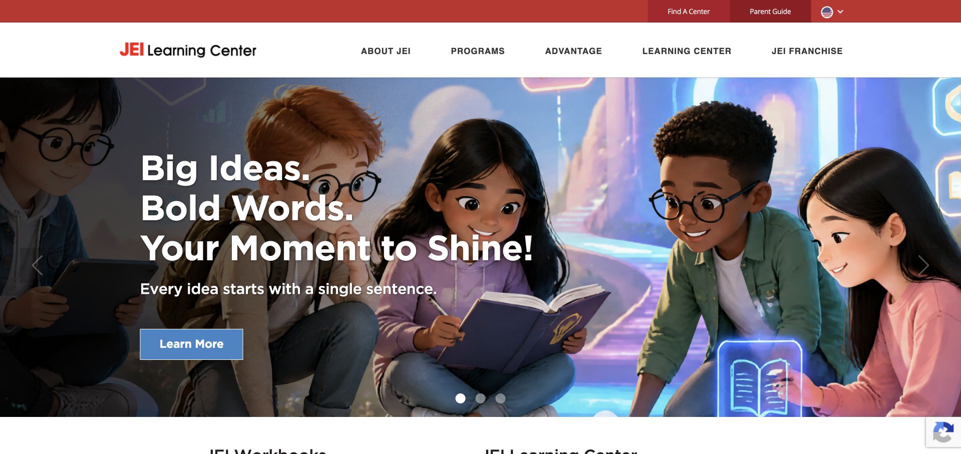
JEI Learning Centers combines a red-and-white header with an illustrated learning scene and a subject-oriented opening message. Programme and centre-finding routes remain visible in the navigation. Current official centre pages identify after-school tutoring and publish local class hours, while the retained screenshot is the broader provider homepage. That distinction matters: a national introduction can explain the programme family, but it does not establish a particular centre’s available times or whether a place is open.
What you can learn
Use the shared website to explain subjects and the programme structure, then let local pages resolve attendance. Keep the distinction between a learning session and extended care explicit. If an assessment precedes enrolment, describe the sequence without suggesting that browsing the website or requesting information already reserves a place.
Pros
The programme and centre routes separate subject discovery from local arrangements.
A consistent illustrated identity gives the learning offer visual recognition.
Cons & considerations
If the national site does not list local hours, make the handoff to centre information obvious.
If programme labels are unfamiliar, explain them in ordinary subject and age terms before the enquiry stage.
Kegan is a freelance web designer and developer with 15+ years of experience helping businesses turn complicated website requirements into clear, maintainable digital experiences. He works directly with clients from planning and design through development, launch, and ongoing support.
For after-school program website design, his development approach focuses on programme ages and formats, locations and schedules, clear distinctions between enrichment and supervised care, practical parent information, and dependable enquiry or registration handoffs. The scope can be a targeted improvement or a complete custom build, with responsive layouts, thoughtful content structure, and integrations chosen around the people using and maintaining the site.
Show 3 other after-school program website designersHide other after-school program website designers
Plan an after-school website around the real family journey
Describe the actual service before the brand promise
Start the brief with a plain definition of the programme. Record whether it is a fixed-length class, a recurring learning appointment, a school-based club or a longer care arrangement. Then describe the intended ages and the place where it happens. These distinctions affect nearly every part of the website, from navigation labels to the questions asked in the first enquiry. Do not use one generic Register button to conceal materially different offers.
A strong activity identity can still have a practical introduction. An activity photograph communicates the subject, but it does not explain whether a child attends one lesson or a whole afternoon. A classroom image does not establish collection times or whether homework support is included. Put the core explanation in ordinary page text and keep aspirational statements subordinate to the actual programme description.
Separate age, school and location decisions
Families may begin with different constraints. One parent knows the child’s school and needs an eligible local programme; another knows the activity but needs to identify the appropriate age group. Write down these starting points before choosing the search or filter interface. A short programme may need only a clear list, while a network may need location finding and programme-specific destination pages.
Do not assume that a centre result establishes school coverage or available places. If the organisation provides transport or serves selected schools, publish only the current arrangements it can verify and identify the relevant programme. If the offer is a short enrichment session without transport, state that clearly instead of letting families infer a wider service. Preserve the selected location when a visitor moves towards an enquiry.
Publish a timetable that can be kept accurate
Define the timetable fields with the people operating the programme. Depending on the actual offer, these may include term dates, days, session start and end, arrival arrangements, collection windows, venue and exceptions. A single recurring class and an extended afternoon programme need different descriptions. The website should reflect those differences rather than forcing every offer into a generic event card.
Assign an editorial owner to holiday closures, cancellations, full sessions and registration periods. Avoid maintaining separate versions of the same dates in a homepage graphic, downloadable PDF and booking system without a reconciliation process. Clearly label archived timetables. If a future term is not yet confirmed, publish an honest status and an appropriate enquiry route instead of displaying an old schedule as though it is current.
Explain the enquiry and enrolment sequence
Map the actual sequence from first interest to participation. A provider may begin with a conversation, a tour, a placement assessment or direct registration. Explain what each action does and what remains unconfirmed. Do not describe an enquiry as reserving a place unless the operating process genuinely supports that statement. If staff must check a location or age group, make that dependency understandable.
Keep the first form proportionate to the first task. A general programme enquiry may need a parent’s contact details and a relevant age or location choice, not a complete enrolment record. Decide separately how the organisation collects information needed later for participation. Test the actual form, confirmation and follow-up process with the responsible team; a visible success message alone does not prove that the right people receive the enquiry.
Distinguish programme information from provider assurances
A website can publish the programme’s actual policies, staff roles and practical arrangements without making broad claims it cannot support. Show which documents apply, who maintains them and where a family can ask questions. A design review is not an assessment of a provider’s supervision, safeguarding, licensing, instruction quality or suitability for a particular child.
Treat testimonials and numerical outcomes as attributed material, not as a replacement for a service explanation. Confirm permission to publish names, photographs and quotations, especially when children are involved. Do not invent participant identities or decorative testimonials to make a new programme seem established. A clear account of the actual afternoon can be more useful than a collection of general claims about confidence or future success.
Use images to explain the setting and activity
Choose photographs with a defined editorial purpose. They might show the activity, the room, the equipment or the approach to a particular subject. Check that the image represents the programme being described, rather than a different age group or a holiday camp used without explanation. Secure the required permissions and keep ownership and attribution records with the asset.
Keep essential eligibility, timing and contact information outside images and video. A family should not need to pause a carousel or read small lettering inside a photograph to discover the offer. Provide useful text alternatives where an image carries meaning, and preserve readable static content if the visual does not load. Use visual energy to support the explanation, not to compete with practical programme details.
Make the local page useful on a parent’s phone
Prototype the information a parent is likely to check while travelling or coordinating a day: the location, the relevant programme, the contact route and the published schedule. Keep these details easy to identify without a large promotional introduction. If the organisation has several branches, repeat the local name clearly so visitors do not mistake central marketing information for a specific venue’s arrangements.
Test navigation, links, forms and expandable sections with a keyboard and at smaller screen sizes. Use descriptive link text rather than a page full of identical Learn More actions without context. If a booking system opens on another domain, maintain consistent programme names and explain the handoff. Do not infer usability or accessibility conformance from a tidy desktop screenshot; those require separate testing of the actual journey.
Keep programme and operational content maintainable
Choose an editing model that the real team can operate. A small activity provider may need a few structured programme pages and a maintained timetable. A larger network may need reusable age-group fields, location relationships and an integration with registration software. Start with content ownership and the update process before selecting a page builder or catalogue application.
Create a recurring review list for age ranges, dates, staff contacts, local arrangements and inactive enrolment links. Define what happens when a session fills or a programme closes. Keep public programme information separate from private participant records and document the actual data configuration before publishing privacy promises. The long-term quality of the website depends as much on accurate updates as on the first design.
The editing job behind the design
Choose a publishing system that fits programme and location updates
Begin with the number of real programmes, venues and recurring updates. A manageable set of pages may be clearer than a large search interface when the offer is small. If several locations share a programme family, model the relationship explicitly so editors can publish local exceptions without duplicating the whole description.
Treat the public website, enquiry form, payment system and participant-management platform as separate parts of the workflow. A technology visible on the homepage does not establish what runs a linked registration portal or how private records are handled. Unknown stack items are left empty in this authored collection rather than inferred from its visual style.
Test representative programme states before launch: open registration, waiting list, a closed term, a cancelled session and an enquiry requiring local confirmation. Check who can update each state and what the visitor sees after acting. Make decisions about data collection, retention and access from the actual implementation, not a borrowed privacy sentence or a software vendor’s general marketing page.
Our WordPress website examples offer a separate look at publishing approaches. A visible platform label is evidence for that named page, not a guarantee that the same system will suit your requirements.
Before the public launch
After-school programme website planning checklist
Define whether each offer is care, a short activity class, tutoring or another programme model.
State the intended ages and distinguish school-term programmes from camps and weekend classes.
Connect the programme to the actual venue or local centre.
Publish current days, dates, session times and relevant exceptions.
State school coverage or transport only where the specific arrangement is verified.
Explain the difference between an enquiry, tour, assessment, waiting list and confirmed registration.
Keep first-step forms proportionate and avoid collecting a full child record prematurely.
Provide a clear route for practical participation questions.
Verify permissions and attribution for participant photographs and testimonials.
Keep essential schedule and eligibility information outside images and video.
Assign responsibility for full sessions, cancellations, old terms and broken registration links.
Test the actual enquiry and external registration handoff on a phone and with keyboard navigation.
Distinguish general provider information from local programme availability.
Document the real data configuration before publishing privacy or access-control assurances.
These checks are a project checklist, not a performance, legal, security, or accessibility certification. Test real journeys with the people responsible for the website before making claims about the result.
Sources & editorial method
How this collection was selected and reviewed
We checked current first-party public material for programme fit and independently inspected genuine original direct browser captures in the stable authored library. Retained screenshots keep their original source URLs, timestamps and dimensions; new reviews are written for this after-school collection. The examples include care, activity classes and academic enrichment, with those differences stated explicitly. We did not register, enter participant systems, verify operational arrangements or assess programme quality, safeguarding, legal compliance or educational outcomes. Editors Choice is a website-design judgement, not a certification or service endorsement.
Each example links to its actual source page. Screenshots are direct browser captures with their own capture dates; moving imagery, announcements and live designs can change. The notes describe observable design choices and conditional tradeoffs, not measured traffic, conversion results, service quality, or accessibility conformance.
Technology labels use public page metadata, asset evidence, or explicitly cited platform documentation. Platform documentation is not a complete current deployment audit. A component reference may be legacy or unused; it is not a complete backend inventory. Unknown stacks are omitted. These sites are editorial examples, not our client portfolio.
Written, Edited and Curated are separate editorial records, not timestamps advanced by a rebuild. Website designs and imagery belong to their owners. See our editorial standards or suggest a correction.
Questions worth asking
After-School Program website design questions
Should a tutoring or language class be presented like after-school childcare?
No. They may be options families explore after school, but they can have different session lengths, attendance arrangements and responsibilities. State the actual model and practical commitment. Do not let a shared search phrase imply that a short class includes extended care, collection or transport.
What should a programme page explain before a parent enquires?
Explain the activity or service, intended age group, relevant location, published schedule and what the next action means. Describe any known local qualifications without making network-wide assumptions. Information that is genuinely still to be confirmed should be labelled as such.
Does a small programme need a complicated booking application?
Not necessarily. Clear maintained pages and a suitable enquiry route may fit a small offer better. Direct booking is appropriate only when the actual operating process can support the programme choice, availability and confirmation it presents. Choose the system around the workflow, not another provider’s visual design.
How can a multi-location provider avoid confusing families?
Connect every programme to the relevant location and preserve that choice through the enquiry journey. Explain differences in age ranges, school coverage, schedules and availability on the local destination. A shared brand homepage should not imply that all centres offer identical arrangements.
Can these screenshots establish that a programme is safe or effective?
No. They show public website content at the recorded capture time. They do not verify supervision, transport, staff checks, legal requirements, instruction quality or individual outcomes. Those matters need appropriate direct evidence and cannot be inferred from a design review.
Make the actual afternoon understandable. Borrow the clear programme routing, local context and practical information patterns, then build an honest explanation of the offer your team really operates.