Best Escape Room Websites of 2026 (29 Real-World Examples)
Escape room websites that make the game and booking conditions clear
A compelling escape room website has two jobs: establish the fictional world and explain the real visit. These 29 examples compare game presentation, group limits, private booking, difficulty, arrival guidance and the transition into a timed reservation.
Atmosphere can make a game memorable, but players still need to know whether their group fits, how long to allow and whether other people can join the booking. Put those operational facts beside the room story rather than forcing visitors to search a general FAQ.
Different groups have different requirements. A family, experienced pair and corporate team should be able to identify suitable options without interpreting a dramatic trailer as a complete description. This collection studies public presentation and does not certify game safety, accessibility or suitability.
Before the examples
What makes good escape room website design in 2026?
Put the visit facts beside the fiction
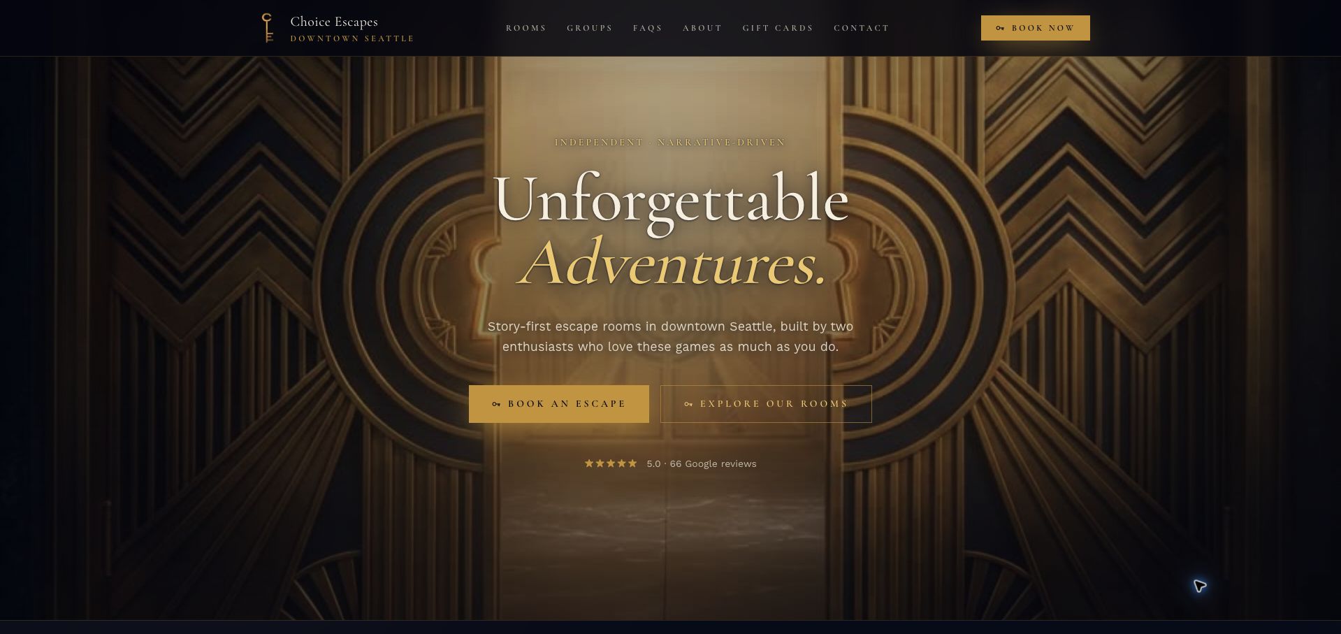
Choice Escapes combines a distinctive Art Deco identity with practical information about capacity, private play, timing, age guidance and getting there. The effect is an inviting room presentation that also supports a real booking decision.
Separate current and future games
An announced room is not a bookable session. Use distinct labels for available, coming-soon and retired games, and make sure the main booking action does not imply that an unfinished experience has live dates.
Explain the price basis
Per-person prices, minimum charges, group totals and private-room fees can produce very different costs. Show the relevant charging model and participant limits before the reservation handoff, with consistent numbers in the FAQ and checkout.
Answer group-specific questions
Children, larger teams and corporate organizers need different details. Give age and adult-participation rules, multi-room arrangements and event inquiry routes clear destinations. Avoid implying that one room’s capacity applies to the whole venue.
The collection · 29 examples
29 escape room websites worth studying
The examples range from independent rooms to multi-location operators. Compare the room-level information and booking expectations, not simply the intensity of the visual theme. A clear constraint can be as valuable as an impressive trailer.
Choice Escapes earns our Editors Choice for combining a distinctive Art Deco identity with unusually concise visit planning. Beyond the gold gate entrance, an at-a-glance strip gathers player range, duration, private booking, parking, transit and recommended age. Room cards distinguish the bookable Abigail Rose story from the forthcoming Dr. Light experience, avoiding the impression that both can already be reserved. A three-step explanation includes arriving fifteen minutes early, and Sean and Kelly's introduction gives the independent business a human presence. The entrance animation delays those useful facts, while small, widely spaced navigation and gold-on-dark secondary text require care. Even with those limitations, the page shows how a small operator can make atmosphere and practical reassurance work together. This selection recognizes website communication, not the quality of the games themselves.
What you can learn
Place a compact visit summary directly beside the storytelling, and distinguish available experiences from future launches.
Pros
Capacity, privacy, duration and transport are collected in one strip.
Room status and the early-arrival instruction are explicit.
Cons & considerations
The animated entrance adds scrolling before practical information.
Small navigation and subdued secondary text reduce readability.
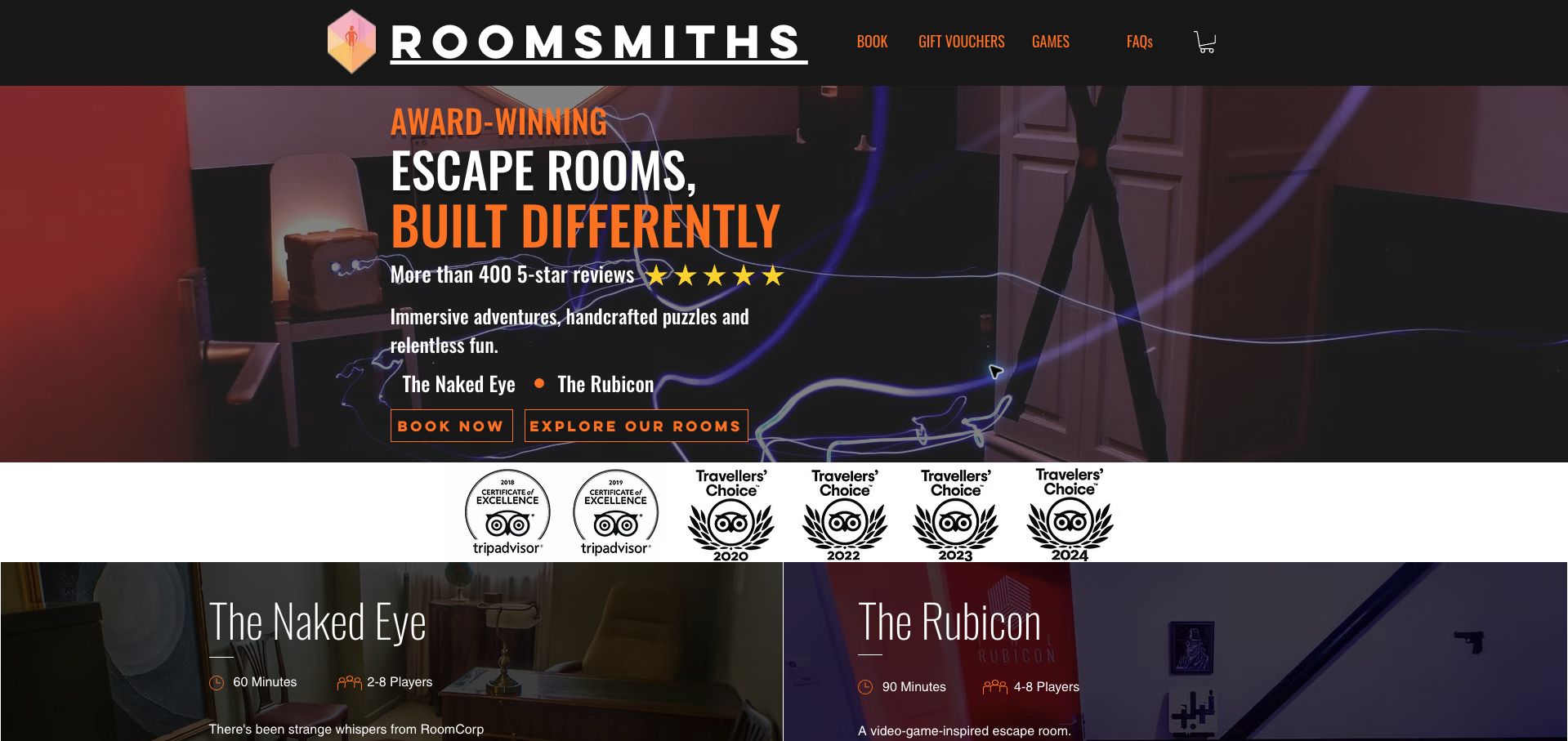
Roomsmiths uses a dark photographic opening, orange accents and a large condensed wordmark to establish a confident independent identity. Separate booking and exploration actions let returning players move quickly while newcomers inspect the two experiences. The important distinction is not just theme: Naked Eye and Rubicon have different durations and player ranges, and the site recommends a sequence between them. That is useful guidance for a group deciding whether the longer experience suits its familiarity with the venue. Private play and parking information remove two common uncertainties. Awards and review material occupy considerable space before the practical comparison, however, and the opening does not supply a price. The strongest lesson is to explain the relationship between products when a small collection contains meaningfully different commitments.
What you can learn
When one room builds on another, explain that progression alongside duration and capacity rather than leaving visitors to infer it.
Pros
The two games have distinct duration and player information.
Separate exploration and booking routes serve different levels of familiarity.
Cons & considerations
Prominent award material delays the practical comparison.
The opening requires further investigation to establish price.
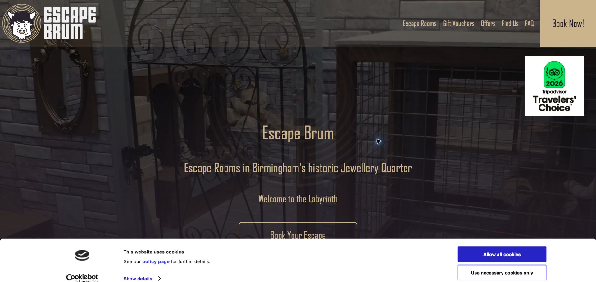
Escape Brum builds its Birmingham identity around a gold minotaur mark, black surfaces and an imposing gate image. The conspicuous booking control remains easy to find, while the homepage introduces the basic escape-room activity before moving through occasions and games. Recommending Blackmail for beginners and families gives the collection a useful entry point; a newcomer need not decode every story title alone. Gift information also distinguishes a monetary voucher from paying for a whole group. The room presentation could make comparison more efficient by placing duration, capacity and difficulty in a consistent row. A cookie banner covers part of the opening on first arrival, and the dense award material competes with the practical explanation. The useful reference is its explicit beginner recommendation within a strong local identity.
What you can learn
Name a suitable starting experience and explain why, then give every room the same compact comparison fields.
Pros
First-time visitors receive a specific room recommendation.
Gift options distinguish value-based vouchers from group purchases.
Cons & considerations
Room facts are not immediately comparable in a uniform grid.
The first-visit banner and awards compete with the opening content.
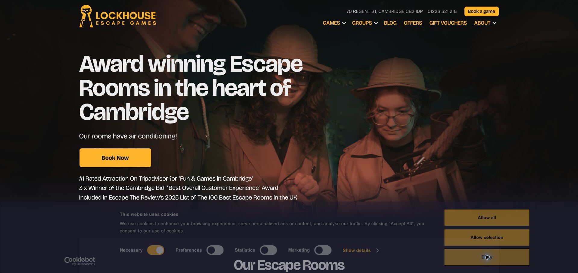
LockHouse combines yellow booking accents with a dark group photograph and a header that exposes both telephone and location information. Its homepage goes beyond the familiar set of room posters: pricing distinguishes standard games from premium experiences and includes group totals. This helps an organizer understand the cost of a two-person booking versus a larger team without treating a headline per-person figure as universal. Walking directions from the station and nearby parking options support the actual visit. The page contains a substantial amount of testimonial and award material, and some access or game concerns are deferred to closed FAQ answers. Premium and standard distinctions could also be carried more visibly onto every room card. The useful pattern is showing the financial consequences of group size before the booking calendar.
What you can learn
Publish both the per-person rate and the group total, with premium exceptions visible beside the affected games.
Pros
Pricing accounts for group size rather than showing only a minimum rate.
Station and parking guidance supports planning beyond the purchase.
Cons & considerations
Proof and promotional sections lengthen the route to operational details.
Room cards could carry the pricing-tier distinction more consistently.
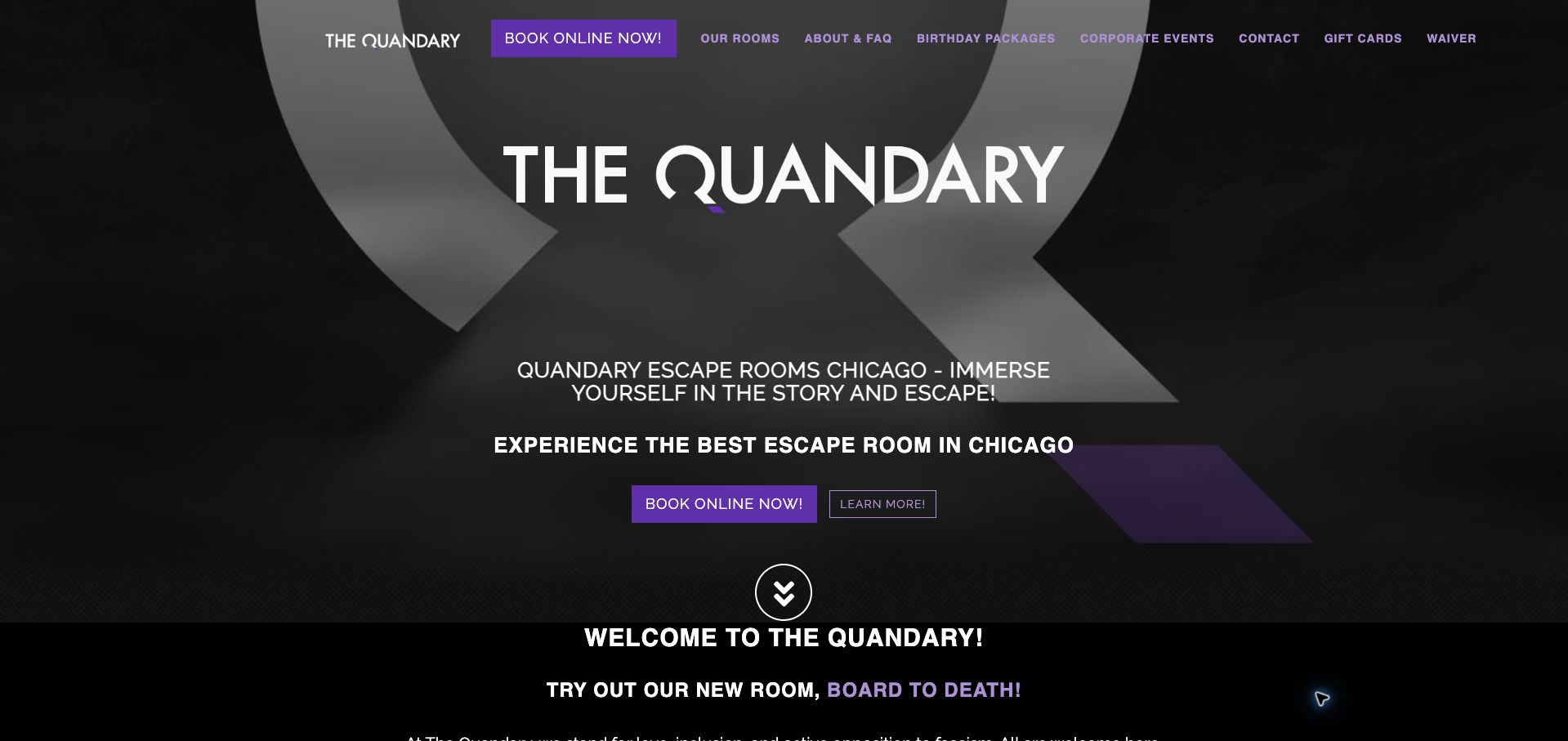
Quandary's black-and-gray Chicago homepage uses purple actions and a large Q identity to support several distinct game stories. Its room-selection quiz acknowledges that difficulty is a real decision, while the pricing explanation separates small groups from larger teams and identifies weekend exceptions. The weekday promotion is qualified by group size instead of presenting its code as universally applicable. A seasonal version of Left at Home is also given a date window, helping visitors distinguish an ongoing room from a temporary treatment. These details are valuable, but the number of exceptions creates a demanding reading task. A compact table would be easier to compare than successive paragraphs, and the large opening consumes space before the room information. The site is most instructive as an example of candidly disclosing a complicated offer.
What you can learn
Keep seasonal dates and promotional eligibility next to the offer, and use a table when several pricing exceptions accumulate.
Pros
Weekday and small-group conditions are explained rather than hidden.
A room-selection quiz offers help beyond reading story descriptions.
Cons & considerations
Paragraph-based exceptions make price comparison laborious.
The large opening pushes detailed room information farther down.
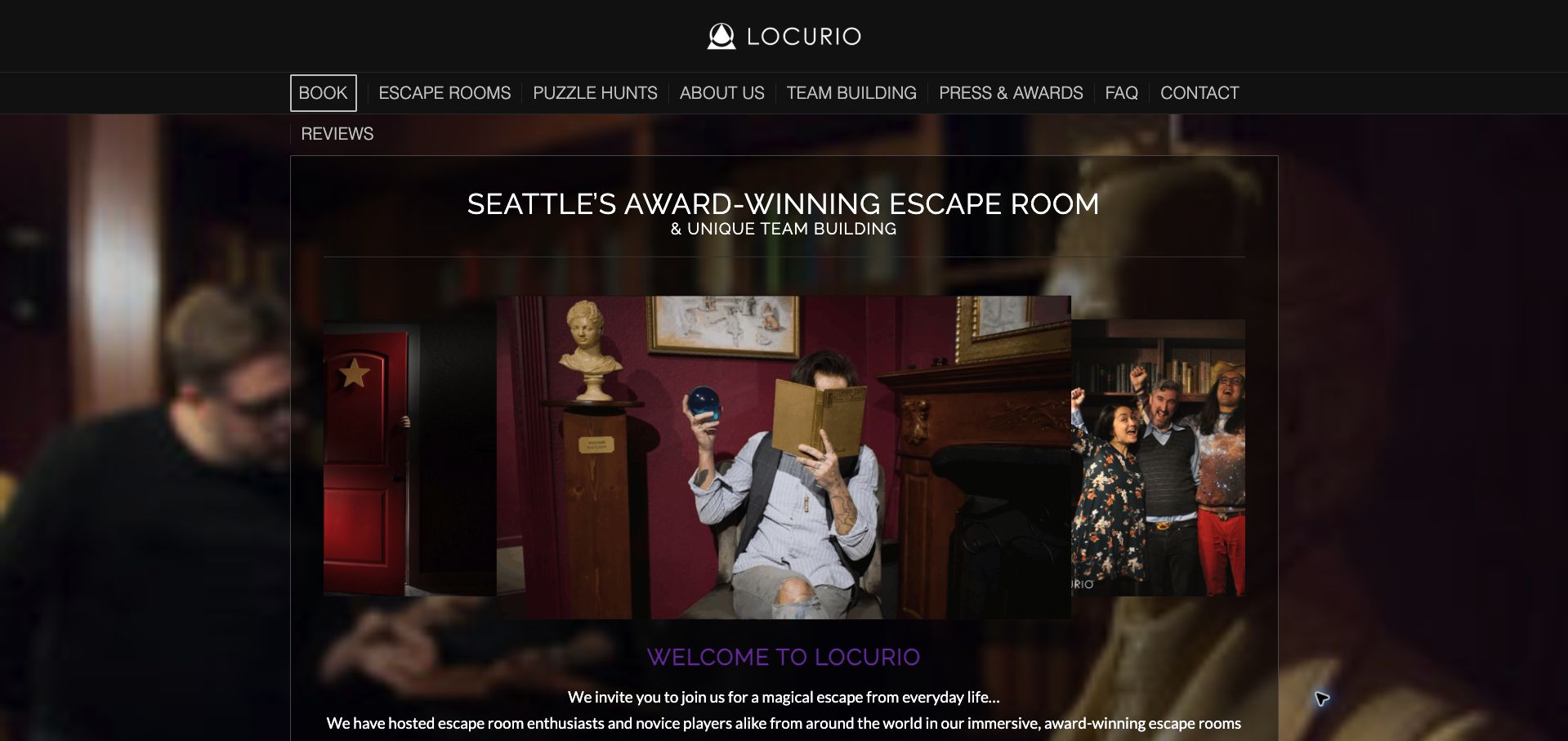
Locurio introduces its Seattle experiences through atmospheric photography, dark purple overlays and strongly differentiated stories. The library setting of The Storykeeper and the magician premise of The Vanishing Act provide concrete reasons to explore, rather than relying on interchangeable claims about excitement. A basic explanation of escape rooms gives newcomers context, and separate puzzle-hunt and team routes acknowledge other kinds of visits. The homepage's emphasis on atmosphere and awards is less helpful for a quick practical comparison: player limits, time commitment and cost are not gathered beside the opening choices. Multiple booking, review and exploration actions also compete, while the desktop navigation wraps into an additional line. The reference value lies in its story presentation, with a clear opportunity to place decision-critical facts immediately underneath each narrative.
What you can learn
Give each experience a recognizable world, then attach the same practical facts so visitors can compare without abandoning the story.
Pros
The two main experiences have clearly differentiated premises.
Newcomer explanations and separate group routes broaden the entry points.
Cons & considerations
Essential room logistics are not collected in the opening comparison.
Competing actions and wrapped navigation weaken the visual hierarchy.
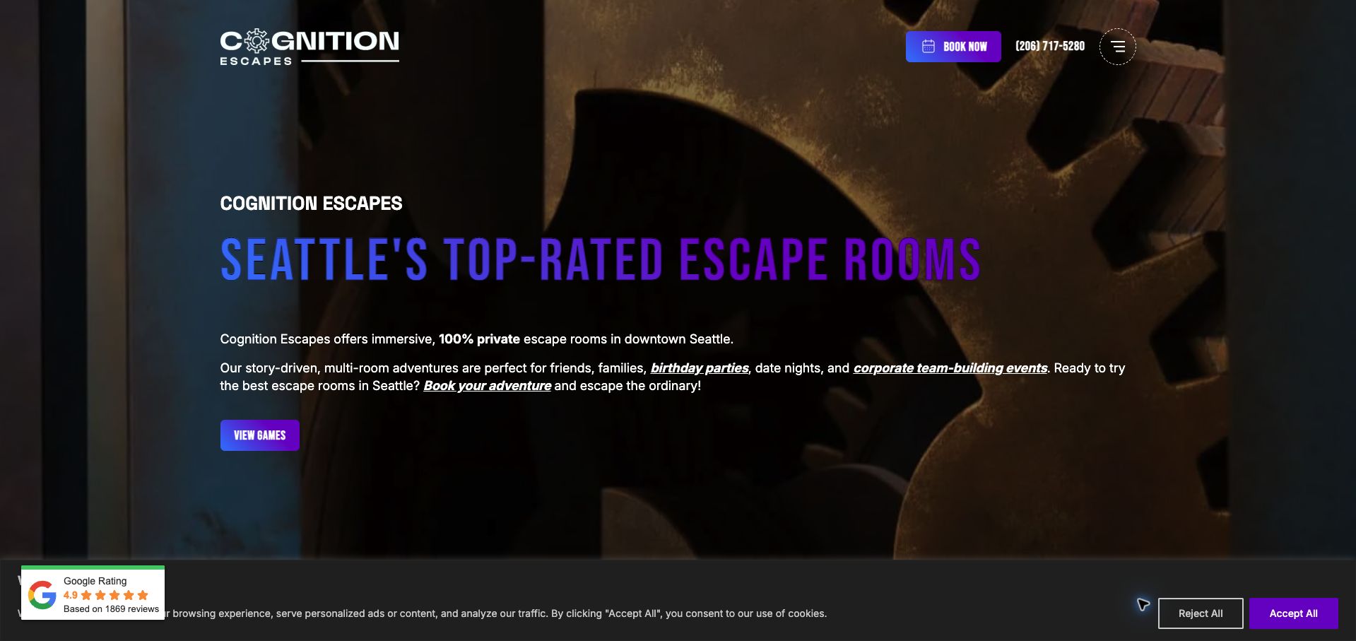
Cognition Escapes uses a gear-patterned dark background and blue-purple accents to present a varied Seattle room collection. The game cards give each experience a player range and duration, so the longer Fourth Door does not look like another interchangeable one-hour option. Theme and audience tags offer additional signals for visitors choosing between lighter and darker experiences. Separate learn-more and booking links allow investigation before commitment, and the private-booking statement is prominent. The many tags can become visually noisy, however, and broad language about suitability for every age needs to be read alongside the individual room themes. Gradient headings are also less legible against the dark decoration than plain high-contrast type would be. The useful pattern is a room catalog that exposes differences before sending users to availability.
What you can learn
Give duration, capacity, fear level and difficulty separate labels; a challenging puzzle need not be a frightening experience.
Pros
Room-specific durations and player ranges are visible in the collection.
Exploration and booking are distinct actions on the cards.
Cons & considerations
Numerous audience tags make scanning more demanding.
Gradient type and background decoration compete for contrast.
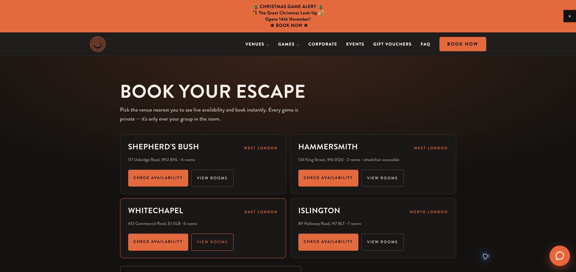
Escape London's booking hub makes geography the first decision. Four venue cards identify the neighborhood, address and room count, then offer separate routes to availability and room descriptions. This is a sensible sequence for visitors who already know which part of London they can reach. The Hammersmith card explicitly calls out wheelchair access, while the page also explains private play, arriving early and allowing more time than the game itself. A route to availability across all venues helps flexible groups. The seasonal announcement competes for attention at the top, and the hub provides little immediate price comparison between locations. Access information could also follow the same structure on every venue card. Its strongest contribution is reducing a large inventory to a manageable location decision before the visitor encounters individual sessions.
What you can learn
For a multi-site operator, establish location and access first, while retaining a cross-venue availability route for flexible visitors.
Pros
Addresses and separate availability actions make the first decision clear.
Arrival timing and private-play expectations are stated before booking.
Cons & considerations
Prices are not readily comparable across the venue cards.
Access information is more conspicuous for one location than the others.
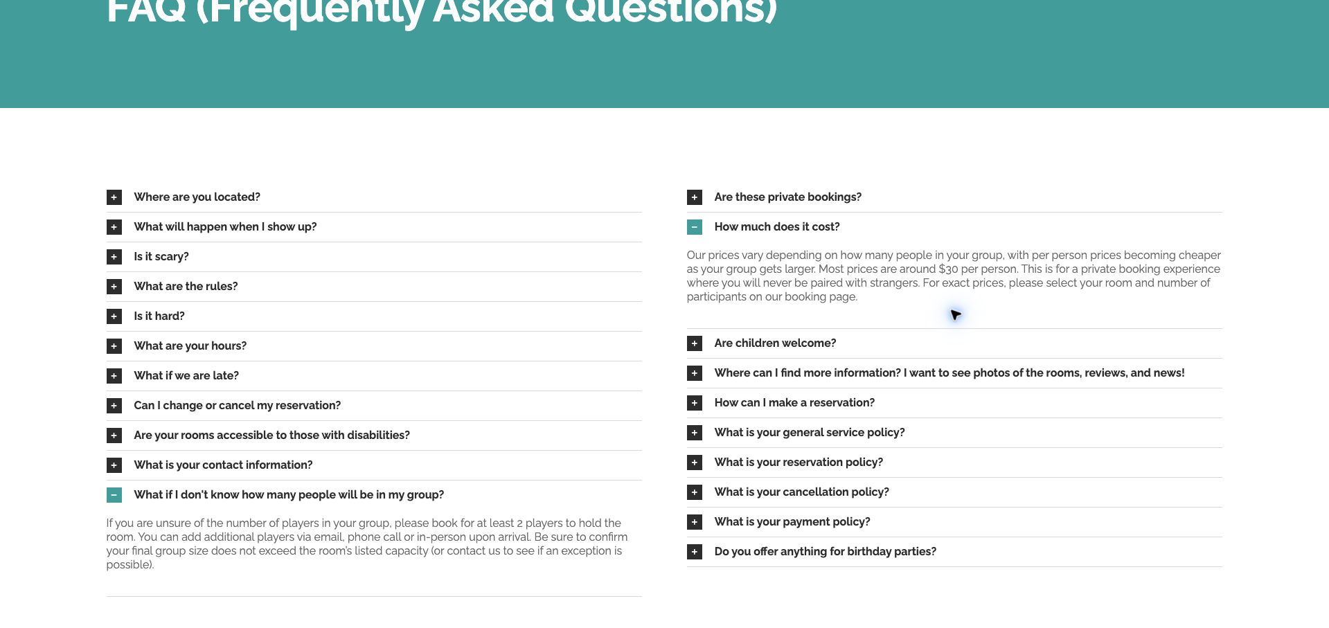
Escapism Portland's FAQ uses a restrained white-and-teal layout with two columns of expandable questions. One especially useful answer addresses an organizer who does not yet know the final headcount: it explains the minimum booking needed to hold a room, ways to add players and the need to respect its capacity. The price answer connects a larger group with a lower per-person amount and directs visitors to the room-and-participant selector for the exact total. This turns a common source of hesitation into an actionable next step. The page is long, with several overlapping policy questions and no obvious topic grouping within the two columns. Exact prices remain elsewhere. The practical value is the specificity of the answers, rather than the visual ambition of the design.
What you can learn
Write FAQs around the real uncertainty that prevents a booking, including what can be decided now and what can change later.
Pros
Unconfirmed attendance is addressed with a concrete booking procedure.
The pricing answer explains the relationship between group size and cost.
Cons & considerations
Overlapping policy questions make the long FAQ harder to navigate.
Visitors must leave the FAQ to calculate an exact group total.
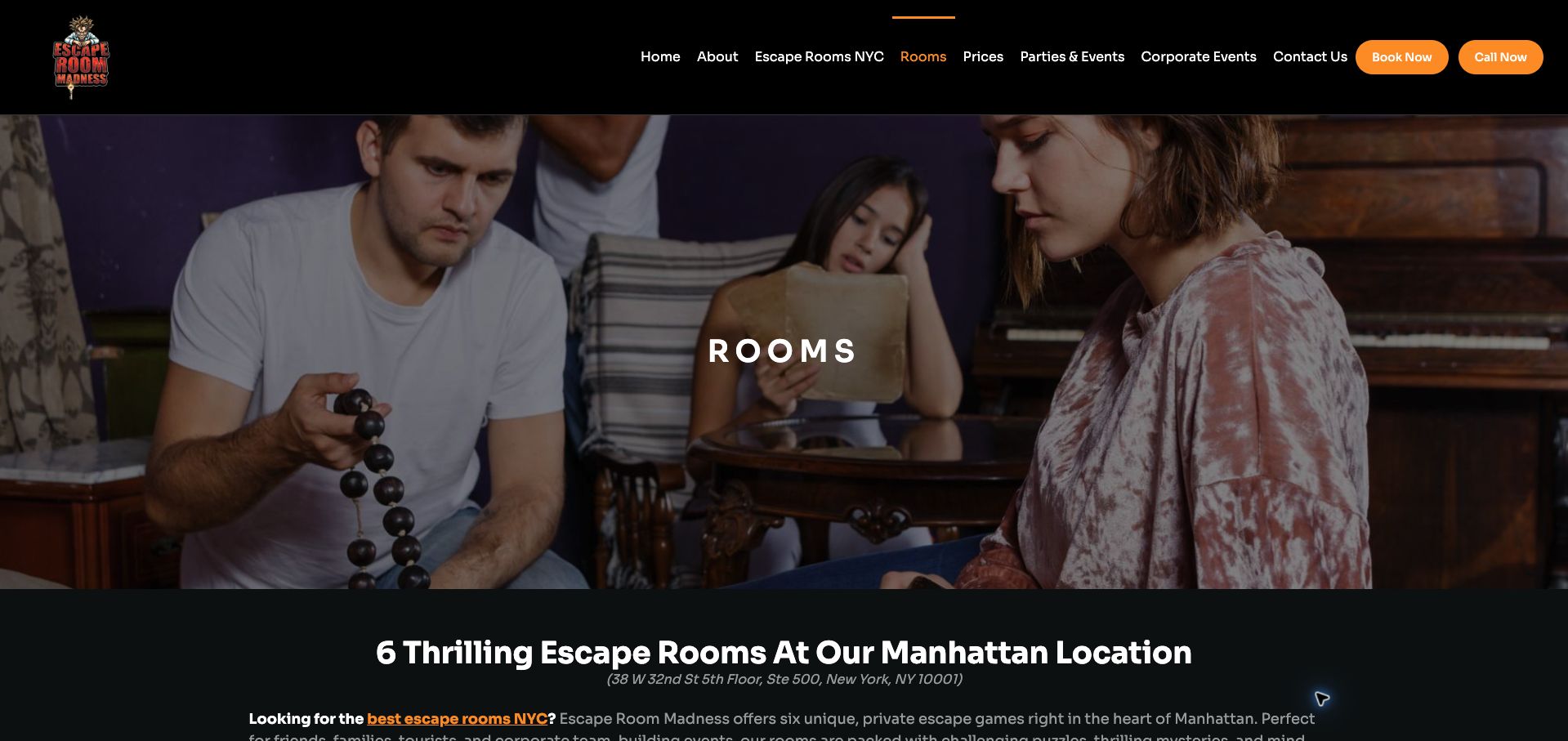
Escape Room Madness introduces its Manhattan collection with a large player photograph and a clear statement that games are private. The room cards then combine a synopsis with difficulty and maximum capacity, allowing an organizer to rule out unsuitable choices before reading every narrative in full. The difference between a six-person room and a larger game is consequential, and the design gives that distinction a place in the catalog. Age guidance and the venue address add practical context. The introductory copy is lengthy, however, and repeated titles consume space without adding much information. Prices are not part of the same comparison, leaving another step before a group can settle on a choice. This is a useful model for structured room attributes, especially when visual posters alone would conceal important capacity differences.
What you can learn
Attach capacity and difficulty to every room card, then include price or a clearly labeled route to the relevant rate.
Pros
Room cards expose meaningful differences in maximum group size.
Privacy, age guidance and location are stated within the collection page.
Cons & considerations
Long introductory copy delays the room comparison.
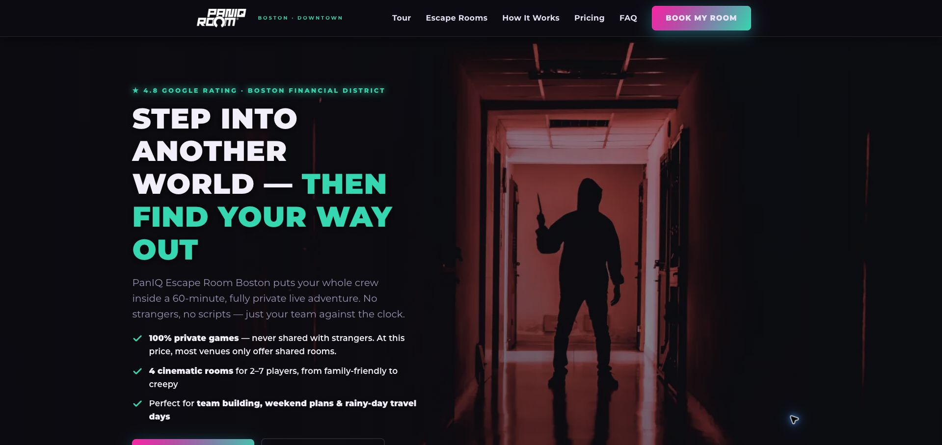
PanIQ Boston uses oversized type, teal and magenta accents, and a looming corridor image to communicate intensity immediately. The opening also offers practical reassurance: private games, a standard one-hour format and a stated group range. Local transit references and the Water Street address help connect the dramatic imagery to a real visit. A weekday offer and corporate-event route serve different audiences without requiring the same booking process. The sales copy is unusually forceful, sometimes taking more space than the distinctions between individual rooms. Claims about value and popularity are presented by the operator rather than demonstrated through a comparison. The design would be more useful if the opening gave each game a concise suitability summary. Its best feature is placing a few operational facts inside an otherwise highly theatrical presentation.
What you can learn
Use the opening to establish private play, duration and location, then let room-specific information carry the choice instead of repeated superlatives.
Pros
Private play and the basic time commitment are easy to identify.
Transit and corporate-event routes connect the offer to practical plans.
Cons & considerations
Forceful promotional language crowds out useful room distinctions.
Value claims need clearer price context to help visitors compare.
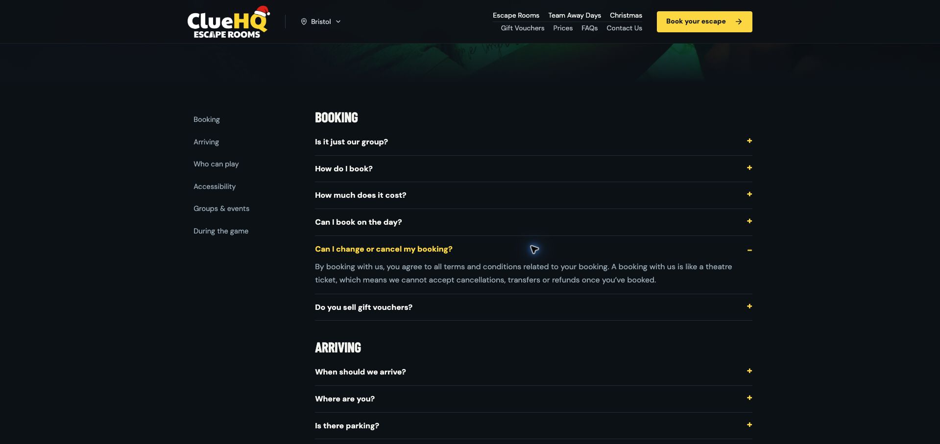
Clue HQ Bristol gives its FAQ a strong hierarchy: a section index separates booking, arrival, eligibility, accessibility, groups and gameplay. Yellow highlights on a dark background make the expanded answer and booking action easy to recognize. The cancellation explanation uses a familiar ticket analogy to clarify that bookings cannot be canceled, transferred or refunded, rather than leaving readers to interpret a distant policy document. Other answers address privacy and how group size affects price. The promotional strips and large opening add considerable height before the questions, and the initial cookie dialog obscures the page until dismissed. Critical purchase conditions could be repeated closer to the booking action as well. The useful reference is the topic-based organization of operational information, which remains coherent even as the FAQ grows.
What you can learn
Group FAQs by the visitor journey, and repeat consequential booking conditions at the point where a session is selected.
Pros
A section index makes a large FAQ navigable by task.
The change policy is stated in direct, understandable language.
Cons & considerations
Promotional material delays access to the questions.
Important conditions still require opening the relevant answer.
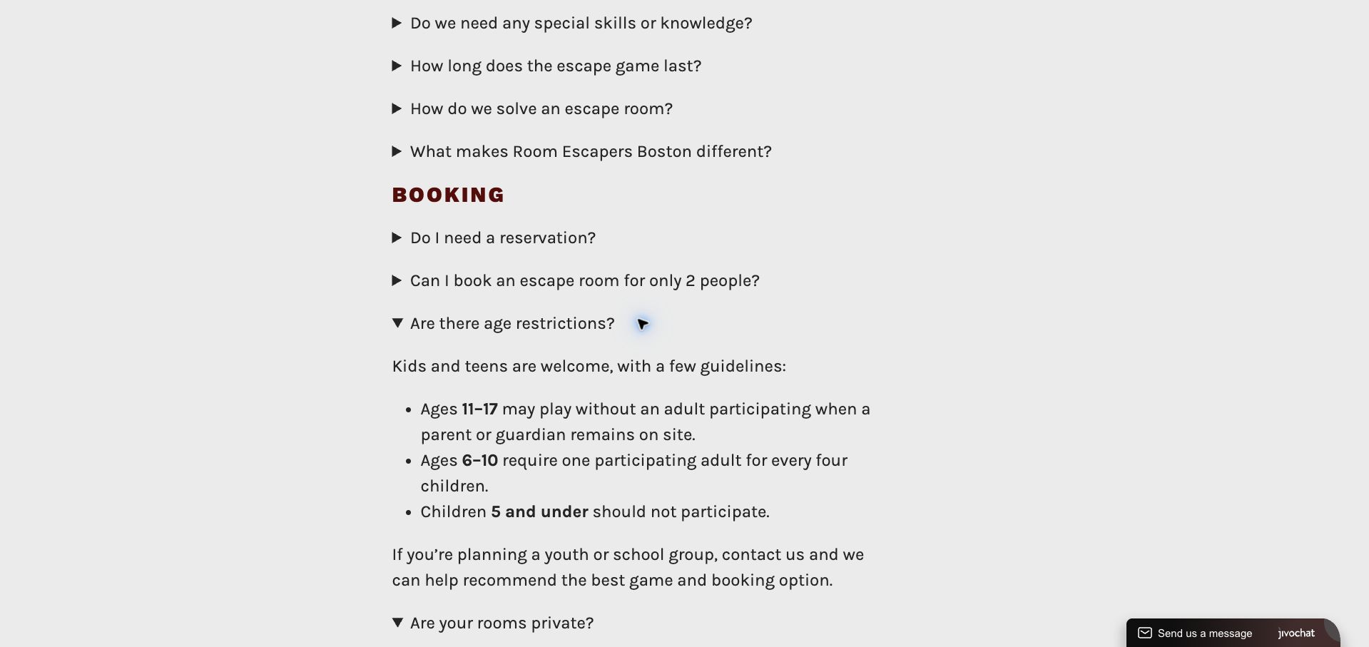
Room Escapers Boston's FAQ is visually modest, using maroon category headings and simple disclosure arrows on a pale background. Its content handles an important distinction well: standard admission can be shared, while an optional upgrade reserves the game for one group, with a separate rule for larger parties. That is more informative than a generic assurance that private rooms are available. Age guidance is similarly specific, distinguishing older teens from younger children and stating when an adult must participate. The footer maps games to two Boston addresses, reducing the chance of arriving at the wrong venue. The long column makes scanning slow, and the dark logo against the header lacks contrast. The page's value lies in explaining operational exceptions clearly enough for an organizer to choose the right booking type.
What you can learn
If privacy is an optional purchase, explain the default, upgrade cost and group-size exception before the visitor reaches checkout.
Pros
Shared admission and exclusive play are clearly distinguished.
Age supervision rules and venue-to-game mapping are concrete.
Cons & considerations
The long accordion column requires substantial scanning.
Header branding has weak contrast against its background.
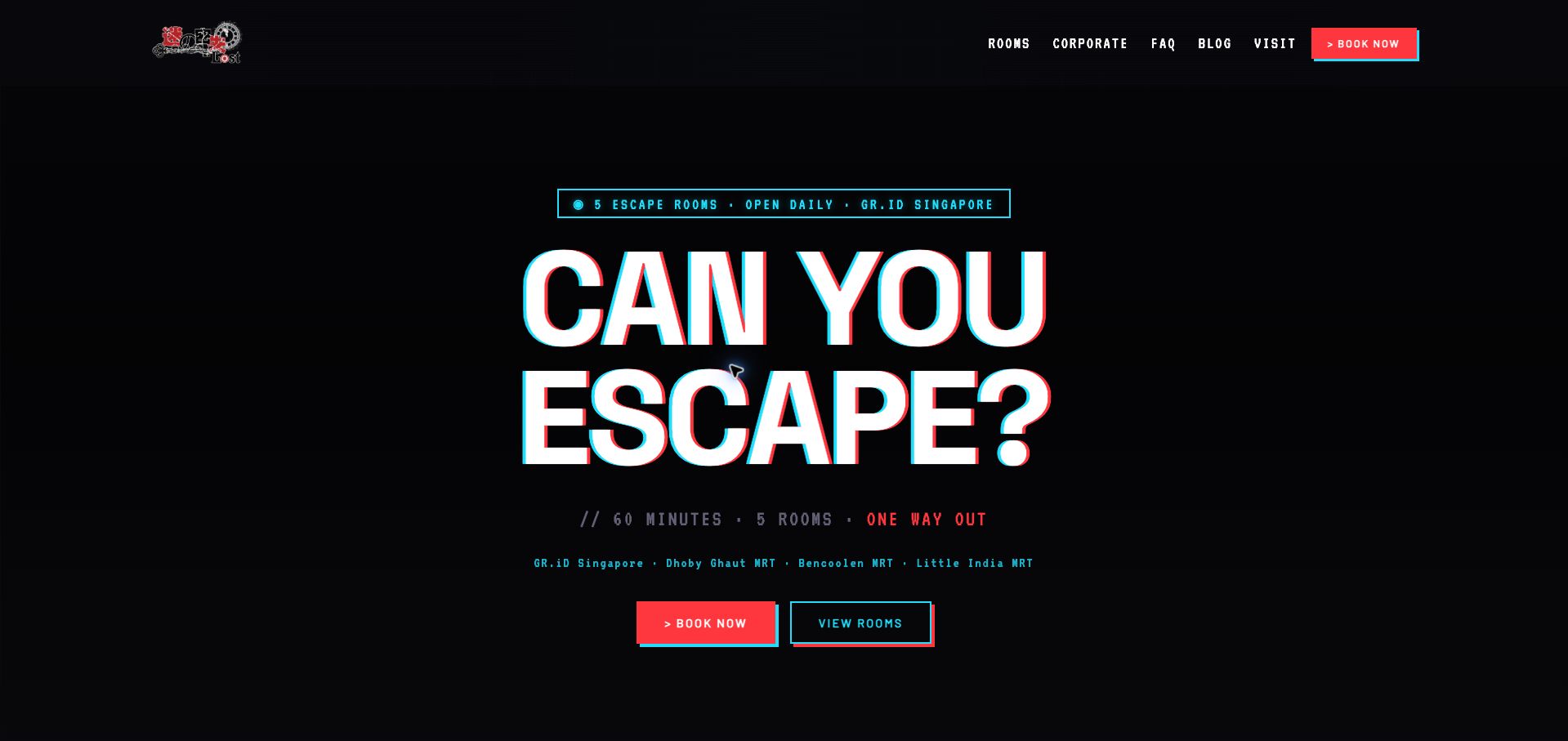
LOST SG uses a black canvas, red-cyan offset typography and terminal-like labels to establish a recognizable visual language. The homepage does more than display five dramatic posters: it explains which room is beginner-friendly, which are intermediate and which are harder, while separating horror from non-horror experiences. Its description of the horror room specifies the kind of scares and the absence of live actors, giving hesitant visitors a more useful signal than a vague scary badge. Cards repeat player range and duration, and nearby MRT stations appear in the opening. The large slogan delays that detailed comparison, while some gray supporting text is subdued against the dark background. The strongest idea is translating a themed catalog into explicit recommendations without pretending that every room suits the same group.
What you can learn
Explain the nature of intensity as well as difficulty, and name a starting room for visitors who have never played.
Pros
Beginner and horror guidance goes beyond the room titles.
Capacity, duration and nearby transit are made visible.
Cons & considerations
The oversized opening postpones the practical room comparison.
Subdued supporting text has less contrast than the main headline.
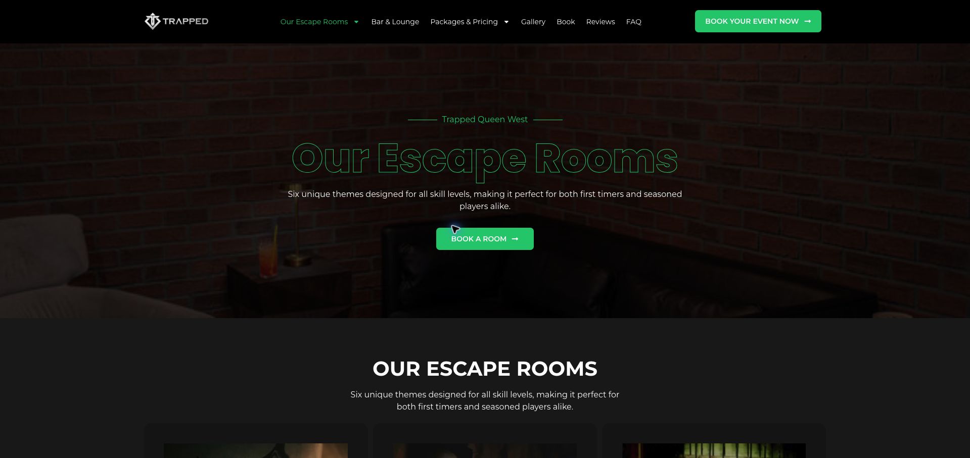
Trapped Queen West presents its Toronto rooms with a dark brick backdrop, bright green controls and an orderly set of genre labels. Each card pairs the story with an age classification, player range and time allowance. This is particularly useful where a paranormal game may have a longer option and other experiences accommodate different group sizes. The bar-and-lounge and package routes also acknowledge that a visit may involve more than the puzzle itself. The room carousel repeats content in the page's reading sequence, making the collection feel longer than six unique games. Outlined green headline text is less legible over the dark photograph than the solid white section title below it. The page provides a useful attribute model, but a stable comparison grid would make the same information easier to revisit.
What you can learn
Use a consistent line of age, capacity and duration beneath every room, and avoid motion that makes a small catalog harder to compare.
Pros
Age classifications and player ranges accompany the story cards.
Separate lounge and package routes support planning a longer visit.
Cons & considerations
The repeating carousel makes revisiting a particular room less direct.
Outlined headline lettering sacrifices readability over the background.
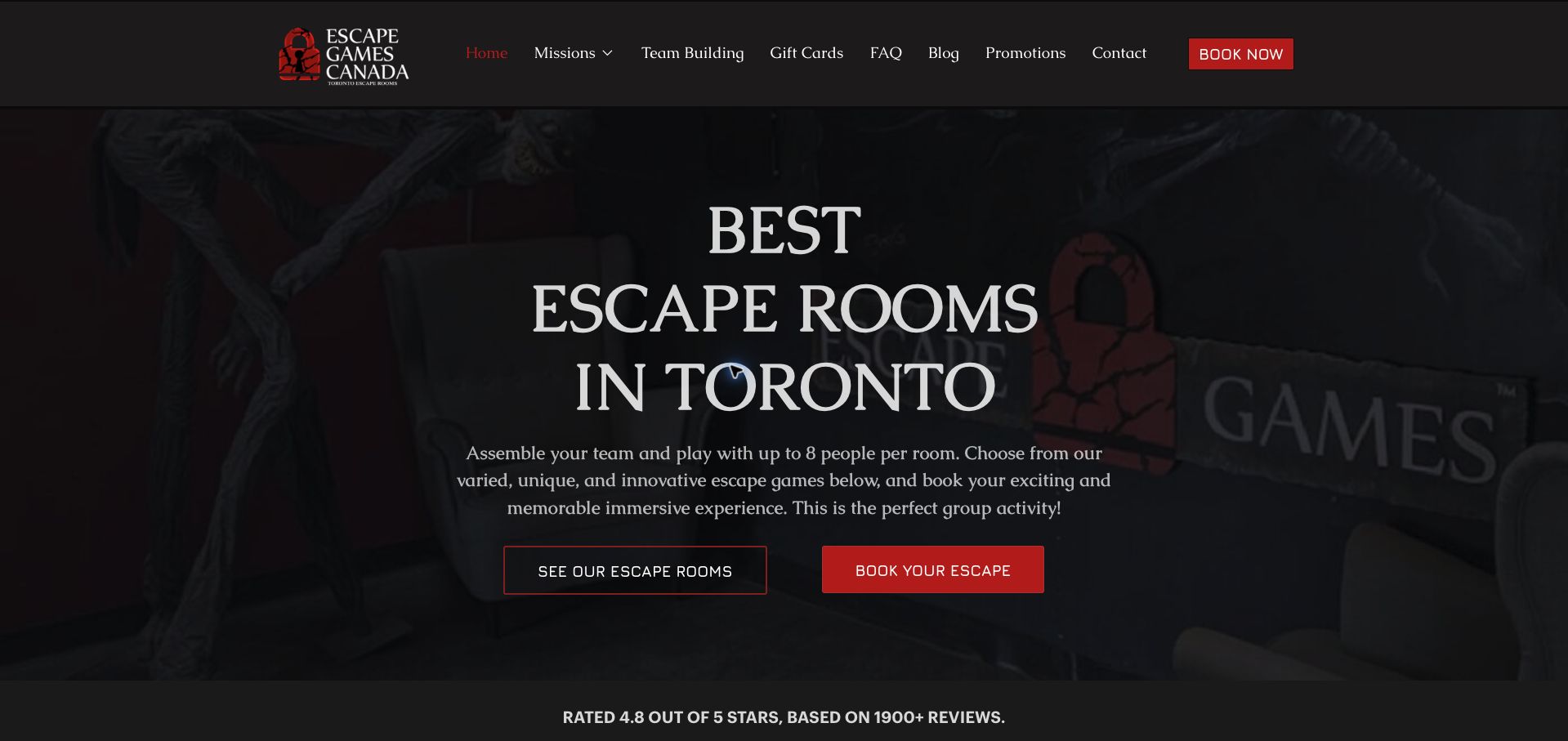
Escape Games Canada uses a dark photographic hero, red actions and substantial serif headings to introduce its Toronto venue. Separate routes to the room collection and booking accommodate both exploration and repeat visits. Lower sections explain private play, the minimum group needed for a date-night visit, family waiver requirements and simultaneous corporate groups. Those details give the broad occasion labels practical meaning. The location explanation also distinguishes North York from downtown Toronto and includes a station walk. The homepage is lengthy, with extensive reviews preceding much of the operational information. It also alternates between seven and eight rooms in different sections, creating an avoidable inconsistency. The useful model is connecting occasion-based marketing to concrete booking requirements, provided that inventory counts and repeated claims are maintained together.
What you can learn
For every occasion section, add the group-size or planning rule that changes the booking, and keep repeated inventory counts synchronized.
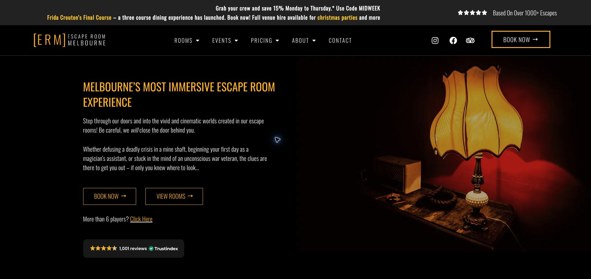
Escape Room Melbourne uses warm lamp photography, narrow yellow headings and a black background to evoke a physical room rather than an abstract puzzle brand. The opening separates booking from exploration and offers an immediate route for parties larger than six. Its process section explains the seventy-minute format, private play, arrival briefing and availability of hints. Room cards identify the relevant neighborhood, which matters because the collection spans several Melbourne locations. The site also introduces a dining experience, making the event offering broader than a conventional room catalog. Multiple promotional messages compete in the top strip, and difficulty relies heavily on visual symbols that are less informative in a plain reading sequence. The strongest reference is the specific explanation of what happens during a visit, supported by location labels on each experience.
What you can learn
Explain duration, briefing and help as separate parts of the visit, and attach the correct location to every room.
Pros
The longer game format and private experience are clearly explained.
Large-group routing and neighborhood labels support practical planning.
Cons & considerations
Several promotions compete within the opening strip.
Difficulty symbols need equally clear textual descriptions.
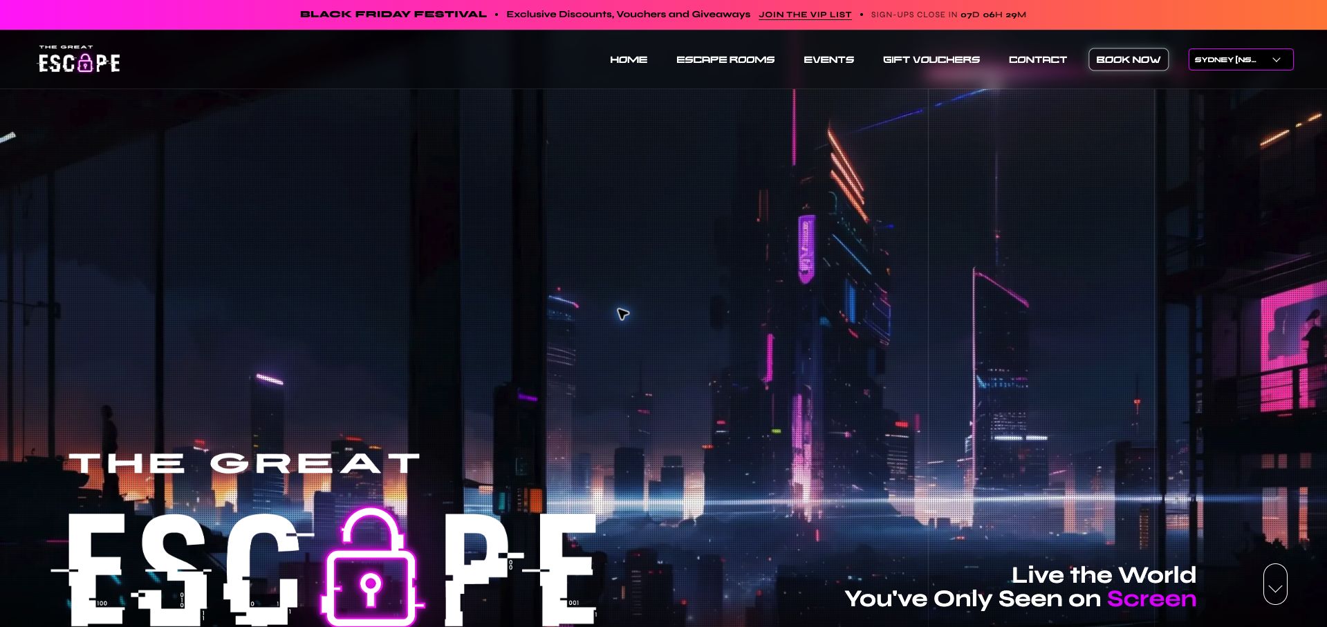
The Great Escape's Sydney page uses a neon cityscape, oversized lock branding and a persistent venue selector to establish a dramatic local entry point. The header keeps booking and city choice together, helping visitors avoid exploring another location's inventory. A starting price and group-saving message provide an initial cost signal, while the events and gift routes acknowledge different purchase intentions. The opening is dominated by imagery and a seasonal countdown, however, so the practical room decision begins well below the first screen. The mission section introduces the experience in broad promotional language rather than immediately presenting a compact comparison. This makes the site a useful reference for strong brand atmosphere and location continuity, with an opportunity to bring capacity, duration and room-specific suitability much closer to the initial booking route.
What you can learn
Keep the selected city visible, but place the local room comparison directly after the opening instead of adding another promotional introduction.
Pros
The venue selector remains prominent alongside booking.
Starting-price and group-saving signals help establish the offer.
Cons & considerations
The large cinematic opening delays room-specific information.
A seasonal countdown competes with the core visit-planning task.
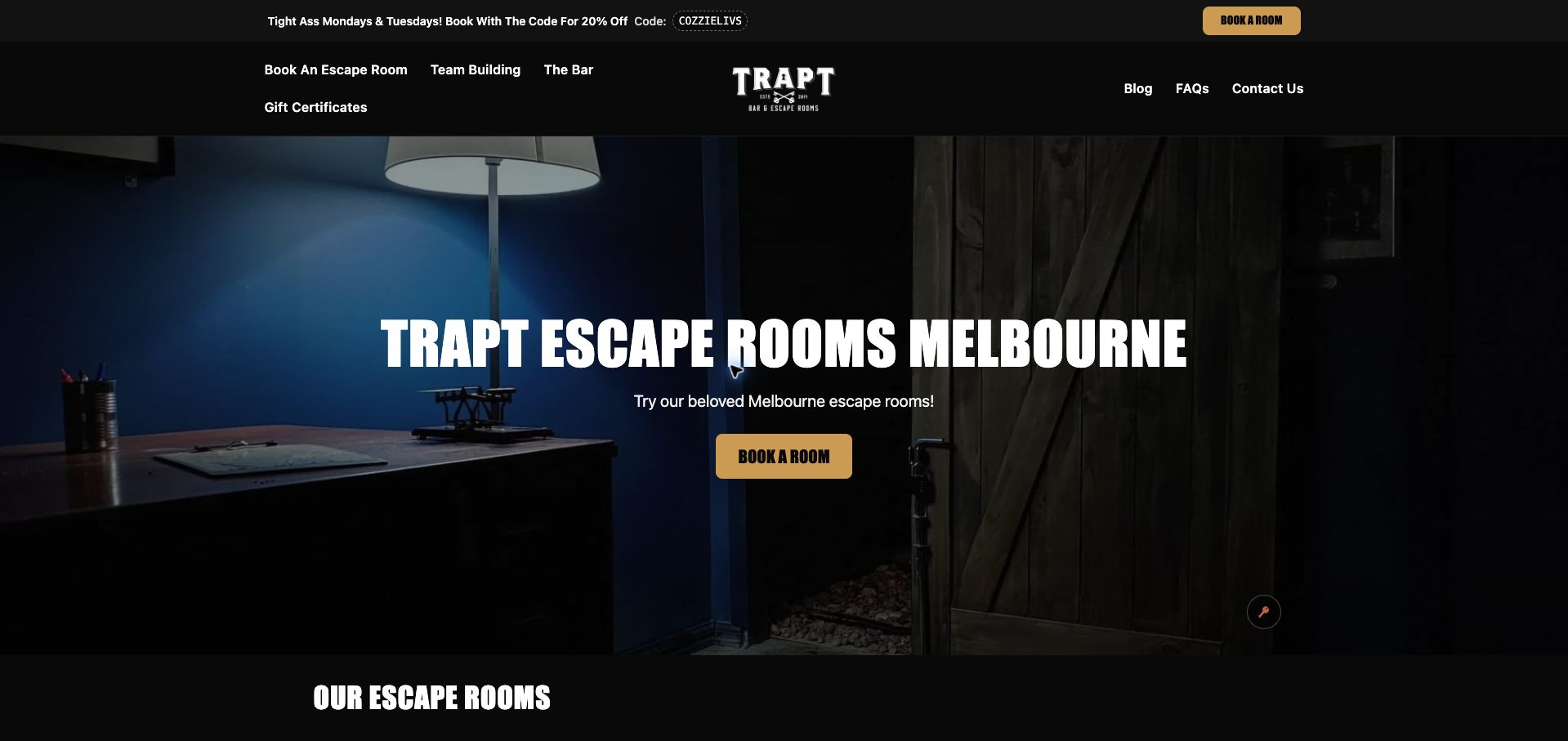
TRAPT combines a dark room photograph, warm gold buttons and bold condensed headings with a straightforward room list. Player ranges sit beside challenge descriptions that progress from least to most demanding, making the collection approachable without requiring visitors to interpret an unexplained numeric scale. A tabletop puzzle option is explicitly described as casual play over drinks, which distinguishes it from the full escape rooms. The bar and team-building routes support the broader venue concept. Promotional codes appear repeatedly, and an elaborate interactive testimonial area adds visual activity without making the game decision easier. Prices and durations could also be more consistently visible alongside the room cards. The useful lesson is the simple language used to differentiate challenge, especially for groups that want to choose an experience before committing to a full evening plan.
What you can learn
Use understandable challenge descriptions and clearly distinguish a casual tabletop activity from a booked escape-room session.
Pros
Player ranges and relative challenge labels are easy to compare.
The tabletop game is identified as a different kind of experience.
Cons & considerations
Repeated promotions distract from choosing a room.
The room overview could expose price and duration more consistently.
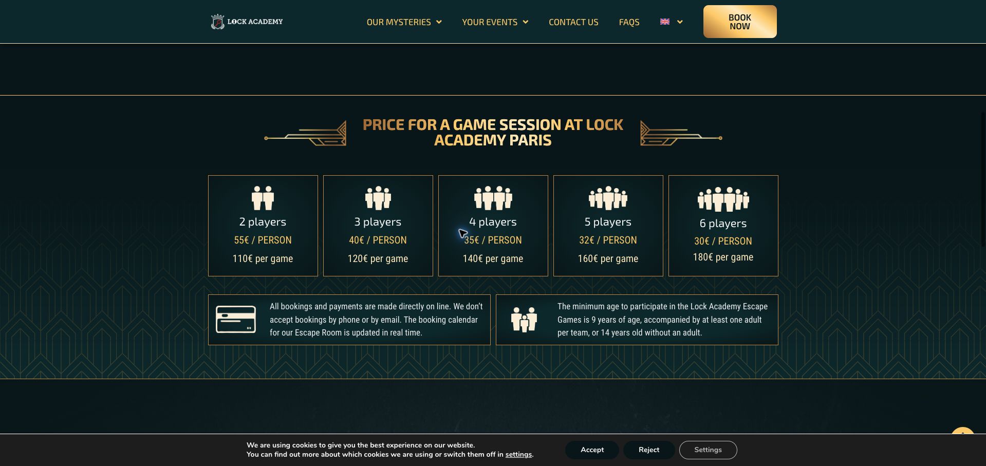
Lock Academy carries its detective-school identity into the booking page through deep green surfaces, gold Art Deco borders and a scene-setting photograph. The price section is particularly effective: five parallel cards show both the per-person rate and total game cost for teams of two through six. That avoids making the smallest headline rate appear applicable to every booking. Two adjacent notes explain that reservations and payments happen online and state the age rules. The format supports a decision before the visitor enters the calendar. The large introductory photograph pushes this comparison below the first screen, and repeated room-name carousels add length after the policy notes. The strongest reference is the pairing of individual and total costs inside a branded layout, with the booking channel made explicit at the same moment.
What you can learn
When rates depend on team size, show both the individual share and complete booking total in the same card.
Pros
Group totals remove the need for mental arithmetic.
Online-only booking and age requirements sit directly beneath the prices.
Cons & considerations
A large introductory image delays the price comparison.
Repeated room-name content makes the lower page less efficient to scan.
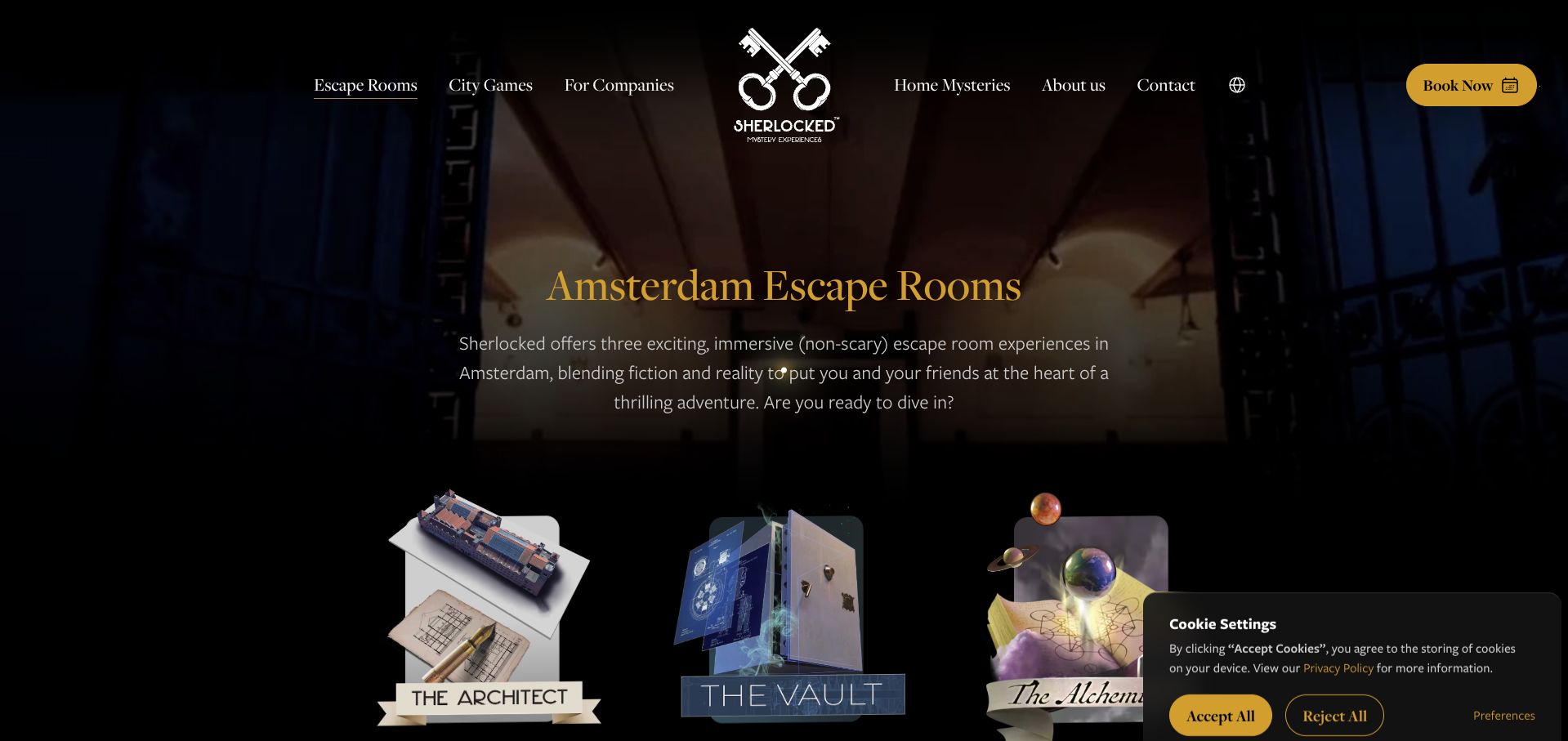
Sherlocked's Amsterdam collection ties its stories to the historic Beurs van Berlage, using dark photography, gold accents and illustrated room emblems to make the setting part of the appeal. Detailed experience sections then expose player ranges, duration, starting price and age guidance. This matters because The Alchemist, The Vault and The Architect involve different time commitments and group requirements. The location explanation gives visitors a concrete station reference rather than relying only on an atmospheric address. The opening emblems are evocative but provide little practical comparison until the visitor scrolls, and broad award claims occupy space between selection and detail. A compact summary table would help groups compare the experiences they have just encountered. The useful pattern is grounding narrative identity in a real venue while retaining measurable booking facts.
What you can learn
Let the building explain why the experience is distinctive, then present age, time, price and group size in a shared comparison format.
Pros
Each experience has specific duration, capacity and age information.
The historic setting and station proximity give the story a tangible location.
Cons & considerations
Opening emblems offer atmosphere before practical comparison.
Award material interrupts the route between overview and detailed choices.
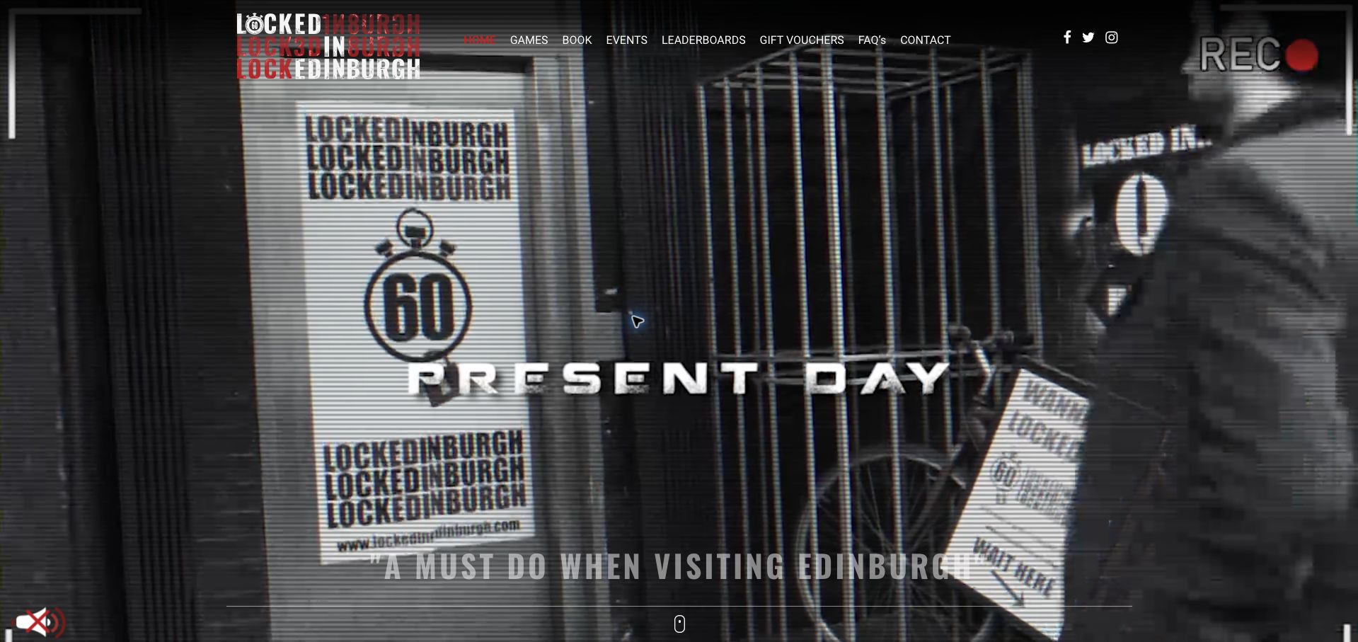
Locked In Edinburgh makes Summerhall's former veterinary school central to its proposition. A surveillance-style video opening introduces the setting, while the following explanation connects laboratories, an anatomy theatre and a distillery story to the actual building. This gives the room collection a reason to exist beyond a set of generic themes. A short sequence of icons explains the basic hour-long activity, and room links, gift vouchers and booking are separated. The visual opening is large and busy, with testimonials layered over the footage rather than immediate logistics. Its prominent ranking is explicitly dated 2018, which preserves context but makes the proof feel less current. The homepage also lacks a compact capacity-and-price comparison. The design is most useful as an example of drawing identity from a venue's physical character.
What you can learn
Explain how the real location shapes the experience, while keeping dated recognition labeled and current booking facts easy to find.
Pros
The former veterinary-school setting gives the room stories specificity.
Booking, gifts and individual room exploration are distinct routes.
Cons & considerations
The video opening delays practical game details.
The homepage provides little direct comparison of capacity and price.
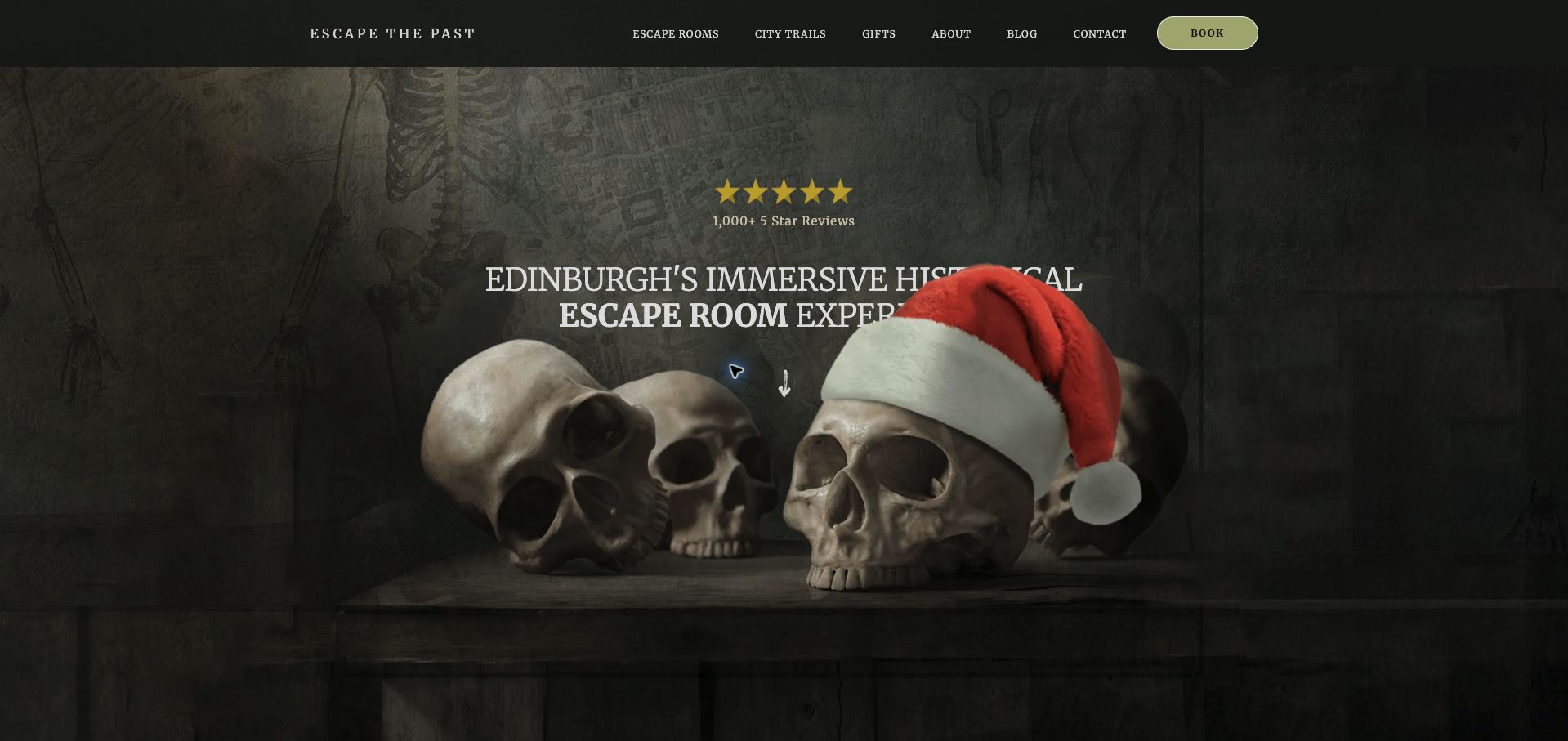
Escape The Past uses muted green, serif typography and macabre historical imagery to give its Edinburgh experiences a coherent personality. Its strongest section is the activity comparison: duration, player range, difficulty and age guidance accompany each story, including the longer outdoor trail. This makes the distinction between an indoor room and a city activity explicit. A separate recommendation for groups that want to stay together acknowledges a genuine capacity limit rather than forcing every party into the same product. The dramatic opening can obscure part of the headline with foreground imagery, and price is not included in the main comparison fields. The age labels also carry qualifications that merit a clear explanation nearby. The site demonstrates how a narrative-led operator can still use structured facts to help visitors choose the right format.
What you can learn
Use the same decision fields across different activity formats, and offer a clear alternative when a group exceeds the room capacity.
Pros
Indoor and outdoor options can be compared by time and group size.
Larger groups receive an alternative suited to staying together.
Cons & considerations
Foreground imagery competes with the opening headline.
Price and age qualifications need more immediate context in the comparison.
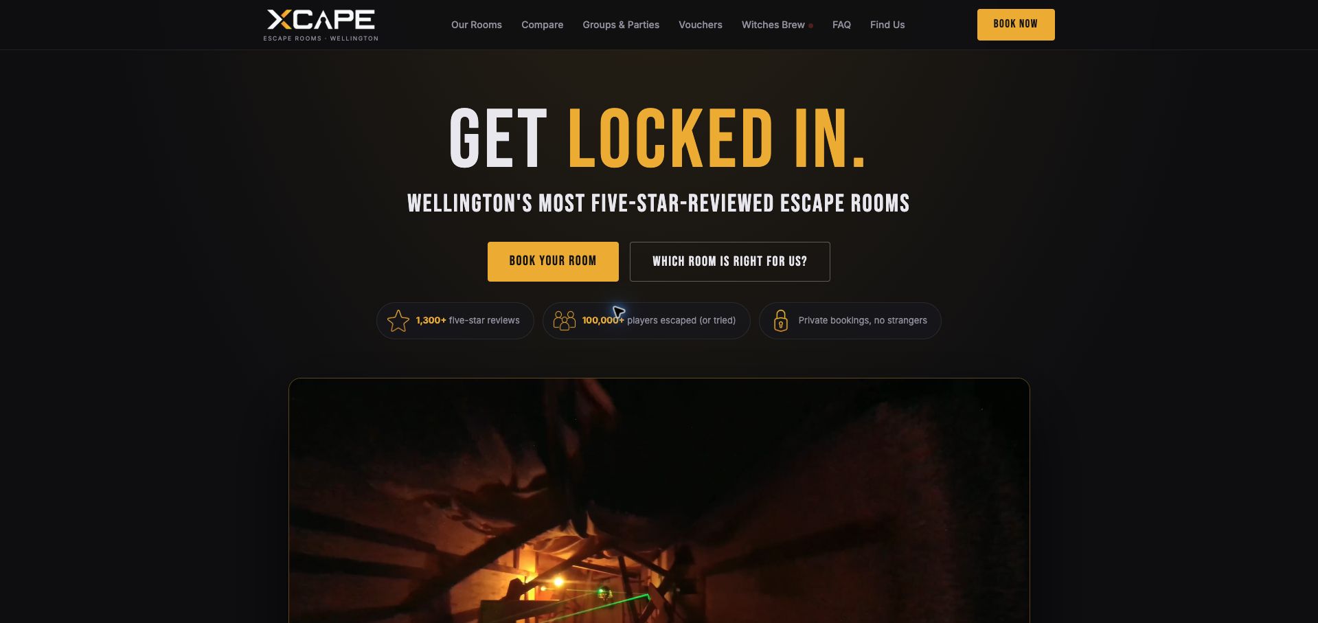
Xcape's Wellington homepage moves from a dark, gold-accented introduction into a room catalog with audience filters and a dedicated comparison table. The table is the standout: difficulty and scare factor are separate rows, alongside player range, access indicators and price information. This helps a group choose intellectual challenge without assuming it must also accept intense scares. Beginner recommendations provide an additional starting point. Private booking is stated near the opening, and the site describes a typical game sequence without requiring prior experience. Some room names differ between cards and the table, which creates a small reconciliation task. The wheelchair-friendly checkmarks are also less useful than a short description of the actual access conditions. The reference value is a decision tool that makes several dimensions of suitability visible at once.
What you can learn
Compare difficulty and fear independently, and explain access labels with practical details rather than relying on a checkmark alone.
Pros
The table separates puzzle challenge from intensity.
Audience filters and beginner recommendations support different entry points.
Cons & considerations
Room naming is not fully consistent between the cards and table.
Binary access indicators need a more detailed explanation.
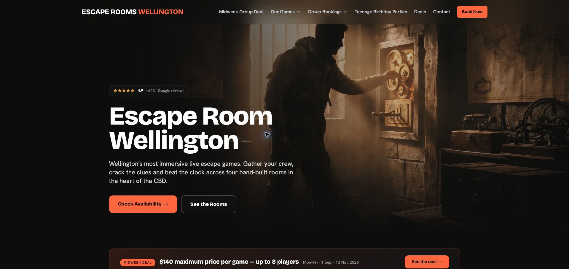
Escape Rooms Wellington combines a warm photographic hero with bright orange actions and a practical room-selection section. A short chooser asks about headcount and previous experience, while the cards expose capacity and duration. The explanation that one theme runs in two identical rooms also makes the advertised four-room inventory understandable. Beginner reassurance addresses leaving the room and requesting hints, reducing anxiety without requiring a long FAQ visit. Pricing is less consistent: a headline starting amount differs from the adult rates in the adjacent table, and an eight-player family offer needs to be read against individual room capacities. The date-bounded midweek promotion is clear about its period. The page offers a useful model for decision support, with a reminder that all prices and capacity statements must agree across the interface.
What you can learn
Help visitors choose using headcount and experience, then reconcile every offer with the actual room capacities and rate table.
Pros
The chooser reflects two concrete reasons groups select different rooms.
The duplicate-room explanation clarifies the available inventory.
Cons & considerations
The headline starting price and displayed adult rate table differ.
Group offers need clearer room-capacity qualifications.
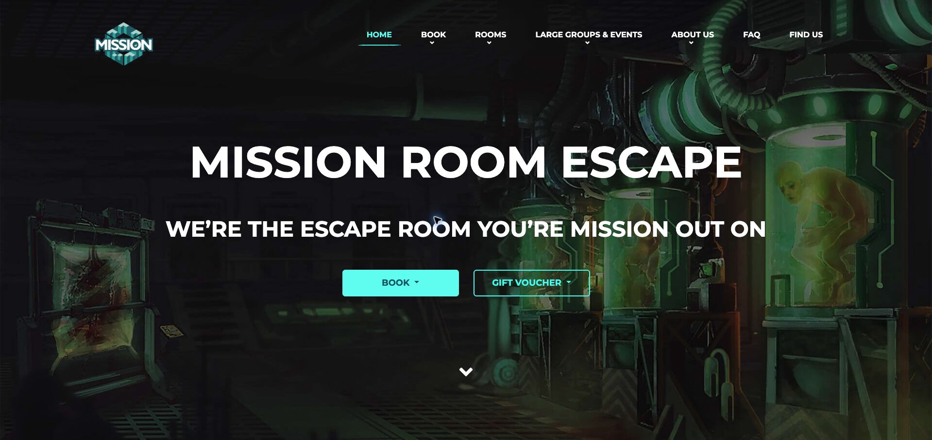
Mission Sydney uses turquoise controls, industrial imagery and a prominent booking action to establish its mechanical-game identity. The homepage explains the intended difference from padlock-heavy rooms and separates current George Street information from a Kent Street venue labeled as forthcoming. That status distinction appears in navigation as well as the page body, reducing the chance of treating an announcement as an available session. A room-choice helper offers another route for uncertain groups, while the footer explains after-hours building access. The opening relies heavily on a slogan and large image, with capacity and duration absent from the first comparison. Broad superiority claims and social content also take space that could support the room decision. Its most useful pattern is consistently labeling an expansion while keeping the operating location's instructions concrete.
What you can learn
Carry availability status into navigation and booking labels, and give the active venue specific arrival instructions.
Pros
The forthcoming venue is consistently distinguished from the operating site.
After-hours intercom guidance supports the actual arrival.
Cons & considerations
The opening lacks a concise comparison of room logistics.
Promotional claims and social content lengthen the route to practical details.
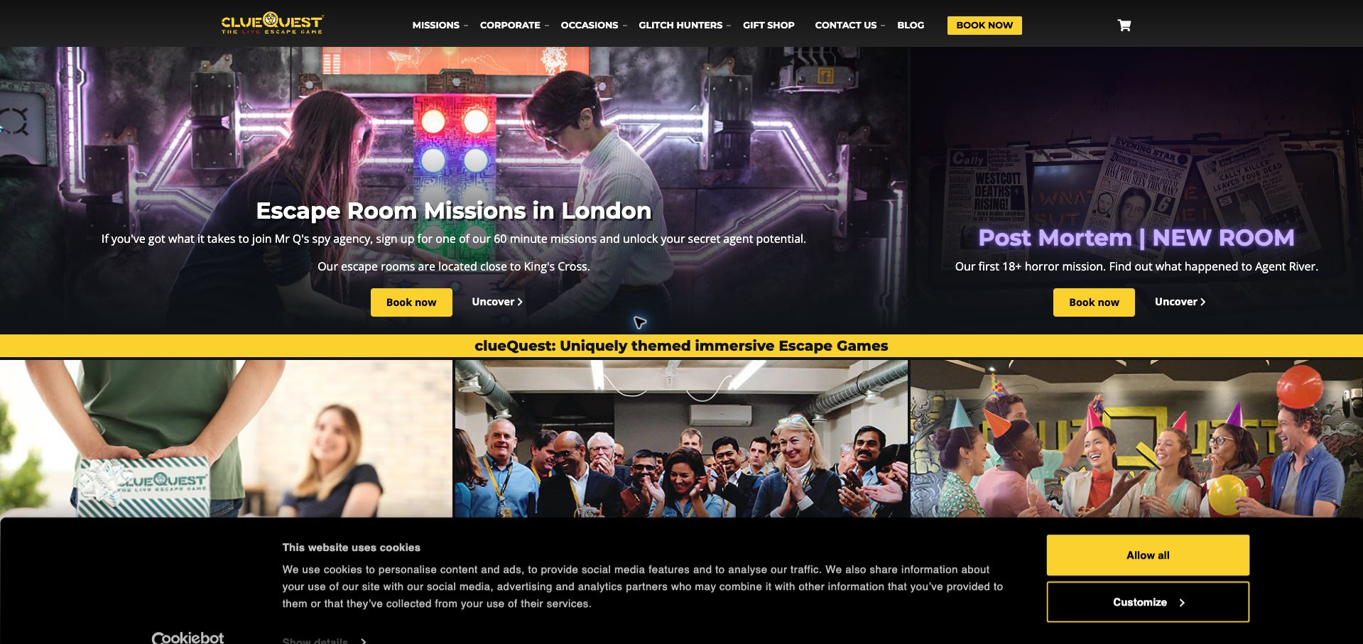
clueQuest's homepage uses bright yellow actions and a split photographic opening to present the established spy missions alongside a new horror room. The new experience is explicitly marked for adults, an important distinction when the same site also promotes family outings and birthdays. The page supplies a basic duration and King's Cross location for the core offer, then routes users by occasion. Birthday and celebration descriptions mention concrete possibilities such as hidden gifts and a separate event space, giving those routes more substance than generic party labels. The expanding catalog of gifts, home games and outdoor experiences makes the homepage busy, and repeated carousel content lengthens the reading path. The initial cookie banner also covers a substantial portion of the lower screen. The useful design move is making an intensity change visible at the point of introduction.
What you can learn
When adding an experience with different age or intensity requirements, mark that distinction in its first promotional appearance.
Pros
The adult horror release is separated from the general spy missions.
Occasion routes describe specific customization possibilities.
Cons & considerations
The broad product mix makes the homepage visually crowded.
Repeated carousel content and the initial banner slow scanning.
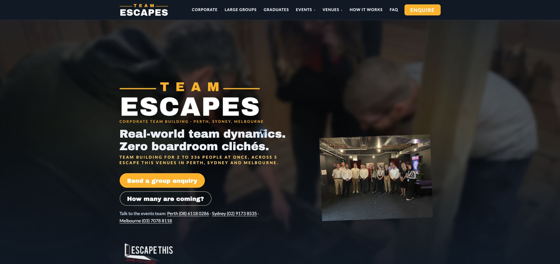
Team Escapes presents Escape This's corporate offer with a restrained dark-blue and gold layout, a group photograph and a direct enquiry route. Its useful feature is an estimate section that breaks a sample headcount into named rooms, explains the proposed format and labels the total as a starting estimate requiring confirmation. The page also distinguishes aggregate capacity across all venues from the capacity of an individual booking. Regional phone numbers and document-request information address the practical needs of an event organizer. Some client-logo positions remain generic placeholders, weakening the adjacent trust section. The large network-wide number is also more prominent than the local decision, so its qualification matters. The reference is the explanation of how a group might be distributed, rather than an unsupported promise that every advertised capacity is available together at one venue.
What you can learn
Explain how an estimated group splits across rooms, identify the venue and label clearly what still requires a confirmed quote.
Pros
The estimate exposes room allocation instead of showing only a total.
Capacity definitions distinguish network scale from a local booking.
Cons & considerations
Generic client-logo placeholders weaken the trust presentation.
The network-wide capacity headline can overshadow the venue-specific decision.
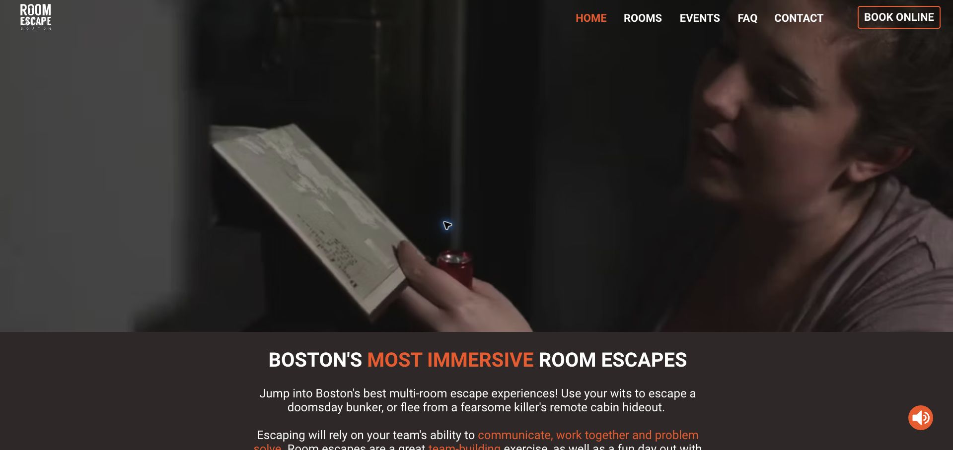
Room Escape Boston uses a large video opening and orange accents before introducing its Chelsea venue's game collection. The page states a base per-player price and explains that the hour-long rooms are private by default. This gives visitors two useful constraints before they compare the bunker, cabin and other stories. Separate learn-more and booking actions appear with each experience, and an online game is labeled as a distinct format. The later section explains nearby activities in the same building, supporting a longer outing without confusing them with the escape-room purchase. The video consumes most of the first screen, while player capacity and the recommended ages are left to further investigation. The strongest lesson is putting privacy and price ahead of the narratives, then distinguishing adjacent activities from the main booking.
What you can learn
Establish the default price and privacy arrangement before room selection, and label virtual or bundled activities as separate choices.
Pros
Private play and the basic time commitment are explained together.
Online play and partner activities are distinguished from physical rooms.
Cons & considerations
The large video delays the practical introduction.
Capacity and age recommendations are not immediately comparable across rooms.
Kegan is a freelance web designer and developer with 15+ years of experience helping businesses turn complicated website requirements into clear, maintainable digital experiences. He works directly with clients from planning and design through development, launch, and ongoing support.
For escape room website design, his development approach focuses on room and capacity comparisons, visit-planning details, group-event inquiries, clear price conditions, and timed-reservation handoffs. The scope can be a targeted improvement or a complete custom build, with responsive layouts, thoughtful content structure, and integrations chosen around the people using and maintaining the site.
Show 3 other escape room website designersHide other escape room website designers
Plan the content around the decisions visitors need to make
Create a consistent game record
Store the title, theme, location, duration, participant range, private or shared format and age guidance together. Use a real description of the experience and link any further suitability questions to the venue.
Distinguish play time from the visit
Explain how early to arrive, the briefing and any expected time afterward. Keep the booked start time unambiguous and make late-arrival conditions visible before payment.
Make group pricing interpretable
Identify minimum headcount charges, per-person bands, private-booking costs and any taxes or fees in the actual offer. Check the same party size across public copy and reservation software to catch conflicting totals.
Explain capacity honestly
Differentiate a room’s preferred group size, hard maximum and total venue event capacity. Describe how larger events split across rooms, and give organizers an inquiry route instead of suggesting one oversized booking.
Keep launch and closure states current
Label future games, temporary closures and retired rooms consistently in menus, cards and booking links. Preserve useful old content only when its status is unmistakable and it cannot be mistaken for an active offer.
Test the complete reservation journey
Check room selection, location, party size and date context at the external-system handoff. Review phone layouts, keyboard navigation and overlapping popups without making real bookings or payments.
The editing job behind the design
Choose a maintainable publishing and booking system
A structured room catalogue should feed game cards, comparison views and location pages from the same facts. Let the reservation platform manage actual slots while the public site explains the room and the visit clearly.
Keep media optional and provide readable text when trailers or third-party widgets fail. Public technology observations can identify visible components, but they do not prove that a booking system is synchronized or reveal the operator’s internal infrastructure.
Our WordPress website examples offer a separate look at publishing approaches. A visible platform label is evidence for that named page, not a guarantee that the same system will suit your requirements.
Before the public launch
Practical website planning checklist
Name the correct room and venue.
Show the participant range.
Explain private or shared play.
State game duration.
Add arrival and briefing time.
Publish age and adult-participation rules.
Show the price basis.
Explain minimum charges.
Label upcoming games.
Distinguish event capacity from room capacity.
Keep FAQ and checkout facts aligned.
Test the booking handoff.
These checks are a project checklist, not a performance, legal, security, or accessibility certification. Test real journeys with the people responsible for the website before making claims about the result.
Sources & editorial method
How this collection was selected and reviewed
The 29 examples match the original saved collection target. Each official public page was opened, inspected and directly captured in an ordinary browser; source URLs and capture dates identify the reviewed state. Reviews describe observed design, information and navigation, with distinct practical lessons and limitations. A bounded public technology-audit attempt accompanies every source, preserving unknown and inaccessible results without inventing a hidden stack. Editors Choice is an explicit editorial selection favoring a smaller specialist or local organization, not a service-quality, safety or outcome endorsement. No booking, application, payment or private form was submitted. Website imagery and trademarks belong to their owners.
Each example links to its actual source page. Screenshots are direct browser captures with their own capture dates; moving imagery, announcements and live designs can change. The notes describe observable design choices and conditional tradeoffs, not measured traffic, conversion results, service quality, or accessibility conformance.
Technology labels use public page metadata, asset evidence, or explicitly cited platform documentation. Platform documentation is not a complete current deployment audit. A component reference may be legacy or unused; it is not a complete backend inventory. Unknown stacks are omitted. These sites are editorial examples, not our client portfolio.
Written, Edited and Curated are separate editorial records, not timestamps advanced by a rebuild. Website designs and imagery belong to their owners. See our editorial standards or suggest a correction.
Questions worth asking
Escape Room website design questions
What should an escape room page show first?
The room’s theme, location, participant range, duration and booking route. Add private-or-shared format and important age guidance close to that summary so a group can assess basic fit.
Should a room’s story hide practical details?
No. The fiction can establish atmosphere while a separate factual panel explains the visit. Players should not have to infer capacity or arrival time from narrative copy.
How should larger team events be described?
Explain how groups divide among rooms, what capacity applies to each and whether an organizer must inquire. A venue-wide number should not look like the capacity of one game.
Where should cancellation terms appear?
Provide a clear link or short summary before the reservation commitment, with the full current policy available. Keep the terms consistent between the site and the booking provider.
Can this collection establish a room’s suitability?
No. It reviews public website design and information. Ask the operator about individual access, age or participation needs using its current guidance.