Best Brewery Websites of 2026 (21 Real-World Examples)
Brewery website examples that connect distinctive beer brands with useful visits
A brewery website has to explain both what it makes and where people can enjoy it. These twenty-one examples show different ways to connect product character, taproom information, food, events and changing availability.
Start with the visitor's actual decision: finding a taproom, checking a draft list, choosing somewhere to eat, attending an event or arranging packaged-beer pickup. Those intentions overlap, but they are not one generic shopping journey. A beautiful can photograph will not tell someone whether the kitchen is open or which venue hosts the show.
The collection examines public website design and content, not beverage quality, consumption advice or the legality of a purchase in any jurisdiction. Screenshots were taken without age attestations, accounts, orders or reservations. A brewery that required an age gate was excluded from this research rather than accessed by making an assertion on the visitor's behalf.
Before the examples
What makes good brewery website design in 2026?
Make the real destination clear
A production brewery, city taproom, beer garden and satellite bar may offer different food, hours and access. Give each place its own address, current schedule and visit instructions. Do not let a single corporate footer imply that every activity happens at the same venue.
Separate the range from current availability
A beer archive documents past and present products; a tap list tells someone what may be pouring now. Packaged stock and shipping inventory introduce further distinctions. Label each view and its update expectations so a compelling release story is not mistaken for a promise of availability.
Treat food and events as maintained information
Publish food arrangements, kitchen hours, event dates and ticket requirements as structured text. A poster or social feed may establish atmosphere, but it should not be the only place to discover a date or cancellation. Archive past events automatically where possible.
Keep hospitality separate from transactions
A visit, group inquiry, merchandise purchase and beer order need different requirements. Explain external destinations before sending visitors away. Where permitted by applicable requirements and the operator's policy, keep practical venue information accessible without checkout or account creation. Have the appropriate specialists review age-access and transaction requirements rather than treating a design preference as universal compliance guidance.
The collection · 21 examples
21 brewery websites worth studying
Compare how each brewery joins identity to an operational task. Cohesion photographs a specialist service; Ratio carries music culture into its graphics; Tree House builds a series of location chapters; Fox Farm distinguishes draft information from packaged releases. The transferable pattern is the relationship between brand, place and current facts, not a particular can style or headline.
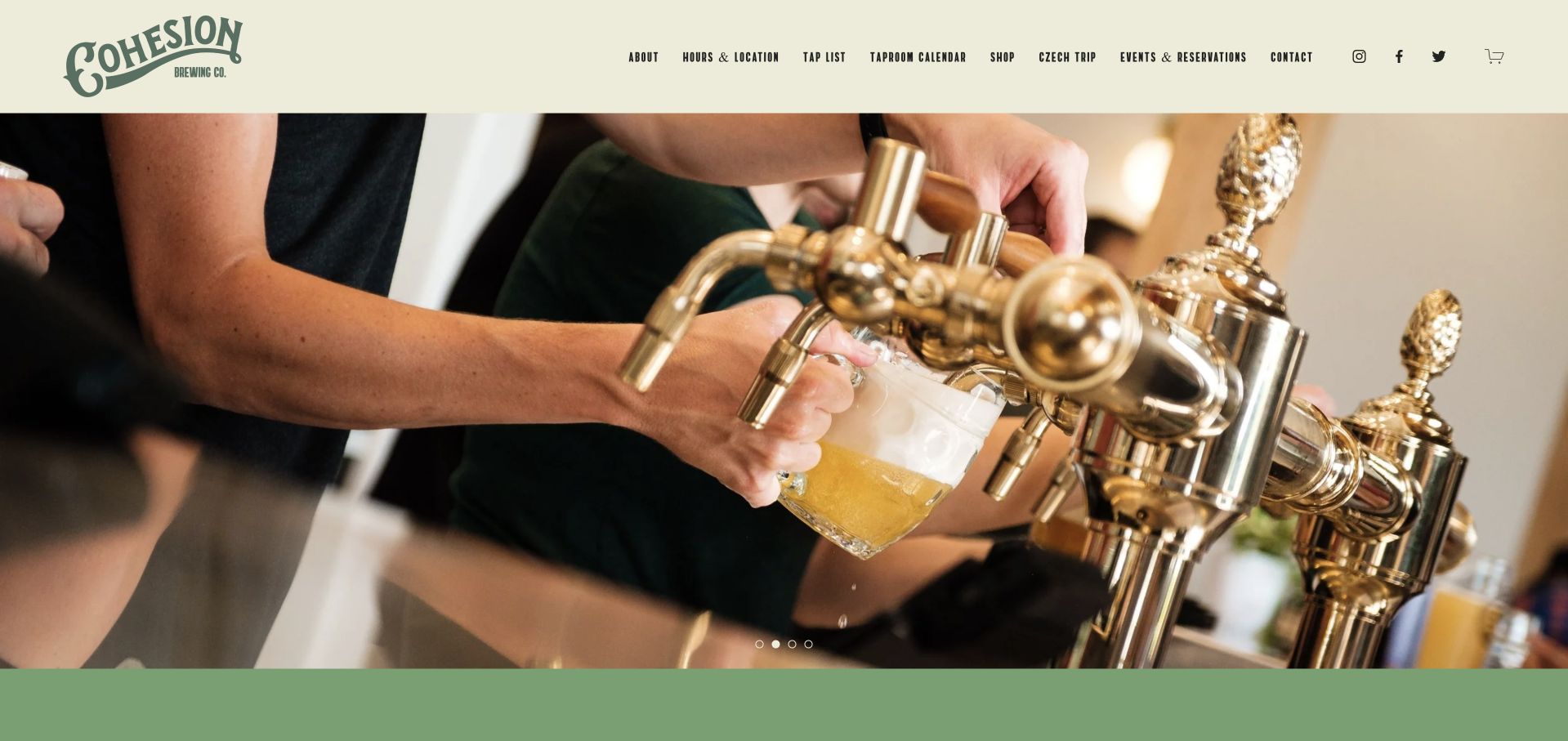
Cohesion opens with a close view of beer service rather than a wall of product badges. The cream and green identity feels deliberately restrained, giving the Czech-focused brewery room to explain what makes its taproom different. Navigation separates the tap list from hours and location, while the calendar, reservations and shop remain recognizable secondary destinations. Details such as patio-only dog access and date-specific changes to opening hours make the visit information useful beyond the attractive first photograph.
What you can learn
Make a specialist process tangible through a real service photograph, then translate that interest into a current tap list and a practical visit page. The brewery's point of view is more convincing when ordinary guest questions receive the same care as its visual identity.
Pros
The taproom and beer-service photography communicates a specific experience without relying on generic lifestyle imagery.
Named destinations for tap list, location and calendar keep three different visitor intentions understandable.
Cons & considerations
If holiday hours appear in several places, give one editor responsibility for keeping every instance synchronized.
When adding trip or private-event promotions, preserve a short, obvious route for someone simply visiting the Denver taproom.
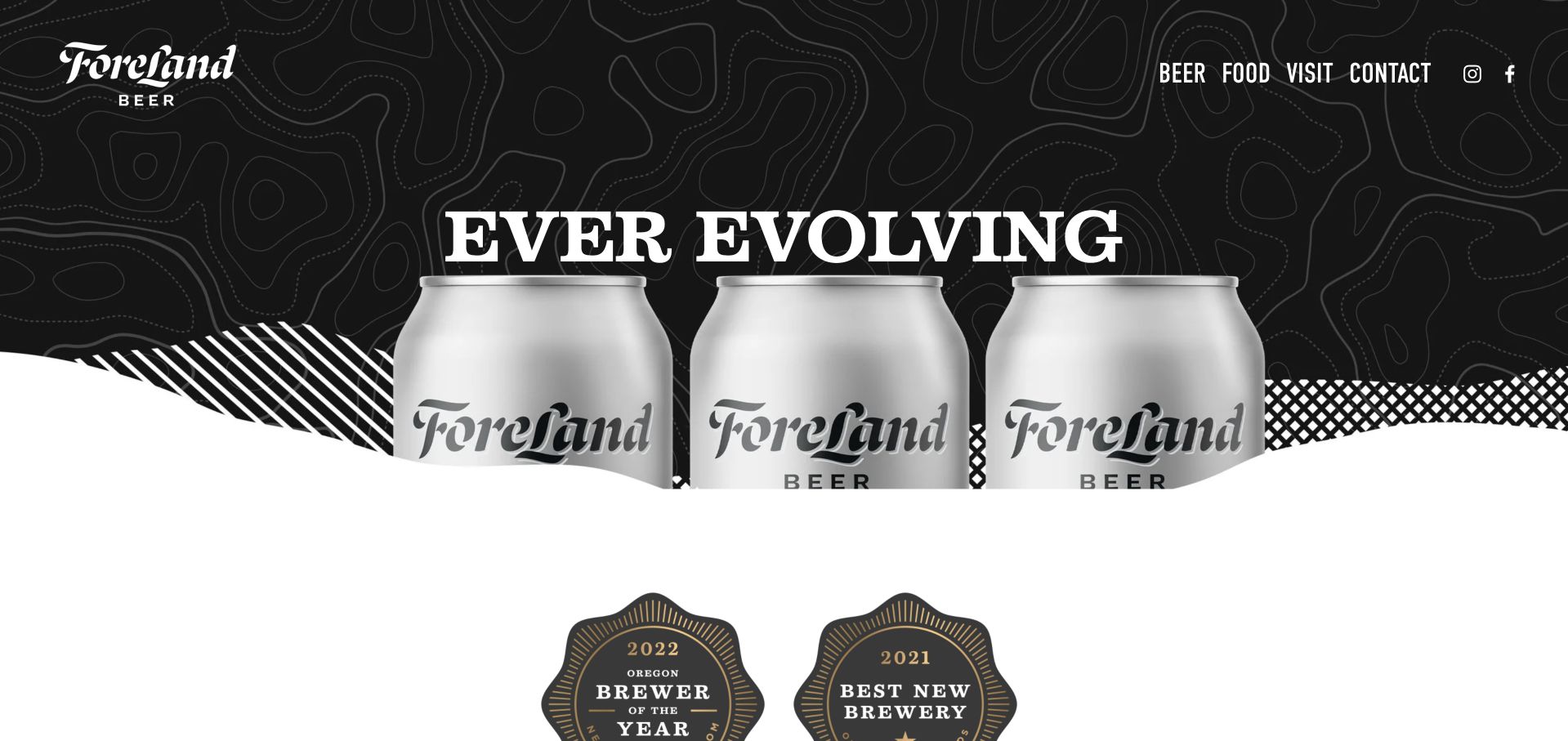
ForeLand uses oversized type, contour-line graphics and a dark product image to establish a recognizable outdoor-inflected world. Its primary choices are unusually economical: beer, food, visit and contact. Farther down, the Broadway taproom announcement brings the brand back to a specific neighborhood destination, while a modular grid sets out beer, the company and forthcoming food or shop areas. That combination makes the page feel designed as an evolving local business rather than a static can catalog.
What you can learn
Borrow the compact navigation and clear separation of drink, food and place. Treat every map and coming-soon panel as operational content, however: a bold visual announcement cannot compensate for location details that point visitors toward a different venue.
Pros
Four plain navigation labels make common tasks easy to recognize against the expressive graphic treatment.
The page connects packaging and atmosphere to a named taproom instead of leaving the brewery as an abstract brand.
Cons & considerations
If relocation information changes, audit embedded maps as well as the large address and announcement text.
Before publishing new shop or food panels, replace indefinite coming-soon states with a dated update or remove the empty destination.
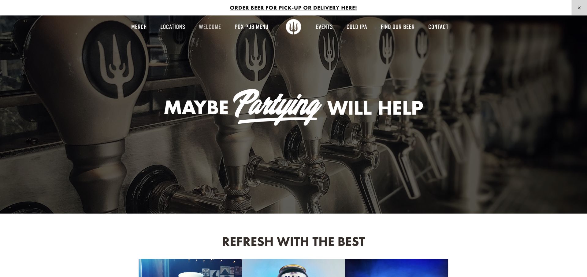
Wayfinder combines a photographic tap backdrop and an irreverent headline with an orderly route into its beers. Product imagery gives individual cans room to be recognized, while navigation names the Portland pub, Troutdale, menus and events. The longer page includes the brewing story as well as highly practical matters such as venue hours, keg arrangements and contact routes. It offers both a brand introduction and enough concrete detail to help a visitor choose the right pub rather than assuming every location provides the same experience.
What you can learn
Use the beer story to give a reason to care, then attach food, hours and directions to the exact venue. Detailed policies are valuable, but should live behind well-labeled links so they do not become the homepage's dominant reading task.
Pros
Location-specific destinations distinguish hospitality choices instead of hiding them in a generic contact page.
Can photography and brewing explanations provide complementary ways to understand the beer range.
Cons & considerations
If keg and dock policies grow further, move the full instructions to a dedicated page with a concise homepage signpost.
Check headline contrast over every rotating photograph and provide a stable, reduced-motion alternative where imagery moves.
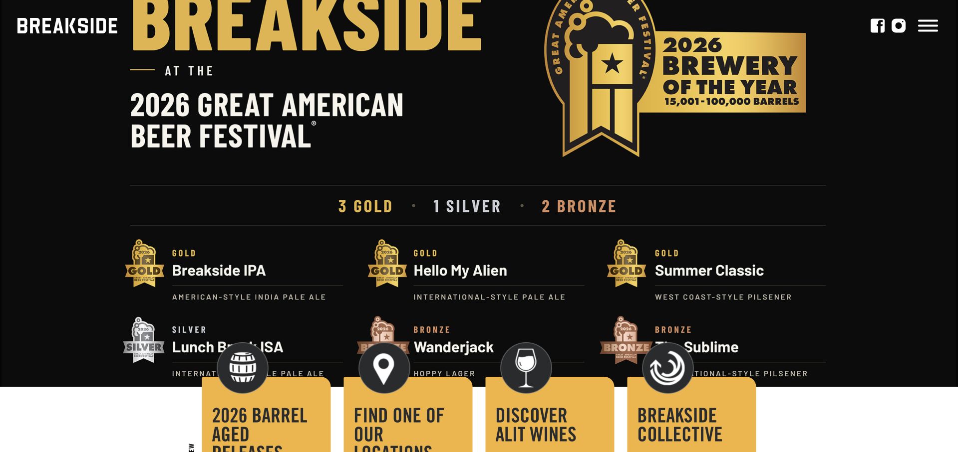
Breakside gives a current awards campaign the opening screen, using large black and gold graphics rather than a neutral welcome message. Below that promotion, beer releases carry concrete product information including strength, bitterness and packaging. A location grid extends the same site into the brewery's regional venues. The result is a useful example of a campaign-led homepage whose permanent responsibilities remain beer discovery and visiting, even when a timely achievement is receiving the most visual attention.
What you can learn
Build campaign areas as temporary modules above durable product and location records. An award can establish context, but the rest of the page must still answer which beer is available, what kind it is and where a guest can encounter the brewery.
Pros
Product facts such as ABV and packaging support comparisons beyond the appearance of the can artwork.
The location grid acknowledges that a regional brewery is also a collection of different physical destinations.
Cons & considerations
When presenting awards, retain the exact year, competition and category as readable text rather than relying only on a graphic.
If a large campaign occupies most of a phone screen, offer an immediately recognizable menu or location shortcut.
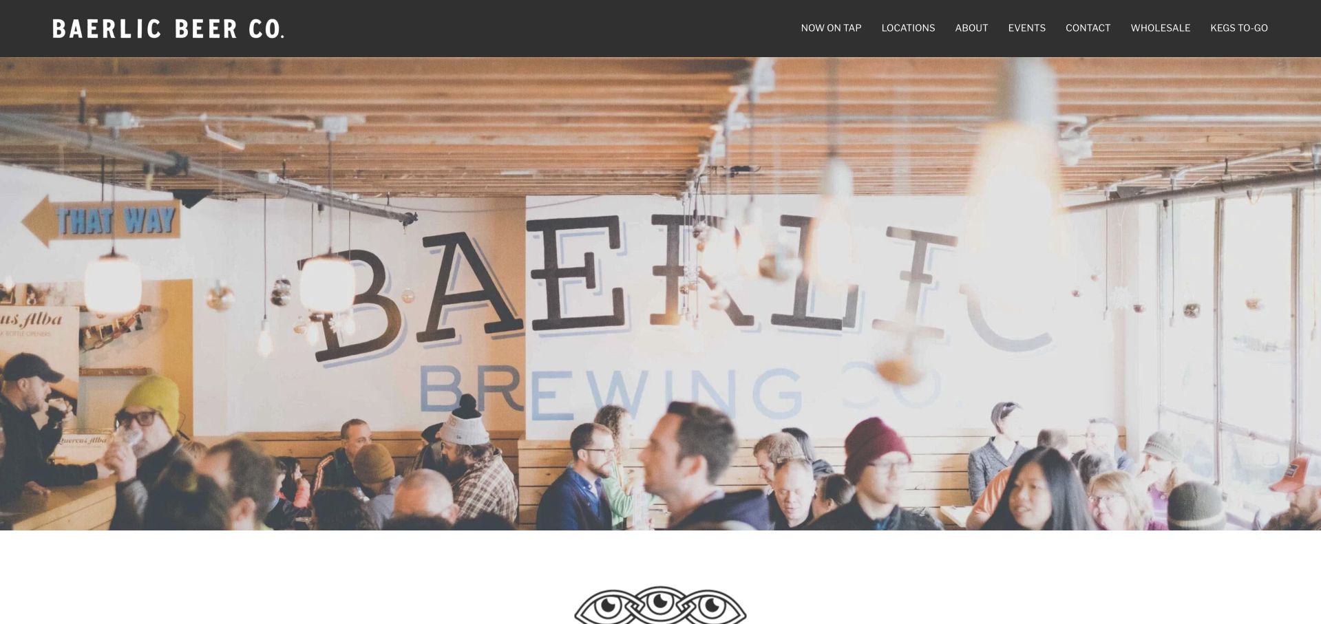
Baerlic starts with a full-width view of its taproom and a direct black navigation bar. The labels lead to what is on tap, locations, events and practical commercial needs such as wholesale or kegs to go. The company describes its independence and self-distribution, then introduces its Southeast, Northeast and Alberta destinations through distinct location cards. Pizza and the food-cart setting are not treated as interchangeable amenities; each venue receives enough context to suggest a different visit.
What you can learn
Let the actual room establish atmosphere, then use location cards to explain meaningful differences in food, setting and access. This is a stronger starting point for a neighborhood brewery than a universal reservation button that makes users investigate which venue it applies to.
Pros
Current tap information receives a top-level label alongside locations instead of being buried in the company story.
The three venue cards communicate different neighborhood and food experiences within a consistent visual system.
Cons & considerations
If food partners or opening days change, update the relevant card and its detail page together.
For a first-time mobile visitor, ensure the broad taproom image does not push the closest location and hours out of easy reach.
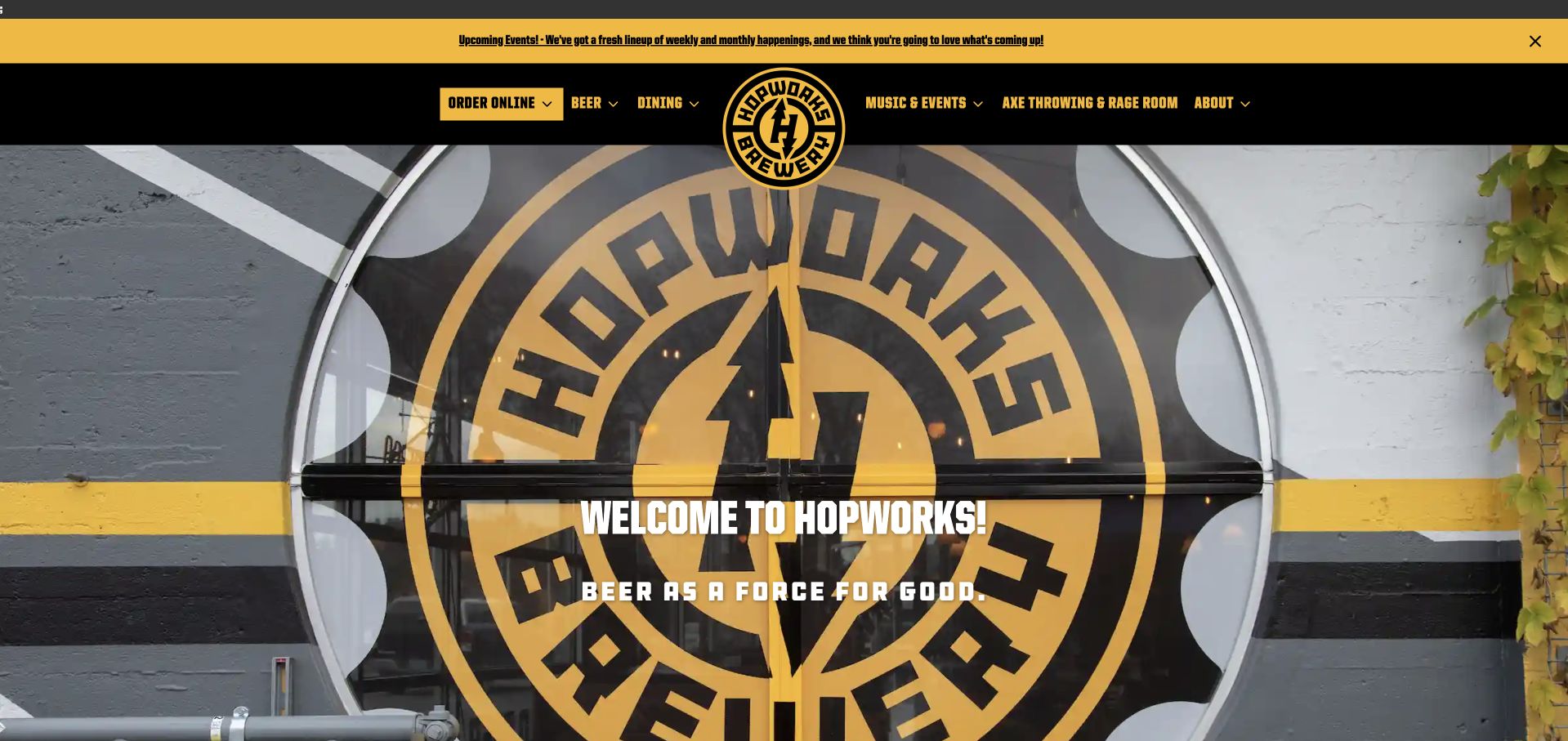
Hopworks uses a yellow and black identity around a large photograph of its entrance, making the real place immediately recognizable. The main navigation covers beer and dining alongside axe throwing, music and events. Its body copy connects the pub experience to the brewery's sustainability story, while a visit-the-pubs route keeps the site grounded in hospitality. The page is useful for studying how several activities can share one recognizable brand without presenting beer as the only reason someone might plan an outing.
What you can learn
Give each activity a clear label and let visitors decide whether they want a meal, an event or beer information. Environmental positioning works best as a documented supporting story with specific practices, rather than an unqualified decorative badge repeated across the page.
Pros
The entrance photograph helps turn an online introduction into a recognizable arrival experience.
Dining and activity links make the range of hospitality offers apparent without requiring visitors to read the full company history.
Cons & considerations
If environmental claims are expanded, attach dates and specific supporting practices so the language remains defensible.
Where load-more modules depend on scripts, provide meaningful initial content and a usable route when an embed does not load.
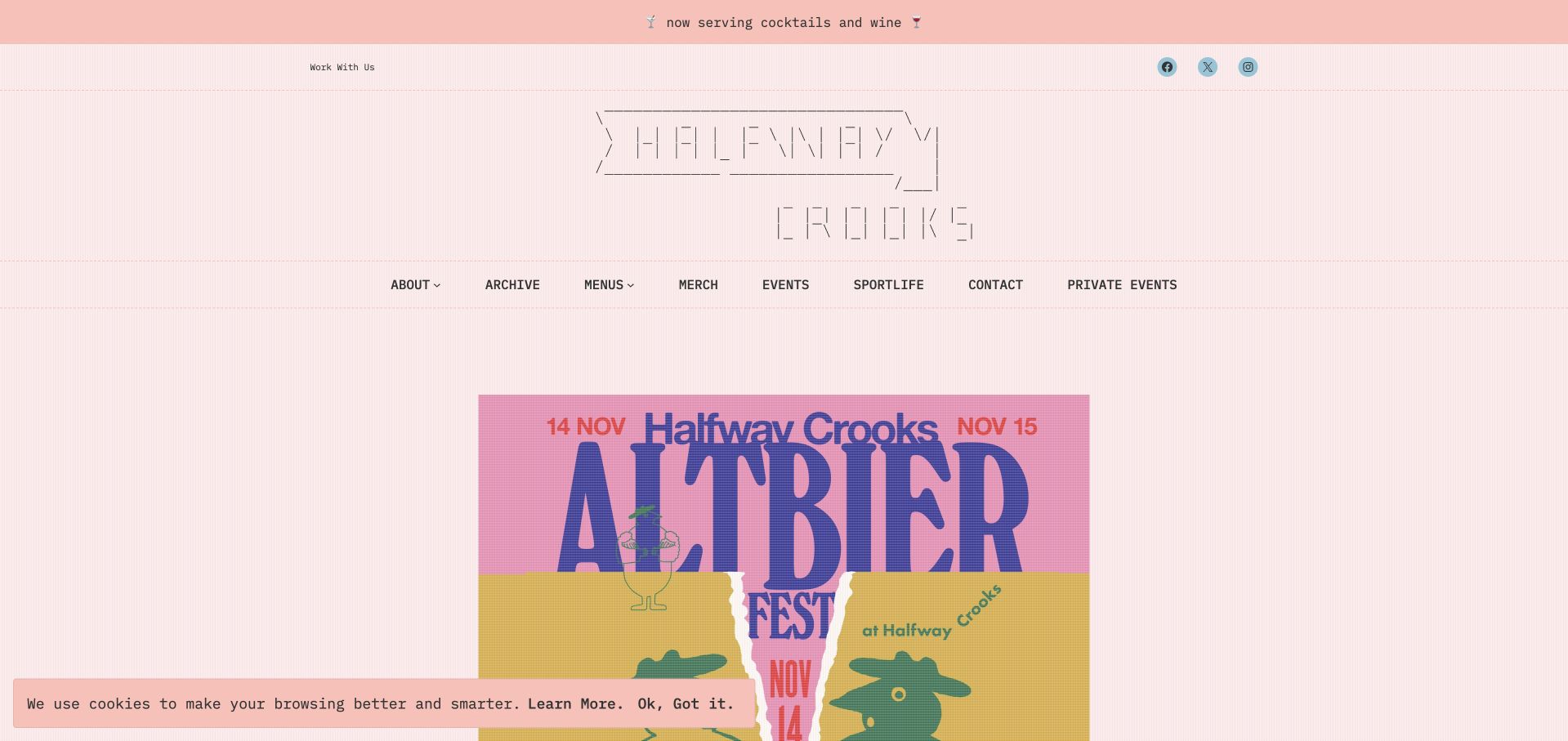
Halfway Crooks uses pale pink, outlined lettering and an ASCII-like graphic language to avoid the familiar dark warehouse brewery aesthetic. A large event poster gives the opening view a timely local purpose. The page also separates the Summerhill brewpub from its neighboring biergarten, with different addresses and hours rather than one ambiguous location block. Food menus, private events and an archive round out the information architecture. Its character comes from a tightly controlled visual voice, not from removing ordinary visitor information.
What you can learn
A highly individual visual system can coexist with precise hospitality details. Keep names, opening times and event information available as ordinary readable text so the poster-led identity still works for people using search, assistive tools or a small screen.
Pros
Adjacent venues are treated as different destinations, reducing the chance that visitors assume identical service or hours.
The event-led opening creates a concrete reason to return without turning the entire site into a social feed.
Cons & considerations
If event art contains essential dates or access details, repeat them in HTML and expire the promotion after the event.
Check that decorative ASCII-style lettering has an accessible textual equivalent and remains legible when the layout narrows.
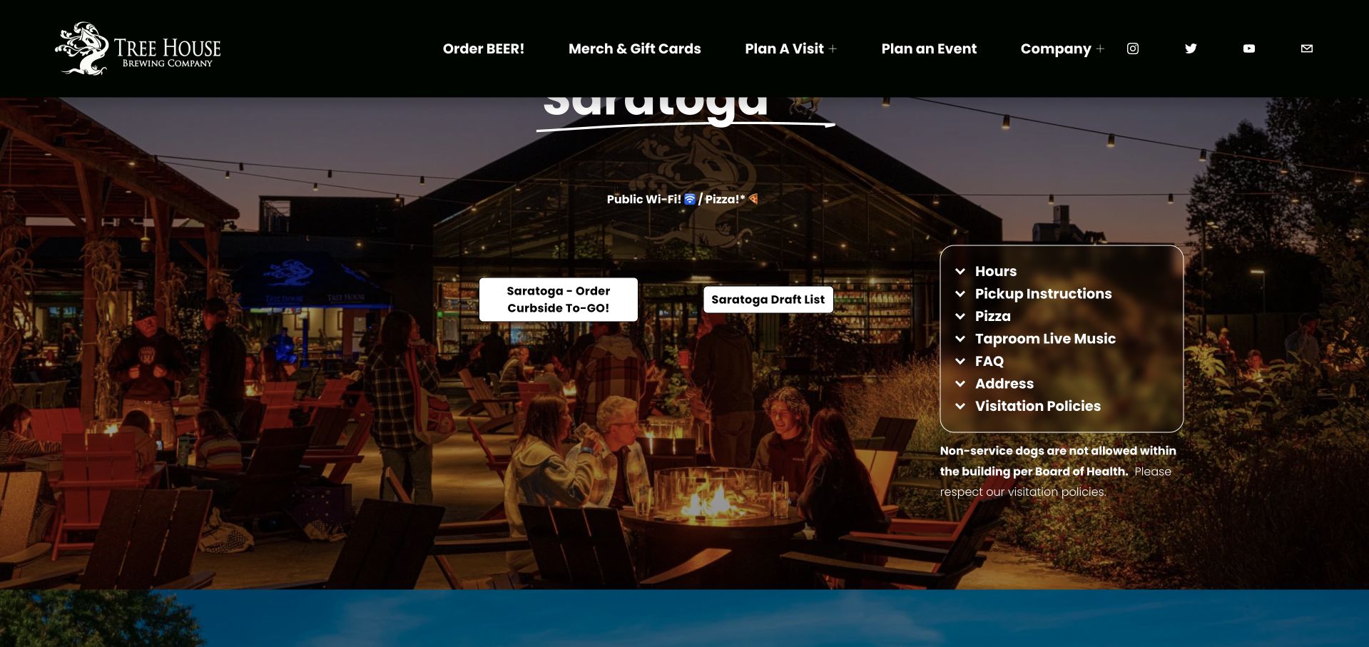
Tree House organizes an expansive homepage around named locations rather than trying to summarize every visit with one universal button. In the captured Saratoga section, a large photograph sits beside collapsible information for hours, pickup, pizza, taproom details and policies. Order links and draft-list routes are distinct. Other location chapters follow the same operational logic, allowing the brewery to explain why a visit to one property may work differently from another. It is a useful large-network example even for a smaller brewer planning a second venue.
What you can learn
Model each destination as a complete visit record: location, hours, food, draft availability and ordering instructions belong together. Reuse that structure consistently, and add a short location index so people do not have to scroll through every chapter to reach their intended venue.
Pros
The distinction between ordering and current draft information prevents two different tasks from collapsing into one checkout journey.
Expandable operational sections keep detailed venue policies close to the correct location.
Cons & considerations
As the number of location chapters grows, provide direct anchors and a clear selected-location state for small screens.
Test the accordions with a keyboard and ensure critical opening or closure information is not discoverable only after expansion.
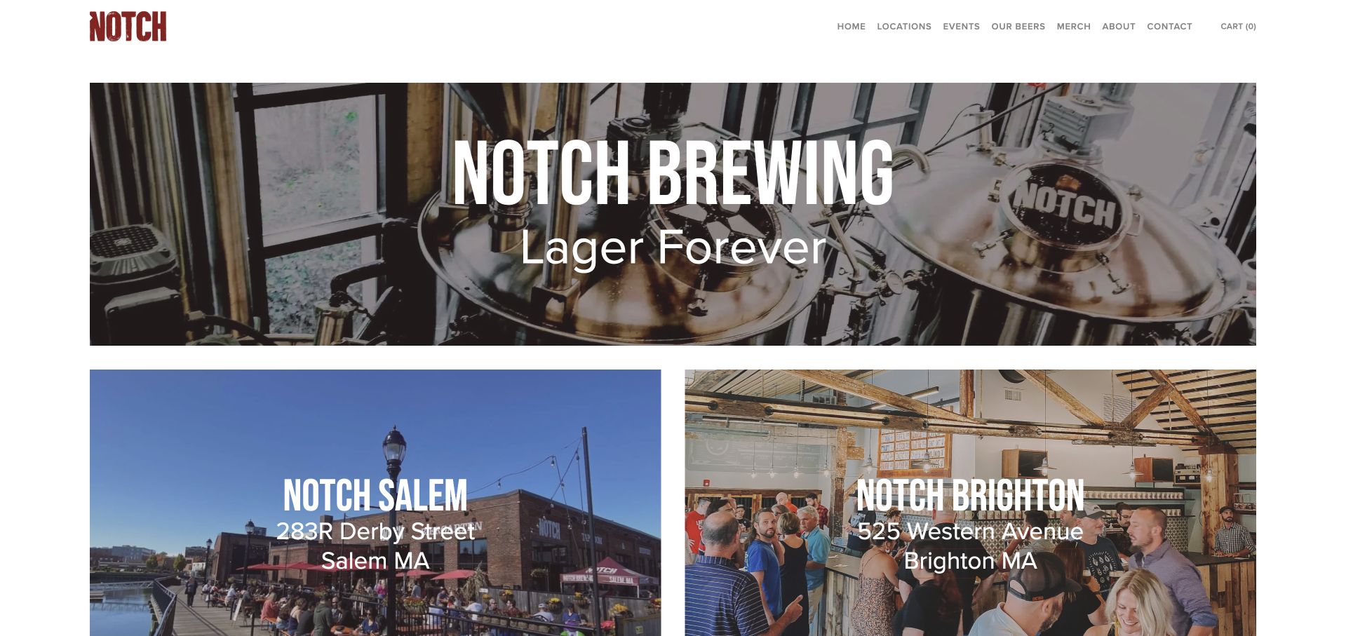
Notch pairs a restrained white header with a broad equipment photograph and a short lager-focused statement. Two large destination panels introduce Salem and Brighton with their addresses, so the transition from brand to visit is particularly direct. The primary navigation keeps beers, locations, events, merchandise and company information separate. Contact information also distinguishes the venues. The page is a useful study in how a brewery can avoid an overwhelming homepage without becoming vague about the physical places that generate most visitor questions.
What you can learn
For a two-location brewery, lead with the relationship between the brand and the two actual rooms. A few well-chosen photographs plus venue-specific addresses can be more useful than a long introduction, provided current menus, hours and access policies are easy to reach next.
Pros
Salem and Brighton are visible as separate choices rather than hidden inside a single address block.
The equipment-led opening supports the lager positioning without needing a dense technical brewing explanation.
Cons & considerations
Check the contrast and tap-target size of the relatively small header links on narrower screens.
If beer archives and taproom menus diverge, label availability explicitly so a historic beer page does not imply it is pouring today.
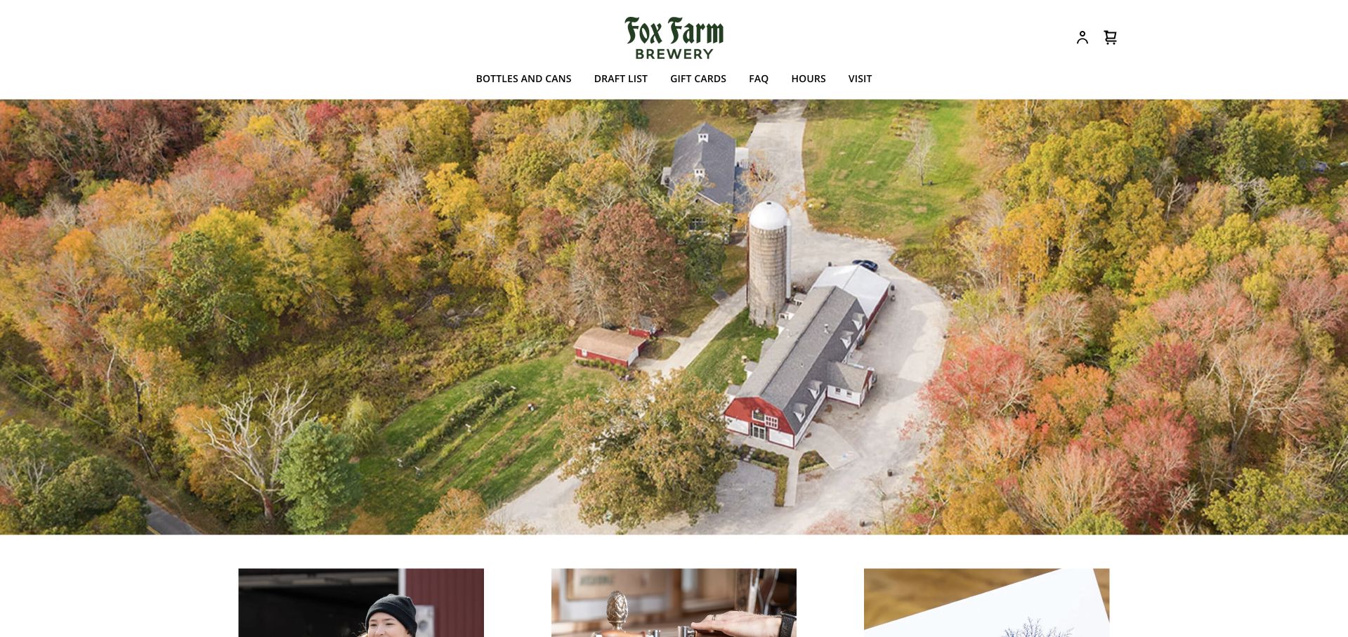
Fox Farm opens on an aerial autumn view of the property, using a centered white mark rather than a sales banner to establish its setting. Navigation is immediately practical: bottles and cans, draft list, gift cards, questions, hours and visiting. The packaged-beer selection uses categories that help visitors browse different styles, while the draft information carries a recent update and a subject-to-change warning. This creates a clear distinction between discovering the farm, checking what is pouring and planning packaged-beer pickup.
What you can learn
Separate the visit, draft list and packaged inventory even when they share a brand and property. Date the information that can change quickly, and explain collection arrangements before a visitor commits to an order or travels to a rural destination.
Pros
Aerial property photography makes the rural setting legible and differentiates the brewery from an urban taproom.
Distinct draft and packaged-beer routes acknowledge that availability and fulfillment are not the same problem.
Cons & considerations
If the draft list is manually maintained, assign an update cadence and a visible last-reviewed date.
Keep visiting instructions available outside the store so checkout requirements do not become a barrier to finding hours or directions.
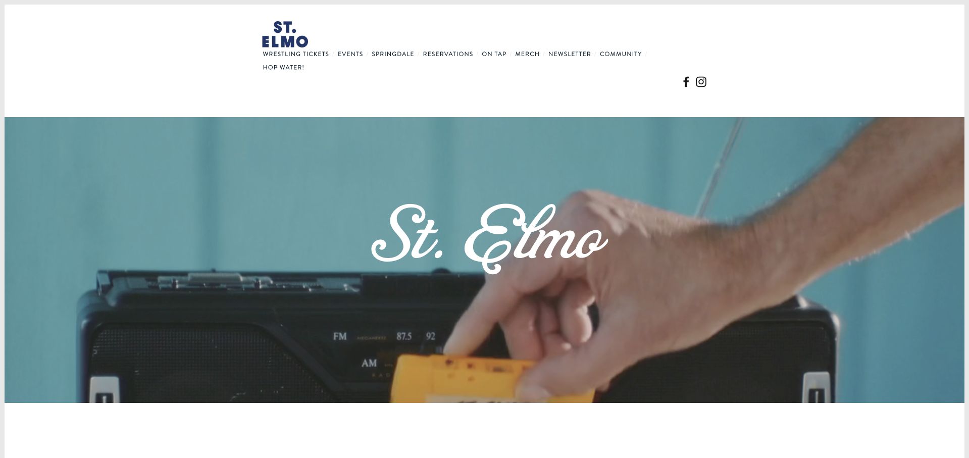
St. Elmo's opening image mixes the brewery name with an everyday musical object, establishing a relaxed neighborhood tone rather than a polished product launch. The navigation offers events, what is on tap, merchandise and a clearly named Springdale reservation destination. A short community-oriented introduction and beer-garden imagery reinforce the place-based identity, while the footer provides the two Austin addresses. The example shows how a brewery can use culture and atmosphere to create interest without making its hospitality destinations completely anonymous.
What you can learn
Connect the neighborhood voice to precise venue information. Events, a tap list and location-specific reservation labels should do the practical work, while music, photographs and community language help visitors decide whether the place suits the outing they have in mind.
Pros
The named reservation route signals that the action belongs to a particular venue rather than both Austin addresses.
A concise brand voice and recognizable everyday photography create character without a lengthy brewing manifesto.
Cons & considerations
If social posts remain on the homepage, treat them as supporting atmosphere and keep essential hours and events in maintained site content.
As locations develop different services, display the venue name before any booking or tap-list action that depends on it.
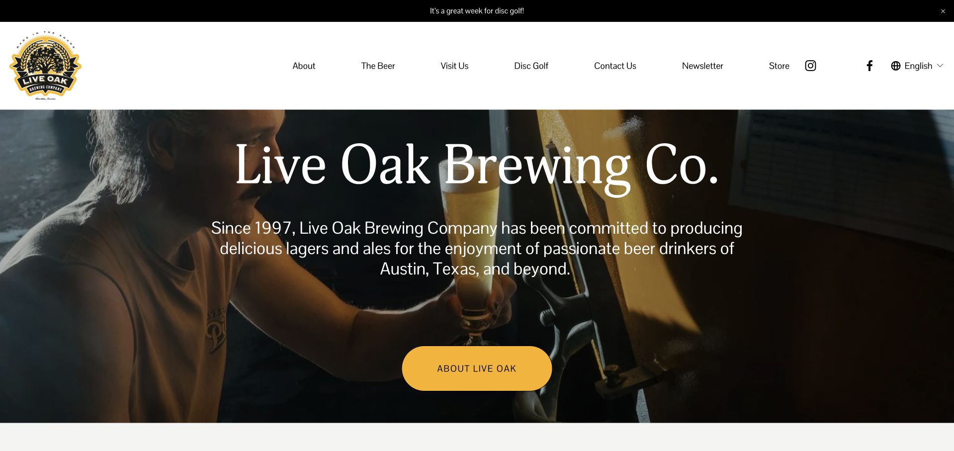
Live Oak uses a close photograph of a pouring beer and large serif naming to introduce its Austin brewery. The story of brewing since 1997 sits alongside clear routes to the beer range, visiting and disc golf. Hours and the address remain available in the page's practical information, while an events list adds reasons to return. The design is useful for studying how a brewery can combine a specialist production story with a broad outdoor visit, rather than asking every prospective guest to begin with technical beer knowledge.
What you can learn
Use the brewing history to explain identity, then present the outdoor and hospitality activities as concrete visitor choices. The date-sensitive parts of the page need a stricter publishing routine than the enduring history or process sections.
Pros
The visit and disc-golf labels acknowledge different motivations for going to the same physical property.
The pouring photograph demonstrates the product in service rather than relying solely on isolated packaging renders.
Cons & considerations
If past events remain in the primary upcoming-events area, archive or relabel them automatically so the page does not imply they are future dates.
For readers unfamiliar with the property, make food arrangements, access and opening hours as easy to find as the brewing story.
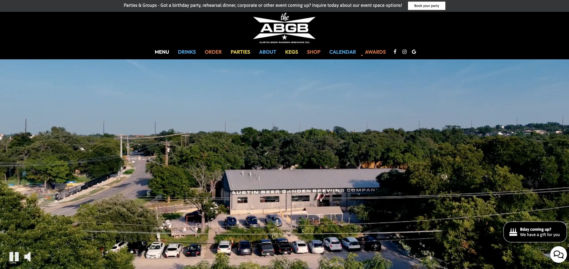
The ABGB places its recognizable mark above a large moving view of the Austin property, followed by navigation for food, drinks, the calendar, parties and awards. The page treats live music, community events and meals as equal parts of the visit. Practical details go further than an address: parking and overflow-parking instructions are published alongside opening hours. Separate ordering, keg and shop links acknowledge that taking beer home is different from attending a show or arranging a group outing.
What you can learn
Plan a brewpub site around actual guest scenarios, not just the beverage catalog. A calendar, food menu, group inquiry and arrival instructions each deserve a direct route, while video should support the atmosphere without becoming a requirement for understanding where to go.
Pros
Food, drink and calendar destinations make the multi-purpose venue understandable before visitors scroll through promotional sections.
Published overflow-parking guidance answers a real arrival question that attractive beer photography cannot solve.
Cons & considerations
If seasonal party promotions appear in a modal, keep dismissal immediate and avoid covering the menu on repeat visits.
Maintain descriptive pause controls and a useful still image so the large opening video works for reduced-motion and slower connections.
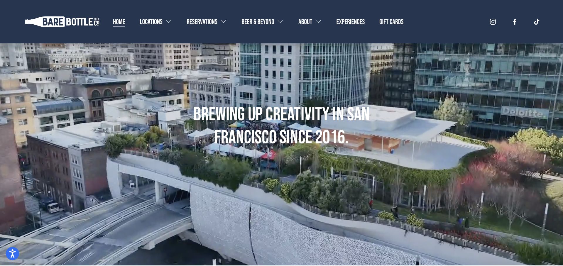
Barebottle introduces its Bay Area setting through a wide rooftop panorama and a navy header with explicit location, reservation and beer destinations. The location cards distinguish the original Bernal Heights venue from Salesforce Park and the other regional taprooms. Further content broadens the offer to coffee, wine and homebrewing information. It is especially useful as an example of a brewery whose physical experiences vary substantially: the home production location and a park or suburban taproom cannot be described adequately by the same generic visit paragraph.
What you can learn
Build location records around the actual experience at each venue, then let a consistent card system hold the network together. Product education and additional drinks can add depth, but food, reservation rules and directions must remain attached to the correct taproom.
Pros
The panoramic opening gives a satellite location a memorable sense of place without replacing the locations directory.
Separate beer, experience and reservation labels create more useful choices than a single undifferentiated shop button.
Cons & considerations
For the broad opening video, supply an appropriate still frame, motion controls and text that remains legible across frames.
Audit every image and heading link in a location card so both take visitors to the intended venue rather than a generic homepage.
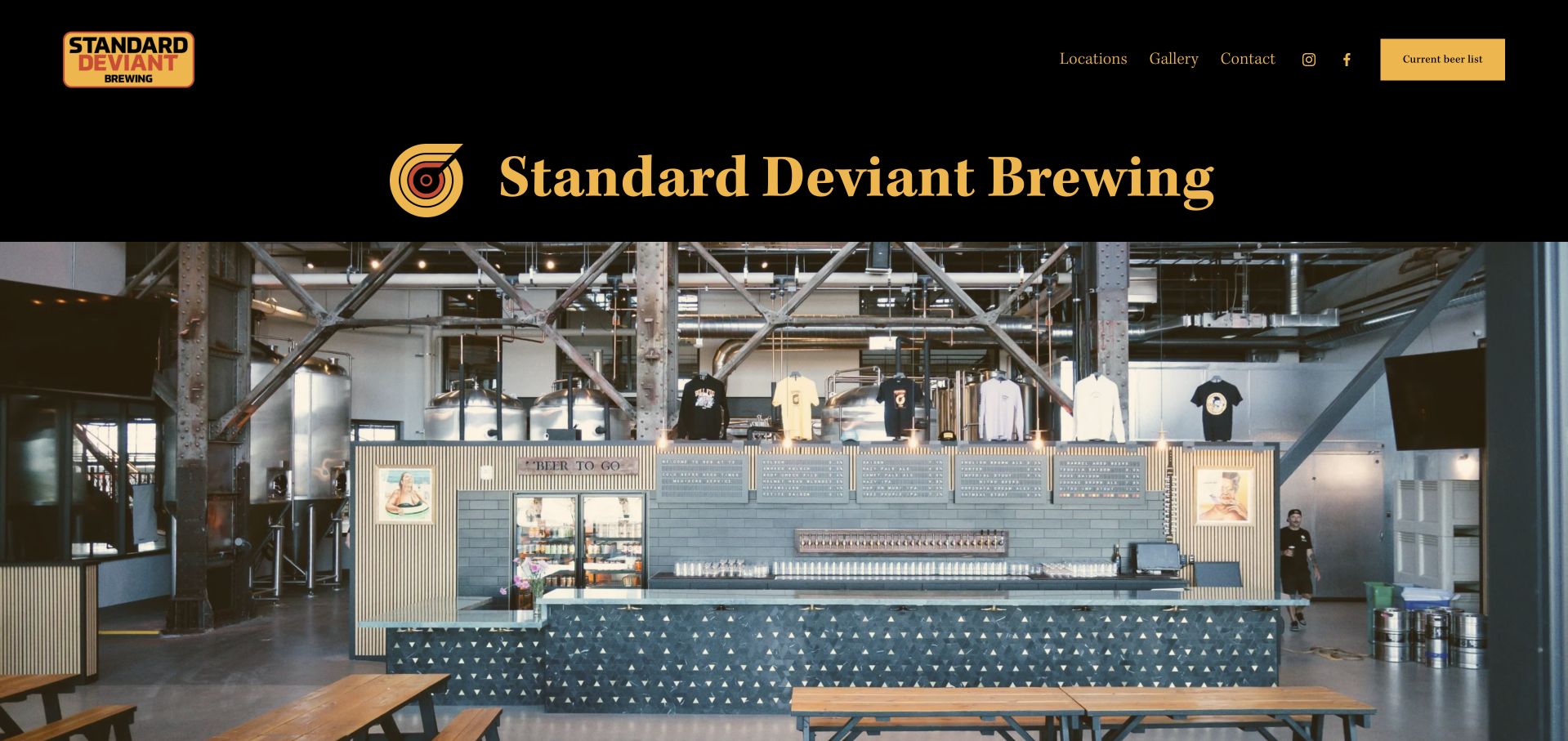
Standard Deviant uses a black and yellow header, a large serif name and a wide photograph of its actual bar and brewing equipment. The navigation is notably compact: locations, gallery, contact and a highlighted current beer list. The rest of the page extends a deliberately irreverent voice while distinguishing the 14th Street and Pier 70 venues. The useful design lesson is not to copy the jokes, but to notice how few structural choices the brewery needs when the main questions are where to visit and what is available.
What you can learn
Give a small brewery a recognizable verbal identity without making that voice do the navigation's job. Keep the actual room visible and preserve plain, functional labels for location and beer information, particularly when the beer list leaves the main website.
Pros
The taproom photograph gives direct evidence of the space, equipment and atmosphere rather than an interchangeable lifestyle scene.
A highlighted current-beer-list action makes the most time-sensitive product task easy to identify.
Cons & considerations
If the external beer-list service changes or fails, retain an obvious fallback contact and clarify which venue its inventory describes.
An irreverent tone should not obscure accessibility, opening hours or event-inquiry requirements; keep those instructions straightforward.
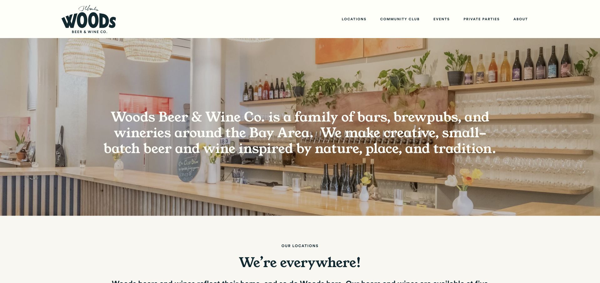
Woods opens with a light cream header and a bright photograph of a real neighborhood bar. A short introduction explains the family of bars, brewpubs and wineries, while navigation groups locations, community, the club and events. Location cards extend that domestic-scale feeling across the Bay Area rather than making every venue look like a duplicate production facility. The company's beer and wine offerings belong to the same place-based identity. The page is useful for a producer whose hospitality network is more varied than a conventional brewery taproom chain.
What you can learn
Unify a collection of small venues through a consistent editorial voice and card structure, but let their photographs retain individual character. Keep future openings explicitly separate from operating destinations, so an appealing expansion announcement does not become misleading visit information.
Pros
Real neighborhood interiors support the small-venue positioning more convincingly than a repeated grid of isolated beverage products.
A locations-first hierarchy allows the beer and wine offers to coexist without forcing visitors through two separate brand sites.
Cons & considerations
When a coming-soon venue joins the grid, label its status prominently and publish hours only after opening is confirmed.
Audit older location and club links as the network evolves so navigation does not lead to obsolete hosted pages.
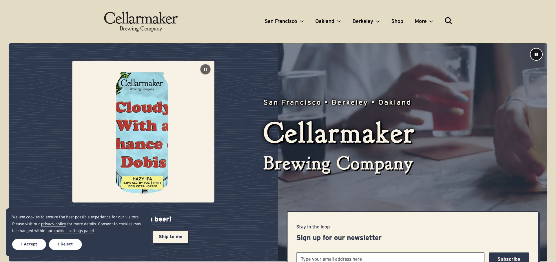
Cellarmaker pairs illustrated cans with a more atmospheric moving image in a split opening composition. San Francisco, Oakland and Berkeley are named in the header, grounding the brand in three regional destinations. The page separates pickup and local delivery from shipping, then presents releases with location-dependent availability, packaging and strength information. This is useful inspiration for a brewery whose catalog is constantly changing: the design makes product discovery a structured task instead of relying on a succession of unsearchable release posters.
What you can learn
Make availability a relationship between a beer, a package and a location. Show that relationship before asking people to choose a fulfillment route, and explain where shipping differs from local delivery so a strong product presentation does not create a misleading expectation.
Pros
Named cities in the header provide quick geographic orientation for a multi-venue brewery.
The release structure combines packaging and availability details, giving can artwork a useful informational framework.
Cons & considerations
If filters or live inventory depend on scripts, test keyboard operation and provide an understandable empty or unavailable state.
Keep shipping eligibility, delivery radius and pickup location explicit at the relevant action rather than relying on later checkout corrections.
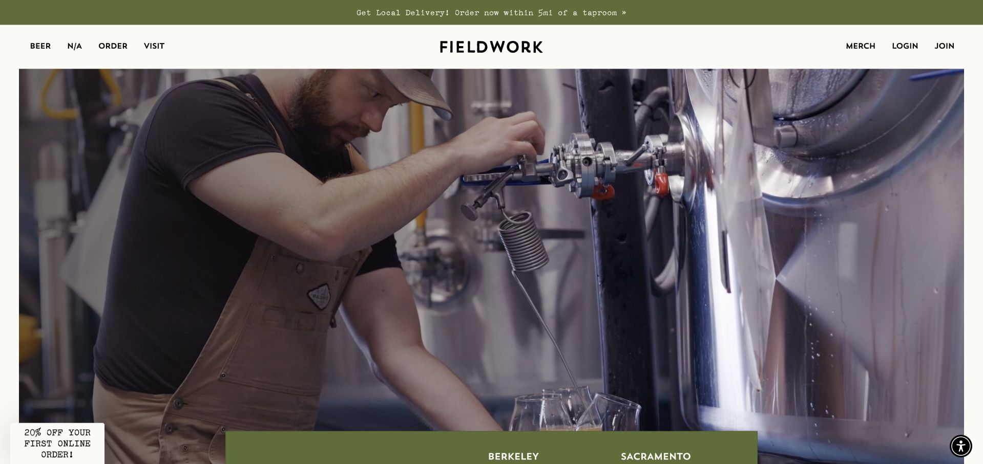
Fieldwork keeps its principal navigation unusually short: beer, nonalcoholic drinks, order and visit. A large photographic opening leads into a list of named Northern California locations. The site describes a constantly rotating range, distinguishing the beer archive from ordering and sending the nonalcoholic line to its own destination. The footer includes venue-specific operational information rather than only corporate links. The design offers a useful contrast to a dense hospitality menu: a small number of high-level choices can support a broad network if the next layer is specific.
What you can learn
Choose a few top-level tasks that remain stable as the business grows, then make location and availability selection explicit inside them. An archive should explain the range without implying that every previously brewed product is in stock today.
Pros
The four-part task menu stays understandable despite the number of taprooms and beverage categories.
Named location links allow visitors to choose a real destination rather than interpreting one generic address.
Cons & considerations
If a discount signup appears on arrival, keep the decline action obvious and preserve the location choices behind it.
Local-delivery claims should remain tied to the selected venue and radius, with archive content clearly distinguished from current inventory.
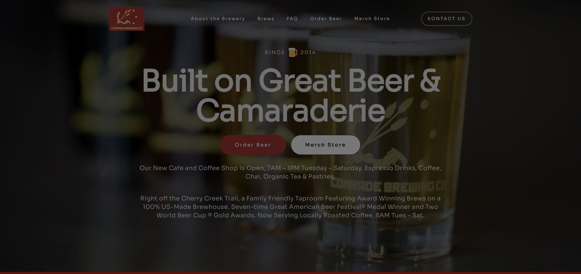
Comrade leads with a large brewery photograph, a straightforward hospitality headline and separate beer-order and merchandise actions. A live monthly calendar below organizes food trucks, trivia, releases and coffee service, while the visit section gives a Denver address and taproom hours. The addition of a daytime cafe is particularly instructive: it gives the brewery another reason to welcome guests, but also introduces another schedule that must be maintained across announcement, introduction and calendar. The page shows both the opportunity and editorial burden of a broader neighborhood offer.
What you can learn
Use the calendar for changing events and a single authoritative service-hours record for enduring operational facts. Coffee, taproom and special-event times may differ; publishing those differences clearly is more useful than repeating an enthusiastic announcement in several disconnected modules.
Pros
A month-based calendar makes different kinds of recurring activity discoverable without requiring a social-media account.
Distinct beer and merchandise links avoid placing unrelated shopping tasks behind one ambiguous order button.
Cons & considerations
If cafe hours change, reconcile the announcement and body copy; the captured page displayed several different coffee-service times.
For time-sensitive notices, use a compact dismissible banner rather than making a large promotion dialog the required first interaction.
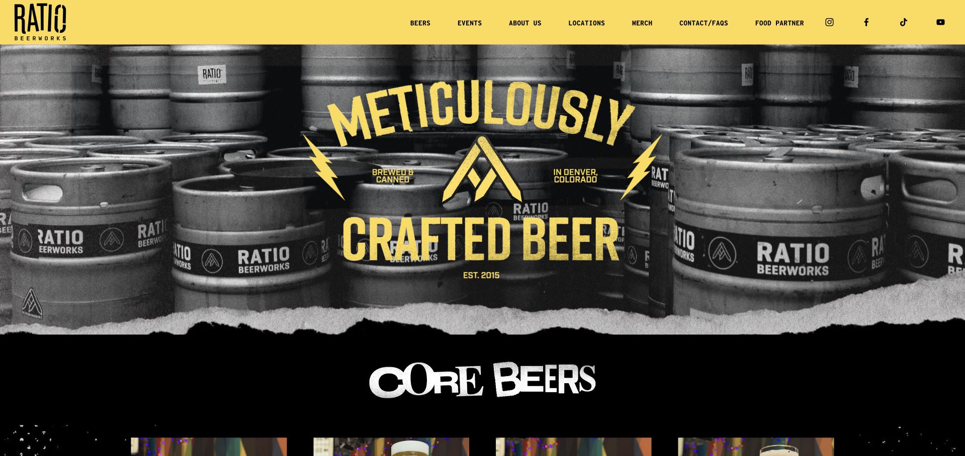
Ratio uses a bright yellow header, black-and-white keg photography and torn-paper edges to establish a music-rooted identity. The beer lineup follows with named styles, strength and bitterness information, translating the graphic energy into a usable introduction to the range. Two Denver taprooms receive separate photographs and addresses, and the food partner has its own navigation destination. The longer company story connects the brewery to the local music and creative community. It is a useful example of strong personality supported by ordinary, legible hospitality information.
What you can learn
Carry cultural character through typography, photography and art direction while keeping beer facts and venue names plain. A visitor should be able to appreciate the identity without learning its references before finding the right taproom or understanding a beer style.
Pros
Core beer entries pair distinctive names with readable style and ABV information instead of relying entirely on can artwork.
The two taproom addresses and location images provide a practical counterweight to the expressive brand presentation.
Cons & considerations
If newsletter acquisition interrupts the first view, give the close control a strong visible affordance and avoid repeating the overlay.
Keep each block of opening hours visibly associated with its venue, especially when the desktop columns become a single mobile stack.
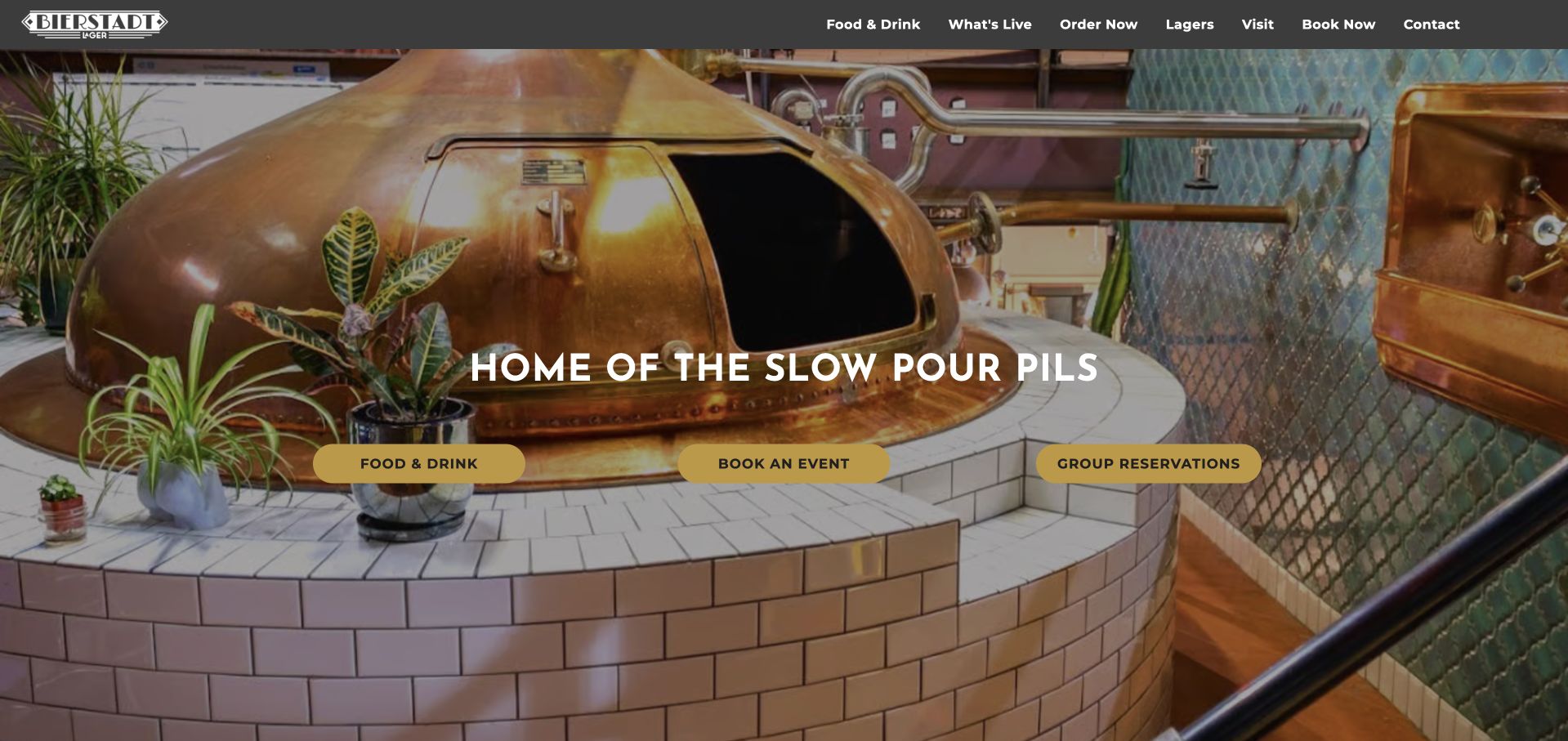
Bierstadt uses a close view of its copper brewing equipment as the entire opening environment. A short signature-product statement sits above three high-visibility actions for food and drink, events and group reservations. The header separates the lager range from visiting and the current program. Unlike a homepage that begins with a large product catalog, this opening treats the brewery as a place to spend time and gives people an immediate next step. Its simplicity is useful for a specialist producer with a strong, easily explained point of difference.
What you can learn
Use one recognizable process image and one specific product idea to orient visitors, then provide direct hospitality choices. If event booking and group reservations share a destination, the next page should explain their differences so the homepage's two labels lead to genuinely understandable options.
Pros
The equipment photograph makes the brewing process physically present without demanding a long technical introduction.
Food, events and visiting are named directly, making the opening useful to people planning a group outing.
Cons & considerations
Where event and group-reservation buttons share a page, clearly distinguish eligibility, size and response expectations on arrival.
If additional content is behind a load-more control, ensure essential hours and directions remain accessible without a successful script response.
Kegan is a freelance web designer and developer with 15+ years of experience helping businesses turn complicated website requirements into clear, maintainable digital experiences. He works directly with clients from planning and design through development, launch, and ongoing support.
For brewery website design, his development approach focuses on taproom information, current beer menus, event publishing, stockist discovery, and clear visit-planning or ordering journeys. The scope can be a targeted improvement or a complete custom build, with responsive layouts, thoughtful content structure, and integrations chosen around the people using and maintaining the site.
Show 3 other brewery website designersHide other brewery website designers
Plan a brewery website around beer, place and changing service
List the journeys the taproom actually supports
Ask staff what visitors need before arriving: food options, outdoor seating, transport, group sizes, accessibility and whether reservations exist. Separately identify draft discovery, pickup, delivery, shipping, kegs and trade inquiries. A single order button should not be expected to explain all of them.
Create location records before designing the grid
Use consistent fields for venue name, address, contact, opening hours, food service, policies and relevant actions. Include temporary closure and upcoming-opening states. A card should link to the matching venue from both its photograph and heading, and its information should feed the footer rather than be manually duplicated.
Define who owns the tap list
Decide whether the point-of-sale service, a menu provider or a staff editor supplies current draft information. Include packaging and venue where relevant. Show a reviewed or updated date for manually maintained lists, and provide a helpful fallback when a third-party menu fails.
Make an event more than its poster
Store the date, time, location, admission rules and destination link as readable content. Give recurring events an exception mechanism for holidays. Distinguish a general calendar entry from an actual booking or ticket purchase, and remove expired promotions from the homepage's upcoming area.
Document the boundaries of every order route
Clarify pickup location, delivery area and shipping availability before checkout. Merchandise may use a different provider from beer or food. Review those journeys without placing real orders or accepting agreements, and leave policy and legal requirements to qualified operational review.
Test an arrival with ordinary interruptions
Check the site on a small screen with cookie choices, event announcements and newsletter notices present. Find a venue, identify its current hours and food service, then reach directions using only the keyboard. Test motion controls, contrast over photographs, map fallbacks and readable beer facts.
The editing job behind the design
Choose tools that keep venues and availability synchronized
A content system should own the enduring brewery story and location records; an operational menu or commerce system may own rapidly changing inventory. Document the boundary explicitly. Avoid retyping live stock into promotional cards unless an editor can maintain it at the necessary cadence, and keep private customer and order data out of public content.
Evaluate menu, calendar, map and ordering integrations in their actual mobile and keyboard states, including failure. A lightweight maintained list can be more useful than an impressive but empty embed. Technology observations in this collection describe visible public evidence only; they do not establish the quality, security or completeness of a private commerce system.
Our WordPress website examples offer a separate look at publishing approaches. A visible platform label is evidence for that named page, not a guarantee that the same system will suit your requirements.
Before the public launch
Brewery website planning checklist
Give each operating venue a named, direct visit route.
Publish current venue hours separately from kitchen or cafe hours.
Connect maps and directions to the exact displayed address.
Distinguish beer archives, current draft lists and packaged inventory.
Show style, strength and packaging information as readable text where relevant.
Identify who maintains tap-list updates and holiday exceptions.
Keep food-partner details and kitchen arrangements current.
Publish event dates, locations and access details outside poster images.
Explain pickup, delivery and shipping as different fulfillment methods.
Make promotion dismissal obvious and keep the menu reachable.
Provide pause controls, readable contrast and keyboard-operable navigation.
Test public journeys without submitting orders, reservations or age attestations.
These checks are a project checklist, not a performance, legal, security, or accessibility certification. Test real journeys with the people responsible for the website before making claims about the result.
Sources & editorial method
How this collection was selected and reviewed
The twenty-one examples meet the collection's saved target. Each selected official page was independently inspected in an ordinary browser and directly captured, with original analysis of its visible design and practical tradeoffs. Tree House is captured at its homepage's Saratoga visit section. Age-gated, certificate-error and inaccessible candidates were excluded; no age checks, purchases, bookings or accounts were completed. Editors Choice is an explicit design selection of a specialist local operator, not a beverage-quality endorsement or a public vote.
Each example links to its actual source page. Screenshots are direct browser captures with their own capture dates; moving imagery, announcements and live designs can change. The notes describe observable design choices and conditional tradeoffs, not measured traffic, conversion results, service quality, or accessibility conformance.
Technology labels use public page metadata, asset evidence, or explicitly cited platform documentation. Platform documentation is not a complete current deployment audit. A component reference may be legacy or unused; it is not a complete backend inventory. Unknown stacks are omitted. These sites are editorial examples, not our client portfolio.
Written, Edited and Curated are separate editorial records, not timestamps advanced by a rebuild. Website designs and imagery belong to their owners. See our editorial standards or suggest a correction.
Questions worth asking
Brewery website design questions
What should a brewery homepage make easy to find?
Prioritize the right venue, its hours, current beer information and food arrangements. Add events and ordering according to the actual business. A visitor looking for tonight's kitchen hours should not need to navigate a wholesale catalog or newsletter signup first.
Should the beer archive and tap list be the same page?
They can share product records, but they answer different questions. An archive explains the brewery's range and past releases; a current tap list describes a specific venue and time. Label the distinction and avoid presenting a historic beer as currently available.
How should a brewery present several taprooms?
Use one consistent location structure with truthful differences in food, hours, reservations and atmosphere. Tree House groups operational information into location chapters, while Notch uses two clear destination panels. The right size of directory depends on the network, not a generic template.
Is a social feed enough for brewery events?
It can show atmosphere, but event dates and cancellations need maintained website content. Publish readable dates, times, locations and requirements, and remove or relabel past events. A poster image or social login should not be the only route to essential information.
How can a small brewery have a distinctive site?
Use its actual process, room, neighborhood and cultural references. Cohesion's close service photography and Ratio's music-inflected graphics are very different approaches, but both retain recognizable task labels. Strong personality works best when the visit remains straightforward.
A strong brewery website makes its identity memorable and its next practical step dependable. Keep venue facts and availability current, make different journeys explicit and let real beer-making and hospitality give the design its character.