Best Music School Websites of 2026 (27 Real-World Examples)
Music school websites that turn interest into a clear lesson inquiry
A music school website should help a learner choose an instrument, format and first step without already knowing the school’s internal programme names. These 27 examples compare independent teachers, community schools and larger institutions through lesson discovery and enrollment.
Students arrive with different goals: a child trying an instrument, an adult returning to music or an experienced player seeking ensemble work. Connect those goals to age, experience, lesson format and teacher availability instead of presenting one undifferentiated course list.
The most useful sites explain the administrative sequence as carefully as the musical offer. A trial request, placement conversation and confirmed recurring lesson are different stages. Clear wording reduces uncertainty for both the family and the school.
Before the examples
What makes good music school website design in 2026?
Explain the request-and-confirmation sequence
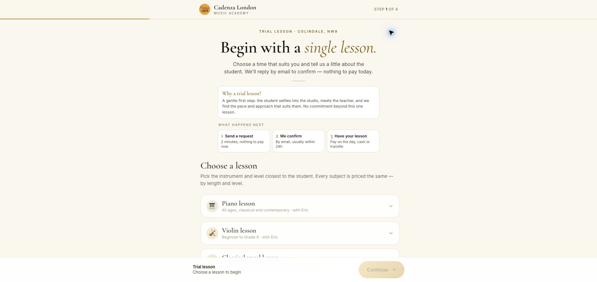
Cadenza London’s trial page gives a short sequence from request to email confirmation and later payment. Its calm typography and focused layout make an unfamiliar first step feel concrete without claiming that the chosen preference is already a confirmed lesson.
Connect instruments to teaching formats
Private lessons, group classes, ensembles and short courses require different information. Show the intended age, experience and teaching location alongside the instrument so learners can compare genuinely suitable options.
Make tuition and scheduling understandable
Explain lesson length, billing period, term dates and makeup or cancellation arrangements. Do not make families infer a monthly commitment from a single-lesson price or confuse a preferred slot with confirmed teacher availability.
Give teachers a useful presence
Instructor profiles can explain instruments, approach and relevant experience. Keep them connected to the programmes they actually teach and avoid unsupported claims that every teacher has the same qualifications or availability.
The collection · 27 examples
27 music school websites worth studying
These examples include both compact local schools and extensive community or institutional catalogues. Borrow the structure that matches the number of programmes and the actual enrollment process, not simply the scale of the organization.
Cadenza London's trial page earns our Editors Choice for a calm and unusually explicit beginning to enrollment. Cream surfaces, restrained gold accents and large serif headings give the form a considered identity. More useful than the styling is the sequence: the page explains that a request requires later email confirmation, that nothing is charged immediately, and that payment happens on the lesson day. Instrument rows identify the teacher and broad level before the visitor advances. A four-step indicator and a persistent summary bar help describe the size of the task. The initial view does not expose every price without further selection, and the long subject list can make the first choice slower. Nevertheless, the page carefully distinguishes expressing interest from securing a lesson. This selection recognizes the website's communication, not the quality of teaching.
What you can learn
State confirmation and payment expectations before a multistep lesson request, then make each choice narrow the next one.
Pros
Request, confirmation and payment are clearly distinguished.
Teacher and level context accompany the instrument choices.
Cons & considerations
Prices require more exploration than the opening screen provides.
Many subject options make the first step fairly long.
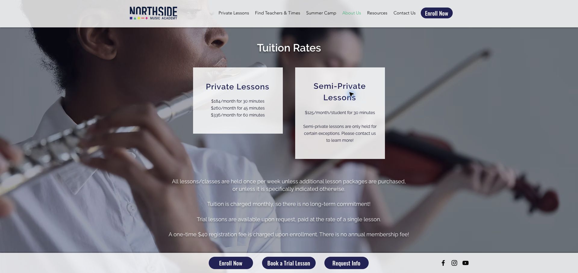
Northside Music Academy places its private and semi-private tuition options in two compact panels over a photograph of young musicians. The monthly prices are tied to lesson length, and nearby text clarifies weekly attendance, the paid trial arrangement and a separate registration fee. That context prevents the displayed monthly figure from standing alone as an incomplete offer. Three actions at the bottom distinguish immediate enrollment, a trial and a general request for information. The background photograph supplies warmth, but some text has to compete with its varying tones. The semi-private option also requires contact to understand its exceptions. This is a useful example of a short fee page that answers the most common billing questions before an external enrollment journey, while showing why decorative photography should not compromise the readability of the actual terms.
What you can learn
Place frequency, trial cost and registration charges beside tuition, with a different next step for visitors who are still deciding.
Pros
Lesson duration and monthly charge are presented together.
The one-time fee and trial-payment basis are explicit.
Cons & considerations
Photographic background makes some copy harder to read.
Semi-private availability still needs clarification by contact.
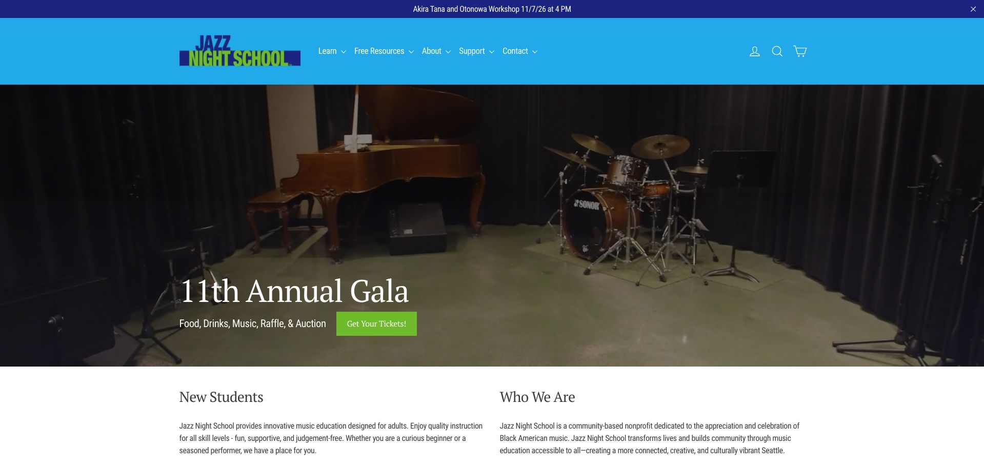
Jazz Night School's bright blue navigation and performance imagery establish a lively adult-learning community. The page directly addresses both beginners and experienced musicians, then explains the difference between combos, big bands, classes and private instruction. A newcomer can learn the course duration, general tuition range and availability of assistance before exploring an individual offering. The requirement for a skills assessment is also stated rather than appearing unexpectedly at registration. The current gala dominates the hero, however, so someone seeking lessons must pass an event promotion to reach the main learning explanation. A rotating visual area and several additional community stories add length. The useful pattern is the dedicated new-student orientation within a school that also needs to serve performers, supporters and existing members.
What you can learn
For ensemble programs, explain placement and course commitment before sending a new student into a large catalog.
Pros
Adult beginners receive explicit reassurance and orientation.
Assessment, course duration and tuition context appear publicly.
Cons & considerations
The event-led hero delays the lesson journey.
Multiple community sections compete with registration information.
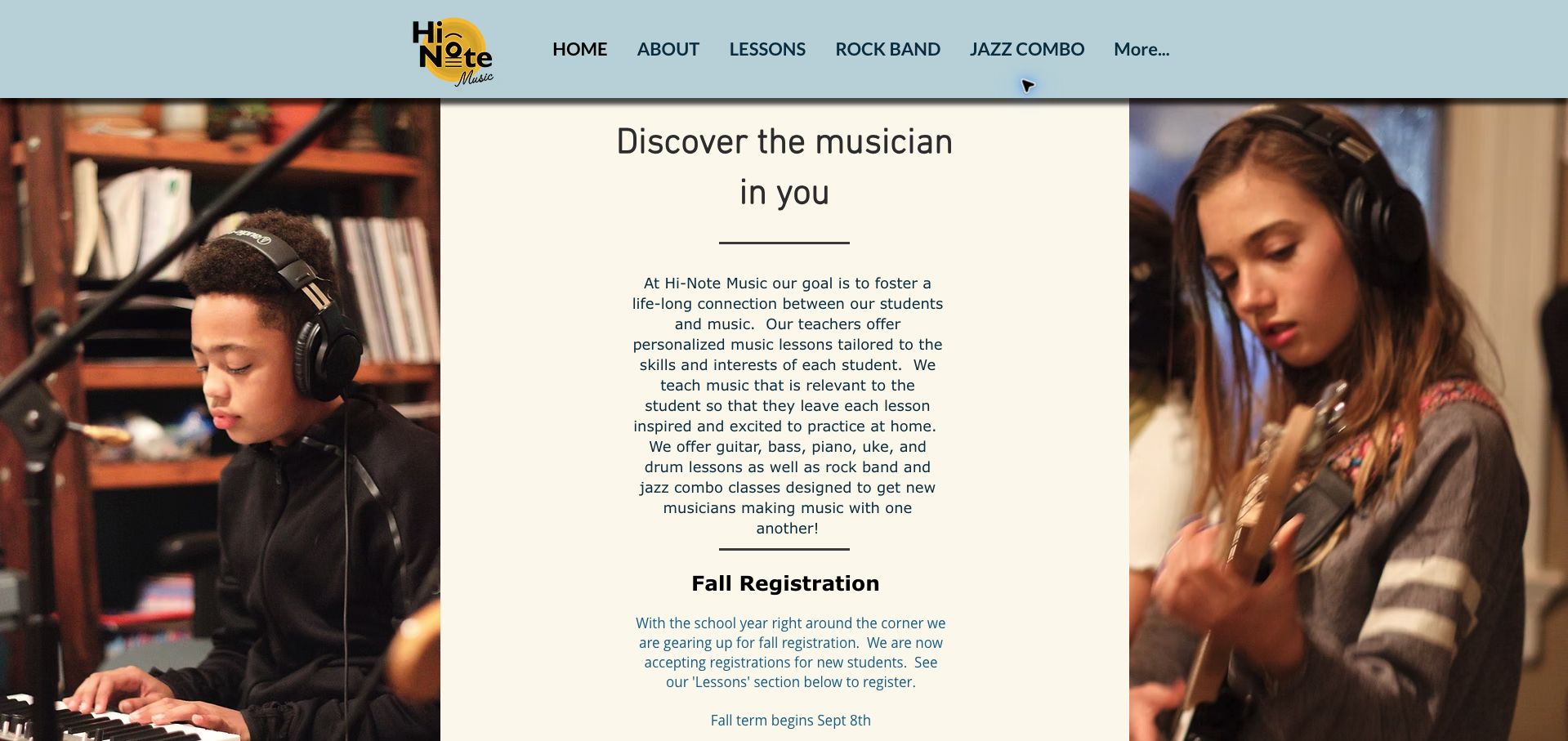
Hi-Note Music frames a central introductory column with large photographs of young musicians, giving its Portland studio a personal and approachable character. Guitar, bass, piano, ukulele and drums are named immediately, and rock-band and jazz-combo routes receive their own navigation labels. Teacher biographies connect instruments to specific people and link to their professional sites, rather than relying on a single anonymous faculty claim. The page later explains its private-lesson approach and tuition arrangement. The narrow center column makes the opening paragraph feel long, and the fall-registration message still describes the school year as approaching during this November review. A dated enrollment banner would make that invitation easier to interpret. The strongest idea is showing a progression from personal instruction to making music with other students, using actual lesson and performance context.
What you can learn
Connect individual teaching and group music-making, then give visitors a direct route to the instructor or format they want.
Pros
Private lessons and ensemble formats are clearly differentiated.
Named teachers and professional links provide concrete context.
Cons & considerations
A narrow text column lengthens the introductory reading.
Seasonal registration copy needs a clearer current-status cue.
The International School of Music Finland's Helsinki page addresses a practical problem that many school websites overlook: choosing a teacher also involves language and location. Instruments are grouped into understandable families, while the longer page lists teaching venues and organizes schedules into location tabs. Individual entries name teachers, age bands, group size and available times; some groups are visibly marked full. That specificity helps prevent an inquiry for an unsuitable session. The opening photograph is very large and delays the text that makes this page valuable. The broad instrument list, teaching approach, locations, exams and timetable also create a lengthy sequence. A shorter route into the schedule would improve the experience, but the underlying information model is useful because it reflects the actual constraints of arranging a recurring lesson.
What you can learn
Treat language, venue and group eligibility as first-class lesson data, alongside instrument and teacher.
Pros
Schedule entries include practical teacher and group details.
Full classes are identified instead of appearing freely available.
Cons & considerations
The oversized opening photograph postpones useful information.
Many different planning tasks share one long page.
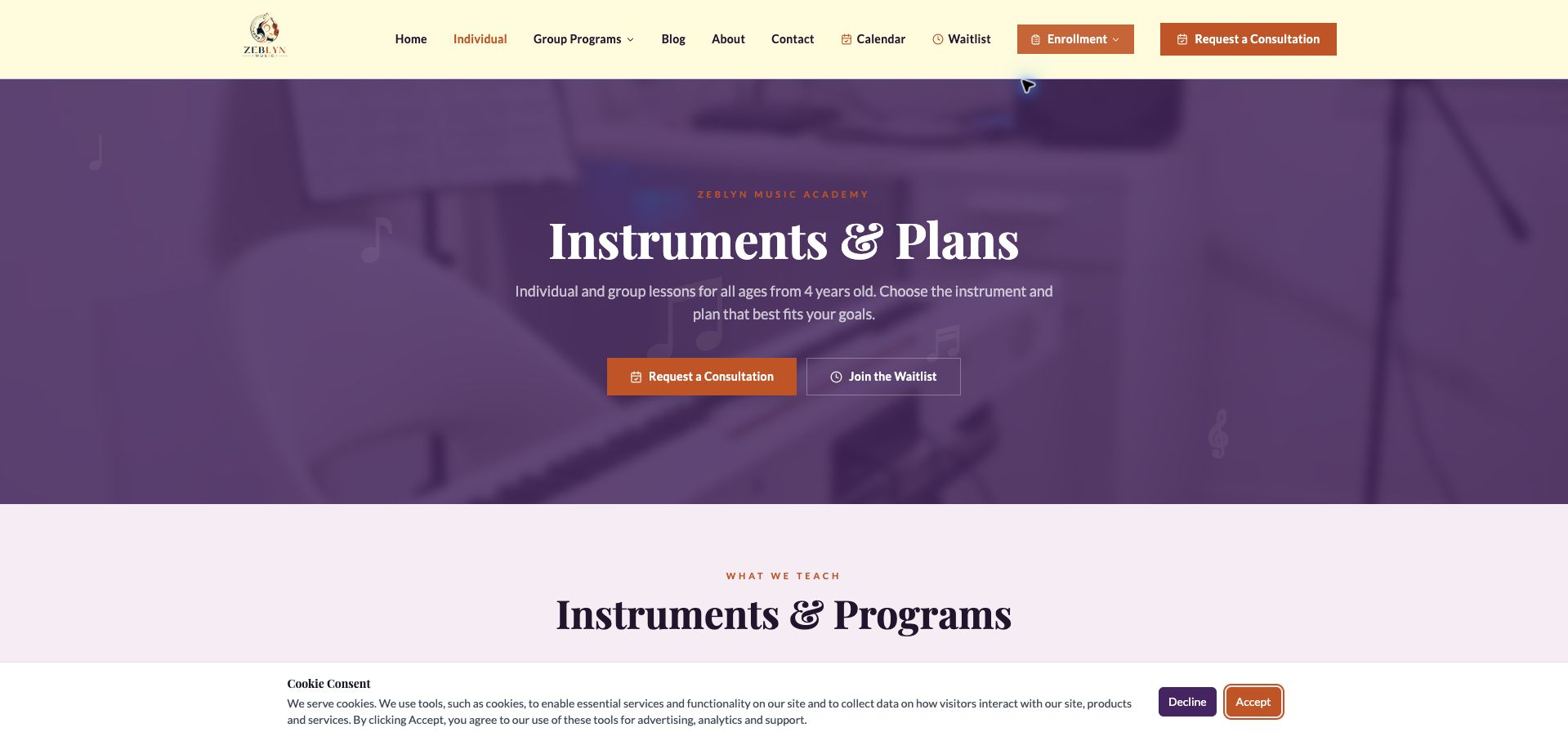
Zeblyn Music Academy uses purple and cream surfaces with orange actions to organize its instrument list and study plans. The page names the minimum starting age, distinguishes individual and group lessons, and explains that exact times depend on availability. Four plans pair monthly tuition with weekly lesson duration and frequency, making the difference between occasional and intensive attendance more concrete. A separate consultation section discloses its fee and explains that it is credited toward the first month after enrollment. This is useful context before the repeated consultation buttons. Some plan language is ambitious about progress, and the teacher-discretion extras make a direct package comparison less certain. The distinction between a waitlist and a consultation is visible, but visitors still need an additional availability conversation before knowing which commitment can actually be scheduled.
What you can learn
Compare plans using weekly instructional time and disclose any consultation charge before inviting a booking.
Pros
Plan frequency and lesson duration accompany monthly prices.
The consultation fee and credit arrangement are disclosed.
Cons & considerations
Discretionary extras make plan comparisons less exact.
Actual time-slot availability is not shown with the plans.
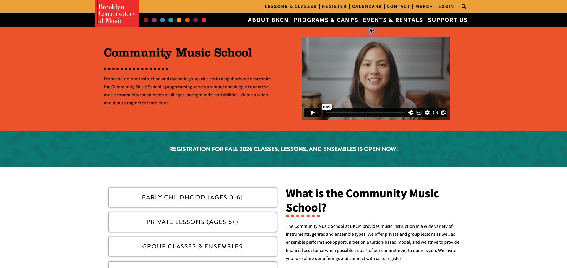
Brooklyn Conservatory of Music uses vivid orange, teal and black to make its Community Music School distinct without losing the institution's identity. Large links separate early childhood, private lessons, groups, registration and policies immediately below the introduction. Subsequent sections explain the difference between individual teaching and ensemble participation, with age ranges attached to each format. The registration material also distinguishes a single trial from the longer commitment and provides tuition and fee information. This helps a family understand the structure before entering an account-based process. The page is extensive, and the two-tier global navigation competes with its local choices. Some age language varies between the overview and detailed section, so individual program eligibility still needs attention. The design succeeds most where broad institutional offerings become clearly named, comparable routes.
What you can learn
Organize a large music school by learning format and age, then keep tuition and registration rules within the same orientation page.
Pros
Prominent local links reduce the complexity of a broad catalog.
Program descriptions distinguish lessons from ensemble participation.
Cons & considerations
The long page asks readers to manage substantial detail.
Overview age labels need checking against individual program rules.
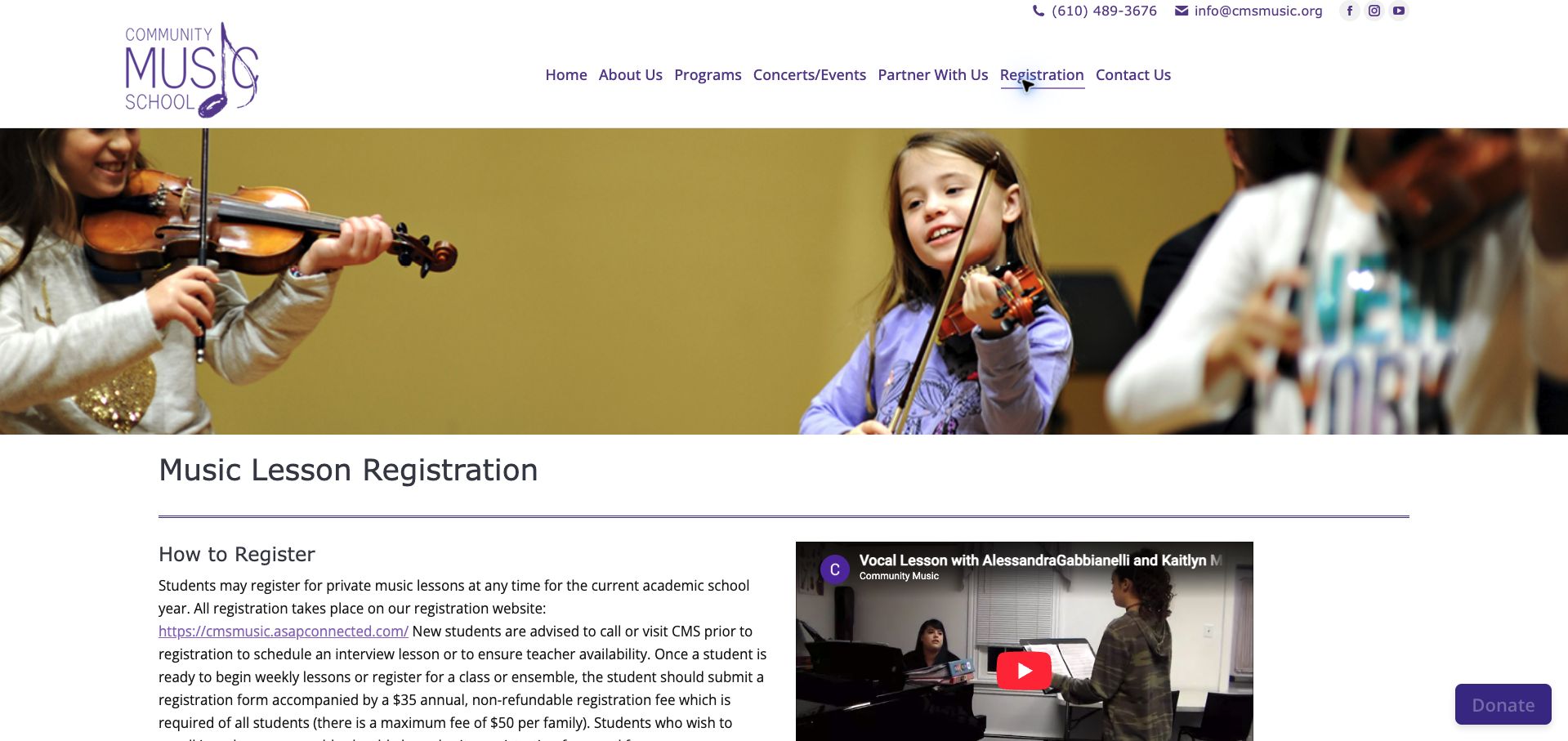
Community Music School's registration page leads with a photograph of children playing strings, followed by a direct explanation of how enrollment works. New students are advised to confirm teacher availability or arrange an interview lesson before using the separate registration website. Annual student and family registration fees are disclosed in the same introductory paragraph. The page then explains rolling enrollment, prorating and the activities included with general instruction, giving tuition more context than a bare lesson price. A performance video adds a view of teaching, but the prose is dense and combines several important conditions in long paragraphs. Prices carry an older effective date, which is useful provenance but warrants a visible confirmation of whether they still apply. The page demonstrates why portal links need preparation rather than functioning as the whole registration experience.
What you can learn
Explain teacher matching, required fees and timing before transferring a family to an external enrollment account.
Pros
Teacher availability is addressed before registration.
Included activities and registration fees are publicly described.
Cons & considerations
Long paragraphs bury several important enrollment conditions.
Older price-effective dates need an explicit currency check.
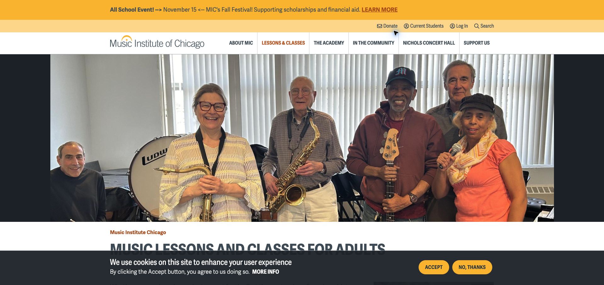
The Music Institute of Chicago gives adult learners a dedicated page, opening with a photograph of adult musicians rather than imagery intended only for children. Its package table compares lesson count, lesson length, standard tuition and reduced tuition for the stated academic year. Discount conditions and faculty exceptions are explained beneath the table, limiting the risk that a headline reduction will be mistaken for a universal price. The inquiry process is described as teacher matching with a campus director, and current-student login remains a separate action. A large hero, festival notice and cookie banner delay the main comparison in the captured first view. The table also has enough rows to demand careful reading. The underlying structure is strong because flexibility is expressed as concrete package choices rather than an unsupported marketing adjective.
What you can learn
For adult learners, show the available commitment lengths and explain exactly how placement and discounted pricing work.
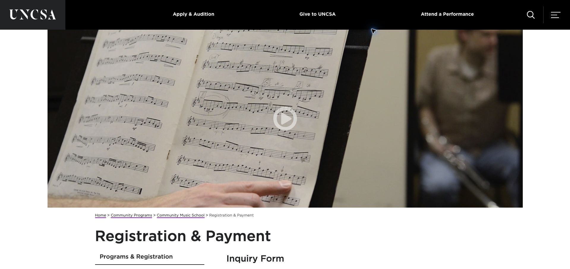
UNCSA's Community Music School registration page uses a restrained institutional layout with a local sidebar and clear section headings. It explains that staff will help choose a course, teacher and lesson time after an inquiry, then provide account access for payment. The four-week trial, prorated private tuition and different treatment of group classes receive explicit explanation. A later table connects duration with trial and semester pricing. This is operationally useful, but the page mixes prospective-student guidance with detailed instructions for families who already have an account. The large opening image also pushes the enrollment explanation downward. Some semester-length wording differs across the prose and table context, so the current period needs careful confirmation. The page is most instructive as a reminder to design registration and payment as related but separate user tasks.
What you can learn
Explain placement and trial options first, then give existing families a clearly separated payment section.
Pros
The staff-assisted matching process is described before inquiry.
Trial and group-class payment differences are made explicit.
Cons & considerations
New enrollment and ongoing payment instructions are interleaved.
Semester references need consistent terminology and dates.
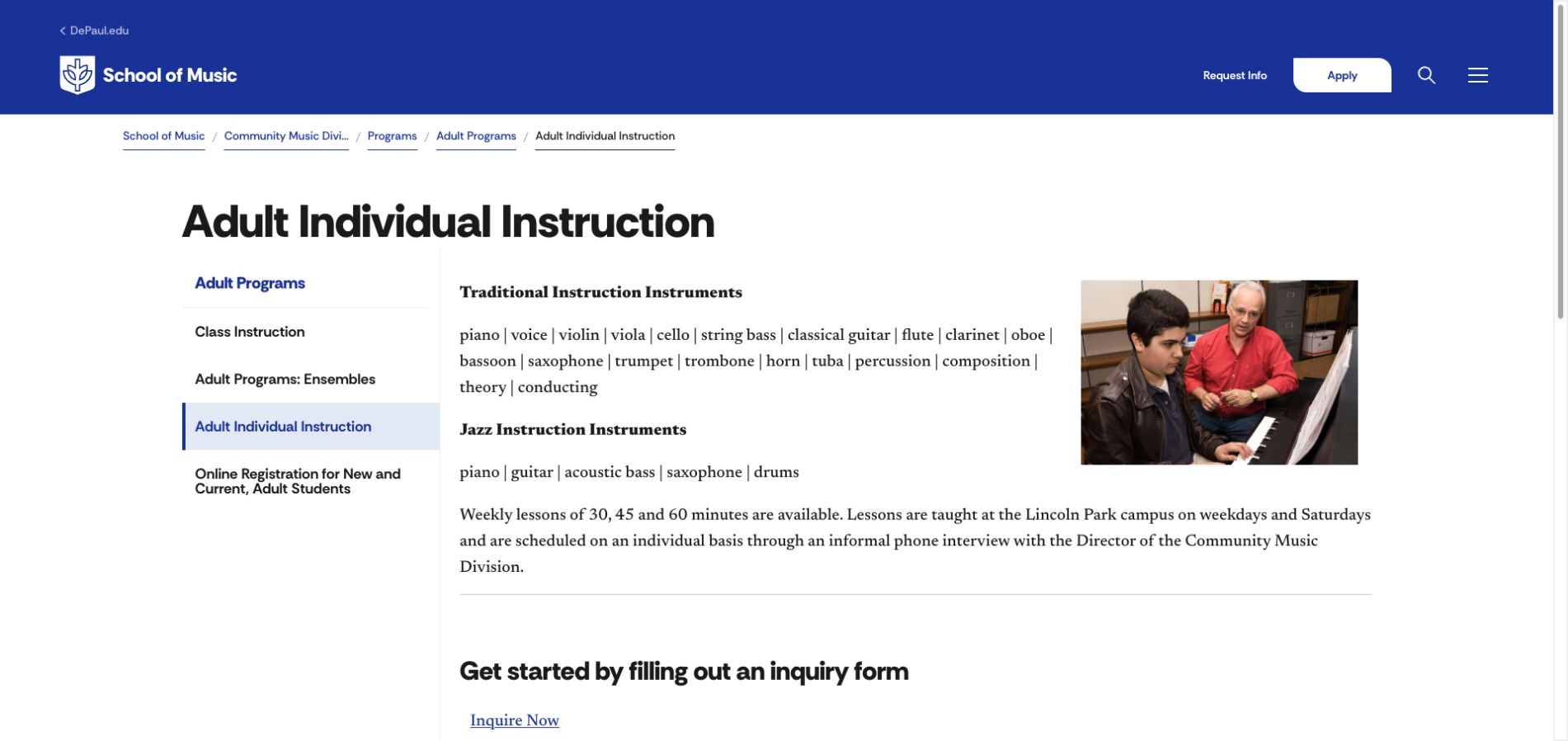
DePaul's adult individual-instruction page places practical information beneath a clear title and a compact local sidebar. Traditional and jazz instrument lists are separated, followed by lesson durations, the Lincoln Park location and the phone-interview process used to arrange a time. A small teaching photograph supports the content without overwhelming it. Per-lesson fees and a warning about special instructor rates appear below the inquiry link, making the basic cost visible without pretending every teacher follows the same tariff. The institutional header still includes a general Apply action, which could distract a community learner from the more relevant inquiry. The long inline instrument list is also harder to scan than a grouped list. Overall, the page shows how a narrow program can be explained with relatively little promotional copy when the essential planning facts are present.
What you can learn
Give community learners a concise program page that separates their inquiry route from degree-admission navigation.
Pros
Location, lesson duration and scheduling process are explicit.
Instructor-rate exceptions qualify the published fees.
Cons & considerations
General university application navigation competes with the local task.
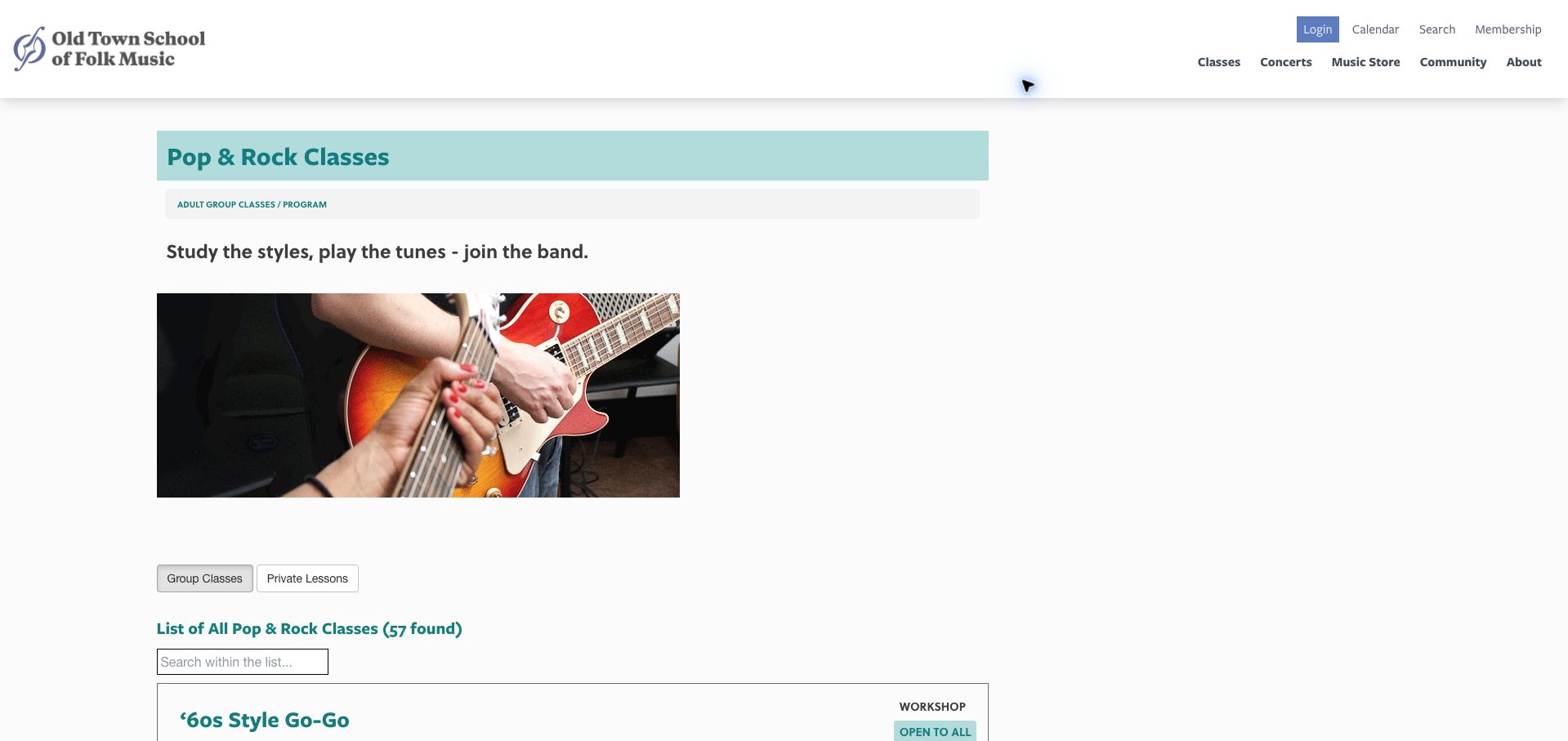
Old Town School of Folk Music's pop-and-rock directory makes a large catalog usable through consistent course rows. Level, teacher, duration, number of weeks, standard and member pricing, and location appear in a repeated order. A search field offers a way to narrow the long list, while separate group and private-lesson tabs distinguish two different learning formats. Courses without a current session remain visible with a plain availability message, preserving useful discovery without pretending registration is open. The layout is utilitarian and leaves substantial space around a modest photograph before the actual list. The overall catalog is also long enough that a beginner may need stronger level-based guidance. Its strongest lesson is consistency: visitors can compare familiar fields instead of decoding a new presentation for every course.
What you can learn
Use the same decision fields for every class and state unavailable sessions explicitly rather than hiding their status behind a registration link.
Pros
Class rows expose level, cost, duration and location together.
Unavailable courses carry clear status messages.
Cons & considerations
The opening uses space that could introduce filters sooner.
Beginners still face a large number of possible ensembles.
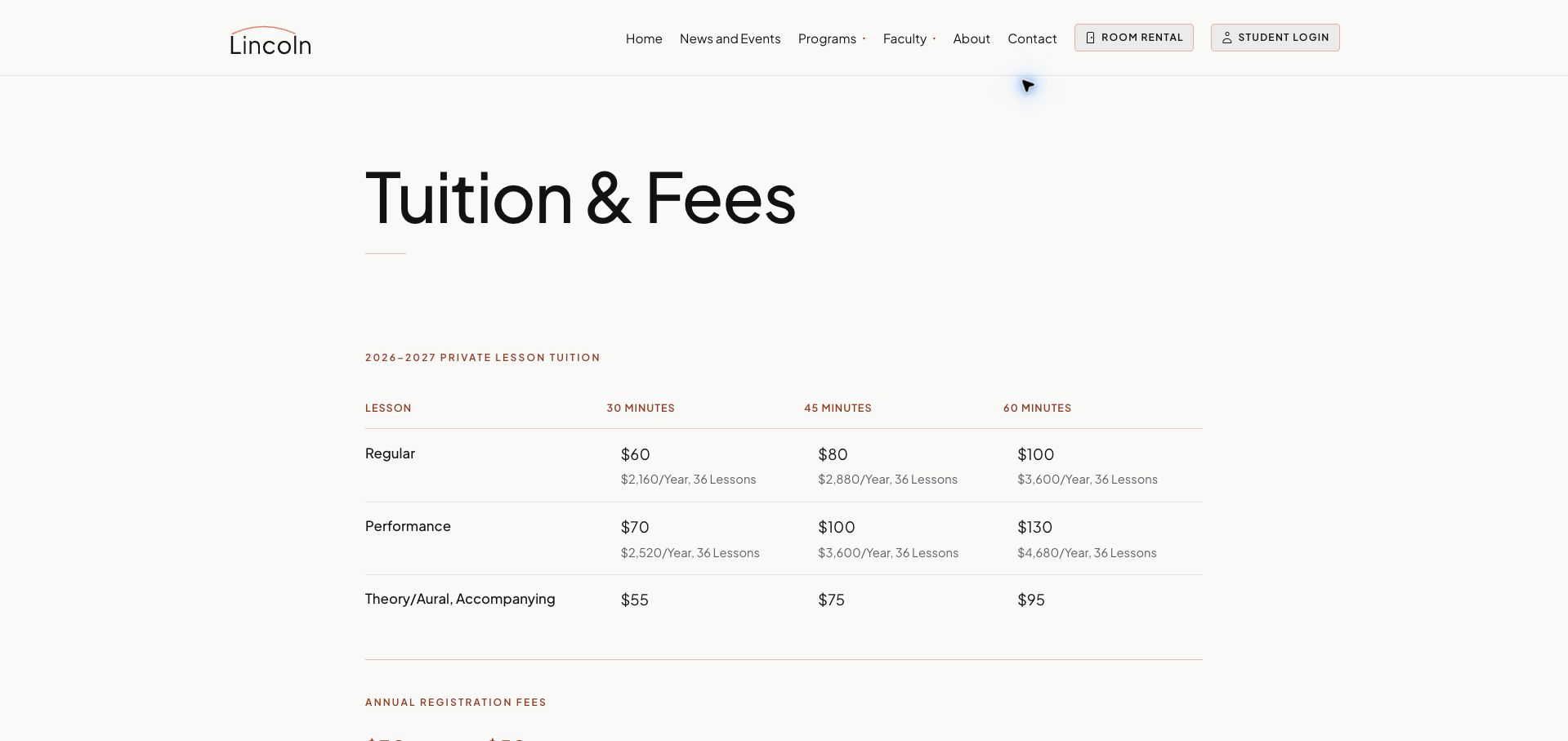
Lincoln Music School presents tuition with a notably quiet visual treatment: a large heading, restrained rules and a small set of clearly aligned columns. Regular and performance instruction appear in separate rows, while lesson lengths form the columns. The page shows both the individual rate and the corresponding annual total for the stated number of lessons, making the longer commitment visible. Registration charges for a student or family are listed separately, with a summer exception. This concise approach is easy to study, although the distinction between regular and performance instruction is not explained inside the table itself. Nor does the page provide an equally prominent next step for a new family seeking placement. The design is strongest at cost comparison and would benefit from a short contextual link from each pricing category to the relevant program.
What you can learn
Publish the total commitment alongside the unit rate and connect unfamiliar fee categories to their program explanations.
Pros
Per-lesson and annual totals can be compared directly.
Registration charges and the summer exception are separate.
Cons & considerations
Program-tier labels need additional explanation elsewhere.
The fee page offers limited guidance on the next enrollment step.
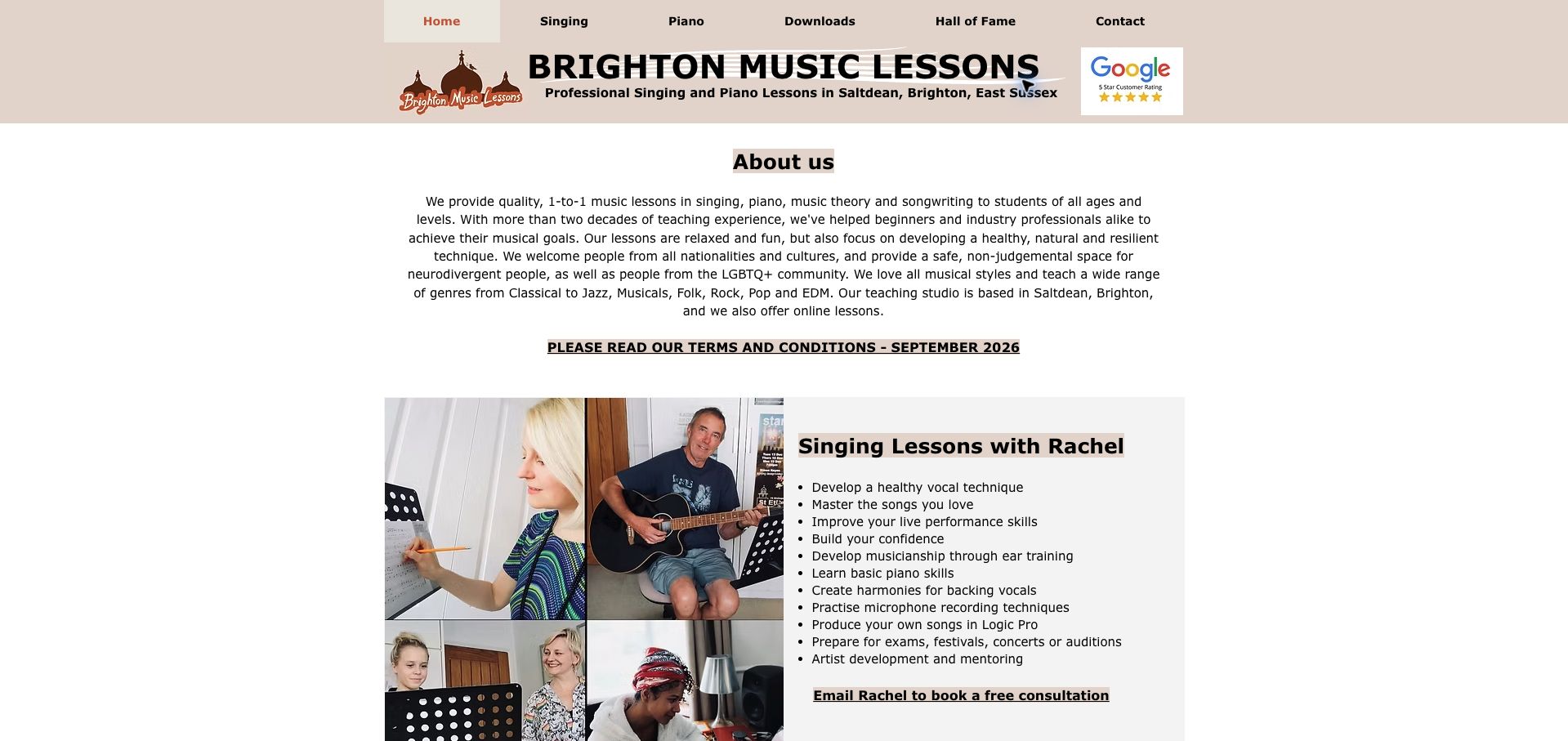
Brighton Music Lessons identifies Saltdean, its two main disciplines and the option of online teaching in a straightforward homepage. Separate sections name Rachel for singing and Jay for piano, then list the skills and activities associated with each. Documentary lesson photographs and direct email consultation links reinforce the personal scale of the practice. Opening hours, dated lesson prices and a parent-attendance requirement appear further down, providing practical context beyond the welcoming introduction. The centered opening paragraph is long, and the extensive skill lists could be easier to compare with a shorter summary for each audience. The policy link is conspicuous, which is helpful, but visitors must leave the main page for its detail. This is a useful example of giving a small studio enough operational information without pretending it is a large institution.
What you can learn
Name the actual teachers and publish the practical attendance and pricing conditions alongside a clear description of each discipline.
Pros
Teacher names and subjects lead to direct consultation routes.
Hours, dated prices and parent-attendance expectations are visible.
Cons & considerations
Long centered prose is harder to read than short left-aligned sections.
Extensive skill lists dilute the initial program comparison.
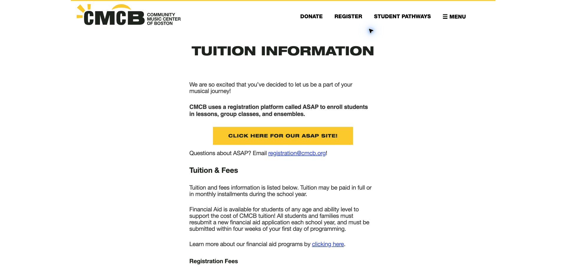
Community Music Center of Boston uses a large tuition heading, a narrow reading column and bright yellow registration links to make an administrative page feel deliberate. Its strongest feature is the surrounding explanation: registration charges, financial assistance timing and the distinction between semester and full-year instruction are presented as part of the cost decision. Semi-private students are told to bring a partner rather than assume the school will arrange one. The external registration platform is identified before the visitor leaves the site, and a contact route offers help. The amount of uninterrupted prose makes comparisons slower than a compact table would, while different effective dates demand careful reading. Even so, the page gives families substantive information before asking them to register. It is a useful model for explaining the conditions that can otherwise turn an attractive lesson price into a confusing enrollment conversation.
What you can learn
Publish the assumptions behind a tuition figure, including term length, registration charges and who arranges a lesson partner.
Pros
The registration platform and help route are introduced clearly.
Partner requirements and assistance timing reduce avoidable surprises.
Cons & considerations
Long text sections make fee comparison laborious.
Different effective dates need a stronger visual hierarchy.
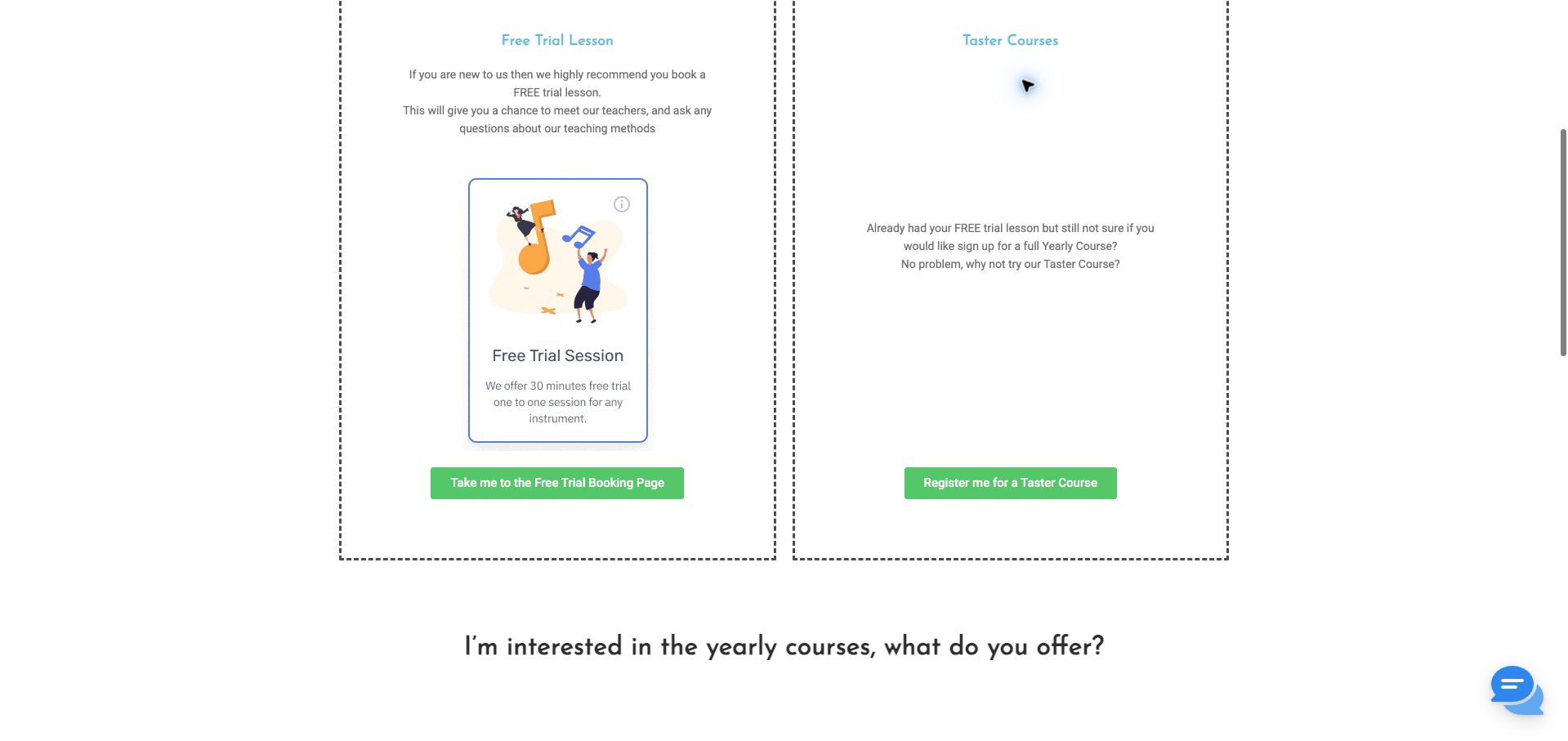
The Masters Music School separates its free trial and taster offer into two outlined panels, giving a new student a manageable first decision. Yellow accents and green action buttons stand out against the otherwise muted page, while the introductory questions explain why a visitor might sample instruction before choosing a longer course. Contact details and opening hours provide a practical route when the displayed offers do not answer a specific need. The important weakness is that the rendered pricing page did not expose clear ongoing course amounts during our review, despite a yearly-course heading. That leaves the central cost question unresolved. Repeated signup instructions also take space that could explain duration, inclusions and renewal terms. The useful pattern here is the side-by-side introduction; a stronger implementation would carry that same comparison structure through to the complete recurring price.
What you can learn
A pricing page should connect each introductory offer to the ongoing commitment that follows it, with amounts visible in the page itself.
Pros
Trial and taster options are visually separated.
Local contact and opening information support an assisted decision.
Cons & considerations
Ongoing course prices were not visible in the reviewed page.
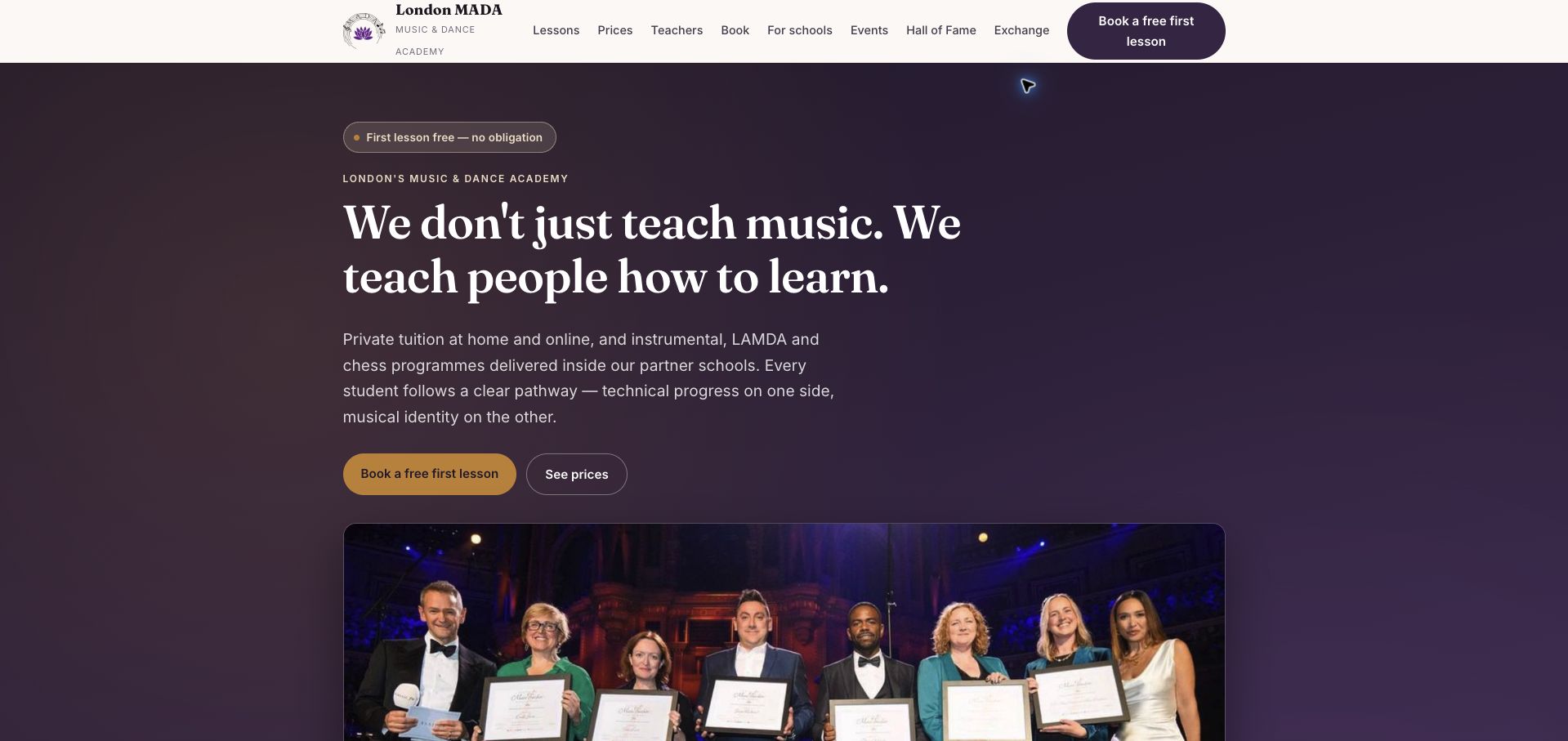
London MADA pairs a deep plum opening panel with cream navigation, large serif lettering and a gold first-lesson action. The adjacent price link is particularly useful: visitors can investigate the commitment without first entering an inquiry. The page distinguishes more structured academy study from a creative artist pathway and describes home, online and school-based options. Those distinctions give a broad music-and-performing-arts offer some shape. Dated autumn pricing information and references to hire, discounts and cancellation add practical substance beneath the promotional introduction. The volume of awards, results and service claims creates a busy reading experience, however, and visitors still need to identify which combination of setting, subject and pathway applies to them. We treat those claims as the school's presentation rather than independently verified outcomes. The strongest design lesson is the equal prominence given to a welcoming first step and a more detailed cost investigation.
What you can learn
Let visitors choose between exploring a trial and understanding the full price before they provide contact details.
Pros
The opening screen provides distinct trial and price routes.
Study pathways and lesson settings are described separately.
Cons & considerations
Numerous promotional proof points compete for attention.
A broad offer still requires several choices before a suitable course is clear.
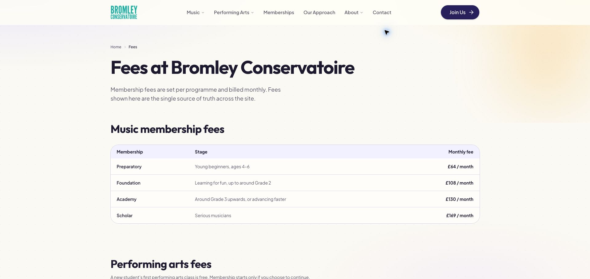
Bromley Conservatoire's fee page uses soft lavender and cream surfaces, restrained purple type and a teal identity to make a long price list approachable. The main membership table connects named stages with monthly fees, helping a family understand that the offer changes as a student progresses. Separate information for performing arts and instrumental trials prevents the introductory lesson from being confused with continuing membership. The page also makes the transition from a single trial to monthly participation explicit. Its weakness is repetition: instrument-specific trial tables extend the page substantially, while the first membership table does not fully explain the duration and inclusions behind every tier. A parent can compare the displayed amounts more easily than the value of each package. This is a helpful reference for a school with real progression levels, provided that a concise comparison of what is included accompanies the stage names.
What you can learn
Pair each membership stage with its practical inclusions, then consolidate repeated instrument pricing where the terms are identical.
Pros
Stage names and monthly amounts share a clear comparison table.
Trials and continuing membership are distinguished.
Cons & considerations
Repeated instrument tables make the page unnecessarily long.
The first table leaves some duration and inclusion questions unanswered.
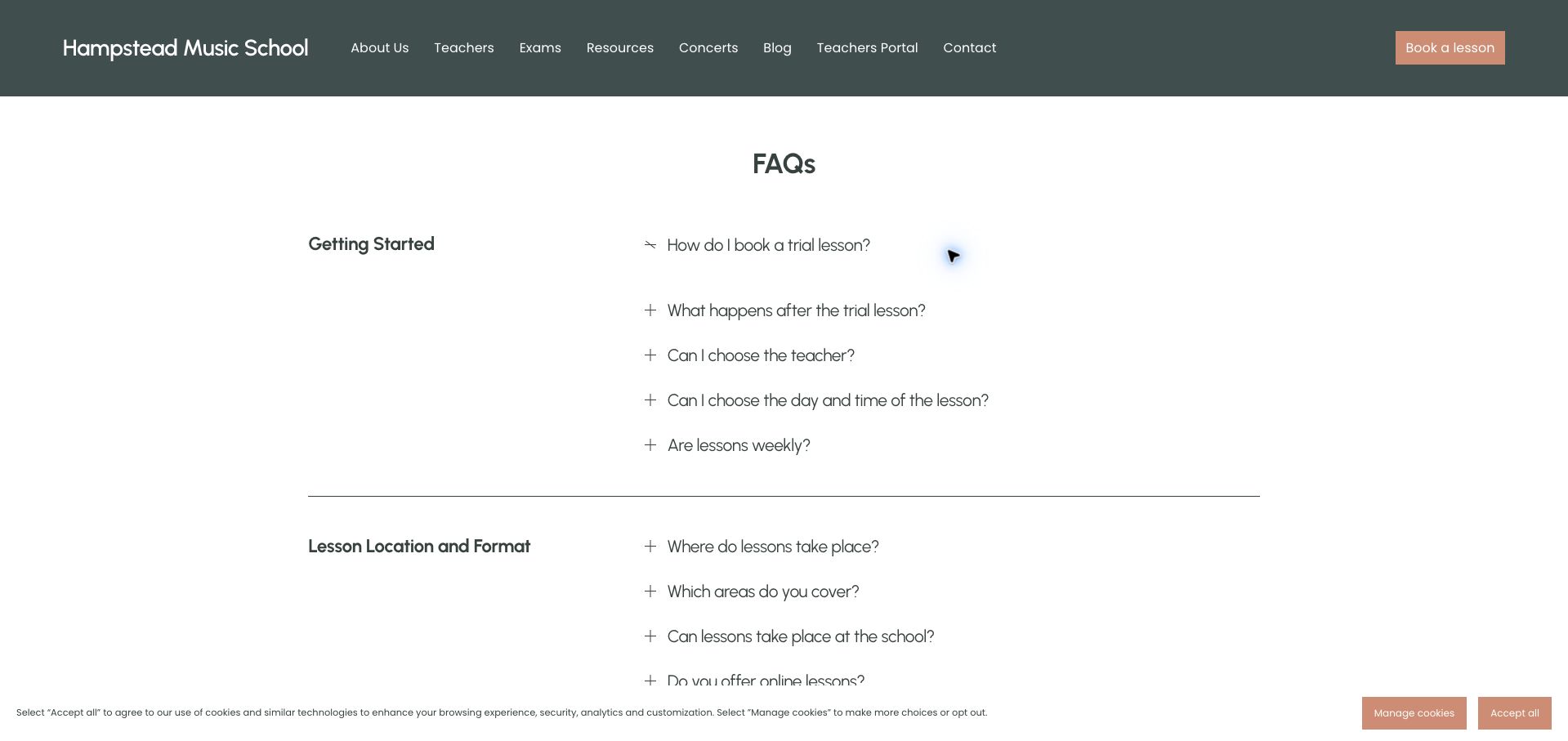
Hampstead Music School gives frequently asked questions a dedicated layout with a dark teal header, a peach booking action and a quiet white reading area. The question list reaches beyond sales copy into teacher changes, sibling arrangements, practice expectations and cancellation. The trial-booking answer is especially useful because it explains teacher availability and the advance payment required before a lesson is confirmed. This makes the human coordination behind a booking more visible. Accordion answers keep the page compact, but important conditions remain concealed until a visitor opens the right question. Some category labels also feel less closely aligned with the questions beneath them than they could be. The website would benefit from a short first-lesson sequence above the full reference list. As reviewed, its strength is anticipating the operational questions families actually have after deciding that lessons sound appealing.
What you can learn
Use FAQs for detailed exceptions, while placing the essential booking and confirmation sequence in an always-visible introduction.
Pros
Questions cover realistic teaching and scheduling situations.
The trial answer explains when a booking becomes confirmed.
Cons & considerations
Important payment conditions sit inside closed answers.
Category grouping could make the long question list easier to navigate.
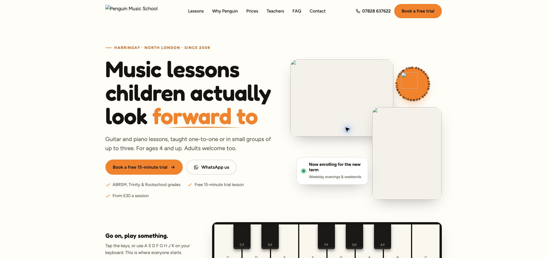
Penguin Music School explains its offer through a short trial, a small-group limit and a week-by-week start sequence. The cream-and-orange palette and rounded lettering suit the approachable tone, while direct call and messaging routes give parents alternatives to a long enrollment form. Stating that beginners do not need equipment for the introduction removes one practical uncertainty. Named teachers and the distinction between the trial and the following matching step also help explain what happens next. During our capture, several prominent images did not load, including visual space near the top of the page; the result felt much less finished than the written proposition. The broad subject claims also needed closer alignment with the more focused guitar-and-piano introduction. This example is useful for its concrete onboarding copy and equally useful as a reminder that image delivery is part of the first impression.
What you can learn
Test the actual rendered booking page as carefully as its copy, and make every introductory claim match the available lesson paths.
Pros
Group size and the initial lesson sequence are explained.
Direct contact options support parents who need a conversation.
Cons & considerations
Several prominent images were missing in the reviewed capture.
The wider subject claims are not fully reconciled with the opening offer.
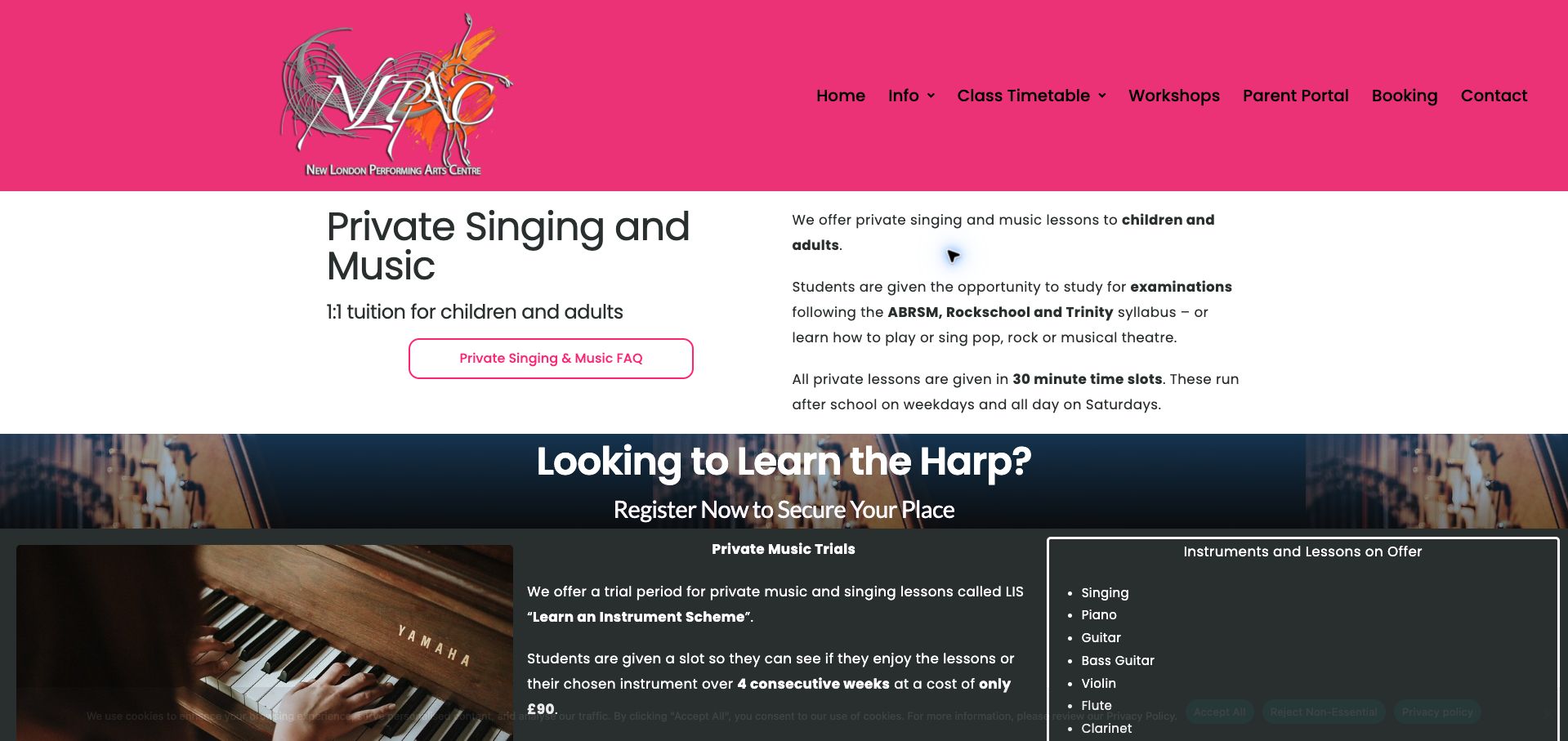
New London Performing Arts Centre uses a vivid pink header and a straightforward two-column page to describe private music lessons. The information is concrete: lesson length, typical scheduling windows, available instruments and the introductory block appear alongside the route to enquire. Most valuable is the explanation that continuing after the trial involves membership and the remaining term, together with the notice requirements for stopping. Those conditions make the introductory price more meaningful. A separate waitlist route acknowledges that an inquiry may not immediately secure a place. The dense instructional paragraphs require effort, and the large header and additional promotion compete with the core enrollment details. A short sequence or comparison panel could improve scanning. Nevertheless, the page demonstrates how a school can be welcoming without obscuring the operational commitment that begins after a discounted first experience.
What you can learn
Place the continuing membership and notice requirements directly beside the trial offer, before a parent begins an inquiry.
Pros
Trial and continuing commitments are described together.
Enquiry and waitlist routes distinguish different availability states.
Cons & considerations
Dense paragraphs make the enrollment sequence harder to scan.
Large branding and promotional content delay key lesson details.
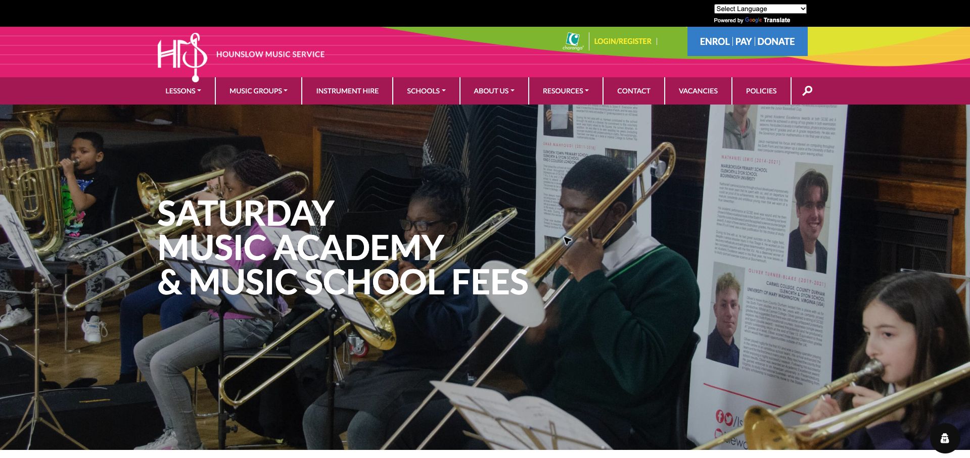
Hounslow Music Service presents its fee page with a large ensemble photograph, a magenta identity and conspicuous enrollment, payment and donation actions. The photograph gives a practical administrative page a sense of the activity it supports. Beneath it, the academic-year label and lesson-package descriptions provide the context needed to interpret the amounts. The page distinguishes individual tuition and theory from award arrangements, including the differing availability of fee remission. That separation matters more than a single attractive headline price. The large navigation and hero consume much of the initial view, however, so a visitor arriving specifically to compare costs has to move past substantial presentation first. Additional event content lengthens the journey. This is a worthwhile example of detailed public-service fee communication, with an opportunity to move a concise tuition index closer to the opening heading.
What you can learn
Date every fee schedule and keep eligibility exceptions attached to the relevant package instead of burying them in a general footer.
Pros
Academic-year labeling gives the figures a clear period.
Different package and remission conditions are explicitly separated.
Cons & considerations
A large hero delays access to the actual fee information.
Navigation and additional event content make a focused pricing task longer.
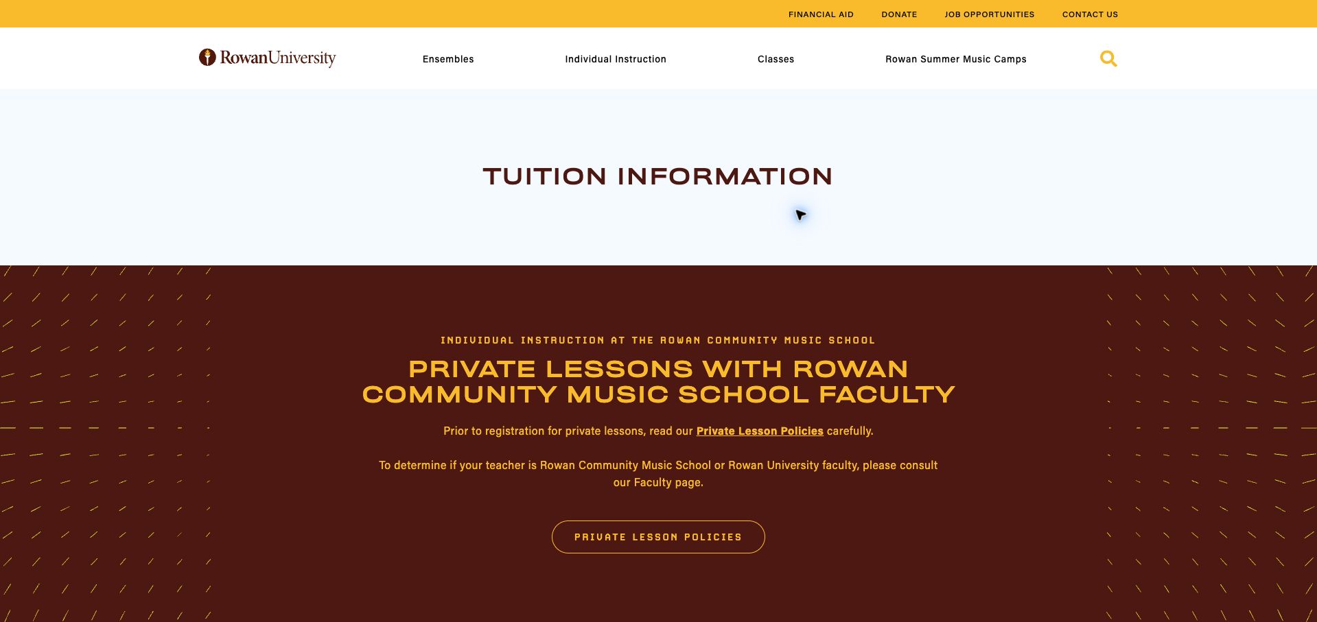
Rowan Community Music School uses maroon-and-gold headings to separate community faculty from university faculty tuition. Links to the faculty information help visitors establish which rate applies rather than treating the categories as self-explanatory. The tables include individual lesson amounts and longer-term totals, with registration charges and enrollment periods identified nearby. Status labels distinguish an available semester from a closed annual option, an important detail for someone arriving from an old search result. The large tuition banner and repeated tables nevertheless create a lengthy page, and special arrangements for some instructors complicate a purely numerical comparison. A compact opening summary could direct each visitor to the right section more quickly. The underlying approach is sound: a lesson price is presented with its instructor category, time period and additional charges instead of being isolated as a promotional starting figure.
What you can learn
When teachers have different rates, explain the categories and show both the individual lesson cost and the actual enrollment total.
Pros
Faculty categories are separated and connected to teacher information.
Totals, registration charges and enrollment status add useful context.
Cons & considerations
Repeated tables require considerable scrolling.
Instructor exceptions make a simple price comparison less straightforward.
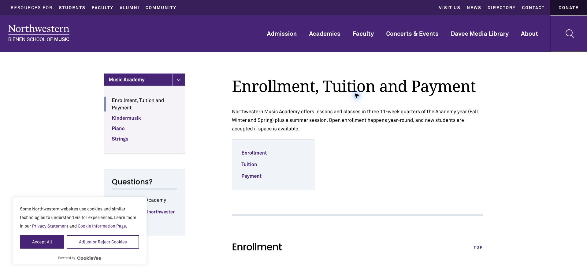
Northwestern Music Academy organizes this page around three linked sections: enrollment, tuition and payment. Within the university's purple identity, a local sidebar keeps the academy's piano, strings and early-childhood routes accessible. The strongest passage distinguishes an initial interest form from registration after assessment and teacher placement. Returning students receive a different explanation, and the page describes automatic renewal and quarterly billing rather than implying that one form is an isolated purchase. A dated tuition table covers lesson lengths and group formats; a separate notice explains a discontinued university-affiliate benefit. The surrounding institutional navigation is extensive, and the distinction between the academic-year registration and recurring quarters still takes several paragraphs to absorb. This is a useful operational reference for schools whose enrollment process depends on a human match, especially when its sequence is translated into a shorter visual introduction.
What you can learn
Make placement a named stage before registration, and explain renewal separately from the first payment.
Pros
Interest forms and confirmed teacher placement are clearly distinguished.
Current tuition and a changed discount policy are explicitly dated.
Cons & considerations
Extensive institutional navigation competes with the local task.
The registration and quarterly renewal relationship needs careful reading.
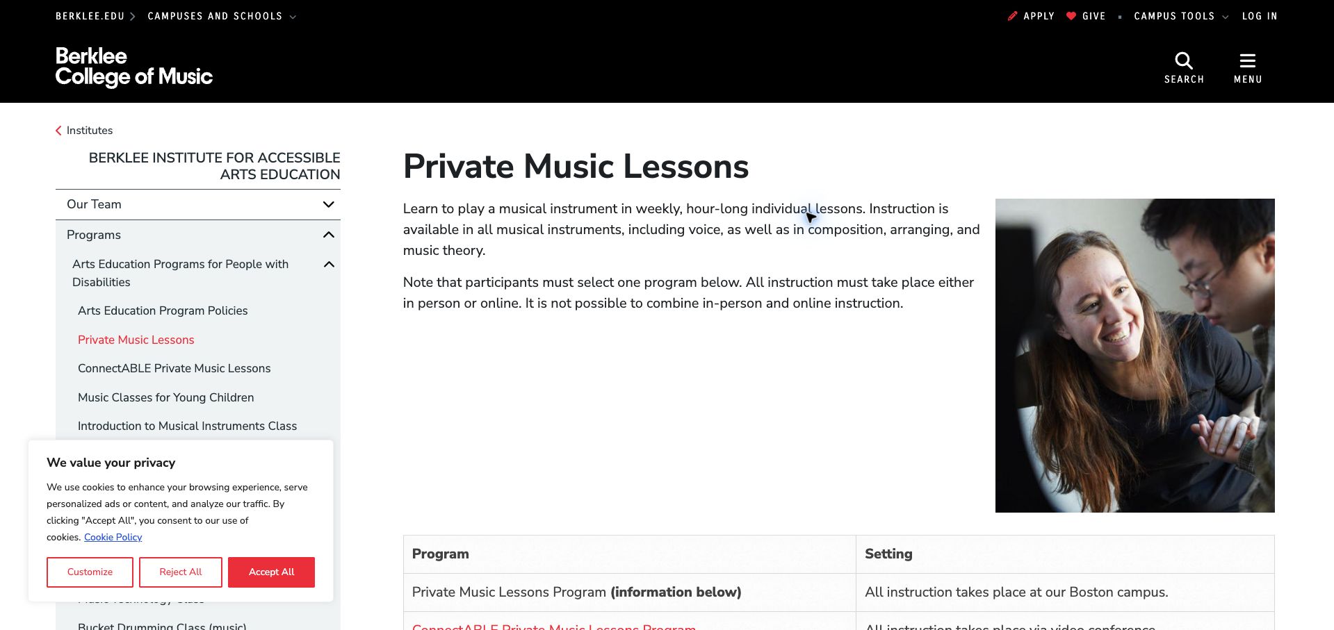
Berklee's private-lessons page puts a specific program within a recognizable institutional structure. A teaching photograph gives the white content area a human focus, while the left navigation shows the wider accessible arts offering. The page differentiates campus lessons from the remote ConnectABLE format and states that the two cannot be mixed. Age ranges, lesson durations, term structure and the need for an instrument at home help visitors understand practical fit before applying. Participation requirements are presented as program information, not left for a later form to reveal. The institution's broad navigation and substantial sidebar reduce the space devoted to the main explanation, and the detailed format comparison appears below the opening view. A short eligibility-and-format summary would improve orientation. The design lesson is to explain a specialist program's boundaries clearly while keeping the invitation to explore it respectful and readable.
What you can learn
Show format, age range, equipment needs and participation requirements before asking an applicant to invest time in an enrollment form.
Pros
Campus and remote formats are distinguished with explicit constraints.
Practical participation information is available before application.
Cons & considerations
Institutional navigation occupies substantial attention and space.
The most useful format comparison is not immediately visible.
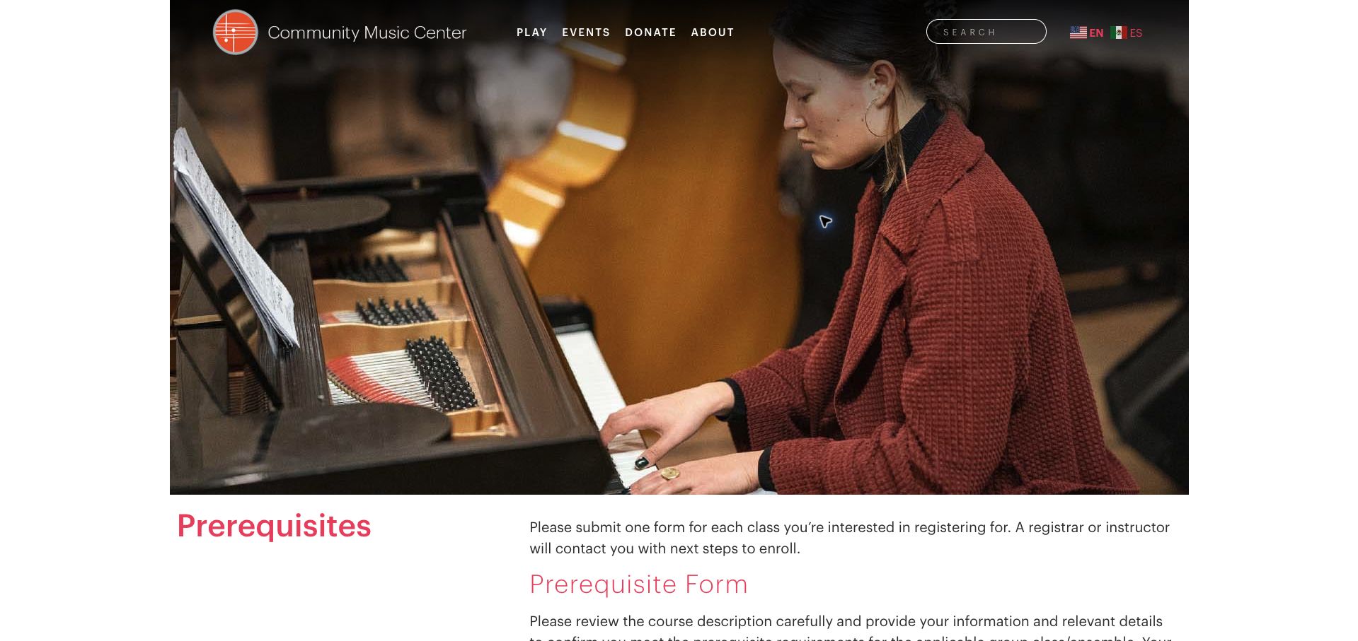
San Francisco Community Music Center introduces its prerequisites page with a wide photograph of adult music making and a simple Play, Events, Donate and About navigation. The page asks visitors to check course requirements before submitting one form per class, then explains that staff or an instructor will confirm the next step. This avoids presenting the form as an instant reservation. Current registration dates distinguish returning and new students, while a delay notice sets expectations about response timing. The form gathers the class context needed for that conversation rather than treating every request as identical. The generous photo pushes the instructions down, and several timing and placement qualifications must be read before completion. A concise checklist above the form could help. The page's central strength is making a human placement decision visible, with an explanation of what happens if a class proves unsuitable.
What you can learn
Tell applicants what staff will review, when they should expect a response and whether submitting a form actually reserves a place.
Pros
The form is clearly framed as a reviewed request.
Registration dates and response expectations provide timely context.
Cons & considerations
Large opening photography delays the practical instructions.
Several qualifications could be condensed into a preparatory checklist.
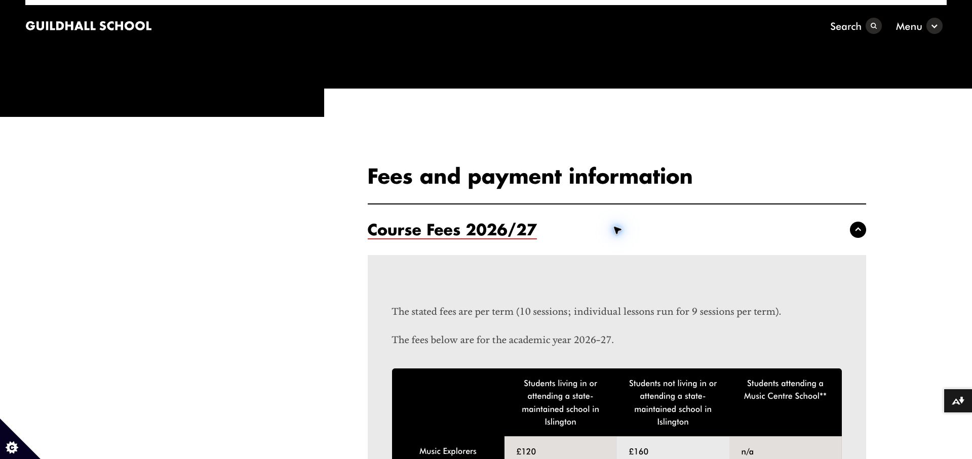
Guildhall's Music Education Islington fee page combines a bold black institutional header with a restrained white content area. Opening the dated course-fee section reveals a table whose columns distinguish the student circumstances that change the price. The introduction specifies the number of sessions and identifies the different count for individual lessons, making the term amounts easier to interpret. Bursary information occupies its own section, with eligibility and application questions separated from ordinary payment, attendance and cancellation details. The accordion structure keeps a complex page manageable, although the central price table is hidden on arrival. Its long column headings also demand patient reading across the table. A concise visible summary could improve the first visit. The strongest idea is the explicit relationship between a fee and the conditions behind it, supported by separate routes for funding and administrative questions.
What you can learn
Label the assumptions behind every price column, and state session counts before visitors compare term totals.
Pros
The table connects prices to clearly stated student circumstances.
Funding questions and administrative policies have distinct sections.
Cons & considerations
Course prices require opening an accordion.
Long column headings make comparison visually demanding.
Kegan is a freelance web designer and developer with 15+ years of experience helping businesses turn complicated website requirements into clear, maintainable digital experiences. He works directly with clients from planning and design through development, launch, and ongoing support.
For music school website design, his development approach focuses on instrument and lesson discovery, teacher and programme relationships, tuition explanations, placement inquiries, and enrollment integrations. The scope can be a targeted improvement or a complete custom build, with responsive layouts, thoughtful content structure, and integrations chosen around the people using and maintaining the site.
Show 3 other music school website designersHide other music school website designers
Plan the content around the decisions visitors need to make
Define the teaching inventory
List instruments, age groups, levels, locations and formats before choosing templates. Distinguish ongoing tuition from seasonal camps, workshops and ensembles so the same course label does not conceal different commitments.
Design an introductory pathway
Explain whether the first step is an inquiry, trial, audition or placement conversation. State what the school confirms and when payment becomes due. Keep the route proportionate to the complexity of the programme.
Structure teacher profiles
Use consistent fields for instrument, role, approach and verified background. Link profiles to relevant lessons and locations. Provide a school contact route rather than assuming a public biography means a teacher currently has space.
Document the tuition model
Show lesson duration, payment frequency, registration or material charges and the relevant cancellation or makeup policy. Keep term calendars and price updates aligned across the public site and enrollment platform.
Support practical participation
Explain instrument requirements, rental or loan routes when offered, practice expectations appropriate to the programme and venue access. Give families a way to discuss individual needs without collecting sensitive details in an open public form.
Test enrollment as a learner
Ask someone unfamiliar with the school to choose a programme and describe the next step. Check long catalogues, filters and timetable tables on phones, and verify that external systems retain the intended course context.
The editing job behind the design
Choose a maintainable publishing and booking system
A structured catalogue should connect instruments, programmes, teachers, locations and dates. Small schools may need only a few editable pages, while larger institutions benefit from consistent filters and shared course records.
Use enrollment software for scheduling and payments where appropriate, but keep the public explanation readable without an account. Test external widgets and provide a clear contact fallback if a timetable or registration service fails.
Our WordPress website examples offer a separate look at publishing approaches. A visible platform label is evidence for that named page, not a guarantee that the same system will suit your requirements.
Before the public launch
Practical website planning checklist
Identify instruments and lesson formats.
State age and experience expectations.
Separate ongoing and seasonal programmes.
Explain trials or placement.
Label requests versus confirmations.
Show lesson length.
State tuition billing periods.
Publish relevant cancellation rules.
Connect teachers to programmes.
Explain instrument requirements.
Keep venue information current.
Test the selected-course handoff.
These checks are a project checklist, not a performance, legal, security, or accessibility certification. Test real journeys with the people responsible for the website before making claims about the result.
Sources & editorial method
How this collection was selected and reviewed
The 27 examples match the original saved collection target. Each official public page was opened, inspected and directly captured in an ordinary browser; source URLs and capture dates identify the reviewed state. Reviews describe observed design, information and navigation, with distinct practical lessons and limitations. A bounded public technology-audit attempt accompanies every source, preserving unknown and inaccessible results without inventing a hidden stack. Editors Choice is an explicit editorial selection favoring a smaller specialist or local organization, not a service-quality, safety or outcome endorsement. No booking, application, payment or private form was submitted. Website imagery and trademarks belong to their owners.
Each example links to its actual source page. Screenshots are direct browser captures with their own capture dates; moving imagery, announcements and live designs can change. The notes describe observable design choices and conditional tradeoffs, not measured traffic, conversion results, service quality, or accessibility conformance.
Technology labels use public page metadata, asset evidence, or explicitly cited platform documentation. Platform documentation is not a complete current deployment audit. A component reference may be legacy or unused; it is not a complete backend inventory. Unknown stacks are omitted. These sites are editorial examples, not our client portfolio.
Written, Edited and Curated are separate editorial records, not timestamps advanced by a rebuild. Website designs and imagery belong to their owners. See our editorial standards or suggest a correction.
Questions worth asking
Music School website design questions
What should a music lesson page include?
Instrument, intended audience, experience level, format, lesson length, location and a clear tuition or inquiry route. Explain whether the next step is a trial request, placement discussion or direct enrollment.
Should every teacher have a profile?
Profiles are useful when they help learners understand the teaching offer. Keep them current, accurate and connected to real programmes rather than treating a long biography as proof of availability.
How should a trial lesson be described?
State the duration, cost, eligibility and what happens afterward. Cadenza’s staged explanation is useful because it distinguishes submitting a preference from receiving confirmation.
How can a large catalogue stay usable?
Use consistent programme records and filters that reflect learner decisions, such as instrument, age, level and location. Keep the same terms across the public catalogue and enrollment system.
Where should makeup policies live?
Near tuition and enrollment information, with a maintained full policy for detail. Learners should understand the relevant commitment before starting recurring lessons.
Make the musical offer inviting and the enrollment process precise. The strongest lesson page tells a learner what fits, what it costs and what the school will confirm next.