Best Pool Builder Websites of 2026 (15 Real-World Examples)
Pool builder websites that connect inspiring projects with practical planning
A beautiful pool photograph starts a conversation; it does not answer where a builder works, what a project includes or how the process begins. These fifteen examples show how regional specialists and larger networks connect portfolios, service choices, planning resources and enquiries.
Pool projects combine design preferences with the constraints of a particular property. A visitor may be comparing a new pool, renovating an existing one, looking for repairs or exploring a commercial assignment. A useful website separates those needs before asking for contact details. Portfolio photographs should be supported by scope, location and process information, not treated as a universal promise of what can be built in any yard.
These reviews examine public website presentation, navigation and content organization. They do not certify builders, engineering, construction quality, safety compliance, finance offers or project prices. Company awards and rankings remain attributed business claims. Images, estimators and visualizers are design references; site assessment and current terms must come from the provider and appropriate qualified professionals.
Before the examples
What makes good pool builder website design in 2026?
Separate building from owning
New construction, renovation, cleaning, repair and warranty support are different tasks. Give each a clear route and a correctly routed contact option. An existing customer with an equipment problem should not have to enter a new-pool sales journey.
Give projects useful context
Describe the assignment, general region, design choices and relevant constraints without exposing a client's private address. Distinguish an actual completed project from a rendering or concept. A gallery becomes more useful when visitors can find a pool related to their intended use or property type.
Explain the planning sequence
Show how consultation, site information, design, proposal, approvals, construction and handover relate. State which parts the builder coordinates and which need other specialists. Avoid presenting a preference quiz or visualization as a final design or quotation.
Keep cost content qualified
A project price, starting estimate and financing illustration are different things. Label their scope, assumptions, exclusions and dates. Give the business's responsible reviewers ownership of updates, rather than scattering numbers across banners and forms.
The collection · 15 examples
15 pool builder websites worth studying
Look beyond the water photography. Compare how each site handles a particular task: a new-build versus care choice, a regional handoff, a project filter, an explanatory process or an early enquiry. Some brands share ownership or similar promotional tools; visual similarity is not independent evidence that a pattern produces better results.
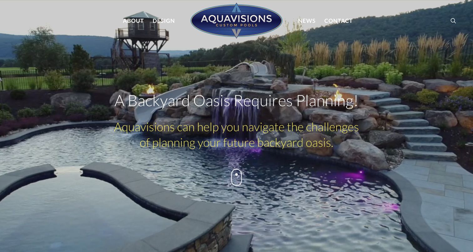
Aquavisions uses a nearly full-screen pool scene, a centered wordmark and a small four-item menu to establish an intentionally focused introduction. The important distinction is the planning message laid over the water, rather than a promise of an instant pool. Below, a question about when a client can swim is answered with a discussion of design, detailed scope and realistic scheduling. A second module introduces 3D design, and the FAQ route continues that explanatory approach. Central Pennsylvania positioning appears in the company introduction. The restrained navigation suits a regional specialist with one clear construction focus, while the dramatic landscape still supplies the visual inspiration expected of a pool builder.
What you can learn
Use completed work to open the conversation, then explain what has to happen before construction can be scheduled. Pair design imagery with a scope and process explanation instead of implying a rendering establishes feasibility. A smaller specialist can borrow the compact navigation and planning language without imitating the scale of the photographed property or making unsupported completion promises.
Pros
Scheduling discussion acknowledges project-specific planning rather than promising one universal timeline
Compact navigation separates company, design, news and contact without a large service maze
Cons & considerations
The full-screen introduction puts the practical scheduling explanation below the fold
Light, thin text over changing imagery needs careful contrast and fallback testing
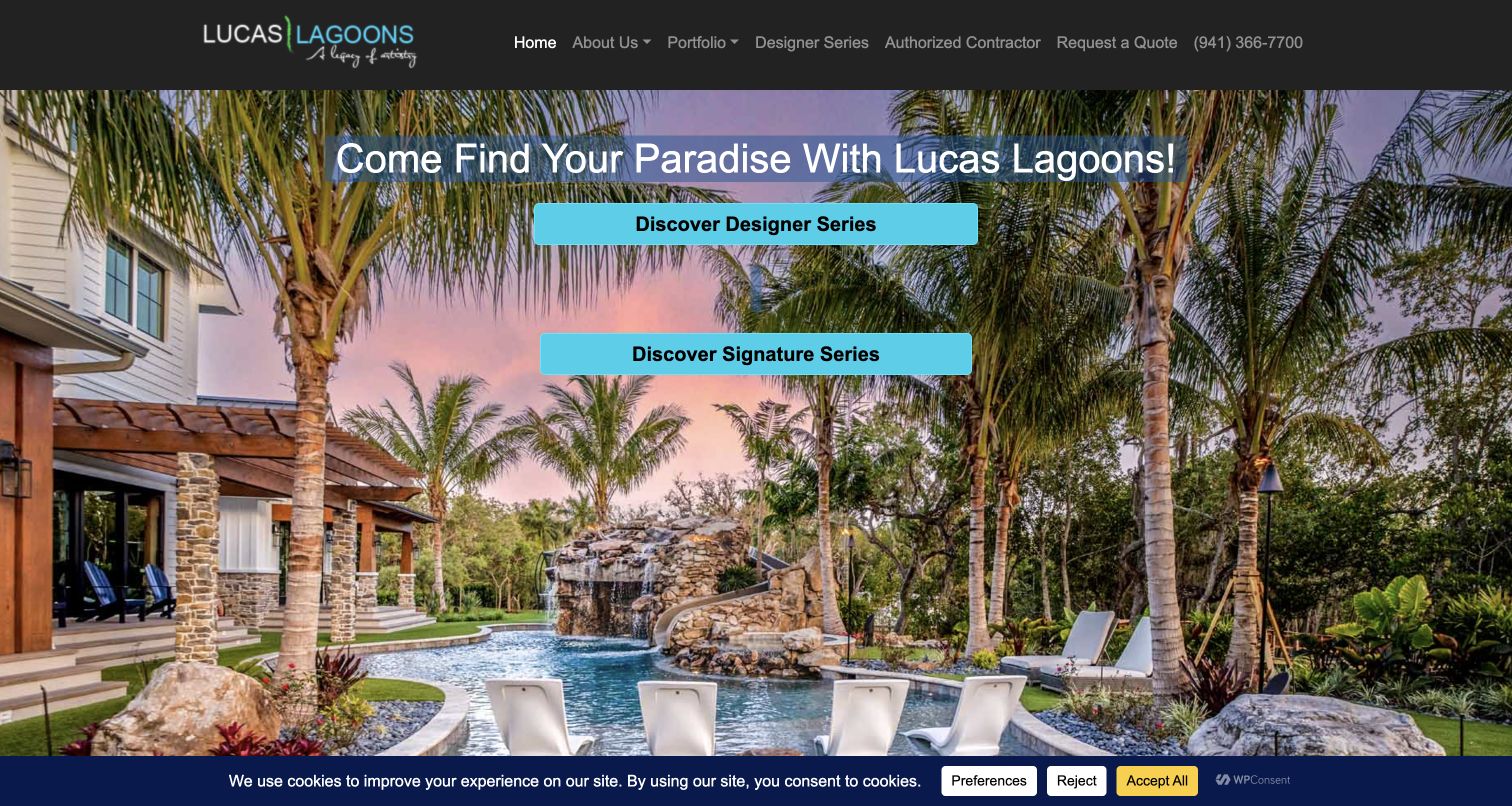
Lucas Lagoons opens with tropical planting, rockwork and a richly textured pool, making its nature-inspired design identity unmistakable. Cyan buttons separate Designer Series from Signature Series, while the header offers portfolio, contractor and quotation routes. The body connects the work to project stories and the firm's television presence, then groups its portfolio into named collections such as Modern ZEN and Northern Natural. This is a distinctive specialist presentation rather than a neutral directory of pool shapes. The design makes strong use of recognizable work, although visitors must learn the difference between the branded series. The site's fame and award language are part of its own positioning, not independent evidence of construction outcomes.
What you can learn
If a builder has a genuinely recognizable design language, show representative projects and explain the differences between collections. Give each branded range a plain-language description of scope and the next conversation. A prospective client should be able to distinguish direct building work, design work and an authorized-contractor program without relying on familiarity with the brand's media appearances.
Pros
Project imagery communicates a specific aesthetic immediately
Named portfolio collections give the large body of work useful groupings
Cons & considerations
Designer and Signature labels require explanation for first-time visitors
Television and social content can compete with service-area and project-feasibility questions
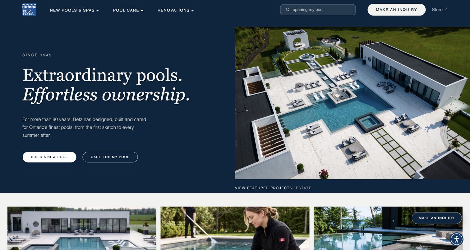
Betz Pools uses a split navy-and-photograph hero with a serif headline and two unusually clear actions: build a pool or care for one. The main navigation preserves the same distinction alongside renovations, while search accepts ordinary maintenance questions. Below, separate build and care modules explain the difference between a construction project and recurring service. Educational articles cover materials and costs, and the regional coverage section locates the offer in Southern and Central Ontario. The aerial photograph shows the pool as part of an architectural setting rather than an isolated rectangle of water. This combination gives an aspirational brand useful everyday routes without forcing an existing owner into a sales enquiry for new construction.
What you can learn
Treat construction, renovation and care as separate customer tasks, even when one company supplies all three. Carry that distinction from the first buttons through contact routing and service pages. Use the portfolio to explain the property context, then let advice answer practical ownership questions. Regional coverage should remain explicit beside a visually ambitious project.
Pros
Build and care actions reflect two genuinely different visitor needs
Articles and service-area content support practical planning beyond the portfolio
Cons & considerations
A large editorial photograph leaves limited first-view space for project constraints
Awards from different years need clear date context rather than appearing as current guarantees
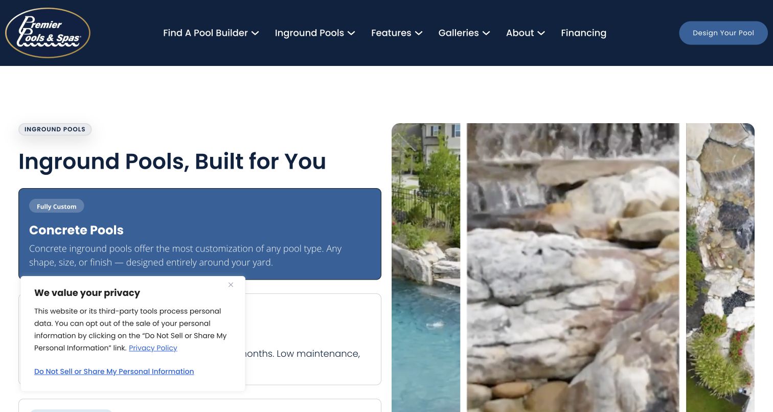
Premier Pools & Spas leads with an inground-pool comparison rather than only a lifestyle headline. Large stacked selections explain concrete, fiberglass and vinyl, with an image region beside them and a route to further material detail. The header keeps finding a local builder distinct from galleries, features and financing. Later sections connect location, cost information, feature inspiration and a consultation form. The captured privacy panel overlaps some of the material choices, demonstrating why a seemingly generous layout still needs overlay testing. The material-level organization is useful, but national availability and timing claims cannot be assumed to apply to every locally owned franchise or every site condition.
What you can learn
Use construction materials as an educational comparison when they genuinely affect the client's options, and establish local availability before implying all choices are offered everywhere. Keep the comparison readable without interacting with tabs and retain a direct detail link. Product claims about installation time or maintenance should carry context supplied by qualified staff rather than become universal design copy.
Pros
Material choices are explained rather than presented as unexplained gallery filters
Finding a local builder has its own navigation category
Cons & considerations
The privacy panel obscures part of the comparison in the captured state
National product and timing language needs office-specific qualifications
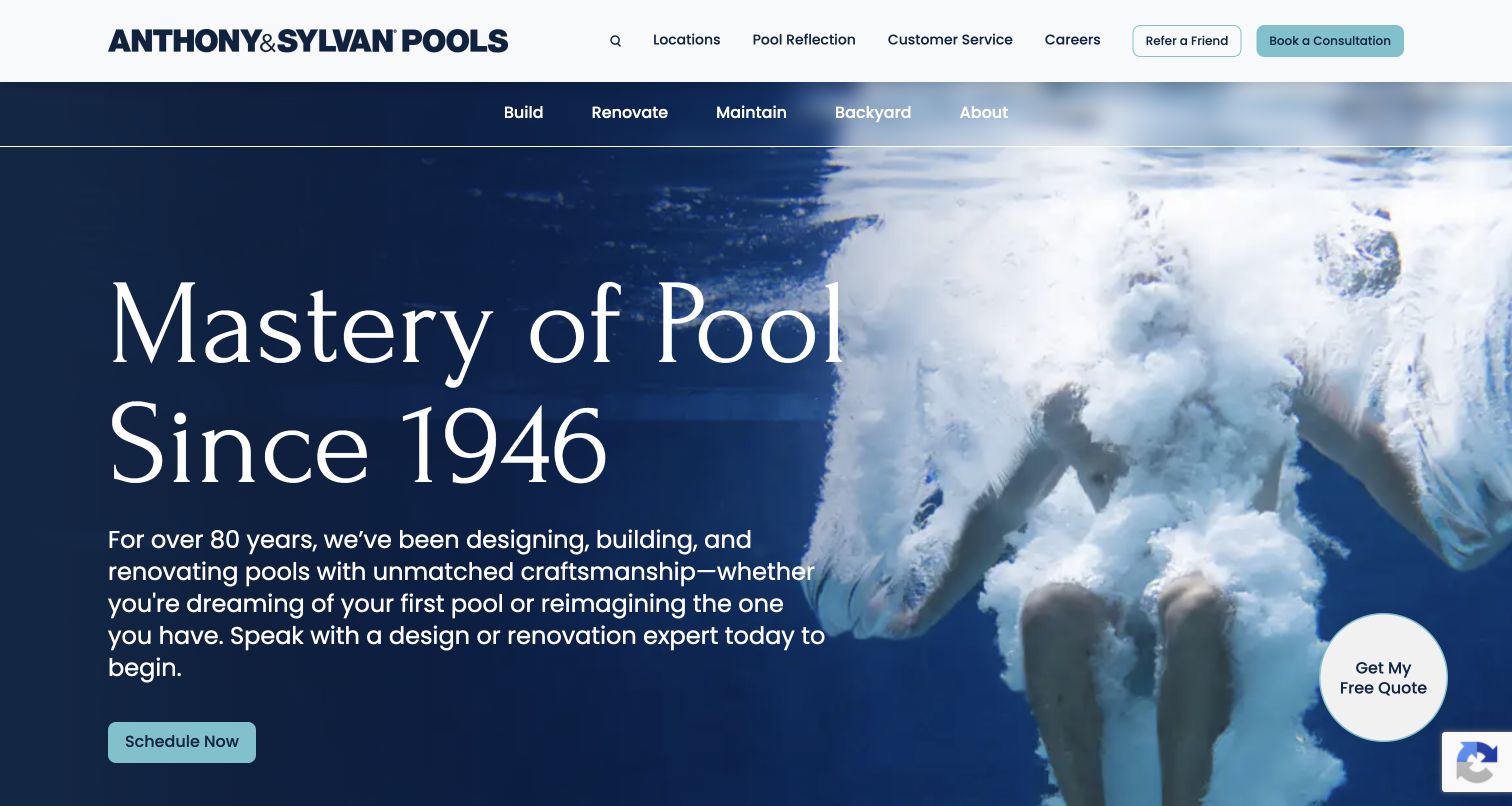
Anthony & Sylvan combines an oversized serif heritage statement with underwater footage and a compact schedule action. Its second navigation row is structured around Build, Renovate, Maintain and Backyard, making different ownership stages explicit. A numbered process follows: inspiration, visualization, construction and ownership. Each stage has a separate route, which gives the visitor something more useful than an undifferentiated consultation button. The homepage also promotes a backyard-visualization tool and links ownership and safety articles. The scale of the typography and movement creates a strong introduction, but practical location and project detail remain separate tasks. Its award and longevity statements are business claims, not a reason to skip local due diligence.
What you can learn
Map the stages of a high-consideration purchase before deciding what the homepage should ask for. A visitor gathering ideas should be able to explore examples without entering an enquiry, while an existing owner should reach maintenance directly. Label visualization as an exploratory aid; a pictured possibility is not an engineered design, quotation or approval to build.
Pros
Lifecycle navigation distinguishes new builds from existing-pool needs
The numbered process connects inspiration with construction and later ownership
Cons & considerations
Large typography and moving footage dominate the initial screen
Multiple consultation controls require consistent labels and destinations
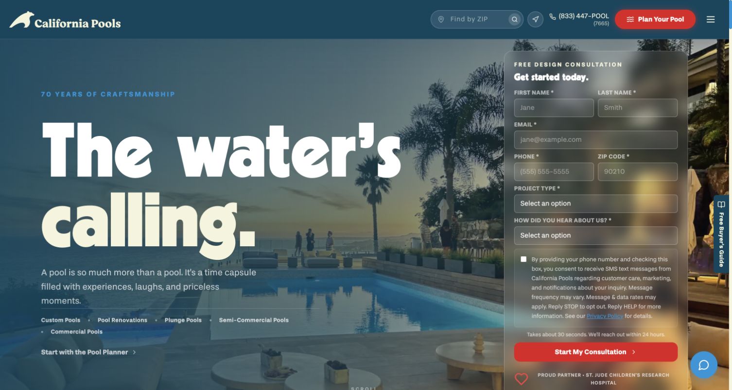
California Pools places a large two-line lifestyle headline beside a translucent consultation panel. The form asks for contact details, ZIP code and project type, while the header provides location search and a separate Pool Planner action. Below, a six-stage process explains consultation, design, preparation, construction, walkthrough and first swim. The site also organizes residential work, renovations, outdoor living, features and galleries. The layout therefore gives a motivated visitor an immediate enquiry route while preserving a less committed planning route. The tradeoff is density: form labels, consent copy, promotional elements and moving imagery all occupy the first view. Company statistics and response or completion claims remain unverified marketing statements in this design review.
What you can learn
Place a form in the hero only when the visitor can understand what will happen after submitting it. Keep project type and geography useful for routing, but avoid collecting more information than the first conversation needs. Maintain an exploration path for people not ready to share contact details, and give translucent fields a dependable reading surface across every background image.
Pros
Project-type selection helps distinguish a new pool from renovation or other work
A planner route supports visitors who are not ready for a consultation
Cons & considerations
Consent, form and campaign elements make the initial screen visually dense
Translucent form styling needs testing against different backgrounds and zoom levels
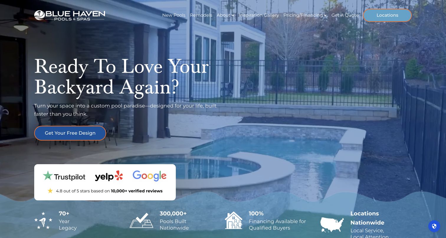
Blue Haven uses a blue-washed backyard photograph and a large serif question to introduce a design enquiry. An outlined Locations control stands out in the otherwise light navigation, while new pools, remodels, galleries and pricing have named routes. The opening places review-platform branding and company-scale claims beneath the main action. Farther down, a visualization invitation and gallery encourage visitors to imagine a particular backyard. The image-led approach supplies aspiration, but the national introduction must ultimately lead to an office that can explain site constraints, local offerings and actual project costs. The review totals, financing percentage and construction counts are presented by the business and were not independently verified here.
What you can learn
A national brand should make the local handoff a first-class task, not a footer discovery. Keep inspirational galleries open without requiring an address, and explain what an address-based visualization tool does before asking someone to use it. Present financing and review claims with their proper conditions rather than allowing them to substitute for a clear construction process.
Pros
Locations remains a conspicuous header route
New construction and remodels are distinguished before the visitor enquires
Cons & considerations
Several large trust and scale claims compete with the project explanation
Address-based visualization can create privacy friction unless its purpose is clear
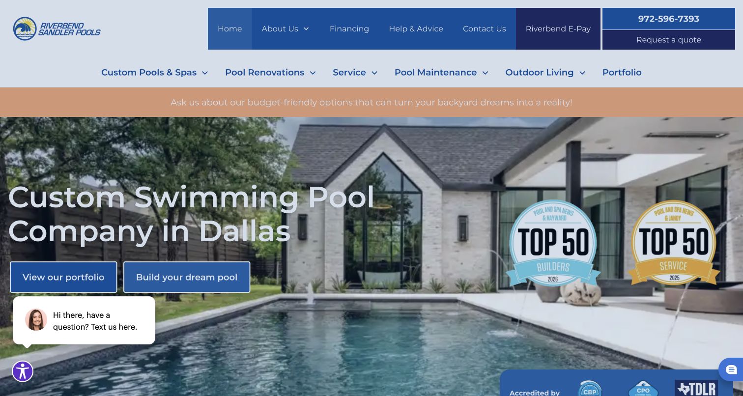
Riverbend Sandler puts Dallas in the hero headline and pairs viewing the portfolio with starting a project. A two-level menu distinguishes custom pools, renovation, service, maintenance and outdoor living, while the utility area retains payment and contact links. The body makes Plano, Dallas and McKinney coverage explicit and explains a proposal and 3D-design sequence. Its portfolio can be browsed through geometric and freeform groupings with named project entries. A financing promotion initially obscured the opening and was dismissed normally for the final capture. That experience is a useful caveat: a site can have clear service organization while a temporary promotion interrupts its most important paths.
What you can learn
For a regional full-service company, keep new-project discovery and existing-owner tasks separate. Give a portfolio enough structure that visitors can find a relevant example without knowing a project name. Treat promotional dialogs as part of the navigation design: they need an obvious dismissal and must not prevent a person from finding repair, payment or contact information.
Pros
The hero identifies the market and offers both browsing and enquiry
Maintenance, repair and payment routes recognize existing customers
Cons & considerations
The initial promotional dialog hid the main project choices
Two navigation rows and an offer strip consume considerable vertical space
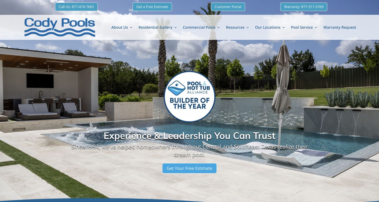
Cody Pools uses a large completed-pool image, an award-led message and a free-estimate action, with customer portal and warranty access in a separate utility strip. Residential, commercial and renovation galleries then divide the work by assignment. Process content, a buying guide, articles and design-center information offer ways to investigate before requesting an estimate. The distinction between public inspiration and private customer support is particularly useful for a construction service whose relationship continues after the sale. Award badges and ranking language dominate the initial impression, so a visitor still needs the linked process and location pages to determine whether the company fits a specific project. Those rankings were not independently validated in this review.
What you can learn
Give active clients a stable, plainly named portal or warranty route that does not resemble a new-sales form. Pair portfolio categories with process and location information, and distinguish a free estimate request from a confirmed appointment. Awards can support a brand story, but the site should still explain how design, budget discussions and construction communication work.
Pros
Customer portal and warranty support are separated from the estimate action
Residential and commercial galleries acknowledge different project contexts
Cons & considerations
Award-led content takes priority over practical scope in the first view
Several estimate and guide routes need consistent maintenance to avoid outdated destinations
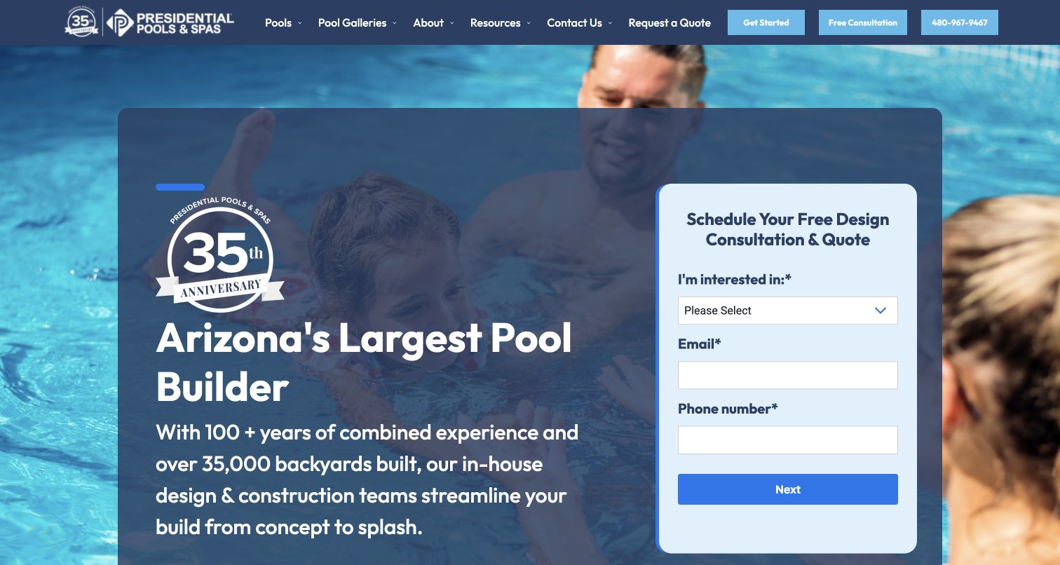
Presidential Pools places an Arizona-focused introduction beside a compact consultation form that first asks what the visitor is interested in. Its options recognize exploration, new pools, spas, remodeling, service and pricing questions. The longer page adds a full-service explanation, pool-park visit, showroom locations and ownership support. Those physical destinations make inspiration something a visitor can inspect in person rather than only through photographs. A financing modal initially covered the opening and was dismissed for the final screenshot. The resulting page is more useful: the service interest, email and phone fields are visible together, although a visitor is asked for personal contact information before reaching any later steps.
What you can learn
Route an enquiry by the visitor's actual need, and make showroom information useful without a form. Explain whether a consultation request produces a call, an appointment or a preliminary design discussion. If a multi-step form requires contact details early, state that expectation and keep an ungated service or gallery route for people who are still comparing options.
Pros
Interest choices distinguish service, renovation and new-construction enquiries
Pool-park and showroom routes support in-person research
Cons & considerations
A promotional modal initially interrupted the consultation form
Early contact fields create a commitment before the later form steps are visible
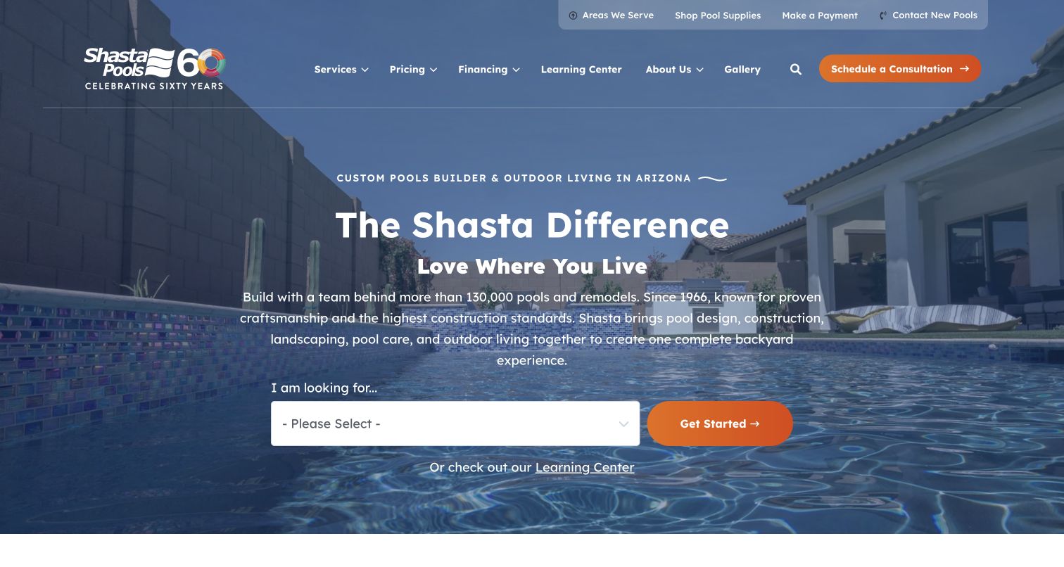
Shasta uses a simple I am looking for selector over pool imagery, with options ranging from new construction to remodeling, care, commercial work and backyard design. Pricing and the learning center are prominent in the header, not hidden within a generic company menu. Below, project examples introduce different investment levels and connect to case studies and estimating tools. The structure addresses a genuine planning question that galleries alone cannot answer. It also creates a demanding editorial responsibility: estimated payments, project prices and finance assumptions need to be current and qualified together. This review examines how that information is organized, not whether the prices or financing examples suit any visitor.
What you can learn
A cost discussion is more useful when tied to a described scope or real project than to a single unexplained starting number. Keep construction cost distinct from financing illustrations and identify what an estimate excludes. Provide direct service links alongside a selector, and have the responsible business and finance professionals review all numerical and conditional content before publication.
Pros
Pricing and educational information receive clear navigation priority
The selector acknowledges existing-owner as well as new-build needs
Cons & considerations
Cost and monthly-payment modules require tightly coordinated editorial review
A large service selector can slow a visitor who already knows the destination
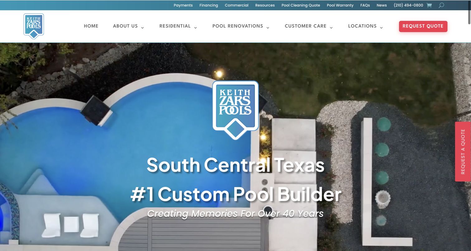
Keith Zars Pools combines aerial pool footage, a central brand mark and South Central Texas positioning with a separate red quote action. The utility bar includes payments, warranty, FAQs and cleaning quotes, while the main menu separates residential work, renovations, customer care and locations. The body gives a more specific town list and divides construction, repairs, cleaning and renovation into explanatory modules. This makes the company legible as more than a portfolio of dramatic pools. The video needed time to render during inspection; the final capture shows the completed introduction rather than its temporary spinner. Large recommendation and ranking claims are part of the company's marketing and do not establish service quality in this review.
What you can learn
Make the local coverage and existing-owner support structure as deliberate as the showcase. Provide a useful static poster and readable text while video loads, and preserve the quote or phone route independently. For a full-service practice, explain how cleaning, equipment repair and renovation differ before sending them into a shared contact workflow.
Pros
Customer-care, warranty and payment utilities are independently named
Service modules distinguish construction from ongoing cleaning and repairs
Cons & considerations
Video loading initially left the main area without a useful introduction
The dense utility and main navigation require careful small-screen prioritization
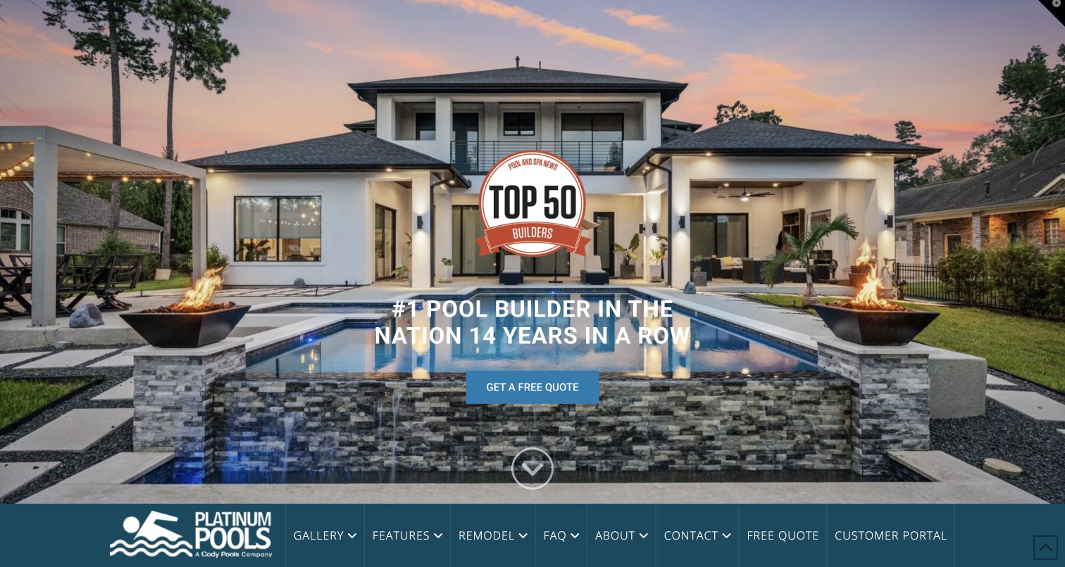
Platinum Pools places a dramatic dusk project across almost the entire opening, with a quote action and a ranking badge over the image. The primary navigation sits along the bottom edge of that introduction rather than occupying the top. The body then becomes more explanatory, discussing Houston and Beaumont coverage, ownership education and the construction process. Three modules give pricing, features and 3D pool videos distinct destinations. A customer portal is available beside the public routes, and the wordmark identifies the business as a Cody Pools company. That relationship is visible context when comparing the collection's brands; shared branding or awards should not be mistaken for independent proof of design effectiveness.
What you can learn
A large project photograph should lead into information that helps someone decide whether the work is relevant: region, scope, process and budget context. Keep navigation discoverable before a visitor has to scroll, and label a customer portal as separate from a new-project request. Where businesses share ownership or systems, make the relationship clear without treating the sites as identical.
Pros
Pricing, features and 3D design material have distinct explanatory routes
Regional coverage and the parent-brand relationship are visible in the site content
Cons & considerations
Bottom-positioned navigation can be missed in a cropped first view
The initial ranking badge competes with the actual project image
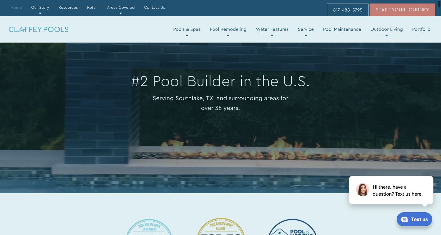
Claffey Pools opens with pool footage, a Southlake-area statement and a large ranking claim. The broad menu distinguishes remodeling, water features, service, maintenance and outdoor living. More importantly, the body describes four practical stages, including the property survey, detailed proposal, 3D review and construction. A substantial portfolio offers filters such as exercise, geometric, infinity and natural, with individual named project links. This gives a visitor ways to find work related to their own intended use or style. A financing promotion initially covered the hero and was dismissed for the capture. The catalogue and process are the stronger reusable patterns, while rankings remain attributed claims rather than editorial conclusions.
What you can learn
Make a large portfolio searchable by client-relevant characteristics, then connect inspiration to the documents and decisions needed for a proposal. Explain survey or site-information requirements before someone begins an enquiry. Keep filters accessible with a keyboard and give projects normal detail links, so the gallery remains usable when scripts or animation are unavailable.
Pros
Portfolio filters offer several meaningful ways to browse a large body of work
The process names practical inputs such as a property survey and proposal review
Cons & considerations
The initial financing dialog interrupted access to the showcase
Many overlapping style filters need clear definitions and manageable mobile presentation
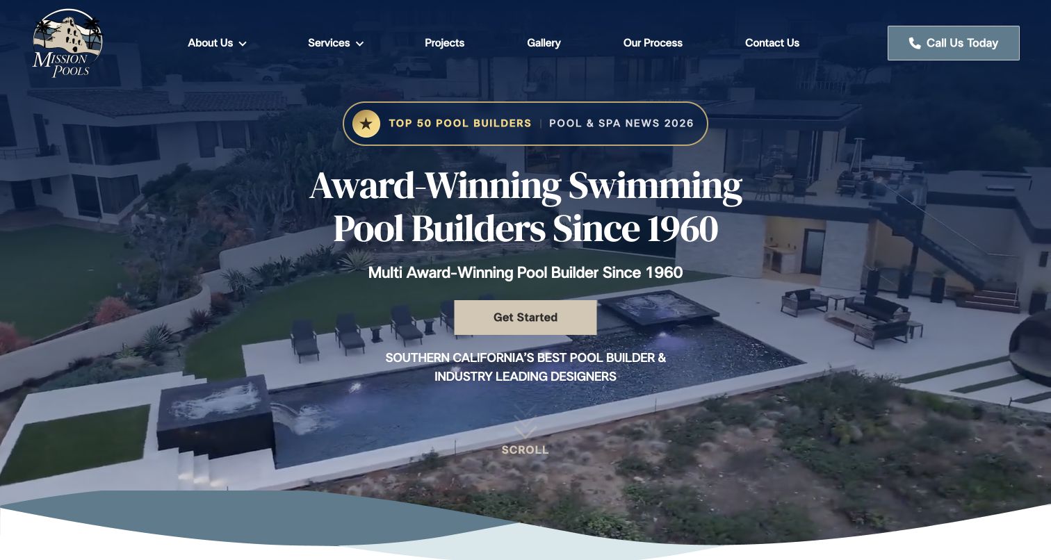
Mission Pools uses a navy overlay, serif headline and gold accents to frame aerial project footage. Projects, Gallery and Our Process are all visible header destinations, with a direct phone action. The body divides custom residential pools, renovation or maintenance and commercial construction before introducing a six-step image-led project questionnaire. Later project sections explicitly distinguish residential and commercial work, and branch contact information identifies the Southern California operation. This is an example of combining a polished showcase with assignment-based organization. The questionnaire can help start a conversation, but its image choices are not a substitute for checking site conditions, engineering, permissions and a detailed scope with qualified people.
What you can learn
Separate project types when they involve different decision-makers and requirements, while keeping the process explanation available to everyone. An image-led brief should have text labels, clear progress and a way to revise selections. Do not imply that completing a preference quiz produces a buildable design or a final price; make the next human review explicit.
Pros
Residential and commercial work receive distinct service and project routes
Process and direct phone access are visible beside the visual showcase
Cons & considerations
Repeated award wording uses space that could explain service coverage sooner
Image-based questionnaires need equivalent labels and accessible selection states
Kegan is a freelance web designer and developer with 15+ years of experience helping businesses turn complicated website requirements into clear, maintainable digital experiences. He works directly with clients from planning and design through development, launch, and ongoing support.
For pool builder website design, his development approach focuses on real project galleries, construction-process explanations, service-area content, maintenance boundaries, and qualified design or estimate inquiries. The scope can be a targeted improvement or a complete custom build, with responsive layouts, thoughtful content structure, and integrations chosen around the people using and maintaining the site.
Show 3 other pool builder website designersHide other pool builder website designers
Plan the pool website before choosing the hero photograph
Map the visitor's project stage
Separate inspiration gathering, feasibility questions, design discussions, active construction and aftercare. Decide which information is public and which requires a site-specific conversation. Keep service and warranty help available outside new-project marketing.
Structure the portfolio
Choose a consistent project record: assignment type, broad location, completed versus concept status, features and useful narrative. Use filters visitors understand and avoid publishing precise private-property details without permission. Provide ordinary project links as well as interactive browsing.
Document regional availability
A national catalogue does not establish what every office can build or service. Make office coverage, local contacts and current offerings easy to find. For a specialist, state the practical region and the kind of projects the firm accepts before the enquiry form.
Write the process with operational staff
Have the team describe the inputs they actually need, such as surveys, access details and design preferences. Explain the next contact and who coordinates each stage. Do not turn a typical sequence into a guaranteed completion date for every property.
Govern offers, estimators and claims
Record owners, supporting sources, assumptions and expiry dates for awards, prices, promotional finance and response-time promises. Review related pages together when one changes. Keep a visualizer's limitations visible, including that it does not establish site feasibility or permissions.
Test the enquiry without sending it
Check fields, labels, progress, validation and external transitions in an authorized test environment. Test navigation and project browsing with keyboard and small screens. Review the combined state of privacy panels, chat bubbles and promotional dialogs so essential contact routes remain usable.
The editing job behind the design
Choose a content system that can maintain projects and service boundaries
A pool-builder website benefits from structured project records, maintainable local coverage and separate forms for construction and service. Pick tools around those responsibilities, not the animation in a theme demo. Where a CRM or third-party scheduler handles enquiries, document the handoff, consent text and who follows up. Public photographs cannot reveal the operational software behind a build.
Use images and video with useful posters, readable overlays and accessible controls. Interactive estimators and visualization tools need their own scope, privacy and professional review; they are not merely decorative website features. Keep essential galleries, process explanations and contact information useful when those tools fail or a visitor does not want to provide an address.
Our WordPress website examples offer a separate look at publishing approaches. A visible platform label is evidence for that named page, not a guarantee that the same system will suit your requirements.
Before the public launch
Pool builder website planning checklist
State the actual building and service regions.
Separate new construction, renovation and ongoing care.
Keep existing-customer warranty and support routes clear.
Identify completed projects separately from concepts and renderings.
Describe project context without exposing private addresses.
Use understandable gallery filters and ordinary detail links.
Explain the site-information and proposal process.
Distinguish estimates, project prices and financing illustrations.
Assign sources, assumptions and expiry dates to offers and claims.
Explain what happens after an enquiry is sent.
Test keyboard navigation, image labels and small-screen forms.
Check privacy, chat and promotional overlays together.
These checks are a project checklist, not a performance, legal, security, or accessibility certification. Test real journeys with the people responsible for the website before making claims about the result.
Sources & editorial method
How this collection was selected and reviewed
The fifteen examples use the saved collection target rather than a ranking of contractors or a complete market survey. Official public homepages were directly inspected and captured in a browser on the recorded UTC date. Each review discusses a specific visible pattern, a reusable lesson and tradeoffs. Coming-soon pages were excluded. Promotional dialogs were dismissed normally where necessary; no form, quote request, booking, upload or finance application was submitted. Editors Choice is an explicit regional-specialist design selection, not a contractor-quality award or vote result. Technology observations require separate evidence and are not inferred from visual style.
Each example links to its actual source page. Screenshots are direct browser captures with their own capture dates; moving imagery, announcements and live designs can change. The notes describe observable design choices and conditional tradeoffs, not measured traffic, conversion results, service quality, or accessibility conformance.
Technology labels use public page metadata, asset evidence, or explicitly cited platform documentation. Platform documentation is not a complete current deployment audit. A component reference may be legacy or unused; it is not a complete backend inventory. Unknown stacks are omitted. These sites are editorial examples, not our client portfolio.
Written, Edited and Curated are separate editorial records, not timestamps advanced by a rebuild. Website designs and imagery belong to their owners. See our editorial standards or suggest a correction.
Questions worth asking
Pool Builder website design questions
What should a pool builder put on the homepage?
Show representative work, the actual region served and clear routes for new construction, renovation and care. Add a concise process explanation and a useful contact option. A visitor should be able to understand the service without completing a form or watching a video.
Should a pool website show project prices?
Cost context can be helpful when it explains the scope, assumptions and exclusions. A completed-project price is not a quote for another property, and a monthly-payment illustration is not the construction price. Keep current figures and terms under the business's qualified review process.
How should a pool portfolio be organized?
Use the characteristics clients can recognize, such as residential versus commercial, new build versus renovation, shape or intended use. Give projects their own descriptions and normal links. Identify renderings and concepts, and protect private-property information.
Are pool visualizers a replacement for a consultation?
No. They can help express preferences and start a discussion, but an image does not establish site feasibility, engineering, permissions or price. Explain what information the tool uses and what happens next before asking someone to share an address or property photograph.
How can a smaller pool builder look distinctive?
Use a specific body of work, a focused region and a clear explanation of the firm's process. Aquavisions pairs a distinctive landscape presentation with unusually direct planning and scheduling language. The useful principle is that specificity supports the visuals; it does not require a national-scale site.
The strongest pool-builder website connects aspiration with a credible next conversation. Show real work, explain local scope and process, and make cost and service information as carefully maintained as the photography.