Best Tattoo Studio Websites of 2026 (28 Real-World Examples)
Tattoo studio website examples that connect distinctive work with a clear consultation process
A tattoo studio website has to help someone choose an artist, understand the next step and find the right shop. These twenty-eight examples show how specialist studios and regional groups present portfolios, explain walk-ins and support considered custom-design inquiries.
Begin a studio redesign with the questions behind an inquiry. A person may know a style but not an artist, have a reference image but no idea of size, or want a small walk-in piece rather than a long custom project. The website should help them understand those differences before asking for personal details or payment.
This is a collection of public website design observations, not a ranking of tattoo quality, a safety inspection or medical guidance. Photographs, reviews and studio claims do not independently establish hygiene, healing outcomes or regulatory compliance. Current availability, policies and suitability questions belong with the studio and its qualified professionals.
Before the examples
What makes good tattoo studio website design in 2026?
Attribute the work to the artist
A studio gallery is useful only if visitors can connect the examples to a maker. Keep portfolios, styles, current working locations and inquiry destinations attached to each artist. Distinguish guests from residents and remove expired appearances from prominent positions.
Explain the inquiry before calling it a booking
A custom design usually needs review of the idea, size, placement and artist availability. Label that first contact honestly. Explain the difference between sending a request, arranging a consultation, paying a deposit and holding an appointment.
Make walk-in expectations specific
Walk-ins welcome is helpful but incomplete. State relevant hours, how availability is handled and whom to contact before traveling. Keep same-day attendance separate from the workflow for a larger custom piece.
Publish practical information with equal care
Address, floor, entrance notes, hours, contact details and aftercare routes deserve the same maintenance as the portfolio. A relocation or rename needs a coordinated update across the homepage, maps, footer and artist pages.
The collection · 28 examples
28 tattoo studio websites worth studying
Compare each example by how it connects visual fit to a practical next step. An immersive work photograph, a roster of named artists and a clear studio directory can all be useful patterns. The strongest idea to borrow is the relationship between the portfolio and the inquiry, not another shop's artwork or claims.
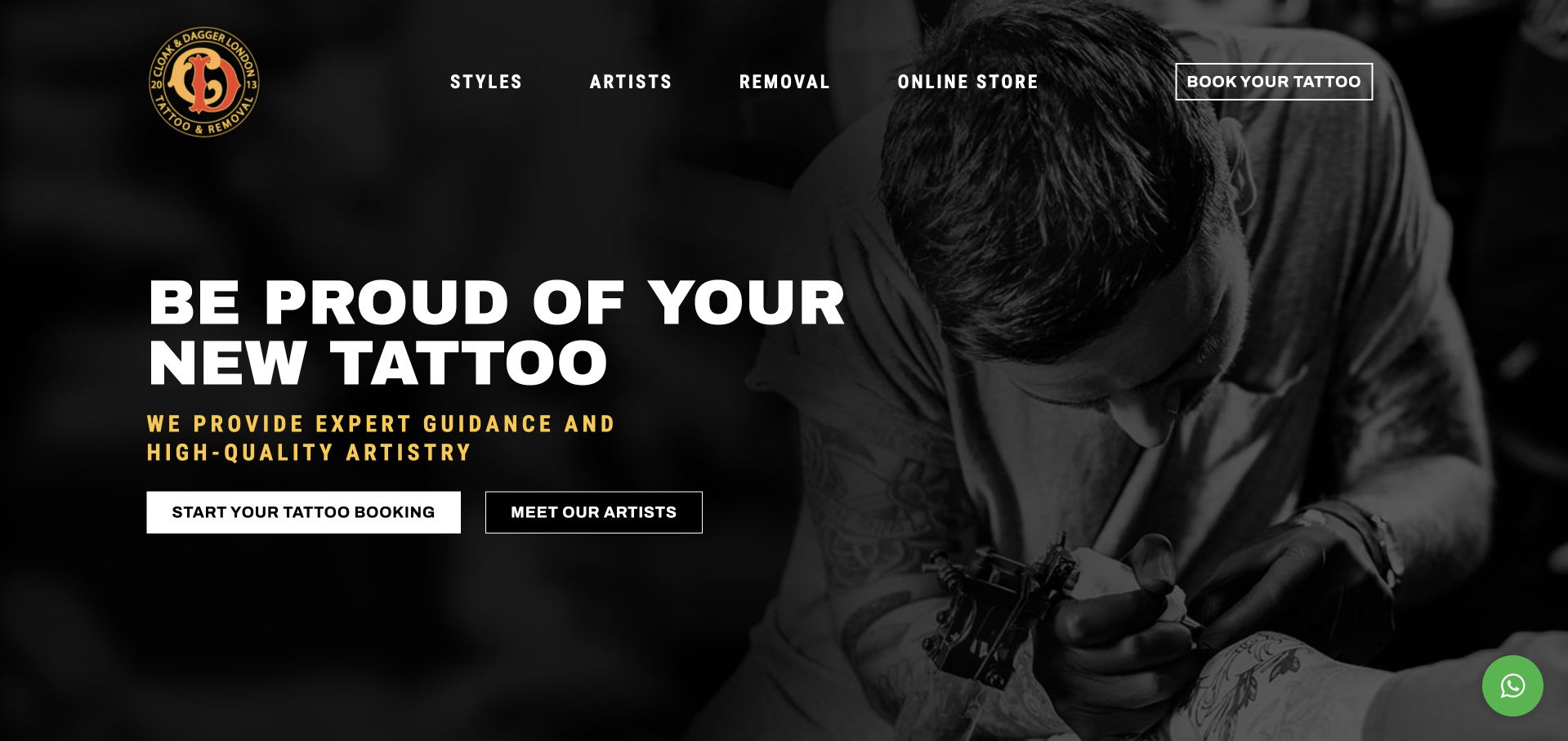
Cloak & Dagger places a black-and-white working photograph behind two clear actions: Start Your Tattoo Booking and Meet Our Artists. Styles and Artists are separate header destinations, recognizing that someone may know the kind of work they want before knowing its maker. Further down, walk-in information, contact details and a three-step consultation-to-appointment explanation make the service more understandable. The restrained yellow accents connect the illustrated mark to the page without competing with the artist image. It is a particularly useful small-studio example of visual character supported by a practical client journey.
What you can learn
Explain what happens before the appointment instead of treating every inquiry as a completed booking. Connect style galleries to named artists and keep walk-in expectations separate from a planned custom-design consultation.
Pros
The hero offers both an inquiry route and a way to investigate the artists.
A short process sequence explains consultation, scheduling and the eventual session.
Cons & considerations
If removal services share the website, keep their claims, qualifications and consent requirements distinct from tattoo design content.
If promotional confidence language is prominent, support it with specific portfolios rather than implying a website establishes safety or outcomes.
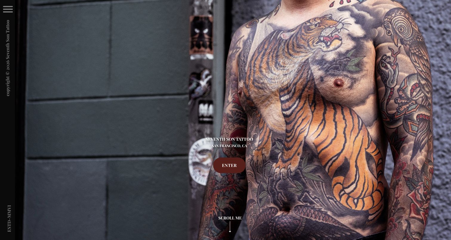
Seventh Son Tattoo opens with a large tattoo photograph, a narrow vertical identity strip and a small Enter button. The page names San Francisco without surrounding the work with sales copy. A side menu exposes Studio, Artists, Consult and FAQ, while the main composition preserves the scale and detail of the artwork. This is useful for a studio with a recognizable visual practice: the portfolio itself establishes the first impression. The minimalism also introduces friction for a visitor who wants an address or a specific artist immediately, since those practical routes rely on discovering the menu or entering the studio section.
What you can learn
Show the work at a scale that communicates its character, then provide a clear route from that image to the people and consultation process behind it. A dramatic entrance should not become an extra compulsory step for every returning client.
Pros
The photograph gives the actual tattoo work priority over generic studio claims.
The menu distinguishes artist discovery, studio information and consultation.
Cons & considerations
If navigation is reduced to an icon, check discoverability, keyboard labels and focus behavior.
If the image fills the viewport, preserve a useful crop on phones rather than losing the work's essential detail.
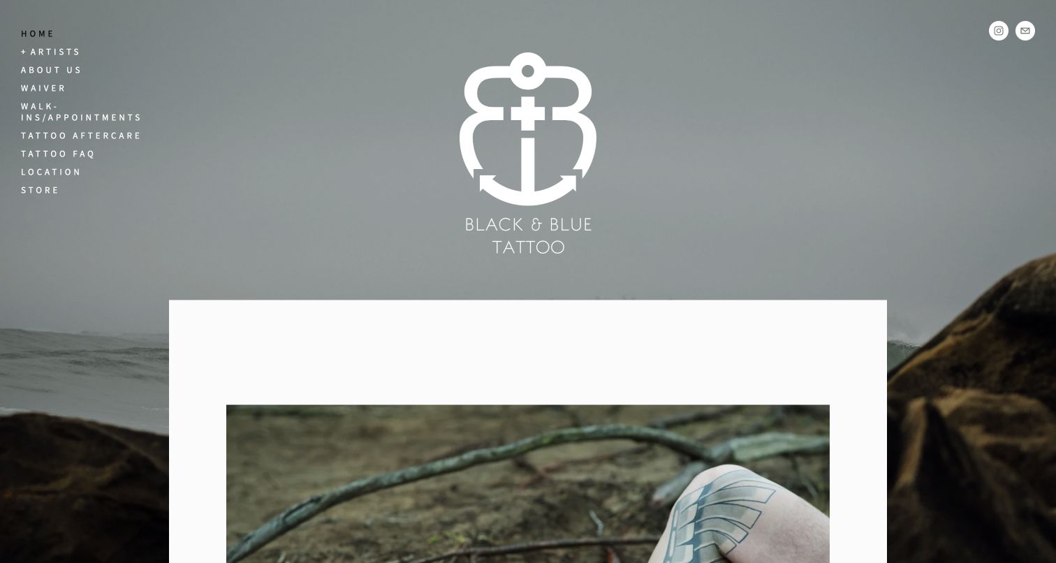
Black + Blue combines a coastal background, centered white identity and left-side navigation. The menu includes artists, appointments and walk-ins, aftercare, FAQs and location rather than a single vague contact destination. The body introduces its San Francisco address and directs appointment requests to the artists themselves. It also publishes a scent-free workplace note, an example of a specific arrival expectation that matters more than another generic welcome paragraph. The artistic presentation is understated, but the contrast and narrow stacked menu need attention when the background or available width changes.
What you can learn
Use studio-specific instructions to make practical content meaningful. When artists manage their own appointments, explain that division clearly and connect each portfolio to the correct inquiry route rather than letting all messages arrive in one unqualified inbox.
Pros
The navigation gives aftercare and location explicit destinations.
Appointment guidance explains that clients contact artists directly.
Cons & considerations
If a photographic background changes, verify that all small navigation text remains legible.
If an additional private studio is introduced, label its different location clearly so visitors do not assume every artist works at the main address.
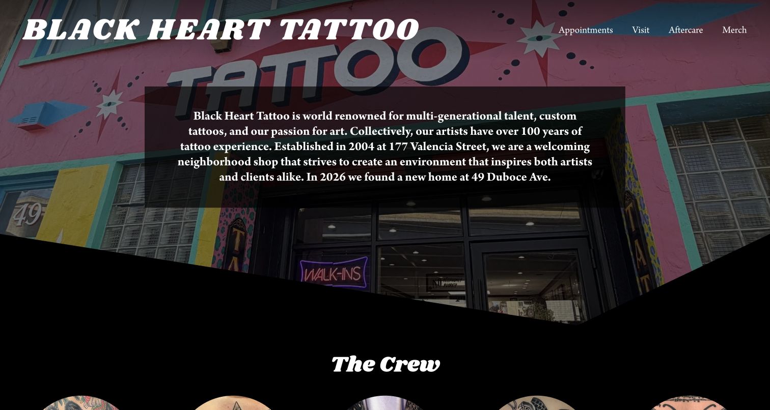
Black Heart Tattoo uses its colorful storefront as the backdrop to a short studio introduction. The large white wordmark and compact Appointments, Visit, Aftercare and Merch navigation keep the structure recognizable. The Crew section then presents individual artists, while booking inquiries and guest-artist dates have separate areas. The page is especially useful for studying a location change: the introduction mentions its new home and the footer supplies the current address. That practical update sits inside the studio story instead of being hidden in a social feed.
What you can learn
Use the physical shop as identity, but keep its address and relocation information explicit. A named roster helps visitors choose the right artist; guest appearances need dates and inquiry destinations rather than an undifferentiated collection of social links.
Pros
The storefront gives the introduction a recognizable sense of place.
Appointments, visiting information and aftercare remain distinct task routes.
Cons & considerations
If most portfolios open on social platforms, offer enough first-party information for visitors who cannot use those services.
If guest-artist dates rotate, maintain expired entries and provide an accessible stable list.
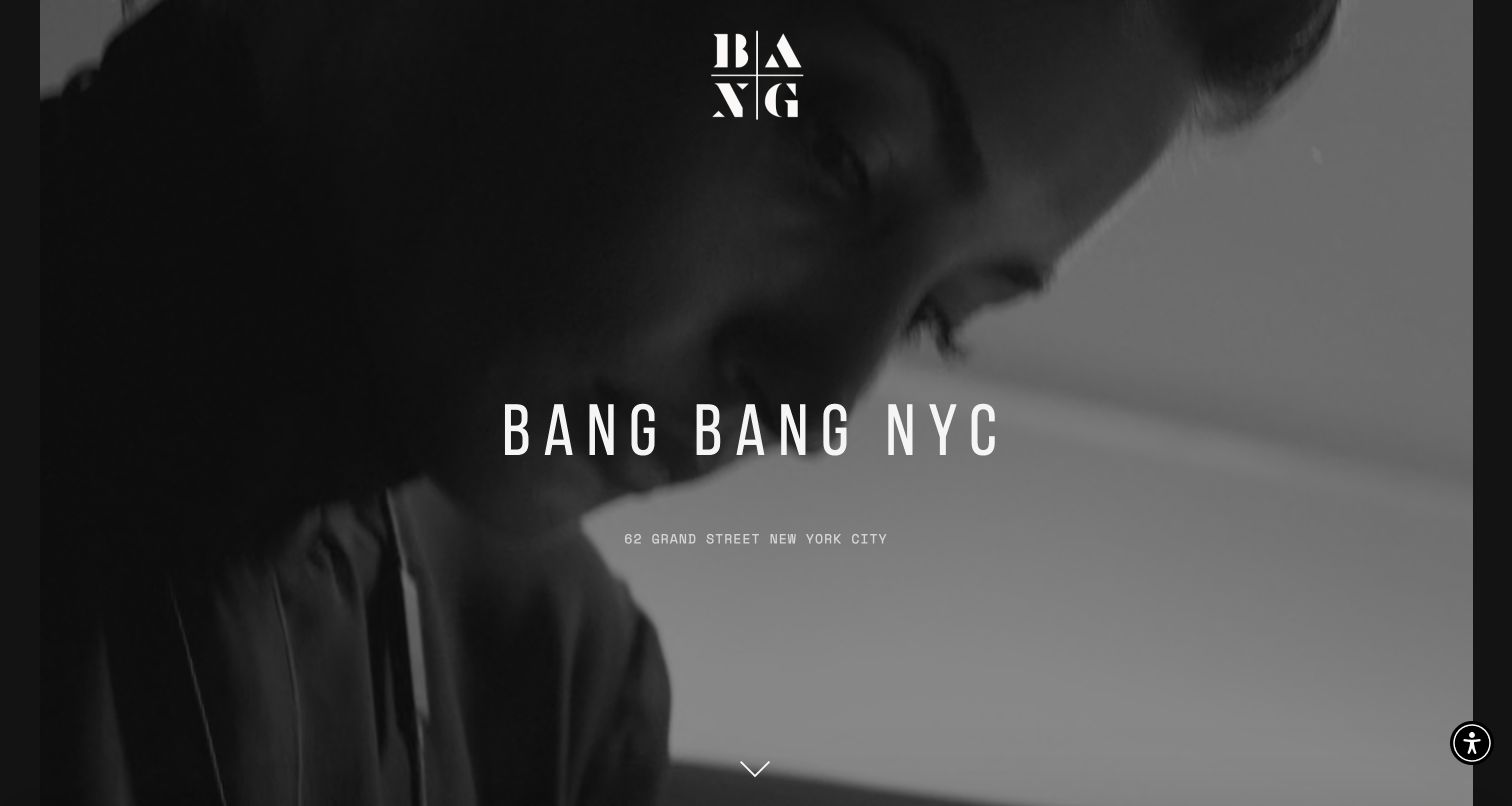
BANG BANG opens with a monochrome studio scene, a restrained wordmark and its New York address. The long page then gives contact and appointment information before an extensive artist roster. Each artist has a gallery route and a short specialty description, distinguishing fine-line, realism, illustrative color and other approaches. This detailed labeling is more useful for a prospective client than presenting an anonymous wall of tattoo images. The cinematic first screen is visually confident, though it delays the ordinary menu and booking cues compared with the more task-led sites in the collection.
What you can learn
Keep the emotional introduction brief enough that people can reach the roster. Use specialty descriptions to help visitors compare artists, and make the transition from an individual gallery to an appointment inquiry specific to that artist.
Pros
Artist introductions explain visual specialties instead of relying only on portraits.
Address, hours and appointment contacts are grouped in a dedicated information section.
Cons & considerations
If the hero relies on motion, provide a static fallback and reduced-motion behavior.
If the roster becomes very long, add usable navigation so clients can return to a chosen artist without scanning the whole page.
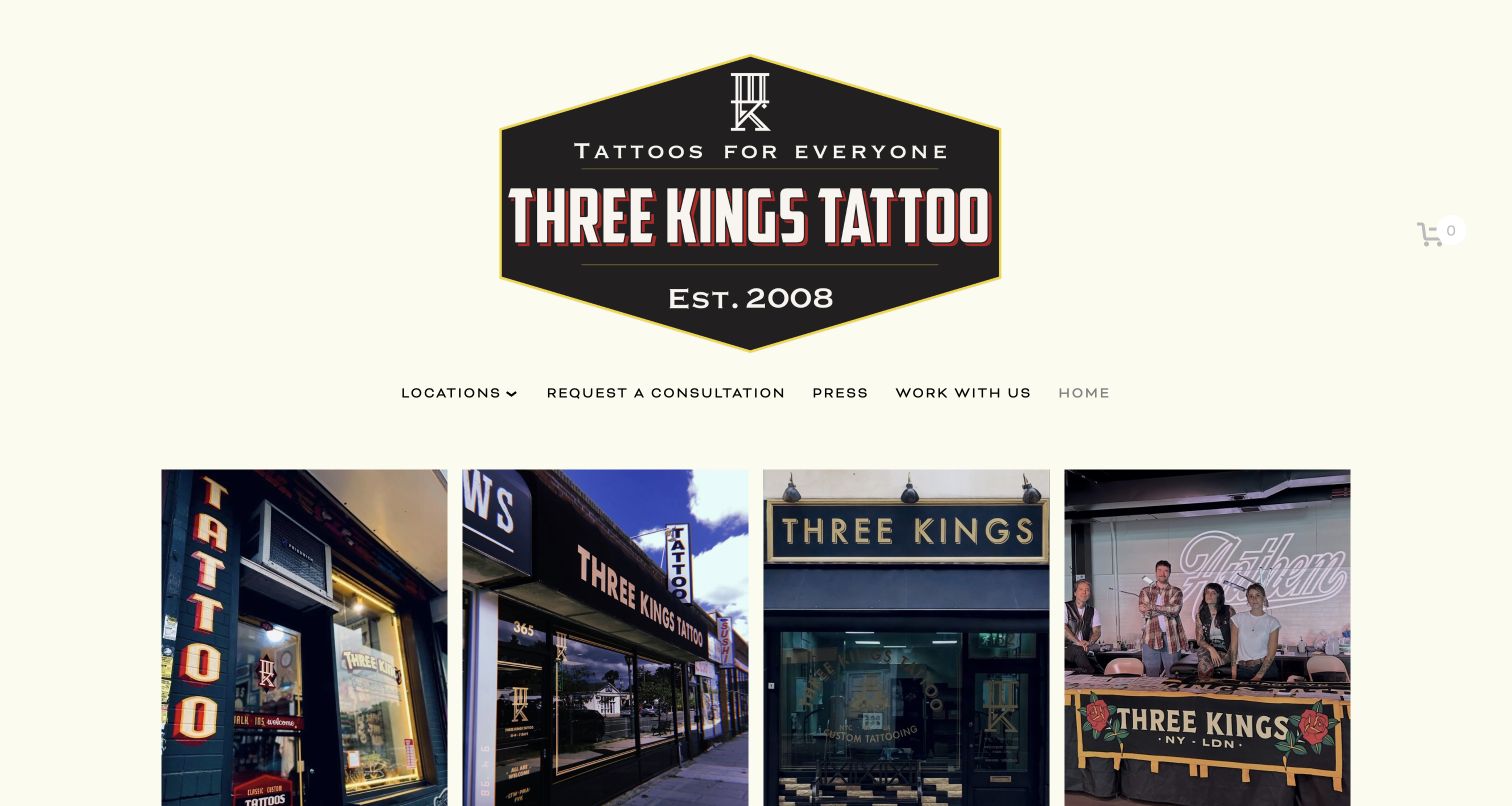
Three Kings gives Brooklyn, Long Island and London their own large photographic entrances, with Hire Us presented as a fourth route. A large badge-like identity and warm pale background hold those different images together. Consultation remains a named header action, and the footer repeats branch-specific addresses and contacts. The homepage therefore works as a routing layer rather than implying every artist is available at every studio. The longer story and latest events appear after those choices, preserving a quick starting point for a visitor who already knows the relevant city.
What you can learn
At group level, establish the location decision before exposing a single generic inquiry form. Event hiring is a different request from an individual tattoo, so it should have its own clearly labeled route and content requirements.
Pros
Large location photographs make the branch choices concrete.
Branch-specific footer contacts reduce ambiguity about where an inquiry belongs.
Cons & considerations
If the same artist works across locations, keep their current schedule and base clearly attached to the profile.
If a video cannot play, retain a useful image and text introduction rather than leaving an empty media area.
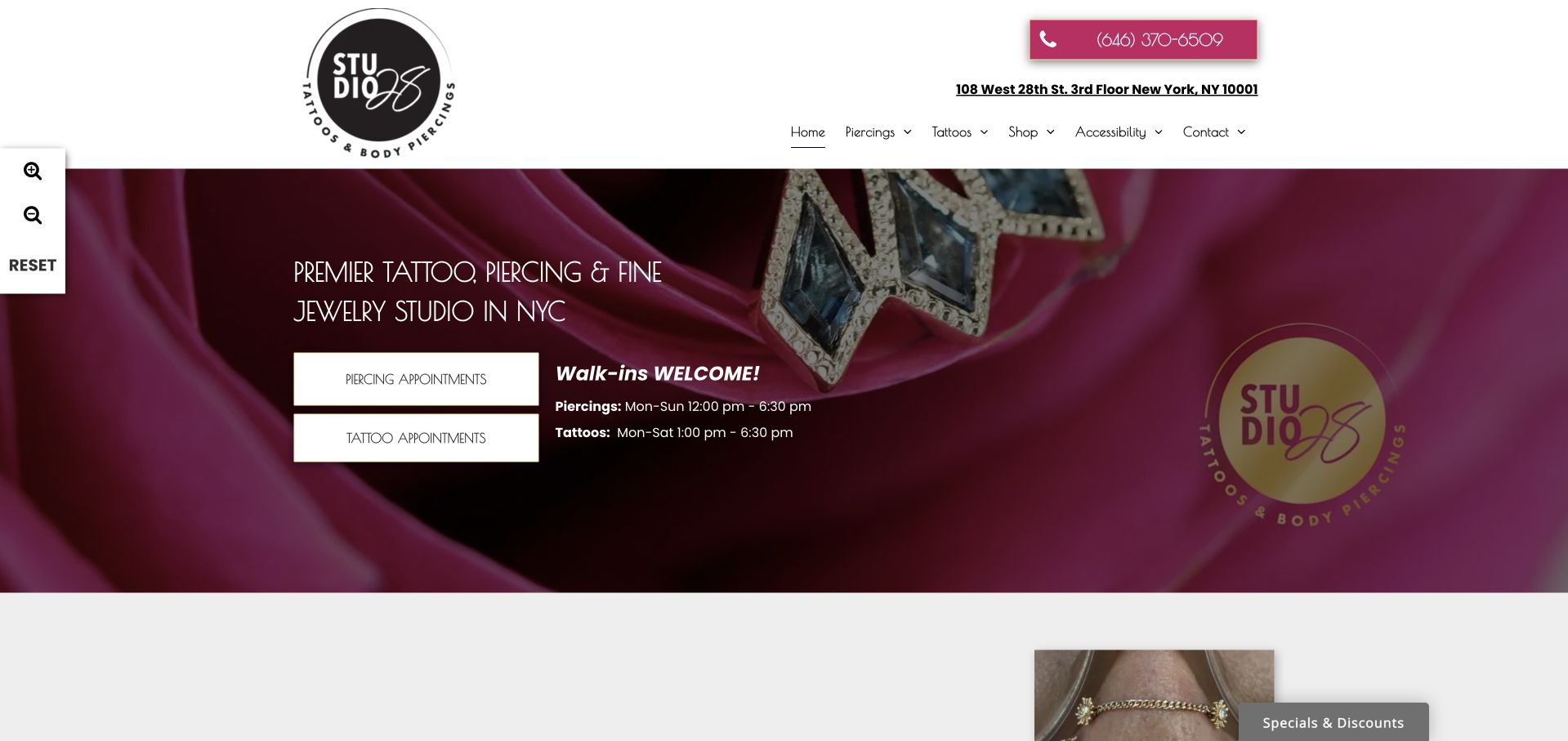
Studio 28 uses a burgundy photographic hero and two large buttons for piercing and tattoo appointments. The header publishes a telephone number and full floor-level address, while the hero distinguishes each service's walk-in hours. Menus mirror that separation with dedicated portfolios, FAQs and aftercare pages. This structure is useful because tattoo consultation and a piercing appointment are not interchangeable journeys. It also shows how contact clarity can coexist with a more decorative brand image. A secondary specials widget and an accessibility control panel share the viewport, making the complete overlay state worth evaluating.
What you can learn
Separate services when their preparation, portfolios and appointments differ. Put floor or entrance details alongside the street address, and label each service's hours rather than publishing one general schedule that visitors may misunderstand.
Pros
The first screen offers different appointment routes for tattoos and piercings.
The address includes the studio's floor, a useful practical detail.
Cons & considerations
If several floating widgets are enabled, test that they do not cover appointment actions or keyboard focus.
If credentials are mentioned for one service, avoid implying that they independently certify every other activity in the studio.
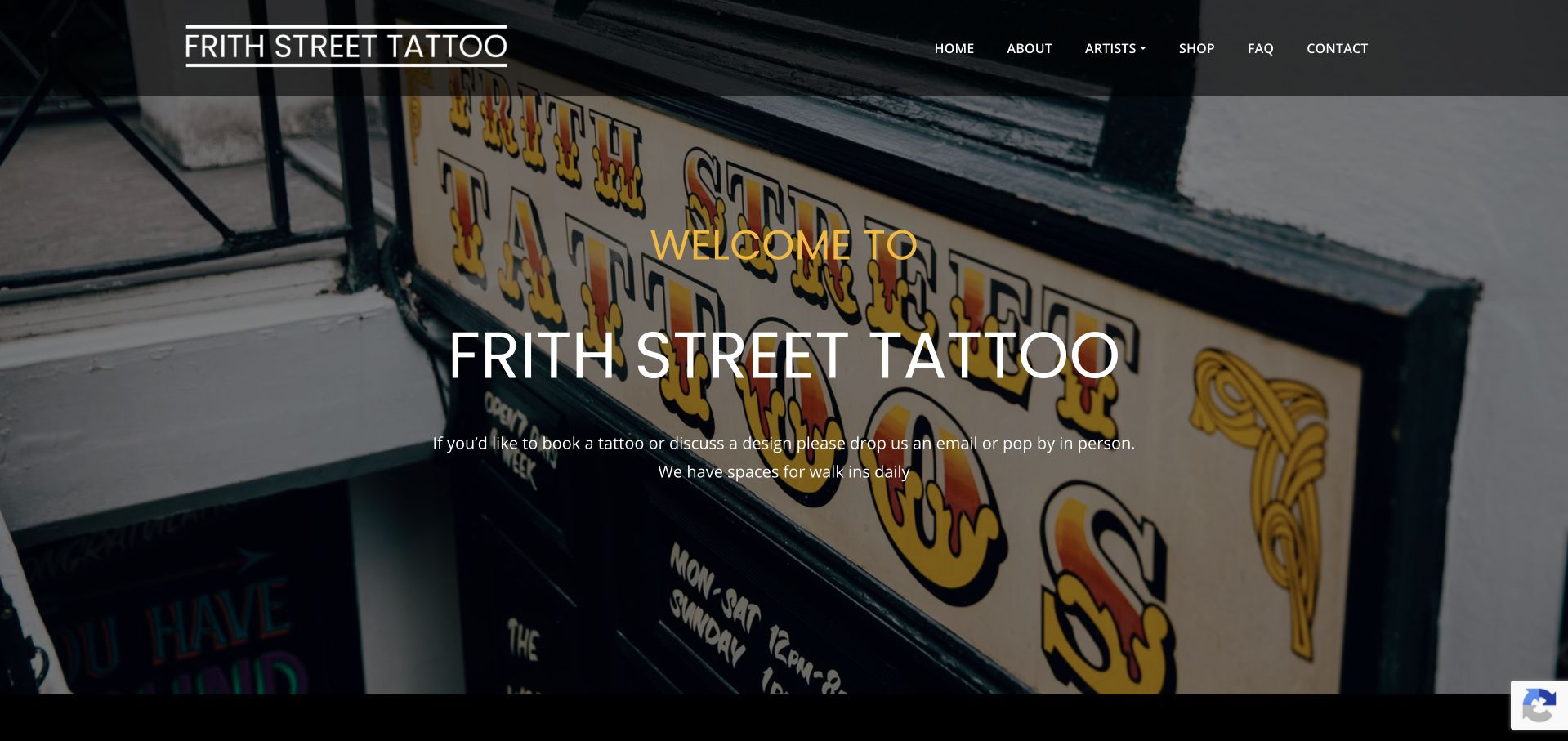
Frith Street Tattoo introduces itself over a photograph of its own sign, with ordinary About, Artists, FAQ and Contact navigation above. The welcome tells visitors that walk-in spaces are available and explains the option of discussing a design. Below, an inquiry form asks for the design idea, size, budget, preferred artist, references and dates. Those fields show what a custom request actually needs without pretending an open appointment is immediately guaranteed. The familiar frame and actual shop imagery make a clear, grounded contrast to more elaborate portfolio entrances.
What you can learn
Show prospective clients what information helps a studio respond. Label the form as an inquiry when an artist still needs to review the idea, and explain the difference between a walk-in possibility and a confirmed appointment.
Pros
The welcome addresses both walk-in visitors and custom-design inquiries.
Form fields gather design, size, artist and timing as separate inputs.
Cons & considerations
If reference images are requested, explain accepted formats, privacy and how uploads are used.
If the hero text overlays a detailed storefront image, test contrast and the mobile crop.
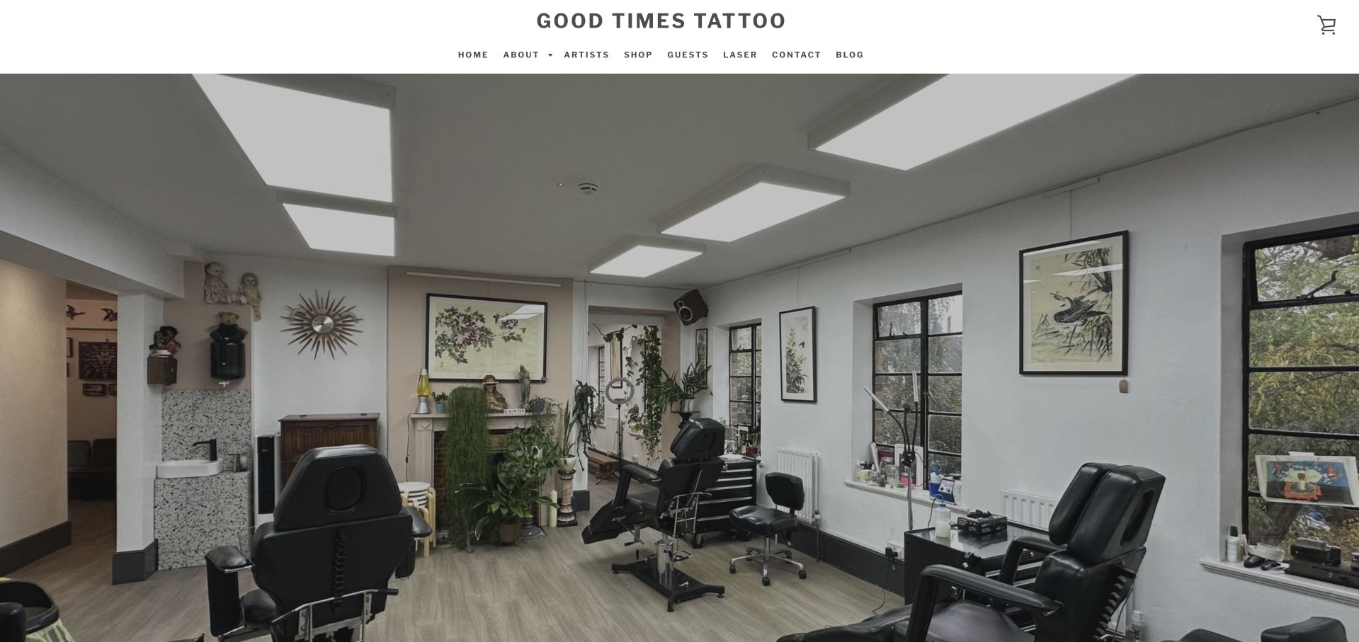
Good Times Tattoo uses a wide interior photograph beneath a simple wordmark and compact navigation. The page then explains custom tattooing in Hackney and offers Meet the Artists and Start Your Tattoo as distinct actions. Gift vouchers, artwork and other merchandise appear further down, giving the shop a commercial layer without making the initial introduction look like a product grid. The photograph is useful evidence of atmosphere, but it should not be mistaken for evidence of hygiene or service quality. Separate laser-related content also makes the service boundaries important.
What you can learn
Let the real studio establish atmosphere, then help visitors choose between exploring the artists and initiating a custom project. Keep merchandise and separate treatment services clearly labeled so they do not become accidental steps in a tattoo inquiry.
Pros
The interior image conveys the studio's setting without a stock visual.
Artist discovery and project initiation have separate labels.
Cons & considerations
If the homepage uses an autoplay interior video, provide a still image and accessible controls.
If laser or skin services are promoted, keep their claims and consultation requirements separate from tattoo portfolio content.
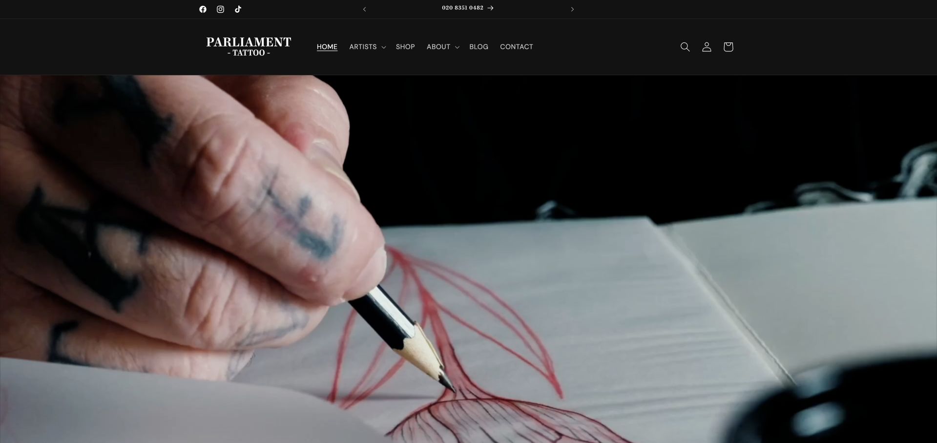
Parliament Tattoo frames its homepage with black navigation and a close-up moving image of drawing. Artists, Shop, About, Blog and Contact are kept as plain text destinations, while the footer explicitly describes custom tattooing by appointment. Aftercare and FAQs remain separate quick links. The creative-process image emphasizes that the service begins with art rather than only a finished result. Its shop account and cart controls also show the challenge of using a commerce-oriented structure for a consultation-led studio: a merchandise transaction and a tattoo appointment need clearly different expectations.
What you can learn
Use process imagery to show the making of the work, but retain ordinary routes to portfolios and appointment information. A cart should describe merchandise purchases, not imply that a custom tattoo can be confirmed without an artist's review.
Pros
The navigation distinguishes artists from the merchandise shop.
Aftercare and FAQs have named first-party routes.
Cons & considerations
If the first screen depends on a video, provide a useful poster frame and motion controls.
If commerce account controls dominate the header, ensure appointment discovery remains clear for visitors who are not buying products.
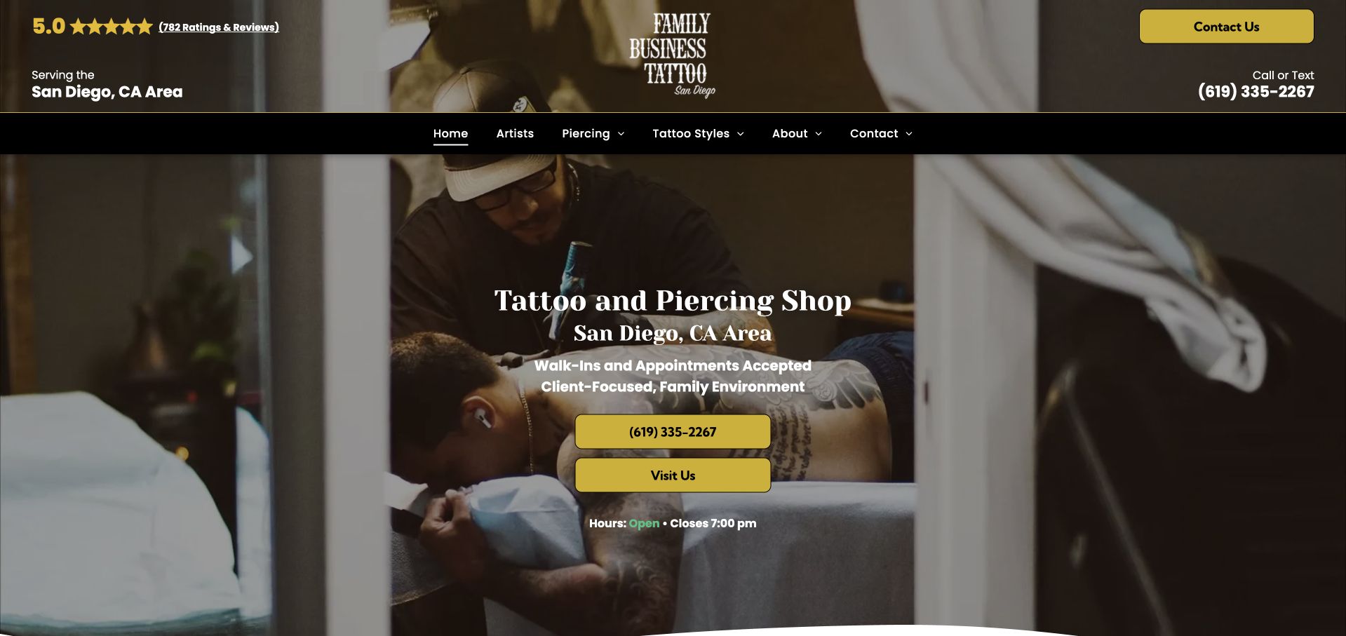
Family Business Tattoo San Diego opens with the service and region spelled out over a working-studio photograph. Contact Us, a call-or-text number and Visit Us make the next steps concrete. The menu separates artists, piercing and tattoo styles, while later sections use portfolios and service cards to expand the offering. The yellow accents are consistently assigned to actions rather than scattered across every line. The page also carries prominent review and experience claims, demonstrating the need to keep marketing evidence current and avoid letting a star display substitute for relevant work.
What you can learn
Name the actual service area and distinguish a phone inquiry from arriving at the shop. Follow trust language with artist-specific work, and keep the website's claims separate from any independent assessment of safety, credentials or tattoo quality.
Pros
Region and service type are immediately understandable.
Call, text and visiting routes match practical local-business tasks.
Cons & considerations
If review totals appear in the header, maintain their source and date.
If experience figures are repeated across sections, keep one governed value so different totals do not conflict.
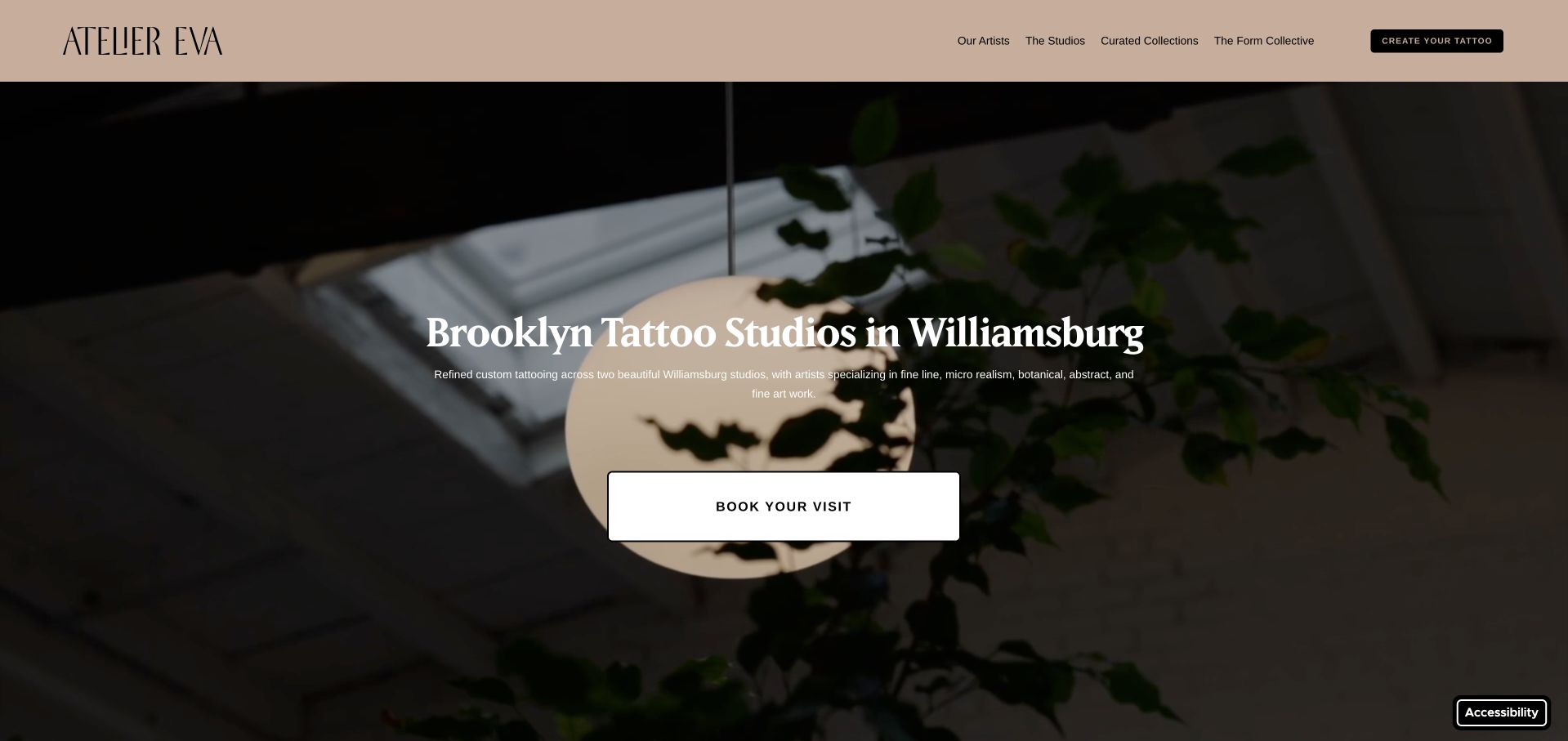
Atelier Eva uses a muted warm header and a studio-interior hero rather than the familiar dark tattoo aesthetic. The first screen identifies Williamsburg and explains the range of work before a prominent visit button. Its navigation separates artists, studios and curated designs, and the longer page labels individual artists by specialties and resident or guest status. Two named locations have their own addresses. This gives the refined visual direction a useful operational foundation: visitors can understand both who might make the work and where they would attend.
What you can learn
Translate an elevated visual identity into specific choices. Artist specialties, guest status and exact studio addresses do more to support a custom inquiry than repeating premium language; connect those details to the intake process before asking for a commitment.
Pros
Artist cards explain specialties and distinguish resident from guest status.
Separate studio addresses support a two-location experience.
Cons & considerations
If the main action opens an external intake form, explain that transition and provide a usable alternative contact.
If video fails, retain readable introductory text and a deliberate image fallback.
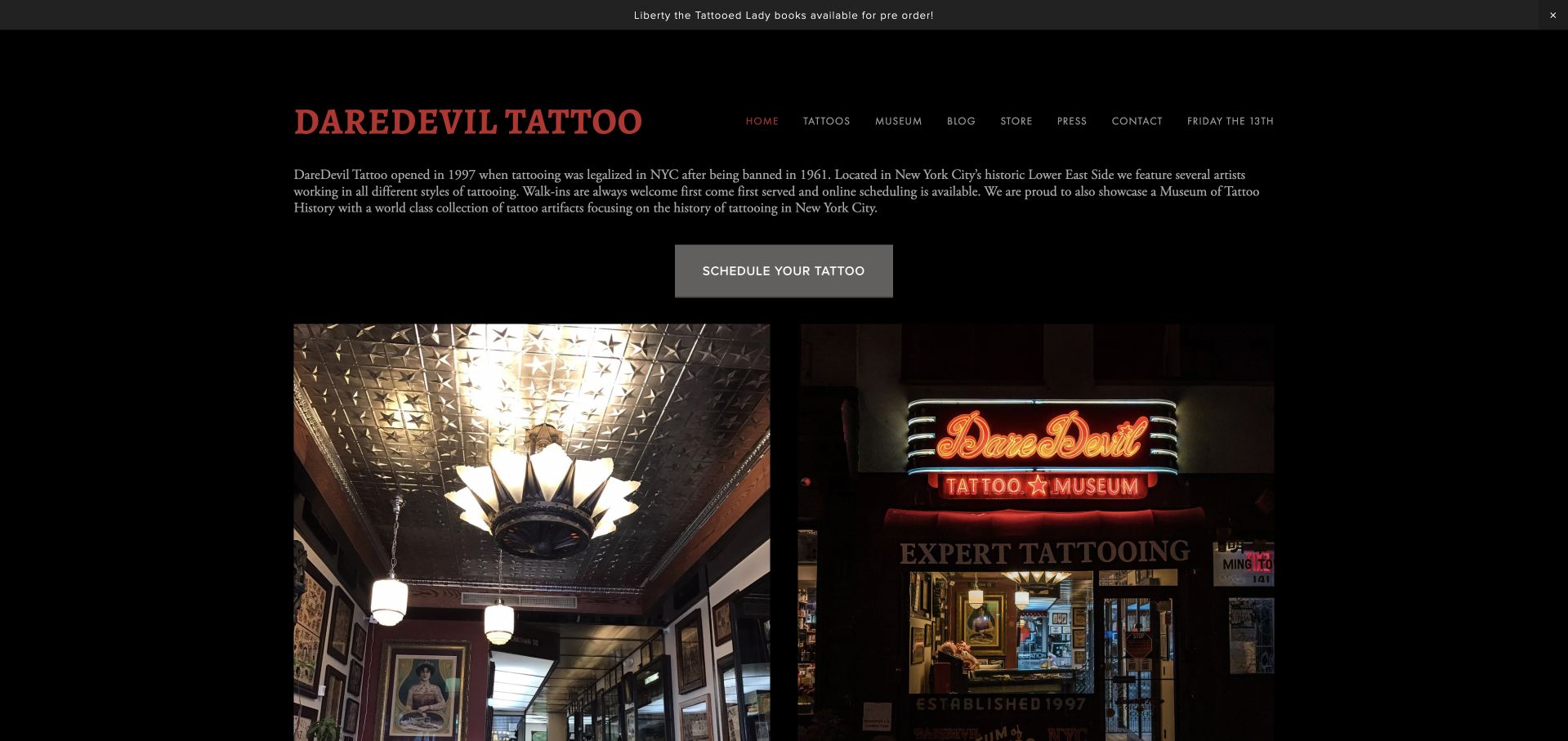
Daredevil Tattoo introduces its Lower East Side shop and museum in readable text, then gives Schedule Your Tattoo a distinct button above two photographs of the actual place. Museum and Tattoos are separate navigation destinations, allowing the cultural story to coexist with an ordinary appointment journey. Below, archival photographs and a long history section explain the shop's context. This is a valuable example of differentiation through real material rather than decorative nostalgia. The history is extensive, so the booking route must stay recognizable to clients who are not there to read the archive.
What you can learn
Give a substantial historical story its own navigation and evidence, while keeping practical studio attendance direct. Label archival photographs as archival so visitors do not confuse a former shop interior or address with the place they should visit today.
Pros
Museum and tattoo journeys are named separately.
The appointment action appears before the extended history.
Cons & considerations
If old photographs are used, retain dates and captions distinguishing former and current locations.
If long quotations appear in history content, review permissions, source attribution and readability rather than treating them as filler.
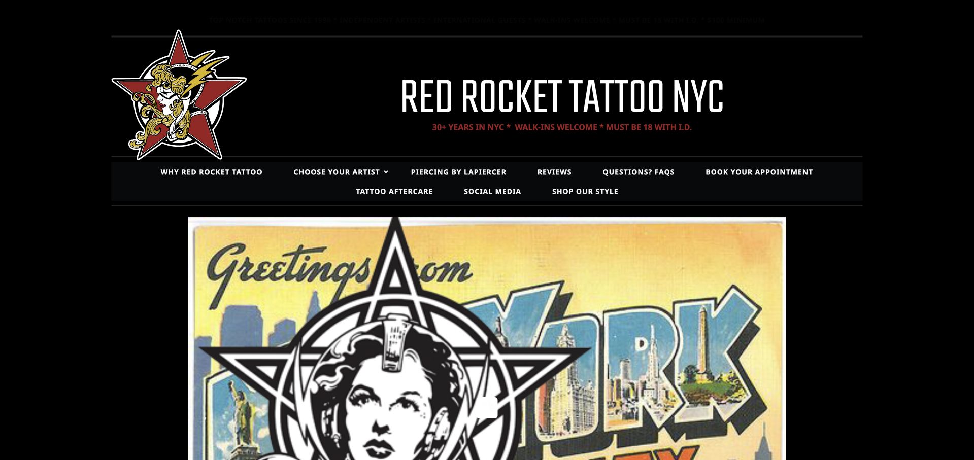
Red Rocket uses an illustrated emblem and large condensed wordmark against a dark canvas. Its navigation names Choose Your Artist, appointment booking, FAQs and aftercare, and the page supplies a floor-level address and ordinary hours. The body presents individual artist destinations rather than one blended portfolio. This is useful for studying a more traditional tattoo identity that still makes everyday tasks explicit. The density of header labels is the main tradeoff: many useful destinations compete for attention, and small dark-red text can recede into the black background.
What you can learn
Keep a strong illustrated identity, but assign clear visual priority among the many tasks. Artist selection and booking are usually different stages; support both without making every secondary policy and shop link equally prominent in the header.
Pros
Artist discovery and aftercare are explicit named routes.
The location includes the floor and contact details.
Cons & considerations
If small red text sits on black, check contrast rather than assuming the brand palette is automatically readable.
If several booking links exist, verify that they all resolve to maintained destinations and explain the same process.
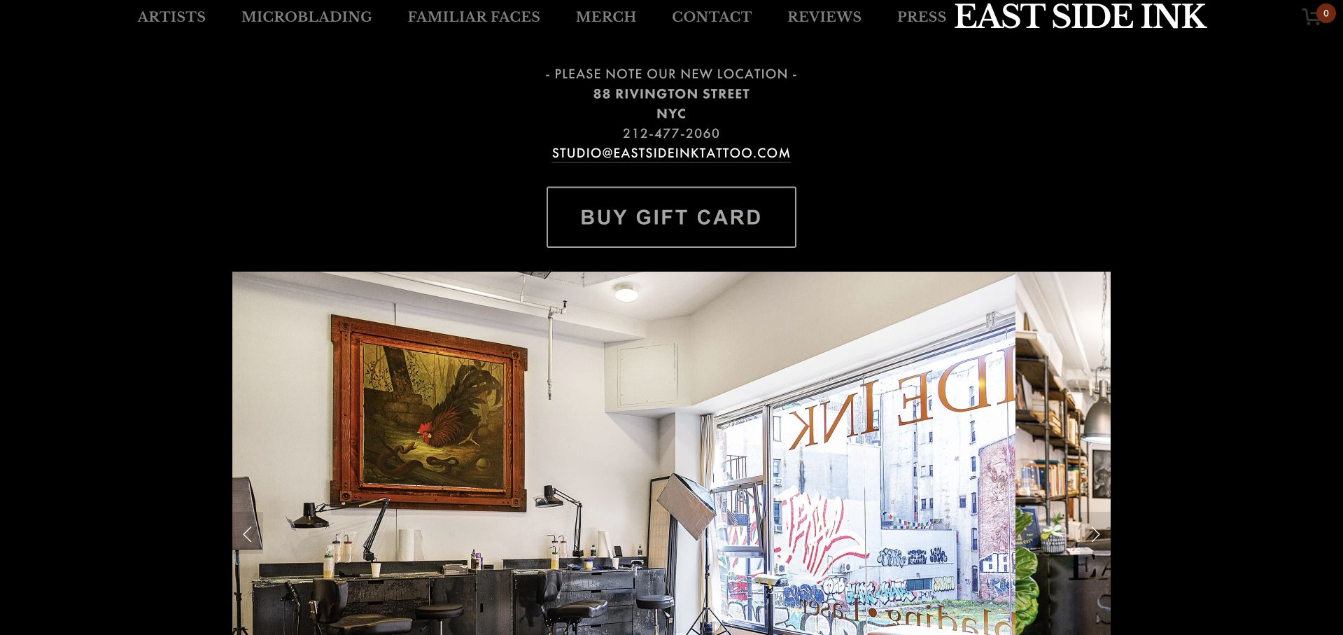
East Side Ink places its new Rivington Street location and contact information before a large interior-image gallery. The dark frame and restrained navigation let the room photographs establish the atmosphere. Artists remains the first menu destination, and the text below explains the studio's custom-work identity before a further roster link. The homepage is useful as an operational example as much as a visual one: an established business has to correct habitual visitor expectations after moving. The gift-card button is prominent too, which makes the distinction between buying credit and arranging a custom tattoo important.
What you can learn
Treat relocation as a high-priority content change across the whole site. Include floor and entrance details, update every contact destination, and keep the custom-work inquiry recognizable even when merchandise or gift cards are being promoted.
Pros
The current-location notice appears before the image gallery.
The interior gallery introduces the real environment rather than a generic campaign.
Cons & considerations
If an image carousel rotates automatically, provide pause controls and useful alternative text.
If gifts are a major action, avoid implying that purchasing a card reserves an artist or appointment.
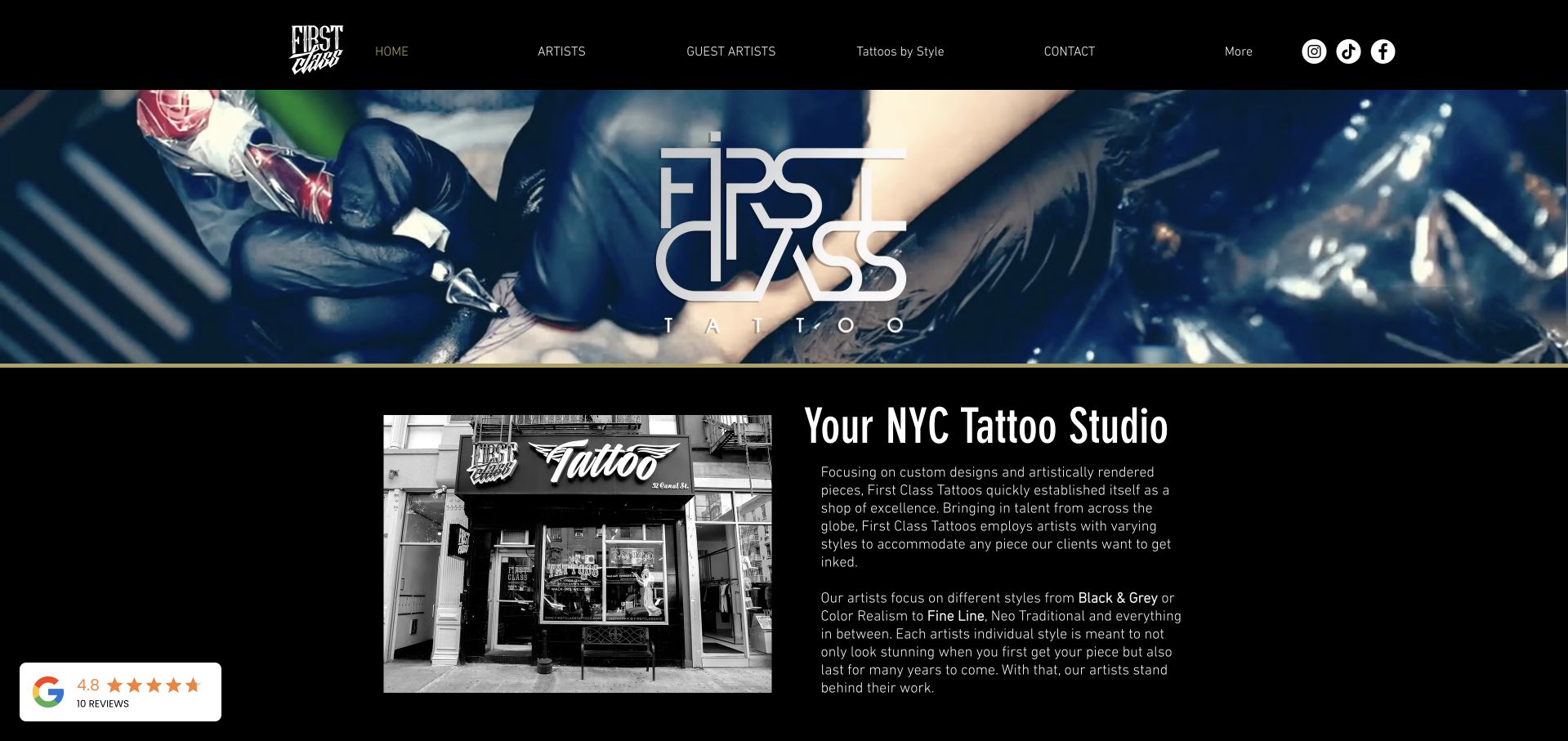
First Class Tattoo combines a close-up working photograph and large brand treatment with a shop-front image and New York introduction. Artist, guest-artist and tattoo-style navigation create different ways into a broad portfolio. A Request a Time section later asks for an artist, design description, style and references. That structure is useful because a client may arrive with either a preferred maker or a visual direction. It also distinguishes an initial request from an automatically confirmed appointment. The number of style cards and form fields means hierarchy and explanation matter more than simply adding further images.
What you can learn
Offer artist-led and style-led discovery, then let both feed an informed inquiry. Explain which details are needed now, which can be discussed later, and whether sending the form creates only a request rather than a reservation.
Pros
The page supports both artist and style-based browsing.
The inquiry distinguishes design details, preferred artist and reference material.
Cons & considerations
If the form includes image uploads, provide clear limits and privacy expectations before submission.
If many style pages are created, keep their examples specific rather than publishing repetitive location-keyword content.
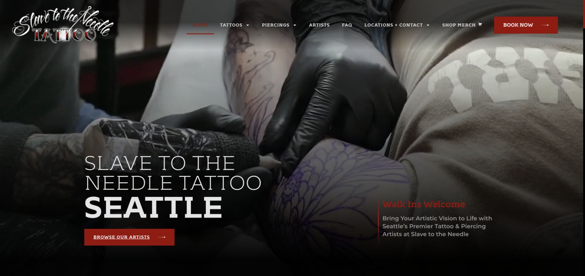
Slave to the Needle uses a close-up tattooing scene, a large Seattle introduction and Browse Our Artists as the main hero action. Book Now remains in the header, while the footer separates Ballard and Wallingford addresses and contacts. The page therefore encourages visual fit before an appointment request without removing a direct route for returning clients. Its red-and-black palette and decorative wordmark fit the work-focused imagery, but small red text over a dark photograph needs careful contrast review. A studio-interior carousel adds context beyond the close-up hero.
What you can learn
Help someone find the right maker before asking them to describe a permanent custom project. For multiple locations, attach an artist's working base to their profile and inquiry route rather than making a footer address list carry that entire responsibility.
Pros
The primary action encourages exploration of the artist roster.
Each branch has a distinct address and contact route.
Cons & considerations
If red labels overlay dark media, check contrast in all frames and responsive crops.
If both branches share an inquiry component, ensure the chosen location remains visible and reaches the correct team.
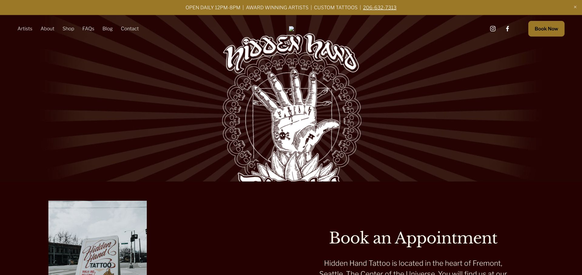
Hidden Hand's burgundy-and-gold page uses a large illustrated hand motif and a visible Book Now button. The opening content explains its Fremont setting, followed by a separate We Have Moved section with the new street address. Artist discovery, FAQs and contact remain ordinary text links across the top. This is a useful example of a visually assertive identity supported by practical content, but it also exposes a maintenance issue: older blog items and external social destinations need the same attention as the main hero. The website is not improved simply by adding a feed if that feed is stale or misdirected.
What you can learn
Give a move its own clear announcement and verify every map, footer and social destination during the update. A distinctive illustration can anchor the design, but it should not distract from correcting information people use to arrive at the shop.
Pros
A persistent booking button is separate from the decorative identity.
The relocation has a dedicated address section rather than only a passing mention.
Cons & considerations
If old news is surfaced on the homepage, date it clearly and decide whether it still helps current visitors.
If social links are inserted from a theme, replace generic provider destinations and test them individually.
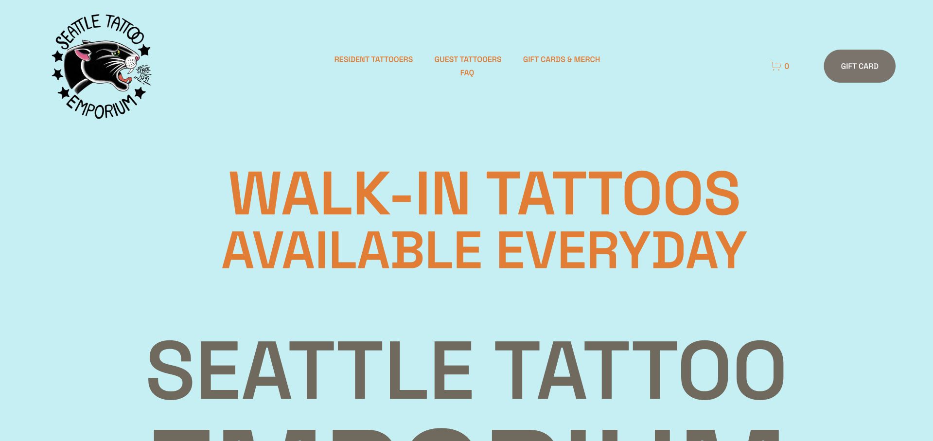
Seattle Tattoo Emporium uses an unusually light blue canvas, a panther mark and oversized orange lettering to emphasize walk-in availability. The navigation separates resident and guest tattooers, while later content supplies opening hours, pricing structure, parking guidance and the studio address. This is useful because walk-in messaging can be more actionable than a generic Book Now button, provided the practical conditions stay close. The page also offers history and a storefront walkthrough, connecting a longstanding identity to the actual place without making every visitor read that history first.
What you can learn
If walk-ins are central, explain what that means operationally: when to arrive, how availability works and whom to contact. Keep the current address and pricing policy maintained separately from historical claims or decorative establishment dates.
Pros
The first screen communicates walk-in availability immediately.
Parking and pricing guidance address real pre-visit questions.
Cons & considerations
If huge headings push practical facts far down, provide a compact route to hours and location.
If historic superlatives are used, treat them as sourced editorial claims rather than assuming an old establishment date proves a ranking.
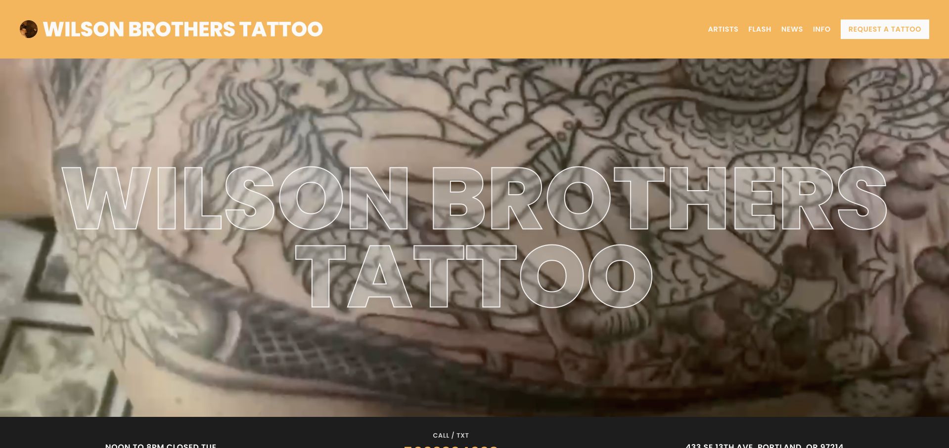
Wilson Brothers Tattoo uses a warm yellow header, a large outlined wordmark over tattoo imagery and a concise information strip. Artists, Flash, News and Info are named separately, with Request a Tattoo distinguished on the right. The page explains that it was formerly Scapegoat Tattoo and gives the Portland address, making the rename understandable. A short roster and a walk-in request section support the different ways a client may approach the shop. The outlined hero type is expressive but has limited contrast against detailed artwork, an important constraint when borrowing the technique.
What you can learn
Explain a rename without losing the useful history or current contact information. Separate available flash from a custom request, and state whether choosing a time sends an inquiry or guarantees a session before a visitor invests effort.
Pros
Flash and custom-tattoo requests are different named destinations.
The former name is explained within the studio's own story.
Cons & considerations
If outlined typography overlays busy imagery, test readability at smaller sizes and offer a solid-text alternative.
If walk-in times load asynchronously, provide a useful fallback rather than leaving a permanent loading message.
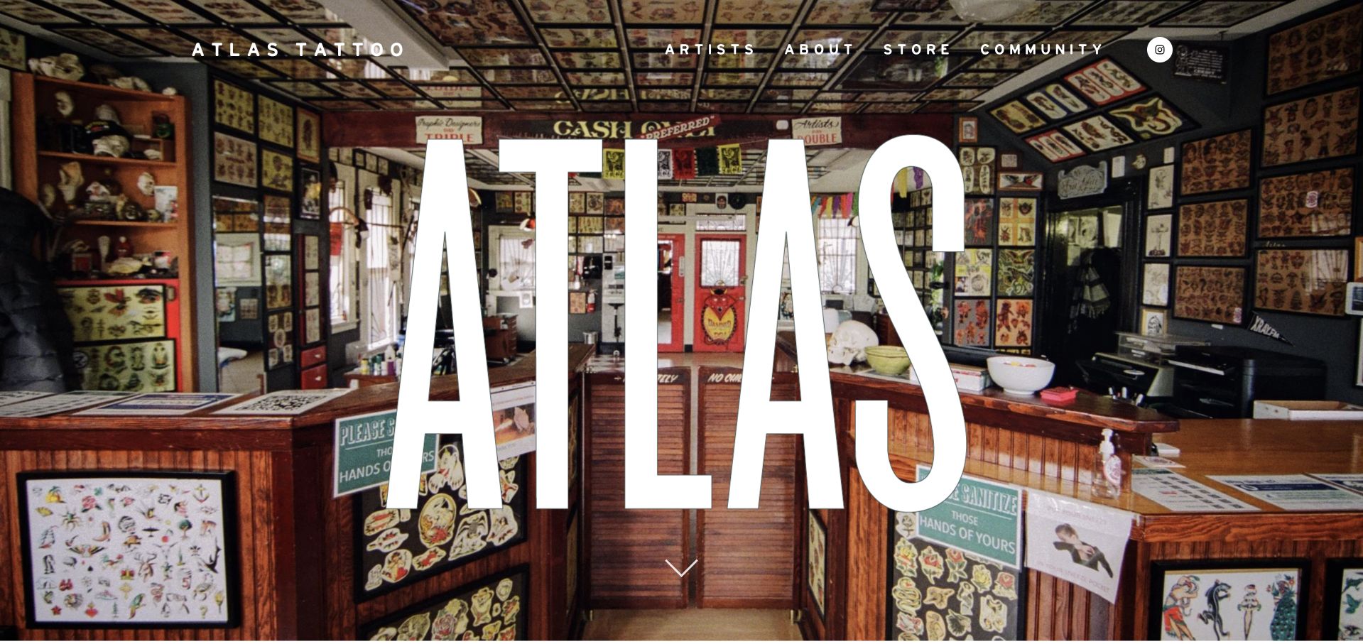
Atlas opens with a full-width photograph of its art-filled interior and a giant white wordmark. Below, the Portland introduction and roster lead into unusually useful practical information: hours, ordinary appointments, same-day call-ins and pricing are separated. The page explains that artists have different booking and payment practices, directing visitors to individual profiles. This is a valuable content pattern for a collective. It avoids implying that one central appointment control describes every artist's process, while retaining a recognizable shared studio identity.
What you can learn
When artists work differently, document the common studio rules and the profile-specific exceptions. Explain same-day attendance separately from future appointments, and keep payment expectations visible before someone arrives rather than introducing them only at the end of a consultation.
Pros
The homepage distinguishes planned appointments from a daily call-in list.
Artist-specific booking and payment differences are acknowledged directly.
Cons & considerations
If the giant hero wordmark occupies most of a small screen, preserve an obvious route to the practical content.
If prices are published, maintain one source and clarify what is a minimum, hourly rate or piece-specific quote.
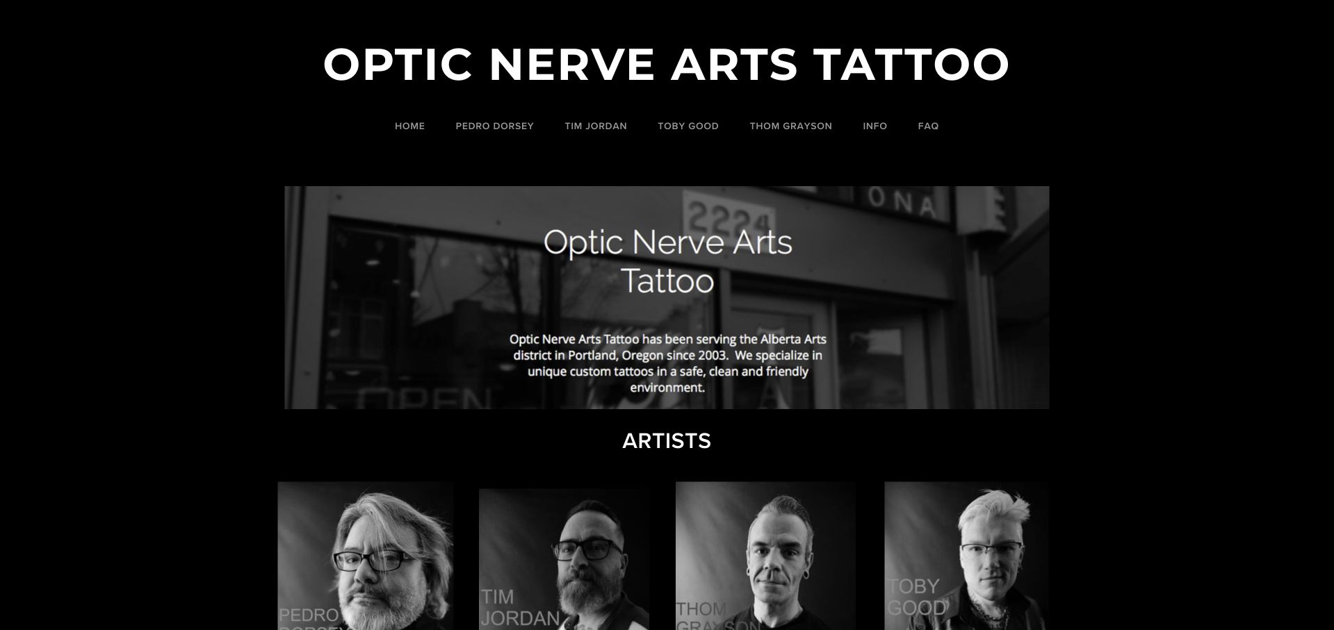
Optic Nerve Arts uses a dark canvas, a straightforward studio heading and a row of four named artist portraits. The same artist names also appear in the navigation, while Info and FAQ have separate destinations. A studio introduction and contact details make this a small, understandable directory rather than an endless gallery. Its simplicity is useful for a collective whose clients mainly need to choose a person. The design also shows the limitations of relying on short generic image labels: a visually clear portrait grid still needs meaningful names and links for nonvisual navigation.
What you can learn
For a small roster, direct named links can be more useful than a complex filter. Keep each portfolio and contact process current, and ensure the accessible link name identifies the artist rather than merely describing the element as a picture.
Pros
A short named roster makes artist selection uncomplicated.
Info and FAQ remain distinct practical destinations.
Cons & considerations
If portrait links expose only generic image labels, supply accessible artist names.
If the studio has moved, update geographic wording throughout the introduction, metadata and address rather than only changing the footer.
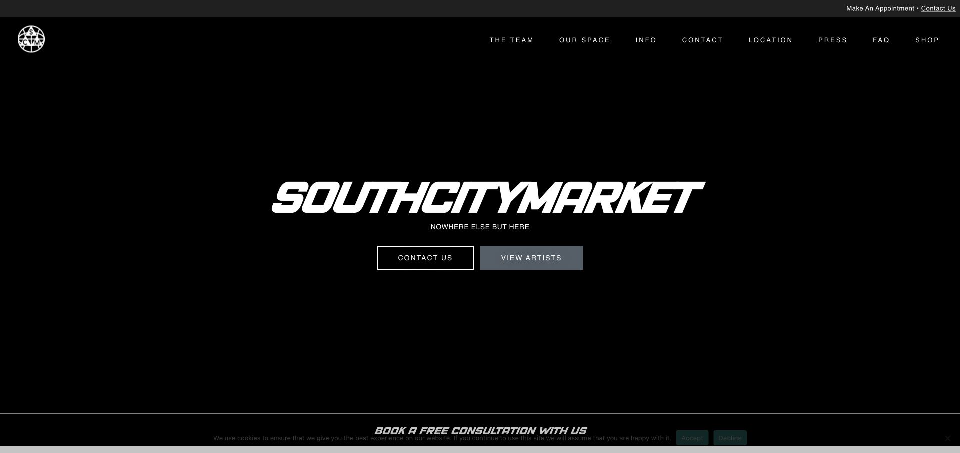
South City Market opens with a dark, minimal brand statement and two actions: Contact Us and View Artists. The header separates team, space, information, location and FAQs, while the page below explains the consultation process and the details an inquiry should contain. That structure gives an uncluttered first impression without reducing everything to one unexplained booking form. The long supporting copy is also instructive: a simple hero does not excuse repetitive or conflicting service descriptions. The relevant artist work and actual studio location must remain easy to identify.
What you can learn
Use a minimal entrance to clarify the next decision, then make supporting information precise. A person should be able to inspect the artists before sending a request and understand which details the studio needs to recommend an appropriate consultation.
Pros
Contact and artist discovery receive equal visual weight.
Location and studio-space information have separate header routes.
Cons & considerations
If long service copy lists many styles, reconcile it with the actual portfolio and current specialisms.
If essential hero imagery fails to load, ensure the remaining heading and controls still form a deliberate, usable entrance.
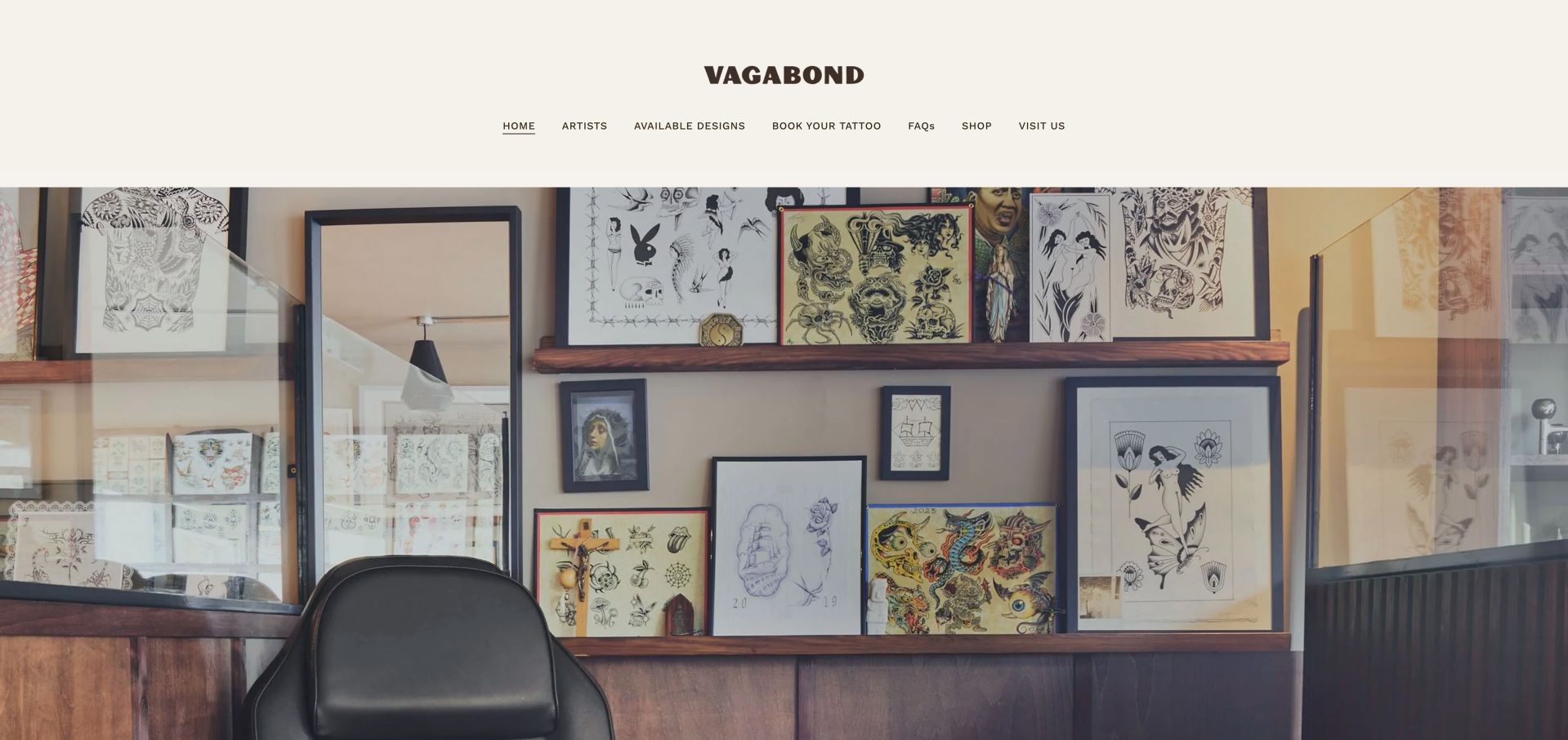
Vagabond uses a cream header, dark wordmark and a wide image of its real studio's art-covered walls. The navigation names Artists, Available Designs, Book Your Tattoo, FAQs and Visit Us, giving visitors several concrete ways to investigate the work. The page's short introduction and making-process photograph then explain its custom approach. Press quotations appear later rather than replacing the initial studio and portfolio routes. This is useful for borrowing a gallery-like visual tone without obscuring the practical distinction between an available design and a new commission.
What you can learn
Keep available designs and custom projects distinct, and tell visitors where each route leads. A real studio photograph can establish atmosphere quietly, while named navigation carries the work of helping clients compare artists, inspect designs and plan a visit.
Pros
The header separates available designs from booking a custom project.
Actual studio and process photographs reinforce the quiet visual direction.
Cons & considerations
If press quotations are used, preserve accurate source links and dates.
If the header becomes tall on mobile, keep the primary inquiry and visit routes within easy reach.
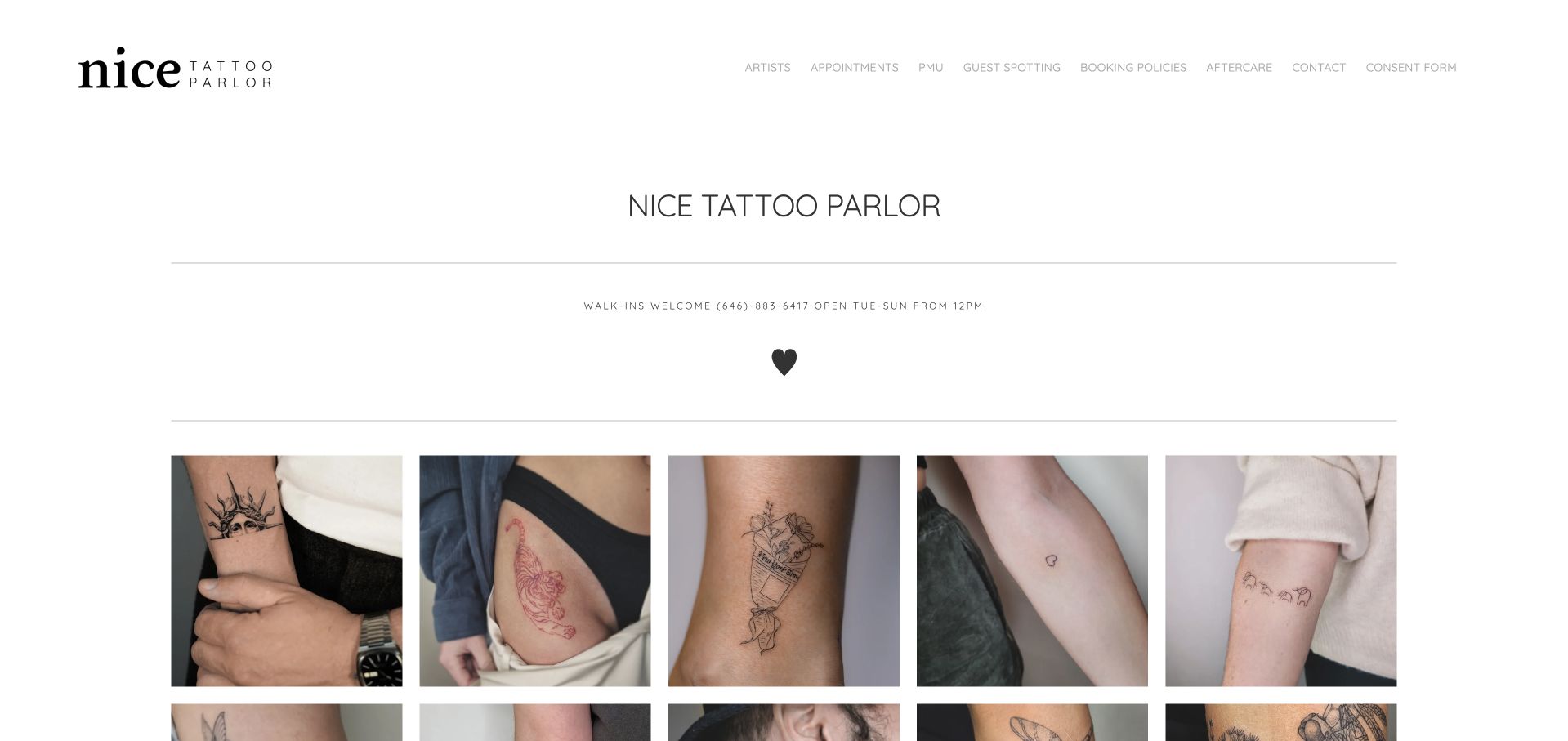
Nice Tattoo Parlor uses a white canvas, restrained serif identity and a dense gallery of finished tattoos. A short walk-in message and phone number appear above the grid, while navigation includes Artists, Appointments, Booking Policies, Aftercare and Contact. The visual tone is deliberately quiet and open, letting small individual pieces become the main content. It is useful for studying how a studio can feel approachable without relying on a long reassurance statement. The grid's volume also raises the need to preserve artist attribution and meaningful descriptions as people explore.
What you can learn
A welcoming visual tone should be backed by clear process and policy content. Use finished-work galleries to help clients recognize a style, but connect individual examples to the artist rather than presenting the studio's collective output as interchangeable.
Pros
Booking policies and aftercare are first-class navigation destinations.
The light gallery gives finished work a calm, uncluttered presentation.
Cons & considerations
If dozens of images load at once, optimize their sizes and preserve layout while they arrive.
If a separate consent form is linked, distinguish it from an ordinary inquiry and avoid implying that viewing the gallery requires agreement.
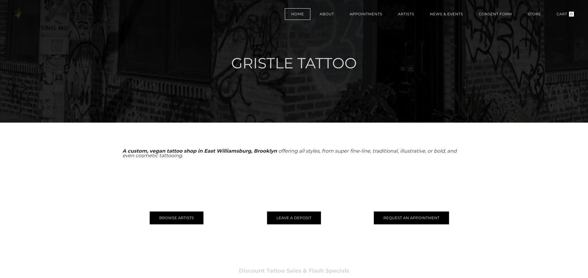
Gristle states its East Williamsburg custom-tattoo identity in a short paragraph beneath a dark photographic banner. Three spaced actions then offer Browse Artists, Leave a Deposit and Request an Appointment. This makes the difference between investigating work, contacting the studio and paying money unusually visible. Its navigation adds appointments, artists, news and a consent form without requiring a long homepage narrative. The main design lesson is the separation itself; a deposit control needs more context than a portfolio link because it can create an actual financial commitment.
What you can learn
Give exploration, appointment requests and payments different labels and destinations. Explain when a deposit is appropriate and ensure payment follows the studio's confirmed process rather than encouraging someone to pay before their design and artist have been discussed.
Pros
The three main actions distinguish browsing, inquiry and payment.
A concise introduction identifies both the local setting and studio approach.
Cons & considerations
If a deposit button appears before consultation details, link clear conditions and instructions nearby.
If the hero uses very dark imagery and small navigation, verify contrast and focus visibility across screen sizes.
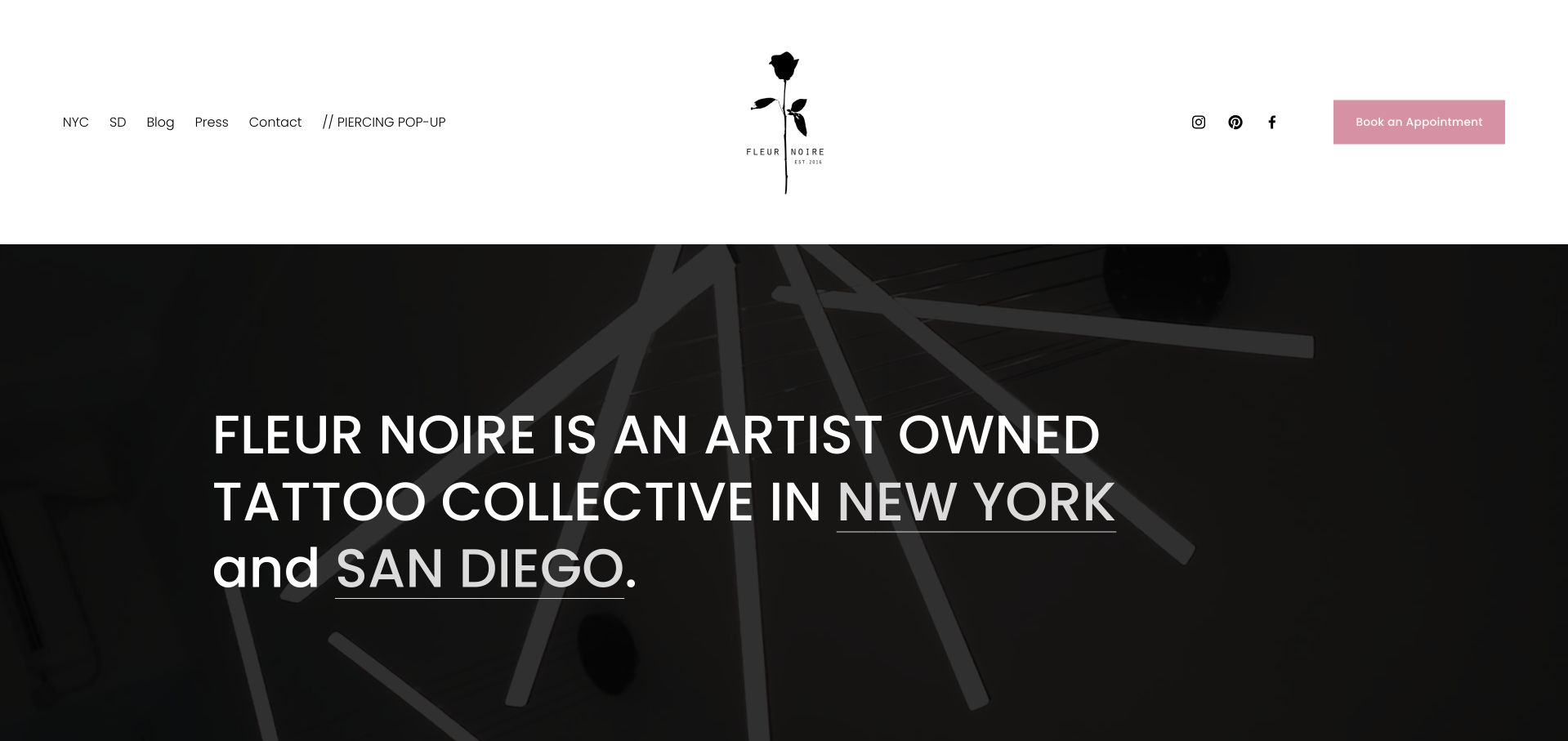
Fleur Noire combines a white header, a floral mark and a soft pink appointment button. The large introduction explicitly names New York and San Diego as linked destinations, with matching city shortcuts in the header. The page describes the collective's welcoming approach and explains that walk-in clients should check availability. This turns the location decision into part of the main story rather than leaving it to a footer. The abbreviation SD works visually in a compact menu, but a newcomer still benefits from full place names and city-specific artist information.
What you can learn
For a multi-city collective, make city selection a first-screen decision and keep the roster attached to that choice. Welcoming language should lead to concrete availability and contact guidance rather than suggesting that every artist or service is present in both places.
Pros
City names are linked directly inside the principal introduction.
The appointment action is visually separated from social links.
Cons & considerations
If the header uses city abbreviations, provide full accessible labels and clear destination headings.
If a pop-up service is temporary, keep its location, dates and availability current rather than letting it look permanent.
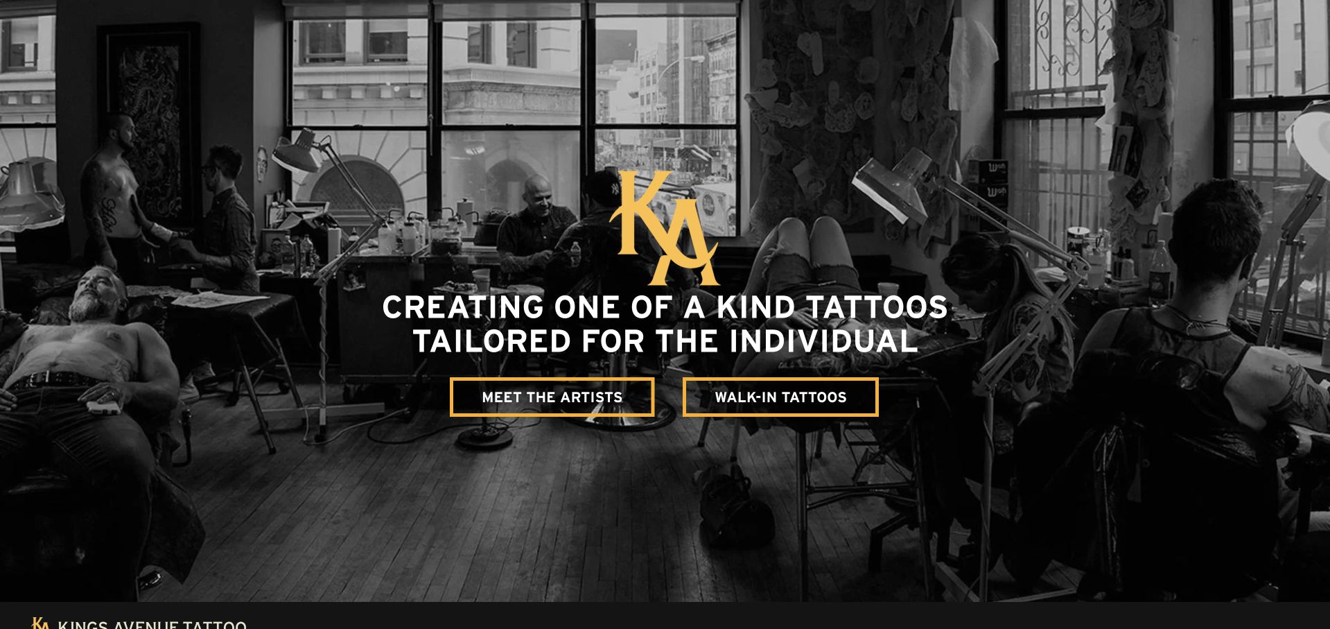
Kings Avenue uses a monochrome photograph of the studio in action, a gold monogram and two outlined actions for meeting artists and investigating walk-in tattoos. The body then introduces the approach and offers location cards for Durham, New York City and Long Island. This is a useful group-level pattern: custom artist selection and a same-day visit do not need the same explanation, and branch choice remains explicit. Editorial articles extend the site beyond booking, but they sit after the core service and place information rather than becoming the only route into the work.
What you can learn
Separate a planned custom project from a walk-in visit and attach each to an actual branch. Consistent location cards help, but artist profiles should still identify where and when the artist works instead of assuming the brand name communicates availability.
Pros
The hero presents artist discovery and walk-in information as different needs.
Location cards make the group's geographic choices explicit.
Cons & considerations
If one group roster spans several cities, keep each artist's location and guest dates maintained.
If editorial articles discuss tattoo symbolism, label interpretation carefully rather than presenting one meaning as universal or guaranteed.
Kegan is a freelance web designer and developer with 15+ years of experience helping businesses turn complicated website requirements into clear, maintainable digital experiences. He works directly with clients from planning and design through development, launch, and ongoing support.
For tattoo studio website design, his development approach focuses on artist portfolios, style and healed-work presentation, studio policies, accessible location information, and clear consultation inquiries. The scope can be a targeted improvement or a complete custom build, with responsive layouts, thoughtful content structure, and integrations chosen around the people using and maintaining the site.
Show 3 other tattoo studio website designersHide other tattoo studio website designers
Plan a tattoo studio website around informed artist selection
Separate the main client journeys
Map custom projects, available flash, walk-in inquiries, returning clients and merchandise purchases independently. They may share a brand but do not require the same information or commitment. Give each a precise destination and avoid treating a payment action as a universal starting point.
Build a maintained artist content model
For each artist, document name, portfolio, styles, resident or guest status, working location and approved contact route. Decide who updates availability and departure dates. Preserve stable URLs when an artist's details change so existing references do not become misleading.
Design the portfolio for comparison
Use well-sized images with attribution and relevant captions rather than an endless anonymous feed. Show the work in enough detail to understand its character. Discuss permissions for client photography and keep unnecessary personal details out of image descriptions and filenames.
Define the consultation intake
Ask only for information the team actually needs to respond. Explain reference-image uploads, accepted formats, privacy and response expectations. Use authorized test data when testing; routine website QA should not submit real client requests, waivers or deposits.
Govern policies and payment boundaries
Give deposits, cancellation rules, appointment changes, age requirements and consent steps their own reviewed content. Do not paraphrase local legal rules without appropriate review. Make clear when an external payment or consent service is being opened.
Test the visit without making a booking
Have testers identify an artist, understand the request process, locate the studio and find aftercare information. Check keyboard controls, image descriptions, mobile cropping, zoom and reduced motion. Include slow or failed gallery and form states, not only the polished first load.
The editing job behind the design
Choose technology around portfolio ownership and careful intake
A studio CMS should make artist attribution, guest dates, locations and portfolio updates straightforward. A separate intake tool can help route requests, but its fields, uploads and notification settings need deliberate privacy and security review. Do not send private client descriptions or reference photographs to ordinary marketing analytics.
Treat merchandise checkout, deposit payment and appointment requests as different workflows even if one platform hosts several of them. Keep ordinary information available without a social-media account or app. The technology observations in these examples describe public evidence, not a complete system inventory or a certification of the studio's operations.
Our WordPress website examples offer a separate look at publishing approaches. A visible platform label is evidence for that named page, not a guarantee that the same system will suit your requirements.
Before the public launch
Tattoo studio website planning checklist
Connect every portfolio to a named artist.
Separate resident artists from dated guest appearances.
State each artist's current working location.
Provide both artist-led and style-led discovery where useful.
Distinguish inquiries, consultations, appointments and payments.
Explain walk-in availability and practical next steps.
Publish complete address, floor and entrance information.
Keep hours, phone numbers and map destinations consistent.
Give booking, cancellation and deposit policies clear destinations.
Explain reference-image uploads and protect private intake data.
Keep aftercare information accessible and professionally reviewed.
Test galleries, forms and navigation with keyboard, zoom and small screens.
These checks are a project checklist, not a performance, legal, security, or accessibility certification. Test real journeys with the people responsible for the website before making claims about the result.
Sources & editorial method
How this collection was selected and reviewed
The twenty-eight examples meet the saved collection target. Selected official homepages were directly inspected and captured in an ordinary browser, with original commentary on their visible structure, practical lessons and conditional tradeoffs. Parked, unavailable and security-blocked candidates were excluded. Editors Choice is an explicit website-design selection within the collection, not a tattoo-quality endorsement, safety award or vote result. No appointment requests, payments, waivers or consent forms were submitted.
Each example links to its actual source page. Screenshots are direct browser captures with their own capture dates; moving imagery, announcements and live designs can change. The notes describe observable design choices and conditional tradeoffs, not measured traffic, conversion results, service quality, or accessibility conformance.
Technology labels use public page metadata, asset evidence, or explicitly cited platform documentation. Platform documentation is not a complete current deployment audit. A component reference may be legacy or unused; it is not a complete backend inventory. Unknown stacks are omitted. These sites are editorial examples, not our client portfolio.
Written, Edited and Curated are separate editorial records, not timestamps advanced by a rebuild. Website designs and imagery belong to their owners. See our editorial standards or suggest a correction.
Questions worth asking
Tattoo Studio website design questions
What should a tattoo studio homepage show first?
Help visitors recognize the work and find the people who make it. A strong first screen can use finished tattoos, the real studio or a clear roster, but it should preserve routes to artists, inquiry information and the actual location.
Should a studio organize portfolios by artist or style?
Artist attribution should remain fundamental. Style-led browsing can be an additional route for people who do not yet know a maker. Connect the two so a visitor can move from an example to the responsible artist and a suitable inquiry process.
Is a contact form the same as booking an appointment?
Not necessarily. If the studio must assess the idea, artist availability or preparation, describe the form as a request. Explain the later consultation, deposit and confirmation steps rather than implying submission guarantees a session.
How much walk-in information belongs on the website?
Enough for a person to decide whether to contact the shop or travel there: the relevant hours, current availability process and correct location. Keep it separate from custom projects that need advance planning, and do not promise capacity the team cannot maintain.
Does a polished tattoo website establish that a studio is safe?
No. This collection reviews public design, not premises, licensing, private procedures or health outcomes. Safety, suitability and aftercare questions require current studio information and the appropriate qualified advice.
A useful tattoo studio website makes artistic fit and the next practical step equally clear. Attribute the work, explain the request process and keep the information people use to arrive at the studio as carefully maintained as the portfolio.