Best Chiropractor Websites of 2026 (25 Real-World Examples)
Chiropractic website examples that make local services and first visits understandable
A chiropractic website has to explain the practice without making visitors interpret a wall of technique names or promotional claims. These twenty-five examples compare independent practitioners, neighborhood clinics and larger networks through their practical design choices: location details, clinician introductions, first-visit guidance and clearly labeled booking routes.
Someone arriving from a local search may need an address, a practitioner they recognize or an explanation of what happens after an appointment request. Put those answers within an ordinary browsing structure. A distinctive visual identity can make the practice memorable, but clear administrative information is what helps a visitor decide which question to ask next.
This collection examines public website design, not the effectiveness or appropriateness of chiropractic care. It does not verify every clinical, insurance or outcome claim displayed by the featured organizations. A screenshot records a particular public page at a particular time; use maintained practice information and appropriate professional advice for personal decisions.
Before the examples
What makes good chiropractor website design in 2026?
Make the local practice tangible
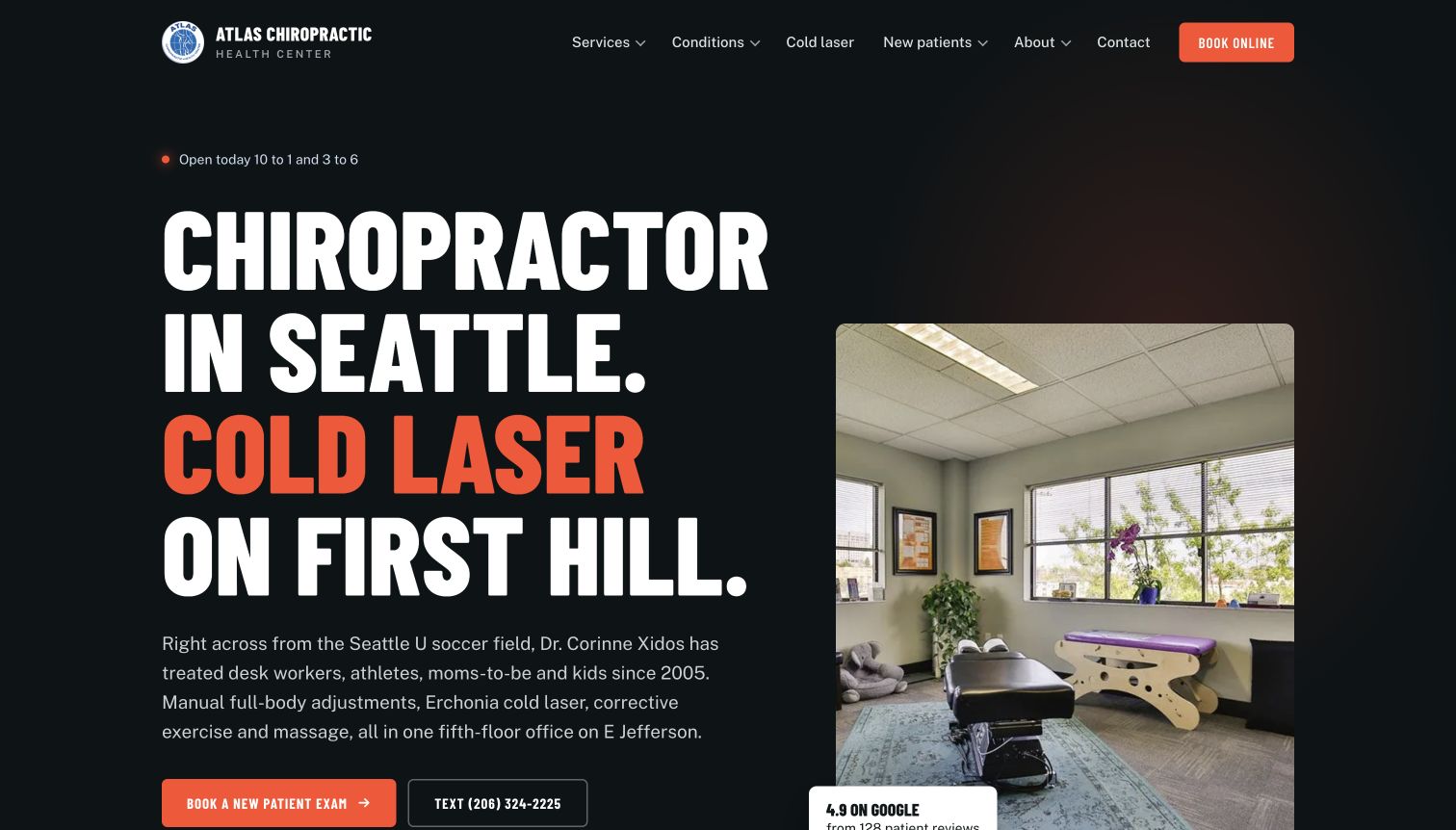
Atlas Chiropractic Health Center names its practitioner, shows the actual treatment environment and explains its First Hill location. A small practice can be specific about people, premises and access without adopting a large network's elaborate directory. Distinguish a real location from a broad list of areas served.
Explain the appointment process
Give new and returning visitors recognizable routes. Tangelo links to a first-visit explanation; Putney's contact page distinguishes a preference request from a confirmed appointment. State what happens after an enquiry and keep administrative information separate from clinical promises.
Connect services to people and places
Multi-location practices need more than a repeated appointment button. Show which team, services and contact details belong to each branch. Cura uses separate practical task cards, while Chiro.London organizes visitors around clinic choices. Keep shared network identity and local details consistent.
Control competing interface layers
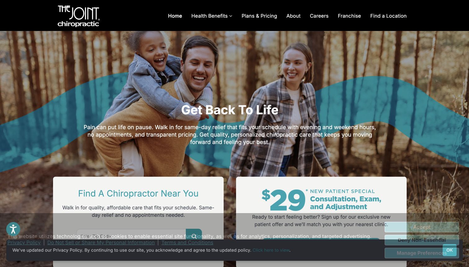
Offers, chat widgets, consent bars and booking panels can obscure the information they are meant to support. The Joint's captured state illustrates overlapping privacy layers. Test realistic combinations and maintain an unobstructed route to contact details and ordinary browsing.
The collection · 25 examples
25 chiropractor websites worth studying
Compare these examples by their most useful job: introducing a solo practitioner, explaining a shared clinic, orienting a new patient or helping someone choose a branch. The collection deliberately includes different scales and visual approaches. A technically ambitious hero is not automatically more useful than a concise explanation and dependable local contact.
Atlas names Seattle and First Hill in oversized type beside a photograph of its treatment room. Its introductory paragraph adds a nearby landmark, the named practitioner, service range and fifth-floor setting, giving the page unusually concrete local context. New-patient booking and texting are separate actions. The inspected page continues with staff profiles, intake categories and a three-step first-visit explanation, including parking and the elevator. Opening hours also appear near the headline. The site publishes clinical and device claims, but the transferable design strength is the practical specificity rather than those unverified outcomes.
What you can learn
Use genuine room photography and precise arrival information to answer the questions that otherwise become reception calls. Explain whether selecting a slot is a request or a confirmed appointment; Atlas says the team calls or texts to confirm. Keep accessibility and parking instructions in ordinary text, not only a map. Clinical descriptions need qualified review, while the designer can make their scope and related information easier to find. Verify live-hours labels against the actual schedule.
Pros
The introduction identifies the practitioner and exact neighborhood
First-visit instructions include parking and floor access
Cons & considerations
The very large headline can push actions toward the fold
Device and treatment claims need separate clinical substantiation
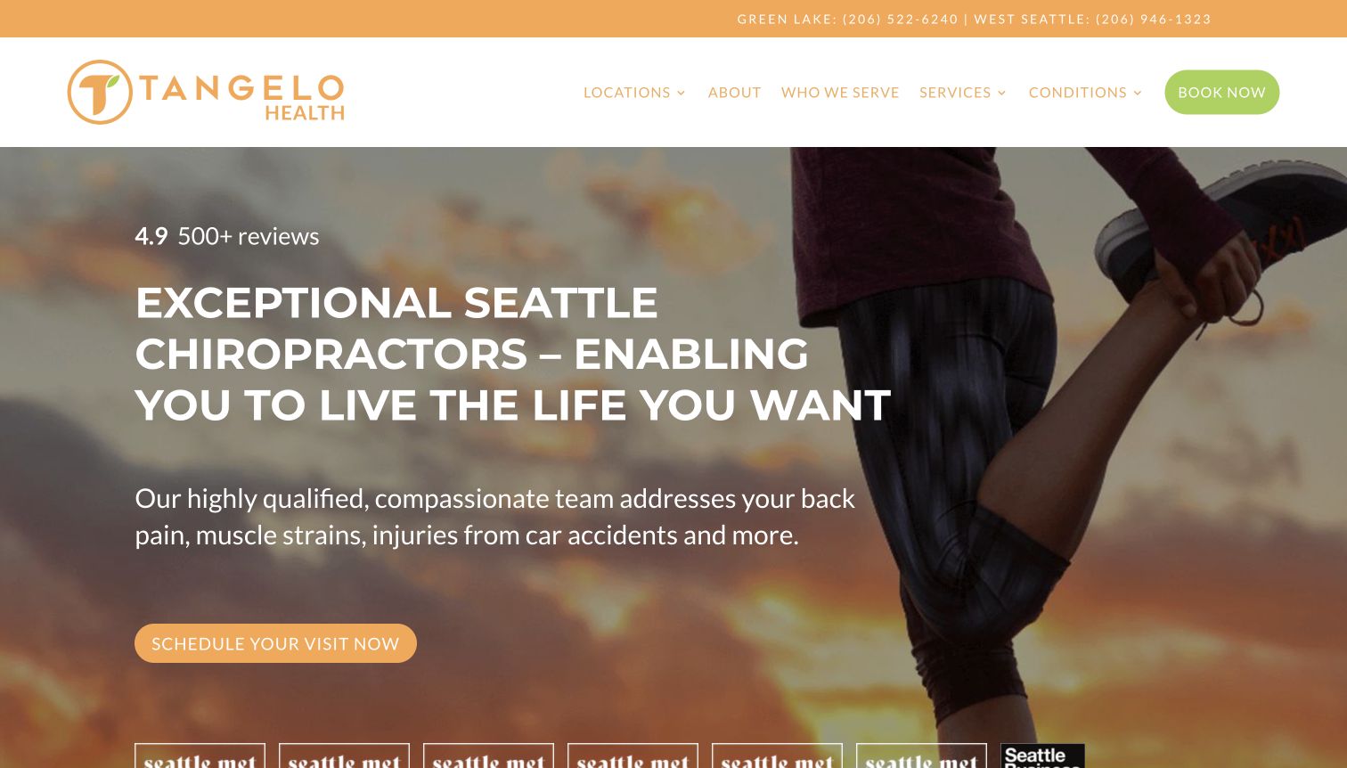
Tangelo uses an orange-and-green identity over a full-width athletic stretching image. The two Seattle clinic numbers have explicit place labels in the top strip, while the main menu separates services, conditions and audiences. A large scheduling action leads the hero. The inspected page explains its chiropractic-and-rehabilitation model and links directly to what to expect at the first visit and to the doctors. This is a service-dense homepage, with reviews and promotional claims further down, but its basic geography and ordinary contact route remain available before those sections.
What you can learn
Give each location a clearly labeled phone route and make the combined service model understandable without adopting a long clinical slogan. A first-visit page can provide orientation for people not ready to schedule immediately. Keep services, conditions and audience pages distinct in purpose so the menu does not become three copies of the same content. If athletic imagery dominates, make the broader intended audience visible in supporting copy and real photography. Awards and testimonials should not replace practical explanations.
Pros
Each clinic's phone number is labeled in the utility strip
A first-visit explanation has a direct homepage route
Cons & considerations
The long all-caps hero statement requires substantial space
Several overlapping content categories need consistent editorial boundaries
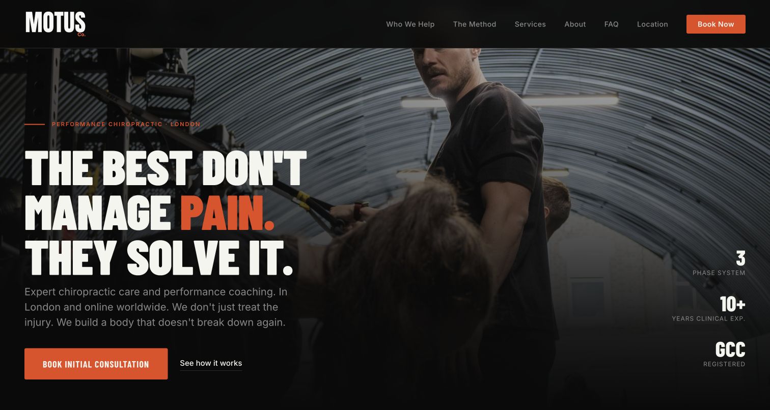
MOTUS uses condensed white typography, orange emphasis and a dark gym photograph to establish a performance-oriented tone. The first action is labeled as an initial consultation, while a quieter link introduces the method. Anchor navigation divides the single page into audience, process, services, practitioner, questions and location. The inspected content presents a three-phase narrative and a named founder biography. The headline and several supporting statements make strong claims about pain and future resilience; those are the publisher's marketing, not findings of this design review.
What you can learn
An independent specialist can use a single long page when the sections answer real decision questions and the anchors remain predictable. Label the initial appointment clearly and explain the service boundary between in-person care and online coaching. Process stages are useful for organizing expectations, but should not imply a guaranteed clinical progression or universal result. Keep the confident identity while having qualified reviewers moderate absolute claims. Check orange small text and paragraph contrast against the dark photography.
Pros
The main action identifies an initial consultation
Section anchors provide a readable outline of the service story
Cons & considerations
Absolute clinical claims require careful professional review
Dark photographic areas and small orange labels warrant contrast checks
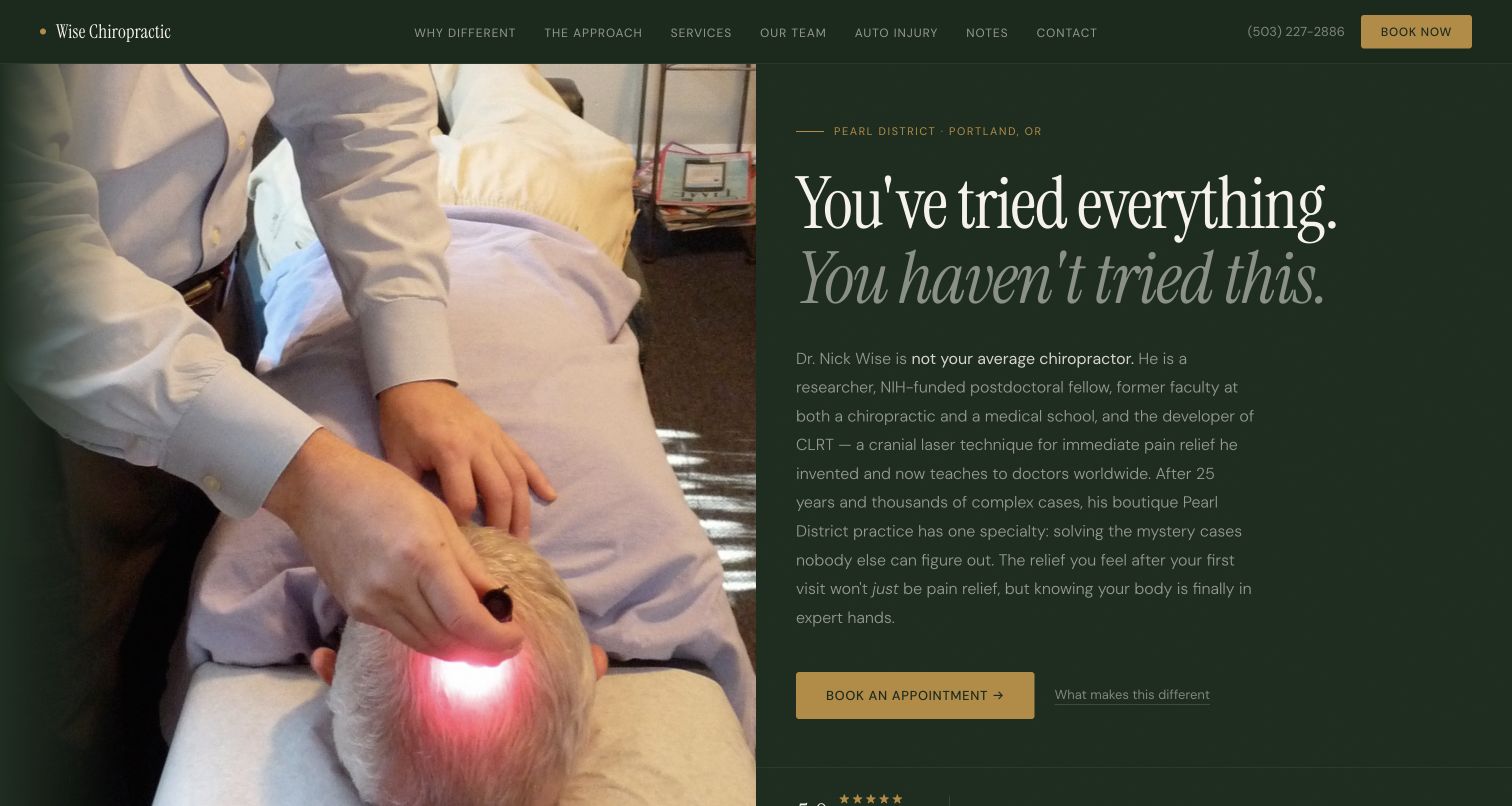
Wise Chiropractic pairs a close treatment photograph with a deep green text panel, serif headline and gold booking action. The Pearl District location appears above the message, and the header preserves phone and booking beside section anchors. The longer inspected page develops a practitioner-led story through biography, service explanations, audience examples and team content. The opening paragraph is unusually long and includes substantial credential and treatment claims. Its strongest design idea is the coherent personal identity and local setting; this review does not verify the asserted clinical effectiveness or special techniques.
What you can learn
Build a practitioner story from maintained biographies, genuine setting and clear services, while distinguishing professional credentials from evidence for a particular treatment claim. A dense opening can be shortened into an introduction with a link to detail, preserving a path for readers who want depth. Keep booking and direct contact visible without requiring the entire story to be read. Check muted paragraph and navigation text against dark backgrounds at ordinary zoom and in bright viewing conditions.
Pros
The practitioner identity and neighborhood are explicit
Phone and booking remain available above the long narrative
Cons & considerations
The introductory paragraph is dense for a first screen
Muted text on dark green needs careful contrast review
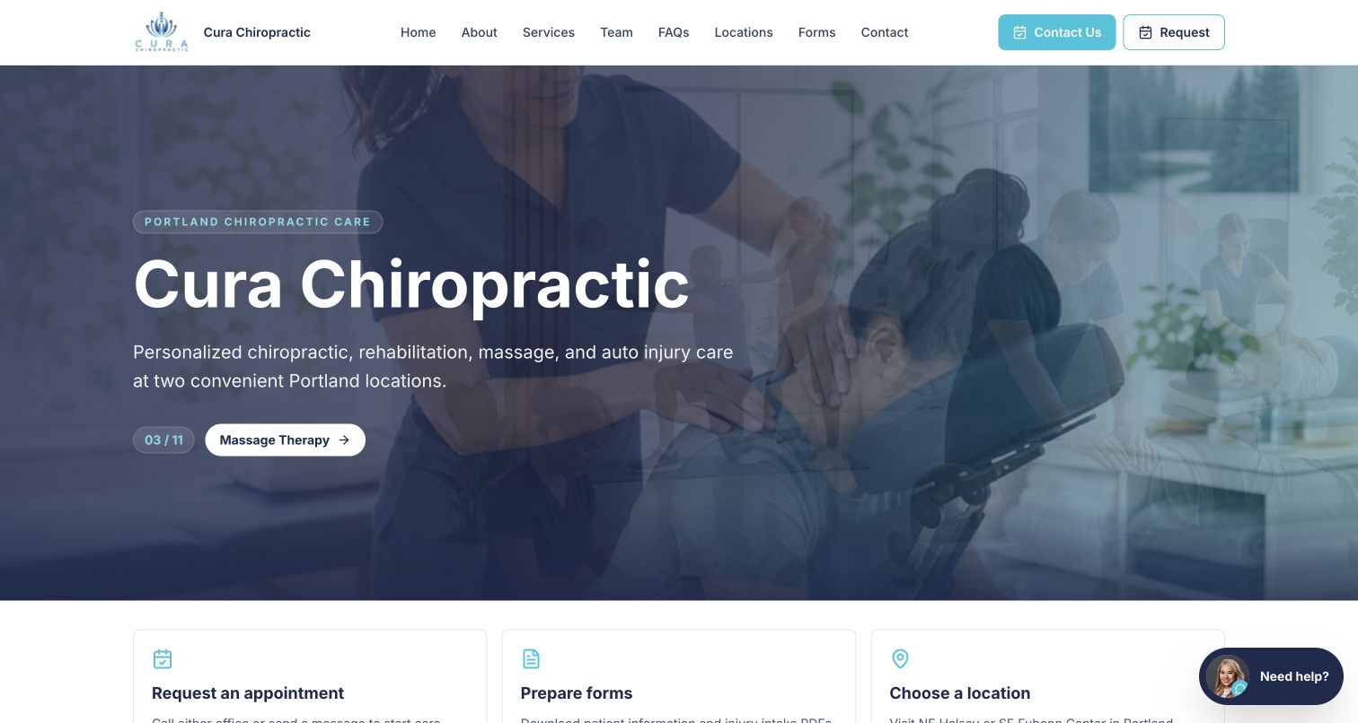
Cura's blue-toned hero names its Portland practice and explains chiropractic, rehabilitation, massage and auto-injury services in one sentence. Beneath the rotating imagery, three cards separate requesting an appointment, preparing forms and choosing a location. The header also exposes Team, FAQs and Forms directly. Inspected content introduces named clinicians and two office records with separate phone numbers and addresses. The saved capture catches an image transition, while the main heading and written service explanation remain stable, a useful contrast between changing decoration and consistent orientation.
What you can learn
Organize the homepage around concrete tasks rather than making every link another version of Book Now. Preparation, location selection and enquiry can be distinct without producing a complicated menu. Keep forms descriptive and clearly separate from general marketing, with appropriate sensitive-data review before collecting information. Rotating imagery should not carry essential facts; stable copy and an accessible static fallback preserve meaning. Maintain office-specific numbers and staff information in reusable records rather than scattering manual duplicates.
Pros
The task cards distinguish request, preparation and location selection
Forms and team information have direct menu entries
Cons & considerations
The long navigation row needs small-screen prioritization
The captured image transition can momentarily look visually busy
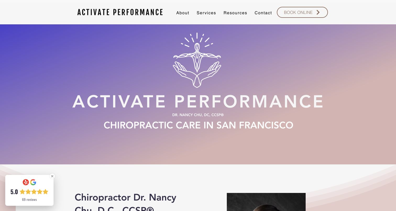
Activate Performance introduces its brand, Dr Nancy Chu and San Francisco chiropractic care over a lavender-to-blush gradient. A compact white header has only four categories and an outlined booking button. The inspected page then moves into the practitioner's portrait and biography, services-and-pricing, FAQs and arrival information. The gradient hero is more abstract than a treatment photograph, but the title makes the service and city explicit. A small floating ratings widget occupies the lower left in the capture; it is visible without being the main organizing element.
What you can learn
Give an abstract visual identity enough concrete text to establish who provides the service and where. A solo practitioner can keep navigation compact if biography, services, prices and first-visit questions have clear destinations. Parking guidance is a useful extension of a city address, especially for an office inside a larger building. Keep credentials and clinical statements under appropriate review, and verify the booking button's meaning across desktop and mobile rather than relying on an outline style alone.
Pros
Practitioner, service and city are named in the first view
Services and pricing share an explicit supporting destination
Cons & considerations
The large abstract hero delays detailed appointment orientation
A floating rating panel needs overlap checks on smaller screens
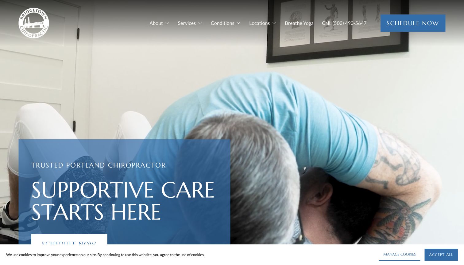
Bridgetown shows treatment footage behind a translucent blue introduction and a repeated scheduling action. Its header separates services, conditions and locations, alongside a phone number. The inspected page places insurance explanation soon after the hero, then a practitioner introduction, named team carousel and four location records with hours and addresses. The saved view retains a small bottom cookie notice that overlaps the lowest portion of the hero action. The useful content sequence moves from welcome to administrative questions and people, instead of treating the promotional video as the whole story.
What you can learn
Let a treatment video support the introduction, then answer practical questions before a long testimonials section. Insurance summaries should connect to current verification and location details rather than serving as blanket coverage promises. A team carousel needs an ordinary route to the complete staff directory, so discovering a clinician does not depend on advancing slides. Test the real first-visit page with cookie notices present; a button near the fold can become partly hidden even by a relatively shallow banner.
Pros
Insurance information appears early in the page sequence
Named staff and complete location records are available
Cons & considerations
The bottom consent notice partly covers the hero action
A large team carousel needs a dependable full-directory alternative
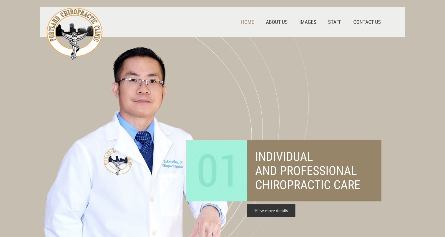
Portland Chiropractic Clinic uses a large practitioner portrait, a beige background and a numbered text panel to introduce individual care. The header is limited to home, about, images, staff and contact. The inspected page continues into a two-column service overview, staff introduction and a conspicuous contact block containing the address and phone. Its layout is more conventional than many examples here, but it demonstrates how a small office can provide a complete public introduction without a complex selector. Several footer links appear as broad category labels rather than detailed destination descriptions.
What you can learn
Use a simple page structure when a single office does not need a network-style finder. Identify the practitioner and provide direct, maintained contact information, then give services enough context for useful browsing. Review every category and footer link so descriptive text actually leads to relevant detail. A numbered promotional panel should not require visitors to wait for another slide to understand basic facts. Keep any clinical or recovery claim separate from the design lesson and subject to professional review.
Pros
The main menu stays compact
The page includes a clear address and phone contact block
Cons & considerations
The broad service list offers limited comparison detail
Generic and repeated footer labels warrant a destination-quality review
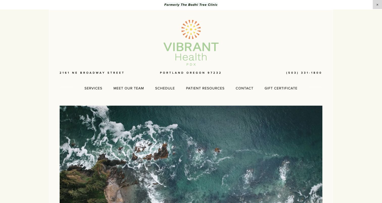
Vibrant Health PDX gives its logo, full address and phone number substantial space above a calm aerial coastline image. A notice explicitly says the practice was formerly The Bodhi Tree Clinic. The menu separates services, team, scheduling and patient resources. The inspected page explains its local care scope, includes a map and lists individual services. It also provides an unusually candid building-access note in the footer, saying the entrance has stairs and offering contact for alternatives. The capture's first screen is mostly identity and atmosphere, with the service introduction further down.
What you can learn
During a rename, preserve the connection to the old identity while updating practical destinations consistently. Contact labels, email targets and booking domains need the same attention as the visible logo. Access limitations should be stated clearly enough to help someone plan before they travel, not buried only in a map. A calm scenic image can establish tone, but a service description and first-step route should remain easy to reach without excessive scrolling through branding.
Pros
The former name is explained explicitly
Practical contact information and access context are published
Cons & considerations
The tall identity area delays the service explanation
Legacy contact and booking references need coordinated review during a rebrand
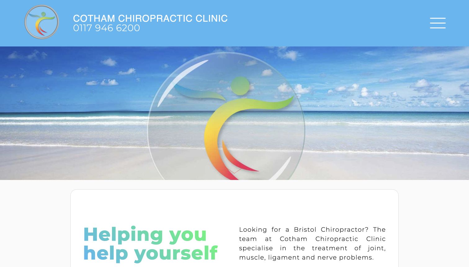
Cotham places a large clinic name and phone number in a blue header, with a compact menu control on the right. A beach image and enlarged brand symbol precede the written introduction. The inspected page then organizes ailments, therapies, individual practitioners, opening times and recent advice in distinct sections. Its team explanation describes practitioners maintaining separate diaries within the shared setting, an operational detail that can affect booking. Direct phone, email and appointment links appear in the main content rather than relying only on a form.
What you can learn
Explain the relationship between a shared clinic and independent practitioners before somebody books. Keep appointment destinations, fees and contact information consistent with that operating model. A long information page benefits from clear section headings and direct links to practitioner profiles, but important tasks should not depend on finding the footer. Review whether an oversized scenic hero contributes enough to justify its height when the immediate visitor question is simply whom to contact or which diary to use.
Pros
Phone contact has a prominent header position
The team content explains the independent-practitioner model
Cons & considerations
The scenic brand panel occupies considerable space before practical copy
The compact menu adds a step to discovering detailed pages
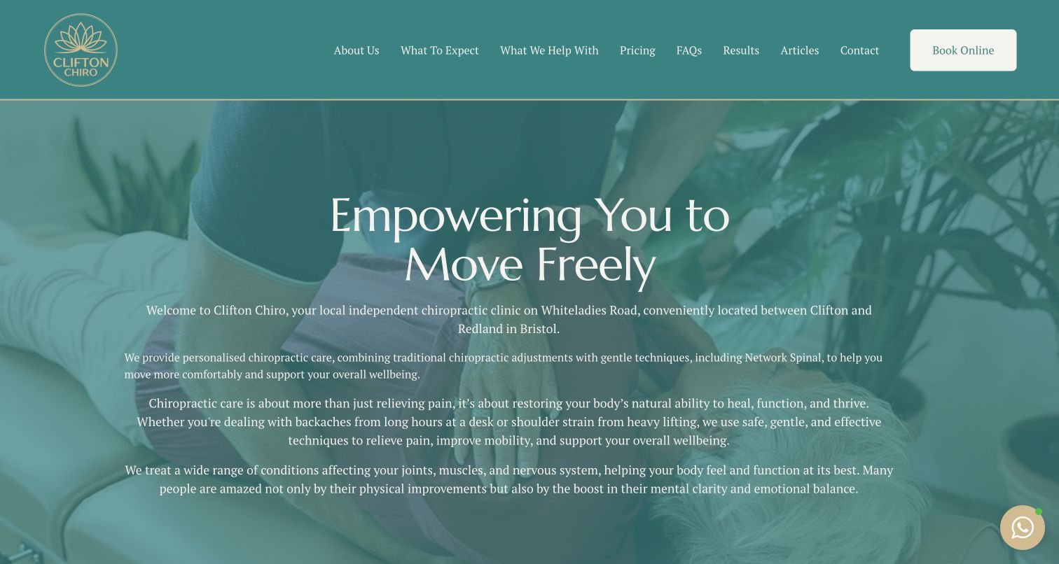
Clifton Chiro uses teal, gold and a treatment photograph as the background for a centered introduction. The first paragraph identifies the Whiteladies Road location and its independent status. Its unusually complete top menu includes What To Expect, Pricing and FAQs beside the service and about routes. The inspected page expands into practitioner context, work-related concerns, service explanations and clinic logistics. The captured hero contains several long paragraphs, including broad wellbeing claims. Its useful design quality is the practical navigation visibility; the density and clinical claims deserve separate scrutiny.
What you can learn
Make first-visit and price information easy to find before asking a newcomer to commit. A local owner-run story can add specificity, but keep the opening concise enough to scan and move detailed approach explanations to appropriate sections. Have qualified reviewers assess broad clinical and wellbeing claims rather than enlarging them for persuasion. White paragraph text over a tinted photograph needs contrast testing throughout the image, and a fixed messaging control must not cover essential content.
Pros
What To Expect and Pricing are primary menu items
The location and independent identity are explicitly stated
Cons & considerations
The hero is text-dense and difficult to scan quickly
Broad wellbeing language requires careful clinical review
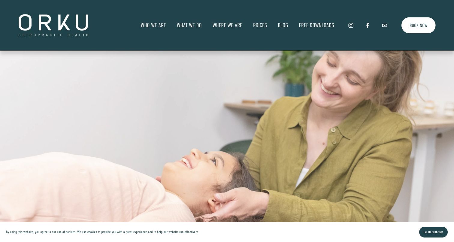
Orku's captured first view is dominated by a warm treatment photograph under a dark teal header. Plain-language labels describe people, services, place and prices, with booking separated in a white pill button. The inspected content below the image gives a Bristol introduction, common concern headings and three service cards for chiropractic, rehabilitation and massage. A compact find-us section includes split opening hours and a Saturday service qualification. The cookie notice stays shallow at the bottom, but the image-led opening leaves most written orientation below the initial screen.
What you can learn
Use understandable navigation labels to reduce jargon, then explain the service range in text close to the imagery. Where different services have different hours, make that distinction part of the location record, not an easily missed note added later. Treatment photographs should be genuine and appropriately permissioned, with meaningful alternatives. Review whether the first screen gives enough information without scrolling and whether social icons are competing with a more useful direct phone or location link.
Pros
Prices and place information have clear menu labels
The hours distinguish a service-specific Saturday schedule
Cons & considerations
The first screen contains little written service orientation
Small header text and social icons need legibility and priority checks
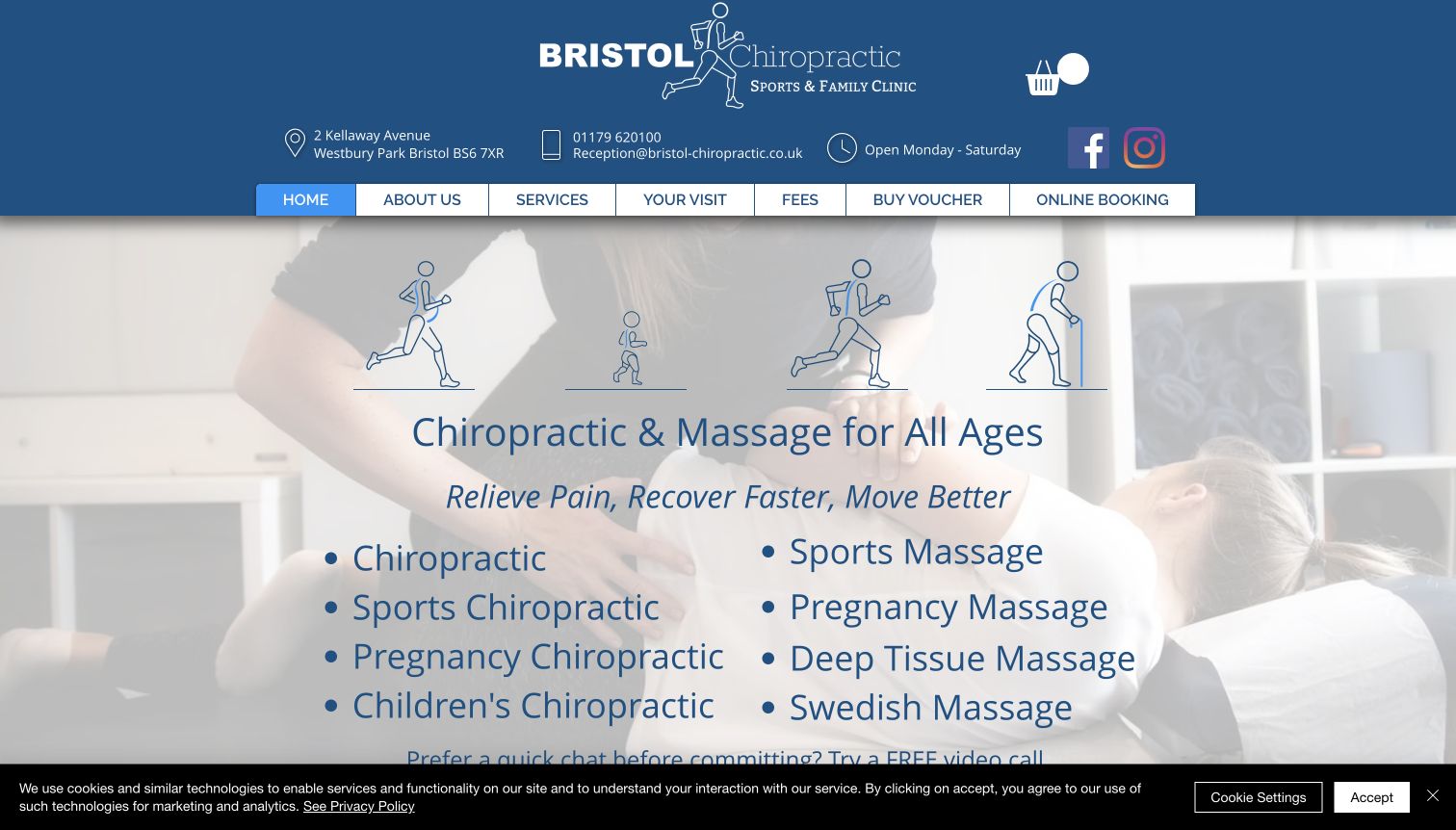
Bristol Chiropractic Sports & Family Clinic combines audience icons with two large lists separating chiropractic and massage services. Its tall blue header exposes the address, contact information and opening-day summary before the main menu. Your Visit, Fees and Online Booking are all explicit. The inspected page explains treatment-room arrangements and continues into more detailed service links. The capture retains a bottom consent strip that limits the visible start of a video-call invitation. The design is information-forward, with practical categories taking precedence over a short abstract brand slogan.
What you can learn
Expose service types and administrative information in a way that helps comparison rather than turning every entry into an equal visual demand. Keep family and sports categories accurate and clinically reviewed, especially when describing care for children or pregnancy. A first-visit page and fee schedule should remain visible on mobile even when the desktop header cannot fit. Test list readability against the faded background photograph and review the combined state with any consent banner present.
Pros
Visit expectations and fees are explicit navigation items
The two lists distinguish chiropractic from massage services
Cons & considerations
The tall header and large lists use most of the first screen
The consent strip competes with the next introductory action
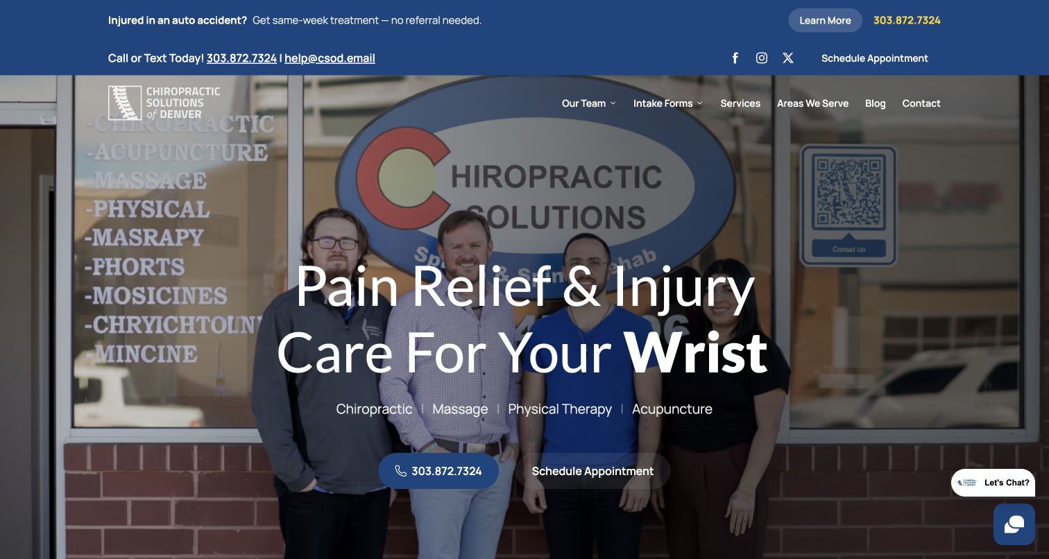
Chiropractic Solutions of Denver places a team-and-storefront photograph behind a changing body-area headline. A blue utility strip contains an injury notice, phone, email and scheduling, while the main menu exposes staff, intake forms and service areas. The inspected page introduces a named practitioner, service cards and a separate section about navigating veterans' care arrangements. The screenshot shows repeated call and scheduling routes over the photograph, plus a small chat launcher. It is a concrete practice entrance, although the rotating wording makes the first service emphasis vary and the top-level contact density is substantial.
What you can learn
Use staff and storefront imagery to make a local office recognizable, then keep intake and enquiry routes explicit. Do not let repeated phone placements become conflicting records; the observed page and capture demonstrate the need for one maintained contact source. Special administrative pathways deserve their own explanation and qualified review, not broad assurances of payment coverage. Changing a body-area word is decorative orientation, not a diagnostic feature, and should have a coherent static fallback.
Pros
Team and intake forms are easy to discover
The storefront photograph anchors the clinic identity
Cons & considerations
Repeated contact numbers need consistency checks across surfaces
Changing headline text can make the service introduction less stable
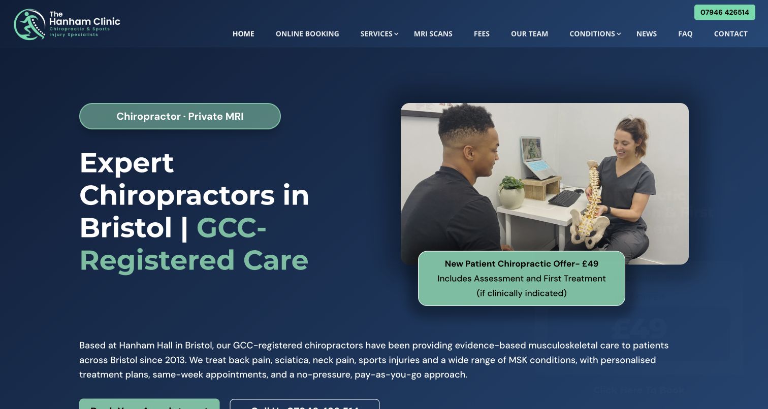
The Hanham Clinic uses navy and green with a consultation photograph showing a spine model, giving the first view a conversational rather than purely treatment-led setting. The offer card describes assessment and first treatment with an explicit if-clinically-indicated qualification. Fees, team, FAQ and booking are separate menu items. The inspected page expands into concern cards and clinic information, with app links also present. An additional promotional popup was dismissed for the retained capture. This layout is useful for studying how price, clinical qualification and introductory process can share the same screen.
What you can learn
When advertising an initial visit, explain its components and the conditional nature of any treatment rather than presenting a fixed clinical sequence. Keep fees and expectation pages available outside the offer. A consultation photograph can help establish process without relying on outcome claims. Coordinate dates and wording across permanent cards and popups; the inspected structure included multiple versions of the promotion. Prioritize the tasks a first-time visitor needs before adding separate app-download decisions.
Pros
The offer includes an explicit clinical-indication qualification
Fees, team and questions are visible menu destinations
Cons & considerations
Multiple promotional surfaces need synchronized dates and wording
The large first-view composition delays its primary contact actions
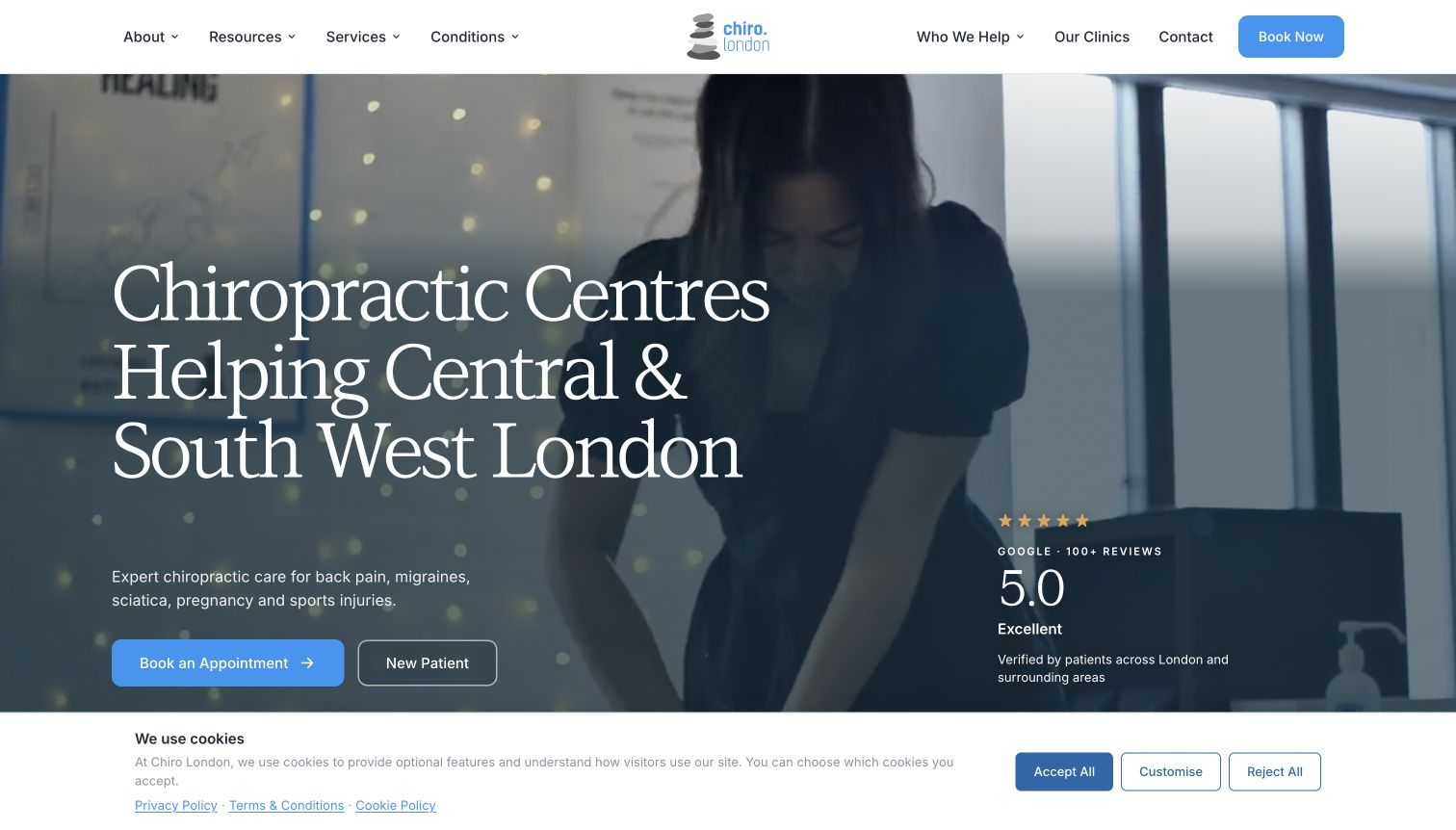
Chiro.London puts its Central and South West London coverage directly in the opening heading over treatment footage. Book an Appointment and New Patient have distinct hero controls. Below, the inspected page separates service categories and introduces six clinics with local phone, email, booking and messaging routes. A shallow consent banner occupies the bottom of the capture. Putney Chiropractic in this collection is part of the same clinic family, so their similar structures are related implementations rather than independent proof that the pattern performs better. The useful group-level role here is directing visitors to the appropriate local office.
What you can learn
Make a clinic-family homepage a reliable directory as well as a brand introduction. Branch records should preserve local contact and booking differences, not send every action into a generic inbox. Keep a new-patient explanation beside the direct appointment route. Shared templates need shared maintenance, while genuinely different clinic facts stay local. Consent should not hide important controls, and video should have a static alternative that retains the geography and service explanation.
Pros
The heading states the geographical scope
Branch cards carry separate practical contact routes
Cons & considerations
The consent strip reduces available first-view space
Shared group and local pages require clear responsibility for duplicated information
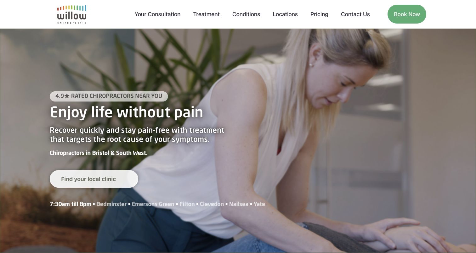
Willow pairs treatment photography with a prominent local-clinic button and a row of linked place names. Its menu gives consultation, treatment, locations and pricing separate positions, keeping the first practical choices familiar. The inspected page continues with concern cards, practitioner explanation, video and consultation content. It also presents several numerical outcome claims; those remain the publisher's assertions, not independently verified results in this review. The retained capture follows dismissal of the central consent dialog and shows the underlying regional orientation clearly, with a wide white navigation bar and green booking control.
What you can learn
Prioritize branch selection when convenience is a major decision, while preserving an explanation of consultation and costs. Place-name links are useful only when they lead to current local details rather than generic duplicates. Published outcome numbers need a defined source, sample, scope and review date; visual prominence does not establish their validity. Keep service and clinical review responsibilities separate from campaign design, and ensure the introductory explanation survives without video or animated counters.
Pros
Consultation and pricing are top-level destinations
Linked place names supplement the main clinic-finder action
Cons & considerations
Broad numerical outcome claims need transparent supporting context
The opening relies heavily on benefit language rather than explaining the first visit
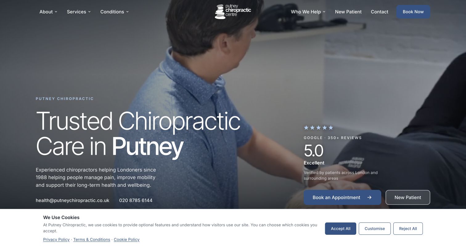
Putney Chiropractic uses treatment footage behind a large local heading, placing email and phone in the hero rather than only the footer. Appointment booking and New Patient are separate actions; the header also gives newcomer information a direct link. Inspected content introduces the local team, service cards, concern categories and practical arrival information. Its contact source clearly distinguishes appointment preferences from confirmed bookings. The capture includes a consent strip at the bottom. The practice is linked with Chiro.London, so the matching visual vocabulary is discussed as a family pattern rather than an unrelated design discovery.
What you can learn
Preserve a local clinic's identity and contact details even when it shares a group template. Give newcomers an explanation before they enter a booking provider, and state when an enquiry is merely a requested time. Keep directions understandable without activating an embedded map. Shared service copy should have an owner, while staff, hours and arrival arrangements remain branch-specific. Test the booking and newcomer actions together with consent, especially when a smaller screen moves them beneath the fold.
Pros
Email and phone are visible in the introductory screen
New-patient guidance is separate from direct booking
Cons & considerations
The family template creates maintenance responsibilities across domains
The consent strip reduces space around the lower hero controls
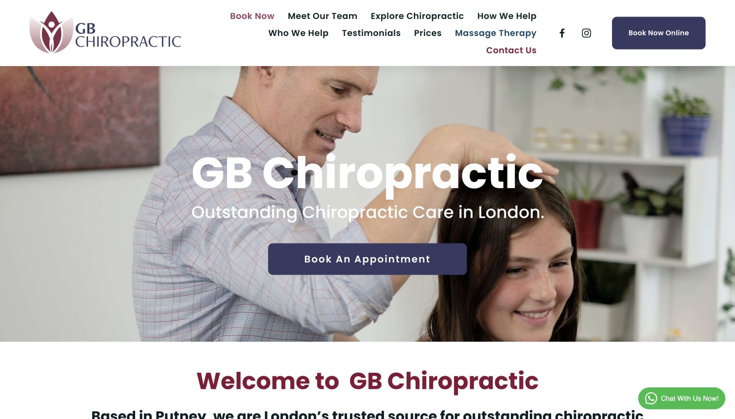
GB Chiropractic places its name and London service description over a treatment photograph, with a large purple appointment action. The inspected page has a dedicated New To Chiropractic section linking to quick answers, a fuller explanation and first-visit guidance. Prices and team discovery are also available. The screenshot shows the cost of the broad header: menu items wrap into several rows beside social icons and a second booking button. The hero remains clear, but the dense navigation gives newcomer education, services, testimonials, massage and contact similar visual weight.
What you can learn
Support unfamiliar visitors with an organized explanation, then keep the top-level choices short enough to scan. First-visit and price pages are useful destinations; they do not all need to compete equally in the header. Combine overlapping educational labels into a clear parent structure and check intermediate desktop widths where wrapping appears. Genuine treatment imagery can make the setting tangible, but should not imply that all visitors need the depicted procedure. Retain a direct question route alongside the large appointment action.
Pros
The page offers explicit first-visit and basic-question routes
Team and prices are discoverable
Cons & considerations
The header wraps into several rows in the capture
Several similar educational labels may slow menu scanning
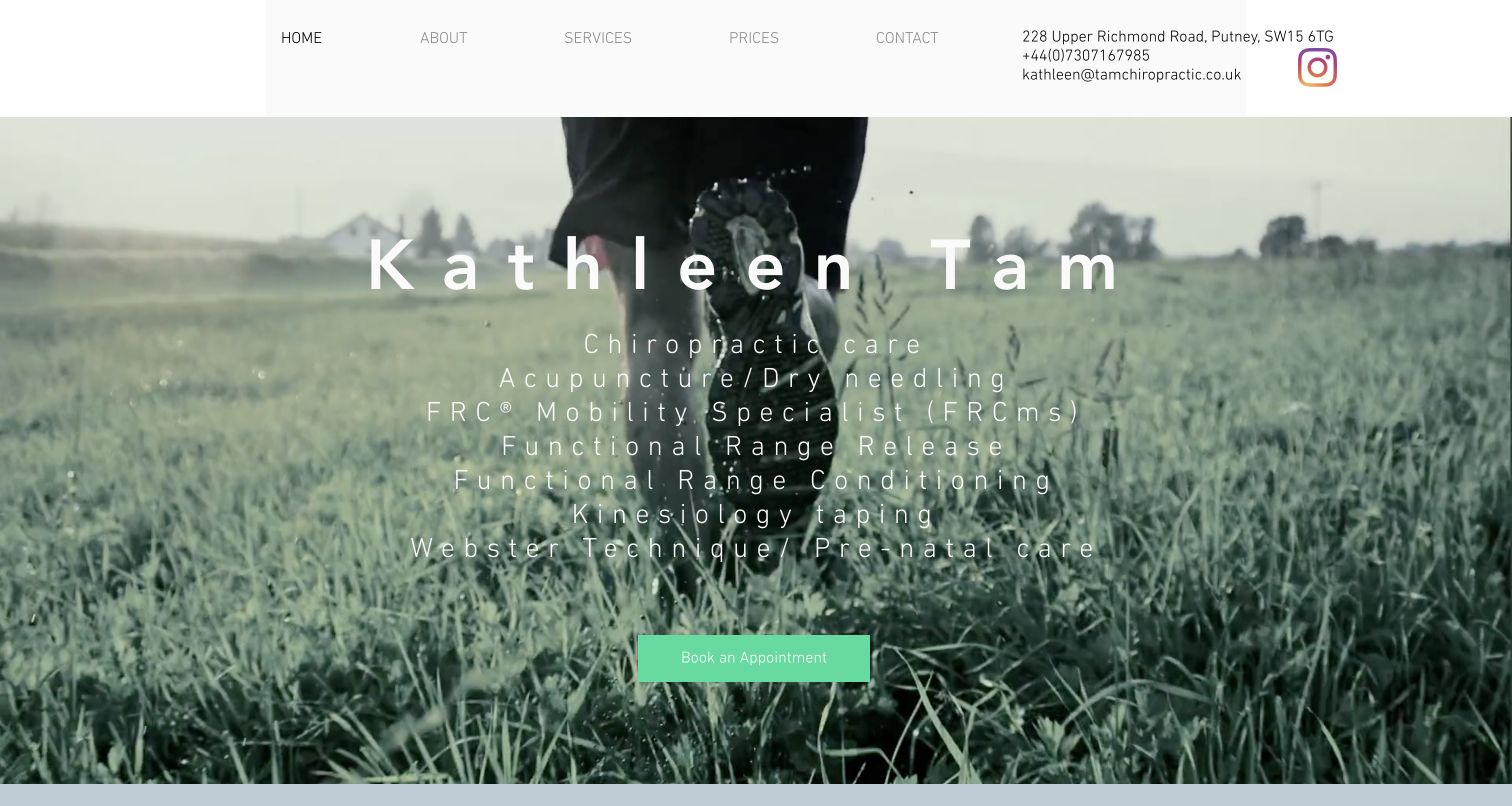
Kathleen Tam's homepage uses a full-width running image behind the practitioner name and a list of offered techniques. A light header keeps address, phone and email visible beside a compact five-item menu. The inspected page introduces the practitioner, explains the shared Pilates-and-yoga studio location and provides hours and insurance enquiry wording. Booking is directed through phone or email in the lower contact section rather than presented as a completed online transaction. Its design is deliberately personal, though the widely tracked light type over the moving background can be harder to read than the compact header.
What you can learn
A solo practice can work with direct contact if the process and response expectations are explicit. Explain a shared-building location using the name a visitor will actually see on arrival, plus floor or entrance details where relevant. Technique lists need plain-language service explanations for readers who do not recognize abbreviations. Keep prices and practical questions accessible without making the first screen a résumé. Review tracking, type weight and contrast over every media frame, with a readable static fallback.
Pros
Address and direct contact appear in the header
The shared-studio context is explained
Cons & considerations
The technique-heavy opening assumes specialist vocabulary
Thin widely spaced text over motion warrants readability testing
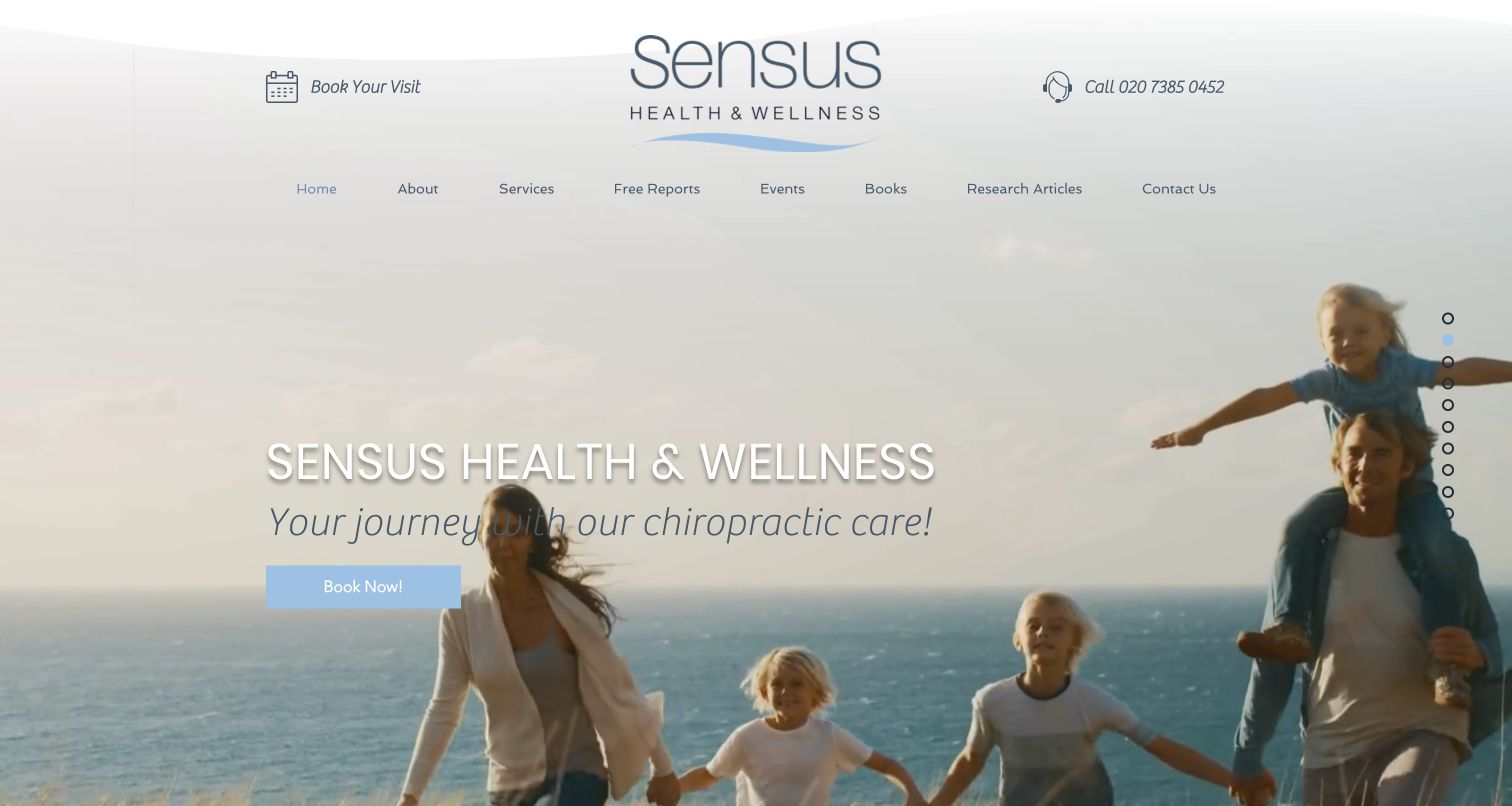
Sensus leads with family footage and a soft blue brand identity, keeping Book Your Visit and phone access above the main menu. The first view is atmospheric, with the service name and a broad journey statement rather than detailed logistics. The inspected page adds a factual Fulham introduction, practitioner context, service summaries and local contact content. Its menu also exposes reports, events, books and research articles, making the website a substantial publishing surface as well as an appointment entrance. Small right-edge section dots suggest another way through the long page.
What you can learn
Keep the practical clinic explanation close to a lifestyle-led opening so visitors do not confuse brand imagery with evidence of outcomes. A resource-rich practice needs clear editorial categories, dates and qualified reviewers, especially for health-related articles. Events and books should support, not crowd out, service and first-visit information. Ensure section-dot navigation has accessible names and a conventional link alternative. If the same booking action appears repeatedly, keep the destination and appointment expectations consistent throughout.
Pros
Phone and visit access are persistent in the header
Services and resource content are organized into named destinations
Cons & considerations
The opening message is less concrete than the local introduction below
Small section-dot controls need accessible labels and keyboard review
The Joint explains its walk-in model in the introductory copy and places a location-search panel beside a new-patient offer. Plans and Pricing have a primary menu position, while careers and franchise links remain visible in the same row. The inspected page expands into a service-model explanation, clinic-network context and information links. The actual screenshot includes a consent layer and a separate privacy-update bar overlapping the bottom of the search-and-offer area. Its clearest design lesson is the explicit operating model; the benefit language and promotional price are not a guarantee of suitability or results.
What you can learn
Tell visitors when the service works differently from ordinary appointment booking, then connect them to current local hours, process and prices. A national offer must retain relevant conditions and branch-specific information. Avoid giving franchising and patient tasks identical prominence on every screen. Coordinate consent and policy notices as one system, because independent panels can obscure the primary location finder. Keep the ordinary directory available if search or location-based features do not load.
Pros
The walk-in model is explained before the finder
Plans and pricing have a clear menu destination
Cons & considerations
Two bottom notices overlap practical finder and offer content
Franchise and career links compete with patient navigation
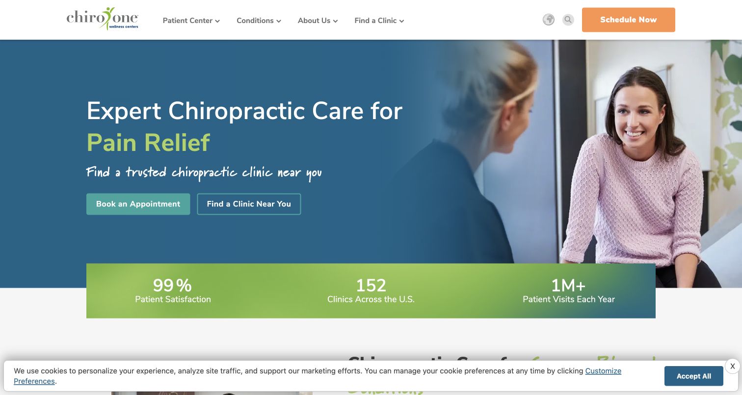
Chiro One uses a blue treatment-consultation image with separate booking and clinic-finder actions. The compact visible menu groups extensive material into Patient Center, Conditions, About and Find a Clinic. The inspected structure includes what to expect, forms, insurance verification and referrer programs within that patient-oriented grouping. A numerical strip follows the hero, and a small consent bar remains at the lower edge of the capture. This is a useful contrast with a menu that exposes every page individually: the visible row stays short, while the expanded content is considerably more complex.
What you can learn
Use grouped navigation to keep a large network legible, but make important administrative pages easy to predict within those groups. Insurance verification, forms and visit expectations should not require trial-and-error browsing. Keep local availability and prices connected to the chosen clinic. Large survey or activity numbers need maintained context rather than being treated as proof of care quality. Test menu keyboard behavior and touch access independently; the screenshot establishes presentation, not complete accessibility.
Pros
Booking and finding a clinic are separate actions
The patient center includes practical administrative resources
Cons & considerations
The large expanded menus need careful keyboard and mobile testing
The numerical claims require clear source and scope context
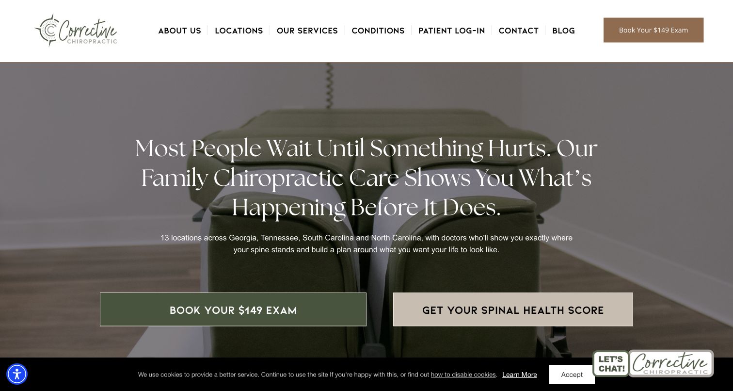
Corrective Chiropractic places a large serif statement over a treatment-table photograph, with two wide actions for a priced exam and its branded spinal-health score. The header keeps patient login separate from locations, services and contact. The inspected page explains its regional coverage and links to a what-to-expect page. Several overlapping promotional and chat panels appeared during inspection and were dismissed for the retained capture; a shallow cookie bar remains. The score is presented by the publisher as a clinical assessment concept, not a website-design measurement or independently validated conclusion from this review.
What you can learn
Name a proprietary assessment carefully and explain its scope before asking visitors to treat it as a decision tool. Preserve plain service, location and first-visit information alongside branded terminology. A priced exam route should disclose current components and terms without implying every person needs the same tests. Coordinate popup and chat behavior so people can understand the page before being asked to engage. Keep existing-patient access dependable as campaigns change.
Pros
Existing-patient login is explicit in the main menu
The exam and assessment routes are visually differentiated
Cons & considerations
Branded score language needs careful explanation and clinical evidence
Several observed overlays can interrupt basic orientation
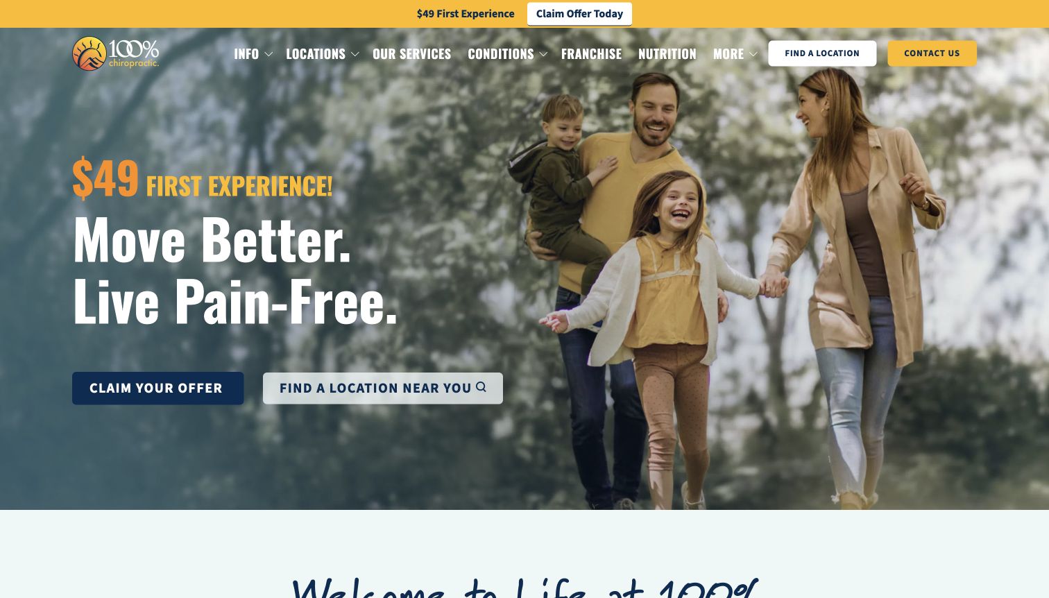
100% Chiropractic uses a family photograph, yellow accents and condensed display type to lead with a first-visit campaign. Claim Your Offer and Find a Location Near You sit together, separating promotional interest from branch discovery. The inspected page explains its advertised experience as a sequence across two visits, then presents service cards and information links. The main navigation also contains franchise and nutrition destinations, illustrating the wider commercial ecosystem around a patient-facing site. The offer's concrete price is prominent, but this review does not adopt its promised clinical outcomes or imply that every advertised component is appropriate.
What you can learn
Make the structure of an introductory offer understandable, including visit count, current conditions and any clinical qualifications. Keep a direct branch finder available to visitors who do not want the promotion. National messaging should connect to actual local hours, providers and service availability. Review how adjacent franchise and product businesses are separated from patient decisions. Bright campaign branding can remain consistent while the offer itself expires through a controlled publishing workflow.
Pros
Offer interest and location discovery have separate controls
The supporting page explains the advertised visit sequence
Cons & considerations
The offer-led opening may overshadow ordinary first-visit questions
National campaign components need clear local terms and clinical qualification
Kegan is a freelance web designer and developer with 15+ years of experience helping businesses turn complicated website requirements into clear, maintainable digital experiences. He works directly with clients from planning and design through development, launch, and ongoing support.
For chiropractor website design, his development approach focuses on clear practice and practitioner information, responsible patient education, local office details, and privacy-conscious appointment-system handoffs. The scope can be a targeted improvement or a complete custom build, with responsive layouts, thoughtful content structure, and integrations chosen around the people using and maintaining the site.
Show 3 other chiropractor website designersHide other chiropractor website designers
Plan a chiropractic website around clear local information
Define the real service and audience structure
List the practice's actual services, practitioners, branches and administrative audiences before choosing page templates. Let qualified staff review service descriptions. Avoid turning a website category, body-area selector or marketing quiz into an apparent diagnosis or personalized recommendation.
Document the first visit accurately
Explain how appointment requests work, who confirms them, what information is needed and where practical questions belong. Use the process actually followed at the clinic. Do not promise that every visitor receives the same examination or treatment merely because an introductory offer lists components.
Maintain one source for local facts
Store each location's address, hours, telephone, access arrangements and booking destination centrally. Review headers, footers, maps, mobile actions and third-party scheduling pages together. Name changes and clinic-family relationships need particular care so legacy addresses and conflicting contact numbers do not persist.
Make cost information a maintained resource
Give fees, offers, payment questions and any insurance process clear destinations and named editorial owners. Date-limited campaigns need expiry handling. Distinguish introductory pricing from ongoing costs and ensure the clinic approves any statements about participation or individual coverage.
Show the clinic without implying outcomes
Use genuine, permissioned practitioner and premises imagery. Explain what the viewer is seeing where it matters. Treat testimonials, numerical results, branded scores and research summaries as content requiring appropriate review; their presence on a page is not independent proof of effectiveness.
Test the complete public journey
Check keyboard use, text zoom, narrow screens, reduced motion, paused media and consent states. Ask testers to identify the right branch, find first-visit guidance and understand whether an action requests or confirms a booking. Do not submit real patient details or create appointments during routine website QA.
The editing job behind the design
Choose technology that keeps people, locations and booking routes aligned
A suitable publishing system connects practitioner profiles, services, clinic details and practical patient information. Keep public content separate from health records and detailed intake. Where scheduling or payments happen in another system, make the transition recognizable and ensure the destination matches the selected clinic.
Prioritize reliable editing, accessible navigation, media fallbacks and control over temporary promotions. Inventory forms, chat, videos, analytics and external portals with appropriate privacy and security reviewers. Public website technology evidence does not reveal a complete clinical infrastructure or establish the compliance of hidden systems.
Our WordPress website examples offer a separate look at publishing approaches. A visible platform label is evidence for that named page, not a guarantee that the same system will suit your requirements.
Before the public launch
Chiropractic website planning checklist
Describe the practice's actual service scope in plain language.
Introduce named practitioners and current clinic teams.
Give each real location a dependable contact and access page.
Separate new-patient and returning-patient routes where useful.
Explain what happens after an appointment request.
Keep fees, offers and administrative policies up to date.
Connect services to the clinicians and branches offering them.
Review old clinic names and external booking destinations.
Use genuine premises and practitioner imagery with permission.
Review outcome claims, testimonials and branded assessments appropriately.
Test overlapping consent, chat and promotion states.
Keep sensitive patient information out of public analytics and routine testing.
These checks are a project checklist, not a performance, legal, security, or accessibility certification. Test real journeys with the people responsible for the website before making claims about the result.
Sources & editorial method
How this collection was selected and reviewed
The twenty-five examples match the collection's saved target. Official public properties were independently opened, inspected and directly captured in an ordinary browser. Original commentary describes visible design choices, practical lessons and conditional considerations without testing care or submitting patient forms. Chiro.London and Putney are related clinic-family properties, included for different local and network design approaches rather than as independent organizations. Editors Choice favors a researched smaller specialist and is not a clinical award, outcome ranking or visitor vote. Website media and trademarks remain their owners' property.
Each example links to its actual source page. Screenshots are direct browser captures with their own capture dates; moving imagery, announcements and live designs can change. The notes describe observable design choices and conditional tradeoffs, not measured traffic, conversion results, service quality, or accessibility conformance.
Technology labels use public page metadata, asset evidence, or explicitly cited platform documentation. Platform documentation is not a complete current deployment audit. A component reference may be legacy or unused; it is not a complete backend inventory. Unknown stacks are omitted. These sites are editorial examples, not our client portfolio.
Written, Edited and Curated are separate editorial records, not timestamps advanced by a rebuild. Website designs and imagery belong to their owners. See our editorial standards or suggest a correction.
Questions worth asking
Chiropractor website design questions
What should a chiropractic homepage include?
Begin with a plain description of the practice, recognizable location information, named clinicians and a clear next step. Give fees, first-visit guidance and contact questions easy-to-find supporting pages. The homepage should orient someone without requiring them to understand every technique name.
Does a small clinic need a large location finder?
No. A single office often benefits more from a clear address, transport and access details, relevant photographs and one dependable contact route. Atlas shows how a specific neighborhood and practitioner identity can give a compact practice substance without network-scale navigation.
Should an appointment button open a request or a live booking?
Either can be appropriate if the label and follow-up explanation match what actually happens. A preference request should not look like a confirmed appointment. Make the clinic, practitioner and any transition to an external service clear before someone shares personal information.
How should offers be handled?
Give campaigns current dates, clear scope and an owner responsible for removing or replacing them. Explain how an introductory price relates to other costs without implying that every visitor needs the same clinical pathway. Test promotional panels alongside consent and chat interfaces.
Can a website's claims establish clinical quality?
No. This guide studies public design and information presentation. Testimonials, numerical results, awards and branded assessment scores are publisher statements unless independently established for a specific purpose. Personal care decisions require appropriate professional advice and current practice information.
A strong chiropractic website makes the real practice understandable: who works there, where to go, how an enquiry works and where practical questions are answered. Build that clarity first, then let imagery, type and interaction express the clinic's individual character.