Best Theater Websites of 2026 (17 Real-World Examples)
Theater websites that make a changing program understandable and connect the character of a production to practical visit and booking information.
Study 17 directly reviewed theater websites, including producing companies, intimate venues and larger cultural organizations. Compare how their homepages balance artistic identity, current productions and the next audience action.
A theater website often meets a visitor at a particular moment: someone has heard a title, is planning an evening, is checking a date or is looking for information that will make a visit possible. The design needs to connect that immediate task to the company’s larger artistic identity.
An expressive campaign image can introduce a production, but titles, performance dates, venue details and booking status must still be legible. The examples in this collection are useful for examining that relationship. They show different programming and ticketing approaches rather than a single template that every theater should copy.
Before the examples
What makes good theater website design in 2026?
Distinguish the production from the performance
Give each show an understandable title, date range, location and route to its actual performance choices. A campaign landing page and a ticket for a particular date are different things. Make that transition clear, especially when a program includes several venues or types of event.
Keep practical visit information close
People should be able to find the venue, arrival guidance, contact route and the theater’s own access information without decoding a promotional graphic. Put relevant details on production pages as well as in a general visit section, and give them a responsible owner.
Make the changing program maintainable
Choose content structures that support new announcements, current events, sold-out dates and past work. A finished run should move into a useful archive without continuing to look bookable. Keep a campaign’s dates and ticket destination consistent wherever it appears.
The collection · 17 examples
17 theater websites worth studying
Compare production artwork, program cards, dates and audience routes across these 17 theater sites. The editorial sequence assesses website presentation, not the artistic quality of performances or the quality of visitor services.
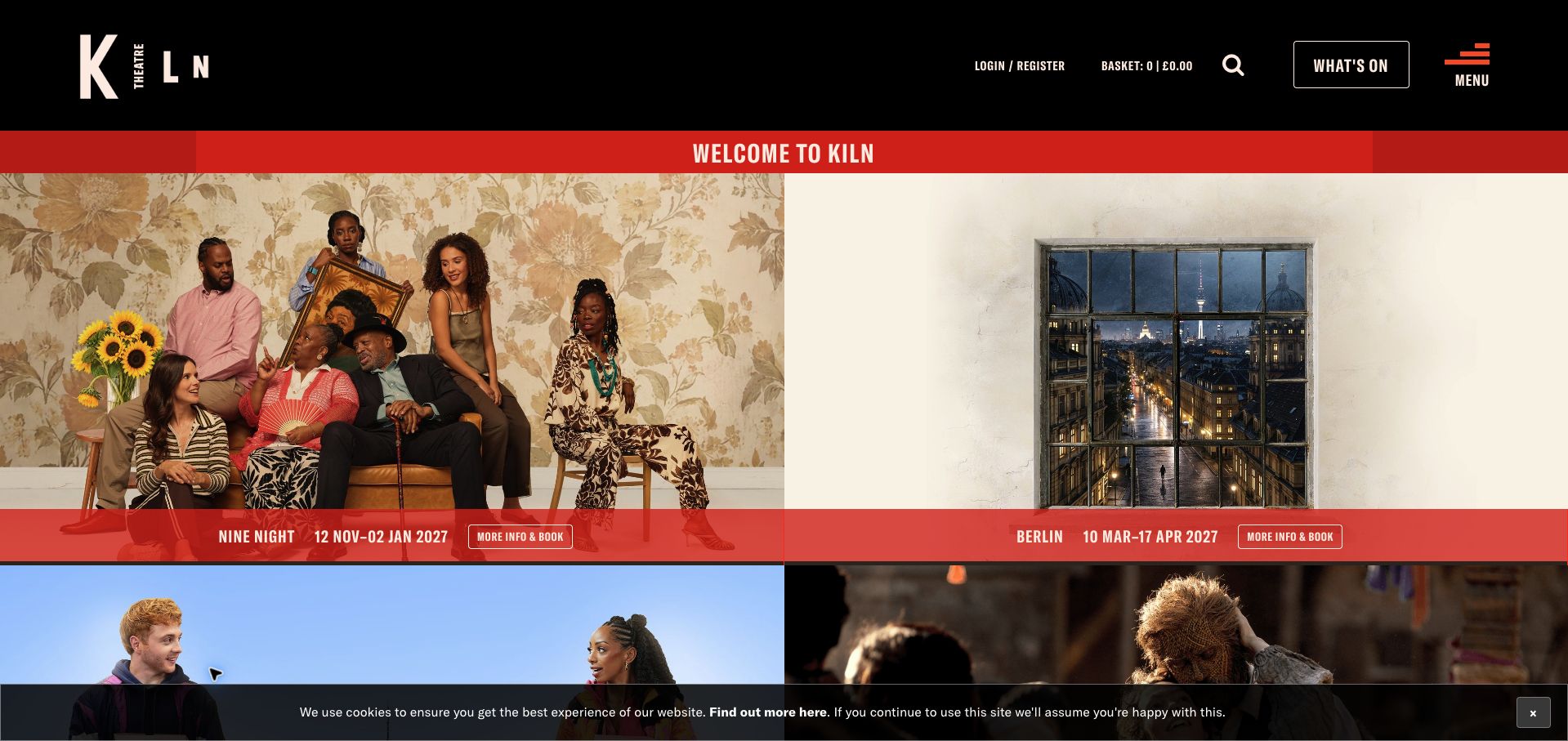
Kiln Theatre gives its current program the structure of a useful noticeboard. Large production images sit in a two-column grid, with red titles, date information and booking links tied to each show. The black masthead keeps the organization recognizable without occupying most of the first screen. This is the collection’s editorial choice because the page connects the visual invitation to the practical decision: which production, when it runs, and where to continue. That selection concerns website presentation, not the quality of a performance or visitor service.
What you can learn
Build the homepage around complete show records rather than disconnected promotional panels. Keep title, run dates, image and next action together when cards reorder on mobile. Give cinema, participation and access information clear routes, while letting the principal program remain understandable without opening a menu.
Pros
Repeated card structure makes different productions easy to scan without waiting for an animated slide.
The red headings and explicit booking links give the imagery a clear practical destination.
Cons & considerations
Several equally prominent images can compete when every production needs a different audience or age range.
A dense program still needs useful filters and accessible-performance details beyond the homepage cards.
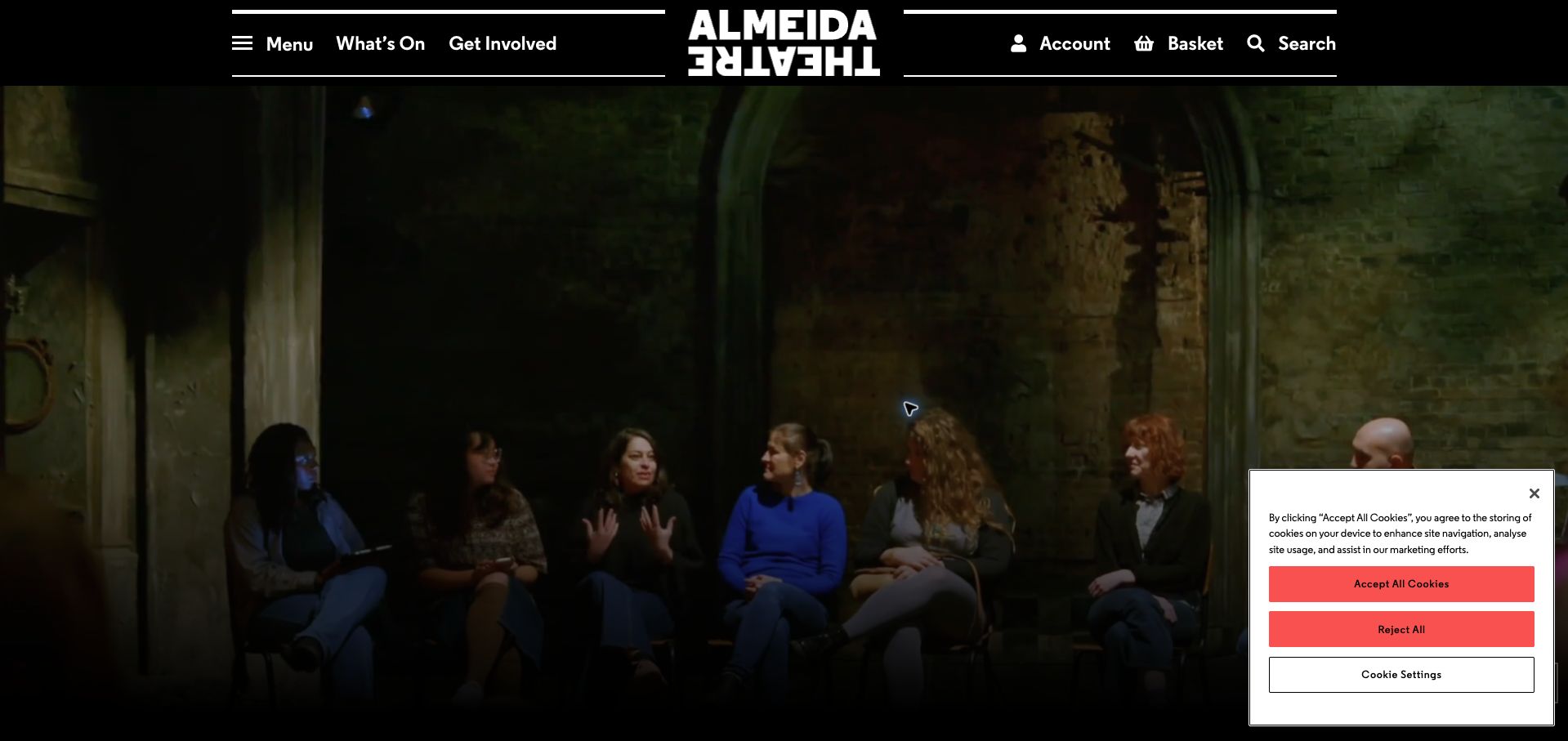
The Almeida homepage opens around performance footage, framed by a compact dark navigation bar. What’s On and Get Involved remain visible alongside the centered theater identity, while account, basket and search serve returning visitors. The page then introduces a show carousel with distinct production names and individual next steps, including a cinema-screening route in the observed program. The contrast is instructive: the opening establishes mood, while the following records have to turn that mood into a specific visit or viewing decision.
What you can learn
Treat the film as an introduction, not the only way to understand the program. Retain a useful still image, a visible pause control and actual production details in ordinary page content. Label screenings differently from performances so someone does not assume every listing takes place in the theater building.
Pros
A visible pause control acknowledges that moving imagery should remain under the visitor’s control.
Separate event actions can distinguish a cinema screening from a conventional performance booking.
Cons & considerations
The opening footage can delay discovery of the show name and practical scheduling details.
A horizontal listing carousel requires extra movement to compare productions that could fit in a simple list.
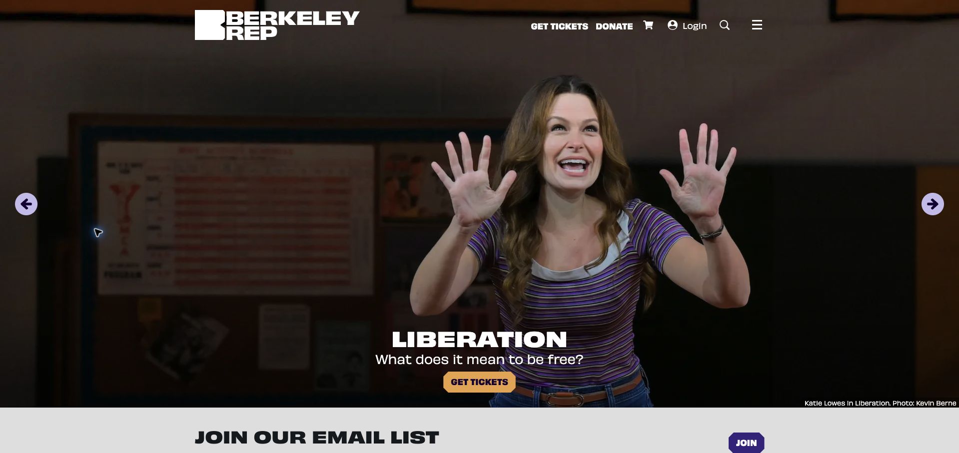
Berkeley Rep’s captured opening gives Liberation almost the entire screen. A large performance photograph is darkened enough for the white title, short question and yellow ticket button to remain legible. Ticket access and donating stay in the top navigation, with basket, login, search and menu controls alongside them. The hero also belongs to a wider showcase that includes the season offer. The design makes an individual production feel immediate, while the persistent navigation offers a route for people who already know what they want.
What you can learn
Separate a specific show’s ticket button from the general program destination. If the hero rotates between a production and a season package, make each slide’s action describe that distinct offer. Preserve the photographer credit and test the text against every image, not just the darkest promotional frame.
Pros
The yellow ticket action stands apart from the white title and surrounding performance photography.
Top-level ticket access remains available independently of whichever showcase panel is visible.
Cons & considerations
A nearly full-screen hero leaves little room for comparing dates or other productions immediately.
A season package and a single-show offer require different explanations even when they share the same carousel.
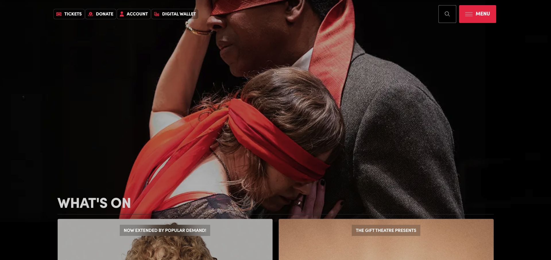
Steppenwolf uses a dark stage-like opening with red emphasis, giving the homepage a recognizably theatrical character. The header separates practical ticket, donation and account-related routes from the production imagery, and the next program cards begin below the hero. Rather than relying on a neutral institutional appearance, the site lets its visual treatment establish an attitude. The useful design question is how well that expressive surface continues to support ordinary tasks such as finding a production, returning to an order or choosing an appropriate date.
What you can learn
Give the expressive artwork one clear job: inviting interest in a show or season. Keep transactional utilities stable across campaigns, and use readable labels for account and ticket-management destinations. Carry each production’s name and schedule into a repeatable card so the wider program does not depend on recognizing its poster.
Pros
Persistent utility routes support returning visitors who do not need another explanation of the theater.
The contrast between dark backgrounds and red accents creates a coherent frame for changing show artwork.
Cons & considerations
Dark image treatments need careful text contrast checks as promotional photography changes.
Several ticket-related utilities can become ambiguous unless their labels explain the difference between buying and managing tickets.
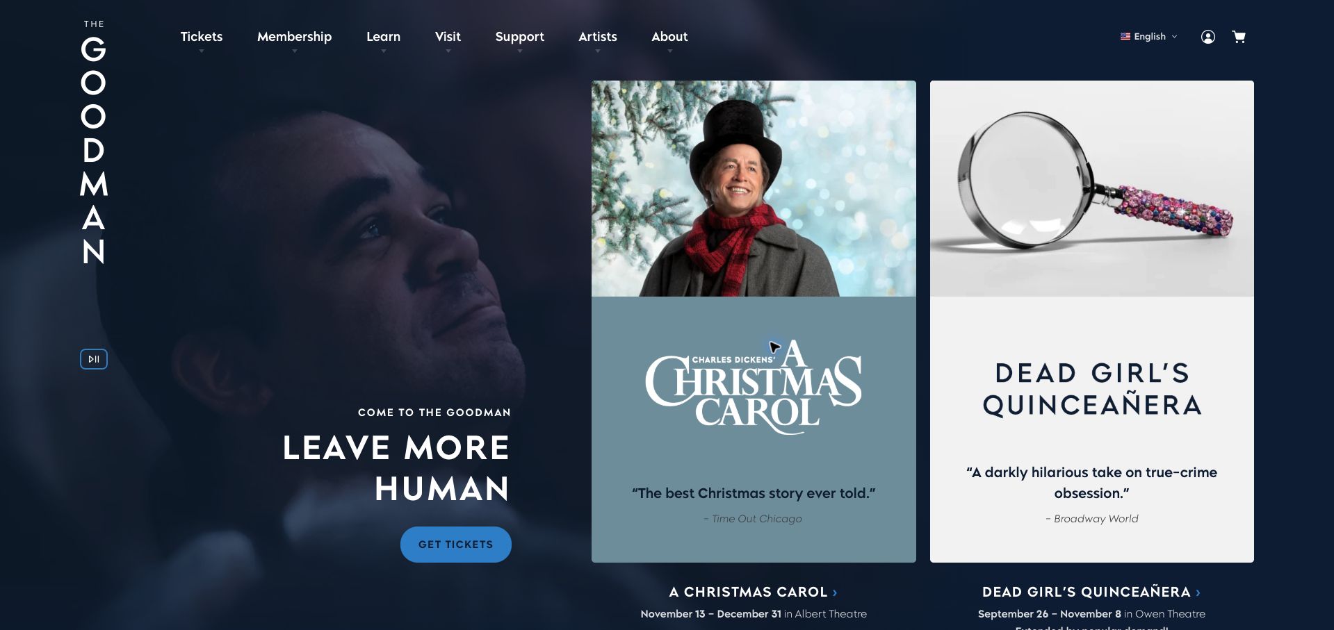
Goodman Theatre places two prominent show panels beside a navy identity area. The observed pairing of A Christmas Carol and The Dead Girl separates the productions through their own imagery and titles, with dates attached to the promotional material. This creates an immediate comparison rather than asking the visitor to wait for a hero to rotate. The navy frame provides continuity while each show keeps a distinctive visual language, an approach that suits a season whose productions should not all look like one campaign.
What you can learn
Use the same information hierarchy across visually different show cards. Visitors should find title, run dates and the next action in predictable places even when artwork changes completely. Make the mobile order an editorial decision, and avoid treating whichever production happens to load first as the only important event.
Pros
Two simultaneous promotions expose more of the program without relying on timed slide changes.
A consistent institutional color can hold together production campaigns with very different imagery.
Cons & considerations
Large cards can push smaller events and visiting programs out of the first screen.
Text incorporated into campaign artwork needs an equally useful accessible text equivalent in the page.
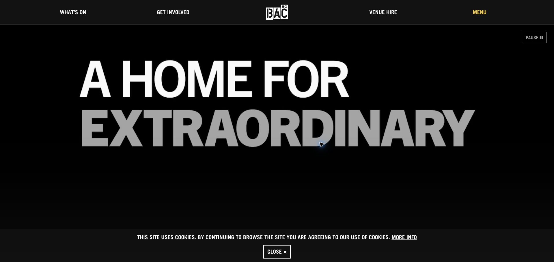
Battersea Arts Centre leads with a large black-and-white statement and moving imagery rather than a single conventional show poster. The opening presents a place for extraordinary work, with the venue identity acting as the frame for a broader program. That makes sense for an organization with several kinds of participation, but it also creates a second task for the page: moving from the institution’s personality to a specific event. The captured cookie notice occupies part of the lower edge, illustrating how consent interfaces become part of the actual first impression.
What you can learn
Follow a broad arts proposition with concrete, dated choices. Distinguish performances, workshops and other activities through useful labels rather than expecting the imagery to explain everything. Ensure essential program information remains available when video is paused, blocked or still loading, and keep privacy choices from swallowing the whole opening view.
Pros
The oversized type gives the organization a distinct identity even without recognizing a particular production.
A restrained black-and-white frame can accommodate very different artistic imagery over time.
Cons & considerations
An atmospheric statement alone does not tell a new visitor what is available on a chosen date.
Moving media and a consent layer can compete with the practical program links that need attention next.
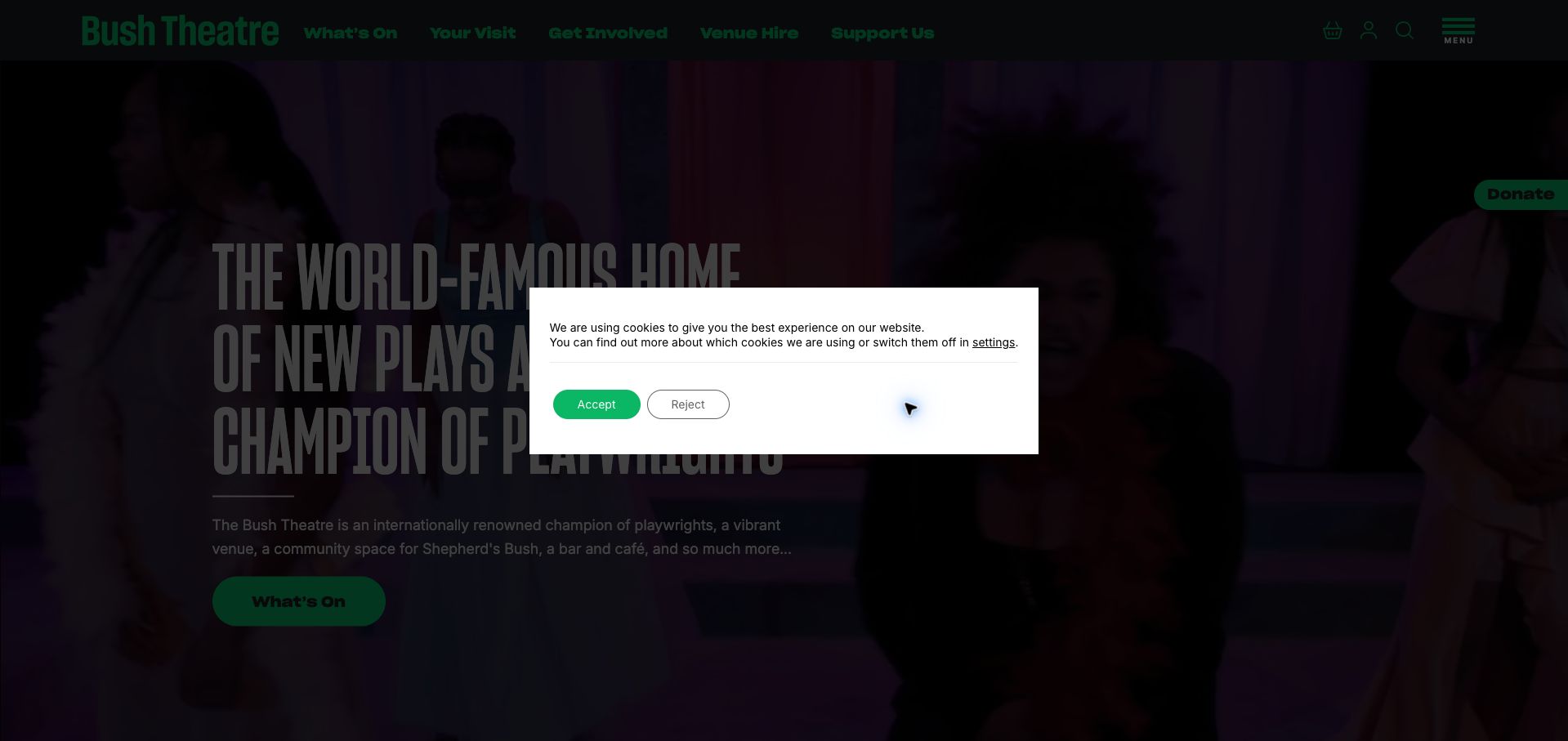
Bush Theatre explicitly positions itself around new plays and playwrights. Its homepage connects that proposition to a season introduction, a What’s On route and visible navigation for visits, involvement, venue hire and support. The observed first view includes a prominent cookie dialog, which interrupts the otherwise direct introduction. The underlying page is useful to study because it explains both the program and the institution’s role as a community space, rather than treating every visitor as someone ready to buy a ticket immediately.
What you can learn
Connect the artistic mission to actual ways of participating. Use specific navigation labels for visiting, getting involved and hiring space, then give each journey an appropriate next step. Review the real first visit with consent controls visible; a strong headline cannot communicate effectively if a large dialog covers it.
Pros
The proposition makes the focus on new writing understandable without a long organizational history.
Visit and participation routes acknowledge audiences beyond straightforward ticket buyers.
Cons & considerations
The captured consent dialog occupies the center of the opening and competes with the theater’s message.
A mission, season announcement and individual shows need a deliberate hierarchy to avoid several competing introductions.
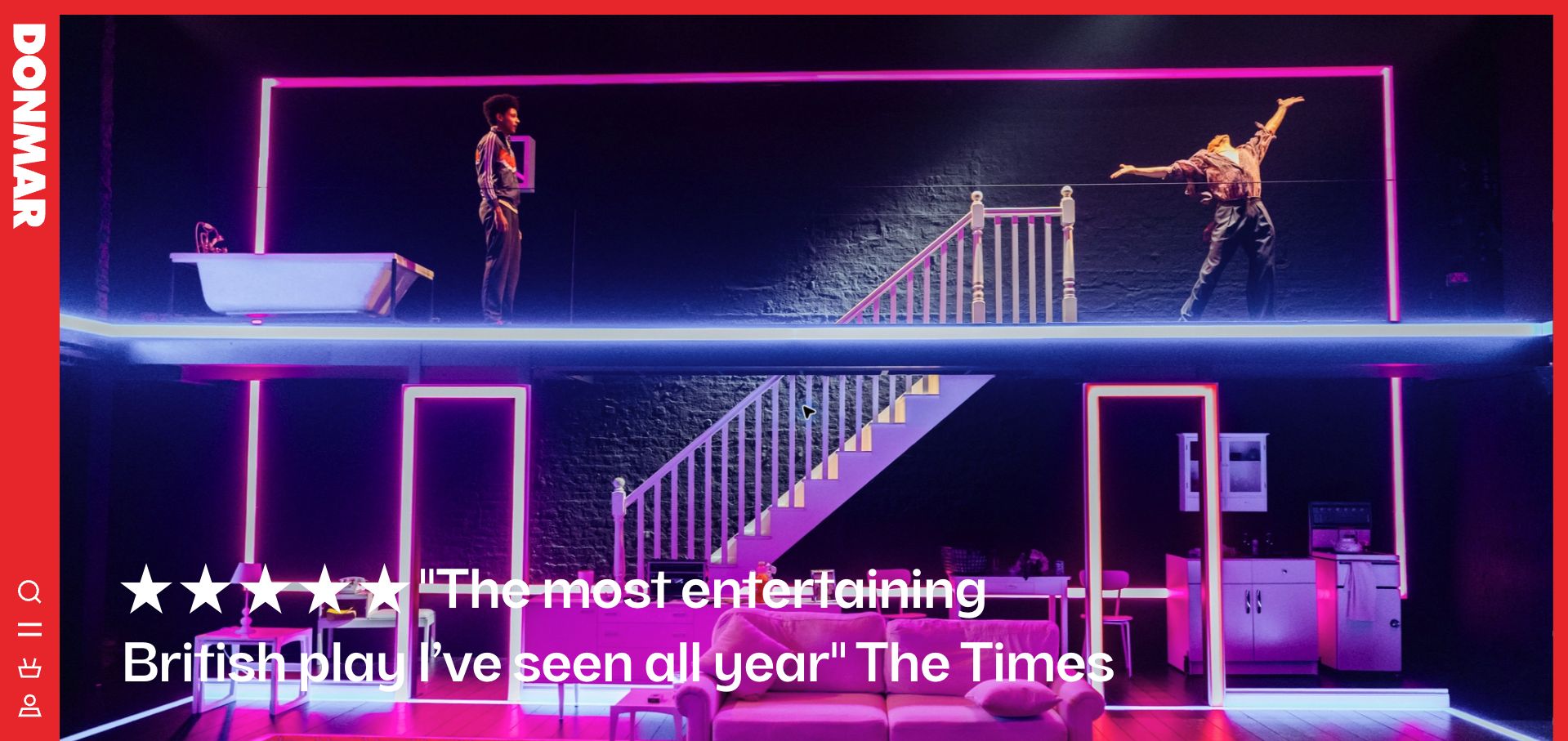
The Donmar Warehouse opening combines saturated production imagery with a vivid red vertical identity rail. A quotation sits over the scene, while the rail gathers the brand and compact controls along the edge. It is a memorable alternative to the usual horizontal theater header: the performance image retains a large uninterrupted area, but the navigation becomes less conventional. The page is most useful as a study in art direction and orientation, especially when familiar visitors and first-time ticket buyers must use the same interface.
What you can learn
If navigation moves into an unusual rail, make its meaning unmistakable. Pair symbols with accessible names, keep the program route easy to discover and test how the rail transforms on a narrow screen. Treat quotations as supporting context rather than a substitute for the production title, schedule and booking information.
Pros
The contrasting side rail establishes a stable identity without placing a large bar across the artwork.
Strong stage photography gives the production a more specific atmosphere than a generic venue image.
Cons & considerations
An unfamiliar navigation position can slow a first-time visitor who is looking for ordinary ticket information.
Overlay quotations require careful contrast and should not obscure the practical facts about the production.
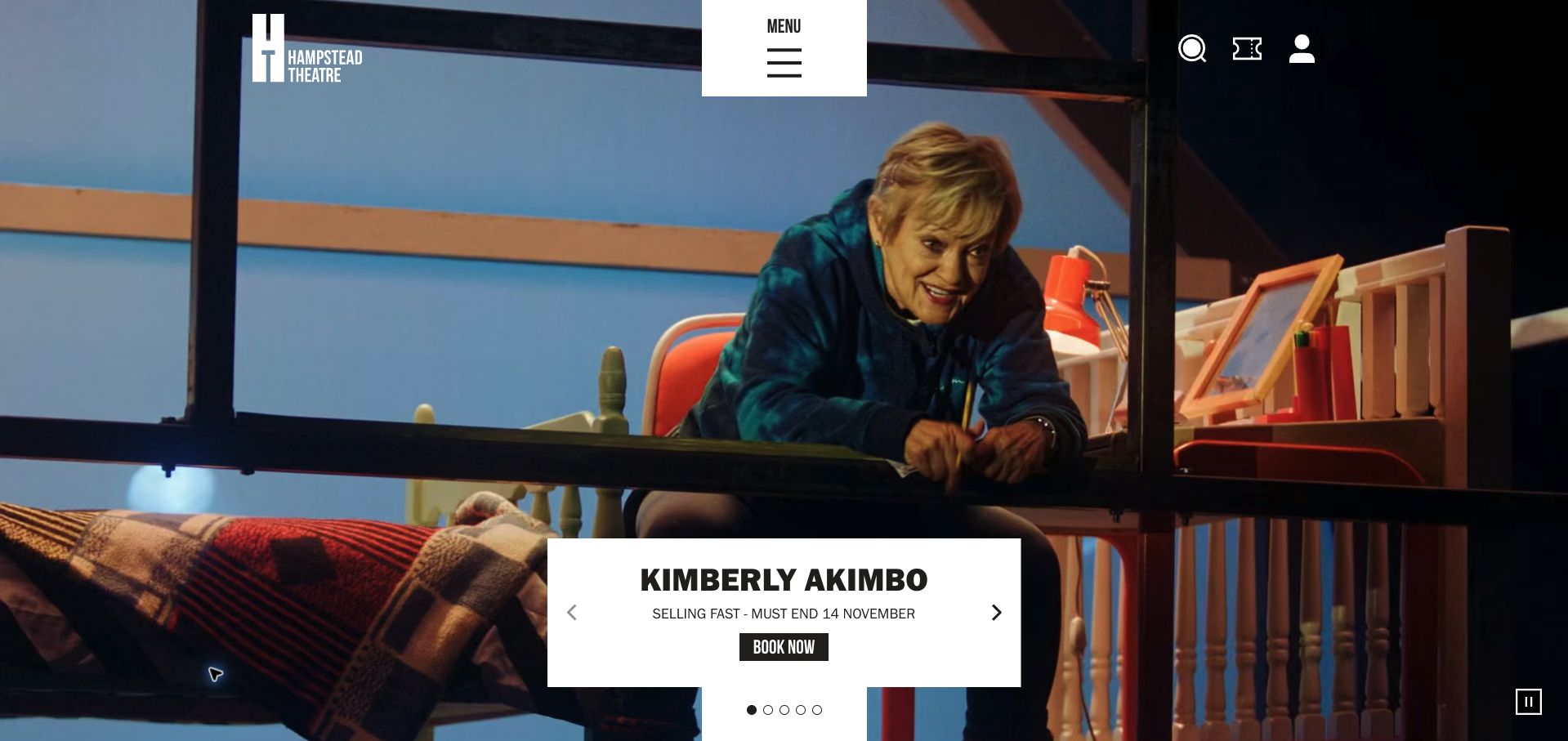
Hampstead Theatre’s captured homepage places production imagery behind a bright information panel for Kimberly Akimbo. The pale panel creates a readable place for the offer and next step, while the surrounding scene supplies character. A separate white navigation block and compact utilities continue the contrast with the darker media. The result is less dependent on finding a quiet patch of photograph for text, although several floating panels can divide attention if the header, production message and booking action all demand equal emphasis.
What you can learn
Use a solid information surface when a video or photograph changes too much to support reliable text contrast. Keep the production title and next action together, and make the panel’s mobile position predictable. The background should enrich the invitation while the readable panel does the practical work of explaining it.
Pros
The light production panel gives text a consistent background even as the surrounding imagery changes.
A clear separation between media and information can support more expressive promotional footage.
Cons & considerations
Multiple floating white interface areas can compete with the show’s principal action.
A video-led opening still needs a useful static fallback and a convenient path to the complete program.
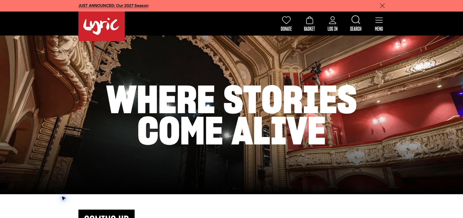
Lyric Hammersmith leads with a wide photograph of its auditorium and very large white type. A coral announcement strip introduces the next season, while a black header presents labeled icons for donating, basket, login, search and menu. The image makes the physical venue feel tangible before a production has been selected. This is a different invitation from a show poster: it asks visitors to imagine being in the room, then relies on the announcement and program below to explain what they can see there.
What you can learn
Use venue photography to answer a real visitor question, such as what the place feels like, while keeping the program close at hand. Give announcement strips a clear destination and an accessible dismissal control. Labels beneath utility icons help people distinguish support, account and shopping tasks without interpreting unfamiliar symbols.
Pros
The auditorium photograph communicates a specific place rather than an interchangeable arts brand.
Utility icons retain visible labels, making their purpose easier to understand.
Cons & considerations
The opening headline occupies considerable space without identifying a particular show or date.
A prominent future-season announcement can distract from productions that are available sooner.
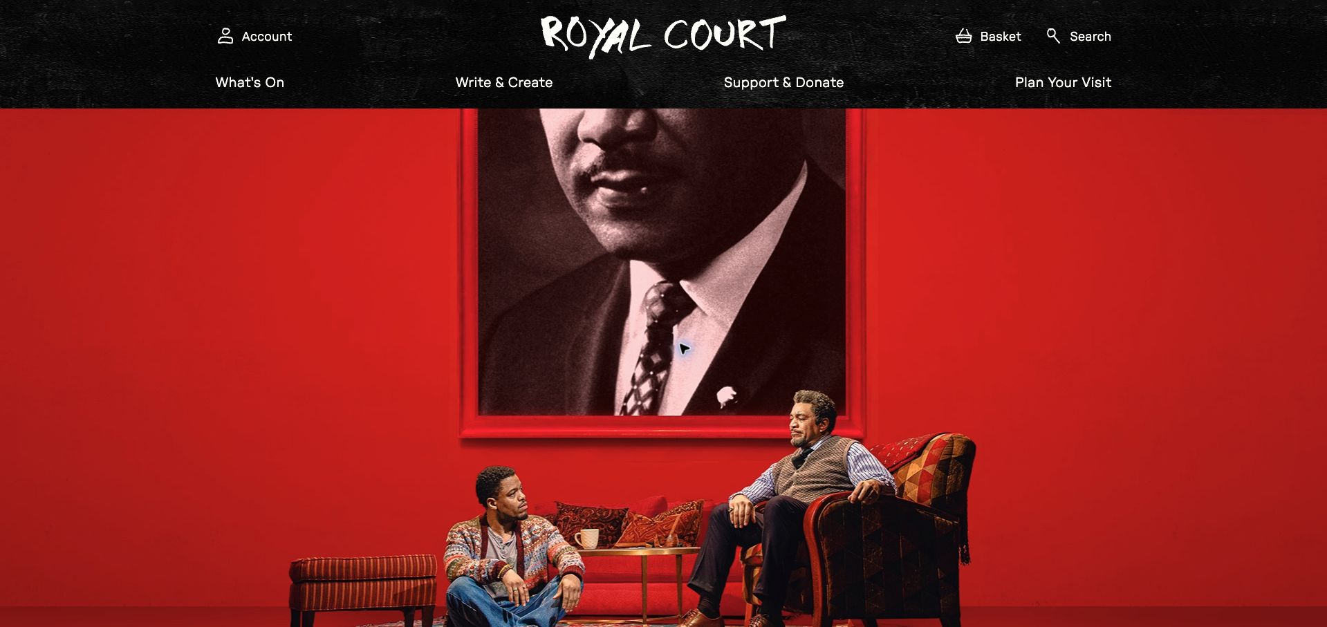
Royal Court Theatre gives the captured opening to a large red stage photograph beneath a textured black header. The central wordmark is flanked by account and shopping utilities, with clear routes for the program, writing and creating, support, and planning a visit. The image has considerable dramatic force, but the first visible frame prioritizes atmosphere over production information. The navigation is the useful counterbalance: it recognizes both audience needs and the theater’s relationship with people making new work.
What you can learn
Let production photography establish a mood while making the associated show record easy to identify. Keep creative participation separate from ticket buying in the navigation, since those journeys require different information. Avoid relying on a recognizable actor, poster or campaign image to communicate the title and availability of an event.
Pros
The main navigation uses distinct audience intentions rather than several overlapping institutional labels.
A strong, uncluttered image area gives current work room to define the homepage.
Cons & considerations
The captured first screen gives little visible space to dates or a direct booking instruction.
Large photography must keep a clear connection to its production when the image crops differently on mobile.
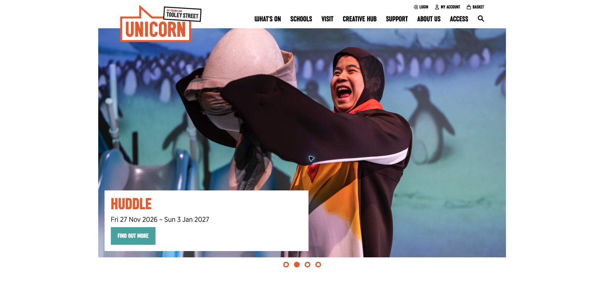
Unicorn Theatre frames its show image within a white page, with a clear white information panel naming Huddle and its run dates. Orange branding and a teal action distinguish the institution from the production artwork. The navigation explicitly separates schools, visiting, creative activity, support and access, acknowledging that a teacher organizing a group trip needs something different from a family choosing a performance. The observed panel uses a find-out-more action, leaving room for practical suitability information before someone commits to a booking.
What you can learn
Put age guidance, access information and school-trip logistics within easy reach of the show record. A broad date range is only the beginning of planning a visit; people also need individual performances and practical arrangements. Keep the primary card readable without requiring the visitor to interpret text embedded in a promotional photograph.
Pros
The solid panel keeps title and run dates legible independently of the production image.
Schools and access receive visible navigation routes rather than being hidden in a generic information page.
Cons & considerations
Carousel dots alone do little to explain which other productions are available.
A general information action still needs to lead clearly toward performance dates and eventual ticket selection.
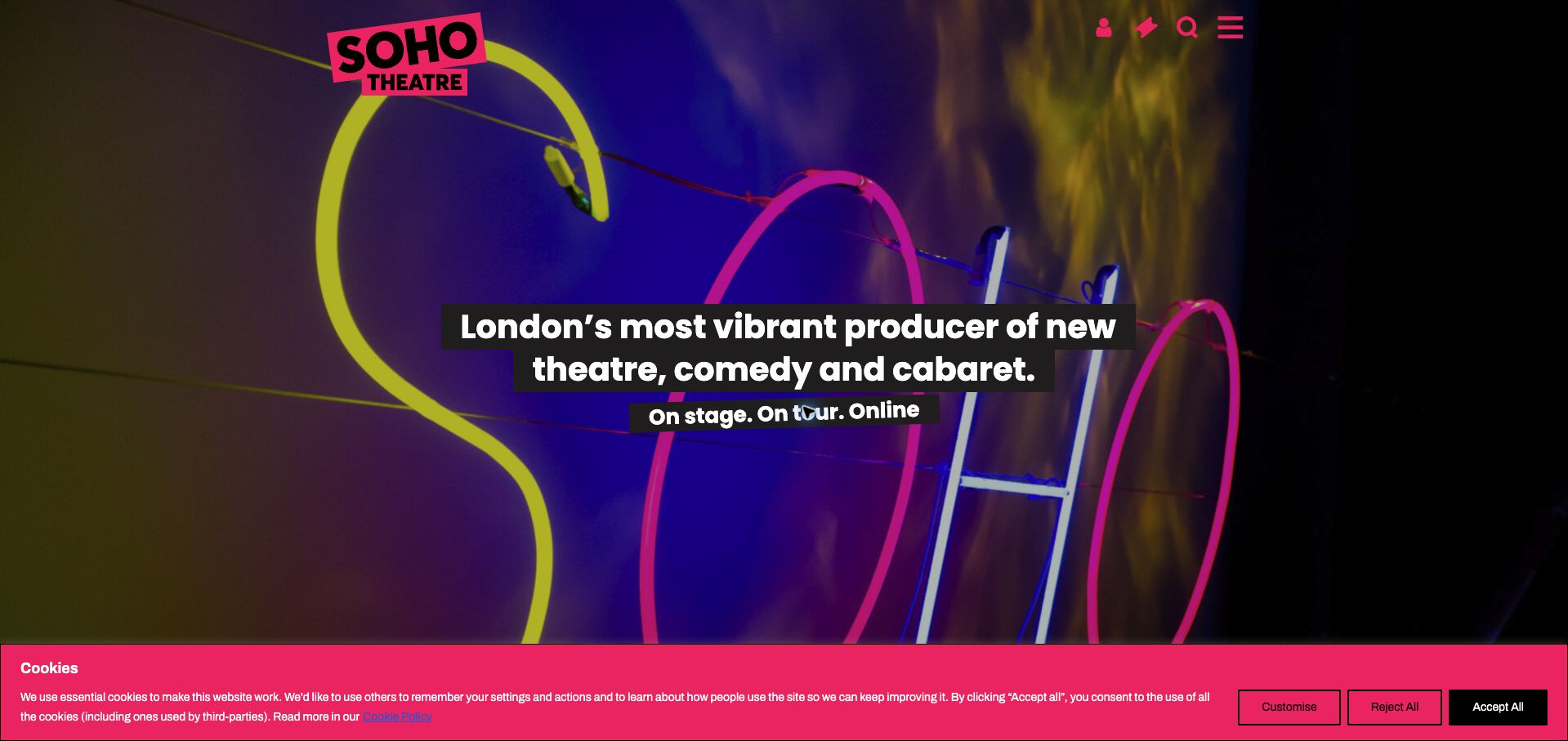
Soho Theatre opens with saturated imagery, a bright pink identity and a concise statement spanning theater, comedy and cabaret. The page then separates its original Soho venue, Walthamstow, digital and touring activity, and South Asian programming. This structure is useful because the brand alone no longer identifies one physical destination. The observed cookie bar remains part of the opening screen, and the compact top-right utilities rely heavily on symbols. The page’s principal job is therefore both emotional and practical: communicating the character of the work while routing visitors to the right place.
What you can learn
When one organization spans several venues and formats, make location and delivery mode explicit before booking. Keep a show’s venue attached to its title and dates throughout the journey. A shared visual identity can unite the program, but it should not imply that every event happens at the best-known address.
Pros
The homepage explains that the offer extends beyond a single venue or one performance category.
Strong pink branding remains recognizable against varied and colorful promotional imagery.
Cons & considerations
Symbol-heavy account and shopping controls may need clearer visible labels for unfamiliar visitors.
A large brand introduction and cookie bar can postpone the specific location and date decision.
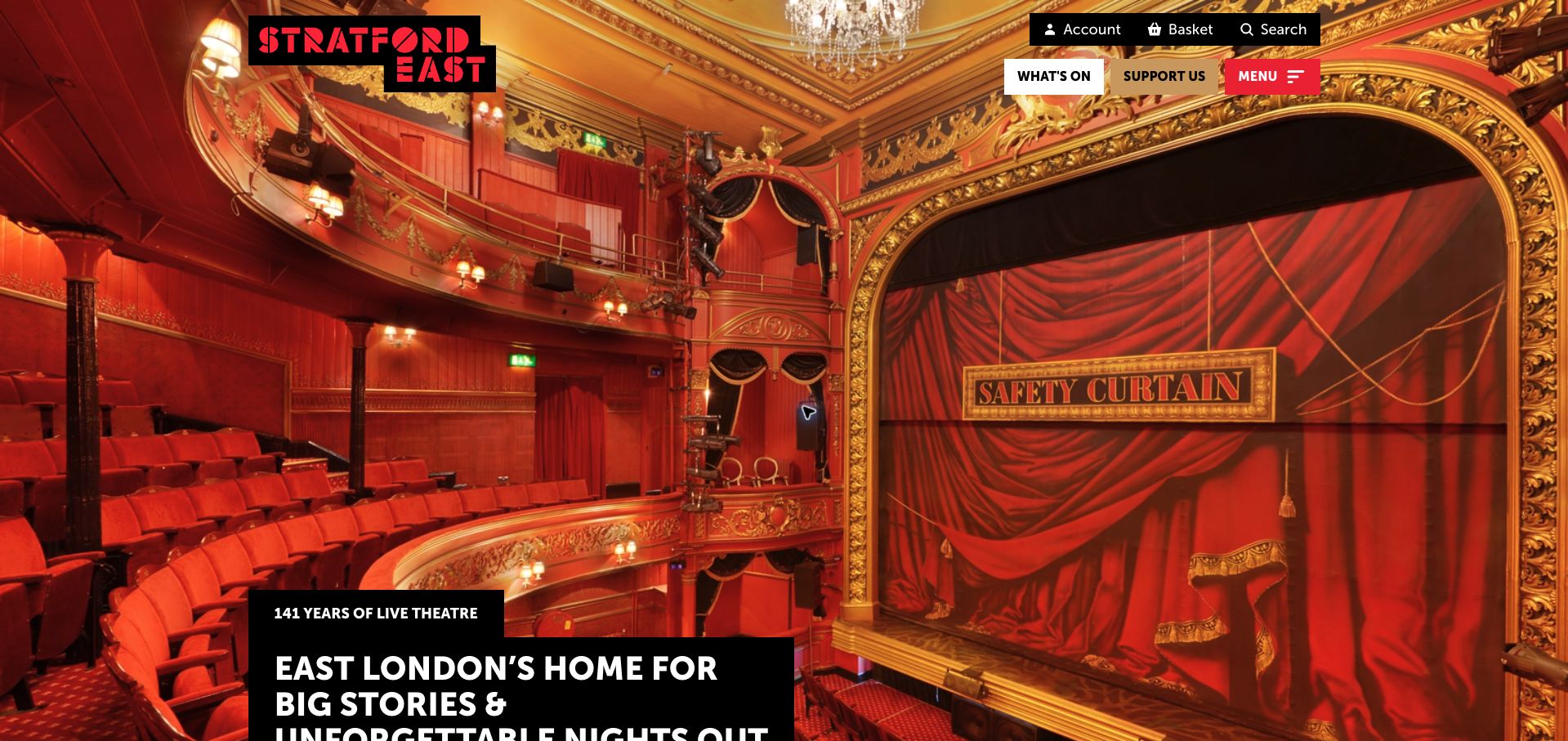
Stratford East uses the red-and-gold auditorium as a full-screen introduction, with black text panels carrying its local proposition. The logo, What’s On and Support Us controls sit above the image, while account, basket and search occupy a separate utility row. It makes the venue’s physical character immediately recognizable. The homepage content also leads into categorized upcoming events, so the strong sense of place has a practical continuation beyond the introductory photograph. The approach depends on balancing an immersive building image with clear access to the actual program.
What you can learn
Make location meaningful through real venue imagery, then provide a fast route to what is happening there. Use separate but consistent treatment for support and booking tasks. Avoid letting a large introductory photograph hide the basic information a visitor needs to decide whether a particular performance fits their plans.
Pros
The real auditorium provides a concrete sense of the experience associated with the venue.
What’s On remains a visibly labeled route above the large opening photograph.
Cons & considerations
The main statement reaches toward the bottom of the first screen at the captured desktop size.
The initial consent dialog can cover the central image until the visitor makes a privacy choice.
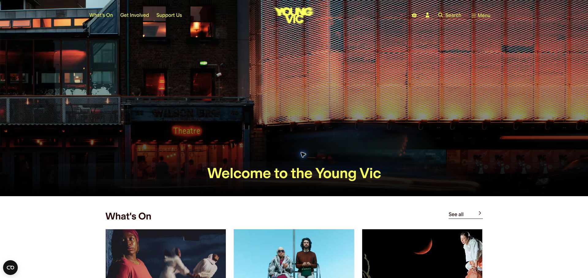
Young Vic’s homepage introduces the building with a broad exterior photograph and a simple welcome, then brings the What’s On grid into view below. Yellow navigation and identity details contrast with the darker facade, while the show cards sit on a white surface. The arrangement avoids making the entire first screen a single production campaign. It gives the institution a recognizable front door and then lets individual productions carry their own visual identities in the program area.
What you can learn
Connect an institutional hero to a useful program grid without a long intervening manifesto. Keep the complete listing link close to its heading, and make every card work independently with a title and practical schedule. Test the bright navigation text against the lightest and busiest portions of the background photograph.
Pros
The opening photograph establishes a recognizable destination before the individual show images begin.
The program section and its see-all route are visible close to the introductory hero.
Cons & considerations
A welcome headline provides less information about current work than a specific program proposition would.
Yellow controls over photography require care when the crop or background brightness changes.
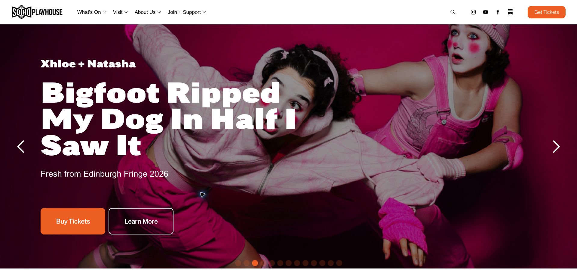
SoHo Playhouse in New York gives a current show a colorful full-width hero with a large title, creator credit and short context line. Two distinct actions offer ticket buying and further information, while a persistent orange ticket button remains in the white header. This is helpful for a program of unfamiliar work: a confident returning visitor can move toward tickets, while someone intrigued by the artwork can first read what the production involves. The extensive carousel also shows the limits of using one hero to represent a busy roster.
What you can learn
Offer an information path alongside the purchase path when the show title cannot explain the experience by itself. Keep production credits readable and show the venue and dates on the destination page. If the carousel contains many items, provide a complete program view so the rest of the roster is not hidden behind repeated navigation.
Pros
Separate buying and information actions accommodate different levels of familiarity with a production.
The persistent ticket button gives returning visitors a stable destination beyond the current slide.
Cons & considerations
A long show title can dominate the screen and leave practical scheduling details farther away.
Many carousel positions make it difficult to compare the full program from the hero alone.
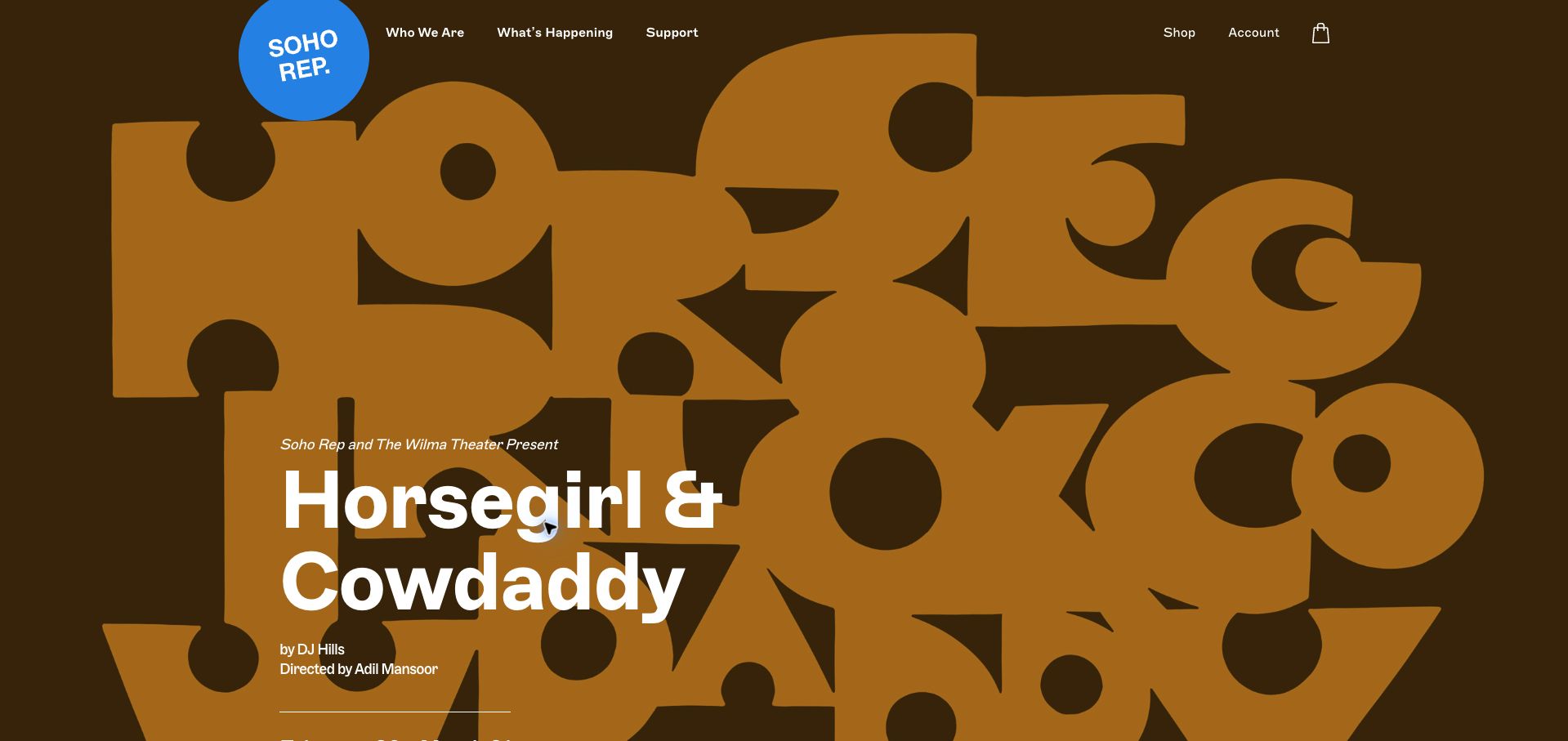
Soho Rep’s captured opening uses oversized brown and ochre lettering as a graphic background, with a bright blue circular identity in the header. The production title, writer and director appear in readable white text over that composition. The navigation stays short, concentrating on the organization, current activity and support, with separate account and shopping utilities. It demonstrates how a distinctive campaign can give a smaller institution a strong public presence, provided the dramatic lettering remains separate from the ordinary text needed to identify the show.
What you can learn
Let expressive typography function as artwork while retaining a clear text version of every essential production detail. Keep creator credits, dates and the booking route close enough to read as one show record. A compact menu is useful only when its few labels still make visiting and ticket information easy to locate.
Pros
The production keeps readable text separate from the oversized decorative lettering behind it.
A short navigation makes the organization’s main public priorities easy to identify.
Cons & considerations
The dramatic composition pushes some practical production details below the first captured screen.
Broad navigation wording such as current activity may need supporting links for visitors seeking a specific date or access arrangement.
Kegan is a freelance web designer and developer with 15+ years of experience helping businesses turn complicated website requirements into clear, maintainable digital experiences. He works directly with clients from planning and design through development, launch, and ongoing support.
For theater website design, his development approach focuses on current production listings, readable run dates, accessible visit information, clear ticketing handoffs, and distinct participation and support journeys. The scope can be a targeted improvement or a complete custom build, with responsive layouts, thoughtful content structure, and integrations chosen around the people using and maintaining the site.
Show 3 other theater website designersHide other theater website designers
Plan around the whole path from discovery to attendance
Build a program model that reflects the real organization
List the kinds of public events the organization presents before designing a single universal show card. A main-stage production, a one-night event, a workshop and a festival may need different dates, descriptions and actions. Use a shared visual language, but preserve those distinctions in the content. Do not force an event into a misleading booking label simply because the homepage template has one button style.
Decide which system owns each piece of information. The ticketing provider may own individual performance availability while the website owns the production description, artwork and supporting resources. Document that division and avoid manually maintaining two contradictory calendars. If the ticketing system cannot be embedded reliably, a recognizable handoff with a useful fallback may be clearer than a broken interactive panel.
Plan the entire content lifecycle. Draft announcements, on-sale events, current productions, cancelled performances and archives need different states. Staff should be able to update them without changing page structure by hand. Keep archived work useful as an artistic record while making its past dates unmistakable. Related current productions can provide a next step without making an old booking button appear active.
Connect campaign expression to readable choices
Give production artwork room to establish tone, then place the title and essential facts in real text. Text inside a poster may be difficult to read on a phone and may not appear in the same order for someone using assistive technology. Avoid assuming that a striking image communicates the production title, venue or date on its own.
Make the first useful action specific. A visitor may need to read about a show before choosing a performance, while someone returning to the site may want dates immediately. Provide those routes in an understandable hierarchy. Check contrast over campaign imagery and decide how the layout behaves when a title is longer than expected or the image has no quiet area for text.
A season announcement can be an effective homepage story, but it should not conceal what is happening now. Keep a straightforward program route available alongside editorial features, membership messages and fundraising appeals. Test the page with the real campaign artwork, consent panel and announcement banners visible; several individually reasonable layers can combine into an obstructed first visit.
Treat visit details and booking handoffs as part of the experience
Work with the people who handle audience questions to identify the information that belongs near a production. This may include its venue, running-time information when established, arrival arrangements, relevant age guidance and the theater’s own access resources. Publish only what the organization has confirmed and make changes easy to communicate. A generic icon should not stand in for an explanation of an actual service or arrangement.
Explain when booking moves to another provider and maintain a recognizable route back to the theater. A receipt, booking confirmation and general enquiry acknowledgement should not be presented as equivalent. Test navigation and error recovery in an appropriate nonproduction environment rather than buying tickets or submitting real audience requests simply to review a design.
Give practical information the same maintenance attention as artwork. Check maps, entrance details, contact links and instructions when a venue changes. For a touring event or a shared building, make the location specific to that performance. Agree on who reviews dates, expired notices and external links so that a campaign remains useful throughout its run rather than only on announcement day.
The editing job behind the design
Connect the program and ticketing systems without duplicating their responsibilities
Choose a content system that lets the team manage productions, events, locations and archives as structured records. A small program can use a simple implementation when its editors can keep it accurate.
Integrate ticketing according to the provider’s actual supported interface. Preserve clear handoffs and fallback links, and do not infer booking capability from a decorative calendar alone.
Public technology evidence concerns the reviewed source page. It does not establish the company’s internal audience database, ticketing administration or donor-management system.
Our WordPress website examples offer a separate look at publishing approaches. A visible platform label is evidence for that named page, not a guarantee that the same system will suit your requirements.
Before the public launch
Theater website planning checklist
List the actual event types and venues the site must describe.
Separate a production’s date range from individual performance choices.
Identify the source of truth for ticket availability and show descriptions.
Keep essential titles and dates in readable text.
Check campaign artwork at narrow widths and with long production titles.
Provide clear current, upcoming, unavailable and archive states.
Keep venue-specific arrival and contact information maintained.
Link to accurate access information and appropriate assistance routes.
Make external ticketing transitions understandable.
Test consent panels, banners and booking errors together.
Use private test environments instead of real audience bookings.
Assign responsibility for updates throughout each production’s run.
These checks are a project checklist, not a performance, legal, security, or accessibility certification. Test real journeys with the people responsible for the website before making claims about the result.
Sources & editorial method
How this collection was selected and reviewed
The original pre-research target is 17 and all 17 selected theater properties have direct browser captures and original reviews. Broad public technology checks are recorded with their actual status and date; unavailable checks are not positive evidence. Reviews concern information hierarchy, imagery and practical navigation. We did not buy tickets, send audience enquiries, assess performances or independently verify venue-service claims. Campaigns and programs can change after capture.
Each example links to its actual source page. Screenshots are direct browser captures with their own capture dates; moving imagery, announcements and live designs can change. The notes describe observable design choices and conditional tradeoffs, not measured traffic, conversion results, service quality, or accessibility conformance.
Technology labels use public page metadata, asset evidence, or explicitly cited platform documentation. Platform documentation is not a complete current deployment audit. A component reference may be legacy or unused; it is not a complete backend inventory. Unknown stacks are omitted. These sites are editorial examples, not our client portfolio.
Written, Edited and Curated are separate editorial records, not timestamps advanced by a rebuild. Website designs and imagery belong to their owners. See our editorial standards or suggest a correction.
Questions worth asking
Theater website design questions
Should every homepage production card link directly to checkout?
A new audience member may need the production description before selecting a performance. Provide a clear route to that information and an appropriately labeled booking route for people ready to choose dates.
Can the poster contain all the important show information?
Keep essential titles, dates, venues and actions in real text as well. A poster may be difficult to read on a small screen and is not a dependable substitute for a structured production record.
What should happen when a run ends?
Move the production into a clearly dated archive and remove or change actions that imply current availability. The page can remain a useful record and offer relevant routes into the current program.
Is a separate ticketing website a design problem?
Not necessarily. A clear, recognizable transition can work well. Explain the destination, preserve the relevant production context and provide a useful route back or alternative contact when something fails.
Do these examples verify venue accessibility or artistic quality?
No. They examine public website presentation. Visitors should consult the theater’s current, specific information and contact its team about arrangements relevant to their visit.