Best Martial Arts School Websites of 2026 (15 Real-World Examples)
Martial arts websites that explain training and the first class
These 15 martial arts school websites show how different dojos and academies introduce their training, organize age groups and explain the first visit. The useful comparison is how well each site connects the school’s character to a practical next step.
A prospective student may not know the differences between styles, ranks or competition formats. Begin with the training offered, the people teaching and the intended audience. Explain introductory arrangements before asking someone to commit to a membership.
Photographs of real instruction can communicate atmosphere better than broad promises about confidence or fitness. This collection reviews the public website experience and does not assess teaching quality, personal safety or the suitability of a training programme.
Before the examples
What makes good martial arts school website design in 2026?
Explain how a newcomer joins
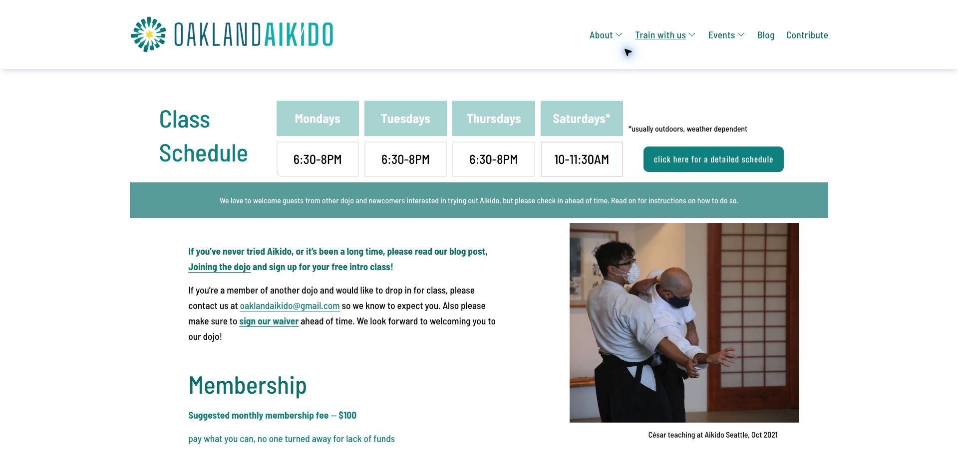
Oakland Aikido combines a readable timetable with contribution information and a staged introduction. That helps a visitor understand how participation begins instead of treating every inquiry as an immediate membership sale.
Connect age groups to actual classes
Children, teenagers and adults may have different schedules, prerequisites and supervision arrangements. Make those distinctions visible in programme pages and timetable rows rather than relying on separate promotional headings alone.
Introduce instructors with context
Name the people teaching and explain their roles and relevant background accurately. Style terminology and ranks can be meaningful, but they should support a plain explanation of the class rather than act as unexplained credentials.
Make the commitment legible
Trial sessions, introductory packages, ongoing tuition and equipment have different costs and conditions. Explain the unit of payment and cancellation process. A free-trial headline needs a clear account of what happens next.
The collection · 15 examples
15 martial arts school websites worth studying
The collection includes different martial arts and organizational models. Compare the clarity of the introductory process, timetable and fees rather than interpreting visual intensity or lineage language as a quality ranking.
Oakland Aikido earns our Editors Choice for making participation understandable before asking a newcomer to make contact. A short, four-column timetable dominates the page, followed by separate instructions for first-time students and visitors from other dojos. The suggested monthly membership amount and pay-what-you-can policy appear alongside a documentary training photograph, giving the design both practical substance and a human setting. Teal headings, generous white space and restrained navigation keep the modest amount of information easy to scan. The outdoor Saturday qualifier sits beside the timetable instead of being buried in a policy page. Some details still lead into a blog post or a separate schedule, and the training precautions would benefit from a visible review date. The selection recognizes clarity of website design, not instruction quality.
What you can learn
Show the weekly commitment, expected contribution and different arrival instructions together so visitors can judge whether attending is realistic.
Pros
Timetable and membership contribution are publicly readable.
Newcomers and visiting practitioners receive different next steps.
Cons & considerations
Introductory instructions require an additional blog-page visit.
Time-sensitive precautions lack an obvious review date.
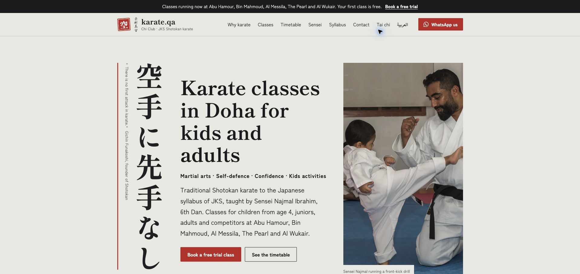
Doha Karate Academy combines a cream background, red accents and Japanese calligraphy with a large photograph of an instructor helping a child practice. The presentation feels more like an introduction to a specific discipline than a generic fitness promotion. Doha is explicit in the opening, while the navigation and body distinguish neighborhood locations and explain elements of Shotokan training. Trial and timetable routes sit together, allowing visitors to investigate logistics before expressing interest. An Arabic route and WhatsApp contact acknowledge different communication preferences. The long page also carries broad benefit statements and instructor credentials that remain the school's own claims in this review. Those promotional passages are less immediately useful than the concrete syllabus explanations. The visual hierarchy succeeds when it pairs a clear local offer with calm space around the next decision.
What you can learn
Introduce the named martial art in plain language and give timetable and trial actions comparable prominence.
Pros
Location and discipline are clear at first glance.
Training photography gives the curriculum a tangible setting.
Cons & considerations
Extended benefit copy lengthens the route to practical details.
Credential and outcome statements need their own supporting evidence.
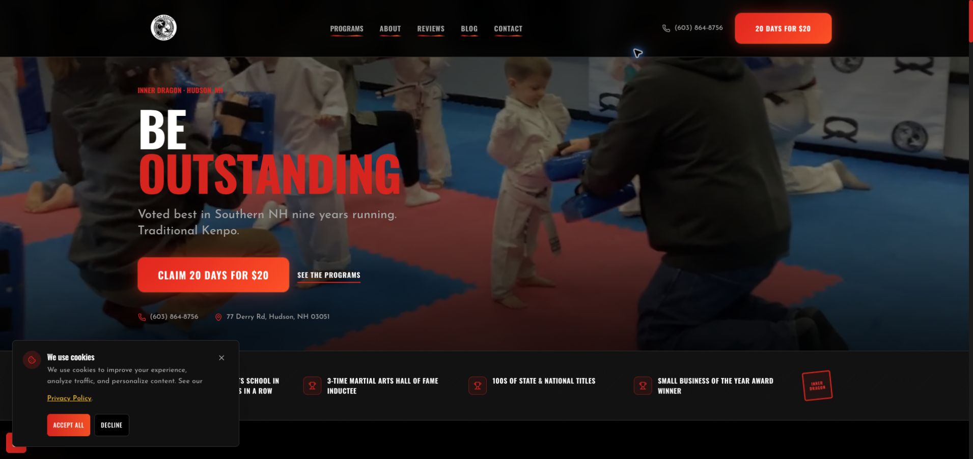
Inner Dragon uses a dramatic black-and-red palette, condensed headings and training photography to make its Hudson location memorable. The repeated twenty-day introductory offer is unusually concrete: the page explains the duration, included shirt, conversation with the instructor and stated absence of a long-term trial contract. Program cards then distinguish preschoolers, juniors, teen and adult Kenpo, fitness kickboxing and after-school care. A five-step class outline adds useful detail about what attendance involves. The first visit included an introductory overlay, and a cookie panel remained in the captured homepage; both compete with an otherwise direct start. Numerous award claims and sweeping comparisons with other schools also make the page more argumentative than its practical program information needs to be. The offer structure is the useful design lesson, rather than the unverified promotional claims.
What you can learn
Describe the trial's duration, inclusions and next step, then connect each age group to a clearly named program.
Pros
The introductory package explains more than its price.
Program cards and a class outline reduce uncertainty.
Cons & considerations
Introductory and cookie overlays interrupt the opening view.
Repeated claims and calls to action make the page lengthy.
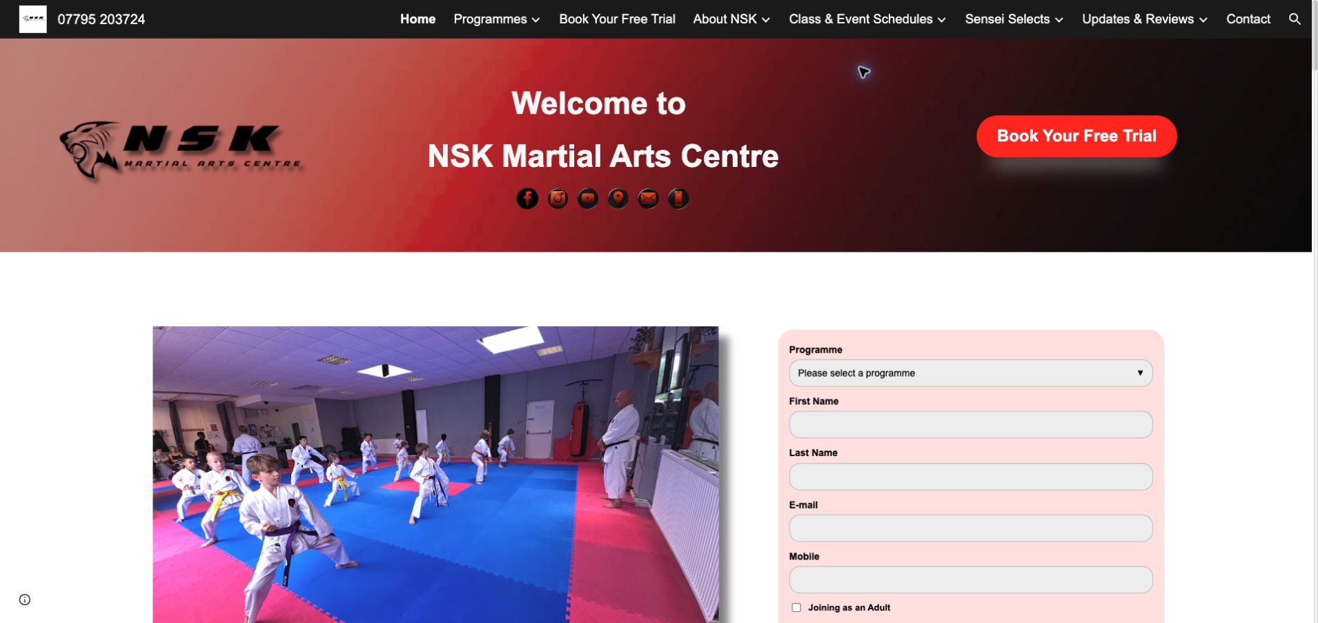
NSK Martial Arts gives its program structure unusually fine age distinctions, separating younger children into several bands before reaching the broader junior and adult options. This is useful for a parent who knows a child's age but not the vocabulary of martial arts. The homepage places a real class photograph beside an inquiry form, with a red trial button standing out against the dark navigation. Goju Ryu, karate and kickboxing receive explicit labels rather than being collapsed into a vague activity category. The navigation is busy, however, and the repeated benefit sections ask readers to work through similar promises. The adjacent lead form also arrives before all practical comparisons have been made. A more compact age-and-schedule overview could preserve the strong segmentation while making the first decision quicker for families comparing several children’s activities.
What you can learn
Use age as a clear entry route, but pair each band with meaningful differences in class format and attendance.
Pros
Specific age bands support quick parent self-selection.
A class photograph grounds the offer in an actual training setting.
Cons & considerations
Dense navigation competes with the main trial action.
Repeated benefits add length without equivalent logistical detail.
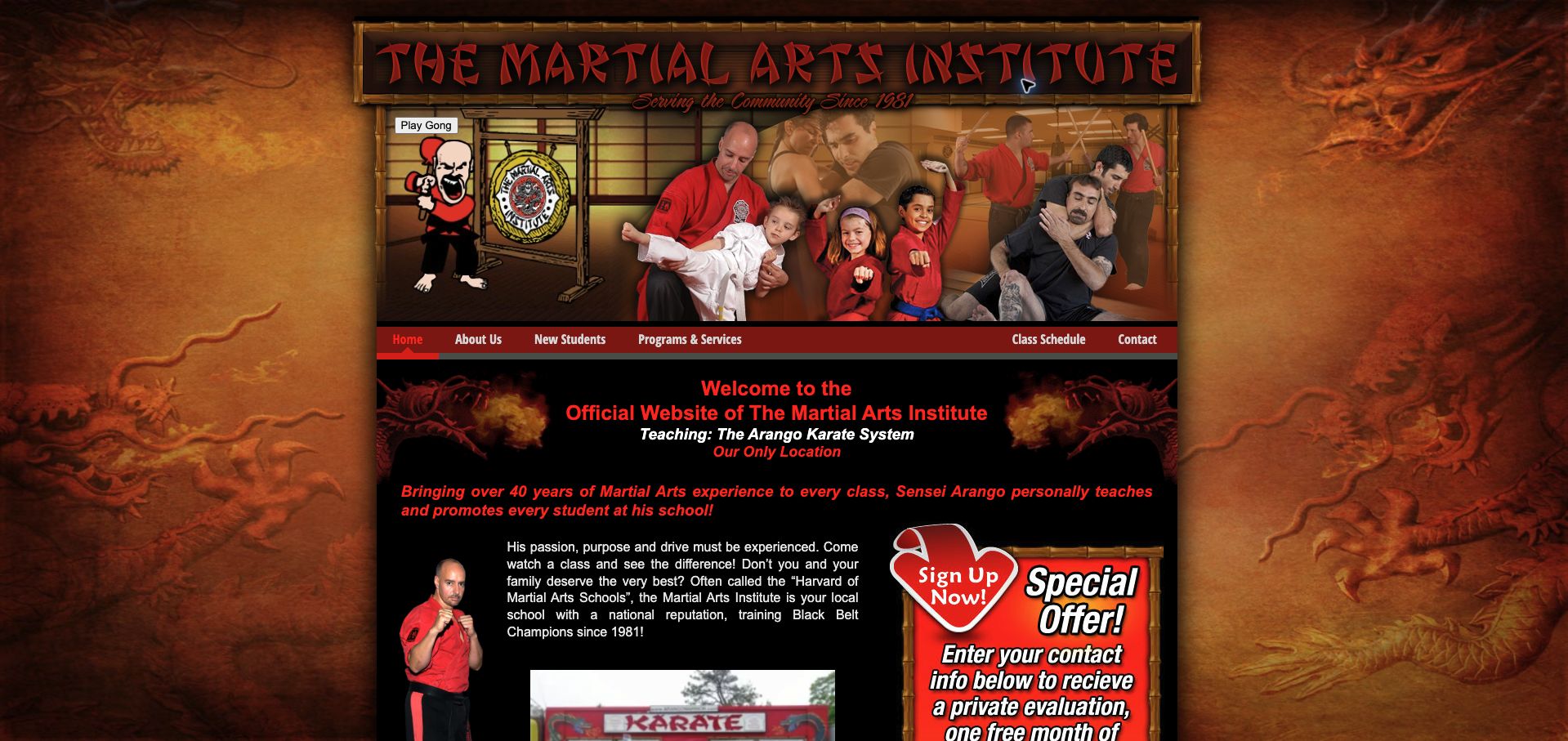
Arango Martial Arts presents a highly individual identity through gold dragons, a black background, red lettering and a montage of instructors and students. The site repeatedly identifies North Massapequa as its location, which helps a visitor distinguish this school from a broad franchise. New-student and class-schedule navigation remain available near the top, and separate children's and adult sections provide useful audience cues. An optional gong control reinforces the theme without requiring visitors to activate it. The narrow, crowded composition and red text on dark areas make the practical information harder to scan than it needs to be. A prominent special-offer form further competes with the program descriptions. The site is instructive because its personality is unmistakable, while the layout shows where a familiar brand can benefit from more space and a simpler reading hierarchy.
What you can learn
Retain recognizable artwork while giving schedules, location and beginner information a quieter, high-contrast area of their own.
Pros
The school has a memorable and consistent visual identity.
New-student and schedule routes are explicitly labeled.
Cons & considerations
Dense ornament and narrow columns hinder scanning.
Dark surfaces and red copy create uneven reading contrast.
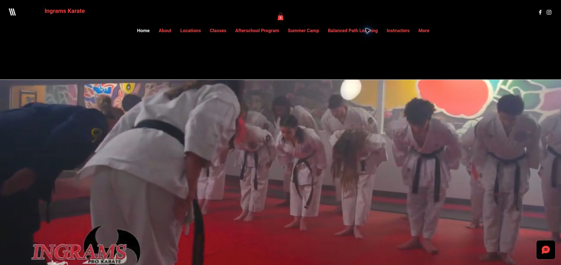
Ingram's Karate combines a substantial black-and-red header with a large training image and distinct navigation for locations, classes, instructors, camps and after-school provision. The page identifies Tampa and Trinity, making its regional footprint more concrete than a generic location selector. Program categories extend beyond children's and adult karate to kobudo and competition, giving experienced visitors a reason to explore as well. A two-class trial provides a recognizable first step for newcomers. The main difficulty is maintaining the seasonal layer: summer training remains prominent in the November review, alongside dated award messaging. This can make a busy family pause over which offers are currently actionable. The hero and header also consume considerable space before the program comparison. The underlying structure is useful, but it needs an editorial calendar as much as a polished visual treatment.
What you can learn
Separate permanent classes from seasonal campaigns and make the relevant branch clear before registration.
Pros
Location and program routes cover distinct visitor needs.
The trial has a specific number of introductory classes.
Cons & considerations
Seasonal promotion needs more visible currency cues.
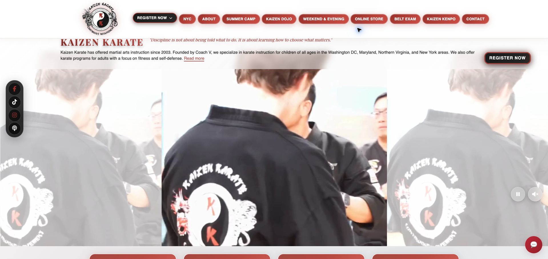
Kaizen Karate's homepage gives substantial attention to operational choices: after-school programs, weekend and evening classes, belt examinations and the store each receive their own route. This is useful for a program whose existing students need different information from new families. The page explicitly describes belt exams as invitation-only, preventing the exam link from looking like a general enrollment option. A centered training video, broad white header and numerous red pill-shaped buttons create a lively but crowded opening. Blurred side panels fill the space around the narrow video, making the footage fit the desktop layout while contributing little new information. The named founder and service-area copy provide context, although the large geographic scope asks visitors to investigate location-level availability. The strongest transferable idea is the separation of class discovery from the tasks of progressing through an established program.
What you can learn
Give current students dedicated exam and account routes so new families can concentrate on choosing a class and location.
Pros
Operational links distinguish enrollment from examinations.
Invitation-only exam guidance sets a useful expectation.
Cons & considerations
Many similarly styled buttons weaken action priority.
Large video treatment pushes location-specific details downward.
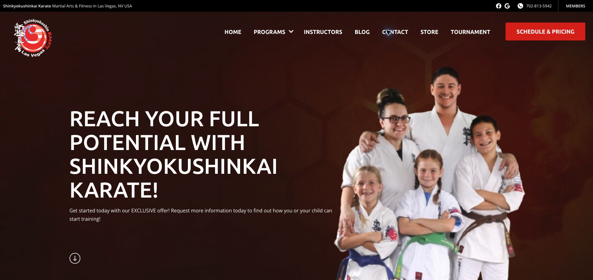
Shinkyokushinkai Karate Las Vegas opens with a family group portrait, a strong red-and-black identity and a prominent schedule-and-pricing action. The discipline and city are both explicit, and the page distinguishes children's, youth and adult programs. Those choices make the offer understandable before visitors reach the lead-generation area. The practical information is then framed around a program selector and contact form, with a countdown attached to a limited offer. That urgency competes with the slower decision a family may need to make about training, travel and recurring cost. The displayed messaging consent is a useful disclosure, but it does not replace publicly readable schedule and price context. The page is worth studying for its clear local positioning and equally for the friction introduced when a logistics-oriented button leads toward an inquiry rather than an immediate answer.
What you can learn
Match a button's promise to the information it reveals, especially when visitors expect schedules or pricing before contact.
Pros
City, martial-art style and age segments are explicit.
The group portrait gives the school a human introduction.
Cons & considerations
Schedule and pricing information is tied to a lead flow.
A countdown adds pressure to a considered family decision.
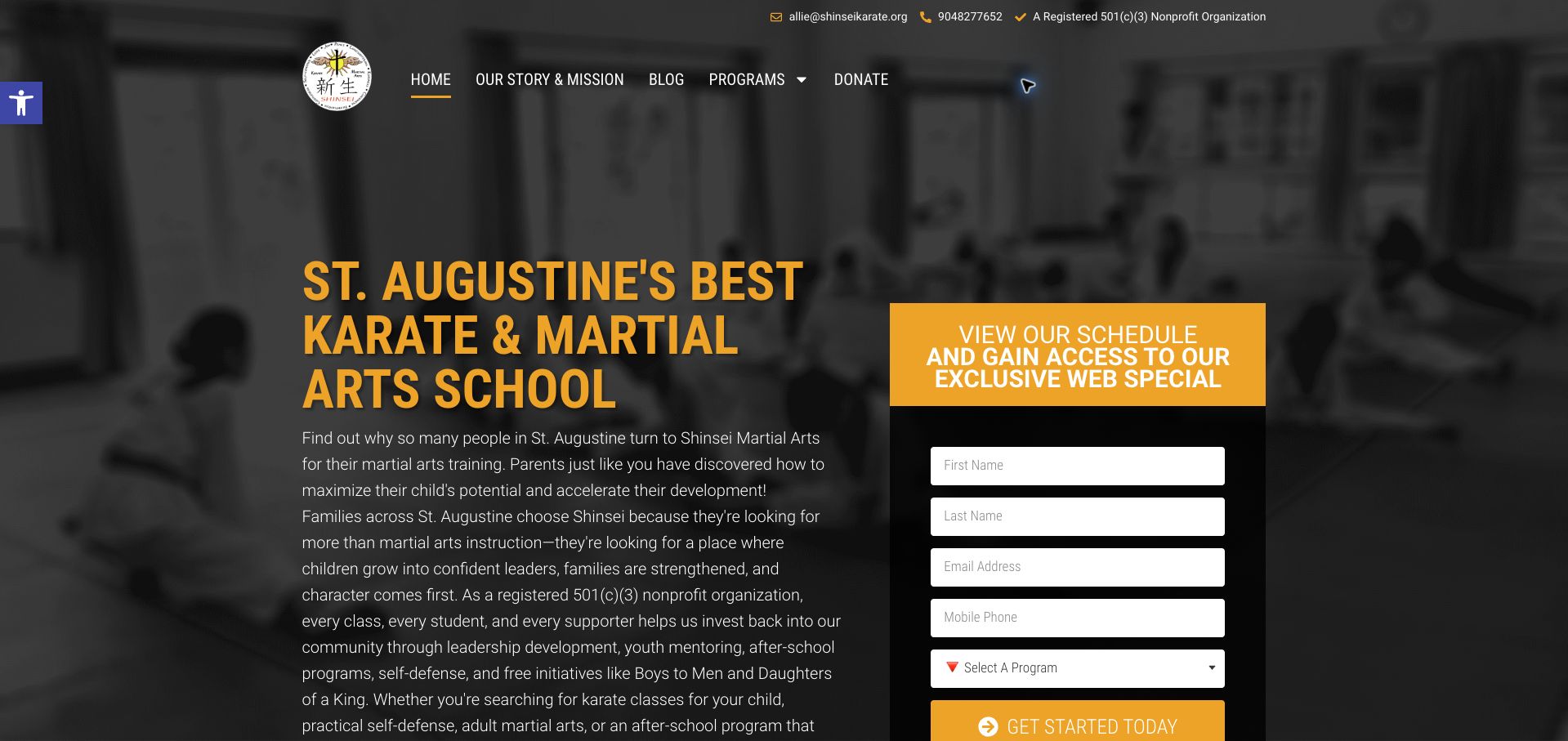
Shinsei Martial Arts uses a black-and-gold presentation to put its community mission alongside an immediate schedule-and-special-offer form. The St. Augustine school identifies several age groups and includes judo, camps and after-school options, giving the site more depth than a single martial-arts landing page. A donation route also communicates a different organizational model, although the nonprofit statement remains the organization's own claim here. The opening is text-heavy, and the form competes with the mission before visitors have compared the programs. Claims about rapid personal benefits occupy space that could explain class format, attendance expectations or beginner arrangements. The form's messaging consent is visible, but basic schedule access still feels closely tied to lead collection. The useful design question is how to express a social purpose while preserving a simple, factual path into the right class.
What you can learn
Keep mission and donation content distinct from the age, timetable and trial details needed by a prospective student.
Pros
Program categories identify several different age and activity needs.
Mission and donation routes establish organizational context.
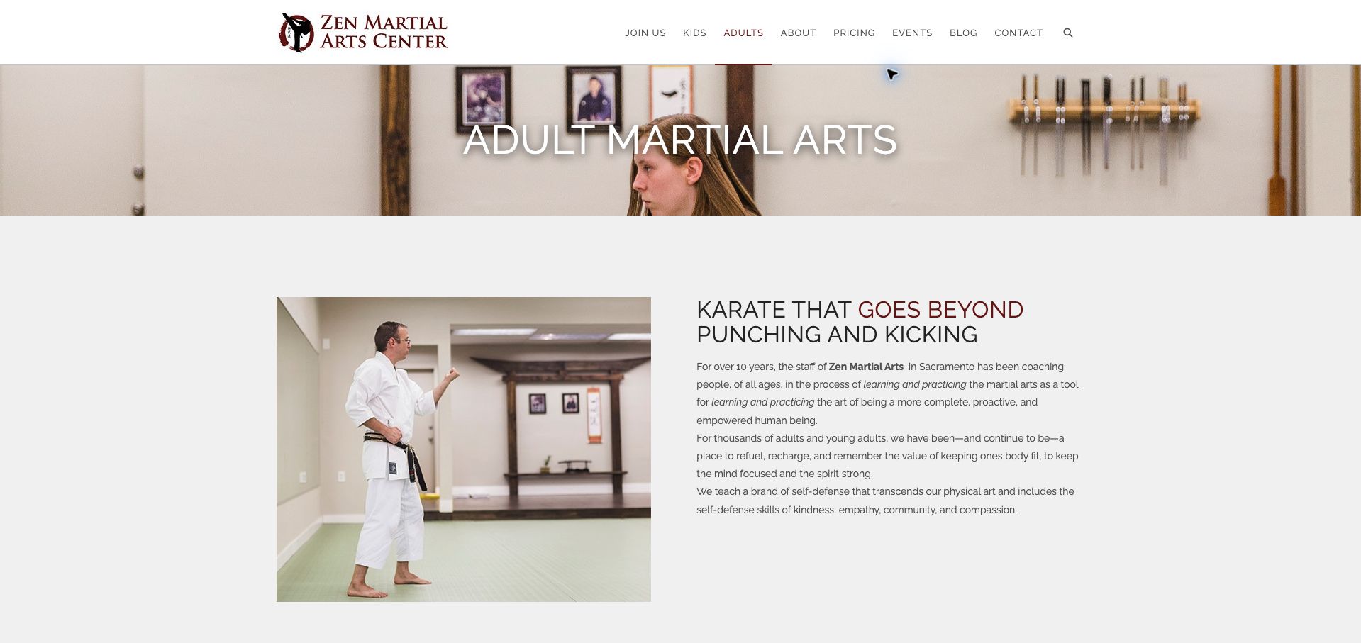
Zen Martial Arts Center gives adult training a dedicated page with a restrained white-and-burgundy design and photographs of an instructor and the training room. The navigation includes separate children, adults and pricing routes, so the adult visitor is not treated as an afterthought within a family offer. The copy emphasizes a broader philosophy of kindness and community, then leads toward an introductory class and weekday schedule sections. Those schedule accordions keep a long page compact, although visitors must open them to compare attendance options. The extended philosophical opening also postpones some of the practical answers a newcomer may want first. Member-oriented app and group links appear later, preserving a reasonable distinction between joining and participating. This is a useful example of tailoring the tone and information sequence to an adult audience without discarding the school's wider identity.
What you can learn
Write a distinct adult introduction and keep timetable, pricing and first-class instructions within that same journey.
Pros
Adult programs and pricing have recognizable navigation routes.
Training-room imagery helps newcomers picture the setting.
Cons & considerations
The philosophical introduction delays logistical details.
Collapsed schedule sections make cross-day comparison slower.
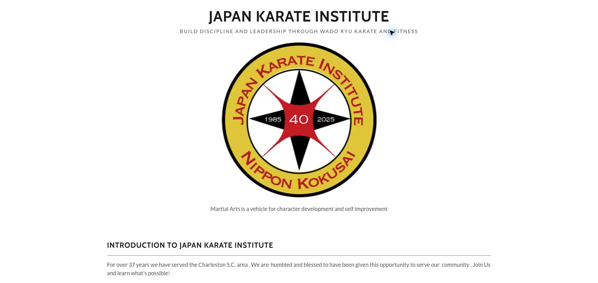
Japan Karate Institute introduces its Charleston-area Wado Ryu identity with an oversized anniversary emblem and a prominent institutional title. The site gives significant space to lineage, named teachers and the founder's background, which may interest practitioners choosing a specific tradition. A dojo-and-class finder eventually connects that history to the practical task of attending. The order is less helpful for someone simply trying to locate a beginner class: the emblem and introductory material occupy much of the opening screen. The observed page also combines a forty-year anniversary graphic for 1985–2025 with copy referring to thirty-seven years, illustrating how historical and evergreen statements can drift apart. The lesson is not to remove the organization's history, but to give it a coherent date and a proportionate place beside the local class decision.
What you can learn
Offer the nearest-dojo route early, then support it with clearly dated history and instructor context.
Pros
The named tradition and lineage give the organization specificity.
A dedicated dojo finder supports a multi-location structure.
Cons & considerations
A very large anniversary mark dominates the first screen.
Conflicting tenure statements create an avoidable maintenance question.
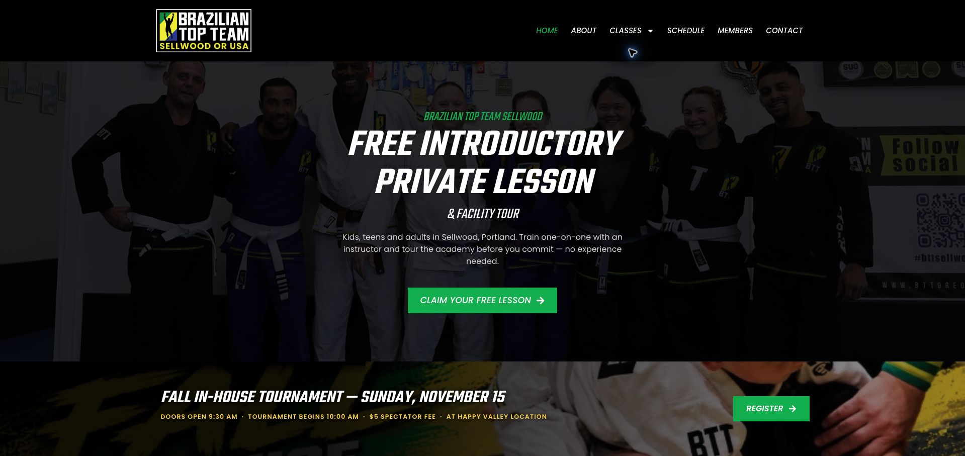
Brazilian Top Team Sellwood leads with a specific introductory experience: a private lesson and facility tour, supported by a photograph of the academy community. The copy names Sellwood and explains that no prior experience is needed, giving a nervous beginner more context than a generic free-trial button. Green actions stand out against dark photographic backgrounds. Below, tournament and camp notices identify when an event takes place at Happy Valley rather than the Sellwood location, an important distinction for families following a local page. Adult, youth and younger-child classes have separate routes, with a schedule link available in the navigation. The number of promotions creates competition for attention, however, and the paid-in-full offer appears among several trial invitations. The first-visit explanation is the most useful part of the page and deserves a clearer hierarchy over the seasonal campaigns.
What you can learn
Explain what the introductory appointment includes and repeat the actual venue whenever a shared event happens elsewhere.
Pros
Private-lesson and tour details make the first step concrete.
Event notices explicitly distinguish the Happy Valley venue.
Cons & considerations
Several promotions compete with the introductory offer.
Dark image overlays reduce the visibility of community photography.
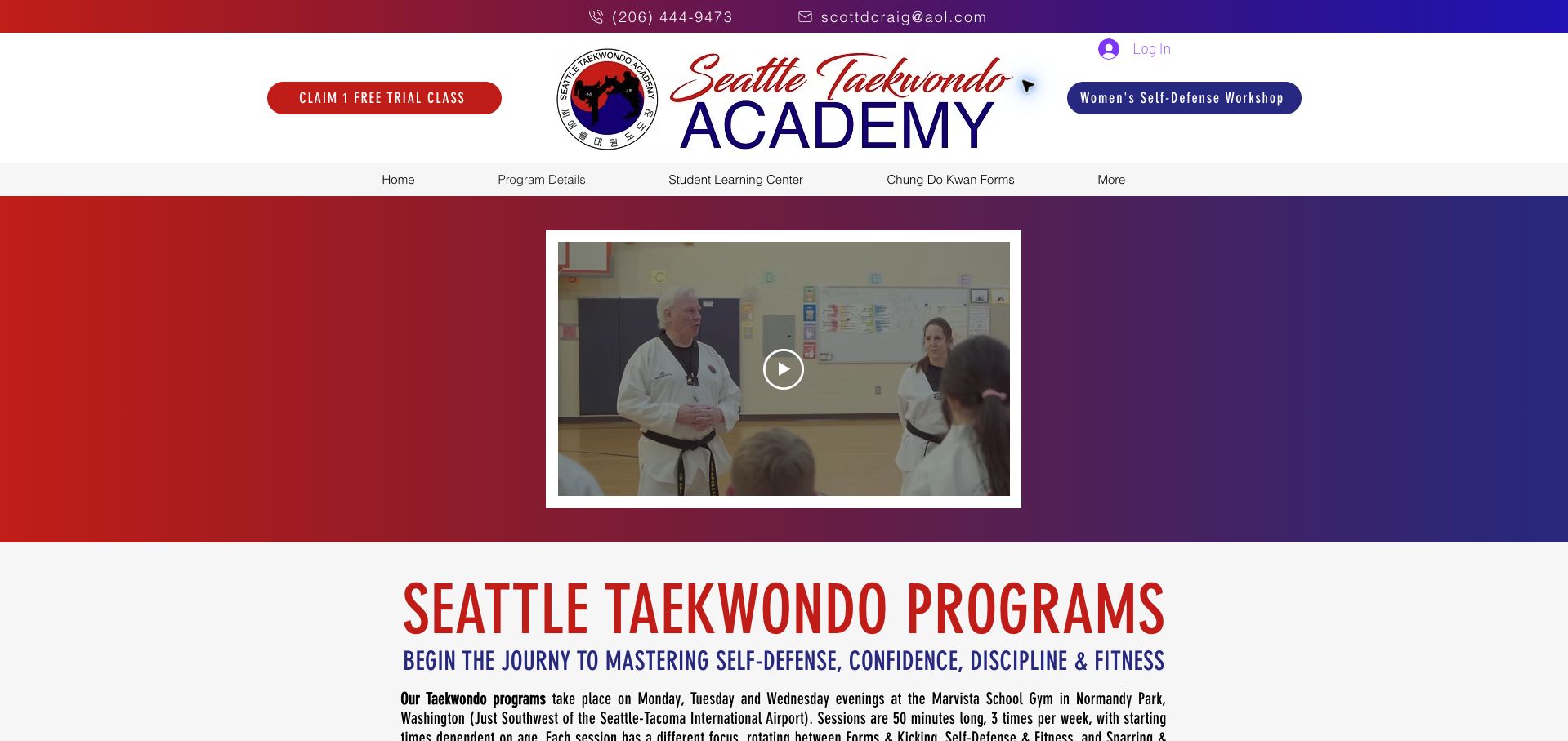
Seattle Taekwondo Academy's program page explains the weekly commitment directly: three evening sessions, a stated duration and different training emphases across the week. It identifies the Marvista School Gym in Normandy Park and separately notes that the academy is not affiliated with the school facilities. That distinction helps prevent a shared venue from being mistaken for an institutional endorsement. The red-to-blue gradient, large academy wordmark and embedded video create a recognizable identity, though they occupy substantial space before the timetable. Age groups and starting times appear below the introductory copy. The program also describes its fitness and school-performance expectations, which are important enrollment considerations rather than general design benefits. The layout would be easier to use with those practical requirements grouped beside the times instead of dispersed through long paragraphs and promotional language.
What you can learn
For a shared venue, publish the exact attendance pattern and clearly distinguish the operator from the host facility.
Pros
Session duration and weekly training rhythm are explained.
The venue-affiliation disclaimer reduces a possible misunderstanding.
Cons & considerations
A large header and video delay the schedule.
Dense paragraphs make enrollment requirements harder to compare.
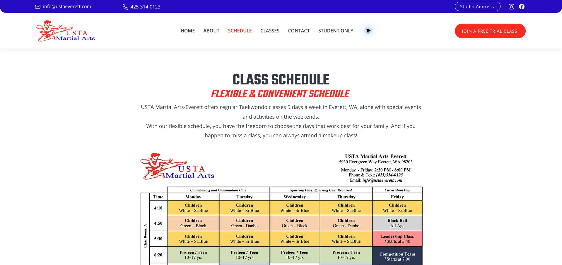
USTA Martial Arts Everett makes scheduling a primary navigation item and explains its flexible attendance and makeup-class approach before presenting a detailed weekly chart. A text version below gives families another way to read the times and age groups, while a visible trial action offers a next step. This combination can serve different reading preferences, but it also creates two sources to maintain. In the reviewed page, the chart labels the preteen and teen group as ages ten through seventeen, while the text summary says twelve through seventeen. That discrepancy matters more than the polished red-and-blue branding because it affects whether a family considers a class suitable. The wide chart also requires careful small-screen treatment. The page is a useful operational example: publishing schedules openly is valuable, provided the graphic and written versions remain consistent.
What you can learn
Maintain one authoritative timetable and derive both the visual chart and readable age-group summary from it.
Pros
Schedule and attendance flexibility are explained publicly.
Text summaries complement the detailed weekly chart.
Cons & considerations
The chart and text disagree on one age-band boundary.
A wide timetable is difficult to compare on narrow screens.
Caio Terra Academy Portland uses a blue-and-white identity and large photographs of its people to establish the local academy before presenting youth jiu-jitsu, adult jiu-jitsu and conditioning routes. Schedule appears in the main navigation and within the opening content, making logistics a recognizable alternative to reading the full story. The body distinguishes the wider association from the Portland founders, which helps explain the relationship without treating the local school as an anonymous branch. A three-day trial appears later, supported by testimonials labeled with the writer's relationship to the academy. The large rotating hero dominates the first screen, and the most concrete introductory offer arrives after substantial background material. Association achievements remain attributed claims rather than independently verified reasons to choose the school. The useful pattern is the combination of local people, clearly separated programs and a visible schedule route.
What you can learn
Explain the local academy and its affiliation separately, then keep program and timetable choices close to the introduction.
Pros
Youth, adult and conditioning programs have distinct entry points.
The local founders are separated from association history.
Cons & considerations
An oversized rotating hero consumes much of the opening view.
The specific trial offer sits well below the initial navigation.
Kegan is a freelance web designer and developer with 15+ years of experience helping businesses turn complicated website requirements into clear, maintainable digital experiences. He works directly with clients from planning and design through development, launch, and ongoing support.
For martial arts school website design, his development approach focuses on programme and age-group navigation, instructor introductions, first-class guidance, membership information, and trial-booking journeys. The scope can be a targeted improvement or a complete custom build, with responsive layouts, thoughtful content structure, and integrations chosen around the people using and maintaining the site.
Show 3 other martial arts school website designersHide other martial arts school website designers
Plan the content around the decisions visitors need to make
Map programmes to audiences
Identify the actual age groups, styles, beginner routes and advanced programmes. Describe contact or placement steps when a class requires prior experience. Avoid presenting a broad benefits claim as a guarantee for every participant.
Write a first-class guide
Explain booking, arrival, clothing, equipment and observation arrangements approved by the school. State whether an introductory session is a request, a scheduled trial or part of a paid package.
Keep instructor information current
Assign each class or programme to the relevant teacher where practical. Review biographies when staff change and distinguish verifiable qualifications from promotional descriptions or unexplained titles.
Publish an understandable timetable
Show location, day, time, duration and audience. Mark temporary closures and holiday changes. If place availability lives elsewhere, explain the difference between the timetable and the booking system.
Explain ongoing membership
Describe the payment interval, introductory eligibility, additional equipment charges and how members ask about changes or cancellations. Use the actual school policy and keep it available before the commitment step.
Test the complete inquiry path
Ask a new visitor to choose an appropriate class and explain what happens after contacting the school. Check mobile navigation, external forms and consent overlays without joining a class or submitting participant information.
The editing job behind the design
Choose a maintainable publishing and booking system
A small school often needs dependable programme pages, a maintained timetable and a short inquiry or trial-booking route. Choose a system staff can update when teaching times and introductory offers change.
Membership software can handle attendance and payments separately from the public explanation. Preserve the selected programme across the handoff and keep personal participant records outside ordinary website analytics and public content.
Our WordPress website examples offer a separate look at publishing approaches. A visible platform label is evidence for that named page, not a guarantee that the same system will suit your requirements.
Before the public launch
Practical website planning checklist
Describe the training in plain language.
Identify age groups.
Define beginner routes.
Publish current class times.
Name the actual teaching team.
Explain trial booking.
State required clothing or equipment.
Show tuition payment intervals.
Qualify introductory offers.
Publish membership-change guidance.
Provide accurate location information.
Test inquiry and booking labels.
These checks are a project checklist, not a performance, legal, security, or accessibility certification. Test real journeys with the people responsible for the website before making claims about the result.
Sources & editorial method
How this collection was selected and reviewed
The 15 examples match the original saved collection target. Each official public page was opened, inspected and directly captured in an ordinary browser; source URLs and capture dates identify the reviewed state. Reviews describe observed design, information and navigation, with distinct practical lessons and limitations. A bounded public technology-audit attempt accompanies every source, preserving unknown and inaccessible results without inventing a hidden stack. Editors Choice is an explicit editorial selection favoring a smaller specialist or local organization, not a service-quality, safety or outcome endorsement. No booking, application, payment or private form was submitted. Website imagery and trademarks belong to their owners.
Each example links to its actual source page. Screenshots are direct browser captures with their own capture dates; moving imagery, announcements and live designs can change. The notes describe observable design choices and conditional tradeoffs, not measured traffic, conversion results, service quality, or accessibility conformance.
Technology labels use public page metadata, asset evidence, or explicitly cited platform documentation. Platform documentation is not a complete current deployment audit. A component reference may be legacy or unused; it is not a complete backend inventory. Unknown stacks are omitted. These sites are editorial examples, not our client portfolio.
Written, Edited and Curated are separate editorial records, not timestamps advanced by a rebuild. Website designs and imagery belong to their owners. See our editorial standards or suggest a correction.
Questions worth asking
Martial Arts School website design questions
What should a martial arts homepage explain?
The style or training offered, intended audiences, location, teaching team and a clear first step. Give newcomers a route to schedules and introductory guidance without requiring familiarity with specialist terminology.
Should a free trial be the main action?
It can be, if a trial is genuinely how the school welcomes new students. Explain eligibility, what is included and whether later enrollment is optional rather than leaving the next commitment unclear.
How detailed should instructor biographies be?
Enough to identify the teacher, role and relevant verified background. Translate unfamiliar rank or lineage terms where useful and avoid implying that a biography alone proves teaching quality.
Where should fees appear?
In the introductory and membership journey, with the payment interval and important additional costs. A school using contribution-based pricing should explain how that arrangement works.
Does this guide rank training quality?
No. It compares public website design, information and navigation. The Editors Choice recognizes a researched website presentation, not personal suitability or instructional outcomes.