Best Auth0 Websites of 2026 (20 Real-World Examples)
Auth0-associated websites, account-journey lessons, and a practical identity brief
These 20 public websites belong to organizations with documented Auth0 relationships. Study their public design separately from the named customer identity workload: an account service is not a CMS, a theme, or proof of the complete stack behind a marketing homepage.
An identity service usually matters at a boundary: a visitor becomes a member, a customer enters a product, or a business user chooses an organization. The public page can remain open and useful before that boundary. Its job is to explain why an account is helpful, which service it belongs to, and what the visitor can still do without signing in.
Siemens, Philips Hue, McLaren Racing, Dunelm and CLAAS open this collection because each has an individual official Auth0 case. Their workloads differ: Siemens ID, a Hue account migration, Racing Club membership, retail identity modernization and connected digital applications. Those are useful differences to preserve. Wyndham, Submittable and Lifen are customer-directory associations only; we do not invent application details that the listings do not supply.
Before the examples
What makes good Auth0 website development in 2026?
Design the journey around the login, not just the login screen
Write down what happens immediately before and after authentication. A saved application, an invitation or a return to a device-related task may need its original context preserved. Universal Login provides a hosted authentication flow, but the surrounding product still needs meaningful labels, a recognizable destination and understandable failure behavior. A beautifully branded sign-in screen does not by itself create a coherent account experience.
A retail customer, a fan-club member and an employee of a business customer are different populations. For a B2B product, decide how someone identifies the organization they are acting for and what happens if they belong to more than one. Auth0 Organizations supports organization-specific membership, connections and roles; it does not remove the need to decide what each organization can see and do.
Knowing who signed in is not the same as deciding whether that person may view a record or perform an action. Describe the permission check at the application and API boundary rather than treating a hidden button as an access control. Choose the documented flow for the application type, and have the responsible implementation team review the resulting design before production.
Compare public audience routing, account value and the continuity between a brand introduction and a protected task. Each example names the documentary workload or the limits of a directory-only association. The screenshots do not claim to show private customer accounts or a complete current backend inventory.
We start with five recognizable brands or organizations: Siemens, Philips Hue, McLaren Racing, Dunelm, CLAAS. Each attribution applies to the named website property, not every product or website belonging to its organization. This is a curated reading sequence, not a measured ranking.
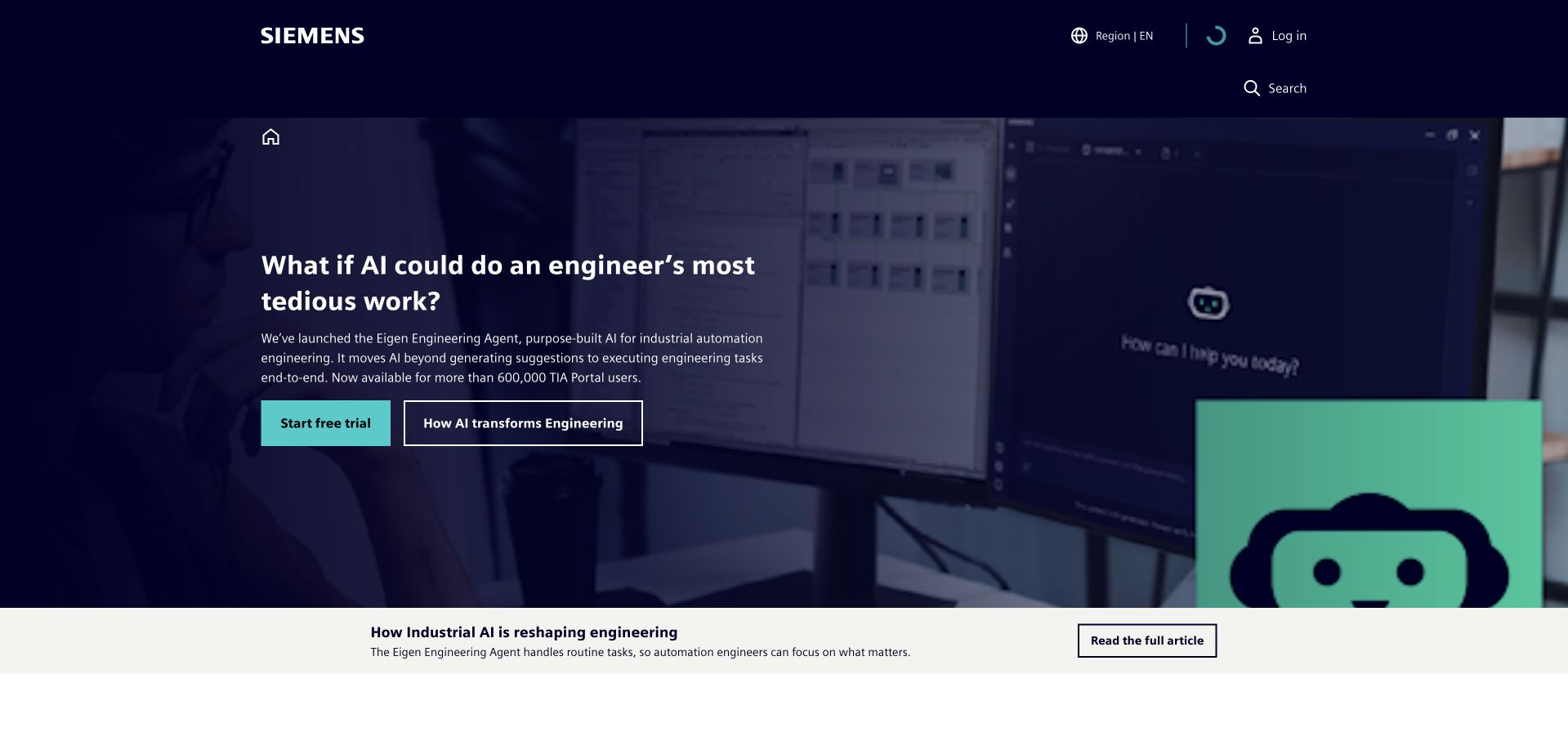
Siemens uses a dark navy canvas, a restrained horizontal navigation and a bright turquoise action to make a large industrial business feel directed. The hero combines a succinct campaign message with a concrete engineering illustration rather than presenting a wall of product categories. The strong contrast keeps the introductory hierarchy understandable even though the organization serves many audiences. This is a useful reference for giving a complex group one clear entrance without pretending that every visitor needs the same application.
What you can learn
Borrow the distinction between the public introduction and the services people enter afterwards. Auth0’s Siemens case concerns Siemens ID and customer identity across digital services; it does not establish the frontend or complete backend of this photographed marketing page.
Pros
The navy and turquoise pairing makes the primary action easy to distinguish.
Engineering imagery gives a broad corporate message a specific visual subject.
Cons & considerations
A campaign-led first screen still needs straightforward routes to individual products.
Do not make account access depend on recognizing the current campaign language.
Platform source: Siemens — official Auth0 association. Siemens ID customer identity across named digital services. Official documentary association only. The named workload or listing is not proof that this public page runs on Auth0, nor a complete or independently tested current stack. Platform evidence is separate from the direct website screenshot and is not a complete current infrastructure audit.
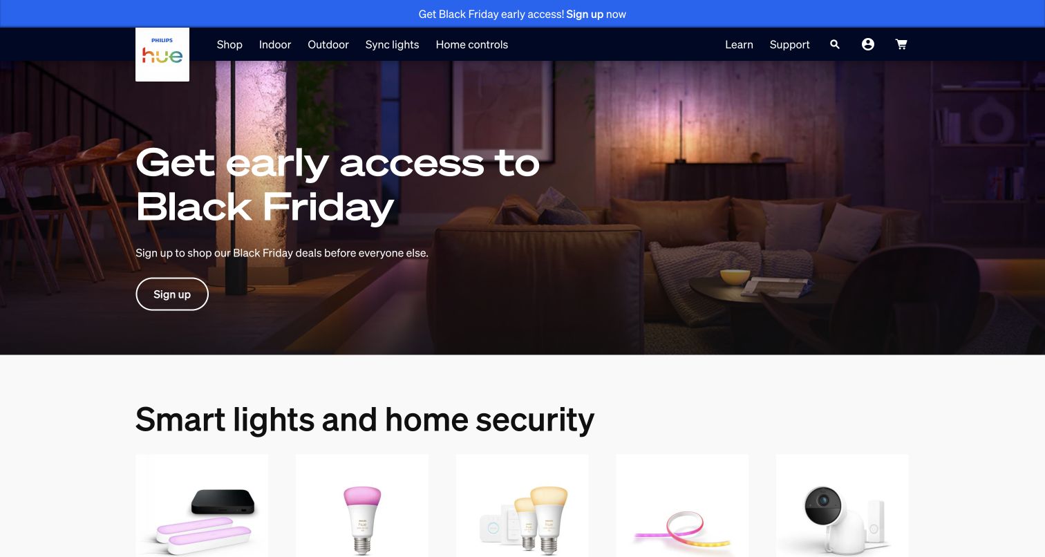
Philips Hue begins with the result of its products: a richly illuminated room, not a diagram of a smart-home system. A compact dark navigation names shopping, outdoor lighting, switches and controls before the page introduces the broader smart-lighting and home-security range. The promotional message is short and the room remains the main subject. The combination is approachable for someone browsing a look while retaining obvious routes for a buyer who already knows the component they need.
What you can learn
Use the brand experience to explain the benefit, then make device and account tasks explicit. Auth0 documents the Philips Hue account migration at Signify. That identity project is separate from this page’s promotional design and is not evidence of its full publishing stack.
Pros
The room photograph demonstrates an outcome without requiring technical explanation first.
Product-family labels support both inspiration-led browsing and more specific shopping intentions.
Cons & considerations
A seasonal offer can temporarily overshadow the permanent product explanation.
Account migration and device recovery need clearer instructions than a shopping campaign.
Platform source: Philips Hue — official Auth0 association. Philips Hue account migration and customer identity. Official documentary association only. The named workload or listing is not proof that this public page runs on Auth0, nor a complete or independently tested current stack. Platform evidence is separate from the direct website screenshot and is not a complete current infrastructure audit.
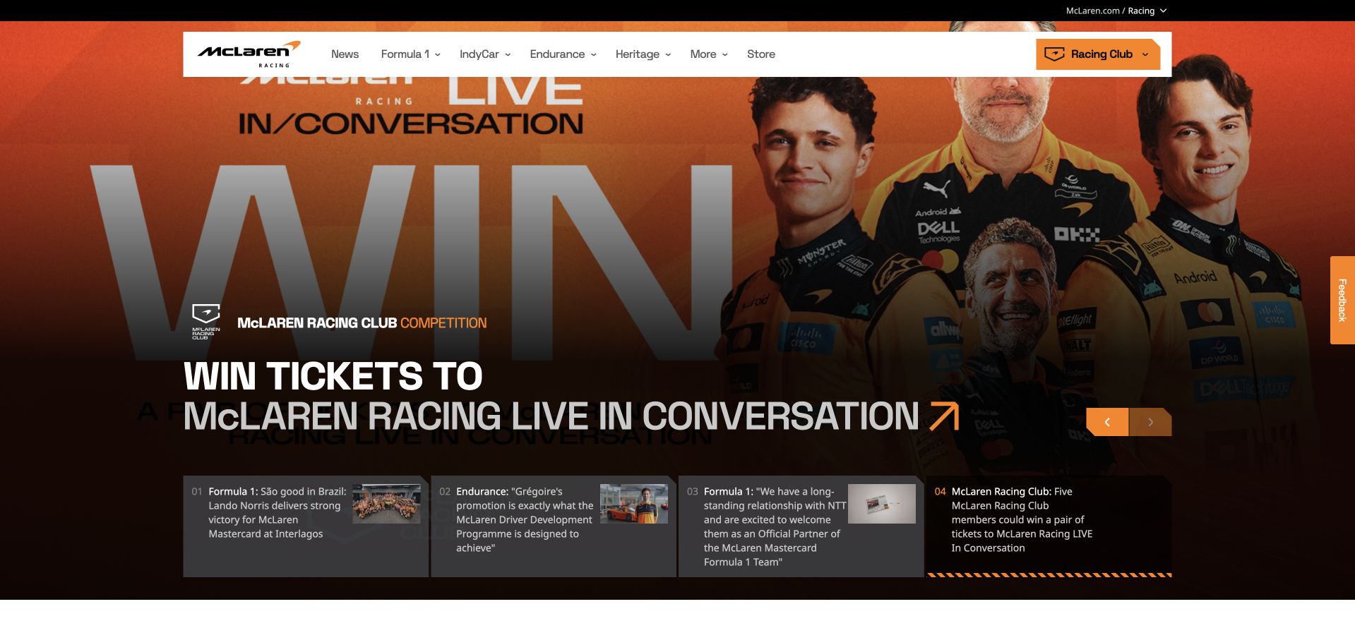
McLaren Racing places a white navigation bar over a large photographic story. Papaya accents connect the Racing Club control, carousel position and action treatment, while a row of story summaries exposes other available coverage. The captured membership competition gives the club a tangible reason to exist rather than introducing it as an abstract account. Its oversized typography and recognizable personalities create energy, but the supporting story cards are what prevent the first screen from becoming only a poster.
What you can learn
Give registration a concrete benefit and preserve an unauthenticated route to useful content. Auth0’s account concerns McLaren Racing Club member identity. It should not be confused with the separate workforce identity relationship documented by Okta or treated as a whole-site technology inventory.
Pros
The membership control remains recognizable within an otherwise news-oriented navigation.
Visible story summaries offer an alternative to the current full-screen feature.
Cons & considerations
A rotating hero makes the opening proposition change between visits.
Large editorial overlays require careful contrast as campaign photography changes.
Platform source: McLaren Racing — official Auth0 association. McLaren Racing Club member identity. Official documentary association only. The named workload or listing is not proof that this public page runs on Auth0, nor a complete or independently tested current stack. Platform evidence is separate from the direct website screenshot and is not a complete current infrastructure audit.
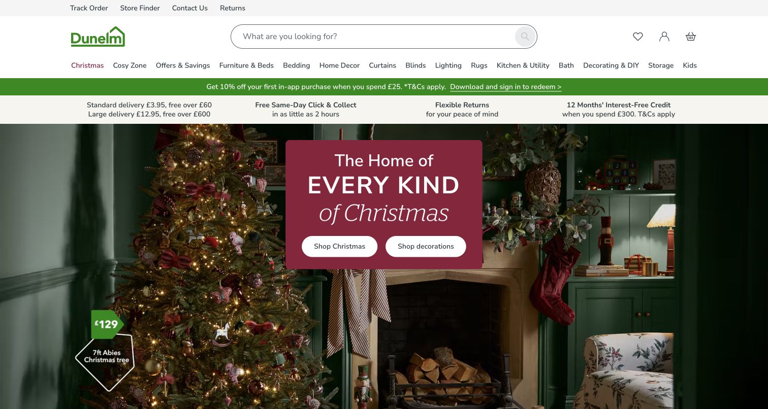
Dunelm turns the captured homepage into a decorated room with a centered seasonal message and two clear shopping choices. Search occupies a prominent position above a detailed category row, so the immersive scene does not remove the practical catalog entrance. Small price annotations help connect the lifestyle image to actual merchandise. The page demonstrates how a retailer can sell a coordinated idea while still supporting someone looking for one item, a known product name or a familiar department.
What you can learn
Keep the inspiration layer and the repeat-customer tasks parallel rather than forcing both through the campaign. Auth0 documents Dunelm’s customer identity modernization. The case supports that account relationship, not an inference that Auth0 supplies this page’s commerce engine or visual components.
Pros
Search remains visually prominent even while a large campaign dominates the page.
Price labels make the styled room more actionable than a purely decorative photograph.
Cons & considerations
Several promotional strips compete for attention before the main content begins.
Seasonal photography needs alternative routes for visitors shopping outside that theme.
Platform source: Dunelm — official Auth0 association. Dunelm customer identity modernization. Official documentary association only. The named workload or listing is not proof that this public page runs on Auth0, nor a complete or independently tested current stack. Platform evidence is separate from the direct website screenshot and is not a complete current infrastructure audit.
CLAAS puts people, agricultural equipment and a service vehicle in the same opening photograph. That choice makes the offer feel operational rather than purely aspirational. The simple top-level labels separate machinery, smart farming and parts, while a compact promotional panel gives the current offer a location without replacing those permanent categories. The bright lime action is distinctive against the darker scene. It is an effective pattern for a business whose relationships continue well beyond the original equipment purchase.
What you can learn
Design for the owner returning for a digital service as well as the buyer discovering a machine. Auth0’s CLAAS account describes unifying customer identities across digital applications; that documentary scope should remain separate from the public page’s appearance or unrelated equipment systems.
Pros
Photography connects the brand to both machinery and the people supporting it.
Three practical navigation groups express different stages of the customer relationship.
Cons & considerations
The campaign headline provides little detail about the underlying offer by itself.
A compact menu must still expose important support tasks clearly on smaller screens.
Platform source: CLAAS — official Auth0 association. CLAAS customer identity across its digital applications. Official documentary association only. The named workload or listing is not proof that this public page runs on Auth0, nor a complete or independently tested current stack. Platform evidence is separate from the direct website screenshot and is not a complete current infrastructure audit.
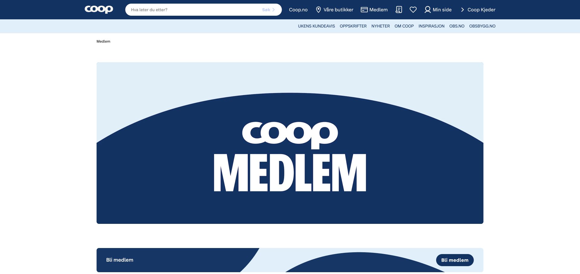
The public Coop membership page uses a large blue membership graphic and a consistent navy header to make the destination unmistakable. Search, stores and membership remain available in the top bar, while the lighter secondary row carries shopping and editorial routes. The first membership action appears as a separate band beneath the graphic rather than being embedded inside a busy promotional image. This is a simpler identity-related visual reference than the general homepage’s changing offers and embedded campaign modules.
What you can learn
Make the purpose of an account clear before asking someone to create one, and give existing members their own recognizable route. Auth0’s Coop Norway case concerns consumer identity and membership authentication. The screenshot is the public membership explanation, not a signed-in member screen.
Pros
The blue membership identity gives this page a clear place within the larger brand.
Stores, search and member tasks remain distinguishable in the persistent navigation.
Cons & considerations
The opening graphic uses substantial space before explaining the practical membership benefits.
Membership details and conditions must remain readable beyond the large brand treatment.
Platform source: Coop Norway — official Auth0 association. Coop Norway consumer identity and membership authentication; public membership page is the visual reference. Official documentary association only. The named workload or listing is not proof that this public page runs on Auth0, nor a complete or independently tested current stack. Platform evidence is separate from the direct website screenshot and is not a complete current infrastructure audit.
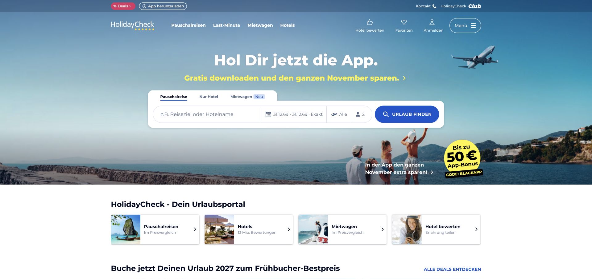
HolidayCheck uses a vivid blue hero around a broad white search panel. Destination, dates and travel-party choices form the central task, while category shortcuts make different types of trip easier to discover. The page does not require a visitor to interpret a large brand statement before understanding what to do. Its cheerful imagery supports the travel context without competing with the form. This balance is worth studying when a site needs both open-ended inspiration and precise, repeatable search behavior.
What you can learn
Keep the first travel task understandable without login, then explain when an account becomes useful. Auth0 documents traveler authentication at HolidayCheck. That establishes an identity association, not the booking engine, the availability source or every technology on the captured public page.
Pros
The white search surface stays visually separate from the colorful travel backdrop.
Trip-type shortcuts offer a useful entrance for people without a specific destination.
Cons & considerations
A large number of search choices can make mobile layouts feel demanding.
Availability and pricing need explicit error states when the search cannot complete.
Platform source: HolidayCheck — official Auth0 association. HolidayCheck traveler account authentication. Official documentary association only. The named workload or listing is not proof that this public page runs on Auth0, nor a complete or independently tested current stack. Platform evidence is separate from the direct website screenshot and is not a complete current infrastructure audit.
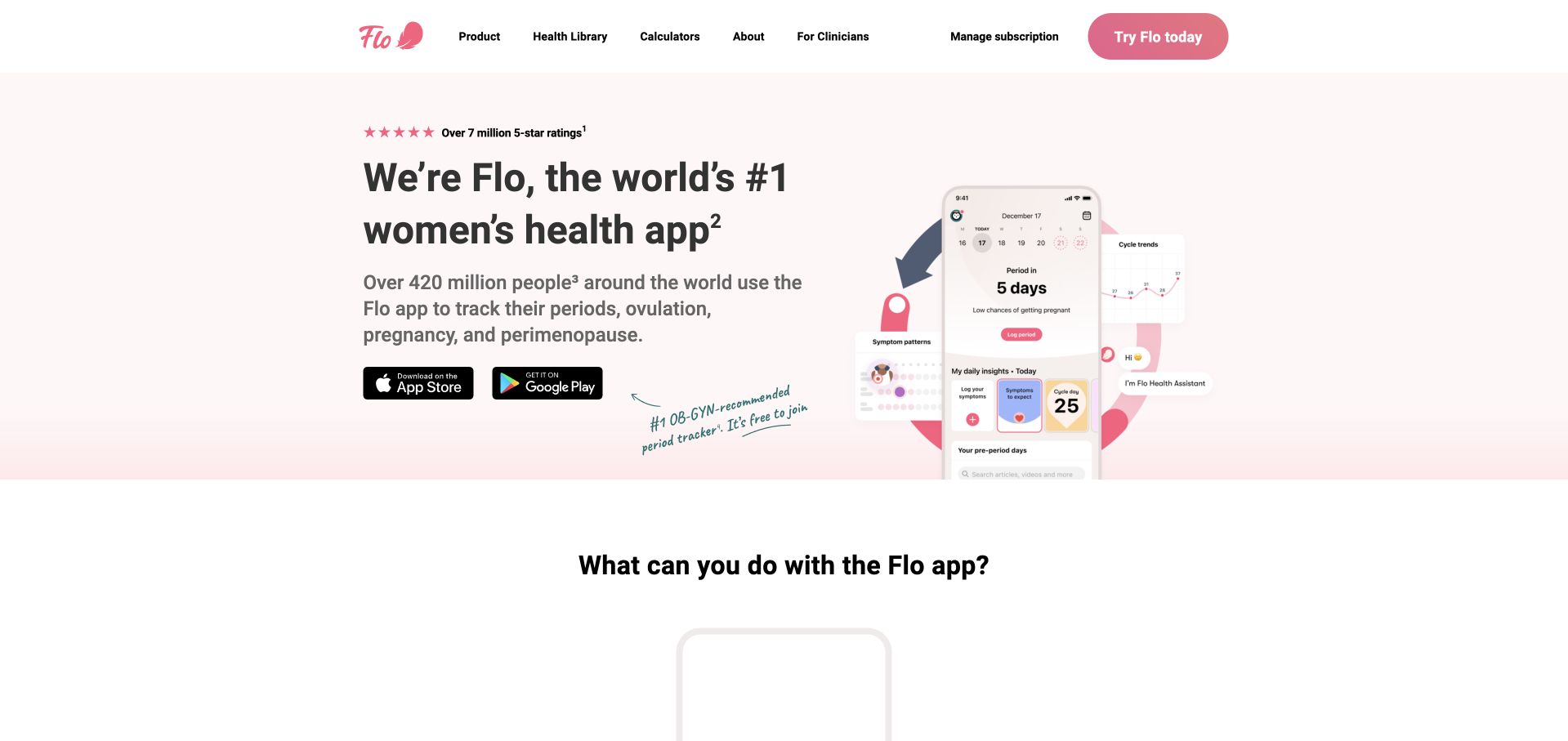
Flo pairs a pale blush background with a large phone mockup, concise dark typography and a pink primary control. App-store references sit near the proposition, making the relationship between the website and the mobile product clear. The page uses the phone screen to demonstrate an experience rather than attempting to make the marketing site look like a full application. Its generous whitespace and limited palette reduce the amount of competing material around a potentially personal subject.
What you can learn
Use a public introduction to explain the product while keeping sensitive account tasks inside an appropriately designed flow. Auth0’s Flo Health case concerns customer authentication. Neither that case nor this visual review evaluates clinical effectiveness, privacy compliance or the security of an individual user’s account.
Pros
The phone mockup establishes the intended product destination without a lengthy explanation.
A restrained palette makes the main action more noticeable than surrounding supporting text.
Cons & considerations
The first screen cannot communicate every important data-use or product limitation.
Small mockup text needs a readable equivalent for visitors relying on text content.
Platform source: Flo Health — official Auth0 association. Flo Health customer authentication; not clinical-service evaluation. Official documentary association only. The named workload or listing is not proof that this public page runs on Auth0, nor a complete or independently tested current stack. Platform evidence is separate from the direct website screenshot and is not a complete current infrastructure audit.
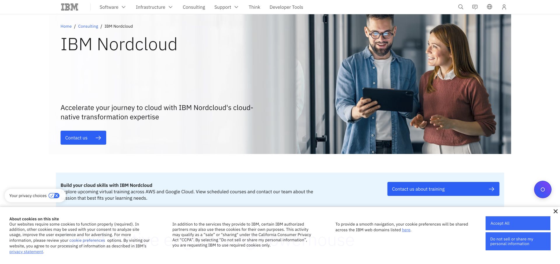
Nordcloud’s public destination now sits within IBM’s consulting website. A spacious blue-and-white layout gives the specialist name room while a large workplace photograph supplies a human counterweight to the enterprise navigation. The parent header makes the corporate relationship visible instead of presenting the business as an unrelated standalone company. The page is useful for studying how an acquired specialist can retain a clear service proposition without duplicating an entire corporate information architecture or hiding its new context.
What you can learn
Preserve continuity when a service moves into a larger organization, including account instructions and old links. Auth0’s Nordcloud case documents cloud-management customer identity. It is a scoped account of that application relationship, not proof that this redirected IBM marketing destination uses Auth0.
Pros
The specialist service is named clearly within the parent company’s visual system.
A restrained composition gives explanatory text more weight than decorative animation.
Cons & considerations
Parent-company navigation can introduce choices unrelated to the visitor’s original Nordcloud task.
Redirected visitors need clear guidance if old account or service links also changed.
Platform source: Nordcloud — official Auth0 association. Nordcloud cloud-management customer identity. Official documentary association only. The named workload or listing is not proof that this public page runs on Auth0, nor a complete or independently tested current stack. Platform evidence is separate from the direct website screenshot and is not a complete current infrastructure audit.
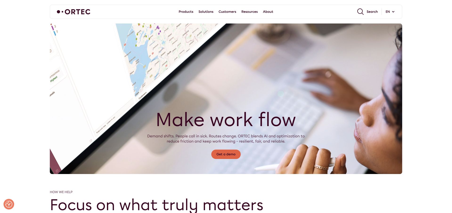
ORTEC uses an overhead workplace scene, a map on a monitor and a short central proposition to introduce optimization software. Burgundy typography and an orange demo control create a recognizable identity without turning the hero into a dashboard collage. A rounded white navigation container keeps products, solutions, customers and resources at the same level. The photograph makes the subject tangible: this is software used by people managing real operations, not just an abstract promise to make a business smarter.
What you can learn
Explain the work first and reserve the technical account model for the implementation discussion. Auth0’s ORTEC case describes tenant registration and identity federation for its cloud environment. That is different from a claim about the visible marketing page or every ORTEC deployment.
Pros
A real operational scene provides context for an otherwise abstract software category.
The demo action stands out without competing with several equally prominent buttons.
Cons & considerations
The short headline relies on the supporting copy to explain the software’s actual scope.
A photographic hero should not become the only explanation available to assistive technology.
Platform source: ORTEC — official Auth0 association. ORTEC cloud tenant registration and identity federation. Official documentary association only. The named workload or listing is not proof that this public page runs on Auth0, nor a complete or independently tested current stack. Platform evidence is separate from the direct website screenshot and is not a complete current infrastructure audit.
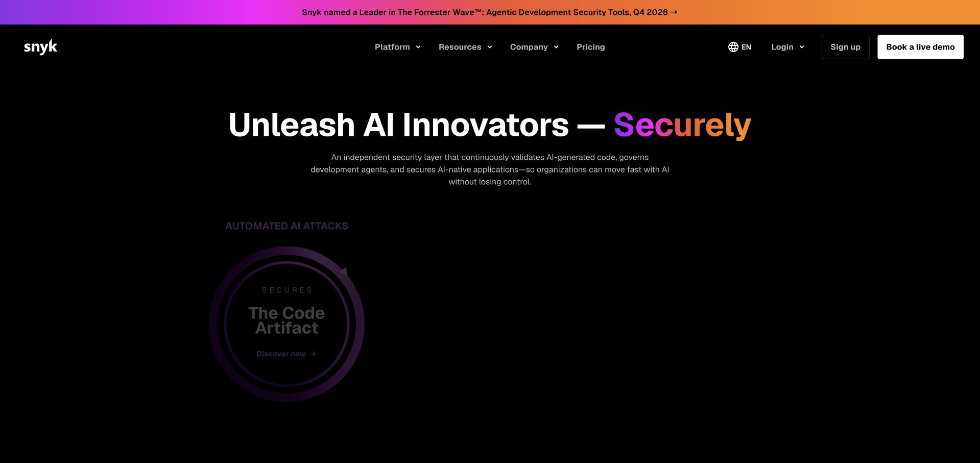
Snyk uses a nearly black background with purple and orange light to frame a large security message. A product-oriented visual supplies a technical reference point, while the navigation preserves practical evaluation choices such as pricing and a demo. The dramatic treatment works because the text remains compact and the primary proposition has a clear focal point. It is a useful counterexample to the assumption that every developer product needs a white page covered in code samples to establish credibility.
What you can learn
Let the marketing language attract attention, then make evaluation and account access predictable. Auth0 documents Snyk’s developer-platform authentication. It does not identify every security control, deployment or frontend dependency, and a customer story should never be presented as an independent security assessment.
Pros
The dark palette creates a strong hierarchy around one principal product message.
Practical evaluation routes remain accessible rather than being buried beneath the campaign.
Cons & considerations
High-energy gradients can reduce legibility if supporting text is placed carelessly.
Broad AI language still needs specific product explanations and limitations further into the journey.
Platform source: Snyk — official Auth0 association. Snyk developer-platform authentication. Official documentary association only. The named workload or listing is not proof that this public page runs on Auth0, nor a complete or independently tested current stack. Platform evidence is separate from the direct website screenshot and is not a complete current infrastructure audit.
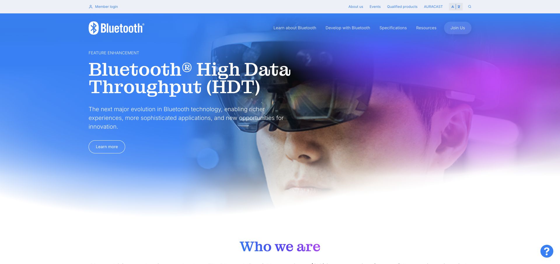
Bluetooth SIG uses a blue-to-purple backdrop and a large headphone photograph to introduce a recognizable everyday application of its standards. A contrasting serif headline gives the page an editorial quality, while the navigation retains the organization’s more technical and membership-oriented routes. The result works at two levels: a general visitor can understand the subject immediately, and an industry participant can look for standards, resources or member access without reading the entire opening story.
What you can learn
Treat public education and member-only work as related but distinct experiences. Auth0’s Bluetooth SIG case documents member access and identity. That association should not be expanded into claims about device firmware, every Bluetooth product or all the organization’s public publishing systems.
Pros
An everyday product photograph gives a technical standards body an accessible entrance.
The header accommodates professional resource discovery without overpowering the broader story.
Cons & considerations
A broad product story may delay access to a specific specification or qualification task.
Member-only labels should explain access requirements before an unexpected authentication redirect.
Platform source: Bluetooth SIG — official Auth0 association. Bluetooth SIG member access and identity. Official documentary association only. The named workload or listing is not proof that this public page runs on Auth0, nor a complete or independently tested current stack. Platform evidence is separate from the direct website screenshot and is not a complete current infrastructure audit.
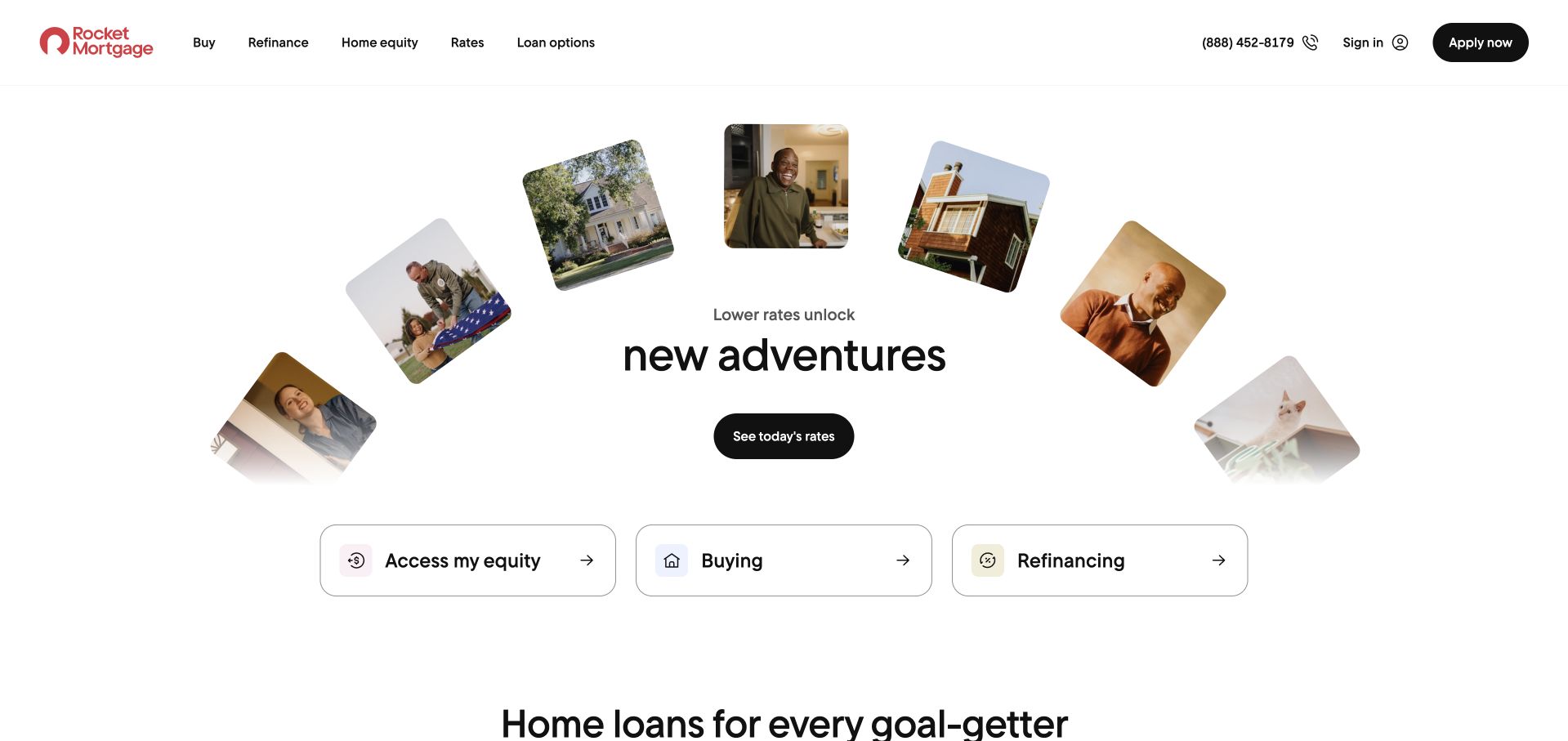
Rocket Mortgage arranges several consumer photographs around a central introduction, then presents three large pill-shaped routes for different borrowing intentions. The design feels less like a single generic application button and more like a deliberate first choice. A phone number and apply route remain available in the header for visitors who already know their goal. The useful lesson is the framing: different customers can enter the same brand without being forced to begin with the same question or sales message.
What you can learn
Map the account experience to the customer’s actual task and explain where identity verification becomes necessary. Auth0 documents Rocket customer and partner identity. This public visual review does not assess lending suitability, underwriting, account protection or the complete mortgage application architecture.
Pros
Distinct intention-based choices make the first step more specific than a generic contact control.
Human photography softens a financial subject without removing the practical navigation.
Cons & considerations
Several large choices still need clear definitions to avoid sending visitors down the wrong path.
Eligibility, costs and conditions require much more explanation than the homepage can provide.
Platform source: Rocket Mortgage — official Auth0 association. Rocket customer and partner identity; not all mortgage-site components. Official documentary association only. The named workload or listing is not proof that this public page runs on Auth0, nor a complete or independently tested current stack. Platform evidence is separate from the direct website screenshot and is not a complete current infrastructure audit.
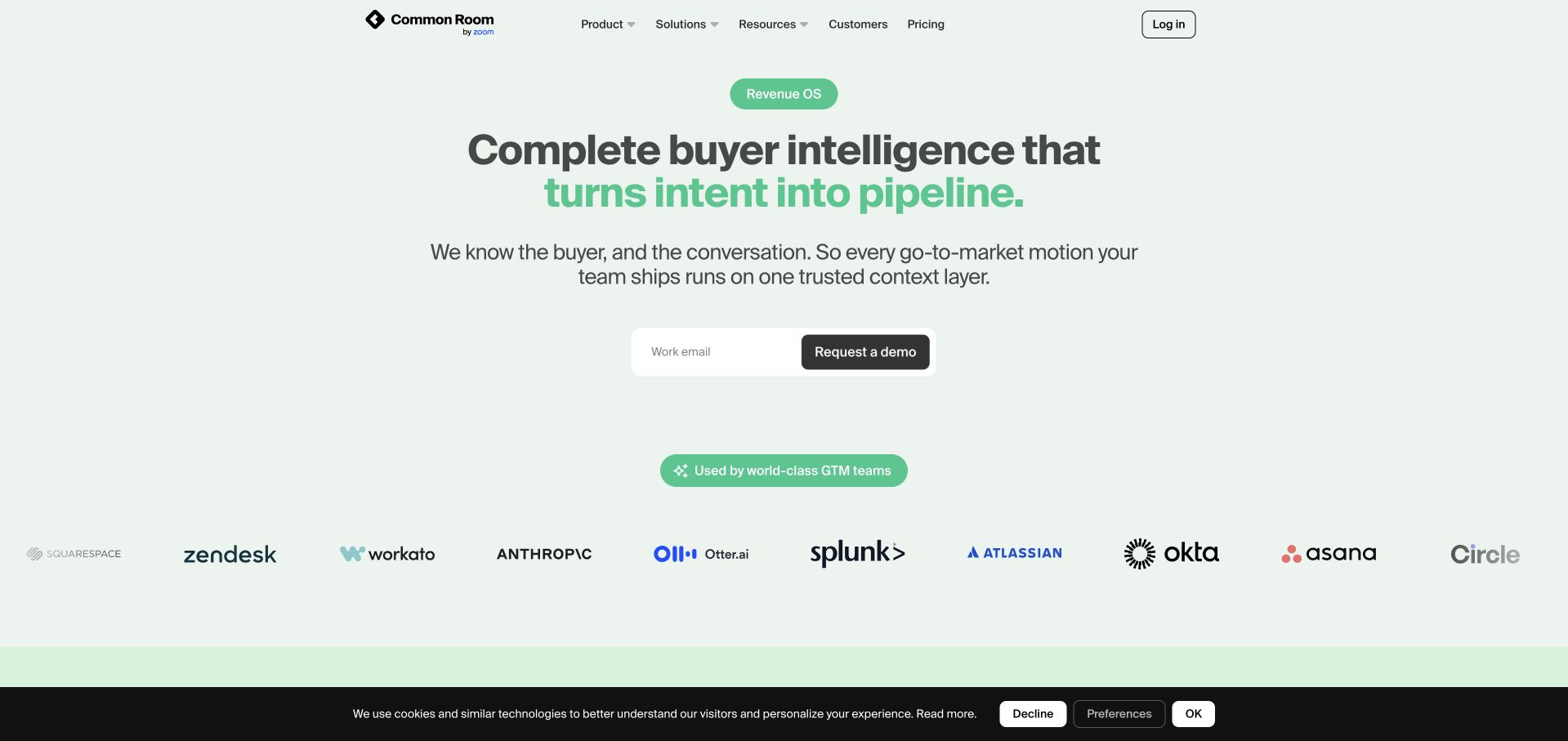
Common Room places a focused headline and email-led demo entrance on a pale green field. Dark green emphasis gives selected words weight, while a row of customer logos supplies a separate layer of recognition beneath the proposition. The composition is deliberately calm compared with many data-platform homepages: the first screen does not attempt to display every integration or workflow. That leaves room to explain an outcome before asking a visitor to understand the machinery behind it.
What you can learn
Keep the public value statement simple, but make the permissions behind real product actions explicit. Auth0’s Common Room case concerns a controlled MCP layer and AI-agent access. It does not mean that an attractive marketing page establishes safe authorization for every agent or connected system.
Pros
The limited palette and centered hierarchy make the central proposition easy to locate.
Customer references occupy their own visual band instead of interrupting the introductory sentence.
Cons & considerations
An email-first demo action needs an understandable explanation of what happens after submission.
A concise hero cannot replace concrete examples of permitted actions and product limitations.
Platform source: Common Room — official Auth0 association. Common Room identity and controlled AI agent access. Official documentary association only. The named workload or listing is not proof that this public page runs on Auth0, nor a complete or independently tested current stack. Platform evidence is separate from the direct website screenshot and is not a complete current infrastructure audit.
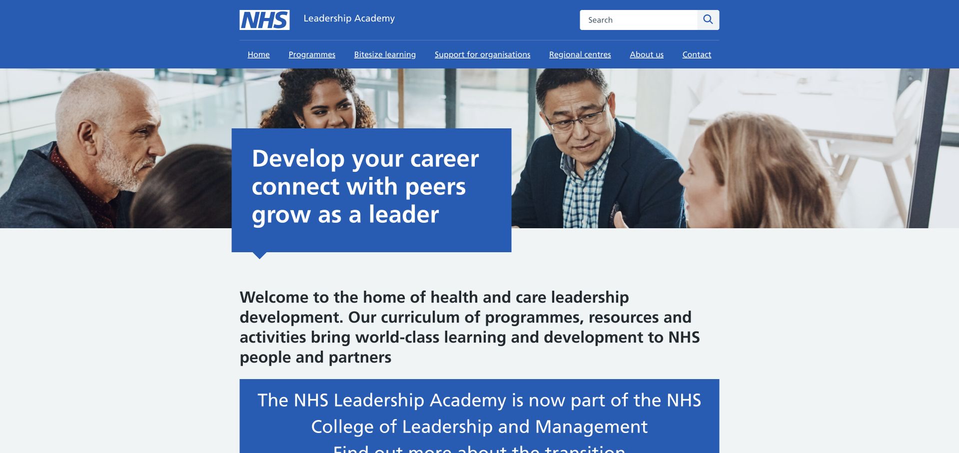
The NHS Leadership Academy combines a familiar blue institutional header with a large group photograph and a prominent career-oriented message. Search is visible in the top navigation, while the page introduces leadership development in ordinary language rather than beginning with an account form. Institutional context is clear before a visitor reaches individual learning choices. This is a useful reference for a specialized service that benefits from a parent organization’s recognition but still needs to explain its own audience and purpose.
What you can learn
Make the service boundary explicit and help learners understand which account belongs to which destination. Auth0’s case is about Leadership Academy authentication, not every NHS website or clinical system. The captured page is a public learning-service introduction, not a private learner record.
Pros
The established institutional palette makes the service’s organizational context immediately recognizable.
A people-focused photograph supports the learning subject without requiring a dashboard illustration.
Cons & considerations
Service-transition notices can compete with the permanent explanation if several are displayed together.
Platform source: NHS Leadership Academy — official Auth0 association. NHS Leadership Academy learner authentication, not every NHS website. Official documentary association only. The named workload or listing is not proof that this public page runs on Auth0, nor a complete or independently tested current stack. Platform evidence is separate from the direct website screenshot and is not a complete current infrastructure audit.
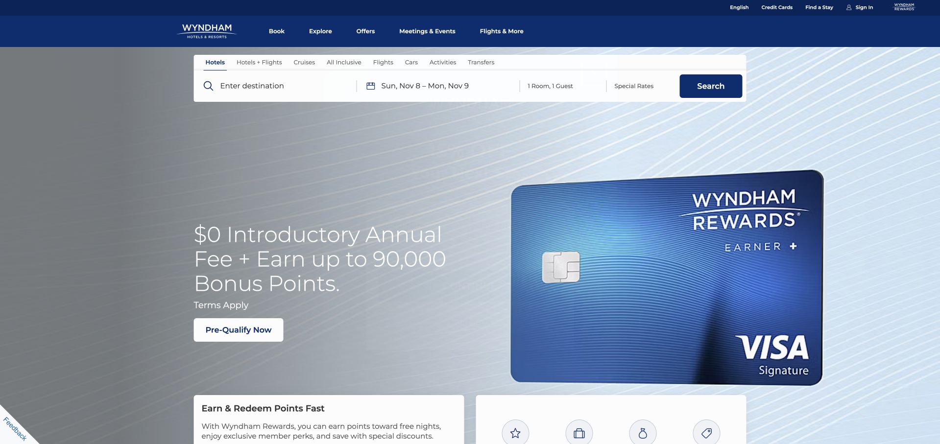
Wyndham gives its booking search a stable horizontal position directly beneath a dark blue header. In the captured campaign, a large rewards-card promotion occupies the hero below that practical entrance. The separation matters: a guest looking for a room can begin with destination and dates without first engaging with the financial promotion. The page also makes rewards and sign-in routes visible in the utility navigation, reflecting several different reasons a person might return to the same travel brand.
What you can learn
Protect the core booking task from campaign changes and make member access understandable on its own. Wyndham appears in Auth0’s official customer directory; that listing does not identify a particular current application, so this collection does not invent a booking-system or account-migration story.
Pros
The booking fields stay in a consistent, conspicuous location above the hero campaign.
Rewards and account routes are separated from the main destination-search controls.
Cons & considerations
A credit-card campaign can dilute the page’s immediate hotel-discovery proposition.
Promotional overlays should never prevent a visitor from returning to the booking task.
Platform source: Wyndham Hotels & Resorts — official Auth0 association. Named in the official Auth0 customer directory; individual applications not independently identified. Official documentary association only. The named workload or listing is not proof that this public page runs on Auth0, nor a complete or independently tested current stack. Platform evidence is separate from the direct website screenshot and is not a complete current infrastructure audit.
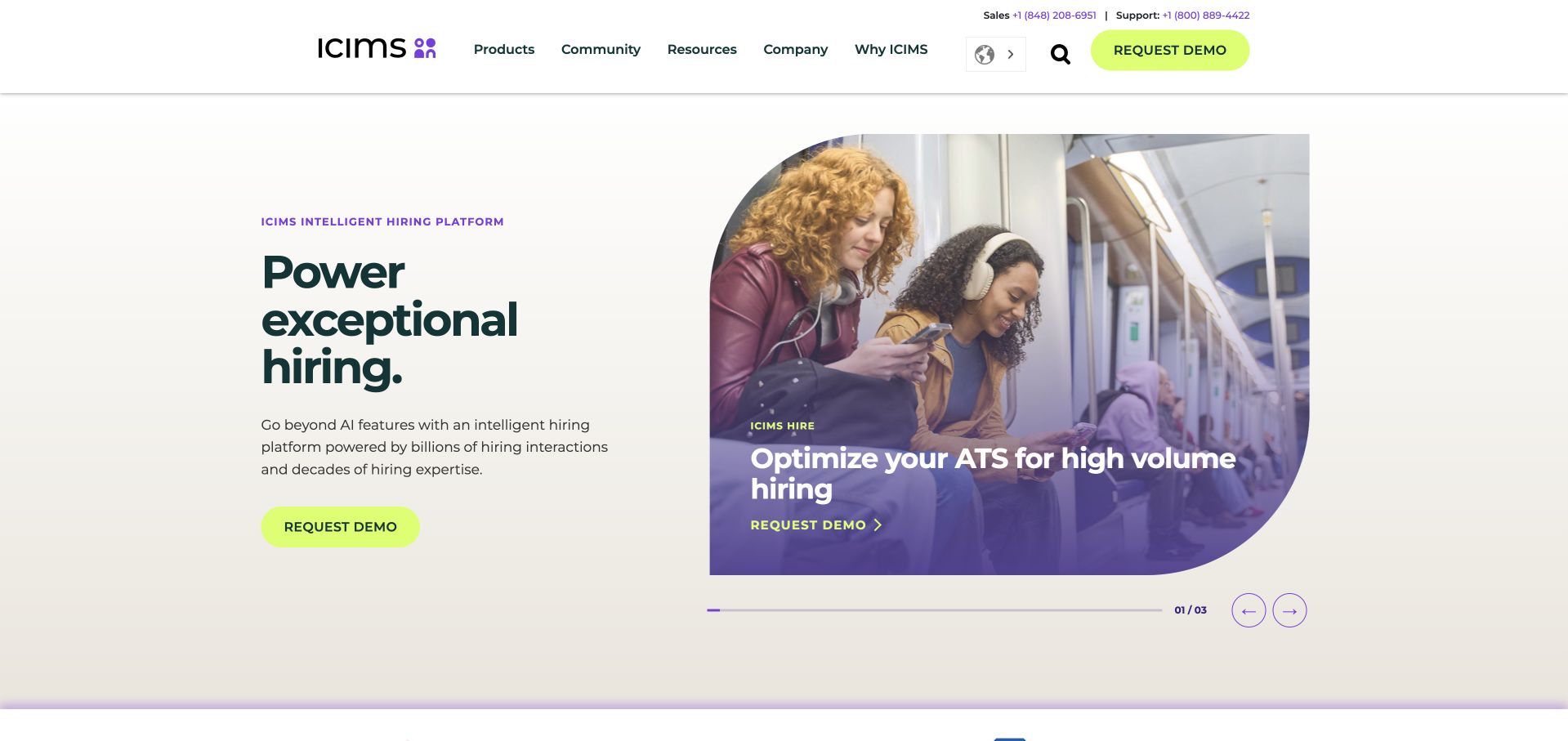
iCIMS pairs a large recruiting message with a portrait framed by a rounded photographic shape and a contrasting caption panel. Lime accents make the demo action visible against the otherwise restrained white and purple palette. The product’s human subject is apparent before a visitor encounters detailed enterprise terminology. Its composition is worth studying because recruiting software has several audiences: a company evaluating the platform, a recruiter using it and a candidate encountering it through another organization’s hiring process.
What you can learn
Keep those audiences distinct, including their account and recovery paths. Auth0’s iCIMS case describes unifying identity across the Talent Cloud. A customer identity relationship does not establish how every employer’s careers page, candidate workflow or this particular public homepage is implemented.
Pros
Portrait-led imagery connects an enterprise product to the people involved in its workflow.
A single bright accent makes the main evaluation action readily identifiable.
Cons & considerations
A sales-oriented hero may not immediately help a candidate looking for application assistance.
Broad platform language needs concrete examples before a buyer can assess implementation complexity.
Platform source: iCIMS — official Auth0 association. iCIMS Talent Cloud candidate and business-user identity. Official documentary association only. The named workload or listing is not proof that this public page runs on Auth0, nor a complete or independently tested current stack. Platform evidence is separate from the direct website screenshot and is not a complete current infrastructure audit.
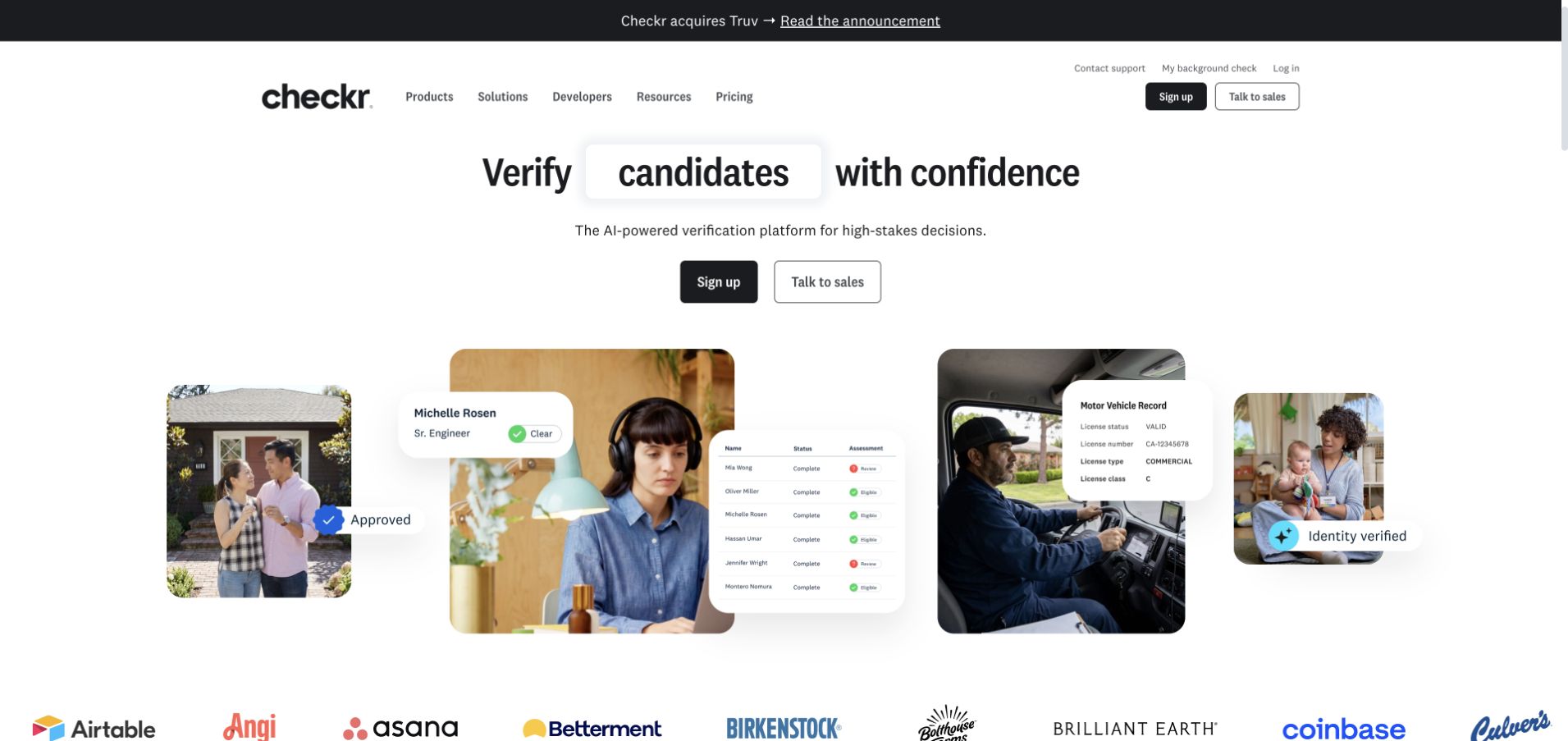
Checkr places a bold verification-related statement beside a collage of people and compact status cards. The interface fragments give the proposition a recognizable software context, while the photography keeps the subject from feeling like a purely mechanical checklist. A restrained black-and-white foundation makes the layered visual the main event. Navigation distinguishes business evaluation from candidate help, an important structural decision for a service where the organization paying for a check is not necessarily the person needing assistance with it.
What you can learn
Route people according to their role before asking them to authenticate or submit sensitive information. Auth0 documents customer authentication and enterprise connections at Checkr. That is not an assessment of screening accuracy, employment outcomes or every permission boundary in its products.
Pros
The combination of portraits and status cards makes an abstract workflow more concrete.
Candidate help is treated as a distinct task rather than another sales inquiry.
Cons & considerations
Layered interface imagery can be hard to read at smaller screen sizes.
Trust-sensitive workflows require more explanation than a short status label can supply.
Platform source: Checkr — official Auth0 association. Checkr customer authentication and enterprise connections. Official documentary association only. The named workload or listing is not proof that this public page runs on Auth0, nor a complete or independently tested current stack. Platform evidence is separate from the direct website screenshot and is not a complete current infrastructure audit.
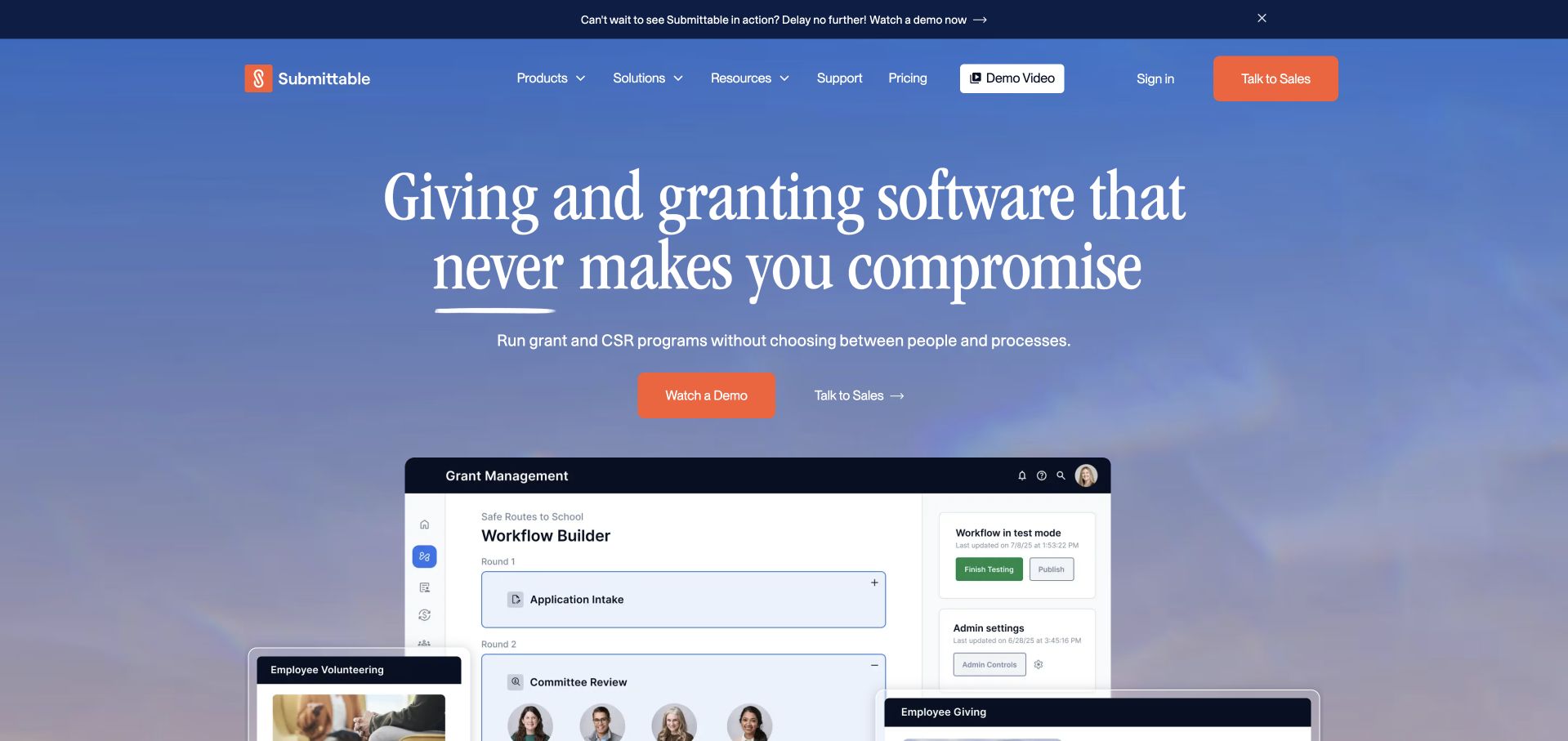
Submittable uses a blue gradient, a centered serif introduction and a contrasting orange demo action. Several overlapping interface panels begin to explain the product beneath the headline, suggesting a workflow with forms, decisions and administration rather than a single-purpose landing page. The combination of editorial typography and application imagery is useful: the page can introduce a broad organizational outcome while still showing that there is a tangible product behind the message. The main evaluation action remains easy to distinguish.
What you can learn
Design the submitter, reviewer and administrator entrances as separate journeys even when the public proposition is shared. Submittable is named in Auth0’s official customer directory. The listing establishes a customer association only; it does not independently identify the current applications or authentication flows in scope.
Pros
The contrasting demo control gives the centered introduction a clear next step.
Interface panels communicate a multi-stage product instead of relying entirely on abstract illustration.
Cons & considerations
Overlapping screenshots may conceal important details unless individual features are explained below.
A broad organizational message should not replace specific help for applicants and existing reviewers.
Visible tech stack
Earlier / documented evidence
Auth0
Platform source: Submittable — official Auth0 association. Named in the official Auth0 customer directory; individual applications not independently identified. Official documentary association only. The named workload or listing is not proof that this public page runs on Auth0, nor a complete or independently tested current stack. Platform evidence is separate from the direct website screenshot and is not a complete current infrastructure audit.
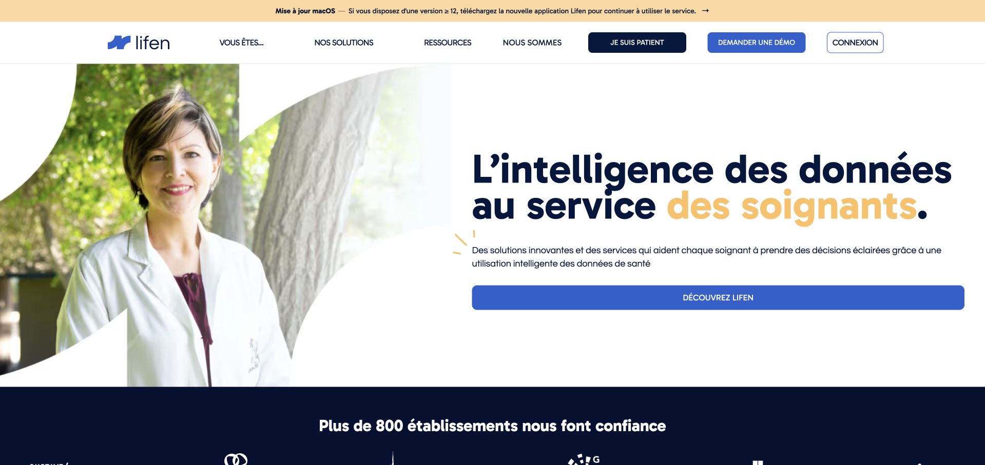
Lifen combines a dark blue French-language proposition with a large clinician photograph and a clean white navigation. The image is shaped into the composition rather than placed in a generic rectangular card, giving the page a softer human focus. A bright blue primary action establishes the business journey, while a separate patient-oriented route acknowledges that visitors may arrive for very different reasons. The design is useful for a specialized health-technology brand that needs to explain software without losing the people and institutions using it.
What you can learn
Keep audience routing explicit before collecting account or health-related information. Lifen appears in Auth0’s official customer directory, but that listing does not identify individual applications. This review makes no claim about clinical outcomes, privacy compliance or the complete architecture behind the photographed public page.
Pros
A clinician photograph supplies context for a technical product without a dense opening diagram.
The patient route is recognizable as a different task from the main commercial action.
Cons & considerations
A visually large introduction still needs plain explanations of the product’s exact responsibilities.
Device or compatibility notices can distract from permanent audience and service information.
Platform source: Lifen — official Auth0 association. Named in the official Auth0 customer directory; individual applications not independently identified. Official documentary association only. The named workload or listing is not proof that this public page runs on Auth0, nor a complete or independently tested current stack. Platform evidence is separate from the direct website screenshot and is not a complete current infrastructure audit.
Kegan has 15+ years of experience working with small businesses, Fortune 500 companies, and everything in between. No development job is too big or too small: he brings the same hands-on attention to a focused improvement, a complete website, or a custom application.
For Auth0 projects, he can help with content architecture, custom functionality, system integrations, testing, and maintainable handover. He works directly with clients on scope, design, implementation, testing, and handover, with an emphasis on clear communication and a system that remains practical to maintain after launch.
Show 3 other Auth0 developersHide other Auth0 developers
Choose the identity boundary before choosing the interface
A public site with a protected service
Keep useful service explanations, support information and discovery content public where appropriate. State clearly when the visitor is leaving the informational site for an account-based task. A conventional publishing platform can remain responsible for the public site while Auth0 supports a separate application.
A consumer account with a clear purpose
Start with one account benefit: returning to a booking, managing a device or participating in a community. Map first use, return visits and recovery separately. Do not borrow a famous company’s entire identity arrangement simply because its homepage is a useful visual reference.
A B2B organization-aware product
Model organizations, membership and permitted actions before adding a company selector. Include an invited user, someone with two organizations and a person whose membership changes. Keep machine access and human access explicitly named rather than assuming every token represents the same kind of actor.
Use representative nonproduction journeys for a stale invitation, a changed email, an unavailable upstream provider and a person returning to an unfinished task. Write the visible explanation for each state. A recovery route should help a person continue without exposing private details or silently granting a different level of access.
Give migration a real owner
An existing account population needs a documented transition, not only a new branded form. Record what stays authoritative, how duplicate identities are handled and what support can explain when the person cannot continue. Review the migration with the people responsible for identity operations before announcing a cutover.
Hand over the account system, not only the page
Identify who maintains connections, application registrations, callback configuration and customer-facing support content. Demonstrate a controlled change and a rollback outside production. Keep documentation close to the application so a future maintainer can distinguish an intentional policy from an accidental configuration difference.
A useful handover demonstration
Ask the actual team to carry out its routine job: publish a realistic update, correct a mistake, preview a narrow screen, and identify who owns an integration failure. For a library or frontend framework, also ask who maintains the content source and deployment. A polished screenshot does not answer those operational questions.
Beyond the screenshot
An Auth0 project checklist
Name the exact user population and account benefit.
Identify what remains useful without an account.
Map the return destination after authentication.
Define application and API permission responsibilities.
Choose the flow for the real application type.
Document B2B organization selection and membership.
Plan invitations, changes and account recovery.
Keep machine actors distinct from people.
Test representative errors outside production.
Assign an owner to migration and duplicate handling.
Demonstrate an operational change and rollback.
Give support a readable account-journey explanation.
Test with real content, a keyboard, a small screen, slow or failed requests, and the people who will maintain the system. These are planning checks, not an accessibility, security, performance, or search-ranking certification.
Sources & editorial method
How this Auth0 collection was reviewed
Twenty distinct public website properties were independently reviewed for this Auth0 collection. Direct public-browser captures were visually inspected; reused exact-page captures retain their original image paths, dates and provenance. Fresh captures were made November 9 UTC during November 8, 2026 Pacific research. A null capturedAt means the original day, but not a precise time, is known; no timestamp was invented. Official primary customer cases, engineering sessions, documentation and explicitly identified directory listings establish only the named workload or association. Historical material stays historical. Public screenshot appearance is not proof of the pictured page’s complete stack or current backend. These are original design observations, not measured rankings or endorsements of financial, clinical, security, accessibility, performance or AI outcomes. No private application workflows, signups, forms, purchases or account changes were used. Website owners retain their images and trademarks. The sole publisher performs a separate bounded public-stack audit before publication without replacing earlier observations.
Every image is an unmodified capture from the actual website, with its source and capture date. Some captures are reused from our shared catalog; their dates remain the original capture dates. None comes from a vendor gallery or a generated reconstruction. Moving imagery and live content can change.
Technology attribution uses public page assets or metadata, official platform documentation, or a cited first-party project case study. Documentary and framework-relationship evidence is identified where used; it is not a complete current backend inventory. A CMS image CDN alone does not establish a full CMS deployment. A library’s presence does not prove which individual controls use it, and a platform label does not establish AI authorship.
The composition notes, lessons, pros and tradeoffs are original editorial observations. We have not measured conversion, traffic, security, performance or accessibility conformance. Website owners retain their brands and imagery; these examples are not our client portfolio. Written, Edited and Curated are independent records, not dates advanced by a build. See our editorial standards or suggest a correction.
Questions worth asking
Auth0 website development FAQs
Are these public pages proven to use Auth0 for login?
Not necessarily. The screenshots establish public appearance; the official cases establish named customer identity workloads. A company may use Auth0 in a product while its marketing page uses a different publishing and frontend system.
Can a public CMS site use a separate Auth0 application?
Yes, the publishing site and account-based service can have different responsibilities. The important work is explaining the boundary and preserving the intended task. A CMS choice alone does not decide the identity architecture.
Does a successful login mean the person can access every record?
No. Authentication and application authorization are separate responsibilities. The product must define permitted actions and data boundaries, then implement and test them at the appropriate application and API layers.
When is organization-aware planning useful?
When access depends on the business or organization a user represents. Plan invitations, multiple memberships and membership changes before adding the selector. A person’s email domain alone is not a complete authorization specification.
Why are a few examples described only as directory associations?
Their official customer listing does not identify an individual workload. Keeping that limit visible is more useful than inventing a migration, product configuration or current whole-stack claim from a company logo.
Borrow the clarity of the public experience, then write an identity brief around your own users, organizations, permissions and support responsibilities. The account boundary deserves as much design attention as the homepage.