Best Computer Hardware Manufacturer Websites of 2026 (20 Real-World Examples)
Computer hardware manufacturer website examples for product discovery, compatibility and support
A hardware website has to connect a physical product with the information needed to choose, configure and maintain it. These twenty examples compare launch campaigns, product catalogs, audience routes and ownership resources across computers, components and peripherals.
People arrive at a hardware manufacturer's website with very different levels of certainty. One visitor knows an exact part number. Another is comparing laptop families. A third already owns the product and needs a driver, installation guide or replacement component. A strong website gives each person a recognizable route without making every task compete equally on the first screen. Product imagery can establish interest, but search, category structure and support navigation determine whether that interest leads somewhere useful.
This collection covers twenty distinct manufacturers of computers, processors, storage, peripherals and PC components. The examples range from large multi-audience catalogs to focused specialist brands. Reviews describe the public pages inspected and captured, including their visual hierarchy and information organization. They do not evaluate the hardware's performance, endorse promotional claims, verify purchase terms or establish that a website meets accessibility or security standards.
Before the examples
What makes good computer hardware manufacturer website design in 2026?
Support exact and exploratory searches
Let a visitor search by model or part number while also browsing by category, intended use or audience. A compatibility lookup is a different task from choosing a product family. Make the information required by each path clear before the visitor starts.
Connect campaigns to durable product records
A launch banner can change frequently; specifications, downloads and ownership resources need stable homes. Connect every campaign to a maintained product destination with clear model identity, regional context and links to relevant documents.
Explain the next action
Learn, configure, buy, find a retailer and rent represent different commitments. Use labels that describe what happens next. When several offer types share a grid, identify condition, price cadence and the route to complete terms beside the offer.
Design for the life of the product
Owners return after a campaign has ended. Give support, drivers, manuals, compatibility information, replacement parts and warranty resources predictable locations. Preserve useful routes for earlier models as the catalog evolves.
These twenty reviews identify a specific pattern and tradeoff on each manufacturer's public homepage. Compare the broad catalogs with the specialist sites to see which structures fit your own products and visitor tasks.
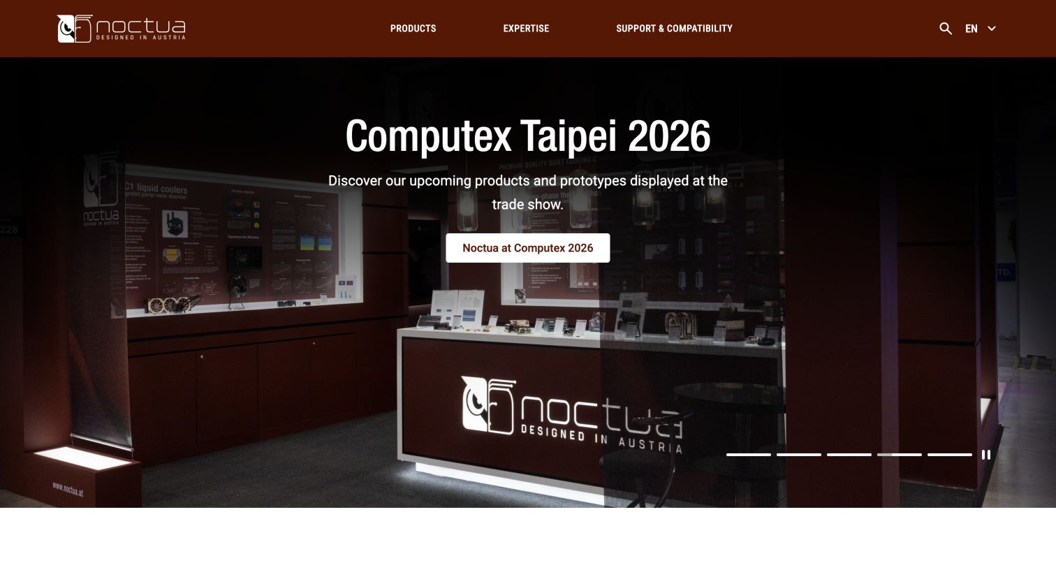
Noctua's header reduces the main structure to Products, Expertise, and Support and Compatibility. That choice is particularly relevant for cooling hardware, where selecting the right component can require more than recognizing a model name. The captured hero features a trade-show story with a darkened photograph, centered explanation and a single action. Below it, the page connects product messaging with technical articles, dated review excerpts, news and product lines. The expertise section includes guides and case studies, while support exposes installation and mounting resources. This is a useful example of treating knowledge as part of the product experience. Its main tradeoff is a long editorial page: review quotations and rotating campaigns can push direct compatibility tasks away from the center of attention despite their strong position in navigation.
What you can learn
Give compatibility and installation their own visible place when they are essential to selection. Use technical articles to explain decisions, and date editorial references so readers can judge their context. Keep practical lookup tools accessible even when news and event stories occupy the hero.
Pros
Support and compatibility receive prominent, explicit navigation.
Guides and technical articles provide a structured knowledge layer.
Cons & considerations
A long stream of editorial material can distract from a specific lookup.
Rotating event and product campaigns require clear controls and stable alternatives.
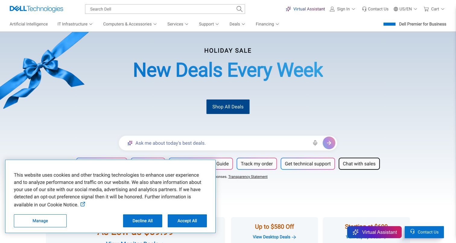
Dell's homepage gives several kinds of visitor an immediate foothold. A large search field sits above product, infrastructure, service and support navigation, while the pale blue campaign area concentrates the current shopping message into a short headline and a single deals action. An assistant prompt offers task suggestions, including order tracking and technical support, so the first screen addresses more than product discovery. Farther down, the support area exposes drivers, warranty and parts routes. This is a useful example of a manufacturer treating ownership as a continuing journey. The tradeoff is competition between the campaign, search, assistant and promotional cards: each can be useful, but their combined weight makes the opening busier than a simple product showcase.
What you can learn
Borrow the separation between shopping and owner assistance. Give returning customers recognizable support tasks before asking them to interpret a new campaign. Then decide which single action deserves the strongest visual emphasis for a first-time visitor, and keep secondary assistance compact.
Pros
Search and product navigation remain prominent above the campaign.
Support tasks address practical needs beyond the initial purchase.
Cons & considerations
Several simultaneous entry points compete for attention.
The first-visit privacy panel occupies part of the lower screen.
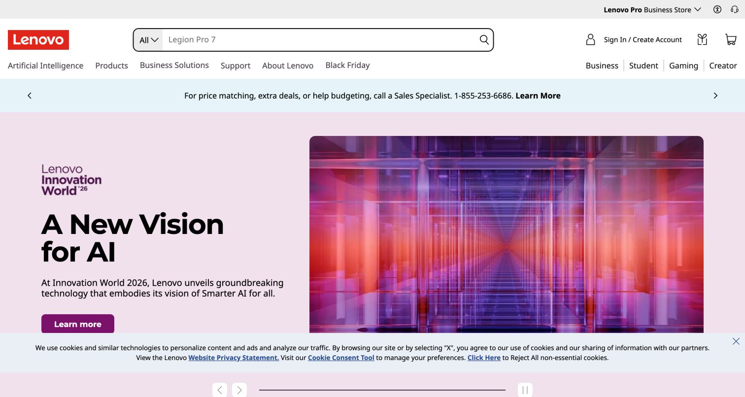
Lenovo balances a wide catalog with more human starting points. The header offers a substantial search field and conventional product and support routes, while audience labels include business, student, gaming and creator interests. The captured campaign pairs a pale lavender text panel with a geometric purple image, giving the message room without hiding the navigation. A row of product-family shortcuts below the opening links computers, infrastructure, monitors and accessories. That combination lets visitors approach the same inventory through either a known category or an intended use. It also reveals a maintenance challenge: audience pages must provide meaningful differences, because overlapping routes can feel repetitive when they simply return the same products with different headings.
What you can learn
Use audience navigation when it changes the explanation, selection criteria or supporting services. Keep a direct product route available for people who already know what they need. A calm split hero can establish the brand while leaving room for those parallel browsing strategies.
Pros
Large search and familiar category labels support exact lookups.
Audience routes acknowledge different purchasing contexts.
Cons & considerations
Overlapping category and audience paths need careful coordination.
Multiple header rows consume space before the main content begins.
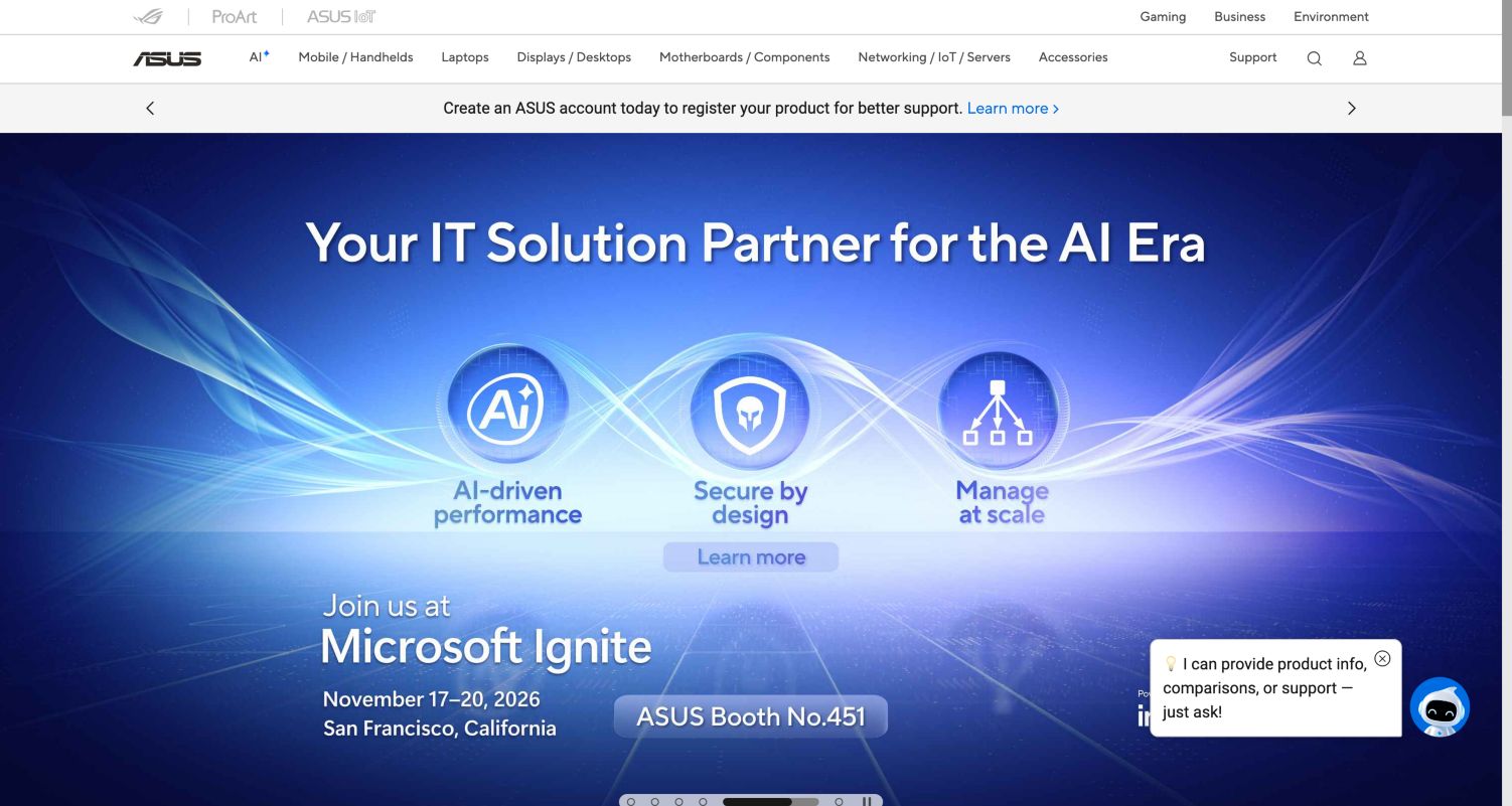
ASUS uses a compact hierarchy of brand links and product navigation to hold together a broad portfolio. Mobile devices, laptops, displays, components, networking and accessories sit in the main navigation, while specialized brand labels receive a separate strip. The captured hero promotes an IT event with a blue background, a large event title and a concise set of solution themes. Elsewhere on the homepage, individual computer and creator-product campaigns provide additional entrances. This structure accommodates frequent launches without rebuilding the entire navigation. Its weakness is cognitive density: visitors may need to understand both a product family and a sub-brand before choosing a route, and the rotating campaign can put an event ahead of a straightforward shopping task.
What you can learn
Keep the durable product taxonomy independent of launch campaigns. If several sub-brands share the site, explain what distinguishes them rather than relying on recognition alone. Use the campaign space for a focused announcement while preserving an obvious path to the complete catalog and support.
Pros
Persistent product categories support a large and varied portfolio.
Separate brand navigation gives specialized ranges a consistent location.
Cons & considerations
Brand, category and campaign layers add decisions for newcomers.
A campaign-led first screen may not answer a direct product query.
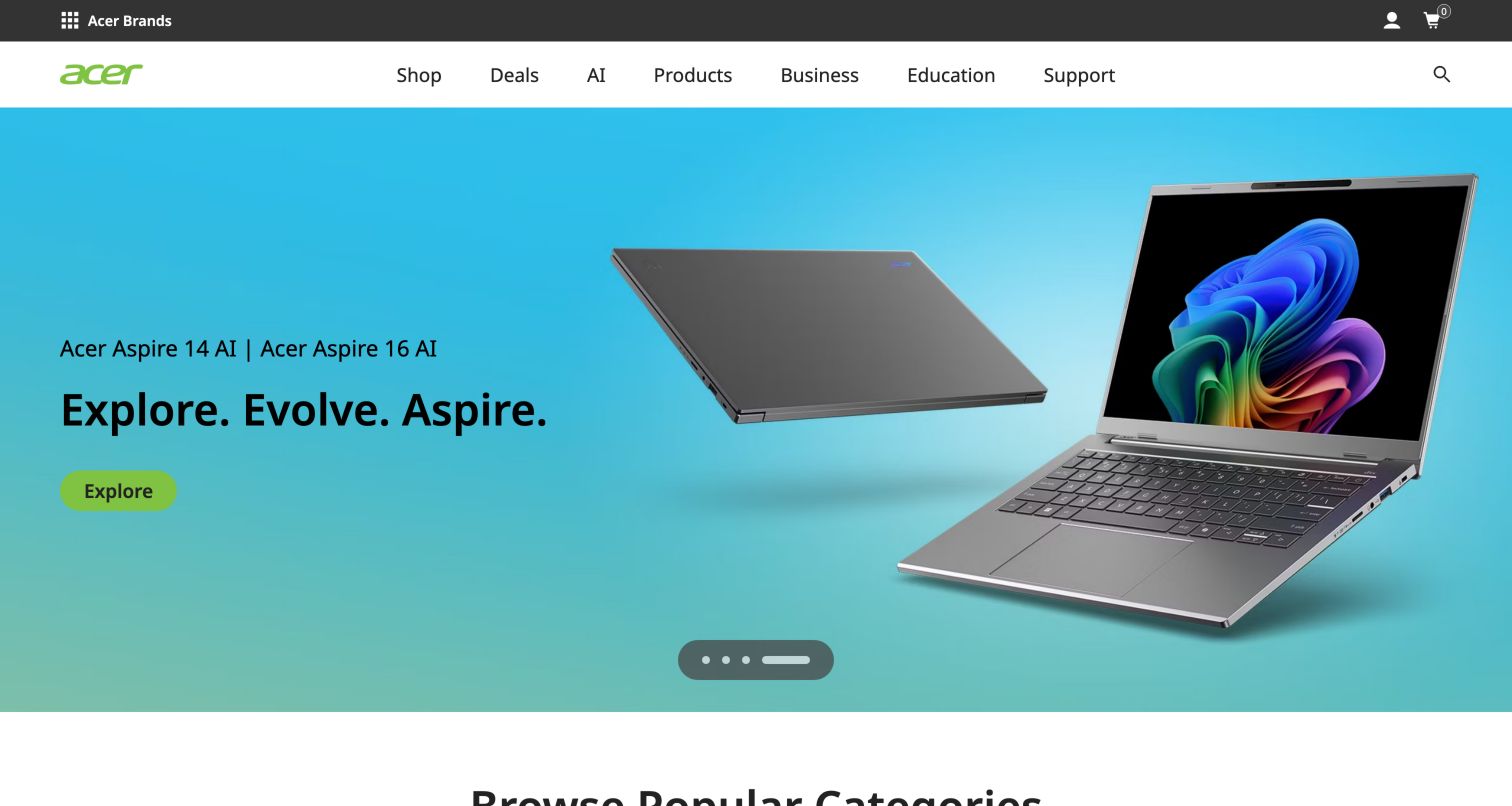
Acer's opening uses a large product photograph and a short headline on a bright cyan background. In the final capture, the Aspire campaign names the laptop family and provides one green Explore action; the header remains plainly readable above it. Shop and Deals sit beside Business, Education and Support, giving commercial and owner tasks stable positions outside the carousel. Below the campaign, popular categories turn the broad catalog into recognizable choices such as laptops, desktops and monitors. Offers and explanatory articles extend the page beyond a launch advertisement. The carousel is the main compromise: its content changes with time, and a useful screenshot required a settled state. That behavior deserves attention when designing for people reading slowly or returning to a specific message.
What you can learn
Use recognizable product categories to ground an expressive campaign. Give business, education and support visitors permanent paths, and make carousel content discoverable without waiting for it to rotate. Check that titles, actions and imagery remain clear through transitions and on smaller screens.
Pros
Bright campaign styling keeps the product and action easy to distinguish.
Category shortcuts provide a practical continuation below the hero.
Cons & considerations
Automatic campaign changes can interrupt reading.
Several brand and utility controls add density above the product message.
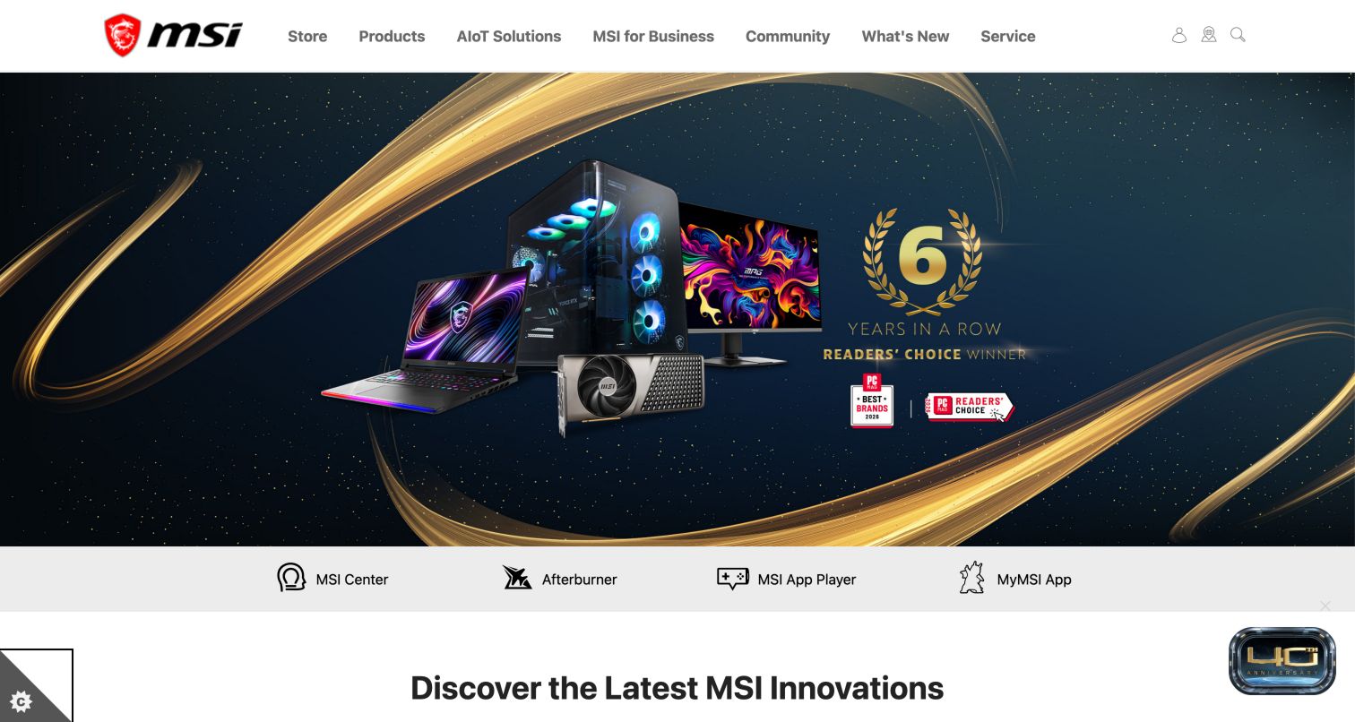
MSI opens with dramatic dark imagery, gold accents and a grouped display of hardware. The captured banner presents an awards promotion, which is considered here as a design element rather than an independently verified product endorsement. Above it, the site separates primary product and service navigation from shortcuts to utilities such as MSI Center and Afterburner. Below the hero, innovation cards use precise product-family names and recognizable hardware images. This suits visitors who already know the manufacturer's ecosystem and may arrive looking for software as often as a new device. The same specialist vocabulary can slow a newcomer: long model names and multiple enthusiast programs ask the interface to provide more explanation than a large image alone can carry.
What you can learn
Give companion software a stable location when it is part of owning the hardware. Pair exact model names with a short category or use description, so technical accuracy does not come at the expense of orientation. Keep promotional accolades visually separate from product specifications and support information.
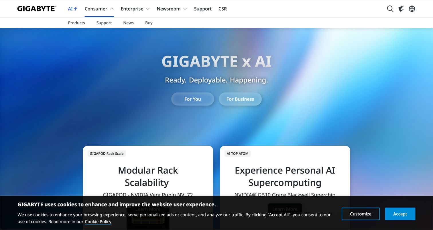
GIGABYTE organizes its first major decision around audience. The captured blue-gradient hero presents two rounded actions for personal and business interests, while the navigation distinguishes consumer and enterprise offerings. That is a useful way to manage a portfolio whose products and buying processes vary substantially. The following product panels continue the visual story without forcing every category into the opening screen. The design also illustrates the limits of a broad theme: the prominent AI message describes a direction more than a specific product, so a visitor still needs a second step to identify the relevant hardware. A dark cookie strip remains at the bottom of the captured first visit but does not conceal the principal audience choices.
What you can learn
Use an early audience fork when the downstream catalogs, terminology and support needs are meaningfully different. Make each choice concrete enough that visitors can predict the next page. Preserve a direct product search or category route for people who already know the model they want.
Pros
Personal and business routes are visually distinct in the hero.
The navigation reinforces the same portfolio division.
Cons & considerations
A broad technology theme gives little immediate product detail.
Audience choices can add a step for visitors seeking a known model.
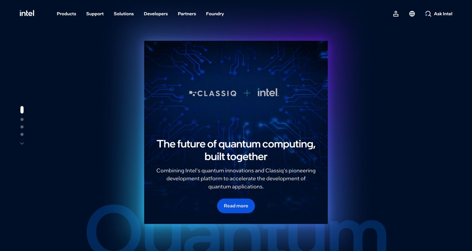
Intel's homepage behaves more like a technology publication than a direct storefront. The captured hero uses a blue collaboration graphic, a headline and a single call to action, while a dark header gives Products, Support, Solutions, Developers, Partners and Foundry their own places. News modules continue the corporate story below, and resource shortcuts lead toward downloads, specifications and developer information. This separation is useful for a component manufacturer whose visitors may be evaluating an ecosystem, implementing a platform or maintaining an existing machine. The visual campaign supplies context, but it is not a substitute for the exact documentation those tasks require. The narrow central composition and carousel indicators also make the hero feel like one editorial item within a larger information system.
What you can learn
Treat technical resources as first-class navigation when the audience includes implementers and partners. Let corporate stories explain direction, then give precise destinations for specifications, downloads and support. Avoid assuming that a visitor interested in a headline has the same intent as someone identifying a particular component.
Pros
Developer and partner audiences are named in the main navigation.
Technical resource shortcuts support practical follow-up tasks.
Cons & considerations
A corporate campaign can delay access to exact component information.
Rotating editorial content requires stable alternatives elsewhere on the page.
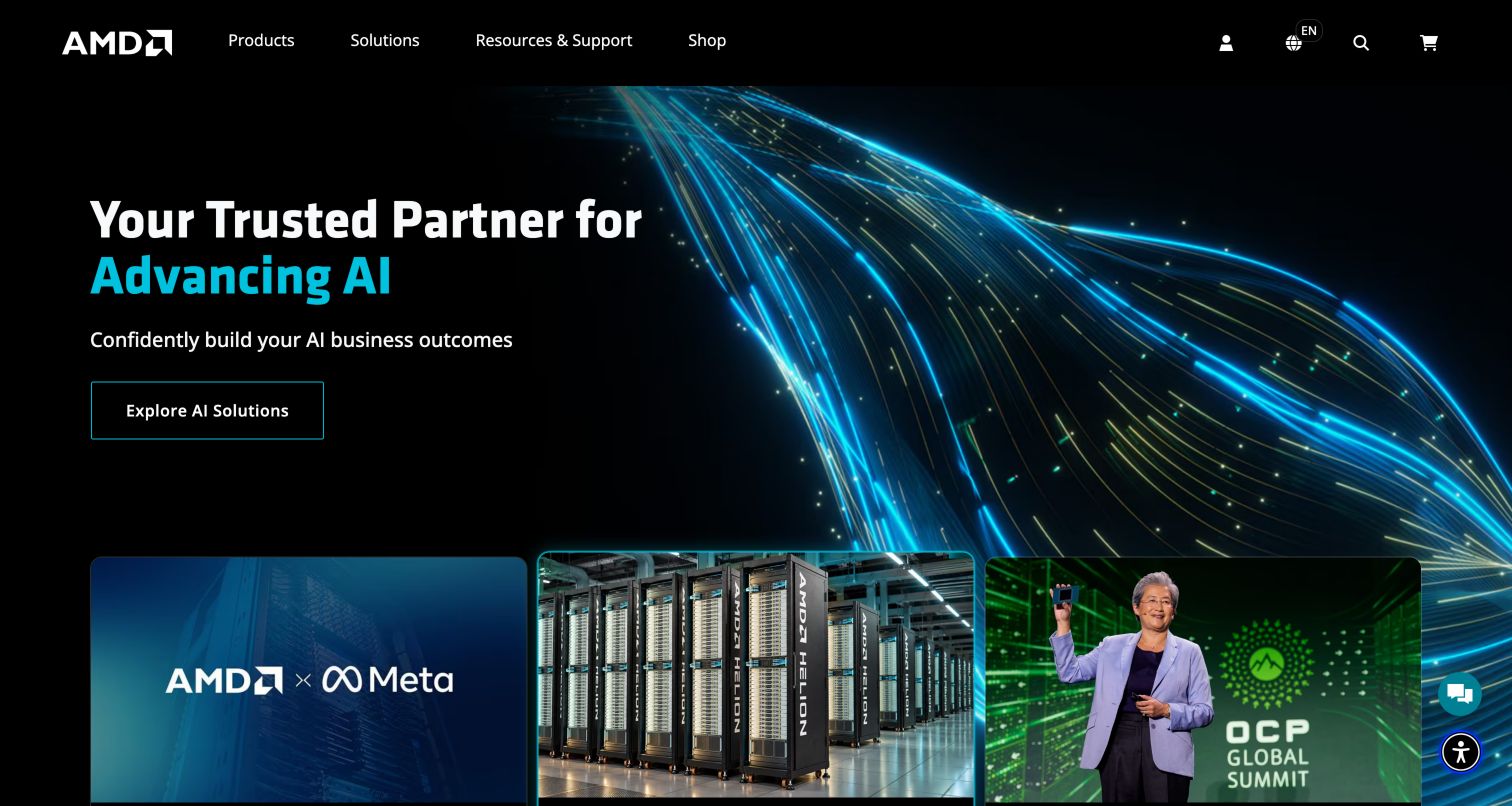
AMD's captured homepage pairs a black navigation bar with a vivid blue and cyan hero. The headline and primary action sit on the left, leaving the light-trail artwork to provide atmosphere without becoming the only source of meaning. Products, Solutions, Resources and Support, and Shop form a compact top-level structure. Feature cards begin immediately beneath the hero, allowing several current stories to coexist without turning the opening into a dense link list. Partner imagery and enterprise-oriented sections further down support the broader platform narrative. This is a useful reference for managing the tension between a corporate technology story and a product catalog. The main limitation is that a large enterprise message gives little direct help to a visitor comparing a particular consumer component.
What you can learn
Keep product discovery and support visible even when a major enterprise campaign leads the homepage. Use a small set of well-labeled feature cards to introduce secondary stories, and distinguish platform messaging from the exact specifications and compatibility evidence needed for a purchase decision.
Pros
A compact main navigation leaves room for the campaign message.
Feature cards expose additional stories directly below the hero.
Cons & considerations
Broad enterprise messaging may not match a component shopper's intent.
Technical comparisons require a deeper destination than the opening screen.
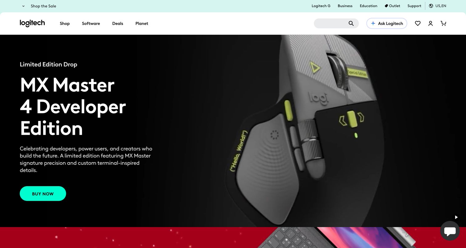
Logitech gives the featured mouse unusually clear visual priority. A close product view occupies the right side of the dark hero, while the name and a bright purchase action remain on the left. The main navigation is short, with shopping, software and promotional routes, and a secondary strip offers business, education and support destinations. Below the campaign, category shortcuts introduce mice, keyboards, webcams and other product families. The hierarchy works because the first screen is allowed to promote one item while the rest of the page restores catalog breadth. The cost is temporary imbalance: someone seeking a different accessory or a software download must rely on the header rather than the featured story. That is acceptable only if those routes remain understandable and easy to reach.
What you can learn
Give a launch campaign a clear product image and action, then quickly return visitors to the wider catalog. Separate software and support from promotional browsing when they serve existing owners. A restrained header can carry these tasks without competing with the featured product.
Pros
The product image, name and action form a clear visual unit.
Category shortcuts broaden the journey beyond the current launch.
Cons & considerations
A single-product hero may be irrelevant to many returning visitors.
Secondary audience links are less prominent than the shopping campaign.
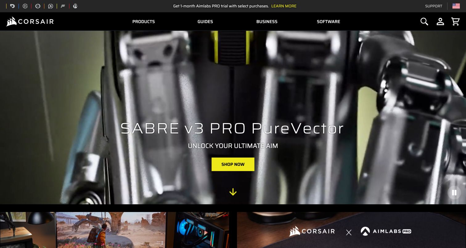
CORSAIR uses black and yellow to make its product launch feel unmistakably branded. The captured hero shows a close hardware detail with a readable product title and a yellow shopping action; a visible pause control acknowledges the moving presentation. The header connects Products, Guides, Business and Software, while a separate strip identifies related brands. Farther down, product categories, custom-design options and reasons to buy directly provide additional routes. This is more than a catalog cover: it connects inspiration, education and configuration. The challenge is keeping those paths distinct. A visitor selecting a standard component should not have to interpret customization language, and an owner looking for software needs a durable shortcut even when the visual campaign changes.
What you can learn
Use motion to reveal the physical product, while keeping the name and next action readable without it. Connect guides and software to the catalog as separate tasks. When customization is offered, explain its scope before sending visitors into a different selection process.
Pros
High-contrast brand accents make the primary action easy to locate.
Guides and software have explicit positions in the navigation.
Cons & considerations
Large launch media postpones detailed category comparison.
Multiple brands and configuration routes can complicate orientation.
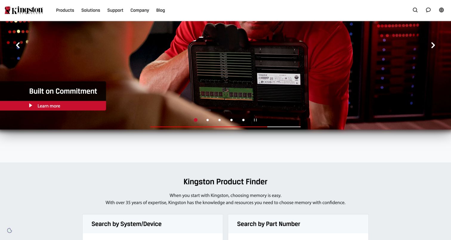
Kingston offers a practical lesson in moving from aspiration to identification. The captured hero combines a person holding a memory kit with a dark text panel and a red action, but the Product Finder begins within the same viewport. Its two approaches distinguish searching by system or device from searching by part number. Those are different levels of visitor knowledge, and the interface recognizes both. Products, Solutions, Support, Company and Blog remain in a straightforward header, while editorial material provides further context below. The design's strength is that compatibility is visible as a task rather than left to product marketing. The limitation is that the homepage only introduces the lookup: the quality of the next-step fields, results and exceptions would determine how well the complete journey works.
What you can learn
Offer separate entry points for people who know their existing system and those who know an exact part number. Explain what information each route needs before the search begins. Place this practical selector near the campaign so marketing and compatibility work together.
Pros
The finder recognizes two common ways of identifying a compatible part.
A relatively compact hero leaves useful task content visible below.
Cons & considerations
The homepage cannot explain every compatibility exception.
Carousel promotions can compete with the more durable lookup task.
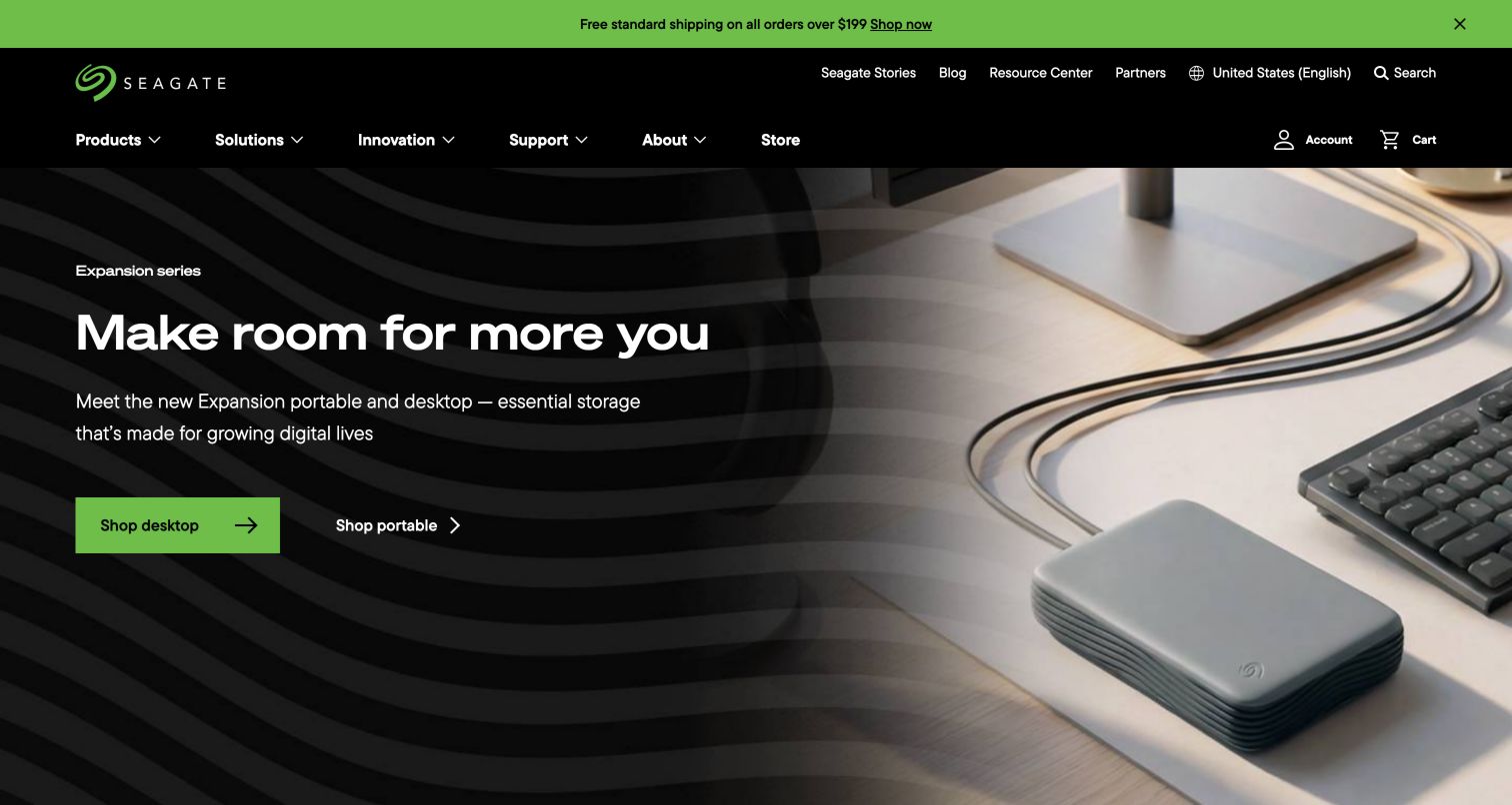
Seagate's captured hero makes the two formats in its featured storage family easy to distinguish. A desktop drive appears prominently on the right, while the left side contains a brief heading, a green desktop-shopping action and a separate portable-shopping link. The two-row header supports a broad portfolio, and later navigation connects storage to personal, gaming, cloud, network-attached and surveillance contexts. Resource and support routes acknowledge that storage ownership involves documentation and help as well as selection. The useful pattern is a specific product-family choice inside a much wider use-case system. The tradeoff is terminology: a general shopper may understand desktop versus portable immediately but need more guidance when moving into specialized storage categories with different compatibility and workload assumptions.
What you can learn
Start a product-family campaign with a concrete distinction buyers can recognize. Then introduce more specialized use cases with plain explanations and maintained resource links. Keep marketing statements about capacity or performance separate from the specifications and compatibility details used for evaluation.
Pros
Desktop and portable paths are distinguishable in the opening campaign.
Use-case navigation accommodates a wide range of storage needs.
Cons & considerations
A broad portfolio introduces specialist terminology quickly.
The hero provides little comparison detail beyond the featured family.
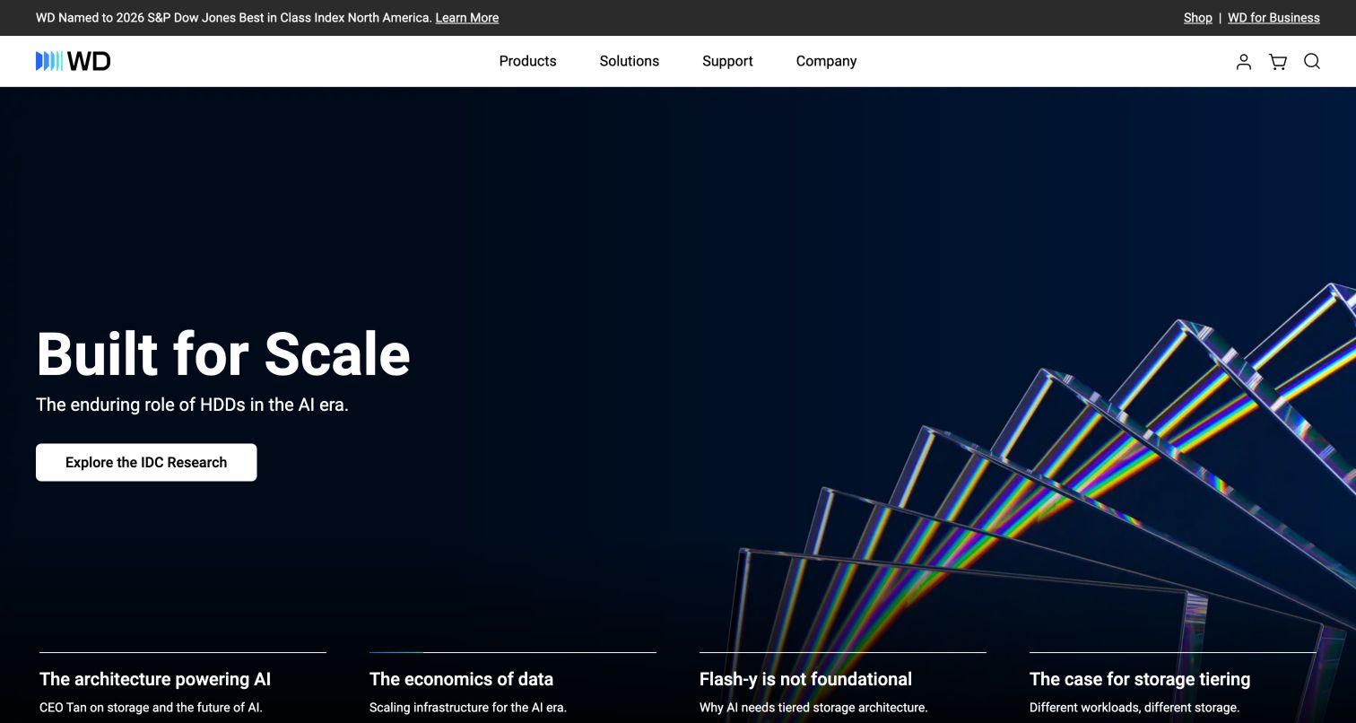
Western Digital presents a restrained white header above a dark blue corporate campaign. The captured opening promotes a scale-related research story with a clear action, while labeled carousel segments preview other messages beneath it. Lower on the page, visitors can browse by category, solution or industry. These are genuinely different organizational views: one begins with the hardware, another with the problem, and another with the operating context. That makes the site useful as a reference for a catalog that must support both specialists and less technical decision makers. The challenge is keeping the views consistent without duplicating entire content systems. The first screen also prioritizes thought leadership over a product, so exact shoppers depend on the main navigation and subsequent category choices.
What you can learn
Provide several browsing lenses only when each helps visitors make a different decision. Reuse accurate product records beneath those views so specifications do not drift. Label editorial research as such, and retain a direct route to hardware for visitors who arrive with a defined requirement.
Pros
Category, solution and industry views offer different discovery strategies.
Labeled campaign segments reveal more than anonymous carousel dots.
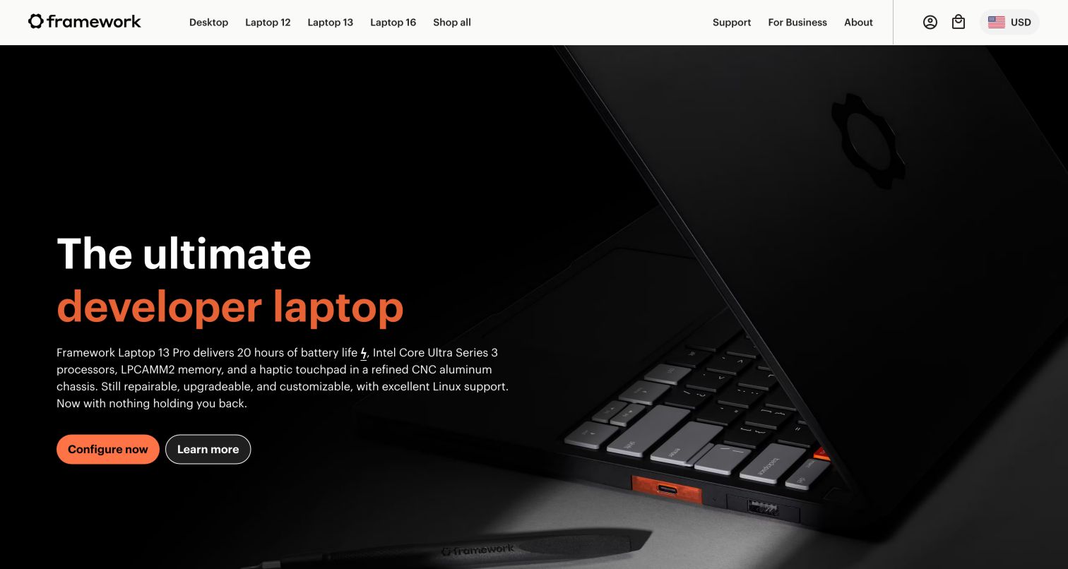
Framework's homepage connects the initial computer purchase with later ownership unusually directly. The dark hero features a laptop photograph, an orange-accented title and separate Configure Now and Learn More actions. Product-family navigation stays visible above, while subsequent sections repeat the choice between configuring and understanding each system. A parts marketplace and repair or upgrade explanations broaden the journey beyond a single sale. The page also includes a testing footnote for a performance-related claim, which is useful as an example of preserving qualification without independently validating the claim itself. This structure gives visitors agency at different stages: some are ready to choose a configuration, while others need to understand the system. The tradeoff is the additional complexity that configurable products bring to an otherwise simple storefront.
What you can learn
Separate the action of configuring a product from learning about it. Make replacement parts and ownership resources discoverable alongside new systems, and keep important qualifications near the claims they explain. A repair-oriented proposition needs concrete navigation, not just a brand statement.
Pros
Configure and Learn More actions acknowledge different levels of readiness.
Parts and upgrade routes extend the design beyond the first purchase.
Cons & considerations
Configuration introduces decisions that require careful explanation.
Several related laptop families can be hard to compare from campaigns alone.
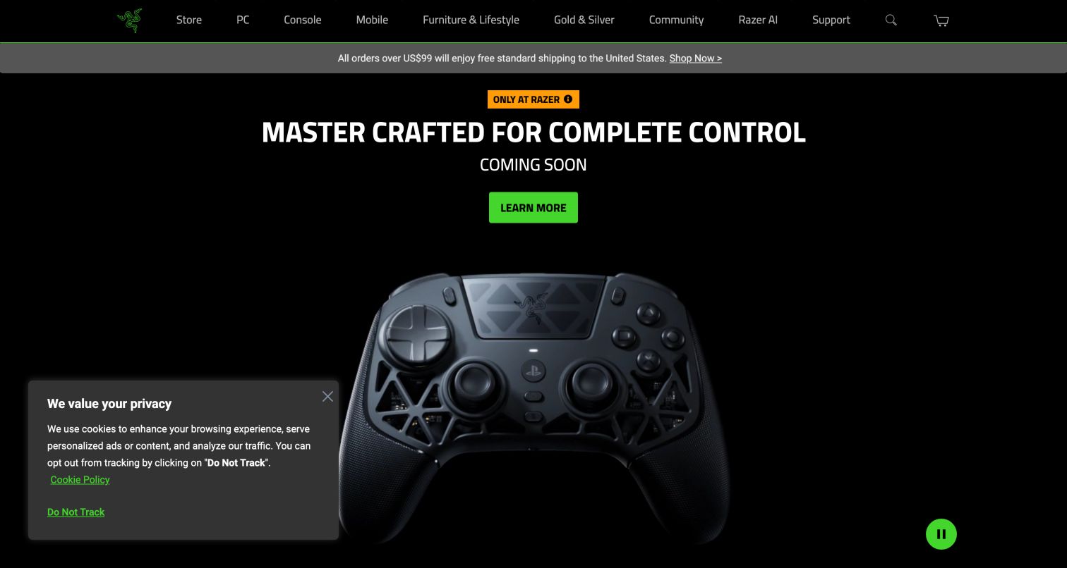
Razer's black and green interface creates a strong visual frame for an extensive gaming catalog. The captured hero centers a controller launch, placing the title, availability message and green Learn More action above a large product image. PC, console, mobile and lifestyle categories remain visible in the header, alongside community and support routes. Further down, individual product campaigns separate learning from buying, and esports content adds an editorial dimension. This is a useful model for keeping many launches visually related without presenting them as a conventional product grid. The downside is that a visitor may have to pass several promotional panels before comparing practical details. A small privacy panel remained at the lower left during capture, illustrating how first-visit interfaces add to the promotional density.
What you can learn
Use a consistent visual system to connect launches across different device categories. Distinguish an announcement from an immediately purchasable product, and provide a stable category route for visitors who want comparison rather than a sequence of campaigns. Keep support as visible as community content.
Pros
Consistent color and typography tie varied product campaigns together.
Category and support routes remain available outside the hero.
Cons & considerations
Stacked promotions can make practical comparison feel distant.
First-visit notices add another layer to an already active interface.
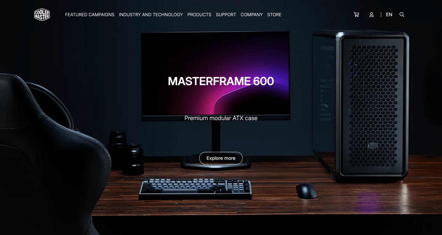
Cooler Master's opening presents its case inside a complete desktop setup rather than isolating it on a plain background. The captured image includes a monitor, keyboard and desk, while the case name and a single Explore More action sit centrally. The dark header keeps Featured Campaigns, Industry and Technology, Products, Support, Company and Store available above the scene. Later sections move through cooling, cases and controls, followed by product cards and ownership resources such as registration. This makes the homepage useful for connecting an individual component to the experience of a finished build. The limitation is precision: an atmospheric room scene communicates style more readily than dimensions, clearance or compatibility, so the next product page has to supply the practical detail needed to evaluate the hardware.
What you can learn
Show components in context when appearance and setup matter, then connect that inspiration to exact product information. Keep support and ownership tools accessible independently of campaigns. A strong environmental photograph should lead into specifications rather than being asked to replace them.
Pros
The desk scene makes the component's role in a complete setup tangible.
Product, store and support destinations are separately named.
Cons & considerations
Atmospheric imagery supplies little immediate compatibility information.
Long campaign sections may slow visitors seeking one exact component.
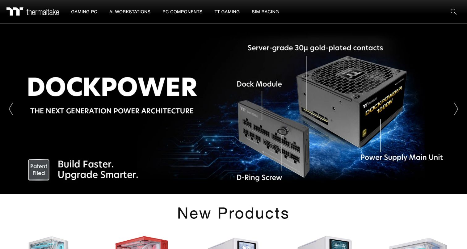
Thermaltake's captured hero uses an exploded power-supply image to make a physical mechanism legible. Labels identify the dock module and main unit, while the large product name anchors the left side. The header groups gaming PCs, workstations, components, gaming accessories and sim racing into a compact set of destinations. Immediately below the hero, a New Products section introduces a grid of cases and variants, including availability labels where applicable. This is a useful contrast to purely atmospheric hardware advertising: the image itself explains relationships between parts. The compromise is reliance on text embedded in a large graphic. Small labels can become difficult to read on narrow displays, and the same explanatory content needs an accessible text equivalent on the relevant product destination.
What you can learn
Use annotated imagery when it explains how a component is assembled or used. Carry the explanation into real page text, preserve readable labels at smaller sizes, and distinguish color or size variants clearly in the following product grid. Avoid making the banner the only source of an important detail.
Pros
The exploded view communicates physical relationships at a glance.
New product cards provide a direct continuation after the campaign.
Cons & considerations
Small labels within a large graphic may shrink poorly.
Long variant names need careful handling in compact cards.
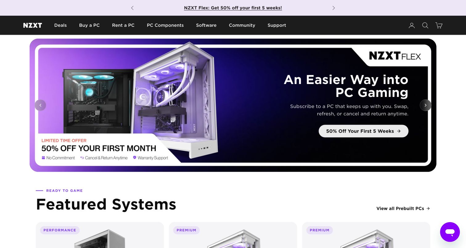
NZXT's homepage distinguishes buying a complete PC, renting one and choosing components for a build. Those choices appear in the main navigation and return later as three explanatory paths, making the business models visible before a visitor enters a product flow. The captured purple campaign promotes the rental option, while featured-system cards below identify condition, core components and whether the displayed price is recurring or a purchase amount. This is a useful example of using content structure to prevent fundamentally different offers from looking identical. It also creates an editorial responsibility: promotions must stay consistent across text and artwork, and terms need a clear destination. During inspection, a cookie interface was followed by a newsletter overlay, adding two interruptions before the unobstructed homepage could be reviewed.
What you can learn
Label ownership model, condition and price cadence wherever different offers share a grid. Give buying, renting and building separate explanations, and keep campaign artwork synchronized with adjacent copy. Review the complete first visit so promotional overlays do not obscure the distinctions the page is trying to establish.
Pros
The navigation clearly separates buying, renting and component selection.
System cards expose condition and pricing cadence near product information.
Cons & considerations
Sequential overlays interrupt the initial browsing experience.
Multiple offer models require especially careful promotional consistency.
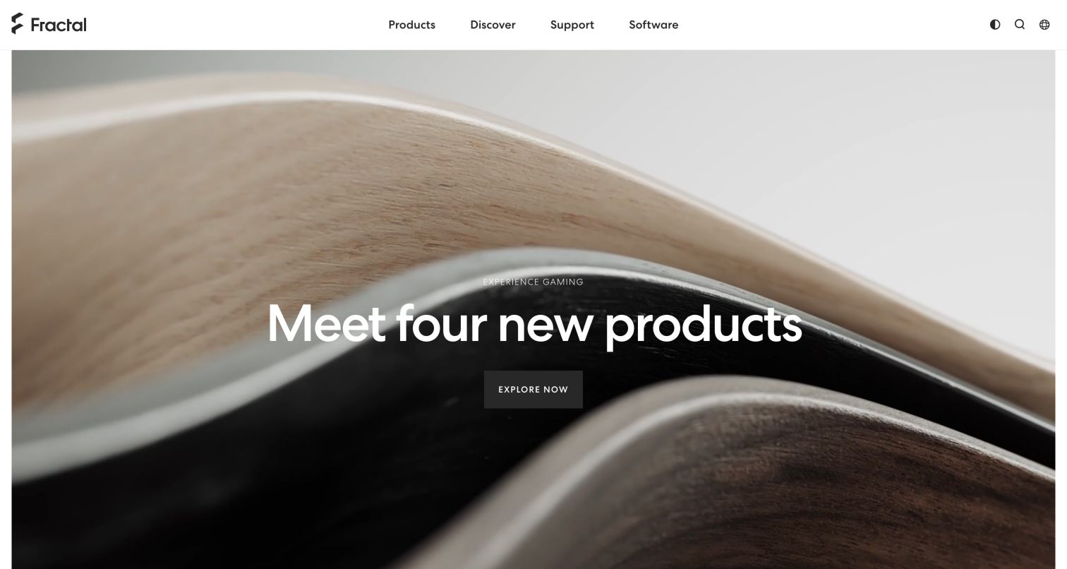
Fractal Design's homepage gives physical materials unusual prominence. The captured video frame shows a close view of wood and curved product surfaces, with a large white headline and a compact dark action over it. The header is intentionally short: Products, Discover, Support and Software carry the main tasks. Below the opening, featured products combine cases, cooling and adjacent accessories, followed by design stories, community material and practical articles. This creates an editorial rhythm closer to a design publication than a dense electronics storefront. The limitation is orientation: the first-screen close-up communicates texture and finish before it identifies the exact products being introduced. That makes the following product cards important, and it places additional responsibility on motion behavior, contrast and a useful still-image fallback.
What you can learn
Use close material photography to express industrial design, but introduce product identity and category quickly afterward. Keep the main navigation restrained without hiding support or downloads. Check that changing video frames preserve text contrast and that a static fallback still explains the next action.
Pros
Material photography gives the hardware a distinctive visual identity.
A short header keeps products, support and software easy to locate.
Cons & considerations
Abstract close-ups can delay recognition of the featured products.
Text over moving imagery needs frame-by-frame contrast consideration.
Kegan is a freelance web designer and developer with 15+ years of experience helping businesses turn complicated website requirements into clear, maintainable digital experiences. He works directly with clients from planning and design through development, launch, and ongoing support.
For computer hardware manufacturer website design, his development approach focuses on product comparisons, technical specifications, support resources, and purchasing journeys. The scope can be a targeted improvement or a complete custom build, with responsive layouts, thoughtful content structure, and integrations chosen around the people using and maintaining the site.
Show 3 other computer hardware manufacturer website designersHide other computer hardware manufacturer website designers
Plan the product information before the launch treatment
Map the decisions visitors must make
List the questions that precede a purchase or support task: product category, existing system, intended use, region, model generation, configuration and compatibility. Decide which can be answered on a category page and which require a dedicated selector or guide. Avoid forcing every visitor through the same questionnaire.
Create a reliable product model
Define fields for model number, family, variants, dimensions, supported interfaces, documents, software, availability and regional differences. Keep shared information reusable and record exceptions explicitly. Product cards should introduce the information that distinguishes alternatives rather than merely repeating long names.
Separate browsing lenses from duplicate content
A product may appear under a category, industry and use case. Let those pages explain different contexts while drawing specifications from the same maintained record. This reduces contradictions when a detail changes and helps editors understand what they are responsible for updating.
Design compatibility as a complete journey
Explain the identifiers a visitor needs, provide examples, and design useful outcomes for ambiguous or missing matches. Include a route to relevant documentation or support. A confident-looking result should never hide important limitations about generations, configurations or regional variants.
Define the relationship between commerce and support
Decide whether sales occur directly, through retailers or through an inquiry process. Make those transitions explicit, and keep ownership tasks available without a shopping detour. If rental or subscription offers are present, distinguish them consistently from purchases in navigation, cards and campaigns.
Review ordinary first-visit conditions
Test the page with consent choices, slower media, keyboard navigation, enlarged text and narrow screens. Inspect carousel transitions and promotional overlays as part of the experience. Check document labels and download destinations without submitting forms or assuming that a polished screenshot proves the full journey works.
The editing job behind the design
Choose systems that keep product facts and ownership resources connected
For a hardware manufacturer, the connection between product data, editorial content, search, commerce and support often matters more than the hero animation library. Evaluate how a proposed system handles a renamed model, a new regional variant, a corrected specification, an updated driver and a discontinued product. Editors should be able to maintain those relationships without recreating the same facts in several disconnected pages.
Public website observations can identify exposed content-system references, libraries, commerce components or delivery services. They cannot establish the manufacturer's internal engineering tools, product-testing process or security controls. Treat observed references, historical associations and dependencies as different kinds of evidence, and preserve their scope when discussing a possible platform.
Our WordPress website examples offer a separate look at publishing approaches. A visible platform label is evidence for that named page, not a guarantee that the same system will suit your requirements.
Before the public launch
Computer hardware website planning checklist
Visitors can search using a model name or part number.
Product categories remain accessible outside current campaigns.
Audience and use-case routes explain how their recommendations differ.
Model families, generations and variants are clearly distinguished.
Compatibility journeys explain required inputs and important limitations.
Configure, buy, rent and retailer actions describe their destinations.
Recurring prices and product condition are labeled where relevant.
Specifications and supporting documents have maintained source records.
Drivers, manuals and support remain easy to find for existing owners.
Replacement parts and older-model resources have durable routes.
Moving campaign imagery has usable controls and an informative fallback.
Consent and promotional overlays leave essential navigation usable.
These checks are a project checklist, not a performance, legal, security, or accessibility certification. Test real journeys with the people responsible for the website before making claims about the result.
Sources & editorial method
How this collection was selected and reviewed
The persisted pre-research target for this collection was twenty examples. We inspected and captured twenty distinct public manufacturer websites directly, retaining each screenshot's actual URL, capture date, dimensions and attribution. The selection includes complete computers, processors, storage, peripherals and components. Two additional candidates, NVIDIA and Crucial, were excluded because their blocking consent interfaces bundled acceptance of terms and waivers; no agreement was accepted. Reviews concern visible website design and content organization, not product testing or transaction completion. Public technology evidence is handled separately through the publisher's broad stack audit.
Each example links to its actual source page. Screenshots are direct browser captures with their own capture dates; moving imagery, announcements and live designs can change. The notes describe observable design choices and conditional tradeoffs, not measured traffic, conversion results, service quality, or accessibility conformance.
Technology labels use public page metadata, asset evidence, or explicitly cited platform documentation. Platform documentation is not a complete current deployment audit. A component reference may be legacy or unused; it is not a complete backend inventory. Unknown stacks are omitted. These sites are editorial examples, not our client portfolio.
Written, Edited and Curated are separate editorial records, not timestamps advanced by a rebuild. Website designs and imagery belong to their owners. See our editorial standards or suggest a correction.
Should a hardware homepage lead with a product or a product finder?
Choose based on the task that most needs help. A launch campaign can introduce a new product, while a finder is useful when compatibility or identification is the main obstacle. Kingston demonstrates how both can appear close together. Keep direct category and support routes available regardless of the lead treatment.
When should a manufacturer use audience navigation?
Use it when the downstream information changes meaningfully, such as business procurement, education deployment or consumer shopping. Audience labels should lead to different explanations and services, not simply duplicate a catalog. Visitors with an exact model in mind still need a direct route.
How should product variants appear in a catalog?
Keep the family name recognizable and identify the differences that affect selection, such as size, interface, configuration or generation. Do not rely on a long model string alone. Detailed specifications should come from maintained records so category pages and comparisons stay consistent.
What belongs in the ownership experience?
At minimum, the relevant support route, manuals and software resources for the product. Depending on the business, compatibility information, installation guides, warranty details, replacement parts and upgrade options may also be important. Give these resources stable locations beyond the life of a homepage promotion.
Do these examples establish product quality or website compliance?
No. The reviews examine public presentation and navigation. They do not validate benchmarks, compatibility promises, commercial terms, conversion results, accessibility conformance or security. Those questions require appropriate testing and evidence beyond a visual review.
Use these computer hardware manufacturer website examples to connect product interest with a confident next step. Clear categories, precise identifiers and durable ownership resources make the website useful long after a launch campaign changes.