Best Firebase Websites of 2026 (20 Real-World Examples)
App-associated websites, documented Firebase services, and a careful plan for managed application backends
These 20 public properties are connected to official Firebase customer examples or case studies. NPR, Alibaba, Duolingo, American Express and The Economist open the collection. Some evidence identifies a particular mobile-app service; some is only a brand-level customer listing. None is silently treated as proof that the pictured marketing homepage is hosted on Firebase.
Firebase includes several services with different responsibilities. Authentication, application data, storage, configuration, testing and crash reporting are not interchangeable. A mobile-app case can be useful technical evidence without telling us anything about the CMS on a company’s public website. That distinction matters especially in a visual collection, where a familiar homepage can otherwise appear to prove more than it does.
The reviews study how the public pages explain an app, a studio, a publication or a service. The accompanying sources describe the particular Firebase association available in public. American Express’s example concerns Android testing; Hawkin Dynamics describes a database change; Fabulous is documented in an Authentication case. Alibaba, Duolingo, The Economist, Venmo, trivago and Todoist have more limited brand-level listing evidence. These boundaries remain explicit.
Before the examples
What makes good Firebase website development in 2026?
Start with the data and the people allowed to use it
Describe the records the application needs, the people or organizations they belong to and the actions each role may perform. Do this before deciding which screen should contain a login button. A managed backend can simplify infrastructure work, but it does not remove the need to design the application’s authorization and data-lifecycle rules.
Treat success, failure and absence as product states
A useful app must explain more than a successful sign-in or a populated list. Plan empty data, denied access, interrupted connections, invalid input and an operation that cannot safely be repeated. These are visible design questions as well as technical ones. A calm, understandable recovery route often matters more than adding another decorative loading animation.
Test the boundary, not just the happy path
Create nonproduction examples of an authorized user, a different user and a request that should be rejected. Verify the rules and the application’s explanation together. The official Emulator Suite supports controlled testing, but a local demonstration should not be confused with proof that every production service is configured correctly.
Study how these pages make an app’s task understandable before asking for a download, an account or a subscription. Their backend relationships differ. A game using Remote Config and a company named in a customer-logo grid do not provide the same depth of technical evidence.
We start with five recognizable brands or organizations: NPR, Alibaba Group, Duolingo, American Express, The Economist Group. Each attribution applies to the named website property, not every product or website belonging to its organization. This is a curated reading sequence, not a measured ranking.
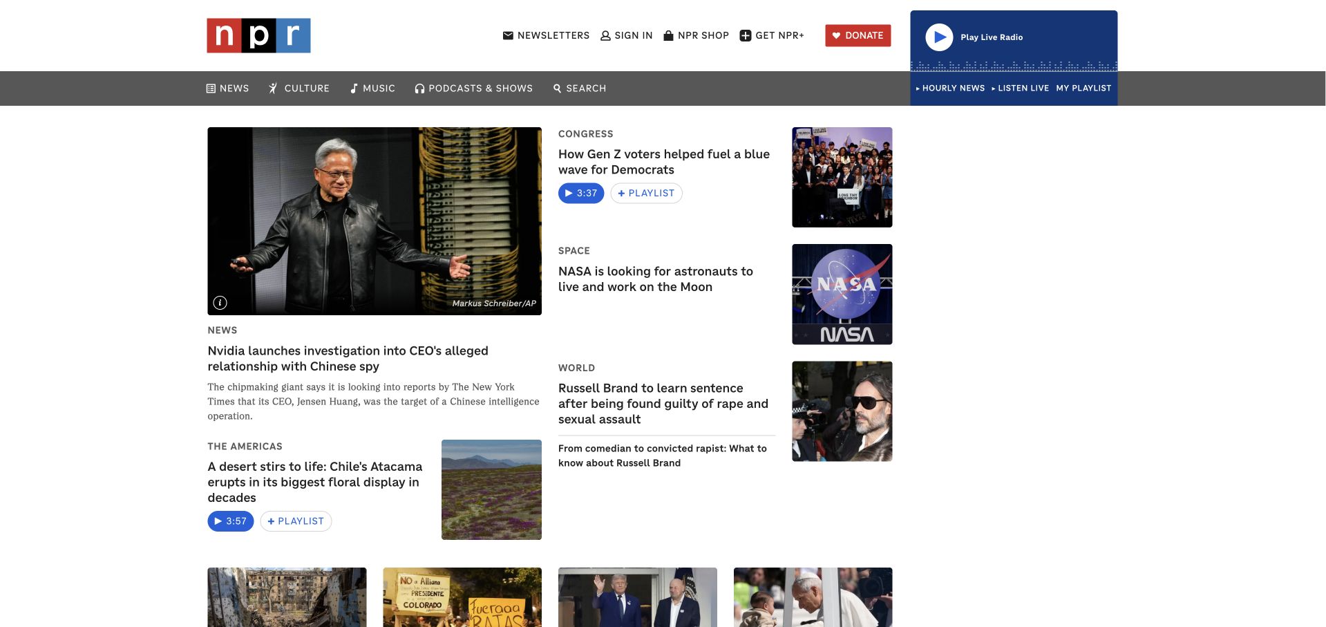
NPR’s homepage uses a recognizable masthead, a strong primary news grid and compact audio indicators rather than one oversized promotional hero. Written headlines, photographs and listening durations coexist within the editorial structure. A prominent live-radio route in the header gives the audio audience a task that does not depend on choosing an article first. The page is useful for studying how an established media organization handles several reading and listening intentions simultaneously.
What you can learn
Different formats need distinct cues without becoming separate, disconnected websites. Firebase’s NPR case concerns audience insights through Google Analytics for Firebase in its app context. That source does not identify the CMS delivering this news homepage, establish the current technical configuration of NPR One or independently validate the journalism pictured in the capture.
Pros
The listening route remains easy to find even when the main page is dominated by written news.
Compact audio durations help distinguish formats without requiring a separate explanation on every story card.
Cons & considerations
A dense news grid needs careful prioritization and readable spacing when columns collapse on mobile.
Fast-changing headlines should remain editorial context rather than being repeated as stable claims in a design review.
Visible tech stack
Earlier / documented evidence
Firebase
Platform source: Official Firebase case study. Firebase’s NPR case concerns NPR One’s mobile-app measurement with Google Analytics for Firebase and analysis of exported data in BigQuery. The evidence is an official customer or case-study association at the stated app, service or brand level. It does not establish that the public page pictured is built or hosted with Firebase, identify a complete stack, or independently validate vendor-reported results. Platform evidence is separate from the direct website screenshot and is not a complete current infrastructure audit.
Alibaba Group’s corporate site relies on large landscape-led storytelling and a restrained white navigation overlay. The opening gives the group a broad technological identity, while subsequent stories lead into news, company information, sustainability and investor material. The composition is markedly different from a transactional marketplace: visitors are being introduced to a corporate organization rather than asked to search a product catalogue. It separates group communication from product selling.
What you can learn
A parent-company website should make its role clear before visitors infer it is the consumer service itself. Firebase’s homepage lists Alibaba among customer examples, without specifying this corporate property or a particular component. Retain that limited documentary association rather than presenting a brand logo as a complete, current inventory of the group’s technology.
Pros
The visual opening establishes a distinct corporate atmosphere without crowding the screen with many business units.
News and investor routes distinguish institutional communication from the group’s separate consumer marketplaces and cloud products.
Cons & considerations
White navigation over changing imagery needs consistent contrast and a reliable nonvideo presentation.
A broad group association requires careful technical qualification because different businesses and public properties may use entirely different systems.
Visible tech stack
Earlier / documented evidence
Firebase
Platform source: Official Firebase customer-brand listing. Firebase displays Alibaba among its customer brands on its official homepage; no particular Alibaba product, legal entity or Firebase service is identified by that logo listing. The evidence is an official customer or case-study association at the stated app, service or brand level. It does not establish that the public page pictured is built or hosted with Firebase, identify a complete stack, or independently validate vendor-reported results. Platform evidence is separate from the direct website screenshot and is not a complete current infrastructure audit.
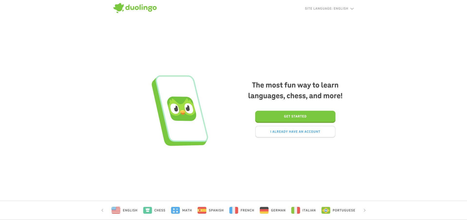
Duolingo’s opening is deliberately sparse: a playful branded character, a short learning proposition and clear routes for new and existing users. The white background and bright green action give the illustration room without making the task ambiguous. Later sections explain motivation, personalization and the mobile experience. The page does not attempt to display every lesson type immediately; it first establishes the feeling and basic decision involved in starting.
What you can learn
For a habit-oriented product, the first screen can reduce uncertainty through tone and a small number of choices. Firebase names Duolingo in its public customer examples, but that listing does not identify the pictured marketing page’s framework, hosting or exact Firebase products. The illustration is design evidence, not evidence of a particular backend implementation.
Pros
New-user and returning-user actions are clearly differentiated without requiring a complicated account explanation.
The character and restrained palette create a recognizable personality while keeping the primary task visually dominant.
Cons & considerations
A playful first impression still needs substantive learning and accessibility information for more deliberate evaluators.
Animated characters should retain meaningful static alternatives and should not be necessary for understanding the available actions.
Platform source: Official Firebase customer-brand listing. Firebase displays Duolingo among its customer brands on its official homepage; the listing does not identify a particular product surface or Firebase service. The evidence is an official customer or case-study association at the stated app, service or brand level. It does not establish that the public page pictured is built or hosted with Firebase, identify a complete stack, or independently validate vendor-reported results. Platform evidence is separate from the direct website screenshot and is not a complete current infrastructure audit.
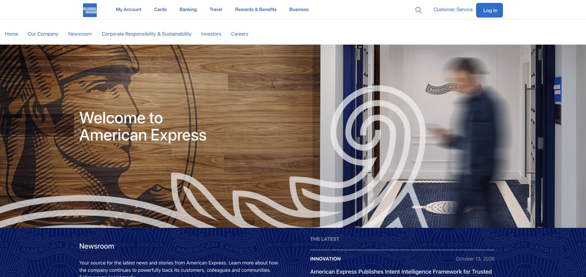
American Express’s company page uses a large architectural image and a simple welcome statement, with a secondary navigation dedicated to corporate information. Newsroom, responsibility, investor and career routes are visible without replacing the broader account-oriented header. A blue editorial band below the image introduces current stories. This layered structure is worth studying when the same brand must serve existing customers, applicants, journalists and people evaluating the organization itself.
What you can learn
Shared branding does not require every audience to use one identical navigation layer. Firebase’s American Express case concerns Android app testing with Test Lab. It does not establish the public company page’s runtime, the authentication technology behind cardholder accounts or any current financial-product terms. The specific mobile-testing association remains separate from the corporate-site design observations.
Pros
A dedicated corporate navigation clarifies the purpose of this page within a much wider financial-services website.
News and institutional routes are accessible without forcing visitors through a product-selection or login process.
Cons & considerations
Two header layers need careful responsive treatment to avoid consuming too much of a small screen.
A broad welcome image should not delay access to practical corporate facts or the specific destination a returning visitor needs.
Visible tech stack
Earlier / documented evidence
Firebase
Platform source: Official Firebase case study. Firebase’s American Express case concerns Firebase Test Lab for Android testing of the AMEX mobile app, including participation during the Test Lab alpha period. The evidence is an official customer or case-study association at the stated app, service or brand level. It does not establish that the public page pictured is built or hosted with Firebase, identify a complete stack, or independently validate vendor-reported results. Platform evidence is separate from the direct website screenshot and is not a complete current infrastructure audit.
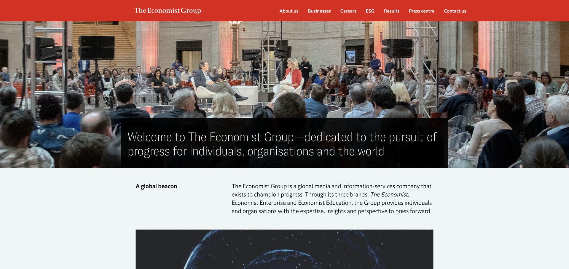
The Economist Group combines a red header, a large event photograph and a long but clearly separated institutional introduction. The page then moves into an explanation of its brands, history, company and editorial independence. Its structure feels deliberately different from a news feed: this is the organization explaining what connects its activities. Busy human imagery alternates with restrained pale text sections.
What you can learn
When a brand has both consumer publications and business services, a corporate homepage should explain the relationship without imitating the subscription product. Firebase’s customer-logo listing names The Economist, not this exact group website or a specific implementation. That evidence supports a qualified brand association only; it does not reveal the technology delivering the pictured corporate page.
Pros
The red masthead and event imagery make the institutional identity recognizable without relying on a product screenshot.
History and editorial-independence sections give the corporate purpose more substance than a standalone mission slogan.
Cons & considerations
A long opening sentence needs careful line length and hierarchy to remain readable on narrow screens.
Brand-level technical evidence must not be stretched into claims about every publication, app or business-service property in a group.
Platform source: Official Firebase customer-brand listing. Firebase’s homepage displays The Economist as a customer brand. The pictured Economist Group corporate website is a design reference, not the specific product or property identified by the logo. The evidence is an official customer or case-study association at the stated app, service or brand level. It does not establish that the public page pictured is built or hosted with Firebase, identify a complete stack, or independently validate vendor-reported results. Platform evidence is separate from the direct website screenshot and is not a complete current infrastructure audit.
Gameloft’s homepage lets a featured game occupy most of the first viewport, with a compact header preserving company and catalogue navigation. The selected scene, title and availability action communicate the entertainment context faster than a generic studio introduction would. Further down, multiple games and business-oriented routes broaden the story. The page is a useful reference for a company that needs to show its creative output while still serving commercial, career and support audiences.
What you can learn
Let the product’s visual world establish relevance, then preserve clear routes to the organization behind it. Firebase’s Gameloft case documents Crashlytics in a mobile-game quality context. That association does not prove the corporate homepage’s CMS, the technology inside every game or the current release status of all featured titles.
Pros
Real game imagery creates an immediate connection to the products rather than an abstract description of a studio.
Catalogue and company routes remain available above a visually dominant campaign area.
Cons & considerations
Rotating game features need clear controls and a useful static state for visitors who disable motion.
Terms notices and subscription panels should not obscure the title or action that makes the featured game understandable.
Platform source: Official Firebase case study. Firebase’s Gameloft case documents Crashlytics crash reporting and issue prioritization for the games described in the source. The evidence is an official customer or case-study association at the stated app, service or brand level. It does not establish that the public page pictured is built or hosted with Firebase, identify a complete stack, or independently validate vendor-reported results. Platform evidence is separate from the direct website screenshot and is not a complete current infrastructure audit.
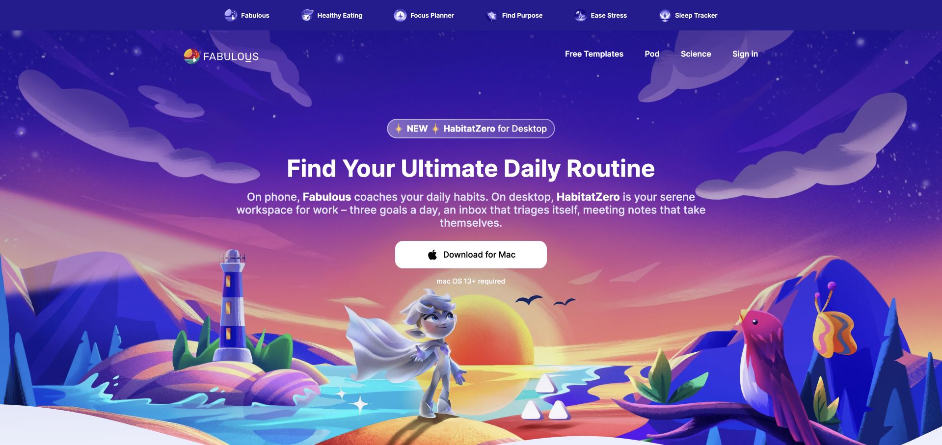
Fabulous uses a vivid illustrated landscape to frame a daily-routine proposition, with a desktop-product introduction placed directly above it. The navigation separates several goal-oriented experiences from science, templates and account access. A prominent download action gives the main viewport a concrete outcome. The design is useful for studying how a consumer app can maintain a strong emotional identity while introducing an adjacent product rather than making every part of the offering look identical.
What you can learn
An expressive illustration can carry the brand, but product relationships need clear words. Firebase’s Authentication case names Fabulous and describes sign-in integrations. That documentary association is about an app context; it does not identify the public homepage’s framework, the desktop product’s backend or the effectiveness of any wellbeing claim.
Pros
The illustrated environment gives an abstract routine-building concept a distinctive and memorable visual setting.
Goal-based navigation offers several ways to recognize relevance without beginning with a technical feature catalogue.
Cons & considerations
Introducing a desktop product alongside the mobile brand can create uncertainty about which application a visitor will download.
Wellbeing language should be supported carefully and must not imply clinical outcomes merely through reassuring illustration or science-oriented navigation.
Platform source: Official Firebase case study. Firebase Authentication’s official case-study page identifies Fabulous’s anonymous, email/password, Google and Facebook authentication integration. The evidence is an official customer or case-study association at the stated app, service or brand level. It does not establish that the public page pictured is built or hosted with Firebase, identify a complete stack, or independently validate vendor-reported results. Platform evidence is separate from the direct website screenshot and is not a complete current infrastructure audit.
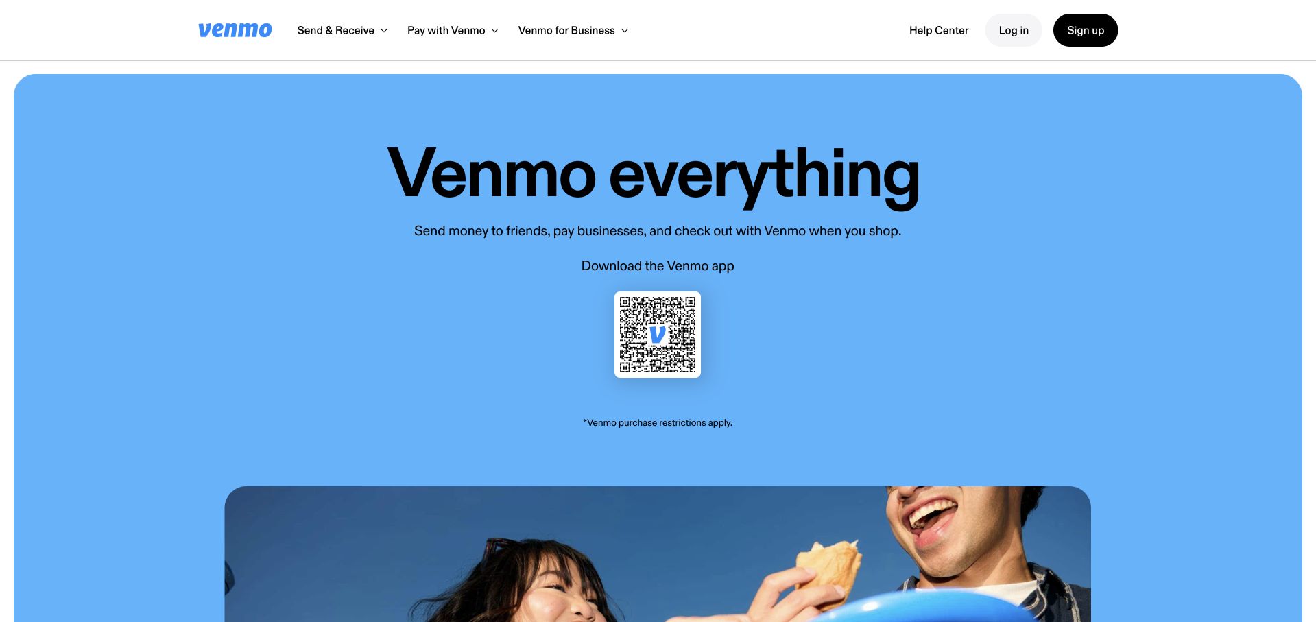
Venmo combines a large blue field, a short all-encompassing headline and a QR-based app-download route. Human photography and later sections explain sending, splitting, gifting and different ways to pay. The first screen avoids turning the homepage into an account dashboard, yet the navigation still retains login and support access. Its strongest design idea is a recognizable consumer setting around a relatively simple next action.
What you can learn
A mobile-first product can lead with an app route when desktop visitors still understand why they would want it. Firebase’s public customer examples name Venmo, but do not identify this marketing page’s implementation or a specific Firebase component. The design review does not verify payment terms, rewards eligibility or any financial claim shown on the page.
Pros
A simple blue palette and concise headline keep the app’s next step easy to recognize.
Everyday payment scenarios explain breadth through familiar activities rather than a technical list of financial services.
Cons & considerations
A QR-led action needs a usable alternative for visitors already browsing on a phone or using assistive technology.
Rewards and payment features require nearby qualification because eligibility and terms can differ substantially between users and products.
Platform source: Official Firebase customer-brand listing. Firebase displays Venmo among its customer brands on its official homepage; the customer logo does not specify the product implementation or Firebase service. The evidence is an official customer or case-study association at the stated app, service or brand level. It does not establish that the public page pictured is built or hosted with Firebase, identify a complete stack, or independently validate vendor-reported results. Platform evidence is separate from the direct website screenshot and is not a complete current infrastructure audit.
Halfbrick places a welcoming studio headline over a large game-led visual, with a compact navigation that exposes games, careers, support and the shop. A latest-release chip gives returning visitors a short current route without overwhelming the broader introduction. Lower sections provide a catalogue, news and more practical support destinations. Rounded imagery and strong white typography create a playful character without making the studio’s identity disappear behind one release.
What you can learn
For a studio with several established titles, a parent-brand introduction can connect the catalogue while allowing each game its own world. Firebase’s Halfbrick case concerns Remote Config personalization in games. It does not establish the technology serving this corporate homepage, prove every title uses the same services or independently validate the case study’s business results.
Pros
The studio remains identifiable even when game imagery supplies most of the opening’s visual energy.
Support and career routes acknowledge audiences beyond people deciding which game to play next.
Cons & considerations
Text over animated game footage needs stable contrast and a useful reduced-motion alternative.
A current-release chip can become misleading if its destination and release status are not maintained independently from the evergreen studio introduction.
Platform source: Official Firebase case study. Firebase’s Halfbrick case documents Remote Config personalization and describes use of Cloud Functions, Cloud Storage and Realtime Database in its games’ backend context. The evidence is an official customer or case-study association at the stated app, service or brand level. It does not establish that the public page pictured is built or hosted with Firebase, identify a complete stack, or independently validate vendor-reported results. Platform evidence is separate from the direct website screenshot and is not a complete current infrastructure audit.
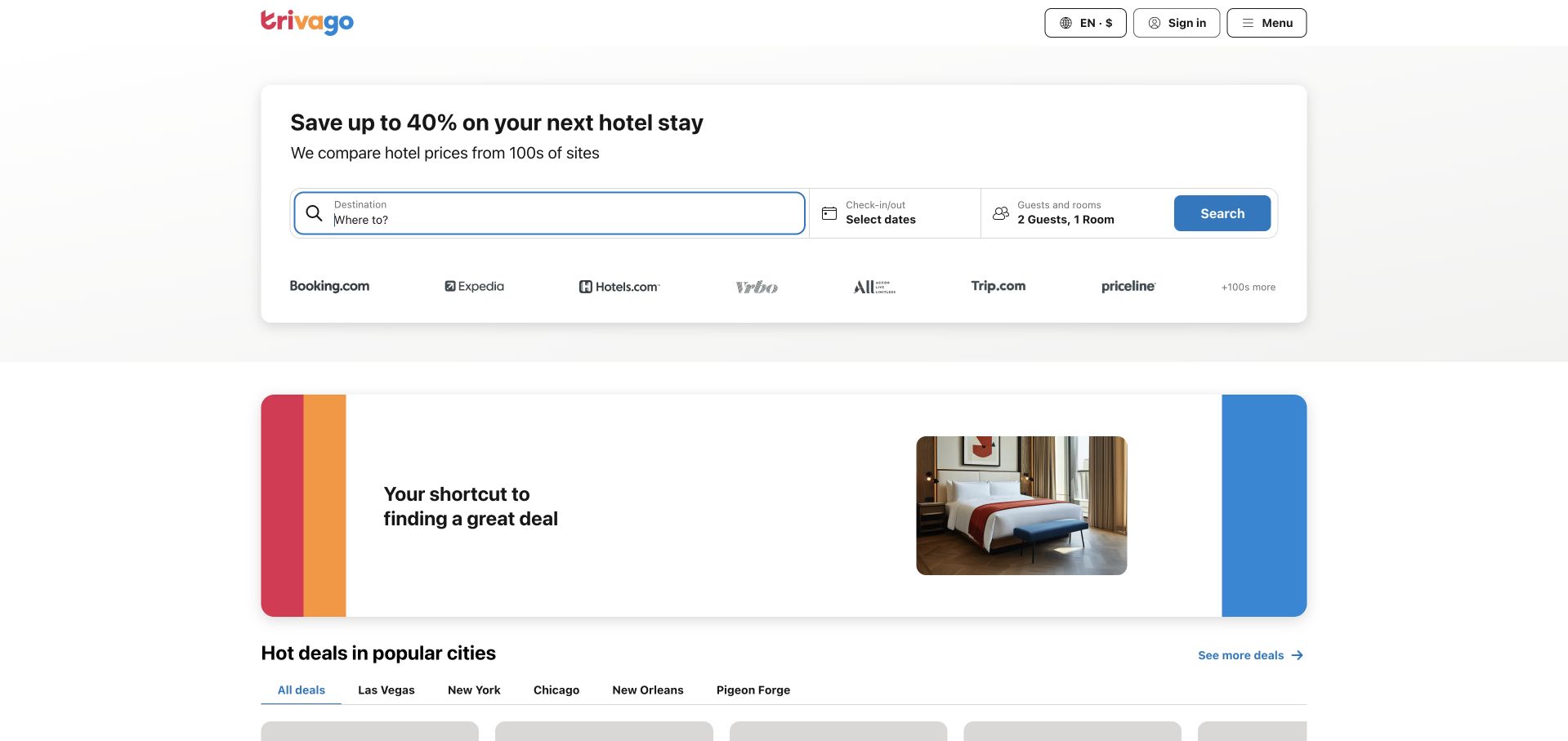
trivago’s public landing page uses a white search panel with destination, dates and guest controls grouped around one blue action. Recognizable partner names sit below the form, and a colorful supporting banner offers a second explanatory layer before deal cards. The relative restraint is useful to study in a category often overloaded with promotional messages. The page’s purpose remains a comparison task rather than a broad travel magazine.
What you can learn
Keep the core search recognizable even when the business depends on a large network of downstream providers. Firebase’s customer-logo collection names trivago but does not specify this exact property or component. That limited association cannot establish the public homepage’s full stack, verify live prices or justify treating promotional savings language as a measured design outcome.
Pros
Destination, dates and party size are collected in one familiar and visually coherent search area.
Partner labels explain the comparison context without requiring visitors to read a long platform description first.
Cons & considerations
Member prompts and sign-in overlays can interrupt the otherwise clear comparison-first experience.
Deal cards and savings claims are transient and need appropriate terms rather than being reused as stable evidence about performance.
Platform source: Official Firebase customer-brand listing. Firebase displays trivago among its customer brands on its official homepage; no exact workload or Firebase service is established by that listing. The evidence is an official customer or case-study association at the stated app, service or brand level. It does not establish that the public page pictured is built or hosted with Firebase, identify a complete stack, or independently validate vendor-reported results. Platform evidence is separate from the direct website screenshot and is not a complete current infrastructure audit.
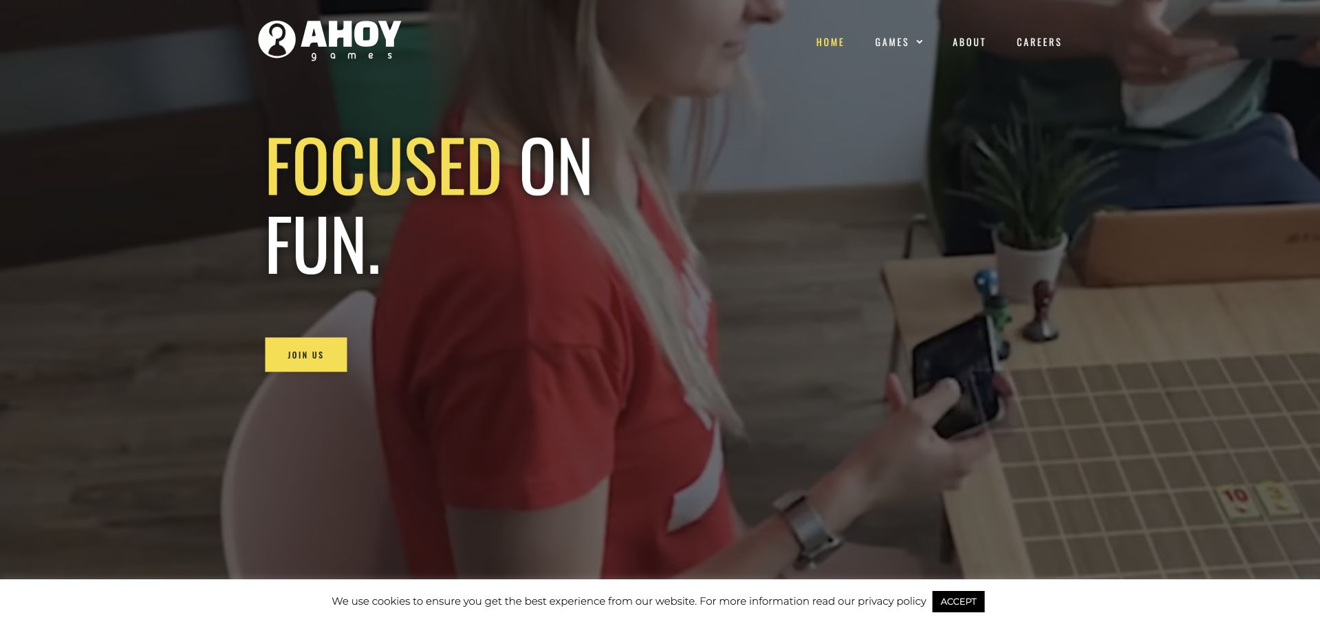
Ahoy Games uses a dark, video-backed opening with a fun-oriented headline and a bright yellow join action. The header remains compact, while the page introduces games through recognizable artwork and short descriptions. A lively introduction and straightforward catalogue cards make the studio easy to understand. It is a useful reference for a creative company that wants its work to lead the explanation.
What you can learn
Use gameplay and individual titles to establish the studio’s character, but keep business and career tasks clearly labeled. Firebase’s Ahoy Games case documents Remote Config, experimentation and other game services. That evidence is about the described app workloads, not the public studio homepage’s runtime or proof that every game currently uses an identical Firebase configuration.
Pros
Gameplay imagery gives the studio a concrete identity before the reader encounters company statistics or broader claims.
A short game catalogue helps visitors recognize what the studio actually makes without navigating a complex product hierarchy.
Cons & considerations
A join action needs clear context so prospective players do not mistake a career route for a game signup.
Autoplay video and animated counters require accessible fallbacks and should not display misleading intermediate values while the page settles.
Platform source: Official Firebase case study. Firebase’s Ahoy Games case documents Remote Config personalization and describes Test Lab, Crashlytics, Cloud Messaging and A/B Testing in its mobile-game context. The evidence is an official customer or case-study association at the stated app, service or brand level. It does not establish that the public page pictured is built or hosted with Firebase, identify a complete stack, or independently validate vendor-reported results. Platform evidence is separate from the direct website screenshot and is not a complete current infrastructure audit.
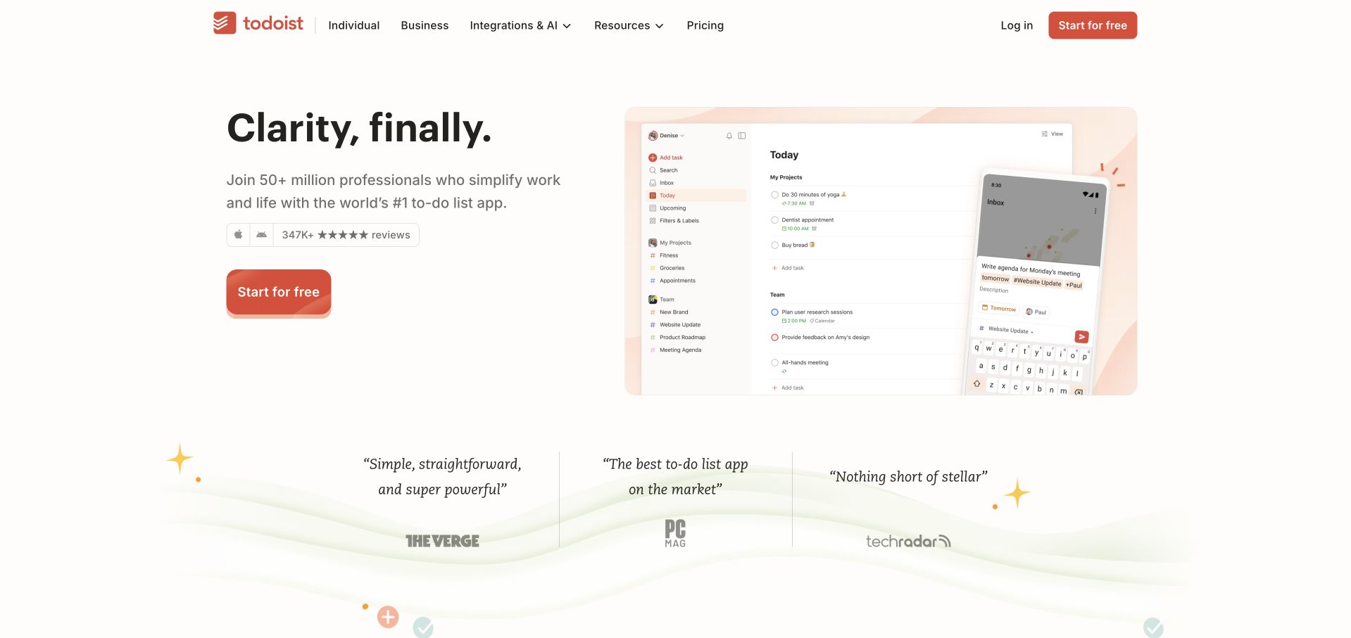
Todoist places a short clarity-focused headline beside a visible task-management interface. Warm neutrals and a restrained orange action make the page feel calmer than a dense enterprise dashboard. Supporting review references sit below the primary message, and later sections explain capture, organization, planning and team use. The design’s appeal comes from showing a familiar working surface while keeping the initial promise narrower than the full product catalogue.
What you can learn
A productivity product should make the next task easier to picture before describing every organizational feature. Todoist’s own public subprocessor disclosure identifies Firebase for Android push notifications. That is a specific app-service association, not evidence of this homepage’s implementation. Do not treat a familiar app screenshot or a published customer count as proof that a particular design caused adoption.
Pros
A real task interface gives the calm positioning a practical anchor instead of relying only on lifestyle imagery.
The primary action stands out without requiring a loud or visually crowded first screen.
Cons & considerations
Large review and usage numbers need dated context and should not substitute for explaining the actual workflow.
A broad personal-and-team offering needs clear distinctions around account organization, collaboration boundaries and paid capabilities.
Platform source: Todoist’s official public subprocessor disclosure. Todoist’s own public subprocessor disclosure explicitly identifies Firebase (Google LLC) for Android push notifications, with Android app installation IDs as the disclosed data elements. The evidence is an official customer or case-study association at the stated app, service or brand level. It does not establish that the public page pictured is built or hosted with Firebase, identify a complete stack, or independently validate vendor-reported results. Platform evidence is separate from the direct website screenshot and is not a complete current infrastructure audit.
Doodle frames scheduling around making better use of time, pairing a human photograph with a concise proposition and a single create action. The page then introduces a wider calendar-and-task story, trust material and different team contexts. Its black-and-white opening is restrained compared with the colorful interface complexity often associated with calendars. The structure gives the visitor a broad reason to care before asking them to understand detailed scheduling mechanics.
What you can learn
Start with a recognizable workday problem, then show how the specific product changes that workflow. Firebase’s Doodle case concerns Crashlytics and Remote Config in its app experience. It is not proof that the current marketing page runs on Firebase, that a forthcoming product uses the same architecture or that the design independently caused the reported case-study results.
Pros
The initial task is clear enough to understand without first learning the entire calendar-product vocabulary.
A restrained palette lets the headline and human context carry the opening without many competing feature badges.
Cons & considerations
A coming-soon platform narrative needs explicit separation from capabilities visitors can use immediately.
Trust and compliance references require precise scope rather than implying that every workflow automatically satisfies an organization’s requirements.
Platform source: Official Firebase case study. Firebase’s Doodle case documents mobile-app crash analysis with Crashlytics and interface experimentation with Remote Config. The evidence is an official customer or case-study association at the stated app, service or brand level. It does not establish that the public page pictured is built or hosted with Firebase, identify a complete stack, or independently validate vendor-reported results. Platform evidence is separate from the direct website screenshot and is not a complete current infrastructure audit.
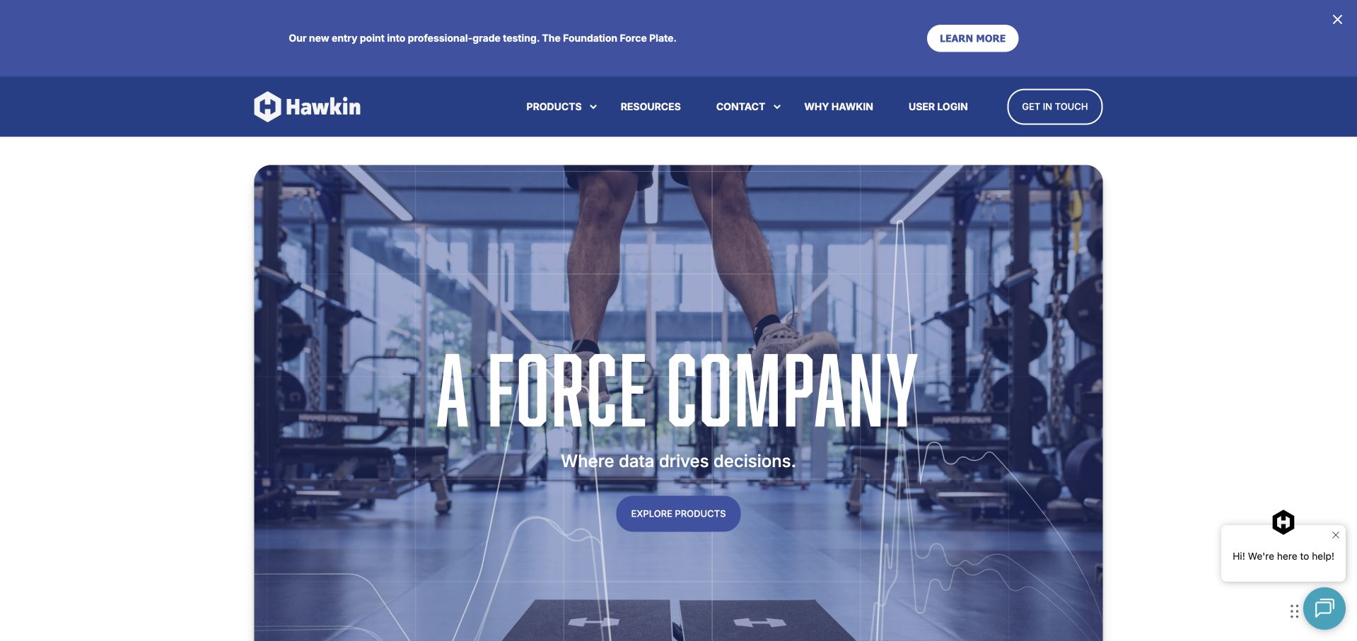
Hawkin Dynamics uses a large performance-testing scene and an emphatic force-oriented headline before introducing software and equipment categories. The blue navigation and product routes make the page feel like a specialist technology business rather than a generic fitness brand. Later sections explain purpose, precision and educational material. This combination is useful for products where a physical device only makes sense alongside the data and interpretation surrounding it.
What you can learn
Show the operating context before asking visitors to compare hardware names. Firebase’s Hawkin Dynamics case describes a move from Realtime Database to Cloud Firestore in its product. That specific historical architecture account does not establish the public marketing site’s CMS, verify equipment measurements or support clinical or athletic-outcome claims based on the screenshot alone.
Pros
The opening photograph gives unfamiliar specialist equipment an immediately understandable real-world context.
Software and device categories remain distinct, helping visitors see that the offering includes more than a standalone physical product.
Cons & considerations
Strong precision language needs accessible supporting evidence rather than being accepted as a visual brand attribute.
Large background media and support widgets should not make product comparison or basic technical specifications harder to reach.
Platform source: Official Firebase case study. Firebase’s Hawkin Dynamics case describes migrating its analytics backend from Realtime Database to Cloud Firestore and replacing Node functions with Cloud Functions. The evidence is an official customer or case-study association at the stated app, service or brand level. It does not establish that the public page pictured is built or hosted with Firebase, identify a complete stack, or independently validate vendor-reported results. Platform evidence is separate from the direct website screenshot and is not a complete current infrastructure audit.
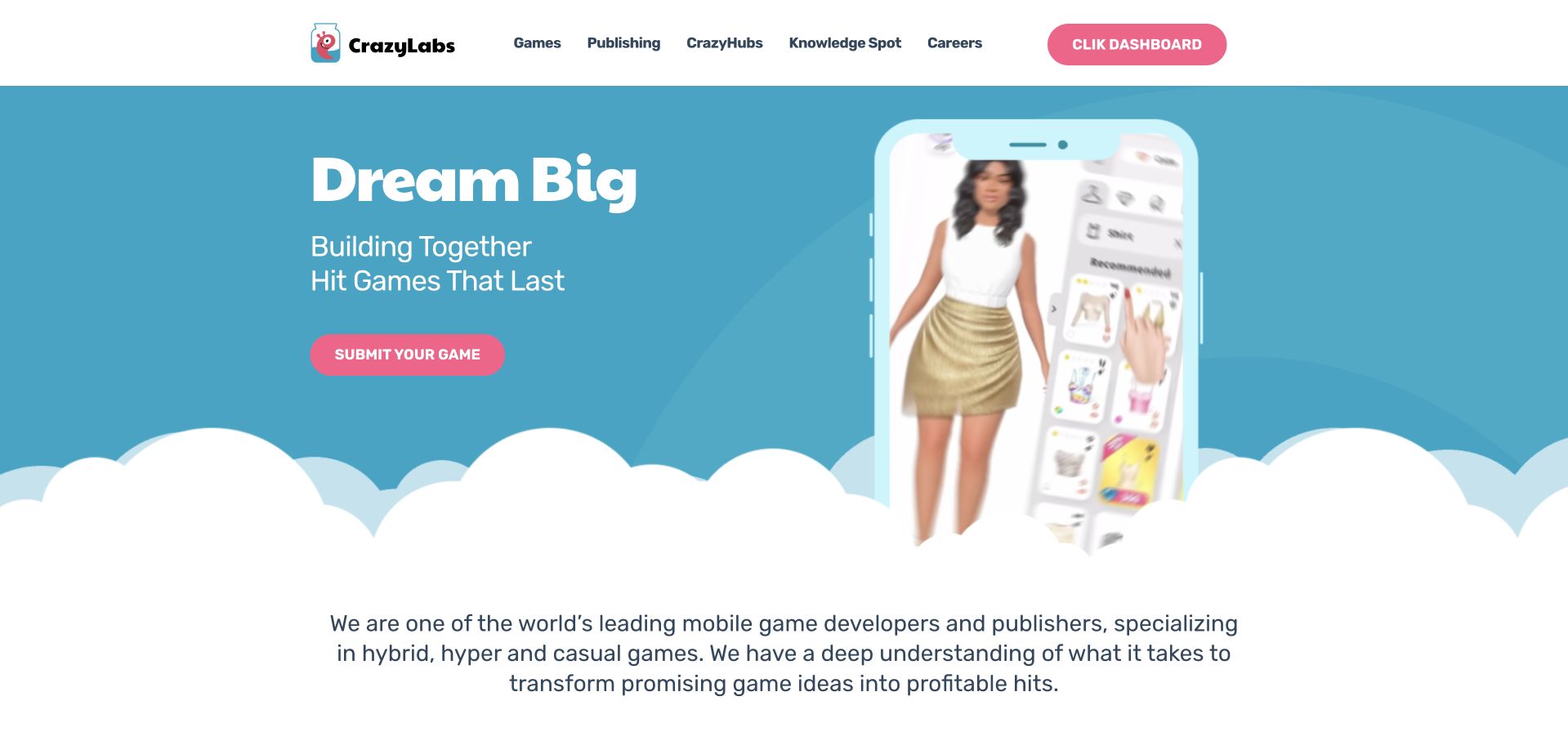
CrazyLabs presents a game-publishing brand through bold color, recognizable creative assets and routes into its game catalogue and publishing information. The product worlds supply much of the visual energy, while the organizational navigation has to support a different audience of developers and partners. The page is useful for studying the balance between showing entertaining output and explaining the business behind it. A visitor should be able to tell whether they are choosing a game or evaluating a publishing relationship.
What you can learn
Differentiate player discovery from developer evaluation even when both depend on game imagery. Firebase’s CrazyLabs case describes Remote Config experiments and game-configuration testing. That evidence does not identify the website’s frontend, verify commercial publishing terms or establish that every title in the catalogue uses the same services.
Pros
Game imagery makes a broad publishing proposition concrete without requiring a long explanation of the category.
Separate organizational routes can serve prospective development partners without replacing the player-oriented visual appeal.
Cons & considerations
Large usage or commercial proof points need definitions, dates and clear attribution to remain meaningful.
Highly animated creative assets must preserve readable actions and should not make the publishing application route ambiguous.
Visible tech stack
Earlier / documented evidence
Firebase
Platform source: Official Firebase case study. Firebase’s CrazyLabs case describes Remote Config API experiments for mobile-game configurations, combining AdMob measurement with BigQuery analysis. It is not a statement about its corporate homepage runtime. The evidence is an official customer or case-study association at the stated app, service or brand level. It does not establish that the public page pictured is built or hosted with Firebase, identify a complete stack, or independently validate vendor-reported results. Platform evidence is separate from the direct website screenshot and is not a complete current infrastructure audit.
Mobills pairs a large purple headline with a person using a phone, then explains organizing expenses, connecting accounts and planning spending in straightforward Portuguese. The page extends into security information and common questions rather than stopping at an app-download banner. Its purple-and-white palette and recurring interface cues make the product feel consistent across the introduction and supporting content. The design is useful for studying how a finance app can explain a practical task without imitating a bank’s corporate tone.
What you can learn
Translate features into the decisions people are trying to make, while preserving clear product and data boundaries. Firebase’s Mobills case concerns Remote Config and A/B Testing in the app. It does not establish this homepage’s infrastructure, validate financial advice or prove that any pictured budgeting feature produces a particular personal outcome.
Pros
The page connects account aggregation and planning features to recognizable daily financial tasks.
Security and question-oriented content provide useful follow-on routes beyond the initial promotional message.
Cons & considerations
Personal-finance positioning needs precise explanations of data access, eligibility and product limitations.
A reassuring human photograph should support clear information rather than substitute for evidence about security, account connections or financial outcomes.
Platform source: Official Firebase case study. Firebase’s Mobills case documents A/B Testing and Remote Config experiments for registration flows and subscription calls to action in its app. The evidence is an official customer or case-study association at the stated app, service or brand level. It does not establish that the public page pictured is built or hosted with Firebase, identify a complete stack, or independently validate vendor-reported results. Platform evidence is separate from the direct website screenshot and is not a complete current infrastructure audit.
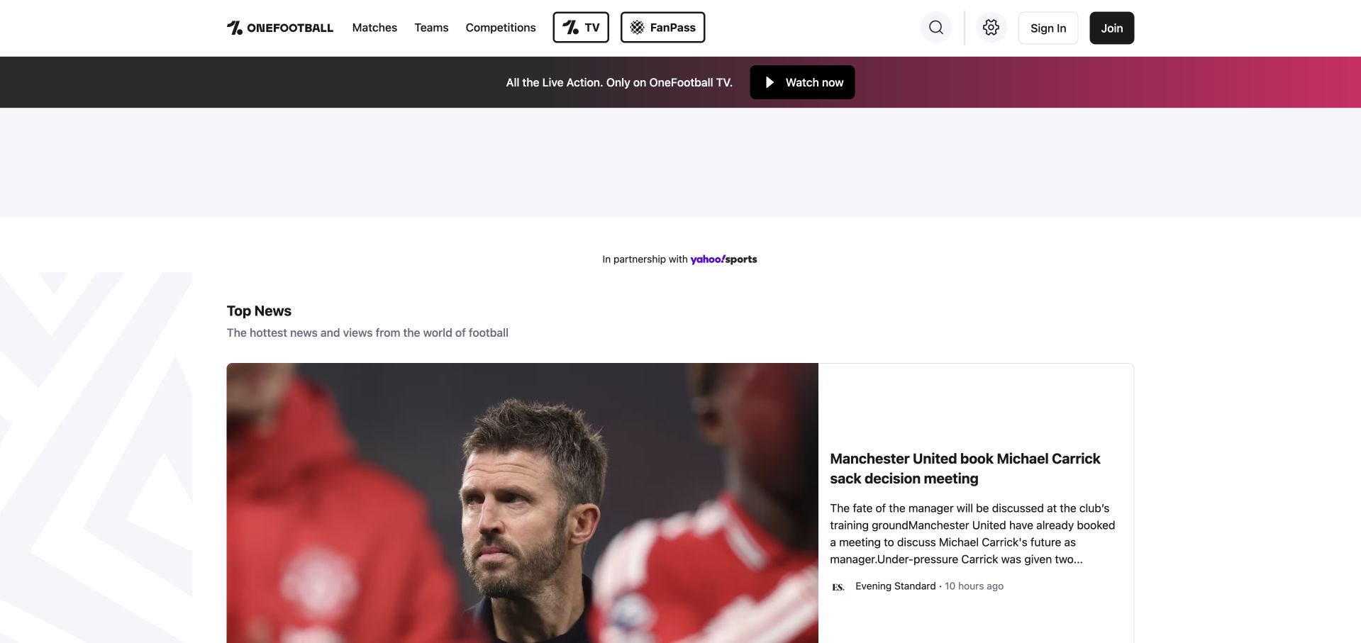
OneFootball’s homepage keeps matches, teams, competitions and video access near the top, then introduces a news-led editorial grid. The black-and-white interface leaves room for team photography and changing story imagery, while source labels and time references explain a mixed publication feed. A streaming promotion occupies a separate band rather than replacing the navigation. The page illustrates serving people checking a specific football task and readers exploring current stories.
What you can learn
A sport-specific portal can rely on familiar task vocabulary, but it still needs clear distinctions between reporting, live scores and paid viewing. Firebase’s Onefootball case describes feature experimentation before release. It does not prove the current public homepage’s backend, establish broadcast availability or independently validate any story presented in the captured news feed.
Pros
Sport-specific task routes let returning users bypass general editorial discovery when they have a precise need.
Source labels and timing cues help distinguish individual stories within a broad, changing content feed.
Cons & considerations
Large advertising or streaming-promotion spaces can create unnecessary visual gaps before the useful news content.
Viewing rights, subscriptions and match availability need explicit regional qualification instead of being inferred from a global homepage.
Platform source: Official Firebase case study. Firebase’s OneFootball case documents Remote Config and Firebase Analytics experiments with the app’s Top News interface. The evidence is an official customer or case-study association at the stated app, service or brand level. It does not establish that the public page pictured is built or hosted with Firebase, identify a complete stack, or independently validate vendor-reported results. Platform evidence is separate from the direct website screenshot and is not a complete current infrastructure audit.
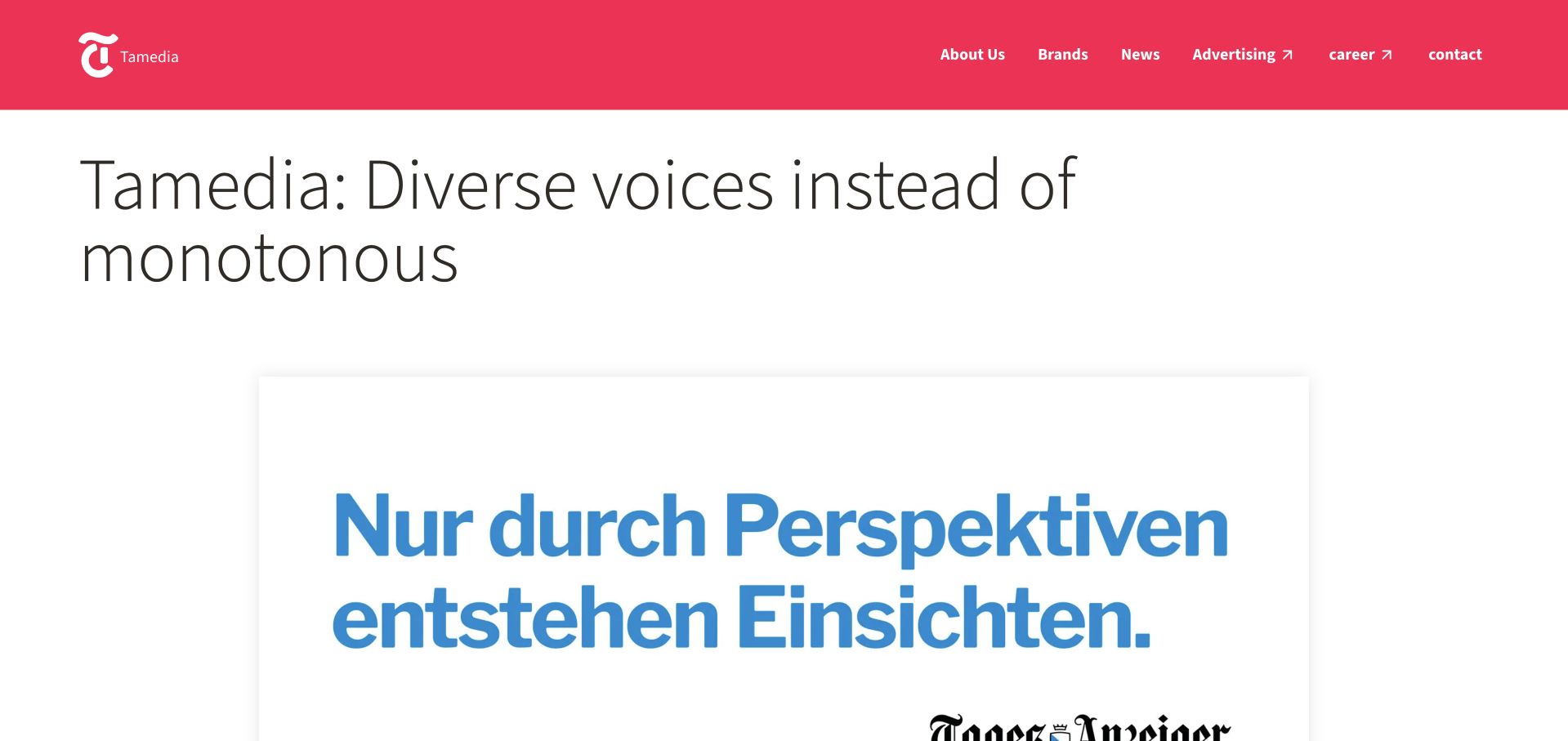
Tamedia combines a vivid pink header with a statement about diverse voices, then uses large editorial panels to express it visually. Corporate navigation is compact, and lower sections explain journalism, careers and the group’s brands. The page feels like the parent organization speaking rather than a daily publication homepage. That distinction helps connect several editorial products without erasing their individual identities or audiences.
What you can learn
A publisher’s corporate site should explain what holds its titles together while preserving routes to the actual publications. Firebase’s Tamedia case concerns Analytics and In-App Messaging in a subscription-engagement context. It does not identify this corporate website’s CMS, prove a current implementation across every title or independently establish any readership or revenue outcome.
Pros
The strong pink identity makes the corporate layer recognizable without copying an individual newspaper’s layout.
Brand and career sections acknowledge that the parent site has different tasks from a consumer news feed.
Cons & considerations
Large statement panels need a clear reading order and sufficient context when the layout becomes a single mobile column.
Animated figures and changing corporate facts require maintenance and should not be treated as evidence of a specific technical architecture.
Platform source: Official Firebase case study. Firebase’s Tamedia case concerns the BZ and 24 Heures apps, using Google Analytics audience segmentation and Firebase In-App Messaging for subscription offers. The evidence is an official customer or case-study association at the stated app, service or brand level. It does not establish that the public page pictured is built or hosted with Firebase, identify a complete stack, or independently validate vendor-reported results. Platform evidence is separate from the direct website screenshot and is not a complete current infrastructure audit.
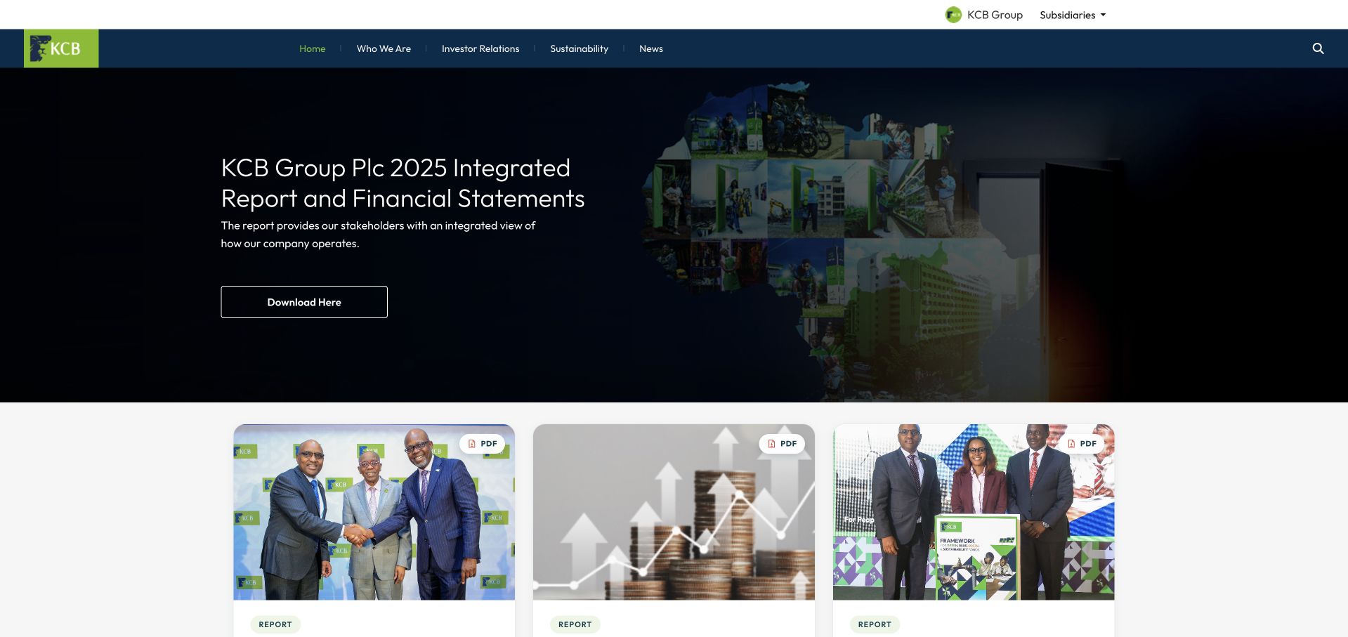
KCB Group’s site opens with an integrated-report feature and a row of supporting investor documents. The dark-blue and green identity carries into navigation for the group, investors, sustainability and news. Further sections explain the organization and regional subsidiaries. The page is useful as a reference for making reports and corporate information visible without turning the group homepage into an account-login interface or a catalogue of consumer financial offers.
What you can learn
Clarify which institutional audience the page serves before adding more transactional features. Firebase’s KCB case concerns Google Analytics for Firebase and mobile-app acquisition work. That evidence is separate from the corporate homepage’s implementation, the systems of individual regional banks and the accuracy of any financial statement or market information shown in the capture.
Pros
Investor documents receive a recognizable content structure rather than being buried as anonymous footer downloads.
Group-level navigation helps distinguish corporate information from the separate services of regional subsidiaries.
Cons & considerations
Multiple report cards need clear dates and document types so visitors can identify the authoritative current version.
Broad financial and sustainability claims require source detail; a polished institutional layout should not be treated as verification of their substance.
Platform source: Official Firebase case study. Firebase’s KCB case concerns KCB’s mobile-app acquisition and conversion measurement using Google Analytics for Firebase. The evidence is an official customer or case-study association at the stated app, service or brand level. It does not establish that the public page pictured is built or hosted with Firebase, identify a complete stack, or independently validate vendor-reported results. Platform evidence is separate from the direct website screenshot and is not a complete current infrastructure audit.
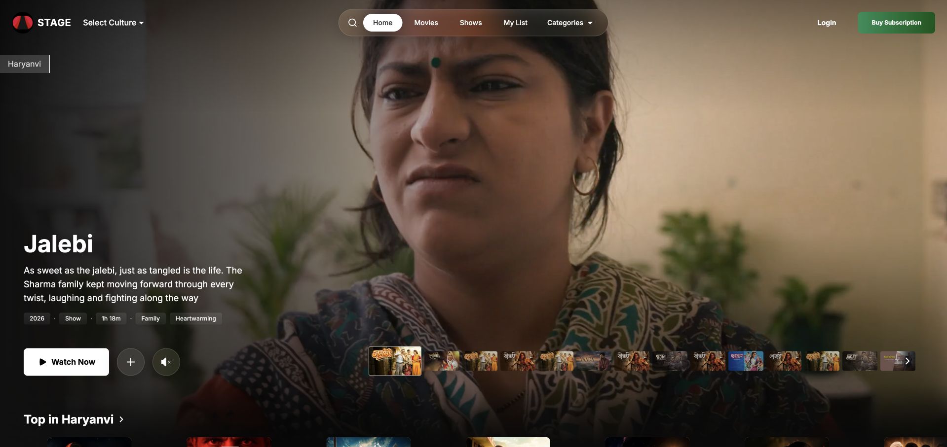
STAGE uses a dark streaming interface with a featured title, synopsis and viewing action above regional content. Culture selection sits in the header, while movies, shows and categories provide familiar browsing routes. The hero combines a large scene with compact language, format and tone information. It shows how local cultural relevance can become part of discovery rather than reducing the catalogue to one undifferentiated grid.
What you can learn
A localized entertainment service needs to explain the context of each title before expecting visitors to subscribe. Firebase’s STAGE case describes Flutter with several Firebase backend and quality services. That specific documentary account does not establish every current client implementation, the public homepage’s complete stack or the availability and rights of every title pictured.
Pros
Language and culture selection give viewers meaningful context before they explore a large catalogue.
A synopsis and compact title metadata help the featured scene function as information rather than decorative background alone.
Cons & considerations
Autoplay previews should provide usable pause and reduced-motion behavior without obscuring the viewing action.
Subscription and regional rights need clear explanations before a global visitor assumes that every displayed title can be watched from their location.
Platform source: Official Firebase case study. Firebase’s STAGE case describes a Flutter multi-platform app with Firebase services supporting content delivery, backend behavior and app quality. The evidence is an official customer or case-study association at the stated app, service or brand level. It does not establish that the public page pictured is built or hosted with Firebase, identify a complete stack, or independently validate vendor-reported results. Platform evidence is separate from the direct website screenshot and is not a complete current infrastructure audit.
Kegan has 15+ years of experience working with small businesses, Fortune 500 companies, and everything in between. No development job is too big or too small: he brings the same hands-on attention to a focused improvement, a complete website, or a custom application.
For Firebase projects, he can help with data modeling, application data access, query design, search and cache integrations, migration planning, access boundaries, and maintainable handover. He works directly with clients on scope, design, implementation, testing, and handover, with an emphasis on clear communication and a system that remains practical to maintain after launch.
Show 3 other Firebase developersHide other Firebase developers
Define one useful signed-in task and the data it requires. Keep account recovery, ownership and deletion in the initial scope rather than postponing them until after launch. The public marketing page can remain a separate publishing surface if its editorial needs differ from the application’s authenticated workflow.
Add one service to an existing product
An established app may need better crash reporting, controlled configuration or a specific testing workflow without replacing its whole backend. Identify the exact service and the team that will maintain it. A narrow integration is easier to evaluate than an unspecified promise to move everything into one platform.
Prototype with a production boundary in mind
A prototype should answer a real product question, not merely demonstrate that data can be stored. Use representative but non-sensitive records, document assumptions and decide which parts would need redesign before production. A fast demonstration is valuable when the team knows what it has not yet established.
From references to requirements
Make ownership and operational limits part of the brief
Write a simple access and data map
For each record type, name its owner, permitted readers and writers, retention needs and deletion process. Include administrative actions and organization membership changes. The map helps designers explain access errors and helps engineers identify which rules need explicit tests before real users depend on them.
Plan abuse and unexpected usage
List the operations that could be expensive, repeated or misused. Decide how the product should behave when a limit is reached and who receives operational alerts. App Check can be one layer of abuse protection, but it is not a replacement for user authorization or a complete guarantee against misuse.
Use a controlled environment to show account recovery, a rejected write and an interrupted operation. Confirm that maintainers can identify the relevant environment without exposing production data or credentials. A handover should include ownership, billing review, data export and recovery responsibilities—not only screenshots of a working happy path.
A useful handover demonstration
Ask the actual team to carry out its routine job: publish a realistic update, correct a mistake, preview a narrow screen, and identify who owns an integration failure. For a library or frontend framework, also ask who maintains the content source and deployment. A polished screenshot does not answer those operational questions.
Beyond the screenshot
A Firebase application-planning checklist
Name the exact Firebase services proposed.
Separate public content from authenticated tasks.
Map records to users and organizations.
Define reading and writing permissions.
Plan joining, recovery and account removal.
Specify empty, denied and interrupted states.
Test authorization in a controlled environment.
Keep secrets and sensitive data out of public clients.
Plan abuse controls and usage review.
Separate development and production responsibilities.
Document export and recovery needs.
Assign support, billing and maintenance ownership.
Test with real content, a keyboard, a small screen, slow or failed requests, and the people who will maintain the system. These are planning checks, not an accessibility, security, performance, or search-ranking certification.
Sources & editorial method
How this Firebase collection was reviewed
Public websites were independently reviewed and captured directly in Chrome, with unchanged dates for exact reused captures. Official Firebase cases and the public customer-logo list establish only the documented app or brand relationship. Blocked, signed-in, error and unsuitable consent-walled candidates were excluded. We did not access private app data, execute application actions or infer homepage hosting from mobile-app evidence.
Every image is an unmodified capture from the actual website, with its source and capture date. Some captures are reused from our shared catalog; their dates remain the original capture dates. None comes from a vendor gallery or a generated reconstruction. Moving imagery and live content can change.
Technology attribution uses public page assets or metadata, official platform documentation, or a cited first-party project case study. Documentary and framework-relationship evidence is identified where used; it is not a complete current backend inventory. A CMS image CDN alone does not establish a full CMS deployment. A library’s presence does not prove which individual controls use it, and a platform label does not establish AI authorship.
The composition notes, lessons, pros and tradeoffs are original editorial observations. We have not measured conversion, traffic, security, performance or accessibility conformance. Website owners retain their brands and imagery; these examples are not our client portfolio. Written, Edited and Curated are independent records, not dates advanced by a build. See our editorial standards or suggest a correction.
Questions worth asking
Firebase website development FAQs
Does a Firebase customer logo identify a website’s full stack?
No. It can establish a brand association, but not the exact app, service, environment or public homepage implementation. Where a case study supplies more detail, we retain that specific workload rather than extending it to every property.
Are Firebase Authentication and authorization the same thing?
No. Identifying a user does not by itself decide which records or actions that user may access. The project still needs an explicit permission model, appropriate rules and tests for requests that must be rejected.
Does App Check replace access rules?
No. App Check is a separate layer intended to help protect backend resources from abuse. It does not replace the application’s user authorization policy, and no single control should be described as preventing every form of misuse.
Can the public marketing site use another platform?
Yes. Editorial publishing, public search discovery and an authenticated application can have different requirements. Choose their boundaries deliberately rather than assuming that one backend service must also determine the CMS and every frontend.
What should be tested before launch?
Test representative authorized and unauthorized access, account recovery, membership changes, interrupted operations and the user-facing explanations around them. Also assign billing, support, data export and recovery responsibilities so a successful demonstration becomes an operable product.
Borrow the clarity with which a page explains its app, then make your own data, access and recovery decisions explicit. A managed backend is most useful when it supports a well-defined product rather than concealing an unfinished permission model.