Best PayPal Websites of 2026 (20 Real-World Examples)
Twenty public storefronts with merchant-documented PayPal payment options, examined through real screenshots and practical design lessons.
A useful PayPal website starts long before the payment button. Product discovery, regional availability, delivery information and a clear order summary all shape the path to a purchase.
PayPal is a payment integration, so these examples are storefronts that document offering it for qualifying online purchases. Their visual designs come from many different systems. A merchant help page can establish an accepted payment method without identifying the CMS, commerce engine or private order-processing architecture. Each review keeps that distinction explicit and limits the claim to the named property.
The collection opens with Nike US, eBay, Etsy, Target and Best Buy, then moves through regional brand stores and specialist retailers. The screenshots show public browsing pages, not completed checkout sessions. Study how the sites organize products, preserve recognizable shopping utilities and communicate practical expectations. Use the merchant sources to understand the scope of payment availability, including geographic, seller, item and order restrictions.
Before the examples
What makes good PayPal website development in 2026?
Keep purchase context visible
A familiar wallet does not explain what is being bought. Establish the product, quantity, seller where relevant, delivery choice and final cost in a readable sequence. Treat payment as part of that sequence, and preserve the context when the shopper returns from a payment approval step.
Describe the actual regional offer
The US IKEA storefront and the UK Samsung shop are specific properties with their own payment guidance. Do not apply their documentation to every country site. Likewise, marketplace methods can vary by listing or seller, and a shop’s online policy may differ from its physical stores or service bookings.
Design for incomplete journeys
People cancel, change their minds or encounter a connection problem. Make the next step understandable without implying that an order succeeded when its state is uncertain. The storefront, support information and payment integration should use consistent language for review, approval, completion and recovery.
The collection · 20 examples
20 PayPal website examples worth studying
These 20 examples combine direct public-site captures with merchant-owned payment documentation. Earlier images retain their original capture dates, while the PayPal evidence was reviewed on November 10, 2026. The order is editorial, with five recognizable opening brands; it is not a ranking of payment performance or business quality.
We start with five recognizable brands or organizations: Nike US, eBay US, Etsy marketplace, Target, Best Buy. Each attribution applies to the named website property, not every product or website belonging to its organization. This is a curated reading sequence, not a measured ranking.
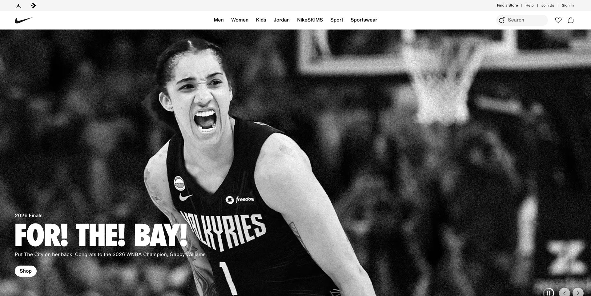
Nike’s captured US storefront gives almost the entire opening to a monochrome athlete photograph. Condensed white lettering and one small Shop button occupy the lower left, while category navigation, search and bag controls stay in a separate white header. That separation allows a campaign to change dramatically without making regular shoppers relearn the store. Nike’s own payment help names PayPal for online purchases and describes its billing agreement. This supports a US storefront payment association; the photograph itself does not reveal a checkout implementation.
What you can learn
Borrow the stable shopping shell and let campaign artwork carry the emotion. Before a visitor reaches payment, make sizing, delivery and return information easy to find from product pages. Keep the wallet choice consistent with those promises rather than treating a recognizable payment logo as a substitute for useful purchase details.
Pros
Strong image contrast gives the campaign a clear focal point.
Shopping utilities remain distinct from the expressive hero.
Cons & considerations
The opening contains little immediate product or price information.
PayPal eligibility and the actual payment experience were not tested.
Platform source: Merchant-owned payment documentation. Nike identifies PayPal as an online payment method and describes a PayPal billing agreement during checkout. US storefront payment option only; no claim about every Nike region, app, CMS or backend. Merchant-owned payment documentation was read November 10, 2026. This documents a payment option; no checkout, account, cart, form, transaction, full backend or CMS was tested or inferred. Platform evidence is separate from the direct website screenshot and is not a complete current infrastructure audit.
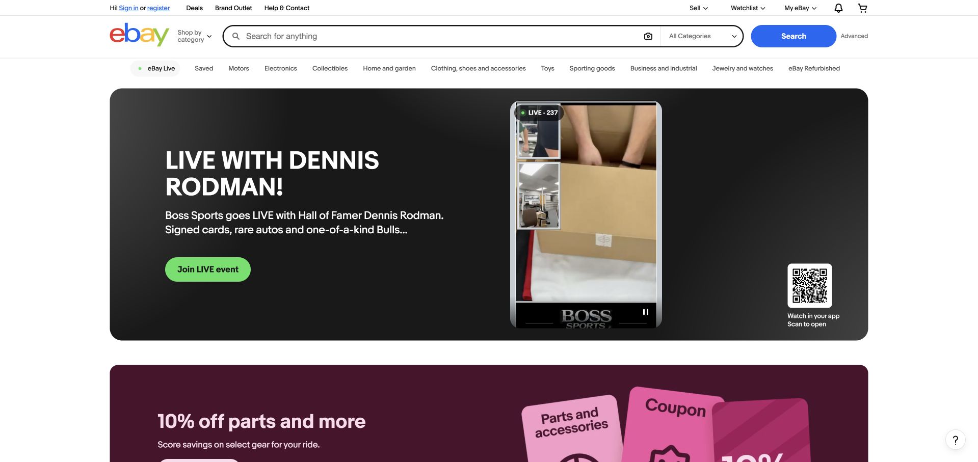
eBay’s captured homepage places a long search field and category selector above a broad row of departments. A dark promotional panel then introduces a live selling event with a bright green action, a vertical video frame and an app QR code. The layout keeps the main search route independent of the event, which matters when visitors arrive with a specific item in mind. eBay’s payment guidance says PayPal is accepted in most categories, while individual listings identify available methods. That qualification belongs with this marketplace example.
What you can learn
Use the marketplace shell to explain where a shopper is and how to narrow the inventory. A payment method should follow the selected listing’s rules, not a promise made indiscriminately across the homepage. Carry seller, item and delivery context forward so the transition to a wallet does not obscure the purchase being approved.
Pros
The search route remains prominent above promotional content.
Category links offer useful alternatives to the live-event feature.
Cons & considerations
Several event and app prompts compete within the large hero.
The documented PayPal option does not apply universally to every listing.
Platform source: Merchant-owned payment documentation. eBay says PayPal is accepted in most categories and explains that each listing shows available methods. Listing and category restrictions apply; not every transaction or seller. Merchant-owned payment documentation was read November 10, 2026. This documents a payment option; no checkout, account, cart, form, transaction, full backend or CMS was tested or inferred. Platform evidence is separate from the direct website screenshot and is not a complete current infrastructure audit.
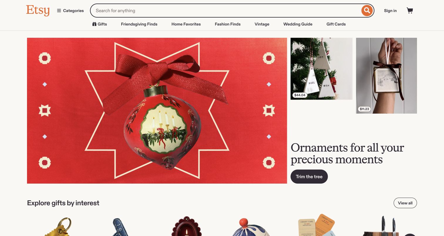
Etsy’s saved homepage pairs a large red ornament photograph with two smaller product images and a restrained serif headline. Price labels on the smaller images introduce a practical shopping cue inside an otherwise editorial composition. The wide search field stays above seasonal links, giving purposeful buyers another route. Etsy’s own help explains paying with PayPal for most items and returning to Etsy after confirmation. Country, seller and item restrictions remain relevant; this is evidence for the public marketplace, not every individual seller’s available payment methods.
What you can learn
Borrow the balance between inspiration and concrete product detail. Gift collections can encourage browsing, but each selected item still needs a clear seller identity, delivery expectation and final total. Explain any wallet handoff in the context of that order, and preserve the shopper’s place when they return from payment approval.
Pros
Product imagery and visible prices connect the campaign to actual merchandise.
The search field remains easy to locate above seasonal navigation.
Cons & considerations
The broad seasonal message provides limited seller-specific context.
Payment availability varies and was not checked through a live transaction.
Platform source: Merchant-owned payment documentation. Etsy documents PayPal payment for most items and a redirect back to Etsy after PayPal confirmation. Country, seller and item restrictions apply; not every shop or buyer. Merchant-owned payment documentation was read November 10, 2026. This documents a payment option; no checkout, account, cart, form, transaction, full backend or CMS was tested or inferred. Platform evidence is separate from the direct website screenshot and is not a complete current infrastructure audit.
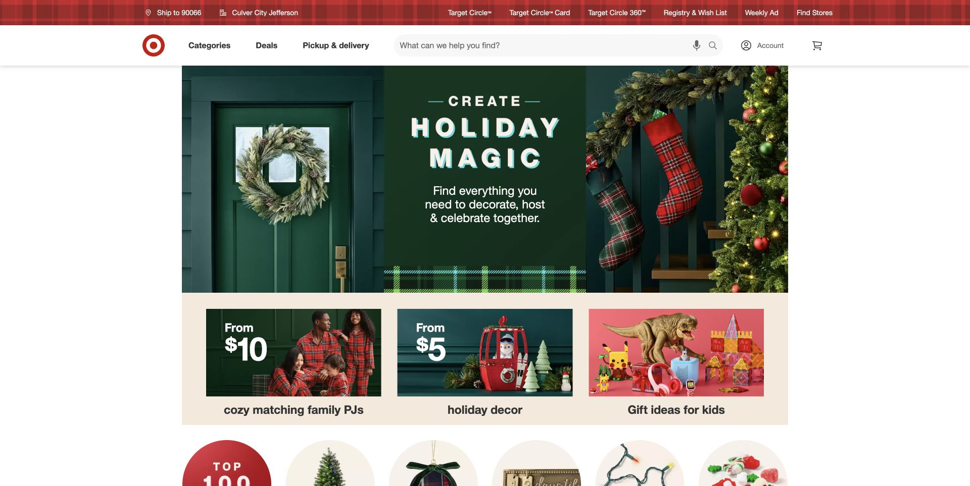
Target’s captured homepage uses a dark green holiday scene as its central campaign and immediately follows it with three smaller tiles. Two of those tiles lead with starting prices, while another groups gift ideas for children. The red brand header keeps categories, deals, pickup and delivery beside a large search field. Target’s own accepted-payment guidance lists PayPal for Target.com shopping. The evidence concerns the online store; it does not establish in-store acceptance, an underlying commerce platform or the behavior of an untested order.
What you can learn
Use a campaign to organize choices, then give shoppers concrete ways to compare them. Delivery and pickup context should remain understandable before they select a wallet. For a broad catalog, consistent product information and a clearly itemized order matter more than adding payment badges to every promotional tile.
Pros
Price-led tiles give the seasonal theme a practical next step.
Search and fulfillment navigation are visible outside the campaign artwork.
Cons & considerations
Several categories share a large amount of promotional space.
The screenshot cannot show payment eligibility for a particular basket.
Platform source: Merchant-owned payment documentation. Target lists PayPal under payment methods for Target.com and its app. Scope this review to Target.com online shopping; no in-store or backend inference. Merchant-owned payment documentation was read November 10, 2026. This documents a payment option; no checkout, account, cart, form, transaction, full backend or CMS was tested or inferred. Platform evidence is separate from the direct website screenshot and is not a complete current infrastructure audit.
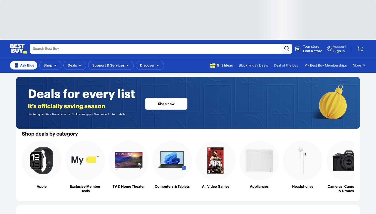
Best Buy’s archived storefront uses a blue header with a long search box, store selection and account controls. A short seasonal deal banner leads into a row of circular category images, including computing, games, appliances and cameras. The result offers a quick route into a large technical catalog without filling the hero with specifications. BestBuy.com’s official payment-options page explicitly includes PayPal. Its payment-combination restrictions remain part of that documentation; the capture is a design reference, not a tested payment session.
What you can learn
Borrow the short path from a broad promotion to recognizable departments. Technical purchases need room for compatibility, model differences and support information before payment. Keep those details attached to the selected product and show the final order clearly before handing control to a wallet, particularly when multiple payment methods cannot be combined.
Pros
Illustrated departments are easy to distinguish beneath the banner.
The persistent search bar suits visitors who know a model number.
Cons & considerations
The promotion explains little about individual product differences.
The captured opening includes unused space above the main navigation.
Visible tech stack
Earlier / documented evidence
PayPal
Platform source: Merchant-owned payment documentation. Best Buy explicitly lists PayPal among payment types accepted by BestBuy.com. Online storefront payment option; combination restrictions exist. Merchant-owned payment documentation was read November 10, 2026. This documents a payment option; no checkout, account, cart, form, transaction, full backend or CMS was tested or inferred. Platform evidence is separate from the direct website screenshot and is not a complete current infrastructure audit.
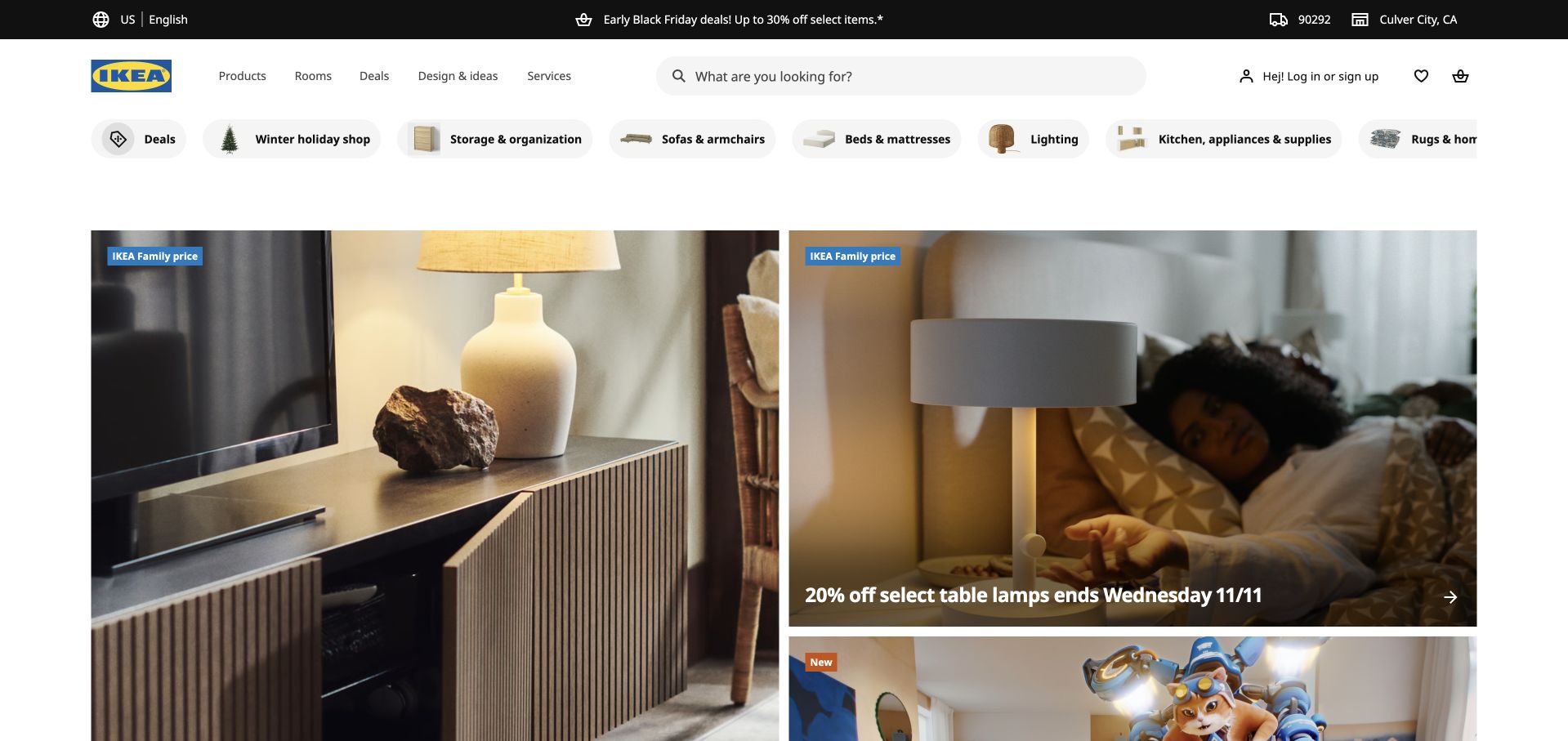
IKEA’s US opening places a wide search bar below its yellow-and-blue identity, followed by a horizontal sequence of product categories. The main content combines a large room photograph with smaller promotional panels, so the page can move between a complete living scene and individual purchases. Visible store and delivery context sits near the header. IKEA US documents PayPal among online payment options. The association is specific to this regional shop; the global corporate website and other country stores are separate properties.
What you can learn
Borrow the movement from room-scale inspiration to a manageable product category. Furniture shoppers need delivery, assembly and availability information before a payment decision becomes meaningful. Keep those details understandable as products move into an order, and avoid implying that the availability of a wallet resolves fulfillment questions for every postcode or item.
Pros
Room imagery makes the products feel connected to a use case.
Category shortcuts provide a practical alternative to browsing promotions.
Cons & considerations
Several promotional panels can dilute the primary campaign.
A homepage view cannot establish delivery or payment eligibility for an order.
Visible tech stack
Earlier / documented evidence
PayPal
Platform source: Merchant-owned payment documentation. IKEA US lists PayPal among online payment options. US store only. Existing IKEA Global capture is a different property and is excluded. Merchant-owned payment documentation was read November 10, 2026. This documents a payment option; no checkout, account, cart, form, transaction, full backend or CMS was tested or inferred. Platform evidence is separate from the direct website screenshot and is not a complete current infrastructure audit.
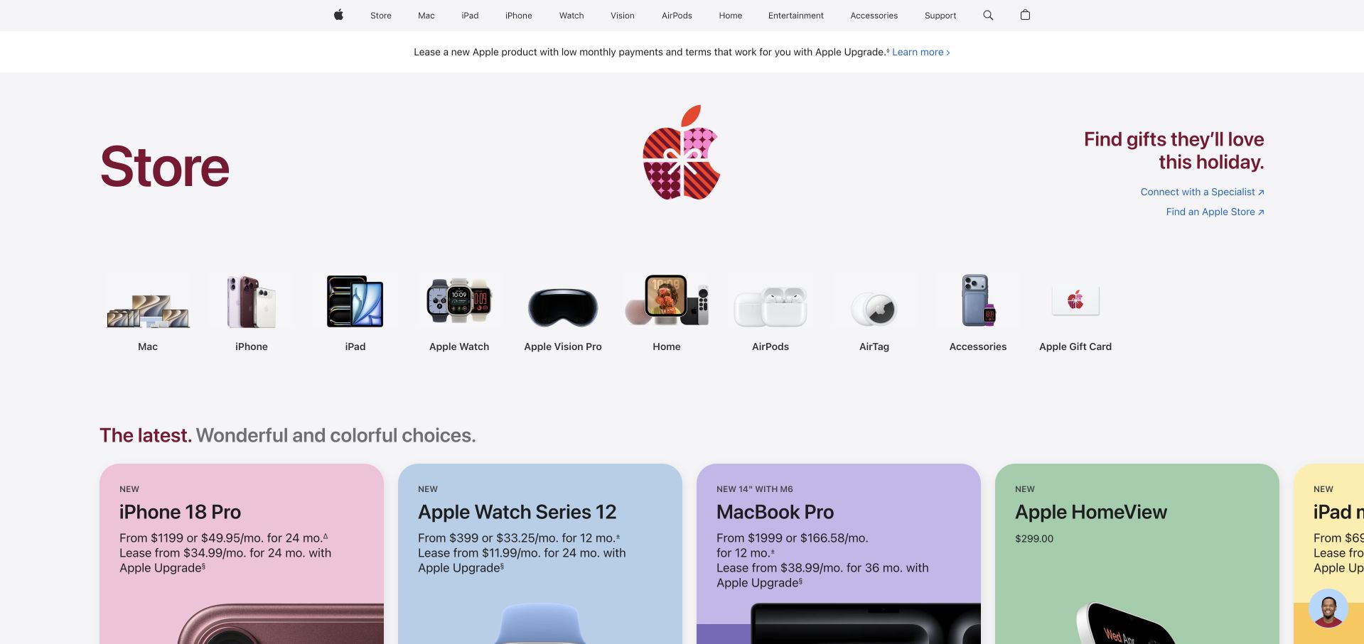
Apple’s US store redirects the requested shop address to its current store route. The captured page begins with a spacious row of product-family illustrations, then introduces holiday gifting above large product cards. Minimal text and generous separation help readers identify a category before comparing individual devices. Apple’s US shopping help describes PayPal for online store orders, including its treatment of multiple shipments. This evidence concerns the hardware shopping property, not App Store billing, Apple Music or every regional Apple service.
What you can learn
Borrow the category-first structure when a product family contains many similar configurations. Keep the product choice, fulfillment estimate and order summary understandable before a wallet handoff. For orders that may ship separately, explain the relevant charging expectations in accessible help rather than leaving the shopper to infer them from a single total.
Pros
Product-family illustrations make the store’s main categories easy to scan.
Large cards create room for product names and purchase information.
Cons & considerations
The seasonal opening requires more scrolling to compare specifications.
The review does not verify a checkout, financing offer or order charge.
Platform source: Merchant-owned payment documentation. Apple shopping help documents redirecting an online store order to PayPal and charging separately for multiple shipments. US hardware store checkout only; not Apple Music, App Store billing, corporate homepage or all regions. Merchant-owned payment documentation was read November 10, 2026. This documents a payment option; no checkout, account, cart, form, transaction, full backend or CMS was tested or inferred. Platform evidence is separate from the direct website screenshot and is not a complete current infrastructure audit.
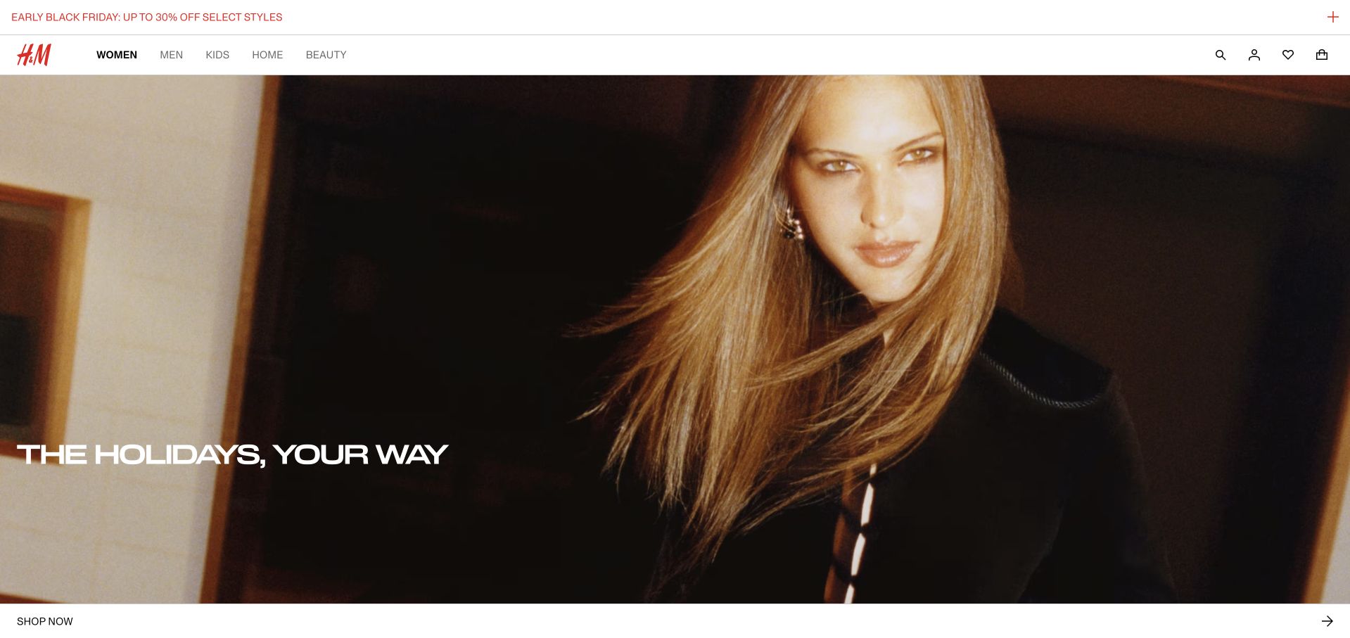
H&M’s US storefront gives the opening to a close-up fashion photograph and a short white holiday headline. A slim red promotion sits above the main navigation, while search, account, favorites and bag appear as compact icons. A full-width Shop now strip below the image supplies a clear next step. The screenshot was taken after choosing required cookies only. H&M’s US payment documentation lists PayPal; that evidence supports this regional online shop and does not describe every country’s available methods.
What you can learn
Borrow the separation of campaign image, store navigation and next action. An image-led opening can stay simple if product pages later answer size, fabric, delivery and return questions explicitly. Payment choices should be explained at the appropriate stage without making the campaign carry technical checkout language or promises about every shopper’s eligibility.
Pros
A short headline leaves the fashion image visually dominant.
The bottom action strip is distinct from the small utility icons.
Cons & considerations
The opening provides little product detail or price context.
Icon-only utilities need clear accessible names and discoverable labels.
Visible tech stack
Earlier / documented evidence
PayPal
Platform source: Merchant-owned payment documentation. The US H&M payment page lists PayPal among accepted payment options; its indexed official guidance describes redirecting to PayPal. US storefront payment documentation; no worldwide availability or CMS claim. Merchant-owned payment documentation was read November 10, 2026. This documents a payment option; no checkout, account, cart, form, transaction, full backend or CMS was tested or inferred. Platform evidence is separate from the direct website screenshot and is not a complete current infrastructure audit.
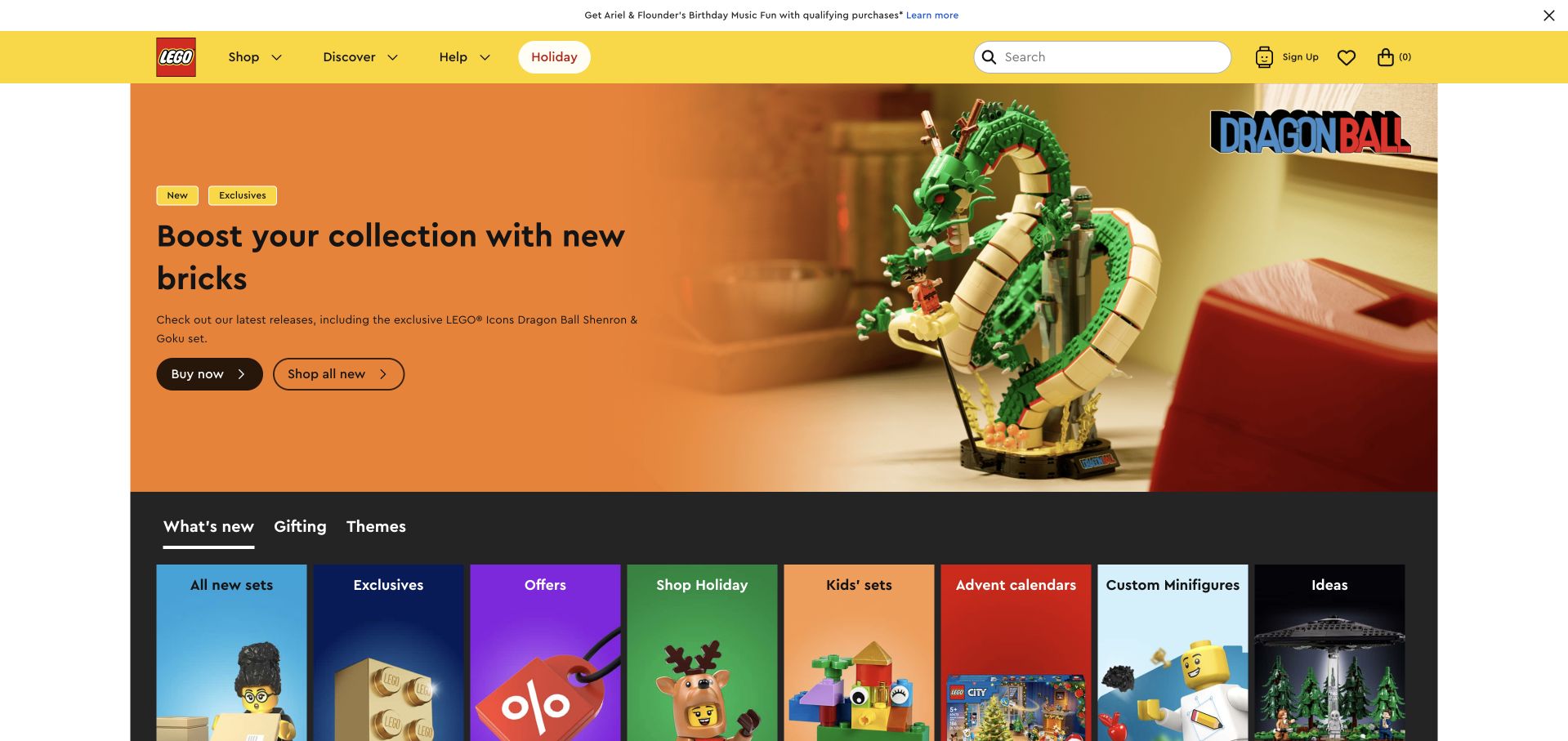
LEGO’s captured US shop combines a bright yellow navigation bar with an orange product-launch feature. The hero separates explanatory copy and actions from a large set photograph, while a row of colorful category tiles begins below it. The public storefront choice and optional-cookie panel were dismissed before capture; no age declaration, account or order was submitted. LEGO’s US payment-method page documents PayPal and its express checkout option. Those statements support the US shop association without proving availability for every order.
What you can learn
Borrow the clear relationship between a featured product, its explanation and the route to learn more. A strong launch graphic should not hide age guidance, set contents or delivery details on later pages. Keep the order context intact when offering a wallet, especially where the buyer may be choosing a gift for someone else.
Pros
The hero distinguishes product explanation from the set photograph.
Bright category tiles provide alternatives to the featured launch.
Cons & considerations
A large licensed campaign can dominate general shopping discovery.
The design review does not assess an express checkout transaction.
Visible tech stack
Earlier / documented evidence
PayPal
Platform source: Merchant-owned payment documentation. LEGO US lists PayPal and explains the PayPal redirect and express checkout option. US shop, subject to payment availability; other country shops are not extra examples. Merchant-owned payment documentation was read November 10, 2026. This documents a payment option; no checkout, account, cart, form, transaction, full backend or CMS was tested or inferred. Platform evidence is separate from the direct website screenshot and is not a complete current infrastructure audit.
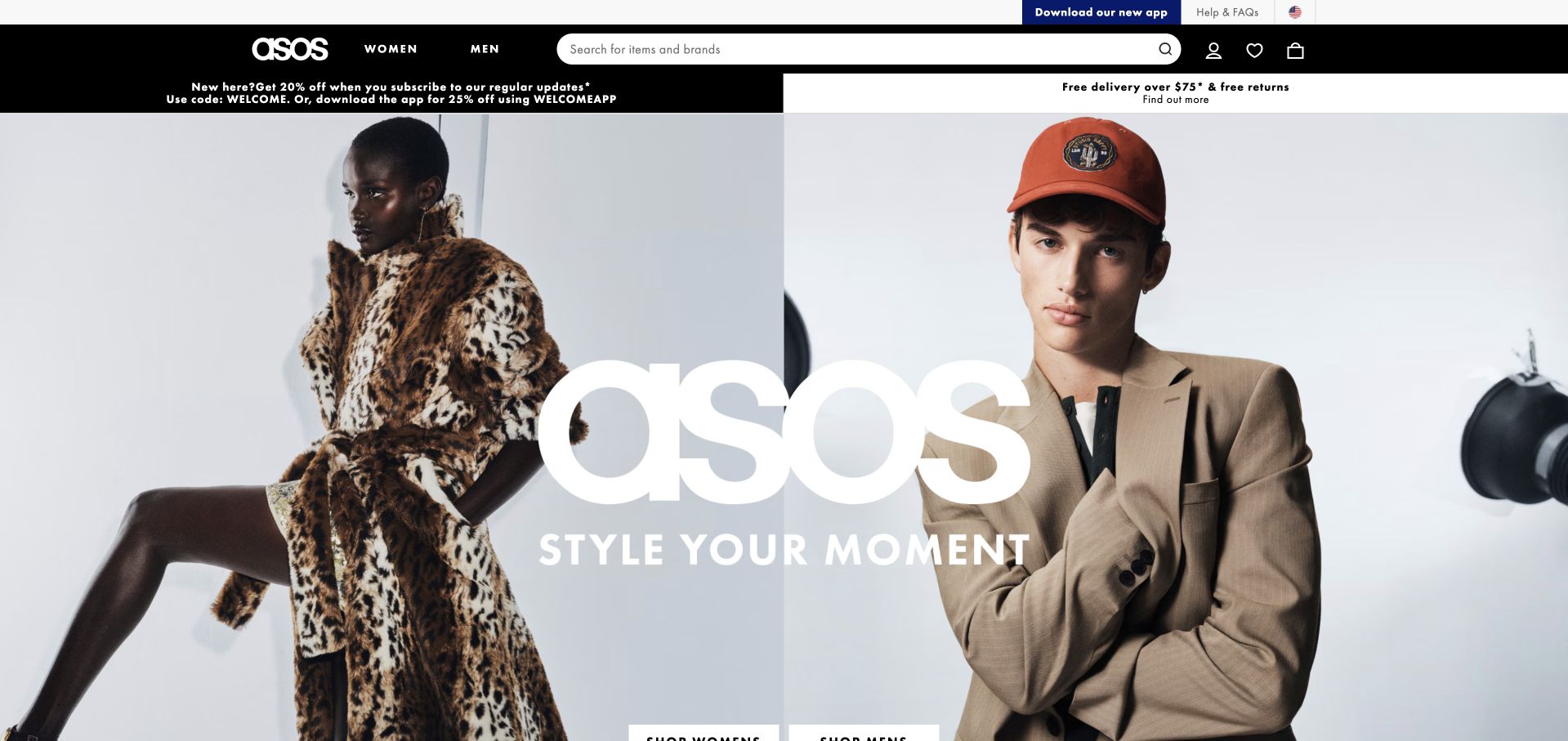
ASOS’s US homepage uses two large fashion photographs beneath a black shopping header. An oversized white wordmark and short campaign line unite the images, while women’s and men’s navigation and a wide search field remain above. Promotional and delivery strips add practical information without replacing the visual campaign. Optional cookie categories were declined before the final capture. ASOS US lists PayPal in its payment guidance and notes that available methods vary by order. The US route is intentionally distinguished from the separately captured global root page.
What you can learn
Borrow the strong audience split while keeping search available for visitors who already know a brand or product. Promotional conditions and delivery thresholds should be easy to inspect before payment. Avoid presenting a wallet as universally available when the merchant itself qualifies the options by the particular order.
Pros
The two-image layout gives the main audience routes equal visibility.
A wide search field supports the store’s extensive product range.
Cons & considerations
Large campaign lettering covers some of the photography.
Several promotional conditions require more explanation than the opening provides.
Visible tech stack
Earlier / documented evidence
PayPal
Platform source: Merchant-owned payment documentation. ASOS US includes PayPal in its payment-method list and says available methods vary by order. Use the US storefront. Existing root ASOS capture does not establish its US locale; do not relabel it. Merchant-owned payment documentation was read November 10, 2026. This documents a payment option; no checkout, account, cart, form, transaction, full backend or CMS was tested or inferred. Platform evidence is separate from the direct website screenshot and is not a complete current infrastructure audit.
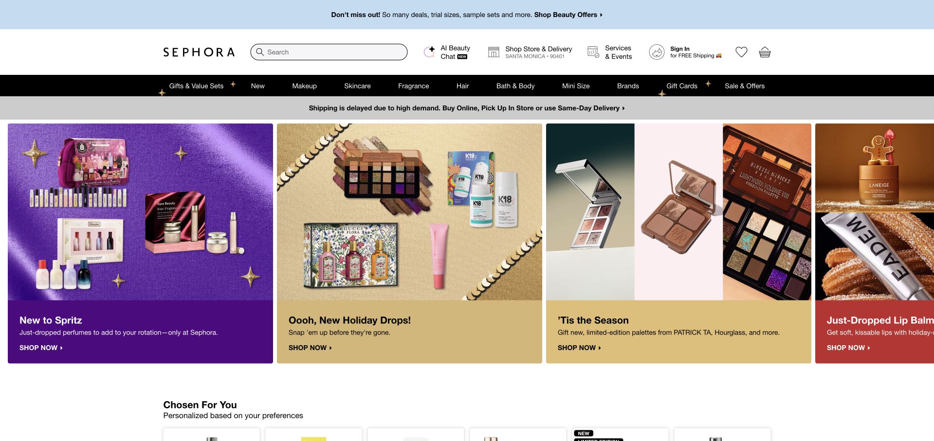
Sephora’s captured US homepage places a black category bar under a large search field and practical store, delivery and service controls. Below a shipping notice, richly colored product panels pair beauty photography with concise campaign copy. Their consistent card structure makes several offers readable without merging them into one collage. An unsolicited sign-in invitation was dismissed without entering an account. Sephora’s payment page identifies PayPal for sephora.com purchases, while excluding subscriptions, beauty services and specified rewards use. Those limits are material to this example.
What you can learn
Borrow the repeated merchandising card structure, but keep service and merchandise paths clearly distinguished. A shopper should understand which purchase is being made before a payment option appears. Place exclusions near the relevant action or help route rather than assuming a familiar wallet brand explains eligibility across every part of a retail business.
Pros
Consistent cards make different campaigns easy to compare visually.
The shipping notice is visible before the product promotions.
Cons & considerations
The unsolicited sign-in invitation interrupted the initial browsing view.
The broad category bar competes with several other header utilities.
Visible tech stack
Earlier / documented evidence
PayPal
Platform source: Merchant-owned payment documentation. Sephora identifies PayPal as a method for purchasing on sephora.com. Excludes subscriptions, beauty services and Sephora Credit Card Rewards; no service-payment or backend inference. Merchant-owned payment documentation was read November 10, 2026. This documents a payment option; no checkout, account, cart, form, transaction, full backend or CMS was tested or inferred. Platform evidence is separate from the direct website screenshot and is not a complete current infrastructure audit.
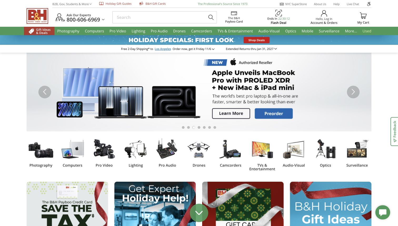
B&H’s saved homepage packs specialist categories into a green navigation strip beneath search and an expert-help telephone route. The central product announcement pairs hardware imagery with distinct Learn More and Preorder actions, followed by illustrated departments. Shipping and return messages sit close to the campaign rather than deep in the footer. B&H’s payment help says it accepts PayPal and explains charging and combination restrictions. This supports an online payment association, not a conclusion about the retailer’s private commerce software or a completed transaction.
What you can learn
Borrow the distinction between learning about a technical product and committing to an order. Keep expert help visible when specifications or compatibility may affect a purchase. Wallet integration should preserve an understandable order summary and the merchant’s payment rules; it should not remove the opportunity to inspect practical product and fulfillment information.
Pros
Specialist department labels reflect the breadth of the catalog.
Separate informational and purchase actions support different levels of readiness.
Cons & considerations
Dense navigation and multiple promotional strips demand careful visual scanning.
The captured campaign’s availability and prices are historical observations.
Visible tech stack
Earlier / documented evidence
PayPal
Platform source: Merchant-owned payment documentation. B&H says it accepts PayPal and describes immediate charging and payment-combination restrictions. US online storefront payment option. PayPal Credit availability is a separate regional qualification. Merchant-owned payment documentation was read November 10, 2026. This documents a payment option; no checkout, account, cart, form, transaction, full backend or CMS was tested or inferred. Platform evidence is separate from the direct website screenshot and is not a complete current infrastructure audit.
Zara’s US storefront redirected to its shorter US route during the visit. The selected view fills the screen with a group fashion photograph and a centered editorial title, leaving menu, search, bag and help around the edges. Thin arrows suggest movement between campaign views. Privacy and text-signup overlays were dismissed without submitting information. Zara’s US help lists PayPal among payment methods and explains its charging behavior. This establishes a regional payment option separately from the highly visual public opening.
What you can learn
Borrow the confidence of one coherent image, but ensure that shopping navigation remains understandable over changing backgrounds. Editorial restraint should continue into clear product facts, delivery information and a legible order summary. A wallet belongs within that practical sequence; the visual treatment alone cannot explain payment availability or the consequences of placing an order.
Pros
The single photograph creates a distinctive and cohesive opening.
Peripheral utilities leave the campaign composition largely uninterrupted.
Cons & considerations
Small navigation text can become difficult to see over photography.
The opening gives few immediate clues about product categories or prices.
Visible tech stack
Earlier / documented evidence
PayPal
Platform source: Merchant-owned payment documentation. Zara US lists PayPal among offered methods and describes immediate PayPal charging after purchase completion. US store; order-specific options are shown at checkout. No claim about all regions. Merchant-owned payment documentation was read November 10, 2026. This documents a payment option; no checkout, account, cart, form, transaction, full backend or CMS was tested or inferred. Platform evidence is separate from the direct website screenshot and is not a complete current infrastructure audit.
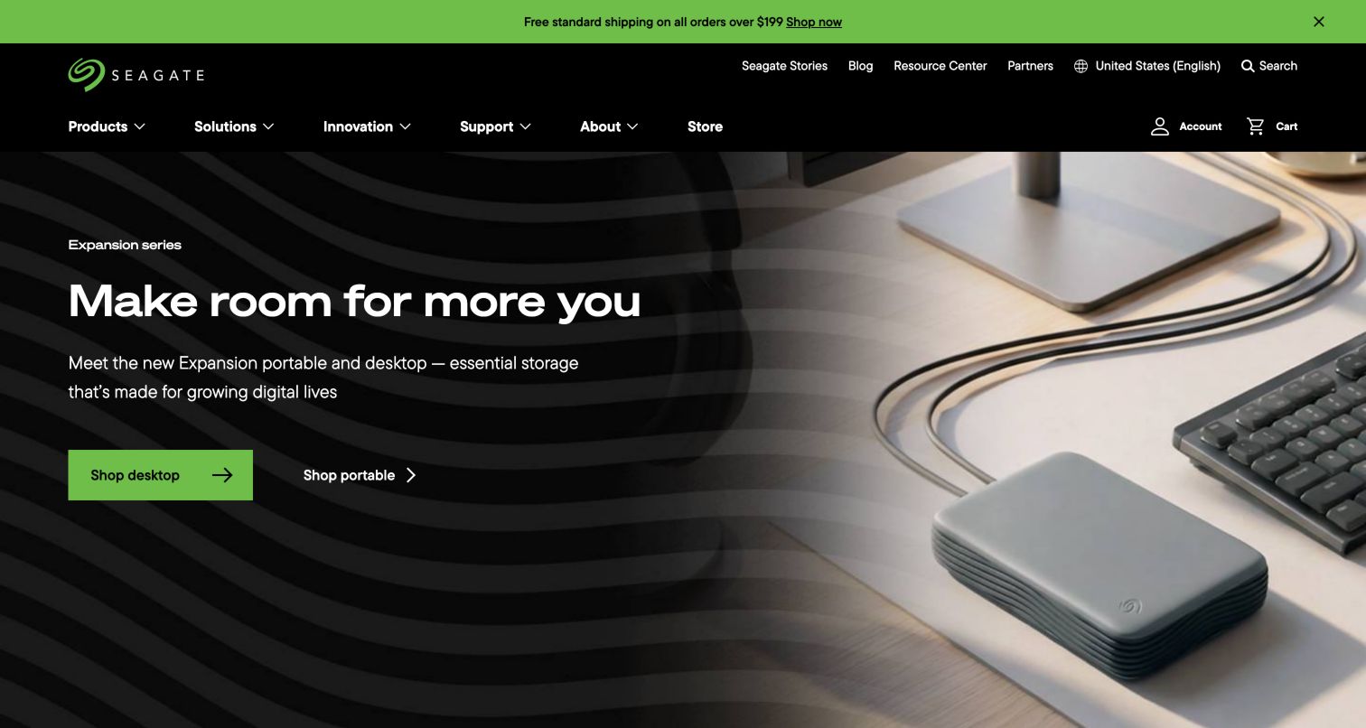
Seagate’s archived homepage presents a desktop drive in a work setting beside a large benefit-led headline. Green accents identify a primary shopping action and the shipping strip, while a quieter second action separates portable storage from desktop products. The black navigation distinguishes products, solutions, innovation, support and the store. Seagate’s store-ordering guide lists PayPal, and an earlier exact-page audit recorded a PayPal SDK reference. That earlier observation keeps its original date and concerns payment integration, not the site’s entire backend.
What you can learn
Borrow the pairing of a concrete product image with an understandable use case. Technical detail can follow without making the opening a specification table. Keep compatibility, capacity and delivery information close to the product choice before payment, and qualify payment availability by the store’s supported countries rather than extrapolating from a script reference.
Pros
Two purchase routes distinguish desktop and portable product needs.
Support remains a visible part of the primary navigation.
Cons & considerations
The opening does not supply detailed compatibility information.
A public SDK reference cannot verify a successful payment or private system.
Platform source: Merchant-owned payment documentation. Seagate's official store ordering guide lists PayPal; the exact homepage also has a retained PayPal SDK observation. Store payment integration only, subject to eligible countries. The November 5 SDK observation retains its original date. Merchant-owned payment documentation was read November 10, 2026. This documents a payment option; no checkout, account, cart, form, transaction, full backend or CMS was tested or inferred. Platform evidence is separate from the direct website screenshot and is not a complete current infrastructure audit.
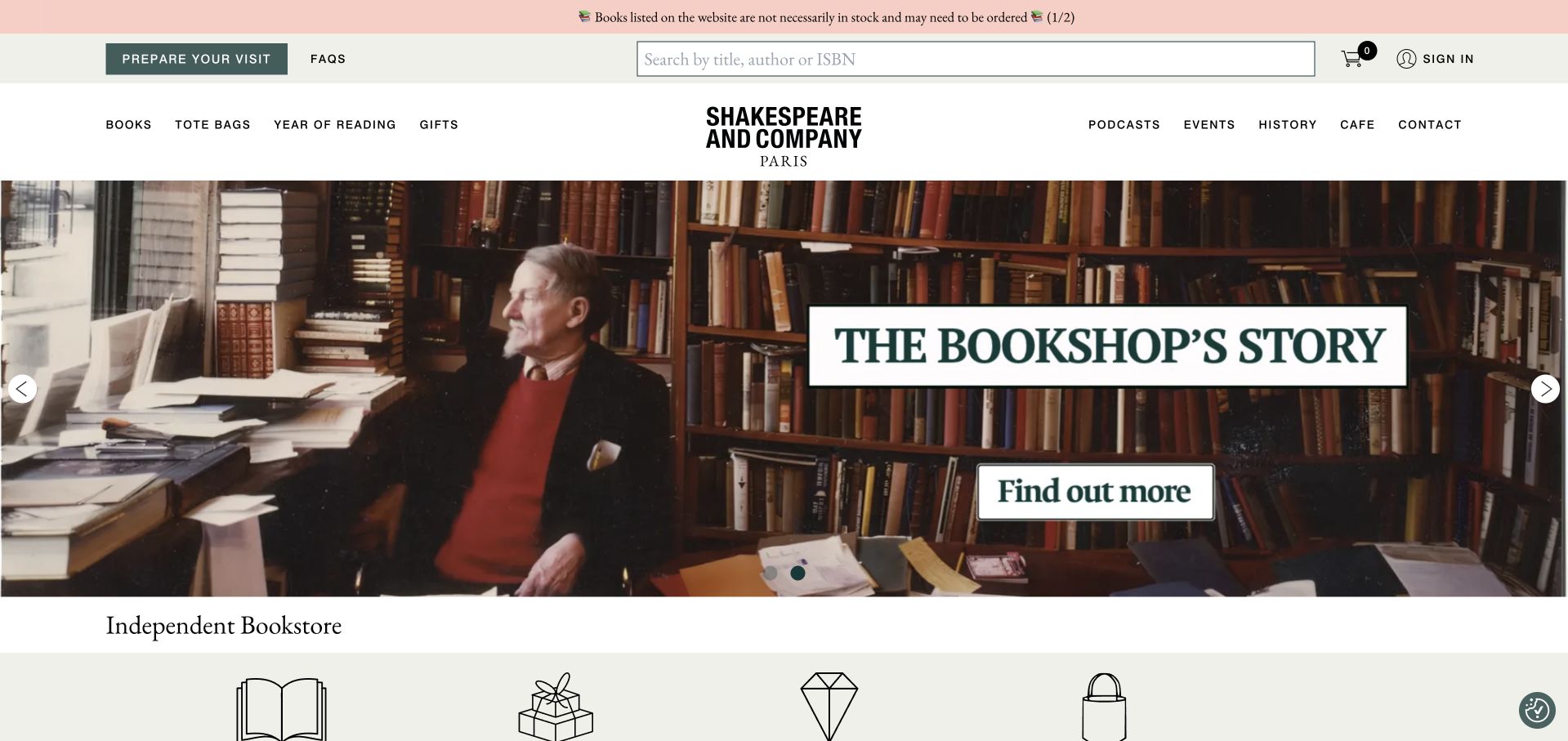
Shakespeare and Company’s captured homepage balances a prominent title, author or ISBN search field with a photographic bookshop story. Shopping categories sit on one side of the centered identity, while events, history and café routes sit on the other. A notice warns that listed books may need to be ordered, setting expectations before browsing. The shop’s FAQ states that its website accepts PayPal, with options varying by location. This is an online bookshop association, not a claim about café or in-person payments.
What you can learn
Borrow the balance between cultural identity and a direct route to a known product. An atmospheric photograph can coexist with plain availability information. Before a reader pays, keep stock expectations, shipping destinations and the selected edition explicit; a wallet option should not make an uncertain supply situation look like guaranteed immediate dispatch.
Pros
Catalog search is visible without displacing the shop’s identity.
The stock notice communicates a practical constraint early.
Cons & considerations
Several cultural and shopping routes compete in the header.
Location-dependent payment options cannot be inferred from the homepage image.
Platform source: Merchant-owned payment documentation. The bookshop FAQ states its website accepts PayPal, with payment options varying by location. Online bookshop payment only; installment eligibility is country-specific and should not become a general promise. Merchant-owned payment documentation was read November 10, 2026. This documents a payment option; no checkout, account, cart, form, transaction, full backend or CMS was tested or inferred. Platform evidence is separate from the direct website screenshot and is not a complete current infrastructure audit.
Made With Love’s saved US homepage uses a full-height bridal photograph with a small centered collection invitation. The navigation remains restrained, while a distinct Find a retailer control appears both in the header and near the lower edge. The visible US availability line anchors the regional context. MWL’s FAQ documents PayPal for online orders, and the exact US storefront has an earlier PayPal SDK observation. These support online payment use without describing boutique arrangements, appointment deposits or every retailer’s payment policies.
What you can learn
Borrow the clear separation between discovering a collection and finding a physical retailer. A brand that serves both routes should explain which products can be ordered online and which need a fitting or local conversation. Payment information must follow that distinction instead of implying that one wallet option covers the whole retail network.
Pros
The collection invitation stays visually quiet within the photograph.
A separate retailer route acknowledges the role of physical shopping.
Cons & considerations
Small light text depends heavily on the image’s background contrast.
The opening leaves online-order scope and boutique policies largely unexplained.
Platform source: Merchant-owned payment documentation. MWL's own FAQ states online orders can be paid using PayPal; the exact US storefront has retained PayPal SDK evidence. Online orders only, separate from boutique payment arrangements. Avoid promising universal installment eligibility. Merchant-owned payment documentation was read November 10, 2026. This documents a payment option; no checkout, account, cart, form, transaction, full backend or CMS was tested or inferred. Platform evidence is separate from the direct website screenshot and is not a complete current infrastructure audit.
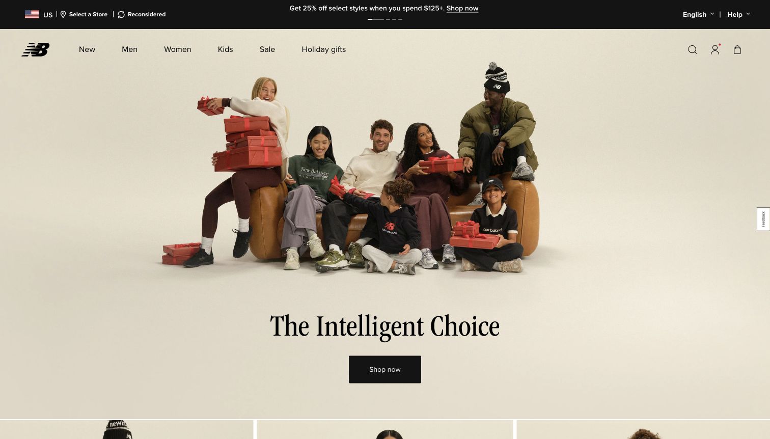
New Balance’s archived US homepage places a group lifestyle photograph against a pale background. Navigation and small utility icons stay above the image, while a serif campaign heading and simple black Shop now button provide a centered next step. The quiet composition lets products and people share the opening without a dense promotional grid. New Balance’s payment FAQ describes PayPal approval followed by review and order placement on newbalance.com. This is a documented US shopping flow, not a transaction performed for this review.
What you can learn
Borrow the uncluttered relationship between campaign, category navigation and next action. When a wallet returns a shopper to the store for order review, make that stage clear and retain the selected items and fulfillment details. The customer should be able to distinguish approving a payment method from completing the merchant’s remaining order steps.
Pros
A single dark action contrasts clearly with the pale campaign.
The main product categories remain separate from seasonal copy.
Cons & considerations
The opening offers little detail for visitors comparing specific products.
The historical capture does not verify the current offer or checkout behavior.
Visible tech stack
Earlier / documented evidence
PayPal
Platform source: Merchant-owned payment documentation. New Balance documents a PayPal payment popup followed by review and placement of the order on newbalance.com. US online store payment flow, not private finance or all regional properties. Merchant-owned payment documentation was read November 10, 2026. This documents a payment option; no checkout, account, cart, form, transaction, full backend or CMS was tested or inferred. Platform evidence is separate from the direct website screenshot and is not a complete current infrastructure audit.
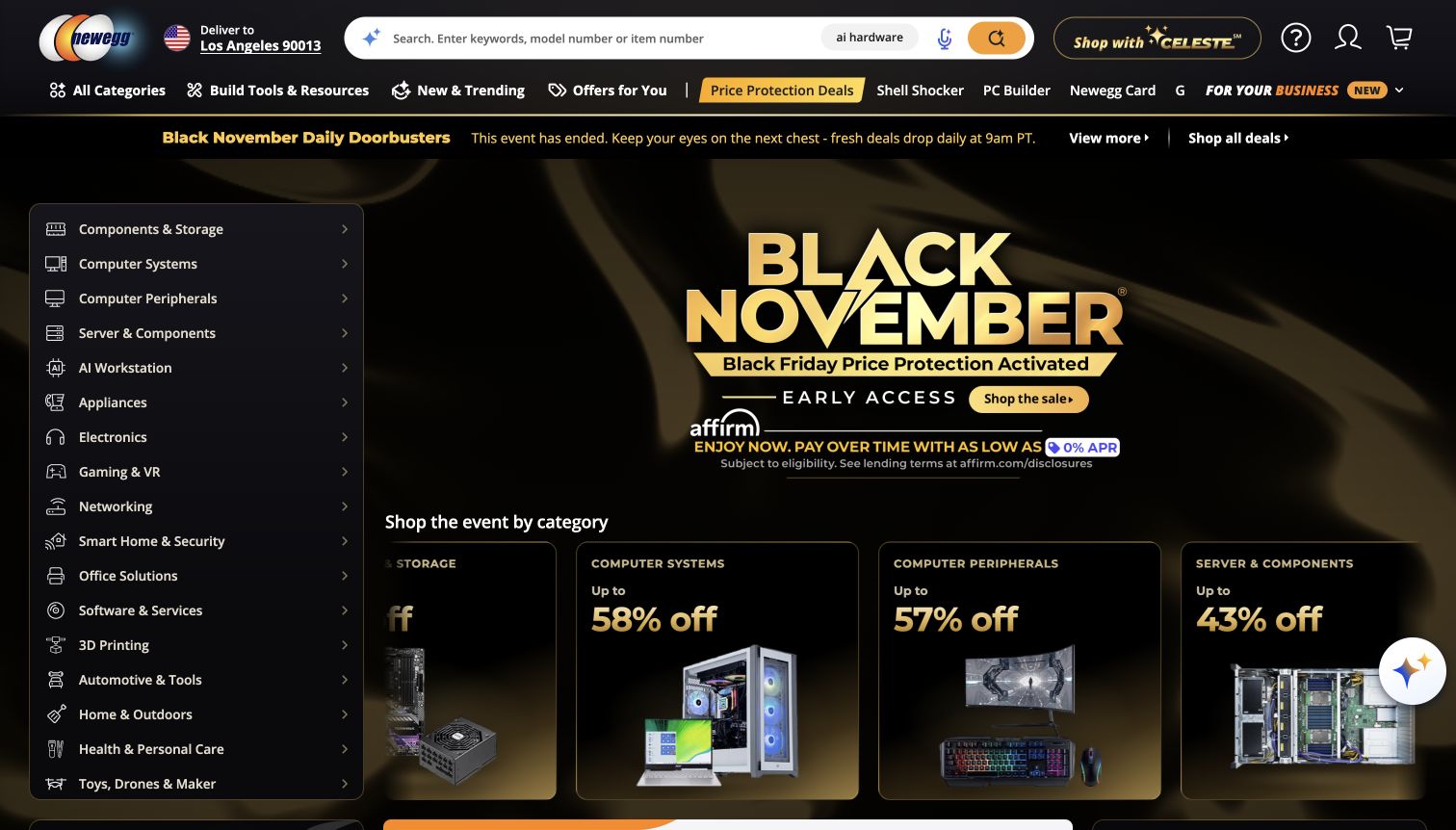
Newegg’s saved US storefront uses a dark header, a wide search field and a persistent department list beside its seasonal promotion. Component, storage, networking and other technical categories remain visible while product cards begin below the campaign. Gold accents draw attention to the sale and search action, although several promotional messages share the view. Newegg’s official payment guidance lists PayPal for US consumer orders with restrictions. Seller payout documentation and international options are separate topics and are not used to establish this example.
What you can learn
Borrow the visible category tree when shoppers need to narrow a technical catalog quickly. Keep model compatibility, seller identity and delivery terms close to the selected items. A payment integration should carry those distinctions into the order summary, especially where a marketplace combines products from different sources or applies method-specific restrictions.
Pros
The department list provides direct access to specialist categories.
Search supports precise product names and model numbers.
Cons & considerations
Multiple promotions and assistance controls compete for attention.
A homepage payment association does not establish every basket’s available methods.
Visible tech stack
Earlier / documented evidence
PayPal
Platform source: Merchant-owned payment documentation. Newegg's payment guide lists PayPal for US orders and documents restrictions and separate international availability. Consumer checkout only; do not use conflicting historical seller payout pages as evidence. Merchant-owned payment documentation was read November 10, 2026. This documents a payment option; no checkout, account, cart, form, transaction, full backend or CMS was tested or inferred. Platform evidence is separate from the direct website screenshot and is not a complete current infrastructure audit.
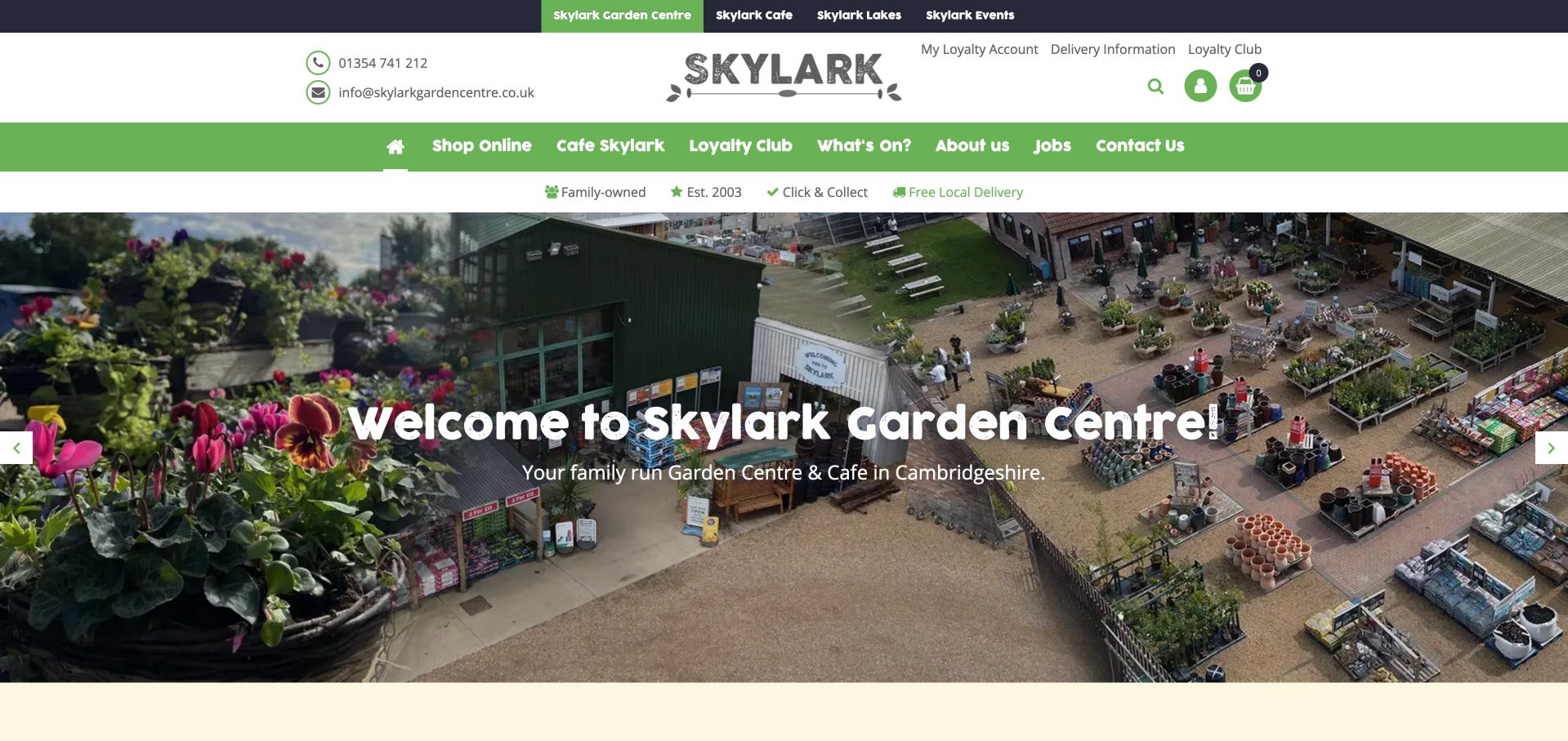
Skylark’s captured homepage combines an aerial garden-centre photograph with a friendly white welcome line. A green navigation band separates the online shop, café, loyalty program and local information, while a narrow strip highlights collection and local delivery. The location-focused imagery makes the business feel tangible before a shopper explores products. A public product page explicitly offers PayPal, and the homepage’s earlier audit recorded a PayPal SDK reference. The cited product was out of stock, so neither source proves a successful purchase or universal installment eligibility.
What you can learn
Borrow the connection between a real place and practical shopping options. Local delivery and collection deserve clear explanations before payment, particularly for bulky or seasonal goods. Keep product availability separate from payment messaging so an offered wallet does not imply that an unavailable item can currently be ordered.
Pros
The aerial photograph explains the scale and character of the venue.
Shopping and local-service routes remain visibly distinct.
Cons & considerations
A large header pushes detailed product information below the opening.
The documented product payment offer is subject to availability and eligibility.
Platform source: Merchant-owned payment documentation. The retailer's public product page explicitly offers PayPal, and its exact homepage has a retained PayPal SDK observation. UK online shop payment offer. The example product was out of stock; this is not proof of transaction success or universal installment eligibility. Merchant-owned payment documentation was read November 10, 2026. This documents a payment option; no checkout, account, cart, form, transaction, full backend or CMS was tested or inferred. Platform evidence is separate from the direct website screenshot and is not a complete current infrastructure audit.
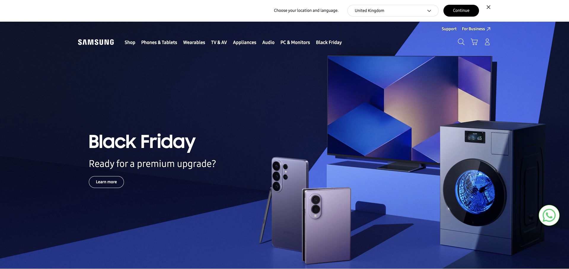
Samsung’s UK opening uses a deep blue campaign background to connect a television, phone and appliance in one composition. A large seasonal headline sits opposite the product group, while the navigation separates phones, wearables, televisions, appliances and computing. The region banner identifies the United Kingdom, and optional cookies were declined before capture. Samsung UK’s shop FAQ says customers can use an existing PayPal account and describes the payment redirect. This evidence applies to the UK online shop, not Samsung Wallet or every country storefront.
What you can learn
Borrow the shared visual treatment when several product families need to feel part of one store. Preserve category-specific details such as delivery, installation and compatibility as the shopper approaches payment. Regional wallet information should remain tied to the relevant shop and order, rather than being generalized from a global manufacturer’s brand recognition.
Pros
A coordinated product scene makes the broad range feel coherent.
The main navigation separates hardware families in familiar language.
Cons & considerations
The campaign supplies little product-specific detail above the fold.
The public view does not validate an order, installation service or payment.
Visible tech stack
Earlier / documented evidence
PayPal
Platform source: Merchant-owned payment documentation. Samsung UK says existing PayPal accounts can be used and describes redirecting to PayPal to complete payment. UK online store only; Samsung Wallet functionality and other country stores are separate. Merchant-owned payment documentation was read November 10, 2026. This documents a payment option; no checkout, account, cart, form, transaction, full backend or CMS was tested or inferred. Platform evidence is separate from the direct website screenshot and is not a complete current infrastructure audit.
Kegan has 15+ years of experience working with small businesses, Fortune 500 companies, and everything in between. No development job is too big or too small: he brings the same hands-on attention to a focused improvement, a complete website, or a custom application.
For PayPal projects, he can help with responsive interfaces, reusable components, custom functionality, API connections, and performance-minded implementation. He works directly with clients on scope, design, implementation, testing, and handover, with an emphasis on clear communication and a system that remains practical to maintain after launch.
Show 3 other PayPal developersHide other PayPal developers
Three ways to organize a storefront that offers PayPal
Campaign-led brand store
Nike, H&M and New Balance use strong campaign photography inside a familiar shopping frame. This approach suits a focused brand with a changing seasonal story. Preserve category navigation and search while artwork changes, then let product pages supply the practical details that a campaign deliberately leaves out.
Search-led catalog or marketplace
eBay, Etsy, B&H and Newegg give shoppers prominent routes into large inventories. Prioritize useful category labels and product-specific information before adding more promotional surfaces. Where sellers or items have different rules, make those distinctions visible throughout the order rather than promising one universal payment experience.
Storefront connected to a physical business
Shakespeare and Company, Made With Love and Skylark pair online products with a tangible place or retailer network. Separate online orders from visits, appointments and local services. Explain stock, collection and delivery expectations in plain language so a wallet option does not blur the difference between those journeys.
From references to requirements
Plan the shopping journey before the payment integration
Map the exact storefront and purchase rules
Start by naming the property, country and type of purchase the project actually supports. A corporate website, regional store, marketplace listing and physical shop can share a brand while following different rules. Record which products are sold online, which require an appointment, and which are supplied by another seller. Then map the information a visitor needs to make a reasonable choice: the product or service, quantity, availability, delivery destination, expected timing and any important exclusions.
Build a short content inventory around those decisions. Identify where payment help belongs, how it is linked from the shopping experience and who will keep it accurate. Do not bury a regional exception inside a general FAQ that appears to describe the whole company. A product that is out of stock should remain clearly unavailable even if a reusable payment message is present elsewhere on its page.
Use the examples as questions for your own store. Does the campaign lead to a clear category? Can a shopper find practical information without creating an account? Does the order summary preserve the selected product and fulfillment details? Write down the answers before deciding how many promotional or payment elements the interface needs.
Describe the journey in ordinary language before turning it into interface components. Distinguish selecting a payment method, approving it, returning to the store, reviewing an order and reaching a confirmed outcome. Different integrations may arrange those steps differently. The wording on each action should help the shopper understand what happens next instead of relying on a familiar logo to carry the explanation.
PayPal’s current JavaScript SDK documentation includes eligibility checks and callbacks for approval, cancellation and errors. Availability depends on the transaction context, including country, currency, merchant configuration and amount. Treat those as implementation inputs rather than reasons to advertise every payment product to every visitor. Confirm the integration path and version your team will use against current documentation.
For the design brief, specify what remains on screen when someone cancels or returns. Keep the cart or order context understandable and give a useful route to recover from a problem. Define the wording for a pending or uncertain outcome so the interface does not encourage an unnecessary second payment. Include long product names, narrow screens and keyboard navigation in the acceptance criteria. These requirements make the payment step part of a coherent store experience rather than an isolated branded button.
A payment integration needs an operating plan as well as a launch plan. Identify who maintains merchant help copy, monitors supported integration changes and investigates orders that do not reach an expected state. Make the support route visible in the storefront, and define what information staff need to locate an order without asking customers to send sensitive payment credentials.
Keep browser presentation separate from authoritative order processing. PayPal’s documentation describes server-side capture or authorization after approval. Its webhook guidance also explains how a server can receive relevant events and why incoming messages must be verified. Use those documented mechanisms in the chosen architecture instead of treating a success animation as the complete record of an order.
Plan reviewable test cases in an authorized test environment: cancellation, failure, repeated notifications, a delayed result and a return to the shop. Record the expected customer message and the expected order state for each. The examples in this collection were not used for transactions; they illustrate public design and documented payment availability only. Finally, schedule ordinary maintenance of regional payment information and help links. Accurate copy, consistent support language and a clear recovery process remain important after the launch campaign has changed.
Ask the actual team to carry out its routine job: publish a realistic update, correct a mistake, preview a narrow screen, and identify who owns an integration failure. For a library or frontend framework, also ask who maintains the content source and deployment. A polished screenshot does not answer those operational questions.
Beyond the screenshot
A practical checklist for a PayPal-enabled storefront
Name the exact country, storefront and supported purchase type.
Keep product identity, availability and seller information clear before payment.
Explain delivery, collection and return expectations in the relevant journey.
Link payment help from places where shoppers are likely to need it.
Qualify methods that depend on the item, seller, location or order.
Use action labels that distinguish review, approval and order completion.
Define cancellation, error, pending and recovery messages before launch.
Check method eligibility against the chosen current integration documentation.
Keep payment secrets and authoritative processing on the appropriate server side.
Verify relevant server notifications and define handling for repeated events.
Test the authorized implementation in a test environment with realistic failure states.
Assign ongoing ownership for payment copy, support routes and integration maintenance.
Test with real content, a keyboard, a small screen, slow or failed requests, and the people who will maintain the system. These are planning checks, not an accessibility, security, performance, or search-ranking certification.
Sources & editorial method
How this PayPal collection was reviewed
We selected 20 distinct public merchant properties with primary merchant-owned evidence documenting PayPal payment use. The first five are recognizable brands whose own storefront and payment-help pages establish the exact property and scope. Twelve verified captures are reused with their original dates and provenance; eight were captured directly on November 10, 2026. All 20 images were inspected for this collection. Reviews describe those public designs, not an unseen checkout. No cart, login, account, form, payment or purchase flow was tested. Documentary payment evidence was read on November 10, 2026 and is qualified by region, item, seller and service exclusions where relevant. Broad source audits retain twelve earlier exact-page attempts and add eight bounded attempts. Access restrictions, timeouts and response-size limits are retained as unavailable observations rather than replaced with guesses. A failed or blocked scan contributes no new stack claim. Public script observations, merchant payment documentation and earlier capture dates remain separate. PayPal does not thereby become a claim about a site’s CMS, full backend, compliance, payment security or conversion results. Skylark’s cited product was out of stock; its payment offer is not evidence of a completed or currently available purchase.
Every image is an unmodified capture from the actual website, with its source and capture date. Some captures are reused from our shared catalog; their dates remain the original capture dates. None comes from a vendor gallery or a generated reconstruction. Moving imagery and live content can change.
Technology attribution uses public page assets or metadata, official platform documentation, or a cited first-party project case study. Documentary and framework-relationship evidence is identified where used; it is not a complete current backend inventory. A CMS image CDN alone does not establish a full CMS deployment. A library’s presence does not prove which individual controls use it, and a platform label does not establish AI authorship.
The composition notes, lessons, pros and tradeoffs are original editorial observations. We have not measured conversion, traffic, security, performance or accessibility conformance. Website owners retain their brands and imagery; these examples are not our client portfolio. Written, Edited and Curated are independent records, not dates advanced by a build. See our editorial standards or suggest a correction.
Questions worth asking
PayPal website development FAQs
What counts as a PayPal website in this collection?
A distinct public storefront or marketplace with merchant-owned evidence that PayPal is offered for qualifying online purchases. PayPal is the payment association being studied, not a claim that it builds or hosts the website. Each example identifies the relevant property and preserves its regional or order-specific limits.
Did you test payments on these websites?
No. We reviewed public browsing pages, captured their designs and checked primary payment documentation. We did not log in, add products to carts, submit forms or make purchases. The guide does not certify transaction success, security, compliance or payment performance.
Why do some screenshots have earlier capture dates?
Verified captures of the exact same public properties can be reused when they remain useful design references. Their original dates and attribution are retained. A new collection review or a newly checked payment-help page does not make an older image newly captured.
Is PayPal available for every product and country shown by these brands?
No universal availability is implied. The cited merchants describe regional, seller, category, product, service and order restrictions. For example, a US store policy does not establish every international store’s methods, and marketplace payment options can differ by listing.
Does a PayPal script reveal the website’s full technology stack?
No. A supported public reference can identify a payment-related signal on the inspected page. It does not expose the complete CMS, commerce system or private order-processing services. The broader audits record only what their bounded public observations support.
Choose the storefront pattern that matches how people buy from you, then make payment one clear step in that journey. Borrow useful navigation, product context and help placement from these examples while checking the actual regional and order rules of your own integration.