Best Locksmith Websites of 2026 (28 Real-World Examples)
Locksmith websites that clarify local identity, service categories, and how to reach the right team.
Compare 28 real company pages, from neighborhood shops to larger networks, for practical contact and catalog design. The collection does not evaluate security products, verify service claims, or recommend access methods.
Locksmith visitors may need a shop visit, vehicle-key discussion, commercial project, or mobile-service inquiry. Those are different tasks, and a useful website should not hide them behind one broad security slogan.
The examples show several approaches: literal service columns, task-selection cards, branded vehicles, storefront stories, and location routing. Study how the page identifies the actual business and explains the next step, not whether a dramatic lock image makes the company look more secure.
Before the examples
What makes good locksmith website design in 2026?
Make business identity and territory unmistakable
Use a consistent company name, accurate local address where relevant, and a clear service-area description. Similar business names are common, so the receiving business should be obvious before a visitor calls or submits a request. Do not rely on a familiar-sounding domain or a generic locksmith label alone.
Separate shop, mobile, and project inquiries
Key duplication, product shopping, vehicle work, residential service, and commercial door or access-control projects may require different information. Give these tasks literal labels and explain which route is appropriate. Storefront opening hours and any separately offered mobile contact arrangements should not conflict.
Keep security claims and access details appropriately bounded
A website can describe services and the contact process without publishing bypass instructions, sensitive property information, or unsupported promises of security. Have the business review qualifications, price explanations, and availability wording. A request form should start a conversation, not imply authorization or a guaranteed dispatch.
The collection · 28 examples
28 locksmith websites worth studying
Compare how each company names its service tasks, establishes a local identity, and differentiates telephone, text, estimate, and scheduling routes. The list is editorial, not a security or service-performance ranking.
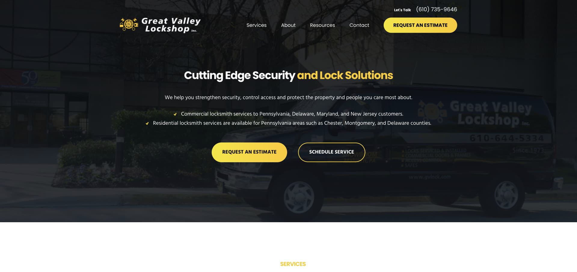
Great Valley Lockshop uses a dark photograph of its premises and vehicle as the background for a compact security-and-lock introduction. Yellow emphasizes part of the headline and the estimate action, while an outlined button provides a separate scheduling route. The small white navigation remains quiet above the composition. Two brief geographic lines distinguish commercial territory from the narrower residential area, which is more useful than a blanket claim to serve everyone. This is a strong regional reference for separating two contact intentions while keeping the business's own identity visible.
What you can learn
Give estimate requests and service scheduling different labels when they lead to different conversations. Keep commercial and residential coverage explicit, rather than allowing a single broad service-area statement to imply identical availability for both.
Pros
Yellow action styling remains recognizable without overwhelming the photograph.
Separate geographic statements acknowledge that residential and commercial coverage can differ.
Cons & considerations
The very dark background needs careful contrast testing for smaller supporting text.
A broad security headline should lead into concrete service and product explanations.
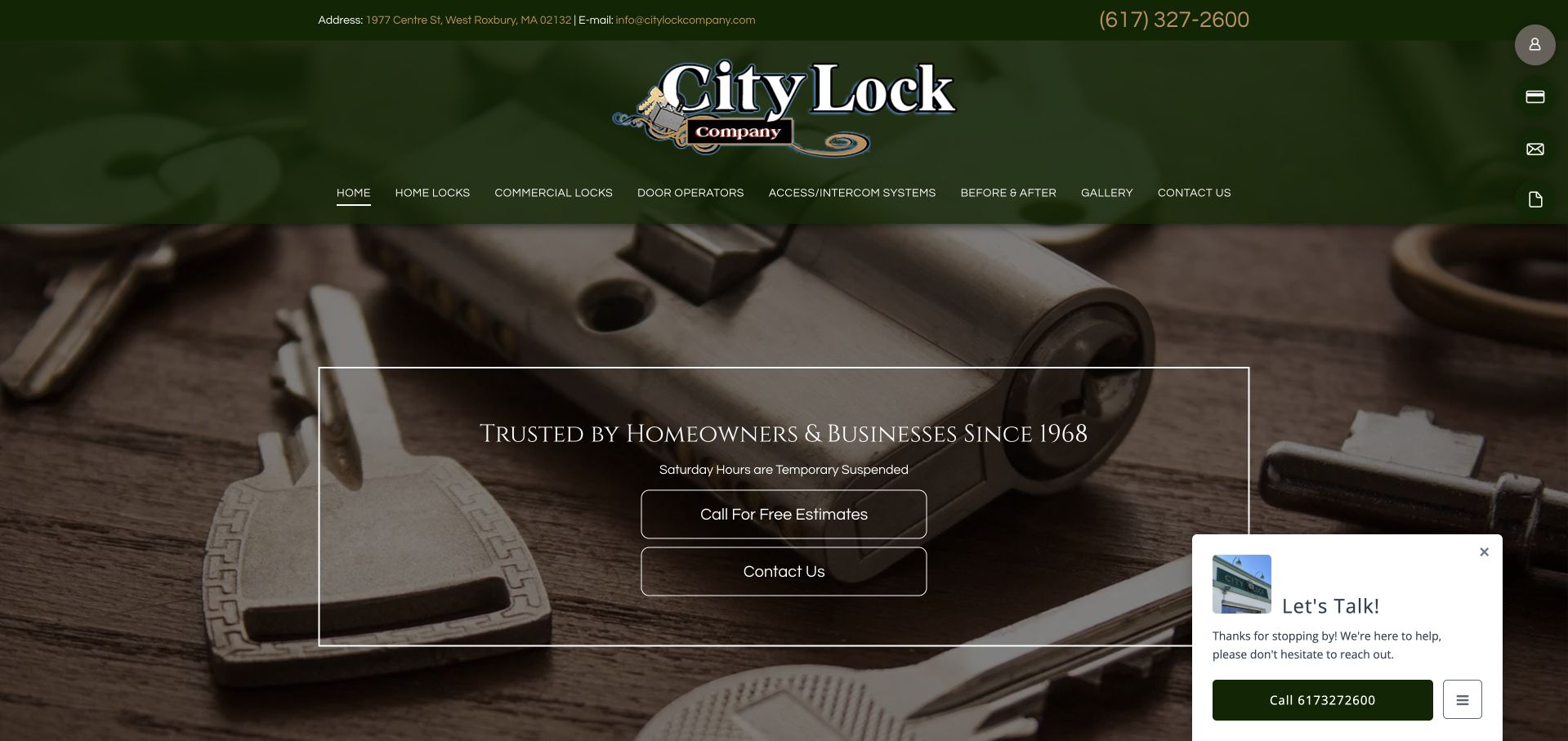
City Lock places its green company header above a large photograph of keys and lock hardware. A thin outlined panel contains the opening trust statement and two contact actions, rather than a long service paragraph. The navigation distinguishes home locks, commercial locks, door operators, access systems, project imagery, and contact information. That structure is useful for a business with both a showroom and field-service work. The familiar hardware image makes the trade immediately recognizable, while the green palette and traditional wordmark provide continuity across the header and hero.
What you can learn
Preserve useful product and service distinctions when modernizing a long-running shop website. Make showroom visits, mobile assistance, and project inquiries clearly different routes, and keep the local address and telephone information easy to find.
Pros
Hardware photography provides a literal visual context for the business.
The navigation recognizes different product and service categories rather than one vague offer.
Cons & considerations
Small navigation labels can be difficult to read against the dark green header.
A floating chat preview can compete with the two central contact actions.
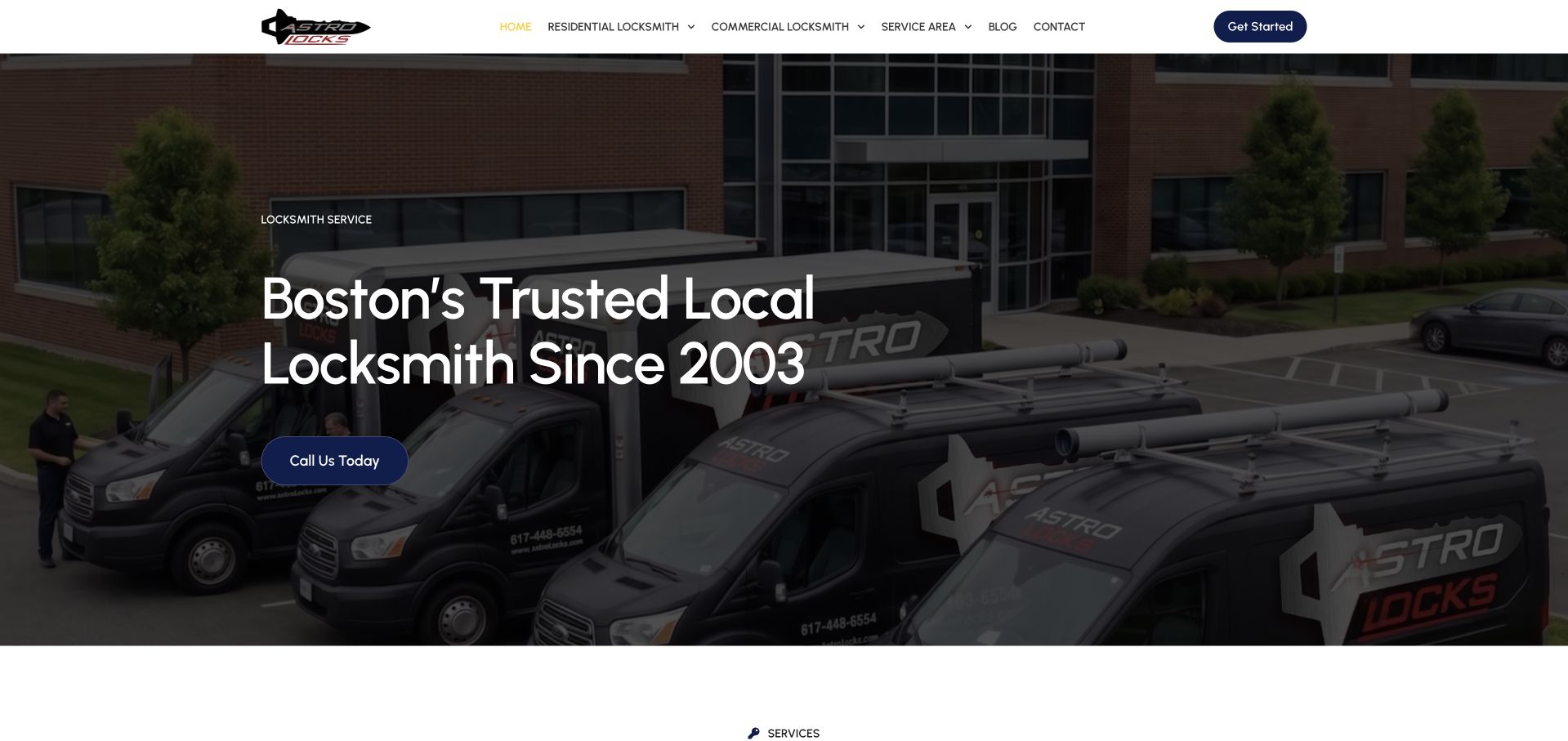
Astro Locks uses a photograph of several branded vans outside a commercial building. A large Boston locksmith headline and one blue call action sit over the darker left side, while a clean white header carries a compact service menu. The hero communicates local identity through actual company vehicles rather than a generic key illustration alone. The next section begins with service categories, creating a simple progression from company recognition to the work offered. Study the balance between the large photograph and the short text block: the image has room to communicate without forcing the headline into multiple competing panels.
What you can learn
Choose a company photograph with a planned quiet area for text and a useful mobile crop. Pair it with a literal service and location heading so the vehicle image supports a concrete inquiry rather than brand recognition alone.
Pros
The branded vans make the opening specific to the business.
A short headline and single contact action keep the first decision simple.
Cons & considerations
The broad photograph can crop important brand details on narrow screens.
The hero needs supporting coverage and service-scope information below the introductory claim.
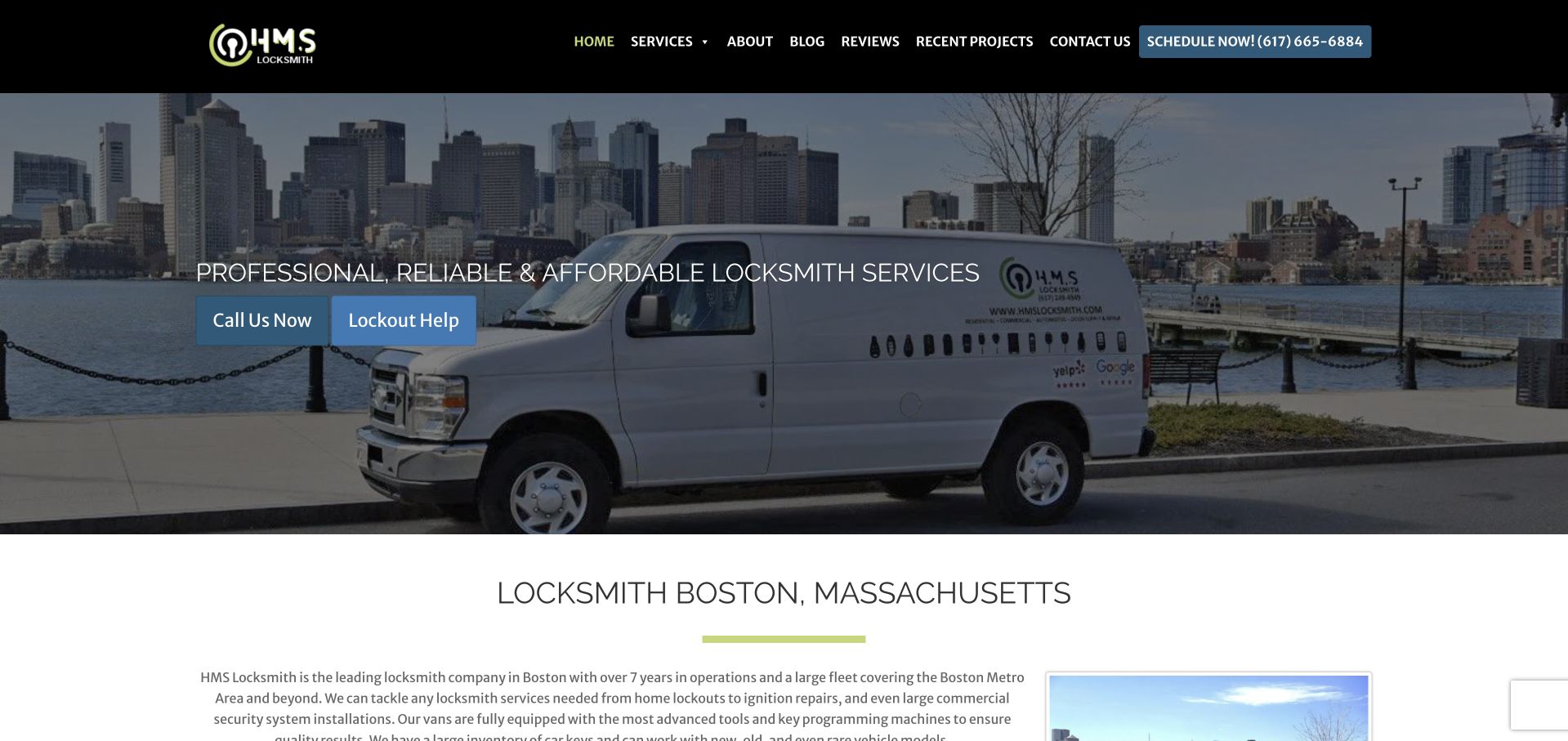
HMS places a branded service van in front of a Boston waterfront skyline. The photograph carries a short service statement and two blue actions for calling and lockout help, while a black header keeps the main navigation and scheduling number visible. A literal Boston locksmith heading appears immediately below the hero, followed by an introductory text section. This is useful for studying how a large regional photograph can be paired with a more explicit content heading beneath it. The vehicle and skyline work together as local identity cues, rather than asking a generic lock image to communicate everything.
What you can learn
Use place imagery to support the business context, then state the service and coverage in readable text. A lockout route should explain how to contact the company without publishing instructions that could compromise someone else's access or security.
Pros
The van-and-skyline photograph combines company and geographic identity.
A separate literal heading reinforces the local service after the visual introduction.
Cons & considerations
Text over a wide waterfront image needs a strong enough overlay for readability.
Multiple call and scheduling labels should lead to a consistent, understandable contact process.
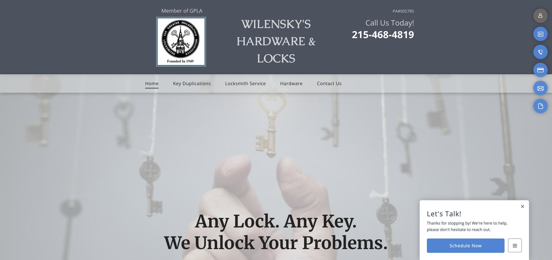
Wilensky's presents its name, association mark, and telephone number in a broad gray header above a pale key photograph. The navigation is deliberately literal, separating key duplication, locksmith service, hardware, and contact information. A large slogan sits near the lower edge of the hero, while the public page names the Philadelphia neighborhoods it serves in its content. This is useful as a contrast to newer app-style locksmith pages: the business is presented as a local hardware and lock shop, not solely as an emergency dispatch interface. The visual tone is restrained and familiar, although the large image delays some practical details.
What you can learn
Keep the shop's recognizable identity and useful category labels, but make the storefront and mobile-service relationship explicit. A redesign should improve reading and contact clarity without erasing the local business context customers already recognize.
Pros
Telephone information remains prominent beside the company name.
Literal navigation labels match common customer tasks such as key duplication.
Cons & considerations
The large pale photograph pushes detailed service information lower on the page.
A chat preview can overlap the lower part of the hero on smaller screens.
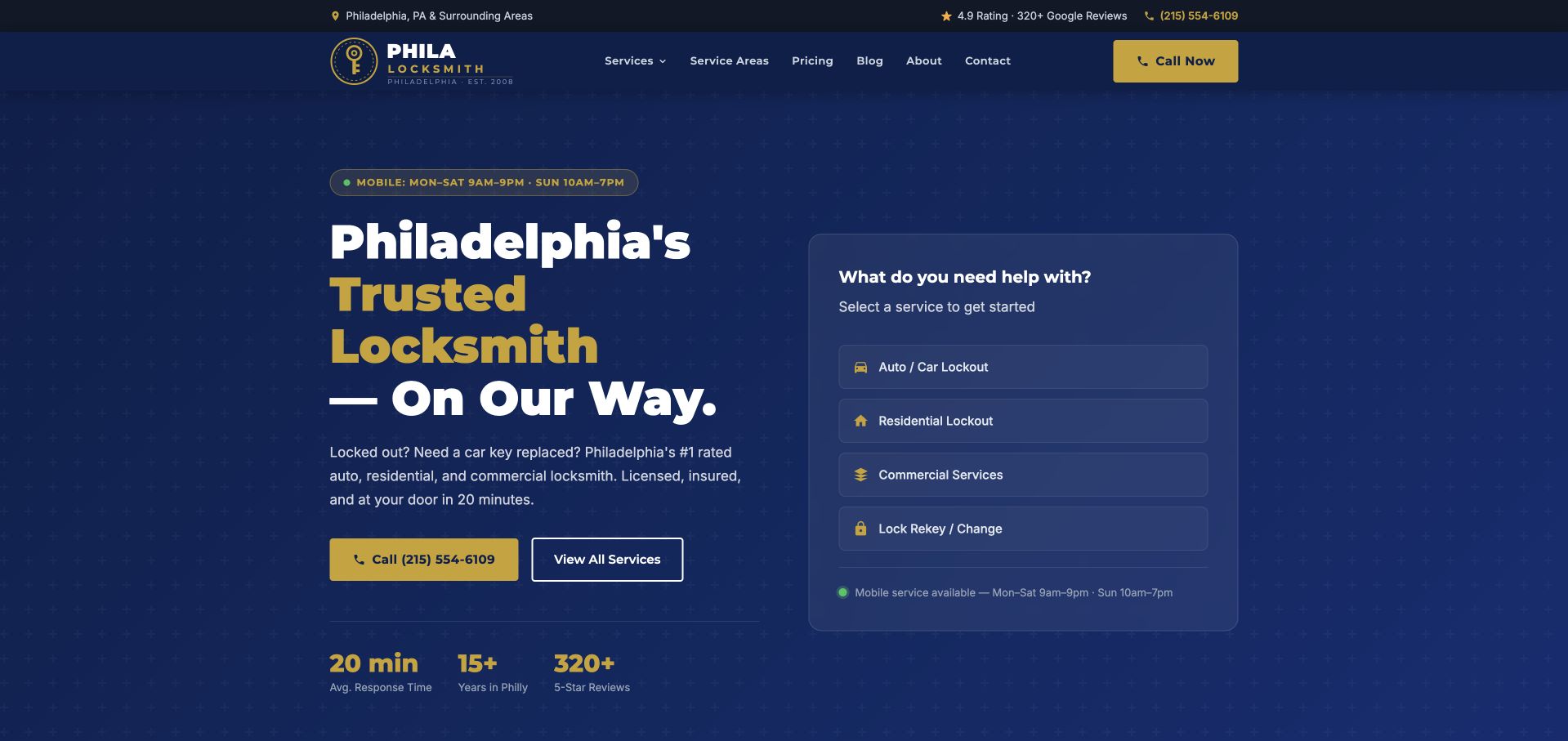
Phila-Locksmith uses a navy-and-yellow hero with a large Philadelphia headline on the left and a structured task card on the right. The card asks what the visitor needs help with and separates vehicle lockouts, residential lockouts, commercial services, and lock replacement or rekeying. This makes the first screen more useful than a single all-purpose emergency button. A call action remains visible beneath the headline for visitors who prefer speaking directly. The solid background also avoids the contrast problems of text over detailed hardware photographs. Study the clear relationship between the service message and the categorized next step.
What you can learn
Organize the first inquiry around the customer's situation, not the company's internal departments. Keep the telephone route available, and explain any identity or authorization requirements in the actual service process without exposing sensitive access details publicly.
Pros
The task card separates common inquiry types in an immediately scannable way.
Solid navy surfaces keep the yellow and white typography readable.
Cons & considerations
Several performance figures can compete with the more useful task-selection interface.
A category choice should not imply a confirmed dispatch or fixed arrival time.
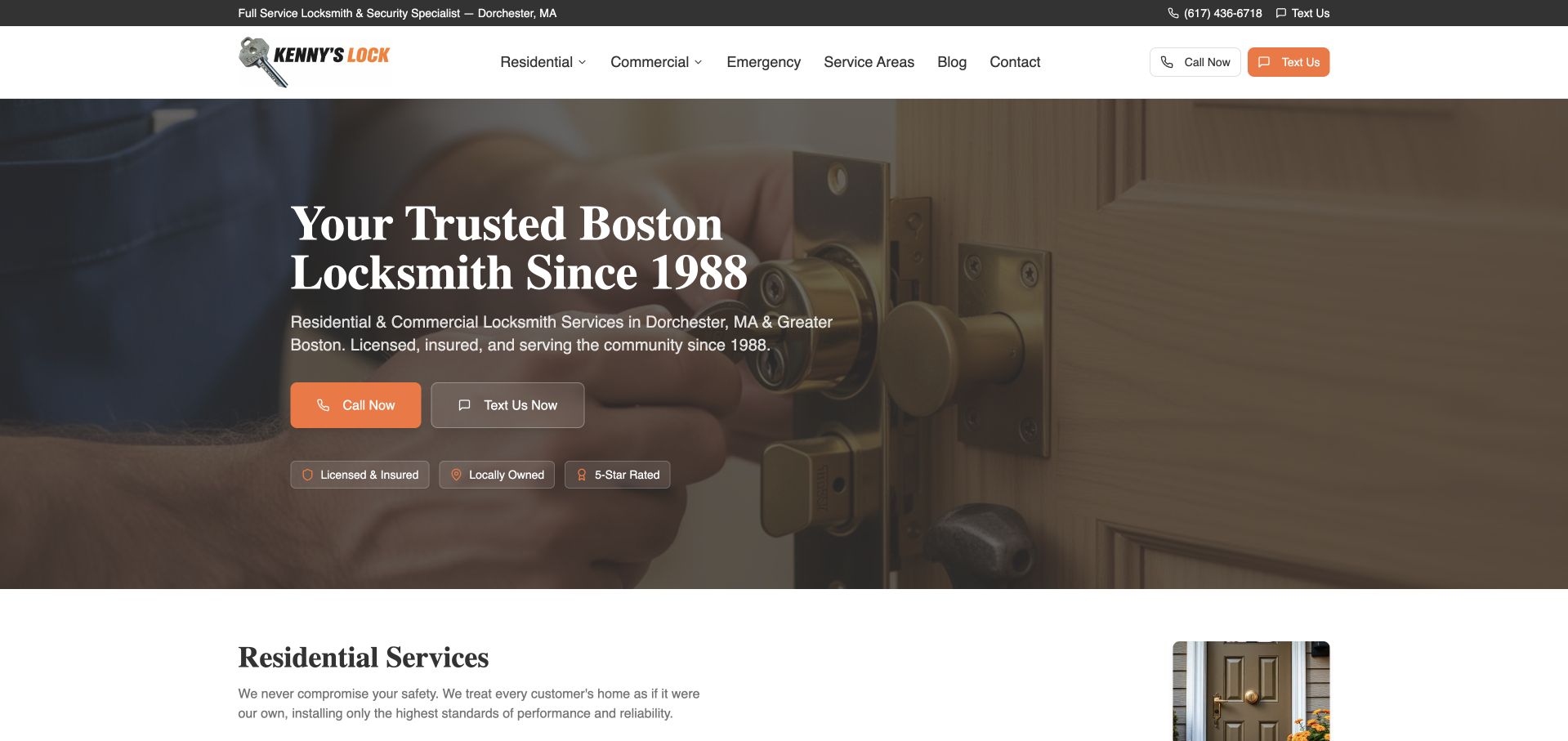
Kenny's Lock uses a close photograph of a door lock beneath a white navigation bar and narrow dark contact strip. A large serif Boston headline sits over the darker left portion of the image, followed by orange call and outlined text actions. Small supporting labels summarize the company's own local, licensing, and review claims. The residential-service section begins directly below the hero, making the page easy to move from introduction into service detail. This is useful for studying the contrast between a warm, traditional photographic opening and very literal contact choices. The two channels remain distinct without requiring a large form in the first screen.
What you can learn
Offer text and telephone routes only when both are maintained, and explain what each can accomplish. Keep licensing and review statements sourced, rather than relying on compact badge styling to imply independently verified service quality.
Pros
Call and text controls are distinct, adjacent, and easy to identify.
The service catalog begins soon after the local introduction.
Cons & considerations
The lock photograph requires careful crop and overlay choices behind the text.
Small reassurance labels need readable sizing and links to supporting context.
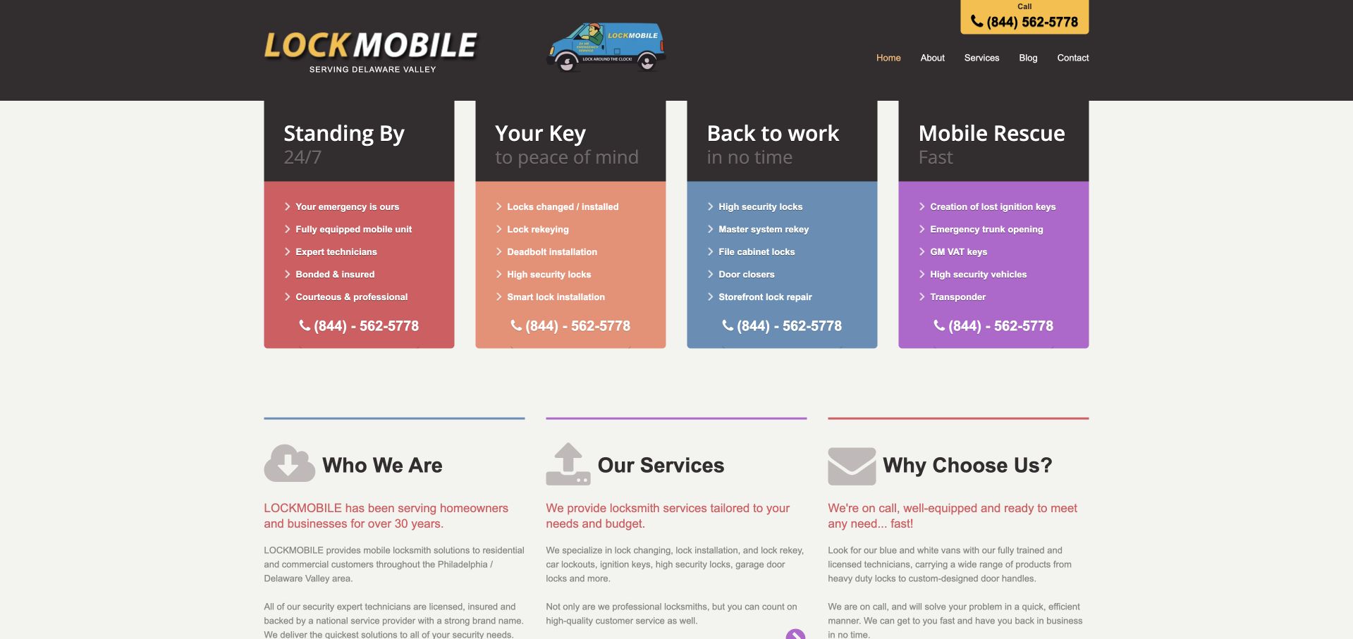
Lockmobile organizes its opening into four colored columns for emergency, residential, commercial, and automotive work. Each column has a short heading, service bullets, and a repeated telephone number. The dark header carries the company name and a small service-vehicle illustration, while three lower text blocks introduce the company, services, and reasons to inquire. This is a useful alternative to the dominant full-width photograph pattern. It exposes the service taxonomy immediately and makes clear that a customer can enter through different needs. The older compact layout is not a model for current type sizing, but its information organization remains worth studying.
What you can learn
Use a small set of customer-recognizable categories when the work genuinely differs. Preserve the clear separation while improving spacing, reading size, and mobile stacking, so each category remains usable without tiny columns or repeated visual clutter.
Pros
Four clearly different categories make the service range visible immediately.
Repeated contact access avoids forcing visitors back to a single top-level button.
Cons & considerations
Narrow columns and small bullets are difficult to read at smaller widths.
Repeated telephone labels need accessible names that identify the intended contact action.
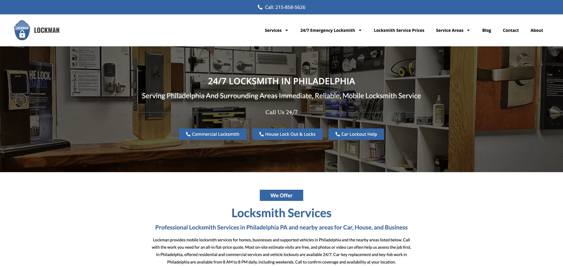
Lockman places a short Philadelphia service headline over an interior hardware-shop photograph. Three blue actions below the text distinguish commercial work, house lockout and locks, and vehicle help. A slim blue telephone strip sits above a simple white navigation bar, while the service explanation begins immediately under the hero. This arrangement is useful because the photograph remains a relatively shallow introduction rather than taking over the full first screen. The visitor reaches literal service information quickly. The design also shows the benefit of pairing a broad locksmith label with concrete customer situations, rather than relying only on a general promise of reliability or security.
What you can learn
Keep a compact hero when customers need service details early. Use situation-specific action labels, but make sure their destinations explain scope and contact rather than presenting an online category selection as a confirmed visit.
Pros
Three task-oriented actions make the broad locksmith offer more concrete.
The short hero leaves room for a service explanation within the first screen.
Cons & considerations
Small white text over a detailed shop photograph needs careful contrast.
Several service routes and a broad menu can become redundant without consistent destinations.
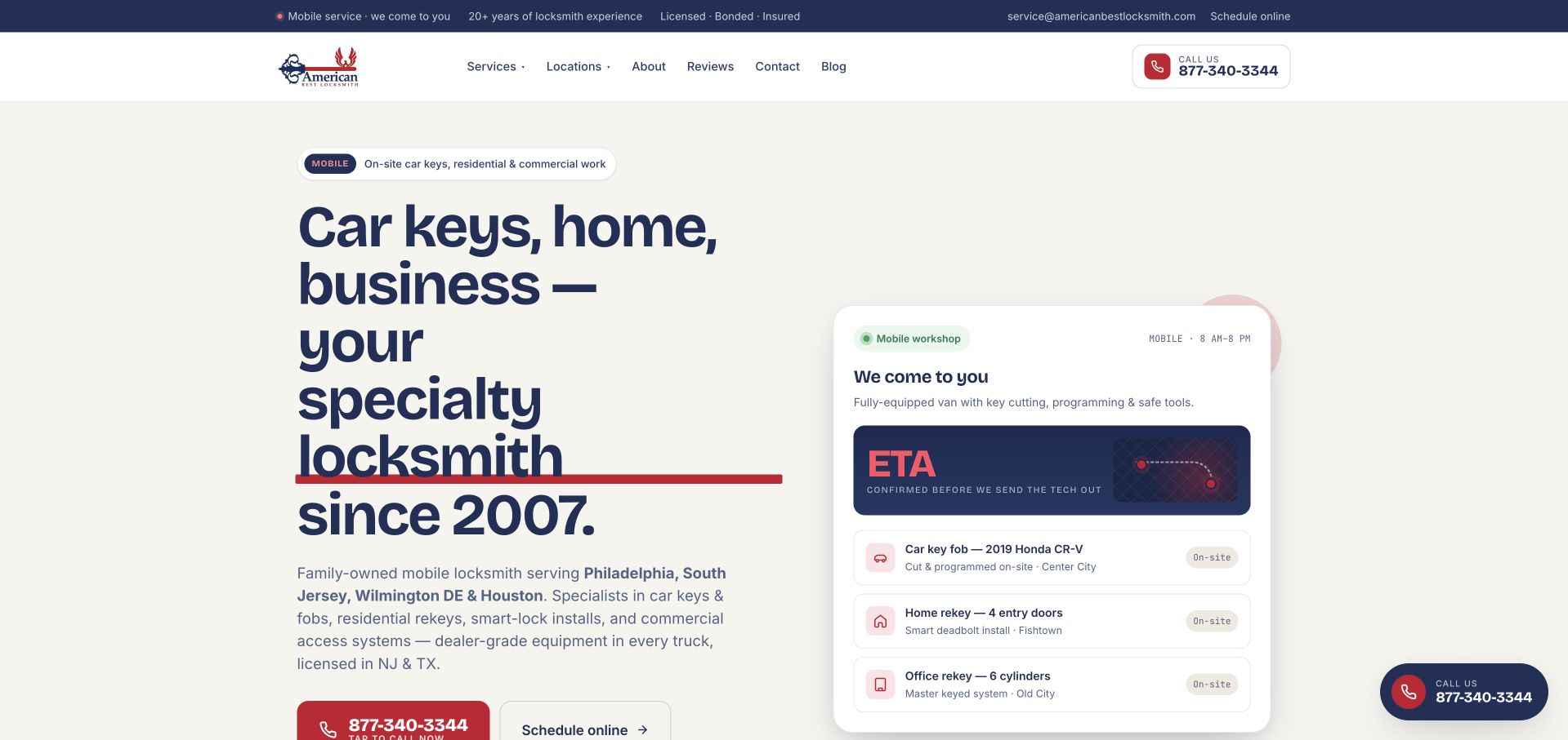
American Best uses a cream background and oversized dark type to introduce car keys, home, and business work. A red underline emphasizes the specialty message, while a product-like card on the right illustrates a mobile-service journey and several customer situations. Telephone and online scheduling actions sit below the introduction, and the header keeps service and location menus compact. The page is useful for studying how a field-service business can borrow the clarity of a software interface without pretending the service itself is an app. The card should be understood as a website presentation, not as independently observed live dispatch or an actual arrival guarantee.
What you can learn
Use an illustrated process card to explain what a mobile service does, but label simulated status or example timing appropriately. Keep real scheduling confirmation distinct from any decorative tracking interface shown in the marketing page.
Pros
The cream surface gives the large service statement strong reading contrast.
The right-hand card organizes mobile-service context without a long paragraph.
Cons & considerations
Status and arrival-style graphics can be mistaken for a live operational promise.
The oversized headline needs deliberate wrapping and spacing on smaller displays.
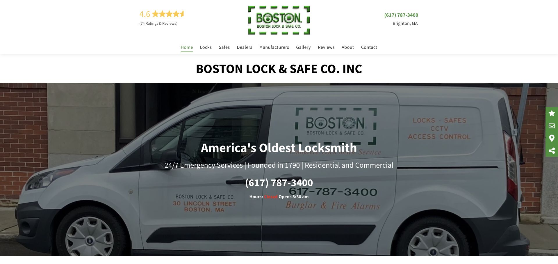
Boston Lock & Safe places its company name and green mark above a large photograph of a branded van. The hero overlays a short heritage statement, residential and commercial context, and a large telephone number. A compact navigation bar includes safe, dealer, manufacturer, gallery, review, company, and contact routes. This is useful as a reference for a business whose catalog extends beyond emergency lockouts into safes and related products. The van gives the page a concrete company asset, while the telephone number remains more prominent than a complicated form. The historical claim is part of the business's own public presentation, not an independently established comparative ranking in this guide.
What you can learn
Use heritage and product breadth as supporting context, but keep the current service and storefront details explicit. Visitors should understand whether they need a shop visit, product discussion, or mobile-service inquiry before contacting the team.
Pros
A large telephone number supplies a direct contact route over the branded vehicle image.
Safe and manufacturer navigation acknowledges the wider product catalog.
Cons & considerations
The heritage headline can overshadow the specific service a new visitor needs.
Several small header elements need a simpler responsive hierarchy on mobile.
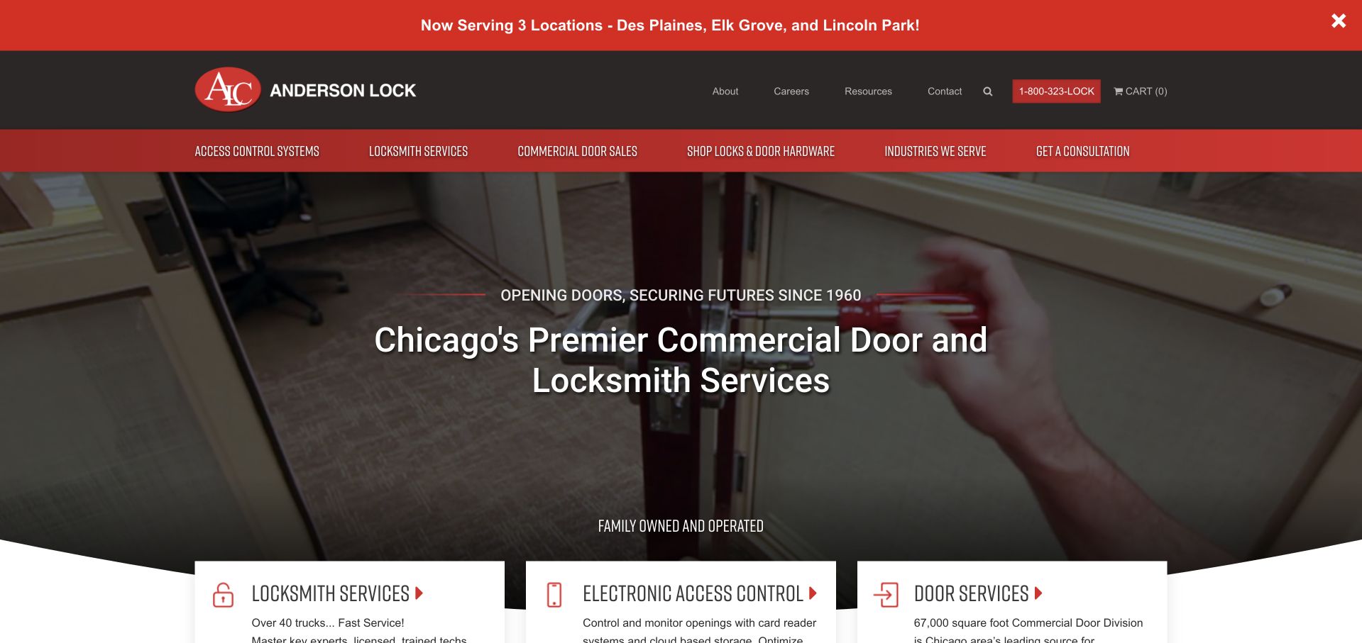
Anderson Lock uses red-and-black branding around a large commercial-door and locksmith heading. The photograph shows hands working at a door, while three white service cards overlap the hero's lower edge for locksmith work, electronic access control, and door services. A narrow upper announcement bar names service locations, and the main menu also exposes a hardware-shopping route. This is useful for a business with project and product work that goes beyond a simple lockout call. The three-card transition gives visitors a way to understand that broader catalog without reading a dense introductory list. The design reference concerns service organization, not an assessment of the security effectiveness of any product or installation.
What you can learn
Separate door, access-control, and locksmith project inquiries when their scope differs. Keep product shopping distinct from a service request, and reserve property-specific security recommendations for an appropriately reviewed professional conversation.
Pros
Three service cards create a clear transition from brand introduction to catalog.
The header distinguishes project consultation from hardware shopping.
Cons & considerations
An announcement bar adds another layer above an already detailed navigation.
Overlapping cards need careful stacking and spacing on narrow screens.
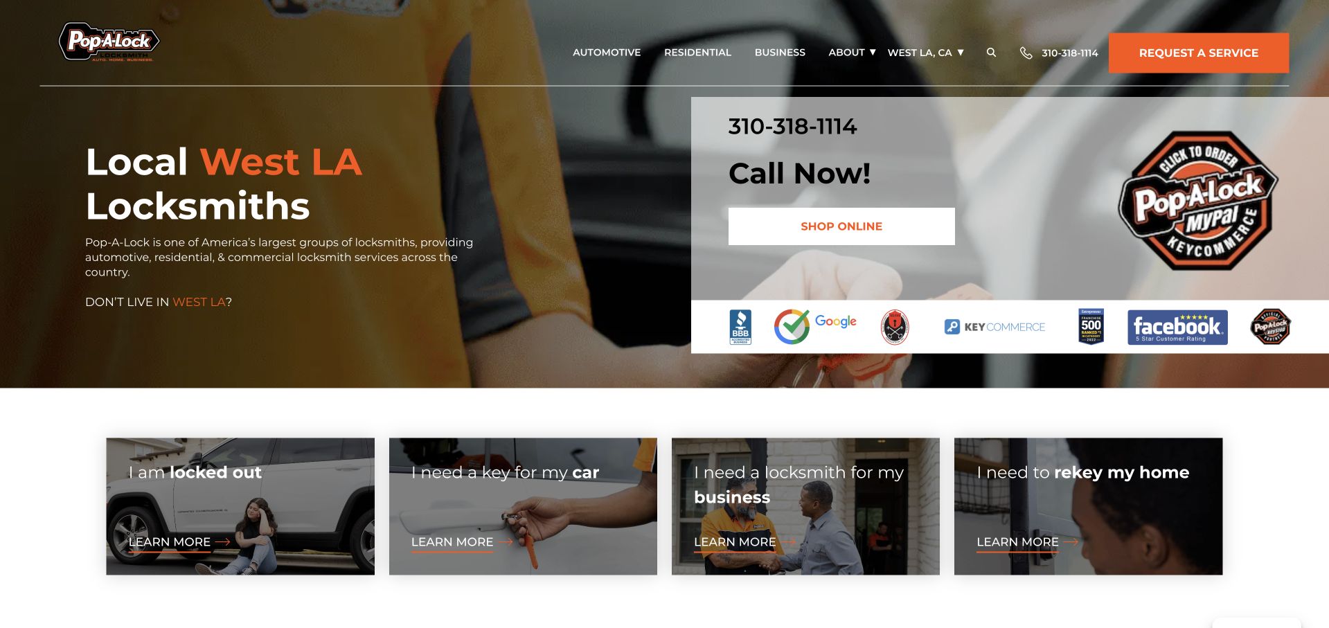
Pop-A-Lock's captured public homepage displayed a West Los Angeles service presentation. A short local heading appears over a working photograph, with a white telephone-and-shopping card on the right and four situation-based tiles beneath. The tiles distinguish being locked out, needing a vehicle key, business help, and home rekeying. This is useful for studying a national brand's transition into a local customer task. The selected area is visible and correctable rather than hidden, while the service tiles give visitors more guidance than a single generic emergency button.
What you can learn
Make the receiving location visible before collecting a request. A national brand should not imply identical availability or scope across every office, and an independent company should not imitate a locator merely to appear larger than it is.
Pros
A recognizable network identity can help visitors orient before choosing a local route.
Location-based organization supports a genuinely distributed service operation.
Cons & considerations
The extra routing step is unnecessary for many single-region businesses.
Local service scope and contact responsibility need explicit confirmation after office selection.
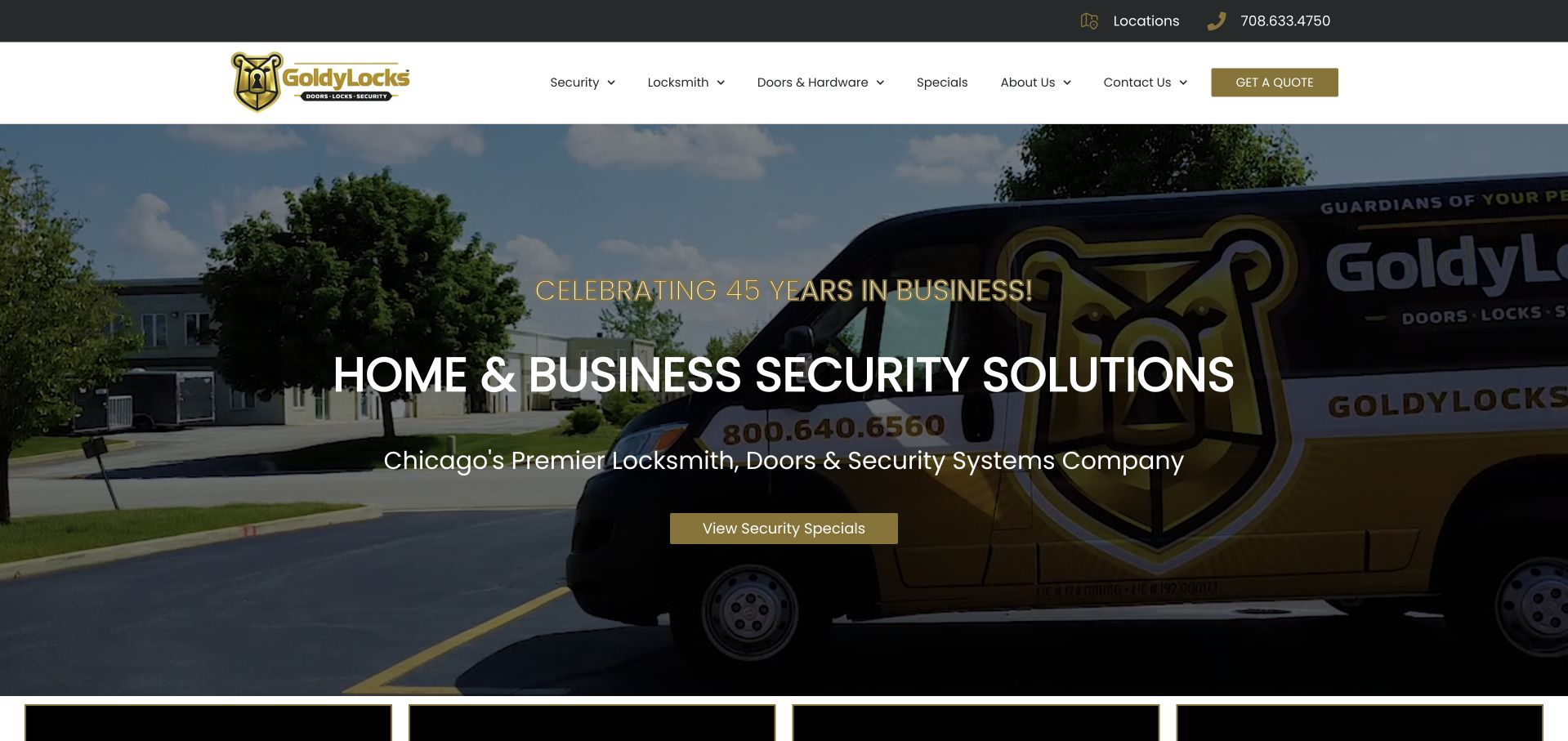
Goldy Locks places a large branded vehicle behind a home-and-business security headline. White text sits over a darkened photograph, with a muted gold action matching the header and company mark. The navigation separates security, locksmith work, doors and hardware, specials, company information, and contact. This is useful for studying a broader catalog that cannot be explained by an emergency locksmith label alone. The service vehicle links the visual presentation to the actual brand, while the category names give visitors a way to investigate their particular need. The page's anniversary and qualification statements are company claims, not an independent evaluation of its products, installations, or service outcomes.
What you can learn
Use catalog distinctions that reflect how the business handles real inquiries. Keep locksmith, door, and security-system work clearly described, and avoid implying that a broad security headline establishes suitability for a particular property's risks.
Pros
The vehicle photograph gives the wider service catalog a company-specific visual anchor.
Navigation categories distinguish locks, doors, and other security products.
Cons & considerations
A broad security headline needs concrete scope information close beneath it.
Text over vehicle graphics requires careful contrast and responsive cropping.
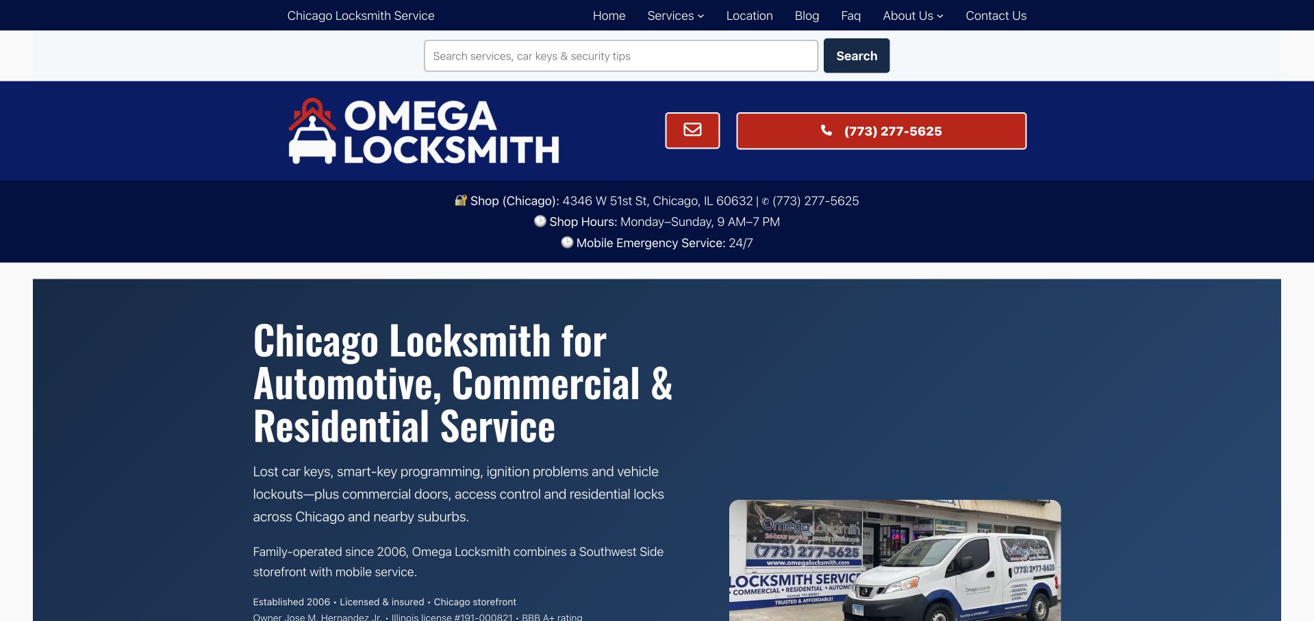
Omega Locksmith uses a dark blue introduction with a large heading naming automotive, commercial, and residential service in Chicago. A small vehicle image supports the text rather than occupying the full hero. Above it, the header makes the shop address, opening hours, emergency-service context, search, and telephone route visible. This is useful for a business that has both a physical shop and mobile work, because customers may need different information for each. The design favors explicit service and location detail over a large decorative image. It also shows the challenge of fitting several practical header functions into a coherent first-screen hierarchy without making everything equally prominent.
What you can learn
Distinguish storefront hours from any separately offered mobile or emergency contact. Keep the address and service categories readable, and avoid assuming that a large telephone banner explains where or how a customer will receive help.
Pros
The heading names the three principal customer categories in literal language.
The header exposes shop and telephone context before a visitor scrolls.
Cons & considerations
Several stacked header bands consume space before the main introduction.
Shop hours and emergency wording need clear separation to avoid conflicting expectations.
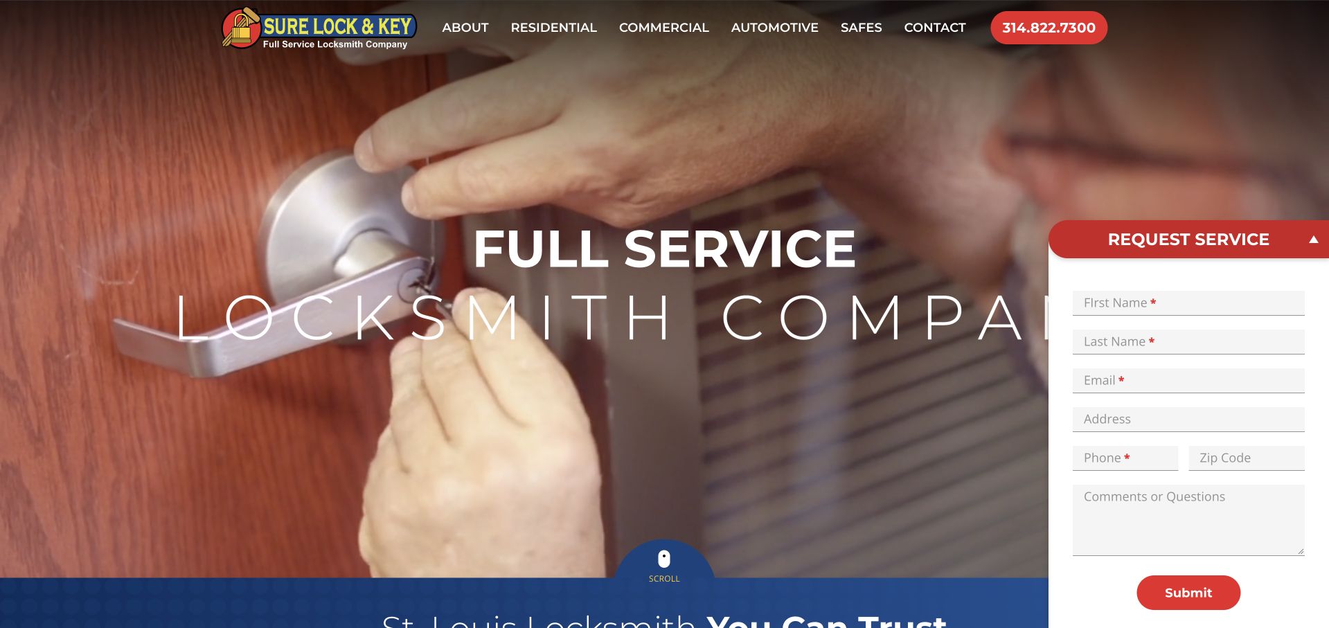
Sure Lock & Key uses a close photograph of a hand turning a door handle beneath a compact red-and-black header. A large white full-service heading spans the image, and a tall request panel sits on the right with contact, address, and message fields. The navigation separates residential, commercial, vehicle, safe, company, and telephone routes. This is useful for comparing a local business with similarly named networks: the company and region need to remain unmistakable. The photograph gives a literal lock-service context, while the first-screen form makes the inquiry task prominent but substantial.
What you can learn
Use consistent company naming, location information, and contact details throughout the site. Make sure a request clearly identifies the business receiving it rather than relying on a familiar-sounding brand name or a generic locksmith category.
Pros
A locally scoped company page can avoid unnecessary national-directory steps.
Clear business identity helps distinguish similarly named providers.
Cons & considerations
The local territory and service boundaries still need explicit supporting detail.
A polished local presentation cannot independently verify qualifications, pricing, or response time.
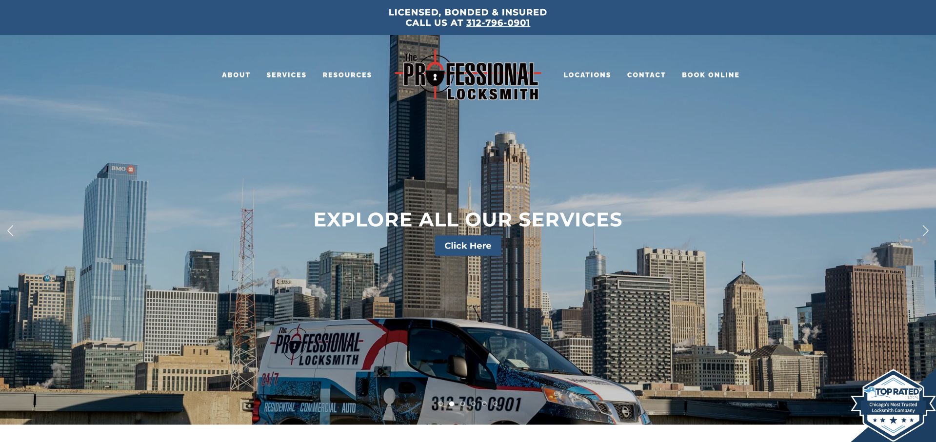
The Pro Lock places a branded vehicle against the Chicago skyline, with a short service-exploration action centered over the image. A blue upper strip carries licensing and telephone claims, while the main navigation is set directly over the photograph. The opening is visually place-led rather than form-led, and the service catalog begins below it. This is useful for studying how skyline imagery can establish a metropolitan identity while the branded vehicle keeps the scene tied to the company. The tradeoff is that a broad explore-services label asks the visitor to take another step before seeing a specific service path or inquiry choice.
What you can learn
Use regional imagery as context, but keep essential service and contact information readable outside the photograph. A specific customer-task action is often clearer than a generic invitation to explore when visitors are trying to solve an immediate problem.
Pros
The skyline and branded vehicle combine geographic and company recognition.
A simple blue contact strip separates practical information from the image.
Cons & considerations
Navigation placed over a photograph depends on consistent contrast at every crop.
A broad services action gives less guidance than situation-specific entry points.
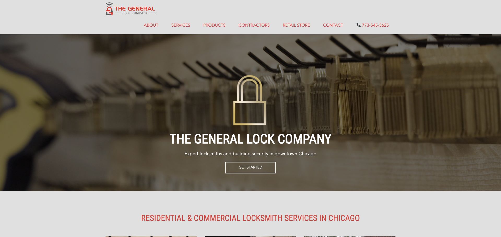
General Lock uses a shallow photograph of hanging keys behind a centered company title and a small get-started action. A pale header provides company, service, product, contractor, retail-store, and contact routes, with a literal Chicago residential-and-commercial heading directly below the hero. The minimal opening is useful for a business whose visitors may be customers, contractors, or retail shoppers rather than one uniform audience. The key display communicates the trade without a dramatic emergency scene. Study the contrast between the very short photographic introduction and the more explicit service statement beneath it. The visual restraint works best when those following sections answer the practical questions the hero intentionally leaves open.
What you can learn
Keep audience routes recognizable and make the storefront relationship explicit. If the hero is deliberately minimal, ensure that service categories, address information, and contact expectations follow immediately rather than requiring several exploratory clicks.
Pros
The key-display photograph gives the trade a simple, literal visual cue.
Retail and contractor routes acknowledge different visitor needs.
Cons & considerations
The small get-started label does not explain the destination or next step.
Minimal hero copy relies on the following section for geographic and service clarity.
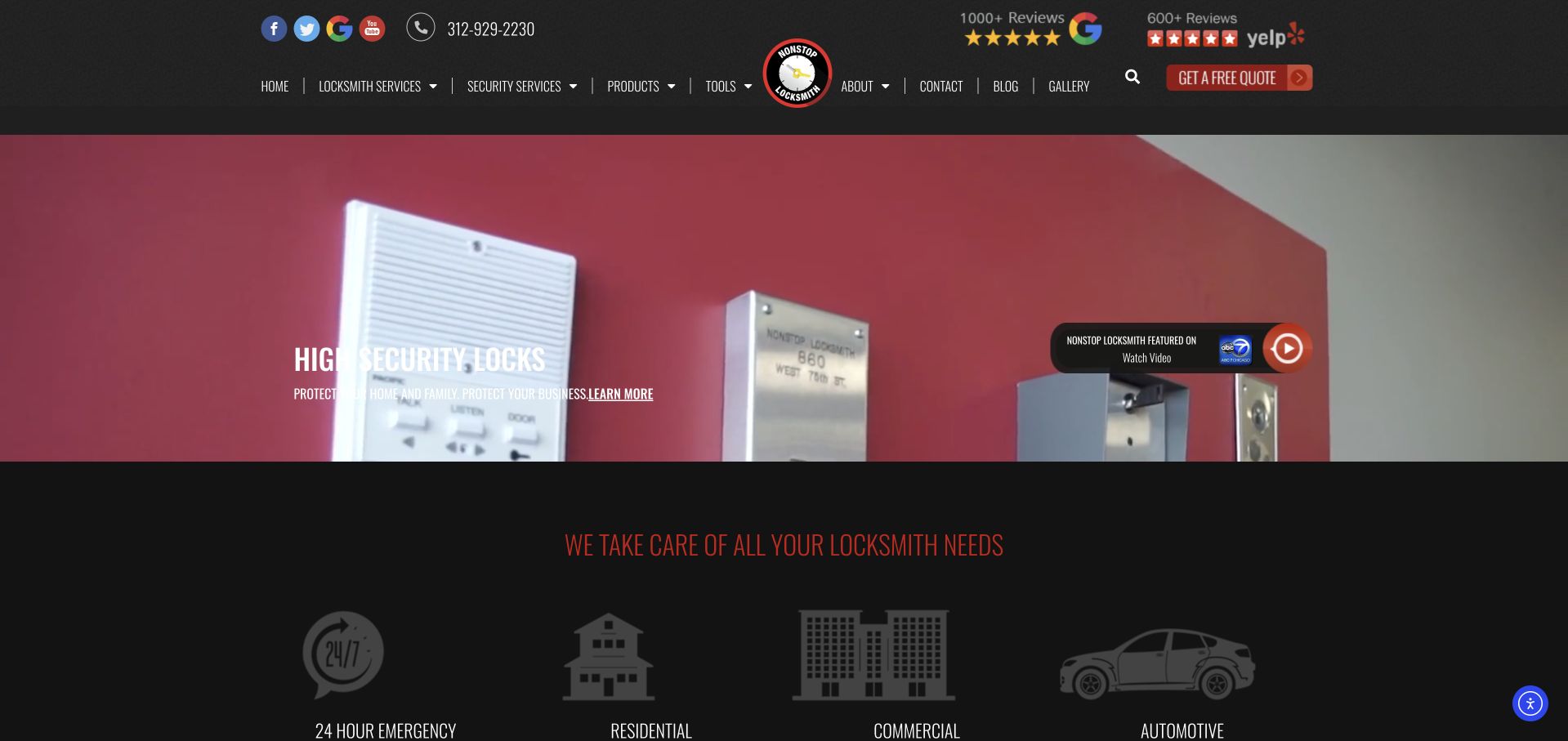
Nonstop Locksmith gives a large hardware photograph the main visual role beneath a dark header filled with contact and review marks. The following black section introduces emergency, residential, commercial, and automotive work with simple white icons. A red quote control remains visible in the navigation. This is useful for studying how product imagery and service navigation can coexist without making the hero list every offering. The slideshow should be treated as a changing visual state rather than the only place a key message appears. The page also illustrates a density tradeoff: several review marks, social icons, telephone details, and navigation labels compete in a comparatively shallow header.
What you can learn
Keep essential service categories and contact information outside rotating media. Use hardware imagery to introduce the work, but make sure visitors can distinguish buying a product from requesting installation, repair, or mobile assistance.
Pros
Four service icons give the broad catalog a simple visible structure.
The quote action is differentiated from the rest of the dark navigation.
Cons & considerations
The header contains many small marks and links competing for attention.
A slideshow should not carry service information unavailable in ordinary text.
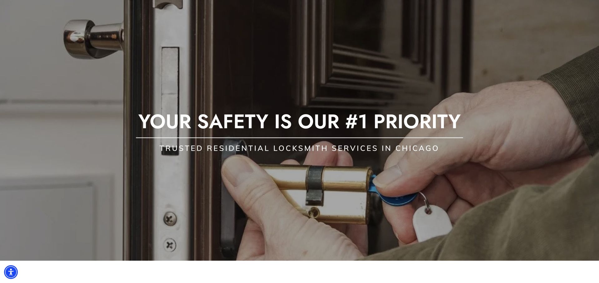
Chicago Lock & Key opens with a close photograph of hands working on a door lock. White text identifies the safety theme and residential locksmith context, while the header uses a simple white navigation bar with the blue company mark. Unlike the sites that emphasize a fleet or skyline, this image puts the physical work itself at the center. The design is useful for studying a narrower residential-service message within a familiar contractor-page pattern. It also shows why image selection matters: the visible working area gives the text enough context without requiring a decorative illustration. Practical contact and service information still need to remain easy to reach beyond the opening statement.
What you can learn
Use task-specific photography to support a narrow service focus, but avoid presenting a general safety slogan as a property-specific security recommendation. Keep the literal service heading, contact route, and authorization process separate from the emotional message.
Pros
The working-hands image makes the residential lock context immediately recognizable.
A restrained header avoids competing with the large photographic opening.
Cons & considerations
A broad safety headline offers less practical detail than a service-specific action.
Text over detailed hardware needs careful contrast and mobile crop testing.
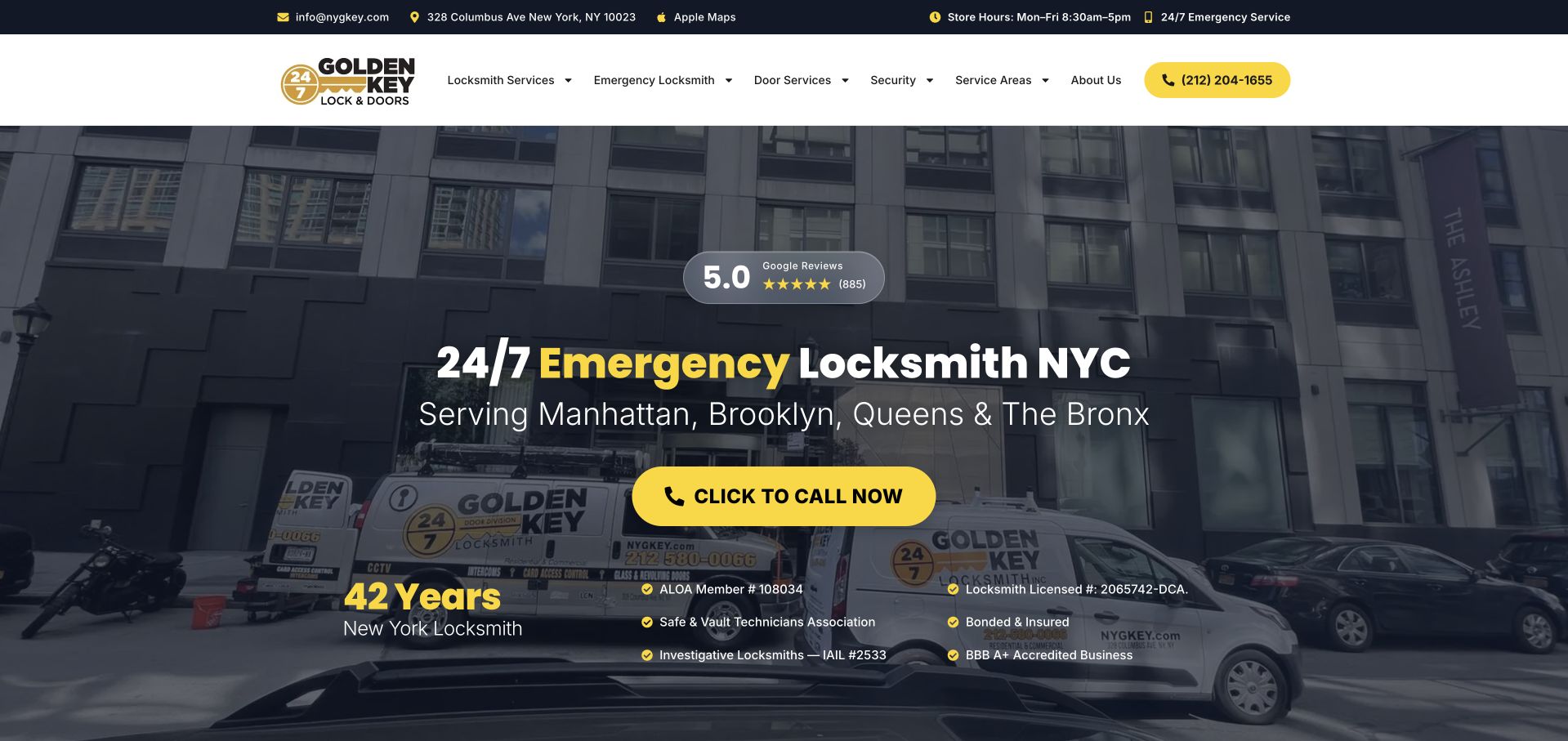
Golden Key uses a darkened streetscape and branded service van behind a large New York emergency-locksmith heading. The supporting line names Manhattan, Brooklyn, Queens, and the Bronx, while a bright yellow telephone button provides the clearest action. A review summary sits above the heading, and a lower band combines experience wording with qualification marks. The header also exposes a shop address and opening context. This is useful for studying how geographic specificity can be incorporated without a large locator interface. The page states the boroughs directly, leaving room for a recognizable company photograph and a clear contact route rather than asking every visitor to begin with a complex directory search.
What you can learn
Name the actual areas served and distinguish shop hours from any separate mobile contact arrangements. Keep review and qualification sources accessible, and avoid treating prominently displayed experience figures as independent proof of service suitability.
Pros
The borough line gives the broad New York heading a concrete coverage context.
Yellow telephone styling remains easy to find against the dark image.
Cons & considerations
Several review and qualification elements can crowd the first screen.
Shop opening information and emergency wording need clear, nonconflicting explanations.
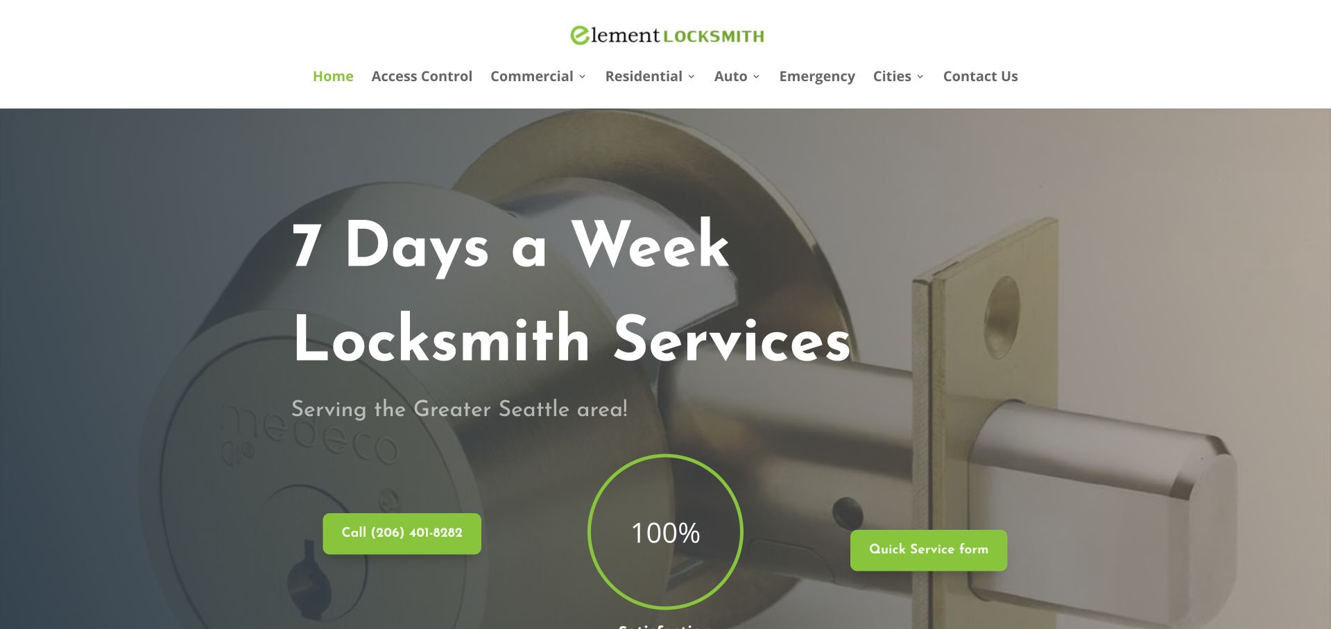
Element Locksmith uses a pale close-up lock photograph under a dark overlay, with rounded white lettering announcing its service availability and Seattle area. Two bright green actions provide calling and a quick-service form, separated by a circular graphic. A white header carries the green mark and literal service categories, including access control, commercial, residential, vehicle, and emergency routes. The design is useful for its limited color vocabulary and short opening message. The hardware image supplies a familiar context without a large vehicle scene or skyline. Its simplicity also exposes the need for meaningful labels: a numerical graphic or broad availability line requires explanation rather than being left to imply a specific service guarantee.
What you can learn
Use a small number of strongly differentiated contact options, and explain the actual next step for each. Avoid unexplained percentage graphics or availability language that visitors could mistake for a guaranteed result or dispatch arrangement.
Pros
Green actions provide a clear contrast against the subdued lock photograph.
Literal service categories remain visible in the white header.
Cons & considerations
The circular percentage graphic needs a meaningful, accessible explanation.
The introductory availability message leaves detailed scope and territory questions for later sections.
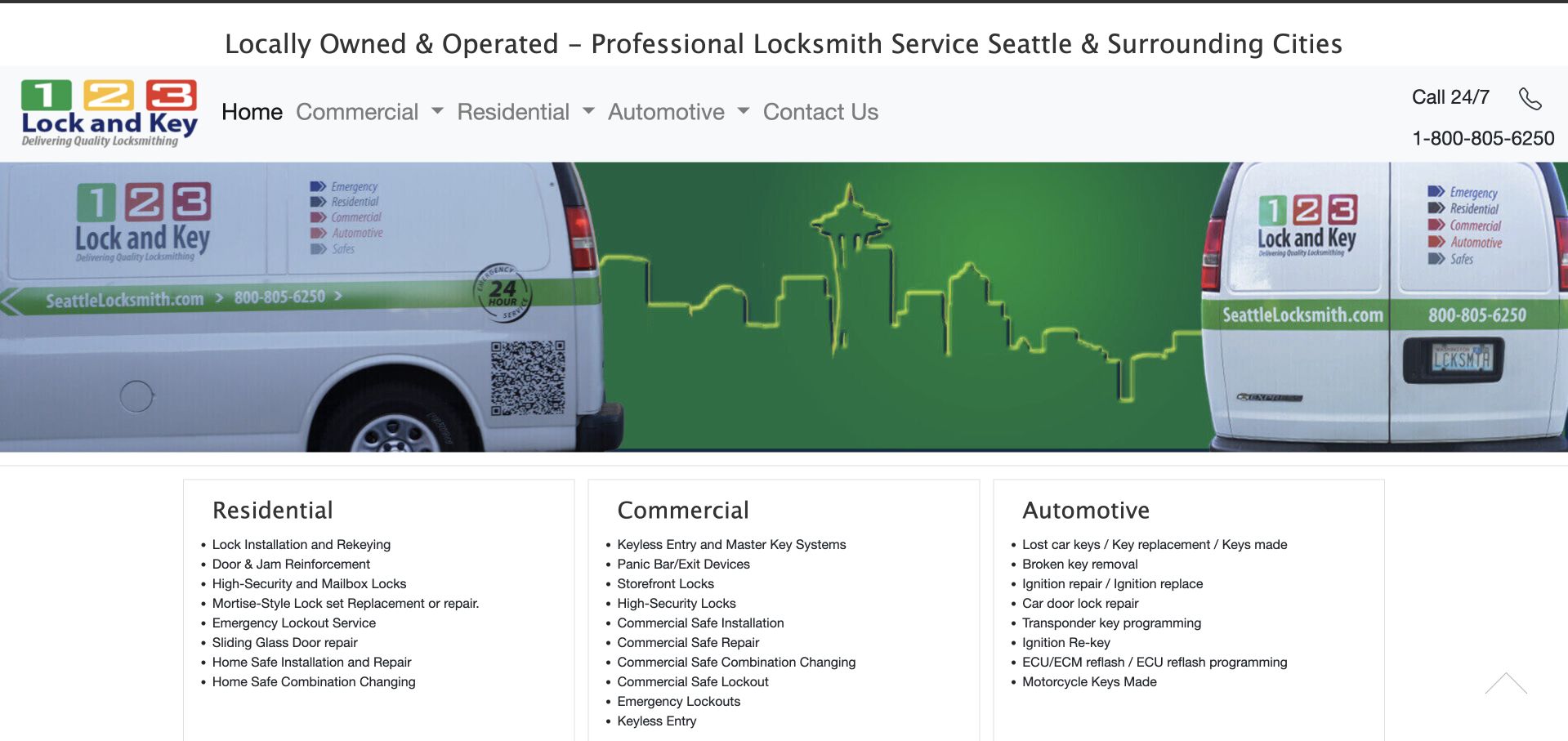
123 Lock and Key pairs a wide branded-vehicle image with three immediately visible service columns. Residential, commercial, and automotive headings lead into detailed lists, so the first screen exposes far more catalog information than a single generic hero button. The white header includes a telephone route and a short local-ownership statement, while the green vehicle graphics reinforce the company identity. This is useful as an information-architecture reference for a business with many specific service tasks. The lists make the breadth visible, but they also reveal the limits of compact desktop columns: a redesign needs to preserve useful specificity without making every item small or equally prominent.
What you can learn
Organize detailed service lists under a few customer-recognizable headings. Prioritize the most common tasks, then use dedicated pages for depth so mobile visitors are not confronted with three dense columns of tiny text.
Pros
The three audience headings make the service taxonomy visible immediately.
Branded vehicle imagery supports a specific local company identity.
Cons & considerations
Long service lists can become difficult to scan at narrow widths.
The page needs a clear primary inquiry route alongside the detailed catalog.
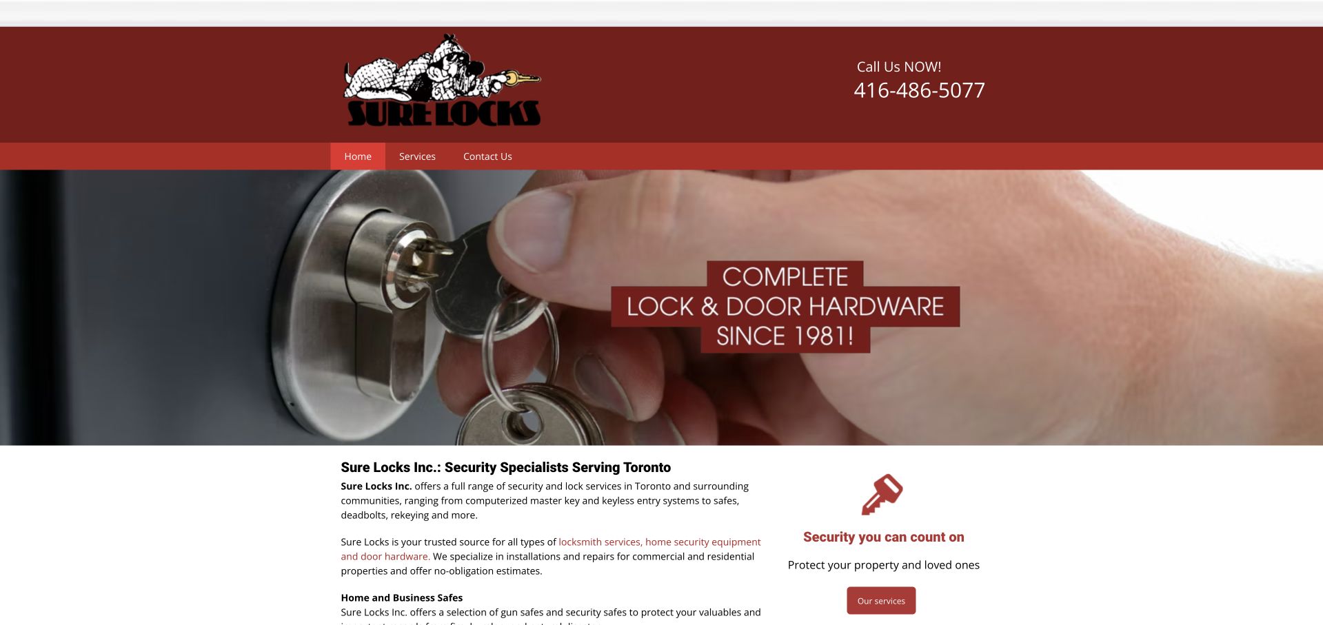
Sure Locks uses a burgundy company header above a shallow photograph of a key turning in a door. A short hardware-and-lock statement sits over the image, with the literal Toronto company introduction immediately below. The narrow text section explains the broader service and safe catalog beside a small estimate card. This is useful for studying a shop-centered business rather than a dispatch-only presentation. The telephone is prominent in the header, and the restrained image height leaves room for service information within the opening screen. The compact navigation could offer clearer routes into the wider catalog.
What you can learn
Separate shopping, advice, and service-inquiry tasks in the navigation. Keep product information readable and current, while reserving property-specific recommendations and authorization checks for the appropriate professional service process rather than a generic marketing form.
Pros
A shop-centered catalog can give product research its own clear route.
Local business context avoids the unnecessary complexity of a national office directory.
Cons & considerations
A mixed product and service offer needs a carefully labeled contact hierarchy.
Broad security wording cannot substitute for current product scope and service-area detail.
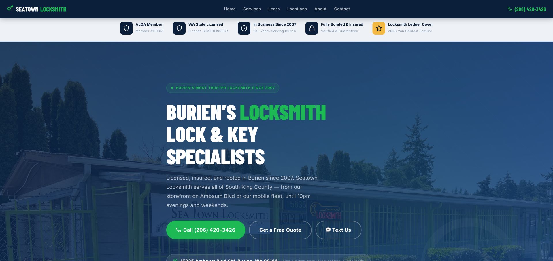
Seatown uses a navy-and-green composition around a large Burien locksmith heading. A subdued storefront photograph sits behind the copy, while three clearly differentiated controls offer a call, a quote request, and texting. A pale proof strip above the hero separates membership, licensing, business-history, insurance, and publication context into small blocks. The local heading is especially useful because it names a specific city rather than relying only on a broad Seattle-region label. Study the relationship between the storefront image and the contact choices: the site presents a real local base while still making remote inquiry channels obvious. The marks remain company-supplied claims requiring their own context.
What you can learn
Explain the relationship between storefront visits and mobile service in ordinary language. Keep call, quote, and text routes distinct, and make sure any public qualification or publication marks link to appropriate supporting information.
Pros
The specific city heading establishes local relevance before a request begins.
Three contact channels are differentiated without requiring an immediate long form.
Cons & considerations
A dense qualification strip can become very small on mobile.
The dark storefront image needs careful contrast behind supporting copy.
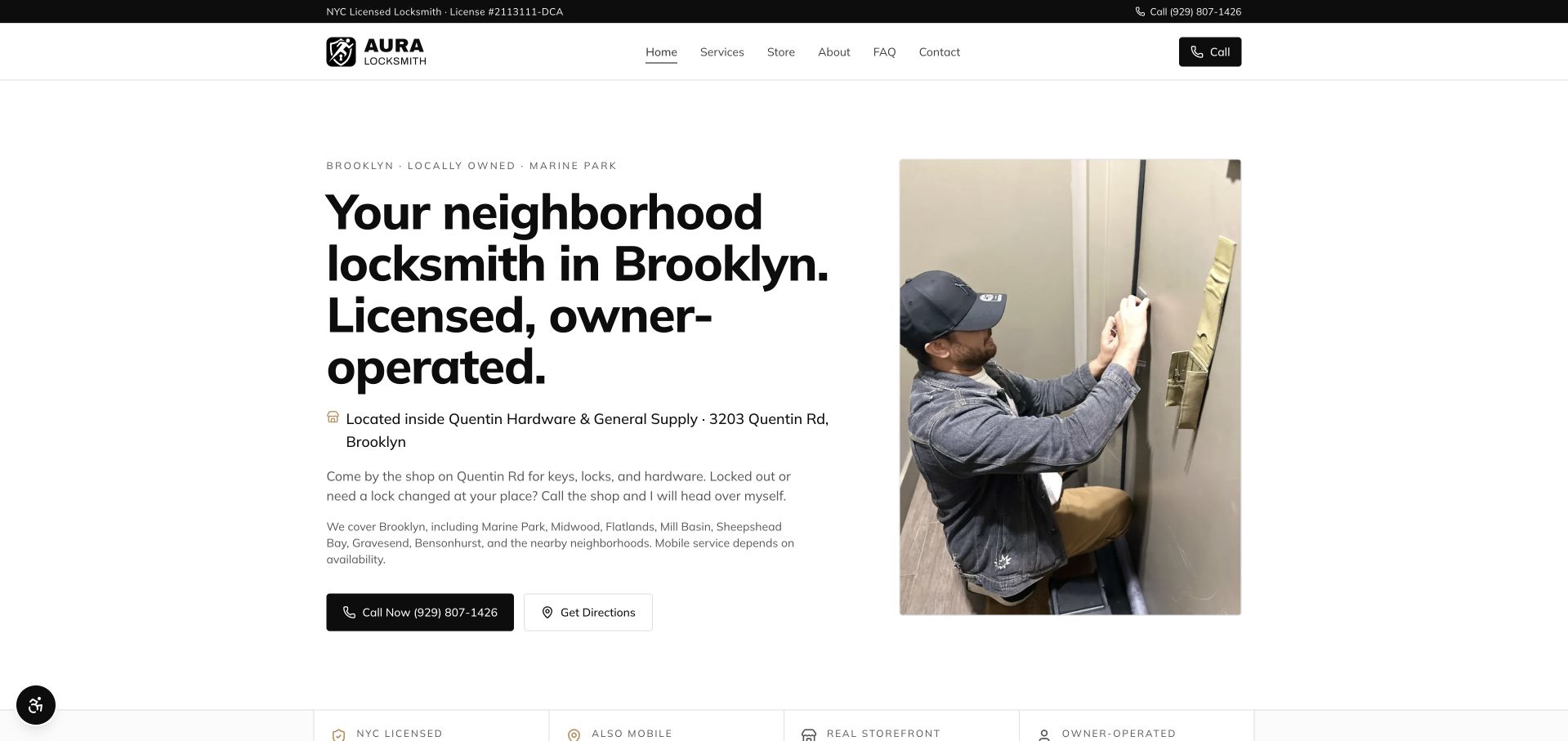
Aura presents a white, generously spaced hero with a large Brooklyn neighborhood-locksmith heading on the left and a photograph of a person working on a lock on the right. The copy identifies a Marine Park location inside a hardware store and explains the relationship between walk-in shop needs and mobile help. Call and directions actions sit together beneath that explanation. This is a useful independent-business reference because the opening answers who the company is and where a customer can find it, rather than relying only on an emergency claim. The later owner section provides a named human connection, while the restrained black-and-white treatment keeps the practical information central.
What you can learn
Make the storefront and owner relationship explicit when they are genuine differentiators. Use real people and accurate location information, and keep directions separate from a mobile-service request so customers understand the next step.
Pros
The opening clearly distinguishes a walk-in shop from mobile assistance.
A working photograph and named-owner context create a specific business identity.
Cons & considerations
Large typography needs careful wrapping to preserve the short local introduction.
A minimal visual style still needs complete coverage and service information below.
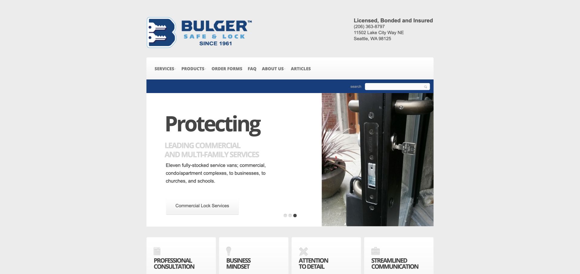
Bulger Safe & Lock uses a centered, relatively narrow page with a blue-and-white header, visible local contact information, and a split hero. The text side introduces commercial and multifamily work, while the photograph shows door hardware in context. Four small cards below summarize consultation and working-process themes. The navigation distinguishes service, products, order forms, questions, company information, and articles. This is useful for studying how a long-running shop organizes a catalog and project relationship without adopting a large marketing-site layout. The compact composition exposes the underlying information structure clearly, even though a modern responsive treatment would need larger text, more space, and a simpler hierarchy.
What you can learn
Preserve useful product and order routes when redesigning a legacy company site. Improve reading size and mobile layout, while making project inquiries and routine product orders visibly different tasks rather than one all-purpose contact route.
Pros
Service, product, and order-form routes acknowledge different customer tasks.
The split hero keeps the text off the detailed hardware photograph.
Cons & considerations
The narrow centered layout leaves substantial unused space on large screens.
Small cards and compact navigation need more generous responsive spacing.
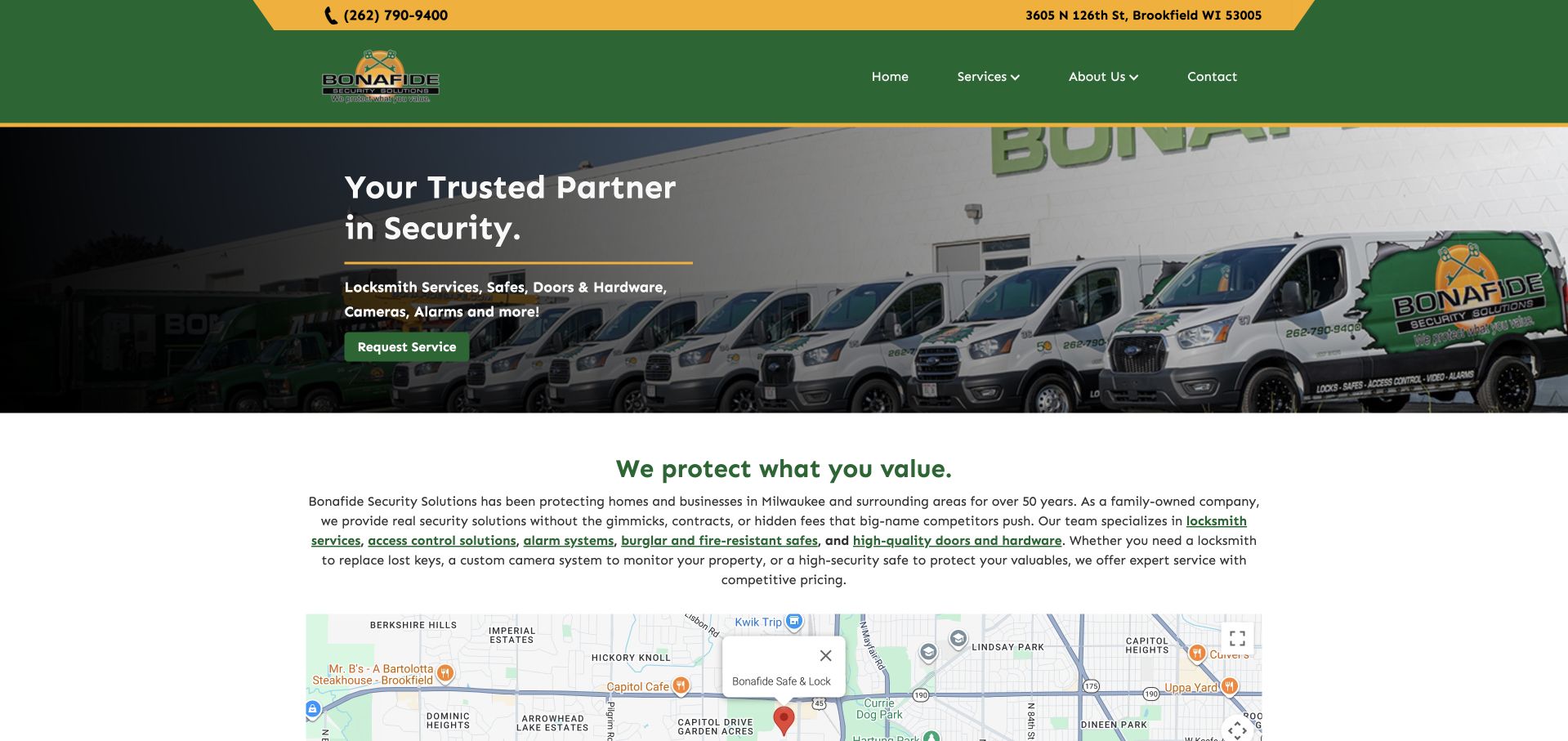
Bonafide uses a green-and-gold header above a wide photograph of branded vehicles. A short security heading and green request-service button sit over the darkened image, followed by a plain-text section explaining the broader catalog. A location map appears early, helping connect the business presentation to a real place rather than a purely mobile dispatch identity. The page is useful for comparing a mixed security-services organization with a narrower locksmith shop. Its service list includes locks, safes, doors, hardware, and related systems, so the website needs enough structure to help different visitors reach the right conversation without treating every inquiry as the same task.
What you can learn
Use a clear catalog and location context when the business extends beyond locksmith calls. Describe each service's boundaries, and keep property-specific security judgments outside the scope of a general website inquiry or promotional claim.
Pros
Branded vehicles provide a company-specific backdrop for the service introduction.
An early map and explanatory paragraph establish location and catalog context.
Cons & considerations
A broad security headline needs specific service routes close beneath it.
The shallow hero can make overlay text small when adapted to narrow screens.
Kegan is a freelance web designer and developer with 15+ years of experience helping businesses turn complicated website requirements into clear, maintainable digital experiences. He works directly with clients from planning and design through development, launch, and ongoing support.
For locksmith website design, his development approach focuses on actual service coverage, residential and commercial service distinctions, and clear urgent and planned inquiry routes. The scope can be a targeted improvement or a complete custom build, with responsive layouts, thoughtful content structure, and integrations chosen around the people using and maintaining the site.
Show 3 other locksmith website designersHide other locksmith website designers
Plan the customer task before adding another lock photograph
Define the real service and storefront structure
Start by mapping the work the company accepts and how customers reach it. A neighborhood hardware shop, a mobile vehicle-key specialist, and a commercial door contractor may all use the locksmith label, but their websites should not be identical. Separate the categories that change the inquiry process. Use customer-recognizable language rather than internal product abbreviations or a single broad security heading.
Make the storefront relationship clear. If customers can visit for keys, products, or advice, publish accurate address and opening information and give directions their own action. If mobile service is offered, explain the territory and the appropriate contact route separately. A telephone number next to an emergency label should not make ordinary shop hours ambiguous. Keep location suggestions correctable when a larger network routes visitors to an office automatically.
Use consistent company identity across the logo, page title, telephone context, and confirmation messages. Do not borrow a larger brand's appearance or describe similarly named businesses as one organization without evidence. A service request should make clear which company receives it. For commercial projects, explain the kinds of property and work the business discusses at a general level, while leaving property-specific assessment and authorization to the proper professional process.
Design useful scope information without exposing sensitive access details
Create service pages that answer ordinary customer questions about the type of inquiry, the information needed to start, and the next conversation. Do not publish step-by-step bypass, entry, or defeat instructions to make the content appear more technical. Avoid collecting access codes, alarm credentials, detailed security layouts, or unnecessary proof documents through a public marketing form. The website is not the place to establish ownership or authorization solely from a self-reported checkbox.
Present product and qualification information accurately. A recognizable lock or safe mark can indicate a catalog item, but it does not prove that the product suits a particular property's risks. Membership, licensing, insurance, training, and review statements should have current supporting context and responsible review. Keep company history separate from comparative claims such as oldest, best, or most secure unless the business can substantiate the exact statement.
Use real storefront, vehicle, team, and working photographs when permission exists. These help establish the business identity without needing invented customer scenarios. If a marketing graphic resembles live dispatch tracking or an arrival estimate, label its illustrative purpose clearly or choose a less ambiguous presentation. A polished status card should not lead a visitor to believe someone is already traveling to their location. The useful design goal is clarity about the relationship, not manufactured certainty about security or response.
Connect the website to a maintained inquiry process
Decide which contact modes the team can reliably handle. Calling, texting, requesting a quote, and booking a visit should have distinct labels when they lead to different processes. A small business may prefer a short callback request to a complex scheduling tool. Explain the next step rather than adding a calendar that does not reflect real availability or service eligibility.
Keep the first request limited. Broad service type, general location, preferred contact details, and a short message may be enough for initial routing. Mark optional information clearly and provide useful errors without clearing the form. Do not require customers to describe sensitive access arrangements in a public text box. The later service process can handle the appropriate authorization and property-specific questions through the business's established procedures.
Test realistic tasks on mobile and with a keyboard: finding shop hours, distinguishing a vehicle inquiry from a commercial project, requesting information, and correcting a location. Ensure telephone labels are accessible and that chat, coupons, privacy notices, and review widgets do not block the main controls. Assign an owner to contact numbers, service territory, product information, qualification statements, and form delivery. A useful locksmith website helps a visitor reach the right business; it does not independently verify identity, guarantee entry, establish a property's security, or promise a specific service result.
Use a short task rehearsal before approving the design. Ask someone unfamiliar with the business to find the storefront, identify the right route for a vehicle-key question, and distinguish a commercial project from a routine shop visit. Notice whether they can name the receiving company without interpreting the domain or logo alone. Record the content owner for each location and contact route. This checks the website's communication, not authorization, physical security, or the effectiveness of any lock or service.
The editing job behind the design
Choose a public catalog and contact layer, not a security-system interface
A local shop may need a maintainable CMS with service, product, territory, and opening information. Keep the catalog structured and avoid adding an office locator when one clearly explained region is sufficient. Fast readable pages matter more than a simulated dispatch dashboard.
A larger service network can justify location routing, while a product-heavy shop may need a separate catalog or order flow. Keep those systems' roles visible and provide clear manual contact when a locator or external booking tool is unavailable.
Keep access credentials, customer authorization documents, property security details, and operational dispatch records outside the public marketing site. Website runtime signals are not evidence of the security products installed by the business or the private systems it uses.
Our WordPress website examples offer a separate look at publishing approaches. A visible platform label is evidence for that named page, not a guarantee that the same system will suit your requirements.
Before the public launch
Locksmith website brief checklist
Use a consistent, specific business identity across every contact route.
Publish accurate local territory and storefront information.
Separate shop hours from any distinct mobile contact arrangements.
Use literal automotive, residential, commercial, and product categories where relevant.
Give directions, product research, and service inquiries different destinations.
Explain call, text, quote, and booking actions according to their real next step.
Keep sensitive access details out of public forms.
Leave authorization checks to the appropriate established service process.
Scope qualification, review, and price statements accurately.
Use permitted company photographs rather than invented customer evidence.
Test mobile navigation, keyboard access, errors, and external-tool failures.
Assign an owner to changing contact, coverage, catalog, and qualification information.
These checks are a project checklist, not a performance, legal, security, or accessibility certification. Test real journeys with the people responsible for the website before making claims about the result.
Sources & editorial method
How this collection was selected and reviewed
These 28 public company pages were directly captured and reviewed for visible information structure and interface decisions. No locks were tested, access methods evaluated, credentials verified, or service outcomes established. The examples are not recommendations about property security or individual providers.
Each example links to its actual source page. Screenshots are direct browser captures with their own capture dates; moving imagery, announcements and live designs can change. The notes describe observable design choices and conditional tradeoffs, not measured traffic, conversion results, service quality, or accessibility conformance.
Technology labels use public page metadata, asset evidence, or explicitly cited platform documentation. Platform documentation is not a complete current deployment audit. A component reference may be legacy or unused; it is not a complete backend inventory. Unknown stacks are omitted. These sites are editorial examples, not our client portfolio.
Written, Edited and Curated are separate editorial records, not timestamps advanced by a rebuild. Website designs and imagery belong to their owners. See our editorial standards or suggest a correction.
Build around the customer’s actual task and a clearly identified local business. Useful categories, accurate contact information, and a predictable next step matter more than another generic promise of security.