Best Environmental Consulting Websites of 2026 (27 Real-World Examples)
Environmental consultancy websites that connect technical expertise with understandable project questions.
Study specialist ecology practices and larger multidisciplinary firms for service taxonomy, project evidence and inquiry design—not as a ranking of scientific quality or environmental outcomes.
A project team may arrive knowing its location, stage and broad concern without knowing the exact survey or assessment terminology. The website should help that team orient itself while preserving the distinction between general information and a professional review of the actual site.
The collection spans ecology, planning, engineering, environmental science and broader technical practices. Some pages also show current brand or ownership transitions. The useful design lesson is how each business explains its role and routes a visitor toward relevant work, people and locations—not the assumption that all of these firms provide the same service.
Before the examples
What makes good environmental consulting website design in 2026?
Offer more than one sensible route into expertise
Some visitors know the discipline; others know a sector, project stage or problem. A small set of clear routes can support both without producing a maze. Keep technical service definitions separate from client sectors, and explain specialized terms before asking someone to choose them in a form.
Give project images a bounded role
A forest, wetland or skyline establishes context but does not show which work a consultancy performed. Pair imagery with a specific project role, location where appropriate and a clear description of the deliverable. Distinguish objectives, recommendations and verified results instead of using a broad sustainability claim for all three.
Make team and service changes understandable
Environmental consultancies often have regional offices or operate within wider groups. Explain the current brand relationship and direct returning visitors to the appropriate service. Preserve useful old-page routes, but do not leave conflicting team, coverage or contact information visible after a transition.
Compare how a visitor reaches a discipline, project or relevant office. The smallest specialist and largest engineering group need different navigation scales, even when they share environmental imagery.
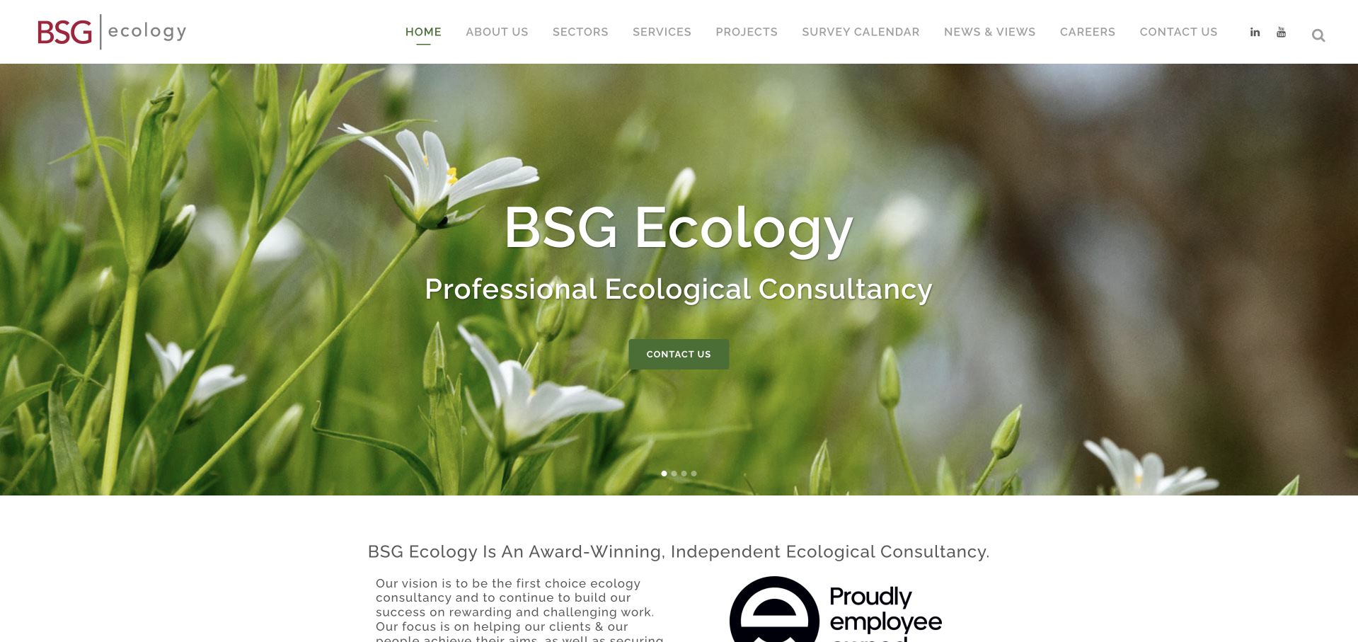
BSG Ecology opens with close natural-world footage beneath a restrained white header. The main navigation names sectors, services, projects, a survey calendar and news rather than relying on a generic solutions label. The next section describes the practice and makes its employee-owned identity visible. The design is especially useful for a specialist consultancy because the service menu and calendar turn the nature imagery into something operational: a visitor can investigate the type of work and its timing. The official company description establishes an independent UK ecological practice with regional offices, rather than a global multidisciplinary engineering group.
What you can learn
Use real field imagery to introduce a consultancy, then give project teams practical routes by survey, sector and stage. A calendar can explain why early discussion matters without promising consent or a particular ecological conclusion. Keep case evidence and professional roles clearer than broad environmental slogans.
Pros
The survey-calendar route addresses a genuine planning question that a purely visual homepage would leave unanswered.
Restrained navigation and field imagery communicate a specialist practice without a large corporate content apparatus.
Cons & considerations
An image-led opening needs a readable static fallback and clear text describing the actual service.
A large service taxonomy can be difficult for a first-time client unless terminology is explained on destination pages.
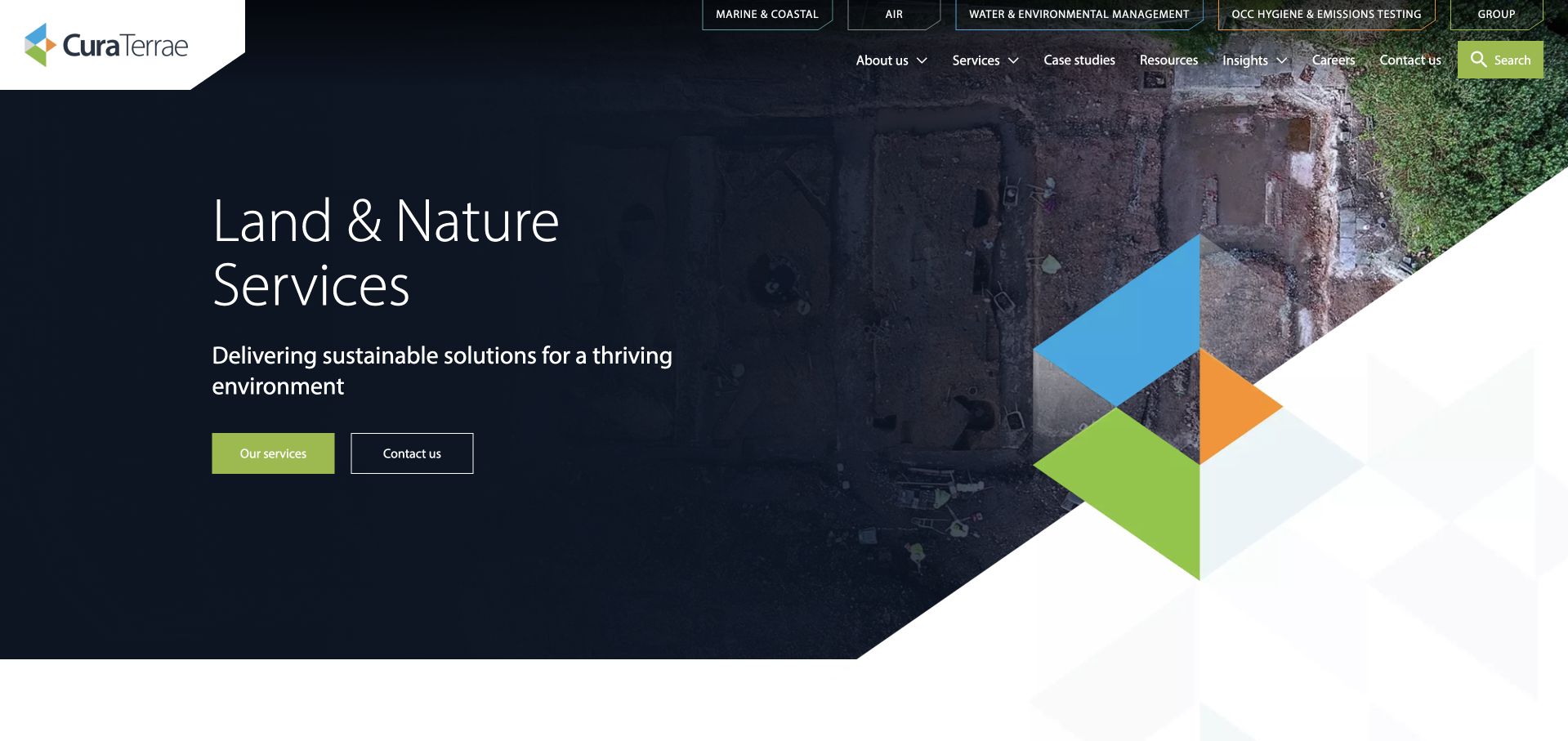
The ecusltd.co.uk address currently presents Cura Terrae Land & Nature Services. Its dark hero, angular multicolor shapes and lime actions introduce a multidisciplinary environmental offering, followed by a project-lifecycle explanation. The header exposes related service areas and case studies, acknowledging a broader group structure. This is included as the current page actually observed, not as an unchanged Ecus homepage. The useful pattern is how a legacy address can lead into a current service identity while retaining practical information. The strong visual system gives the transition coherence, but a returning visitor still needs an explicit explanation of the relationship between the names.
What you can learn
A consultancy rebrand should preserve service continuity in navigation and explain old and new names directly. Map legacy pages to relevant current destinations, retain useful project context and avoid leaving clients to infer whether a team, office or service has disappeared because the logo changed.
Pros
The project-lifecycle structure connects a broad environmental offer to recognizable stages of work.
The current brand is visible immediately rather than hiding the transition behind an old identity.
Cons & considerations
A legacy domain and new name can confuse returning visitors unless the relationship is clearly explained.
Several group service labels require careful boundaries so users understand which team a contact route reaches.
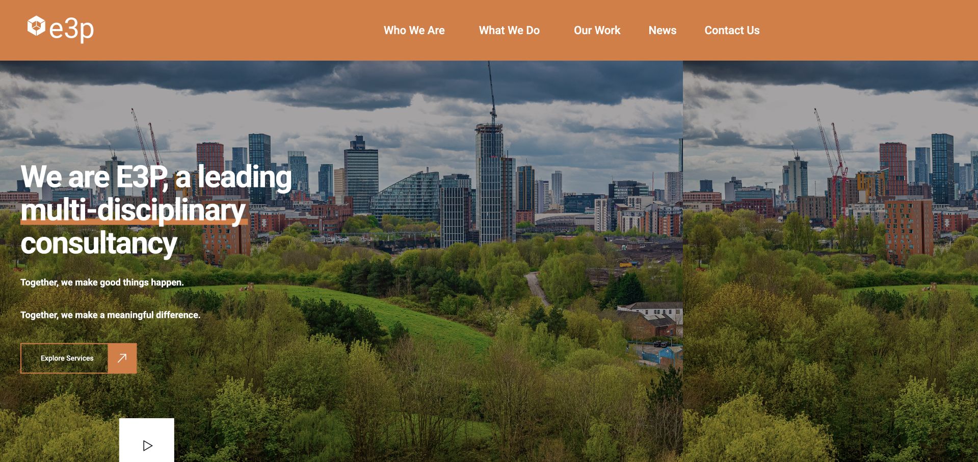
E3P uses a broad city-and-green-space photograph under an orange header. The opening states a multidisciplinary consultancy role and pairs it with a single service-exploration action. Company, work, news and contact routes remain plainly labeled above. The composition is useful because the image contains both the built and natural environment, fitting the type of project context without trying to illustrate every technical discipline. The page gives the broad introduction a practical next destination rather than filling the hero with a long list of specialisms. Its claims about impact remain brand language, not an independent measurement of environmental outcomes.
What you can learn
Show a project setting that reflects the interface between land, buildings and environmental work, then explain the actual services in a structured destination. Use case studies to identify scope and role, and avoid asking a scenic photograph or a broad impact statement to demonstrate technical competence.
Pros
The orange header and restrained action create a consistent visual link between brand and navigation.
The service-exploration route supplies a clear next step after the broad multidisciplinary introduction.
Cons & considerations
A general consultancy headline gives limited help to visitors seeking one specific assessment or survey.
Large scenic imagery needs clear captions or case context before it can communicate the work actually performed.
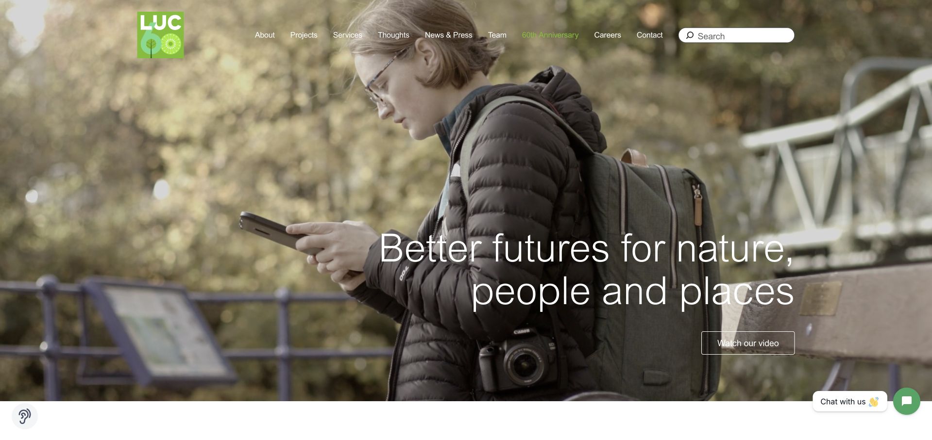
LUC places a fieldworker photograph behind a large nature, people and place headline. The white navigation remains compact, with work, expertise, people, company and contact routes. A watch-video control is secondary to the text rather than the only explanation. Lower sections move into impact and projects, turning the broad introduction toward concrete examples. The useful detail is the choice of a person carrying out observation rather than only a landscape or urban skyline. It gives environmental consultancy a visible activity, although the homepage still needs the expertise pages to explain the different disciplines and responsibilities involved.
What you can learn
A fieldworker image can make technical work tangible without showing confidential project information. Follow it with clearly scoped projects, named expertise and relevant people. Keep video optional and ensure the page communicates the same core service information when motion or media playback is unavailable.
Pros
The fieldworker photograph illustrates an actual kind of professional activity rather than generic green imagery alone.
Work, expertise and people are separate routes, allowing visitors to approach the practice in different ways.
Cons & considerations
The broad nature-and-place proposition does not identify which technical service a new client may require.
Light text over a detailed photograph needs dependable contrast across responsive crops.
Tyler Grange uses a dark illustrated landscape with a fox, vegetation, buildings and wind turbines. A short seasonal message and lime contact action sit within that scene, while the header remains minimal. The following content names arboriculture, ecology and related environmental-planning work, giving the illustrated introduction a service context. This is useful for studying how a consultancy can differentiate itself without adopting the usual aerial-city image. The illustration conveys a relationship between development and the natural environment, but it is a brand device rather than evidence of a particular project, protected species finding or planning outcome.
What you can learn
A distinctive illustration can give a specialist firm a recognizable tone if the next sections clearly explain services and people. Keep seasonal copy maintained, provide accessible text equivalents and avoid letting a large animated entrance delay the essential description or contact route.
Pros
The illustration connects buildings, habitats and energy infrastructure within one coherent branded scene.
A single contrasting contact action prevents the illustrated opening from becoming an entirely decorative splash screen.
Cons & considerations
A minimal menu creates extra discovery work for a visitor seeking a specific survey or discipline.
Seasonal messaging and animation require active maintenance and a useful static fallback.
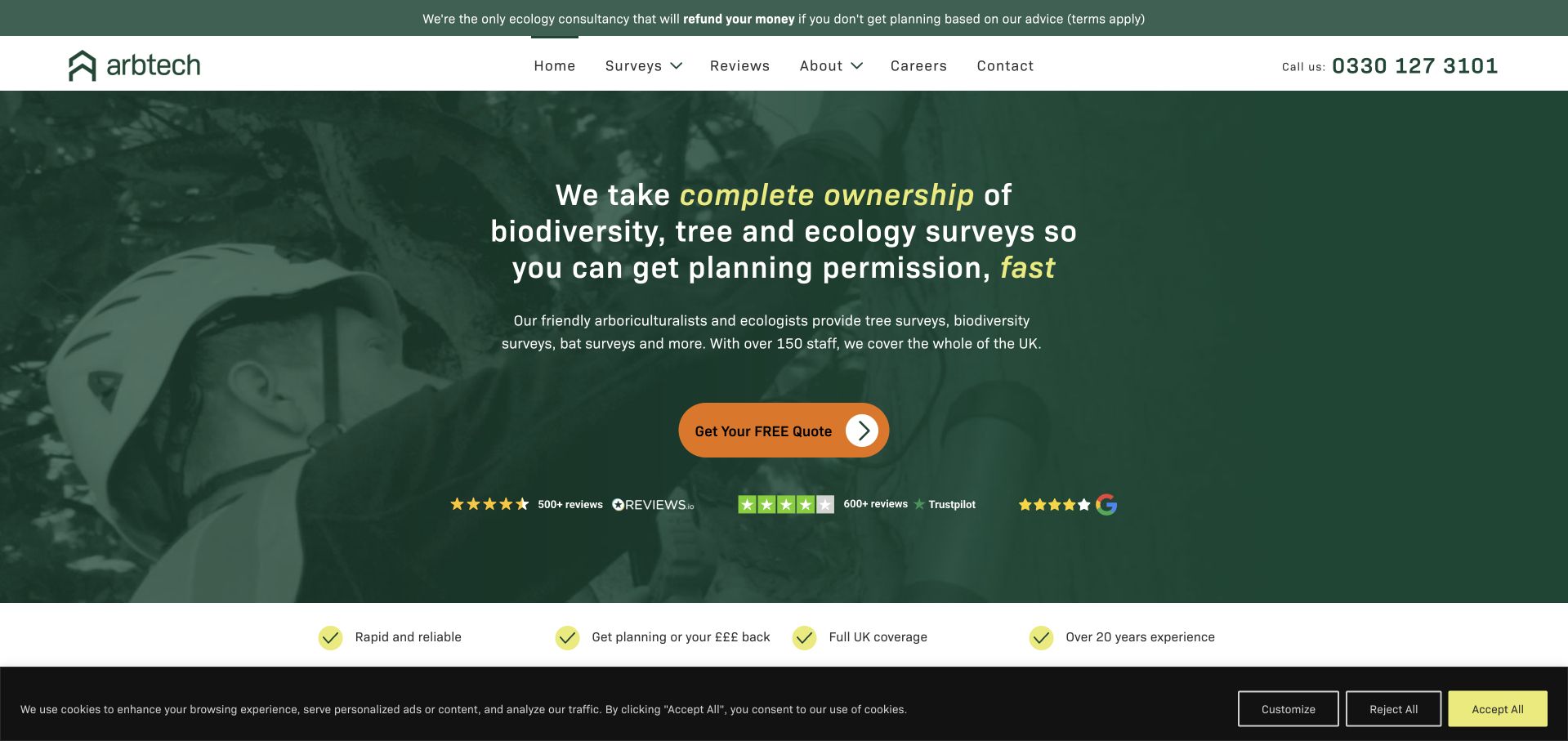
Arbtech uses a dark-green field photograph, a direct survey-related introduction and an orange quote action. Review marks and a short benefits strip sit underneath, while navigation names surveys, reviews, company information, careers and contact. The site is useful for studying clarity of category: biodiversity, ecology and tree surveys appear early rather than being buried inside a generic sustainability menu. The strong claims in the opening are the source’s own marketing, not independently verified promises about permission, timing or a project result. The more transferable design lesson is the plain relationship between service category and the next inquiry step.
What you can learn
Lead with the actual survey or consultancy scope, then explain what information is needed for an initial discussion. Avoid copying consent or turnaround promises. A quote action should clarify the next step while the page preserves realistic distinctions between gathering evidence, professional assessment and decisions made by authorities.
Pros
The service category is explicit before the visitor reaches a technical navigation tree.
The orange quote action is easy to distinguish from the green brand background and supporting proof row.
Cons & considerations
Outcome-oriented wording can oversimplify a process that depends on site conditions and external decisions.
A dense row of review marks requires readable source context rather than functioning as an unexplained trust wall.
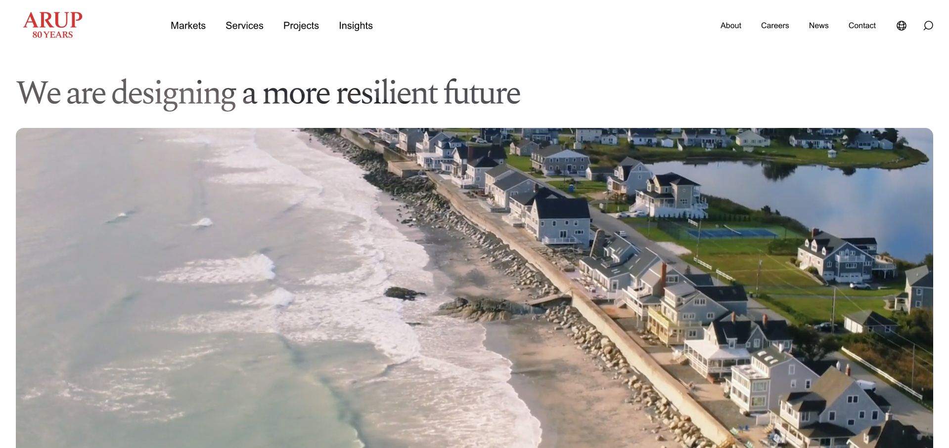
Arup uses a white header, generous editorial typography and a large coastal film beneath a resilience-oriented headline. Markets, services, projects and insights remain plainly labeled above the image. The opening does not pretend that the organization is only an environmental consultancy; it introduces a wider planning, design and engineering practice. That scope matters when borrowing the example. The useful pattern is the separation between the large brand statement and stable discipline-based navigation, which lets a visitor investigate a particular service without needing to interpret every featured visual. The coastal scene supplies context, not evidence of a measured resilience result.
What you can learn
A broad practice can use an editorial introduction if its service taxonomy stays clear. Explain the environmental role within each project, credit collaborators and distinguish design intent from verified outcomes. Large moving media should have a static alternative and must not delay navigation or essential text.
Pros
The headline sits on a plain white background rather than depending on contrast over moving footage.
Markets, services, projects and insights provide several stable ways into a very broad practice.
Cons & considerations
A resilience-oriented introduction gives little immediate detail about the environmental scope of a specific engagement.
Large media can dominate loading and first-screen space if not supported by an efficient fallback.
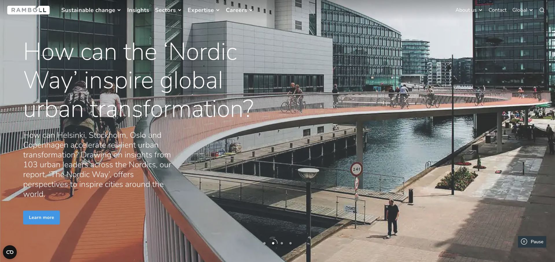
Ramboll leads with a large urban-infrastructure image and an editorial question, then introduces its wider role further down the page. The header exposes sustainable change, insights, services, expertise and careers rather than reducing the practice to one product. A carousel control indicates that the current story is one of several features. This is useful for studying a large consultancy homepage that treats projects and ideas as entry points into a complex organization. The page is not a narrow environmental-service landing page, and the selected story should not be read as a comprehensive statement of the firm’s capabilities or measured effects.
What you can learn
If project stories lead the homepage, connect each one to a clearly explained service and the team’s actual role. Keep permanent navigation stable as featured stories change, and distinguish a discussion of urban transformation from verified project performance or advice for another site.
Pros
The case-led opening offers a concrete subject rather than only an abstract sustainability slogan.
Permanent service and expertise navigation remains visible outside the rotating feature.
Cons & considerations
A large carousel headline can push practical contact and discipline information into secondary positions.
Light text over complex urban imagery needs careful contrast and a consistent static alternative.
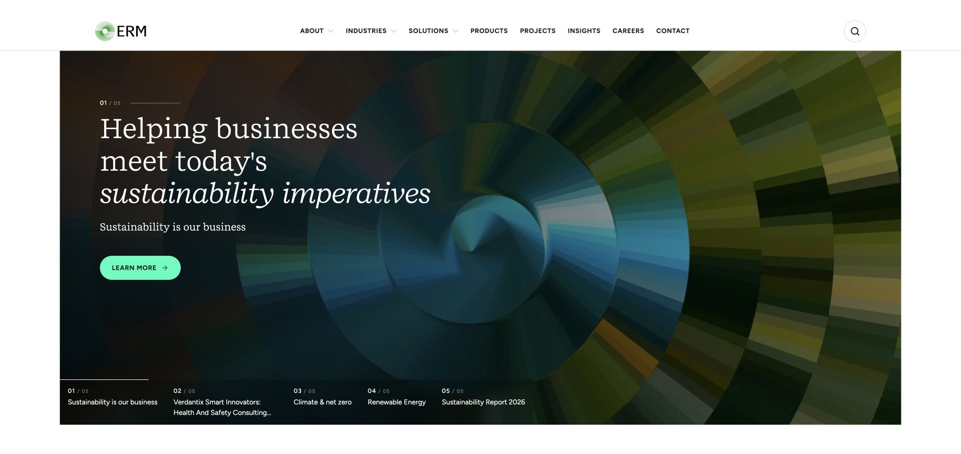
ERM places an editorial-style serif heading over a richly colored circular image within a contained hero. A mint exploration action contrasts with the dark visual, while the white header provides industries, solutions, expertise, projects and publication routes. Several smaller story indicators sit along the lower edge of the feature. The layout is useful for studying a broad sustainability-consulting brand that wants a distinctive visual identity without abandoning a conventional information structure. Its environmental and business language remains a positioning statement; the image and headline alone do not establish the scope or results of a particular consulting engagement.
What you can learn
Use the opening to frame the consulting category, then give visitors discipline-specific explanations and scoped project evidence. A visually rich feature should remain optional to comprehension: people looking for a service, a publication or a team member need reliable text routes independent of the current image.
Pros
The contained feature gives the brand image a defined area instead of covering every navigation element.
Industry, solution and publication routes distinguish different research intentions within a broad practice.
Cons & considerations
Abstract circular imagery conveys mood more effectively than a particular environmental activity or deliverable.
Multiple feature indicators can become small and difficult to understand on narrow screens.
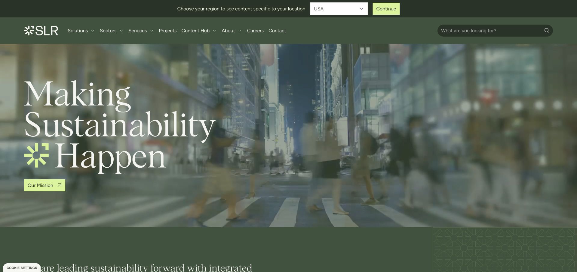
SLR uses a dark-green header and a large sustainability headline over a city scene. Lime accents connect the call to action with the brand mark, while a region selector is kept in a separate utility strip. The page moves into advisory, digital and technical service groupings beneath the introduction, helping visitors make sense of a broad practice. This is useful for studying the move from a high-level brand statement to a service taxonomy. The opening itself is not evidence that any specific project achieved a sustainability target; the useful information comes from the more detailed service and project destinations.
What you can learn
Broad sustainability language needs a concrete second layer. Explain how advisory, digital and technical work differ, identify who each service helps and keep geographic context visible. Project stories should state the work performed and the limits of any reported result rather than borrowing a universal brand promise.
Pros
The green and lime system creates continuity between navigation, headline and primary action.
The lower offering categories begin translating the broad brand message into more specific service routes.
Cons & considerations
A general sustainability headline can be difficult for a first-time client to connect to an immediate need.
A region selector and broad service menu add complexity that a smaller practice may not require.
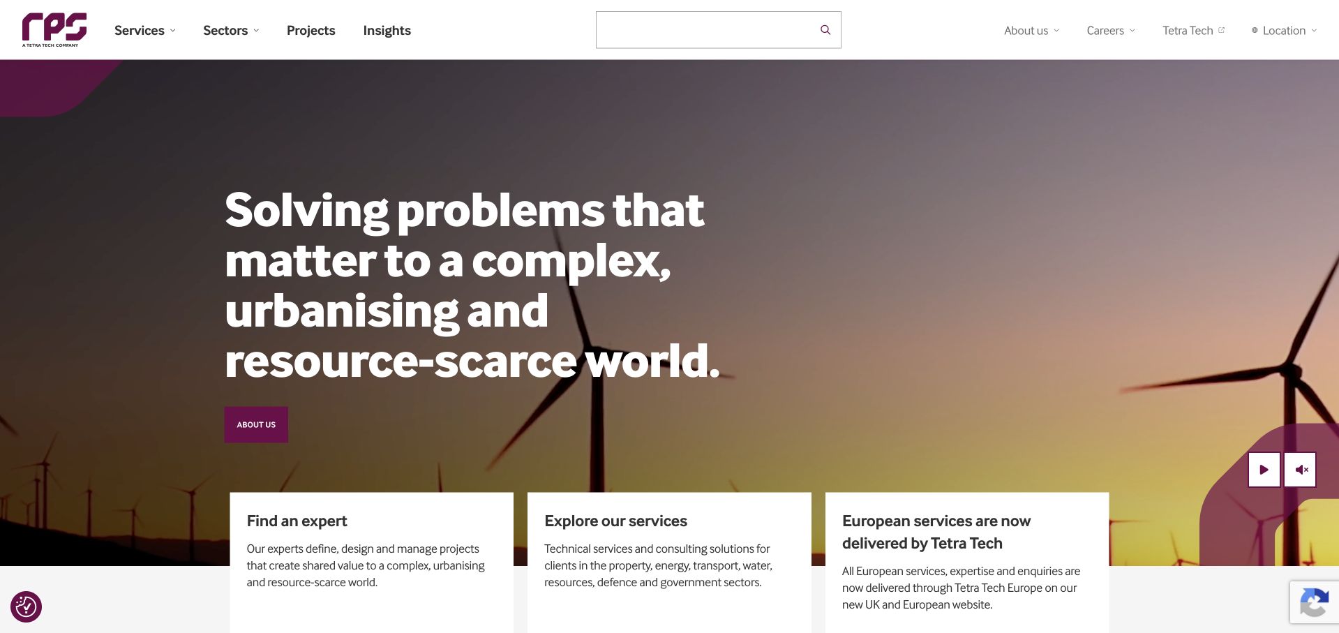
RPS currently identifies itself as a Tetra Tech company. Its opening combines a wind-energy scene with a strong headline and three practical cards: finding an expert, exploring services and understanding a change in European service delivery. The third card is particularly useful because it acknowledges a real organizational transition rather than leaving visitors to infer it from a logo. The site remains a distinct public design example, but it should not be mistaken for an entirely independent group. The page demonstrates how company-change information can coexist with direct routes to technical expertise and service detail.
What you can learn
When a consultancy changes ownership or service structure, explain the operational effect in plain language. Preserve expert and service routes, identify the current destination for existing clients and avoid relying on corporate news alone to tell a visitor whether the relevant team is still available.
Pros
The transition card makes organizational change visible alongside the normal service and expert actions.
Three practical cards bring the introduction back to specific visitor tasks.
Cons & considerations
A broad problem-solving headline needs concrete scope and case information to establish relevance.
Group and regional changes require regular review so old branding does not imply an outdated service arrangement.
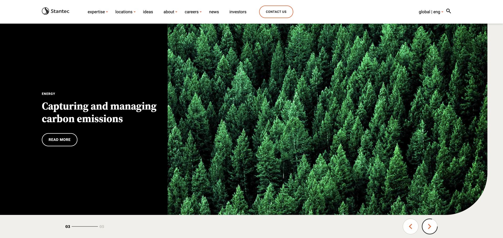
Stantec’s captured feature concerns carbon management and pairs a dark text panel with a forest image. The white header keeps expertise, projects, ideas, careers and contact routes separate. A restrained feature control at the bottom indicates that the opening is editorially changeable rather than a permanent service description. This is useful for studying how a multidisciplinary firm can give an environmental subject prominence without relabeling the whole organization as one specialist service. The forest image establishes a relevant setting, but it does not verify a carbon claim or demonstrate the result of an individual engagement.
What you can learn
A featured environmental topic should lead to a scoped explanation with named responsibilities, methods and source context. Keep the broader service structure stable, and distinguish general educational content from project-specific findings or advice. Do not let a rotating feature become the only route to a discipline.
Pros
The dark text panel protects readability while the forest photograph supplies visual context.
Expertise and project navigation remain separate from the currently featured editorial subject.
Cons & considerations
Rotating subjects may leave visitors unsure where a particular environmental discipline lives permanently.
A scenic environmental image cannot substitute for evidence about methods, responsibilities or measured outcomes.
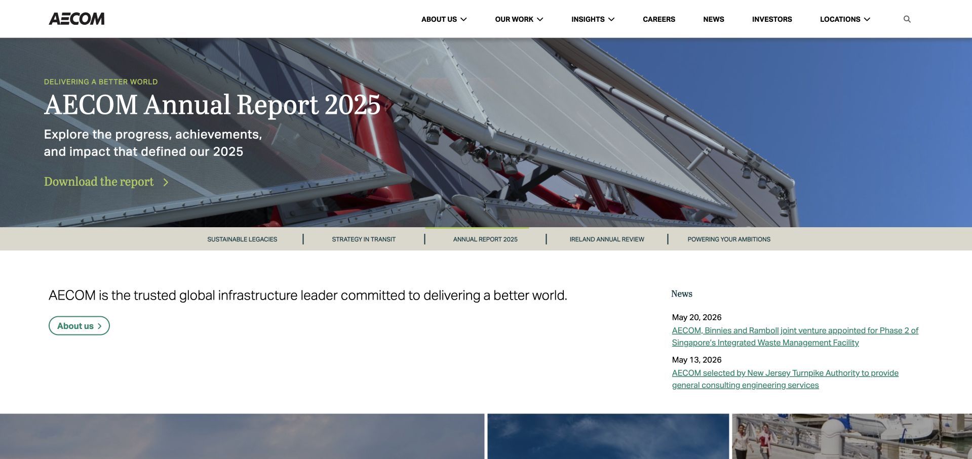
AECOM’s captured homepage places an annual-report feature in a bounded image strip, followed by a plain-text corporate introduction and a small news column. The header groups company information, work, insights, careers and locations, making the broad infrastructure scope explicit. For an environmental-consulting collection, this is an adjacent multidisciplinary example rather than a local survey-practice model. The design is useful for the way it contains corporate publishing instead of turning the entire page into one report cover. A visitor can move from the featured publication toward projects or services without assuming that the report is the only relevant destination.
What you can learn
Large organizations should give publications a clear place without displacing service discovery. A smaller consultancy can borrow the bounded feature and concise introduction while keeping its own discipline, region and contact context more prominent than a corporate reporting cycle. Scope project claims to the actual work performed.
Pros
The report is presented as a contained feature rather than an all-consuming full-screen announcement.
The following text and news areas introduce a second layer of information close to the opening.
Cons & considerations
A corporate annual report may be less useful than discipline information for someone with an immediate project need.
A global navigation structure can obscure the specific regional team responsible for an inquiry.
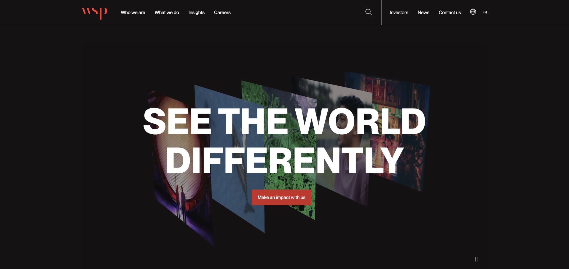
WSP uses a mostly black opening with a large white typographic statement and a small red action. Narrow image fragments sit behind the text rather than forming a conventional full-width landscape. The header provides company, work, insight and career routes within the same restrained visual system. This is useful as a study of typographic emphasis, especially compared with the many environmental sites that rely on forests, water or city panoramas. The tradeoff is specificity: the opening says little about a particular assessment or environmental deliverable, so the subsequent service navigation must do more explanatory work.
What you can learn
A strong corporate typographic system can be distinctive without turning every environmental page into a scenic image. Pair it with precise discipline labels and regional contact information. Broad perspective language should introduce the brand, not stand in for project evidence, professional responsibilities or verified environmental outcomes.
Pros
The black, white and red treatment creates a clear hierarchy without a complicated color system.
The main action is visually separate from the display statement and remains easy to identify.
Cons & considerations
An abstract perspective statement gives limited help to someone seeking a specific environmental service.
Large display typography can consume much of a mobile first screen before practical information appears.
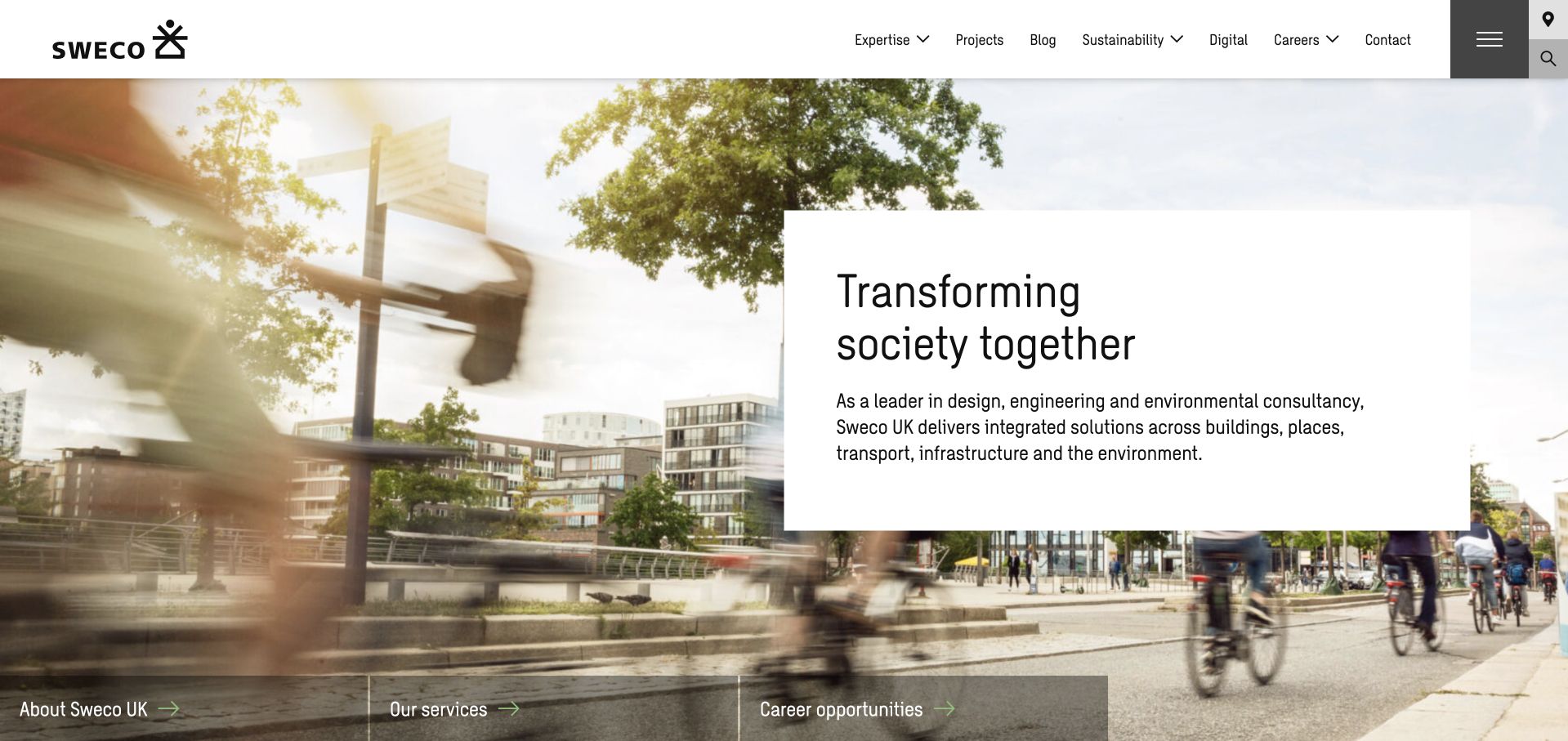
Sweco places a white text panel over an urban public-space photograph, with a concise introduction naming engineering, design and environmental consultancy. The header keeps expertise, projects, blog, sustainability and contact routes visible. A small lower strip offers company, service and career shortcuts. The useful pattern is the plain panel: it gives a broad brand message a reliable reading surface without discarding the contextual image. The scene links the consultancy to places people use, although the photograph alone does not establish which parts of that setting were designed or assessed by the firm.
What you can learn
Show real project settings with clear role captions, and keep essential text on a stable background. A broad practice should explain the environmental discipline within its larger offer, then use project pages to identify scope and collaborators rather than implying ownership of every visible element in an image.
Pros
The white panel separates introductory text from the detailed photograph and protects readability.
Expertise and projects are plainly labeled routes that support different research intentions.
Cons & considerations
A broad transformation message needs more specific environmental-service detail to guide an initial inquiry.
Multiple lower shortcuts can duplicate the header unless they are prioritized for a distinct visitor task.
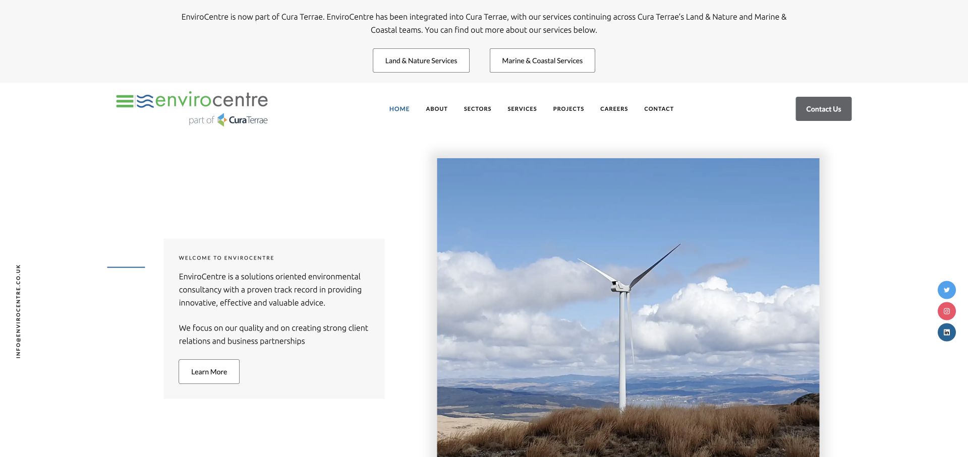
EnviroCentre’s page currently states that its services are being integrated into Cura Terrae, with routes to land-and-nature and marine-and-coastal services. The remaining homepage uses a restrained white layout, a small introductory panel and a wind-energy photograph. It is included as a distinct transition-page design example, not as a separate independent company claim alongside the group’s other page. The useful detail is the explanation at the very top: returning users are told where services continue before they explore the older brand structure. That reduces the uncertainty a silent redirect or unexplained new logo would create.
What you can learn
A legacy consultancy website should explain the current service destination and preserve useful regional context. Keep the transition notice factual, route clients to the right team and review old service and contact pages so they do not contradict the new operating arrangement.
Pros
The transition explanation appears before the older brand introduction, giving returning visitors immediate context.
Separate service-area buttons describe where the continuing work can now be explored.
Cons & considerations
Keeping a legacy homepage alongside a new group site can create duplicate or inconsistent service information.
The sparse older layout needs careful maintenance so its contact and team details do not become misleading.
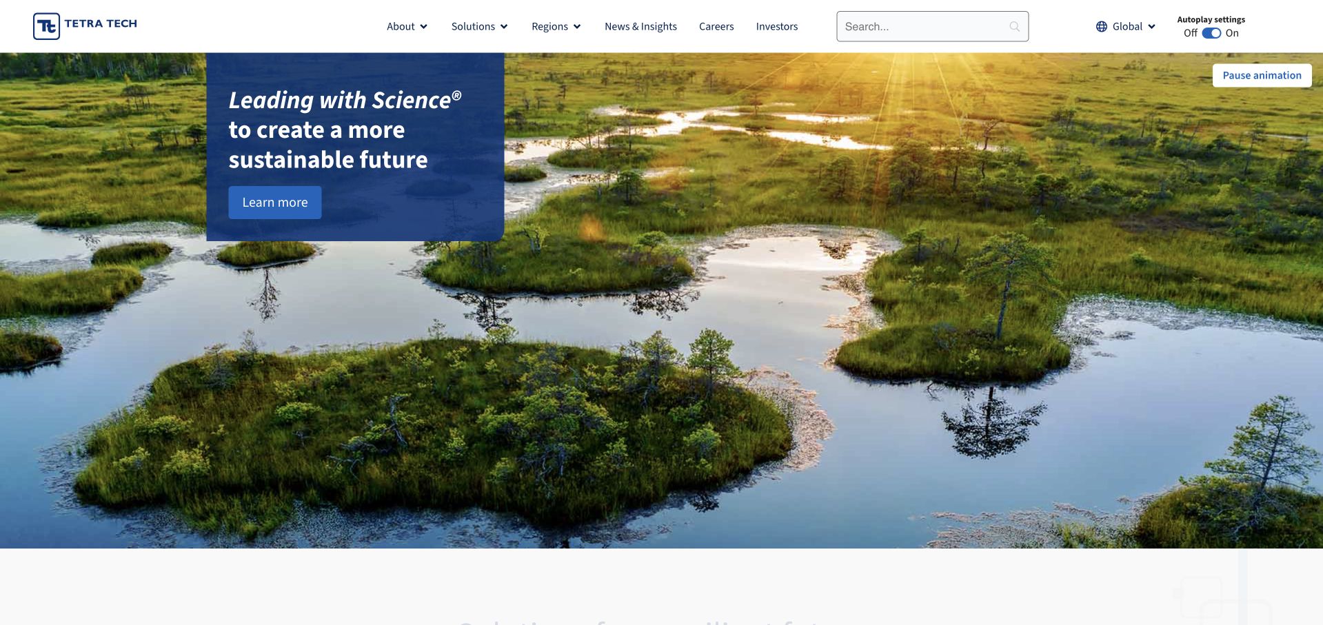
Tetra Tech uses a wide wetland photograph and a small blue message panel rather than a full-screen paragraph. A pause control is visible for the moving media, while the header separates company, solutions, regions, news, careers and investors. The composition gives the environmental setting room without asking the image to carry the entire explanation. This is a broad technical-consulting group, so the homepage is not a direct template for a small ecological survey practice. The useful pattern is the combination of a concise introduction, explicit media control and a stable navigation structure that remains available as the featured scene changes.
What you can learn
Use environmental imagery as context, then give each technical discipline a precise destination. Keep motion optional and make the role of the consultant explicit in project stories. A broad science-led statement should lead to evidence and scope, not be treated as proof of a particular result.
Pros
A bounded blue panel gives the short introductory message a reliable contrast background.
The visible pause control recognizes that a moving landscape is not useful or comfortable for every visitor.
Cons & considerations
The broad introduction leaves a new client to find the specific service and regional team elsewhere.
Scenic environmental imagery needs role and project context before it can support a technical claim.
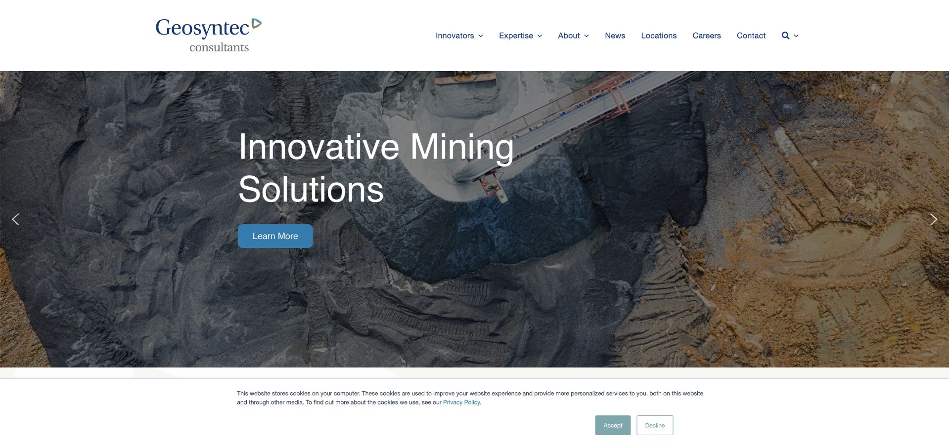
Geosyntec’s captured feature shows a mining setting with a short sector-specific headline and a restrained learn-more action. The white header separates innovations, expertise, projects, news, locations and company information. This gives the homepage a more concrete subject than a generic sustainability slogan, while still exposing the broader practice. The image is a useful contextual example, not an independent assessment of the environmental effect of mining work or the firm’s role in every visible part of the site. The design lesson is the connection between a recognizable project setting and a stable expertise route.
What you can learn
When featuring a technical sector, explain the exact environmental question and the consultant’s scope on the destination page. Let visitors move from sector context to methods, people and projects, and avoid using broad solution language where a bounded explanation of work performed would be more informative.
Pros
The sector image gives the featured story a specific setting rather than an abstract green metaphor.
Expertise and locations provide useful permanent routes outside the changing homepage feature.
Cons & considerations
A sector-led feature may not help visitors who arrive seeking a different technical discipline.
A short solutions headline needs detailed scope and project context before it communicates meaningful environmental work.
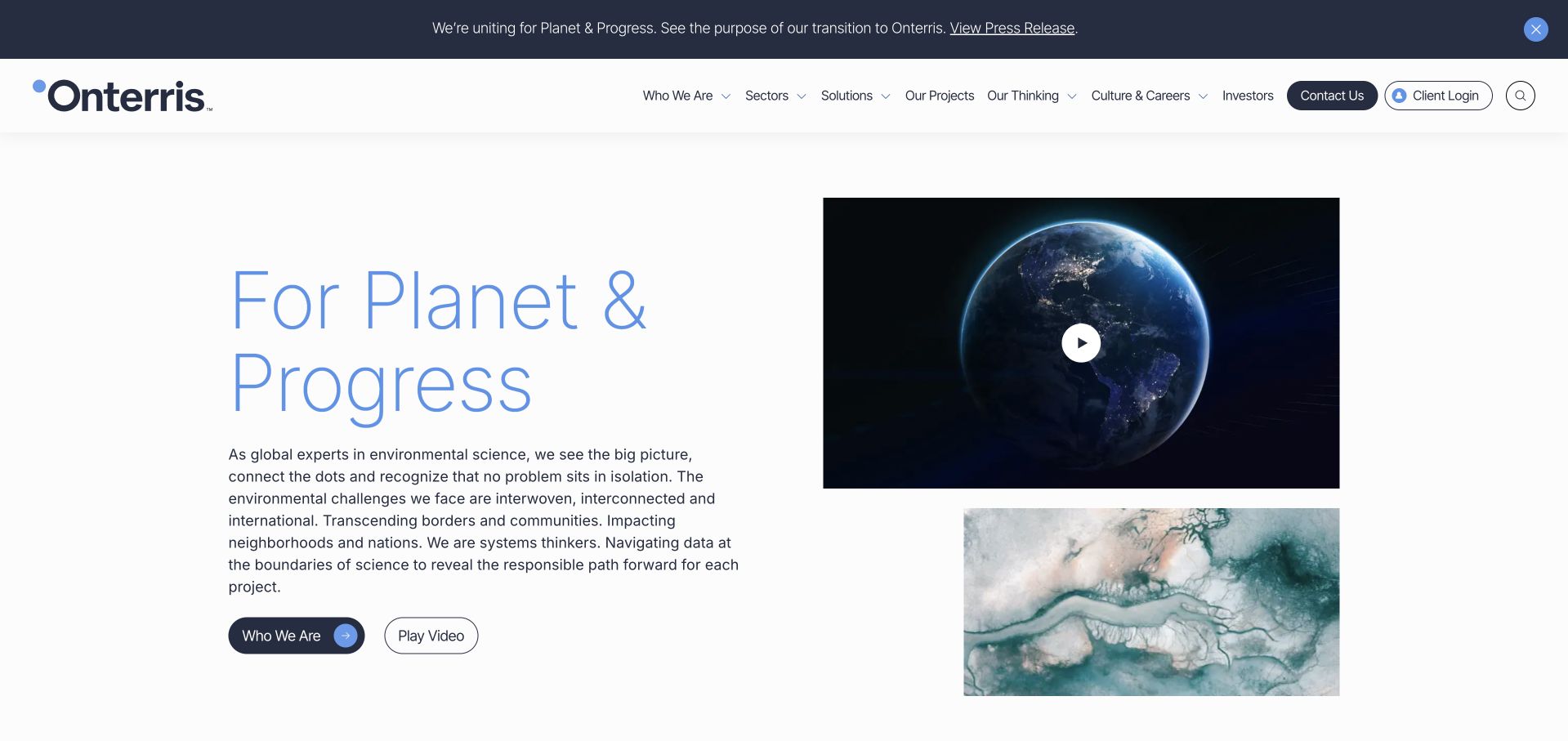
Onterris presents a transition notice at the top of the page, followed by a light split layout with a planet-and-progress message and a globe visual. Navigation separates company, sectors, solutions, projects, thinking and contact, while a client-login route has its own position. The design is useful for studying a current environmental brand transition without relying on a redirect announcement as the whole experience. The homepage continues into working content and project-related material. Its planetary imagery is a brand device, not evidence of a quantified environmental result or an inventory of the firm’s technical capabilities.
What you can learn
A new environmental brand should explain what changed and keep existing-client tasks visible. Follow the identity story with concrete services, regional contacts and scoped project evidence. Make sure a transition notice points to current factual information rather than allowing old names and new claims to coexist without explanation.
Pros
The top notice acknowledges the brand transition instead of leaving returning visitors to guess the relationship.
Client login remains distinct from general service exploration and a new inquiry.
Cons & considerations
A broad planet-and-progress proposition provides little immediate detail about an individual service or deliverable.
Abstract globe imagery can feel interchangeable unless supported by specific project and technical content.
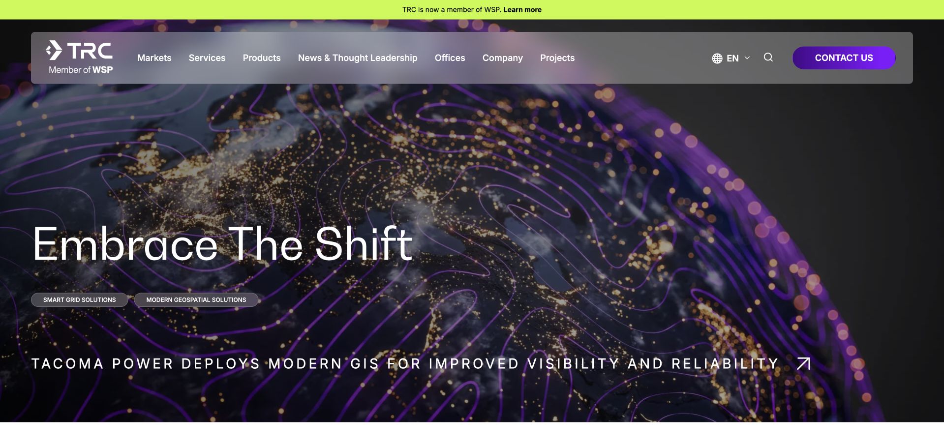
TRC currently identifies its WSP relationship in the header while using a vivid purple-and-black technical image for the main feature. A broad adaptability message leads into program management, energy and other service routes. The opening is useful for studying how a consultancy can preserve a recognizable sub-brand while acknowledging a wider corporate structure. The bright graphic treatment differs from the more conventional scenic environmental imagery elsewhere in the collection. Its technology-led appearance does not establish the website’s hidden stack or prove a particular project’s performance; the practical information lies in the named service and project destinations.
What you can learn
When a consultancy joins a larger group, make that relationship visible without interrupting the task of finding a service. Connect technical imagery to a specific case or discipline, and explain scope and responsibility rather than relying on an adaptability statement to describe every part of the practice.
Pros
The group relationship is visible in the header rather than buried in corporate news.
The distinctive graphic system separates the brand from standard forest-and-skyline environmental introductions.
Cons & considerations
A broad change-oriented headline can delay the practical explanation of environmental services.
Vivid imagery and moving features require restrained text placement and a readable static alternative.
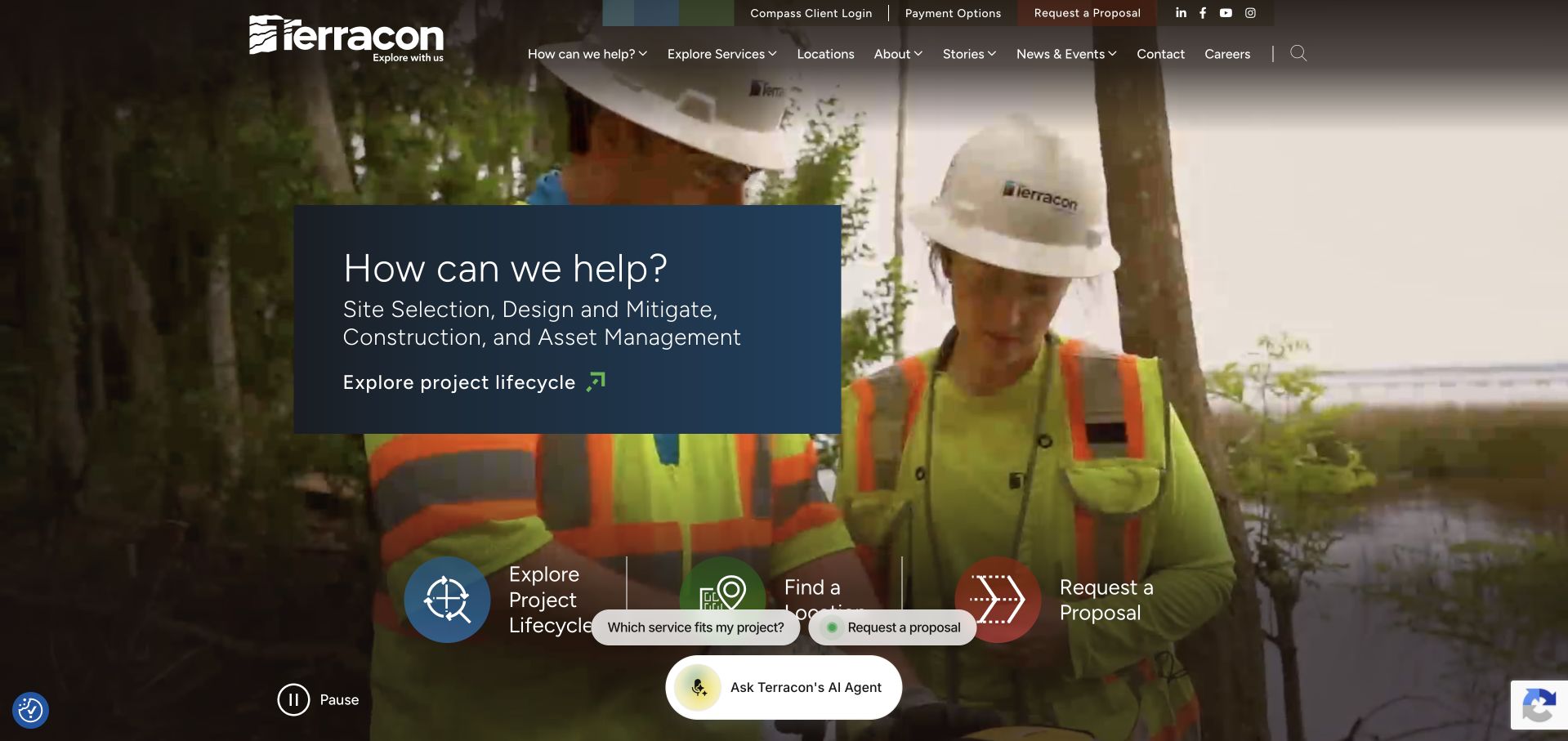
Terracon places a compact how-can-we-help panel over fieldwork imagery, then offers project-lifecycle, location and proposal routes. The page also names site selection, design and mitigation, construction and asset management as ways into the offer. This is a useful structure because a client may know the stage of a project before knowing the exact technical service required. The field image gives the work a recognizable setting, while the lifecycle organization supplies the practical meaning. Chat suggestions are present, but they are secondary to the normal navigation and should not become the only way to understand the service.
What you can learn
Let clients enter by project stage as well as discipline, then explain the relevant assessments and responsibilities. Keep a conventional location and contact route available alongside any assistant. Do not turn a guided question into an implied technical recommendation before an actual project review has occurred.
Pros
Lifecycle labels match a way project teams may already think about their work.
Location and proposal routes give practical alternatives to exploring the full service inventory.
Cons & considerations
Several floating shortcuts and chat suggestions can crowd the first screen or obscure media controls.
Stage-based navigation needs clear cross-links so users can still find a known technical discipline directly.
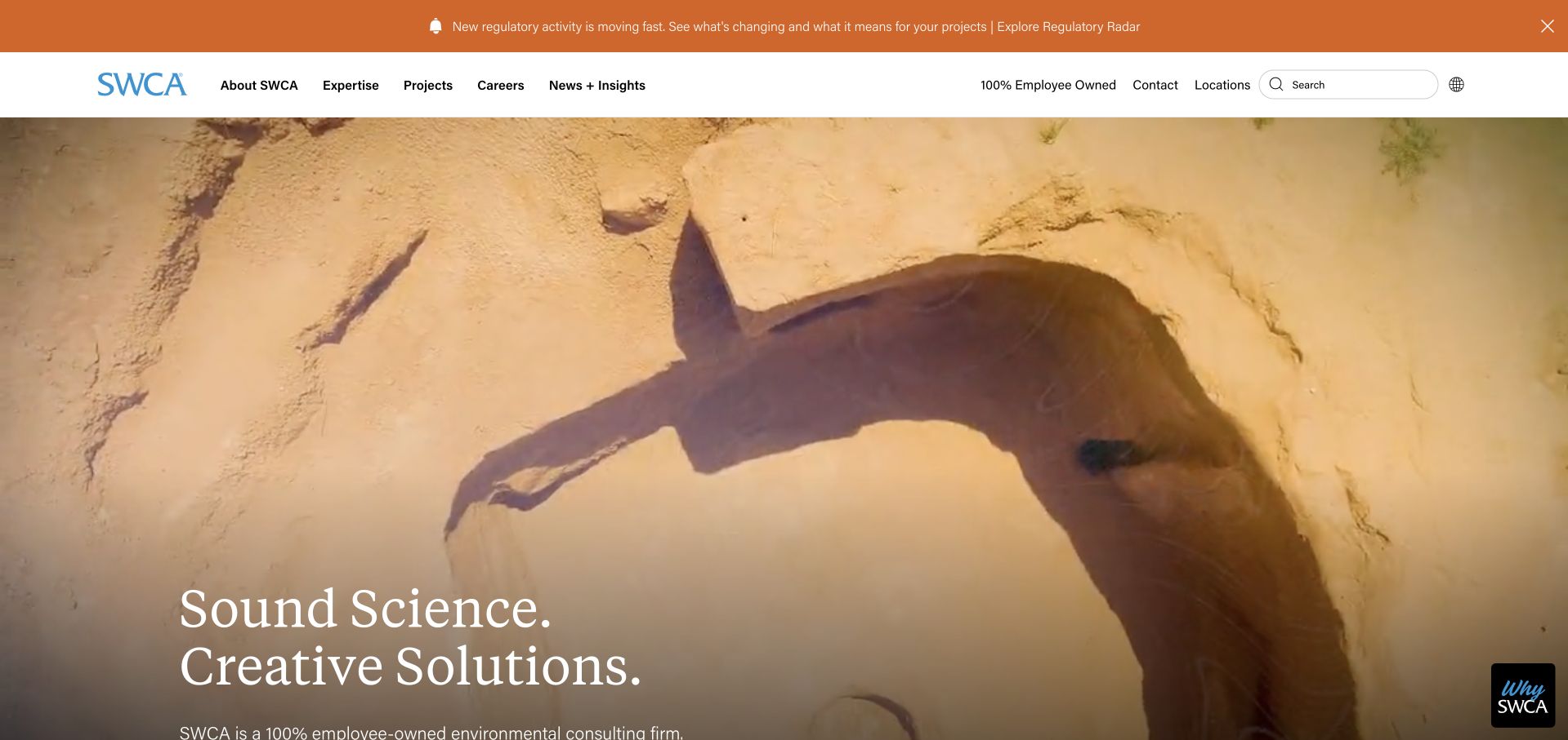
SWCA uses fieldwork footage and a short science-and-solutions introduction beneath a white header. The navigation exposes expertise, projects, locations and company information, while the following section asks how the firm can help and offers a role or function selector. This is useful because environmental projects involve different participants who may use different terminology for the same initial question. The image communicates professional activity rather than only a landscape. The website’s broader claims remain its own; the visual review focuses on how the page organizes discovery, not on the scientific quality or results of any assignment.
What you can learn
Support both discipline-based and role-based discovery when a consultancy has several client types. Explain the work behind each route and connect it to a relevant person or office. Keep a field video optional and avoid letting broad reassurance replace scoped case studies or a clear inquiry process.
Pros
The role selector provides an alternative for users who do not know the exact technical service name.
Expertise, project and location routes remain available as conventional navigation choices.
Cons & considerations
Role-based routing can become vague if the resulting pages do not identify concrete services and outputs.
Moving field imagery and promotional strips need careful prioritization to preserve a readable opening.
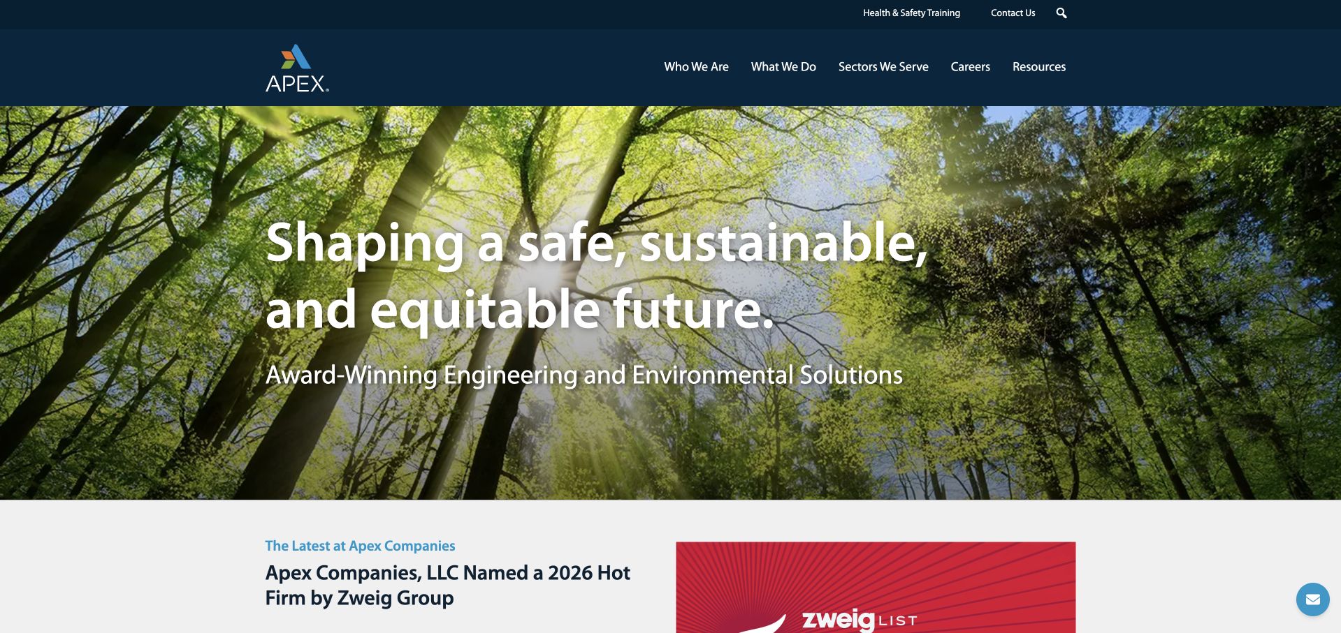
Apex uses a dark-blue header and a forest photograph behind a concise engineering-and-environmental introduction. The next section introduces company news in a separate white area, so the hero does not need to carry every proof point. Navigation distinguishes what the firm does, who it serves, careers and resources. The structure is useful for a business spanning infrastructure, environmental and stormwater work: it provides different ways to understand the offer without presenting an enormous service list immediately. The forest image is contextual, and the headline’s safety and sustainability language is not an independently measured project outcome.
What you can learn
A broad technical firm should distinguish services from sectors, then use project pages to explain how they intersect. Keep news separate from evergreen service information, and make sure any environmental claim identifies the relevant project, role, measurement and source rather than relying on a broad homepage statement.
Pros
Services and audience navigation offer different entry points into a multidisciplinary offer.
The separate news area prevents the introduction from becoming a dense collection of corporate announcements.
Cons & considerations
A generic forest scene does not explain the infrastructure or stormwater work named by the business.
Broad safety and sustainability language needs scoped technical evidence on the relevant destination pages.
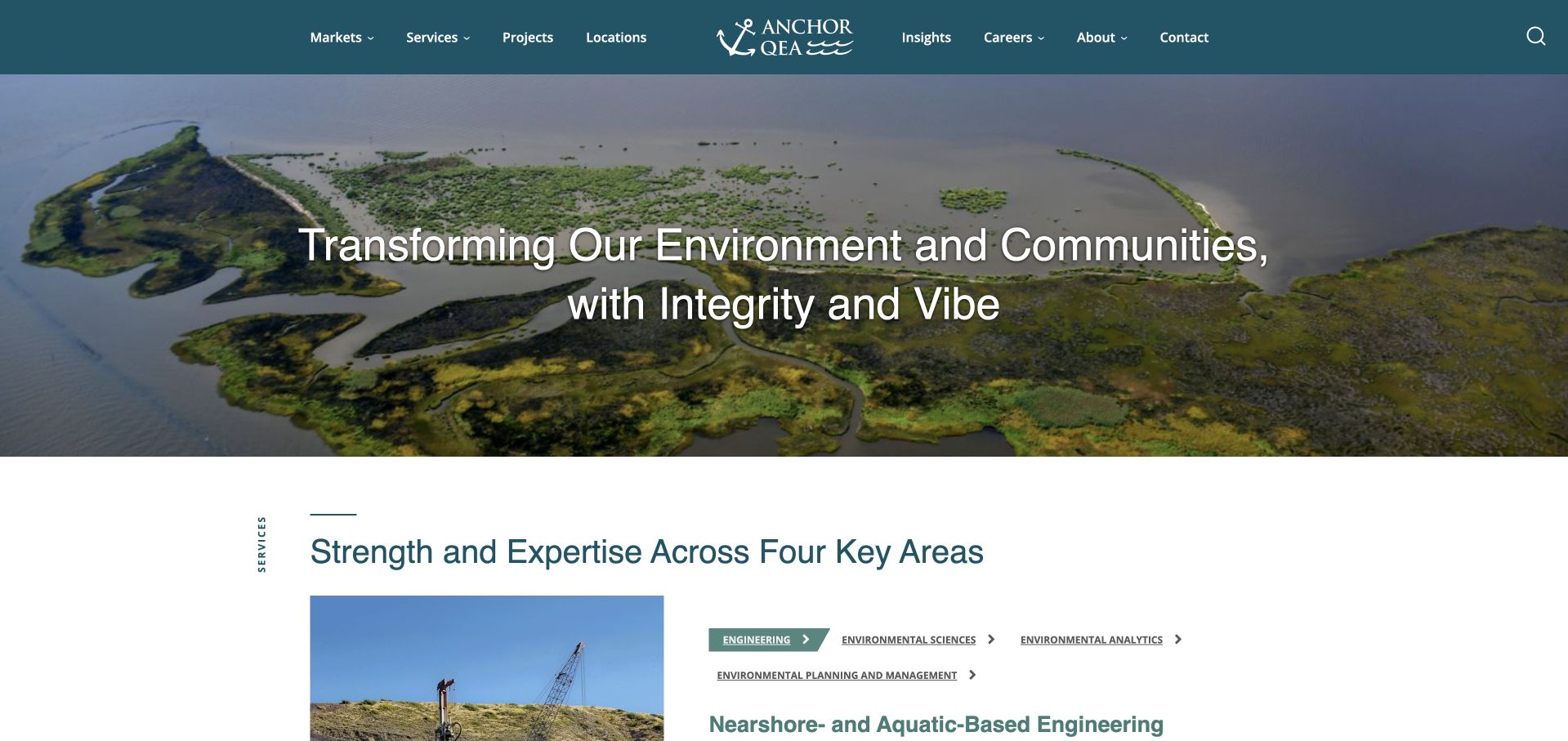
Anchor QEA places a wetland-and-water photograph beneath a teal header, with a short environment-and-community statement. Immediately below, a white section introduces four expertise areas and a more specific technical heading. Markets, expertise, projects, insights and locations are all visible in navigation. The useful pattern is the shift from a broad environmental setting to defined areas of work, rather than leaving the introduction at the level of scenery. The photograph supports the aquatic context of the brand, but it is not treated as proof that the firm designed every visible feature or achieved a particular environmental result.
What you can learn
Use project-context imagery with clear role information, then describe the technical disciplines that make the offer distinct. A small consultancy can borrow the transition from visual setting to expertise without copying the scale of a larger practice’s navigation or making unsourced environmental-performance claims.
Pros
The expertise section begins close to the hero, giving a concrete next layer to the broad introduction.
Markets and technical expertise remain distinct ways into the content library.
Cons & considerations
A wide wetland image requires useful captions or case links to communicate actual work performed.
A general transformation statement does not by itself tell a project team which assessment or discipline to request.
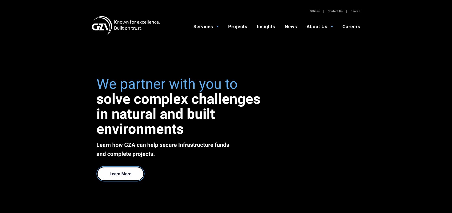
GZA uses a black background, white type and small blue accents for a direct statement about complex challenges in natural and built environments. A simple learn-more action sits below, while services, projects, insights, news, company information and careers remain in the header. The opening is useful as a contrast to scenic, video-led consulting sites: it can communicate a category without requiring a large image to finish loading. Its restraint also places more responsibility on the following content to explain the actual disciplines and project contexts. The brand statement is not a substitute for scoped technical evidence.
What you can learn
An environmental consultancy can choose a text-first opening when clarity matters more than atmosphere. Follow the broad proposition with specific service definitions and case roles, then give visitors a reliable route to relevant people and locations. Avoid replacing concrete explanations with repeated problem-solving language.
Pros
The high-contrast text-first treatment keeps the basic proposition independent of a large media asset.
Services and projects are visible, conventional navigation labels rather than hidden behind an unusual interaction.
Cons & considerations
A broad challenge-solving statement gives limited guidance to visitors unfamiliar with environmental-service terminology.
An almost image-free opening needs supporting case evidence to communicate the settings and work the firm actually handles.
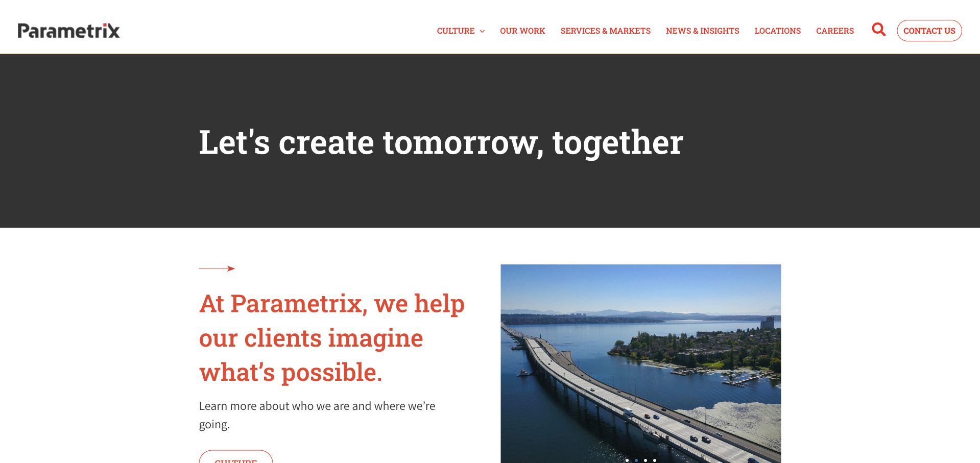
Parametrix uses a restrained white header and a dark introductory strip, then moves into a serif company statement beside a project image. Navigation separates culture, work, services and markets, news, locations and contact. The structure is useful because it does not ask one large hero photograph to explain the whole practice. Instead, the page introduces the brand briefly and lets the next section begin the explanation. This is a broad engineering and consulting example, not a narrowly scoped environmental survey practice. The useful lesson is the pacing between a short opening and the more specific work and service destinations.
What you can learn
A compact introduction can improve reading flow when it is followed quickly by concrete service and project context. Keep culture content distinct from client-facing scope, explain the environmental role within multidisciplinary projects and provide location-specific contact information rather than relying on a single corporate inquiry.
Pros
The compact opening leaves room for the explanatory company section to appear early.
Work, services and markets provide practical routes alongside culture and careers content.
Cons & considerations
A general tomorrow-oriented statement is not specific enough to guide an environmental inquiry on its own.
A broad services-and-markets grouping needs careful organization to avoid mixing client sectors with technical disciplines.
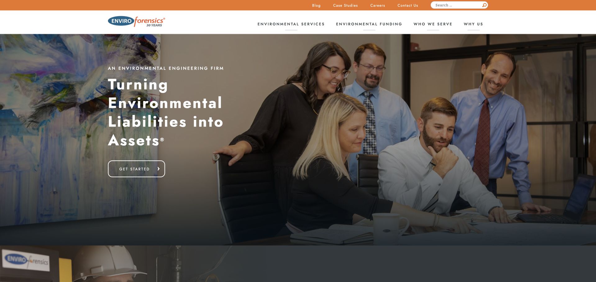
EnviroForensics uses an office-team photograph and a strong introductory statement beneath a restrained orange header. The navigation distinguishes environmental services, funding, portfolio information and company content. The next section describes the firm before introducing more specific work. This is useful for studying a specialist consultancy whose business model needs more explanation than a generic environmental-service menu. The people-led image makes the practice tangible, while the separate navigation categories signal that technical work and funding-related questions are not identical. The source’s liability-to-asset language is marketing positioning, not an independently verified financial or legal outcome.
What you can learn
When a specialist consultancy combines technical work with another complex service context, separate the explanations clearly. Define responsibilities, eligibility and process on the relevant pages, keep introductory forms limited and avoid implying a guaranteed recovery, funding result or regulatory outcome through the homepage headline.
Pros
The team photograph makes the specialist practice feel identifiable rather than relying only on environmental scenery.
Technical services and funding-related content receive distinct navigation routes with different purposes.
Cons & considerations
An outcome-oriented headline can be read too broadly without careful scope and qualification nearby.
A specialized business model needs substantial explanation before a visitor can understand the right inquiry route.
Kegan is a freelance web designer and developer with 15+ years of experience helping businesses turn complicated website requirements into clear, maintainable digital experiences. He works directly with clients from planning and design through development, launch, and ongoing support.
For environmental consulting website design, his development approach focuses on specialist service explanations, project context, technical resources, and qualified project inquiries. The scope can be a targeted improvement or a complete custom build, with responsive layouts, thoughtful content structure, and integrations chosen around the people using and maintaining the site.
Show 3 other environmental consulting website designersHide other environmental consulting website designers
Turn technical expertise into a useful project-facing website
Separate disciplines, sectors and project stages
Begin with a structured inventory of the work the consultancy actually performs. Ecology, environmental assessment, engineering, remediation and planning-related support are not interchangeable labels. Have the technical team define the services in the language it uses with clients, then identify which terms need a plain-language explanation. Avoid building a menu from every keyword associated with the field. A page should exist because it helps a real visitor understand an actual service, not because the phrase sounds adjacent to the business.
Create separate content relationships for disciplines, client sectors, project stages, locations and people. A renewable-energy project can involve several disciplines; a specialist discipline can appear across several sectors. Those relationships are useful cross-links, but they are not a reason to repeat the same paragraph on every page. Decide which page gives the authoritative explanation and which pages summarize and link to it. This reduces contradictory definitions and makes future changes easier for technical reviewers to manage.
Provide a route for visitors who do not know the service name. A project-stage introduction or a short inquiry can help the team clarify the next conversation. Do not turn a routing question into an automated technical diagnosis or a promise of approval. Explain what information will help the consultancy review the request, such as a general location, project type and timing context. Keep confidential site material or sensitive species information out of a public marketing form unless an appropriate handling process has been deliberately established.
Build project evidence that explains the actual role
Choose project stories for the questions they help answer, not only for the quality of the photograph. A useful case page identifies the setting, the client’s broad need, the consultancy’s role, the disciplines involved and the deliverables that can be discussed publicly. Record permission and confidentiality constraints before writing. Where several organizations worked on a project, credit the relevant roles rather than implying the consultancy designed, assessed or delivered everything visible in the image. A precise limited role is more informative than a sweeping claim.
Distinguish planned objectives from work performed and from verified outcomes. If a result is reported, identify its source, period and relevant context. Do not turn a client’s statement or a broad corporate sustainability message into an independently measured finding. Similarly, do not imply that a method used successfully on one site guarantees a consent, remediation endpoint or ecological conclusion elsewhere. This guide concerns communication design, not the technical or regulatory decision that a new project requires.
Create a maintainable case-study template with fields the team can actually complete. Use concise summaries, relevant discipline links and clear captions. Include dates that explain the work rather than automatically refreshing old stories to look current. Make report downloads readable and appropriately described, but keep the essential case explanation in accessible page content. If a full report cannot be public, say what can be learned from the example without inventing detail. A small library of well-scoped cases provides more useful evidence than a large gallery of attractive landscapes with little explanation.
Make the inquiry and ongoing review operationally realistic
Agree on how inquiries are triaged before deciding where the main button leads. A specialist practice may use one team, while a multidisciplinary group may need region and discipline routing. Explain that structure in ordinary language. Ask for a short project description and enough context to identify the right contact, not every possible technical detail at once. Use clear field labels and let visitors say they are unsure of the discipline. A useful confirmation tells them what the team will review and what happens next without inventing a response time or acceptance commitment.
Keep ordinary public inquiries separate from secure project collaboration and document exchange. A client should understand whether a link leads to a marketing form, a portal or another organization’s system. Review external destinations after acquisitions, office moves and system changes. Where a legacy brand remains online, explain where its services continue and avoid maintaining contradictory contact routes. A simple, factual transition notice can be more helpful than a silent redirect or a new logo with no explanation.
Plan content ownership with the technical team. Service definitions, staff roles, survey calendars, project permissions and public claims all need review, not just visual polishing. A survey calendar should explain its intended scope and remain an aid to discussion rather than an automatic determination for every site. Test the website with realistic tasks: finding a discipline, understanding a project role and locating a relevant office. Include keyboard and mobile checks, readable media controls and a static alternative to large video. Evaluate whether the site clarifies the conversation, not whether it appears to guarantee a technical, environmental or regulatory outcome.
The editing job behind the design
Choose a content model your technical team can keep accurate
A CMS with structured services, people, projects and offices is often more valuable than a complex visual frontend. Define relationships between those records and give technical reviewers a manageable publishing workflow. Avoid putting essential scope explanations only inside PDFs or animated homepage features.
Use efficient photographs, optional video and clear controls. A project portal or document-sharing system has different needs from the public site and should be treated as a separate integration. Visible website technologies do not establish the tools used for GIS, modeling, field data, engineering or internal project records.
Our WordPress website examples offer a separate look at publishing approaches. A visible platform label is evidence for that named page, not a guarantee that the same system will suit your requirements.
Before the public launch
Environmental consultancy website brief checklist
List actual technical disciplines and have the relevant specialists approve the definitions.
Keep disciplines, client sectors, project stages and geographic offices as distinct content relationships.
Provide a plain-language route for a visitor who does not know the correct service term.
Explain project scope, team role and deliverables rather than relying on landscape imagery alone.
Record permissions, confidentiality constraints and collaborator credits before publishing case material.
Distinguish objectives, work performed and verified outcomes with appropriate sources and dates.
Avoid presenting a survey calendar or routing tool as a project-specific technical determination.
Keep current brand, office and service destinations clear after acquisitions or rebrands.
Limit the first inquiry to information needed for triage and explain what happens next.
Separate public contact forms from secure project documents and sensitive site information.
Test navigation, form labels and media controls with a keyboard and at narrow widths.
Assign reviewers for service pages, people, project claims, calendars and external portal links.
These checks are a project checklist, not a performance, legal, security, or accessibility certification. Test real journeys with the people responsible for the website before making claims about the result.
Sources & editorial method
How this collection was selected and reviewed
The public pages and direct browser captures were reviewed on November 9, 2026 for design, content and navigation. Specialist and multidisciplinary models are distinguished, and current brand transitions are described where visible. Inclusion does not assess scientific competence, environmental performance, consent likelihood or regulatory compliance. Primary source and capture records preserve the actual pages observed.
Each example links to its actual source page. Screenshots are direct browser captures with their own capture dates; moving imagery, announcements and live designs can change. The notes describe observable design choices and conditional tradeoffs, not measured traffic, conversion results, service quality, or accessibility conformance.
Technology labels use public page metadata, asset evidence, or explicitly cited platform documentation. Platform documentation is not a complete current deployment audit. A component reference may be legacy or unused; it is not a complete backend inventory. Unknown stacks are omitted. These sites are editorial examples, not our client portfolio.
Written, Edited and Curated are separate editorial records, not timestamps advanced by a rebuild. Website designs and imagery belong to their owners. See our editorial standards or suggest a correction.
Questions worth asking
Environmental Consulting website design questions
Should we organize the site by sector or technical discipline?
Often both are useful, but they should not be mixed into one unstructured menu. Give each discipline one clear explanation, then connect relevant projects and sectors to it. The appropriate depth depends on the real practice, not the size of another consultancy’s website.
Can a project photograph demonstrate an environmental result?
Not on its own. Explain what the consultancy did, which part of the project is shown and what any result statement is based on. A scenic image can provide context without implying responsibility for everything visible or a verified environmental improvement.
Is a survey calendar a useful website feature?
It can be, when the consultancy can maintain it and explain its scope. It should support early discussion rather than determine the requirements of every site automatically. Have the relevant specialists review the content and keep any project-specific conclusions within the actual professional process.
What should happen to a website after a consultancy rebrand?
Explain the current relationship, preserve relevant service routes and update team and office information. A legacy address should help returning users reach the continuing service. Avoid leaving old and new sites with contradictory contacts or implying that a previous operating model remains unchanged.
Does an impressive website establish technical quality?
No. This collection studies public communication and interface decisions. It does not evaluate field methods, scientific findings, engineering work, professional competence or regulatory outcomes. Those questions require appropriate evidence and project-specific review outside a website-design inspiration guide.
Make the technical role understandable and the next conversation easy to begin. Specific services, scoped cases and current people information are stronger than an unsupported sustainability slogan.