Best Assisted Living Websites of 2026 (24 Real-World Examples)
Make a real community understandable through place, living options and practical information—not only lifestyle imagery.
An assisted-living website is part of a considered decision, often involving several people and many practical questions. A dramatic film can introduce the atmosphere, but it cannot explain the actual living options, location, visit process or current terms. Good design helps visitors compare a real place and ask useful questions without pretending the website can decide what support a person needs.
This collection includes one-community organisations, regional groups and larger portfolios. Compare how each connects its brand to a specific place. A location finder may be essential for a large network, while a single community can put its address, telephone number and local story directly into the opening. The same full-screen resort-style film is not automatically appropriate for both.
These are website-design observations, not a review of care quality, housing suitability, safety or resident outcomes. Published service categories, recognition claims and availability remain the organisation’s information. A photograph does not establish the identity or experience of the people pictured. Have the community’s responsible teams approve service descriptions, current practical information and the handling of family enquiries.
Before the examples
What makes good assisted living website design in 2026?
Attach information to the actual place
Give each community a record with its address, contact route, published living options and practical visit information. Separate brand-wide storytelling from facts that apply to one location. Label photographs accurately and distinguish shared promotional material from images of the selected property. A visitor should not need to guess whether a garden, dining room or apartment belongs to the place being considered.
Explain living options without deciding for the visitor
Use plain descriptions approved by the organisation for independent living, assisted living, memory care and any other options actually offered. Explain the enquiry and assessment process without encouraging self-diagnosis or making suitability promises. A shared brand should not imply that every community has the same services. Keep comparison information public where possible rather than requiring a sales conversation for every basic question.
Make visits and enquiries proportionate
Tell people what a tour request does, who responds and what information is needed initially. Keep a general enquiry separate from any later sensitive process. Offer a telephone alternative and avoid asking a family to supply detailed health information simply to receive a brochure. Do not turn an attractive lifestyle page into an unexplained assessment funnel.
The collection · 24 examples
24 assisted living websites worth studying
Compare the relationship between lifestyle presentation and practical local detail. The first selection is a family-owned local community documented by its own public About page. The wider examples illustrate different website structures, not an independent ranking of communities, care quality or resident satisfaction.
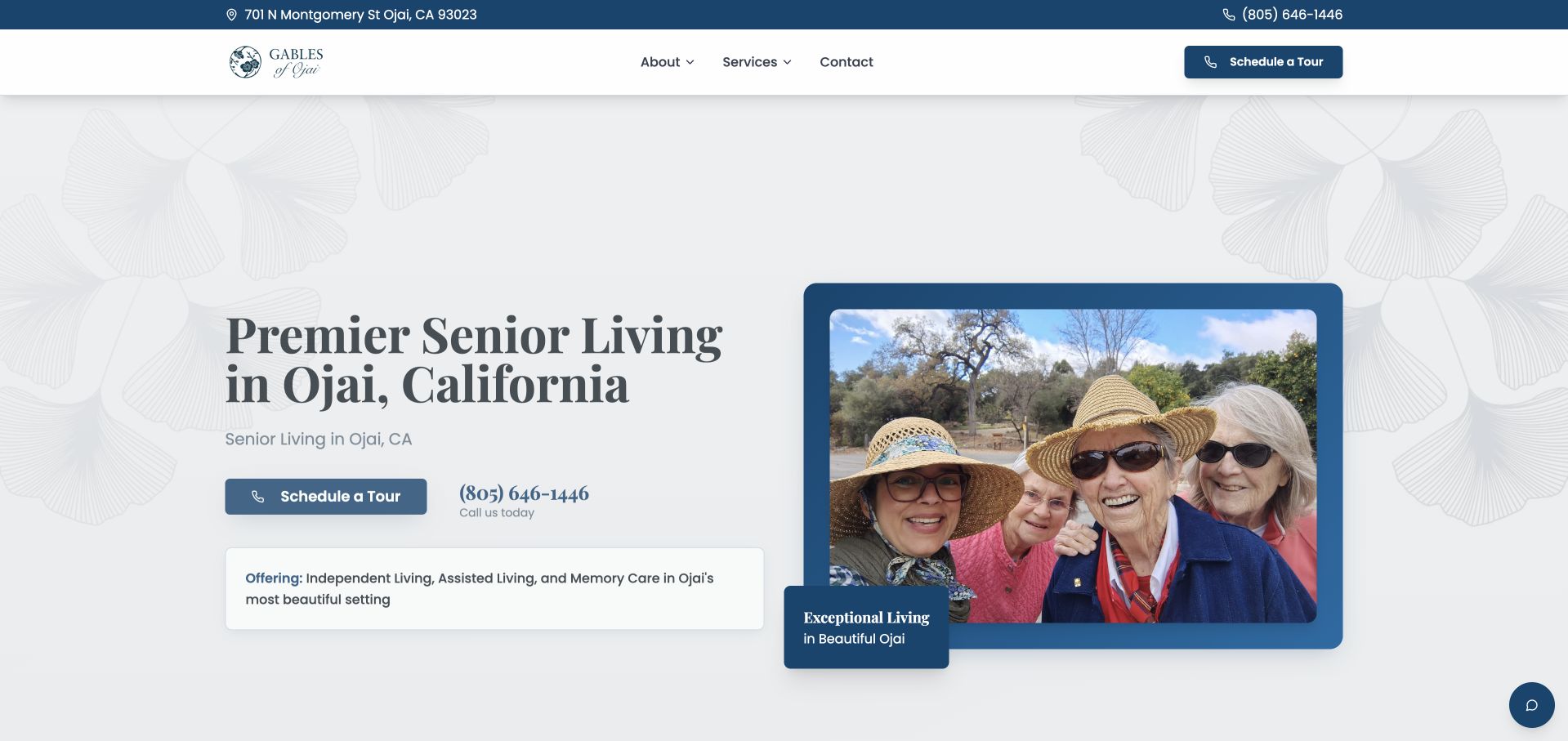
Gables of Ojai pairs a location-specific headline with a framed photograph and a restrained blue-and-white identity. The address and telephone number appear in a slim top strip, while the main navigation stays compact: about, services, contact and a tour action. Its official About page identifies a family-owned Ojai community, giving the local positioning a direct source. The opening also distinguishes independent living, assisted living and memory care rather than presenting one vague accommodation category. The design’s useful quality is its scale: a visitor can understand the place without navigating a national directory. The photograph and published care claims do not independently establish resident experience or service quality.
What you can learn
For a single community, make place, contact and the next visit step explicit. Explain living options individually and use photography to introduce the environment rather than as proof of care outcomes.
Pros
The city, address and telephone route make the community’s physical context immediately understandable.
Compact navigation avoids imposing a multi-region directory structure on a single local property.
Cons & considerations
A small first-view service summary needs fuller explanations of what each living option includes.
Tour and information actions should explain the next step without requesting unnecessary health or family details.
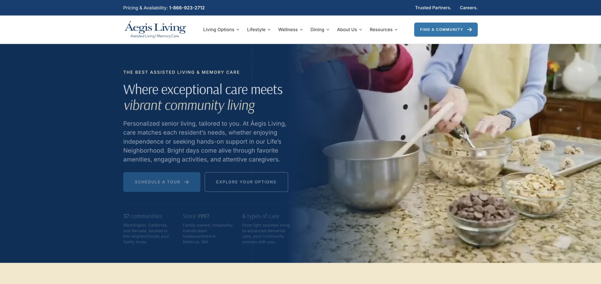
Aegis Living uses a deep blue text panel beside an everyday activity image, with a white navigation bar and a narrow utility strip above. The opening emphasises community life rather than beginning with a property grid. Information about options and the organisation remains accessible through the header, while supporting copy gives the lifestyle message more context. The split composition is valuable because it gives text a stable reading surface even when the image changes. Its limitation is practical specificity: the opening atmosphere does not tell a visitor which community has the relevant living option, what a visit involves or how to compare local details.
What you can learn
Use everyday activity imagery to introduce a community brand, but pair it with an explicit route to local options. Keep text separate from variable media and make practical comparison possible before a visitor requests a tour.
Pros
The dark text panel maintains a consistent reading area beside changing photographic material.
The header provides a stable information structure beyond the lifestyle-led campaign.
Cons & considerations
Aspirational community language can delay the specific location and living-option questions a family brings.
Fine supporting text in a dark panel needs careful spacing and contrast at smaller sizes.
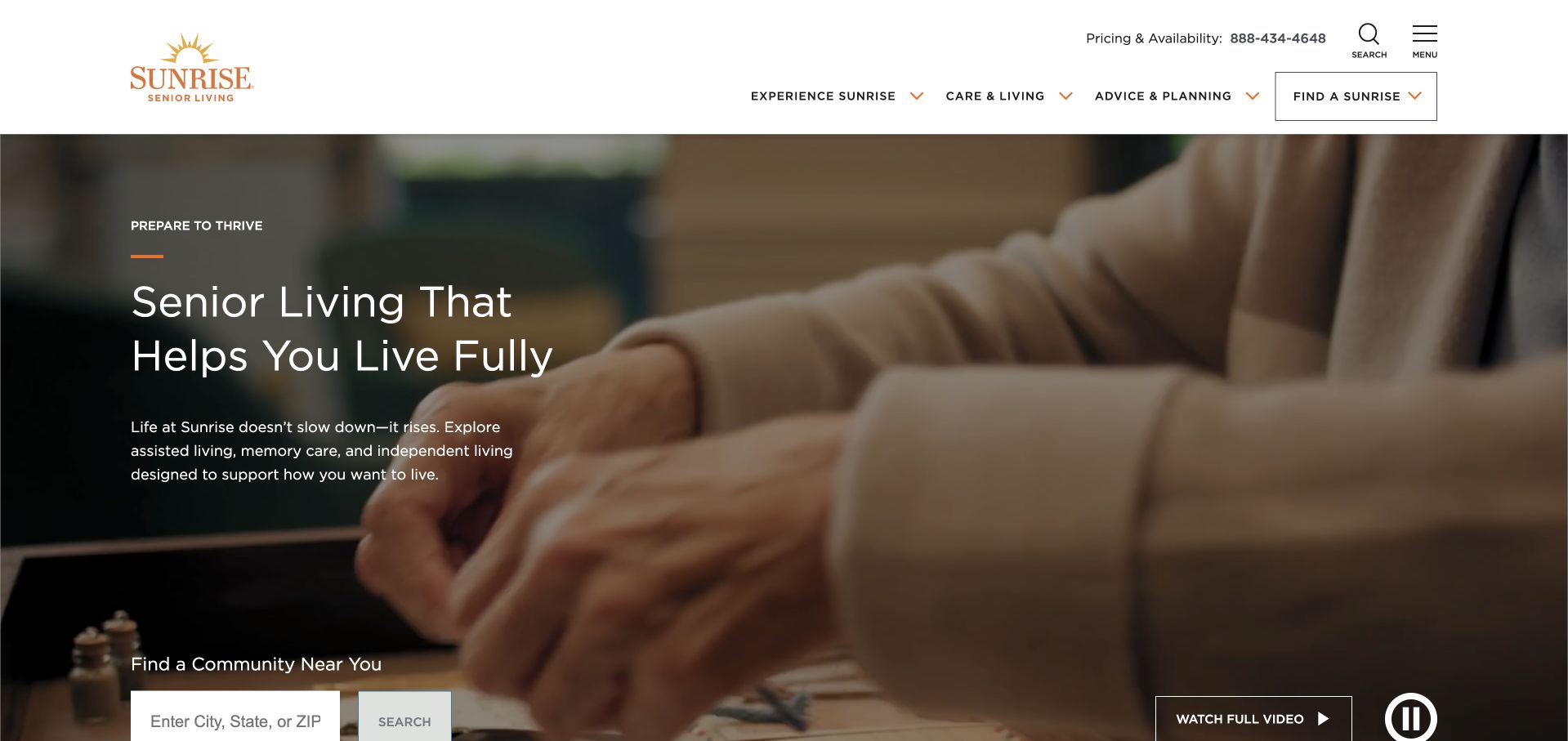
Sunrise presents a broad lifestyle film with a compact text introduction and a community finder. A visible pause control and watch-full-video option acknowledge that the hero is moving media rather than a static photograph. The header separates living experience, care and planning information, with a telephone route for pricing and availability. The useful lesson is the coexistence of storytelling and a location task: visitors can move towards local information without watching the entire film. The film still dominates the first view, and emotional imagery cannot answer questions about a particular community’s services, current availability or terms.
What you can learn
Give a film-led homepage a meaningful still state, usable motion controls and a permanent community route. Keep published care information and local practical details available independently of the campaign narrative.
Pros
A community finder remains available within the cinematic opening rather than after the video story.
Visible playback controls make the moving-media treatment easier to understand and manage.
Cons & considerations
A full-width film can dominate attention and slow access if its fallback is not carefully designed.
Network-level lifestyle messaging needs community-specific service and pricing information before a visitor can compare options.
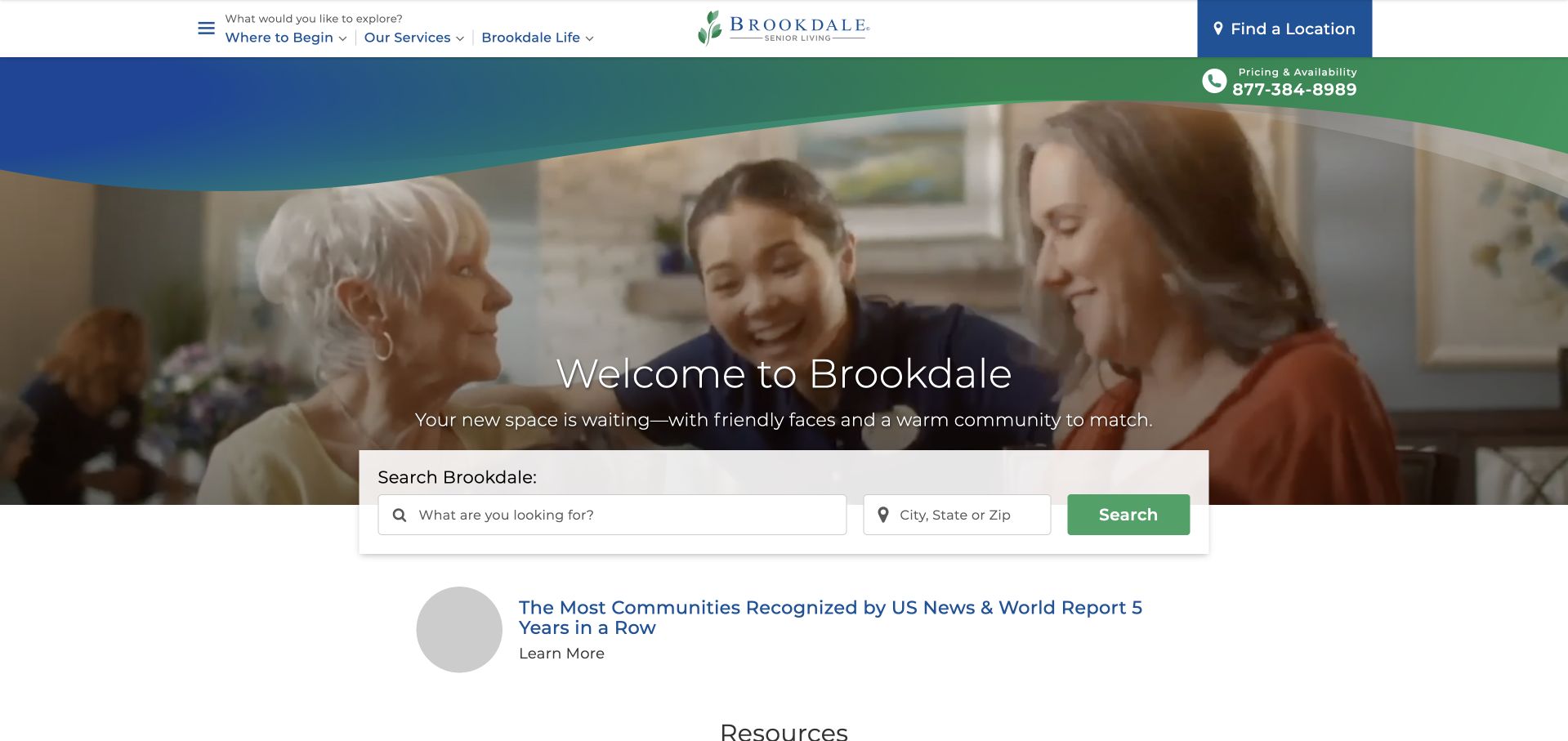
Brookdale combines a large care-interaction photograph with a prominent search component near the lower edge of the hero. The search accepts an area and a care-related choice, while a curved blue-and-green brand treatment creates continuity with the header. Telephone and location actions remain visible at the top. This is useful directory design: the opening asks the visitor to narrow place and service rather than browse a long list of properties. Supporting recognition material sits below, where it should remain source-qualified rather than substitute for local information. The search must also support people who do not yet know the organisation’s terminology for living options.
What you can learn
Let geography narrow a large directory while providing plain explanations for living-option filters. Treat local availability, pricing and care requirements as separate facts, not consequences of selecting a broad category.
Pros
The search offers a practical bridge from a national brand introduction to local community information.
Location and telephone actions remain visible outside the changing promotional content.
Cons & considerations
Care-related filter labels can be difficult for visitors who are still learning the available options.
Recognition and lifestyle imagery cannot establish the suitability or current provision of a specific community.
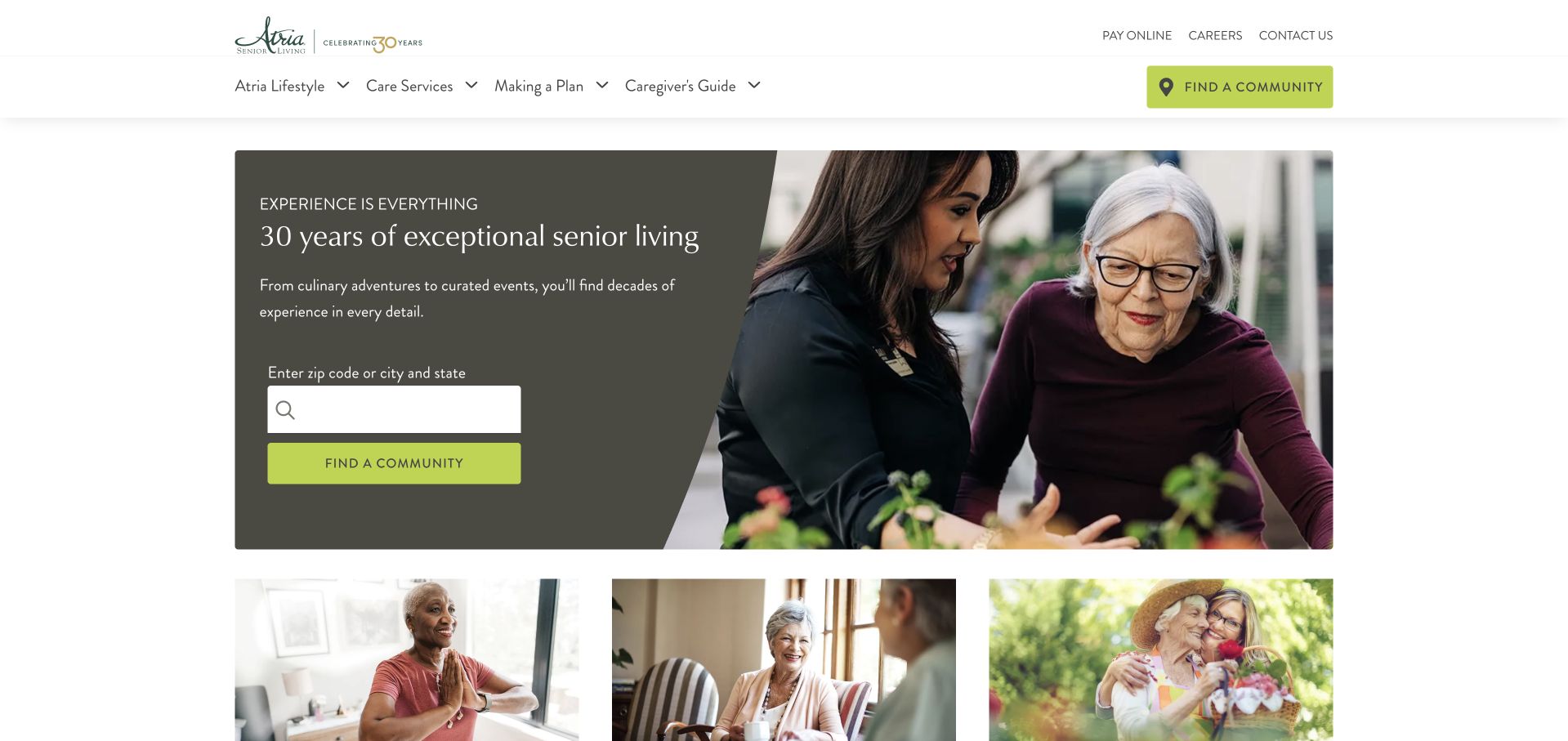
Atria uses a dark contained text panel next to a large photograph, with a green location-search action embedded in the panel. The following row of images suggests different aspects of community life without requiring each to become a separate campaign. The navigation distinguishes the living experience, services and resources, preserving an informational path alongside the locator. This is a useful alternative to placing all text directly over video: the panel provides a predictable reading surface. The search label and surrounding copy still need to explain what happens next, and a broad lifestyle presentation should not imply that every property has the same spaces, activities or services.
What you can learn
A contained text-and-search panel can make a photographic homepage easier to use. Keep community-specific facts attached to their location and label lifestyle imagery so it is not mistaken for a uniform promise across the network.
Pros
A solid background keeps the main message and search readable beside the large image.
The photographic sequence adds visual variety without replacing the permanent navigation structure.
Cons & considerations
A broad community-life presentation needs local detail before visitors can make meaningful comparisons.
Small field labels and muted text inside a dark panel require careful enlarged-text and mobile testing.
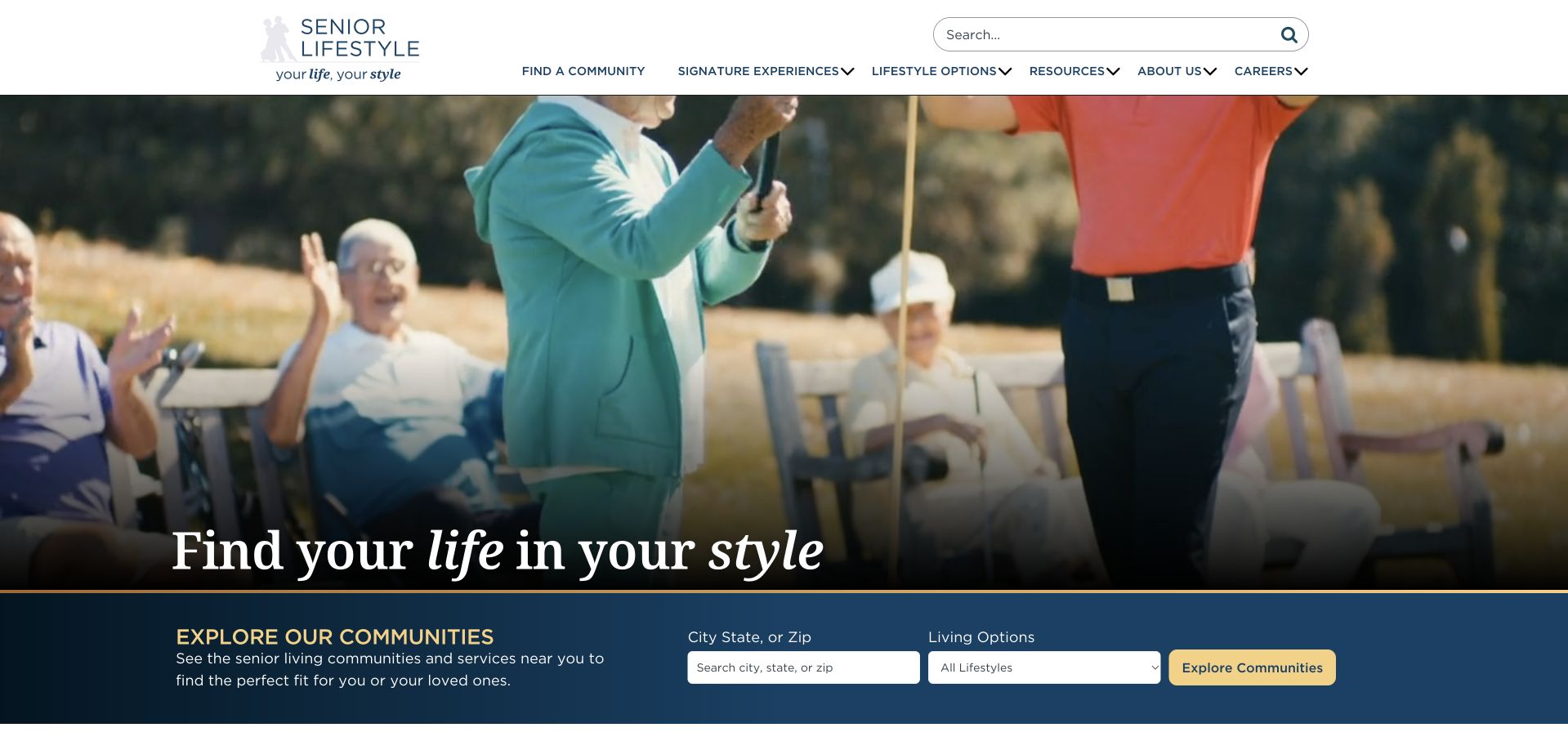
Senior Lifestyle uses a large outdoor activity scene with a short statement, then places an explicit community-search strip below it. City, state or ZIP information and living options are separate choices in that strip. The white header preserves navigation for community discovery, experiences, options and resources. The composition recognises that a visitor may enjoy the lifestyle story but still need a practical way to narrow a large collection. Its challenge is maintaining that hierarchy when the film or photograph changes. The action strip should remain stable, and terms for different living arrangements need explanation rather than assuming every family already understands them.
What you can learn
Separate the emotional introduction from the comparison controls. Keep location and living-option filters on a stable background and provide plain-language explanations before a visitor must choose a category.
Pros
The search strip clearly separates geographic and living-option decisions beneath the main image.
A stable white header keeps informational navigation readable outside the media area.
Cons & considerations
Moving lifestyle imagery needs a useful fallback and must not delay access to community information.
Living-option terminology can create friction when visitors are still uncertain about the differences.
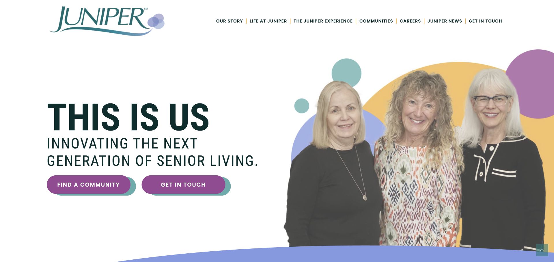
Juniper Communities introduces itself with a group portrait cut out against colourful abstract shapes. Large typography and purple actions make the page recognisable without opening on a building exterior. Community discovery and contact are the two clear actions, while the header offers the organisation’s story, experience and resources. The design is useful for challenging the assumption that every senior-living site must begin with a resort photograph. Its boldness also means practical details can feel secondary. The page needs to make local living options, contact expectations and property-specific information as clear as the brand campaign, without treating pictured people as independent evidence of resident satisfaction.
What you can learn
A people-led brand can be distinctive while remaining practical. Keep the community finder literal and prominent, then use local pages to provide specific environments, services and visit information rather than relying on a shared campaign.
Pros
The portrait-and-shape composition creates a clear identity without requiring background video.
Community discovery and contact are easy to distinguish as separate next steps.
Cons & considerations
Large campaign typography leaves less first-view space for practical living-option information.
The shared brand treatment needs local photography and specific details to support meaningful community comparison.
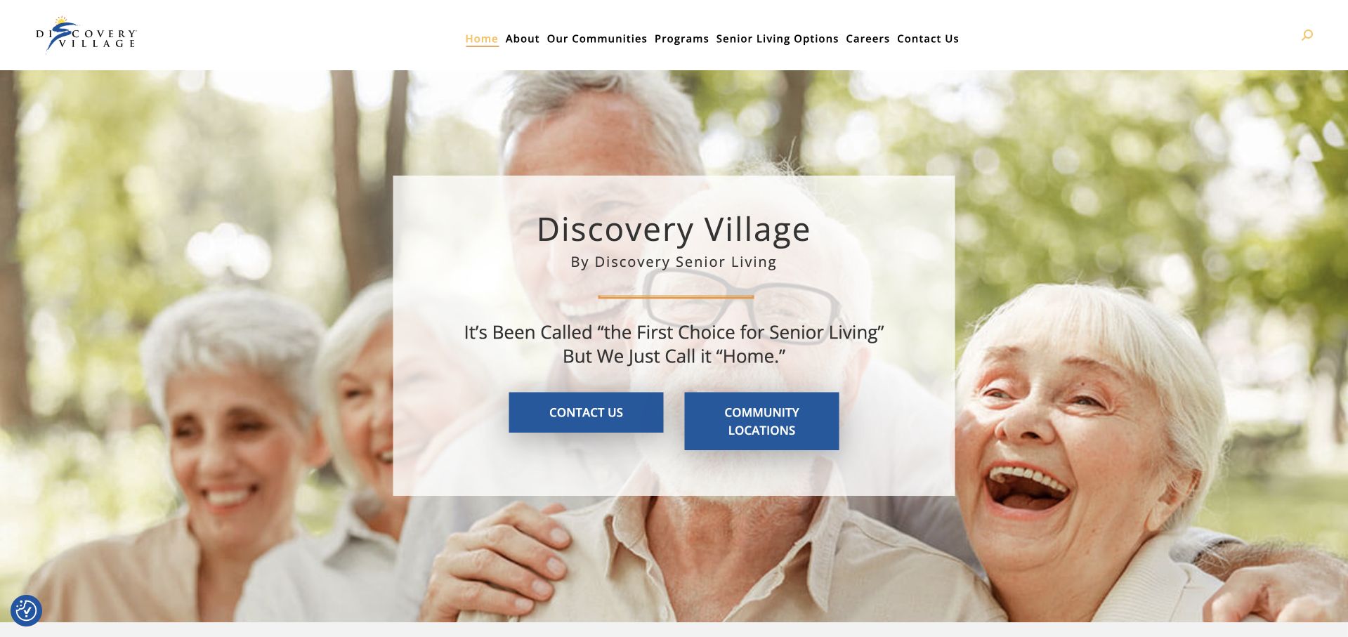
Discovery Village places a pale central card over a large photograph of older adults. The card names the brand and gives contact and community-location actions equal, clearly separated places. The header exposes communities, programmes and living options, which provides a route beyond the promotional opening. The composition is familiar and easy to recognise, although the photographic background can make it feel generic without local supporting content. A quotation-style marketing line in the opening remains the organisation’s presentation, not an independently measured assessment. The strongest transferable element is the bounded action card: it makes two practical paths visible without requiring an immediate detailed enquiry.
What you can learn
Use a central card to keep actions readable over an image, then support it with location-specific information. Keep promotional quotations source-qualified and distinguish a general contact request from choosing a particular community.
Pros
The pale card gives the brand and actions a stable reading surface against a full-width photograph.
Contact and location discovery are distinct options rather than a single catch-all conversion button.
Cons & considerations
A generic lifestyle image needs local context before visitors can understand individual communities.
Promotional quotation language should not be presented as independent evidence of service or resident outcomes.
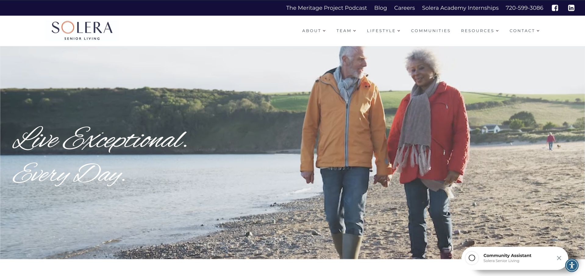
Solera uses a wide lifestyle film, a script headline and a restrained navy identity. The header distinguishes team, lifestyle, communities and resources, while the page below groups properties into different collections. That supports a brand whose work includes both development and community operation, rather than a single local residence. A separate public partnership section provides additional business context. The opening is atmospheric, but the script lettering and large moving image offer less immediate practical detail than a locator-first design. Visitors evaluating a place to live still need a clear route from the parent brand into specific communities, living options and local contact information.
What you can learn
When a senior-living brand serves both residents and business partners, distinguish those journeys. Use lifestyle media to introduce the identity, then make community selection and local practical information more literal than the campaign language.
Pros
Team, community and resource navigation provide substance beyond the broad lifestyle opening.
Distinct property collections can explain differences within the organisation when their criteria are clear.
Cons & considerations
Script typography and moving backgrounds create readability challenges across small screens and variable frames.
A parent-brand story can obscure the local community task unless the route is explicit.
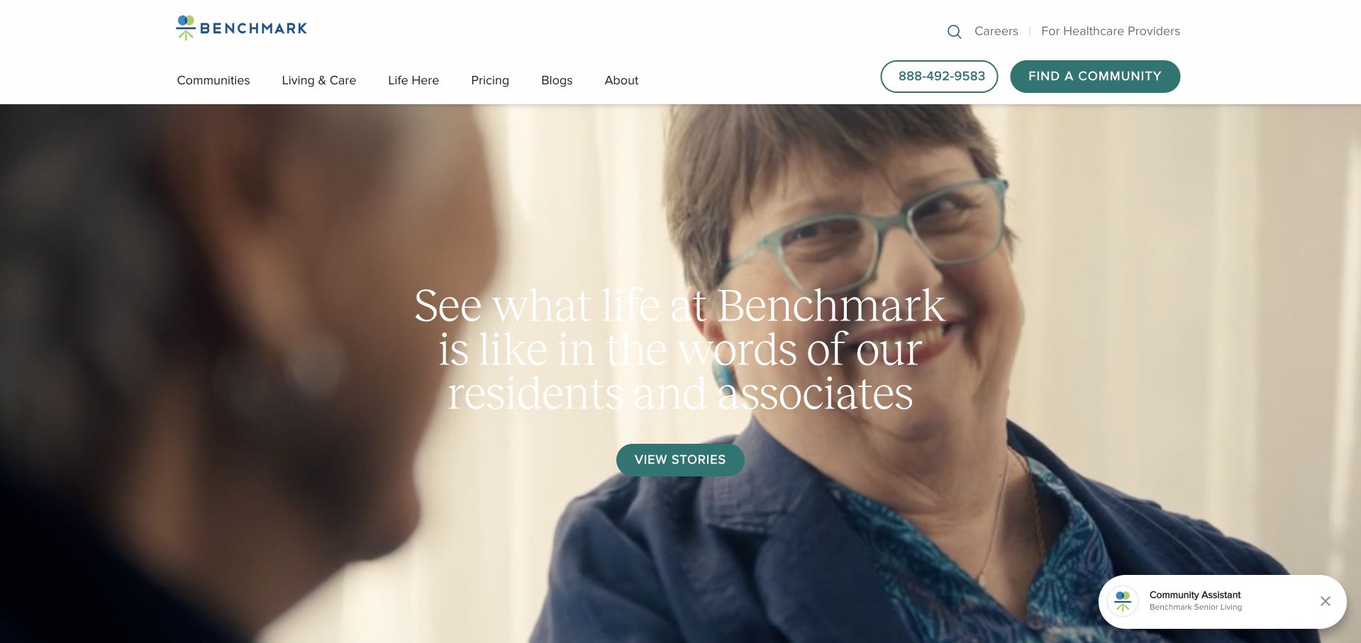
Benchmark presents a large people-focused photographic scene with a central invitation to explore community stories. A white header keeps communities, care, life and pricing information in separate navigation routes. The page’s story-led opening gives the brand a human tone, while the community-finding action remains available above it. That balance is useful for a considered decision rather than an immediate retail purchase. The design does not establish whether a pictured person is a resident or how representative the scene is. The practical comparison information must therefore stand on its own, with local details, current options and clearly explained enquiry expectations.
What you can learn
Use stories as context rather than as substitutes for comparable community facts. Keep pricing and living-option information publicly discoverable, and offer a local-community route for visitors who do not want to watch or read a story first.
Pros
Care, community life and pricing are explicitly separated in the navigation rather than hidden behind one sales route.
The human-scale scene provides a clear alternative to a building-only institutional introduction.
Cons & considerations
A story-led first view can delay practical location and service comparison for task-focused visitors.
Photographic storytelling needs accurate context and cannot by itself establish a typical resident experience.
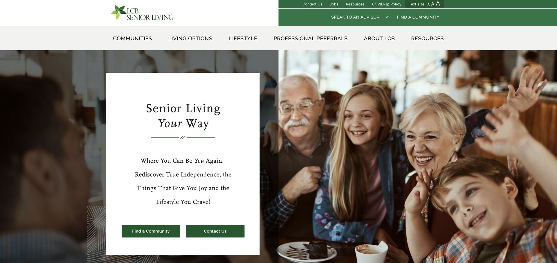
LCB uses a tall white panel to carry its central statement beside a broad people-focused image. A green utility strip and matching actions create continuity across the navigation and hero. Community discovery and contact are separate buttons, while the main menu includes living options, lifestyle, professional partners and resources. The layout gives short text a calm reading surface without covering the photograph in multiple captions. The tradeoff is an unusually narrow text column, which can force repeated short lines and slow reading. Its choice-oriented language needs practical local information beneath it so visitors can understand the actual differences among communities and services.
What you can learn
A narrow text panel can create a strong visual contrast, but give important copy enough width to read naturally. Support a choice-oriented brand with specific local options and separate resident, professional and business-partner paths.
Pros
The solid white panel keeps the main message and actions readable alongside the large image.
Professional-partner navigation acknowledges an audience different from prospective residents and families.
Cons & considerations
A narrow text column can turn short statements into many fragmented lines on intermediate screen sizes.
Broad choice language needs local service detail rather than an implied identical experience across communities.
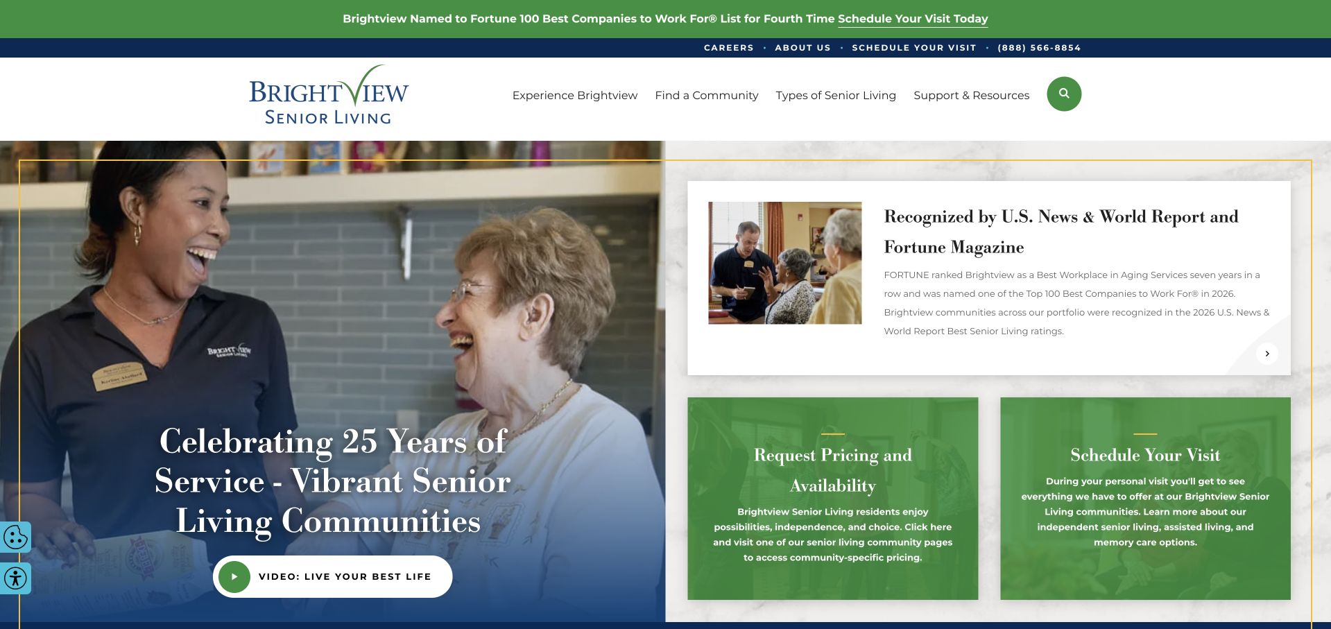
Brightview divides its first view into a large human-focused scene and a set of smaller information panels. Pricing and availability, scheduling a visit and recognition material have their own spaces rather than competing as text over one full-screen film. A green utility strip adds a timely campaign message above the main header. The modular approach is useful because different priorities can be updated independently. It can also become visually busy, particularly when recognition, a campaign and practical actions all use similar emphasis. A visitor should be able to identify the local-community and visit route without first interpreting every panel.
What you can learn
Use modules to separate pricing, visits and brand evidence, but give them a deliberate order of importance. Keep local service facts distinct from network-wide recognition and time-limited campaign copy.
Pros
Pricing and visit information have dedicated areas instead of being buried beneath a long introduction.
The modular layout can support independent updates to practical and promotional content.
Cons & considerations
Several high-emphasis panels can compete and make the first view feel crowded.
Recognition material needs its original scope and date rather than implying uniform results across all communities.
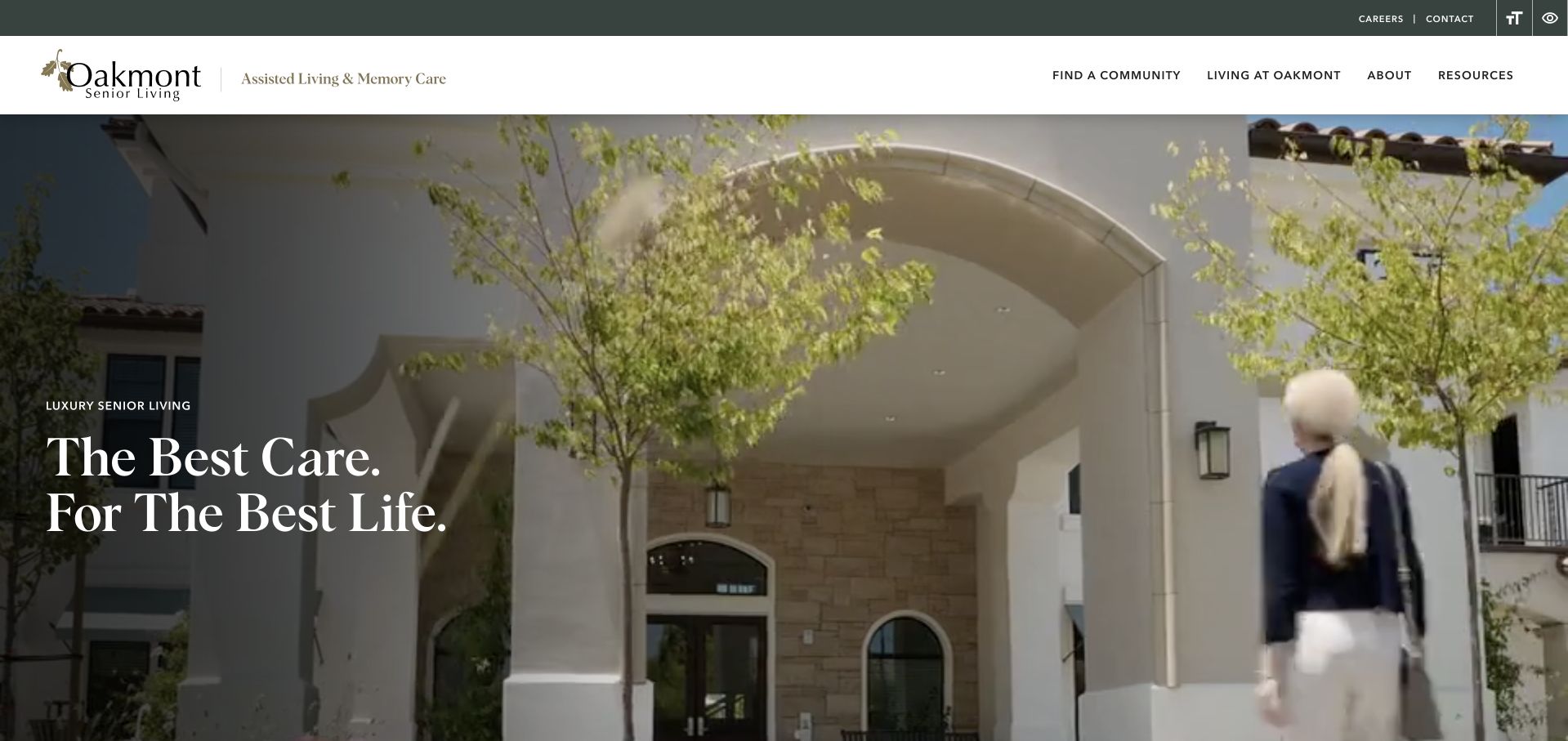
Oakmont uses a large exterior scene with a short white headline placed over a darkened portion of the image. The muted green header provides community discovery, organisational information and experience-focused navigation. The physical setting is the main visual argument, which is useful for a service tied closely to place. It should still be treated as the brand’s selected presentation, not a complete account of accessibility, room layouts or everyday conditions. The restrained overlay creates an elegant opening but offers little immediate qualification. Visitors need a nearby route to specific locations and the living options actually available at each property.
What you can learn
Let a real environment introduce the brand, then add practical local detail that photography cannot supply. Keep community selection and visit information visible, and avoid treating polished architectural imagery as evidence of care quality.
Pros
The physical setting gives the opening a concrete sense of place instead of an abstract lifestyle promise.
The restrained colour system preserves the image without surrounding it with competing promotional graphics.
Cons & considerations
A short overlay headline explains little about local availability, living options or the enquiry process.
Exterior imagery needs supporting interior, access and layout information before it can help visitors compare communities.
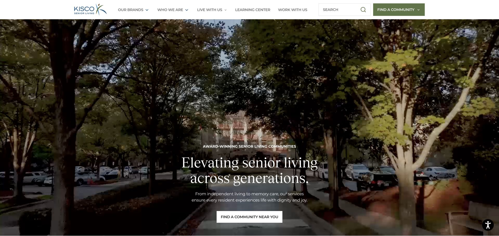
Kisco opens with a large lifestyle film and a centred white headline. Its header uses direct labels such as brands, who we are, live with us, learning centre and work with us, making different relationships visible before the visitor starts exploring. A community finder has a distinct green treatment. This is useful when the organisation contains several brands and regions: the navigation acknowledges that structure rather than expecting every visitor to understand it. The film provides atmosphere, but a person evaluating a specific community still needs a clear path through the portfolio. Awards and broad lifestyle claims require their original context rather than becoming an independent comparison.
What you can learn
Use literal relationship-based navigation to explain a multi-brand organisation. Keep the community finder stronger than the campaign film, and carry the selected brand and location consistently into the local information pages.
Pros
Resident, employment and organisational information paths are expressed in understandable language.
The contrasting community finder provides a practical action alongside the large cinematic opening.
Cons & considerations
Multiple brands add a navigation layer that can complicate a visitor’s local-community search.
A full-width film needs a useful static state and must not delay essential location or service information.
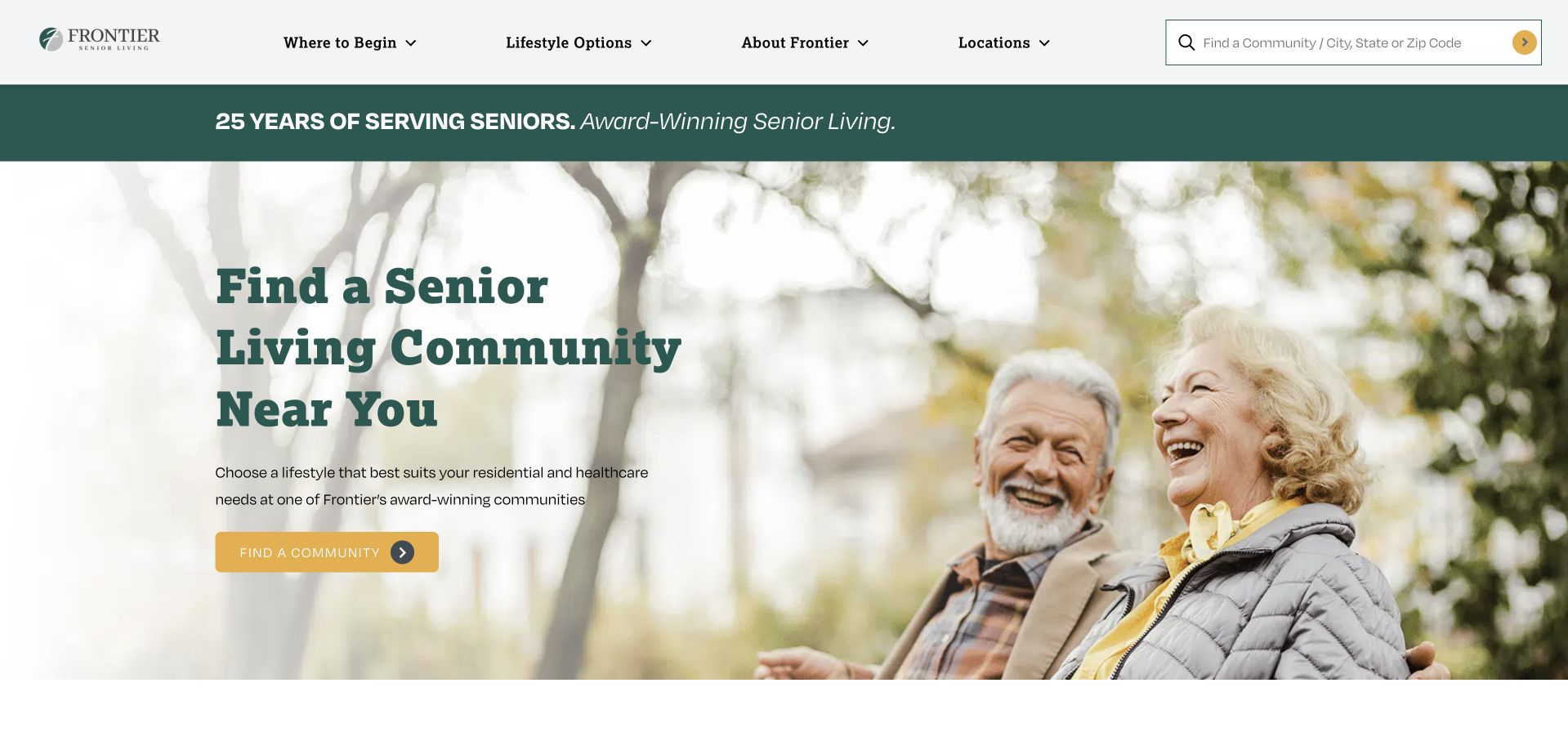
Frontier uses a large outdoor photograph and a prominent community-finding headline. A yellow action contrasts with the green identity, while the header includes a search field that accepts a community, city, state or ZIP. That flexible input is useful for visitors with different levels of knowledge: some know a property name, while others only know the area. A narrow experience-related strip adds a second layer of brand information above the hero. The page’s practical strength is the clear local-search model. The supporting lifestyle scene and broad care claims do not establish which options, availability or policies apply to a particular property.
What you can learn
Let a community search accept the information visitors actually have, not just an internal property name. Preserve the selected geographic context and provide meaningful local results before asking for an enquiry.
Pros
The search supports both known-community and area-based discovery within the same visible interface.
The contrasting action gives the locator task a clear place in the photographic opening.
Cons & considerations
Broad operating-network claims need property-specific detail before they support an individual comparison.
A photograph-led opening can crowd the search if the mobile crop and text position are not separately designed.
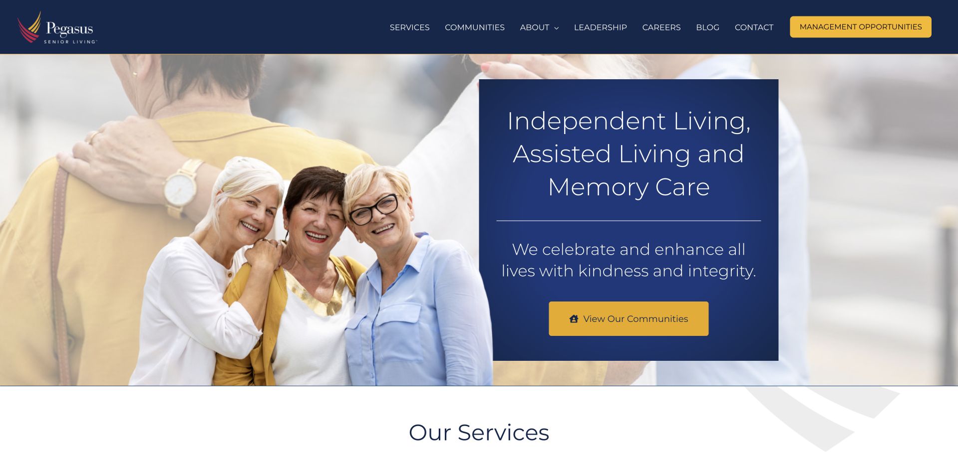
Pegasus places a dark blue panel over a large people-focused image, naming independent living, assisted living and memory care in the opening. A contrasting yellow community action connects that explanation to local discovery. The header separates services, communities, about, careers and contact, with a management-opportunities route also visible. The page is useful for making living categories explicit instead of relying entirely on a vague lifestyle slogan. Those categories still need detailed explanations at the local level. A consistent brand page cannot establish that every property offers all three options or that their services and admission processes are identical.
What you can learn
Name the living options plainly, then attach specific provision to individual communities. Keep business-development and employment routes separate from resident enquiries so they do not compete for the same primary action.
Pros
The opening explicitly identifies several living options rather than requiring visitors to infer them from imagery.
A contrasting community action creates a clear transition from general information to local discovery.
Cons & considerations
A multi-option headline can imply uniform provision unless community pages clearly distinguish available services.
Business and resident audiences share the header and need an intentional hierarchy to avoid confusion.
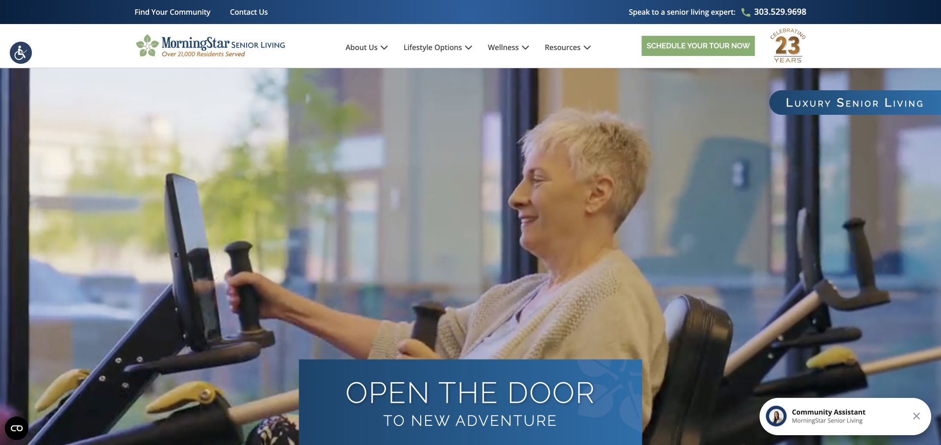
MorningStar uses a wide lifestyle film with a blue introductory panel near its lower edge. The header provides community discovery, living options and resources, while a separate telephone strip offers a direct contact route. The opening feels personal and hospitality-led without removing the broader information structure. The film can show several scenes, which adds variety but creates a need for captions, stable text contrast and a meaningful still image. The most useful design lesson is the separation between emotional introduction and permanent access routes. The video should never be the only place where a visitor learns what type of community or service is being presented.
What you can learn
Make a hospitality-style film optional to understanding the site. Keep community, living-option and telephone routes stable, and provide specific local information outside the changing scenes and promotional text.
Pros
A separate telephone strip remains available above the main navigation and campaign.
Living-option and community navigation provide practical alternatives to watching the introductory film.
Cons & considerations
Moving scenes need meaningful fallback imagery and controls that remain usable with reduced motion.
A broad welcome message still leaves local service scope, availability and visit expectations to supporting pages.
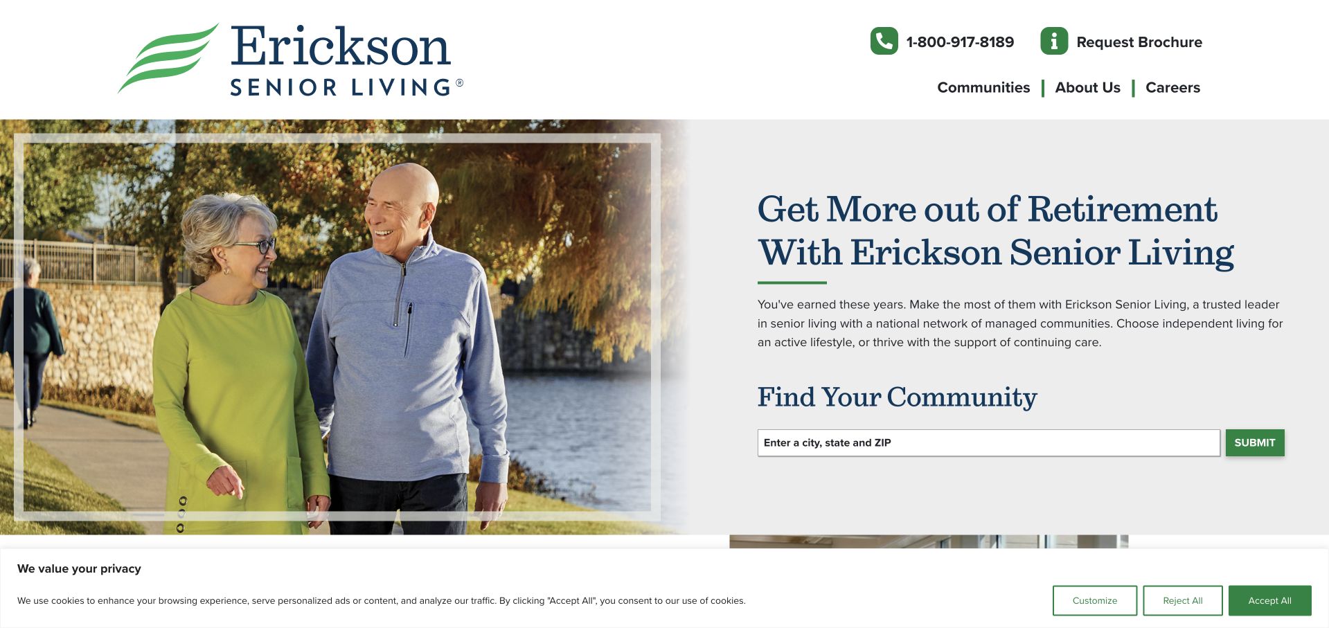
Erickson places a large photograph beside a pale text area with a community finder. Telephone and brochure actions sit in a compact header rather than competing inside the hero. The search invites the visitor to identify an area, making the opening useful without requiring a long personal enquiry. A separate video introduction begins lower on the page. This is a helpful progression from browsing to learning more: the film is not a prerequisite for understanding the principal task. The broad retirement proposition still needs precise local explanations, including which living arrangements and services belong to each community rather than to the network in general.
What you can learn
Give location discovery its own stable text area and make deeper storytelling optional. A brochure request should complement, not replace, useful public information about individual communities and the process of arranging a visit.
Pros
The finder is readable on a solid background rather than superimposed on a moving scene.
Telephone and brochure routes remain distinct from the geographic browsing task.
Cons & considerations
A general retirement message cannot explain the local combination of accommodation and support services.
Brochure-led information can create unnecessary enquiry pressure if comparable details are not also available publicly.
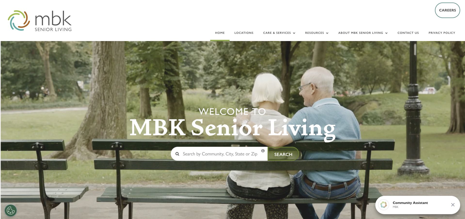
MBK uses a broad outdoor photograph with a centred brand introduction and a compact community search. The header is unusually spacious, placing the logo, navigation and a separate careers action in clear zones. Living services, programmes and resources have distinct routes, which helps the page serve more than a single sales task. The visual calm is useful, but the small search component carries much of the opening’s practical function. It needs strong labels and a clear results experience, especially for visitors who only know a city or approximate area. The shared brand introduction should not imply uniform service provision across every community in the portfolio.
What you can learn
A minimal hero still needs a conspicuous, well-labelled task. Keep careers and resident discovery separate, and follow a quiet brand introduction with specific local information rather than another layer of generic reassurance.
Pros
The spacious header gives the logo, information routes and employment action distinct positions.
Community discovery remains visible within the opening rather than after a long corporate introduction.
Cons & considerations
A very small search component can be overlooked against the large outdoor image.
Shared lifestyle messaging needs local facts to distinguish individual communities and available living options.
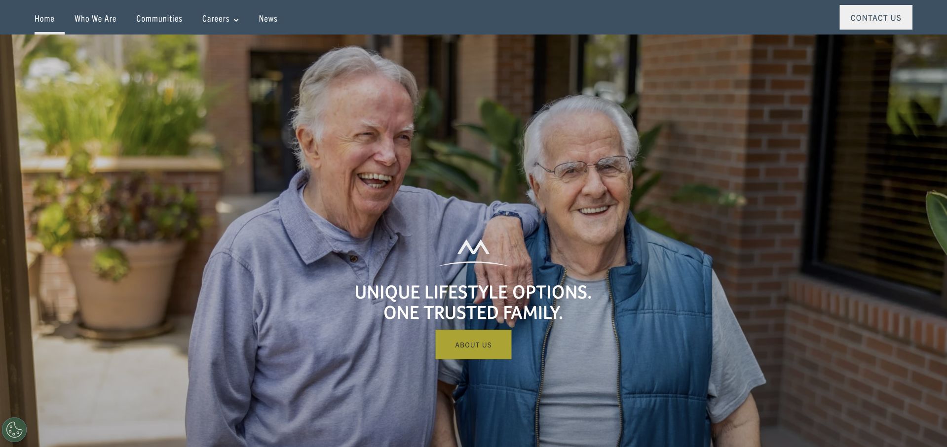
Merrill Gardens places a large two-person photograph beneath a restrained dark navigation bar. A short statement and contrasting action sit near the centre of the image, keeping the opening visually simple. The menu separates the organisation, communities, careers and news, while contact has a distinct position. The approach is useful for a brand seeking warmth without a complex hero interface. It also puts considerable responsibility on the following content: the first view says little about locations, living options or what an enquiry involves. A welcoming portrait should introduce the brand, not become the sole evidence offered for community life or resident experience.
What you can learn
Use a simple personal image to establish tone, then quickly supply concrete community and living-option information. Keep the main action literal and avoid making visitors contact sales merely to learn the basic service scope.
Pros
The restrained header and short overlay avoid turning the photograph into a crowded promotional canvas.
Communities and employment have separate navigation paths rather than a single general contact destination.
Cons & considerations
The first view offers limited practical qualification beyond the broad brand message.
A people-focused photograph cannot explain local spaces, support services or the actual visit and enquiry process.
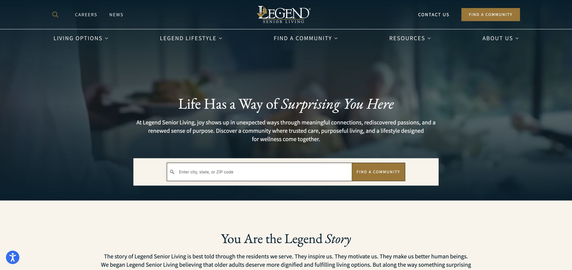
Legend uses a dark blue photographic field, serif typography and a light search panel. The search accepts city, state or ZIP information, giving the reflective headline an immediate practical companion. The header separates living options, lifestyle, resources and the organisation, while contact remains visible above. The design’s strength is the contrast between atmospheric storytelling and the literal locator. Its muted palette also raises a readability question: small navigation and supporting copy can recede against the dark background. A traditional visual tone should not require visitors to work harder to find service explanations or compare local communities.
What you can learn
Pair an editorial headline with a literal geographic task and a stable search surface. Give small navigation text enough contrast, and make the local living-option detail more concrete than the surrounding lifestyle language.
Pros
The light search panel is visually distinct from the dark photographic introduction.
Living options, resources and organisation information have clear separate navigation categories.
Cons & considerations
Small muted text can become difficult to read against the darker palette and photographic background.
A broad lifestyle statement needs local service and visit information before it supports a meaningful comparison.
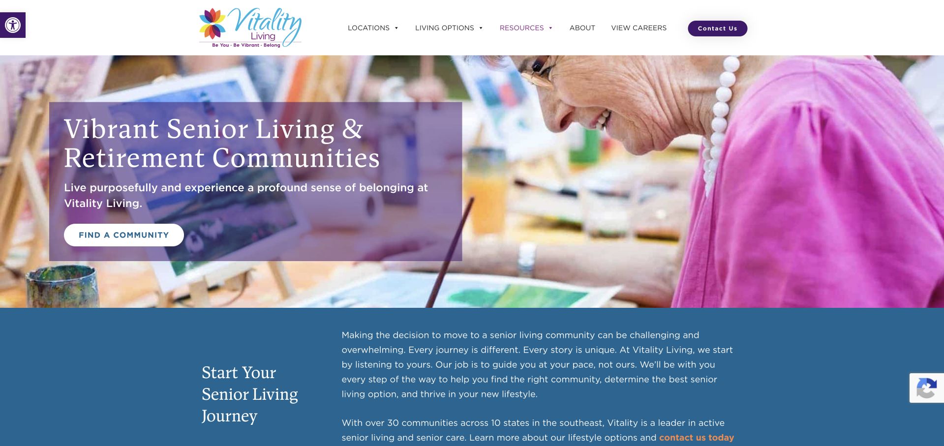
Vitality uses a colourful activity photograph and a purple text treatment to introduce its retirement communities. A community-finding action appears within the hero, followed by a blue section that begins explaining the decision process. The photograph offers a concrete activity rather than a generic building exterior, while the lower explanatory section gives the page a more considered rhythm. The design should still avoid implying that a selected activity scene represents every property or resident. The opening is strongest when it leads to clear local information about spaces, living options and visits, rather than treating vibrant imagery as a substitute for those details.
What you can learn
Let activity photography introduce the tone, then provide practical information for a considered choice. Keep local programme descriptions specific and avoid presenting a single lively scene as a universal resident experience.
Pros
The activity-focused image gives the brand a concrete visual subject rather than an abstract promise.
An explanatory section follows the hero instead of moving directly into an enquiry form.
Cons & considerations
A busy colourful image needs careful text positioning and responsive cropping to remain readable.
A network-wide activity presentation needs local context before visitors can compare actual community offerings.
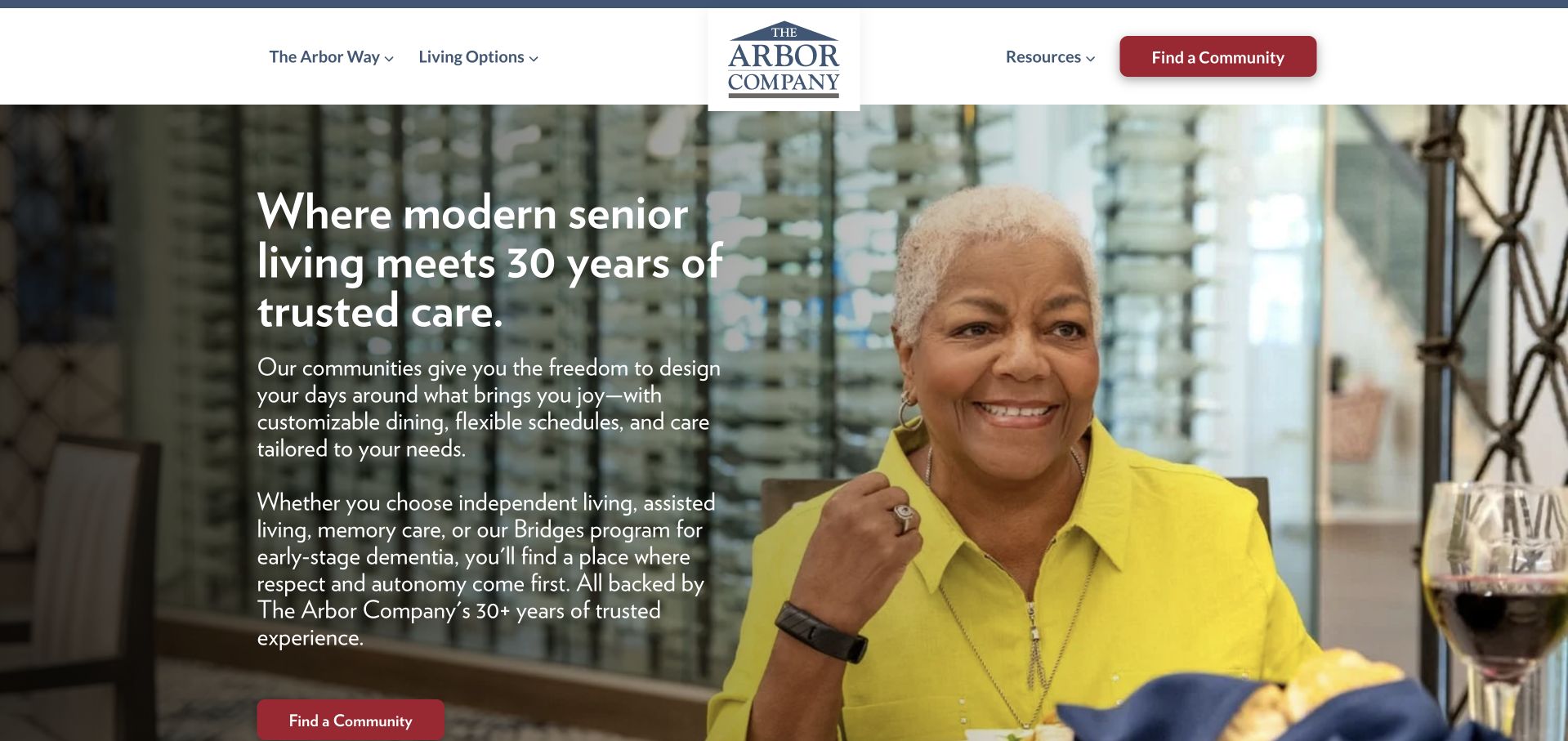
The Arbor Company overlays a dark text panel on a large people-focused photograph. Its opening develops a more detailed explanation than many image-led competitors, and the red community action is repeated in the white header. Navigation distinguishes the Arbor approach, living options, resources and community discovery. The page is useful for showing how a brand can give its operating approach real textual space rather than limiting it to a slogan. The longer opening also creates a scanning tradeoff. Visitors looking for a nearby community should not need to read the entire philosophy before locating practical information about a specific place.
What you can learn
Give an operating approach enough explanation to be meaningful, but preserve a shorter route for task-focused visitors. Separate published service facts from broad trust-oriented language and maintain clear local community details.
Pros
A solid dark panel gives the longer introduction a predictable reading surface beside the image.
The contrasting community action remains visible in both the header and the main opening.
Cons & considerations
A longer philosophy-led introduction can slow visitors whose immediate need is geographic discovery.
Experience and trust claims need current supporting context rather than acting as blanket evidence of service quality.
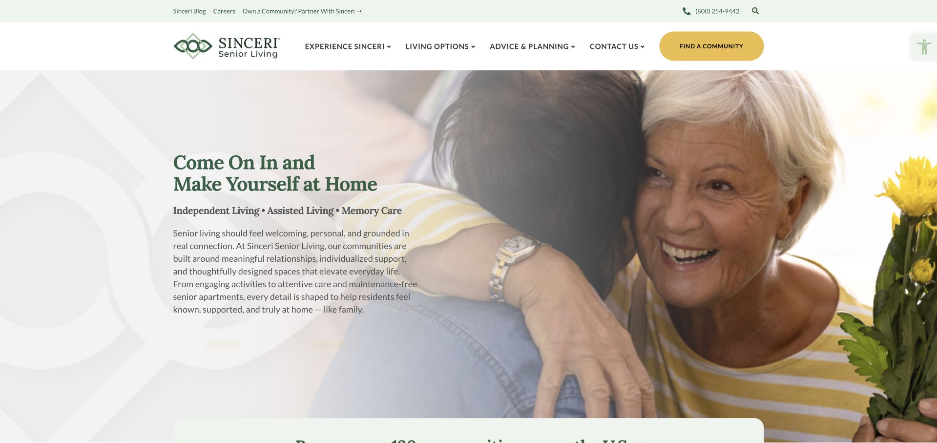
Sinceri uses a bright domestic scene with a pale text area on the left. The opening names independent living, assisted living and memory care, while a yellow community action stands out in the header. Navigation includes experiences, living options, family planning and the organisation, giving the practical decision more structure than a generic welcome page. The soft composition is approachable, but fine serif text over a very light area needs careful contrast. The named categories also require property-specific detail. A brand-wide opening should not imply that every location offers the same combination of accommodation, support or admission arrangements.
What you can learn
A warm visual introduction can still name living categories directly. Follow it with local comparisons and clear enquiry expectations, and test pale text treatments with real small-screen and enlarged-text conditions.
Pros
The opening identifies living categories without making visitors interpret the lifestyle photograph.
Family-planning information has a visible navigation route beyond immediate contact or tour booking.
Cons & considerations
Fine serif text and pale backgrounds can reduce readability despite the visually calm treatment.
A shared set of living categories needs local qualification rather than an implied uniform service across the network.
Kegan is a freelance web designer and developer with 15+ years of experience helping businesses turn complicated website requirements into clear, maintainable digital experiences. He works directly with clients from planning and design through development, launch, and ongoing support.
For assisted living website design, his development approach focuses on care-level information, location and amenity content, family decision resources, and tour inquiries. The scope can be a targeted improvement or a complete custom build, with responsive layouts, thoughtful content structure, and integrations chosen around the people using and maintaining the site.
Show 3 other assisted living website designersHide other assisted living website designers
Plan the local information before the lifestyle campaign
Define a useful community template
Include location, contact, living options, spaces, permitted photography and the visit process. Give pricing and availability information the organisation can actually maintain, with clear conditions where needed. A portfolio page should preserve which community is selected as the visitor browses images or resources. Avoid sending every local page back to an unqualified national contact form.
Build an honest visual library
Record where each image was taken and whether it shows the property, an illustrative scene or a permitted story. Keep current spaces distinguishable from planned developments and renderings. Give films a meaningful still image and optional playback. Never fabricate resident testimonials or imply that a selected smiling portrait establishes a typical experience or a clinical result.
Support collaborative browsing
Visitors may compare information over several sessions or share a page with relatives. Use stable URLs, readable headings and public explanations that do not depend on a remembered filter. Keep floor-plan labels, downloadable material and enquiry details consistent. A useful page can answer a question without forcing immediate contact, while a clear tour action remains available for someone ready to take that step.
The editing job behind the design
Maintain communities and living options as structured information
A multi-community CMS should relate locations, options, media and contacts rather than duplicate a generic paragraph on every page. For a single property, keep the structure proportionate. Store photographic credits and context alongside assets. Give current facts one maintained source, with explicit responsibility for correcting them after a service change or rebrand.
Test location filters, tour forms and photo galleries as real interfaces. Provide text alternatives to map-only information, stable focus states and usable controls at increased text sizes. Do not assume a large lifestyle photograph makes a page accessible. The image tutorial below provides implementation context; it does not certify the examples or reveal their private operational systems.
Our WordPress website examples offer a separate look at publishing approaches. A visible platform label is evidence for that named page, not a guarantee that the same system will suit your requirements.
Before the public launch
Assisted-living website planning checklist
Identify the actual community and its complete public address.
Distinguish local facts from brand-wide marketing statements.
List only living options actually offered at the selected property.
Have responsible teams approve descriptions and practical enquiry information.
Explain what a tour or brochure request does and who responds.
Keep initial enquiries proportionate without unnecessary health questions.
Label property images, illustrative scenes, renderings and future developments accurately.
Keep pricing and availability wording current and clearly qualified.
Provide useful public detail before requiring a sales conversation.
Give films a meaningful still state and usable motion controls.
Test filters, galleries and forms with keyboard, zoom and small screens.
Assign owners for community facts, people, media permissions and contact destinations.
These checks are a project checklist, not a performance, legal, security, or accessibility certification. Test real journeys with the people responsible for the website before making claims about the result.
Sources & editorial method
How this collection was selected and reviewed
We inspected public pages and direct browser views. Original reviews cover design, content hierarchy and enquiry communication, not care, housing eligibility or measured resident outcomes. The editorial first selection has documented local scope; published service claims remain attributed to each organisation.
Each example links to its actual source page. Screenshots are direct browser captures with their own capture dates; moving imagery, announcements and live designs can change. The notes describe observable design choices and conditional tradeoffs, not measured traffic, conversion results, service quality, or accessibility conformance.
Technology labels use public page metadata, asset evidence, or explicitly cited platform documentation. Platform documentation is not a complete current deployment audit. A component reference may be legacy or unused; it is not a complete backend inventory. Unknown stacks are omitted. These sites are editorial examples, not our client portfolio.
Written, Edited and Curated are separate editorial records, not timestamps advanced by a rebuild. Website designs and imagery belong to their owners. See our editorial standards or suggest a correction.
Questions worth asking
Assisted Living website design questions
Should a senior-living homepage lead with a building or people?
Either can introduce the brand, but neither should do all the explanatory work. Use accurate context and show practical local information nearby. A building image explains place; a people-focused image sets tone. Neither establishes care quality or suitability.
Do all communities need their own page?
A separate page is useful when it contains genuine local information. Avoid thin duplicates that change only a city name. Preserve the community’s actual living options, contact details and visual context so the page supports comparison.
Should the website recommend a living option?
It should explain the organisation’s options and appropriate next steps, not make an individual suitability decision. Have qualified responsible teams approve any assessment process and its wording. Ordinary browsing filters should not appear to diagnose a need.
How much information belongs before a tour request?
Enough to understand the place, the options offered and what the request means. Keep useful details public where possible. A tour form can begin with basic contact and scheduling context rather than demanding a complete personal or health history.
Are lifestyle videos worth using?
Only when the service information remains useful without them. Provide a meaningful still, controls and a reduced-motion experience. Do not make a long film the only way to learn about local spaces or the community’s practical offer.
Borrow the clear local navigation, honest imagery and proportionate enquiry patterns. The goal is not to make every community look like the same resort, but to help people understand the real place and prepare a useful conversation.