Best Pressure Washing Websites of 2026 (22 Real-World Examples)
Pressure-washing website design that connects local scope, property imagery, and a clear estimate conversation.
Compare 22 public exterior-cleaning pages for useful contact hierarchy, service categories, and regional communication. These are design references, not assessments of cleaning methods, safety, qualifications, or outcomes.
Property owners need to understand what is offered, where the company works, and how to ask about their particular surface. A dramatic cleaning image can create interest, but it cannot answer those practical questions on its own.
The collection ranges from compact local brochure sites to more extensive regional service catalogs. Some use comparison photographs, others branded vehicles or tall intake forms. Choose the structure that fits the business's actual response process instead of copying whichever page has the largest headline.
Before the examples
What makes good pressure washing website design in 2026?
Name the service without prescribing a method
Pressure washing, soft washing, roof cleaning, and other exterior services need accurate descriptions from the responsible business. A designer should make those distinctions understandable, not invent technical recommendations. Avoid implying that one pictured tool or broad service name is appropriate for every surface or property condition.
State the real local territory
Patty's Chagrin Falls wording and North Coast's Cleveland West Side introduction show how a concise geographic phrase can orient visitors. Keep coverage maintained and explain uncertain locations. Do not manufacture city pages or claim availability merely because a location name can be inserted into a headline.
Prioritize one useful contact task
Call, text, quote, project search, and booking can all be legitimate routes, but they are not the same outcome. Pick a primary task and label alternatives clearly. Staff should know where each route goes and what response the customer has been led to expect.
The collection · 22 examples
22 pressure washing websites worth studying
These 22 pages show a wide range of actual public presentations: before-and-after pairs, fleets, work photographs, pale split layouts, and request-heavy heroes. The observations explain both the useful pattern and its tradeoffs, without treating marketing claims as independently measured results.
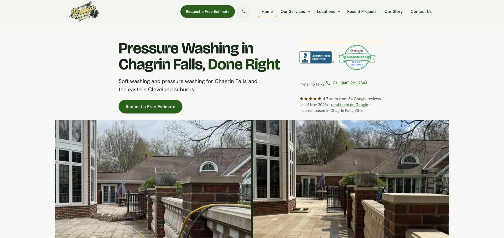
Patty's uses a warm cream background, green accents, and a literal Chagrin Falls introduction rather than filling the first screen with a large request form. The quote action, telephone context, and supporting business details establish a clear next step before a large pair of house photographs appears. That comparison offers something specific to inspect instead of relying on a badge or slogan. The restrained palette also makes the service feel recognizable without competing with the property imagery. This is an editorial choice for regional communication and photographic presentation, not verification of cleaning results, treatment safety, qualifications, or the circumstances shown in the comparison.
What you can learn
Keep paired project photographs attributable and comparable, with accurate descriptions of the surfaces and work. Preserve the calm introduction, but explain service scope and what follows an estimate request rather than treating a before-and-after image as a universal outcome.
Pros
The location appears in readable text before the photographic comparison.
Cream and green surfaces create a clear hierarchy without excessive promotional panels.
Cons & considerations
Comparison images need captions and accessible descriptions to explain their context.
A compact hero must still provide detailed coverage and estimate information elsewhere.
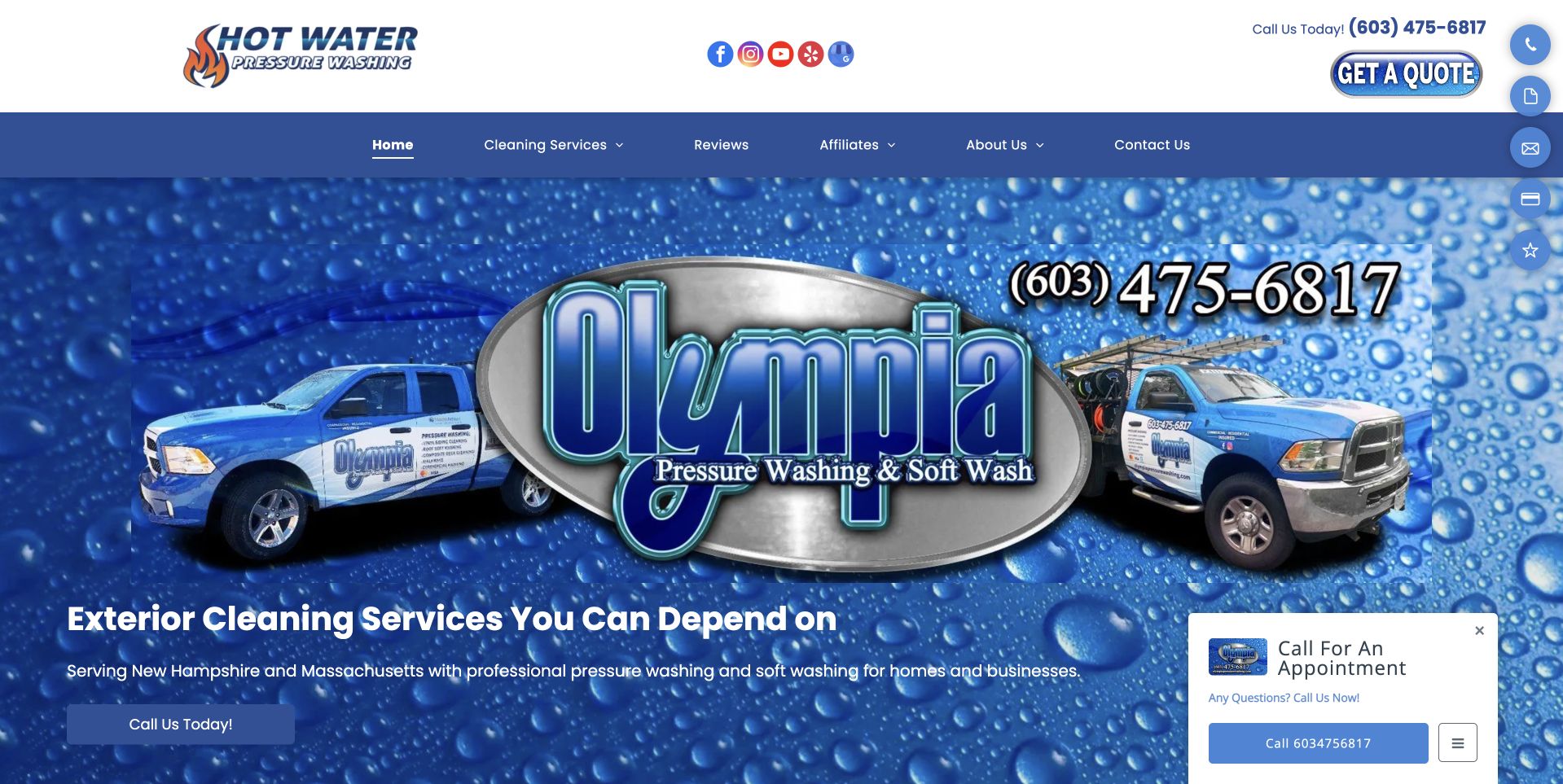
Olympia builds its opening screen around a very large blue company mark, two branded service vehicles, and a water-texture background. The telephone number and concise service wording sit within that company-specific composition rather than beside a generic house photograph. A small chat route remains secondary. An independent operator can make its equipment and identity visible this way, although oversized branding leaves less room for customer tasks. The header also contains another equipment-oriented mark, making clear relationships and labels important. The design review does not establish ownership of every pictured item, service capacity, treatment methods, or the company's performance on a particular property.
What you can learn
Use recognizable business assets to support a literal service introduction, not replace it. Explain the operating territory, the work offered, and the relationship of additional marks so visitors do not have to infer the business structure from logos.
Pros
Branded vehicles make the visual identity more specific than a stock exterior image.
The telephone route remains easy to identify within the large composition.
Cons & considerations
Oversized branding can push service details below the initial view.
Multiple marks require careful labeling to prevent confusion about the provider.
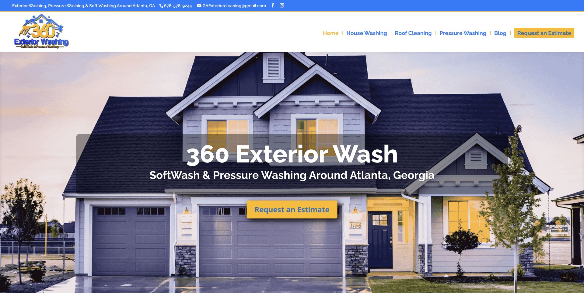
360 places a centered gray text panel over a wide photograph of a house at dusk. The soft-washing heading identifies the Atlanta context, while a gold quote action creates a restrained focal point below the message. The broad image establishes a residential setting without placing a long intake form over the property. This concise, image-led introduction uses a clearly separated reading surface. The tradeoff is that a centered panel can conceal some of the architectural details that make the image useful. The soft-washing terminology also needs a plain explanation beyond the hero; the photograph alone does not demonstrate suitability, methods, protection measures, or a particular cleaning outcome.
What you can learn
Keep the first screen focused on service, territory, and one useful action. Give technical service labels an accurate explanation on the destination page, and avoid asking a pleasant house photograph to prove the way a surface will be treated.
Pros
The gray text panel separates the message from a detailed evening photograph.
The small gold quote action gives the introduction a clear next step.
Cons & considerations
A centered panel covers part of the property image.
Specialist washing terminology needs more explanation than the opening headline provides.
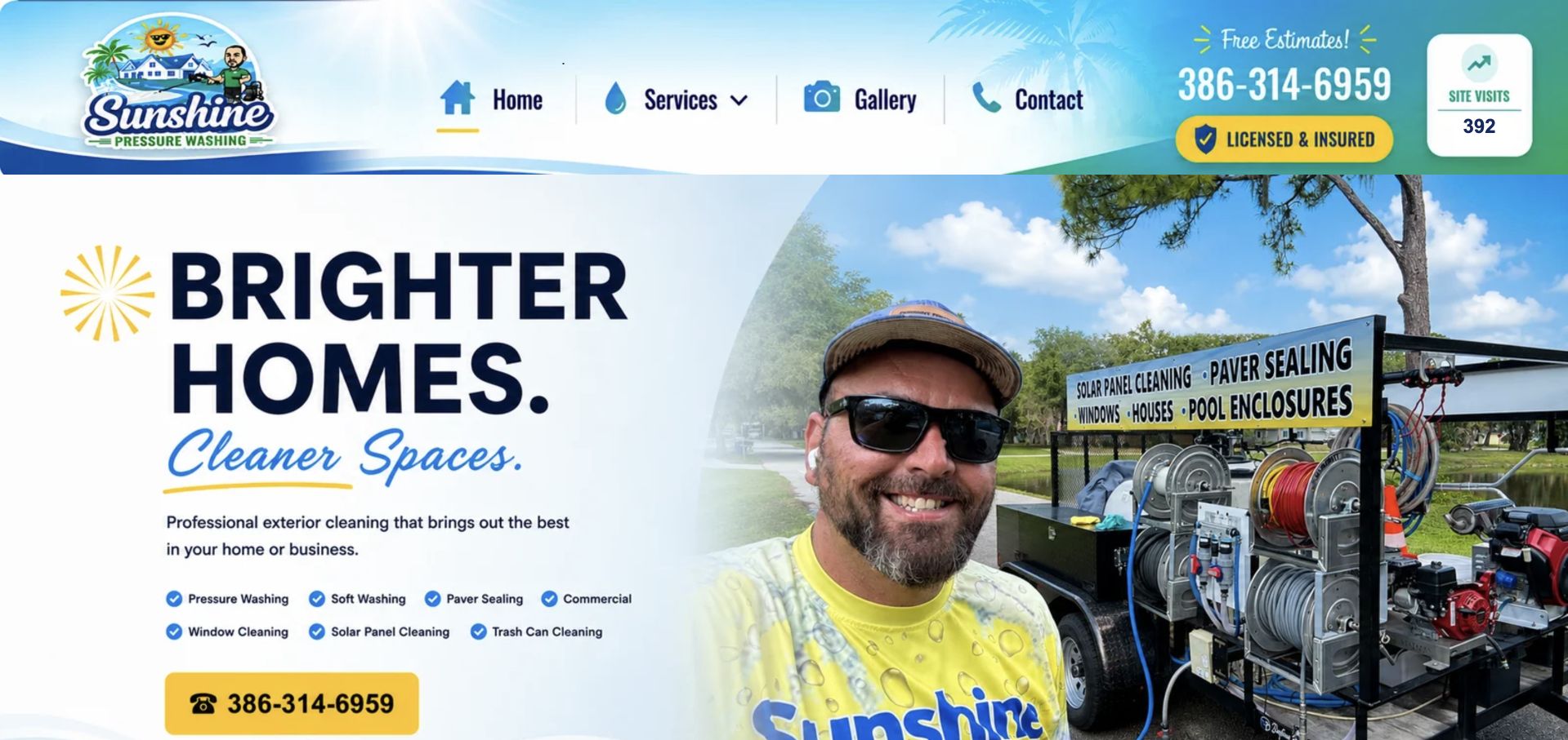
Sunshine uses a white and blue composition with a large black service heading on the left and a person beside cleaning equipment on the right. Yellow telephone emphasis connects the action to the company's illustrated beach-themed identity. The division between readable text and company imagery is clearer than placing every word directly over a detailed exterior photograph. This is useful for studying how a service brand can look distinctive while keeping the immediate contact task understandable. The person and equipment provide context, not independent evidence of credentials, cleaning effectiveness, or who will attend a particular appointment. Detailed service and territory information still needs a maintained place beyond the introductory composition.
What you can learn
Pair human imagery with factual role and service context when available. Keep the text on a stable reading surface and make the next contact step explicit, while distinguishing marketing personality from the practical scope a property owner needs to discuss.
Pros
The split layout protects the headline from photographic clutter.
Yellow contact emphasis creates a recognizable connection to the illustrated brand.
Cons & considerations
Illustrated branding needs supporting literal service and location information.
A person-and-equipment photograph cannot explain the full assessment or appointment process.
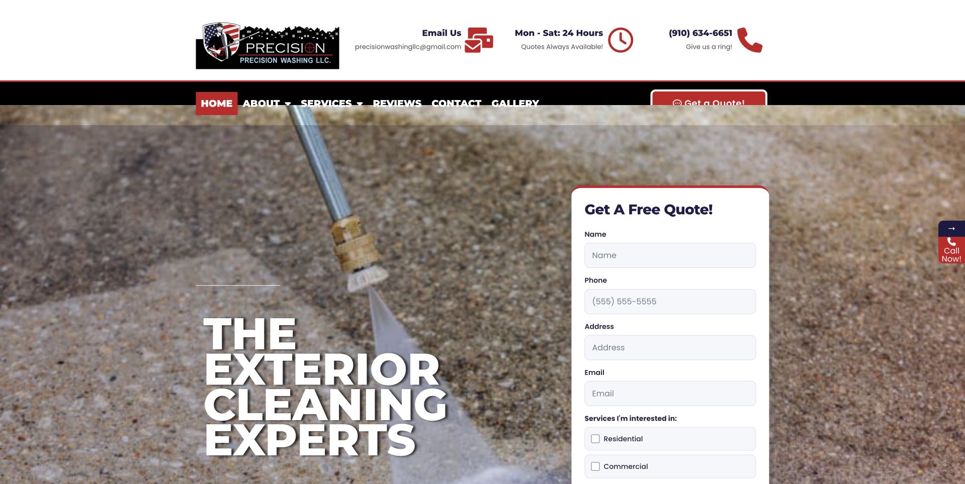
Precision uses a close view of surface-cleaning work behind large white text, with a tall white quote form on the right. Red and black header details carry telephone and operating information above the scene. The design makes the intended first task unmistakable: describe a project or contact the company. The page balances an action-oriented website with visual detail of the work. The form's solid background helps separate inputs from the photograph, but its length also consumes substantial space. Visible work imagery should not be treated as a technical instruction, proof of safety, or evidence that a pictured method is appropriate for every exterior surface.
What you can learn
Keep the initial inquiry proportionate to the actual next step. A visitor should understand whether the form requests a callback or estimate discussion, and required fields should not imply that scope, price, timing, or suitability has already been agreed.
Pros
A solid white form provides a distinct surface for project information.
The photograph relates directly to exterior-cleaning work rather than generic lifestyle imagery.
Cons & considerations
The tall form competes with the introductory service explanation.
Busy work imagery requires deliberate contrast behind the large and small text.
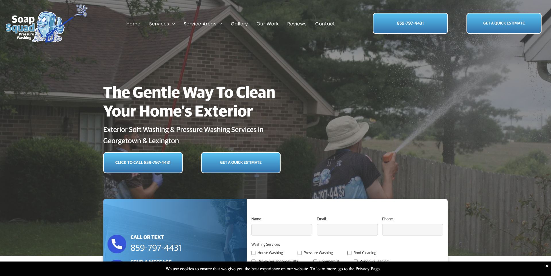
Soap Squad places a crew-at-work photograph beneath a dark treatment, then introduces exterior soft washing and pressure washing in Georgetown and Lexington. Blue buttons separate a local call from a quote request, while a compact white form begins lower in the first view. The illustrated company mark adds personality without displacing the literal service wording. The local page offers several contact routes without making the whole hero a form. A thin privacy notice was also visible in the public page. Neither the work photograph nor the company's gentle-cleaning language independently establishes surface suitability or the methods appropriate for an individual home.
What you can learn
Keep call and written-request labels specific, and describe what staff will do with the information received. Make optional notices and widgets unobtrusive so they do not compete with the service explanation or cover form controls on smaller screens.
Pros
The named communities give the exterior-cleaning offer a local frame.
Call and quote actions are visually consistent but remain different tasks.
Cons & considerations
The lower form needs a sensible reading order on narrow screens.
Privacy notices and floating controls can add visual competition near the page edge.
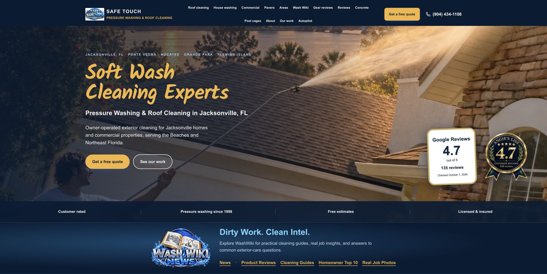
Safe Touch uses a roof-cleaning photograph with a dark navy text area and gold script headline. The Jacksonville service context appears in smaller literal wording underneath, followed by quote and work-viewing routes. Review-oriented cards sit on the right, and a dark supporting strip leads into a wash-club promotion below. This is useful for studying how a company combines a distinctive display style with a practical local introduction. It also shows the importance of keeping promotional and review elements subordinate to the service explanation. The review numbers and process wording are the company's presentation; this collection does not verify them or infer cleaning effectiveness, roof condition, or treatment suitability from the photograph.
What you can learn
Use decorative type sparingly, with a plain description nearby. Separate recurring-service promotions from one-time quote inquiries, and provide context for any displayed ratings rather than letting compact cards stand in for detailed service information.
Pros
Navy and gold create a coherent contrast between text, actions, and imagery.
The Jacksonville wording makes the broad headline geographically specific.
Cons & considerations
Script display type needs a readable alternative in supporting text.
Ratings cards and membership promotion can compete with the primary inquiry path.
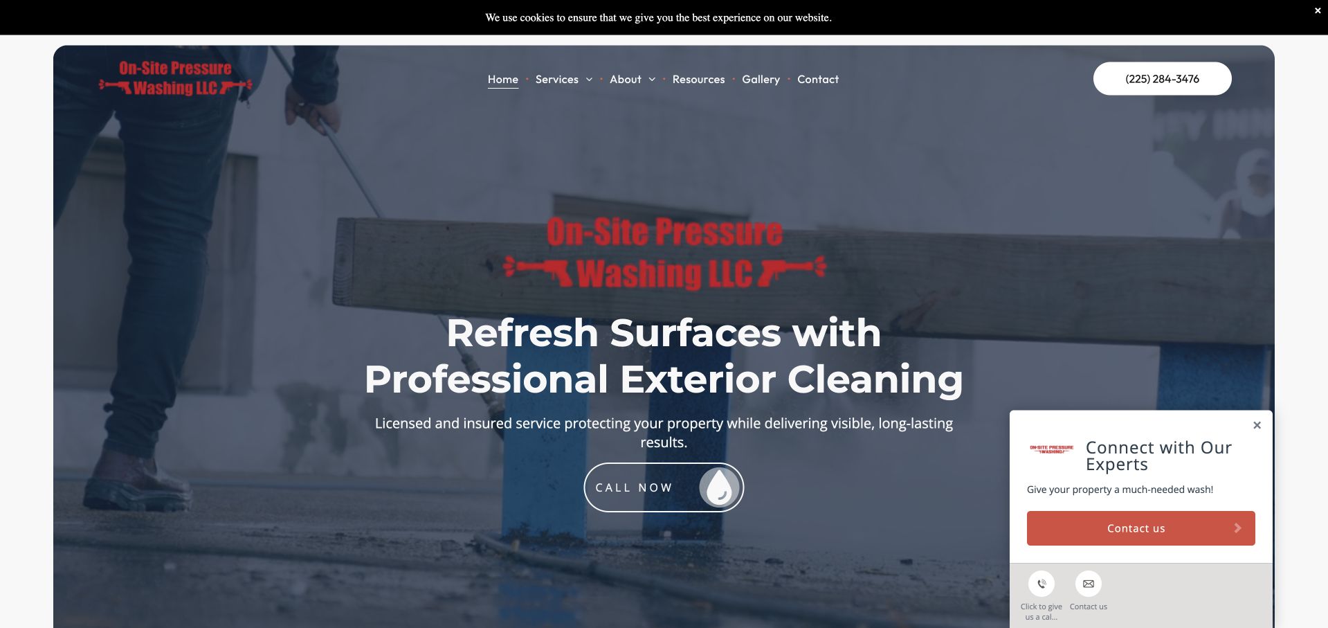
On-Site uses a broad work photograph beneath a gray-blue overlay, with a centered company mark, white service headline, and rounded call control. A restrained navigation bar keeps services, company information, resources, gallery, and contact accessible. A small contact prompt appears at the lower right, while a thin privacy notice runs above the main header. This is useful for studying a simple call-led introduction that does not begin with a long project questionnaire. The prominent red logo against the darkened image also illustrates why brand color needs contrast testing in its actual context. The image and refresh-oriented wording describe the offer but do not establish treatment suitability or independently verified service results.
What you can learn
Keep the direct contact task clear and provide a readable service explanation nearby. Optional prompts should remain dismissible and avoid covering the main action, especially when the header already includes privacy and navigation layers.
Pros
The centered introduction gives a call-led page a straightforward first task.
Gallery and service routes remain separate in the compact navigation.
Cons & considerations
Red branding loses some clarity against the dark photographic background.
A contact prompt plus privacy strip adds competing interface layers.
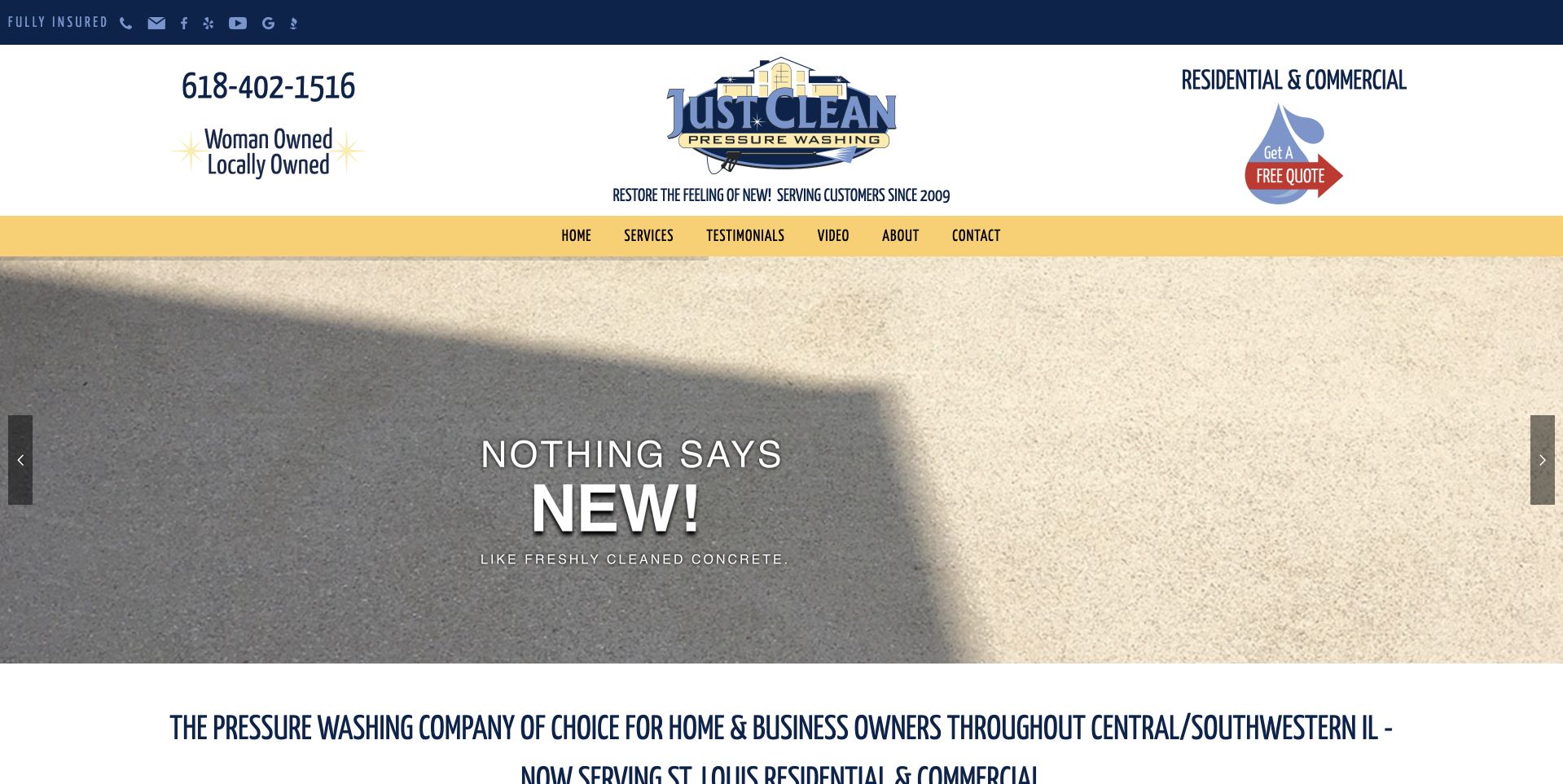
Just Clean uses a generous white header with a centered company mark, telephone number, local ownership wording, and a quote graphic. A yellow navigation band separates that identity area from a large cleaning comparison photograph. The first slide uses a short new-looking-surface message rather than a lengthy sales paragraph. Below it, the page begins a literal explanation of its central and southwestern Illinois service context. This is useful for studying an older, compact service presentation with several practical facts available before the imagery. The photograph is a visual communication device, not a verified controlled comparison or evidence of the methods, durability, or suitability of the cleaning work shown.
What you can learn
Preserve useful local facts when modernizing a service header. Pair short promotional slides with accurate scope information, and give comparison photography captions that explain the context instead of relying only on a broad result-oriented slogan.
Pros
Telephone and ownership context are visible without opening a secondary page.
The yellow navigation band creates a clear division before the image.
Cons & considerations
The large identity header consumes considerable vertical space.
A short rotating slogan cannot explain the service scope or comparison conditions.
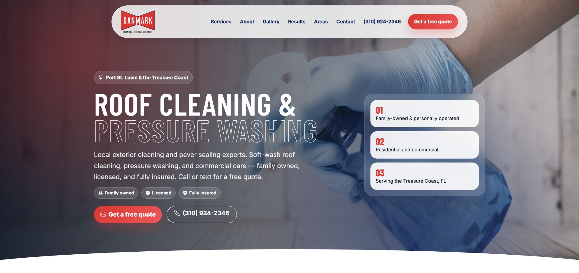
Danmark places very large outline pressure-washing lettering over a photograph of a gloved hand at work. A rounded white navigation surface sits above a maroon and blue visual treatment, while several qualification-oriented cards occupy the right side. The page names its Treasure Coast context elsewhere in the introduction. This graphic treatment offers an alternative to the familiar house-photo-and-form layout. The scale and overlapping elements create a recognizable composition, but they also make small explanatory text and a clear reading sequence more important. Work imagery and qualification cards remain marketing material; the design review does not establish certifications, safety practices, service quality, or the treatment appropriate for a particular property.
What you can learn
Use expressive display lettering as a visual layer while keeping service and location facts plain. Test the composition at narrow widths, where large outline words and multiple cards can otherwise overwhelm the actual inquiry task.
Pros
Large outline type makes the visual identity different from a generic service template.
A rounded white navigation surface remains distinct from the work image.
Cons & considerations
Overlapping type and photography need careful contrast and reading-order checks.
Several qualification cards can distract from the basic service and contact explanation.
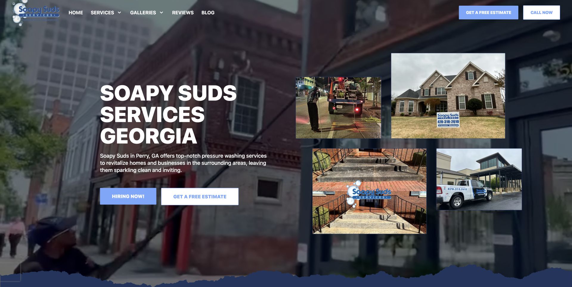
Soapy Suds uses a darkened cleaning photograph with large white company wording on the left and a four-image grid on the right. The smaller images include property work and company equipment, giving the hero more than one visual reference. Blue quote and hiring actions appear within the composition, while the main header remains comparatively compact. This is useful for studying an image-rich introduction that can show breadth without relying on a single oversized slideshow. The competing customer and recruiting actions also illustrate why audience hierarchy matters. The photographs establish public visual context, not independently verified project provenance, cleaning results, employment conditions, or the service arrangement a visitor would receive.
What you can learn
Let project thumbnails support a specific service explanation and provide captions or destinations when useful. Keep hiring clearly secondary to customer contact on the homepage, or separate the two audiences so their next steps are not confused.
Pros
The smaller image grid introduces varied work and company context immediately.
White text remains distinct against the dark photographic treatment.
Cons & considerations
Multiple images can increase page weight without careful image sizing.
Quote and hiring actions need an explicit priority for different audiences.
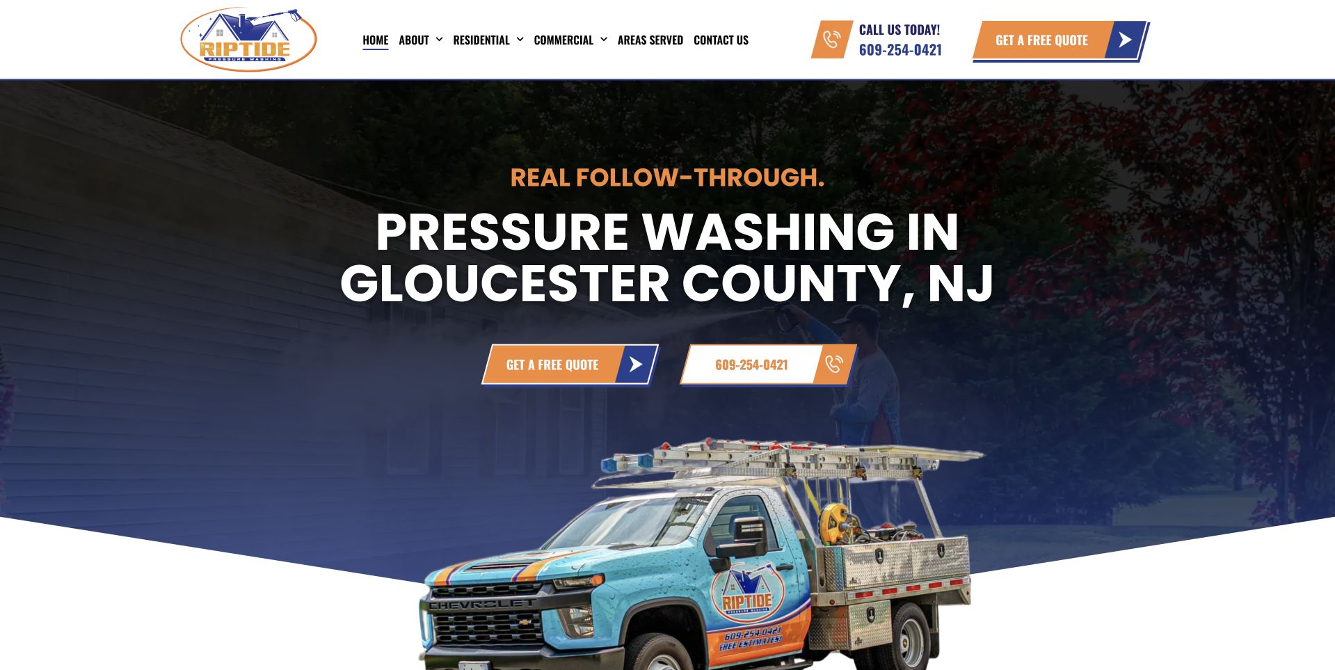
Riptide uses a dark navy hero with a literal Gloucester County, New Jersey heading, orange emphasis, and separate quote and telephone controls. A branded service truck occupies the right side and meets an angled white edge at the bottom. The white navigation above stays visually separate from that composition. A regional operator can communicate territory and company identity without beginning with a long intake form. The truck provides a concrete brand asset, while the solid text area keeps the main message readable. It should not be treated as evidence of equipment capacity, the crew assigned to a job, or the suitability of a particular washing method.
What you can learn
Combine recognizable assets with precise geographic wording and a predictable contact route. Explain the estimate process after the initial action, and keep the photograph's role distinct from any technical or performance claims about the service.
Pros
The Gloucester County heading gives the broad service name immediate local meaning.
Solid navy provides a stable reading surface beside the truck image.
Cons & considerations
Angled imagery needs careful responsive behavior to avoid awkward cropping.
A concise hero still requires maintained detail about service scope and coverage.
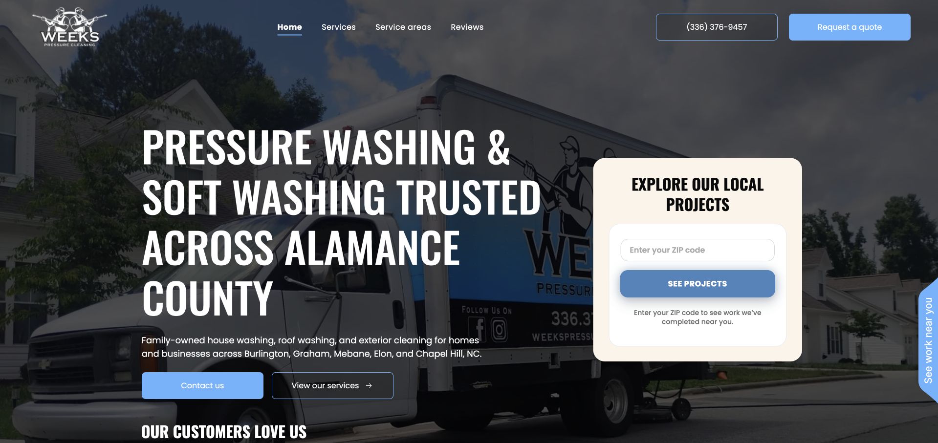
Weeks places a large Alamance County pressure-washing and soft-washing headline over a darkened photograph of its branded service vehicle. Contact and service-viewing actions appear on the left, while a pale project card asks for a ZIP code on the right. The restrained blue navigation and buttons create a consistent interface around the company imagery. This is useful for studying a project-discovery task that is different from an immediate booking form. The visitor can see that local examples are part of the site's intended experience. However, a ZIP-based result needs meaningful behavior and an explanation of what it represents; the visible card alone does not verify a completed project, current service eligibility, or a confirmed appointment.
What you can learn
Use location-based project discovery only when there is a maintained, accurately attributed collection behind it. Give unmatched searches a useful fallback, and keep browsing examples separate from confirming scope, timing, or an agreed cleaning job.
Pros
The county-level headline makes the operating context explicit.
A separate project card introduces an alternative to an immediate estimate request.
Cons & considerations
ZIP-based project browsing needs a clear empty-result and privacy explanation.
The detailed vehicle background requires strong contrast behind smaller text.
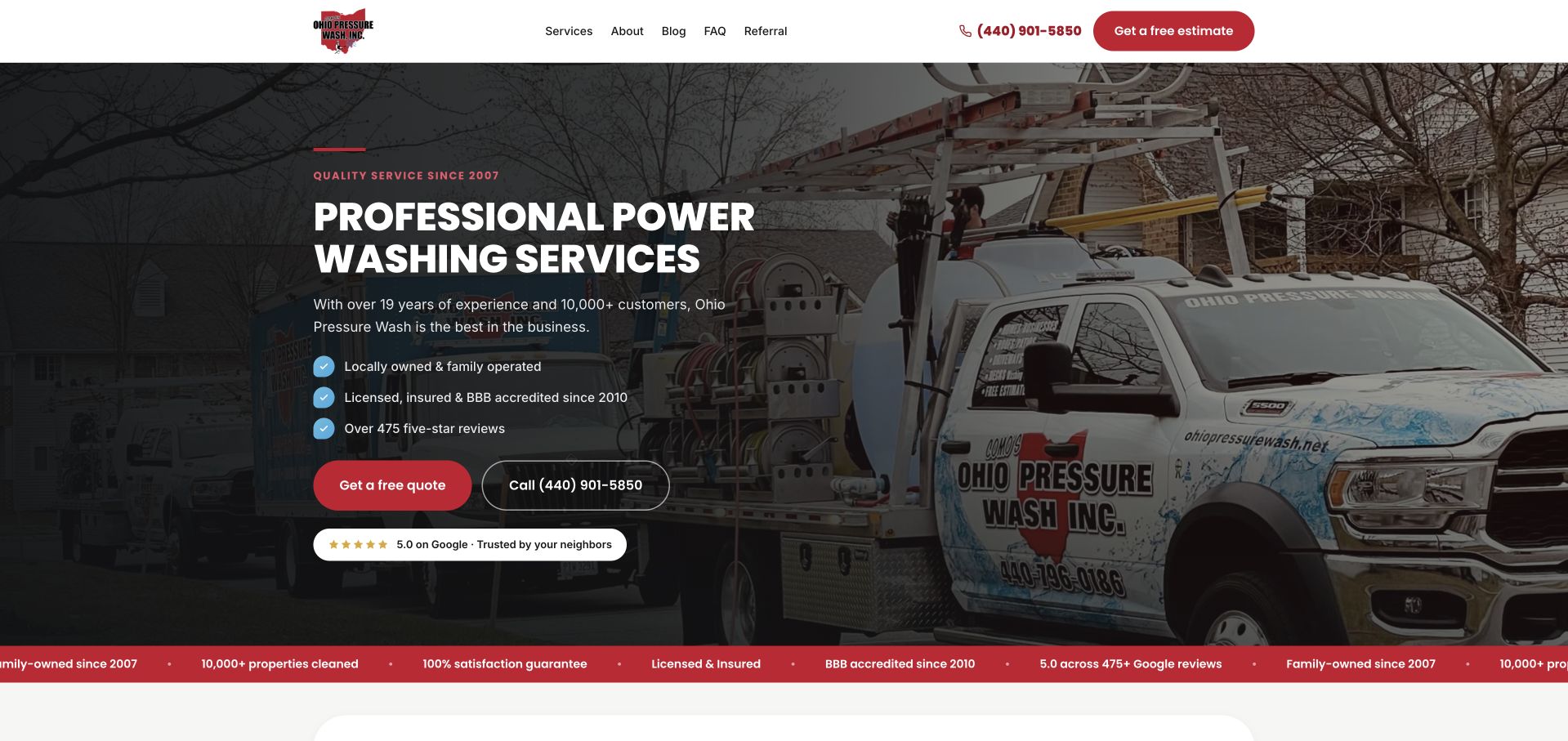
Como's uses a photograph of a branded work truck beneath a dark overlay, with a large power-washing heading and red quote emphasis. An outlined telephone control gives the visitor another immediate route, while a narrow red strip carries supporting company statements below. This is useful for studying a straightforward local operator presentation with company-specific imagery instead of a stock property scene. The visual hierarchy is familiar but clear: service, contact, then supporting context. The lower strip's compact claims should remain understandable and attributable rather than being treated as independently tested facts. The vehicle photograph does not establish the equipment or service arrangement that will apply to an individual project.
What you can learn
Use real business imagery to make a familiar layout specific, then explain the actual scope and receiving team. Keep supporting claims readable and maintain their context, especially when a narrow colored band compresses several statements together.
Pros
A branded vehicle gives the opening image a recognizable company connection.
Quote and telephone controls remain distinguishable within the dark composition.
Cons & considerations
A narrow supporting strip can make important context too small.
The familiar image-overlay layout needs more specific detail beyond the headline.
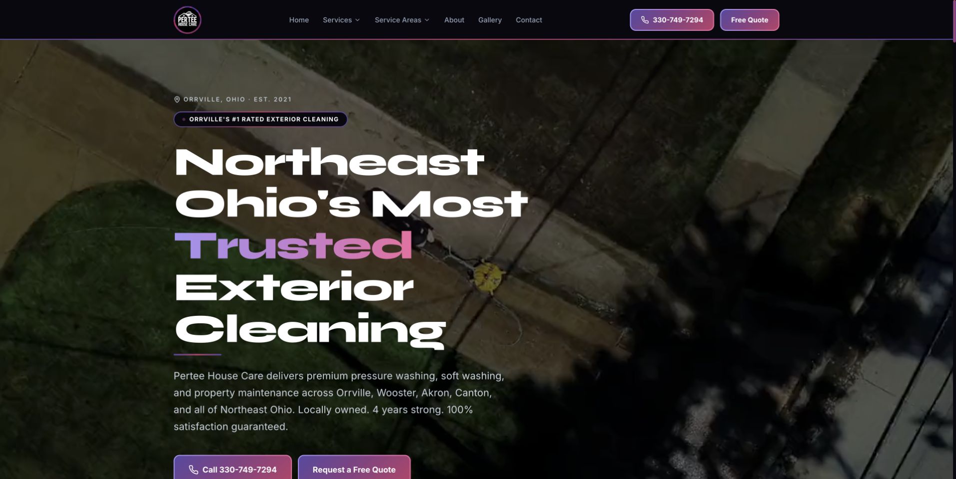
Pertee uses an aerial work photograph with large white Northeast Ohio wording and purple accent text. Call, quote, and text-message routes sit within the main introduction, supported by a short explanatory paragraph. The high viewpoint provides a different visual perspective from a close cleaning-tool image or a finished house facade. This is useful for studying how a regional company can identify territory and contact preferences before the visitor reaches the wider service catalog. The number of immediate actions also creates a hierarchy challenge on smaller screens. The photograph and broad exterior-cleaning message do not independently establish methods, service quality, scheduling availability, or the condition of the property shown.
What you can learn
Offer contact choices that the business can actually monitor, with clear labels and an obvious primary route. Keep territory wording specific and use the wider service pages to explain scope rather than relying on a dramatic overhead photograph.
Pros
The Northeast Ohio wording gives the regional offer a clear geographic anchor.
Call, quote, and text options acknowledge different contact preferences.
Cons & considerations
Three immediate contact routes can compete on a small screen.
Aerial imagery needs descriptive text to explain what work the viewer is seeing.
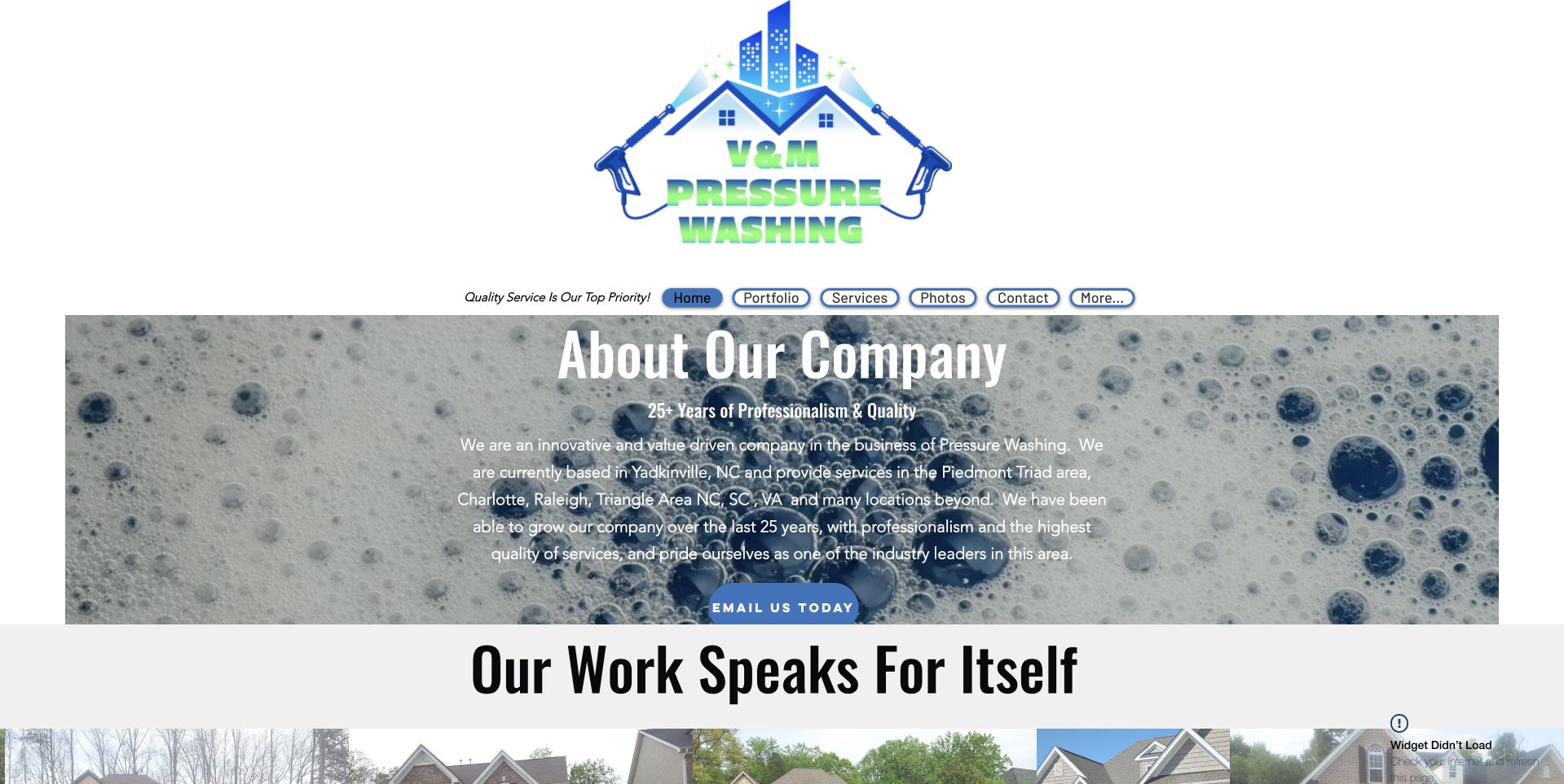
V & M gives its company mark substantial space above a compact oval navigation bar. The opening content uses a bubble-themed visual treatment around an introductory paragraph, with a work-related section starting directly beneath. This brochure-style service website prioritizes identity and company explanation over an elaborate quote form. The unusual header proportions and small navigation also reveal where a refresh could improve reading comfort without discarding the recognizable branding. The introductory company statements are public marketing content, not independent verification of service quality, cleaning outcomes, qualifications, or the suitability of any treatment. More literal service and territory information would help visitors connect the identity to their practical task.
What you can learn
Keep distinctive branding while giving the customer question more room. Increase navigation and body-text comfort, state services and coverage plainly, and let the next section explain the work rather than repeating broad company praise.
Pros
The large mark creates a strong visual identity for a small brochure site.
The company introduction is available before a visitor is asked to complete a form.
Cons & considerations
Oversized branding leaves less room for practical first-screen information.
The compact oval navigation needs generous touch targets and clear responsive behavior.
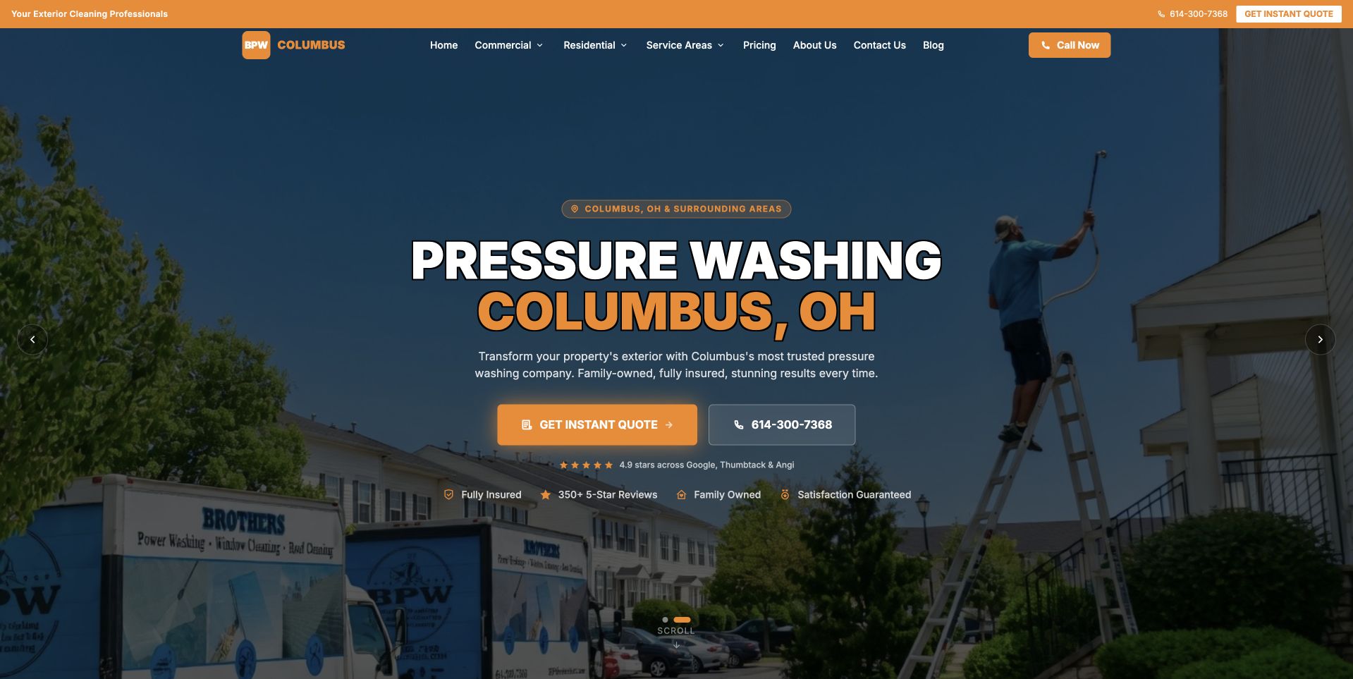
BPW uses a tall photograph of cleaning equipment and a work vehicle beneath a navy overlay. The large Columbus service heading appears on the left, followed by orange quote and telephone controls and a row of smaller qualifiers. This is useful for studying a local homepage that makes geographic relevance and the next contact task visible together. The dark treatment protects the large white type, although smaller supporting statements still need careful contrast. The photograph relates to the work without explaining an individual property's assessment. Qualifiers and company claims remain the business's own presentation rather than proof of certifications, safe procedures, current availability, or a particular cleaning result.
What you can learn
Keep the city-level message precise and make the primary action easy to distinguish from supporting qualifiers. Explain what happens after contact and provide accurate service details, since equipment imagery cannot answer suitability or scope questions by itself.
Pros
The Columbus heading establishes immediate local relevance.
Orange contact controls stand out against the navy photographic treatment.
Cons & considerations
Small supporting qualifiers can become difficult to read over a detailed image.
A full-height hero may delay service-category information on a phone.
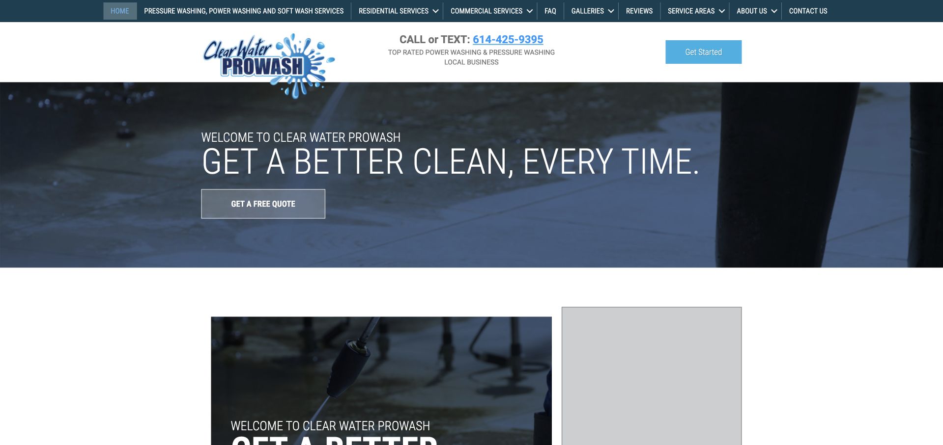
Clear Water uses a relatively shallow work-image hero with a slim white headline and an outlined quote control. The white header is organized around a separate band of service categories, while the next content block begins with imagery and a form. The opening photograph does not occupy the entire first screen. The service taxonomy receives a prominent place before the visitor reaches the longer explanation. At the same time, thin display text and outlined actions need enough contrast to remain clear against a detailed background. The imagery and service labels do not establish treatment suitability, technical procedures, or an independently verified outcome for any particular property.
What you can learn
Use a short hero when the next section carries useful practical information. Keep service-category labels literal, ensure the quote route is easy to find, and make the form's purpose explicit rather than assuming every visitor is ready to book.
Pros
The shallow image leaves room for practical content to begin earlier.
A dedicated service-category band exposes the catalog near the top.
Cons & considerations
Thin white type requires careful contrast against work photography.
Outlined actions can lose prominence when surrounding image detail is strong.
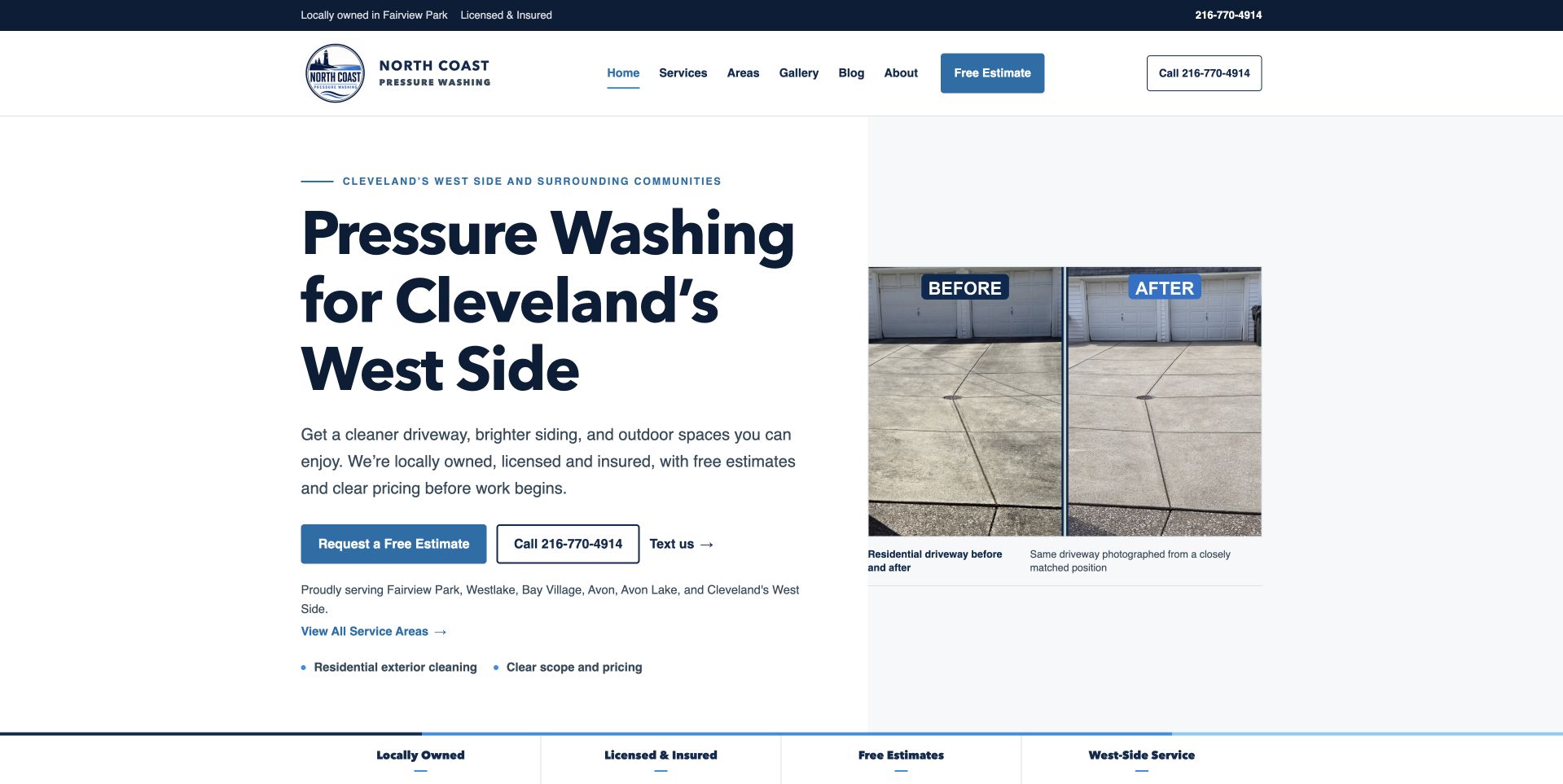
North Coast uses a pale blue text surface beside a paired driveway comparison. The Cleveland West Side heading is literal, and quote, call, and text routes sit together beneath the explanation. A thin supporting strip begins below the split composition. This is useful for studying a calmer alternative to a dark full-width work photograph, with enough space for both readable service context and a visible example. The paired image is the focal point rather than a long form. Its presence should not be treated as a controlled test or a promise of identical results for every surface; accurate captions, project context, and service limitations remain important beyond the introductory view.
What you can learn
Keep comparison imagery visually substantial but contextually honest. Pair it with precise local wording and distinct contact labels, then provide enough information for a customer to discuss their property rather than infer an agreed treatment or outcome.
Pros
The pale text area provides a stable, readable surface next to the comparison.
Cleveland West Side wording gives the service a specific regional context.
Cons & considerations
Before-and-after images need comparable conditions and explanatory captions.
Several contact actions need an obvious priority on narrow screens.
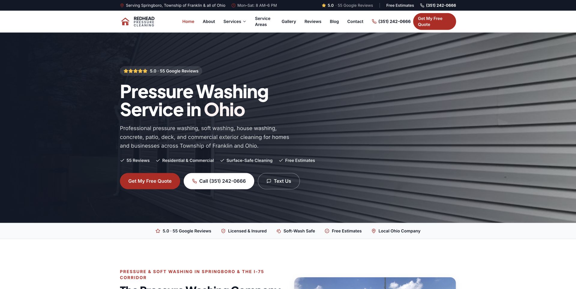
Redhead uses a dark siding photograph behind a large white Ohio service heading. A red quote action supplies the main color emphasis, while white call and text controls provide alternatives. A narrow row of supporting statements starts beneath the primary message. This is useful for studying a familiar exterior-service layout with a controlled palette and a literal geographic frame. The separation between a colored primary action and lighter secondary controls helps the visitor distinguish tasks. The design still depends on enough contrast around smaller copy, and supporting statements need accurate context. Nothing in the image independently verifies treatment safety, cleaning effectiveness, the condition of the siding, or the actual service arrangement for another property.
What you can learn
Let a limited palette establish hierarchy rather than adding many promotional colors. Keep supporting statements readable and explain the quote process clearly, especially when multiple contact choices share the same first-screen area.
Pros
A red primary action is easy to distinguish from the white contact alternatives.
The Ohio wording makes the broad cleaning message more locally specific.
Cons & considerations
Dark siding detail can compete with smaller supporting text.
A compressed proof row needs context beyond short promotional labels.
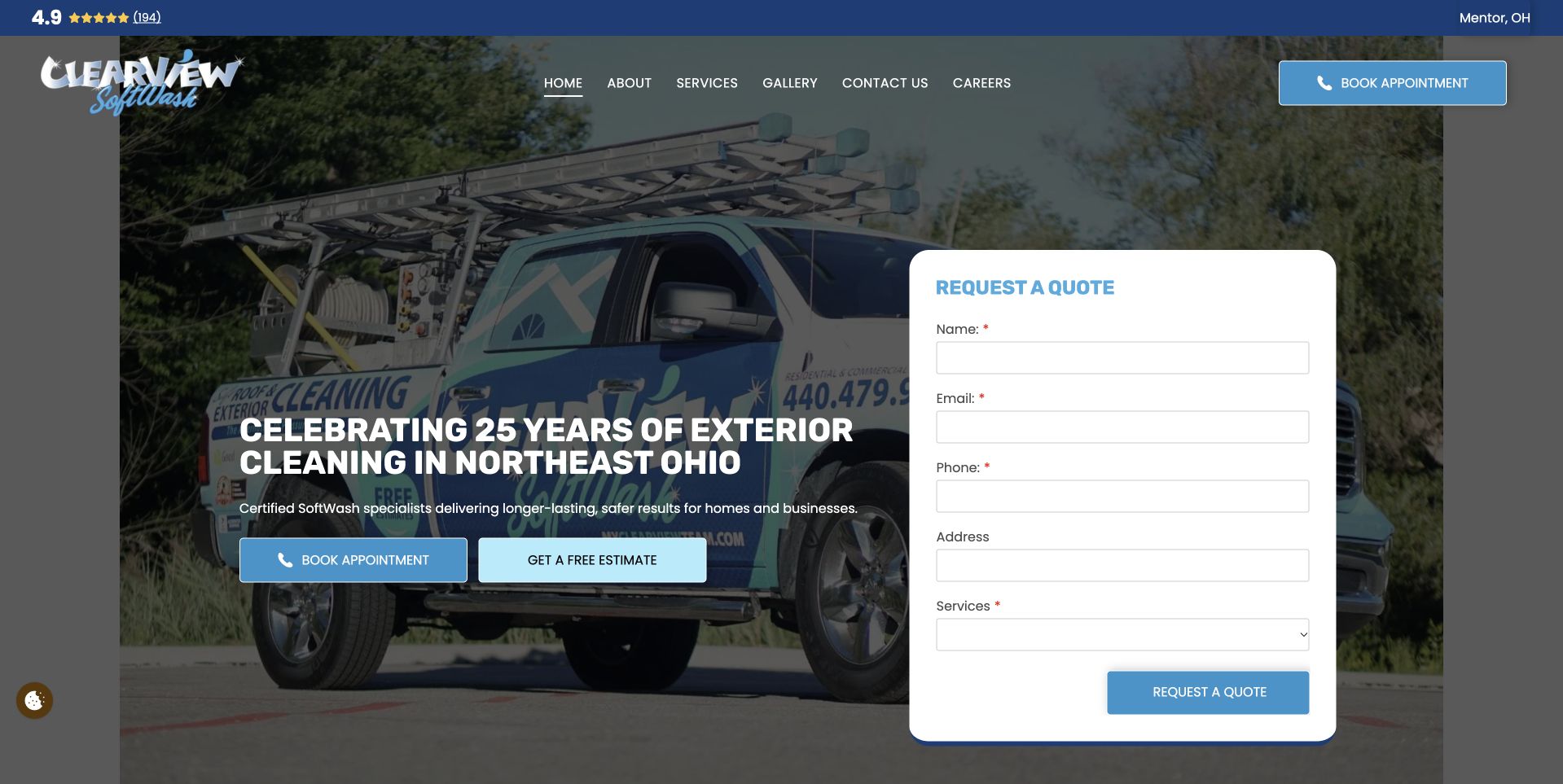
Clearview uses a photograph of several branded vehicles behind a dark overlay, with an anniversary-oriented introduction on the left and a tall white request form on the right. A blue header includes booking and navigation routes above the image. The company uses its fleet and history as visual context while offering immediate intake. The solid form surface is distinct from the vehicle detail, but it occupies much of the initial view. The anniversary statement and displayed company claims are the business's presentation, not an independent assessment of experience, capacity, cleaning results, or who will attend a particular property. Optional cookies were declined.
What you can learn
Use company history and fleet imagery as supporting context, then make the current service and inquiry process precise. Keep form fields limited to what staff need next, with a useful route for visitors who prefer to ask a question first.
Pros
Branded fleet imagery makes the introduction specific to the business.
A white form separates the inquiry task from the busy photograph.
Cons & considerations
A tall request form can dominate the first view on a phone.
Anniversary messaging needs a plain current-service explanation alongside it.
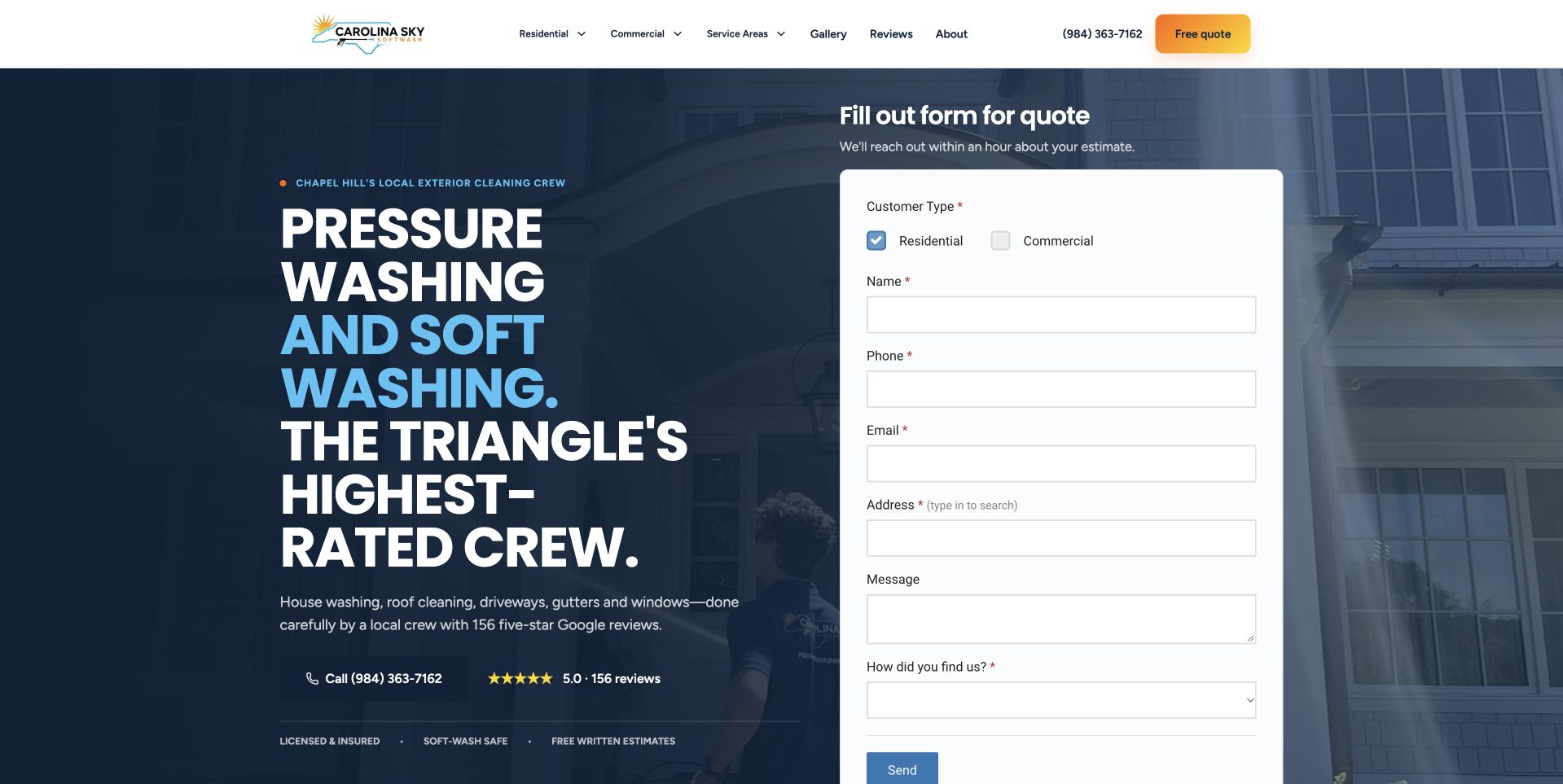
Carolina Sky uses a dark blue house-and-work photograph with large white and blue wording on the left. A tall white request form on the right includes residential and commercial choices plus property information. The Triangle-area framing gives the message local context, while the form exposes the intended customer task immediately. The mixed-audience service website provides a clear intake surface. It also shows how quickly the opening view can become information-heavy when a form requests several details before a conversation. The company's crew and process claims remain attributed marketing content; the design review does not verify service quality, safety, suitability, or the outcome of the photographed work.
What you can learn
Separate household and commercial routing only where the next questions differ. Explain what staff will do with property details, and make sure a submitted request is not mistaken for an accepted job, fixed price, or confirmed appointment.
Pros
Residential and commercial choices make the mixed inquiry scope visible.
The solid white form remains distinct from the dark property image.
Cons & considerations
Detailed first-screen intake can create friction for visitors with an initial question.
Large promotional wording needs more specific service and territory detail after the hero.
Kegan is a freelance web designer and developer with 15+ years of experience helping businesses turn complicated website requirements into clear, maintainable digital experiences. He works directly with clients from planning and design through development, launch, and ongoing support.
For pressure washing website design, his development approach focuses on surface-specific service explanations, documented before-and-after work, coverage areas, property access details, and qualified estimate requests. The scope can be a targeted improvement or a complete custom build, with responsive layouts, thoughtful content structure, and integrations chosen around the people using and maintaining the site.
Show 3 other pressure washing website designersHide other pressure washing website designers
Build the site around a property owner’s first useful question
Create a maintained service-and-surface map
Start with the services the company actually offers, then gather the questions its team needs to clarify. A visitor may know only that a driveway, siding, roof, deck, or commercial exterior needs attention. Give those concerns understandable routes, with accurate scope written or approved by responsible staff. Keep uncertain cases easy to discuss rather than forcing a customer to select a technical method. The homepage should orient, while service pages explain the assessment and next conversation. Review performance, environmental, health, and safety statements for evidence and scope before they become reusable marketing components across many pages.
Match intake to the receiving team’s workflow
Decide whether a form requests a callback, a preliminary estimate, a visit, or an appointment. Write the action and confirmation around that actual outcome. Ask only for the contact, general location, and project context needed at the first stage. If photographs or property addresses are requested, explain why and protect the information. Offer a monitored fallback for visitors who cannot use the form. Test missing fields, failed delivery, duplicate submission, and mobile keyboard behavior. A visually polished estimate form is not useful if the business cannot identify its source or respond through the promised channel.
Make project imagery informative rather than absolute
Prepare a genuine image library with permission, attribution, surface context, and an accurate account of the work shown. Before-and-after pairs should use comparable presentation and avoid implying guaranteed results. Branded vehicles can establish identity but do not prove the exact crew or equipment assigned to a future job. Crop responsive variants without hiding important context, and use descriptive alternatives for meaningful images. Keep headlines and actions on stable readable surfaces. A background photograph should not carry essential instructions, and optional video should have a useful fallback rather than leaving an empty first screen.
The editing job behind the design
Use a small, reliable service-site toolkit
[object Object]
[object Object]
[object Object]
Our WordPress website examples offer a separate look at publishing approaches. A visible platform label is evidence for that named page, not a guarantee that the same system will suit your requirements.
Before the public launch
Exterior-cleaning website brief checklist
List the actual exterior services and the questions customers use to describe them.
Have responsible staff approve method, surface, performance, safety, and environmental wording.
State the genuine operating territory and provide a fallback for uncertain locations.
Choose one primary contact task and label call, text, and quote alternatives distinctly.
Explain what an estimate request does and does not confirm.
Collect only the property and contact details needed for the first response.
Record permission and context for project, vehicle, equipment, and team images.
Give comparison photographs accurate captions and comparable presentation.
Keep optional chat, reviews, and promotional prompts away from inputs and actions.
Prepare responsive images and a useful fallback for optional background video.
Test keyboard use, mobile reading order, failed submission, and notification delivery.
Assign ownership for service scope, territory, image rights, and contact maintenance.
These checks are a project checklist, not a performance, legal, security, or accessibility certification. Test real journeys with the people responsible for the website before making claims about the result.
Sources & editorial method
How this collection was selected and reviewed
The collection is based on actual public-page inspection, selected captures, and primary company material. Patty's Pressure Washing is the editorial choice for its restrained local introduction and substantial comparison imagery, not for independently verified cleaning performance. The examples are not provider endorsements or technical instructions. We did not assess surface conditions, treatments, certifications, safety practices, prices, ratings, or environmental outcomes. Forms and contact routes were observed without submitting inquiries. Technology labels require separate evidence; a familiar layout, form, or image treatment is not sufficient to identify a site's backend.
Each example links to its actual source page. Screenshots are direct browser captures with their own capture dates; moving imagery, announcements and live designs can change. The notes describe observable design choices and conditional tradeoffs, not measured traffic, conversion results, service quality, or accessibility conformance.
Technology labels use public page metadata, asset evidence, or explicitly cited platform documentation. Platform documentation is not a complete current deployment audit. A component reference may be legacy or unused; it is not a complete backend inventory. Unknown stacks are omitted. These sites are editorial examples, not our client portfolio.
Written, Edited and Curated are separate editorial records, not timestamps advanced by a rebuild. Website designs and imagery belong to their owners. See our editorial standards or suggest a correction.
Give the visitor a clear local frame, an honest service explanation, and a predictable next step. Use genuine project imagery to support that conversation, not to make promises the page cannot establish.