A telecommunications website should help people find a suitable connection, understand what they will pay, and manage the service they already have. Strong campaigns earn attention; clear eligibility, comparison and support routes make that attention useful.
A visitor may need a SIM, a phone, home broadband, a bundle, an upgrade, an activation link or help with an outage. Those are different tasks, and a single shopping button cannot serve all of them. Start with recognizable product categories and stable service routes. Then explain the choices that change suitability: address availability, device compatibility, network coverage, data allowances, contract duration and the relationship between device payments and service charges.
These twenty-eight examples cover mobile networks, focused SIM brands and broadband providers across several markets. They show different ways to organize promotions, account access, availability checks and plan comparisons. Study the interface decisions rather than treating the collection as a ranking of network performance or value. The captured offers belong to a particular observation date; prices, eligibility and service details should always be checked with the provider before purchase.
Before the examples
What makes good telecommunications website design in 2026?
Separate buying from keeping a service working
Give activation, bill payment, account access, coverage and service status clear destinations. Someone holding a new SIM or dealing with a connection problem should not need to navigate a handset sale to find the appropriate next step.
Establish eligibility before detailed configuration
Home broadband depends on the property, while mobile suitability may depend on coverage, device support and plan eligibility. Explain what each check establishes. Ask only for the information needed at that stage, and let visitors browse general information without surrendering contact details.
Present the complete pricing story
Keep the initial term, later rate, upfront amount, device payment, service cost and meaningful qualifications close to the offer. If auto-pay, membership, trade-in, multiple lines or an existing service changes the price, make that dependency visible before selection.
The collection · 28 examples
28 telecommunications websites worth studying
Use the reviews to compare specific approaches: address-first broadband entrances, separate ordering and activation actions, regional context, customer-stage routing, device-versus-plan cards and small repeated plan tables. Each example includes an observed strength, a limitation and a practical lesson for a telecom project.
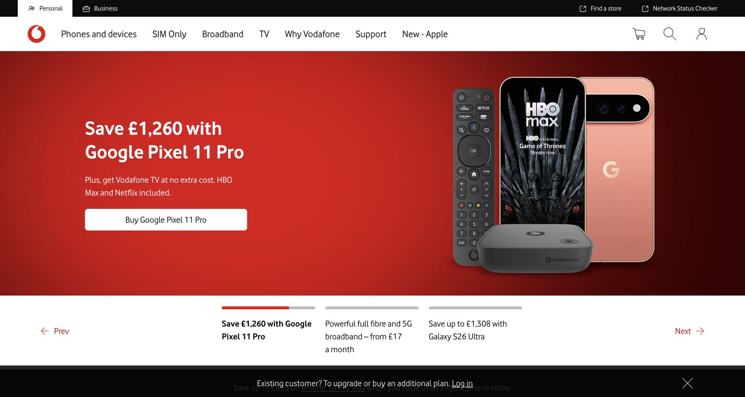
Vodafone places a red device-and-entertainment campaign beneath a broad product navigation. The carousel gives its alternatives descriptive text labels, so a visitor can see that broadband and another handset offer exist without interpreting anonymous dots. A narrow utility strip keeps the network status checker and store finder available. Below the campaign, quick links divide phones, SIM-only, home broadband, tablets, login and deals. This is a useful example of a large sales surface retaining operational routes, although the campaign occupies most of the first screen.
What you can learn
When a carousel is necessary, label its alternatives with the product or task they represent. Keep network status and account access outside the rotation so service customers do not need to wait for a relevant campaign or browse through shopping categories.
Pros
Text labels explain the alternative hero panels before someone switches slides.
The network status checker is directly available in the top utility navigation.
Cons & considerations
The opening focuses on a bundled promotion before showing comparable service options.
Large savings claims still require close attention to eligibility and the complete plan terms.
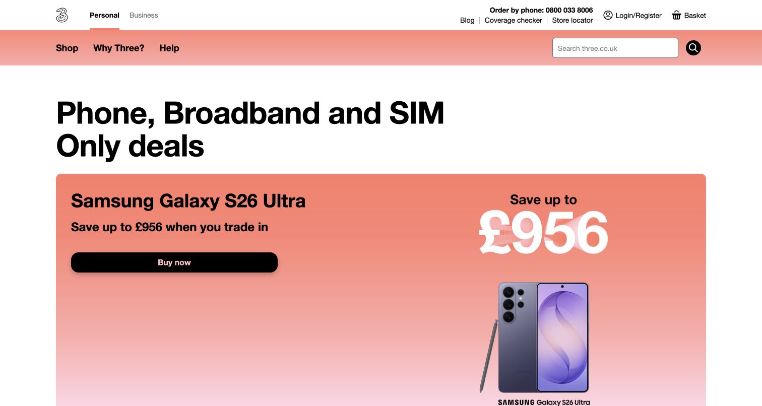
Three begins with a literal heading naming phones, broadband and SIM-only deals, followed by one oversized handset promotion. Its compact Shop, Why Three and Help navigation sits beside a prominent search field. Coverage checking, the store locator and an order-by-phone number occupy the upper utility area. Further down, the page inserts an existing-customer upgrade route and multiple offer cards, including price-change text beside a SIM offer. The structure makes the business scope clear, but the first product receives much more visual space than the other needs named in the heading.
What you can learn
Use a broad headline to orient people, then make sure the screen beneath it offers routes matching that promise. Place coverage and assisted-sales options where shoppers can consult them before committing to a particular device or plan.
Pros
The main heading describes the available service categories in ordinary terms.
Coverage, stores and telephone sales are visible without opening the shopping menu.
Cons & considerations
The large handset panel pushes broadband and SIM comparisons farther down the page.
A series of savings-led cards can make recurring price and trade-in conditions harder to scan together.
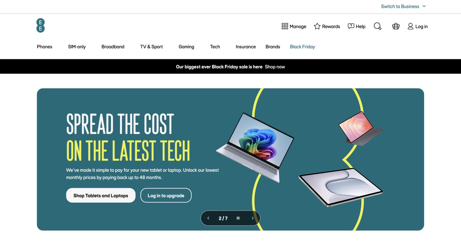
EE uses a roomy white header to separate account management, rewards and help from its product categories. The observed hero carousel includes visible previous, next and pause controls, with an explicit slide count. Its tablet-and-laptop panel pairs a shopping action with a login-to-upgrade action. Below, category links span phones, SIM-only, broadband, television, gaming, technology and insurance before a tabbed deals section. This shows how a telecom homepage can behave like a broader electronics store while preserving an existing-customer route inside the promotion itself.
What you can learn
Give repeat customers a contextual upgrade action beside the new-purchase action. As the product range expands, keep service management visually distinct from retail discovery, and provide a reliable pause control for campaigns that change while someone reads their conditions.
Pros
The promotion distinguishes shopping from logging in to upgrade.
Visible slide numbering and playback controls help explain the changing campaign area.
Cons & considerations
Seven hero panels and a wide product range create substantial competing navigation choices.
Repayment language needs a clear connection to the complete cost and duration on the destination page.
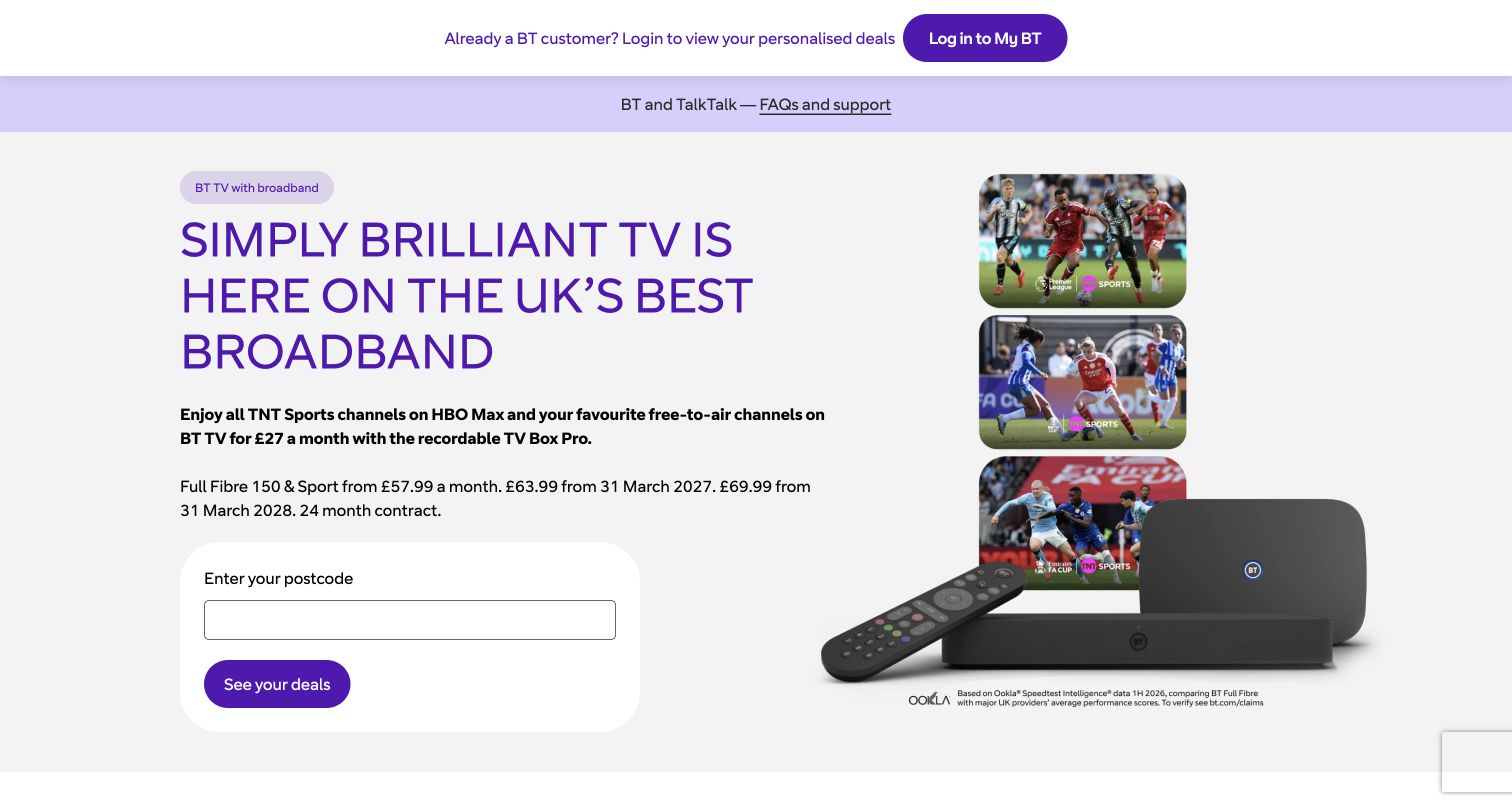
BT puts a postcode field directly inside its opening television-and-broadband offer. The accompanying text names a contract term and future monthly prices, while the device image explains the television component of the bundle. Above the hero, an existing-customer login strip and a separate customer-update link provide non-shopping routes. Later sections introduce broadband, security and package building. The useful design move is proximity: the visitor sees the offer, its main qualification text and the availability entry point in the same opening area.
What you can learn
For a service that depends on location, put the availability check beside the actual proposition. Explain what the check will establish and retain an existing-customer route, rather than requiring every visitor to begin as a new household shopping for a bundle.
Pros
The postcode field makes geographic eligibility part of the initial decision.
Contract duration and scheduled price changes appear alongside the featured package copy.
Cons & considerations
The television-led opening may be less direct for visitors seeking broadband alone.
The strong multi-line headline leaves limited space for explaining all bundle components above the fold.
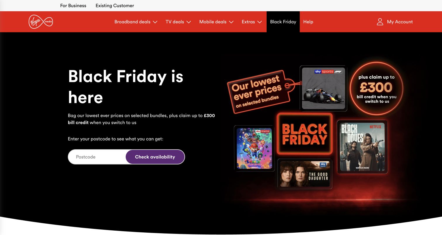
Virgin Media places a postcode check in the middle of a black seasonal campaign, supported by entertainment artwork and a switching-credit message. Its red navigation separates broadband, television, mobile and extras, while existing customers have both a utility link and an account control. The page later covers switching, benefits, support and offer conditions. Despite the campaign's visual intensity, the first practical action is specific: check what is available at a postcode. That relationship is more useful than sending everyone straight into a generic bundle catalogue.
What you can learn
Let the main campaign lead to an eligibility decision when the product cannot be bought everywhere. Keep switching incentives visually subordinate to the service check, and make their conditions easy to reach before customers assume they will receive a credit.
Pros
The availability field is visibly attached to the opening offer.
Existing-customer and help routes remain accessible in the persistent header area.
Cons & considerations
The entertainment collage competes with the more functional broadband decision.
A large switching-credit figure can overshadow the conditions needed to understand its real relevance.
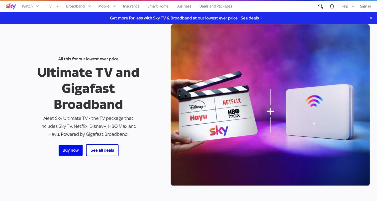
Sky's opening pairs a television clapperboard and broadband router with a short explanation of the combined package. Two adjacent buttons distinguish buying from viewing the wider set of deals. The narrow header keeps television, broadband and mobile as recognizable categories alongside help and sign-in. Farther down, individual product sections offer both purchase and learning routes. The example is useful for showing a bundle as a relationship between services, although the prominent entertainment brands can take attention away from the connection's practical suitability.
What you can learn
Explain a bundle with one visual for each major component and a plain sentence describing how they fit together. Offer a comparison route beside the direct purchase action so visitors who have not yet chosen a package can make progress without entering checkout.
Pros
Router and entertainment imagery make the two parts of the offer immediately recognizable.
The opening gives separate actions for purchase and reviewing available deals.
Cons & considerations
Entertainment logos receive more emphasis than broadband eligibility and speed details.
A broad navigation spanning insurance and smart-home products adds decisions beyond the core connection.
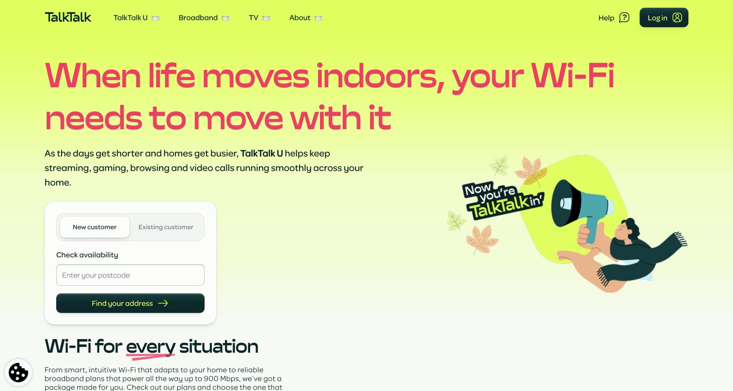
TalkTalk uses a bright yellow-green opening with a large seasonal headline and a compact eligibility panel. That panel asks visitors to choose new or existing customer before entering a postcode. Below it, two service propositions compare an adaptive Wi-Fi concept with fixed-speed plans, including contract duration and scheduled price changes. Help and login remain in the header. The example is useful because the customer relationship affects the next step before the address check begins, rather than being discovered only after a visitor has followed the wrong sales route.
What you can learn
Ask whether someone is new or already connected when that changes the available journey. Keep alternative broadband concepts comparable through the same core fields, such as speed approach, equipment, term and recurring cost, rather than relying on unfamiliar product names alone.
Pros
The new-versus-existing choice appears directly above the availability field.
The following service panels explain their different approaches with comparable practical details.
Cons & considerations
The very large headline delays the comparison section despite a relatively simple proposition.
An adaptive Wi-Fi product name needs continued explanation so customers can distinguish access speed from in-home coverage.
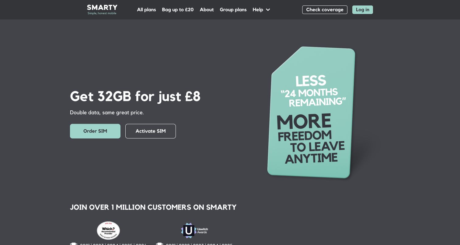
SMARTY uses a charcoal background and mint accents to put a compact data offer beside a large SIM illustration. Order SIM and Activate SIM sit next to each other, giving visitors a clear distinction between buying and using something already received. Coverage checking and login remain in the header, and awards appear directly beneath the hero. Lower sections explain plan categories and practical topics such as keeping a number. The restrained palette makes the main actions easy to identify without relying on a full catalogue of devices.
What you can learn
Treat activation as a first-class homepage task when many visitors already have a SIM. Keep it visually separate from ordering, and place coverage checking nearby so a simple acquisition pitch still supports the checks that determine whether switching is sensible.
Pros
Adjacent order and activation buttons address two different stages of the same customer journey.
The limited color palette gives the primary actions clear contrast with the background.
Cons & considerations
The large promotional SIM graphic takes space that could support plan comparison.
An attractive headline allowance still requires an easy route to the complete roaming and usage conditions.
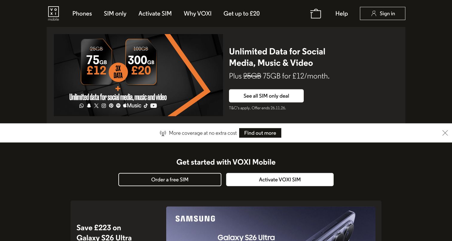
VOXI presents its social, music and video data proposition in a dark hero with a vivid plan graphic and a single route to SIM-only deals. A light coverage strip interrupts the dark campaign, followed by a strong getting-started section with separate ordering and activation choices. Device offers sit farther down the page. The approach makes the brand's distinctive benefit memorable, while the following task split helps visitors translate that promise into action. Its main editorial challenge is explaining which uses are covered by the special allowance and which consume ordinary data.
What you can learn
A distinctive benefit should lead to an equally clear explanation of its boundaries. Separate the marketing concept from the operational choice to order or activate, and keep ordinary allowance, eligible applications and exclusions close enough to compare before plan selection.
Pros
The order-versus-activate split supports both prospective and newly joined customers.
A contrasting coverage strip makes network information stand apart from the dark offer area.
Cons & considerations
Application logos and headline data figures can imply broader inclusion than the detailed terms support.
The strong lifestyle pitch delays a conventional side-by-side plan comparison.
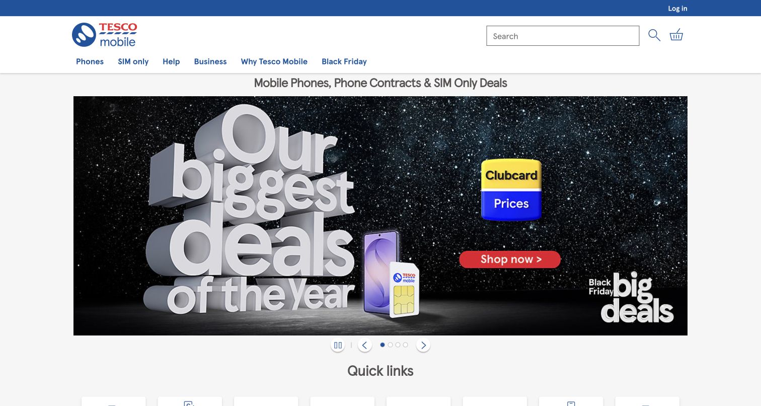
Tesco Mobile leads with a large seasonal banner, prominent Clubcard pricing branding and a red shopping button. Above it, search and familiar phone, SIM-only, help and business categories give visitors ways around the promotion. The quick-links section below includes account access, upgrades, pay-monthly products and pay-as-you-go choices. Carousel controls are visible on the campaign. This is a useful reference for integrating a loyalty proposition into telecom shopping, while preserving the everyday tasks of people who already use the service.
What you can learn
If membership changes the price, make the qualification visible wherever that price appears. Build a stable quick-link layer for account access, upgrades and payment models so frequent customers are not forced to reinterpret a new seasonal campaign on every visit.
Pros
Quick links cover both shopping categories and existing-customer actions.
The loyalty-price identity is visually distinct within the main promotion.
Cons & considerations
The oversized campaign postpones detailed plan and device comparison.
Loyalty pricing and several payment models can increase the amount of qualification a shopper must understand.
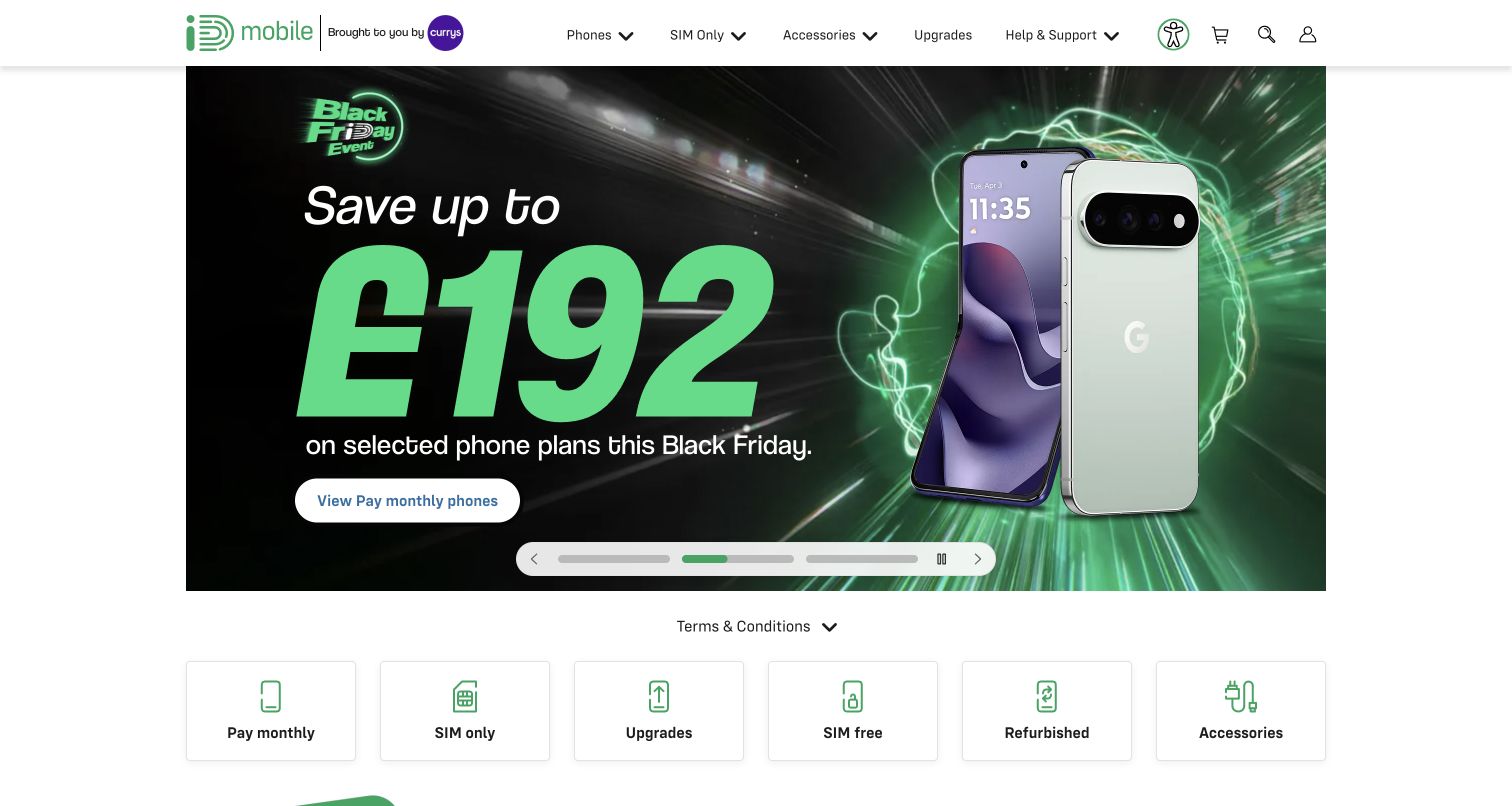
iD Mobile combines a white service header with a high-contrast green device promotion. A terms-and-conditions row sits below the campaign, followed by category tiles for pay-monthly phones, SIM-only, upgrades, SIM-free, refurbished products and accessories. The Currys association appears in the header. This category layer is the strongest lesson: it names the different ways to acquire or keep a device without making visitors decode individual promotional offers first. The initial visit also surfaced both consent and a prize-draw prompt, illustrating how promotional interruptions can accumulate.
What you can learn
Keep acquisition models explicit and stable beneath changing campaigns. A shopper comparing a refurbished phone, an outright purchase and a monthly contract needs clear category names before evaluating individual deals; additional popups should not obstruct that first orientation.
Pros
The category tiles distinguish several materially different purchase and upgrade routes.
A nearby terms row gives the campaign a recognizable qualification entry point.
Cons & considerations
The rotating promotion gives one offer much greater visual weight than the wider catalogue.
Multiple initial overlays can interrupt visitors before they reach the stable category choices.
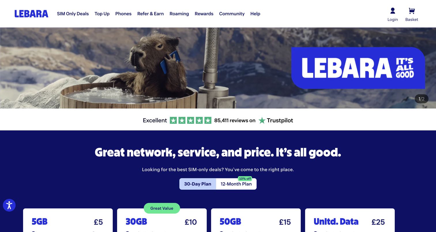
Lebara opens with a memorable campaign image, then moves into a dark blue plan area with a clear choice between shorter and longer plan durations. Plan cards display data and price in a repeated arrangement. Farther down, the page introduces a dated comparison with other providers and separates help for people considering the service, people who have just switched and existing customers. That final grouping is especially useful: activation, number transfer and account management are different needs even though all can be described loosely as help.
What you can learn
Organize support by customer stage when the required next step changes after purchase. If a competitor comparison is included, attach its observation date and source basis so editors know it requires maintenance and readers understand that the offers may have changed.
Pros
The plan-duration control establishes an important comparison dimension before selection.
Stage-specific help separates evaluation, switching and ongoing account tasks.
Cons & considerations
The opening campaign image consumes substantial space before the plan cards appear.
A competitor table needs active maintenance and cannot remain accurate merely because a date is displayed.
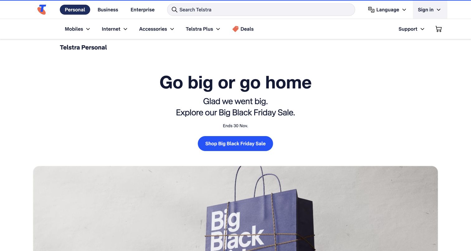
Telstra opens with a centered sale headline, one blue call to action and a large campaign visual. The header separates personal, business and enterprise audiences, with a wide search field, language option and support access. Subsequent sections organize mobile, internet, accessories, payment choices and delivery information into distinct propositions. This is a deliberately broad sales entrance rather than an immediate plan comparison. Its strength is a clear campaign destination, while the practical task is helping visitors return quickly to the particular service or support issue they arrived with.
What you can learn
For a broad sale, use one entry point to avoid a crowded hero, then divide the following content by meaningful product and fulfilment decisions. Keep audience selection and support outside the campaign so commercial activity does not absorb the whole navigation hierarchy.
Pros
One prominent hero action avoids a cluster of competing promotional buttons.
Personal, business and enterprise navigation makes the intended audience explicit.
Cons & considerations
The broad sale entrance adds a step for someone ready to compare a specific plan.
A large campaign visual gives less first-screen space to eligibility and ongoing price information.
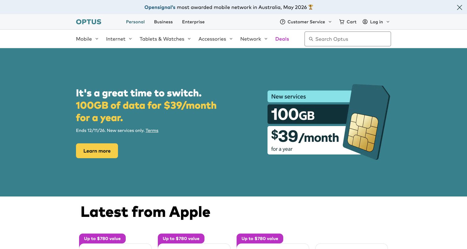
Optus uses a teal hero to present a specific SIM proposition, with the introductory period, new-service condition and terms link close to the main action. The header includes customer service, network navigation and search. Beneath device promotions, a row of useful tasks covers bills, account access, recharge, plan changes, moving home, SIM activation, help and network status. The example shows how a promotional homepage can still function as a service hub, although returning customers must pass substantial acquisition content to reach those shortcuts.
What you can learn
State the introductory period and eligibility next to the offer, then provide a task-based service layer using the language customers use. Billing, recharge, activation and outages should be distinct destinations, even if they share a common account system behind the scenes.
Pros
The hero places duration, eligibility and terms beside the promotional price.
The service shortcuts cover concrete tasks beyond a generic support link.
Cons & considerations
The shortcut row follows a large promotion and device section, delaying repeated service tasks.
Network awards and large allowance figures still need accessible supporting context to avoid overgeneralization.
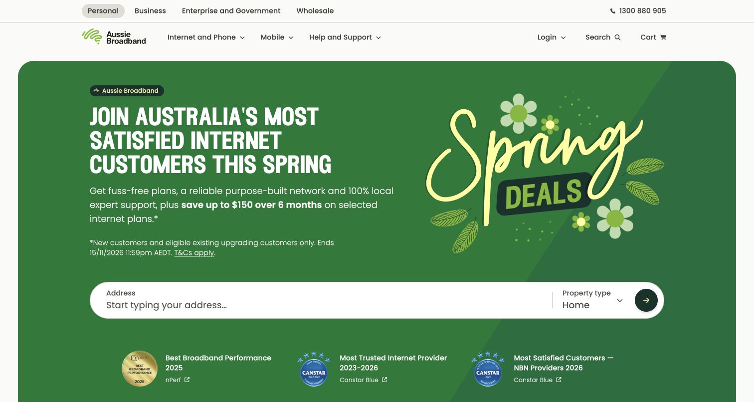
Aussie Broadband places an address field and property-type choice inside its green seasonal hero. The offer's customer qualification and expiry text appear before the form, while named awards with source links sit below it. Audience navigation distinguishes personal, business, enterprise and wholesale users. Later sections cover internet, mobile, hardware and local support. The page ties brand claims to a concrete next step without requiring visitors to choose a speed tier before checking their property. It also illustrates how credibility marks can be organized as a supporting row rather than a separate destination.
What you can learn
Ask for the information that determines service eligibility before presenting a detailed configuration. If property type changes the catalogue, make that choice explicit, and place supporting awards with their names, years and source links so the claim can be evaluated in context.
Pros
Address and property type are grouped into one clear eligibility entrance.
The award row names the recognition and provides linked supporting sources.
Cons & considerations
The long promotional headline makes the hero relatively dense on a smaller screen.
Awards about trust or satisfaction should not be confused with a performance guarantee at a particular address.
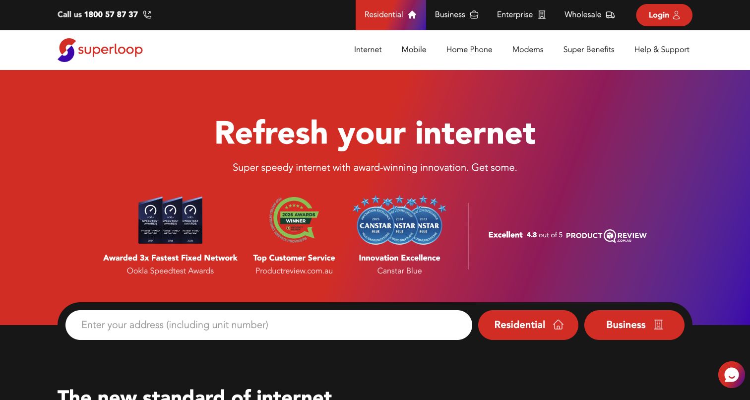
Superloop uses a red-to-purple hero with a short internet proposition and a prominent row of award and review references. The address field spans the width beneath those claims and pairs residential and business choices. Product navigation includes internet, mobile, home phone, modems and support. Subsequent sections connect faster plans with suitable hardware and describe service tools. The page is useful for studying how an infrastructure-led promise becomes a household decision: the visitor must identify a property and customer type before exploring what the advertised network can provide there.
What you can learn
Connect network-level credibility to property-level eligibility rather than letting one stand in for the other. Keep hardware requirements near speed propositions, because a faster access plan does not by itself explain what router or local setup a customer may need.
Pros
The wide address field forms a clear bridge from the hero to service selection.
Residential and business choices are visible beside the eligibility entry point.
Cons & considerations
The large award row consumes more space than the practical explanation of available service.
Speed and free-hardware messaging requires careful qualification about location, plan and minimum connection period.
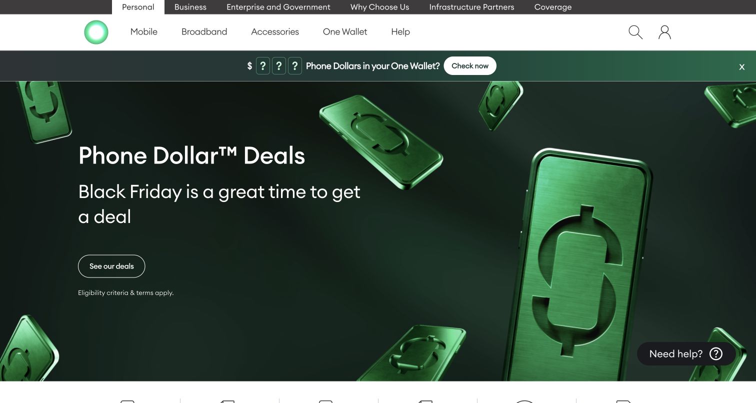
One NZ leads with a dark green Phone Dollars campaign and a clear eligibility qualifier. Its header separates customer audiences, coverage and product categories. Below the hero, the task row covers prepay top-up, bill payment, phone deals, changing a plan, moving broadband and eSIM. A network-retirement notice follows, before broader mobile, satellite and business content. This combination is useful because it gives ongoing service changes a place beside the retail campaign. The reward concept is memorable, but visitors still need an explanation of how it applies to a phone purchase.
What you can learn
Keep recurring tasks specific and give service-transition notices a stable location outside sales artwork. A rewards campaign should explain the conditions of redemption without making customers search for the practical routes they need to manage or maintain their connection.
Pros
The task row names individual actions such as topping up, moving broadband and connecting with eSIM.
A service-transition notice appears as separate operational content below the shopping entrance.
Cons & considerations
The rewards-led opening may be unclear to visitors unfamiliar with the programme.
Prominent satellite and coverage propositions need qualification about compatible devices and supported uses.
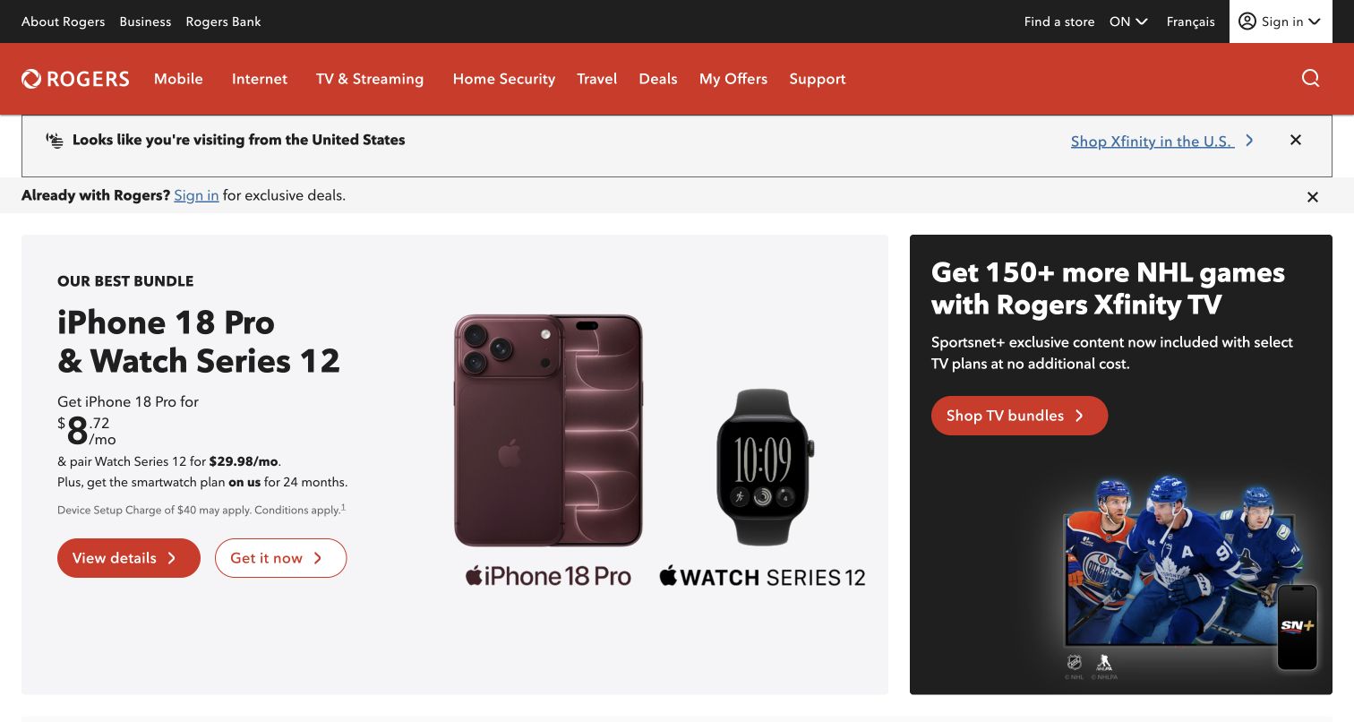
Rogers uses two adjacent promotional panels to give mobile devices and television separate visual territory. A sign-in strip provides a route to existing-customer offers, while a visible region control and a location-related notice establish geographic context. The header covers mobile, internet, television, home security, travel and support. Below the initial offers, network and roaming sections include linked legal references. The parallel layout reduces reliance on one rotating hero, but it also means a visitor must distinguish device cost, service plans and bundle benefits across several concurrent messages.
What you can learn
Use separate panels for genuinely different service categories, and make geographic context visible before prices are interpreted. A regional notice should help people understand relevance without blocking the public page, while account-specific offers need a clear sign-in route.
Pros
The split opening gives mobile and television promotions distinct destinations.
Region and existing-customer context are visible above the main promotional area.
Cons & considerations
Multiple monthly figures and bundle components can complicate a first comparison.
The broad service navigation introduces many choices for visitors with a narrow support need.
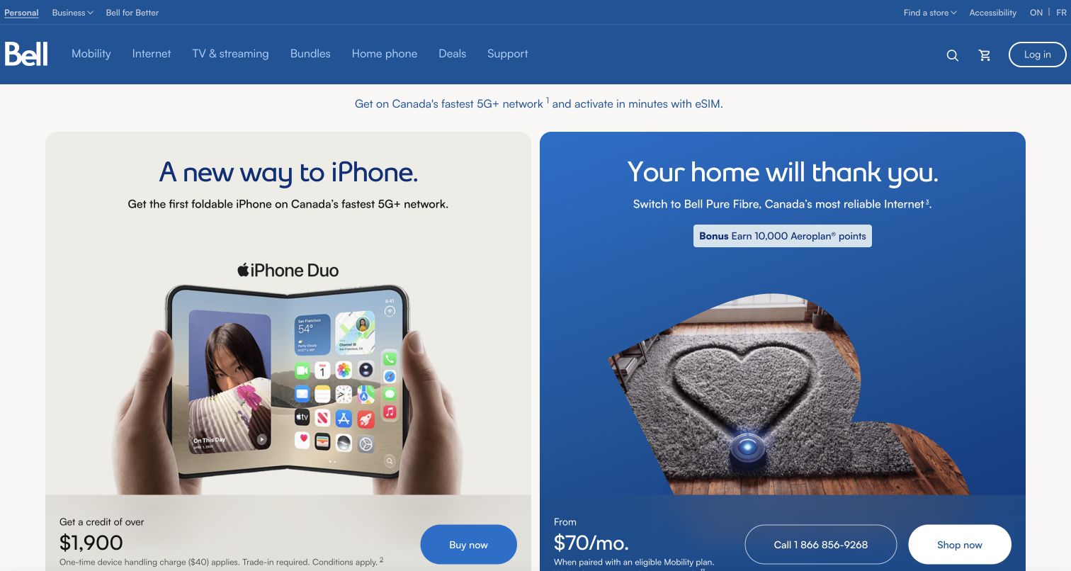
Bell presents a province selector in the utility navigation and a prominent current-region notice before its offers. The opening pairs a handset campaign with a home-internet card, each using its own image, supporting copy and action. Price and trade-in qualifications sit within the cards rather than being deferred entirely to the footer. Accessibility, store finding, support and login remain in the header. The design is a useful reference for a national provider whose content depends on location, although the two tall cards require considerable scrolling before the wider range becomes visible.
What you can learn
Make the current market explicit wherever it changes the available catalogue. Keep each offer's qualifications inside its own card so readers can associate a trade-in requirement, bundle condition or term with the correct price instead of untangling a shared disclaimer.
Pros
The current province is visible and has a direct change route.
Mobile and home-internet offers keep separate images, conditions and actions.
Cons & considerations
The tall product cards limit the number of service choices visible at once.
Dense qualification text remains visually smaller than the headline device and monthly-price messaging.
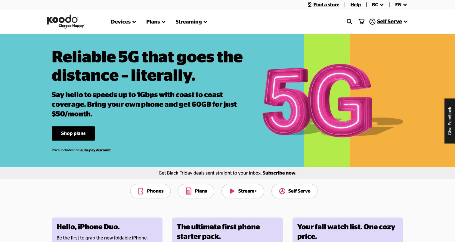
Koodo uses a bright teal hero, oversized black type and a large 5G graphic to present a bring-your-own-phone proposition. The auto-pay qualification is linked immediately below the main plan button. Its compact navigation separates devices, plans and streaming, while Self Serve is prominent on the right. Rounded quick links below the promotion repeat the principal choices, including Self Serve. Later cards add roaming, device protection, referrals and community help. The result is an approachable first screen, though the benefit headline gives more prominence to speed language than the practical boundaries of the plan.
What you can learn
Place price qualifications directly under the action they affect, and repeat a short set of useful routes where the campaign ends. An account destination can be part of the main choice set instead of being treated as a small utility link only.
Pros
The auto-pay condition is visibly connected to the featured monthly price.
Self Serve appears in both the header and the quick-link row.
Cons & considerations
Large speed and coverage language needs a clear route to the conditions behind those claims.
Cross-selling streaming and device protection can distract from the initial plan comparison.
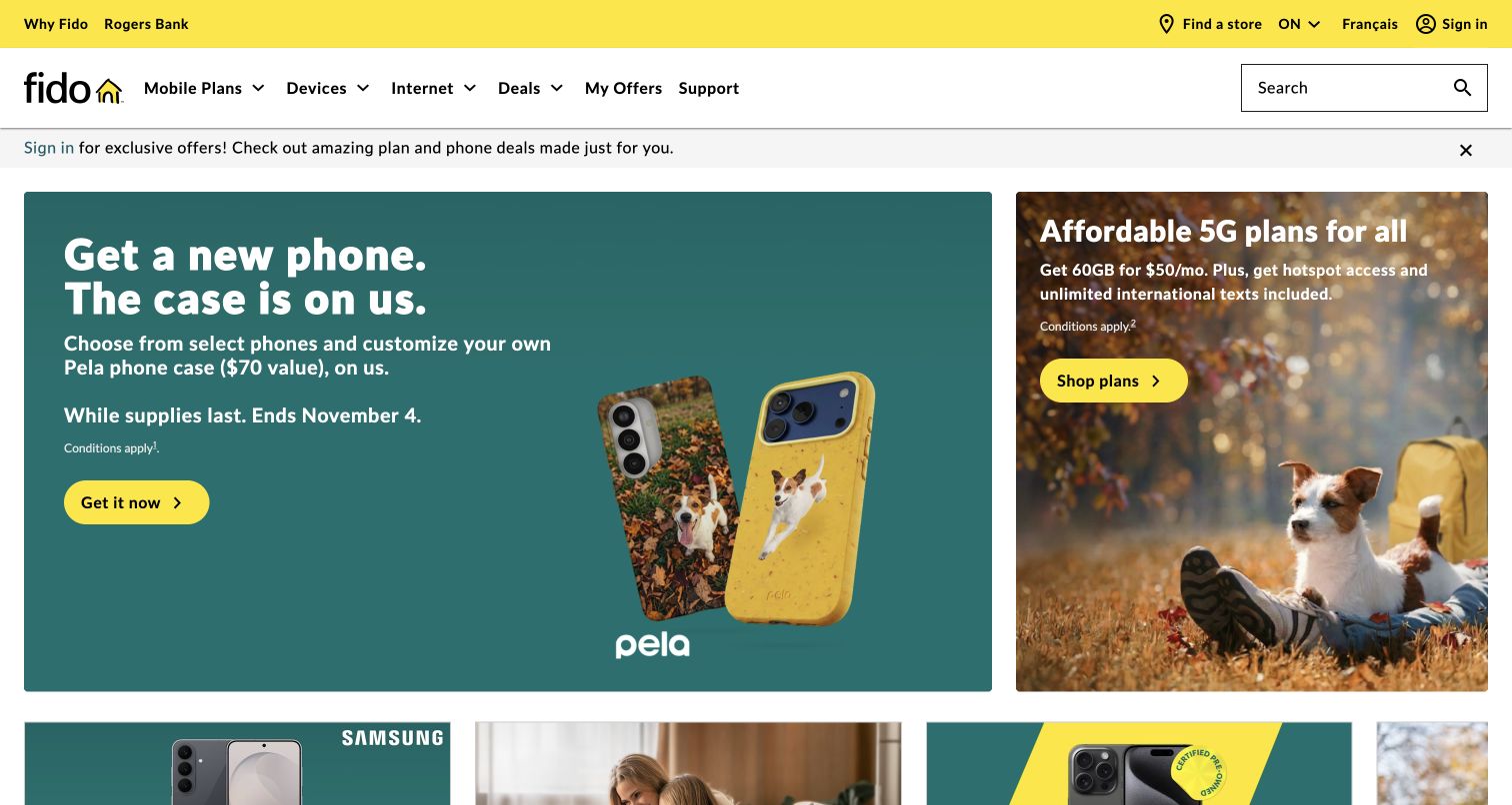
Fido pairs a large device promotion with a narrower plan card, using yellow accents and distinct photographic treatments to separate the two. An existing-customer sign-in strip spans the page above them. The header names mobile plans, devices, internet, deals, offers and support, with a visible search field. Lower sections explain coverage and travel options. The opening therefore supports two different buying intentions without forcing both into one composite offer. Its main maintenance challenge is that seasonal deadlines and promotional qualifications must stay aligned across the cards and their destination pages.
What you can learn
Separate hardware-led and plan-led offers when they answer different shopping intentions. Keep the qualification, expiry and destination of each card together, and give returning customers a persistent route to their own offers before they browse public acquisition promotions.
Pros
Device and plan promotions occupy clearly different cards with their own actions.
The sign-in strip tells existing customers where to find relevant offers.
Cons & considerations
The larger device campaign can overshadow the simpler plan-only option.
Several concurrent promotions increase the editorial work needed to keep dates and conditions consistent.
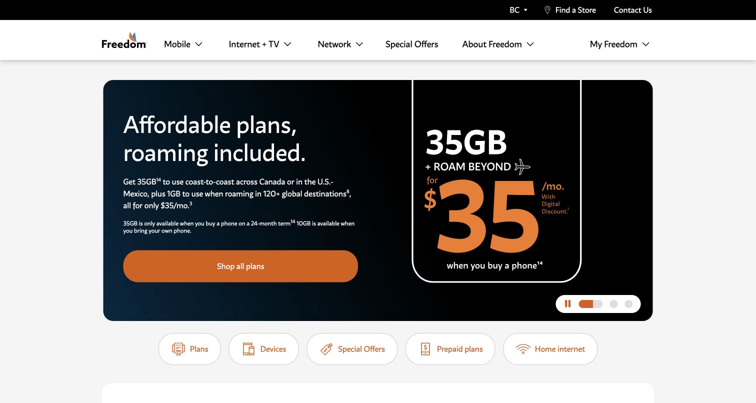
Freedom Mobile puts a roaming proposition inside a dark rounded hero, with a large price graphic and a broad plan button. The accompanying copy distinguishes the data allowance available with a phone purchase from the allowance for bringing an existing device. Visible carousel controls and a row of plans, devices, offers, prepaid and home-internet shortcuts follow. A province selector sits in the upper utility bar. This example is useful because it exposes a meaningful eligibility difference in the opening panel, while also showing how several geographic data allowances can make a compact offer difficult to parse.
What you can learn
When the advertised allowance changes with device purchase, explain that difference before the main selection action. Describe domestic, regional and international roaming separately, with the relevant destinations and limits attached to each, so one large data figure cannot stand for every use case.
Pros
The opening explicitly distinguishes device-purchase and bring-your-own-phone allowances.
Quick links provide direct routes to prepaid and home-internet options beyond the featured plan.
Cons & considerations
Several footnotes and geographic allowances make the hero copy demanding to scan.
The oversized price graphic gives less visual weight to the conditions that determine eligibility.
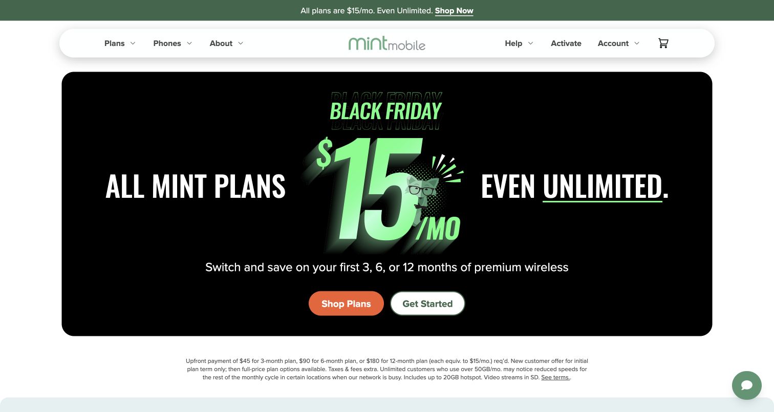
Mint Mobile centers a striking black seasonal offer inside a rounded panel, with Shop Plans and Get Started as separate actions. The main message states that the promotion covers an initial period, while the paragraph below explains upfront payment, later plan options, taxes and usage limitations. A coverage check and device bundles appear farther down the page. This is a useful example of the tension between a simple monthly-equivalent headline and a purchase that actually requires multiple months of payment. The brand's illustration helps recognition, but the explanatory paragraph carries much of the decision-making detail.
What you can learn
If a price is a monthly equivalent, display the actual amount due and the initial term beside the main action. Keep a guided starting route for uncertain shoppers, but let experienced visitors go directly to plan comparison and coverage information.
Pros
Separate shopping and guided-start actions support different levels of buyer certainty.
The page provides explicit upfront-payment and initial-term detail near the hero.
Cons & considerations
The qualification paragraph is much smaller and denser than the headline monthly figure.
Coverage checking appears after the promotion rather than as part of its first decision.
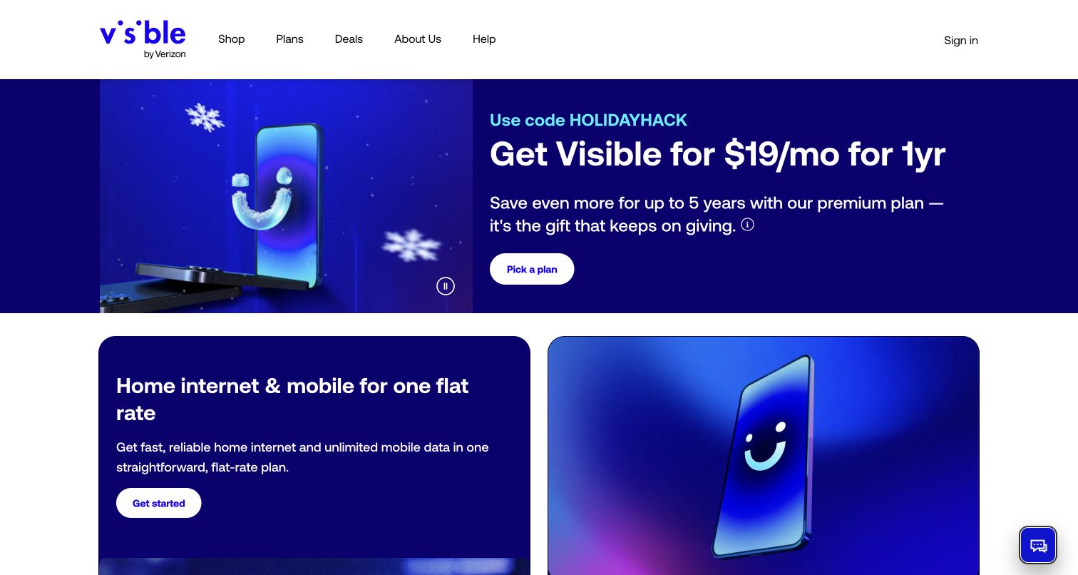
Visible opens with a promotional code and a plan-selection action against a blue campaign. Farther down, three plan columns show different promotional periods, hotspot speeds and travel features, with taxes-and-fees wording and links to full details. A Broadband Facts link provides another comparison route. The useful pattern is a narrow, repeated plan structure that exposes what changes between tiers. The observed first visit also produced an email signup overlay, showing how acquisition prompts can obstruct an otherwise focused comparison journey before a visitor has decided whether the service fits.
What you can learn
For a small plan range, repeat the same feature order across every tier and make duration differences as visible as price differences. Keep optional email collection out of the way until visitors have had a fair opportunity to understand the service and its limitations.
Pros
The plan columns make hotspot and travel differences available in a repeated structure.
Full-details and Broadband Facts links offer routes beyond the campaign headline.
Cons & considerations
Different promotional periods across tiers make the headline prices harder to compare over time.
The initial email overlay interrupts the core shopping task and requires dismissal.
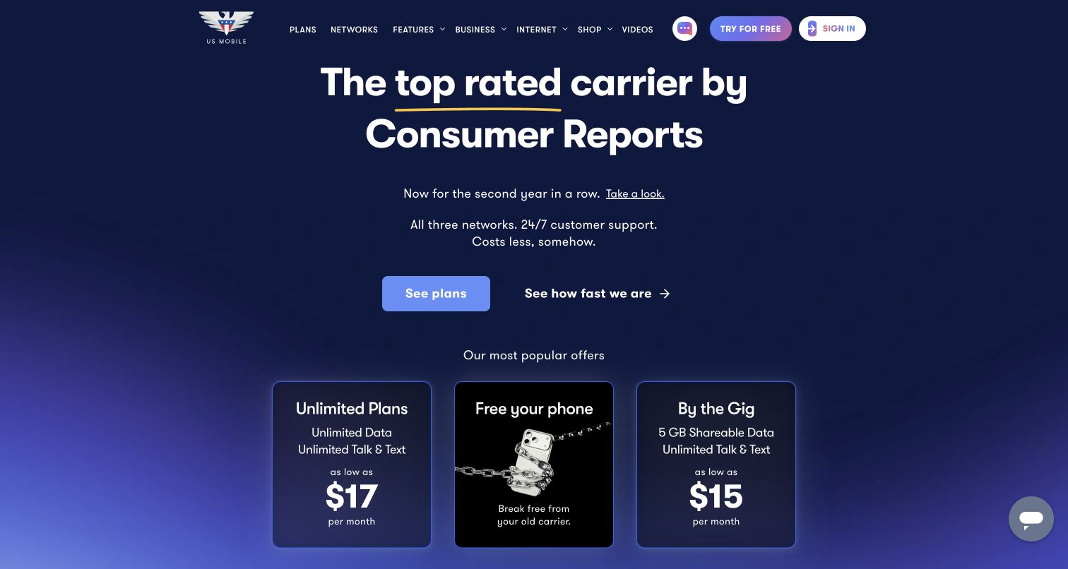
US Mobile opens with a large editorial-recognition claim and a linked explanation, then presents three cards for unlimited plans, phone unlocking and shared data. The dark blue treatment gives these options a consistent visual frame, while See Plans is the main action above them. Navigation also names networks, features and business service. This is useful for studying how a provider can introduce different service models before a detailed plan table. The comparison remains conceptual at first, so visitors still need clear explanations of network choice and the conditions behind the starting prices.
What you can learn
When the catalogue contains different billing models, help visitors choose the model before choosing a tier. Link recognition claims to supporting context, and explain network selection separately from the price so an inexpensive starting figure does not obscure a compatibility or coverage decision.
Pros
The opening cards distinguish unlimited and shared-data plan families.
The recognition headline includes a direct route to more context rather than relying on a logo alone.
Cons & considerations
The phone-unlocking card interrupts an otherwise parallel set of plan choices.
Starting prices and multiple network options require further explanation before meaningful comparison.
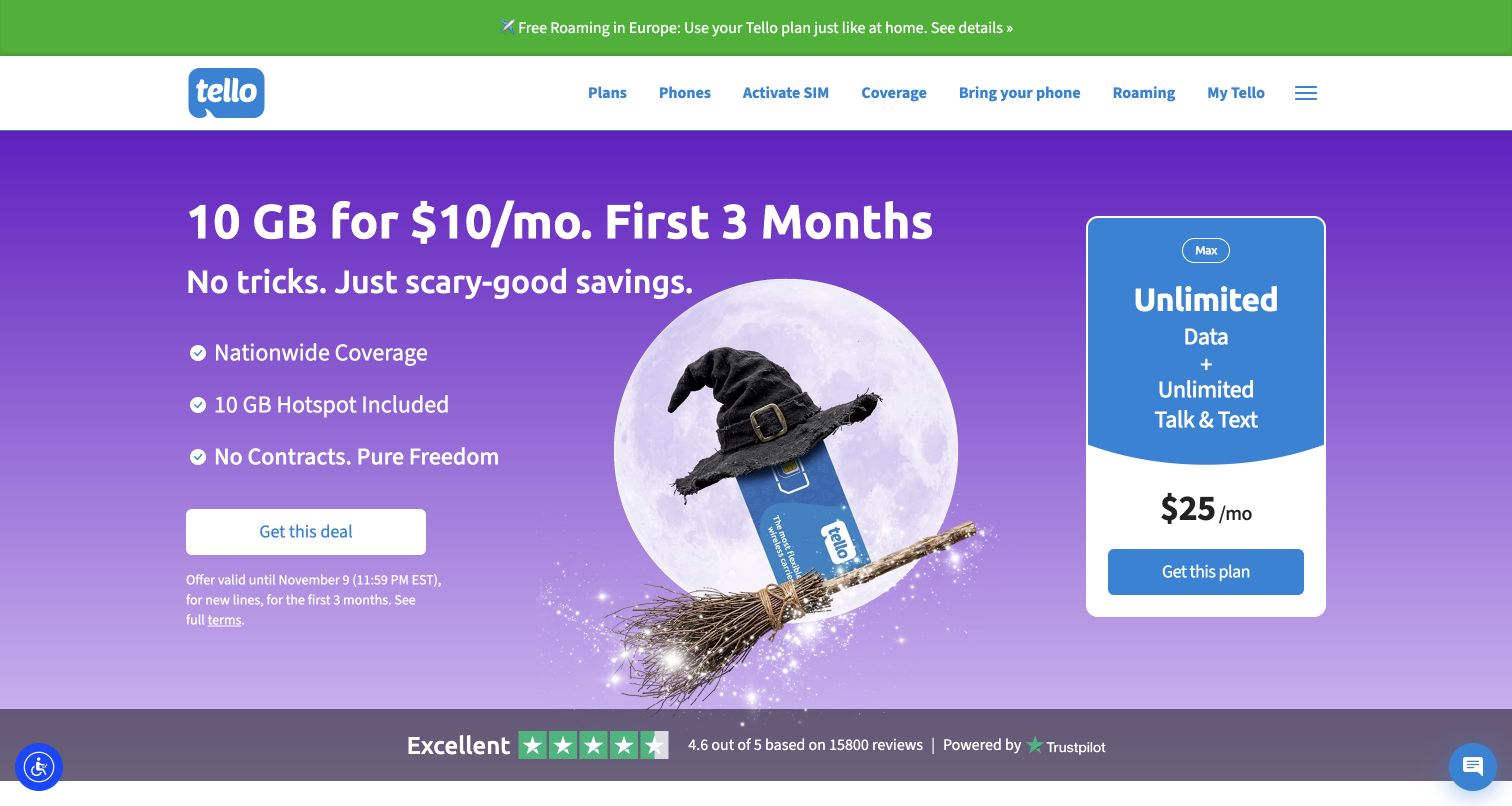
Tello combines a seasonal data offer with a separate unlimited-plan card, then explains customization, family plans and bringing an existing phone. Its header keeps plans, activation, coverage, compatibility and roaming visible as individual routes. The introductory period and expiry are stated close to the featured deal. This is a useful reference for a provider whose core benefit is flexibility: the page gives both a ready-made promotion and a build-your-own route. It also illustrates why a broad coverage promise should be followed by a concrete check rather than treated as reassurance for every location.
What you can learn
Give flexible-plan customers both a sensible starting offer and a clear route to customize. Keep device compatibility, coverage and activation separate, because success at one of those checks does not establish the others and each occurs at a different stage of switching.
Pros
The header makes coverage, compatibility and activation independently discoverable.
The promotion states its introductory duration and deadline beside the offer action.
Cons & considerations
Two prominent plan propositions can compete before the visitor understands customization.
The seasonal illustration occupies space that could explain recurring price or data limits more directly.
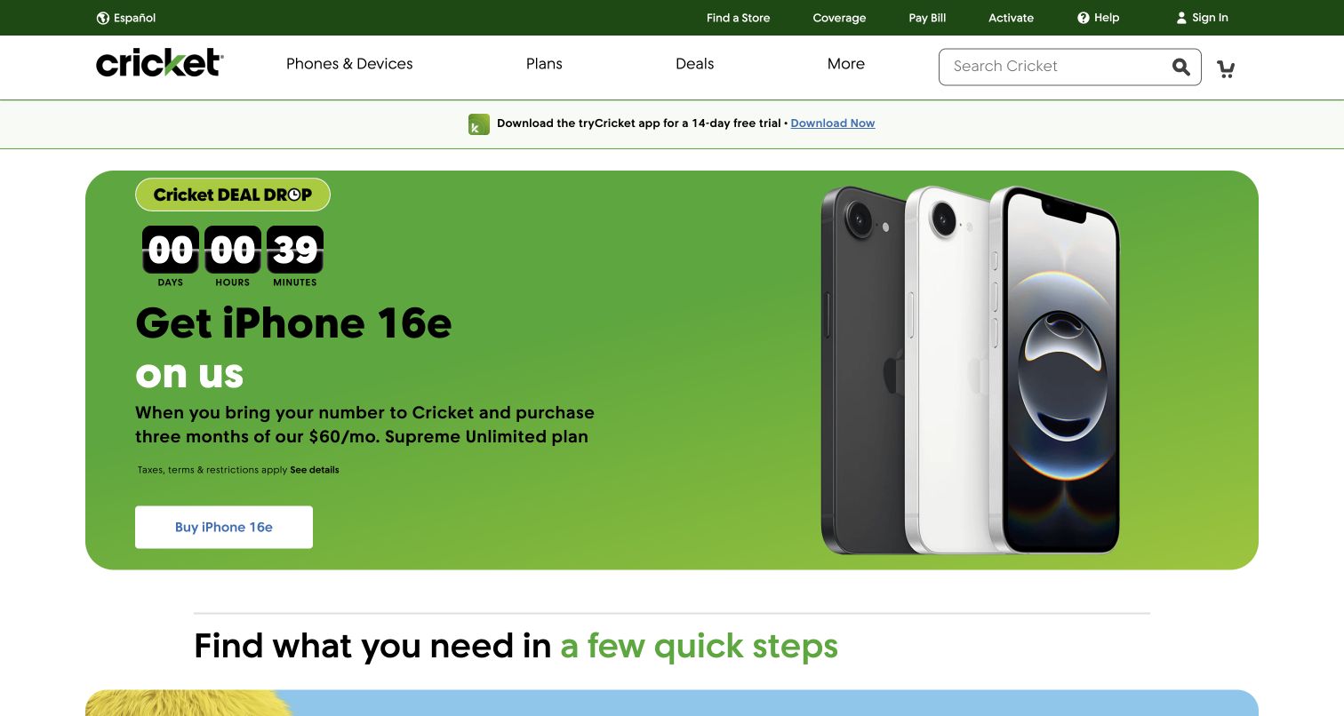
Cricket Wireless leads with a large device promotion that states a number-transfer requirement and a multi-month service purchase. Immediately below, a getting-started area separates new visitors from existing customers. The utility navigation exposes coverage, bill payment, activation, help and sign-in before the shopping categories. Subsequent cards cover network information, multiple lines and home internet with conditions close to the offer copy. The example is useful because it names the steps behind a headline device deal rather than presenting the hardware price as an isolated product purchase.
What you can learn
Describe the service commitment attached to a device promotion in the same panel as the hardware. Then separate existing-customer tasks from acquisition so bill payment or activation visitors can reach their destination without entering a number-transfer shopping path.
Pros
The hero states both number-transfer and service-purchase requirements for the device offer.
Bill payment, coverage and activation have direct utility-navigation routes.
Cons & considerations
The countdown adds urgency to an offer that requires careful reading of conditions.
Numerous device, multi-line and home-internet promotions can dilute the initial customer-stage choice.
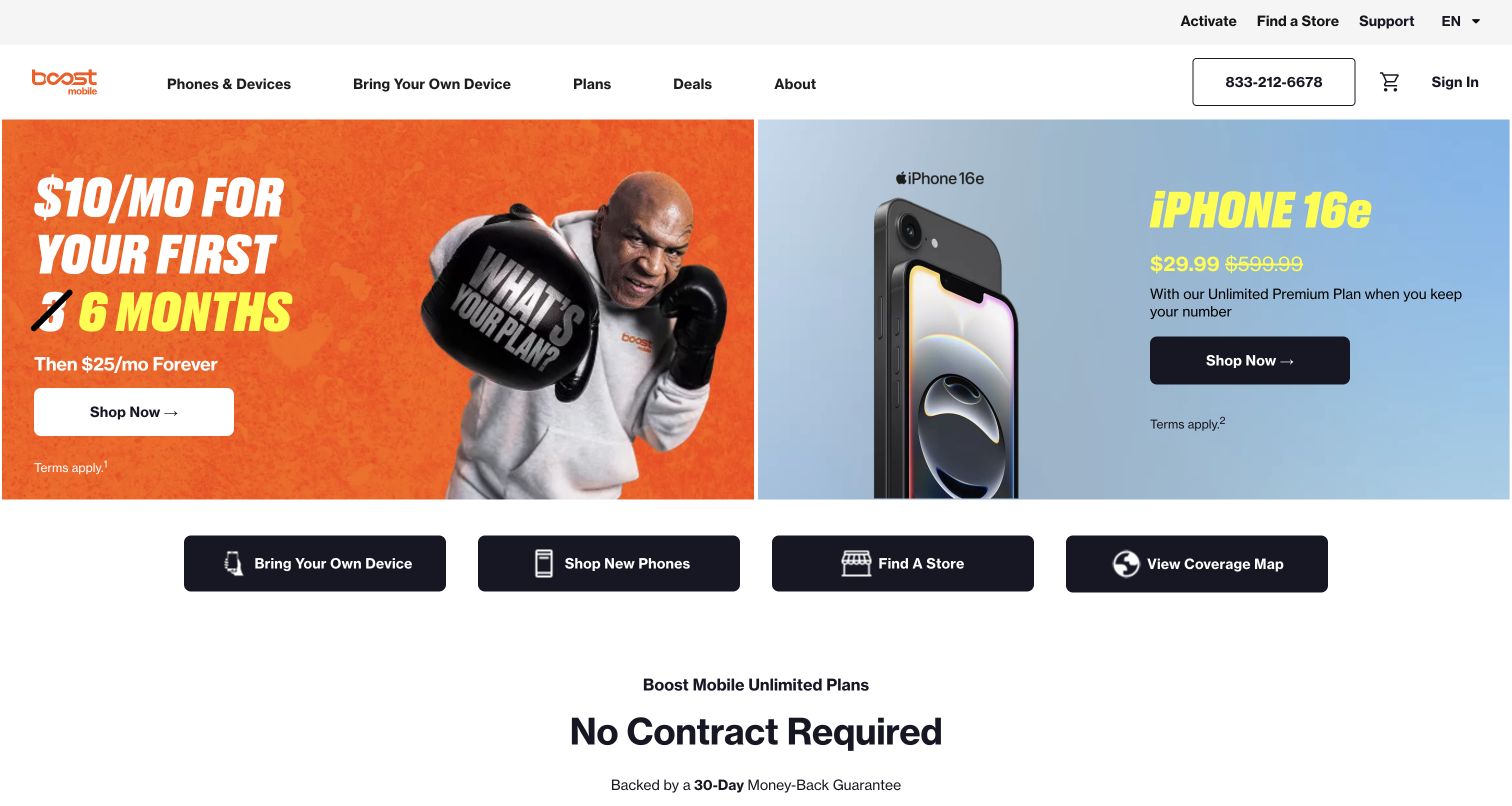
Boost Mobile uses two contrasting hero panels: one presents an introductory service price and the later rate, while the other promotes a handset with its plan and number-retention condition. A row beneath them provides shortcuts for bringing a device, shopping phones, finding a store and viewing coverage. Later plan cards repeat separate actions for existing and new phones. This is a useful structure for preventing the hardware decision from becoming an assumed prerequisite to joining. The main design tension is between large promotional typography and the detail needed to interpret each offer's requirements.
What you can learn
Keep the bring-your-own-device route visible at the same level as phone shopping. When an introductory price changes later, present the transition in the headline area, then connect each path to compatibility, coverage and complete plan details before a purchase decision.
Pros
The first shortcut row gives existing-device shoppers a direct route around the handset catalogue.
The introductory offer visibly states the rate that follows the promotional period.
Cons & considerations
The two hero panels demand attention simultaneously and use different pricing contexts.
Large promotional lettering gives relatively little emphasis to the linked terms and eligibility details.
Plan the customer decisions before designing the promotion
Map the main tasks and their starting conditions
Write down what a new visitor, a switching customer, a recent purchaser and a current subscriber need to do. Identify which tasks require authentication and which should stay public. Keep the route to service status independent of a promotional carousel, and make account recovery discoverable without implying that customers must purchase something first.
Create a comparable plan record
Define a shared set of fields for each relevant product family: data allowance, hotspot rules, speed qualification, roaming scope, included destinations, term, upfront payment, recurring service cost and device cost where applicable. Use the same order across comparable plans. Label genuinely different models, such as prepaid bundles and monthly subscriptions, before placing their prices beside each other.
Connect availability to the next useful action
Explain why an address or compatibility check is needed and what happens after it. Provide clear states for available service, unavailable service, incomplete addresses and a device that needs further checking. When a visitor cannot buy the advertised product, offer an accurate alternative or a contact route without silently changing the original proposition.
Design switching and ongoing support together
A plan selection should lead to understandable activation, number-transfer or installation guidance. Explain which steps happen before and after service starts, and provide a clear way to find help. Keep shopping claims separate from support instructions, and maintain customer notices in stable locations where returning visitors can recognize them.
The editing job behind the design
Choose systems around eligibility, offers and service continuity
A telecom website often combines a marketing site with plan data, availability checks, device catalogues, authenticated accounts and support systems. Plan the boundaries between them. The interface should preserve the selected product and explain a change of destination without exposing implementation details to the customer. Keep pricing and eligibility content tied to a named source of truth and an editorial owner so promotional updates do not leave conflicting cards, terms and comparison pages.
Public stack observations can identify visible scripts, consent tools, fonts or delivery services, but they do not establish the provider’s billing system, network equipment or hidden backend. Assess a platform by the work it must support: structured offers, localization, accessible forms, reliable account handoff, search and content maintenance. A technology detected on one public page is evidence about that page, not proof that the entire telecommunications operation uses it.
Our WordPress website examples offer a separate look at publishing approaches. A visible platform label is evidence for that named page, not a guarantee that the same system will suit your requirements.
Before the public launch
A practical telecommunications website checklist
Keep mobile, SIM-only, broadband and device categories recognizable wherever they apply.
Give existing customers visible routes to account access, bills, activation, support and service status.
Explain coverage, address availability and device compatibility as different checks.
State introductory duration and the later price beside the promotional rate.
Distinguish device payments, service charges and upfront amounts before checkout.
Attach auto-pay, membership, trade-in and multi-line qualifications to the affected offer.
Compare plans in a consistent feature order, including hotspot and roaming boundaries.
Give changing carousels visible controls and keep essential tasks outside their rotation.
Test forms, navigation and comparison content with keyboard use and narrow screens.
Assign owners and review dates to offers, comparison claims, support notices and linked terms.
These checks are a project checklist, not a performance, legal, security, or accessibility certification. Test real journeys with the people responsible for the website before making claims about the result.
Sources & editorial method
How this collection was selected and reviewed
This collection contains the saved target of twenty-eight distinct public website properties. Each example was reviewed directly in a desktop browser and captured on November 5, 2026 UTC, during the November 4 evening work session in America/Los_Angeles. Source URLs, original capture dates, dimensions and attribution accompany the examples. Consent or promotional overlays were dismissed where possible; blocked or blank pages were excluded. No purchase, account login, address lookup, number transfer or real service form was submitted. The reviews assess public presentation and navigation, not network reliability, speed, coverage at a particular location or contractual suitability. Promotional copy is treated as observed page content rather than an independently verified service claim.
Each example links to its actual source page. Screenshots are direct browser captures with their own capture dates; moving imagery, announcements and live designs can change. The notes describe observable design choices and conditional tradeoffs, not measured traffic, conversion results, service quality, or accessibility conformance.
Technology labels use public page metadata, asset evidence, or explicitly cited platform documentation. Platform documentation is not a complete current deployment audit. A component reference may be legacy or unused; it is not a complete backend inventory. Unknown stacks are omitted. These sites are editorial examples, not our client portfolio.
Written, Edited and Curated are separate editorial records, not timestamps advanced by a rebuild. Website designs and imagery belong to their owners. See our editorial standards or suggest a correction.
Questions worth asking
Telecommunications website design questions
Should a telecom homepage lead with a promotion or an availability check?
Choose according to the decision that gates the product. A broadband provider may need to establish address availability early. A mobile provider can lead with a plan proposition while keeping coverage and compatibility routes close by. In either case, retain clear paths for existing customers and explain what the next step will establish.
How should phone and SIM-only offers be organized?
Make them distinct choices before detailed comparison. A phone offer may combine a device payment, an airtime plan and a trade-in requirement, while a SIM-only shopper may already have suitable hardware. Use clear headings and consistent cost fields so visitors can understand the difference without decoding promotional language.
What information belongs beside a promotional price?
Include the period covered, the later rate where applicable, the amount due upfront and the main eligibility conditions. If the displayed figure assumes auto-pay, membership, a trade-in, several lines or another service, state that relationship near the price. Link to full details without relying on the footer to explain the basic offer.
How can the site support people who have already joined?
Give activation, account access, bill payment, number-transfer help and service status stable routes. Organize support around the task or customer stage instead of forcing every visitor into product browsing. Separate urgent operational notices from sales campaigns so returning users can find them consistently.
Do these examples verify which provider has the best network?
No. The collection examines website design and the clarity of public information. A screenshot does not test network performance, coverage at a particular address, customer-service outcomes or the suitability of a contract. Use the provider’s current coverage, eligibility and plan information for those decisions.
Start with the customer’s task, then make the next decision understandable. A useful telecom website connects the campaign to coverage, eligibility, full pricing and ongoing help, with enough structure that an offer can change without breaking the service journey.