Best Wix Websites of 2026 (20 Real-World Examples)
Twenty public Wix properties with real screenshots, dated platform evidence and practical lessons for content, navigation and maintenance.
A useful Wix website makes the organization’s work understandable and gives visitors a clear way to proceed. These examples range from creative portfolios and media directories to local services, showing how a focused structure can support very different visual identities.
Begin a Wix project with the information people need, the decisions they must make and the people who will maintain the site. A page builder can help arrange content, but it cannot decide which service belongs on a page, what a location record needs or when a seasonal announcement should disappear. Those choices determine whether the site remains useful after the first launch.
The collection opens with Wondery’s home.wondery.com property, Cristina Mittermeier, Timothy Goodman, PAINT Nail Bar and Davies & Son. Their public identities are verified separately from the Wix evidence. This is a collection of specific source pages, not a claim that every application, booking service or system belonging to those organizations uses Wix.
Before the examples
What makes good Wix website development in 2026?
Start with the visitor’s next decision
A venue visitor needs different information from a returning salon customer or someone browsing a photographer’s work. Write those decisions in plain language and give each an understandable destination. Keep important choices visible before refining a decorative opening. A short navigation works when it describes the site accurately, not merely because it looks quiet.
Make repeated content a deliberate structure
Wix CMS supports dynamic list and item pages connected to collection content. A useful application is a library whose entries need the same kinds of information, such as projects or locations. Decide which fields are required and how missing optional details behave. Consistent design should help readers compare entries while leaving room for their genuine differences.
Use long names, modest photographs, short descriptions and unusually detailed entries while developing the layout. A design that works only with the launch’s best image is difficult to maintain. Give editors clear guidance on image crops, titles and link labels, and ensure removing an optional section does not leave a confusing gap.
The collection · 20 examples
20 Wix website examples worth studying
Each review below describes a genuine saved capture of the named public property. Explicit Wix generator metadata supports all twenty selections, and their broad public stack audits retain the original observation dates. A screenshot shows a composition at its capture time; it does not reveal private workflows, conversion results or the exact editor used to build the page.
We start with five recognizable brands or organizations: Wondery — home.wondery.com, Cristina Mittermeier, Timothy Goodman, PAINT Nail Bar, Davies & Son. Each attribution applies to the named website property, not every product or website belonging to its organization. This is a curated reading sequence, not a measured ranking.
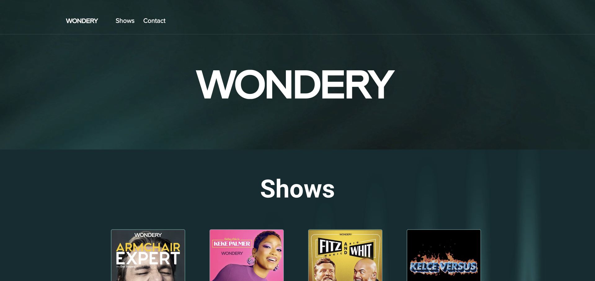
Wondery’s home.wondery.com property keeps the opening unusually direct: a compact header, an oversized wordmark and a show grid beginning below it. The dark green background gives varied cover artwork a consistent setting. Shows and contact are the only visible header destinations in the saved view. For a Wix project, this is a useful example of giving a small public property a defined job within a larger organization. Wix generator metadata qualifies this specific property; it does not identify Wondery’s listening applications, subscription systems or audio delivery infrastructure.
What you can learn
Write the property’s purpose before adding navigation. A show collection needs consistent artwork, titles and destinations, with a clear rule for adding or retiring entries. Preserve recognizable covers without making them the only source of a show’s name. Keep contact information separate from the browsing structure so the directory can grow without turning the header into a catalog.
Pros
A limited navigation makes the site’s two visible purposes easy to recognize.
Consistent card framing helps unrelated show artwork feel like one collection.
Cons & considerations
The large wordmark delays the first complete row of shows.
Cover artwork needs accompanying readable titles and meaningful destination labels.
Platform source: Dated public Wix generator metadata. Dated Wix generator metadata on home.wondery.com; no editor-version, individual app, private-system or other-property attribution. Platform evidence is separate from the direct website screenshot and is not a complete current infrastructure audit.
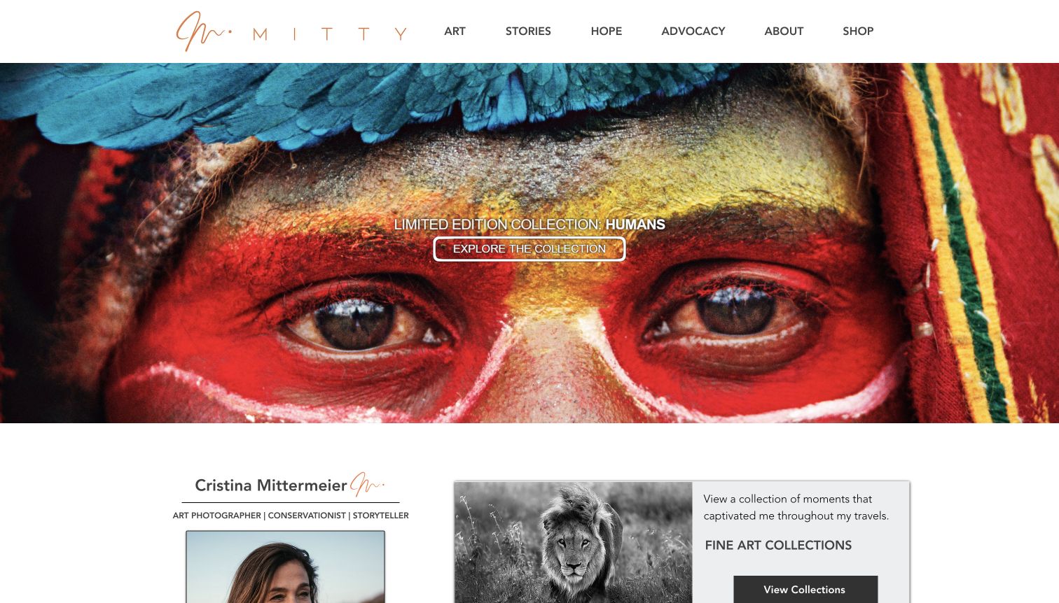
Cristina Mittermeier’s capture opens with a vivid close-up photograph and a small collection invitation. A solid white header keeps art, stories, advocacy, biography and shopping distinct, while the beginning of the next section pairs an artist introduction with another photographic collection. The page balances image-led discovery with ways to understand the person and purpose behind the work. For Wix planning, the useful lesson is to make a repeatable collection structure support strong images. Dated Wix metadata concerns this public portfolio, not every linked advocacy or education property.
What you can learn
Define collection titles, image descriptions, credits and destinations as content before choosing a gallery arrangement. Keep a quiet navigation surface so it remains readable when the featured photograph changes dramatically. A new collection should fit the established system without requiring its essential information to be painted into the image.
Pros
A neutral header remains visually separate from the saturated featured photograph.
Art, stories and advocacy give visitors several intelligible ways into the work.
Cons & considerations
Small white text over detailed imagery needs careful contrast and placement.
The opening emphasizes a collection before explaining its context or contents.
Platform source: Dated public Wix generator metadata. Dated Wix generator metadata on cristinamittermeier.com; no editor-version, individual app, private-system or other-property attribution. Platform evidence is separate from the direct website screenshot and is not a complete current infrastructure audit.
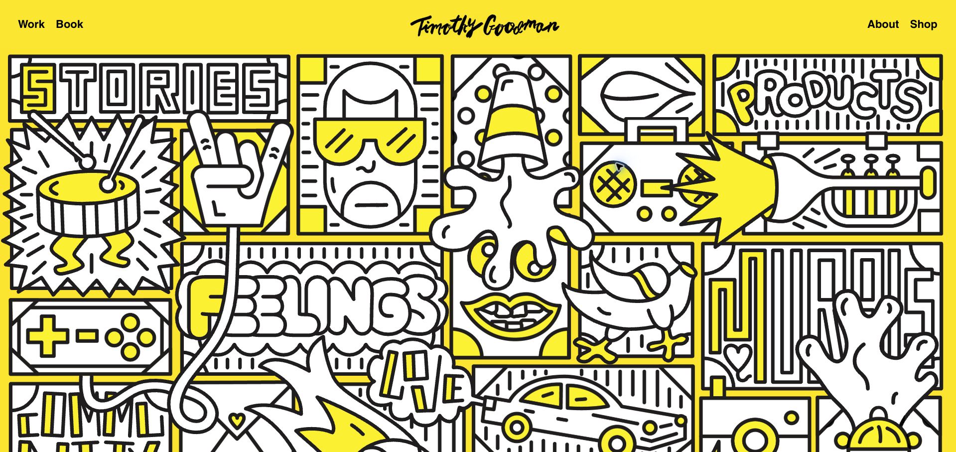
Timothy Goodman’s homepage uses a bright yellow field and a dense black-and-white illustration that feels continuous with the artist’s signature. Short navigation labels sit across the top, with work and the book on one side and biography and shop on the other. The artwork establishes character before a conventional project grid appears. A Wix brief can learn from this alignment between identity and content, while keeping the navigation ordinary enough to understand. Generator metadata establishes Wix; the visible Editor X credit is historical context, not proof of the current editor configuration.
What you can learn
Let the portfolio’s own visual material guide the interface rather than adding an unrelated decorative style. Keep project categories and contact routes readable outside the artwork. Plan a compact layout that preserves the illustration’s character while ensuring a visitor can reach actual work without interpreting every hand-drawn word as a button.
Pros
A tightly limited palette creates a coherent relationship between navigation and illustration.
Short top-level links remain readable beside a highly expressive visual surface.
Cons & considerations
The opening does not immediately expose individual project names or client context.
Illustrated words can resemble navigation even when their purpose is purely decorative.
Platform source: Dated public Wix generator metadata. Dated Wix generator metadata on tgoodman.com; no editor-version, individual app, private-system or other-property attribution. Platform evidence is separate from the direct website screenshot and is not a complete current infrastructure audit.
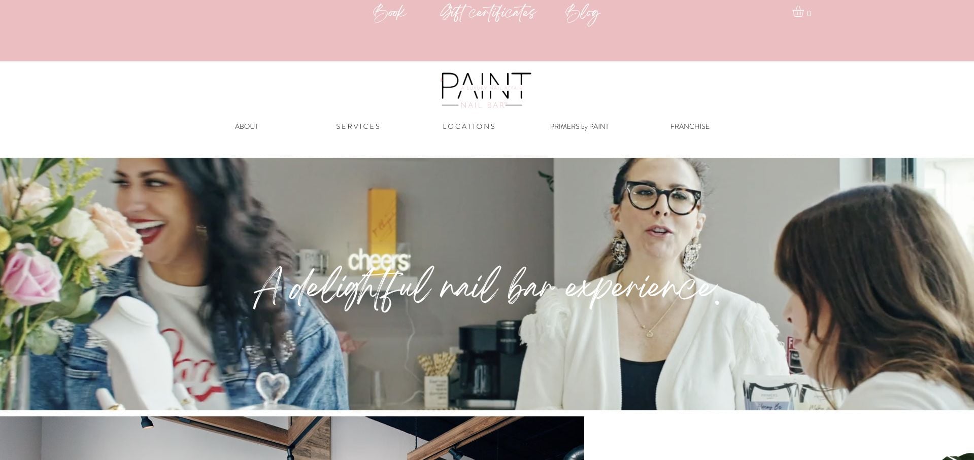
PAINT Nail Bar uses a soft pink utility strip, a centered identity and a broad salon scene to establish its tone. Booking and gift certificates sit above navigation for services, locations, products and franchise information. The opening image presents the social environment rather than a menu of treatments. For a Wix site with several locations, the important pattern is the division between a shared brand introduction and practical local decisions. The saved Wix metadata does not establish the appointment system, franchise operations or the service and product claims displayed elsewhere.
What you can learn
Give each location a consistent record for its address, services, hours and booking destination. Keep franchise enquiries separate from customer tasks, even when both use the same brand header. A friendly visual style should still provide readable text and a clear route from the national homepage to the relevant local information.
Pros
Booking and location discovery are visible without entering a large menu.
The salon photograph gives the brand a recognizable setting and social character.
Cons & considerations
Pale script links in the top strip require careful legibility checks.
The tall header occupies substantial space before the main content begins.
Platform source: Dated public Wix generator metadata. Dated Wix generator metadata on paintnailbar.com; no editor-version, individual app, private-system or other-property attribution. Platform evidence is separate from the direct website screenshot and is not a complete current infrastructure audit.
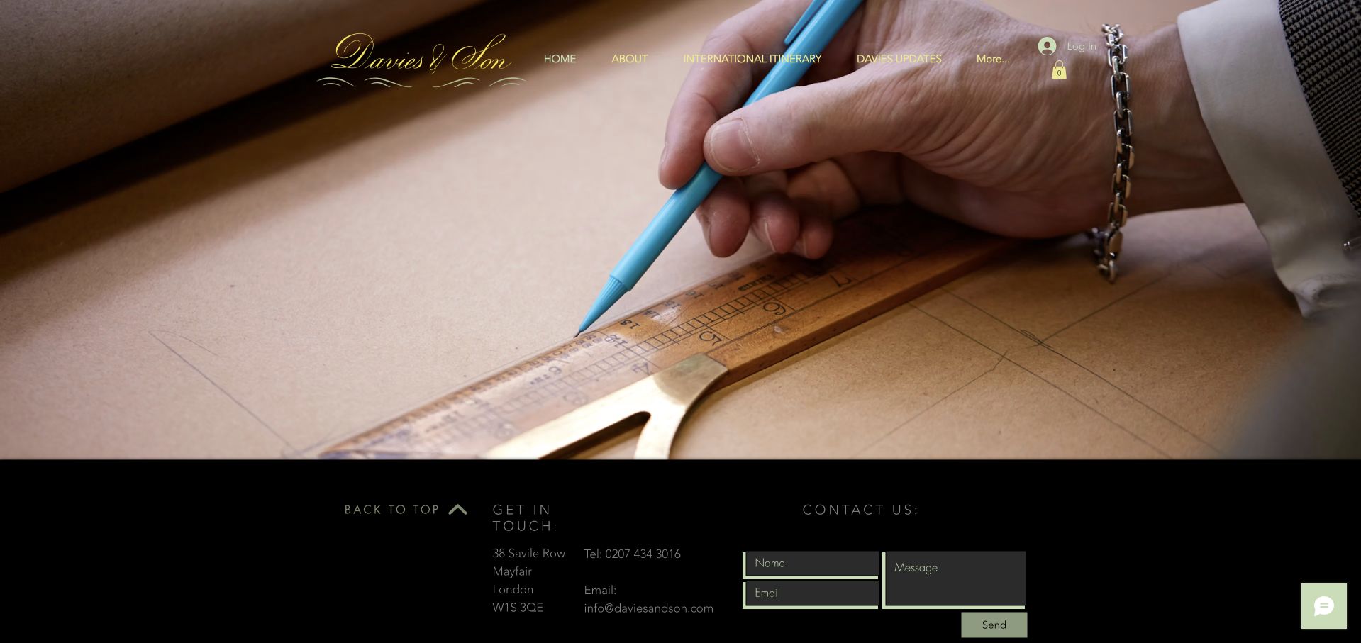
Davies & Son lets a close-up of pattern drafting carry the homepage. Its script identity and simple navigation sit over the image, while a dark contact area begins immediately below. International itinerary and company updates appear alongside the expected background information. The page treats craftsmanship as the introduction rather than surrounding it with several promotional panels. For a Wix project, this is a useful reference for a compact site with specific tasks. Platform metadata does not verify appointment availability or the bespoke commission process.
What you can learn
Use authentic process imagery to establish context, then make the practical route to an appointment explicit. A travel calendar needs its own maintenance owner and clear dates rather than an undated promise of international availability. Keep contact details readable and give a short enquiry form enough explanation for someone who is unfamiliar with the service.
Pros
The drafting photograph communicates a specific craft process without a long headline.
International itinerary is a meaningful destination for a geographically dispersed clientele.
Cons & considerations
Navigation placed directly over the photograph depends on a suitable crop and contrast.
The sparse opening leaves newcomers to seek more explanation on subsequent pages.
Platform source: Dated public Wix generator metadata. Dated Wix generator metadata on daviesandson.com; no editor-version, individual app, private-system or other-property attribution. Platform evidence is separate from the direct website screenshot and is not a complete current infrastructure audit.
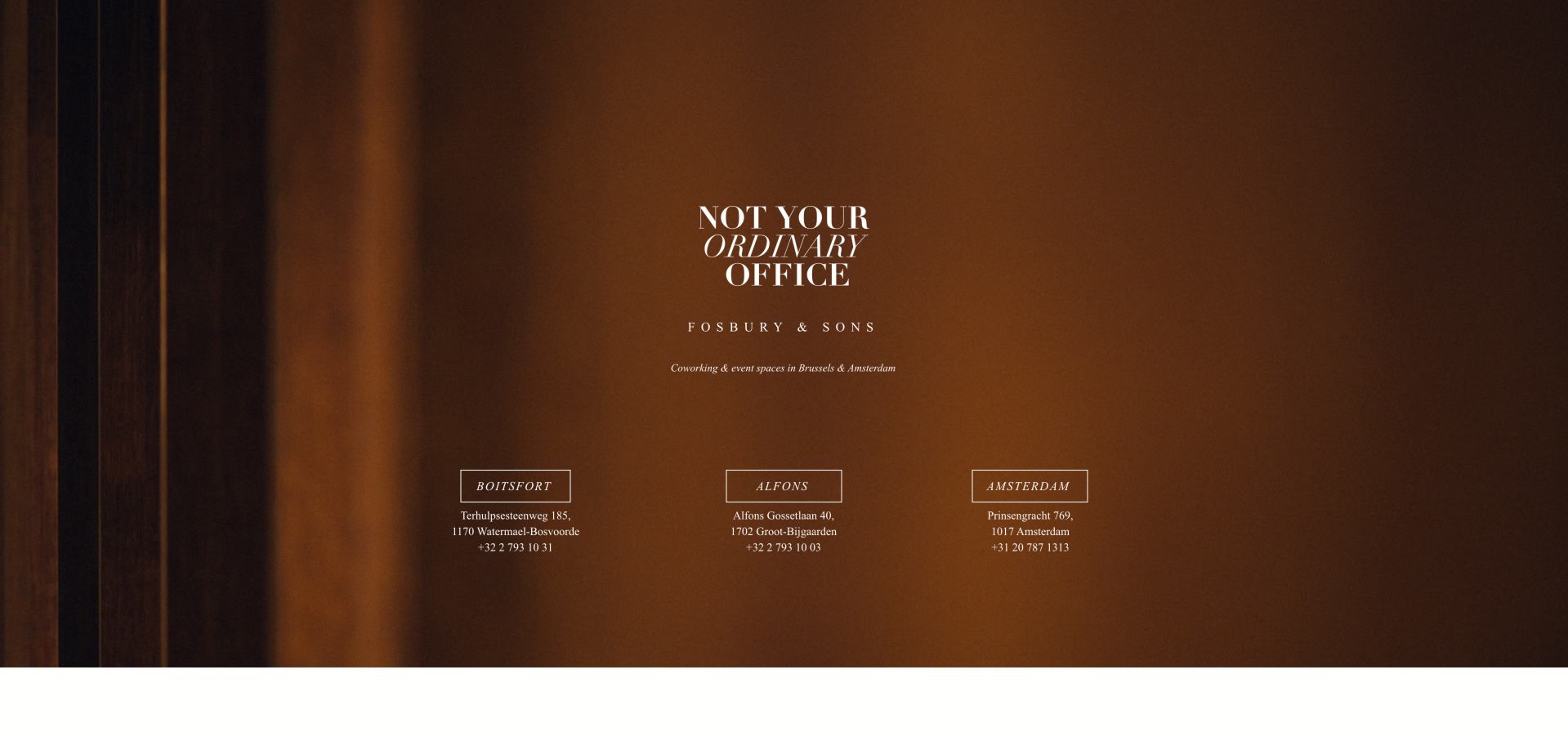
Fosbury & Sons presents a quiet brown background, centered identity and a short coworking description above three location choices. Each location pairs an outlined button with address and phone information. This arrangement makes the initial decision geographic rather than asking visitors to navigate a large general menu. A Wix project can use the same planning idea when the individual destinations have their own details and offerings. The recorded Wix metadata applies to this public landing property; it does not reveal membership management, room inventory or booking infrastructure.
What you can learn
Start by deciding whether visitors need to choose a location before comparing services. If so, give every location the same minimum information and a distinct, descriptive destination. Preserve the relationship between the button and its address when columns stack. Add a direct way to understand the overall offer for visitors who do not yet recognize the location names.
Pros
Three parallel location choices make the opening task straightforward.
Addresses and phone details support the choice without requiring another click.
Cons & considerations
Small text and generous empty space can make practical information feel remote.
Location names alone may not explain differences in facilities or membership options.
Platform source: Dated public Wix generator metadata. Dated Wix generator metadata on fosburyandsons.com; no editor-version, individual app, private-system or other-property attribution. Platform evidence is separate from the direct website screenshot and is not a complete current infrastructure audit.
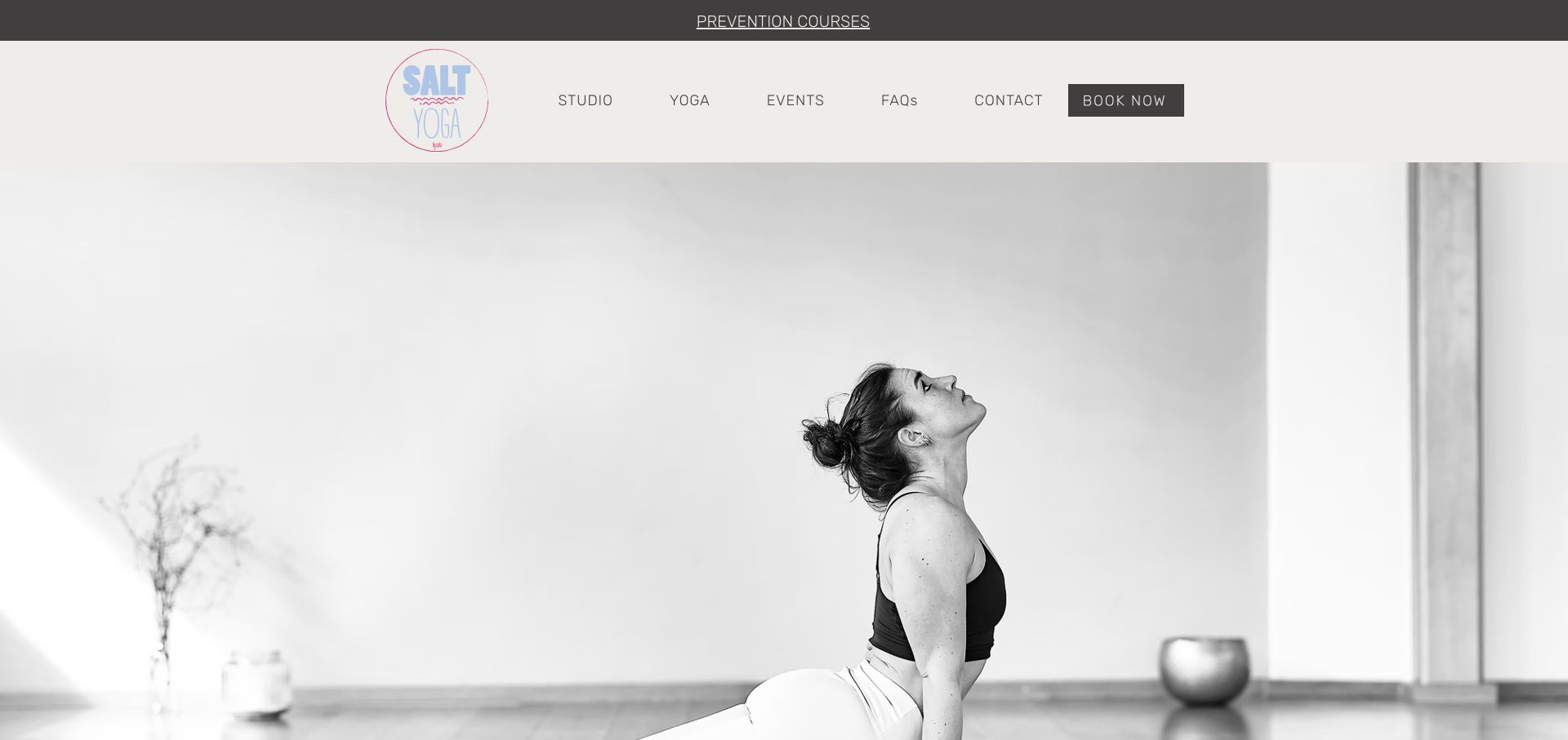
SALT YOGA uses a monochrome studio photograph under a solid light header. The logo adds a small pastel accent, while studio, yoga, events, questions and contact form a compact navigation. A dark booking button stands apart from those browsing routes, and a narrow announcement strip sits above the main header. For Wix planning, the strongest lesson is that a recognizable atmosphere does not require a crowded hero. Dated generator metadata identifies Wix on the public property; it does not establish class availability, instructor credentials or the system used to handle bookings.
What you can learn
Give classes and events consistent records before refining the homepage photograph. Visitors need the level, location, schedule and relevant preparation details in predictable places. Keep the booking route distinct from general studio information, and assign an owner to announcements so a temporary program does not become a permanent unexplained banner.
Pros
A solid header keeps navigation independent from changes in the photograph.
The booking action has a clear visual treatment without dominating every link.
Cons & considerations
The opening photograph provides atmosphere but little information about choosing a class.
The narrow announcement introduces another message before the main site structure.
Platform source: Dated public Wix generator metadata. Dated Wix generator metadata on salt-yoga.com; no editor-version, individual app, private-system or other-property attribution. Platform evidence is separate from the direct website screenshot and is not a complete current infrastructure audit.
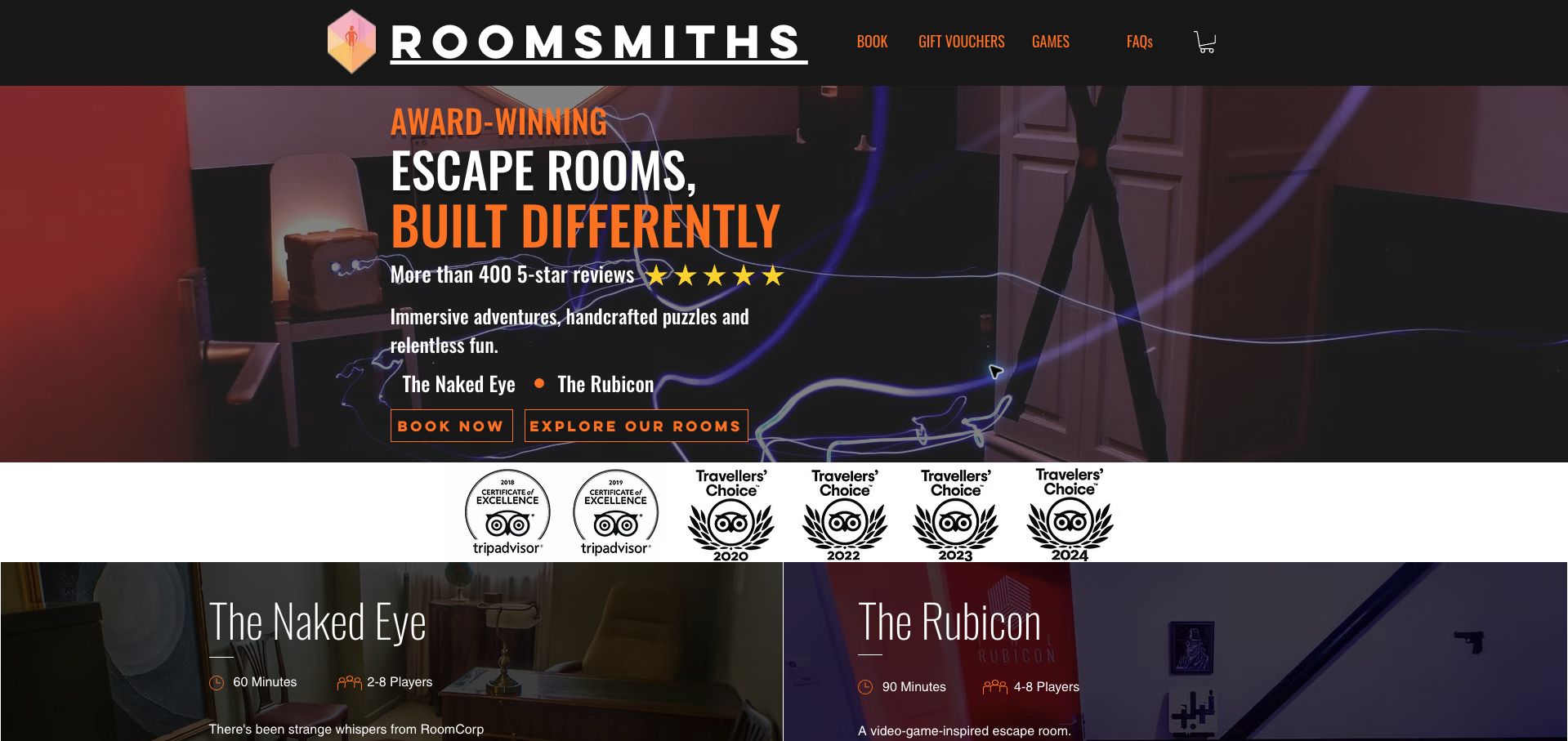
Roomsmiths uses a dark room scene, orange accents and a direct escape-room proposition to establish its theme. Two actions separate immediate booking from exploring the rooms. Below a strip of award graphics, the first room cards expose duration and player counts, helping visitors compare practical requirements. This is useful Wix inspiration because the page begins translating atmosphere into choices. The saved generator metadata establishes the public platform association, but it does not validate review totals, award claims or the booking engine shown through the navigation.
What you can learn
Model each experience with the facts needed for a sensible choice: duration, group size, suitability and location. Give all room cards the same structure, then let their images and stories differ. Keep availability and payment integration responsibilities explicit so a themed landing page does not hide the conditions a group needs before reserving.
Pros
Exploration and booking are separate actions for visitors at different stages.
Room cards reveal useful comparison details rather than relying on theme names alone.
Cons & considerations
Large award and review claims need clear supporting destinations and maintenance.
Condensed lettering over a busy background warrants careful readability checks.
Platform source: Dated public Wix generator metadata. Dated Wix generator metadata on roomsmiths.com; no editor-version, individual app, private-system or other-property attribution. Platform evidence is separate from the direct website screenshot and is not a complete current infrastructure audit.
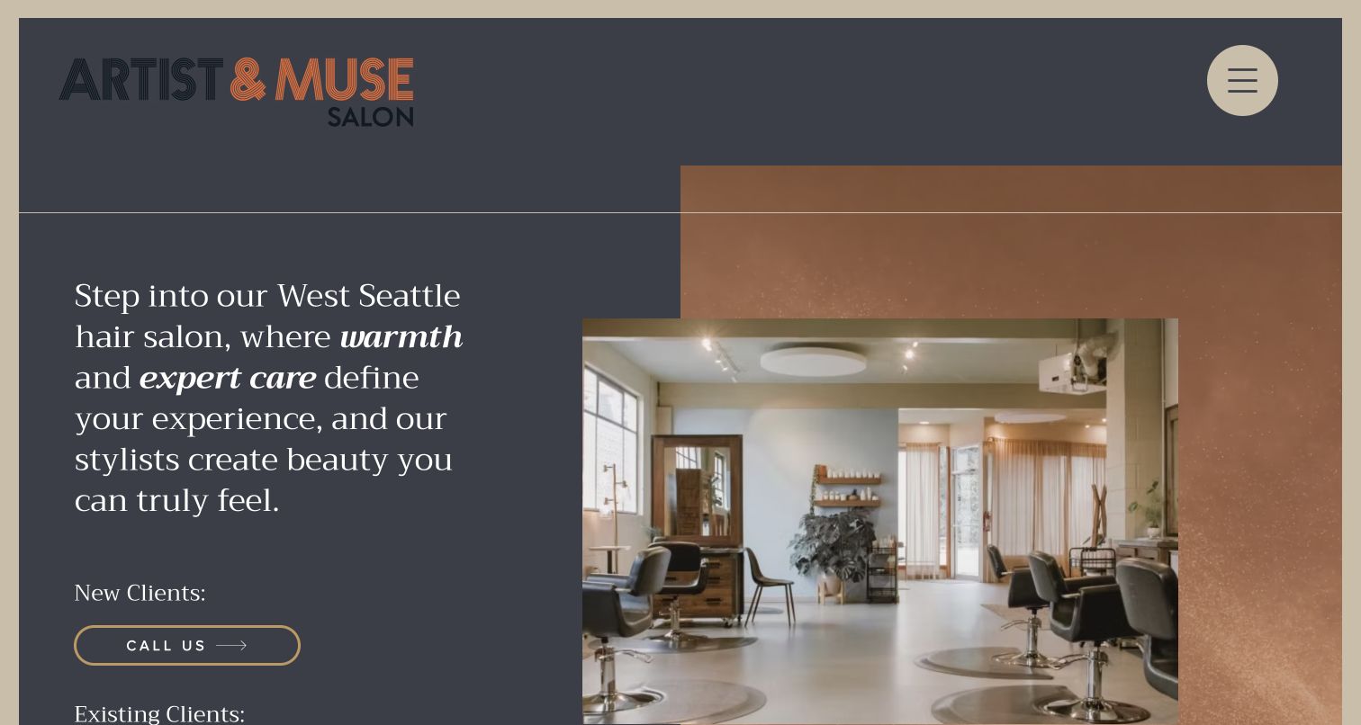
Artist & Muse Salon pairs a large text introduction with a layered photograph of the salon interior. A charcoal background, warm accent shapes and serif copy give the opening a particular character. The visible new-client section offers a phone route, while an existing-client heading starts below it. The practical idea for a Wix build is to distinguish appointment needs before sending everyone to the same destination. Generator metadata identifies the public website as Wix; it does not establish the salon’s scheduling system or verify the expertise described in its marketing copy.
What you can learn
Write separate instructions for first-time and returning visitors. A consultation, a routine appointment and a complex service may need different information. Keep those pathways short and visible, and ensure the overlapping image arrangement collapses into a sensible reading order when the page becomes narrow or the introduction grows longer.
Pros
The introduction names the neighborhood, giving the business immediate local context.
New and existing clients are treated as different journeys rather than one generic enquiry.
Cons & considerations
Most destinations are hidden behind a menu icon even on the wide view.
The layered composition requires deliberate behavior when text wraps and images resize.
Platform source: Dated public Wix generator metadata. Dated Wix generator metadata on artistandmusesalon.com; no editor-version, individual app, private-system or other-property attribution. Platform evidence is separate from the direct website screenshot and is not a complete current infrastructure audit.
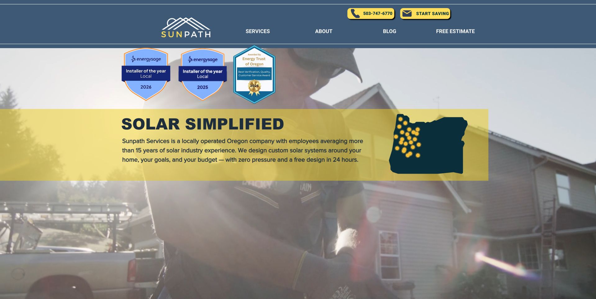
Sunpath Services pairs a blue header with yellow phone and enquiry controls. The opening places a short service explanation and an Oregon graphic inside a translucent yellow panel, with installation imagery behind it. Award graphics occupy a separate area above the message. This gives a Wix planner useful examples of regional context and repeated visual emphasis, while also showing how quickly proof and promotion can compete. The dated platform metadata concerns the public website, not the accuracy of award, experience, savings or response-time claims in its presentation.
What you can learn
Separate service coverage, project questions and supporting credentials in the content model. A regional map should lead to specific coverage information rather than serve as the only explanation. Give any time-sensitive claim a source and review owner, and keep the initial enquiry focused on what is needed to assess the project.
Pros
The regional graphic and text make the intended service area visible.
Phone and enquiry routes receive a consistent, recognizable accent treatment.
Cons & considerations
Several award graphics compete with the principal service explanation in the opening.
A translucent panel needs checking against each background frame or replacement photograph.
Platform source: Dated public Wix generator metadata. Dated Wix generator metadata on sunpathservices.com; no editor-version, individual app, private-system or other-property attribution. Platform evidence is separate from the direct website screenshot and is not a complete current infrastructure audit.
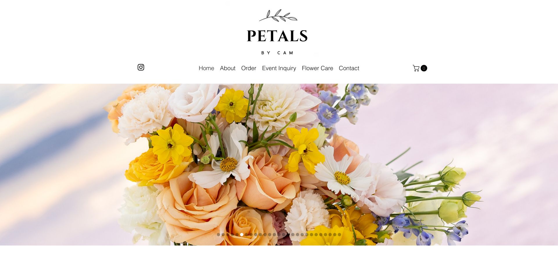
Petals by Cam gives its floral photography a wide, uninterrupted area beneath a spacious white header. The identity sits centrally, with navigation separating ordinary orders from event enquiries and flower-care information. A visible cart reinforces the shopping route without covering the bouquet. For a Wix project, the useful distinction is between a repeatable product order and a custom event conversation. Saved Wix generator metadata qualifies the public property, but it does not demonstrate inventory management, delivery coverage or how checkout and event enquiries are handled behind the page.
What you can learn
Define product and event information separately. Routine arrangements need clear options, delivery conditions and care guidance; a larger event may need a date, location and consultation process. Keep gallery images associated with useful descriptions so a beautiful slideshow is not the only way to understand what can be ordered.
Pros
Order and event enquiry are explicit, separate destinations in the main navigation.
The uncluttered image area keeps the floral work easy to inspect.
Cons & considerations
A long row of slide indicators gives little information about the other photographs.
The opening does not itself explain service area, timing or arrangement availability.
Platform source: Dated public Wix generator metadata. Dated Wix generator metadata on petalsbycam.com; no editor-version, individual app, private-system or other-property attribution. Platform evidence is separate from the direct website screenshot and is not a complete current infrastructure audit.
Eye Level combines a large portrait with oversized stacked typography, while a compact logo anchors the opposite corner. Booking and ordering contacts remain visible in the top-right controls, alongside a menu icon. The page gives the brand a strong visual voice but still recognizes two concrete reasons to arrive. For a Wix brief, this is a useful balance between a distinctive opening and straightforward service access. The dated Wix metadata identifies the public page; it does not verify clinical services, appointment availability or the separate contact-lens ordering system.
What you can learn
Decide which recurring tasks deserve direct access before collapsing the rest of the navigation. Keep appointment information and product reordering distinct, with destinations that explain their requirements. A prominent headline should remain actual readable content, and the portrait needs a crop strategy that preserves the message without covering important facial detail.
Pros
Booking and contact-lens ordering are visible without opening the main menu.
The oversized typography gives the page a recognizable visual identity.
Cons & considerations
The marketing phrase offers little immediate detail about services or location.
Text placed over photography needs careful checks across changing images and screen sizes.
Platform source: Dated public Wix generator metadata. Dated Wix generator metadata on eyelevelboston.com; no editor-version, individual app, private-system or other-property attribution. Platform evidence is separate from the direct website screenshot and is not a complete current infrastructure audit.
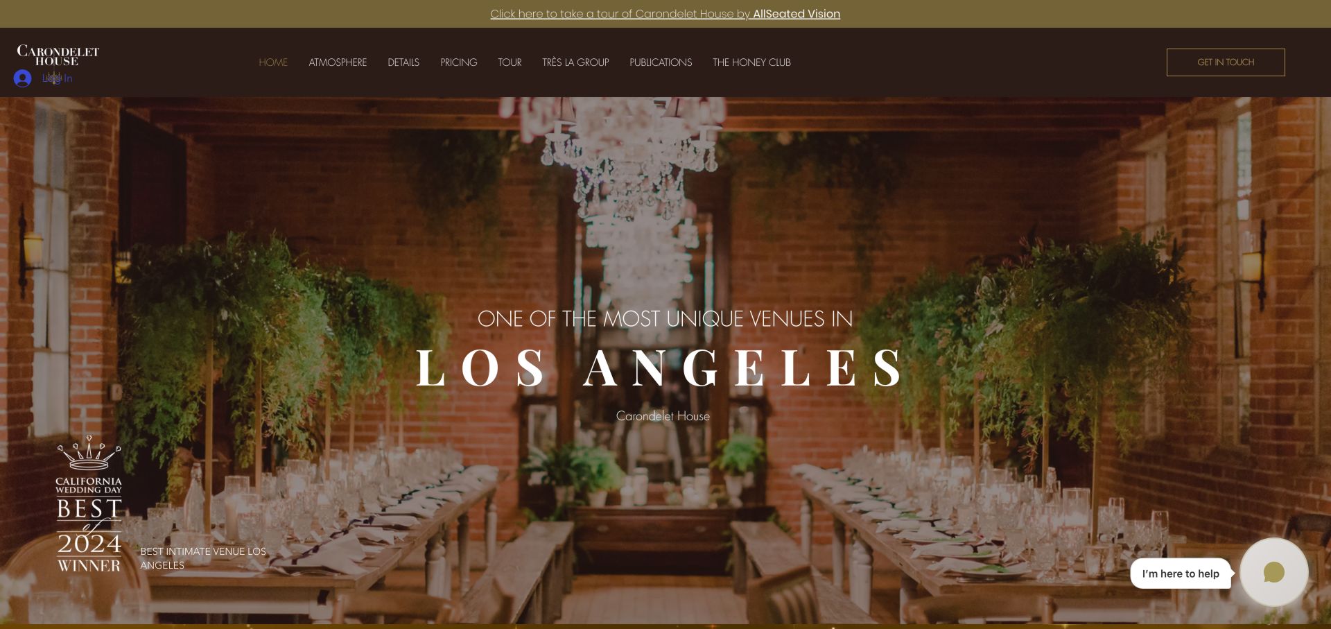
Carondelet House uses a warm interior photograph with a centered Los Angeles message to establish the setting. A dark header names atmosphere, details, pricing and tours, while an announcement links to a separate virtual-tour service. A contact action and chat prompt offer additional routes to an enquiry. The useful Wix lesson is to keep practical planning destinations visible around a highly atmospheric opening. The public metadata establishes Wix for this property, without identifying the virtual-tour provider’s technology or validating the award and venue claims shown in the capture.
What you can learn
Build the venue detail pages around the decisions an organizer must make: layout, capacity, services, restrictions and pricing context. Keep external tours clearly labeled and provide still photographs or written information alongside them. A gallery should prepare a useful enquiry rather than require every visitor to contact the venue for basic facts.
Pros
Pricing and practical details are named directly in the primary navigation.
The interior photograph gives a concrete sense of materials and spatial character.
Cons & considerations
The header contains many low-emphasis links that need a clear compact arrangement.
Chat, award artwork and the tour announcement add several competing peripheral elements.
Platform source: Dated public Wix generator metadata. Dated Wix generator metadata on carondelethouse.com; no editor-version, individual app, private-system or other-property attribution. Platform evidence is separate from the direct website screenshot and is not a complete current infrastructure audit.
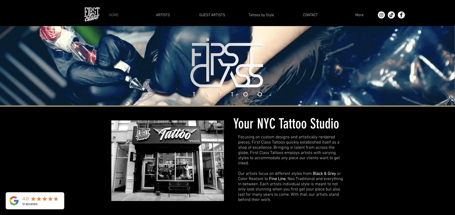
First Class Tattoo uses a black background, a wide working-process image and a large identity graphic to introduce the studio. The main navigation distinguishes resident artists, guest artists and styles, while the next section pairs a storefront photograph with an explanation of the business. The page gives visitors different ways to begin choosing a practitioner. For Wix planning, that structure is more instructive than the dramatic hero treatment. Saved generator metadata applies to the public site and does not verify artist credentials, safety practices or the private appointment process.
What you can learn
Give each artist and style a consistent detail structure, with accurately attributed work and clear next steps. Guest availability needs explicit dates and an owner for updates. Keep enquiry requirements understandable before asking for personal information, and separate a public portfolio from any private consultation or scheduling system.
Pros
Artist and style routes recognize that visitors may choose work in different ways.
The storefront image connects the visual portfolio to a physical studio.
Cons & considerations
The hero identity repeats branding that is already present in the header.
A floating rating panel needs supporting context and can distract from the studio introduction.
Platform source: Dated public Wix generator metadata. Dated Wix generator metadata on firstclasstattoos.com; no editor-version, individual app, private-system or other-property attribution. Platform evidence is separate from the direct website screenshot and is not a complete current infrastructure audit.
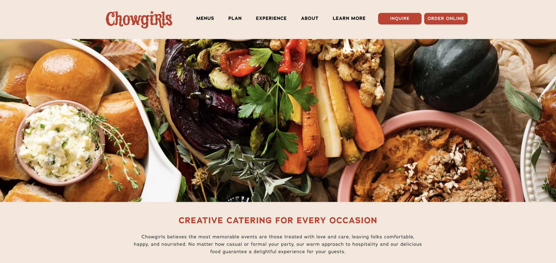
Chowgirls Catering fills the opening with a detailed food photograph, framed by a cream header and a short introduction below. Red accents connect the identity, headline and two prominent actions: inquire and order online. Navigation for menus, planning and experience provides routes for visitors who need more information first. This is useful Wix inspiration for a business serving both straightforward orders and more involved events. The saved Wix metadata concerns the public marketing property; it does not establish the online-ordering system or substantiate service promises in the site’s copy.
What you can learn
Distinguish a standard order from an event that needs discussion. Each should explain relevant timing, scope and conditions before collecting details. Build menus and event information as maintainable content, with clear owners for seasonal changes, rather than placing all practical information inside a campaign photograph or downloadable artwork.
Pros
Ordering and enquiry are distinct, visible actions for different levels of complexity.
A consistent cream-and-red palette lets the food photograph provide the visual variety.
Cons & considerations
The opening image does not explain which event or menu options are available.
Broad labels such as experience need useful destination content to support decision making.
Platform source: Dated public Wix generator metadata. Dated Wix generator metadata on chowgirls.net; no editor-version, individual app, private-system or other-property attribution. Platform evidence is separate from the direct website screenshot and is not a complete current infrastructure audit.
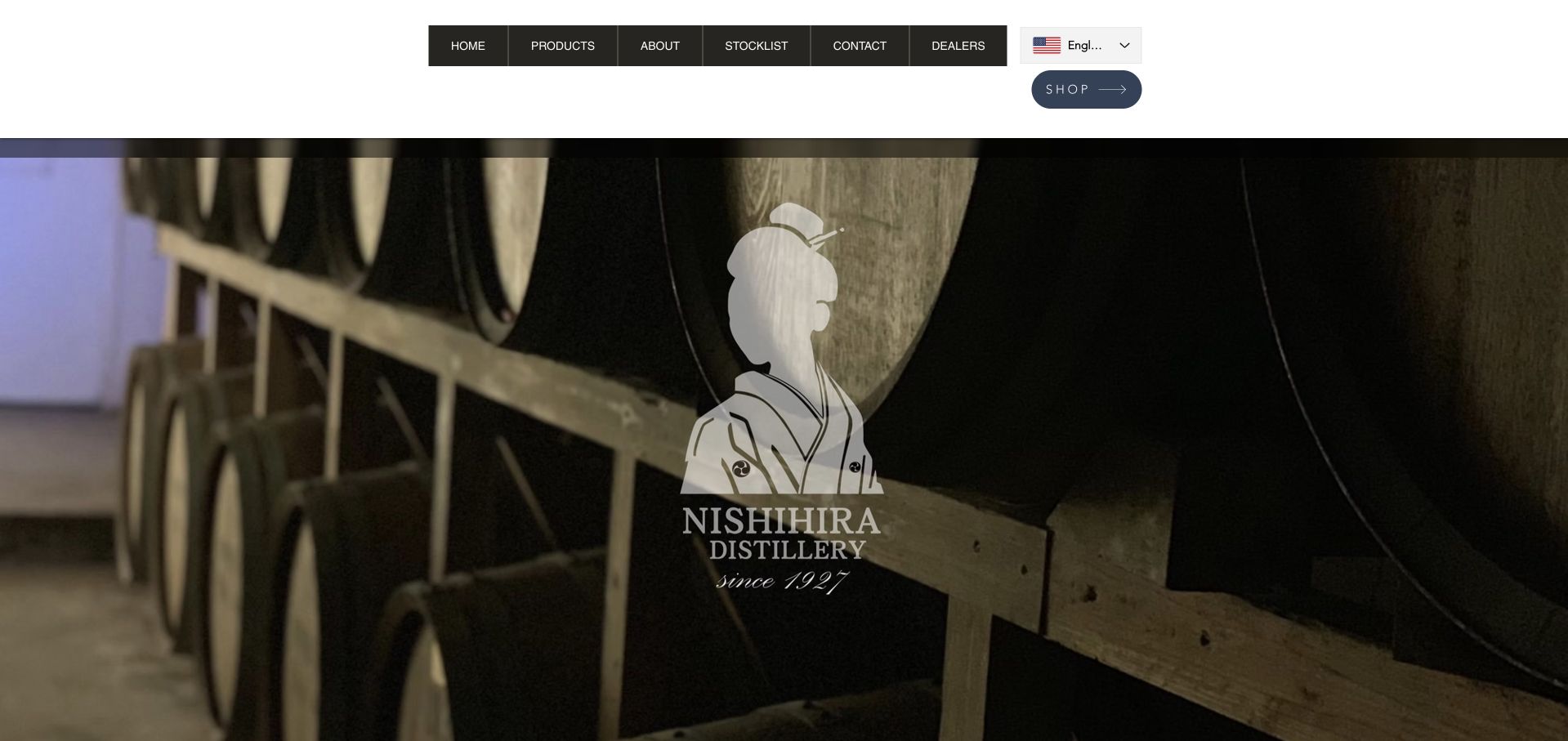
Nishihira Distillery’s English page places a compact navigation and language control above a barrel photograph with the central distillery identity. Products, background information, stockists and dealers are separate destinations, with shopping given its own rounded button. The image conveys a production setting while the header carries the practical choices. For a Wix project, the most useful reference is the distinction between localized editorial content and commercial destinations. The platform evidence is specific to this English source page and does not establish the translation workflow, dealer systems or purchasing arrangements.
What you can learn
Plan language equivalents and destination behavior before translating individual labels. A visitor switching language should understand whether they remain on the corresponding page or move elsewhere. Keep product descriptions, stockist records and trade enquiries distinct, and identify who maintains each language when products, distribution or contact information changes.
Pros
The language control is visible alongside ordinary navigation rather than hidden in the footer.
Products, stockists and dealers acknowledge different visitor intentions.
Cons & considerations
The large identity image provides little immediate detail about individual products.
A compact language label and separate shop action need clear destinations and accessible names.
Platform source: Dated public Wix generator metadata. Dated Wix generator metadata on nishihira-shuzo.com/en/english-home; no editor-version, individual app, private-system or other-property attribution. Platform evidence is separate from the direct website screenshot and is not a complete current infrastructure audit.
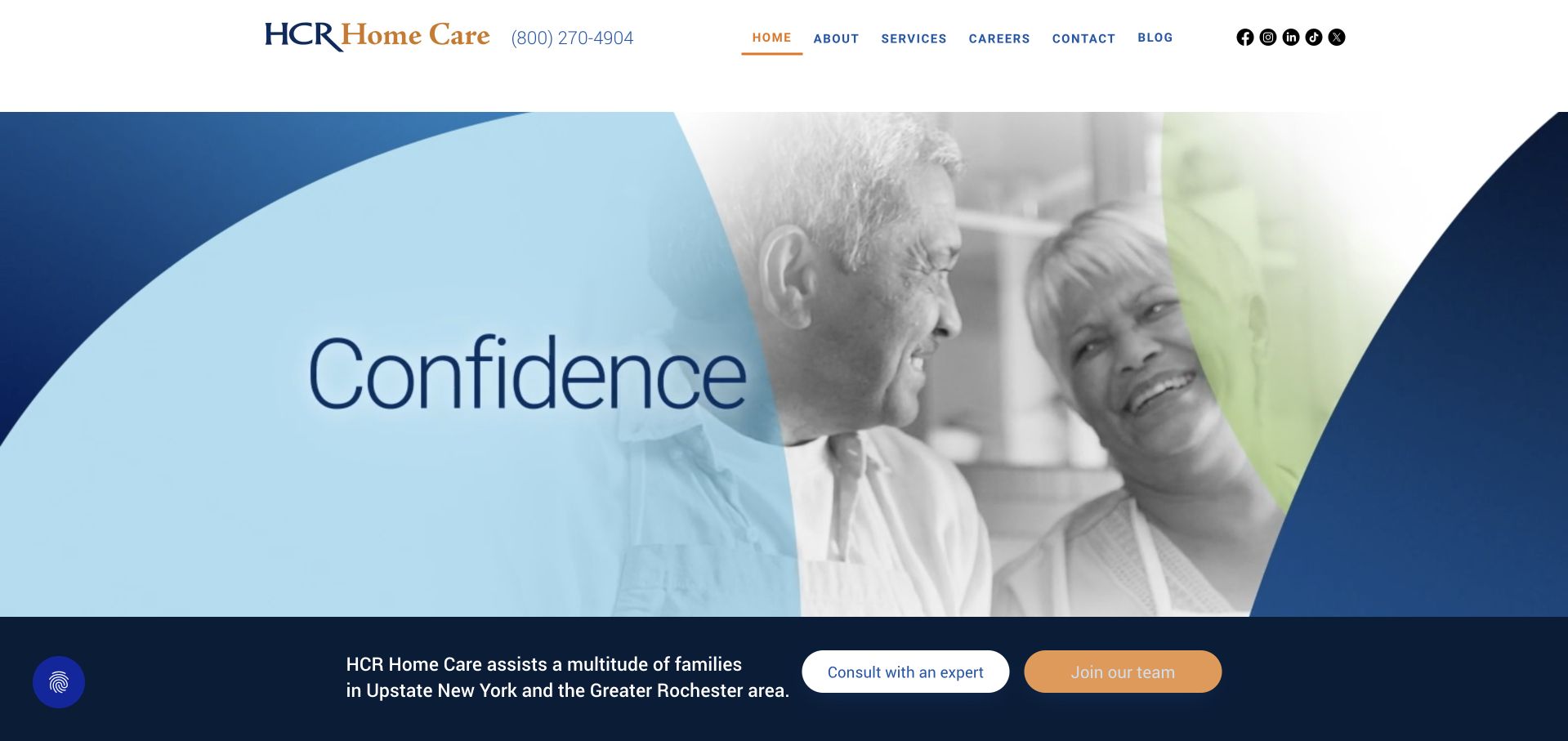
HCR Home Care uses blue curves, a grayscale portrait and a single large word to create a reassuring opening. A solid white header includes the phone route and standard navigation. Beneath the hero, a dark strip adds regional context and separates consultation from joining the team. For Wix planning, the useful detail is how the page acknowledges both people seeking information and prospective employees. Generator metadata qualifies this public website only; it does not establish clinical systems, patient records, security compliance or the quality of care offered.
What you can learn
Keep public service information and recruitment content in separate, understandable journeys. Explain coverage and contact options in plain language before asking people to provide details. A public website form should collect only appropriate enquiry information and clearly direct sensitive matters to the organization’s approved process, with responsibilities settled before design begins.
Pros
The phone number is visible beside the identity in a stable header.
Consultation and employment actions are clearly separated beneath the opening image.
Cons & considerations
The single-word hero conveys tone but gives little detail about available services.
Recruitment and service enquiries need distinct destinations to avoid confusing different audiences.
Platform source: Dated public Wix generator metadata. Dated Wix generator metadata on hcrhealth.com; no editor-version, individual app, private-system or other-property attribution. Platform evidence is separate from the direct website screenshot and is not a complete current infrastructure audit.
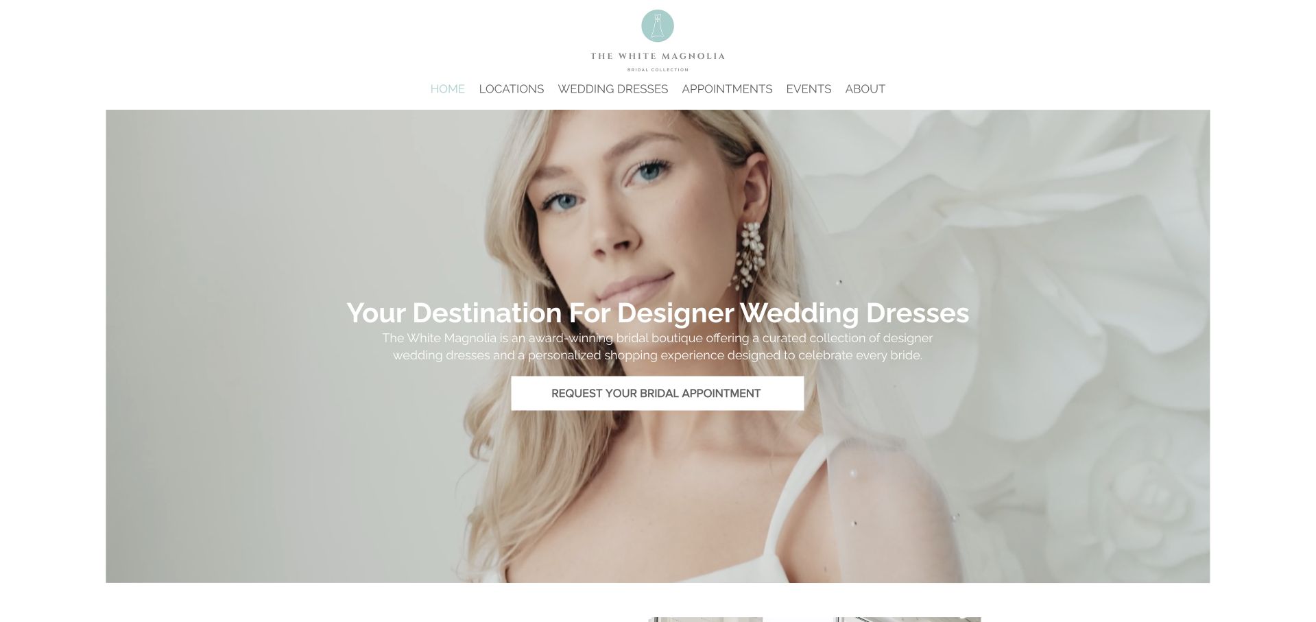
The White Magnolia places a delicate centered identity above concise navigation for locations, dresses, appointments, events and company information. A wide bridal photograph carries a short introduction and a white appointment-request button. The composition keeps the shopping experience personal while still naming the practical routes a visitor may need. For a Wix project, the key lesson is to connect visual inspiration to a specific next step. The saved Wix metadata does not verify dress inventory, designer availability, appointment capacity or the business’s displayed award claims.
What you can learn
Give each location and appointment type a clear explanation before inviting a request. Dress imagery should connect to accurate product or designer information, with limits made clear when availability varies. Maintain events separately from the permanent boutique introduction so an old trunk show does not remain attached to an otherwise current page.
Pros
The appointment action uses a specific request label rather than a vague invitation.
Locations and dresses are available as separate browsing routes above the hero.
Cons & considerations
White text on a pale photograph needs stronger support when the image changes.
The opening does not indicate how products or appointments differ between locations.
Platform source: Dated public Wix generator metadata. Dated Wix generator metadata on whitemagnoliabridal.com; no editor-version, individual app, private-system or other-property attribution. Platform evidence is separate from the direct website screenshot and is not a complete current infrastructure audit.
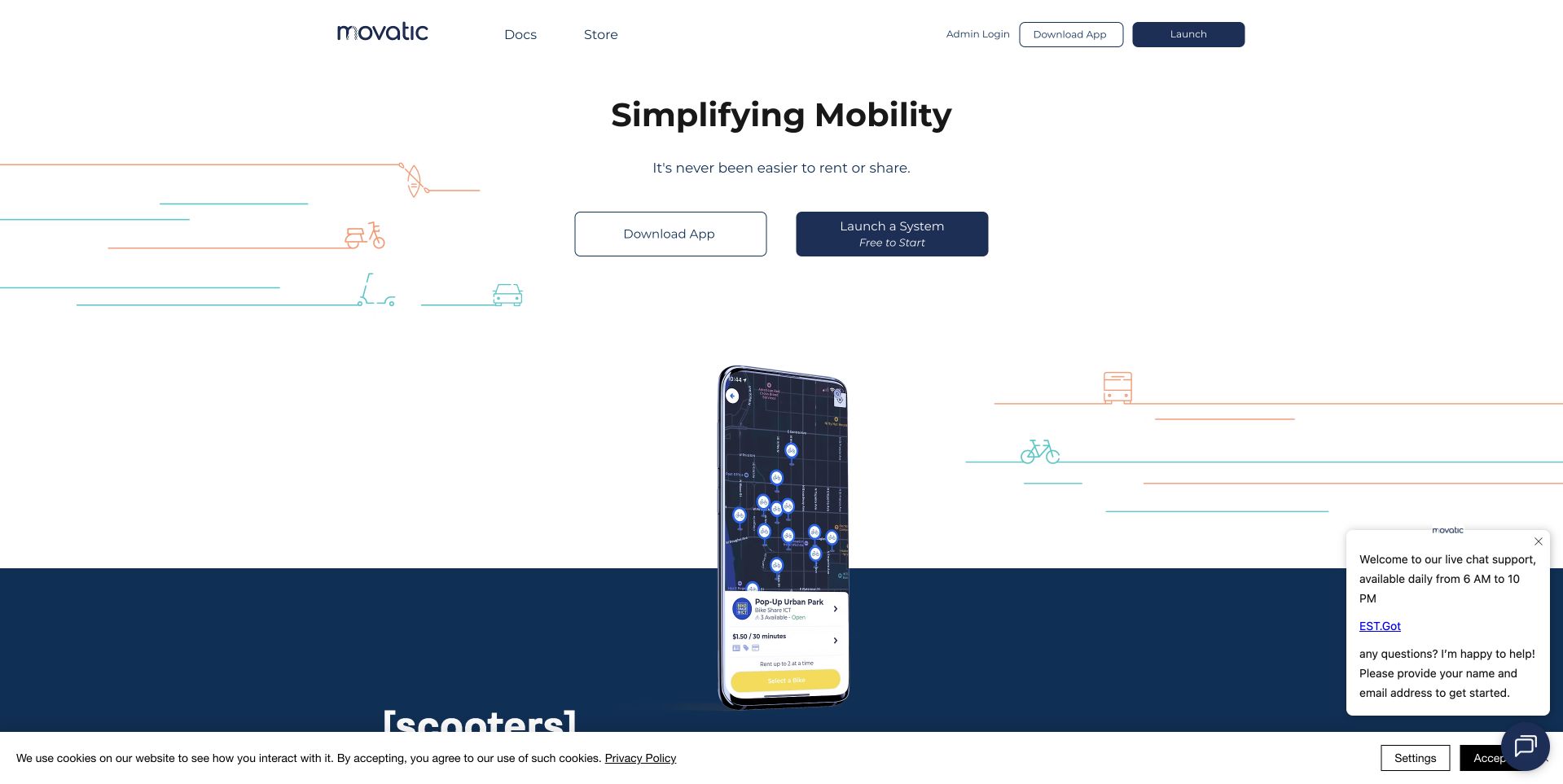
Movatic’s public homepage pairs a short mobility proposition with two central choices: download the app or launch a system. Thin transport illustrations and a phone mockup provide context, while the header includes documentation, a store and administrator access. This structure is useful for a Wix marketing site supporting both end users and operators. The public generator metadata identifies Wix at movatic.co; it does not show that the mobile application, administrator interface, fleet management or rental infrastructure is implemented with Wix.
What you can learn
Define the audiences before choosing the page layout. An app user needs a clear download route and basic expectations, while an operator needs an explanation of setup and responsibilities. Keep the product screenshot accompanied by readable context, and make handoffs to documentation, account systems and app stores explicit rather than blending them into one generic action.
Pros
The paired actions acknowledge distinct user and operator journeys immediately.
Documentation and administrator access remain reachable without competing with the main explanation.
Cons & considerations
The short headline leaves the supported mobility use cases to illustrations and later content.
The visible chat and cookie panels compete with the lower portion of the product presentation.
Platform source: Dated public Wix generator metadata. Dated Wix generator metadata on movatic.co; no editor-version, individual app, private-system or other-property attribution. Platform evidence is separate from the direct website screenshot and is not a complete current infrastructure audit.
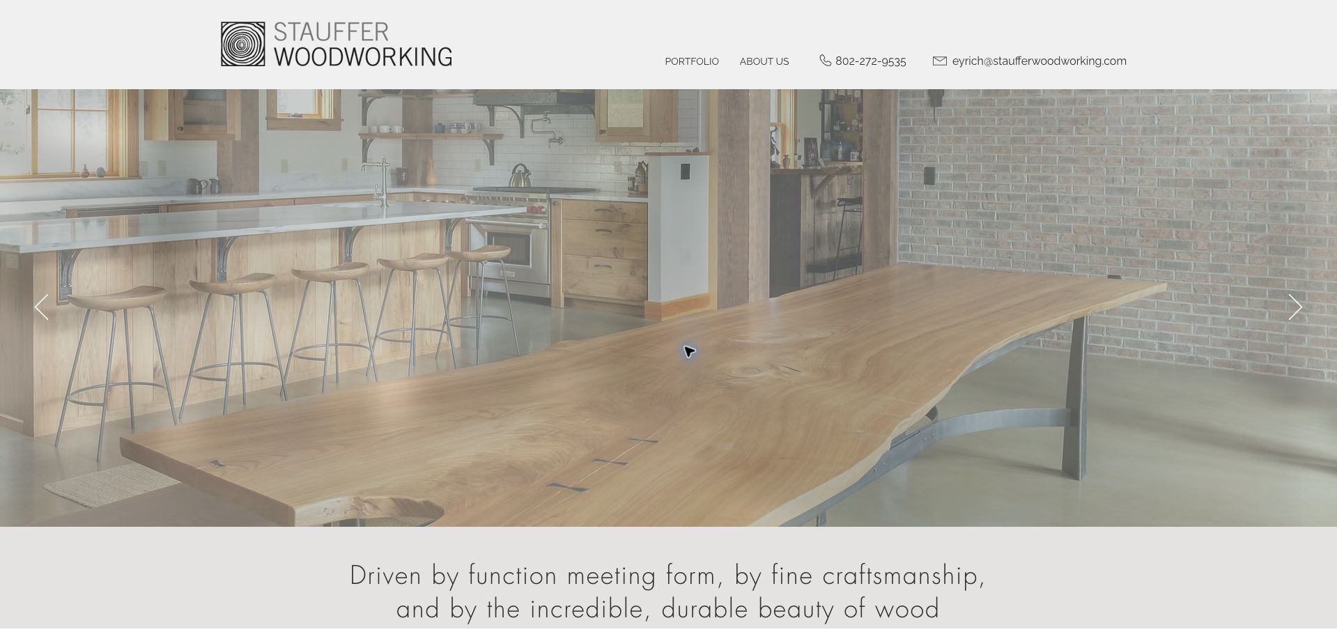
Stauffer Woodworking gives a completed interior and large timber table most of the opening view. A light header holds the identity, portfolio and company links, plus direct phone and email routes. Beneath the photograph, a short statement introduces the relationship between function, craft and material. The design is a useful Wix reference for a specialist whose work can carry the presentation without a long menu. Dated generator metadata qualifies the public property; it does not independently verify project attribution, materials or the process behind a commission.
What you can learn
Create project records that explain what the visitor is seeing, including the scope, materials and relevant constraints. Keep the portfolio easy to reach without requiring use of a slideshow. A direct enquiry route works best when visitors can first understand the kinds of work considered and what information will help begin a useful conversation.
Pros
The compact header leaves substantial space for the detail of the finished work.
Direct contact routes are visible without a separate promotional panel.
Cons & considerations
The opening photograph lacks a visible project name or explanatory caption.
Carousel arrows should supplement a browsable portfolio rather than serve as its only structure.
Platform source: Dated public Wix generator metadata. Dated Wix generator metadata on staufferwoodworking.com; no editor-version, individual app, private-system or other-property attribution. Platform evidence is separate from the direct website screenshot and is not a complete current infrastructure audit.
Kegan has 15+ years of experience working with small businesses, Fortune 500 companies, and everything in between. No development job is too big or too small: he brings the same hands-on attention to a focused improvement, a complete website, or a custom application.
For Wix projects, he can help with responsive interfaces, reusable components, custom functionality, API connections, and performance-minded implementation. He works directly with clients on scope, design, implementation, testing, and handover, with an emphasis on clear communication and a system that remains practical to maintain after launch.
Show 3 other Wix developersHide other Wix developers
For a business with a few services, agree on the information needed to understand each offer and begin an enquiry. Reuse a clear sequence of introduction, practical details, relevant examples and next steps. Avoid multiplying pages whose content is substantially identical. Keep location and contact information consistent wherever it appears.
Give a growing portfolio a content model
A portfolio, location directory or show library benefits from predictable records. In Wix CMS, a dynamic item page can present different collection entries through a shared design, with a distinct URL for each item. Choose clear names and useful fields before populating a large library. Preserve stable destinations when titles or featured images change.
Separate the marketing property from the operating system
A software company can use a focused public website without using the same platform for its application. A venue can present its space while a separate service handles tours or reservations. Document those handoffs, who maintains each destination and what visitors should expect. Do not assume the platform behind the homepage also supplies every linked transaction.
From references to requirements
Plan content ownership and editing together
Describe the behavior of each layout
Wix Studio documentation describes responsive behaviors, breakpoints and layout tools such as grids and stacks. Those tools still need a clear design intention: which content stays together, which columns can collapse and what must remain prominent. Agree on those relationships before adding arbitrary fixed positions. Do not infer a source site’s editor or settings from its public Wix metadata.
Wix CMS collection permissions determine who can view or change collection content. Hiding an element is not a substitute for restricting access to its underlying data. Define the intended audience and owner for each collection, and treat ordinary public content differently from personal enquiries. Review the actual configuration instead of relying on an attractive page to demonstrate privacy.
Schedules, promotions, guest appearances, location details and event announcements all become misleading when they outlive their context. Record who updates each category and when it needs review. A reusable component should make routine changes straightforward, but the editorial handoff must also explain what to remove when a program ends and where older links should lead.
A useful handover demonstration
Ask the actual team to carry out its routine job: publish a realistic update, correct a mistake, preview a narrow screen, and identify who owns an integration failure. For a library or frontend framework, also ask who maintains the content source and deployment. A polished screenshot does not answer those operational questions.
Beyond the screenshot
A practical Wix project checklist
List the audiences, their decisions and the destinations they need before drawing the homepage.
Choose the right content structure for services, projects, locations and recurring events.
Use realistic long titles and varied images when evaluating a reusable layout.
Keep meaningful link labels and essential tasks available outside decorative imagery.
Define the relationship between columns, stacks and images as the layout changes size.
Provide suitable image descriptions, clear headings and understandable control names.
Document the owner and expiry conditions for campaigns and time-sensitive information.
Review collection permissions independently from whether a field is visible on a page.
Separate public editorial content from personal enquiries and other private records.
Identify external booking, commerce, account and application destinations explicitly.
Preserve useful URLs and arrange clear redirects when restructuring published content.
Run the project’s automated checks, publish through its approved route and verify live pages and assets.
Test with real content, a keyboard, a small screen, slow or failed requests, and the people who will maintain the system. These are planning checks, not an accessibility, security, performance, or search-ranking certification.
Sources & editorial method
How this Wix collection was reviewed
We selected twenty distinct public website properties with explicit Wix generator metadata in their saved public evidence. Every example has a genuine direct browser capture with its original source URL, dimensions, attribution and date. All twenty images were inspected for these new collection-specific reviews on November 9, 2026 Pacific. Existing broad audit attempts and observation dates were retained independently of the review date. The first five selections were identified through official corporate, biography, location or history pages; their opening order is an editorial choice rather than a measured traffic ranking. We excluded a candidate supported only by Wix-hosted media. The reviews assess visible design and practical planning, without validating organizational marketing claims, inferring private systems or treating public metadata as proof of an editor version.
Every image is an unmodified capture from the actual website, with its source and capture date. Some captures are reused from our shared catalog; their dates remain the original capture dates. None comes from a vendor gallery or a generated reconstruction. Moving imagery and live content can change.
Technology attribution uses public page assets or metadata, official platform documentation, or a cited first-party project case study. Documentary and framework-relationship evidence is identified where used; it is not a complete current backend inventory. A CMS image CDN alone does not establish a full CMS deployment. A library’s presence does not prove which individual controls use it, and a platform label does not establish AI authorship.
The composition notes, lessons, pros and tradeoffs are original editorial observations. We have not measured conversion, traffic, security, performance or accessibility conformance. Website owners retain their brands and imagery; these examples are not our client portfolio. Written, Edited and Curated are independent records, not dates advanced by a build. See our editorial standards or suggest a correction.
Questions worth asking
Wix website development FAQs
Does a Wix homepage mean the entire company uses Wix?
No. The evidence applies to the specific public page at the recorded observation time. An organization may use different systems for applications, accounts, payments, appointments or other subdomains. The collection keeps those property boundaries explicit.
Can Wix support a growing directory or portfolio?
Wix CMS documents dynamic list and item pages connected to collection content. This can provide a consistent presentation for repeated entries. A project still needs useful fields, clear destinations and an owner responsible for keeping the information accurate.
Do the examples prove which Wix editor was used?
No. Generator metadata identifies Wix without consistently identifying the editor generation or its configuration. An older public credit can provide historical context, but implementation decisions should use verified details from the actual project.
Is hiding a field enough to keep CMS information private?
No. Wix documents collection permissions as the control over who can access and change collection data. Information can remain accessible through the data interface even if it is not placed on the visible page. Private records need an appropriate permission model.
Why do the screenshots have different dates from the reviews?
The guide reuses genuine saved captures and existing public observations while adding new analysis. Each capture and technology observation keeps its original date. A new review or rebuilt page does not make that earlier evidence a fresh capture or audit.
Choose a clear purpose for each page and a dependable way to maintain it. The most useful pattern to borrow is the one that helps visitors understand the content and helps the team keep that content accurate.