Best Audio Equipment Store Websites of 2026 (23 Real-World Examples)
Audio equipment store websites that make listening goals, component choices, used stock and specialist advice easier to understand.
A useful audio store website helps customers understand what belongs in their system before asking them to choose a product.
Audio shopping can begin with a specific model number or a much less defined question: how to improve sound in a room, record a voice or replace a worn component. A good storefront supports both. Search and product departments matter, but so do clear explanations of connection requirements, listening context, condition and the help available from the store.
This collection includes independent hi-fi dealers, headphone specialists, direct audio-brand storefronts and broader retailers with explicit audio departments. Compare their approaches to demonstrations, component discovery, support and used equipment. The reviews concern website design and information structure, not measured sound quality, customer-service performance or verified product availability.
Before the examples
What makes good audio equipment store website design in 2026?
Start with the customer’s listening or recording task
Separate domestic listening, headphones, studio recording, live sound and vehicle installations where those contexts are part of the assortment. A customer searching for a DAC may know a precise model; another may need a plain-language explanation. Keep search direct while providing useful introductions that explain what a component does and when it is relevant.
Make compatibility and condition understandable
Product records should identify inputs, outputs, relevant formats, power requirements and documented compatibility. Used or demonstration equipment needs its own condition, included-accessory and availability information. Distinguish manufacturer specifications from the store’s editorial advice. A photograph, brand name or promotional badge cannot establish whether a component fits someone’s existing system.
Connect online shopping to real assistance
Explain what customers can expect from an audition, setup appointment, installation consultation or repair request. Keep locations, contact methods and service scope easy to find. Separate these journeys from ordinary checkout so someone buying a replacement cable does not have to enter a project-enquiry flow, and someone planning a system is not left with only a cart.
The collection · 23 examples
23 audio equipment store websites worth studying
Study how these storefronts balance the appeal of equipment with the practical questions about use, compatibility, condition and advice.
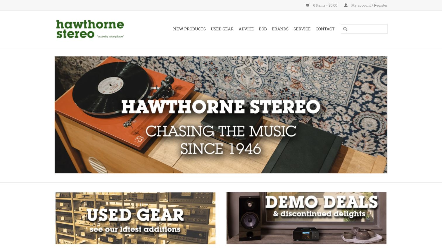
Hawthorne Stereo places a green wordmark and a modest personal tagline above a warm photograph of an orange turntable. The surrounding wood and patterned rug give the equipment a believable domestic setting. New Products, Used Gear, Advice and Service remain separate routes, while the next row begins with used equipment and demonstration deals. This is a welcoming specialist storefront rather than a wall of specifications. The personal Bob navigation label adds character, although its purpose is less obvious to a newcomer than the product and service labels.
What you can learn
Give a specialist shop a recognisable visual voice while keeping new, used and service journeys literal. Personal history can enrich the site, but should not replace clear buying or listening-appointment information.
Pros
New and used stock have distinct, prominent entry points.
The turntable photograph makes the shop’s audio specialism immediately tangible.
Cons & considerations
The Bob label needs context for first-time visitors.
Large introductory imagery leaves condition, price and model comparison for later pages.
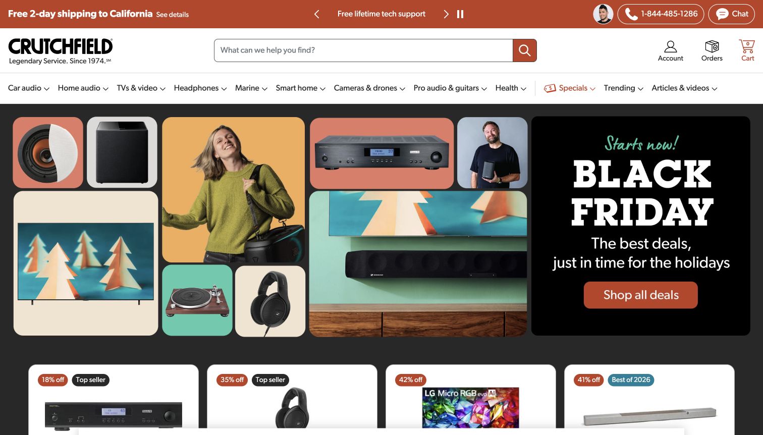
Crutchfield pairs its wide search field with a named advisor photograph and prominent help routes. The navigation separates car audio from home audio and other equipment, acknowledging that the installation context changes what a shopper needs. The opening promotion uses a collage of products and people beside a compact dark offer panel, with product cards beginning below. Articles and videos provide a further route for uncertain buyers. The breadth is useful, but it also gives the header many departments to communicate before a visitor reaches a specific component.
What you can learn
Let customers choose the listening or installation context before asking them to compare equipment. Keep expert help and explainers close to model search, especially when compatibility matters more than a headline discount.
Pros
A named advisor makes the assistance route concrete.
Car and home audio have visibly separate shopping contexts.
Cons & considerations
Many departments compete for limited header space.
A seasonal promotion cannot explain the compatibility requirements of every featured product.
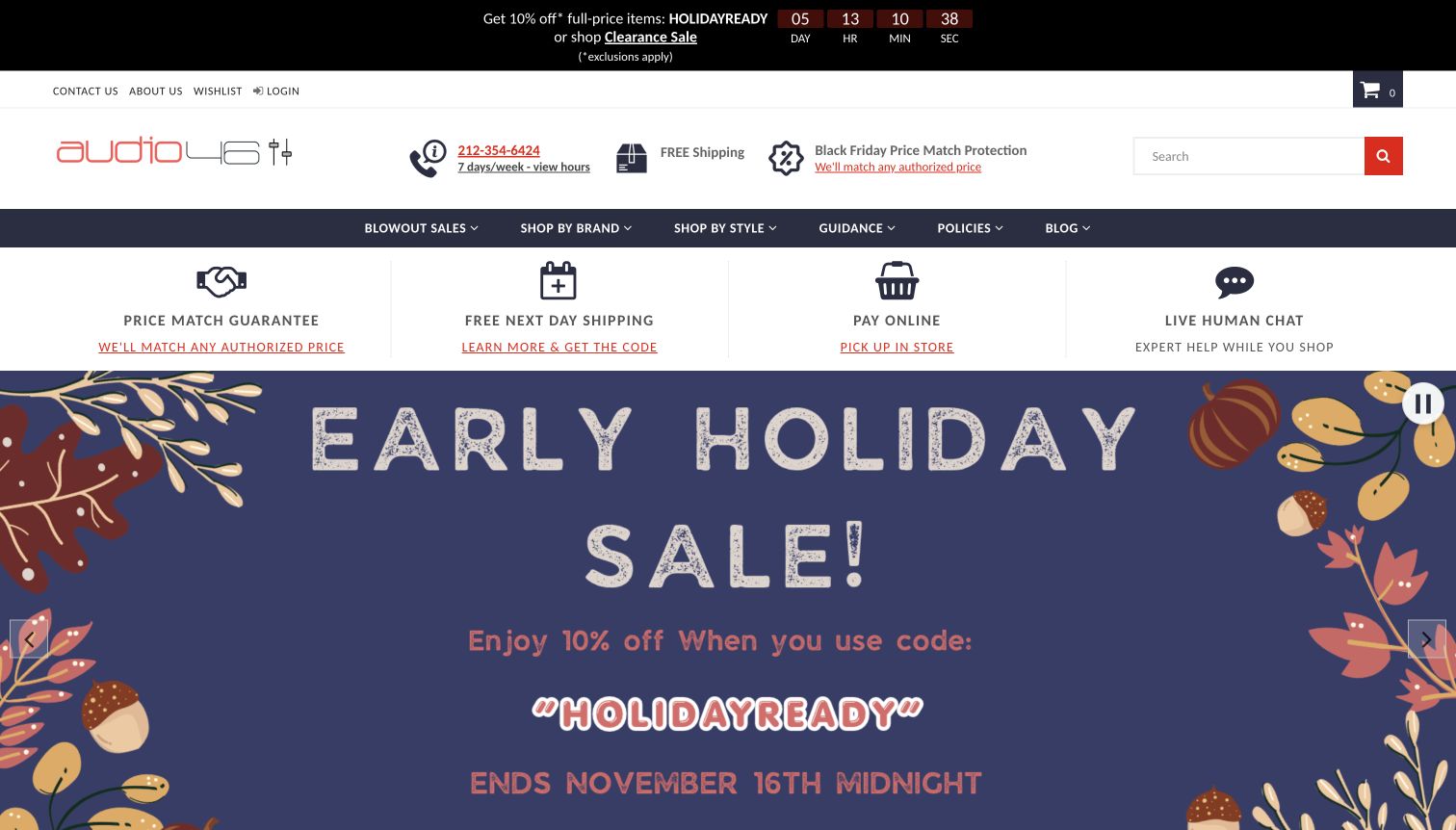
Audio46 gives practical shopping conditions a conspicuous row of icons before the seasonal hero. Price matching, shipping, store pickup and human assistance appear as separate ideas. Shop by Brand and Shop by Style offer different ways into a headphone-focused catalogue, while guidance and policy links remain visible. The illustrated autumn campaign provides a lively visual change from product grids. Several stacked header and service rows, however, consume much of the first screen, delaying the actual equipment and the distinctions between listening styles.
What you can learn
Explain the support around a considered headphone purchase, but keep reassurance compact enough that shoppers can still see products. Pair brand browsing with plain-language listening needs and fit guidance.
Pros
Brand and style navigation accommodate different levels of product familiarity.
Store pickup and assistance are presented as explicit service routes.
Cons & considerations
The accumulated header bands reduce space for product discovery.
Campaign artwork needs supporting product information to help visitors choose a headphone type.
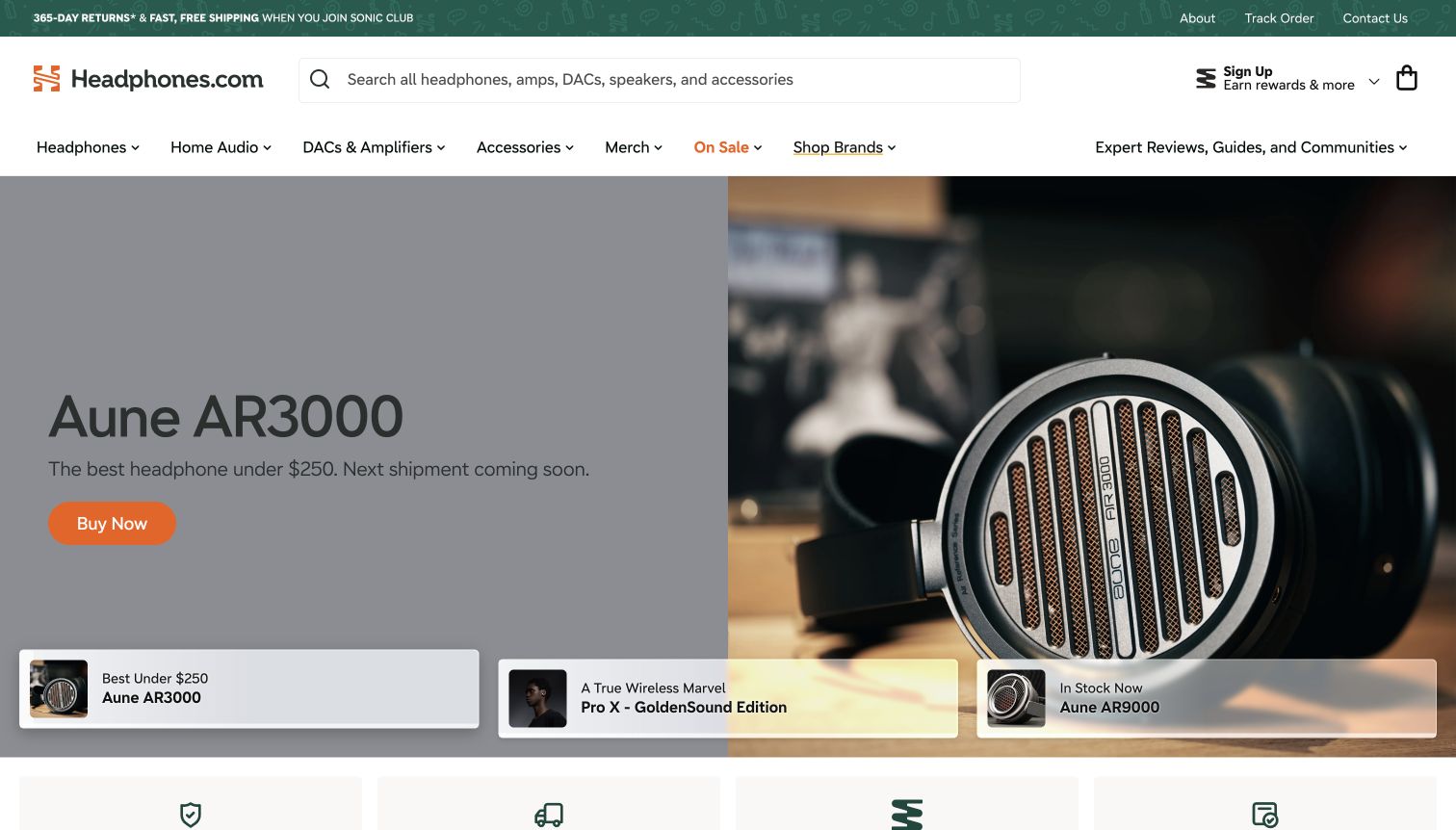
Headphones.com combines a large equipment search field with clear routes for headphones, home audio, DACs and amplifiers. Expert reviews, guides and communities are visible alongside commerce. The captured hero introduces an Aune model through a close product photograph and adjacent copy, with labelled campaign thumbnails below. A membership-qualified returns message sits in the upper strip rather than appearing as an unconditional promise. The model presentation is focused, but the nearby next-shipment notice and purchase action require careful reading to understand availability.
What you can learn
Connect product stories to independent navigation for advice and comparison. Keep membership conditions, shipment timing and the meaning of a purchase button close enough that shoppers can understand the actual next step.
Pros
Equipment categories and editorial help are both easy to identify.
Labelled campaign thumbnails give more context than anonymous carousel dots.
Cons & considerations
Availability wording needs to remain consistent with the purchase action.
A model-led hero assumes more prior product knowledge than a needs-based introduction.
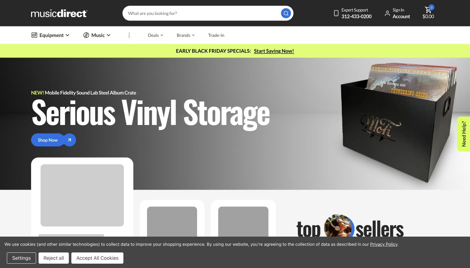
Music Direct puts a broad search field and expert-support telephone route in a charcoal header. Equipment and Music are distinct primary choices, with deals, brands and trade-in options nearby. The captured opening promotes a record-storage product through a large physical object and a concise headline on a restrained background. That choice treats the collection around a sound system as part of the shopping experience. It is a coherent accessory story, although someone seeking an amplifier or speakers must use the navigation rather than the opening campaign.
What you can learn
When a store sells both recordings and equipment, give each its own clear route and connect them through useful ownership needs. Keep accessory promotions from obscuring the core hardware departments.
Pros
Music and equipment are separated without splitting the store identity.
Support and trade-in routes acknowledge purchases beyond a simple new-product checkout.
Cons & considerations
The accessory-led hero does not introduce the main audio component categories.
A very broad search needs useful results for both album names and hardware models.
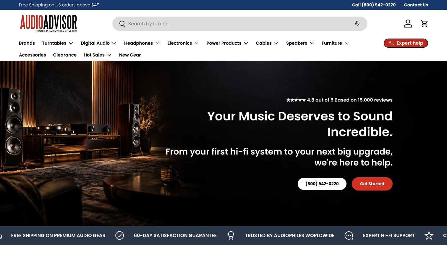
Audio Advisor exposes detailed departments including turntables, digital audio, electronics, speakers and cables rather than relying on a single Shop menu. A wide search field and a contrasting expert-help control sit above them. The hero shows equipment in a listening room and addresses both starting a system and upgrading one, with telephone help and a clear next step. This makes a complex purchase feel approachable. The dense department list still assumes customers can distinguish several technical categories before they seek assistance.
What you can learn
Organise products by component while offering a parallel route for the customer’s whole system. First-system and upgrade guidance should explain compatibility and priorities without forcing beginners to learn every department name first.
Pros
The catalogue’s component structure is visible immediately.
The opening connects shopping to system-level advice.
Cons & considerations
Technical department names can be difficult for new listeners.
Many adjacent categories need careful spacing and readable navigation at smaller widths.
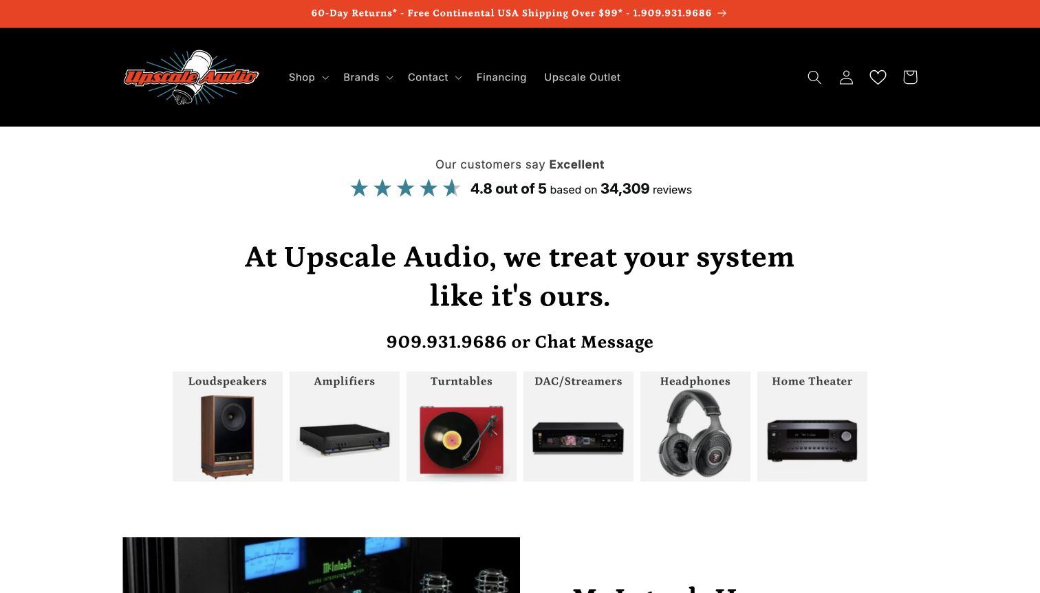
Upscale Audio leads with a strong personal-service message and visible telephone and chat options, then presents a row of equipment tiles. Loudspeakers, amplifiers, turntables, DACs and streamers, headphones and home theatre each receive a recognisable object image. The restrained white canvas makes those choices easy to distinguish. A black header and orange service strip provide a consistent frame. Reputation material occupies substantial space before the categories, so the useful product map is slightly delayed in the opening sequence.
What you can learn
Use concrete equipment images to turn a specialised catalogue into understandable starting points. Place human help nearby, while keeping reputation claims and service promotions proportionate to the customer’s immediate shopping task.
Pros
Product tiles make several equipment families visually distinct.
Telephone and chat assistance have a clear place in the introduction.
Cons & considerations
Reputation content takes space before visitors reach the equipment choices.
A broad Shop label in the header depends on the category tiles to provide detail.
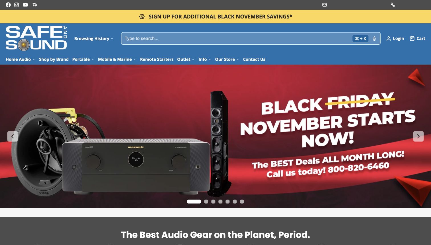
Safe and Sound HQ uses a blue header, a generous search field and explicit departments for home audio, portable products, mobile and marine equipment. Remote starters and outlet stock are also visible, giving the assortment a clear commercial breadth. The first screen then shifts to receiver and speaker closeouts, with a newsletter promotion nearby. The catalogue can serve several listening contexts, but the promotional layers make the opening busy and do little to explain how an individual component fits a system.
What you can learn
Separate home, portable and installed vehicle audio early. Promotions should lead to relevant departments with clear stock and condition details, while newsletter invitations remain secondary to finding the right equipment.
Pros
Listening and installation contexts are named in the navigation.
Outlet stock has a distinct route rather than blending invisibly into new equipment.
Cons & considerations
Several promotional messages compete with product orientation.
A broad assortment needs compatibility guidance beyond the opening sale panel.
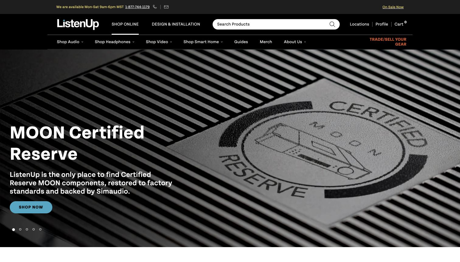
ListenUp distinguishes Shop Online from Design and Installation in its dark header. Below that, audio, headphones, video and smart-home departments provide a more specific equipment map. The captured hero focuses on a restored-component programme, with a detailed amplifier photograph and a clear route into that collection. Trade and sell options reinforce a longer equipment lifecycle. The presentation gives service projects and product purchases different entrances, although specialist programme language needs further explanation before a newcomer can assess condition or suitability.
What you can learn
Offer separate paths for a straightforward equipment purchase and a designed installation. When promoting restored or used gear, explain the inspection scope, condition and support on the destination rather than relying on a badge alone.
Pros
Product shopping and project services have distinct entrances.
Trade and restored-equipment routes support customers with existing systems.
Cons & considerations
Programme terminology may be unfamiliar to first-time audio buyers.
A photographed component cannot establish its condition or the service behind it.
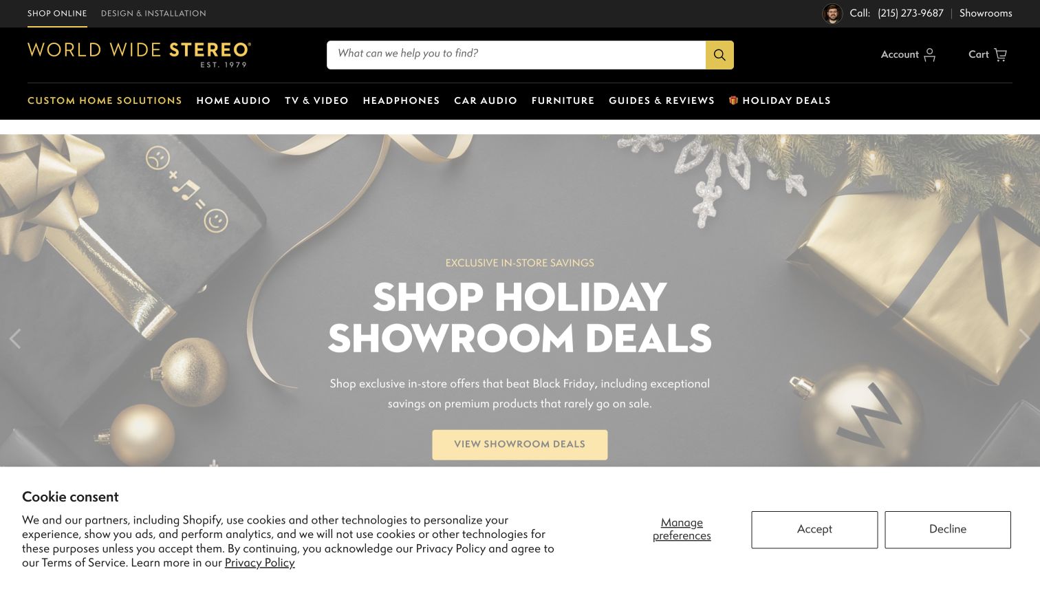
World Wide Stereo places online shopping and design services within the same black-and-gold identity. A staff image, contact details and showroom route make the physical business visible alongside a wide search field. The captured seasonal hero explicitly describes showroom-only offers, a useful distinction when online and local promotions differ. Home audio, car audio, furniture and guides appear in the navigation. The range of choices is substantial, and a privacy notice covers part of the lower opening in the retained view.
What you can learn
Label location-specific offers where the promise appears, then connect them to the relevant showroom information. Keep product, installation and advice routes distinct so visitors can choose the kind of assistance they actually need.
Pros
The hero states that the featured offers apply to showrooms.
Staff and showroom information connect the online catalogue to a physical business.
Cons & considerations
The large number of departments makes the header demanding to scan.
The captured privacy notice occupies space that would otherwise reveal lower content.
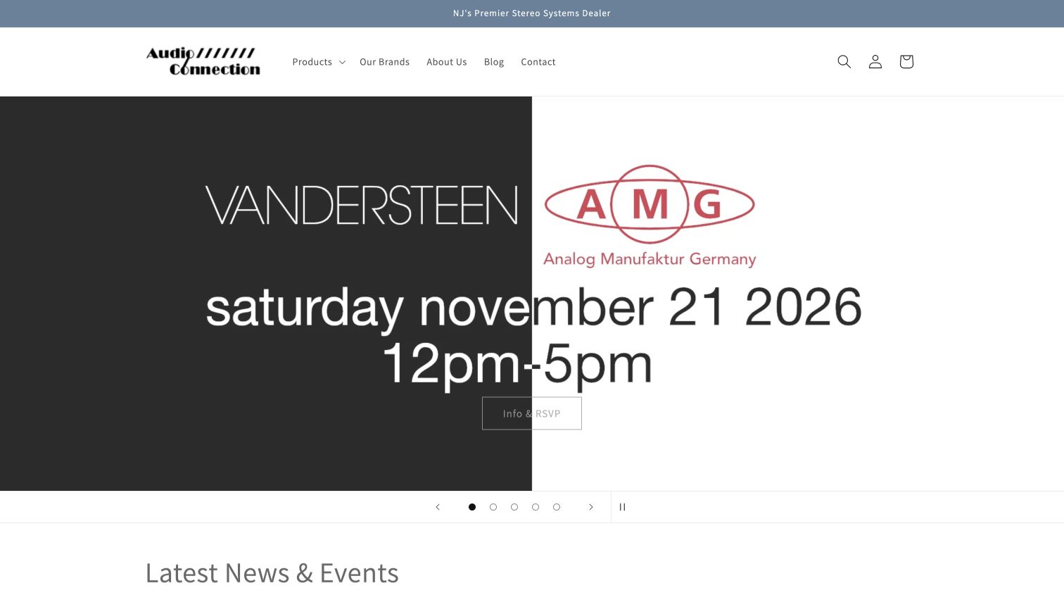
Audio Connection uses a restrained header with products, brands, company information and contact routes. Its opening campaign is an explicitly dated listening event featuring audio brands, a time window and an information-and-RSVP action. The monochrome composition feels focused and gives the store a reason for an in-person visit beyond a discount. Carousel controls include a visible pause option. The thin outlined event action is less prominent than the large logos, and the date makes this a presentation that requires regular maintenance.
What you can learn
Make a listening event concrete through its date, location and next step. Preserve a permanent product and contact route alongside the event so the homepage stays useful after the campaign expires.
Pros
The event’s date and time are part of the main message.
A visible pause control acknowledges the rotating presentation.
Cons & considerations
The event action has less contrast and emphasis than the brand graphics.
Time-sensitive homepage content needs a clear expiry and replacement plan.
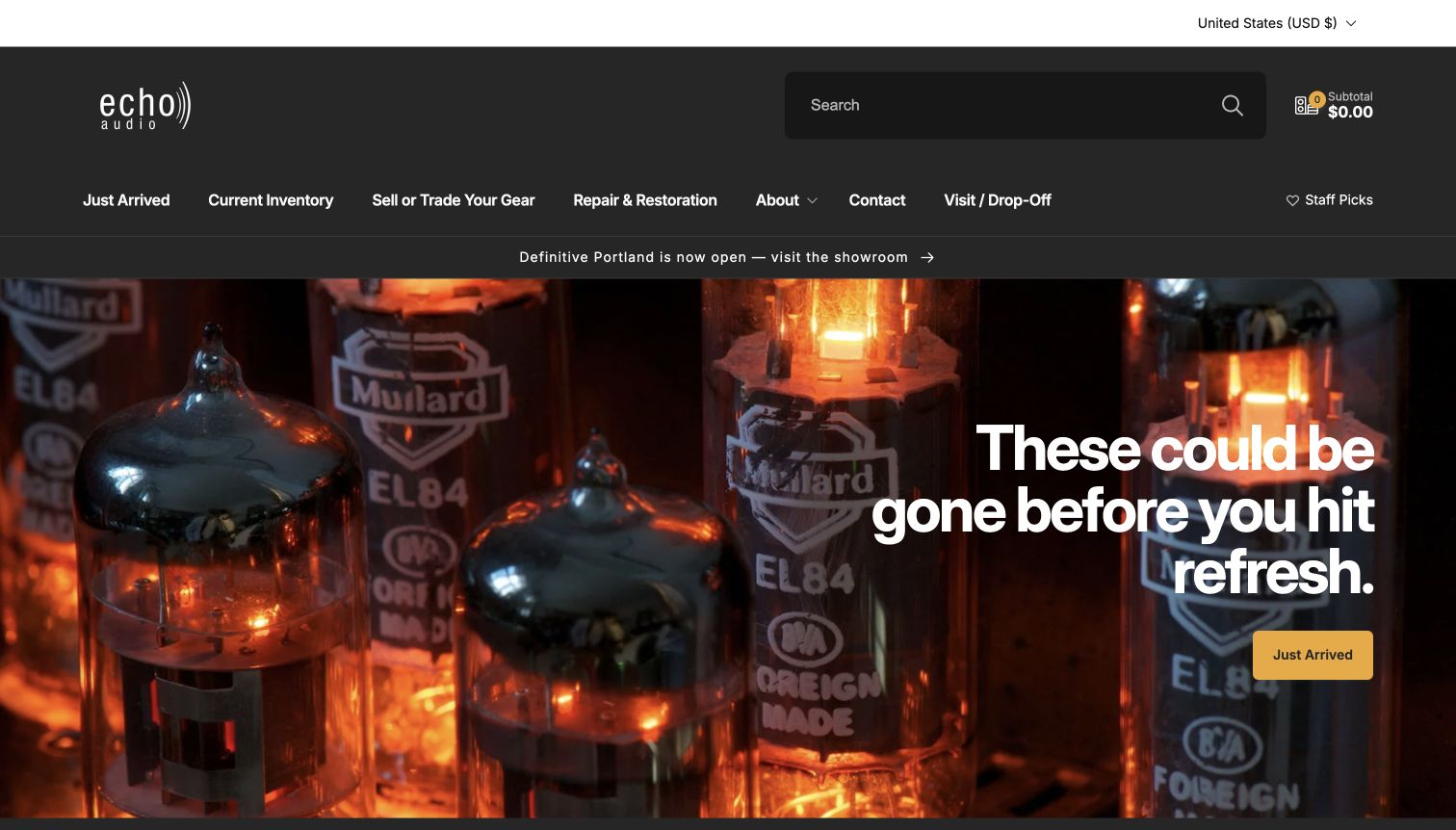
Echo Audio frames a warm close-up of glowing valves with a dark header and a conspicuous search field. Just Arrived and Current Inventory sit beside selling, trading, repair and restoration routes. The opening’s stock-urgency message is appropriate to a catalogue of individual pieces, and the yellow action points directly to recent arrivals. A store-visit route remains visible. The emphasis on freshness makes accurate inventory and condition records especially important; visual atmosphere alone cannot tell a buyer what remains available.
What you can learn
For changing used inventory, give recently added items a stable destination and keep repair and trade-in tasks separate. Product records should explain condition, included parts and availability without depending on urgency copy.
Pros
Inventory freshness is reflected in literal navigation labels.
Repair, restoration and trade-in routes recognise the equipment’s continuing lifecycle.
Cons & considerations
Urgency language becomes misleading if inventory updates fall behind.
The atmospheric hero postpones price and condition comparison.
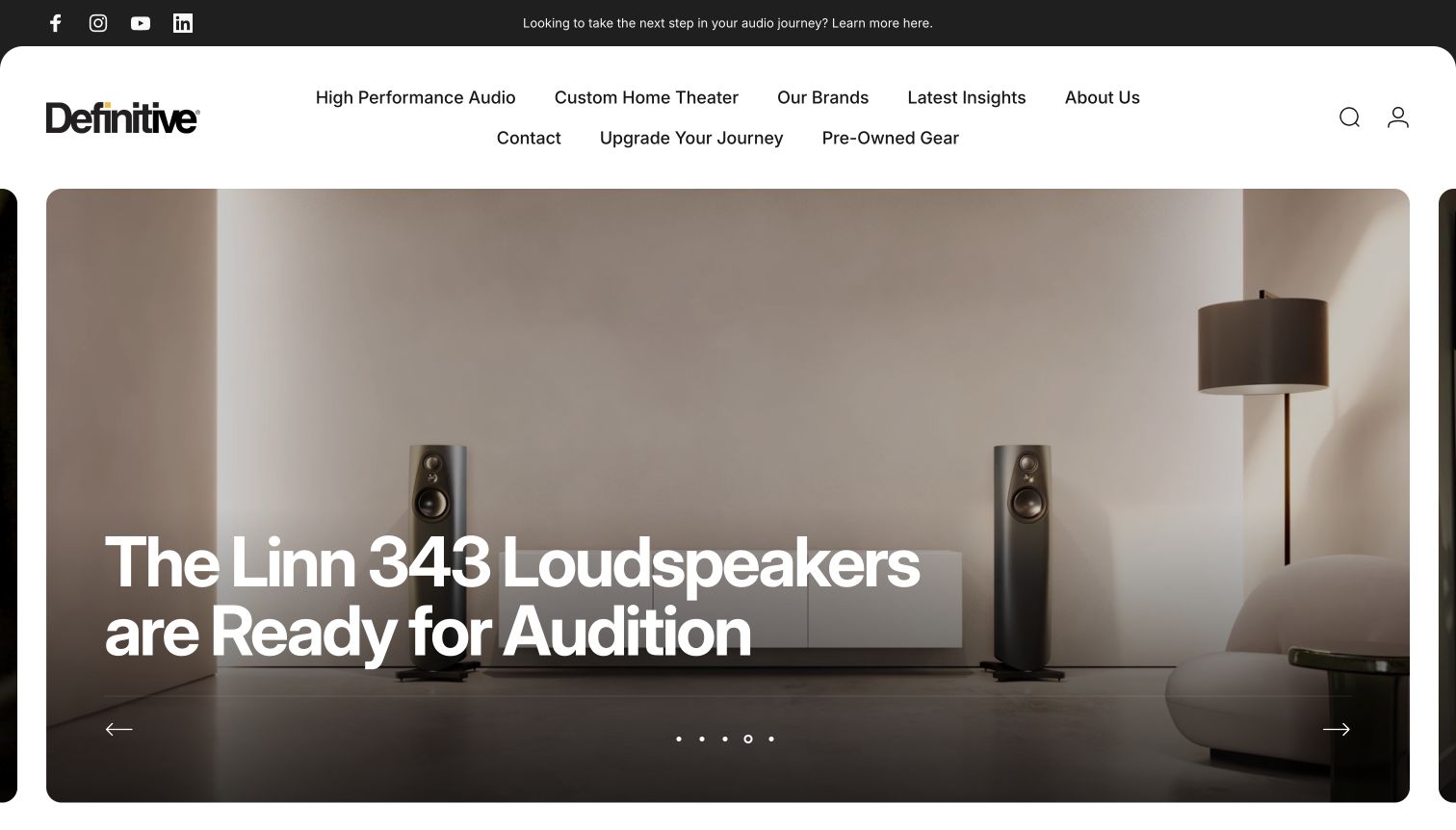
Definitive uses a large rounded white navigation area above an almost full-screen listening-room photograph. The settled capture names a loudspeaker model and says it is ready for audition, making the image an invitation to hear equipment rather than just admire it. High Performance Audio, Custom Home Theater and Pre-Owned Gear are distinct routes. The generous spacing communicates a measured specialist experience. At the same time, the oversized carousel delays specific store details, and the phrase Upgrade Your Journey is less literal than the product categories.
What you can learn
For a showroom-led audio purchase, connect aspirational room photography to a concrete audition path. Keep location, appointment requirements and equipment details easy to reach instead of relying on a broad lifestyle invitation.
Pros
The featured model is identified in the audition message.
New audio, theatre projects and pre-owned equipment have separate routes.
Cons & considerations
The large hero leaves practical visit information outside the opening view.
An abstract upgrade label explains less than a specific service or product destination.
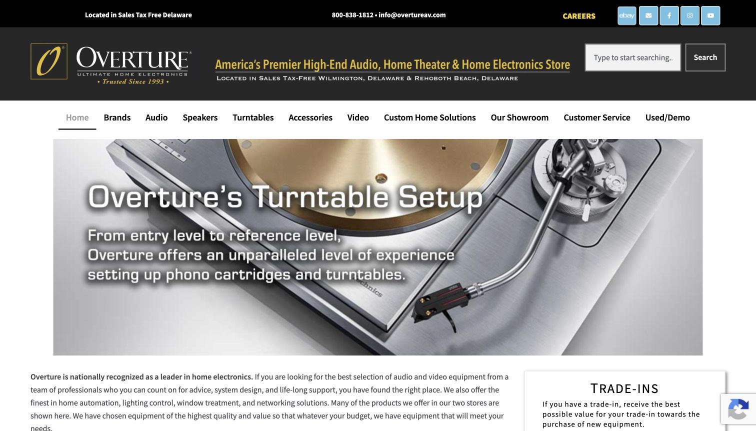
Overture places its Delaware store context, telephone contact and search above a substantial equipment navigation row. Audio, speakers, turntables, accessories and used or demonstration equipment receive explicit labels. The captured hero promotes turntable setup with a close photograph of the mechanism, making a practical service the central story. Showroom and custom-home routes sit beside shopping. The dense header and text over a detailed image create a more information-heavy opening than the quieter specialist sites in this collection.
What you can learn
Show how a dealer helps a customer use the equipment, not only which brands it carries. Give setup services a defined destination and keep the technical catalogue readable around promotional photography.
Pros
The hero connects a specific service to recognisable equipment.
Showroom, used-stock and custom-home routes are visible alongside product departments.
Cons & considerations
The header contains many competing text elements.
Text over detailed turntable photography needs careful contrast and responsive treatment.
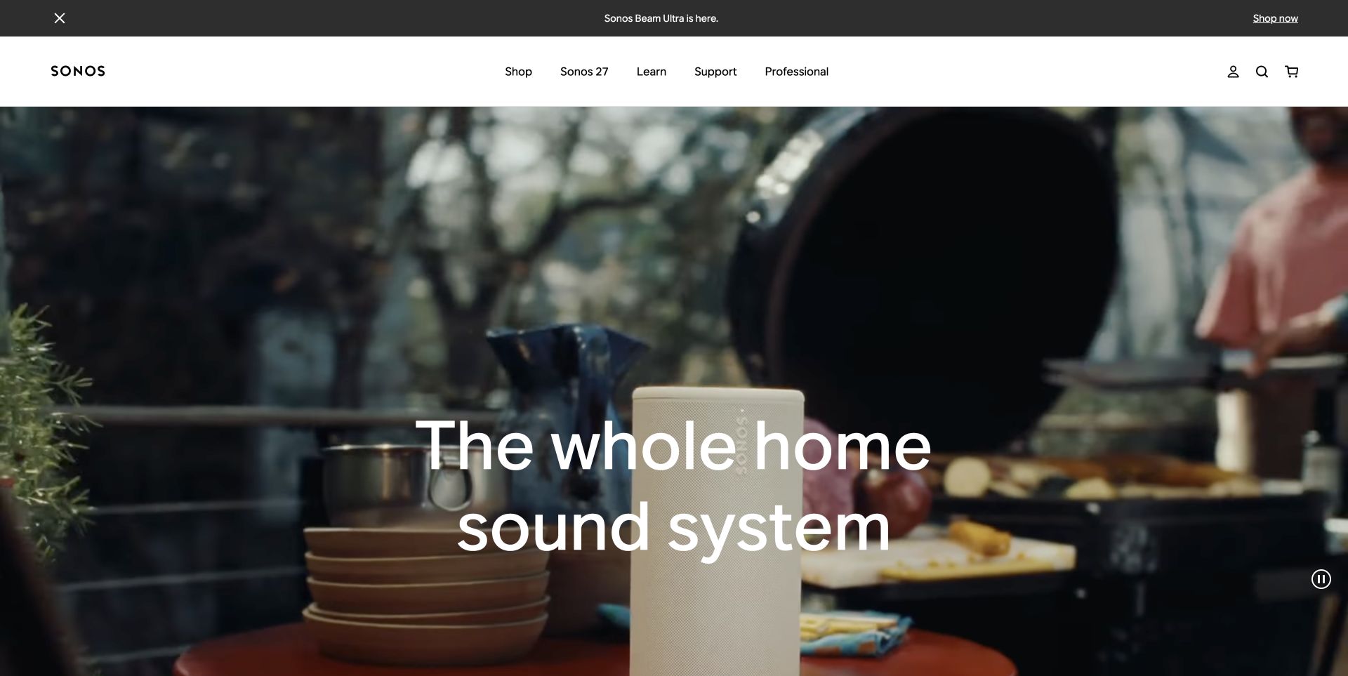
The retained November 2 Sonos storefront capture presents a compact speaker in a kitchen scene beneath a spacious white header. A whole-home system message explains the broader use case, while Shop, Learn, Support and Professional remain separate choices. The composition shows scale and placement without a dense specification panel. A product announcement occupies the slim upper strip, and a pause control is visible on the moving hero. This is a focused brand-store approach; it does not offer the cross-brand comparisons of a multi-manufacturer dealer.
What you can learn
Use a real room to explain where audio equipment belongs, then connect that story to setup and compatibility guidance. Maintain a direct shopping route for returning customers who already know the model they need.
Pros
Learning and support remain visible next to shopping.
The room setting gives the speaker a clear sense of scale and use.
Cons & considerations
A system-level message does not explain model-by-model differences.
Large text over moving imagery needs sustained contrast and motion controls.
Platform source: Official Next.js showcase. The official Next.js showcase features this named website; the captured public page also exposes Next.js assets. Platform evidence is separate from the direct website screenshot and is not a complete current infrastructure audit.
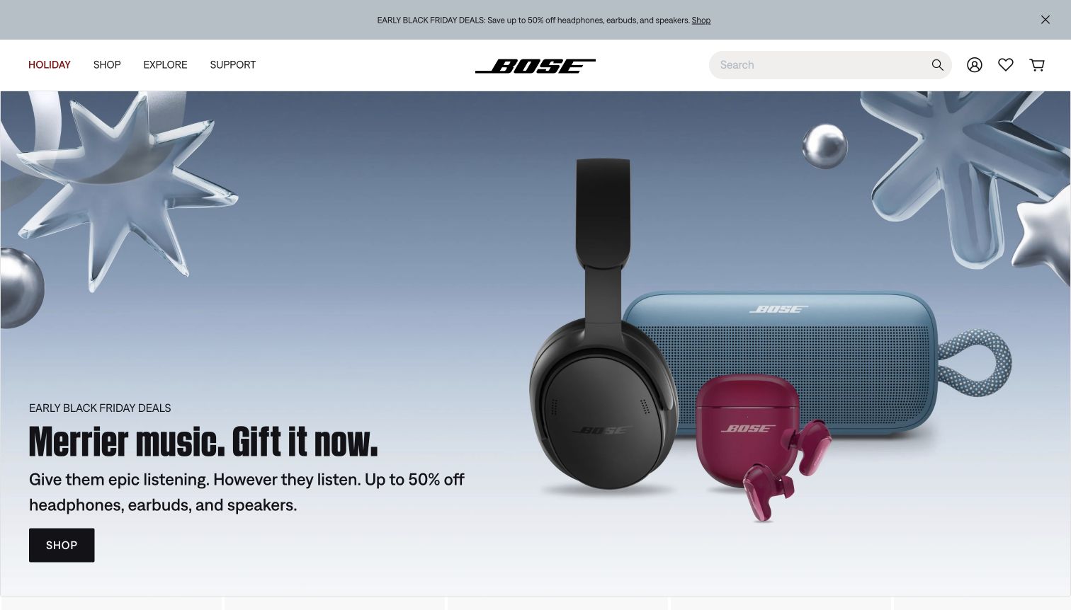
Bose’s retained November 4 opening groups headphones, earbuds and a portable speaker against a cool seasonal background. The three product shapes remain distinct despite sharing one campaign. Holiday, Shop, Explore and Support keep the navigation short, with search on the right. Offer copy and a black shopping button sit together at the lower left. The image is useful as a dated design example, not a current promise about discounts. Specifications and differences between listening products sit beyond this broad campaign introduction.
What you can learn
A focused audio range can use fewer navigation categories and larger product images. Keep the buying action beside the explanation, then provide comparison and support information for customers choosing between different listening formats.
Pros
The hero distinguishes three audio product families visually.
Short navigation leaves room for search and ownership support.
Cons & considerations
The oversized promotion postpones detailed product comparison.
Repeated sale messages use space that could explain how to choose a product type.
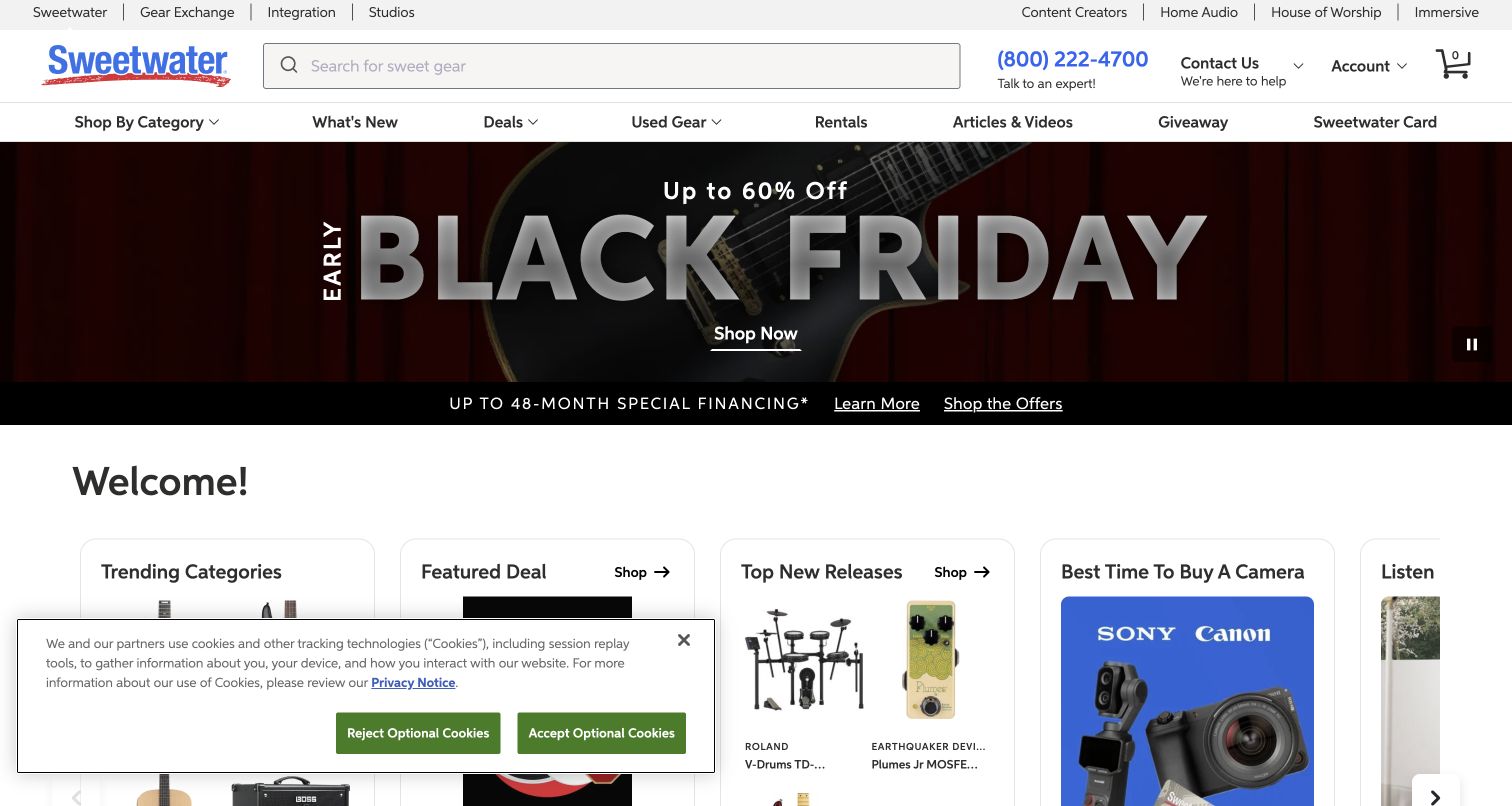
Sweetwater’s retained November 4 capture puts a large search field beside a telephone route explicitly offering expert help. Home Audio appears in the upper navigation, while used equipment, rentals and articles provide additional purchase paths. The seasonal guitar campaign reflects the store’s broader music assortment; the audio customer can still enter through search or a relevant department. Discovery cards begin below, partly covered by a privacy notice. The result is useful for studying how a broad equipment business supports precise requests and exploratory shopping together.
What you can learn
Keep exact model search prominent in a large catalogue and make assistance easy to find when compatibility is uncertain. Use explicit audio destinations so customers do not have to interpret a music-focused campaign as the whole assortment.
Pros
Search and expert help are positioned together.
Home-audio, used-gear and rental routes acknowledge different buying needs.
Cons & considerations
The opening campaign is not specifically focused on home or studio audio.
The privacy panel overlaps some of the lower discovery content in this capture.
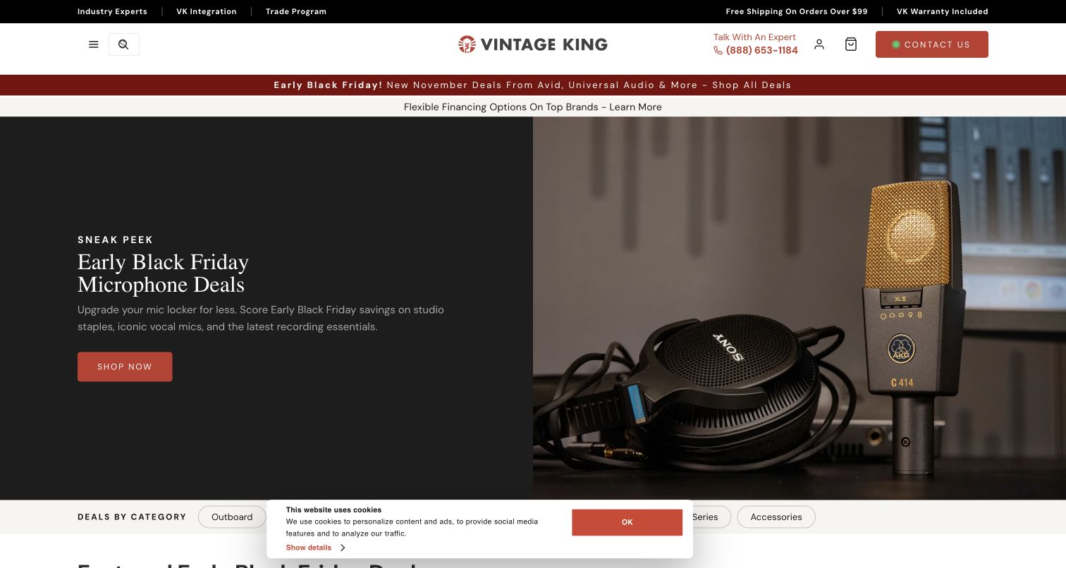
Vintage King’s retained November 4 opening pairs a dark microphone campaign with a detailed product photograph. A centered wordmark and visible expert-contact route sit above it, while integration and trade links frame equipment as part of a larger studio purchase. Deal-by-category controls begin immediately below the hero. The restrained red accents provide a consistent action colour. The principal menu is compact, so a customer seeking a particular recording department must use search or reveal the menu instead of scanning a full department list.
What you can learn
Connect specialised audio products to clearly described advice and integration services. Keep category discovery direct for replacement purchases, and explain the scope of consultation when a customer is assembling a larger system.
Pros
Microphone photography makes the professional-audio focus concrete.
Expert and integration routes sit close to product shopping.
Cons & considerations
The compact menu adds a step to department scanning.
Service promises need a defined process beyond the introductory contact invitation.
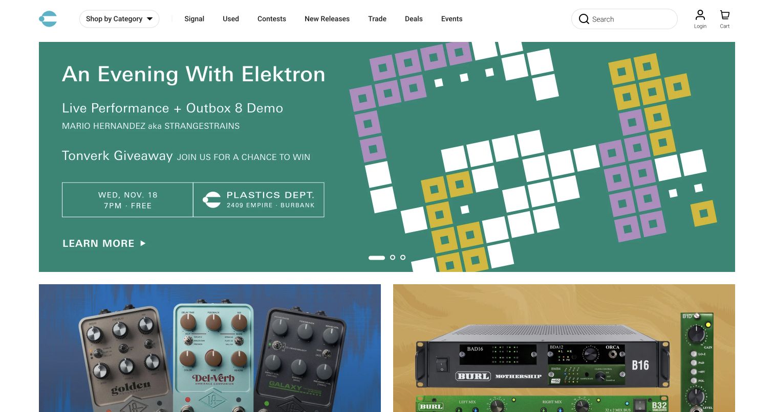
Perfect Circuit’s retained November 4 screenshot opens with a dated electronic-music demonstration presented in geometric green artwork. The row beneath shows signal-processing and rack equipment, grounding the event in a real store assortment. Used equipment, trade, new releases and events have separate header routes, and a category control remains visible. The site encourages discovery through practical demonstrations as well as catalogue browsing. The event-led opening is time-sensitive, and the Signal label requires more context than the more literal shopping destinations.
What you can learn
Use demonstrations to explain unfamiliar audio equipment, while retaining a direct path to products and used stock. Give dated event content an expiry owner and explain editorial labels that newcomers may not immediately understand.
Pros
Equipment tiles connect the community event to a tangible audio catalogue.
Used stock and trade routes support customers building or changing a setup.
Cons & considerations
A dated event requires regular maintenance to remain useful.
Abstract editorial naming can make navigation less obvious to new visitors.
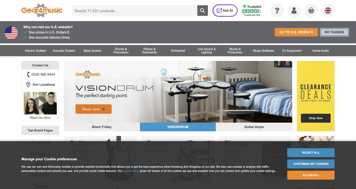
Gear4music’s retained November 4 capture exposes Live Sound and Lighting, Studio and Production, DJ Equipment and Home Audio as separate departments. A wide search field and contact information support more specific needs. The main campaign features an electronic drum kit, reflecting the broader musical-instrument business, while clearance receives its own side panel. A country prompt and a large cookie banner occupy substantial space in the captured view. The explicit audio taxonomy is the useful lesson here, rather than the instrument-led hero itself.
What you can learn
Separate live, studio, DJ and domestic audio because their buying requirements differ. For an international catalogue, keep location choices and privacy controls clear without allowing them to obscure the permanent equipment navigation.
Pros
Several audio purchasing contexts have literal department labels.
Search and contact details offer alternatives to browsing the promotional campaign.
Cons & considerations
The country prompt and privacy banner consume much of the opening view.
An instrument-focused hero provides little immediate guidance for audio-only shoppers.
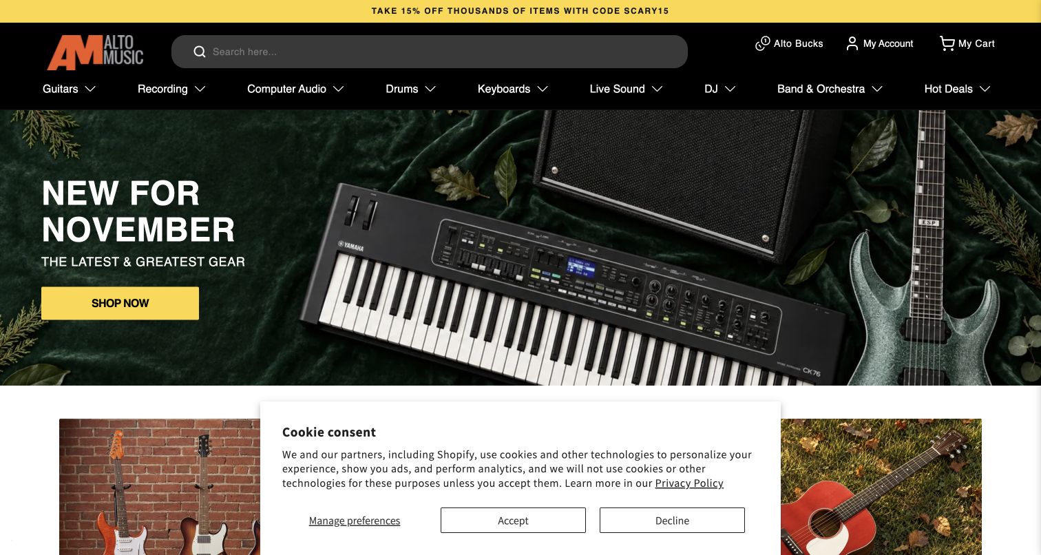
Alto Music’s retained November 4 opening combines an orange wordmark with a long search field on a black header. Recording, Computer Audio and Live Sound are distinct navigation choices among the instrument departments. The main campaign shows a keyboard, amplifier and guitar against a dark green backdrop, with a yellow action that matches the upper offer strip. The visual system is consistent, but the seasonal message remains broader than a customer’s audio task. A cookie notice overlaps the lower content in the captured state.
What you can learn
Make audio departments explicit even when instruments dominate a campaign image. Use consistent action styling and precise category names so an interface buyer or live-sound customer can enter without following the seasonal promotion.
Pros
Recording, computer audio and live sound are separated clearly.
The wide search field accommodates precise equipment names.
Cons & considerations
The hero does not explain differences between the audio departments.
The captured privacy panel hides part of the content below the campaign.
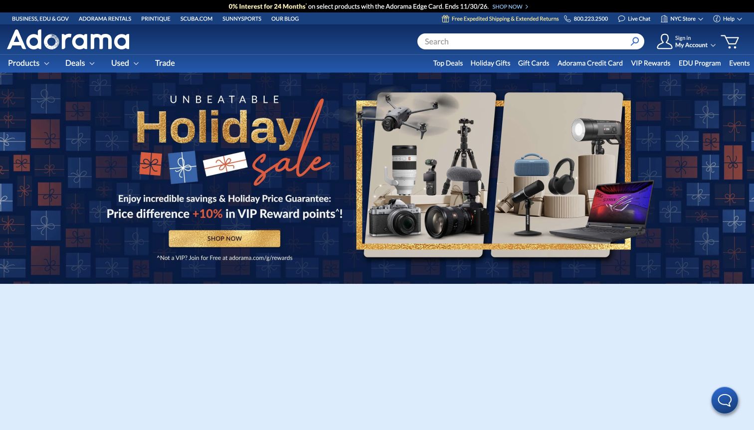
Adorama’s retained November 4 holiday composition includes microphones, headphones and a speaker alongside cameras and a computer. This makes the audio offer visible even though the store covers several creative disciplines. Products, Used and Trade remain distinct header routes, with search and specialist services above. A gold shopping button contrasts against the deep blue campaign. The design unifies a broad assortment, but multiple utility and promotional strips make the header dense, and the opening offers little detail about audio compatibility or recording use.
What you can learn
Show related equipment families together when customers build a complete creative setup, but keep audio departments and used-stock options easy to reach. A coordinated campaign should lead to precise product information rather than substitute for it.
Pros
Audio products are recognisable within the wider campaign composition.
Used and trade routes sit beside ordinary product shopping.
Cons & considerations
Stacked utility and promotional rows make the header crowded.
The broad hero delays specialised audio comparisons and compatibility guidance.
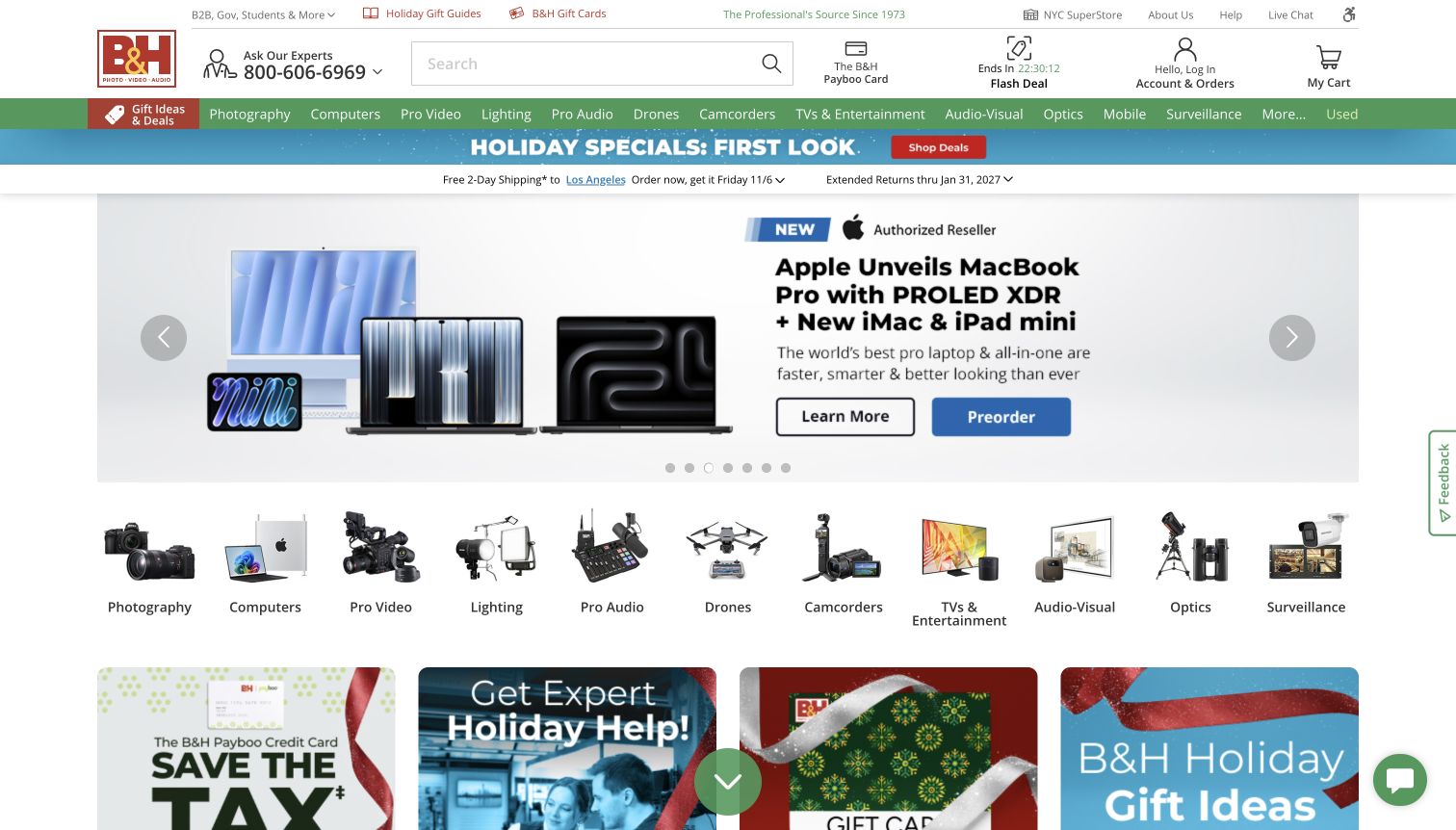
B&H’s retained November 4 capture places expert telephone help beside its logo and search field. Pro Audio and Audio-Visual appear in the green department row and again as illustrated shortcuts below the opening computer campaign. Those repeated routes keep audio discoverable even when another department occupies the hero. Learning and preorder actions are separated within the campaign, while shipping information has its own narrow band. The layered organisation is practical, although it asks the visitor to scan several horizontal groups before reaching product details.
What you can learn
Keep specialised audio departments visible independently of the rotating homepage campaign. Combine literal category names with recognisable equipment images, and provide expert help for customers comparing technically dependent products.
Pros
Audio remains visible in both text and illustrated department navigation.
Expert assistance is prominent beside search.
Cons & considerations
Repeated department layers use substantial vertical space.
A campaign for another equipment category can distract an audio-focused visitor.
Kegan is a freelance web designer and developer with 15+ years of experience helping businesses turn complicated website requirements into clear, maintainable digital experiences. He works directly with clients from planning and design through development, launch, and ongoing support.
For audio equipment store website design, his development approach focuses on product comparisons, listening and demonstration appointments, new and used inventory, and clear specialist service information. The scope can be a targeted improvement or a complete custom build, with responsive layouts, thoughtful content structure, and integrations chosen around the people using and maintaining the site.
Show 3 other audio equipment store website designersHide other audio equipment store website designers
Plan around systems, individual components and ongoing ownership
Map the main purchase contexts
List the listening and recording tasks the store actually supports. Include a first system, a specific replacement, a used-equipment purchase and a service enquiry. Identify where each task needs product data, explanation or a person. Build the catalogue’s main routes around those differences before choosing a promotional layout.
Model equipment information consistently
Select representative products across speakers, amplifiers, headphones, interfaces or other real departments. Define model identifiers, variants, connection details, included items and condition fields. Decide which comparisons are useful and which require explanation. Keep temporary offers separate from the enduring facts that make equipment understandable.
Give events and changing stock an owner
Listening events, demonstrations, trade-ins and unique used products change frequently. Define who updates availability, expires events and checks service information. Link campaigns to maintained records rather than recreating important details in artwork. An attractive homepage should remain useful when its current promotion is over.
The editing job behind the design
Choose tools around catalogue accuracy and customer assistance
Assess model search, structured specifications, product variants, condition records, comparison, local availability and advice publishing before selecting a commerce platform. A store with unique used components has different content needs from a brand selling a small fixed range. Test the system with representative awkward products, not just the easiest item in the catalogue.
Keep service and editorial content maintainable alongside products. Public technology observations can identify some page-level signals, but they do not reveal the full inventory, payment or installation-management system. Preserve that distinction when comparing these stores and when deciding which tools your own team needs.
Our WordPress website examples offer a separate look at publishing approaches. A visible platform label is evidence for that named page, not a guarantee that the same system will suit your requirements.
Before the public launch
Audio equipment store website launch checklist
Make exact brands and model identifiers searchable.
Separate home, studio, live, portable and vehicle audio where the assortment requires it.
Explain inputs, outputs and documented compatibility in consistent product fields.
Distinguish new, used, restored and demonstration stock.
Record included accessories and specific condition for individual used items.
State whether availability refers to online stock, a showroom or a future shipment.
Make audition, setup, repair and installation services distinct from ordinary shopping.
Keep learning and support routes visible alongside product departments.
Give demonstrations and seasonal campaigns an accurate destination and expiry owner.
These checks are a project checklist, not a performance, legal, security, or accessibility certification. Test real journeys with the people responsible for the website before making claims about the result.
Sources & editorial method
How this collection was selected and reviewed
We reviewed official public audio-store pages and their original captures, with new observations on November 11, 2026 and retained screenshots dated November 2 or November 4 where shown. The retained images were inspected again for this collection; they are not presented as new live captures. Hawthorne Stereo is the Editors Choice for its distinctive listening-room presentation and clear new, used and advice routes. This is an editorial website-design selection, not a vote-based ranking or service-quality endorsement. Reviews cover the observed page state, including notices and dated campaigns. Bounded technology audits preserve earlier records and access limitations without inferring hidden systems.
Each example links to its actual source page. Screenshots are direct browser captures with their own capture dates; moving imagery, announcements and live designs can change. The notes describe observable design choices and conditional tradeoffs, not measured traffic, conversion results, service quality, or accessibility conformance.
Technology labels use public page metadata, asset evidence, or explicitly cited platform documentation. Platform documentation is not a complete current deployment audit. A component reference may be legacy or unused; it is not a complete backend inventory. Unknown stacks are omitted. These sites are editorial examples, not our client portfolio.
Written, Edited and Curated are separate editorial records, not timestamps advanced by a rebuild. Website designs and imagery belong to their owners. See our editorial standards or suggest a correction.
Questions worth asking
Audio Equipment Store website design questions
What should an audio store homepage prioritise?
Give visitors clear equipment departments, exact-item search and useful assistance. Separate listening and recording contexts when they require different products. A campaign can introduce the store, but it should not hide the permanent routes into the catalogue.
How can a website help customers choose compatible equipment?
Use consistent, manufacturer-supported specifications for connections, formats and relevant requirements. Explain technical terms and provide a clear advice route where a system decision needs more context. Do not imply that appearance, price or a brand badge proves compatibility.
How should used audio equipment be presented?
Give each item accurate condition, included-accessory and availability information. Distinguish used, demonstration and restored stock. Explain any inspection or support programme rather than relying on a label that customers may interpret differently.
Should demonstrations and auditions appear on the homepage?
They can be useful when they are a real part of the store’s service. Show the location, timing and booking requirements clearly, with a permanent route to product information. Remove or replace dated events promptly.
Can one store serve both home audio and professional recording customers?
Yes, if the navigation makes those contexts explicit and product information supports their different requirements. Use dedicated departments and relevant advice rather than expecting a general promotional hero to explain the whole assortment.
Do public technology observations reveal a store’s complete commerce system?
No. They describe limited public page signals or documented associations. Inventory, payments, customer support and other operations may use systems that are not visible. Choose tools around your own catalogue and workflow instead of assuming another store’s full architecture.
Borrow the clear product routes, useful advice and credible equipment presentation. Make the details that determine a successful audio purchase as easy to find as the campaign that first attracts attention.