Best Graphic Designer Websites of 2026 (15 Real-World Examples)
Graphic designer websites that make the visual work understandable
A graphic design portfolio should reveal a point of view without making the visitor decode the practice. These examples balance typography, identity, illustration, editorial applications and practical context in different ways.
Graphic design is a wide discipline, so the first useful decision is to explain what kind of work the practice actually takes on. A studio focused on cultural identities has a different portfolio from an illustrator, a packaging specialist or a team building digital brand systems. A distinctive interface can introduce the designer’s taste, but a clear account of assignments, responsibilities and applications makes that taste useful to a prospective collaborator.
This collection looks at public website presentation rather than judging the designers’ professional quality or suitability for a particular brief. Some examples are individual-led studios; others are broader agencies with documented graphic and identity work. Study the relationship between visual expression and explanation, then adapt the underlying idea to your own material.
Before the examples
What makes good graphic designer website design in 2026?
Make the discipline easy to identify
Describe the actual practice in ordinary language near the work. Typography, identity, illustration, editorial design, motion and packaging can overlap, but a buyer should not need to infer the entire service offer from a collage. Use precise project captions and a short service description rather than an exhaustive list of fashionable terms.
Preserve the project’s context and credits
Explain the brief, your role, the relevant applications and the collaborators. A beautiful poster or rendered package does not establish who wrote the copy, drew the image, designed the type or produced the object. Distinguish commissioned work, self-initiated experiments and unused concepts so the portfolio remains clear and credible.
Use expressive design without hiding the interface
The portfolio can be playful, restrained, theatrical or highly typographic. Work, information and contact still need recognizable routes. Keep essential content readable without a hover effect, custom cursor, video sequence or sound. A useful alternative state is part of the design, not an admission that the original idea failed.
The collection · 15 examples
15 graphic designer websites worth studying
Compare the studio introduction, project labels, image sequencing, typography and contact route. Look for a useful design decision you can explain, not merely a surface treatment you can reproduce.
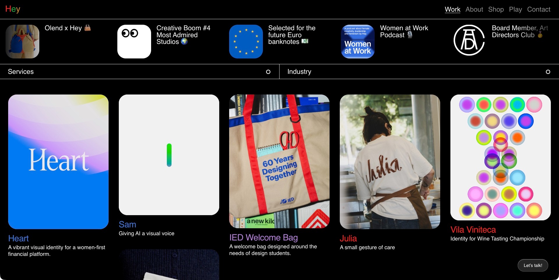
Hey’s official work directory uses a black background, a small multicolored wordmark and ordinary Work, About, Shop, Play and Contact navigation. Services and Industry filters sit above a five-column project grid. The saved frame includes Heart, Sam, an IED welcome bag, Julia and a colorful Vila Viniteca application, each with a readable title or short explanation. A studio-news strip occupies the space above the filters, but the projects remain the main evidence. Current first-party services explicitly identify typography, illustration, identity, motion, packaging and editorial work. The directory is useful for its combination of visual variety and practical project identification.
What you can learn
Let different projects retain their own graphic language while the portfolio supplies consistent labels and routes. A short explanation can make a beautiful thumbnail meaningful. Give visitors filtering tools without removing an ordinary all-work view or making them understand the studio’s taxonomy before seeing anything.
Pros
Readable titles and short descriptions connect the images to actual assignments.
Service and industry filters offer complementary ways into a varied portfolio.
Cons & considerations
A five-column grid needs a thoughtful smaller-screen arrangement.
The news strip can compete with the work if it grows too tall or becomes difficult to scan.
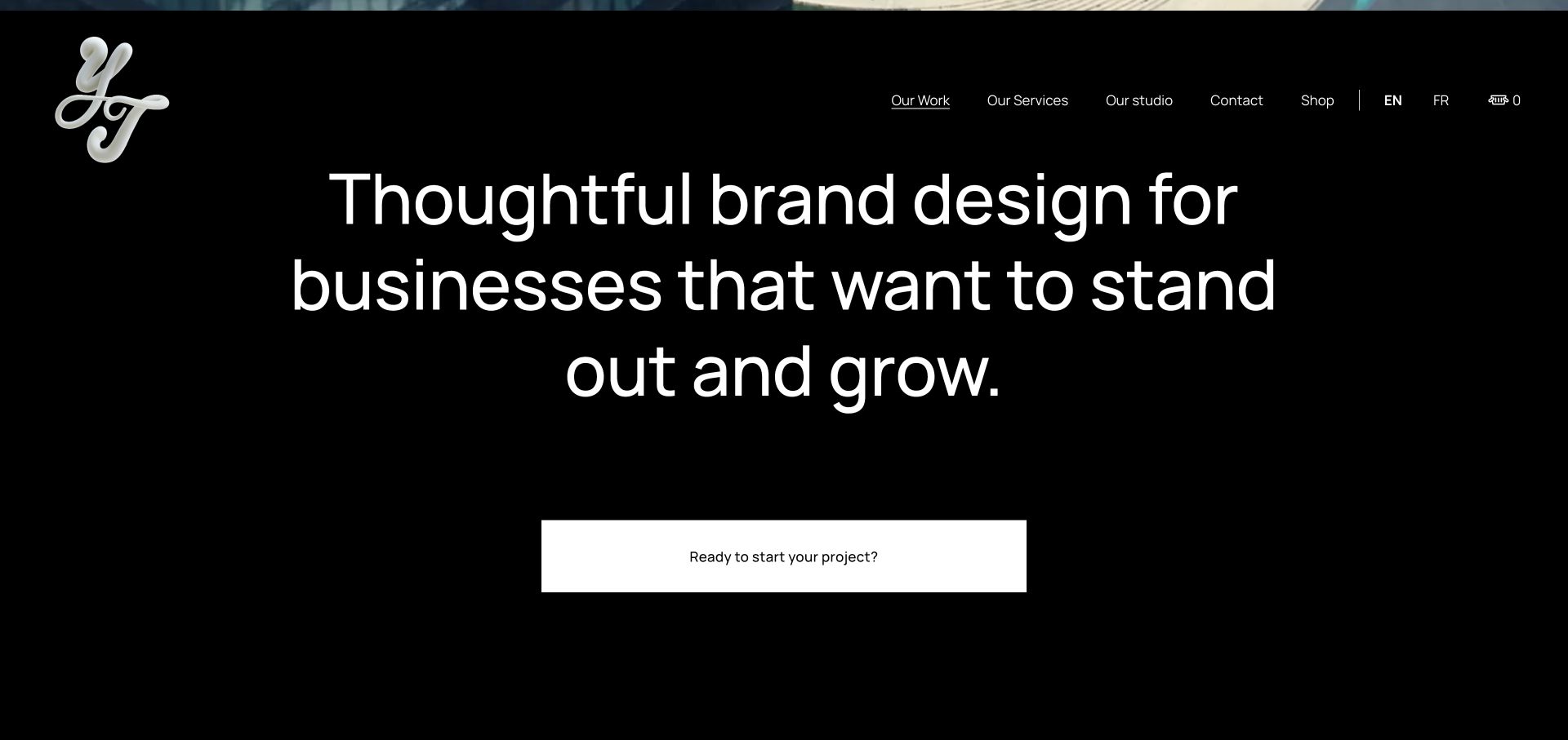
Yarza Twins combines a sculptural white studio mark with a very large brand-design introduction on a black background. The retained view sits below the opening film and keeps work, service and studio routes visible in a horizontal navigation. The unusual mark supplies expression while the headline remains comparatively direct. Current first-party services explicitly include graphic design, typography, illustration and editorial work, rather than relying on the screenshot to imply those capabilities. This is useful for a graphic-design portfolio because it shows a strong own identity without asking every navigation label to become an experimental graphic object.
What you can learn
Give the designer’s own visual language a clear role and let ordinary text explain the practice. A memorable mark can establish authorship, but project captions should still identify whether the work involved type, illustration, layout or a wider identity system.
Pros
A simple black-and-white frame lets the studio mark and introduction have different visual roles.
Ordinary service navigation provides a practical route to the specific graphic disciplines.
Cons & considerations
A visitor seeking immediate application detail will need to continue into the work.
If the typography becomes too large on mobile, the practical introduction could require excessive scrolling.
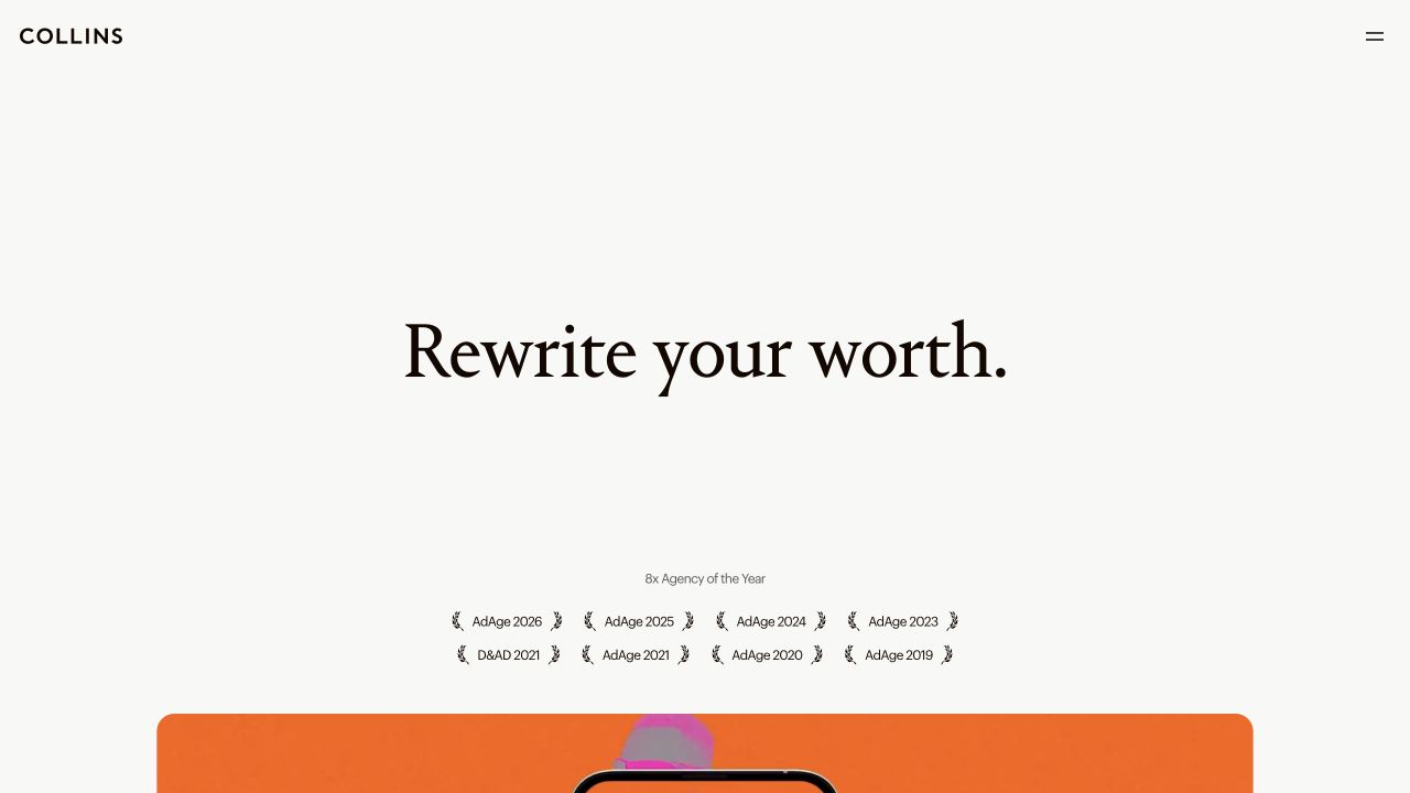
COLLINS uses an off-white background, a small black wordmark and a centered serif statement, with a compact recognition row below. An orange project tile begins at the lower edge rather than filling the screen with multiple competing previews. The frame demonstrates typographic restraint, not an absence of visual direction. Current first-party cases document identity and related graphic applications. A graphic designer can study how the relative scale of the wordmark, proposition and emerging project creates a reading sequence, while remembering that the broad statement alone does not explain the designer’s role in any particular assignment.
What you can learn
Use hierarchy to decide what the visitor reads first, then let project evidence supply the detail. A restrained opening can create anticipation, but the case pages need scope, credits and specific visual decisions instead of repeating abstract propositions.
Pros
A small set of elements creates a deliberate typographic reading order.
The emerging color tile signals a transition from introduction to actual work.
Cons & considerations
A very sparse opening may not immediately identify a narrower graphic-design specialty.
If the following project context is equally abstract, the visitor may struggle to understand the practical contribution.
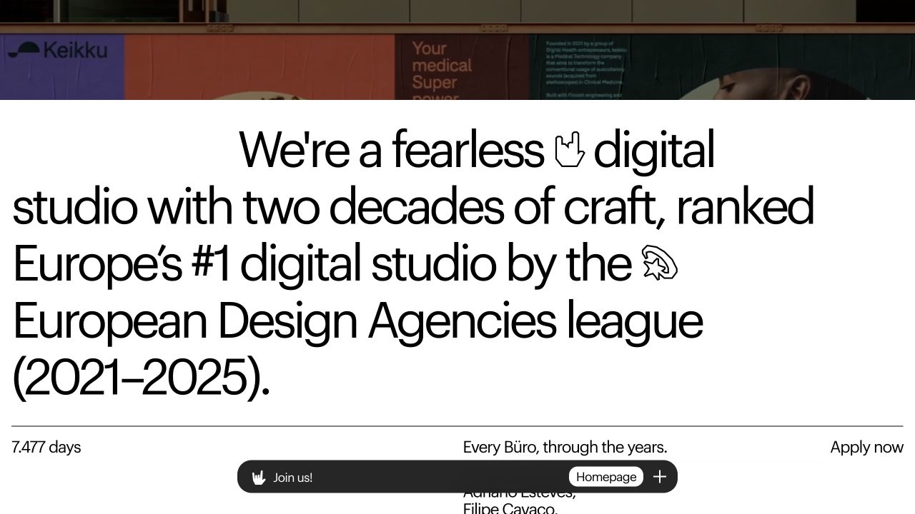
Bürocratik’s retained scrolled section places oversized black text on white, with illustrated hand and star motifs inserted into the sentence. A thin rule separates smaller studio information, and a persistent black bottom bar belongs to the normal interface. The visual character comes mainly from type, spacing and a few graphic interventions rather than an elaborate photograph. Current first-party information identifies typography, branding and work across screen and paper. This makes the screen useful for studying how a studio can demonstrate a graphic point of view in its own introduction while still providing a secondary information layer.
What you can learn
Let a typographic idea carry the visual expression, but keep the difference between decoration and interaction clear. Pair the large statement with readable project labels and a useful description of the actual practice. A distinctive sentence is an introduction, not a substitute for explaining assignments.
Pros
Inline graphic motifs give the typography a recognizable voice without a dense collage.
The smaller information layer provides a calmer reading pace after the large statement.
Cons & considerations
Large display type may produce awkward line breaks when the viewport changes.
A persistent bottom interface can compete with short project descriptions on smaller screens.
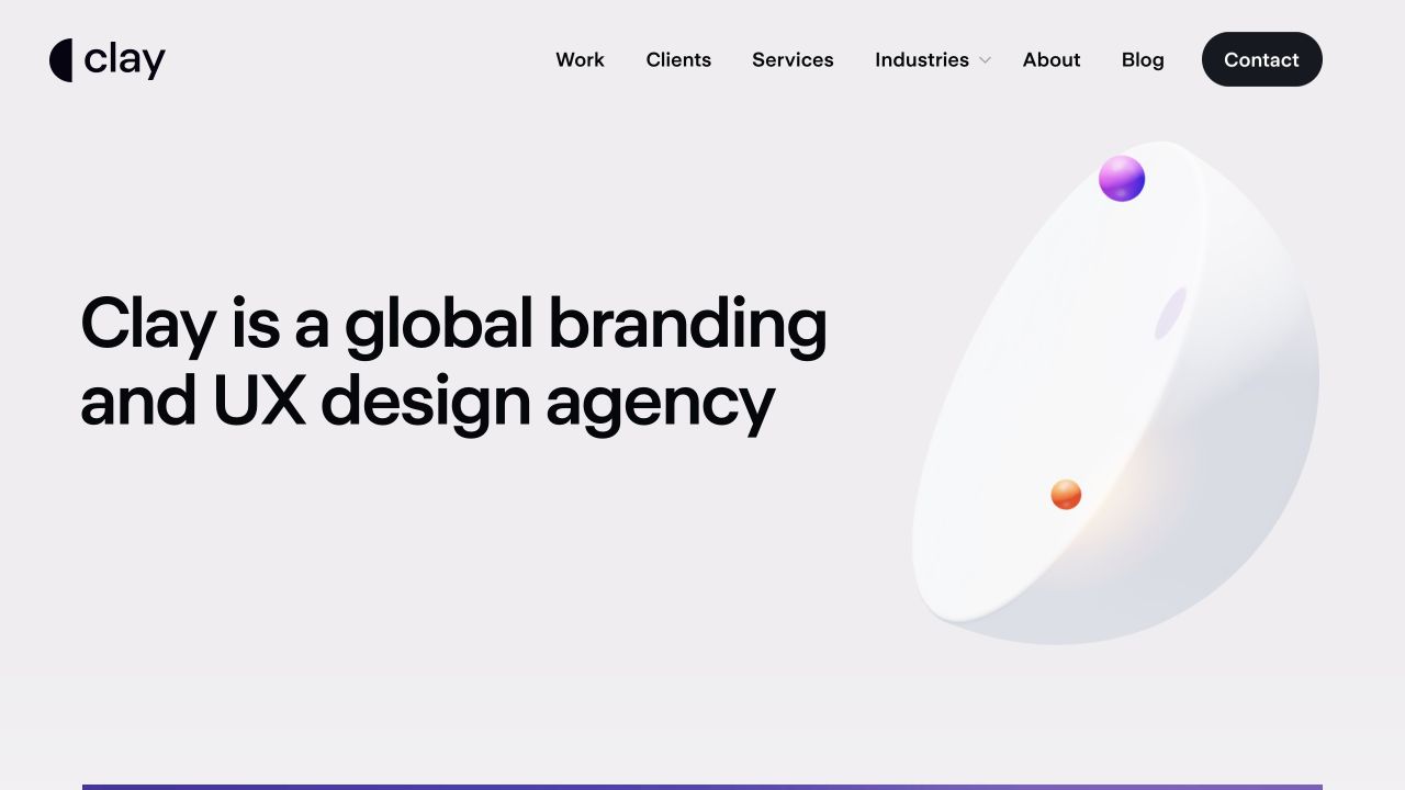
Clay sets a direct branding-and-UX introduction beside a soft three-dimensional composition on pale gray. The purple and orange forms occupy one clear visual territory, while the wordmark and ordinary work, service, industry and contact links remain above. Current first-party information includes illustration, iconography and two- and three-dimensional content alongside identity and product work. The captured forms are the agency’s visual presentation, not a named client project in this frame. For graphic designers, the useful pattern is a limited expressive accent within a stable information layout rather than making every element compete for attention.
What you can learn
Choose one dominant visual idea and give it room, while letting text identify the real disciplines. A graphic portfolio should connect that visual confidence to specific assignments and credits. Do not imply that an abstract three-dimensional motif demonstrates all the studio’s illustration or identity work.
Pros
The artwork and explanatory text occupy separate, understandable areas.
Persistent navigation makes the practice’s different disciplines discoverable.
Cons & considerations
A broad service inventory can need careful simplification in the mobile header.
An abstract opening still needs project evidence to show how the visual skills apply to actual briefs.
Platform source: Public page or referenced asset source. Public source observed 2026-11-03 contains S3-hosted touch-icon link. This establishes a public object reference or dependency, not bucket ownership, origin hosting, private storage or successful execution for every visitor. Platform evidence is separate from the direct website screenshot and is not a complete current infrastructure audit.
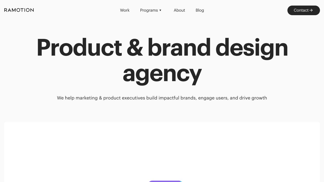
Ramotion uses a large centered product-and-brand design heading, a short audience description and a small set of navigation links on a white page. A dark Contact pill provides a contrasting action, while only the beginning of a rounded project card appears beneath the introduction. Current first-party service information explicitly includes visual identity and iconography. This is a useful graphic-design reference for hierarchy and restraint, not a complete application showcase in the captured frame. The typography explains the broad discipline first; the project archive must then clarify the narrower responsibilities and visual systems behind that proposition.
What you can learn
Use a clear discipline statement to orient the visitor, then give each project enough context to distinguish identity, iconography and product contributions. A minimal hero should make the portfolio easier to approach, not require a buyer to infer every service from a large headline.
Pros
A small navigation inventory keeps the central introduction visually clear.
The contact action remains distinct from the exploratory work links.
Cons & considerations
The first view contains little application detail for a buyer comparing graphic styles.
A broad product-and-brand statement needs more precise case explanations to avoid an ambiguous remit.
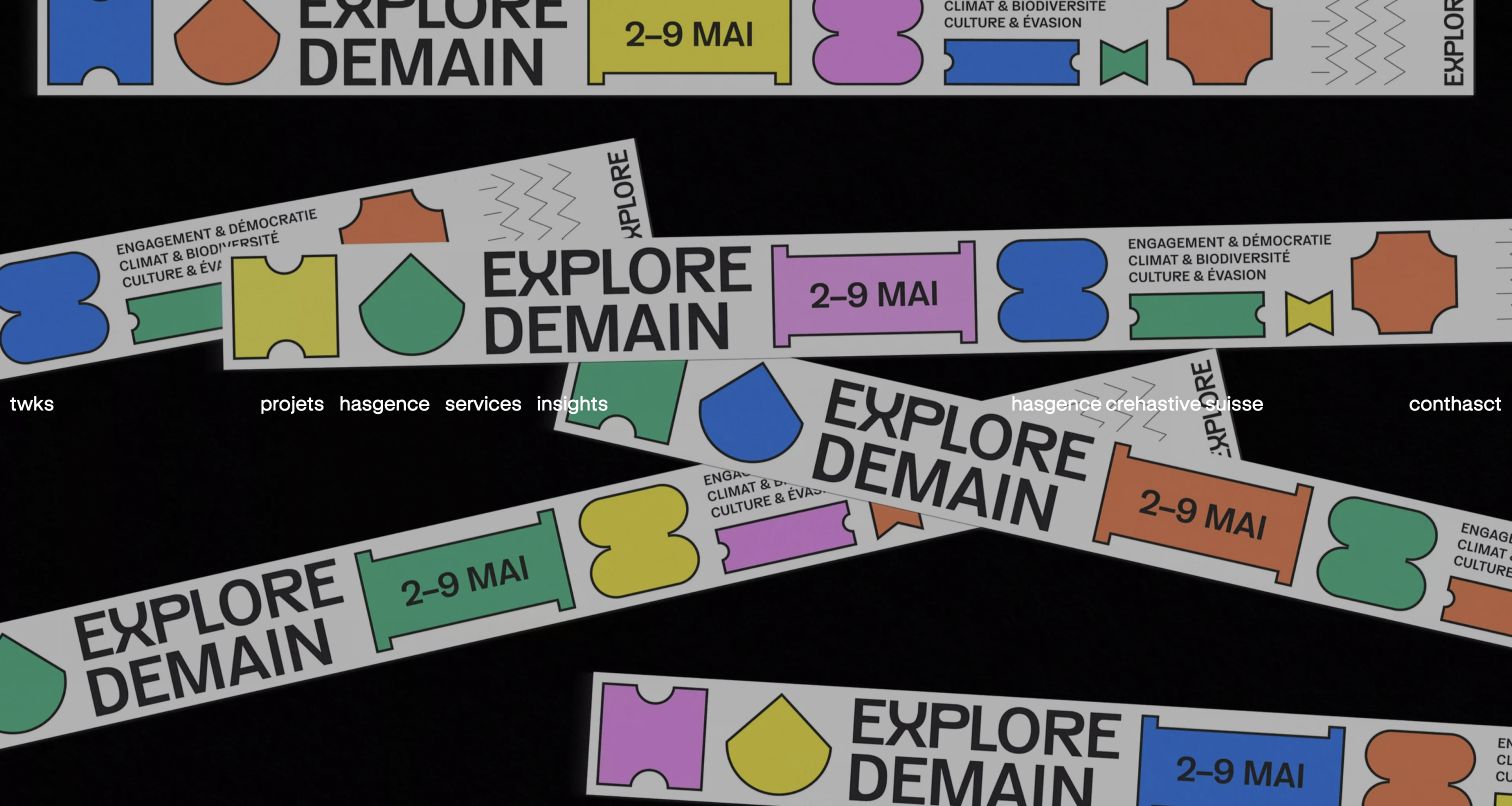
twks’ retained frame uses overlapping colorful ribbons and graphic forms on a dark field, with a compact white navigation panel above the artwork. The featured visual system feels closer to a campaign application than a neutral agency slide. Some lettering is irregular in the saved frame, and the original capture record identifies a browser English-translation state; it would be misleading to treat that still as a test of the original language or full motion sequence. Current first-party information confirms branding, campaign and digital work. The useful graphic-design lesson is the distinction between an expressive project surface and the interface used to explore it.
What you can learn
Let the featured graphic system remain expressive while the navigation stays readable and predictable. Provide project names and explanations outside changing artwork, especially when typography animates or translation can affect it. A portfolio still records one state, not the complete behavior of the system.
Pros
The project-led composition provides a distinctive visual introduction.
A separate white navigation panel helps distinguish ordinary controls from the artwork.
Cons & considerations
Busy graphic layers require contrast testing through all relevant states.
A captured translated animation frame cannot establish the original text’s readability or timing.
Platform source: WordPress.org Showcase. Linked script matches Fathom Analytics. Exact public source-page sample: https://twks.ch/. This identifies a public Fathom Analytics reference or response association, not private configuration, complete architecture, measured performance or successful data collection. Platform evidence is separate from the direct website screenshot and is not a complete current infrastructure audit.
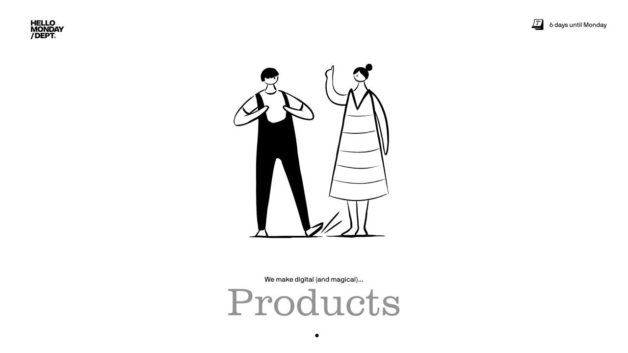
Hello Monday’s retained opening is mostly white, with a stacked studio mark, a small calendar note and a central line illustration of two people. A short introduction and an oversized gray Products label create a second typographic layer. The visible category is products, not a claim that this exact screen is an editorial-design case. Current first-party work includes identity-related projects alongside the broader multidisciplinary practice. For graphic designers, the useful observation is how a simple drawing can establish tone without filling the first screen with decorative elements or obscuring the agency’s recognizable identity.
What you can learn
A restrained illustration can introduce a visual personality, but it still needs a route to actual assignments. Keep the distinction between the studio’s own graphic language and the client work clear, and label changing disciplines accurately instead of making a single captured state stand for every service.
Pros
The loose drawing gives the introduction character without a crowded composition.
Large and small text create distinct reading levels on a simple background.
Cons & considerations
The broad practice needs more context than this first screen provides.
A changing category label may make a specific graphic specialty less obvious to a new visitor.
Platform source: Public page or referenced asset source. Public source observed 2026-11-03 contains Hello Monday webpackChunkHM_Starter runtime. This identifies that bundle or dependency, not every page component, build configuration or backend. Platform evidence is separate from the direct website screenshot and is not a complete current infrastructure audit.
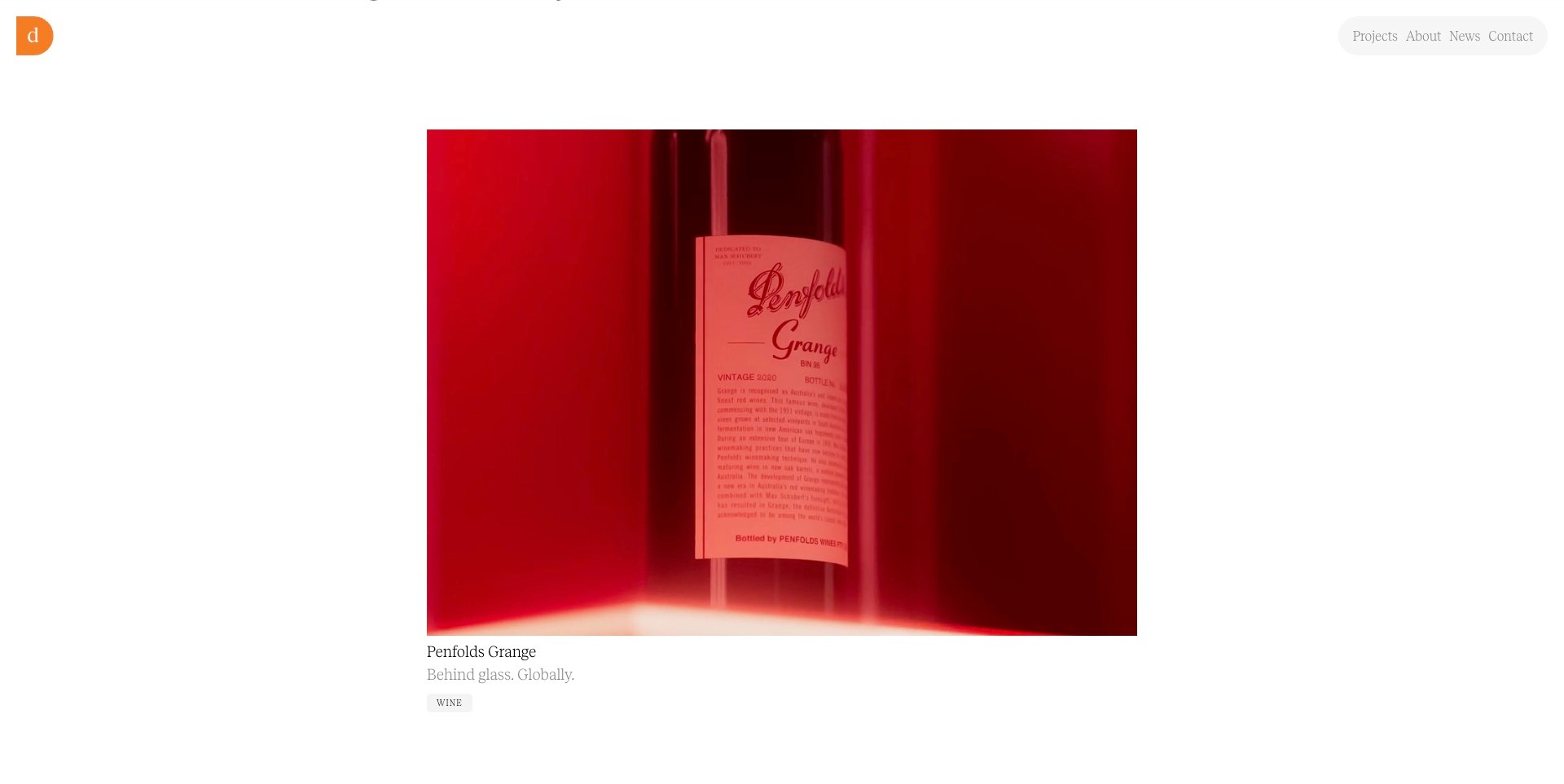
Denomination’s saved scrolled homepage places a large red Penfolds Grange image on white, with a small orange studio mark and a compact navigation pill above. The project title, short descriptor and Wine label sit below the image instead of being embedded in it. The photographed label contains detailed lettering, but the surrounding page remains restrained. Current first-party work establishes branding and packaging as genuine disciplines. A graphic designer can study the relationship between an expressive application image and a quiet portfolio frame without mistaking the frame for evidence about the product’s printed claims or the studio’s complete assignment.
What you can learn
Keep the portfolio’s own typography subordinate to the work when the application already contains rich visual detail. Identify the project in ordinary text and use the case page to explain lettering, layout, identity and other responsibilities. A dramatic image is more useful when its context remains readable.
Pros
Separate project text makes the image identifiable without decoding the photographed label.
A simple white frame gives the application’s color and detail a clear visual territory.
Cons & considerations
A single detail image needs further views to explain a complete graphic system.
Very light navigation styling needs contrast and focus testing beyond the captured still.
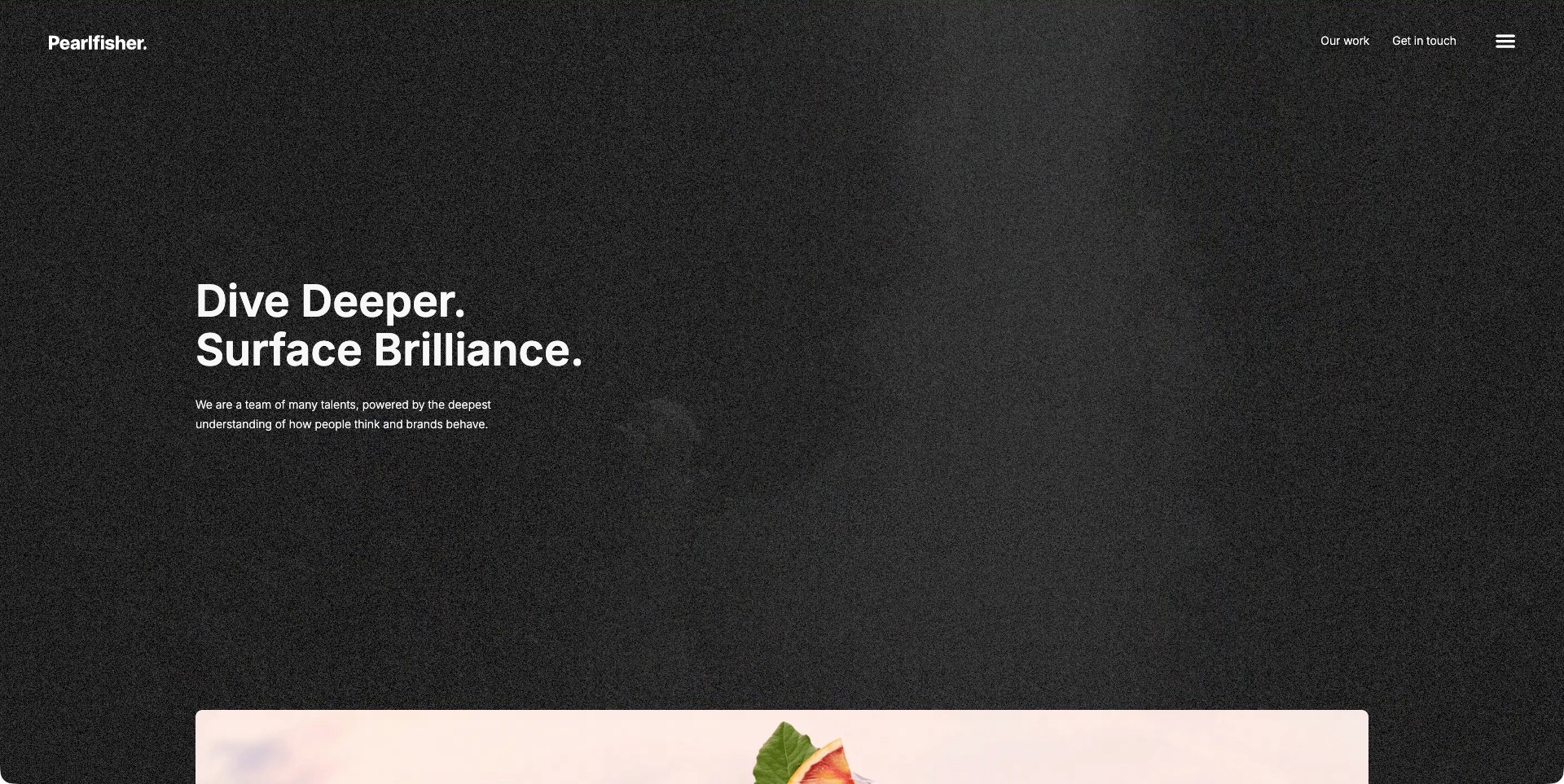
Pearlfisher sets a compact white wordmark and a short proposition against a textured dark field. The supporting sentence is small, while direct work and contact routes remain visible in the header. Only the top edge of a colorful project appears below. Current first-party information establishes a design practice with identity and packaging work. The frame is useful for graphic designers because it creates a deliberate pause before the visual archive, rather than forcing every discipline into an icon list or dense thumbnail collage. It is an introductory composition, not a demonstration of every service in the practice.
What you can learn
Use type scale and space to define a calm agency frame, then let individual projects carry their own visual language. A quiet first screen should make the work easier to approach and should lead to precise case explanations, not a sequence of equally abstract statements.
Pros
Few competing elements make the typographic hierarchy easy to identify.
Work and contact links give the restrained opening practical destinations.
Cons & considerations
A visitor comparing visual styles must continue before seeing substantial project imagery.
A similar dark treatment can become monotonous if the subsequent archive lacks clear variation and context.
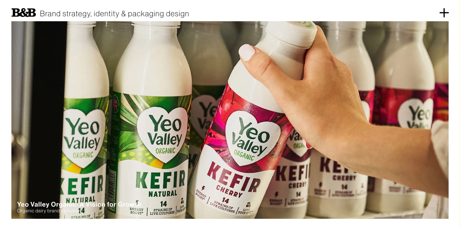
B&B Studio places a plain service description above a large Yeo Valley image showing green and red product variants within a shared white heart-shaped identity. A hand selecting one bottle provides a human scale cue, while a small project title anchors the lower corner. The layout combines a compact agency wordmark with a visually rich client application. Current first-party capabilities include visual identity, visual language and packaging. The useful graphic-design lesson is how the page lets the viewer compare repeated elements and differences without making the studio’s own presentation compete with the client’s palette.
What you can learn
Choose an application view that reveals the graphic rule, not just the attractiveness of one object. A range can explain identity consistency and differentiation at the same time. Follow with project context and credits so the viewer knows which decisions belonged to the studio.
Pros
The range photograph makes repeated identity elements and variant colors visible together.
The plain header gives the image a clear professional context.
Cons & considerations
A photograph of packaging cannot explain the whole visual system without supporting material.
The caption needs to remain readable against every featured image state.
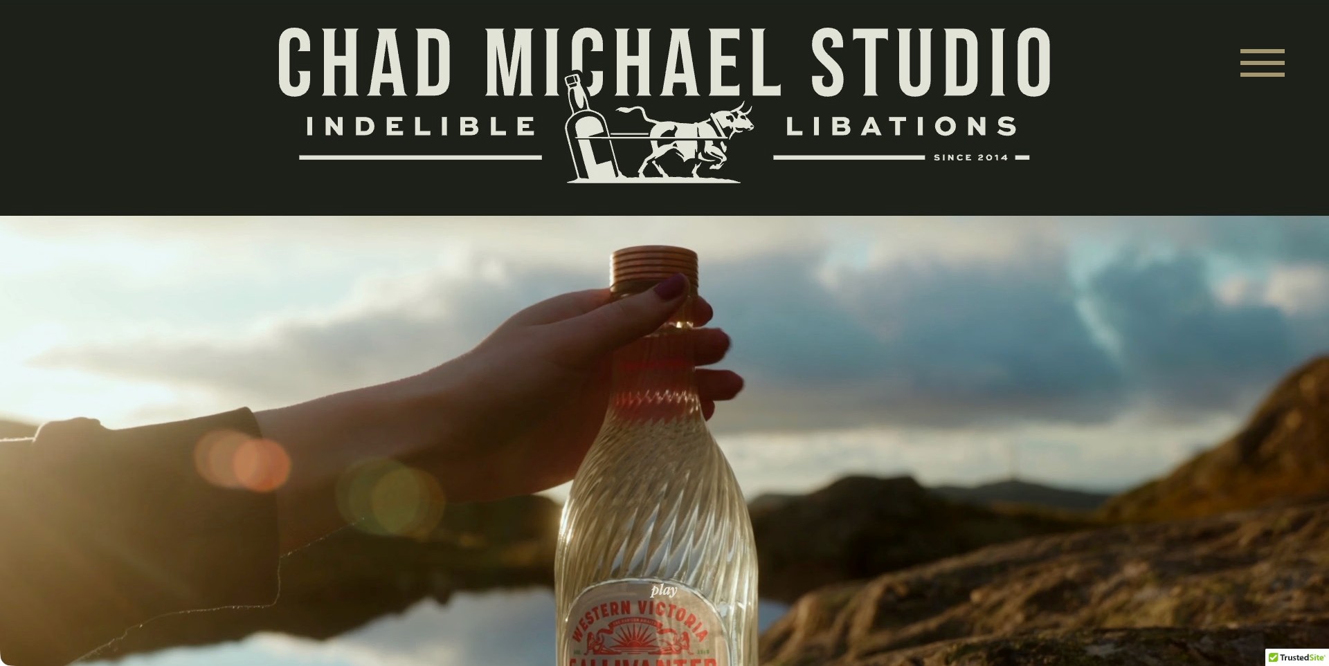
Chad Michael Studio’s cream-on-olive header combines tall lettering, small supporting type and an illustrated bottle-and-animal emblem. Beneath it, a product film frame shows a spirits bottle in a coastal landscape. The studio identity has enough scale to be studied as a graphic composition in its own right. Current first-party material establishes a spirits branding and packaging practice, rather than leaving that category to inference. The example is useful for understanding how lettering, emblem and supporting rules can introduce a studio while a separate image area carries the client application.
What you can learn
Build a coherent hierarchy inside an expressive studio identity instead of adding unrelated decorative motifs. Then distinguish that own-brand expression from the different client assignments in the archive. A specialist visual voice still needs precise project explanations and credits to show how it responds to actual briefs.
Pros
Lettering, emblem and small supporting type work together as one own-studio identity.
A separate project image keeps the client application distinct from the header.
Cons & considerations
A large identity header can reduce the amount of project evidence visible initially.
A strong specialist aesthetic needs broader case context to demonstrate variation rather than repetition.
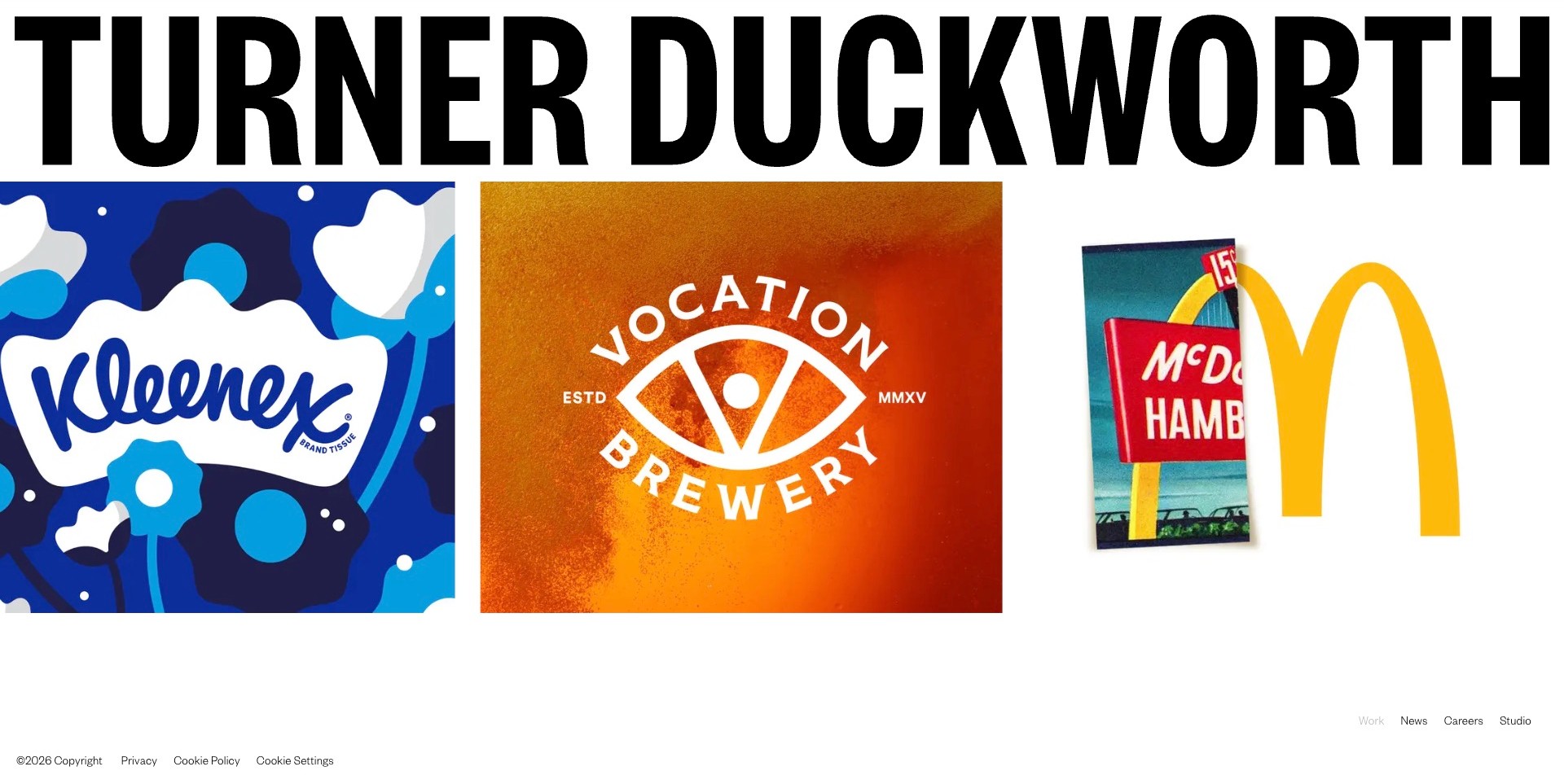
Turner Duckworth’s large black wordmark introduces three contrasting tiles: blue Kleenex graphics, an orange Vocation Brewery identity and a McDonald’s application. The simple white background preserves the differences between those client systems. Small navigation at the lower right and policy links at the lower left leave the work visually dominant. The current official Sprite case documents wordmark changes, custom display typography and identity applications, establishing a substantive graphic-design remit. The opening is useful as a visual index, but the familiar brands are not a substitute for explaining the agency’s actual role in each assignment.
What you can learn
Use a limited selection of contrasting applications to demonstrate range without overwhelming the viewer. Let each identity retain its palette and typography, then provide case studies that explain the decisions behind it. A bold agency name should frame the work rather than absorb its visual character.
Pros
The three tiles demonstrate different graphic languages within one consistent structure.
A neutral frame avoids forcing every client into the agency’s own palette.
Cons & considerations
Navigation near the bottom edge can be missed on a short screen.
Familiar logos require project context before they establish the designer’s precise contribution.
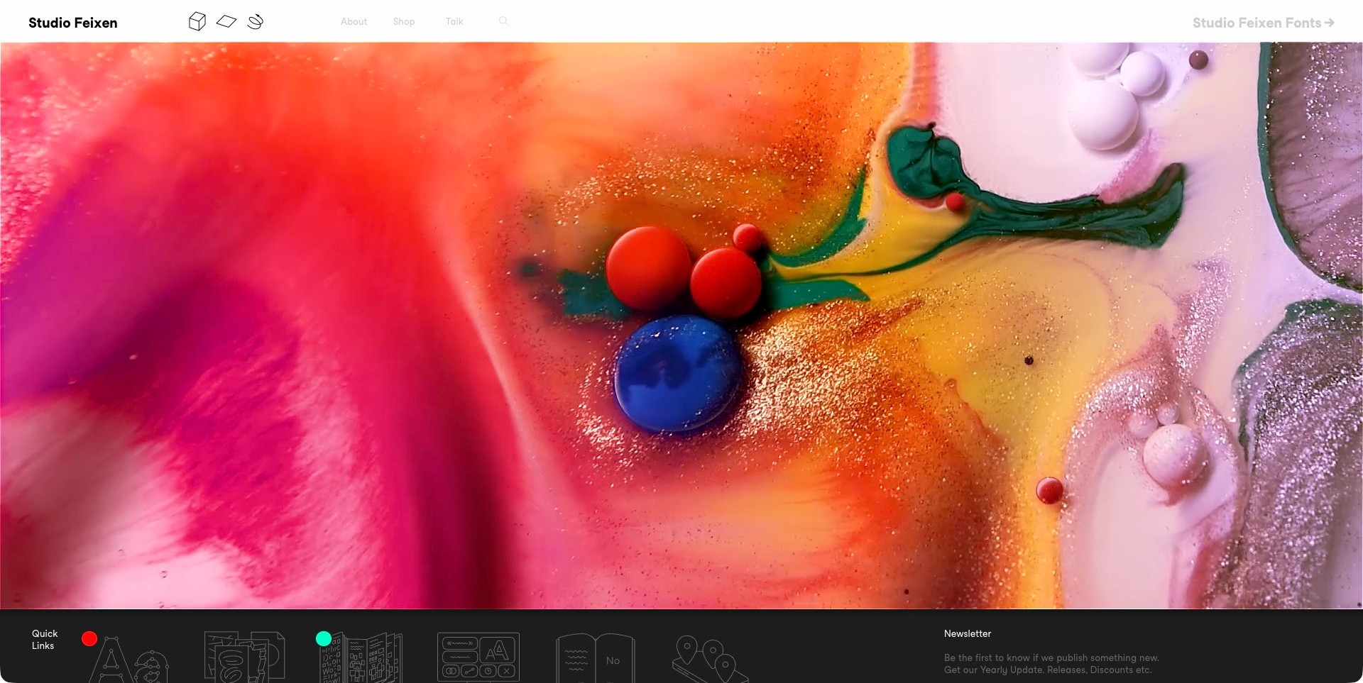
Studio Feixen’s saved homepage frame is dominated by a close abstract composition of bright pigments, translucent surfaces and rounded colored forms. A slim white header contains the studio name, small graphic controls and ordinary About, Shop and Talk labels. A dark quick-links section begins below the image. This is the actual saved color composition, not another frame from the changing hero. Current first-party About information establishes the Lucerne studio’s graphic-design, typography, illustration and layout work. The useful pattern is the contrast between a highly expressive visual field and a comparatively restrained interface, rather than a claim that the image represents a particular client assignment.
What you can learn
Use an expressive image to establish a visual sensibility, then make the practice and project context easy to find in ordinary text. Keep the header readable and provide a useful still state. An atmospheric opening does not replace a case explaining the designer’s responsibilities.
Pros
The large image gives color, texture and form enough space to be studied.
A separate header distinguishes the portfolio interface from the featured visual material.
Cons & considerations
Some pale header labels need contrast checking in the actual implementation.
A visitor seeking a specific discipline or client case must explore beyond the abstract opening.
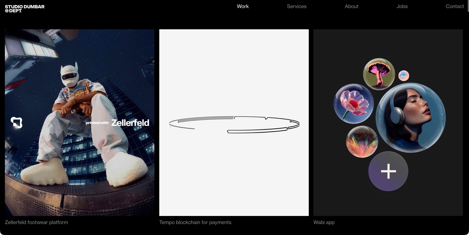
Studio Dumbar’s official work directory places a small white studio mark and ordinary navigation above three large project tiles on black. The retained frame shows a helmeted person in the Zellerfeld application, a thin outlined graphic in the Tempo tile and a cluster of photographic bubbles for Wabi. The captions identify the assignments beneath the images. These are the actual saved project states, not a complete account of the associated animations. Current first-party services establish visual design, branding, motion and related graphic systems. The page is useful for comparing how different visual languages can share one clear portfolio structure without being made stylistically identical.
What you can learn
Use consistent spacing and project labels to unify a varied body of work, while allowing each client system to retain its own character. Provide case explanations and useful still states so the work remains understandable outside a moving preview.
Pros
Large separate tiles allow different applications to be compared without a dense collage.
Project captions connect each visual state to a named assignment.
Cons & considerations
Some preview states need the case page to explain what the graphic is demonstrating.
Dark captions and navigation require adequate contrast and visible focus beyond a screenshot.
Kegan is a freelance web designer and developer with 15+ years of experience helping businesses turn complicated website requirements into clear, maintainable digital experiences. He works directly with clients from planning and design through development, launch, and ongoing support.
For graphic designer website design, his development approach focuses on readable project collections, clear client and collaborator credits, useful design-service information, considered image presentation, and straightforward commissioning enquiries. The scope can be a targeted improvement or a complete custom build, with responsive layouts, thoughtful content structure, and integrations chosen around the people using and maintaining the site.
Show 3 other graphic designer website designersHide other graphic designer website designers
Plan a graphic design portfolio around the work you can actually show
Decide what the portfolio needs to communicate
Write a short description of the work you want to be considered for and the responsibilities you can demonstrate. A general statement about creativity is less useful than a clear explanation of identity systems, editorial design, typography or another genuine focus. If the practice is multidisciplinary, identify the common thread without implying that every assignment includes every service. The description should help a visitor decide which project to inspect next.
Choose a small set of questions the site must answer: what you do, what the work looks like, what your role was, how a collaboration starts and how to contact you. Use those questions to evaluate the navigation before adding visual effects. The site can express an unusual point of view while still using familiar labels for the ordinary tasks a visitor needs to complete.
Select projects for different reasons
Choose projects that demonstrate different decisions rather than several versions of the same mockup. One might show a typographic system, another a publication sequence and another an identity across physical and digital applications. Record why each assignment belongs in the portfolio. A selective collection becomes stronger when every project adds evidence, rather than merely making the grid longer.
Do not publish confidential client material or imply that a concept was commissioned when it was self-initiated. A student or independent experiment can be valuable if it is labeled honestly and the design question is explained. If your contribution was one part of a larger team effort, describe that part and credit the others. Accurate boundaries do not diminish the work; they help a reader understand it.
Write captions that explain a design decision
A project title and client logo rarely provide enough context. Add a concise brief, a statement of your role and the principle joining the applications. Explain why the pictured material matters: a grid rule, a type relationship, an information hierarchy or an approach to variation. Keep this explanation readable before a long image sequence so that a visitor has a useful lens for looking at the work.
Use longer text only where there is something specific to explain. Avoid retrofitting a grand strategic narrative to a narrow execution assignment. If a result is mentioned, attribute it and explain its scope rather than treating a visual change as the sole cause of a business outcome. A portfolio is more persuasive when the explanation is proportionate to the evidence.
Prepare imagery for the actual viewing conditions
Build the image set from the material you have rights to publish. A full poster, a close typographic detail and a contextual photograph each answer different questions. Do not force every project into an identical device mockup if the work was not intended for a screen. Preserve meaningful proportions and use captions to distinguish a render, production photograph and concept presentation.
Create responsive image sizes and check small-screen crops. Text that is important to understanding the assignment should also exist as ordinary page content, not only inside an image. Write useful alternatives for meaningful visuals and avoid a gallery that can be navigated only by dragging. Large imagery is worthwhile when it reveals something; it is not a reason to send every full-resolution source file to every visitor.
Give typography and motion a readable fallback
A portfolio can demonstrate a custom typeface, variable typography, animated identity or responsive composition. Define what remains understandable before the effect starts and when it is disabled. Keep project names, navigation and contact information available as normal text and links. A changing word or custom pointer should not be the only explanation of an action.
Test keyboard focus, reduced-motion preferences, text resizing and contrast in the finished implementation. A still screenshot does not establish how a transition behaves or how a menu is announced. If a work preview uses video, provide a useful still and an intentional playback route. Let the most expressive layer add meaning rather than becoming a requirement for accessing the portfolio.
Explain the working relationship honestly
An information page should identify the actual person or studio, location where relevant, service focus and collaboration model. Explain when external specialists join an assignment instead of implying a permanent department for every discipline. Use genuine portraits or a considered alternative, not invented team members. Keep biographies current and avoid claiming a client relationship solely because you contributed through another employer or agency.
The contact page can ask for a name, reply address and a short description of the need. Let a visitor be uncertain about scope. Describe typical engagement types or a useful starting point if that helps, but do not turn the first inquiry into a detailed specification exercise. Define what happens after submission and confirm delivery truthfully; a form is not a promise of availability, price or acceptance.
Design an editorial system that protects the work
Use structured project fields for title, year, discipline, role, credits, description and media. Keep the layout flexible enough for a publication, identity or motion project without making every case a one-off page that only a developer can update. Establish useful image limits and preview behavior. The editor should be able to add a caption or correct a credit without rebuilding the composition.
Assign responsibility for publishing, client approvals, corrections and archived work. Preserve useful URLs when a project is renamed, and redirect retired pages deliberately. Review contact details and biographies as the practice changes. Backups, secure access and software updates remain necessary even when the public design is deliberately minimal or experimental.
The editing job behind the design
Choose a platform that supports the portfolio’s real content
A hosted builder or conventional CMS may be enough for a focused portfolio with editable cases and an information page. A custom frontend can make sense for a deliberate interaction system when there is a maintenance plan. Start with the media model, editing needs, accessibility requirements and budget rather than selecting a framework from the appearance of a reference.
Plan image delivery, reusable case templates, credits, redirects and preview access before choosing extensions. Keep meaningful project content and ordinary links independent of an elaborate animation. A technology visible in public source identifies an observable component, not the designer’s internal tools or the complete website implementation.
Test the actual finished site on smaller screens and with keyboard input. Check form delivery, error messages, motion preferences, image loading and text readability separately. No particular CMS, design tool or JavaScript library automatically establishes a usable portfolio.
Our WordPress website examples offer a separate look at publishing approaches. A visible platform label is evidence for that named page, not a guarantee that the same system will suit your requirements.
Before the public launch
Graphic designer website checklist
Describe the actual discipline and collaboration model plainly.
Select projects that demonstrate different useful design decisions.
Label commissioned work, experiments and unused concepts honestly.
Record your role and credit collaborators and rights holders.
Write a brief and a useful explanation before long image sequences.
Prepare appropriate overview, detail and contextual images.
Keep meaningful information available outside image-only text.
Provide keyboard-operable galleries and visible focus states.
Respect reduced-motion preferences and supply useful still images.
Make work, information and contact routes discoverable.
Keep the first inquiry short and its confirmation accurate.
Assign owners for approvals, updates, corrections, redirects and backups.
These checks are a project checklist, not a performance, legal, security, or accessibility certification. Test real journeys with the people responsible for the website before making claims about the result.
Sources & editorial method
How this collection was selected and reviewed
The editorial assessment concerns observable website presentation, project context, hierarchy and navigation. Original direct captures keep their actual dates, including earlier captures requalified through current first-party service or project information. Editors Choice identifies an interesting public design approach, not a professional recommendation, measured ranking or assessment of client outcomes.
Each example links to its actual source page. Screenshots are direct browser captures with their own capture dates; moving imagery, announcements and live designs can change. The notes describe observable design choices and conditional tradeoffs, not measured traffic, conversion results, service quality, or accessibility conformance.
Technology labels use public page metadata, asset evidence, or explicitly cited platform documentation. Platform documentation is not a complete current deployment audit. A component reference may be legacy or unused; it is not a complete backend inventory. Unknown stacks are omitted. These sites are editorial examples, not our client portfolio.
Written, Edited and Curated are separate editorial records, not timestamps advanced by a rebuild. Website designs and imagery belong to their owners. See our editorial standards or suggest a correction.
Questions worth asking
Graphic Designer website design questions
Should a designer’s website be experimental?
It can be, when the experiment communicates something useful about the practice and ordinary tasks remain accessible. Clear project labels, keyboard navigation, reduced-motion behavior and a normal contact route are compatible with an unusual visual identity.
Can self-initiated work be included?
Yes. Label it as self-initiated and explain the design question. Do not imply a commission, public launch or client relationship that did not exist. Honest experimental work can demonstrate a useful skill without being presented as commercial evidence.
How much text belongs in a visual portfolio?
Enough to explain the brief, role, important decisions and credits. Begin with a concise account, then add detail where it helps a reader understand the work. Long generic process language is not a substitute for specific project context.
Should all projects use the same image format?
A consistent frame can help, but the content should determine the useful views. A publication, poster, identity system and animation may need different proportions and sequences. Preserve the meaning of the work rather than forcing everything into a decorative device mockup.
Does a visible technology identify the designer’s creative tools?
No. A public website component does not reveal which illustration, layout, prototyping or production tools were used for the projects. Keep website technology observations separate from claims about the practice’s workflow.
Borrow a more useful project explanation, a clearer image sequence or a stronger distinction between expression and navigation. Build the portfolio around the work and responsibilities you can genuinely show.