Best Adult Education Websites of 2026 (24 Real-World Examples)
Adult learning websites that make the next step understandable.
Explore 24 adult education websites covering community literacy, creative classes, language learning and professional skills. Study how they explain who a course is for, what participation involves and where a prospective learner should start.
Adult education is not one uniform product. Someone looking for help reading English, a returning ballet student and a professional exploring a coding course have different questions and different levels of confidence about asking them. A useful website identifies its audience before demanding an application, an account or a sales conversation. The most transferable design decisions in this collection concern that first moment of recognition: can I tell whether this programme is intended for someone in my situation?
These examples include dedicated adult programme pages and broader provider homepages with verified adult-learning routes. That distinction is intentional. A university community division can teach adults without requiring degree admission; a cultural organisation can run language classes alongside public events; a commercial platform can offer self-paced professional learning. The collection compares how those public offers are presented. It does not treat every provider as equivalent, recommend a particular course or assess teaching quality, accreditation, learner outcomes or support provision.
Use the screenshots to examine hierarchy, audience labels and practical information, not as a current timetable. Existing original captures retain their actual capture dates, while current first-party pages were checked again for topic fit. Prices, course names and availability can change. When planning your own site, build around the decisions learners must make and assign an owner to the operational details that need regular review.
Before the examples
What makes good adult education website design in 2026?
A learner can recognise the offer
State the subject, audience and type of learning in ordinary language. Separate adult programmes from youth activities, degree admissions, public events and organisational procurement when those routes coexist. A photograph can communicate setting or character, but it should not be the only clue about who can participate.
Practical commitment is visible
Explain format, level, dates, time zone, location and typical weekly commitment before the final action. Where fees, materials or prerequisites vary, show the distinction on the relevant course page. Avoid making a prospective learner register merely to discover whether attendance is possible.
The next step matches the programme
Use different actions for an open class, a placement conversation, an application and a waiting list. Describe what happens after an enquiry without promising a response time the organisation has not agreed to. A clear next step is more useful than several competing buttons that all lead to the same generic form.
The collection · 24 examples
24 adult education websites worth studying
The examples below are editorial observations of public websites, not measured rankings of learning providers. The first is our Editors Choice for a focused regional adult-learning presentation; each subsequent example contributes a different practical design lesson.
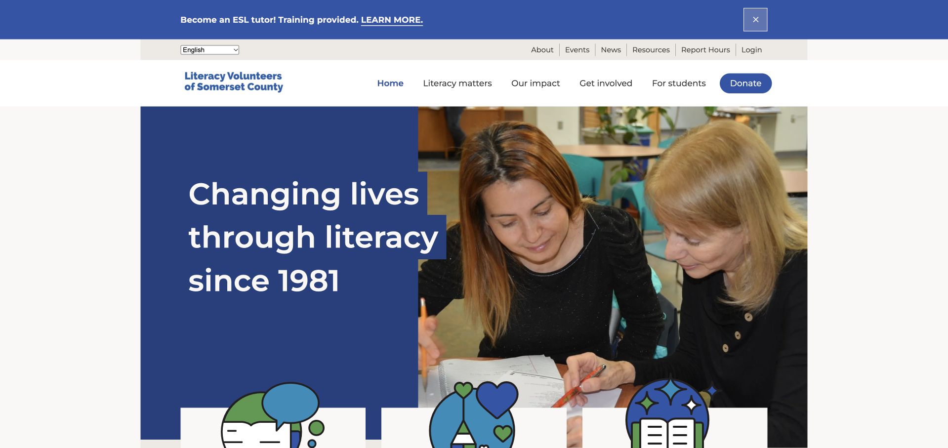
Literacy Volunteers of Somerset County combines a blue introductory panel with a photograph of two people working together. The opening statement names literacy rather than an abstract transformation, and the following routes distinguish becoming a student, volunteering and learning about the mission. Current public copy explicitly describes adult English-literacy support. This is a useful regional example because the learner does not have to interpret a university-style catalogue to discover whether the organisation can help.
What you can learn
Give prospective learners a recognisable first step in ordinary language, then maintain a separate route for the people supporting the programme. A community education homepage can introduce its purpose without turning every visitor into a donor or making the first task an account registration.
Pros
A student-specific route separates getting help from offering help.
The two-person photograph gives the literacy introduction a human, local context.
Cons & considerations
If learners have limited English, the first enquiry instructions need additional language support.
If fundraising grows, preserve the prominence of the student route rather than adding competing appeals.
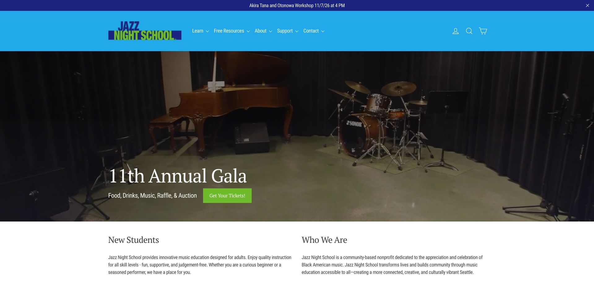
Jazz Night School pairs a turquoise identity with a large stage photograph and an event-led opening. Below that visual introduction, New Students and Who We Are explain that its music education is designed for adults. The current public page distinguishes offerings such as combos, classes and private instruction, and explains the registration sequence rather than simply presenting a purchase button. The contrast between event promotion and a newcomer orientation is the useful design tension here.
What you can learn
Adult beginners need help understanding where they belong before they choose a class. Give the first-time visitor a short orientation that explains the available formats and any assessment step, while letting existing participants reach the current programme without reading the whole introduction again.
Pros
A dedicated newcomer route acknowledges that an adult may be starting from scratch.
Community imagery gives the programme a setting beyond a list of course names.
Cons & considerations
If a gala occupies the opening screen, keep the learning route visible nearby.
If placement is required, explain the next step before a student reaches a registration form.
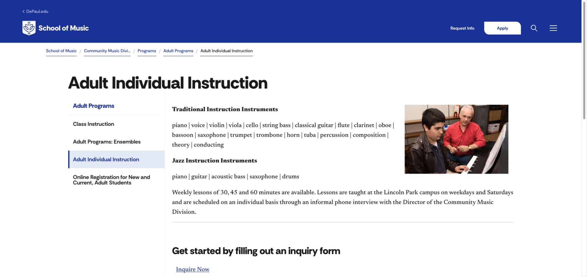
DePaul Community Music Division uses an explicit Adult Individual Instruction page rather than asking a community learner to navigate degree admissions. A left-hand menu distinguishes adult classes, ensembles, individual lessons and online registration. The main column lists instruments, explains lesson lengths and scheduling, and offers an inquiry route. The screenshot places a teaching photograph alongside this practical information, so the page reads as a service explanation rather than a campus recruitment campaign.
What you can learn
Separate community learning from academic admissions even when both share an institutional brand. An adult looking for weekly lessons should be able to identify the format, location and next conversation without deciding whether an application for a degree is relevant.
Pros
The adult-specific local menu keeps related learning formats together.
Instrument choices and lesson arrangements are described in normal page content.
Cons & considerations
If institution-wide Apply links remain, distinguish them from the community inquiry action.
If instructor-specific fees vary, place the qualification beside the price rather than only in a general policy.
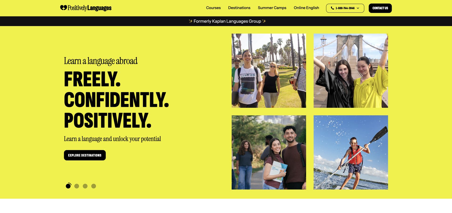
Positively Languages uses a vivid yellow background, a four-image collage and a compact black action to introduce language study abroad. Courses, destinations, summer camps and online English have separate header routes. The retained original image visibly carries the Positively identity and a former-brand notice; its legacy filename is not treated as evidence of a different website. A current indexed official course page confirms an adult-focused offer, while the homepage text request itself was blocked and is not represented as a successful fresh inspection.
What you can learn
When learning also involves choosing a destination, keep the course and place decisions distinct. An adult visitor should be able to explore the subject, format and practical commitment without assuming that the lifestyle photographs explain the programme. A brand-transition notice can clarify identity, but it should not replace useful navigation.
Pros
Course and destination routes expose two different browsing questions.
The strong colour and compact image grid give the introduction visual coherence.
Cons & considerations
If destination browsing leads the opening, retain a direct route for course-first visitors.
If brand-transition messaging persists, keep its wording and linked destinations current.
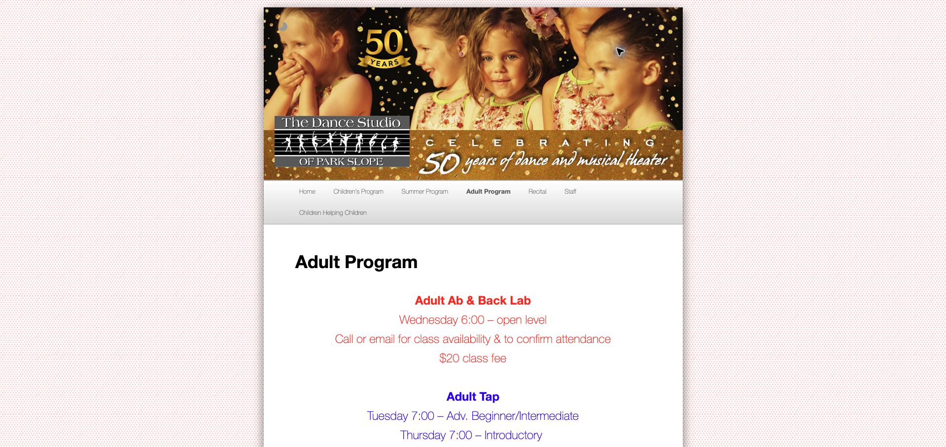
The Dance Studio of Park Slope presents its Adult Program inside a narrow, distinctive pink page frame. Rather than opening with a full-screen photograph, it moves quickly from the studio identity to named classes, times and attendance instructions. The current page includes adult tap and ballet information and asks visitors to confirm availability. This is an instructive small-provider example: its main value is the visibility of a manageable programme, not an elaborate campaign or a complicated course search.
What you can learn
A small adult-learning provider can prioritise a clear timetable and an honest next step over a large catalogue interface. Keep class names, intended levels and the way to confirm a place together, so a prospective learner can judge relevance without sending a general enquiry first.
Pros
The adult page is explicitly labelled rather than mixed into children’s classes.
Short listings place attendance instructions close to the activity.
Cons & considerations
If a date is still to be announced, make that status obvious and remove expired details.
If the narrow layout is retained, check that the timetable remains readable on small screens.
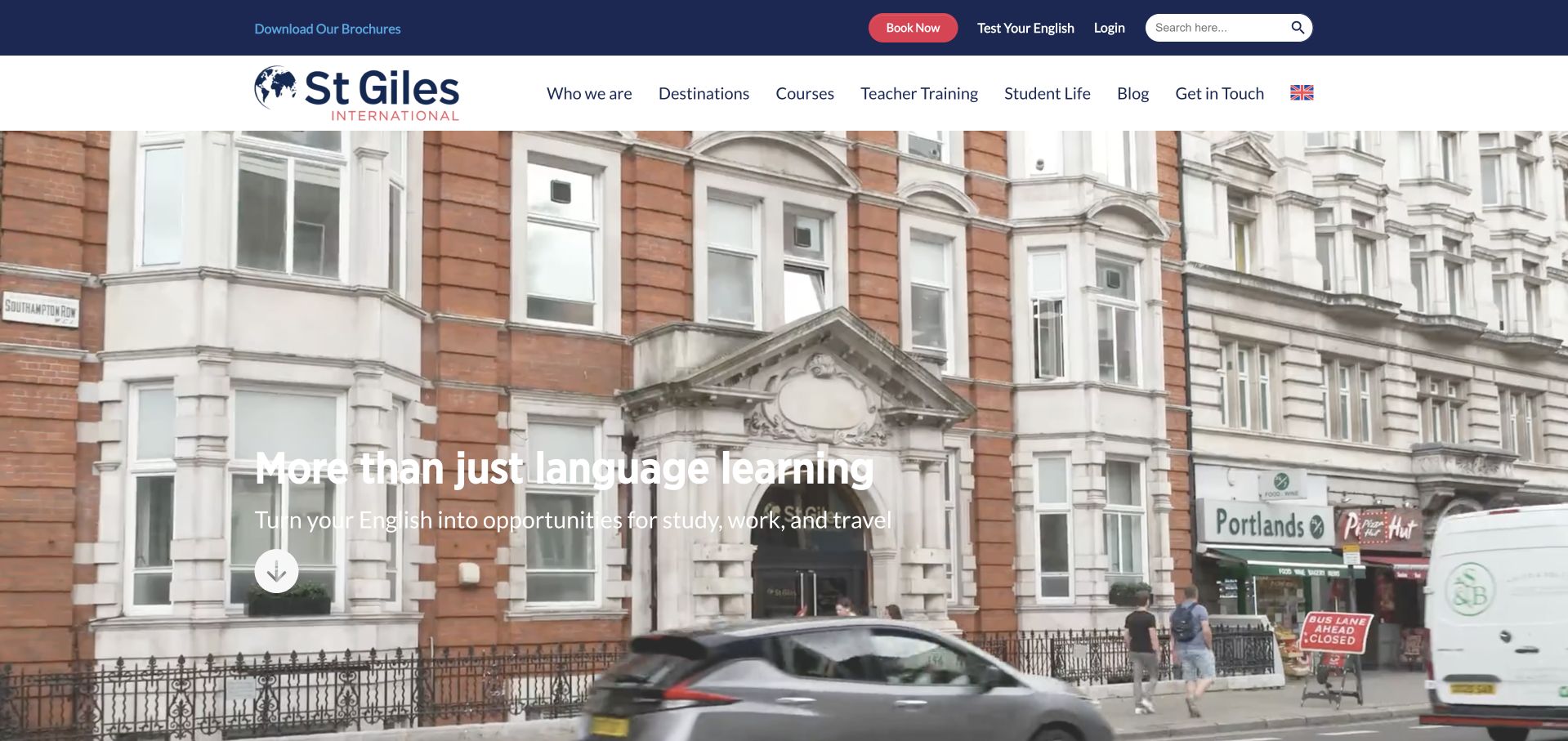
St Giles International places a large streetscape photograph beneath a clear two-level header. The main navigation separates destinations, courses, teacher training and student life, while practical actions such as brochures and booking sit in the utility row. The current official homepage explicitly distinguishes adult courses from junior and family routes. For adult education, this is a useful example of establishing a real study setting without making that setting the only way to discover the relevant programme or its practical information.
What you can learn
Use place imagery to give a school context, then make the audience and course type explicit in the navigation. An adult comparing general language study with a more specific programme needs to understand the learning format and requirements, not merely recognise the building or city in the photograph.
Pros
The header separates programme exploration from practical booking actions.
Adult, junior and family course routes are explicitly distinguished on the public site.
Cons & considerations
If white text sits over a changing image, test readability across every frame.
If several destinations offer different courses, qualify availability before the booking handoff.
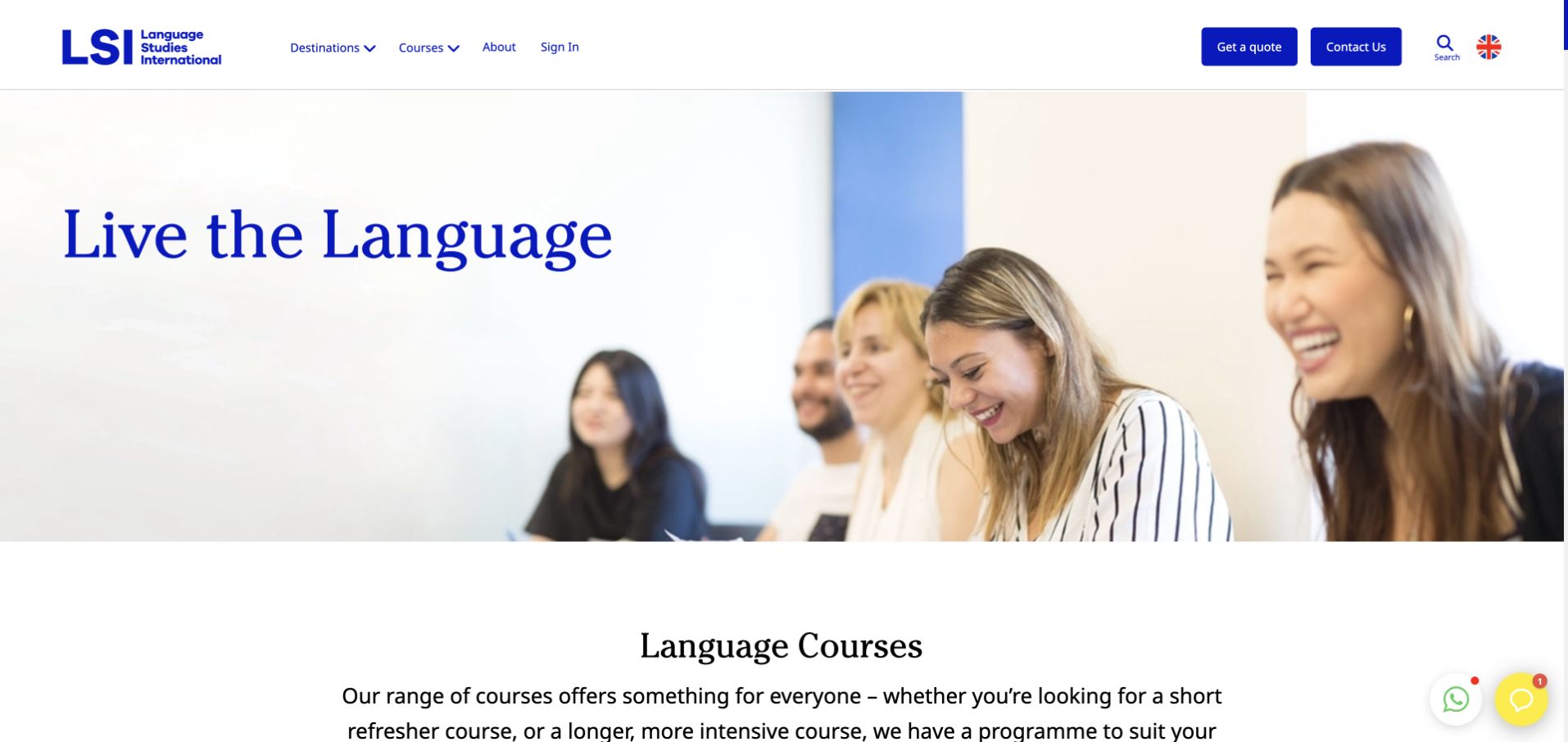
Language Studies International combines a white-and-blue header with a classroom photograph and a large language-learning headline. The visible opening leads into a Language Courses section rather than filling the whole page with an abstract campaign. Destination and course navigation remain separate, alongside quote and contact actions. The current official public page identifies adult year-round and corporate-learning routes as well as junior options. The retained screenshot represents that shared provider entrance, not a particular class timetable or a verified booking experience.
What you can learn
Pair a broad learning identity with an immediate explanation of the available course choices. Separate destination, audience and participation format so an adult can establish relevance before making an enquiry. Where the same provider also serves younger learners, make the distinction explicit rather than expecting the classroom photograph to communicate age eligibility.
Pros
Course and destination routes support different ways of exploring the offer.
A dedicated course section follows the visual introduction with explanatory content.
Cons & considerations
If several age audiences share the homepage, keep their programme boundaries clear.
If quote requests require details, provide enough public course information for a visitor to investigate first.
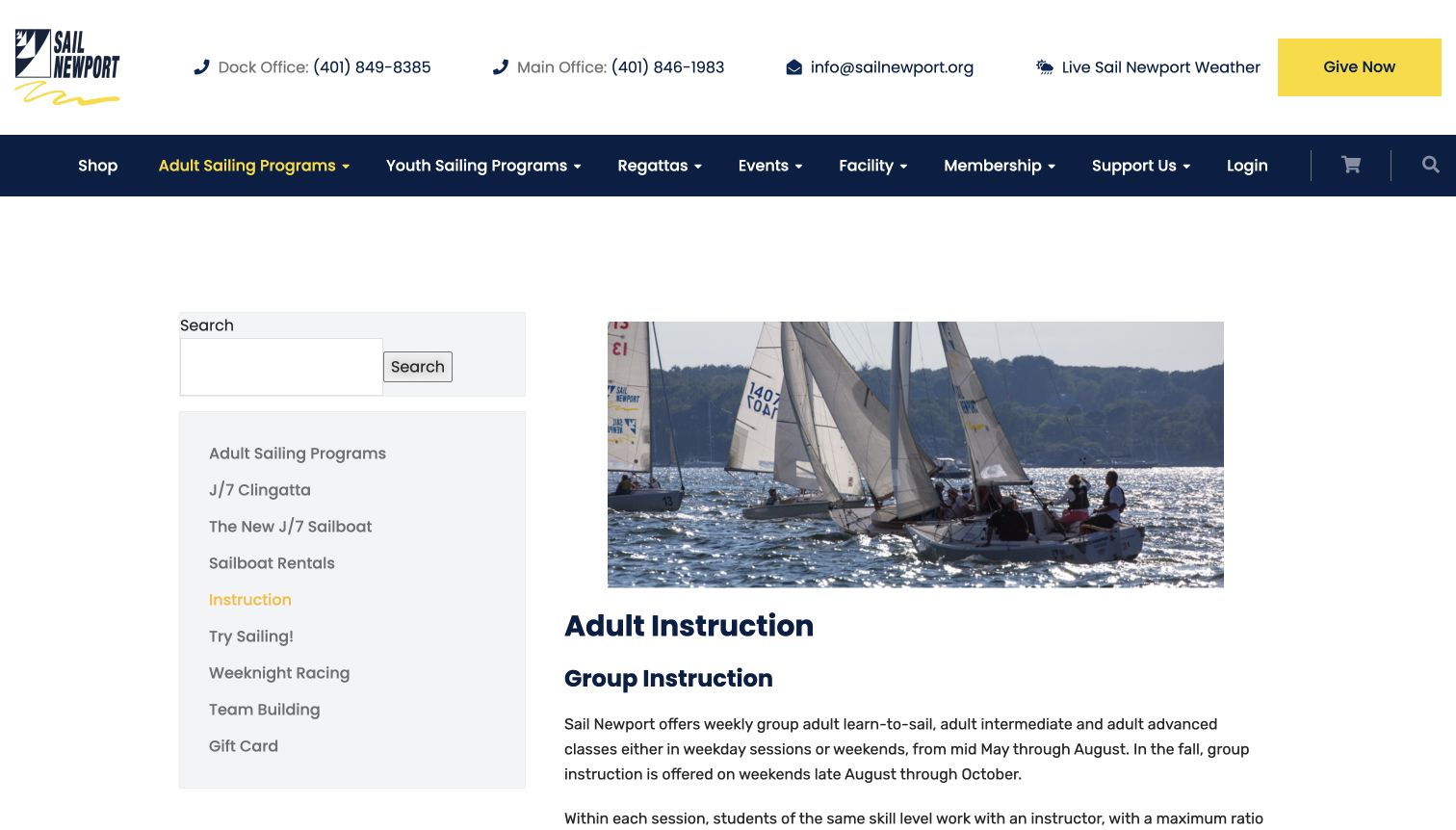
Sail Newport places its Adult Instruction page inside a clear adult-sailing section. A local sidebar, contact details and a substantial photograph of boats give the page both practical and geographic context. The main column introduces group instruction rather than assuming that every visitor wants a rental or a racing event. Its wider menu separates adult and youth programmes, which is particularly useful when the same facility serves learners, members and experienced participants with very different intentions.
What you can learn
Treat recreational adult learning as a distinct task, not merely a subsection of an activity business. Explain what instruction means, who it is for and how it differs from simply hiring equipment, then connect that explanation to the local programme navigation.
Pros
Adult and youth programme routes are visibly distinct.
Contact information and the programme sidebar support practical follow-up questions.
Cons & considerations
If several boat or lesson formats are available, compare them in learner-friendly terms.
If seasonal availability changes, place the current instruction status beside the next-step link.
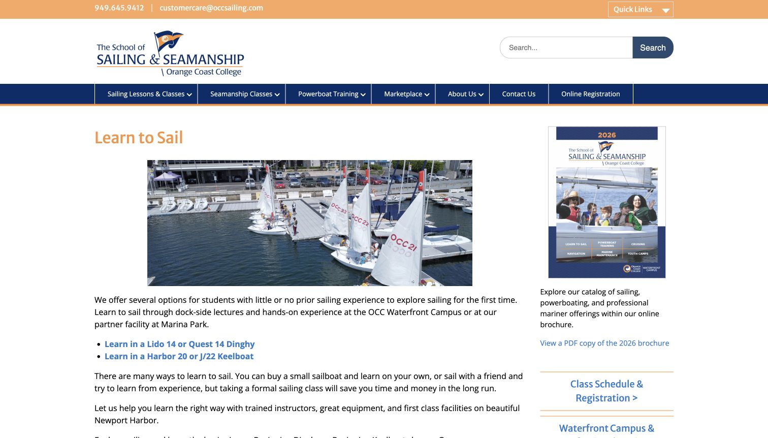
OCC School of Sailing and Seamanship introduces Learn to Sail with a boat photograph and a direct explanation for people with little or no experience. The page connects the beginner decision to different boat types, and its public content explains prerequisites and possible next courses. A side column provides practical registration and brochure routes. This is a useful adult-education pattern because it does not rely on the learner already understanding the equipment names used in the course catalogue.
What you can learn
Start with the learner’s experience, then explain the available formats and any prerequisites before registration. Where a practical course has several starting options, the website should help someone understand the difference rather than merely duplicating names from the booking system.
Pros
The introduction explicitly recognises first-time learners.
Course information connects entry requirements with possible progression.
Cons & considerations
If physical requirements apply, state them plainly without assuming that photography explains them.
If the booking catalogue lives elsewhere, keep course names consistent across the handoff.
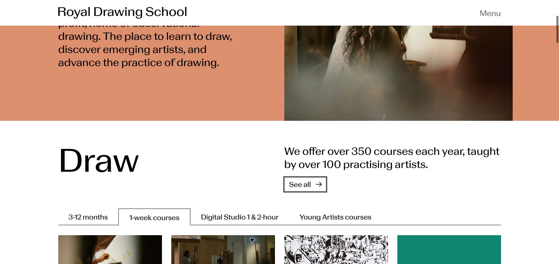
The Royal Drawing School screenshot shows a Draw section with a warm, restrained visual treatment and a series of course-format choices. Time commitments, including short sessions and longer study, become navigation rather than being buried inside individual descriptions. The current public site still presents drawing tuition through different formats, including part-time and on-demand options. For adult education, the interesting design decision is to make commitment part of discovery instead of treating subject choice as the only meaningful filter.
What you can learn
Let people choose a realistic learning commitment before asking them to compare every course. For an adult fitting study around work or other responsibilities, an evening, a short workshop and a longer programme represent different decisions even when all teach the same subject.
Pros
Format categories offer a useful alternative to browsing only by subject.
A restrained composition gives the course choices room to stand out.
Cons & considerations
If course formats overlap, explain the distinctions on the destination pages.
If applications and open-enrolment classes coexist, label their different entry processes clearly.
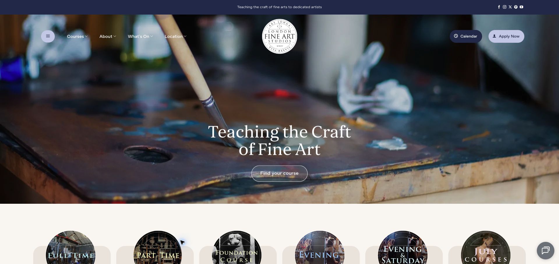
London Fine Art Studios opens with a close photograph of paint and brushes, using the materials of the subject rather than a generic classroom image. Its public homepage then distinguishes full-time, part-time, foundation, evening and Saturday routes, with upcoming courses and a calendar below. The screenshot’s direct headline and small primary action give the opening a focused character. Adult learning here is presented as a range of possible commitments within one studio identity, rather than a single all-or-nothing enrolment.
What you can learn
Use subject-specific imagery to establish character, then quickly translate that interest into workable attendance options. Adults may share the same creative goal while needing different weekly commitments, so the navigation should expose those differences before the enquiry stage.
Pros
The materials photograph communicates the taught subject without an abstract illustration.
Evening and Saturday routes acknowledge different attendance needs.
Cons & considerations
If upcoming dates appear in several sections, assign a clear owner for keeping them aligned.
If a hero action is visually small, ensure its wording still makes the next step obvious.
Sydney Art School uses an expansive photograph of a working art class to introduce its name, with a prominent enquiry route in the header. The public navigation distinguishes artistic-skills courses from qualifications and children’s classes, and a dedicated adult timetable is available. That separation matters more than the broad school headline: someone wanting a weekly recreational class should not have to interpret diploma information to find a suitable starting point. The screenshot supplies the shared identity; the menu supplies the practical distinctions.
What you can learn
Use one recognisable brand while giving adult recreational study its own vocabulary and timetable. Make the difference between a qualification, a short skills class and a children’s activity explicit, because those routes involve different expectations even when they share facilities and teachers.
Pros
The classroom image gives the offer a concrete learning setting.
Distinct course families avoid treating every learner as a qualification applicant.
Cons & considerations
If several studios operate, put the relevant location beside each class time.
If promotions dominate the introduction, preserve a straightforward route to the normal timetable and fees.
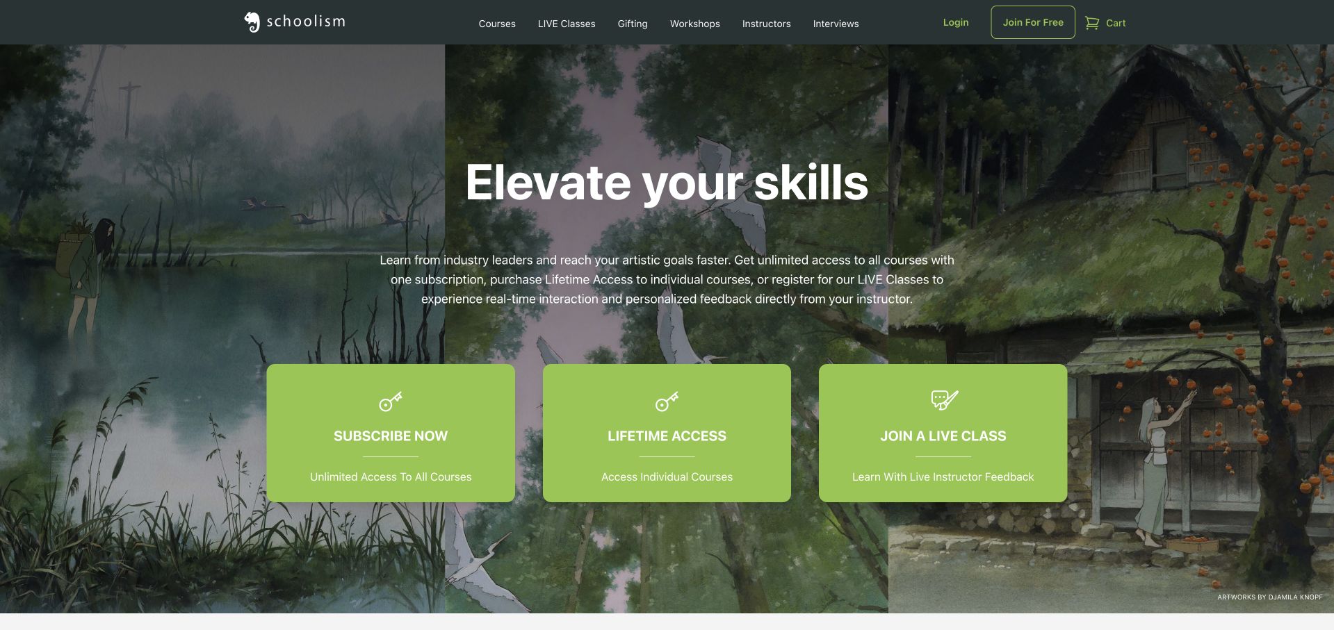
Schoolism combines a dark illustrated landscape with a bold skills headline and several prominent entry cards. The current official offer distinguishes a course subscription, access to individual courses and live classes, giving visitors different ways to approach creative study. Its public catalogue also names instructors and subjects. The design is useful for adult learning because it acknowledges that browsing a recorded course and committing to live feedback are not the same purchase or the same weekly obligation.
What you can learn
Explain the learning format as clearly as the subject. A prospective adult learner should be able to distinguish self-paced viewing, an individual course purchase and scheduled feedback before comparing prices or creating an account, especially when the same course material appears in more than one format.
Pros
The illustrated identity is closely related to the subject being taught.
Separate participation models help frame different learning commitments.
Cons & considerations
If membership labels change, keep the homepage and course pages consistent.
If career-oriented imagery is prominent, avoid implying that enrolment guarantees a professional outcome.
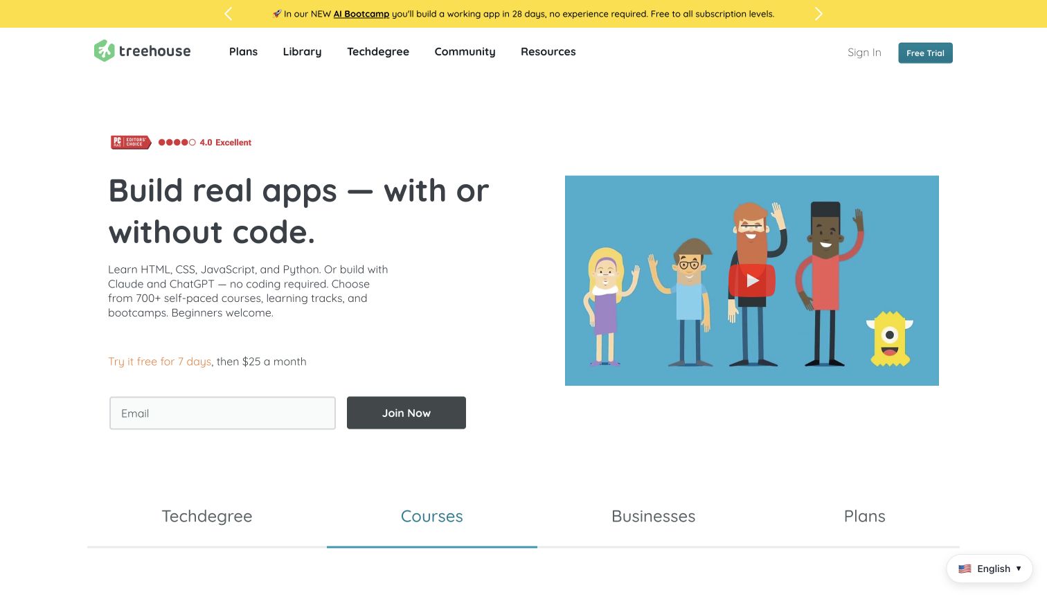
Treehouse leads with an app-building goal and places a short introduction, trial explanation and email field beside a course-video visual. The navigation distinguishes plans, courses and more structured study, while the current public page describes several learning formats. This is a focused professional-learning example: the opening communicates the kind of activity a learner will undertake before presenting the wider catalogue. It also illustrates the tradeoff between a direct signup action and the information a cautious adult may want first.
What you can learn
Describe the practical subject of study before presenting an account form. Keep a visible route to the curriculum, format and recurring cost so an adult can investigate whether the programme fits their time and experience without treating a trial signup as the only possible next step.
Pros
The headline names a concrete learning activity rather than a vague career promise.
Courses and structured programmes have recognisable navigation routes.
Cons & considerations
If a trial converts to a paid subscription, make the billing transition clear at the action.
If coding and no-code routes coexist, explain which skills and prerequisites belong to each.
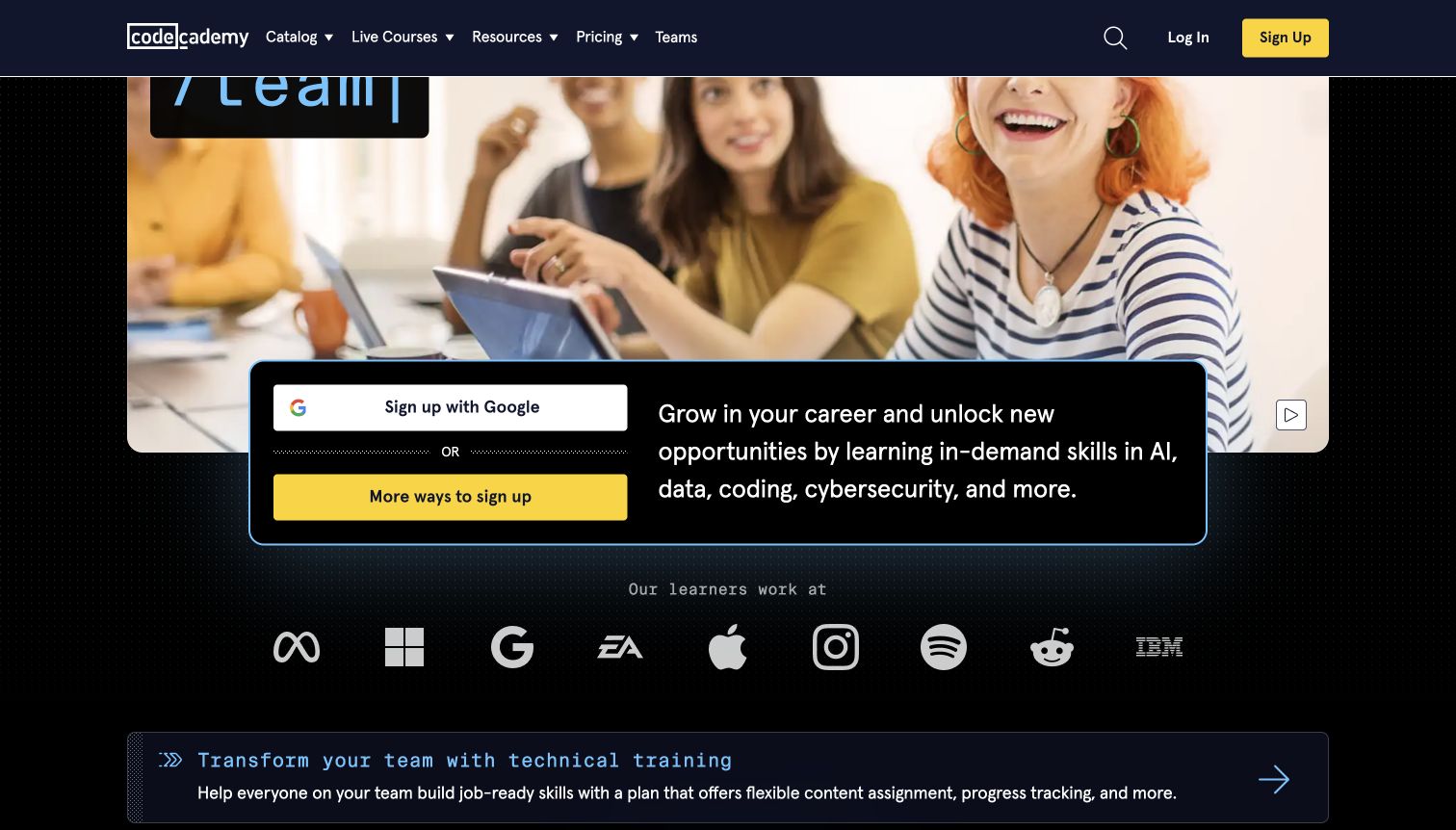
Codecademy’s screenshot places a signup card over a dark, people-led opening and follows it with a distinct team-training panel. Current public content groups technical subjects and offers live learning alongside its wider catalogue. The design separates two reasons for visiting: an individual exploring new skills and an organisation considering training for others. That distinction is a useful adult-education pattern, although the immediate signup emphasis means curriculum exploration needs to remain easy to find for visitors who are not ready to create an account.
What you can learn
Separate the learner journey from the employer journey without making either audience decode a generic sales message. For individual adults, show what can be studied and how it is delivered; for organisations, provide a different route rather than placing both tasks inside the same first form.
Pros
A dedicated team-training panel recognises a different buying context.
Subject navigation gives the broad skills offer an explorable structure.
Cons & considerations
If signup dominates the first view, retain a clear browse-before-registering route.
If employer logos appear, do not treat them as a promise of employment for new learners.
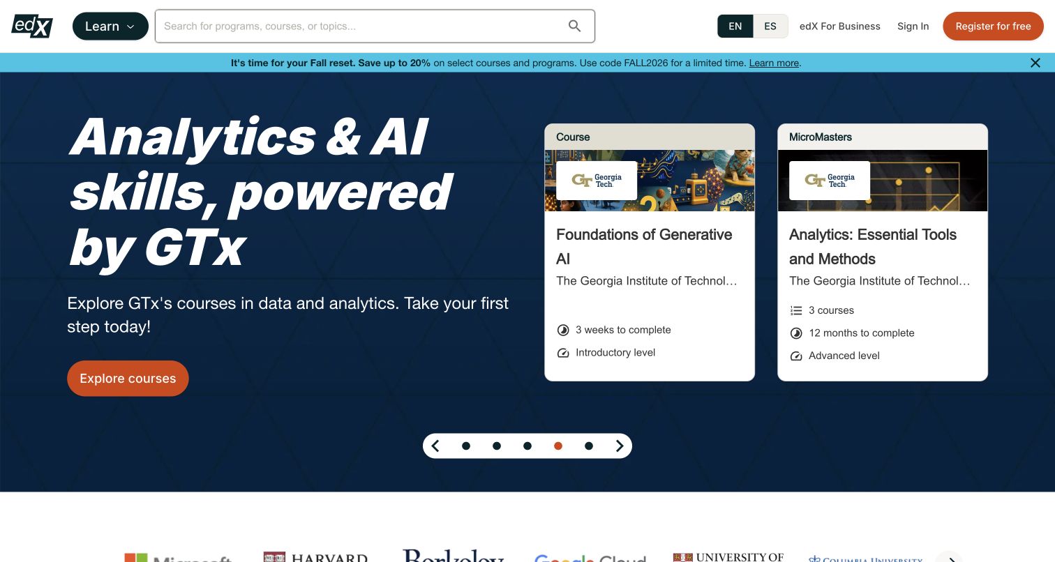
The edX screenshot pairs a broad skills message with course cards naming the relevant institutions. A subject navigation row and further course options turn the homepage into an entrance to a sizeable learning catalogue. Current public listings distinguish courses, certificates and degrees rather than presenting them as equivalent products. For adult education, this example is most useful as an information-architecture study: a visitor needs to understand both what they will study and the type of programme being offered.
What you can learn
Keep subject, provider and credential type distinct in course discovery. Adults comparing a short course with a longer academic programme need those differences before opening an enrolment route, and a recognisable university name should not have to carry the whole explanation of what the learner is selecting.
Pros
Course cards connect the subject to a named learning provider.
Programme-type labels help distinguish different levels of commitment.
Cons & considerations
If promotions lead the page, preserve an obvious route to the ordinary catalogue.
If fees or assessment vary by programme, make those distinctions on the individual destination rather than implying uniform terms.
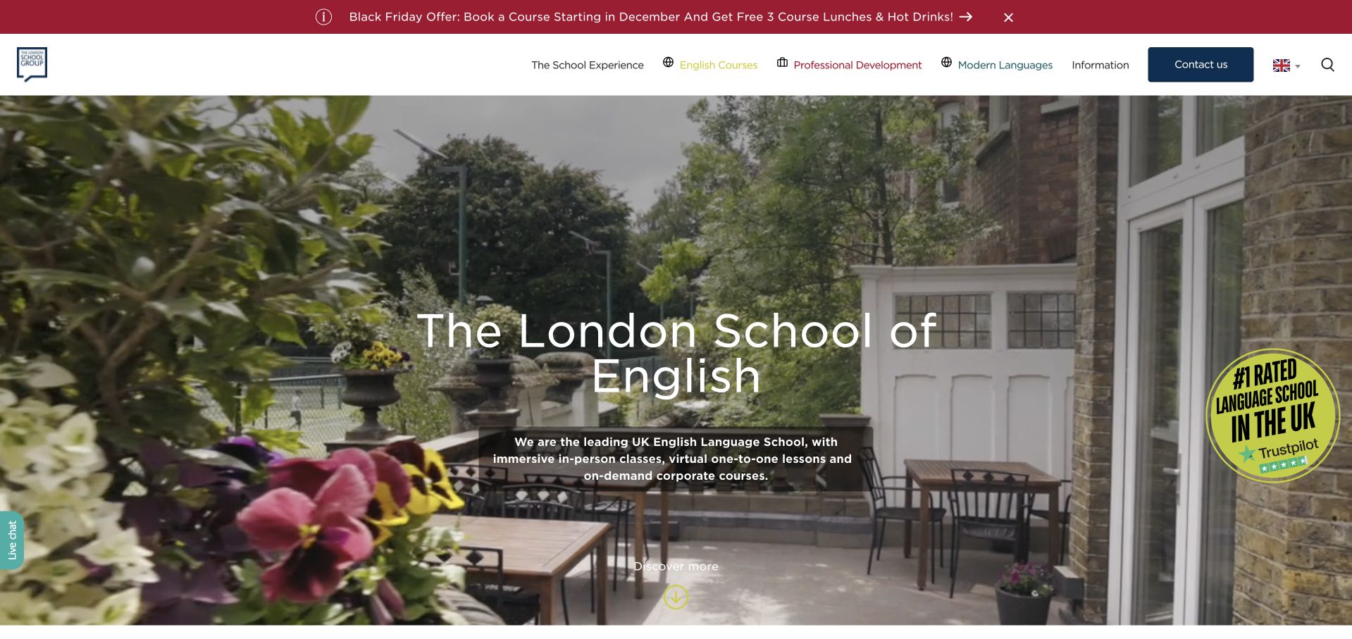
The London School of English combines a terrace photograph with a prominent school introduction and a clear contact route. Its current navigation distinguishes general English, professional learning, online study and age-specific programmes, while practical information has its own section. The visual opening introduces the setting; the menu then turns that broad experience into different learning decisions. For adult education, this is an example of giving both the subject and the surrounding attendance arrangements a place in the browsing journey.
What you can learn
When learning also involves travel or a particular campus, distinguish the course decision from the surrounding experience. An adult should be able to find the subject and schedule first, then investigate location, accommodation and other practical arrangements without losing the relevant programme context.
Pros
Professional and general language routes avoid one undifferentiated course pitch.
A practical information section recognises questions beyond the curriculum.
Cons & considerations
If promotional offers appear prominently, make their scope and period easy to understand.
If many age-specific options coexist, clarify eligibility on the individual course pages.
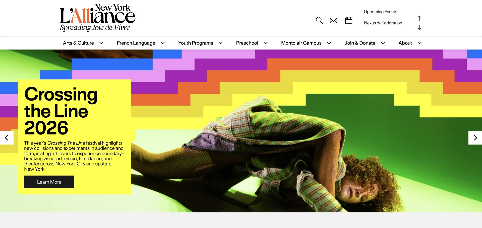
L’Alliance New York uses a vivid festival-led homepage and a restrained header that separates arts activity from French-language learning. The current public menu exposes adult classes, placement, private lessons and corporate learning as distinct routes, alongside youth programmes. The screenshot does not pretend to be a dedicated adult course page; it shows how a cultural organisation introduces a broader identity while still making adult education discoverable. That relationship between the event programme and the language school is the useful pattern to study.
What you can learn
Let cultural activity establish context without making a prospective learner navigate an events calendar to find classes. Give adult study a clear menu destination and distinguish placement, attendance formats and locations before handing visitors to a class-selection or registration system.
Pros
The French-language menu explicitly separates adults from youth programmes.
The cultural identity gives language learning a context beyond a course transaction.
Cons & considerations
If a festival dominates the opening, keep the adult class route visible in the header.
If multiple campuses offer different schedules, show the campus choice before listing availability.
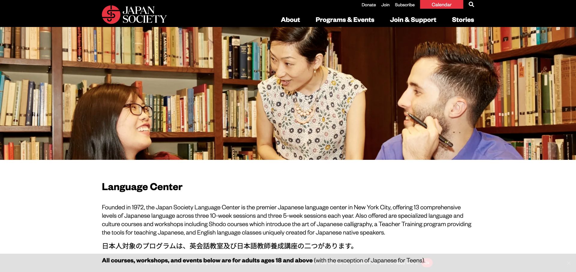
Japan Society gives its Language Center a classroom photograph and a substantial introduction, then separates Japanese study, calligraphy, workshops and teacher training into recognisable destinations. The public page explicitly states the adult audience and labels its teen exception, avoiding a common ambiguity on organisations serving several age groups. The bilingual content also reflects the programme’s actual audiences. This is useful adult-education design because the overview explains the scope before asking someone to choose from a schedule or an individual level.
What you can learn
State the audience and the boundaries of the offer in the overview, then organise specialist subjects beneath it. Where an organisation teaches adults and also has a youth exception, label that distinction in normal content instead of expecting the visitor to infer it from the class name.
Pros
The adult audience is stated directly rather than left to the imagery.
Separate subject routes make the language centre more than a single registration link.
Cons & considerations
If course levels are numerous, add a clear way to identify an appropriate starting level.
If bilingual content grows, keep equivalent instructions aligned rather than maintaining competing versions.
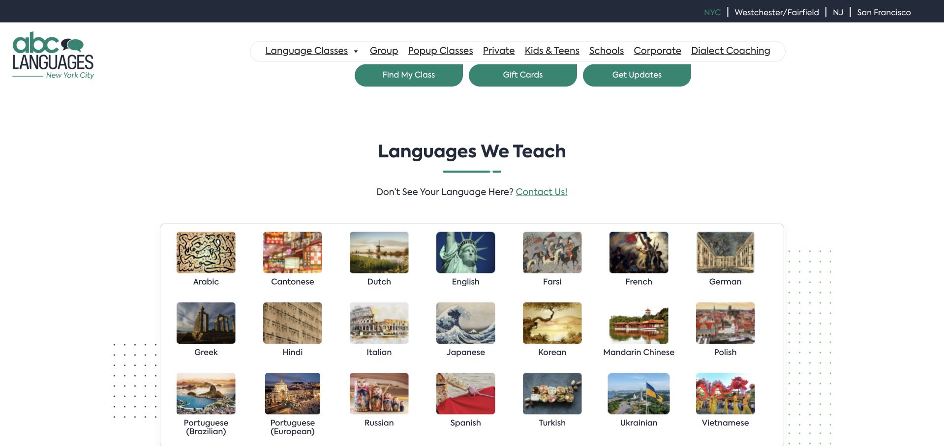
ABC Languages makes its language catalogue the opening task, pairing a teal navigation bar with a clean grid of named subjects. Group, private, corporate and children’s routes remain distinct in the header, with regional locations also visible. The current public site confirms this broad language offer. The useful adult-learning pattern is the separation of two questions: which language someone wants to learn, and how they want to study it. Neither decision has to disappear inside a general enquiry form.
What you can learn
Choose a clear starting dimension for a broad catalogue, then make the next dimension easy to find. For adult language education, subject, format and location all matter, but presenting them as a sequence can be easier to understand than displaying every possible combination in the first screen.
Pros
Named language choices provide a concrete starting point for browsing.
Group and private routes distinguish different learning arrangements.
Cons & considerations
If a language has limited local availability, show that before asking for registration details.
If the catalogue becomes very large, provide a text search as well as an image grid.
Berlitz uses a large photograph of adults in conversation with a clear language-learning introduction and contact action. Its current navigation separates individuals, corporations and government, then subdivides the individual offer into different course formats. The screenshot’s broad headline reflects that shared identity rather than a single class. For adult education, the informative choice is to recognise the reason someone is buying training before presenting a large list of subjects, schedules or account options.
What you can learn
Use audience-based navigation when individual learning and organisational procurement require different information. Keep the individual route plainly labelled, then explain the available formats and practical next steps rather than assuming every adult learner wants a sales conversation before exploring the offer.
Pros
Audience labels distinguish personal study from workplace training purchases.
Different individual course formats have their own destinations.
Cons & considerations
If the first action is to contact someone, retain an accessible route to basic course information.
If a global brand has regional availability, keep the visitor’s selected country visible.
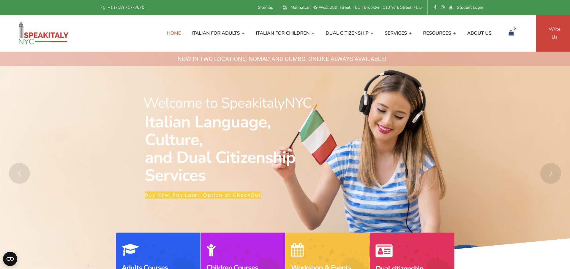
SpeakItaly NYC combines a warm photographic opening with an Italian-language identity and a series of coloured service cards. Its public navigation explicitly separates Italian for adults from children’s programmes, while private lessons, group courses and level information sit within the adult route. Translation and citizenship-related services are separate branches rather than being mistaken for classes. The design is useful because a specialist school can retain its wider business offer without forcing prospective adult learners to untangle it themselves.
What you can learn
Keep the adult course route explicit when a specialist provider also offers cultural events or non-teaching services. Group learning formats beneath the relevant audience, then let each destination explain its level, commitment and next action without duplicating the entire business menu.
Pros
The adult and children’s learning entrances use direct, recognisable labels.
Group, private and level-information routes make the adult offer more specific.
Cons & considerations
If the hero rotates, keep a stable route to adult courses outside the slide.
If the menu becomes extensive, reduce nested choices before they become difficult to use on mobile.
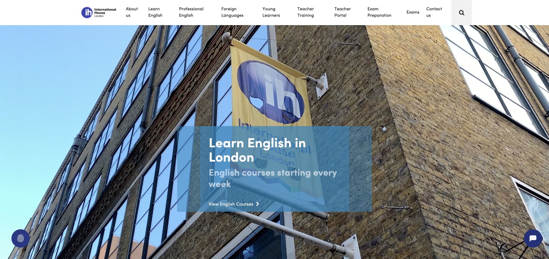
International House London introduces the school through a large exterior photograph and a compact overlay naming English study in London. The header distinguishes English, professional English, languages, young learners and teacher training. Current public course information includes adult learning routes and practical timetables, rather than leaving the offer as a general destination promise. For adult education, the example shows how a strong place identity can coexist with different formats and audiences, provided that the menu remains understandable.
What you can learn
Use the building or destination photograph to establish place, then provide explicit programme choices nearby. An adult comparing a shorter class with a more intensive commitment needs the format and timetable, not only a compelling image of the school they might attend.
Pros
Distinct programme families separate adult study from young-learner activity.
Practical course information supports a decision beyond the introductory photograph.
Cons & considerations
If a claim about ranking or accreditation is used, identify its scope and source.
If course fees change between years, label the relevant start-date period clearly.
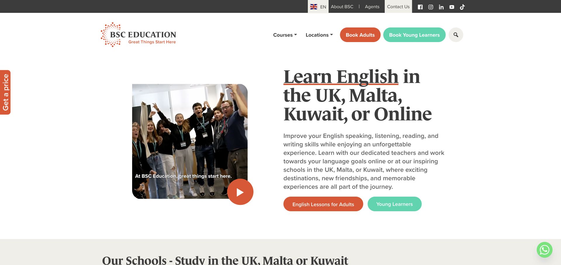
BSC Education pairs a concise English-learning headline with classroom imagery and separate actions for adults and young learners. Its header also distinguishes course and location browsing. Current official pages describe adult English study and practical destination-specific options, confirming that this is a learning provider rather than a generic travel page. The screenshot gives the adult visitor an early audience choice before the wider destination catalogue, which is a useful way to avoid mixing substantially different course requirements.
What you can learn
Make age audience and study location explicit early in the journey, then explain the specific course format on the destination page. Adults should not have to work through young-learner material to establish whether a programme fits, while shared branding can still connect the different offers.
Pros
Separate adult and young-learner actions are visible in the introduction.
Course and destination navigation acknowledge two different browsing questions.
Cons & considerations
If a course is offered only at selected centres, connect availability to the chosen location.
If video is used in the opening, preserve useful static text and a readable alternative.
Kegan is a freelance web designer and developer with 15+ years of experience helping businesses turn complicated website requirements into clear, maintainable digital experiences. He works directly with clients from planning and design through development, launch, and ongoing support.
For adult education website design, his development approach focuses on course and format comparisons, learner prerequisites, practical schedules and locations, accessible enquiry and registration journeys, and distinct learner and volunteer routes. The scope can be a targeted improvement or a complete custom build, with responsive layouts, thoughtful content structure, and integrations chosen around the people using and maintaining the site.
Show 3 other adult education website designersHide other adult education website designers
Plan an adult education website around real learner decisions
Define the audience before drawing the homepage
Write down the actual groups the organisation serves and the first questions each one brings. A person returning to study may ask whether prior experience is required; an employer may need to understand group arrangements; a volunteer may be looking for training rather than tuition. Keep these audiences separate in the content plan even if they eventually use the same facilities. Do not choose navigation labels solely because they mirror internal departments.
Test the opening description with someone who does not already know the organisation. Ask them what is taught, who can join and what action they would take next. If the answers depend on reading a mission statement or interpreting an acronym, simplify the introduction. A specific explanation is usually a stronger starting point than a headline promising transformation without describing the learning offer.
Give each course a consistent information model
Decide which fields belong to every course before importing an existing spreadsheet or booking catalogue. Useful fields often include subject, intended level, format, location, start date, duration, recurring times, fees, required materials and the next step. Some programmes need different fields; a literacy enquiry should not be forced into the same purchase model as a recorded video course. Consistency means predictable information within a comparable course family, not pretending every offer is identical.
Write a short explanation for any specialist level label. Beginner, open, intermediate and professional may mean different things across subjects. State what prior knowledge is expected and how someone can ask about fit. Keep restrictions, recommendations and optional preparation distinct. The public page should help a visitor understand the offer without making unverified promises about what every participant will achieve.
Design the timetable as a maintained service
An attractive timetable is useful only if somebody owns its accuracy. Record which system supplies the dates and who can update cancellations, holiday exceptions, full classes and waiting lists. Display the time zone for online courses and the location for in-person sessions. Avoid publishing several manually maintained copies of the same schedule across a homepage, PDF and registration platform unless the team has a realistic process for keeping them aligned.
Plan the states that occur between enrolment periods. A course may be full, not yet open, temporarily unavailable or offered only on request. Give each state an honest explanation and an appropriate action. Do not leave an apparently active registration button pointing to an empty result. Past timetables can remain useful as archives if they are clearly identified and do not compete with the current programme in search or navigation.
Make different learning formats comparable
A live online class, a self-paced library, an individual lesson and a classroom group are different commitments. Explain what happens during each format and which parts are scheduled. Where feedback or assessment is optional, say which route includes it. Do not let a broad membership label obscure whether a learner is buying recordings, a defined course or recurring access to a catalogue.
Use comparison tables only when the same questions genuinely apply to all options. Otherwise, create short format pages with consistent headings and links to relevant courses. The goal is to reduce uncertainty, not to add a pricing-style interface to every programme. Keep the route back to the subject or programme visible when someone explores delivery details.
Separate exploration from enrolment
Let prospective learners inspect the important information before asking for personal details. A course page can explain its subject, commitment and next step without requiring an account. If a placement conversation is part of the actual process, describe its purpose and the information needed. Do not label a general enquiry as enrolment or imply that submitting it reserves a place unless that is genuinely how the organisation operates.
When a booking platform opens on a different domain, use a clear action label and preserve consistent course names. Test the handoff on a phone and with keyboard navigation. A learner should be able to understand where they have arrived and how to return to the public course information. Verify the actual booking process separately; a screenshot of a public page does not demonstrate the behaviour of the registration system.
Write practical support information without broad promises
Provide a specific route for questions about participation, language support, equipment, physical access or learning adjustments. Publish only the arrangements the organisation can describe accurately. A general welcome statement is not a substitute for practical details, and a design review cannot establish that a programme or venue meets a particular accessibility standard.
Use readable headings, descriptive links, properly labelled forms and useful text alternatives for meaningful images. Test common tasks with different input methods and screen sizes rather than assuming that a clean visual layout is sufficient. Where a detailed access statement exists, connect it to the relevant course or location. Keep the public explanation proportionate and allow people to ask about needs without putting sensitive information into an unnecessary first-step form.
Show people and places with an editorial purpose
Select photographs that explain the actual subject, setting or format of learning. A classroom image can show the environment; a materials photograph can establish a creative practice; an instructor profile can help explain who leads a programme. Confirm permissions and attribution requirements before publishing. Do not invent testimonials, learner identities or headshots to make the page appear established.
Keep essential course information outside images and video. If an opening photograph carries decorative lettering, repeat the relevant words as accessible page text. Give motion a clear purpose and preserve useful static content. On a course page, a carefully chosen modest image may leave more room for practical information than a full-height visual treatment that delays the decision-making content.
Build an editorial maintenance routine
Assign responsibility for course descriptions, instructor changes, contact routes, fees and expired announcements. A small team may need a simpler publishing workflow than a large catalogue platform. Use reusable fields for recurring operational details and maintain an archive policy before old sessions accumulate. Check that search results and internal links lead to current information rather than an abandoned registration cycle.
Review the learner journey after publication without reducing success to a single signup number. Useful questions include whether visitors can find an appropriate class, distinguish formats and complete the actual next step. If collecting analytics or enquiry data, decide what is necessary and document the real configuration and retention practices. Do not add privacy assurances to the design copy unless they have been verified against the implementation.
The editing job behind the design
Choose technology for course information and the real enrolment process
Start with content ownership and the registration workflow. A small provider with a handful of recurring classes may need clear editable pages more than a large catalogue application. A broader organisation may need structured course fields, filters and integration with a separate learning or enrolment platform. Establish the operational requirements before choosing a visual theme.
Keep the public website, booking system, payment service and learning environment conceptually separate. Evidence of a tool on one public page does not identify the entire backend or prove that a linked portal uses the same technology. Unknown technology items are left empty here; visible stack notes should be based on scoped public evidence rather than appearance.
Prototype representative states with real content: an open class, a full class, a closed application, an online course and a cancelled session. Test how editors maintain each state and how a learner moves between the public page and any external system. The best platform choice is the one the team can operate accurately, not the one inferred from a screenshot of another provider.
Our WordPress website examples offer a separate look at publishing approaches. A visible platform label is evidence for that named page, not a guarantee that the same system will suit your requirements.
Before the public launch
Adult education website planning checklist
Name the actual adult audiences and distinguish learners from employers, donors and volunteers.
State the subject and learning format before an account or enquiry form.
Separate adult programmes from children’s activities and academic admissions where relevant.
Define consistent course fields and explain specialist level labels.
Show dates, recurring times, time zones and the relevant location.
Describe fees, materials and prerequisites on the appropriate course page.
Explain what the next action actually does: enquiry, placement, application or registration.
Plan honest full, closed, cancelled and not-yet-open states.
Give timetable updates and expired announcements a named editorial owner.
Keep essential information outside photography, video and downloadable files.
Verify permissions for photographs, testimonials and instructor profiles.
Provide an appropriate route for practical participation questions without unverified assurances.
Test the external enrolment handoff on mobile and with keyboard navigation.
Document the real data and analytics configuration before publishing privacy claims.
These checks are a project checklist, not a performance, legal, security, or accessibility certification. Test real journeys with the people responsible for the website before making claims about the result.
Sources & editorial method
How this collection was selected and reviewed
We reviewed public first-party provider pages for adult-learning topic fit and independently inspected original direct browser captures from the stable authored source library. Existing screenshots retain their original URLs, timestamps and dimensions; they are not represented as newly captured. Reviews are newly written for this adult-education collection. We did not enrol, enter learner portals, verify teaching quality or assess educational outcomes. Editors Choice is an editorial design selection, not an accessibility certification or service recommendation.
Each example links to its actual source page. Screenshots are direct browser captures with their own capture dates; moving imagery, announcements and live designs can change. The notes describe observable design choices and conditional tradeoffs, not measured traffic, conversion results, service quality, or accessibility conformance.
Technology labels use public page metadata, asset evidence, or explicitly cited platform documentation. Platform documentation is not a complete current deployment audit. A component reference may be legacy or unused; it is not a complete backend inventory. Unknown stacks are omitted. These sites are editorial examples, not our client portfolio.
Written, Edited and Curated are separate editorial records, not timestamps advanced by a rebuild. Website designs and imagery belong to their owners. See our editorial standards or suggest a correction.
Questions worth asking
Adult Education website design questions
Should adult education have a separate page from children’s programmes?
Usually it needs at least a clearly labelled route when both audiences are served. Adults may need different level descriptions, schedules and next steps. A separate route does not require a separate brand; it requires information that lets the visitor recognise the relevant programme without interpreting the children’s offer.
What information should appear before a learner registers?
Show the subject, intended audience, format, level, timing, location, relevant fees and any prerequisites. Explain whether the next action starts an enquiry, requests placement or actually reserves a course. The precise fields depend on the programme; avoid forcing community support and paid courses into the same transaction model.
Can a homepage screenshot prove that a learning platform works well?
No. A screenshot can support observations about the visible layout and content at the recorded time. It does not demonstrate checkout, account access, assessment, teaching quality or the private learning environment. Those workflows need separate testing and evidence.
How should a provider handle classes that are full or between terms?
Use a clear status with an appropriate next step, such as a waiting-list enquiry or a labelled future announcement. Avoid leaving stale active buttons that lead to empty registration results. Keep archived sessions distinct from the current programme and assign responsibility for updating the timetable.
Do adult learning websites need a large course-search application?
Not necessarily. A short programme may be easier to understand through a consistent list and a practical timetable. Larger catalogues may benefit from subject, level, format and location filters. Choose the interface according to the number of real choices and the team’s capacity to keep them accurate.
Borrow the learner-first thinking, not another provider’s promises. Build a site that explains your actual programme, makes practical decisions easier and gives the team a realistic way to keep the information current.