Best Artist Websites of 2026 (29 Real-World Examples)
Artist websites that give the work a distinctive setting while keeping projects, context, credits and the right contact route understandable.
Explore 29 directly reviewed artist, illustrator and studio properties, including personal portfolios, selected project sites and maintained archives. Compare the different ways they organize work and introduce visitors to its context.
An artist’s website can be quiet, expansive, playful or deliberately unconventional. Its visual identity does not have to follow a standard business template, but the work still needs a usable frame: visitors should be able to tell what they are seeing and find the information appropriate to their interest.
This collection includes artists working across different media and different kinds of public website. A commercial illustration portfolio, an artist’s film property and an estate archive serve distinct purposes. The reviews preserve those scopes rather than treating every page as a complete current inventory of an individual’s practice.
Before the examples
What makes good artist website design in 2026?
Give the work a deliberate sequence
Choose an opening selection that explains the practice without requiring every visitor to browse the whole archive. The order can establish a visual rhythm or a particular theme, but make it possible to reach a specific project when a visitor arrives with that intention.
Provide useful context without overwhelming the images
Titles, dates, media, credits and a concise project description can help someone understand a work. Put the information where it can be found consistently. An image alone should not be expected to explain authorship, scale, location or the artist’s role in a collaboration.
Separate the different visitor relationships
Someone looking for a commission, a print, a biography, exhibition information or research material may need different routes. Label the destinations around the actual practice and its representatives. Do not imply that every artist accepts commissions or sells work through the website.
The collection · 29 examples
29 artist websites worth studying
Study image sequences, grids, project pages, navigation and supporting text across these 29 properties. The collection is an editorial website-design study, not a ranking of artistic merit, career standing or the value of the work.
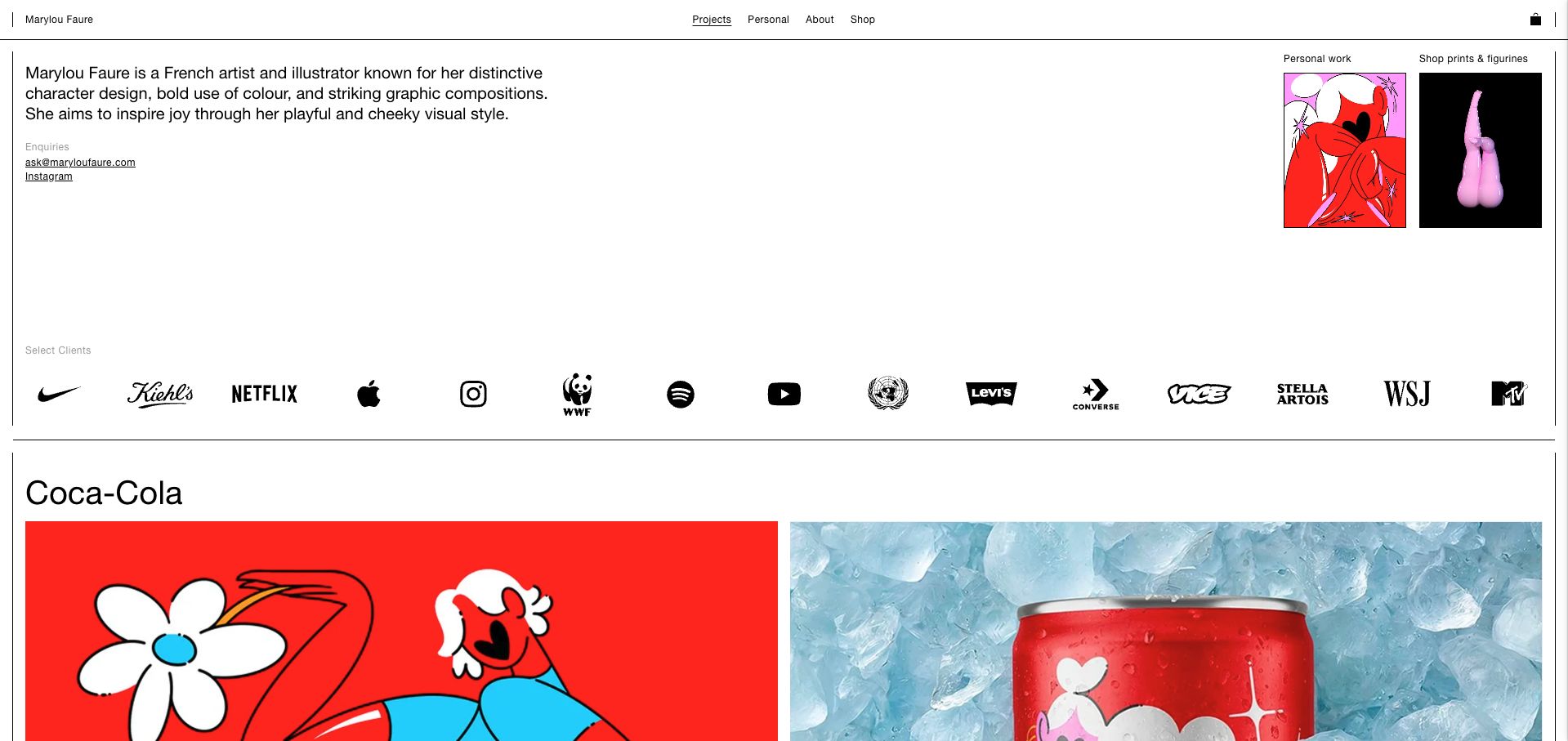
Marylou Faure’s homepage uses fine black rules and an orderly white canvas to distinguish several ways of engaging with her work. A concise introduction explains the practice, while small Personal and Shop entrances sit beside the main editorial area. The opening project pairs finished artwork with its application on a product, making the relationship between illustration and commission immediately understandable. A short navigation and visible inquiry route support people who arrive with a brief rather than a shopping intention. This is our editorial choice for its balance of personality, project context and practical organization; the selection concerns website design rather than the quality of a commissioned service.
What you can learn
Separate personal work, commercial case studies and purchases without making three disconnected websites. Show the artwork and its real application together, and give prospective collaborators a direct route to the right conversation.
Pros
The layout explains different visitor paths without a long introductory essay.
Artwork and finished application provide useful context for a commission.
Cons & considerations
Small navigation labels need careful attention on compact screens.
A client-logo strip benefits from links to the particular projects it represents.
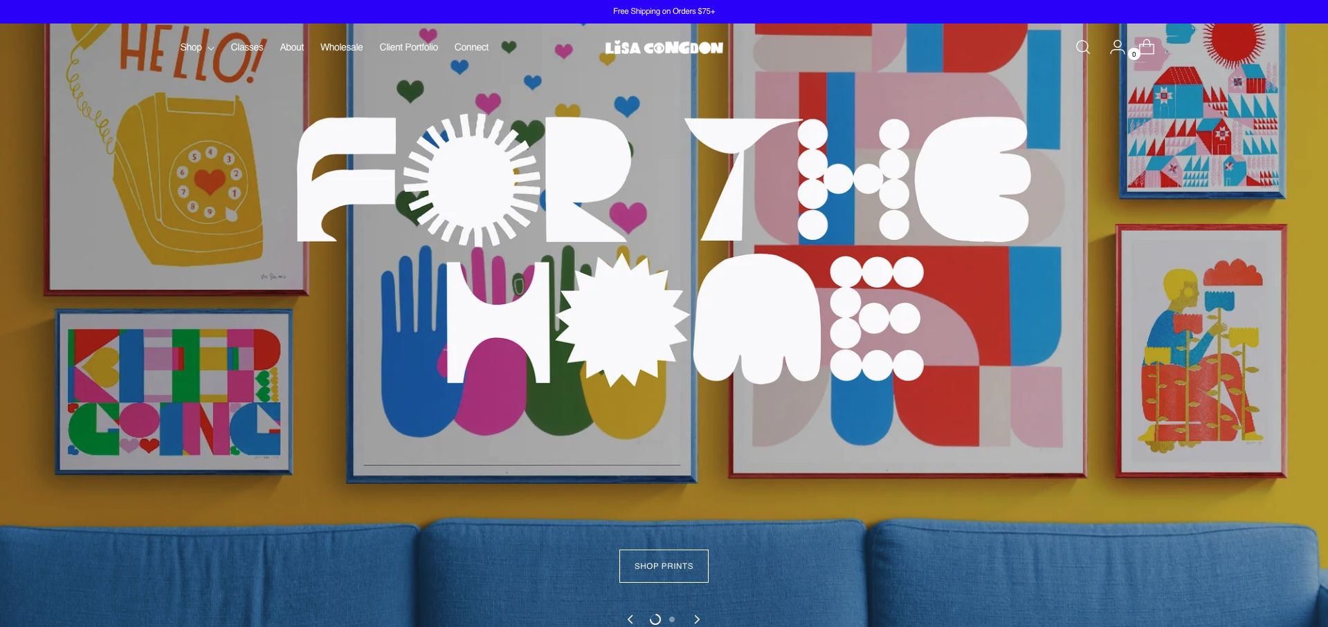
Lisa Congdon’s homepage leads with a colorful room, placing framed work above a blue sofa against a strong yellow wall. Large white lettering identifies the home-oriented offer, and an outlined print-shopping action turns the scene into a useful entrance. The navigation also makes room for classes, wholesale information and a client portfolio, so the retail emphasis does not erase the wider practice. The composition is useful because it shows how artwork can live with furniture and other objects instead of presenting every piece as an isolated thumbnail. Its main tradeoff is the scale of the campaign lettering, which overlaps much of the setting it introduces.
What you can learn
Use room photography when scale and context help someone understand an artwork. Keep professional commissions and educational offers separately labeled so a strong shop campaign does not make other visitors hunt for their route.
Pros
The installed prints help communicate scale and domestic context.
Distinct classes, wholesale and portfolio routes support different audiences.
Cons & considerations
Oversized white lettering competes with the work in the photograph.
A campaign-led opening reveals less about individual projects than a portfolio index.
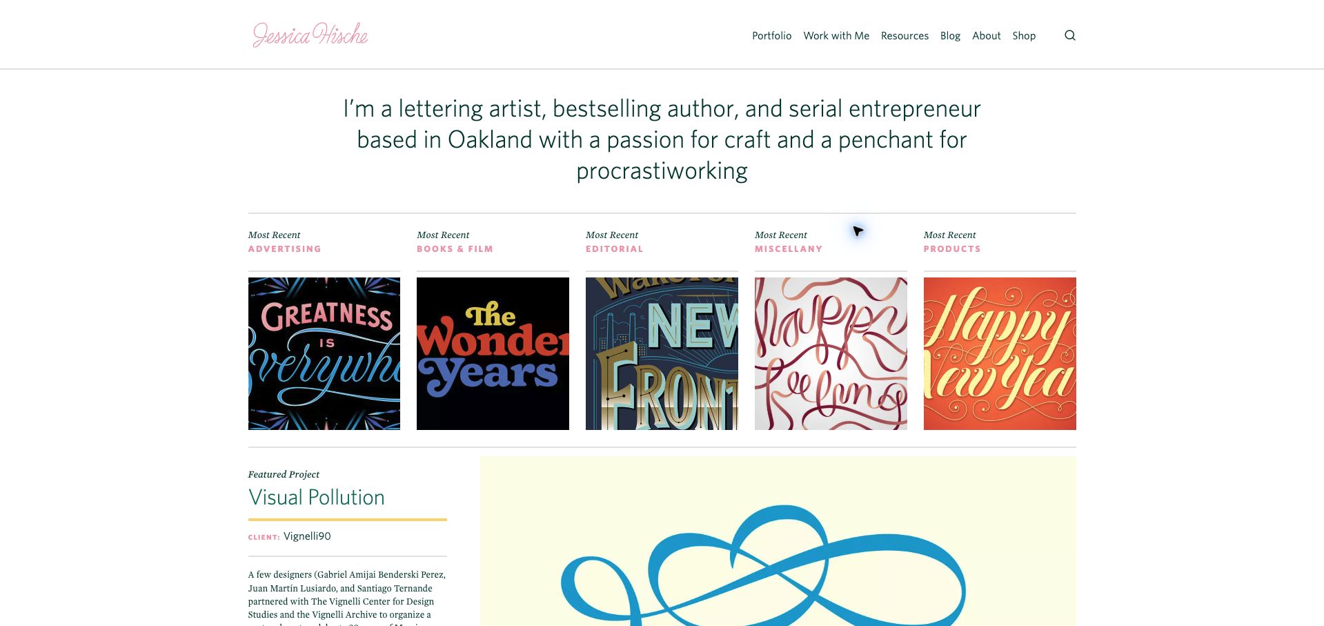
Jessica Hische introduces her lettering practice in a spacious text block before presenting recent work across five named categories. Advertising, books and film, editorial, miscellaneous projects and products each receive an image, making the range understandable without a dense filter interface. The featured project below adds a title, client context and a short explanation, moving beyond a visual mood board. The restrained green and pink interface lets the lettering samples carry the color. A newsletter overlay interrupted the initial visit and was dismissed for the saved view; the clean page demonstrates how effective the underlying information hierarchy is once that interruption is removed.
What you can learn
Explain the practice briefly, then use a few meaningful work categories to help clients find relevant evidence. Pair selected projects with client and role information rather than relying entirely on a recognizable finished image.
Pros
The category labels clarify the kinds of commission represented.
Featured-project copy adds context beyond a grid of attractive lettering.
Cons & considerations
The initial newsletter overlay delays access to the work.
Five equal columns can make category images relatively small on intermediate screens.
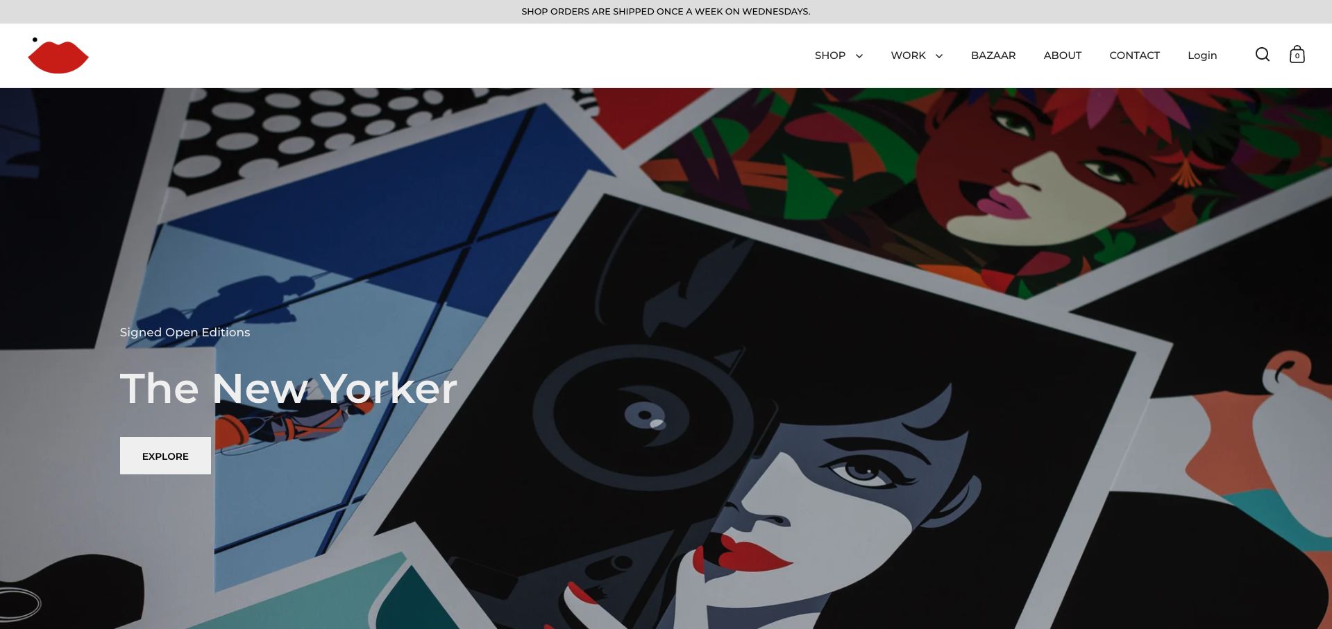
Malika Favre’s site uses a compact lips mark and a short white navigation above a large editorial display of printed covers. The opening feature names the collection and gives it a clear exploration route, rather than asking the visitor to interpret an unlabeled collage. Shop, Work, Bazaar, About and Contact appear as distinct destinations, separating buying from reviewing the professional practice. A shipping notice provides practical retail context but introduces another message before the artwork. The design is a useful reference for an illustrator with a recognizable visual language: the interface remains quiet while a specific body of work supplies the immediate subject and color.
What you can learn
Choose a coherent body of work for the homepage and explain what the visitor can explore. Keep the commission portfolio and retail shop distinct, with straightforward labels that work even for someone unfamiliar with the artist.
Pros
A named collection gives the hero a specific subject and destination.
The compact navigation separates professional work from shopping.
Cons & considerations
The shipping notice adds a competing message to the first view.
An opening collection feature necessarily represents only part of the artist’s range.
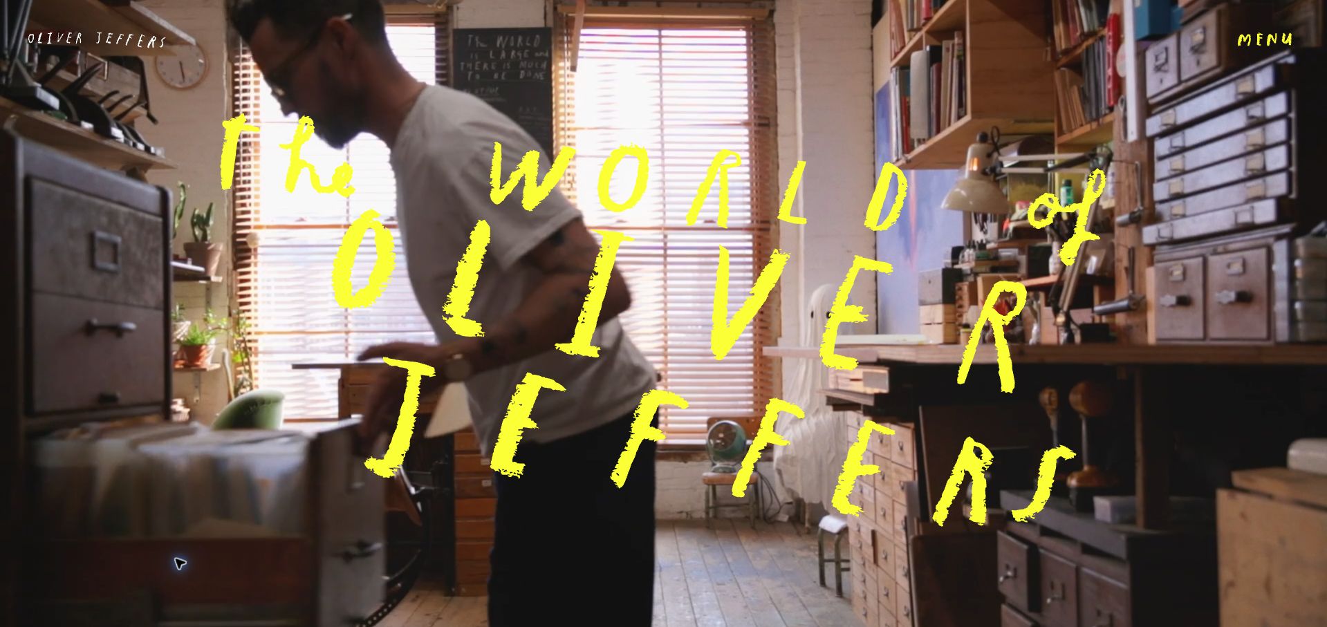
Oliver Jeffers opens with moving studio imagery and a loose yellow title treatment that feels connected to the hand-made work. A compact menu sits in the corner while the public page introduces a visual storytelling practice beyond a single book or exhibition. The captured frame communicates a working environment more than a catalog of finished pieces. That is useful for studying how an artist can create a recognizable atmosphere without beginning with an ordinary project grid. It also creates a practical burden: visitors who want a particular publication, event or contact route must use the navigation rather than learning all of those options from the opening scene.
What you can learn
Use studio imagery to introduce the character of a practice, then provide clear routes to its different outputs. A distinctive title treatment should complement ordinary navigation, with a written alternative to any information conveyed by film.
Pros
The studio setting connects the presentation to the making process.
The hand-drawn title treatment reinforces a consistent personal identity.
Cons & considerations
A changing film frame may show little finished artwork at arrival.
The compact menu keeps most practical destinations out of the initial view.
James Jean gives the opening view to a richly detailed artwork, with a light wordmark and a short set of navigation labels laid over it. Work, objects, sketchbooks, information and shopping are separated without a lengthy introduction. The public archive then organizes work by year, providing a more structured route once someone leaves the immersive first frame. The contrast is useful: the homepage establishes visual character, while the archive supports deliberate browsing. The interface depends on the selected image, however. Fine navigation can become less prominent against intricate artwork, and a visitor receives little project context before choosing a destination.
What you can learn
Let one representative artwork establish the visual tone, but support it with a stable archive organized around meaningful categories or dates. Keep navigation legible across every image that might occupy the opening frame.
Pros
The large image preserves the detail and atmosphere of the work.
Separate object and sketchbook routes recognize different kinds of output.
Cons & considerations
Fine overlaid navigation competes with complex artwork.
The opening frame provides little title, date or project explanation.
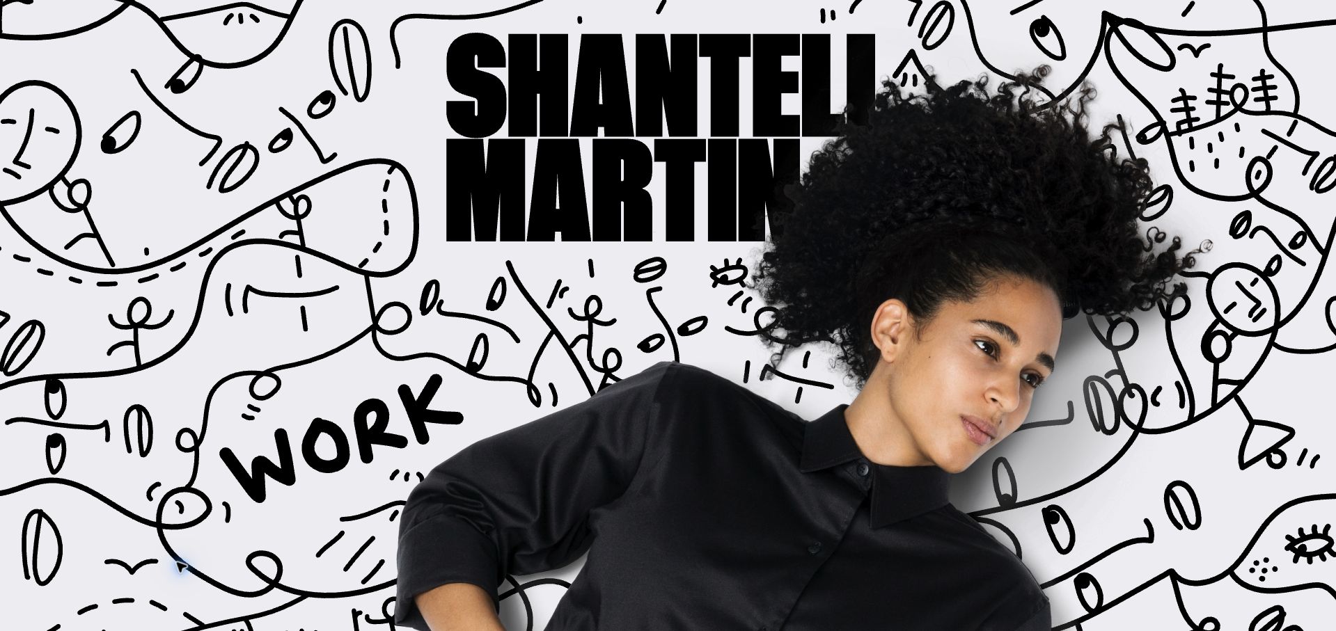
Shantell Martin combines a portrait with a field of black-and-white drawings and a prominent central name. A hand-drawn Work entrance sits within that composition, while conventional links remain along the lower edge. The result makes the artist’s visual language part of the browsing experience rather than confining it to portfolio thumbnails. It is useful for considering how personality can shape a homepage without a long biography. The same approach needs careful implementation: a drawn label can be easy to notice visually while giving less information to someone using a screen reader, and the artwork should not obscure the ordinary routes into the site.
What you can learn
Use the artist’s own marks to give the interface character, but retain descriptive links and clear text alternatives. Treat expressive navigation as an additional layer over a usable structure rather than its only route.
Pros
The portrait and drawing language create a recognizable introduction.
Conventional links provide an alternative to the illustrated Work entrance.
Cons & considerations
Some inspected links lack informative accessible names.
A busy illustrated background can compete with smaller navigation labels.
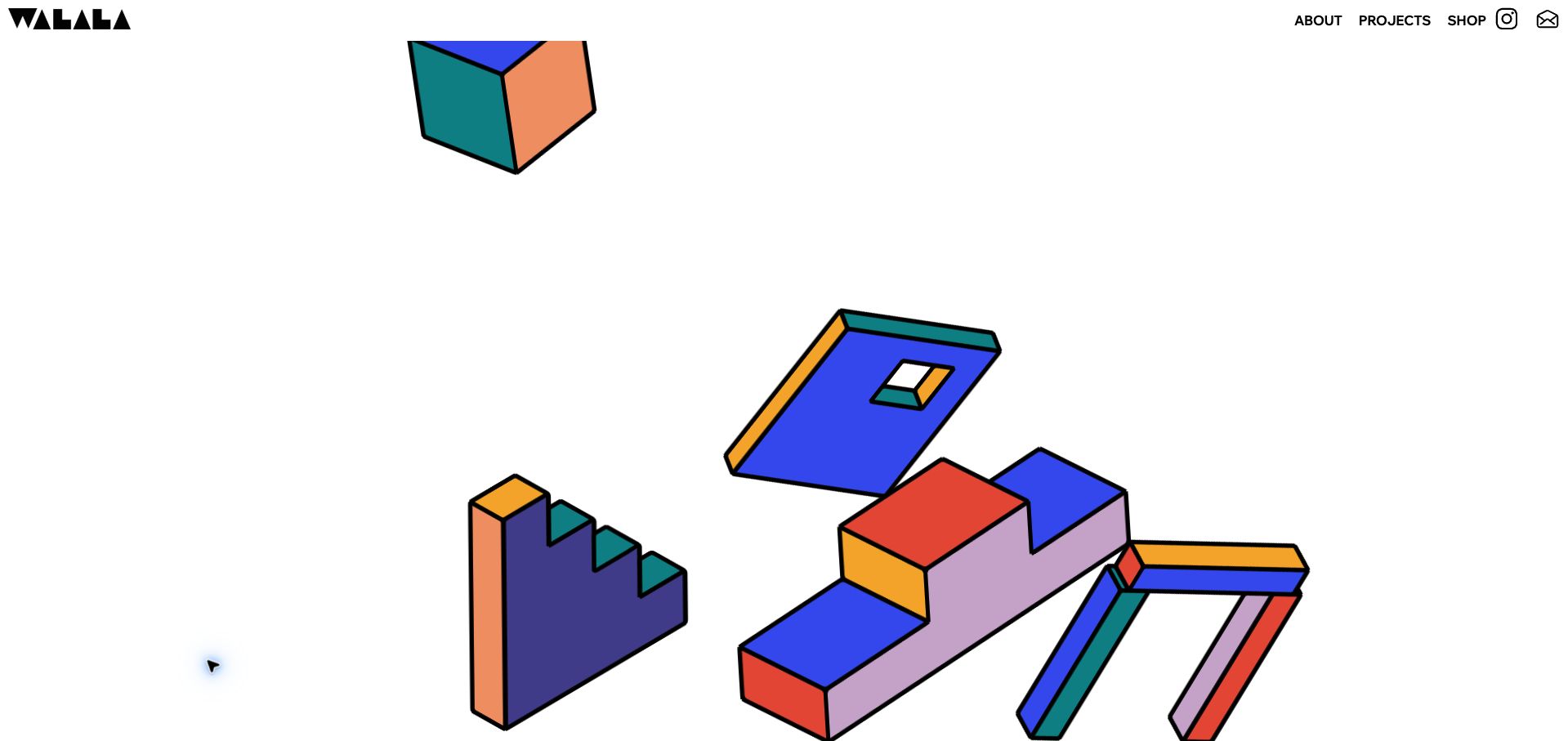
Camille Walala’s homepage places colorful geometric forms on a generous white background, with a bold identity at the upper left and a short navigation at the right. The animated, object-like opening reflects a practice concerned with shape and space rather than beginning with a written service pitch. Projects, information and shopping remain recognizable destinations around the expressive center. The public introduction supplies the artist context farther down the page. This is a useful example of keeping the interface sparse while the artwork contributes most of the energy, although someone looking for a specific completed commission must move beyond the opening animation.
What you can learn
Use a representative visual idea to introduce a spatial art practice, then connect it quickly to documented projects. Keep the ordinary navigation calm and readable so expressive motion does not become a prerequisite for understanding the site.
Pros
White space gives the colorful forms room to remain distinct.
The short navigation separates project browsing from shopping and background information.
Cons & considerations
The opening animation explains less than a captioned completed project.
Small corner links can be overlooked beside a dominant moving composition.
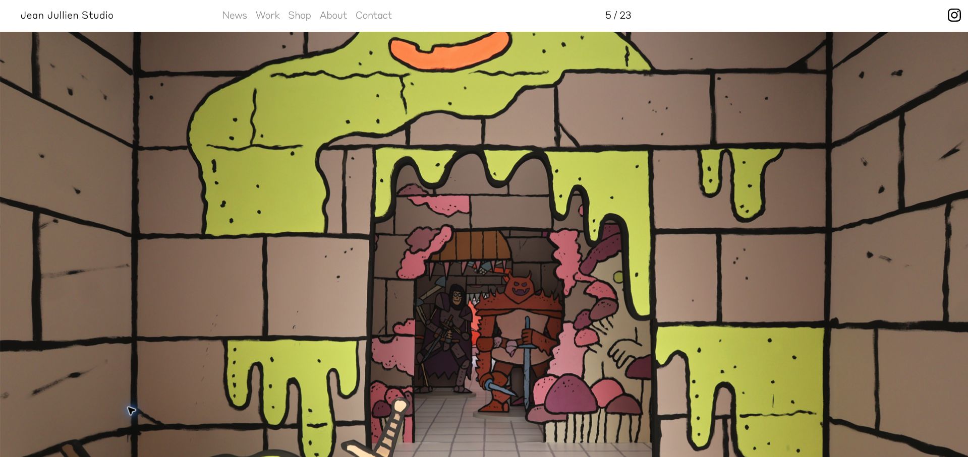
Jean Jullien’s opening view gives most of the screen to an installation photograph, showing drawings across a bright interior rather than presenting a single isolated image. A compact white header keeps News, Work, Shop, About and Contact available, and a small slide counter indicates that the view is part of a larger sequence. The room photograph helps communicate the relationship between the artwork and its setting. This is a useful reference for a practice that moves between illustration, objects and environments. The minimal framing also leaves a gap: the first view provides little visible explanation of the installation’s title, location or purpose.
What you can learn
Show environmental work at a scale that reveals its relationship to the room. Add a concise caption and a direct project link so an immersive image also becomes useful evidence for a curator or prospective collaborator.
Pros
The installation view communicates scale and surrounding context.
The white header keeps conventional destinations separate from the artwork.
Cons & considerations
The opening image lacks a prominent explanatory project caption.
A numeric carousel counter does not tell visitors what the other slides contain.
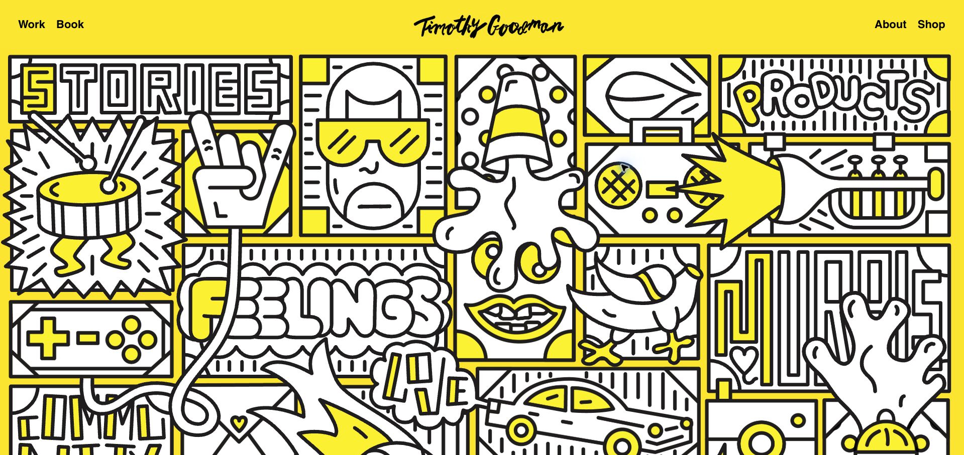
Timothy Goodman’s homepage uses a bright yellow background and a dense black-and-white illustrated panel. Stories, projects and drawings become large hand-lettered entrances within the artwork, while Work, Book, About and Shop remain in a simple header. The combination gives the site a strong personal identity without abandoning familiar destination names. The main embedded artwork was blank in the first capture and loaded on the bounded follow-up; the saved view shows the intended illustrated structure. That loading difference is a practical part of the example, because a homepage built around an embedded composition needs a useful fallback while its central content arrives.
What you can learn
Turn recognizable work categories into part of the visual identity, but provide ordinary links and a dependable loading fallback. An expressive homepage should still explain its destinations before every embedded asset has finished rendering.
Pros
Large illustrated category names connect the navigation to the artist’s style.
The header retains clear book, shop and biography routes.
Cons & considerations
The central composition was initially blank while its embedded content loaded.
Dense drawing can make the boundaries of interactive areas less obvious.
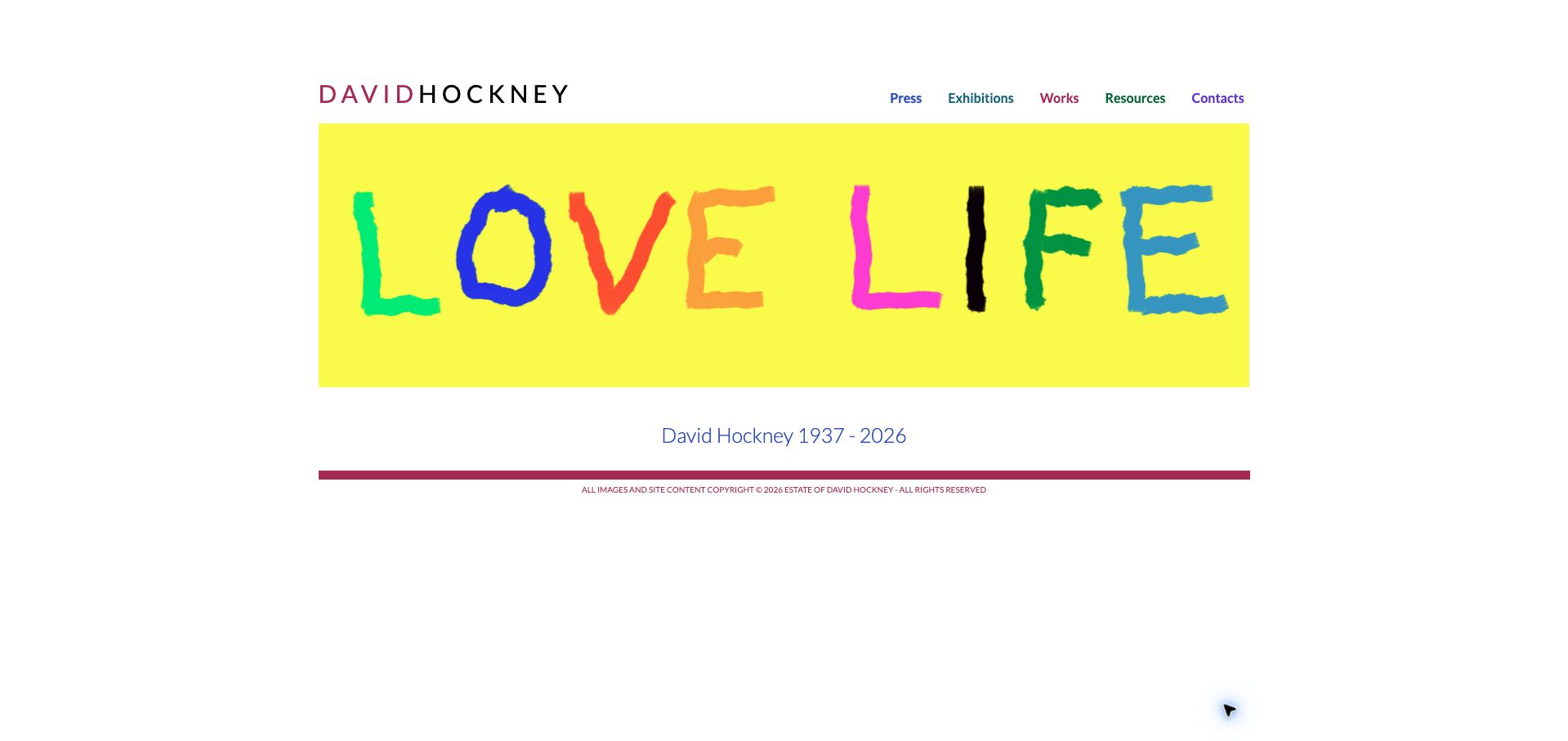
David Hockney’s site uses a restrained white page, compact navigation and a large hand-lettered artwork as its opening image. The inspected homepage includes an estate and memorial notice, so this example is a maintained artist archive rather than a claim about a living artist’s current studio activity. The navigation organizes access to work and background information without a retail-style campaign dominating the view. The approach is useful for an archive whose visitors may include researchers, curators and people discovering the work for the first time. Its compact labels and modest explanatory copy make the structure quiet, but also ask visitors to begin exploring before receiving much orientation.
What you can learn
State clearly whether a website represents a current practice, an estate or an archive. Keep the body of work easy to browse, and distinguish historical records from new notices without silently treating older material as newly created.
Pros
The restrained frame gives the opening artwork clear visual priority.
The estate notice clarifies the role of the maintained website.
Cons & considerations
Compact navigation labels require close attention.
The opening view provides limited guidance for different research or browsing needs.
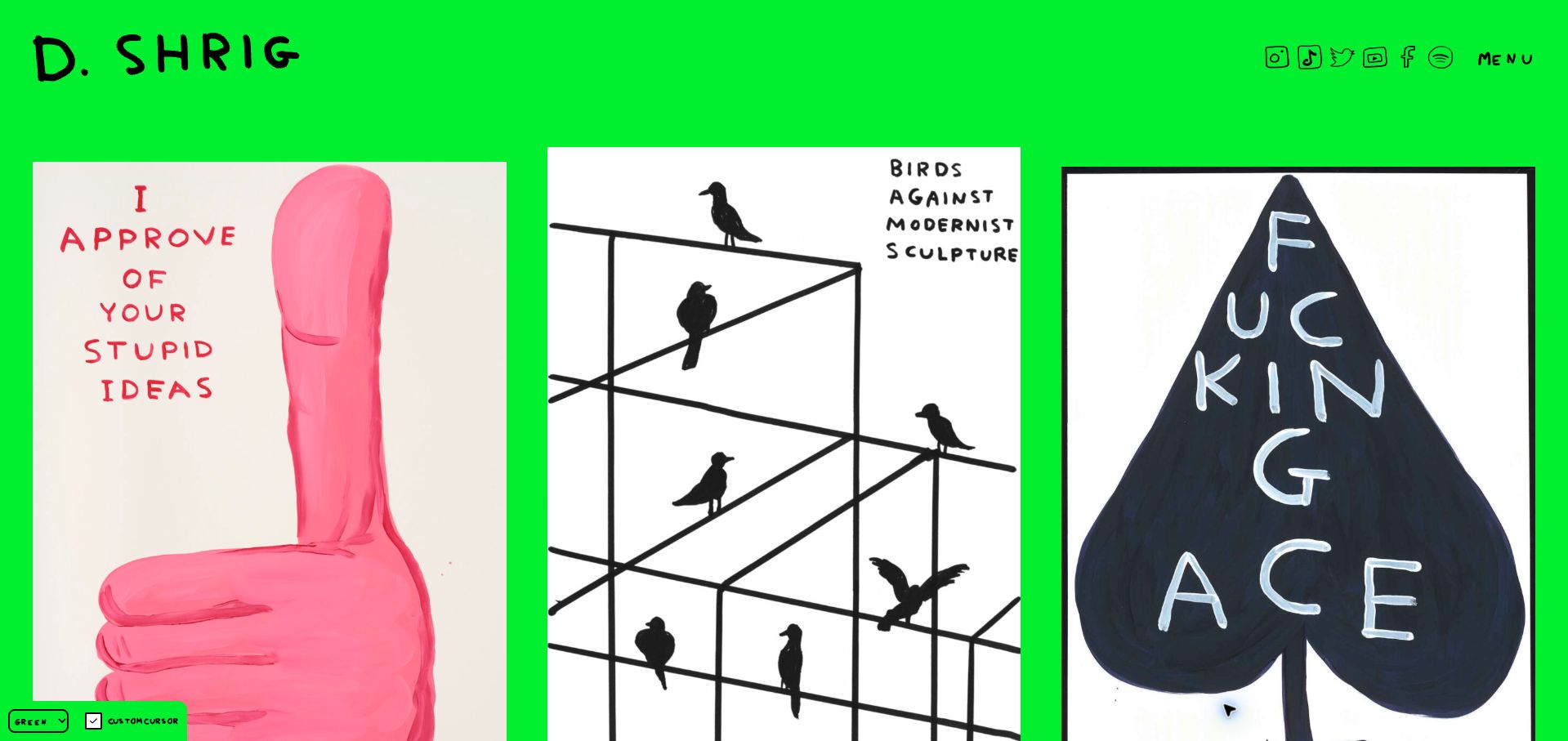
David Shrigley’s homepage places an irregular grid of artworks on a vivid green field beneath a hand-drawn identity. The interface includes color choices and a custom-cursor control, making the page’s presentation part of the playful experience. The work remains the main content, with drawings, painted objects and written pieces appearing together rather than being separated into a formal exhibition catalog. This is useful for studying a site whose tone comes from both the artwork and the surrounding controls. The unusual cursor and strong background are also deliberate tradeoffs: they can distract from close inspection, especially for someone who arrives with a specific research task.
What you can learn
Give expressive interface features an obvious off switch and keep the work accessible through ordinary navigation. A playful visual system should help communicate the practice while still allowing visitors to choose a quieter way to browse.
Pros
The artwork and hand-drawn identity create a consistent tone.
Presentation controls let visitors change aspects of the visual experience.
Cons & considerations
A vivid background can compete with artwork colors and written pieces.
A custom cursor may distract from reading or make interaction less familiar.
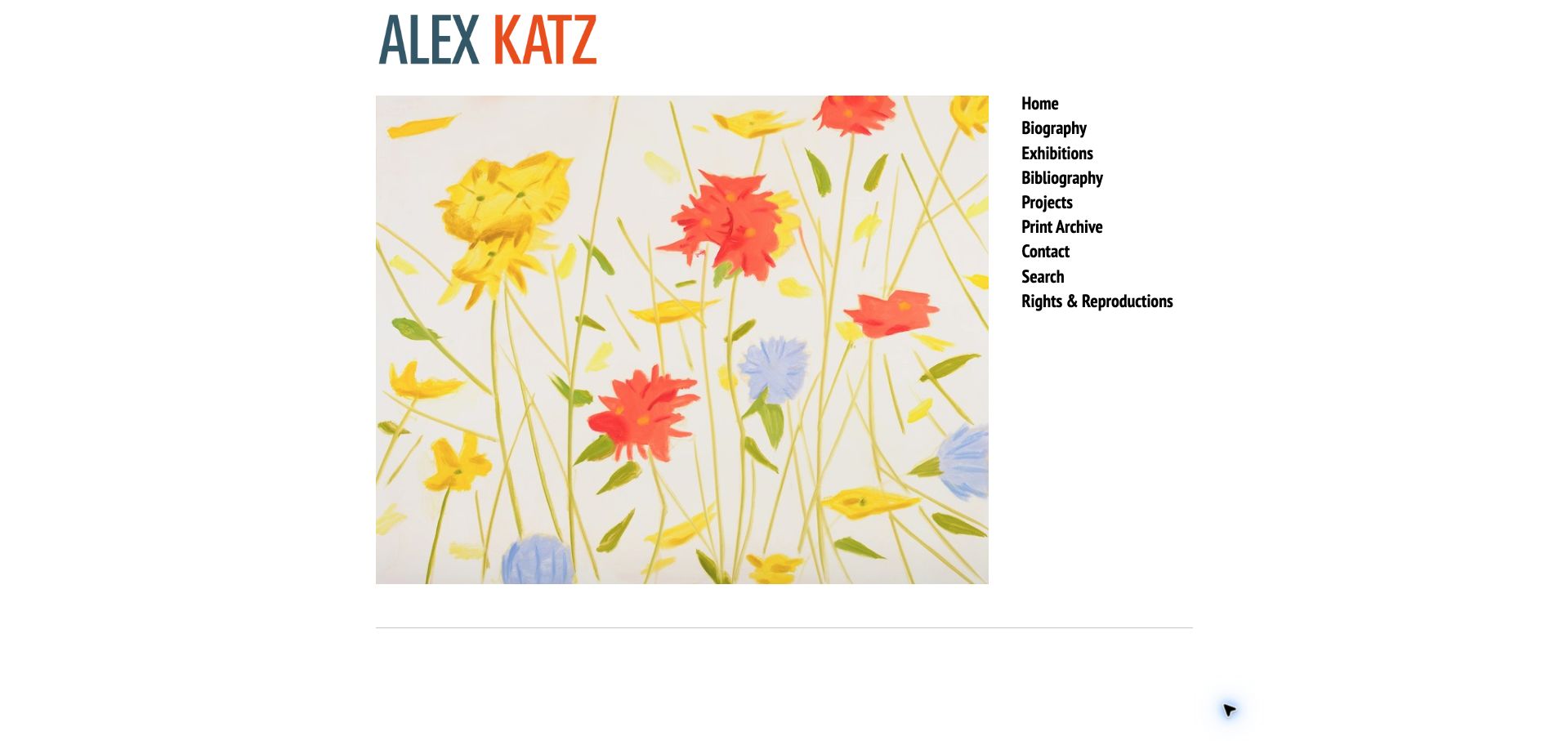
Alex Katz’s homepage places a large painting beneath a two-color name, with a vertical navigation list immediately to its right. Biography, exhibitions, bibliography, projects, the print archive, contact, search and rights information are all visible without opening a menu. The generous white margins keep the structure easy to understand and allow the artwork to carry the visual interest. This is a useful reference for a long-running practice whose visitors need reliable archival routes as much as an atmospheric introduction. The page is less explanatory at the project level: the prominent painting has little visible title or date information in the opening frame.
What you can learn
Use descriptive archive labels when visitors may be looking for publications, rights or exhibition records. Keep practical routes visible beside the artwork, and add concise work metadata so the main image can serve as a reference as well as an introduction.
Pros
Archival and rights destinations are visible in a single clear list.
White space separates the artwork from navigation without decorative clutter.
Cons & considerations
The opening painting lacks a prominent identifying caption.
The fixed-looking two-column composition needs careful adaptation on narrower screens.
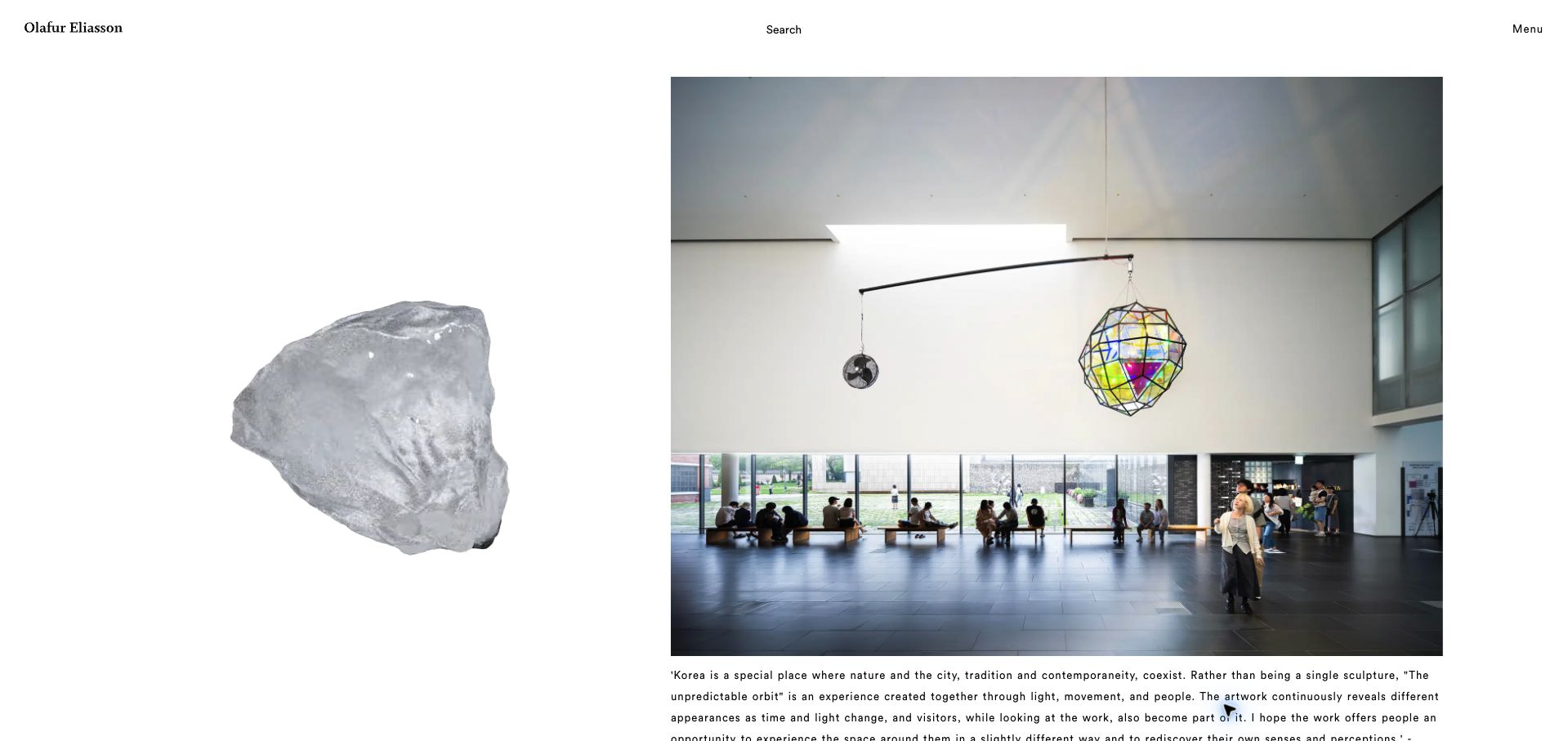
Olafur Eliasson’s homepage combines a large project photograph with explanatory text, a linked institution and a visible relative posting date. The captured installation is shown in a public interior with people nearby, which helps communicate its scale and setting. A large floating object at the left adds a more experimental visual layer, while Search and Menu remain at the top. The page is useful because it treats current work as a sequence of documented updates rather than an unlabeled slideshow. The detailed captions provide more orientation than many image-led portfolios, although their small type and long lines require deliberate reading.
What you can learn
Document public installations with their title, setting, image credit and a useful institutional link. Let a project journal explain how work is encountered, while keeping decorative motion separate from the text people need to understand it.
Pros
The project caption connects the image to a location and public presentation.
People and architecture in the photograph communicate the installation’s scale.
Cons & considerations
Long, small caption text is less easy to scan than a short project summary.
The floating decorative object competes with the documentary photograph.
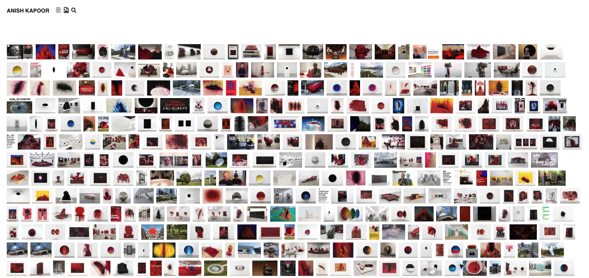
Anish Kapoor’s homepage displays many small images in a tightly packed grid, giving a broad view of the archive in a single screen. Compact controls offer text, image and search modes, while the underlying list names artworks, exhibitions and related references. This approach is useful for an established body of work where visitors may recognize an image before they know its title. It also makes the archive feel extensive without a lengthy introduction. The density creates a clear tradeoff: individual thumbnails reveal little detail, and the icon-based controls require more interpretation than fully written navigation labels would.
What you can learn
Offer both visual and textual routes through a large archive, with search for known titles. Use the overview to support discovery, then provide substantial images and clear metadata on individual records rather than expecting thumbnails to do every job.
Pros
The dense grid makes the breadth of the archive immediately visible.
Text and search alternatives support visitors who know what they are seeking.
Cons & considerations
Small thumbnails are difficult to inspect closely.
Compact icon controls can be less self-explanatory than visible text labels.
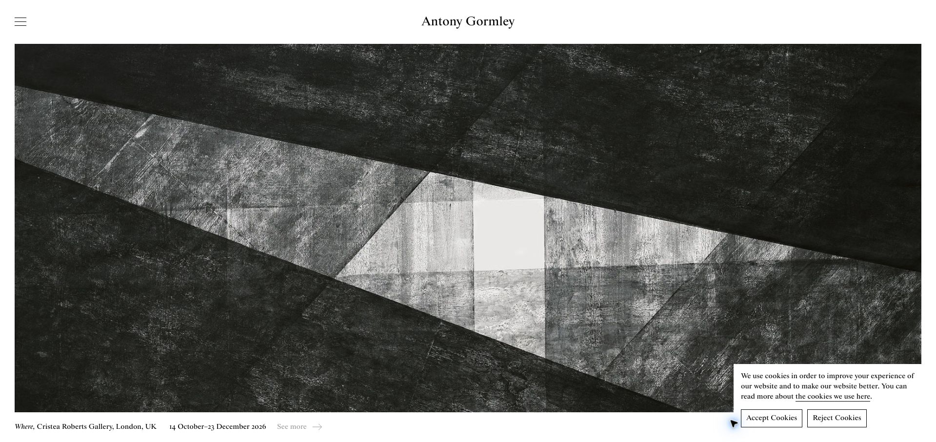
Antony Gormley’s homepage gives a monochrome artwork most of the opening view, with the artist’s name centered above it and a compact menu at the left. A narrow caption below the image identifies the exhibition, venue, city and date range, followed by a continuation link. The public page then lists additional exhibitions and publications in a readable sequence. The useful distinction is between atmosphere and information: the image can remain large because its essential context has a consistent place immediately beneath it. The initial cookie panel covers part of the lower image, however, and the subdued continuation link is less noticeable than the artwork itself.
What you can learn
Give exhibition images a compact, reliable caption containing title, venue and dates. Keep current and past activities distinguishable, and make the route to practical exhibition information obvious without placing a large block of text over the work.
Pros
The caption supplies concrete location and date information.
A restrained header leaves the artwork visually dominant.
Cons & considerations
The first-visit cookie panel overlaps part of the main image.
The light continuation link has limited visual emphasis.
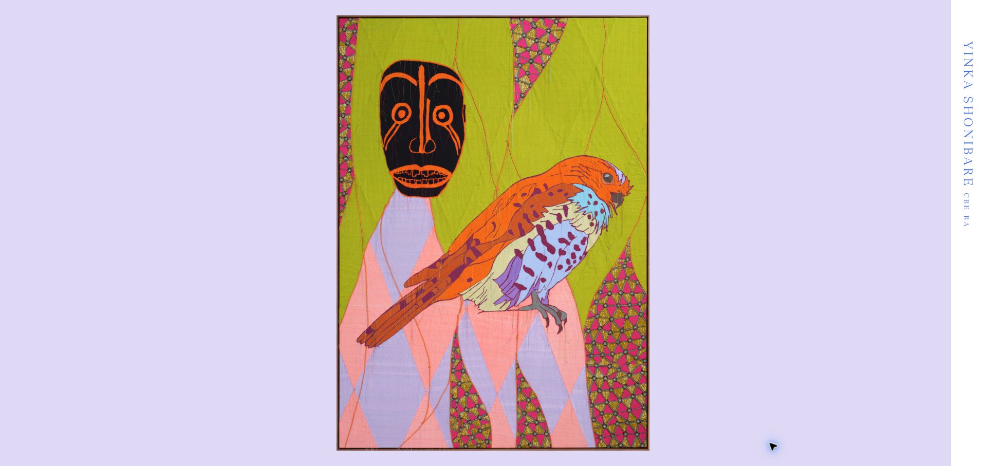
Yinka Shonibare’s opening view places a tall artwork against a pale lavender field, with the artist’s name arranged vertically along the right edge. The underlying collection provides filters for editions, film, painting, photography, public art, sculpture, textiles and works on paper, together with alternate gallery and overview modes. Individual records include medium and dimensions, giving the archive useful factual depth beyond its immersive entrance. The example shows how a practice spanning many formats can retain a coherent visual presentation. Its main tradeoff is discoverability: the initial frame gives little indication of the extensive filtering and descriptive structure available farther into the collection.
What you can learn
Use medium filters when the distinctions help people find relevant work, and include materials and dimensions on individual records. Let an immersive opening introduce the artwork while making the archive’s more practical controls easy to discover.
Pros
Medium filters support a practice with several distinct forms of work.
Record descriptions include useful materials and dimension information.
Cons & considerations
The opening frame hides much of the archive’s practical structure.
Vertical branding takes longer to read than a conventional horizontal title.
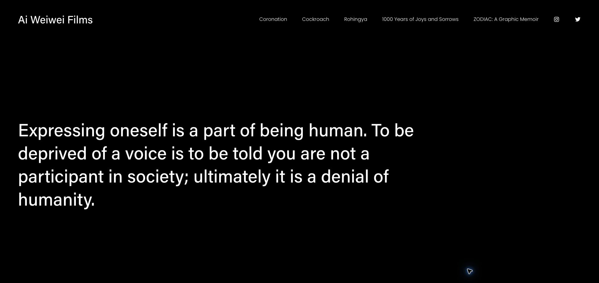
Ai Weiwei Films uses a black page and large white statement to establish the subject and tone of this particular website. A concise header links directly to named films and publications, while About and Contact are available below. The property is presented here as the artist’s film and publication site, not as a complete catalog of every artwork or project. Its unusually direct structure is useful when a practice needs a focused destination for a small set of substantial works. The tradeoff is equally clear: the opening statement takes the place of visual previews, so visitors must choose a title before learning much about an individual film.
What you can learn
Define the scope of a specialist artist website clearly and let a short menu reflect that scope. If the opening uses a statement instead of artwork, provide concise project summaries or previews nearby to help unfamiliar visitors choose where to begin.
Pros
Named film and publication links provide direct routes to the main material.
High-contrast text creates a clear and consistent opening hierarchy.
Cons & considerations
The first view offers no visual preview of the linked films.
Project titles alone provide limited guidance to someone unfamiliar with the work.
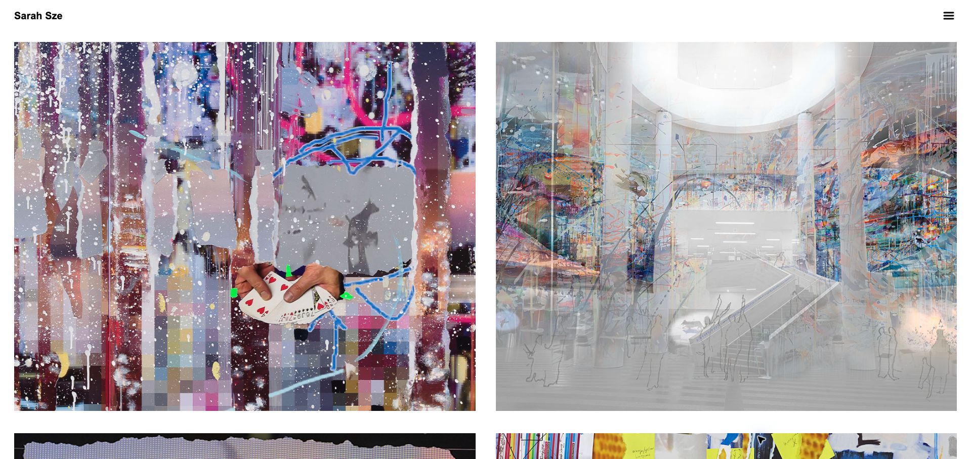
Sarah Sze’s homepage uses a simple name and menu above a two-column image grid. The large image cells preserve installation detail, while the inspected links connect individual items to galleries, museums and other exhibition sources. This makes the page function as a visual index of activity rather than a conventional self-contained project catalog. The arrangement is useful for a practice whose public work is often documented by presenting institutions. It also creates a maintenance responsibility: the artist’s site depends on those outside destinations remaining available, and the uncluttered opening view gives little written context before a visitor follows an image away from the site.
What you can learn
Use large documentary images when installation detail matters, but explain each destination and preserve essential project information locally. External museum and gallery links should supplement a durable record rather than be the only place a visitor can understand the work.
Pros
Large image cells retain the detail and scale of installation photographs.
Institutional destinations provide direct paths to exhibition information.
Cons & considerations
The image-led grid provides little visible explanatory text initially.
External project destinations can move or disappear outside the artist’s control.
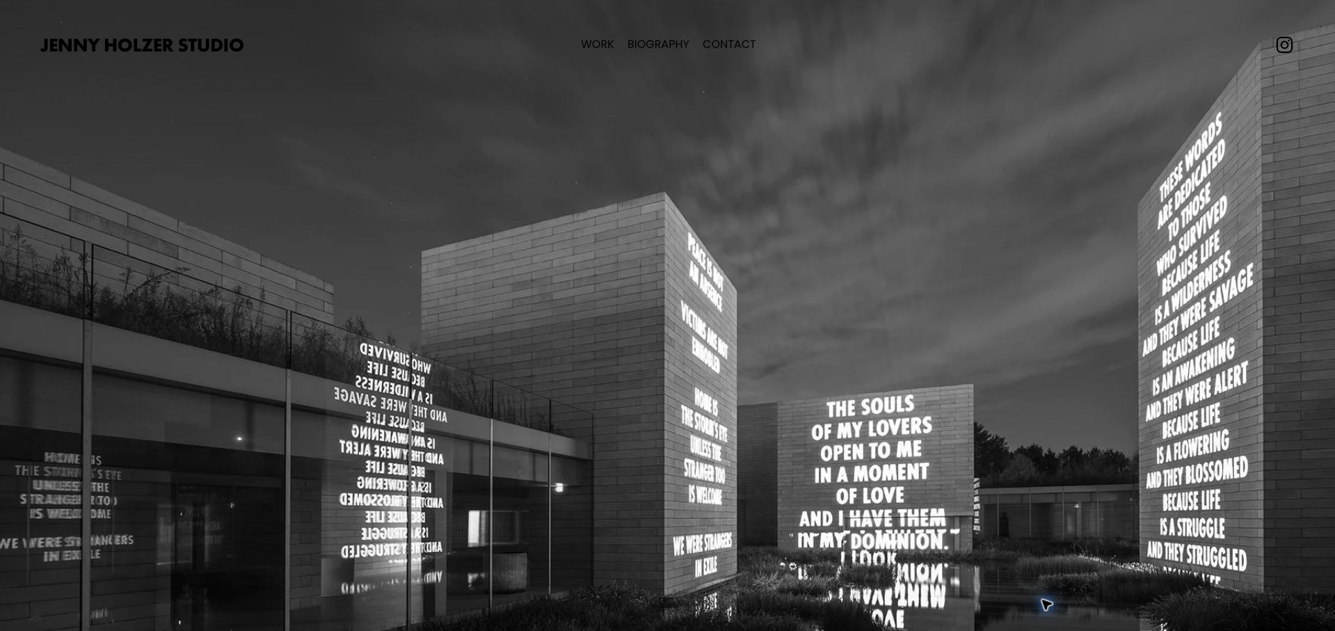
Jenny Holzer Studio places a full-screen installation photograph beneath a compact studio identity and a small set of navigation labels. The captured scene shows projected text across buildings, allowing the relationship between language, architecture and public space to become the main introduction. Work, Biography and Contact remain available along the top, with a separate social link at the edge. The page is useful for studying an artist website that lets a documented installation establish its subject without an additional marketing headline. Its limitations follow from the same restraint: the opening view supplies little caption information, and dark navigation has modest separation from parts of the photograph.
What you can learn
Show public work in its actual setting when the setting is part of the piece. Provide a clear work archive and a concise title, location and credit so the photograph can support understanding as well as atmosphere.
Pros
The wide photograph explains the relationship between artwork and architecture.
A short navigation preserves direct biography and contact routes.
Cons & considerations
The opening installation lacks a prominent identifying caption.
Dark header text can blend into darker areas of the image.
Kehinde Wiley Studio begins with full-screen moving imagery and a quiet studio name in the corner. A contrasting black menu button provides the main entrance to exhibitions, special projects, selected works, background information, press, shopping and the associated residency initiative. The saved frame shows people within a winter landscape, demonstrating how a film can introduce mood and setting without functioning as a conventional painting thumbnail. The public page contains substantial context beyond that opening. For an artist website, the useful lesson is the relationship between a strong cinematic first impression and the ordinary archival routes needed by visitors with specific questions.
What you can learn
Treat a homepage film as one entrance to the work, with clear archive and contact routes available alongside it. Add written context and usable alternatives so visitors do not need to watch a sequence to understand the practice.
Pros
Original moving imagery gives the studio a distinctive introduction.
The broader menu separates exhibitions, selected work and background information.
Cons & considerations
The first frame gives little explanation of the film’s project context.
Most practical destinations remain hidden behind the menu control.
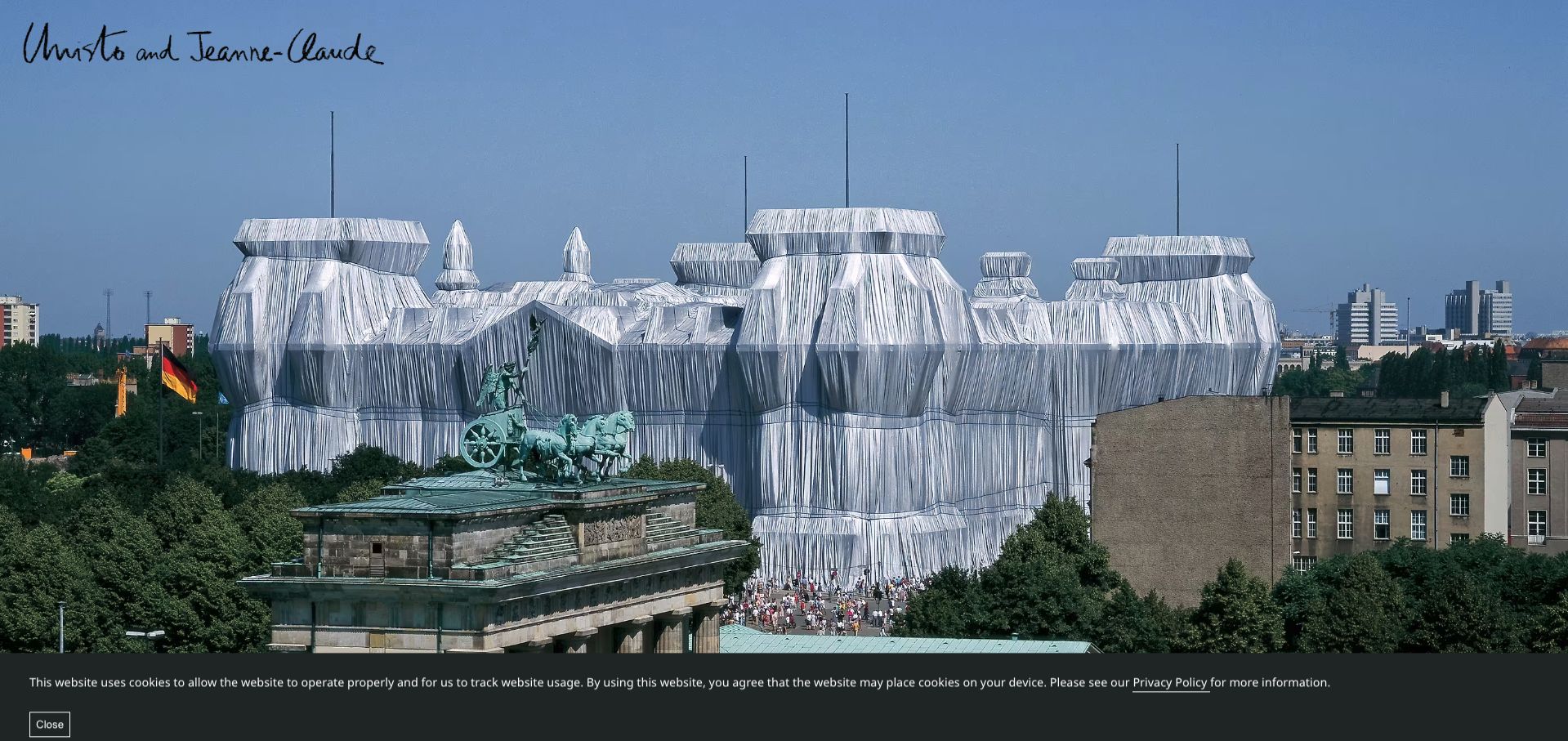
Christo and Jeanne-Claude’s site opens with a large documentary photograph and a handwritten identity. The captured view of a wrapped building conveys the scale of the project through its surrounding city and visitors. The public navigation distinguishes realized projects, early work, indoor installations, work in progress and projects not realized, while a separate group provides biography, publications, films and frequently asked questions. Those distinctions make this archive especially useful as an organizational reference: a proposal does not need to be presented as a completed artwork. The immersive opening, however, reveals little of that structure until the visitor proceeds into the site.
What you can learn
Separate completed work, proposals and ongoing projects explicitly in an artist archive. Pair documentary photographs with dates, image credits and factual project records, preserving the distinction between historical intentions and what was actually realized.
Pros
The archive differentiates realized and unrealized projects clearly.
The large documentary image communicates the work’s physical scale.
Cons & considerations
The opening photograph gives limited orientation to the archive structure.
The first-visit cookie notice occupies a substantial strip below the image.
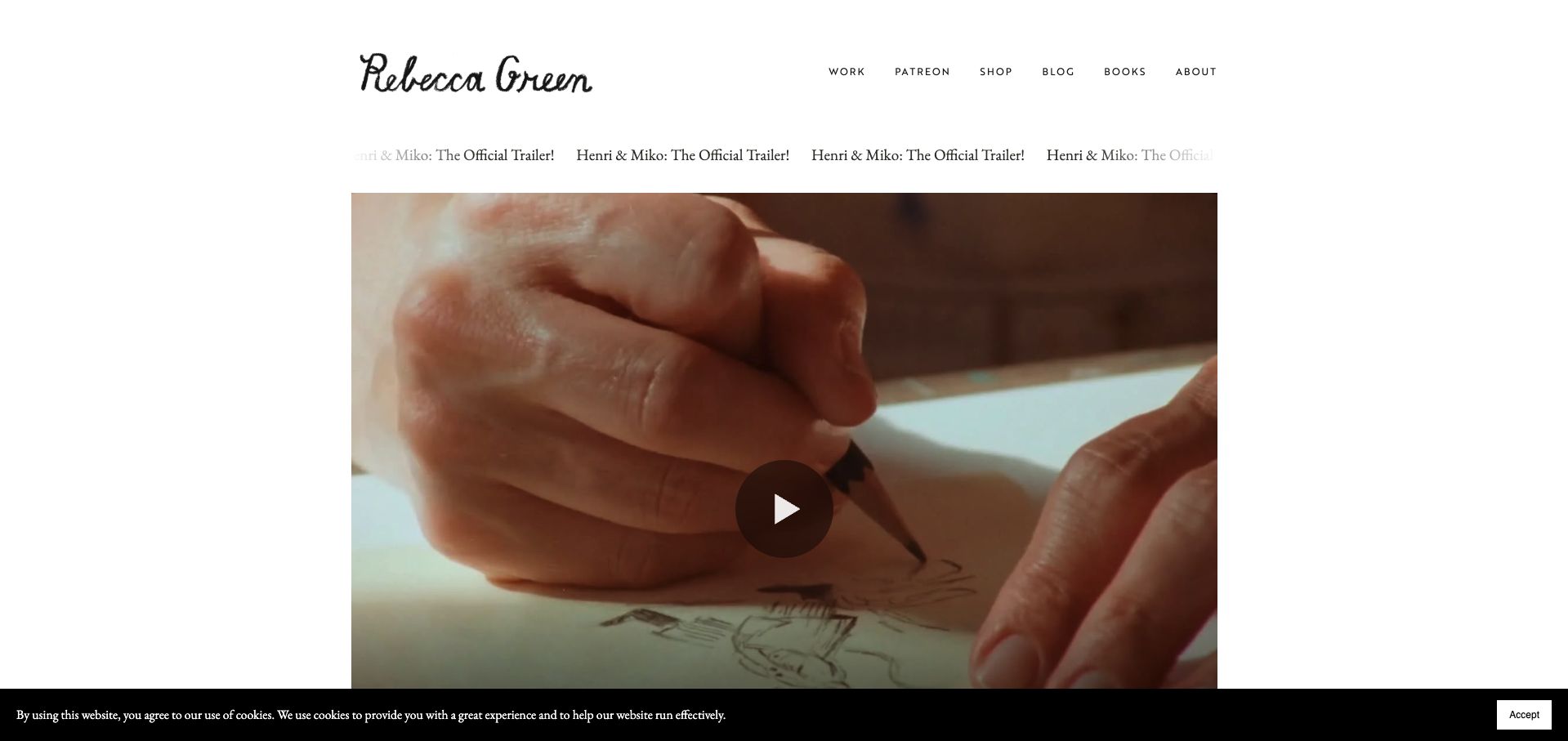
Rebecca Green’s homepage combines a handwritten name with a short navigation and a large book-trailer preview. The captured image shows a hand drawing, connecting the publication to the process behind its illustrations. Work, books, a shop, a journal and supporter information remain separately available above the launch material. The page gives the current book a prominent campaign position without replacing the broader portfolio structure. This is useful for an illustrator whose audience includes readers as well as commissioning clients. The repeated trailer announcement adds movement and emphasis, but visitors looking for a quick overview of completed illustration work need to use the Work destination.
What you can learn
Give a new publication a clear launch area while retaining a stable portfolio route. Show process when it helps explain the artwork, and provide a written summary and ordinary project links alongside any trailer or moving announcement.
Pros
The drawing image connects the publication to the illustrator’s process.
Books, work and shopping remain distinct navigation choices.
Cons & considerations
The repeated trailer announcement competes with the otherwise restrained layout.
The launch emphasis delays a broad overview of the illustration portfolio.
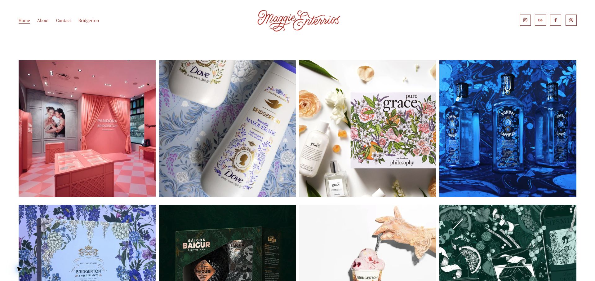
Maggie Enterrios presents a four-column grid of commissioned work beneath a centered script identity and a compact navigation. The opening images show artwork applied to packaging, products and an event setting, rather than treating every illustration as a flat digital file. Named project links in the public page connect those images to particular collaborations. The arrangement is useful for a potential client trying to understand how an illustrator’s visual language works in a real application. About and Contact remain easy to find, while a separate collection destination supports a recurring body of work. The highly visual grid could still benefit from more immediately visible role and project descriptions.
What you can learn
Show commissioned artwork in its finished context and explain what part of the project the artist created. Keep case-study names and inquiry routes clear so the portfolio can support a practical brief as well as visual inspiration.
Pros
Product and environmental photographs demonstrate the artwork’s applications.
The short header retains direct background and contact routes.
Cons & considerations
Project context relies heavily on opening individual image links.
Four equal columns make detailed illustrations relatively small in the overview.
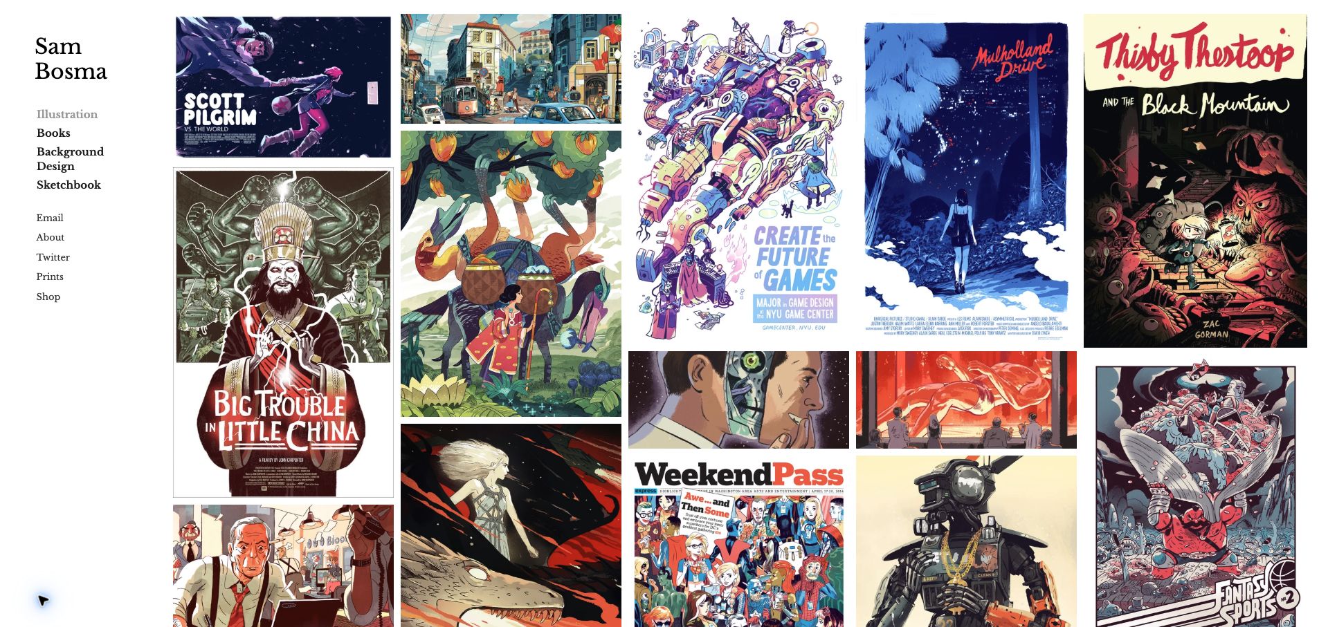
Sam Bosma’s site places a narrow text sidebar beside a dense masonry arrangement of illustrations. The sidebar separates illustration, books, background design and sketchbook material, then provides contact, biography, prints and shop destinations. The images keep their varied proportions, allowing book covers, posters and landscape work to coexist without forcing every piece into the same square crop. This is a practical reference for an illustrator whose work spans several formats but shares a recognizable visual character. The large number of images creates an immediate sense of range, although project titles, dates and commissioned roles are not prominent in the first visual overview.
What you can learn
Preserve meaningful image proportions and use a small, stable set of categories to organize a varied portfolio. Add enough project context to distinguish a commission from personal work, and keep the contact route available while people browse.
Pros
The sidebar keeps work categories and contact destinations visible.
Varied image proportions preserve the character of posters and book covers.
Cons & considerations
The dense gallery can overwhelm someone seeking a single relevant project.
The overview provides limited visible dates, client context or role descriptions.
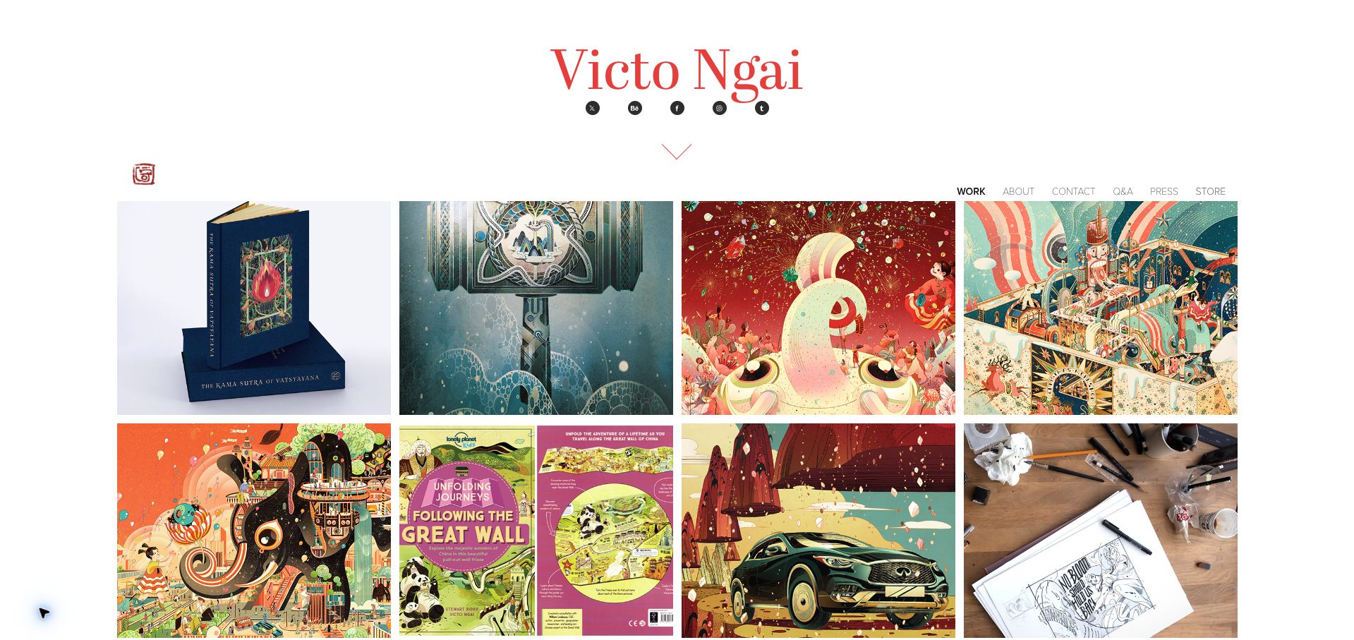
Victo Ngai’s homepage uses a large red name above a compact navigation and a four-column image grid. The work includes book objects, illustrated campaigns and finished applications, giving the overview variety without adding decorative interface elements. Project titles and years are available in the public page, while About, Contact, questions, press and shopping have separate routes. The contrast between a quiet white frame and intricate artwork is the useful design lesson. The generous identity area takes substantial room before the portfolio begins, and the older dates attached to prominent projects mean visitors should read them as an archive rather than assume every featured item is newly created.
What you can learn
Let detailed artwork provide the visual richness while the interface stays simple. Preserve accurate project dates and explain the artist’s role, using the homepage to present a considered selection rather than implying that every featured commission is recent.
Pros
The restrained frame gives complex illustrations clear visual priority.
Project years help distinguish archival work from current activity.
Cons & considerations
The large introductory name pushes the first work row lower on the page.
Small navigation labels are less prominent than the surrounding artwork.
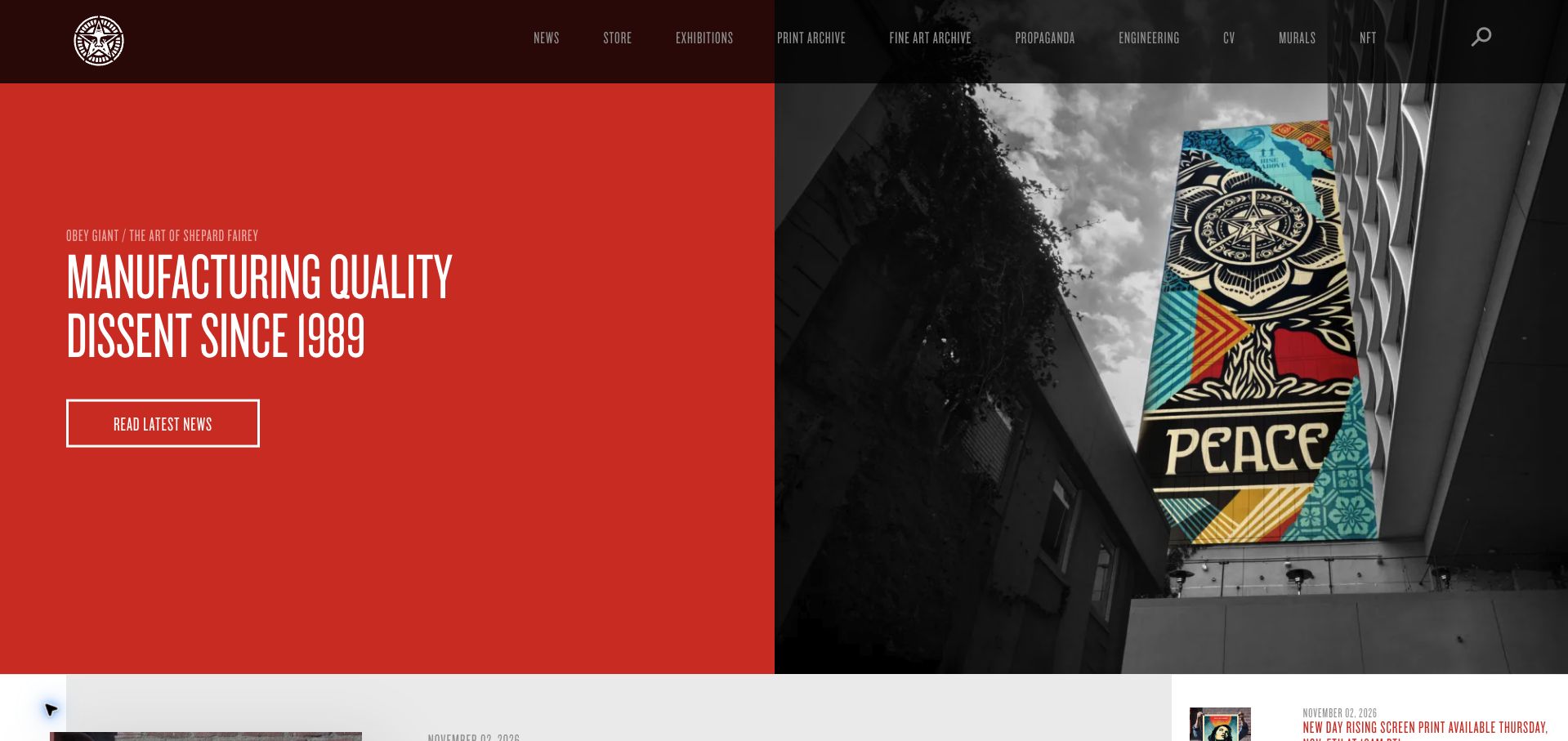
Shepard Fairey’s Obey Giant site combines a strong red text panel with a large mural photograph, then gives a clear route into the latest news. The header distinguishes the store, exhibitions, print and fine-art archives, writing, murals and background information. Below the opening view, dated posts connect new editions and exhibitions to explanatory text and source destinations. This is useful for an artist whose website serves an ongoing audience as well as first-time visitors. The editorial structure provides context beyond a portfolio grid, though the dense uppercase navigation and several specialized labels require more interpretation than a short conventional menu would.
What you can learn
Connect new releases to a dated journal and preserve separate archives for different kinds of work. Use documentary images to show public projects in context, while making specialized menu terms understandable to visitors who are new to the practice.
Pros
The mural photograph shows the artwork at architectural scale.
Dated posts connect current releases with explanations and further information.
Cons & considerations
The dense uppercase navigation makes the first choice less immediate.
Specialized menu labels may be unclear without prior familiarity with the site.
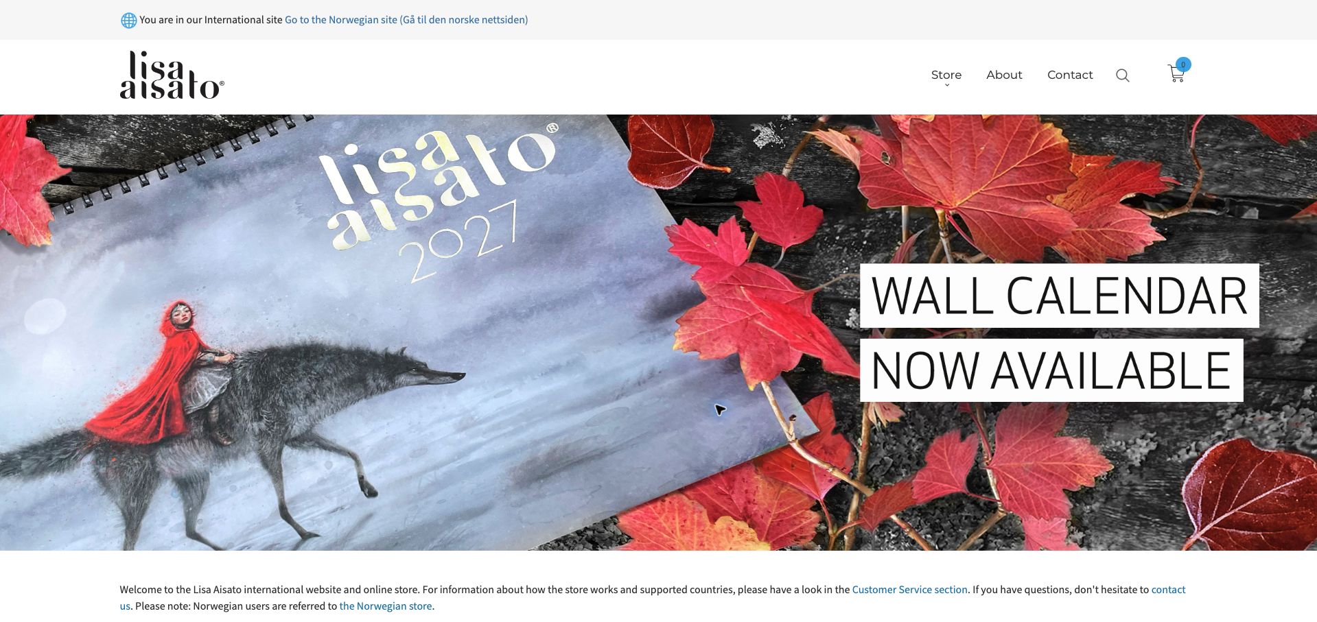
Lisa Aisato’s international site identifies the visitor’s regional storefront in a narrow top strip and links to the Norwegian alternative. A spacious white header separates Store, About, Contact, search and cart controls from a large illustrated calendar campaign. The introductory copy explains the international store and points to customer-service information, adding useful context before the product listings. This is a strong organizational reference for an artist selling work across different delivery territories. The first visit presented a substantial cookie dialog; the saved view follows the necessary-only choice. The campaign image is attractive, but its large promotional lettering temporarily takes priority over the broader print collection.
What you can learn
Make storefront territory and customer-service information explicit before someone begins shopping. Keep art, edition information and delivery expectations connected, and ensure a seasonal product campaign does not hide the permanent routes into the artist’s work.
Pros
The regional-store notice reduces uncertainty about the intended market.
Customer-service guidance appears near the introduction to the shop.
Cons & considerations
The initial cookie dialog obscures much of the opening artwork.
The calendar campaign dominates the first view of the wider collection.
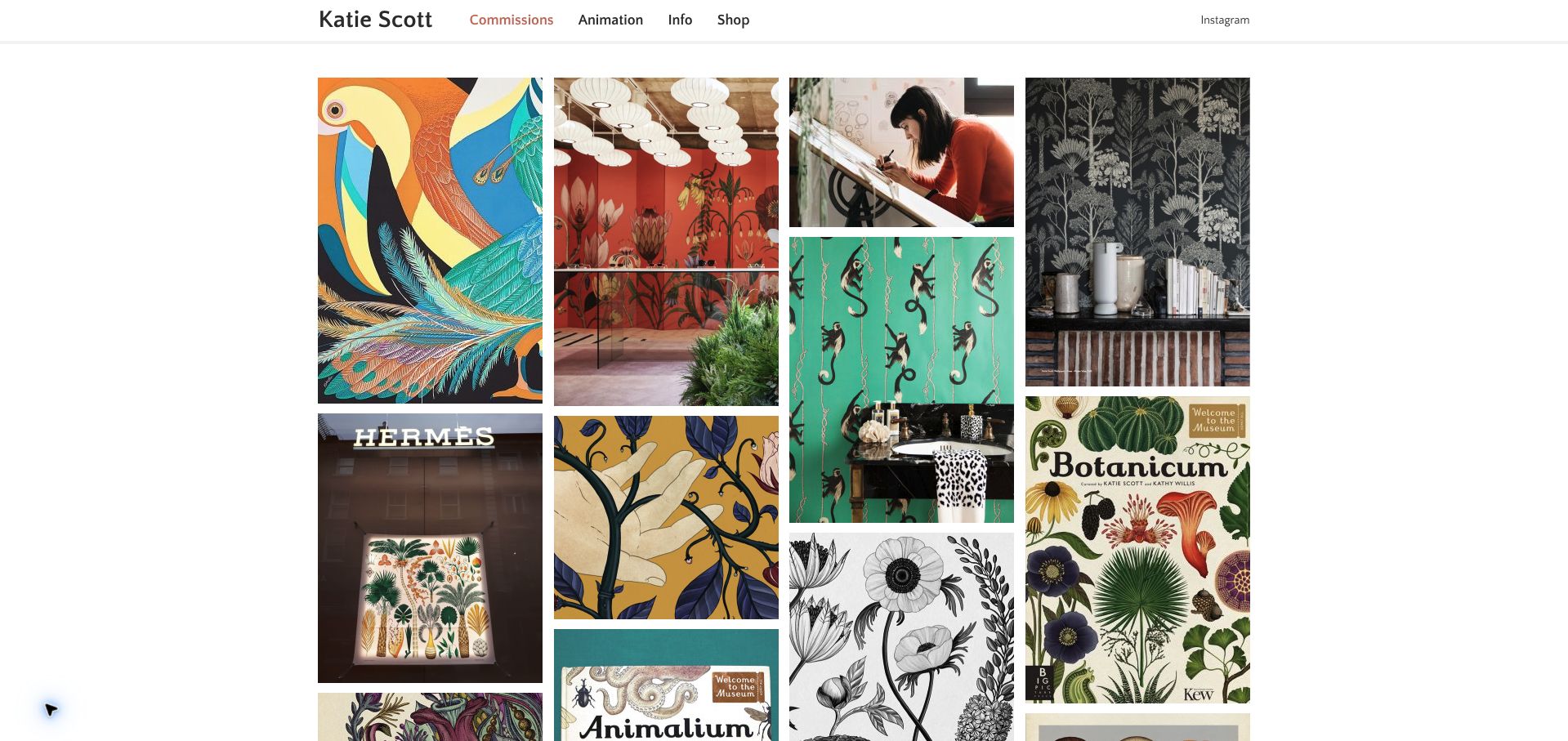
Katie Scott’s homepage places a concise navigation above a masonry grid of commissioned work. The saved view combines botanical artwork, interior applications, a working portrait, a shop window and illustrated books, showing how a consistent drawing language can move across formats. The header distinguishes commissions, animation, information and shopping without requiring a long introductory statement. This is useful for studying a portfolio that lets actual applications demonstrate the scope of the practice. The grid’s restraint has a downside: project titles and roles are not prominent in the overview, and the inspected image descriptions are uninformative, leaving important context dependent on visual recognition.
What you can learn
Show a range of real applications when an artistic practice crosses media, but attach useful project names, roles and image descriptions. A quiet interface should simplify browsing without removing the information people need to understand each commission.
Pros
The mix of books, interiors and objects demonstrates the work’s range.
The concise menu provides clear routes to commissions, animation and shopping.
Cons & considerations
The overview gives little visible project or client explanation.
Inspected image descriptions do not meaningfully describe the artwork.
Kegan is a freelance web designer and developer with 15+ years of experience helping businesses turn complicated website requirements into clear, maintainable digital experiences. He works directly with clients from planning and design through development, launch, and ongoing support.
For artist website design, his development approach focuses on original work portfolios, readable project context, careful image presentation, commercial and personal work navigation, and appropriate commission or shop inquiries. The scope can be a targeted improvement or a complete custom build, with responsive layouts, thoughtful content structure, and integrations chosen around the people using and maintaining the site.
Show 3 other artist website designersHide other artist website designers
Choose a structure that reflects the practice and the people visiting it
Decide what the website is responsible for presenting
Start by defining the site’s scope. It might be a selected portfolio, a chronological archive, a studio introduction, a shop or a property devoted to one medium. That decision affects how visitors interpret the opening work. A selective presentation does not need to look exhaustive, while an archive should help readers understand its coverage and dates.
List the recurring visitor tasks without assuming every audience needs the same entrance. A curator may seek a biography and project context, a prospective client may want to see relevant commissions, and a collector may be looking for a gallery or sales route. Use only the relationships that actually apply. A clear contact or representation page can explain responsibilities without making the homepage feel like a generic service business.
Choose categories that reflect meaningful distinctions in the work. Medium, project, year or commission type can all be useful, but avoid a dense classification system with only one item in each section. If a project crosses categories, give it one maintained record and several sensible paths into it rather than duplicating contradictory descriptions. Keep a simple route back to the overview.
Edit the visual sequence and its supporting information together
Treat the portfolio edit as part of the design. A strong image at the beginning can establish tone, but a long sequence of similarly cropped thumbnails may conceal differences in scale or medium. Mix overall views and details deliberately, and make clear when several images belong to one project rather than several separate works.
Prepare a consistent minimum set of captions appropriate to the practice. A title, date, medium and relevant credits often answer basic questions without requiring a long explanatory paragraph. Installation photographs may need a venue or exhibition context; commissioned illustration may need the actual client or publication when that information is approved for release. Do not invent project outcomes or a broader role than the record supports.
Keep visual experiments usable on small screens. Check whether navigation remains recognizable over changing imagery, whether a visitor can leave a large image view and whether captions can be reached without hover. Meaningful alternative text should describe the purpose of the image in its context. Avoid treating filenames as captions or leaving every image to be announced with the same generic label.
Maintain biographies, archives and external routes as carefully as the images
Give biographies, exhibition lists and contact information a clear owner. Dates and roles should reflect the actual record, not the time a website happens to be rebuilt. A maintained archive or estate website should explain its own role and should not inadvertently imply that its subject is accepting current commissions. Preserve the distinction between a present-day website observation and the historical date of the work it displays.
If sales, representation, ticketing or downloads move elsewhere, label the transition accurately. A link to a gallery, publisher or shop should explain enough context for the visitor to understand who handles the next step. Do not put sensitive enquiries or private project materials into a public portfolio simply because they arrived through a website form.
Plan for regular, modest maintenance. Replace broken external links, update genuinely changed representation details and keep project credits intact when rearranging the work. Test a direct link to an older project as well as the homepage. Search engines, publications and social posts may send people to a page that is no longer featured, and that visitor should still find a recognizable site and a useful route through it.
The editing job behind the design
Choose a publishing system that protects the work’s context
Use structured project records when titles, dates, images and credits need to appear in several views. The editor should be able to reorder a selection without rewriting each project or losing its stable URL.
Plan responsive media around the actual work. A large painting detail, an installation photograph and a film still may need different crops and explanations. Keep navigation and text usable when media has not loaded.
Technology observations describe the sampled public page, not the artist’s creation tools or the complete infrastructure of a gallery, shop or archive linked from it.
Our WordPress website examples offer a separate look at publishing approaches. A visible platform label is evidence for that named page, not a guarantee that the same system will suit your requirements.
Before the public launch
Artist website brief checklist
Define whether the site is a selection, archive, studio property or shop.
Identify the actual visitor relationships the website should support.
Choose meaningful categories and a deliberate opening sequence.
Keep one maintained record for each project or work.
Use overall views and details for distinct explanatory purposes.
Confirm titles, dates, media, venues and collaborator credits.
Distinguish work dates from website observation and editorial dates.
Explain representation, archive and estate roles accurately.
Keep navigation and captions usable without hover.
Label external shop, gallery and download destinations clearly.
Test older direct project links and narrow-screen image views.
Assign responsibility for biographies, contact routes and archive updates.
These checks are a project checklist, not a performance, legal, security, or accessibility certification. Test real journeys with the people responsible for the website before making claims about the result.
Sources & editorial method
How this collection was selected and reviewed
The original saved draw is 29 and the collection includes exactly 29 accepted direct browser captures with original, collection-specific reviews. It includes selected portfolios, studio properties and archives rather than claiming that every source represents the entirety of a current practice. Broad technology-audit attempts preserve checked, partial and unavailable outcomes separately. We did not enquire about commissions, purchase work, assess artistic merit or independently verify sales and exhibition claims. The website observations do not change the dates of works or archival records.
Each example links to its actual source page. Screenshots are direct browser captures with their own capture dates; moving imagery, announcements and live designs can change. The notes describe observable design choices and conditional tradeoffs, not measured traffic, conversion results, service quality, or accessibility conformance.
Technology labels use public page metadata, asset evidence, or explicitly cited platform documentation. Platform documentation is not a complete current deployment audit. A component reference may be legacy or unused; it is not a complete backend inventory. Unknown stacks are omitted. These sites are editorial examples, not our client portfolio.
Written, Edited and Curated are separate editorial records, not timestamps advanced by a rebuild. Website designs and imagery belong to their owners. See our editorial standards or suggest a correction.
Questions worth asking
Artist website design questions
Does an artist website need a conventional homepage?
No. Its structure can reflect the practice. It still helps to provide recognizable navigation, a deliberate introduction to the work and a dependable way to find essential context or contact information.
Should every work appear in the opening portfolio?
Not necessarily. A selected edit can communicate a practice clearly. If the site also maintains a broader archive, distinguish that scope and give visitors an understandable route to it.
How much text should accompany the images?
Use the amount needed to identify and contextualize the work. Consistent titles, dates, media and credits can be more useful than long promotional descriptions. Add project explanation where it helps a visitor understand the actual brief or setting.
Should a portfolio and shop be separate?
Either arrangement can work. Make it clear when someone is viewing a work as part of a portfolio and when they are looking at a particular item offered for sale. Explain any handoff to a separate seller or representative.
Does the order rank the artists themselves?
No. The sequence is an editorial selection of website-design examples. It does not rank artistic merit, career importance, commercial success or the value of any work.