Best Postman Websites of 2026 (20 Real-World Examples)
Public developer portals and product websites with documented Postman API workflows, plus the design and integration lessons worth borrowing.
Postman helps teams organize, explain and test APIs. It is not a website builder. These twenty references connect public website design to a documented API workflow, with the scope of each relationship stated beside the example.
A useful API website does two jobs: it explains what a product can do and helps an integrator make the next informed decision. Some examples here are public developer portals; others are the marketing surfaces of products whose API delivery is documented in official Postman cases. Their screenshots do not establish a frontend runtime or CMS.
Study the transition from promise to implementation. Can someone find the correct product, understand the access model, locate a maintained collection and identify the next step without guessing? Those questions are more useful than copying the color palette of a familiar company.
Before the examples
What makes good Postman website development in 2026?
Describe the integration job before listing endpoints
Start with the outcome a developer needs: take a payment, synchronize a record, publish an incident update or manage a device. Explain which product owns that task and where its boundaries lie. A collection becomes easier to navigate when its organization follows a recognizable workflow instead of the internal team chart.
Make collections part of the documentation
Postman collections organize saved requests and can be shared with a team or publicly. Give each published collection a purpose, an owner and a route back to the authoritative reference. The website should explain what the example does, which environment it targets and what must be configured before it can run.
Keep the public promise separate from runtime claims
A vendor case about API testing does not identify the CMS behind a marketing site. Describe the documented service or engineering relationship precisely. Treat a public screenshot as design evidence and a technical source as evidence for the specific claim it makes; neither should silently stand in for the other.
The collection · 20 examples
20 Postman website examples worth studying
The opening five recognizable brands are PayPal, WhatsApp Business Platform, Autodesk, HubSpot and Siemens. Compare task navigation, integration choices and the transition into documentation. Every Postman association is scoped to a documented API service or delivery workflow, rather than inferred from a company logo.
We start with five recognizable brands or organizations: PayPal Developer, WhatsApp Business Platform, Autodesk, HubSpot developer documentation, Siemens Xcelerator Developer Portal. Each attribution applies to the named website property, not every product or website belonging to its organization. This is a curated reading sequence, not a measured ranking.
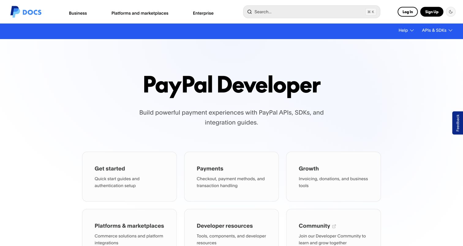
PayPal's developer entrance organizes a complicated payment ecosystem into a calm set of routes. The broad heading establishes the destination, while rounded cards divide getting started, payments, growth and supporting resources. Search remains near the brand instead of competing with the central explanation. Postman's official case documents public API collections and onboarding; the captured portal also links to PayPal's Postman repository. That connection supports an integration-workflow association, not a claim that Postman renders the page. The useful design decision is making the developer's next task more prominent than an exhaustive endpoint inventory.
What you can learn
Organize an API entrance around the first decisions an integrator makes. Keep a quickstart, reference and working collection discoverable together, then let the detailed documentation handle individual operations and exceptions.
Pros
The generous card layout makes several payment and developer resource categories easy to distinguish.
Persistent search provides a direct route for returning developers who already know their task.
Cons & considerations
Large introductory spacing pushes some useful resource choices below the initial desktop viewport.
Audience navigation and task cards need clear boundaries to avoid overlapping routes for newcomers.
Platform source: Official Postman customer case — documented API relationship. Public payment API collections, discovery, testing and developer onboarding. Official documentary API-service or delivery-workflow association. The public capture is not proof of Postman frontend runtime, CMS, a complete current stack or independently tested performance. Platform evidence is separate from the direct website screenshot and is not a complete current infrastructure audit.
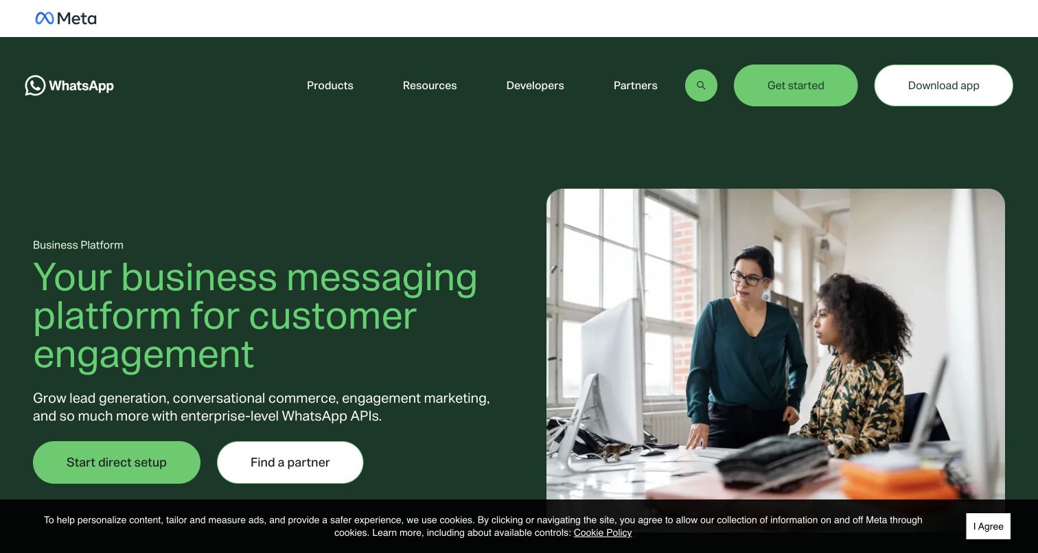
WhatsApp Business Platform uses a dark green background, bright green typography and workplace photography to make an API offering feel connected to everyday customer communication. Two adjacent actions distinguish direct setup from finding a partner. This is more useful than sending both audiences through an undifferentiated sales funnel. The official Postman case concerns Business Platform Cloud API documentation and onboarding, rather than the consumer messaging app or this page's rendering technology. The capture presents the public product proposition and its integration choices; it does not demonstrate message delivery, authenticated setup or a completed implementation.
What you can learn
Make integration ownership an explicit early decision. A business using a partner and a team building directly need different next steps, even when both are evaluating the same API product and customer outcomes.
Pros
The paired setup actions describe distinct routes without requiring visitors to decode technical terminology.
Consistent green accents connect the product identity, headline and most important action across the hero.
Cons & considerations
The opening view offers broad benefits before the detailed constraints an implementation team needs.
The visible cookie strip occupies the lower edge and competes with the hero's supporting content.
Visible tech stack
Earlier / documented evidence
Postman
Platform source: Official Postman customer case — documented API relationship. WhatsApp Business Platform Cloud API documentation, public collections and onboarding. Official documentary API-service or delivery-workflow association. The public capture is not proof of Postman frontend runtime, CMS, a complete current stack or independently tested performance. Platform evidence is separate from the direct website screenshot and is not a complete current infrastructure audit.
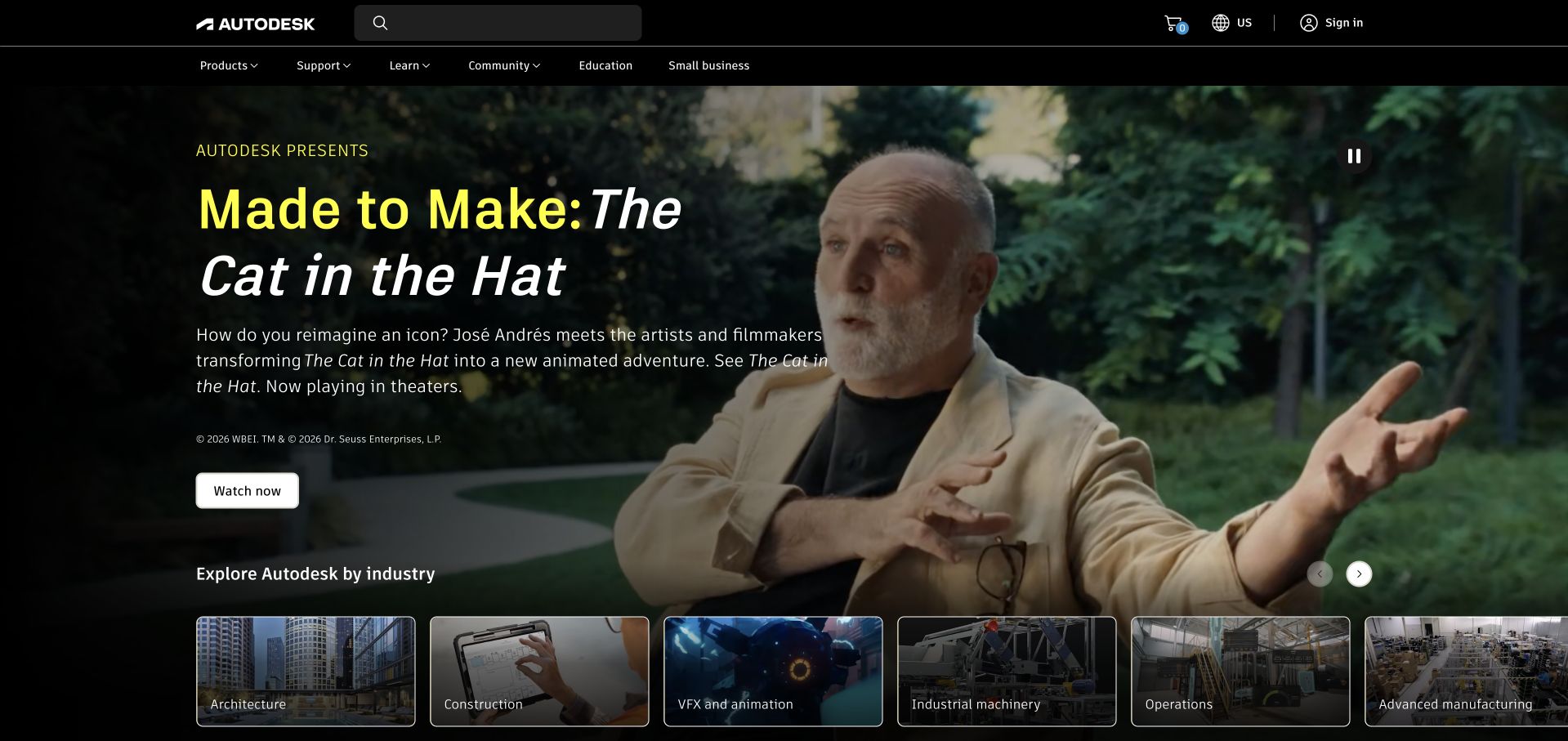
Autodesk's retained November capture combines a campaign with a row of industry destinations. A dark overlay gives the yellow and white headline enough separation from the video still, while the product, support and learning navigation remains consistent above it. Postman's case concerns Partner Web Services API distribution and partner licensing integrations. The homepage is a public design reference for Autodesk's software business, not a view of those partner workflows or proof of Postman runtime. Its useful detail is the immediate transition from an expressive story into architecture, construction, animation and manufacturing categories.
What you can learn
Let a campaign communicate the brand, but keep stable product and audience routes available around it. API partners need a separate documentation path with clear scope; the marketing story should never substitute for that technical reference.
Pros
The lower industry cards give the dramatic opening a useful route into more specific content.
Search and support remain visible above the campaign rather than disappearing into the promotional composition.
Cons & considerations
A large film-led hero can delay visitors who arrive with a precise software or licensing question.
The corporate capture cannot reveal the usability or current implementation of the documented partner API service.
Platform source: Official Postman customer case — documented API relationship. Partner Web Services API distribution and partner licensing integrations; the capture is Autodesk’s public software marketing homepage. Official documentary API-service or delivery-workflow association. The public capture is not proof of Postman frontend runtime, CMS, a complete current stack or independently tested performance. Platform evidence is separate from the direct website screenshot and is not a complete current infrastructure audit.
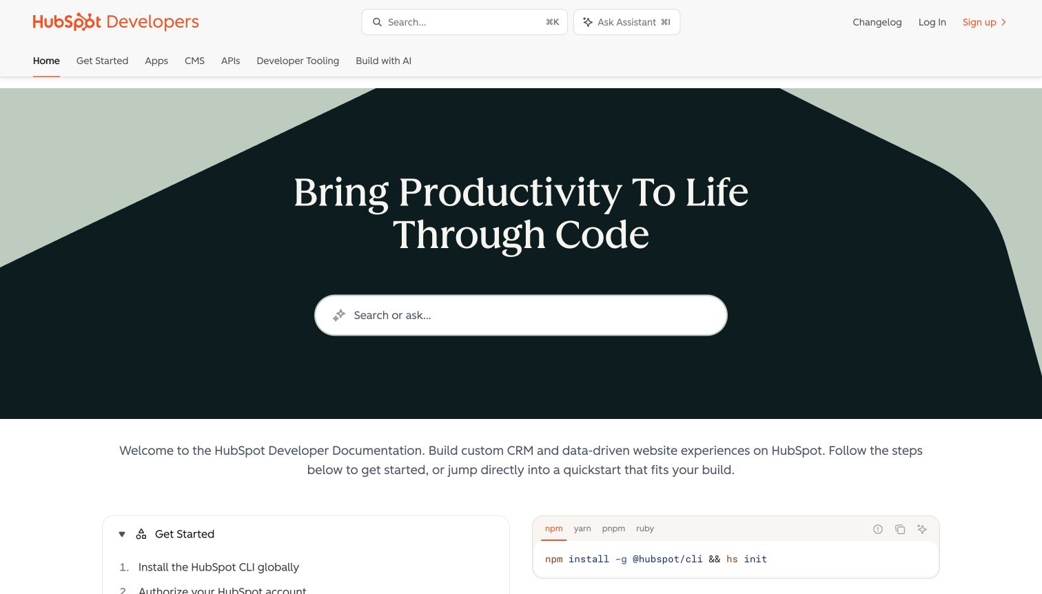
HubSpot's developer documentation puts a large search field inside a dark geometric hero, with product-area tabs and a smaller persistent search above it. The retained capture shows the beginning of a quickstart and a code example below the introductory copy, connecting exploration to an actionable next step. Postman's case documents public API collections and onboarding for HubSpot developers. The existing Mintlify evidence belongs to this documentation property and retains its original observation date; the newer Postman association describes the API workflow. These are separate facts, and neither establishes the entire implementation of HubSpot's customer applications.
What you can learn
Give experienced developers a direct search route while providing newcomers with a short, visible starting sequence. Keep API collections, authentication guidance and runnable examples attached to the same product vocabulary used in the navigation.
Pros
Product tabs distinguish apps, CMS, APIs and tooling before visitors enter the documentation tree.
The first code example appears close to the welcome message rather than behind an unexplained conversion step.
Cons & considerations
Two search surfaces can feel redundant unless their behavior and scope remain consistent.
The large decorative hero leaves less initial space for the practical quickstart steps underneath.
Platform source: Official Postman customer case — documented API relationship. Public HubSpot CRM and CMS API collections, workspace documentation and developer onboarding. Official documentary API-service or delivery-workflow association. The public capture is not proof of Postman frontend runtime, CMS, a complete current stack or independently tested performance. Platform evidence is separate from the direct website screenshot and is not a complete current infrastructure audit.
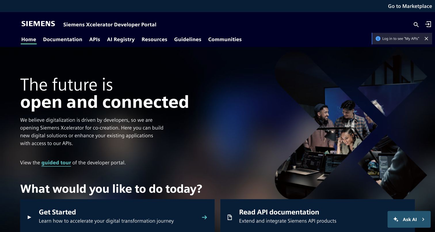
Siemens Xcelerator's developer portal pairs a dark industrial visual identity with a direct question about the visitor's task. Documentation, APIs, resources and communities are available in the horizontal navigation, while large cards begin the route into getting started and API reference material. The public Postman case specifically concerns this portal's API ecosystem and Run in Postman integration. The screenshot therefore shows a relevant developer surface, although it does not prove the implementation of individual industrial services. The photographed team gives the page a human focal point without displacing the technical categories that define the portal's purpose.
What you can learn
A large technical catalog needs a small entrance. Separate finding an API, understanding it and obtaining implementation resources, then preserve those labels as visitors move deeper into individual product documentation and examples.
Pros
The task cards translate a broad industrial ecosystem into recognizable developer actions.
Documentation and API navigation stays visible above the promotional introduction and supporting imagery.
Cons & considerations
Several navigation categories require careful editorial boundaries as the portal grows over time.
The assistant control and login reminder add competing interface elements to an already information-rich opening.
Platform source: Official Postman customer case — documented API relationship. Siemens Xcelerator public developer portal and Run in Postman integration for industrial APIs. Official documentary API-service or delivery-workflow association. The public capture is not proof of Postman frontend runtime, CMS, a complete current stack or independently tested performance. Platform evidence is separate from the direct website screenshot and is not a complete current infrastructure audit.
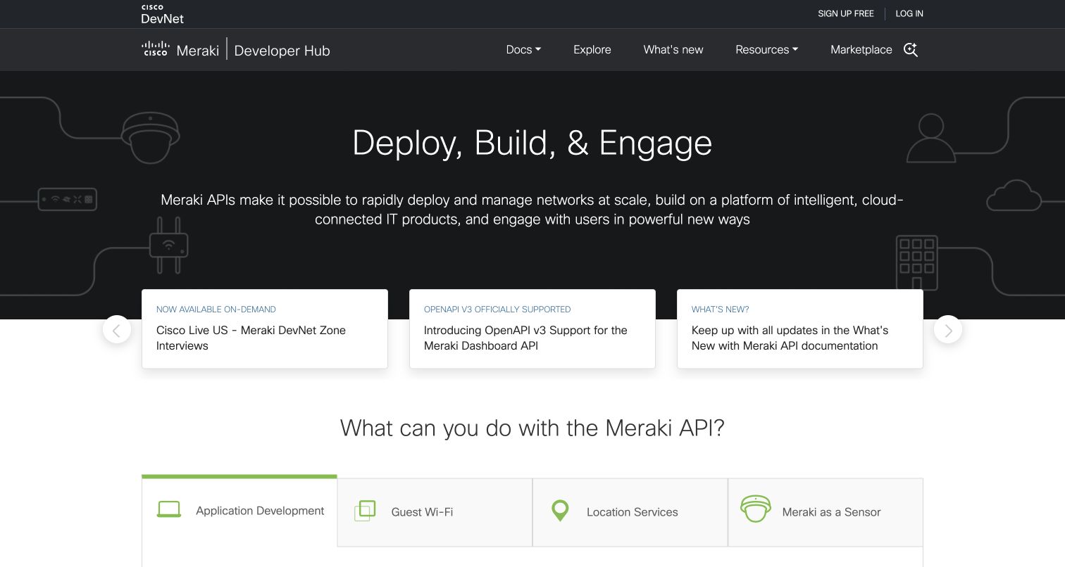
Cisco Meraki's developer hub introduces deployment, building and engagement against restrained network illustrations. Beneath the dark hero, white update cards bridge into an application-oriented section with tabs for distinct API uses. The page explicitly discusses exporting the Dashboard API to a Postman collection, complementing the official customer case. This is a public developer-distribution relationship, not a claim about the portal's CMS or the hardware's complete software stack. The composition works best where it explains what an integrator can accomplish before presenting the mechanics of requests, libraries and code samples further down the page.
What you can learn
Explain the job an API performs before showing its syntax. Pair a few concrete use cases with clear documentation routes, and distinguish release news from the durable steps a new developer needs to begin.
Pros
The capability tabs create a useful bridge between the general platform promise and specific developer tasks.
White update cards stand apart from the dark introduction without breaking the overall visual hierarchy.
Cons & considerations
A rotating news area can obscure useful items unless equivalent stable links remain available.
Older announcement cards require maintenance so the entrance does not imply that historical updates are new.
Platform source: Official Postman customer case — documented API relationship. Meraki Dashboard API public collections, developer onboarding and API demonstrations. Official documentary API-service or delivery-workflow association. The public capture is not proof of Postman frontend runtime, CMS, a complete current stack or independently tested performance. Platform evidence is separate from the direct website screenshot and is not a complete current infrastructure audit.
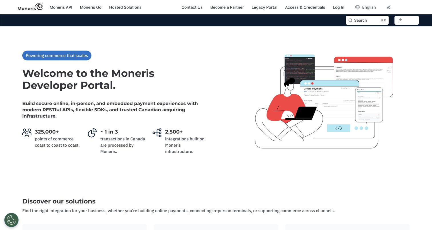
Moneris introduces its developer portal with a direct welcome, an illustrated implementation scene and a concise explanation of online, in-person and embedded payment options. The page then separates its unified API, terminal integrations and hosted solutions, instead of treating every developer as the same audience. A resource card explicitly links the official Postman workspace and describes its collections and environment variables. That visible link supports the customer case's onboarding relationship. The design is useful as a public integration entrance; the review does not test payments, credentials, terminal behavior or any of the provider's performance and security claims.
What you can learn
Make the first integration decision legible before presenting authentication details. Each route should explain who it suits and lead to its own getting-started instructions, reference material and maintained example collection.
Pros
The solution groups distinguish API, terminal and hosted approaches in terms an implementation team can compare.
Postman resources appear alongside documentation and support rather than as an isolated promotional badge.
Cons & considerations
Several product families make naming consistency essential between this entrance and deeper reference pages.
Large trust statistics occupy space that some returning developers would prefer to use for immediate technical links.
Visible tech stack
Earlier / documented evidence
Postman
Platform source: Official Postman customer case — documented API relationship. Unified payment API public workspace and merchant developer portal onboarding. Official documentary API-service or delivery-workflow association. The public capture is not proof of Postman frontend runtime, CMS, a complete current stack or independently tested performance. Platform evidence is separate from the direct website screenshot and is not a complete current infrastructure audit.
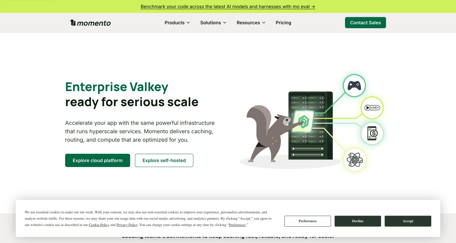
Momento's homepage turns a caching proposition into a clear visual choice. A green headline and squirrel illustration share a white canvas with two actions for its cloud platform and self-hosted offering. The product navigation and pricing link remain compact, while the lower page expands the operational explanation. Postman's case documents Momento's public HTTP API workspace and developer discovery, not the implementation of this marketing frontend. The most reusable pattern is the separation of deployment choices early enough that visitors can follow the path matching their operating model before reading the infrastructure details.
What you can learn
When a product supports different operating models, show those choices beside the core promise. Explain the responsibilities attached to each route in deeper content, and connect API examples to the relevant service rather than a generic download.
Pros
Two clearly labeled actions distinguish managed cloud exploration from a self-hosted technical evaluation.
The simple illustration gives an infrastructure topic a recognizable identity without replacing the explanatory text.
Cons & considerations
The opening uses specialist terminology that may need a plain-language explanation for less experienced buyers.
The captured cookie notice overlaps the lower part of the page and reduces the visible supporting content.
Visible tech stack
Earlier / documented evidence
Postman
Platform source: Official Postman customer case — documented API relationship. Public HTTP API workspace for Momento caching services and developer discovery. Official documentary API-service or delivery-workflow association. The public capture is not proof of Postman frontend runtime, CMS, a complete current stack or independently tested performance. Platform evidence is separate from the direct website screenshot and is not a complete current infrastructure audit.
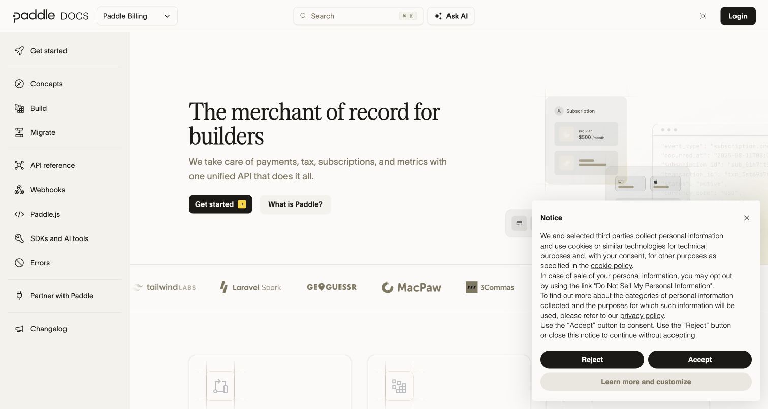
Paddle's developer site combines a persistent left navigation with a restrained editorial hero and a visual checkout illustration. Getting started, concepts, building, API reference and webhooks are distinct destinations, so the page can support both learning and lookup. Further down, an example checkout is paired with implementation choices; this review did not submit that form. The official Postman case concerns Paddle Billing API exploration and collections. It supports the developer-workflow relationship, while the screenshot remains evidence of the public documentation design. The serif headline and pale surfaces soften a technical page without hiding its task-oriented structure.
What you can learn
Connect reference material to a recognizable product outcome. Show how a request relates to the checkout or subscription journey, but keep demonstration interfaces clearly separated from real accounts, payments and production credentials.
Pros
Persistent navigation keeps conceptual guides and endpoint reference close without mixing their purposes.
The hero connects the unified API proposition to a concrete checkout-oriented product illustration.
Cons & considerations
The long landing page contains several competing routes for someone seeking only a single endpoint.
The visible privacy panel covers part of the illustration and some supporting content in the captured view.
Platform source: Official Postman customer case — documented API relationship. Paddle Billing public API exploration and maintained developer collections. Official documentary API-service or delivery-workflow association. The public capture is not proof of Postman frontend runtime, CMS, a complete current stack or independently tested performance. Platform evidence is separate from the direct website screenshot and is not a complete current infrastructure audit.
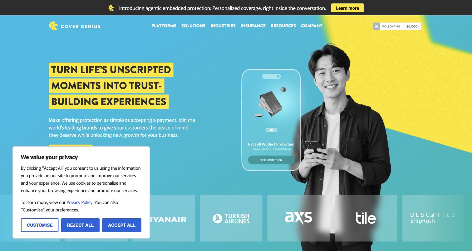
Cover Genius uses cyan and yellow to frame a protection story. Highlighted headline strips and a product overlay make the abstract idea of embedded insurance visible, while partner logos begin immediately below the hero. Postman's case documents partner API collaboration and validation for the protection platform. The public homepage is the commercial explanation of that service, rather than a capture of partner accounts or proof of its frontend technology. The useful design move is tying an integration-heavy product to the moment a customer might need it, then offering deeper routes through platforms, industries and insurance categories.
What you can learn
Translate an API capability into a specific customer moment, then provide a technical path for the team that must implement it. Keep partner proof separate from any unsupported promise about outcomes, coverage or service quality.
Pros
The strong color contrast and highlighted headline make the main proposition visually distinctive.
The product overlay helps explain where protection can appear inside another company's customer experience.
Cons & considerations
Broad platform and industry navigation can require an extra decision before reaching implementation information.
The captured privacy panel obscures part of the main action and the first row of partner proof.
Platform source: Official Postman customer case — documented API relationship. Embedded insurance partner API documentation, collaboration and integration validation. Official documentary API-service or delivery-workflow association. The public capture is not proof of Postman frontend runtime, CMS, a complete current stack or independently tested performance. Platform evidence is separate from the direct website screenshot and is not a complete current infrastructure audit.
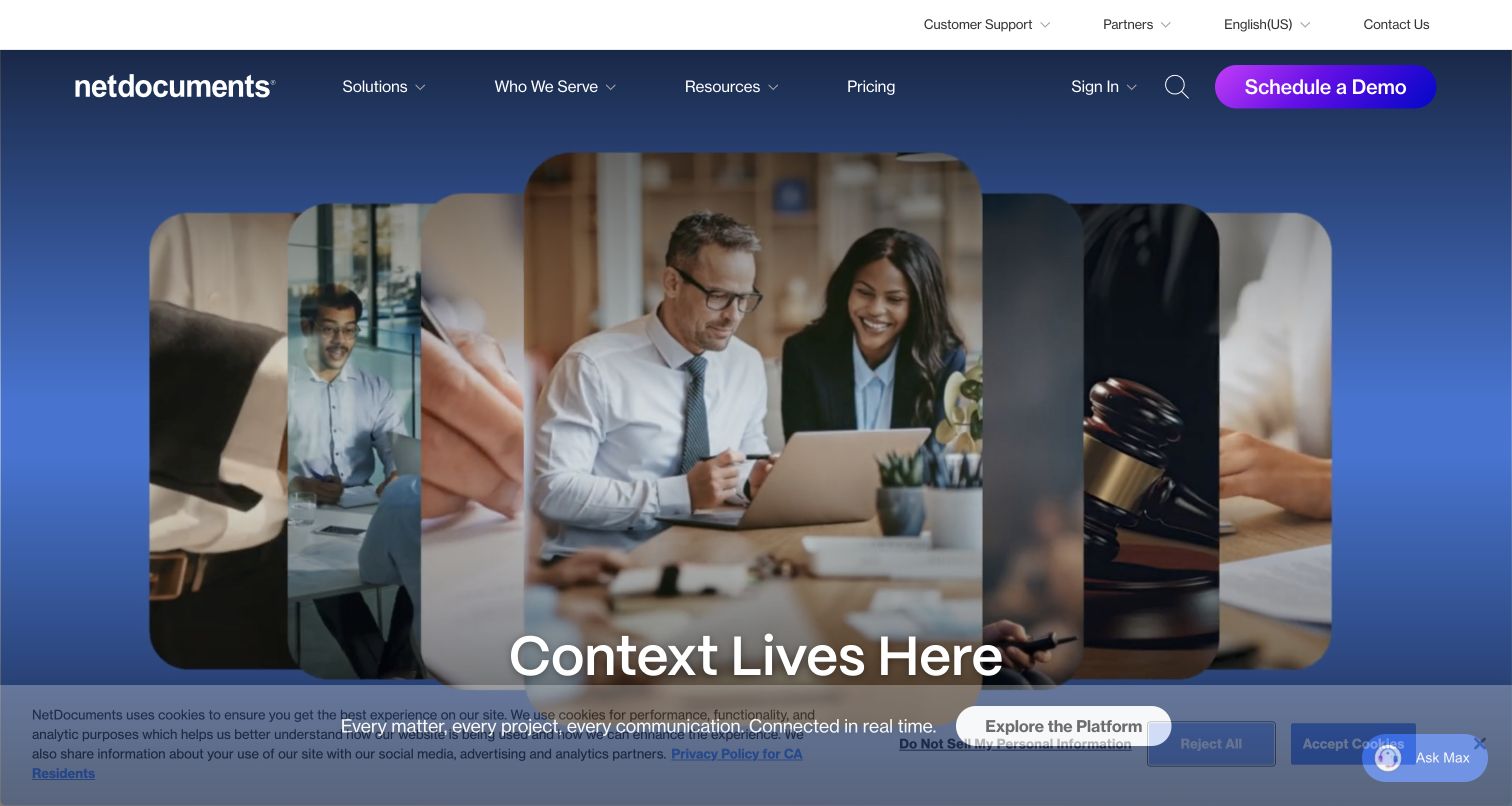
NetDocuments leads with a layered sequence of legal-work imagery and a short headline about context. The consistent blue setting and rounded image panels keep the presentation coherent, while navigation offers solutions, audiences, resources and pricing. Lower sections explain document management, collaboration, legal AI and governance as parts of a connected platform. The official Postman case concerns APIs supporting that document-management product and its integrations. The screenshot is a public product-design reference; it does not establish the site's runtime or inspect customer documents. The central lesson is showing the working environment before unpacking the software's multiple capabilities.
What you can learn
Use a broad platform message as an introduction, then give each capability a concrete job and route. For API partners, provide documentation that explains how those capabilities connect instead of relying on the marketing metaphor alone.
Pros
Consistent imagery and color connect the platform story to a recognizable professional audience.
The navigation separates buying information from support and existing-customer sign-in routes.
Cons & considerations
The short opening headline needs the supporting sections to explain the specific product functionality.
The large media treatment leaves relatively little initial room for detailed technical or integration information.
Platform source: Official Postman customer case — documented API relationship. Document-management platform API design, testing and customer integration implementation. Official documentary API-service or delivery-workflow association. The public capture is not proof of Postman frontend runtime, CMS, a complete current stack or independently tested performance. Platform evidence is separate from the direct website screenshot and is not a complete current infrastructure audit.
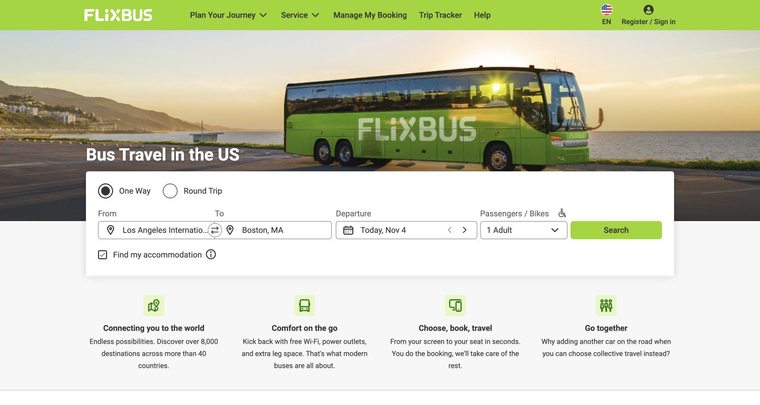
FlixBus places a prominent journey form across its travel photograph, turning the page into an immediate route-planning entrance. Origin, destination, departure and passenger choices sit in one horizontal group, with a green search action at the end. The retained capture also shows practical service navigation above the hero and benefit explanations below it. Postman's case documents Flix's published APIs, partner collections and contract testing for its travel platform. The screenshot supports analysis of the public booking entrance only; no search, reservation, payment or service-quality claim was tested as part of this editorial review.
What you can learn
Put the product's main task before a general brand explanation when visitor intent is already clear. Make route, date and passenger state explicit, and use API examples to document the same states and error cases for partners.
Pros
The search form provides a concrete starting point directly within the opening view.
Booking management and trip tracking remain easy to distinguish from the new-journey search path.
Cons & considerations
A dense horizontal form needs careful responsive behavior when labels and destination names become long.
The accommodation option can introduce an additional decision before the visitor finishes the core transport search.
Platform source: Official Postman customer case — documented API relationship. Flix travel-platform published APIs, partner collections and automated contract testing. Official documentary API-service or delivery-workflow association. The public capture is not proof of Postman frontend runtime, CMS, a complete current stack or independently tested performance. Platform evidence is separate from the direct website screenshot and is not a complete current infrastructure audit.
Sling's retained capture combines a concise live-TV promise with a collage of news, entertainment and sport. The dark background keeps the media and blue plan action prominent, while the top navigation separates plans, channels, sports and offers. Postman's official case describes validation of the streaming product's client and server APIs across browsers and devices. That is a documented engineering relationship, not evidence that the marketing page is built with Postman. The page demonstrates how a service can make its content visible before asking visitors to understand all the package differences and account requirements.
What you can learn
Let the product's content explain the value, then make plan comparison straightforward. Document how catalog, entitlement and availability states connect at the API level, while keeping the public marketing path readable for people who simply want to watch.
Pros
The media collage gives the streaming offer a concrete visual meaning beyond a generic subscription claim.
Distinct navigation routes help visitors approach the service through plans, channels or particular sports.
Cons & considerations
Promotional price language needs supporting plan and eligibility details before a purchase decision.
The retained capture includes a privacy overlay that dims the page and occupies the lower edge.
Platform source: Official Postman customer case — documented API relationship. Streaming product client/server API functional validation across browsers and devices. Official documentary API-service or delivery-workflow association. The public capture is not proof of Postman frontend runtime, CMS, a complete current stack or independently tested performance. Platform evidence is separate from the direct website screenshot and is not a complete current infrastructure audit.
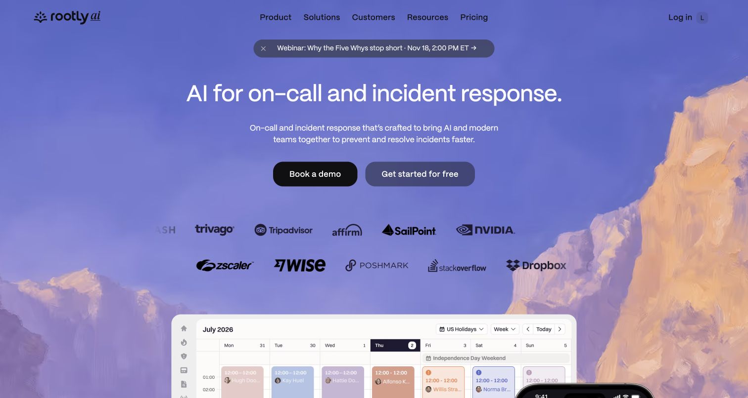
Rootly's homepage introduces incident response over a soft landscape background, followed by two clear actions and a visible on-call calendar preview. The calm palette is a useful counterpoint to a product concerned with stressful operational events. Customer marks add context, while deeper sections explain investigations, schedules and communications through interface imagery. Postman's case explicitly describes public distribution of Rootly's commercial APIs and AI Labs projects, alongside standardized engineering collections. The screenshot shows the public product explanation, not a live incident or an authenticated customer environment, and it supplies no independent evidence for the performance claims on the page.
What you can learn
For operational tools, pair the outcome with a recognizable interface early. Keep API discovery connected to the product's actual workflows, and distinguish a published integration example from a demonstration of live reliability or incident resolution.
Pros
The calendar preview quickly grounds the broad incident-response proposition in a specific product task.
Demo and self-service actions offer separate routes without requiring visitors to open a navigation menu.
Cons & considerations
Large customer-logo rows occupy space that could otherwise show more of the initial interface preview.
The atmospheric background needs careful contrast treatment wherever lighter text overlaps brighter areas.
Platform source: Official Postman customer case — documented API relationship. Public distribution of commercial product APIs and AI Labs projects, with standardized API collections and validation in the incident-response product delivery workflow. Official documentary API-service or delivery-workflow association. The public capture is not proof of Postman frontend runtime, CMS, a complete current stack or independently tested performance. Platform evidence is separate from the direct website screenshot and is not a complete current infrastructure audit.
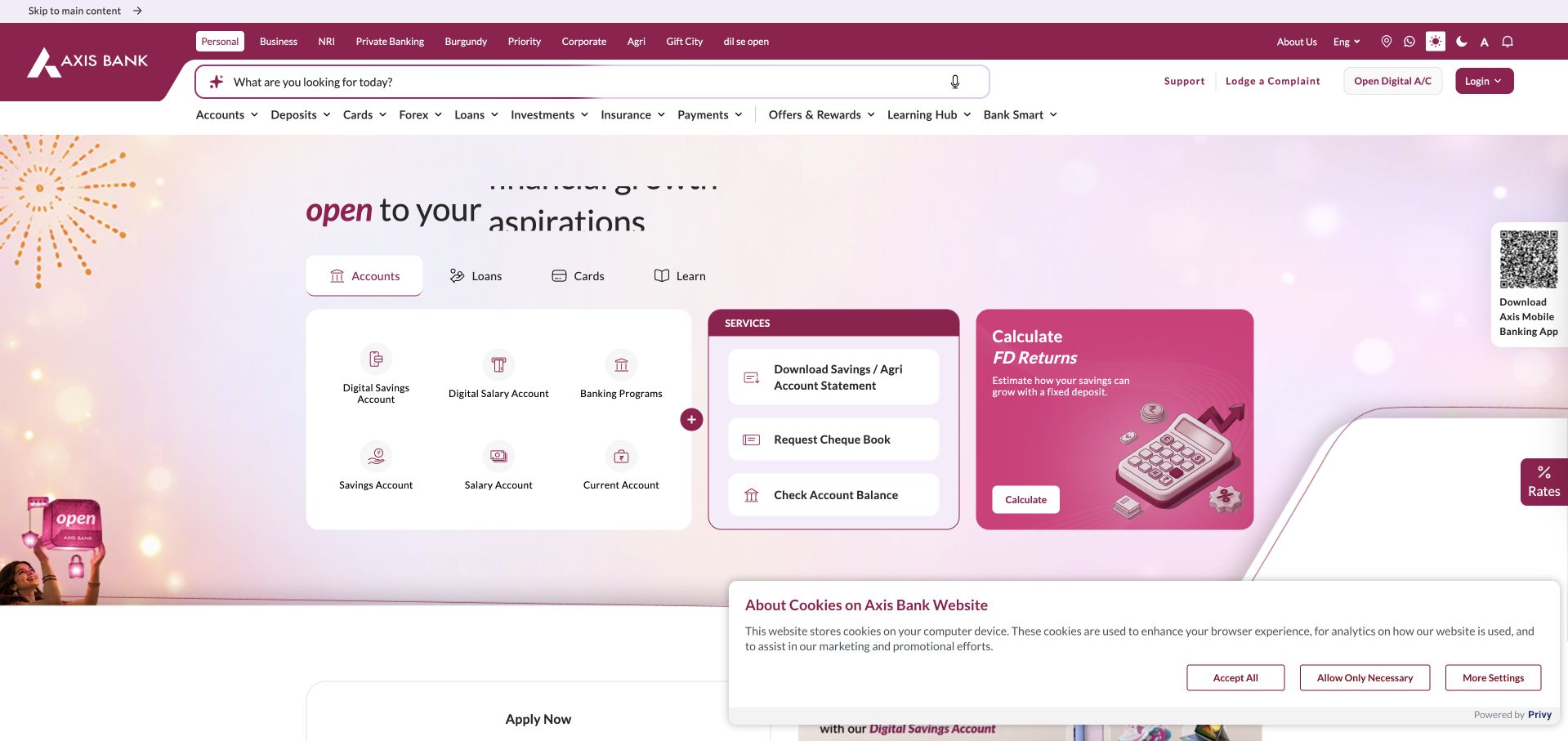
Axis Bank's retained capture uses burgundy navigation and a search field to organize banking services. Account choices, service shortcuts and a return-calculation panel sit together inside the hero rather than relying on photography. Postman's case explicitly describes partner integrations using publicly published APIs and a public Open API platform, as well as digital product delivery. The homepage represents customer-facing banking services; it is not proof that its rendering layer uses Postman. The design is worth studying for how it brings frequent service needs into the same visual hierarchy as acquisition paths.
What you can learn
Separate choosing a product from servicing an existing one, even when both must fit on a busy homepage. API documentation should preserve those distinctions, with clear authentication and permission boundaries rather than a flat list of operations.
Pros
The prominent search and service shortcuts support visitors who arrive with a specific banking task.
Audience categories and product navigation provide several recognizable ways into a large information structure.
Cons & considerations
The many simultaneous navigation rows can impose a high scanning burden on new visitors.
The retained privacy notice covers part of the lower page, and the capture does not test any financial workflow.
Platform source: Official Postman customer case — documented API relationship. Public Open API platform and partner integrations using publicly published APIs, alongside digital banking product delivery. Official documentary API-service or delivery-workflow association. The public capture is not proof of Postman frontend runtime, CMS, a complete current stack or independently tested performance. Platform evidence is separate from the direct website screenshot and is not a complete current infrastructure audit.
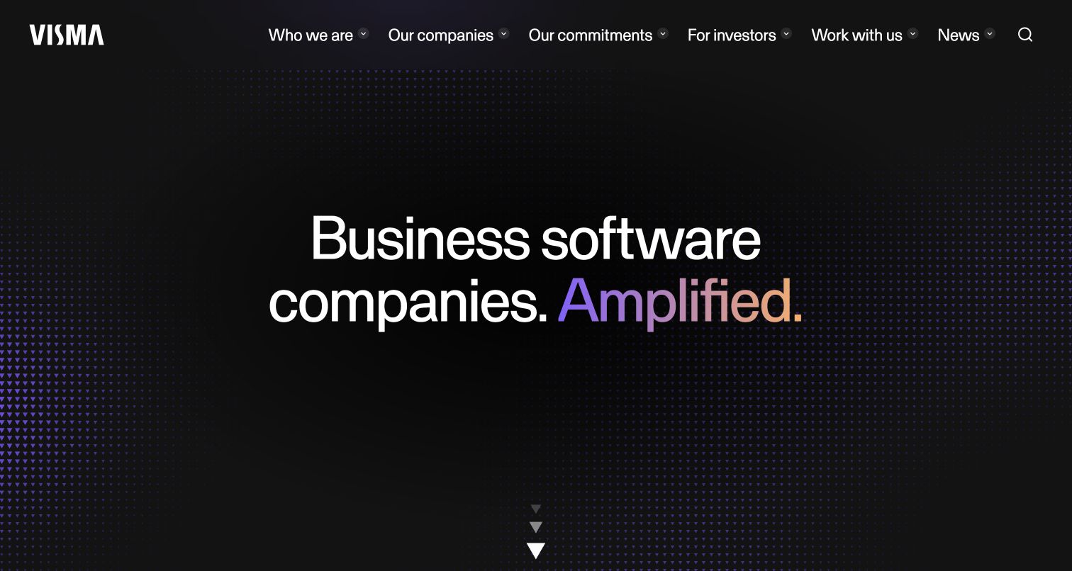
Visma's public homepage uses a nearly black background and a large two-line headline to establish its business-software identity. A subtle triangular pattern and a gradient emphasis add character without introducing a dense product mosaic. Navigation distinguishes the organization, its companies, commitments, investors and news. The official Postman case specifically connects its customer and developer API integrations to pre-publication tests. The photographed surface is the group's public marketing entrance; its case-linked developer portal required sign-in and was not reviewed as an application. This distinction keeps the editorial design observation separate from the documented API lifecycle relationship.
What you can learn
A portfolio homepage can stay concise if its navigation clearly explains where the detail lives. Give developers a dedicated technical route, and label any gated service honestly rather than implying that a marketing page demonstrates the integration experience.
Pros
The restrained composition makes the business-software positioning easy to identify before deeper exploration.
Audience-oriented navigation distinguishes company information and investor needs without filling the hero with competing actions.
Cons & considerations
The opening does not immediately expose individual products or a concrete developer quickstart.
The sparse hero relies on subsequent sections to explain the company's practical value and software breadth.
Visible tech stack
Earlier / documented evidence
Postman
Platform source: Official Postman customer case — documented API relationship. Published business-software APIs for customer and external-developer integrations, with Postman tests required before API publication. Official documentary API-service or delivery-workflow association. The public capture is not proof of Postman frontend runtime, CMS, a complete current stack or independently tested performance. Platform evidence is separate from the direct website screenshot and is not a complete current infrastructure audit.
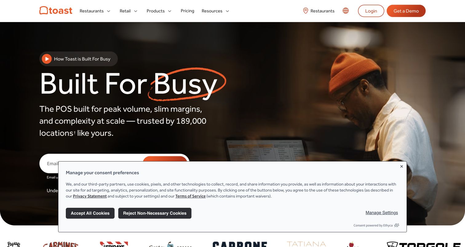
Toast presents its point-of-sale product through a restaurant scene and a statement about busy operations. Orange accents connect the brand, highlighted word and actions, while the navigation distinguishes restaurants, retail, products and pricing. The main view asks for an email; this review did not enter information or submit that form. Postman's case concerns the restaurant platform's API development and collections, rather than the marketing site's rendering technology. The screenshot is useful because it makes the operating context tangible before the page expands into ordering, hardware, payments and integration choices for businesses.
What you can learn
Explain operational software through a task and environment the buyer recognizes. Provide a useful exploration route alongside lead capture, and make technical integration information available for the team responsible for connecting the product to existing systems.
Pros
The restaurant imagery connects the software proposition to an understandable everyday working situation.
Product and pricing navigation remains visible above the hero rather than being replaced by a single sales action.
Cons & considerations
Email capture asks for commitment before some visitors have compared the relevant product options.
The visible consent panel covers part of the form and lower hero content in the captured view.
Visible tech stack
Earlier / documented evidence
Postman
Platform source: Official Postman customer case — documented API relationship. Restaurant software platform APIs, collections and developer QA workflows. Official documentary API-service or delivery-workflow association. The public capture is not proof of Postman frontend runtime, CMS, a complete current stack or independently tested performance. Platform evidence is separate from the direct website screenshot and is not a complete current infrastructure audit.
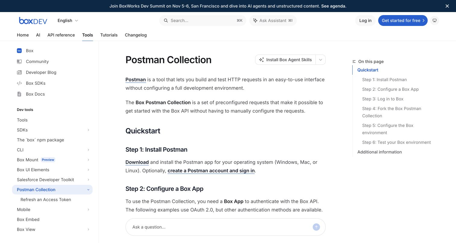
Box's public Postman Collection guide is a direct documentation example in this selection. A concise introduction explains the collection, then numbered steps cover installation, app configuration, authentication and testing. The left navigation preserves context within developer tools while a right-hand contents list exposes the complete sequence. The page documents Box's Postman collection, complementing the official customer case about onboarding automation. Reading the instructions does not mean they were executed: no app was created, credentials entered or API requests submitted. The design's value is making prerequisites and progress visible before a developer begins a multi-stage integration.
What you can learn
Show the full integration sequence before asking developers to perform its first step. Keep authentication assumptions, required permissions and environment setup close to the examples, and provide anchors so people can resume a partially completed implementation.
Pros
Numbered steps and the matching contents list make the procedure easy to scan and revisit.
The collection is explained in plain language before the documentation introduces credentials and OAuth configuration.
Cons & considerations
Three-column documentation can become crowded when technical text or configuration tables grow wide.
A large assistant input near the lower edge adds another interface element beside the reading task.
Platform source: Official Postman customer case — documented API relationship. Public Box API onboarding and automated specification-to-collection maintenance. Official documentary API-service or delivery-workflow association. The public capture is not proof of Postman frontend runtime, CMS, a complete current stack or independently tested performance. Platform evidence is separate from the direct website screenshot and is not a complete current infrastructure audit.
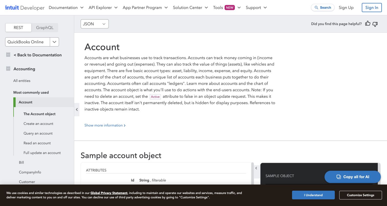
QuickBooks Online's Account reference places a detailed entity explanation beside persistent accounting navigation. Below it, attribute definitions and a contrasting sample-object panel introduce the shape of the data. REST and GraphQL choices, the selected product and JSON format remain visible above the reference, making context explicit. Postman's official Intuit case describes QuickBooks Online endpoint onboarding and Run in Postman documentation. The captured page is a public API reference, not an account balance or customer record. Its practical strength is explaining what an accounting object means before presenting the operations and fields a developer must work with.
What you can learn
Treat domain concepts as part of API documentation. Explain an object's meaning and lifecycle before its field list, then keep examples close enough that developers can compare the conceptual description with the request and response structure.
Pros
The active entity and operation list remain visible beside a long technical reference page.
Sample data and attribute explanations provide complementary ways to understand the API's accounting model.
Cons & considerations
Long explanatory text can push the first complete code example below the opening viewport.
Dense nested navigation and the privacy strip reduce the space available for reading wide examples.
Platform source: Official Postman customer case — documented API relationship. QuickBooks Online public API endpoint onboarding and Run in Postman documentation. Official documentary API-service or delivery-workflow association. The public capture is not proof of Postman frontend runtime, CMS, a complete current stack or independently tested performance. Platform evidence is separate from the direct website screenshot and is not a complete current infrastructure audit.
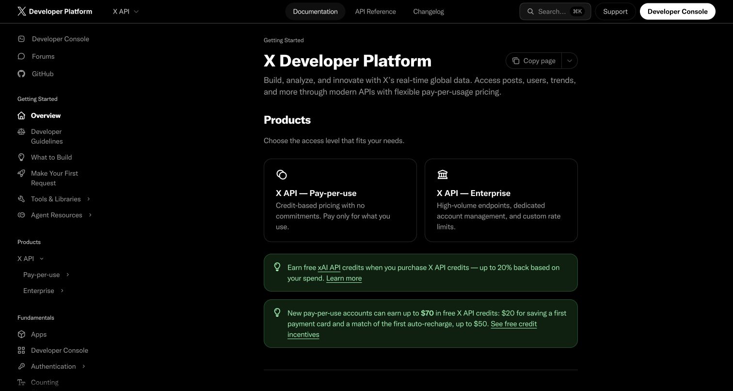
X's developer documentation uses a dark, restrained layout with a persistent topic tree and two prominent product cards. The opening distinguishes usage-based API access from enterprise access before leading into quickstarts and references. The official Postman case documents the platform's public API collection and developer-onboarding history, including earlier Twitter-era initiatives. That historical relationship does not establish today's pricing or availability of every endpoint, and the screenshot supplies no runtime attribution. The page is useful as a design reference for making access models explicit while keeping authentication, rate limits, security and support within a consistent documentation structure.
What you can learn
Explain access choices before sending developers into endpoint detail. Keep current commercial terms and limits in maintained reference pages, and clearly date historical ecosystem evidence so it cannot be mistaken for a current product guarantee.
Pros
Two comparable access cards give the opening a clear decision point for different developer needs.
Persistent navigation exposes important operational topics such as authentication, rate limits and security.
Cons & considerations
Promotional credit notices compete with the documentation's more durable getting-started content.
The extensive navigation tree can overwhelm new developers without a short, clearly prioritized quickstart path.
Platform source: Official Postman customer case — documented API relationship. Documented X/Twitter public API collections and developer onboarding, including historical Twitter-era initiatives. Official documentary API-service or delivery-workflow association. The public capture is not proof of Postman frontend runtime, CMS, a complete current stack or independently tested performance. Platform evidence is separate from the direct website screenshot and is not a complete current infrastructure audit.
Kegan has 15+ years of experience working with small businesses, Fortune 500 companies, and everything in between. No development job is too big or too small: he brings the same hands-on attention to a focused improvement, a complete website, or a custom application.
For Postman projects, he can help with responsive interfaces, reusable components, custom functionality, API connections, and performance-minded implementation. He works directly with clients on scope, design, implementation, testing, and handover, with an emphasis on clear communication and a system that remains practical to maintain after launch.
Show 3 other Postman developersHide other Postman developers
Choose the role Postman should play in the developer journey
A public collection for initial exploration
Use a small, maintained collection when the immediate need is helping external developers understand representative requests. Provide a short prerequisite list and a safe sample environment. Keep production credentials and personal records out of anything published, and make the limits of the demonstration clear.
Shared collections for an API product team
Organize collections around the API capabilities people maintain together. Decide who reviews changes, who owns documentation and how consumers learn about breaking behavior. The website can link to the approved public subset while internal delivery material remains within its intended access boundary.
Response checks within an established delivery process
Postman supports JavaScript post-response tests at request, folder and collection levels. Define assertions that explain meaningful behavior, including invalid inputs and expected failures. Connect those checks to the team's existing release process without treating a passing request collection as a complete security or browser test.
Plan the public entrance, examples and ongoing ownership
Map the first successful integration
Write a sequence from product discovery to understanding the access model, obtaining authorized credentials, choosing an environment and evaluating a response. Name every prerequisite and distinguish actions that only read data from actions that change it. Use that sequence to structure the public quickstart and its navigation.
Separate reusable configuration from sensitive values
Variables can reuse values across requests, while environments group related configuration. Document which environment a collection expects and who may change shared values. Keep secrets outside public examples and review exported material before distribution. A convenient example should never depend on copying a real customer's data.
Record the product version, owner and intended audience for each public example. Decide how an outdated collection is replaced and how developers discover migration notes. Revisit links from the marketing website when documentation, API access or the service itself changes; a historical case can remain valid evidence without guaranteeing present availability.
Evaluate the website as a reading and navigation tool
Check whether long endpoint names, code blocks and dense menus remain understandable on narrow screens and with keyboard navigation. Keep search, task labels and contents links consistent. A page can be visually polished while still leaving its readers unsure which request or prerequisite comes next.
A useful handover demonstration
Ask the actual team to carry out its routine job: publish a realistic update, correct a mistake, preview a narrow screen, and identify who owns an integration failure. For a library or frontend framework, also ask who maintains the content source and deployment. A polished screenshot does not answer those operational questions.
Beyond the screenshot
A practical Postman and developer-site checklist
State the named product and exact scope of each API example.
Publish a short prerequisite list before installation or authentication steps.
Identify the intended environment and distinguish read-only examples from writes.
Remove credentials, personal data and private configuration from public collections.
Keep request names, folders and documentation labels consistent.
Explain expected responses and meaningful error cases.
Check the collection's owner, version and last editorial review.
Keep a route to the authoritative reference and current access terms.
Review search, keyboard navigation, code overflow and mobile reading behavior.
Document update, deprecation and support responsibilities before handover.
Test with real content, a keyboard, a small screen, slow or failed requests, and the people who will maintain the system. These are planning checks, not an accessibility, security, performance, or search-ranking certification.
Sources & editorial method
How this Postman collection was reviewed
This collection combines fifteen new direct browser captures with five retained originals, whose capture dates remain unchanged. Each public property has an official Postman customer case supporting a specific public API service or delivery workflow; several developer pages also link directly to a collection. These sources establish the documented relationship and its scope, rather than a detected Postman frontend runtime. Public technology checks remain limited to the sampled pages and accessible resources, and unavailable observations retain their original status.
Every image is an unmodified capture from the actual website, with its source and capture date. Some captures are reused from our shared catalog; their dates remain the original capture dates. None comes from a vendor gallery or a generated reconstruction. Moving imagery and live content can change.
Technology attribution uses public page assets or metadata, official platform documentation, or a cited first-party project case study. Documentary and framework-relationship evidence is identified where used; it is not a complete current backend inventory. A CMS image CDN alone does not establish a full CMS deployment. A library’s presence does not prove which individual controls use it, and a platform label does not establish AI authorship.
The composition notes, lessons, pros and tradeoffs are original editorial observations. We have not measured conversion, traffic, security, performance or accessibility conformance. Website owners retain their brands and imagery; these examples are not our client portfolio. Written, Edited and Curated are independent records, not dates advanced by a build. See our editorial standards or suggest a correction.
Questions worth asking
Postman website development FAQs
Are these websites built with Postman?
That is not what the evidence establishes. Postman is an API collaboration and testing platform. The examples document public API services or product delivery workflows associated with it; the captured website's CMS and frontend are separate questions.
Why are developer portals and marketing pages both included?
They show different parts of the same integration journey. A developer portal can explain requests directly, while a product page explains the service that an API supports. Each example identifies which surface was captured and how its official evidence relates to the product.
Does a published collection mean every request is safe to run?
No. Read its instructions, credentials requirements, environment and side effects first. Examples can create or change data. Use an appropriate authorized test workflow and avoid treating a public collection as permission to operate another person's service.
Can a successful collection replace all release testing?
No. It can check the behavior covered by its requests and assertions. Browser interaction, accessibility, security, operational recovery and other requirements still need their own suitable checks.
Do the screenshots show current accounts or private data?
No. They are public website and documentation captures. Retained screenshots keep their original capture dates. No authenticated customer application, private account or live transaction was used for this review.
How should an API team keep its public examples useful?
Assign an owner, document prerequisites and intended environments, review meaningful behavior changes, and connect examples to migration notes and the authoritative reference. A familiar brand's historical case is inspiration, not a substitute for maintaining your own integration path.
Borrow a clear task label, a useful quickstart structure or an honest integration choice. Then make your own API examples accurate, maintainable and safe for their intended audience.